1/6
This Bold Blue Kitchen Taught Us a Reno Shortcut: Invert the Color Palette
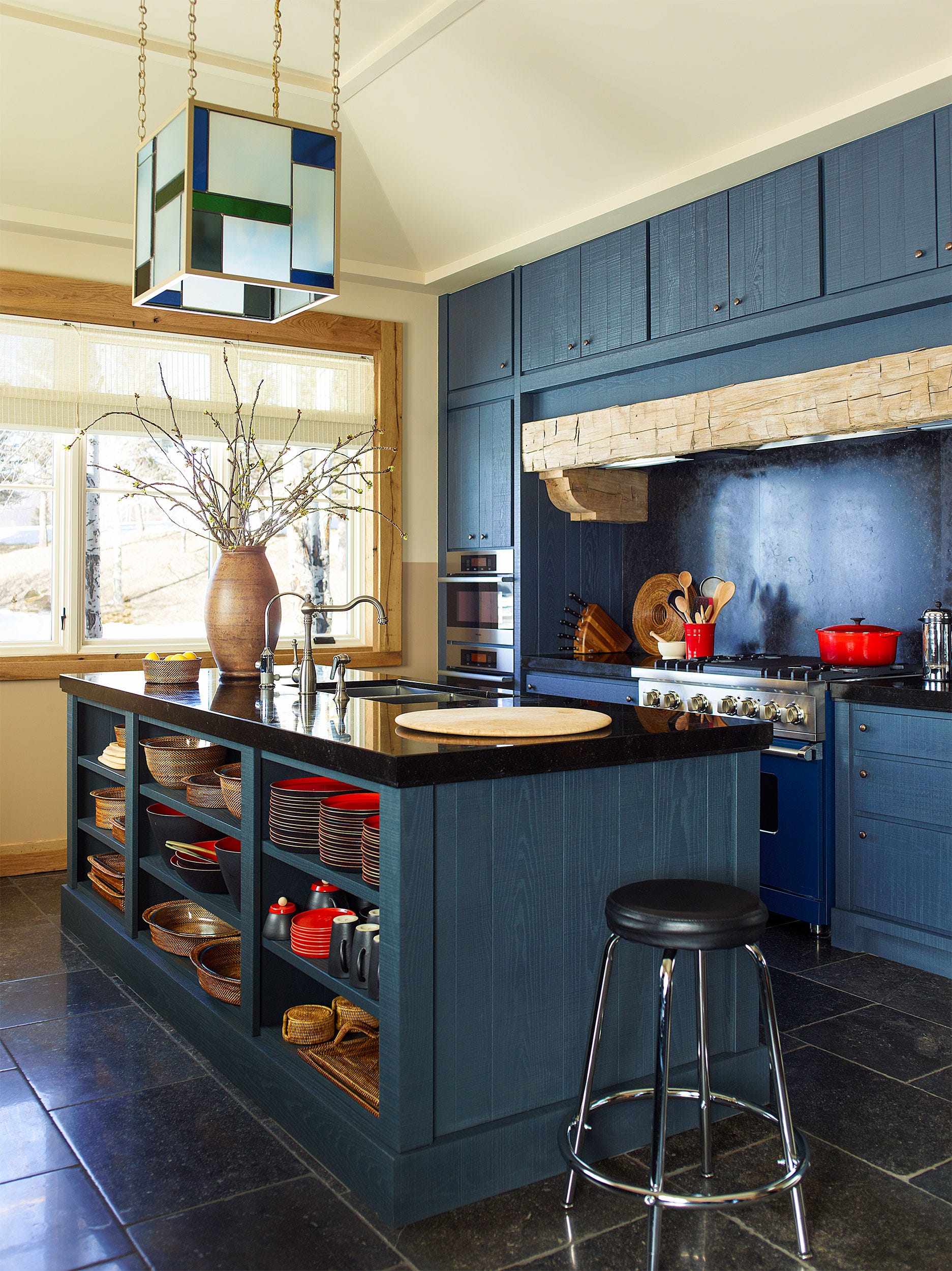
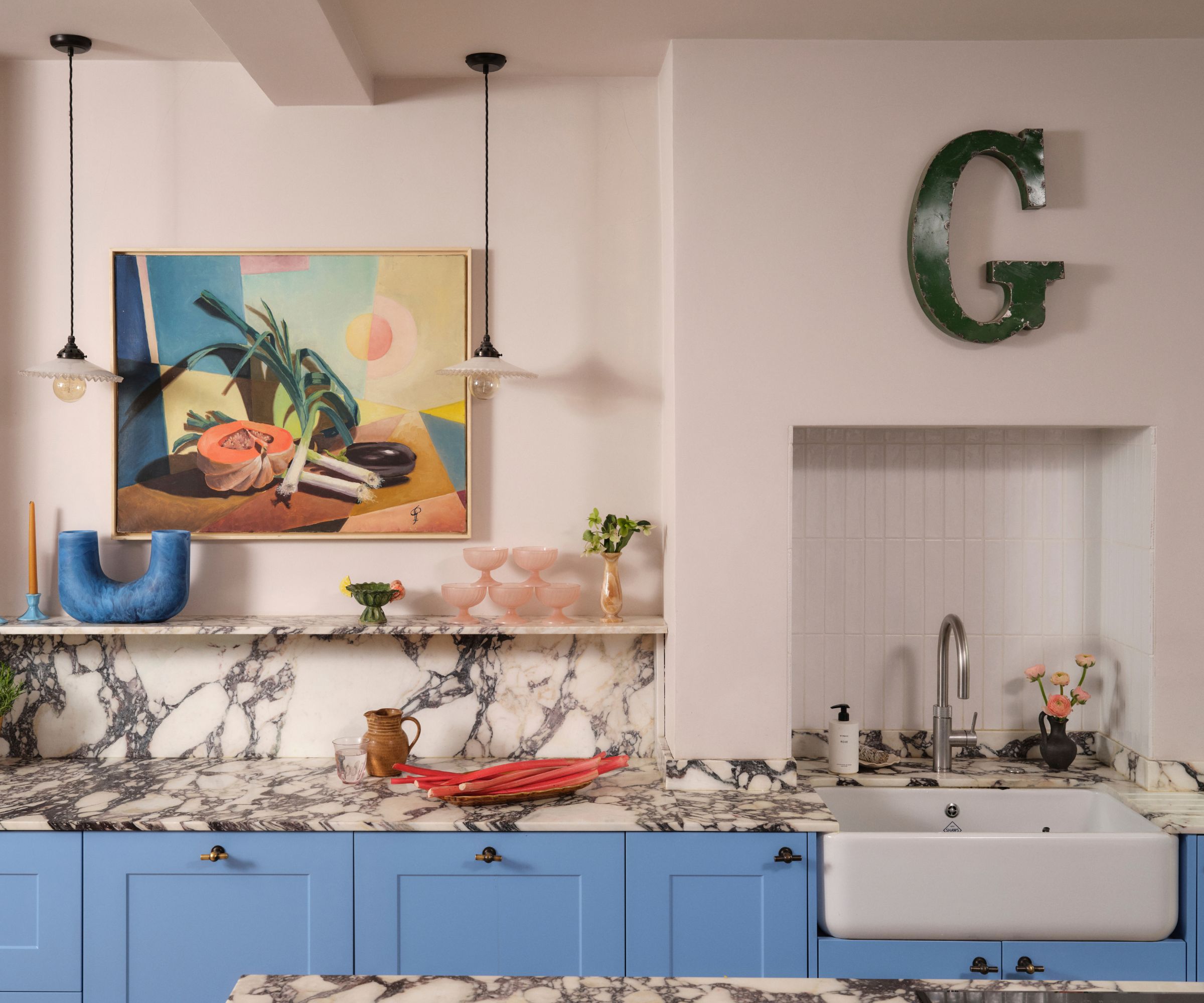
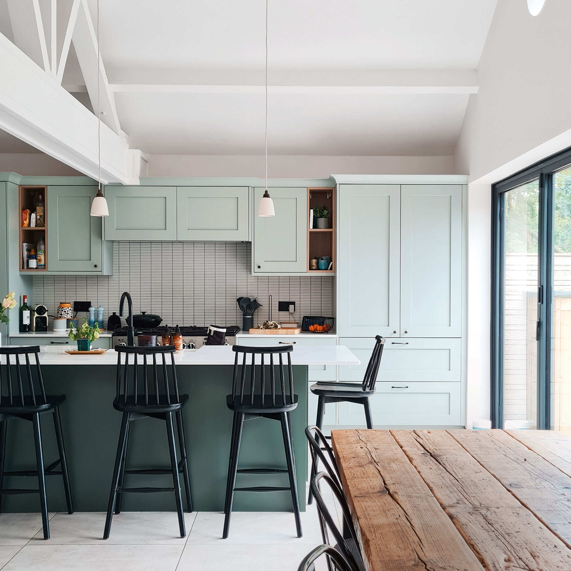
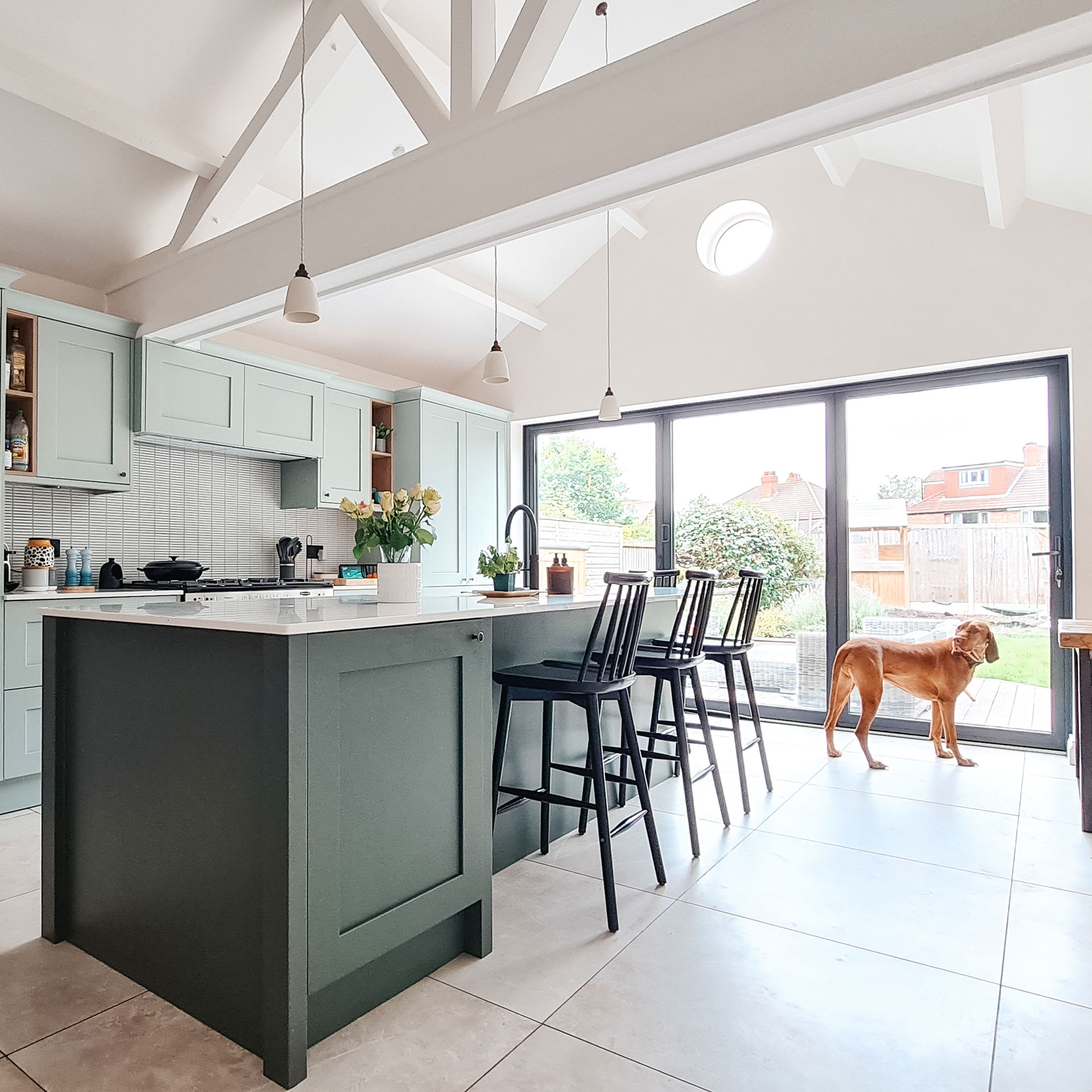
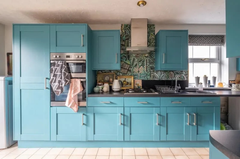
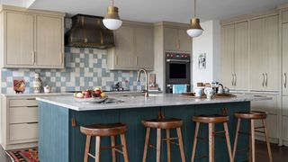
The article details an interior design project by Jessica Preston of Colour + Shape, focusing on the renovation of a 1990s country-style kitchen within a 1970s-era home in Cambridgeshire, England. The existing kitchen featured a white and blue color scheme, which the homeowners appreciated, despite the layout's imperfections, such as a stove wedged in a corner, a breakfast bar dividing spaces, and cabinets that didn't reach the ceiling. Rather than a complete overhaul, Preston opted for a strategic renovation, deciding to retain the original color pairing but invert its ratio.
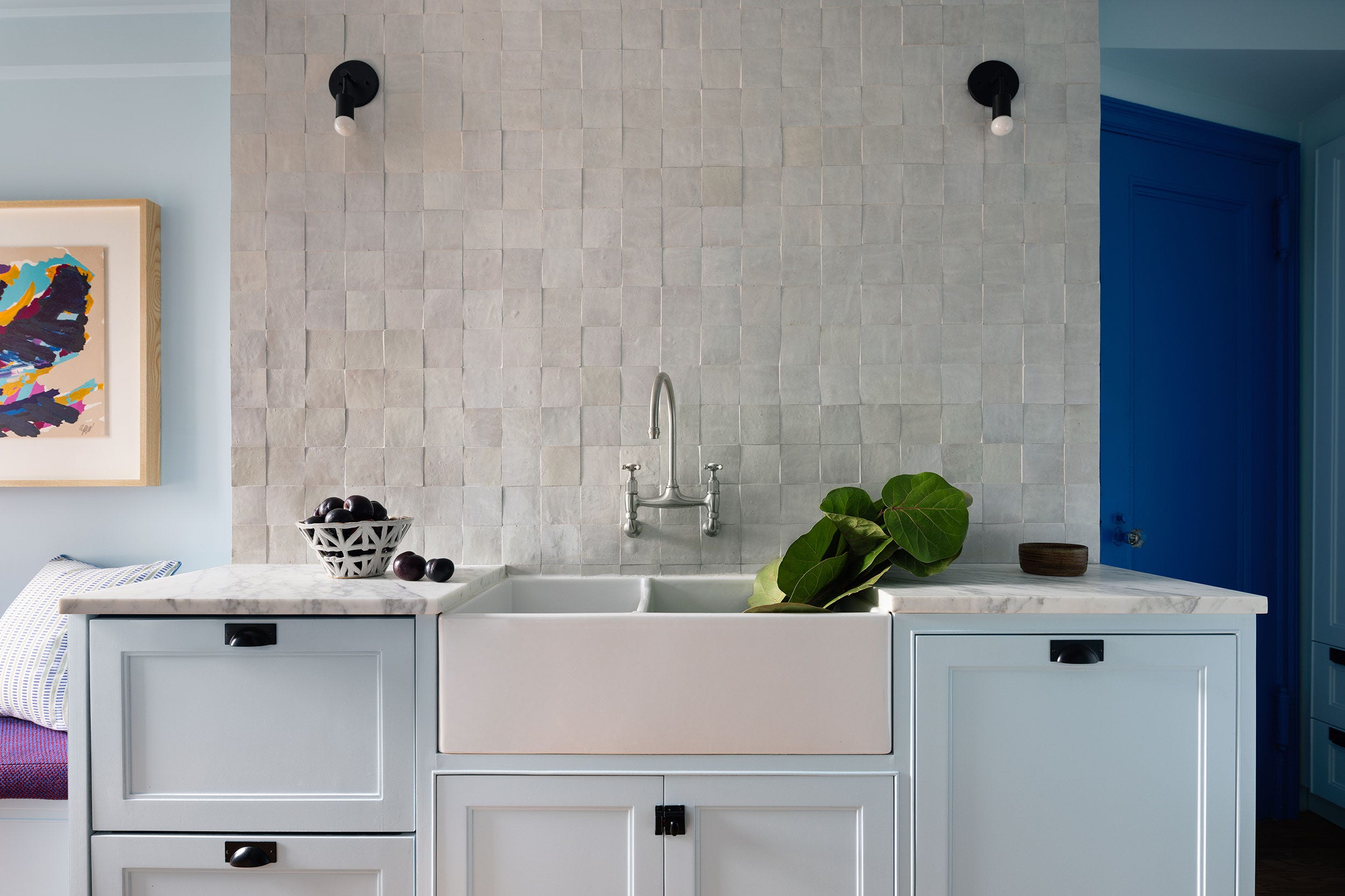
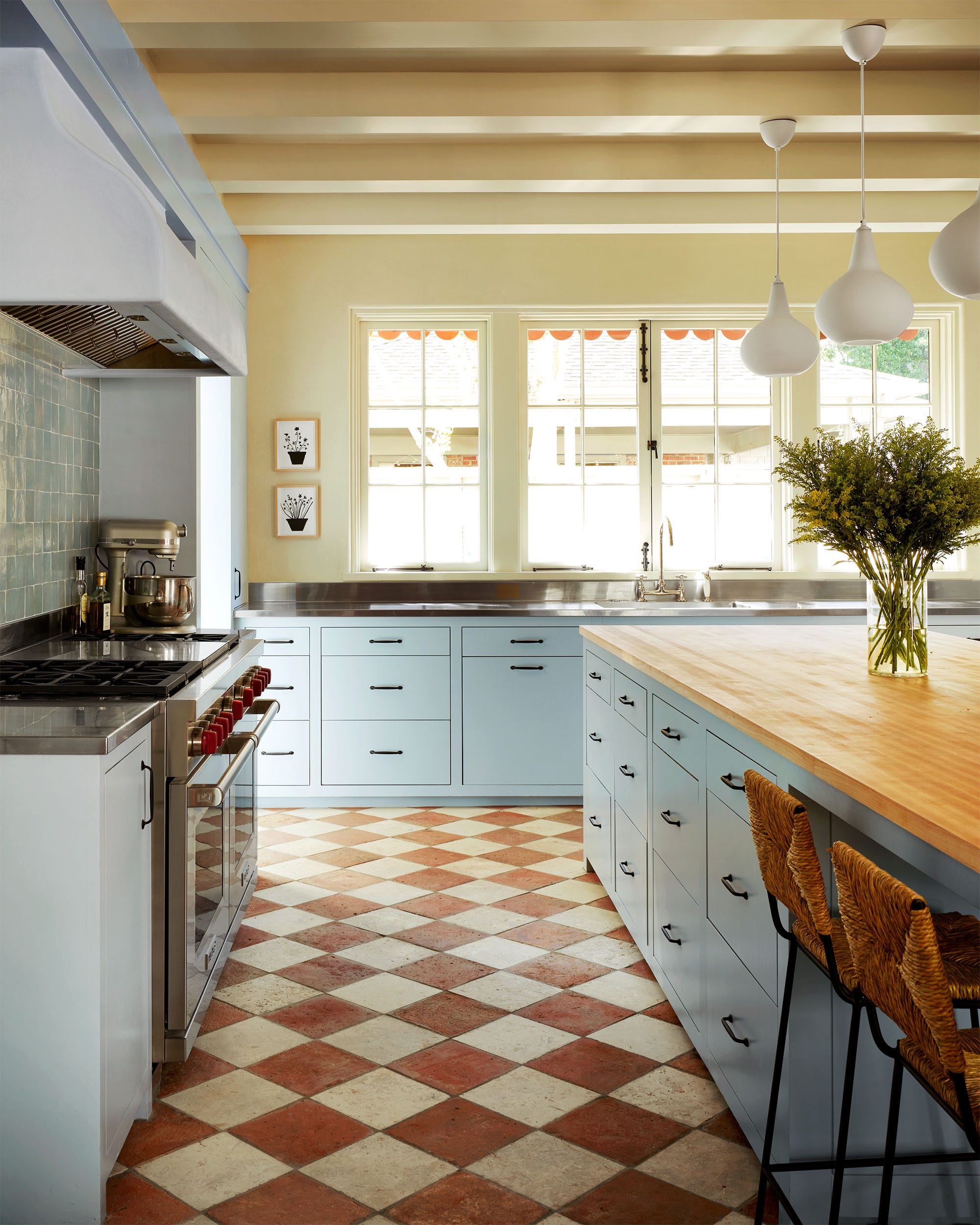
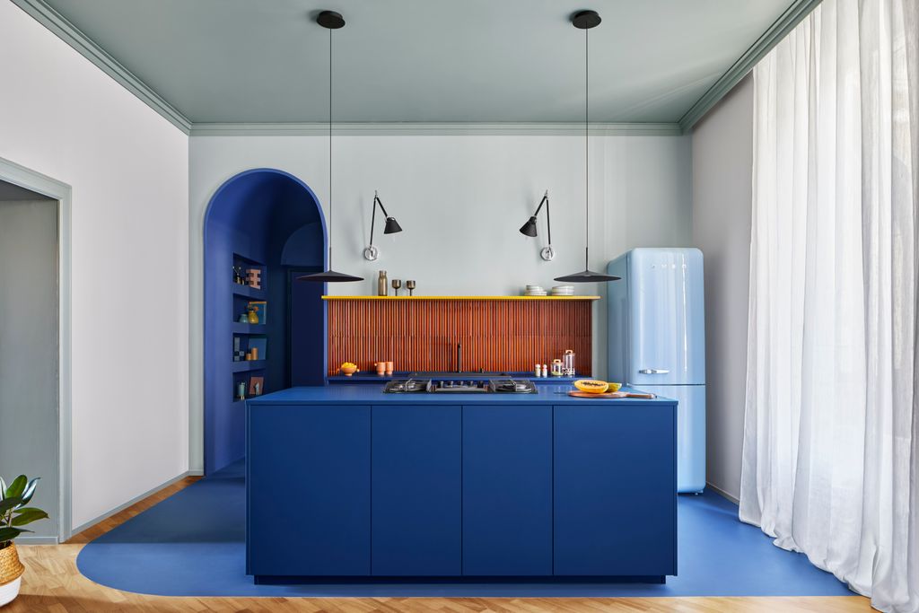
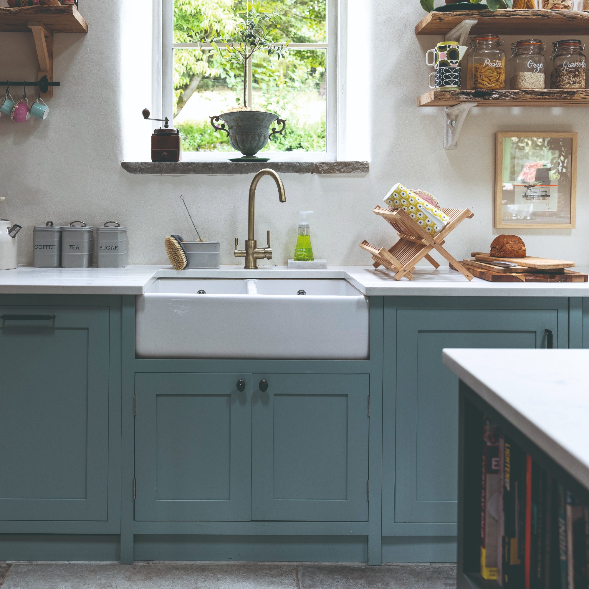
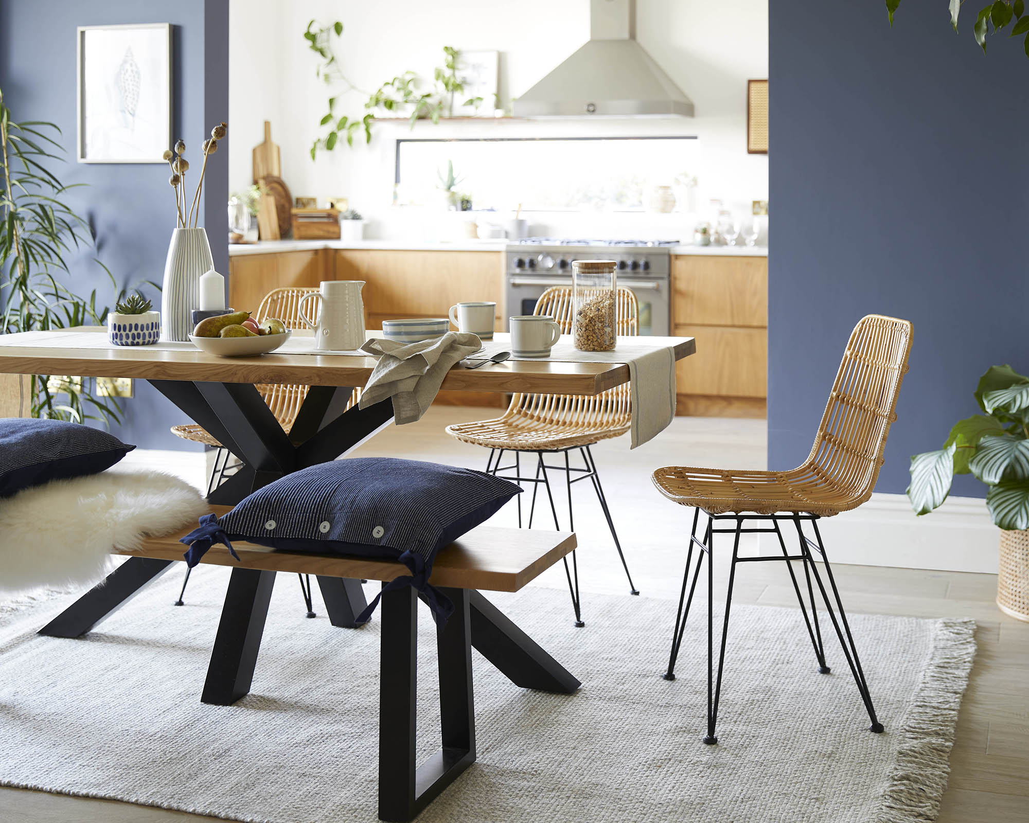
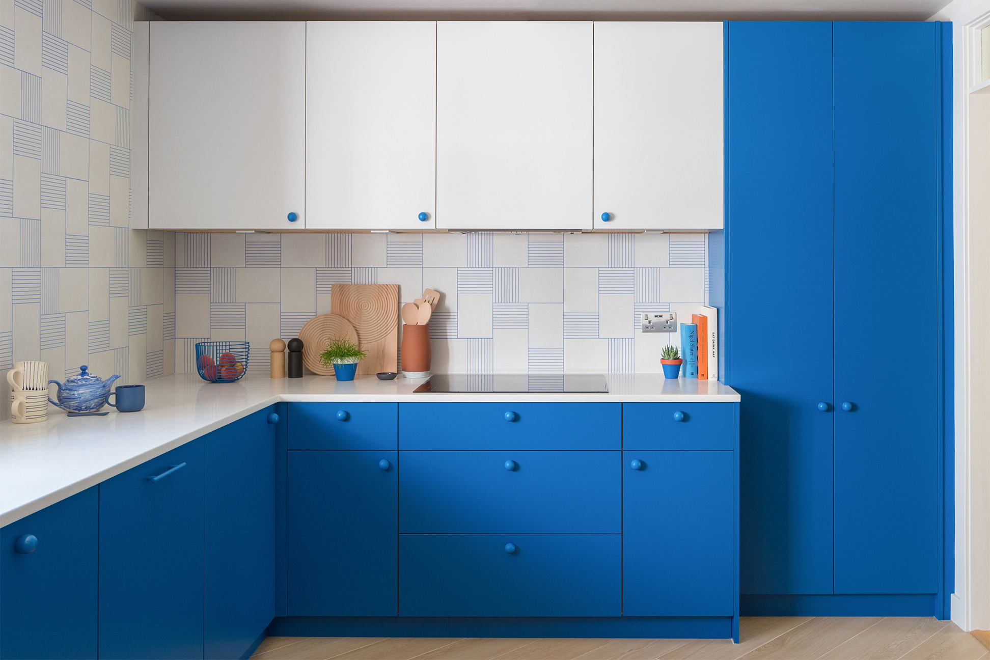
The renovation strategy involved making cornflower blue the dominant color, complemented by off-white accents, a departure from the original crisp white walls and cabinets with blue tiles. This bold, yet calculated, use of color was designed to modernize the space, evoking the wall-to-wall hues typical of 1970s kitchens while also visually enhancing the room's height. The design incorporates a balance of vibrant blue tones with more subdued neutrals. These include understated Corian countertops, oak-effect tile flooring, and matte white light fixtures, which together create a clean, geometric aesthetic. Preston emphasized that the contrast between the powerful blue and the fresh off-white contributes to a minimalist feel, with the blue being restrained within distinct areas.
The initial inspiration for the color palette came from an unexpected source: window treatments. The homeowners sought privacy due to new housing developments nearby, leading Preston to suggest a single-stack wave curtain for the French doors, featuring a modern fabric with circles layered over a grid. The various shades of blue in this fabric became the guiding principle for the entire kitchen's color scheme, even influencing the choice of grout.
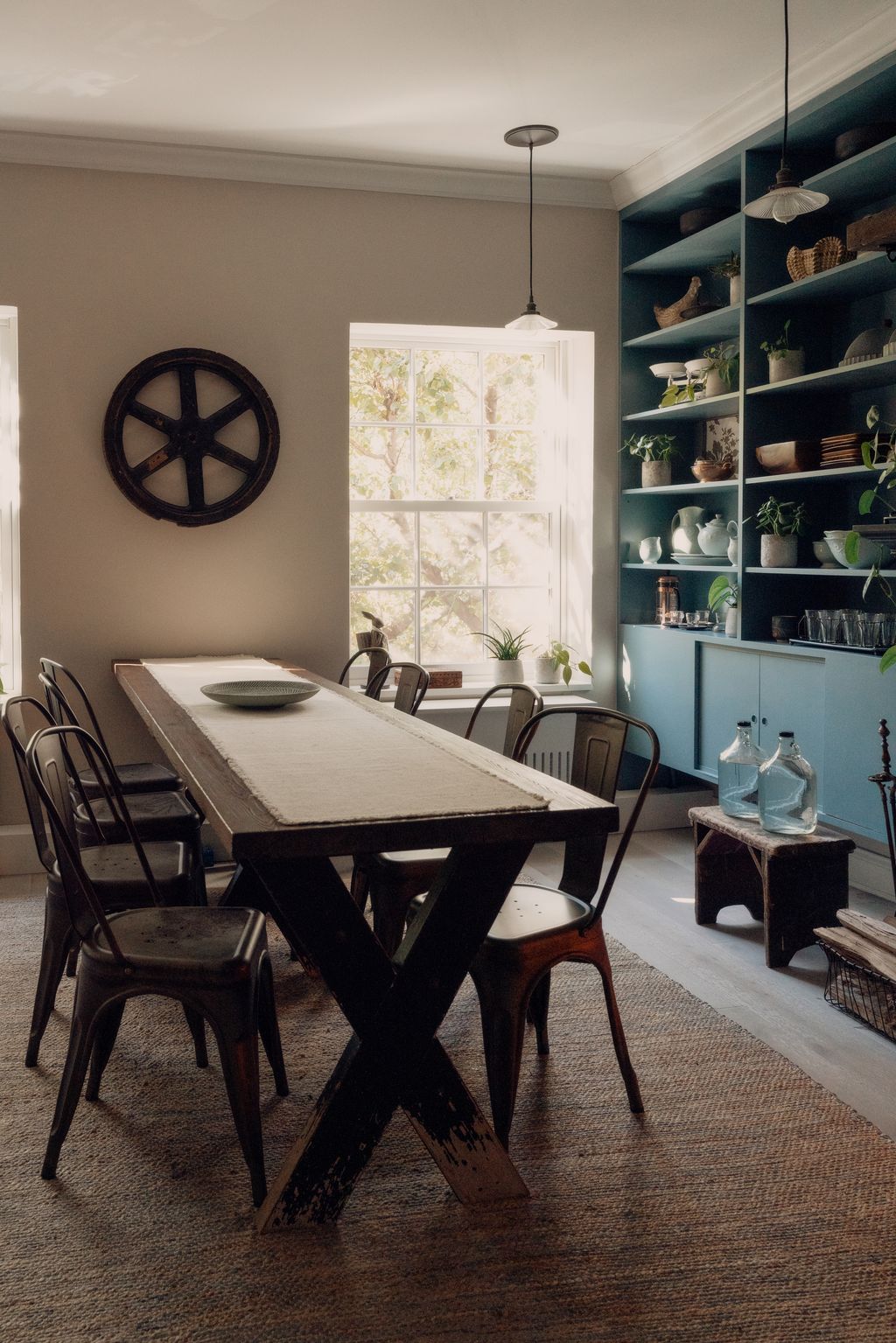
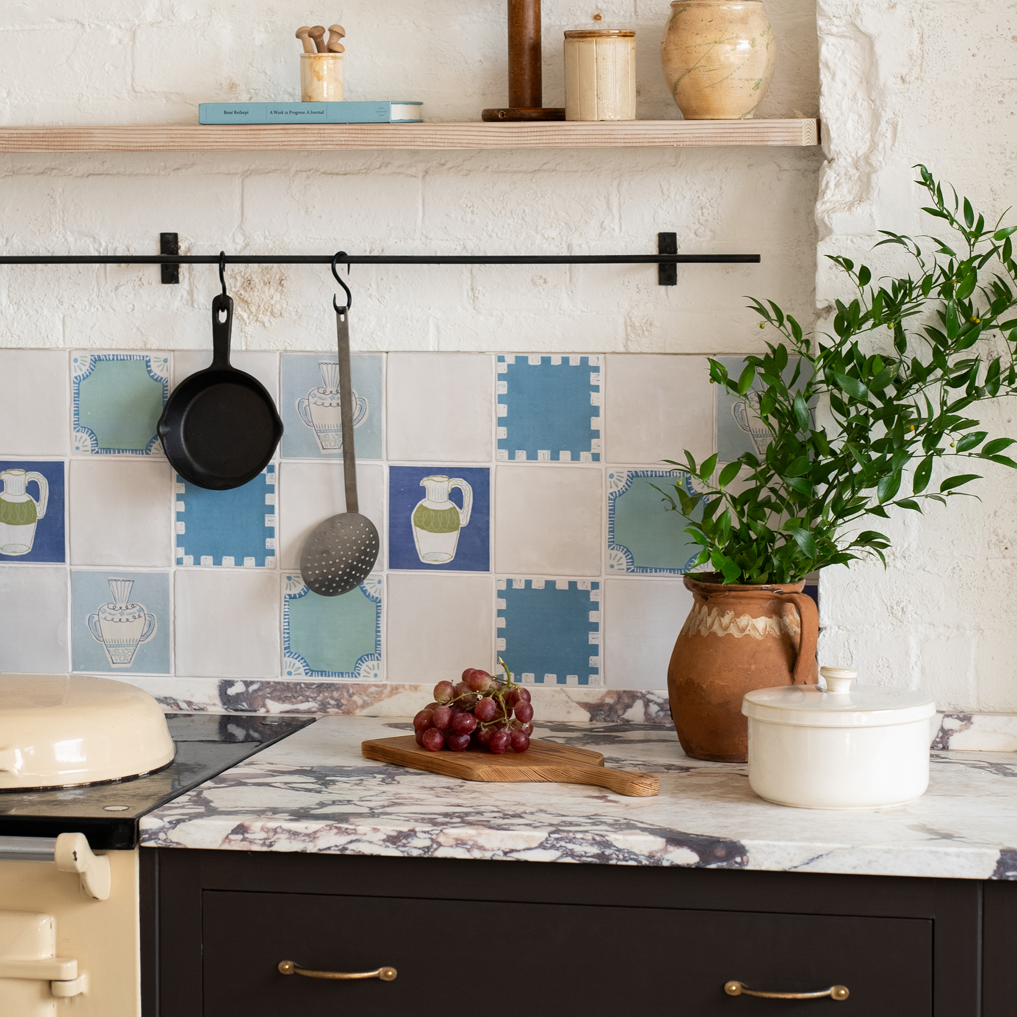
To provide contrast to the prominent blue, Preston chose terracotta, described as a more toned-down and earthy alternative to orange, blue's direct complement on the color wheel. This choice added texture and depth to the space. The design further integrates geometric lines, evident in the backsplash, and extends to smaller decorative items such as cutting boards, a fruit basket, vases, and a platter displayed on the dining area shelves.
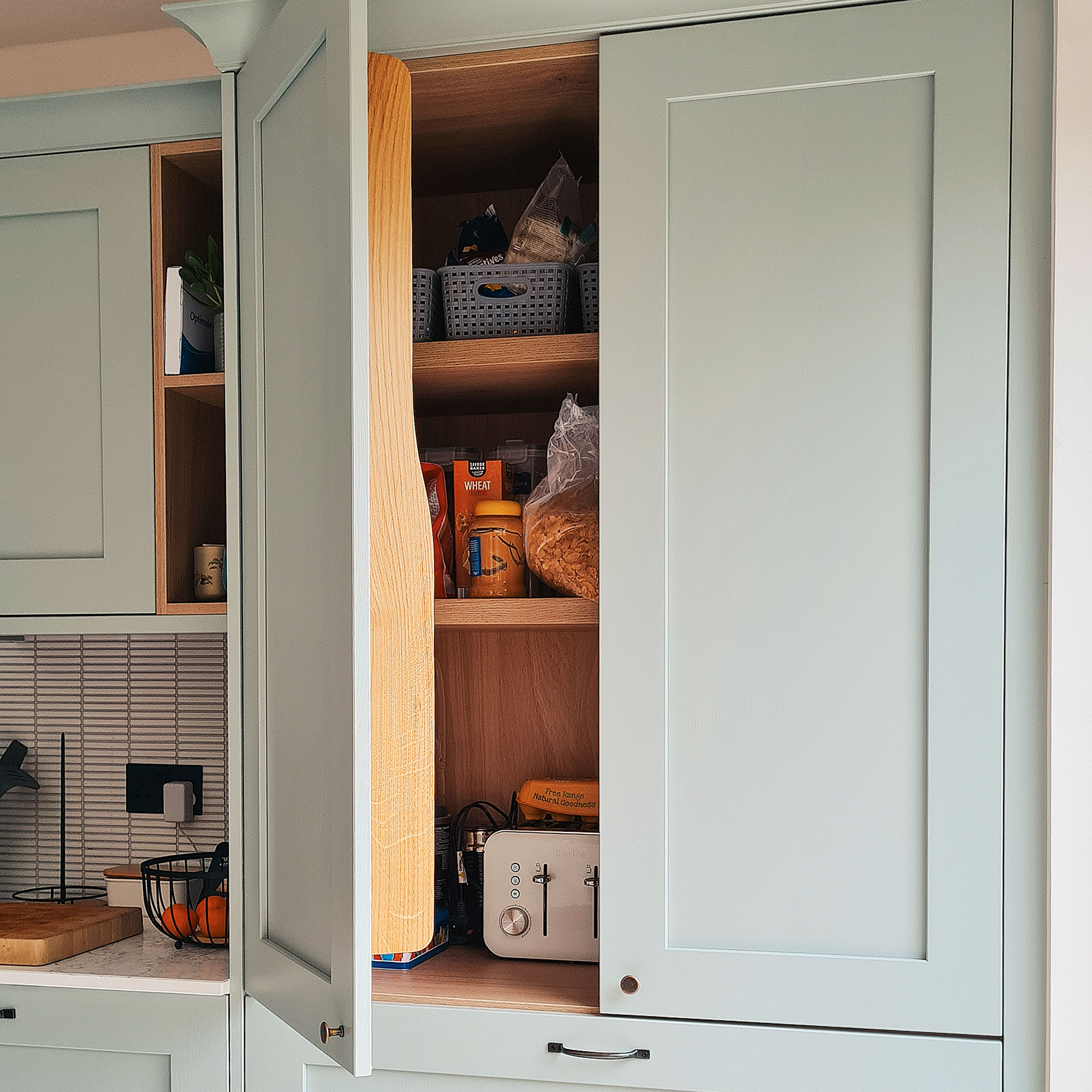
The homeowners appreciated the final design, which successfully blended striking colors with a simple composition. They particularly valued the practical details, such as the matte cabinets and counters, which are easy to clean and resist marks, aligning with their preference for stylish yet functional elements. The project demonstrates a unique approach to kitchen renovation, proving that a dramatic transformation can be achieved by creatively reinterpreting existing elements rather than entirely replacing them, resulting in a vibrant, functional, and aesthetically pleasing space.
#KitchenRenovation #ColorPalette #BlueKitchen #InteriorDesign #DesignInspiration #HomeRenovation #CornflowerBlue #TerracottaAccents #GeometricDesign #KitchenRenovation #ColorPalette #BlueKitchen #InteriorDesign #DesignInspiration #HomeRenovation #CornflowerBlue #TerracottaAccents #GeometricDesign
0 comment in total
 No comments yet
You may also like
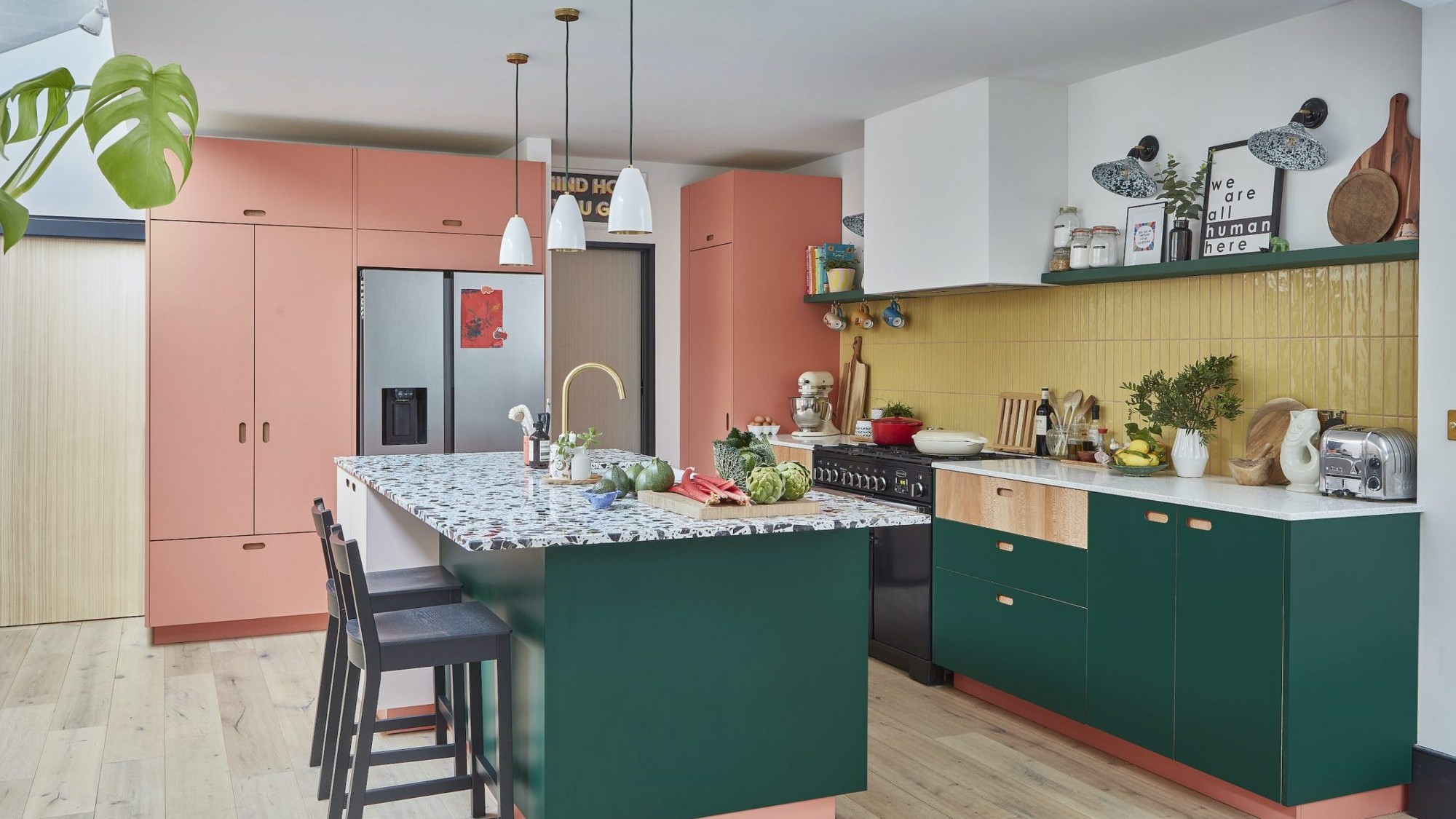
Rainbow colours have transformed a tired kitchen into a vibrant space
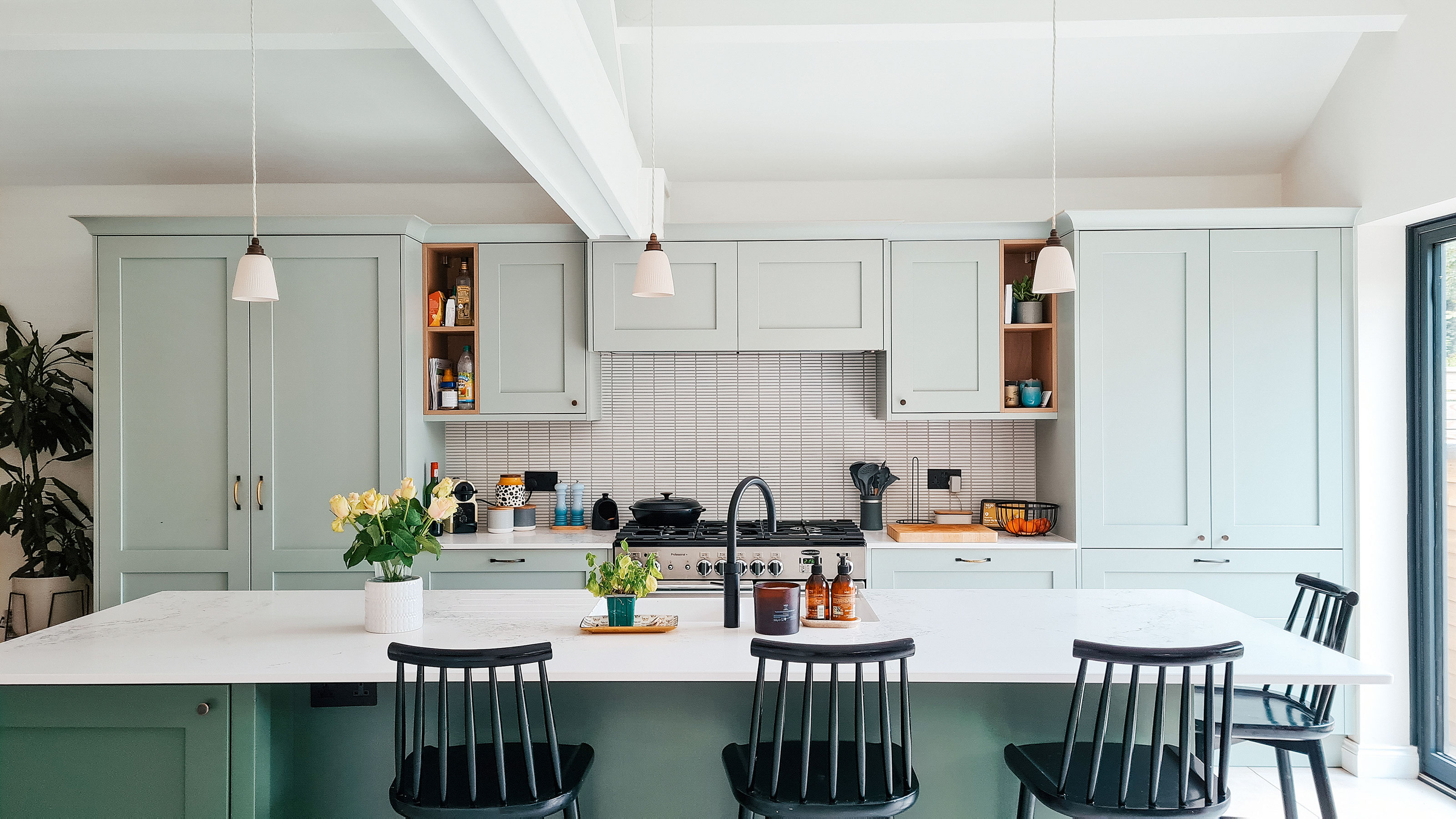
A reconfiguration and fresh colour scheme have brought new life to this once dark and dreary kitchen
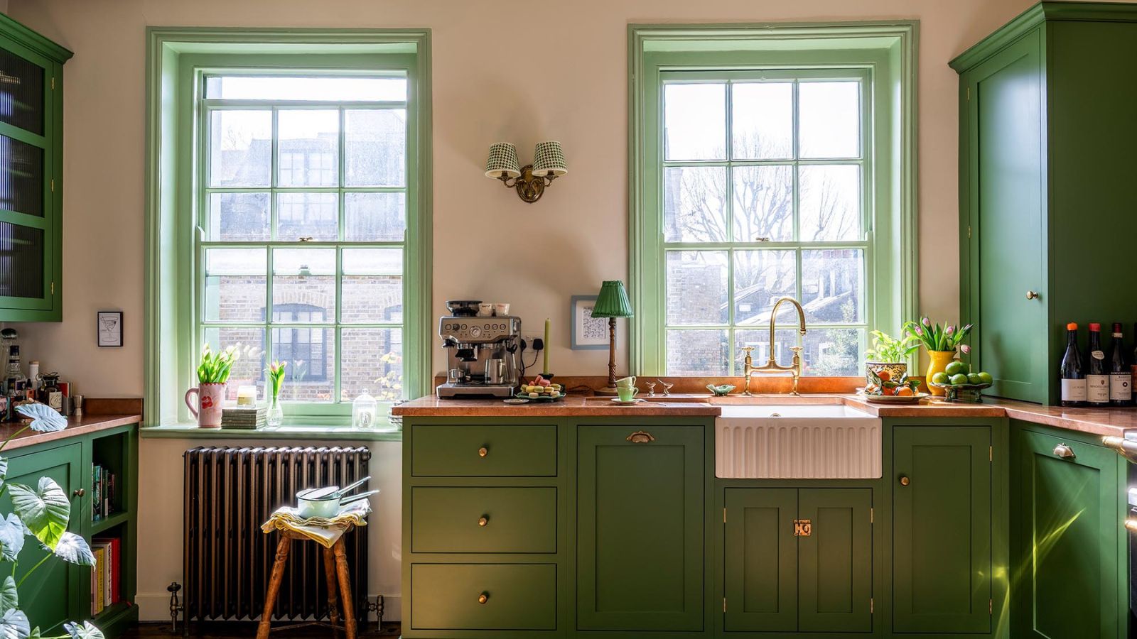
This small kitchen has been transformed with a bold color

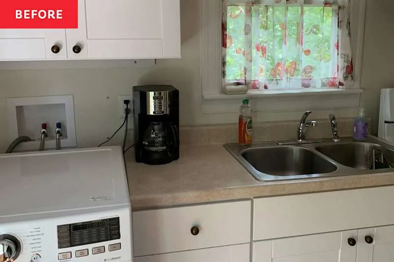
Before & After: A “Dark, Bland” Beige Kitchen Gets an Airy Blue Makeover (It’s So Much Brighter!)
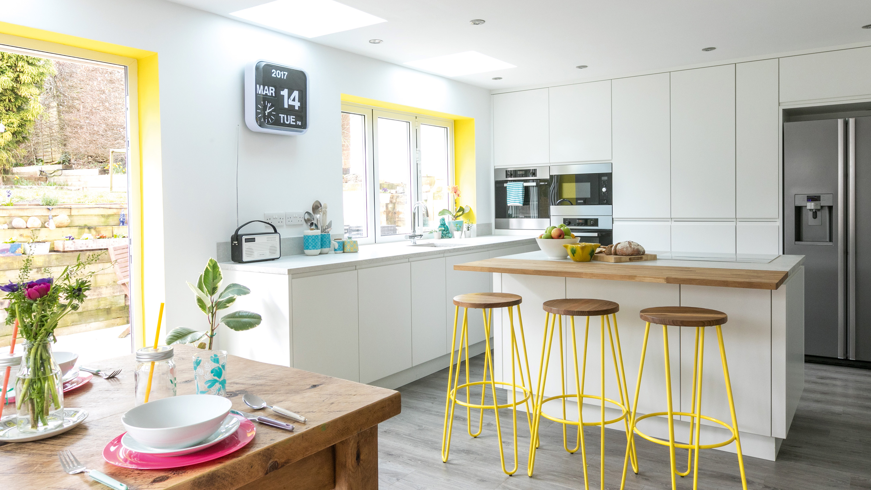
a colourful open-plan kitchen transformation

13 Blue Kitchen Ideas to Steal, From the Boldest Pops of Color to Clever Tilework

Before & After: A “Dark, Bland” Beige Kitchen Gets an Airy Blue Makeover (It’s So Much Brighter!)

Beat the All-White Kitchen Blahs With More Colorful Options
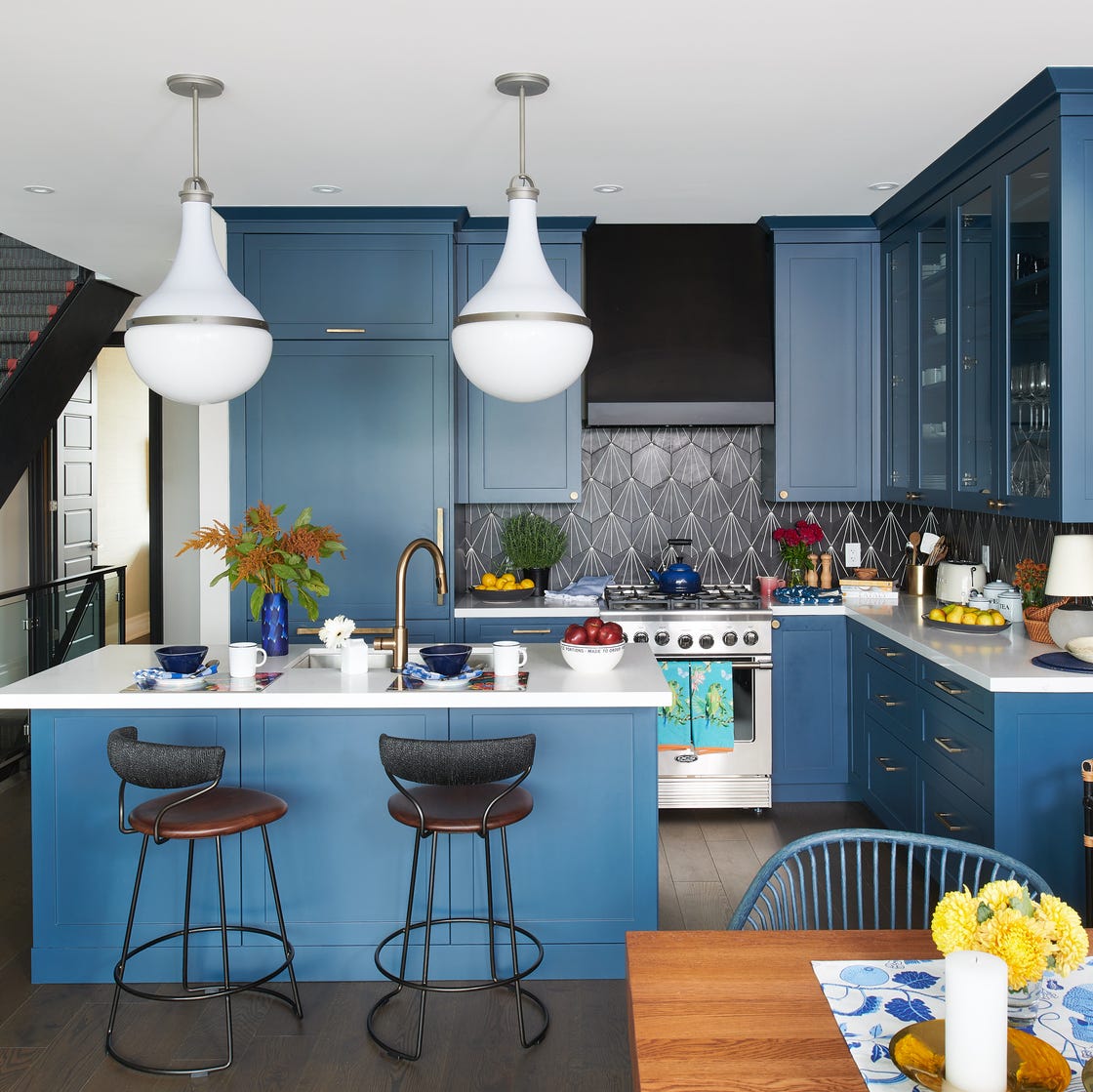
32 Kitchens That Prove Why Blue Is the Most Flattering Cabinetry Color

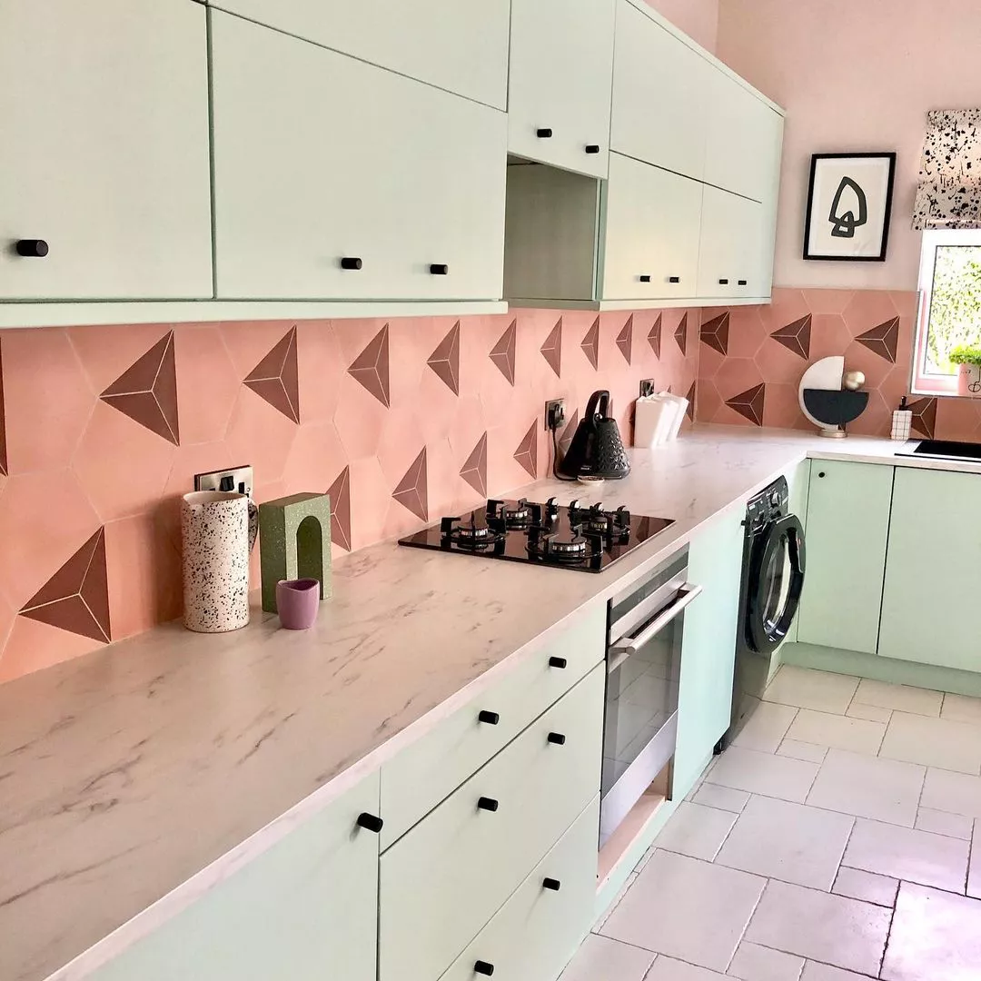
10 Genius Tips Designers Always Use to Add Pops of Color to a Dull Kitchen

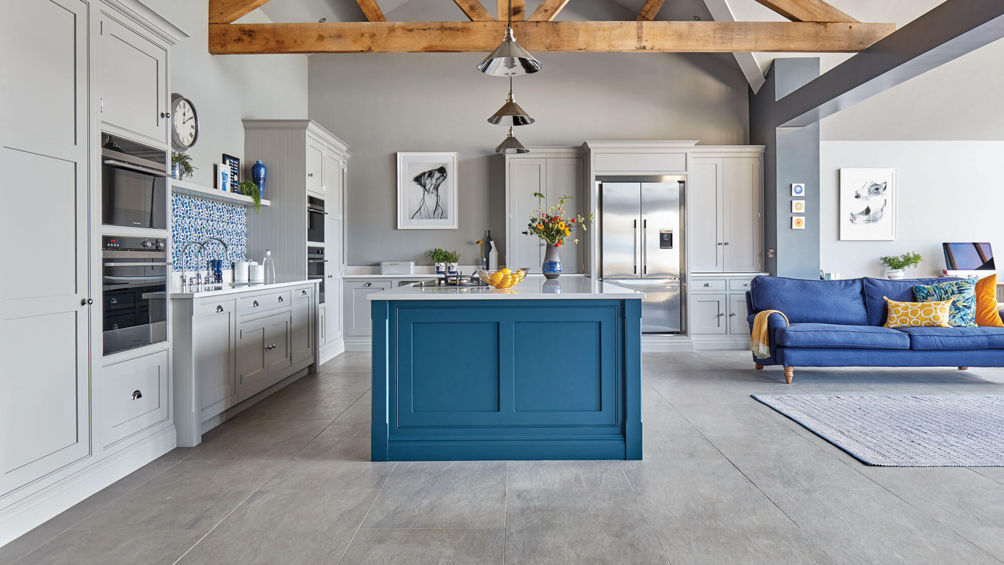
15 blue kitchen ideas to make you want to try this on trend look

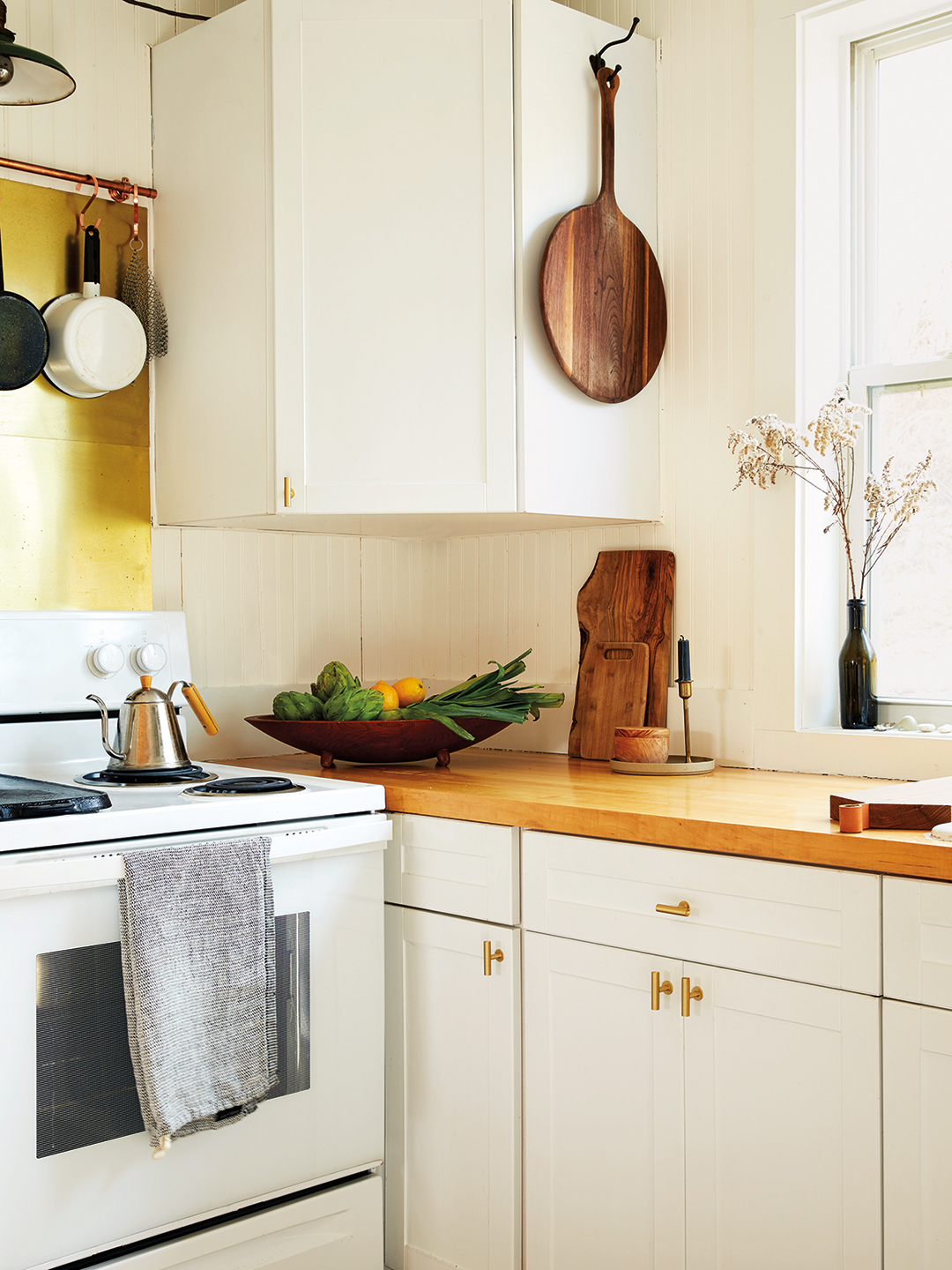
This Paint Color Is Way More Popular With Lower Cabinets Than Upper Ones

Bring In Calming Vibes: 5 Instagram-Inspired Ways To Do Beautiful Blue in Your Kitchen
16 Blue Kitchen Ideas That Celebrate This Timeless Shade to Its Very Best

13 Navy Blue Kitchens, And Not a Nautical One In Sight

15 Gorgeous Blue Kitchen Cabinet Ideas That’ll Never Go Out of Style
The designer totally transformed this kitchen with an unexpected color combination and a controversial decorating technique
10 blue kitchen ideas to inspire a bright, airy and on trend cooking space
10 Colorful Kitchens That Buck The All-White Trend

8 Ways to Bring Color Into Your All-White Kitchen Without Renovating