1/22
Farrow & Ball and Liberty Just Made Matching a Paint Color to Your Sofa Infinitely Easier
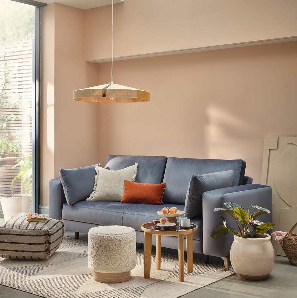
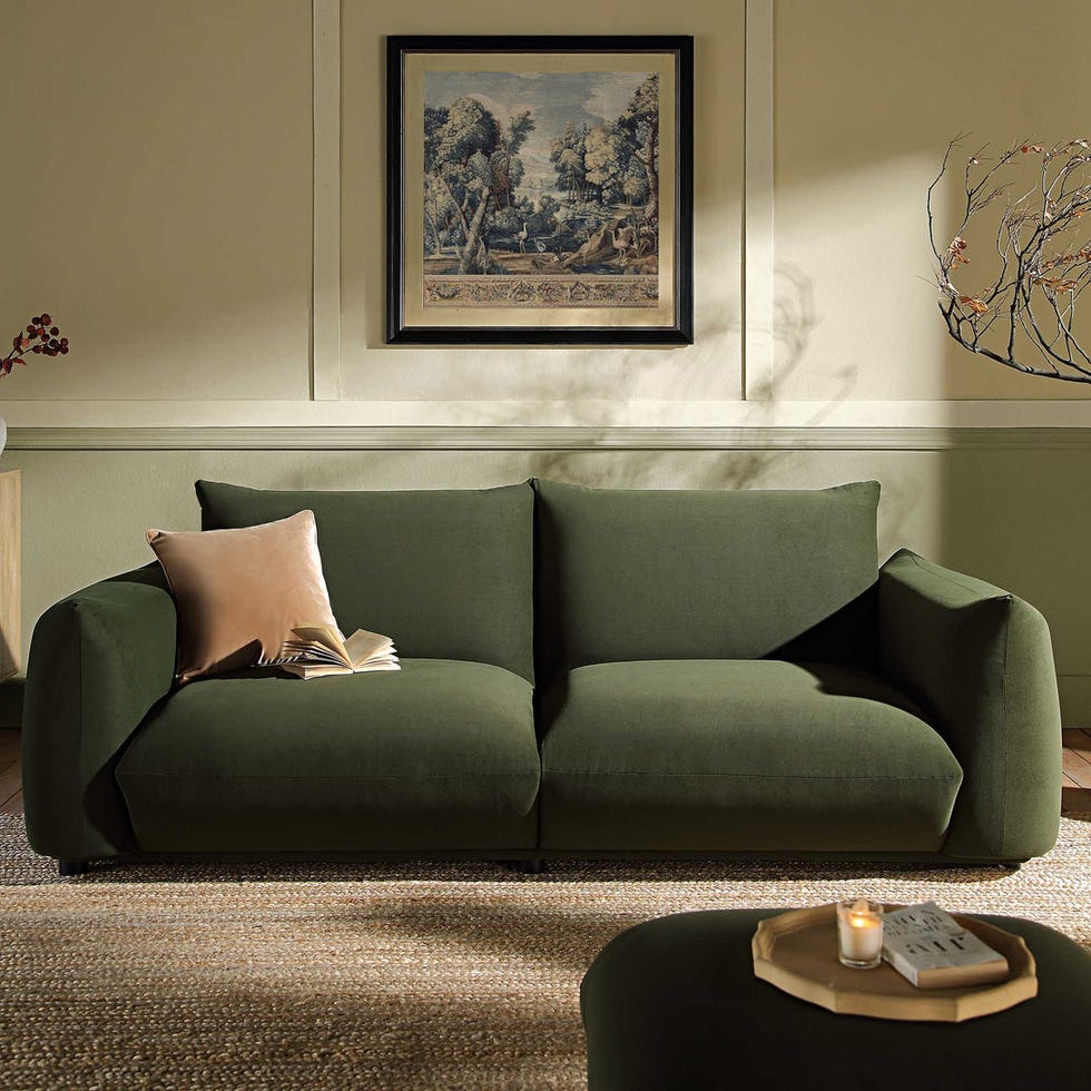
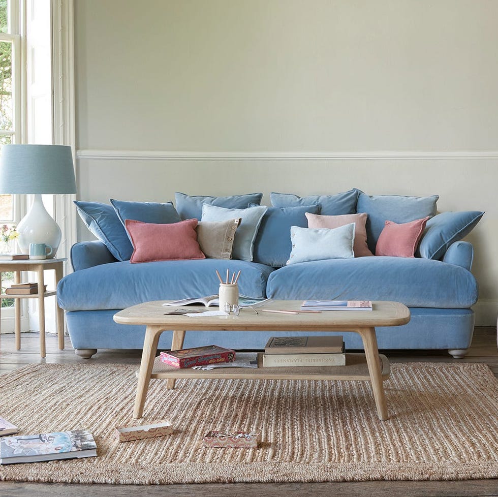
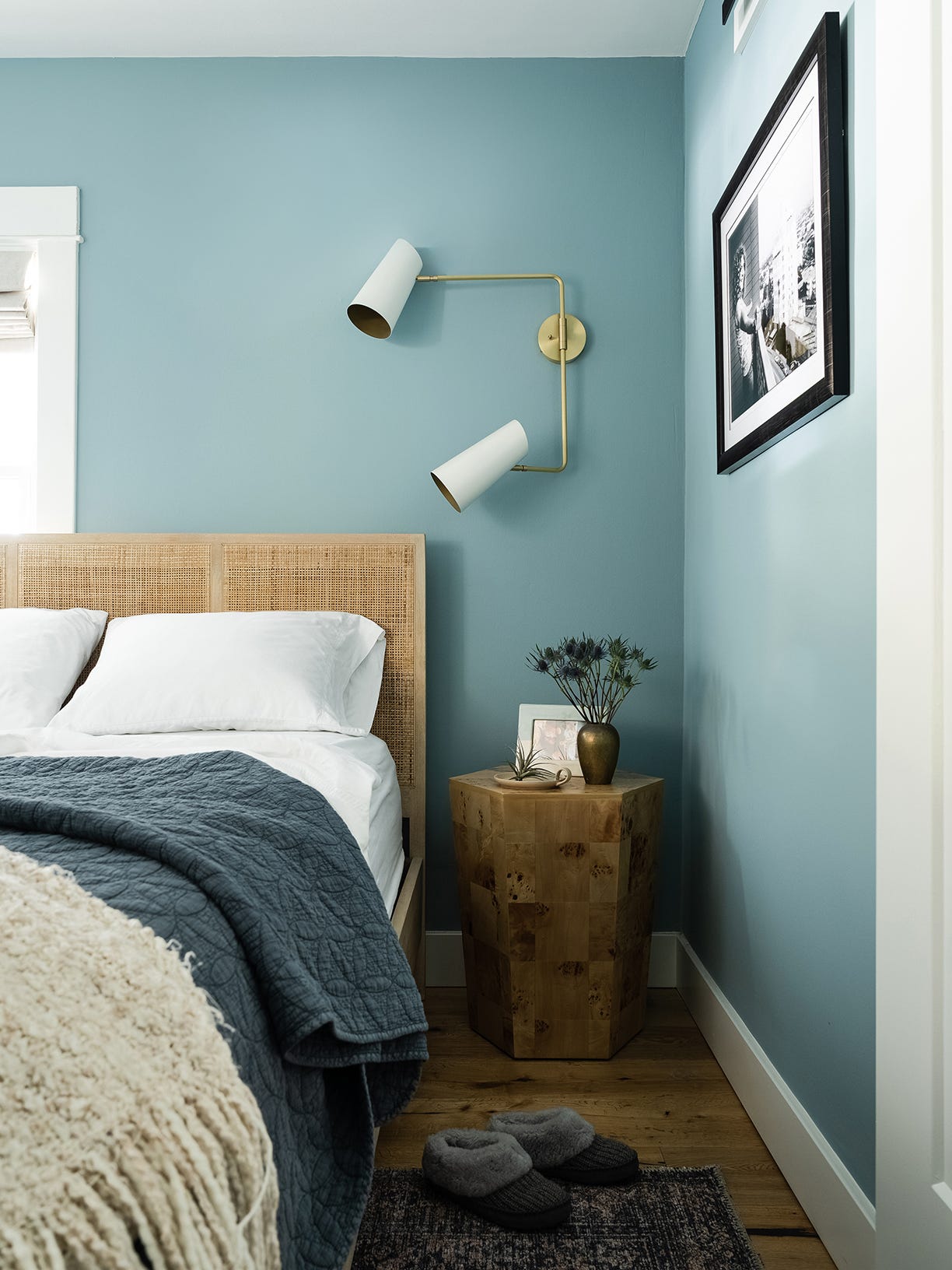
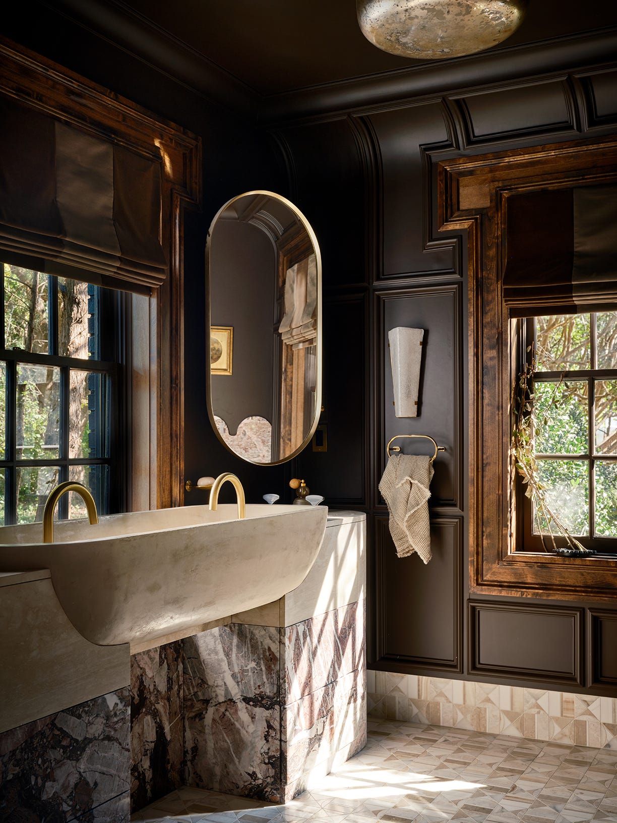
The article highlights a significant collaboration between two iconic British brands, Farrow & Ball and Liberty, aimed at simplifying the process of coordinating paint colors and fabric patterns in interior design. This partnership marks their first joint venture, where 15 exclusive shades from Farrow & Ball's Archive collection have been meticulously matched with complementary interior fabrics from Liberty’s Modern Collector range.
The collaboration addresses a common challenge in interior decorating: finding harmonious combinations of paint and fabric. Joa Studholme, international color consultant at Farrow & Ball, emphasizes the importance of the tactile quality of the fabric and the color when paired, noting that the combinations were chosen instinctively and with trust in their inherent synergy. Genevieve Bennet, head of interiors at Liberty, expressed that partnering with Farrow & Ball felt natural due to their shared appreciation for Farrow & Ball's rich and sophisticated color palette.
A key piece of advice offered by Bennet for achieving a successful duo is to select a secondary color from within the fabric print—specifically, a subtle detail like a small flower or a leaf that isn't the dominant color—and then use that hue for the wall paint. This approach, she explains, leads to a less obvious yet beautifully effective color scheme.
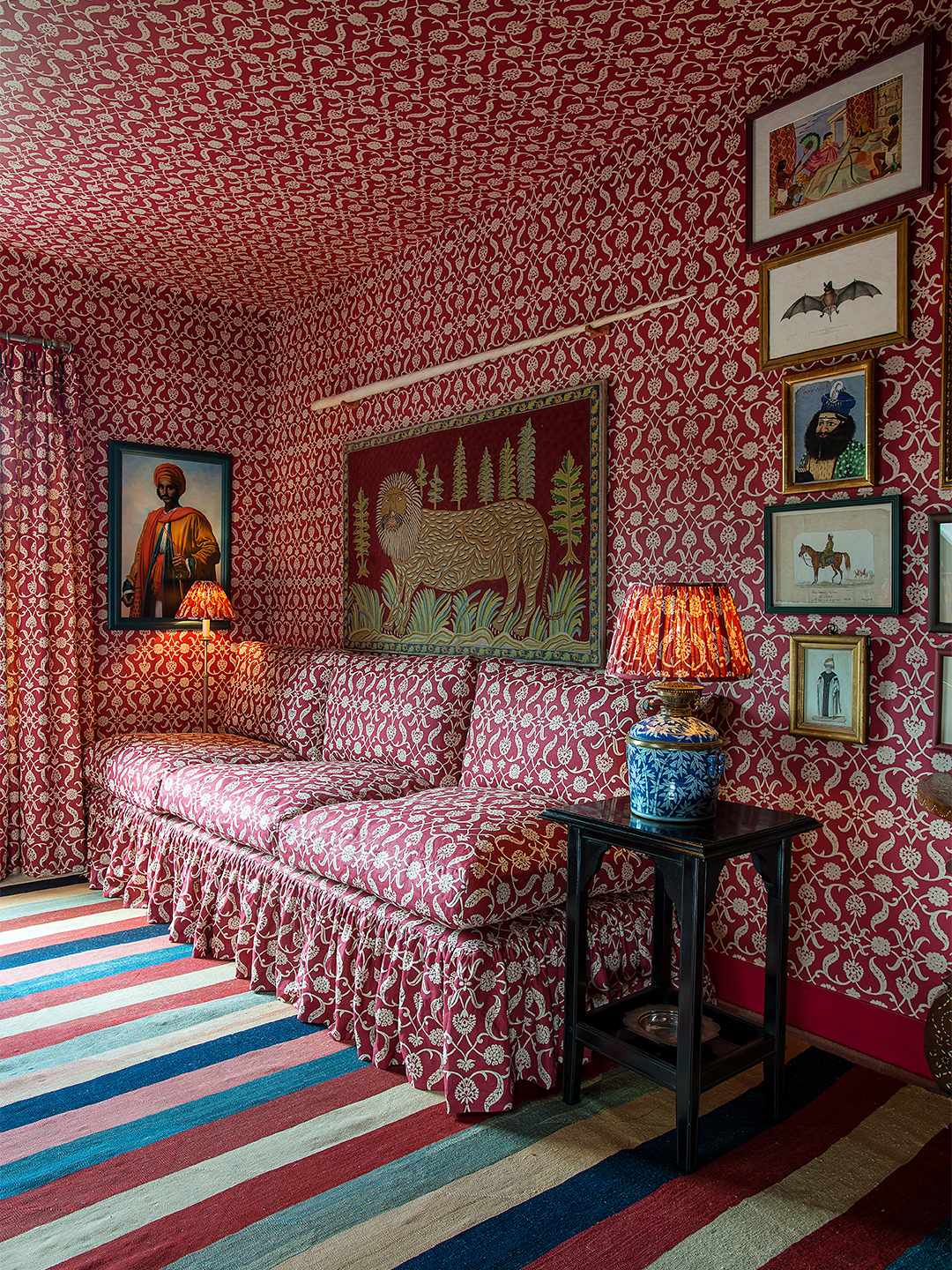
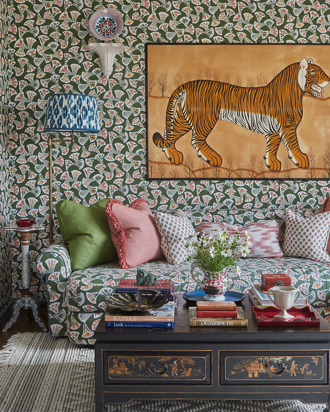
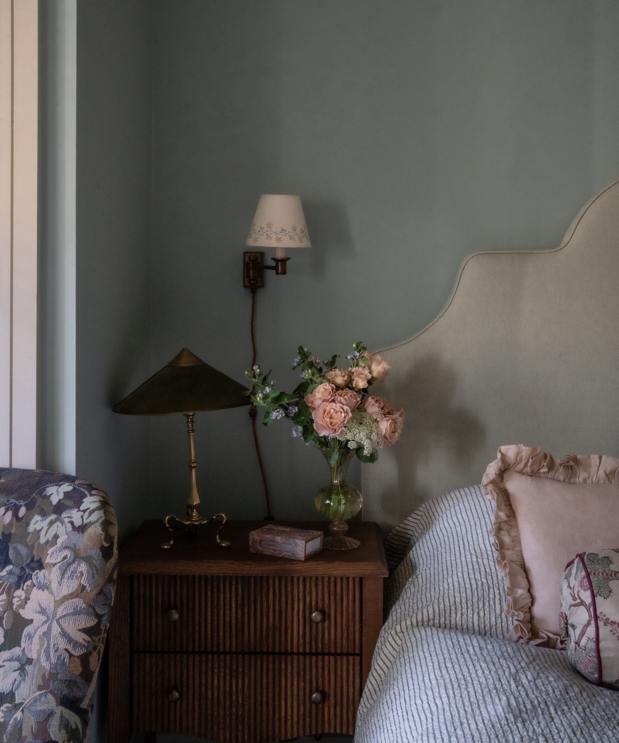
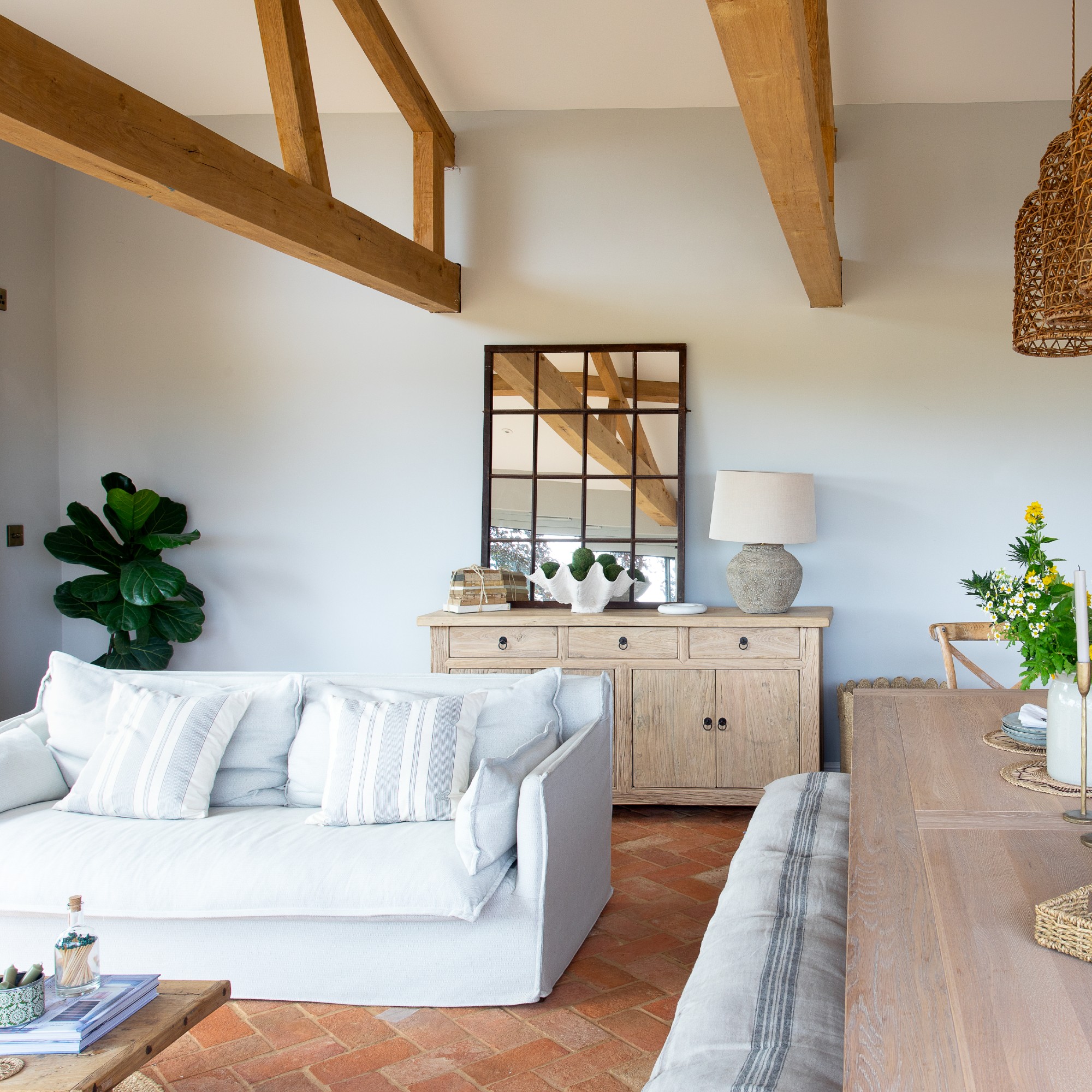
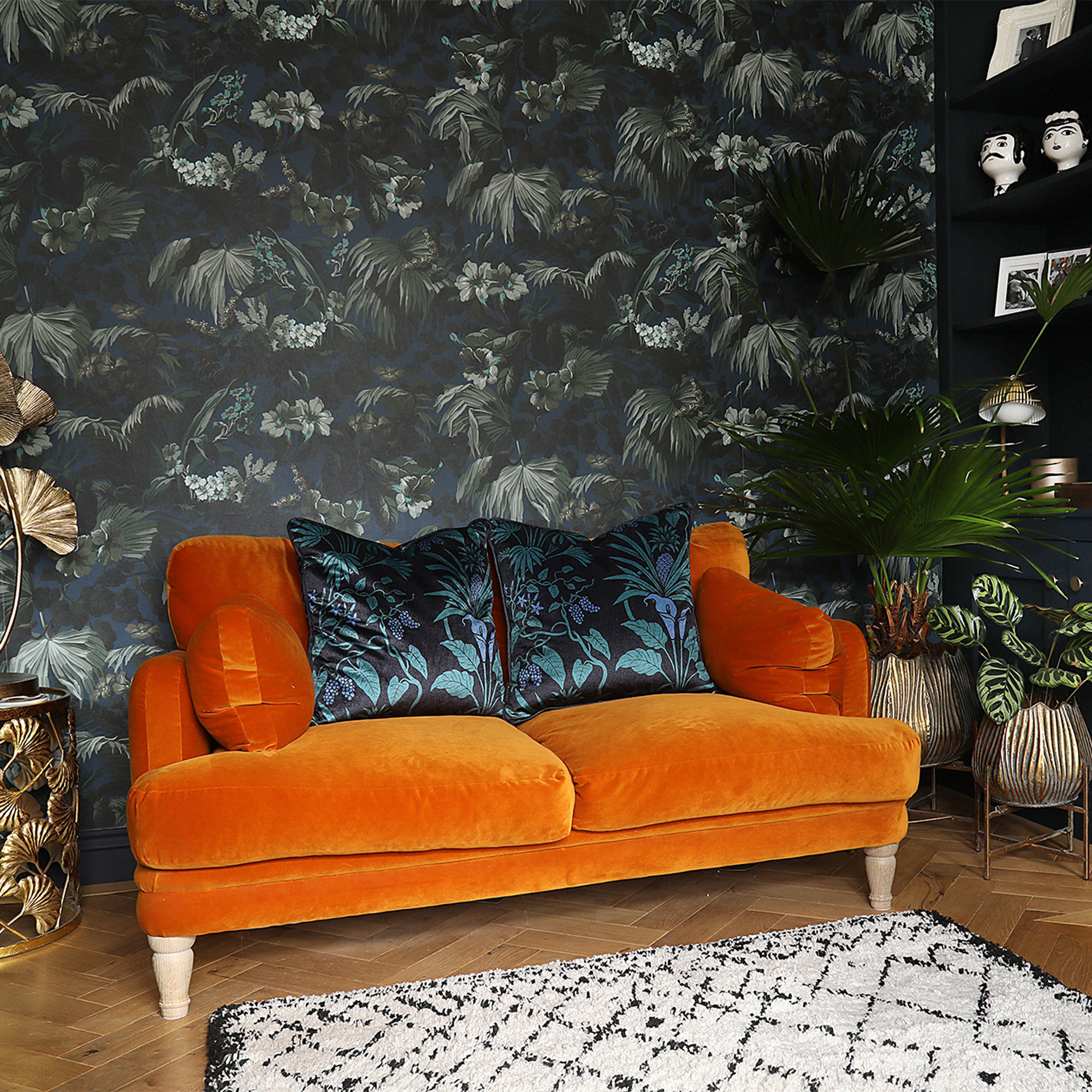
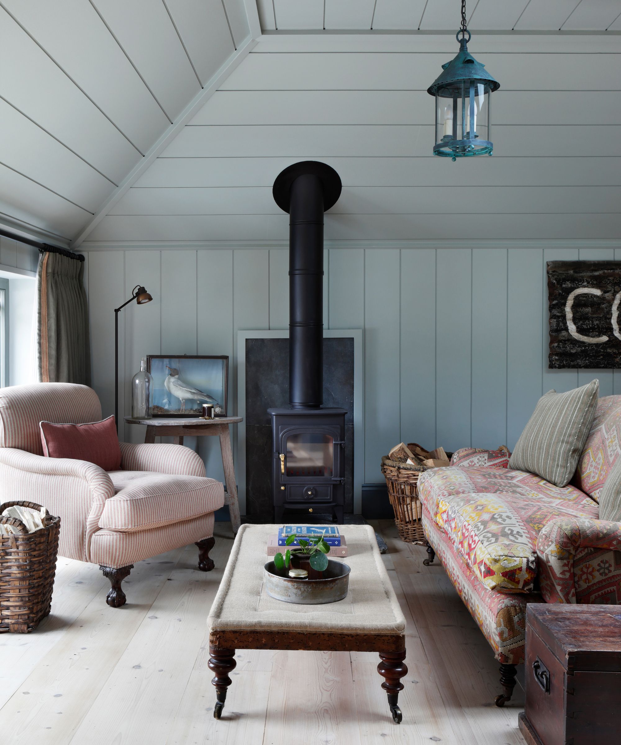
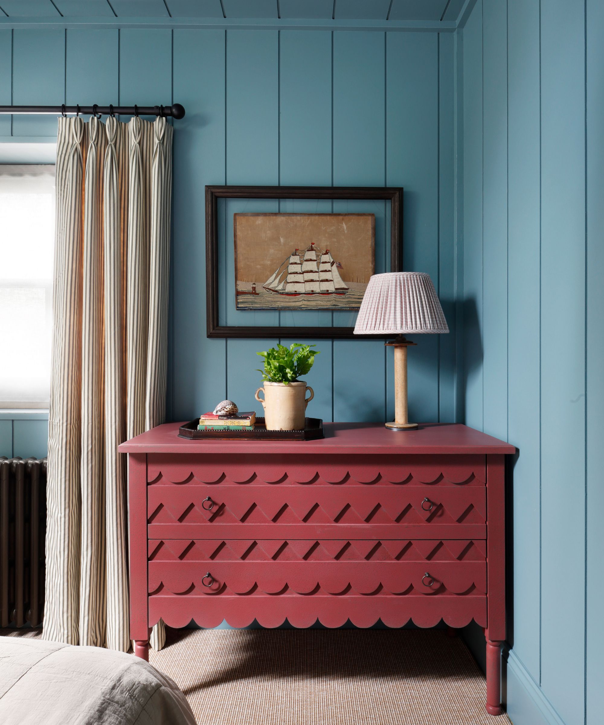
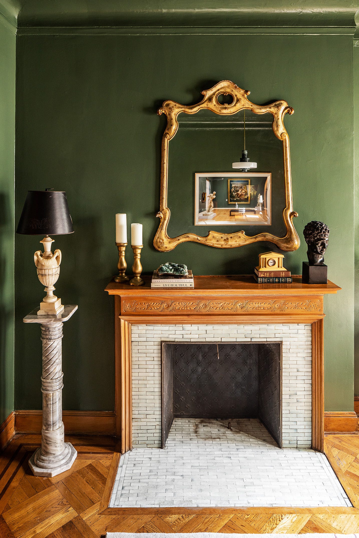
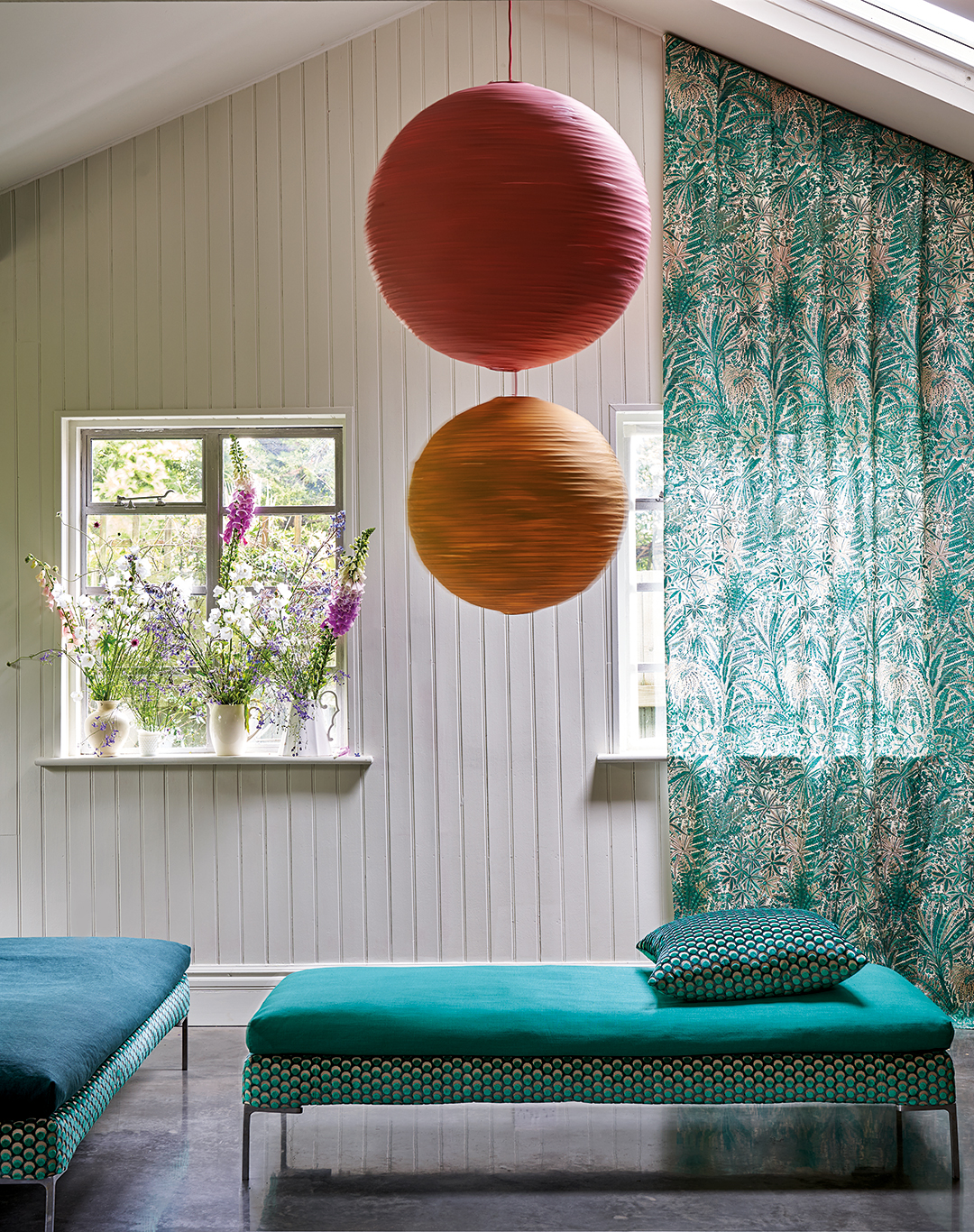
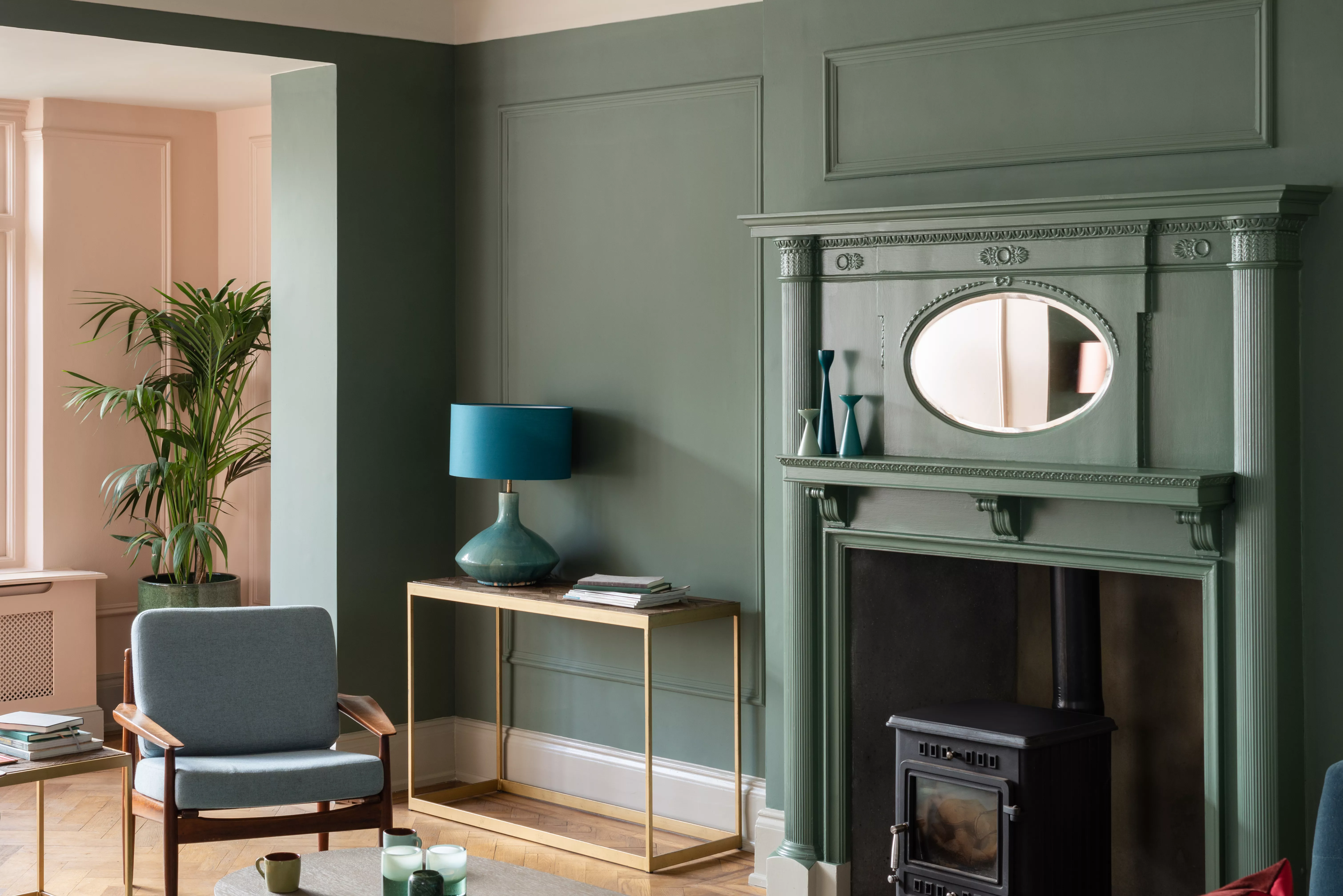
The article provides several examples of these curated pairings, showcasing diverse aesthetic outcomes. For a 'Countryside Cottage' aesthetic, Suffield Green paint is paired with Wiltshire Blossom fabric in Lichen, where the wall color subtly mirrors the hints of green in the fabric rather than its brighter floral elements. In 'Modern Romance,' the contrasting effect of Cola paint with Botanical Flora in Lacquer is highlighted, where a secondary tone from the fabric is used on walls or molding to create a strong impact.
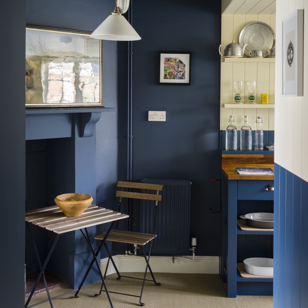

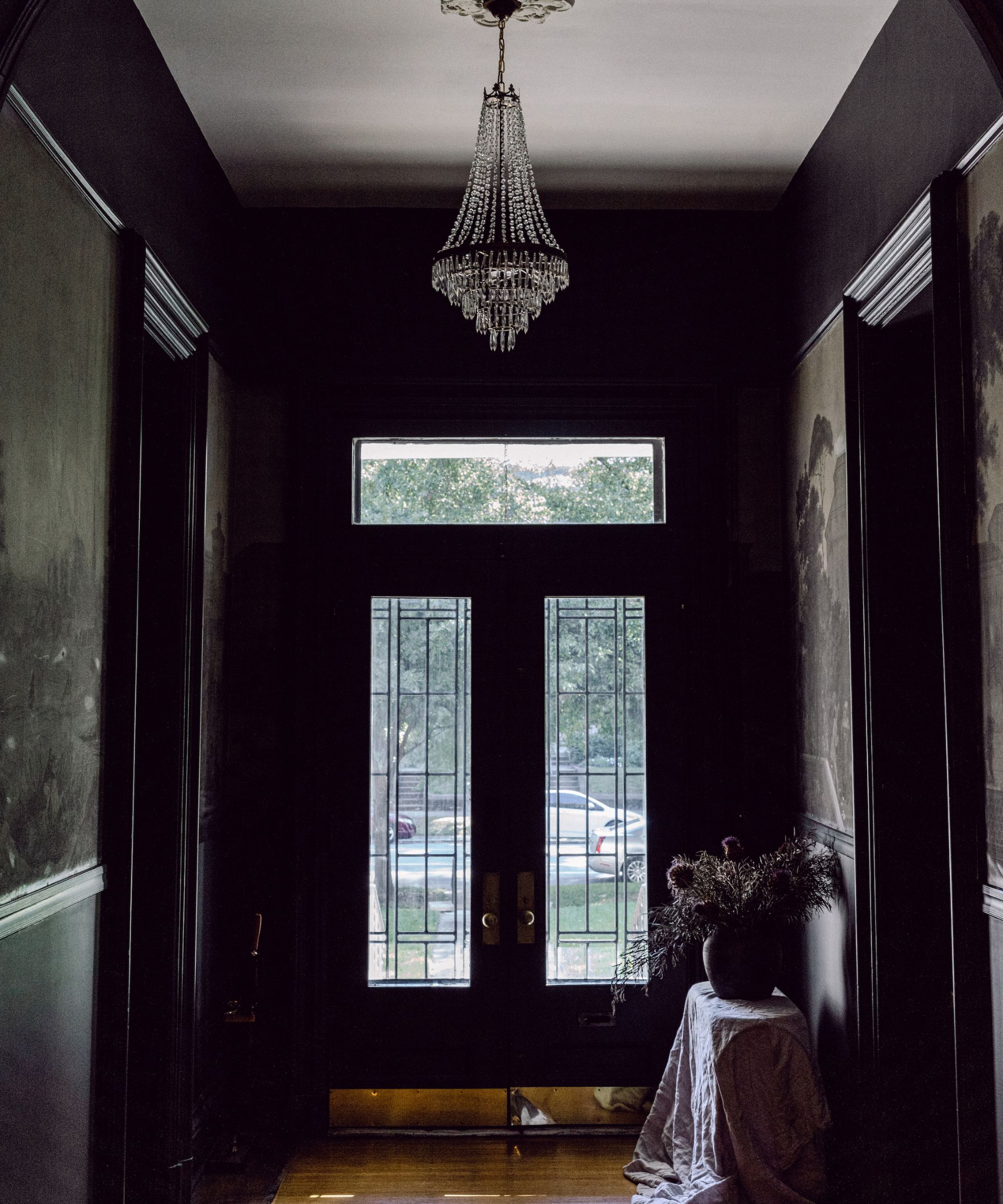
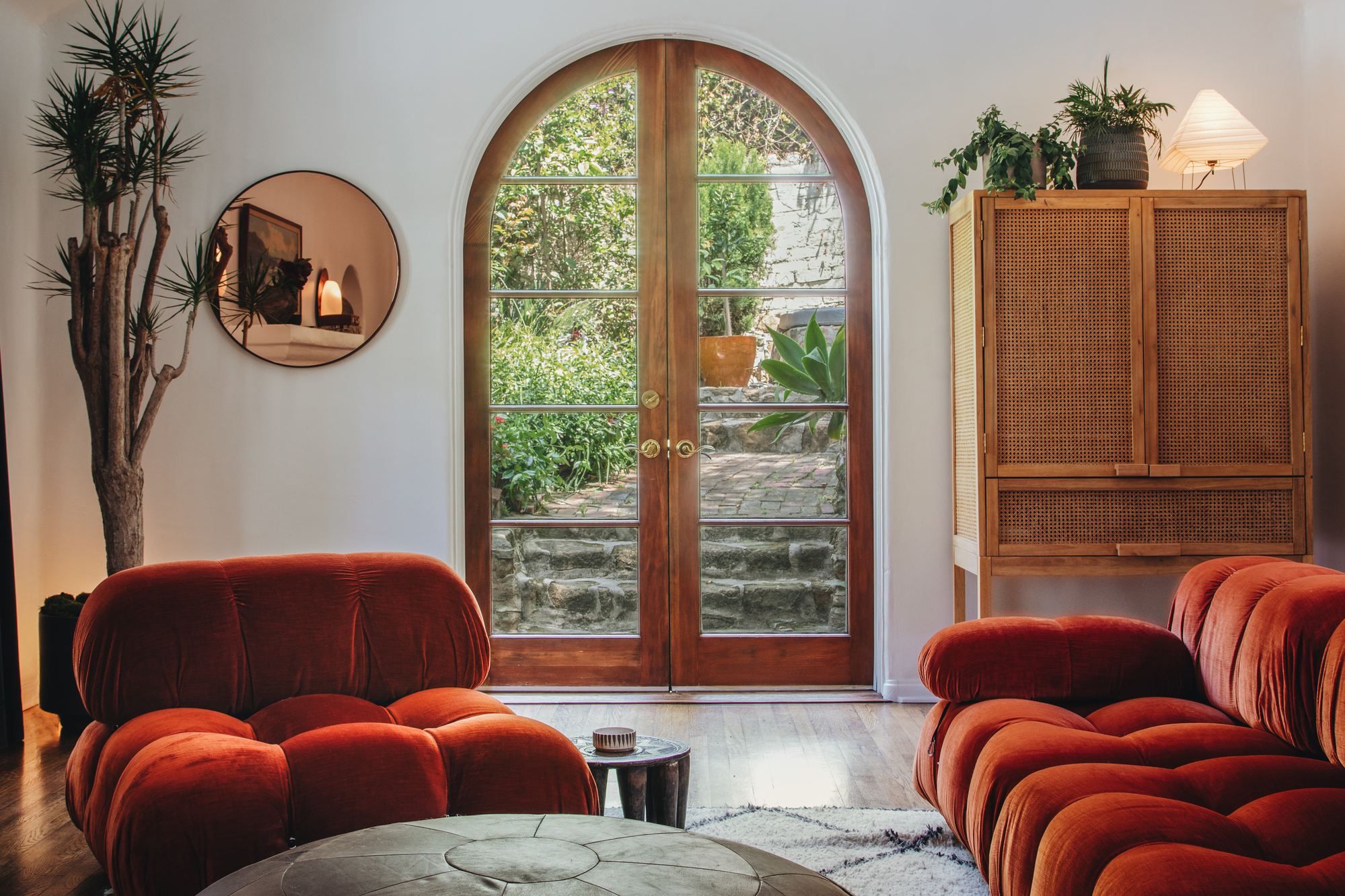
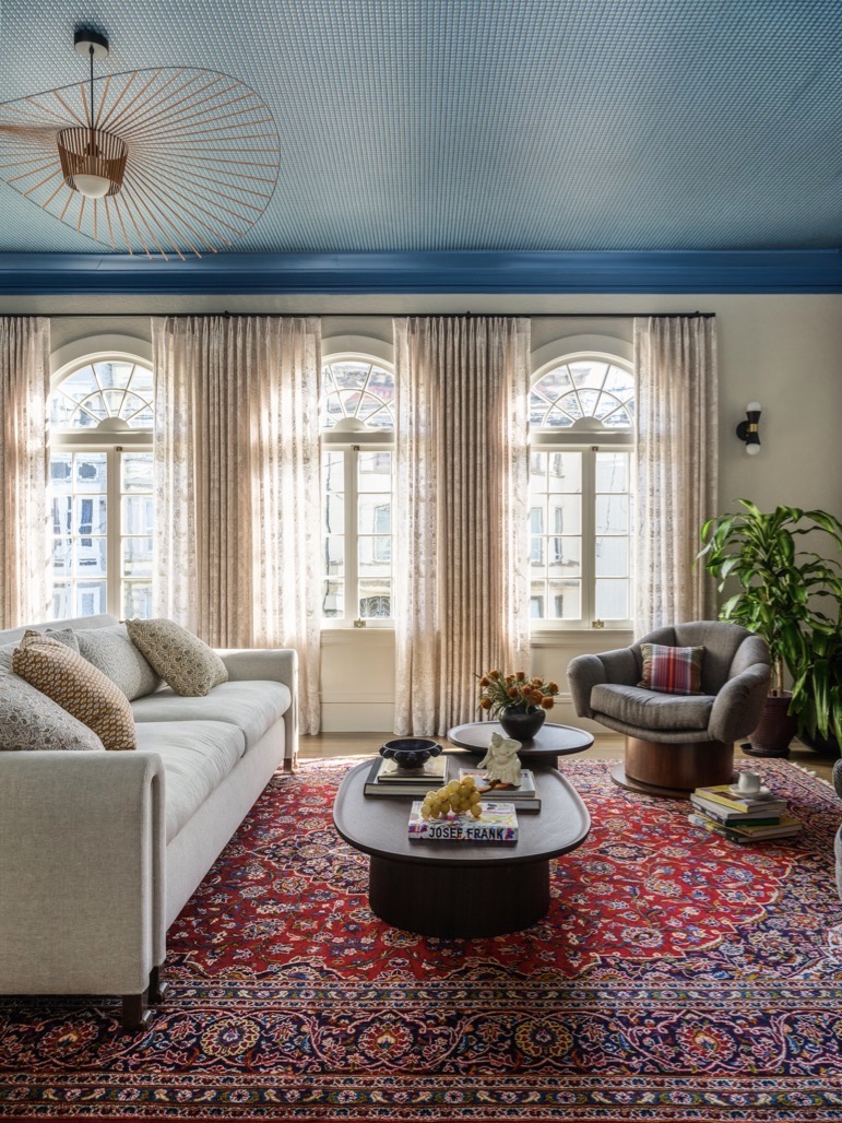
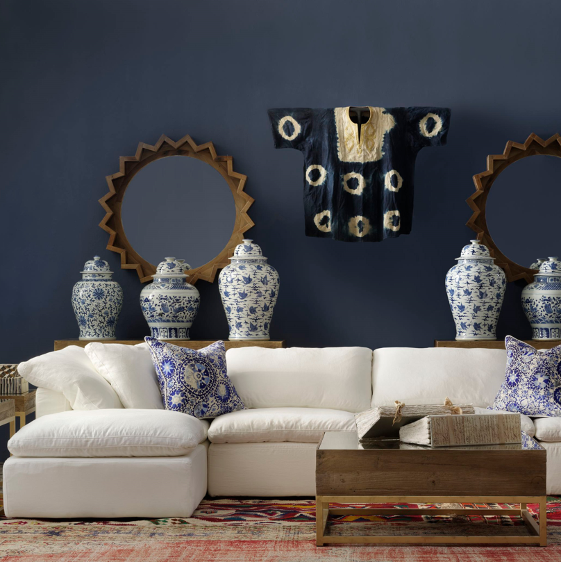
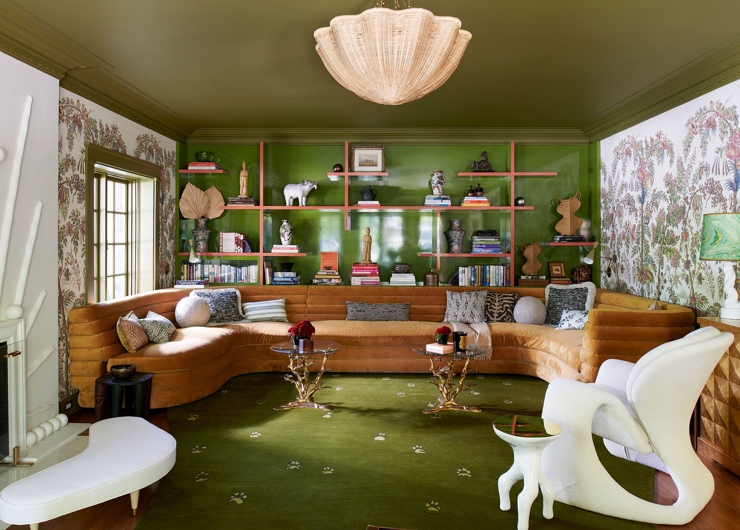
For 'Deep Blues,' Serge paint is suggested as a perfect intermediary between the dark ground color of Regency Tulip fabric in Lapis and its bold botanical print, recommending its use on molding for a luxurious feel. 'Retro Chic' combines Olive paint with Poppy Meadowfield fabric in Pewter Blue, where the fabric's reworked archival print creates a 1960s vibe that complements the paint for a contemporary take on mid-century modern design.
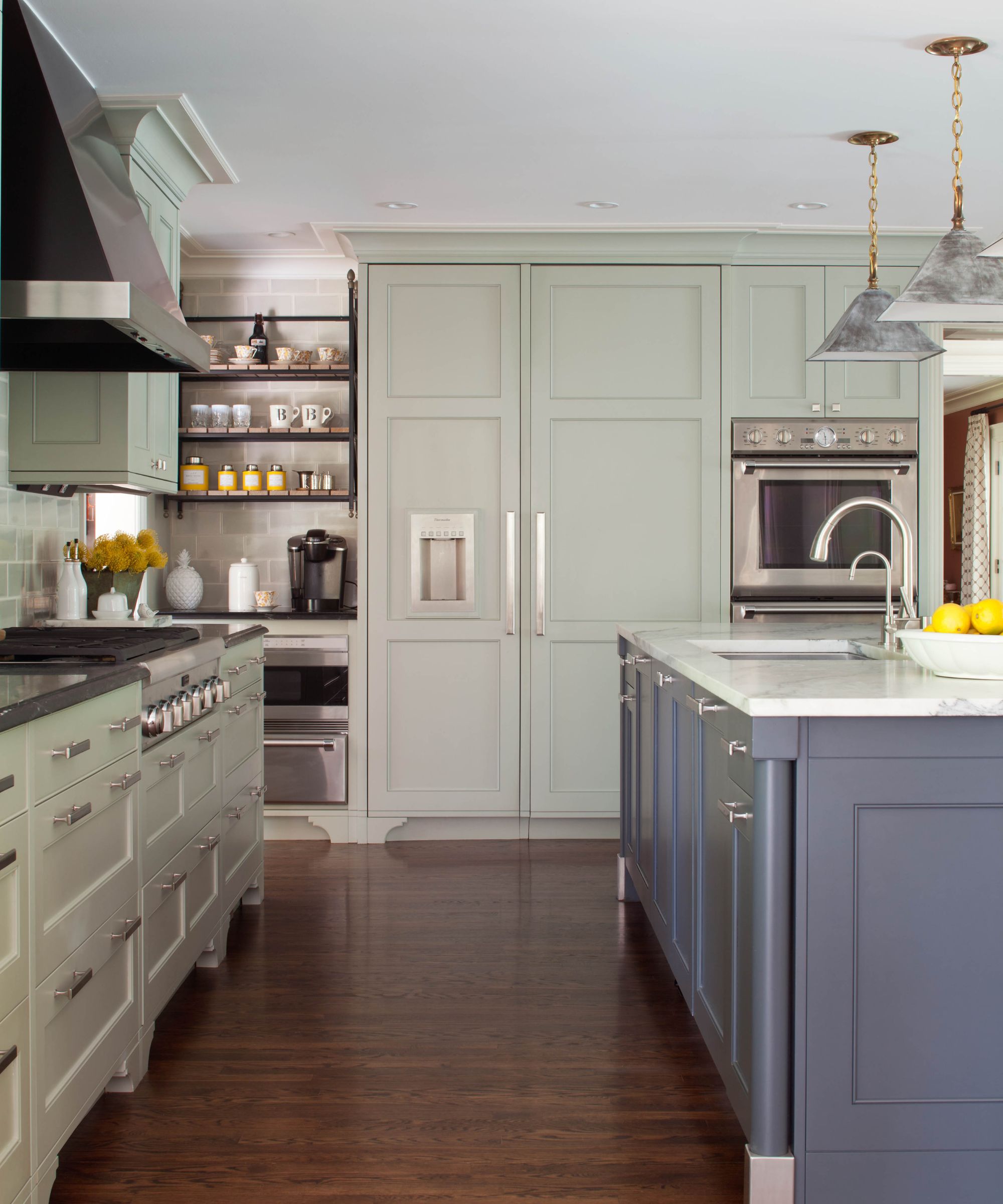


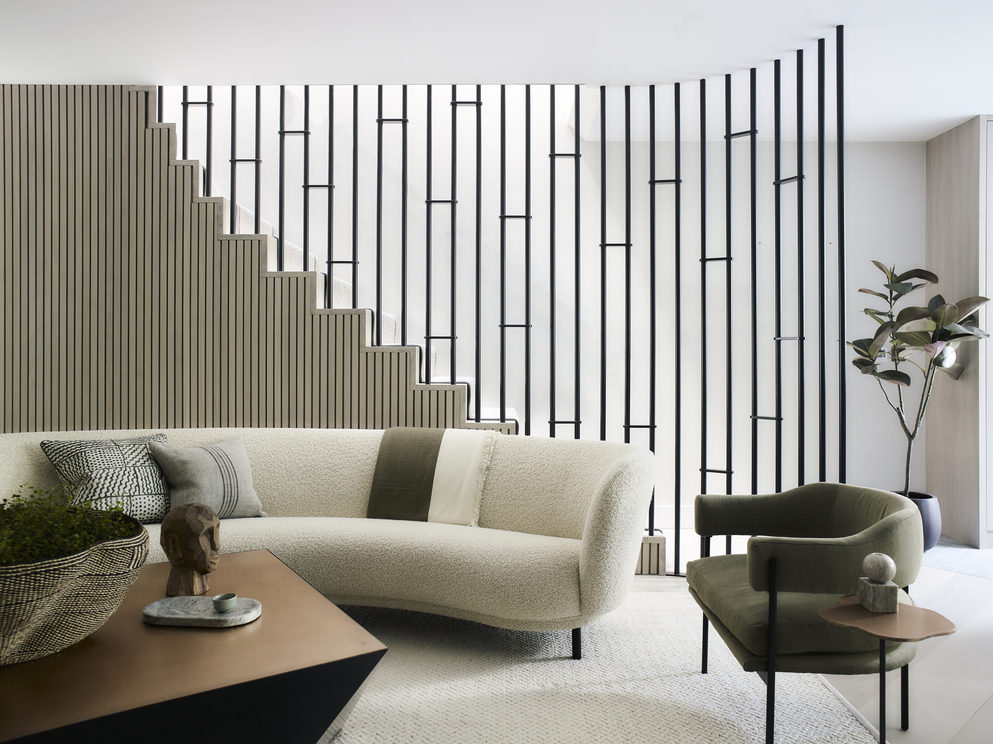
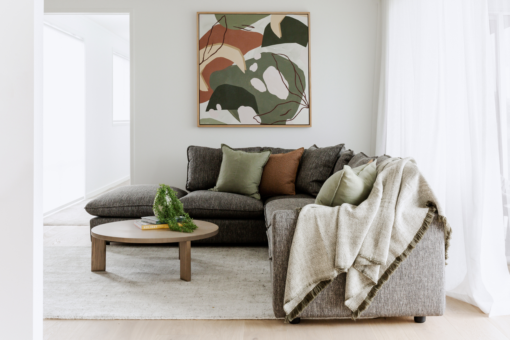
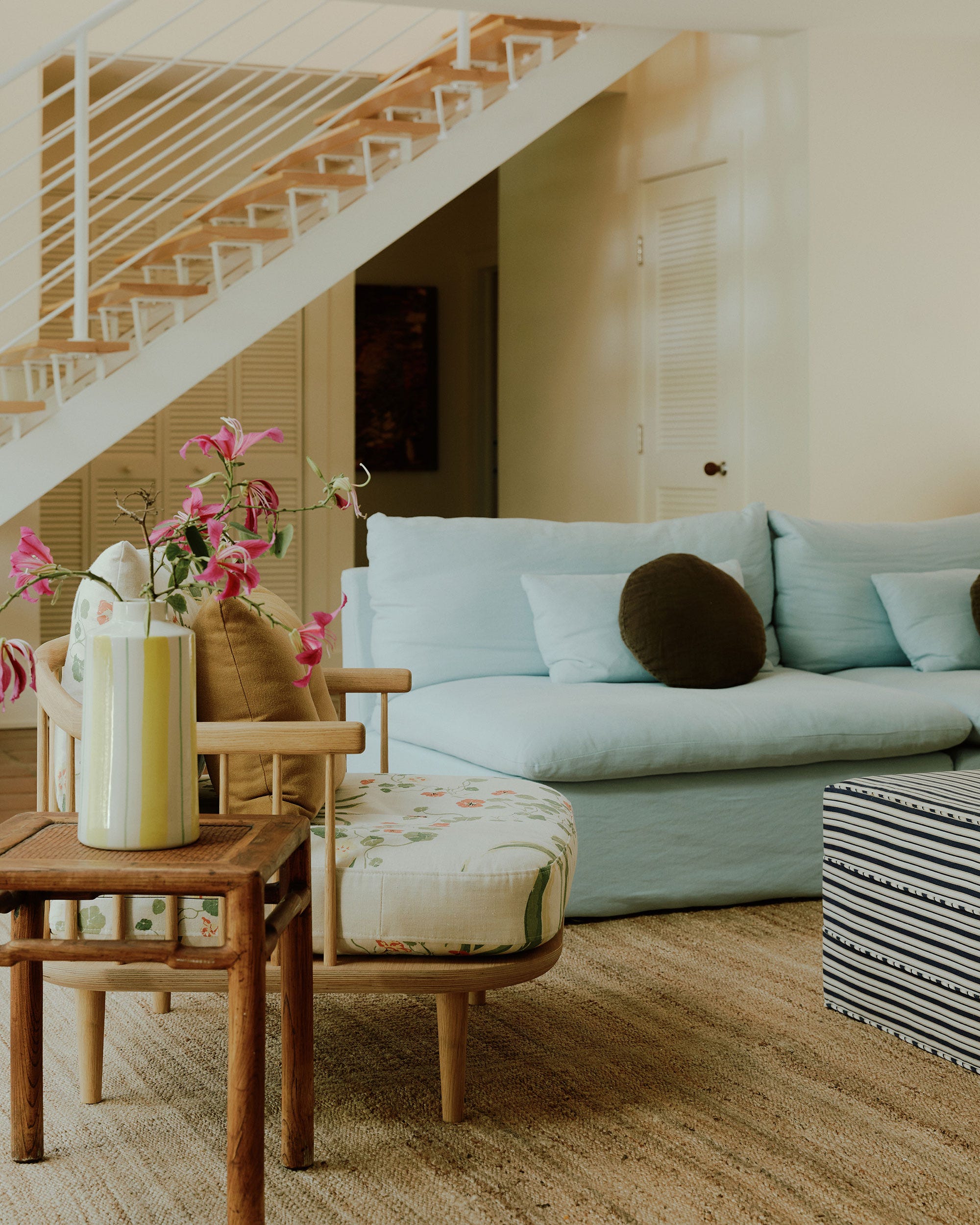
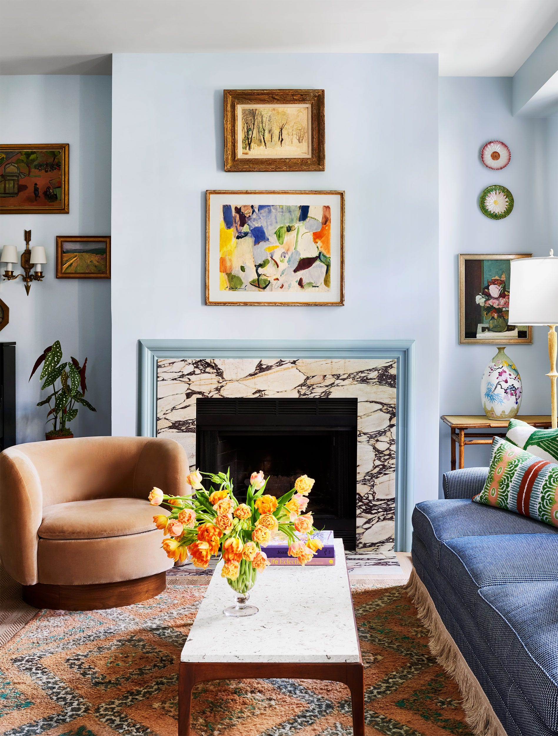
'Soothing Pastels' features Berrington Blue paint with Palampore Trail fabric in Lichen, demonstrating how a wall color a few shades darker than the fabric's background can create a dynamic yet calming living space. Lastly, 'Crown Jewels' pairs the neutral Clunch paint with Persian Voyage fabric in Jade Stone, allowing the intricate, jewel-like colors of the fabric to stand out against a clean backdrop. The 'Downton Abbey Vibes' pairing uses Chine Green paint with Zennor Arbour fabric in Plaster Pink, where the deep green adds strength to the delicate fabric print, resulting in a balanced and modern scheme.
Each example illustrates the philosophy behind the collaboration: to provide designers and homeowners with expertly curated options that make color and pattern coordination effortless, encouraging both subtle and impactful design choices.
#FarrowAndBall #LibertyLondon #PaintColors #FabricPatterns #InteriorDesignCollaboration #HomeDecor #ColorCoordination #DesignInspiration #BritishDesign #FarrowAndBall #LibertyLondon #PaintColors #FabricPatterns #InteriorDesignCollaboration #HomeDecor #ColorCoordination #DesignInspiration #BritishDesign
0 comment in total
 No comments yet
You may also like
‘When your sofa and wall colours are in sync, the space feels intentional’ – experts reveal the 4 best paint and sofa colour combinations
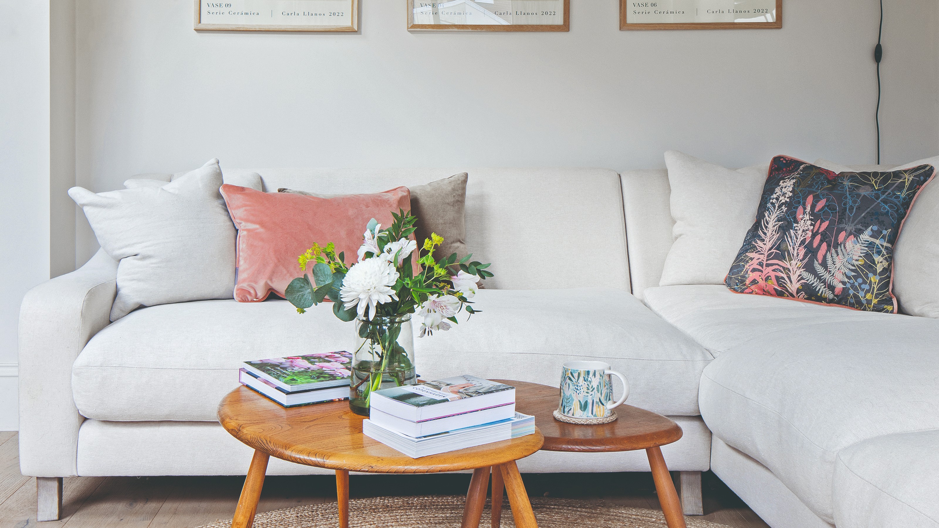
Experts say these are the 3 sofa colours to avoid

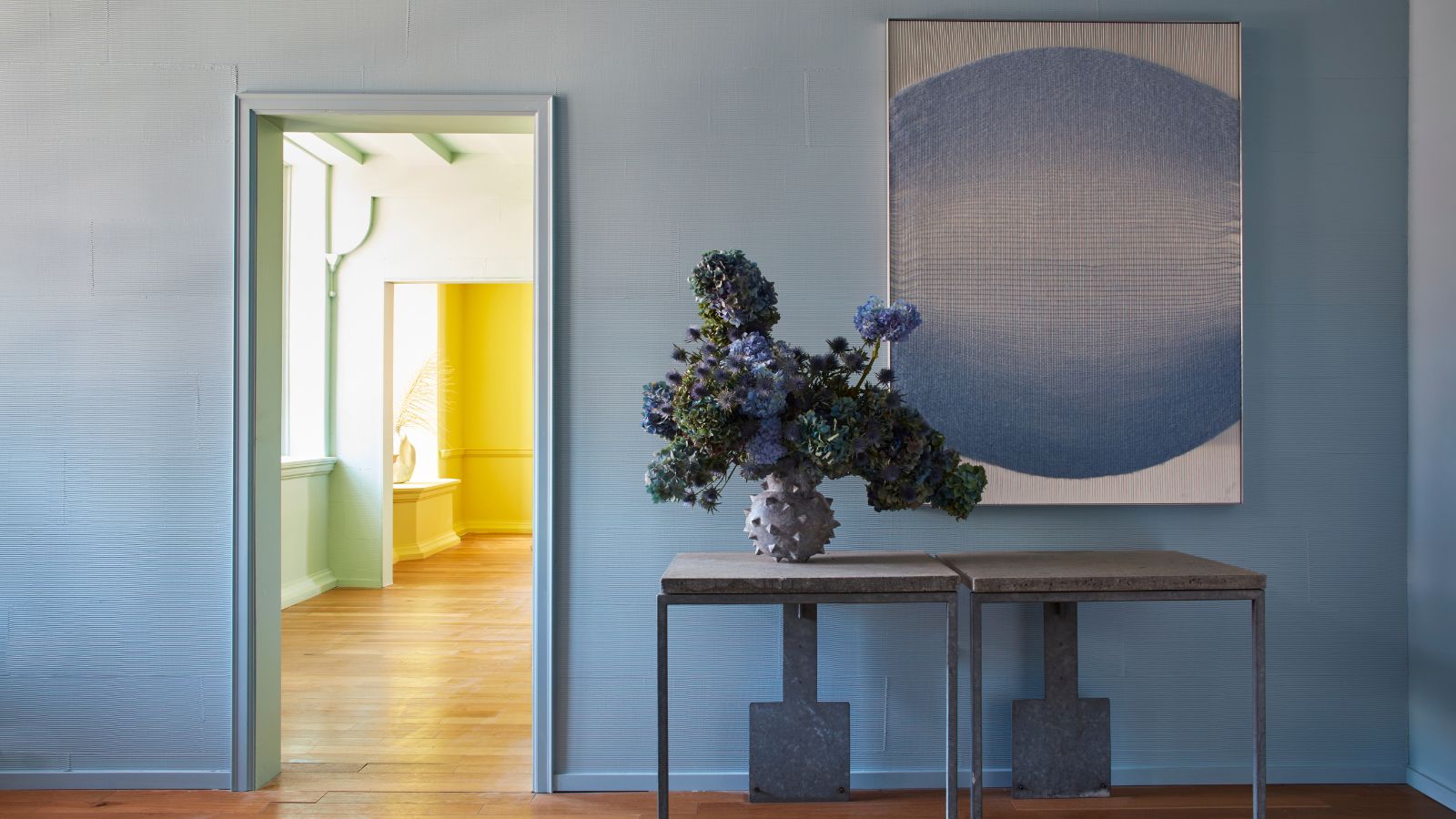
6 calming and cozy paint colors from Farrow & Ball

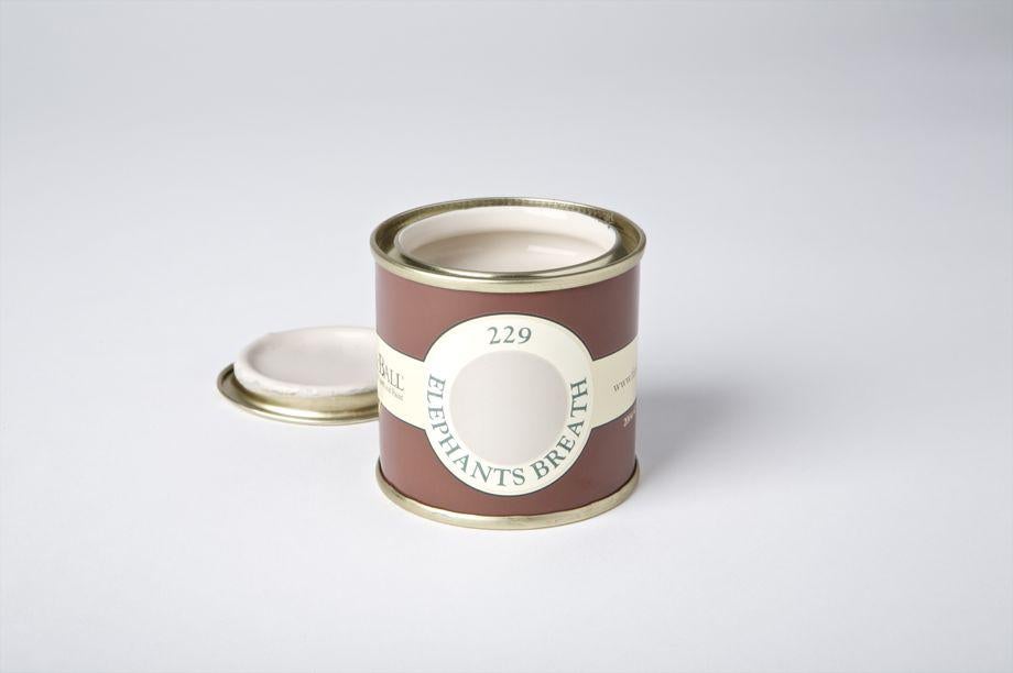
How Do Paint Colors Get Their Names?
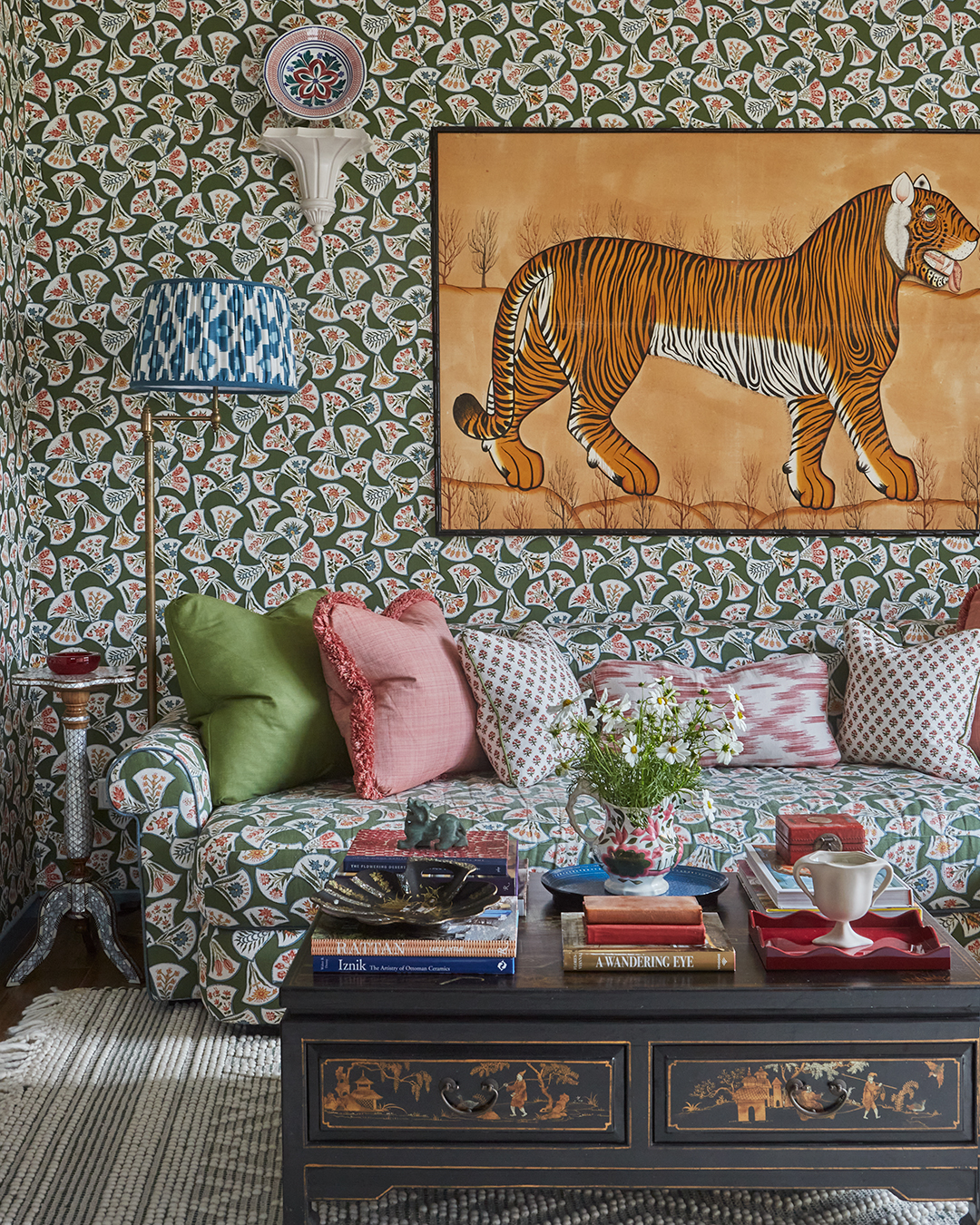
Matching Your Sofa Fabric to Your Walls Isn’t Just for Maximalists
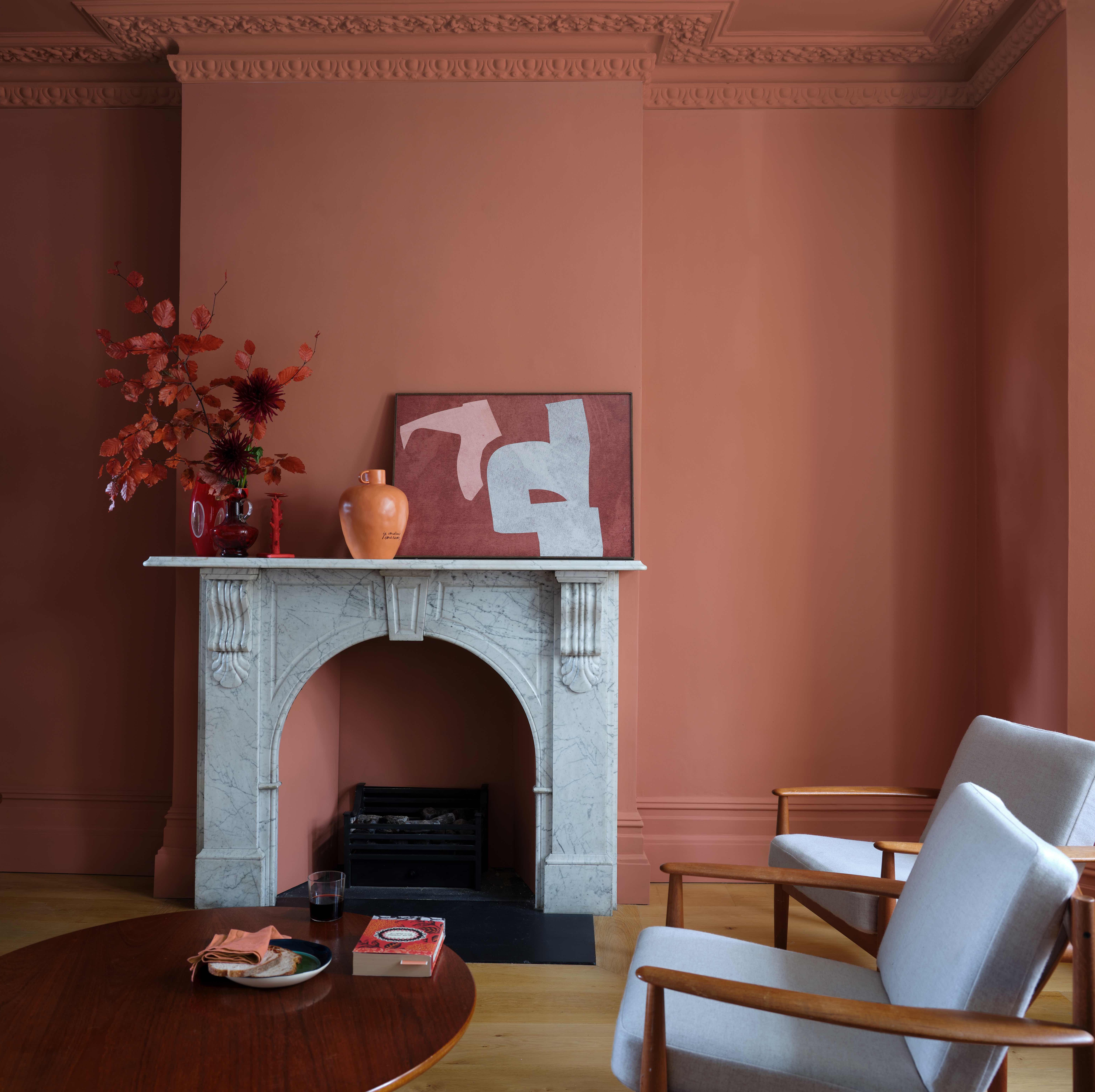
6 great ways to use colour drenching in your home

It’s easier to match paint colors than you think
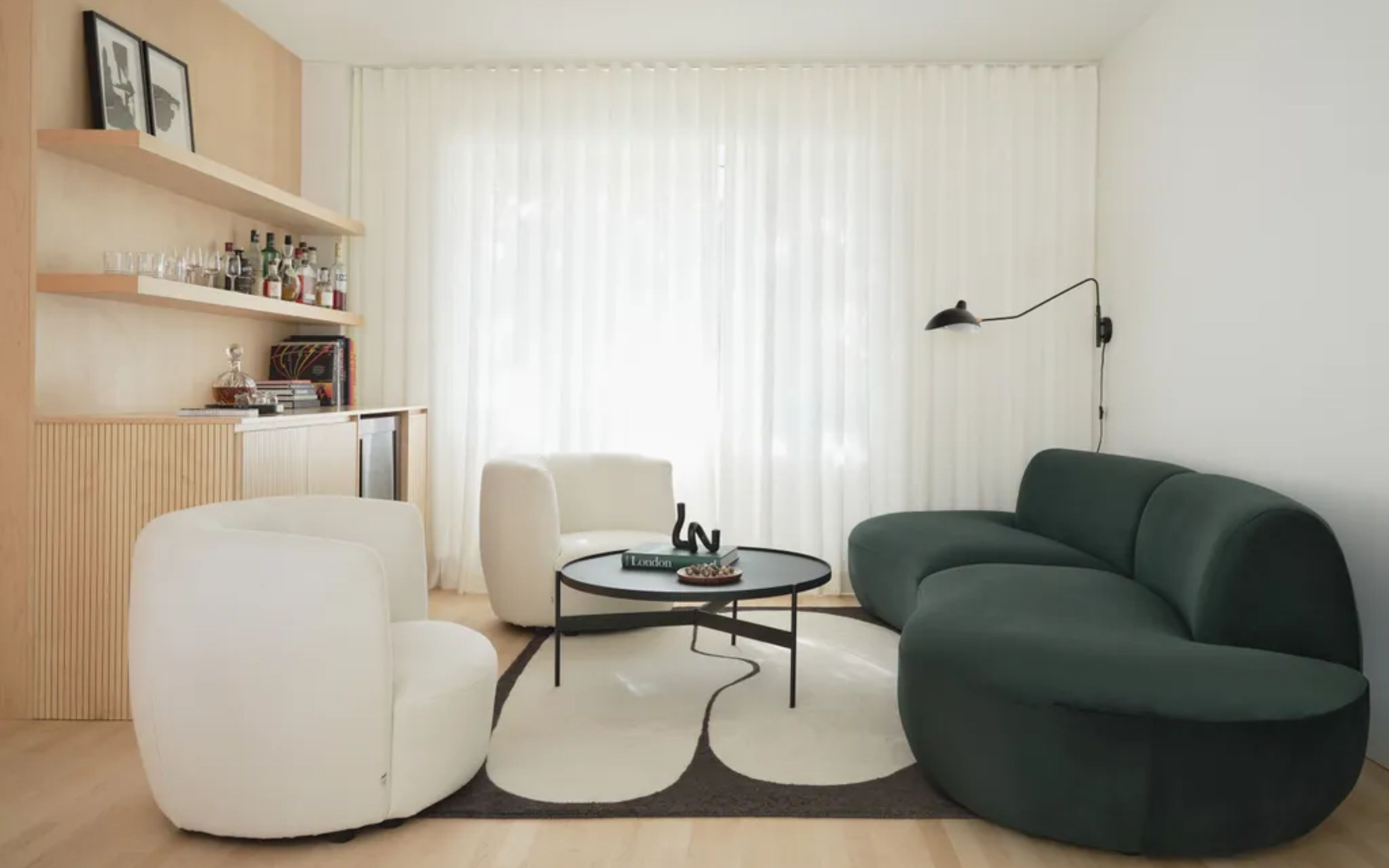
6 Timeless Sofa Colors That Will Make Your Living Room Look Classy and Expensive

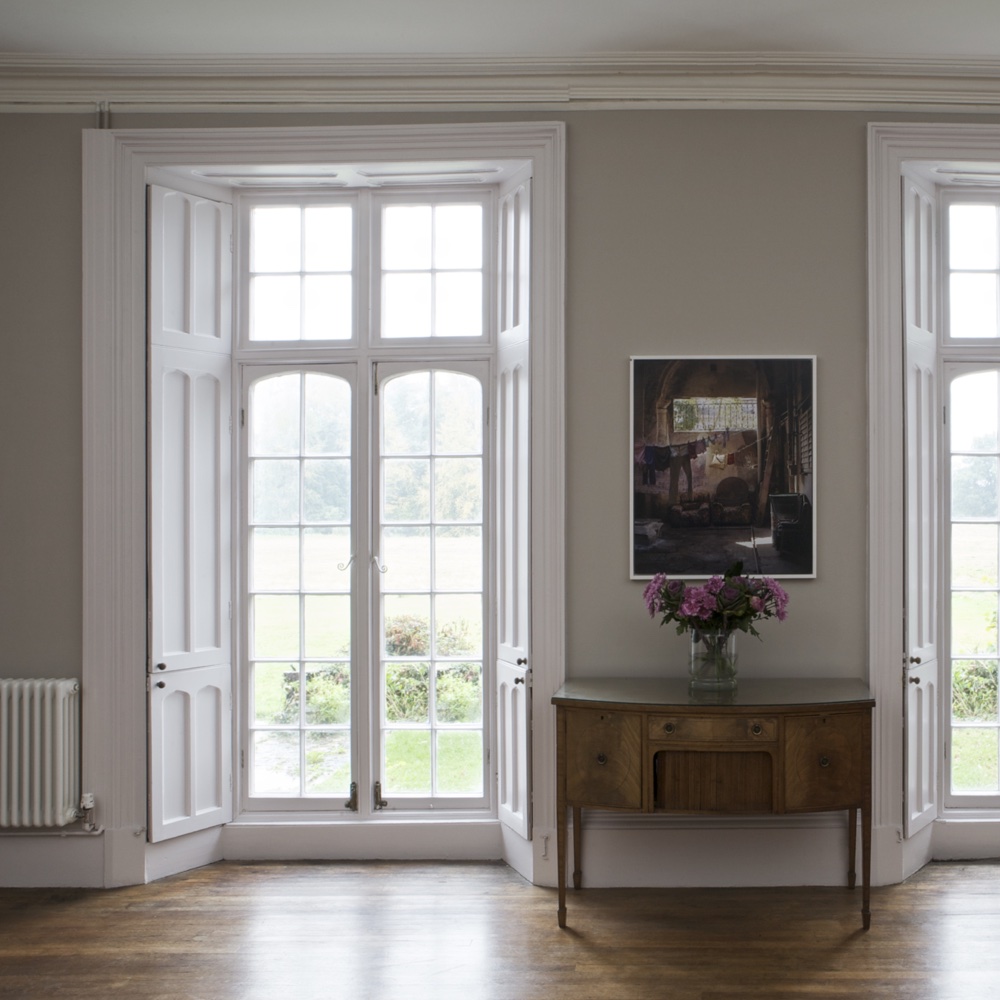
The top 54 paint colours of the decade – all the shades we couldn't live without
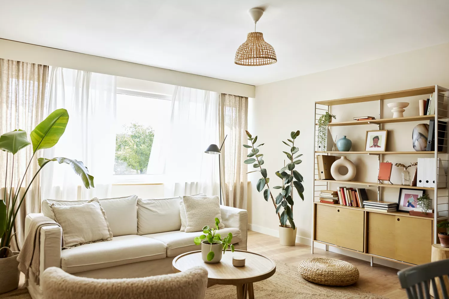
Designers Agree: This Classic Living Room Paint Color Never Goes Out of Style

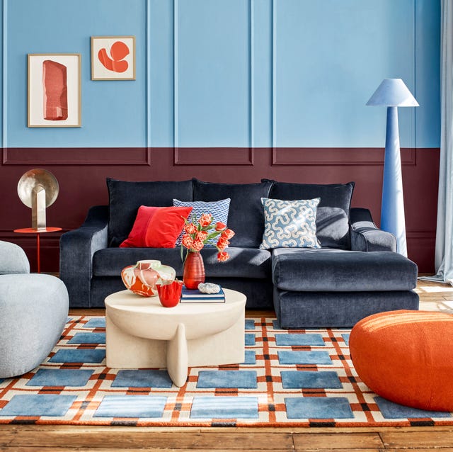
The 5 Sofa Colours Pinterest Says Will Be Everywhere In 2026

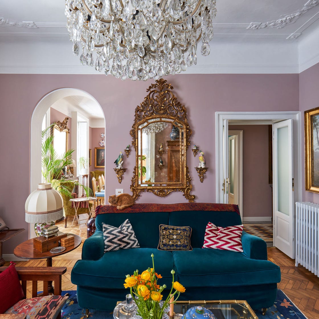
These Living Room Paint Colors Are a Total Mindset Shift
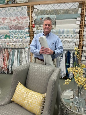
6 quick tips to find the right furniture fabric
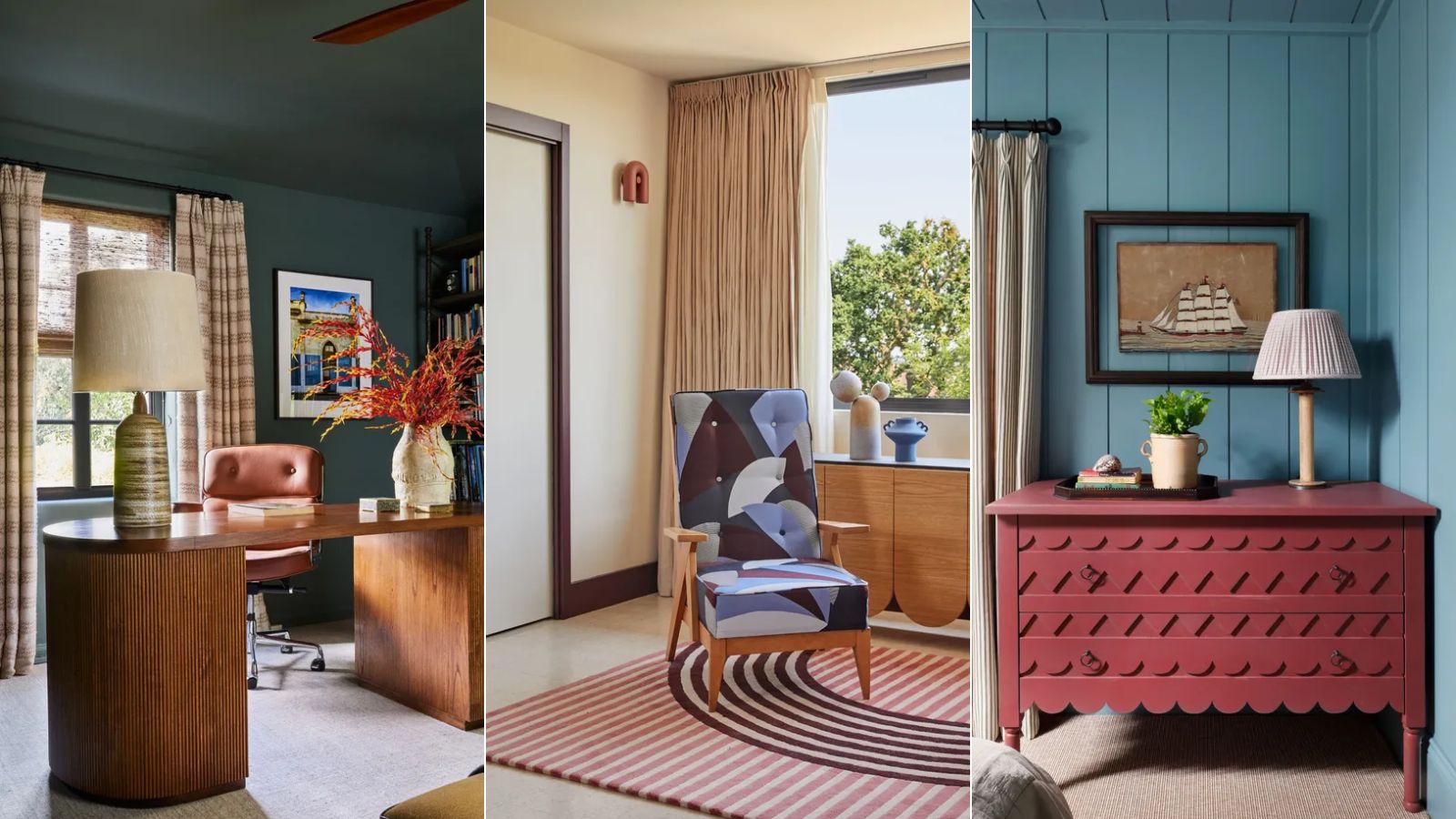
15 Farrow & Ball paint colors in real homes – from calming blues to warm neutrals
12 Trending Paint Colors for 2024, According to Design Experts


10 Timeless Living Room Paint Colors Designers Swear By
Interior designers' favorite Farrow & Ball paint colors
5 couch colors to avoid – stay clear of these shades for a sofa that stands the test of time

2024's Sofa Color Picks: Vibrant & Cozy

The 10 Best Farrow & Ball Paint Colors of All Time