1/15
10 fall color schemes that aren't all about orange
This article explores various fall color schemes beyond traditional orange, offering inspiration for seasonal home makeovers. While acknowledging the classic appeal of pumpkin-inspired colors, it highlights a broader palette including greys, greige, and even light blues. The piece emphasizes that fall color palettes are suitable for refreshing different areas of the home, such as living rooms, kitchens, and bedrooms.
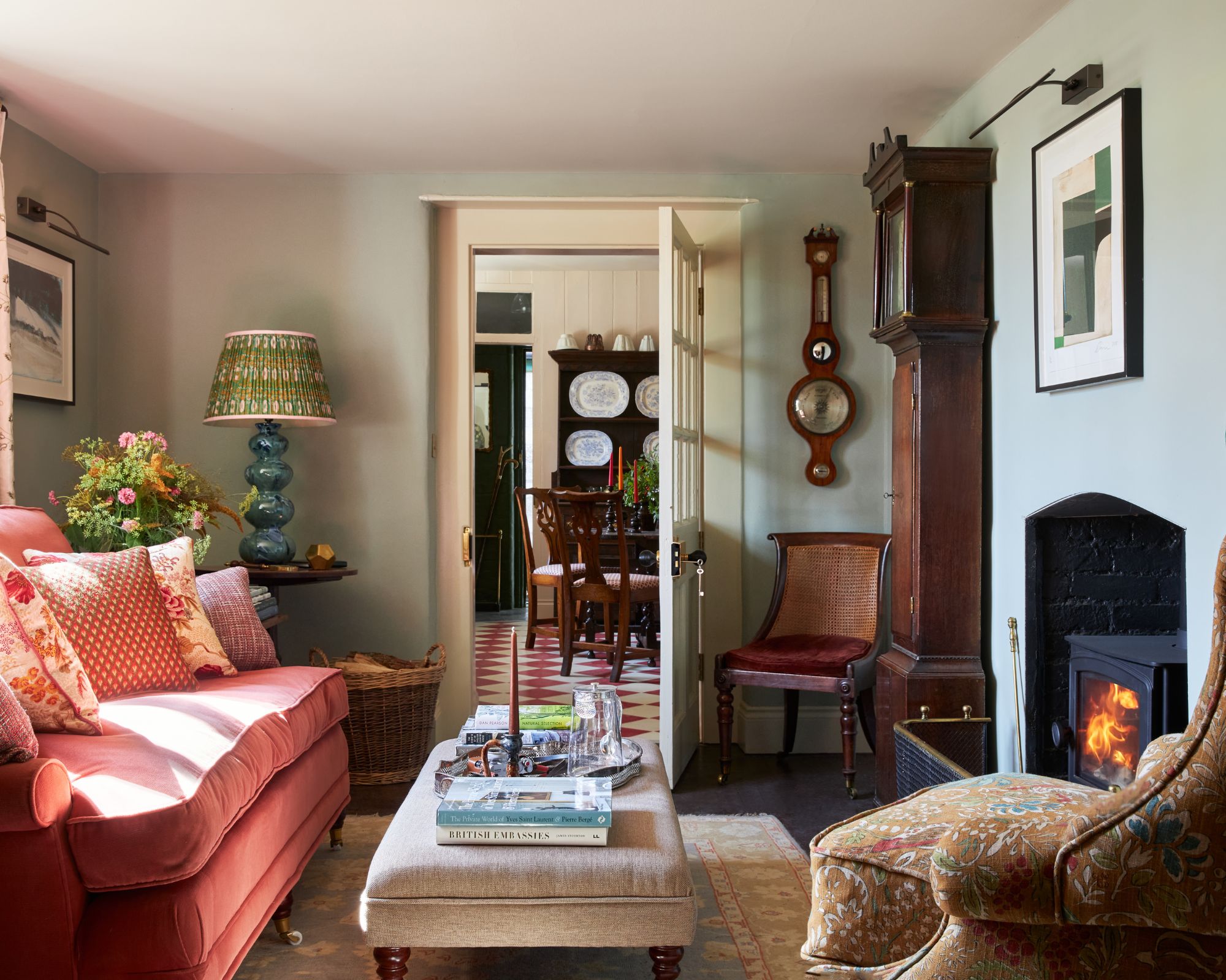

The article begins by introducing 'Meadow tones,' exemplified by Dulux's 'Calming Meadow,' which is described as cozy and sophisticated. Marianne Shillingford, Creative Director of Dulux, suggests that nature-inspired shades from their Greenhouse palette are perfect for bringing 'life' into spaces as leaves fall, and they work well with natural materials. Next, 'Bright Skies' is presented as a color that can extend the feeling of summer into fall and winter. Shillingford notes that this warming blue is an all-season color, particularly relevant after periods of being indoors, and its breeziness makes small spaces appear larger.
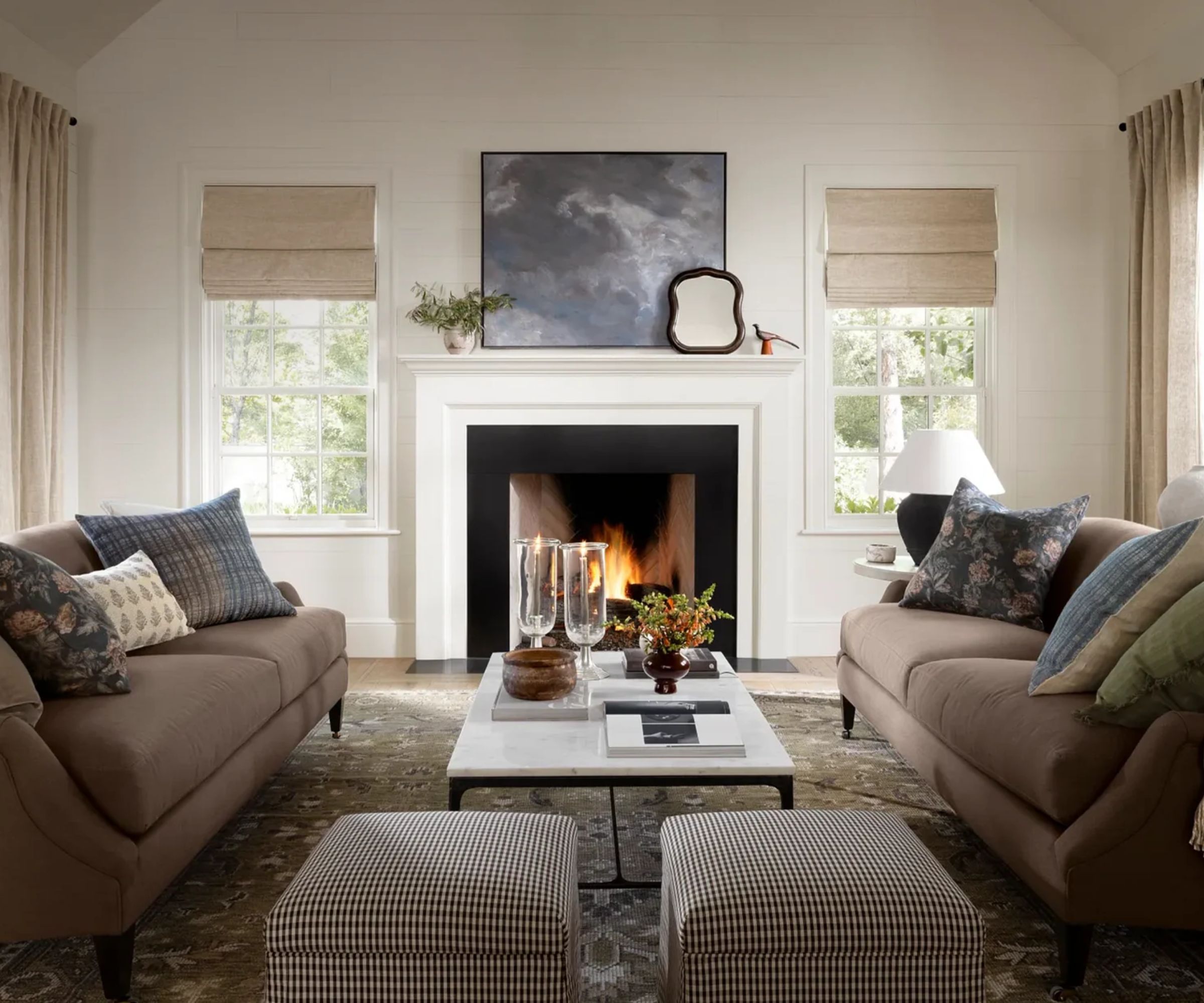
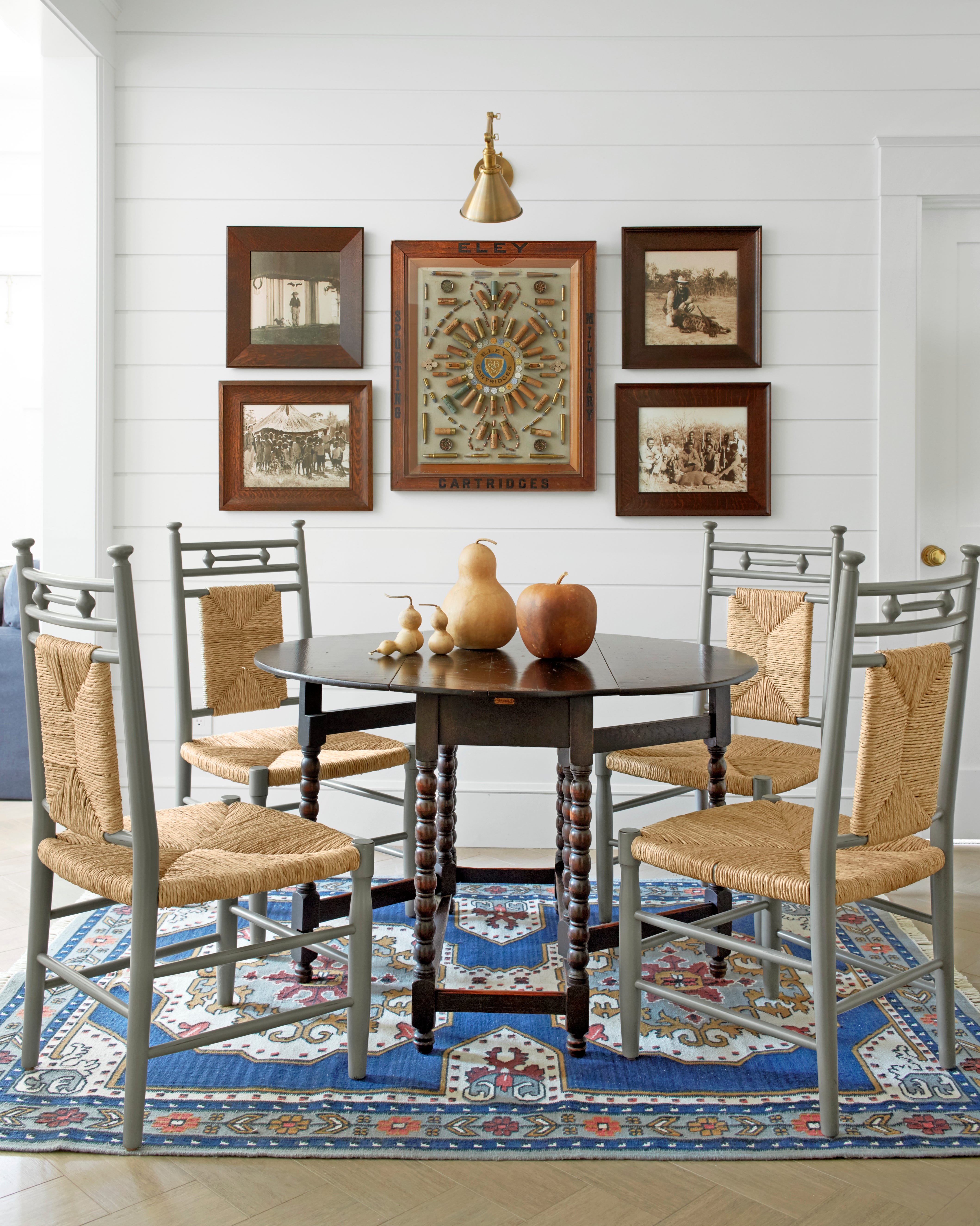
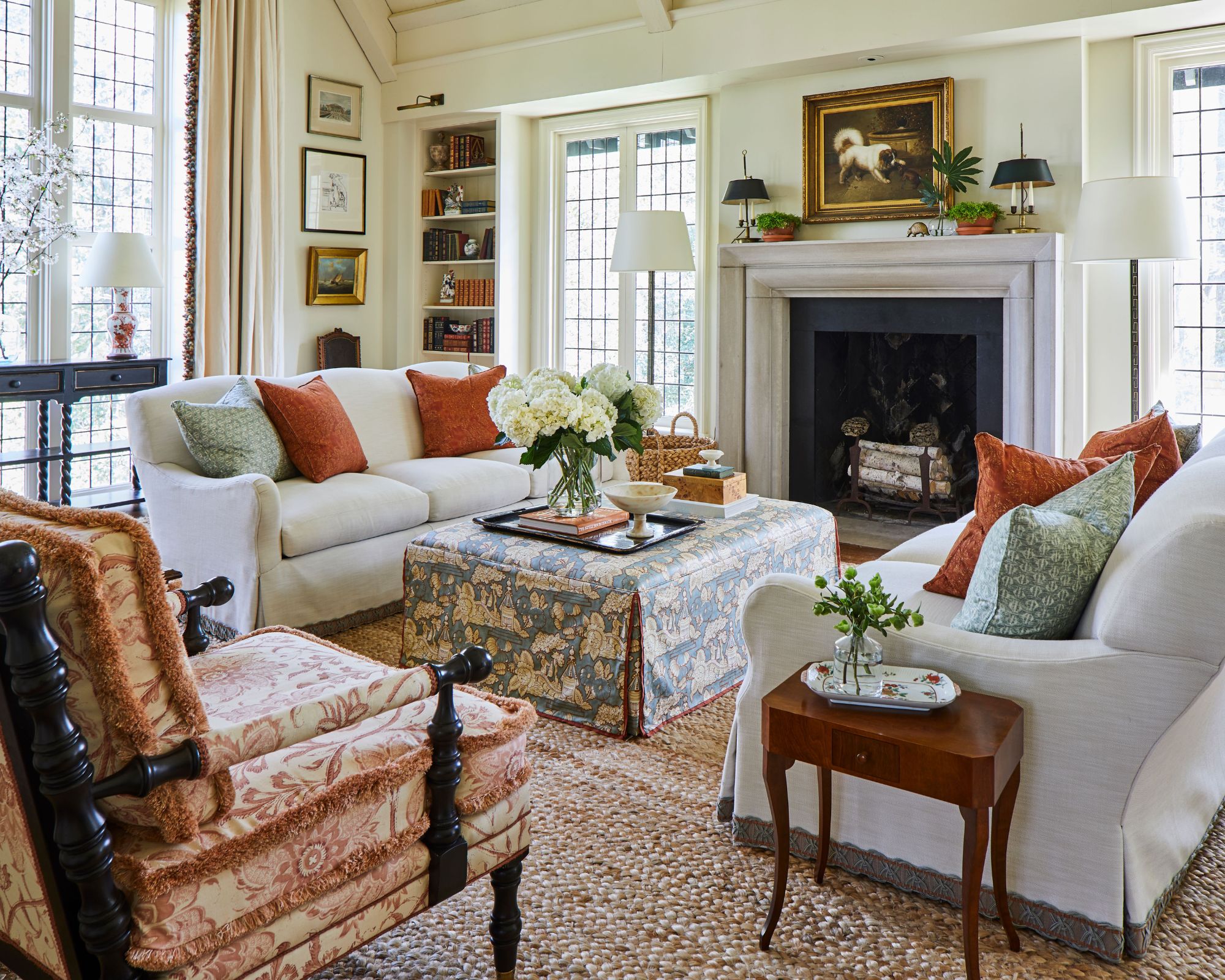
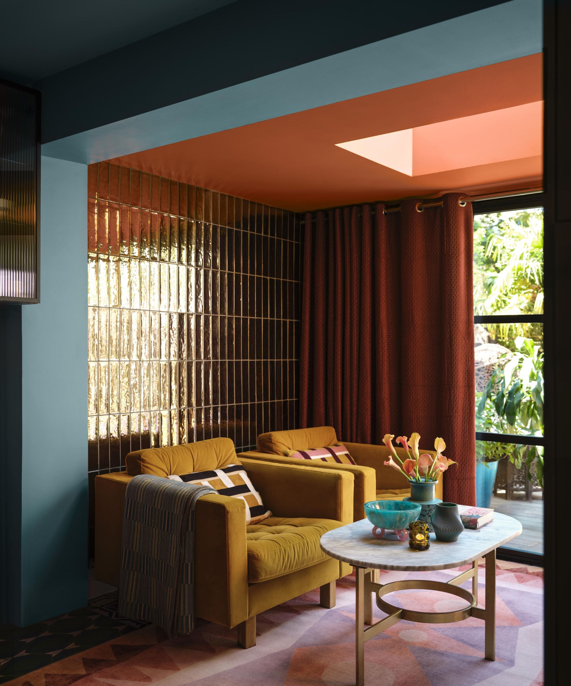
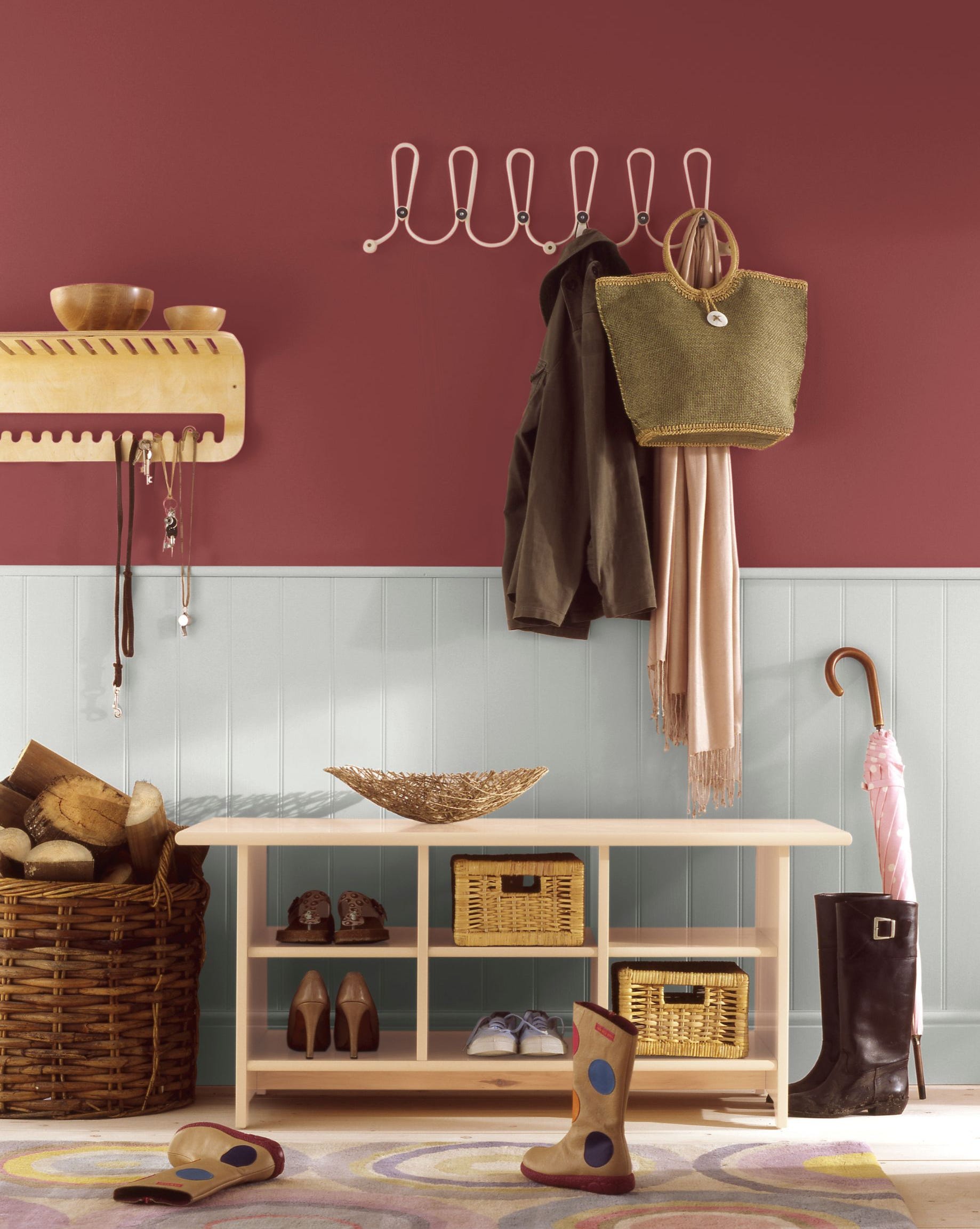
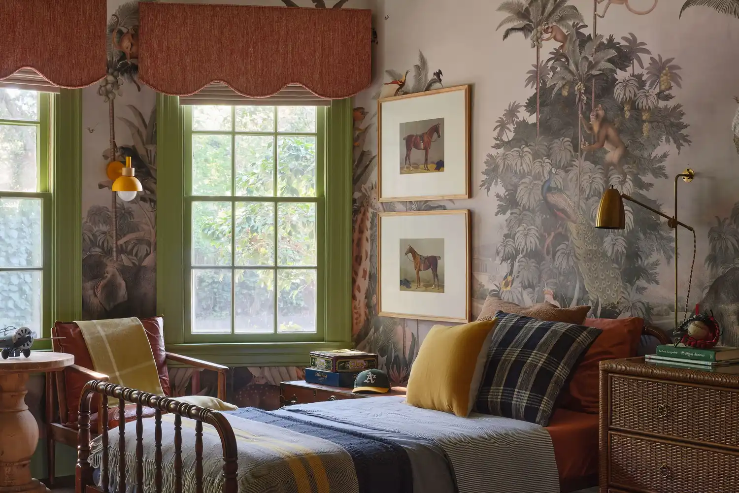
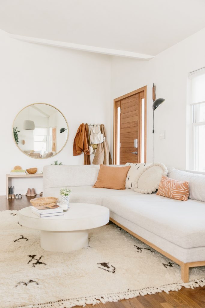
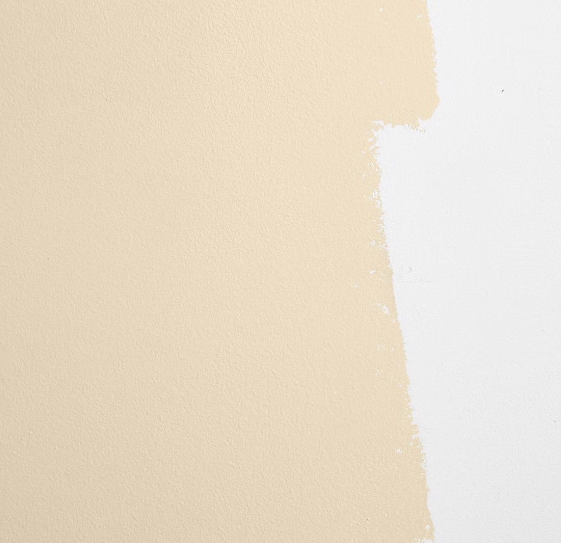
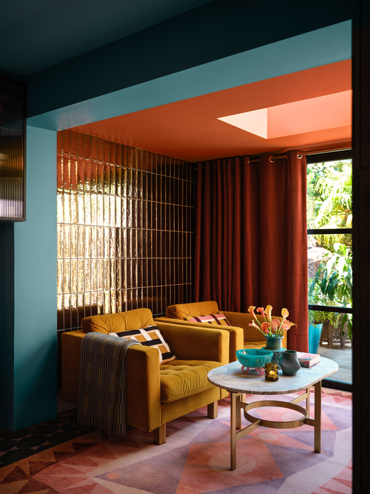
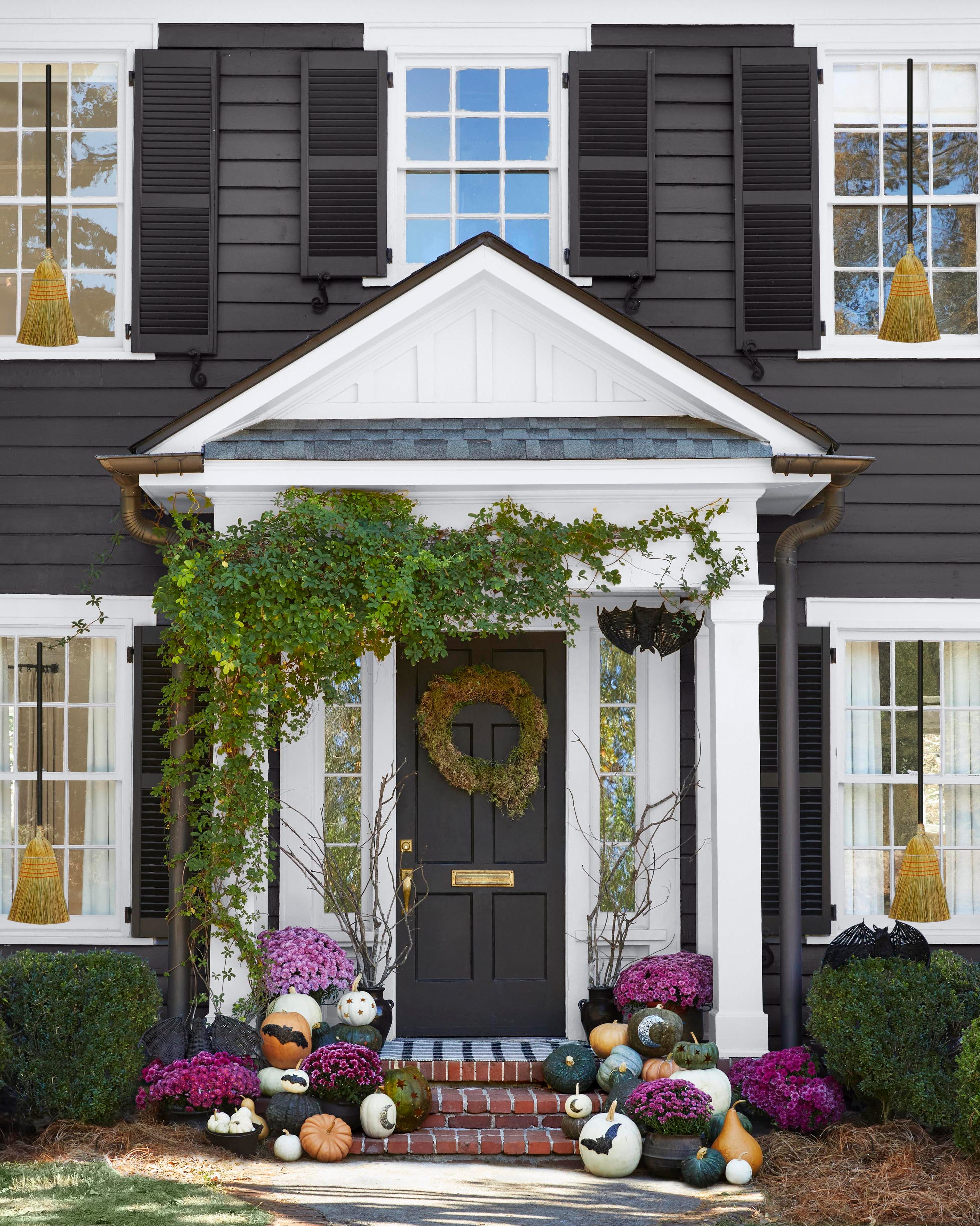
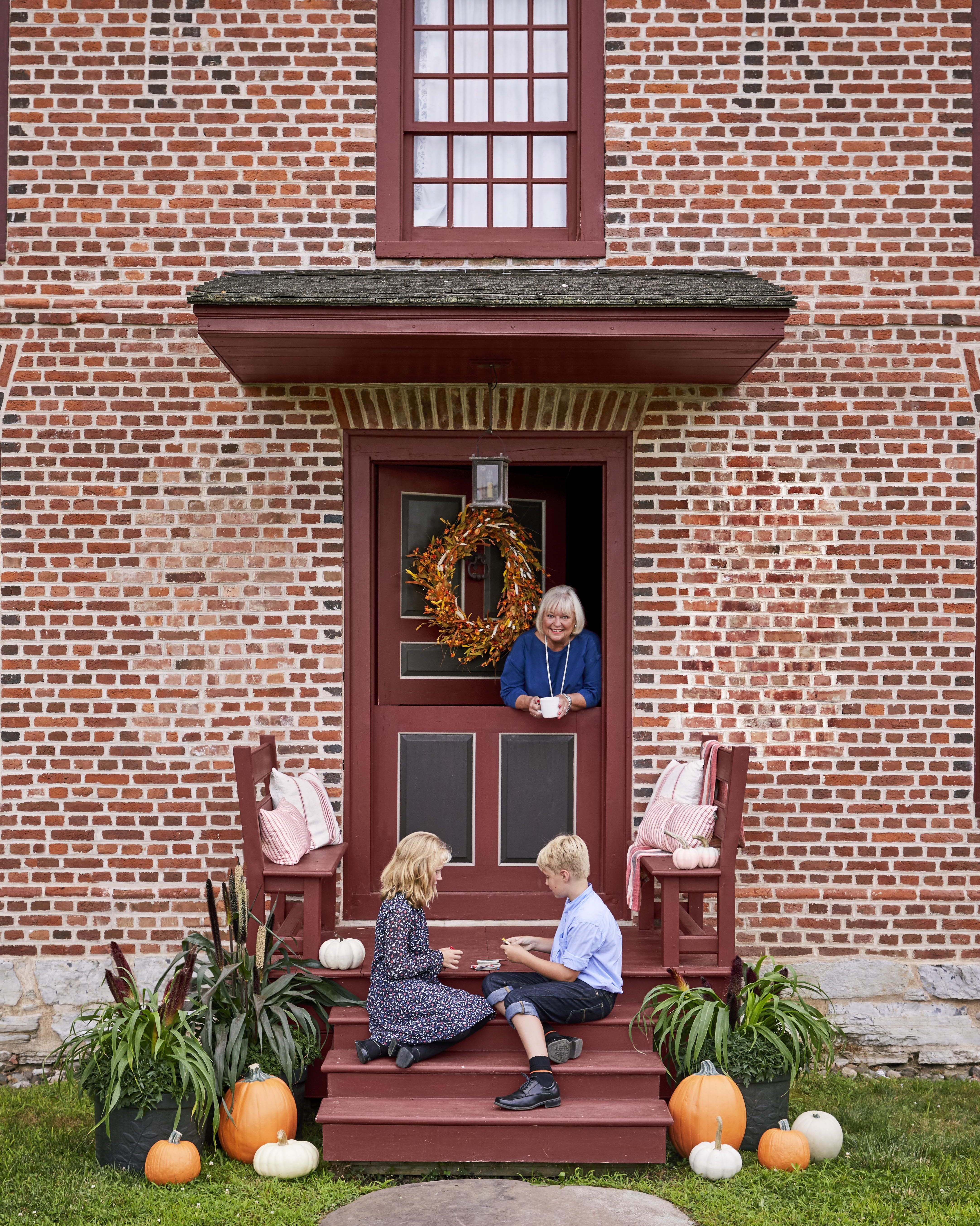
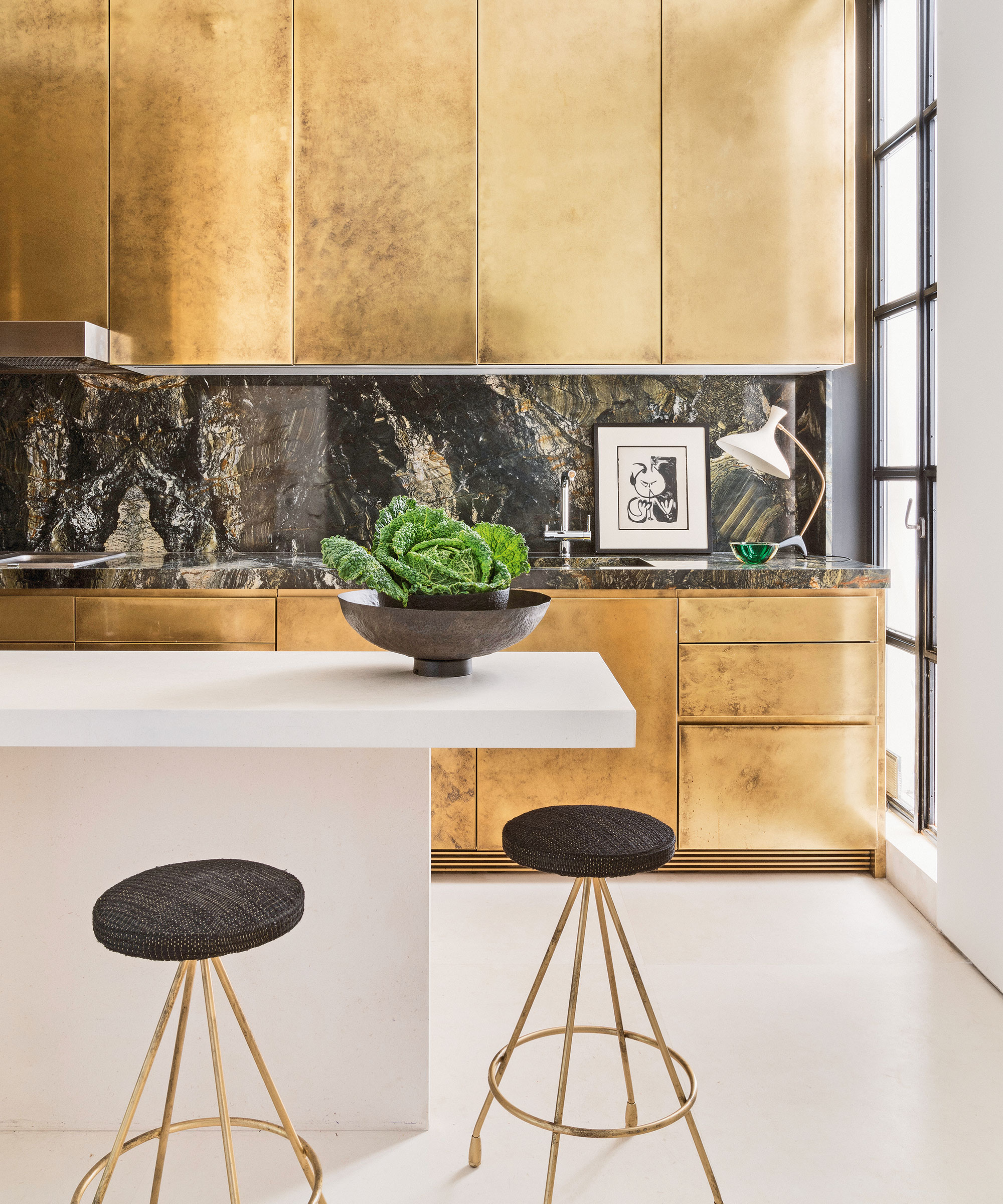
Following this, 'Gorgeous grays' are discussed as a simple yet impactful backdrop for dining rooms, especially when paired with natural accents for a rustic finish. 'Brick reds' are highlighted as a timeless autumnal color, particularly effective around fireplaces, evoking the shades of maple leaves. 'Mustard' is introduced as an energizing fall color ideal for bedrooms, especially when combined with natural linen bedding or wall paneling. The article then advocates for 'keeping things warm with a mix of neutrals,' noting the resurgence of beige and cream. These warm-toned yet light colors are presented as perfect for creating cozy autumn spaces.
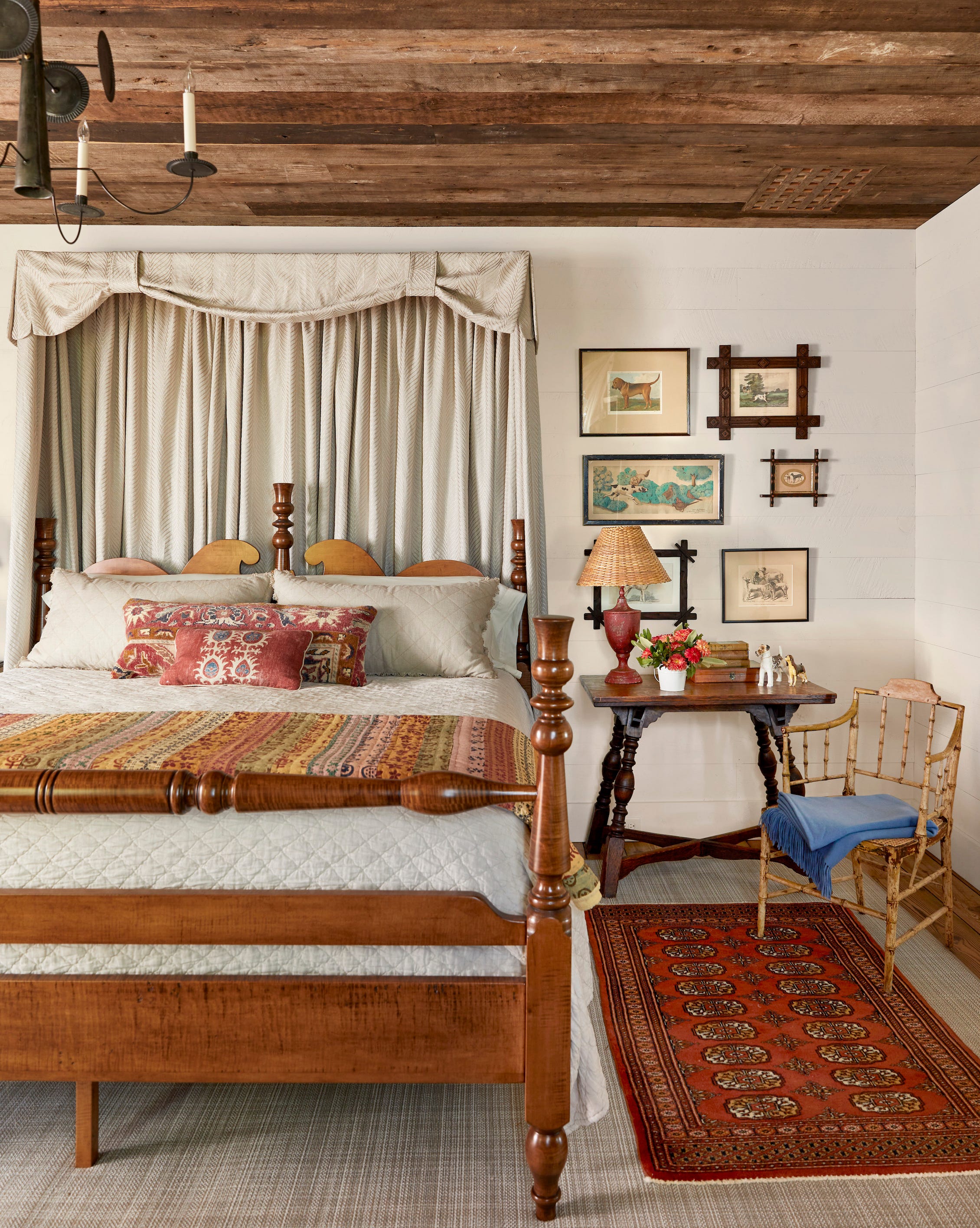
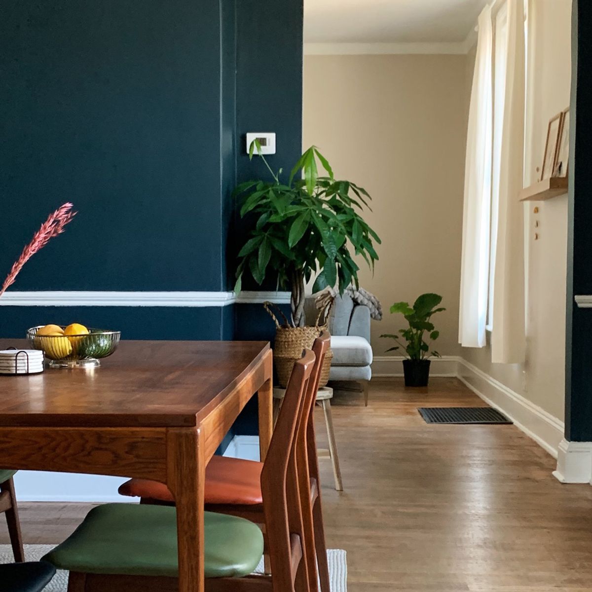
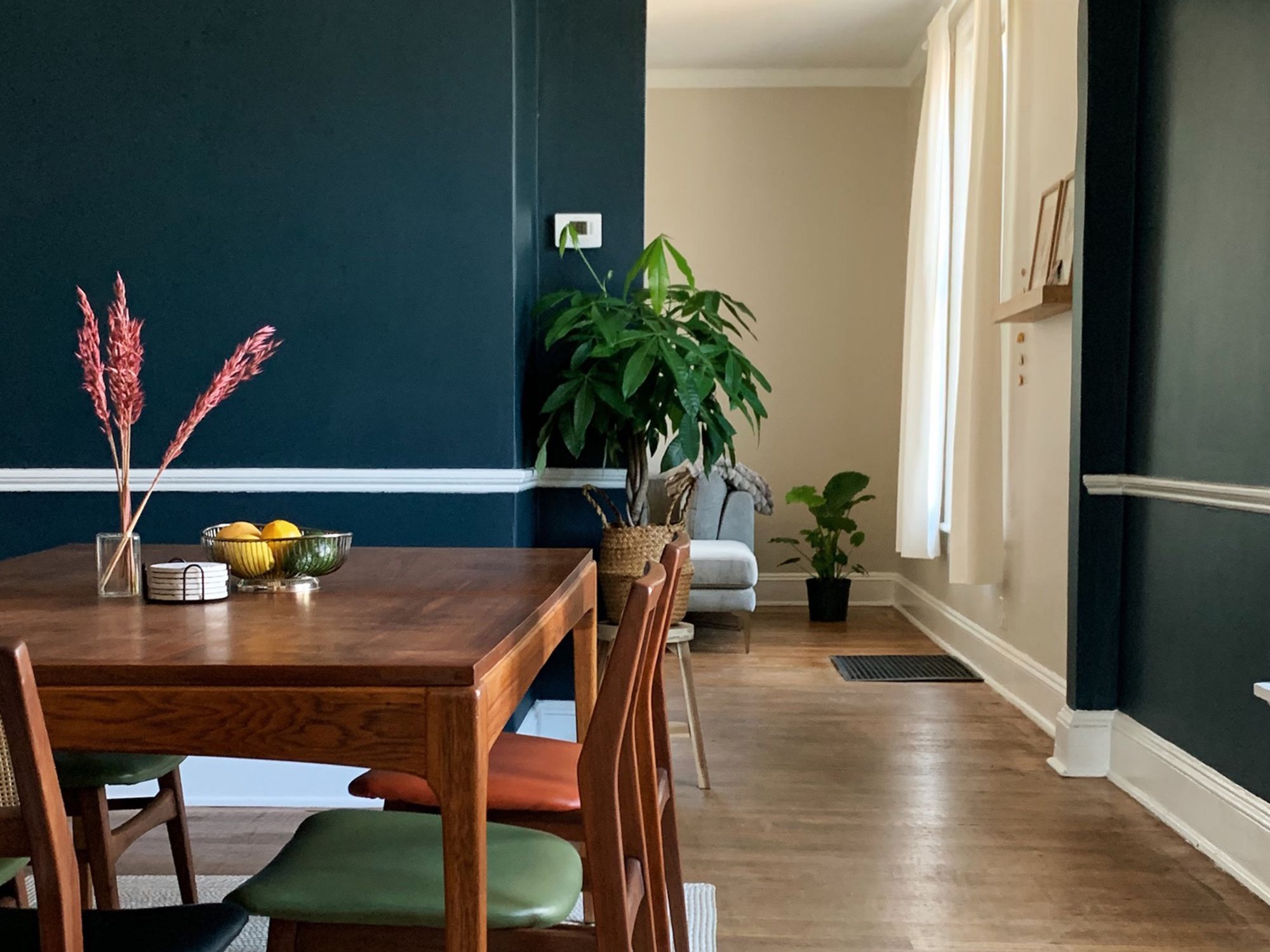
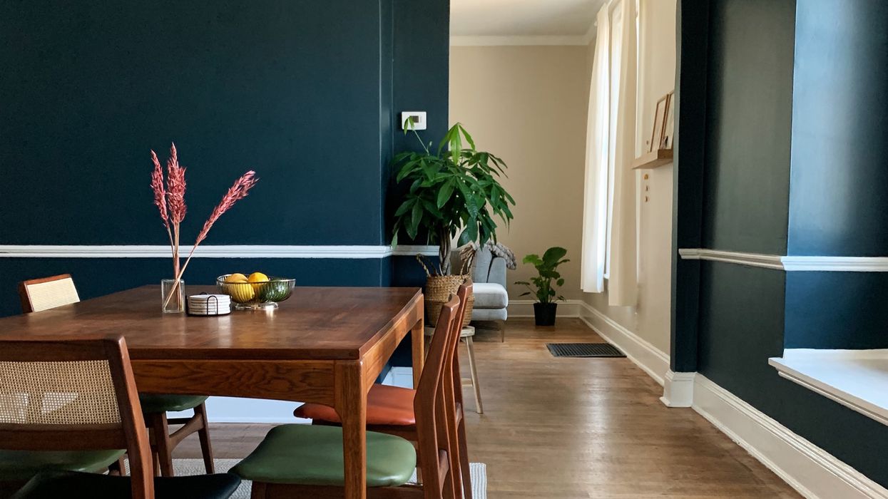
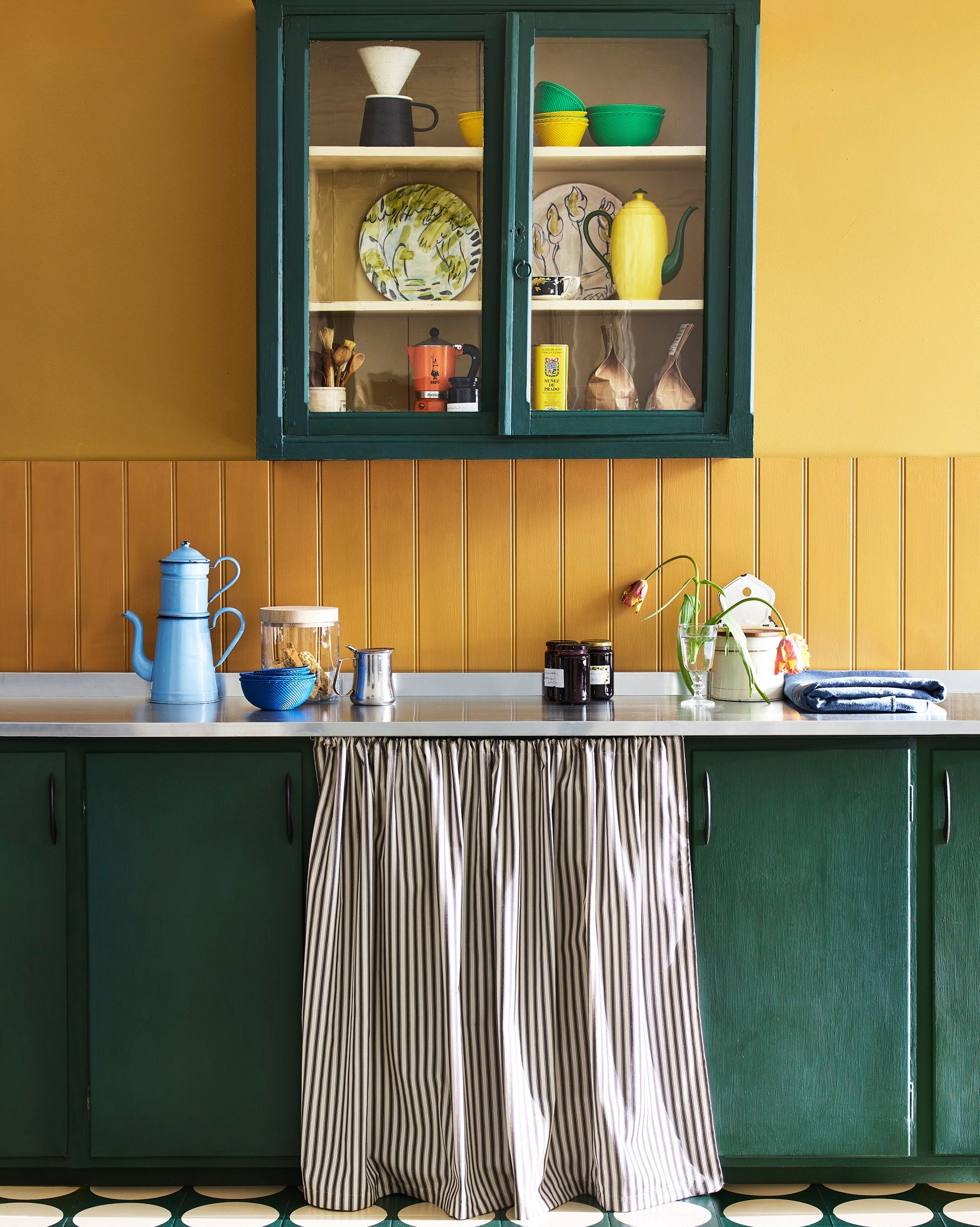
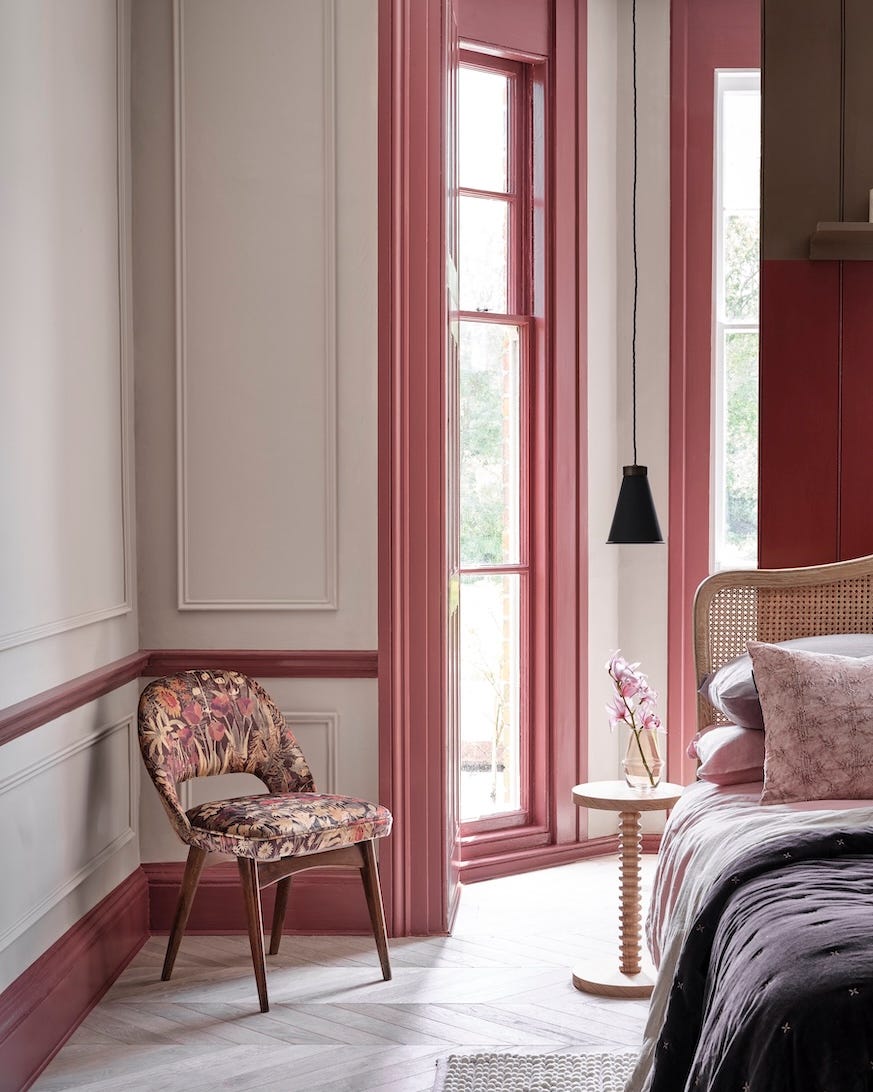
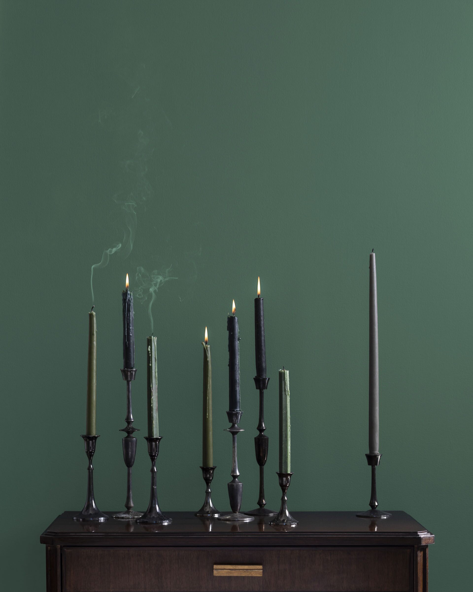
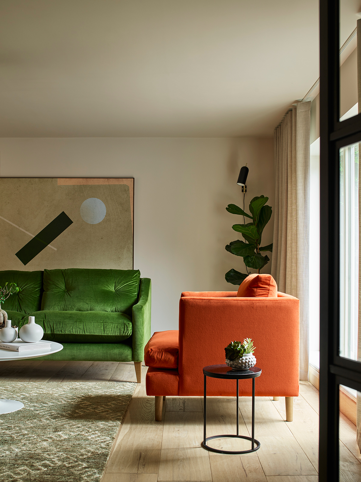
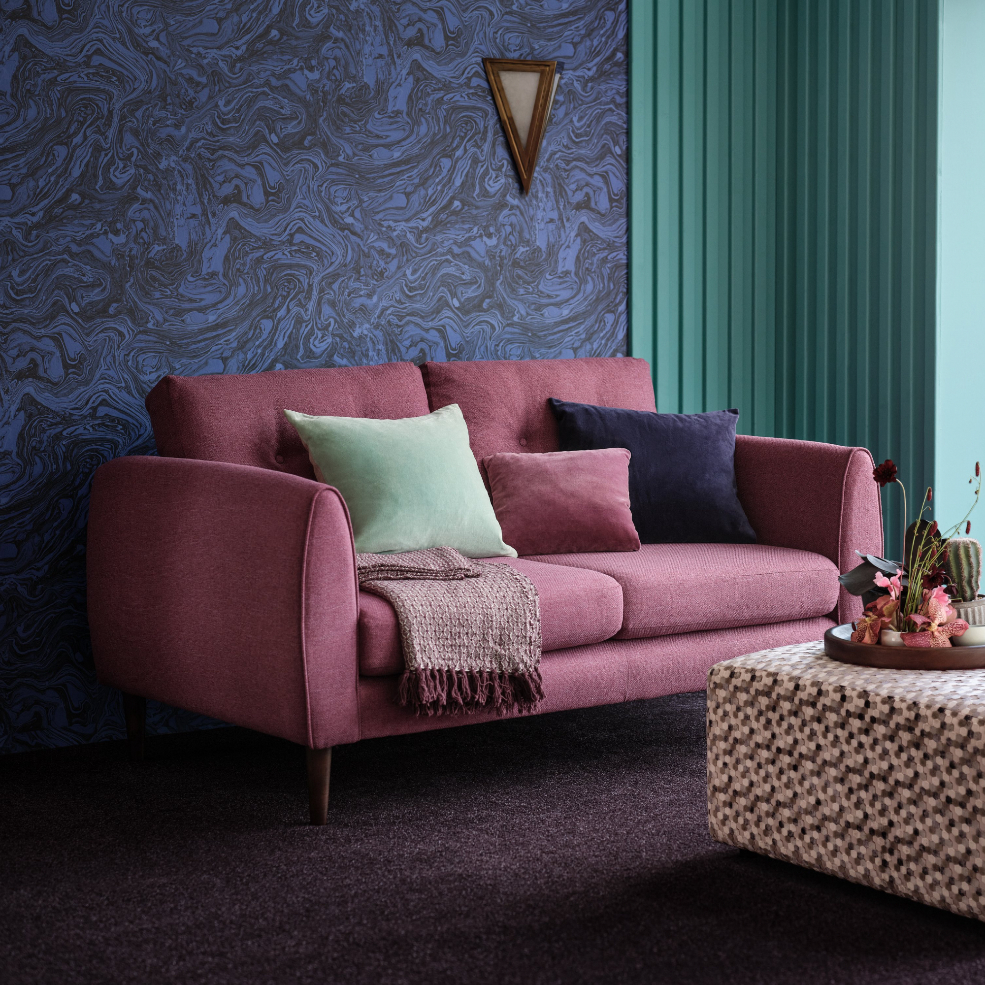
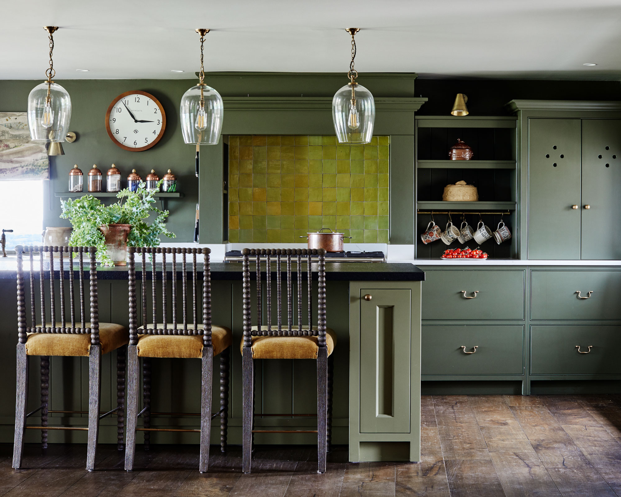
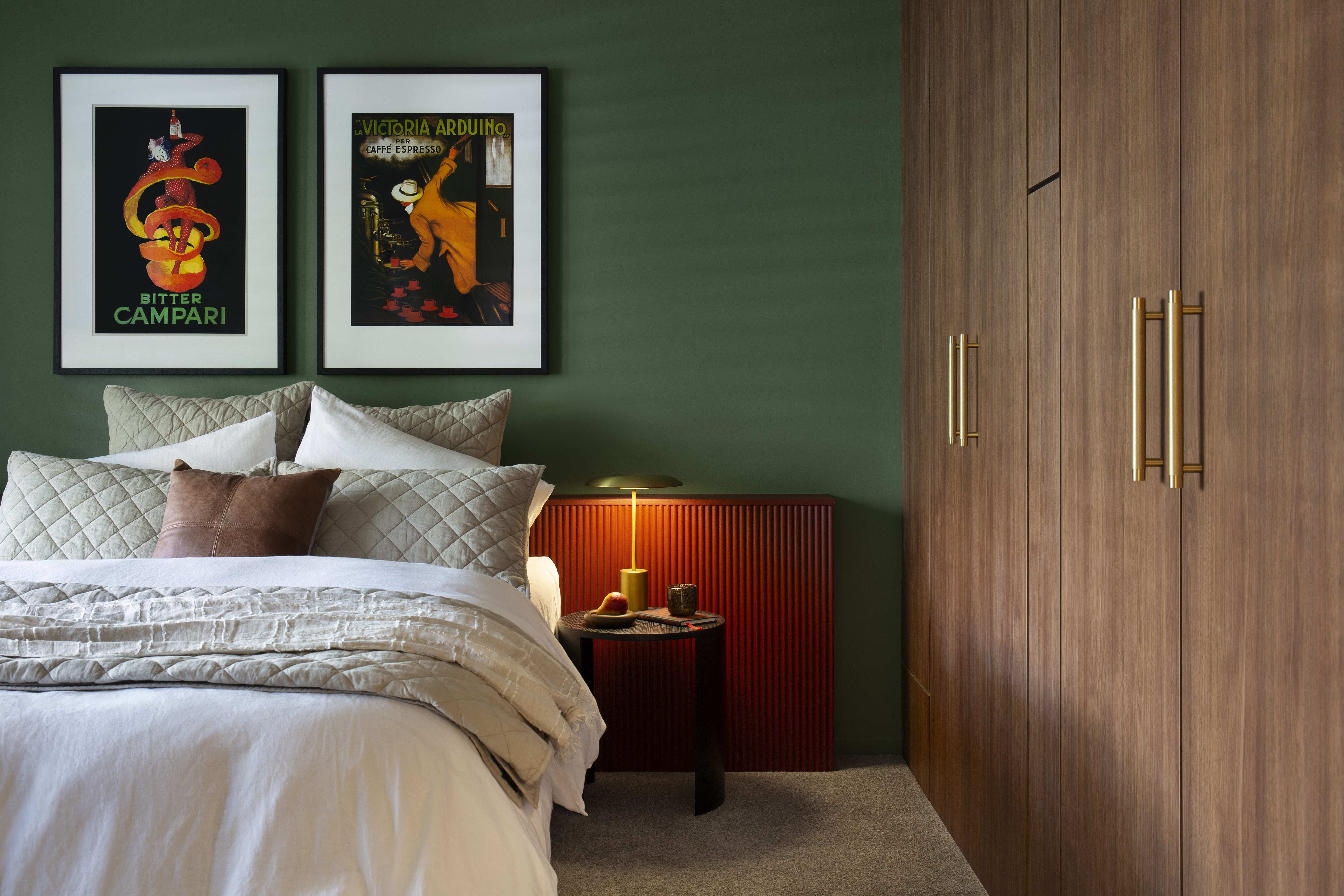
Further into the article, 'dark green with warm woods' is recommended, with deep forest greens recognized for their autumnal appeal, especially when paired with woody tones and touches of mustard. 'Sage green' is also mentioned as a popular choice, working well year-round and easily updated for fall with gold and orange accents. 'Dusky pink,' specifically Farrow & Ball's 'Sulking Room Pink,' is suggested for bringing warmth to cooler tones and complementing greys or blacks, ideal for a feature wall or soft furnishings.

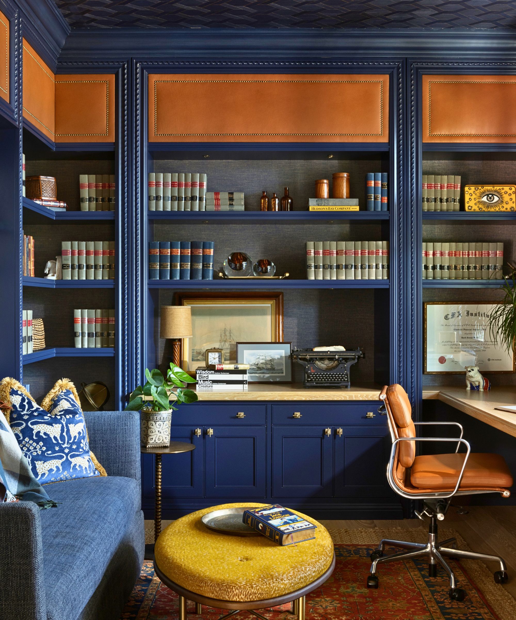
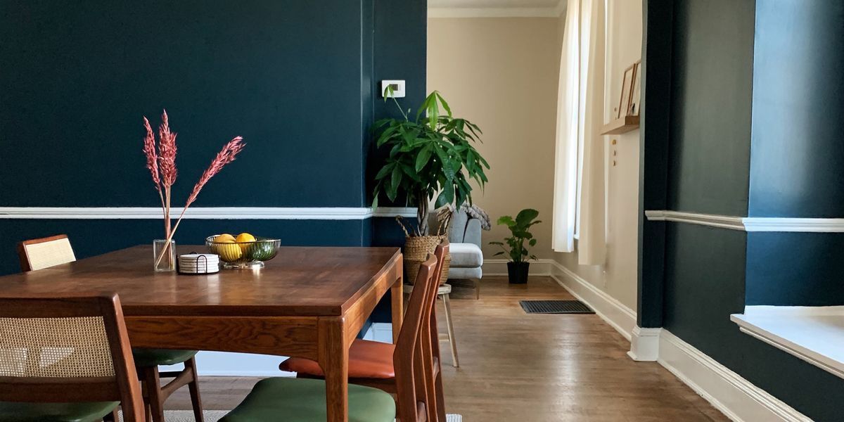
The article also explores blue schemes, starting with 'Cool blues,' which are light, grey-toned blues suitable for rooms with limited light, making small spaces feel larger. These colors act as a versatile canvas, pairing well with deep browns and olive greens in the fall. Alternatively, a 'classic deep blue,' such as an inky blue, is presented as a favorite for kitchens, offering a classic look when combined with crisp whites and pops of yellow. It is also suggested for bedroom feature walls with white sheets and yellow or orange pillows.
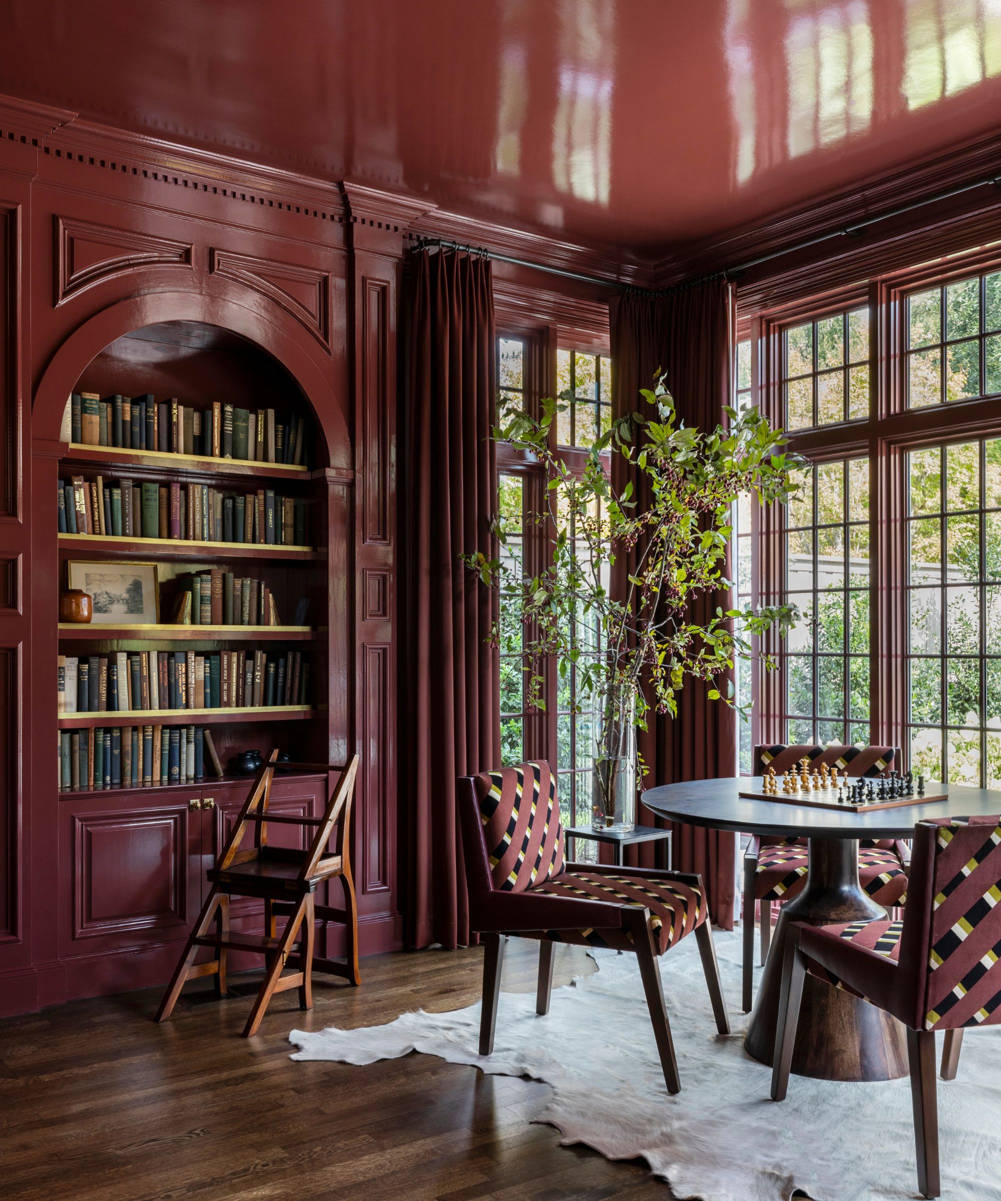
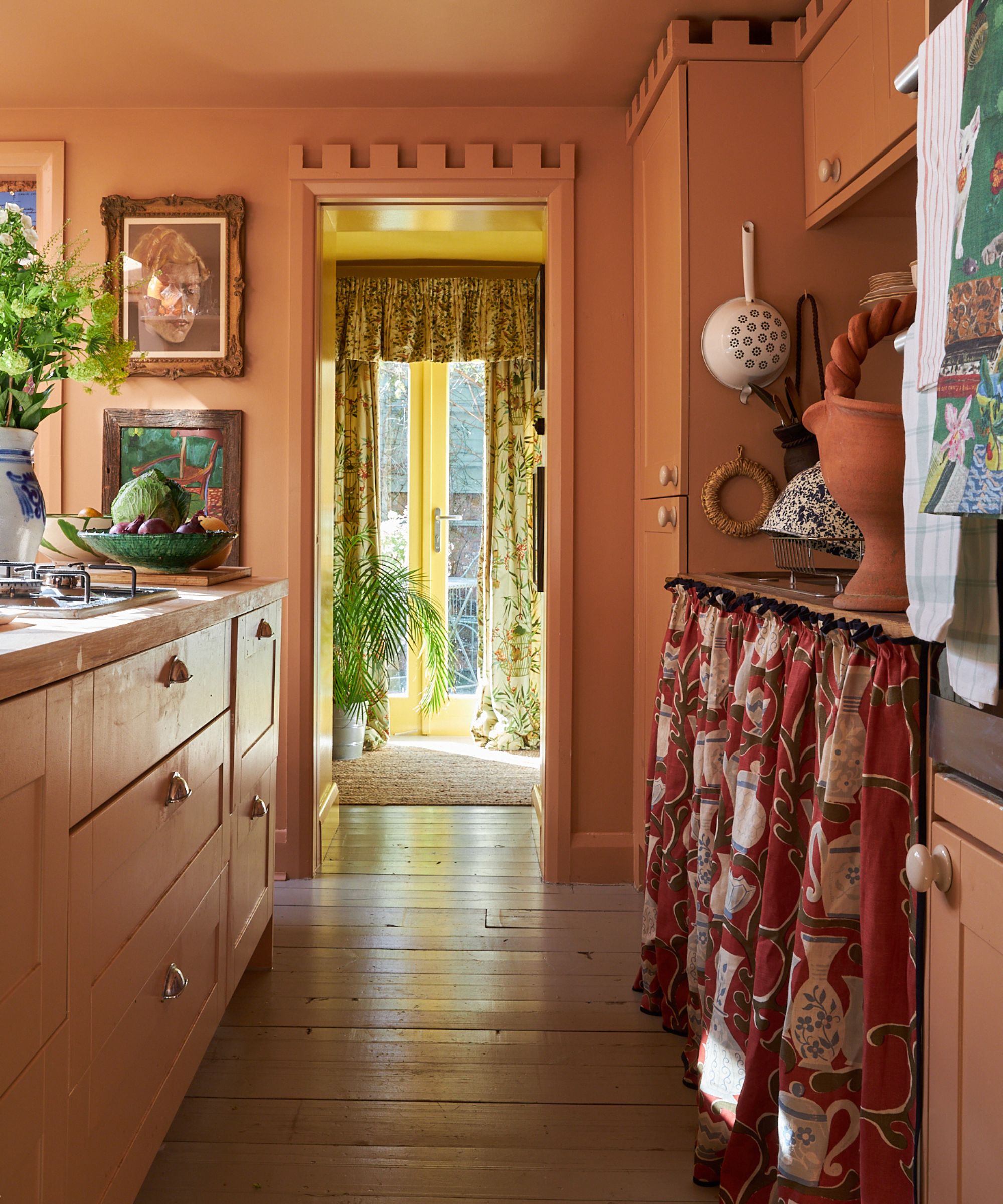
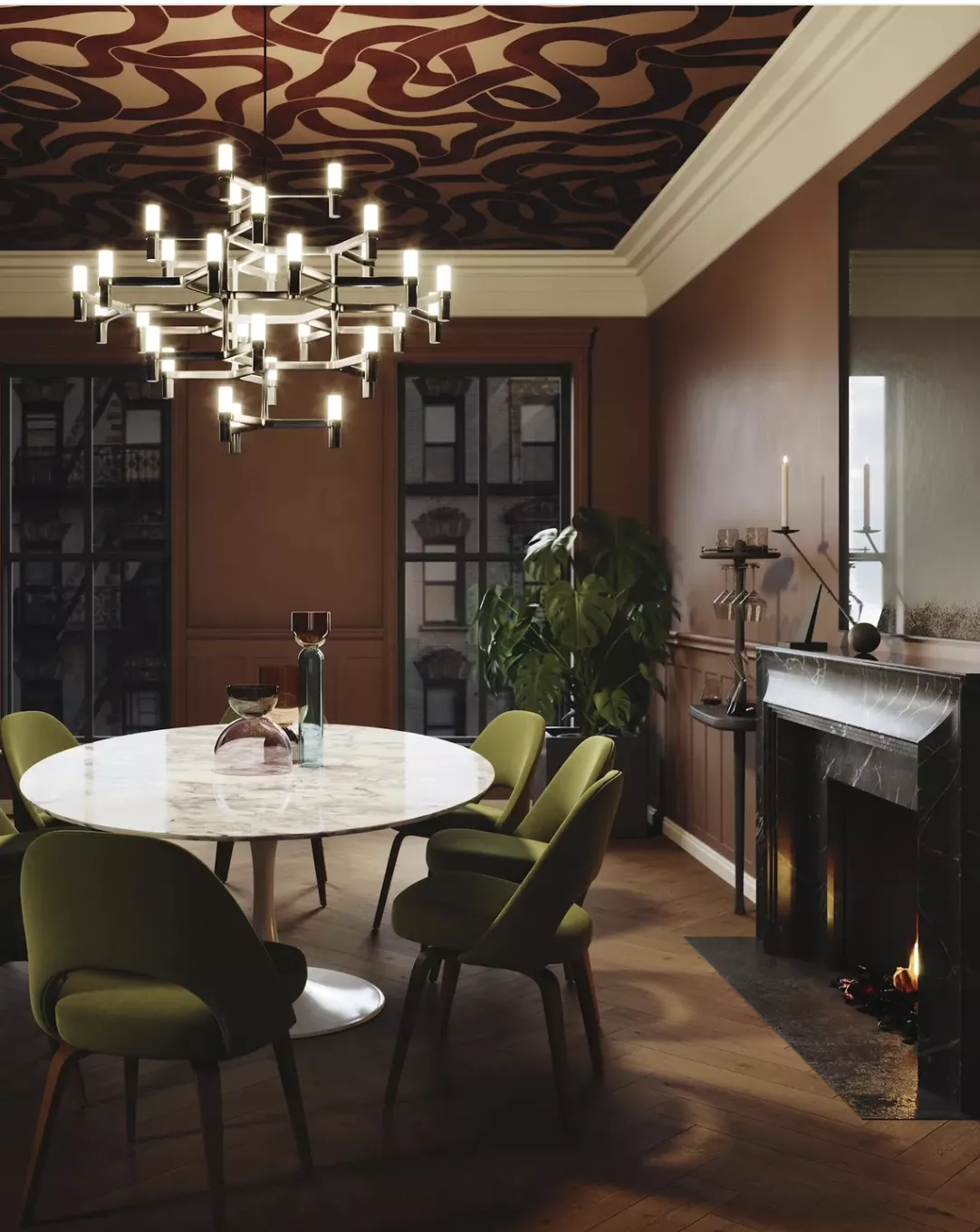
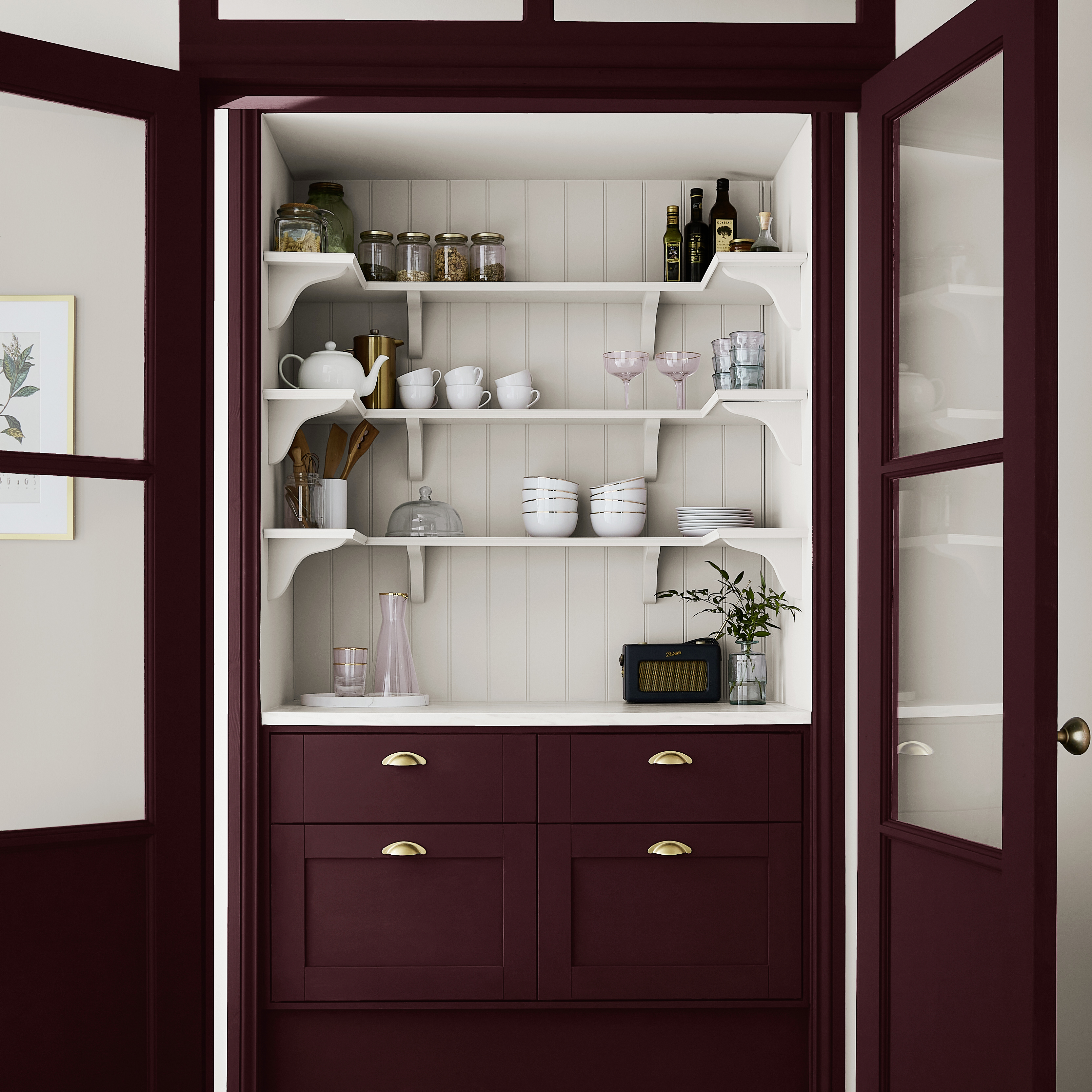
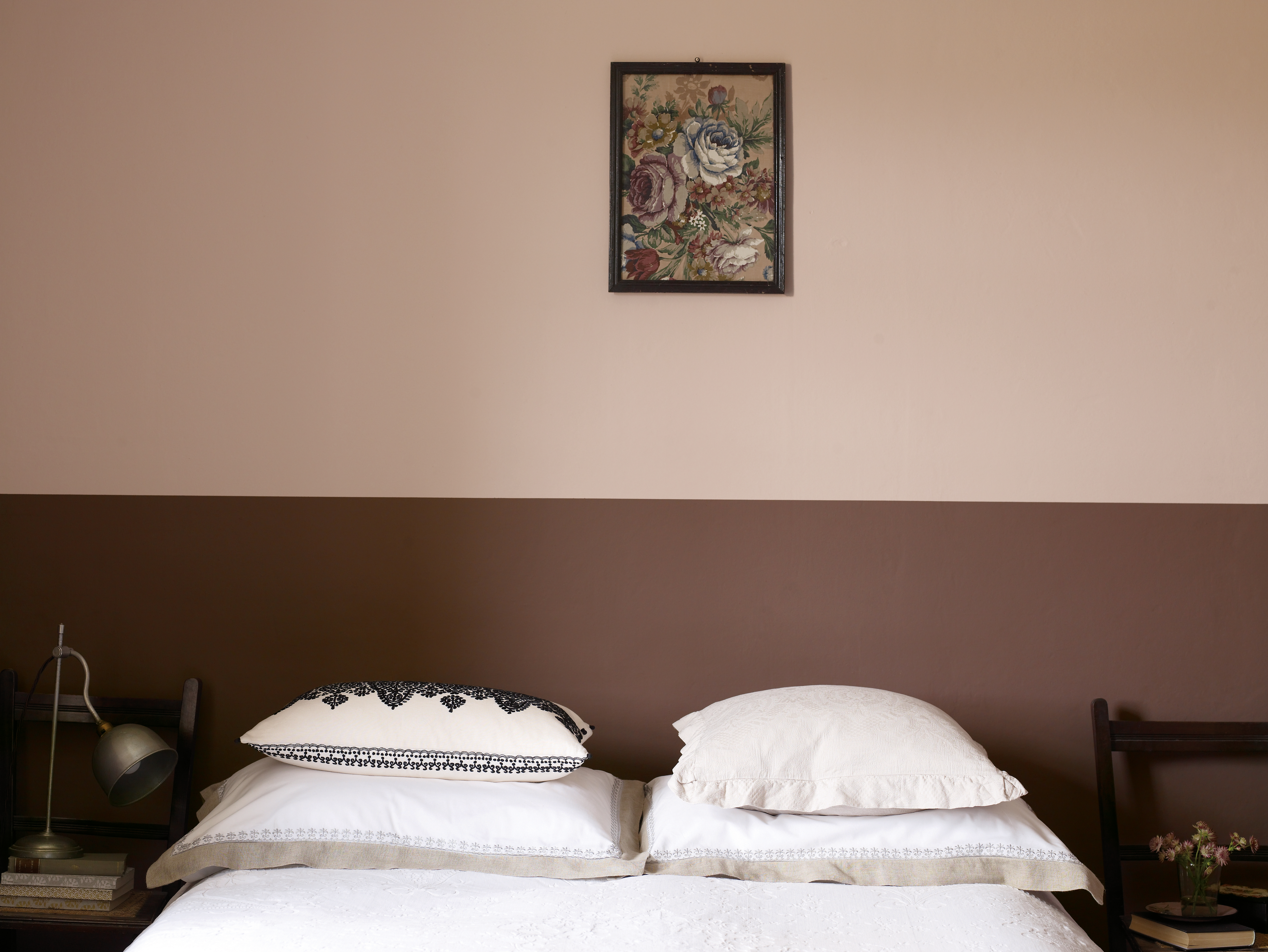
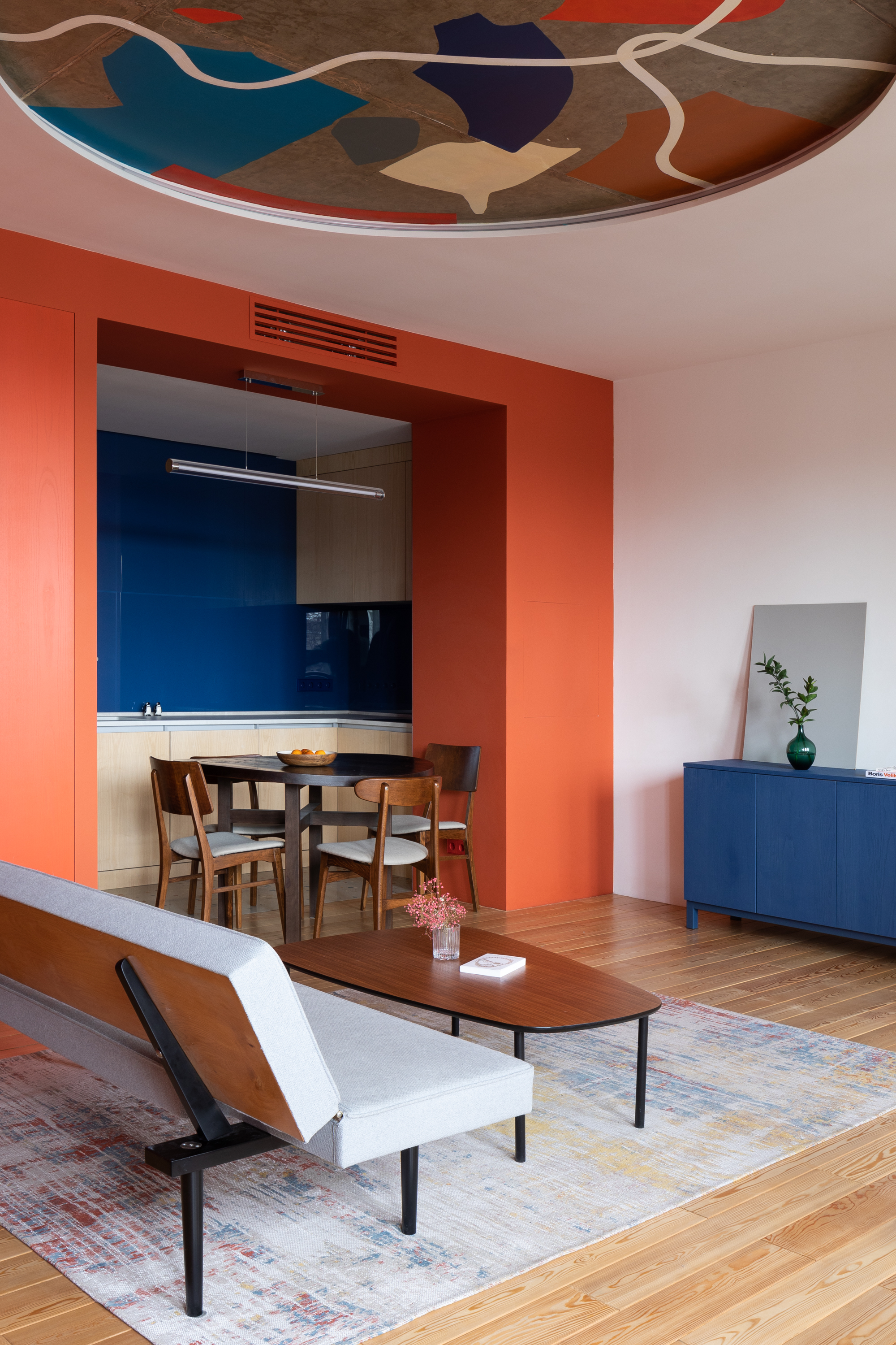
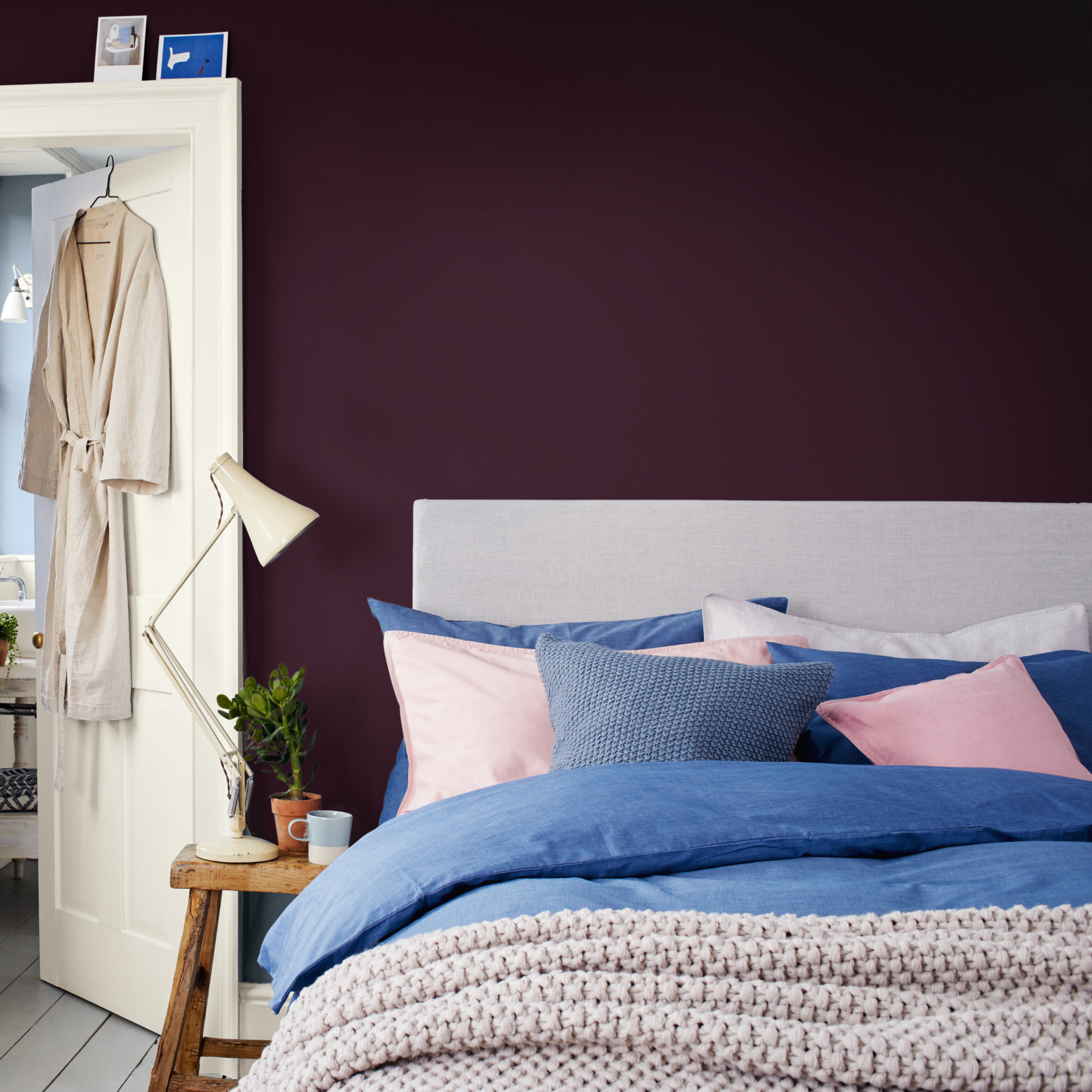
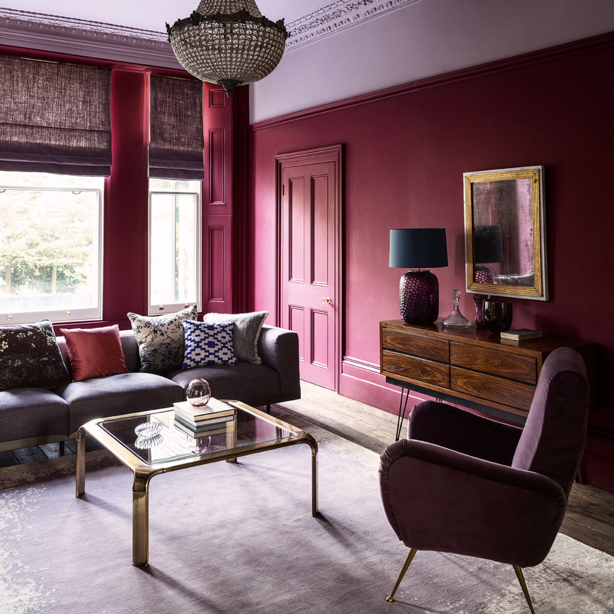
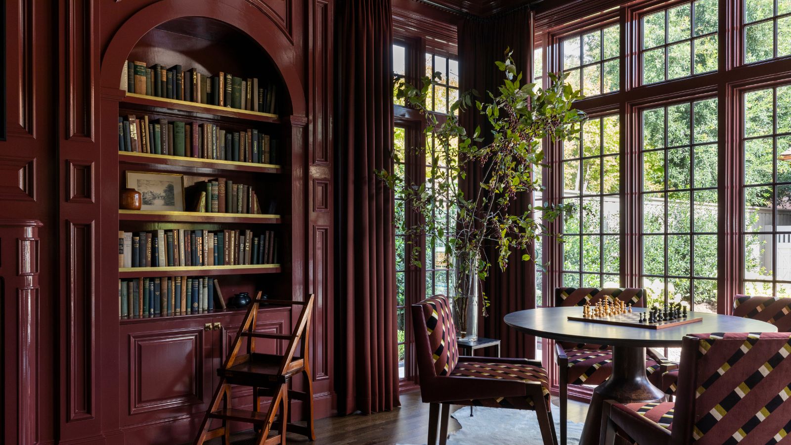
For a touch of luxury, 'dark reds,' like burgundy, are proposed for fall and winter decor. The article illustrates how this bold color can be incorporated subtly through elements like headboards and cushions without overwhelming a room, especially when balanced with lighter elements. 'A touch of drama with a half charcoal wall' is offered as an easy color-blocking technique for darker, dramatic fall colors, advising painting only half a wall and keeping the rest neutral. Finally, 'sunny yellow' is suggested for brightening rooms, either through accessories or a painted wall, particularly effective in spaces with high ceilings. The article concludes by acknowledging the undeniable place of 'pumpkin orange' in fall color schemes, demonstrating how it can warm up cold, dark rooms like a light-starved cottage kitchen, making it feel welcoming.
#FallDecor #ColorSchemes #InteriorDesign #HomeMakeover #AutumnColors #SeasonalDecor #Painting #HomeDecor #DesignTrends #FallDecor #ColorSchemes #InteriorDesign #HomeMakeover #AutumnColors #SeasonalDecor #Painting #HomeDecor #DesignTrends
0 comment in total
 No comments yet
You may also like
It's time to look beyond pumpkin spice – 10 fall colors designers swear by for a cozy, seasonal, and timeless look

Fall’s Most Stylish Paint Color Trends Have Us Swooning
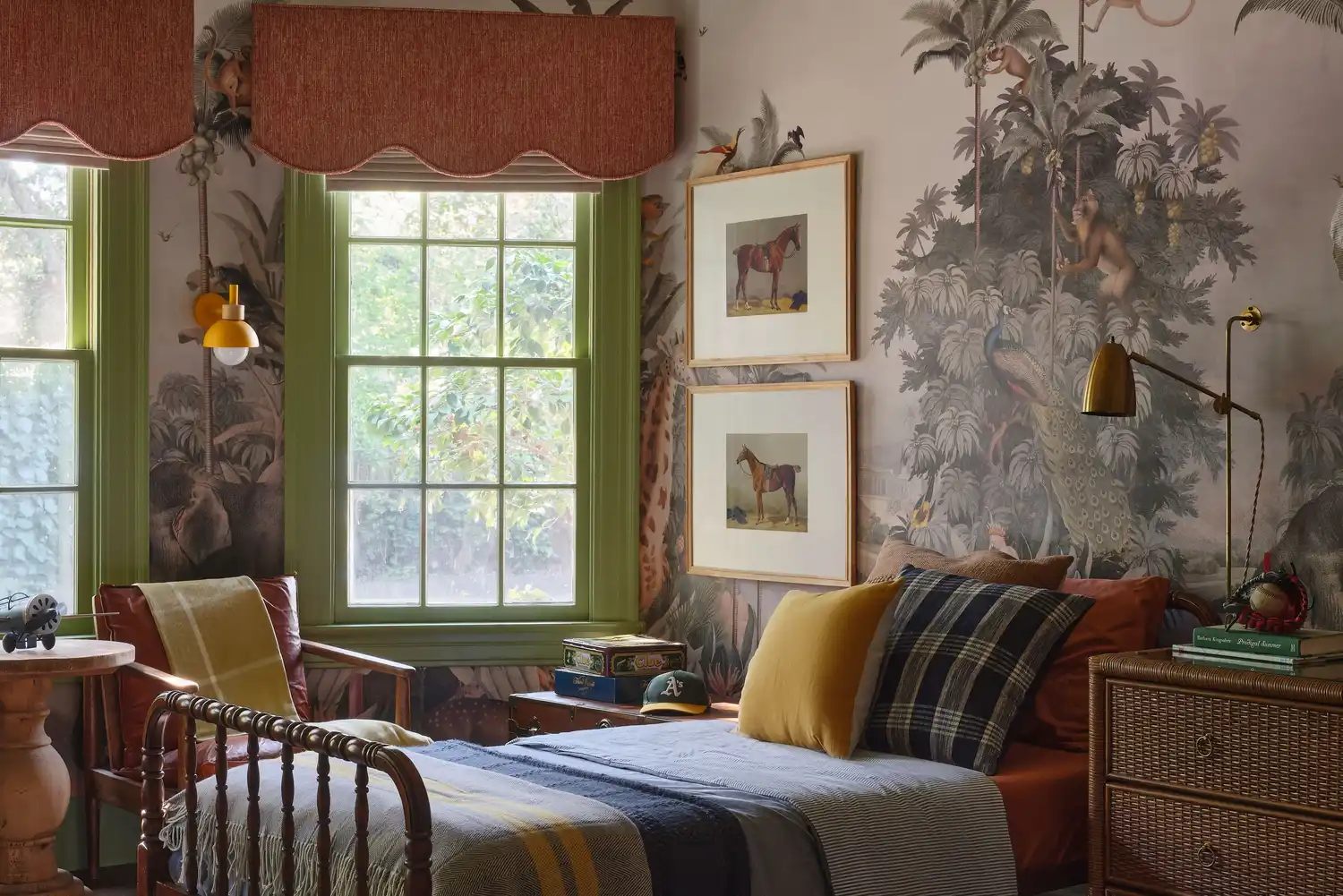
6 Paint Color Duos Designers Can't Get Enough of This Fall

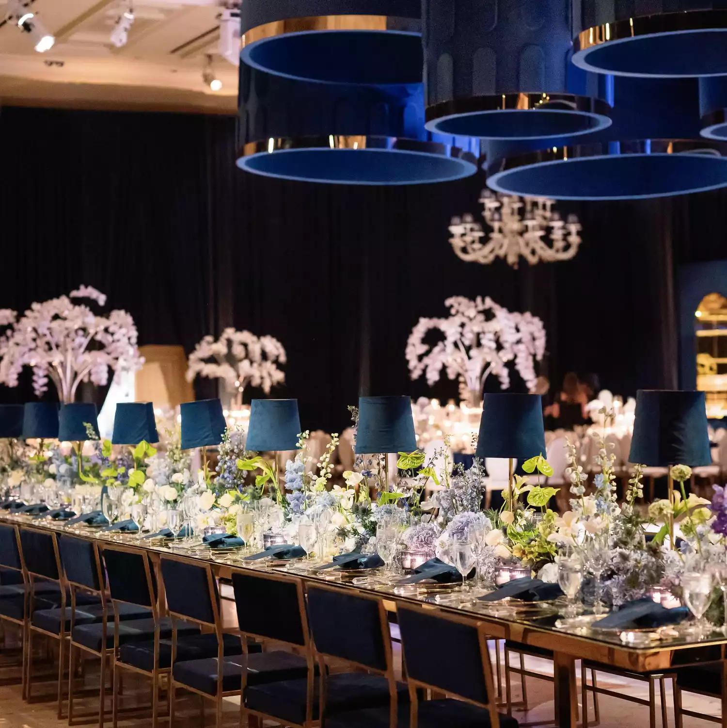
40 Fall Wedding Colors Perfect for an Autumnal Affair
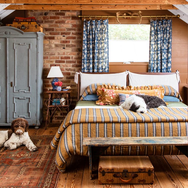
22 Beautiful Fall Color Schemes for Your Home
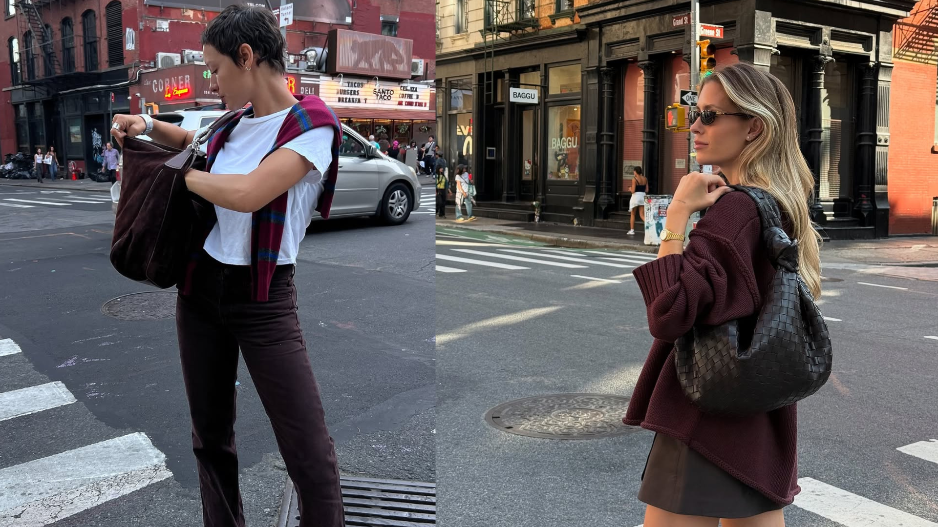
This Chic Color Pairing Is Cooler Than Beige and Black and Set to Dominate Fall Outfits


7 Fall Paint Color Trends Designers Want You to Use This Year

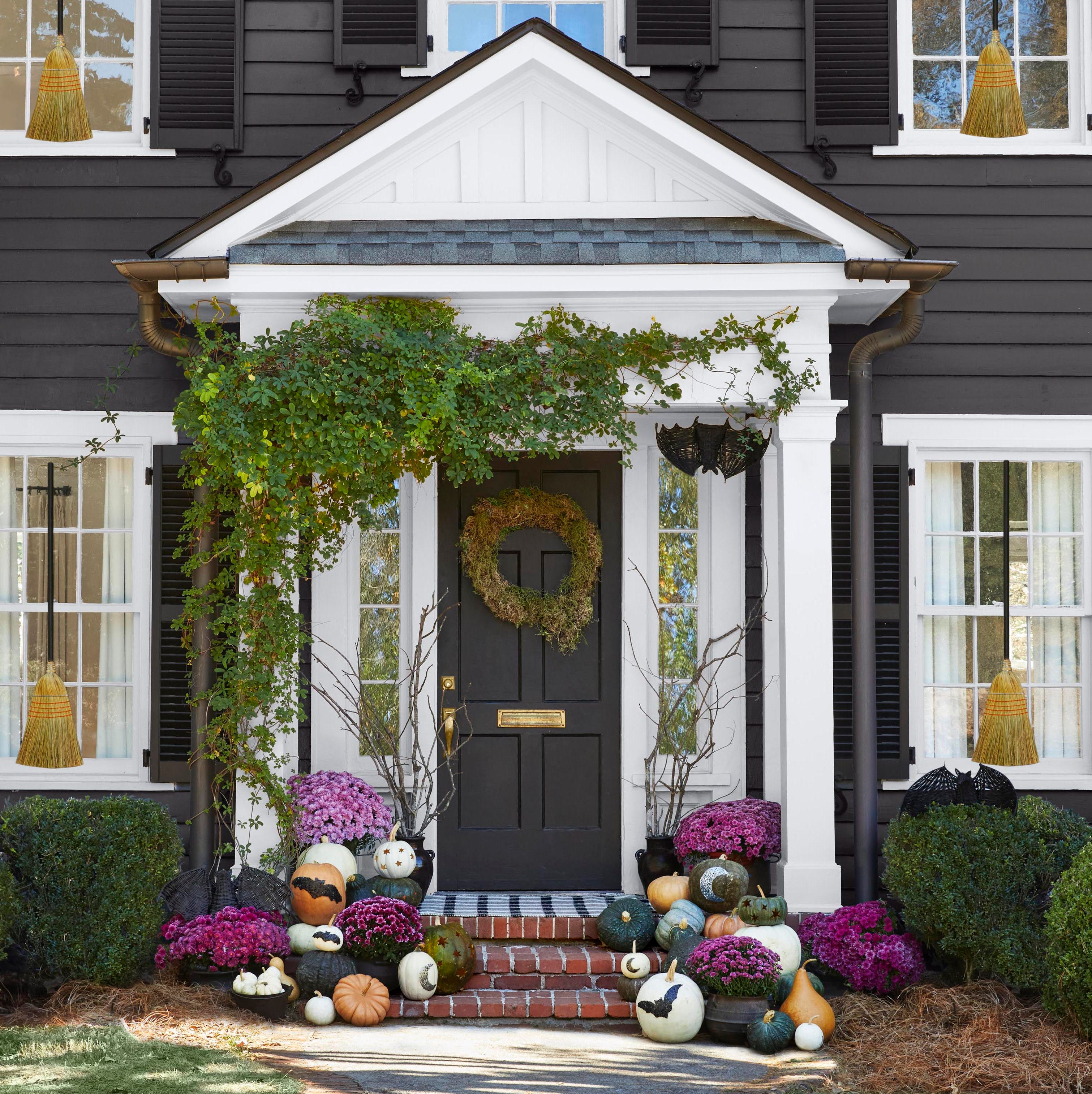
5 Cozy Front Door Paint Colors That Feel Just Like Fall
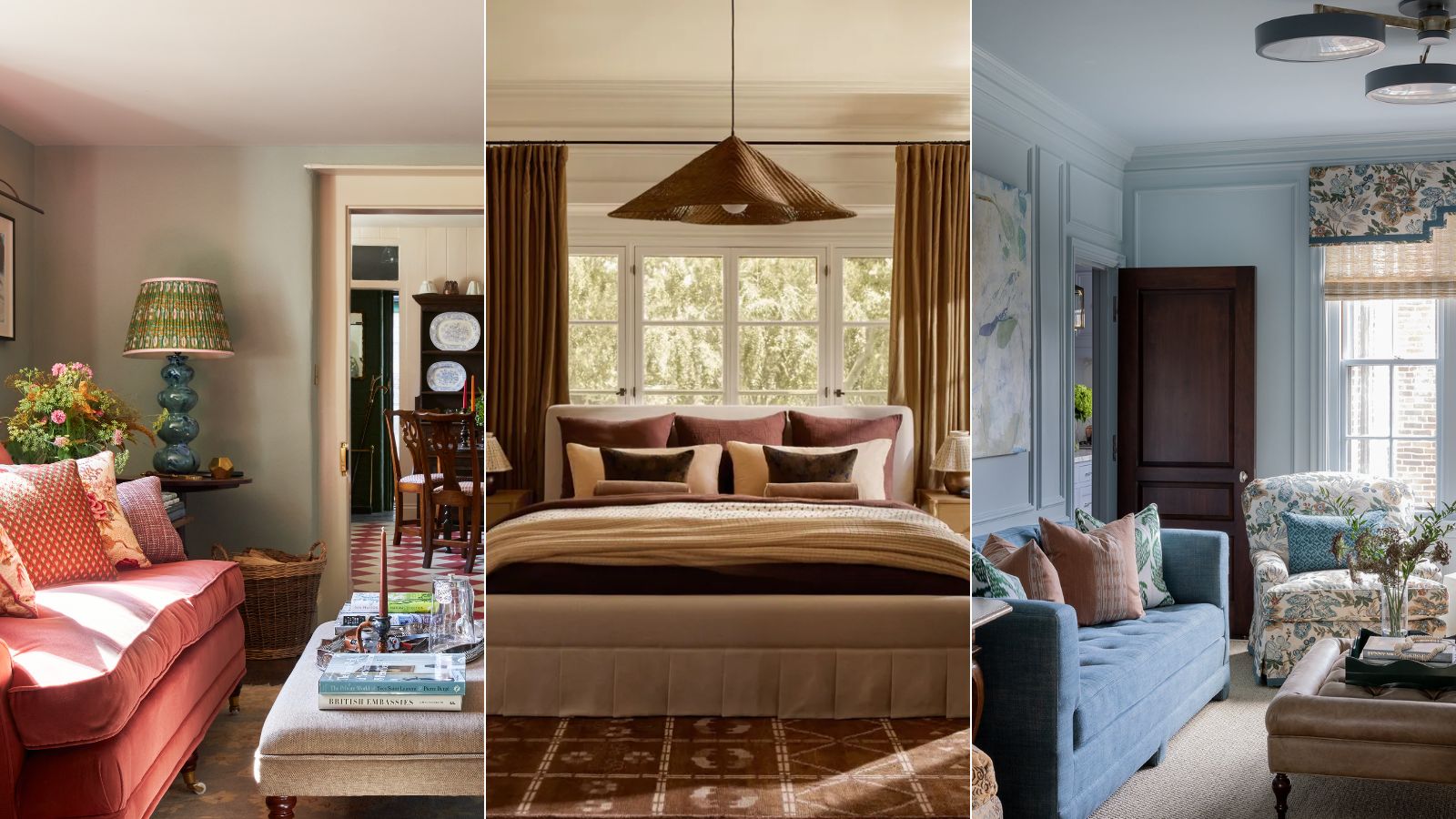
What are the best color combinations for fall? 7 cozy-season-ready suggestions from designers
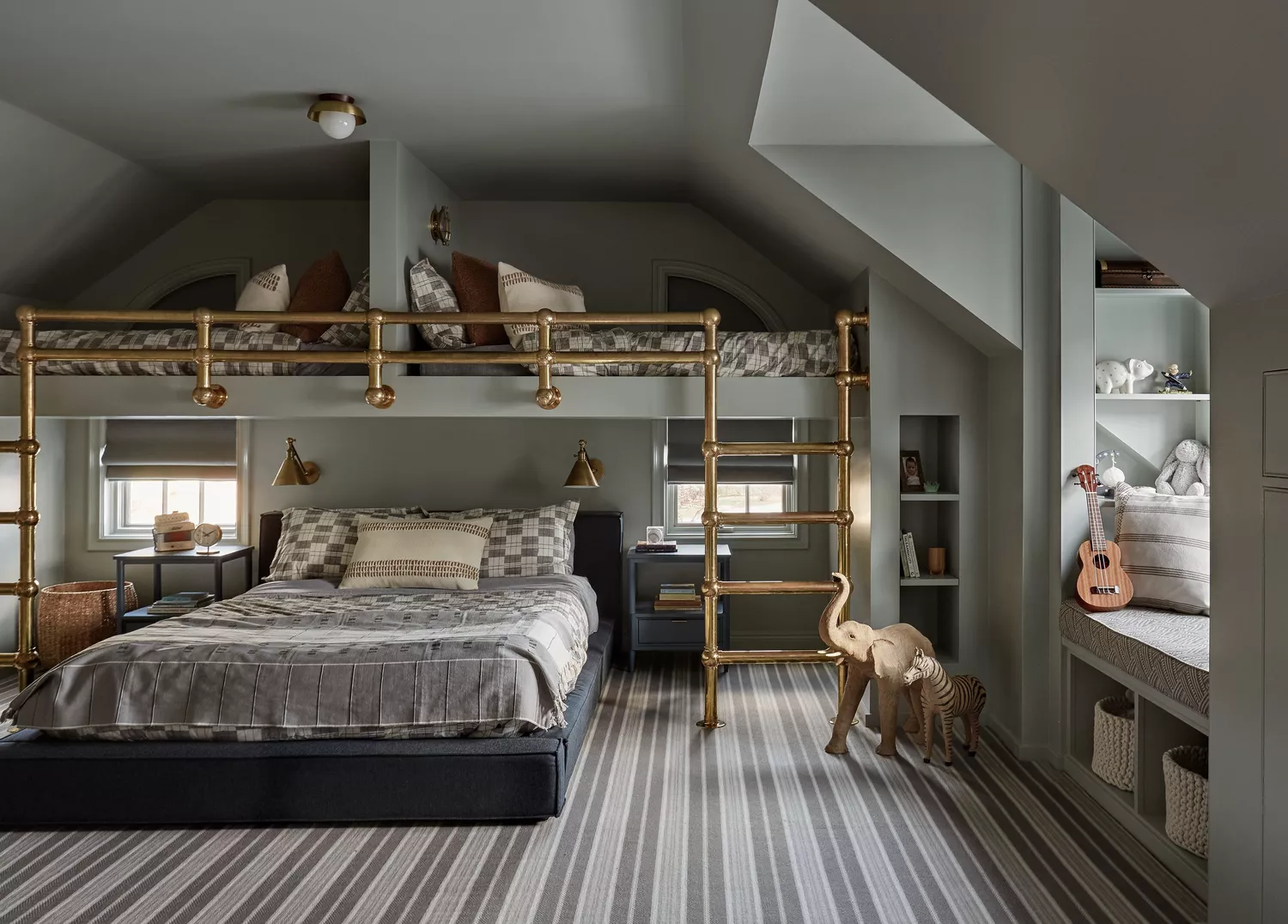
24 Fall Paint Colors to Make Your Space Cozy Just in Time for Autumn

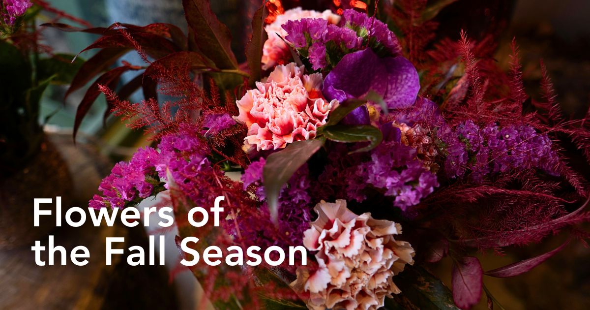
10 Typical Autumn Flowers That You Can Try Out

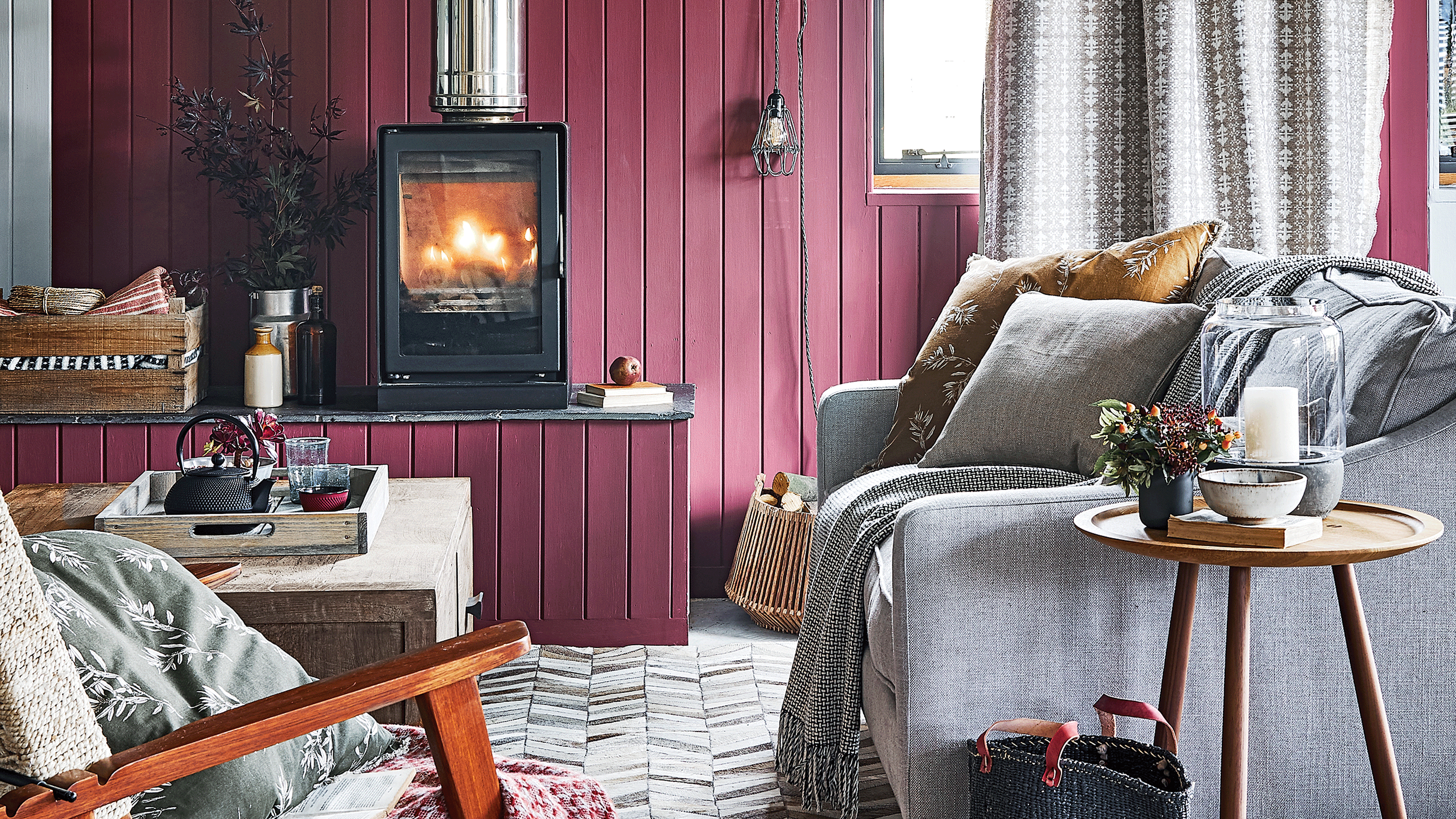
This cosy and warm colour is on track to become autumn's stand out shade

16 Fall Paint Colors That Capture the Beauty of Autumn
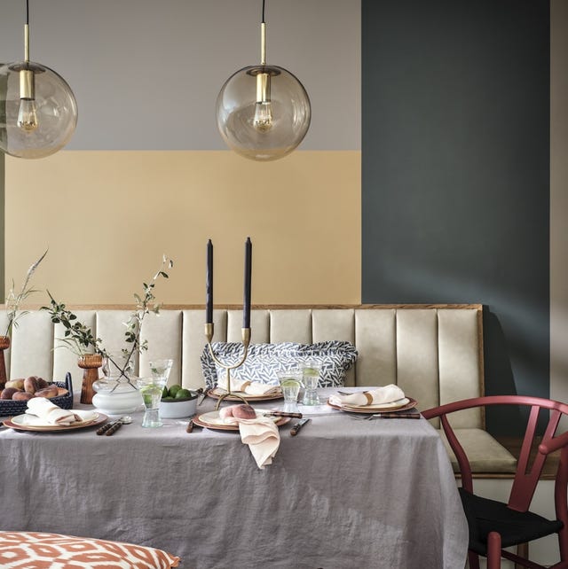
5 Autumn Paint Colours Designers Say Will Make Your Home Feel Instantly Cosier

Designers Weigh In on the 7 Biggest Paint Color Trends of Fall 2022
7 colors to decorate with in September 2024
12 Home Paint Colors We're Loving for Fall

The best paint colours for autumn — and how to style them at home
What Colors Go With Orange? 10 Harmonious Hues to Pair With This Zesty Shade

Cute Fall Decor That Has Nothing To Do with Halloween