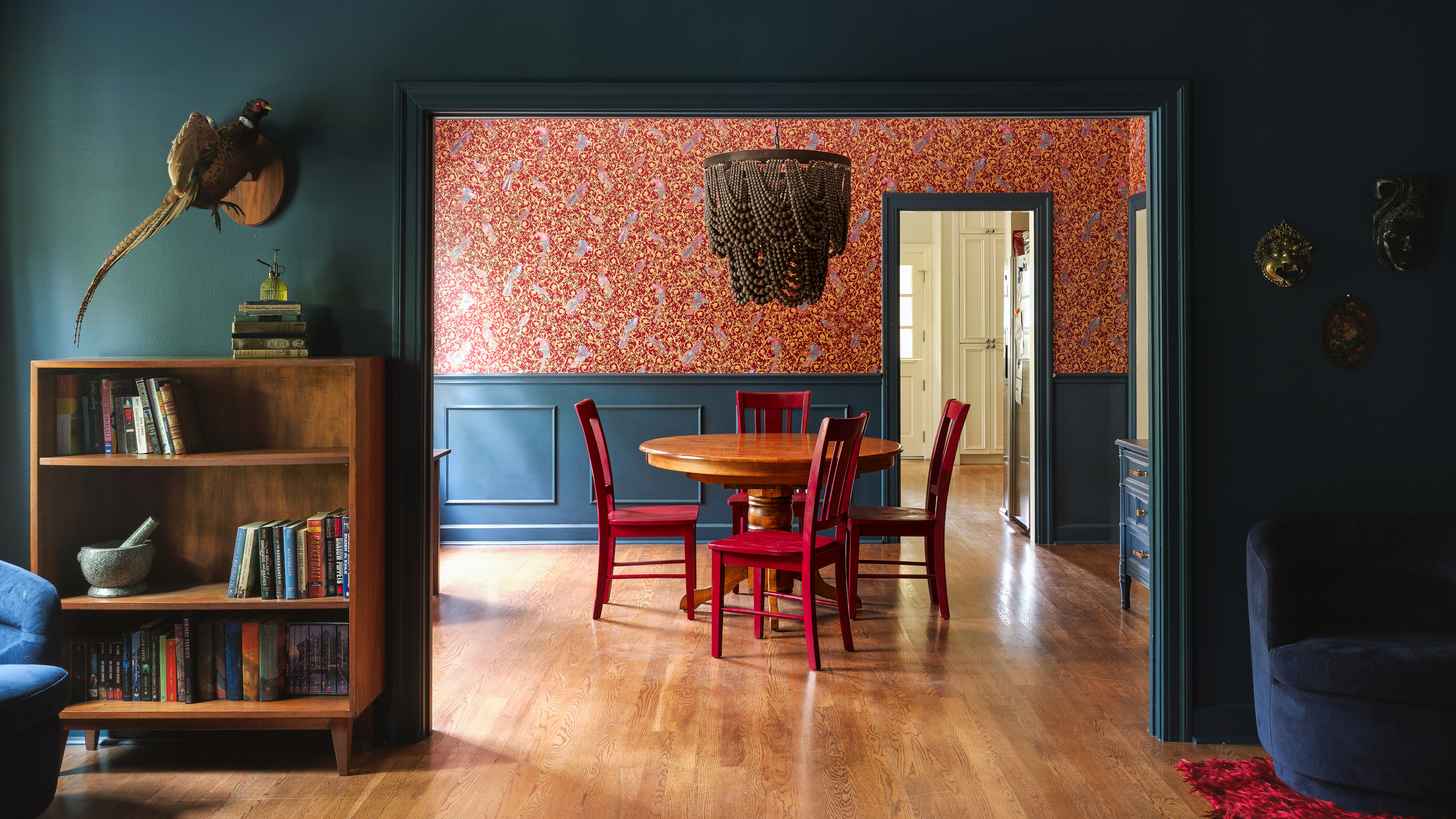
1/9
8 dark trim paint color schemes from interior designers that nail the look - 'they're cozy, cocooning and dramatic'
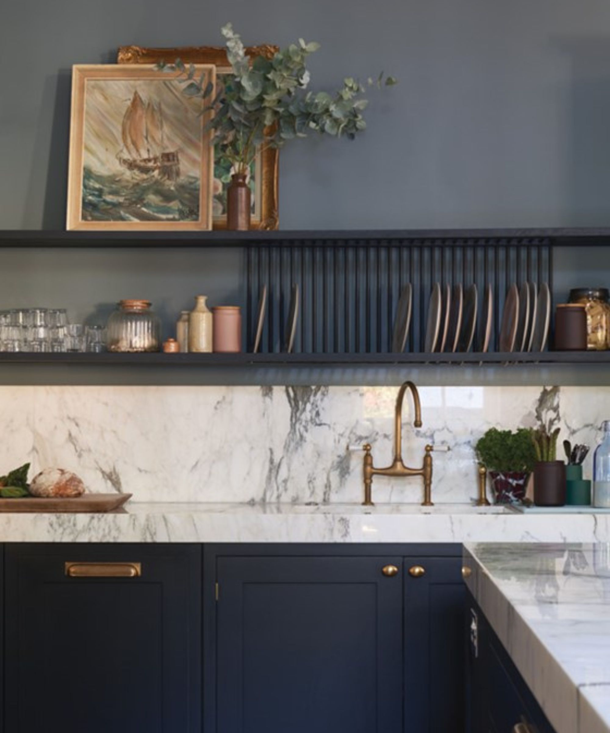
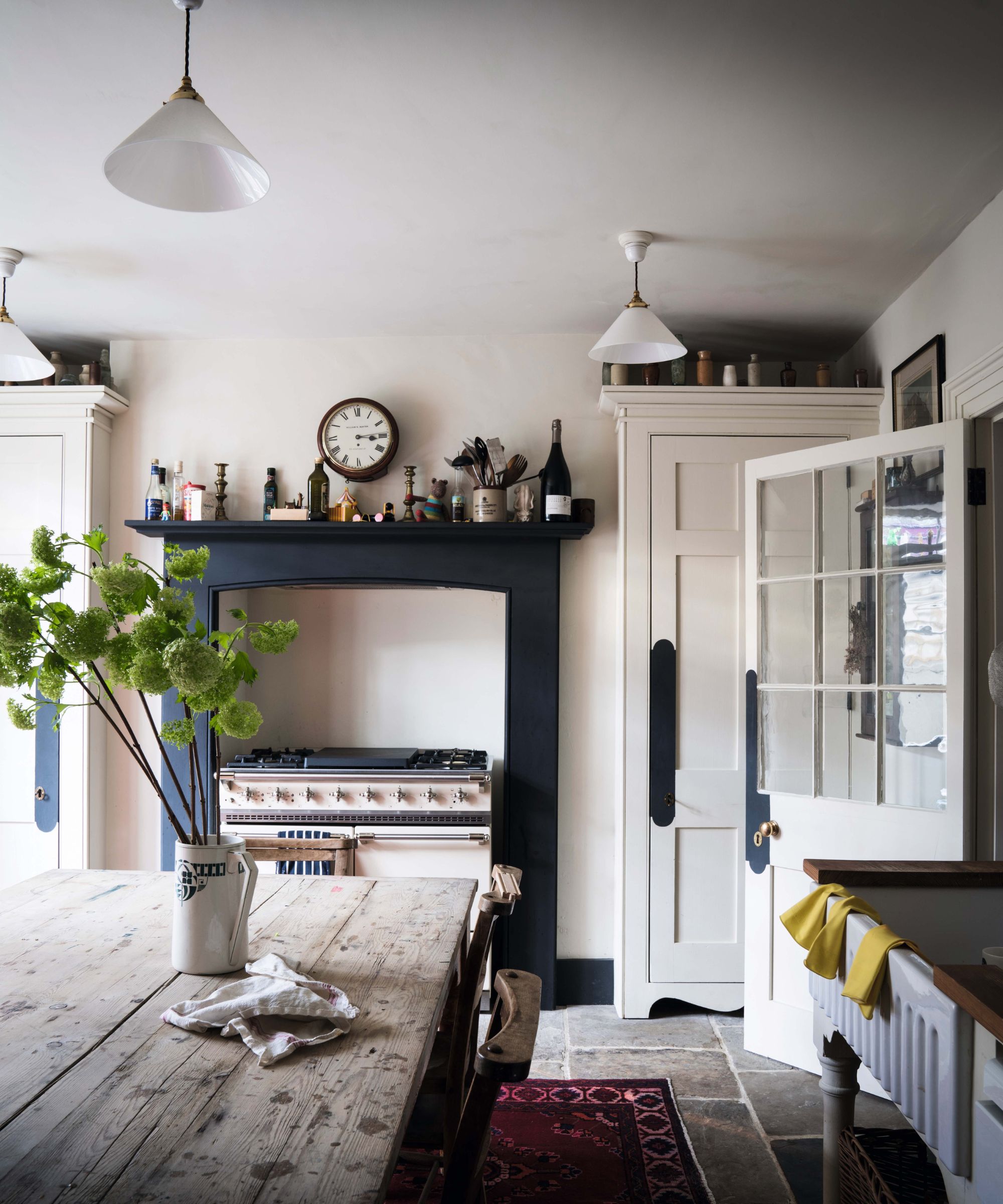
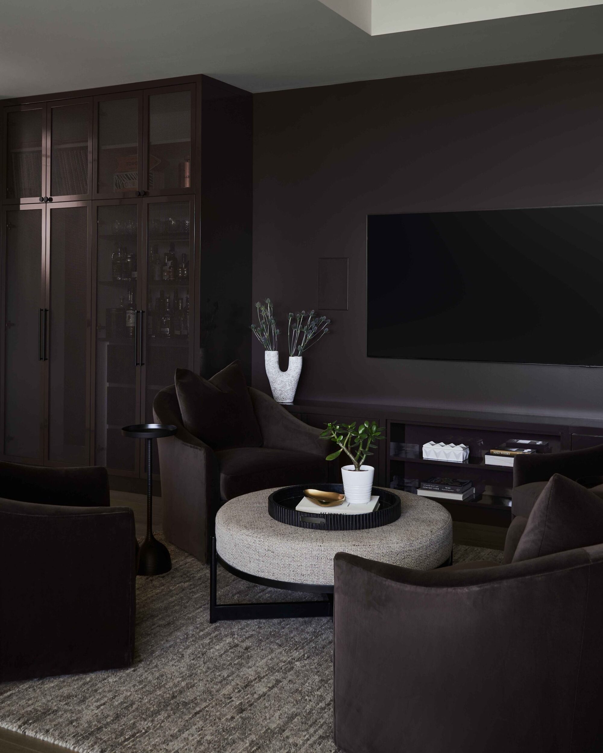
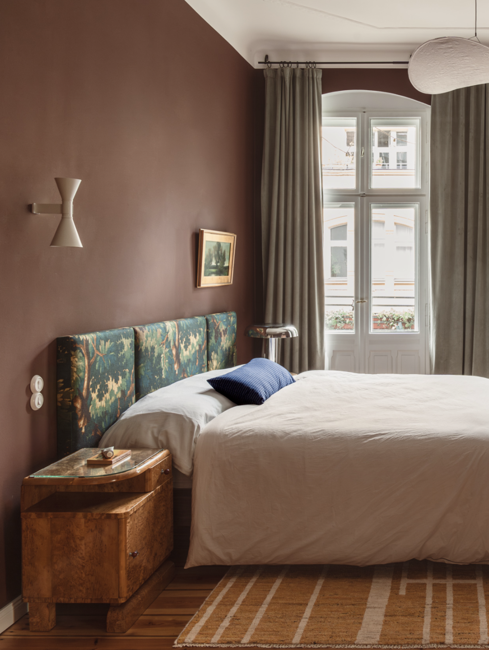
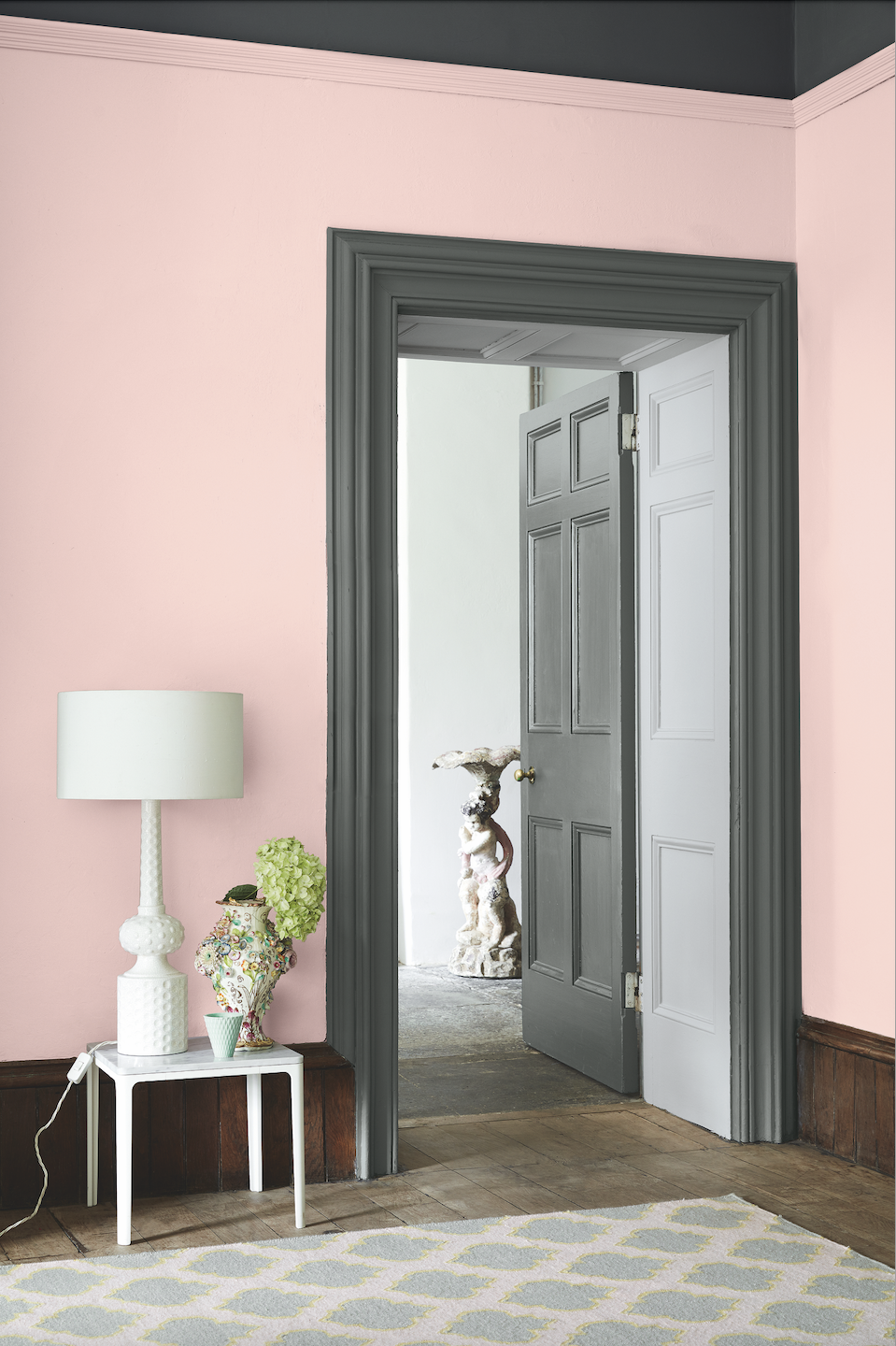
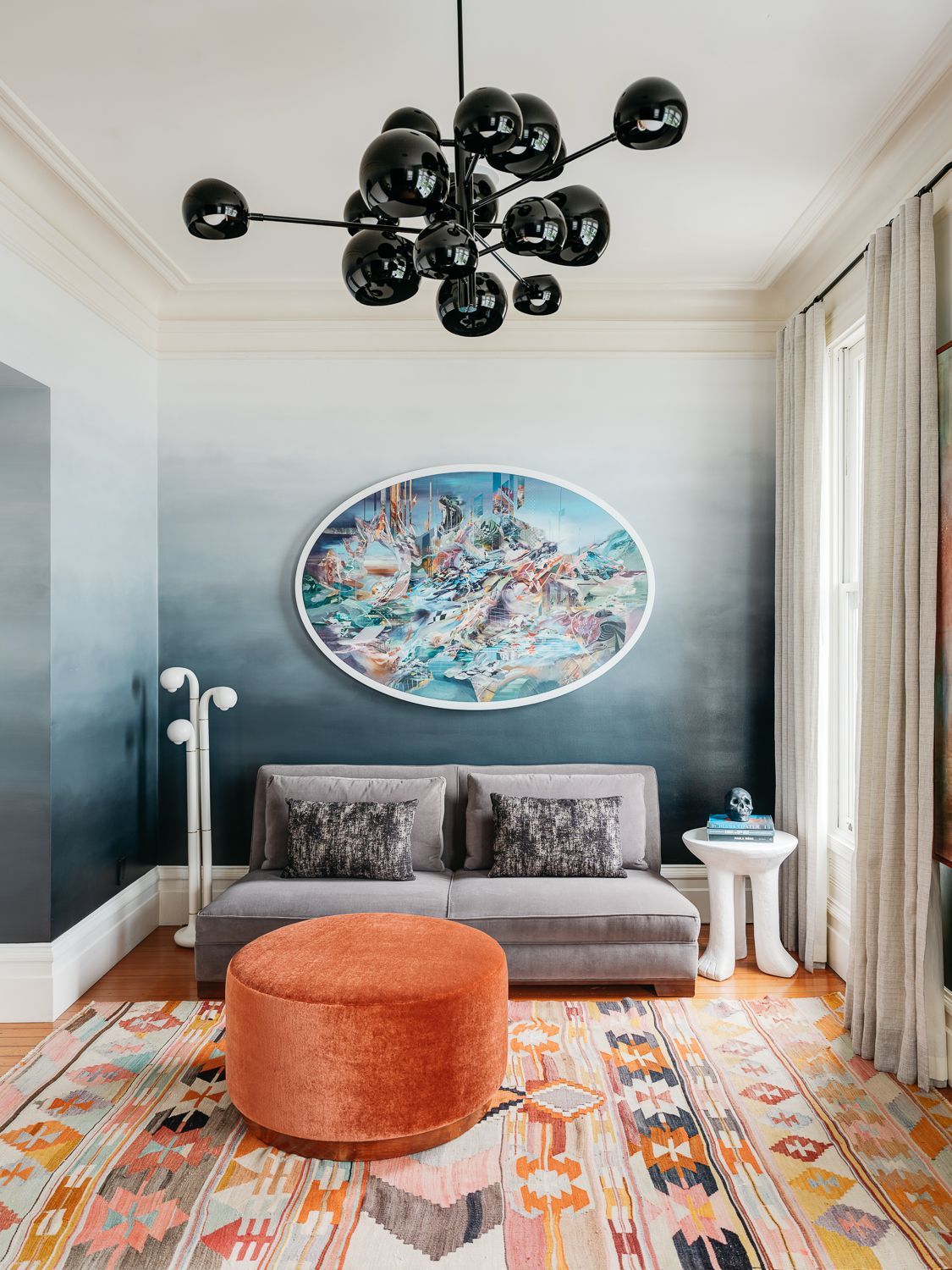
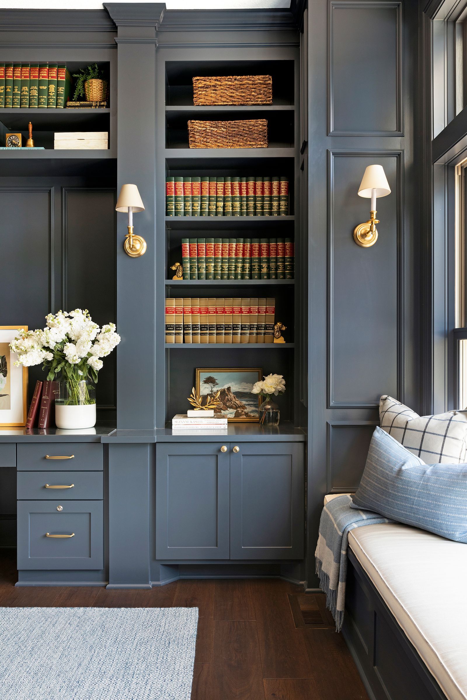
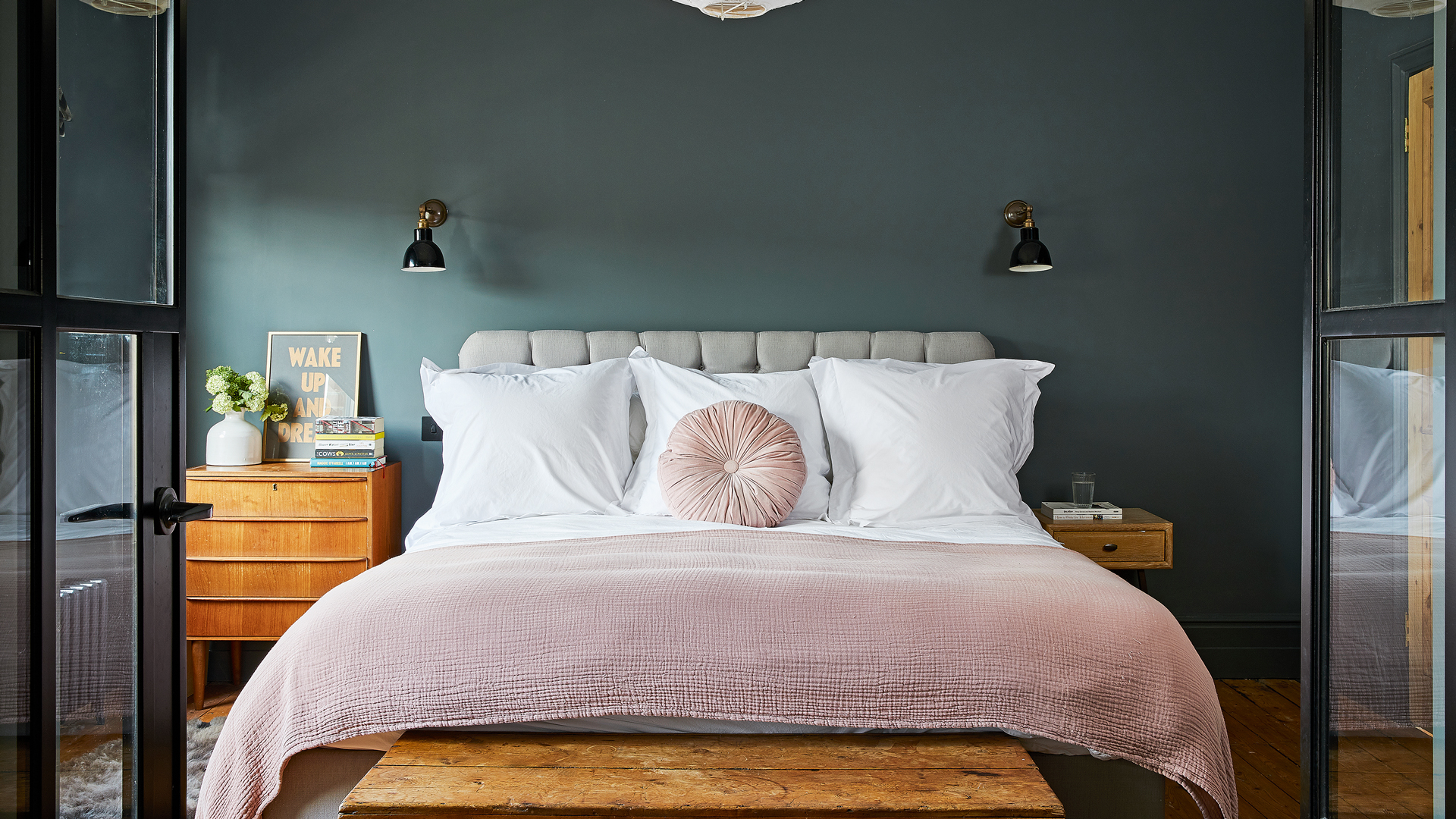
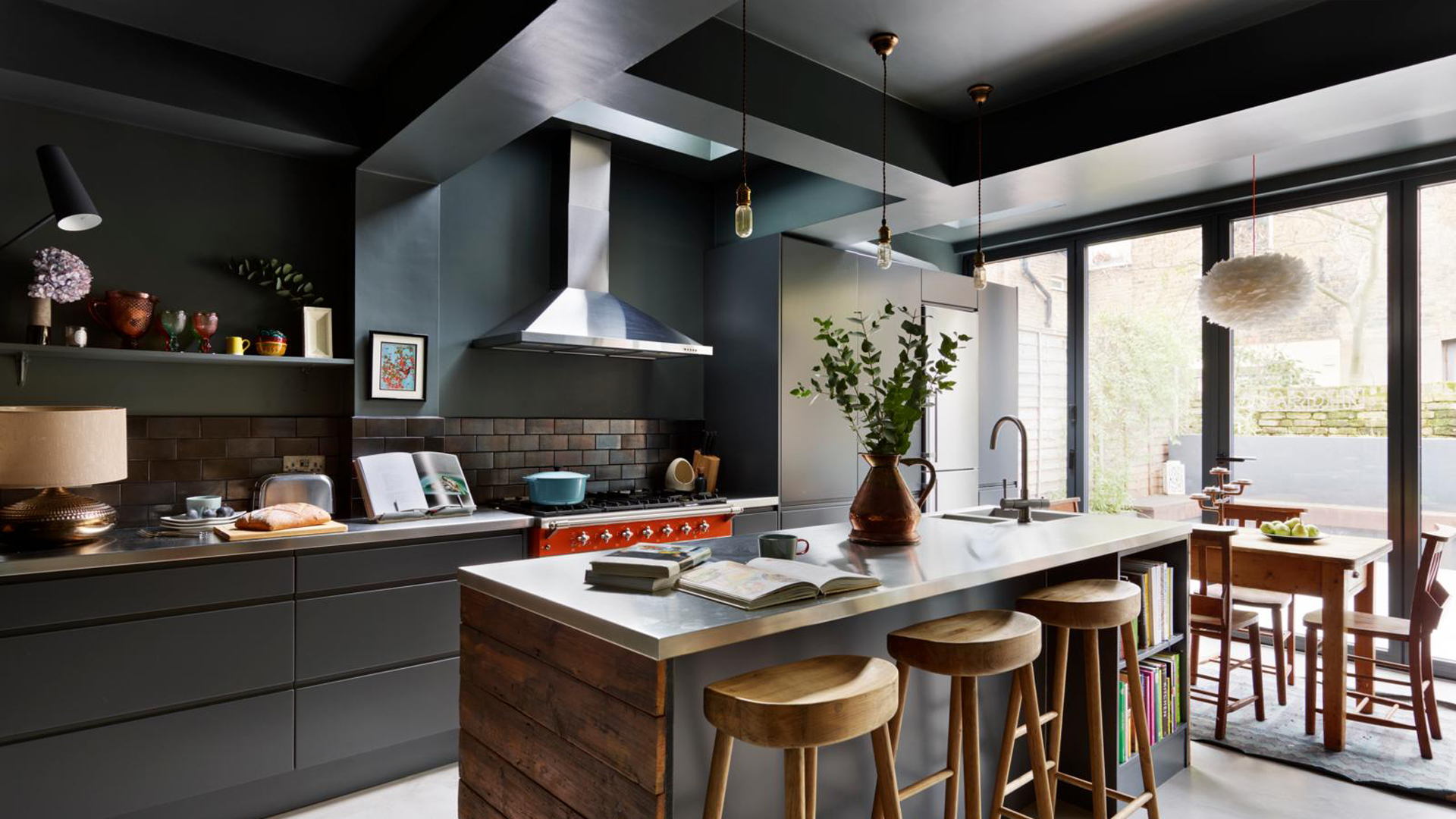
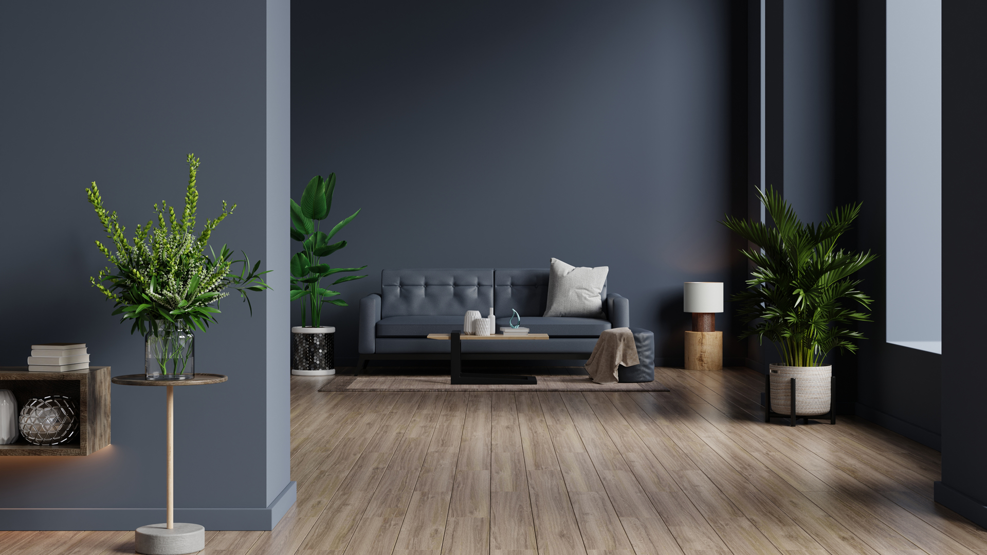
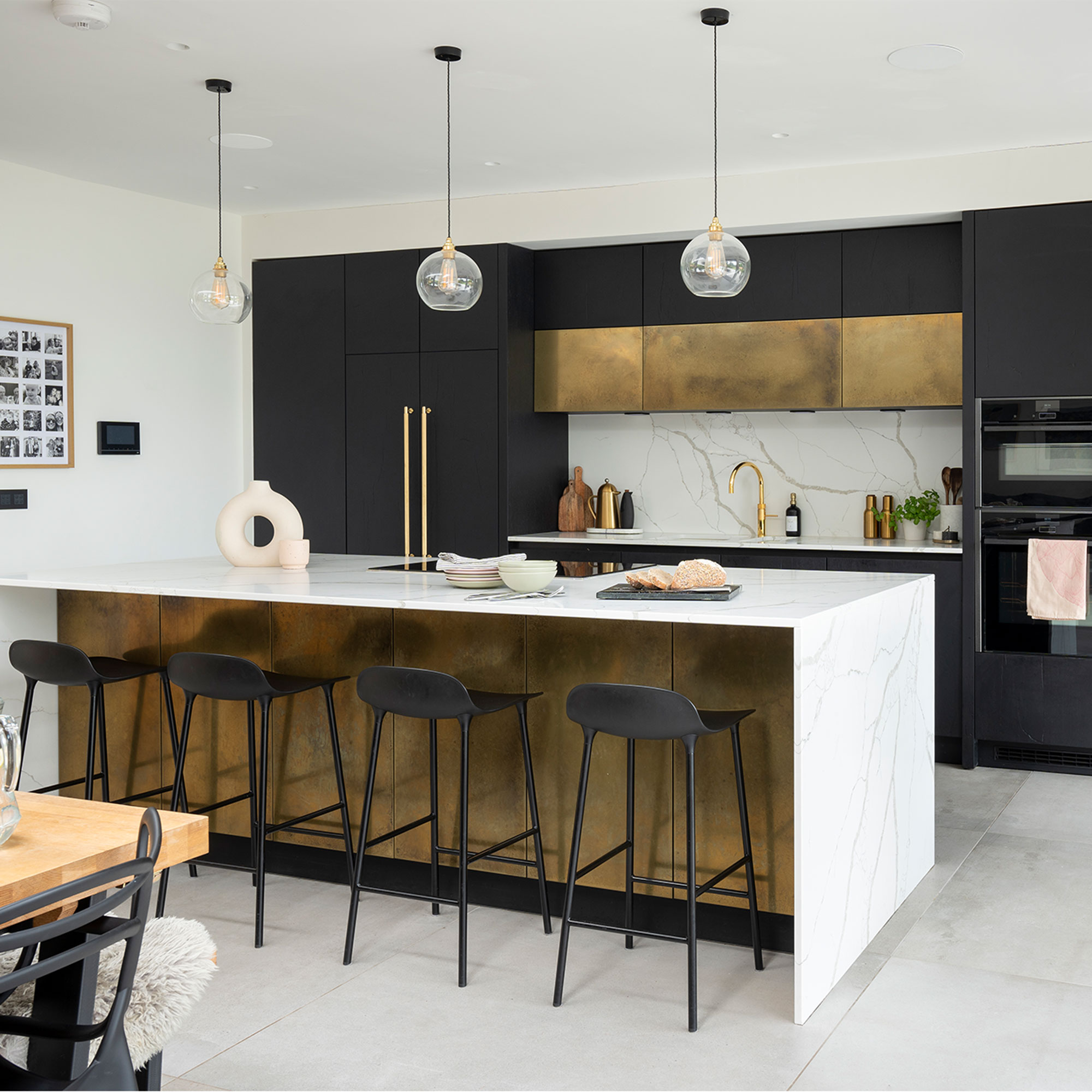
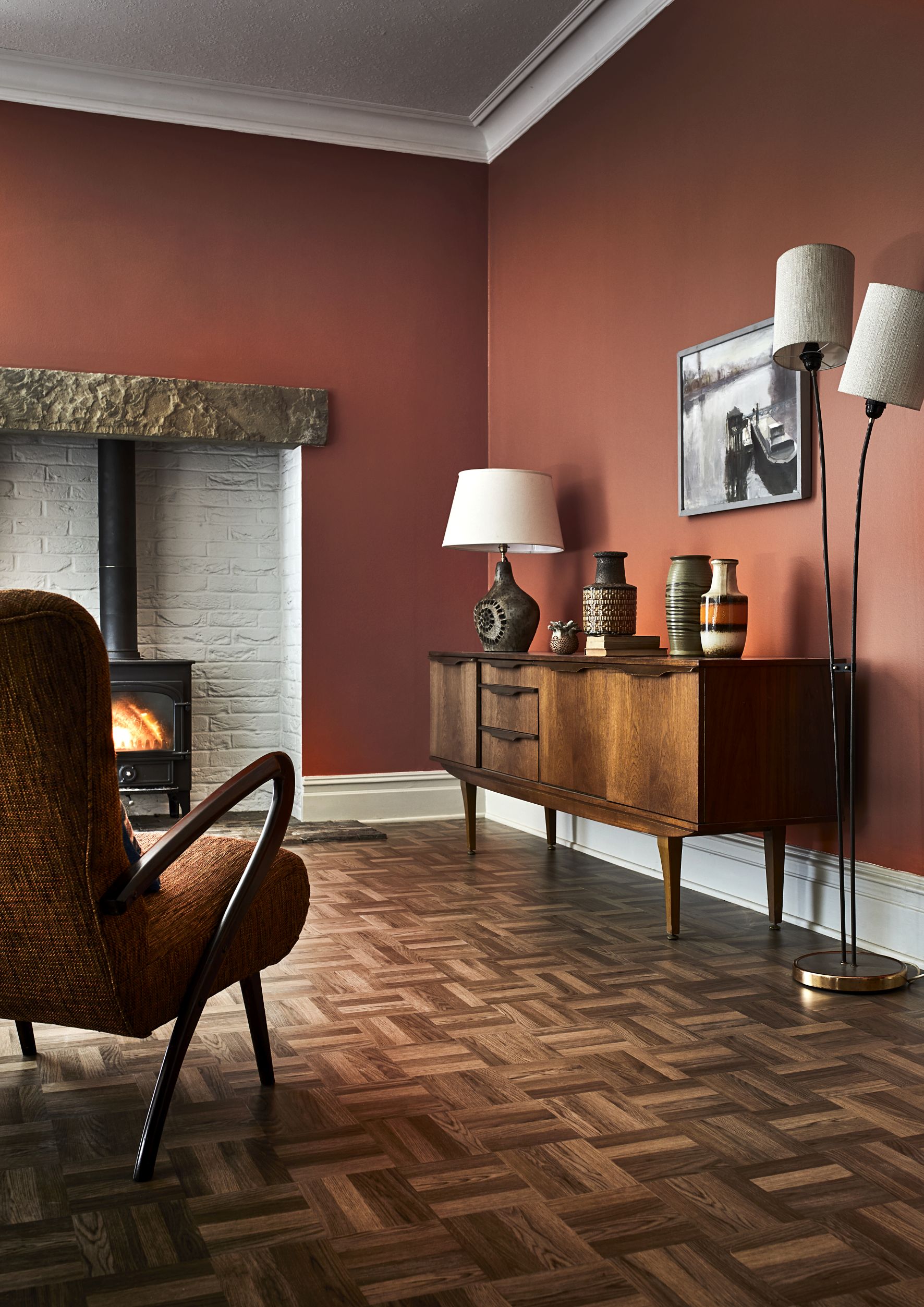
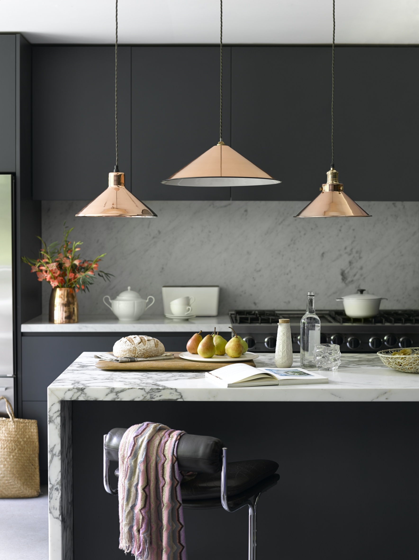
This article explores eight dark trim paint color schemes, demonstrating how this decorating technique can add depth, interest, and a luxurious feel to any room. Using deep hues on coving and woodwork transforms these architectural elements into focal points, rather than allowing them to blend into the background. The article highlights the versatility of dark trim in experimenting with color and manipulating the perception of space, offering ways to create an impression of height, sophistication, or a graphic quality.
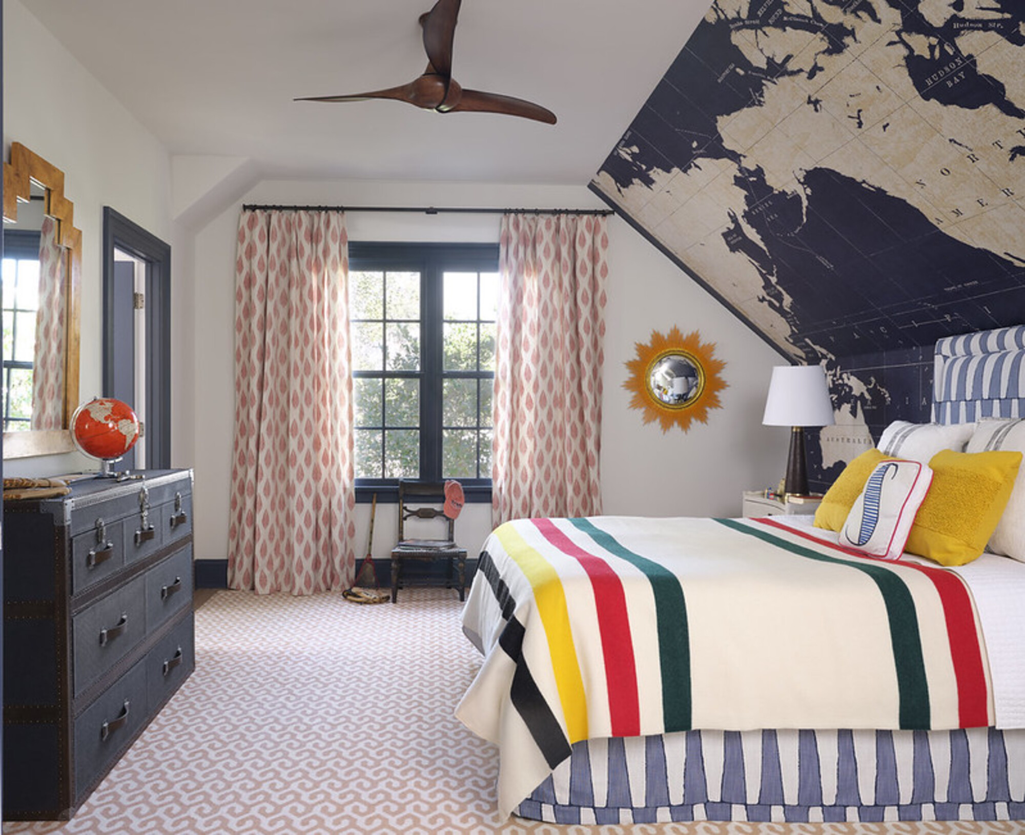
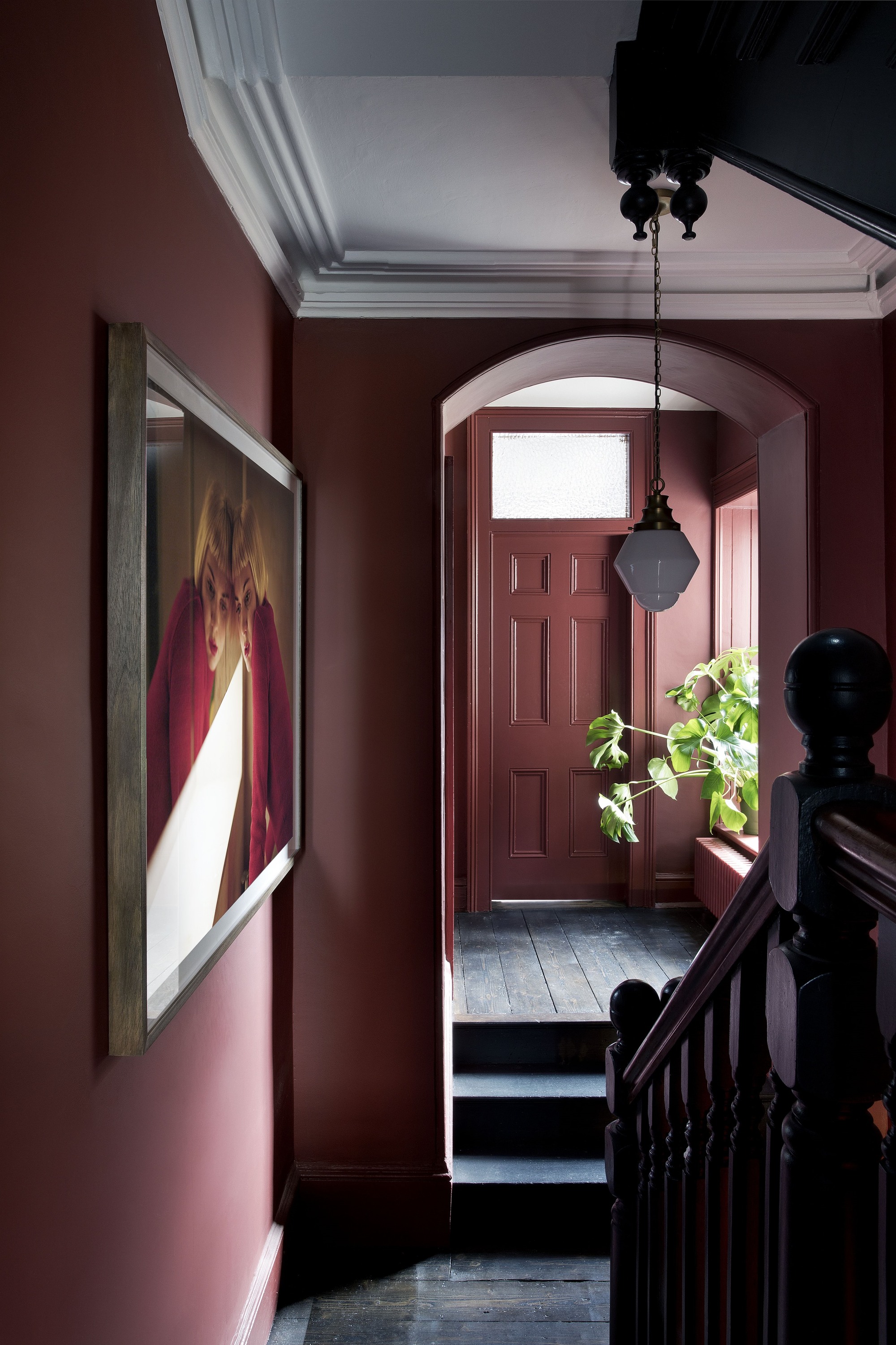
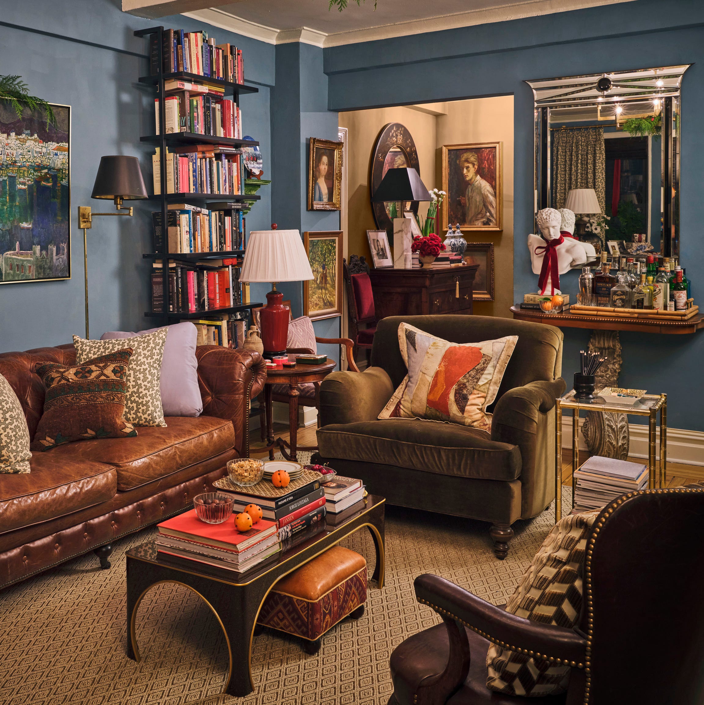
One featured scheme pairs burgundy-brown trim with neutral walls in a dining room. Designer Zoe Feldman notes that this choice complements deep wood tones, bringing the walls to life and creating a more cocooning atmosphere. Another example showcases burgundy and blue, where a warm red hue on skirting and door frames, combined with a slim black trim near the ceiling, adds a playful yet sophisticated contrast to a pale blue living room.
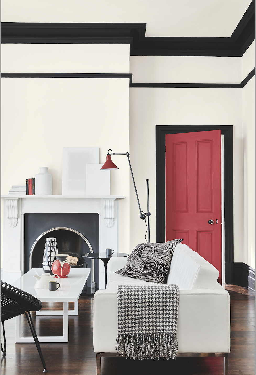
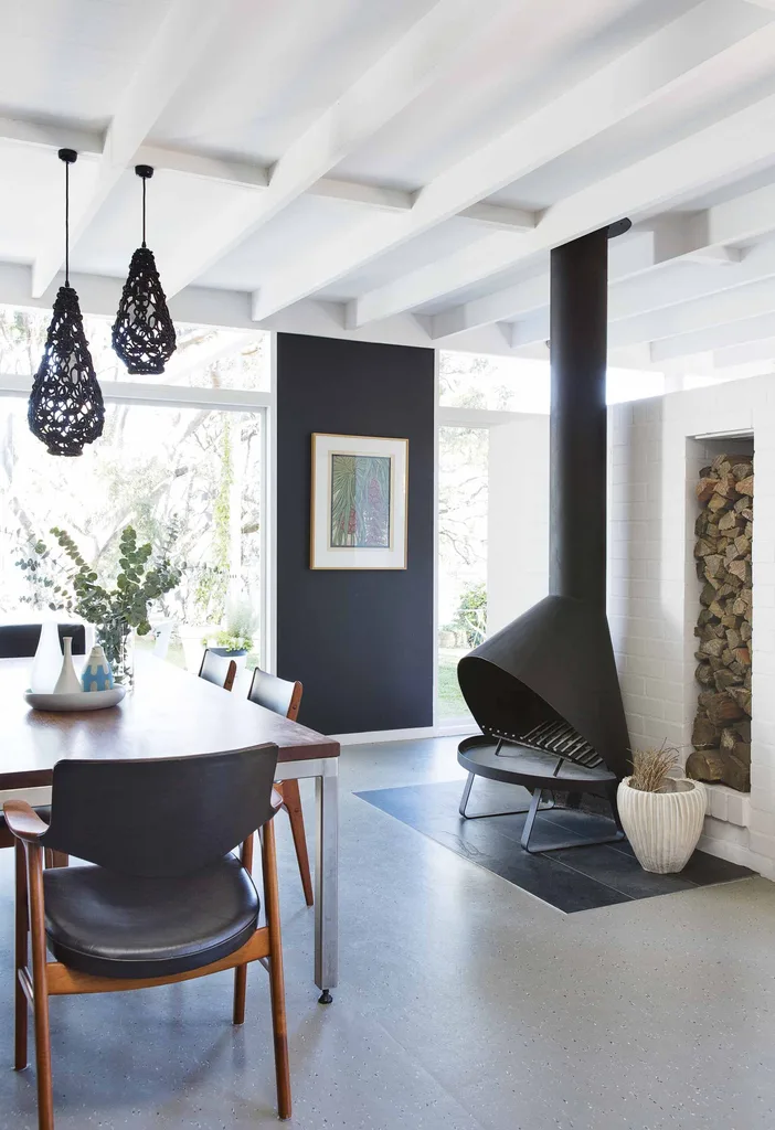
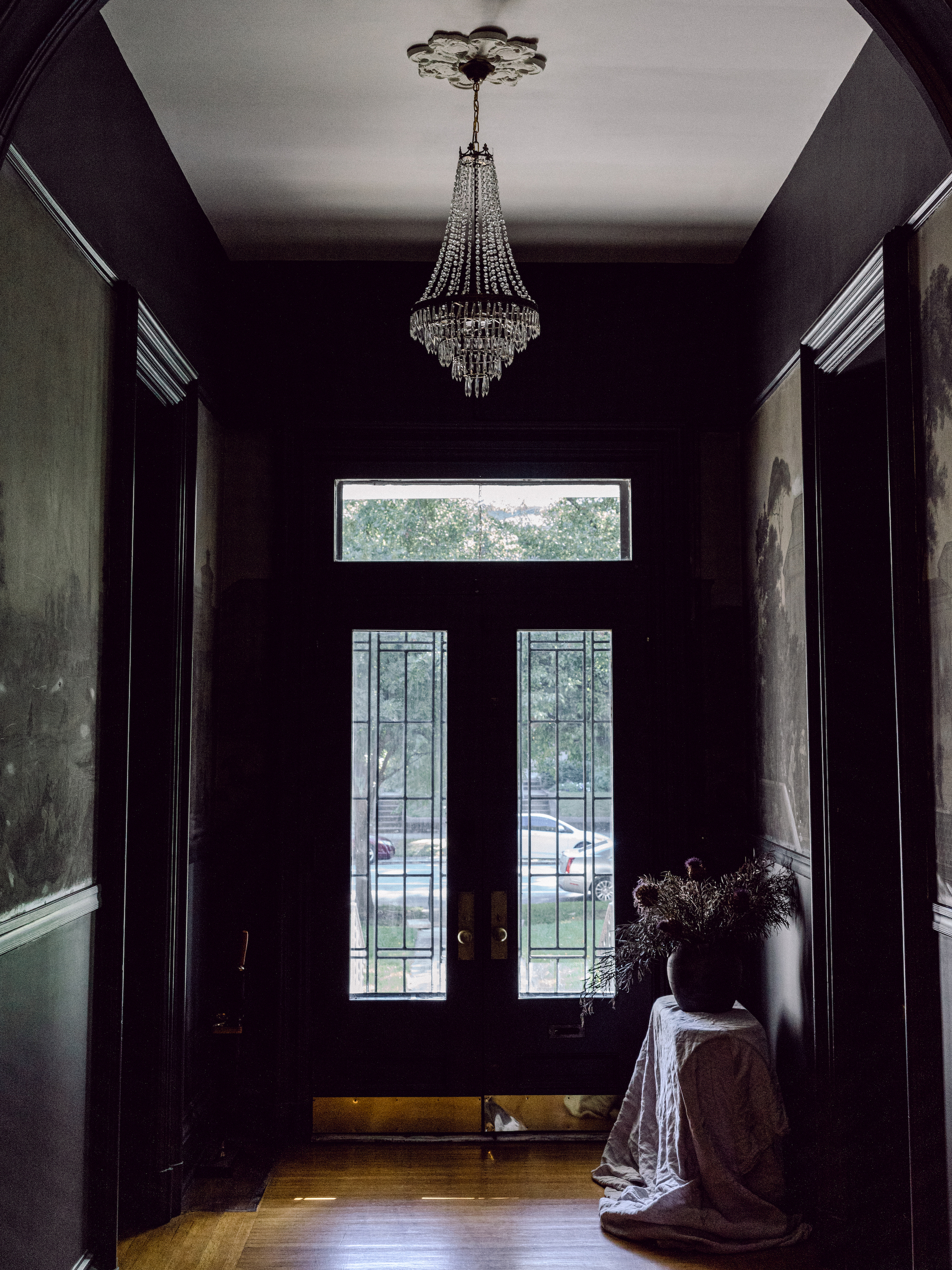
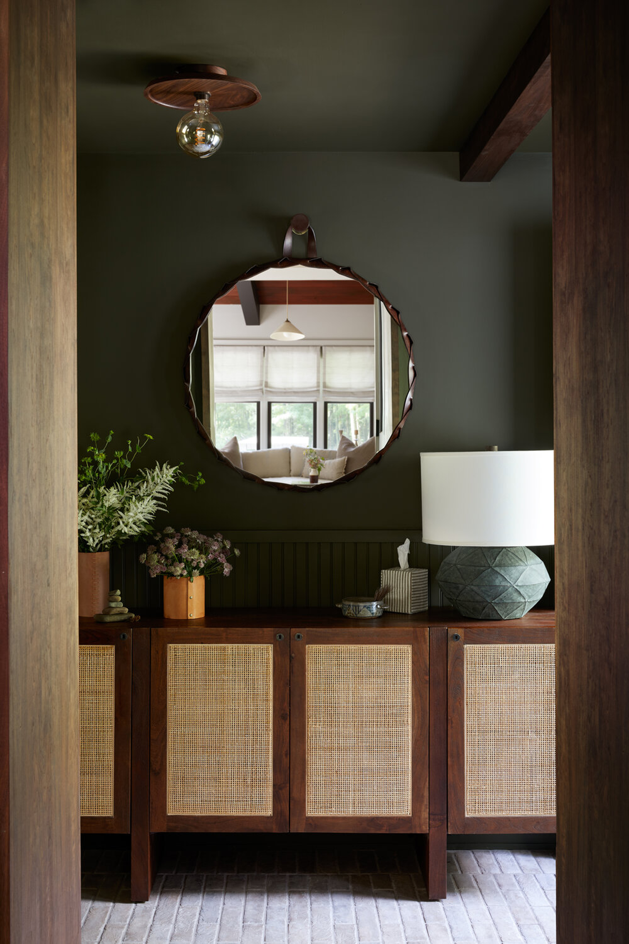
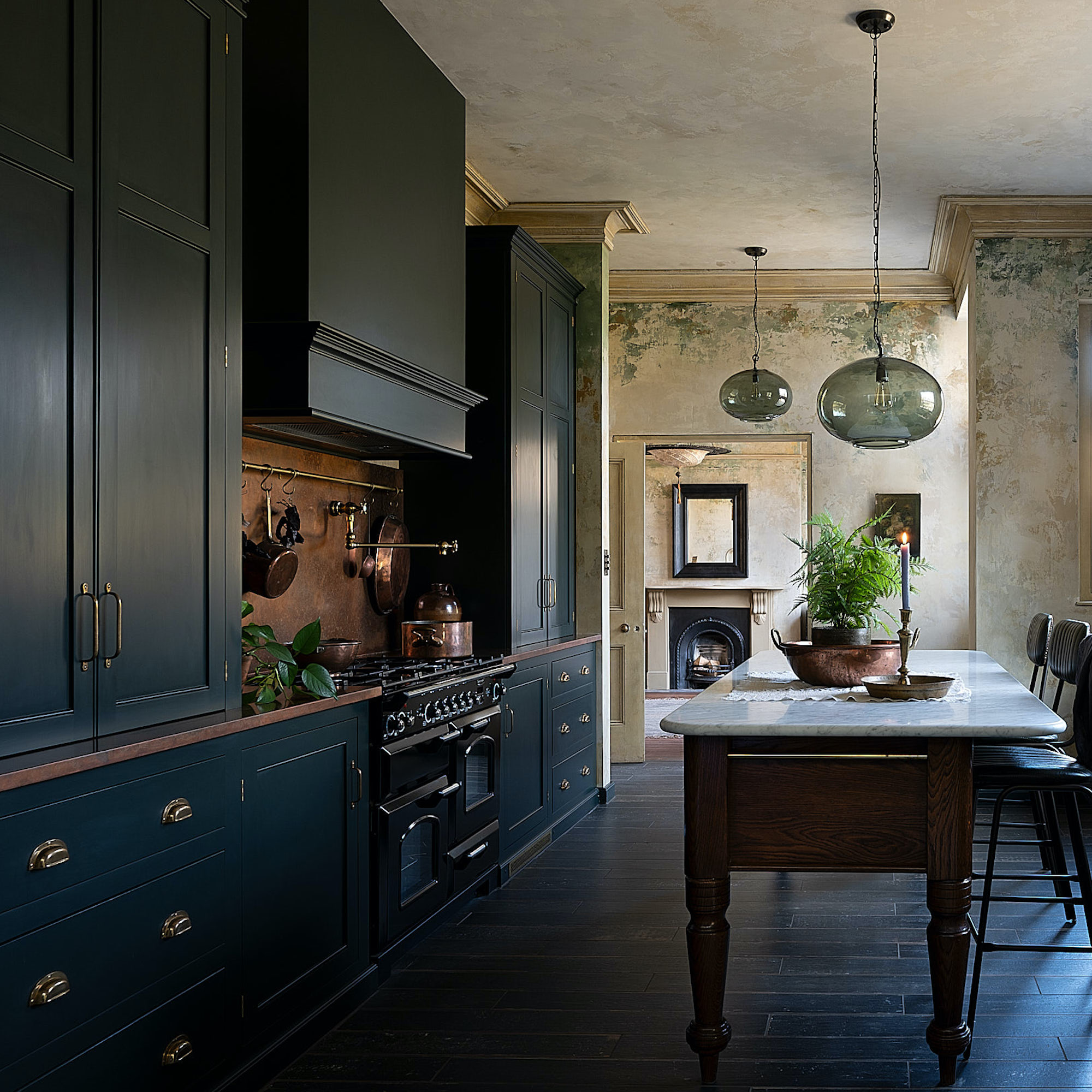
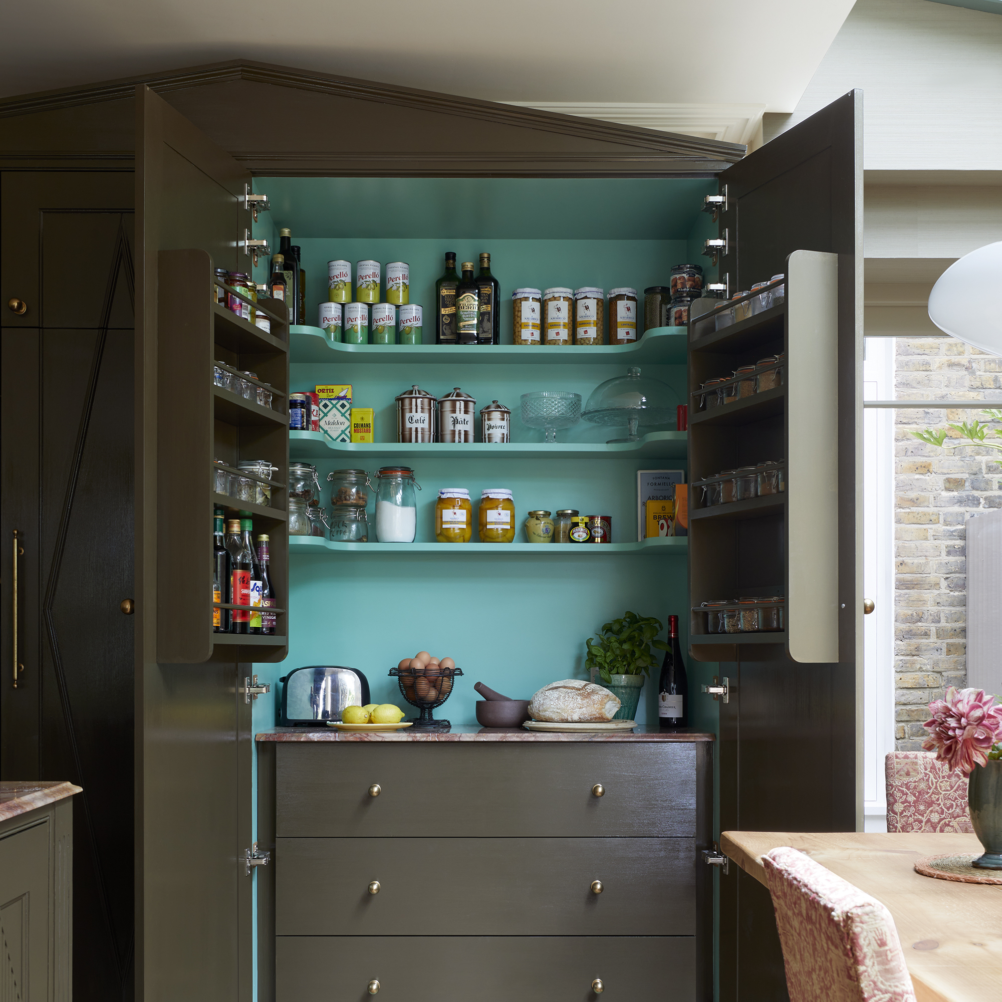
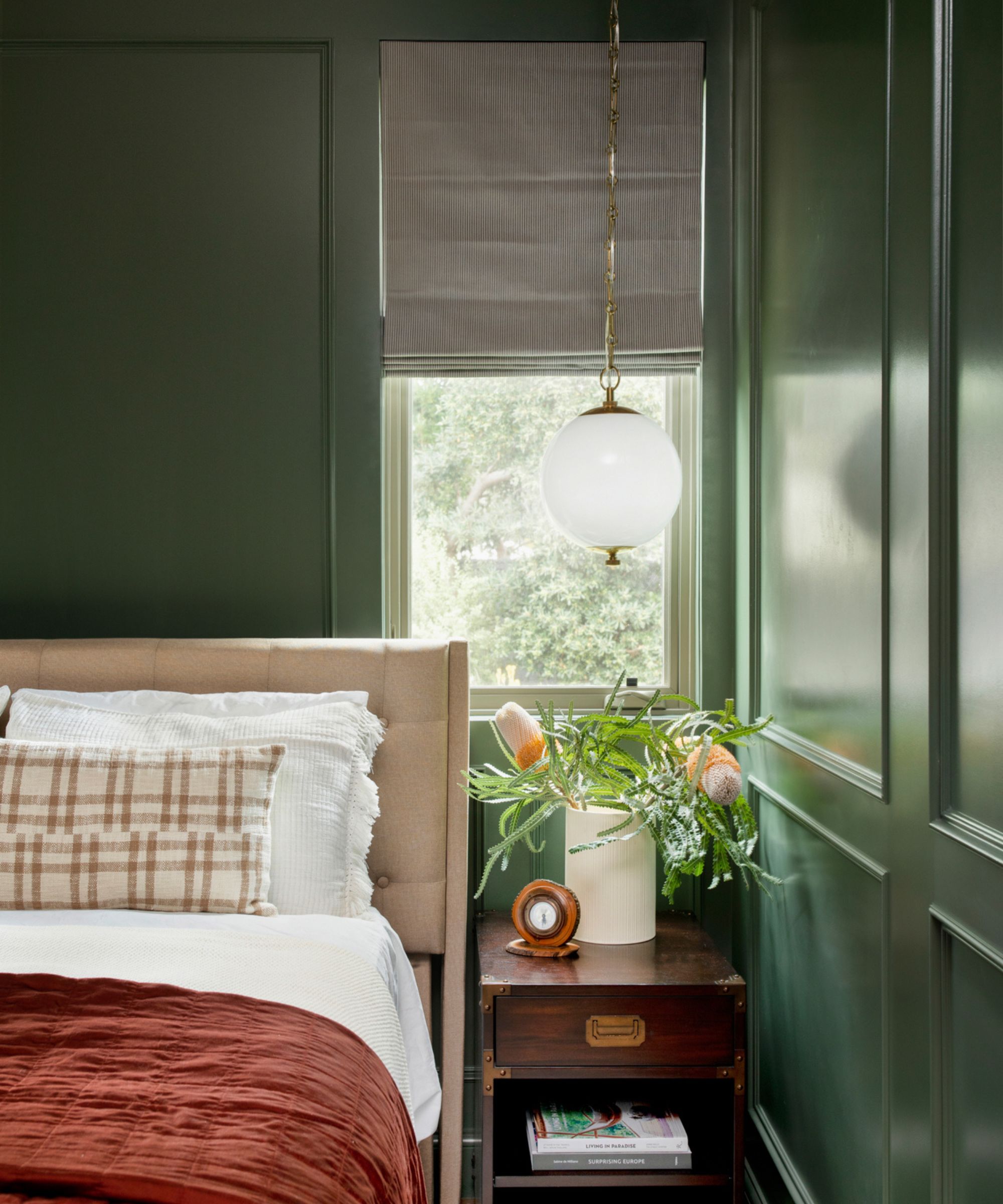
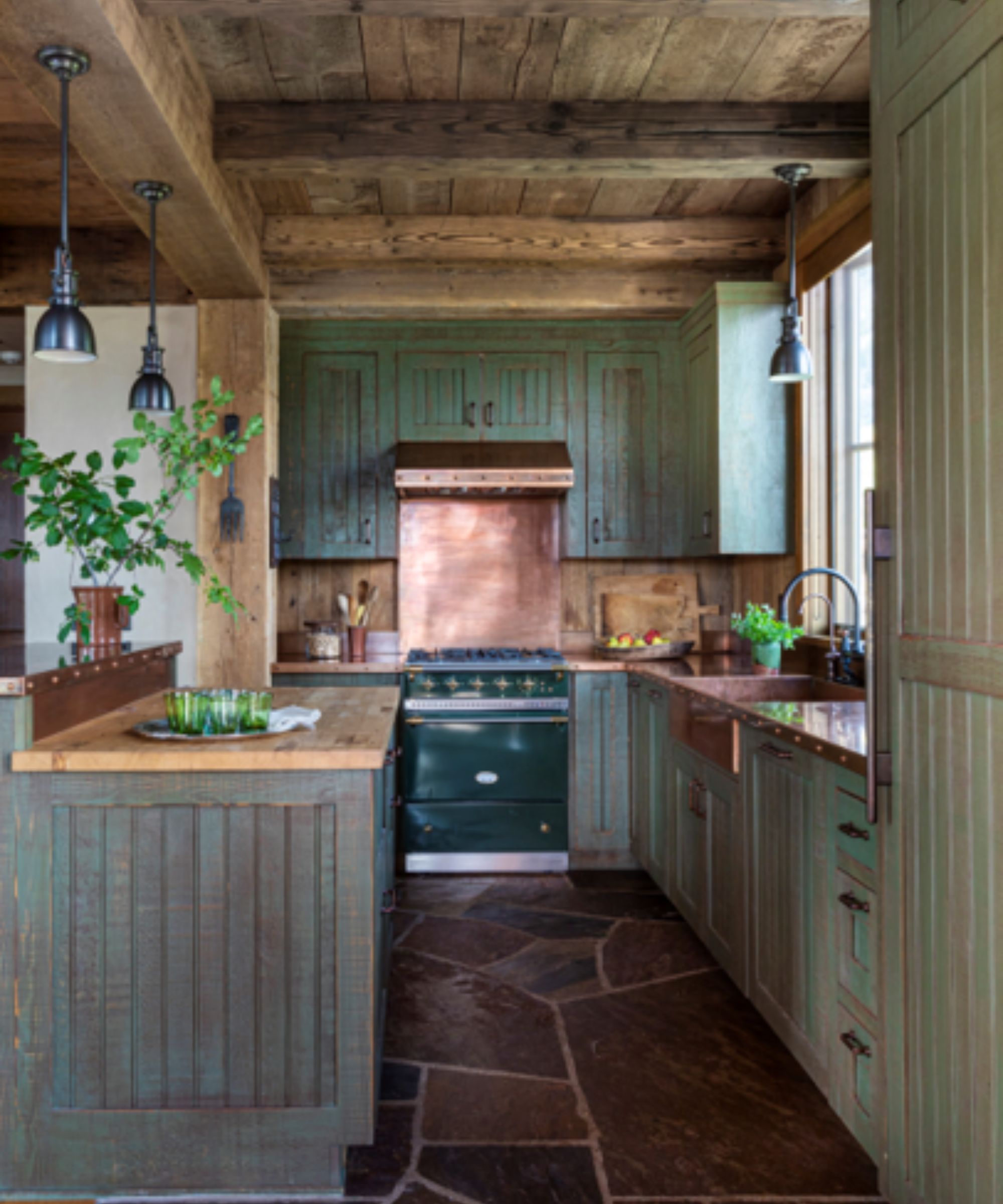
Olive green trim on paneling, built-in storage, and skirting is presented as a way to create a calm yet focal point. Chris Shao Studio uses this shade as a signature, emphasizing its ability to function as a timeless neutral despite being a color. The classic black and white scheme is revisited, with black coving and door frames in a silky satin finish adding grounding depth to an otherwise light and bright living space. The key to this scheme's sophistication lies in using black to highlight architectural features and connect them with small accessories.
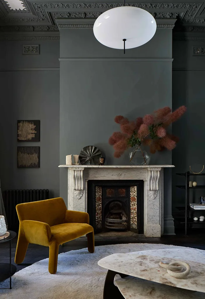
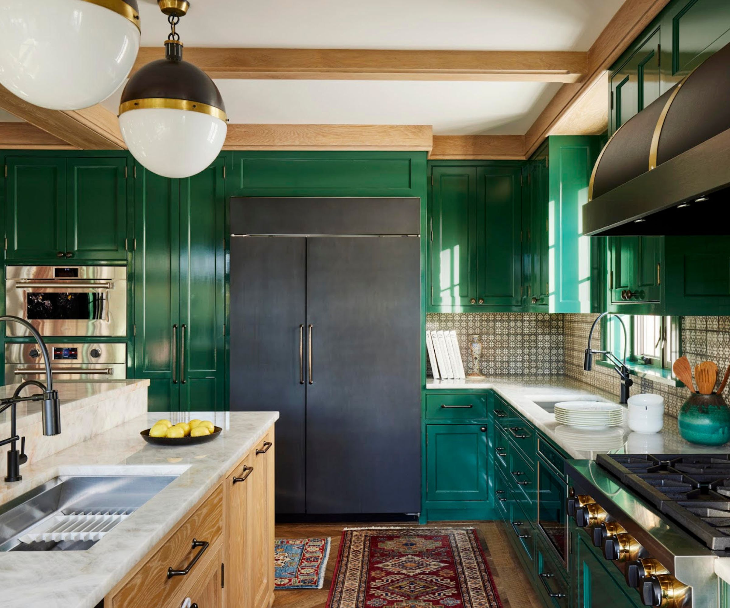
For rooms lacking decorative plaster features, the article suggests using paint to create a trim and add visual interest to plain walls. An example demonstrates a green-on-green approach, using a darker outer trim with a delicate border to create a picture-frame effect. Emerald green on ceilings and coving is shown to create a comforting and cocooning effect, balanced by a dark herringbone wood floor and pale grey walls.
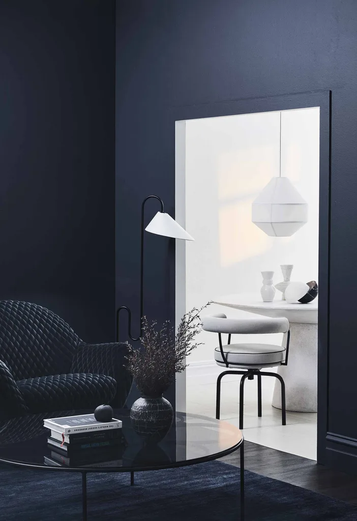
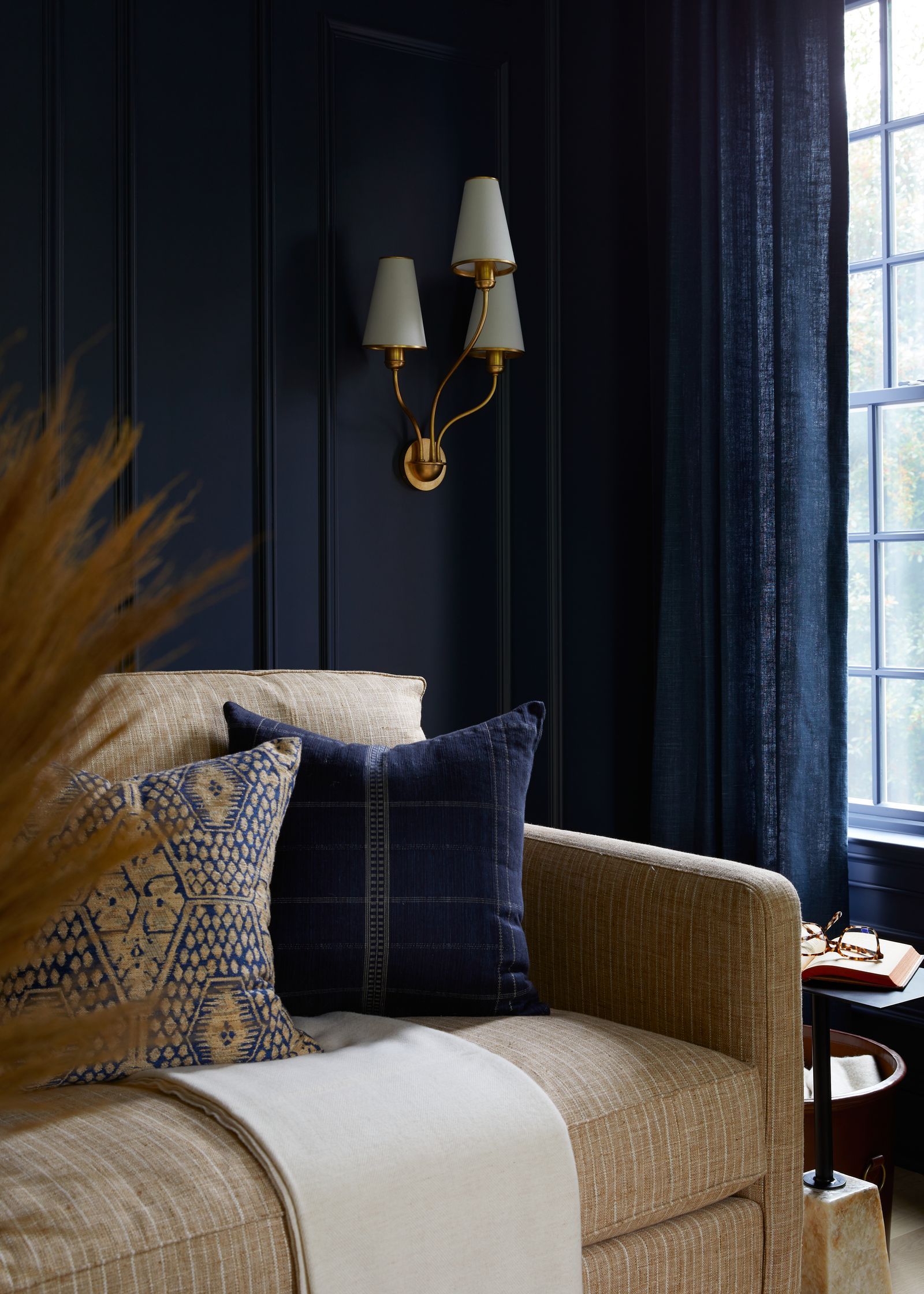
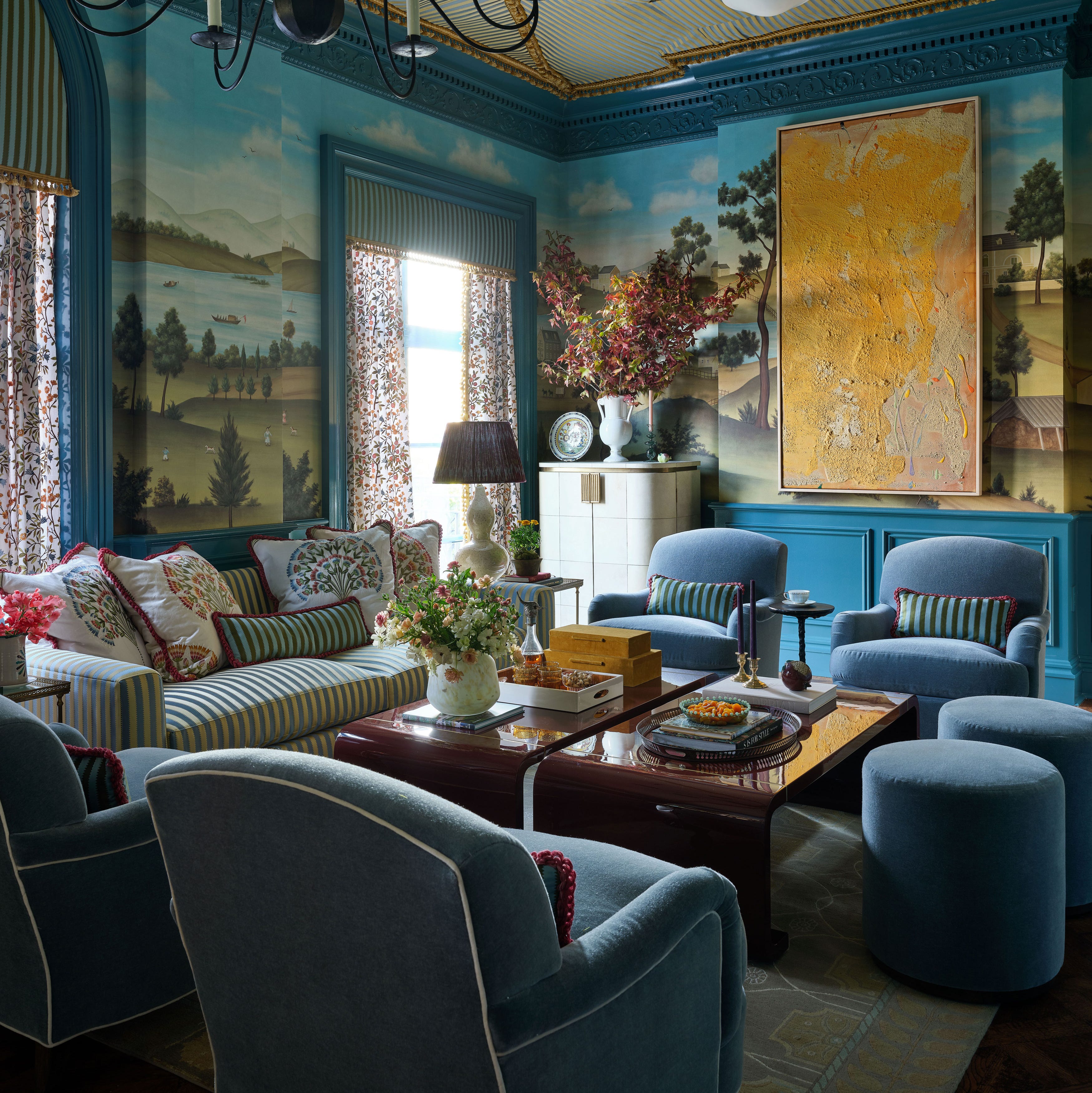
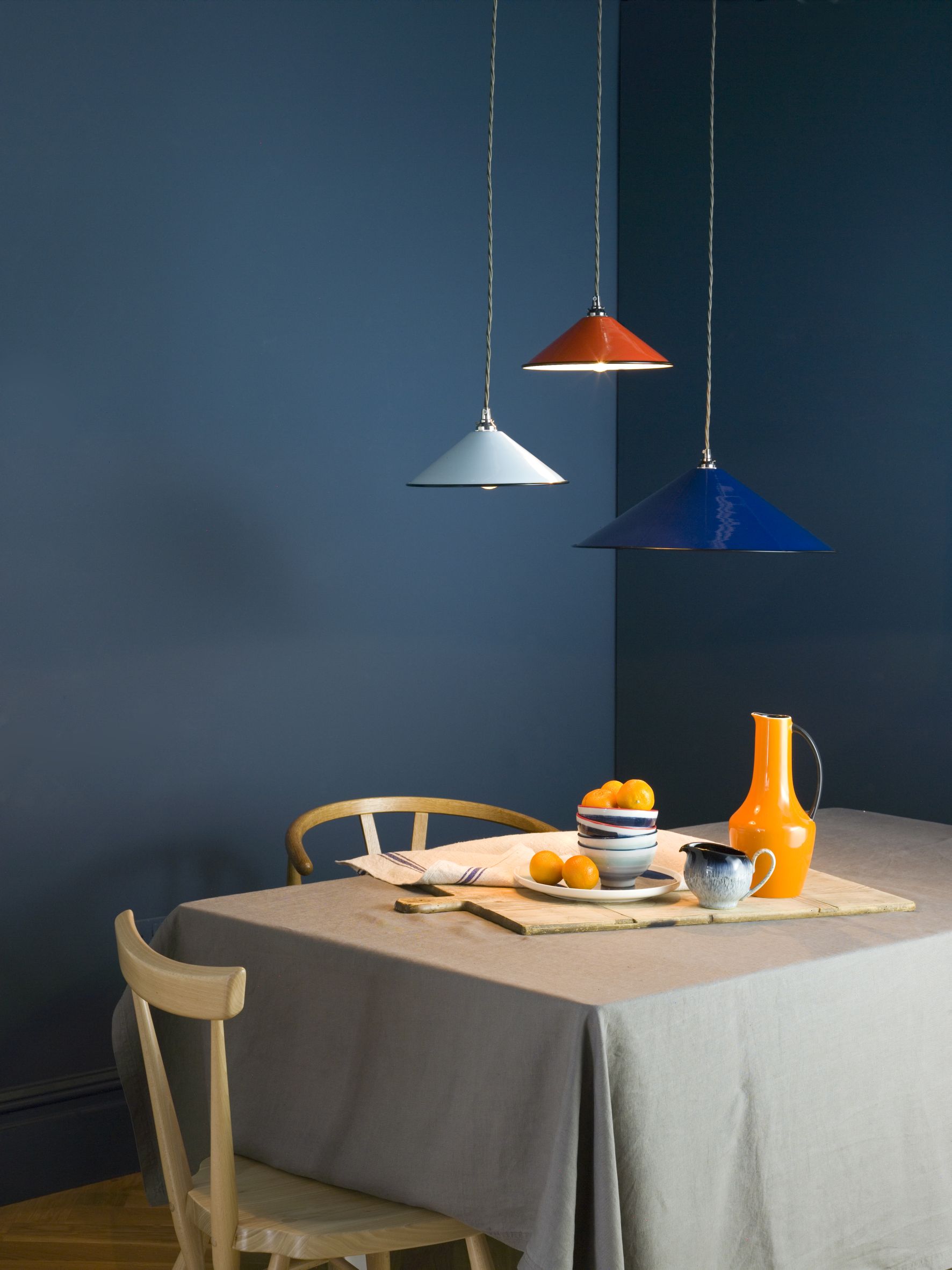
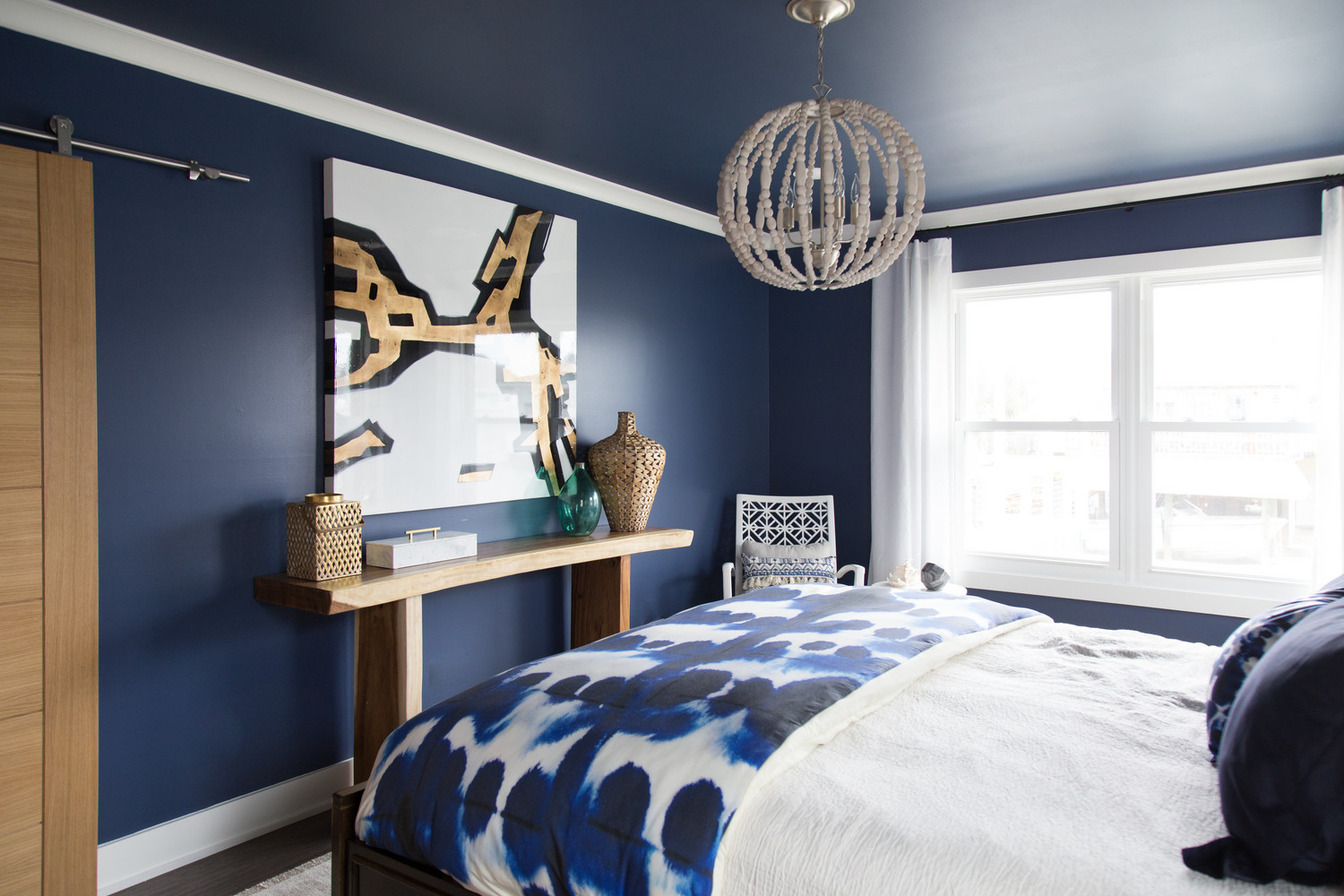
A blue-on-blue dining room concept uses dark, bold navy trim to color-match wallpaper, creating a cozy yet sophisticated look. Designer Caroline Finnegan explains how a thicker crown molding with a darker color can trick the eye, making a room with lower ceilings feel taller. Finally, the article highlights the dramatic effect of deep, dark green coving paired with a wood-paneled wall, enhancing the grandeur of a living room and tying the scheme together with matching green fireplace tiles.
Each example emphasizes the transformative power of dark trim, whether used to create contrast, add warmth, define architectural details, or enhance the overall mood of a space. The designers' insights underscore the practical and aesthetic benefits of incorporating darker shades into interior paint schemes.
#DarkTrimPaint #InteriorDesign #PaintColorSchemes #HomeDecor #ArchitecturalFeatures #ColorContrast #RoomTransformation #DesignerTips #DarkTrimPaint #InteriorDesign #PaintColorSchemes #HomeDecor #ArchitecturalFeatures #ColorContrast #RoomTransformation #DesignerTips
0 comment in total
 No comments yet
You may also like
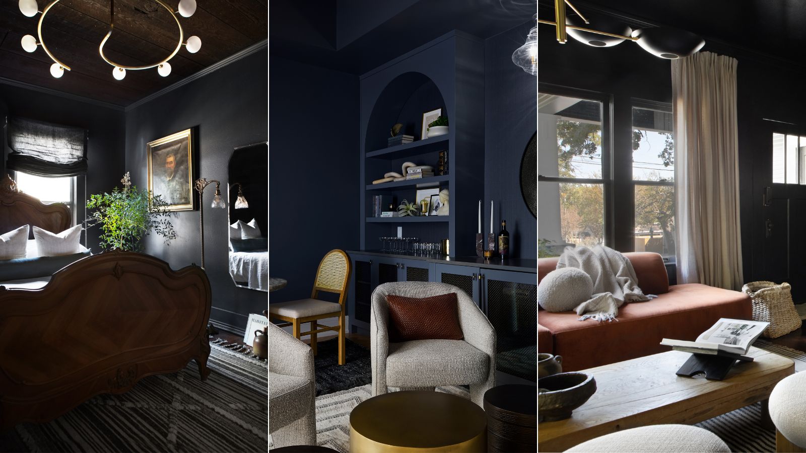
7 best dark paints loved by interior designers

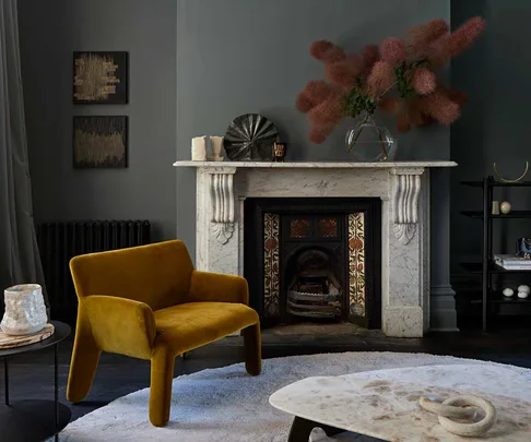
8 of the best dark paint colours for your home and how to use them

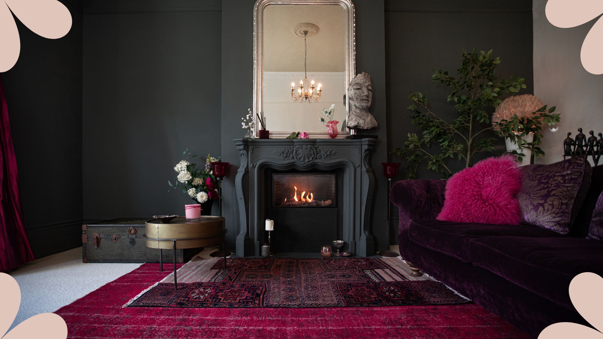
An interior designer reveals the 5 mistakes to avoid when painting with dark colours

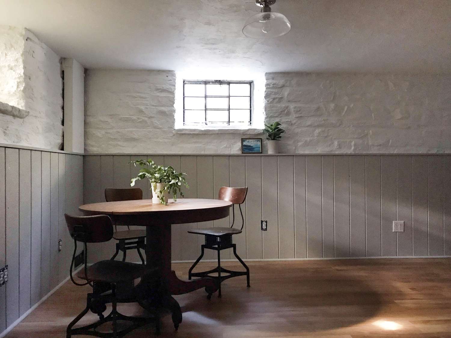
8 Basement Paint Colors Interior Designers Rely on to Brighten Dark Spaces

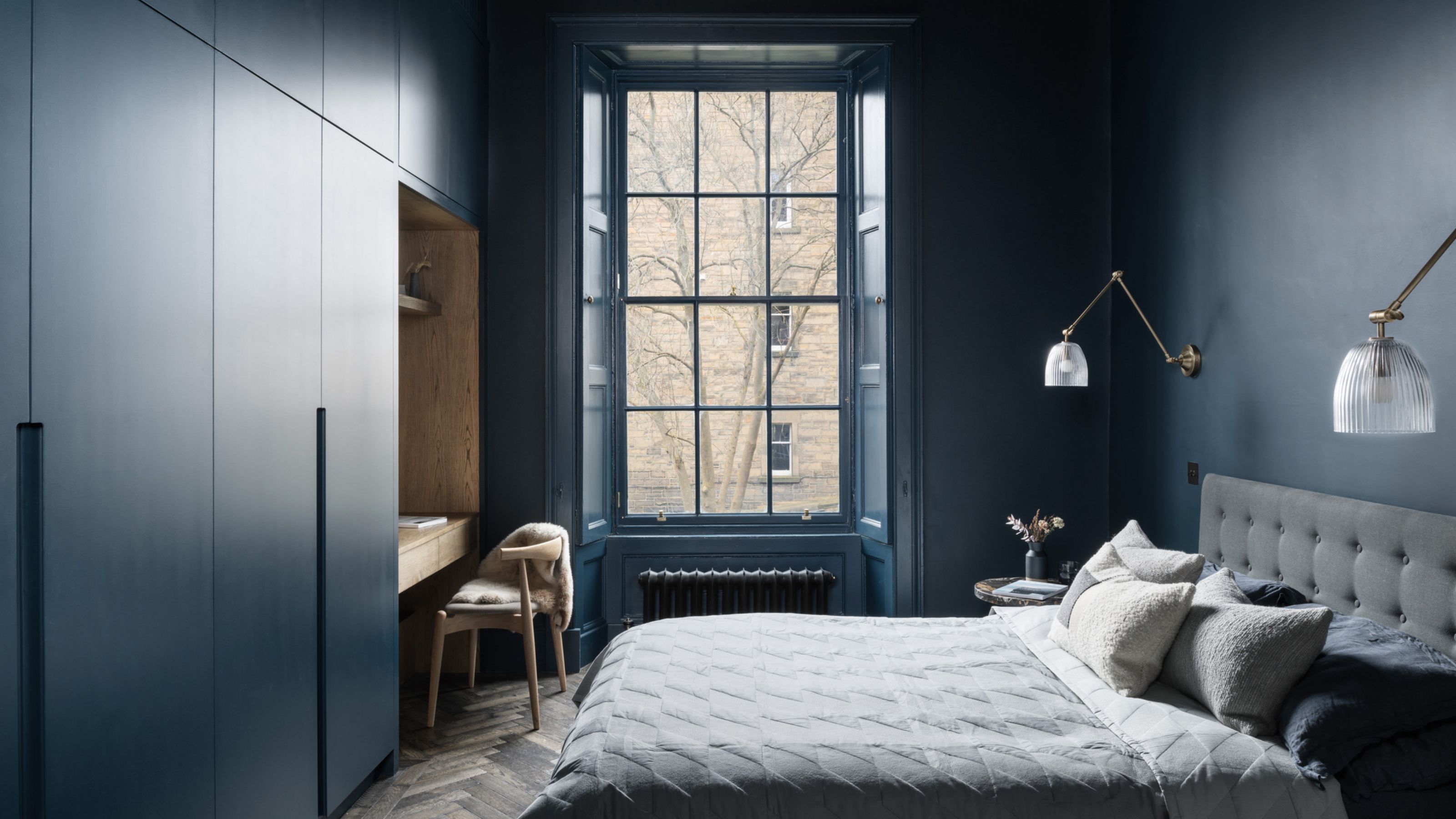
6 Dark Paint Colors That Designers Use to Bring Glamour
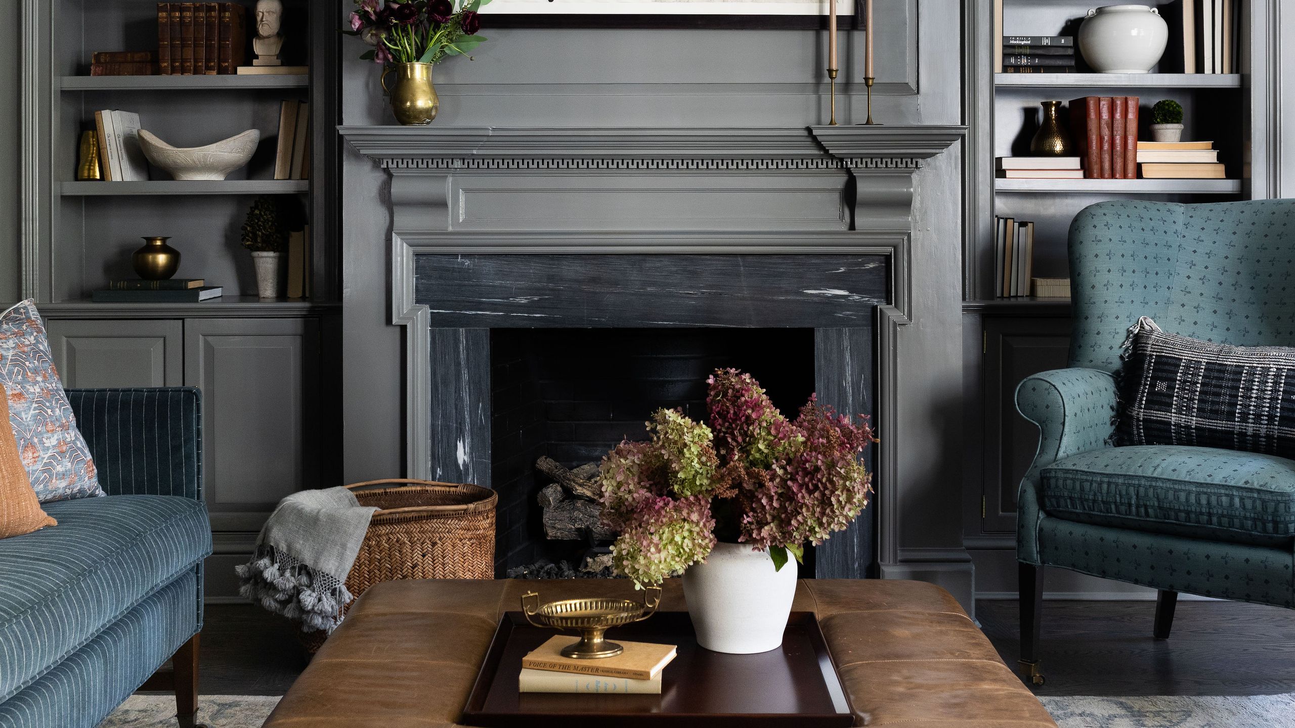
7 dark colour palette ideas that won’t overwhelm your space

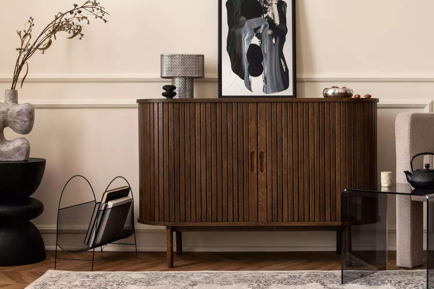
8 Paint Colors That Pair Beautifully With Dark Wood, According to Designers

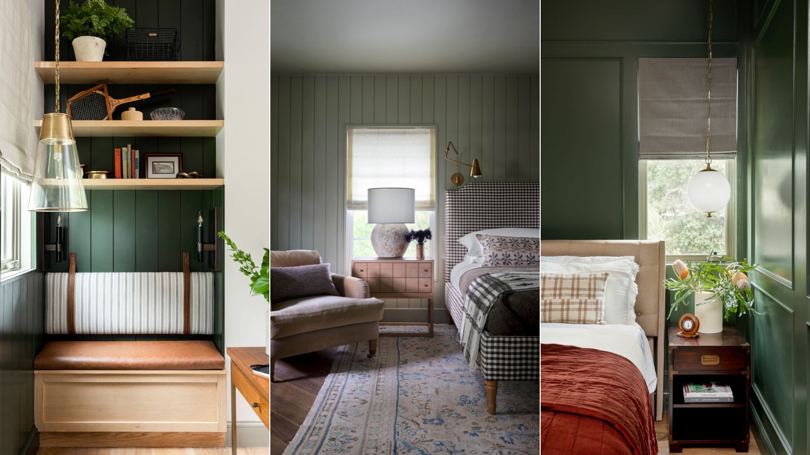
8 best dark green paints designers promise will bring calm and a touch of drama to any room

8 ideas for light walls with dark trim that capture this paint trend perfectly
7 Dark Paint Colors That Will Convince You to Swap Your Neutrals
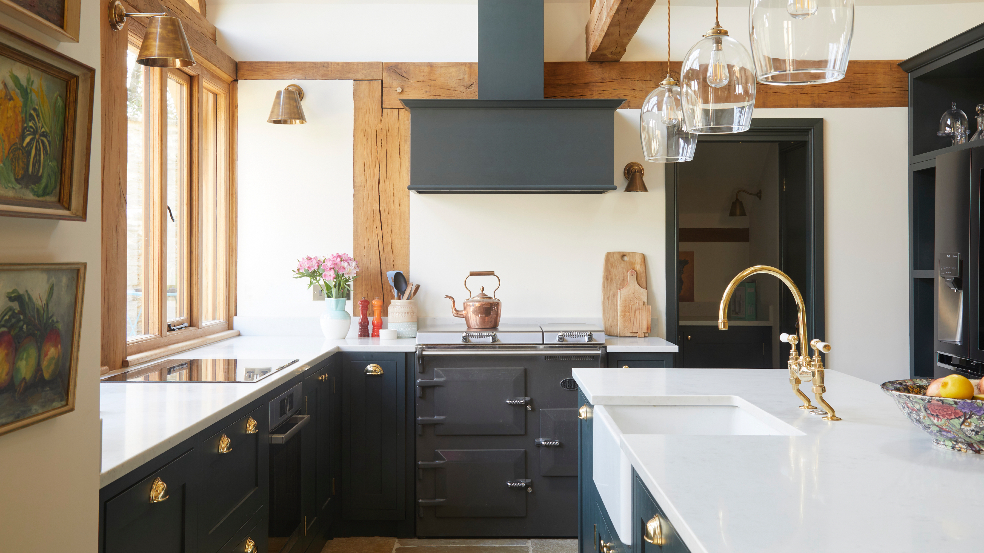
The best paint finishes for dark colours in a kitchen
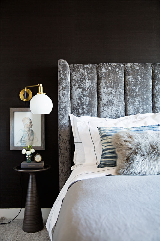
Why You Should Paint Your Bedroom a Dark Color
14 Perfect Dark Paint Colors, According To Interior Designers
Rich colors and sumptuous textures are on designers' minds
Designers Swear By These 11 Dark Blue Paint Colors for Chic and Moody Spaces

Best black paints – 10 dramatic shades and how to use them in your home
This Is the Best Paint for Dark Rooms — 6 Shades Interior Designers Swear By for Light-Limited Spaces

Dark colors to choose for an expensive-looking entryway - interior designers always go back to these paint shades
16 dark interior design ideas to embrace this winter

5 of best dark colors to paint small rooms, as chosen by designers – 'they'll make them feel bigger, and ceilings higher'