Seriously Cool Color Combos We’re Stealing From the Danish
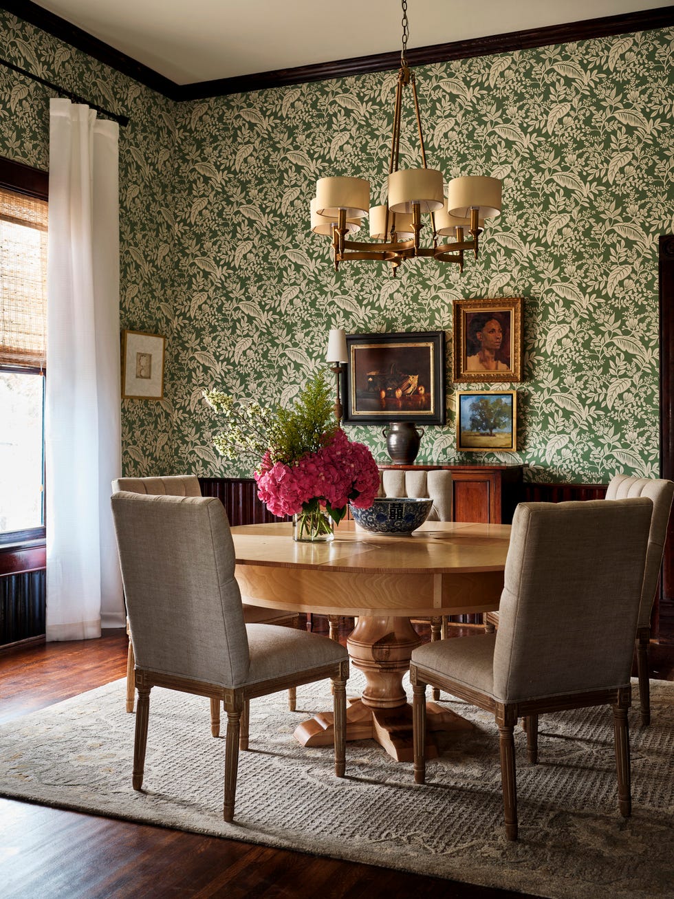
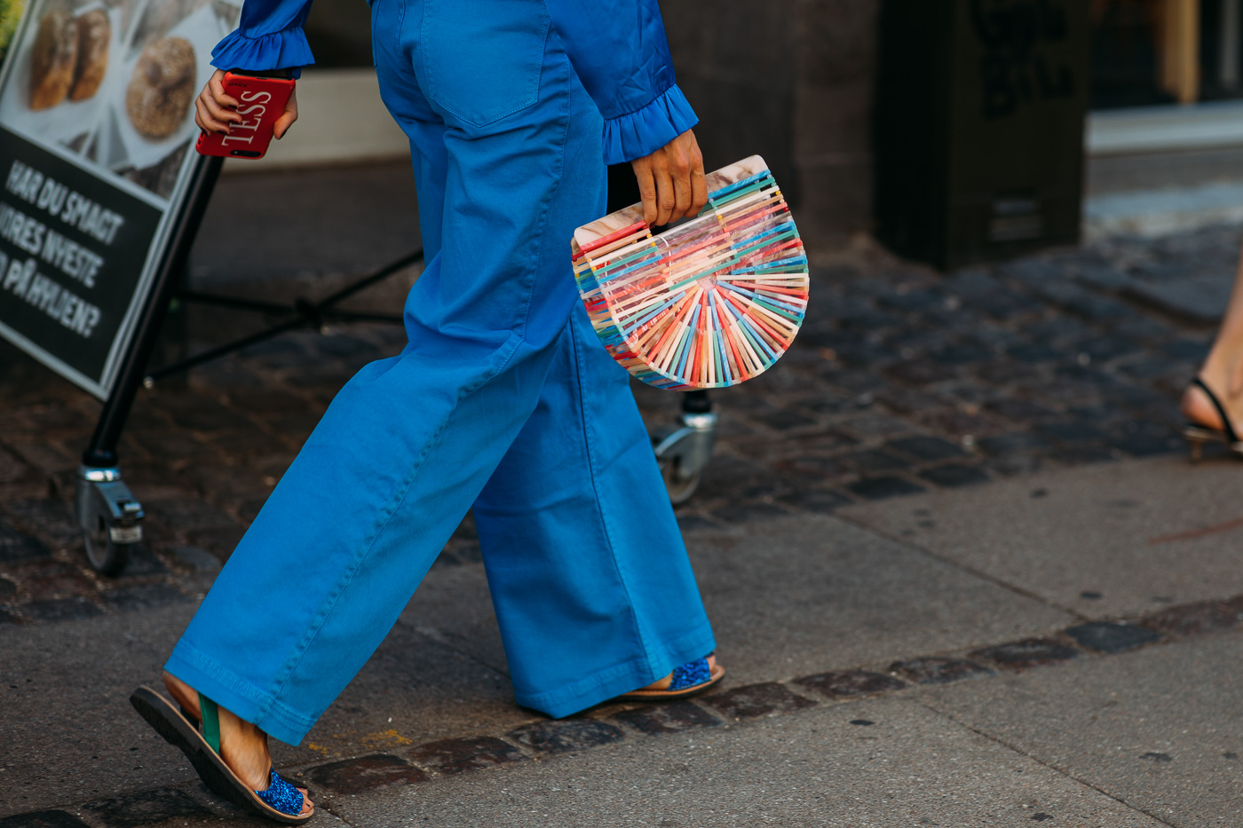
Traditional Scandinavian design is often associated with neutrals, soft textures, and ample wood accents, embodying a calm, minimalist aesthetic. However, Copenhagen Fashion Week demonstrates a stark contrast, showcasing bold colors, playful patterns, and an eclectic mix of silhouettes and fabrics in its street style. While not all fashion trends directly translate to interior design, several striking color palettes observed during Copenhagen Fashion Week offer unique inspiration for home decor, moving beyond conventional minimalist interpretations of Scandinavian style.
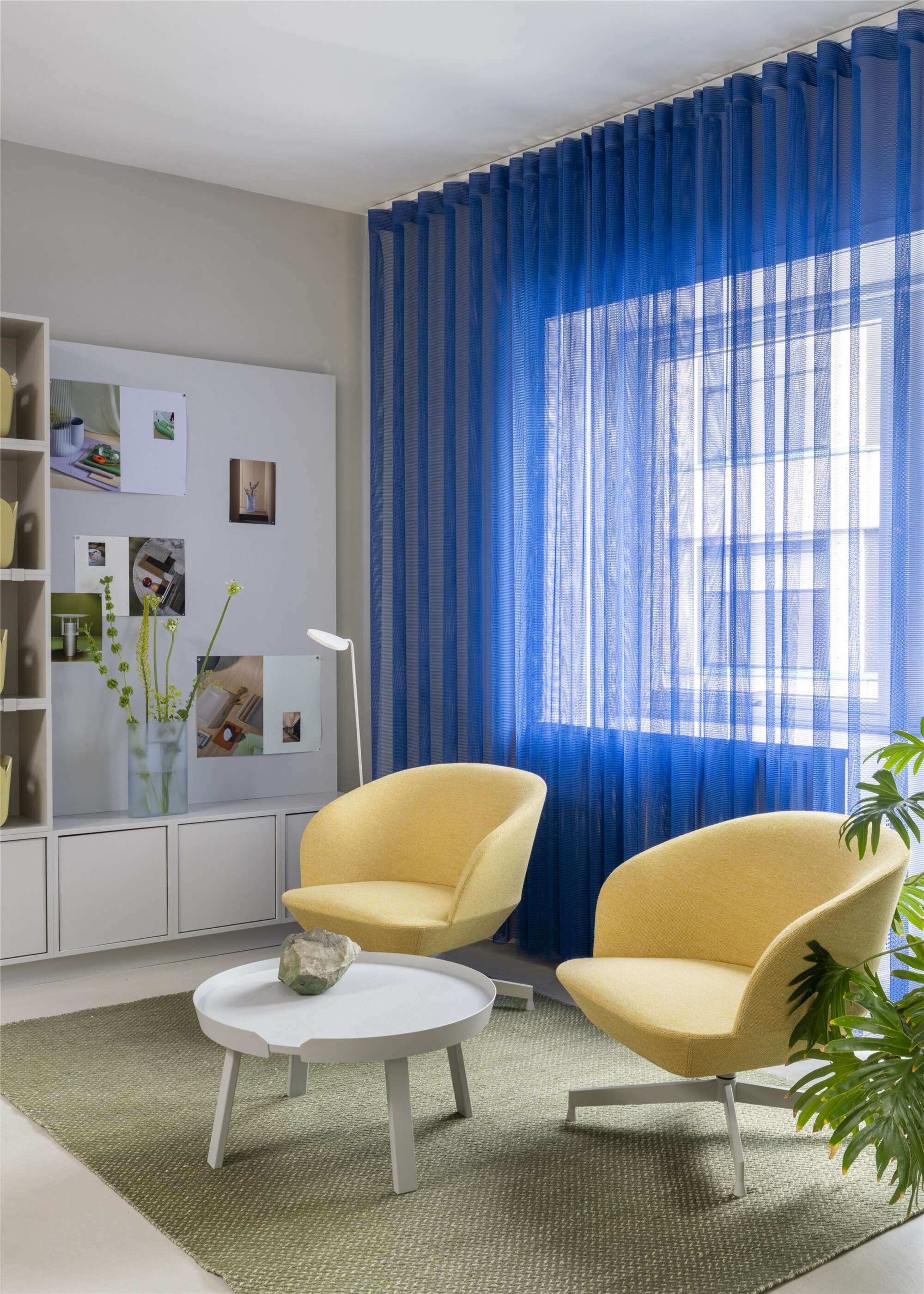
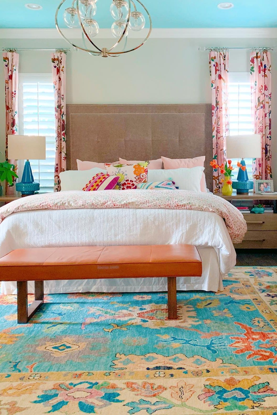
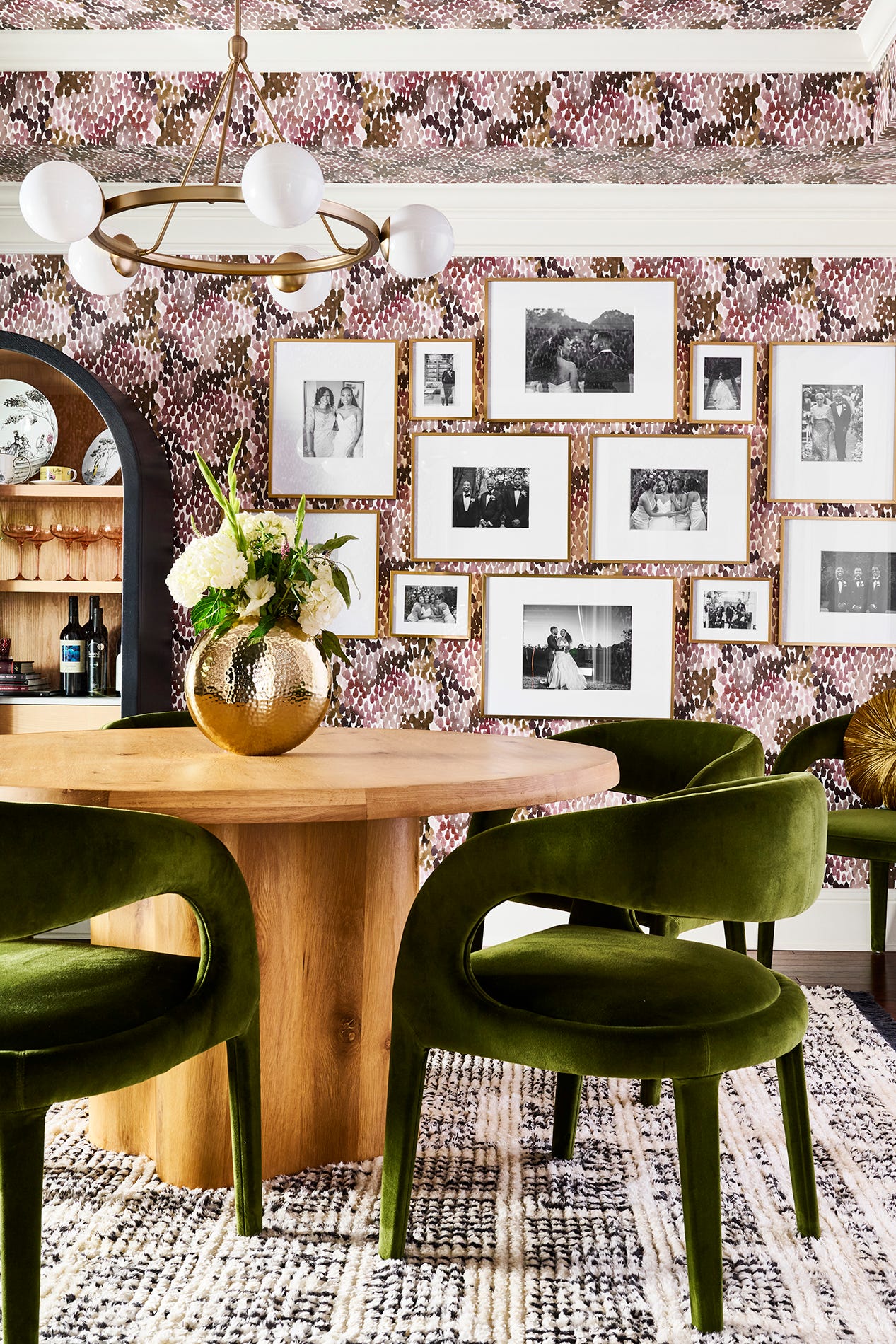
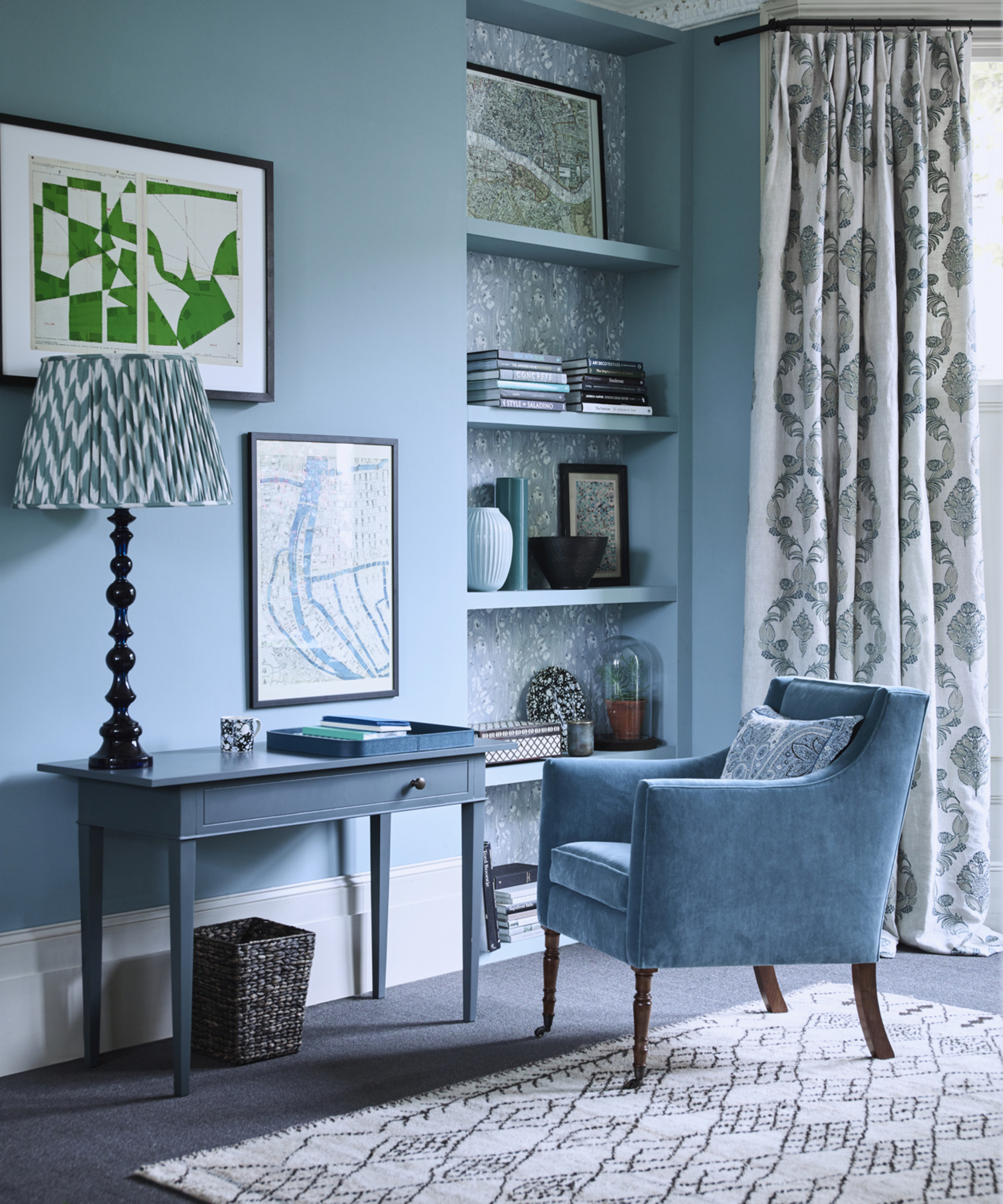
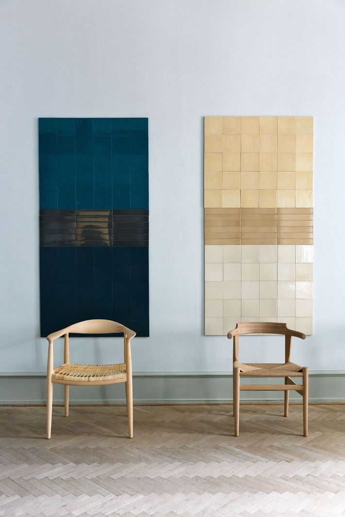
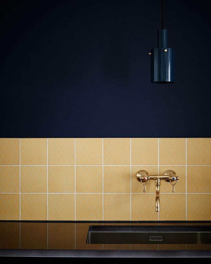
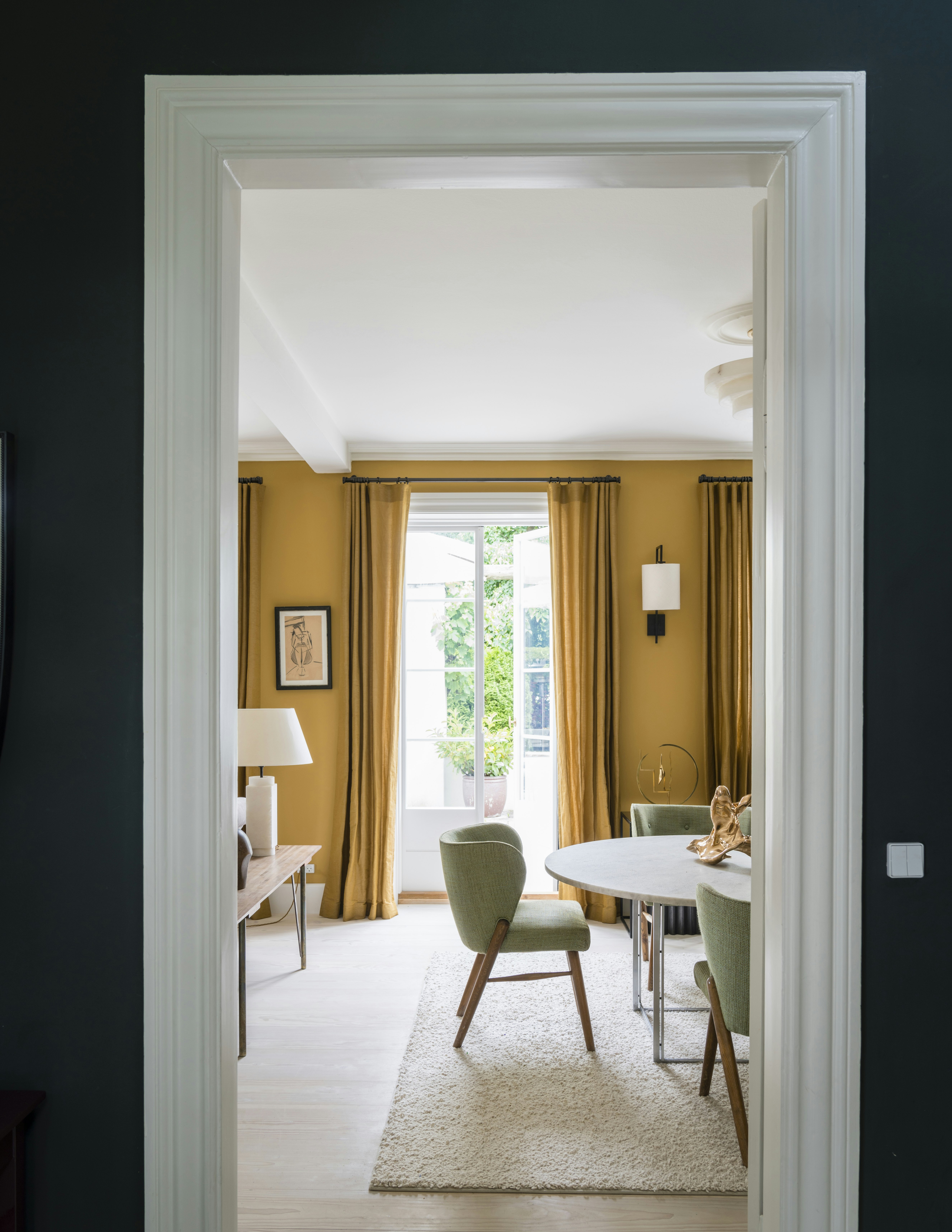
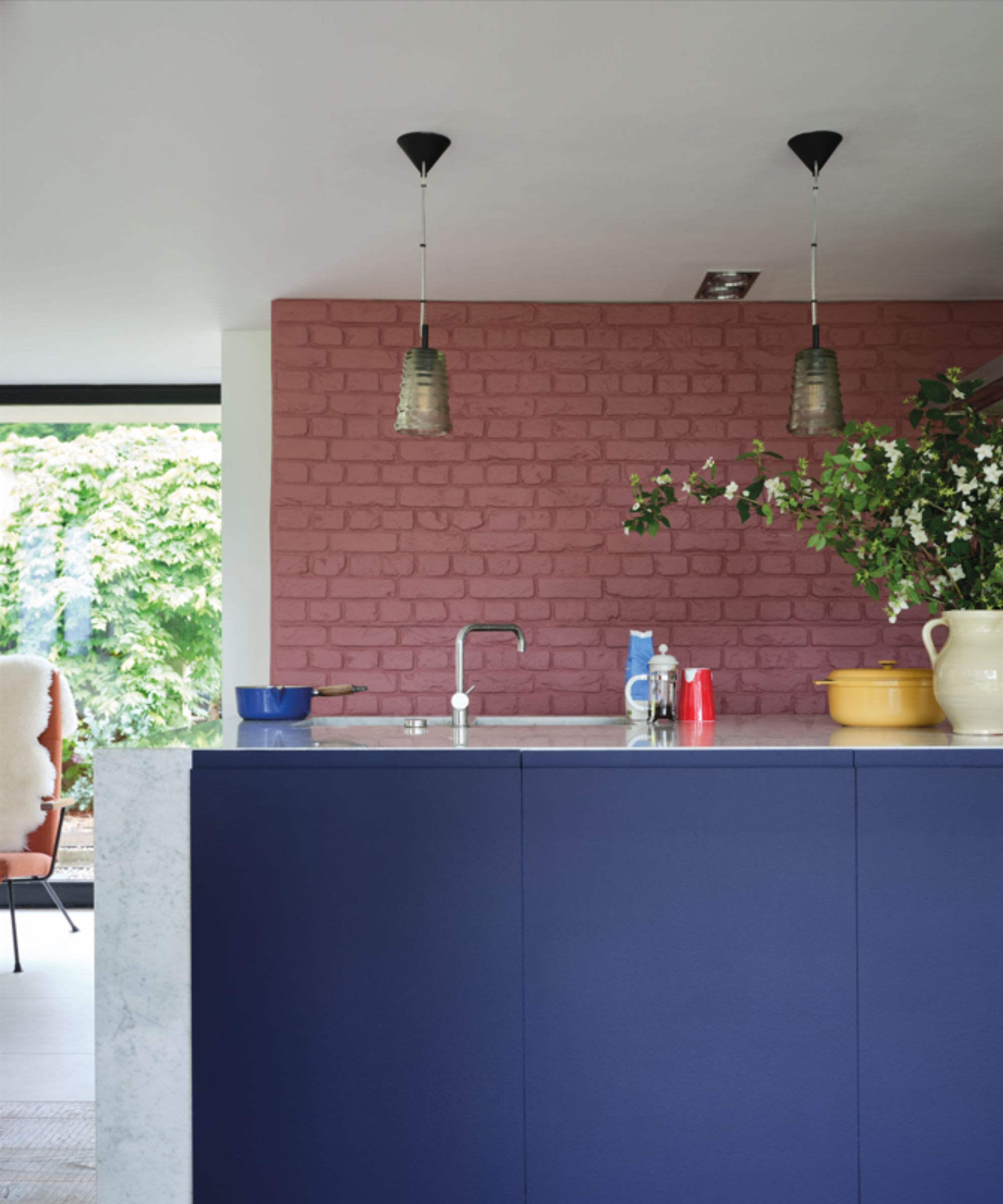
One compelling combination is cornflower blue and mustard yellow. This shade of blue, a calming hue, was previously noted in February fashion shows and is suggested for a more vibrant home application by pairing it with mustard yellow, as seen in the Mykke Hofmann presentation. Another intriguing pairing is wine and banana yellow. Deep burgundy tones are a classic for autumn and holidays, but balancing them with a lighter, unexpected banana yellow allows this duo to be versatile across all seasons, adding an interesting contrast.
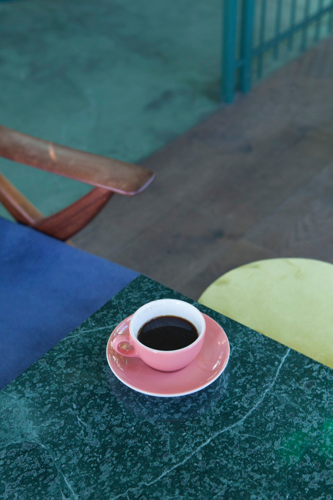
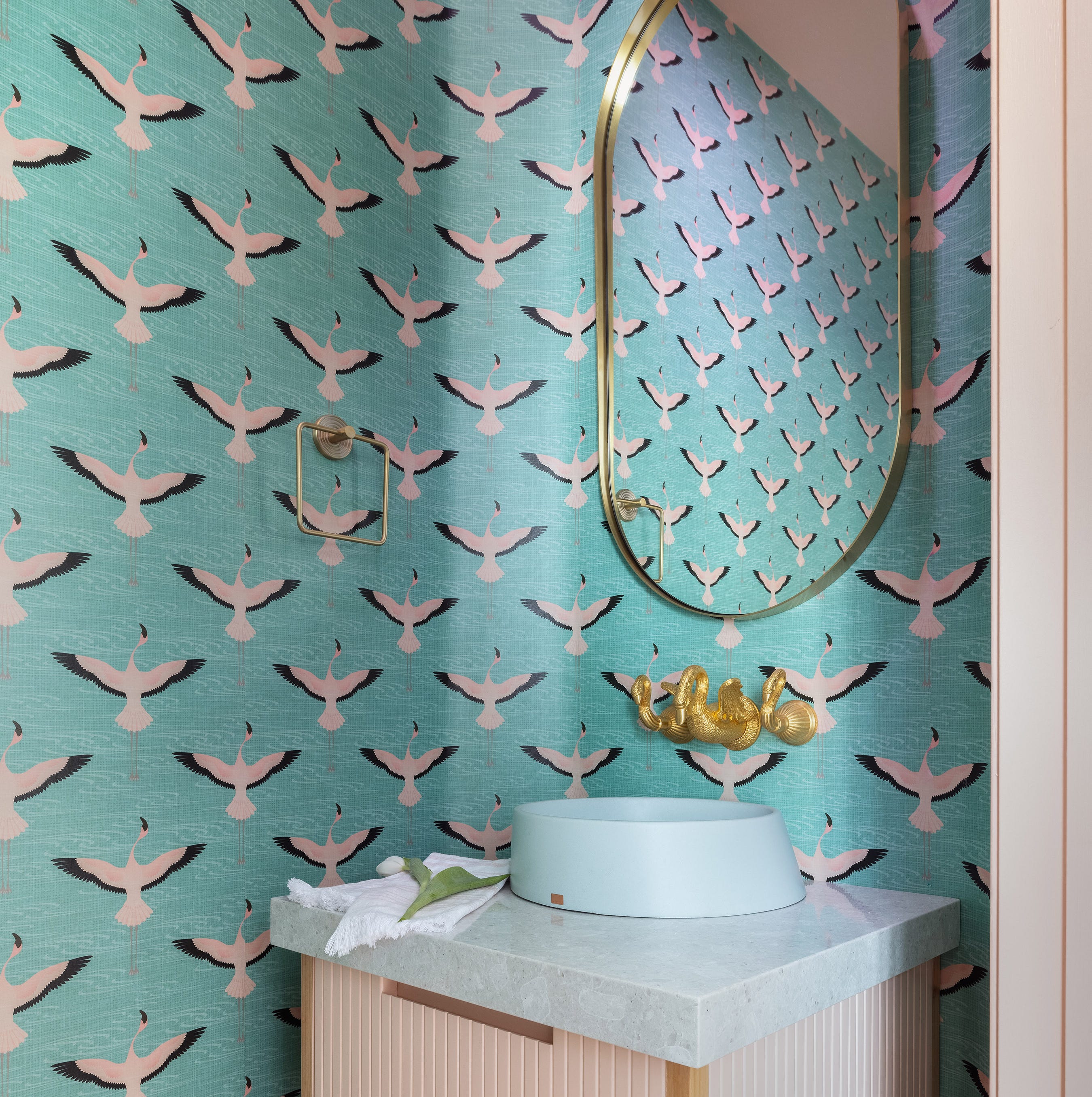
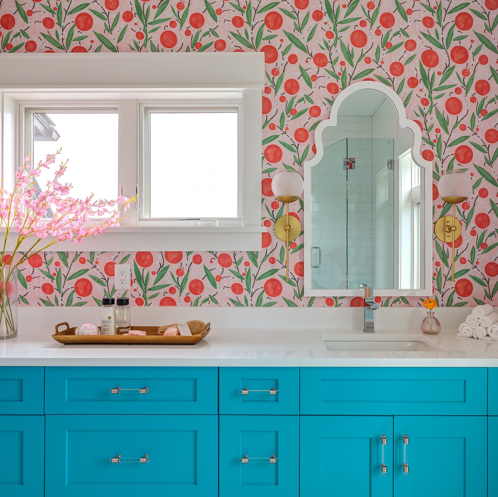
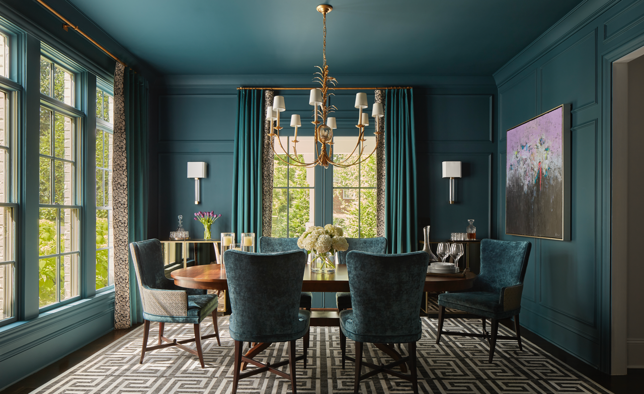
The article also highlights watermelon and pale mint as a fresh and on-trend combination. Mint green has gained significant popularity, and watermelon offers a slightly deeper, more mature alternative to millennial pink, bringing a whimsical touch to any space. For those seeking drama, vibrant orange and teal present a bold choice. These color wheel opposites, while requiring careful application to avoid a "traffic cone" effect for minimalists, are celebrated by maximalists for their striking visual impact, especially when seen in Copenhagen street style.
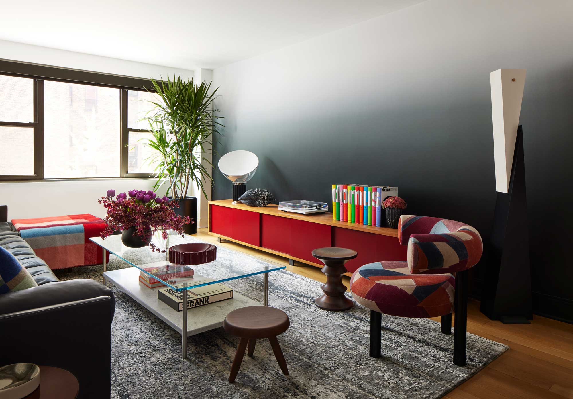
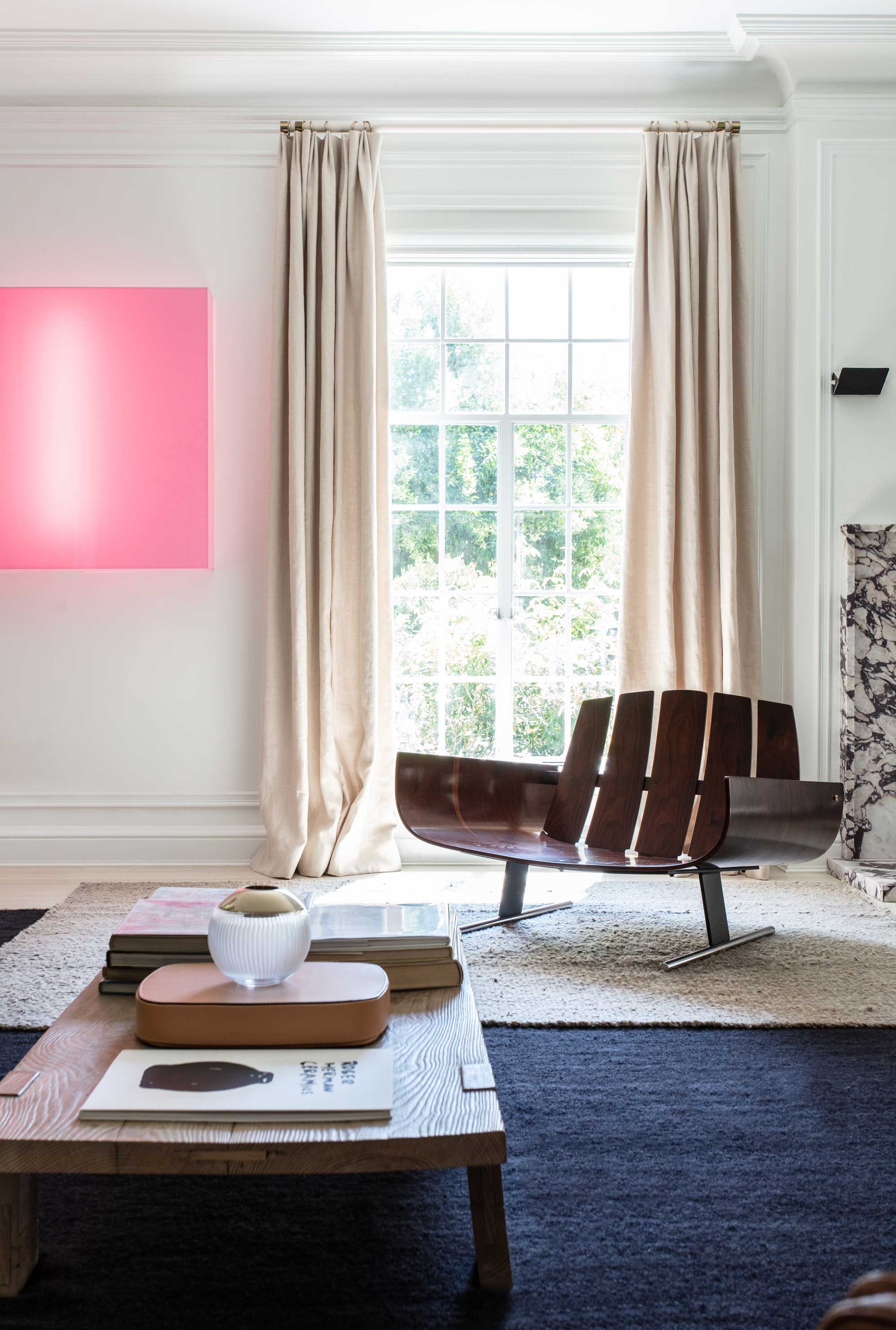
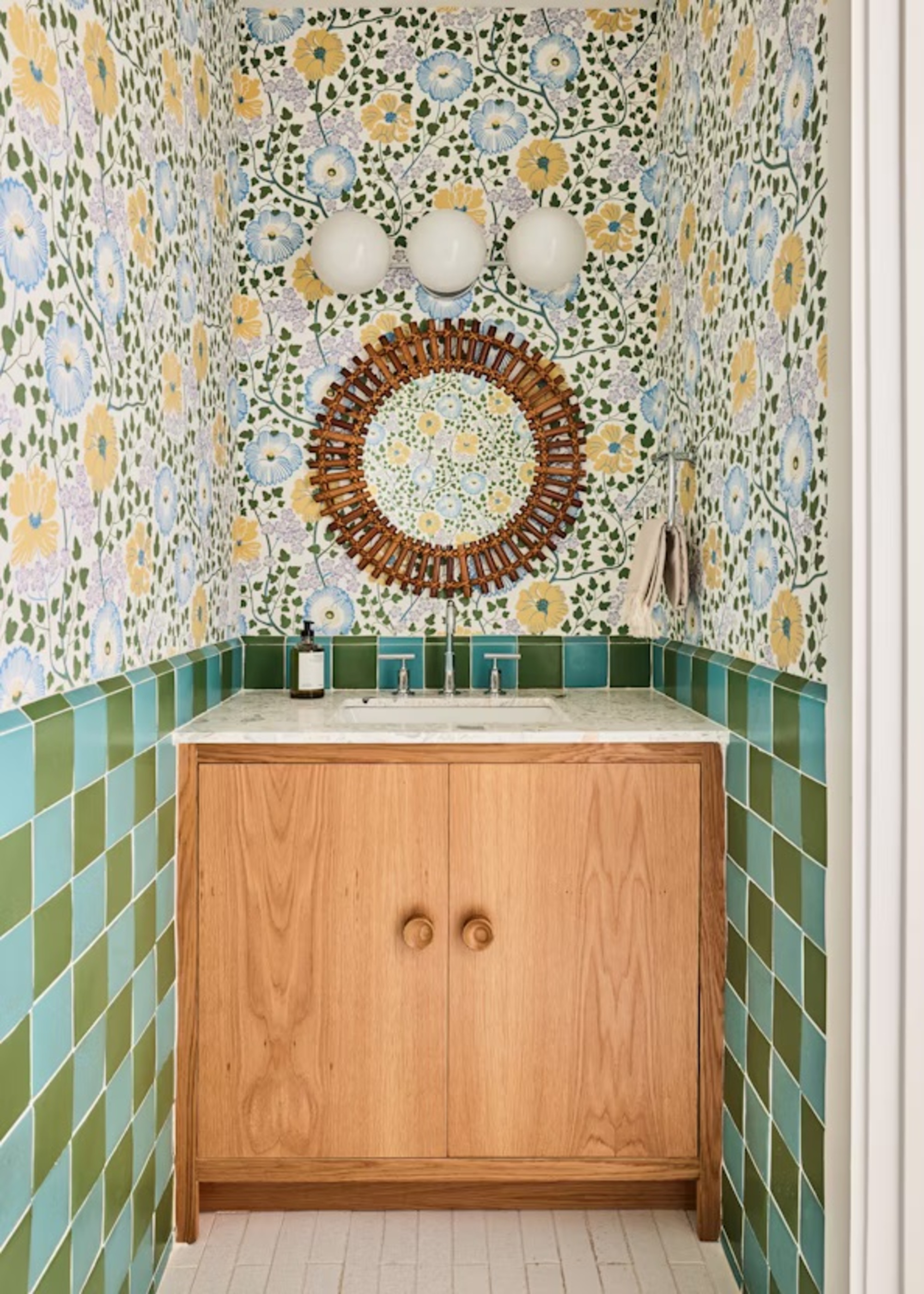
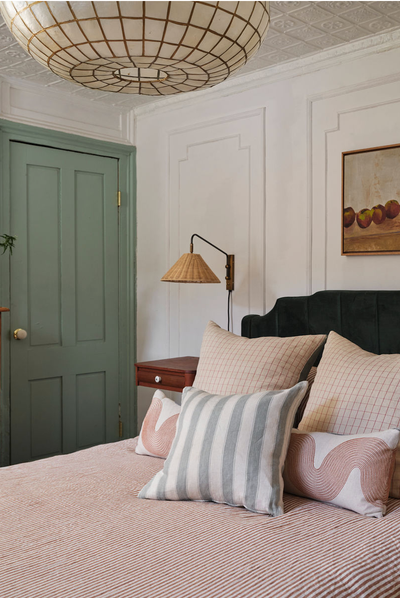
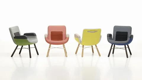
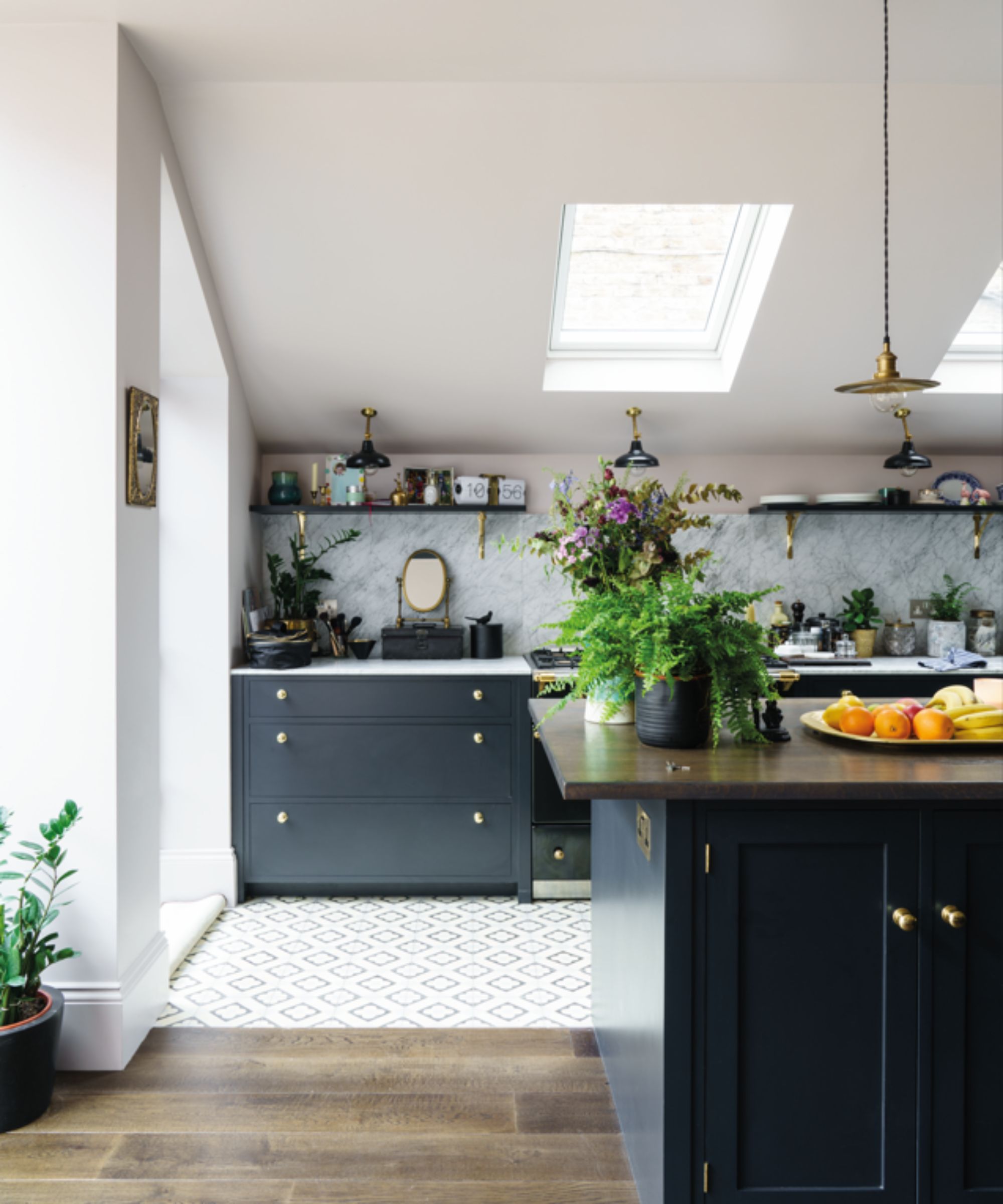
For a more nuanced approach, pale blue, celery green, and tomato red form an almost-primary color palette. This trio, while seemingly basic, makes a significant statement, particularly when set against a clean, whitewashed backdrop to maximize its impact. The article also acknowledges the enduring appeal of tonal neutrals, featuring calming tones of cream, ecru, and soft caramel. These shades, when combined, create a sense of cohesion and sophistication, transforming a living space into a sanctuary, and offering a chic alternative to uniform stark white.
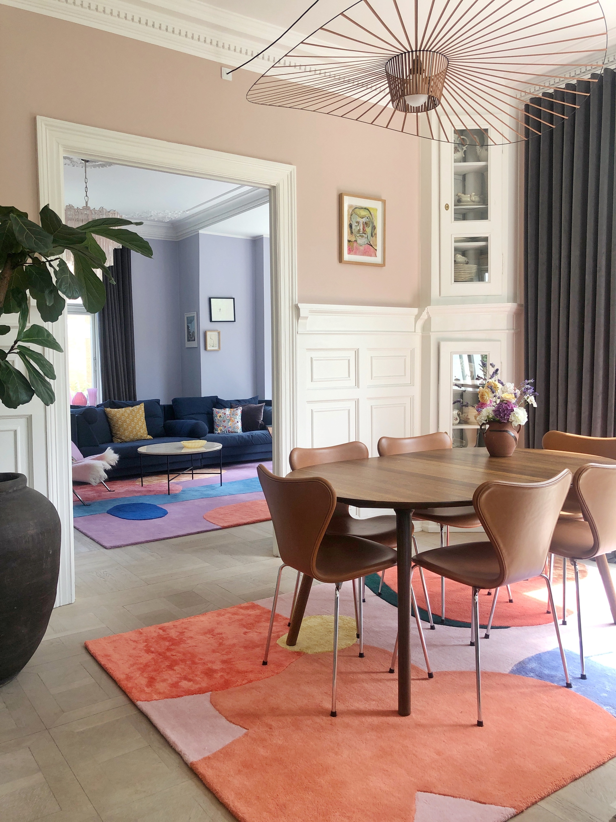
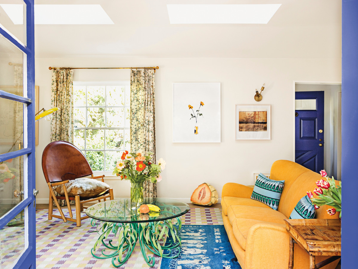
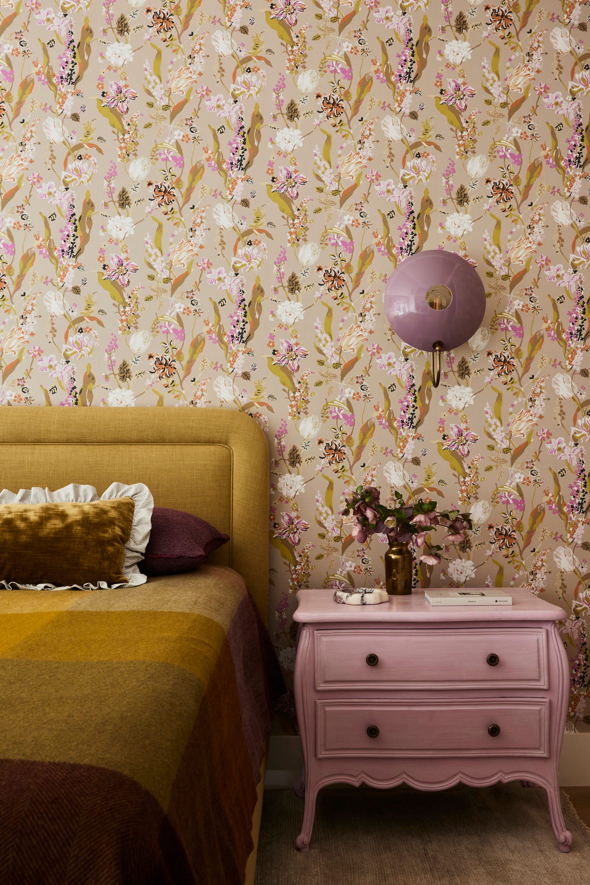
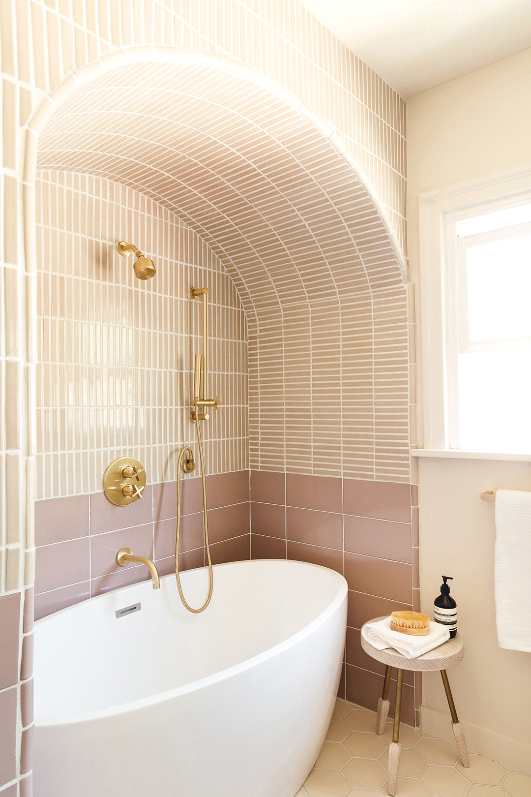
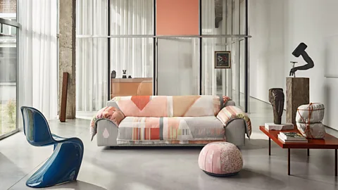
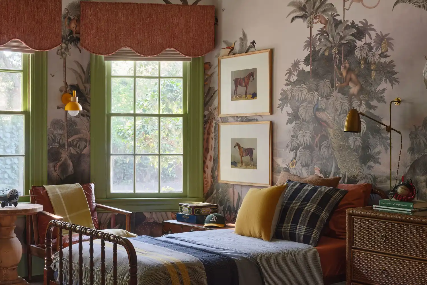
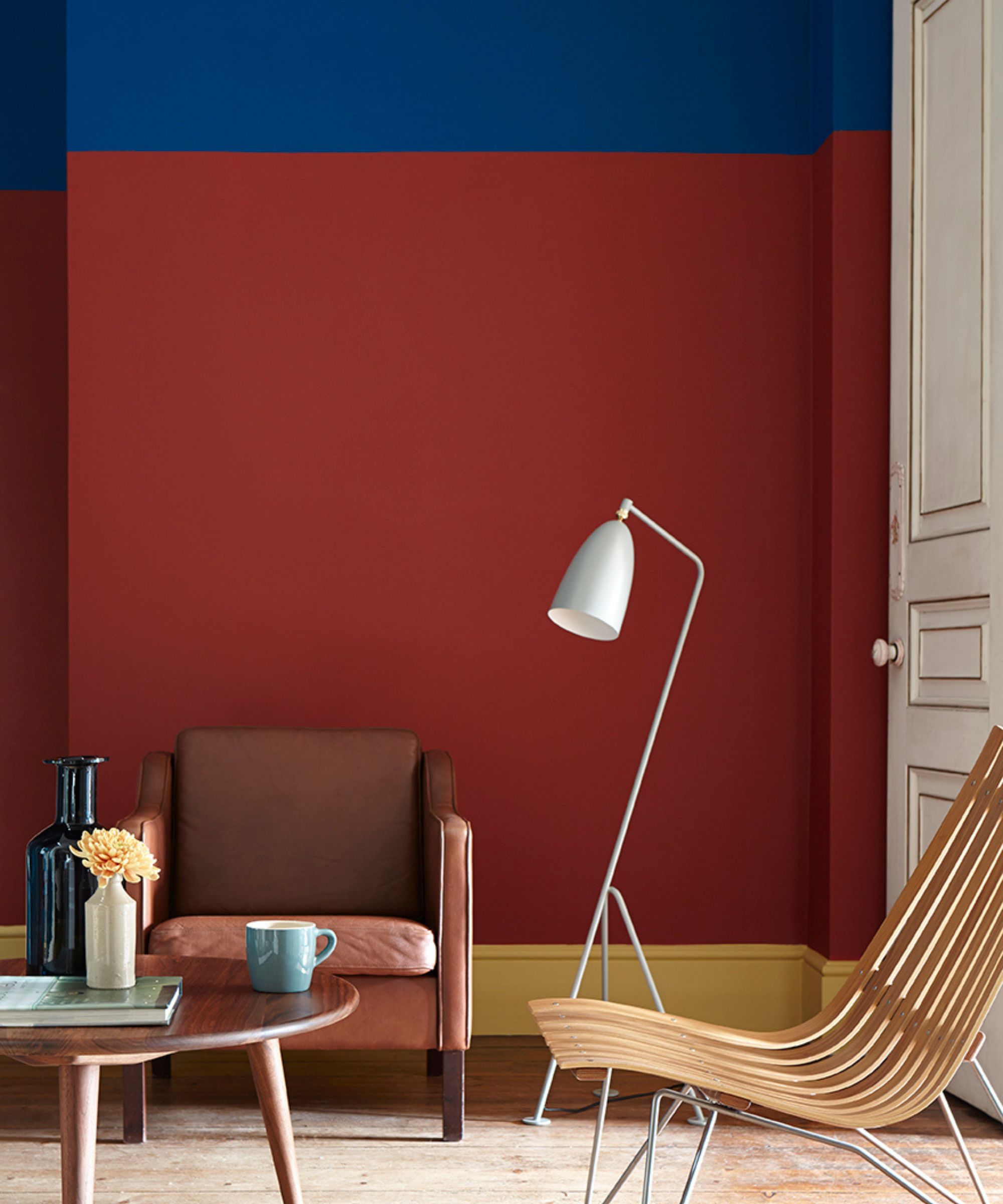
Finally, blush pink and baby blue are presented as a continuation of the popular soft pastel trend. These shades, lending themselves particularly well to feminine styles and breezy fabrics, offer a way to incorporate a romantic and delicate aesthetic into home decor. Another vibrant option is brick red and mustard yellow, described as "McDonalds-chic." This punchy pair, with its deep golden tones and bold red, can create an eye-catching contrast in a living room, perhaps with a rust-hued sofa complemented by jewel-toned textiles. These diverse color combinations offer creative avenues for homeowners to infuse their spaces with personality and contemporary style, inspired by the vibrant world of Danish fashion.
#CopenhagenFashionWeek #ScandinavianDesign #ColorPalettes #InteriorDesignTrends #HomeDecor #FashionInspired #DanishStyle #ColorCombinations #CopenhagenFashionWeek #ScandinavianDesign #ColorPalettes #InteriorDesignTrends #HomeDecor #FashionInspired #DanishStyle #ColorCombinations
0 comment in total
 No comments yet
You may also like
This surprising color trend is having a comeback

12 Color Schemes That Are Popping Off Right Now, According to Designers

3 Nordic Women Designers Defining Modern Hygge
Every Designer I Talked to Said This Popular Paint Color Is on Its Way Out

10 Colorful Scandinavian Schemes That Prove This Style Is So Much More Than Pared-Back White Rooms
Margrethe Odgaard

12 Jewel-Tone Paint Colors Designers Say Are Always On-Trend
6 Paint Color Duos Designers Can't Get Enough of This Fall

The Color Combo You’re About to See Everywhere
It’s Official: Designers Are Ditching This Once-Classic Color
What you didn’t know about colour

Designers are swapping tonal color schemes for high-contrast hues – here's how to do this daring color trend stylishly

Editor’s Letter: The 'Danish Design' Digital Issue
My whistle-stop tour of Copenhagen reaffirmed these 5 Danish design lessons in cool and cozy design
The Best Scandinavian-Inspired Paint Colors for Your Home, According to Experts
This Very "Controversial" Color Is About To Be Everywhere Again
Designers LOVE Pairing These Unexpected Colors With This Sophisticated Hue


Designers LOVE Pairing These Unexpected Colors With This One Timeless Hue
This SURPRISING Color Is About to Be Everywhere, According to Designers
7 Trendy Paint Colors for Every Room in 2026, According to Designers