1/4
This Popular Fabric Designer Reveals the Right Way to Decorate with Color
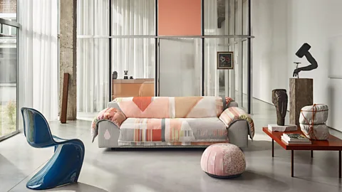
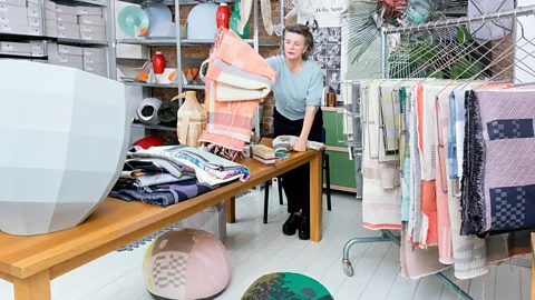
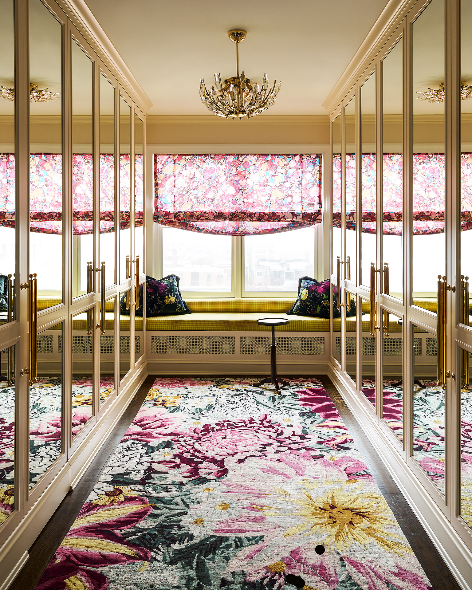
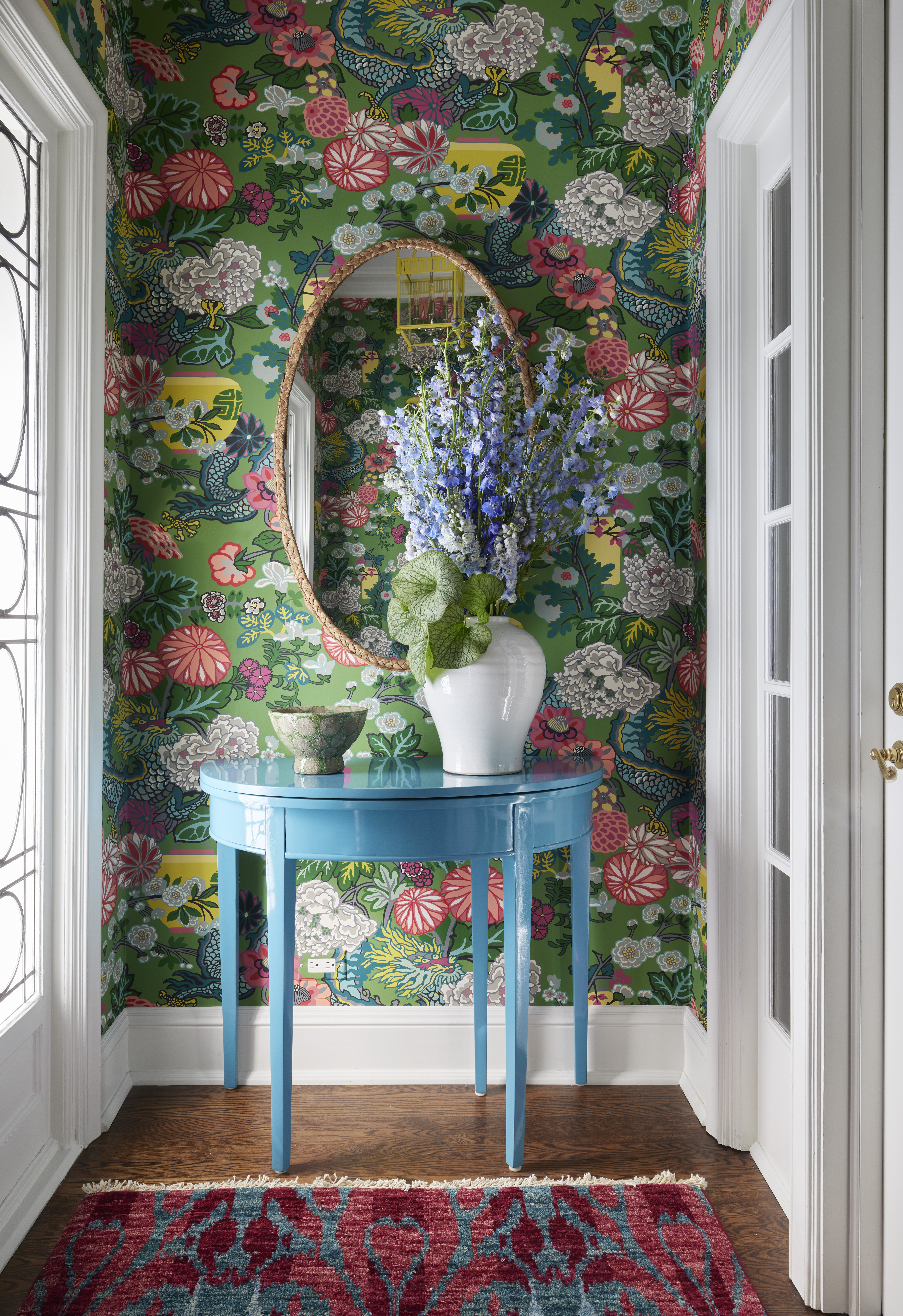
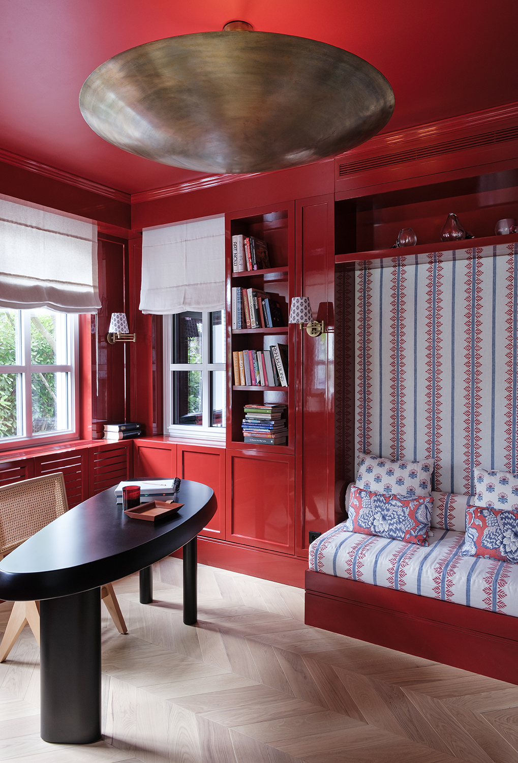
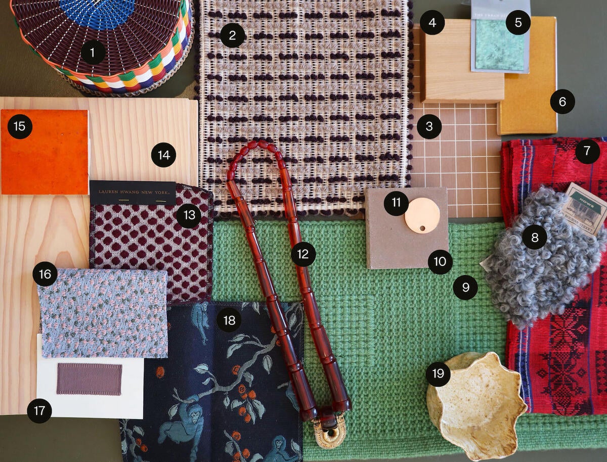
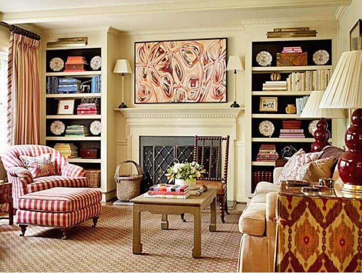
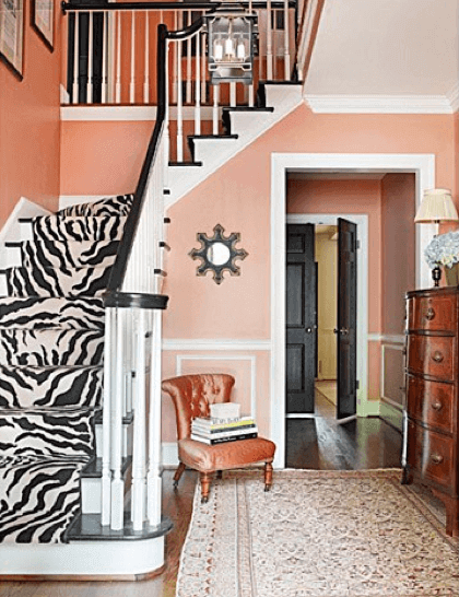
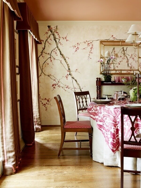
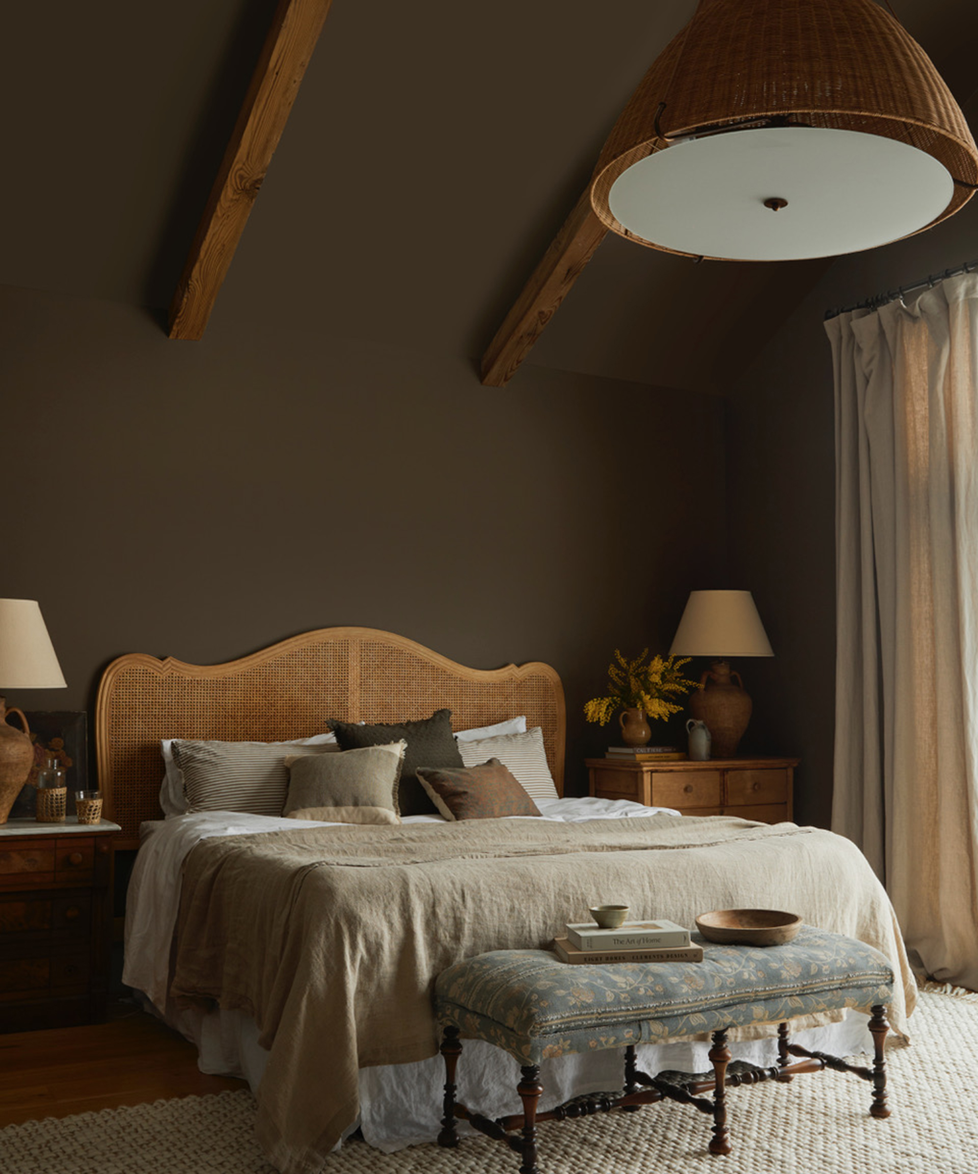
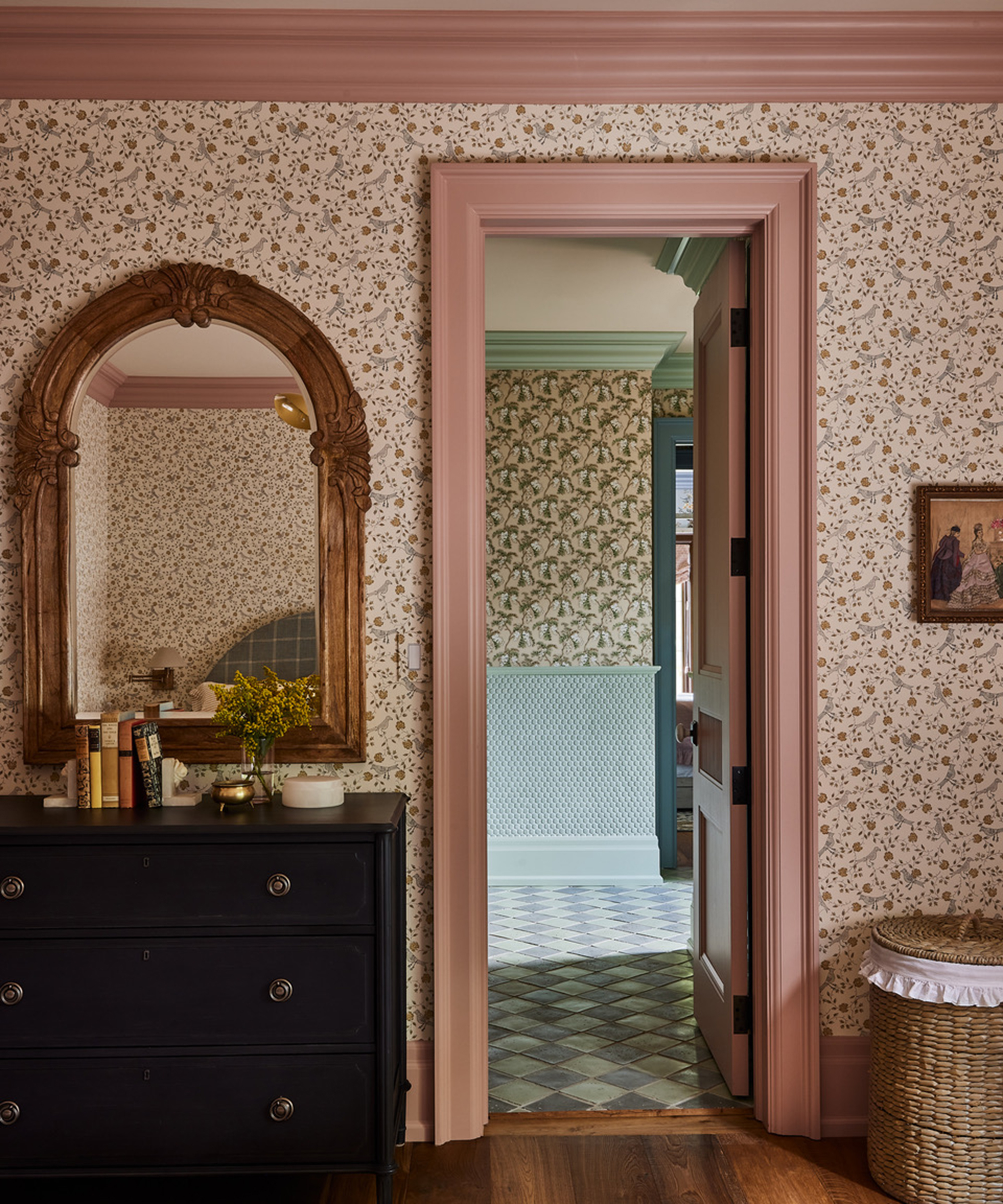
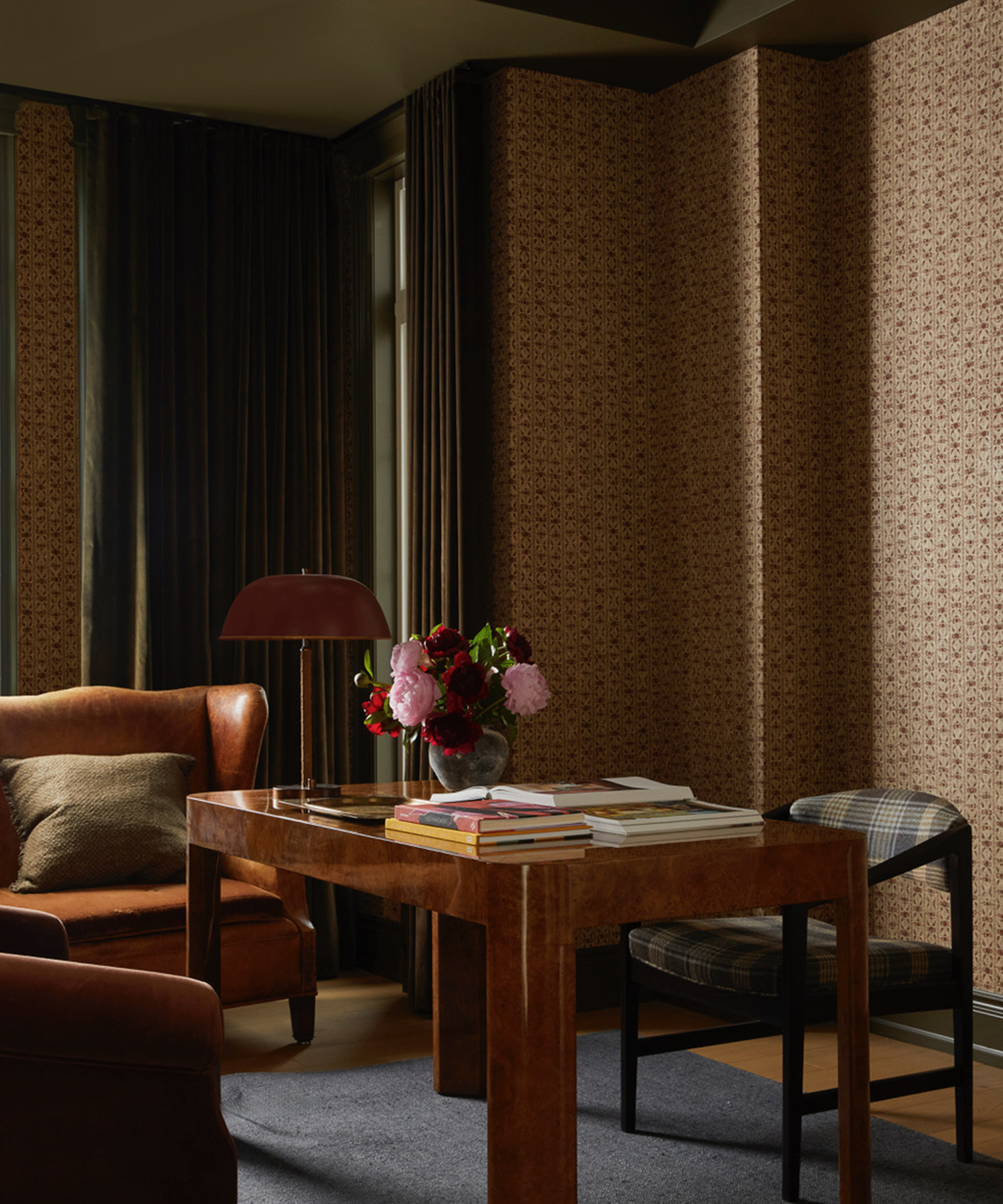
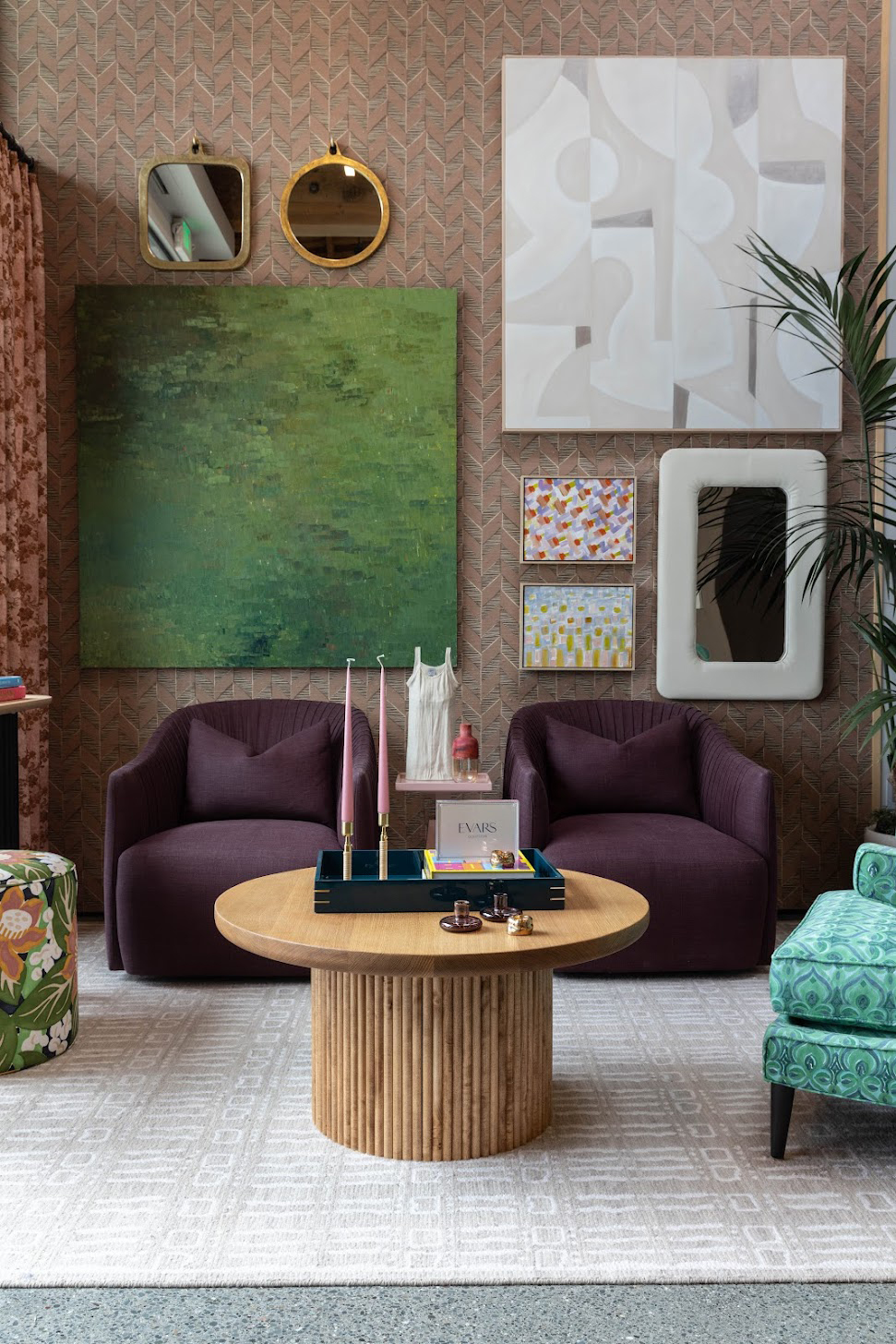
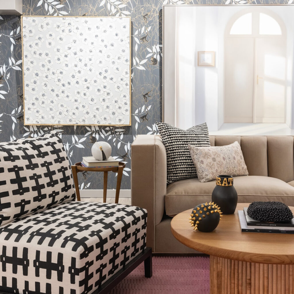
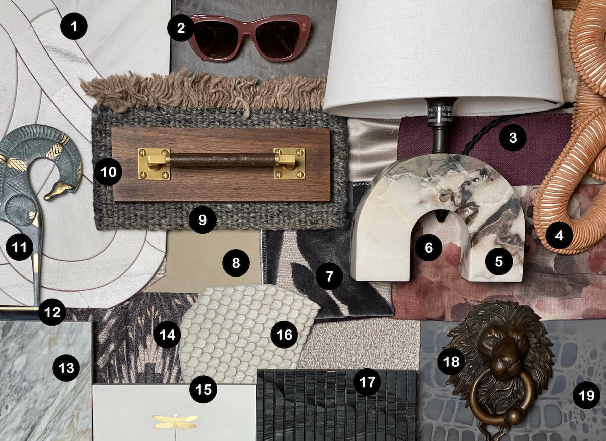
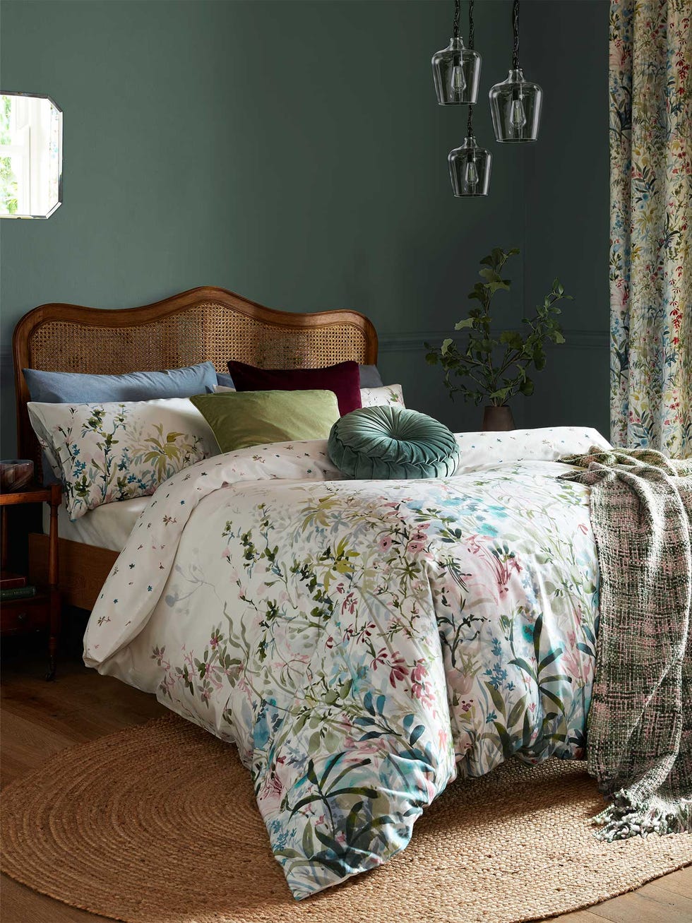
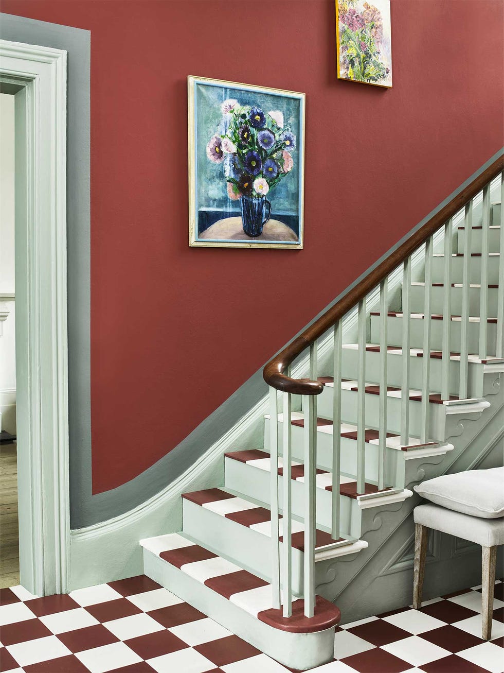
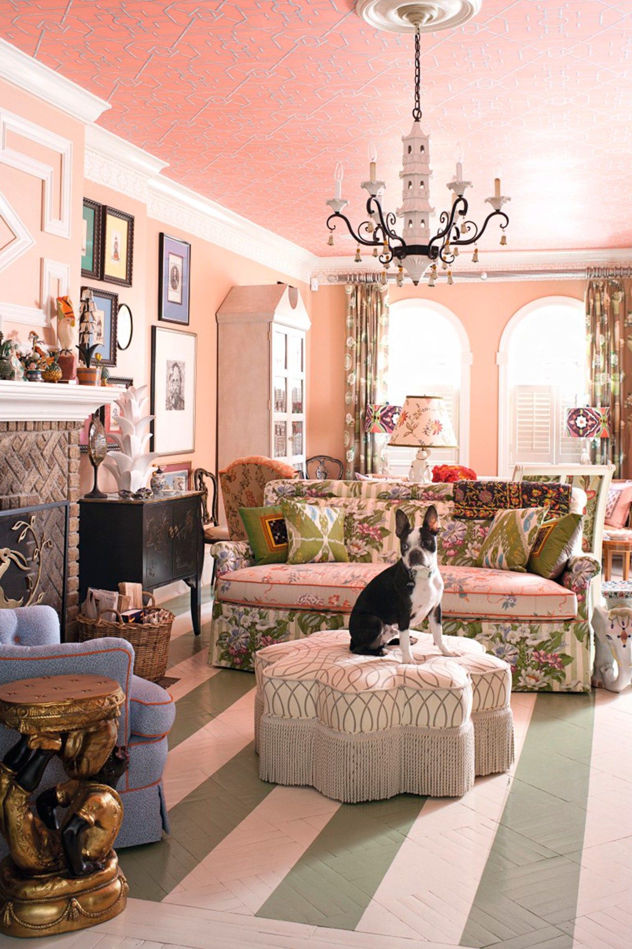
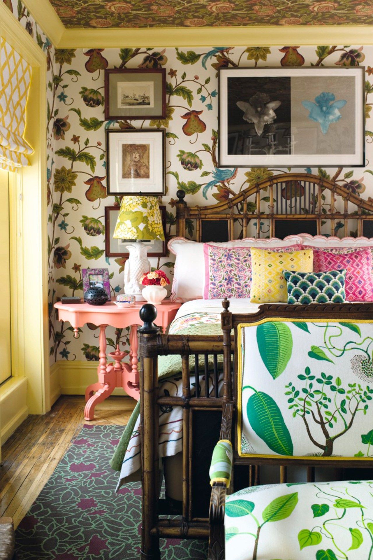
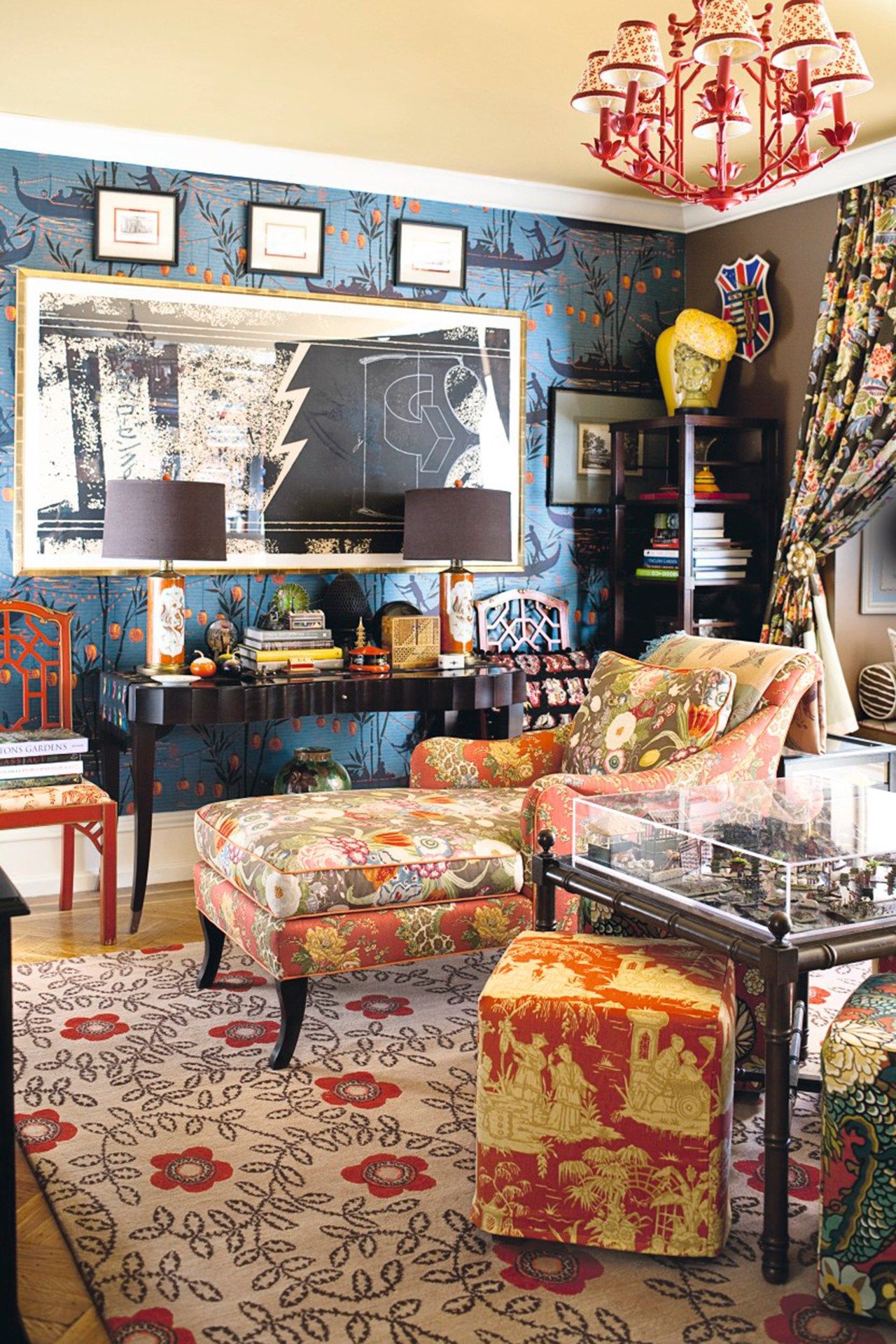
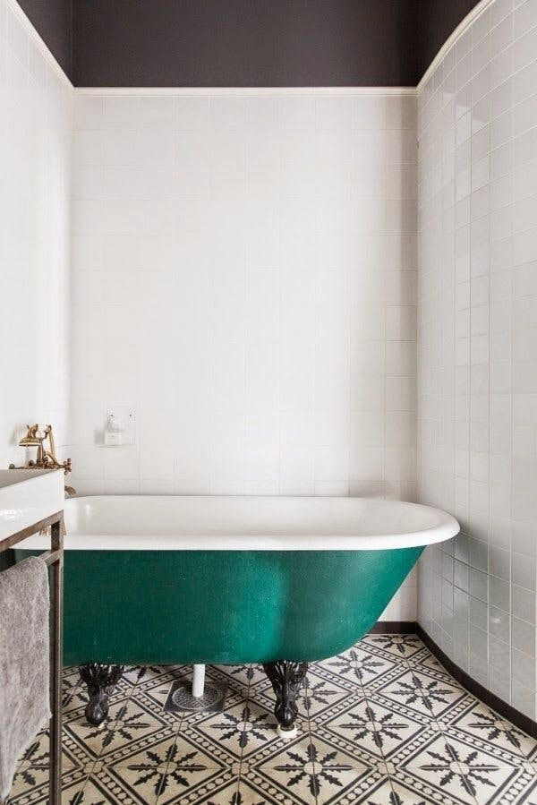
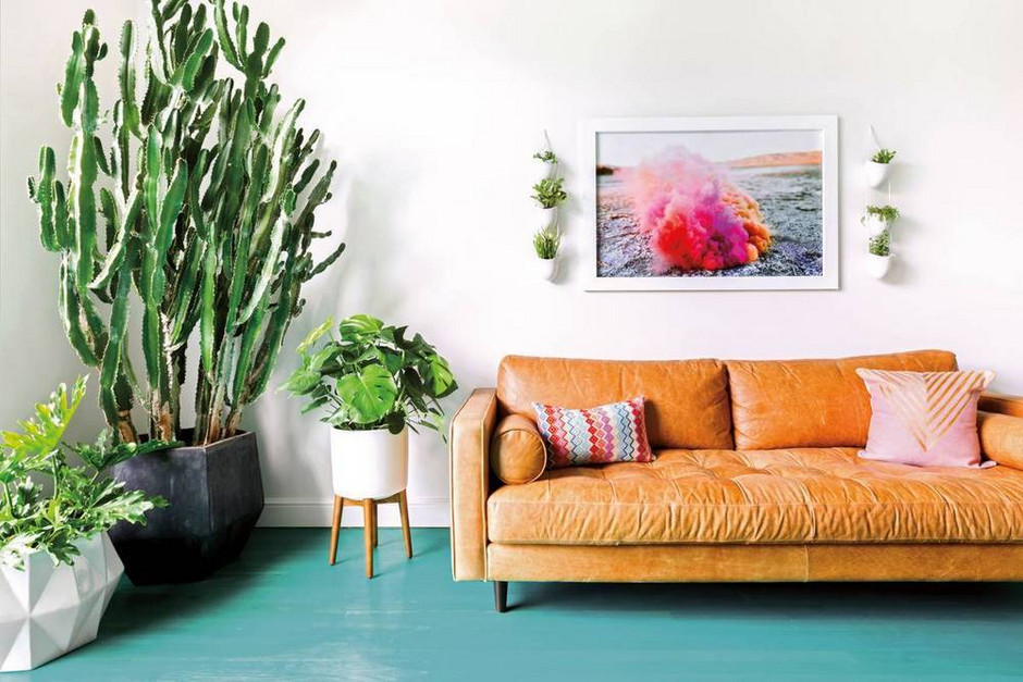
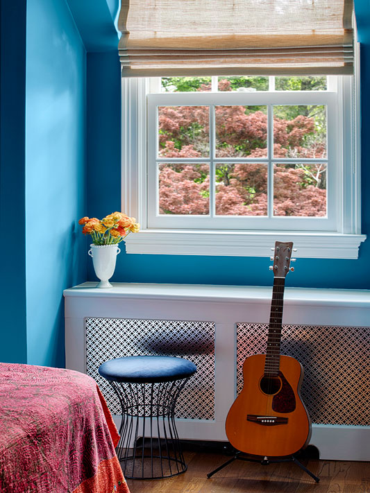
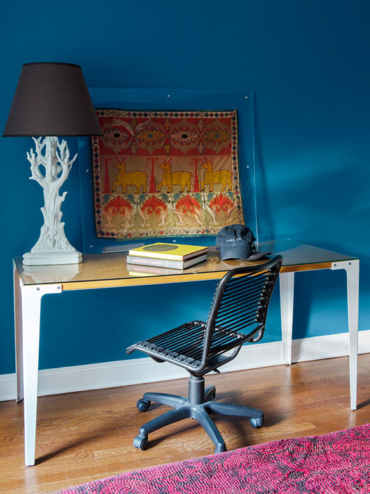
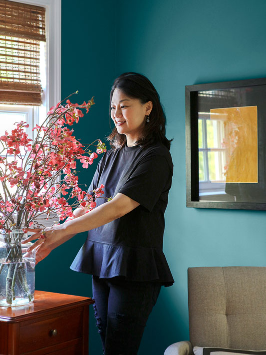
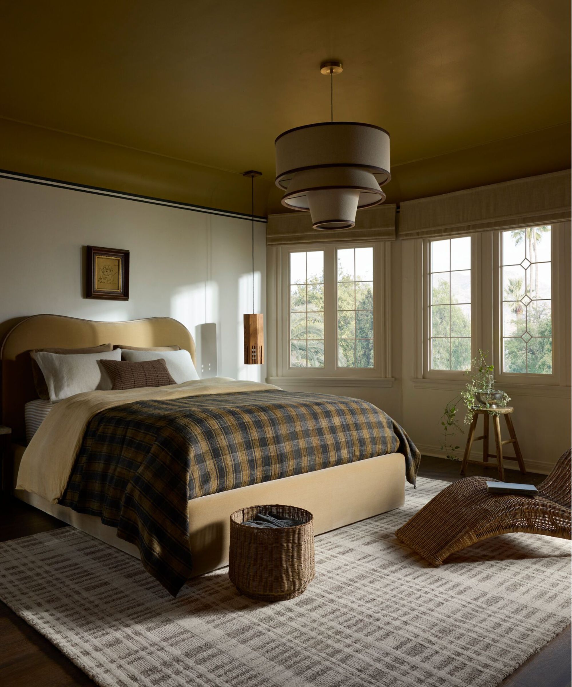
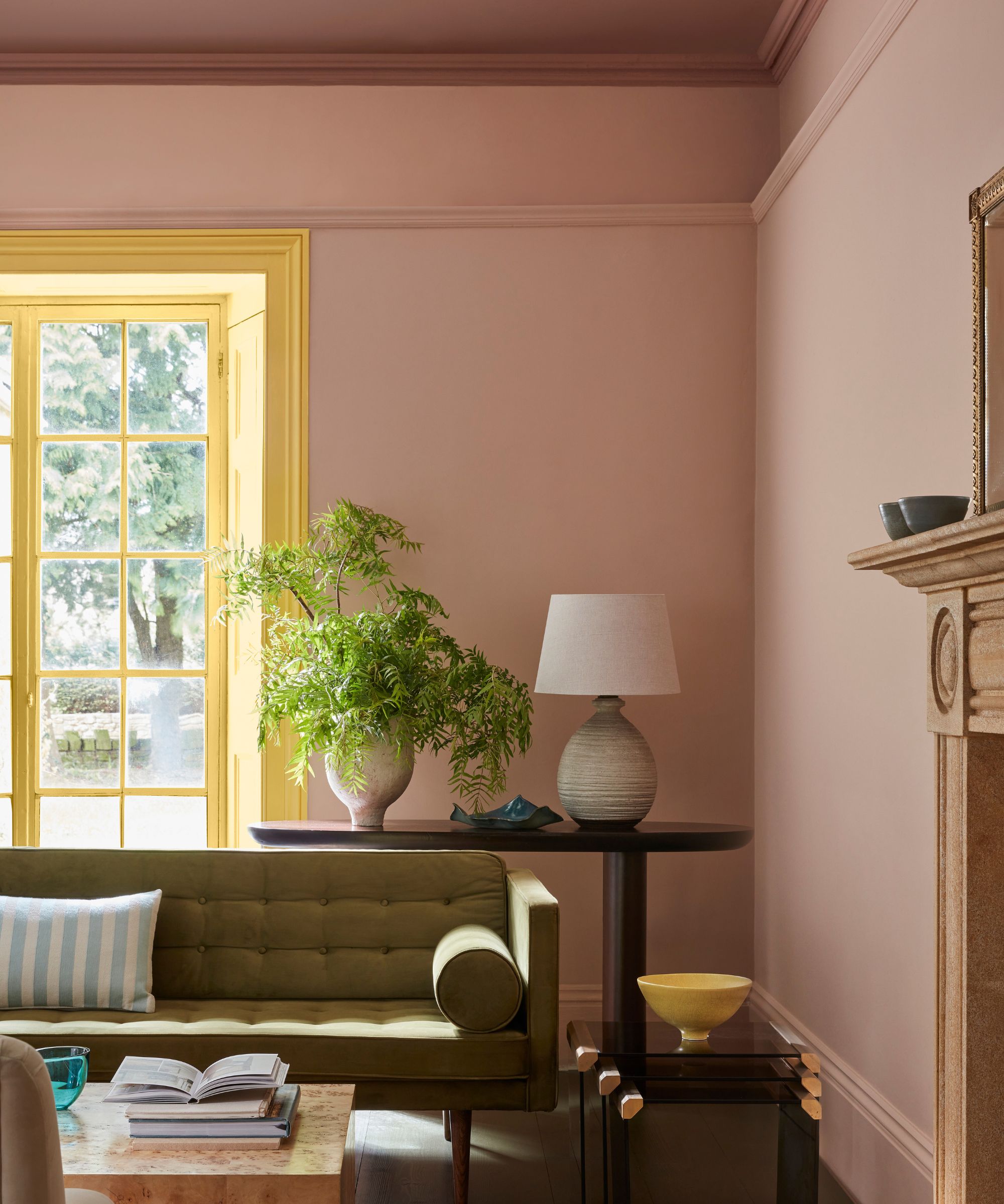
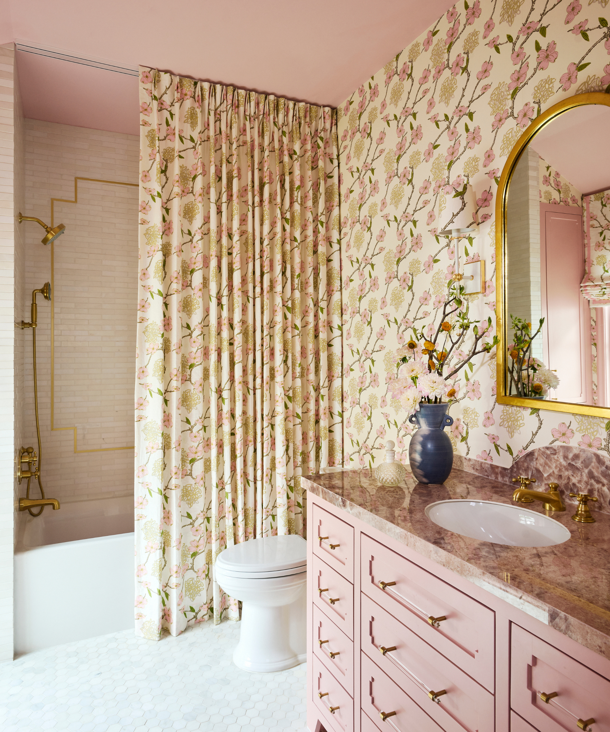
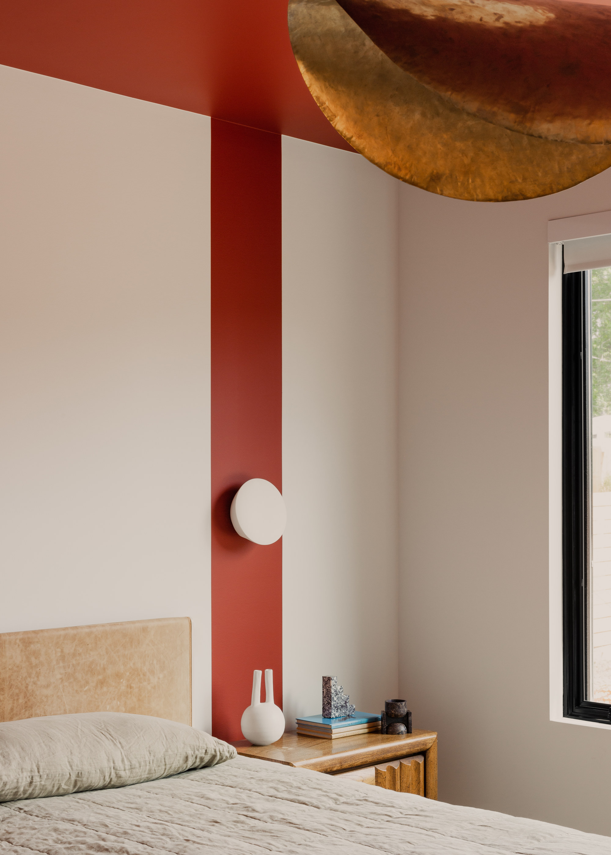
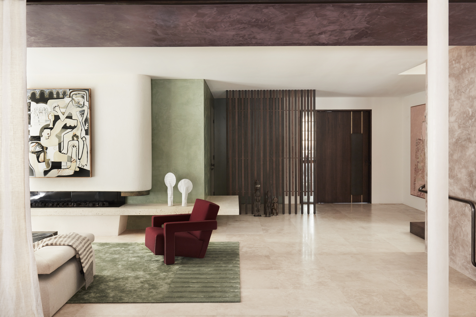
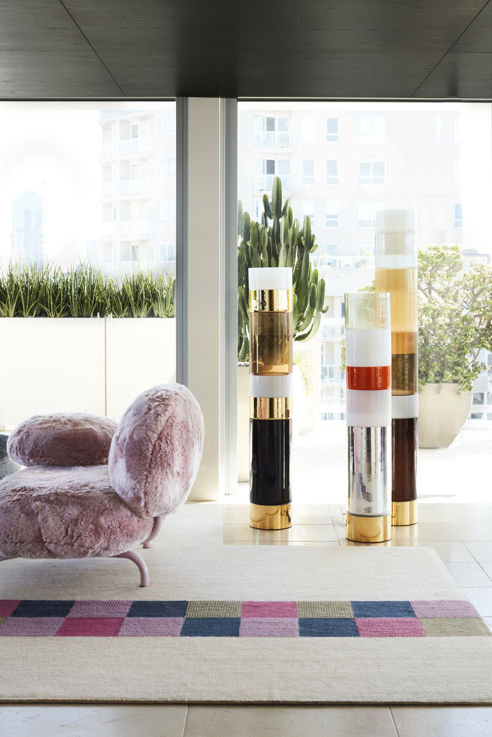
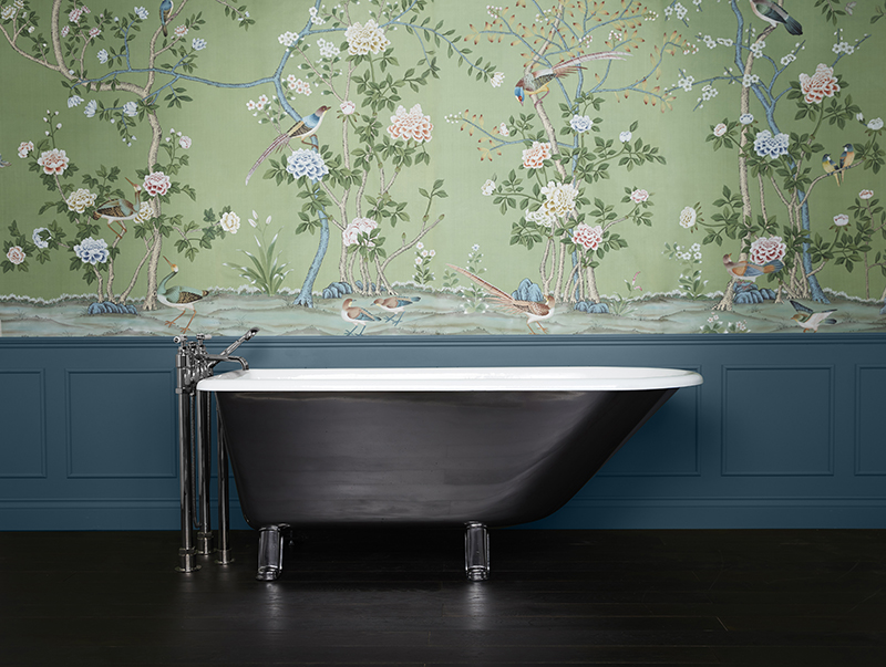
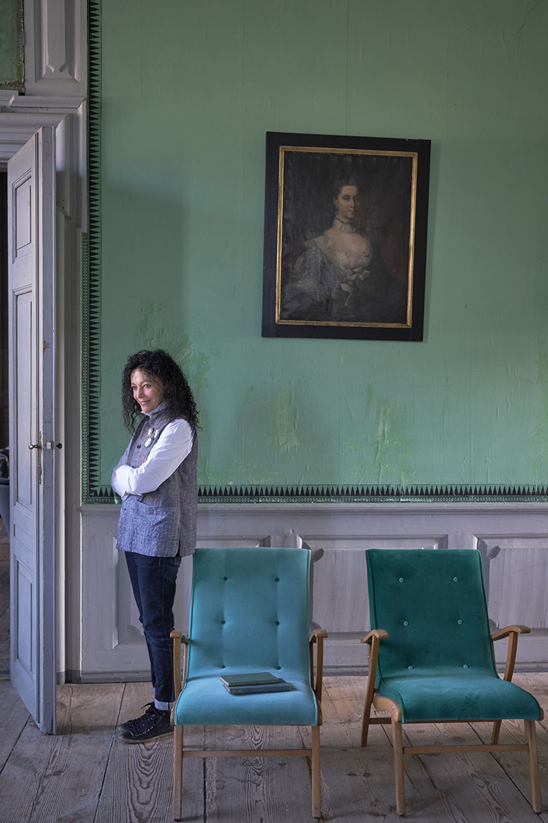
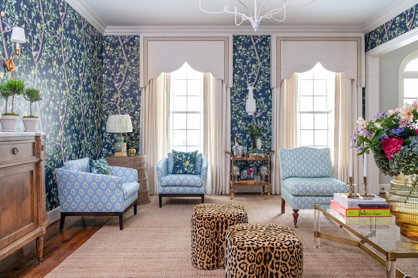
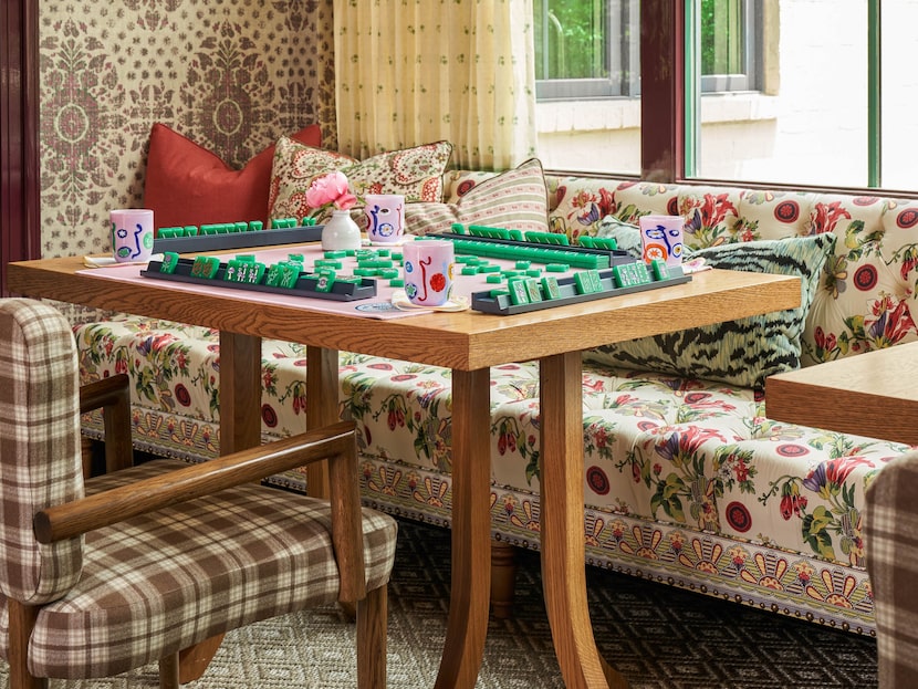
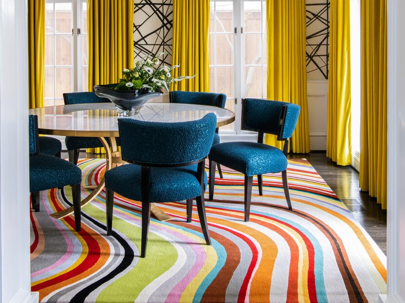
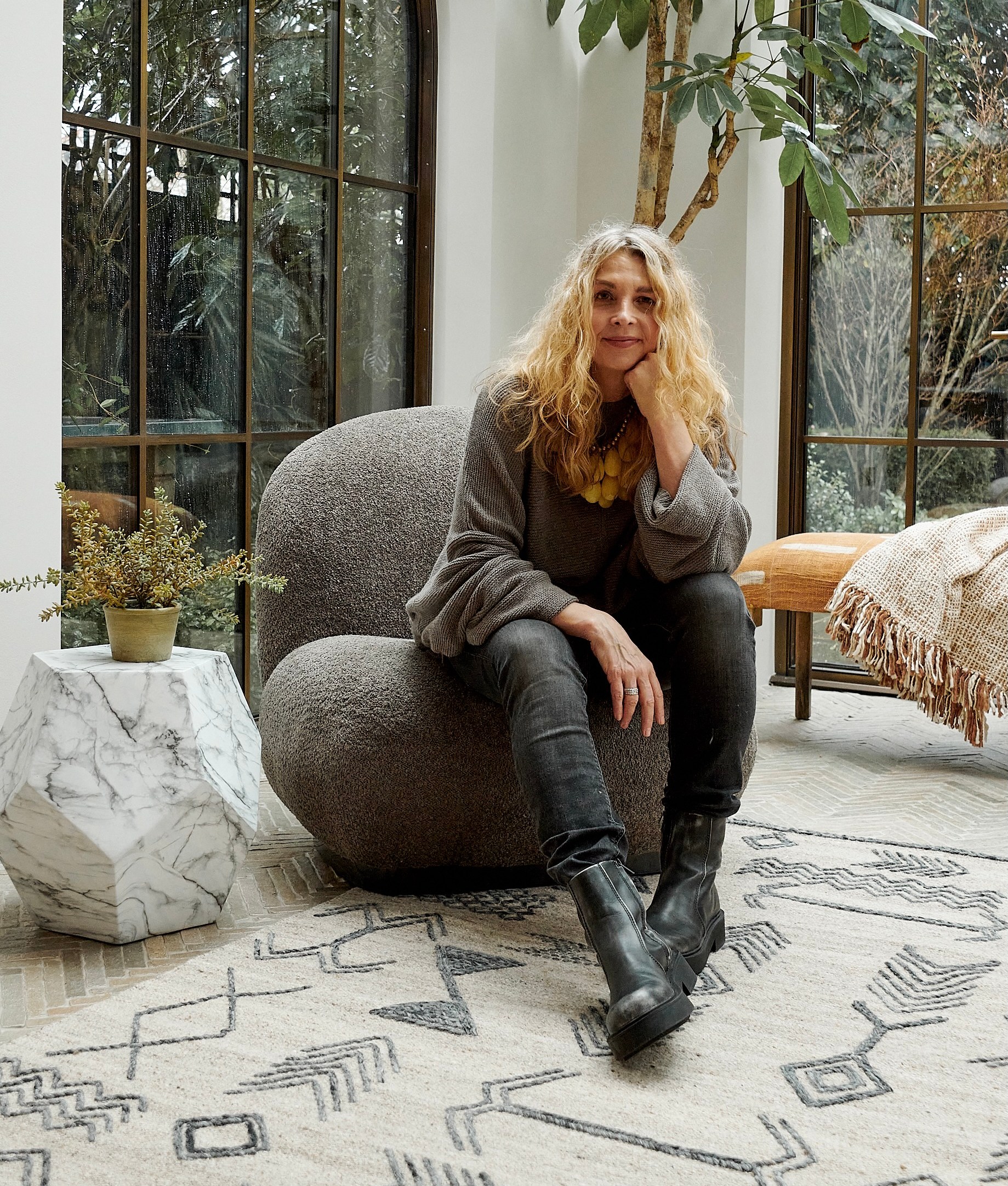
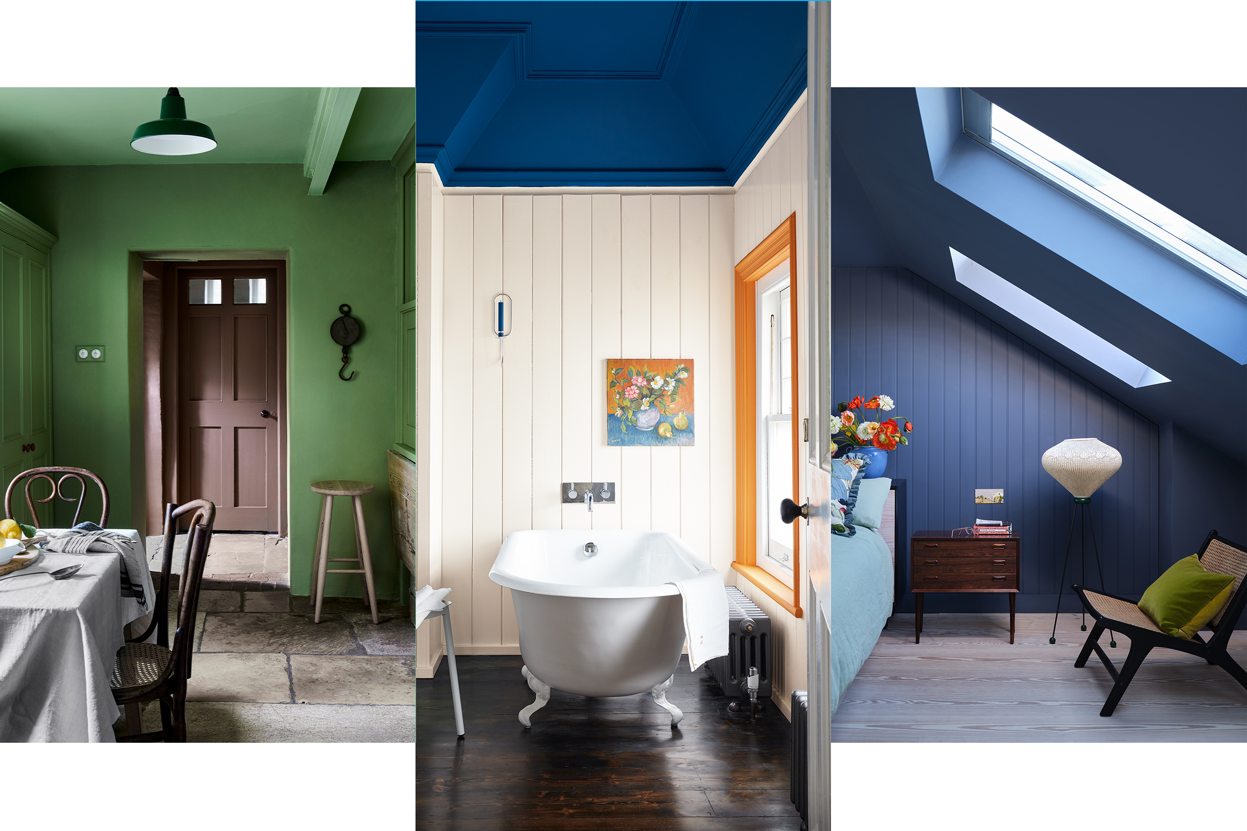
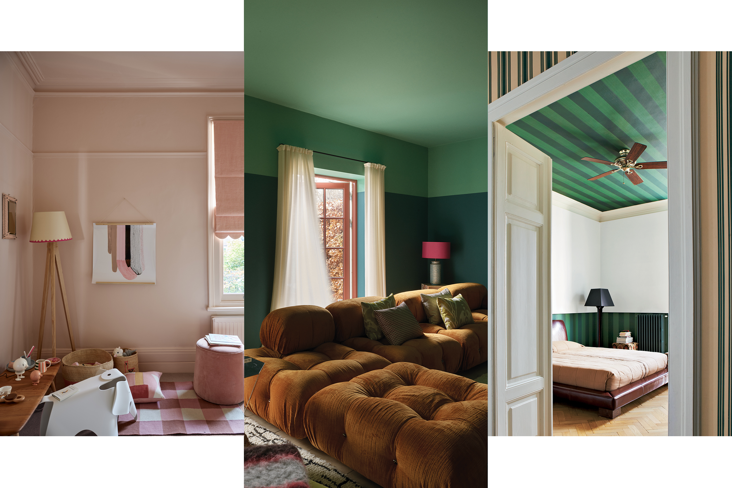
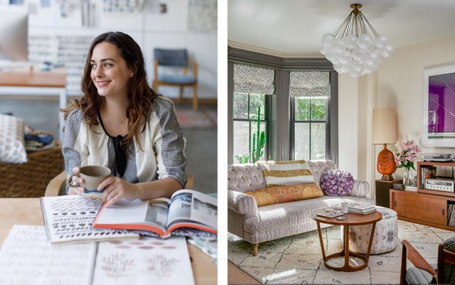
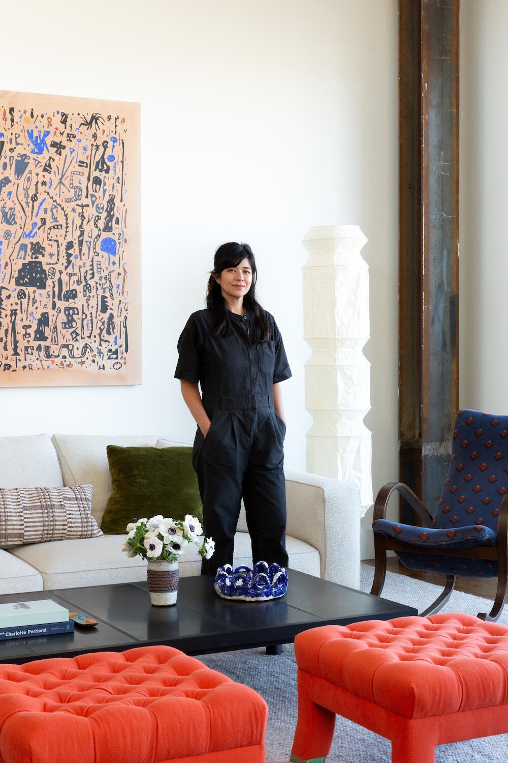
Rebecca Atwood, a fabric designer, discusses her new book, "Living with Color," which focuses on the challenges and joys of incorporating color into home decor. This book follows her previous work, "Living with Pattern." Atwood emphasizes that color is fundamental to design, influencing mood and reflecting personal style, and she aims to provide practical guidance for its use in homes. She addresses the common reluctance to use bold colors, often stemming from a fear of being stuck with a particular hue or growing tired of it. Atwood suggests that neutrals, while seemingly safe, can lead to a dull space if not approached creatively. Her book offers strategies for making neutrals interesting by exploring their undertones, such as pinker taupes or greener grays, to create a chromatic neutral palette. She advises looking to natural landscapes for inspiration on color palettes and proportions.
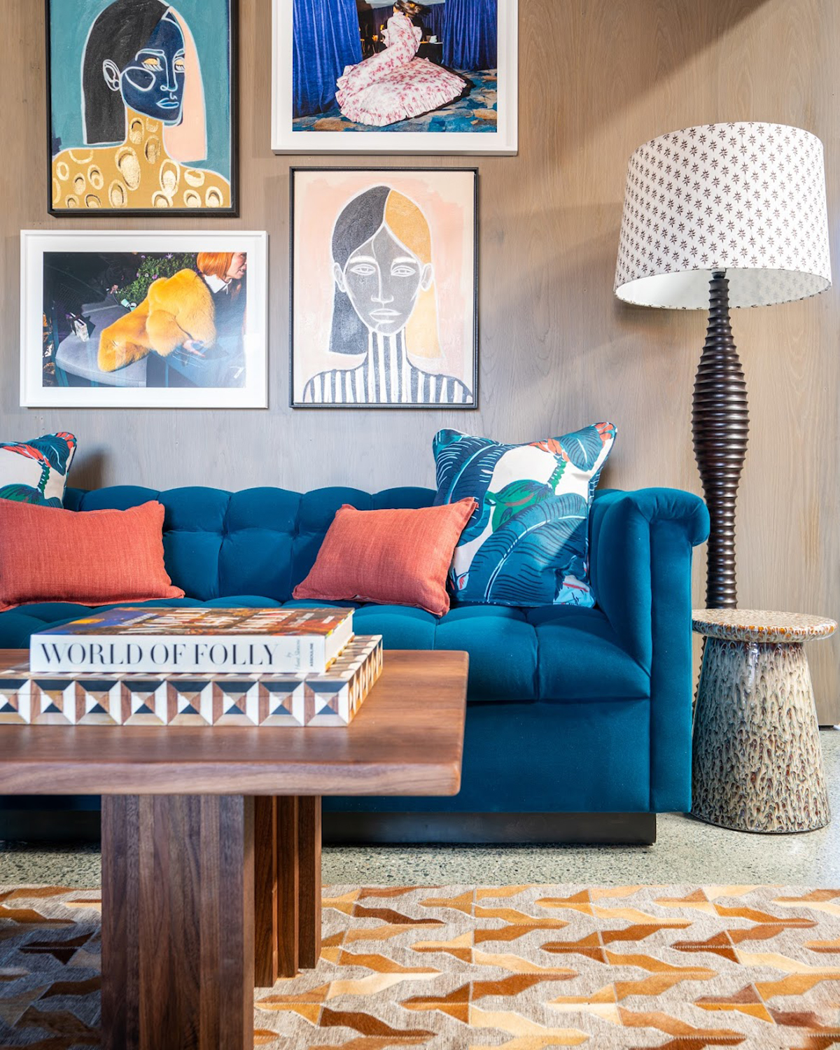
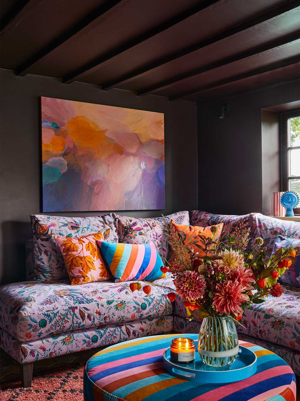
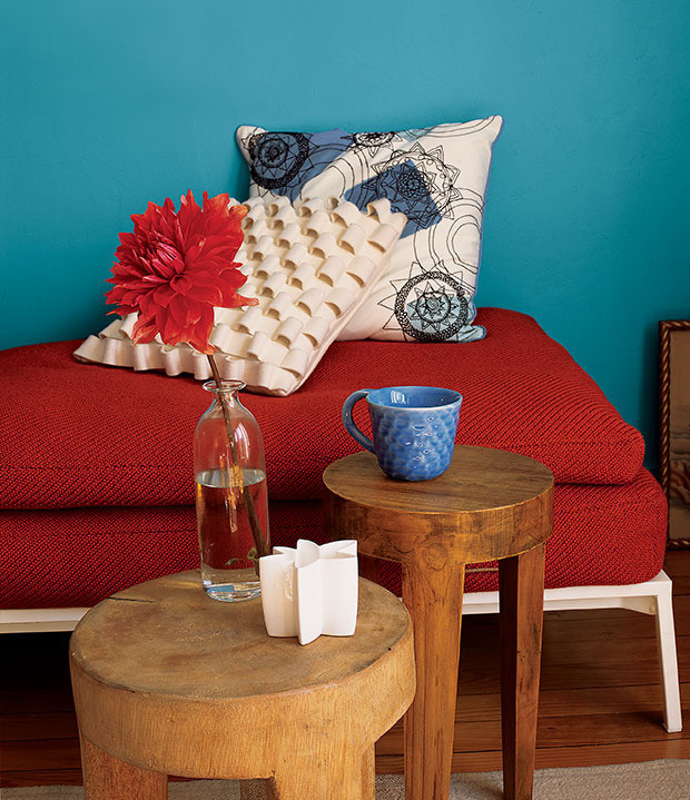
For those new to integrating color, Atwood recommends starting with easily changeable items like fresh flowers, fruit bowls, pillowcases, napkins, or small decorative objects on a bookshelf. This approach allows for experimentation without a significant commitment. She highlights the significant impact color has on mood, explaining that different values of color—light, mid-tone, and dark—can evoke different feelings, from airy to cozy to moody. She encourages individuals to reflect on how colors personally affect them to tailor their environment accordingly.
Atwood shares that her personal color palette is deeply rooted in the landscape of Cape Cod, where she grew up. This origin inspires her use of chromatic neutrals and her appreciation for tonal variations, which she incorporates into her fabric designs. She aims to create collections that are easy for customers to mix and match, both within her line and with other decor elements, fostering a sense of cohesion and harmony.
The discussion also touches upon the timelessness of bold colors, citing historical examples such as Thomas Jefferson’s bright yellow dining room at Monticello and George Washington’s Prussian Blue room at Mount Vernon. These examples challenge the misconception that past interiors were always subdued in color, noting that the availability and colorfastness of pigments influenced historical perceptions. Atwood stresses that for bold colors to be timeless, quality is crucial, whether it pertains to paint, rugs, or furniture. Currently, Atwood expresses a particular fondness for various shades of green and gray-lilac, demonstrating her continuous engagement with color trends and personal preferences.
#DecoratingWithColor #RebeccaAtwood #InteriorDesign #HomeDecor #ColorPsychology #FabricDesign #TimelessDesign #ChromaticNeutrals #DesignTips #DecoratingWithColor #RebeccaAtwood #InteriorDesign #HomeDecor #ColorPsychology #FabricDesign #TimelessDesign #ChromaticNeutrals #DesignTips
0 comment in total
 No comments yet
You may also like
What you didn’t know about colour

As a designer, I can tell you: this one simple change can transform any home’s decor
10 Ways To Decorate With The World’s Favorite Color
How to Incorporate Color Drenching in Your Home Design

9 ombre designs for a soft splash of color

The 8 Dos and Don’ts of Mixing Patterns in Your Home
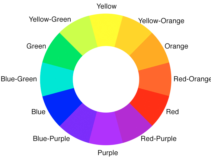
3 color coordination tips any beginner can master
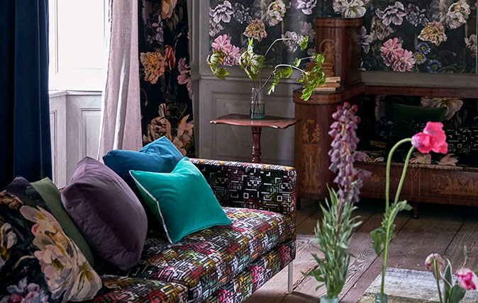
How to combine colour, pattern and texture without making a complete mess of things
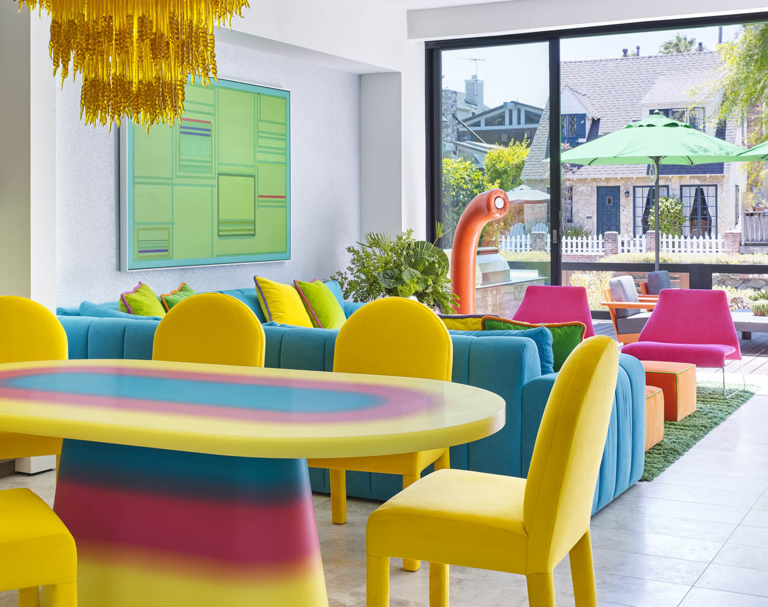
5 Vibrant Color Palettes Designers Are Using to Add Energy and Excitement to Decor


Tineke Triggs’s dusk-driven blend of deep maroon, graphite gray and inky blue
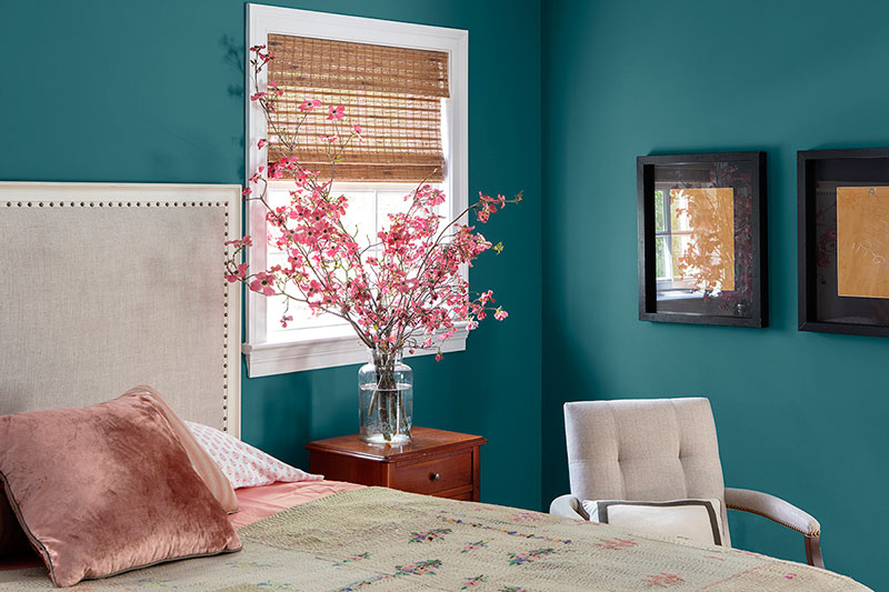
Read This Interior Designer's Tips For Modernizing a Space Using Color

Pattern play: These 15 rooms by Dallas designers will inspire mixing and matching
Julia Sobrepeña King’s contrary curation of orange zellige tile, bright green rugs and curly gray shearlings

Colour experts share their top paint trends for 2024

Move over color drenching, ‘color capping’ is the chic new tonal technique you’ll be seeing everywhere this fall
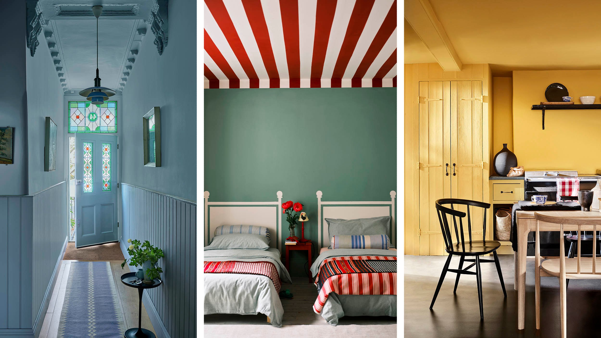
Painting the ceiling with colour is a trend that is looking up
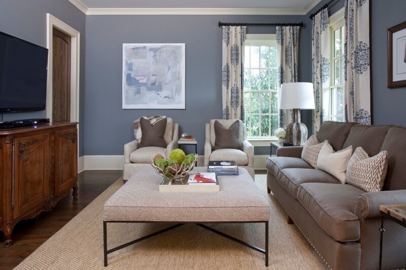
The ONLY Advice You Need to Mix Patterns Like a Pro!


A masterclass in mixing pattern
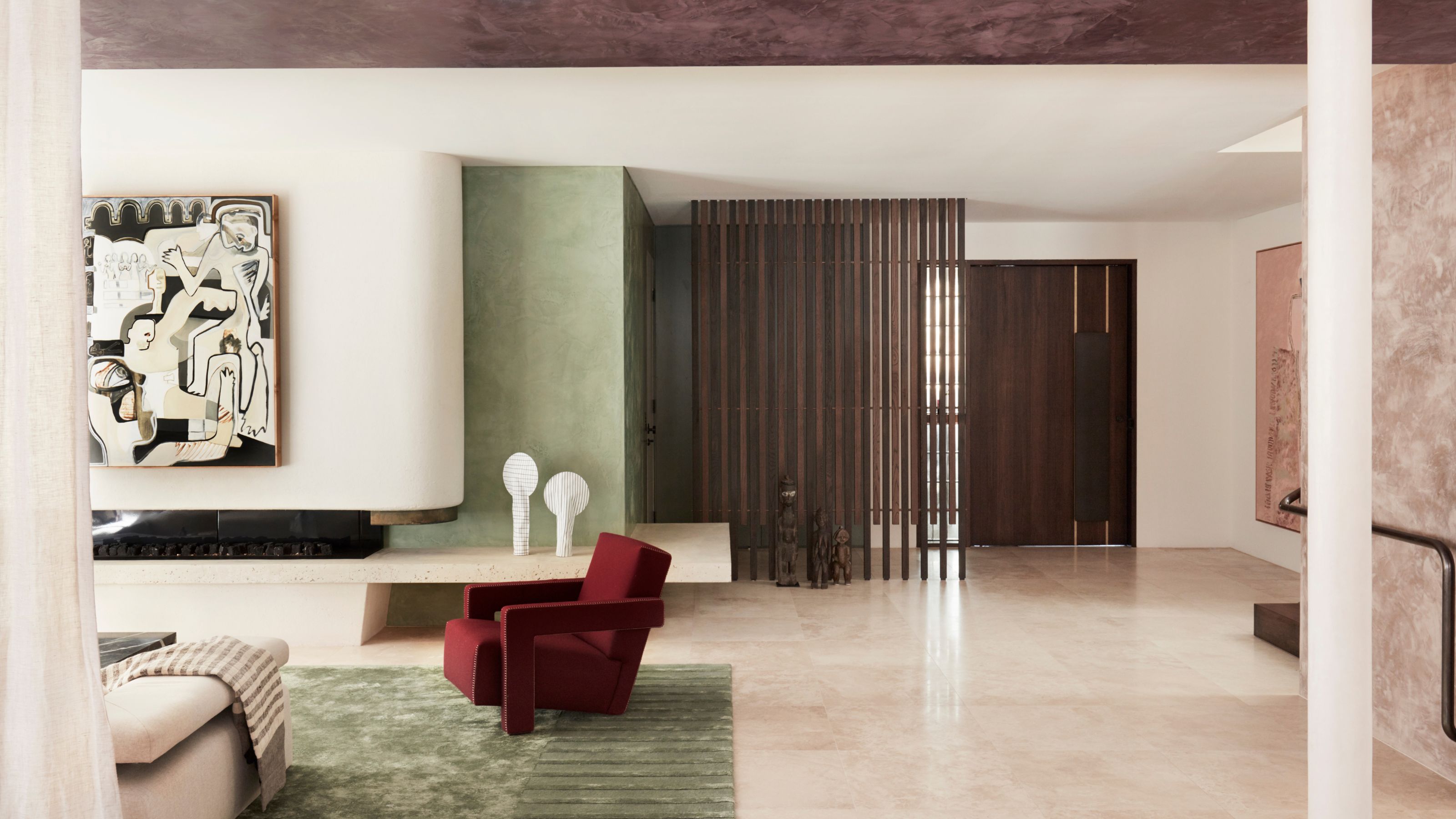
'The World of Color is Rife With Danger' — 5 Color Combinations That Don't Go Together and What to Use Instead
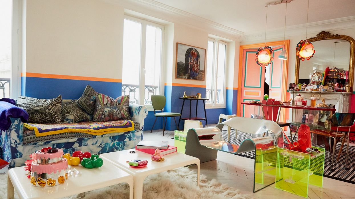
Tips for Bringing More Color Into Your Home, Straight from Interior Designers