40 Fall Wedding Colors Perfect for an Autumnal Affair
This article explores a comprehensive guide to selecting the ideal color palette for a fall wedding, emphasizing the rich and varied hues inspired by the autumn season. It delves into the reasons why fall is a popular time for weddings, citing the crisp weather, changing leaves, comforting food, and the anticipation of holidays as key factors. The guide aims to help couples choose a wedding aesthetic that harmonizes with the seasonal ambiance, offering diverse options from classic autumnal tones to more unexpected combinations.
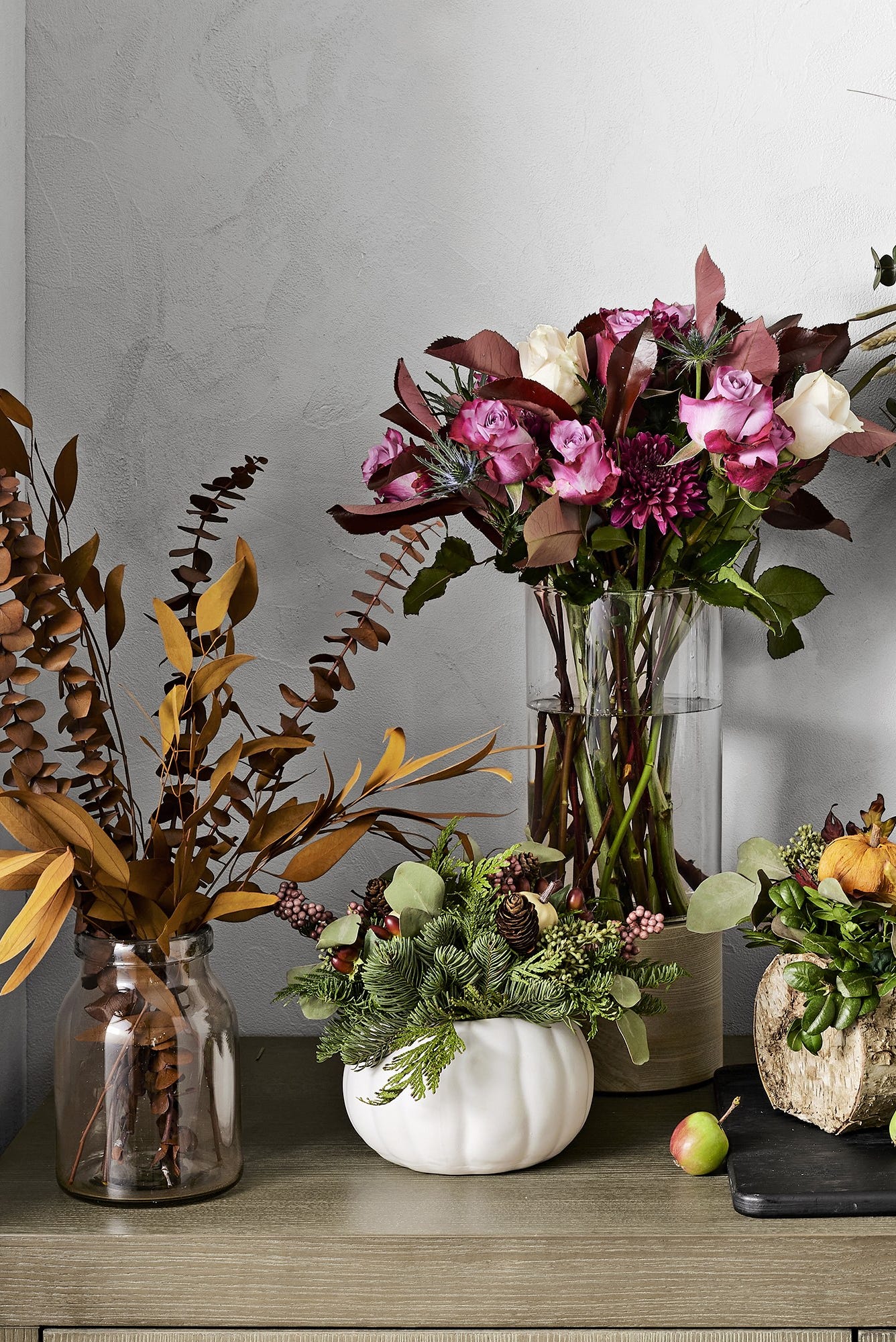
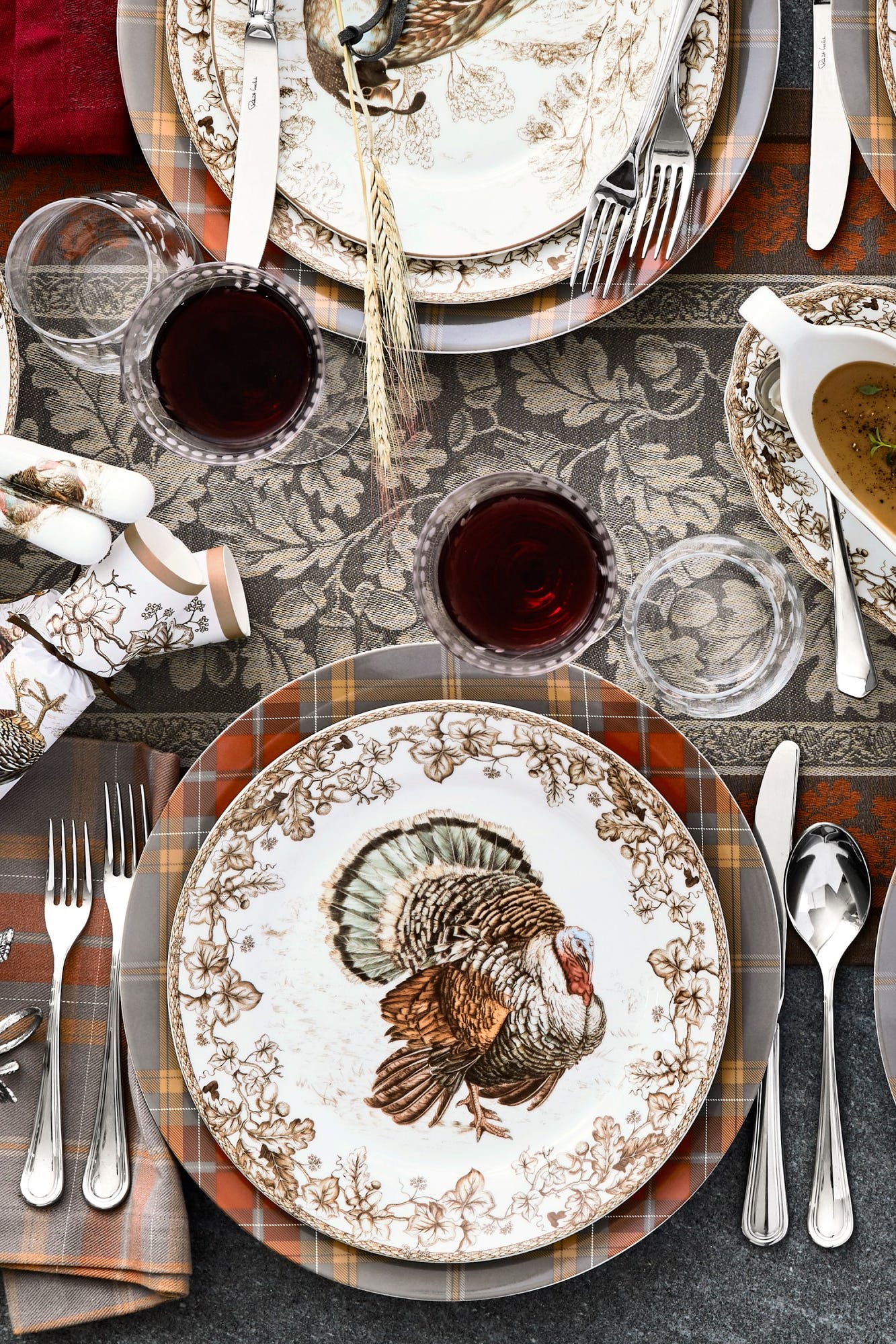
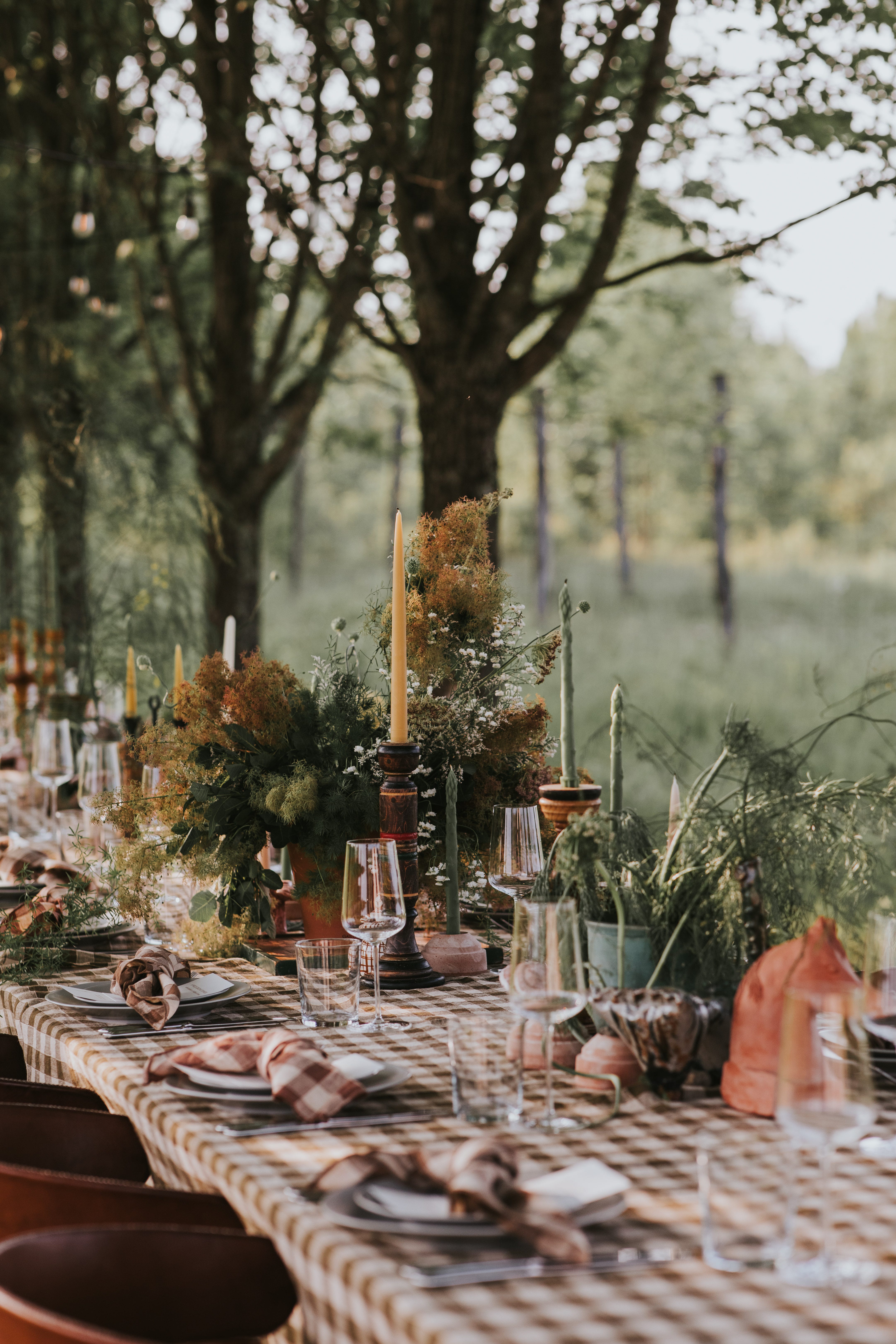
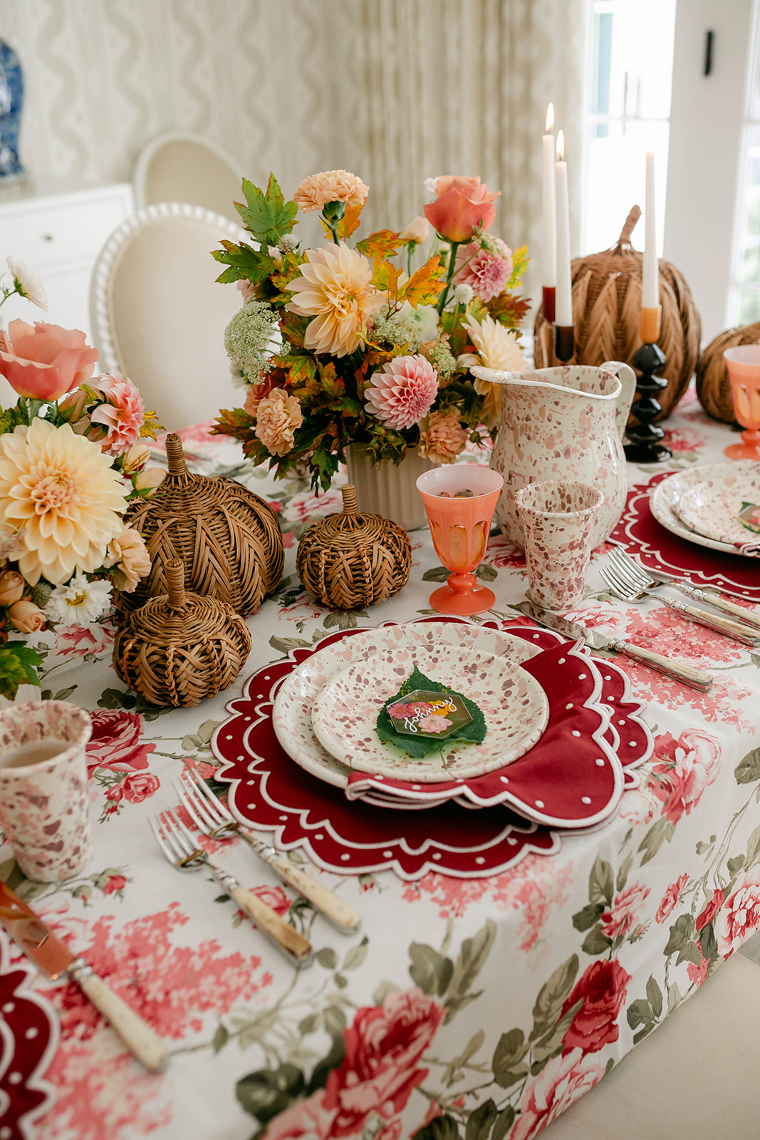
Expert insights from floral designer Annie Armstrong of Best Day Ever Floral Design and event planner Michelle Norwood of Michelle Norwood Events are integrated throughout, providing practical advice on incorporating these colors. The article highlights how the colorful leaves can inspire bright tones of red, yellow, or orange, which are traditional choices for fall weddings. For a more sophisticated event, it suggests saturated jewel tones like emerald green, navy blue, or ruby red. Earthy affairs can benefit from warm tones such as terracotta, rust, amber, or camel. The flexibility to choose a monochromatic theme or mix various shades is also discussed, all aimed at establishing a strong sense of place for the celebration.
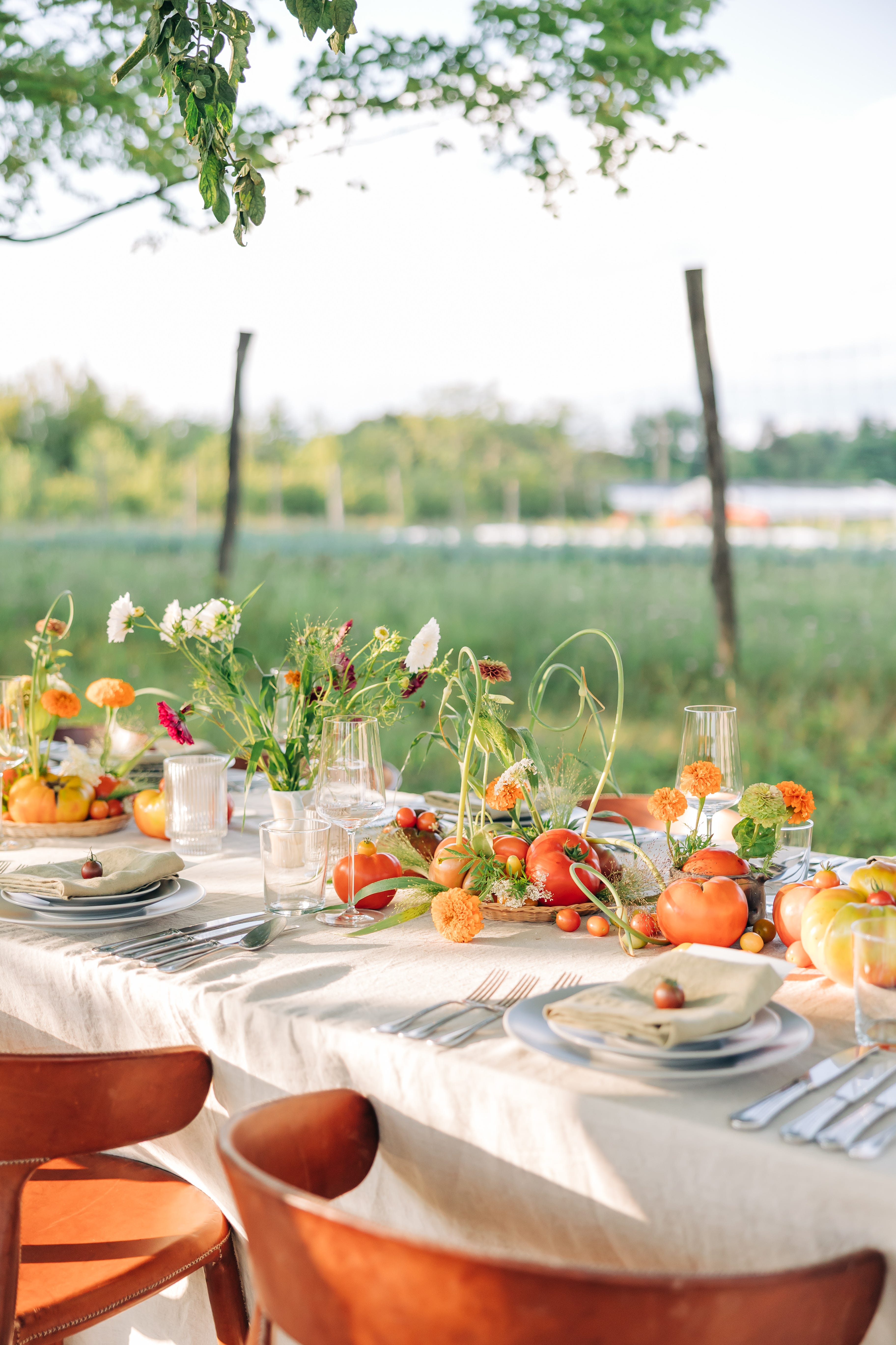
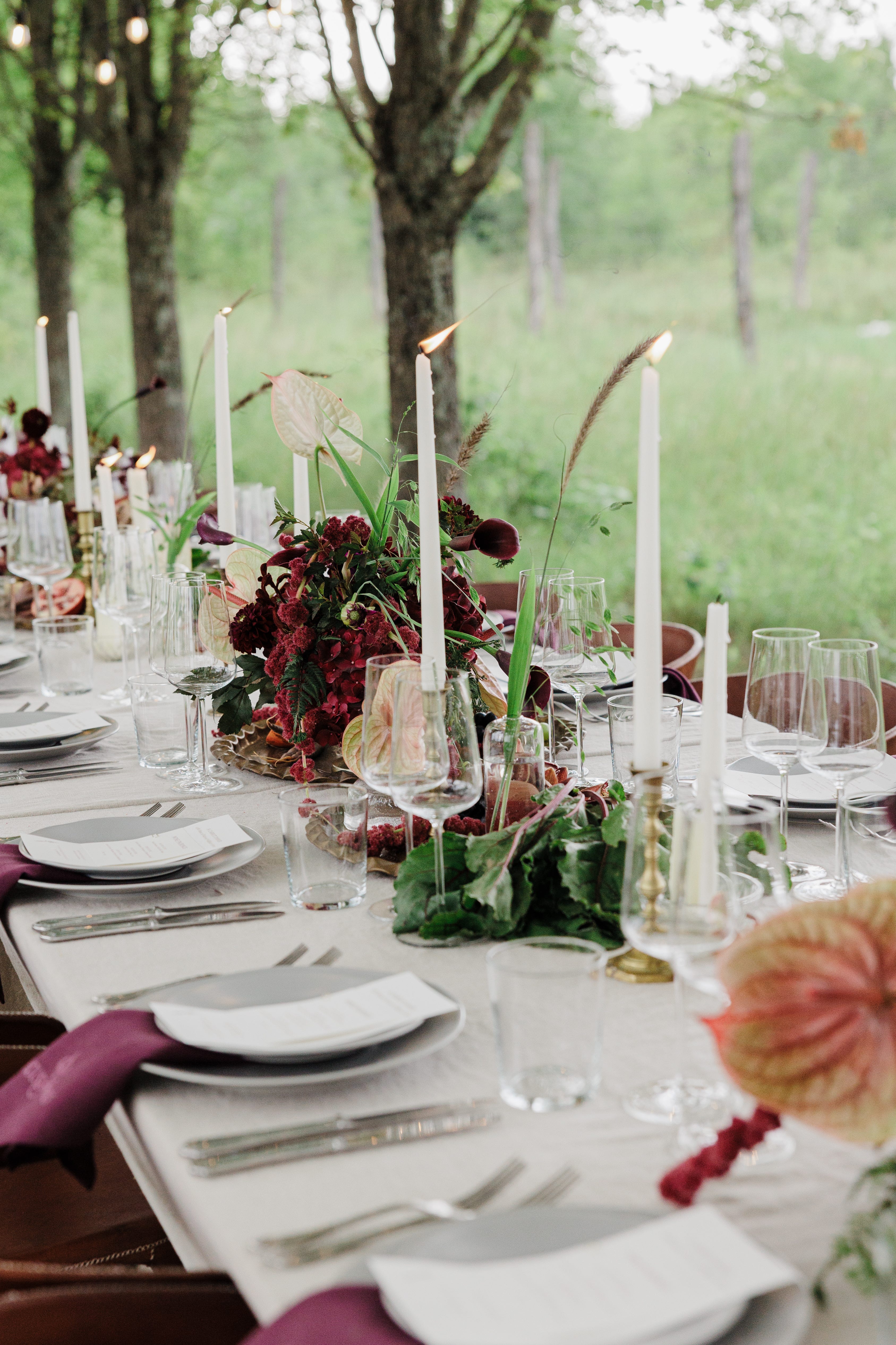
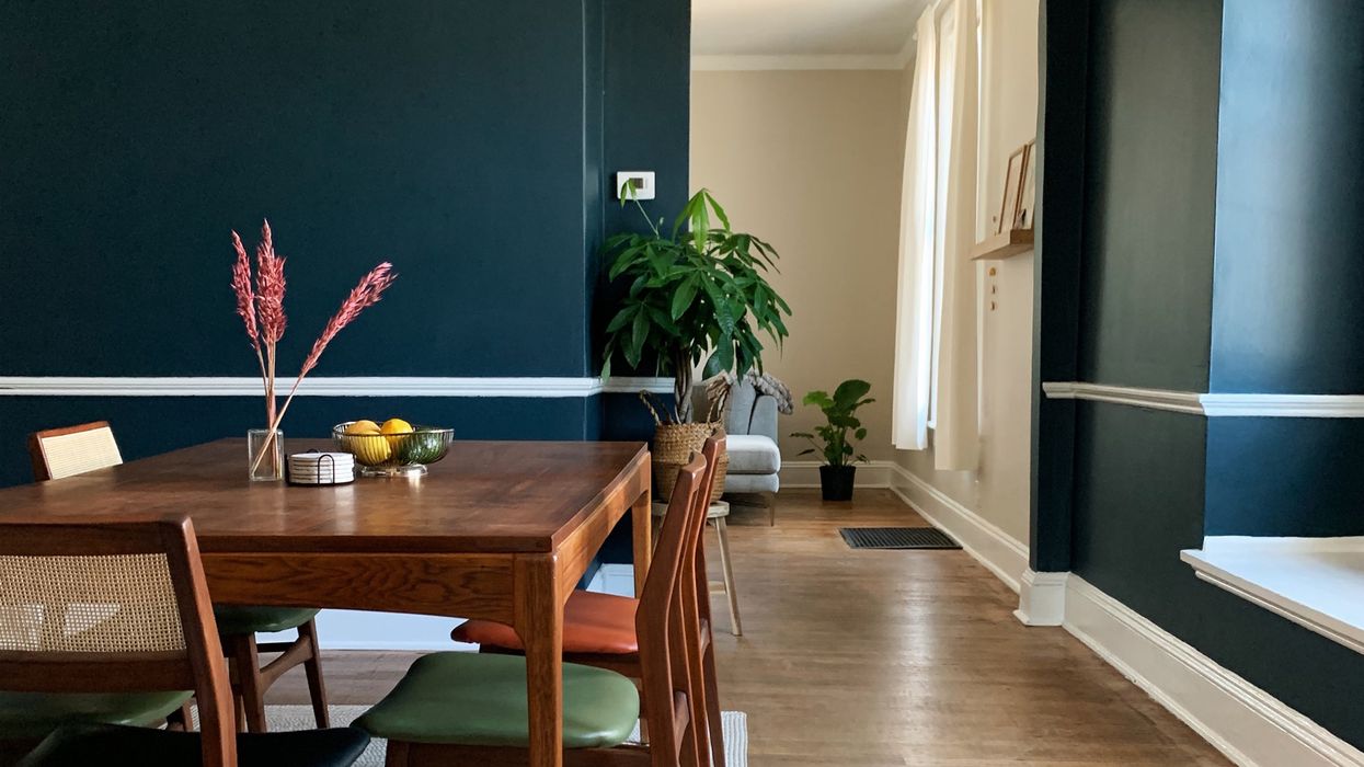
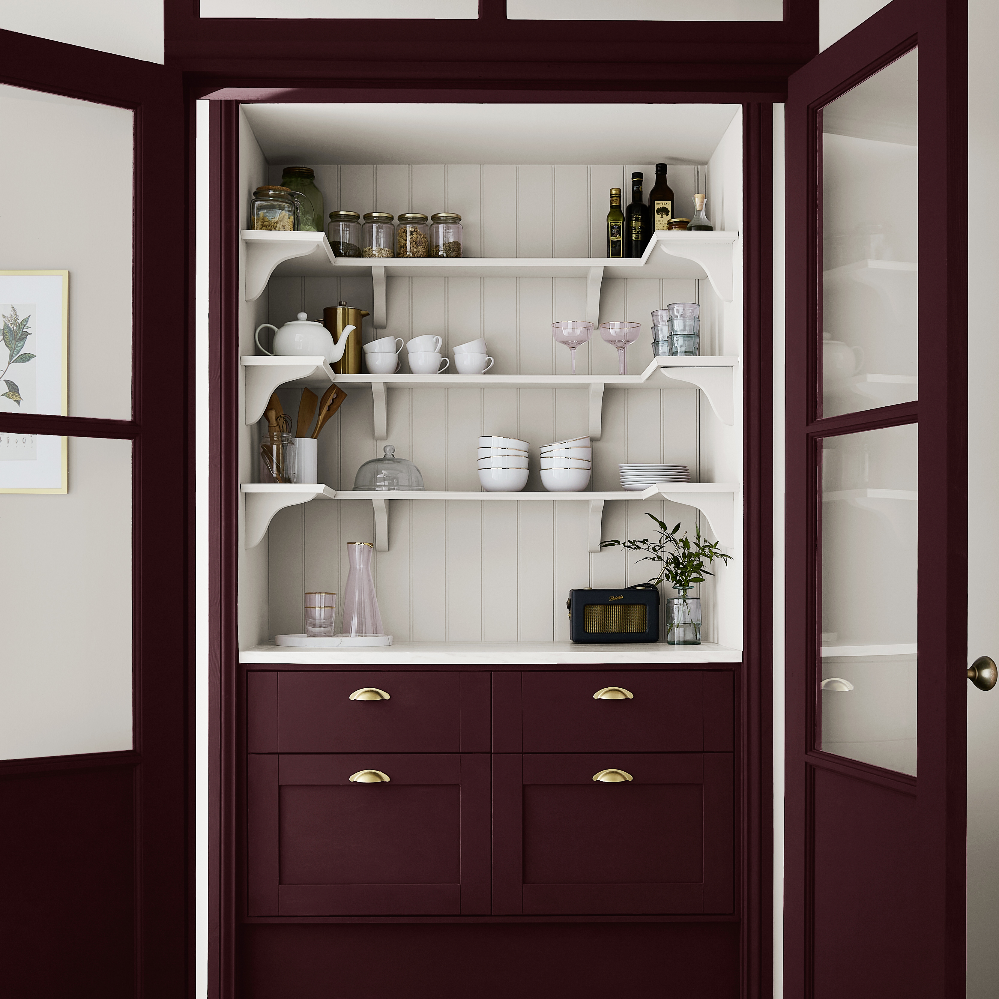
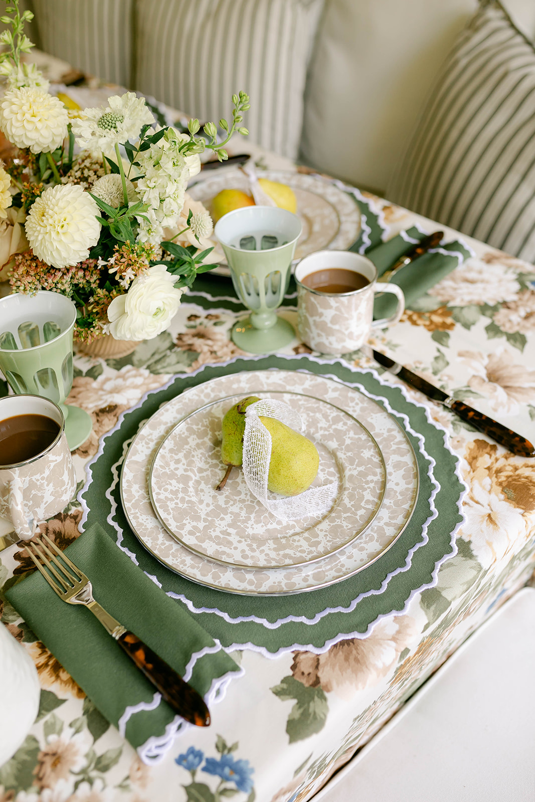
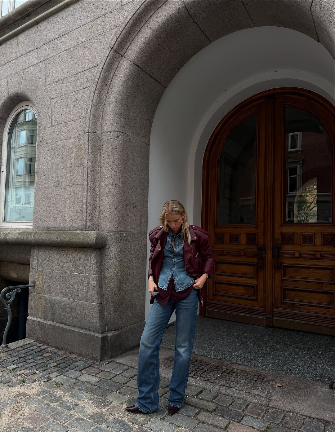
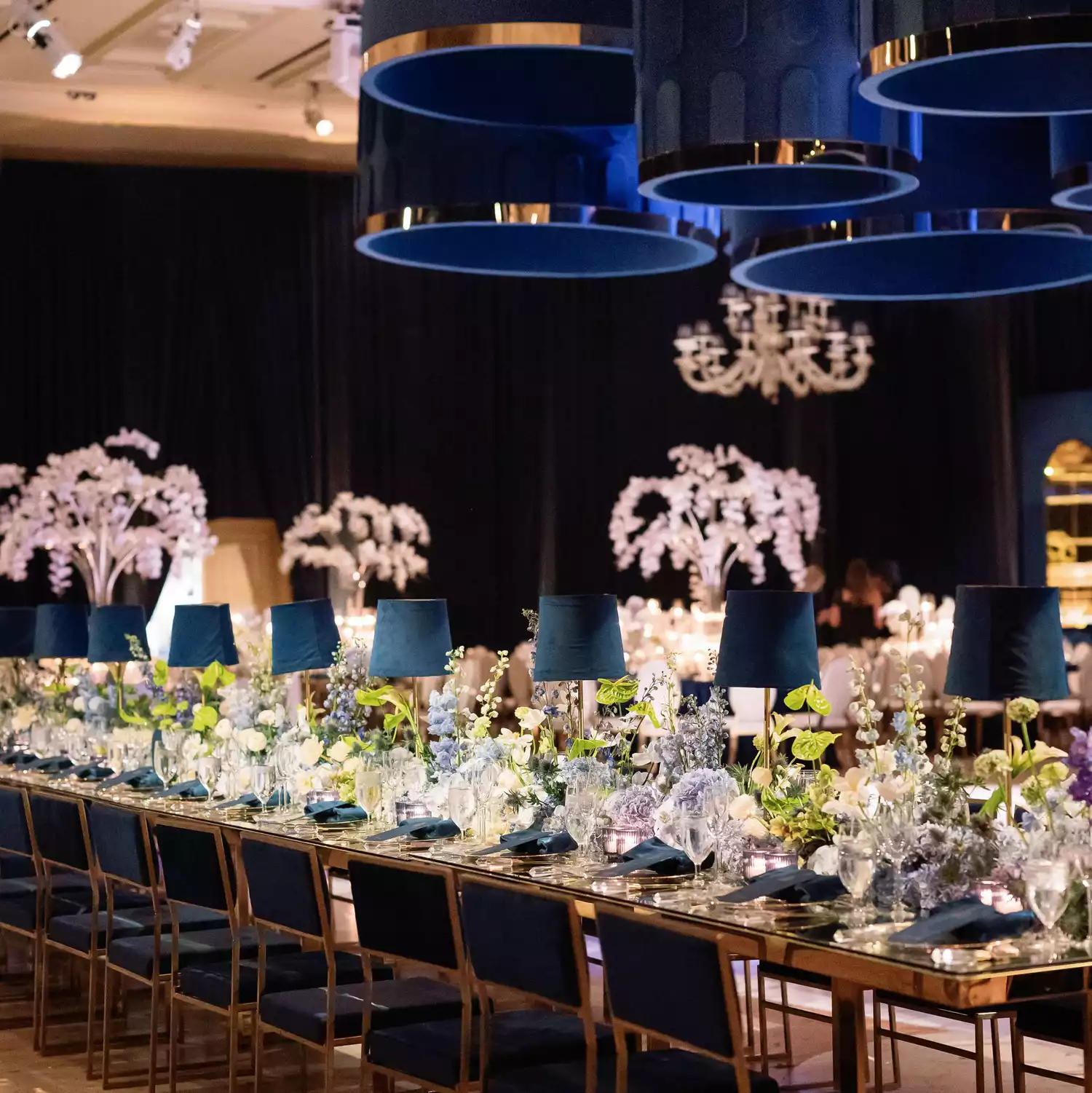
The article then presents 40 specific fall wedding colors, detailing their characteristics and how they can be effectively integrated into wedding decor. For instance, Forest Green is suggested for outdoor events, pairing well with wood, gold, and other jewel tones like burgundy. Navy is presented as a versatile jewel tone that can serve as a focal point or be subtly incorporated through elements like bud vases or table linens. Burgundy is highlighted as a popular choice, mirroring changing foliage and suitable for bold floral arrangements or velvet linens, and can be mixed with cranberry and peach for contrast.
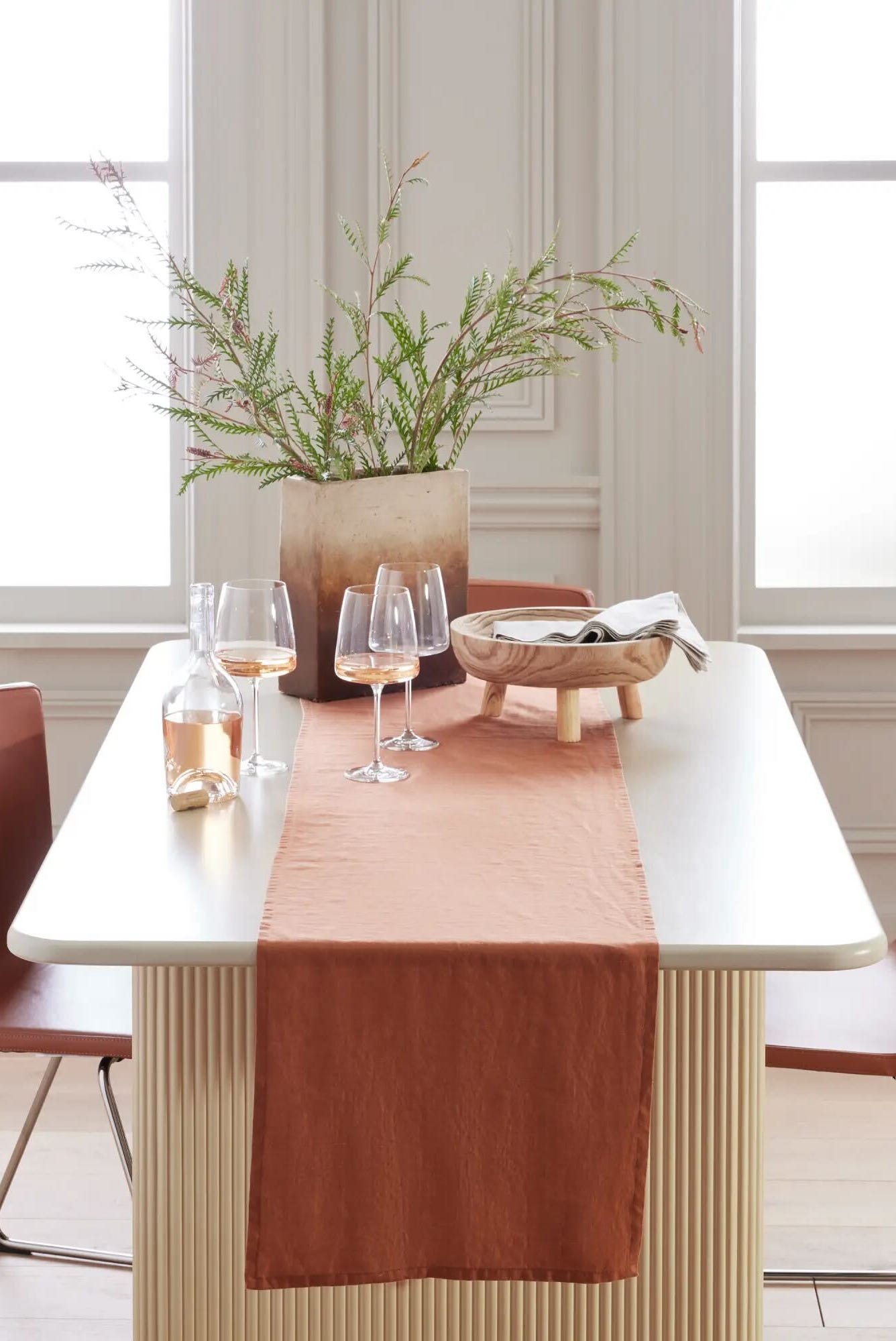
Pumpkin, a bright orange, is recommended for nature-inspired palettes, to be used in lanterns, florals, or cozy elements like blankets. Mauve offers a comforting, mature tone ranging from pinkish hues to smoky taupes, pairing well with lilacs, pinks, grays, or peach. Copper, a metallic hue, enhances the sensory experience, especially when combined with earth tones or moody blues. Plum, a rich gemstone-inspired purple, is ideal for a moody affair, while Terracotta provides a warm, earthy, boho-friendly option that combines well with tan and marigold. Teal, a greenish-blue, can bring a tranquil feel to coastal events or act as a grounding color for signage and centerpieces.
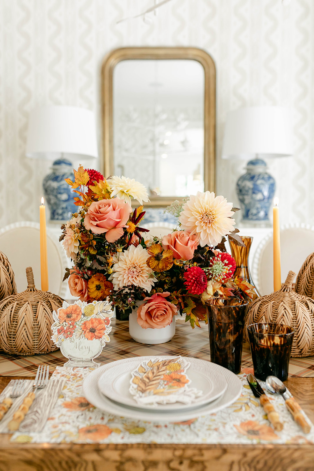
Red is noted for its vivaciousness, suitable for roses, bridesmaids’ dresses, or cocktail napkins, and can be paired with mauve, pink, and purple. Amber, a yellow-orange tone, works as a foundation for nature-focused celebrations, particularly with amber-colored glassware and greenery. Turquoise, a striking blue-green, can enliven or calm a space, applicable in bar designs or floral accents. Emerald Green is a luxurious, highly requested color that fits various palettes, from white and gold to navy and burgundy. Camel offers a light, chic fall-inspired shade that pairs with gold and subtle warm tones like coral and persimmon.
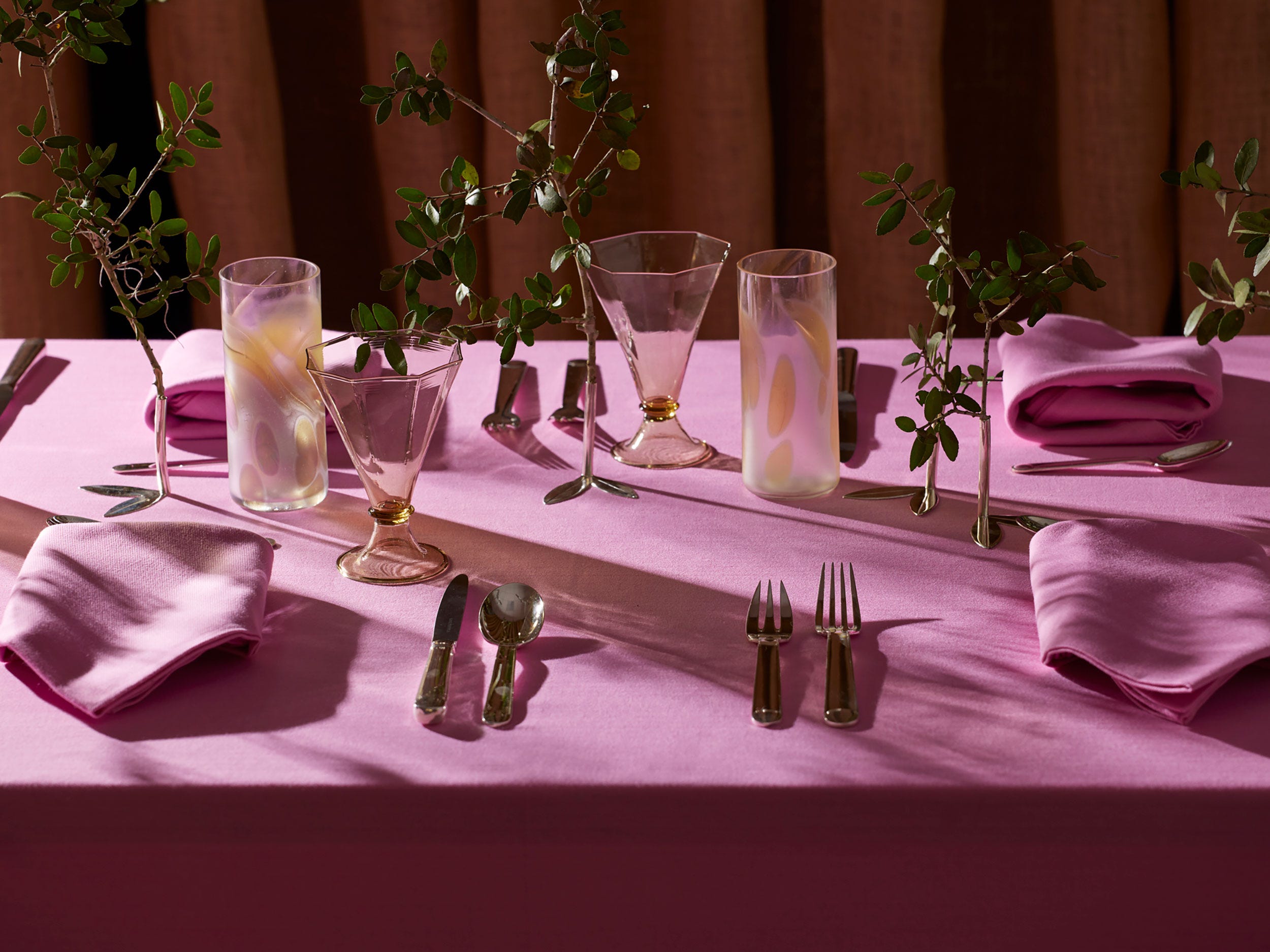
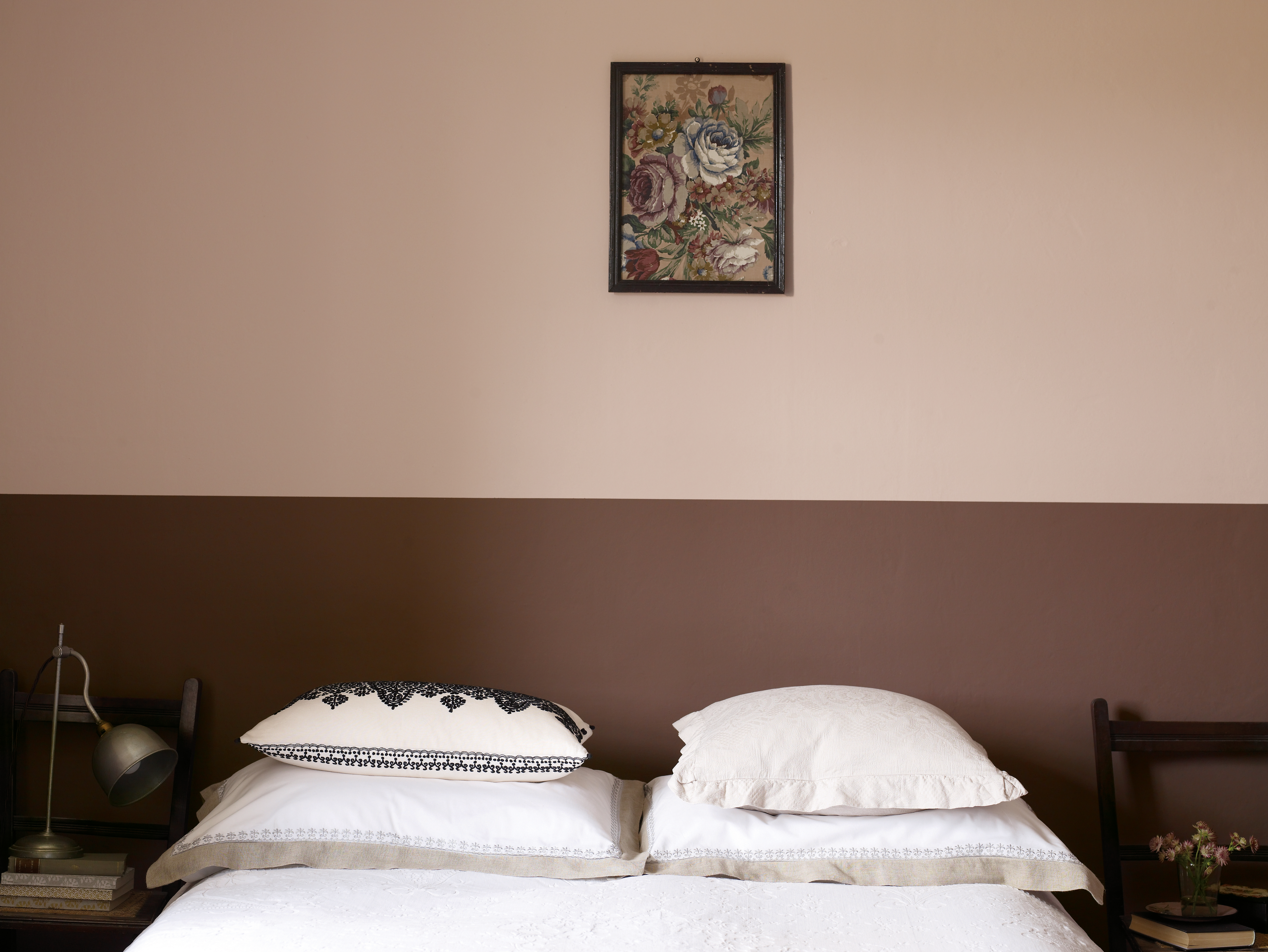
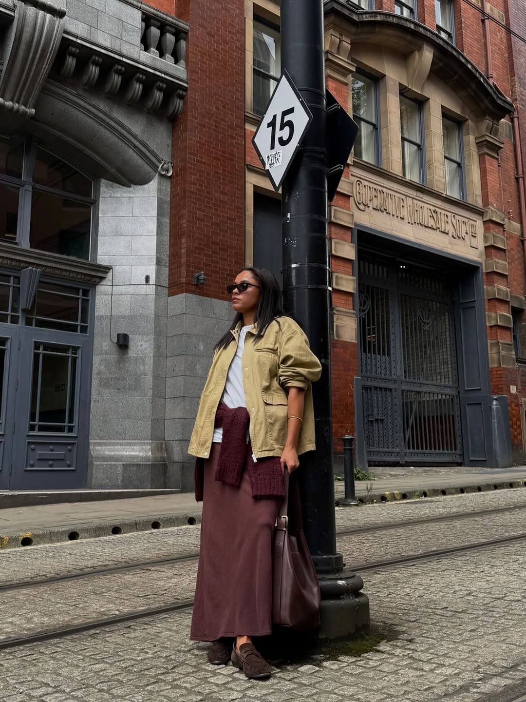
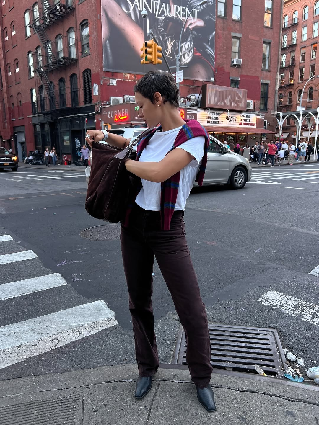
Sapphire provides a luxurious touch for ballrooms or châteaus, making a big impression with velvet linens or subtle napkin accents. Brown balances elegance and coziness, adaptable with taupe, gray, cream, navy, or plum, and can be used in invitation suites or cake stands. Dusty Rose is a versatile pink that suits fall, appearing in attire, tablescapes, or subtle linen details. Rose Gold, a refined metallic, creates a glamorous backdrop for arches, drapery, and bridal accessories. Violet, a deep purple, casts a dreamy glow, suitable for paper goods and floral installations, and can be accentuated with navy and fuchsia.
Marigold is a bold pick that should be incorporated strategically through colorful candles or handheld floral arrangements, pairing well with neutrals or green. Crimson, a romantic red, adds decadent richness to fall fêtes, especially with greenery and black accents. Sage Green, a light green, is best used intentionally in foliage or as a main color with whites and creams. Ruby, an intense dark pink-red, is ideal for smaller increments in aisle markers or centerpieces. Persimmon, a vibrant red-orange, complements earthy terracotta or golden yellow, and can be combined with dark accents for an edgy look.
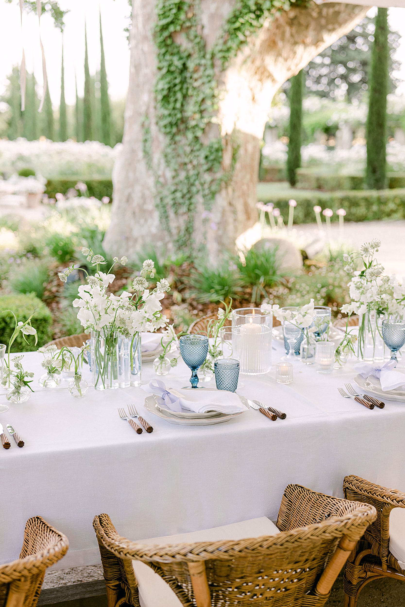
Cornflower, a cheerful lighter blue, brings a decadent feel, suitable for taper candles and table linens, especially with sage green and golden yellow. Gold is presented as a glitzy and versatile metallic for flatware, candle holders, and even ferns. Cranberry, a mix of deep red and playful pink, is best in small doses, pairing with burgundy or black. Olive, with warm golden undertones, transitions well from late-summer to colder months, appearing in linens, stationery, and glassware. Blush, a soft pastel, offers a refreshing transition when paired with deep reds or rich oranges. Peach, an orangey-pink, provides a bold pop of color for cakes or escort cards, pairing with earth tones or navy blue.
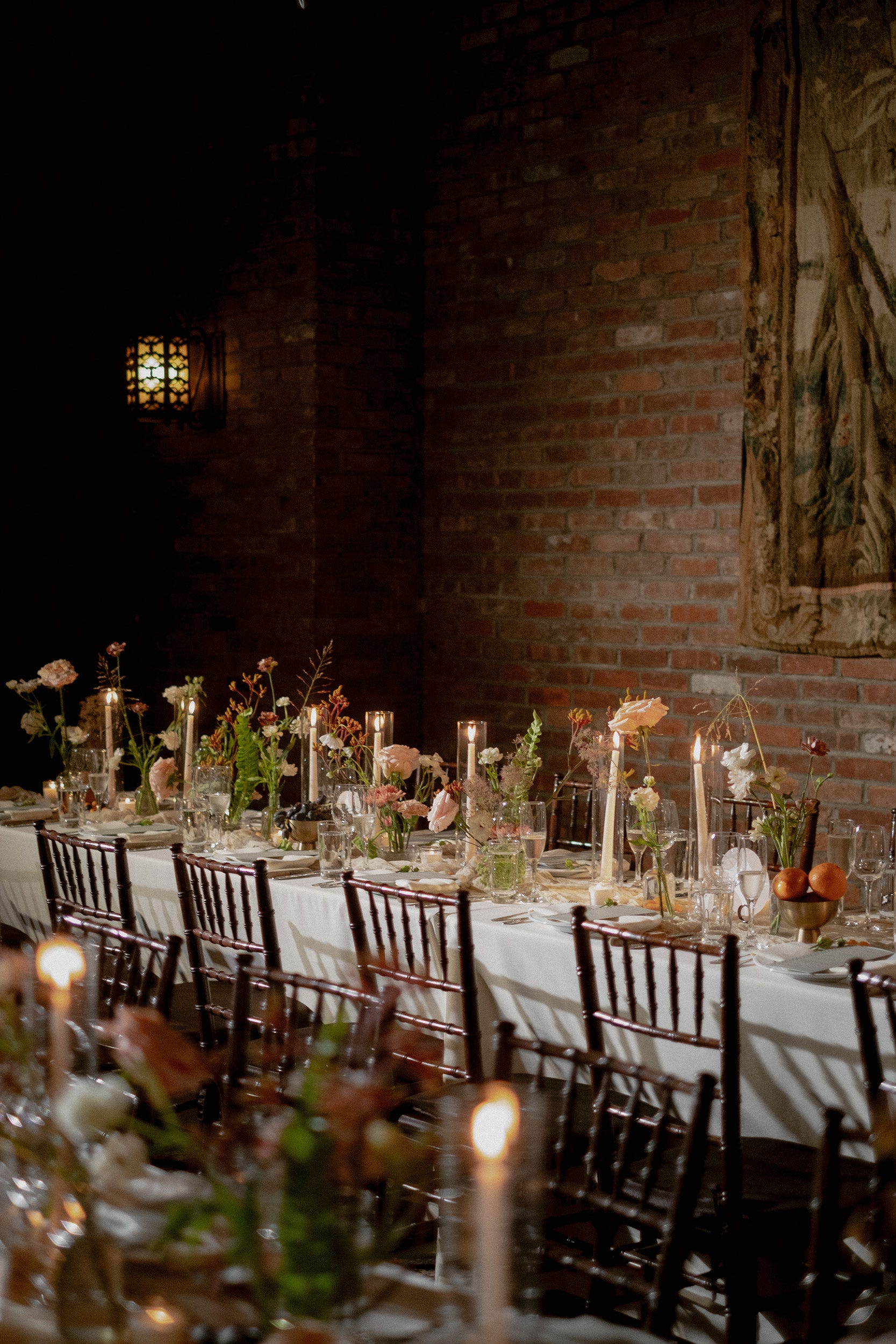
Taupe, a deep, dramatic shade, can be paired with rich purple and lighter grays for a sultry scheme or used as a canvas for lighter flowers. Black serves as a perfect accent for edgy soirées, especially with candlesticks or napkins, and can be enriched with jewel tones. Rust, a balance between orange and brown, adds a rustic feel through florals, cake, stationery, and napkins. Cream, a neutral, is beautiful for golden-hour photos and creates an ethereal combination with white. Apricot, a playful orange, feels seasonally appropriate when used with surprising pops of burgundy or mauve. Dusty Lilac, a muted pastel, is a fresh addition that pairs perfectly with earth tones. Caramel, a warm brown, elevates any setting, accentuating with cream or ivory. Charcoal, a smoky gray, creates a captivating effect with translucent glassware, paired with blush, crimson, and lilac. Clay, similar to terracotta but less saturated, offers a rustic and earthy aesthetic, pairing beautifully with soft blush tones or vibrant greens. Finally, Cinnamon, embodying the essence of autumn, can be a subtle pop or a full monochromatic theme, adding spice to the color palette.
#FallWeddings #WeddingColors #AutumnalAffair #WeddingDecor #SeasonalPalette #EventPlanning #FloralDesign #JewelTones #EarthyHues #FallWeddings #WeddingColors #AutumnalAffair #WeddingDecor #SeasonalPalette #EventPlanning #FloralDesign #JewelTones #EarthyHues
0 comment in total
 No comments yet
You may also like
22 Beautiful Fall Color Schemes for Your Home
41 Beautiful Fall Table Decor Ideas for Your Next Cozy Dinner Party

Fall’s Most Stylish Paint Color Trends Have Us Swooning
64 Fall Centerpieces To Complete Your Autumn Feast

10 fall color schemes that aren't all about orange

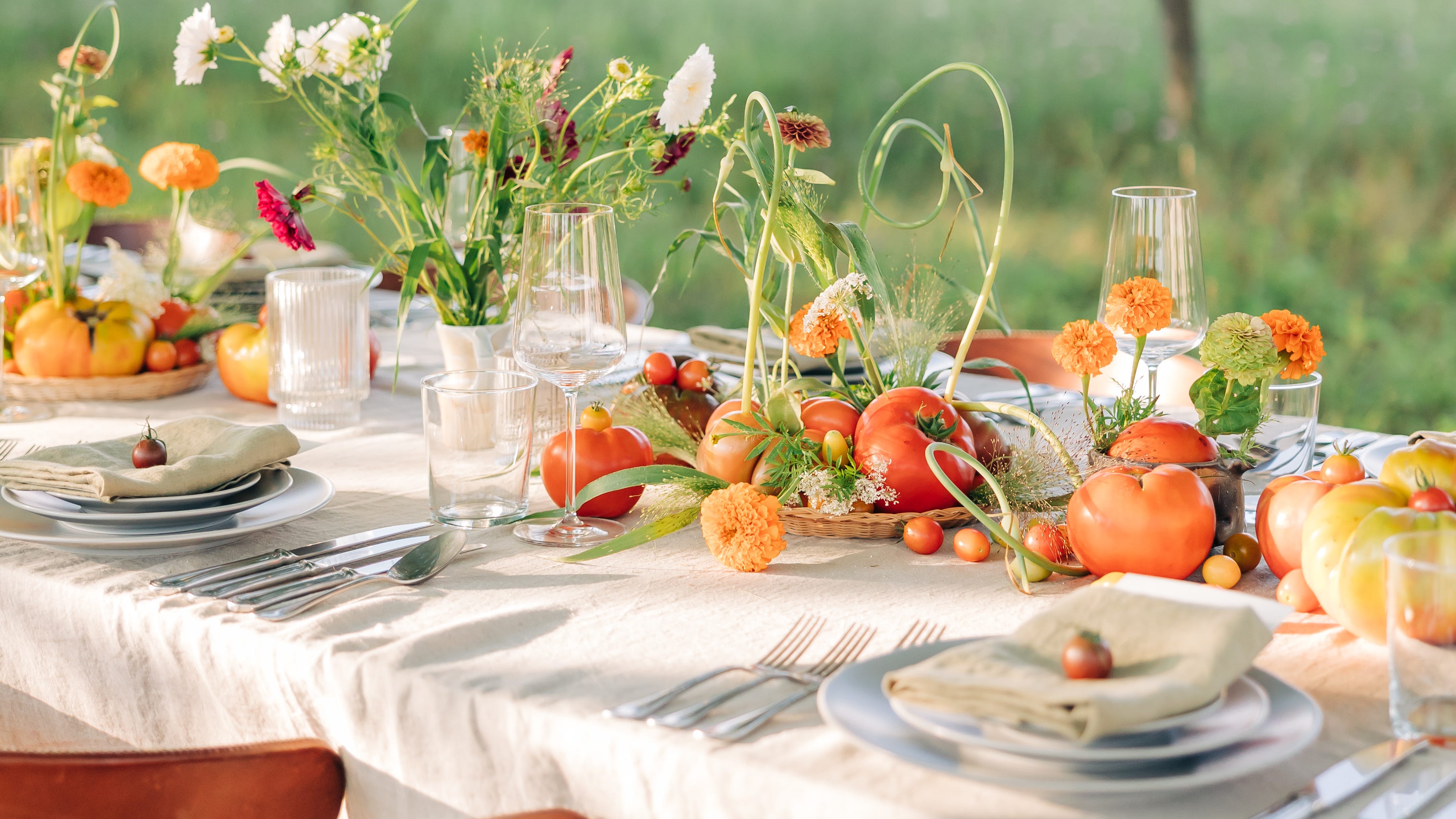
Elevate Your Fall Dinner Party With These Gorgeous Tablescaping Ideas

16 Fall Paint Colors That Capture the Beauty of Autumn

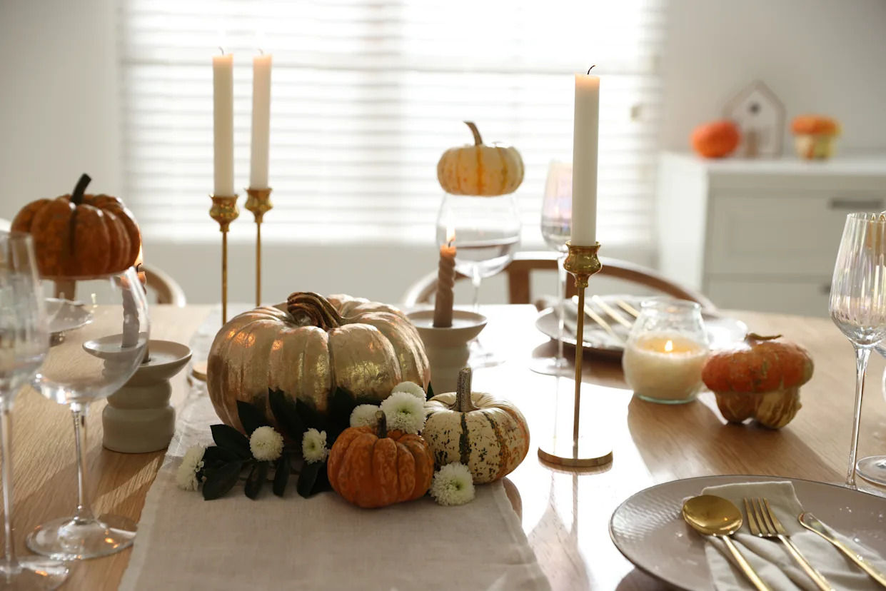
Fall Decor Favorites To Spruce Up Your Dining Table
What are the best color combinations for fall? 7 cozy-season-ready suggestions from designers

24 Fall Paint Colors to Make Your Space Cozy Just in Time for Autumn

Getting Hitched This Spring? Try One of These Elegant Color Schemes
9 fall table decor ideas to level up your seasonal hosting
21 Fall Wedding Décor Ideas for a Gorgeous Seasonal Celebration
12 Home Paint Colors We're Loving for Fall

The best paint colours for autumn — and how to style them at home
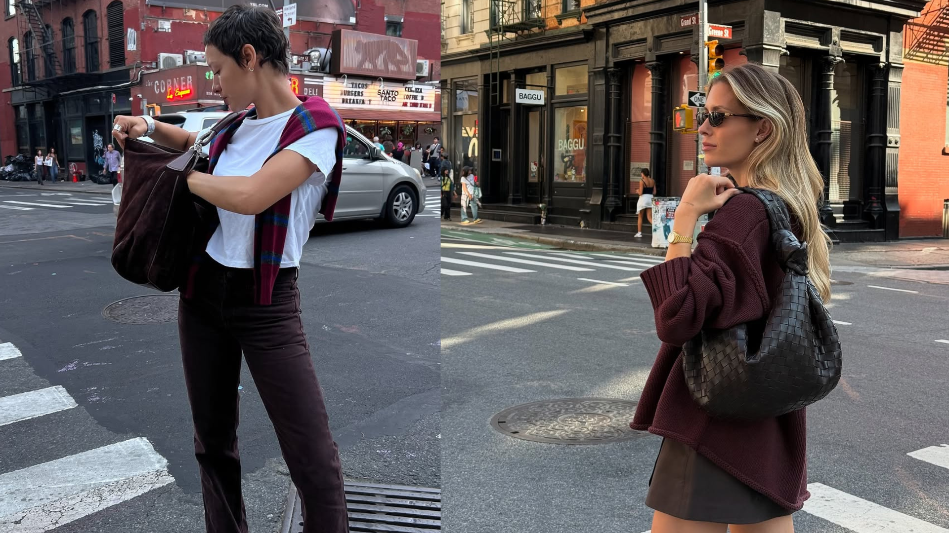
This Chic Color Pairing Is Cooler Than Beige and Black and Set to Dominate Fall Outfits

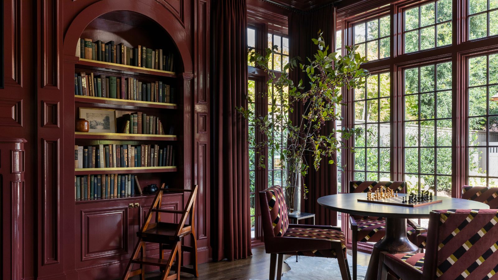
It's time to look beyond pumpkin spice – 10 fall colors designers swear by for a cozy, seasonal, and timeless look
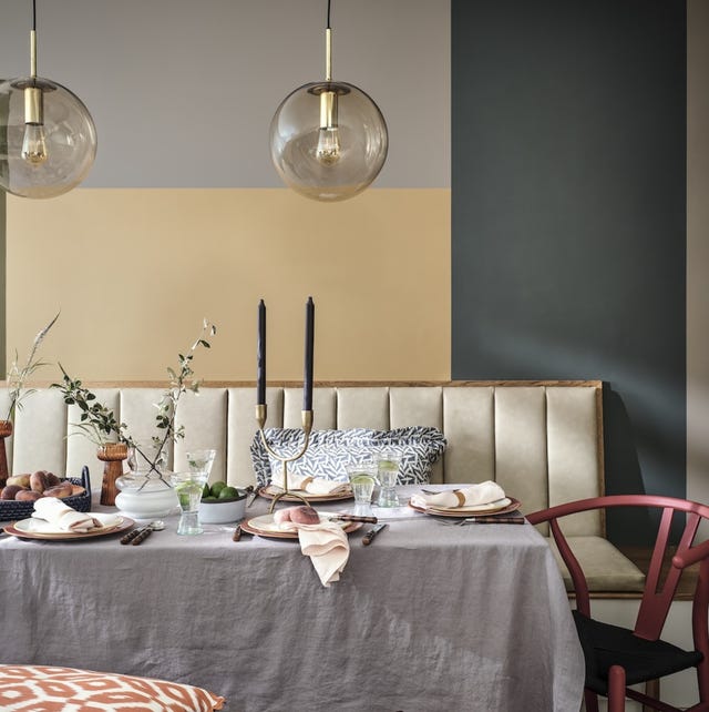
5 Autumn Paint Colours Designers Say Will Make Your Home Feel Instantly Cosier

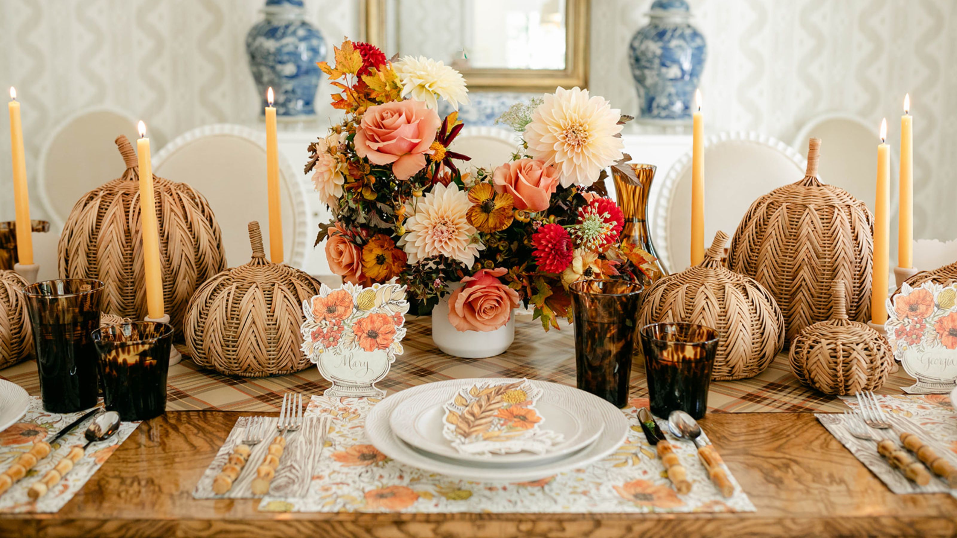
9 Stylish Fall Table Decor Ideas You’ll Want to Steal for Your Seasonal Soirées (And a Guide to Doing Just That)

67 Fall Decorating Ideas For A Beautiful Autumn Season