3 Philly Hotel Designers on Their Favorite Interior Design Trends
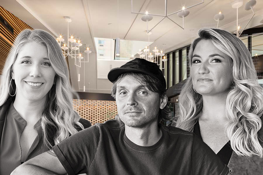
This article features insights from three prominent Philadelphia-based hotel designers: Katie Pass, Hospitality Design Director at Daroff Design; Lance Saunders, Director of Design at Stokes Architecture + Design; and Kate Rohrer, Founder of Rohe Creative. These designers share their perspectives on current interior design trends, offering advice for both hospitality and home settings.
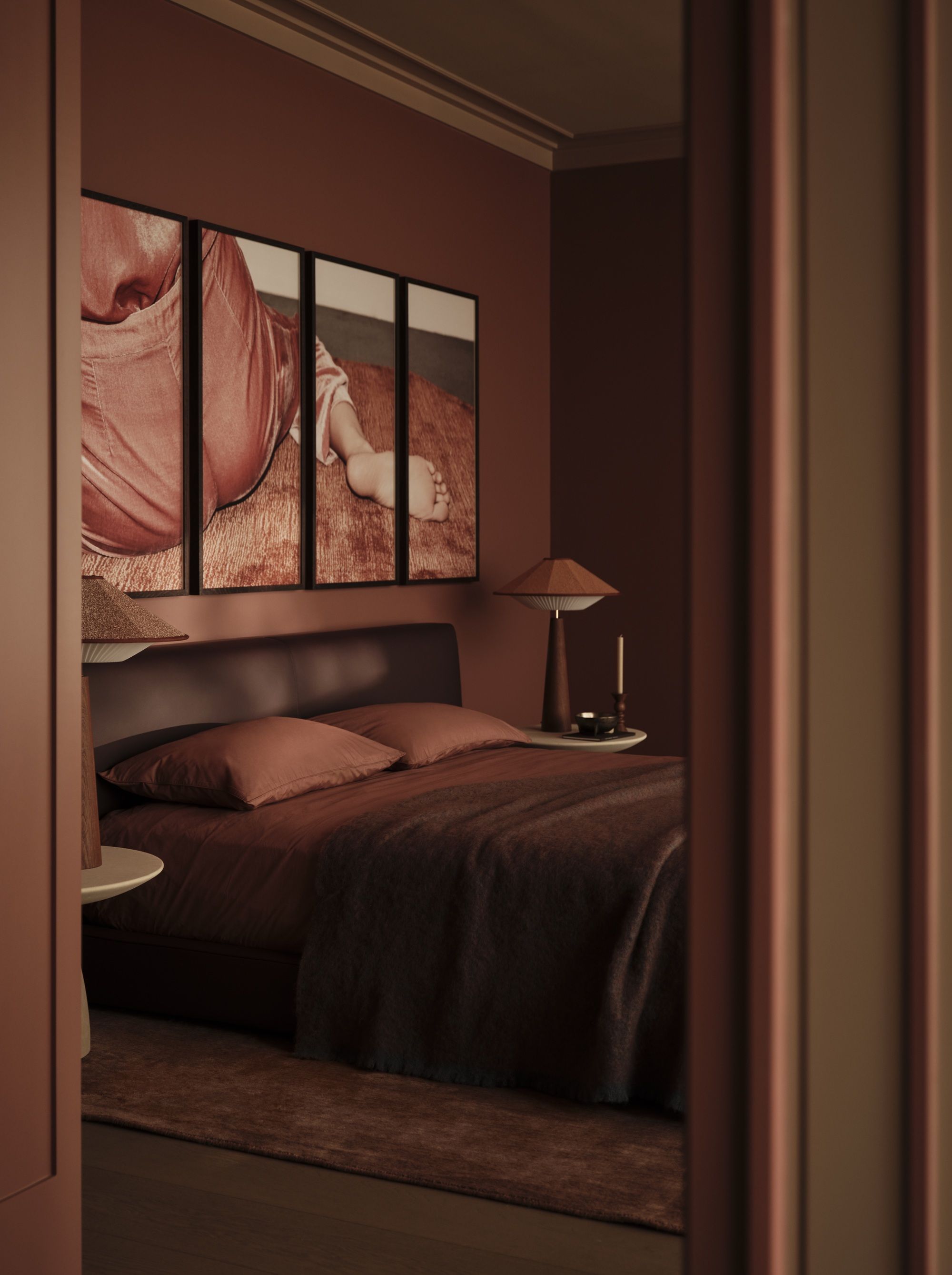
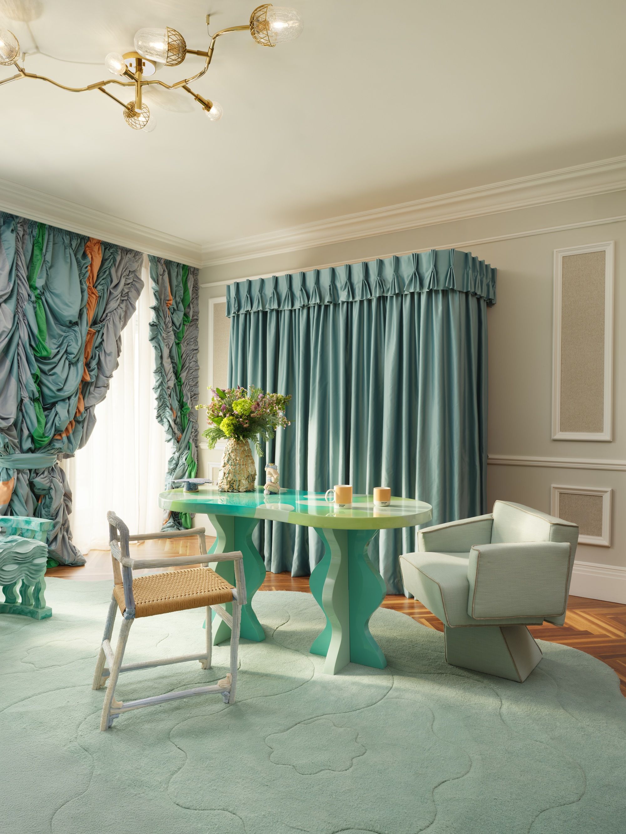
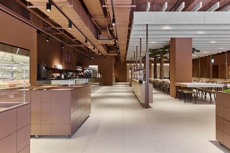
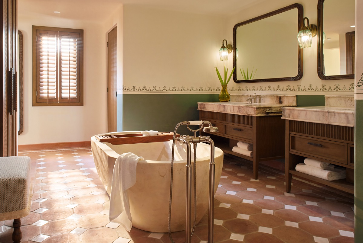
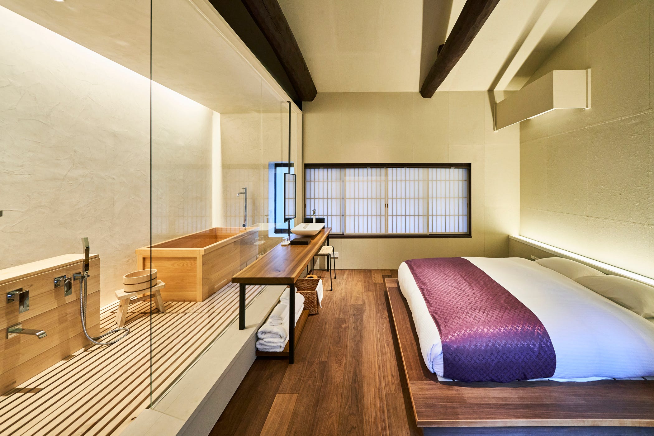
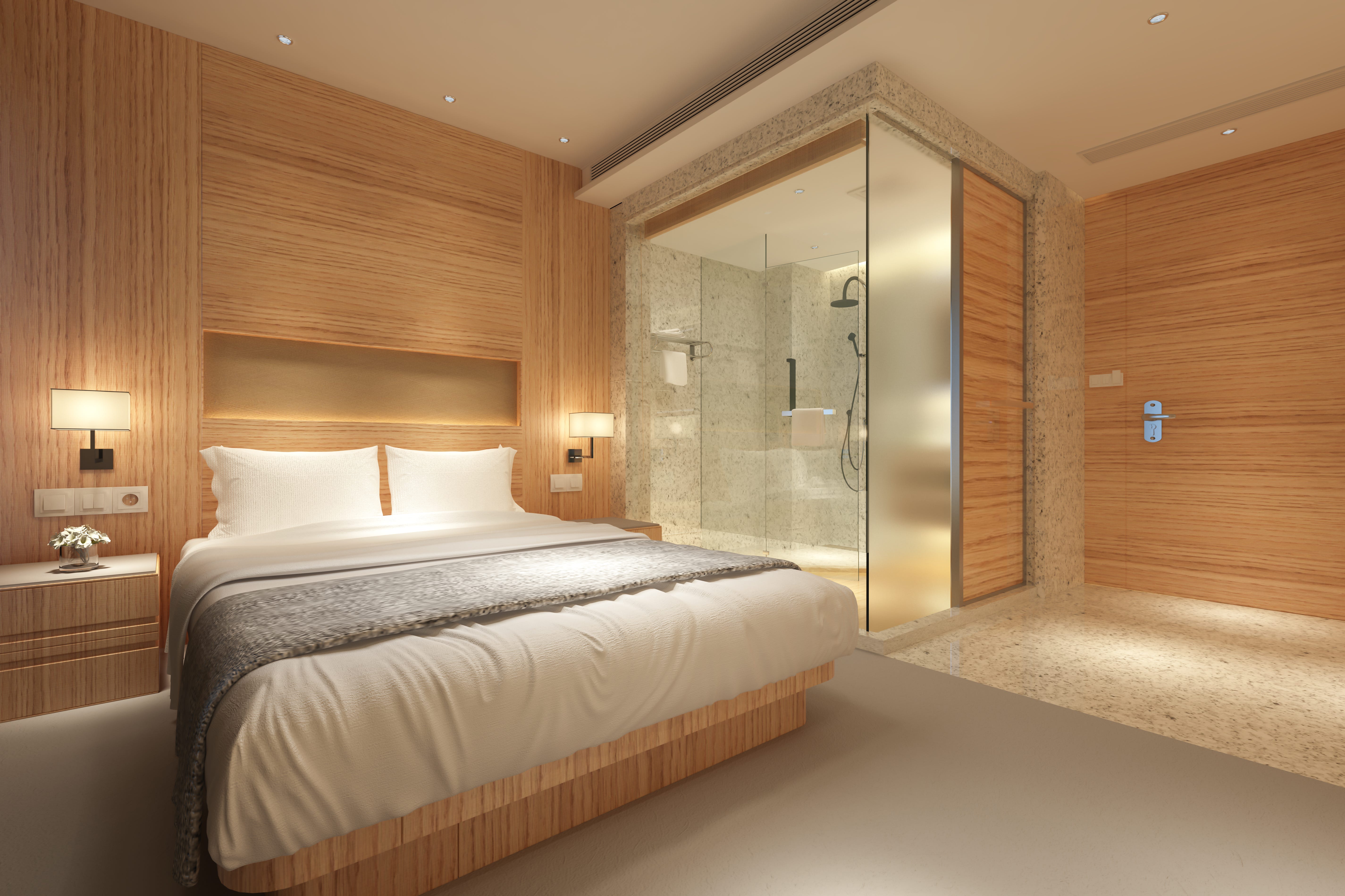
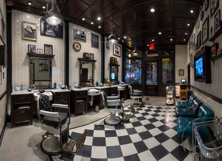
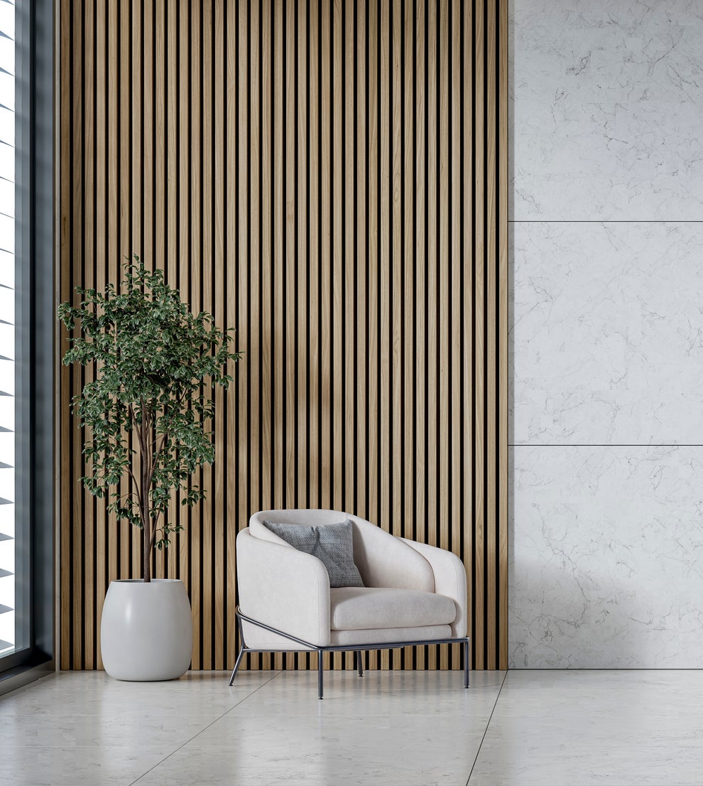
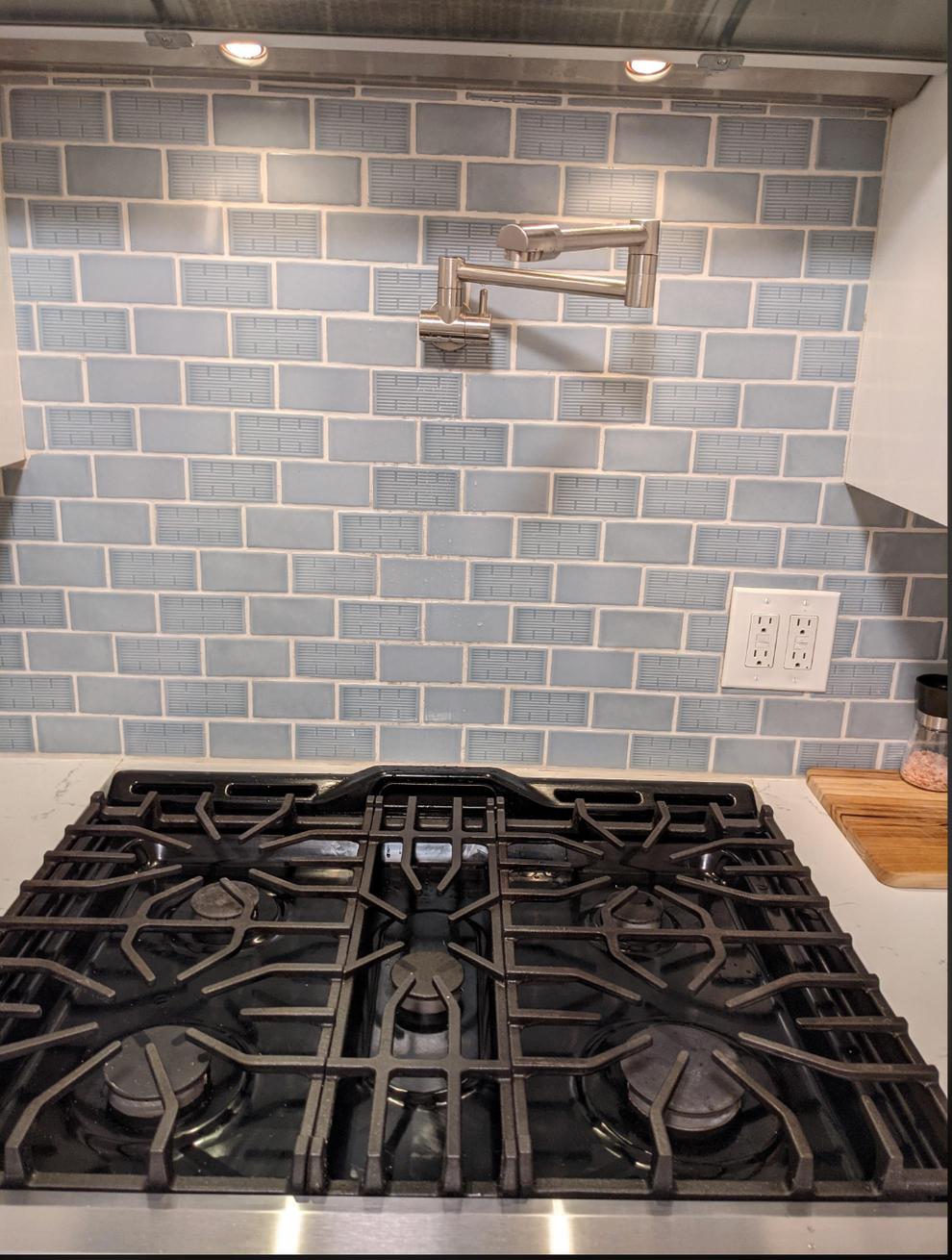
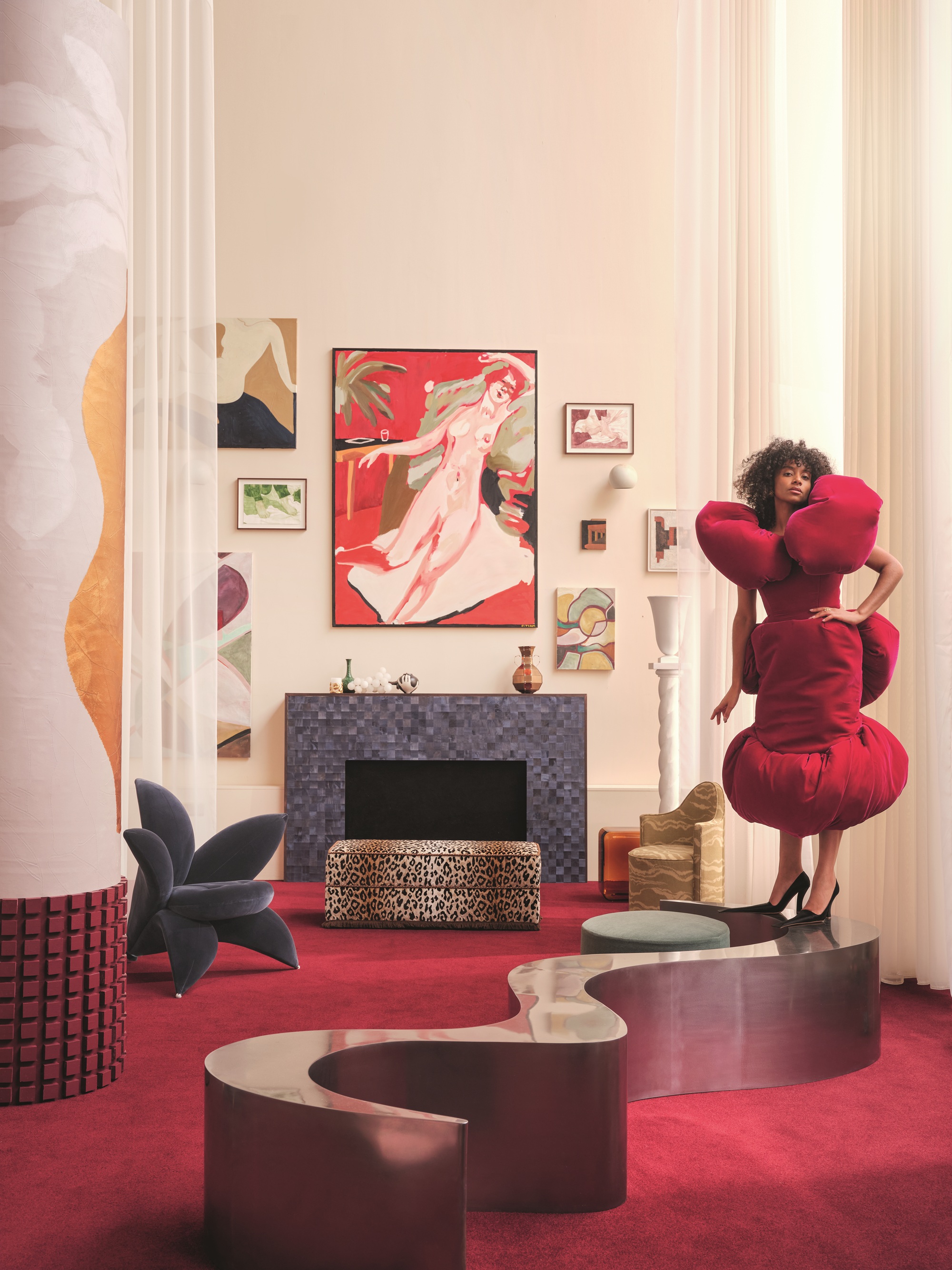
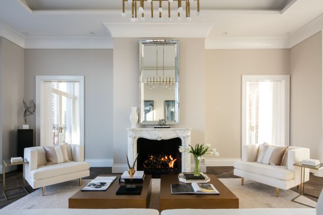
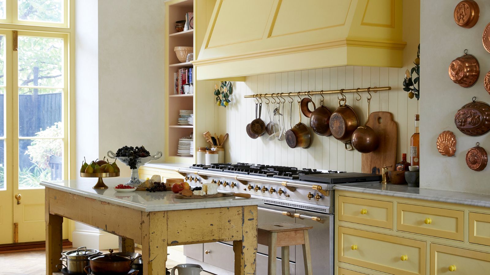
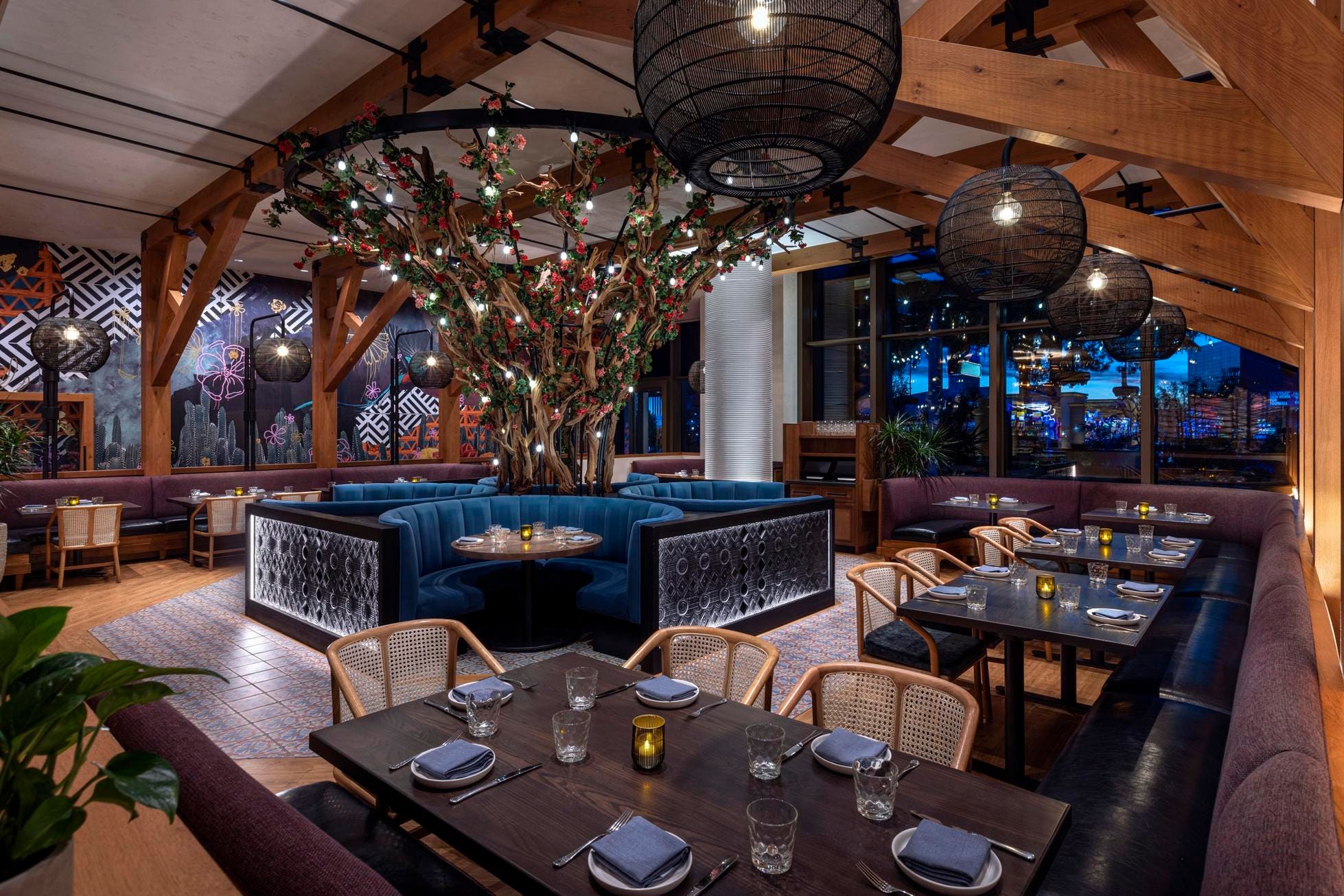
Katie Pass, known for her work on the Loews, The Rittenhouse, and Ritz-Carltons in Aspen and St. Thomas, expresses her admiration for all 1 Hotels properties. She favors Alabaster by Sherwin-Williams as her current go-to paint color. Pass advises against placing a desk in a sleeping area for a hotel but suggests that multiple light sources at varying levels are crucial for eliminating dark corners in any space. She finds too much technology in social spaces to be a tiring trend and prefers brass over rose gold, stripes over florals, and neutrals with added textures over jewel tones. When asked about high ceilings or hardwood floors, she opts for both.
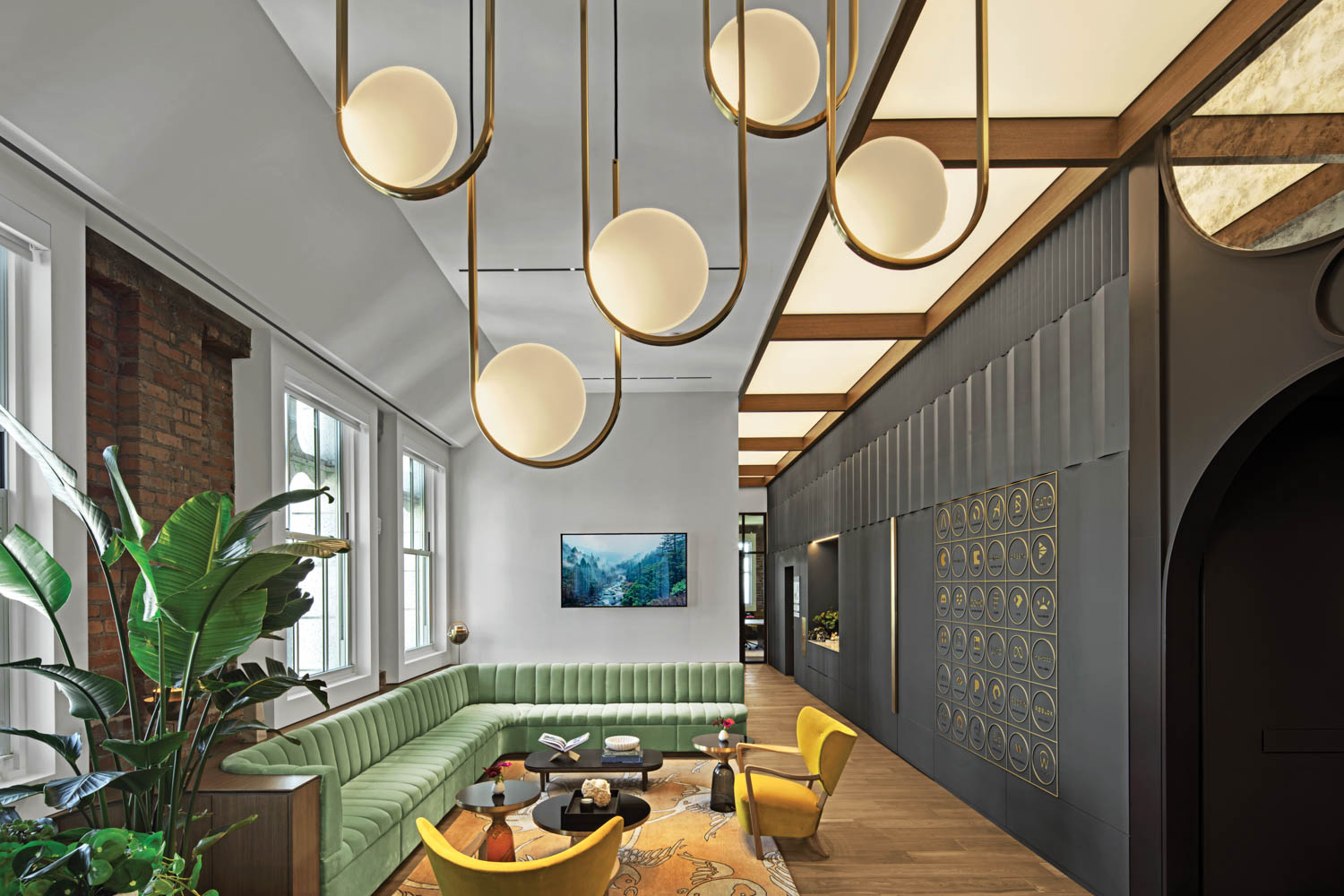
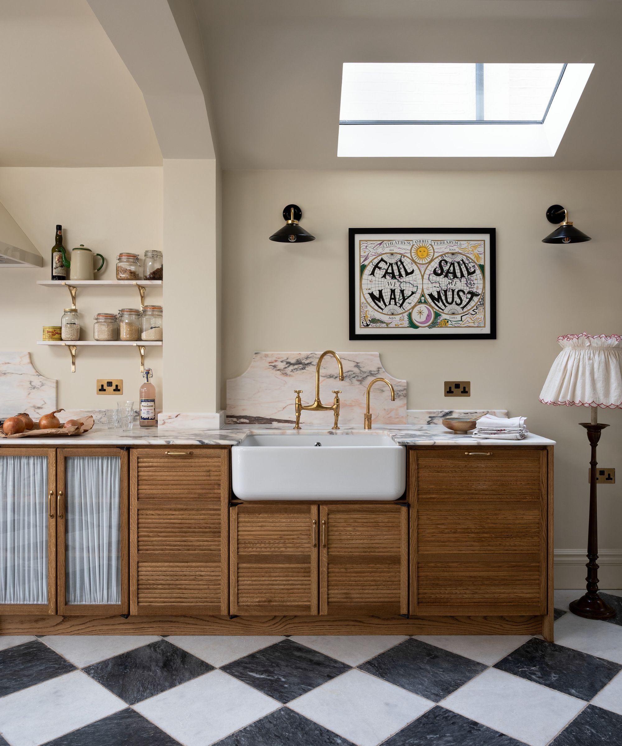
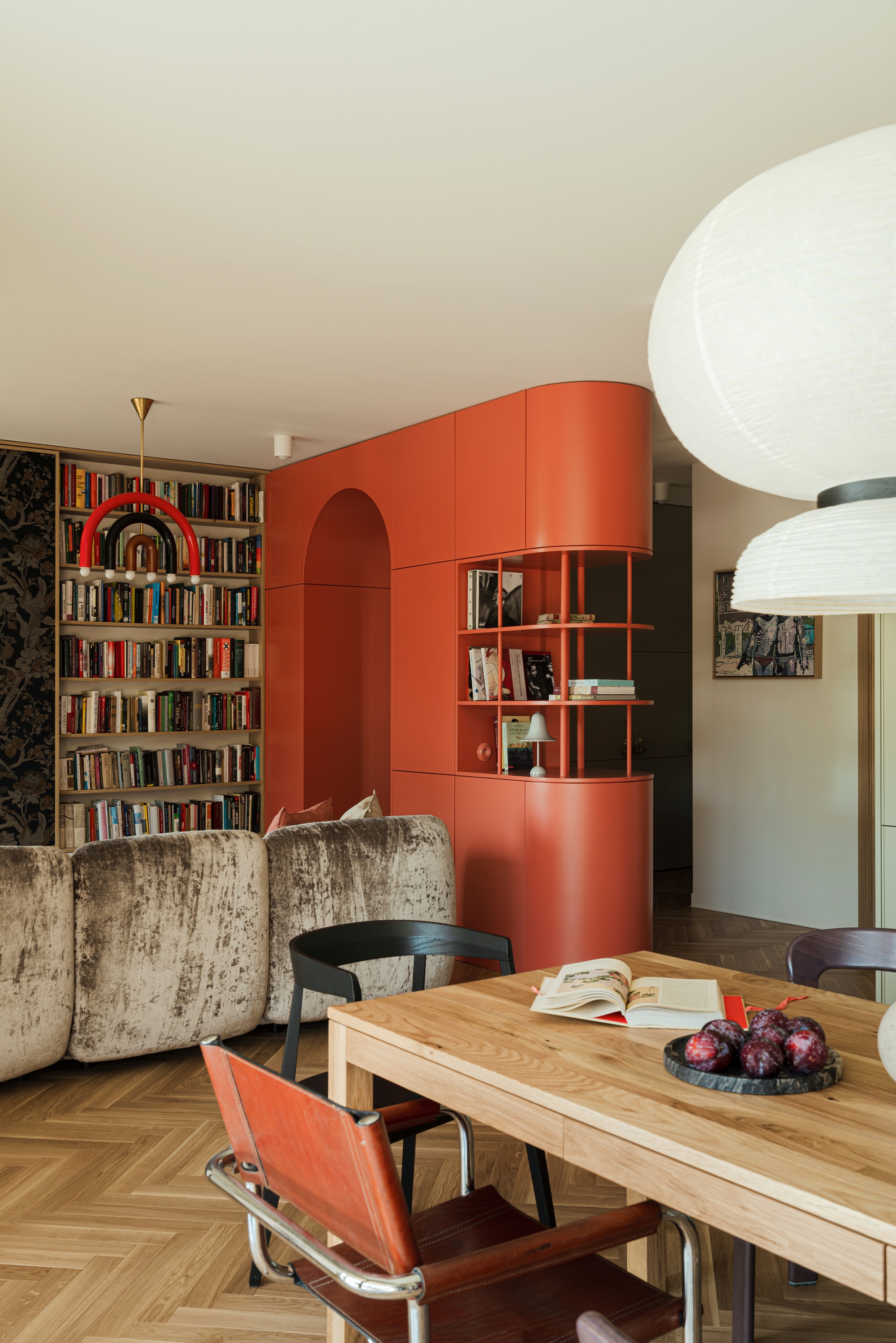
Lance Saunders, whose portfolio includes Pod Philly, River House at Odette's, and Le Cavalier at Hotel Du Pont, believes in reinventing classics, as people crave familiarity. His dream design project is Hotel Kinsley in Kingston, New York, and he currently favors Waterbury Green by Benjamin Moore. Saunders's first observation in a hotel is always the floor material. For making a home feel more like a hotel, he recommends housekeeping if budget allows, or investing in nicer toiletries and bedding. He prefers wainscoting over wallpaper and neutrals over jewel tones. His unique take on high ceilings or hardwood floors is to have hardwood on the high ceiling.
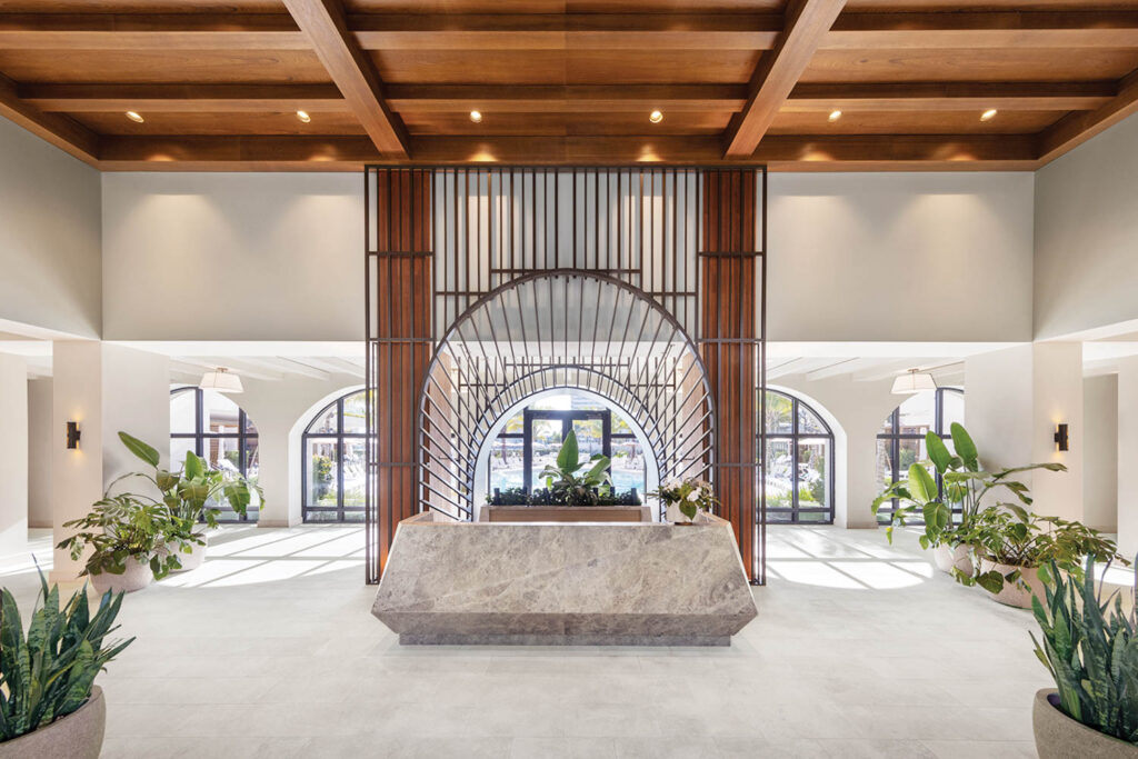
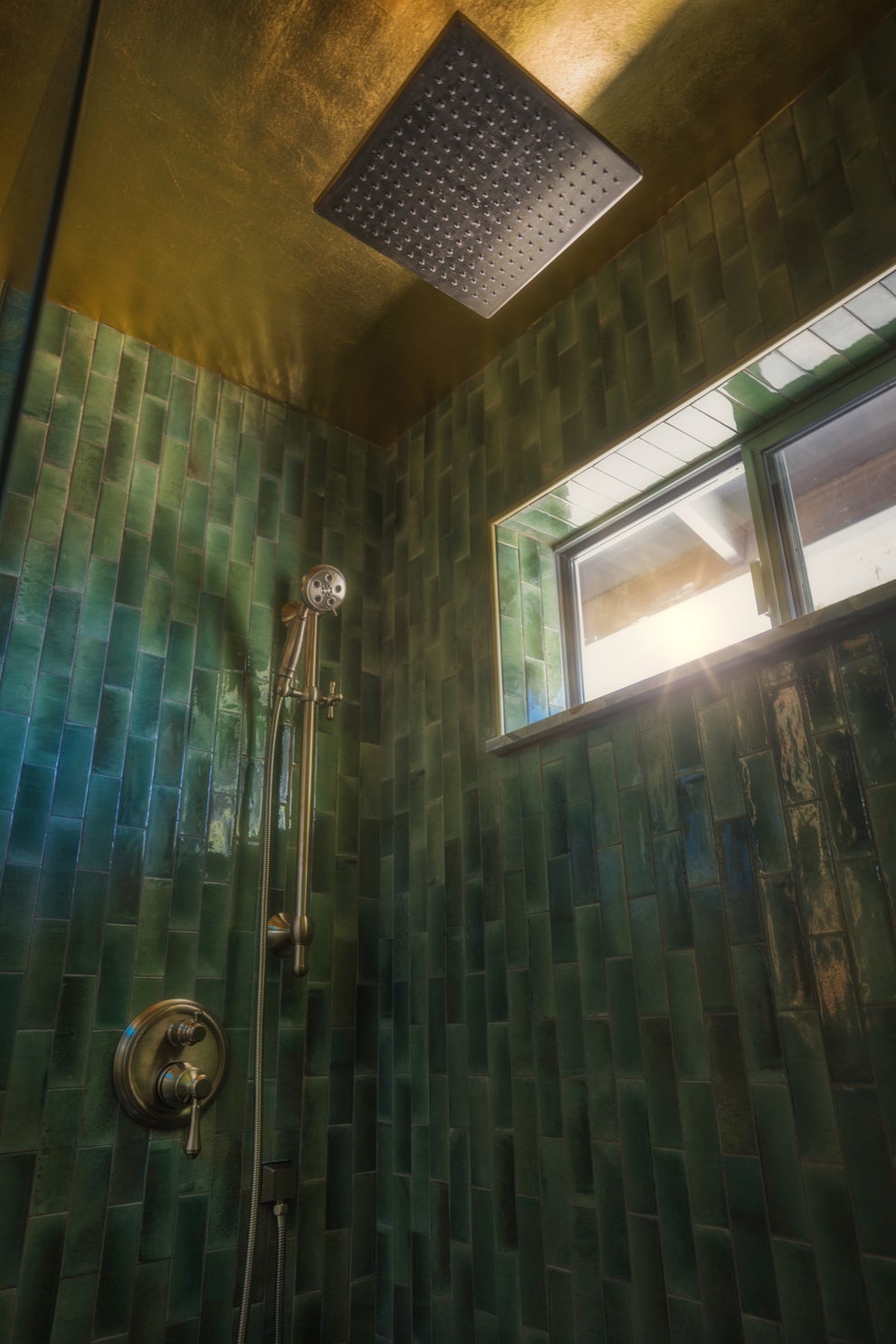
Kate Rohrer, recognized for her work on Guild House Hotel and Houston’s C. Baldwin, admires The Standard in London. White Dove by Benjamin Moore is her favorite paint color at the moment. Her initial thought upon entering a hotel is how to operate the lights. Rohrer champions being unapologetic about personal design preferences and has a particular fondness for handmade tiles. She anticipates that the pandemic will lead to more meaningful hospitality design, as people long for social experiences in these spaces. She enjoys a mix of florals and stripes and prefers wall sconces over chandeliers or table lamps. Her choice between wallpaper and wainscoting is wallpaper, and she adapts her preference for neutrals or jewel tones based on her mood.
The designers collectively provide a comprehensive look into their design philosophies, preferred materials, and predictions for the future of hospitality design, while also offering practical tips that can be applied to residential interiors. The article emphasizes the blend of functionality, aesthetics, and user experience in creating inviting and memorable spaces.
#InteriorDesign #HotelDesign #HospitalityDesign #PhiladelphiaDesigners #HomeDecor #DesignTrends #PaintColors #ResidentialDesign #KateRohrer #InteriorDesign #HotelDesign #HospitalityDesign #PhiladelphiaDesigners #HomeDecor #DesignTrends #PaintColors #ResidentialDesign #KateRohrer
0 comment in total
You may also like
The Zeitgeist Edit — The Design Moments an Editor Is Talking About in November

9 Stunning Art Deco Interior Design Styles

Interior Designers Share Their Best Traditional Design Tips

The Interior Design Trends Stylish Buyers Are Flocking to This Fall

Interior Design Trends of 2024

We're Experiencing a "Bathroom Privacy Crisis" in Hotels Now—Experts Explain Why
Interior designers share the 9 trends they wish they saw more of in homes
What's making a home look dated in 2025? Interior designers share the design icks that they say are aging your interiors
Year in review: top 10 design stories of 2022, selected by Wallpaper* design editor Rosa Bertoli

17 Trends That Need to Disappear Forever , According to Interior Designers


People Are Exposing The Home Decor Trends That'll "Completely Fade Out" Sooner Than You'd Think

What’s Next for Our Homes? The 14 Defining Interior Design Trends That Will Shape the Way We Live in 2026


In conversation with: Tina Norden, Interior Designer of the Year 2021

Enhancing the Stay: Hilton Hotels & Resorts Around the Globe Debut Major New Design Innovations
30 of the worst modern home trends that WILL go out of fashion | loveproperty.com

10 Horrifying Home Design Trends: 2023 Edition
Roundtable: merging spaces & the future of bathroom design
Celebrated Designer Vincent Celano Tackles Eclectic Projects
"It's A Huge Fire Hazard": People Are Calling Out The Modern Home Design Trends They Secretly Hate, And It's Jarring
I've been an interior designer for 3 years. Here are 6 trends that are in and 5 that are out this season.