1/21
26 Most Popular Kitchen Paint Colors Throughout the Decades
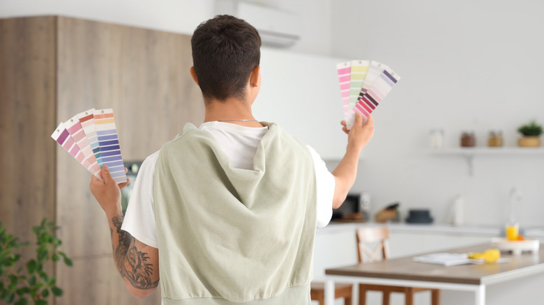
This article explores the evolution of popular kitchen paint colors from 2000 to 2025, highlighting how different shades have reflected prevailing interior design trends and societal shifts. Interior designers Tessa Mack Noval, Liz Williams, Leigh Kirby, and Lina Galvoa provide insights into why certain colors gained popularity each year and their impact on the kitchen's aesthetic.
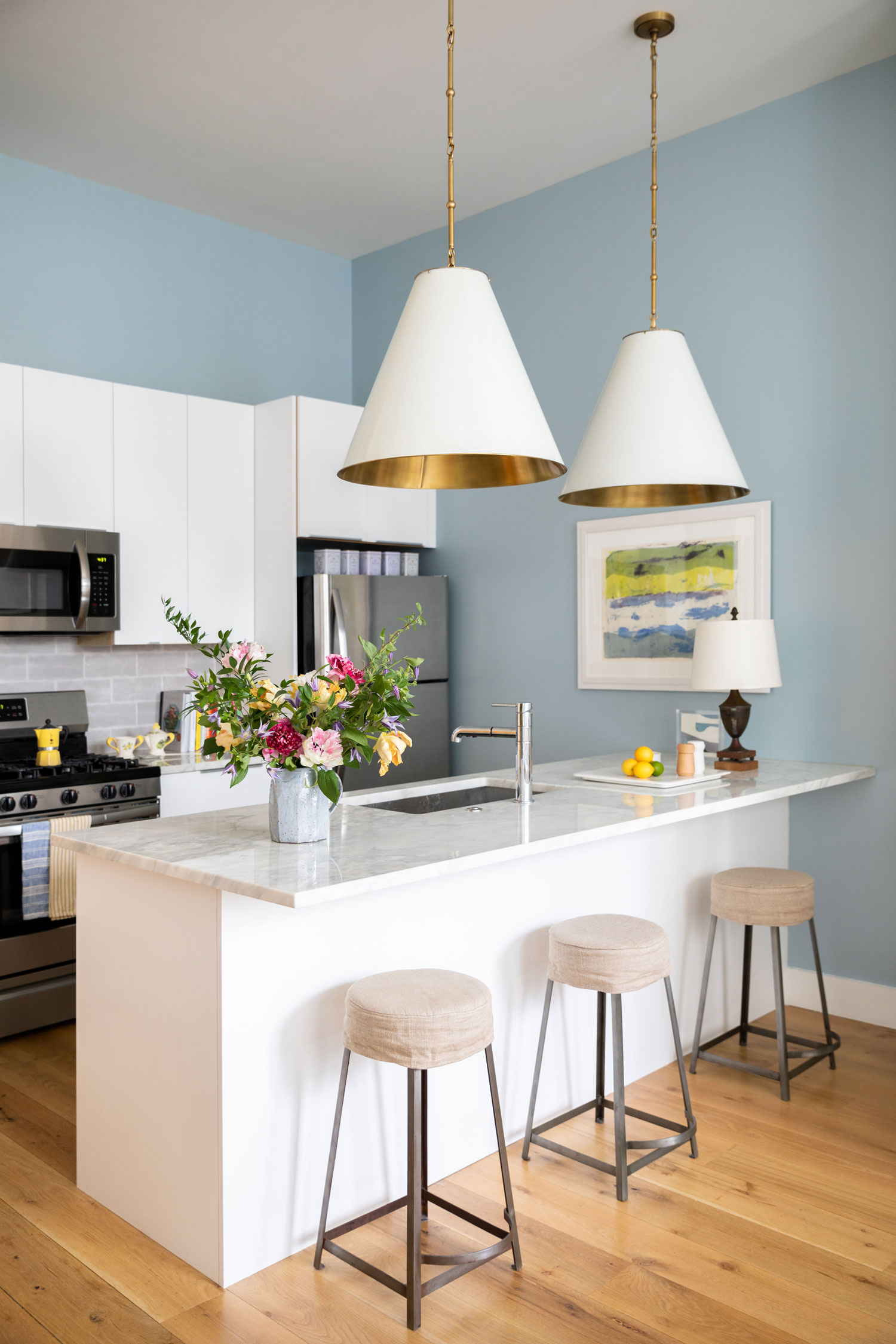
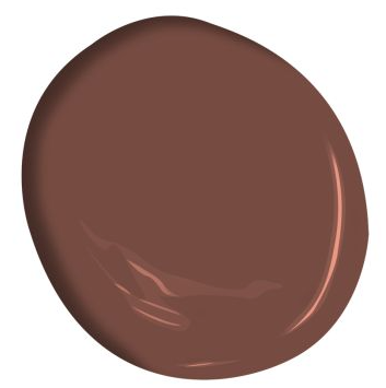
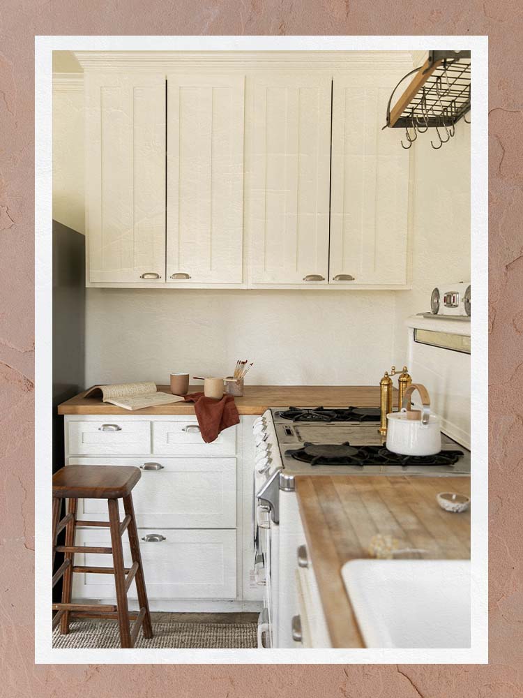
The early 2000s saw a transition from the bold tones of the 1990s to softer, more sophisticated aesthetics. Cappuccino Brown, built on a beige foundation, offered a modern twist to a classic favorite in 2000. Glistening Pearl, a glossy white, maintained elegance in 2001, while Linen White in 2002 provided a clean, uncluttered backdrop, allowing sophisticated countertops like granite to stand out. Azure Blue introduced a serene, optimistic vibe in 2003, fitting the neutral theme without being dull.
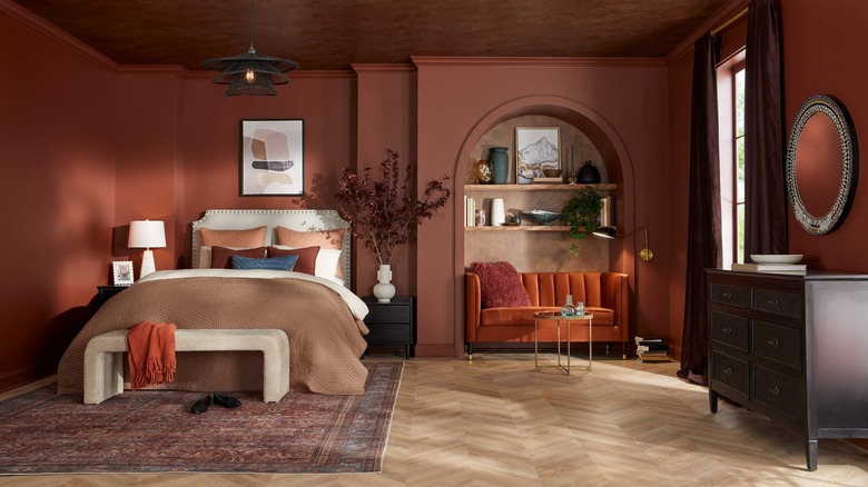
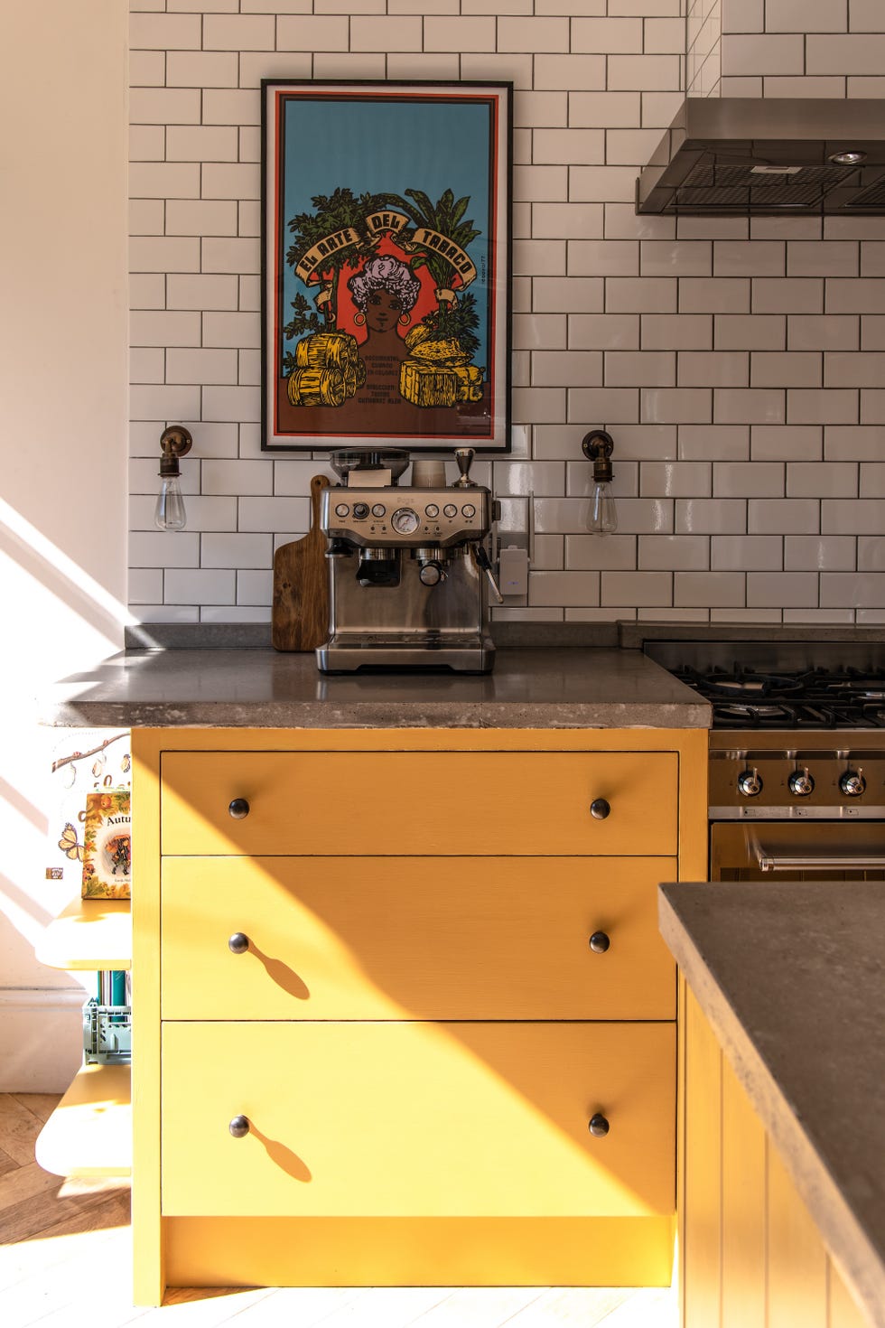
The mid-2000s brought a desire for pops of color. Cherry Red became a statement color in 2004, adding a playful tone to kitchens. Cool Turquoise in 2005 merged tranquility with color, offering a calming yet vibrant option. By 2006, Clay Orange emerged as a bold, rebellious choice, reflecting the coming-of-age of millennials. The decade concluded with pastels, with Sky Blue in 2007 creating open, fresh, and spacious feelings, and Light Pink in 2008 adding a tranquil and warm neutrality. Chic Violet in 2009 marked a shift towards muted, sophisticated statement tones.
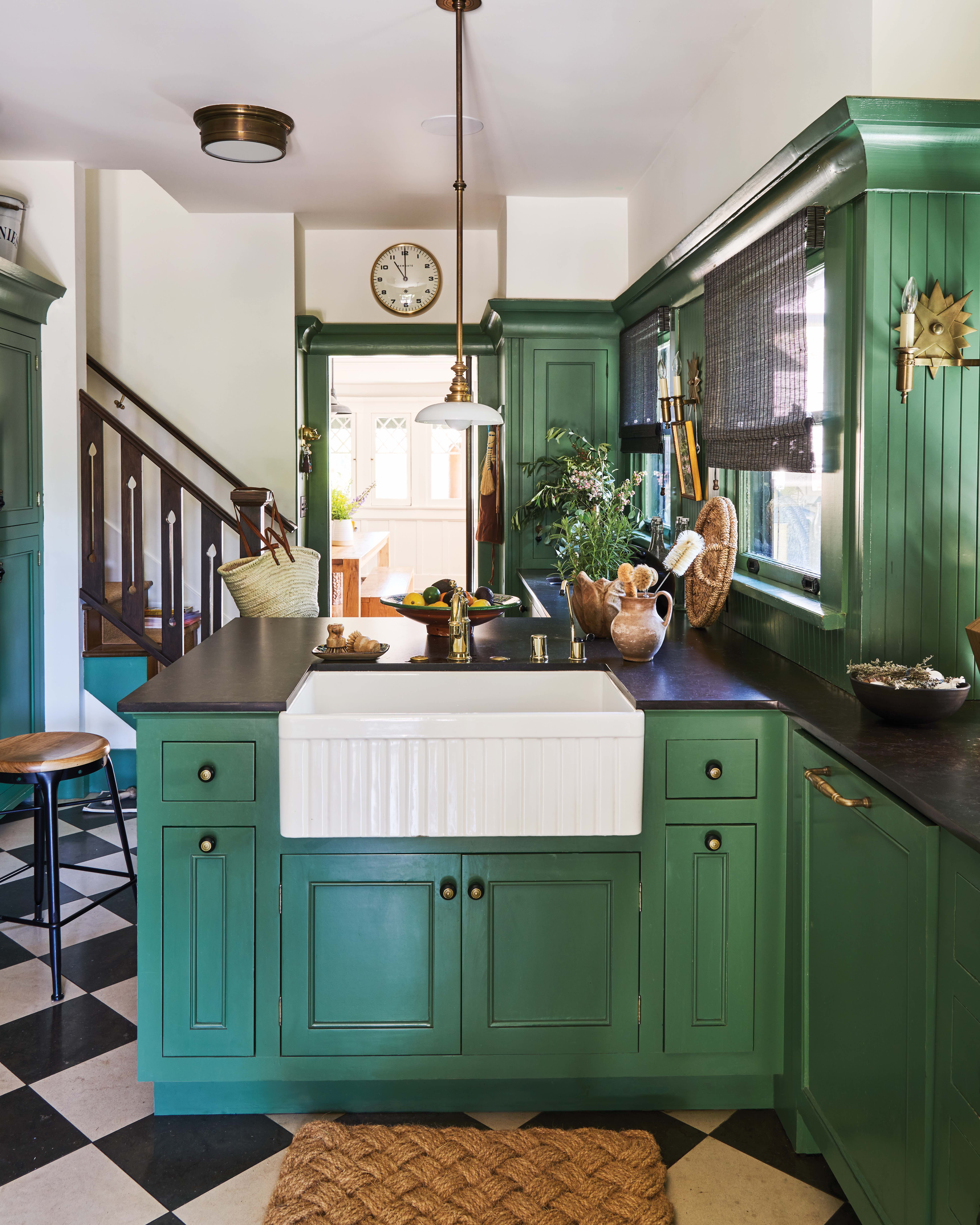
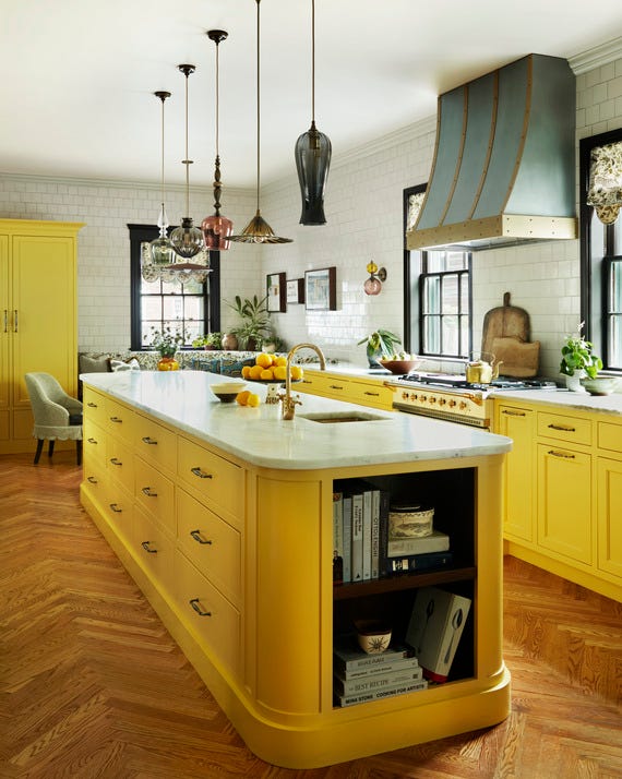
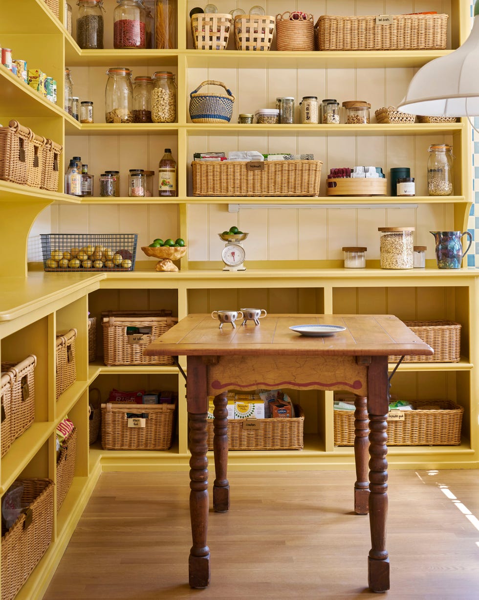
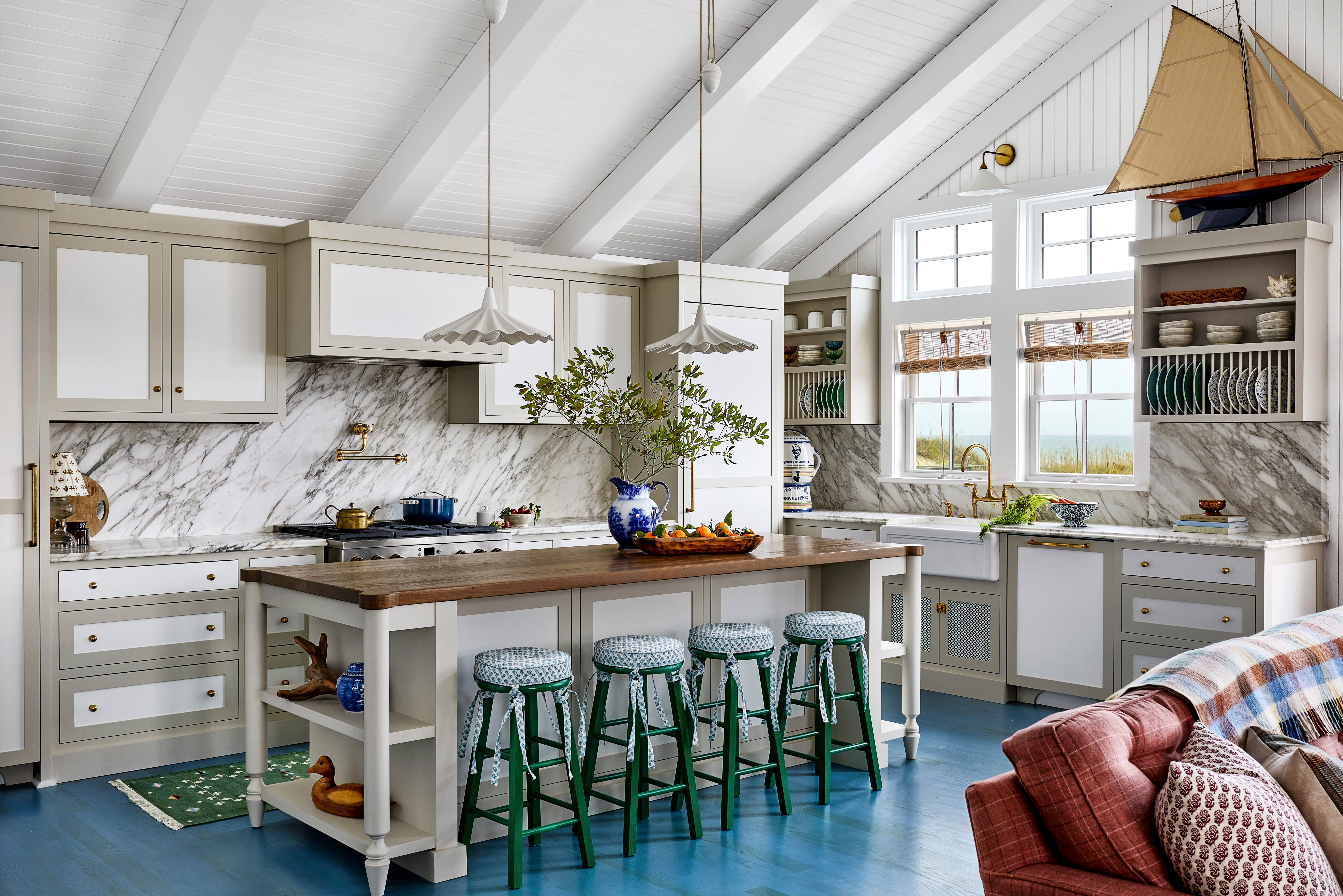
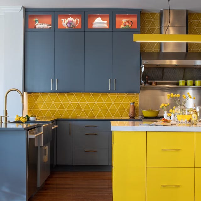
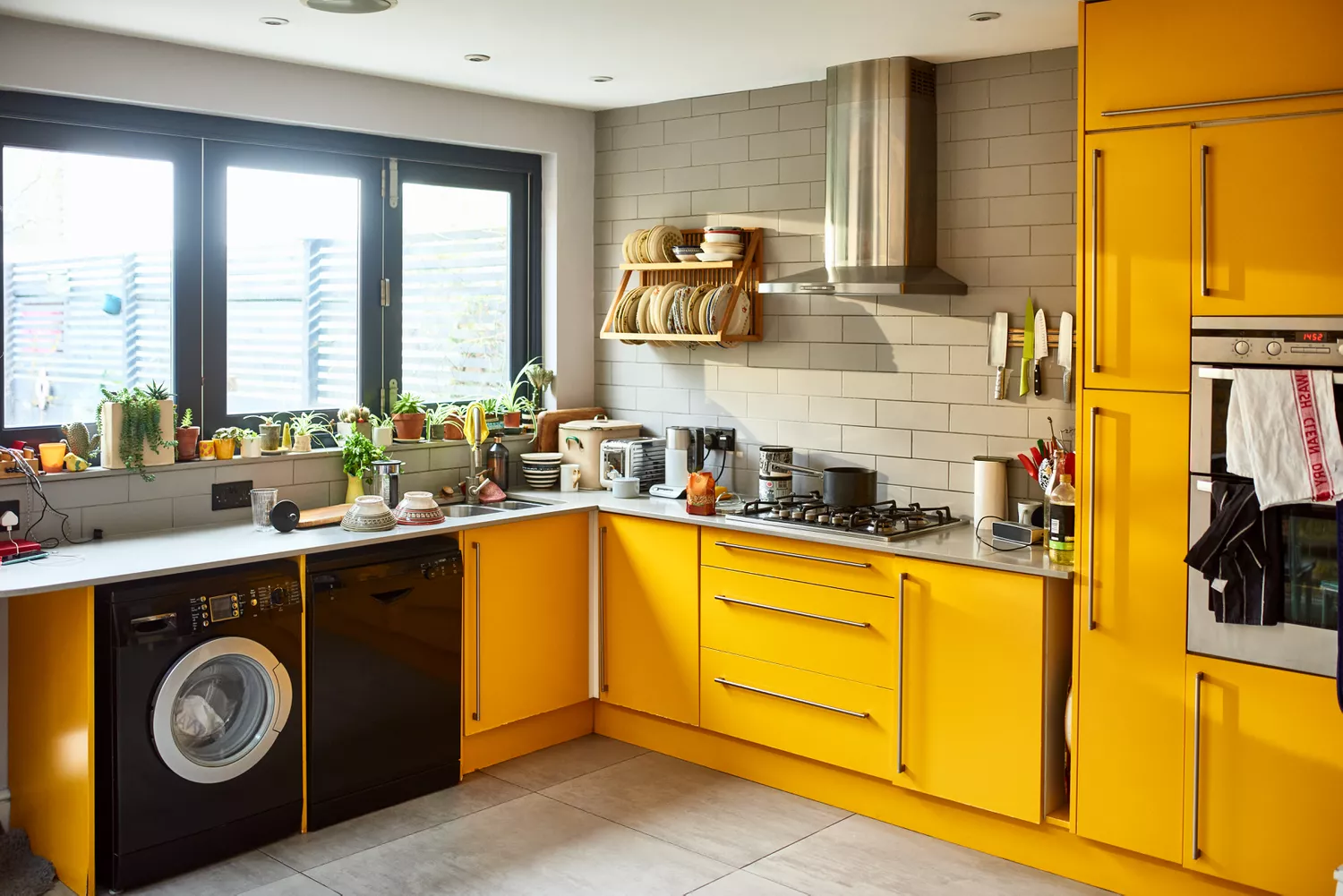
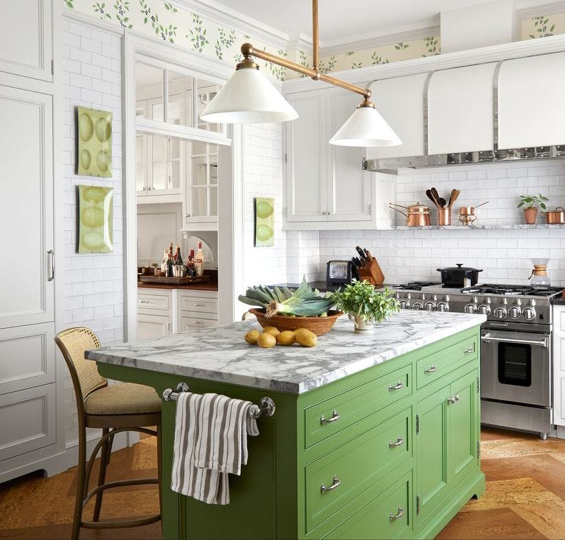
The 2010s began with a move towards moodier hues. Complex Grey in 2010 allowed for dark tones without being overwhelming, balanced by white finishes. Millennial Pink dominated 2011, lauded for its versatility. Sunny Yellow brought brightness and a fresh, entertaining feel to kitchens in 2012. By 2013, a preference for off-white returned, offering a crisp, spacious feel, as noted by Williams. Chocolate Brown in 2014 provided a warm, timeless, and nature-inspired look, while Forest Green in 2015 created soothing spaces with unique contrasts.
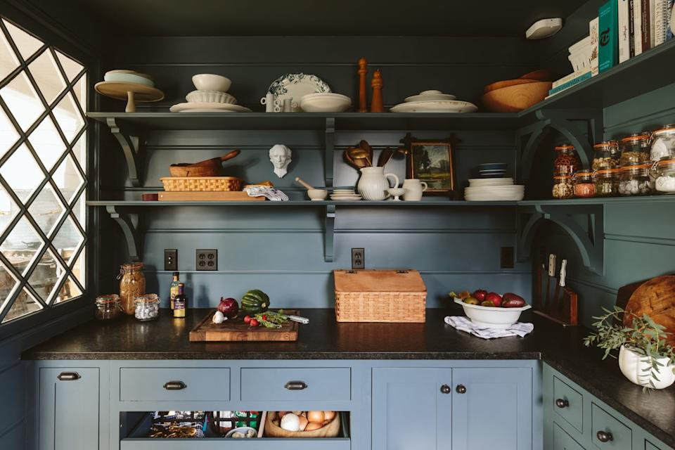
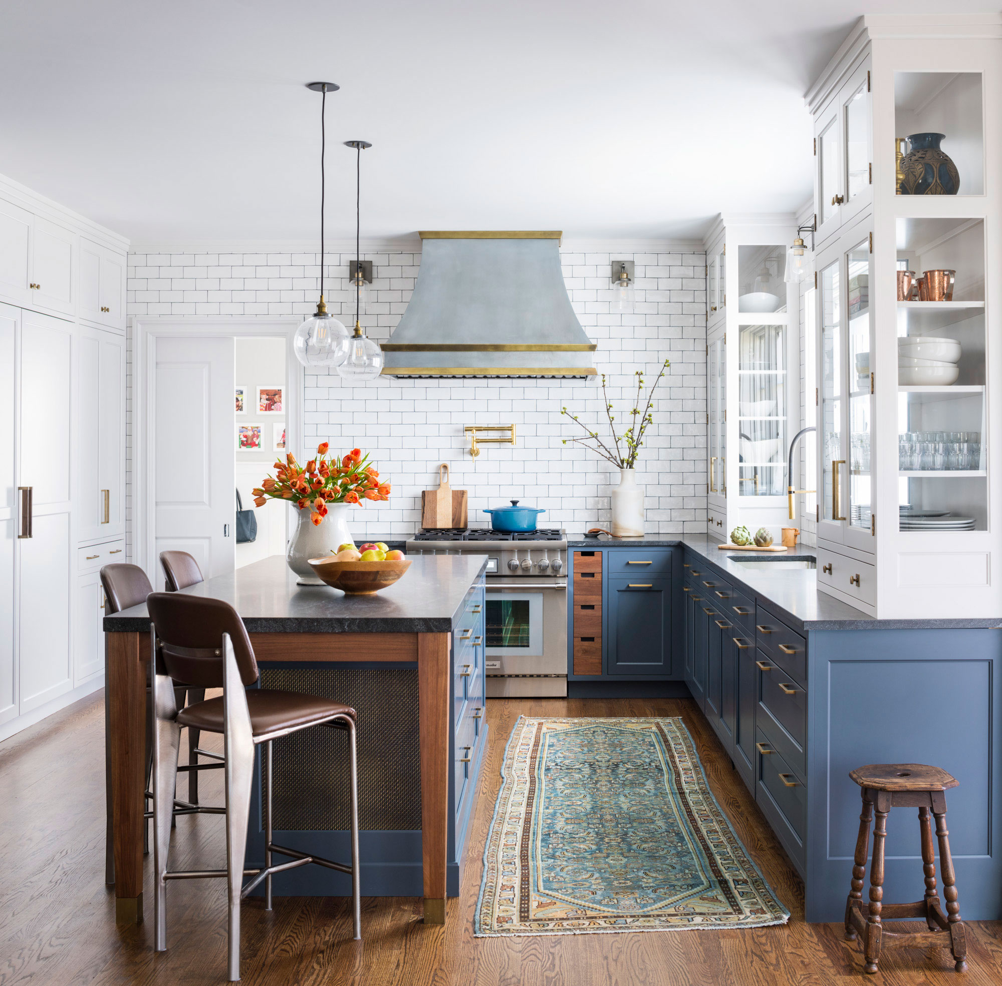
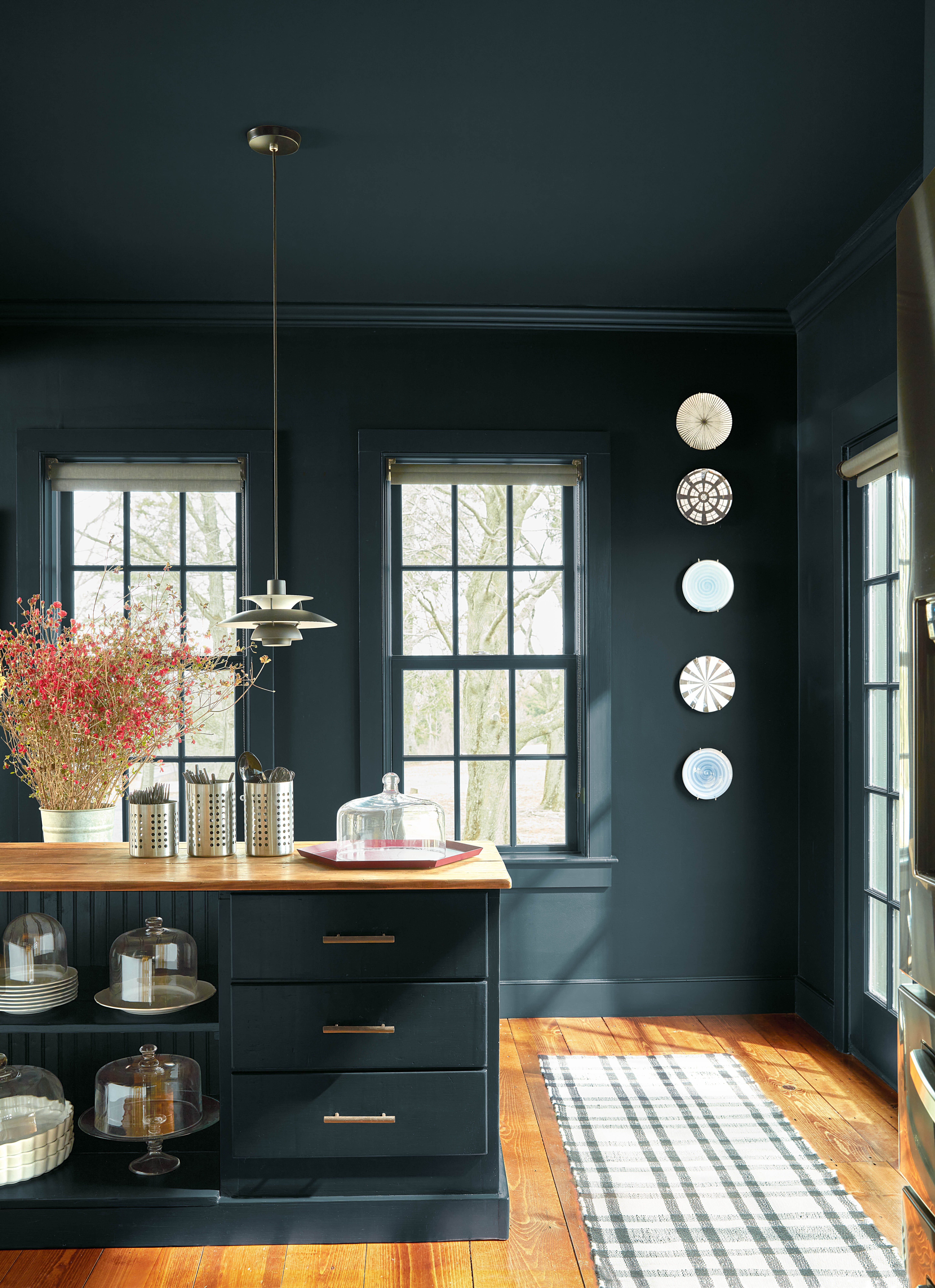
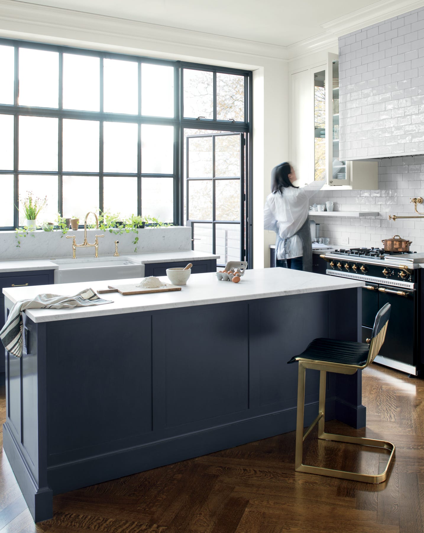
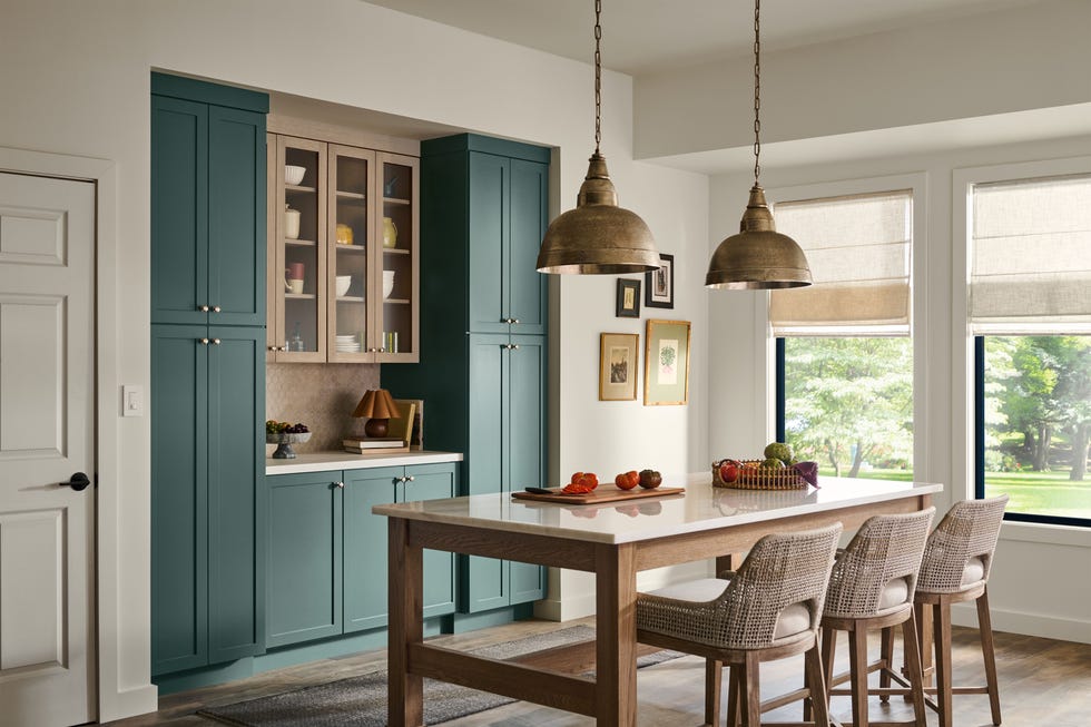
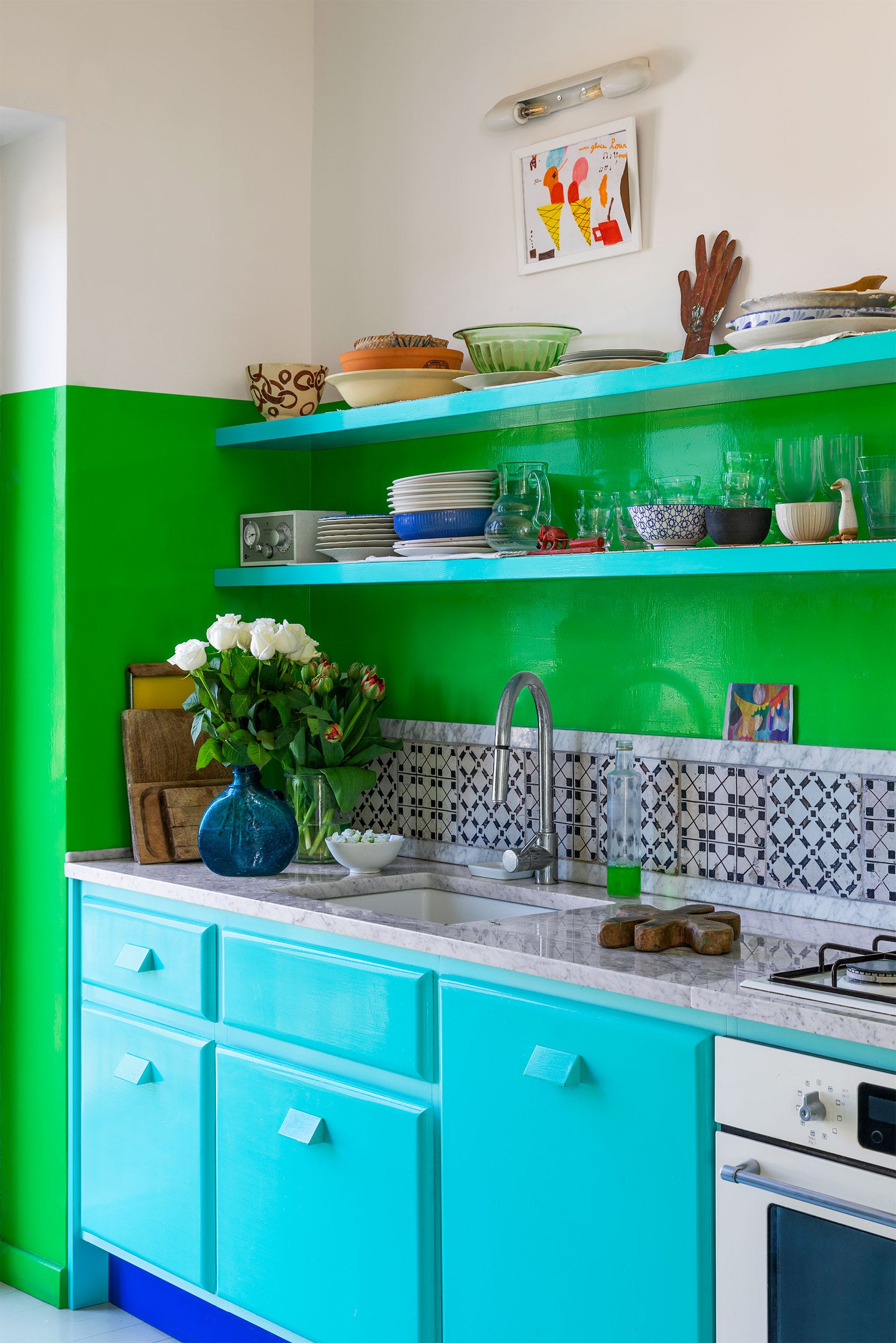
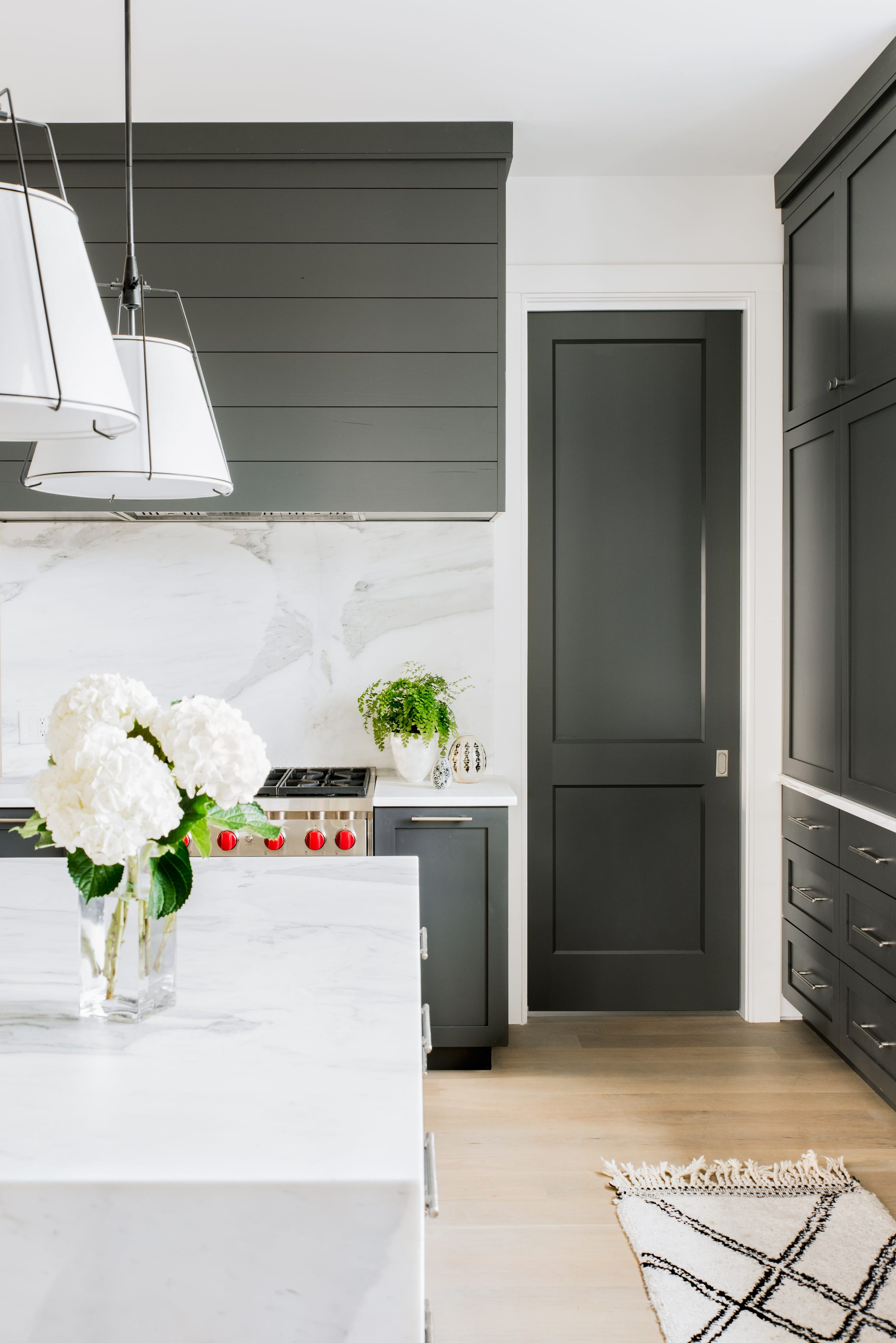
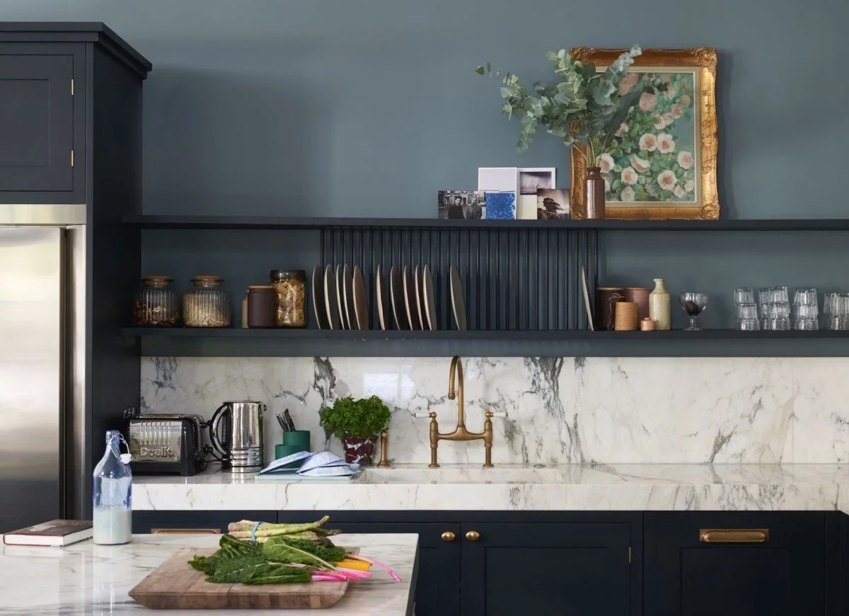
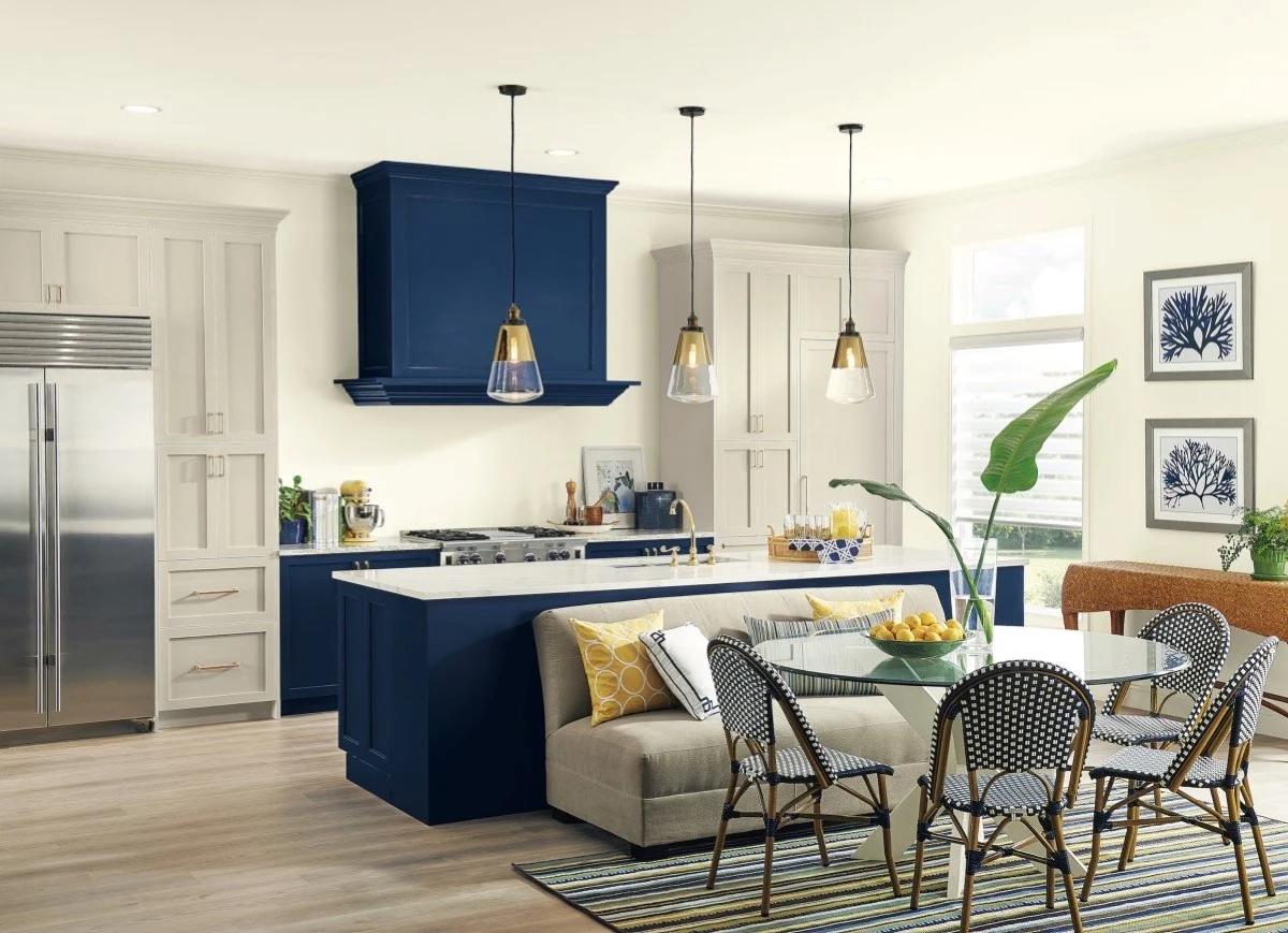
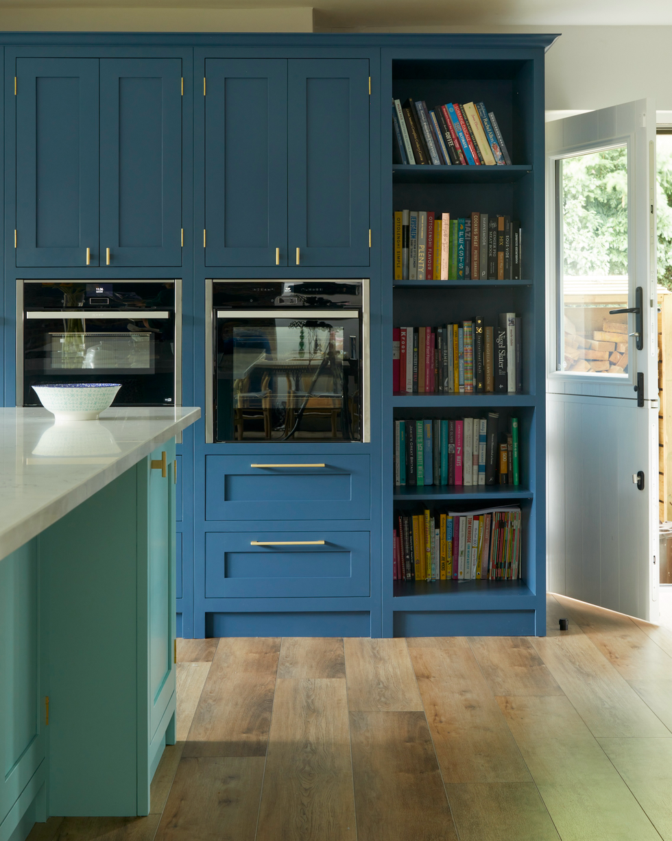
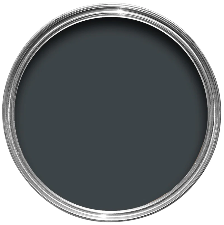
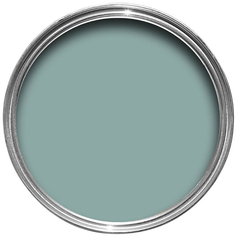
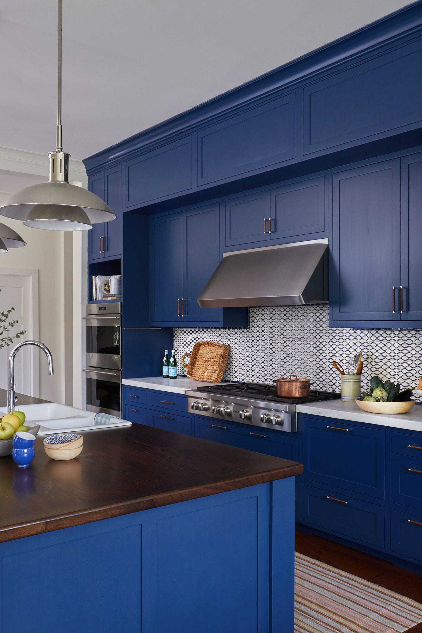
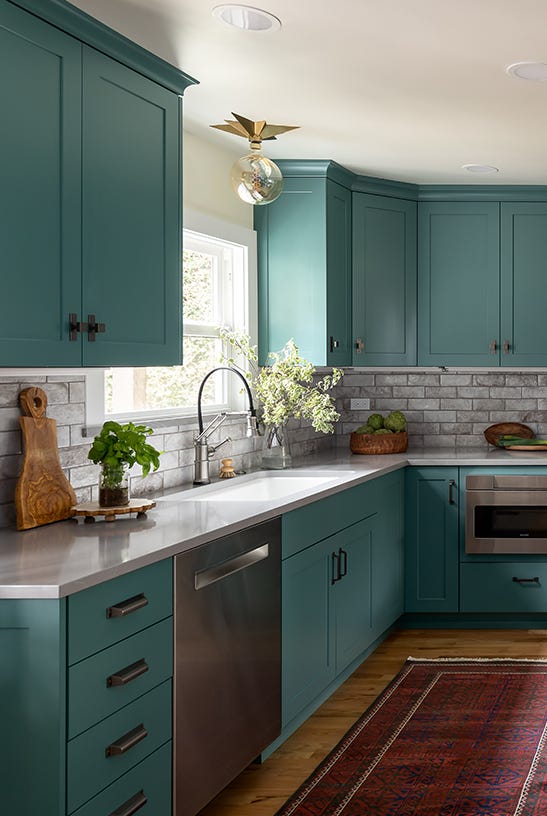
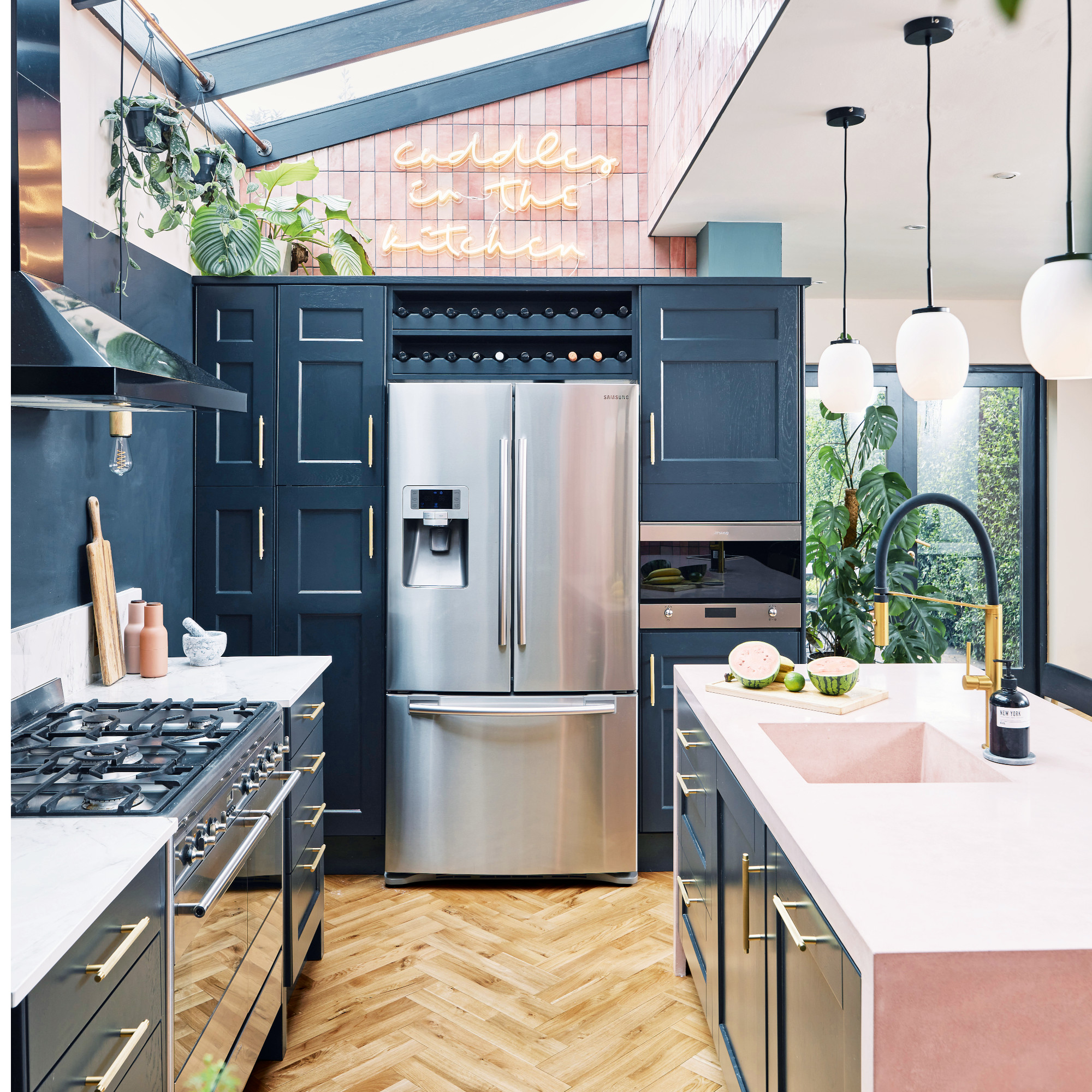
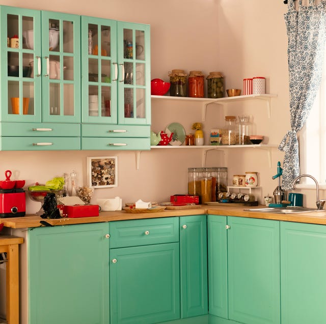
The latter half of the 2010s revisited some classics and introduced bolder choices. Basic Beige saw a resurgence in 2016, complementing the boho-chic trend. Striking Navy Blue in 2017 was a popular choice, often paired with white for a two-tone effect. Daring Black in 2018 capitalized on the navy trend, embracing richer, cozier hues. Vibrant Teal, mimicking a retro vibe, became a hit in 2019, just before the pandemic.
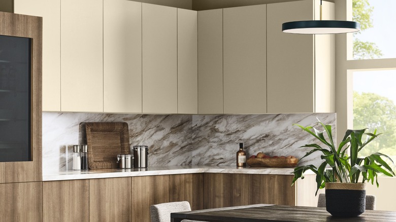
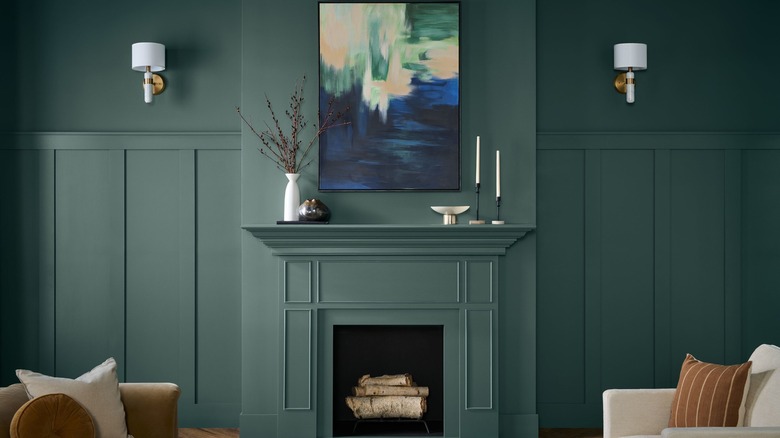
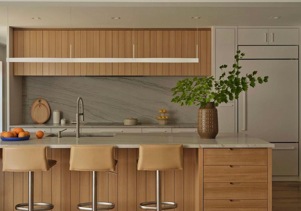
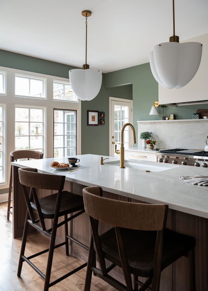
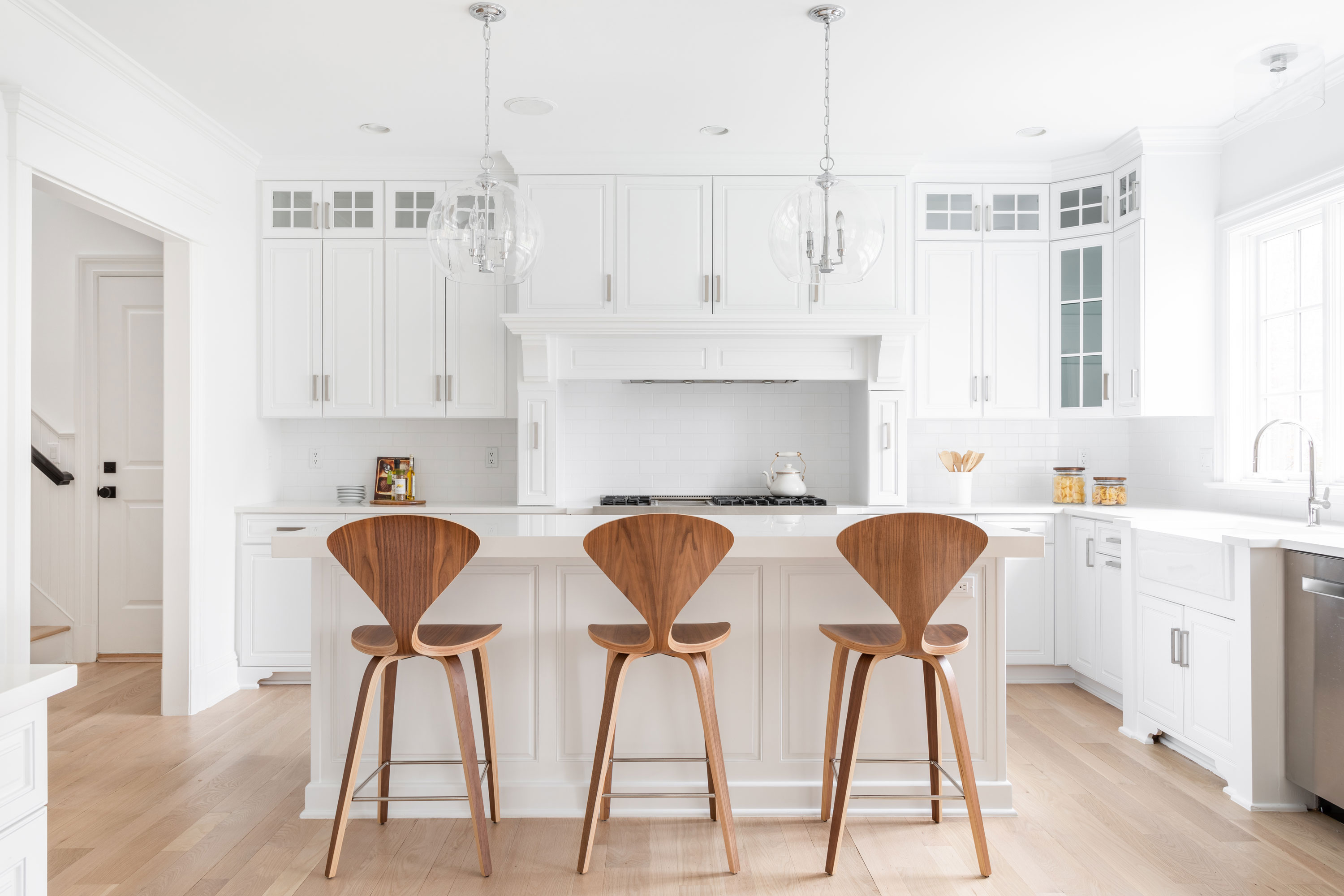
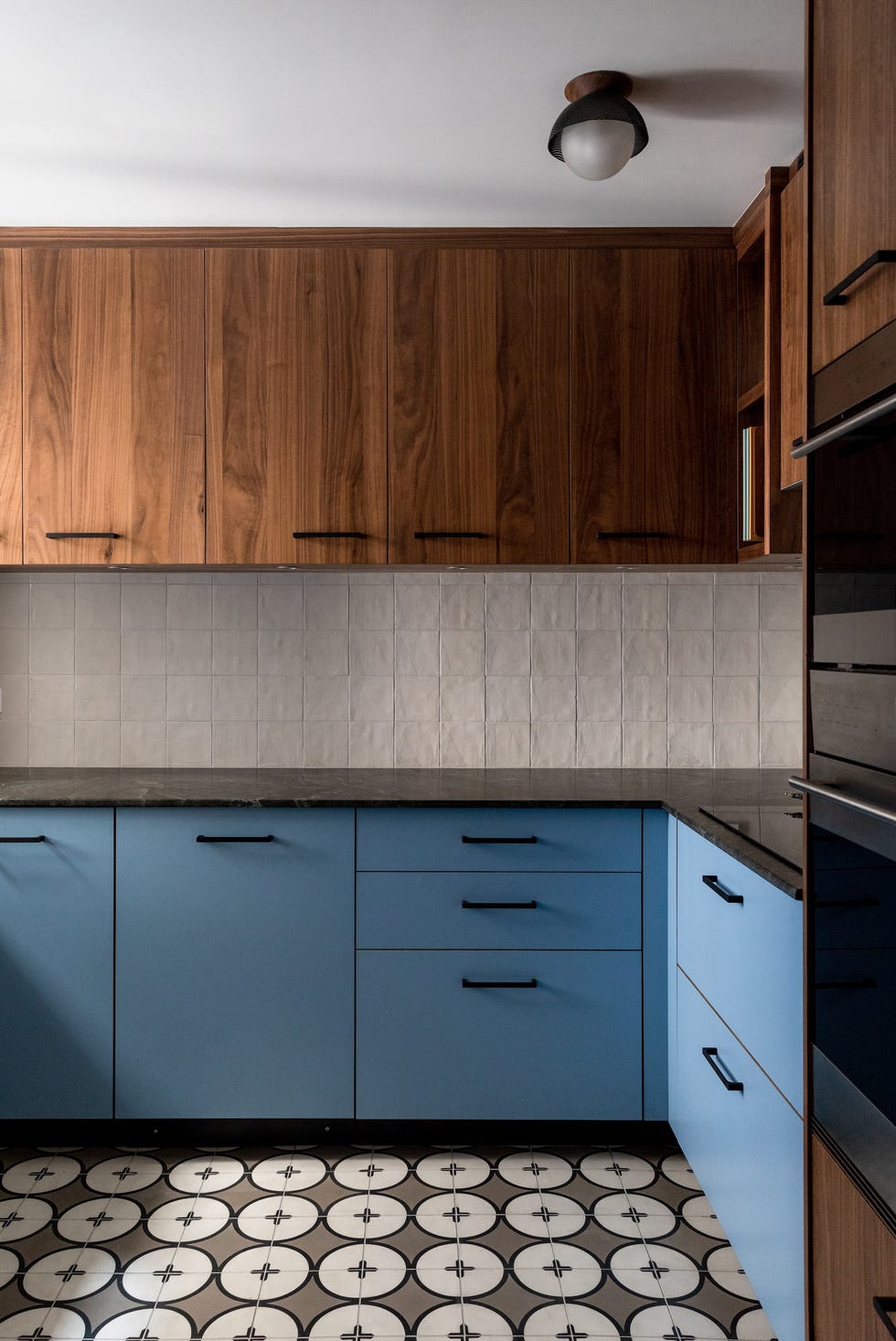
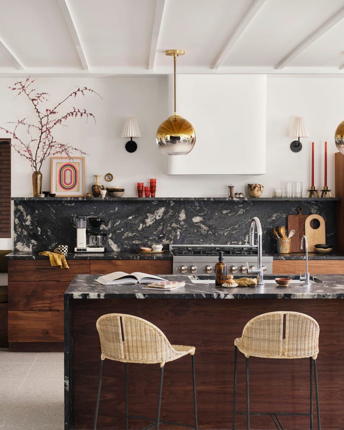
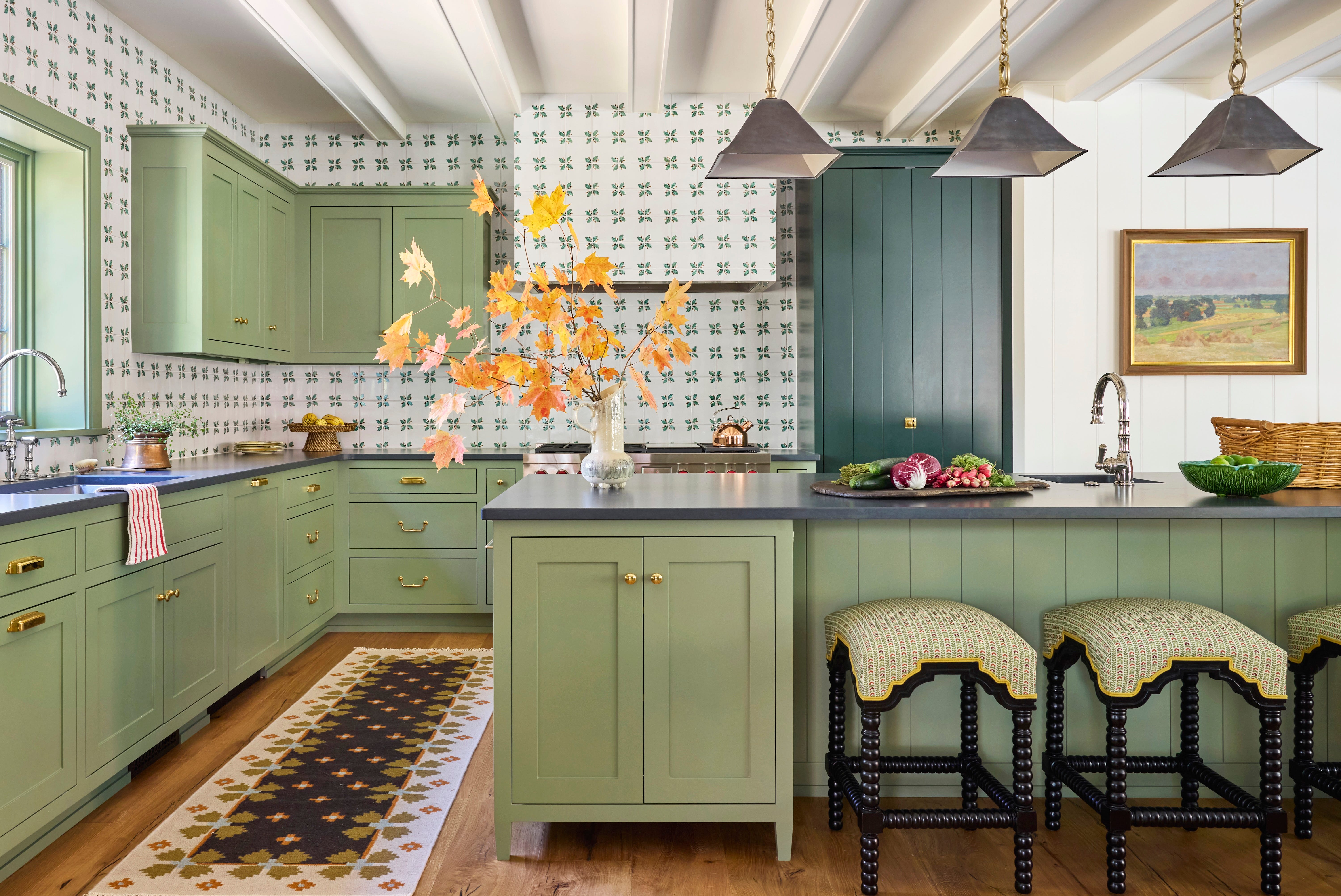
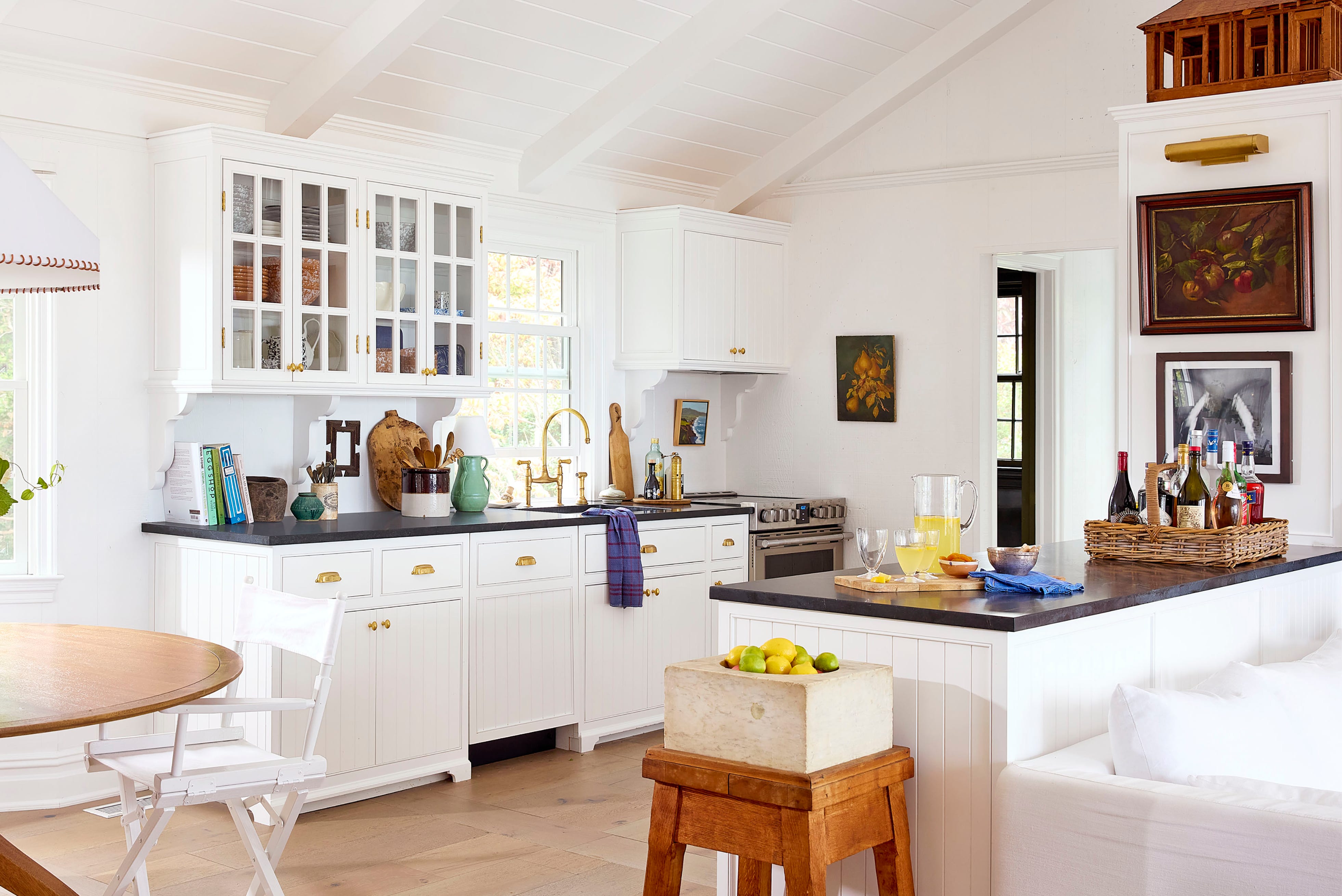
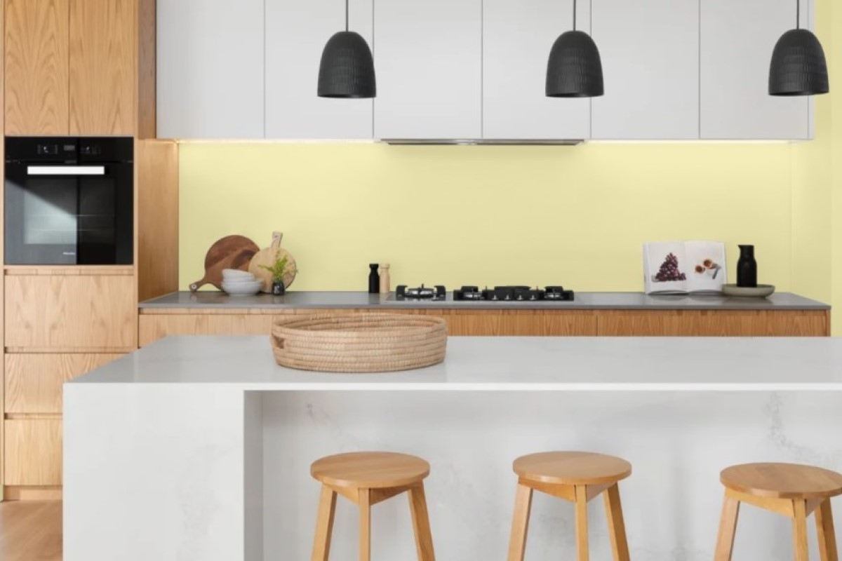
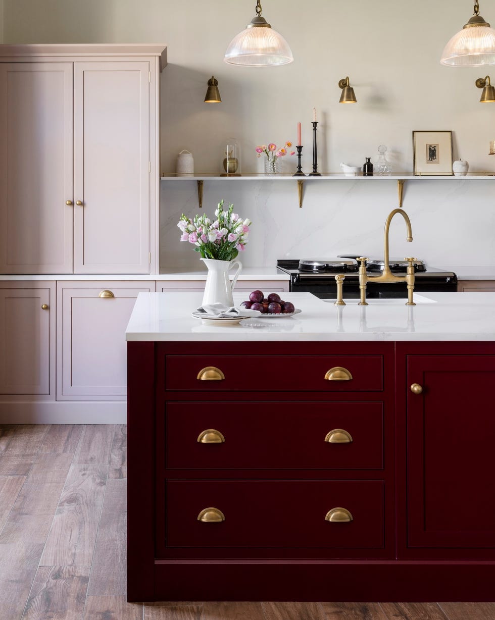
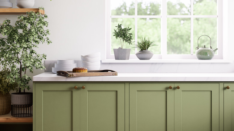
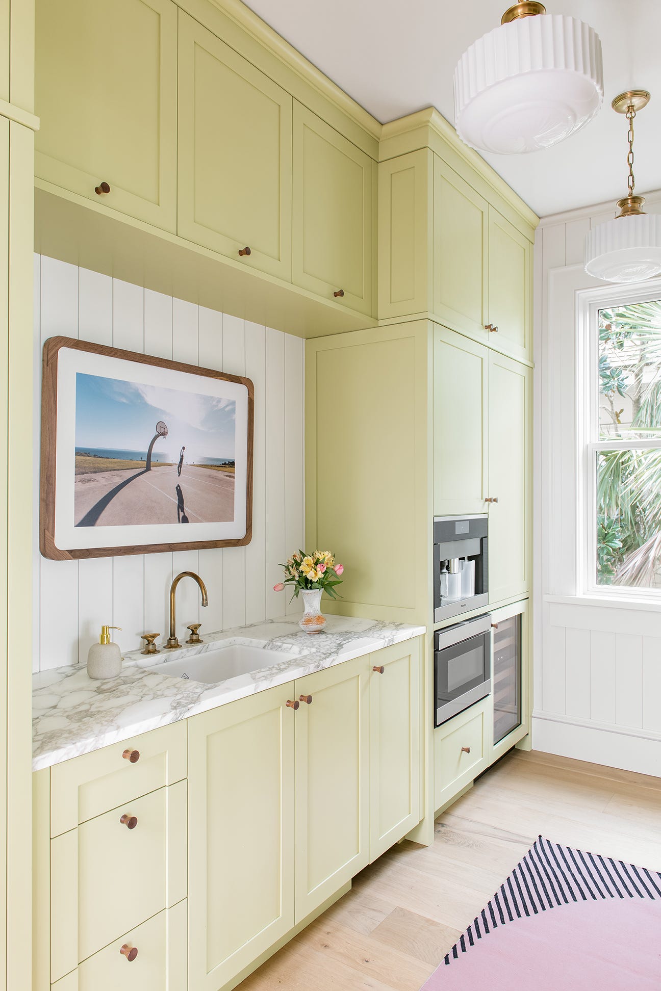
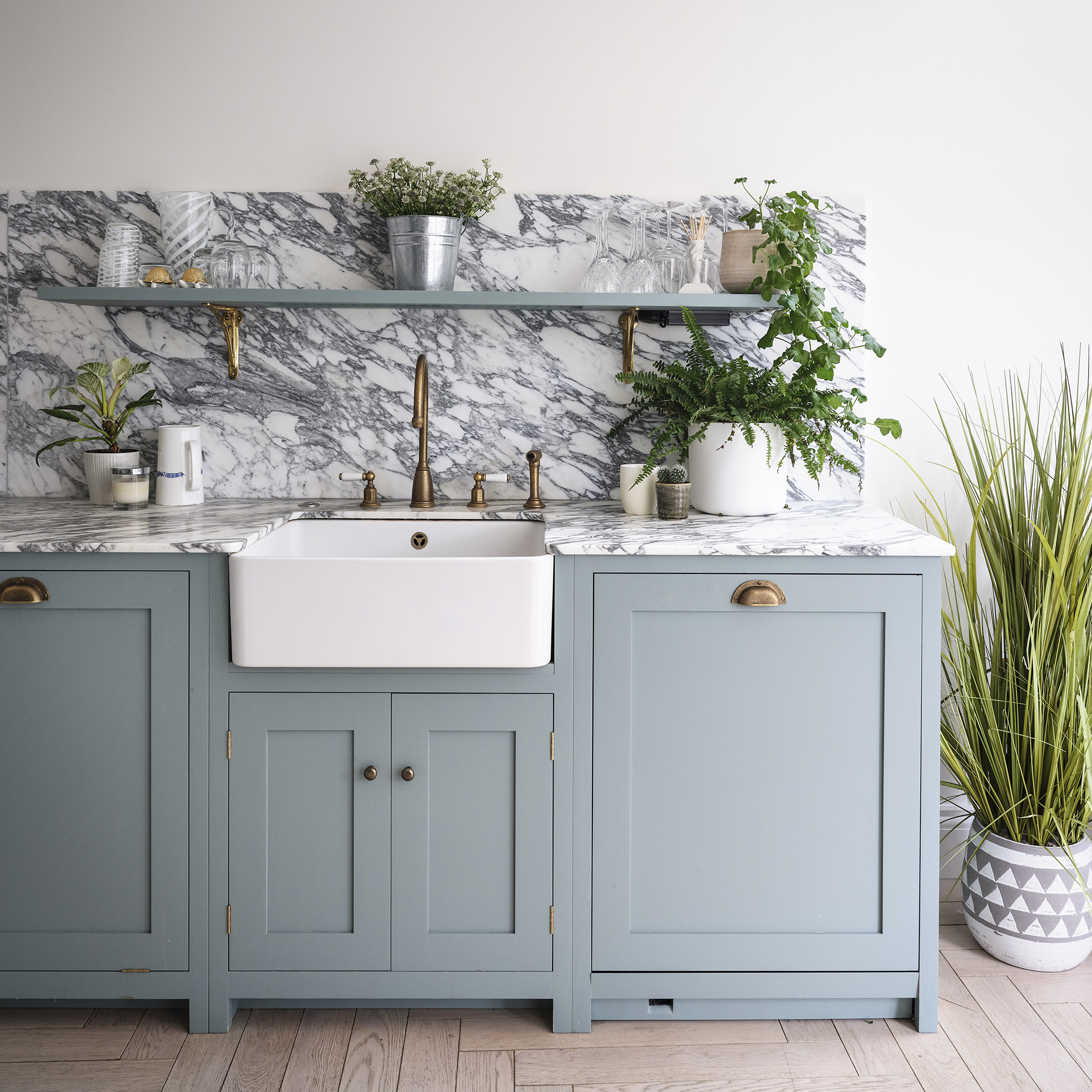
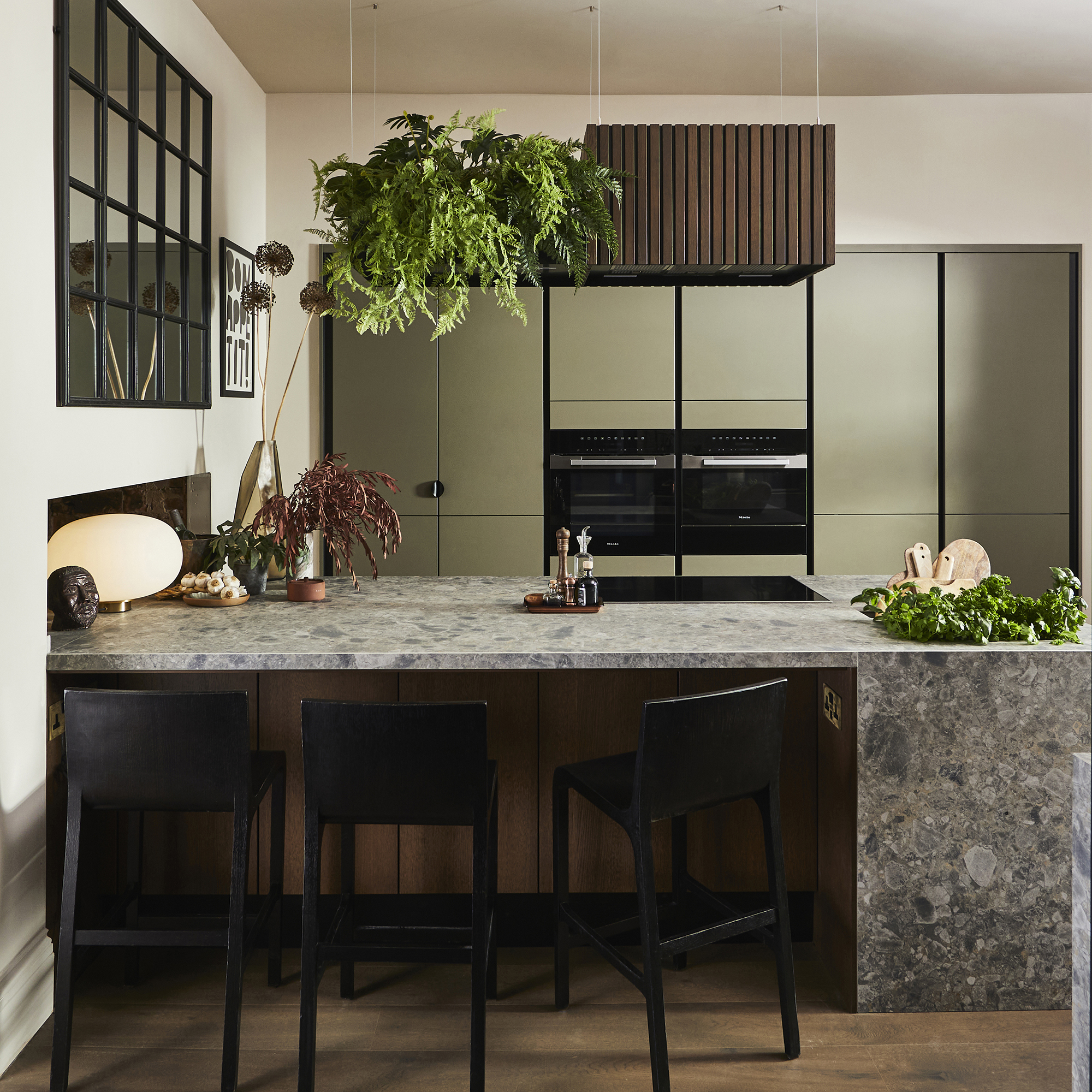
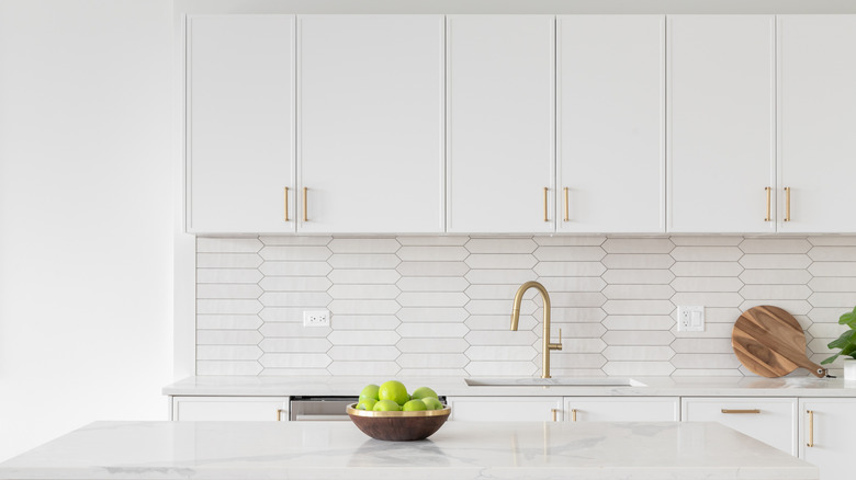
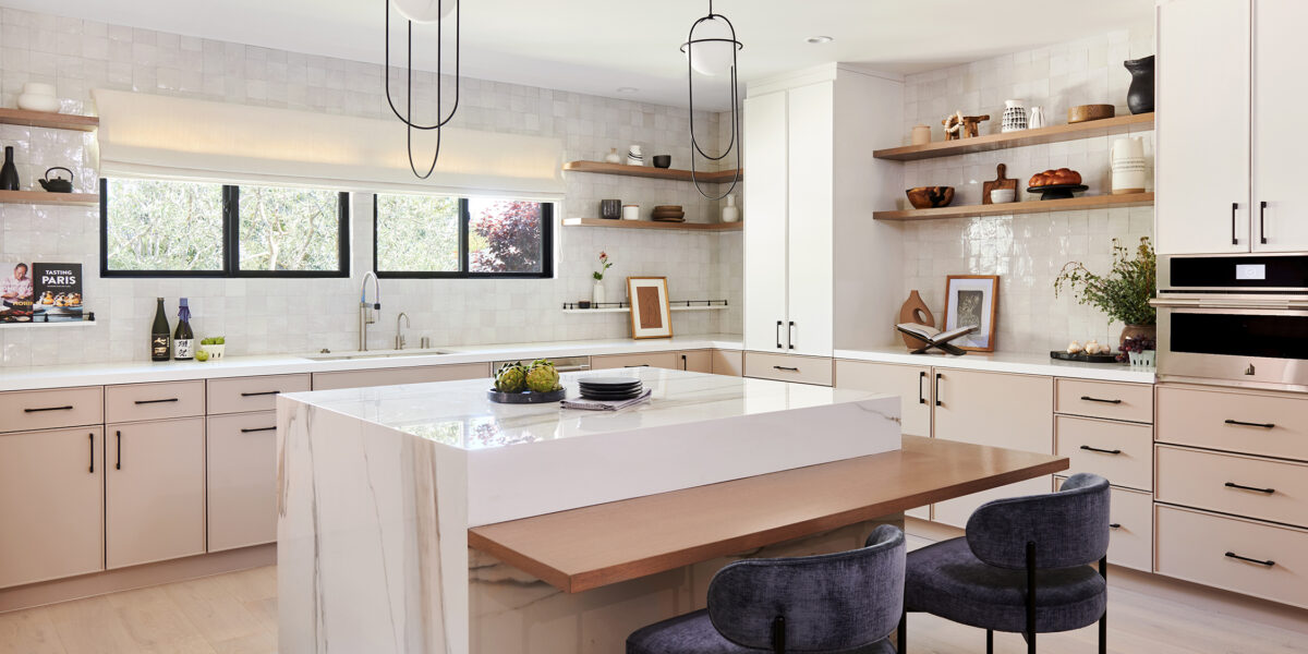
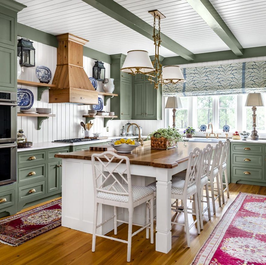
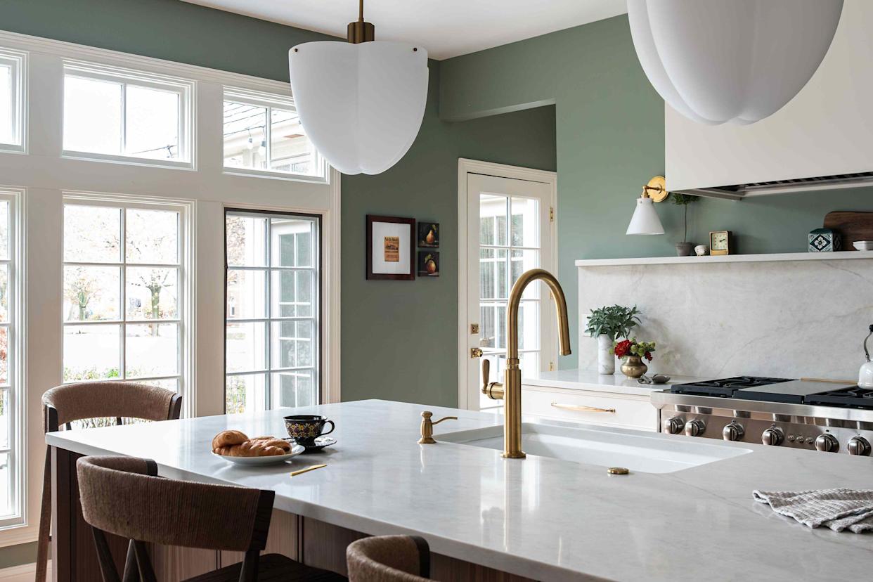
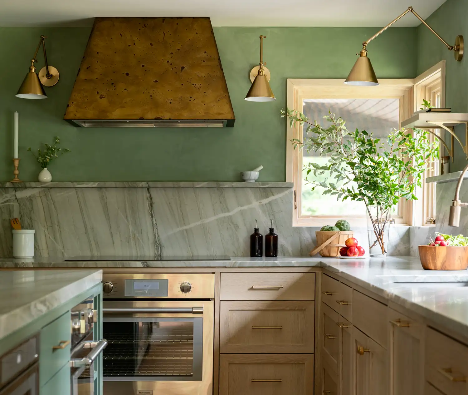
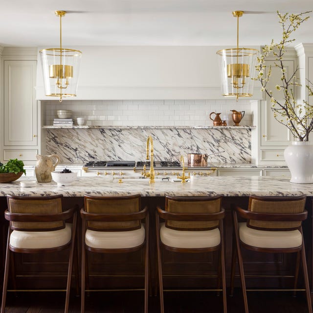
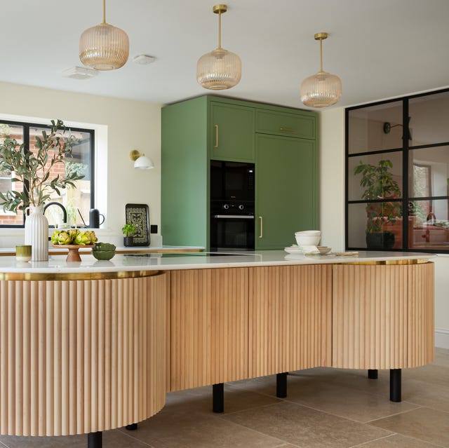
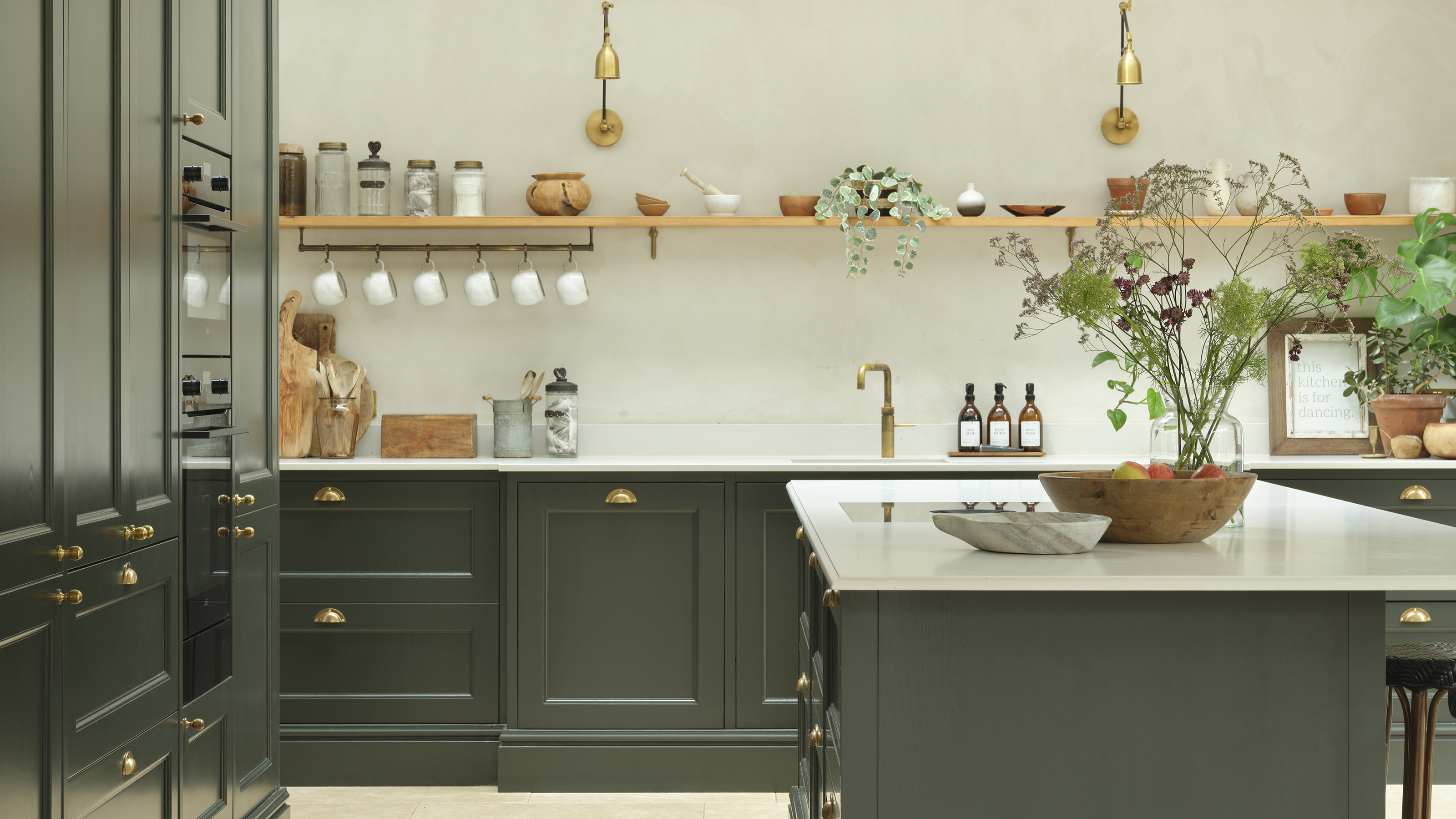
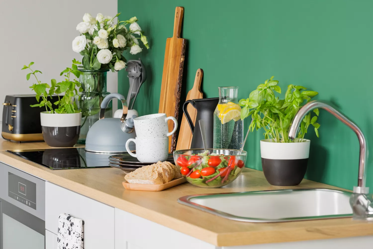
The early 2020s were characterized by a return to comforting neutrals. Pale Grey in 2020 became the new beige, offering a soft and subtle calm during uncertain times. Pastel Lavender in 2021 extended the grey theme with an optimistic touch. Pure White, paired with modern furniture, marked a return to muted sophistication in 2022. Soft Cream in 2023 offered a less stark, yet still neutral and classic, option. In 2024, Rich Plum stood out as a dark, convention-breaking color, often accented with gold. For 2025, Earthy Green is predicted to be popular, reflecting a significant shift towards natural elements and a desire for outdoor connection without being overly moody.
#KitchenDesign #PaintColors #InteriorDesignTrends #HomeDecoration #ColorPsychology #KitchenRenovation #DesignHistory #KitchenDesign #PaintColors #InteriorDesignTrends #HomeDecoration #ColorPsychology #KitchenRenovation #DesignHistory
0 comment in total
You may also like
11 Trendy Kitchen Paint Colors To Try In 2026

The 6 Paint Colors for Your Kitchen That Will Never Go out of Style
The Kitchen of Your Dreams Is Just a Paintbrush Away

Our Favorite Kitchen Wall Paint Colors
6 Kitchen Paint Color Trends That Are Already Taking Over Walls in 2026

6 Kitchen Cabinet Colors Design Pros Say Will Be Huge in 2026
Trending Now: Paint Colors for Your Kitchen Cabinets
5 Gorgeous Paint Colors To Elevate Your Kitchen Cabinets In 2025

The Best Kitchen Paint Colors All Have This One Thing In Common
Top 20 Kitchen Paint Colors for Every Style—From Timeless Neutrals to Rich Earth Tones
29 Best Paint Colors for a Kitchen You’ll Never Want to Leave

Ditch the White! Try One of These Designer-Approved Kitchen Colors
5 Outdated Kitchen Paint Colors That Interior Designers Are Tired of Seeing
Five Mistakes People Make When Selecting Kitchen Cabinets—and How to Avoid Them

These kitchen paint colours will be everywhere in 2025 – and there's even one for neutral lovers
These 3 kitchen colours are officially out of style in 2025 - here are the shades replacing them
The Best Kitchen Paint Colors for 2024, According to Experts
20 Kitchen Paint Colors to Try in 2024

It’s Official: These are the Best Kitchen Paint Colors, According to Designers
These Will Be the Most Popular Kitchen Paint Colors In 2025, According to Interior Designers