1/9
The Paint Trend That’s Arguably Helping Us Sleep Better
The article explores the emerging design trend of monochromatic bedrooms, often referred to as “color drenching,” suggesting it contributes to better sleep and a more serene environment. Traditional color theory often links specific hues like creamy white or sage green to calmness, but this trend posits that the specific color is less important than its consistent application throughout the room.
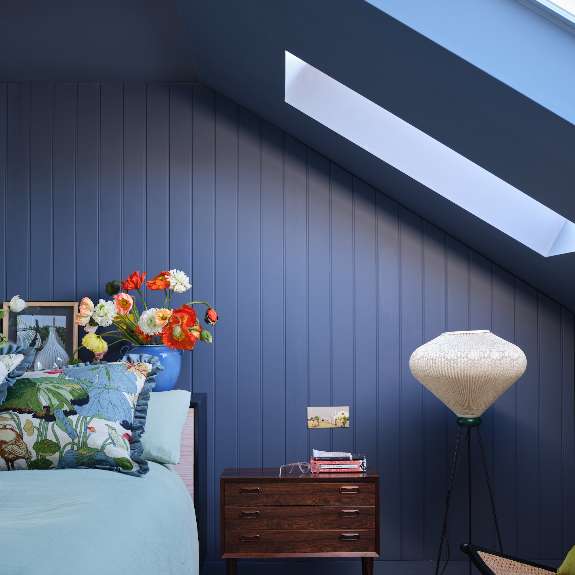
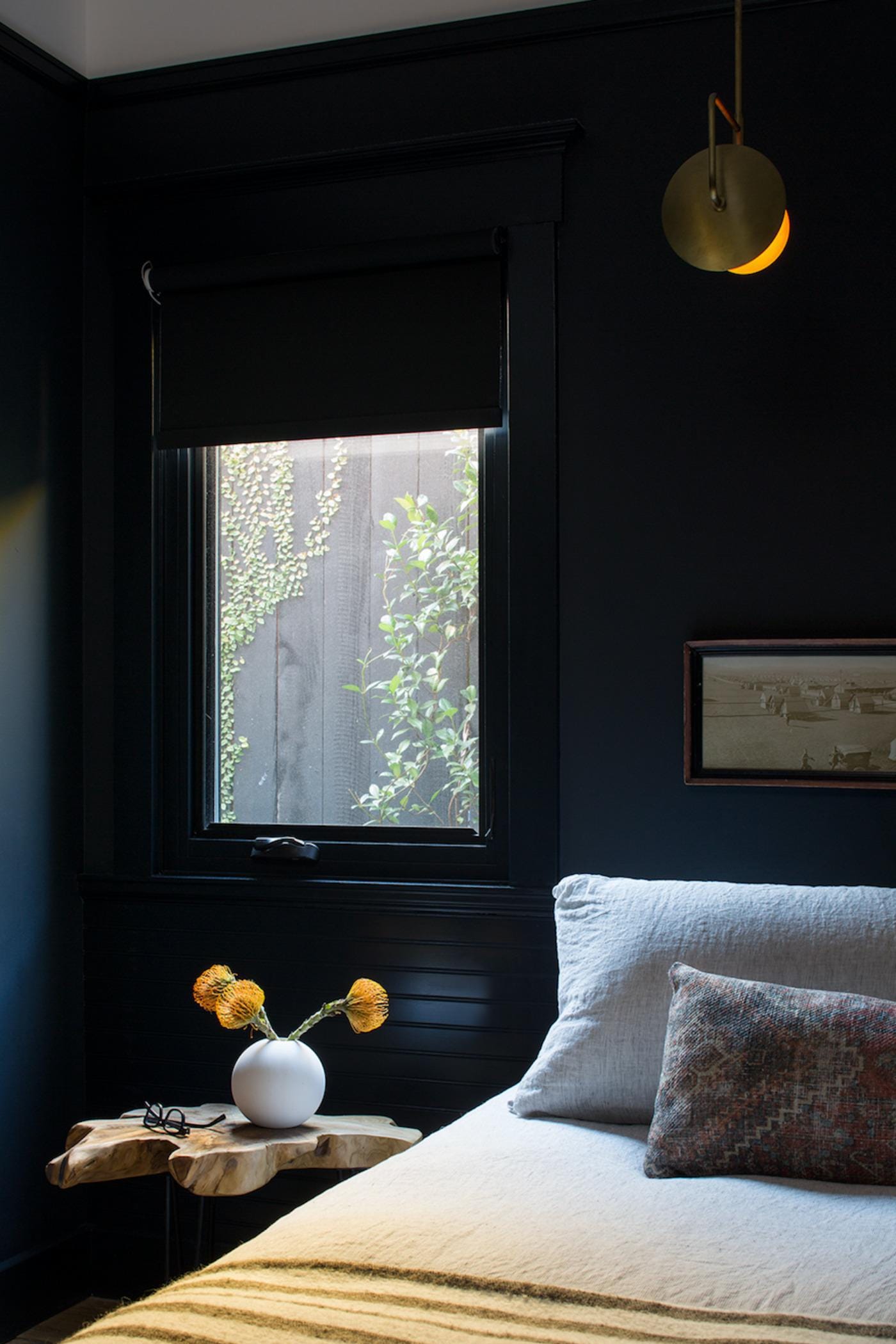
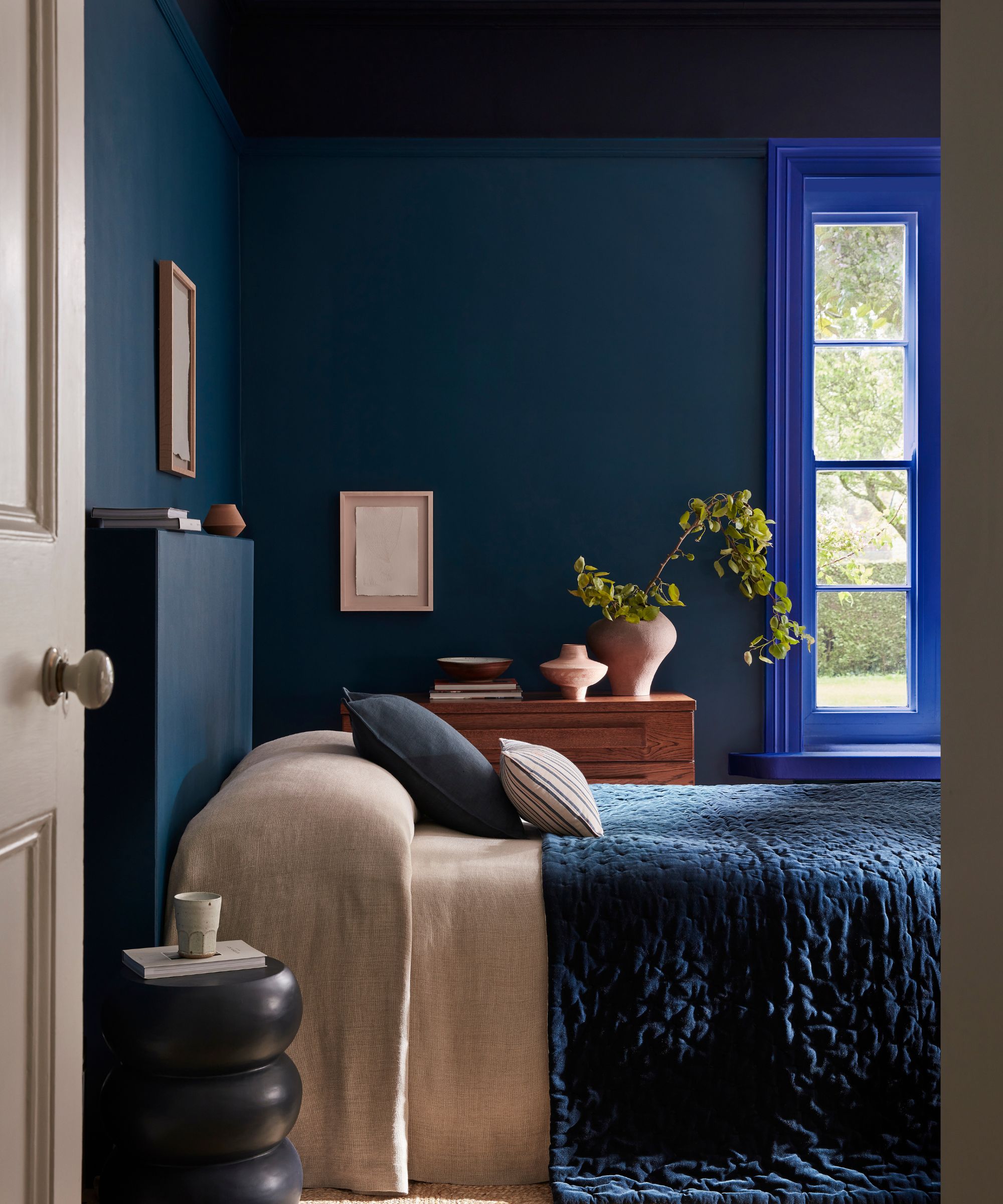
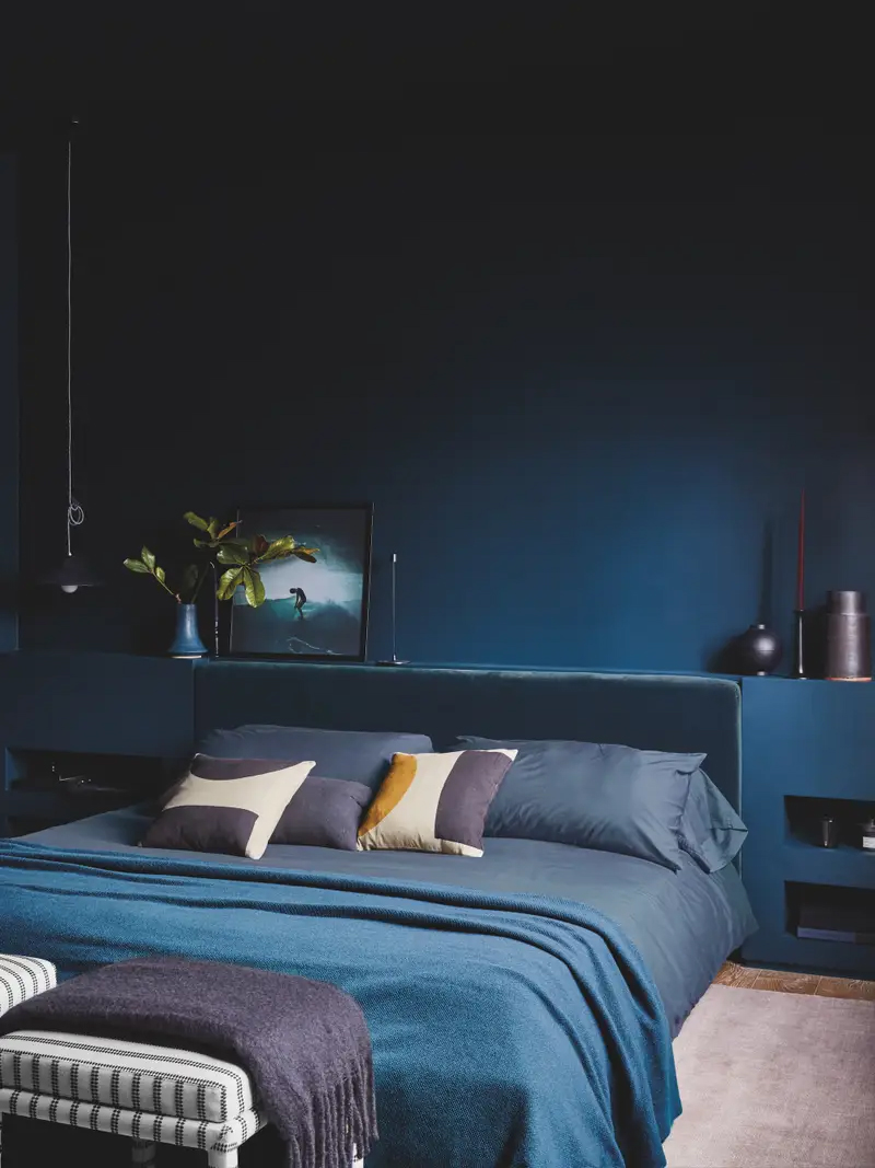
Garance Doré, a French photographer and influencer, exemplifies this approach, choosing a deep blue shade, Dark Night by Sherwin Williams, for her bedroom to create a “chill down” atmosphere. She incorporated blackout shades and custom-dyed sheets to enhance the monochrome effect. While she initially considered a matching carpet, her designer advised against it, emphasizing the core principle: selecting a single color and applying it extensively across walls, ceiling, bedding, and window treatments to achieve a tranquil space.
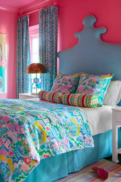
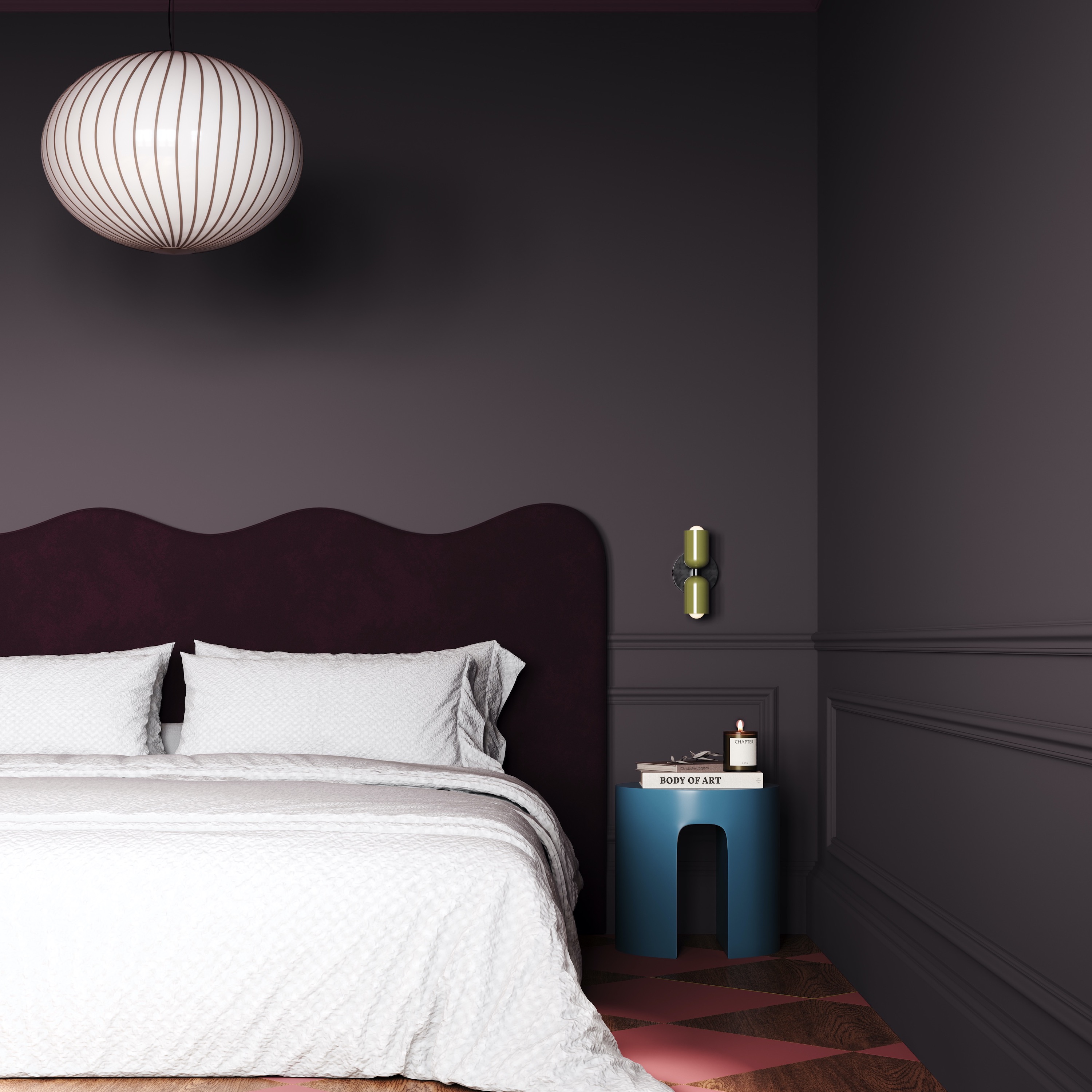
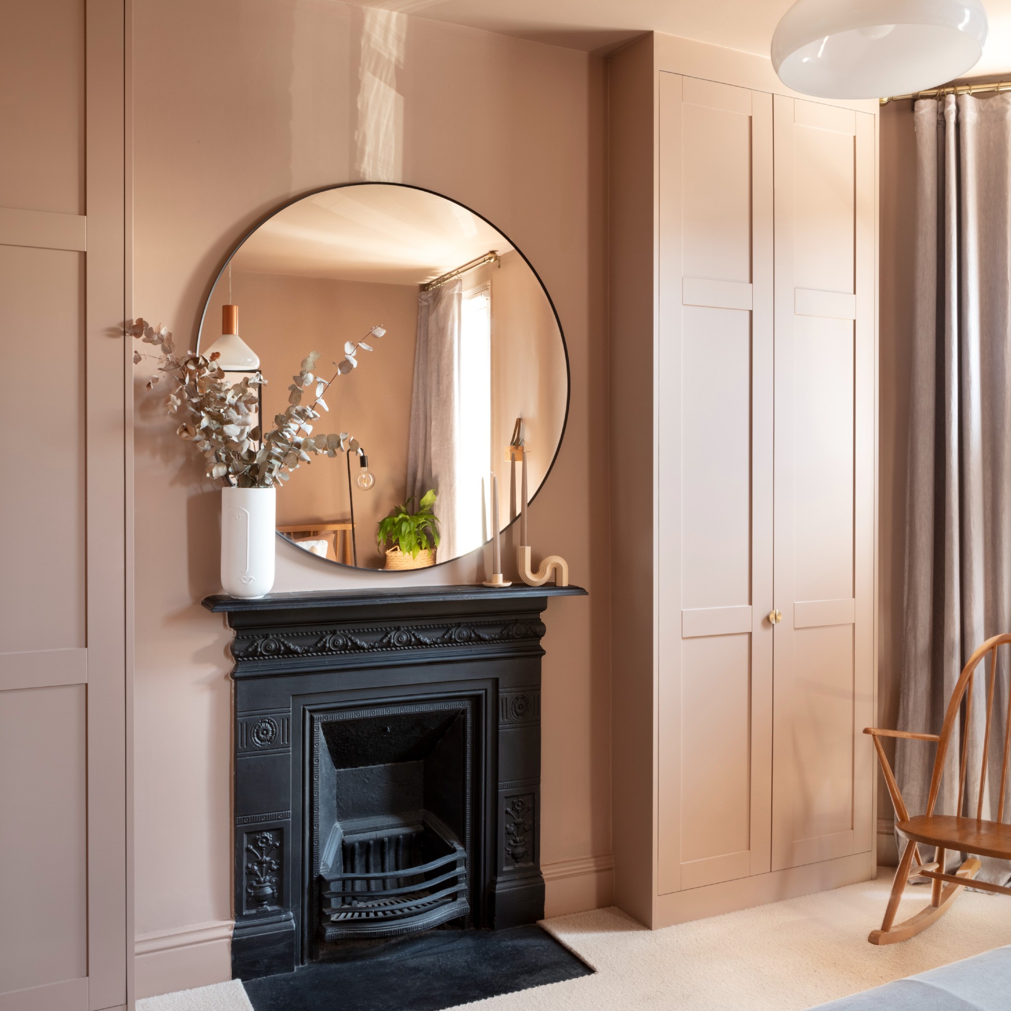
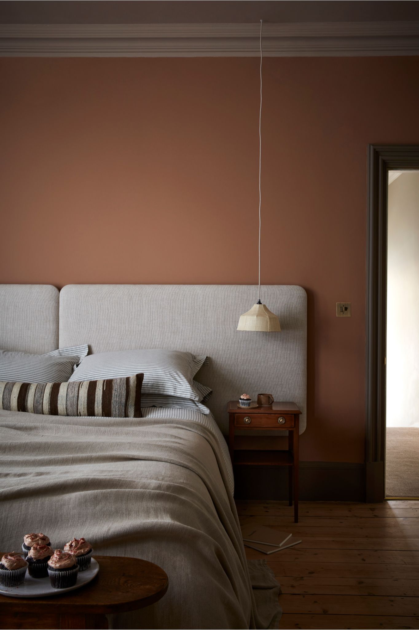
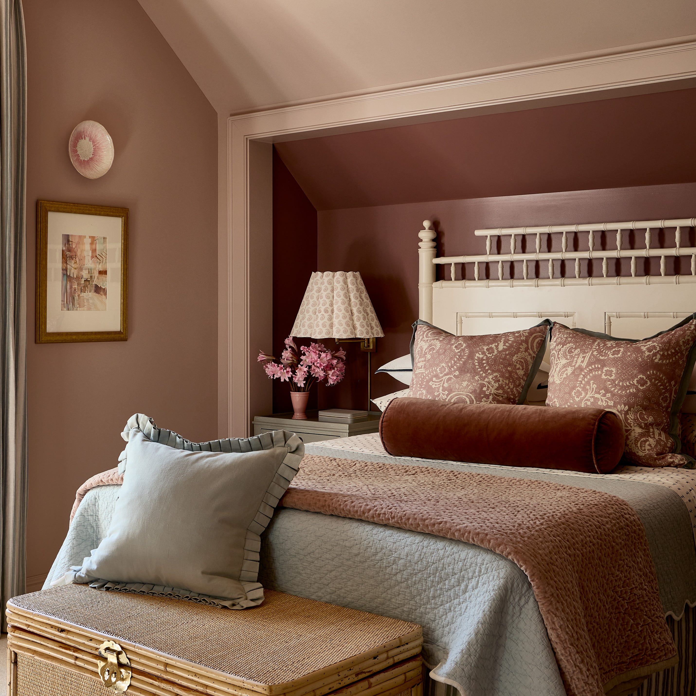
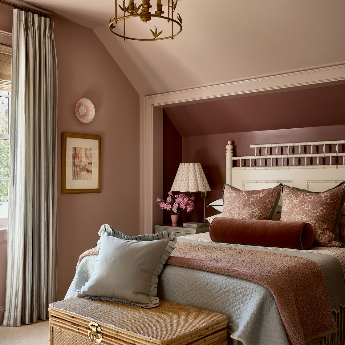
The article provides six practical tips for successfully implementing this monochromatic design. The first tip, "Keep the Paint Brush Moving," suggests painting all surfaces, including walls, ceiling, and trim, in the same hue and finish to simplify the process and create a cohesive look. Sally Breer's bedroom, featuring a dark rosy pink on all flat surfaces, including a drywall bump-out for art, illustrates this point.
Another tip, "Add Fabric to Unusual Places," demonstrates how renters can achieve a similar effect with temporary solutions. Designer Hugh Long wrapped his client’s bed in the same raspberry pink fabric used for the bedspread, creating a cocoon-like corner that is easily removable. This highlights the versatility of fabric in achieving a monochrome aesthetic.
"Find a Perfect Match" emphasizes the importance of meticulously matching bedding and other accessories to the chosen paint color to enhance tranquility. Julia Stevens, Domino’s style editor, was inspired by a space designed by Charlap Hyman & Herrero and decided to paint her studio apartment in a similar soft blue, extending the color to her bedding to amplify the effect.
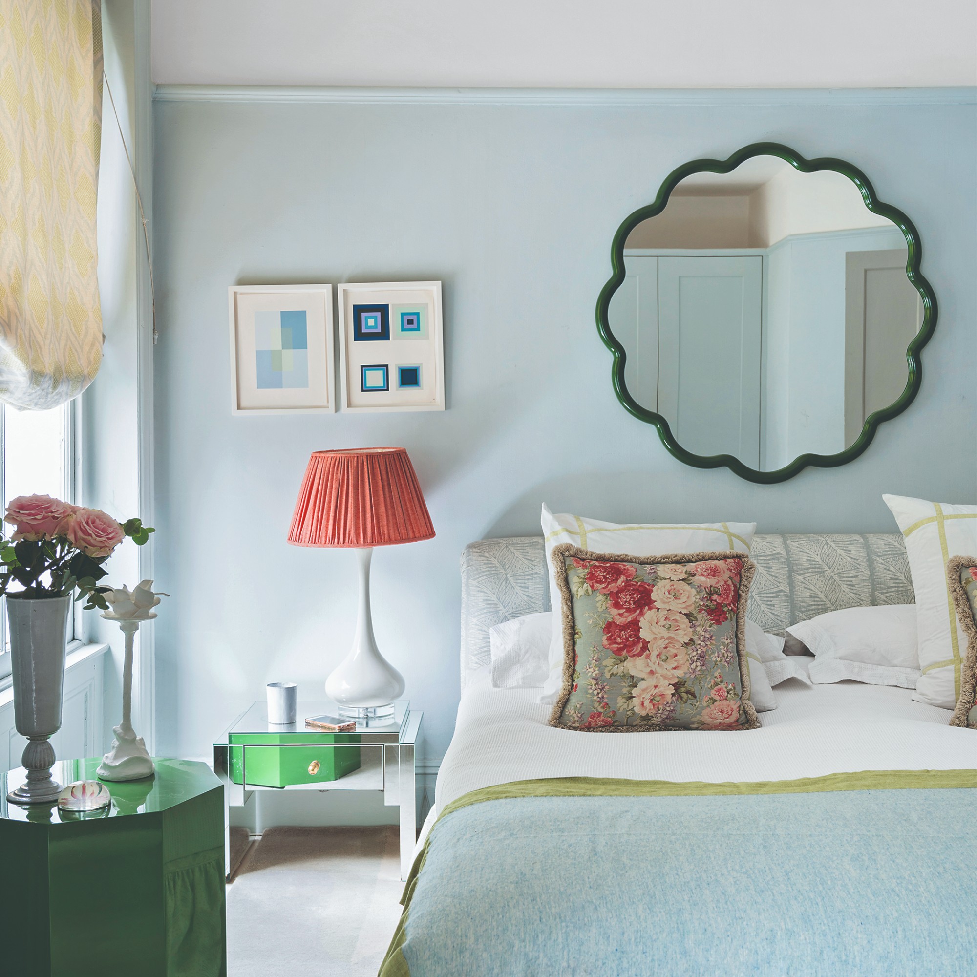
"Amplify the Effect With Mirrors" suggests using mirrors to create an illusion of infinite color. Laura Yeh's bedroom, painted in Farrow & Ball’s Breakfast Room Green, utilizes clever mirror placement to make the vibrant green appear to extend indefinitely, achieving her goal of feeling “wrapped in color.”
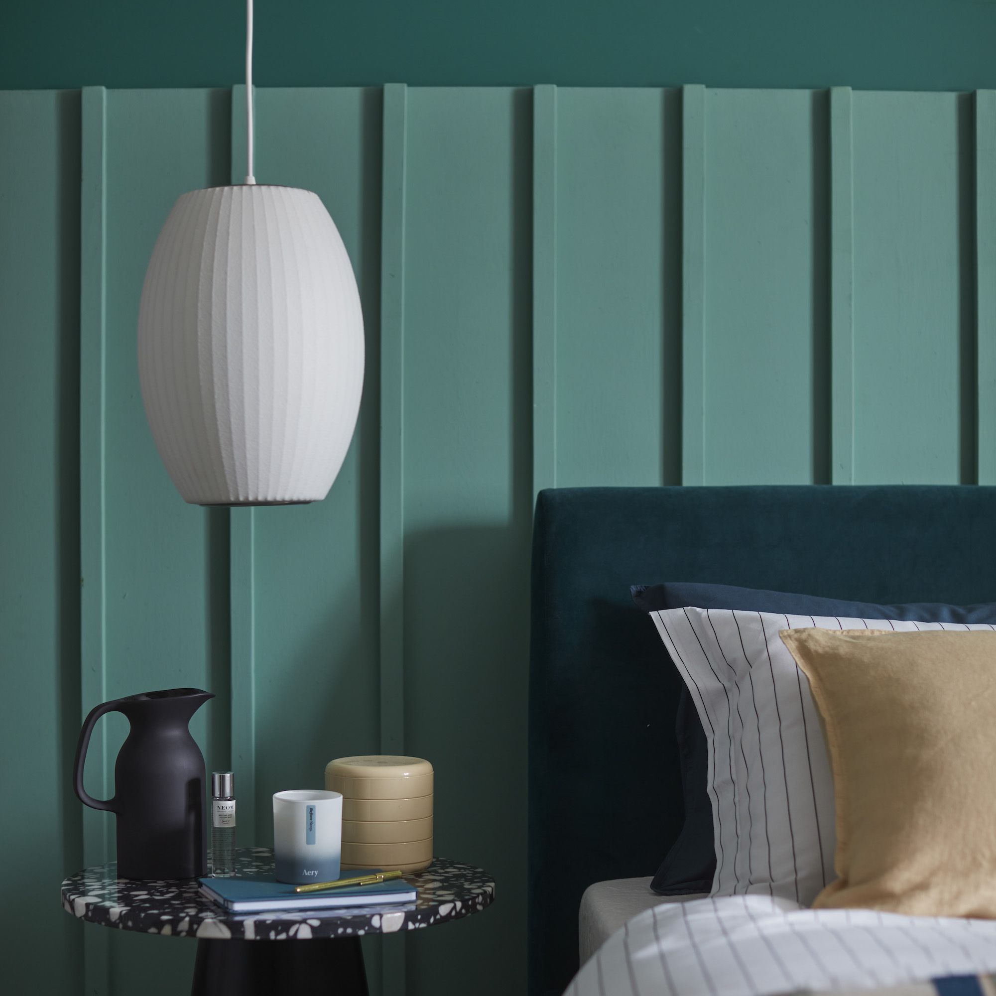
"Bring Curtains Into the Fold" focuses on integrating window treatments into the monochromatic scheme. Designer Tamarra Younis of Union of Art used Benjamin Moore’s Bali, an elegant minty tone, for a client's guest bedroom and worked with a fabricator to create coordinating wall-to-wall, floor-to-ceiling drapery that hangs from custom valance boxes wrapped in the same color. This method provides a sense of grandeur and glamour while maintaining the unified color palette.
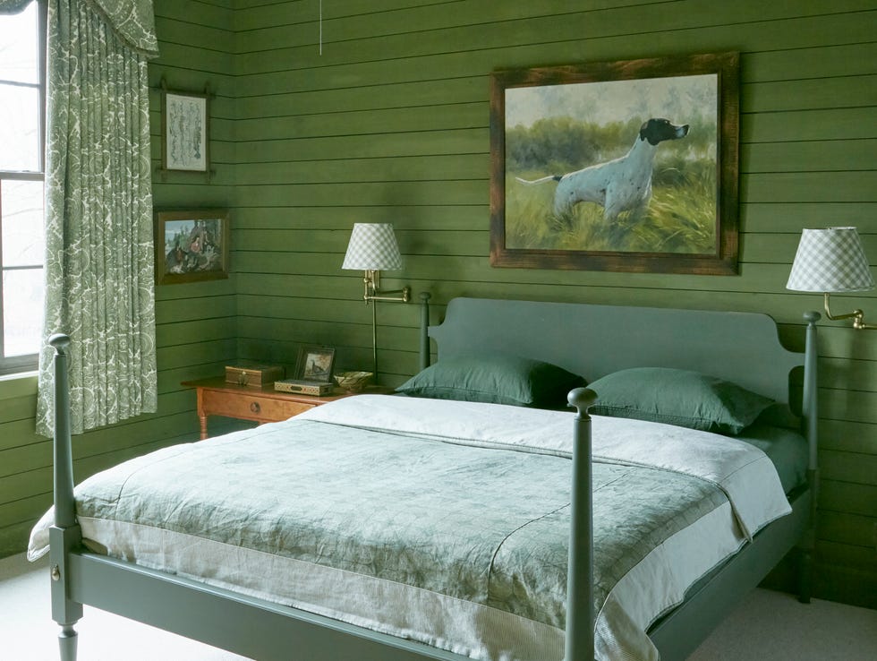
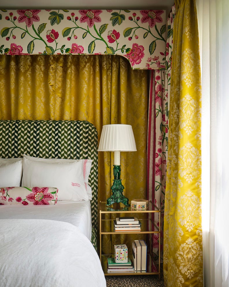
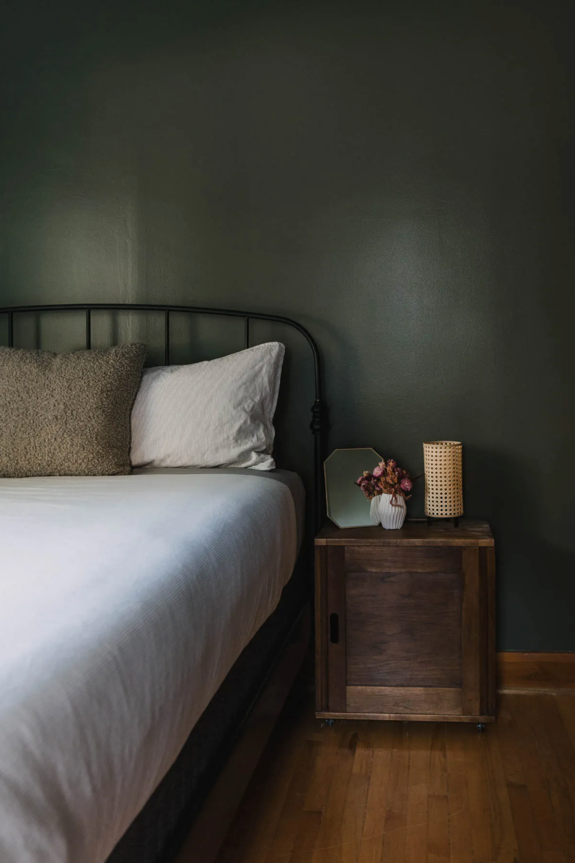
The final tip, "Get Weird With Your Color Choice," encourages experimentation with less conventional colors such as murky greens, blue-blacks, and earthy purples. These moody tones are presented as suitable for creating a theatrical and romantic atmosphere, especially when complemented by elements like canopies or linen Roman shades.
#MonochromaticBedrooms #ColorDrenching #BedroomDesign #InteriorPainting #SleepEnvironment #HomeDecorTrends #DesignTips #MonochromaticBedrooms #ColorDrenching #BedroomDesign #InteriorPainting #SleepEnvironment #HomeDecorTrends #DesignTips
0 comment in total
 No comments yet
You may also like
5 Paint Colors That Will Help You Sleep Better if You Use Them in Your Bedroom

Designer-Approved Bedroom Paint Colors That'll Help You Wake Up Happier
You're Styling Your Bed All Wrong—Here's How to Get It Right, According to Experts

8 Bedding Trends to Try This Year That Are Absolutely Dreamy

The Best Bedroom Colors to Help You Sleep (And Wake Up Happy)
5 bedroom design tips to help night owls fall asleep – and wake up feeling fresh

Sleep experts say Kristen Bell's bedroom color is the ultimate soothing shade for a restful slumber
18 dreamy bedroom colour ideas to create a rest-promoting, stylish space
Best Bedroom Colors for Sleep

5 Bedroom Paint Colors That Could Be Ruining Your Sleep
You Can Wake Up HAPPIER Just by Painting Your Bedroom—Here Are the Colors Designers Love

5 rooms that prove color drenching your bedroom is a good idea

11 Soothing Bedroom Paint Colors Designers Say Can Help You Sleep

The Best Bedroom Paint Colors for Unwinding at Night

The Best Bedding to Improve Your Sleep

5 bedroom colors going out of style in 2025 – and what designers are using instead for a stylish sleep space
These Designer-Approved Bedroom Paint Colors Are the Key to the Best Sleep of Your Life

Is colour drenching a bedroom a good idea? 7 rooms that prove it is
A Dark Bedroom Color Palette Might Be the Key to a Good Night's Rest

The Most-Googled Bedroom Paint Color Isn’t the Soothing Hue You’d Expect