1/11
The 10 Best Blue-Green Paint Colors Designers Can't Stop Using
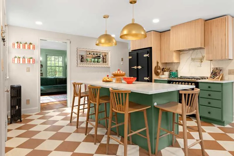
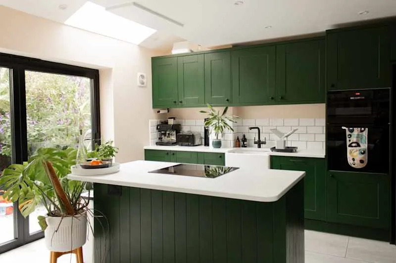
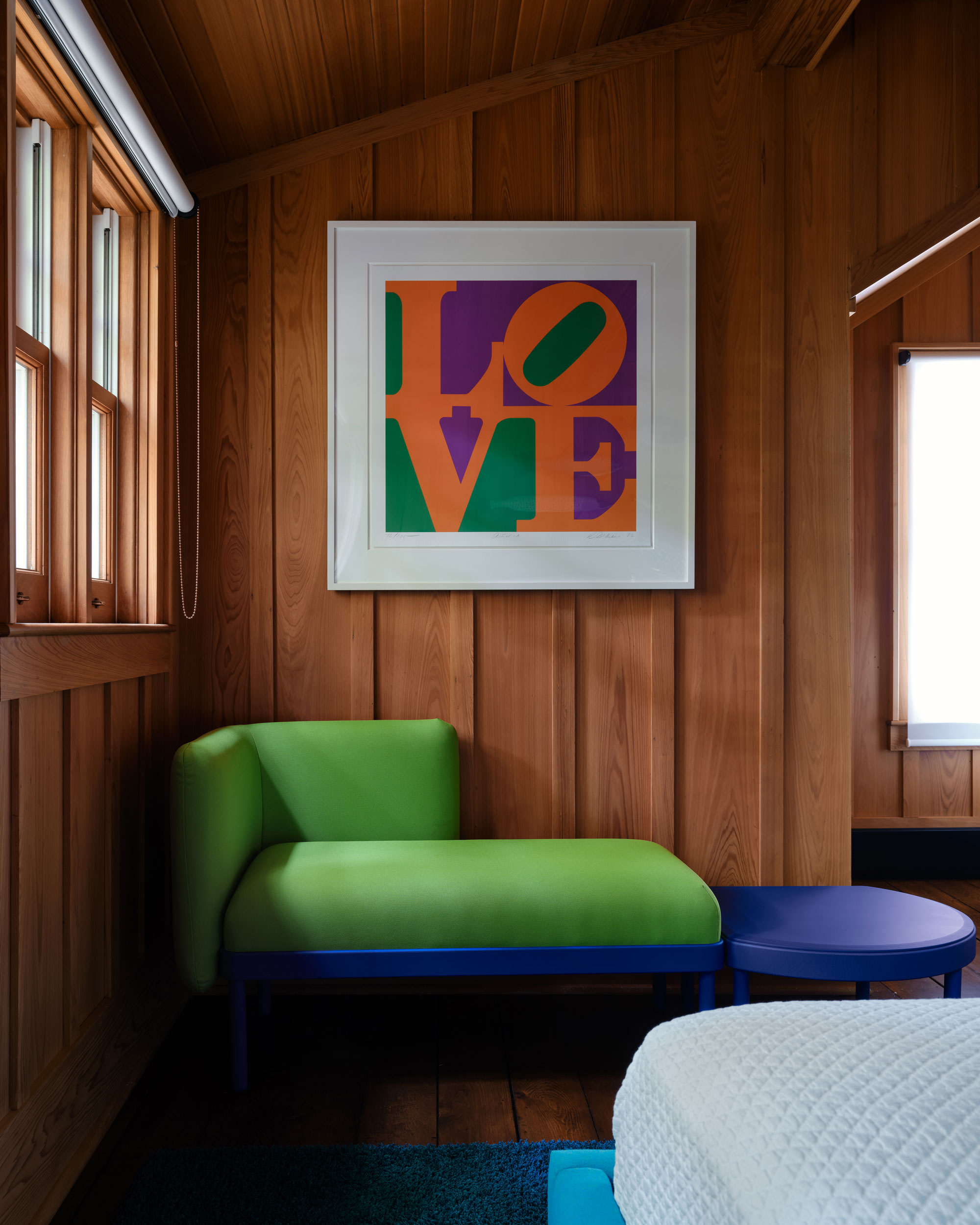
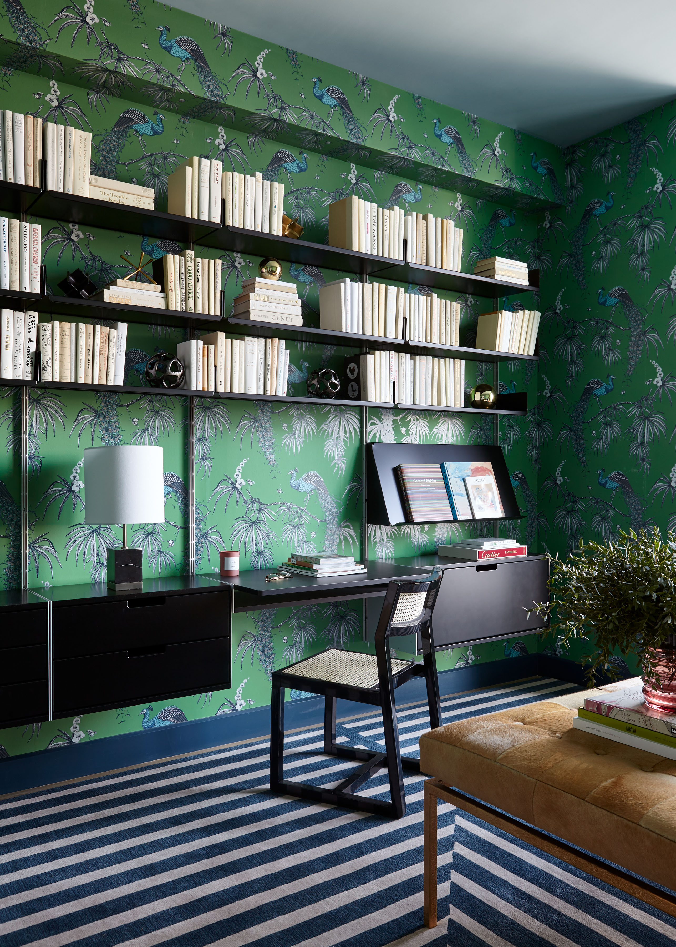
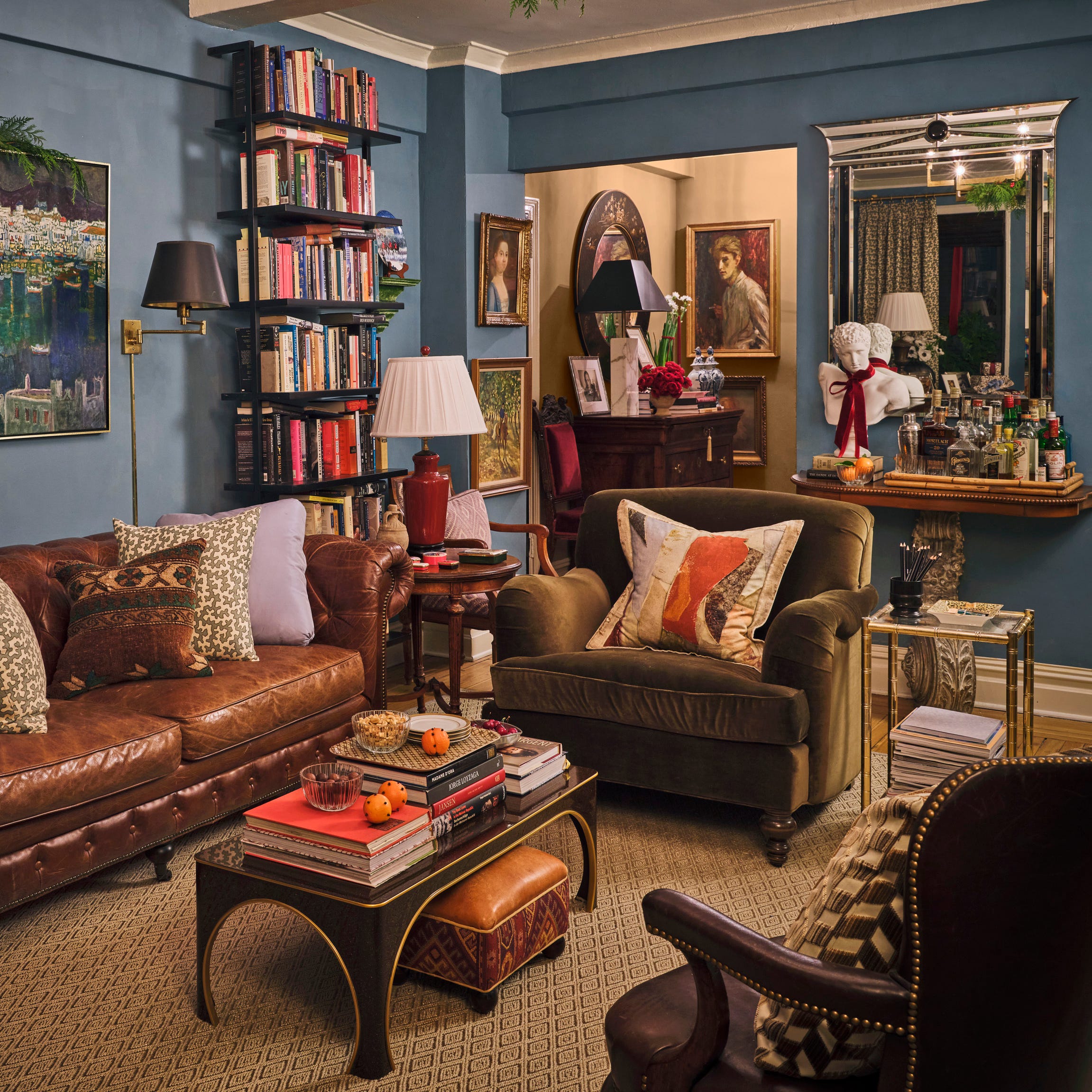
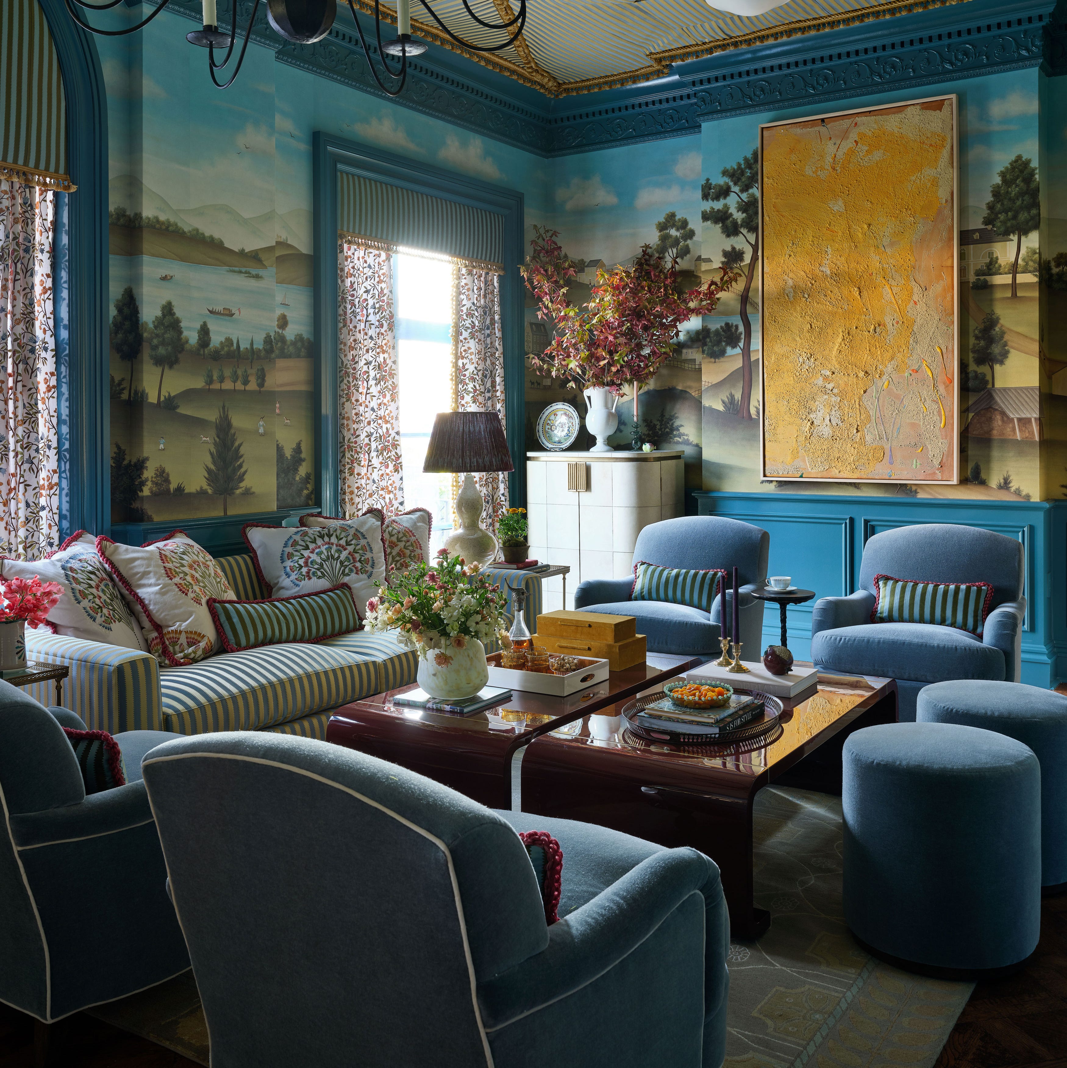
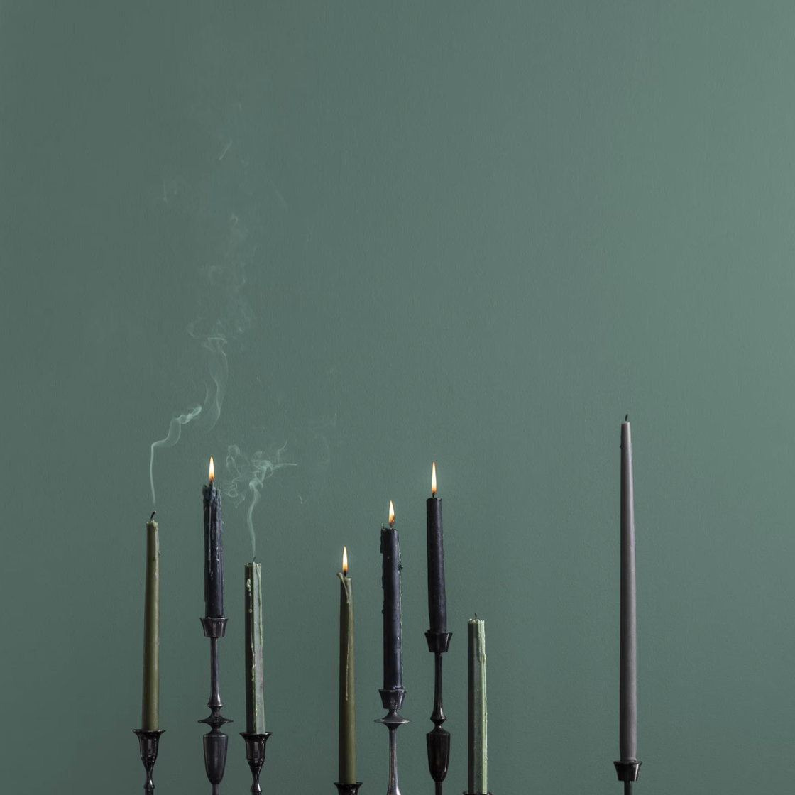
Blue-green paint colors are a versatile and timeless choice in interior design, offering a unique blend of statement-making appeal and soothing tranquility. These hues are suitable for a variety of settings, from bright beach houses to sophisticated urban apartments, and their appearance subtly shifts with changing light conditions, always maintaining an inherent elegance. This selection highlights ten designer-approved blue-green paint colors, detailing their characteristics and recommended uses, gathered from a network of designers and color experts.
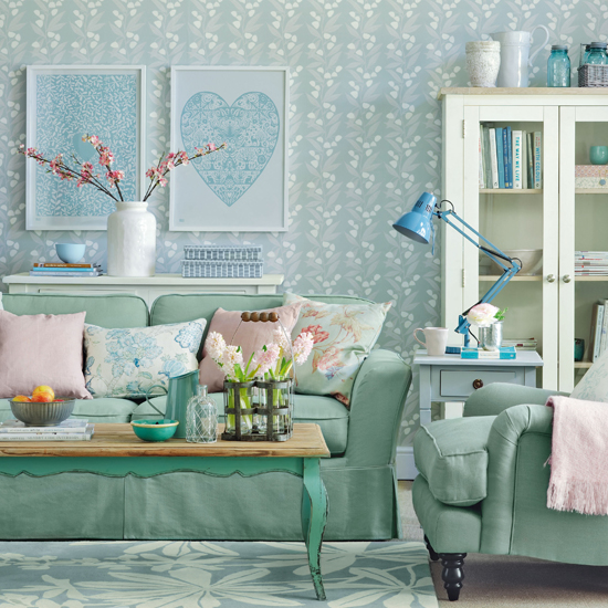
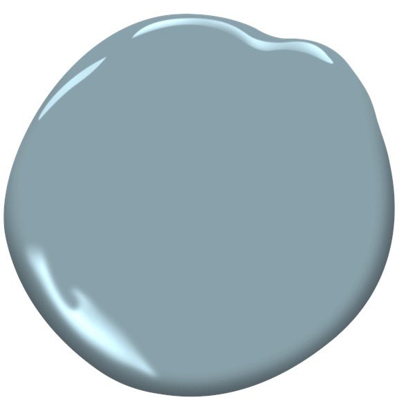
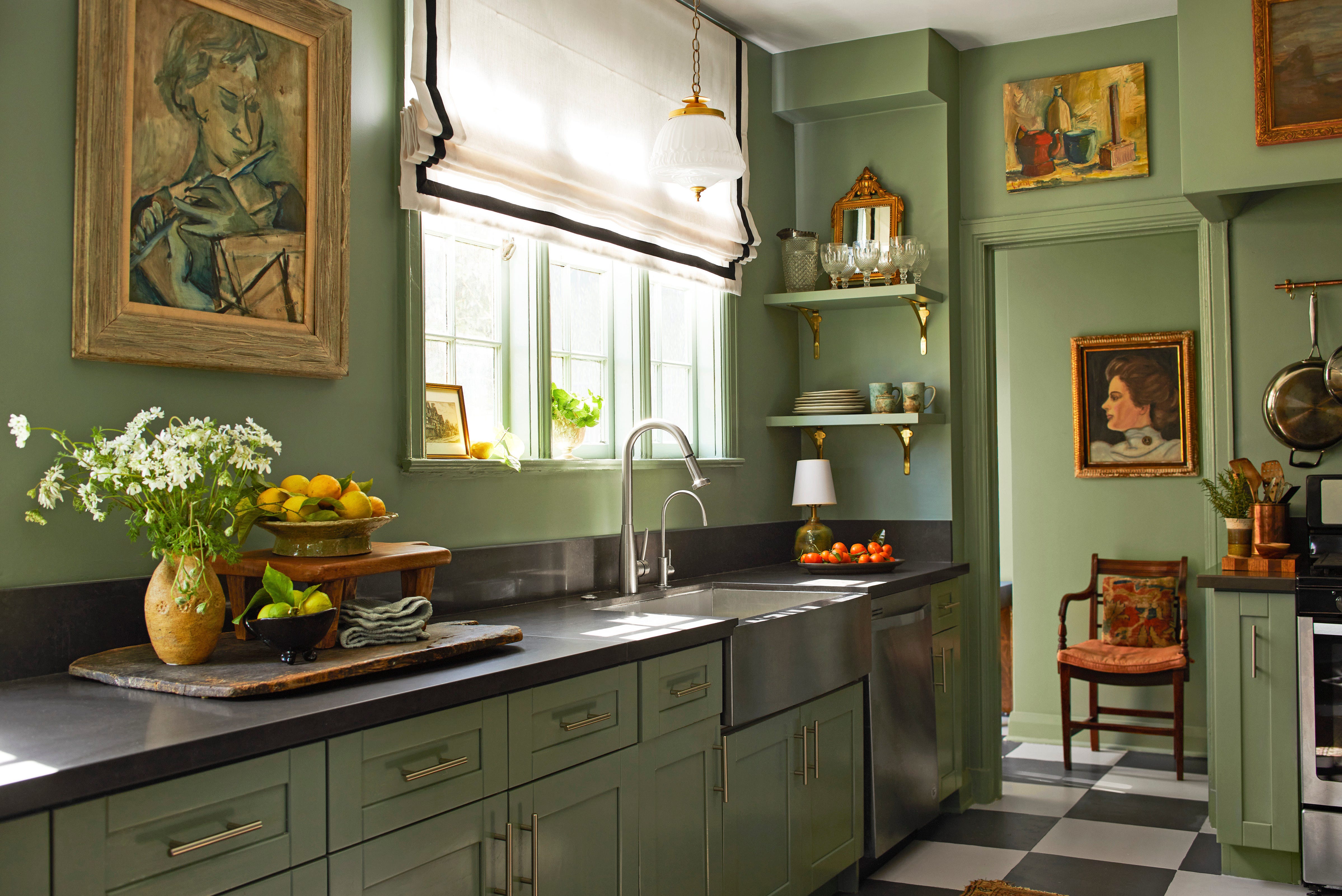
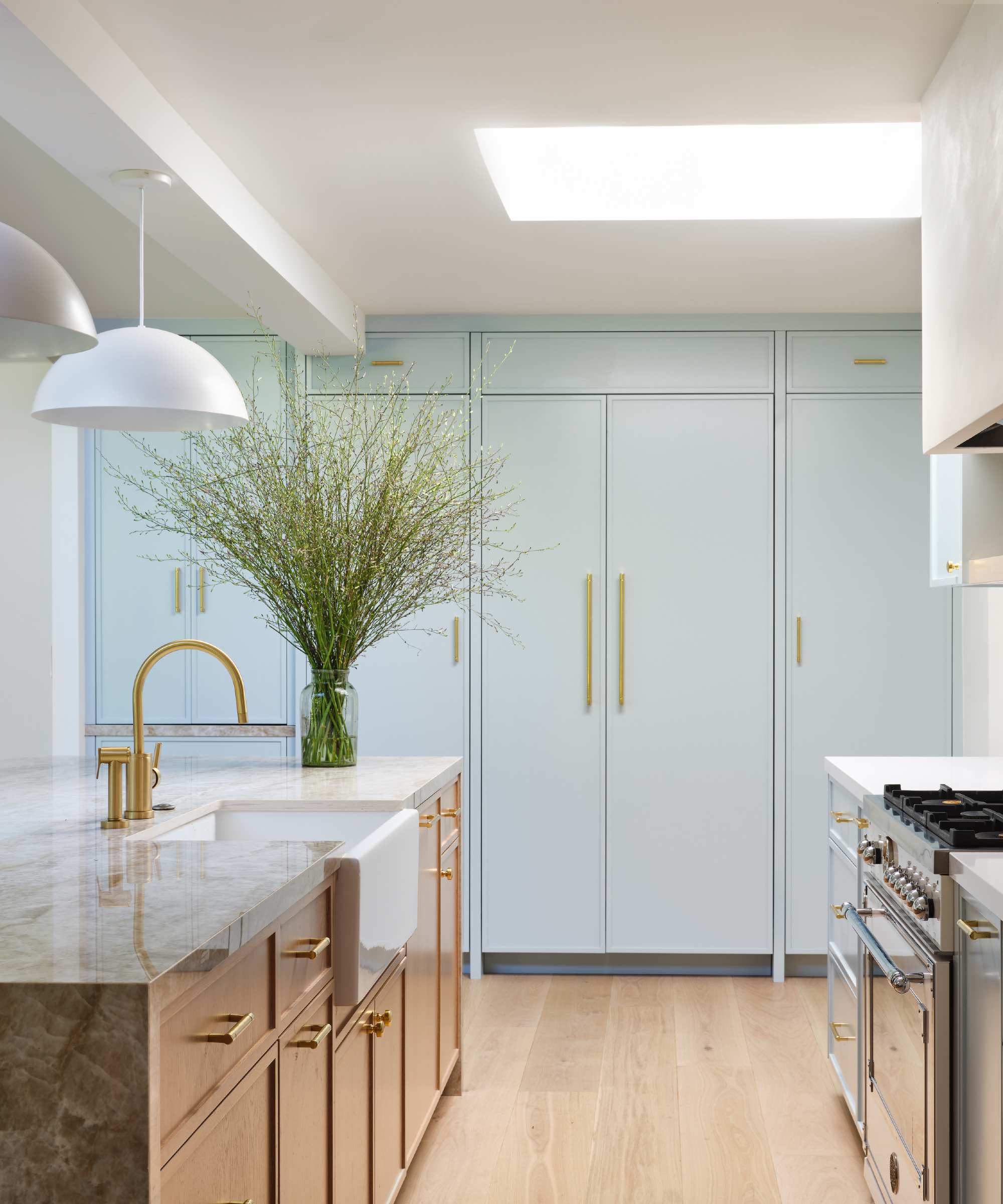
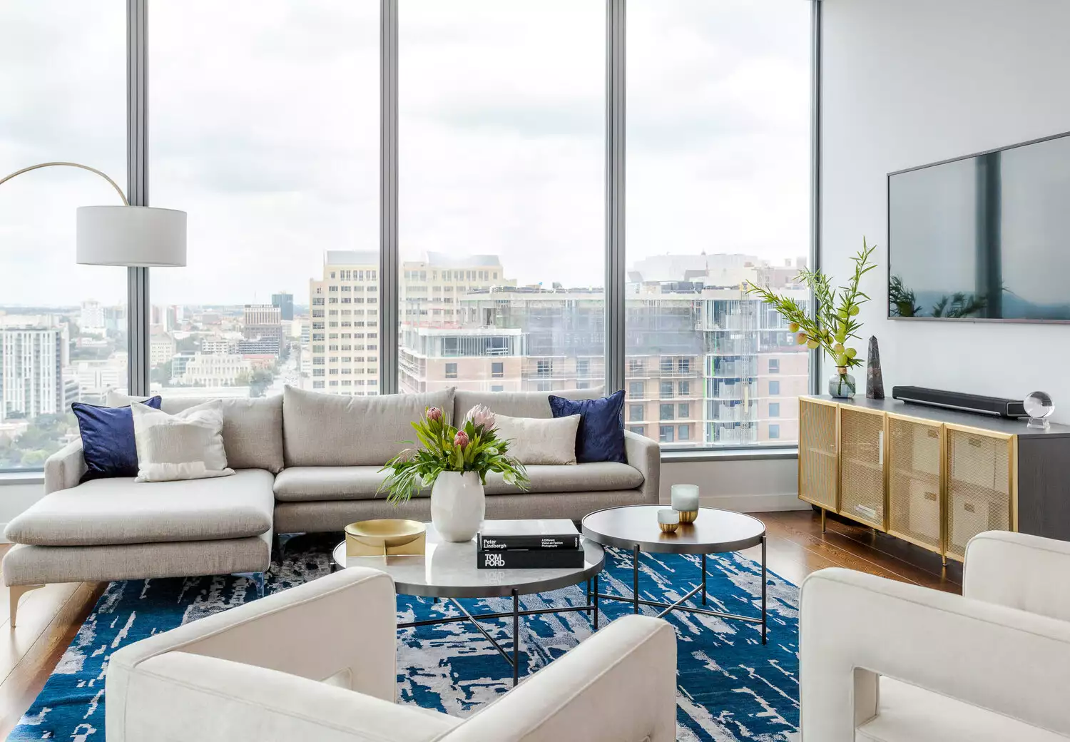
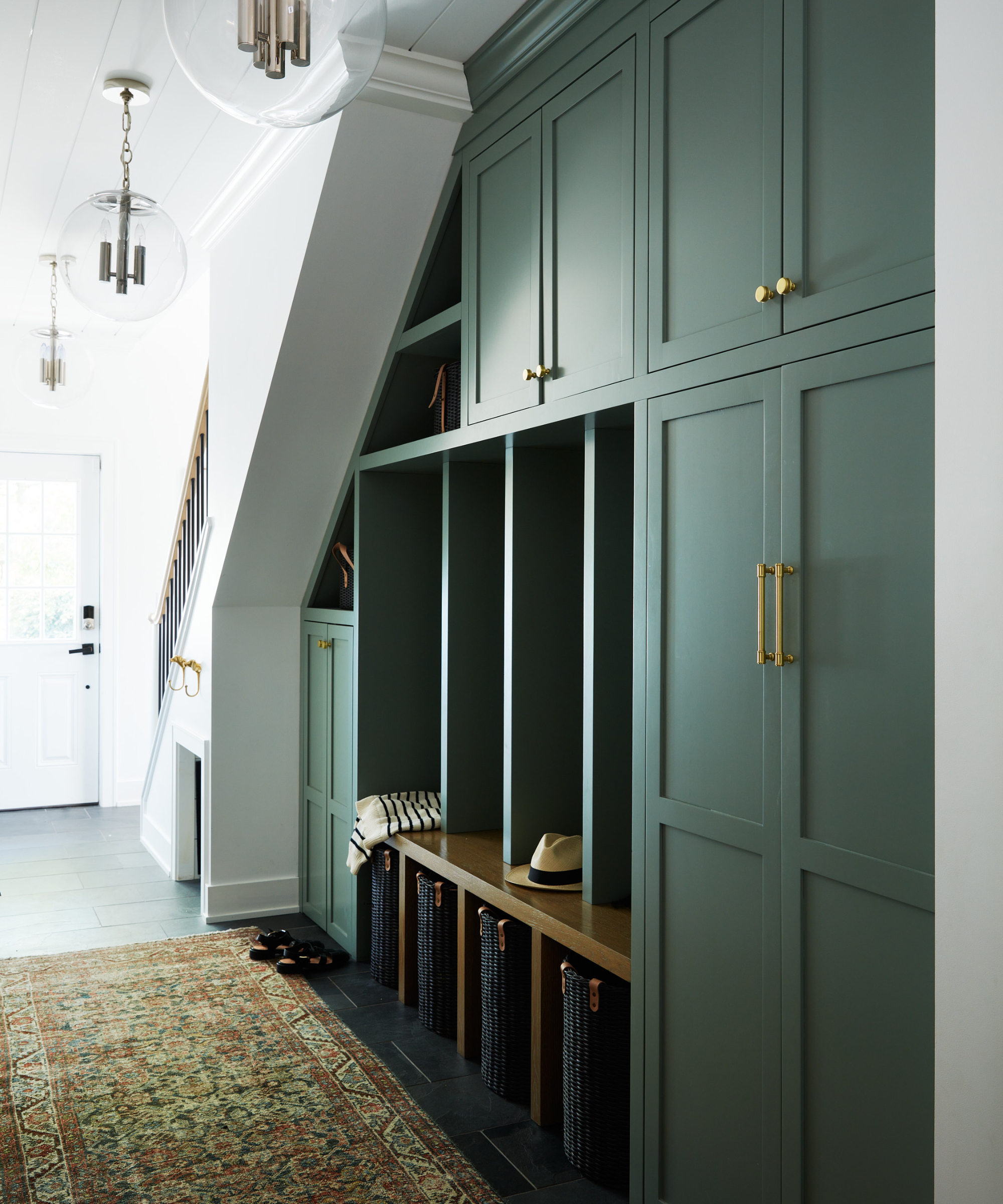
First, Jack Pine by Benjamin Moore is described as a gentle green with a subtle blue undertone, celebrated for its calm and timeless quality. It is frequently used in living rooms and bedrooms for clients desiring color without excessive boldness, complementing both classic and modern styles, and pairing well with wood furniture or warm lighting.
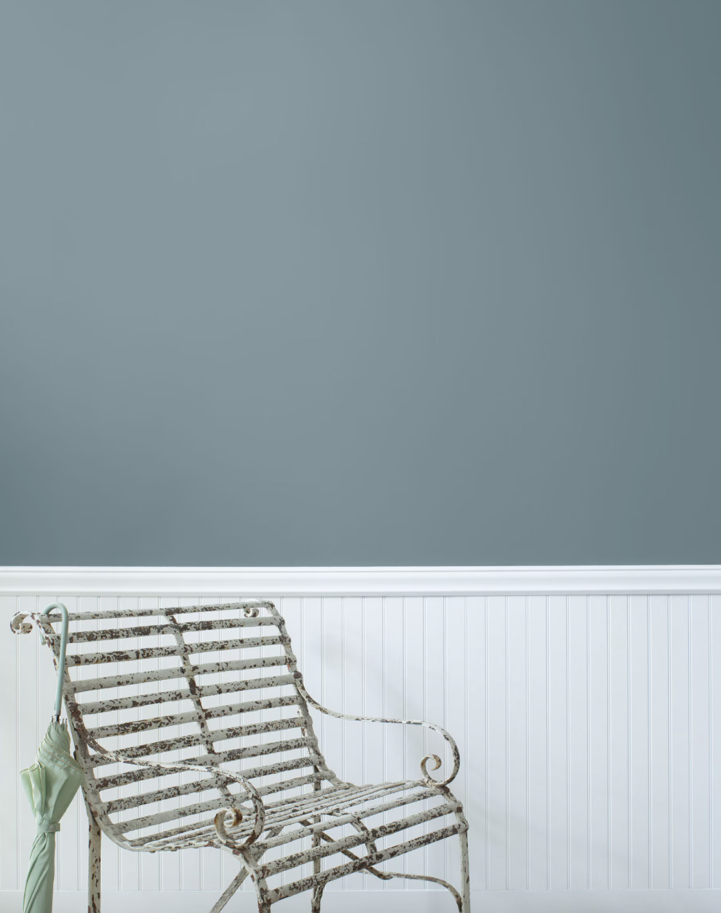
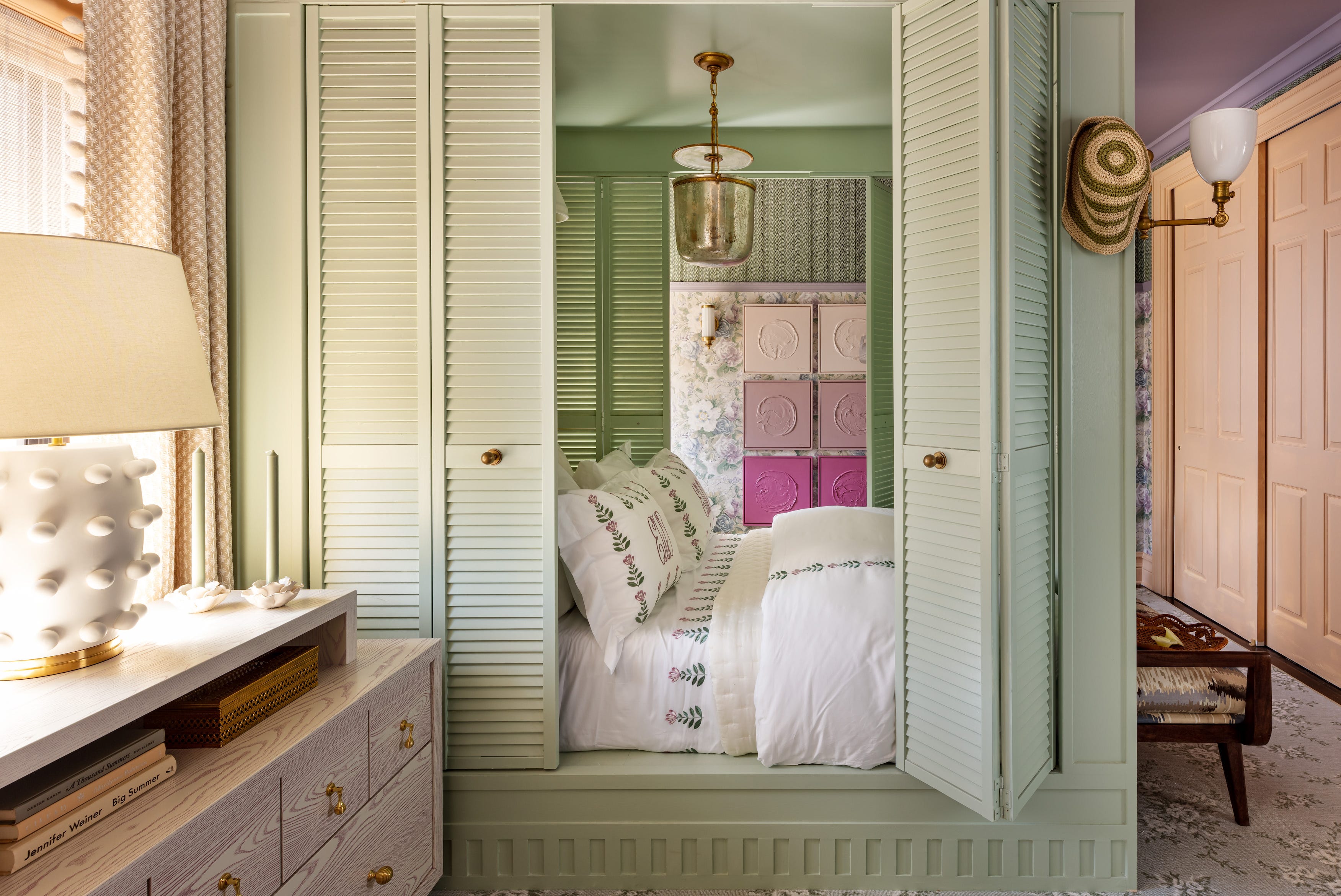
Sea Salt by Sherwin-Williams is a softer, greener option favored for its suitability in traditional homes and its ability to create a coastal aesthetic. Its gentle quality makes it a popular choice for those seeking a tranquil atmosphere.
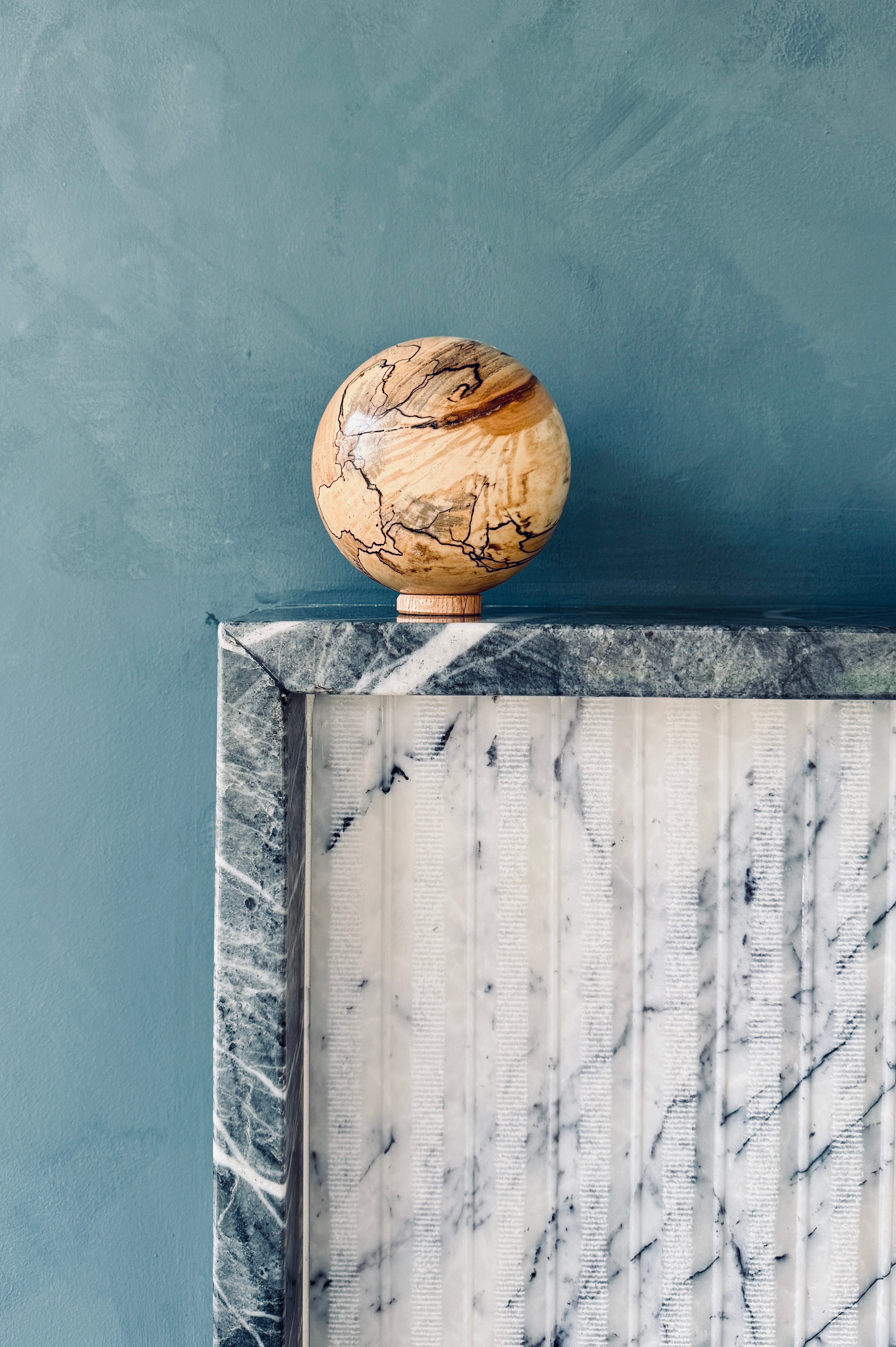
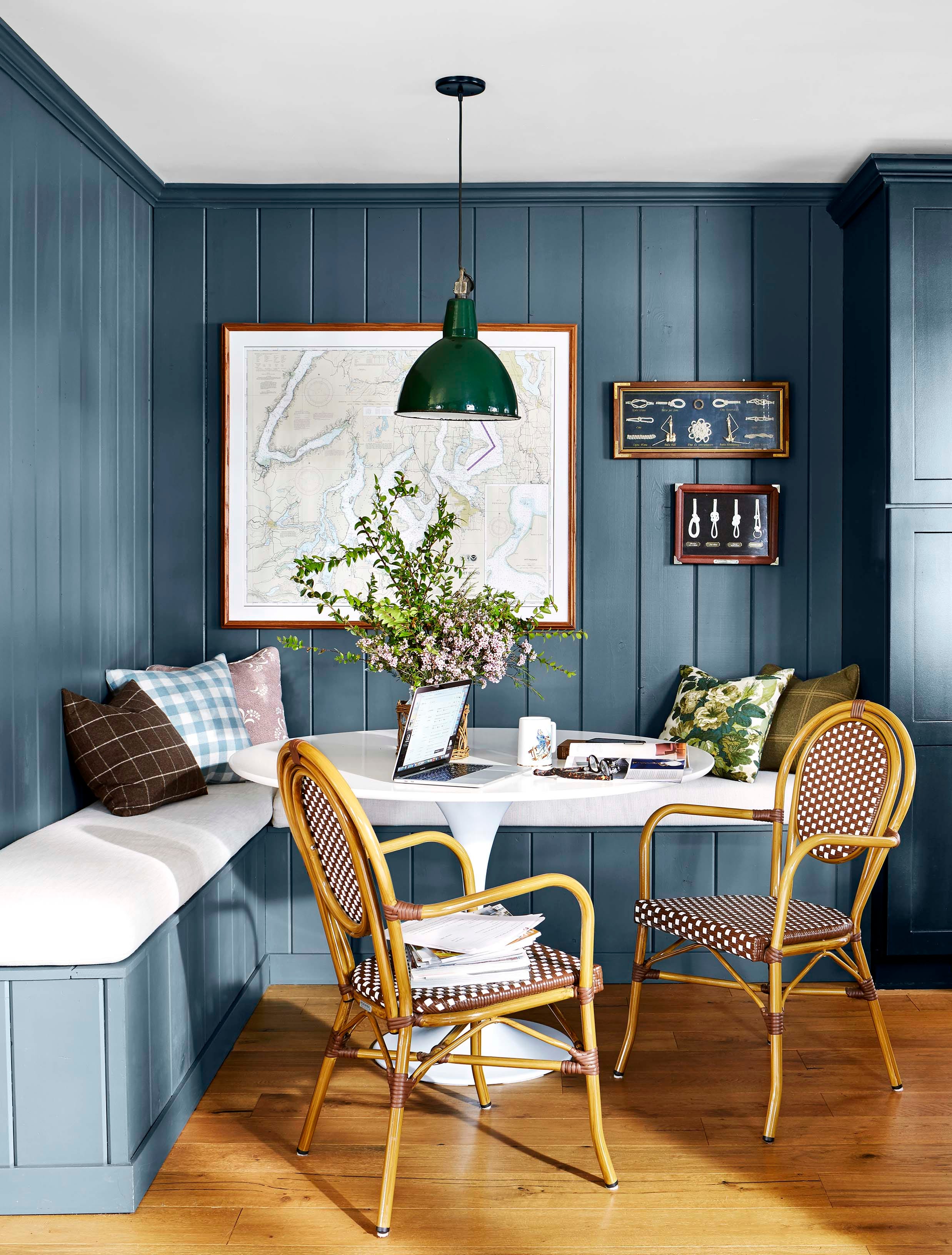
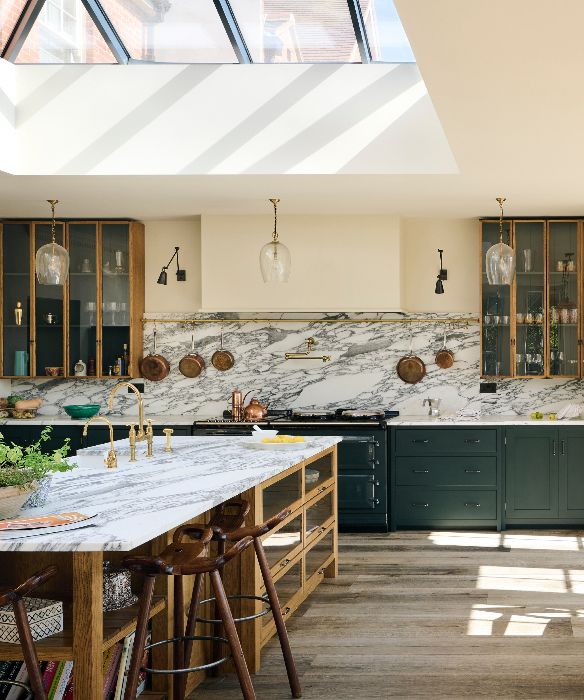
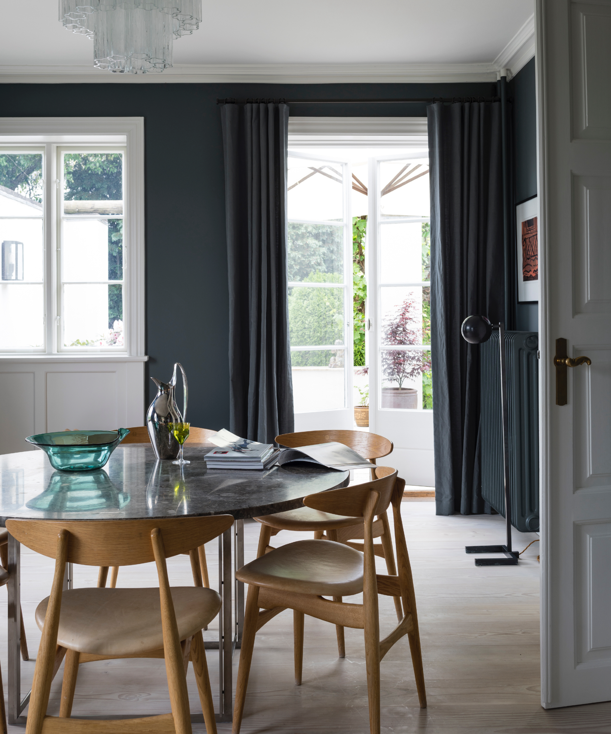
Wellfleet by Portola Paints is a deep-hued limewash paint that offers subtle shifts in color throughout the day, creating a calming and moody ambiance, particularly effective in dining rooms.
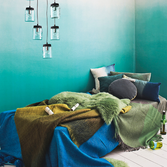
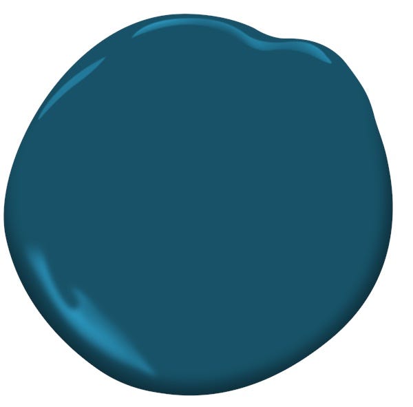
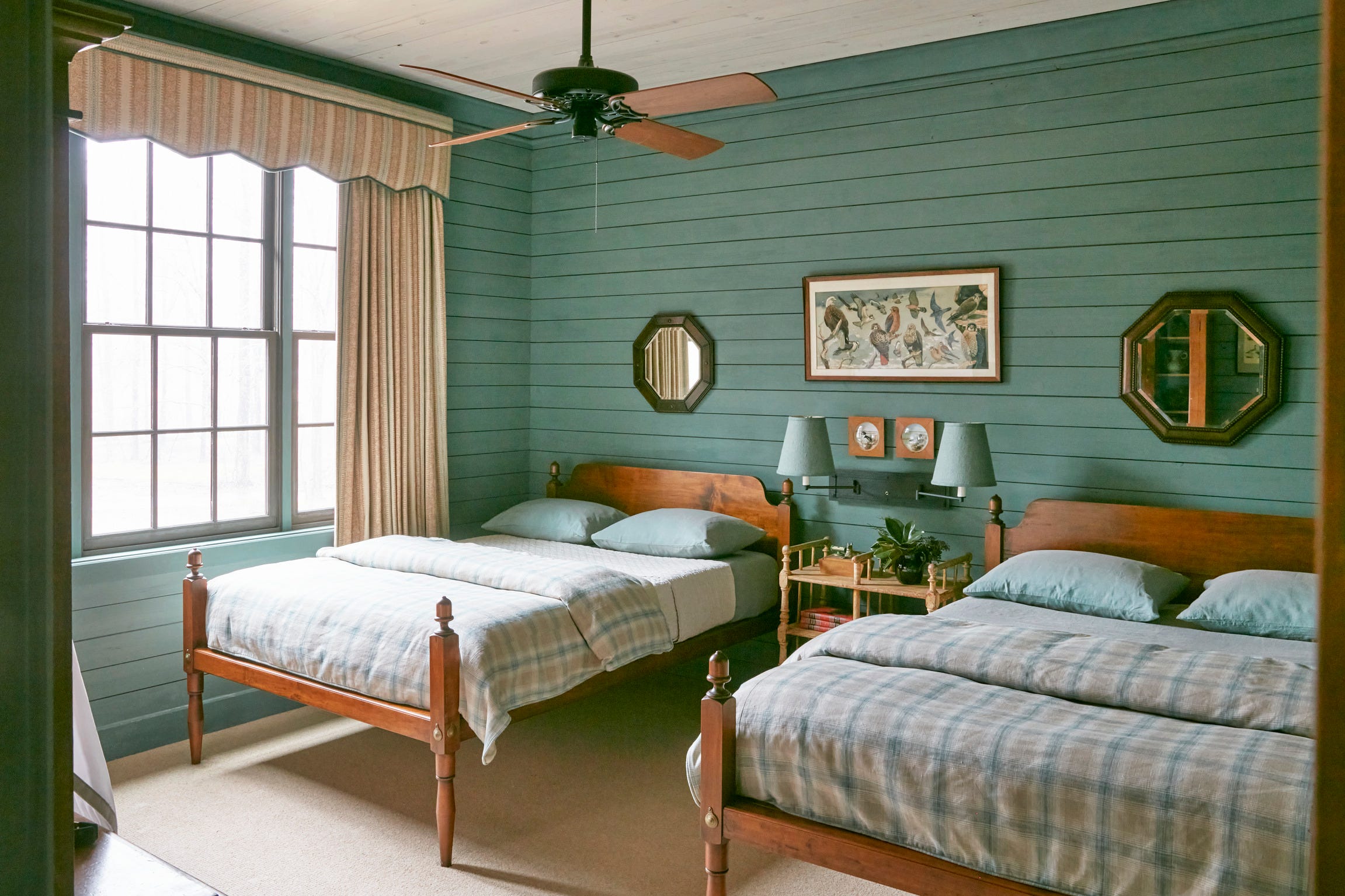
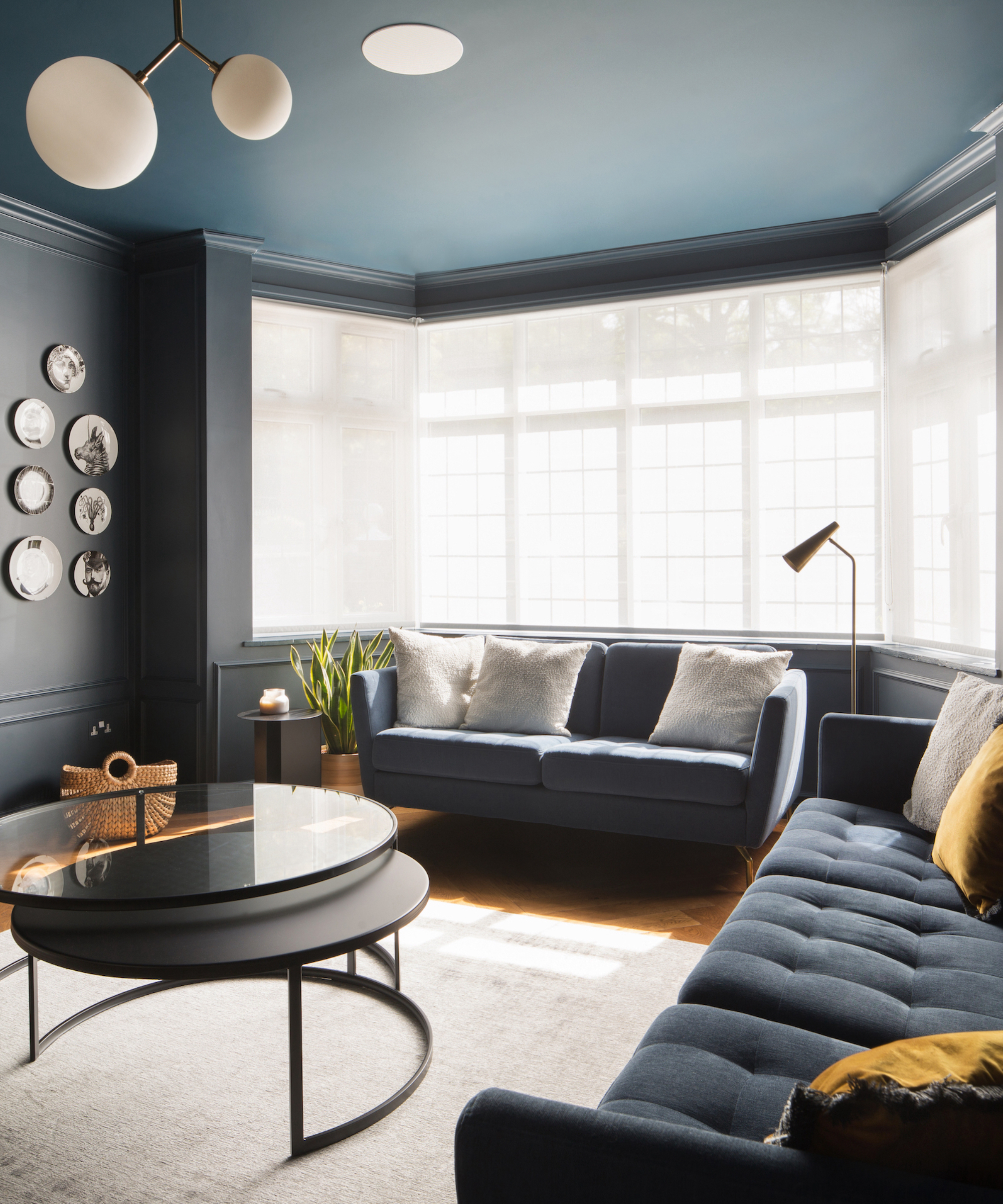
Twilight by Benjamin Moore is a jewel-toned shade that balances calming blue with invigorating green, resulting in a rich and sophisticated feel. This dynamic color beautifully transitions between blue and green depending on the light, making it suitable for spaces like a child's bedroom that needs to adapt over time.
Sage Wisdom by Benjamin Moore is recognized for its beautifully complex nature, providing both uplifting and soothing qualities. This color is suggested for focal walls in home offices or living rooms to create a creative yet grounded mood.
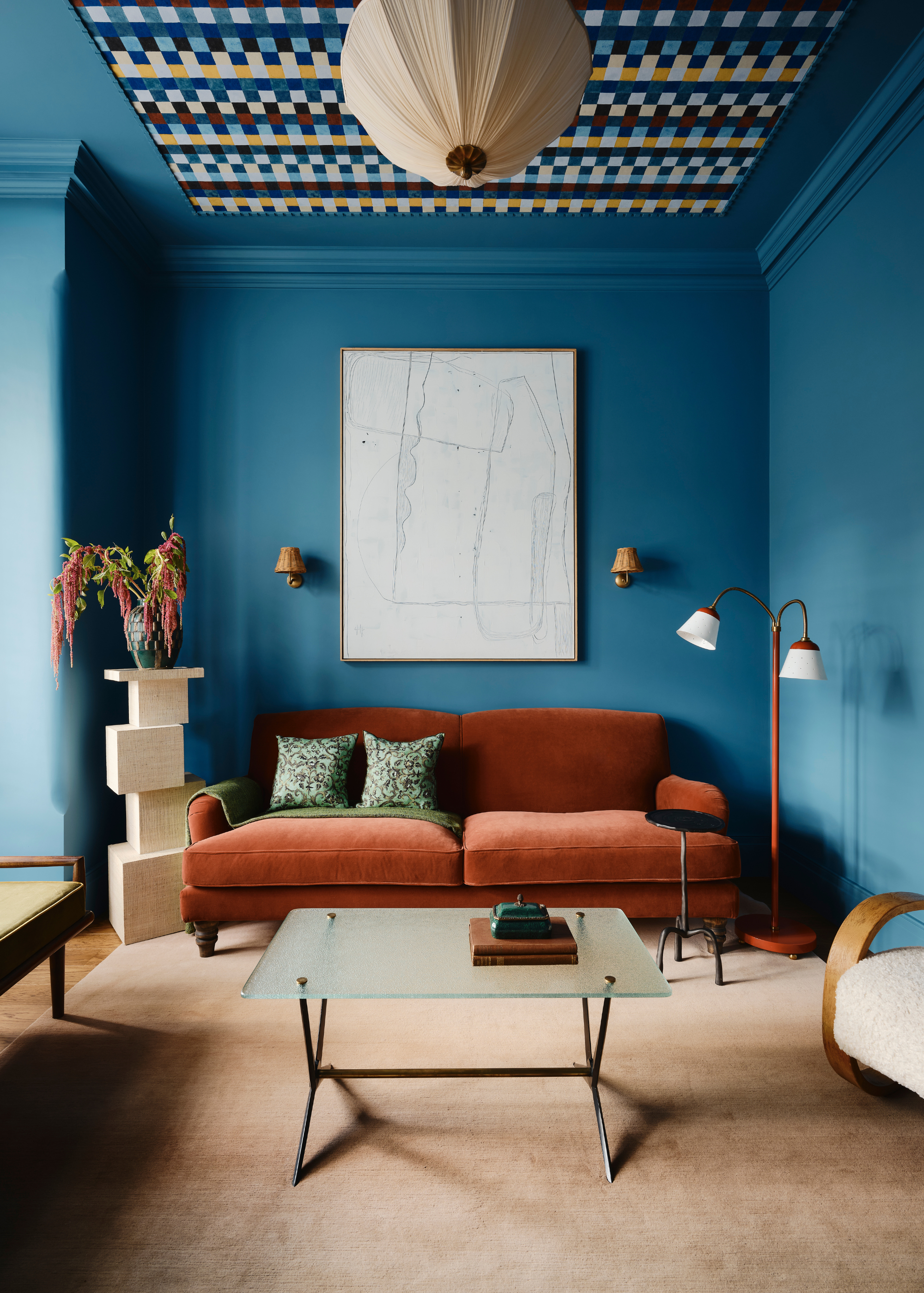
Studio Blue Green by Sherwin-Williams is recommended for bold, moody spaces. Its moderate saturation allows it to be extended to the ceiling, fostering an environment that is both playful and soothing.
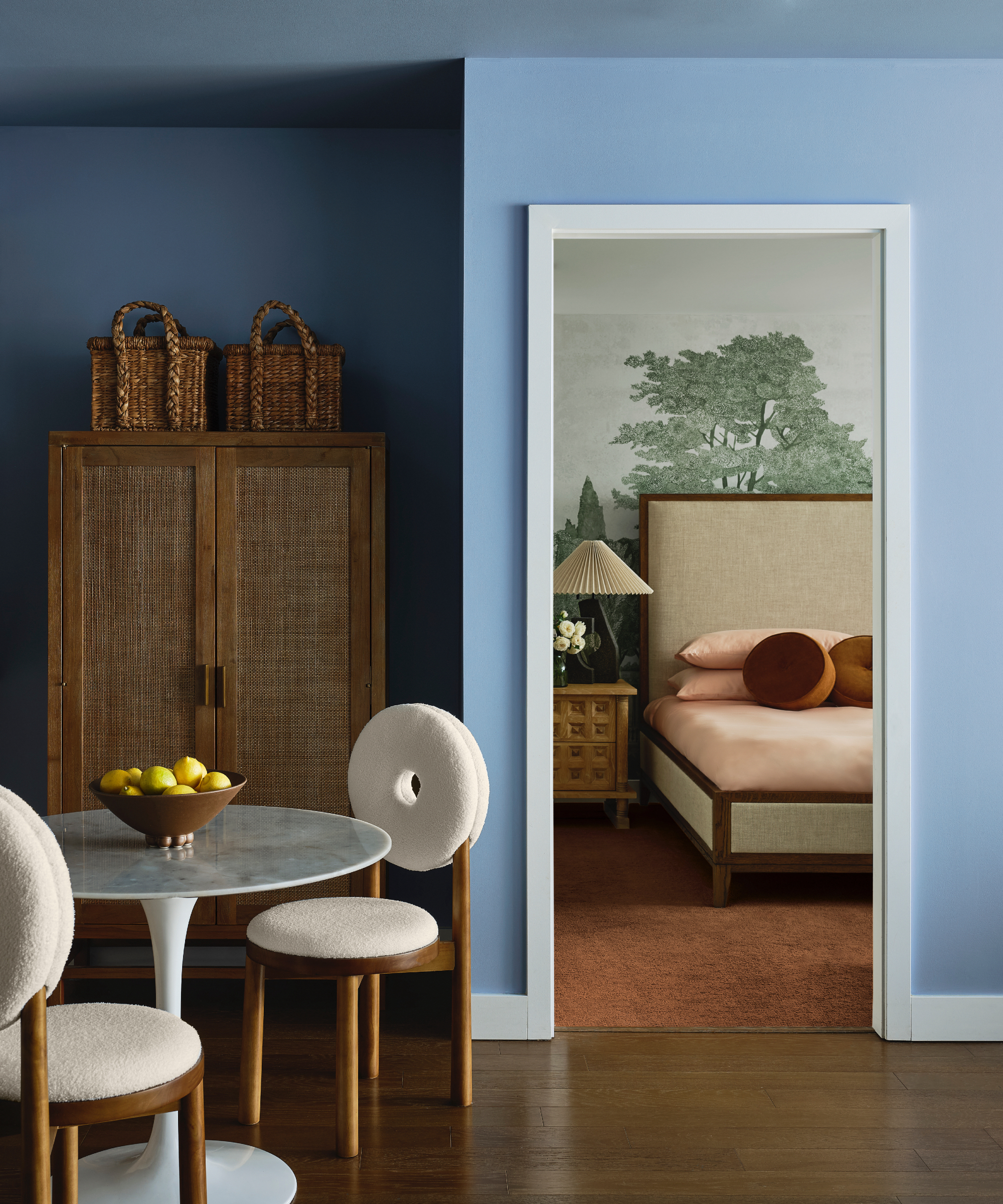
Boca Raton Blue by Benjamin Moore imparts a soft, grounded feel, making it ideal for relaxation areas. This color is noted as a personal favorite by interior designers for its ability to create a serene environment.
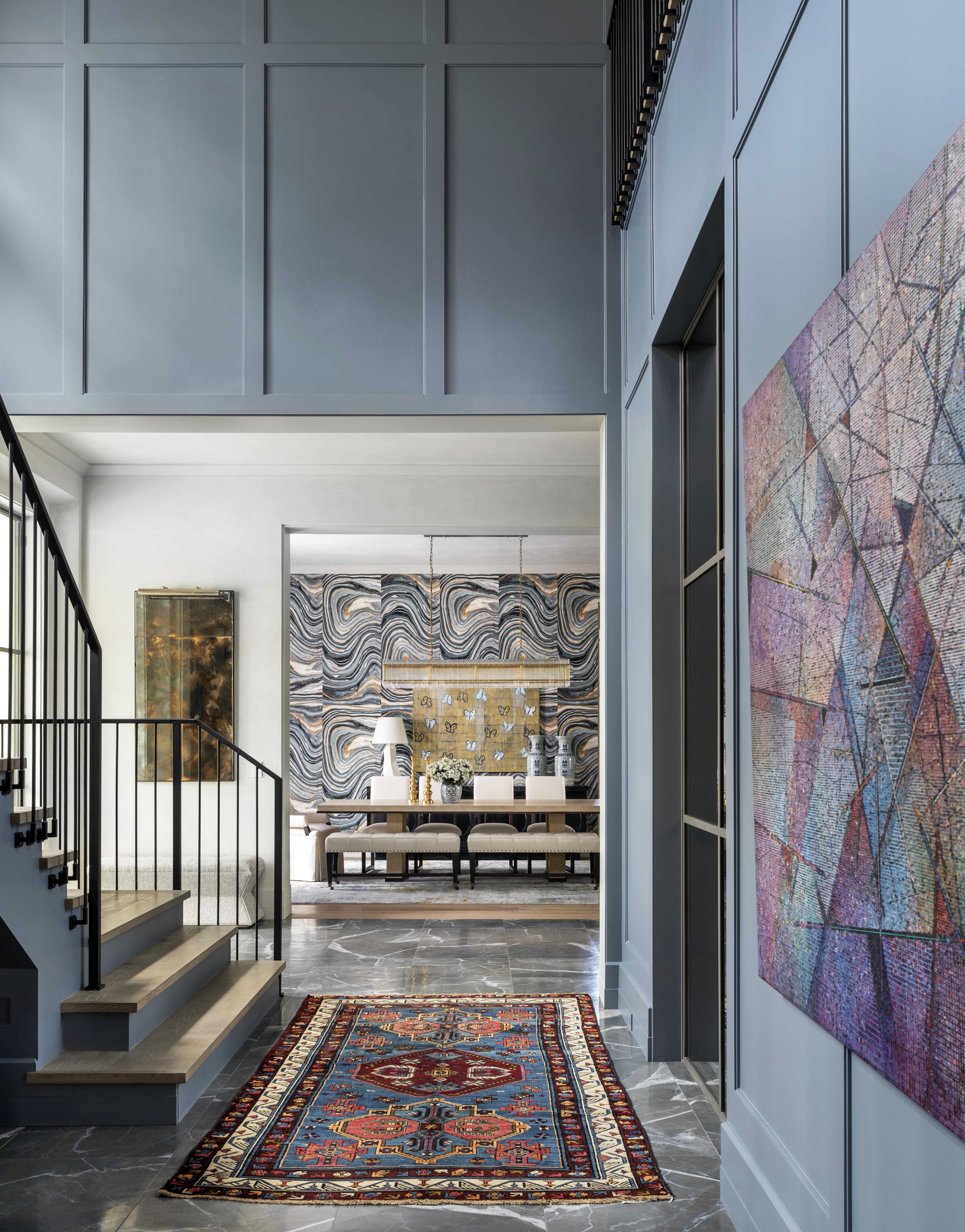
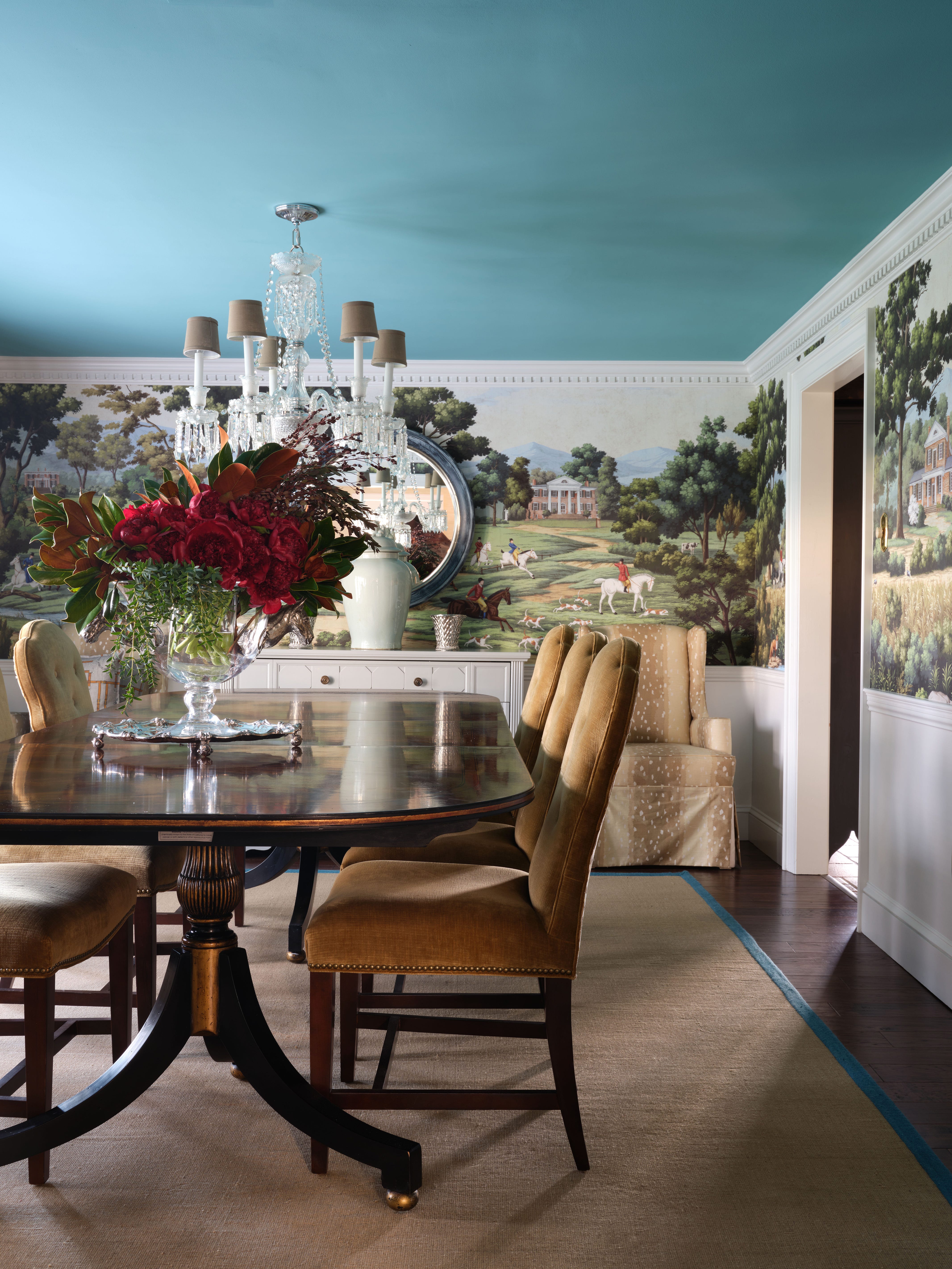
Oval Room Blue by Farrow & Ball is a historic yet modern tone, perfect for formal dining rooms, paneled libraries, or bedrooms. It pairs elegantly with antique brass and deep walnut, adding a sense of heritage and contemporary style.
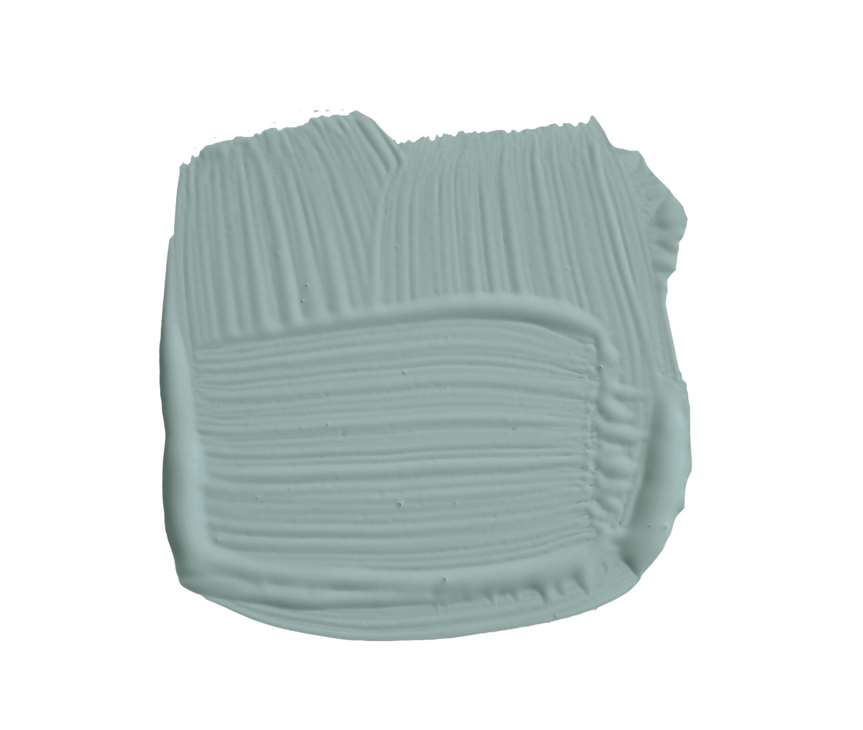
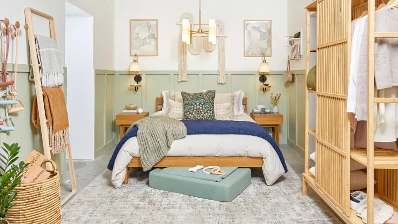
Castle Walls by Benjamin Moore is a blue-green with gray undertones, offering a sophisticated and calming look. It is particularly effective on bedroom walls due to its balanced color saturation.
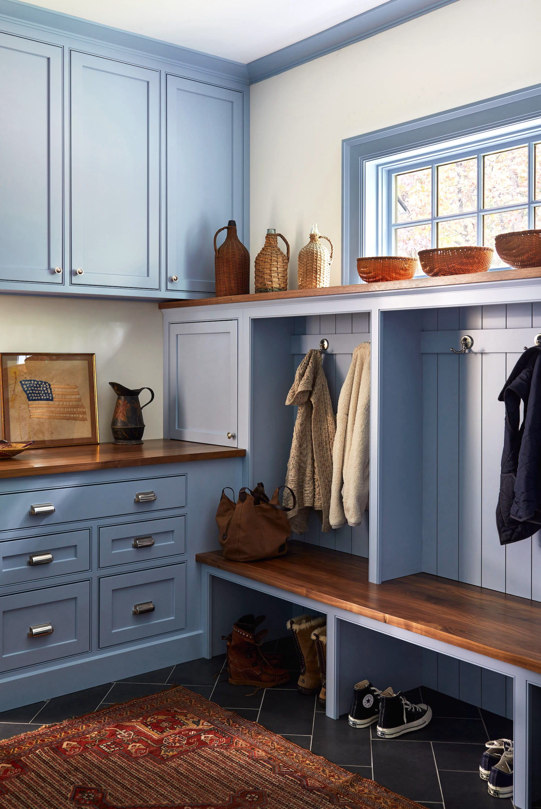
Finally, Palladian Blue by Benjamin Moore is cherished for its resemblance to the iconic Tiffany Blue. This refined shade is a favorite among designers for its ability to create a fresh and elegant palette. Each of these colors offers distinct attributes, enabling designers to achieve specific moods and styles within diverse interiors.
#BlueGreenPaintColors #InteriorDesign #BenjaminMoore #SherwinWilliams #PortolaPaints #FarrowAndBall #HomeDecor #ColorTrends #PaintSelection #BlueGreenPaintColors #InteriorDesign #BenjaminMoore #SherwinWilliams #PortolaPaints #FarrowAndBall #HomeDecor #ColorTrends #PaintSelection
0 comment in total
 No comments yet
You may also like
15 Designer-Approved Blue-Gray Paint Colors That Will Never Go Out of Style
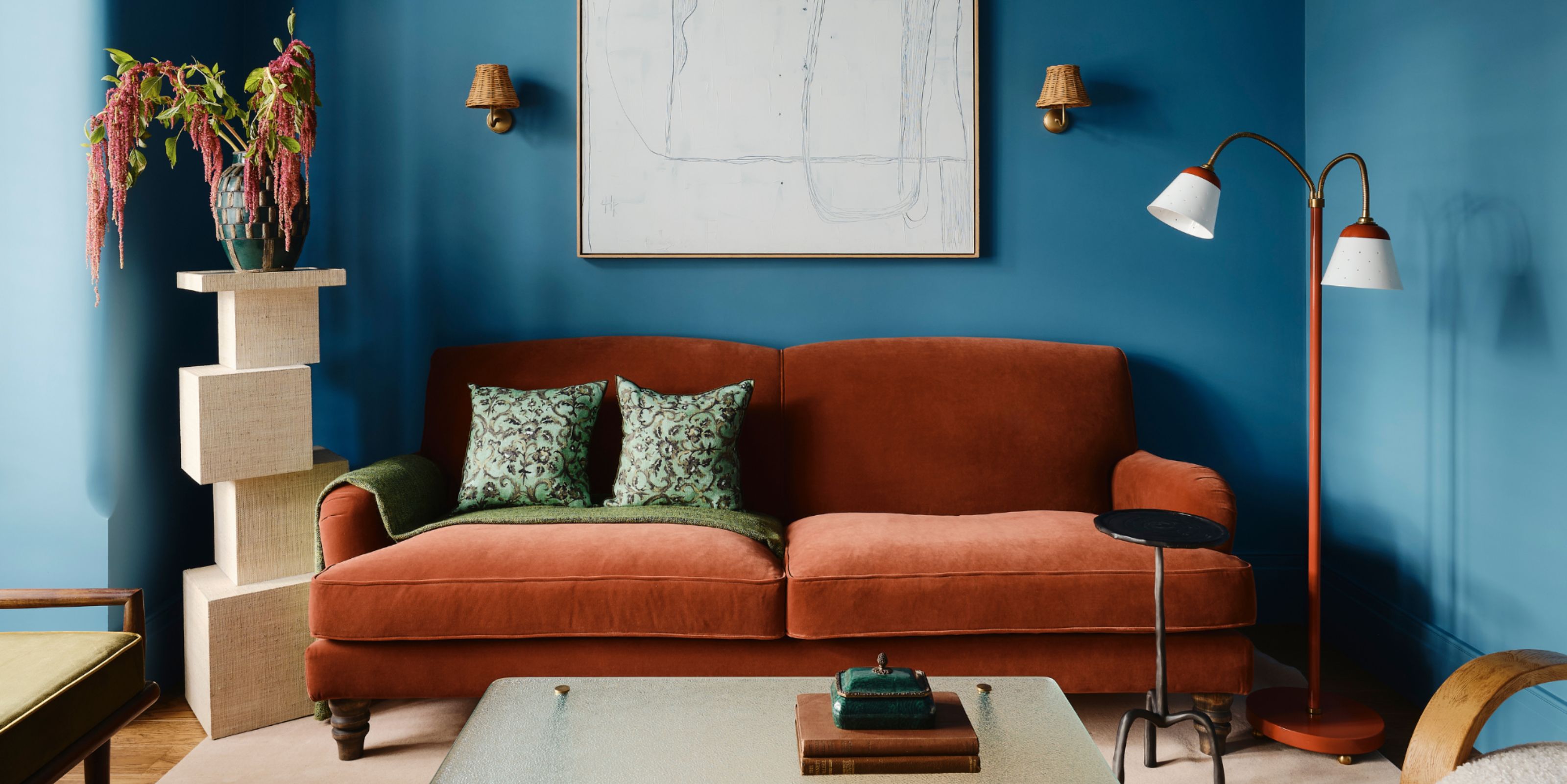
Colors That Go With Blue — 16 Pairings Designers Depend on for Bold, Breezy, and Perfectly Balanced Palettes

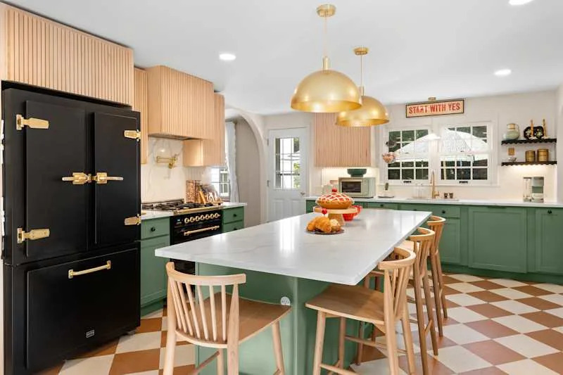
These 13 Green Paint Colors Are the Best We’ve Ever Seen

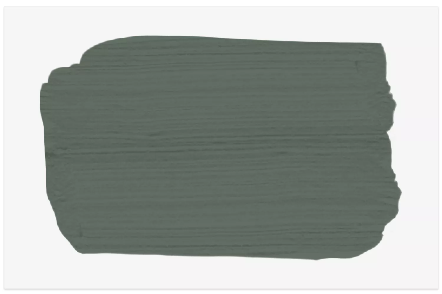
14 Best Green Paint Colors

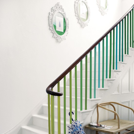
Green and blue colour schemes 2013 – 10 of the best
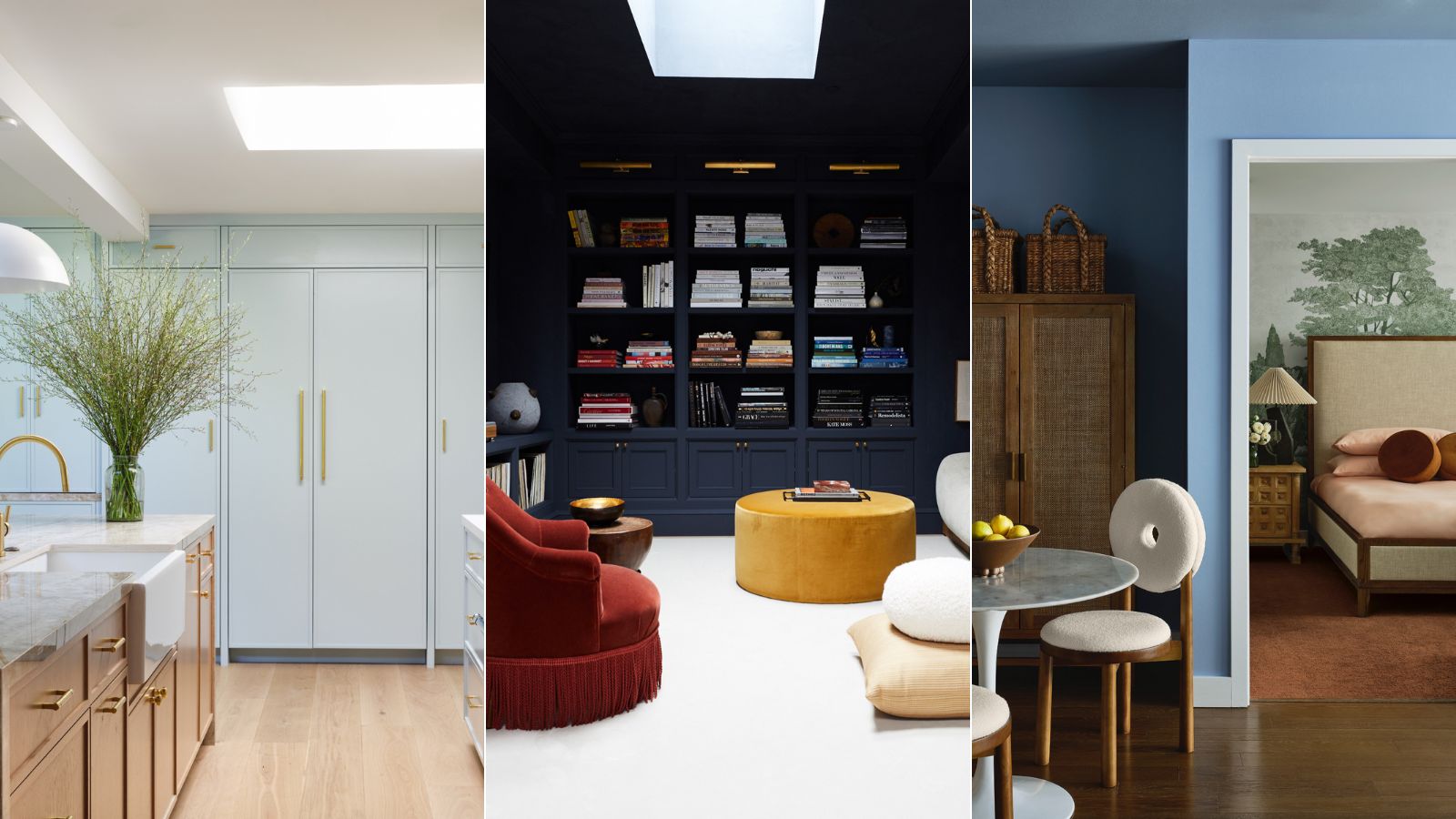
5 best blue paints as chosen by interior designers

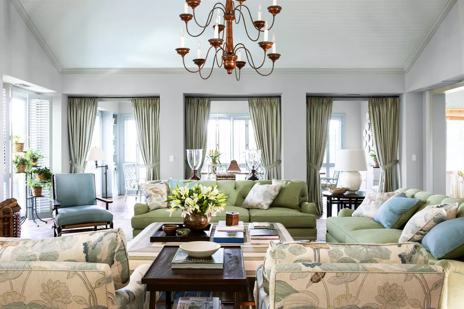
15 Timeless Paint Colors You’ll Never Tire Of, According To Designers
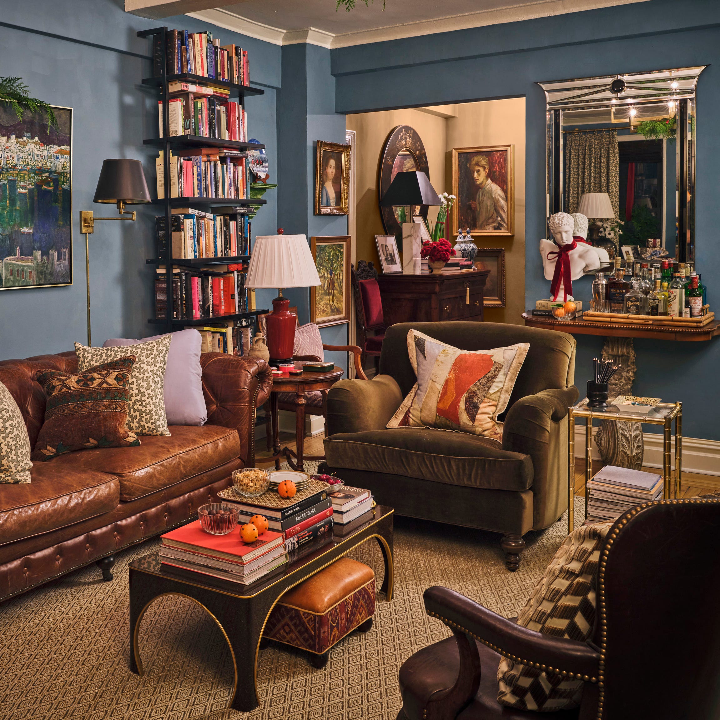
Designers Swear By These 11 Dark Blue Paint Colors for Chic and Moody Spaces

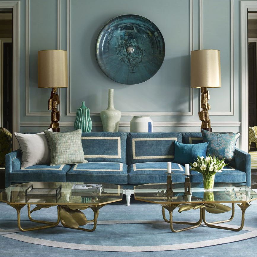
55 Tried-and-True Blue Paint Colors
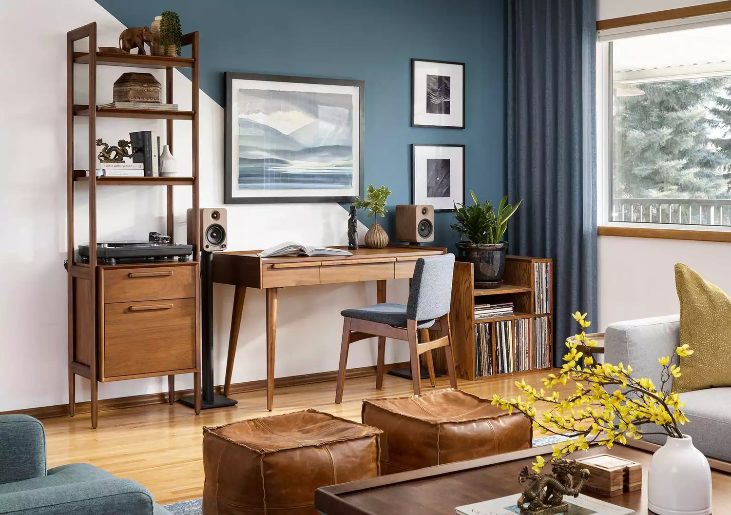
These 10 Colors Always Look Beautiful With Blue


The most timeless paint colors according to designers

10 Timeless Living Room Paint Colors Designers Swear By
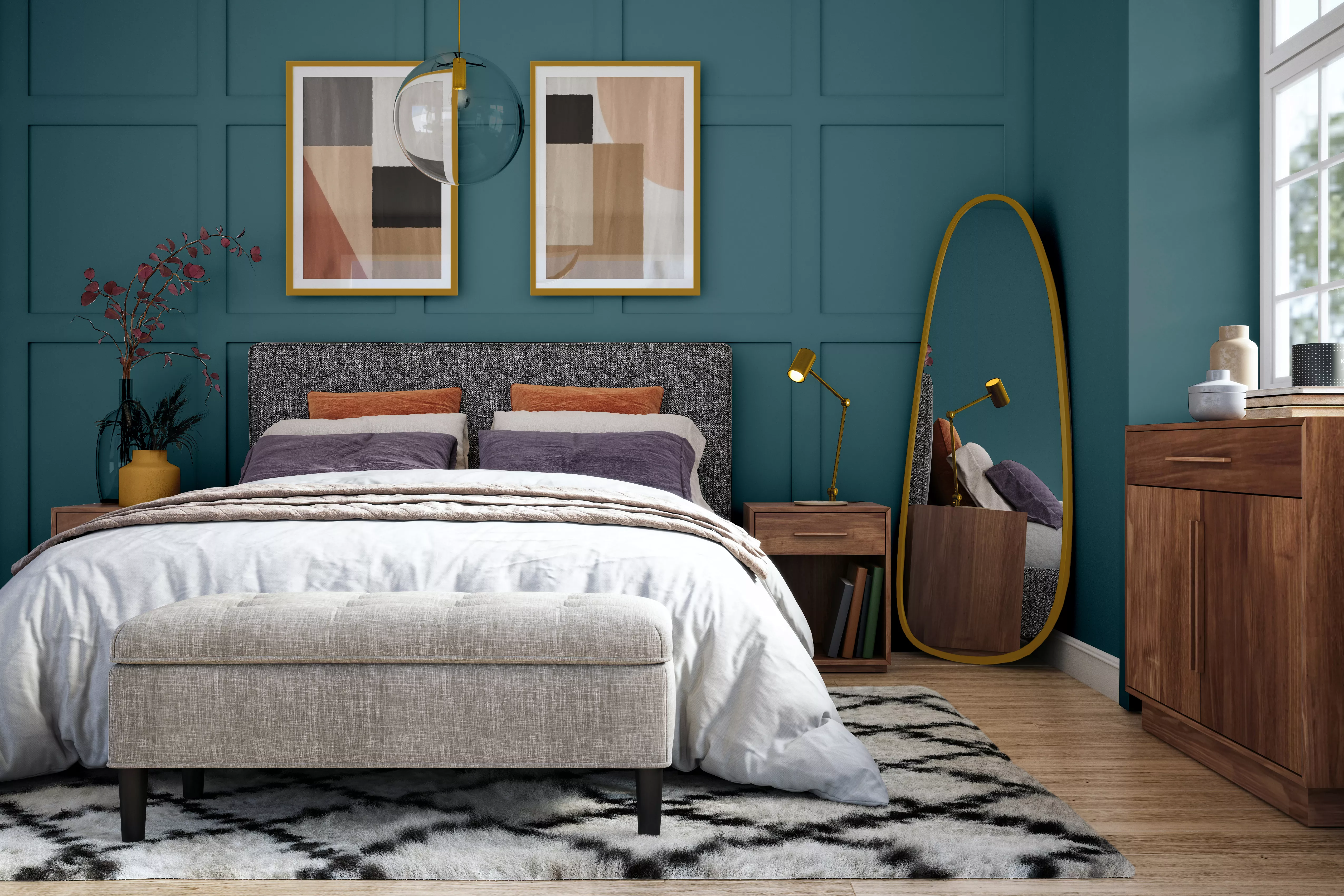
15 Blue-Green Paint Colors the Experts Recommend

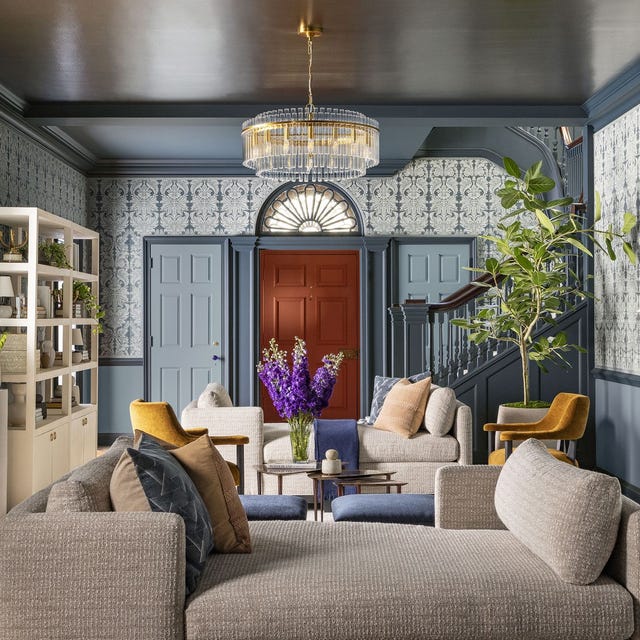
This Is the Best Blue Paint Color, According to Designers

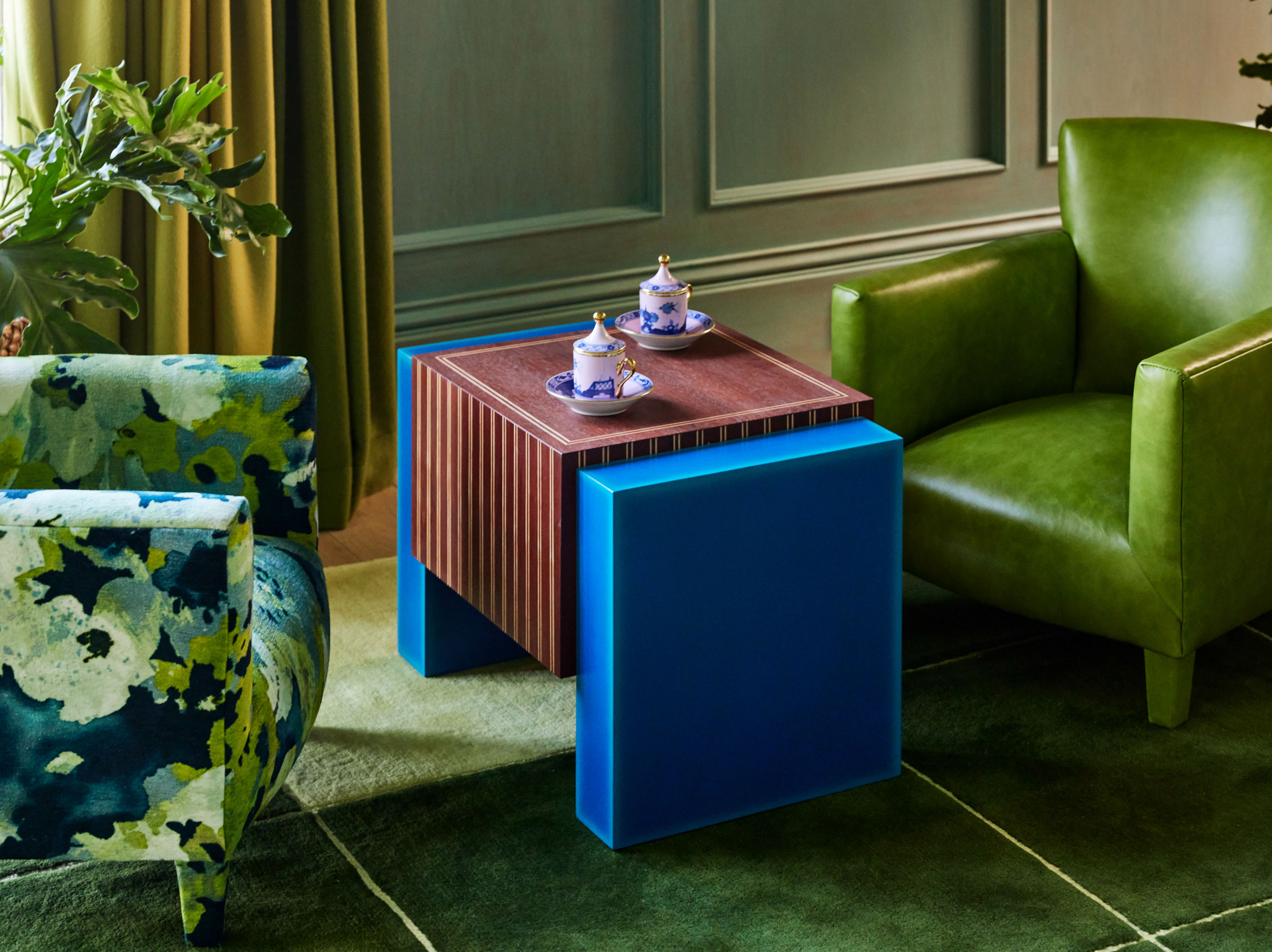
Do Blue and Green Work Together? 8 Modern Ways Designers Are Using This Controversial Color Pairing

5 Timeless Paint Colors That Will NEVER Go Out of Style, According to Designers
Designers Swear By These 11 Sage Green Paint Colors

5 best green paints that will always be classics, according to interior designers

7 of the most versatile and easy to use paint colors according to designers
10 Greige Paint Colors Designers Recommend Again And Again