1/3
Google and Chromasonic make sense of colour at Milan Design Week
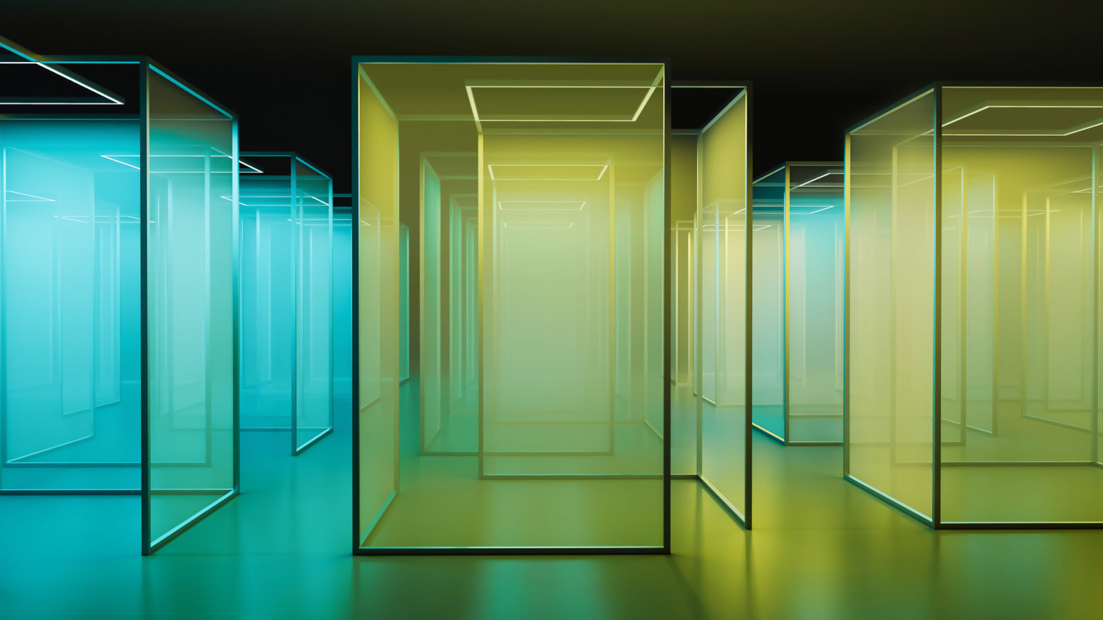
Google, in collaboration with the Los Angeles-based art and research lab Chromasonic, presented its third interactive exhibition titled 'Making Sense of Color' at Milan Design Week 2024. The installation explores how color influences human perception and can be experienced through multiple senses beyond just vision, including sound, taste, smell, and touch. This multisensory approach is a key theme for Google's design team, led by Ivy Ross, Vice President of Design, UX, and Research for Hardware Products at Google.
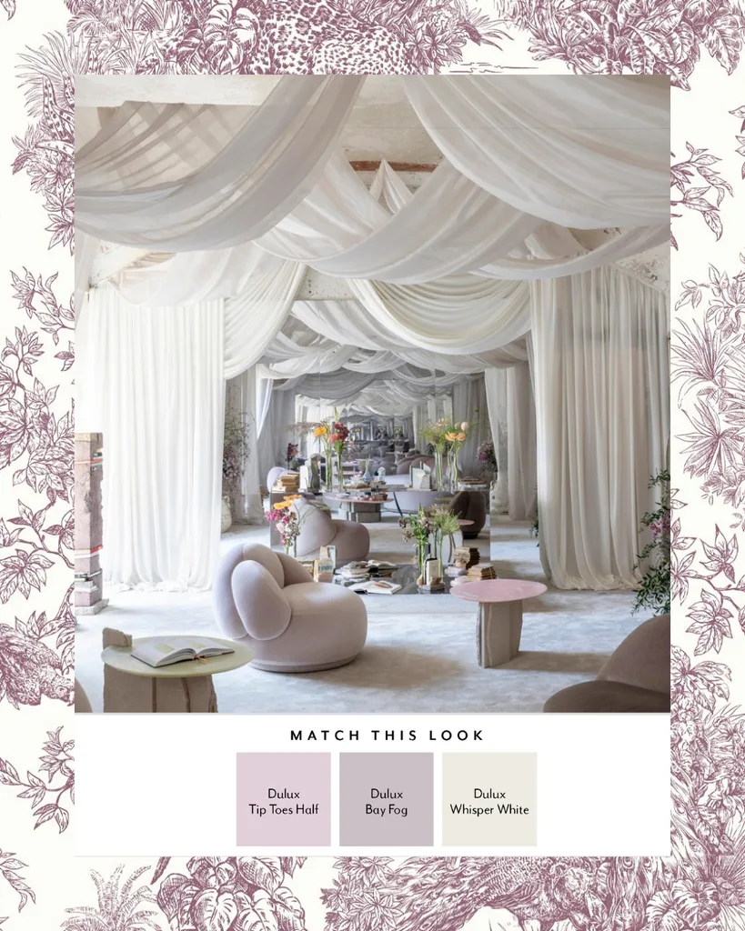
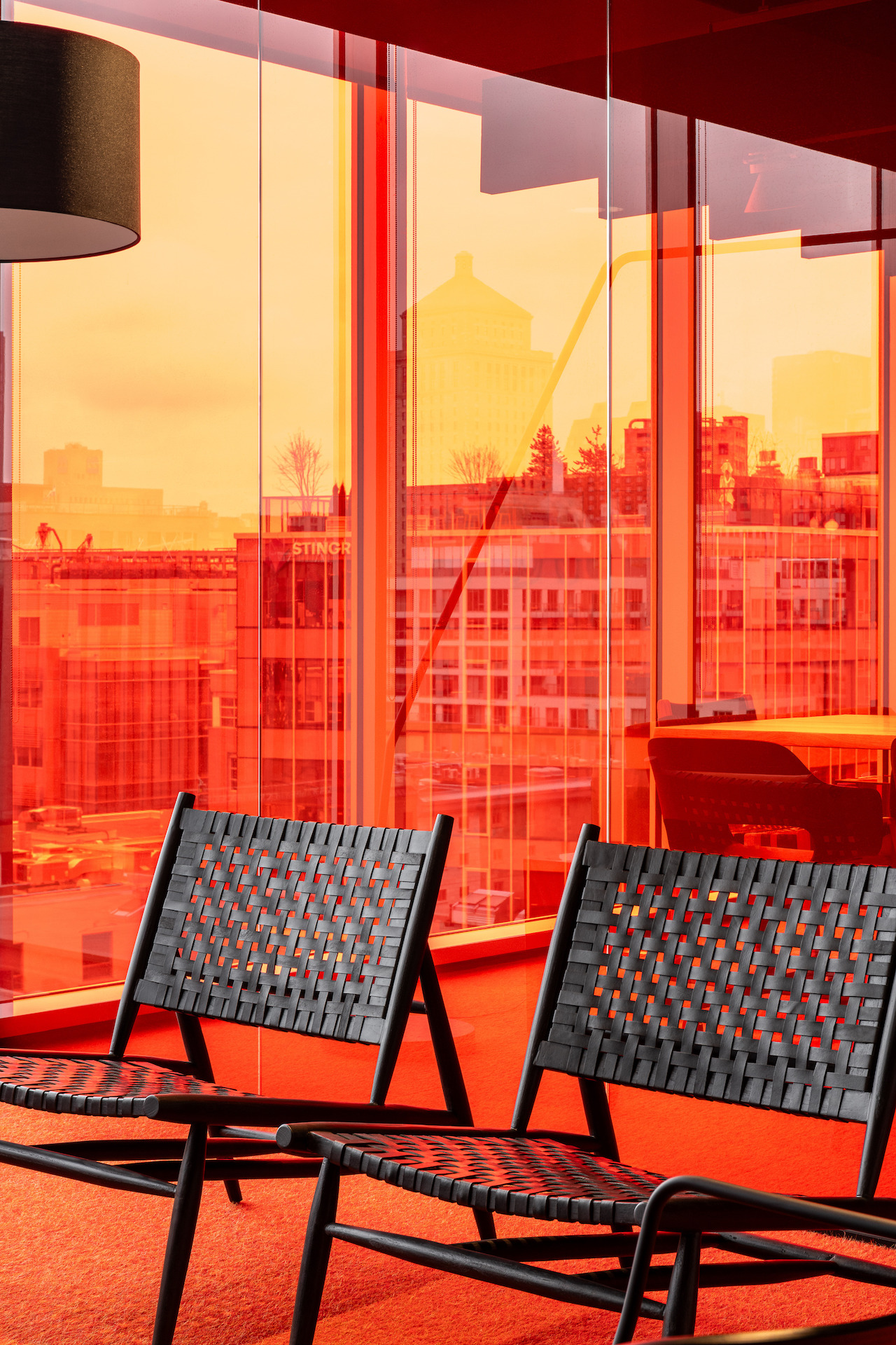
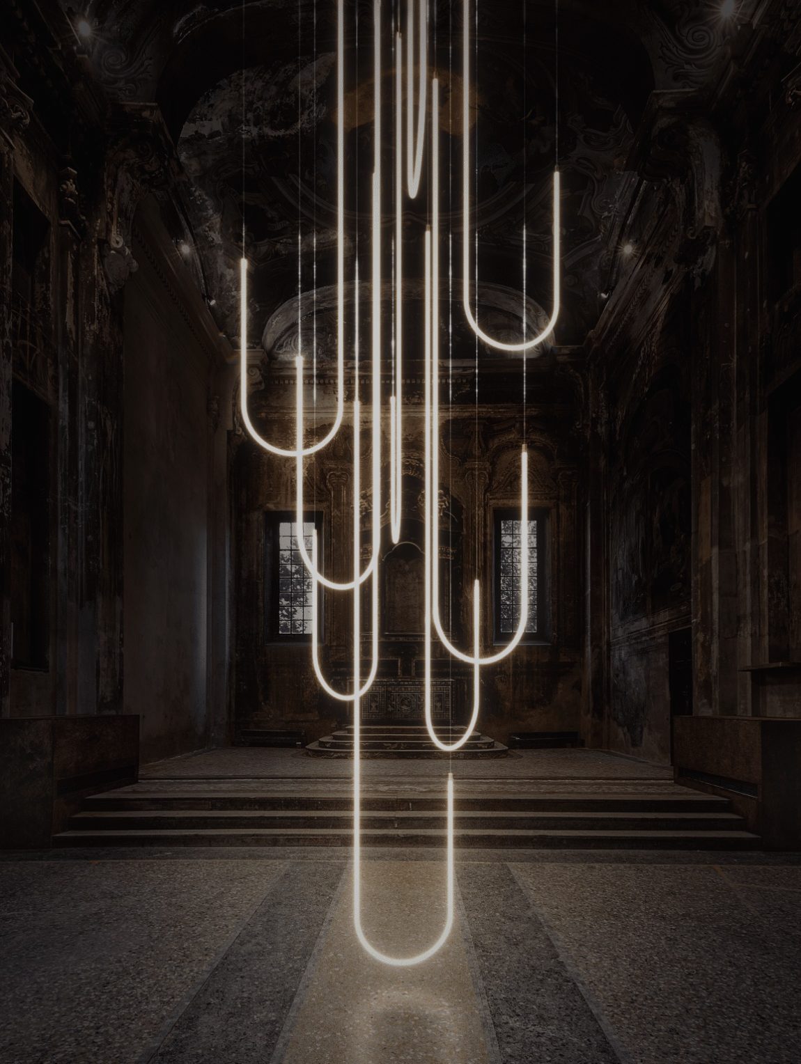
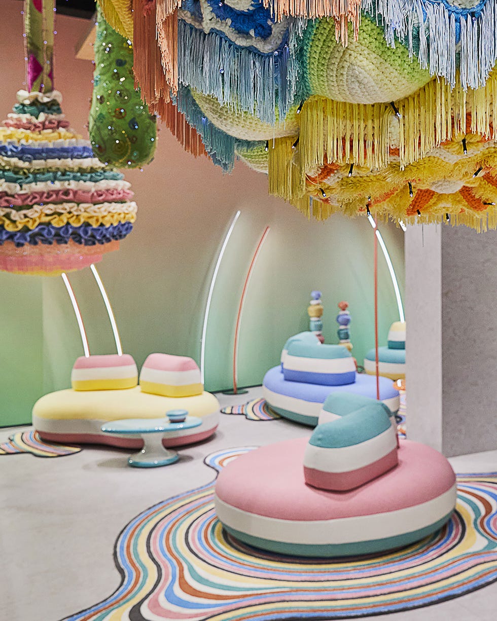
The 'Making Sense of Color' exhibit comprises 21 distinct ethereal spaces, which are defined by scrim walls and feature responsive light and audio displays. As visitors navigate these spaces, they are introduced to a synesthetic experience where light and sound are interconnected. The journey culminates in a series of rooms that more explicitly demonstrate the relationship between specific color tones and various sensations. These rooms also highlight how Google integrates these sensory understandings into the design of its products, such as phones, tablets, and smart home devices.
Ivy Ross emphasizes the vibrant and energetic nature of color, noting its biological and psychological impact on individuals. She highlighted the current societal context, where understanding natural forces and their properties, such as color, is particularly relevant given the emotional experiences people are undergoing. The collaboration with Chromasonic was initiated due to their established expertise in creating immersive light and sound installations that foster well-being, such as their work at Satellite One space in California.
Chromasonic utilizes its proprietary 'Chromasonic Refrequencing' technology to achieve this unique sensory integration. Harriet Girardoni, co-founder of Chromasonic, explains that this technology converts light waves into sound waves and vice versa in real-time, effectively making light audible and sound visible. This process allows light and sound to travel as a unified entity, heightening visitors' awareness of their presence within the installation and the interaction with others as they move through the dynamic spaces. The merging of the immateriality of light with the materiality of sound is intended to expand natural perception and enhance a deeper sense of presence within the environment.
Johannes Girardoni, also a co-founder of Chromasonic, further elaborates on the power of color, stating that it can evoke memories, inspire desire, and create a sense of awe. He describes their work as spatializing color and sound to craft 'shapeshifting experiences of physical space,' thereby engaging in intentional placemaking. For attendees of Milan Design Week and Salone del Mobile, often navigating numerous exhibits, Google's installation aims to provide a space for rest, relaxation, and contemplation. Ross concludes that these installations serve as a platform for Google to share its design thought leadership and inspirations, offering enriching experiences for both design professionals and the general public alike.
#MilanDesignWeek #GoogleDesign #Chromasonic #SensoryExperience #ColorPerception #InteractiveInstallation #LightAndSound #ProductDesign #ArtAndTechnology #MilanDesignWeek #GoogleDesign #Chromasonic #SensoryExperience #ColorPerception #InteractiveInstallation #LightAndSound #ProductDesign #ArtAndTechnology
0 comment in total
 No comments yet
You may also like
Notes: how to transform the paint industry with a brilliant idea

9 Show-Stopping Installations Seen at Milan Design Week 2022

Color Blocking Defines This Gaming Office’s Long Floor Plan
Madewell Is Selling Paint Now?
What you didn’t know about colour

Color And Contrast Shape Behr’s Commercial Color 2026 Forecast
Design Pros All Agree: The Color-Blocking Trend Is One to Try

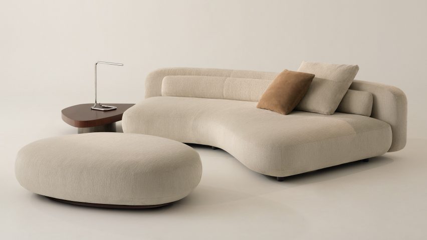
Ten notable furniture designs by architects from Milan design week
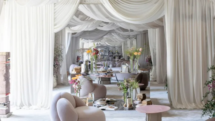
9 Colour Palettes Inspired By Milan Design Week 2025

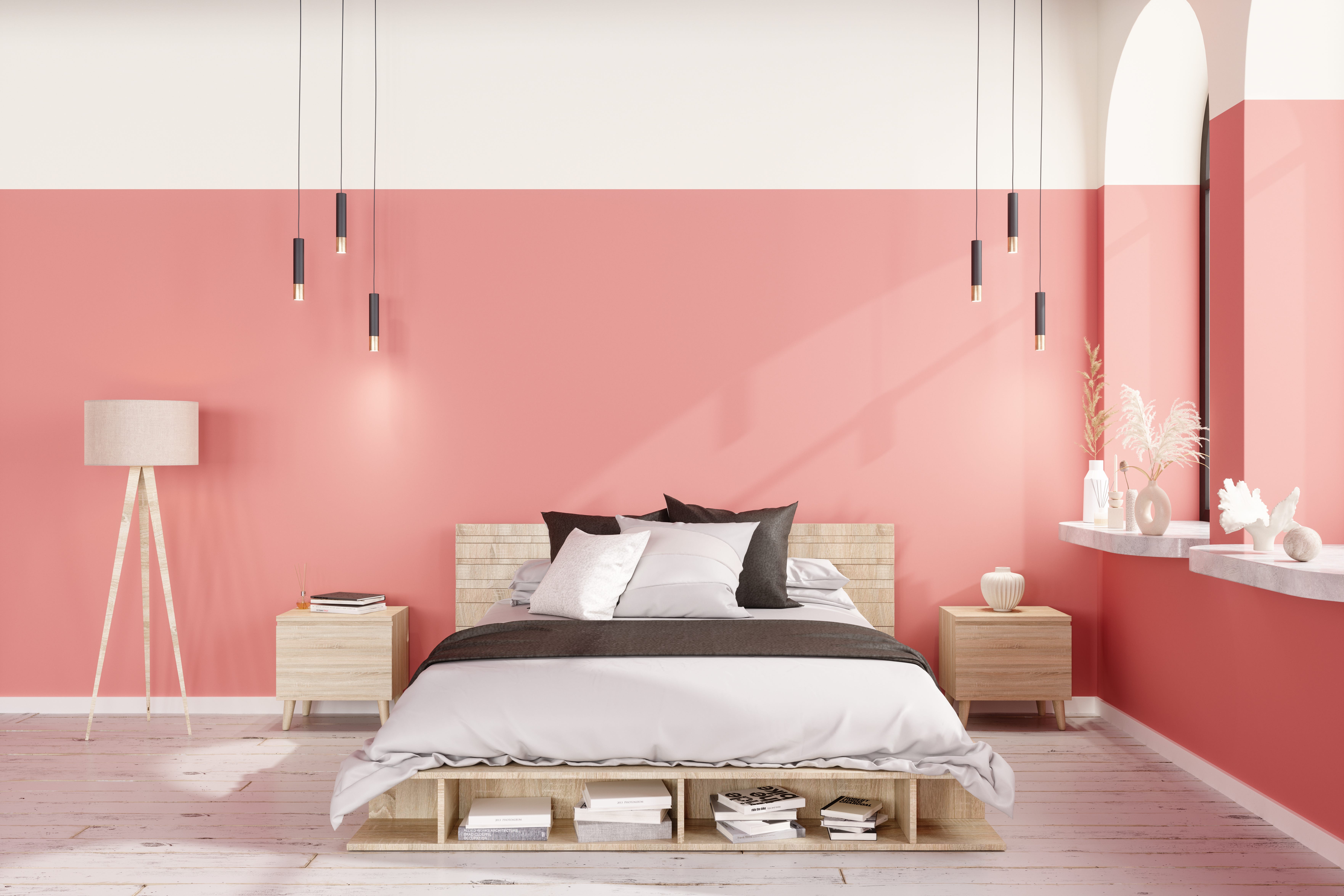
Design Pros All Agree: The Color-Blocking Trend Is One to Try

Add These Installations To Your Milan Design Week Itinerary

Moss-Core, Squishy Shapes, and 6 Other Trends We’re Super Excited About Right Now

Watch Every Talk From the AD PRO Global Design Summit

Japan in Milan: the best of Japanese design at Milan Design Week 2024

Creative Ideas From Milan Design Week

Ten bright and bold interiors that make use of colour theory

Four designers weigh in on Pantone's Colour of the Year
This SURPRISING Color Is About to Be Everywhere, According to Designers

Rich colors and sumptuous textures are on designers' minds
A Fusion of Function and Flair: Interior Paint and Beauty Partnerships