Four Designers Pick Their Fave Exterior Paint Color For Your Abode
The article explores the evolving trends in exterior house paint colors, moving away from conventional neutrals like beige and taupe. It highlights insights from four local designers who share their preferred bold and timeless color choices for residential exteriors. The piece aims to provide homeowners with inspiration and expert recommendations for refreshing their homes' curb appeal.
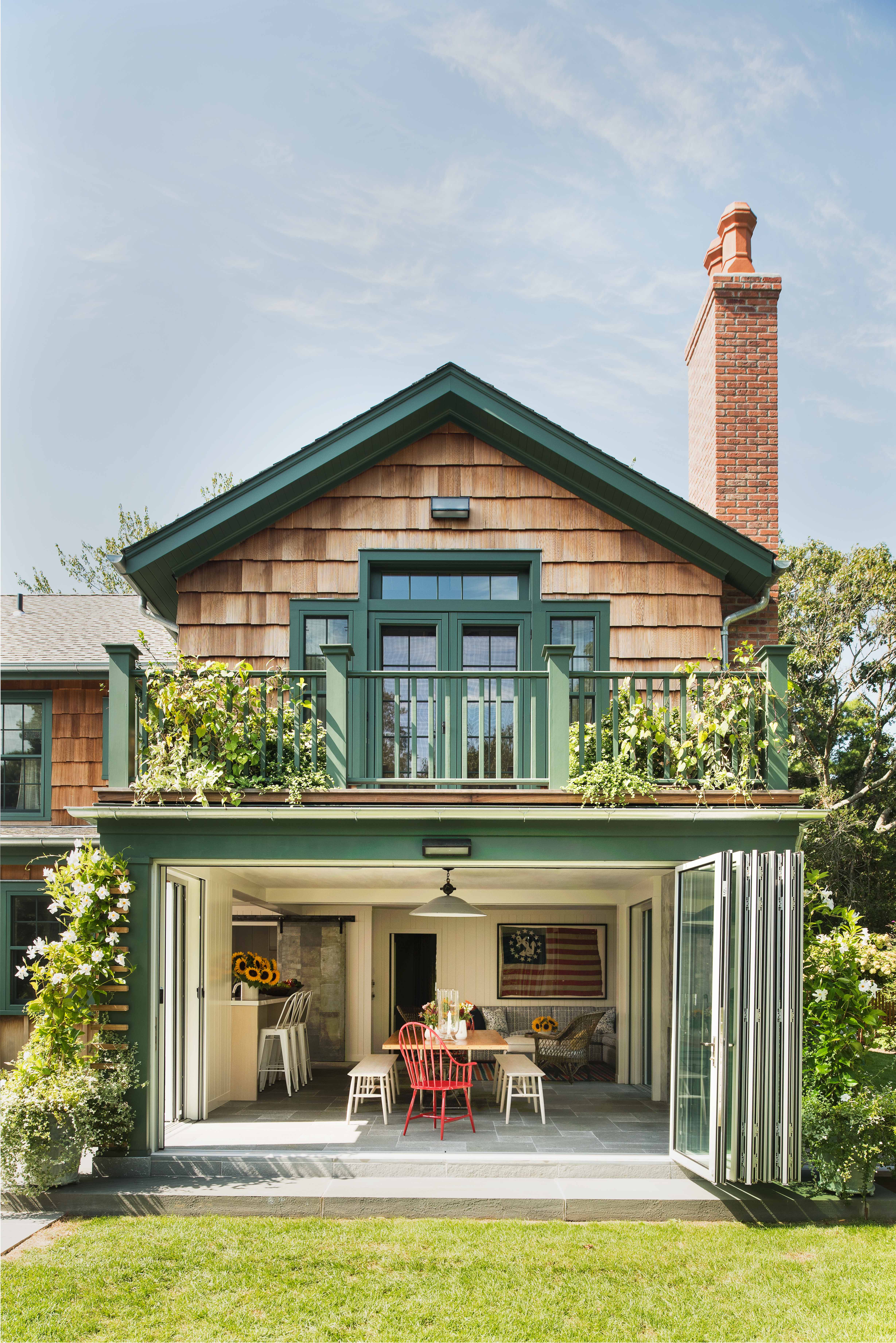
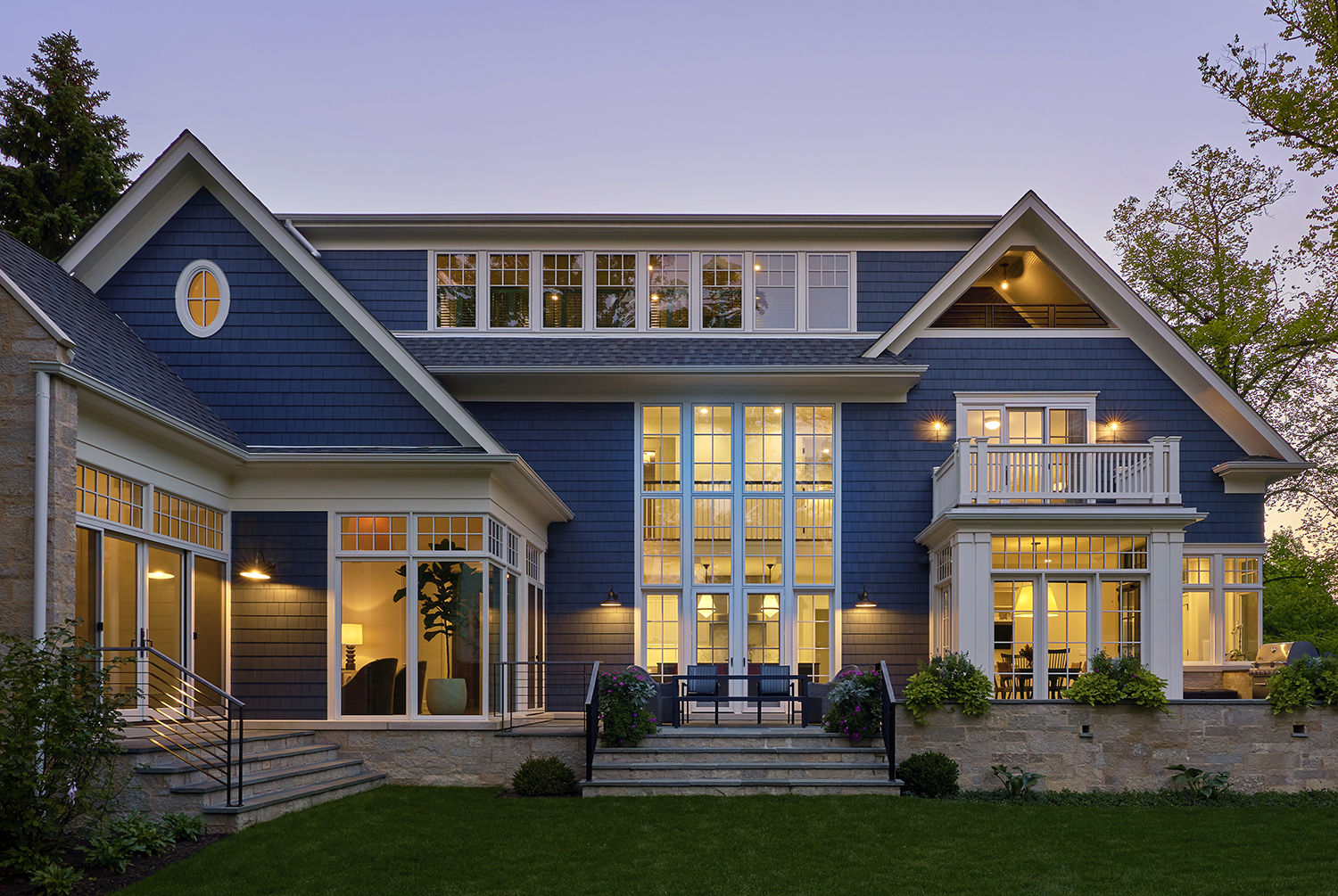
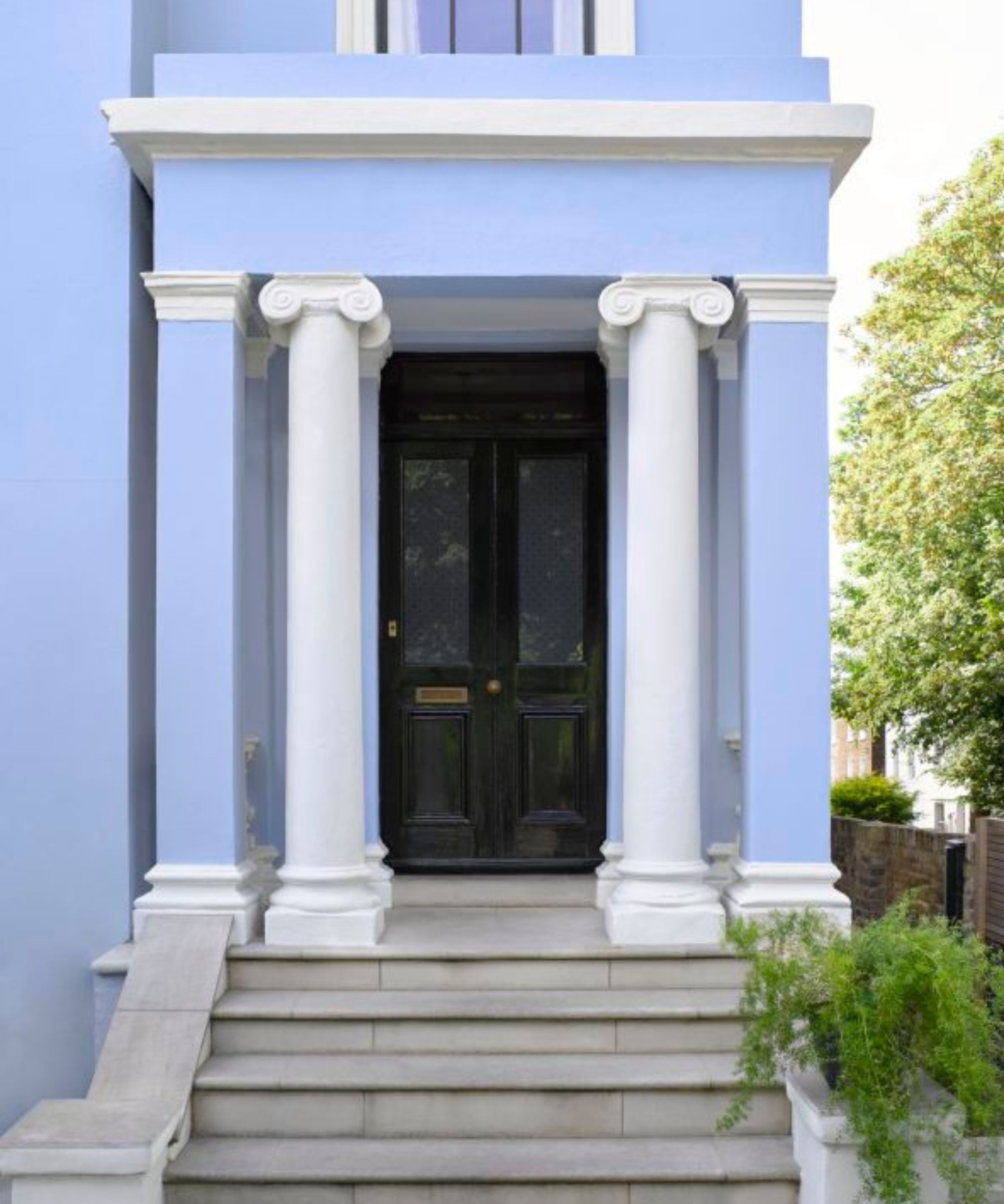
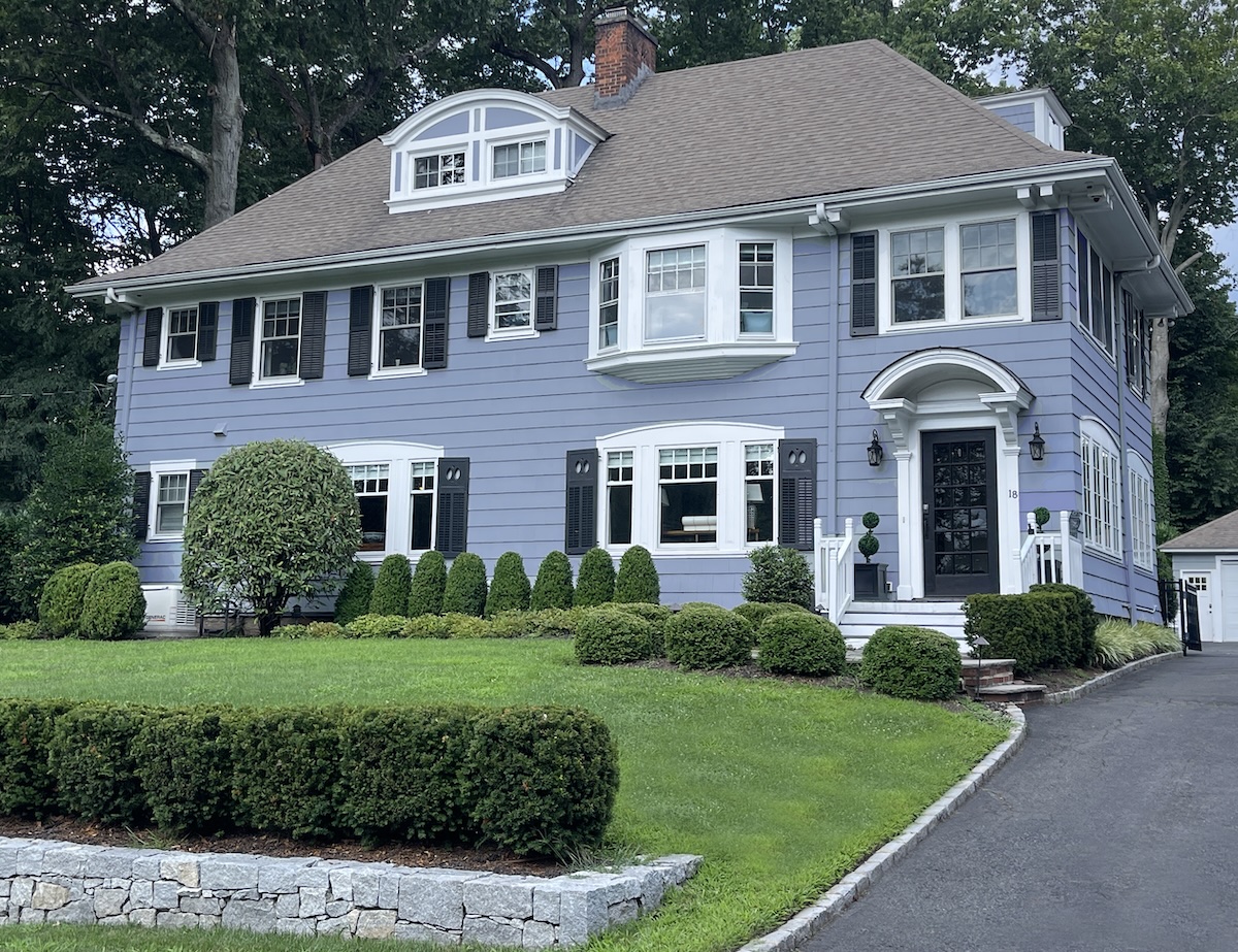
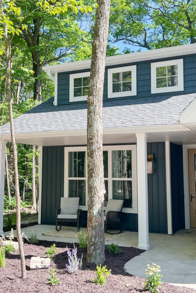
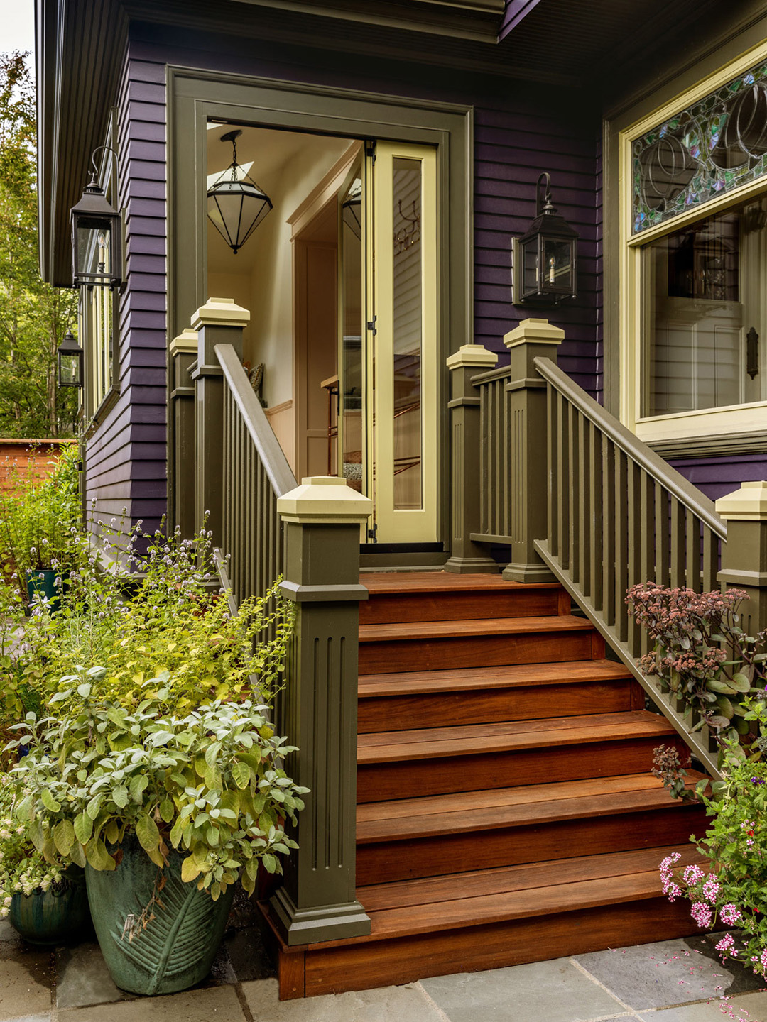
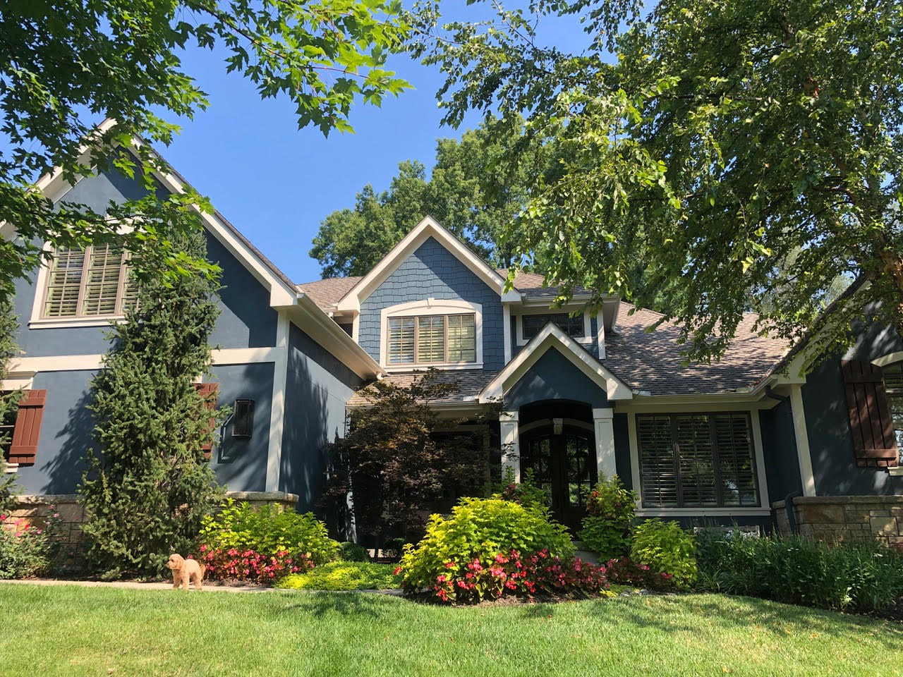
Marci Knoff of Marci Knoff Interiors discusses a specific project where she opted for Sherwin Williams’s Grays Harbor SW6236. This choice was made to complement existing golden-toned stone and wood doors on a house previously painted in a golden tan and blue. Knoff emphasizes that the deep blue-gray shade harmonizes with the stone, wood, and surrounding landscaping, offering a sophisticated and integrated look that moves beyond traditional neutral palettes.
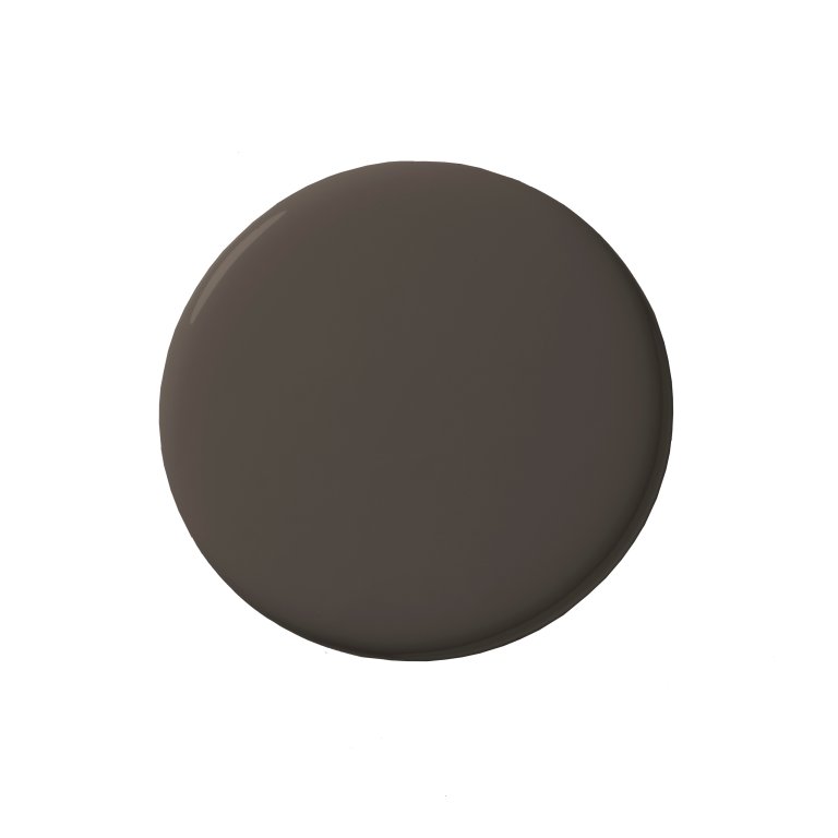
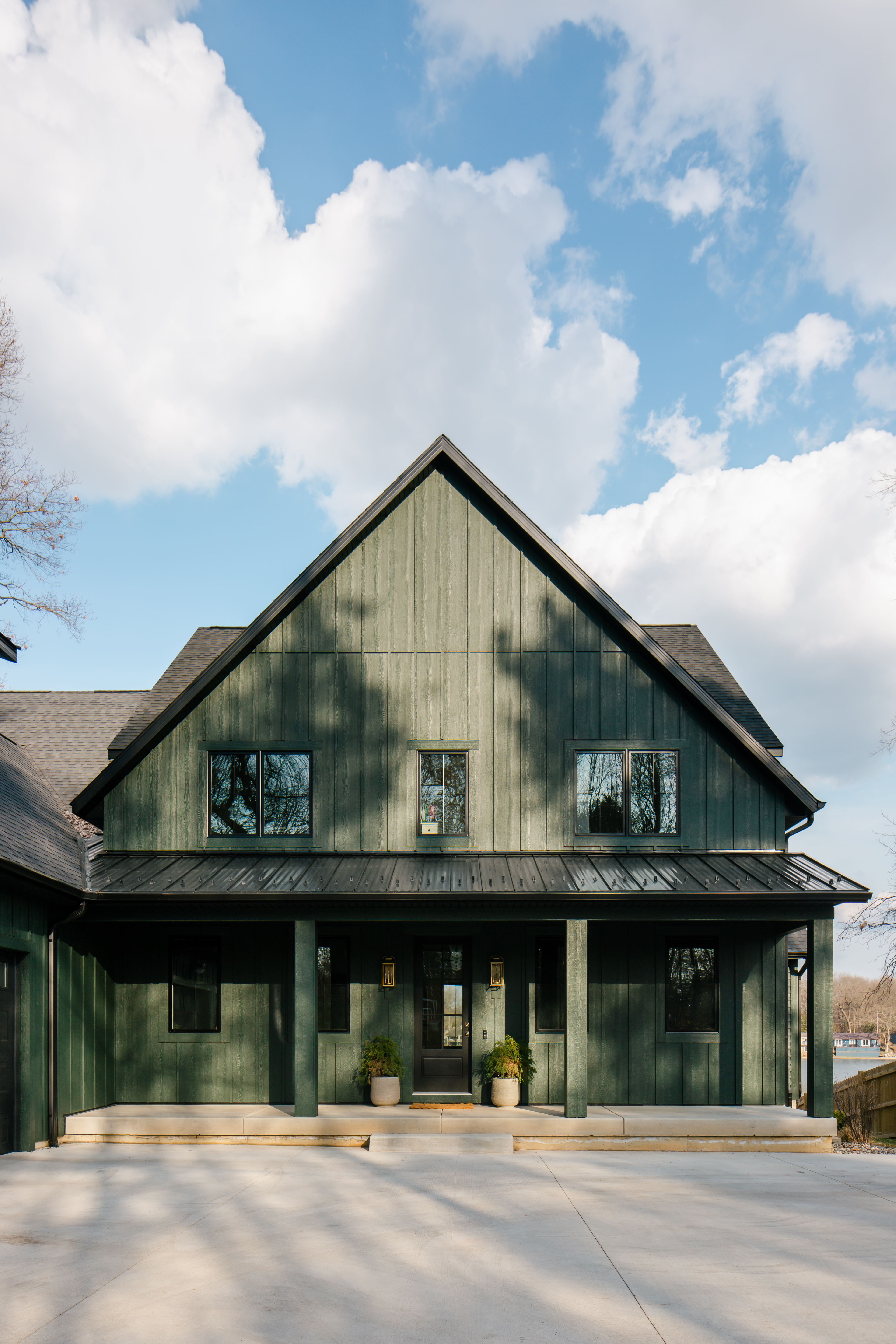
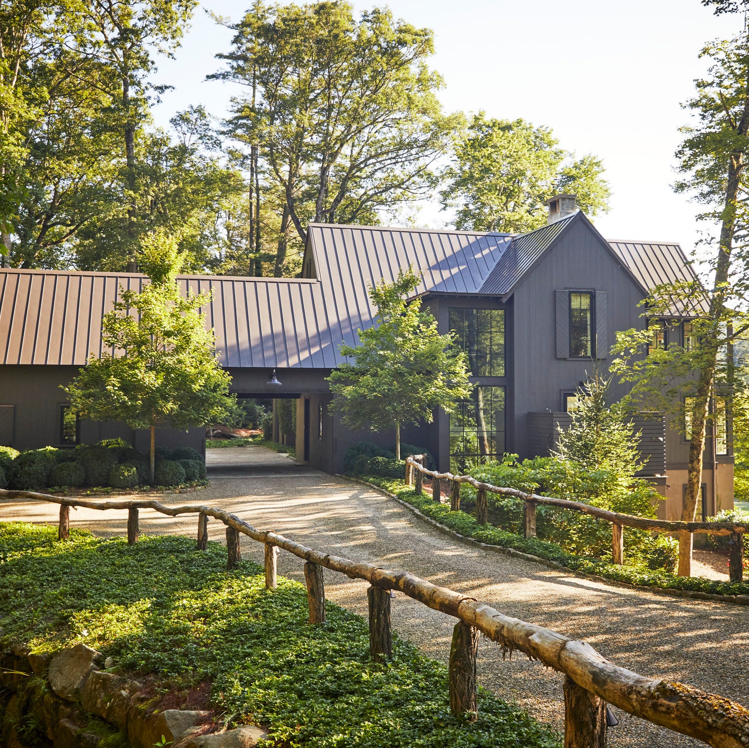
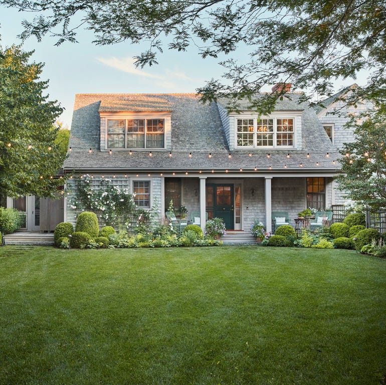
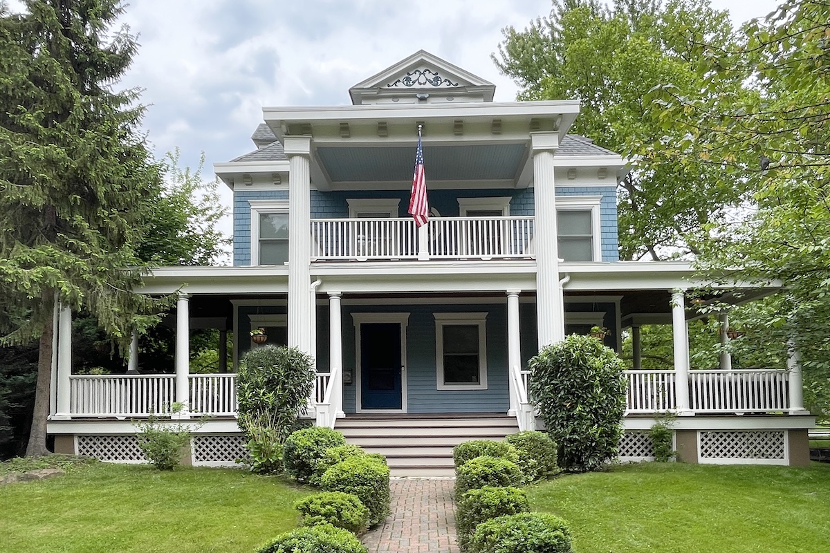
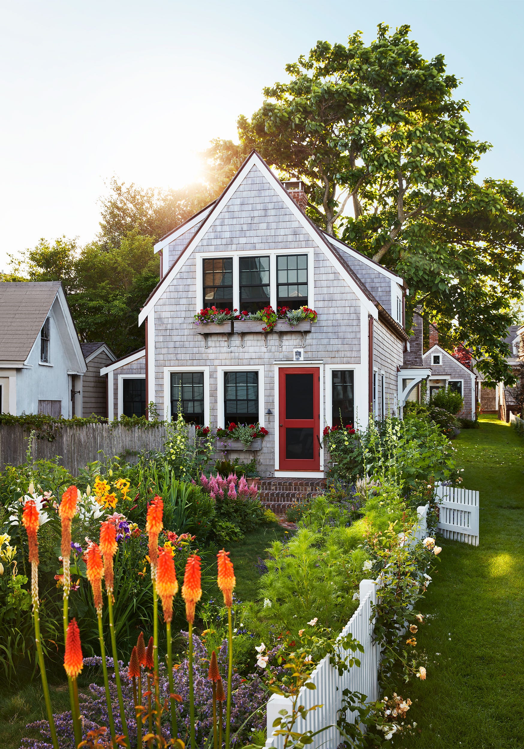
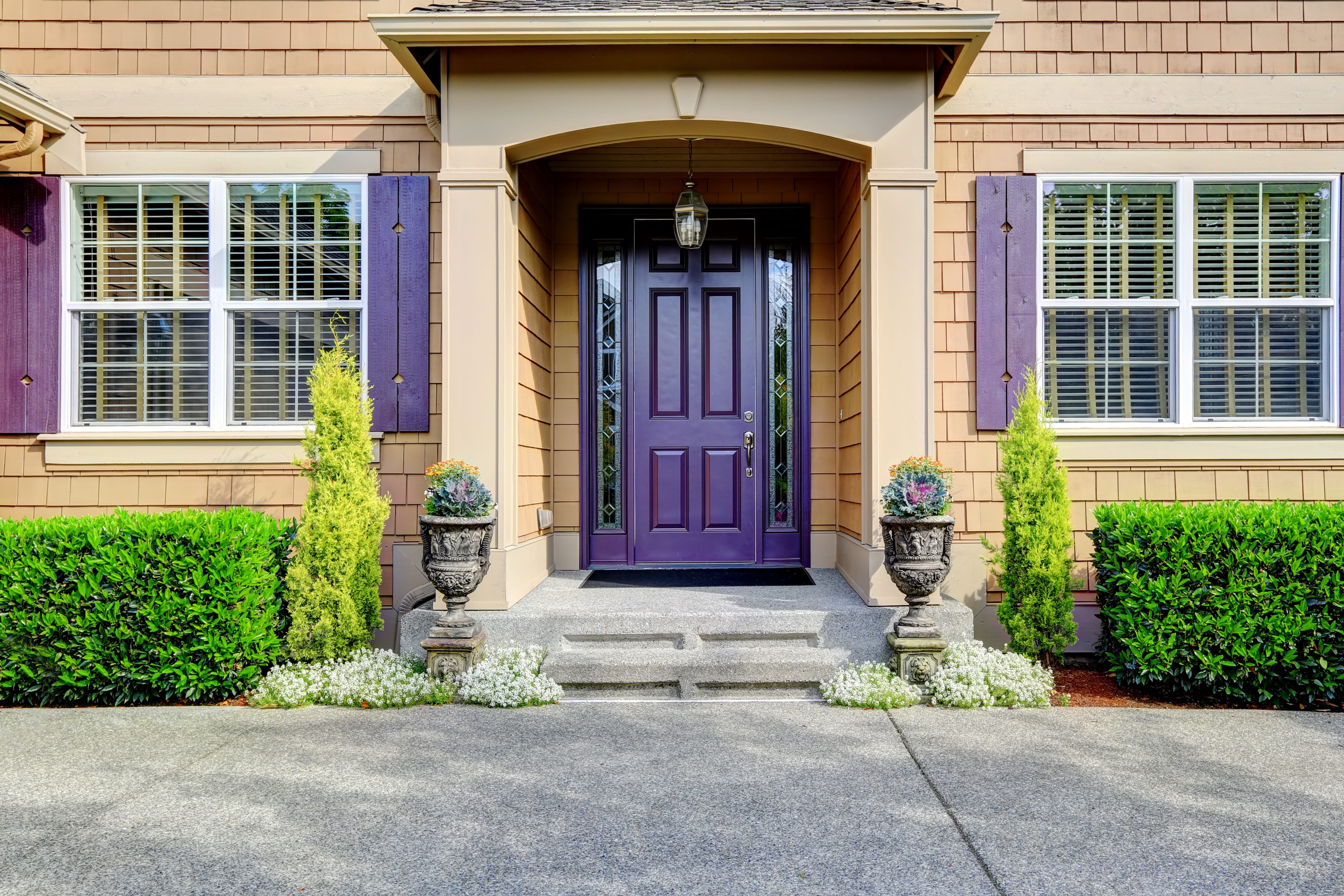
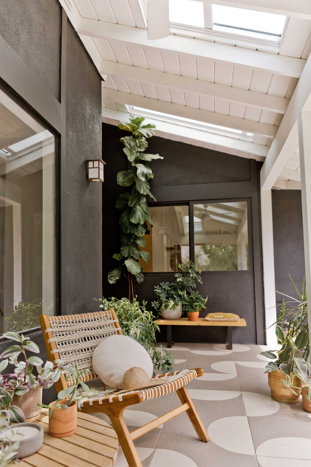
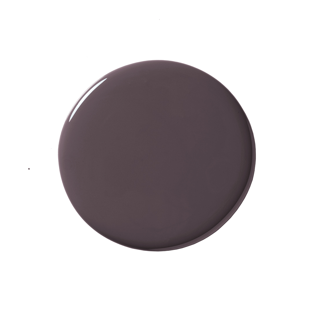
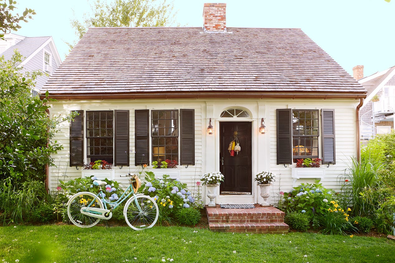
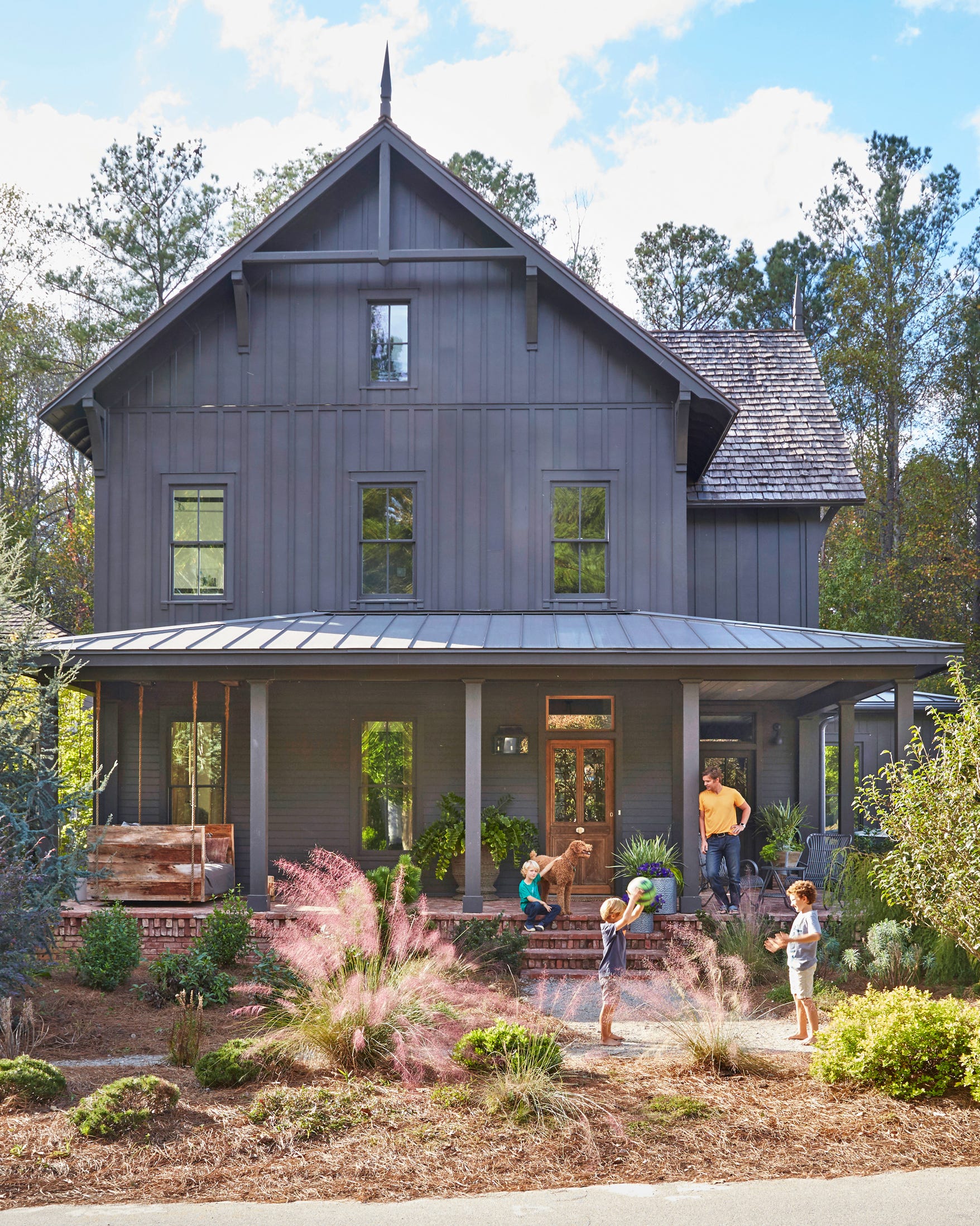
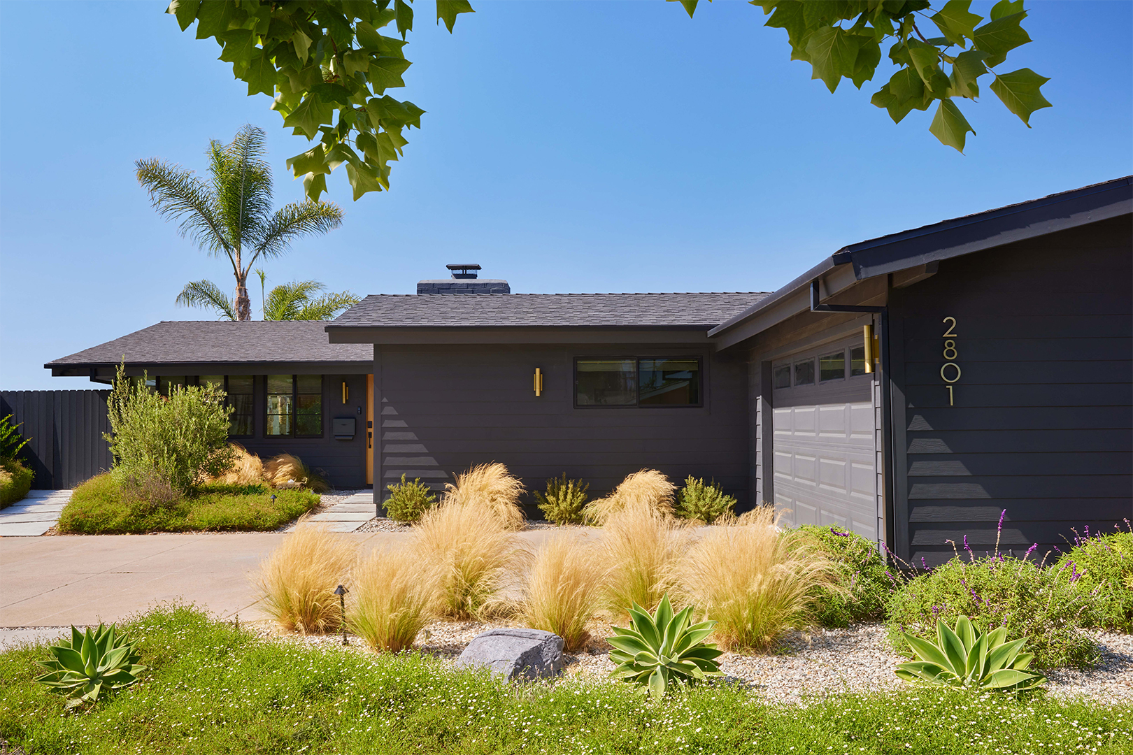
Richard Lippincott, a designer at Madden-McFarland, advocates for the use of unexpectedly dark and rich tones for house exteriors. He explains that applying these dramatic colors to both the main body and trim of a house can create striking curb appeal. Lippincott suggests that this approach is versatile, suitable for both midcentury-modern and more traditional homes, especially when paired with a vibrant front door. He specifically recommends Benjamin Moore Dragon’s Breath 1547, a blackish-bronze shade known for enhancing architectural details, and Benjamin Moore Navy Masterpiece 1652. The latter, a blue hue, is gaining popularity and offers a nod to Nantucket style without appearing overly coastal for a Midwestern setting, effectively complementing wood shingles, cedar trim, warm neutrals, and stone accents.
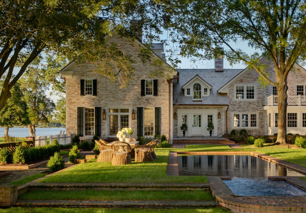
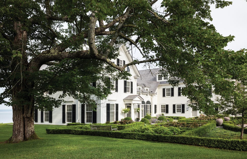
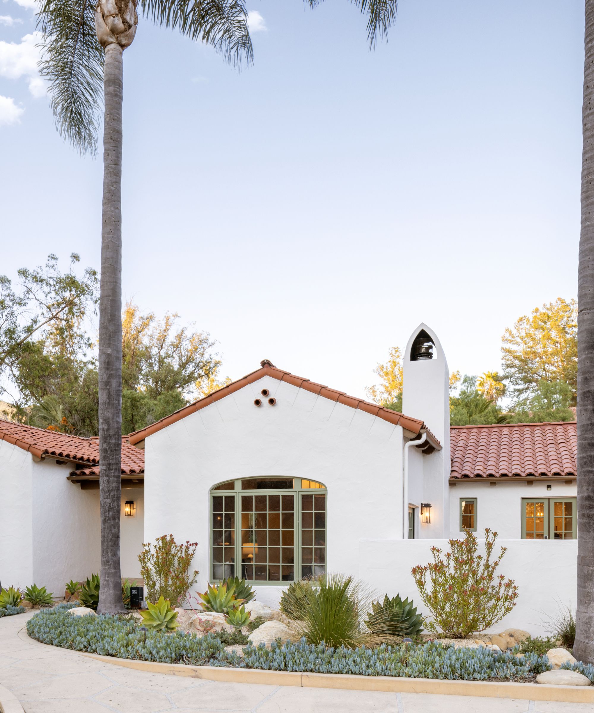
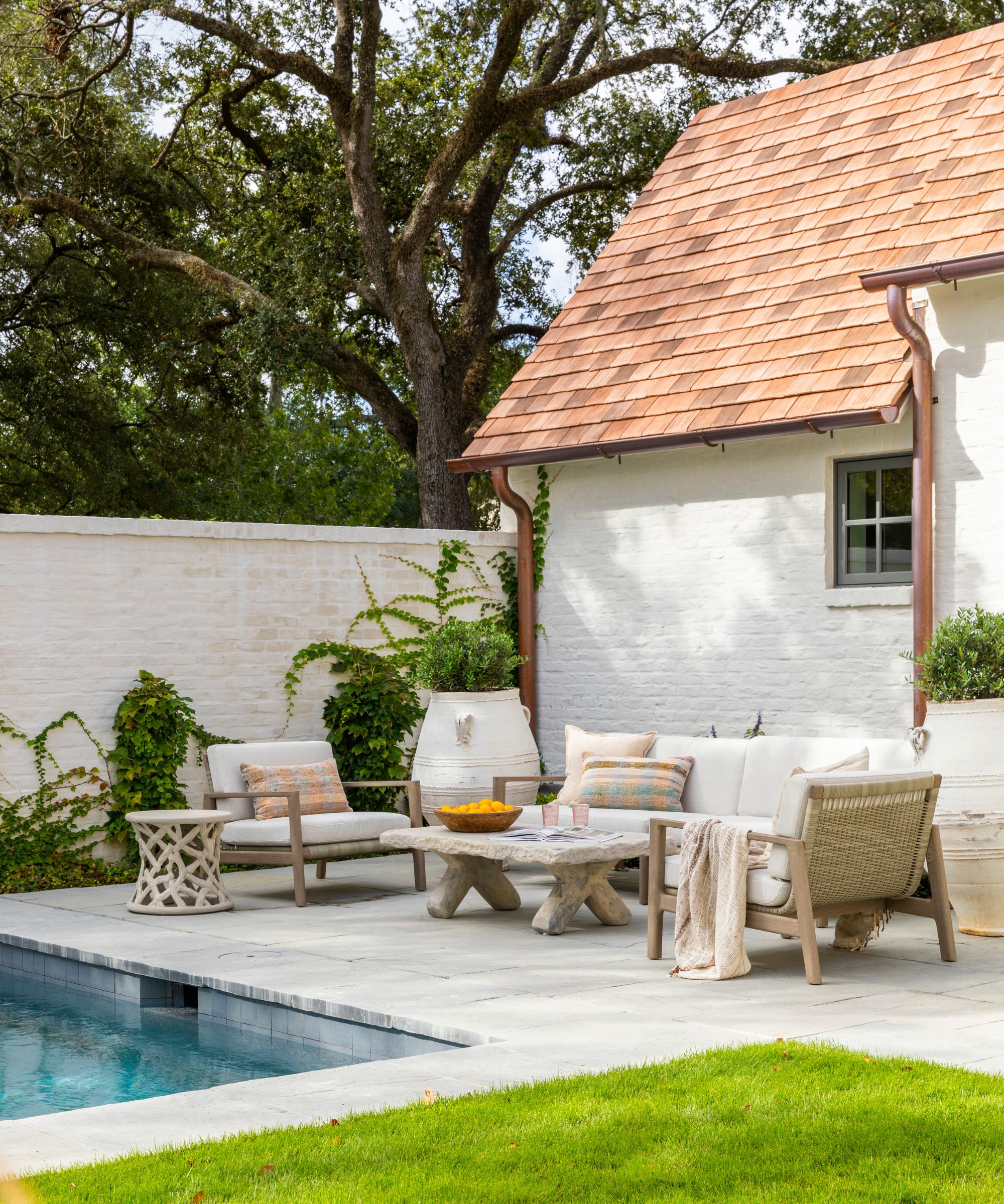

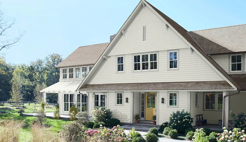
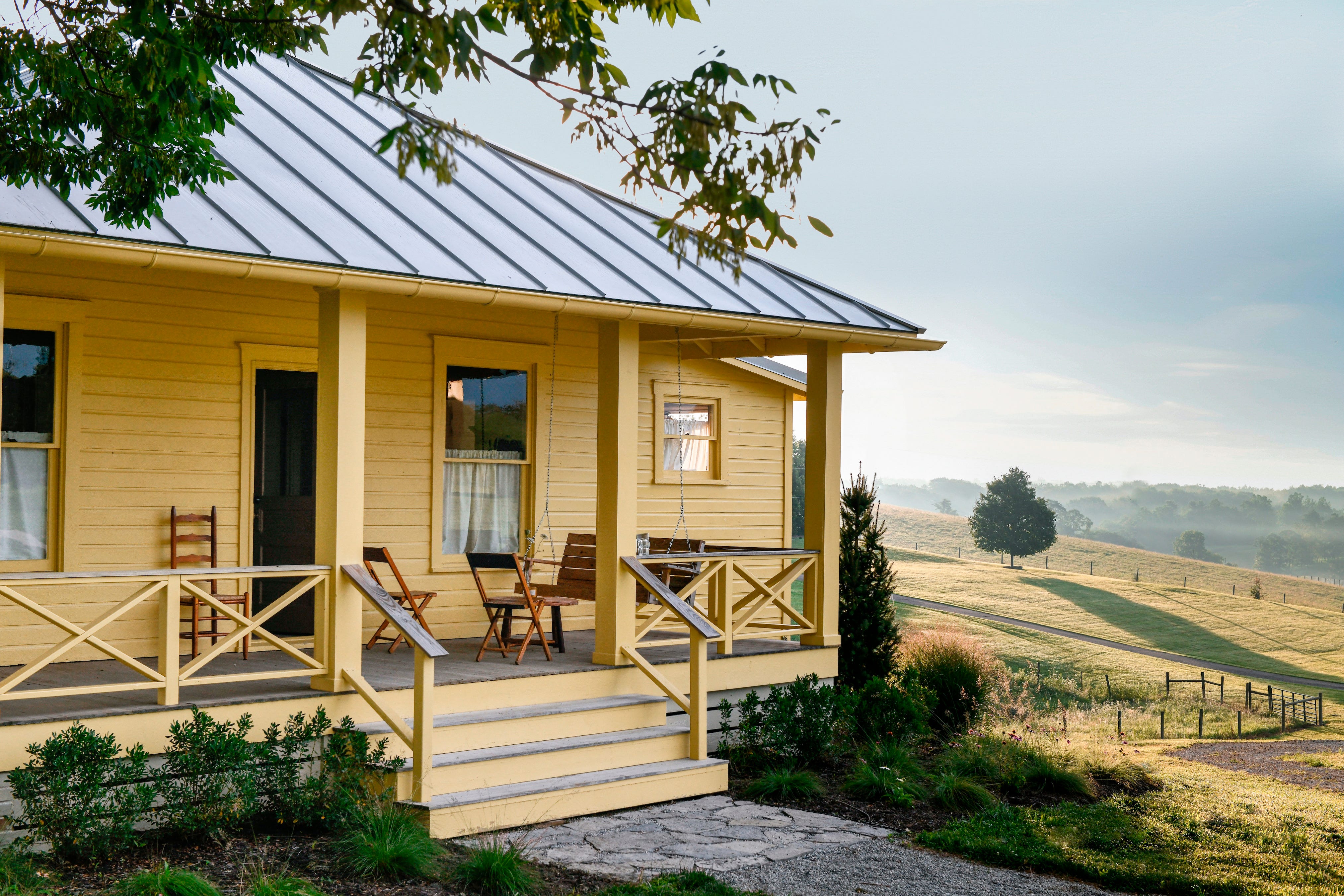
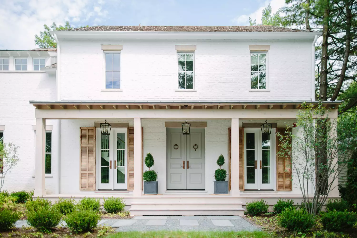
Amy Thurston, another featured designer, expresses a preference for creamy whites over stark bright whites. She finds cream to be less imposing and more welcoming, describing it as a "friendly neighbor" in the color spectrum. Thurston suggests pairing creamy whites with charcoal or gray trim and shutters, along with wood elements, to achieve a look that is both sharp and fresh, yet timeless. She notes that this combination works well with brick, stands out on siding, and maintains its appeal in various lighting conditions, offering sophistication without harsh contrasts. Her specific recommendations include Farrow and Ball’s Schoolhouse White and Benjamin Moore’s China White.
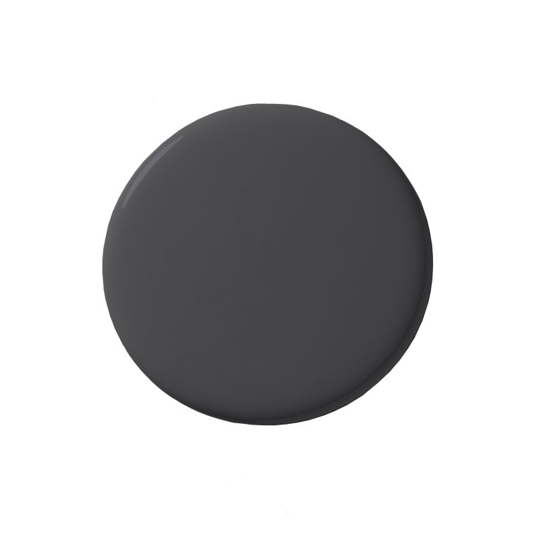
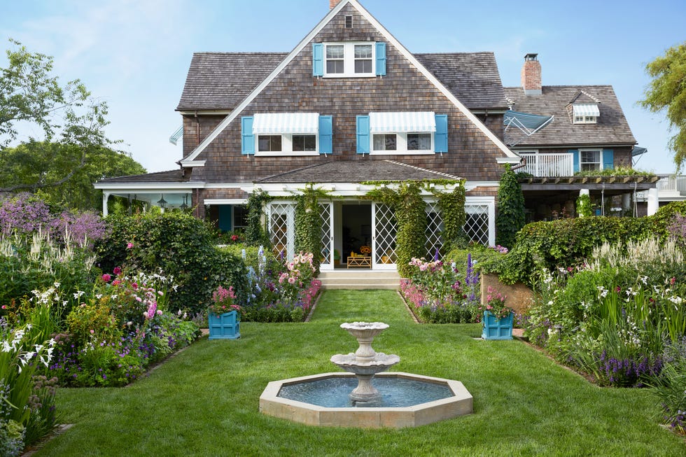
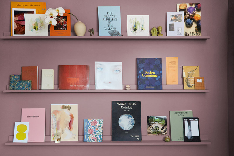
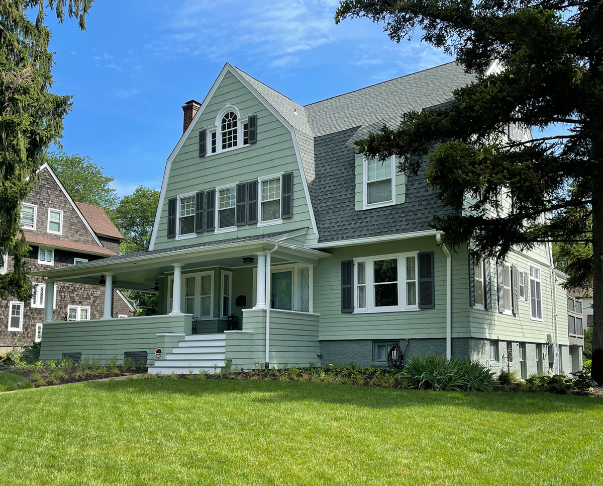
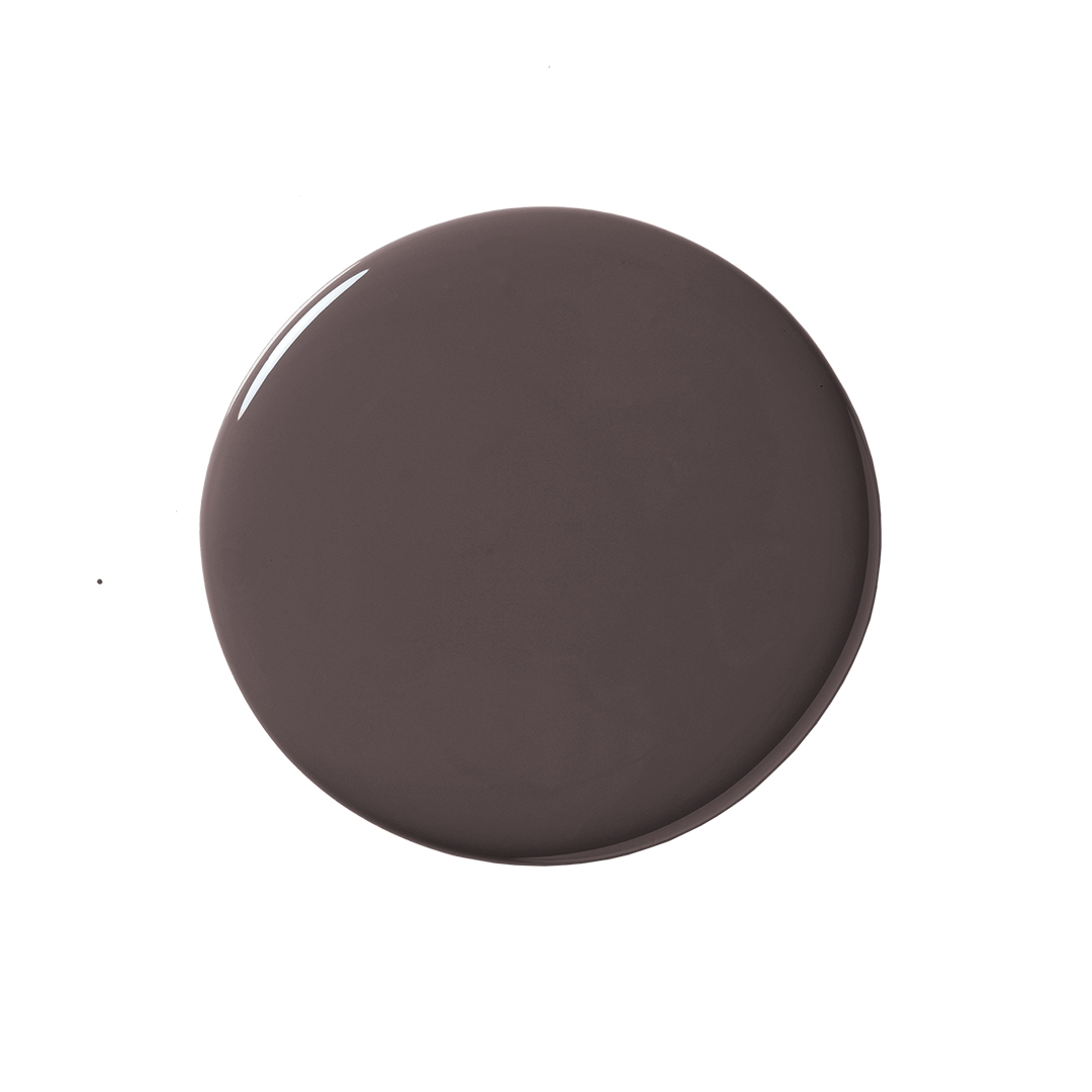
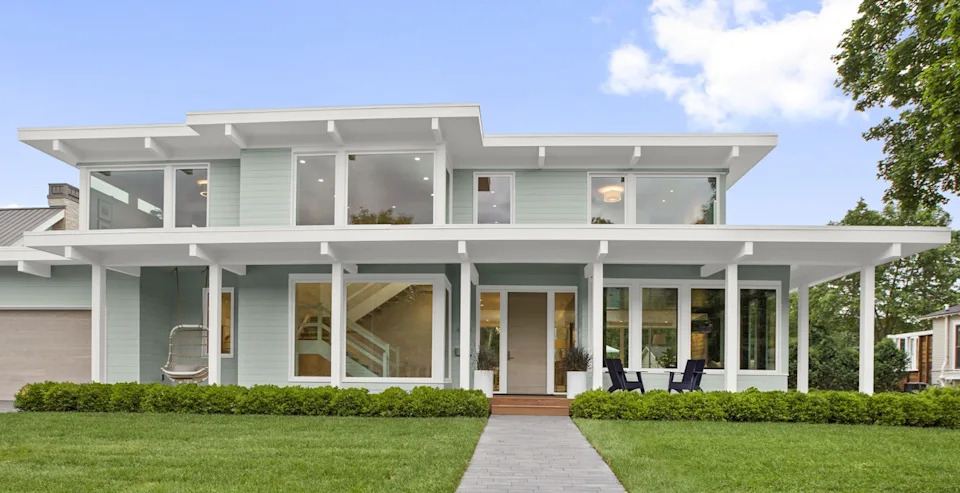
Michelle Schneider, a color consultant for PPG, recommends PPG paint’s Old Silk (PPG0993-6). She describes it as a classic, stormy-gray color with subtle navy undertones. Schneider highlights its versatility, stating it looks stunning when applied to a home’s entire exterior and pairs impeccably with either black or charcoal trim. Additionally, she notes that Old Silk appears idyllic alongside vibrant greenery, suggesting it can enhance a home's overall aesthetic and make it stand out. Schneider also mentions that PPG offers free virtual color consultations to assist homeowners in selecting appropriate paint colors for their projects.
The article collectively demonstrates a shift towards more deliberate and distinctive exterior paint choices. Designers are moving away from conservative neutral tones to embrace richer, more nuanced colors that enhance architectural features and complement natural surroundings. The recommendations provided offer a range of options from bold blues and dark bronzes to creamy whites and sophisticated grays, catering to diverse aesthetic preferences while emphasizing timeless appeal and harmonious integration with a home's existing elements.
#ExteriorPaintColors #HomeDesign #ColorConsultation #ArchitecturalDetails #CurbAppeal #InteriorDesigners #PaintTrends #ExteriorPaintColors #HomeDesign #ColorConsultation #ArchitecturalDetails #CurbAppeal #InteriorDesigners #PaintTrends
0 comment in total
 No comments yet
You may also like
The Best Exterior Paint Colors Designers Have Ever Used

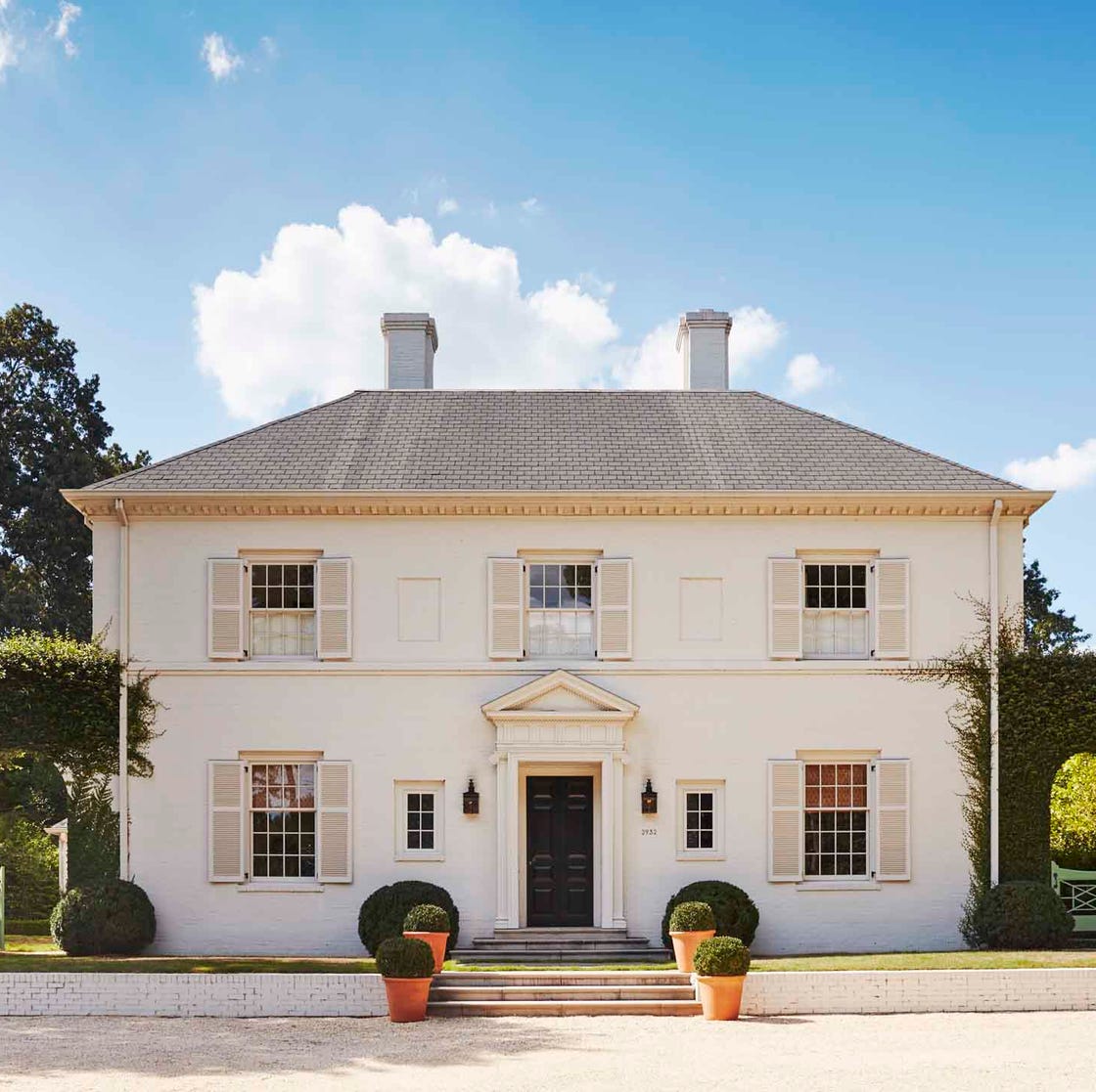
8 Exterior Paint Colors That Make Your House Look More Expensive, According to Designers

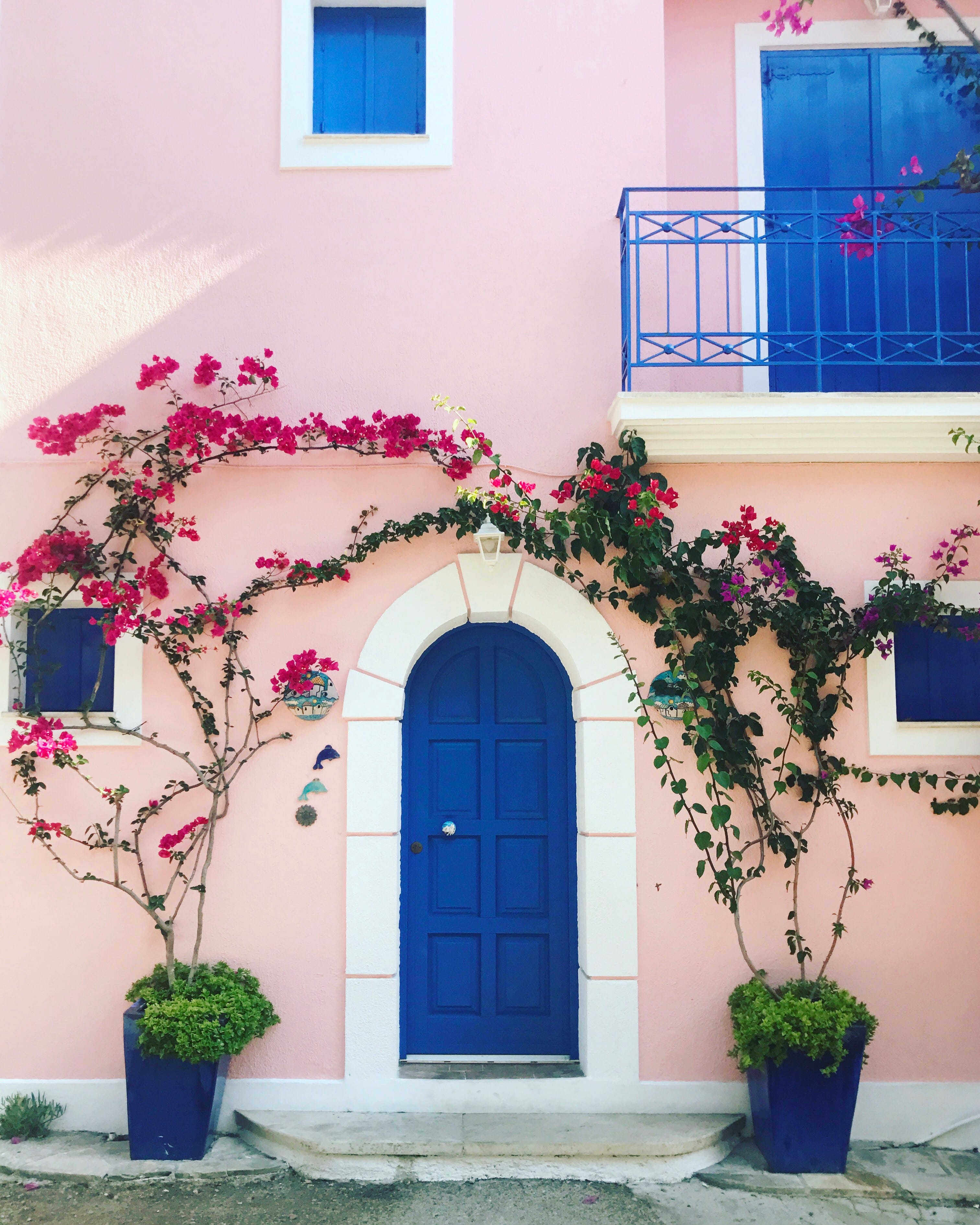
These 50 House Colors Are All the Rage in 2024

6 tips for picking the perfect exterior paint color for your home

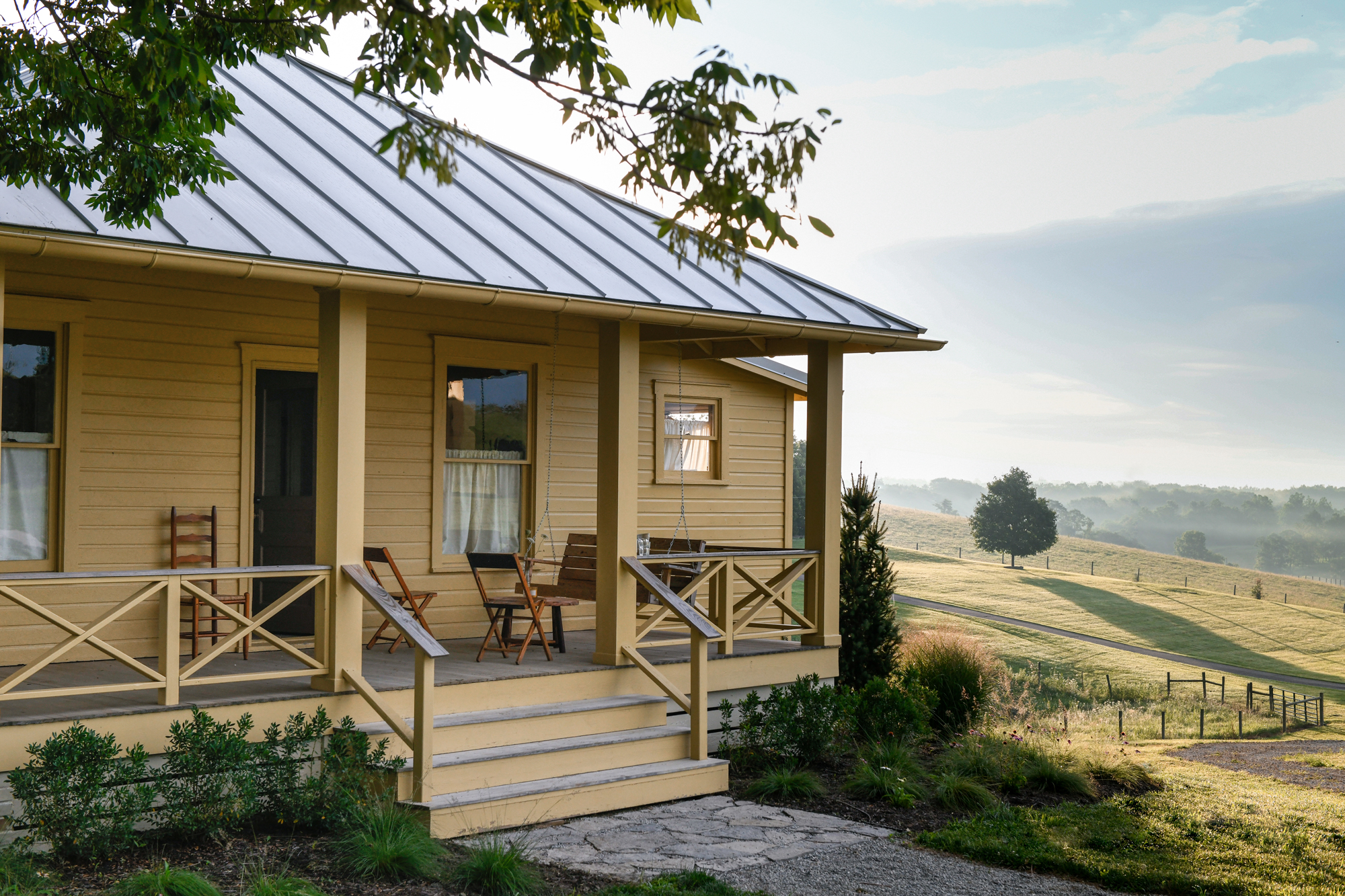
7 rules designers always follow to find the best exterior paint for your home

11 best colors for the exterior of your home, for a classic look year-long as suggested by experts
10 Exterior Paint Color Trends You'll See Everywhere In 2025

4 Interior Designers Share the Biggest Paint Color Trends Right Now (and What’s Out!)


8 Favorite Paint Colors of Local Interior Designers

9 Tips for Choosing Exterior Paint Colors

6 Best Exterior Paints for Your Home, According to Experts

The Best Exterior House Paint Colors for Hot and Cold Climates
The Best Exterior Paint Colors, According To Designers
Designers Share Their Tried-and-True Shades From the Best Interior Paint Brands
These Exterior House Paint Color Combos Are Bound to Turn Heads
The 25 Best Exterior Paint Colors To Give Your Home Inviting Curb Appeal for 2025
Here's What Colorists Want You to Know About Picking House Paint
I Asked Three Color Experts How to Choose Modern Exterior House Colors. Here's Their Best Advice.

The Moody Shade That Will One-Up White Exteriors in 2026

Designers Reveal 7 Exterior Paint Colors They Always Use for Their Projects