5 Bedroom Paint Colors That Could Be Ruining Your Sleep
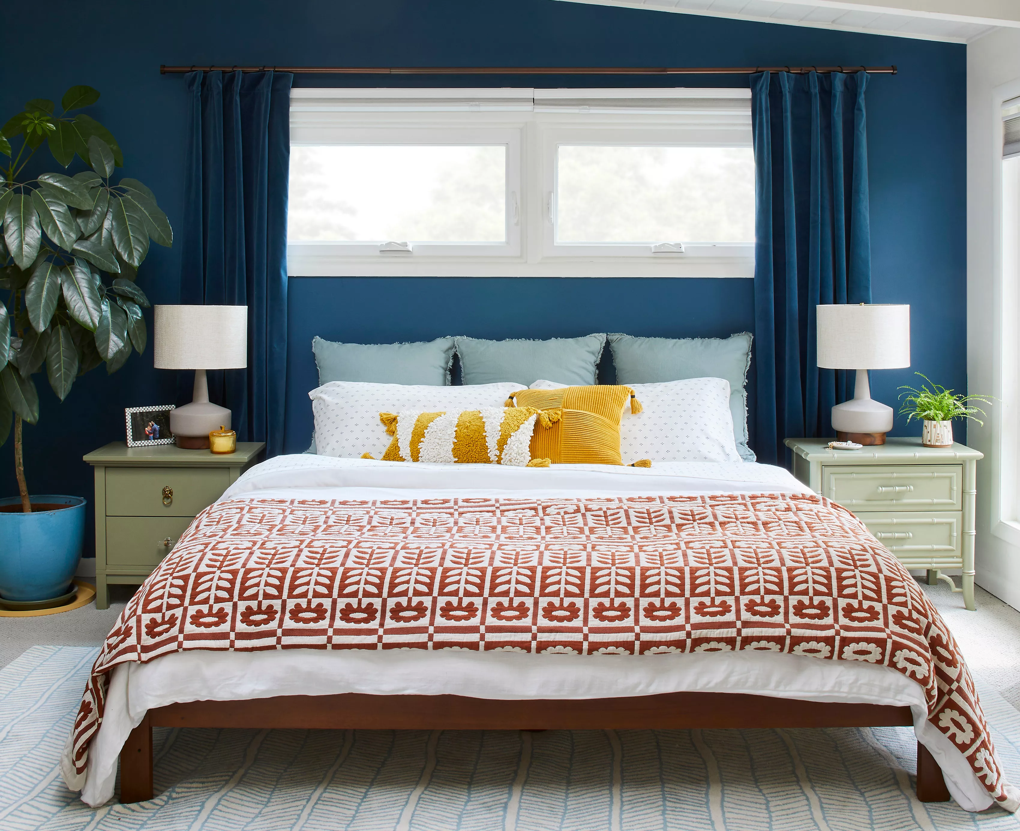
The selection of paint colors for a bedroom goes beyond aesthetic preferences, as certain hues can significantly impact sleep quality. Experts advise against using colors that stimulate the mind and energize the body, recommending instead shades that promote relaxation and calm. Kendra Cosenza, brand manager at Mulberry Park Silks, emphasizes the crucial role of color in shaping a peaceful bedroom environment conducive to restful sleep.
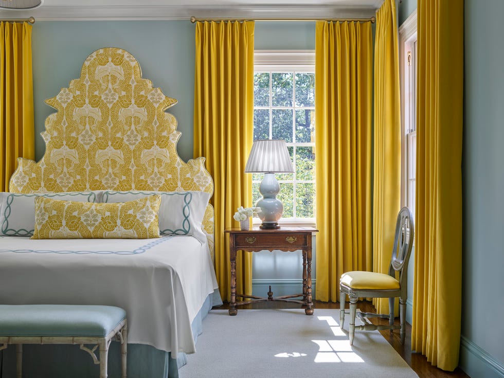
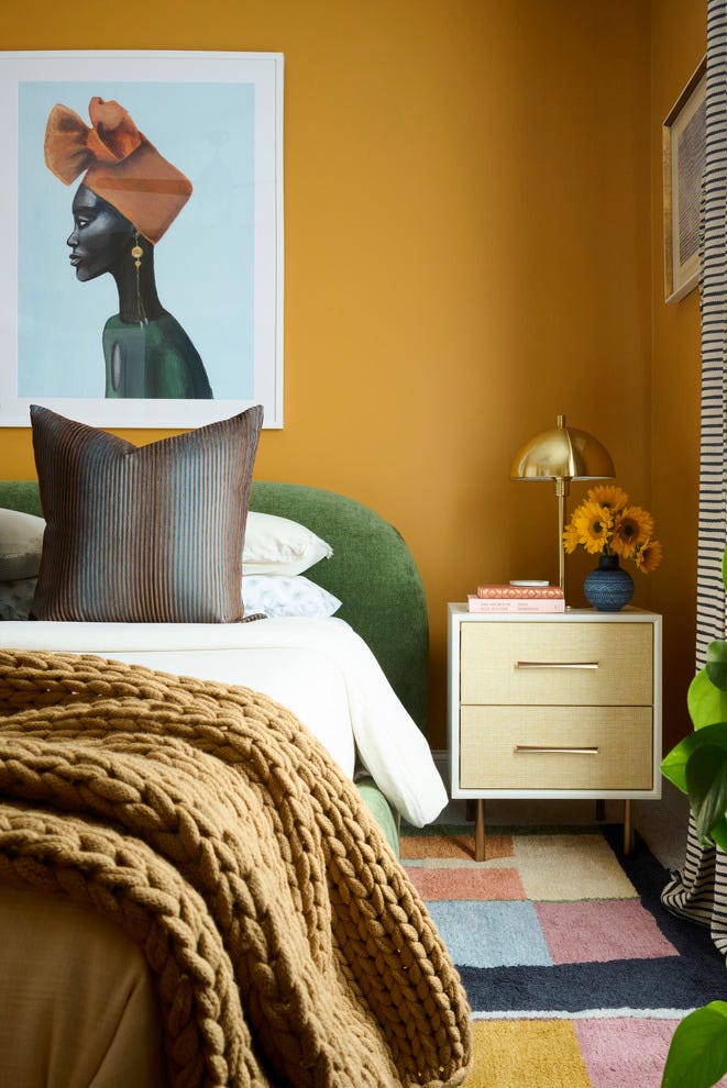
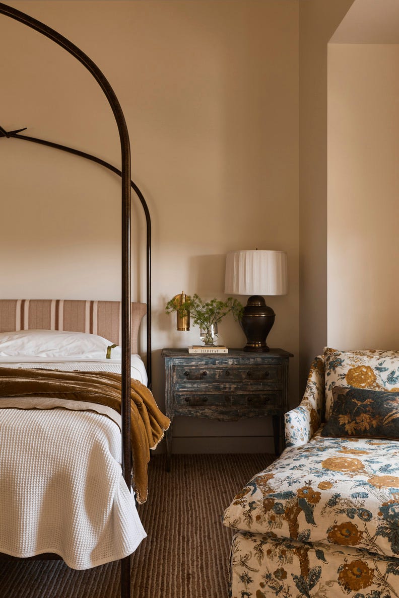
Vibrant yellow is identified as a color to avoid in bedrooms. While it is often associated with cheerfulness and positivity, vibrant yellow hues possess an intense energy that can stimulate the brain, making it difficult to fall asleep. Such colors are better suited for social or active areas of a home. For individuals who prefer yellow, a softer, paler butter yellow or a muted, beige-leaning tone is suggested to create a light, airy, and more restful atmosphere.
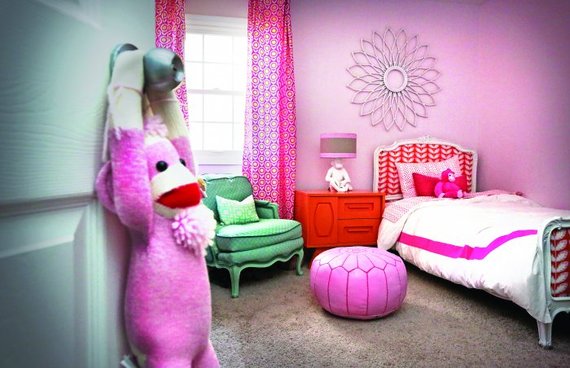
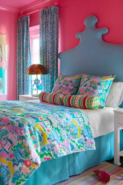
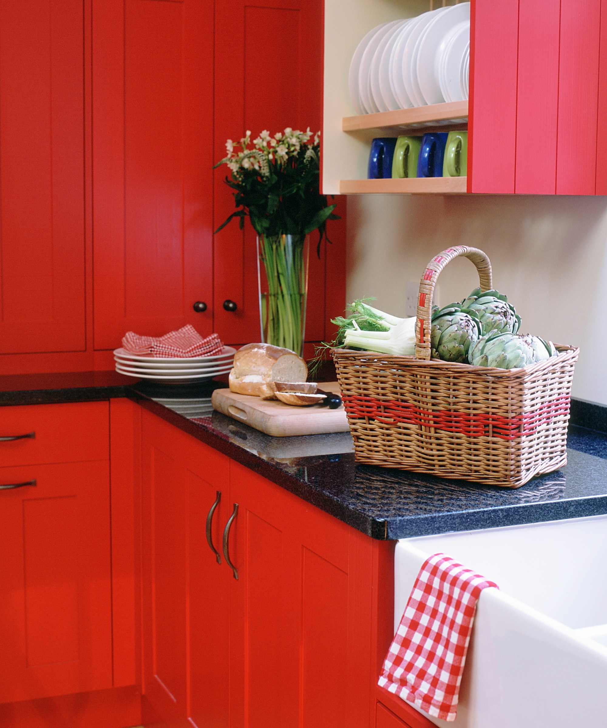
Bright red is another color that can negatively affect sleep. Its energetic and stimulating properties can increase heart rate and create a sense of excitement, which is counterproductive to relaxation. Red is traditionally associated with passion and intensity, making it unsuitable for a space intended for rest. If red is desired, it should be introduced through muted shades, as an accent wall, or via accessories, rather than as the dominant wall color.
Eggplant purple, a dark and dramatic shade of purple, is also flagged as detrimental to sleep. Although it can convey elegance and luxury, its mysterious quality can keep the brain stimulated, preventing the mind from settling down. For those who enjoy purple, a muted lavender is recommended, as it is known to reduce stress and promote a calming atmosphere, lending itself to both sophisticated and laid-back designs.
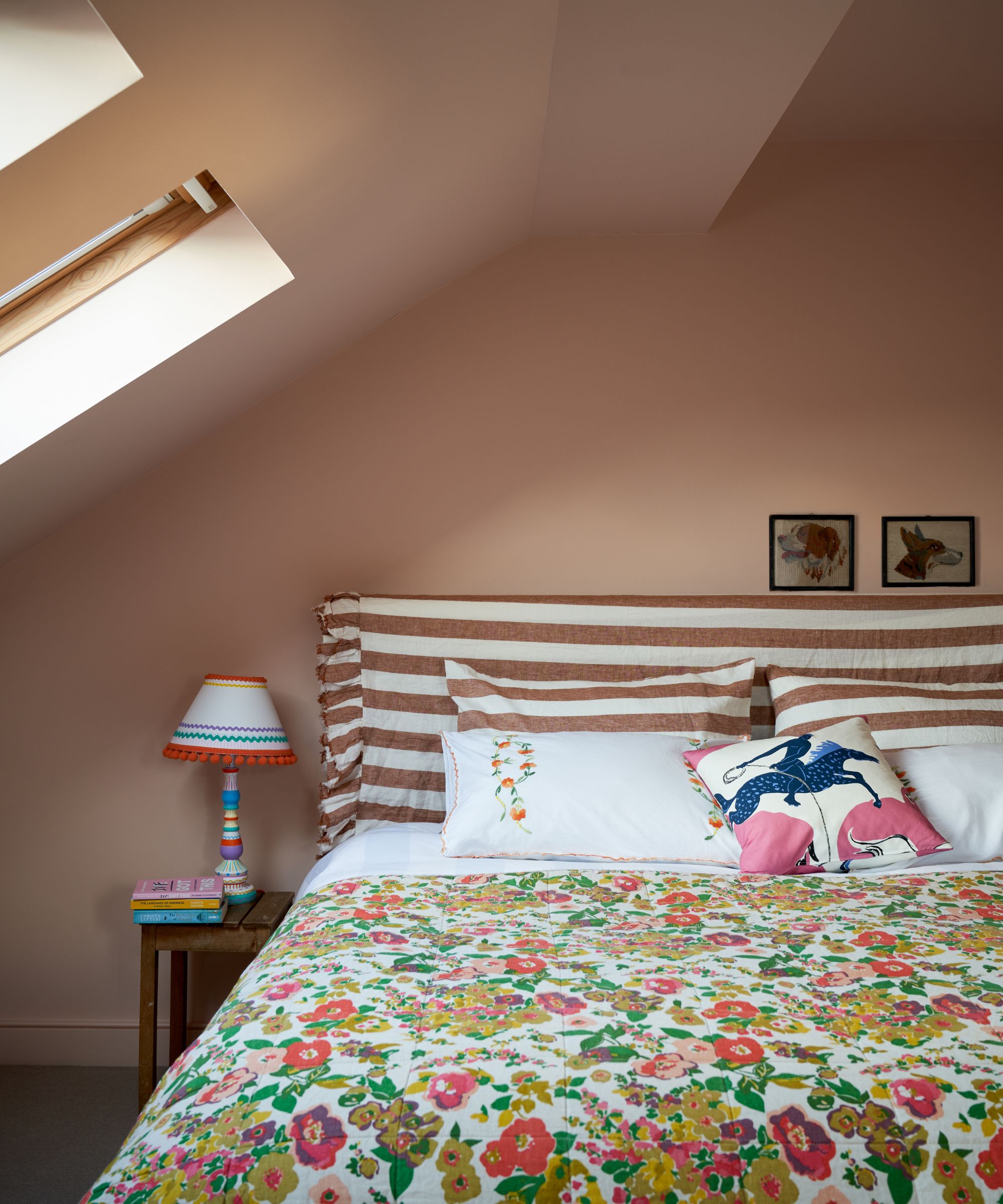
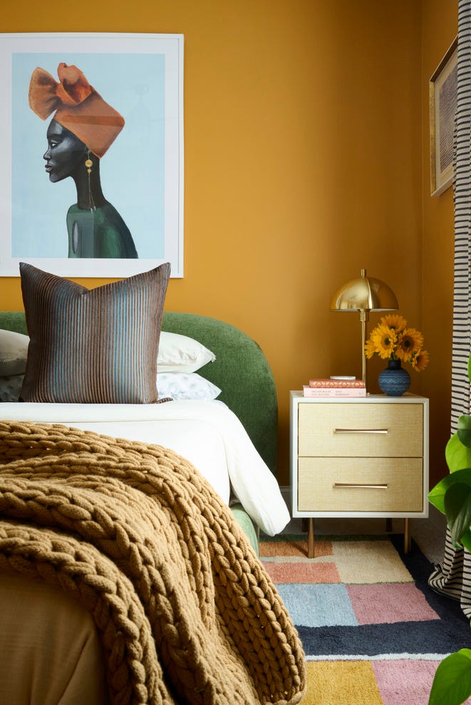
Fiery orange shares similar stimulating effects with bright red. Despite its potential to make a room feel warm and inviting, its bright, bold, and energetic nature is not conducive to relaxation. Orange, while optimistic, can overstimulate the mind and body, fighting against the natural instinct to rest. A pale, soft peachy hue is presented as an alternative for incorporating orange tones in a bedroom, providing a gentle and calming backdrop for sleep.
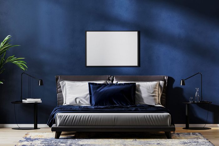
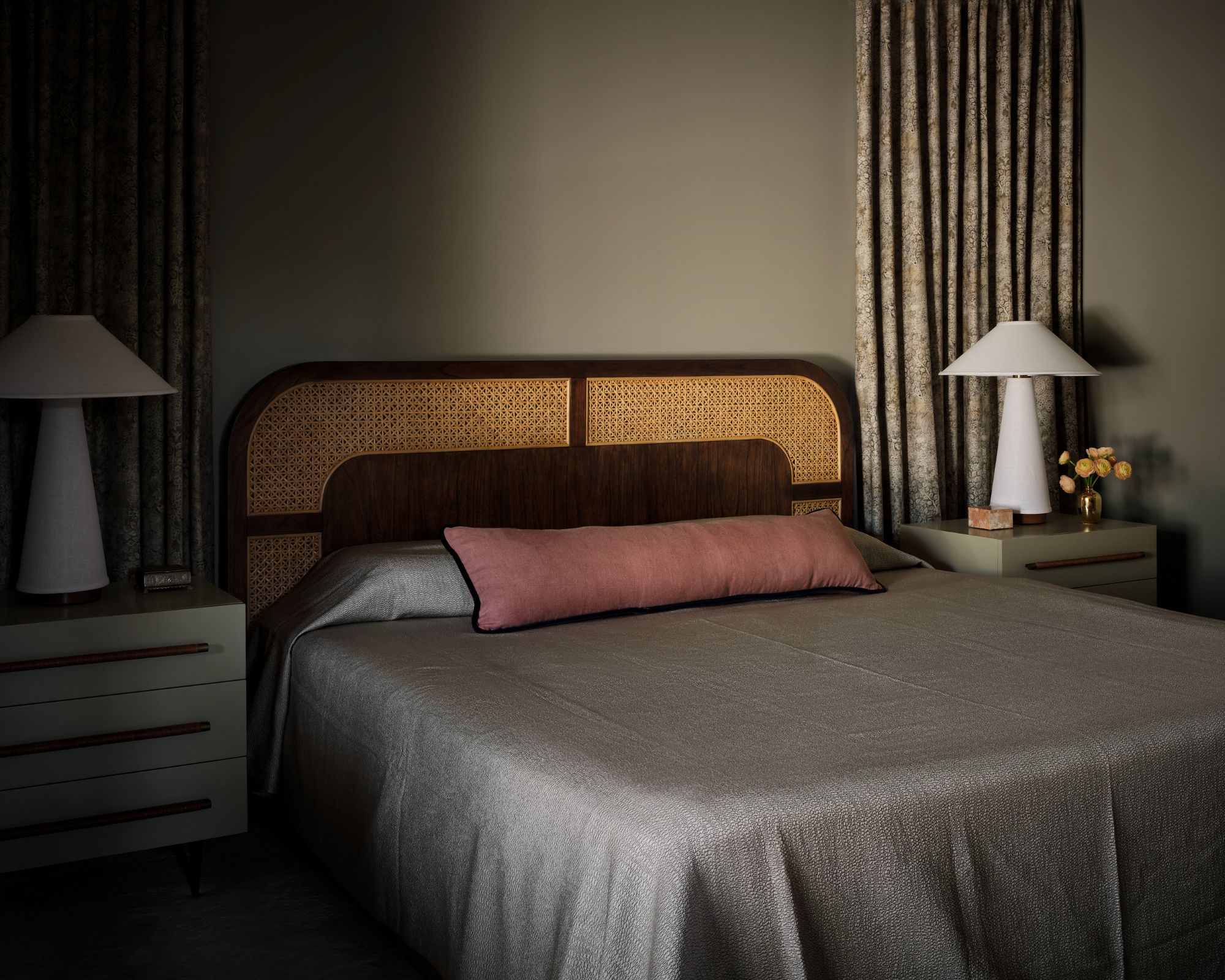
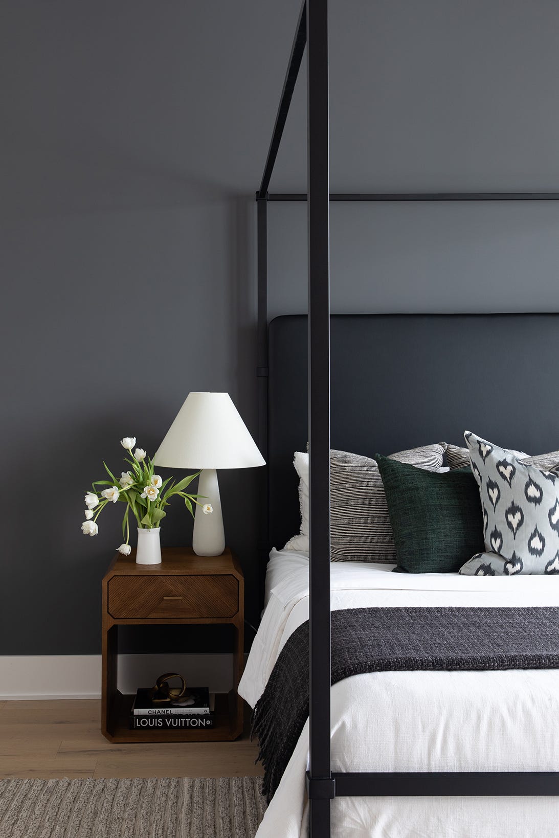
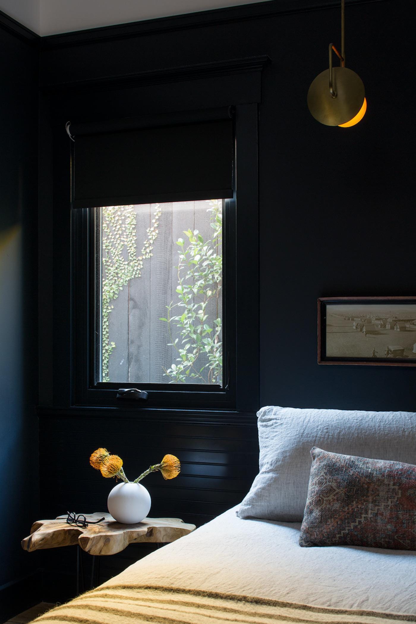
True black, despite its ability to darken a room, is not recommended for bedrooms due to its high saturation and light-absorbing qualities. This can make a room feel cramped and small, hindering the body's ability to relax. Black is also often associated with negative energy, which could lead to unwanted preoccupation before bedtime. Furthermore, its light-absorbing properties can negatively impact energy levels in the morning. A cool, steely blue is suggested as a more appropriate alternative, offering depth while promoting a sense of calm.
#BedroomPaintColors #SleepQuality #ColorPsychology #HomeDecor #InteriorDesign #Relaxation #MindStimulation #ColorImpact #HomeImprovement #BedroomPaintColors #SleepQuality #ColorPsychology #HomeDecor #InteriorDesign #Relaxation #MindStimulation #ColorImpact #HomeImprovement
0 comment in total
 No comments yet
You may also like
5 Paint Colors That Will Help You Sleep Better if You Use Them in Your Bedroom

These Designer-Approved Bedroom Paint Colors Are the Key to the Best Sleep of Your Life

5 Trending Bedroom Paint Colors for 2024

The Most-Googled Bedroom Paint Color Isn’t the Soothing Hue You’d Expect
Best Bedroom Colors for Sleep


What are the worst colors to paint a room? The shades experts say you should never use

6 Bedroom Paint Colors Designers Don't Want to See in 2026

5 Bedroom Paint Colors To Pair With Green Bedding

The Best Bedroom Paint Colors for Unwinding at Night

6 Paint Colors You Should Never Use in Your Bedroom, According to Interior Designers
5 colors that will make your bedroom feel calmer, according to designers

Colors not to paint a mudroom – 5 hues to avoid in this high-traffic space
5 Paint Colors You Should Never Use In A Bedroom, According to Designers

The Best Bedroom Colors to Help You Sleep (And Wake Up Happy)

10 Bedroom Decor Mistakes Keeping You From Your Best Sleep Ever

A Dark Bedroom Color Palette Might Be the Key to a Good Night's Rest

5 bedroom colors going out of style in 2025 – and what designers are using instead for a stylish sleep space
You Can Wake Up HAPPIER Just by Painting Your Bedroom—Here Are the Colors Designers Love

Designer-Approved Bedroom Paint Colors That'll Help You Wake Up Happier

11 Soothing Bedroom Paint Colors Designers Say Can Help You Sleep