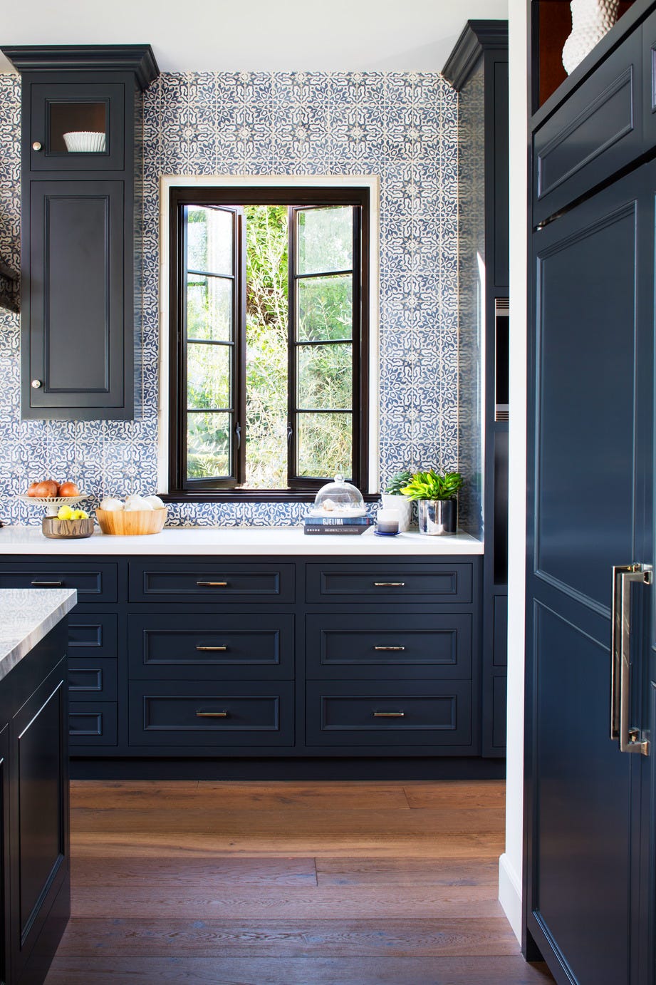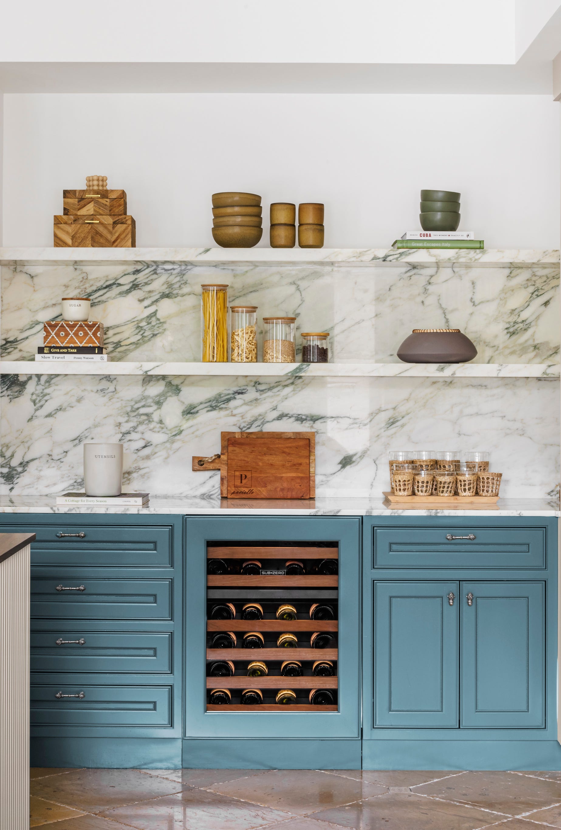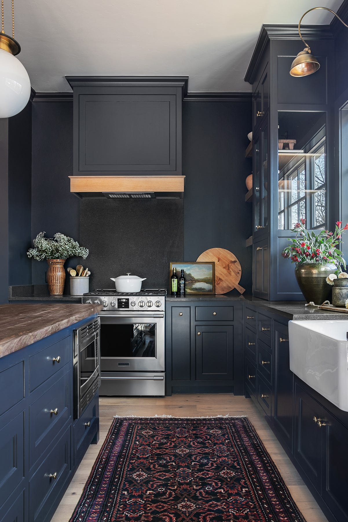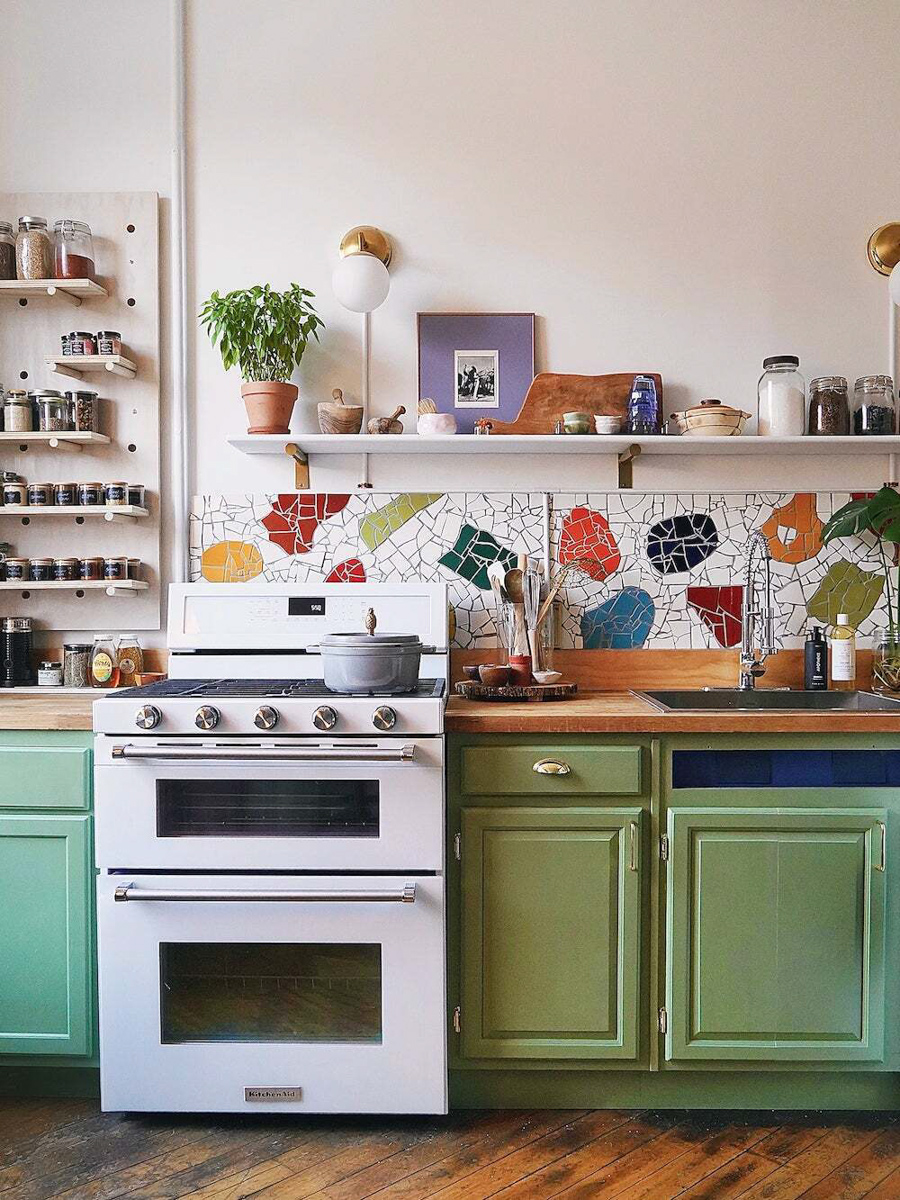
The 14 Best Blue Paint Colors For Your Kitchen, According To Designers
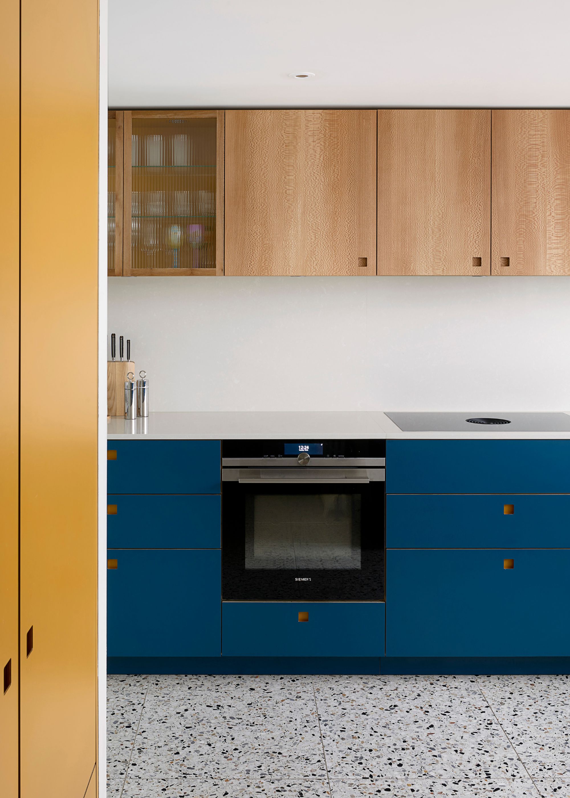
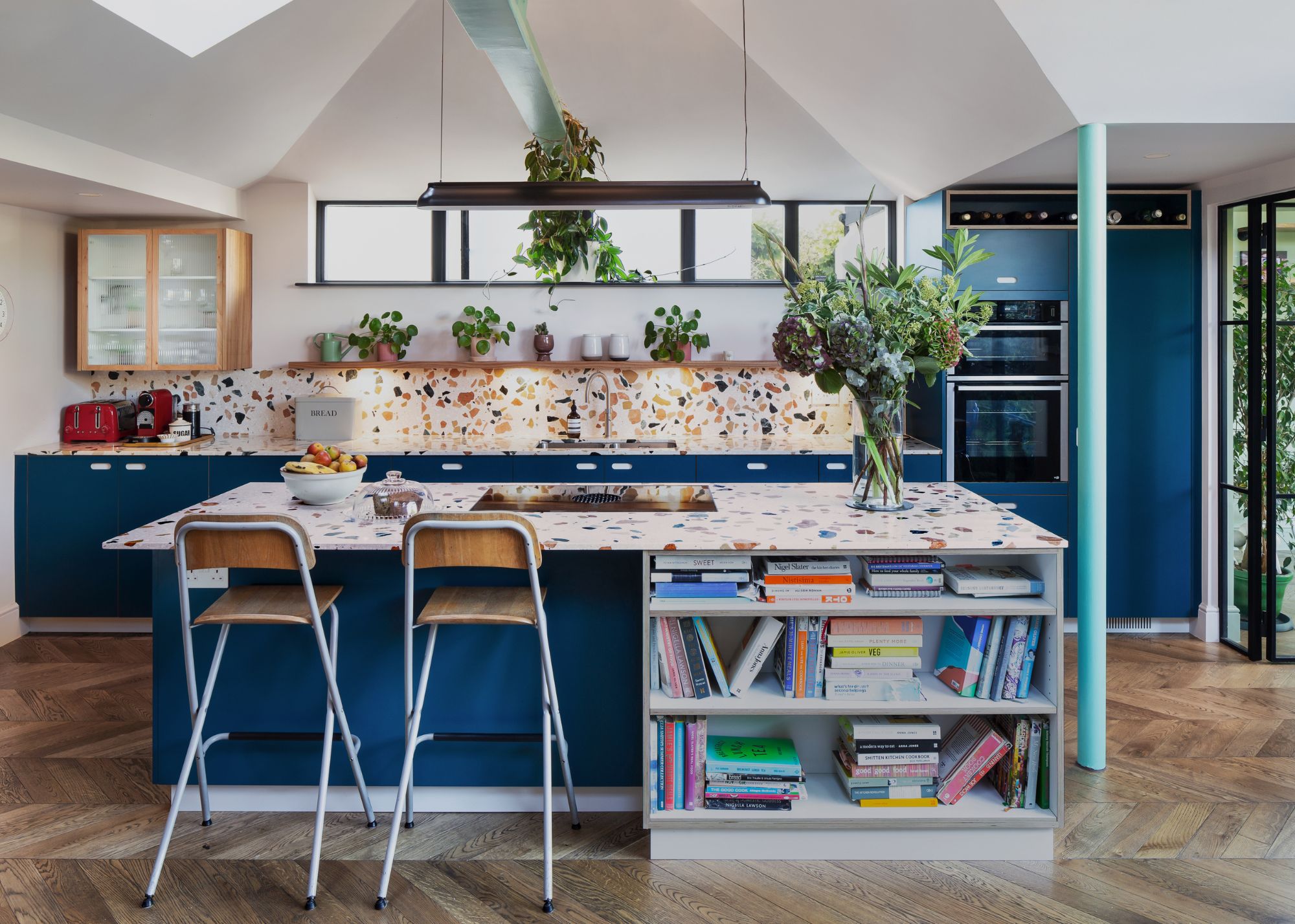
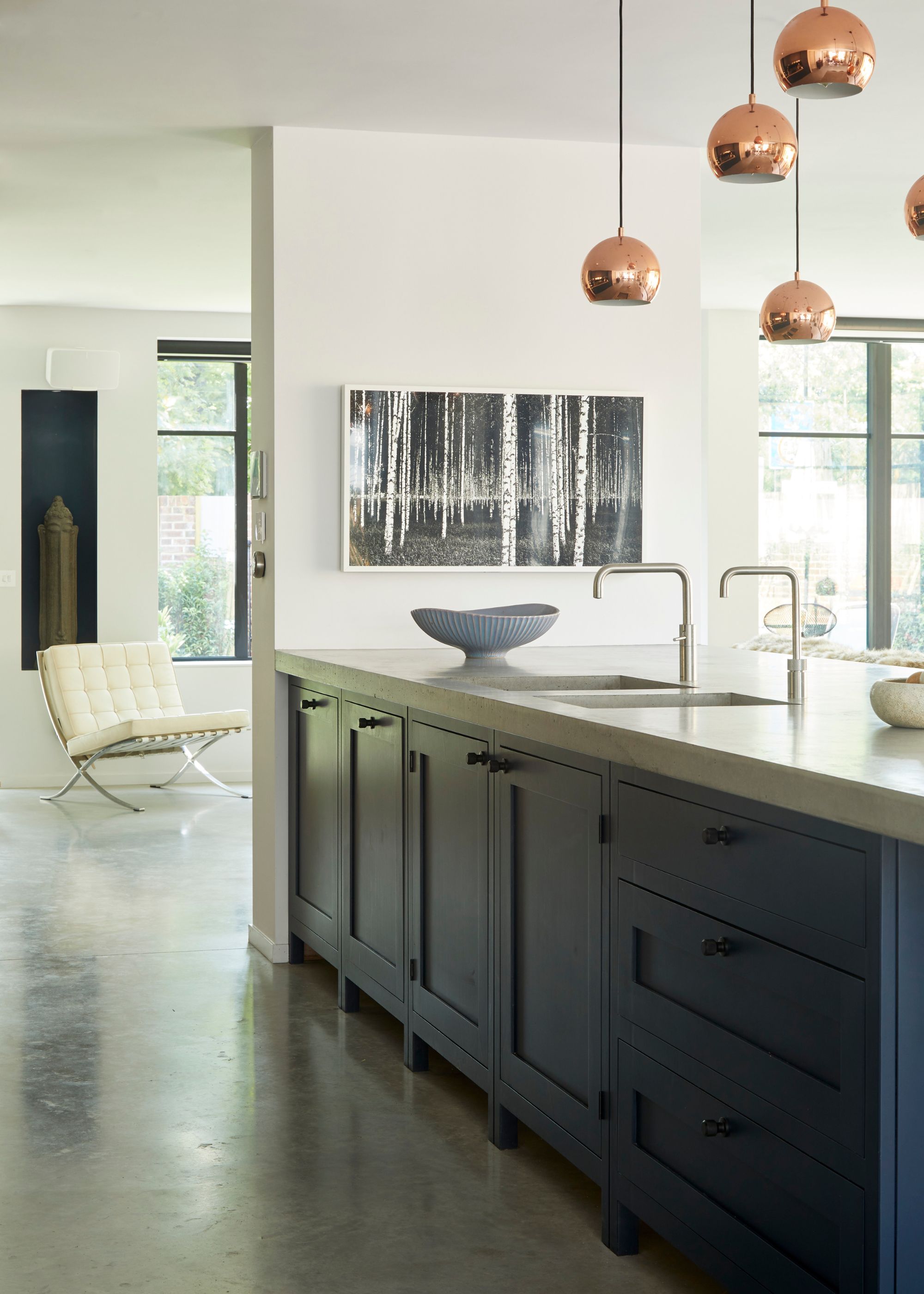
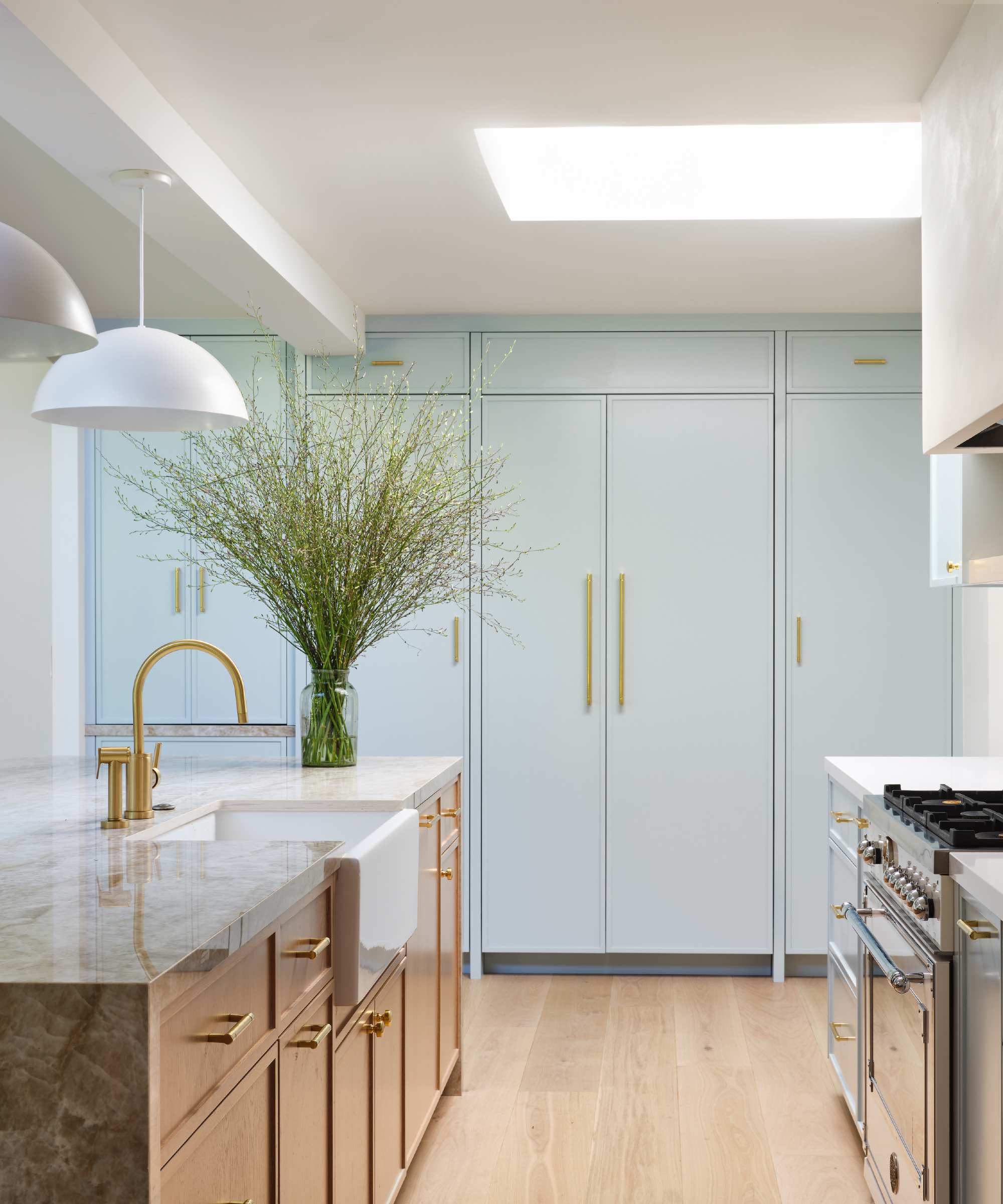
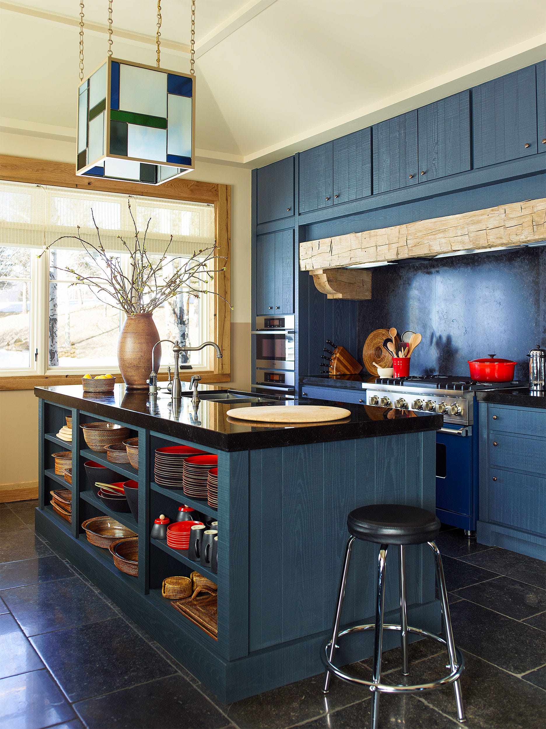
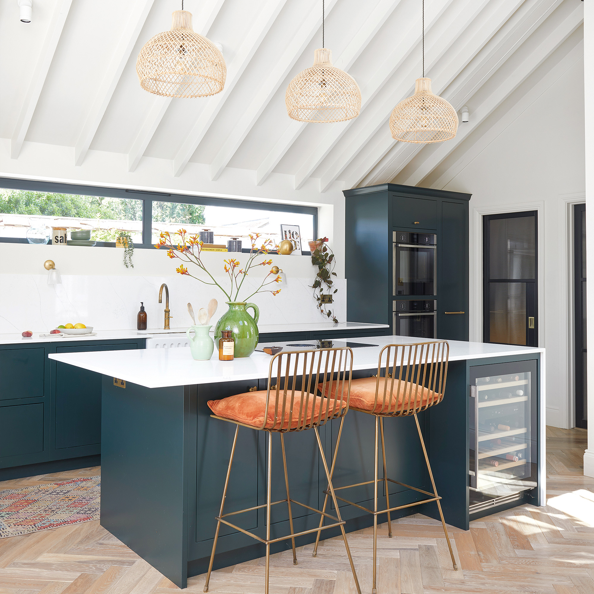
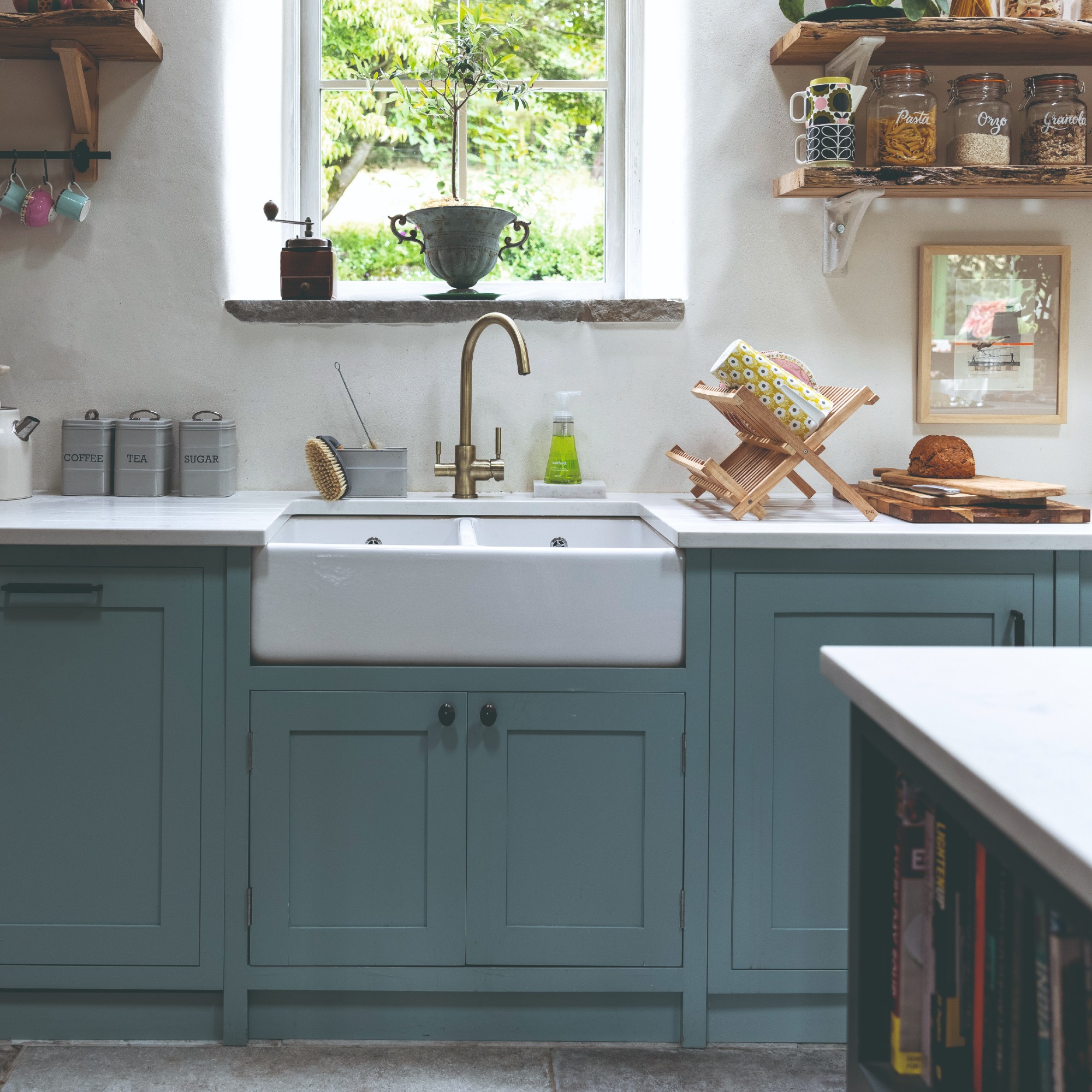
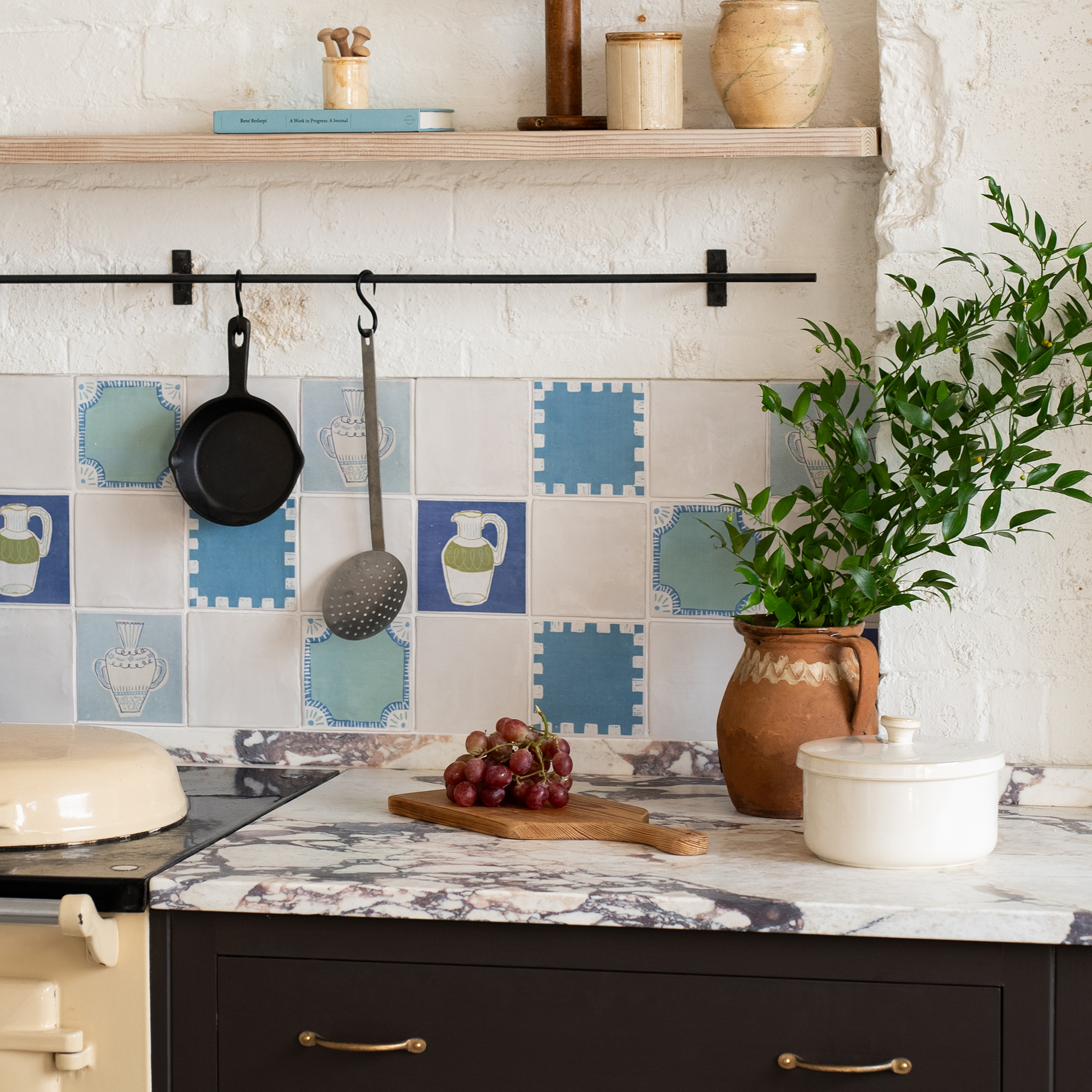
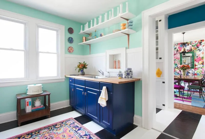
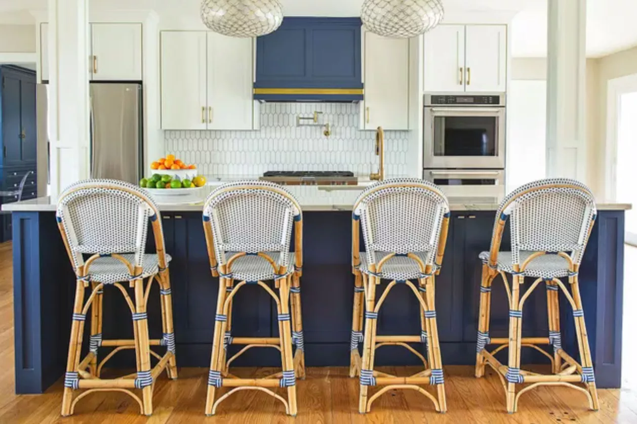
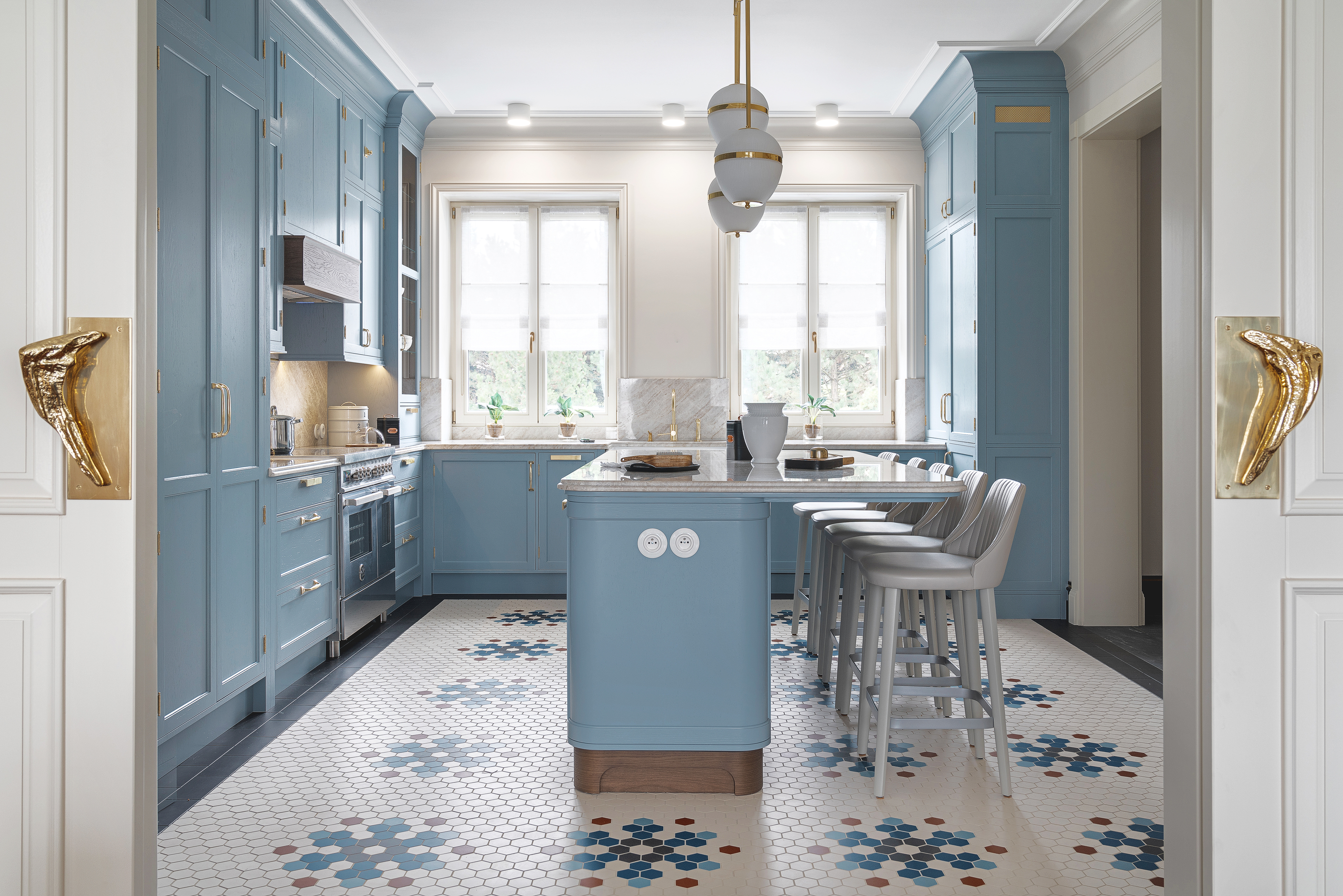
This article highlights 14 top blue paint colors recommended by designers for kitchen spaces, categorizing them into light pops of color, neutral blue-greys, calming blue-greens, and moody dark blues. The piece emphasizes blue as a timeless and versatile choice for kitchens, which are considered the heart of the home, setting the overall palette. Designers suggest that blue can add personality without being overwhelming, acting as a neutral in many instances while providing a sophisticated touch. The article aims to guide homeowners in selecting the ideal blue shade to transform their kitchen's aesthetic.
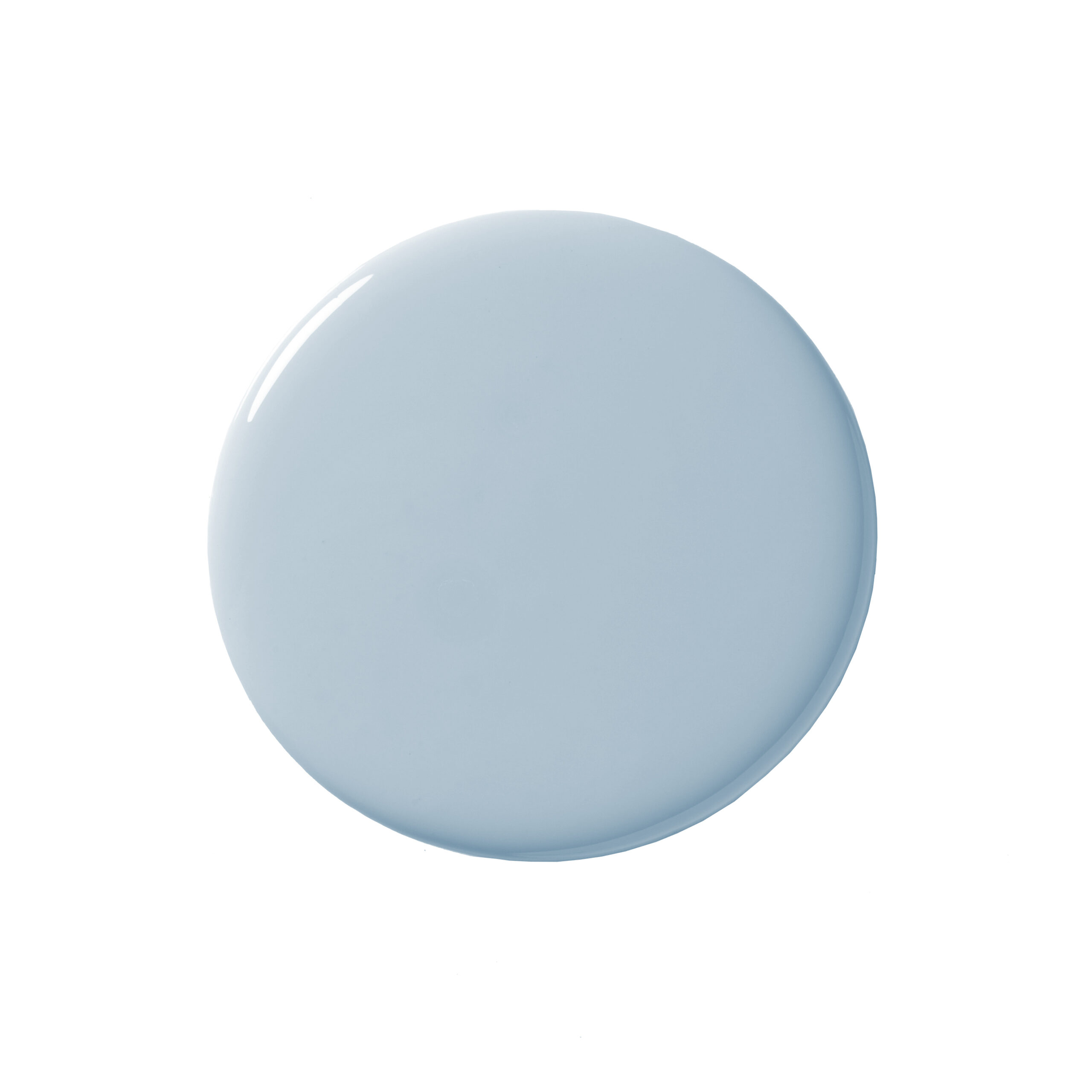
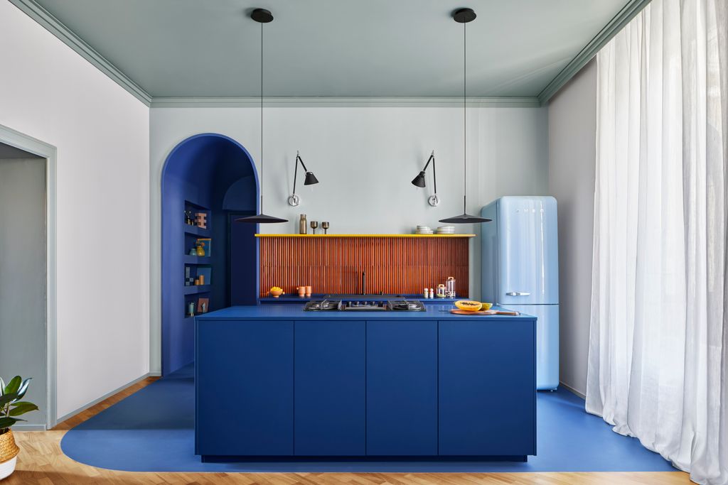
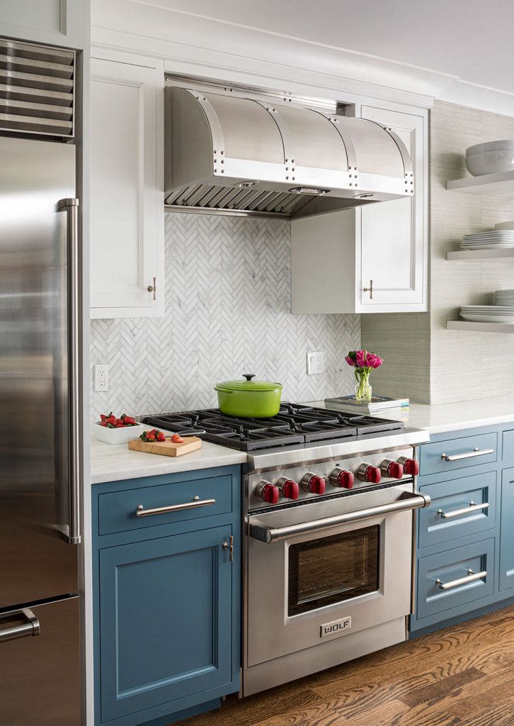
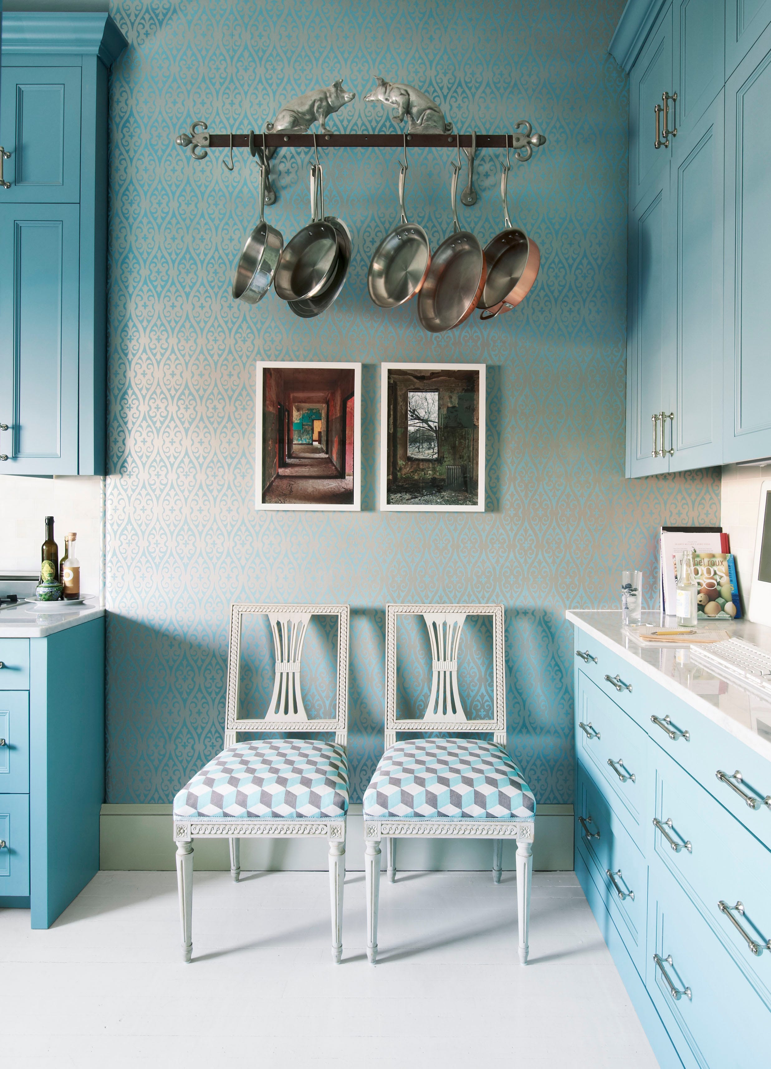
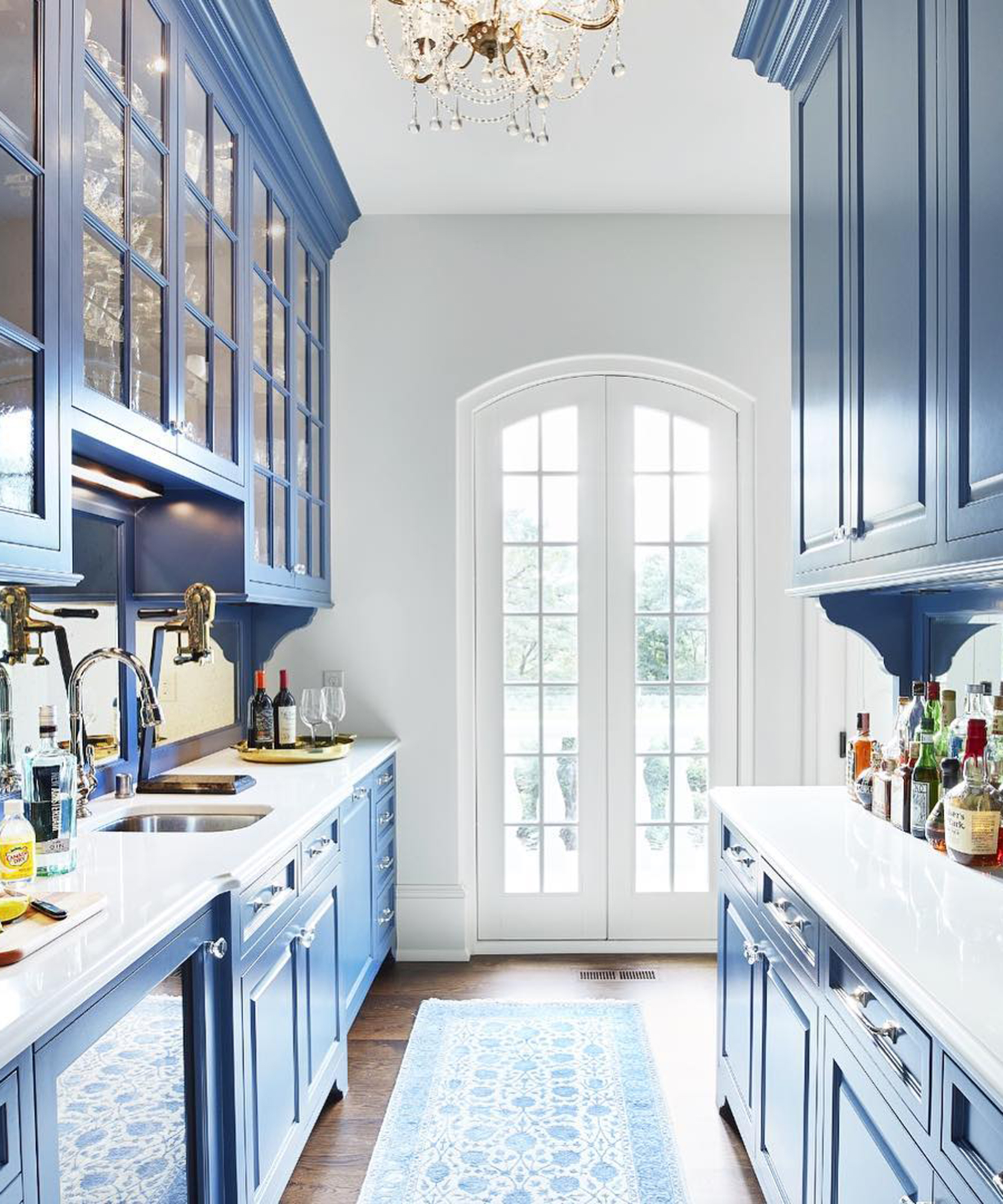
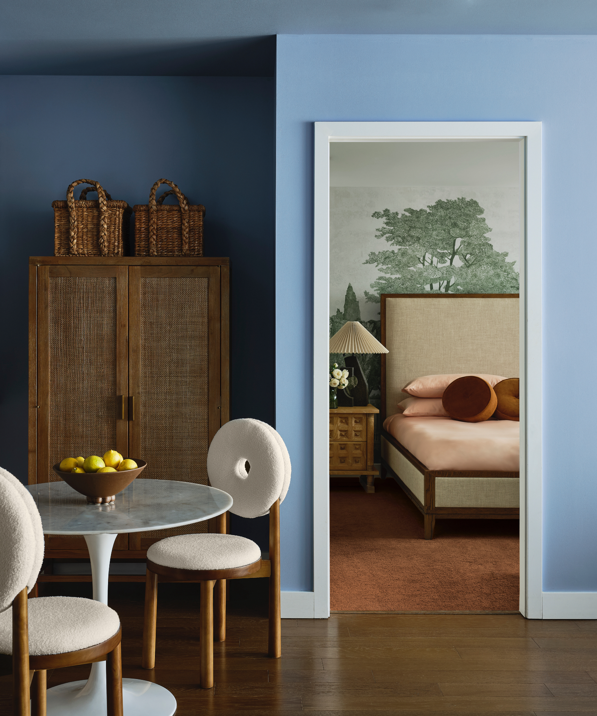
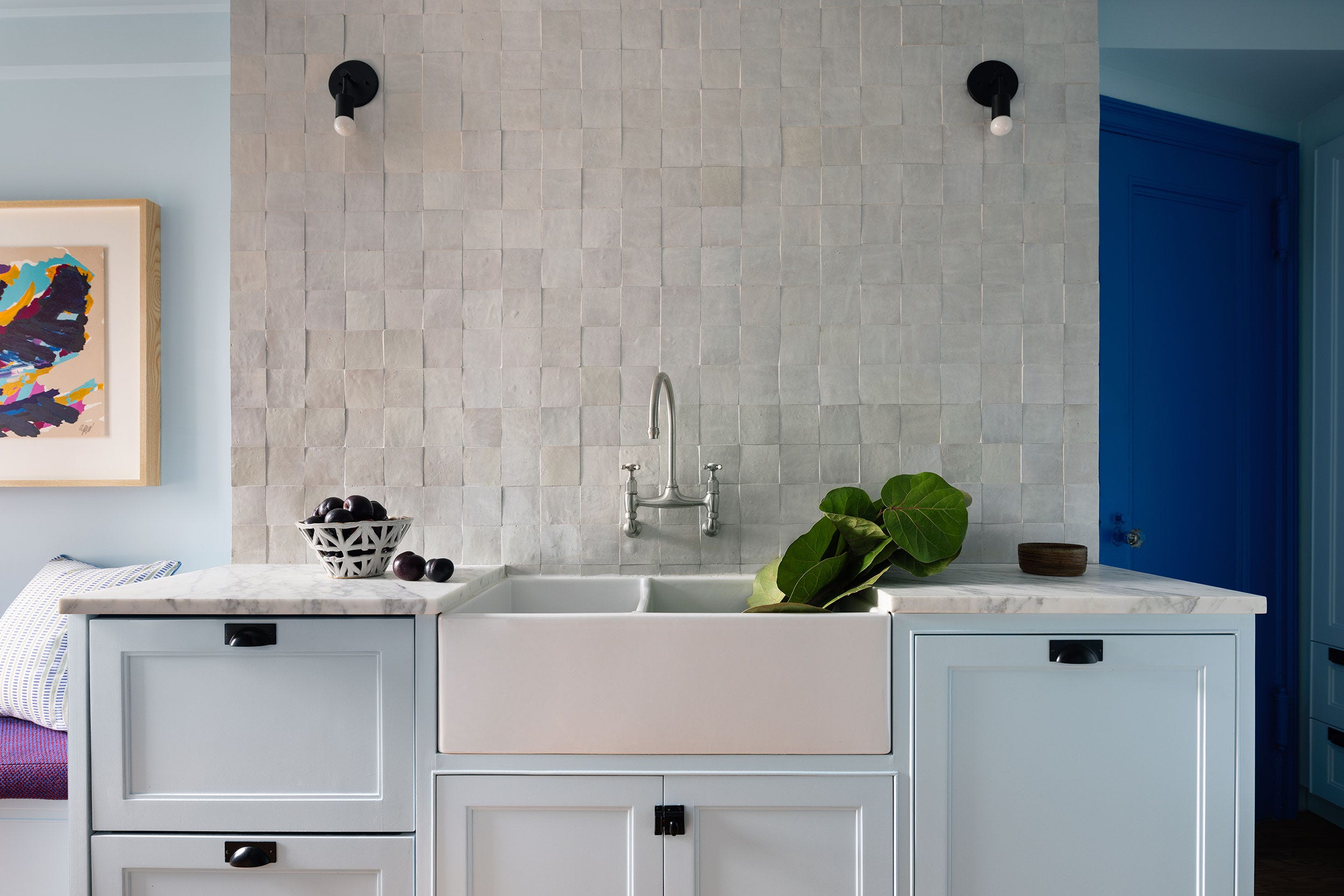
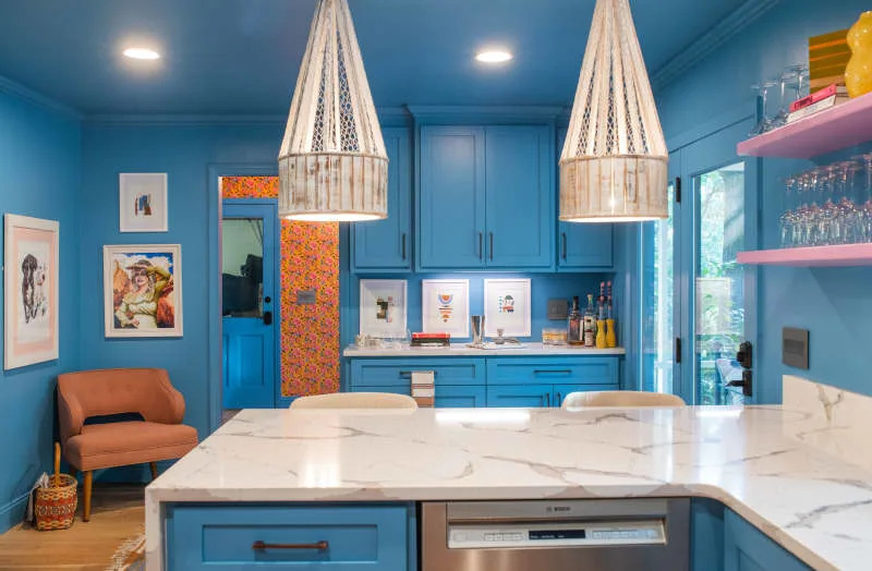
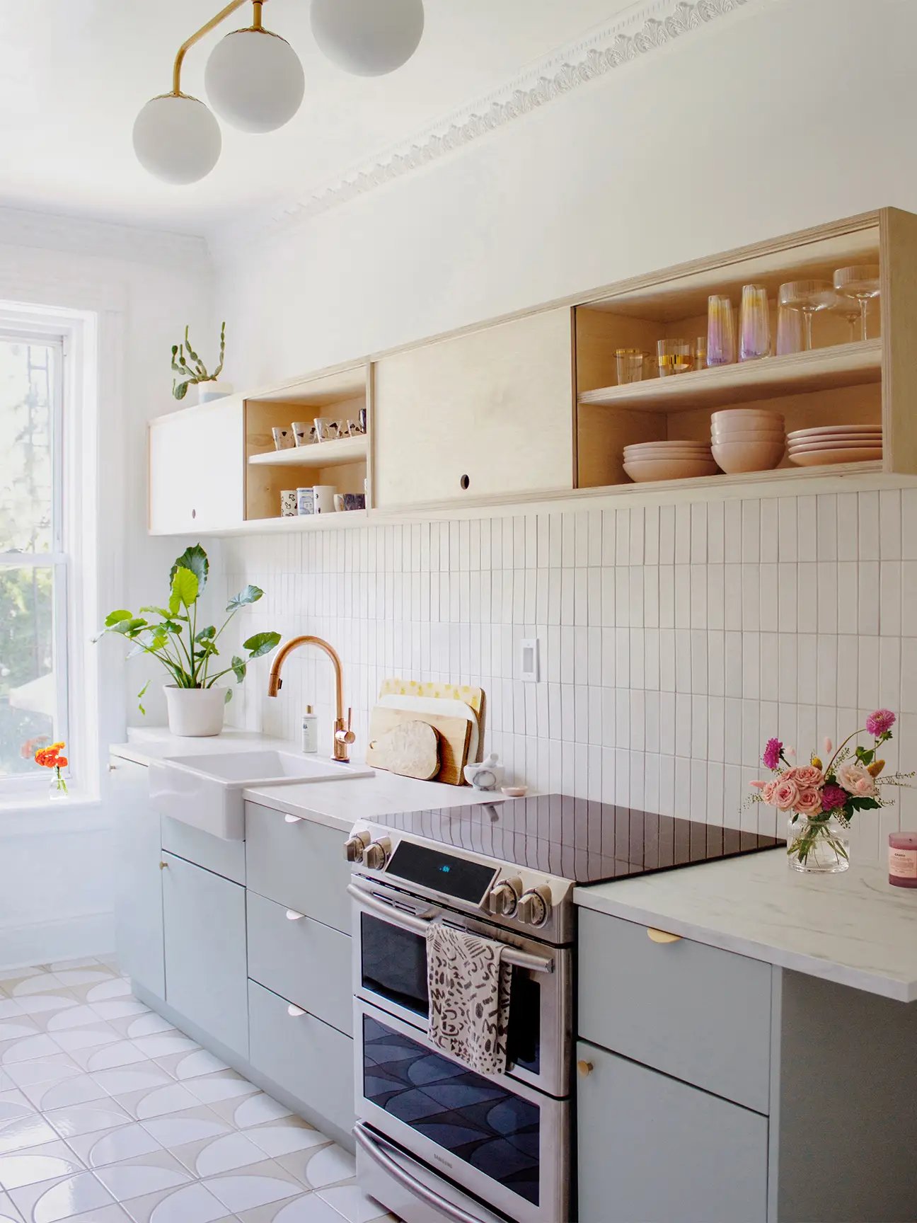
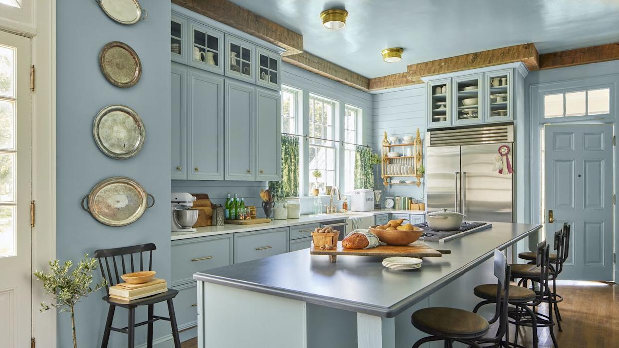
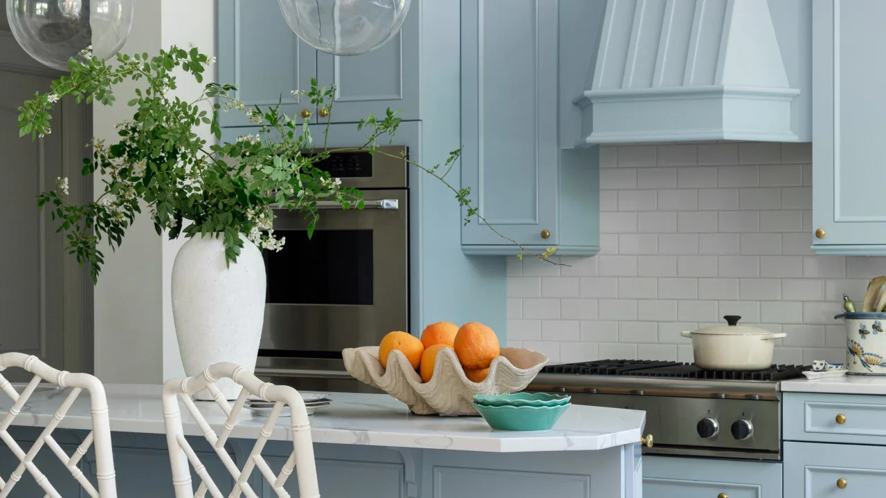
Under 'Light Pops of Color', Farrow & Ball Cook’s Blue (No. 237) is noted for its vibrant, saturated quality, ideal for creating high-energy spaces like a butler’s pantry. Sherwin-Williams Icelandic (SW 6526) is praised for its ability to infuse personality while remaining neutral; its subtle powder blue tint becomes apparent and inviting on larger surfaces like cabinets. Benjamin Moore Ice Cap (1576) is described as a very pale blue that can almost function as a neutral, particularly suitable for cabinetry.
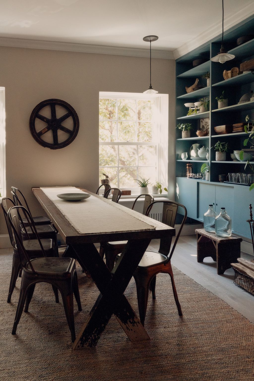
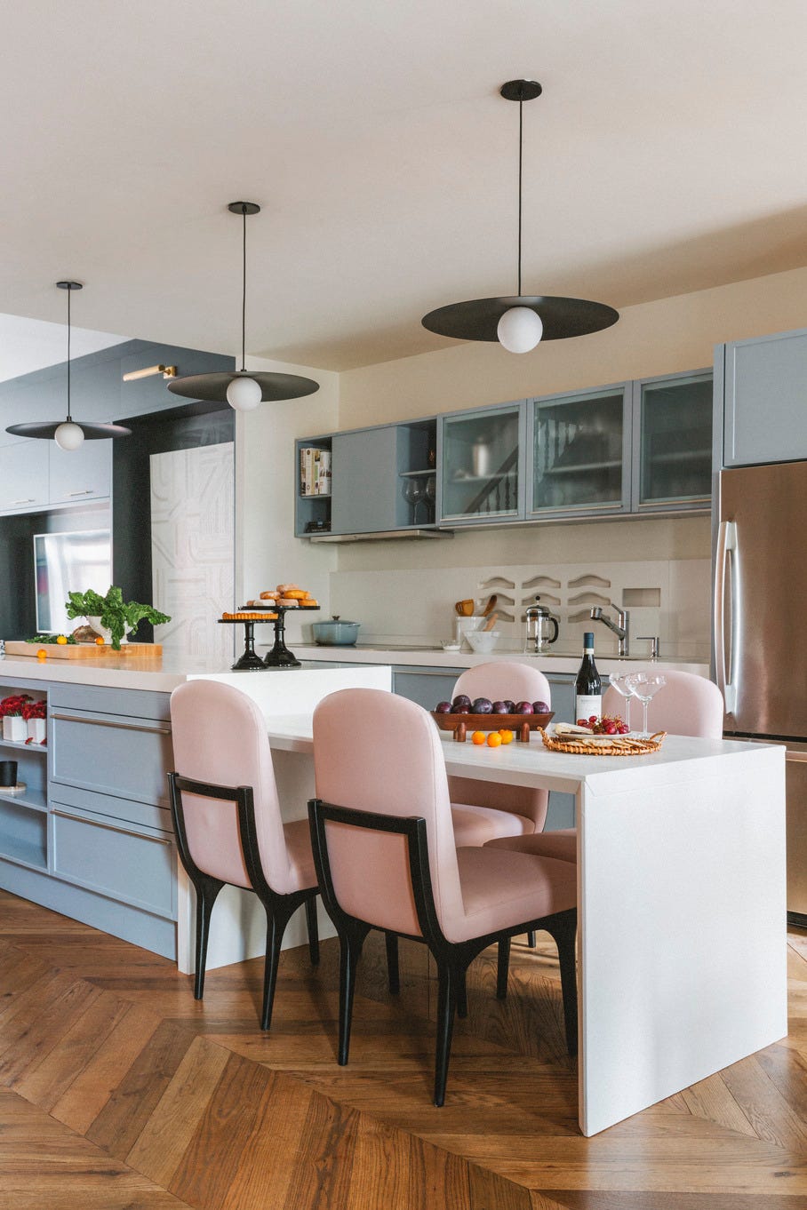
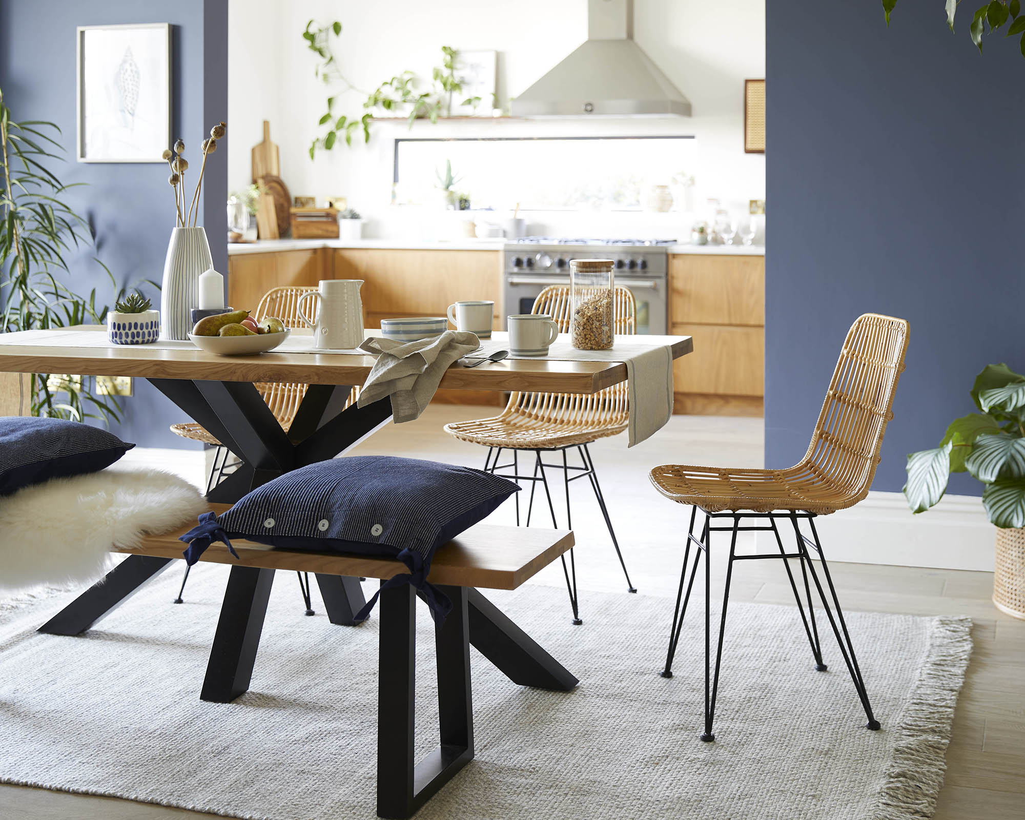
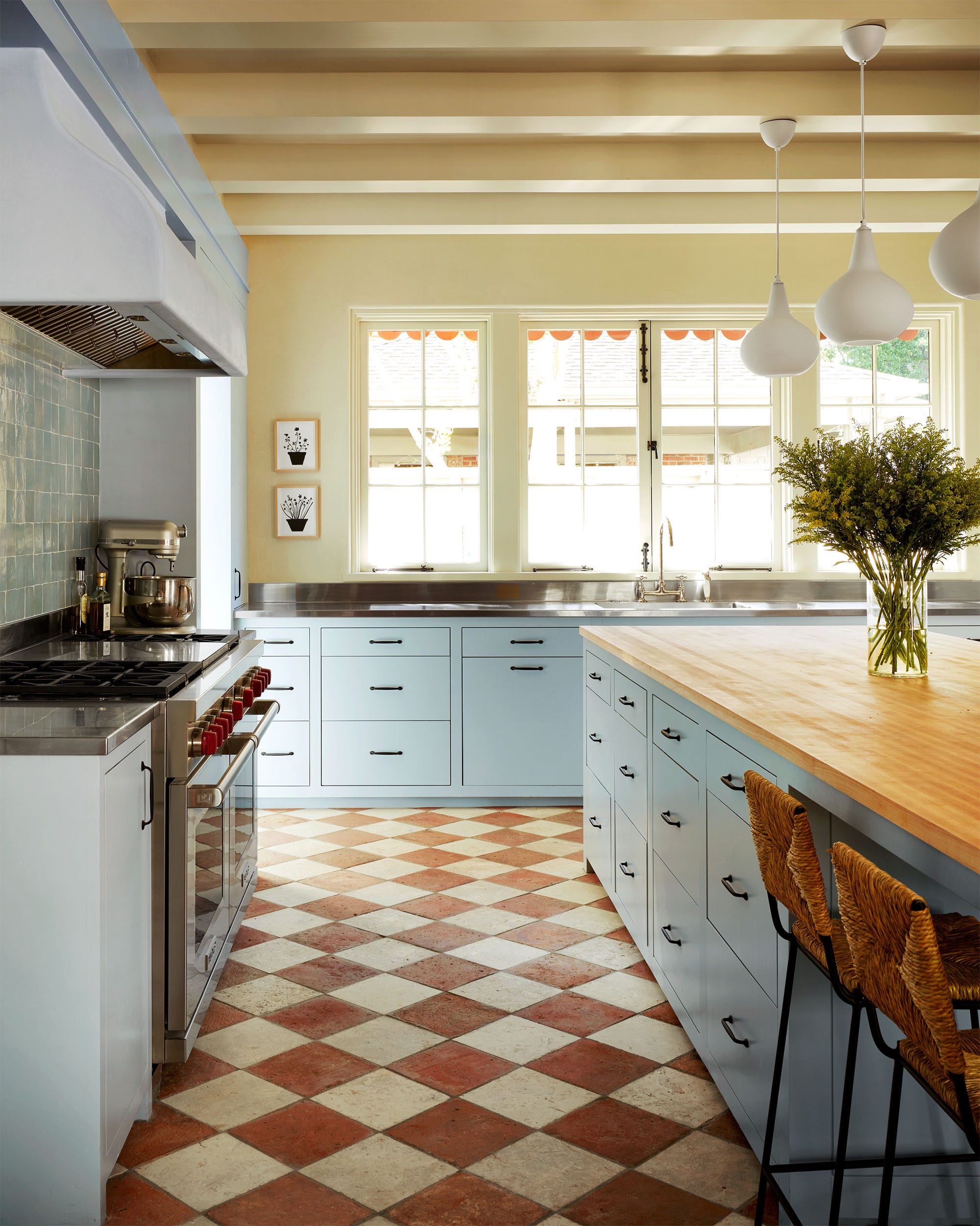
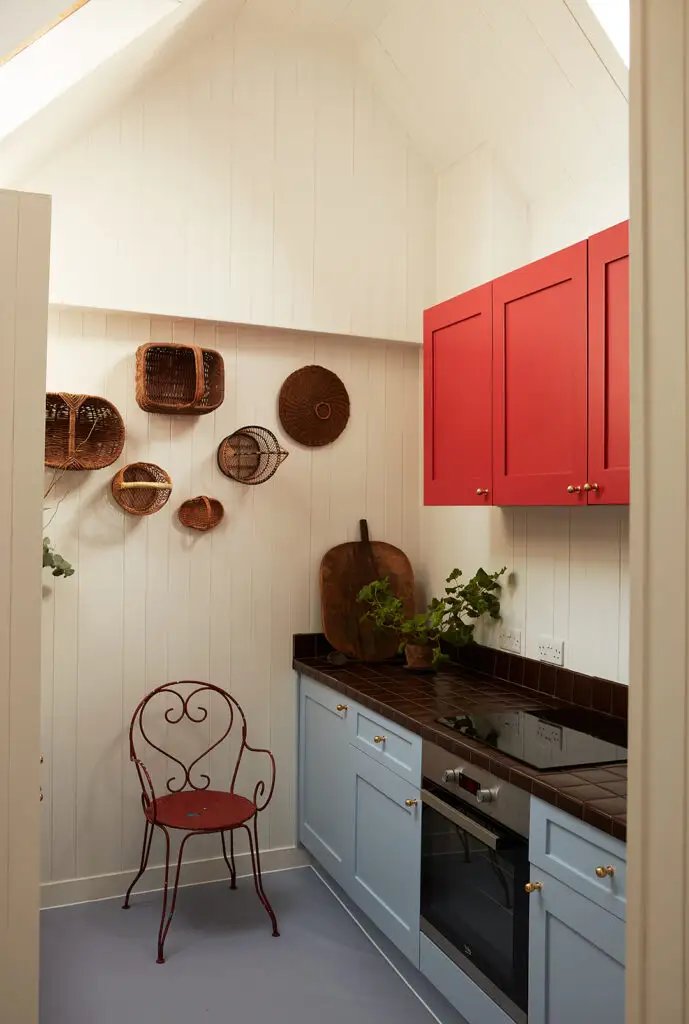
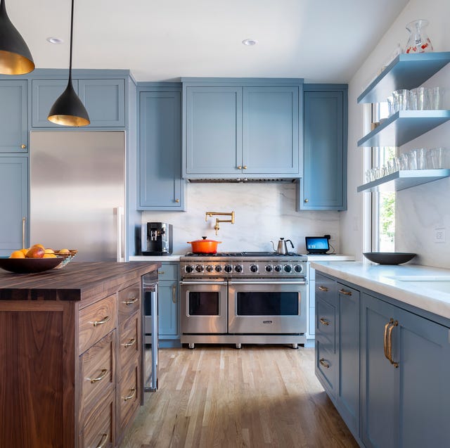
In the 'Neutral Blue-Greys' category, Benjamin Moore Anchor Grey (2126-30) is highlighted as a versatile deep blue-gray that pairs well with lighter wood tones. Behr Blueprint (S470-5), a shade between navy and denim, is favored for its adaptability with various holiday and seasonal decor colors. Sherwin-Williams Debonair (SW 9139) offers a rich yet muted blue, adding depth to kitchen islands and complementing modern, organic designs. Farrow & Ball De Nimes (No. 299) is recommended for its soft, chalky blue-gray with a French utilitarian yet Southern warm feel, perfect for a custom look. Benjamin Moore Van Courtland Blue (HC-145) is a classic blue with a gray undertone, suitable for both historic and contemporary homes, and can be used on cabinetry or walls.
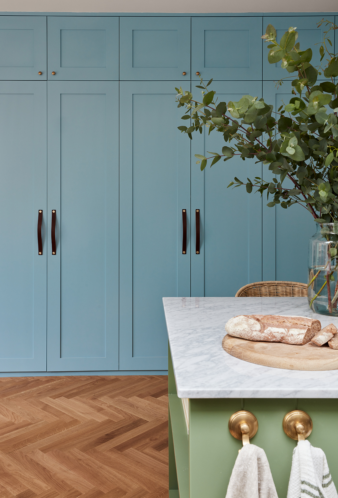
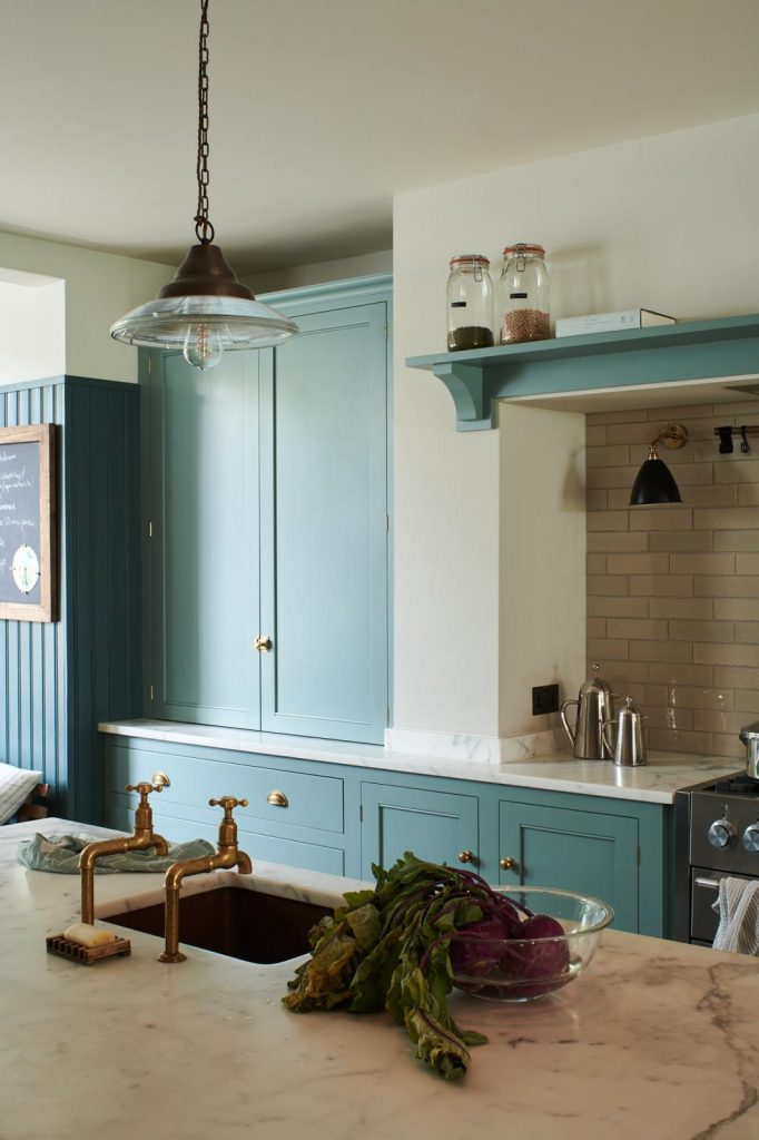
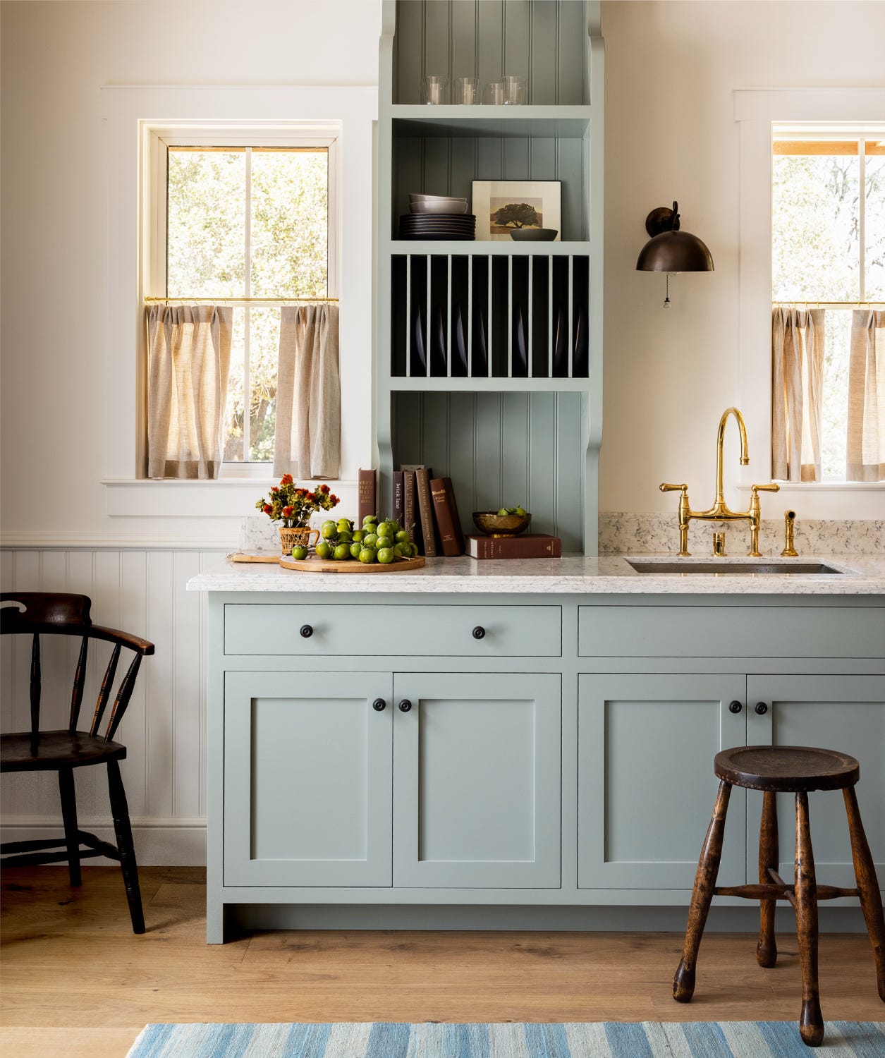
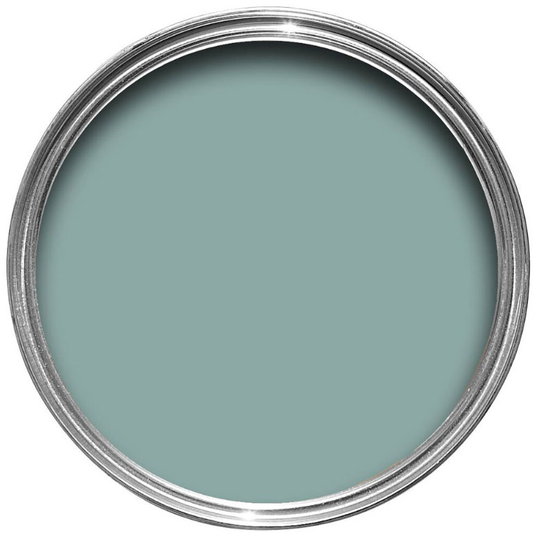
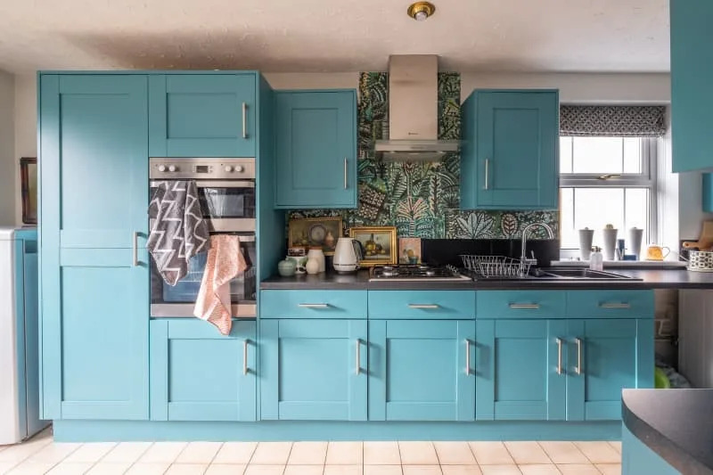
For 'Calming Blue-Greens', Benjamin Moore Mystic Lake (CSP-745) is described as a moody, timeless, and versatile choice for adding depth to a kitchen. Farrow & Ball Middle Ground (No. 209) is a rejuvenating blue-green that blends coastal and countryside aesthetics, ideal for layered color and pattern schemes. Farrow & Ball Oval Room Blue (No. 85) is an understated and elegant dusty blue with green undertones, offering a heritage feel for traditional kitchens with intricate millwork.
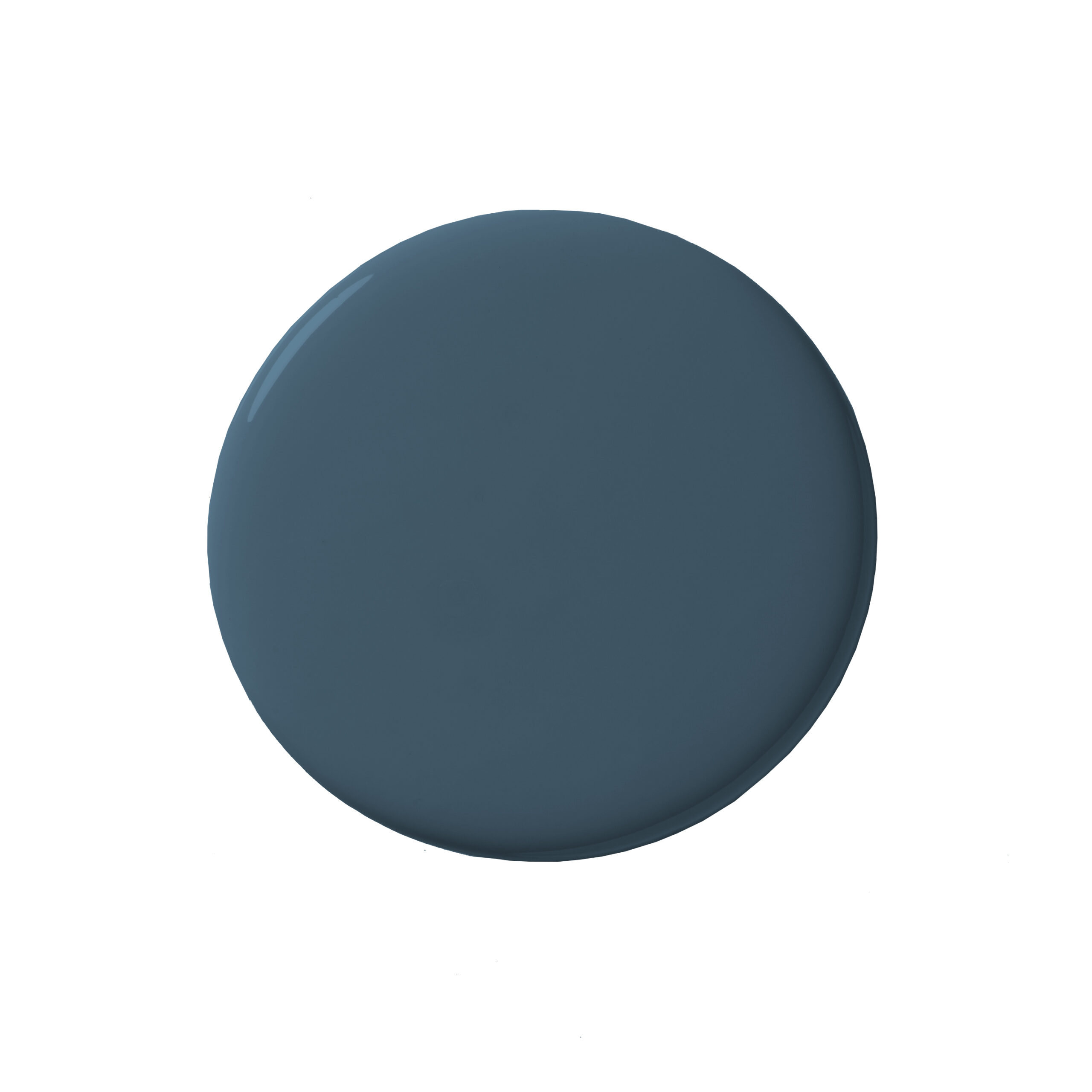
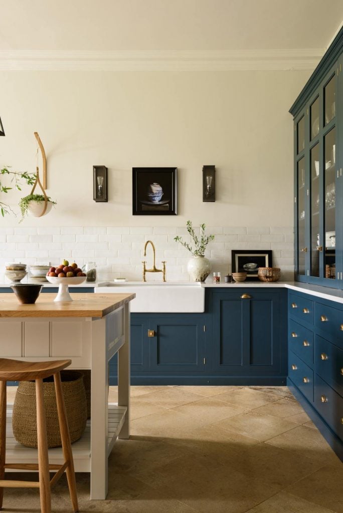
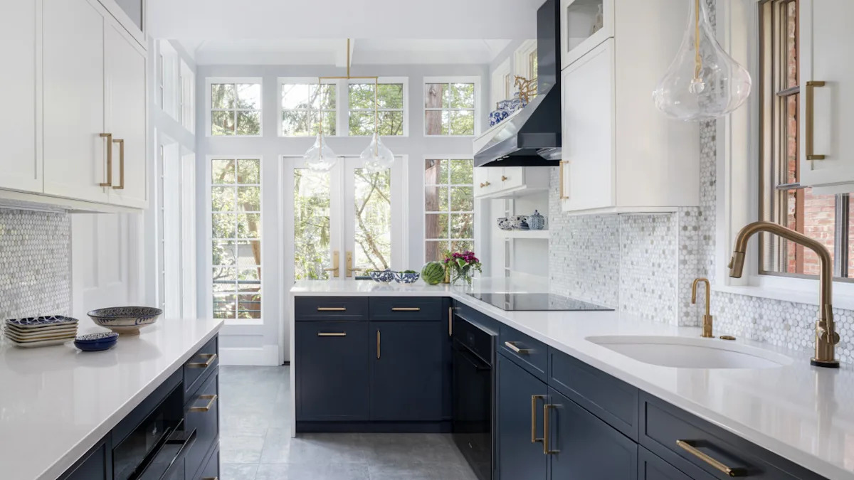
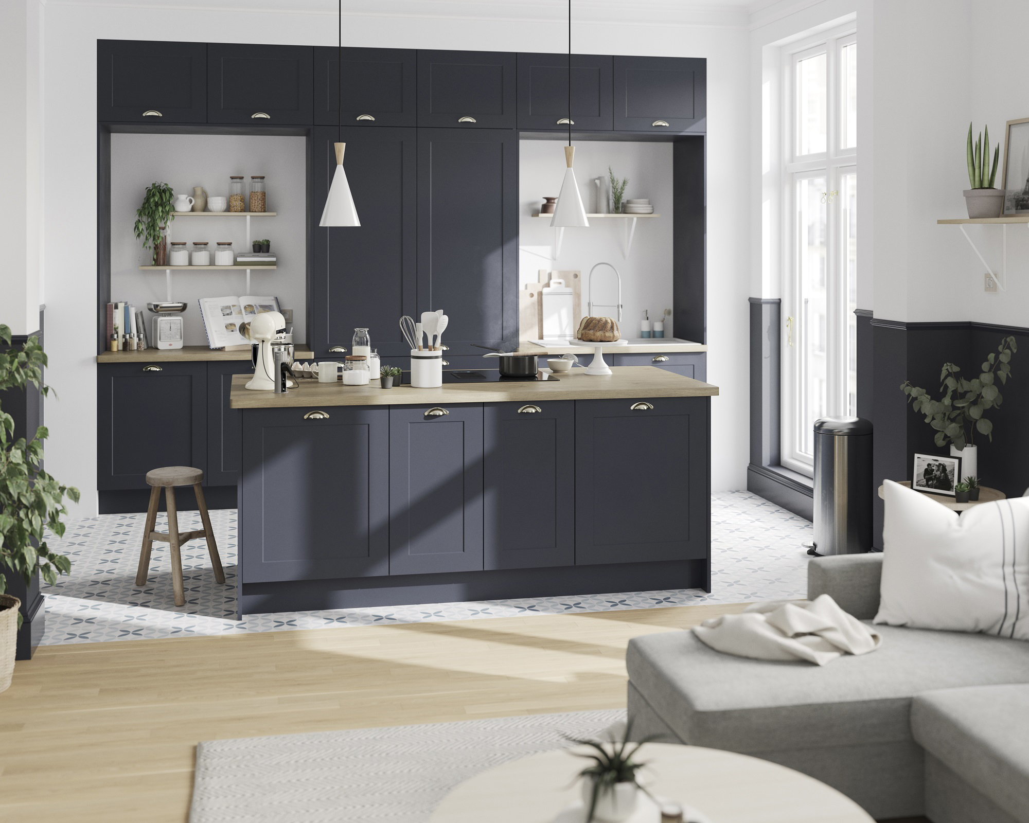
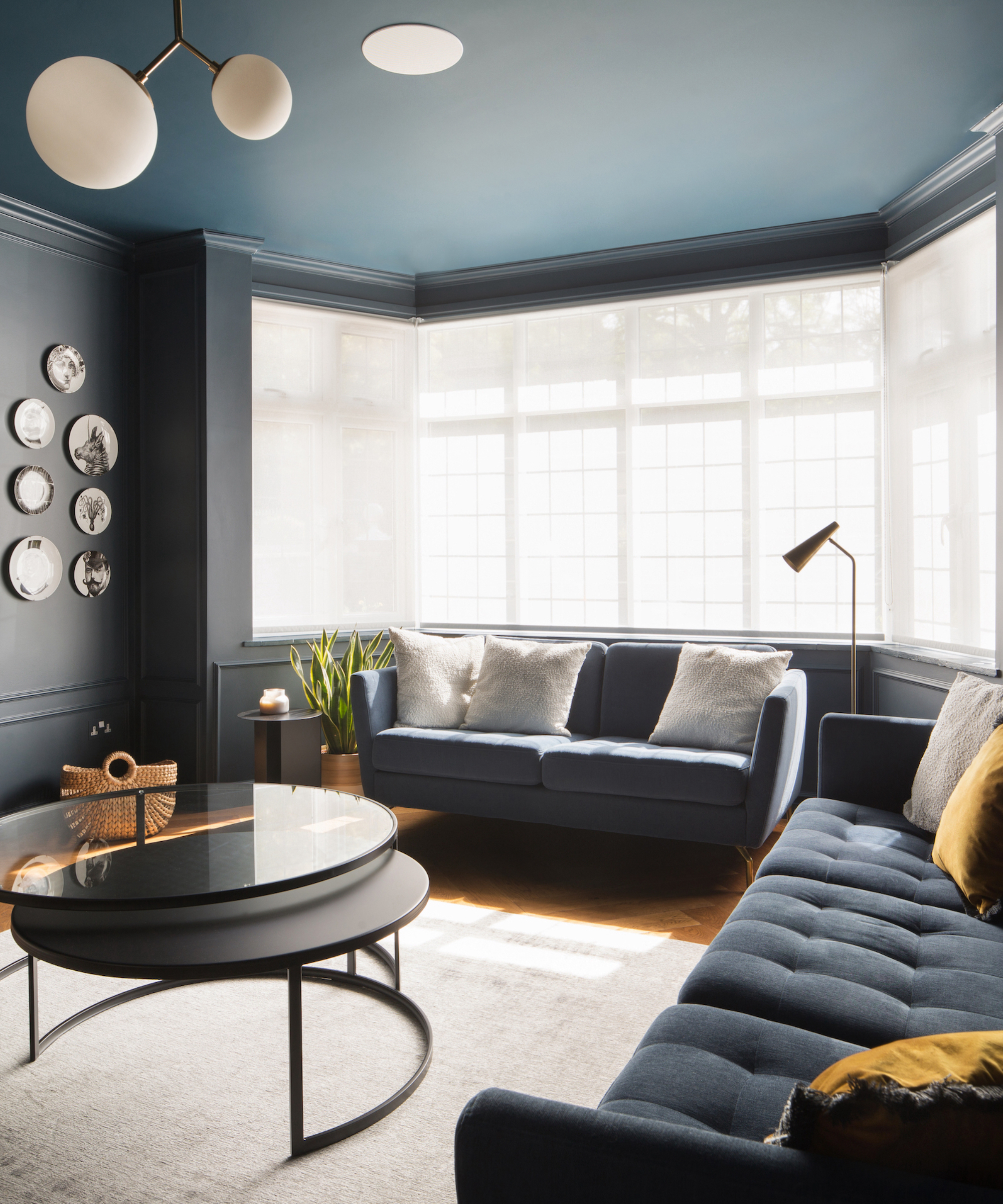
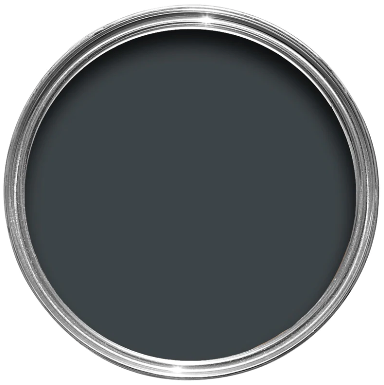
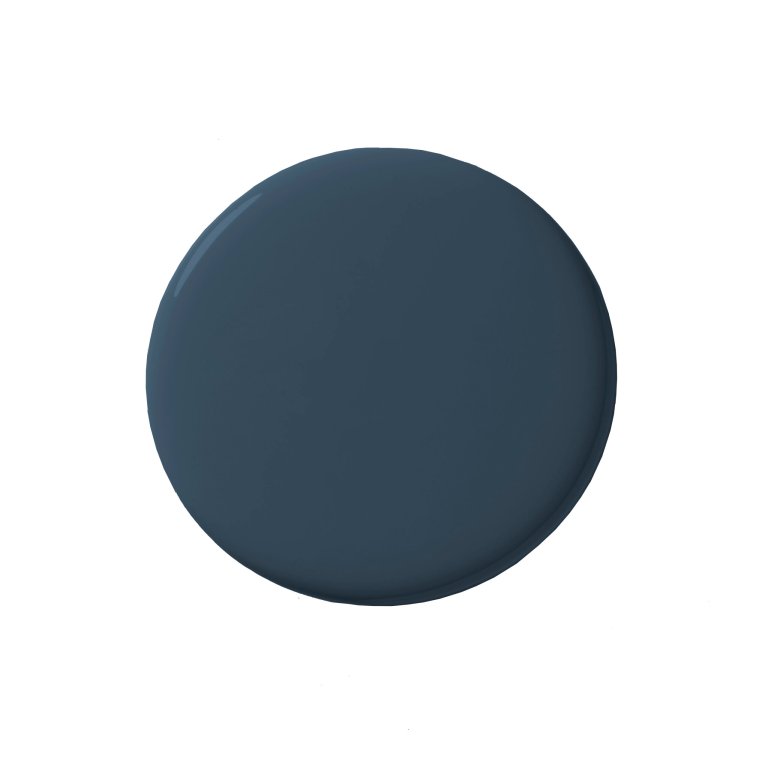
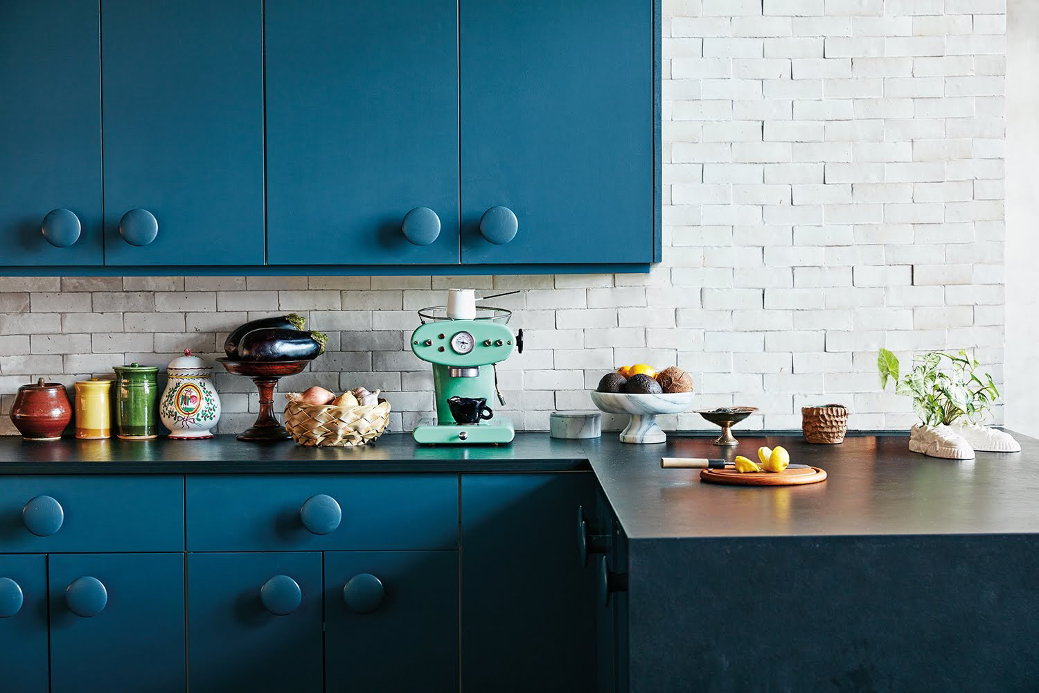
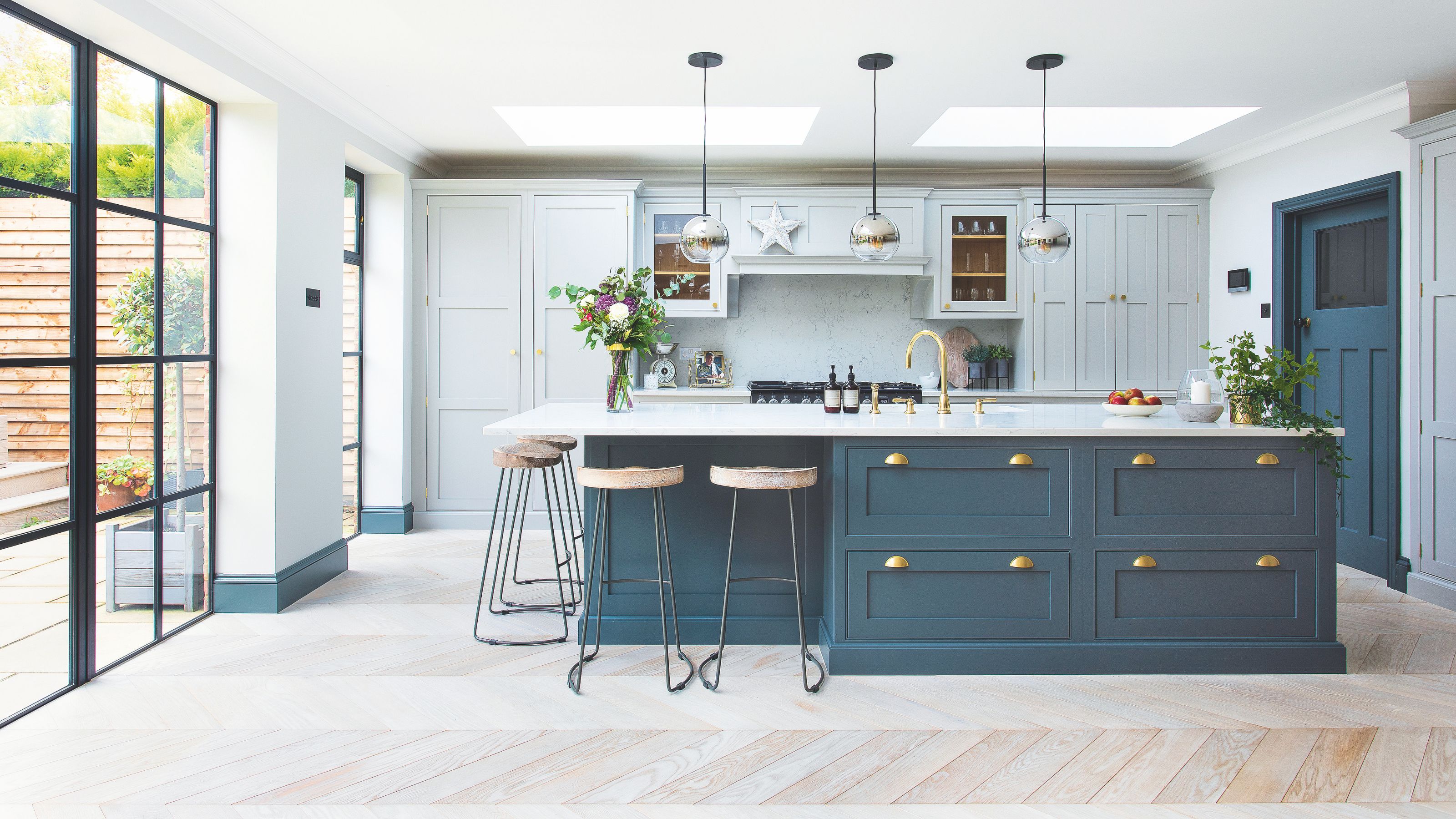
Lastly, 'Moody Dark Blues' include Sherwin-Williams Mount Etna (SW 7625), a darker alternative to navy with charcoal undertones, providing depth and uniqueness. Farrow & Ball Hague Blue (No. 30) is a sultry, teal-undertone shade that pairs beautifully with natural textures like antique brass and warm woods. Farrow & Ball Inchyra Blue (No. 289) is celebrated for its balanced mix of blue, green, and charcoal, making it a natural fit for both historical and modern new-builds, offering significant depth.
#KitchenDesign #PaintColors #InteriorDesign #BluePalette #HomeDecor #SouthernLiving #ColorTrends #DesignersChoice #KitchenDesign #PaintColors #InteriorDesign #BluePalette #HomeDecor #SouthernLiving #ColorTrends #DesignersChoice
0 comment in total
 No comments yet
You may also like
The 18 Best Paint Colors for Blue Kitchen Cabinets, Straight From Our Favorite Spaces

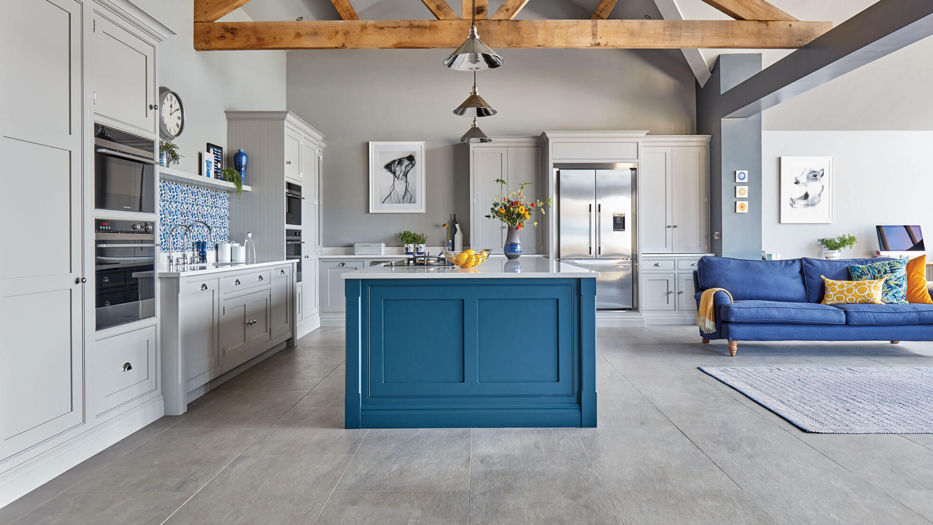
15 blue kitchen ideas to make you want to try this on trend look

It’s Official: These are the Best Kitchen Paint Colors, According to Designers
The Best Light-Blue Paint Colors for Every Room, According to Designers

13 Blue Kitchen Ideas to Steal, From the Boldest Pops of Color to Clever Tilework

16 Blue Kitchen Ideas That Celebrate This Timeless Shade to Its Very Best

Bring In Calming Vibes: 5 Instagram-Inspired Ways To Do Beautiful Blue in Your Kitchen
This Paint Color Is Way More Popular With Lower Cabinets Than Upper Ones
Which Color is Sexy, Daring, and “a Craze” Right Now? An Expert Fills Us In

Feeling Blue? You'll Love These Beautiful Blue Kitchen Cabinet Ideas
10 blue kitchen ideas to inspire a bright, airy and on trend cooking space
Chic Spaces That Prove Blue Kitchen Cabinets Are Here to Stay

21 Stunning Blue Cabinet Ideas That Transform Any Kitchen

5 best blue paints as chosen by interior designers

15 Gorgeous Blue Kitchen Cabinet Ideas That’ll Never Go Out of Style
The 14 Paint Colors Featured in Our Favorite Green Kitchens

20 Modern Blue Kitchen Cabinet Ideas That Are Trendproof

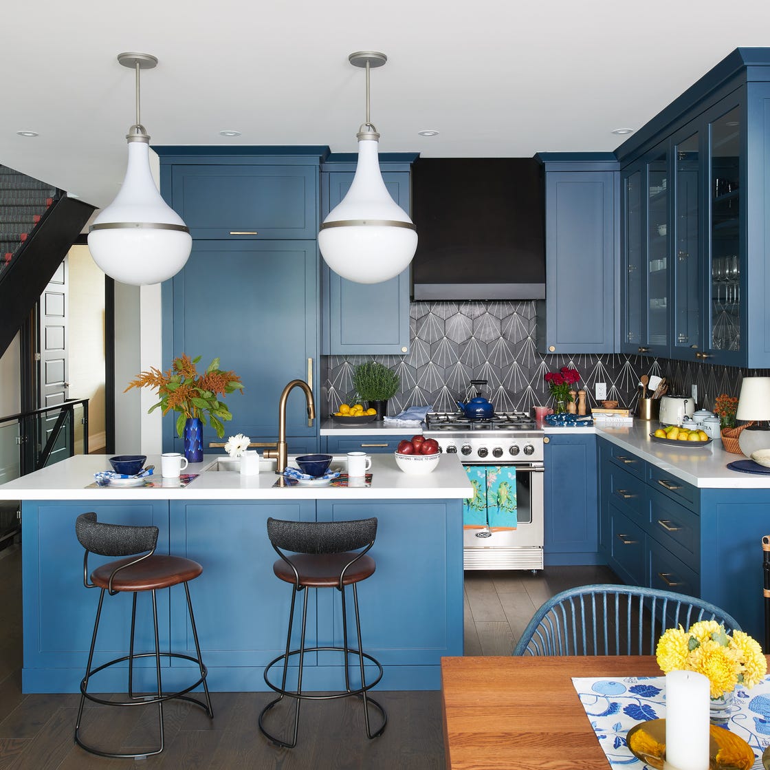
32 Kitchens That Prove Why Blue Is the Most Flattering Cabinetry Color

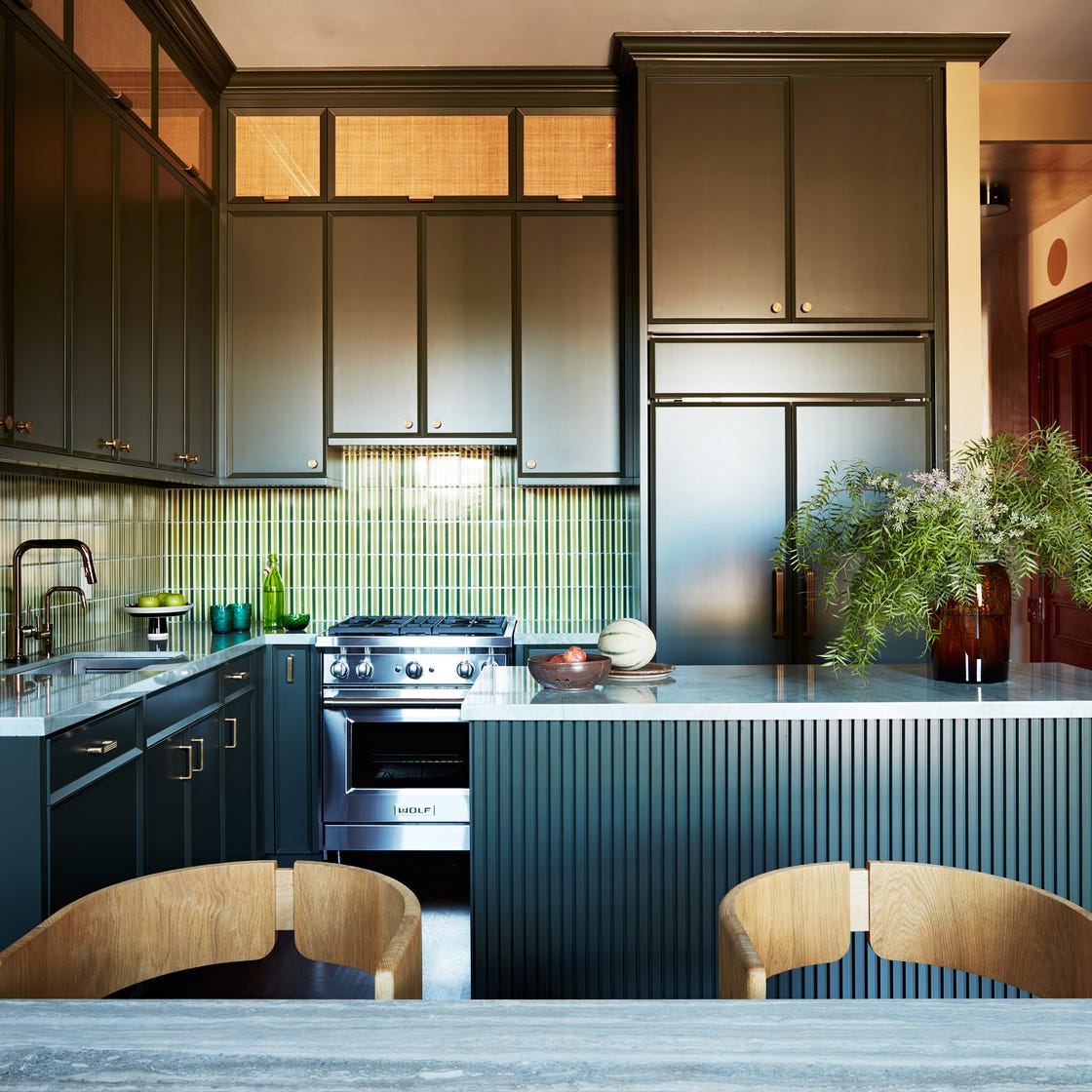
16 Designer-Approved Kitchen Color Schemes You’ll Want to Steal
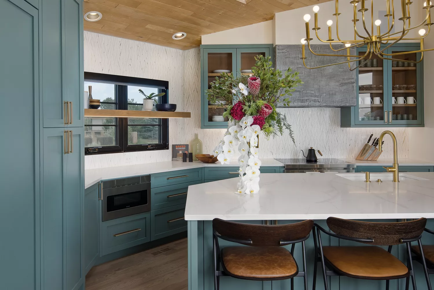
14 Mood-Boosting Kitchen Paint Colors That Will Instantly Brighten Your Day