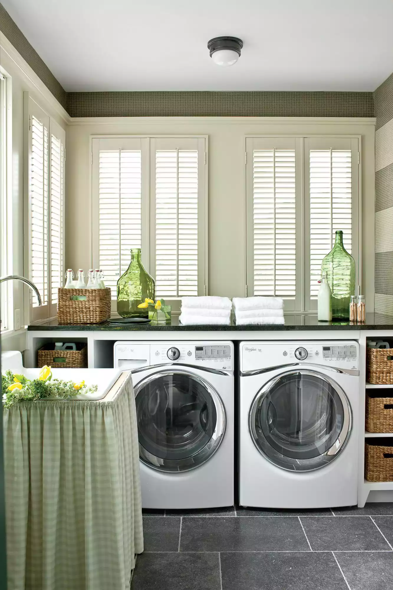
23 Best Paint Colors for Laundry Rooms
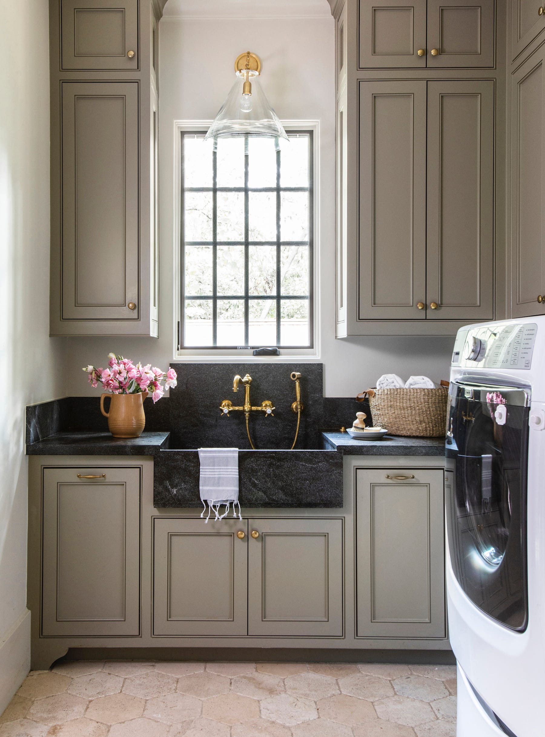
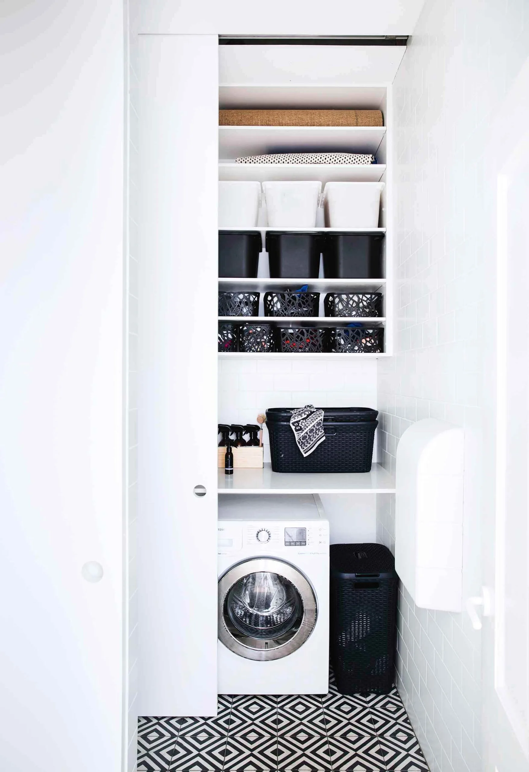
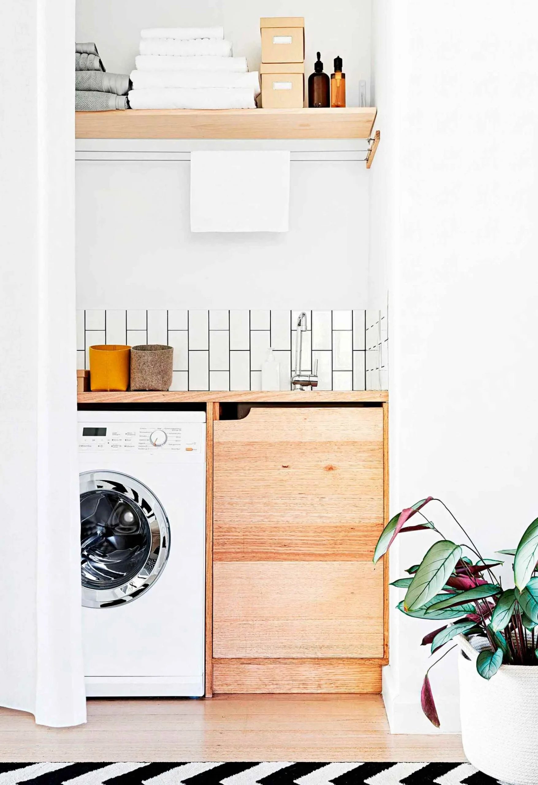
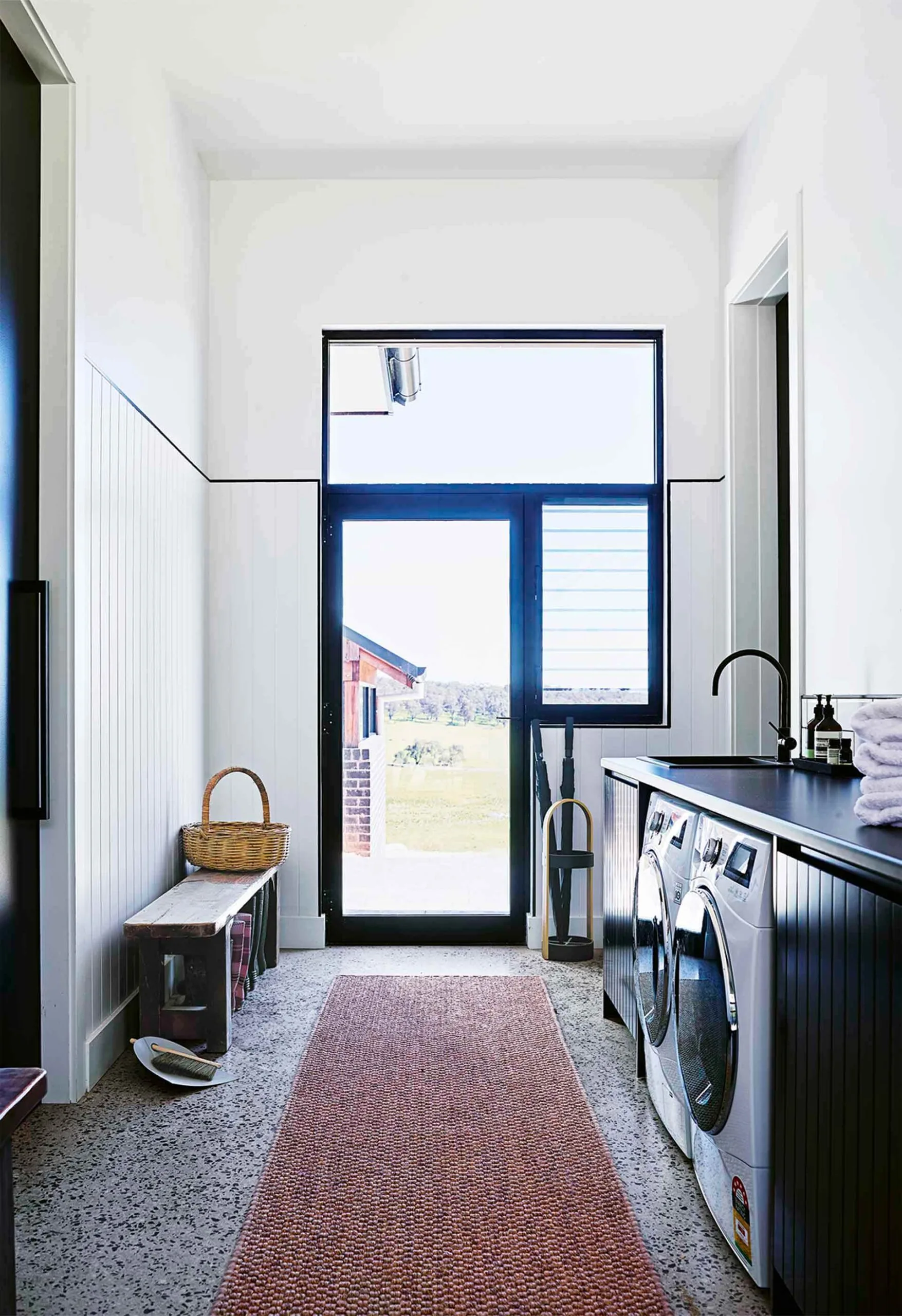
The article highlights the transformation of laundry rooms from mere utilitarian spaces to areas deserving of aesthetic attention, emphasizing how color can significantly enhance their appeal and functionality. Traditionally relegated to hidden corners, laundry rooms are now being recognized as primary spaces within the home, offering an opportunity for creative expression in design.
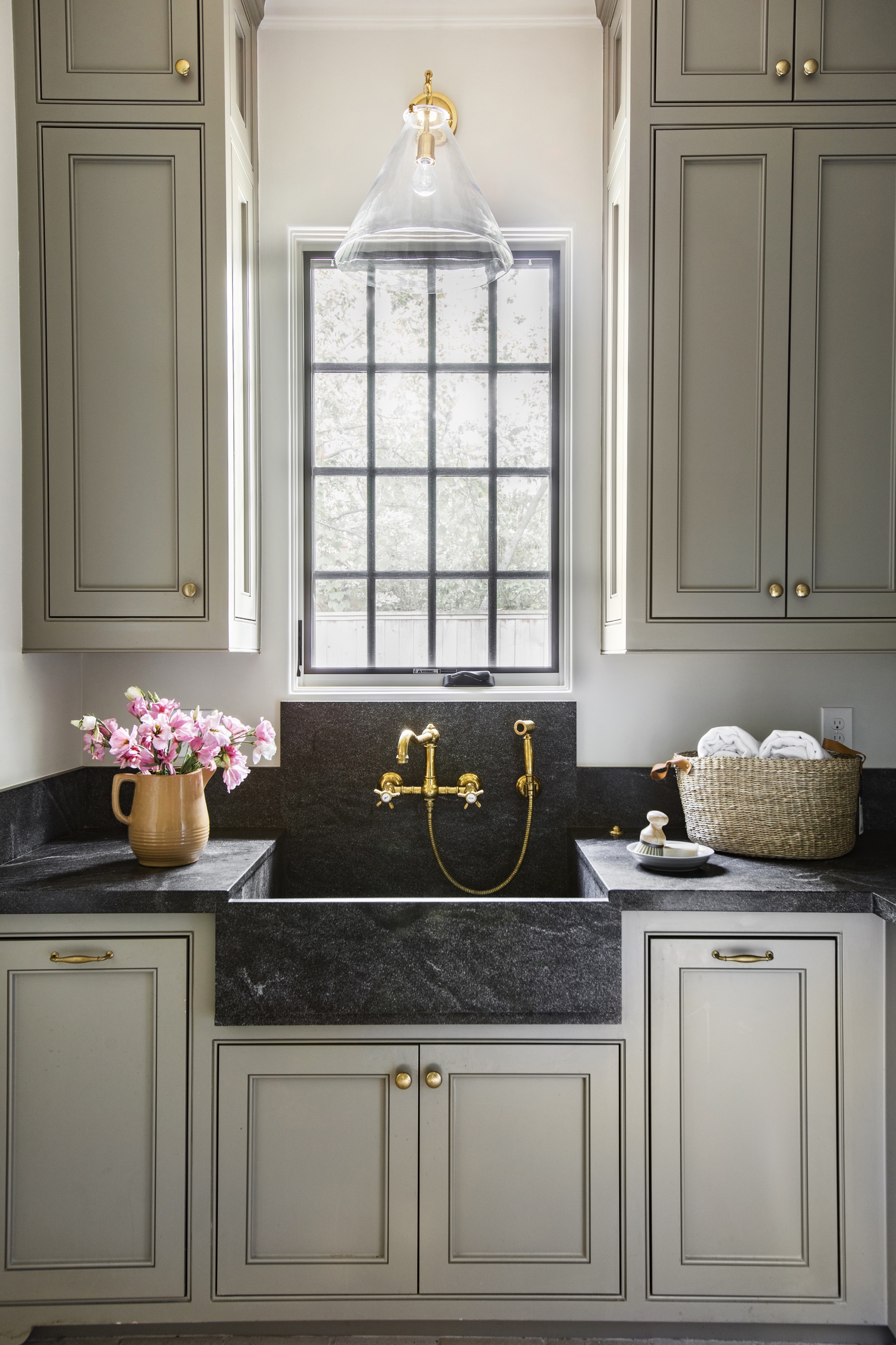
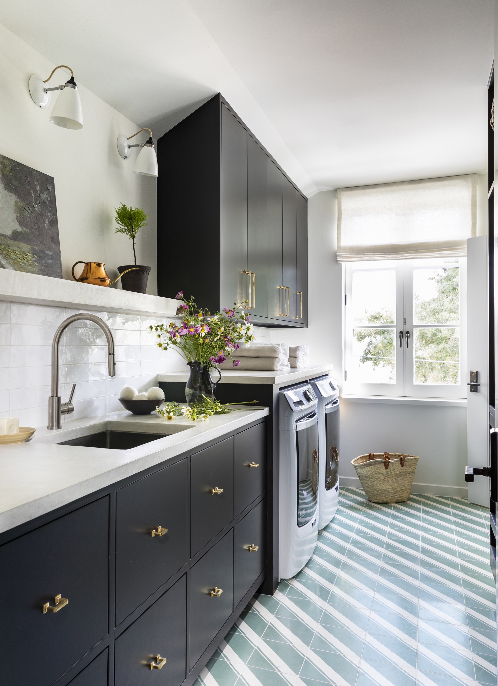
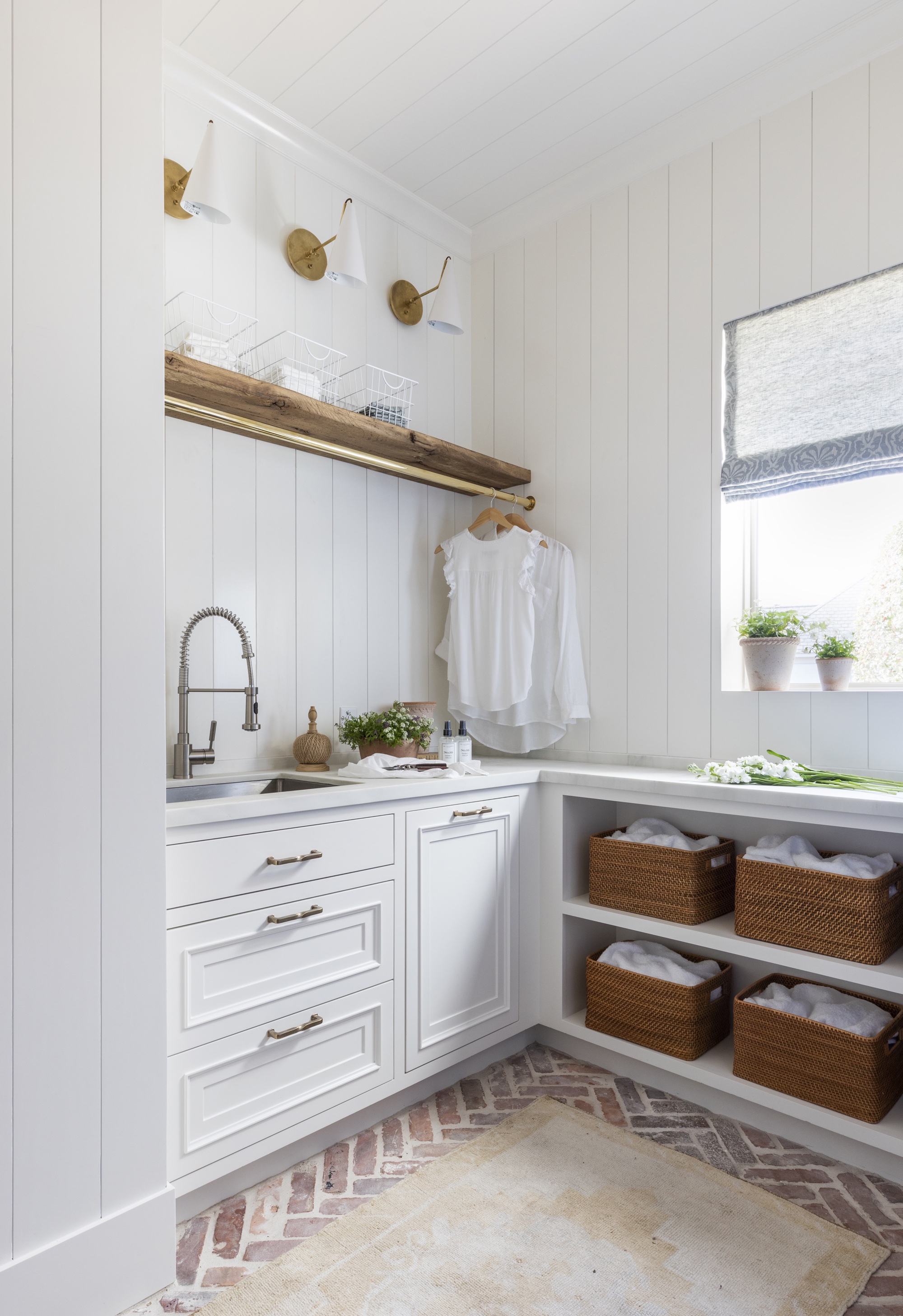
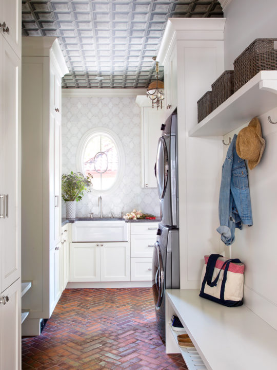
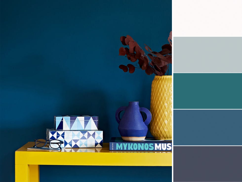
The piece presents a diverse array of 23 paint color recommendations for walls and cabinets, catering to various design preferences, from bold and vibrant to subtle and neutral. Each suggestion is accompanied by specific paint brand and color names, along with examples of how these hues can be integrated into a laundry room setting.
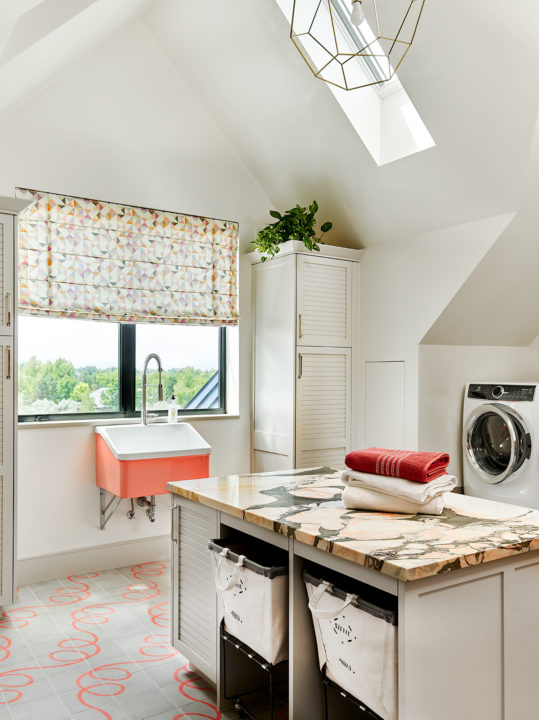
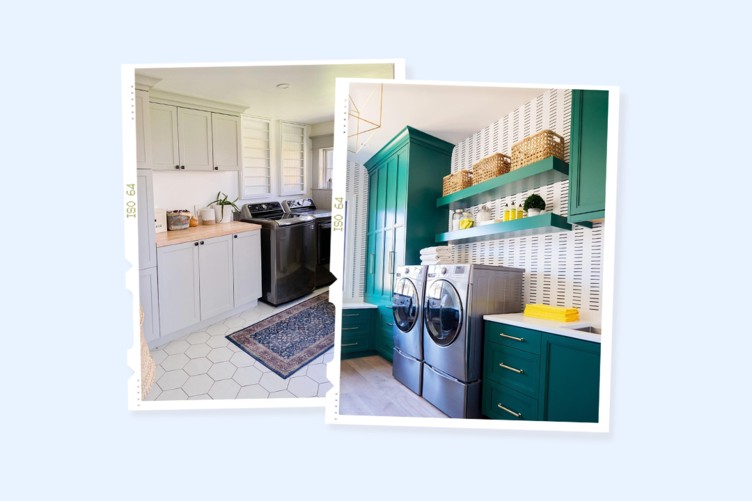
For those seeking a lively and energetic atmosphere, the article suggests bold colors like Sherwin-Williams Fame Orange and Benjamin Moore Slate Teal. These vibrant choices are depicted as ideal for infusing personality and style, as seen in a Florence, Alabama cabin renovation where orange cabinets are paired with a gallery wall, or in a Mount Pleasant, South Carolina home where teal cabinetry complements stainless steel appliances and gold fixtures.
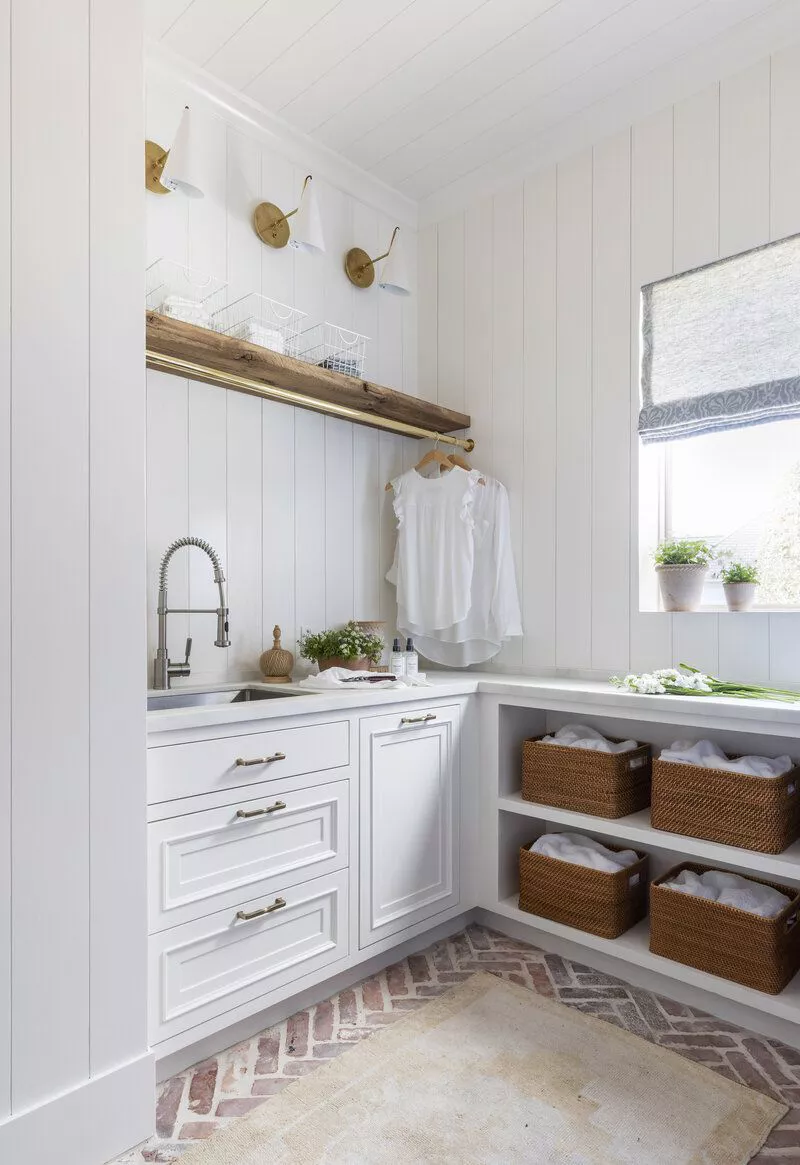
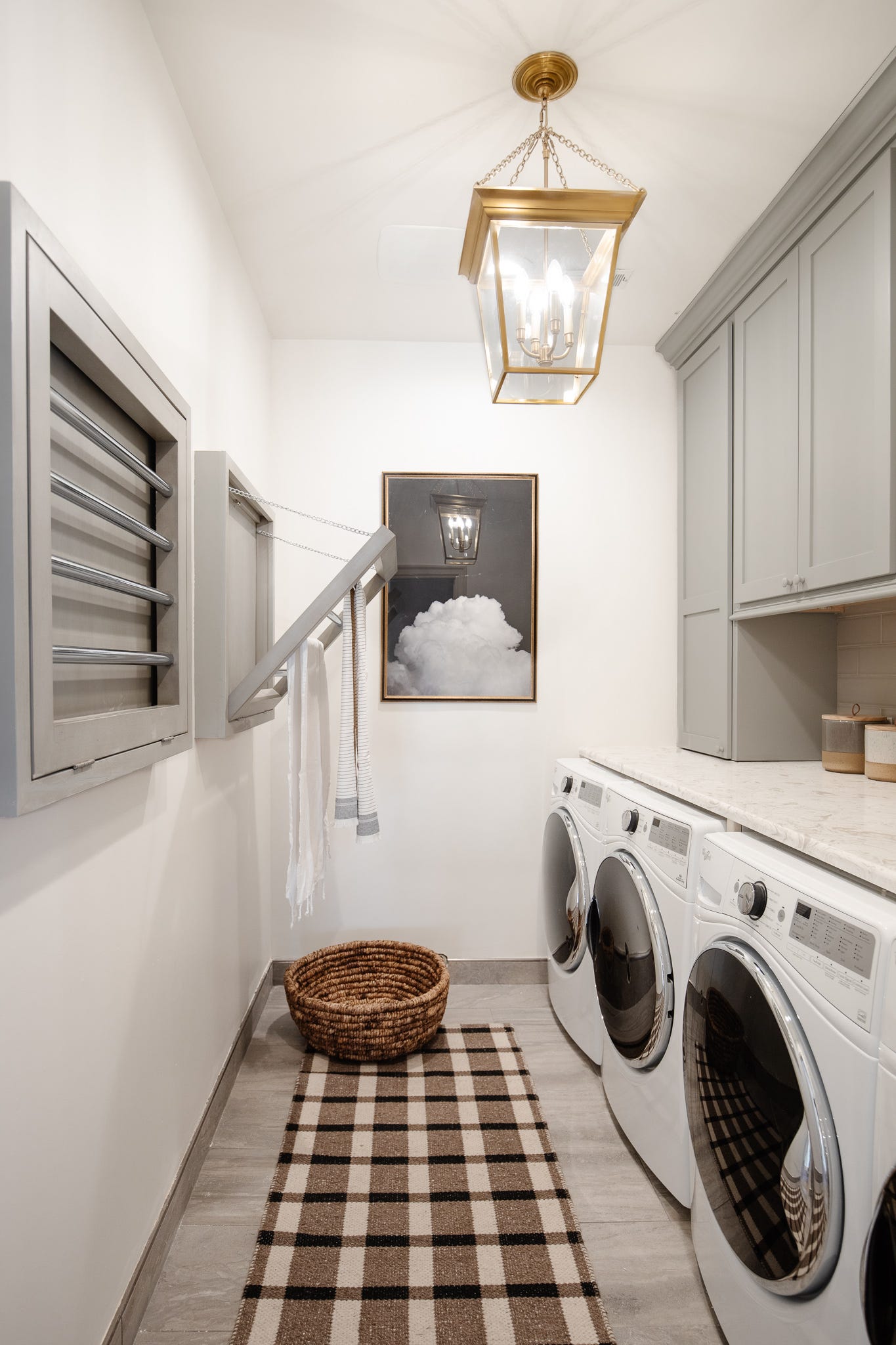
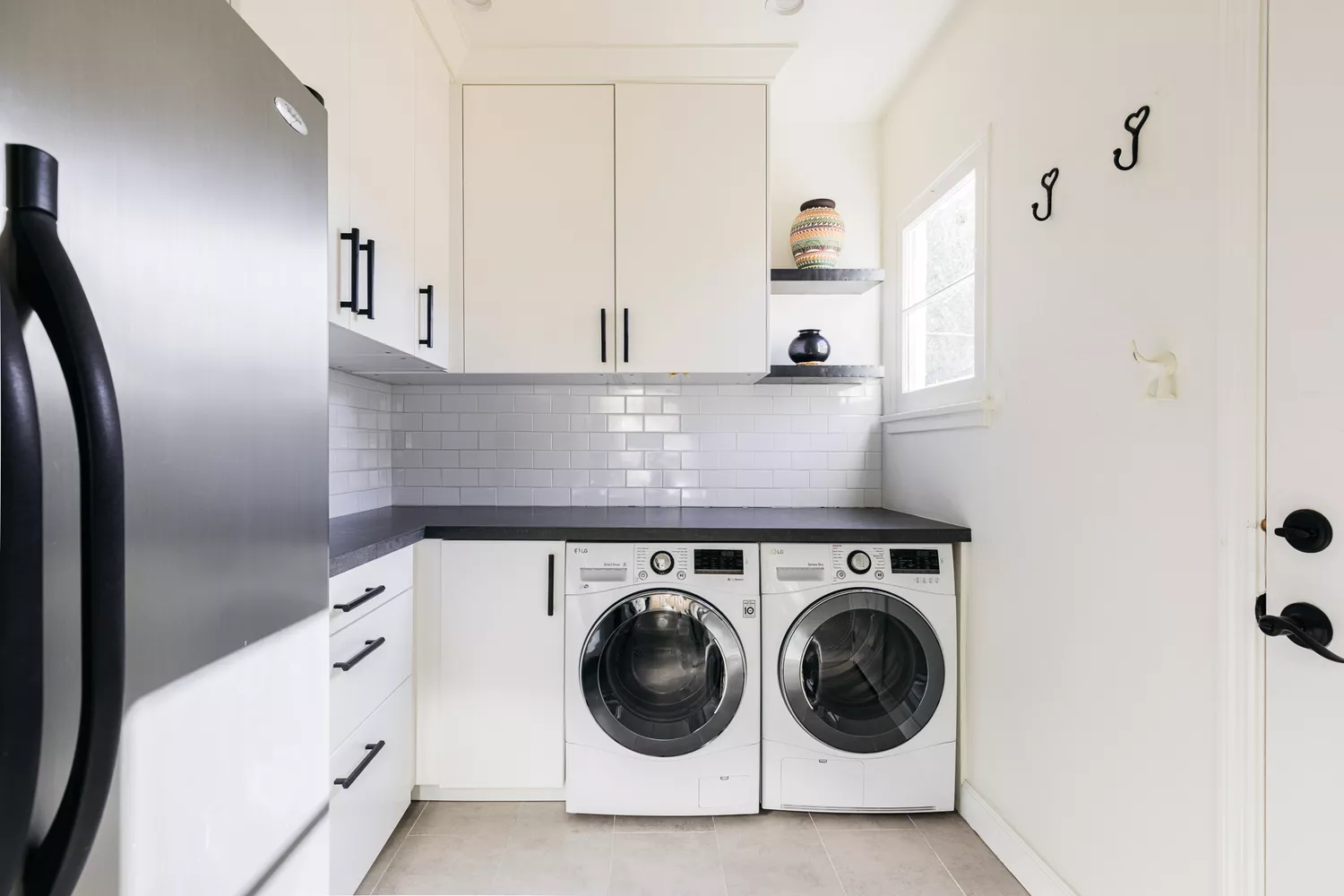
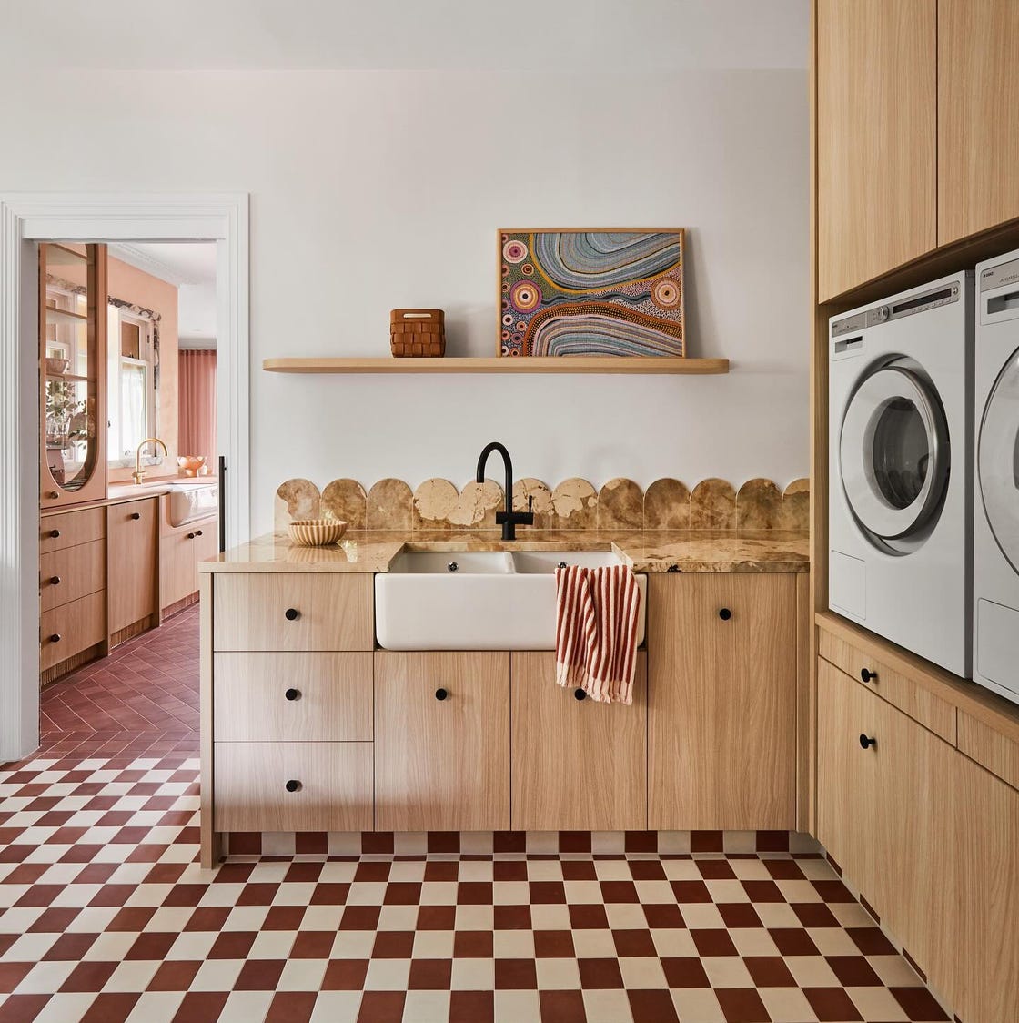
Conversely, for individuals who prefer a classic and clean aesthetic, options such as Sherwin-Williams Dover White are recommended. The article notes that while white maximizes natural light and promotes a sense of cleanliness, incorporating darker accents can prevent the space from appearing sterile. Other traditional choices include Benjamin Moore Gray Huskie for a classic character, often paired with traditional flooring like black-and-cream checkerboard tiles.
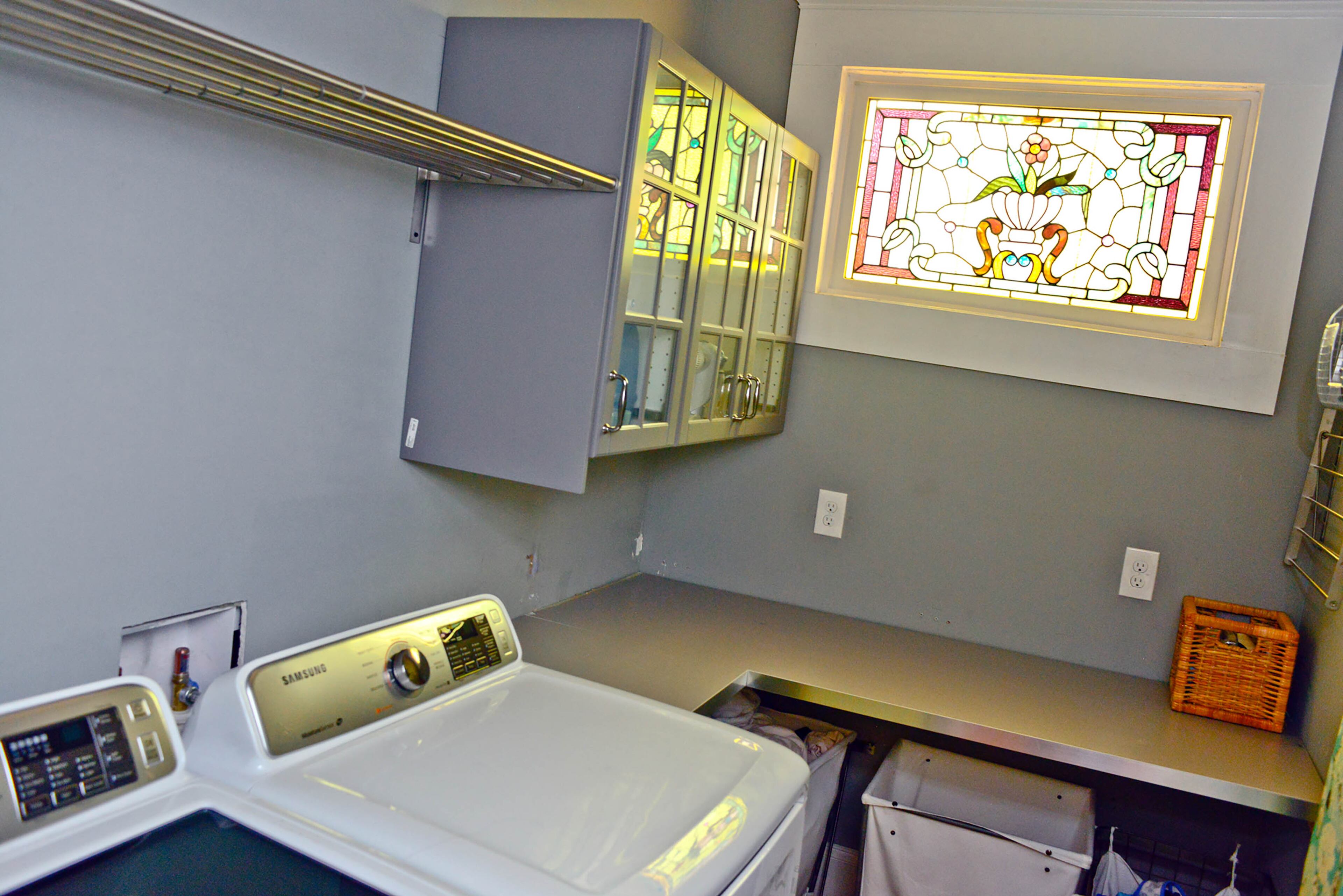
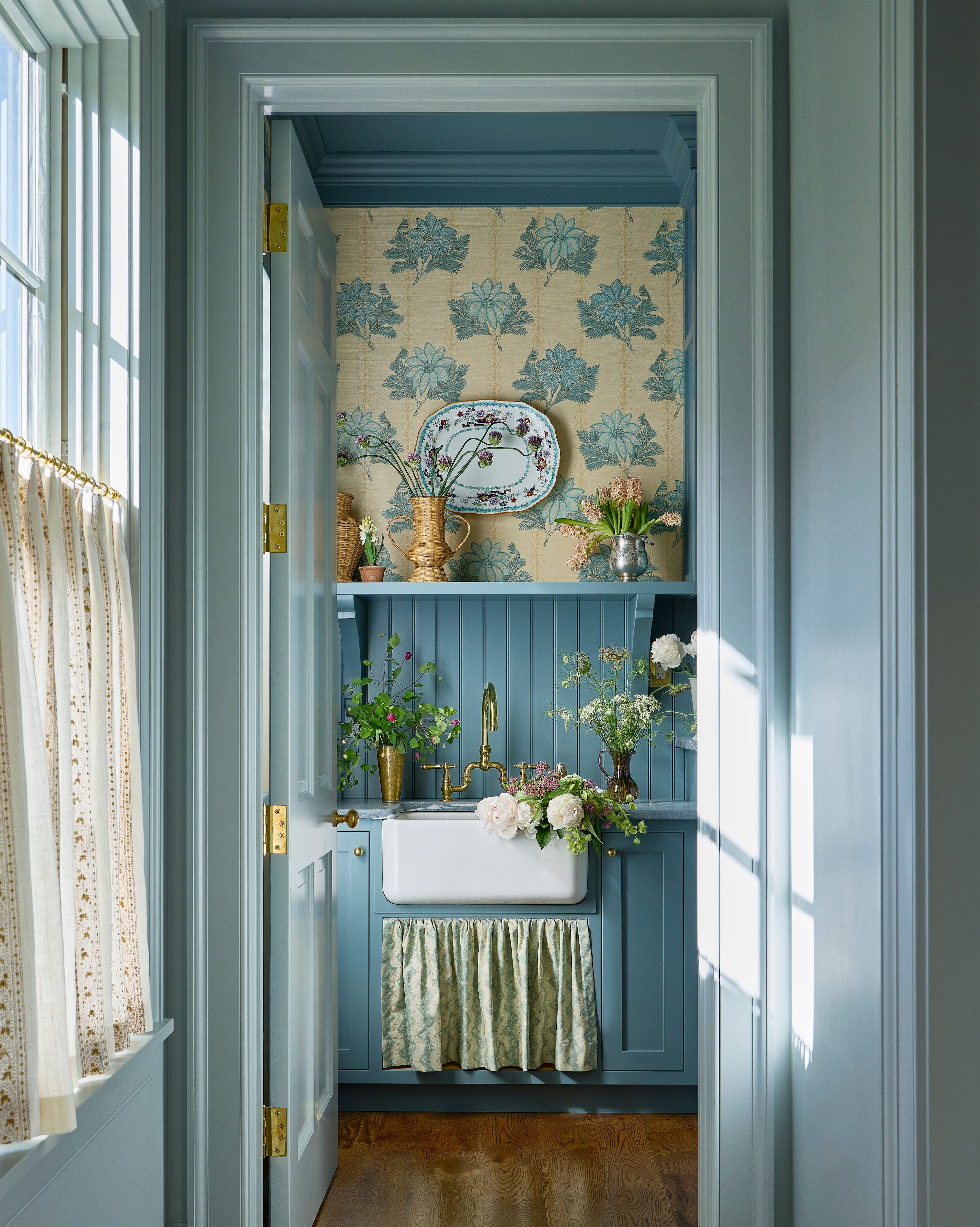
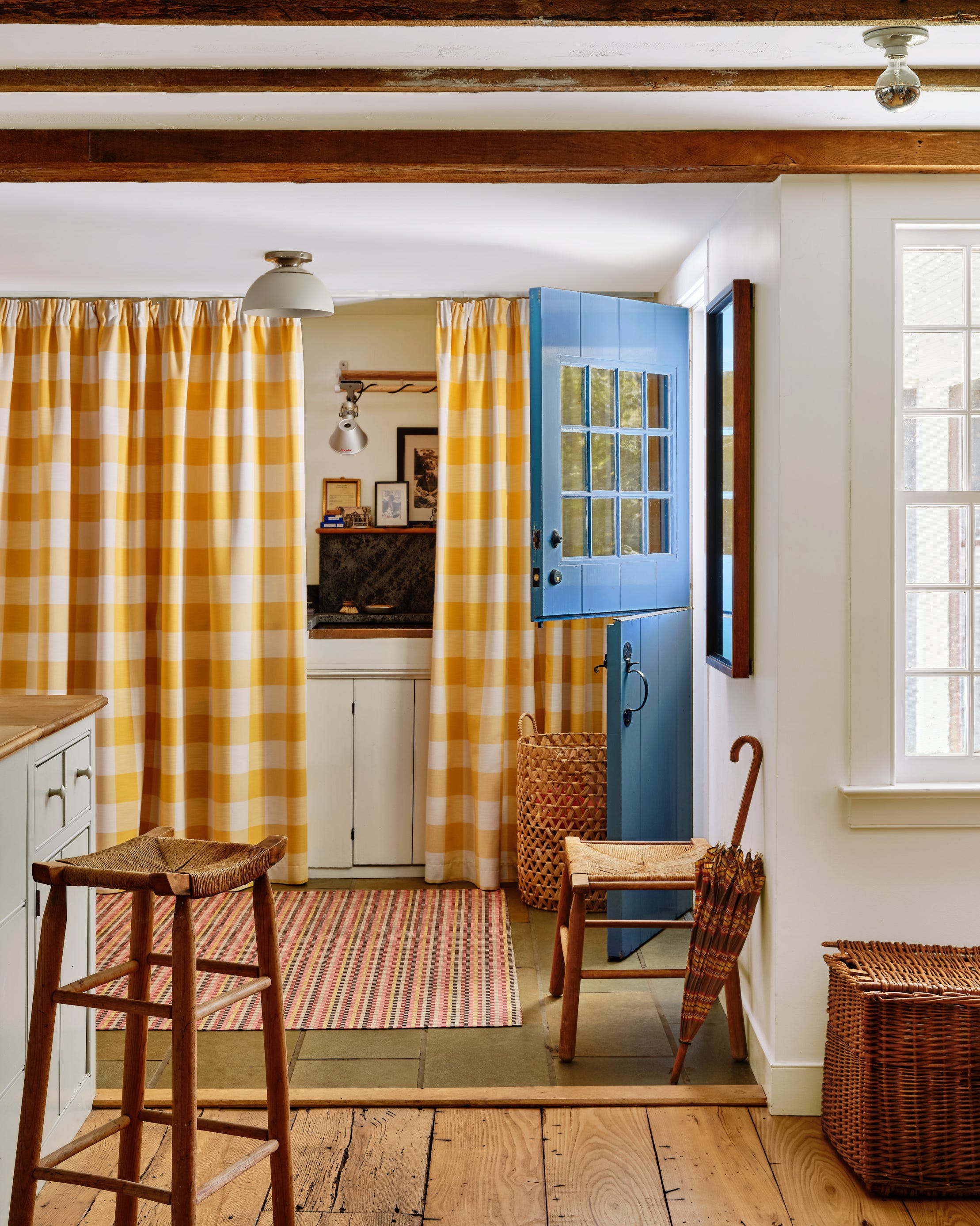
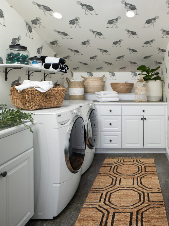
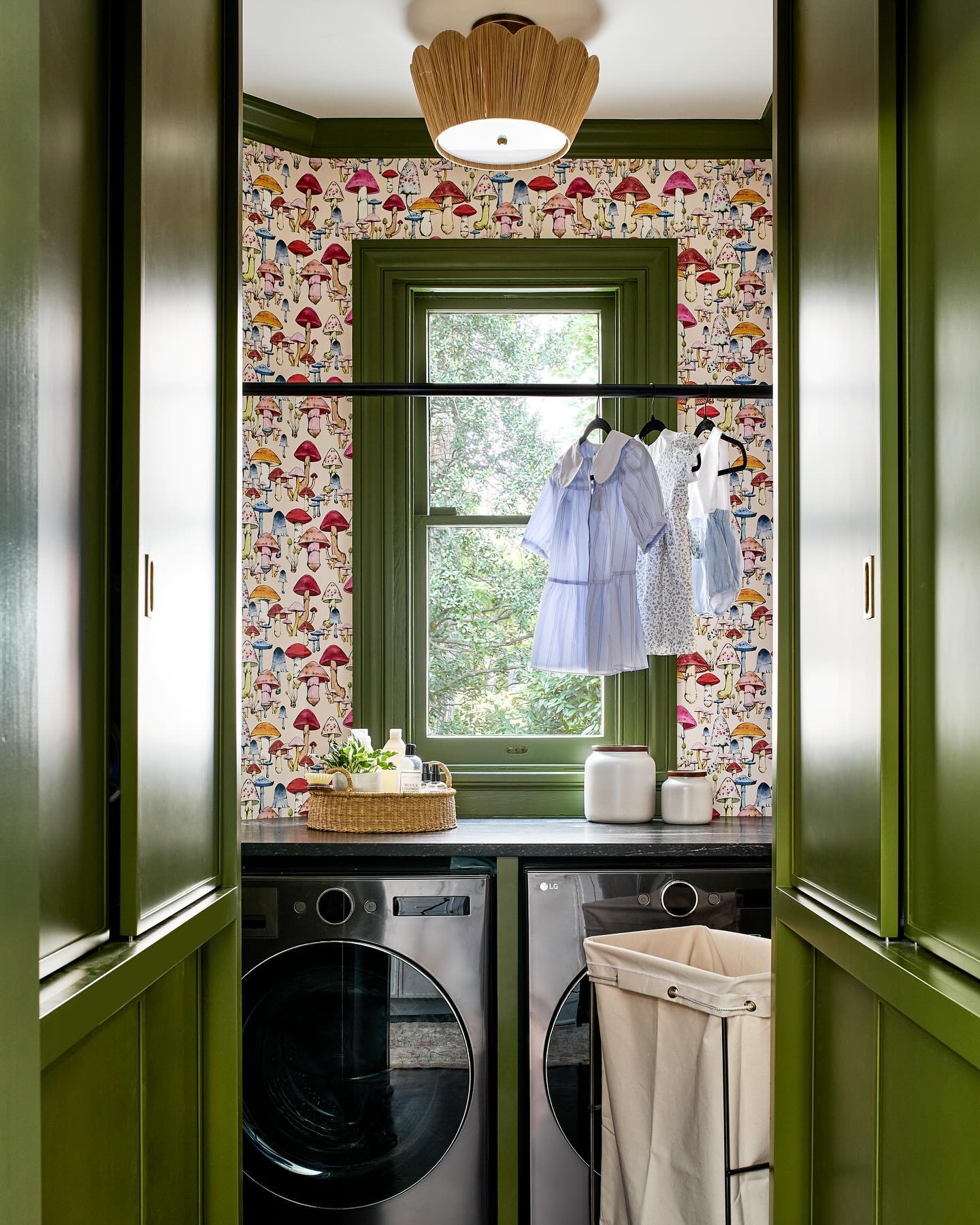
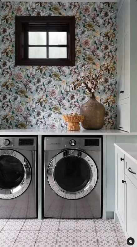
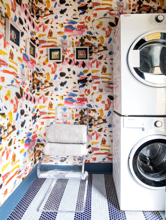
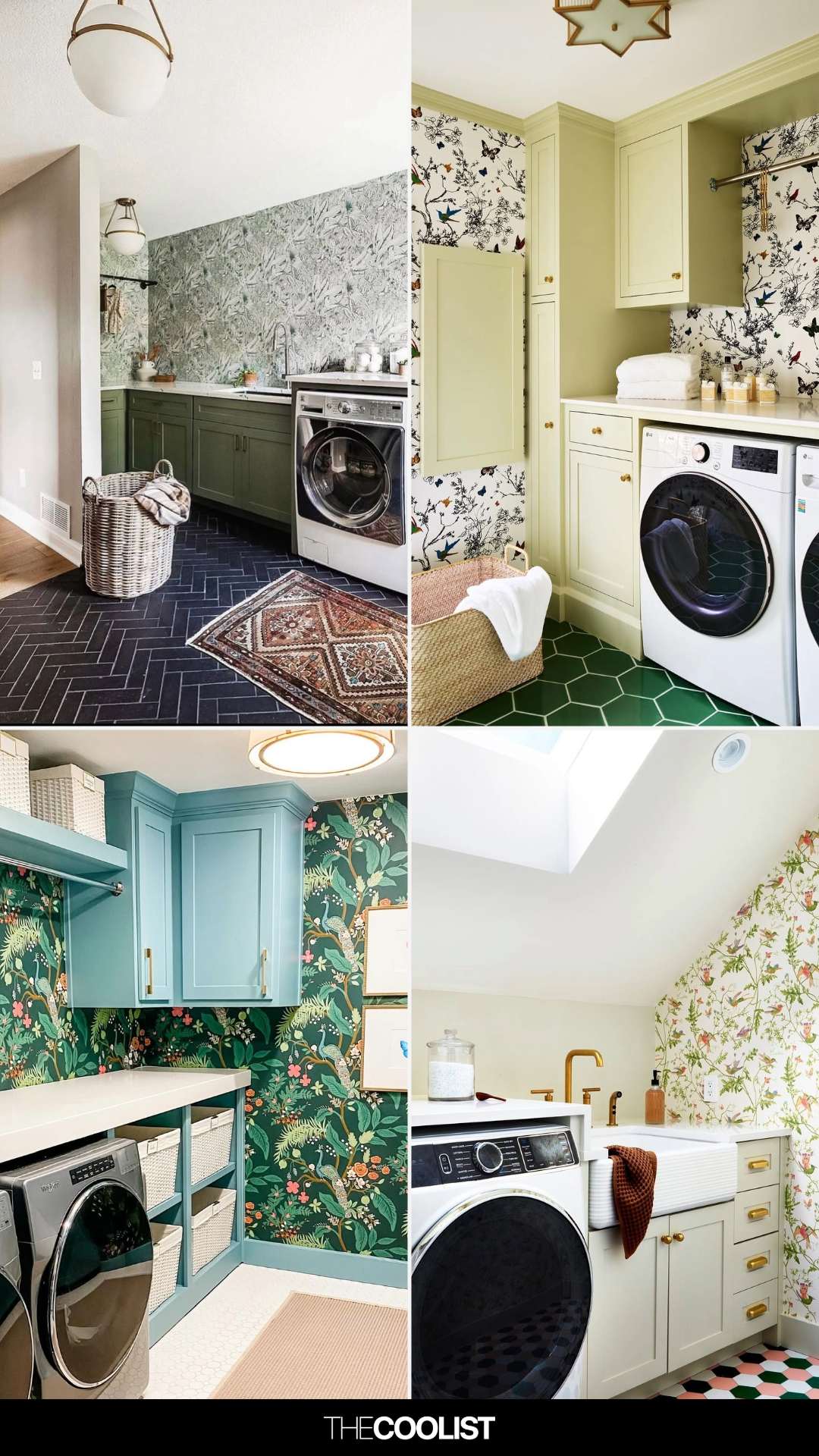
The article also explores creative uses of color beyond solid walls, such as making wood paneling pop with shades like Sherwin-Williams Portsmouth, which brings in outdoor elements. It delves into the use of contrast, illustrating how deep blue-black cabinetry combined with Farrow & Ball’s Manor House Gray wainscoting can create a dynamic feel. The integration of patterns and colors, particularly in spaces lacking natural light, is addressed with suggestions like pairing whimsical wallpaper with powder blue accents using Sherwin-Williams Wondrous Blue.
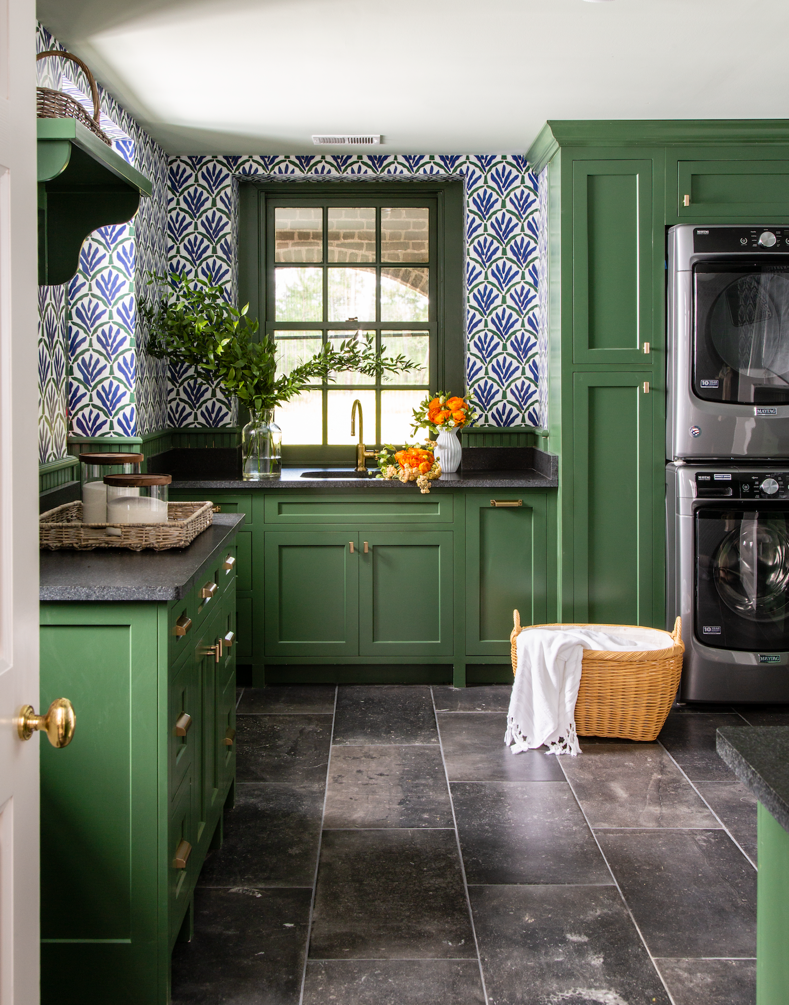
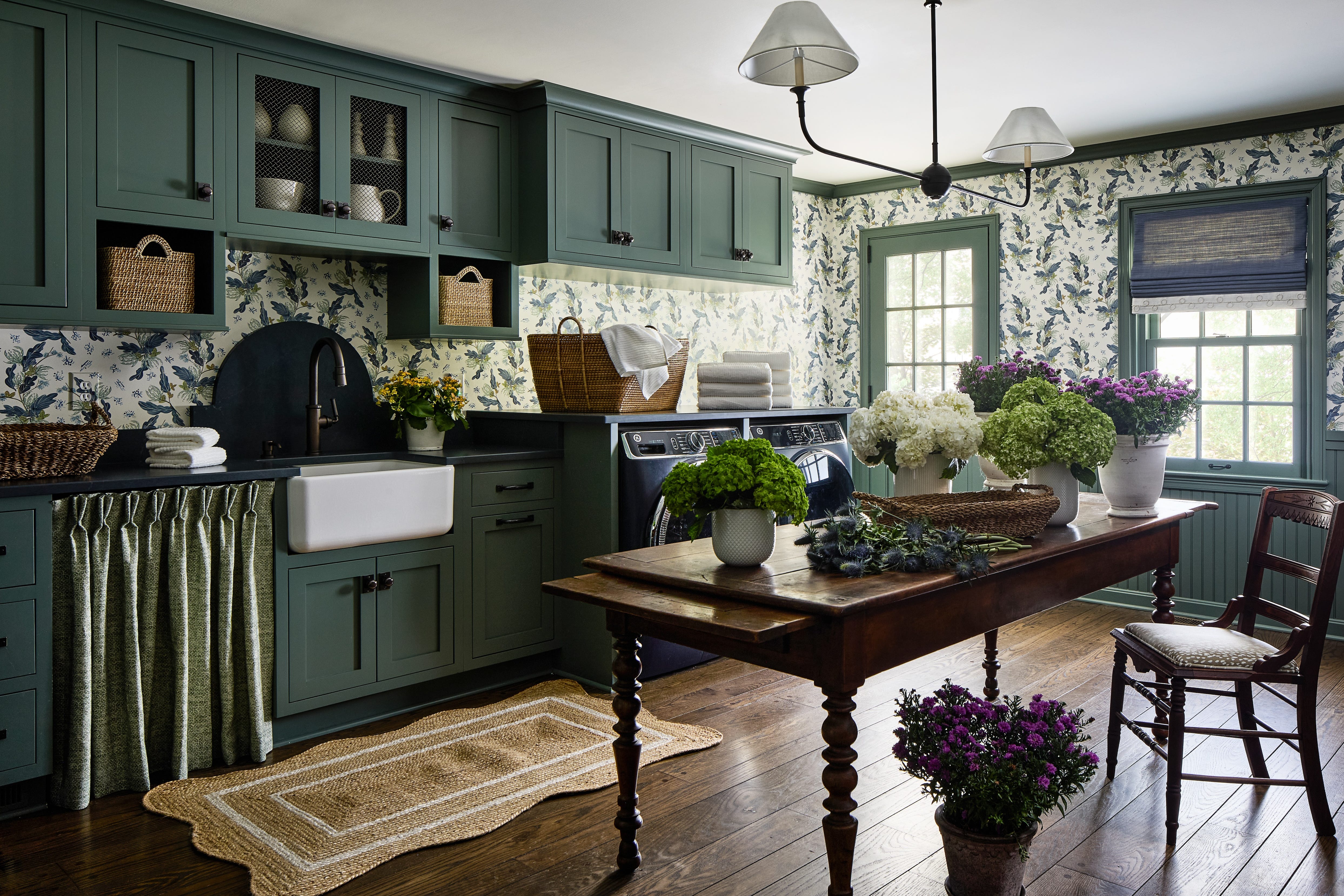
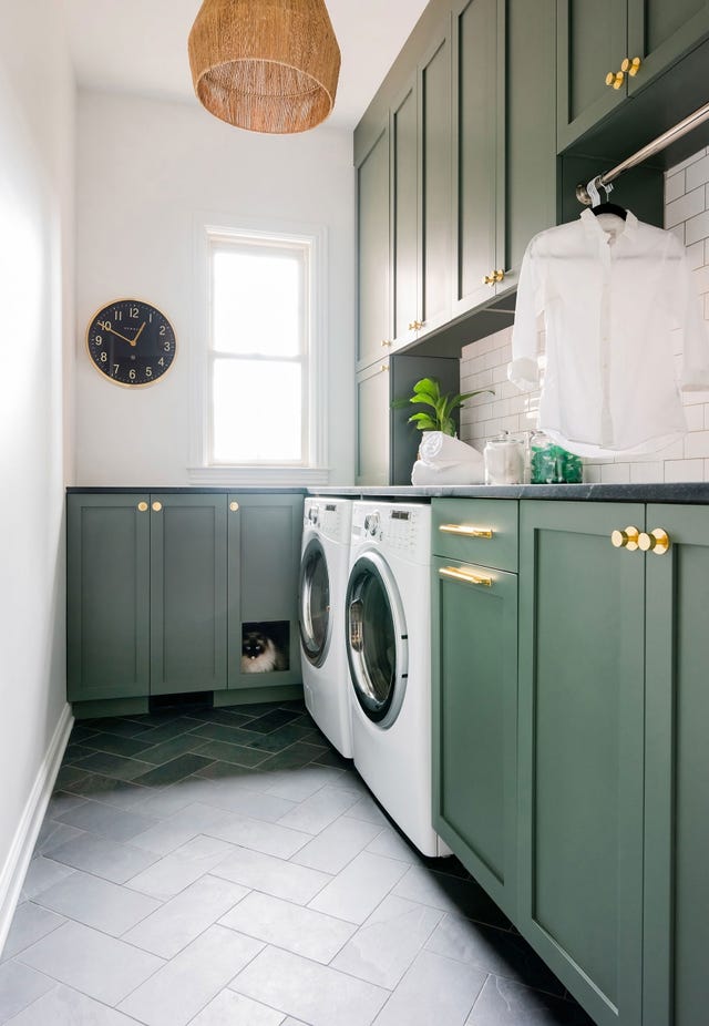
Various green shades are proposed to refresh and invigorate the space. Benjamin Moore Spruce Green is highlighted for its minty freshness, suitable for laundry rooms that also function as mudrooms, creating a happy and clean ambiance. For a more sophisticated touch, Benjamin Moore Garden Cucumber in a satin finish is suggested, especially when combined with abstract wallpaper, to brighten up the room and offer an inviting view.
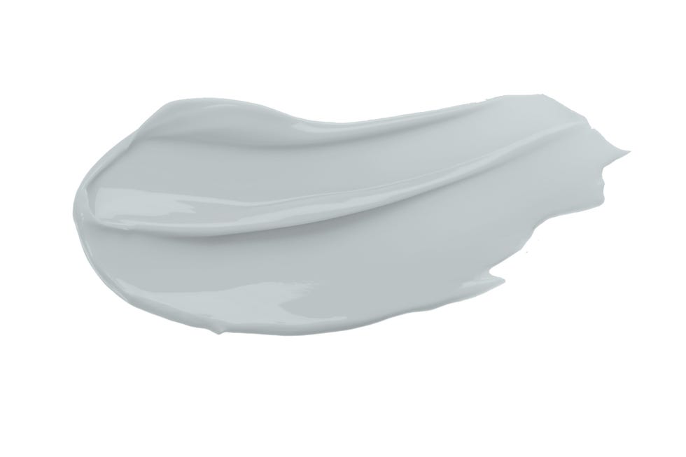
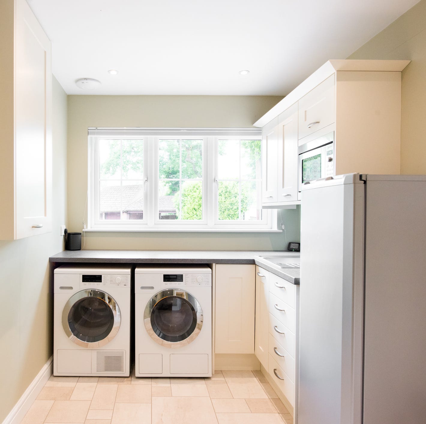
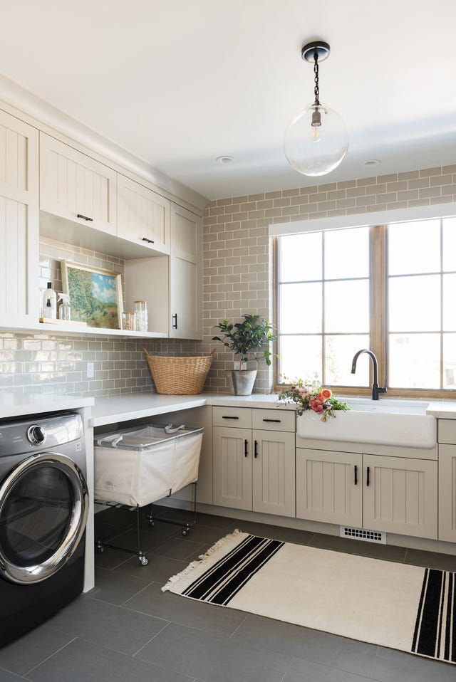
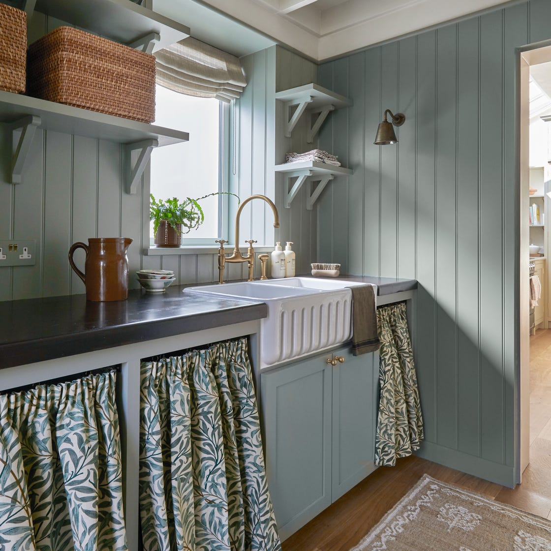
Warm tones like Benjamin Moore Concord Ivory are recommended for creating a calm and cozy workspace, often enhanced by elements such as sink skirts and vintage lighting. On the cooler spectrum, Farrow & Ball Parma Gray or Sherwin-Williams Lullaby are suggested for ceilings, aiming to create a light and airy atmosphere.
The article further encourages daring choices, such as Sherwin-Williams Cyberspace for a bold facelift, balanced with bright floor tiles to keep the mood light. For a tranquil beachy feel, Sherwin-Williams Waterscape is presented as a moody blue-green that can bring serenity to a potentially chaotic space. Unexpected colors like high-gloss lilac (Benjamin Moore Spring Iris) are suggested for ceiling accents to invigorate a timeless, white palette. Neutral options like Sherwin-Williams Grecian Ivory offer a soft look that can be enhanced with wallpaper or patterned window treatments.
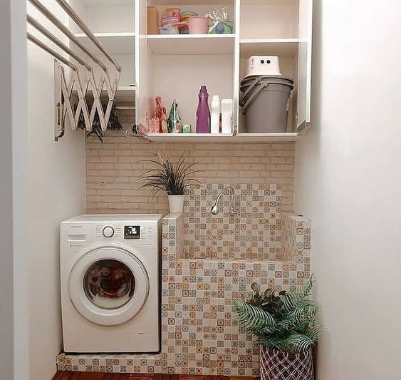
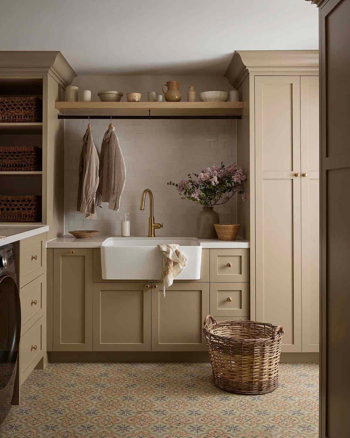
Accent colors are also covered, with Sherwin-Williams Evergreens providing an outdoorsy feel, suitable for an accent wall or the entire room. The use of mosaic tiles is presented as an alternative to wallpaper for adding color and texture. For those who prefer a subtler approach, warm neutrals like oatmeal or taupe are suggested for a calm setting, while a vivid teal stool can add a pop of color without overwhelming the space. Finally, the article explores the impact of cheerful wallpaper, such as Quadrille's "Climbing Hydrangea," and the use of bold reds for an energetic feel, particularly when balanced with a white background. It concludes with the idea of adding charm by painting cabinets in accent colors like an enchanting mossy green, keeping walls neutral for a balanced look.
#LaundryRoomDesign #PaintColors #HomeDecor #InteriorDesign #ColorPalettes #HomeImprovement #DIYDecor #RenovationIdeas #LaundryRoomDesign #PaintColors #HomeDecor #InteriorDesign #ColorPalettes #HomeImprovement #DIYDecor #RenovationIdeas
0 comment in total
 No comments yet
You may also like
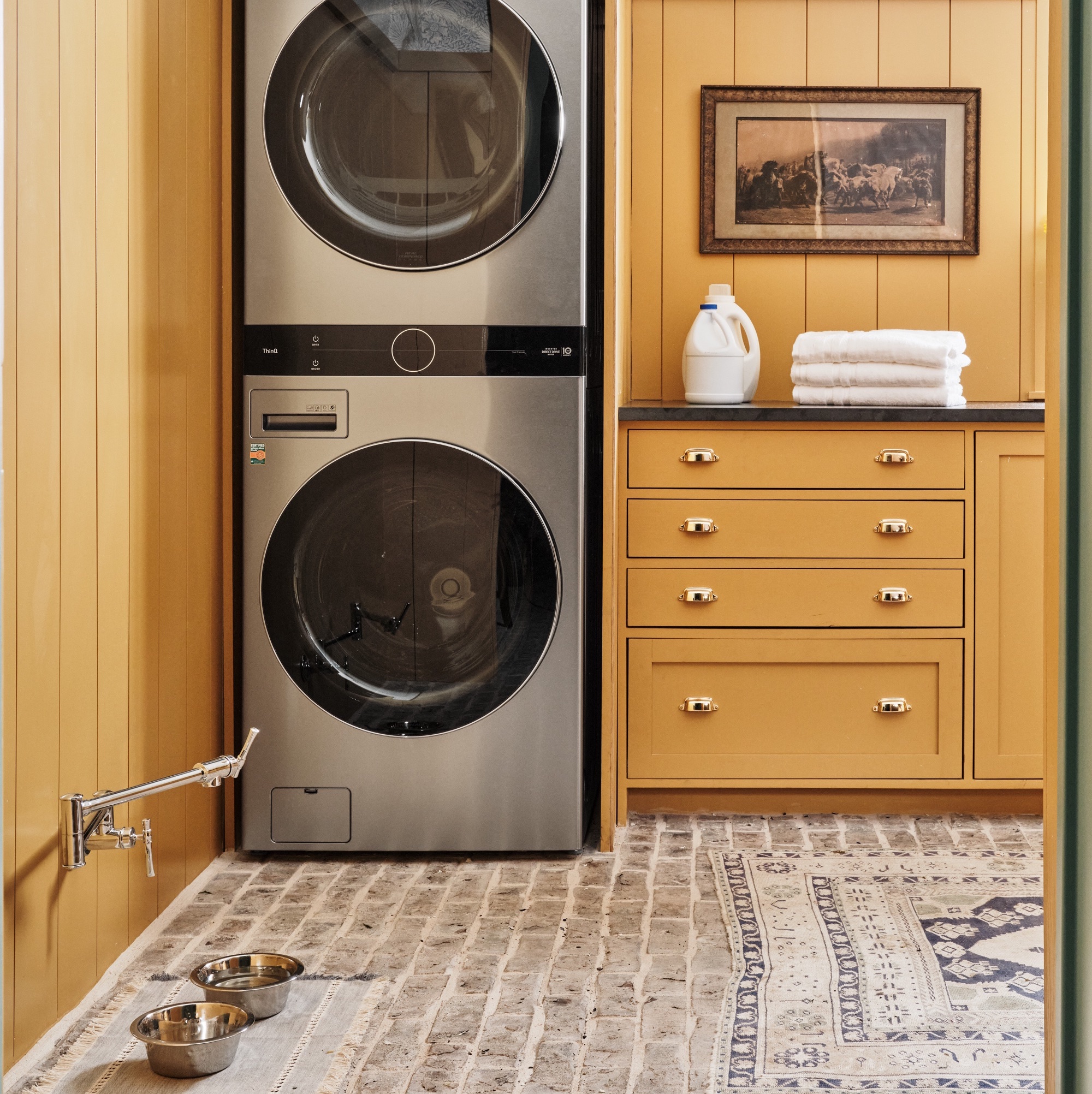
6 colors designers pick for laundry rooms - exact paint matches, from classic choices to surprising shades

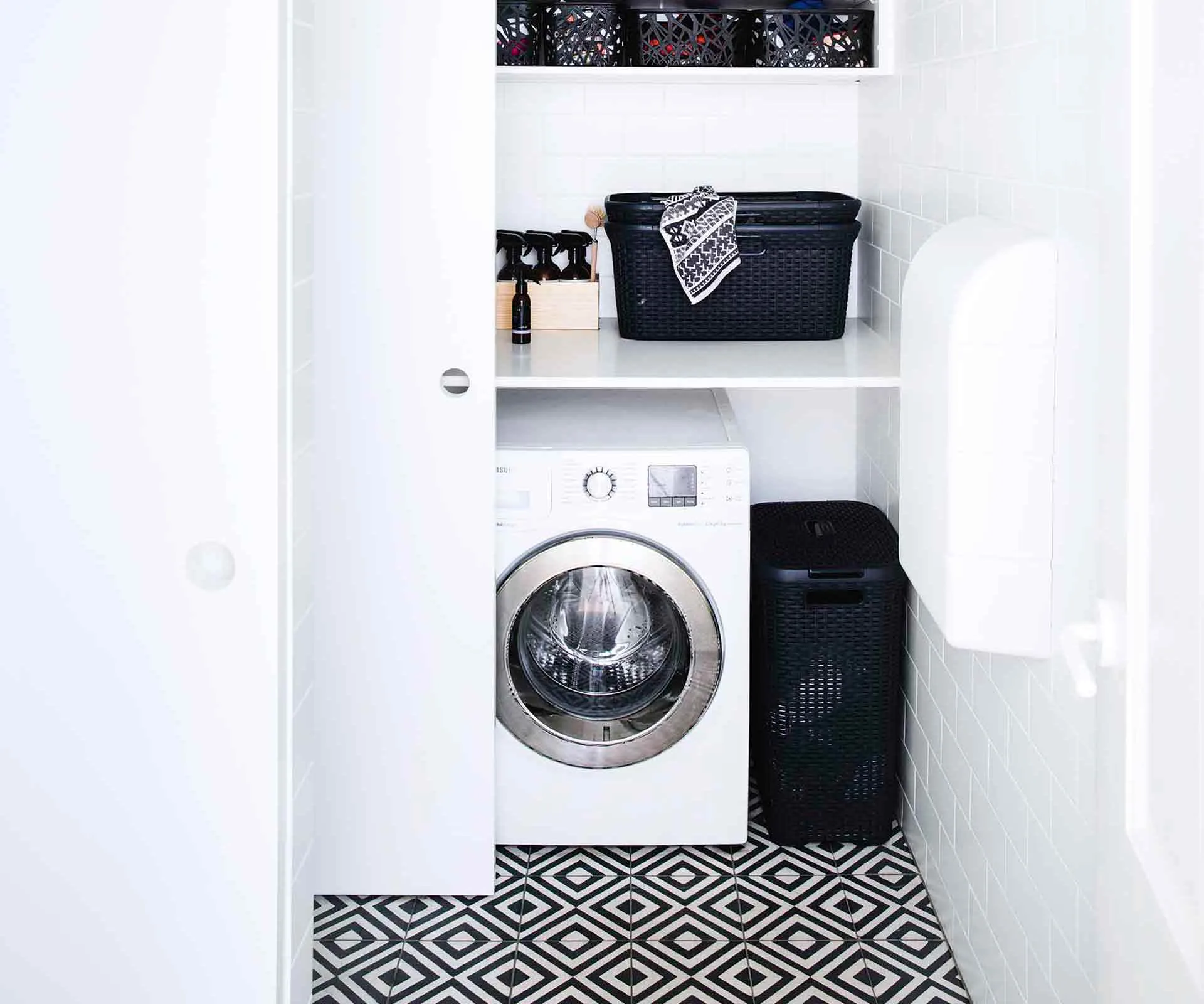
5 laundry room decor ideas to take it to the next level

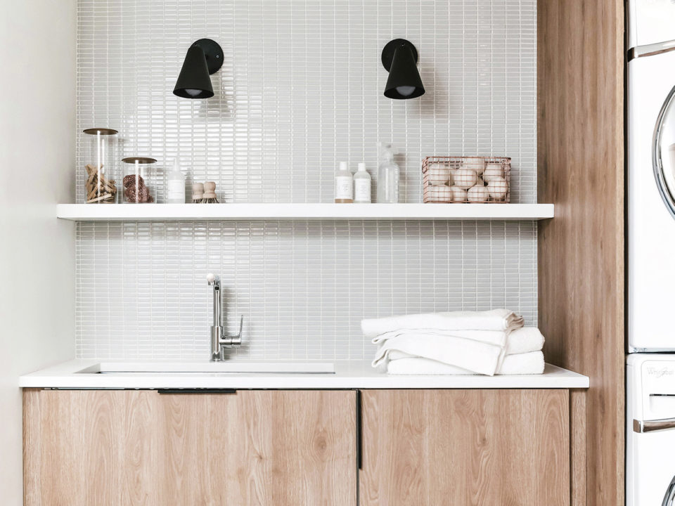
9 Laundry Rooms That Will Make You Want To Sort and Fold
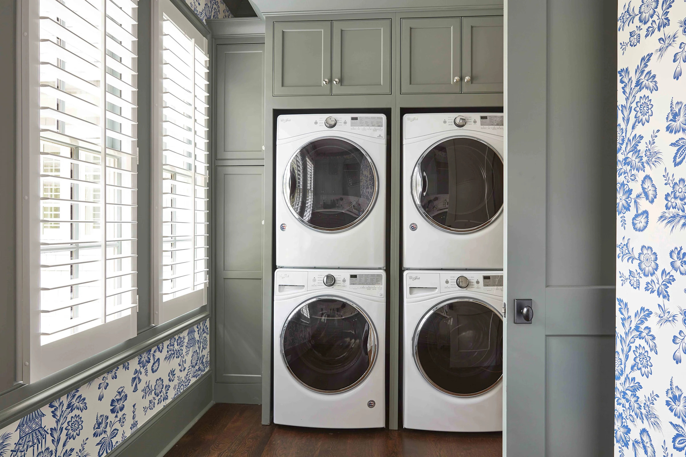
15 Laundry Room Colors So Pretty, You'll Even Look Forward to Wash Day

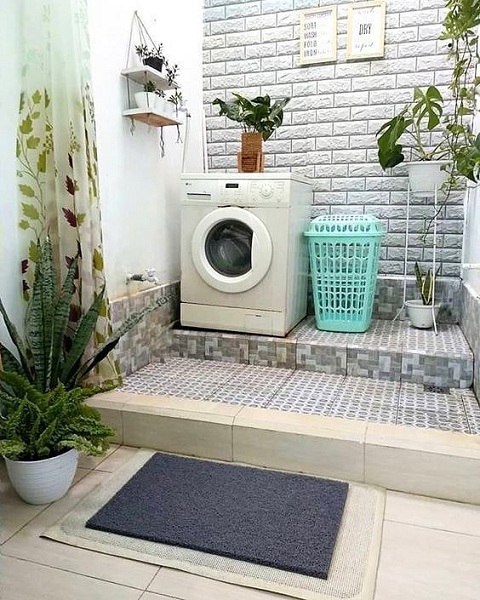
15 Best Laundry Room Ideas For Your Home In 2023

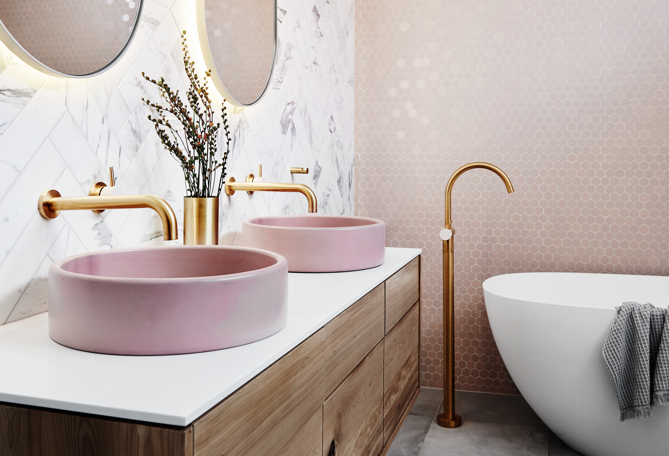
25 bathroom color ideas to add character to your washroom space

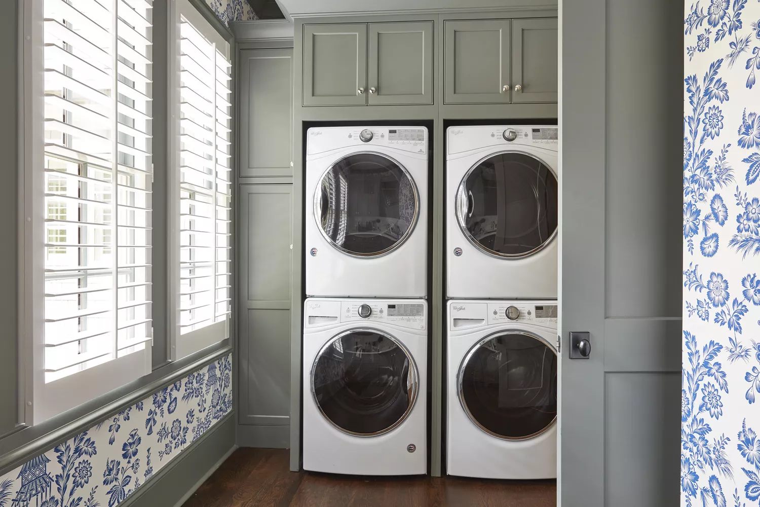
15 Laundry Room Colors So Pretty, You'll Even Look Forward to Wash Day
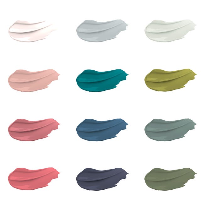
30 on-trend paint colours for every room in your home

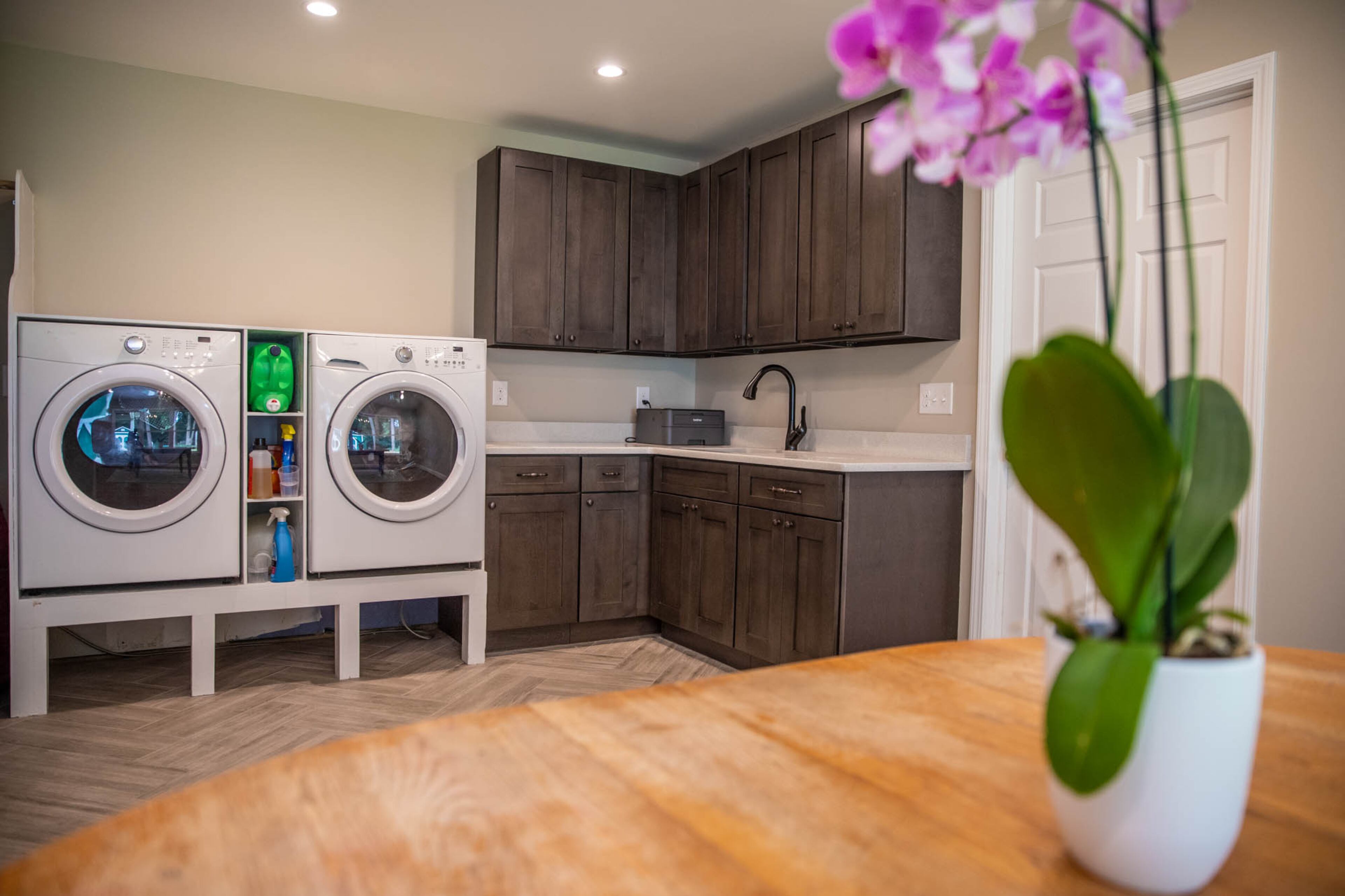
Make over your laundry room with these fresh and organizational designs
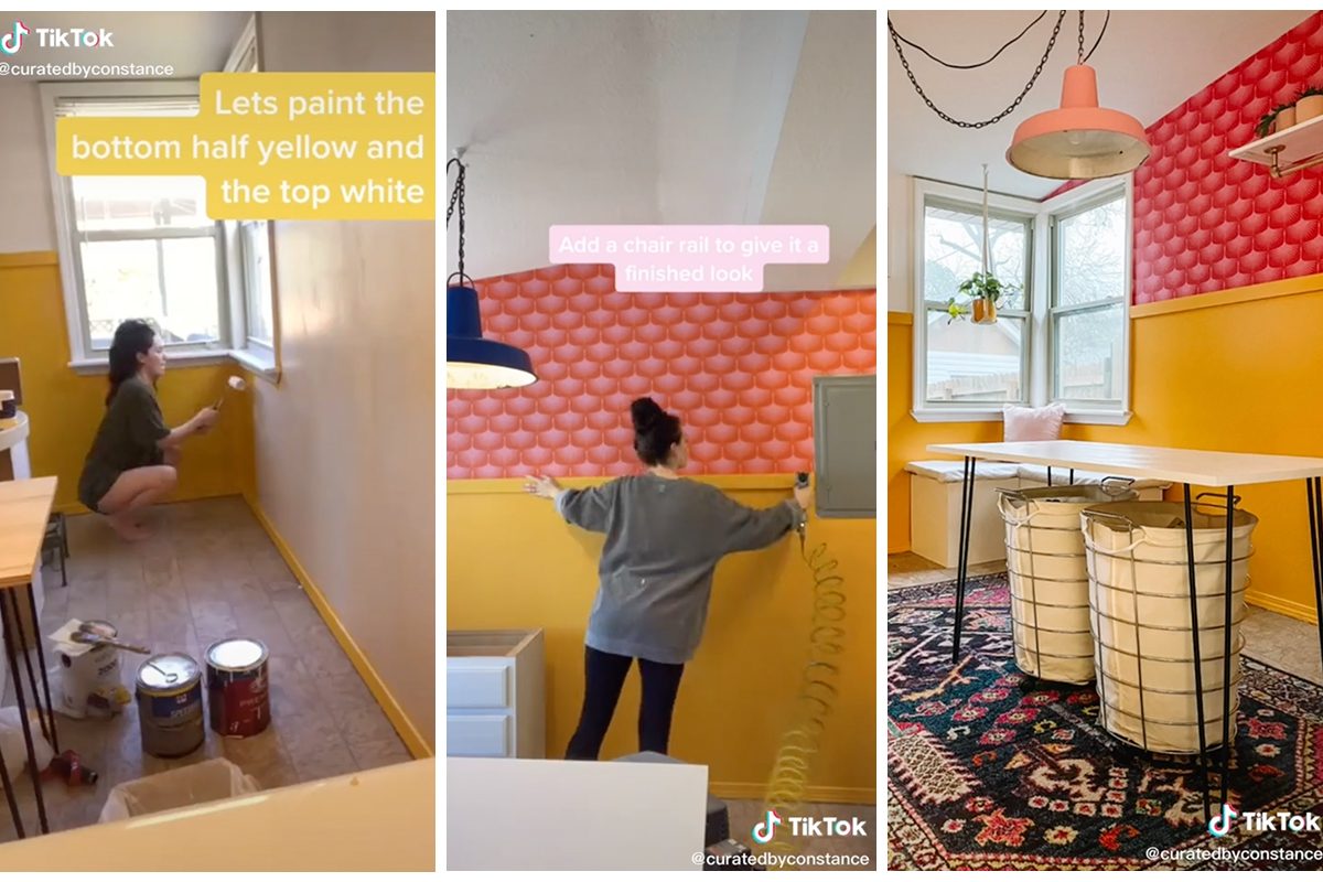
8 Eye-Catching Laundry Room Colors To Look Out For


23 Things That'll Help You Get The Laundry Room Of Your Dreams

13 laundry room organization ideas to try | Shop TODAY
23 Best Laundry Room Paint Colors for a Fresh Space

The Best Laundry Room Hacks

10 Pretty Laundry Room Designs That’ll Actually Make You Want to Do Chores
Yes, This Is a Laundry Room

13 Inspiring Laundry Rooms That Will Help Make Yours a Favorite Place in the Home
These Laundry Room Ideas Will Make You Actually Look Forward to Laundry Day
These Pretty Laundry Room Cabinet Ideas Make Me WANT to Do Chores
24 Laundry Room Wallpaper Ideas That Add Style and Charm to Your Space