1/10
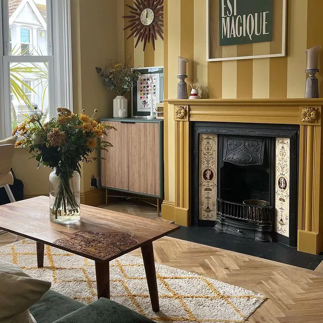
10 skirting board colour ideas – from sunshine yellow to jet black to freshen up tired schemes
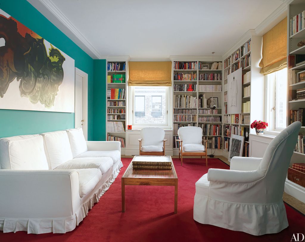
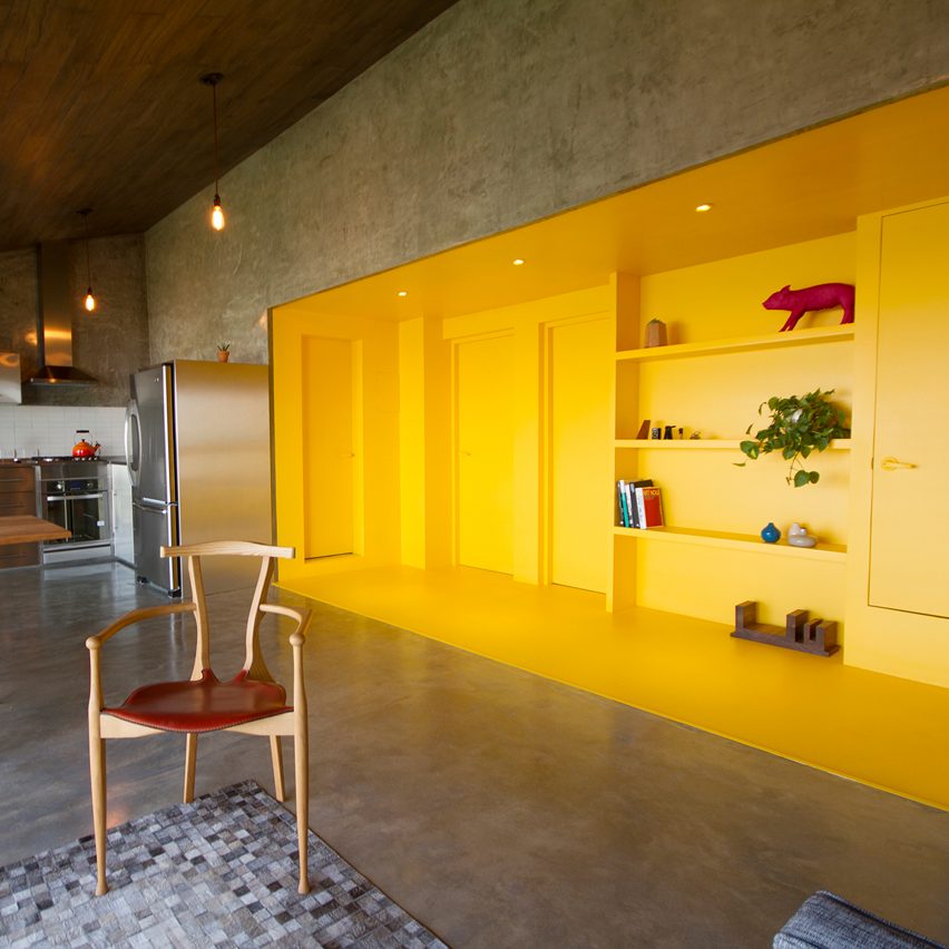
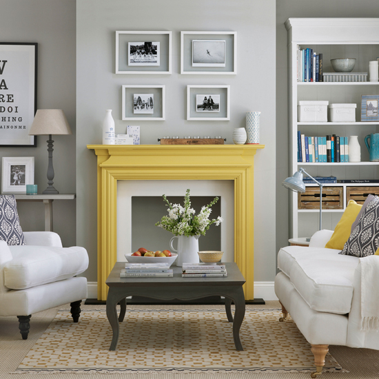
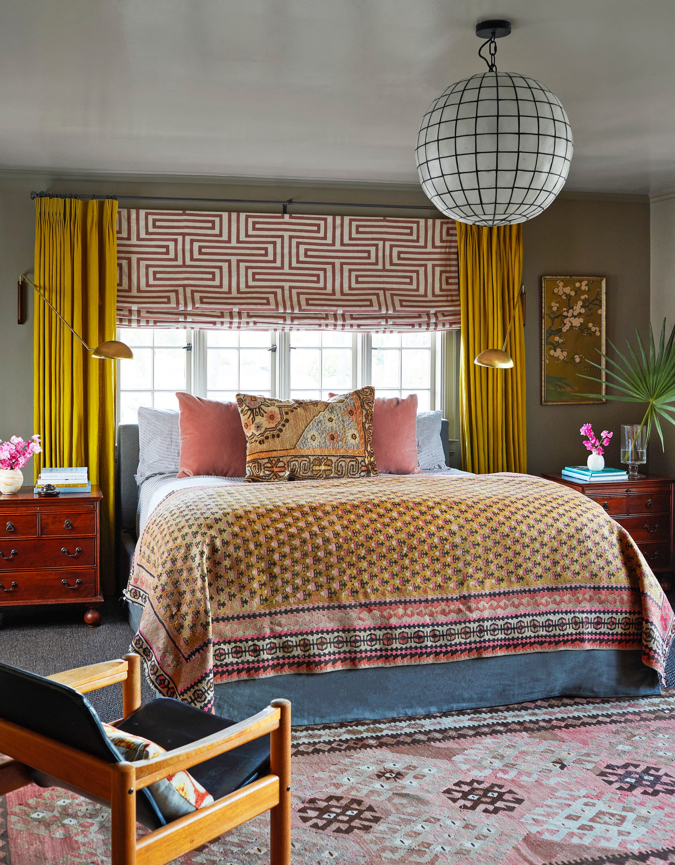
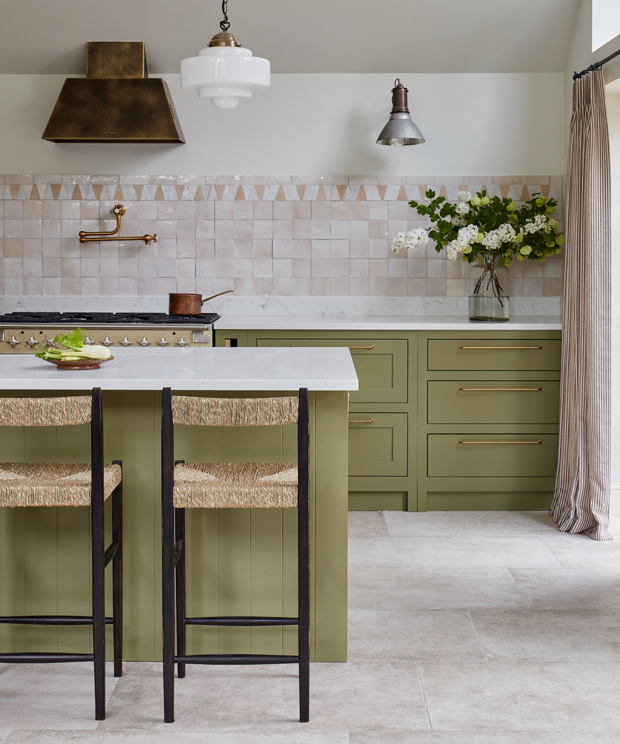
Skirting boards, traditionally overlooked and often painted white, are emerging as a key element in interior design, offering a versatile canvas for introducing colour and personality into a space. The increasing popularity of "colour drenching," where walls and woodwork are painted in the same or harmonising shades, has transformed how skirting boards are perceived and utilised. This trend allows for creative expression, ranging from subtle blending to bold statement-making, and can significantly influence a room's aesthetic and perceived dimensions.
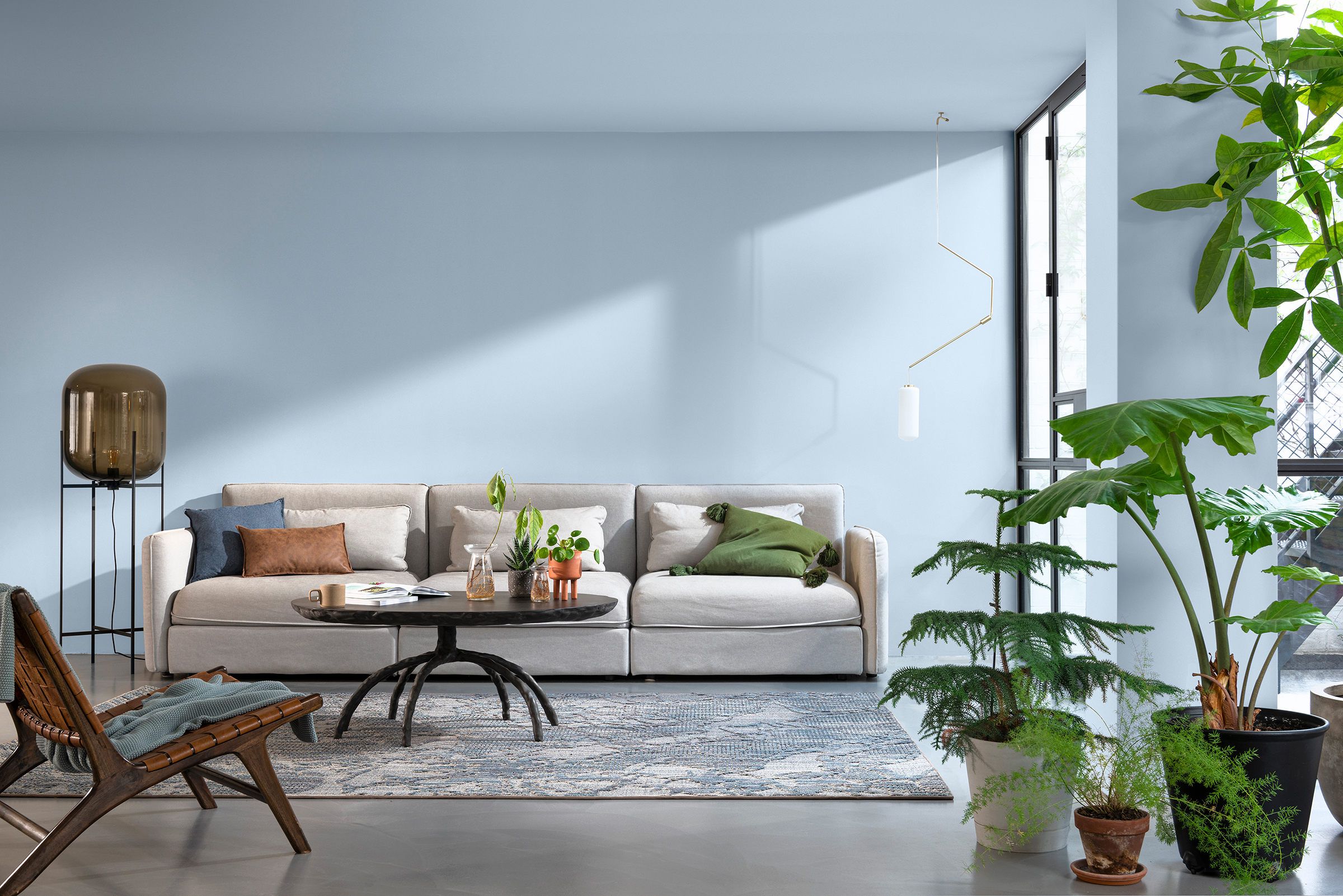
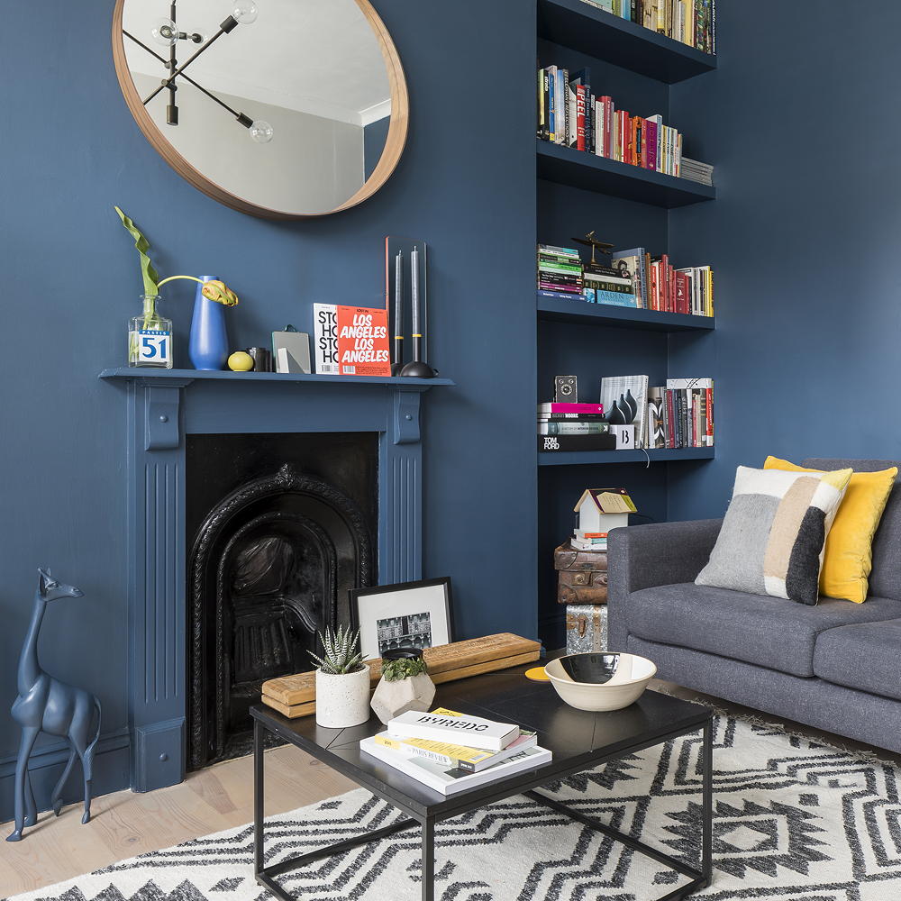
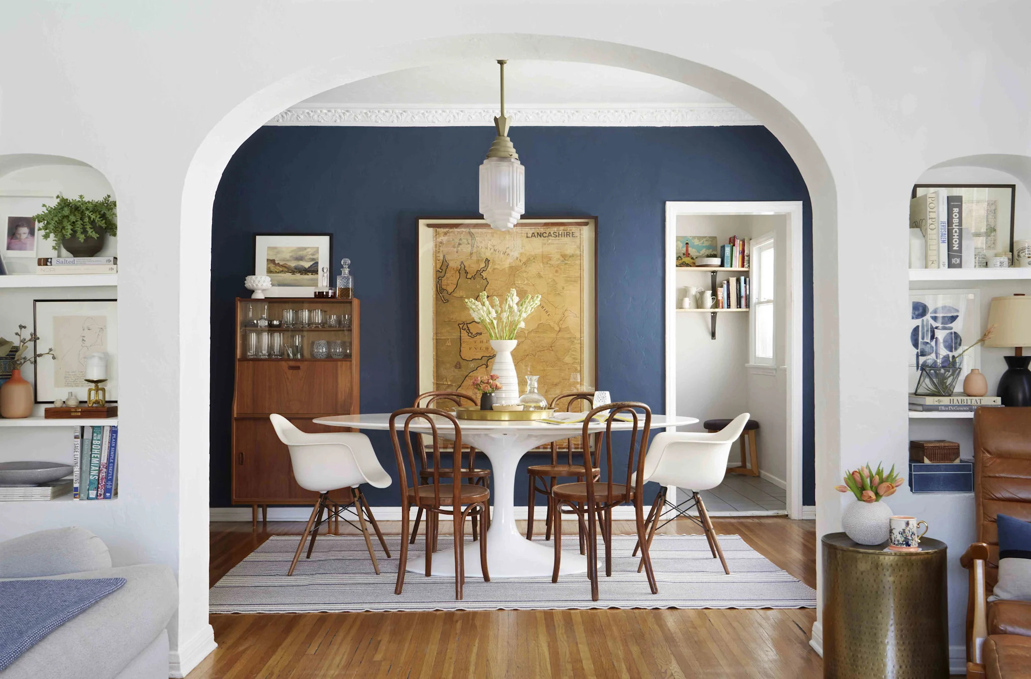
Selecting the right skirting board colour involves considering the existing wall tones. A general guideline suggests pairing darker-toned walls with darker skirting boards to achieve a modern and contemporary look, while lighter wall hues benefit from neutral or lighter skirting shades. Beyond mere aesthetics, the choice of skirting colour can strategically manipulate the perception of a room's height or draw attention to other architectural features. This approach offers an accessible way for anyone to engage with interior design, regardless of their comfort level with vibrant colours.
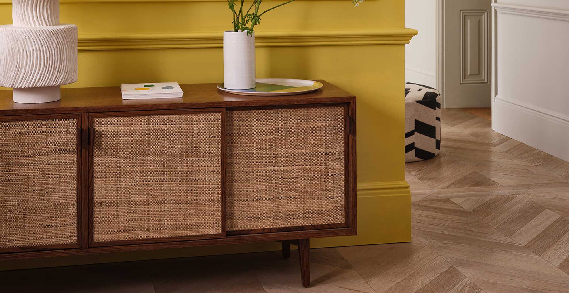
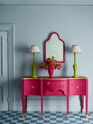
Design experts advocate for incorporating colour into skirting boards to add visual interest and define spaces. Mylands CEO, Dominic Myland, highlights them as grounding elements that enhance character. For those looking to inject flair, painting skirting boards in contrasting colours or even matching them with furniture can yield striking results. For instance, a forest green skirting board against a pink wall creates a harmonious and elegant combination, especially effective in rooms lacking historical features, according to paint expert Annie Sloan. This budget-friendly method can restore personality to spaces that might have been stripped of traditional details.
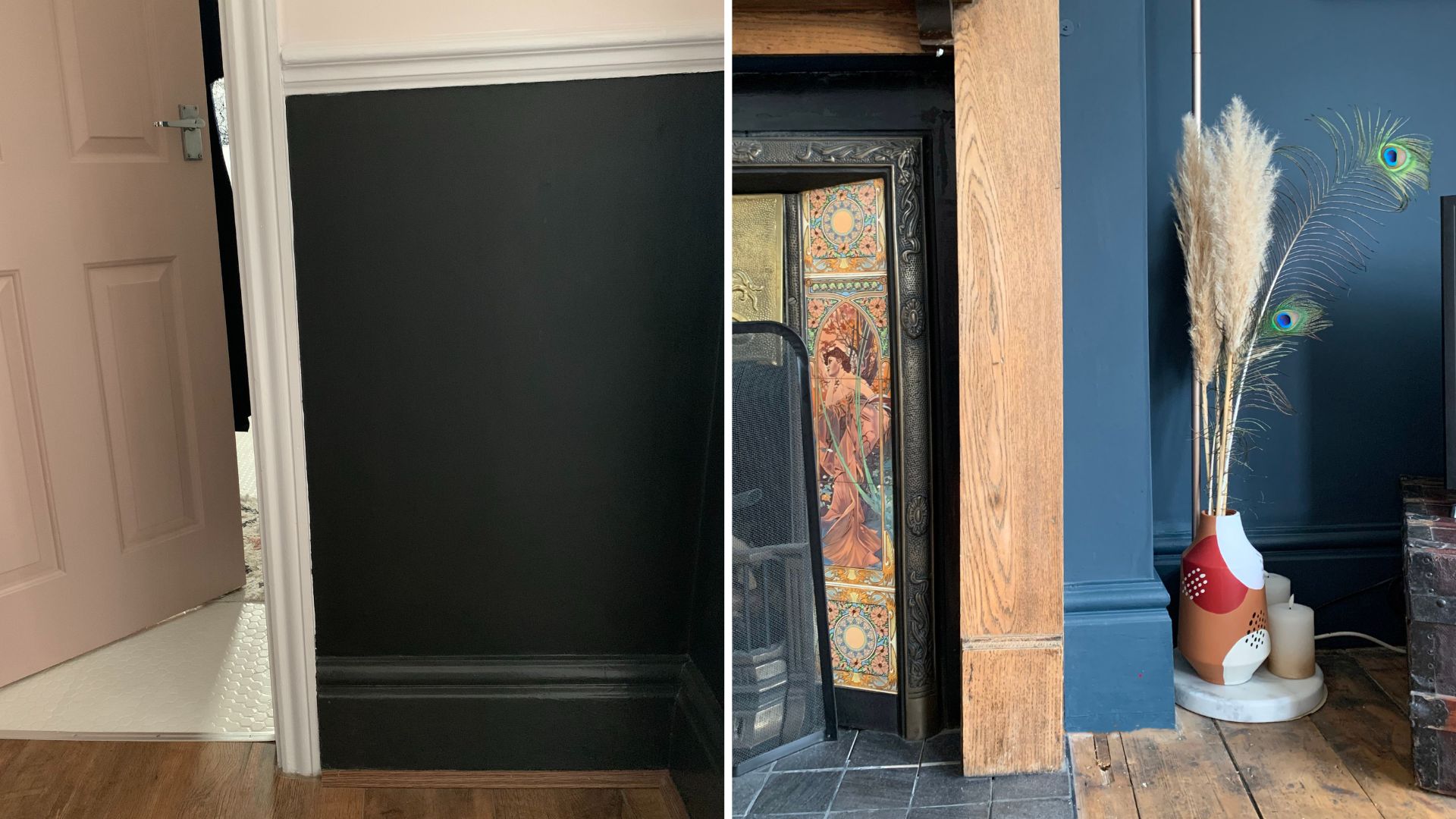
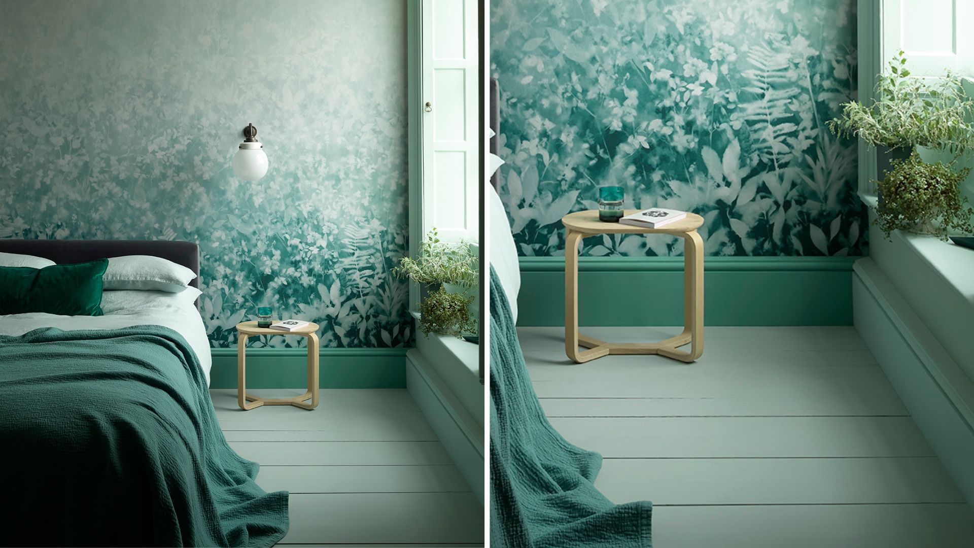
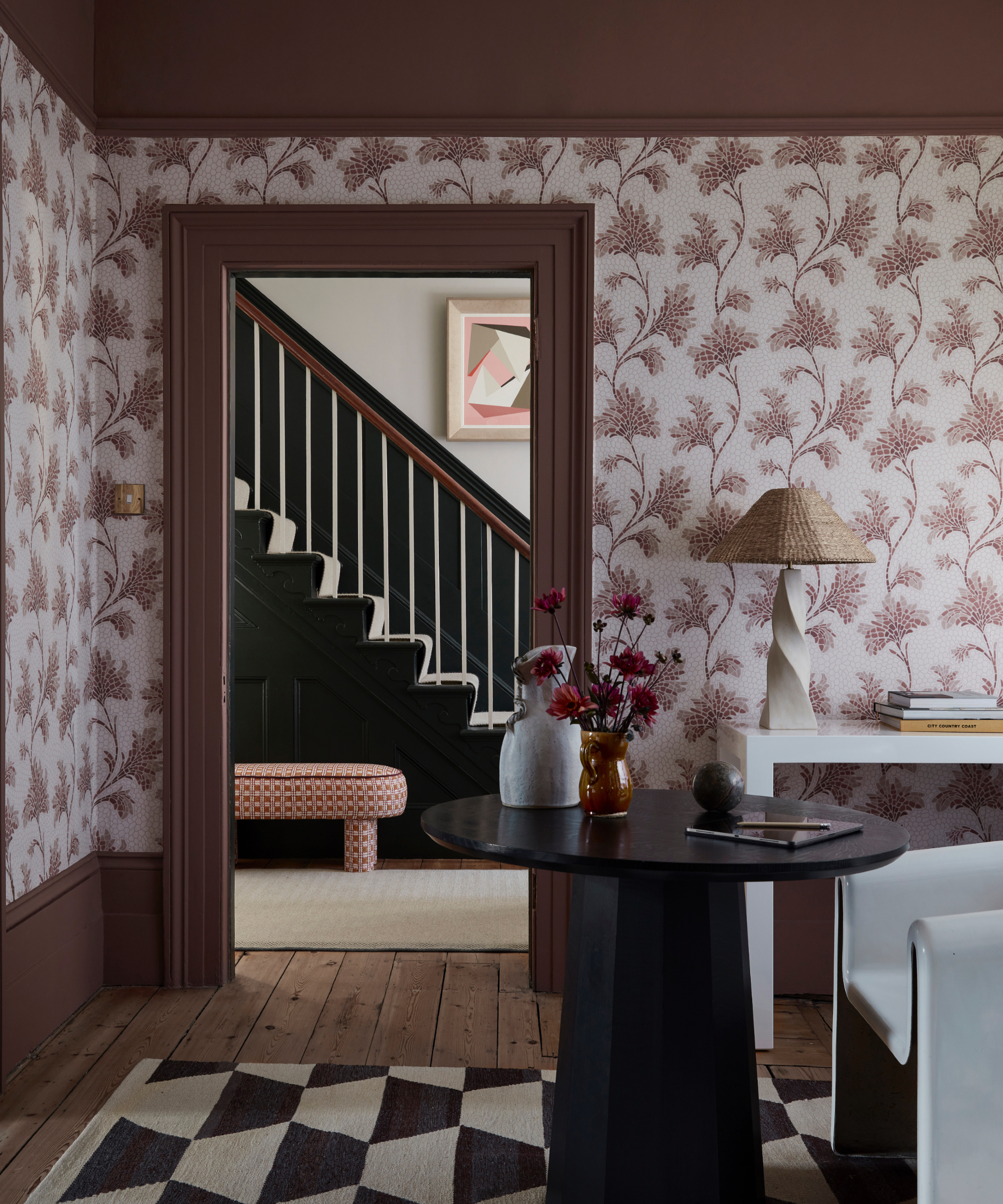
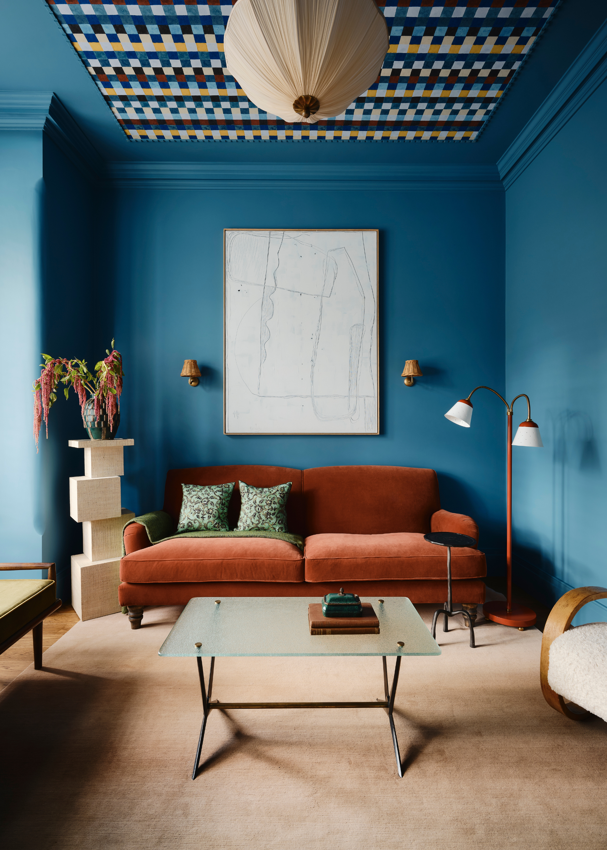
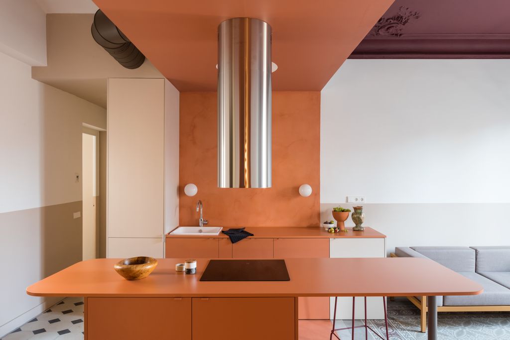
Colour drenching, where skirting, walls, ceilings, and window frames are unified in one colour, is presented as an ultimate statement look. Helen Shaw of Benjamin Moore explains that this technique, particularly with bold shades like Savannah Green, can make small spaces feel more expansive by blurring lines and edges, providing a rich backdrop for furnishings. Conversely, black or deep dark shades on skirting boards can introduce a dramatic element, complementing most colours and creating a striking contrast, especially against white walls. Punam Chada of Carpetright suggests extending this dark shade to picture rails for a balanced, cohesive look, using accessories to tie the scheme together.
In period properties or spaces with limited natural light, blending skirting colours with wall shades creates a seamless effect. Patrick O'Donnell of Farrow & Ball notes that using the same shade as the walls allows woodwork to recede, offering a modern touch that works in various settings. Another innovative approach involves matching skirting colours to prominent furniture pieces, such as a blue sofa in a blue-painted room. Patricia Gibbons from Sofa.com explains that this creates harmony, elongates the room, and gives the illusion of higher ceilings and more space, with accessories layering in complementary tones and textures.
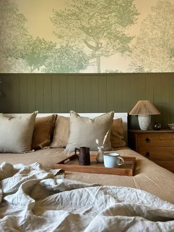
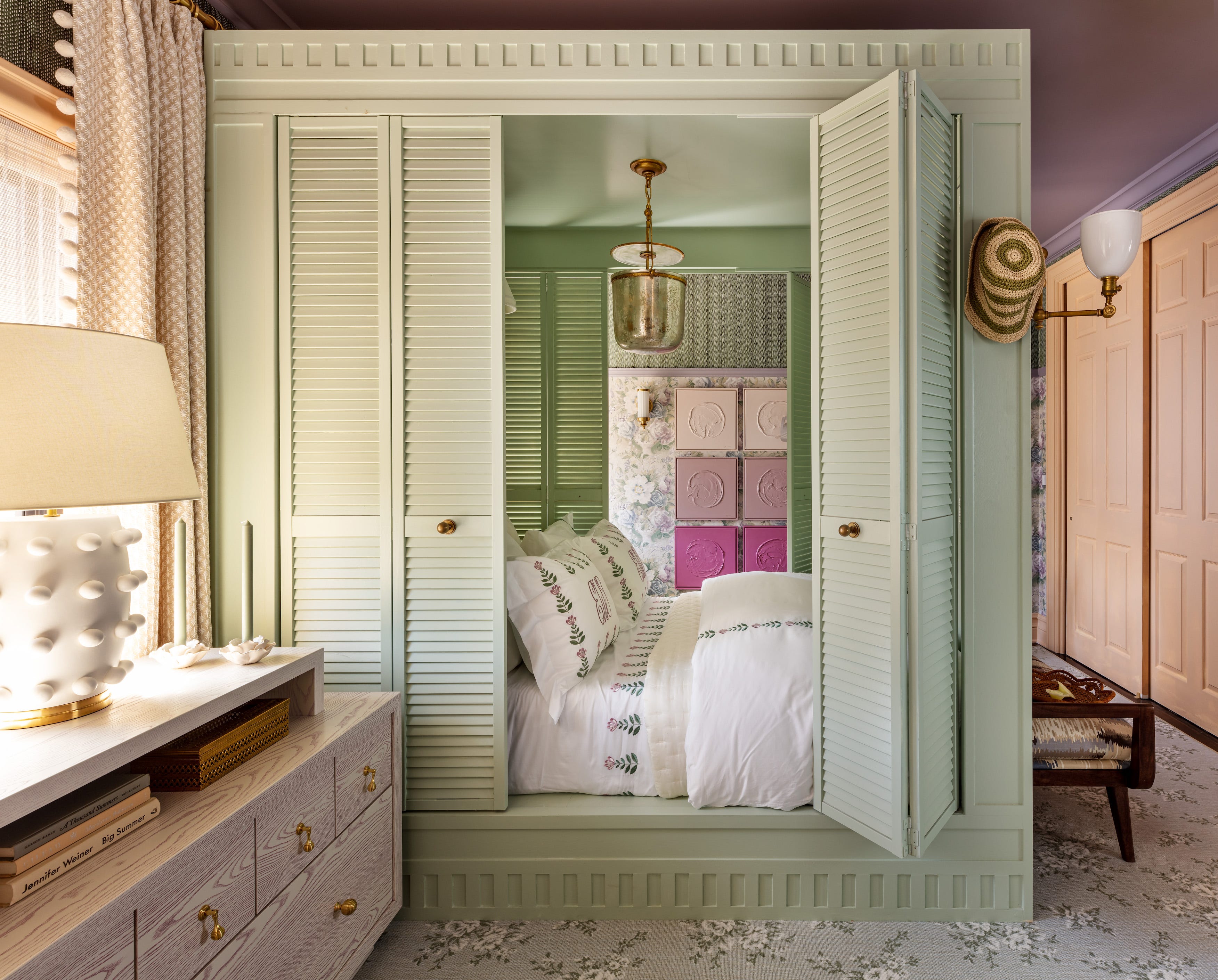
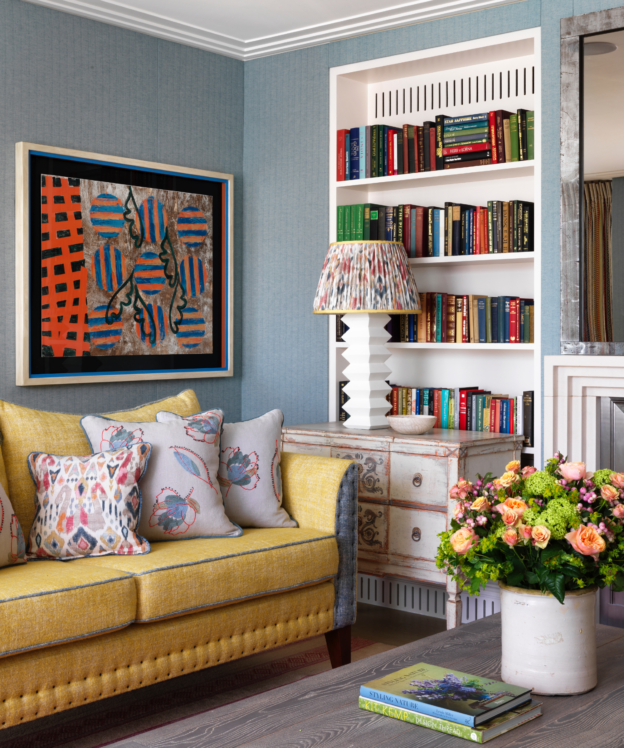
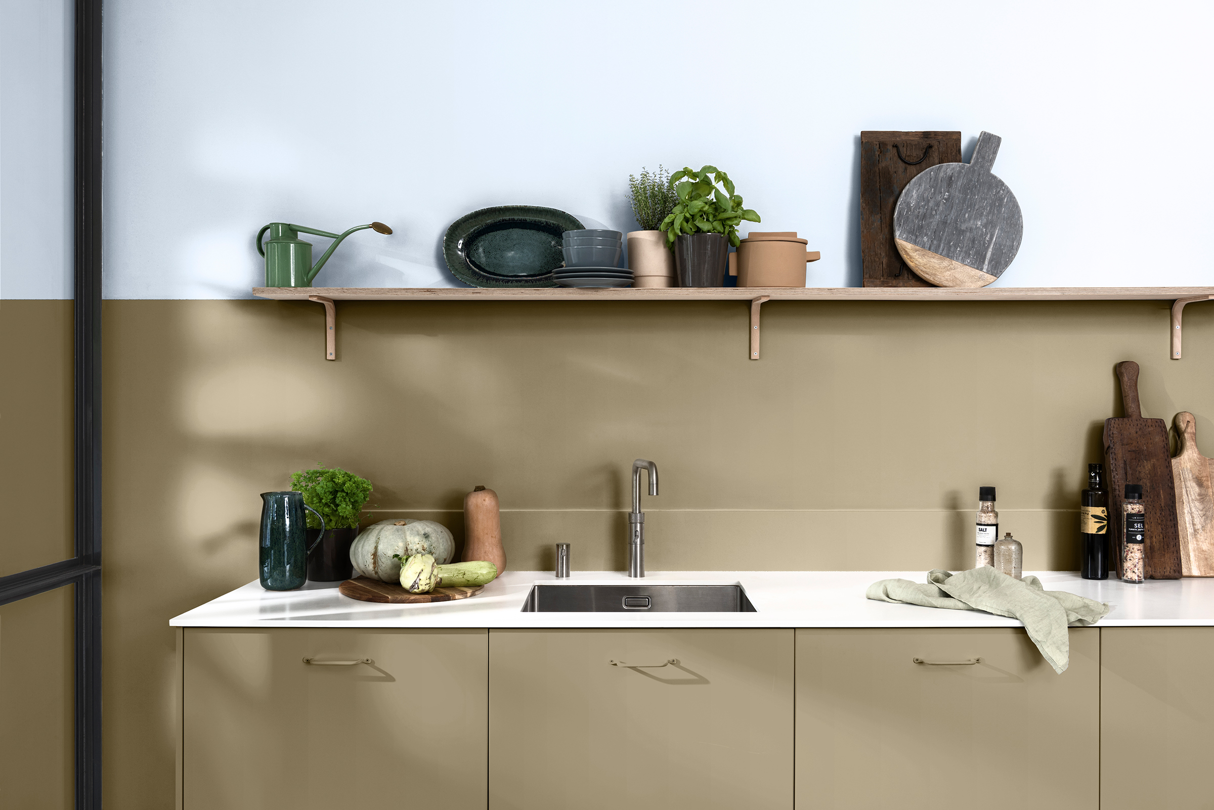

Skirting boards can also serve as a visual bridge between different colours within a room. James Sirett of Fired Earth illustrates how a pale green skirting with reddish undertones can harmonise a pink and green room, creating a seamless flow from walls to flooring. For rooms featuring wallpaper or murals, selecting a shade from the design for the skirting board can frame the artwork and create an enveloping, intimate atmosphere, as suggested by Ruth Mottershead of Little Greene. Darker colours like deep red or purple, applied to skirting boards and chair rails, can also trick the eye to make low ceilings appear higher and link various colours within the scheme without overwhelming the space, according to Dominic Myland.
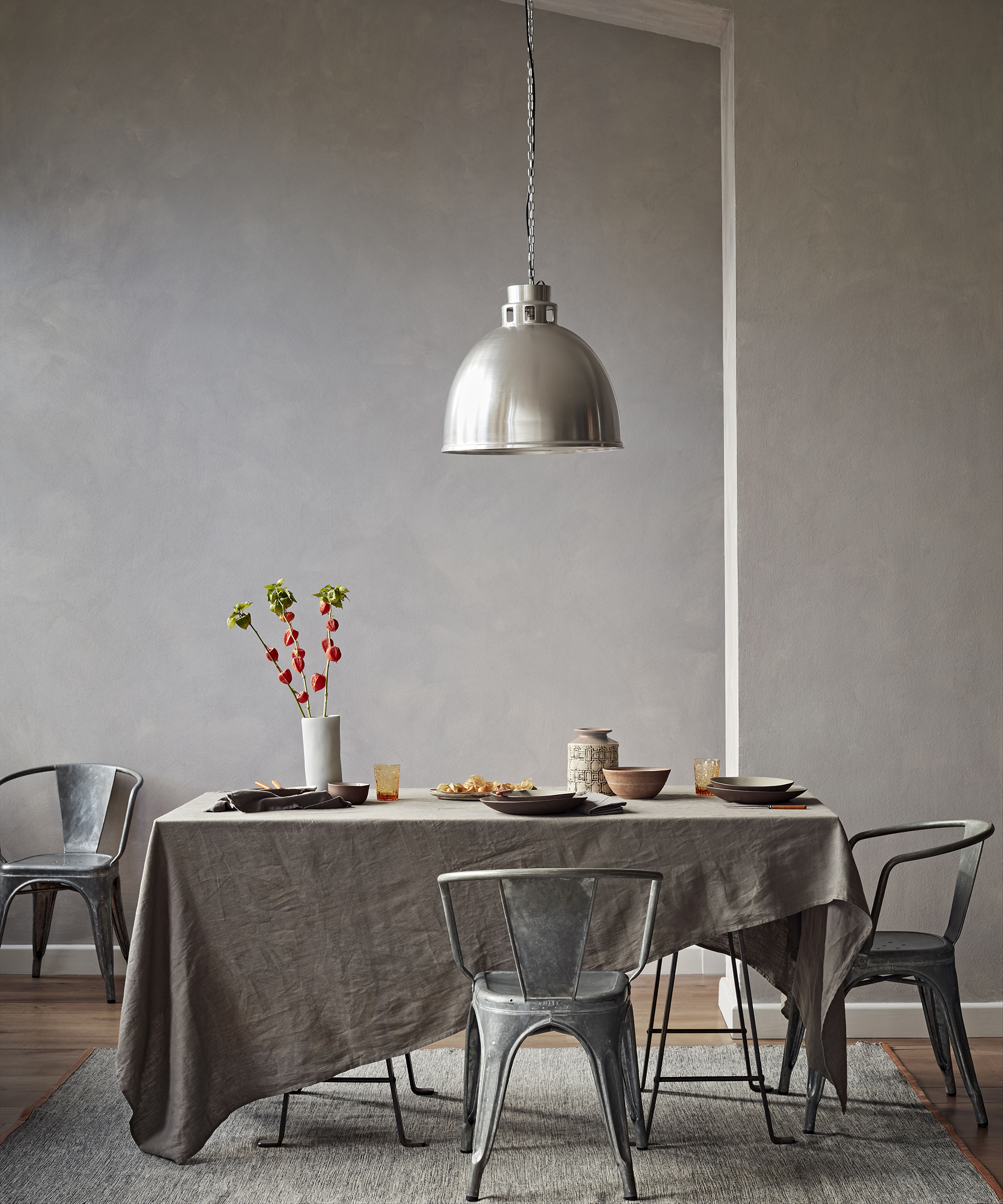
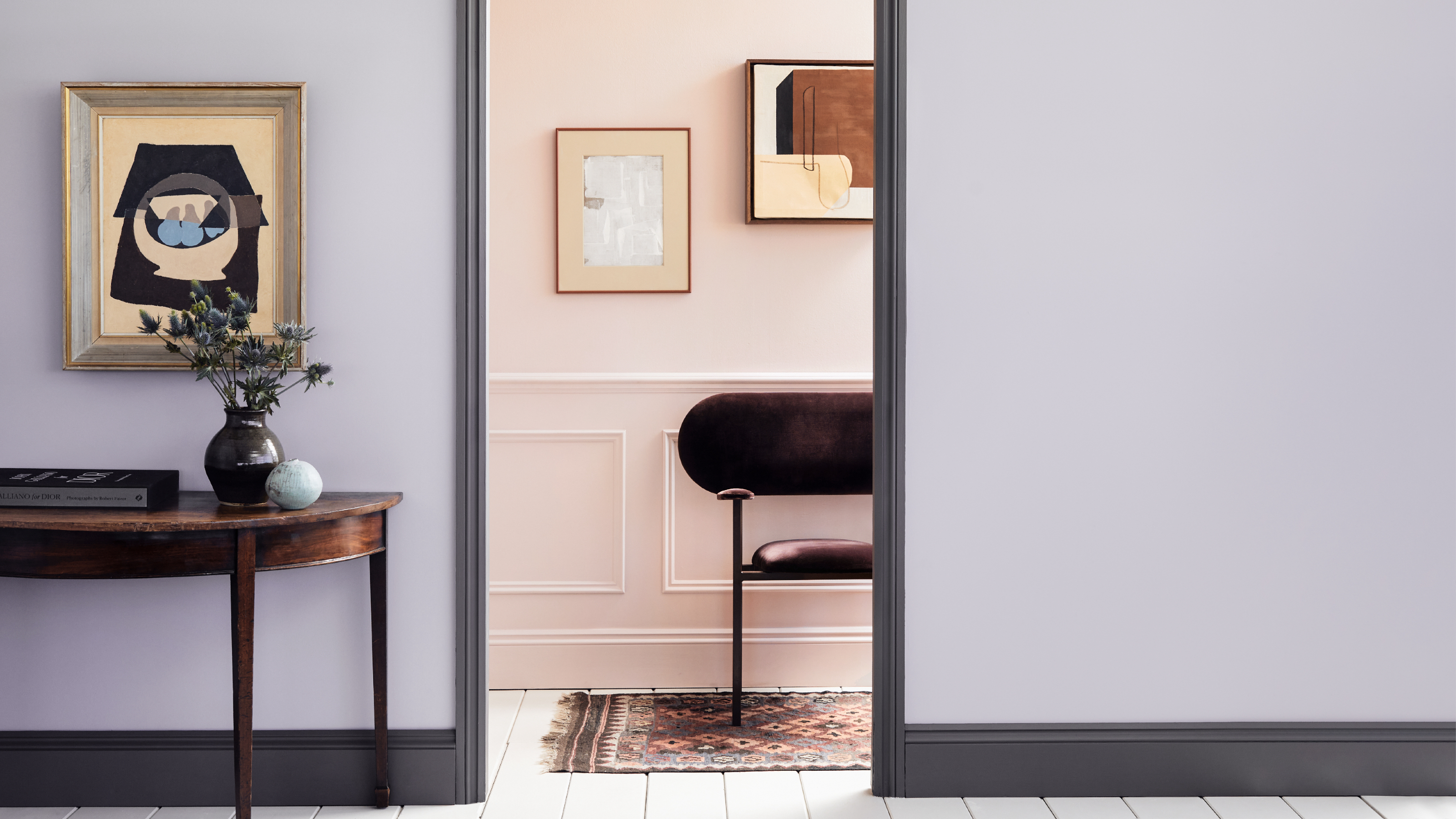
Dark grey skirting boards can highlight architectural features, particularly when paired with pale greys or lavenders, and offer an illusion of space similar to white but with added warmth. For deeper skirting boards, common in period homes, choosing an unusual colour like deep violet can create a significant impact when contrasted with pale walls, adding personality without overpowering the room. Marianne Shillingford of Dulux highlights that painting skirting boards adds colour without overwhelming the space, frames it beautifully, and conceals wear and tear more effectively than traditional white.
While white remains the most popular choice for its ability to frame a room and provide a fresh contrast, experts encourage experimentation. The freedom to choose any colour, or even reverse traditional colour schemes, allows homeowners to truly personalise their interiors. The key is to select a leading tone and use accessories to add balance and depth, making the skirting board an intentional design element rather than a default white border.
#SkirtingBoard #ColourIdeas #HomeDecor #InteriorDesign #PaintIdeas #ColourDrenching #WallDecor #HomeRenovation #RoomTransformation #SkirtingBoard #ColourIdeas #HomeDecor #InteriorDesign #PaintIdeas #ColourDrenching #WallDecor #HomeRenovation #RoomTransformation
0 comment in total
 No comments yet
You may also like
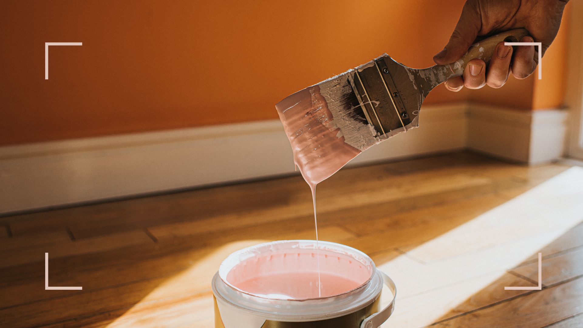
This is the colour you should paint skirting boards instead of 'uninspired' white, according to experts

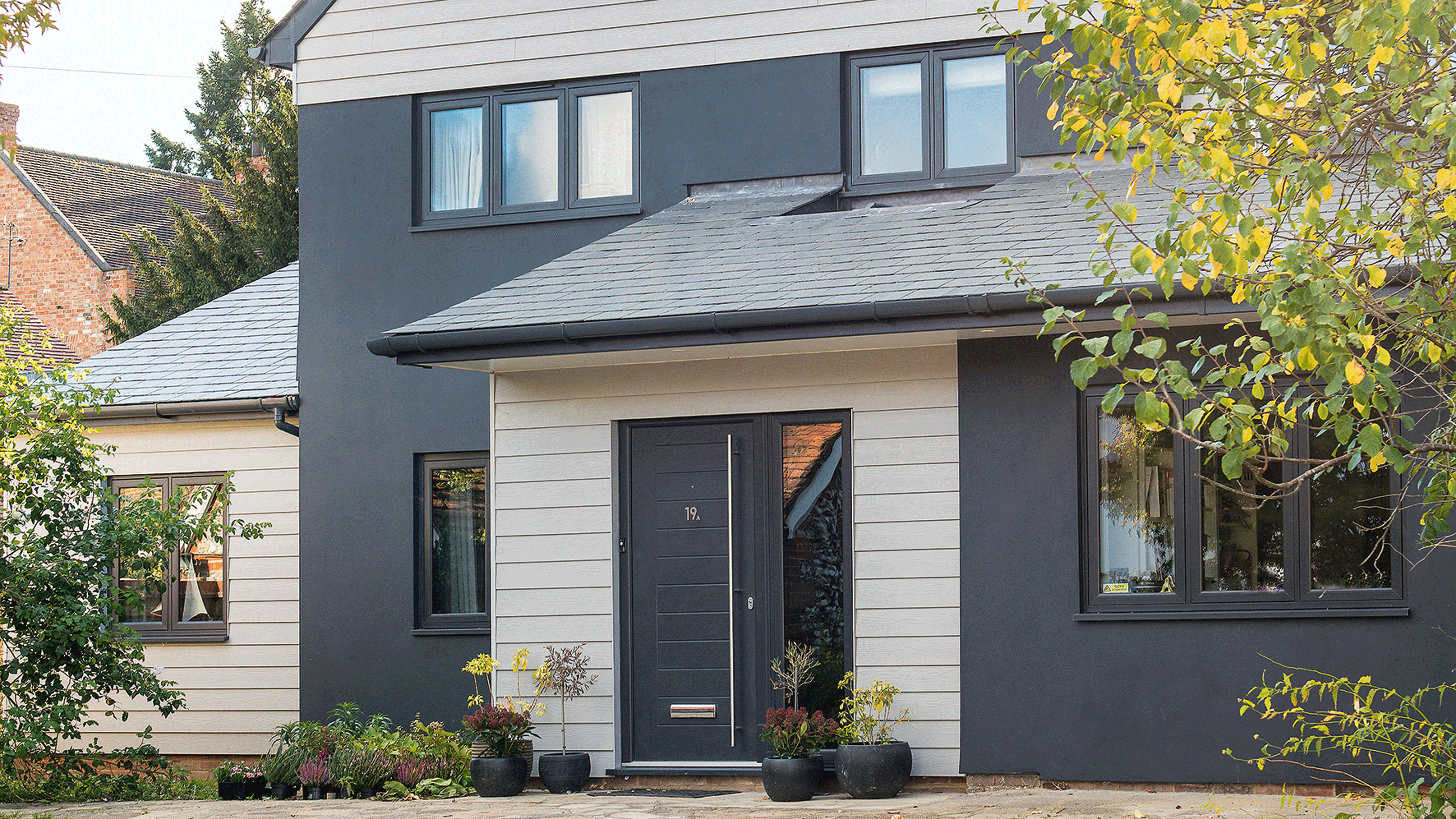
11 house exterior colour ideas - boost your kerb appeal with paint, cladding and tiles
10 Spaces Designed With Colorful Tiles

10 Color Drenching Ideas That Highlight the Beauty of This Paint Trend
Smart decking colour ideas - from pale patinas to dark and daring shades

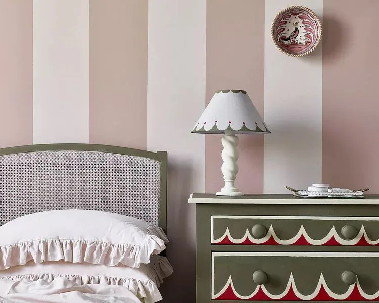
12 Chalk Paint Colors That Will Transform Your Furniture, Walls, and More

An interior expert reveals the one thing you should never do when painting your walls

6 key colors to decorate with in May 2025, according to interior design and color experts in the know

9 Color Blocking Ideas for a Bright, Cheery Home

10 Accent Wall Paint Colors That Will Freshen Up Any Space, According to Designers
These Beautiful Paint Colors Will Make You Want to Switch Up Your Bedroom Right Now

Colors That Go With Blue — 16 Pairings Designers Depend on for Bold, Breezy, and Perfectly Balanced Palettes

Take a Leap into Bold Color with These Decorating Ideas

10 homes that feature colour blocking
10 beautiful transitional color schemes for every room in the house
10 fall color schemes that aren't all about orange


Skirting Boards

How to decorate with yellow – 10 of the best ideas
Is the checkerboard trend over? The designers re-inventing this classic pattern don't think so
18 Stunning Striped Wall Ideas That Put Solid Colors to Shame