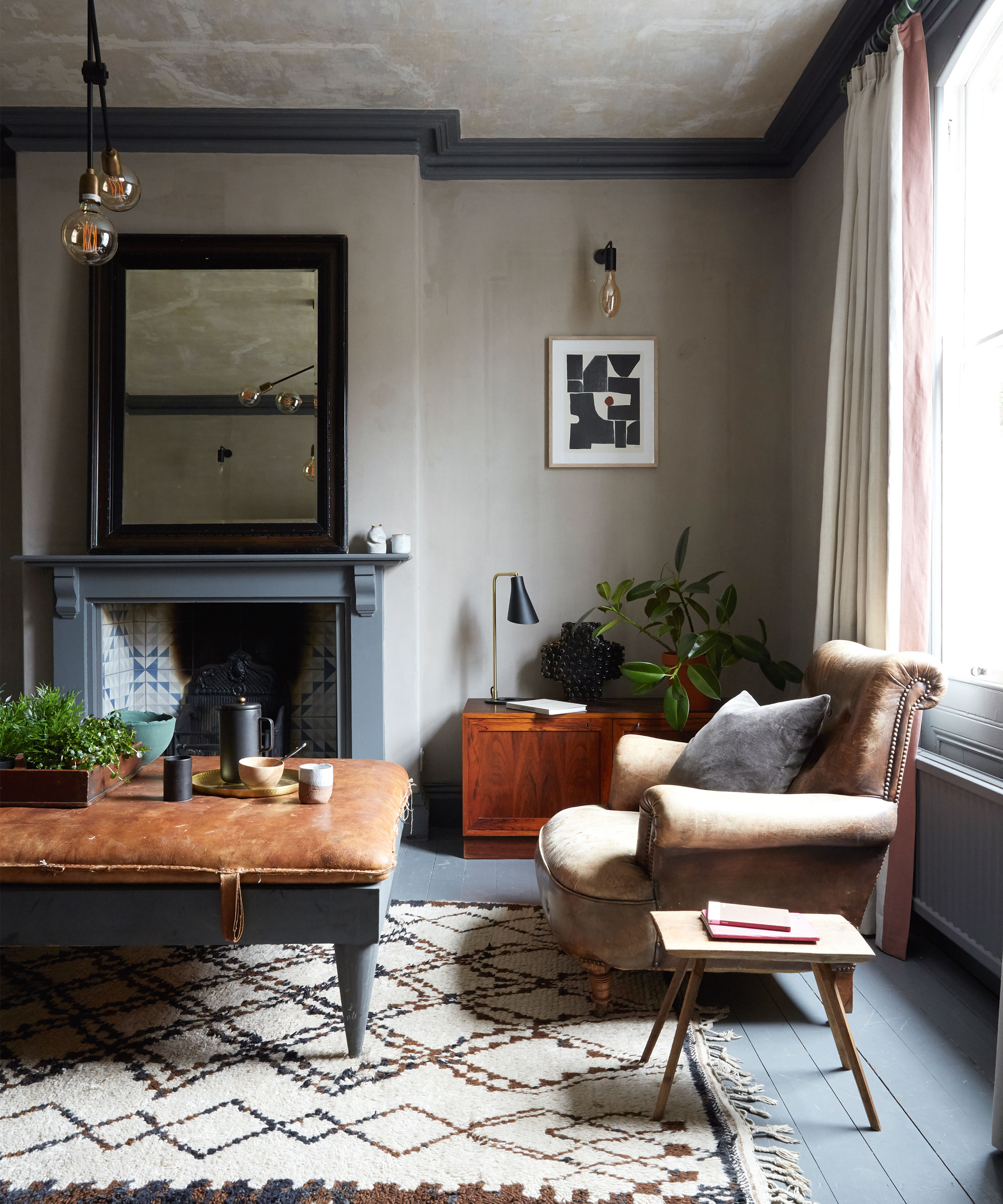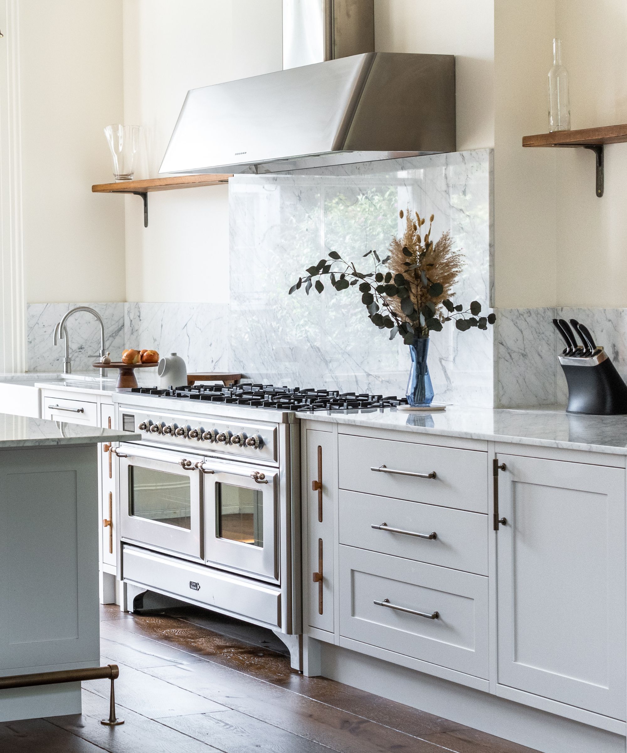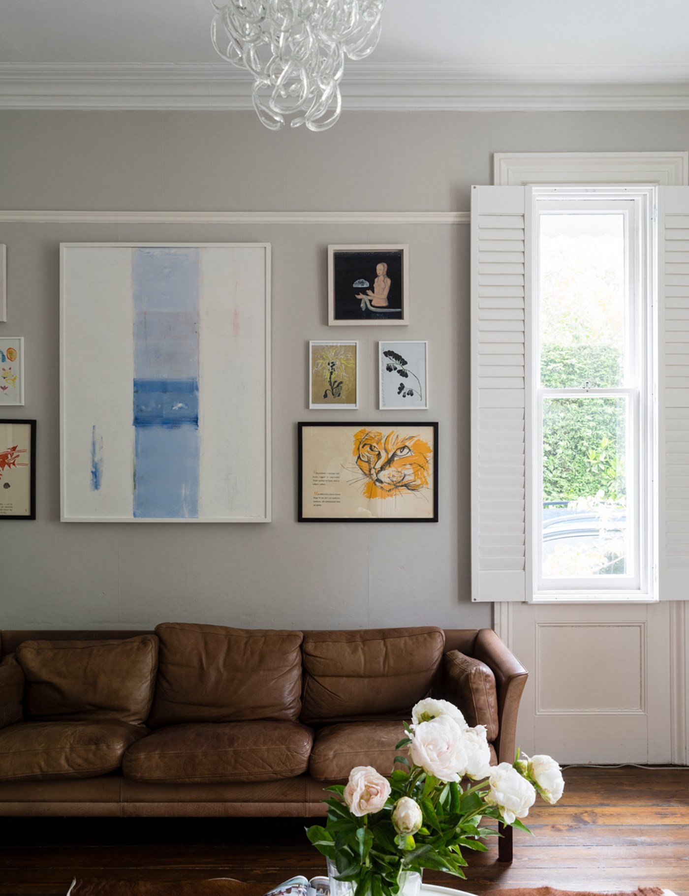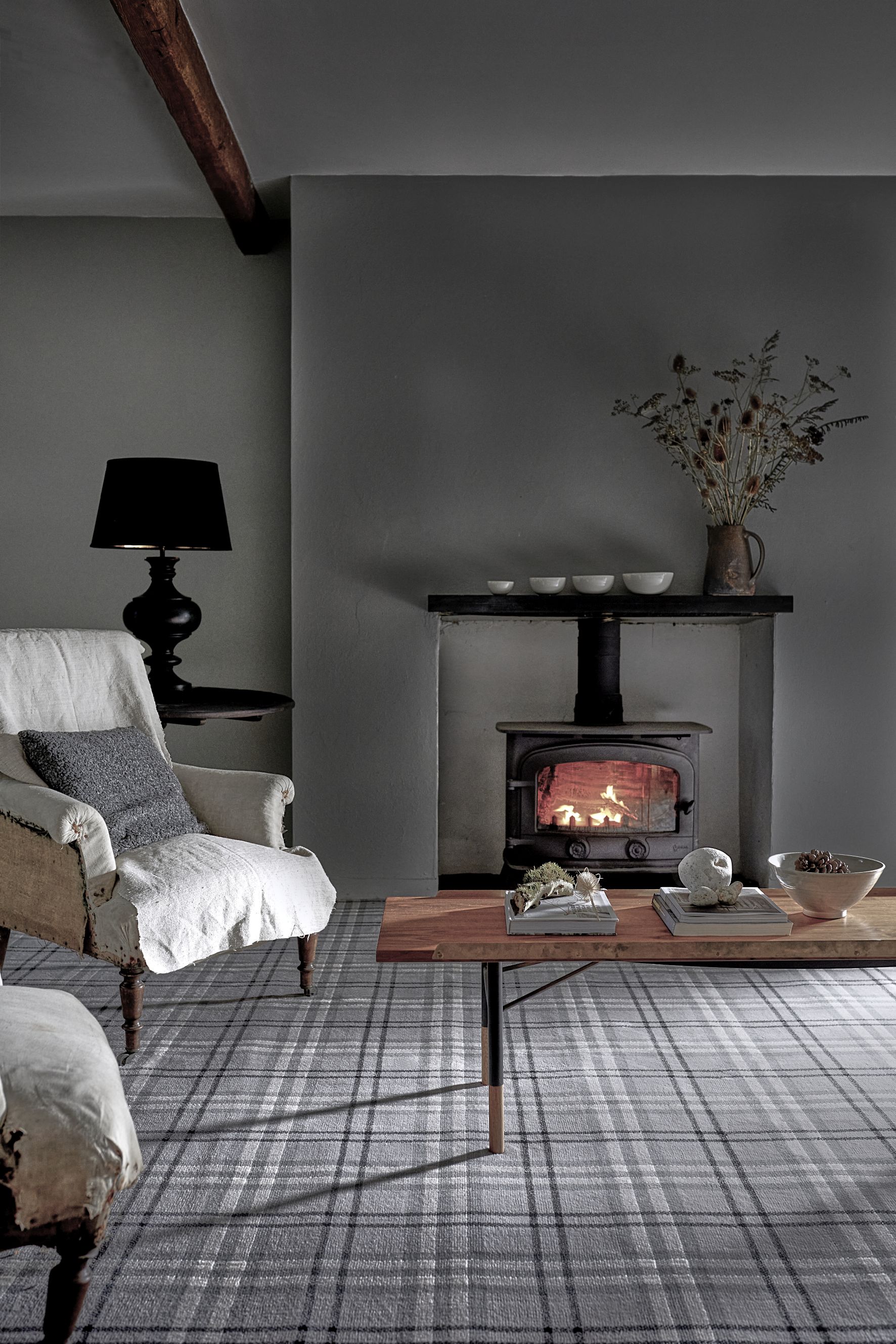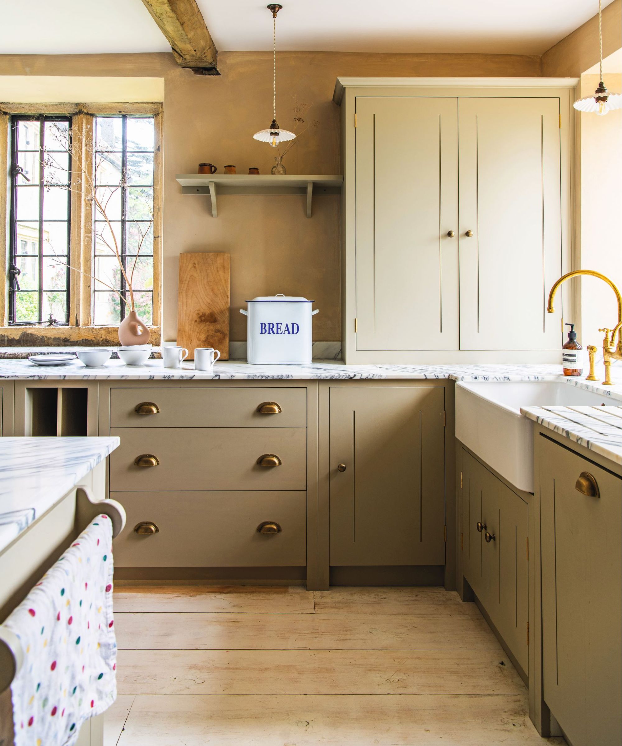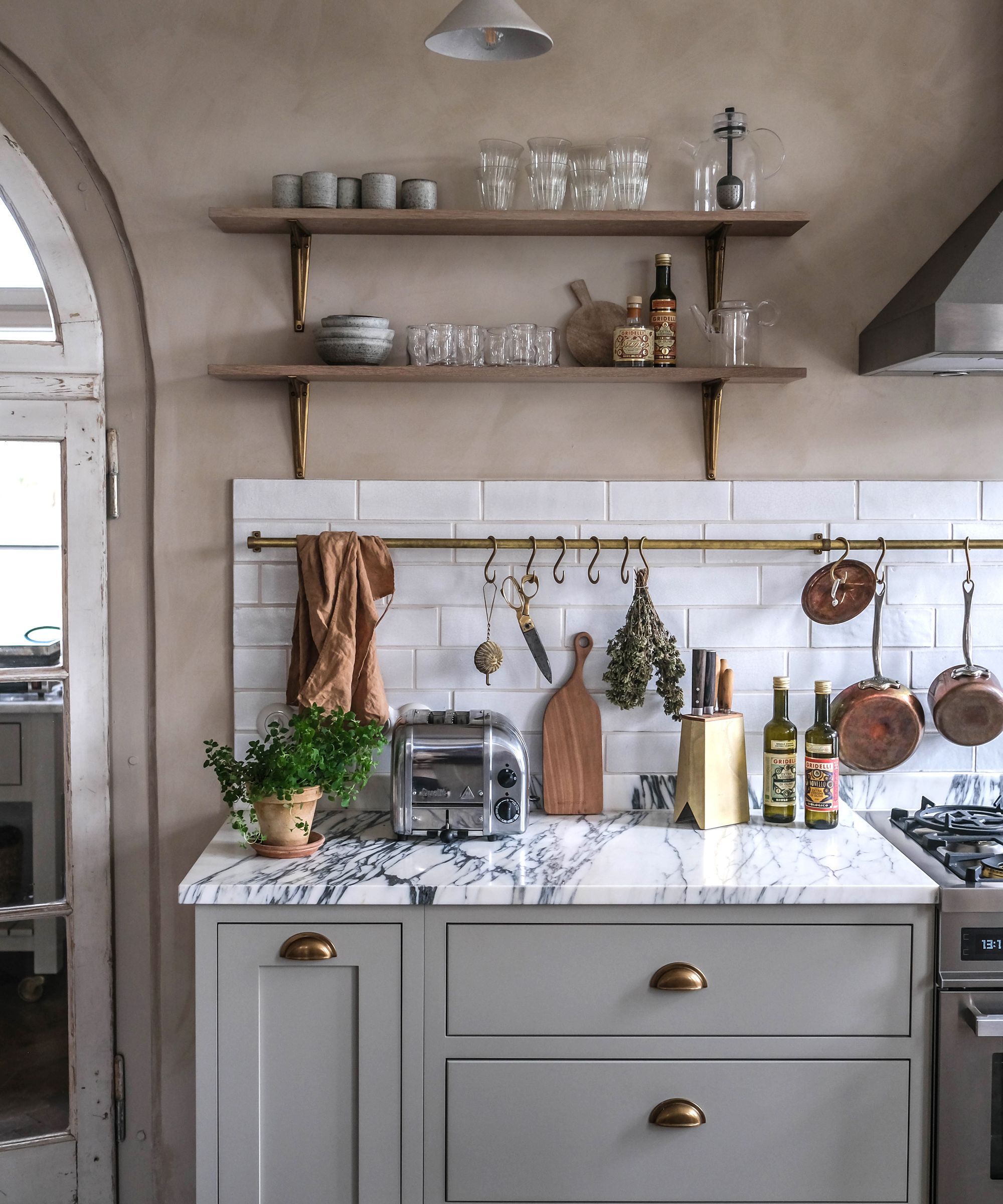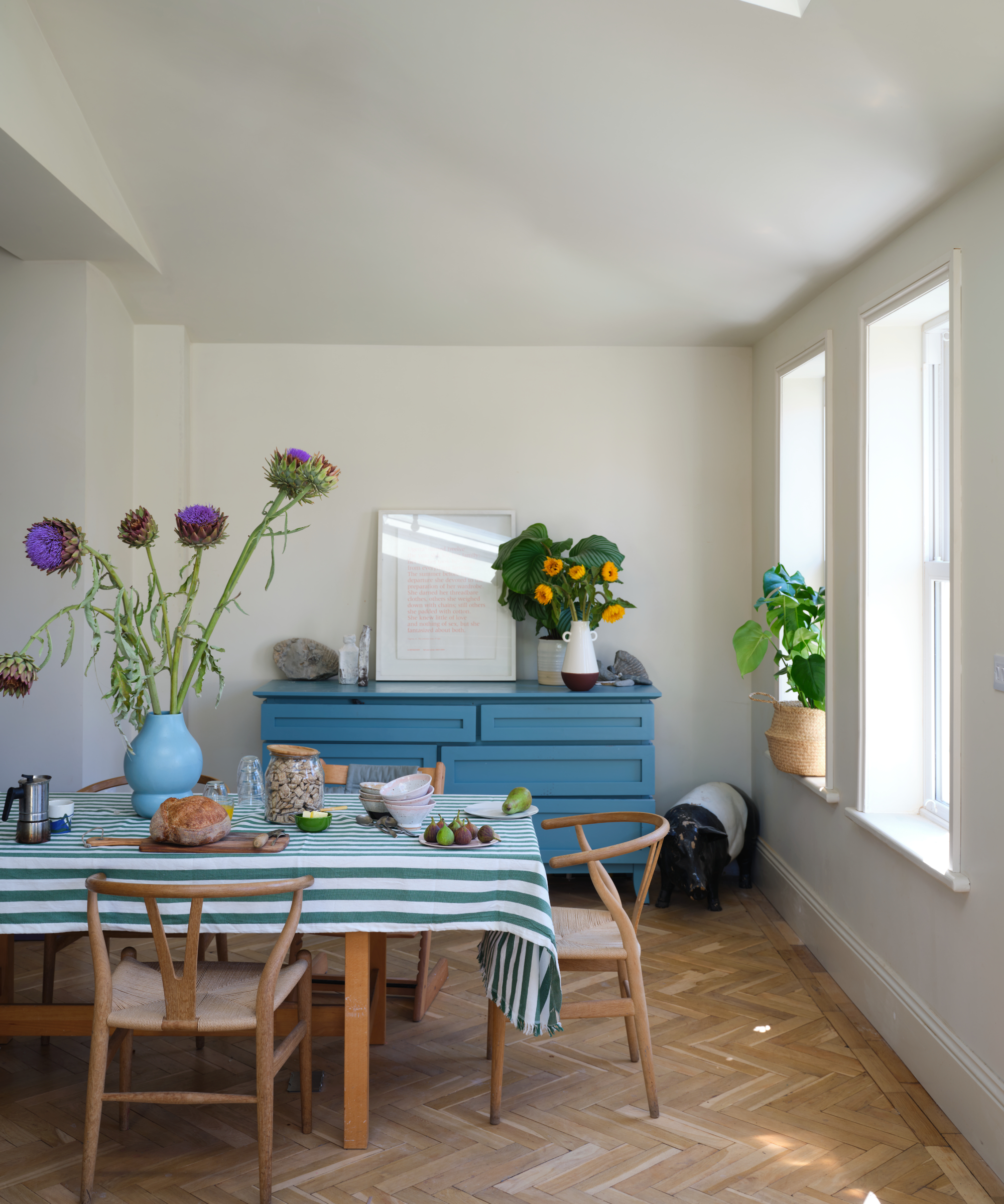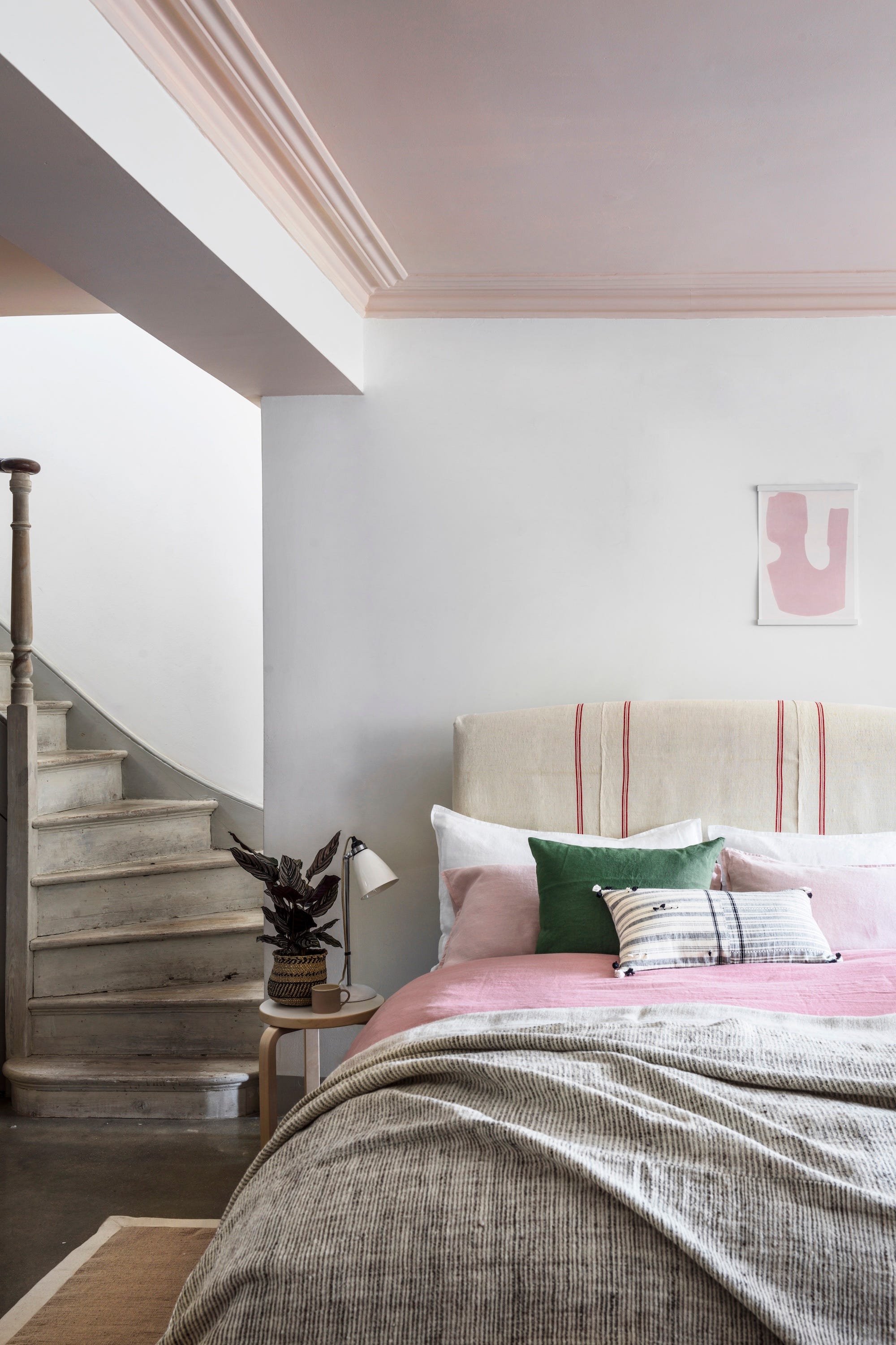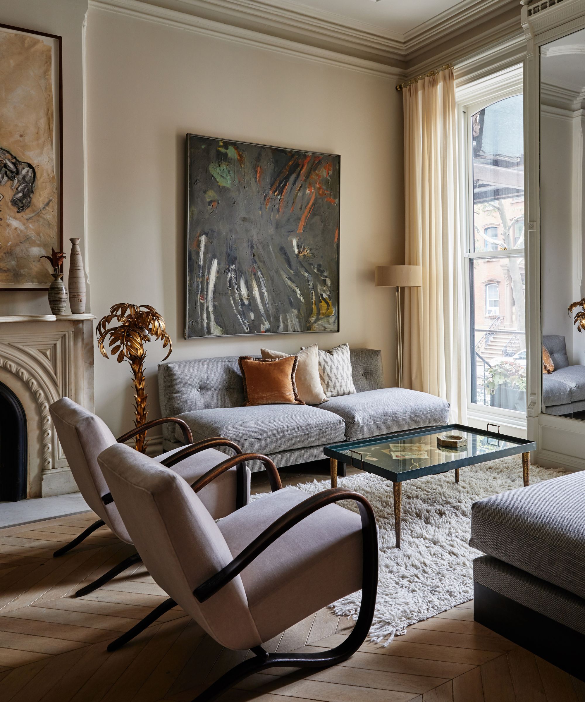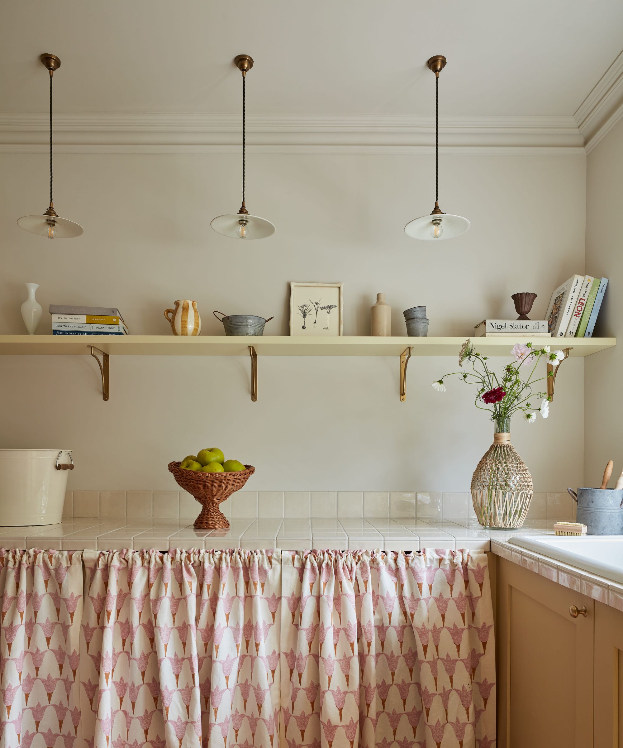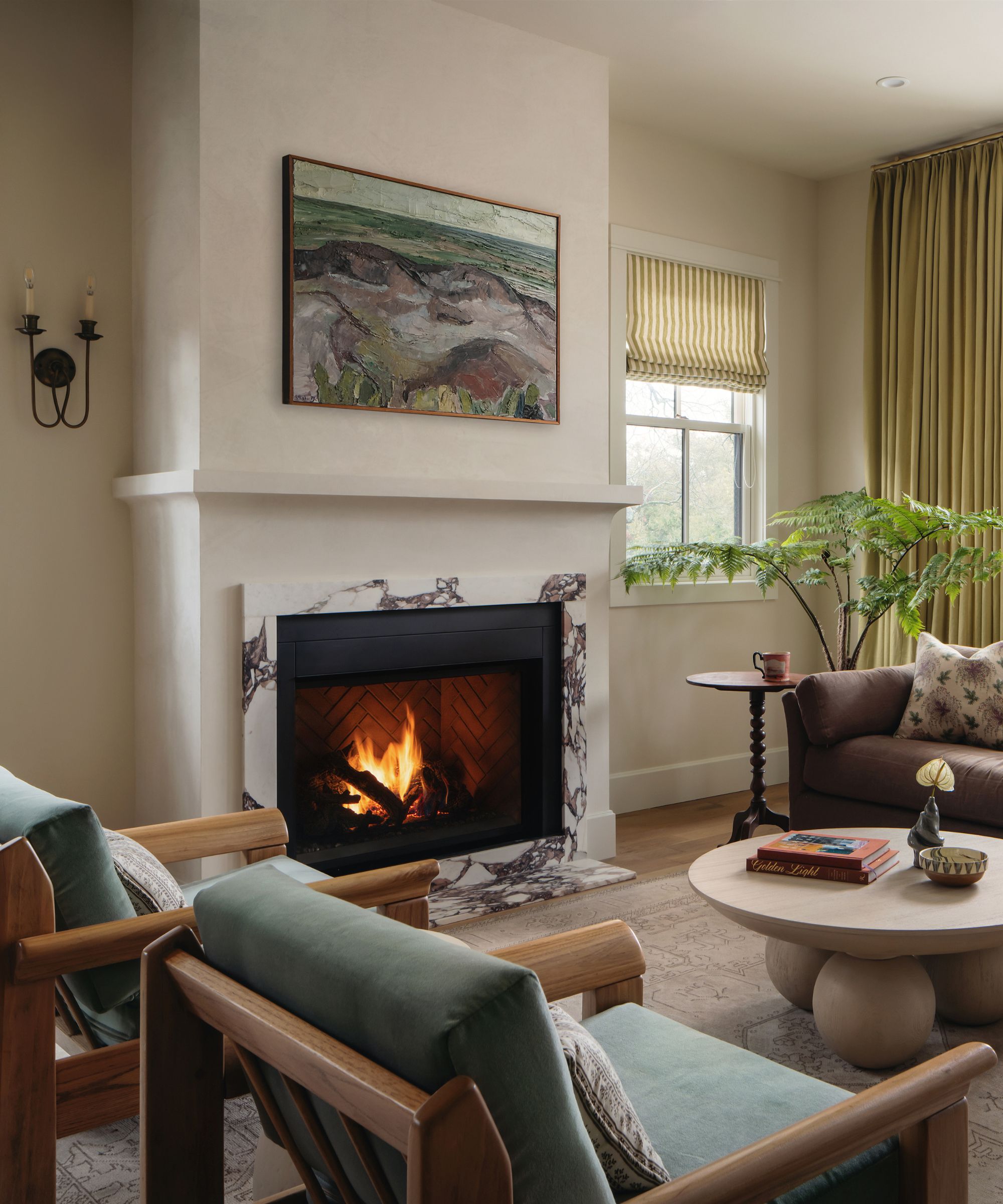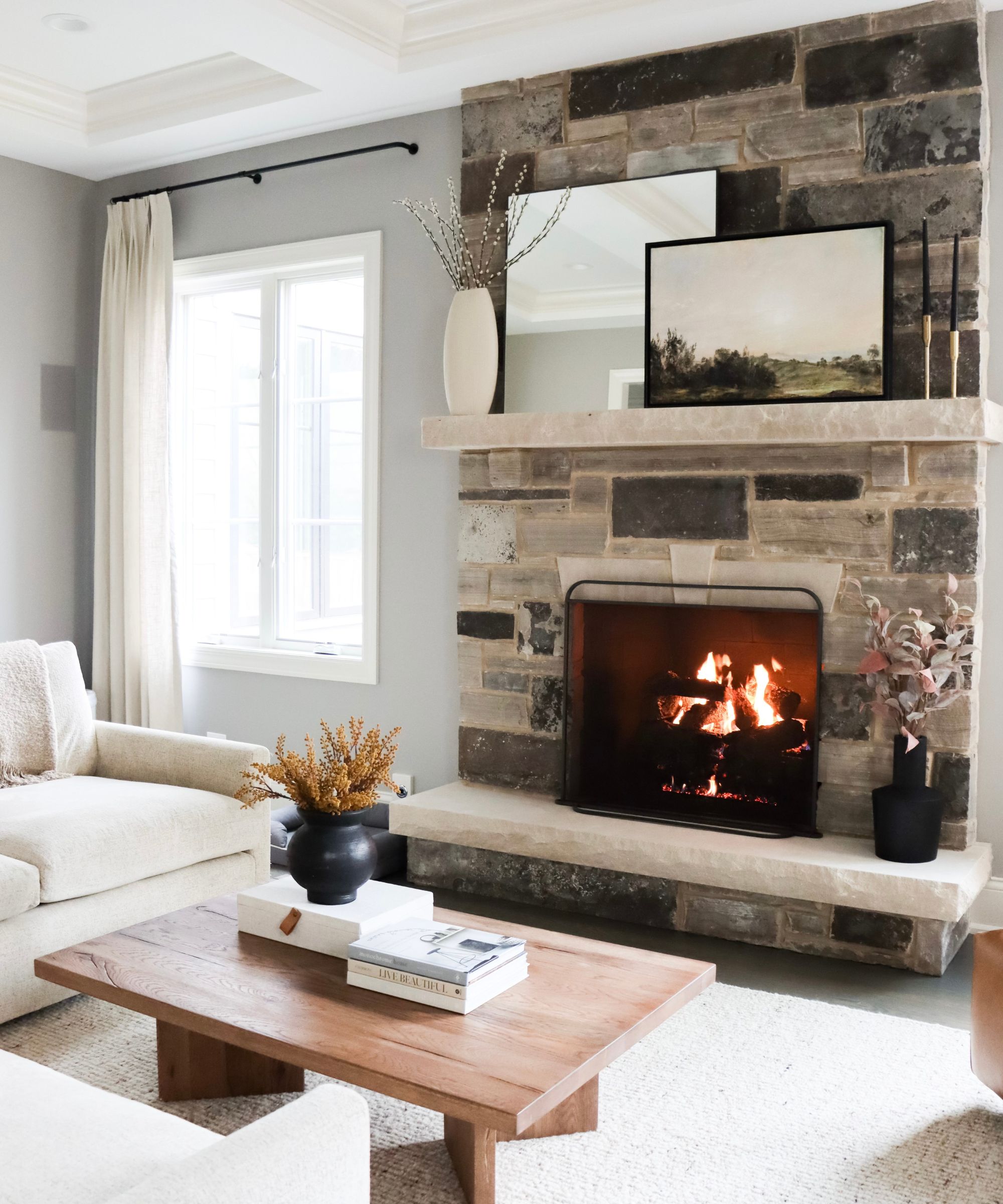
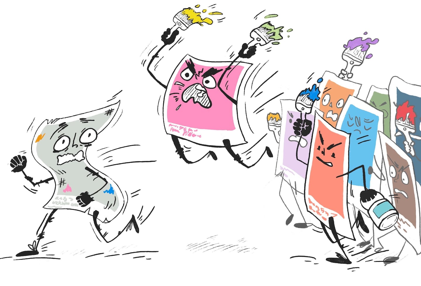
The interior-design world has turned on gray. What finally killed the color?
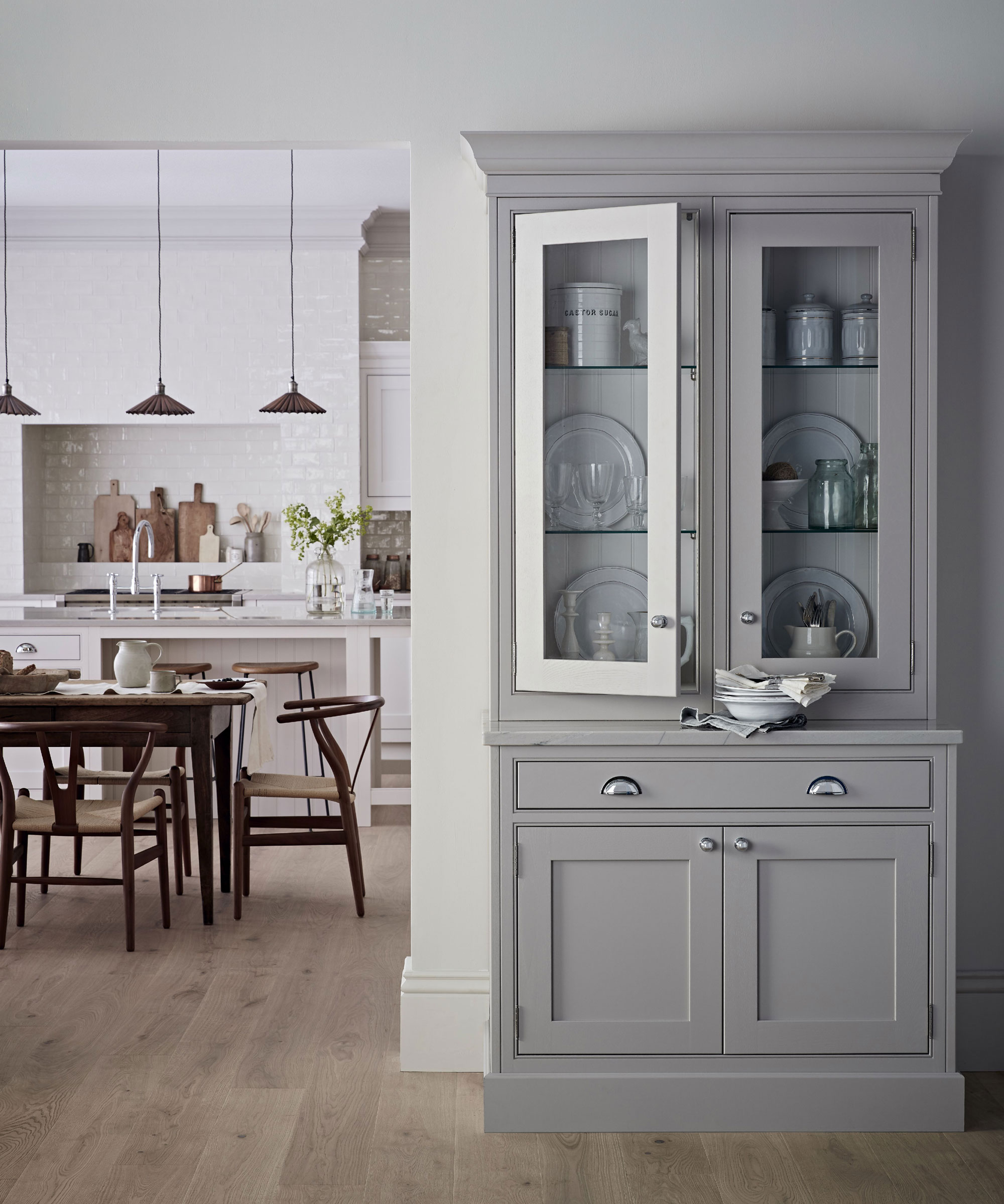
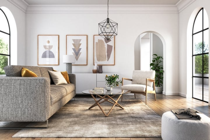
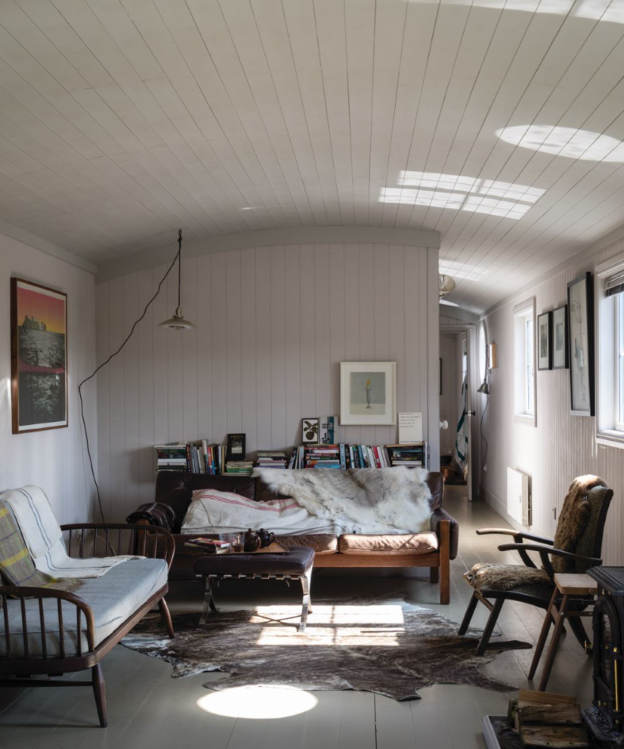
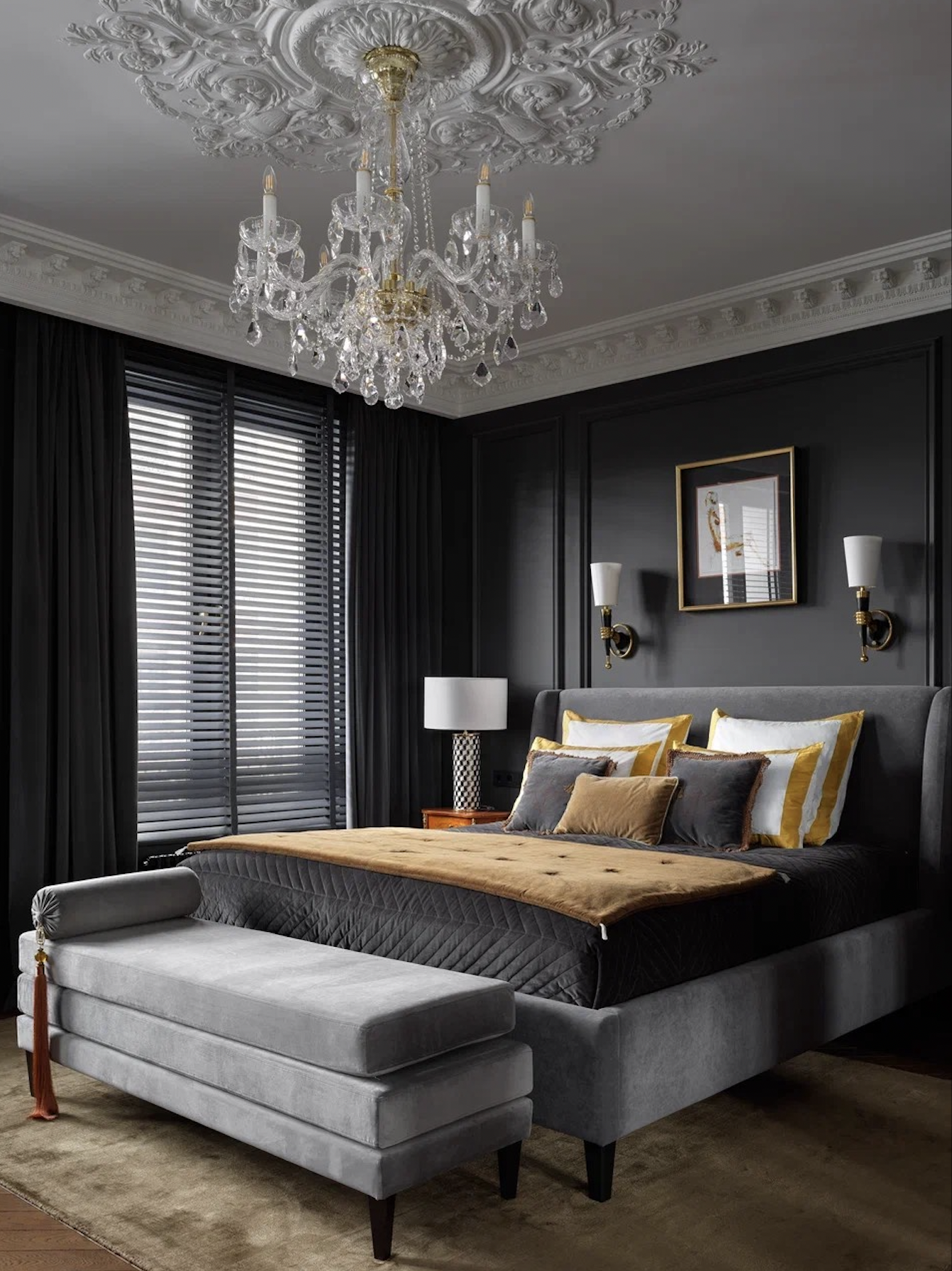
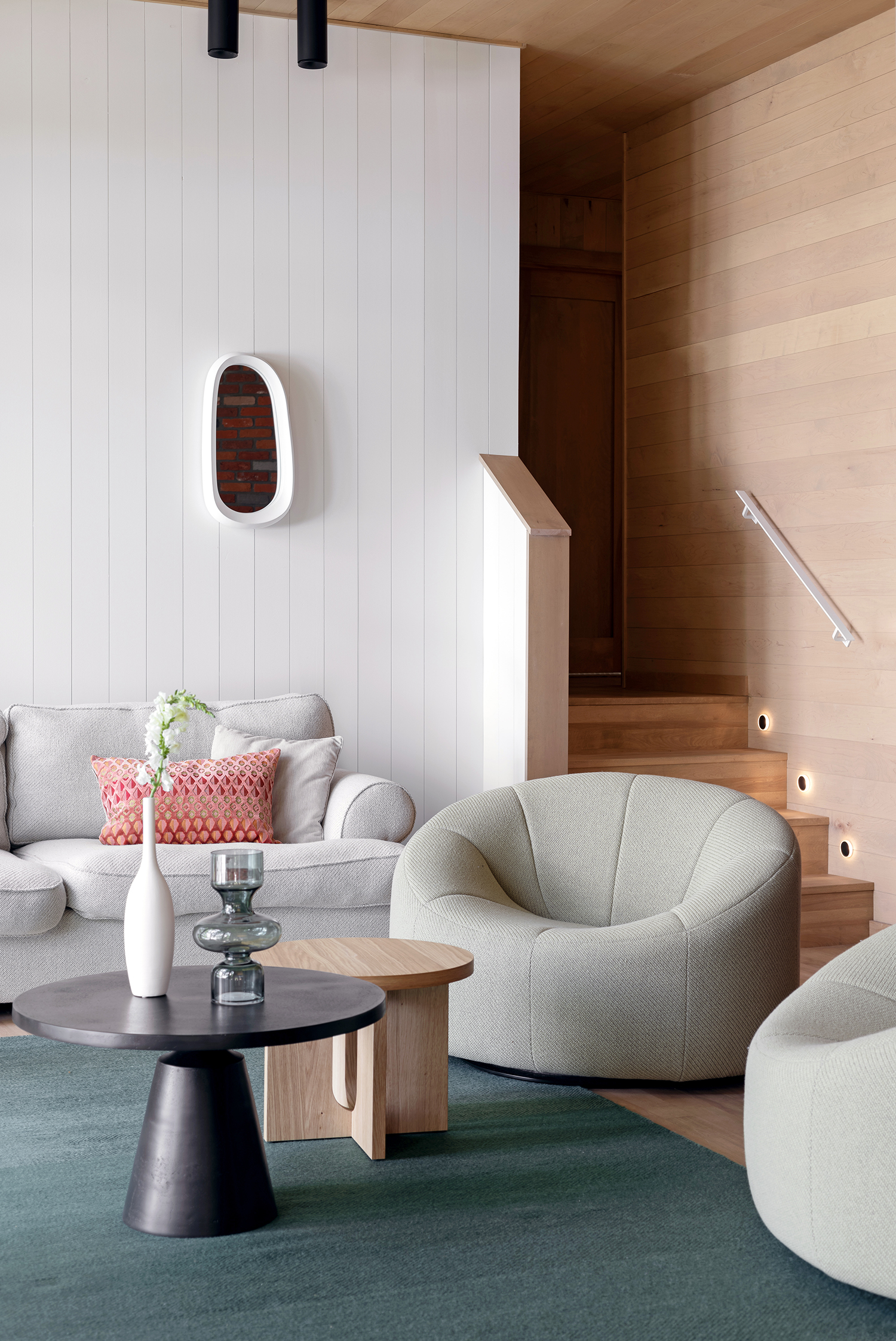
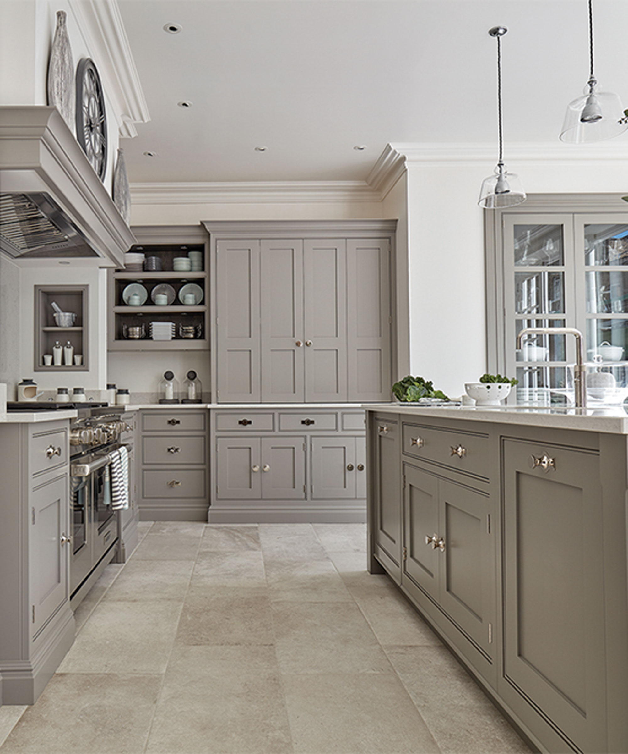
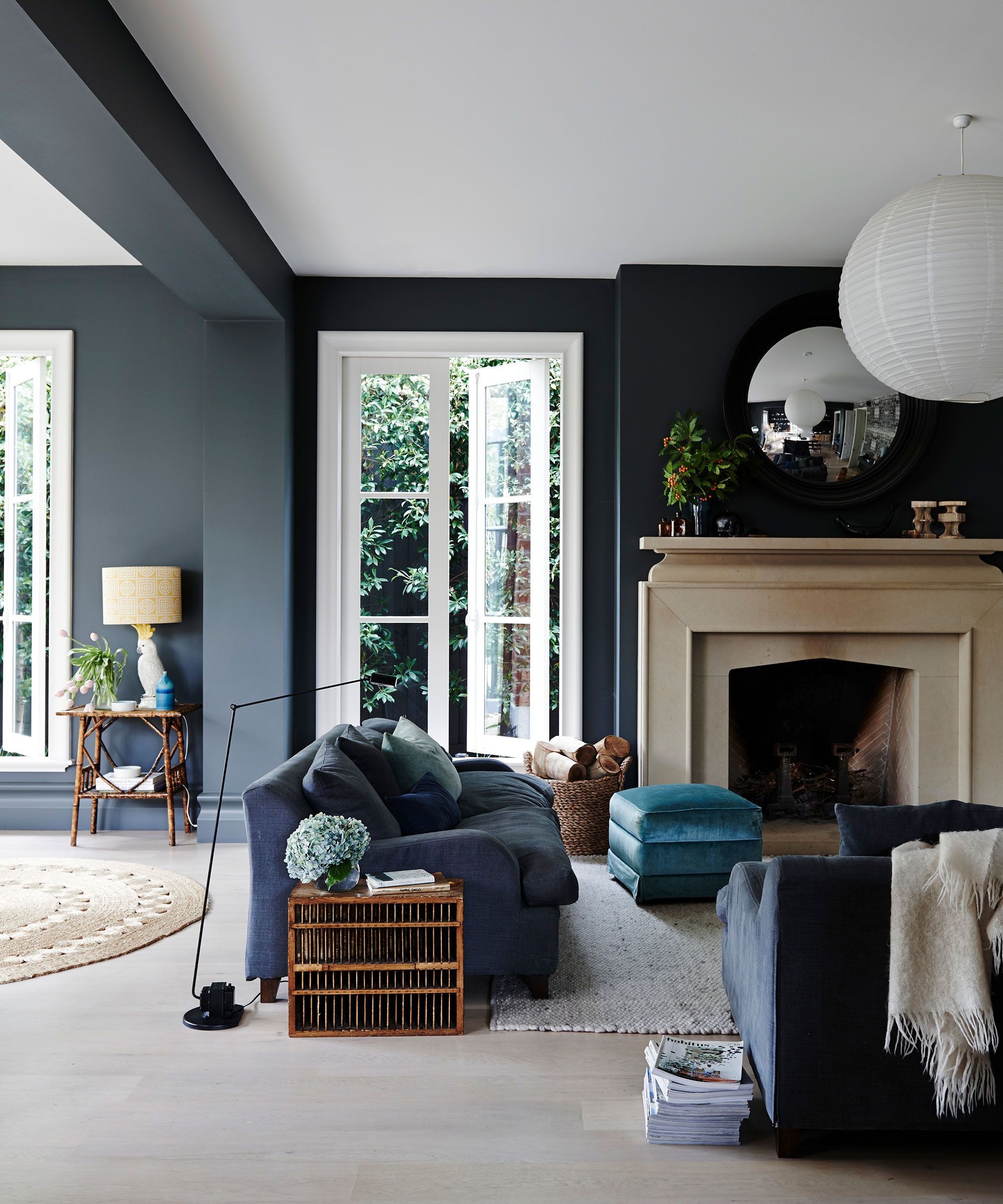
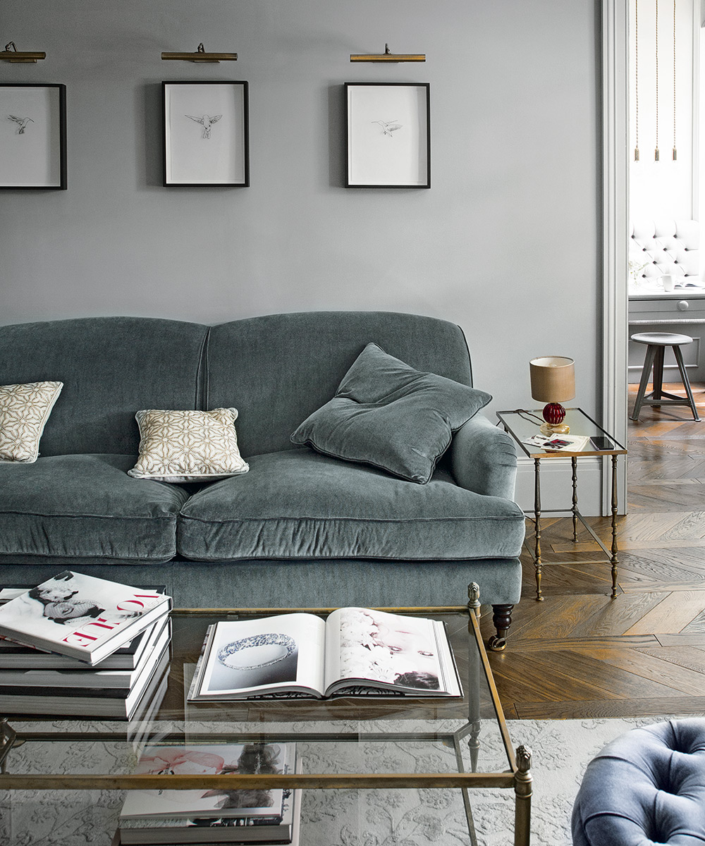
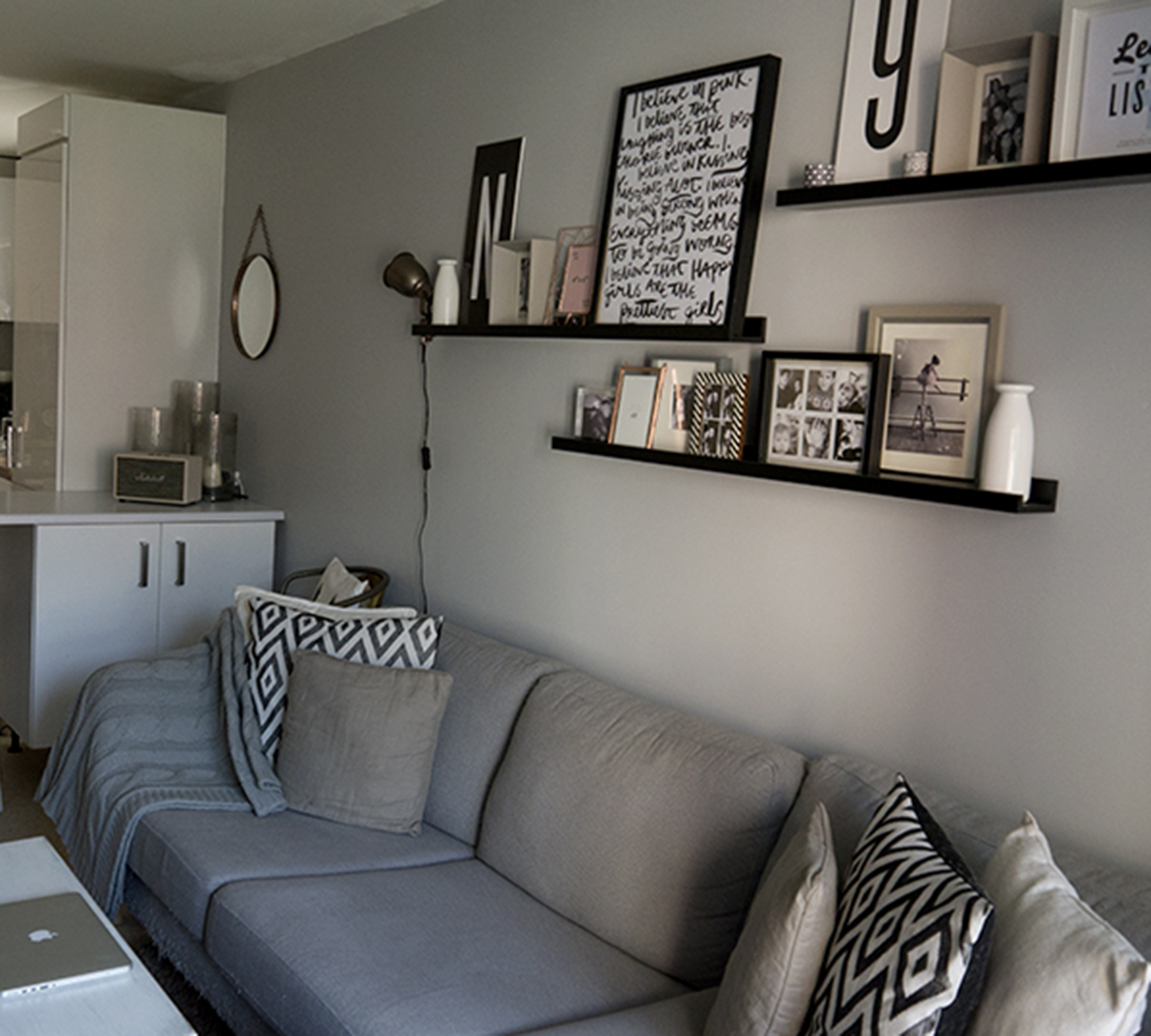
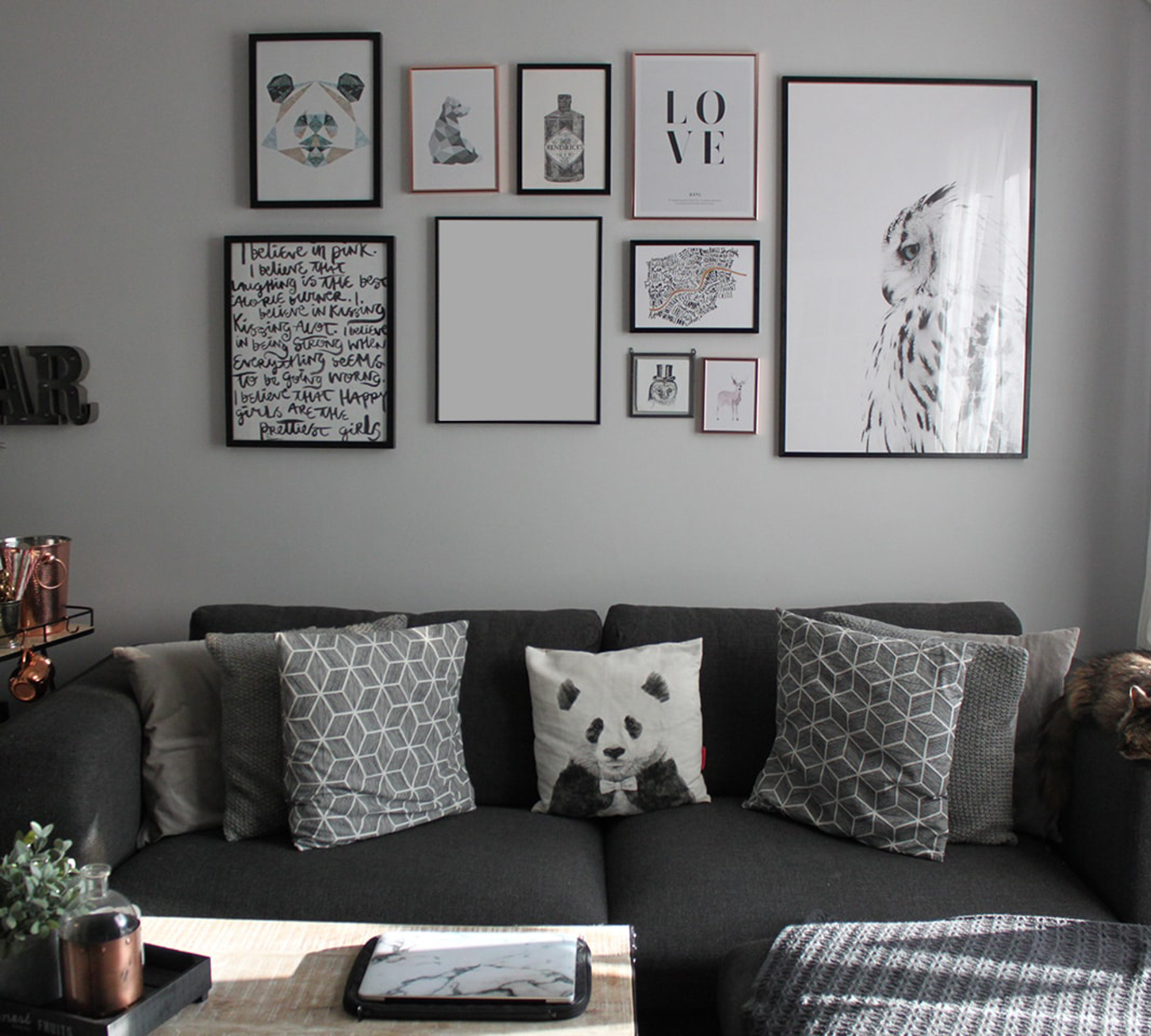
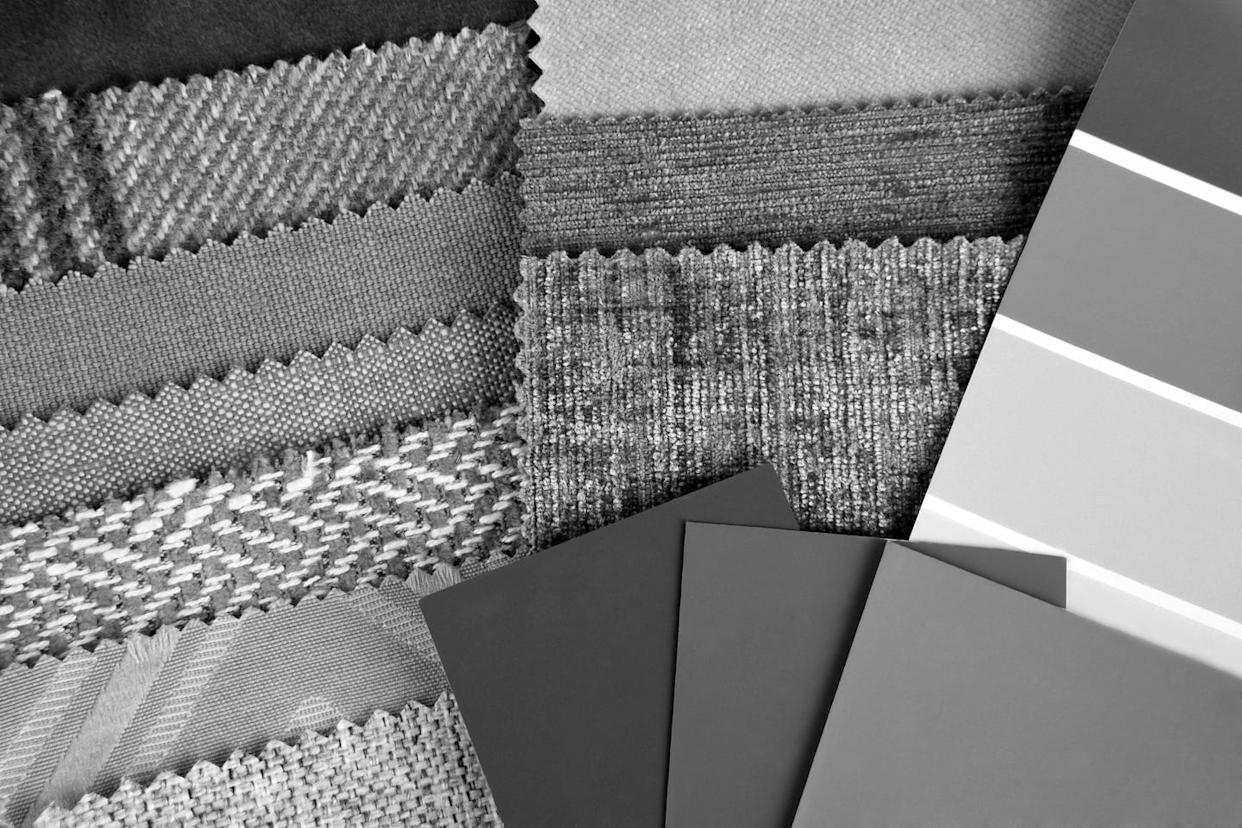
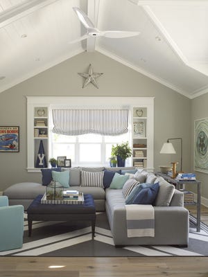
The article explores the decline in popularity of gray in interior design, a color that once dominated the industry as the "perfect neutral." The author recounts a personal experience with the overwhelming presence of gray in an RH (Restoration Hardware) store, highlighting its pervasive influence on walls, floors, cabinets, tiles, and even furniture. This widespread adoption led to gray becoming synonymous with a safe, aspirational aesthetic, particularly popular in the "modern farmhouse" style, allowing homeowners to achieve a chic look.
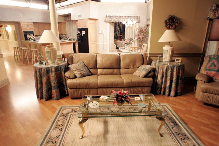
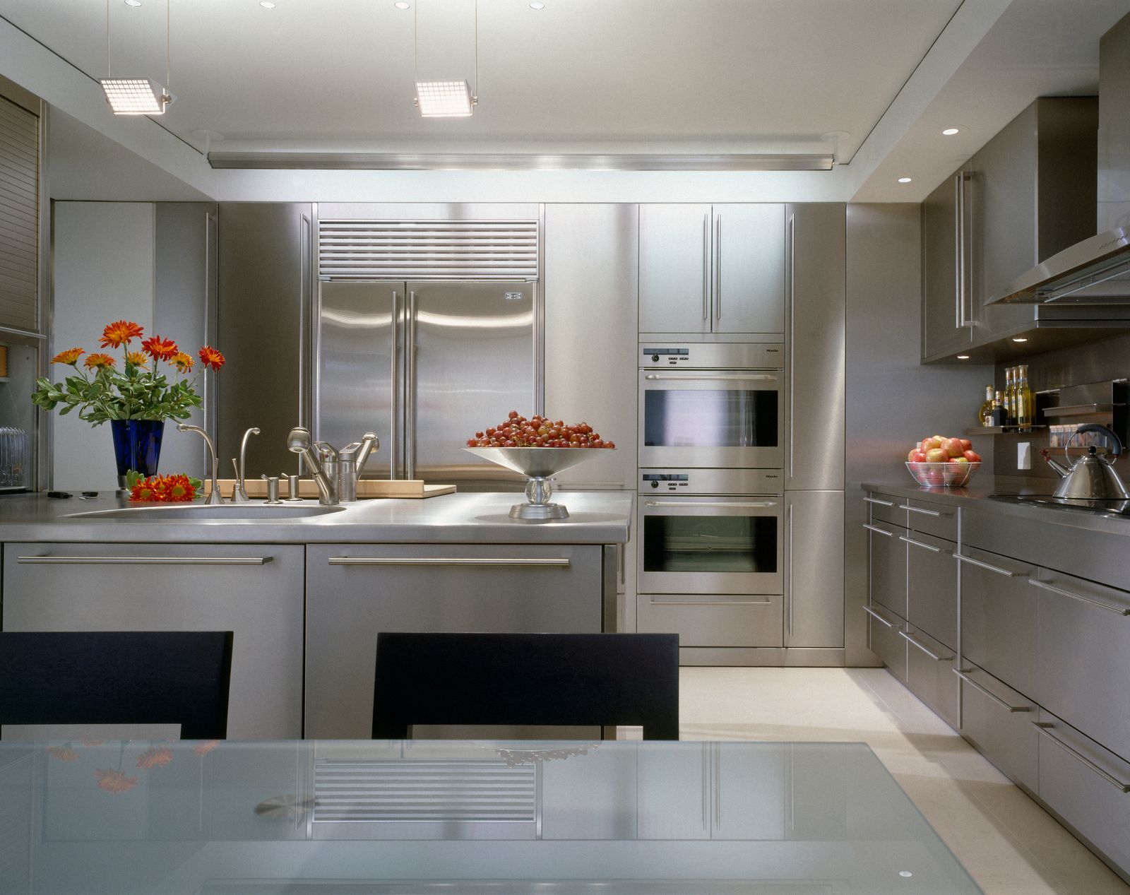
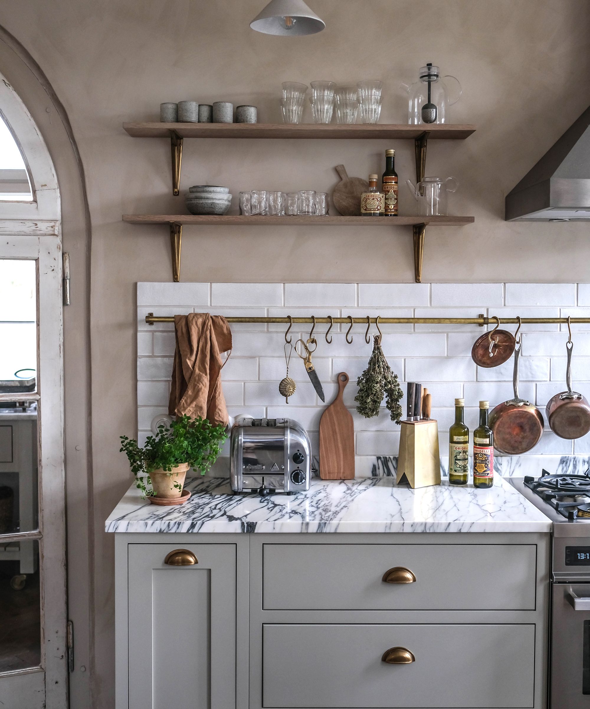
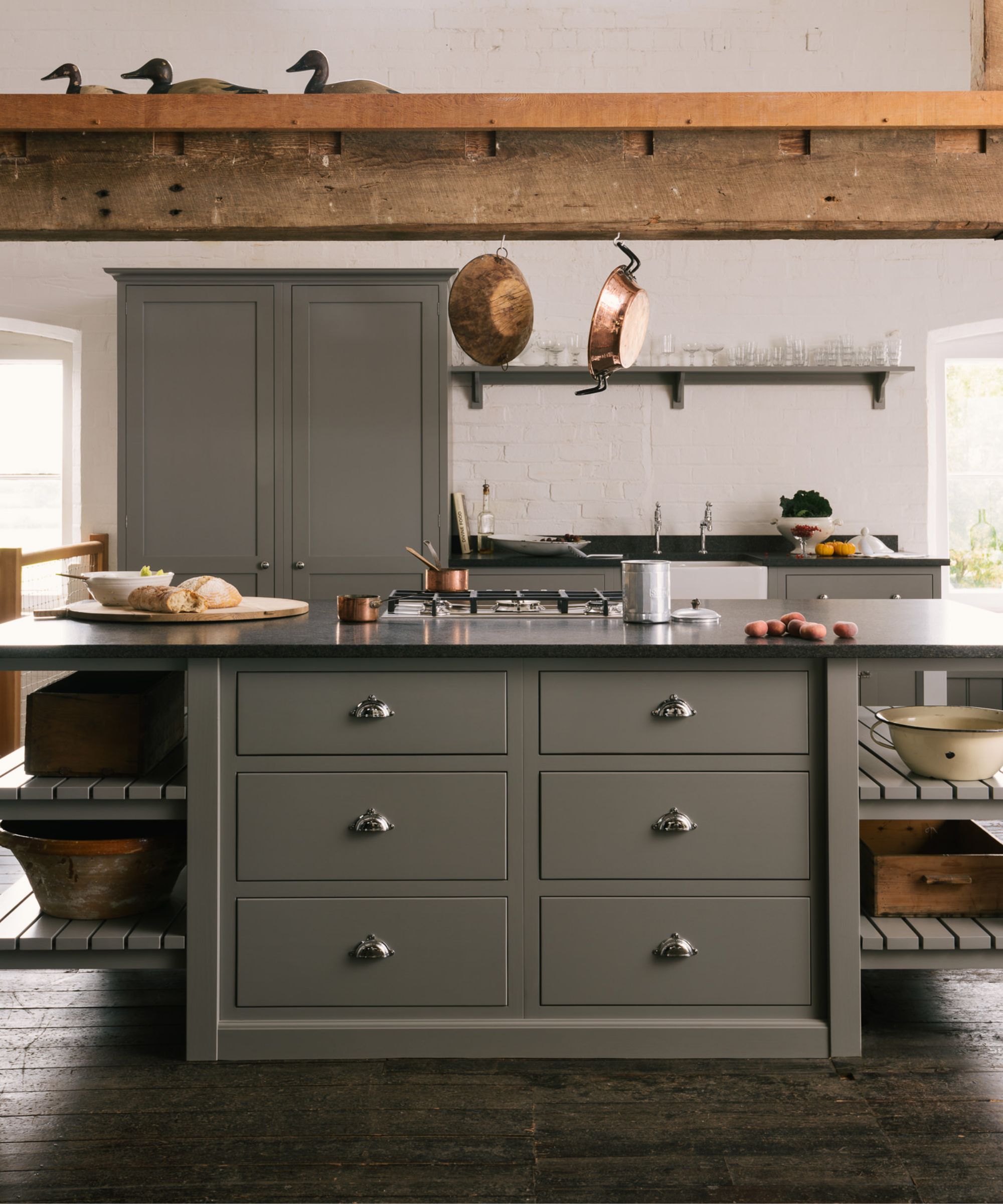
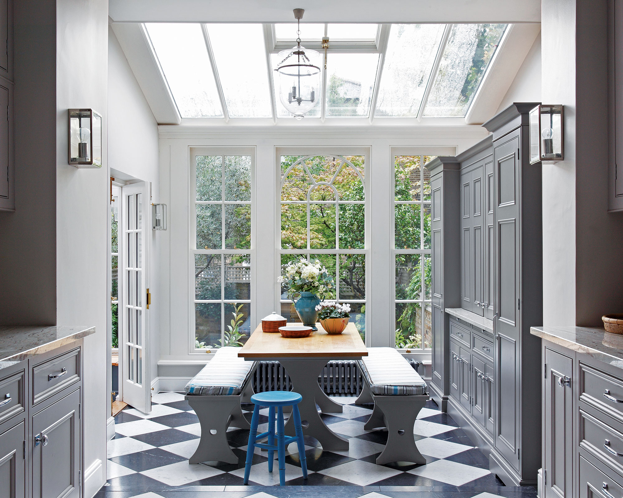
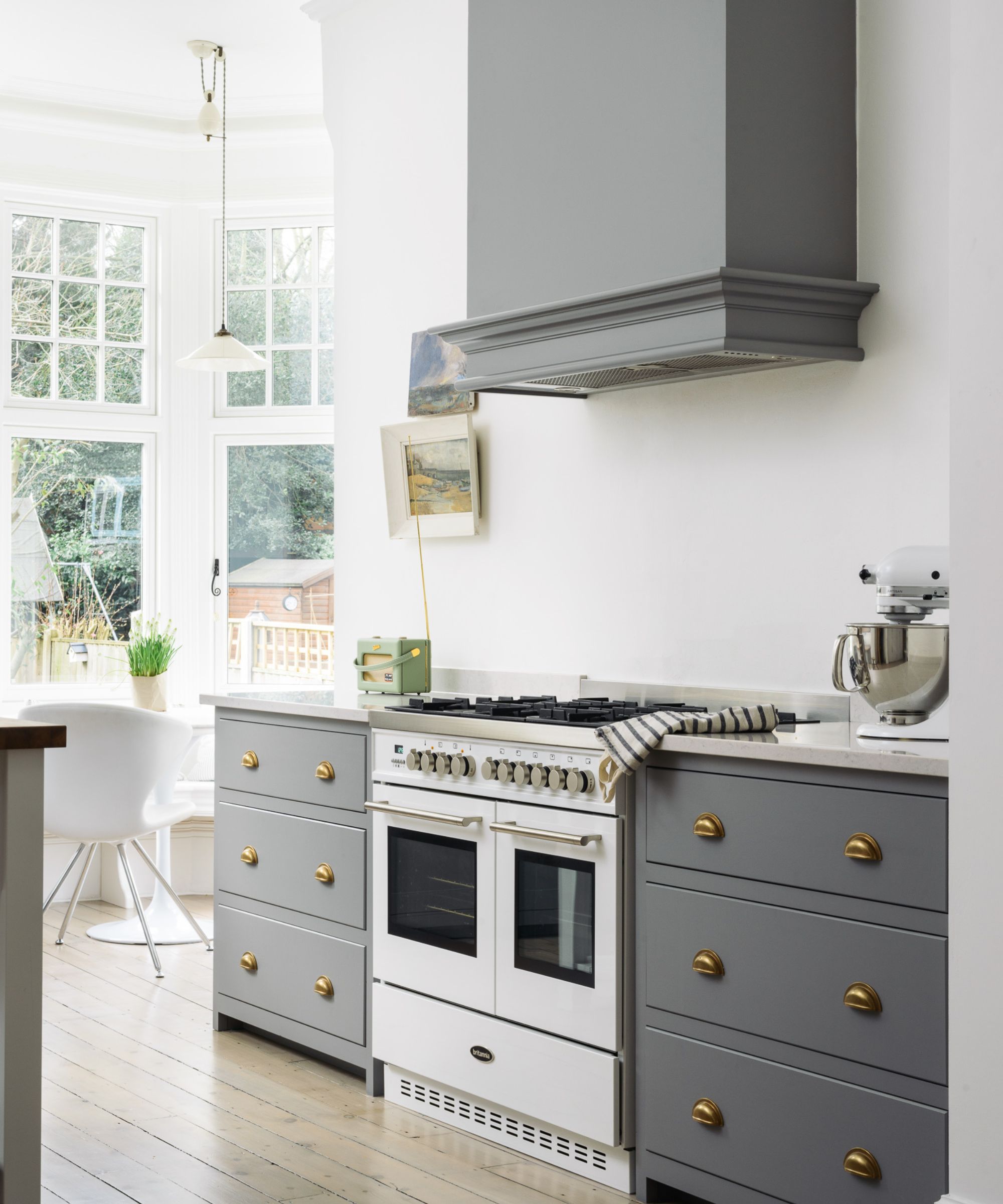
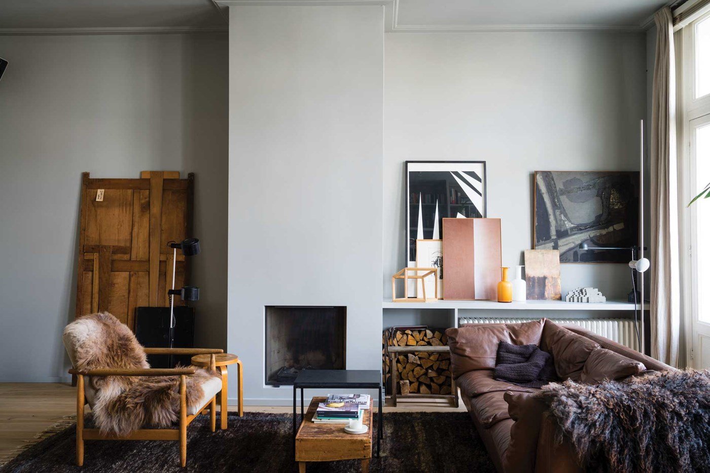
According to Leatrice Eisman, executive director of the Pantone Color Institute, gray's rise in popularity began around the 2008 financial crisis. During this period, with the housing market unstable, people sought colors that would appeal to potential future buyers. Gray, being perceived as inoffensive and versatile, emerged as a preferred alternative to the previously dominant beige and off-white neutrals. Its cool undertones also complemented the increasing use of stainless steel kitchen appliances, further solidifying its position in design. Cecilia Casagrande of Casagrande Studio notes that gray also served as a modern counterpoint to the Tuscan-inspired and shabby chic styles prevalent in the late 1990s and early 2000s, offering an easy way to update interiors.
However, the article details how gray eventually fell out of favor, leading to what some designers call "gray fatigue." Critics began to describe it as "50 shades of boring" and "sterile," a stark contrast to its earlier association with "cool sophistication." The turning point was significantly influenced by the COVID-19 pandemic. As people spent more time at home, they were confronted daily with their gray surroundings, which many began to perceive as a "gray prison cell or hospital." This intensified feelings of bleakness and monotony, accelerating the shift away from the color.
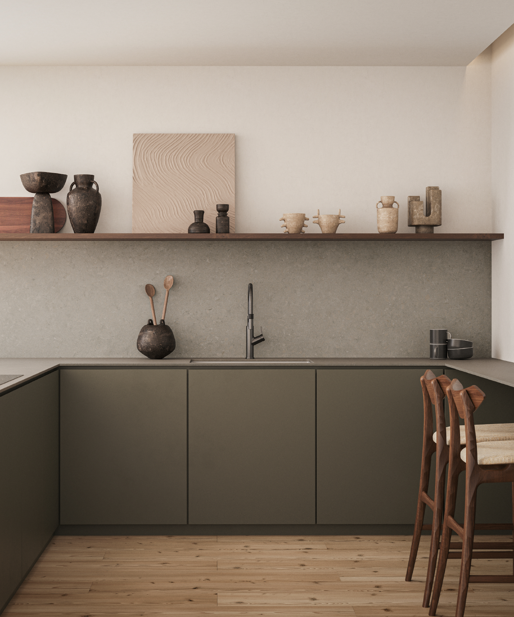
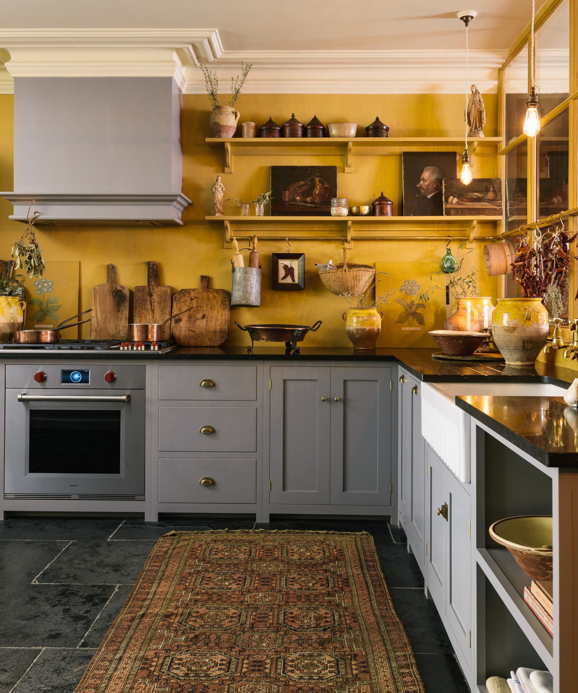
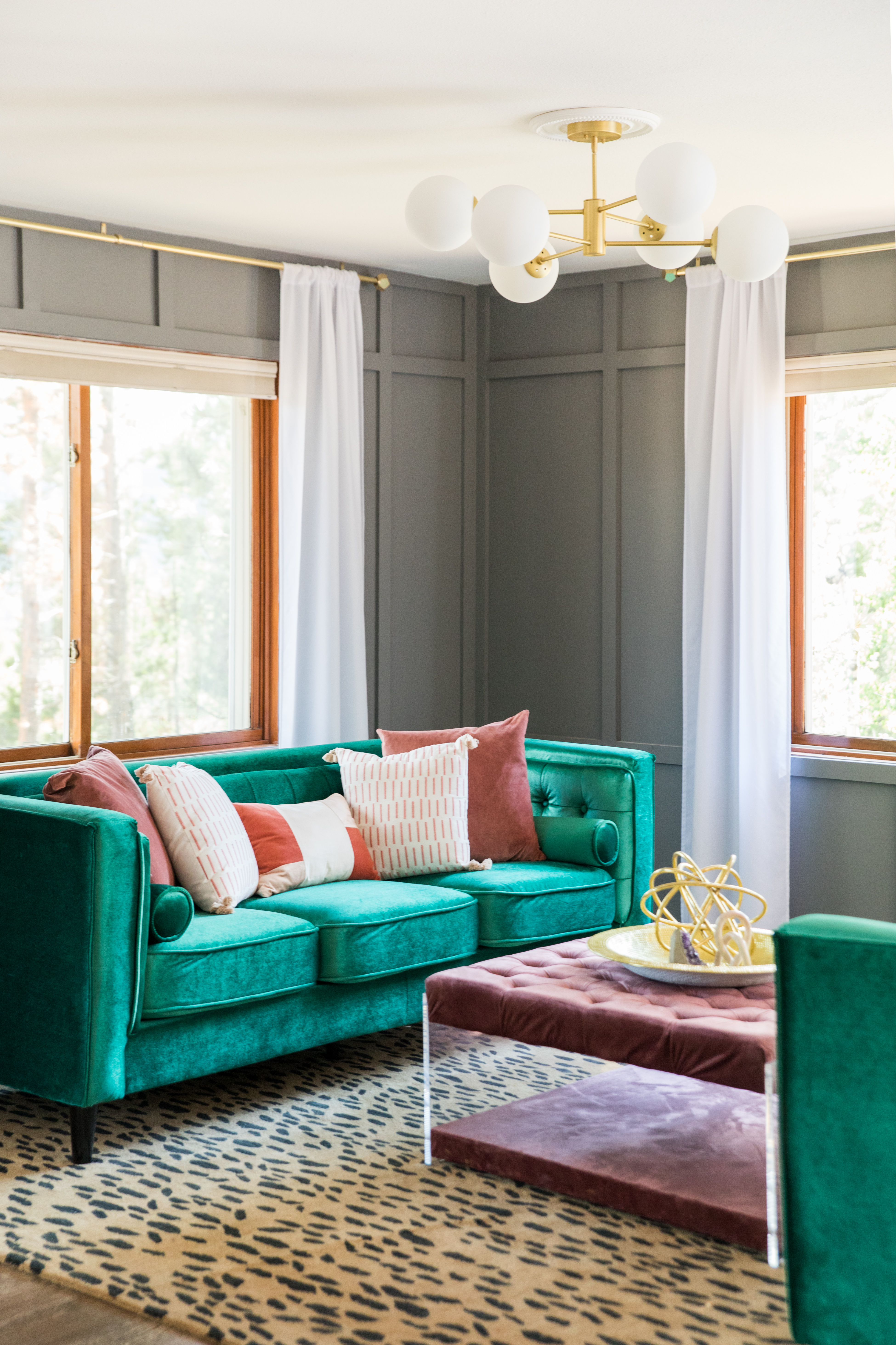
Interior designers and color specialists expressed widespread relief at gray's demise, with many eagerly sharing their negative sentiments about the color. Alysha St. Germain, owner of Hello Pearl Interiors, states that gray evokes negative emotions, likening it to a battleship. The article concludes by noting the uncertainty surrounding the "new gray," as designers offer a variety of alternatives such as gem tones and earth tones, reflecting a move towards colors that evoke positive emotions and personal well-being rather than broad appeal or neutrality. This shift underscores a broader trend towards individualized and emotionally resonant design choices in a post-pandemic world.
#InteriorDesign #ColorTrends #Gray #HomeDecor #DesignTrends #PantoneColorInstitute #PostPandemicTrends #NeutralColors #FengShui #InteriorDesign #ColorTrends #Gray #HomeDecor #DesignTrends #PantoneColorInstitute #PostPandemicTrends #NeutralColors #FengShui
0 تعليق إجمالاً
 لا توجد تعليقات بعد
قد تعجبك أيضًا
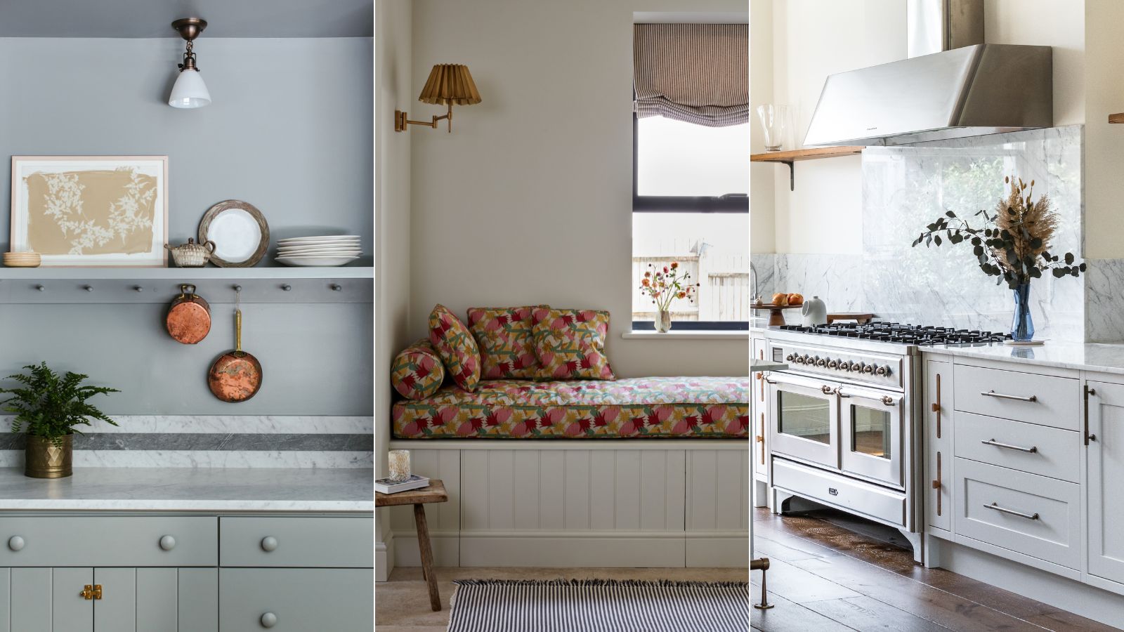
Are gray interiors really out of style? Interior designers weigh in on how to use this cool shade

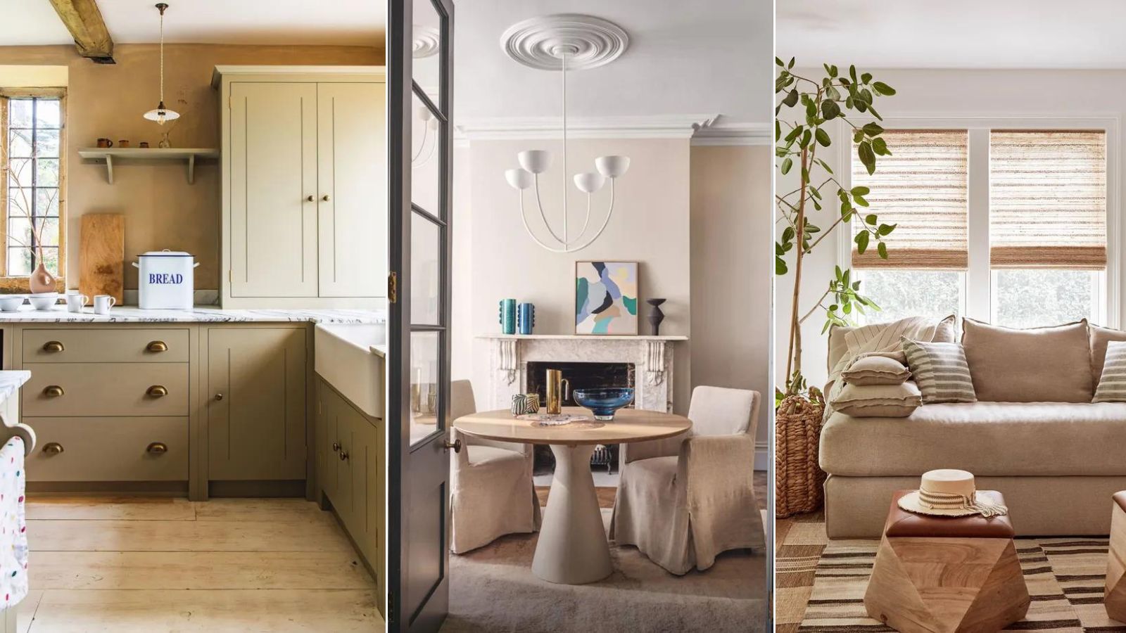
What color is replacing gray? This is the shade designers say is becoming the perennial favorite
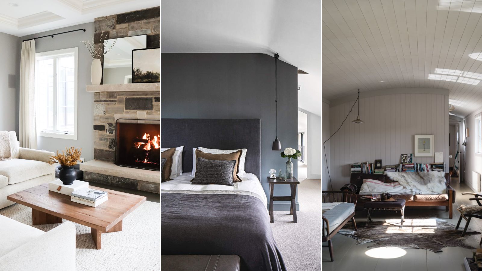
5 of the best gray paints that interior designers love using
Every Designer I Talked to Said This Popular Paint Color Is on Its Way Out

REVEALED: Is grey paint going out of style?

23 colours that go with grey, as revealed by interior stylists

The Best Gray Paint Colors Interior Designers Swear By

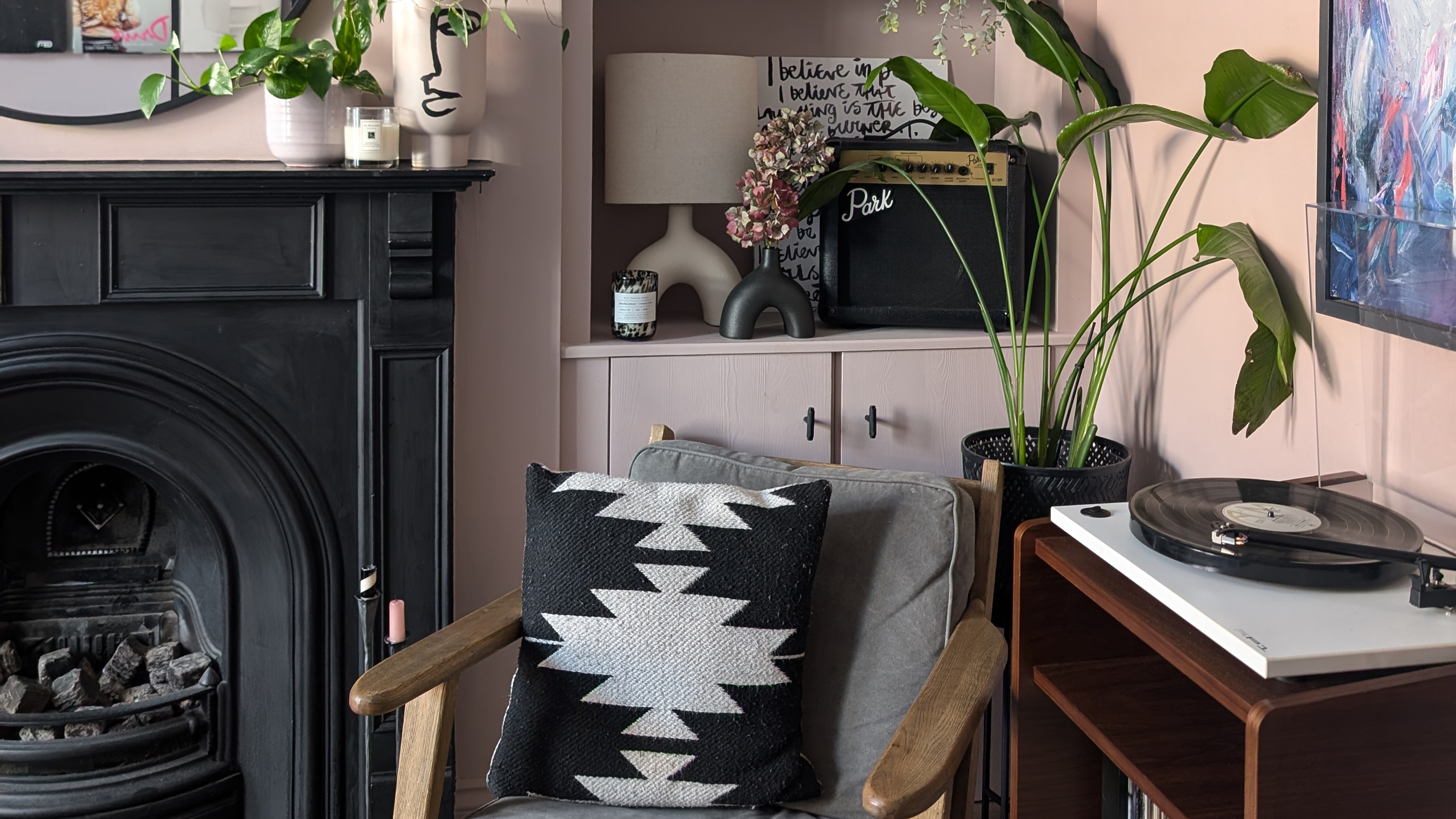
Why I'm finally leaving millennial grey behind, and what I've learnt about how to be bolder with colour
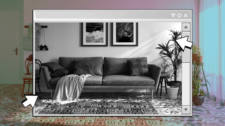
Are They OK? The Psychology Behind ‘Millennial Gray’ Homes
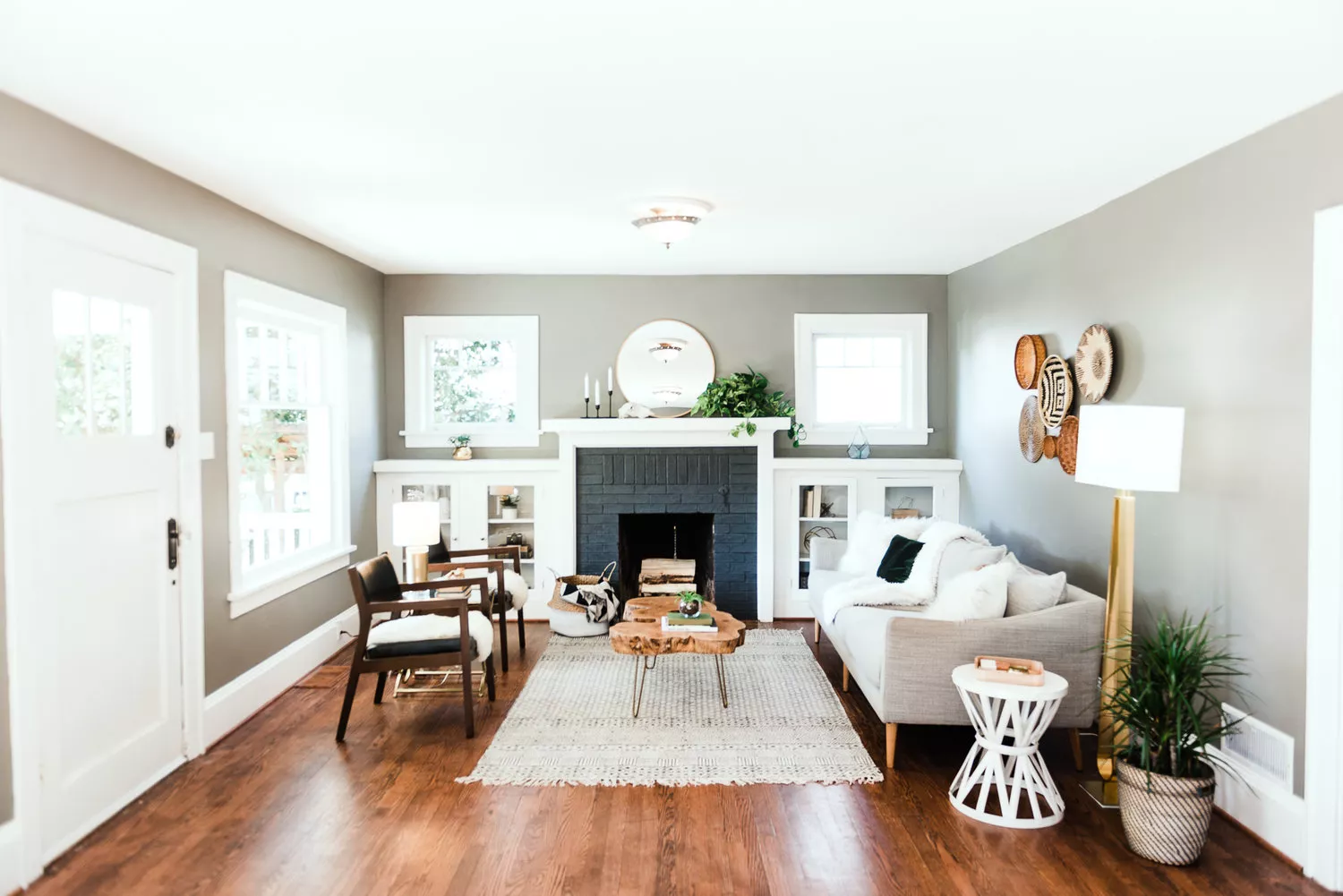
Is Gray On Its Way Out? Designers Tell Us Their Opinions

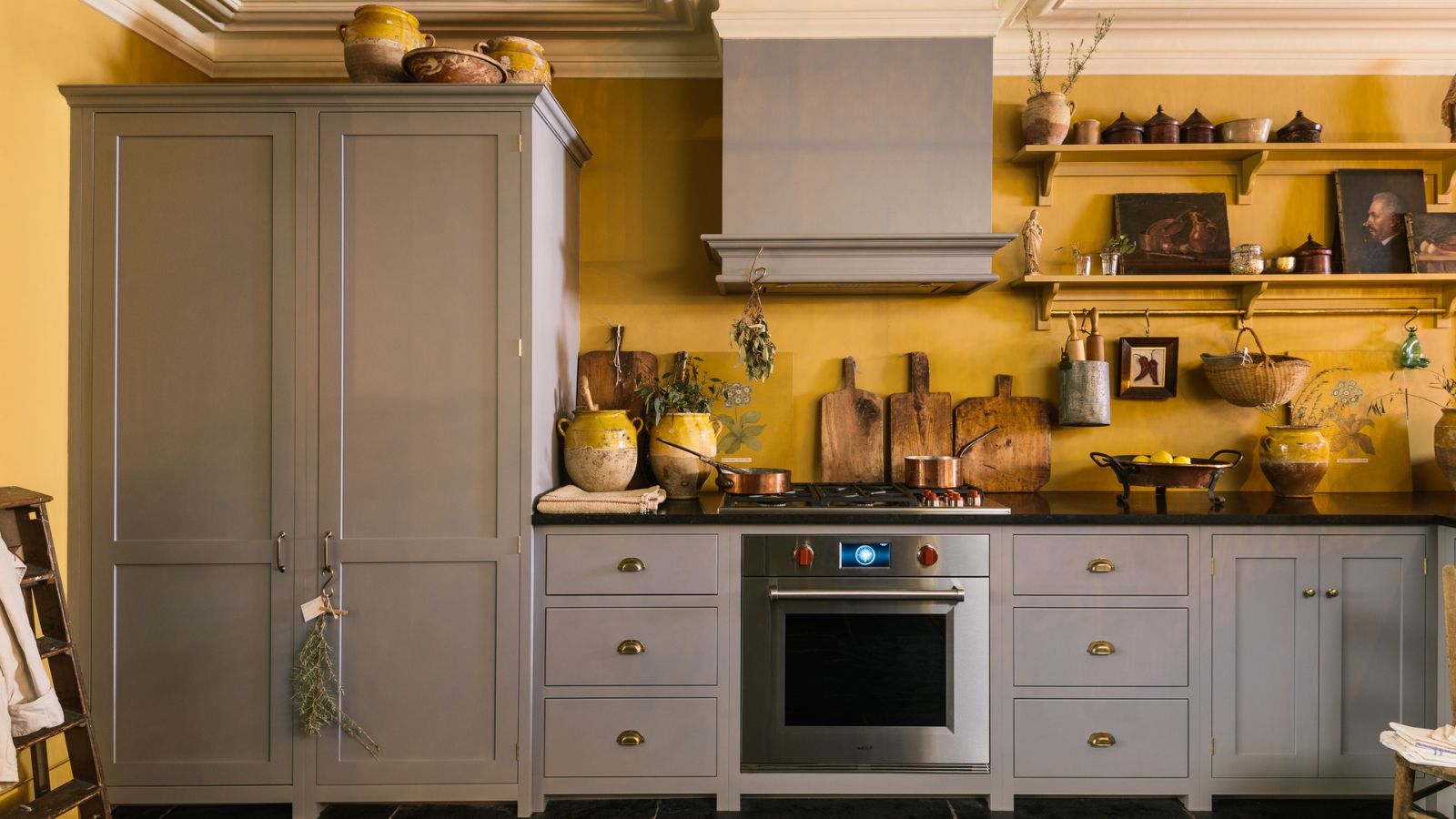
What colors go best with gray kitchen cabinets? Interior designers explain how to decorate with this cool neutral
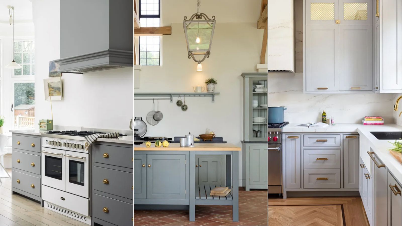
Are gray kitchens still in style? Designers weigh in on this cool-toned and divisive color scheme
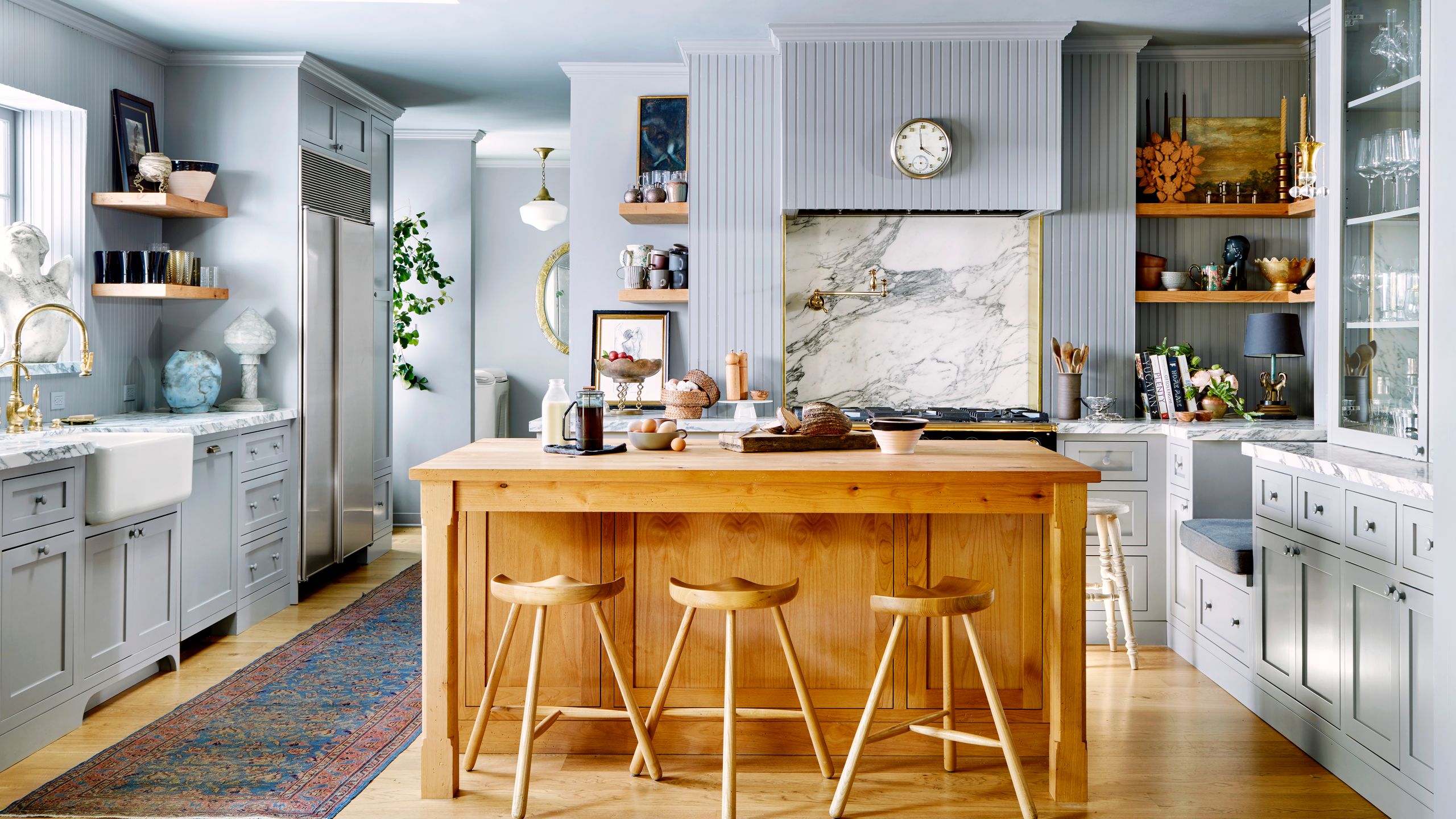
Is the Color Gray Taking Over the World?

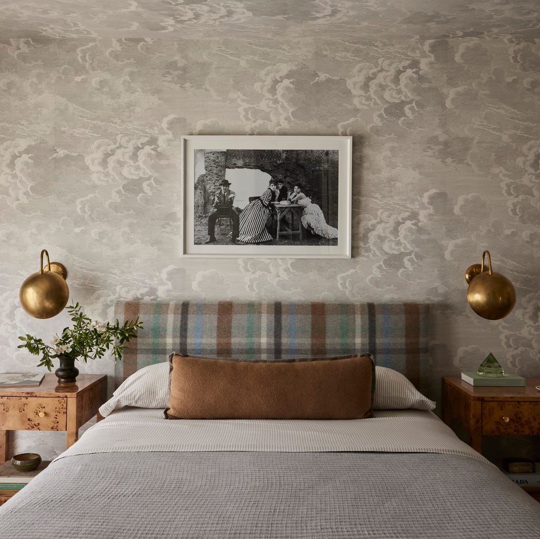
Committed to Your Millennial Gray Walls? Designers Share the Best Colors to Pair With It
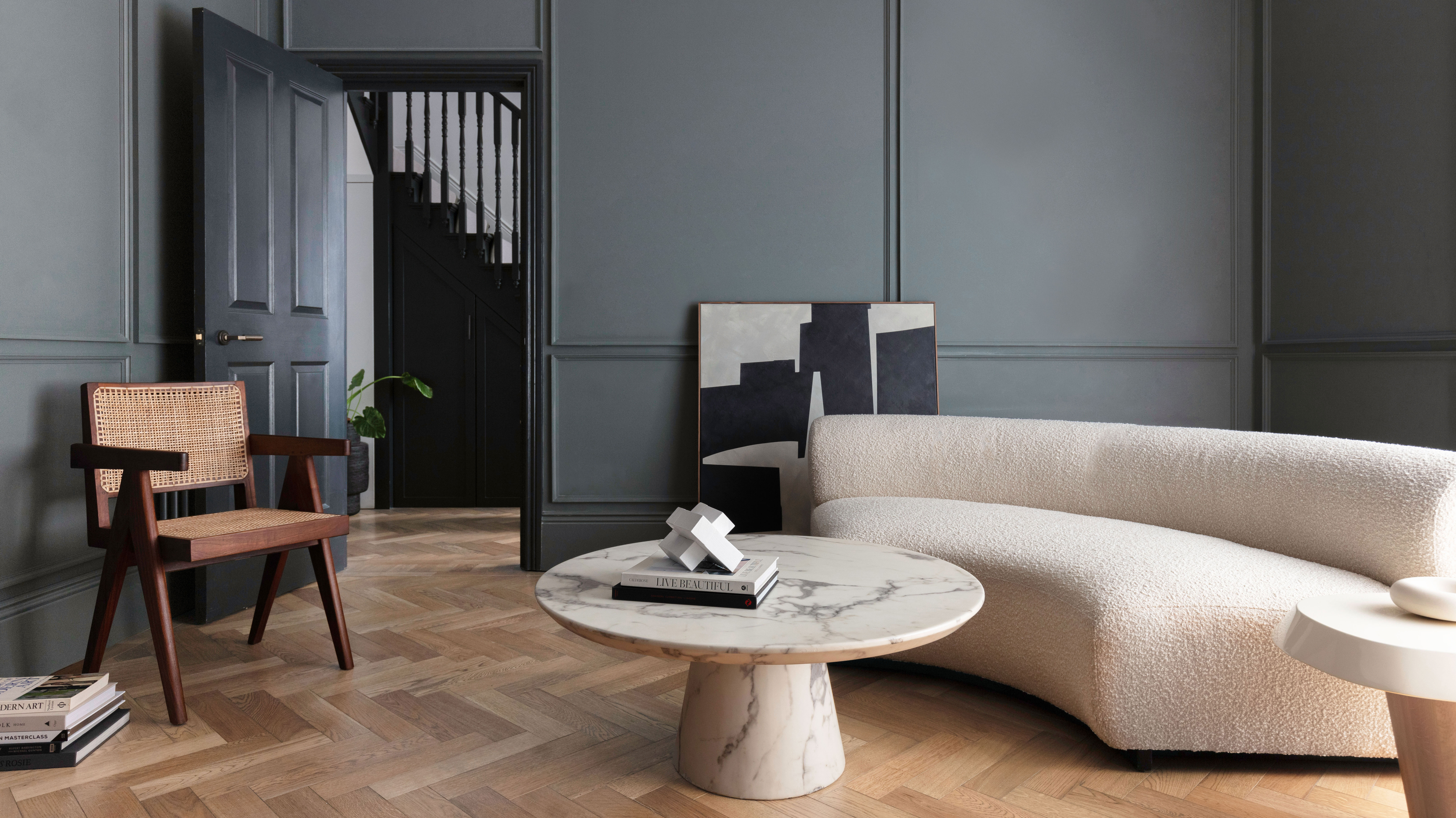
What Colors Go With Gray? 19 Arresting Combinations With This Time-Tested Neutral

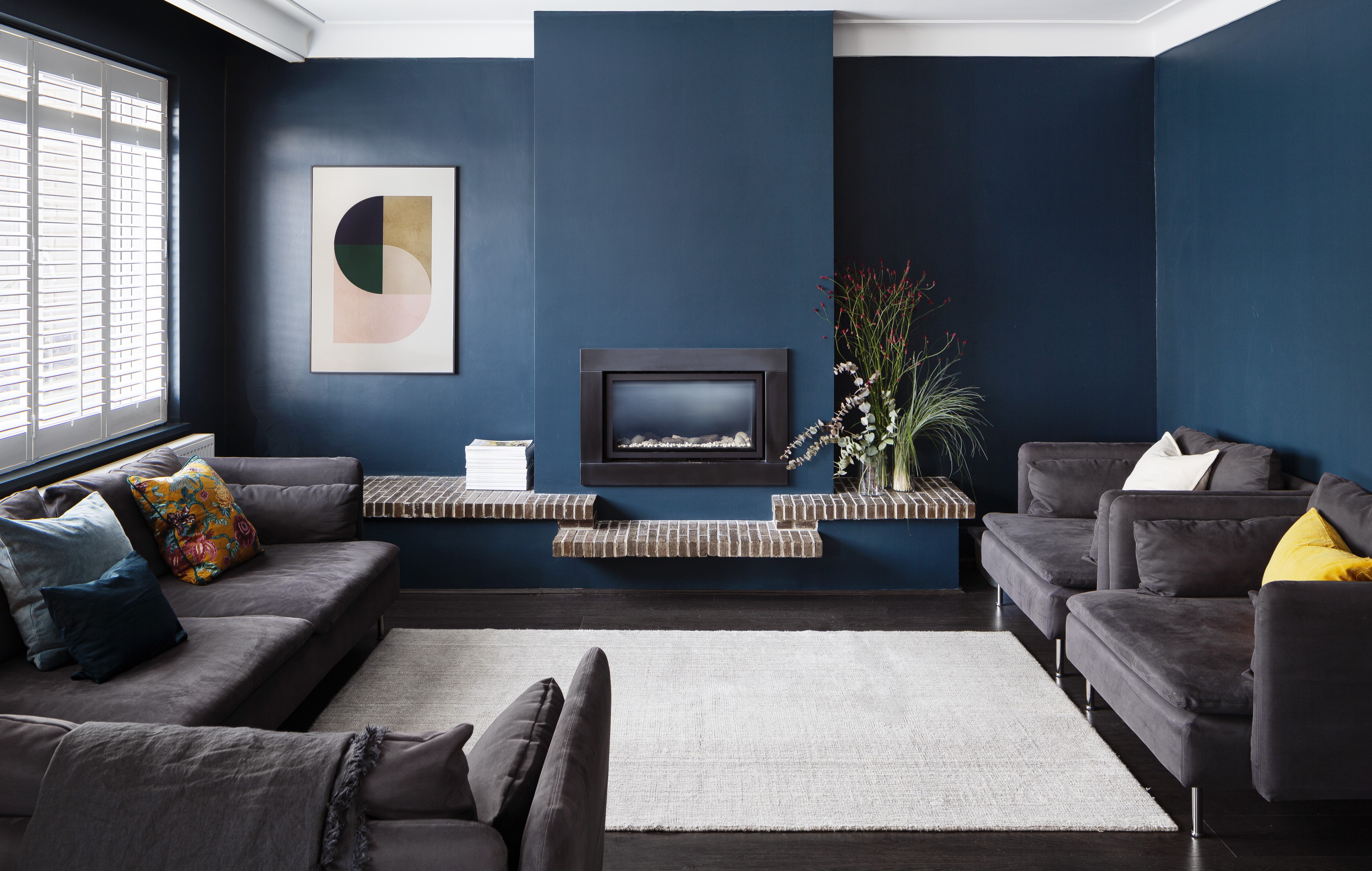
What Colors Go With Dark Gray? 13 Designer-Approved Pairings That Are Versatile and Timeless
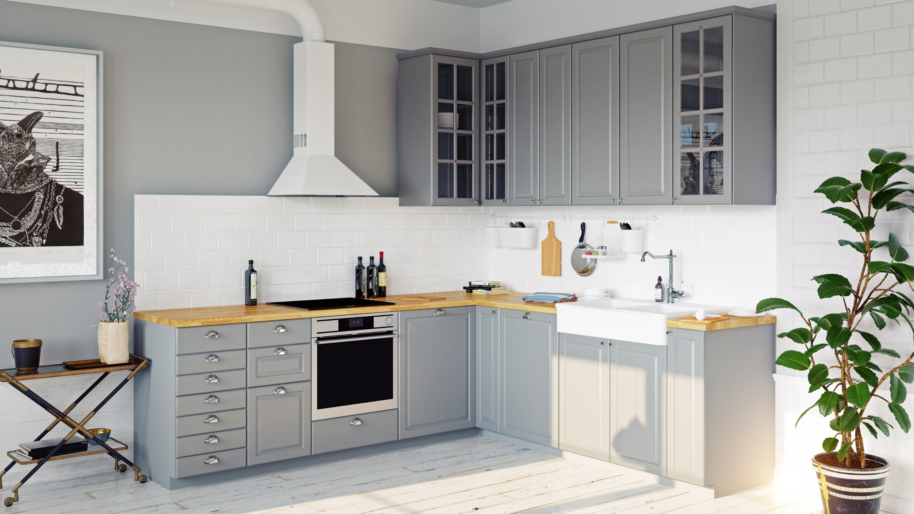
Are gray kitchens out of date? We get the low-down from design experts
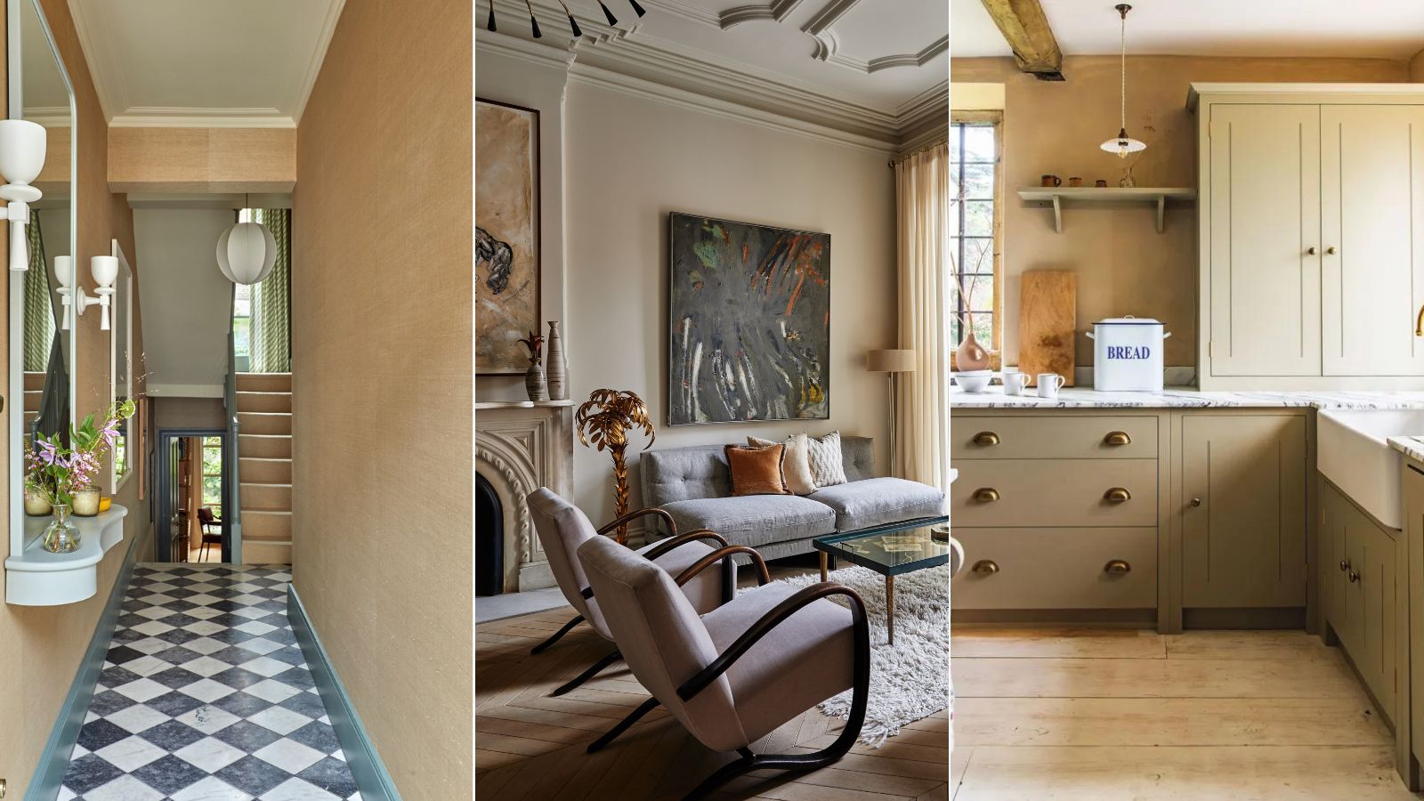
I used to love gray interiors, but here's why my remodel is bringing back 'boring' beige instead
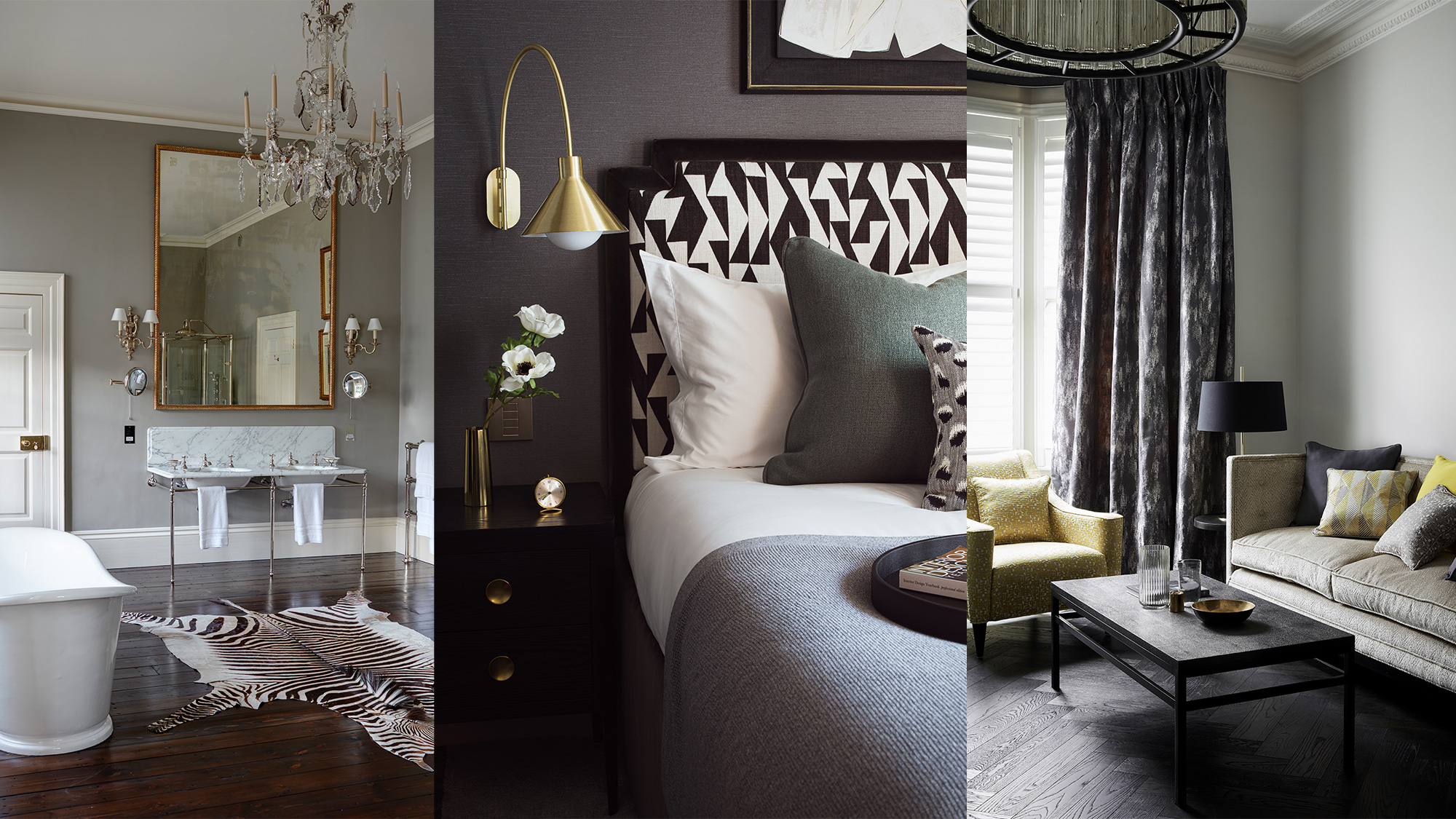
Grey room ideas – 12 ways to use this versatile shade
A versatile neutral, gray goes with anything