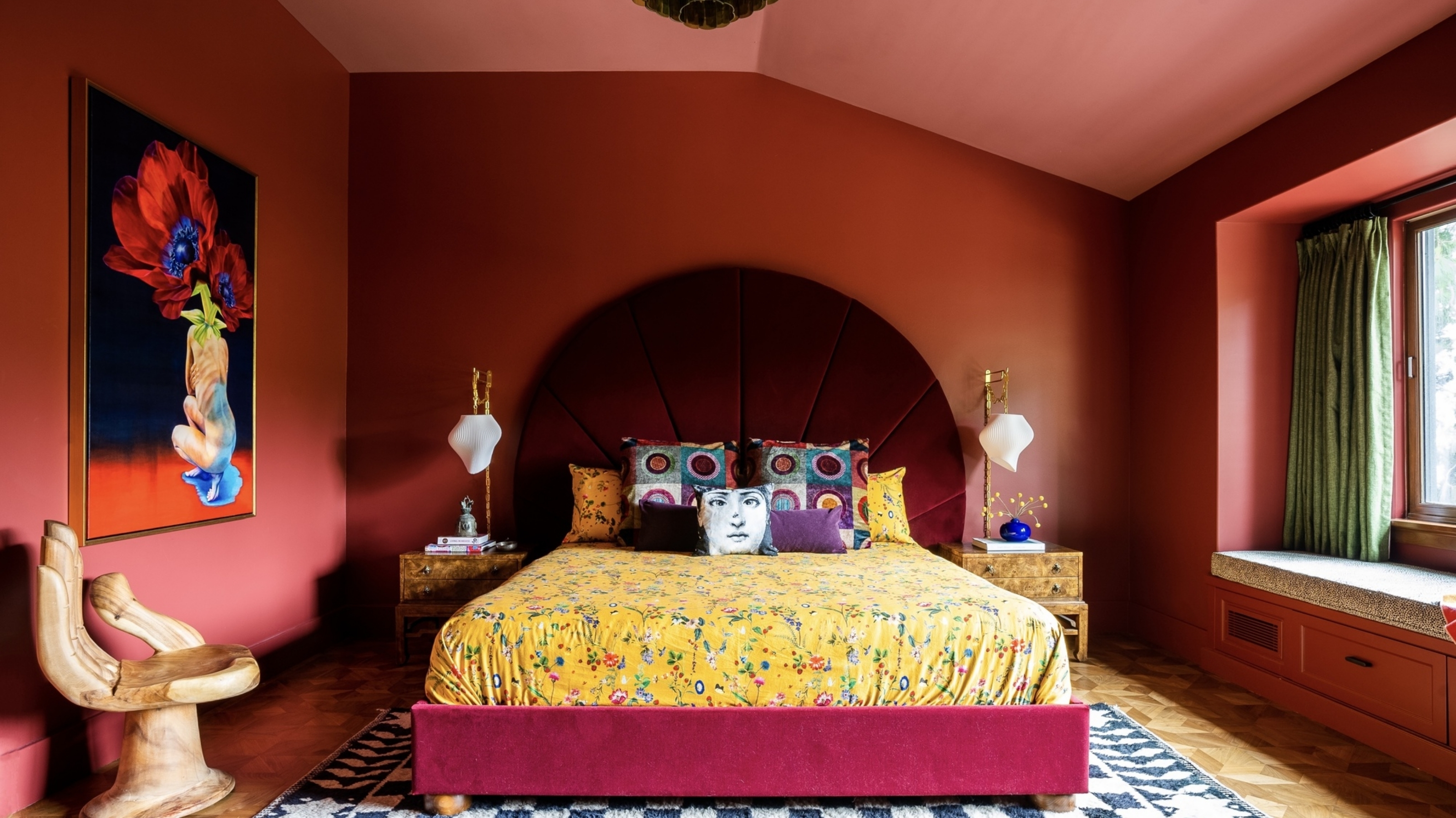
1/4
OMG — Is Color Blocking Actually Cool Again?
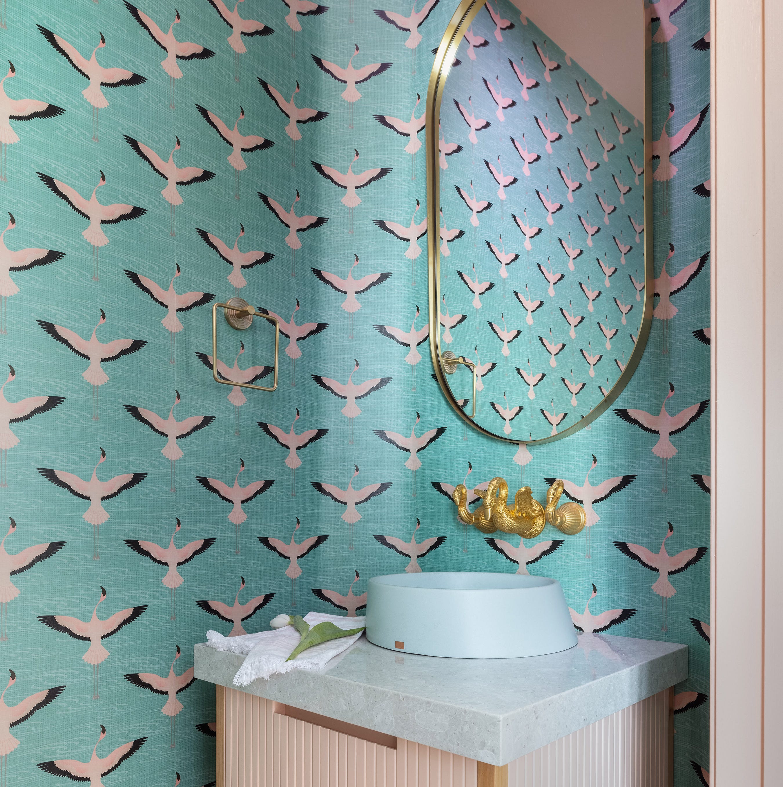
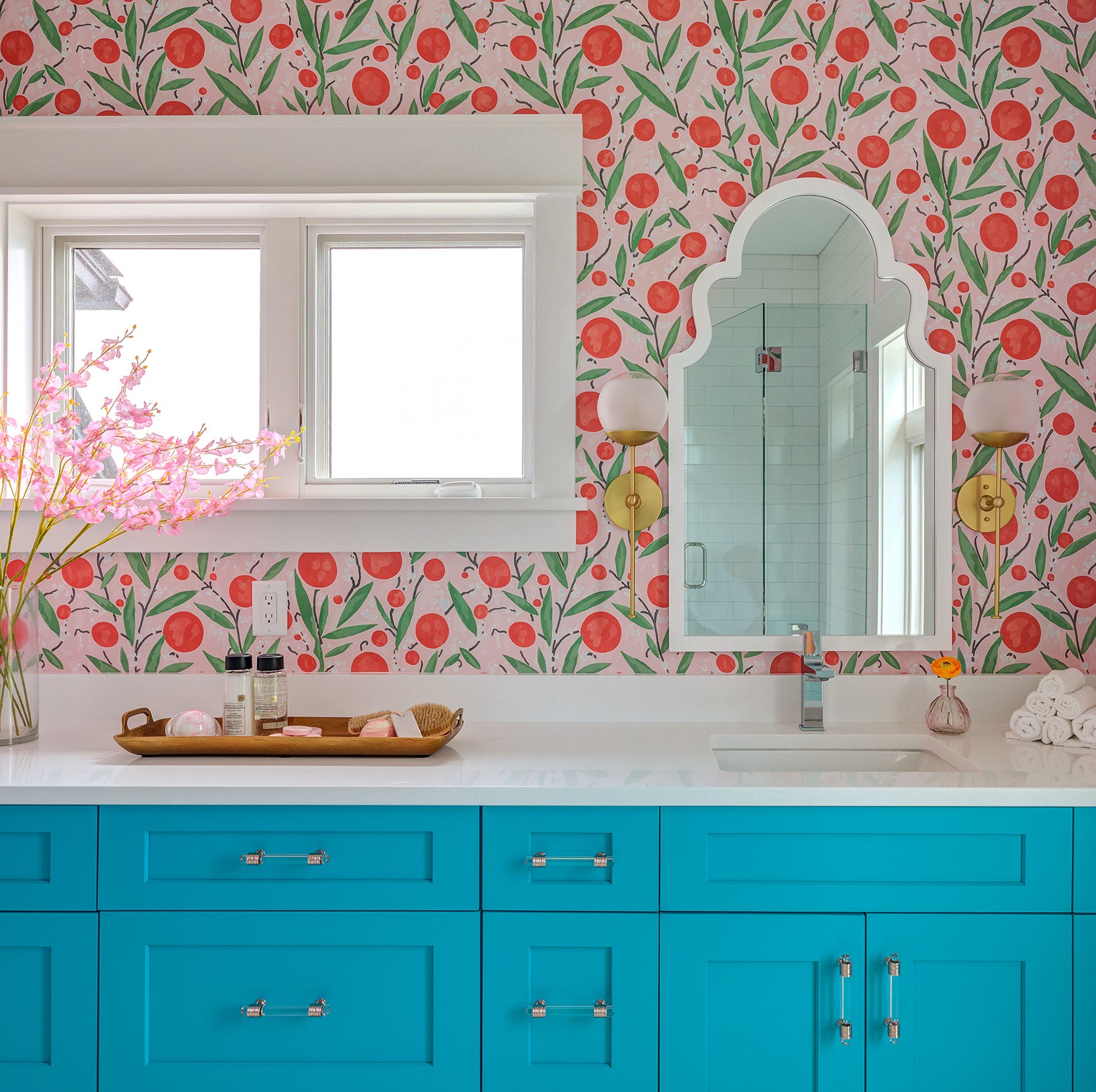
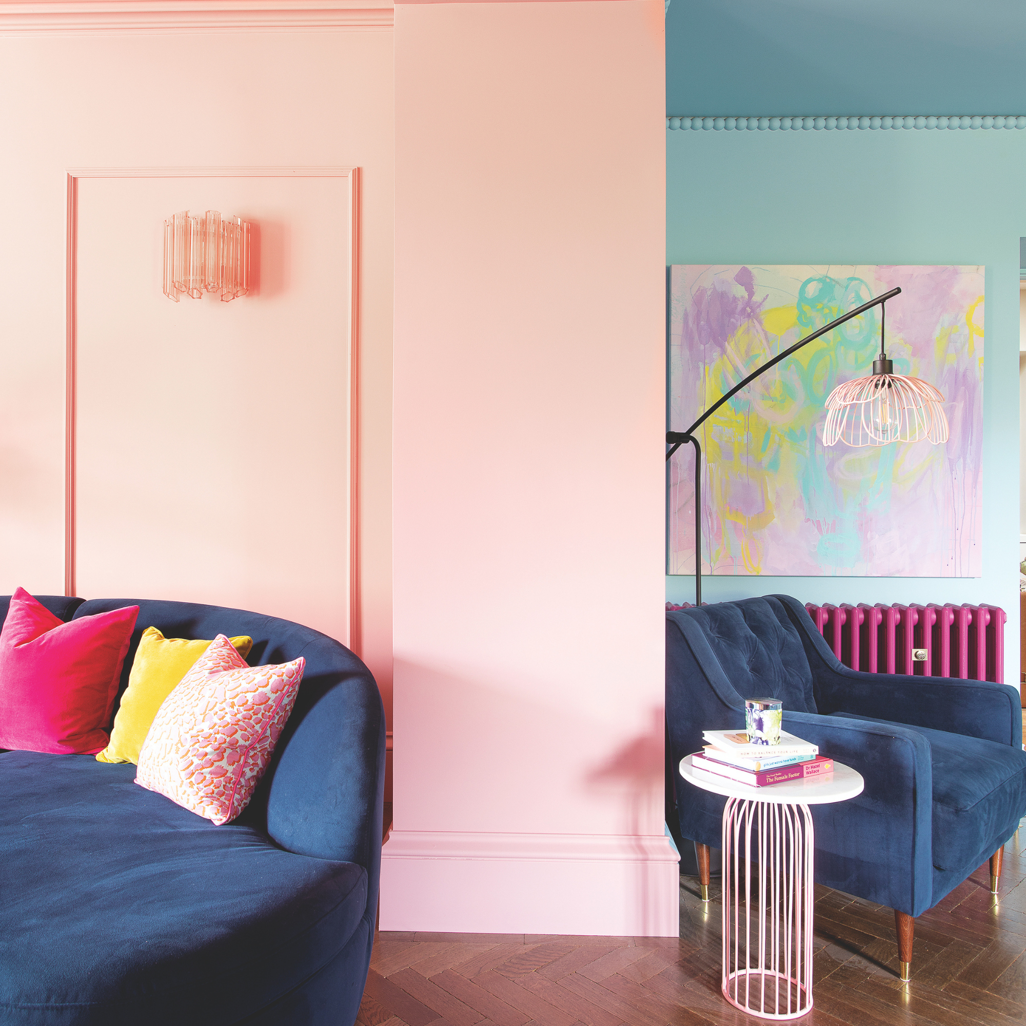
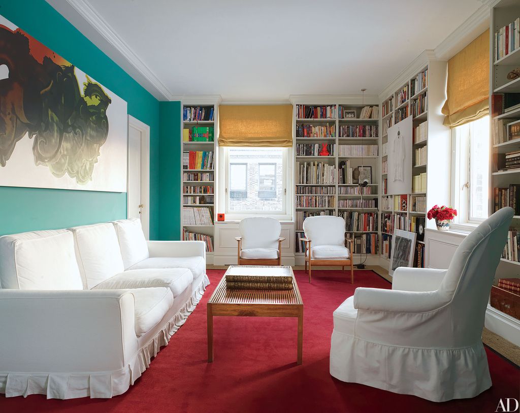
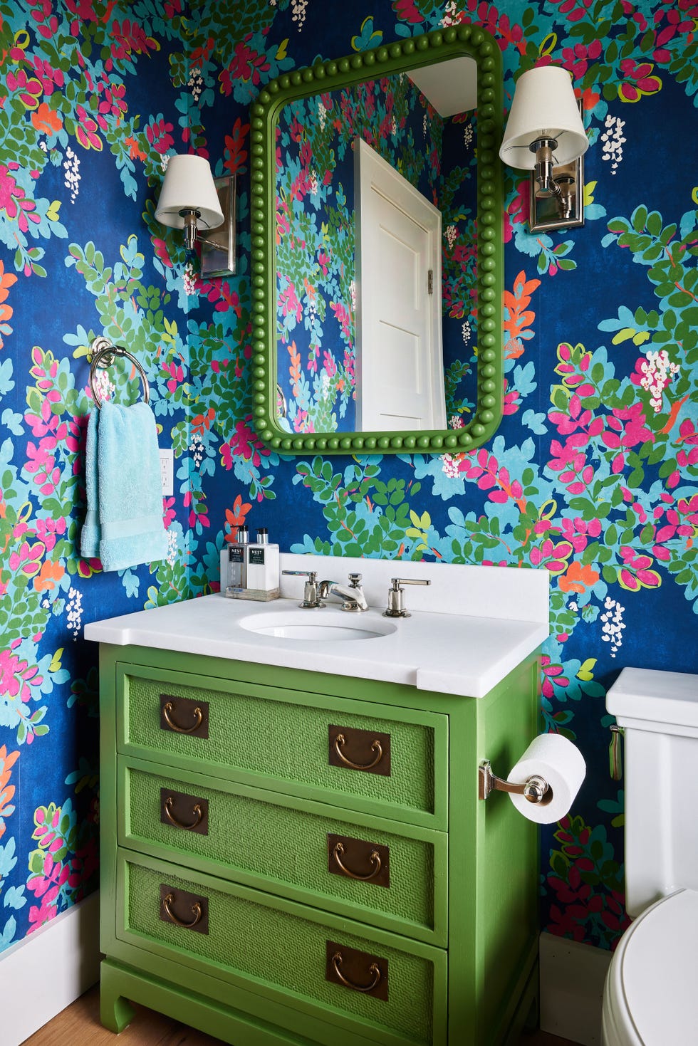
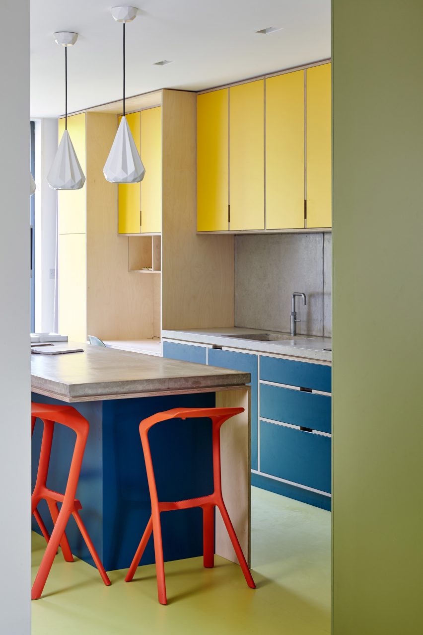
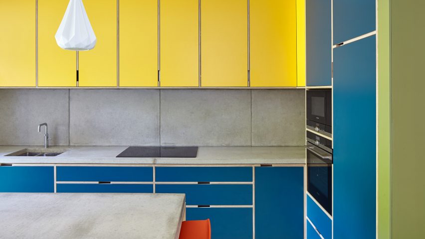
Color-blocking, a trend reminiscent of the early 2010s, appears to be making a sophisticated resurgence in interior design for 2026. While the earlier iteration featured bright, clashing segments of colors like teal, hot pink, and tangerine, the contemporary approach is significantly more considered and layered. This evolution in interior color blocking mirrors trends observed in high fashion, with brands like Balenciaga, Tory Burch, and Fendi showcasing updated versions on their S/S 2026 runways, suggesting a shift away from the 'quiet luxury' aesthetic towards more expressive and colorful designs.
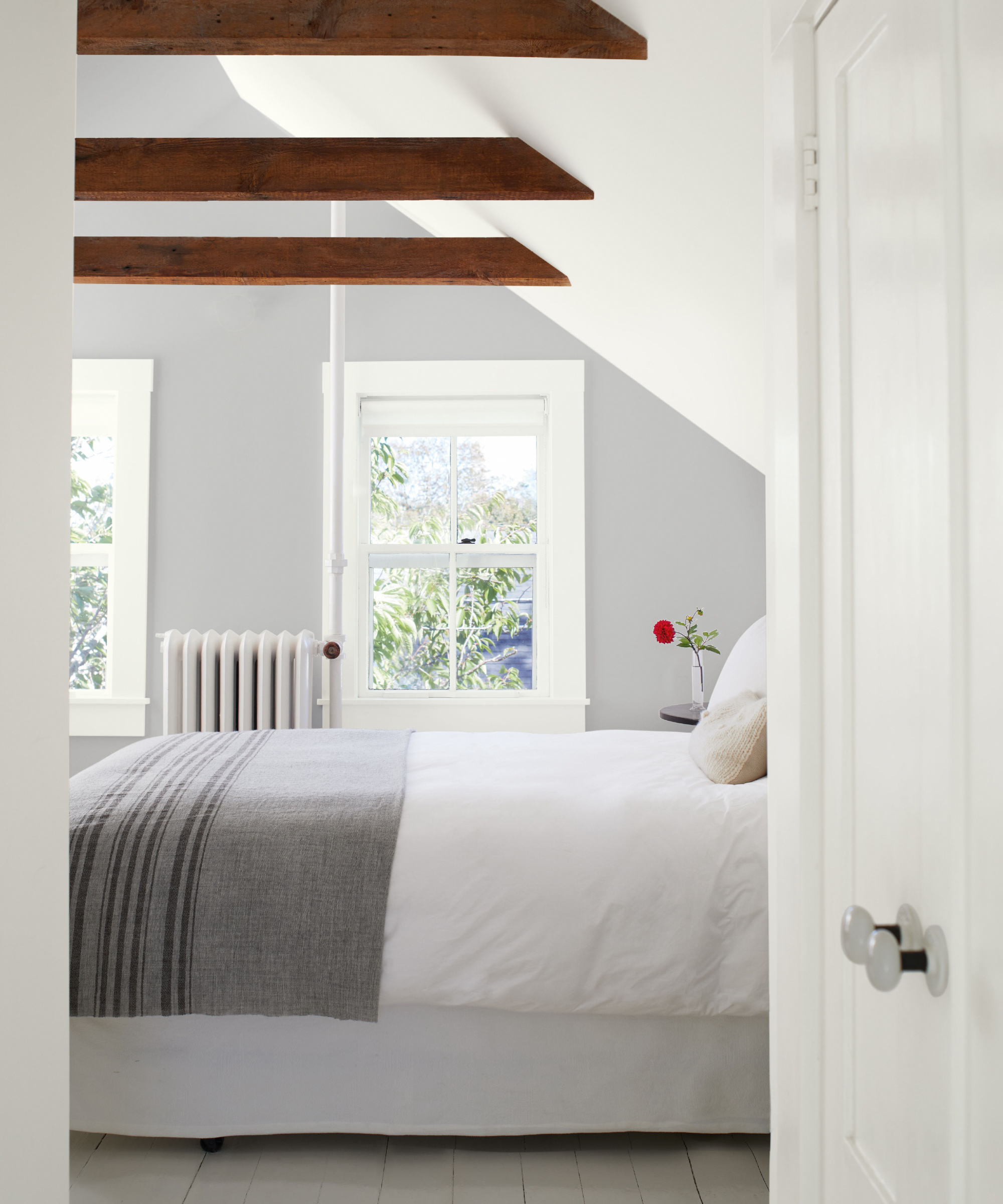
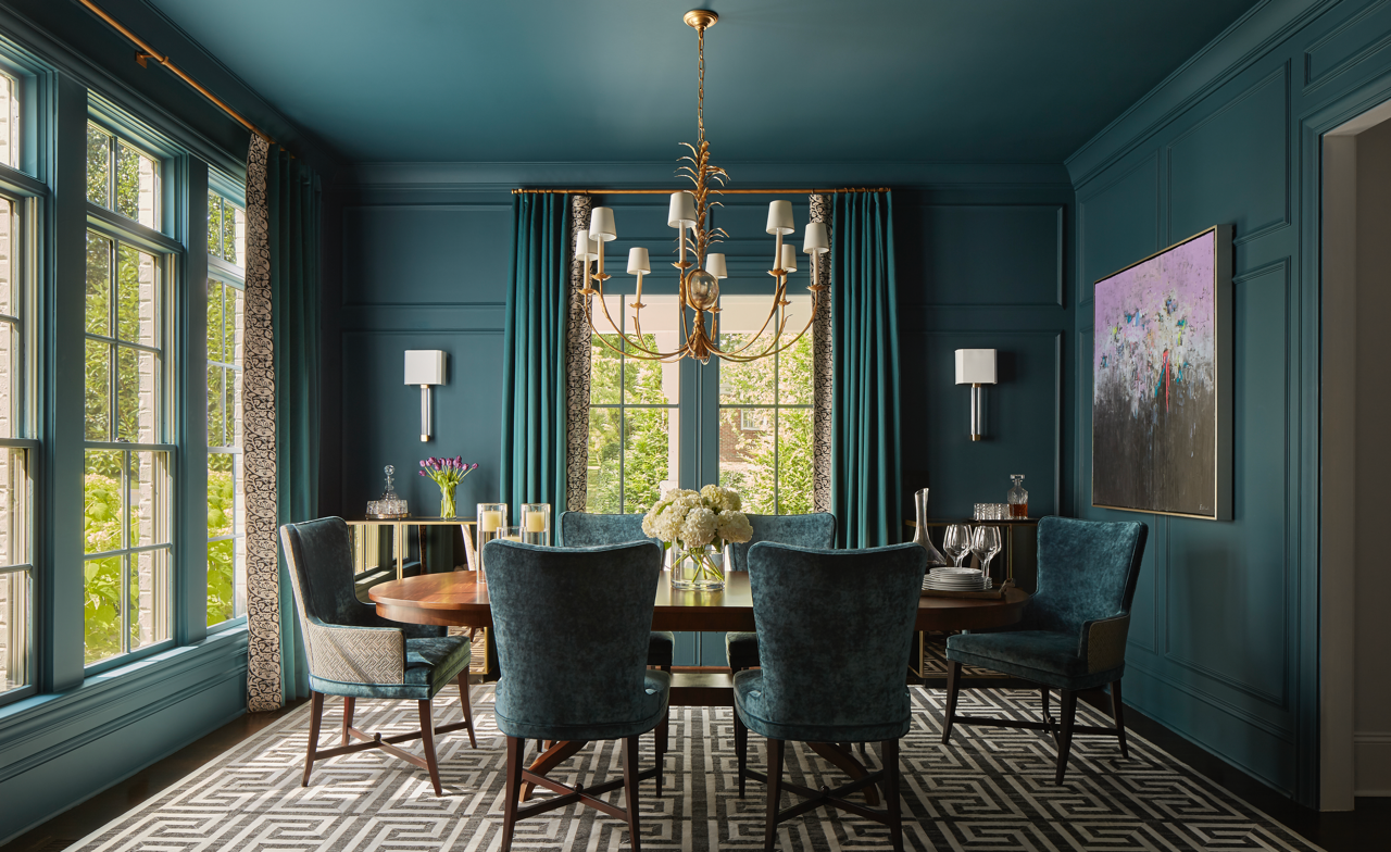
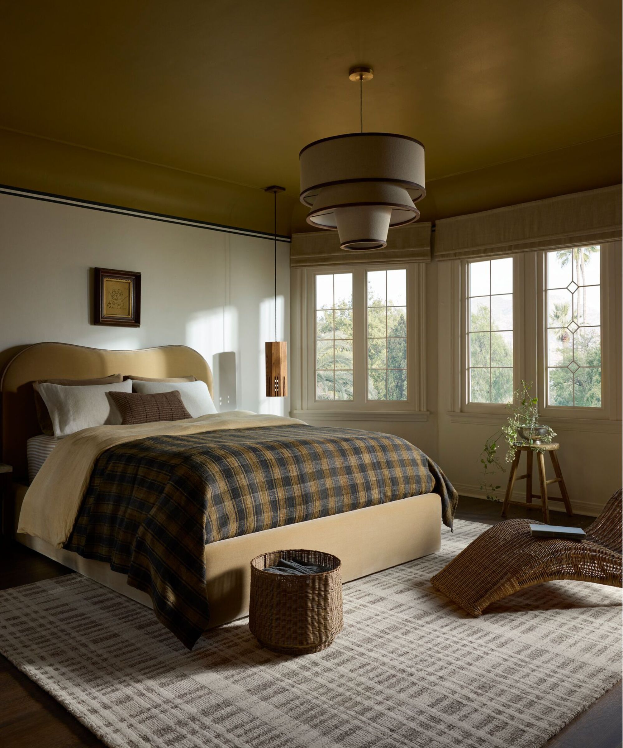
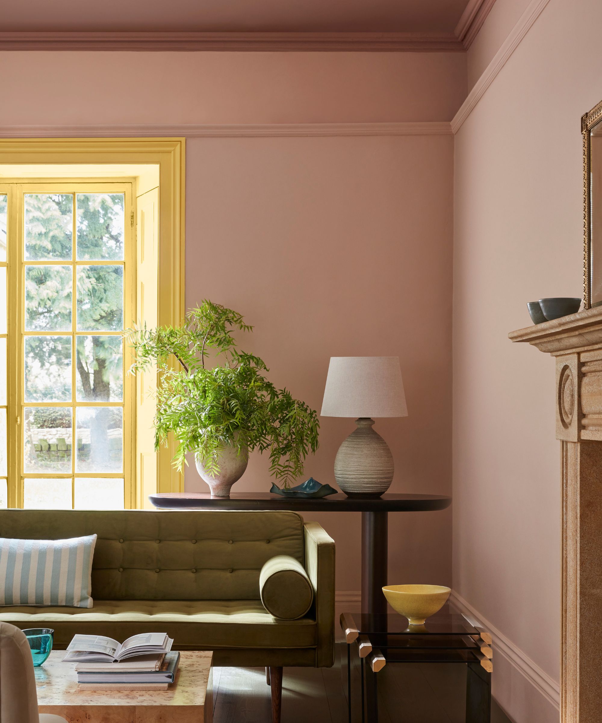
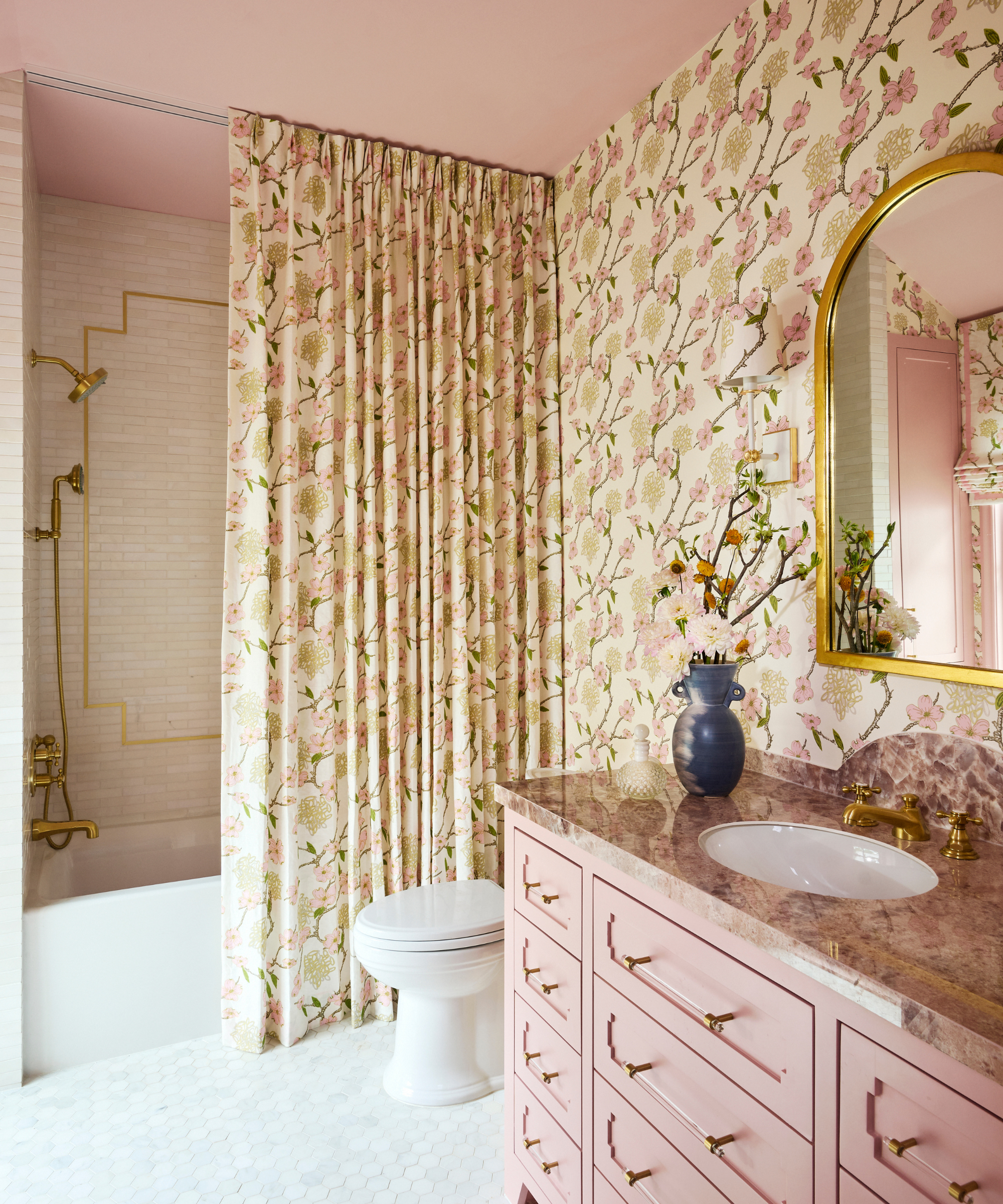
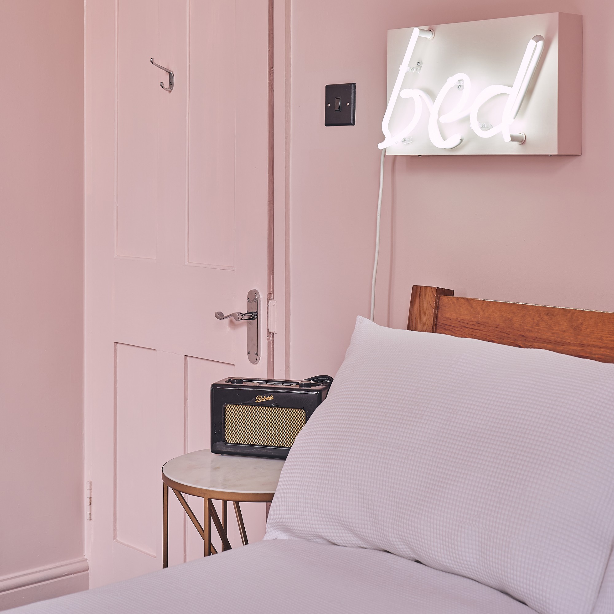
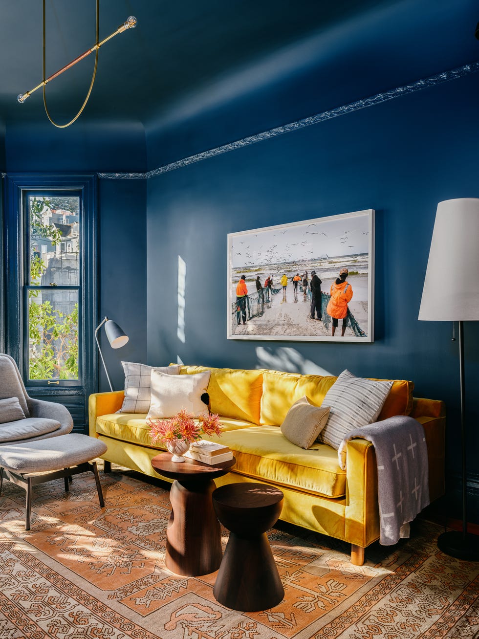
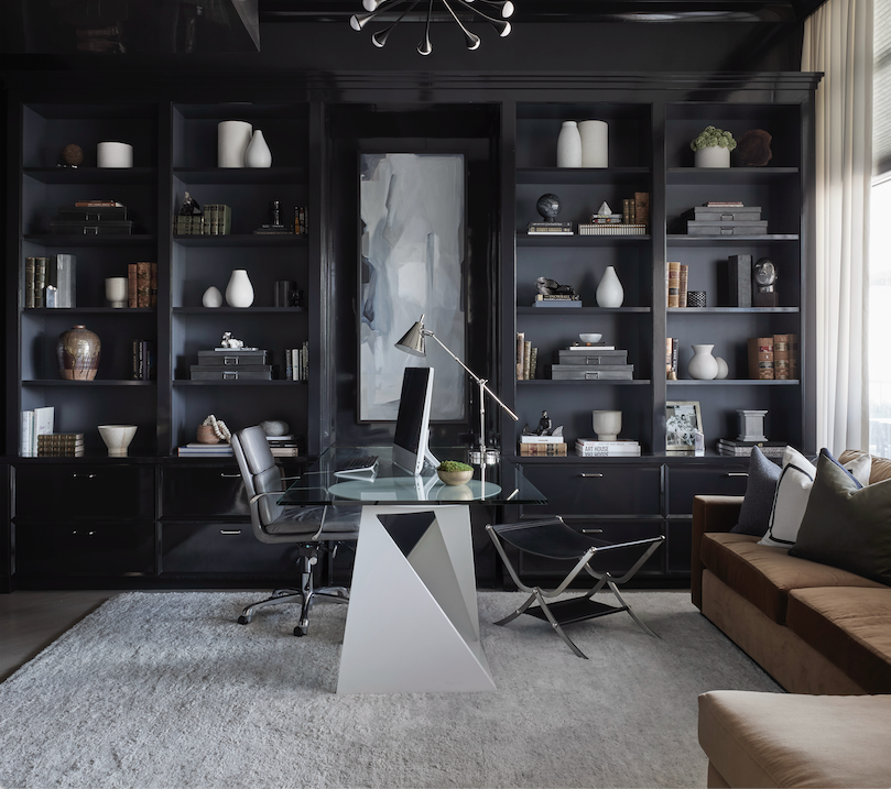
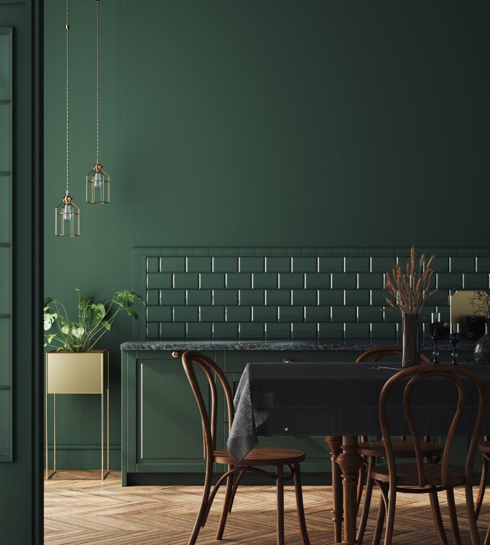
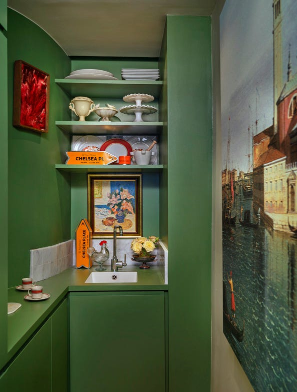
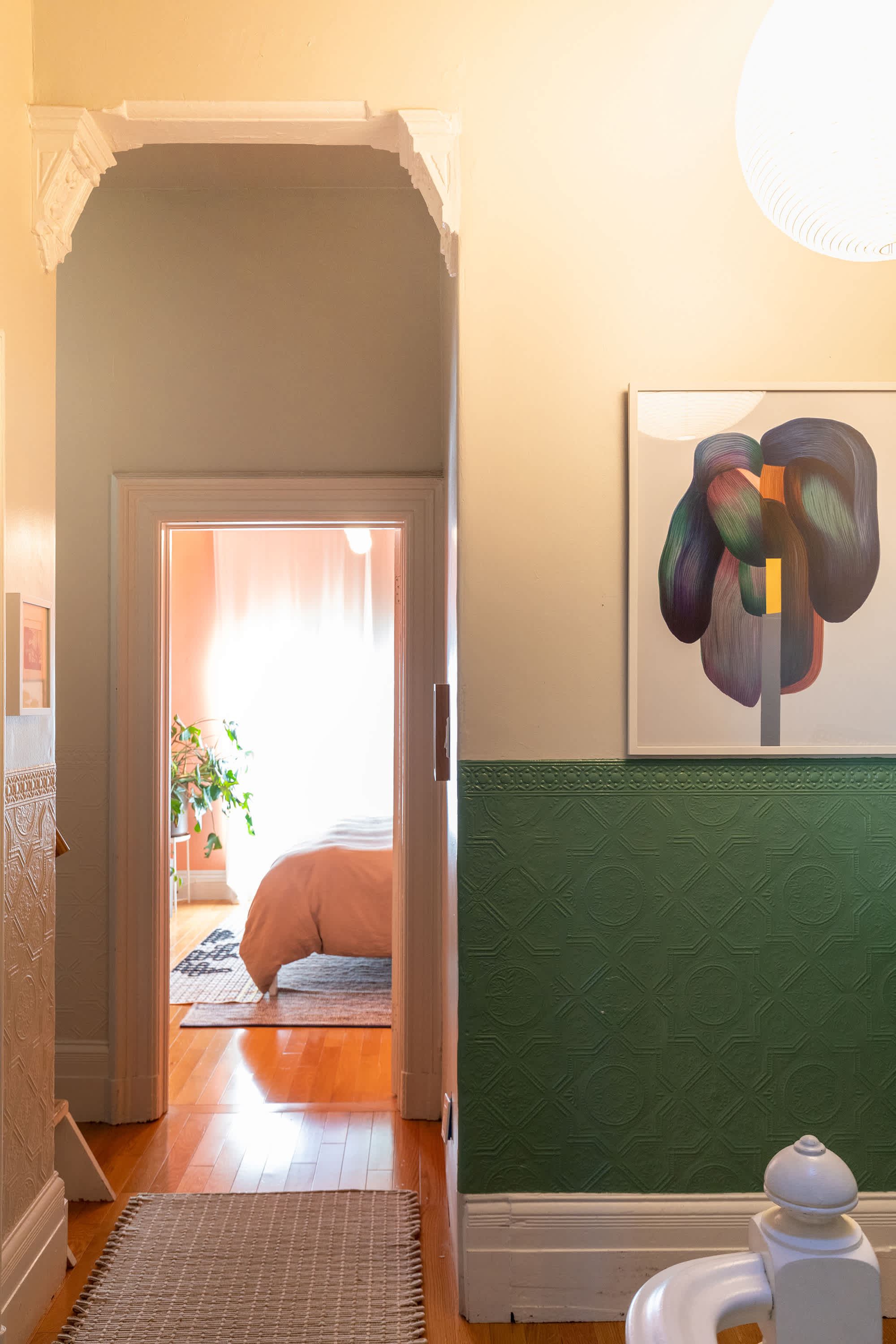
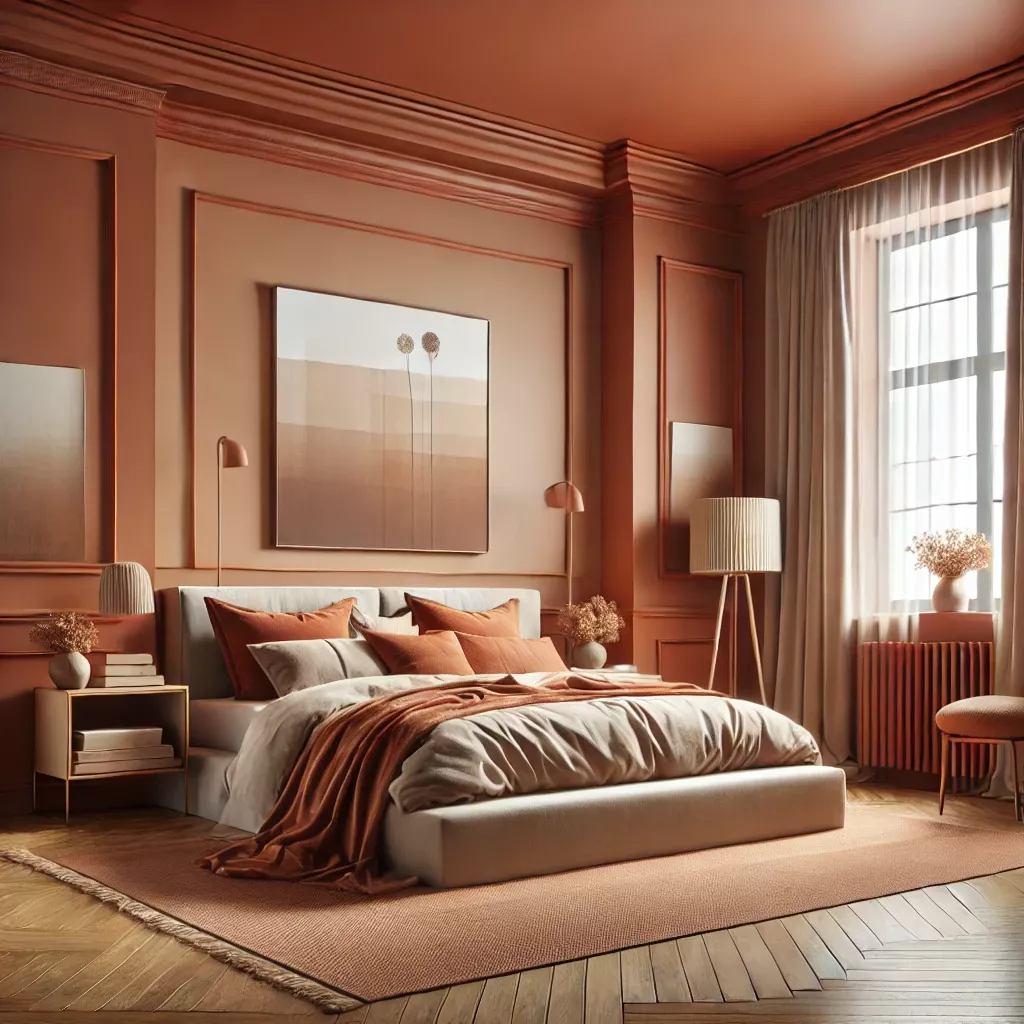
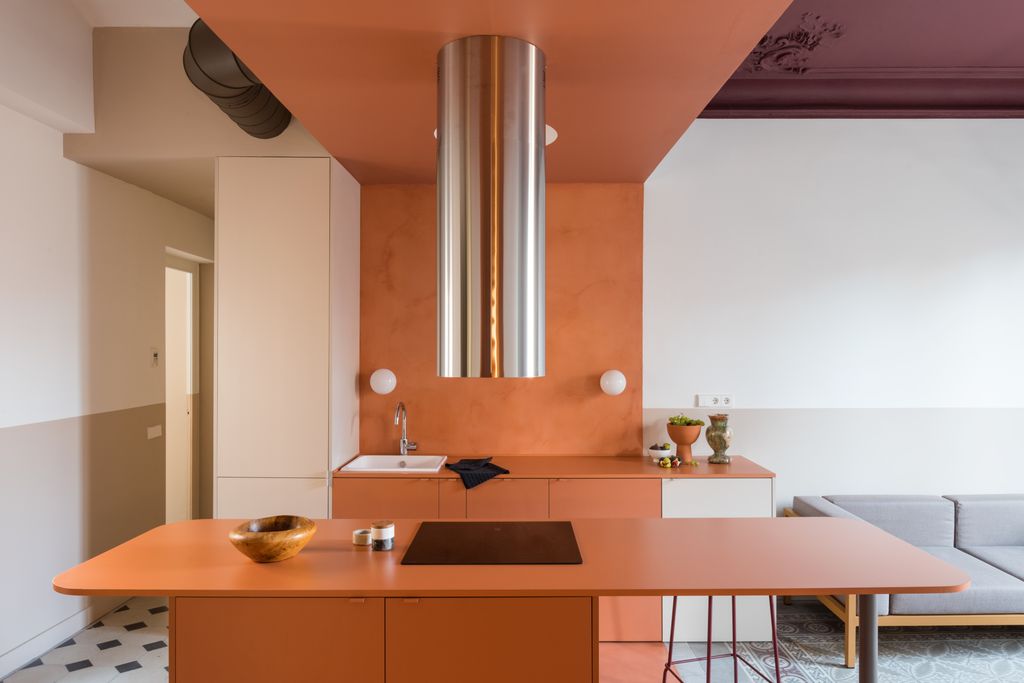
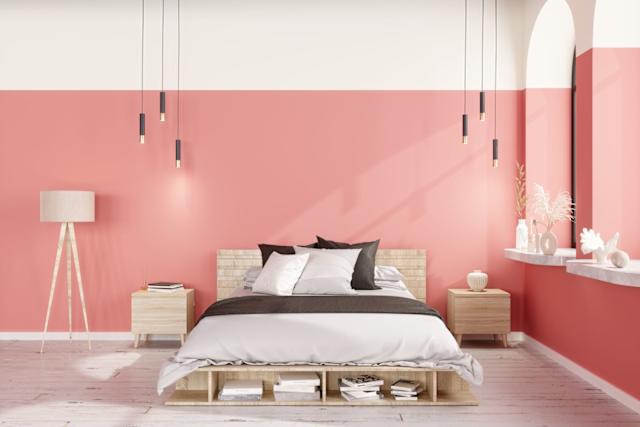
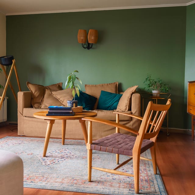
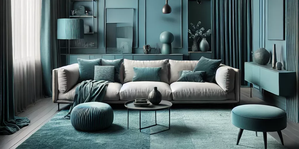
The modern interpretation of color-blocking in interiors draws heavily from techniques such as color drenching, which acclimated designers and homeowners to painting not just walls but also ceilings, doors, and trimmings in a single hue. This initial step allowed for experimentation with varying finishes of the same color, introducing subtle textural differences. Building on this, 'color capping' emerged as a more varied form of drenching, where a second, often tonal, color is applied to the upper portion of a room, creating an architectural and decorative effect. This technique favors harmonious combinations such as clay with terracotta, deep teal with gentle moss, or ivory and tobacco, aiming for a grounded yet uplifted feel depending on the placement of darker or lighter caps.
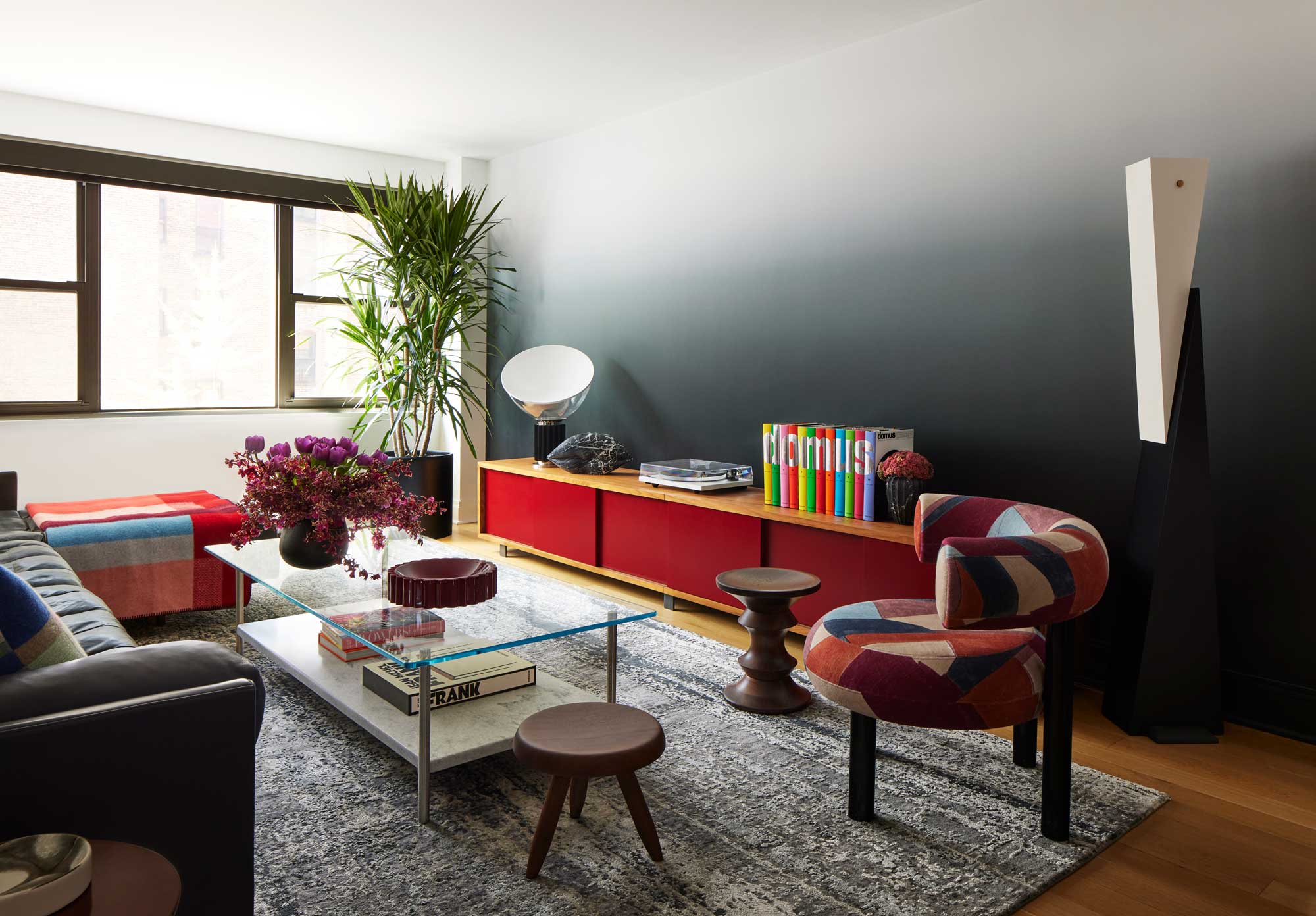
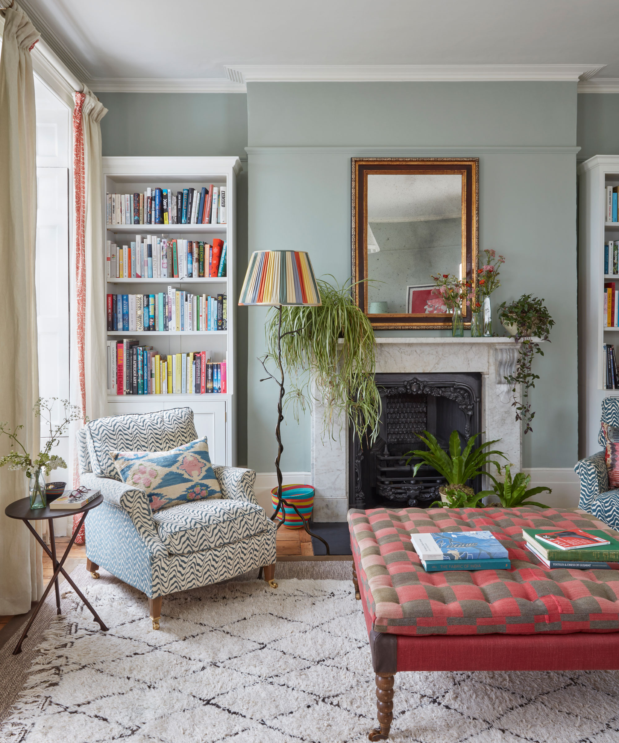
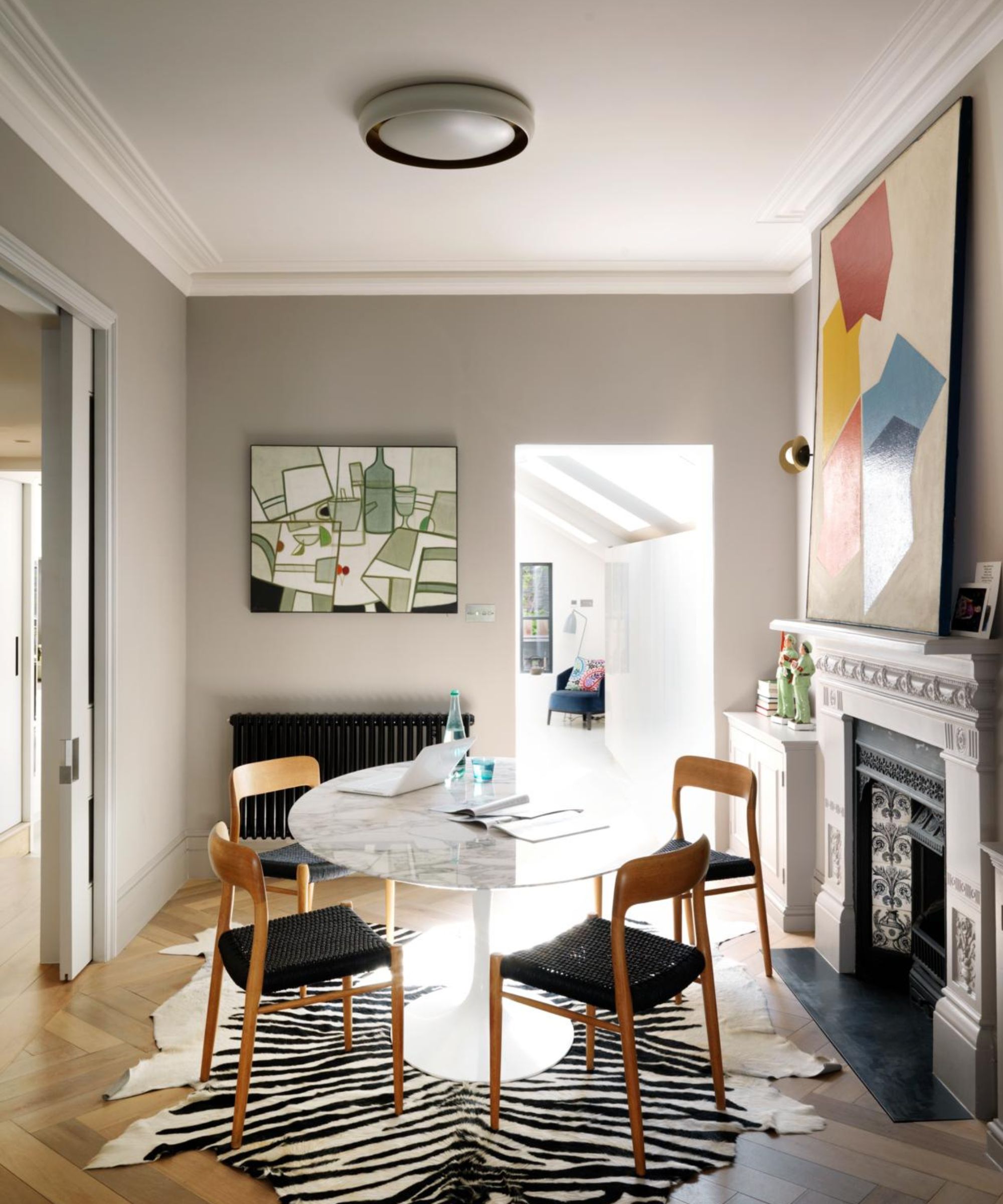
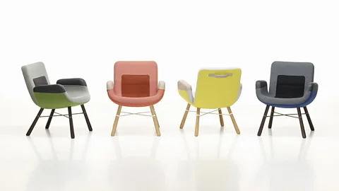
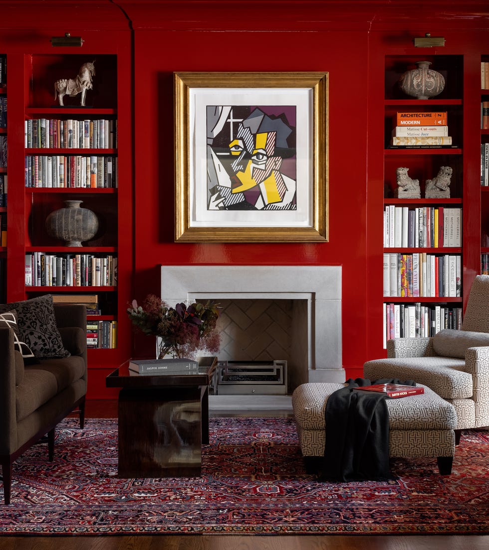
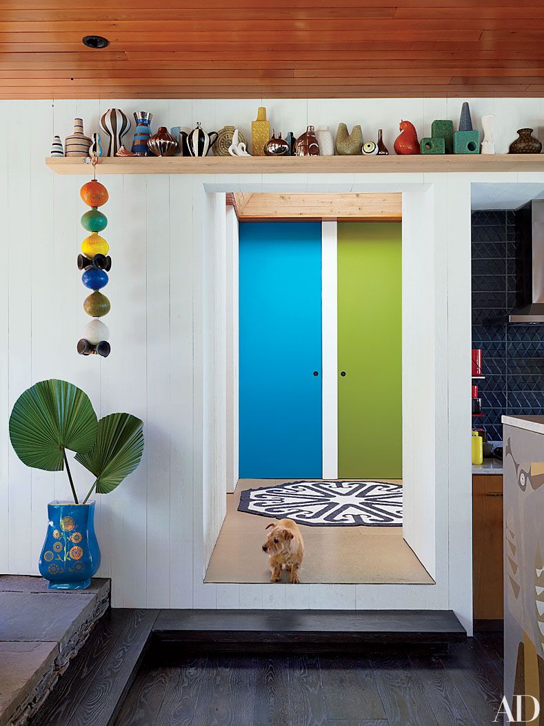
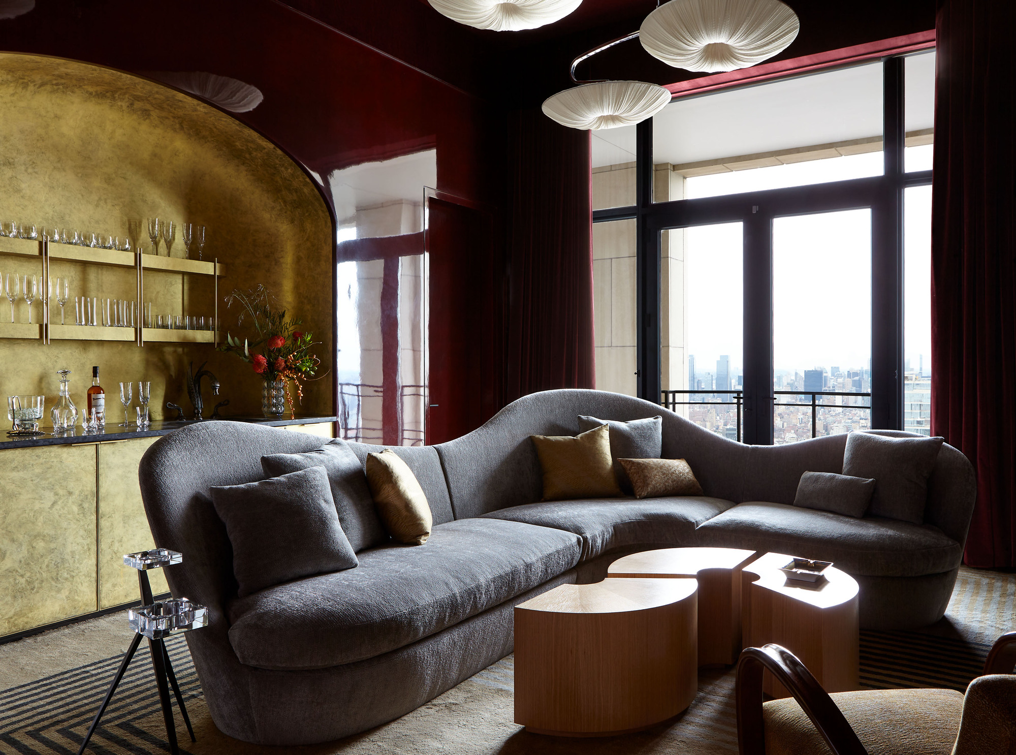
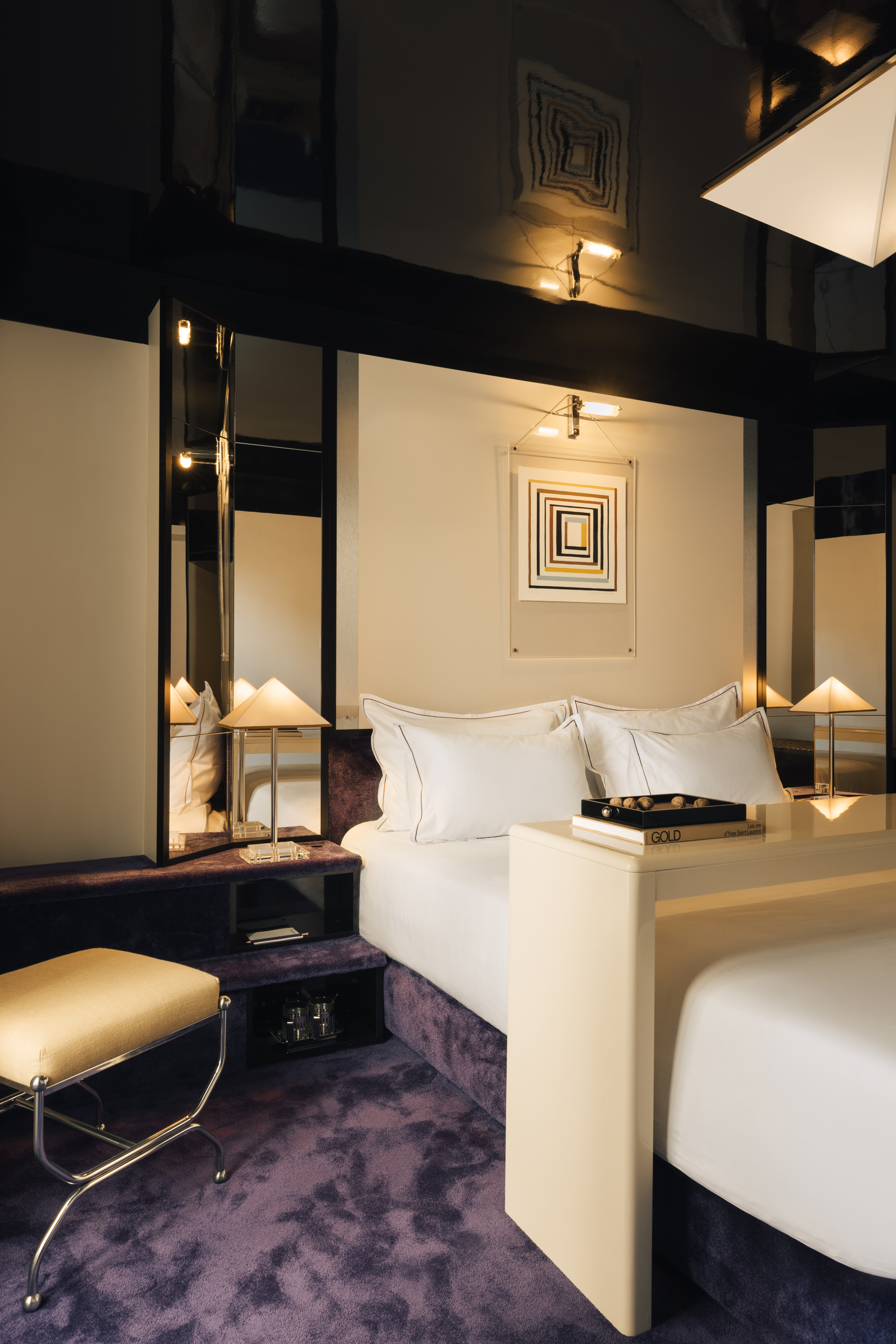
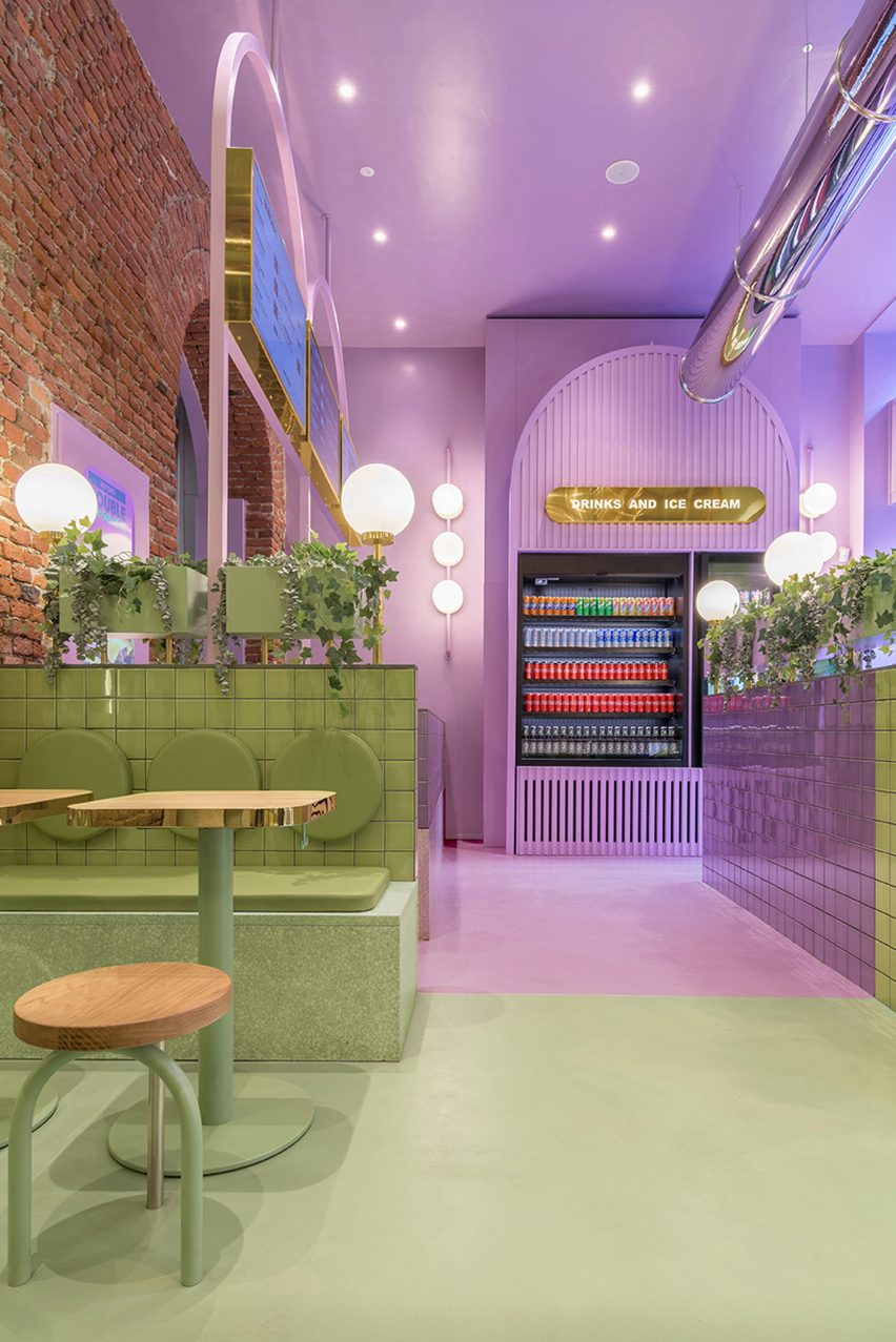
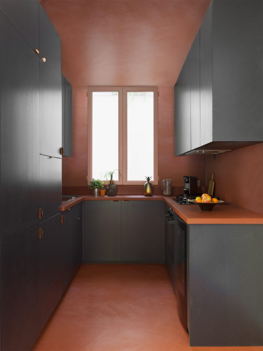
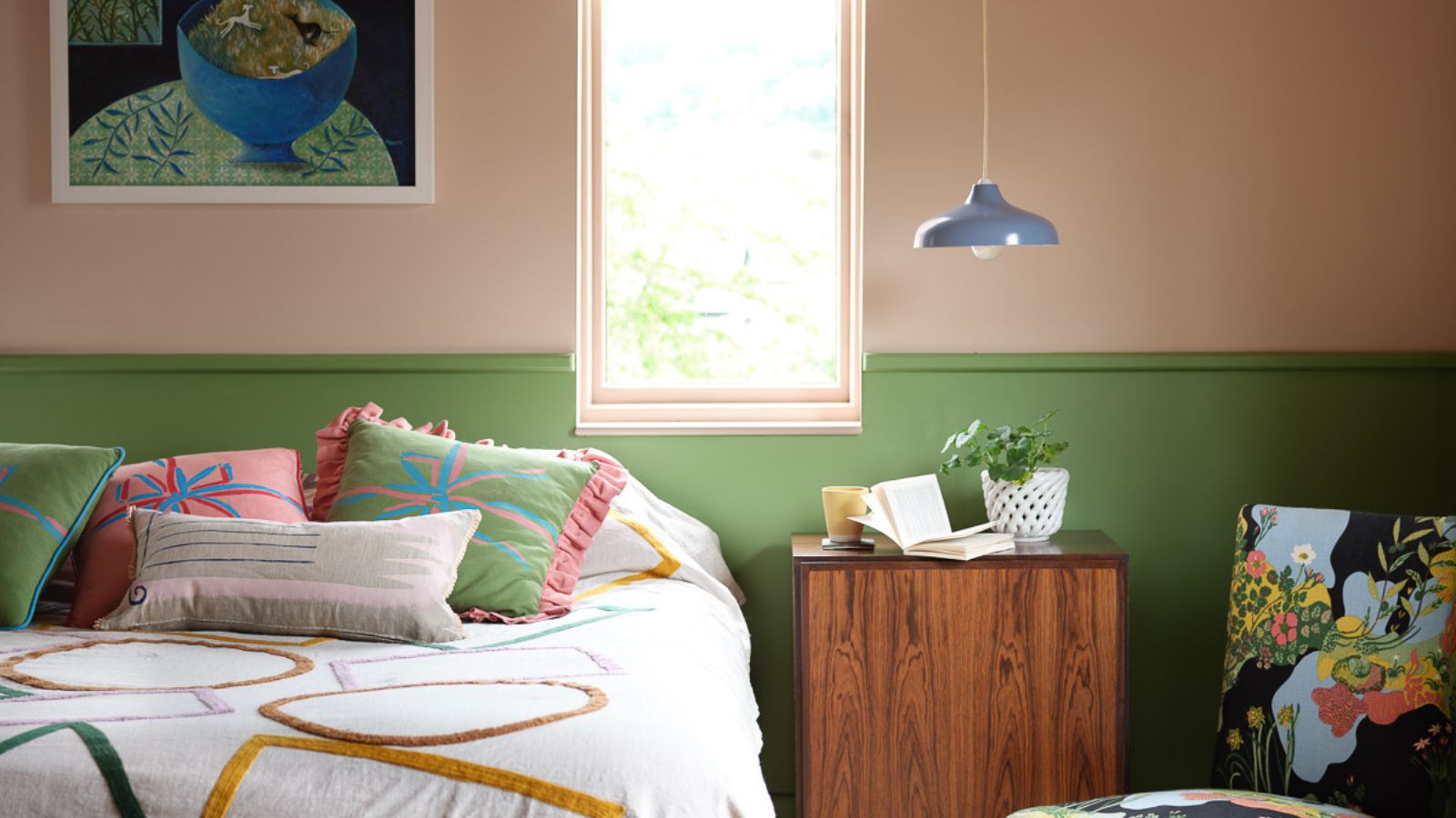
Another avant-garde approach contributing to the modern color-blocking trend is 'chromatic tension.' This technique emphasizes strategic color contrast to maintain visual engagement within a space. It involves introducing a section of an opposing color into a predominantly drenched or capped interior, creating a deliberate focal point that stands out from the main color scheme. Examples include pairing a lacquered red table with chalky mushroom walls, a lilac bouclé headboard against stony olive walls, or a deep charcoal alcove within a soft blush surface. These combinations result in interiors that are visually intriguing yet considered and calm, moving beyond mere shock value to make a smooth, layered statement.
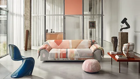
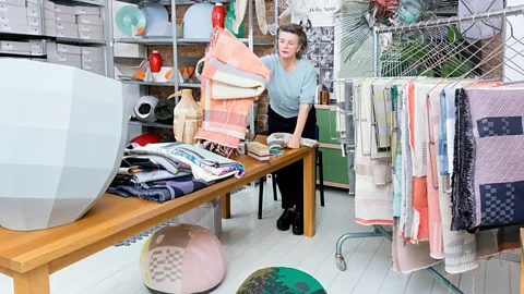
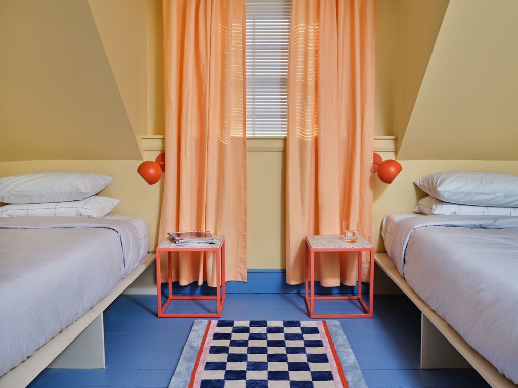
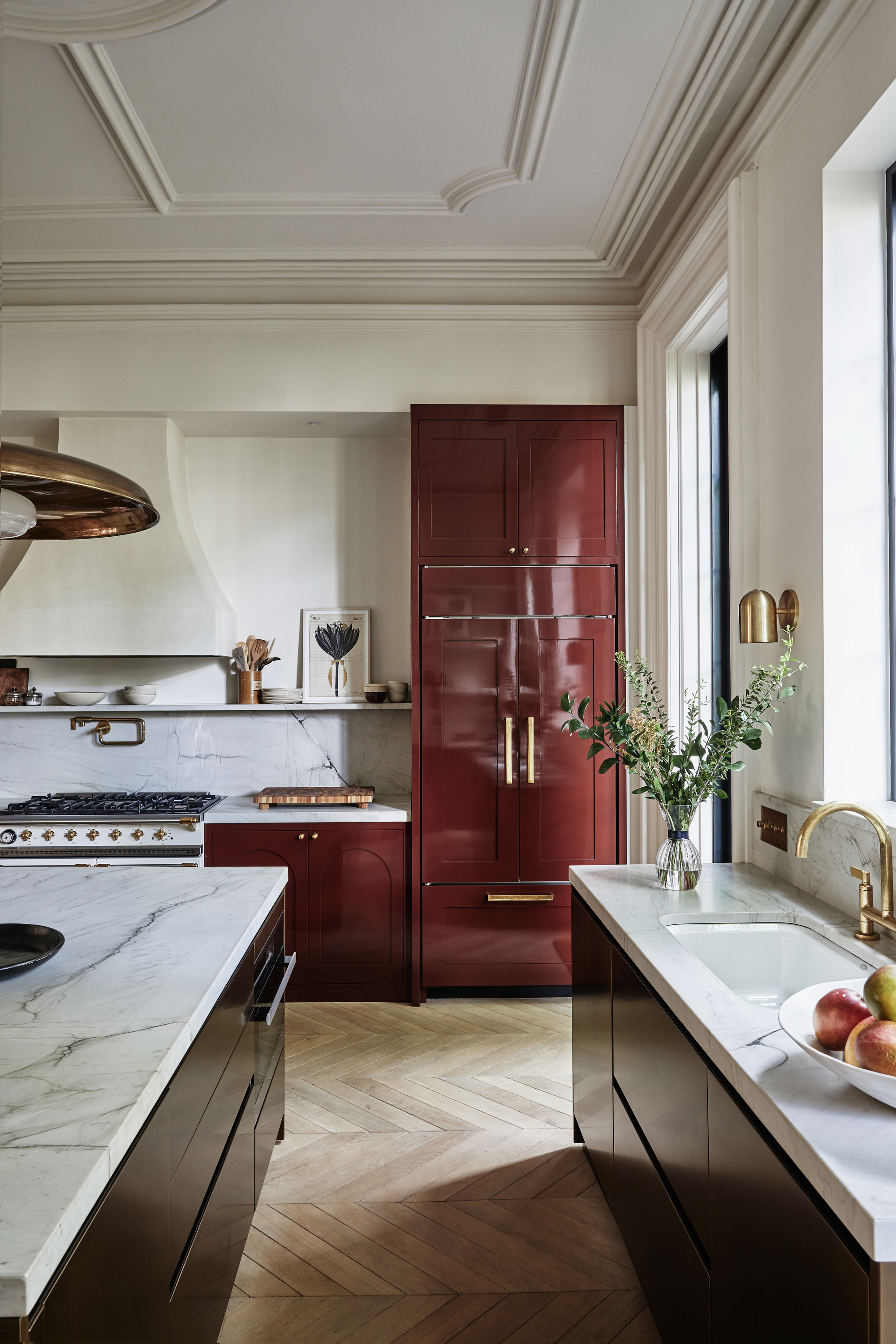
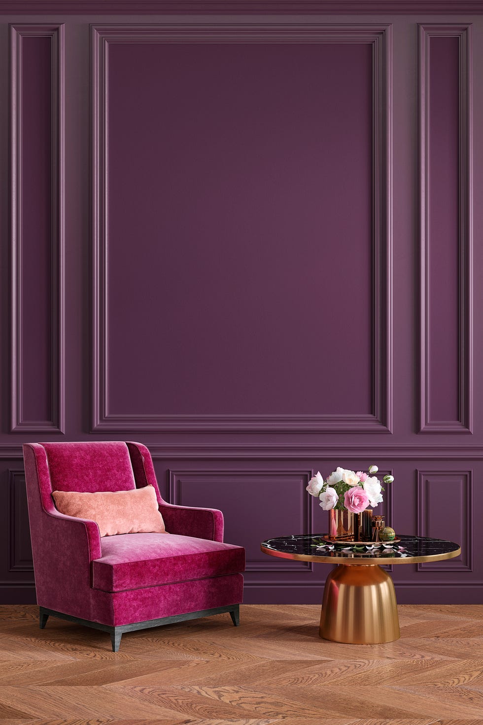
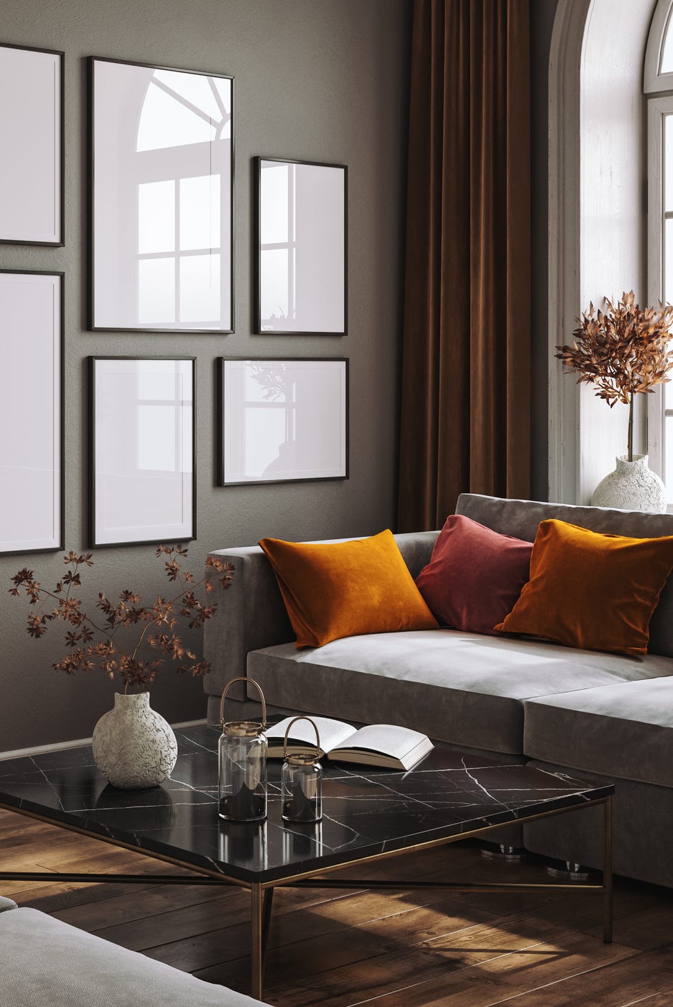
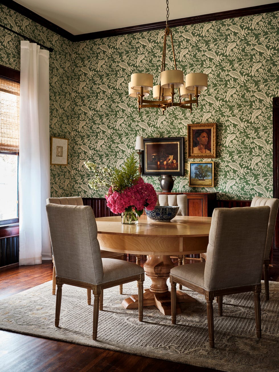
The color palettes for 2026's color-blocking trend are shifting away from the vibrant, retro hues of the past. Instead, the focus is on chic, sophisticated tones that evoke a warm and nuanced atmosphere. Suggested pairings include soft sand with burnt sienna, taupe with plum, latte with rust, or pale almond with rose. These combinations aim for inviting, balanced, and sophisticated spaces that are quietly engaging. The trend also extends to creative fabric pairings, using vibrant prints alongside solid-colored fabrics to achieve a modern and fresh aesthetic.
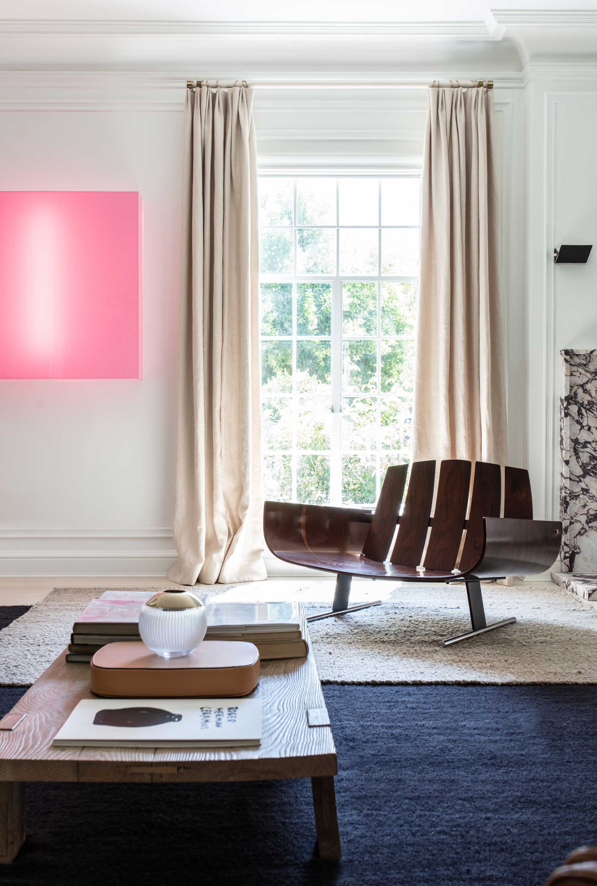
To ensure cohesion, designers recommend that once core blocking tones are chosen, all other elements—furniture, rugs, and textiles—play a supporting role. Larger pieces should either coordinate with the chosen shades or be neutral to allow the color pairing to be the room's central narrative. Introducing new textures is encouraged, but other tones should be kept to a minimum, with only occasional areas of intentional tension. Smaller accents like ceramics, artwork, or lighting can subtly echo the color-blocking shades, drawing the entire space together and creating a curated feel. This revival of color-blocking and maximalism indicates a growing desire for 'dopamine-boosting' environments that offer both style and a sense of curated personality.
#ColorBlocking #InteriorDesignTrends #HomeDecor #ColorTheory #DopamineDecor #ModernInteriors #DesignTrends2026 #ColorDrenching #ChromaticTension #ColorBlocking #InteriorDesignTrends #HomeDecor #ColorTheory #DopamineDecor #ModernInteriors #DesignTrends2026 #ColorDrenching #ChromaticTension
0 تعليق إجمالاً
 لا توجد تعليقات بعد
قد تعجبك أيضًا
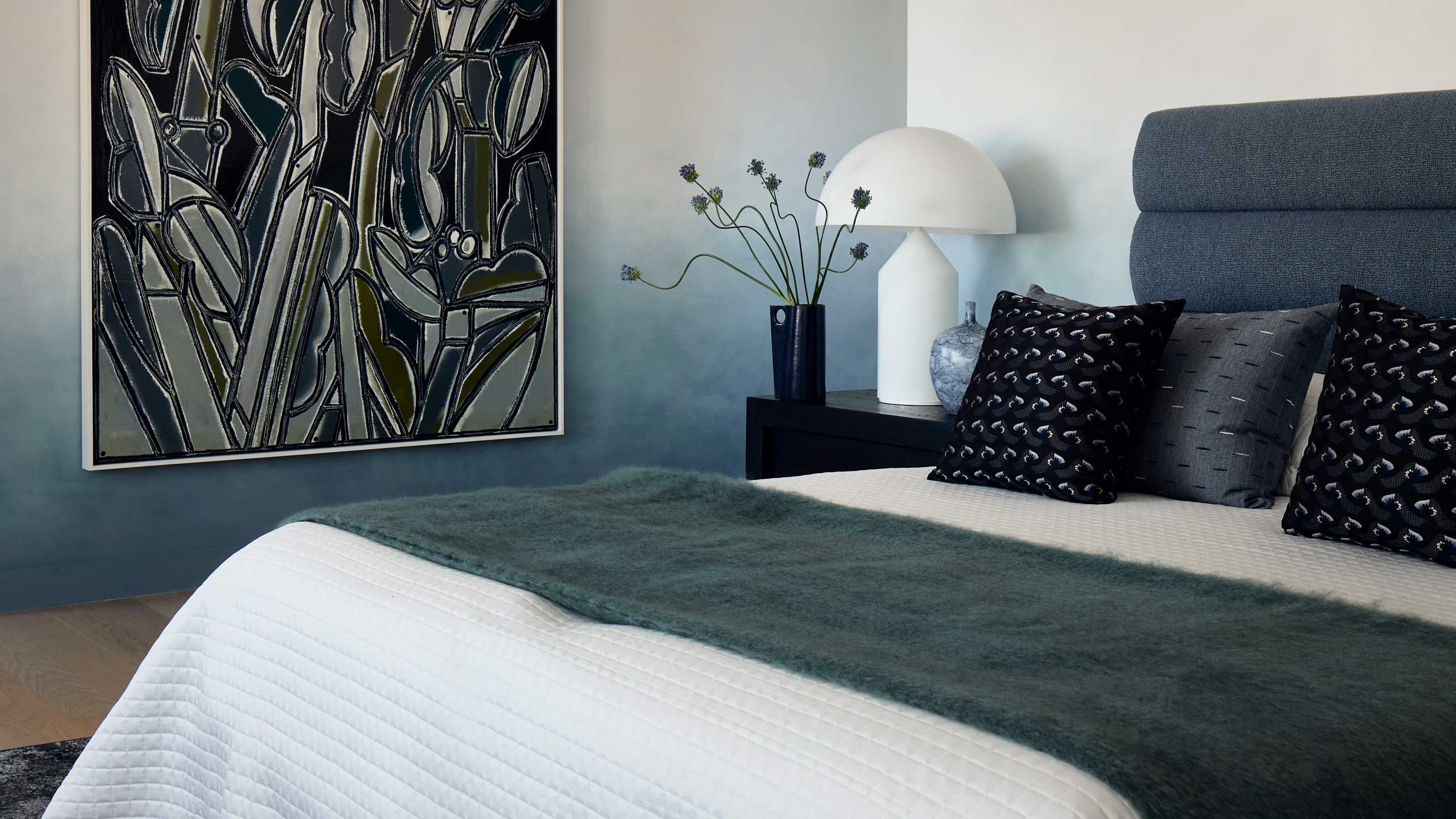
This surprising color trend is having a comeback
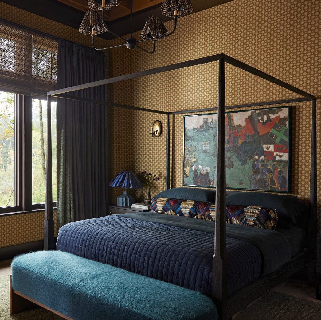
This Very "Controversial" Color Is About To Be Everywhere Again

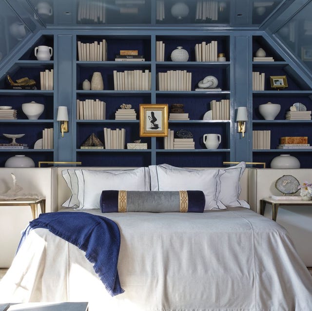
The Color Drenching Paint Trend Isn't Going Anywhere
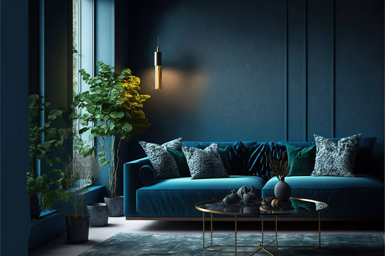
This Is the Color Trend You'll Soon See Everywhere—And It'll Make Your Space Look Much Bigger

Understanding colour blocking
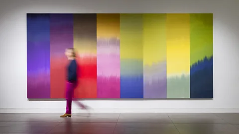
What you didn’t know about colour

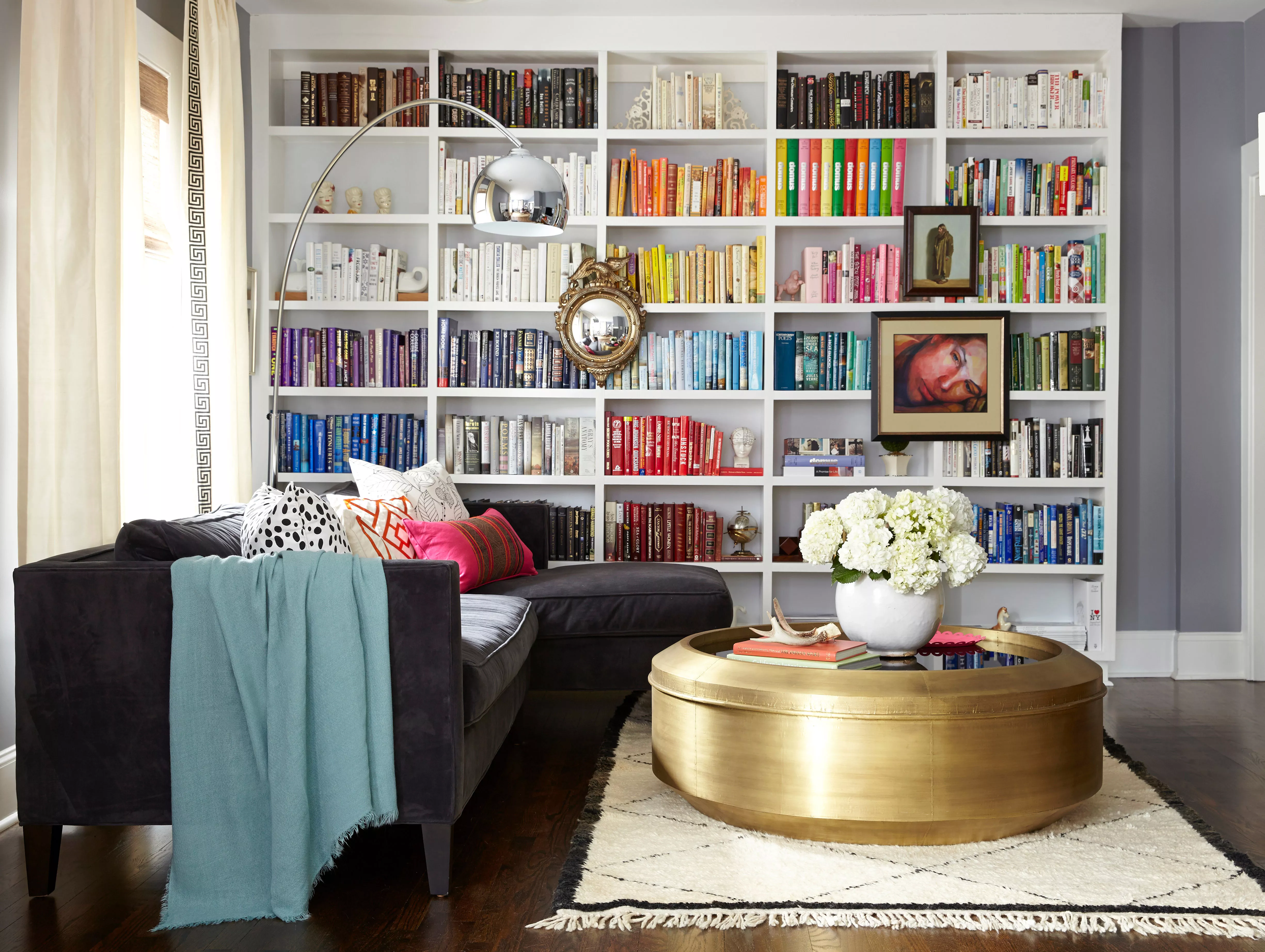
Is the Color-Coded Bookshelf Here to Stay? Here’s What Designers Have to Say

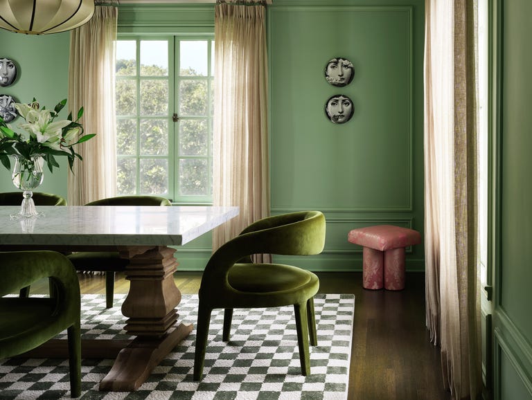
This SURPRISING Color Is About to Be Everywhere, According to Designers

Getting your colours done is the latest 1980s fashion trend resurrected by TikTok — but does it actually work?
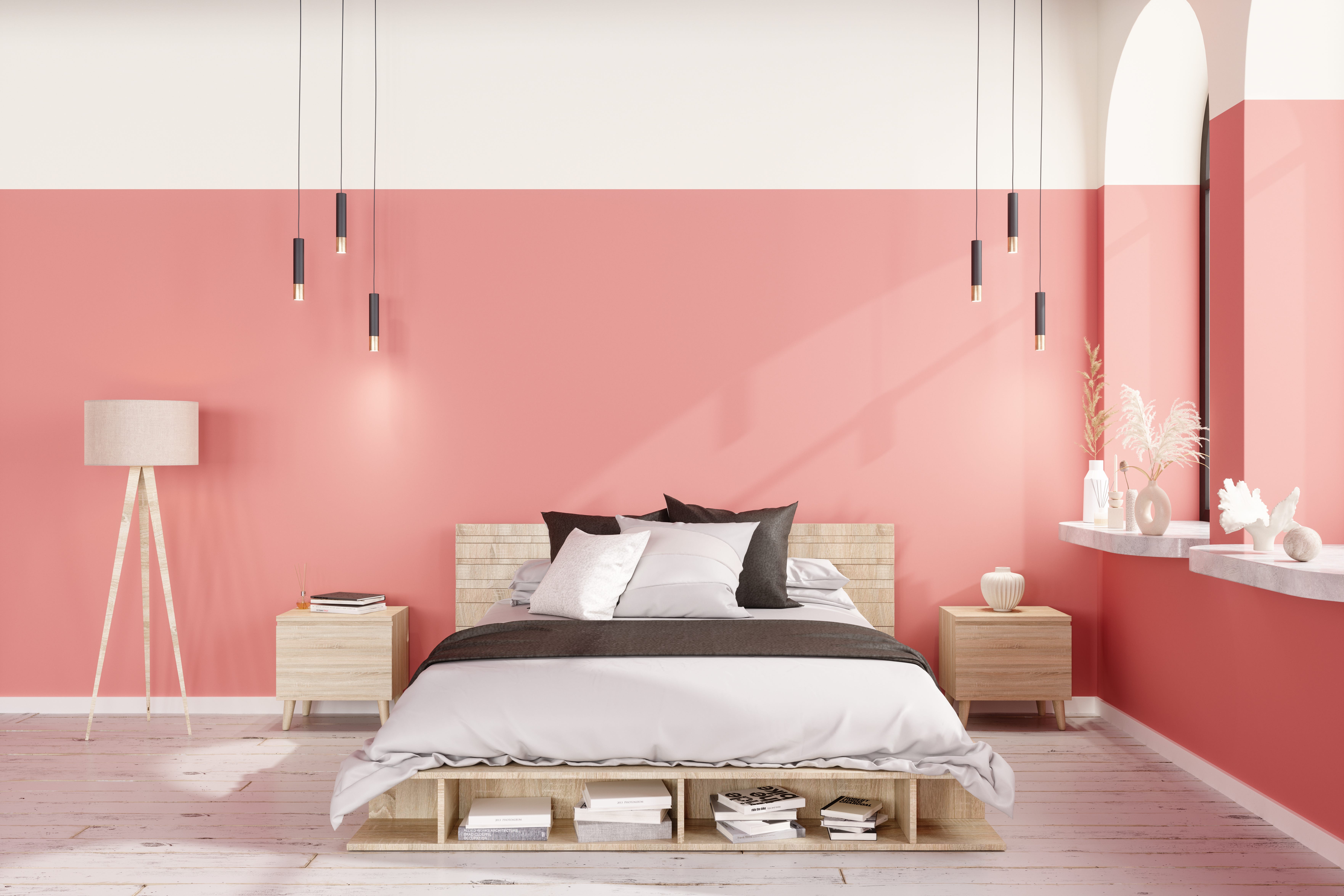
Design Pros All Agree: The Color-Blocking Trend Is One to Try

9 Color Blocking Ideas for a Bright, Cheery Home

Ten bright and bold interiors that make use of colour theory
Design Pros All Agree: The Color-Blocking Trend Is One to Try

Move over color drenching, ‘color capping’ is the chic new tonal technique you’ll be seeing everywhere this fall
This Outdated Paint Trend is now Predicted to Return — Designers Love its "Fun, Eye-Catching Glamor"
Forget Millennial Pink: When It Comes to Wall Paint, "Boring" Beige is Back
Is gray still on trend? Designers explain how to use this cool-toned hue in a world of warm color schemes

Is colour drenching still on trend for 2025? Experts reveal how the popular paint trend is evolving in the new year
Designers Say These Vintage Paint Colors Are Back

Colour drenching: the interior design trend everyone’s talking about