1/6
How to decorate with ocean blue – the sophisticated moody blue shade designers say is the color for summer 2024
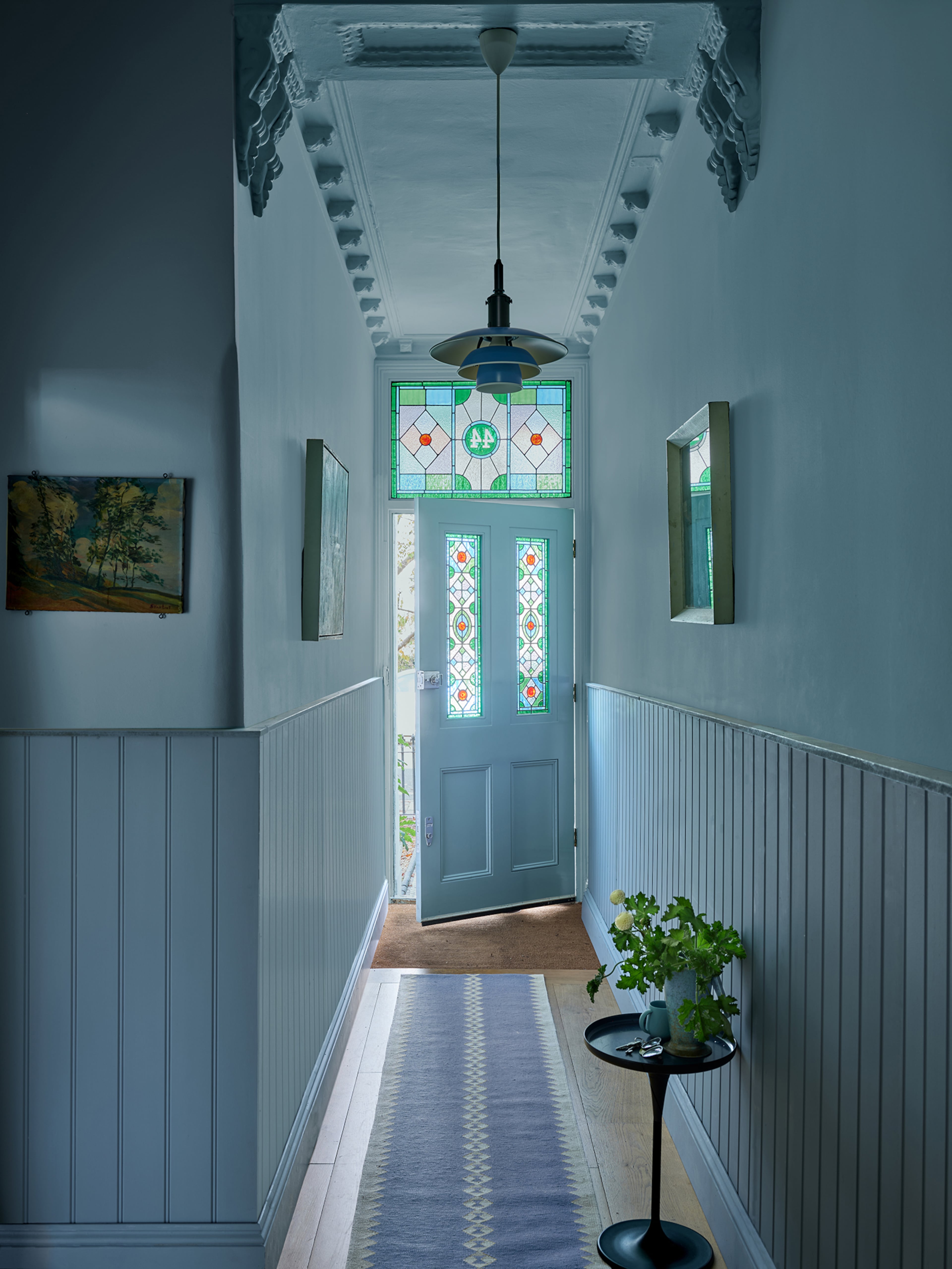
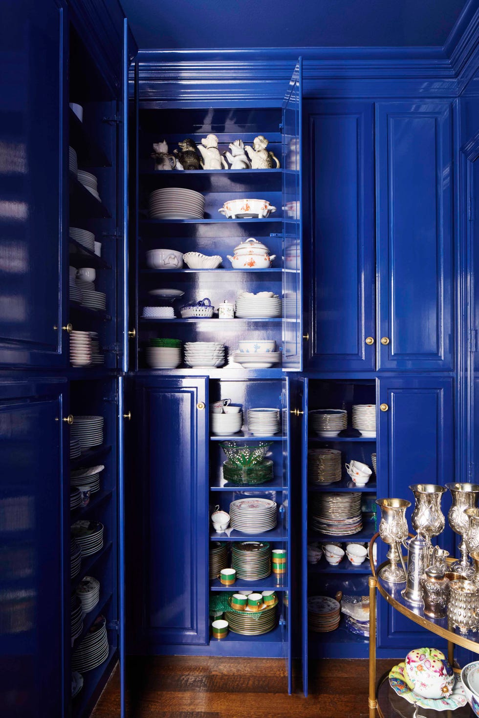
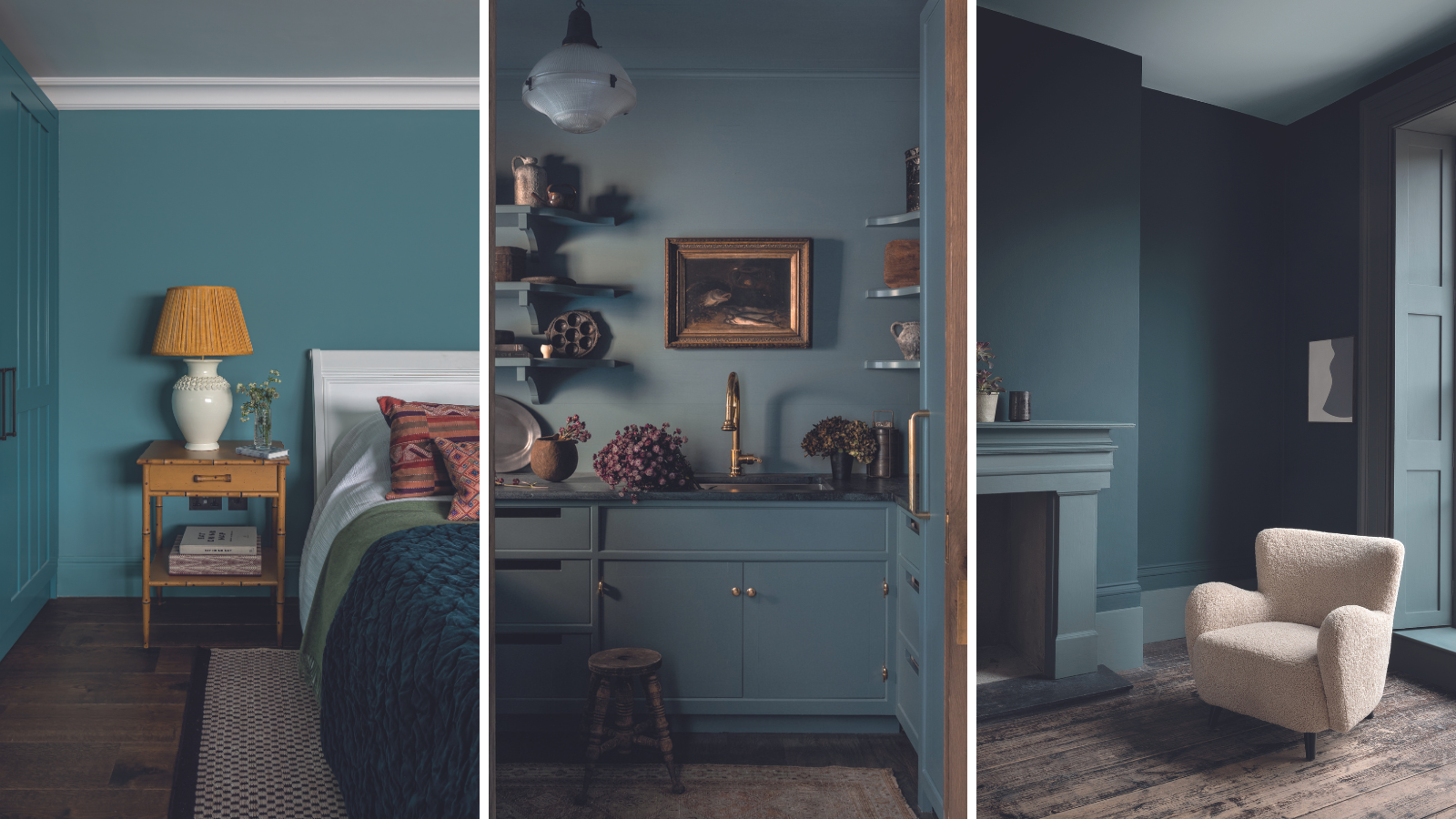
The article explores the rising popularity of ocean blue as a sophisticated and versatile shade for interior decoration, particularly for summer 2024. This mid to dark-toned blue, characterized by its rich, glittering depths and green undertones, is presented as a color that is both enveloping and not ostentatious. Its subtle hints of purple also enable it to complement warm decorating schemes effectively. The piece delves into various applications and benefits of incorporating this moody blue into different living spaces, drawing insights from color experts and leading interior designers.
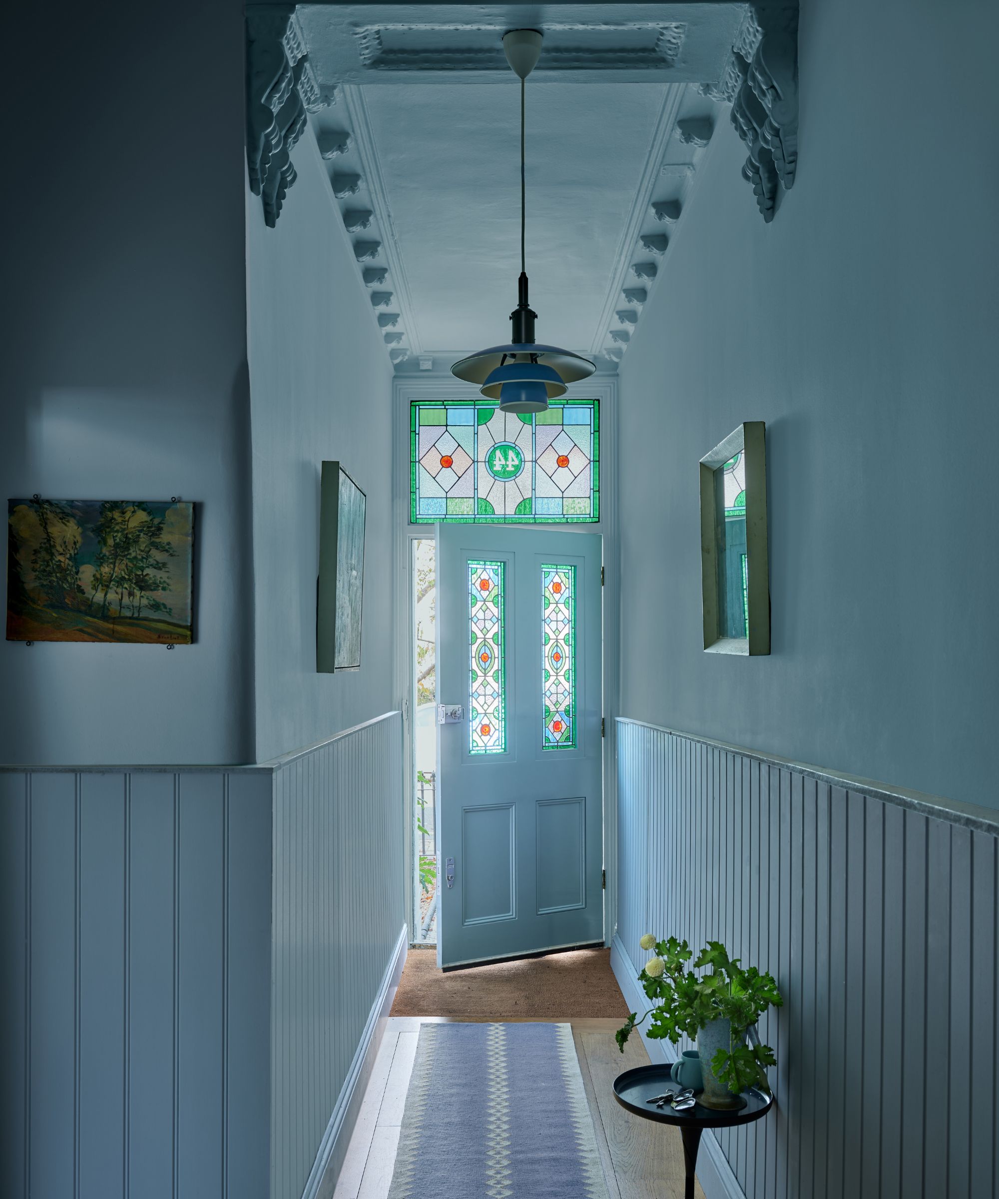
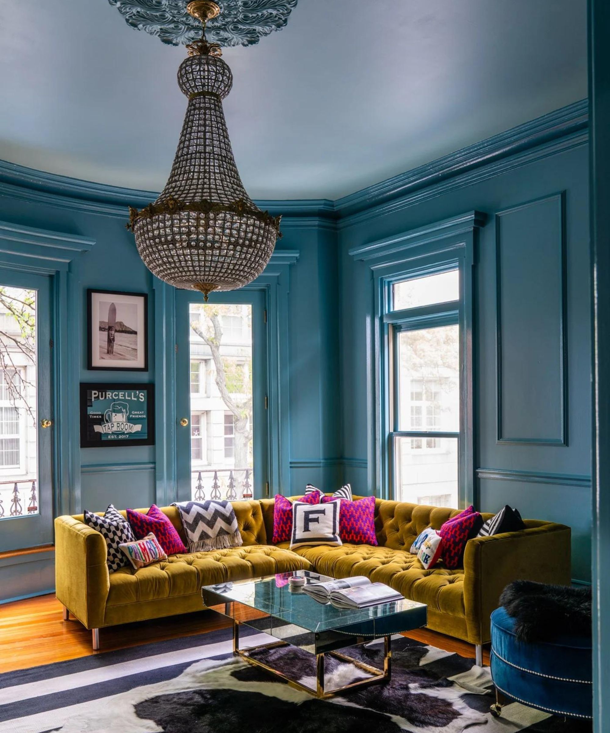
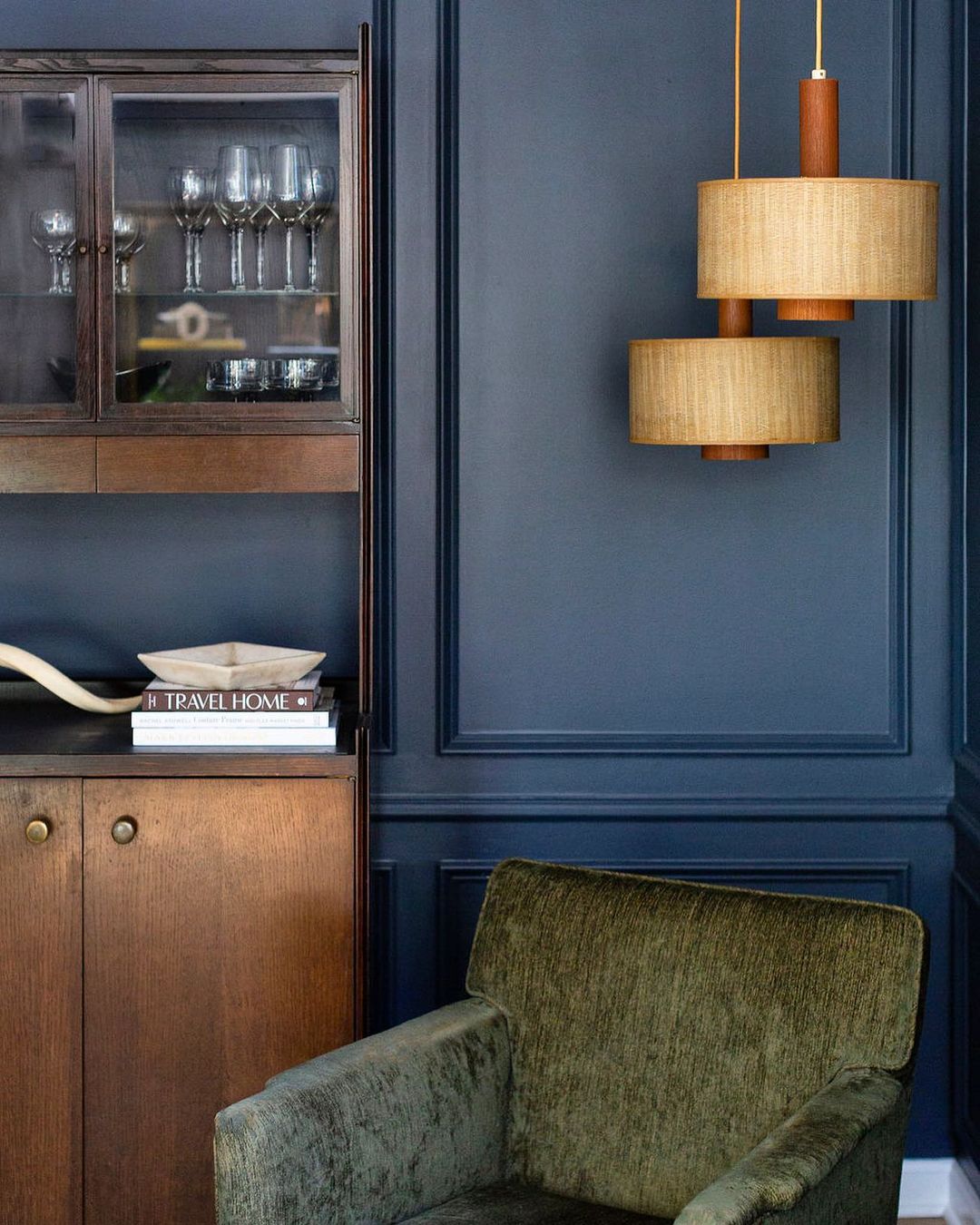
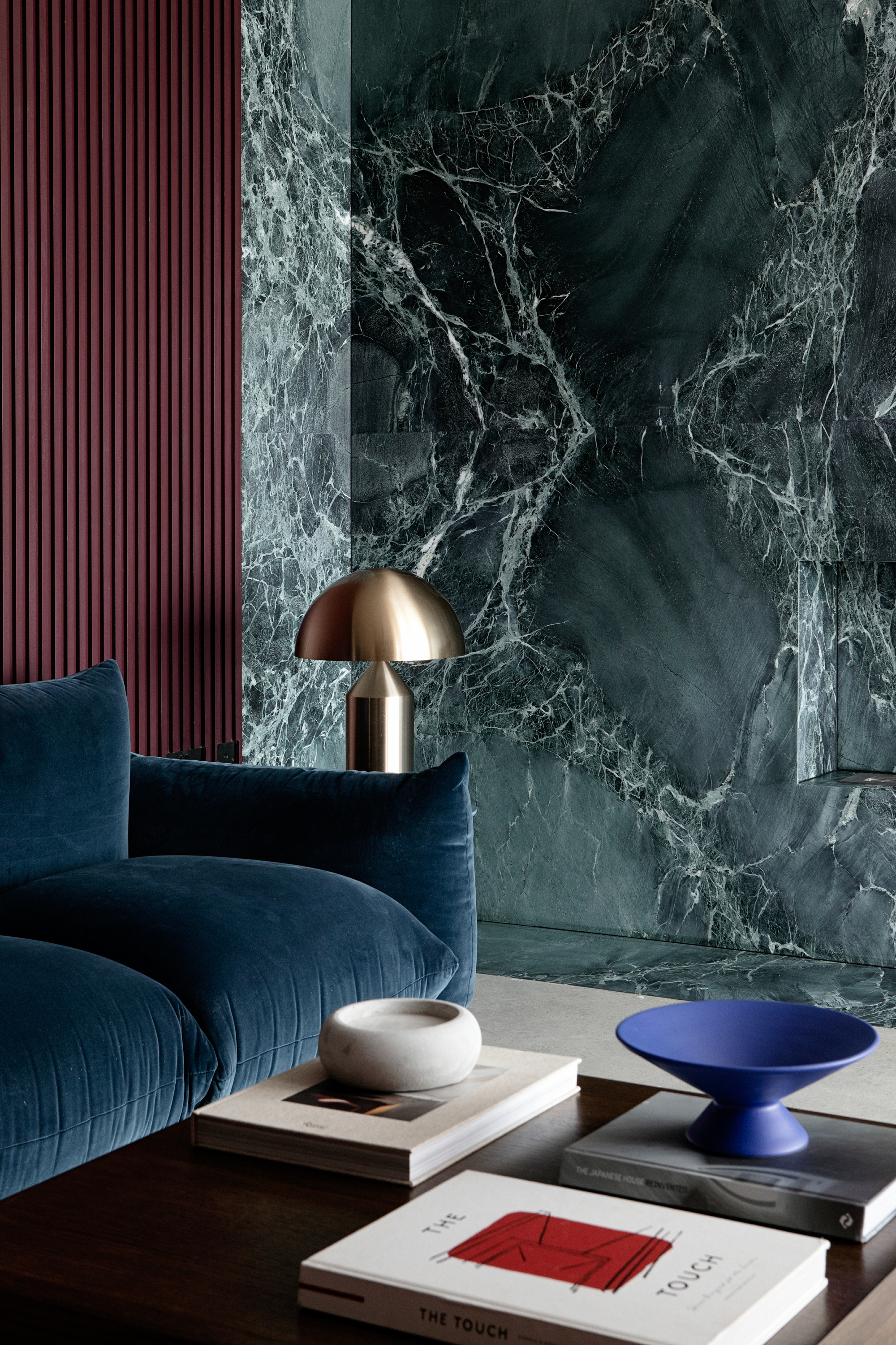
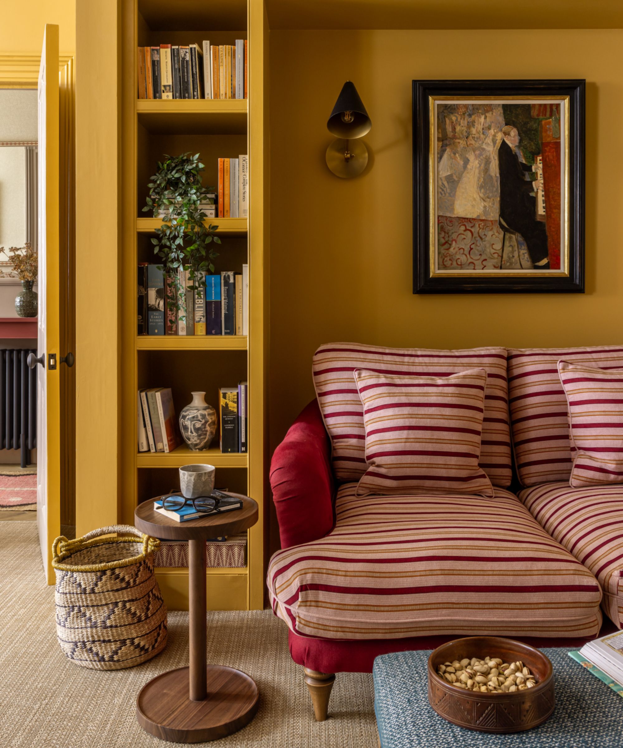
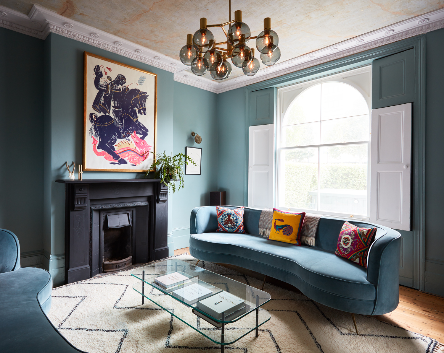
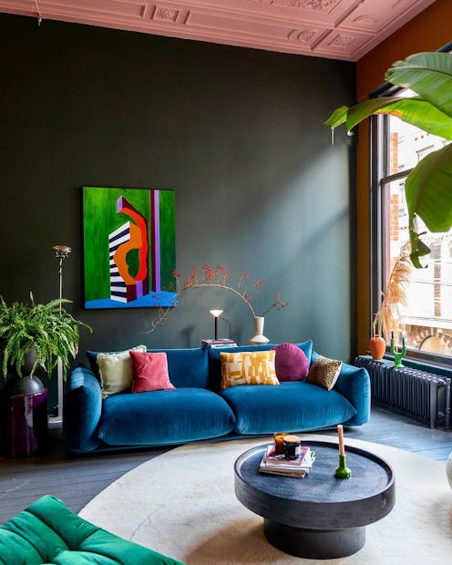
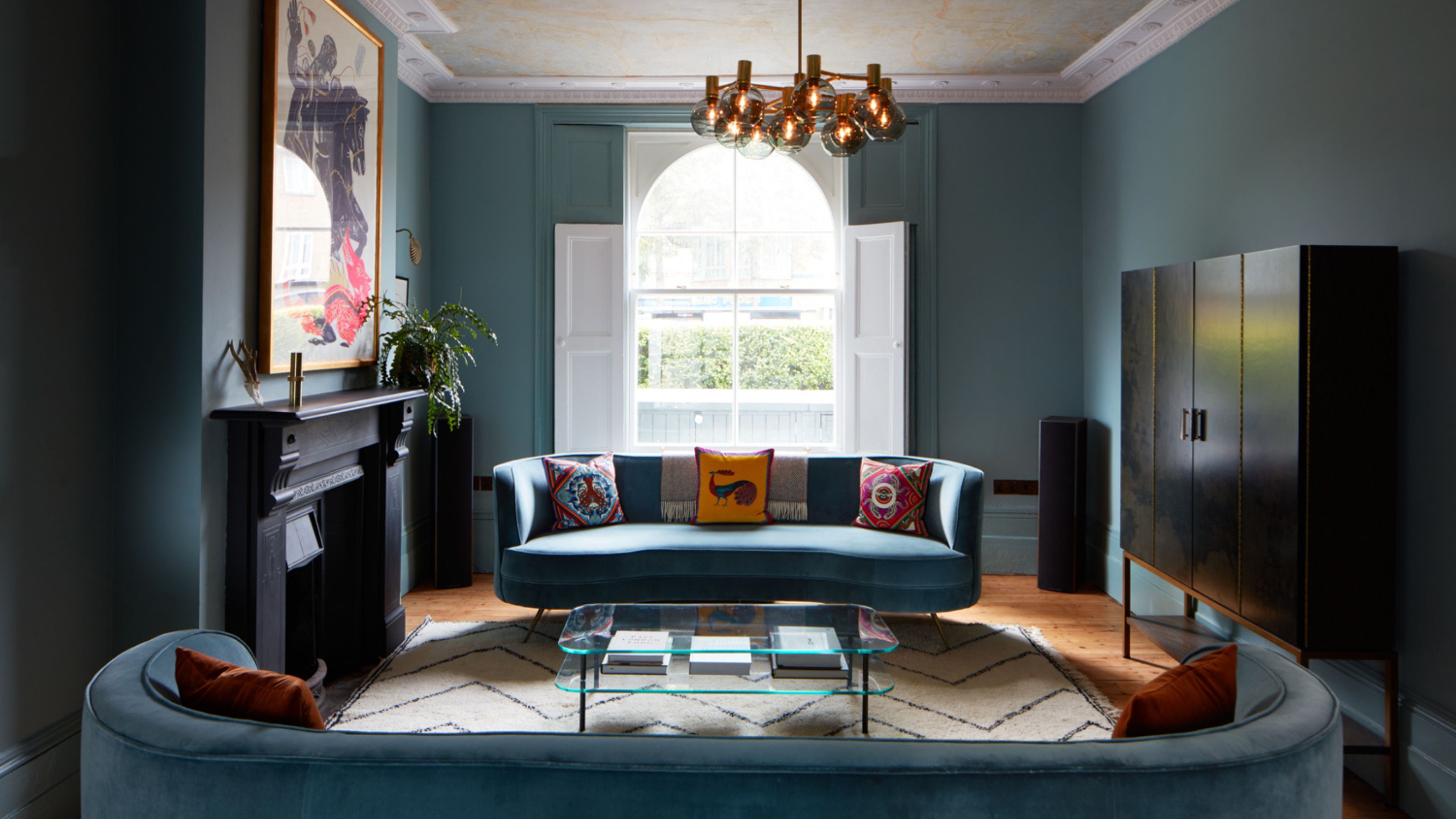
One significant advantage highlighted is its ability to complement warm accents. Edward Bulmer, founder of Edward Bulmer Natural Paint, recommends using jewel-like blue, specifically Saxony from their range, for living spaces. He describes Saxony as a color that hovers between blue and green, offering an intense yet comforting richness. Bulmer suggests it is ideal for evening rooms, as it transitions well with nightfall and appears inviting under lamplight. It also serves as an excellent backdrop for natural weaves and yellow-red hues.
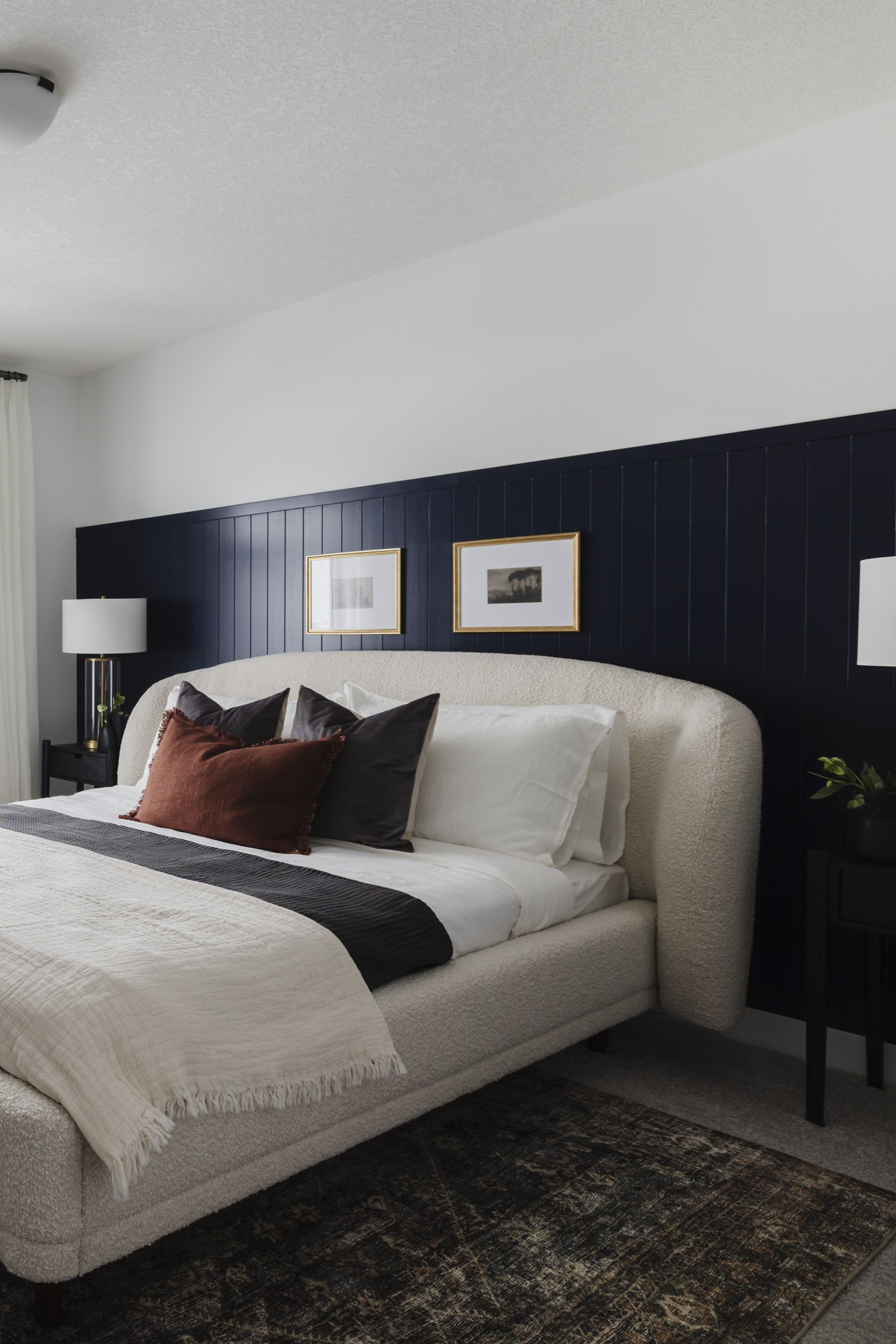
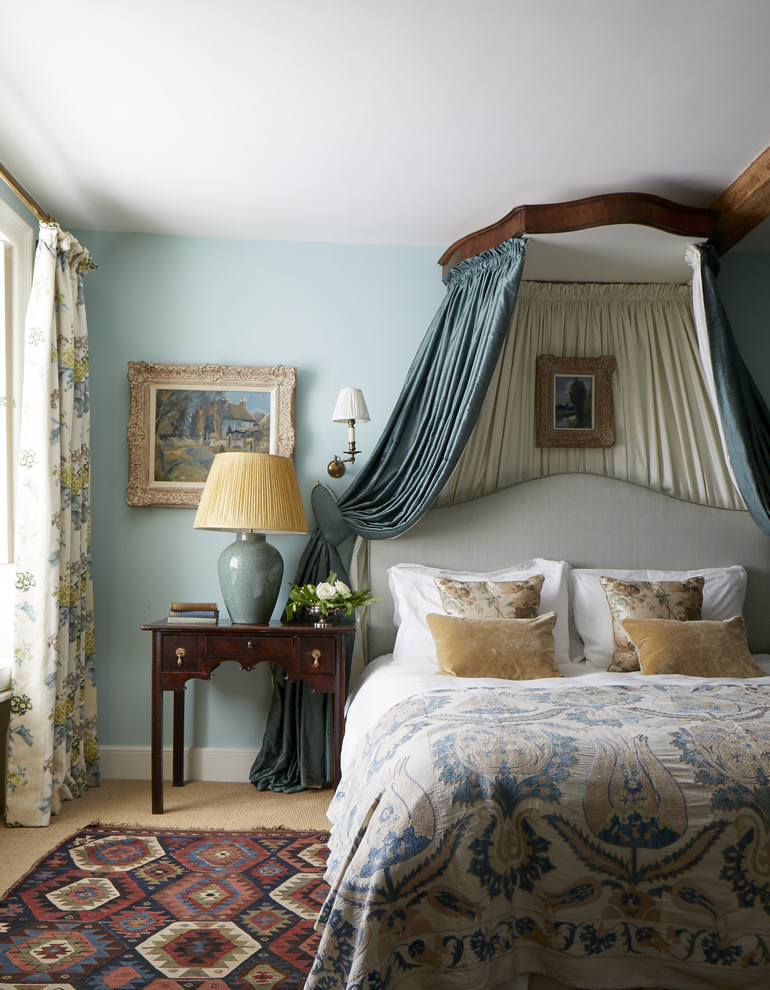
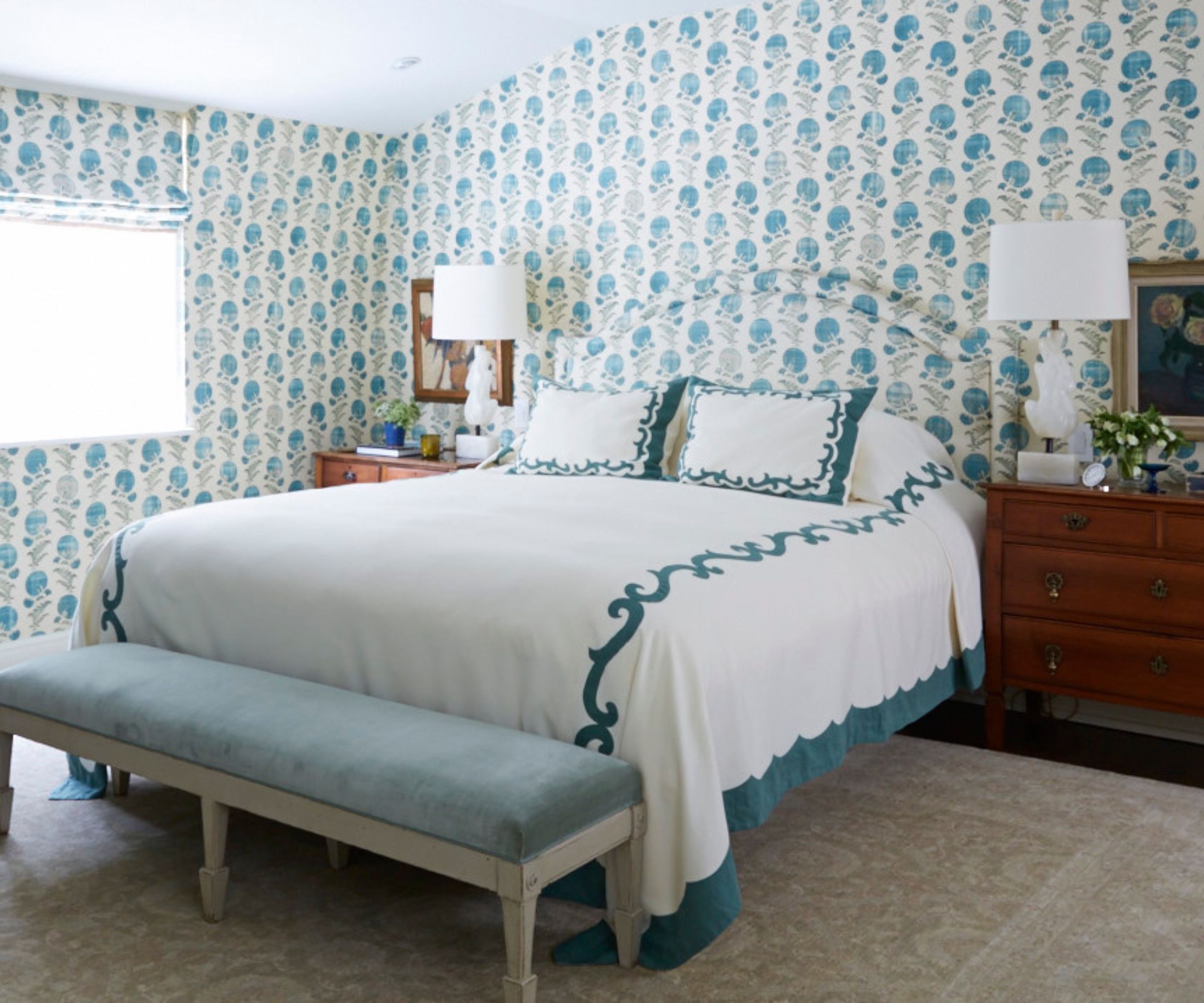
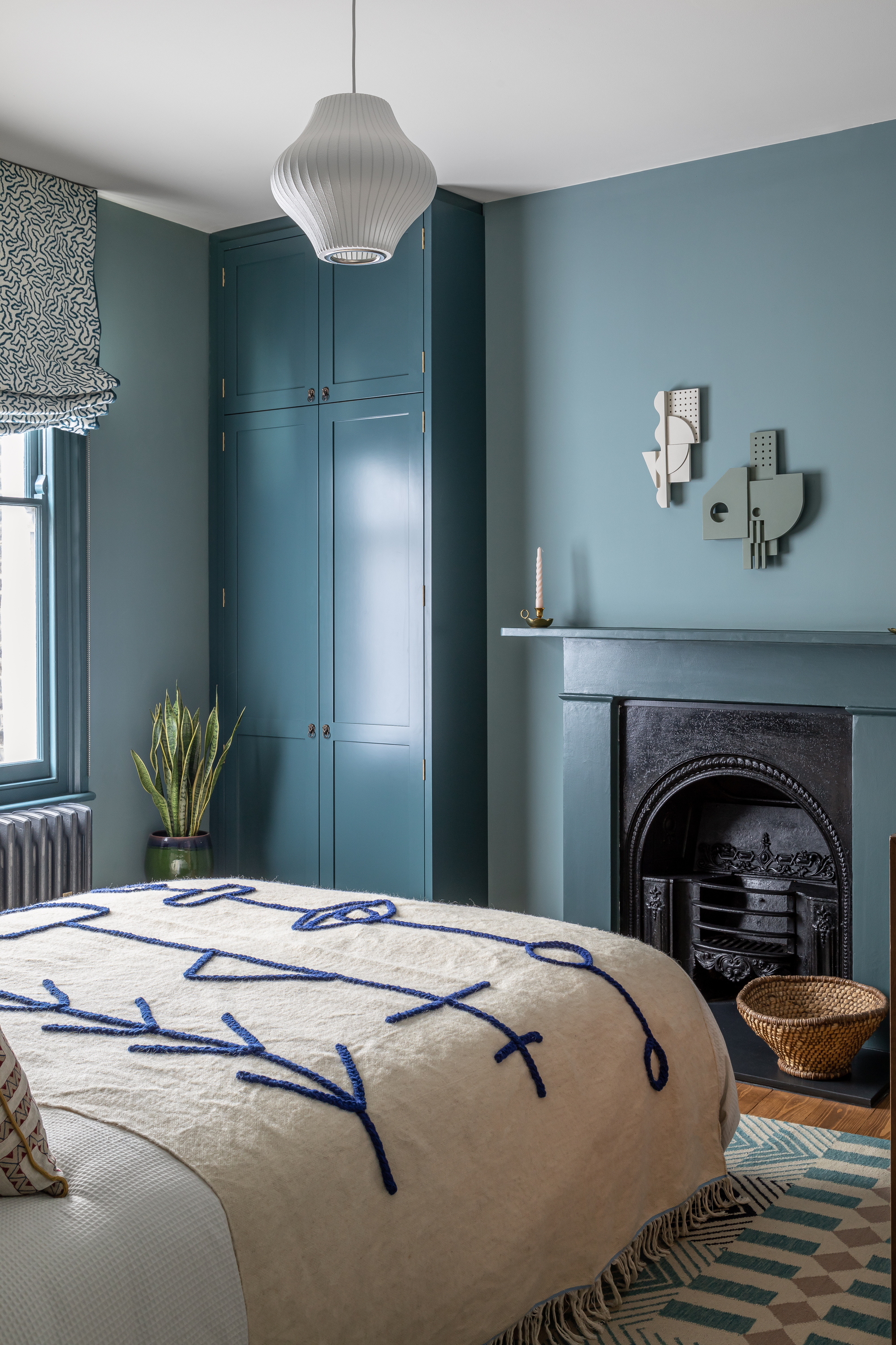
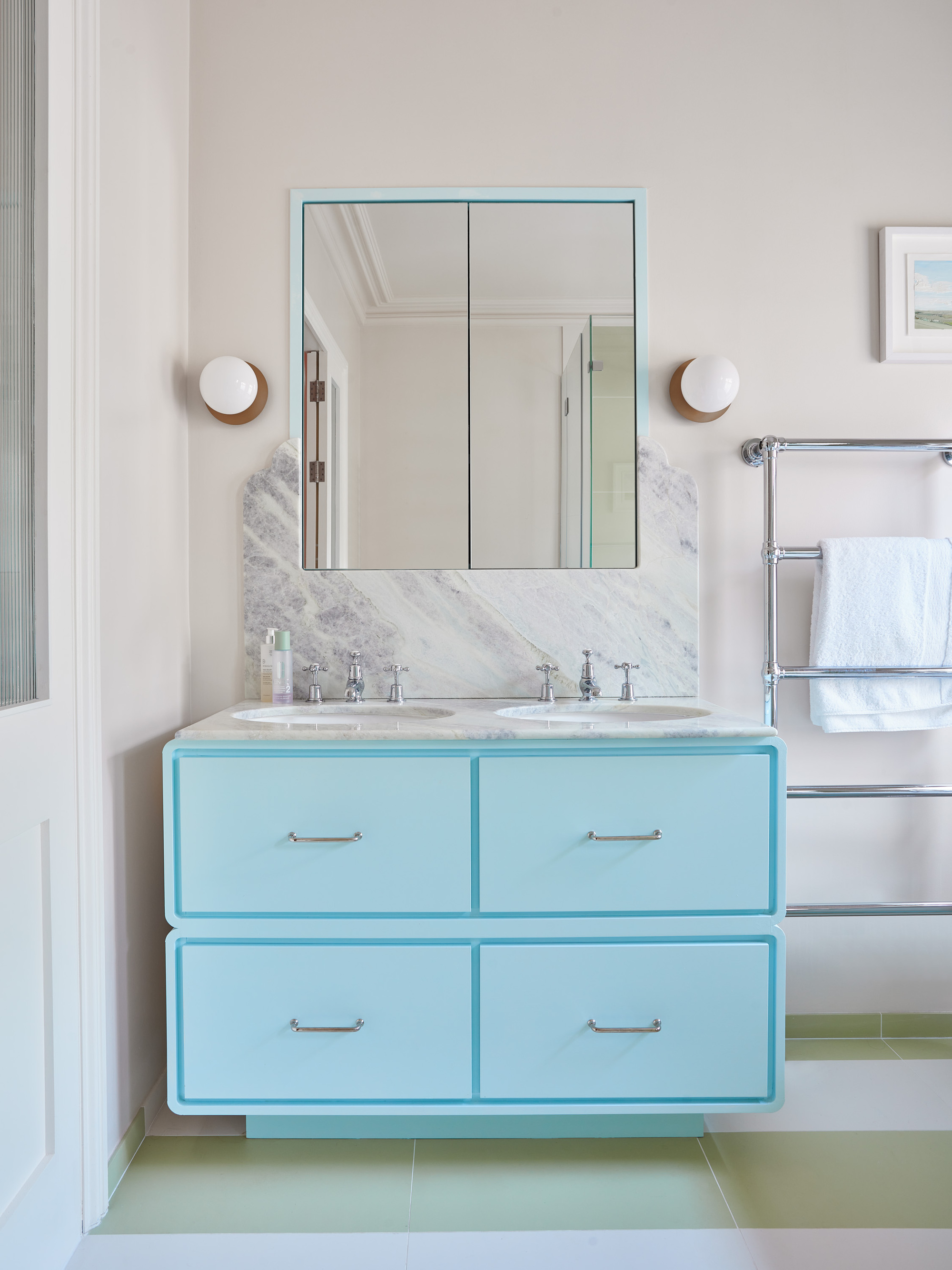
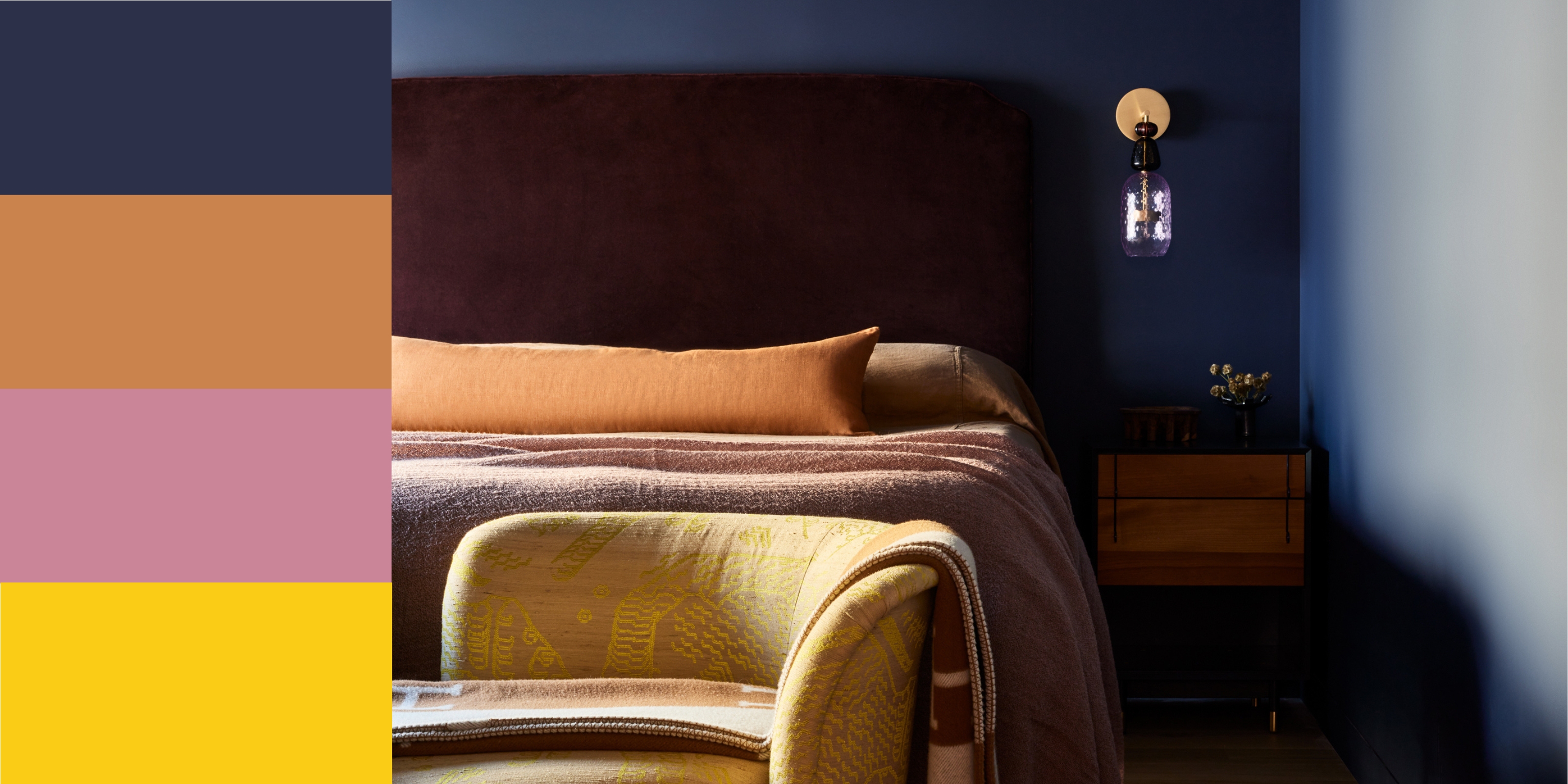
Another key aspect of ocean blue is its restorative qualities. Ali Johnson, director of Otta Design, utilized a jade blue, such as Edward Bulmer’s Vert de Mer, in a guest bedroom to create a tranquil and nurturing environment conducive to deep, restorative sleep. She recommends pairing this natural sea blue with accent colors like mustard or aubergine for a contrasting effect, ensuring the space feels rich without being overwhelming.
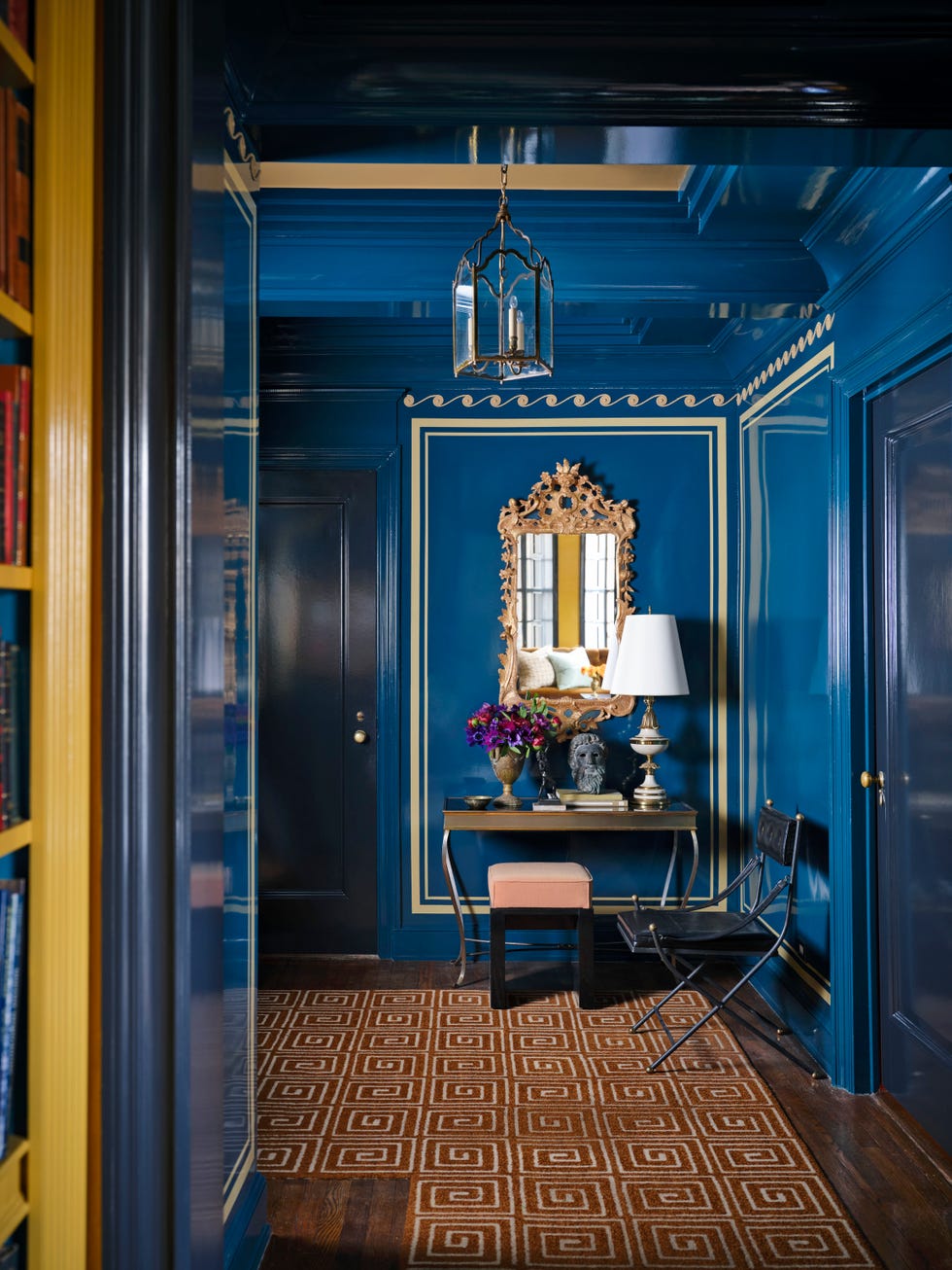
The article also emphasizes the color's effectiveness in providing a rich backdrop for displaying objects and art. Claire Sá, co-founder and director of De Rosee Sá, employed a moody blue, specifically Paint & Paper Library's Kigali, in a home office design. This deep blue allowed the client's collection of objects and art to stand out, giving the library a distinct identity.
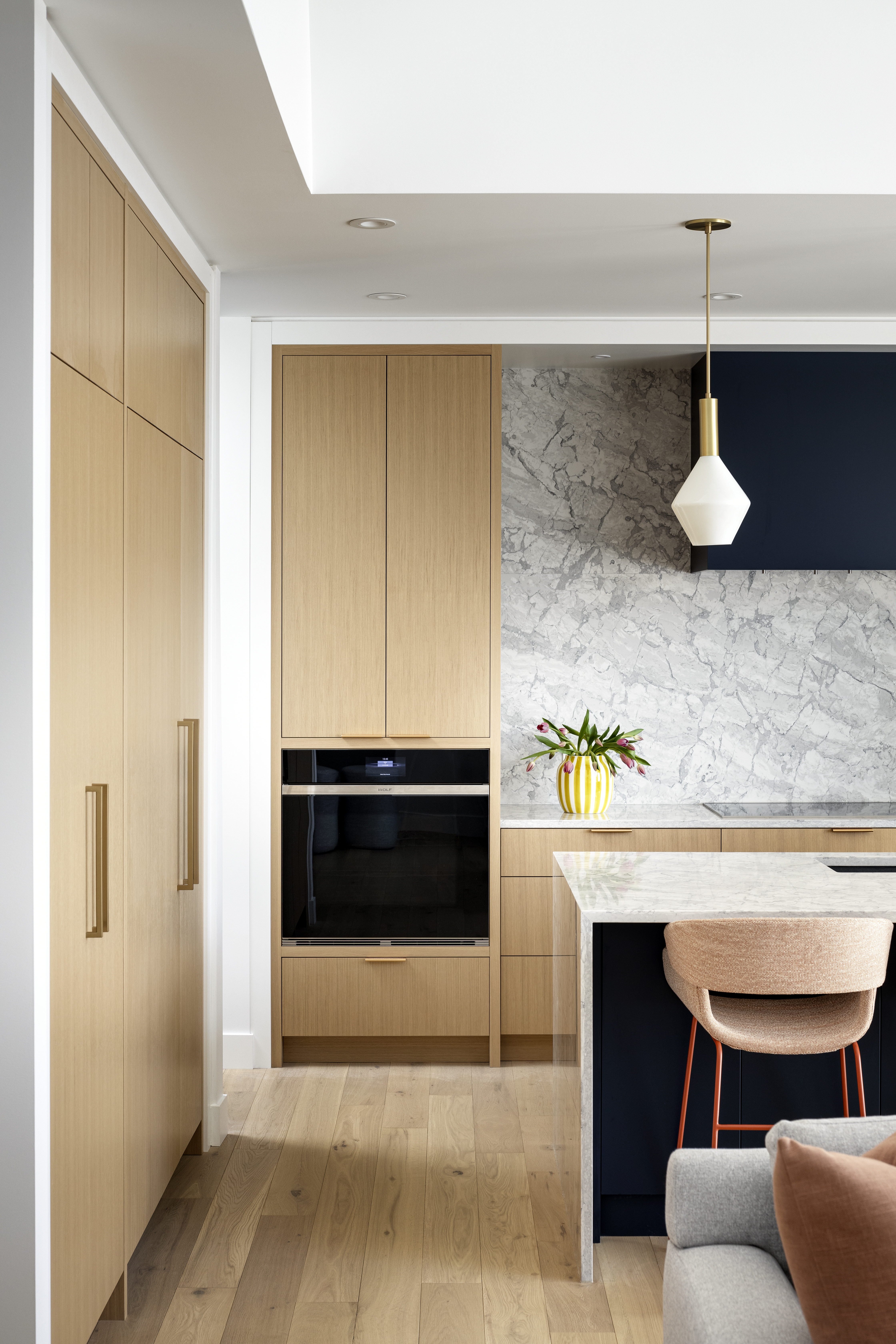
Furthermore, ocean blue is presented as an ideal choice for year-round decoration due to its versatility. Andy Greenall, head of design at Paint & Paper Library, notes that Kigali, with its green undertones, is neither too warm nor too cool. He advises considering the natural light of a room, suggesting truer blues for south-facing spaces and greener teals for north-facing rooms to optimize the color's effect throughout the seasons.
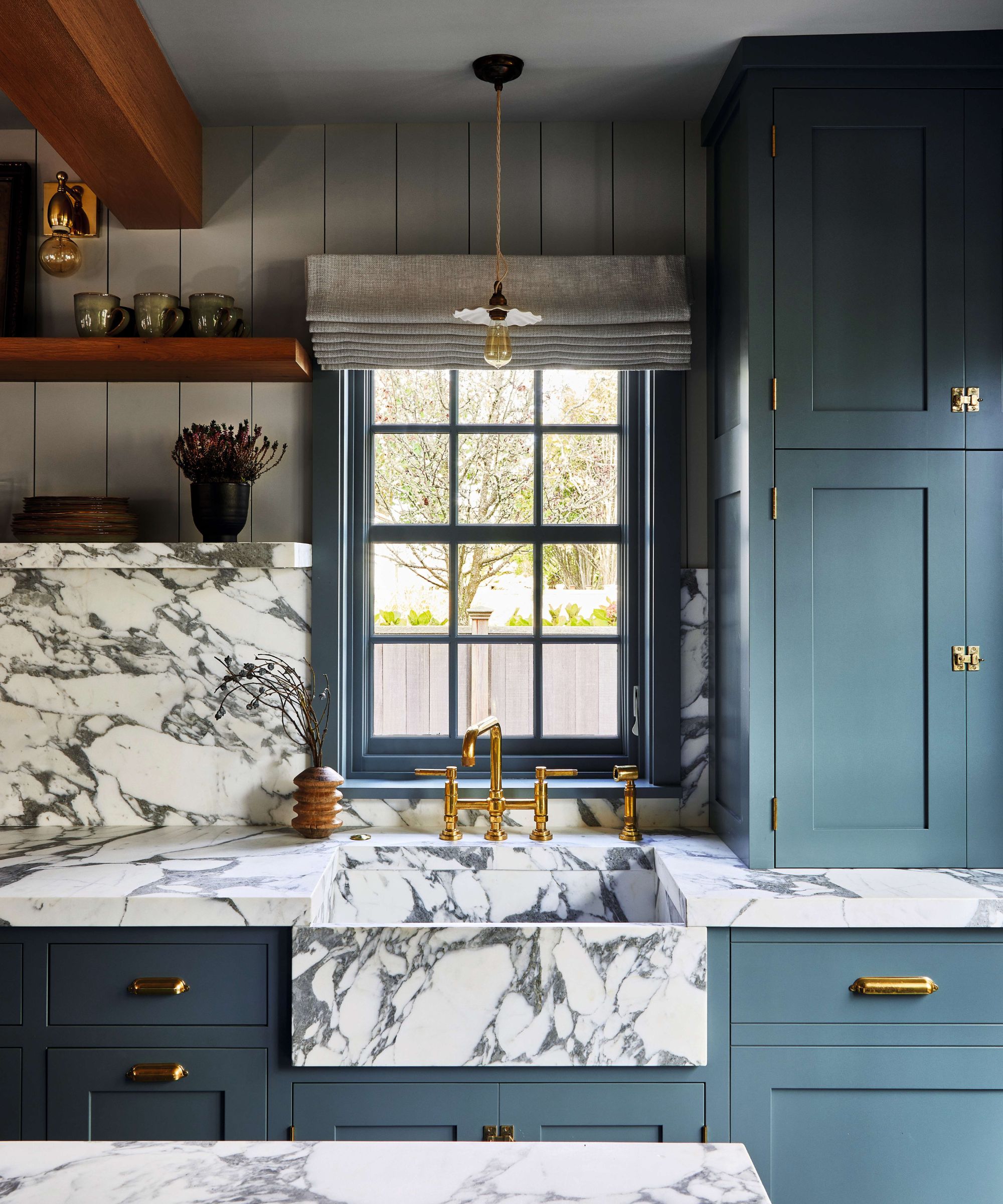
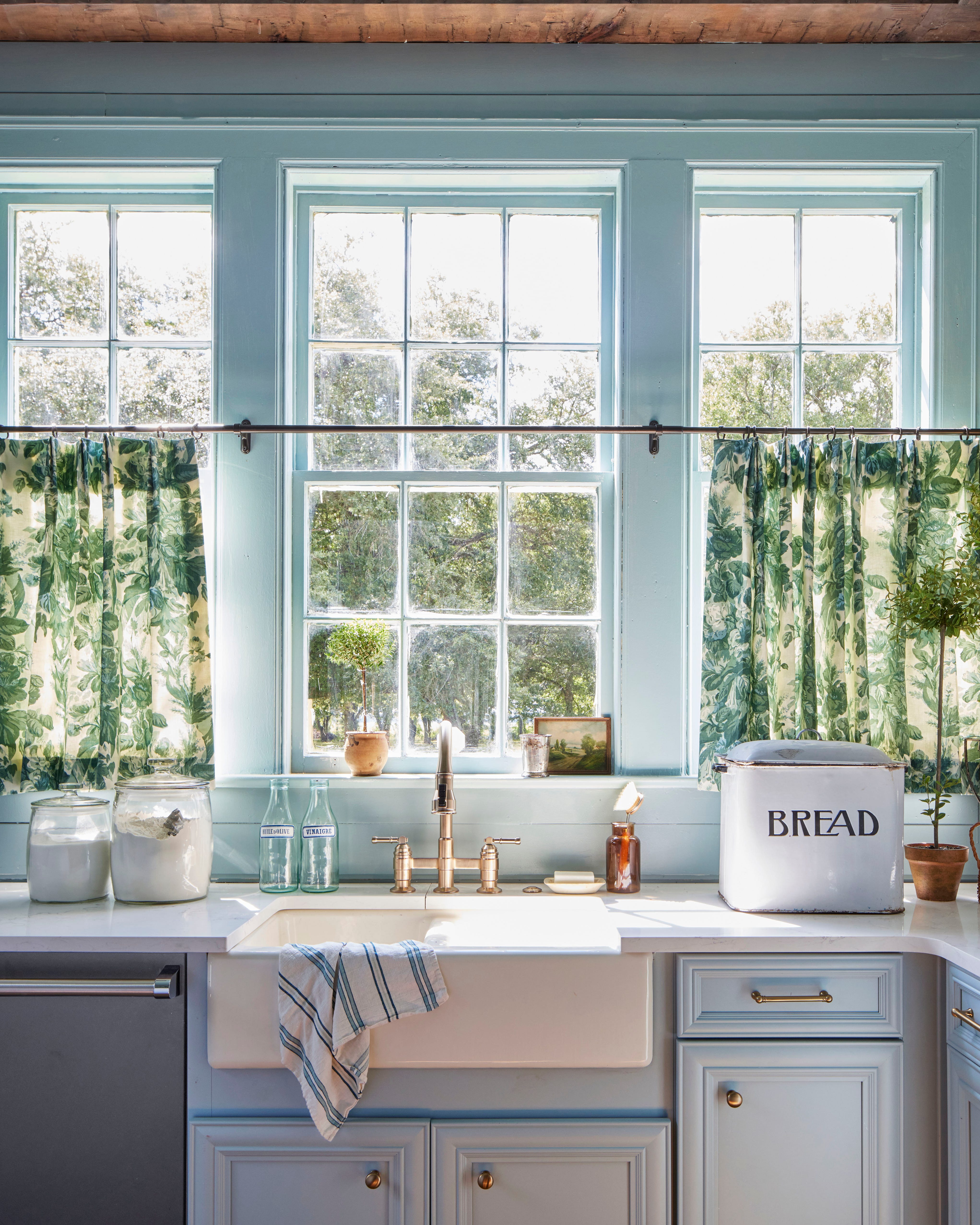
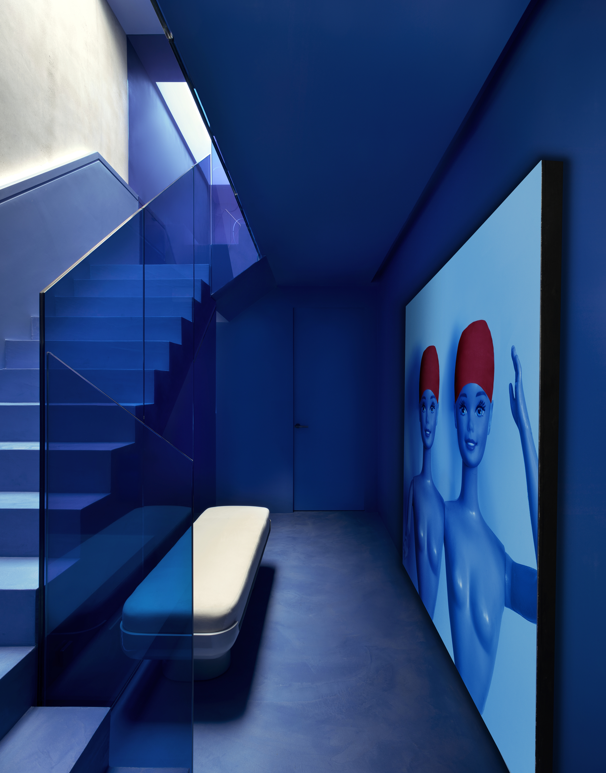
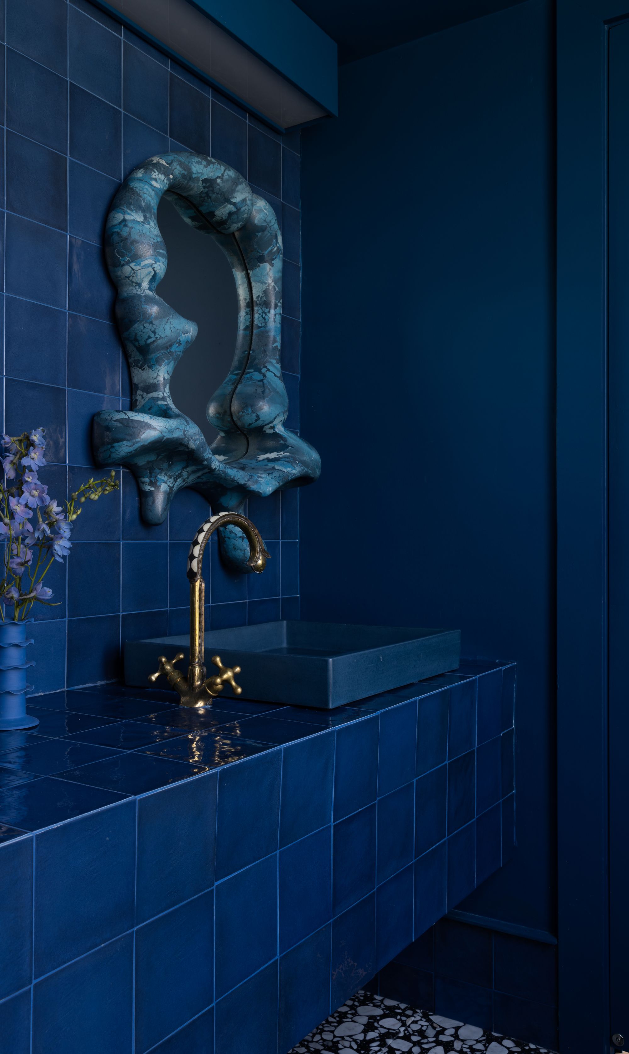
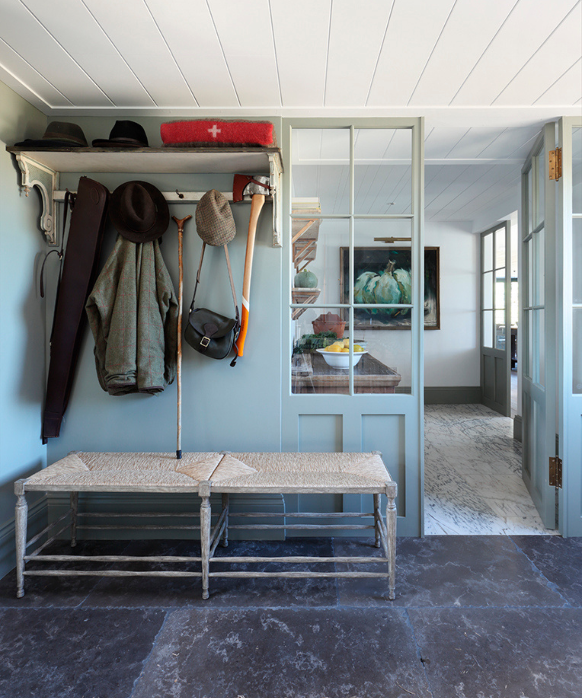
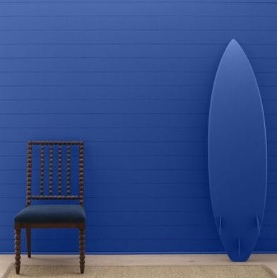
Finally, the article demonstrates that ocean blue does not overwhelm small spaces. Sean Anderson, founder of Sean Anderson Design, used a muted iteration of ocean blue, Farrow & Ball’s De Nimes, in a modest lakeside house kitchen. By applying it across walls, trim, and the ceiling, he achieved an impactful yet calming space that felt expansive rather than confined. This approach proves that even in smaller areas, a deep, thoughtful application of ocean blue can create a sophisticated and cohesive aesthetic.
#InteriorDesign #OceanBlue #ColorTrends #HomeDecoration #SummerDecor #PaintColors #DecoratingTips #MoodyBlue #AccentColors #InteriorDesign #OceanBlue #ColorTrends #HomeDecoration #SummerDecor #PaintColors #DecoratingTips #MoodyBlue #AccentColors
0 تعليق إجمالاً
 لا توجد تعليقات بعد
قد تعجبك أيضًا
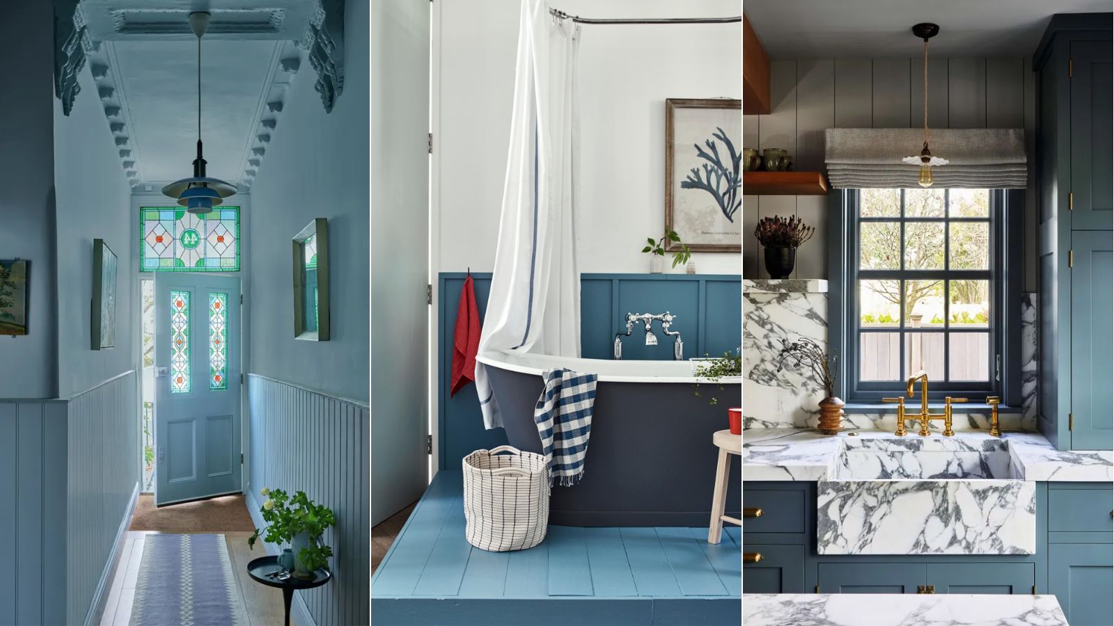
Blue has dominated Colors of the Year for 2024 – here's what it means and how you can decorate with it
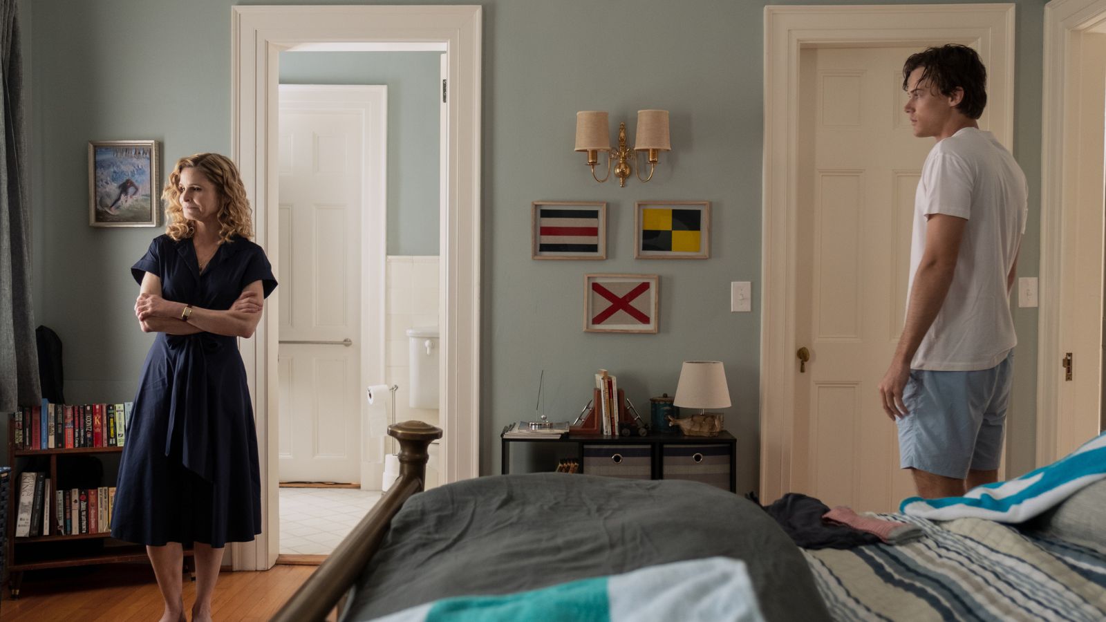
The subtle color tricks in ‘The Summer I Turned Pretty’ that can transform any room into a soothing coastal retreat
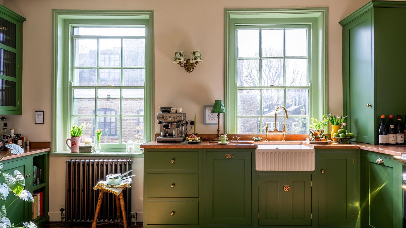
Summer color trends for 2025 – 8 bang on shades interior designers can't get enough of
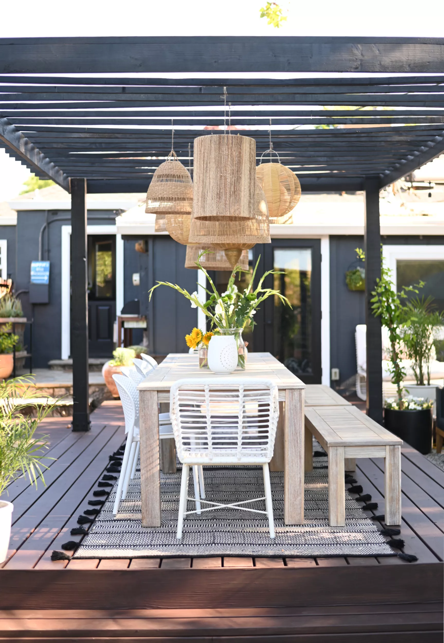
The Top Deck Colors for Summer 2024, According to Experts

Pick Your Favorite 2024 Color of the Year

Is Blue And White The Most Classic Bedroom Color Combination? Interior Designers Weigh In
29 Best Blue Paint Colors for Perfectly-Hued Walls
How to Decorate with Cobalt Blue the Right Way, According to Designers

The 60 Best Blue Paint Colors for Every Room in Your Home
Here's Every 2024 Color of the Year We Know So Far
Bold, edgy color drenching is going to be big in 2024
Kitchen colour experts are calling this the 'it' colour of 2024 that will go down as a future classic
Sorry Peach Fuzz, This Serene Shade Is Taking Over Home Decor In 2024
We Already Know the Color That's Going to Have 2027 in a Chokehold — Now's Your Chance to Beat the Trend

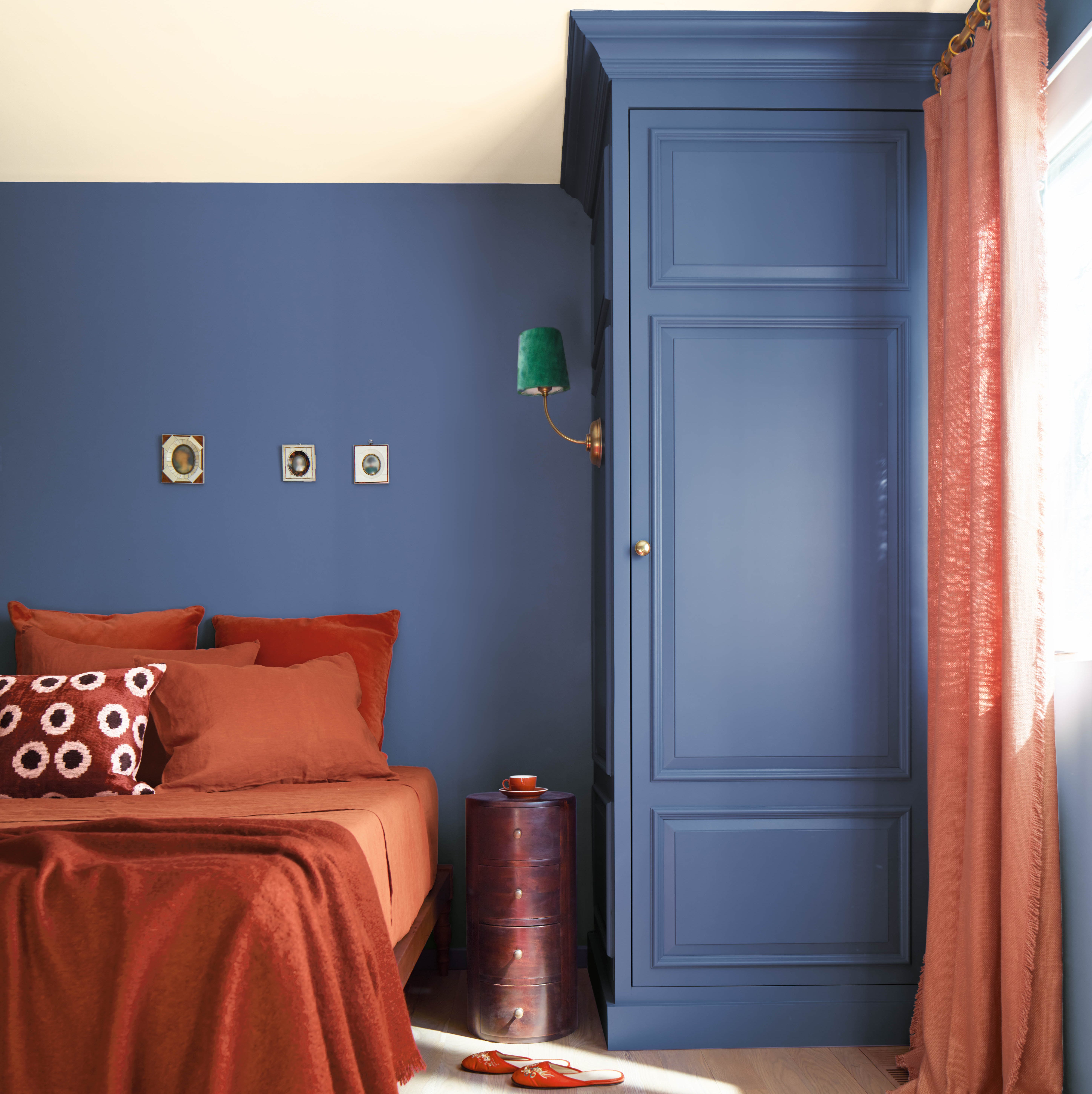
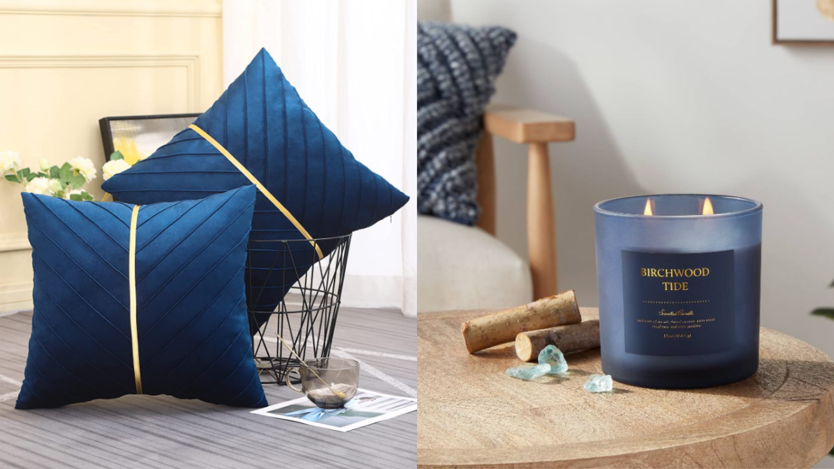
10 ocean blue and terracotta homeware buys for a summer refresh

Navy blue is the new black — here’s how to decorate with it

Colors That Go With Navy Blue — 12 Combinations Designers Are Choosing in 2025

2024 Fashion Colour Trends To Brighten Up Your Wardrobe

I'm a Color Expert — This Is How I Think You Should be Decorating with Blue
29 Blue Living Room Ideas You Haven’t Seen 100 Times Already