1/6
Here's how designers decorate with a soft summer color palette – 5 ideas for a toned-down take on summery hues
Summertime decor often brings to mind bold and bright colors, but for those who prefer a more understated aesthetic, a soft summer color palette offers a fresh and timeless approach. This article explores five shades that allow homeowners to embrace summer trends without resorting to highly saturated hues, focusing on creating calming and sophisticated interiors. These colors are versatile enough to maintain their appeal throughout the year, making them ideal for long-term design choices.
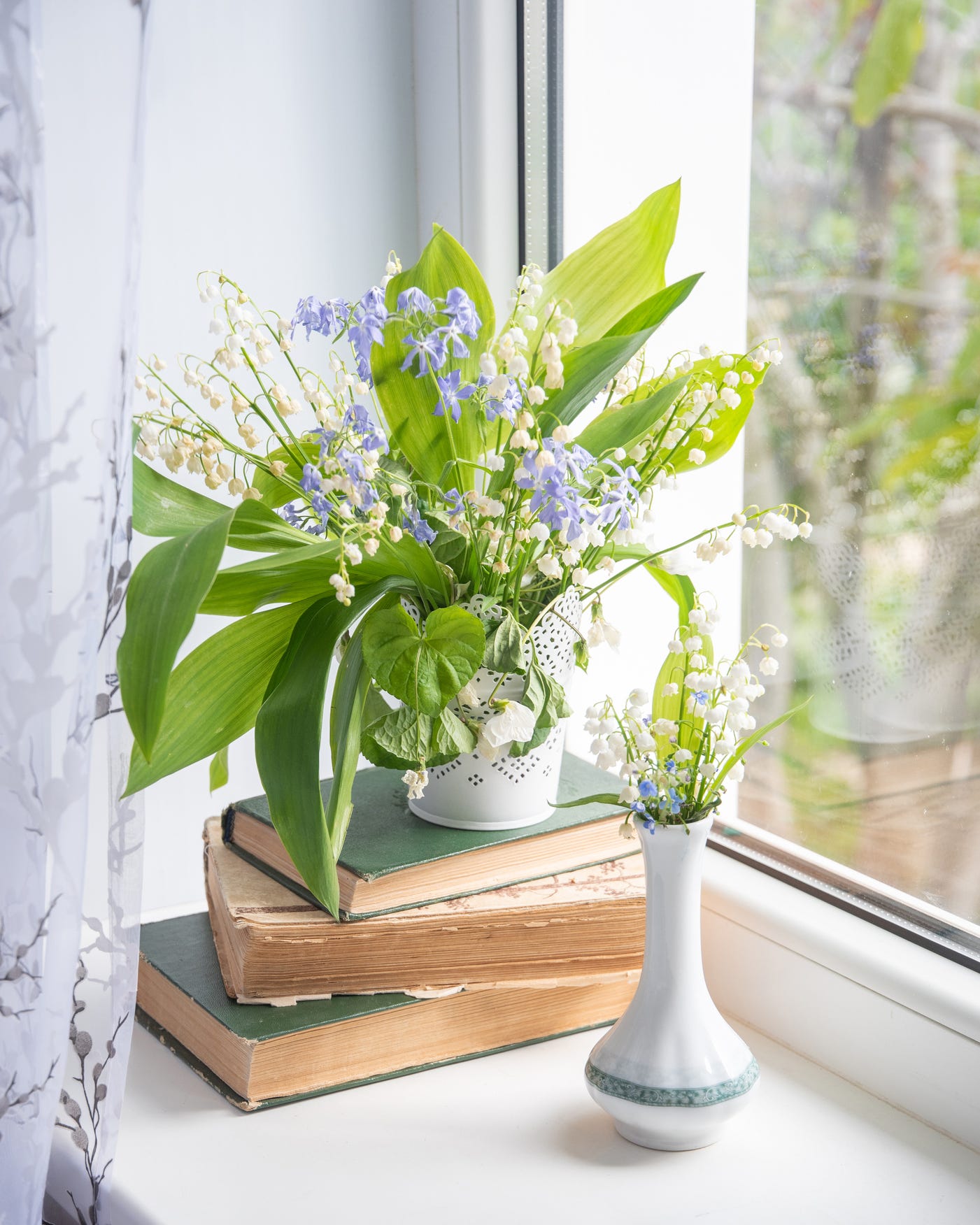
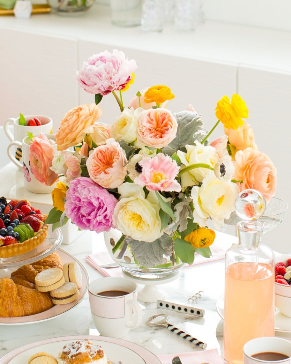
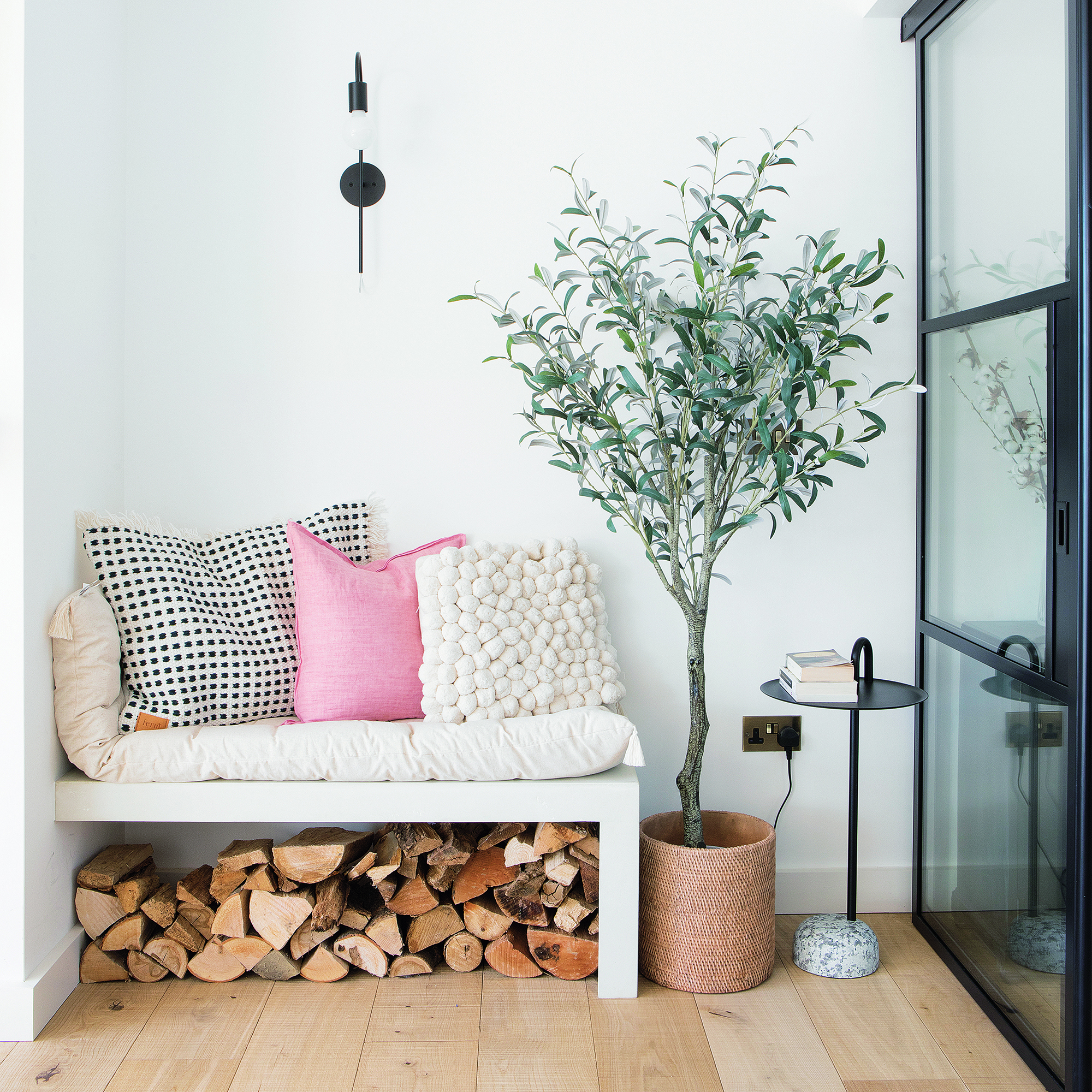
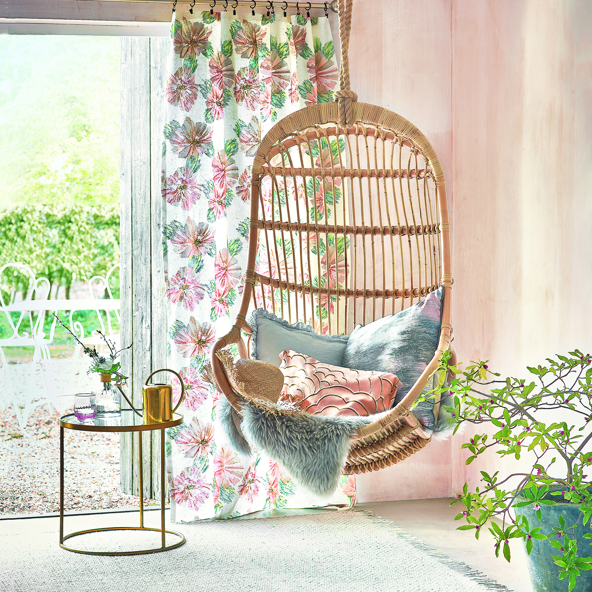
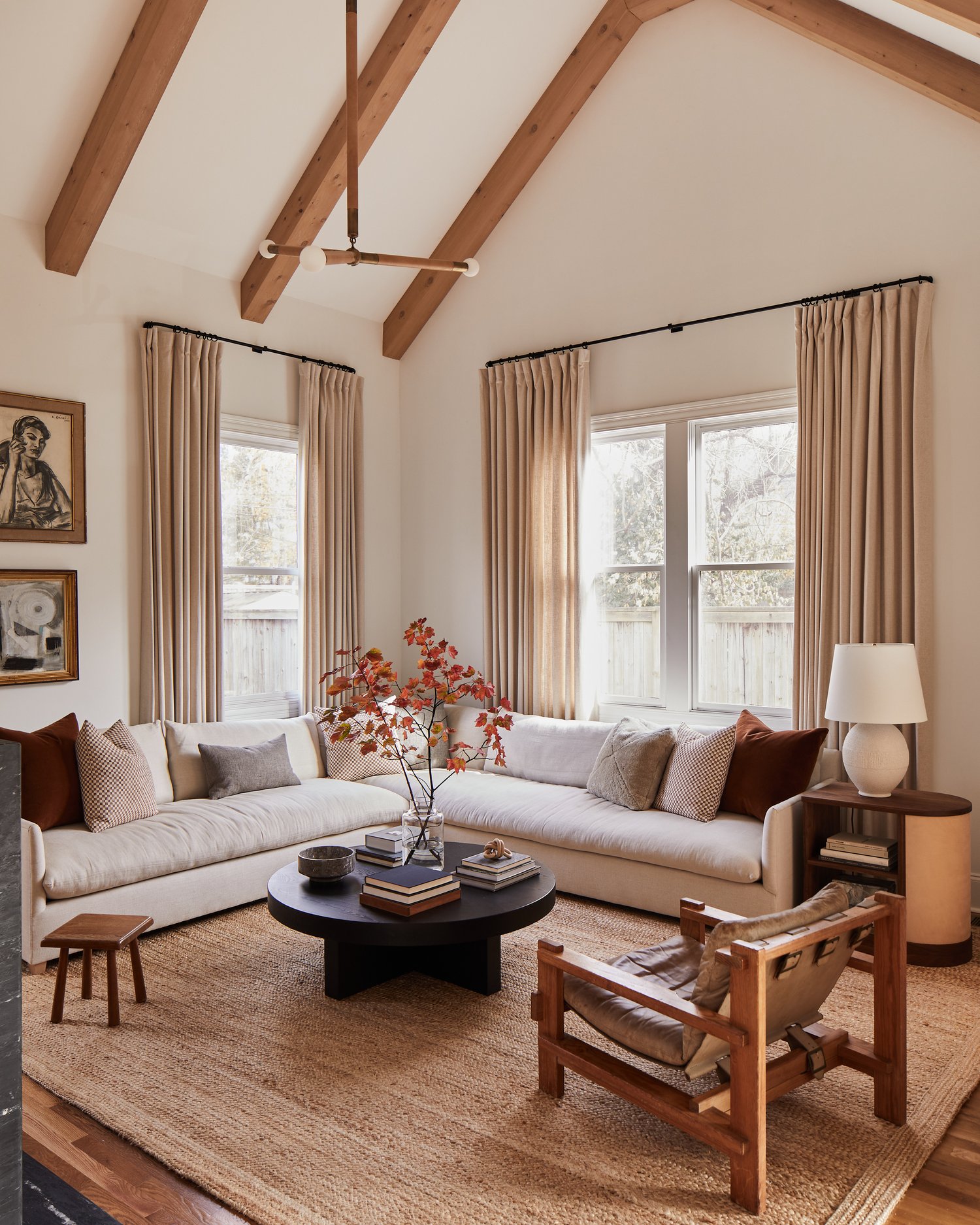
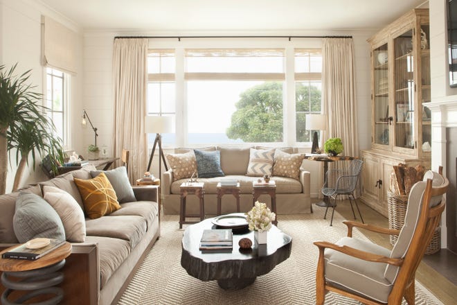
Light neutrals serve as an excellent foundation for a soft summer palette. Interior designers suggest starting with neutral whites and beiges to establish a light and airy base. These shades provide a clean and timeless backdrop, allowing for the subtle introduction of color through accents. Soft blues, light pinks, and muted greens can be incorporated via pillows, throws, table settings, and other accessories to add a soothing, laid-back summer feel. This method is exemplified in a bedroom design where white dominates, with color appearing in curtains, artwork, and flowers, showcasing how light linens, crisp whites, and pastels can work harmoniously.
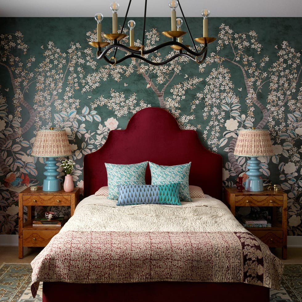
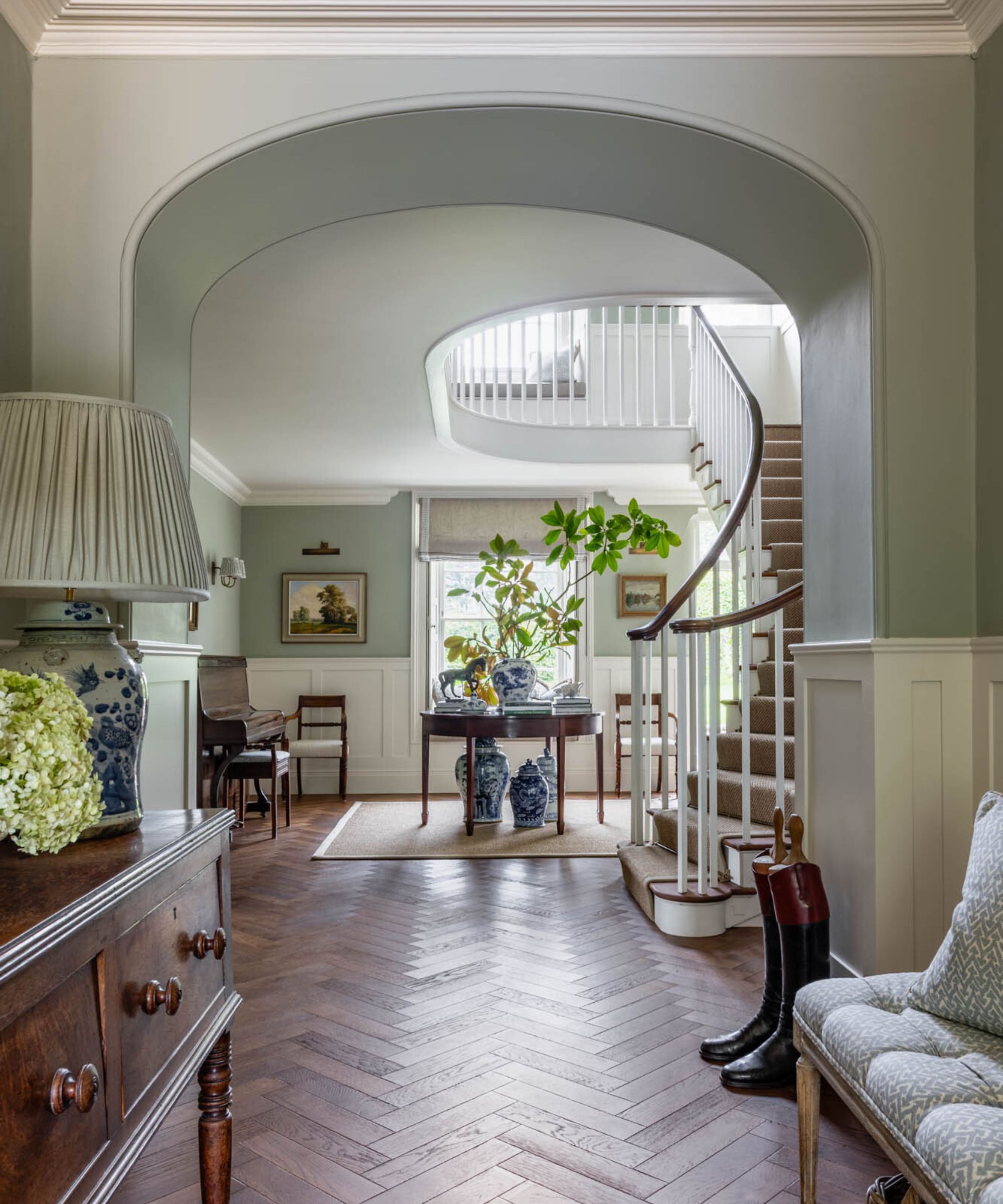
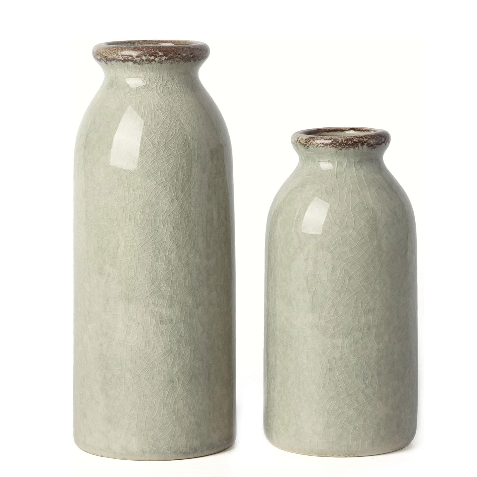
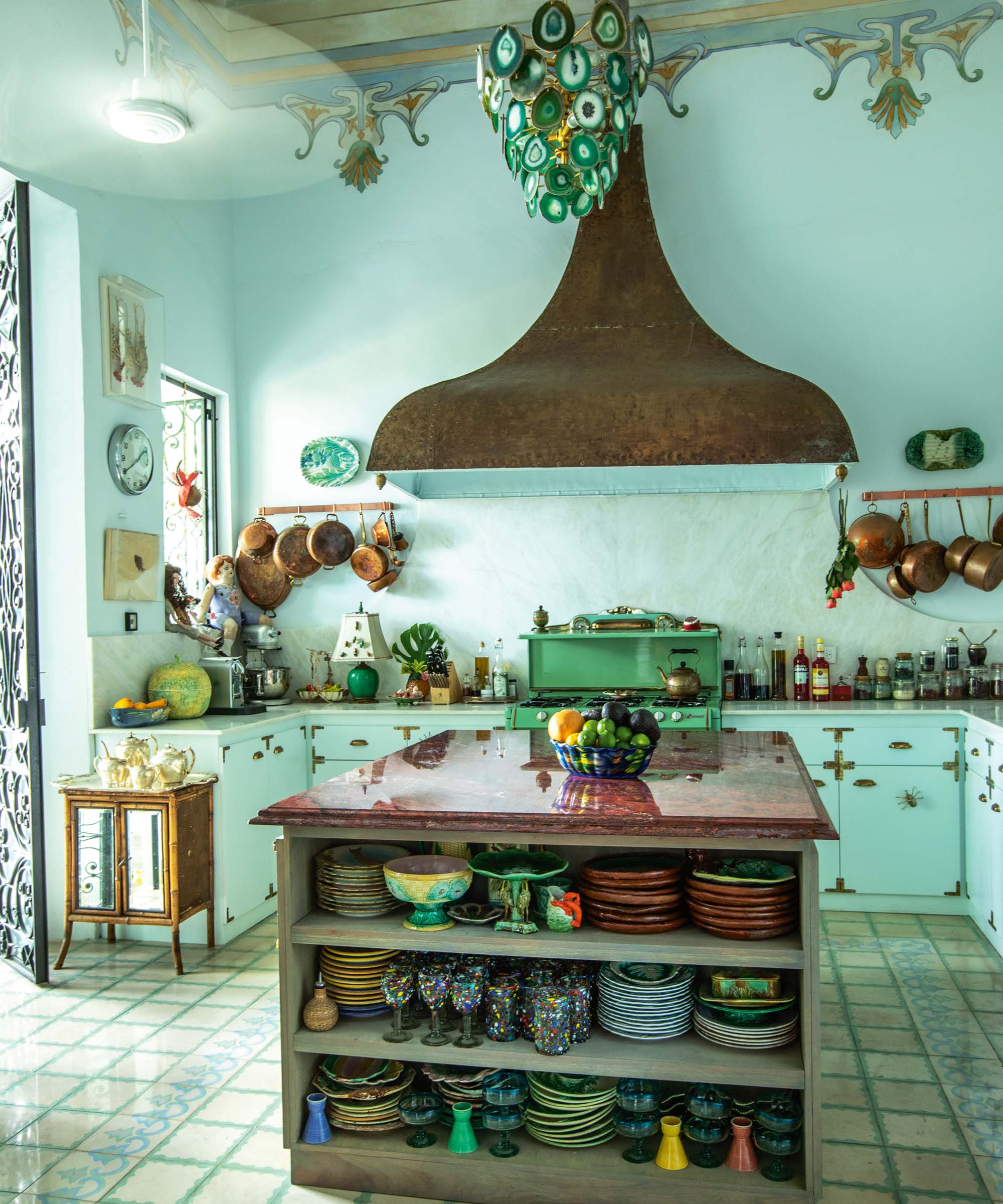
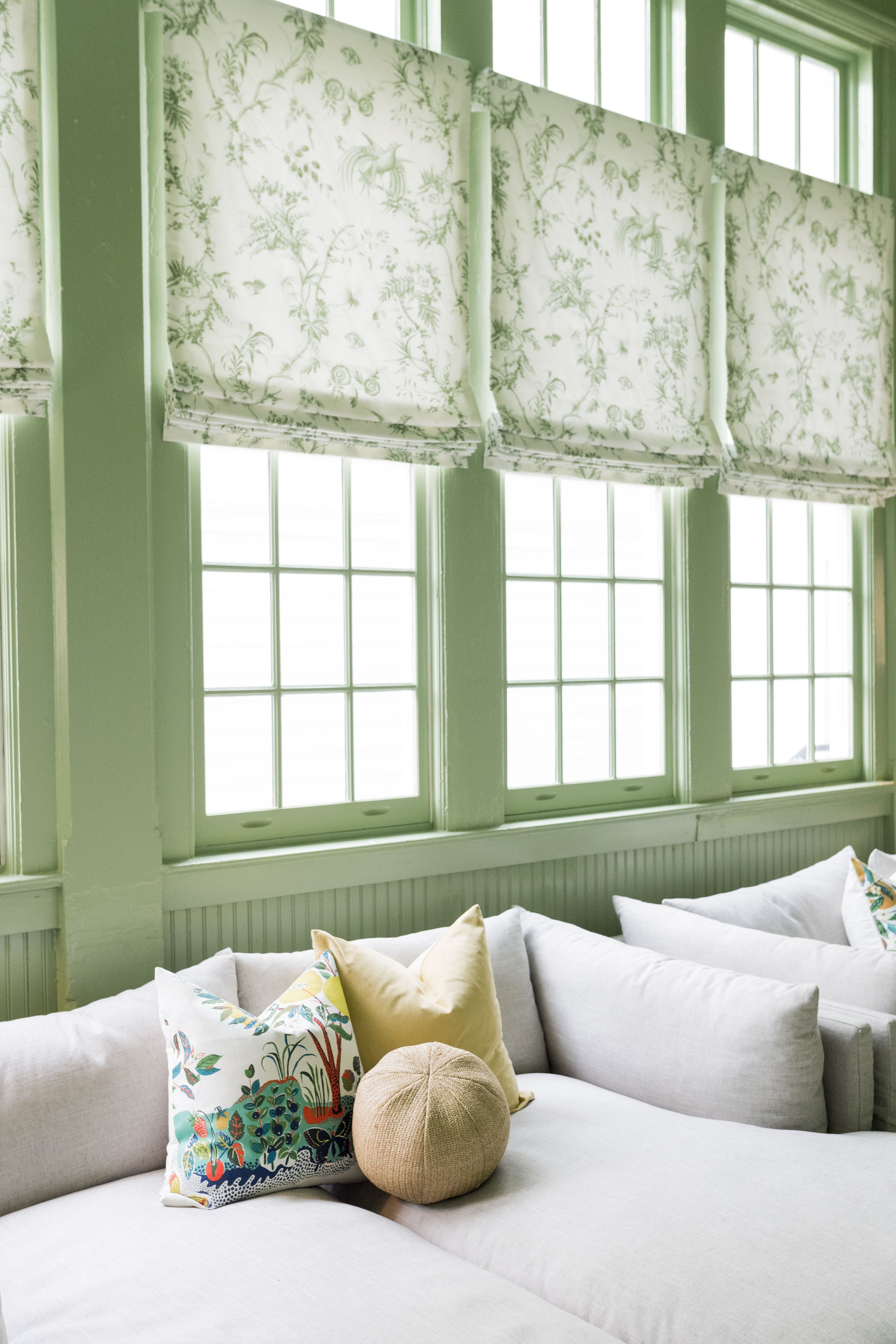
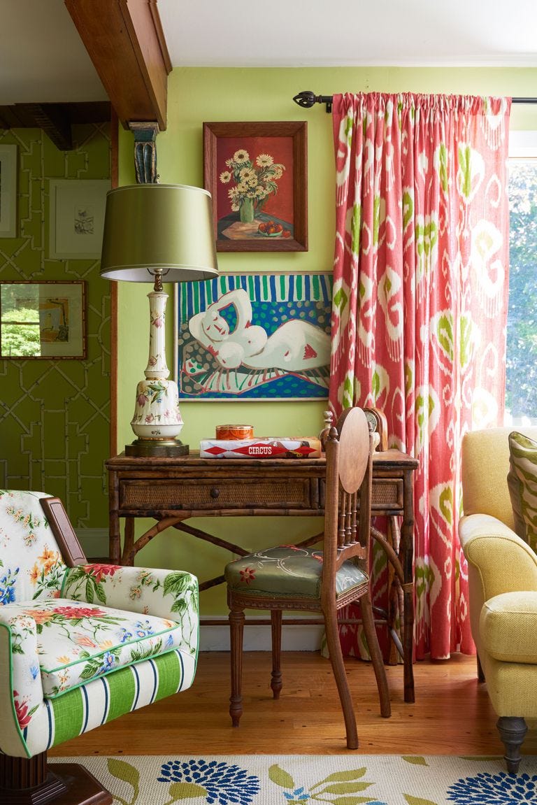
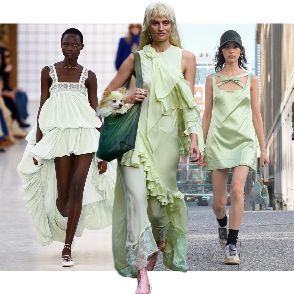
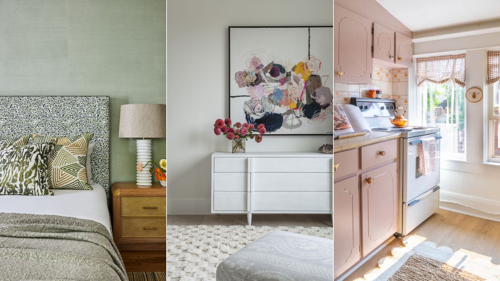
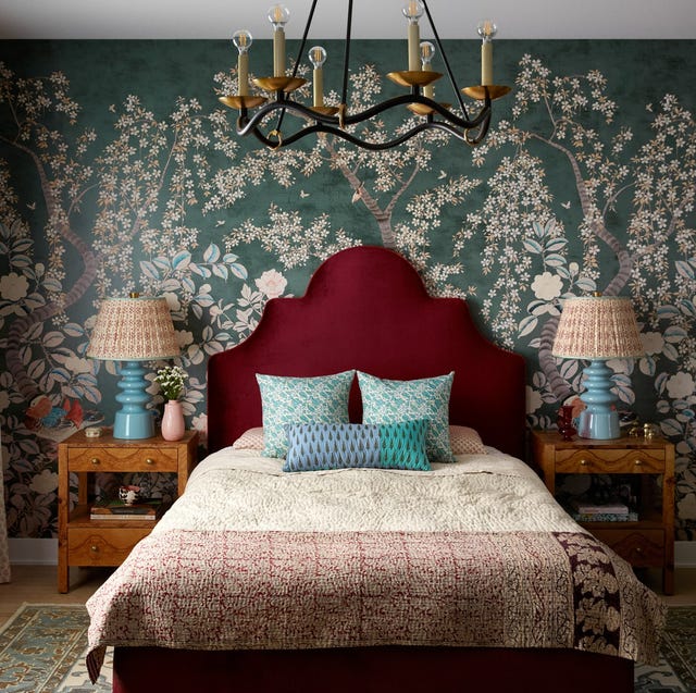
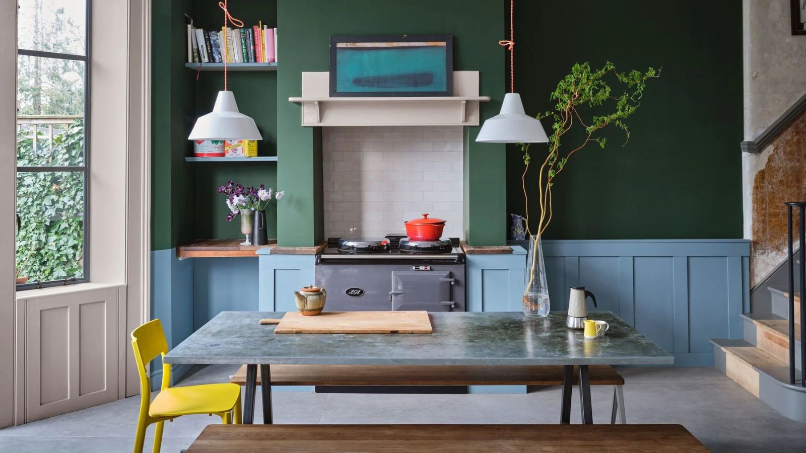
Muted green is another favored choice for summer interiors, drawing inspiration from nature to create a tranquil atmosphere. This color is known for its calming properties and can be used effectively in various spaces, including bedrooms, to evoke a sense of restorative freshness or sedate moodiness depending on the shade. The key lies in selecting the right hue; lighter variations promote restfulness, while more saturated shades can achieve a dramatic effect, demonstrating the color's adaptability.
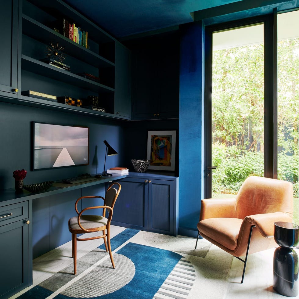
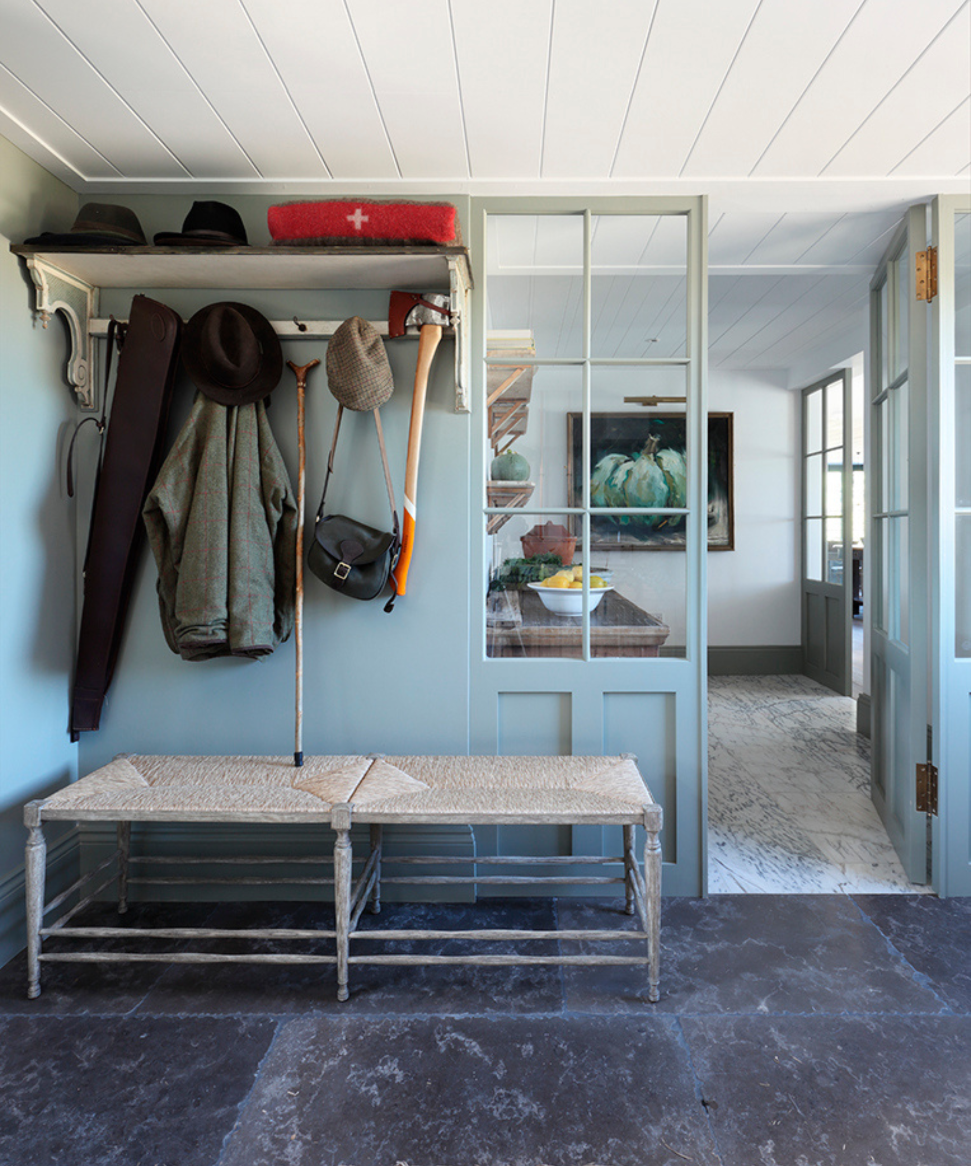
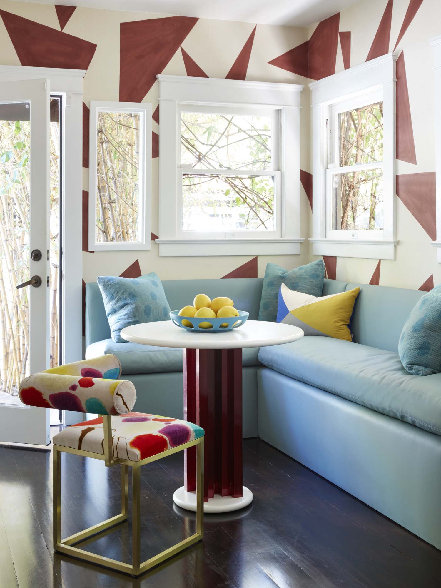
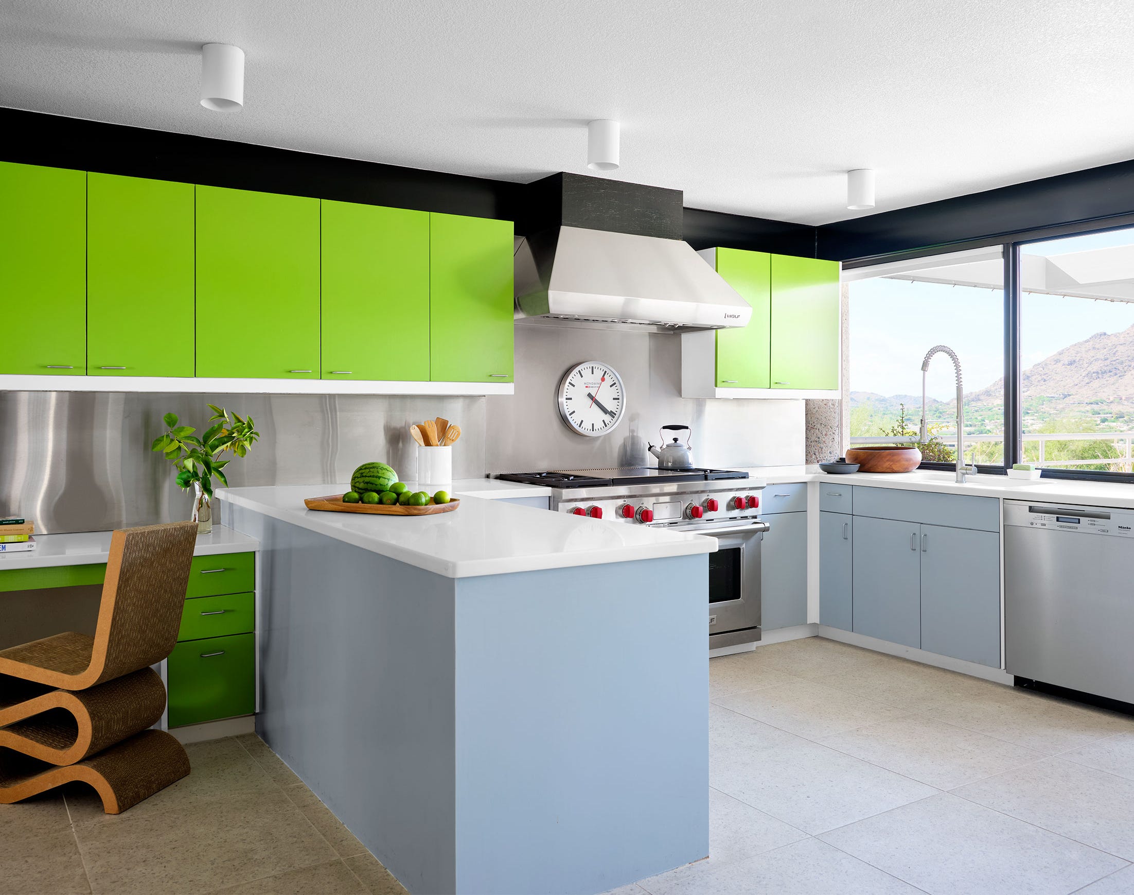
Blue-gray offers a toned-down alternative to traditional summery blues, providing a fresh and sophisticated option for living spaces. This color, such as Benjamin Moore's Wickham Gray, blends gray tones with buoyant blue undertones, creating a soft visual experience. When used on paneled walls, it establishes a calming ambiance, with the tone echoed in upholstery, artwork, and stained glass. The overall scheme can be complemented by layering additional summer-inspired hues reminiscent of sand and peachy sunsets, enhancing the seasonal feel.
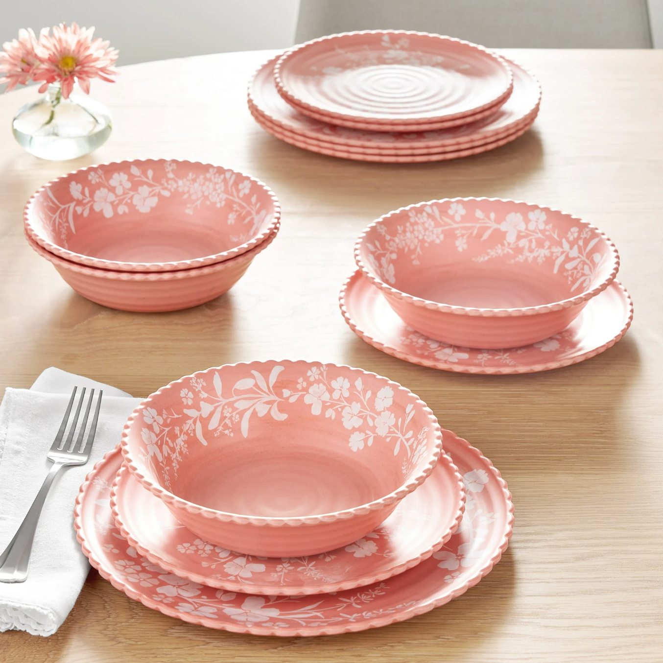
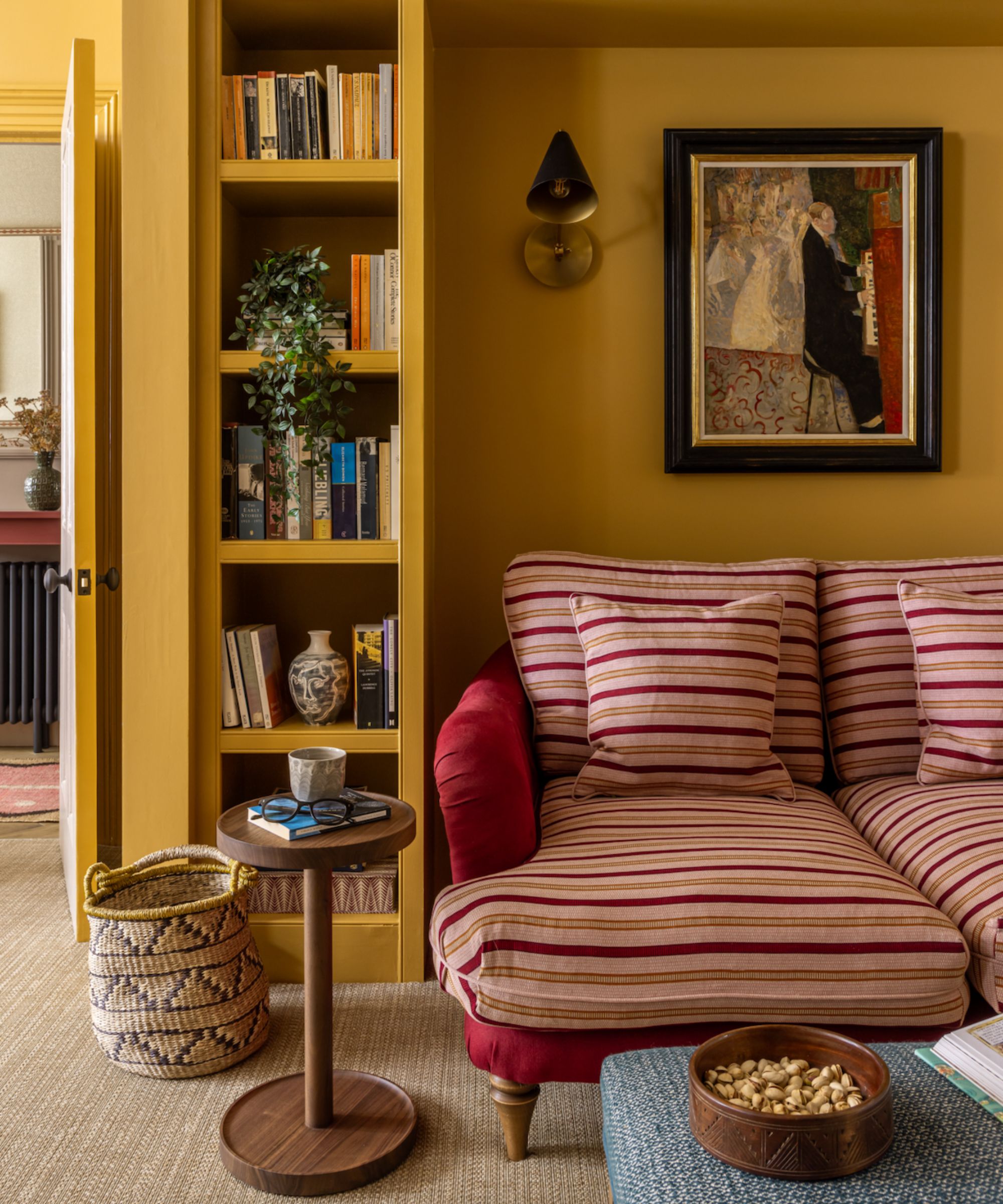
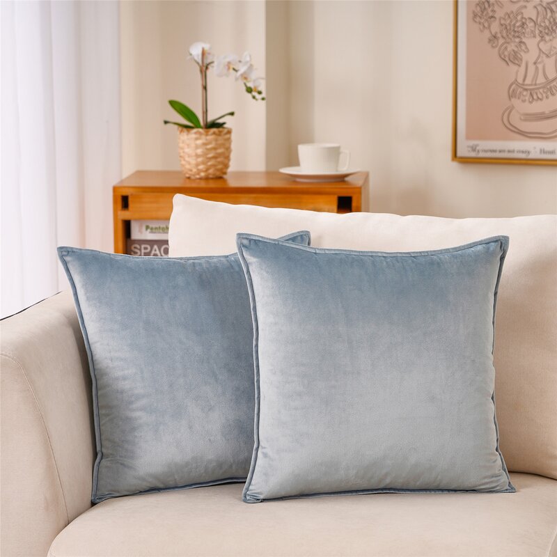
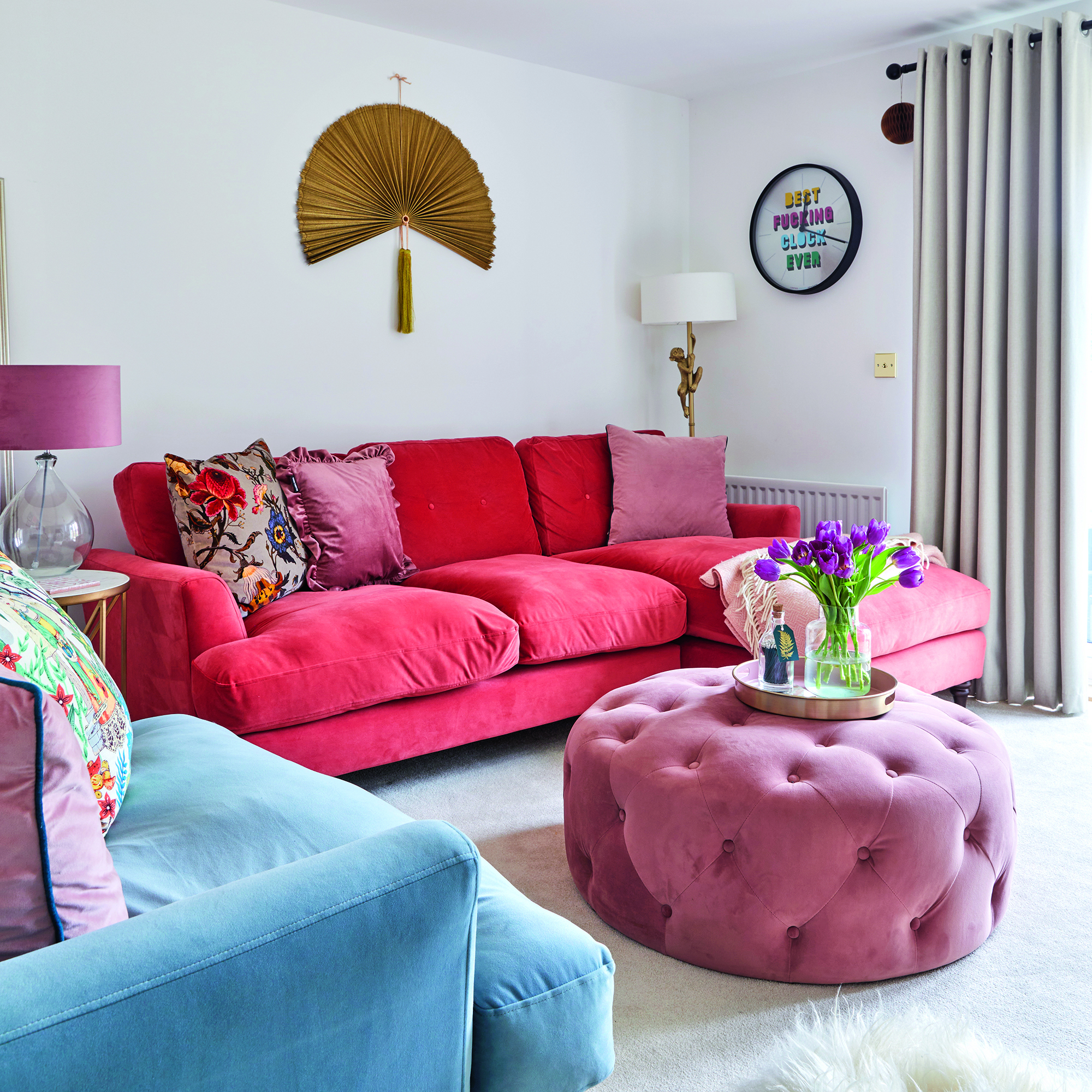
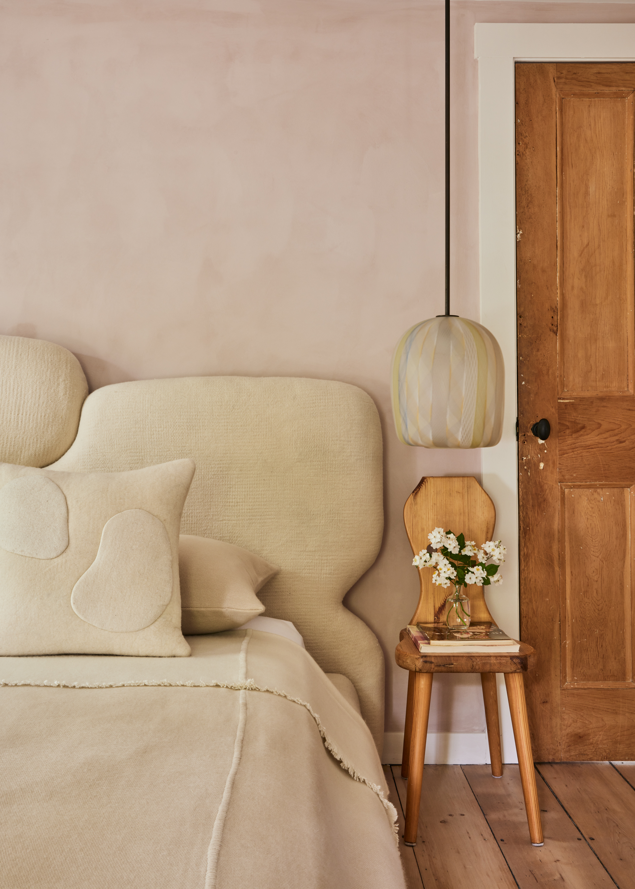
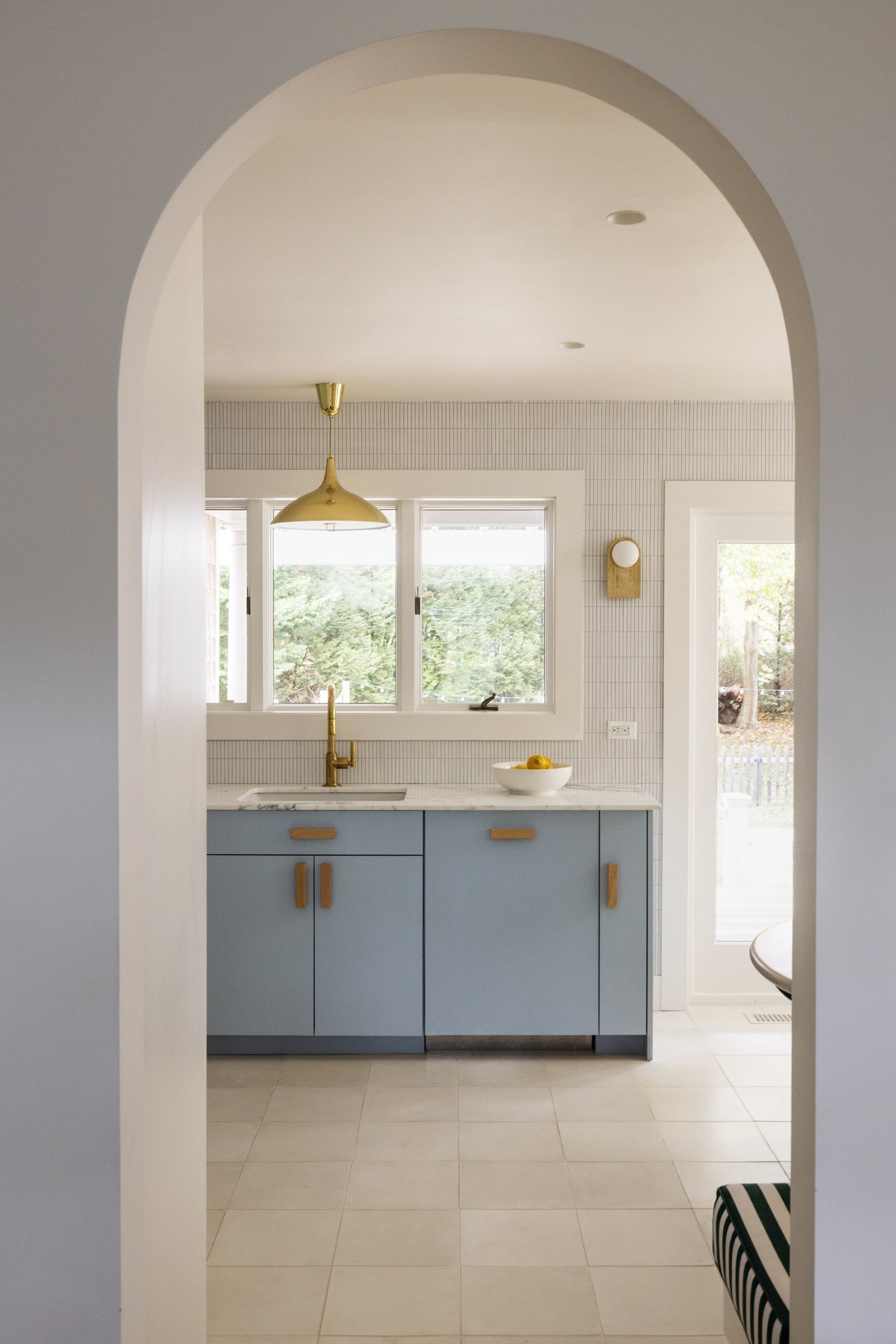
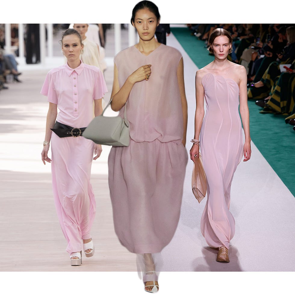
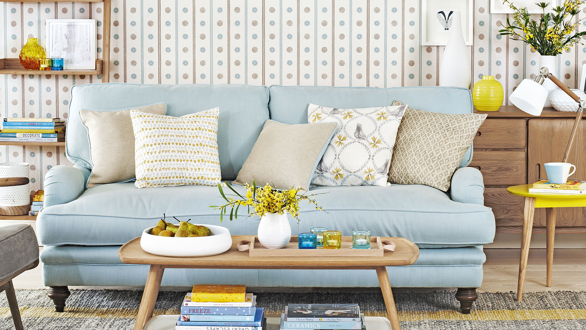
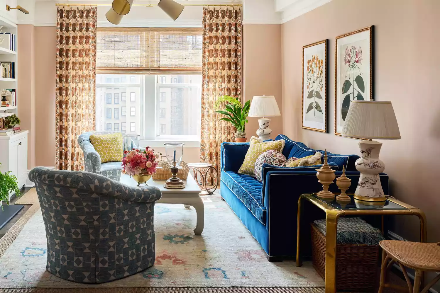
Muted pink presents a less saccharine take on classic summer pinks, leaning towards earthier, brown-toned variations for a more liveable feel. These soft pinks are versatile, creating a soothing and calming atmosphere suitable for bedrooms, living rooms, and even kitchens. An example includes the use of Flax by Benjamin Moore on kitchen cabinets, a brown-toned pink with mauve undertones that appears soft yet impactful. This shade pairs well with colors like sage or pistachio green and can be adapted for colder months with darker accessories. Finally, coastal blues, particularly when combined with white, are a reliable choice for summer, evoking a calm and refreshing atmosphere. These hues can be incorporated as accent colors in living rooms, pairing well with neutrals and other pastels. The resurgence of monochromatic blue palettes, from ice blues to chambray, allows for the use of soft blue throw pillows and textiles to enhance the coastal feel, making the color more palpable and inviting. These five color strategies provide a comprehensive guide to achieving a soft summer aesthetic that is both elegant and enduring.
#InteriorDesign #SummerColors #ColorPalette #HomeDecor #MutedTones #NeutralDecor #CoastalBlues #MutedGreen #BlueGray #InteriorDesign #SummerColors #ColorPalette #HomeDecor #MutedTones #NeutralDecor #CoastalBlues #MutedGreen #BlueGray
0 تعليق إجمالاً
 لا توجد تعليقات بعد
قد تعجبك أيضًا
Designers Predict These Color Combinations Will Be EVERYWHERE This Summer

The 6 must-have colors to bring into your home this June
Summer living room ideas to embrace the season in style
These Will Be the Hottest Paint Colors for Summer 2025, Designers Predict

These Summer Décor Ideas Will Make Your Space Bright and Beautiful

Interior design ideas — adding quirky stripes for summer
15 Summer Wedding Color Palettes to Inspire Your Seasonal Celebration
5 Vibrant Color Palettes Designers Are Using to Add Energy and Excitement to Decor

Summer color trends for 2025 – 8 bang on shades interior designers can't get enough of
44 Summer Decor Ideas for a Seasonal Sunny Makeover

How to Create a Calm Color Palette Without Skimping on Character — 8 Interior Designers Share Their Tips
These Are the Top 6 Color Trends We’ll Be Sporting This Summer
Summer can inspire decor all year
Designers Reveal the Surprising Home Trend That's Taking Over Right Now

21 Chartreuse Color Ideas for a Summer-Ready Refresh
8 Summer Arrangement Ideas
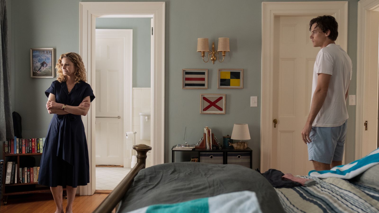
The subtle color tricks in ‘The Summer I Turned Pretty’ that can transform any room into a soothing coastal retreat
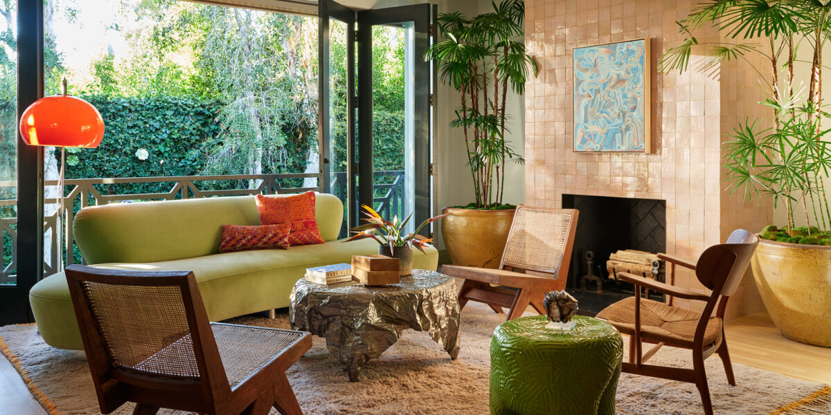
Easy, Colorful Ways to Elevate Your Space for Summer Entertaining

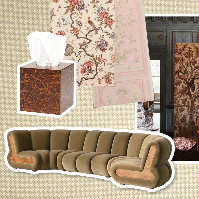
We Combed Design Markets and Shows Around the World to Find the 11 Biggest Interior Trends Right Now

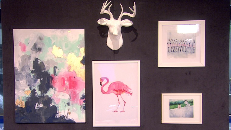
Add summer accents to your home with DIY décor