1/5
Hallway ideas: Interior design inspiration for ‘posh’ halls
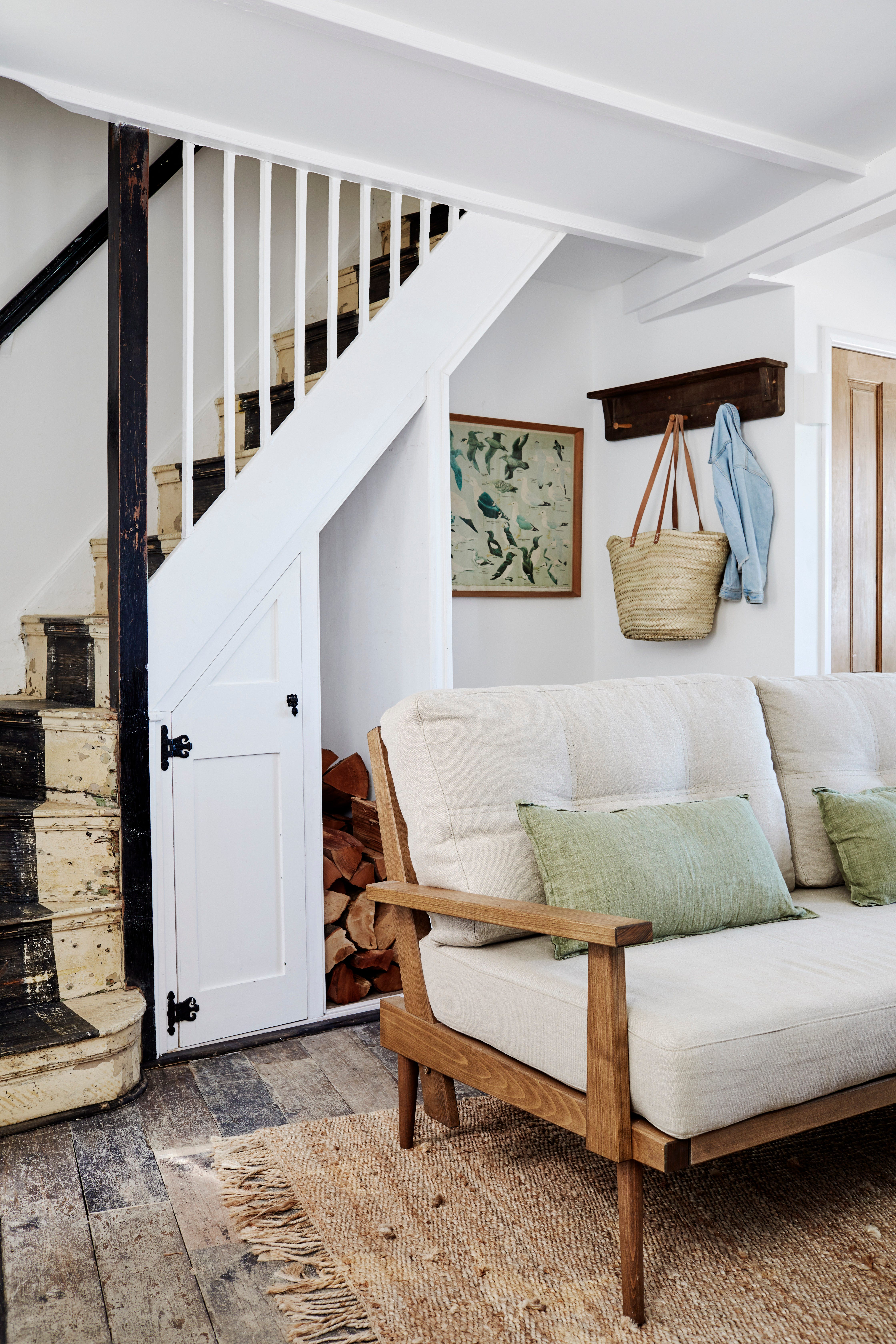
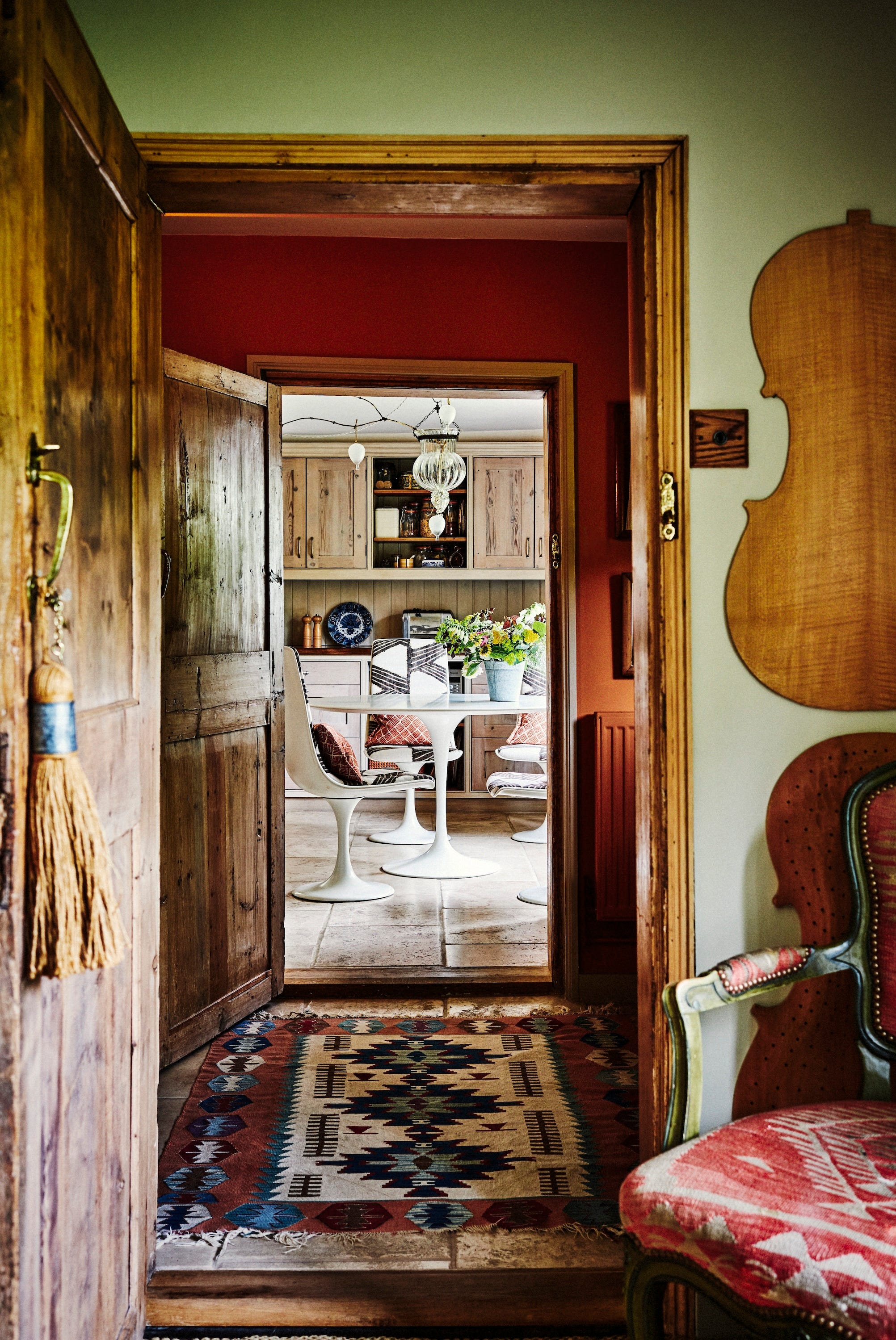
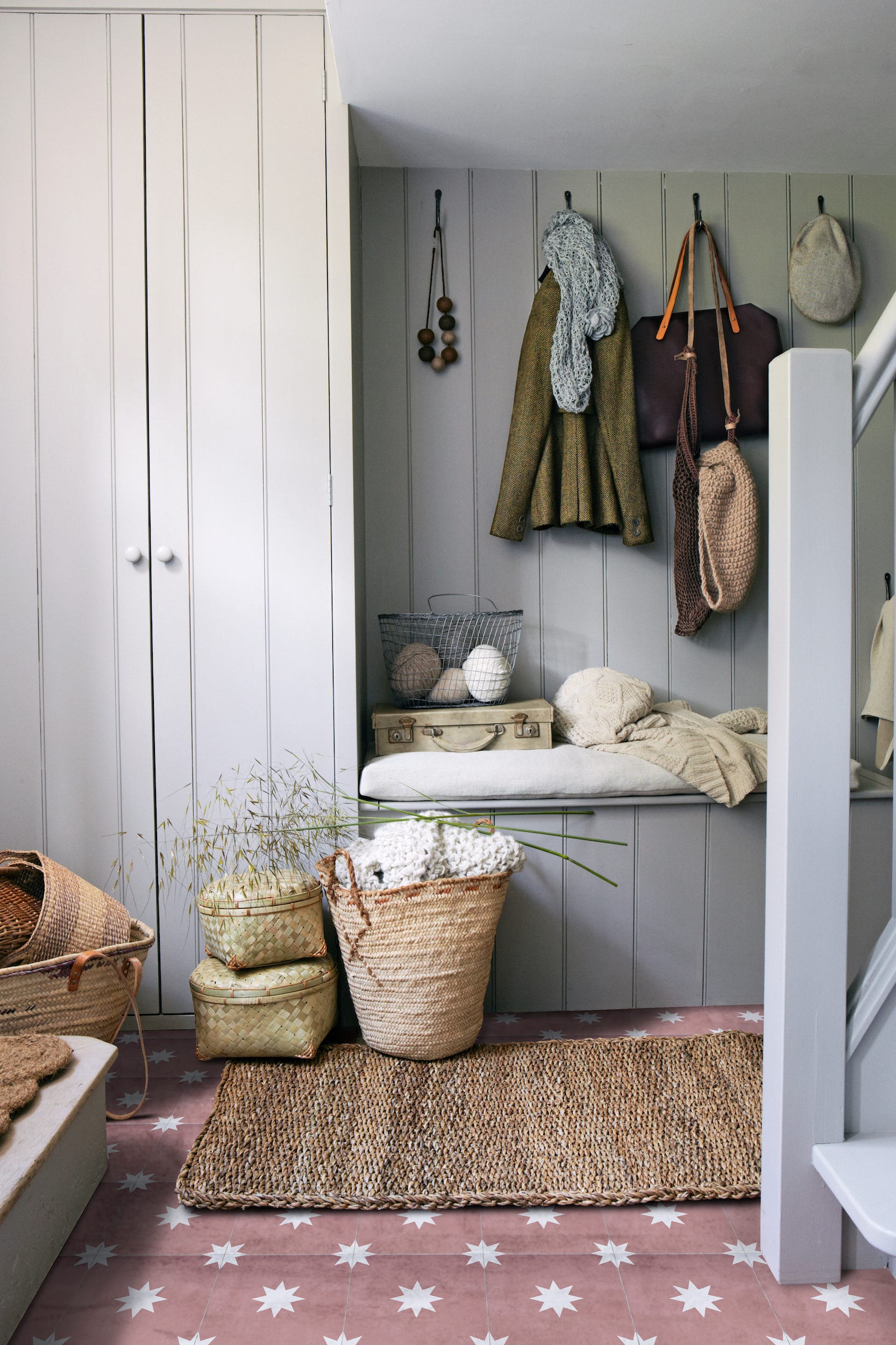

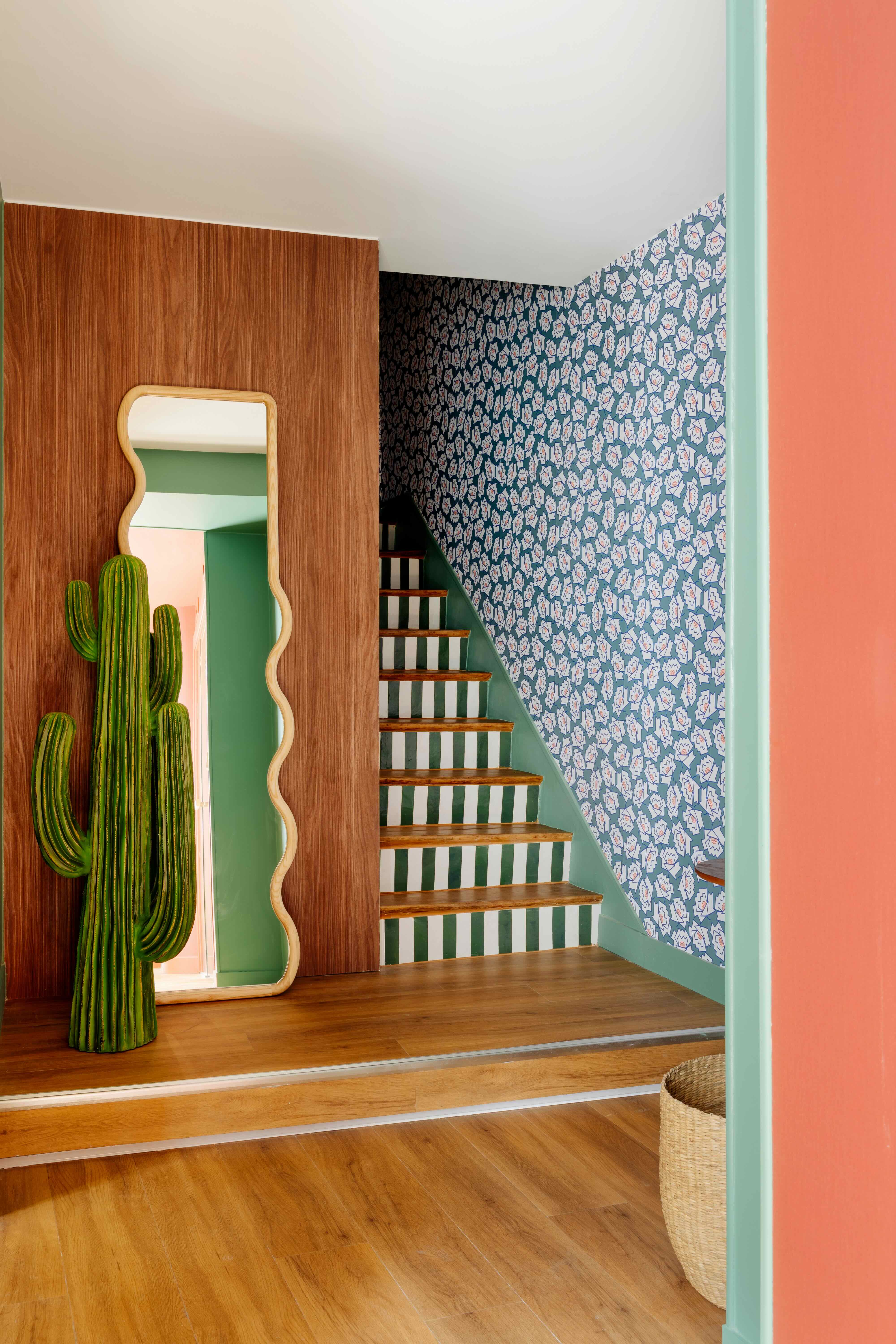
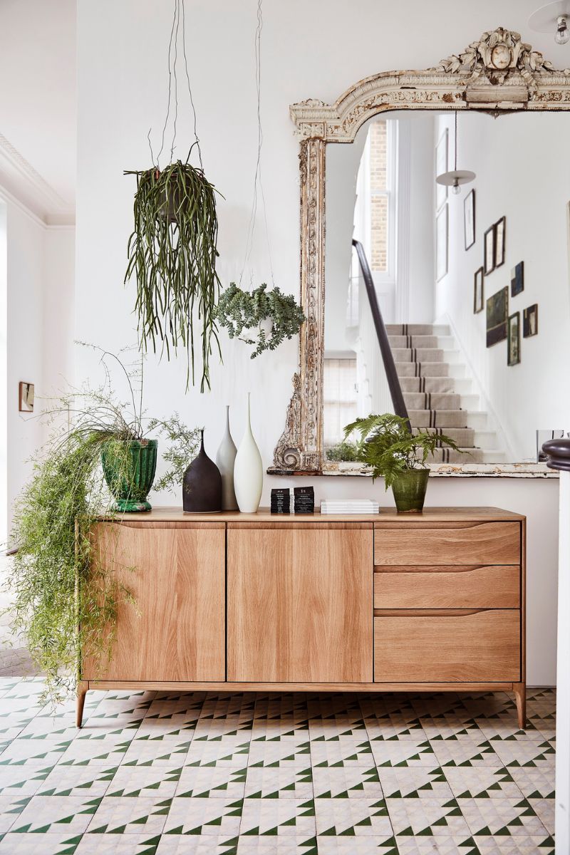
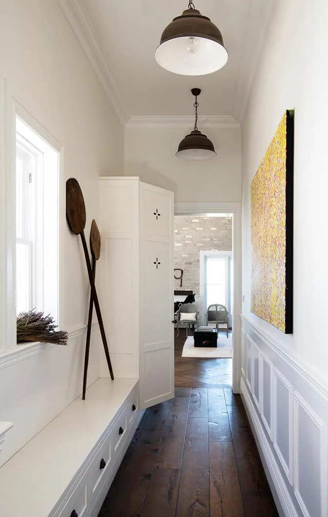
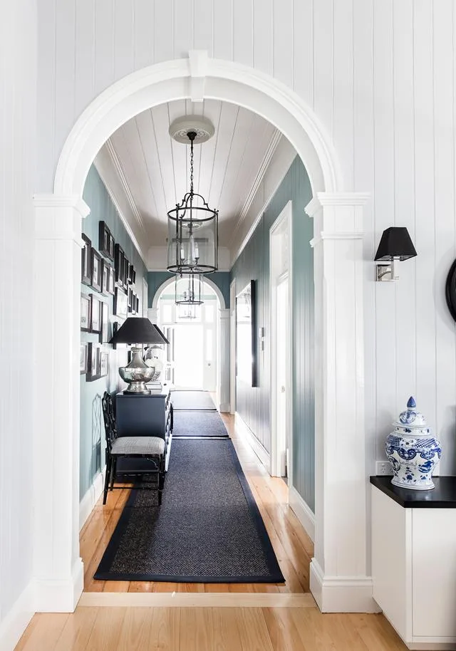
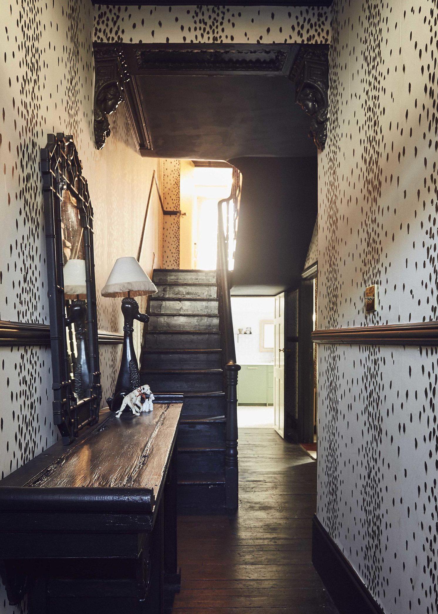
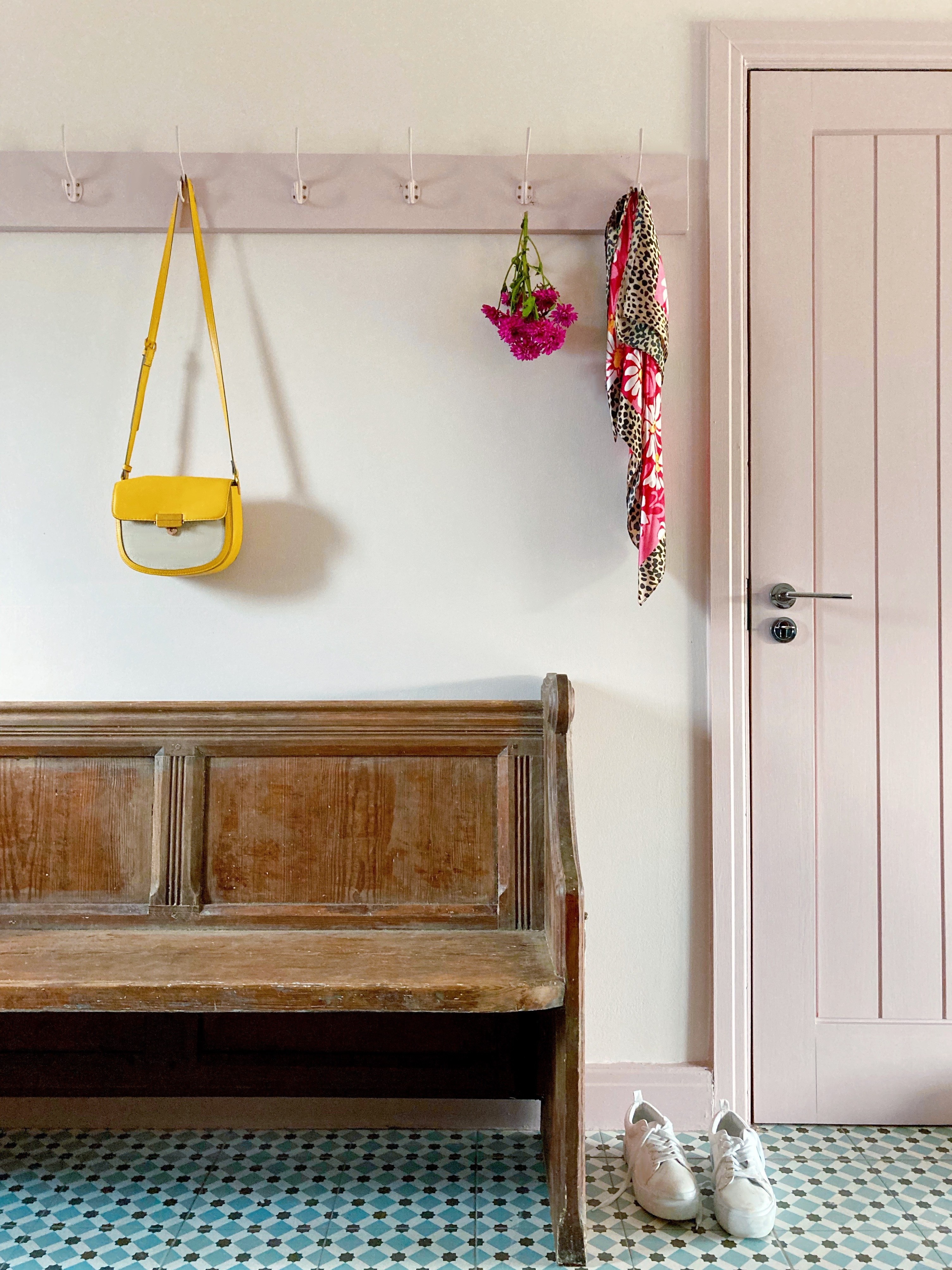
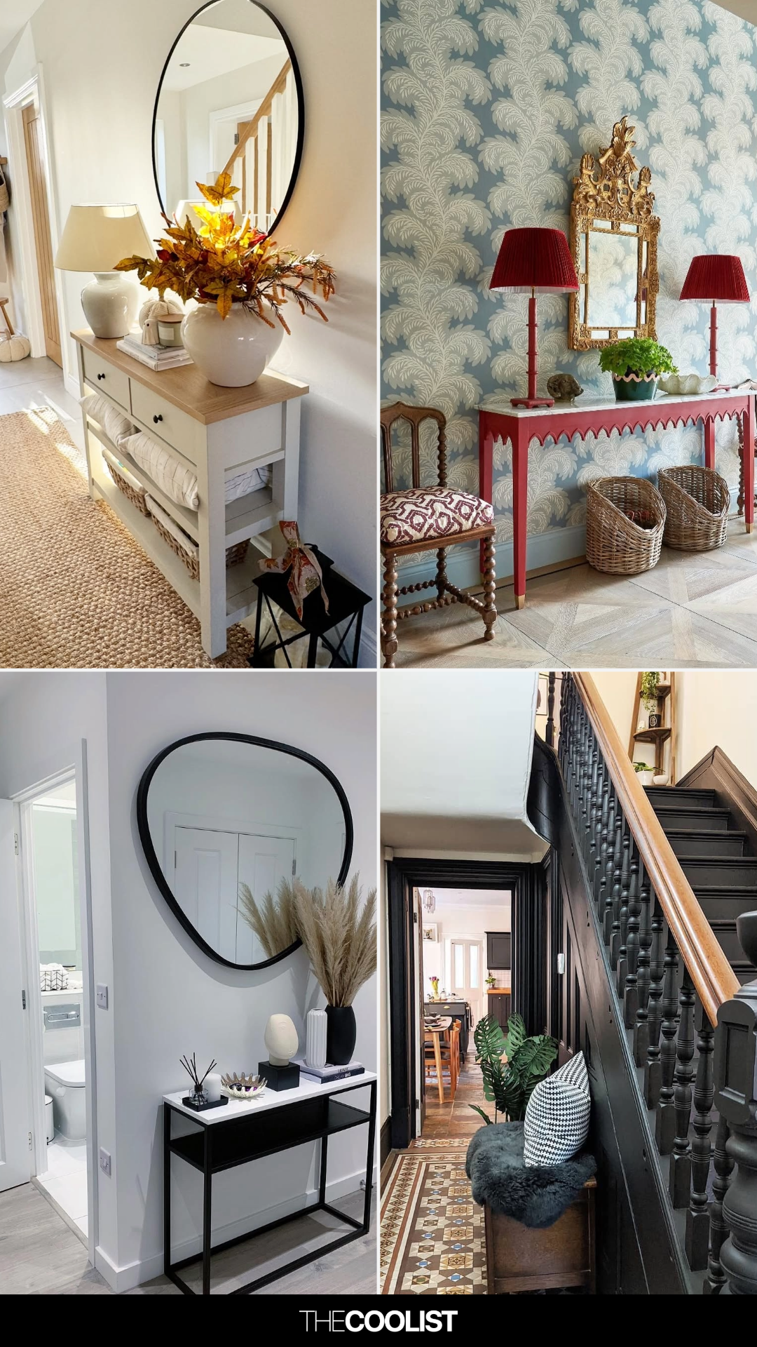
The article emphasizes the importance of designing hallways with as much care as other rooms in a home, moving beyond their typical perception as mere dumping grounds or thoroughfares. It highlights how these transitional spaces offer the first impression of a home and can significantly impact its overall aesthetic. The piece draws inspiration from various designers and their approaches to transforming hallways into distinct and inviting areas.
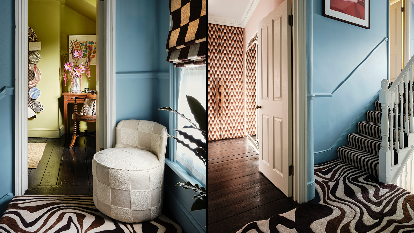
Fashion designer-turned-potter Henry Holland's approach to his East London townhouse exemplifies this philosophy. He meticulously designed his corridors with Cinderella blue walls, vibrant colour-pop artworks, and a unique 'Melting' carpet. This wool-viscose carpet, a collaboration with Floor Story, features a pattern that drips and flows across three levels, creating a sense of a room in itself. Holland used colours that echo his ceramics range, made using the Japanese nerikomi technique, showcasing an intentional and cohesive design. He stresses that these spaces, seen frequently by guests, should have a 'colour story' and proper execution, avoiding muted and neutral tones.
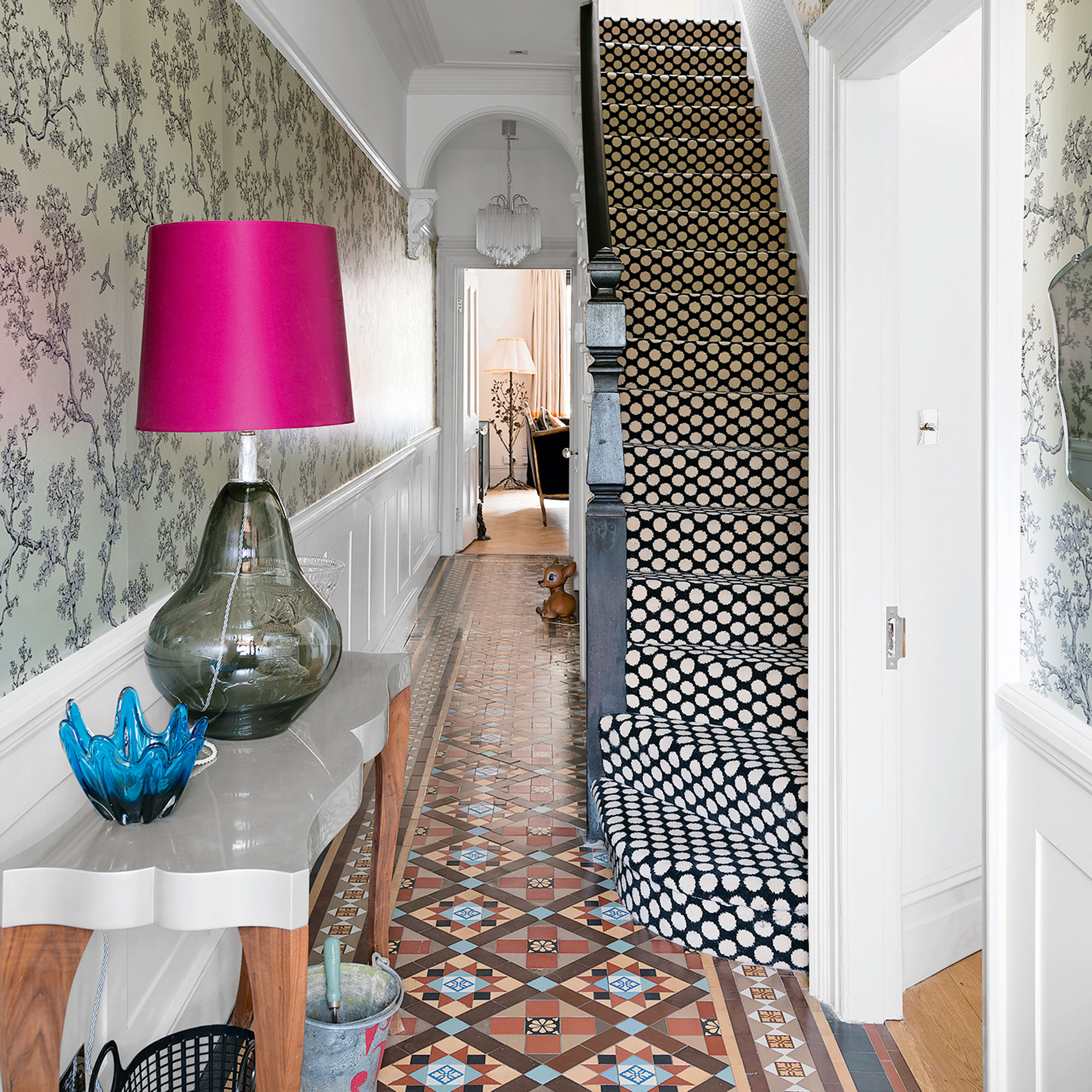
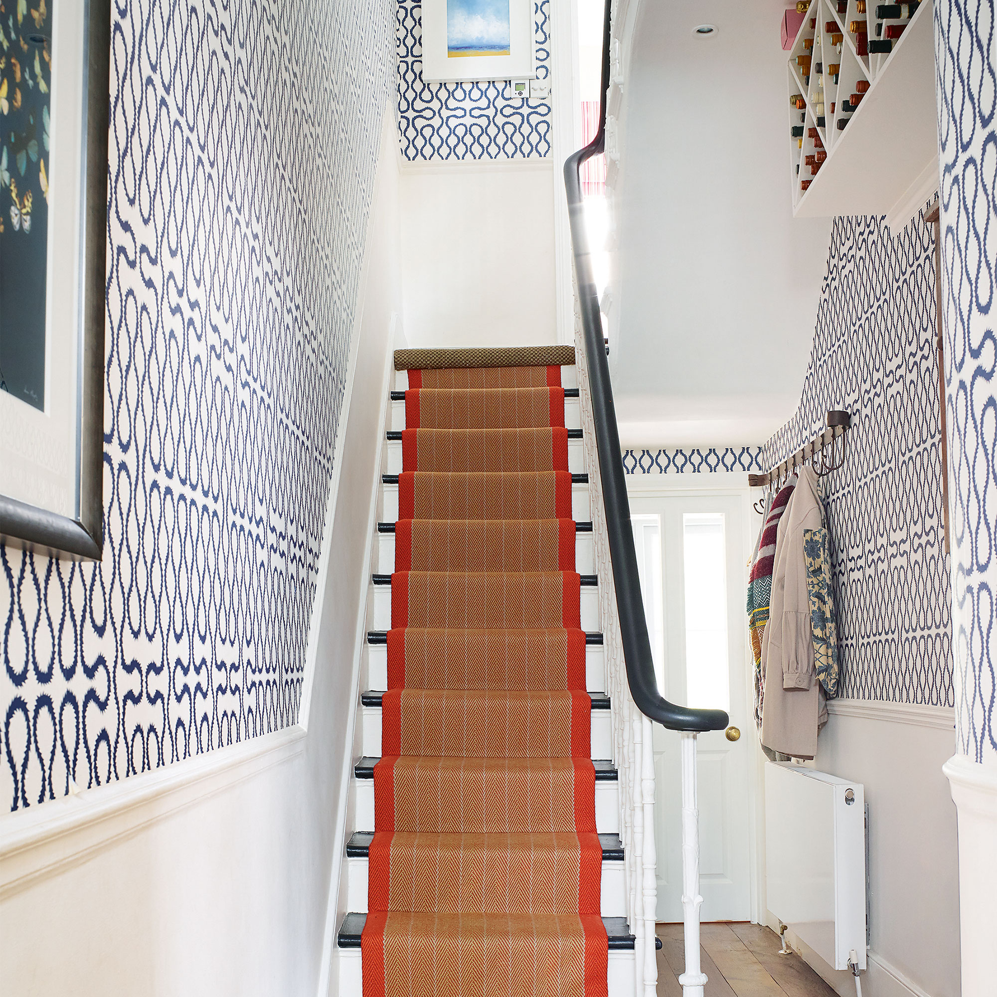
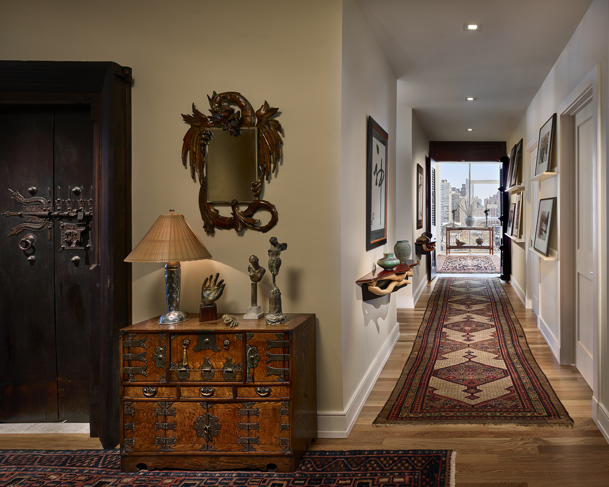
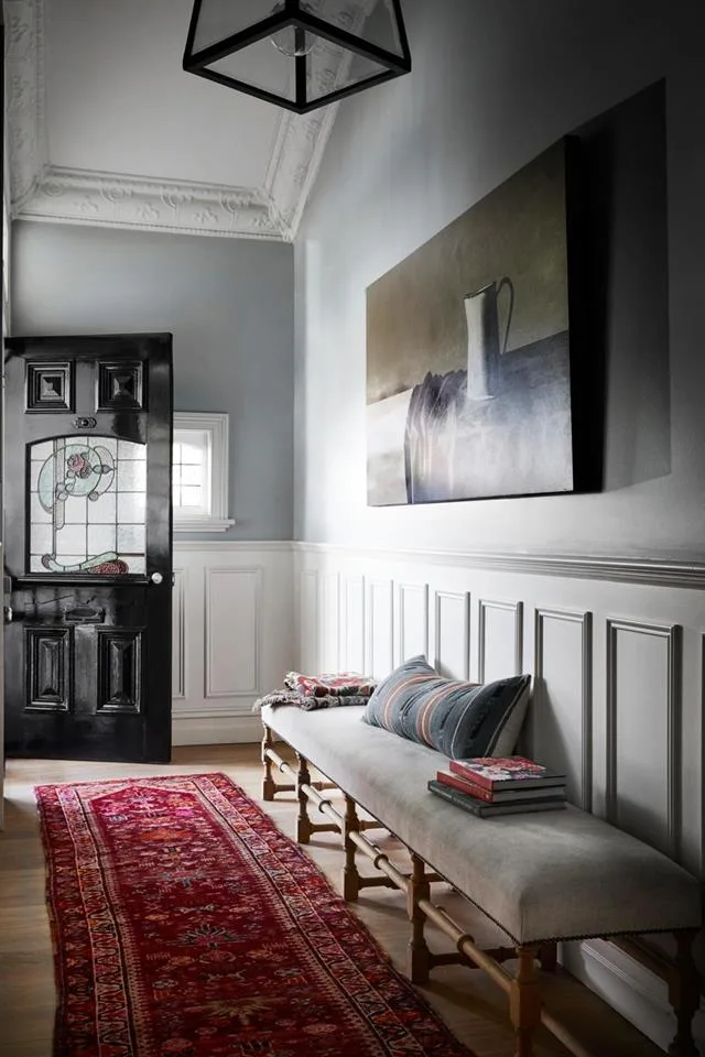
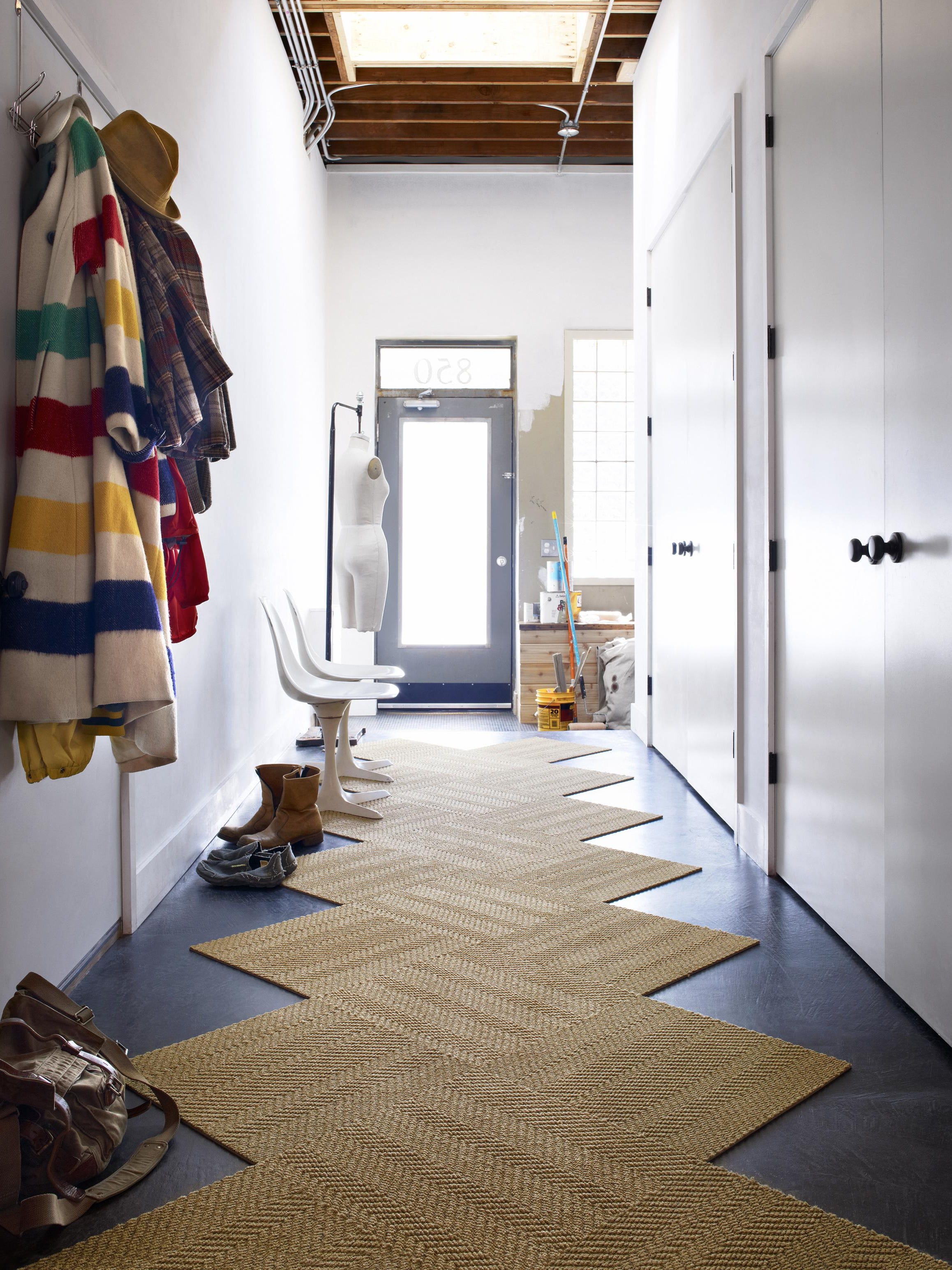
Several experts agree that statement runners are excellent opportunities for bold design choices in hallways. Isabella Valenzia, founder of Pelican House, suggests that without the competition of other fabrics and furniture found in larger rooms, a standout runner can be incorporated without making the space feel too busy. This approach allows for a unique and impactful design element.

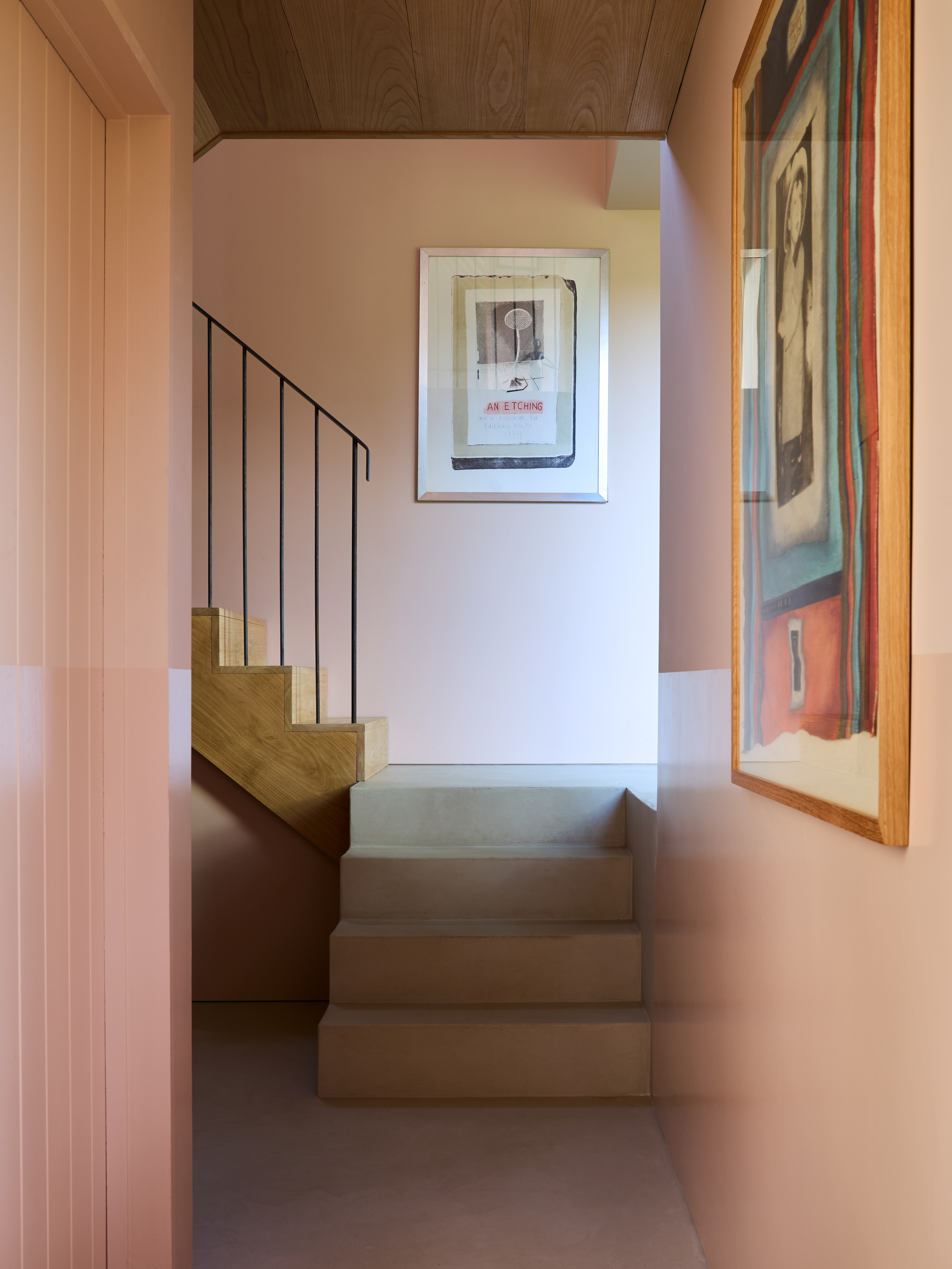
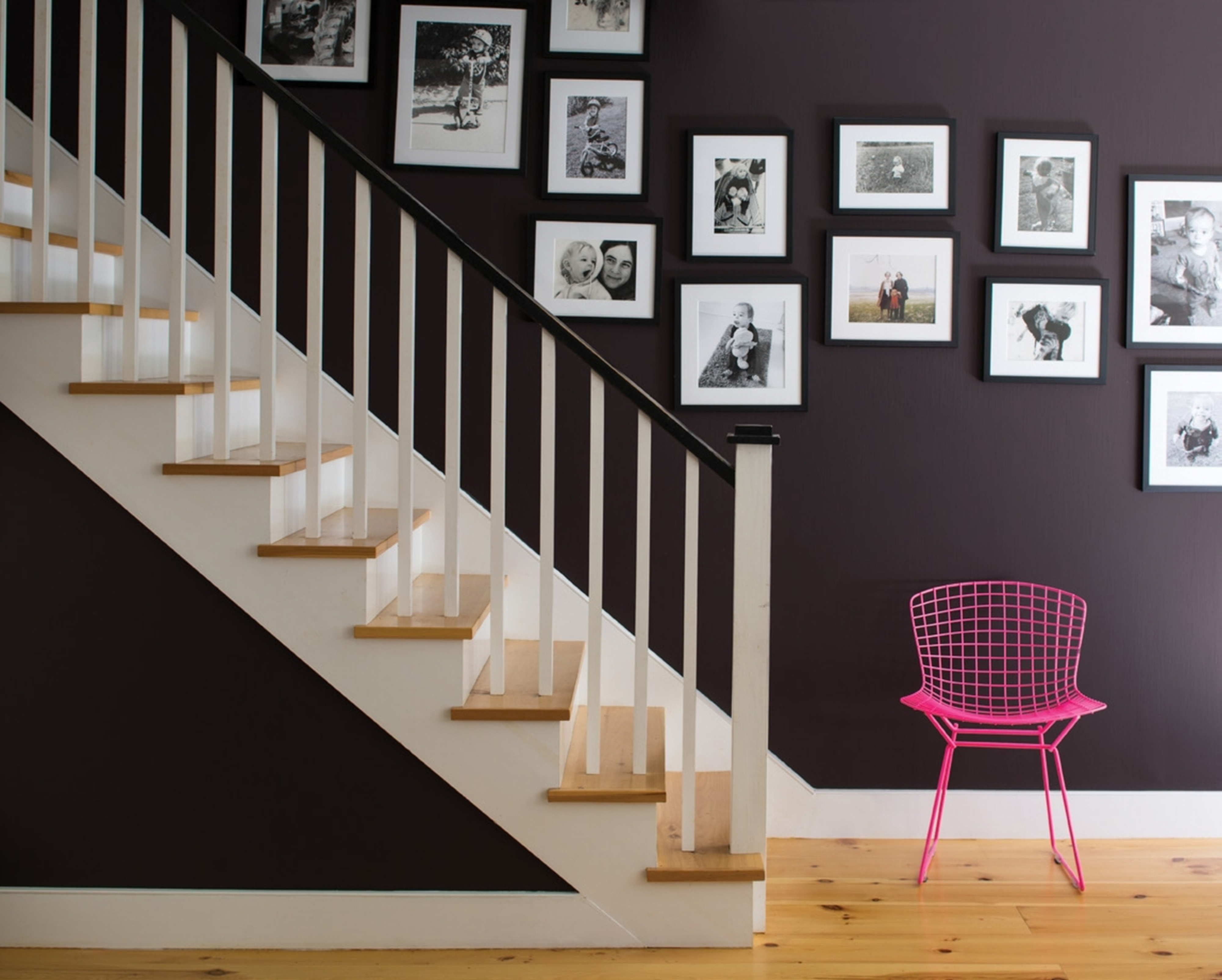
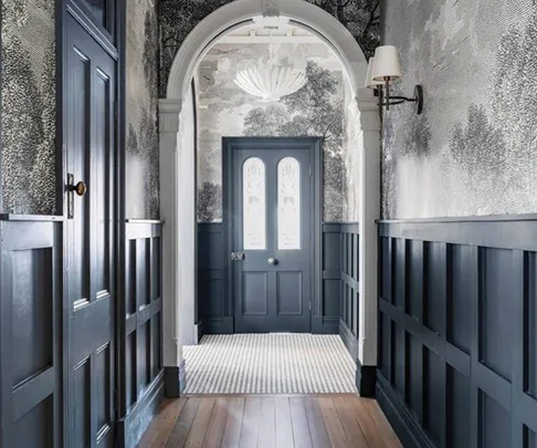
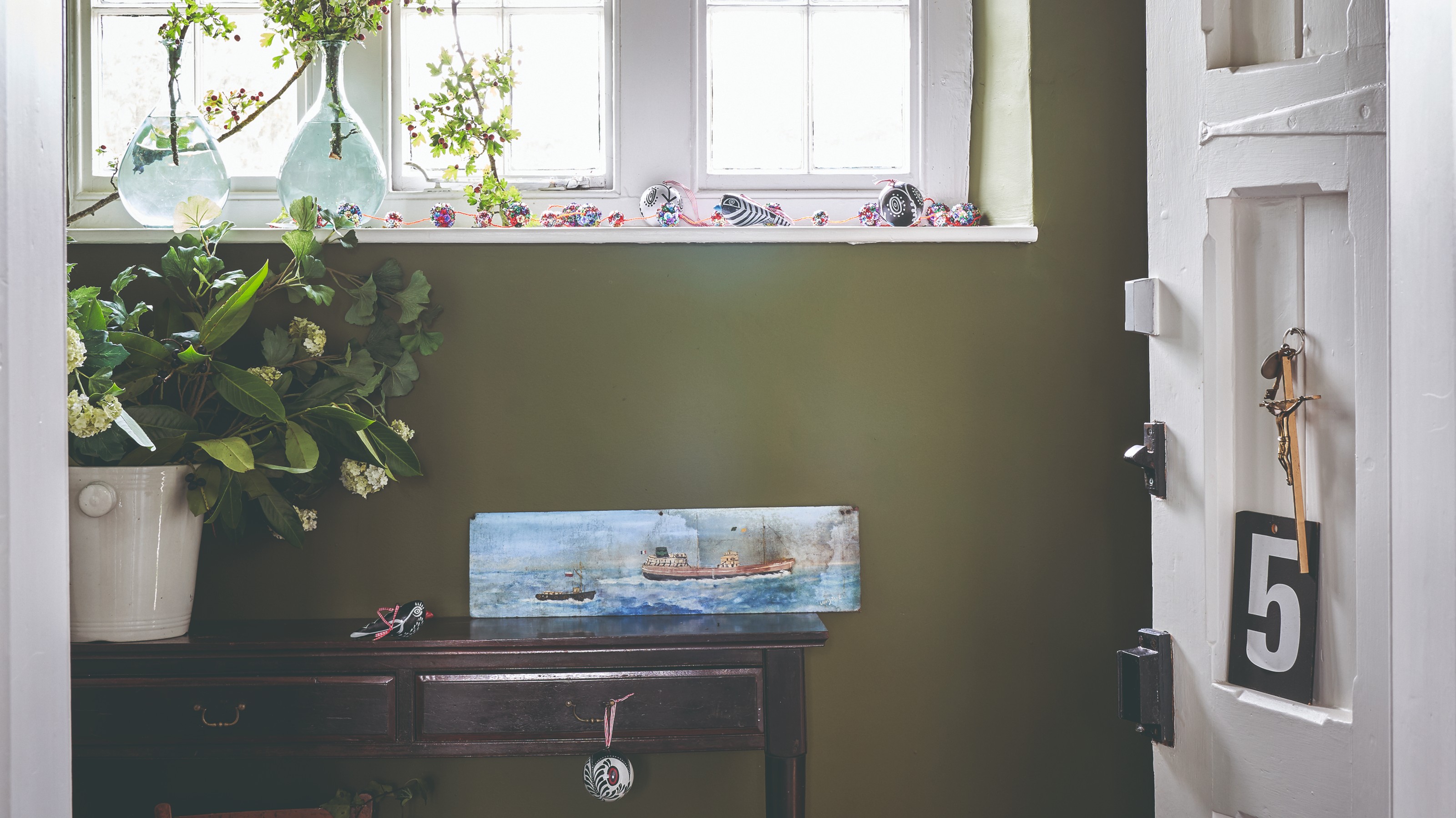
For dark and dull hallways, the article advises against using Brilliant White paint. Instead, Joa Studholme, Farrow & Ball’s colour curator, recommends embracing the existing darkness by using strong colours. This technique makes adjacent, paler rooms appear bigger and brighter when transitioning from a darker space. She also suggests using two different finishes, such as gloss on the bottom half of the walls and matt on the top, for a contemporary look that is both chic and practical in minimizing scuff marks.
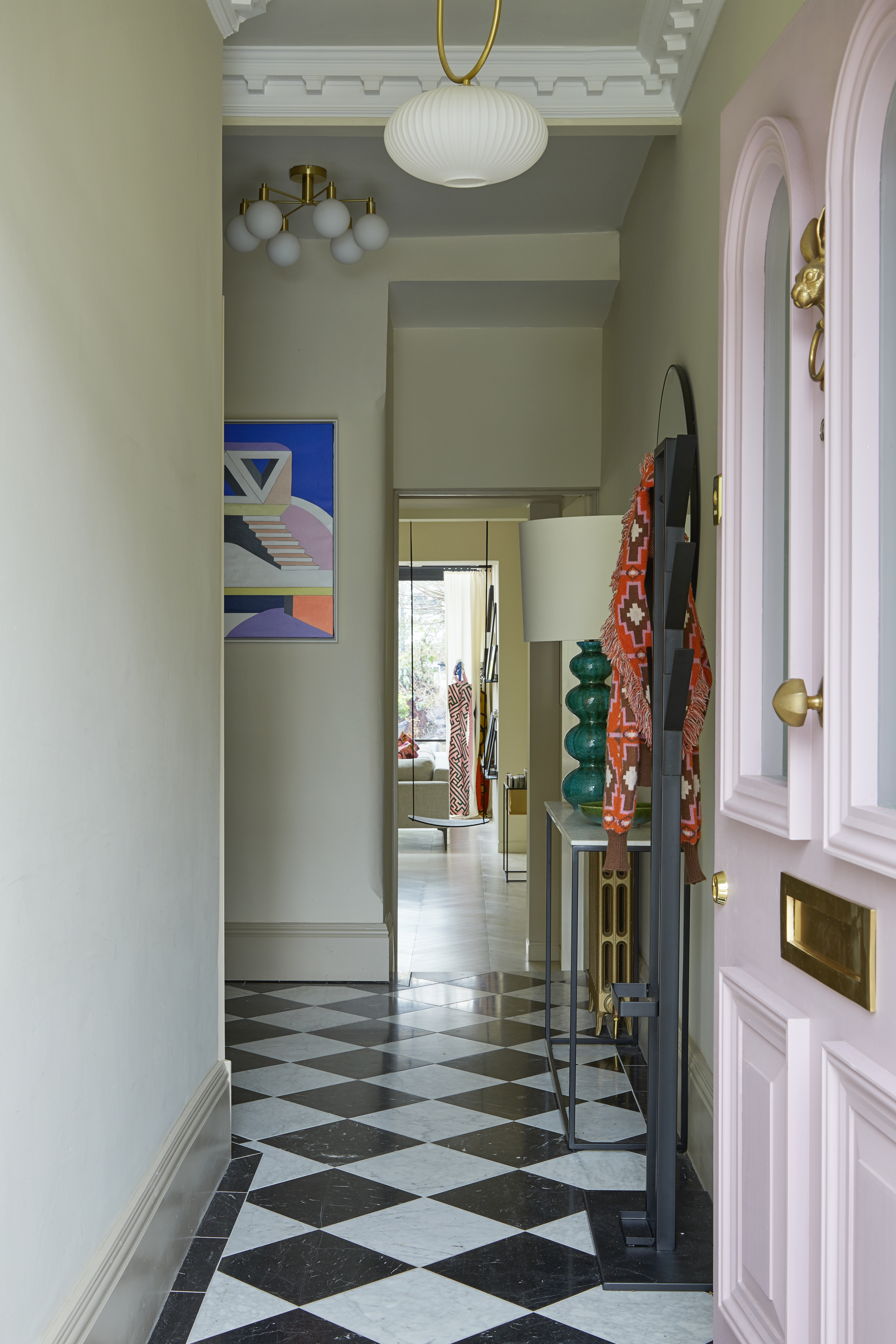
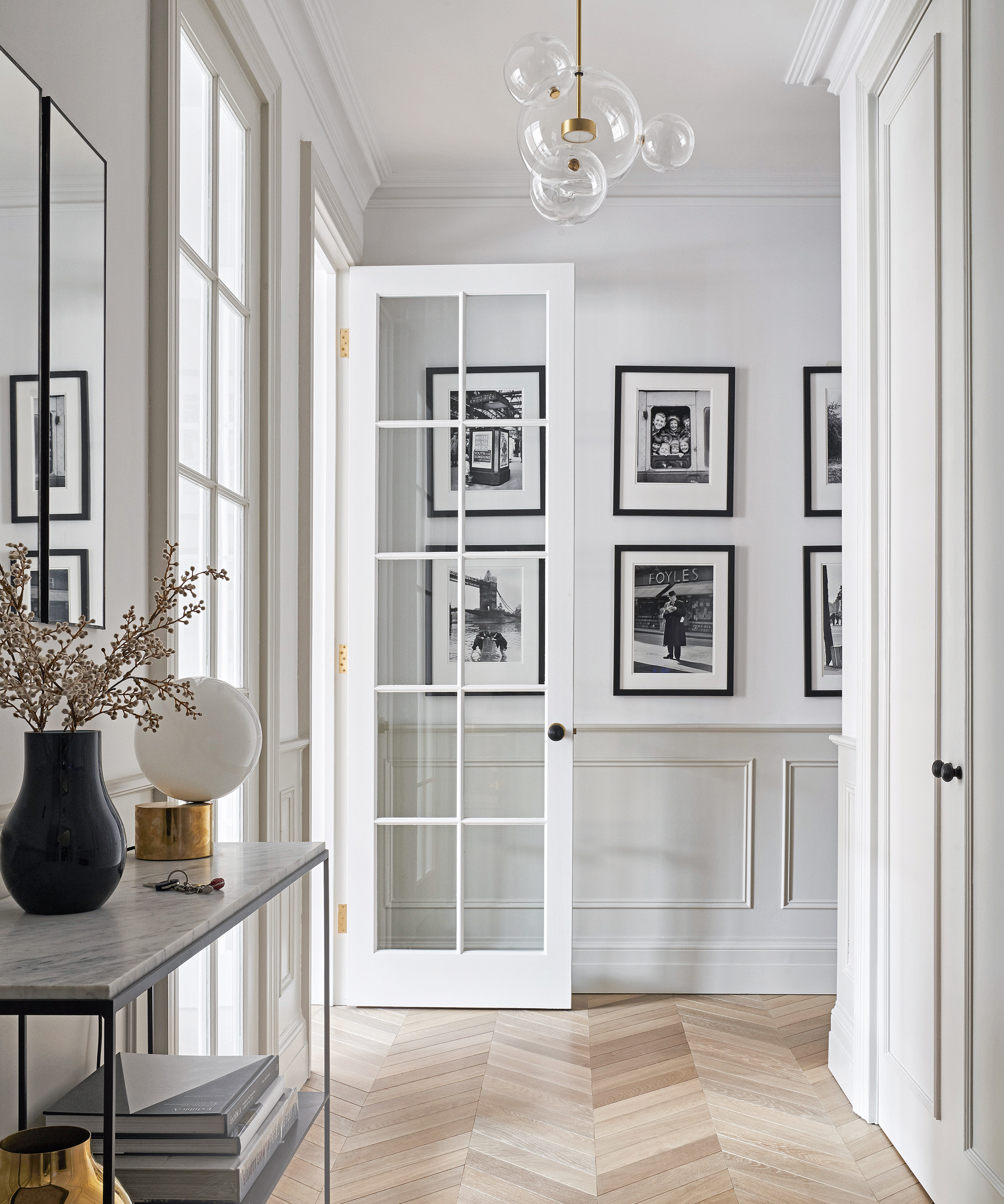
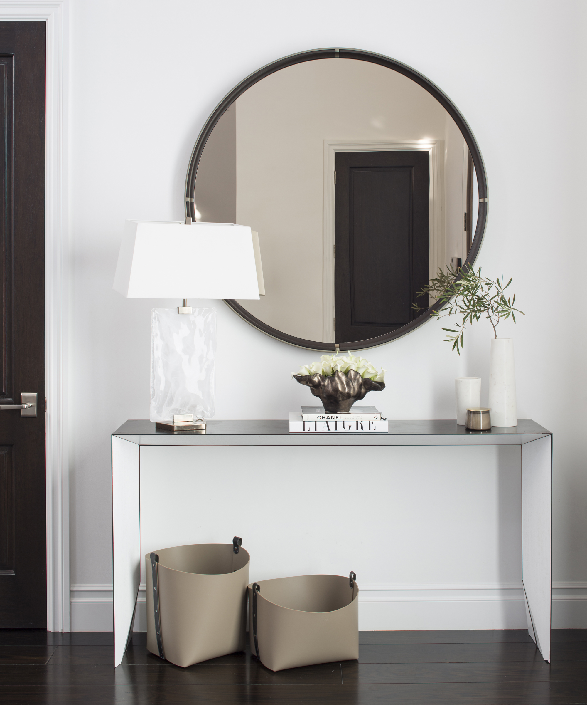
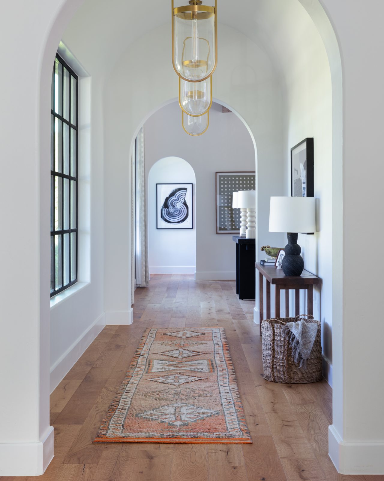
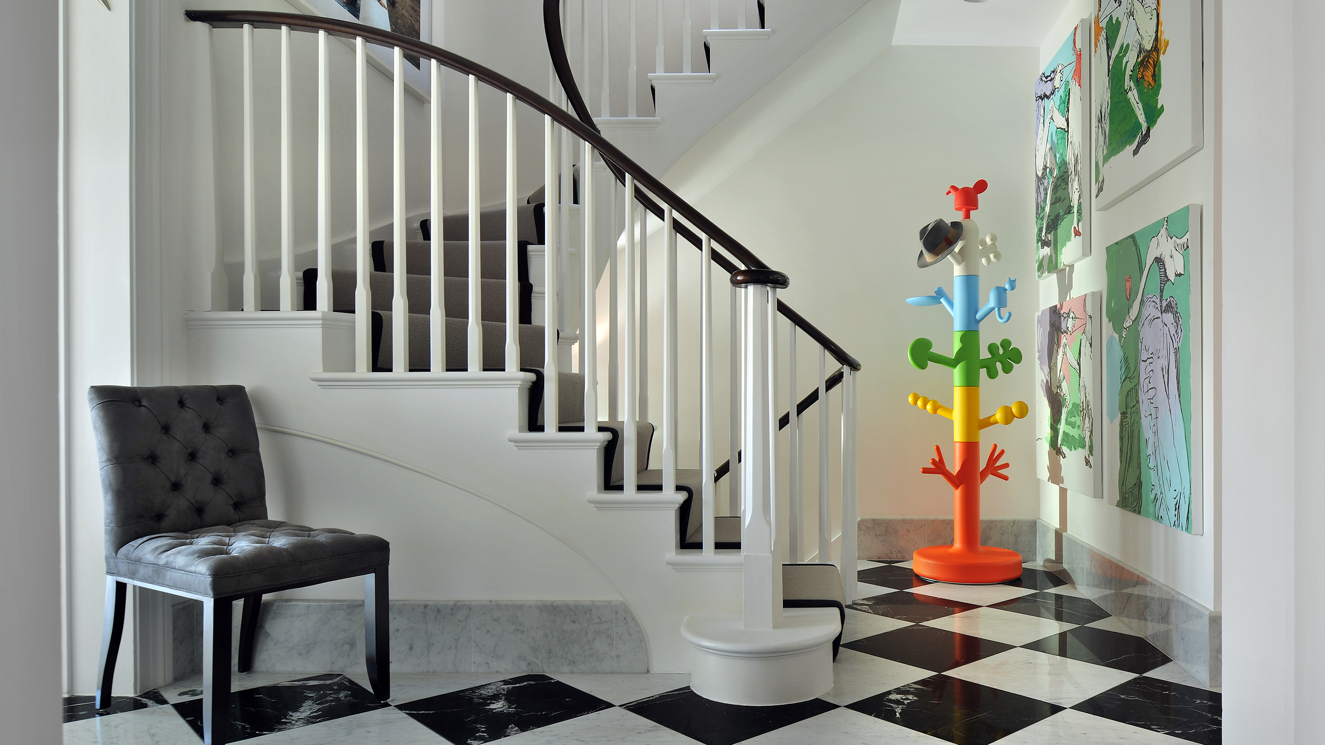
Christian Bense, a London-based interior designer, offers the mantra "light but never white," advocating for approachable off-white tones instead of stark white to soften edges. In a Mayfair project, Bense used an off-white palette for walls, maintained a chequered marble floor, and added a peachy-red runner to connect corridors. He also incorporated a Rupert Bevan mirror above a floating marble shelf to avoid visual clutter.
The article also explores the use of natural materials. Interior designer Bryan O’Sullivan transformed his windowless Barbican entrance with pippy oak panelling on walls and ceiling, creating a welcoming, cocooning effect. This is paired with a richly veined red-onyx floor and kooky parquet flooring in the adjoining corridor, which he treats as a gallery space with directional lighting for artworks. Sophie Goldhill of Liddicoat & Goldhill and Hector Interiors utilized deep-hued iroko wood stair treads, umber-coloured tongue-and-groove panelling, and tough coir matting for a beach home, emphasizing robustness and functionality. She added vintage lamps and flea market prints to enhance the welcoming feel.
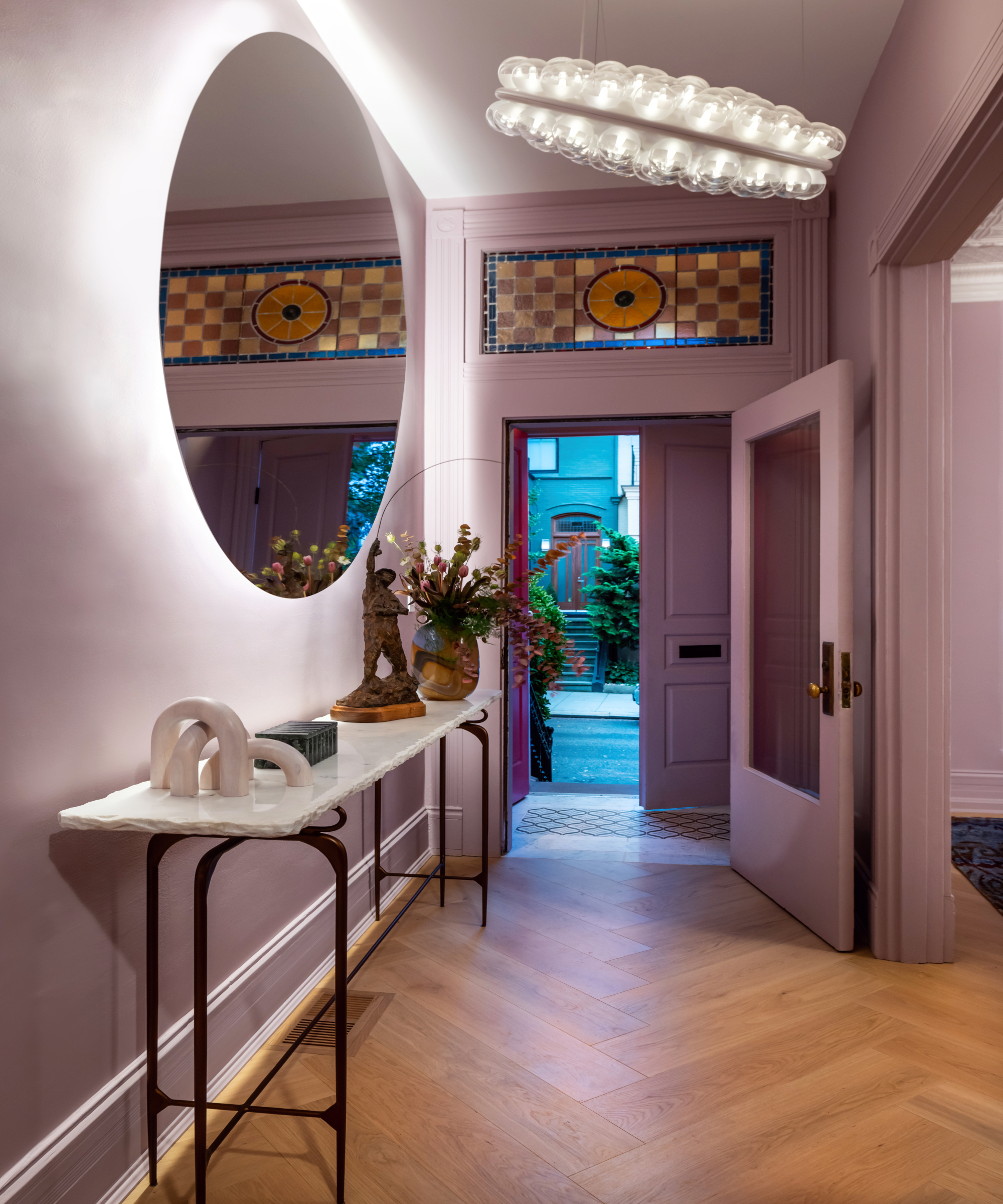
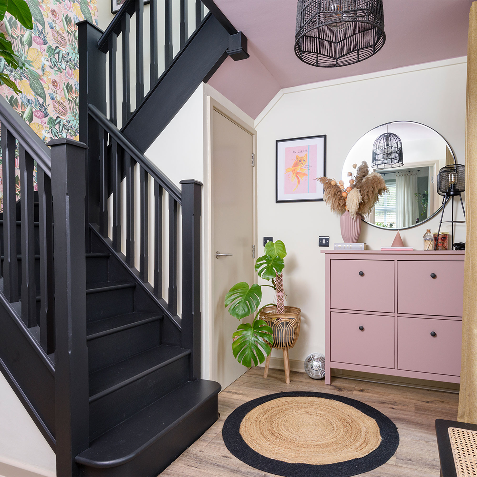
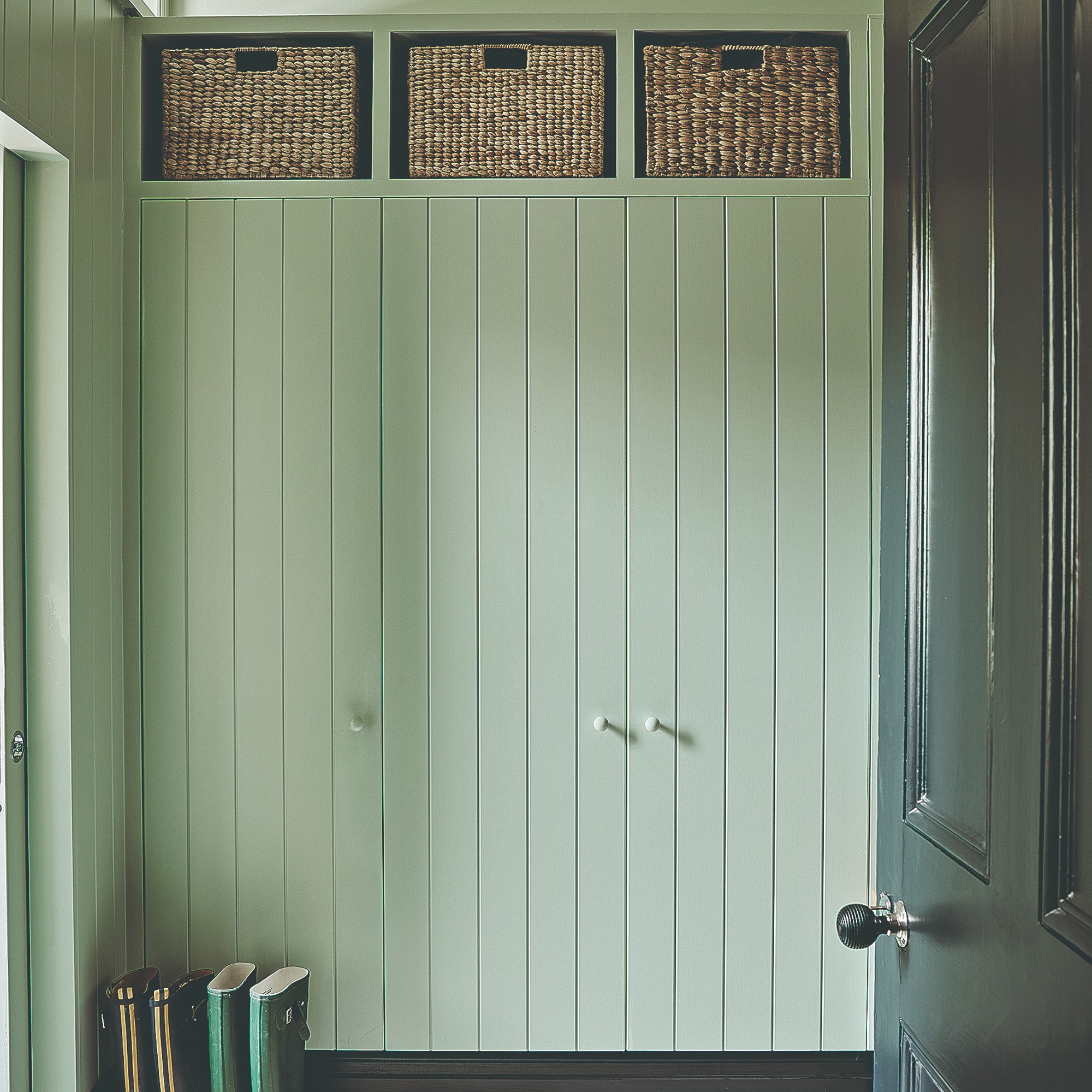
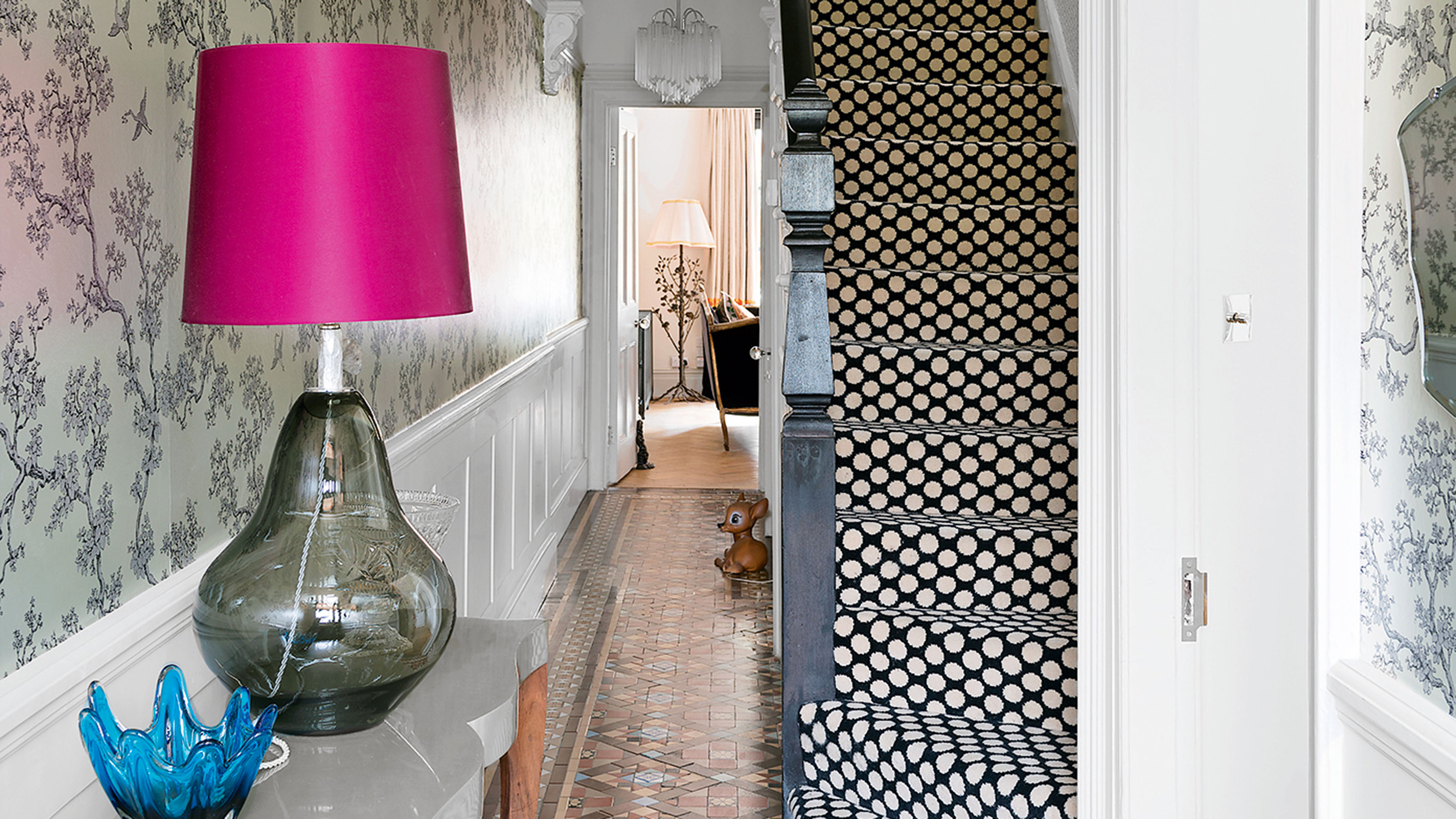
Gemma McCloskey, founder of Cupla design studio, transformed her once cold West London hallway by replacing stark grey-white walls with pastel hues and unflattering spotlights with Murano glass pendants to create a soft, atmospheric glow. She added texture and warmth with a portrait, a mauve Slub Silk wallcovering, and a bespoke multicoloured runner. A narrow console table with mixed marbles and a large mirror maximize light, while tall wardrobes keep clutter out of sight.
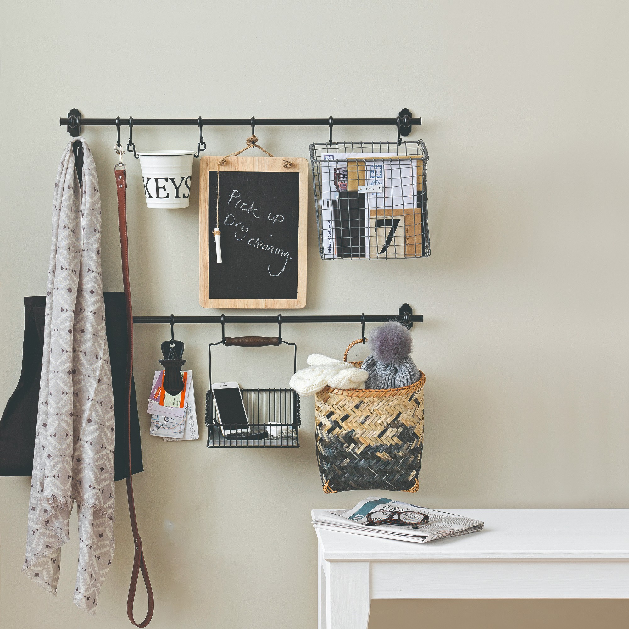
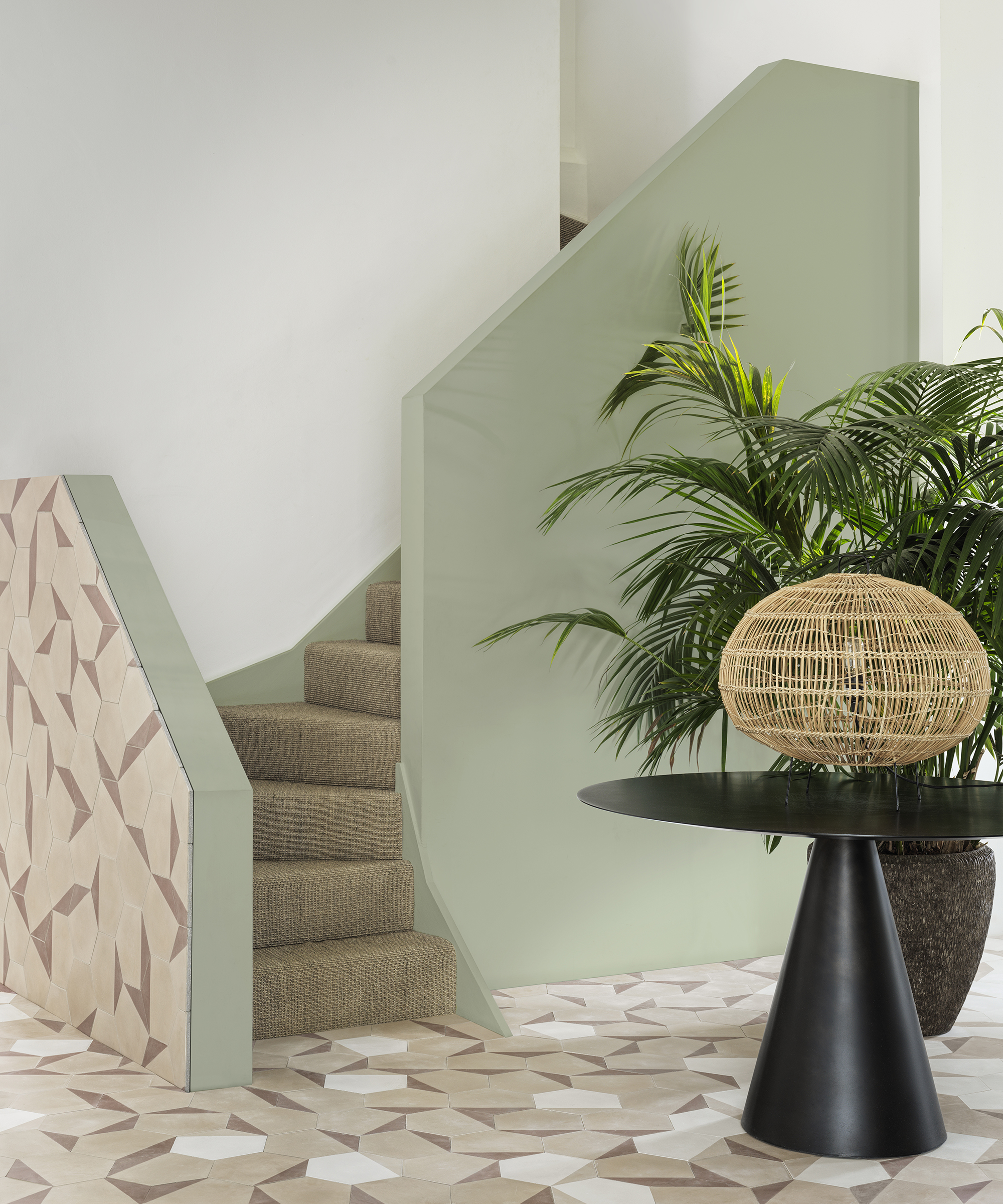
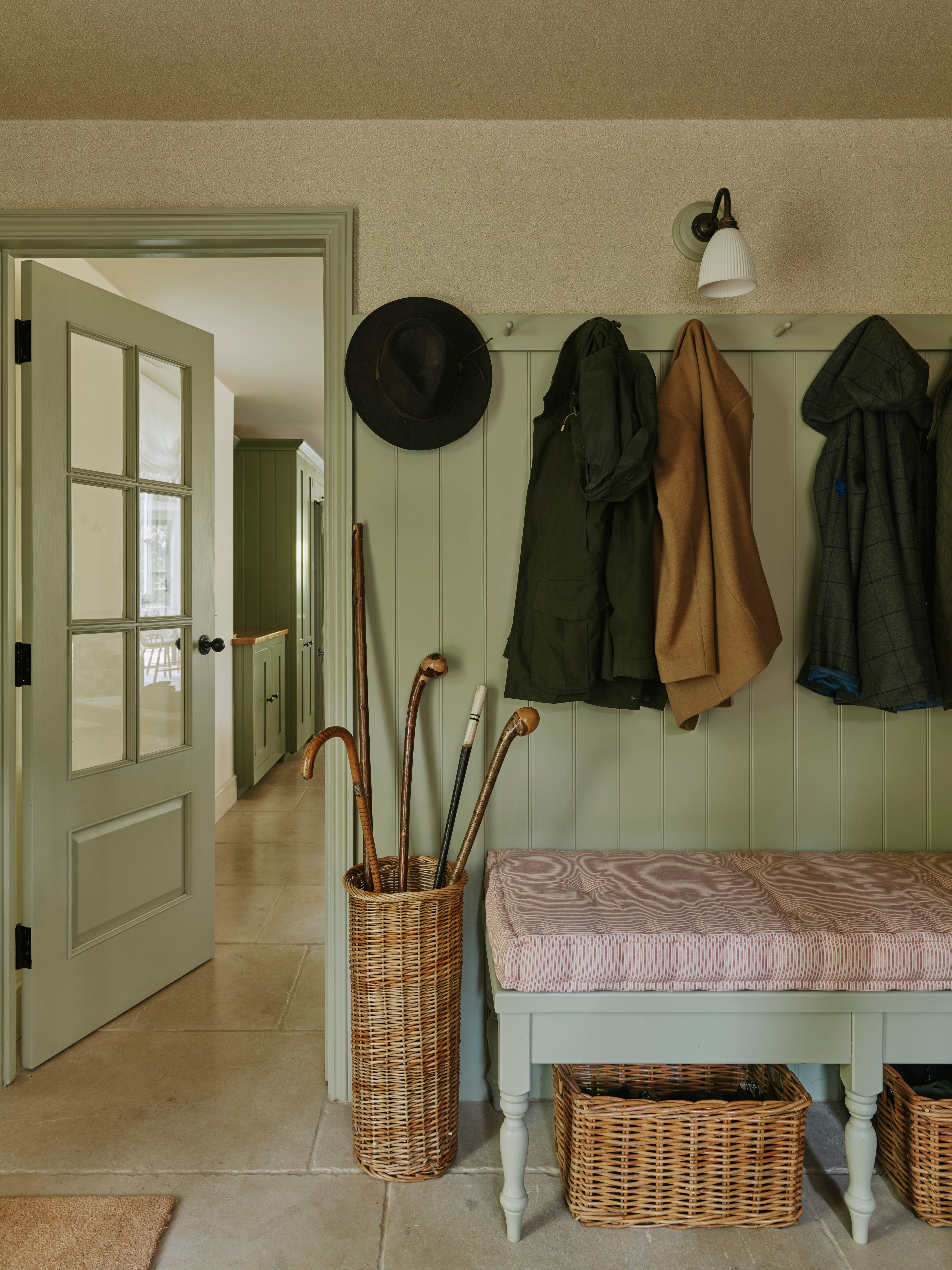
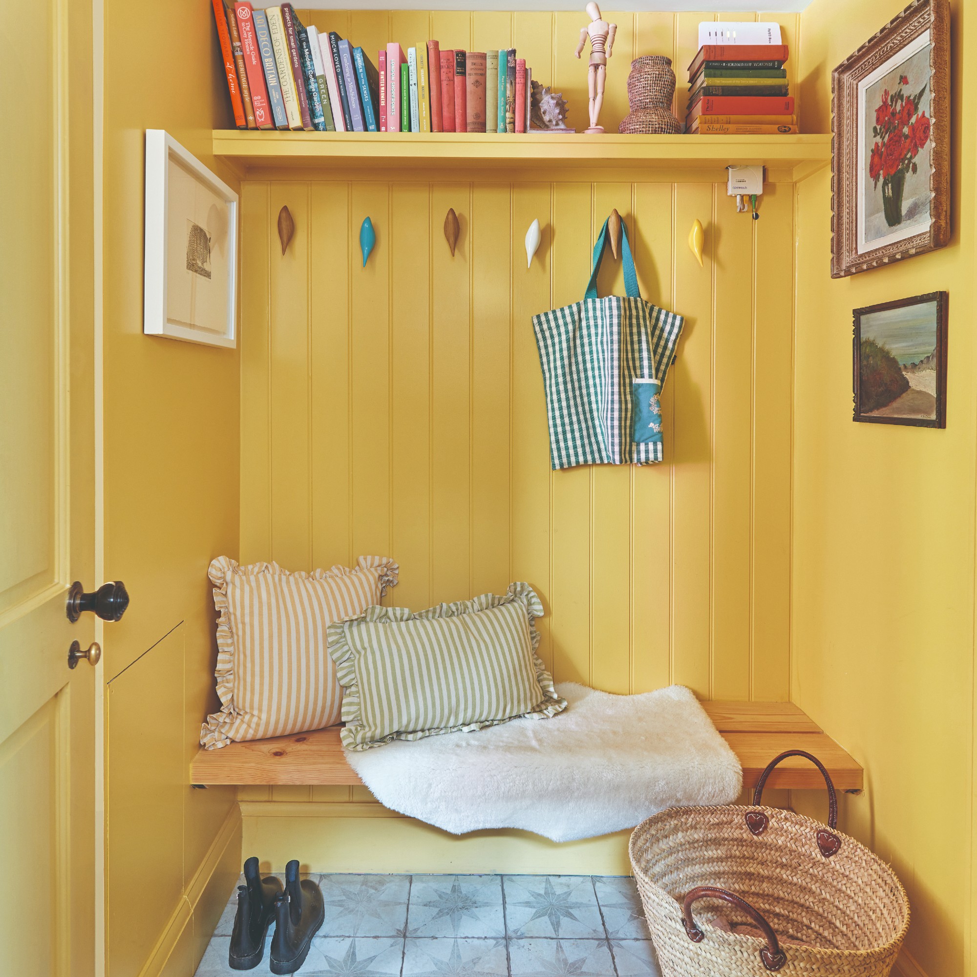
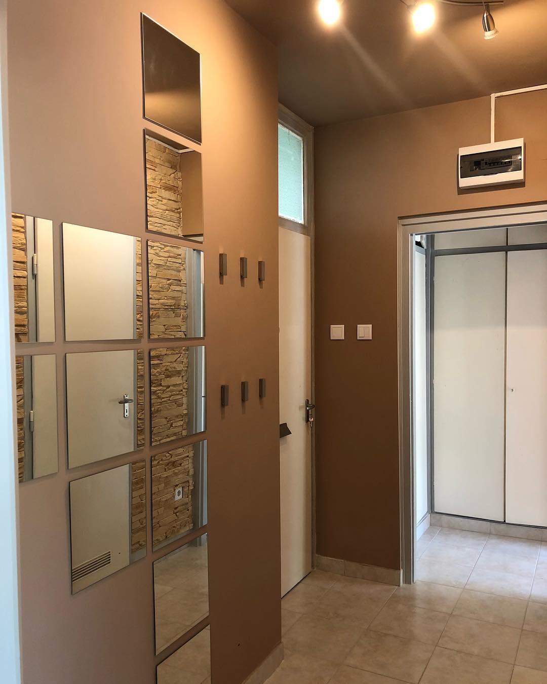
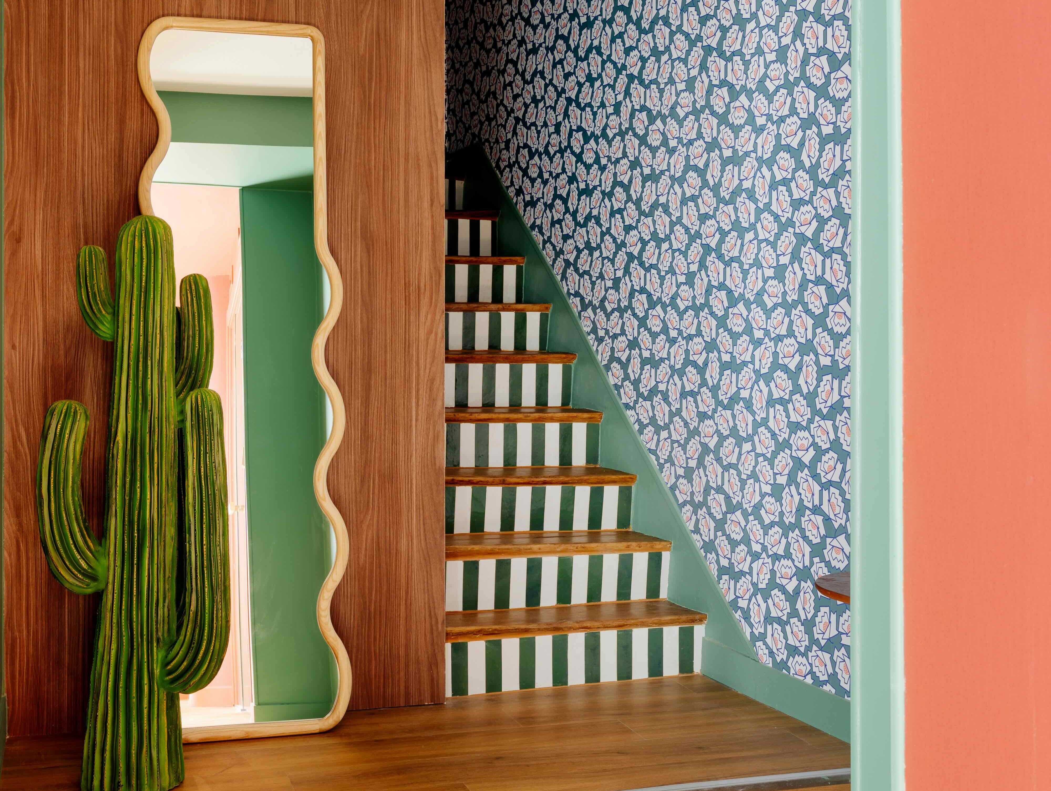
Leo Wood of Kinder Design suggests practical solutions for characterless new-build flats. In a Bankside hallway, she painted walls an inviting gold, replaced generic furniture with a high-gloss floating console table and an Etsy mirror, and added functional hanging storage in a plant room to keep the main hallway clutter-free. Helen Parker of deVol’s Leicestershire home uses Farrow & Ball’s Arsenic green with toile de Jouy-style wallpaper under the dado rail, clashing greens and reds with patterned floor tiles.
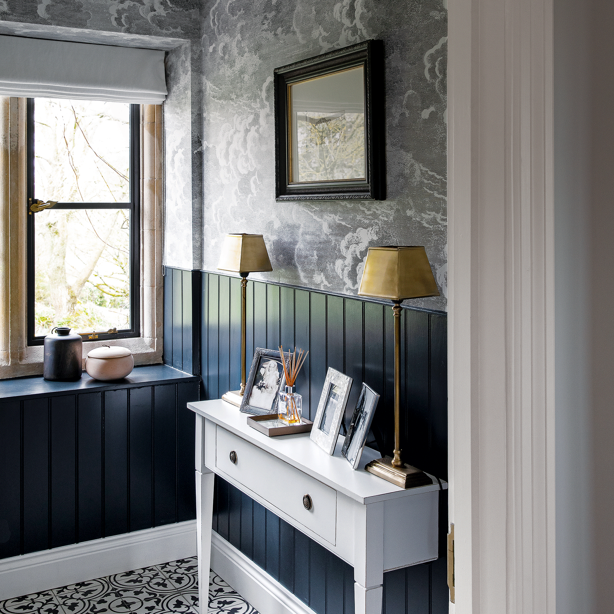
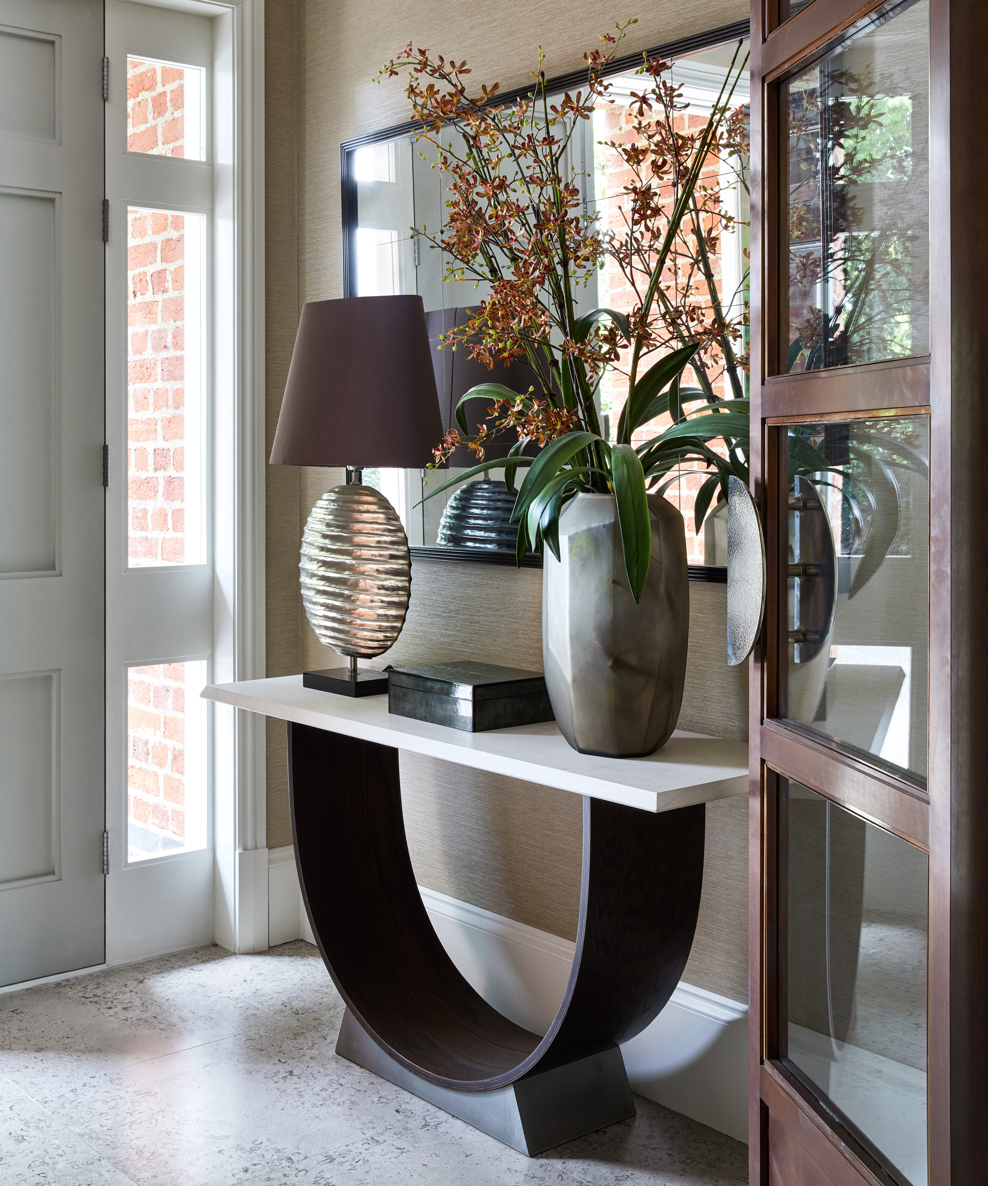
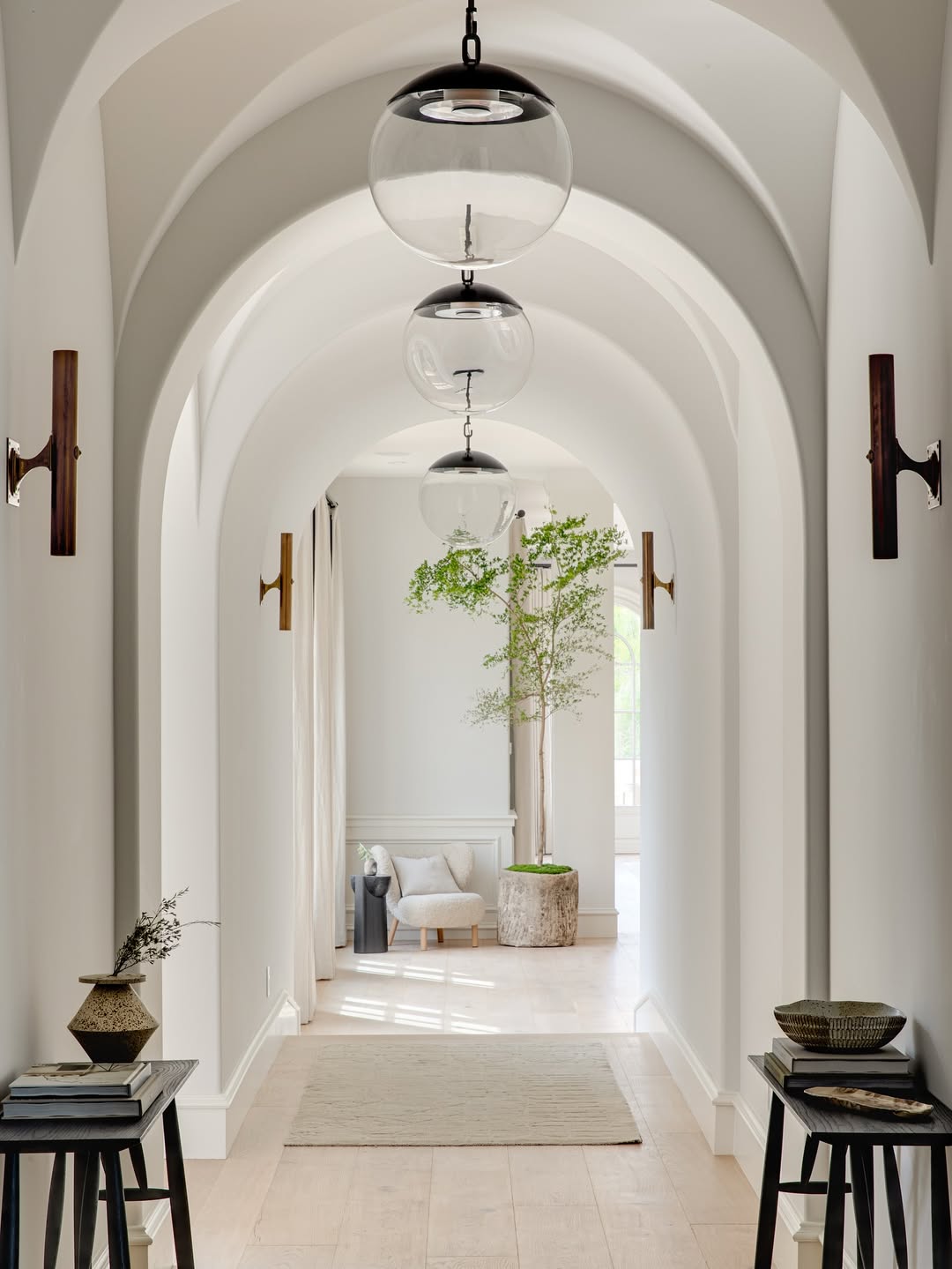
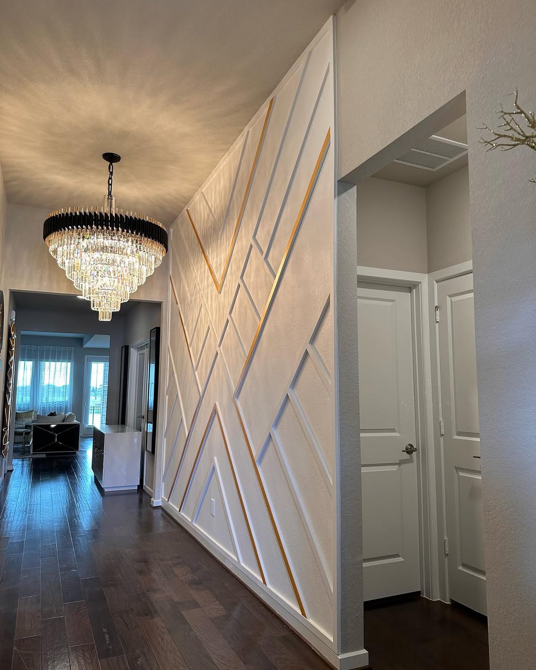
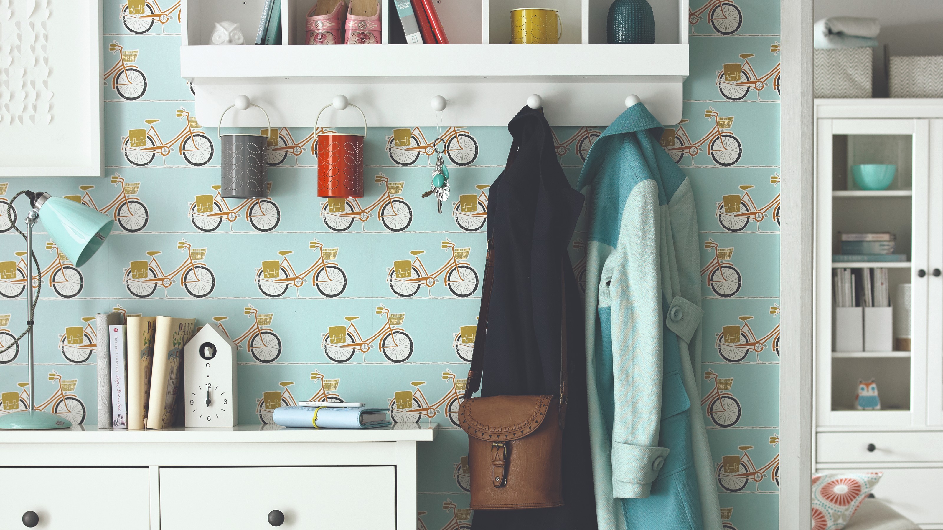
Finally, the article highlights the critical role of lighting. Hanna Walter, creative manager at Heathfield & Co, advocates for layering general, task, and feature lighting to create a personalized and practical space. Chandeliers or clusters of pendants suit high ceilings, while compact pendants or wall lights are better for smaller spaces. She advises against harsh spotlights, recommending uplighters to highlight architectural features and modern sconces or wall washers for a soft, multifaceted glow. Walter also suggests a pair of table lamps on a console and emphasizes the importance of dimmer switches to adjust the mood.
#HallwayDesign #InteriorDesign #HomeDecor #StatementRunners #ColourPalette #LightingDesign #MaterialSelection #SpaceTransformation #HomeImprovement #HallwayDesign #InteriorDesign #HomeDecor #StatementRunners #ColourPalette #LightingDesign #MaterialSelection #SpaceTransformation #HomeImprovement
0 تعليق إجمالاً
 لا توجد تعليقات بعد
قد تعجبك أيضًا
Hallway decor ideas to make your space look amazing

Decorating lessons from 17 brilliant small hallways
13 reasons everyone hates your hallway — and ideas to fix it
Hallways: Take break from the bland
Long hallway ideas – 10 ways to make the most of your space
22 of the hottest decorating ideas for hallways

How to Avoid the 5 Worst Hallway Design Mistakes

14 stylish hallway designs we’d love to come home to

15 Modern Hall Decoration Ideas For Home In 2023
30 Hallway Decor Ideas That Make Even the Smallest Hall Feel Styled, Bright, and Welcoming

5 mistakes making your hallway look smaller and how to fix them, according to designers

How to give your hallway a stylish makeover
14 Hallway Decor Ideas To Add Style To Every Part Of Your Home
Small hallway ideas – 38 ways to make your tiny entryway look both stylish and bigger than it really is
Hallway storage ideas – 16 ways to eliminate clutter and turn your entryway into a neat and stylish space
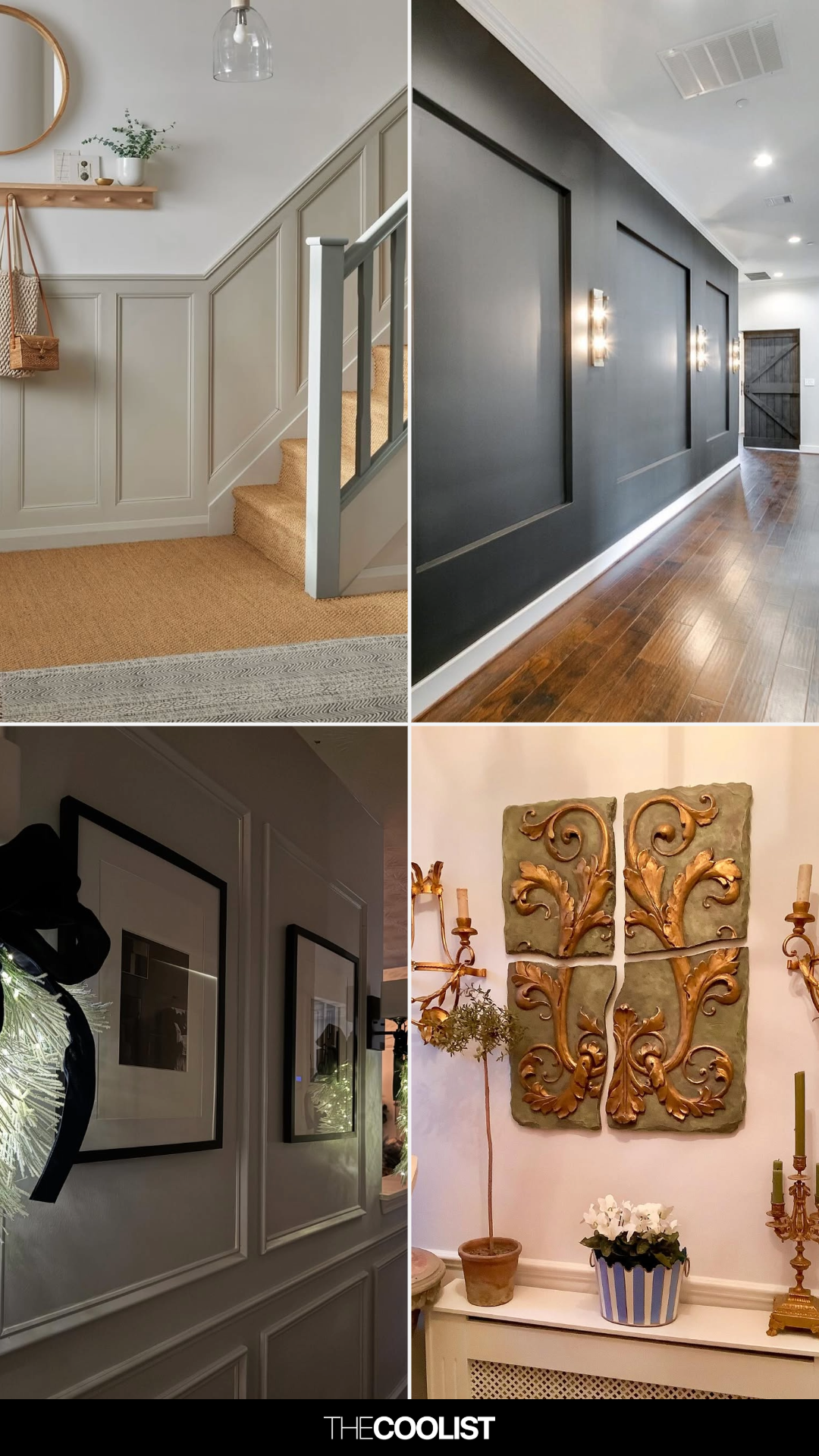
33 Hallway Wall Decor Ideas Guests Will Compliment Before Seeing the Living Room
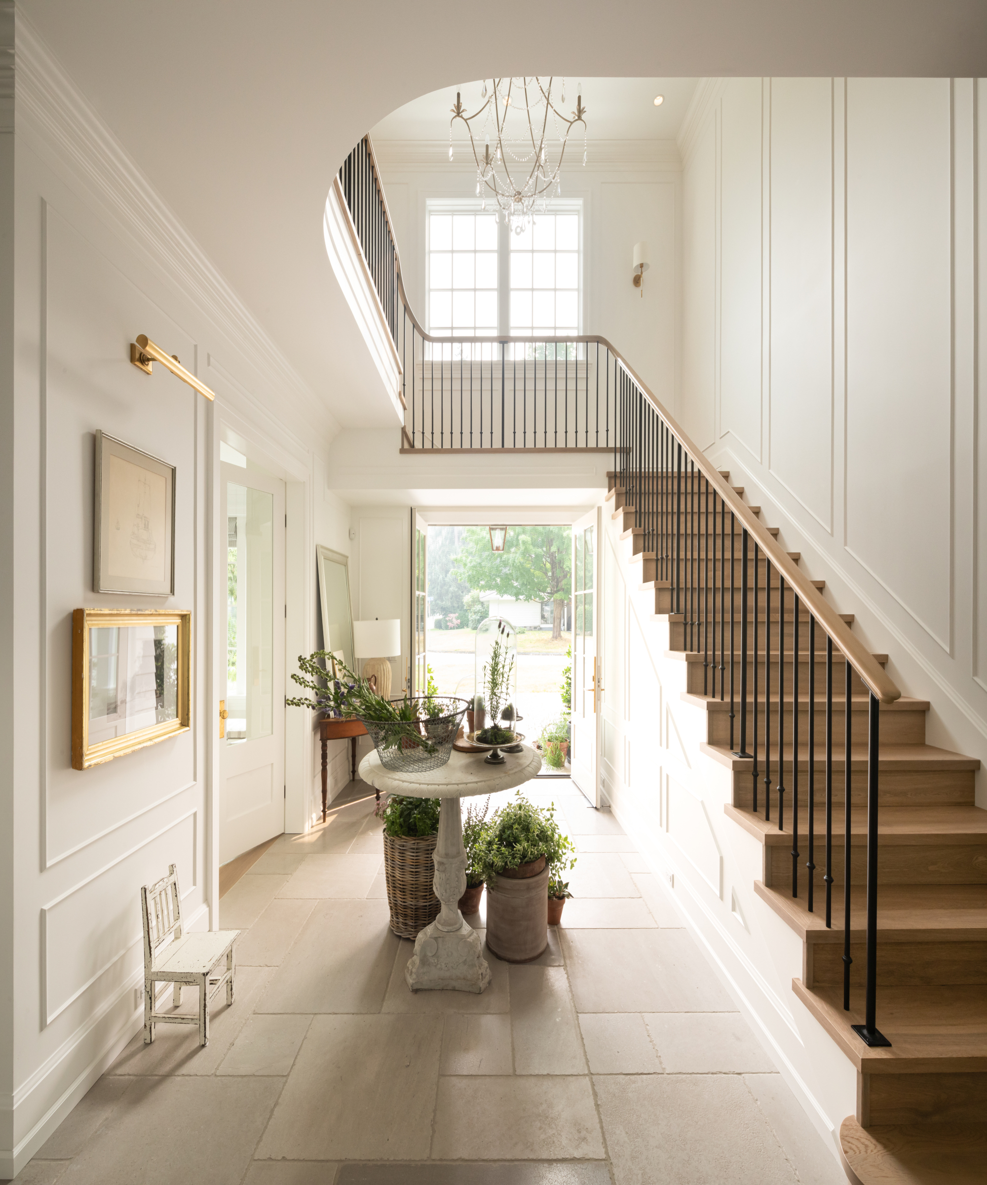
Hallway ideas – 25 clever design tricks and color schemes for a fresh and modern style

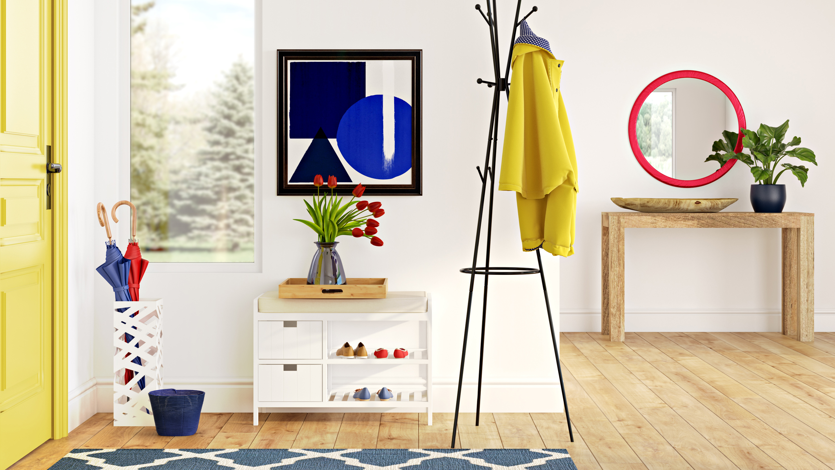
16 modern hallway ideas – contemporary designs for spaces big and small

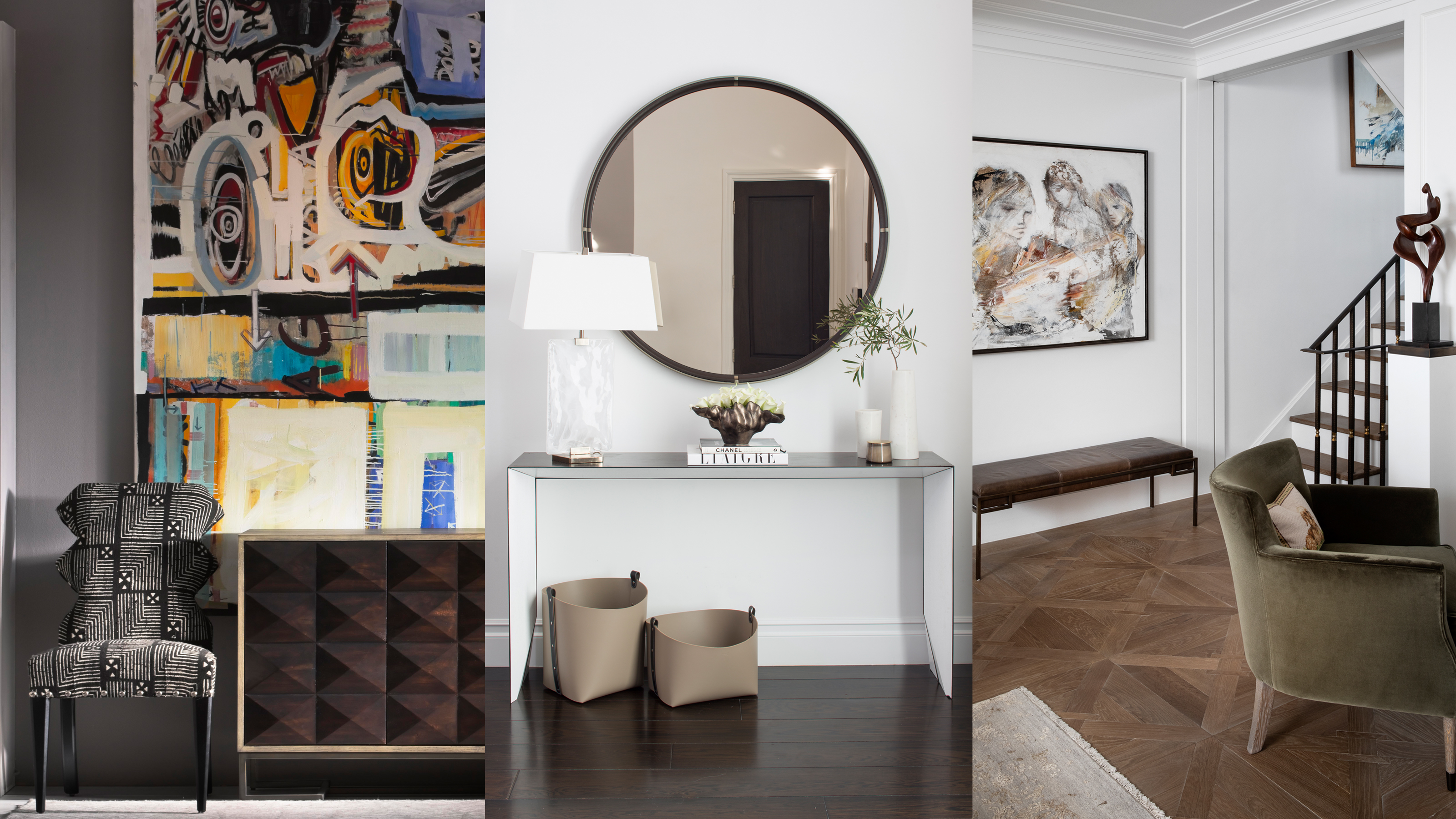
Modern hallway ideas – 10 tips for creating a contemporary hall

28 Hallway Decorating Ideas That Fix the “Long, Boring Hallway” Problem Almost Instantly