1/4
Color Palette Inspiration: Earth Tones & Global Hues 🌍🍂
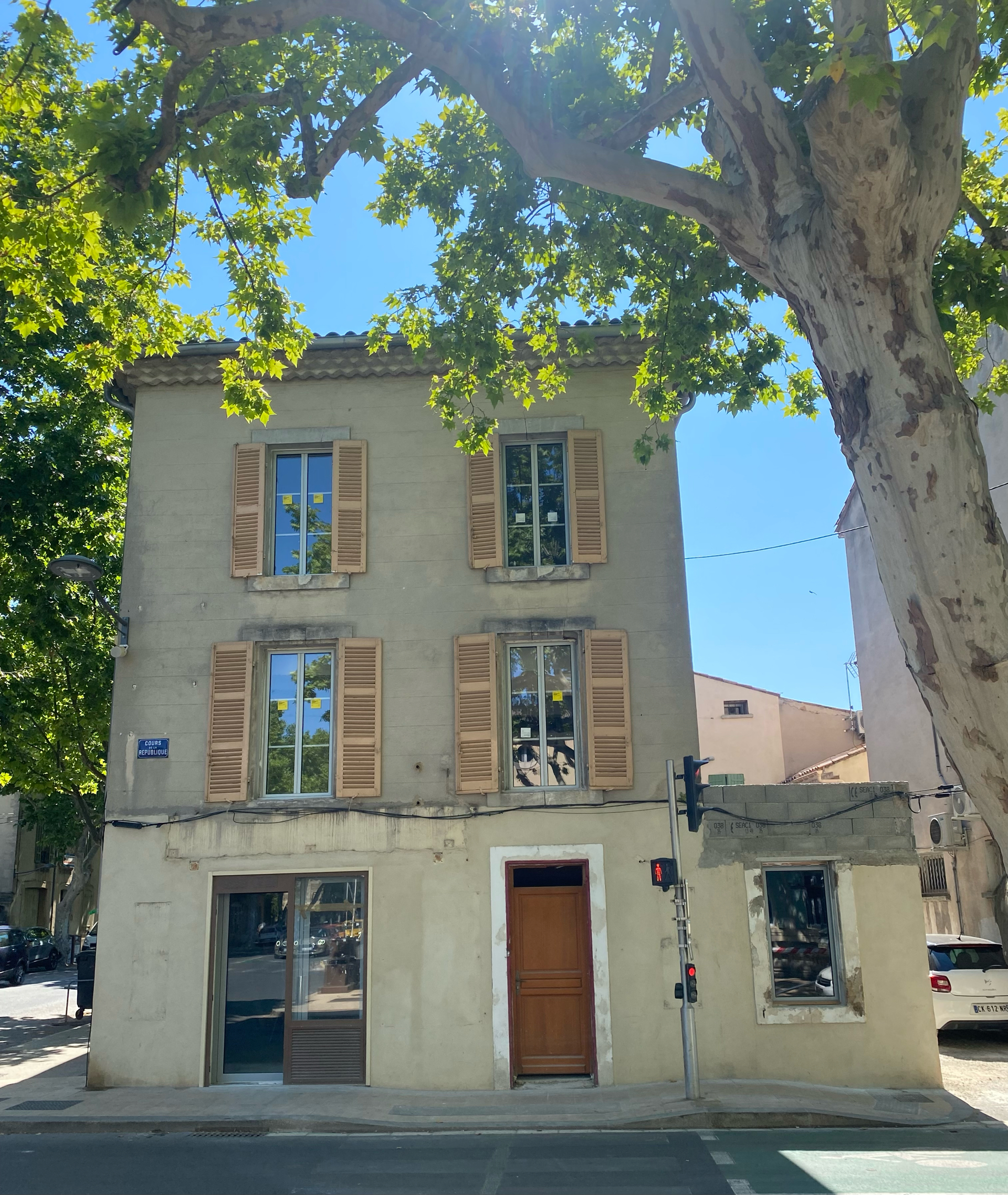
My color palette is inspired by the earth and the diverse hues I encounter on my travels. It’s all about creating a grounding yet inspiring atmosphere.
🤎 Rich Browns & Terracottas: Evoke warmth, stability, and a connection to ancient cultures.
💚 Muted Greens & Olives: Bring in the calming essence of nature and the tranquility of lush landscapes.
🧡 Warm Neutrals: Soft beiges, creams, and subtle grays provide a serene backdrop for richer accents.
These colors create a harmonious and inviting space that reflects a well-traveled soul. Save this for your next color palette! #ColorPaletteIdeas #EarthToneDecor #ColorPaletteIdeas #EarthToneDecor #GlobalHuesIdeas #InteriorColorInspo #WarmColorPalette #NaturalColorScheme #EarthyInteriors #NomadColor #ColorInspiration #HomeColor
10月24日 2025年
复制风格
共0条评论
暂无评论你可能还喜欢
Earth-Inspired Color Palettes: Nature's Calm for Your Home 🎨
Colors directly impact our mood. Embrace nature's calming palette for your home! Think soft greens reminiscent of moss and leaves, warm sandy beiges, muted terracotta oranges, and gentle sky blues. These hues create a grounded, serene atmosphere that promotes relaxation and well-being. They're timeless and pair beautifully with natural materials. Which earth tone speaks to you the most? Save this for a harmonious and tranquil color scheme! 🌿 #ColorPaletteIdeas #EarthTonesIdeas #NatureInspiredColorsIdeas #CalmingColorIdeas #NeutralPaletteIdeas #InteriorDesign #HomeDecor #ColorInspiration #PaletteInspo #EarthyHome
The Artisan's Palette: Earthy Tones for a Tranquil Home 🎨🌿
Greetings, seekers of serenity! The Heritage Crafter finds immense peace in the rich, subtle beauty of earthy tones. Our traditional artisanal approach often embraces a palette drawn directly from nature: soft creams, warm beiges, deep terracottas, muted olives, and gentle browns. ✨
These colors create an enveloping sense of calm and timelessness. They allow the craftsmanship and textures of your furnishings to take center stage, fostering a serene environment. It's about creating a haven that feels both grounded and visually restful. 🤎
What's your favorite earthy tone for home decor? Save this for your color palette inspiration! 🎨 #EarthyTonesDecorIdeas #NaturalColorPaletteIdeas #TranquilHomeIdeas #ArtisanalColorIdeas #ColorInspiration #InteriorDesign #HomeDecor #SereneSpaces #NeutralDecor #WabisabiHome
Earthy Elegance: Incorporating Terracotta & Clay Tones 🤎
Infuse your space with the warm, grounding elegance of terracotta and clay tones. 🌿 These natural hues evoke a sense of earthiness and tranquility, perfect for creating a serene sanctuary. Use them in paint colors, ceramics, textiles, or even potted plants. ✨ They blend beautifully with natural wood and other organic textures. Embrace these rich, warm shades for an inviting and grounded aesthetic. Save this for sophisticated natural style! #TerracottaIdeas #ClayTonesIdeas #EarthyEleganceIdeas #WarmHuesIdeas #NaturalColorPaletteIdeas #HomeDecor #InteriorDesign #ColorPalette #InteriorStyling #CalmColor
Nature's Palette: Inspiring Decor with Earthy Tones 🤎
Bring the outdoors in by drawing inspiration from nature's beautiful earthy tones! 🍂 Think warm beiges, deep browns, muted greens, and terracotta hues. These colors create a grounding and calming atmosphere, perfect for a tranquil home. 🪵 Use them in your paint choices, textiles, and decorative accents. Combine these tones with natural materials like wood, stone, and linen for a cohesive and harmonious look. It's a timeless palette that exudes warmth and elegance, fostering a deep sense of connection to the earth. Save these earthy tone ideas for your grounded sanctuary! #EarthyToneIdeas #NatureInspiredDecor #HomeDecor #InteriorDesign #WarmColorPalette #GroundedLiving #NaturalMaterials #RusticRefinement #CozyHome #ColorInspo
Balancing Act: Japandi Color Palette Secrets 🎨💚
The Japandi color palette is the soul of its serene aesthetic. It’s a masterful blend of Japanese restraint and Scandinavian warmth, creating a peaceful and grounding atmosphere. 🌿
Embrace these hues for your Japandi home:
1. **Neutrals as a Base:** Whites, off-whites, creams, and light grays are your foundation.
2. **Earthy Tones:** Think warm beiges, muted browns, and soft terracotta. 🤎
3. **Subtle Greens:** Olive green, sage, or muted moss tones bring the outdoors in.
4. **Natural Wood Tones:** The varying shades of wood act as a beautiful accent. 🪵
5. **Occasional Black Accents:** Used sparingly for definition and contrast, often in hardware or minimalist frames. 🖤
Keep your palette intentionally restrained for maximum tranquility. Save this for your color scheme inspo! #ColorPaletteIdeas #JapandiColorPaletteIdeas #MinimalistColorIdeas #HomeDecorColorIdeas #NeutralColorIdeas #EarthyTones #InteriorDesignPalette #SereneColors #ScandiMinimalism #CalmSpaces
Nature-Inspired Palette: Earthy Tones for a Grounded Home 🍄
Bring the grounding energy of nature indoors with an earthy color palette. Think deep forest greens, rich terracotta, warm sandy beiges, and calming stone greys. These tones create a sense of warmth, security, and connection to the natural world. Layer textures like wood, stone, linen, and natural fibers to enhance this organic feel. This palette is perfect for creating a tranquil and inviting atmosphere in any room, from your living area to your bedroom. It's all about evoking a sense of calm and natural beauty. 🤎 #EarthyColorPaletteIdeas #NatureInspiredDecorIdeas #GroundingHomeIdeas #WarmInteriorIdeas #ColorSchemeIdeas #NaturalDecor #HomeAesthetics #CozyColor #InteriorPalette #ThePaletteCurator
Palette Play: Sophisticated Earth Tones for Any Room 🤎
Discover the calming sophistication of earth tones. This palette offers warmth, depth, and timeless appeal. 🤍
Think beyond beige! Explore rich browns, muted ochres, warm terracottas, and subtle olive greens. These colors create a grounding and inviting atmosphere.
Combine different shades and textures within the earth tone family. A deep chocolate brown sofa paired with warm beige linen cushions and an olive green rug creates a rich, layered look.
Natural materials like wood, rattan, and clay complement this palette beautifully, enhancing its organic feel. Save this for your grounding and elegant palette inspiration! ✨ #earthtoneideas #paletteideas #homedesignideas #decorideas #colorpaletteideas #neutraltones #warminteriors #naturalcolor #designharmony #timelessstyle
The Magic of Muted Tones: A Woodland Color Palette 🍄
Escape the harshness of bright colors and embrace the calming influence of a woodland palette. These muted tones are deeply inspired by the forest floor, evoking a sense of peace and grounding.
Incorporate these hues:
* **Earthy Browns:** From deep loam to soft mushroom.
* **Gentle Greens:** Think moss, fern, and sage.
* **Stone Greys:** Like mist or weathered granite.
* **Soft Ochre:** For a touch of subtle warmth.
These colors create a sanctuary that feels both sophisticated and incredibly comforting. Save this for your tranquil home inspiration! 🐿️ #WoodlandColorIdeas #MutedTonesIdeas #EarthyPaletteIdeas #CalmColorIdeas #NaturalHuesIdeas #HomeColorInspo #InteriorPalette #SereneLiving #NatureInspiredColors #DecorInspo
The Color Palette: Earth Tones in Prairie Design 🎨
The color palette of Prairie School architecture is deeply inspired by the natural landscape. 🌾 We favor earthy tones: rich browns, warm ochres, muted greens, and soft beiges. These colors create a sense of grounding, tranquility, and seamless integration with the outdoors. They are subtle yet sophisticated, allowing the textures of natural materials to take center stage. This approach fosters a serene and welcoming atmosphere. Save these hues for your next design project! 🏡 #earthytone #prairieschool #colorpalette #naturalcolors #architecturalcolors #ColorPaletteIdeas #PrairieStyleIdeas #EarthyTones #NaturalColorInspiration #InteriorColor #HomeDesignColors #OrganicPalette #ArchitecturalInspiration #SereneInteriors #DesignHues
Earthy Tones: A Palette for Serene Homes 🍂
Earthy tones are inherently calming and grounding, creating a sanctuary of peace within your home. My curated palettes celebrate the warmth and natural beauty of these hues.
Embrace an earthy palette:
• Use muted greens, warm beiges, deep terracotta, and soft browns.
• Incorporate them through paint, furniture, and decor.
• Mix natural textures: wood, linen, jute, stone.
• Layer different shades for depth and richness.
• Keep surfaces uncluttered to let the colors shine.
Create a harmonious and tranquil living space. Save this for your earthy tone inspiration! 🤎 #EarthyTonesIdeas #SereneHomeIdeas #CalmInteriors #ColorPaletteInspo #HomeDecor #NaturalColors #InteriorDesign #GroundingDecor #CozyHome #TheCuratorsCollection
Color Palettes Inspired by Nature: Muted Tones for Calm Spaces 🍂
Drawing inspiration from the natural world offers an endless palette of soothing and sophisticated colors. Muted, earthy tones create a serene and grounding atmosphere, perfect for a home that feels like a tranquil escape.
Nature-inspired palettes:
* **Forest Floor:** Deep greens, mossy browns, and soft stone greys.
* **Desert Dusk:** Warm sands, muted terracotta, and dusky purples.
* **Coastal Fog:** Soft blues, driftwood greys, and off-white hues.
Let's use these to create depth and serenity.
Save for your next color scheme! 🎨 #NatureInspiredColors #MutedTones #CalmColorPalettes #InteriorDesign #HomeDecorInspo #EarthyTones #ColorInspiration #SereneSpaces #TheArtfulAssemblage #DecorIdeas
Nature's Palette: Earth Tones and Neutrals in Modernist Homes 🎨
Modernist homes often draw inspiration from nature's own palette, utilizing earth tones and neutrals to create a calming and grounded atmosphere. 🌎 Think of soft greys, warm beiges, deep browns, and muted greens. These colors, combined with natural materials, foster a connection to the environment and enhance the sense of tranquility within the residence. The simplicity of these tones allows architectural forms and textures to take center stage.
Key colors:
- Stone greys
- Warm beiges and sands
- Earthy browns
- Muted forest greens
What's your favorite earth tone for interiors?
#ModernistMansions #EarthToneIdeas #NeutralPalettesIdeas #ModernistColorIdeas #NatureInspiredDesignIdeas #CalmingInteriorsIdeas #InteriorColor #HomeDecor #MinimalistColors #GroundedLiving #NaturalColor
Boho Color Palette: Earthy Tones & Jewel Tones 🤎🧡💜
The heart of bohemian color lies in a rich, earthy palette with pops of jewel tones. ✨ Think warm beiges, deep browns, burnt oranges, and creamy whites, beautifully accented by vibrant corals, deep blues, emerald greens, and ruby reds. 🧿 This combination creates a cozy, grounded yet visually exciting atmosphere. Layering these colors through textiles, art, and accessories is key to achieving that signature bohemian depth and warmth. Save this for your color inspo! 💫 #BohoColorPaletteIdeas #EarthyTonesIdeas #JewelTonesIdeas #ColorCombinationIdeas #InteriorColorIdeas #BohemianDecor #HomeColor #DesignPalette #ColorInspiration #WarmAndCozy
The Art of the Natural Palette: Earth Tones for a Grounded Home 🤎
There's a timeless elegance in an earth-toned color palette. These grounded hues bring a sense of warmth, comfort, and connection to nature into any space. Think shades of beige, terracotta, muted browns, deep olives, and soft creams. 🌿 They create a wonderfully soothing backdrop that feels both sophisticated and incredibly livable. Combine them with natural materials like wood, stone, and linen for an even more organic feel. It's an easy way to evoke a sense of calm and tranquility in your home, no matter the design style. ✨ #EarthToneDecorIdeas #NaturalPaletteIdeas #CalmingColorsIdeas #GroundingDecorIdeas #HomeColorInspoIdeas #InteriorColorPalette #OrganicHome #TimelessStyle #CozyLiving #TheEclecticEdit
The Japandi Color Palette: Serene & Earthy Tones 🎨
Achieve tranquility in your home with a Japandi color palette that embraces the beauty of nature. It’s all about creating a calm and harmonious space.
• **Muted Neutrals:** Think warm whites, soft beiges, sandy taupes, and gentle greys. These form the calming foundation. ☁️
• **Earthy Greens:** Incorporate muted olive, sage, and forest green tones, reminiscent of natural foliage. 🪴
• **Warm Browns:** Deep walnut, light oak, and earthy terracotta add depth and grounding. 🪵
• **Subtle Black Accents:** Used sparingly, black can provide grounding and definition without overpowering the serene feel.
This palette encourages mindfulness and a connection to the natural world. Save these color inspirations! 🌿 #JapandiIdeas #ColorPalette #EarthyTones #JapandiColors #InteriorColor #HomeDesignInspo #NeutralDecor #MinimalistColors #SereneSpaces #ColorInspiration
🌿 Color Palette Perfection: Earthy Tones for Biophilic Homes
Color is a powerful tool in creating biophilic serenity! 🎨 My palette focuses on nature's own hues to evoke calm and connection. These earthy tones are grounding and restorative. 💚
My go-to biophilic colors:
- **Greens**: From soft sage and moss to deep forest green. 🌿
- **Browns & Beiges**: Warm wood tones, earthy clays, sandy neutrals. 🤎
- **Blues**: Muted sky blues or deep ocean blues. 🌊
- **Whites & Creams**: Off-whites and creamy beiges for a soft, natural feel. ☁️
- **Terracotta & Rust**: Warm, earthy accents that add depth.
Create a sanctuary that breathes. Save this for your color inspiration! ✨ #biophilicdesign #earthytone #colorpalette #organicinteriors #naturalcolors #biophiliccolorideas #homedecor #interiordesign #calmcolors #decorstyle
Nature's Palette: Earthy Tones for Your Cozy Home 🍂
Step into a world of warmth and grounding with earthy tones. These colors, inspired by nature, bring a sense of comfort and stability to any room. 🧡 Think soft browns, mossy greens, warm terracotta, and sandy beiges. They create an immediate feeling of coziness and tranquility, making your home a true sanctuary. 🤎 Pair these colors with natural materials like wood, linen, and stone for a harmonious and organic feel. It's about creating a space that feels like a gentle hug from Mother Earth. Save this for your color palette inspo! 🤎 #EarthyTonesIdeas #CozyHomeIdeas #NatureInspiredColorsIdeas #LivingroomColorIdeas #WarmInteriorIdeas #ColorPalette #HomeDecor #InteriorDesign #NaturalHome #TerracottaDecor
Earthy Tones & Bold Accents: A Boho Color Palette 🤎💛
The bohemian palette is wonderfully versatile! Embrace rich, earthy tones as your foundation, then add pops of vibrant, soulful accents. 🌺 Think warm browns, deep terracottas, and creamy neutrals, beautifully contrasted with pops of mustard yellow, deep teal, or rich magenta. Texture plays a huge role in bringing these colors to life – think natural fibers like jute and rattan, alongside soft velvets and intricate weaves. It’s about creating a warm, grounded, yet visually exciting space. What are your go-to boho colors? Save for your earthy & bold inspo! ✨ #BohoColorPaletteIdeas #EarthyTonesDecor #BoldAccentIdeas #MaximalistColors #EclecticPalette #BohoColorInspo #TexturedColors #HomeColorIdeas #BohoStyle #VibrantBoho


