1/5
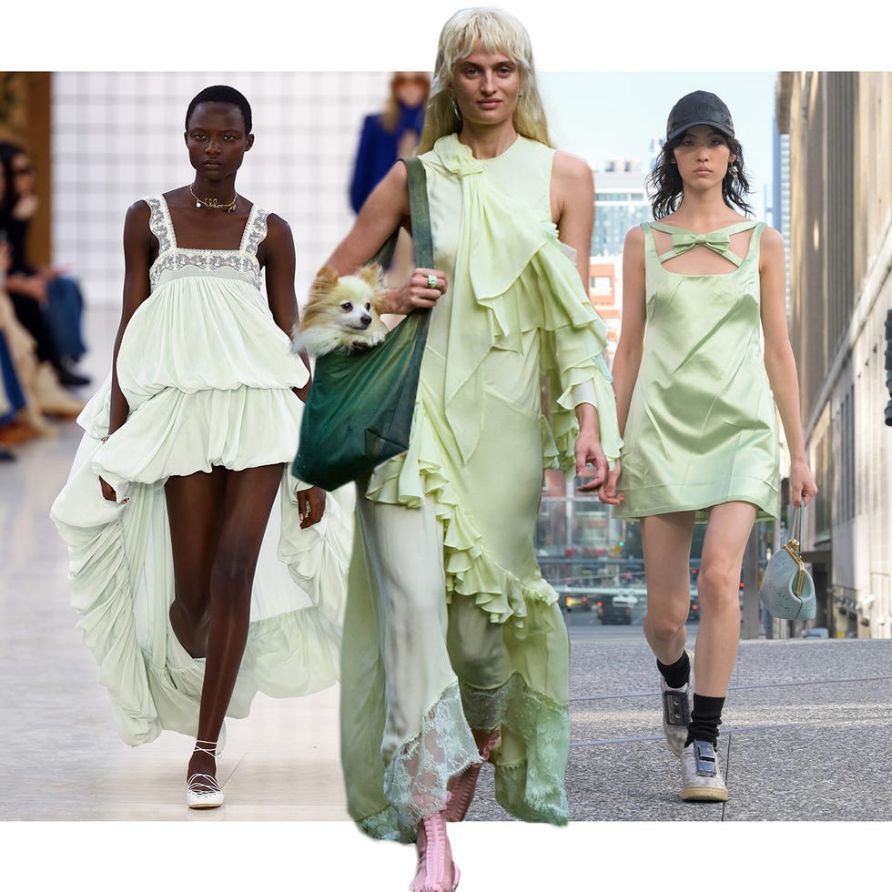
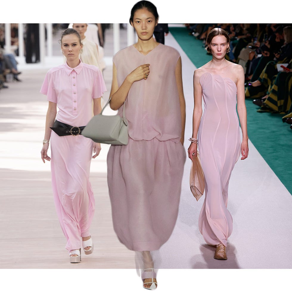
Sorry pastels, there's a new color palette on trend for spring – and it's all about playful and more saturated hues
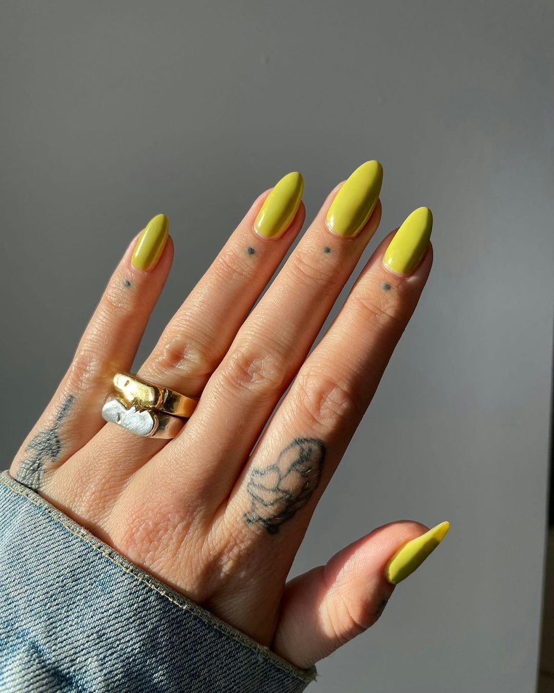
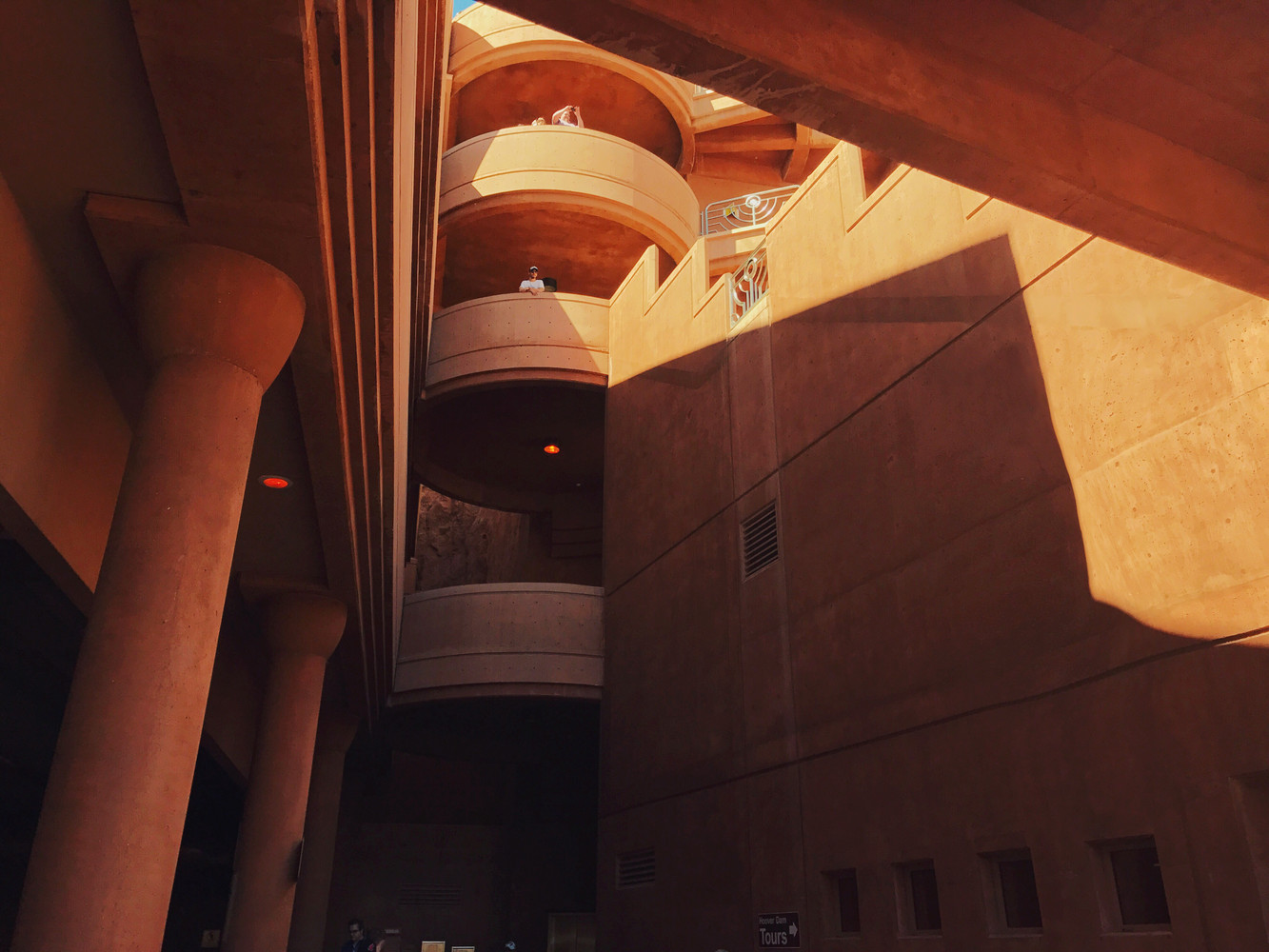
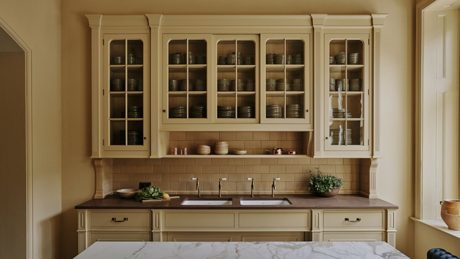
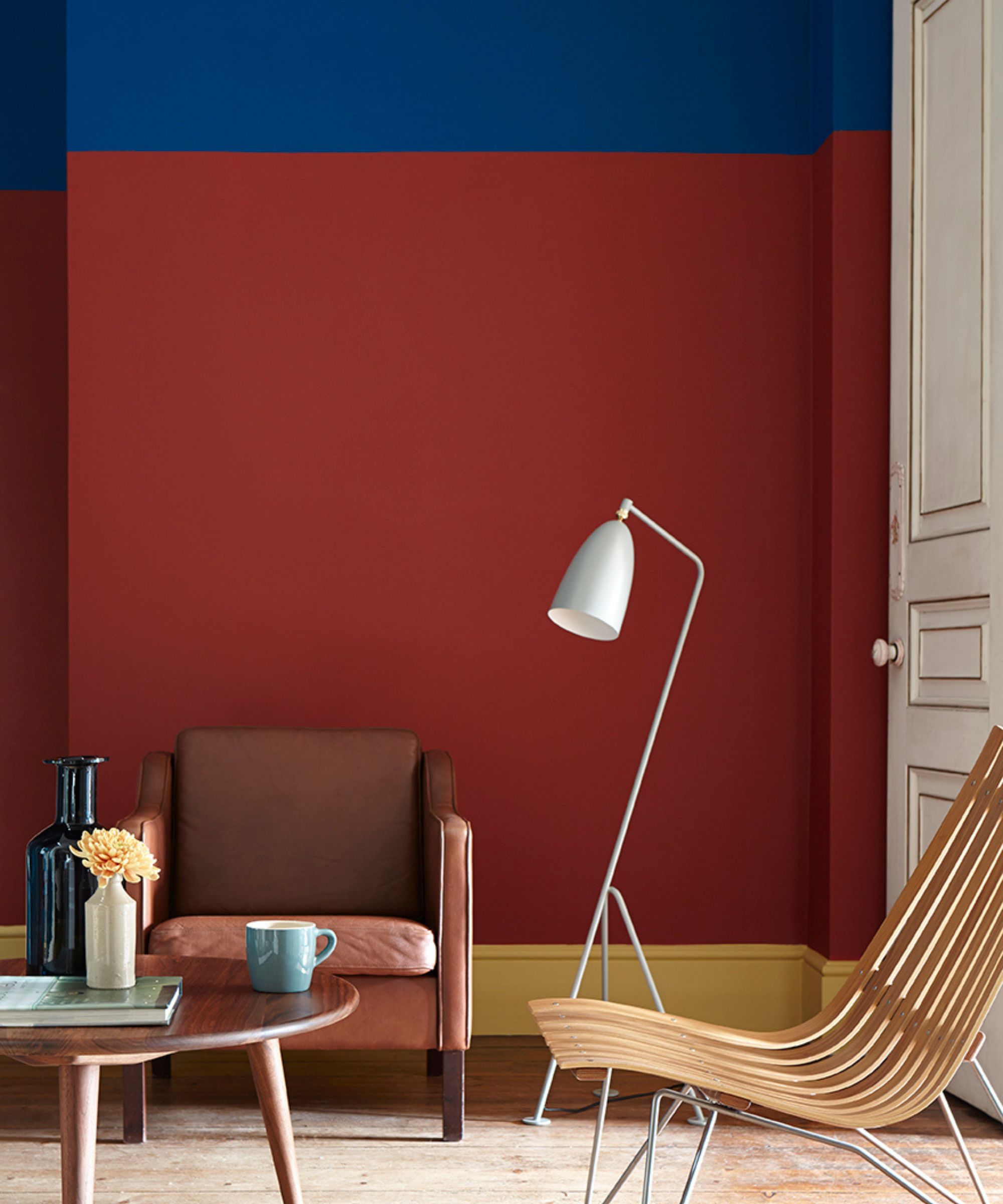
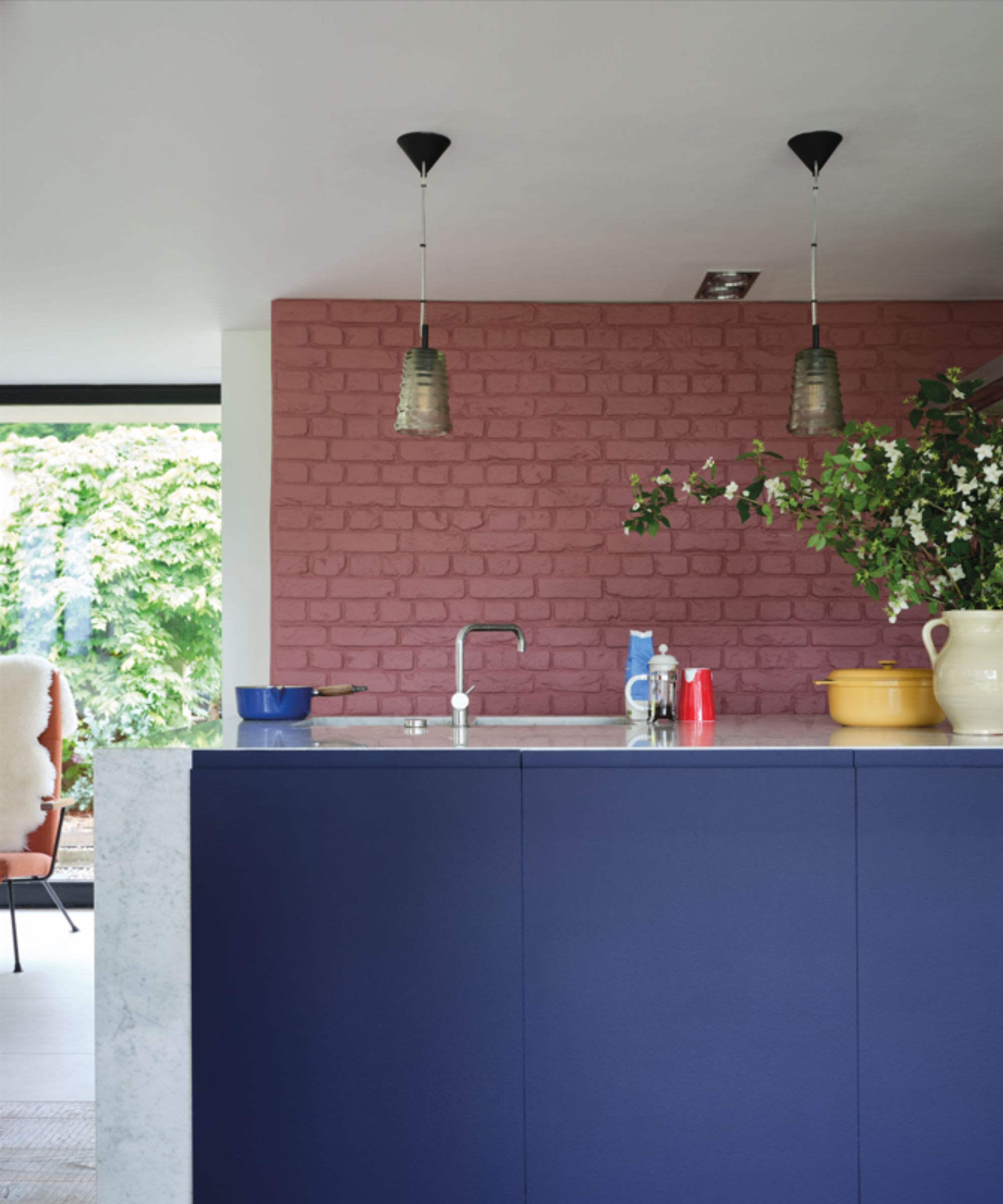
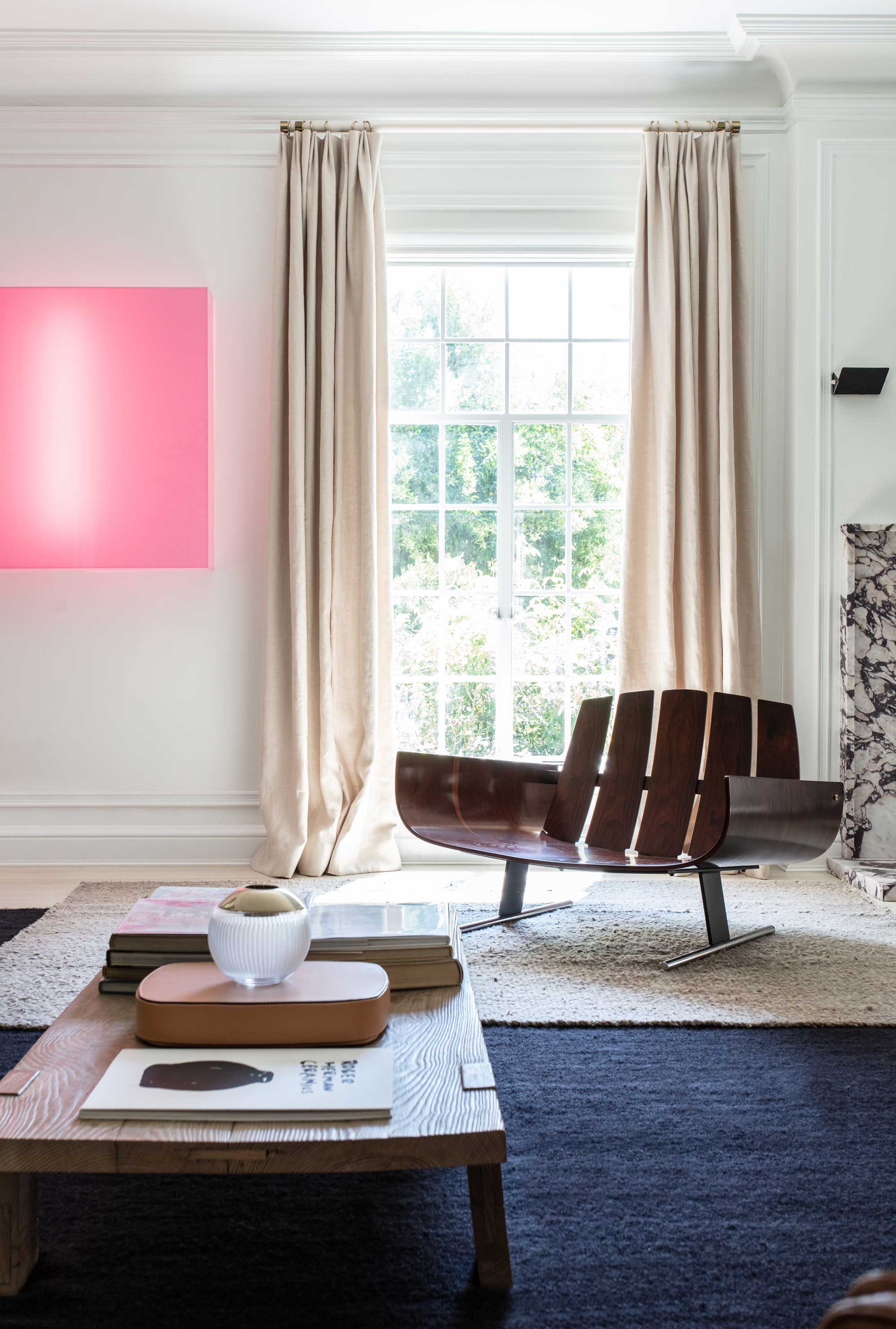
This article explores the evolving trend in interior design for spring 2025, moving away from traditional pale pastels towards richer, more saturated, and warmer mid-tone colors. Designers are increasingly opting for hues that offer vibrancy, personality, and sophistication, contrasting with the softer, sometimes 'too sweet' perception of classic pastels. The shift is evident in recent paint collections, such as Farrow & Ball's new releases featuring colors like Duster (a vibrant yellow) and Marmelo (an orange-brown hybrid), signaling a broader acceptance of bolder tones in home aesthetics.
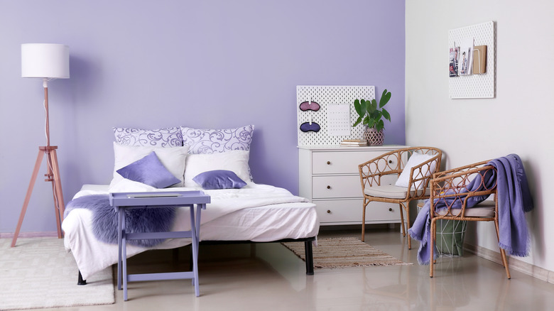
Several designers weigh in on this trend, highlighting the versatility and inviting nature of these mid-tones. Sarah Hargrave of The Collective notes that these colors blend seamlessly across various design styles, from modern to vintage, and complement both neutral and deeper foundational shades. Tineke Triggs of Tineke Triggs Interiors emphasizes the depth and complexity of these new pastels, preferring 'mid-tone pastels' that feel grounded and livable, including buttery yellows, earthy corals, and warm lavenders. These colors maintain an airy quality while possessing a richness that broadens their applicability.
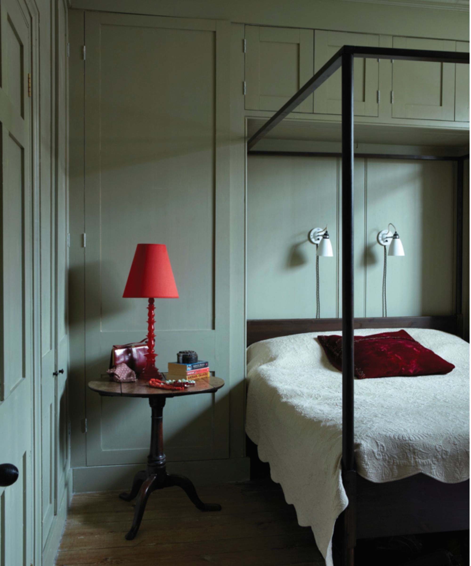
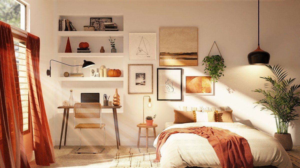
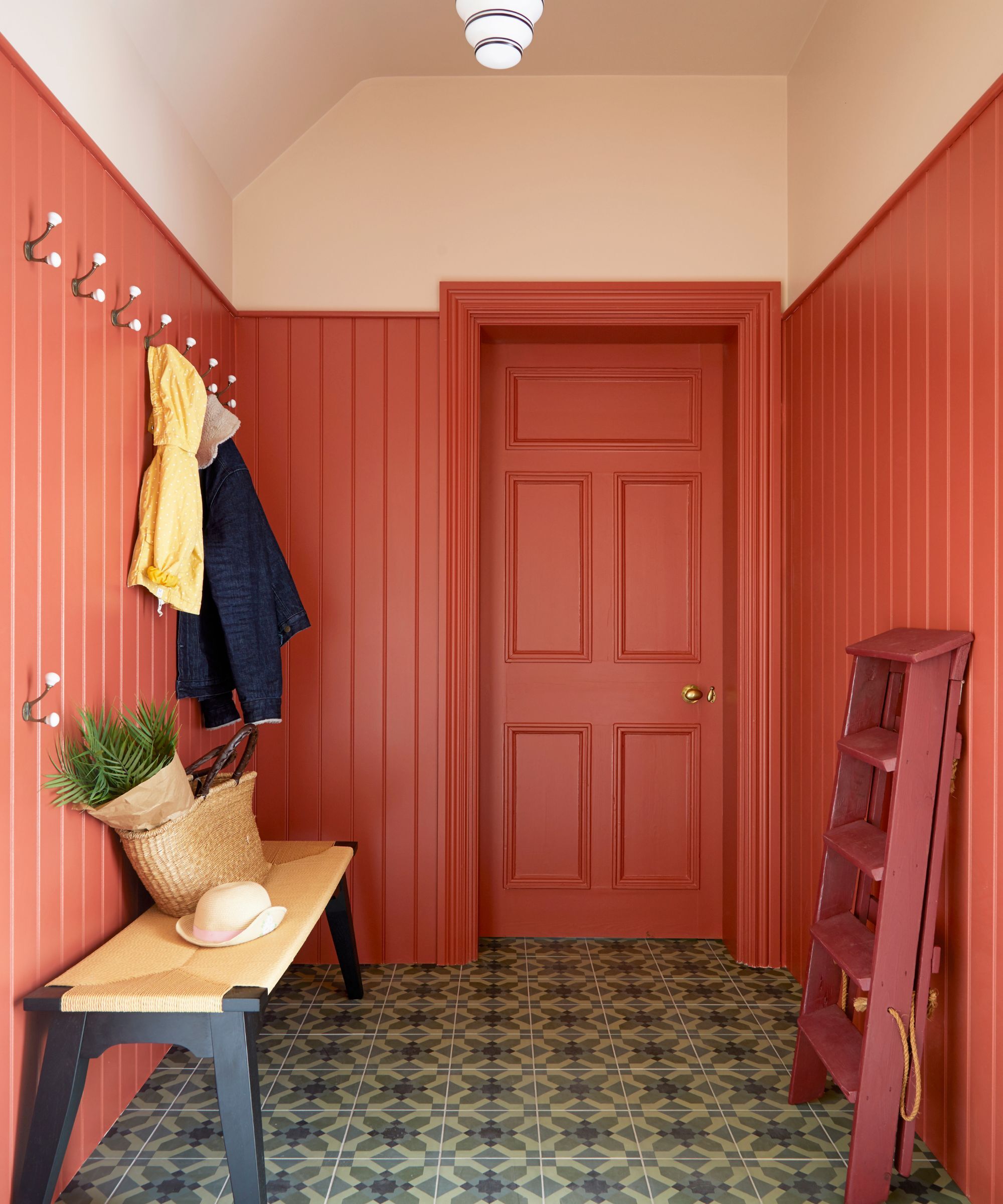
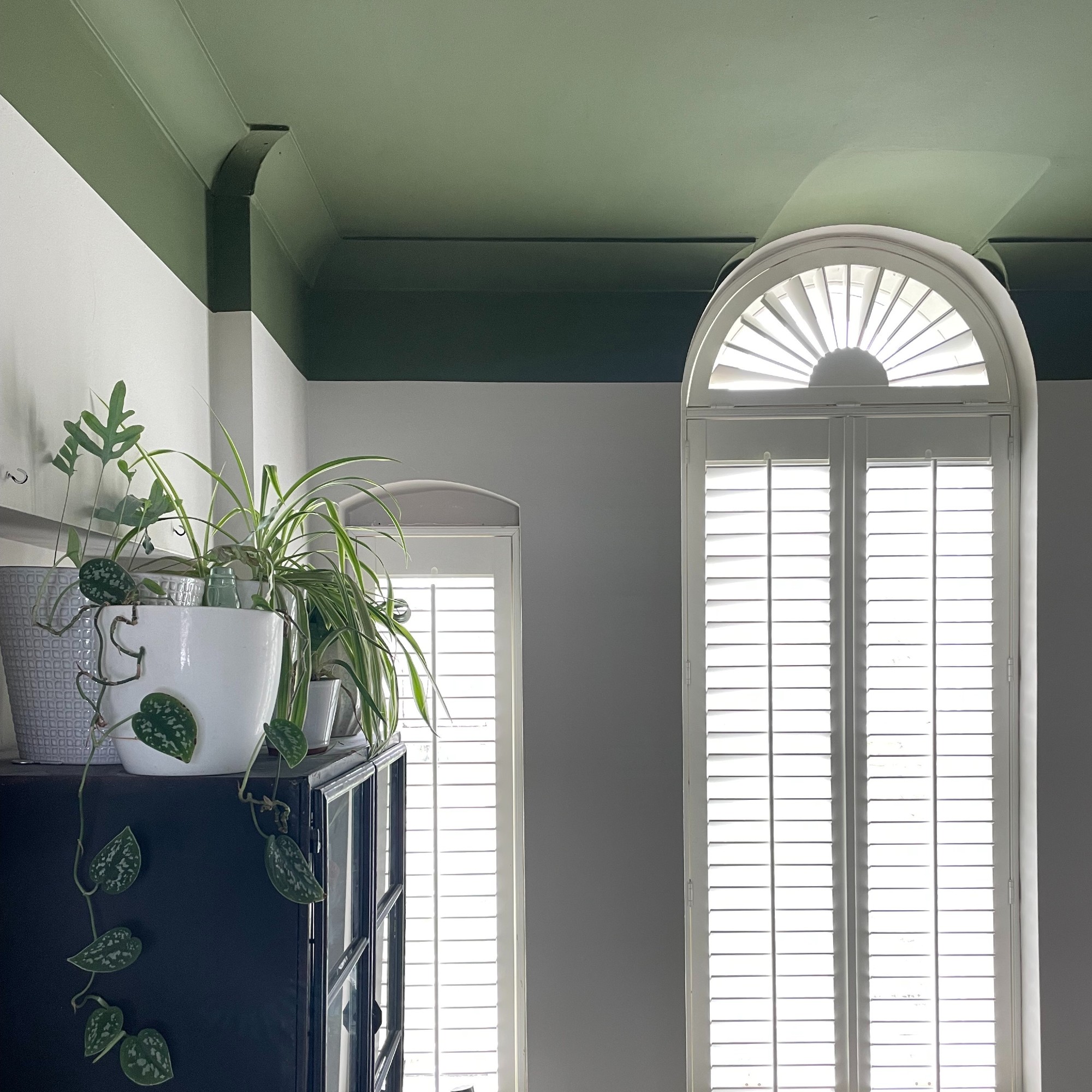
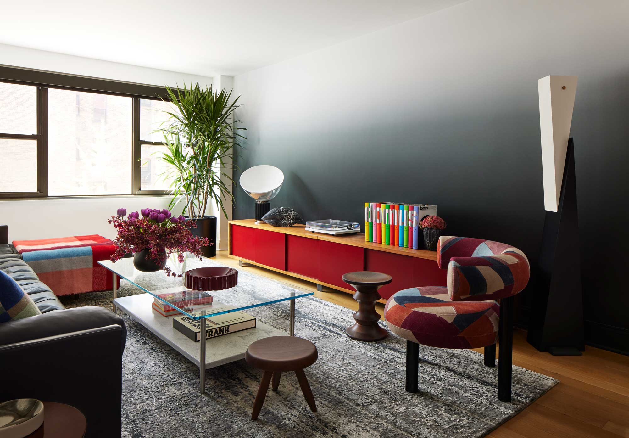
Practical advice is provided on how to incorporate these bolder tones into home decor. One key recommendation is 'color drenching' with mid-tone paints. Emma Kemper of Emma Beryl Interiors suggests that people are becoming less apprehensive about using color, and mid-tones offer a subdued yet encapsulating effect, making a room feel 'hugging.' She advises considering coordinating wood tones and extending the paint to ceilings and trim for a cohesive, complete look. This technique minimizes visual breaks and effectively makes color the room's focal point.
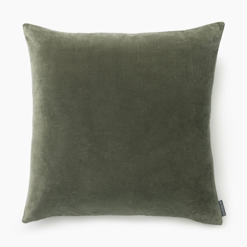
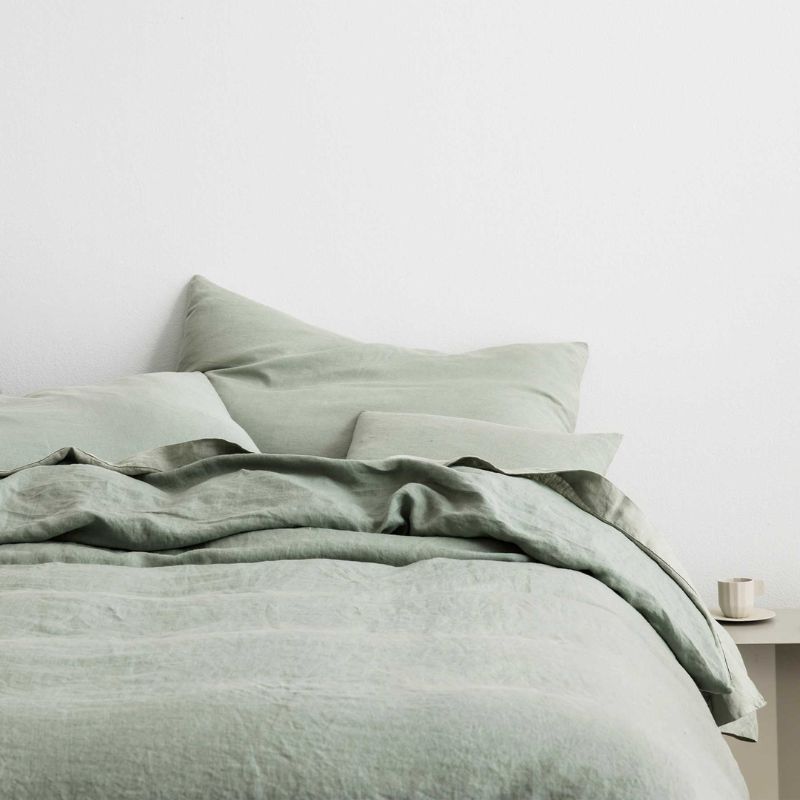
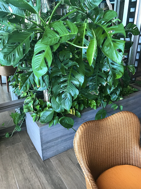
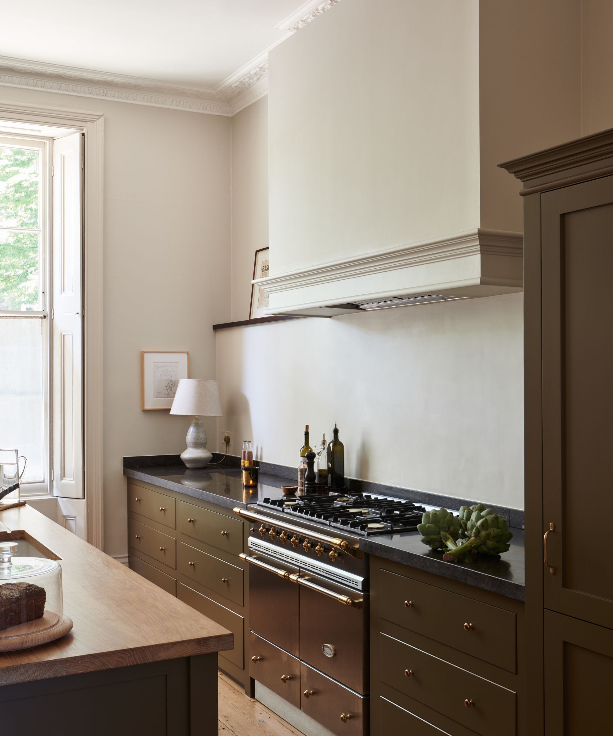
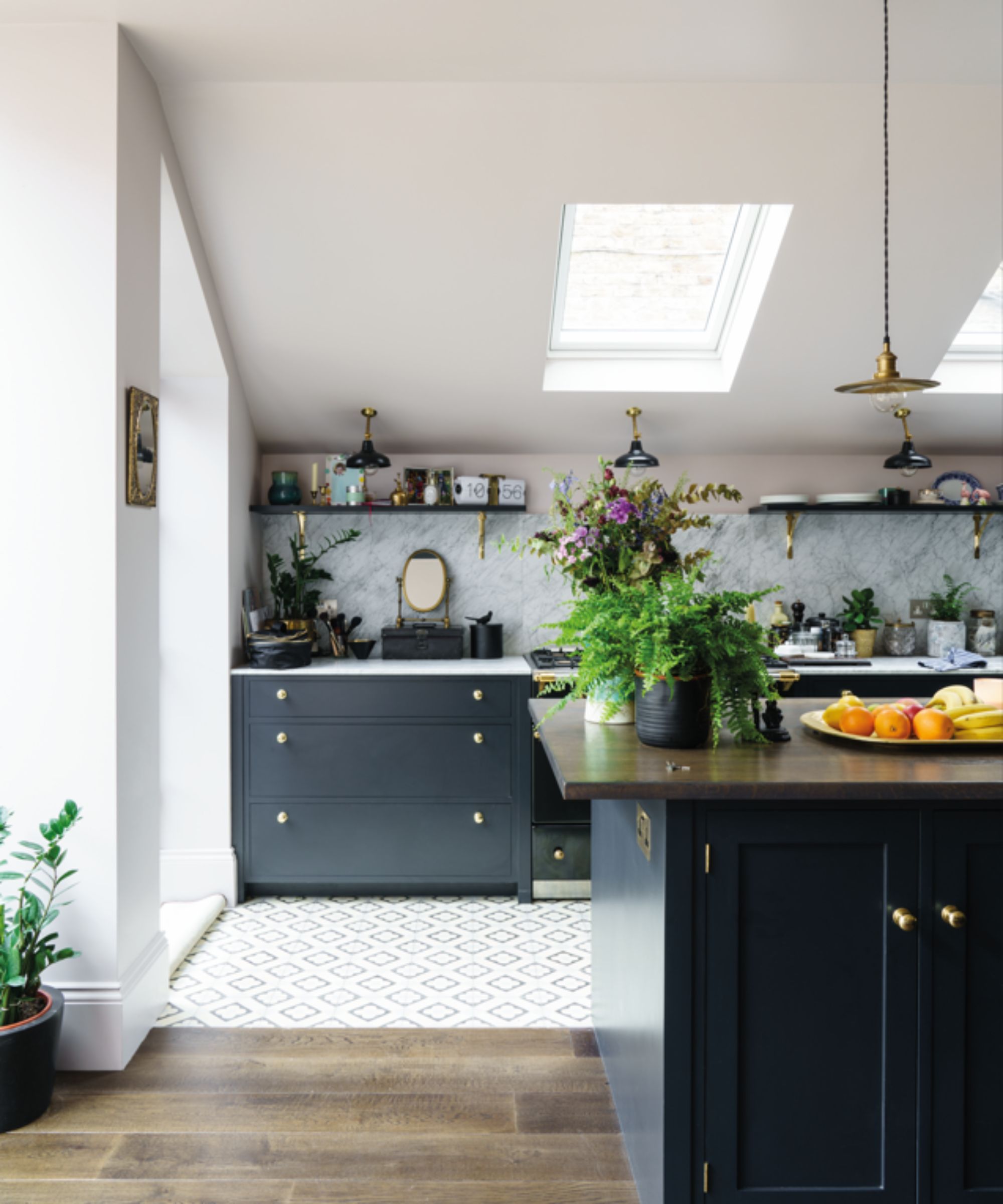
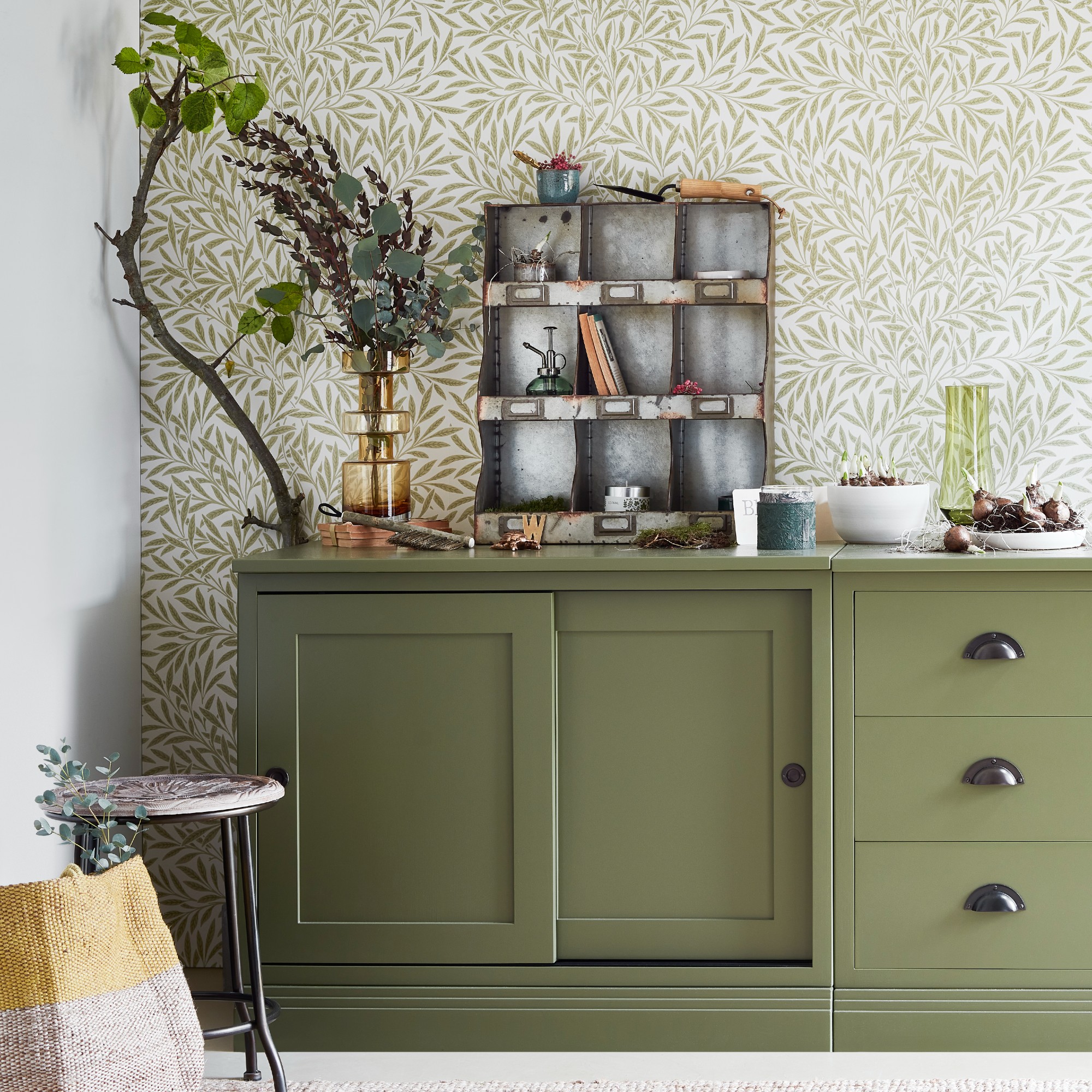
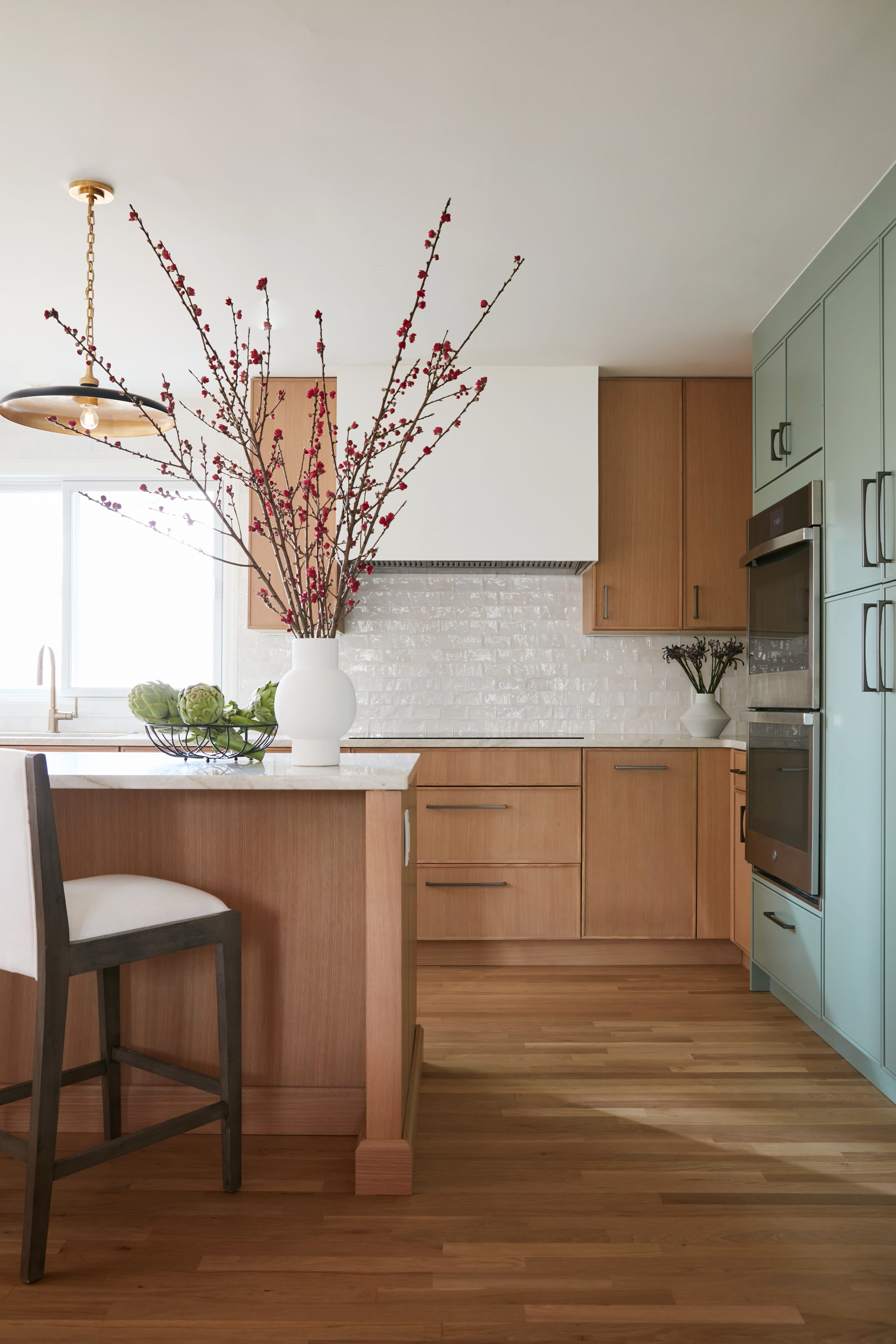
Another strategy involves pairing colorful hues with natural materials. Sarah Hargrave recommends using mid-tones on walls for a fresh yet cozy ambiance or introducing them through accent furniture, textiles, and decor. The integration of natural textures like linen, wood, and rattan can enhance the warmth of these richer pastels, while soft metallics such as brass or warm nickel add an element of sophistication.
Warm blue paints are highlighted as a significant trend, particularly mid-tones that exude a playful character. Caroline Kopp points out that such blues, when used for color drenching, create spaces that are fresh, cozy, and avoid the clinical or childish feel sometimes associated with standard pastels. These blues pair well with mid-toned woods and marble, adding character to rooms, especially bathrooms. Examples include Lick's Blue 08 and Farrow & Ball's Yonder.
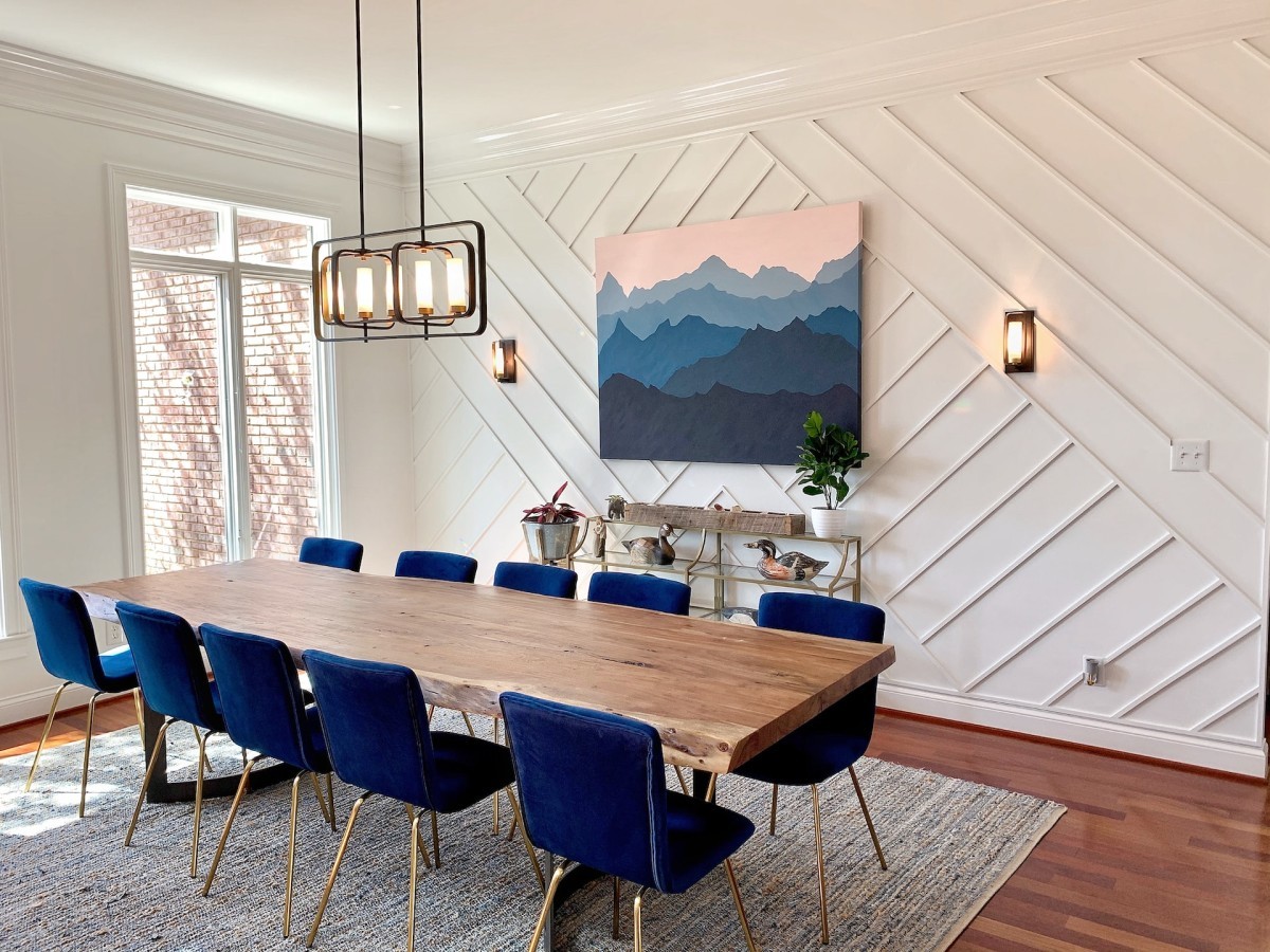
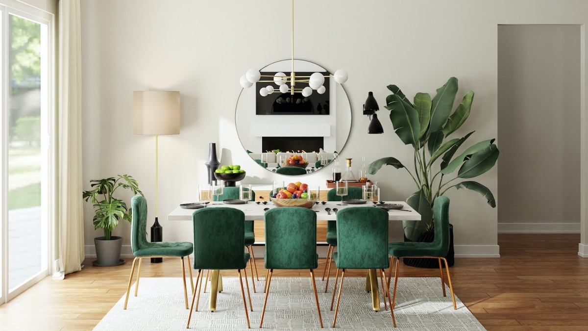
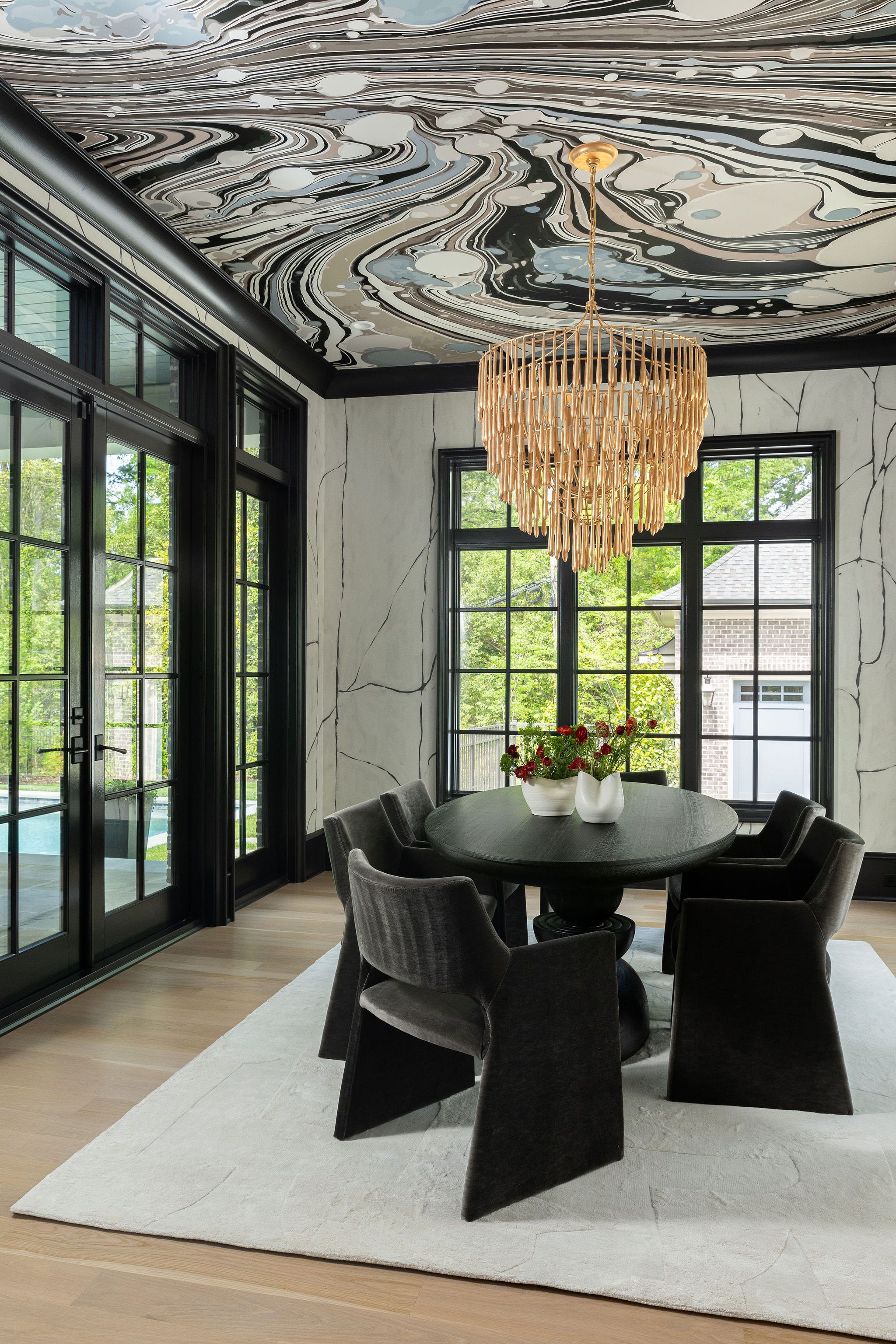
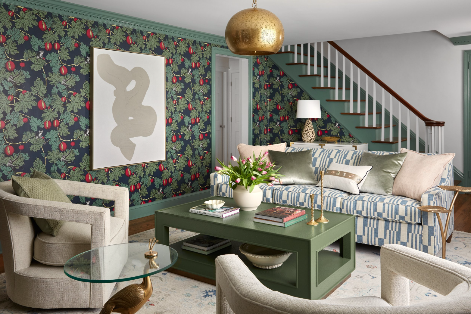
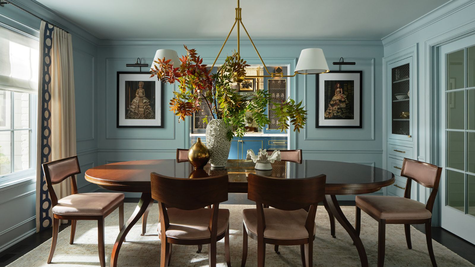
The article also suggests pairing saturated hues with dark wood tones. Tineke Triggs illustrates this with a dining room featuring Benjamin Moore's French Toile, a rich pastel blue that is both sophisticated and inviting. She advises balancing these shades with neutrals, dark wood tones, black accents, or brass fixtures to anchor the color and elevate its sophistication. Furthermore, she notes that a matte-painted wall combined with lacquered furniture or natural textiles creates a dynamic and layered space. Richer pastels also harmonize beautifully with deeper hues like forest green, navy, or deep merlot, adding drama and depth to the interior design.
In essence, the article advocates for a vibrant and sophisticated approach to spring decorating, encouraging homeowners to move beyond pale pastels and embrace a palette of richer, warmer, and more saturated tones, implemented through strategic painting techniques and thoughtful material pairings.
#InteriorDesign #ColorTrends #SpringDecor #SaturatedColors #MidTonePastels #HomeDecor #PaintIdeas #ColorDrenching #NaturalMaterials #InteriorDesign #ColorTrends #SpringDecor #SaturatedColors #MidTonePastels #HomeDecor #PaintIdeas #ColorDrenching #NaturalMaterials
共0条评论
 暂无评论
暂无评论你可能还喜欢
7 Best Colors Designers Say You Should Use to Make Your Home Feel Fresh, Light and Spring-Ready
The Color Palettes Currently Inspiring Domino Editors

Designers are swapping tonal color schemes for high-contrast hues – here's how to do this daring color trend stylishly
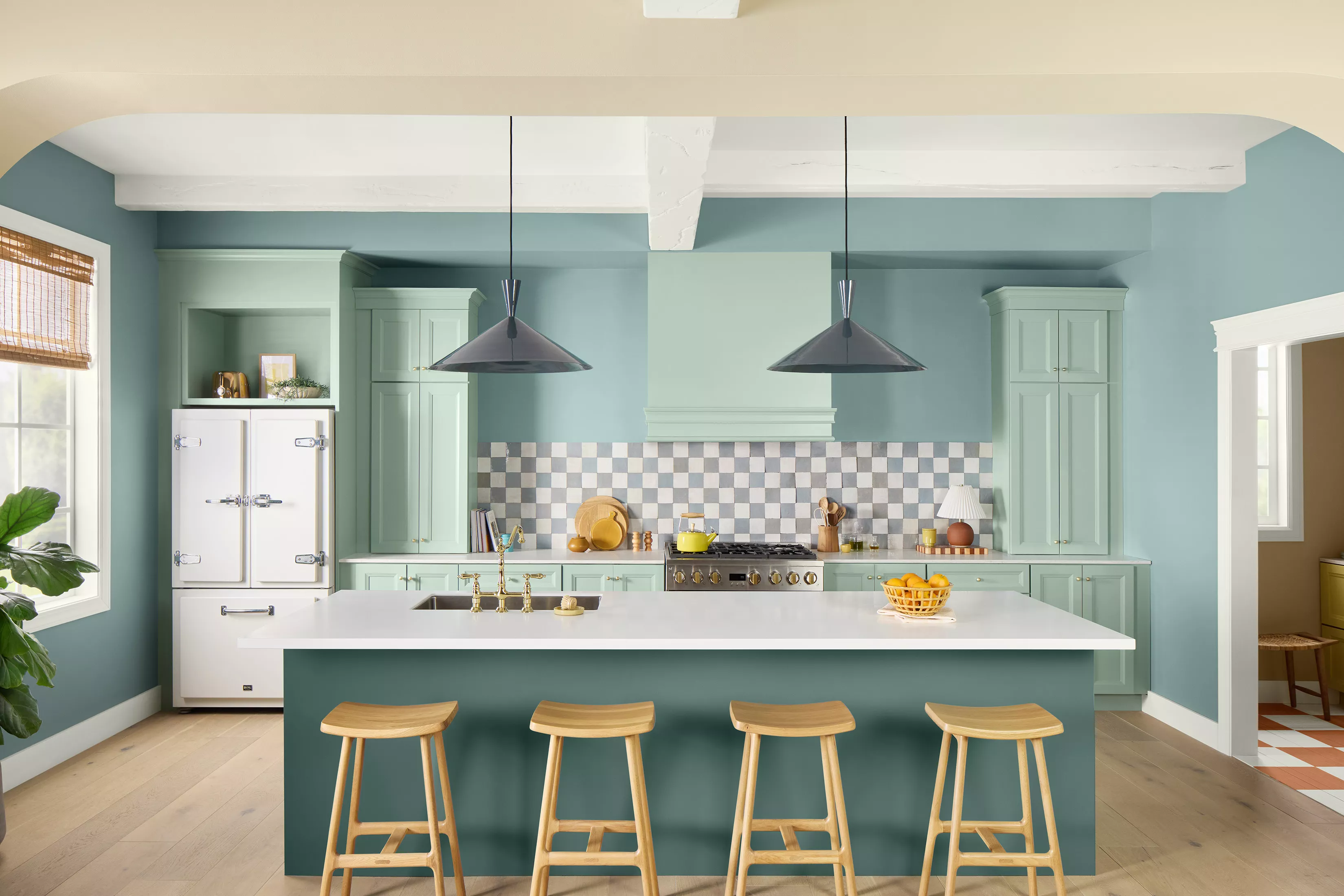
8 Spring Color Schemes the Paint Pros Are Raving About for 2025

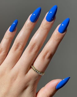
Chartreuse, Cobalt, & 9 More Of Spring’s Hottest Nail Polish Color Trends
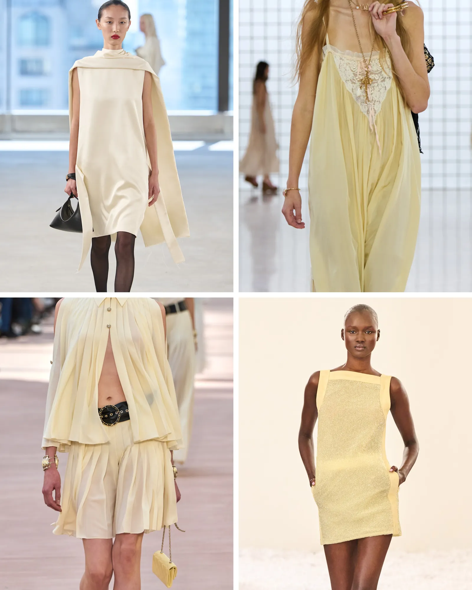
This Spring Colour Is the New Beige for Fashion People Everywhere


Colour analysis by season: Spring, characterised by warmth and liveliness
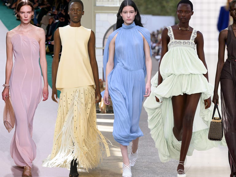
These Are the Top 6 Color Trends We’ll Be Sporting This Summer
Unexpected Color Combinations Trend Spring/Summer 2026
7 Spring Paint Colors to Freshen Up Your Space, According to Designers

Deeper, moody colours and precious jewel tones are in style this year
This surprising color trend is having a comeback


The Spring Color Trend That'll Make Your Home Feel Refreshed

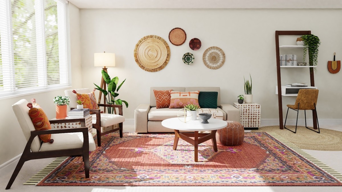
2023 spring trends: decorate your home with this season's colours
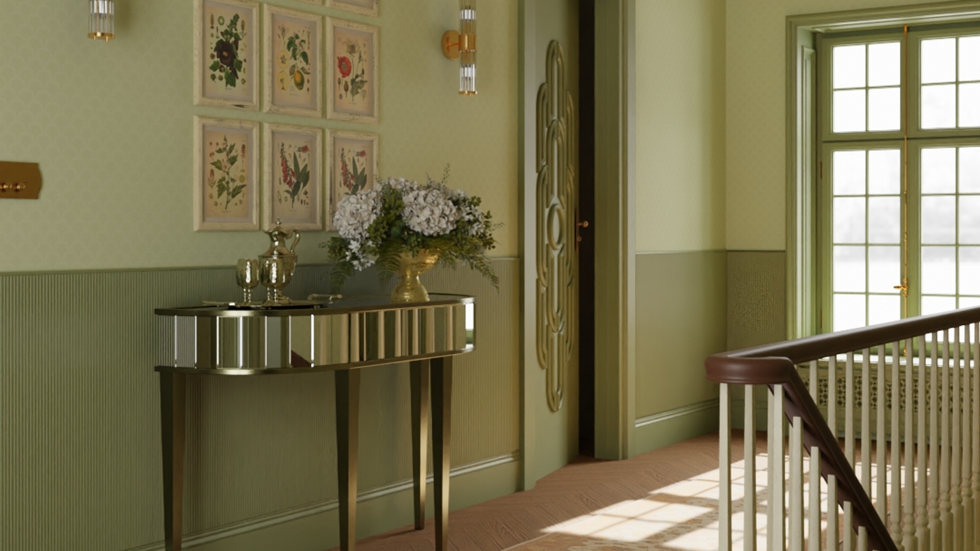
Olive green is the fresh new colour trend of this spring
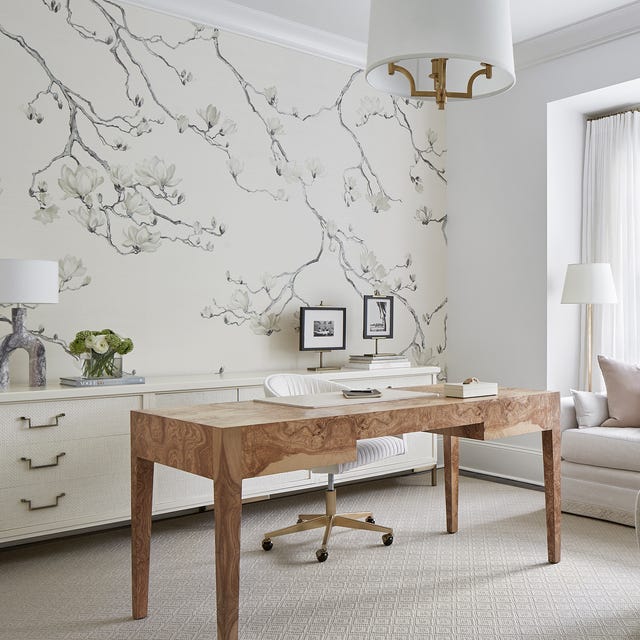
15 Unexpected Spring Home Trends That Will Define the Season


The "Boring" Hue That Will Dominate Our Feeds This Spring

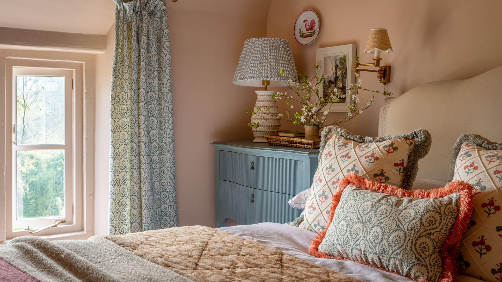
These are the 6 must-have colors to decorate with in April 2025
How To Style Your Home With Spring Styling Trends
21 Designers Share Their Color-Trend Predictions for Spring