



1/4

The Color Palette: Earth Tones in Prairie Design 🎨
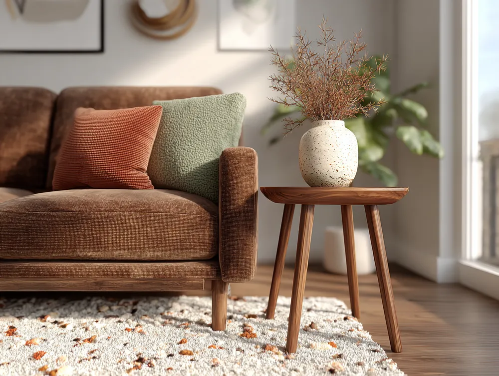
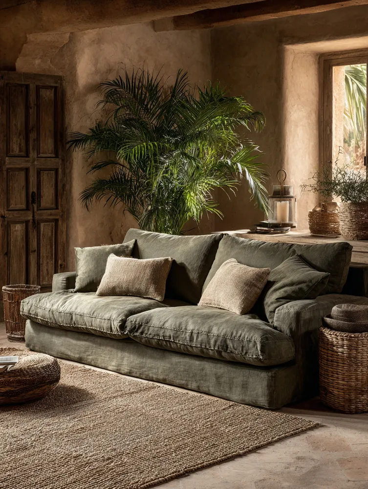
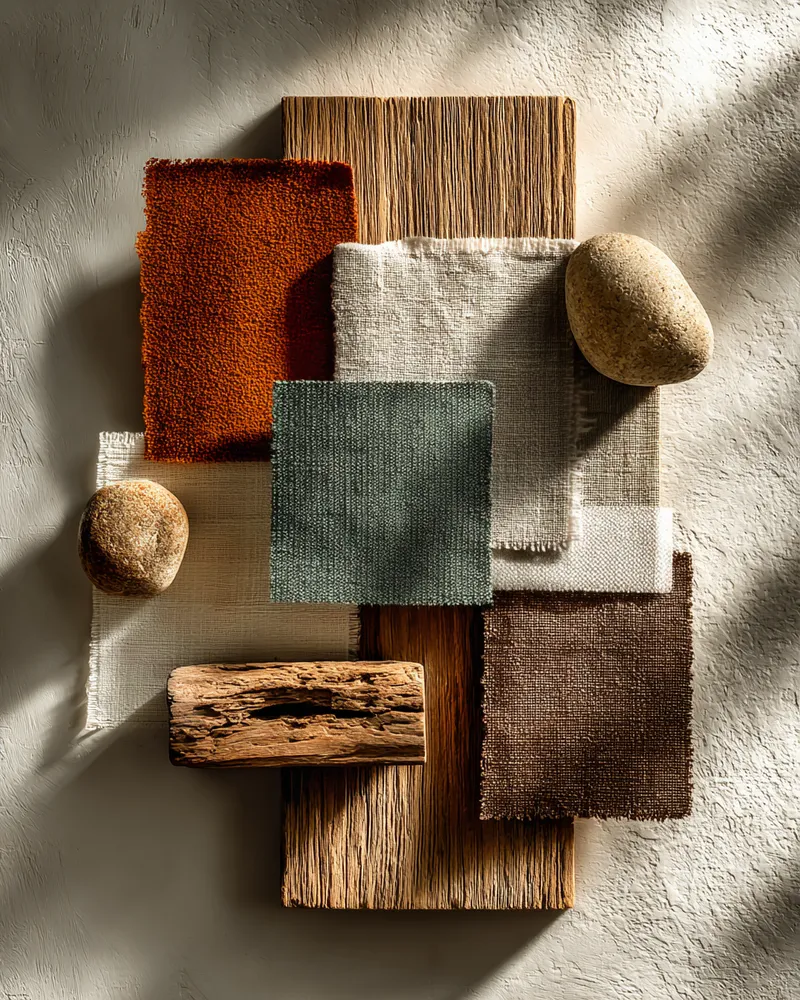
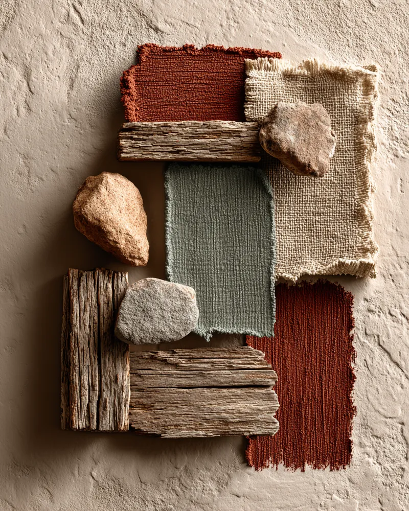
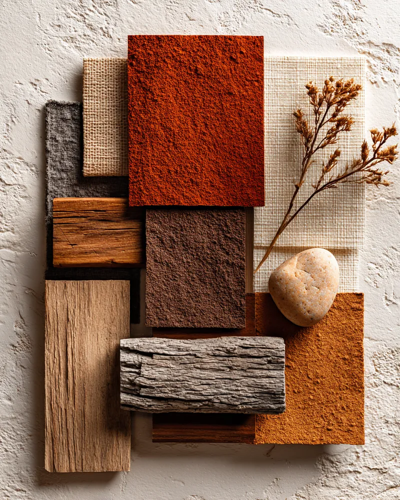
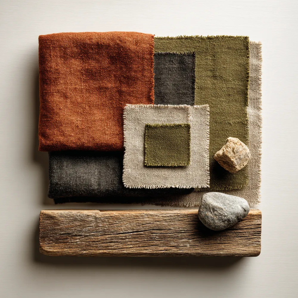
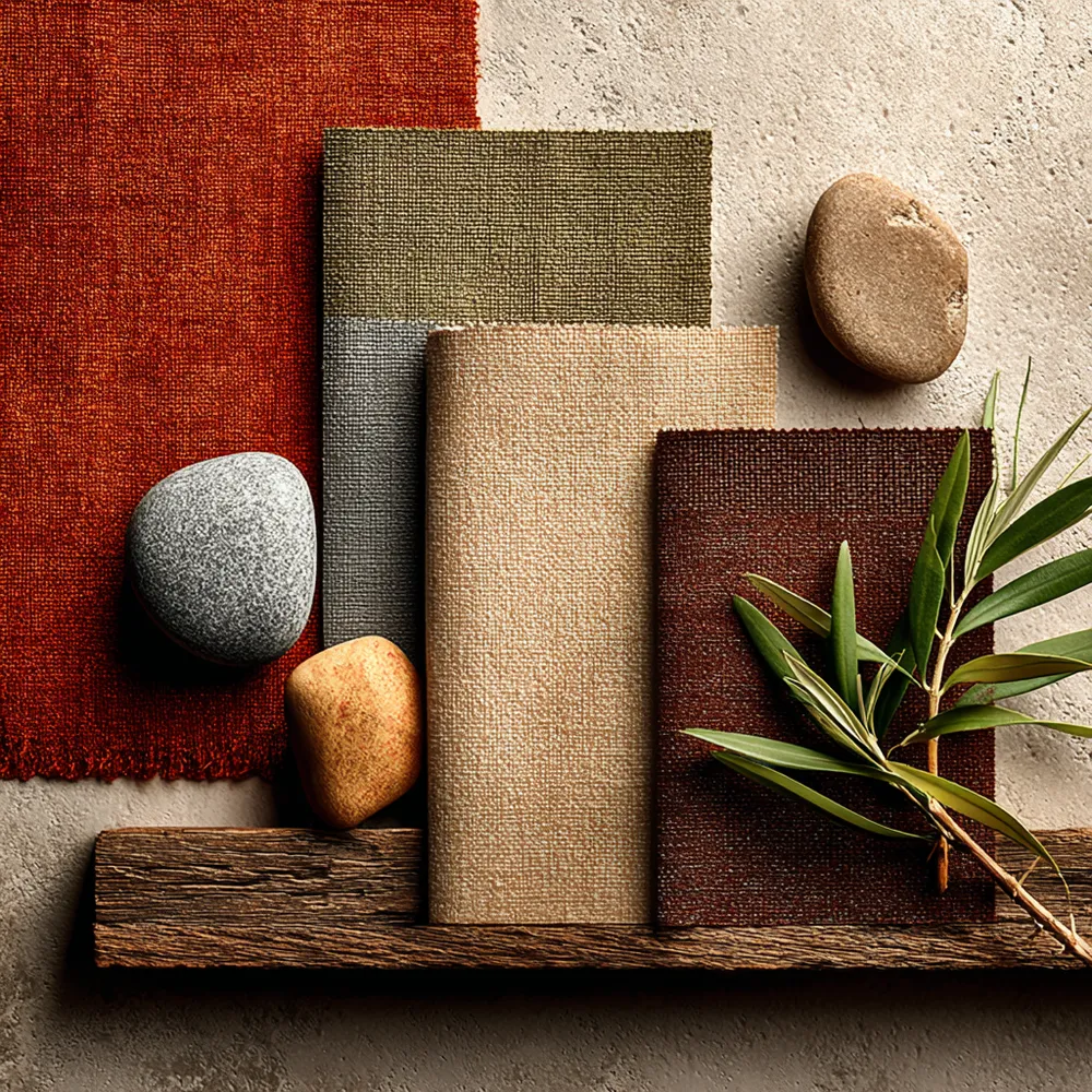
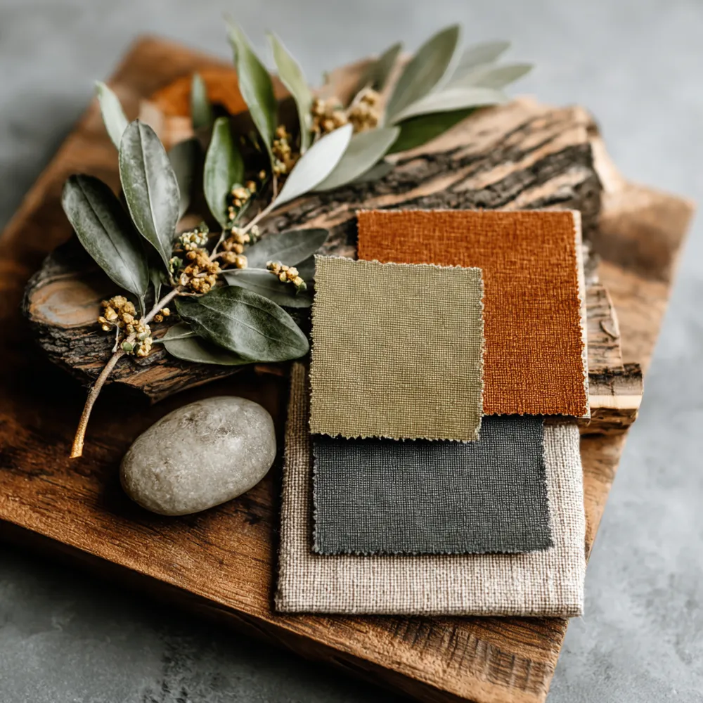
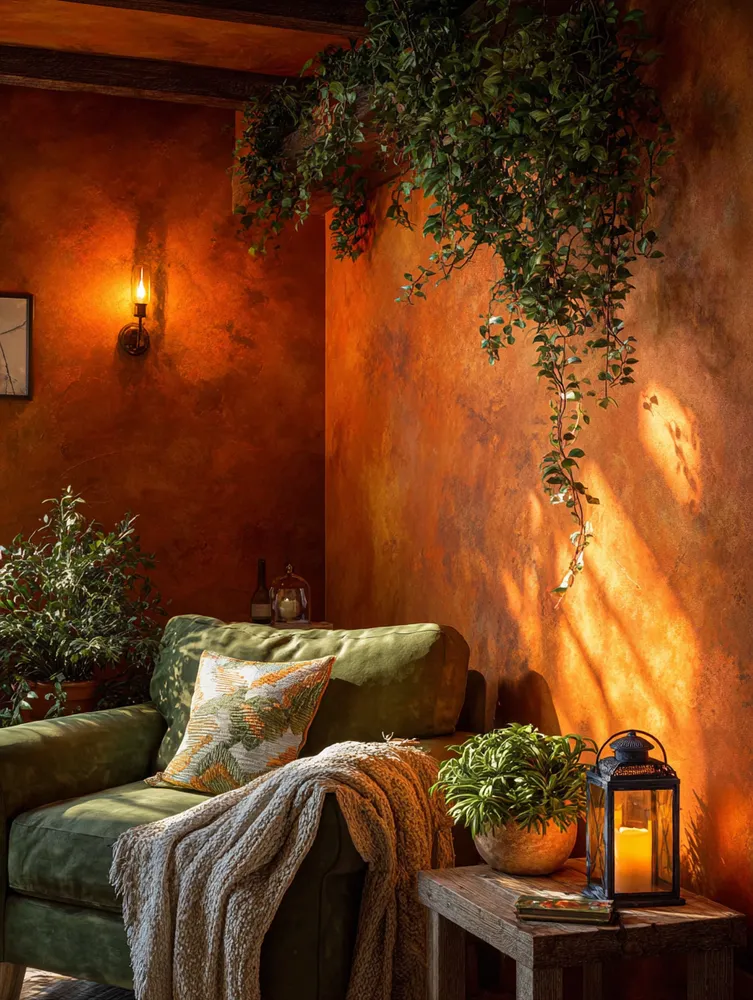
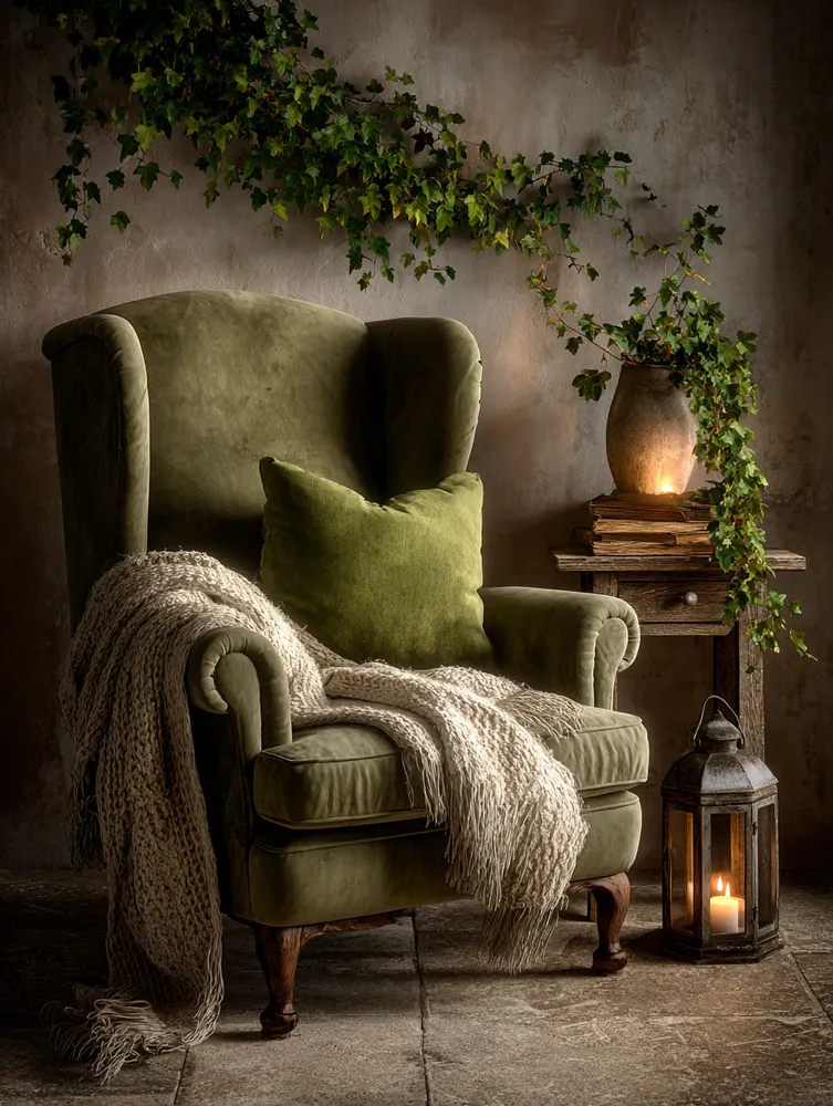
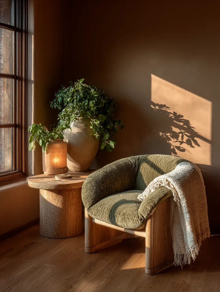
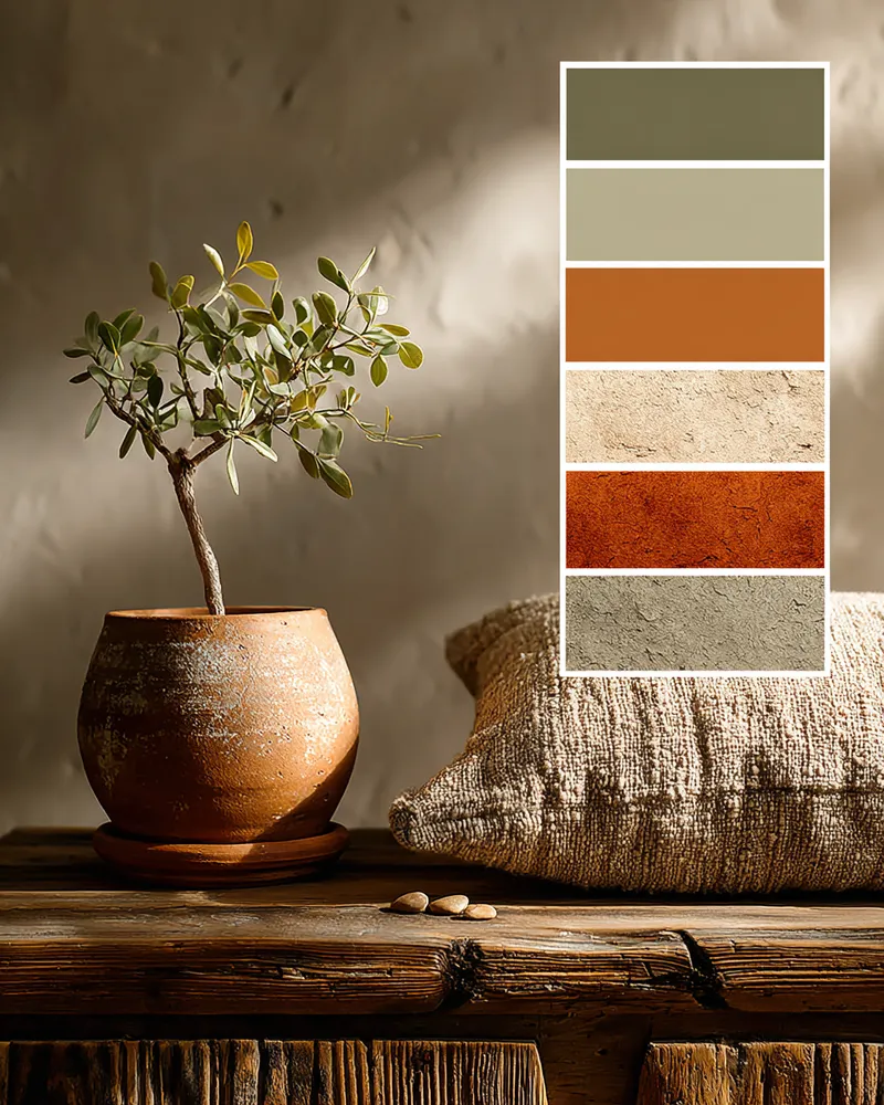
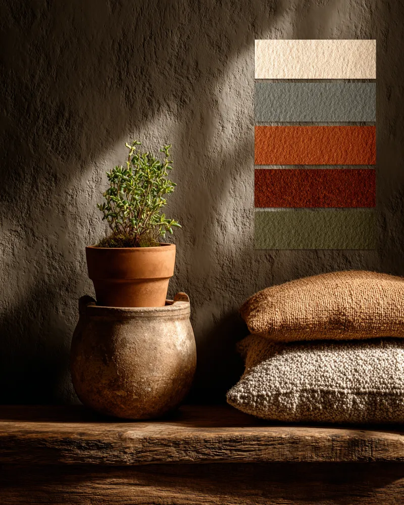
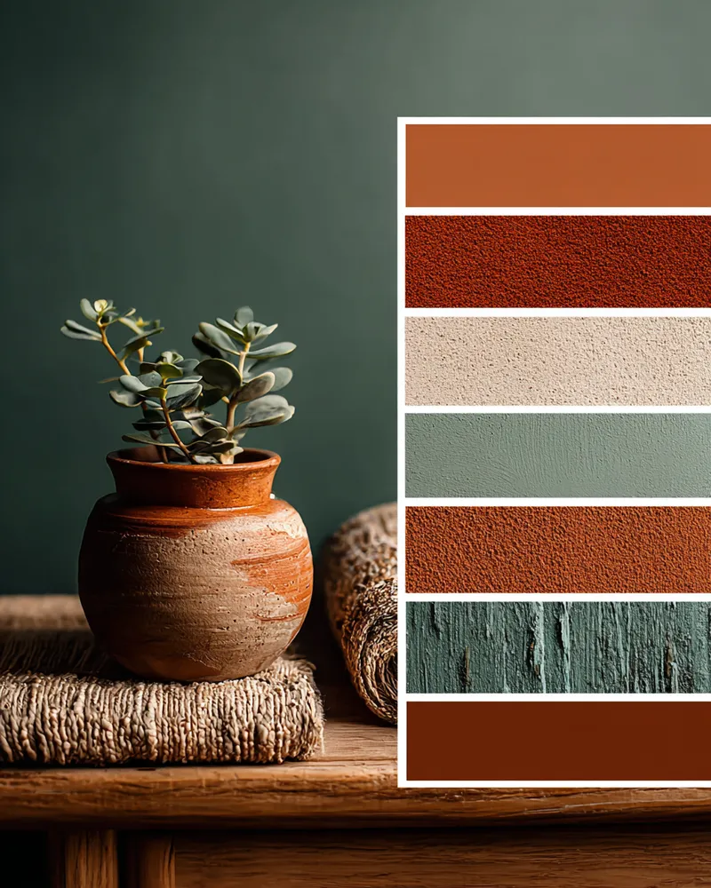
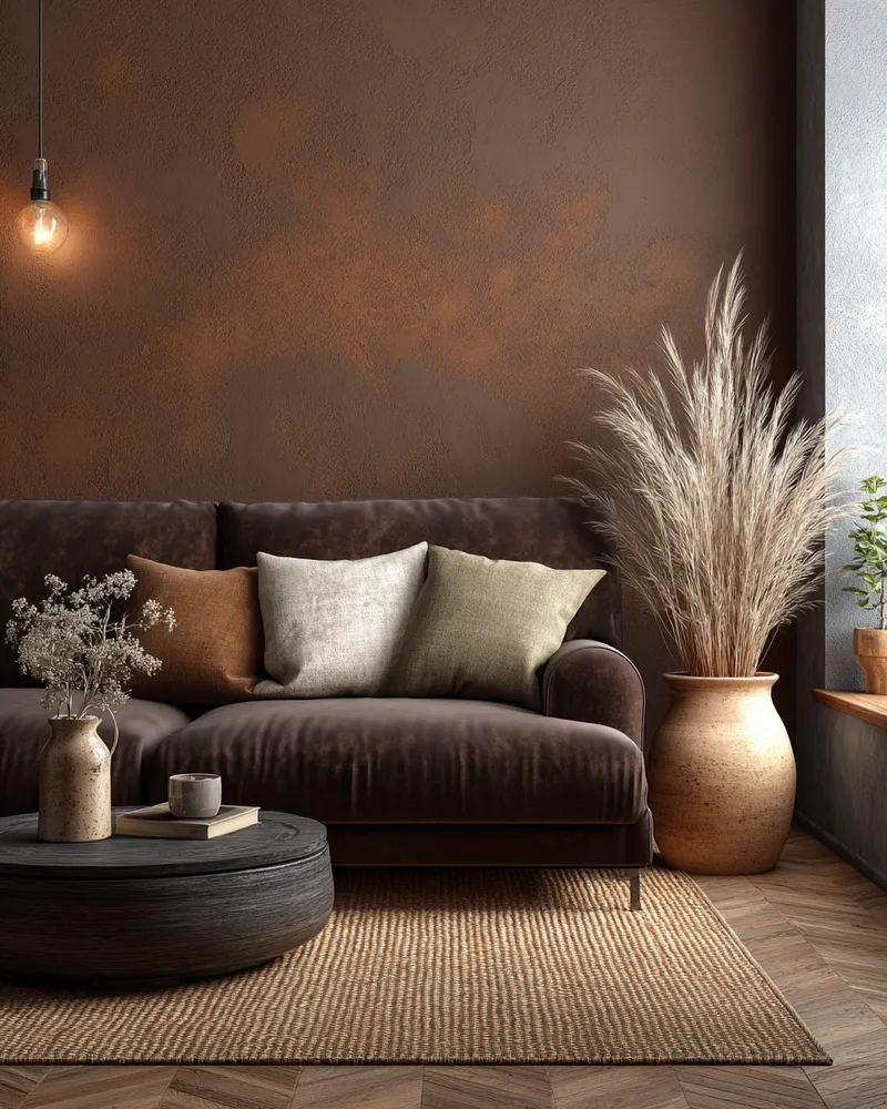
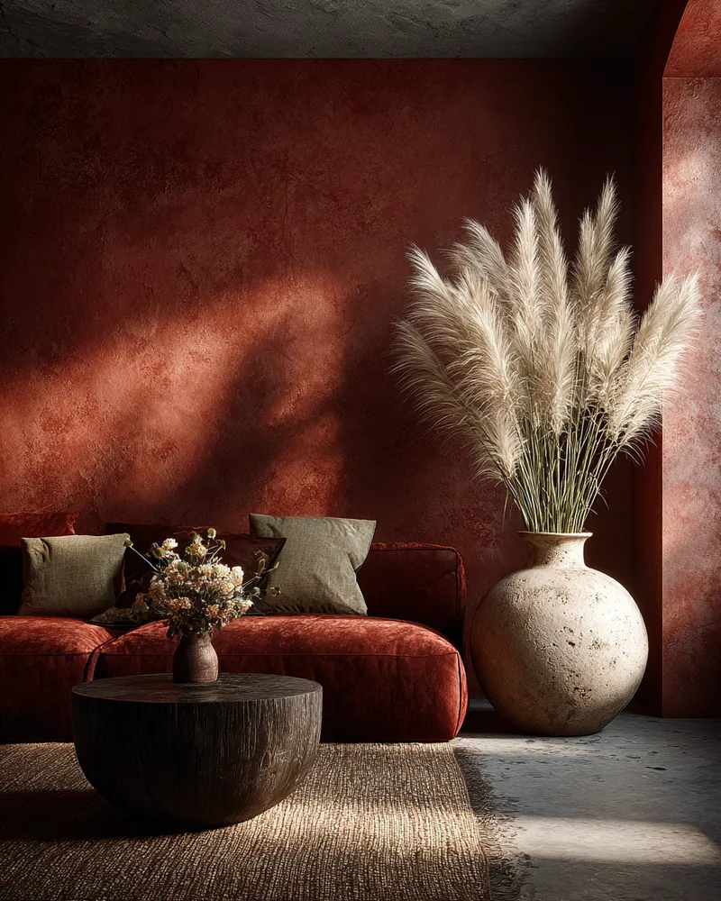
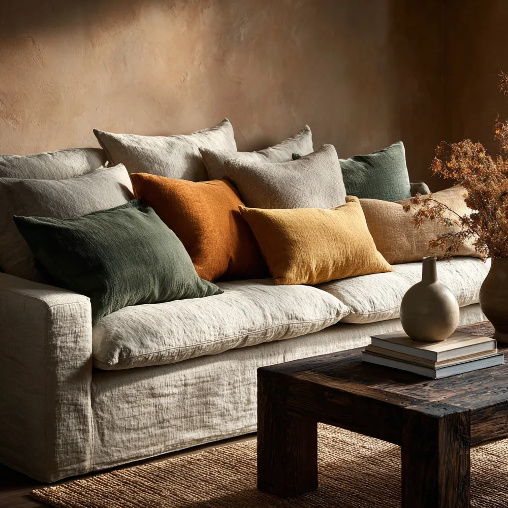
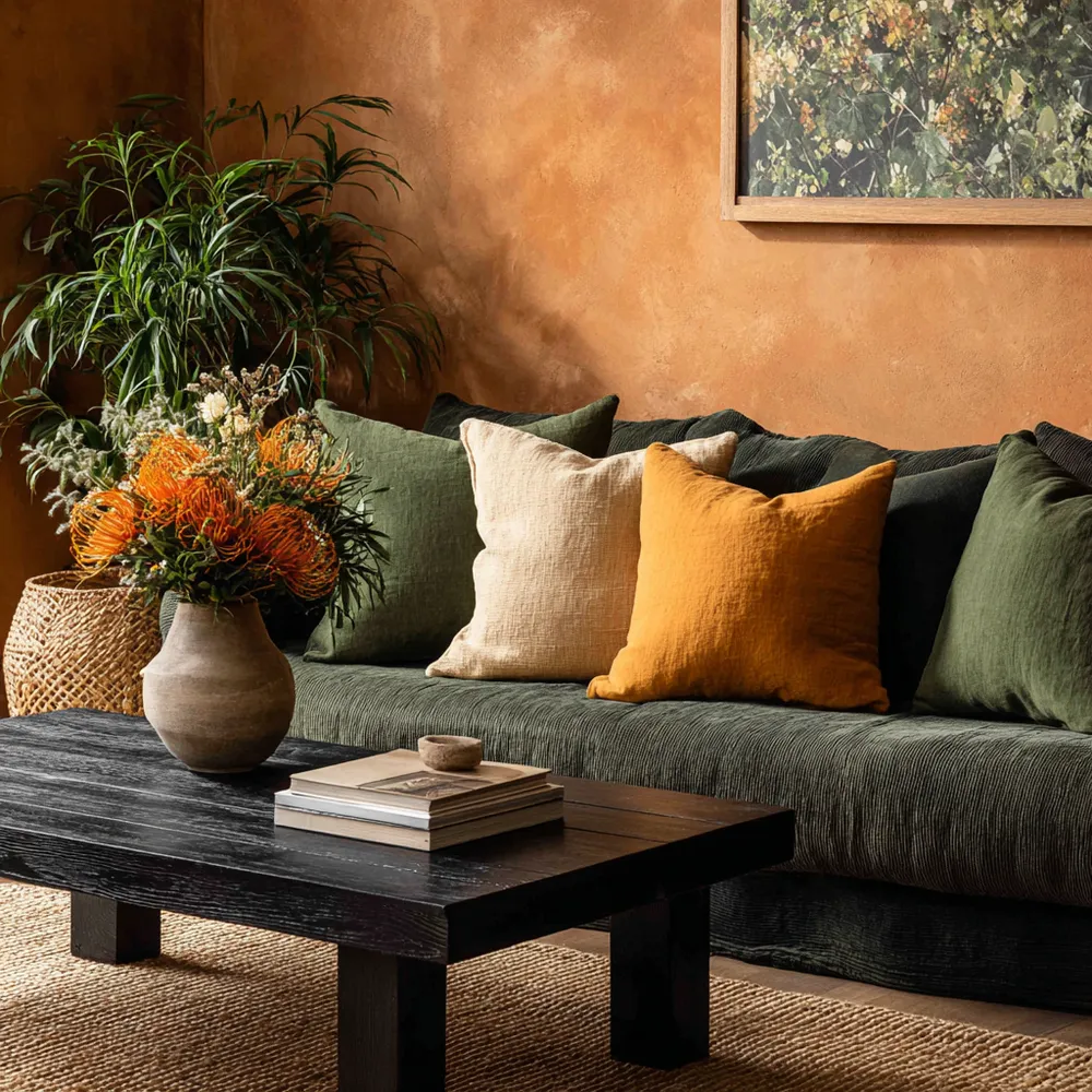
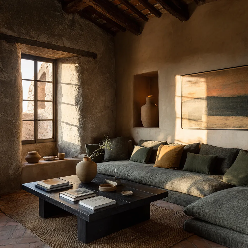
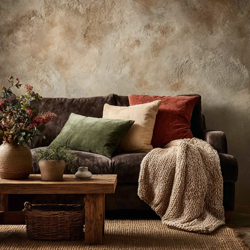
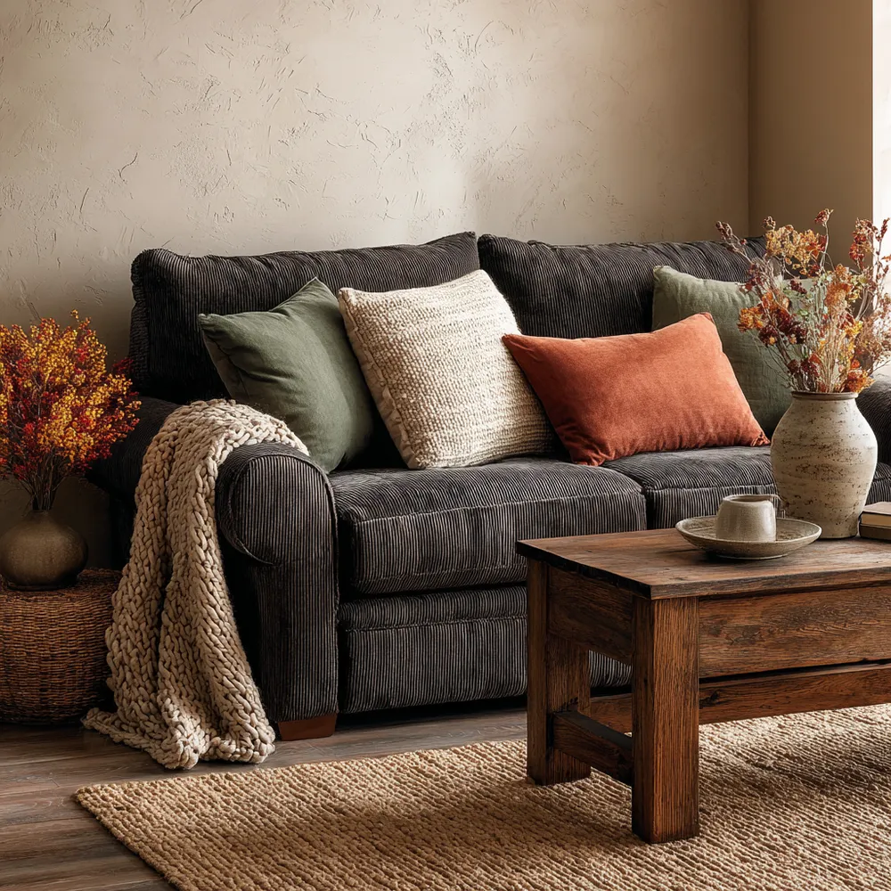
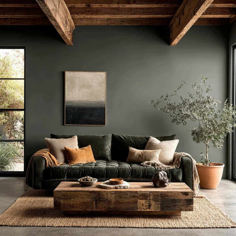
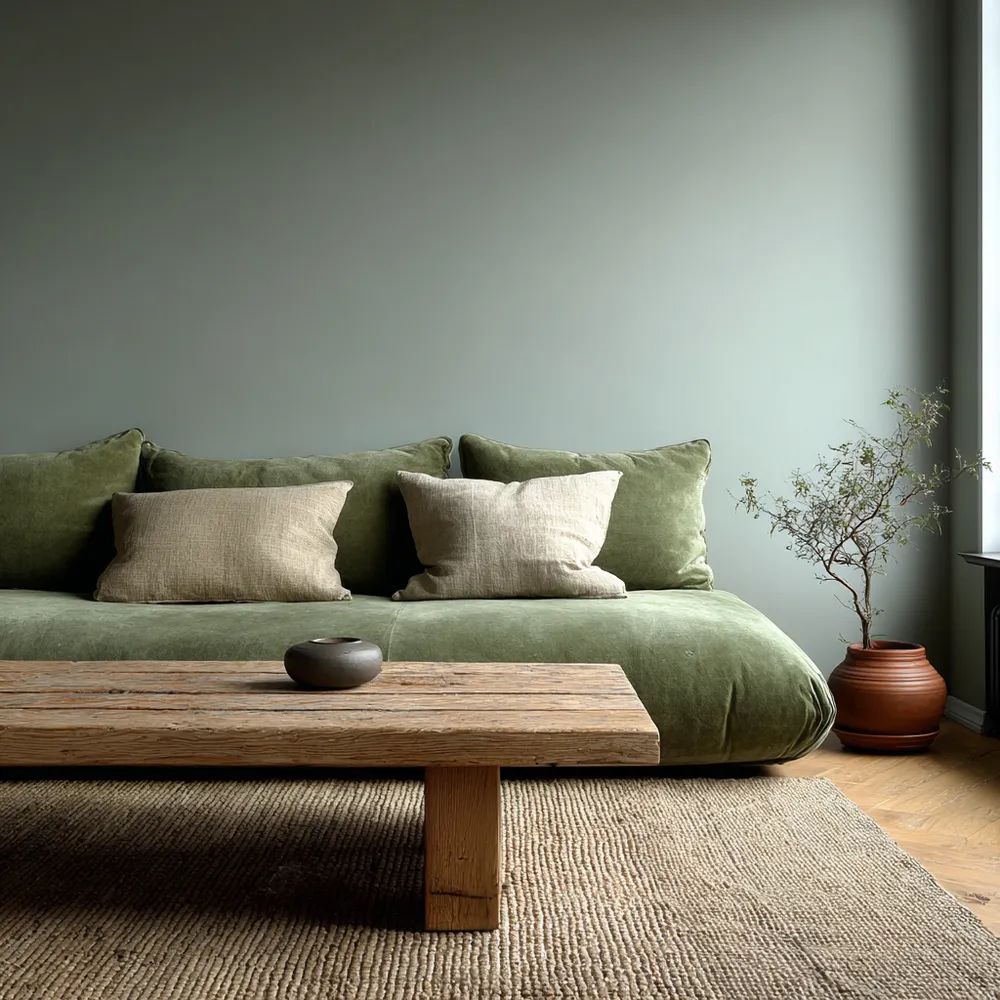
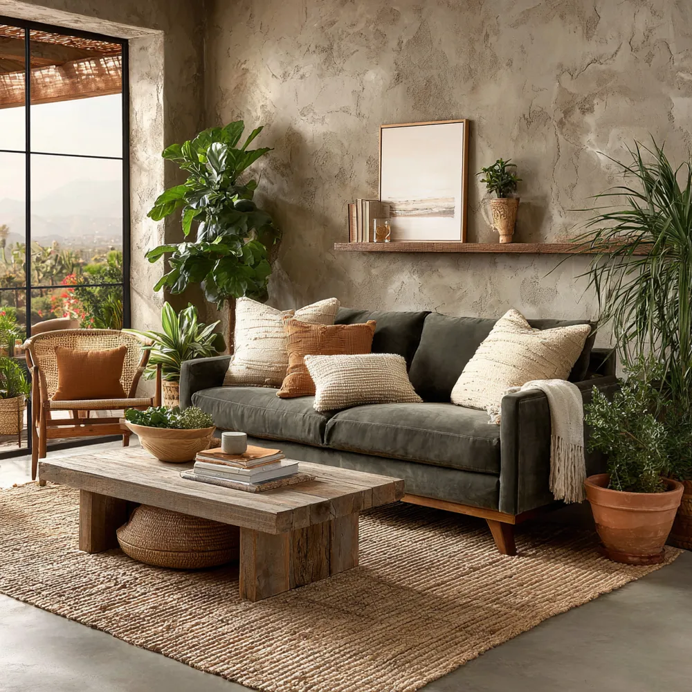
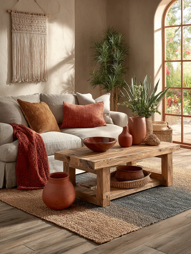
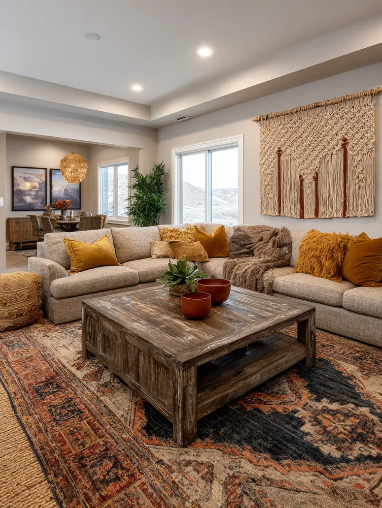
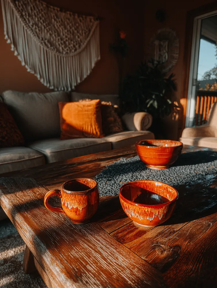
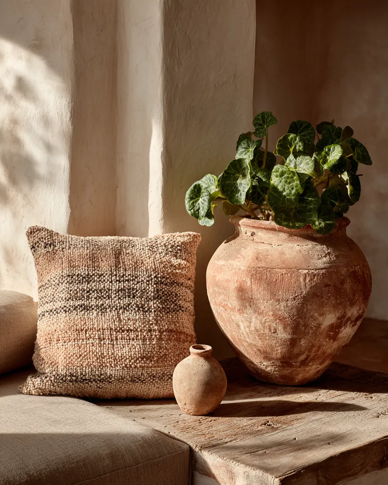
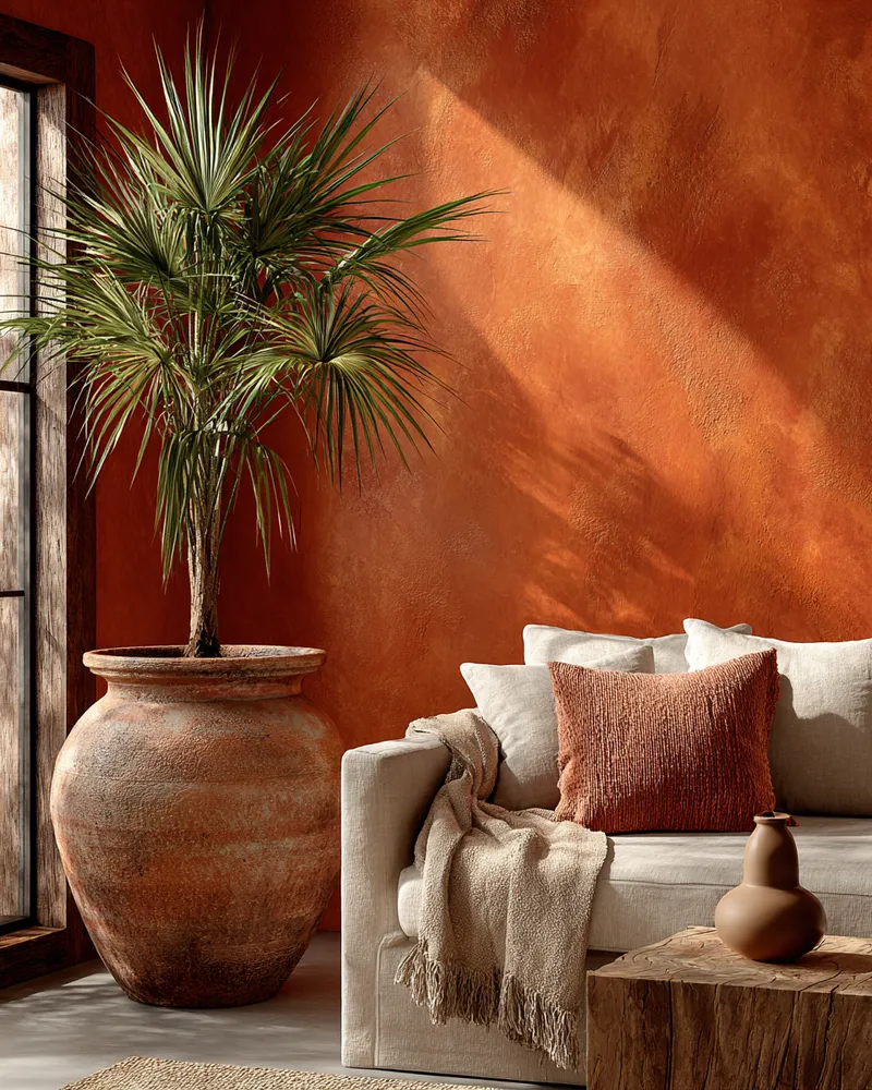
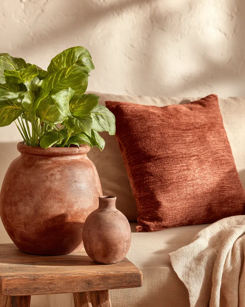
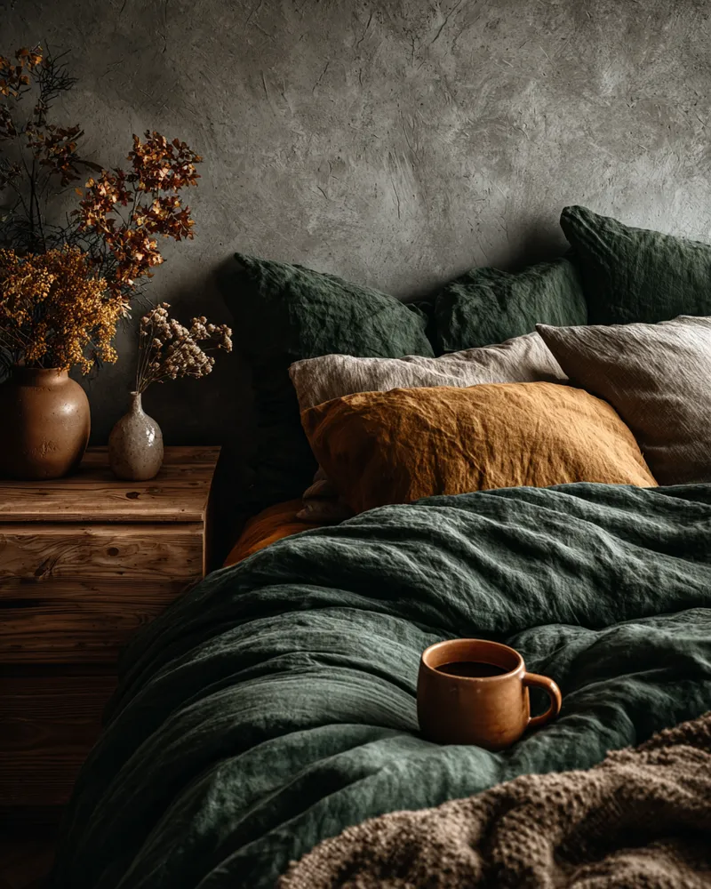
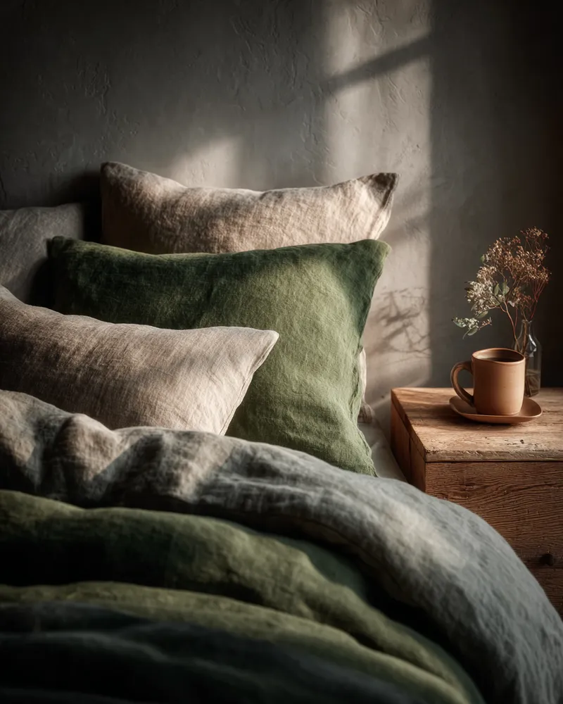
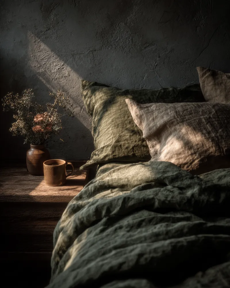
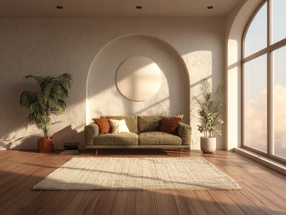
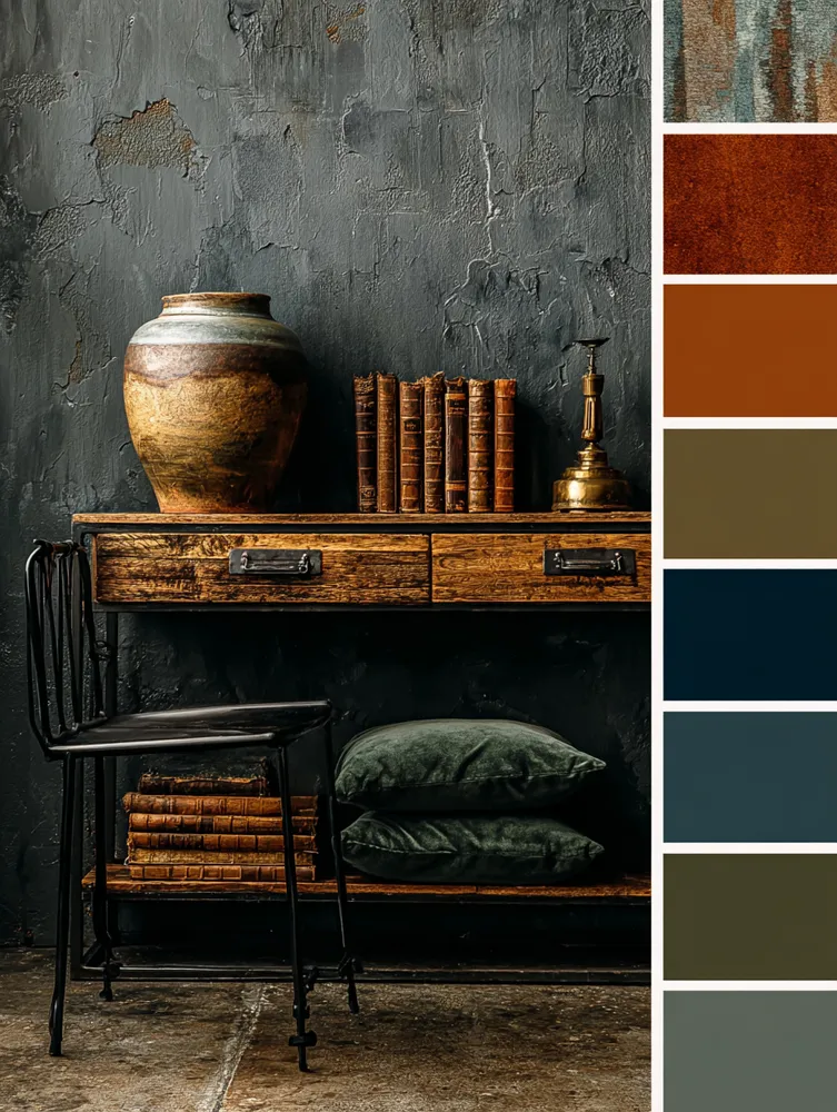
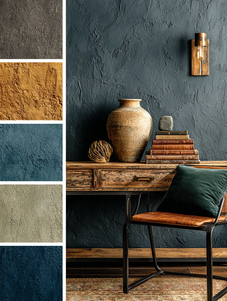
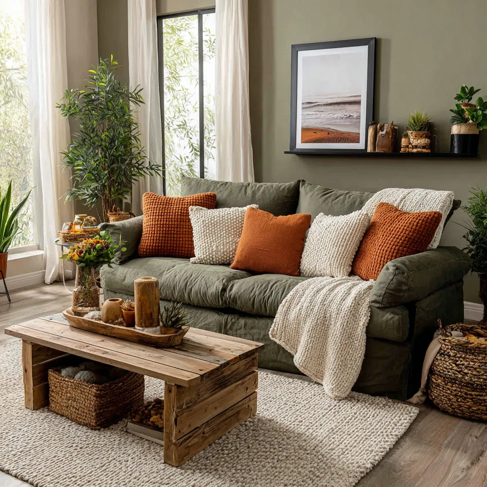
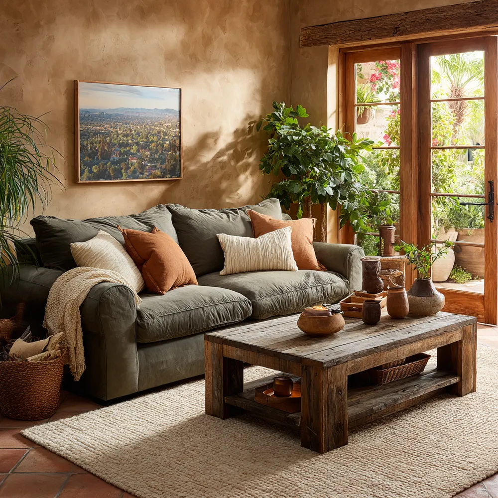
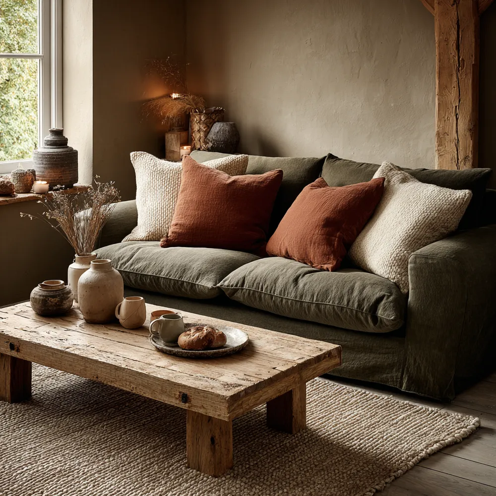
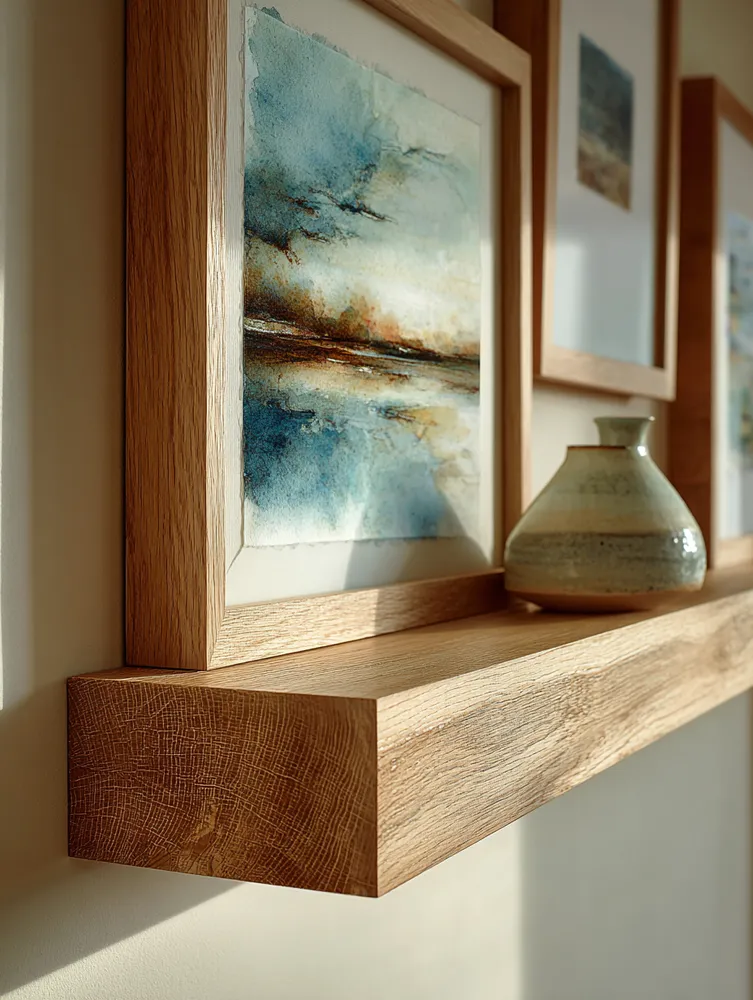
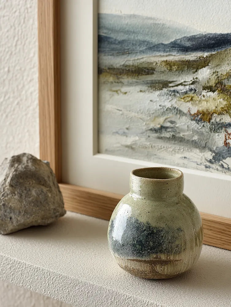
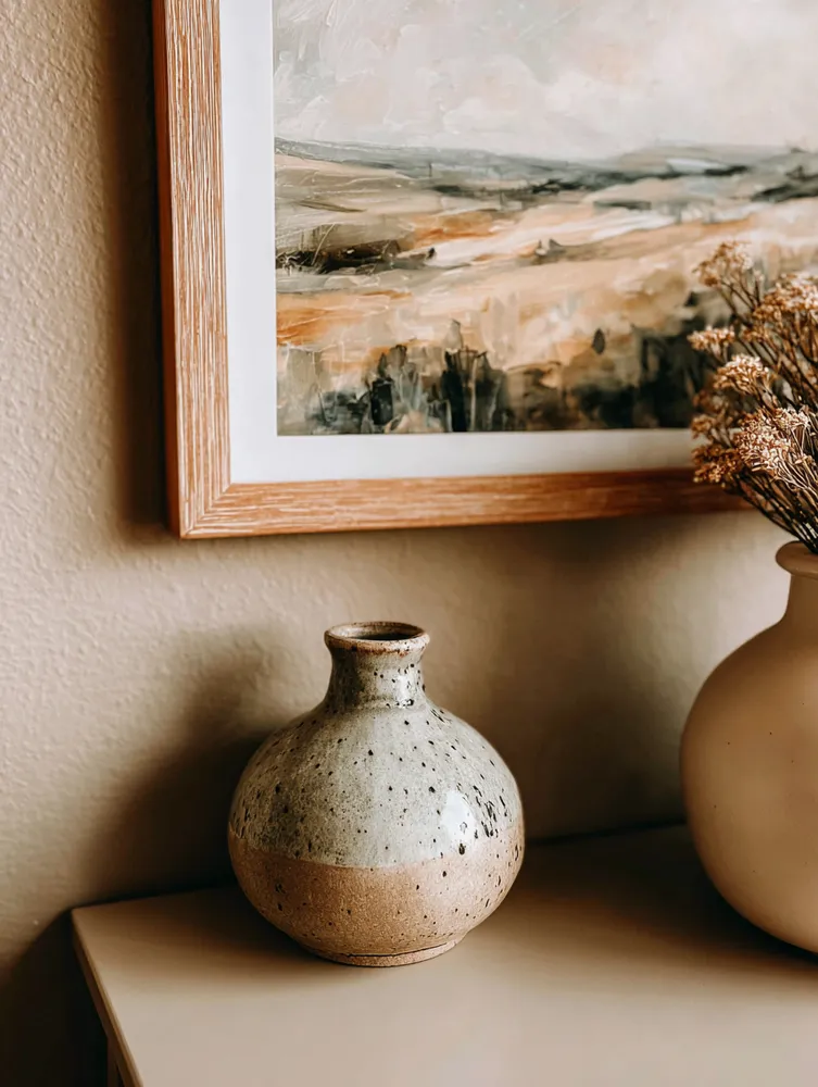
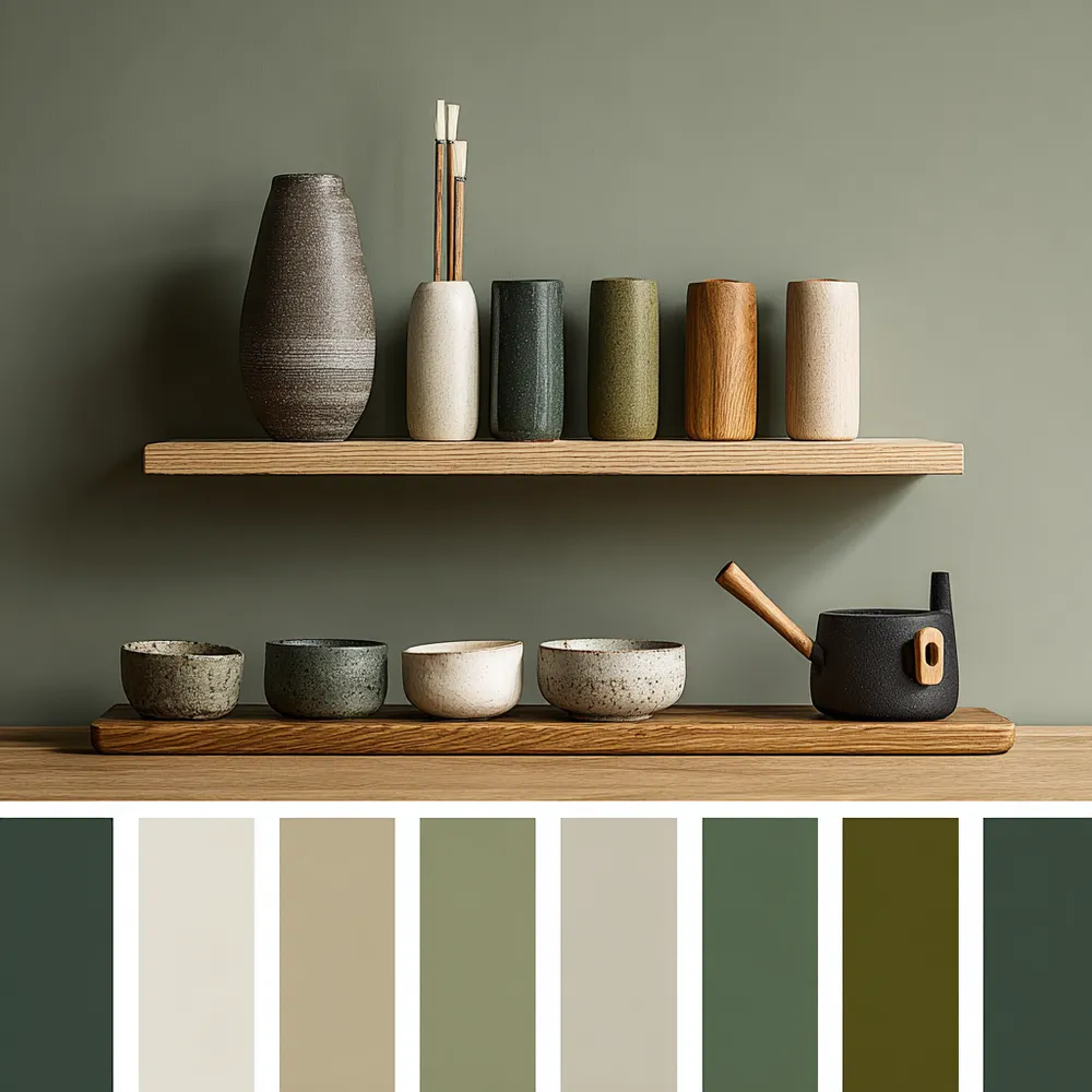
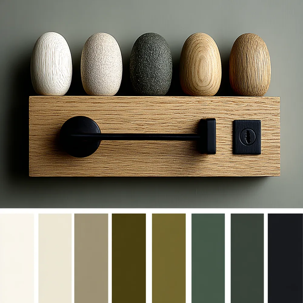
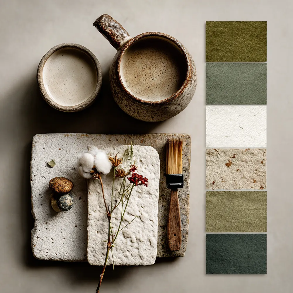
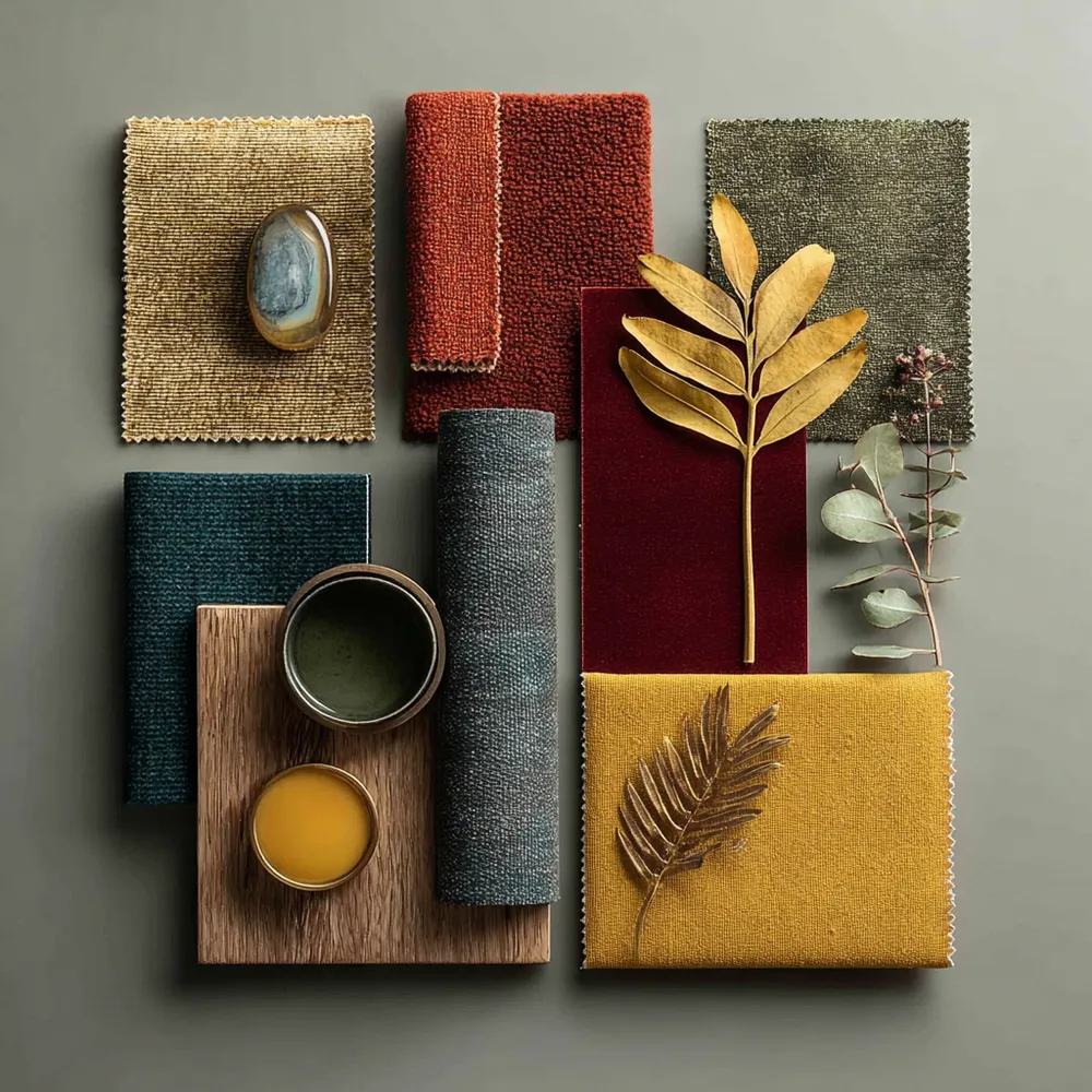
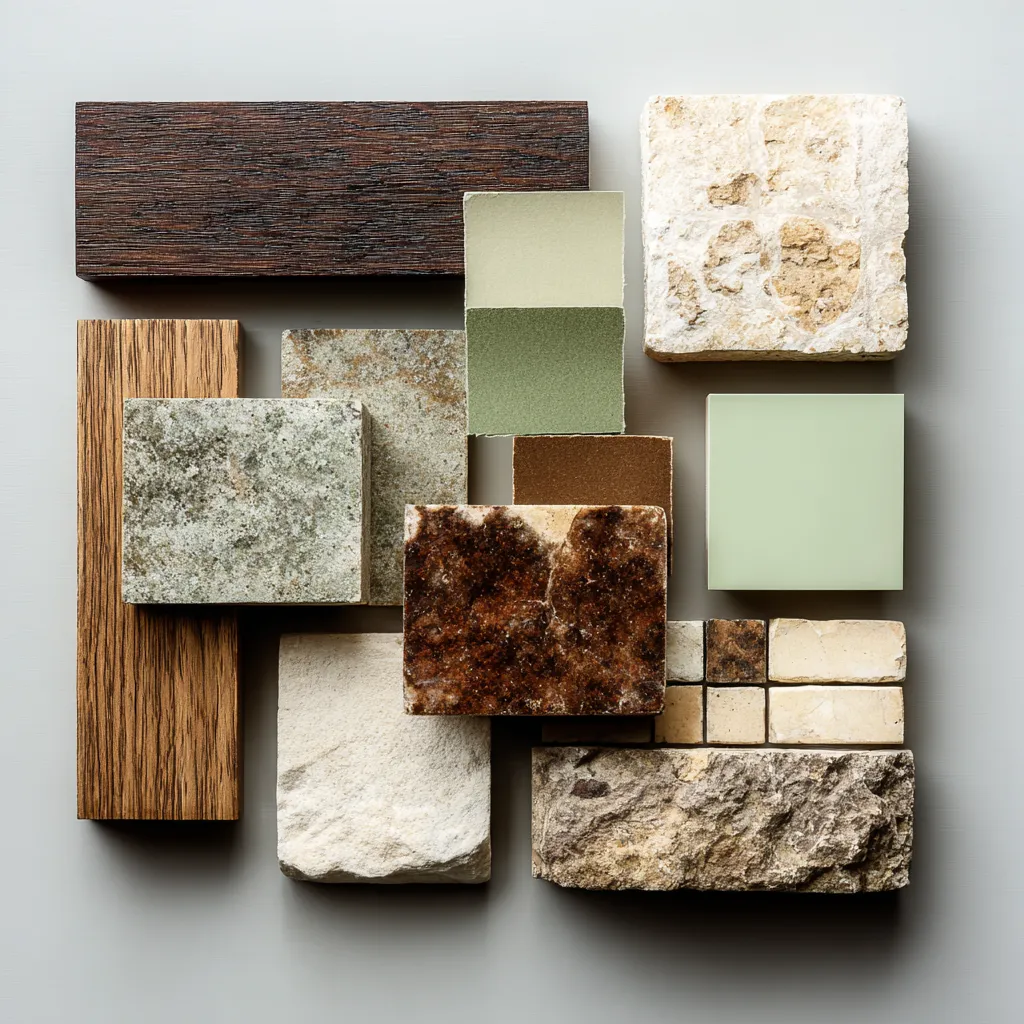
The color palette of Prairie School architecture is deeply inspired by the natural landscape. 🌾 We favor earthy tones: rich browns, warm ochres, muted greens, and soft beiges. These colors create a sense of grounding, tranquility, and seamless integration with the outdoors. They are subtle yet sophisticated, allowing the textures of natural materials to take center stage. This approach fosters a serene and welcoming atmosphere. Save these hues for your next design project! 🏡 #earthytone #prairieschool #colorpalette #naturalcolors #architecturalcolors #ColorPaletteIdeas #PrairieStyleIdeas #EarthyTones #NaturalColorInspiration #InteriorColor #HomeDesignColors #OrganicPalette #ArchitecturalInspiration #SereneInteriors #DesignHues
28 Eki 2025
Stili Kopyala
 Henüz yorum yok
Nature's Palette: Inspiring Decor with Earthy Tones 🤎

Earth-Inspired Color Palettes: Nature's Calm for Your Home 🎨

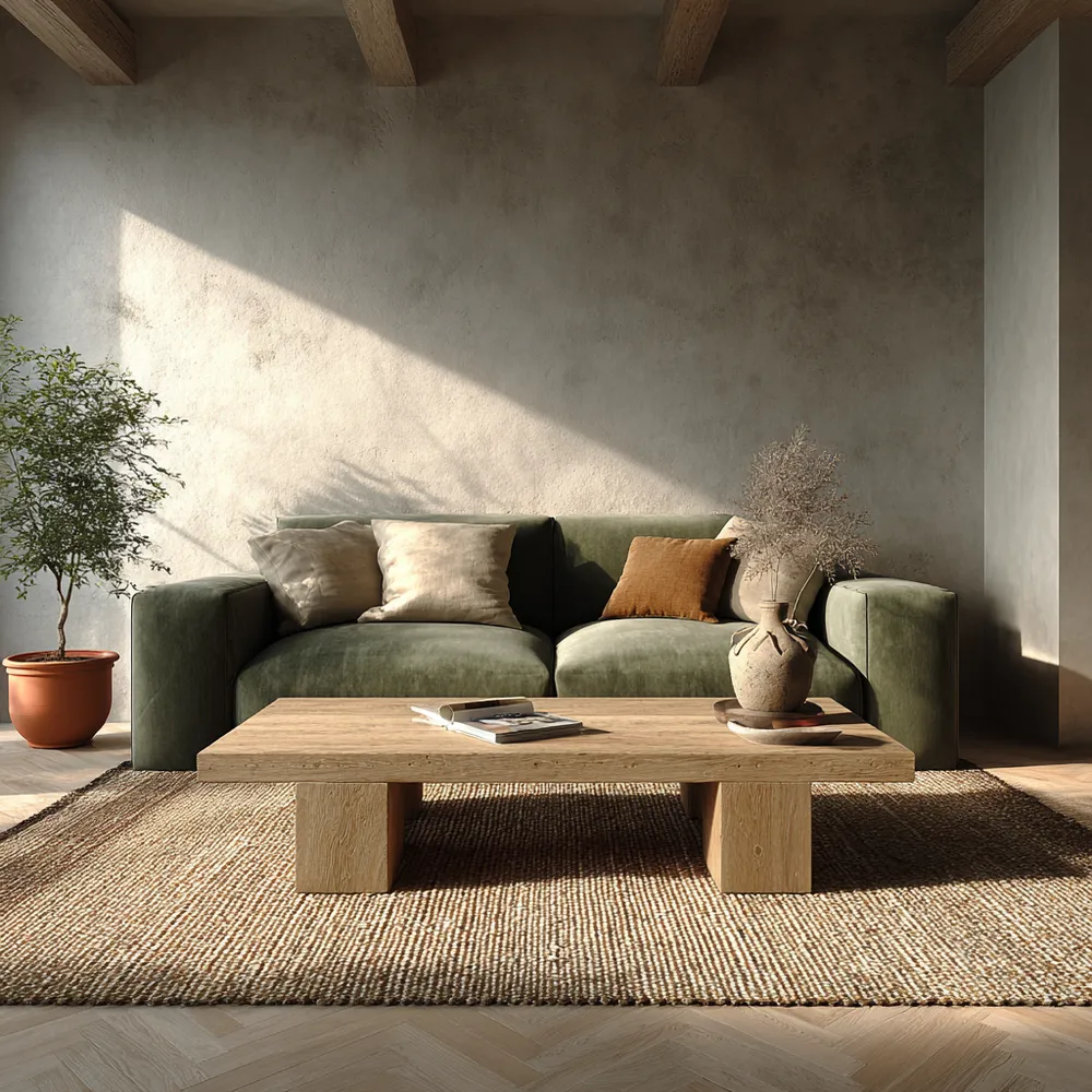
Nature's Palette: Earthy Tones for a Peaceful Home 🌳

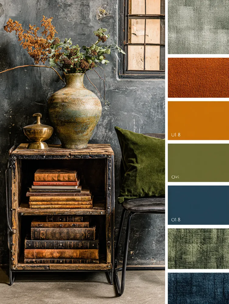
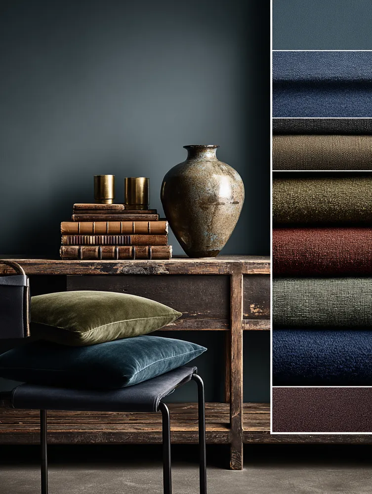
The Industrial Color Palette: Earthy Tones & Moody Hues ⚙️

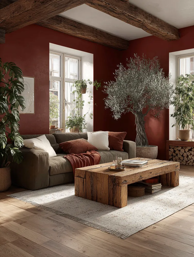
The Art of the Natural Palette: Earth Tones for a Grounded Home 🤎

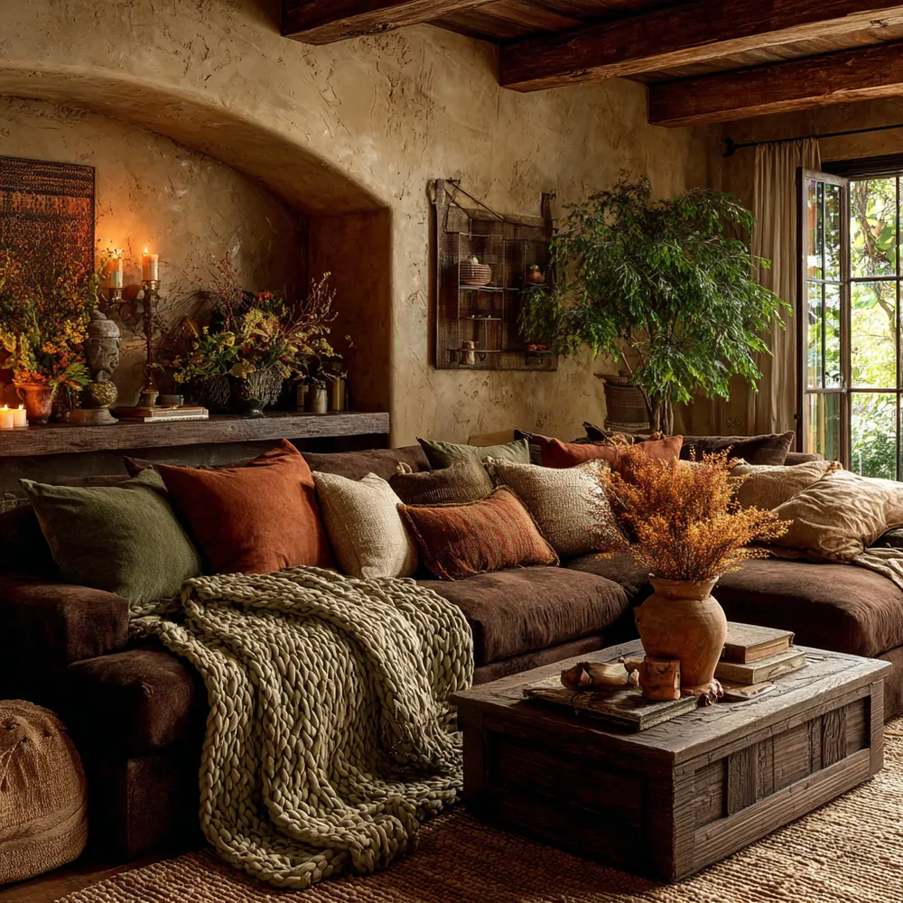
Earth Tones & Natural Textures: Your Cozy Haven 🤎🍂

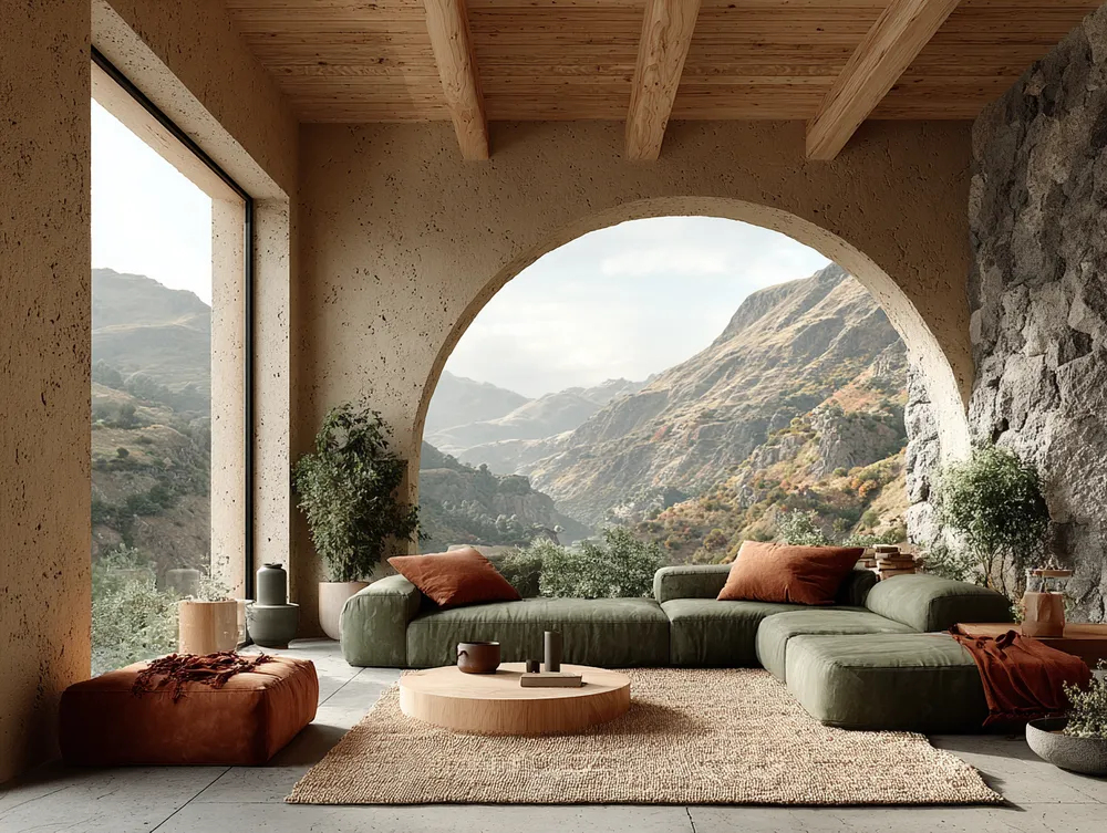
The Artisan's Palette: Earthy Tones for a Tranquil Home 🎨🌿

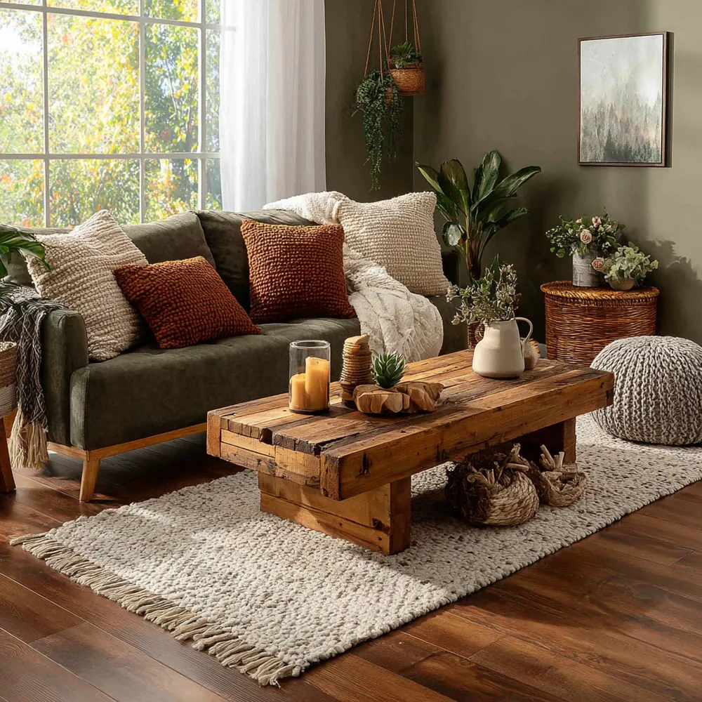
🍄 Forest Floor Palette: Earthy Tones for a Cozy Home! 🌿

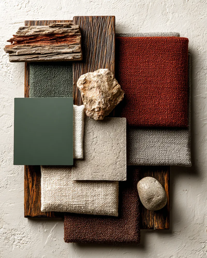
Nature-Inspired Palette: Earthy Tones for a Grounded Home 🍄

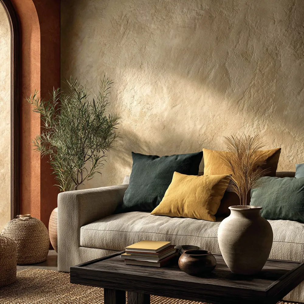
Earthy Tones: A Palette for Serene Homes 🍂

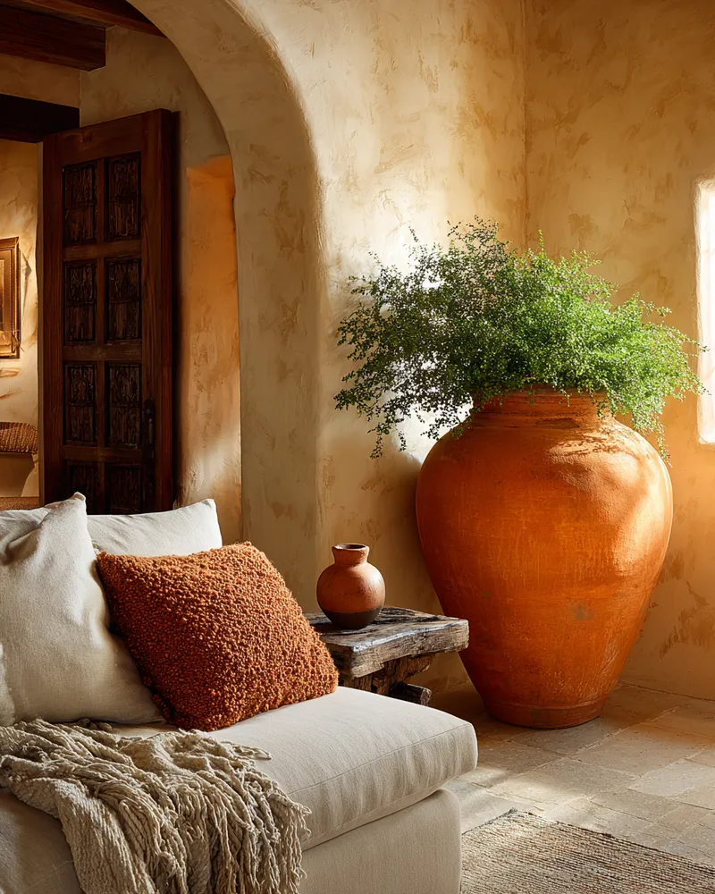
Earthy Elegance: Incorporating Terracotta & Clay Tones 🤎
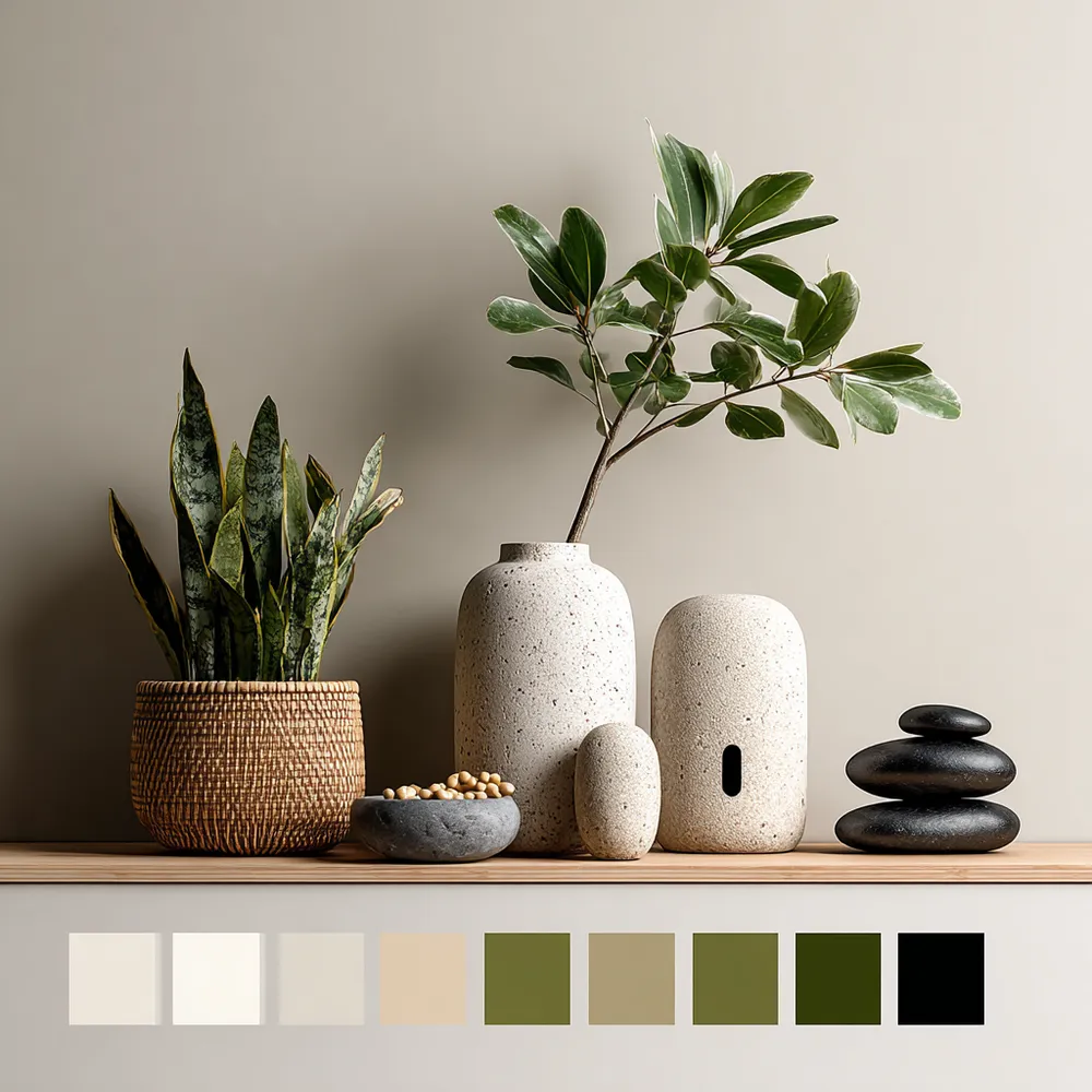
Balancing Act: Japandi Color Palette Secrets 🎨💚


color
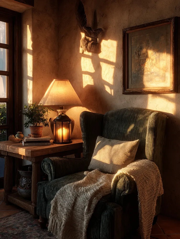
Nature's Palette: Earthy Tones for Your Cozy Home 🍂

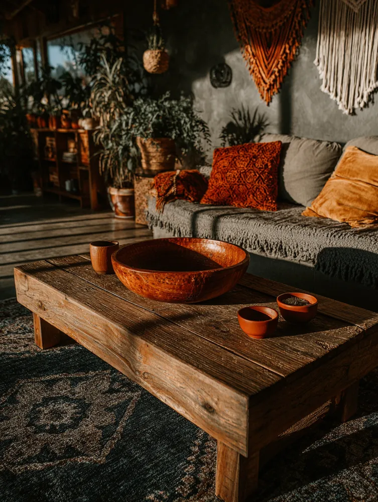
Earthy Tones & Bold Accents: A Boho Color Palette 🤎💛

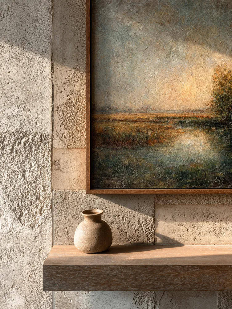
Art for Prairie Modern Spaces: Nature's Palette 🌾

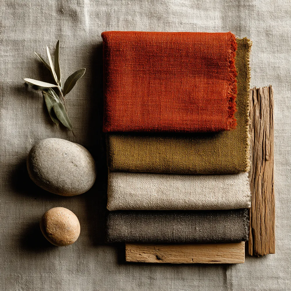
Color Palette Inspiration: Earth Tones & Global Hues 🌍🍂
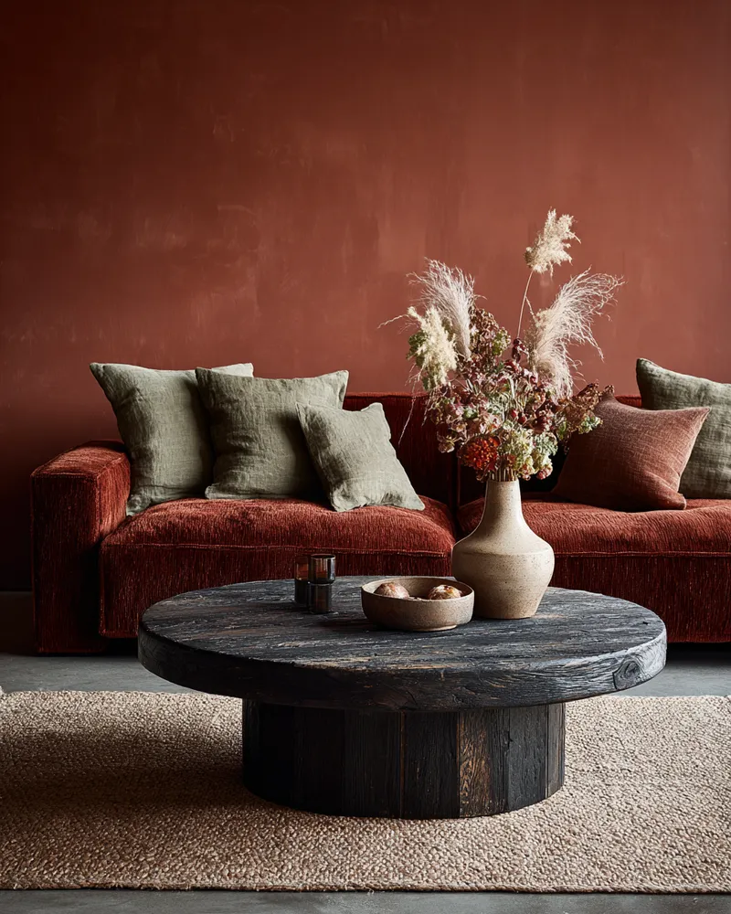
Palette Play: Sophisticated Earth Tones for Any Room 🤎

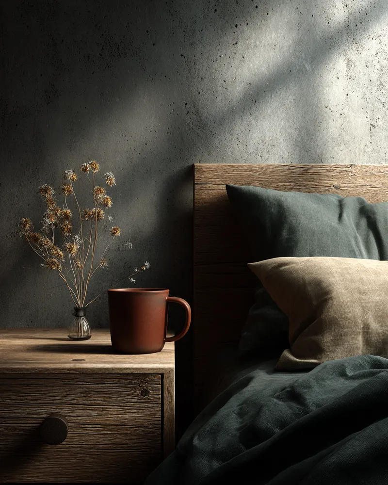
The Magic of Muted Tones: A Woodland Color Palette 🍄

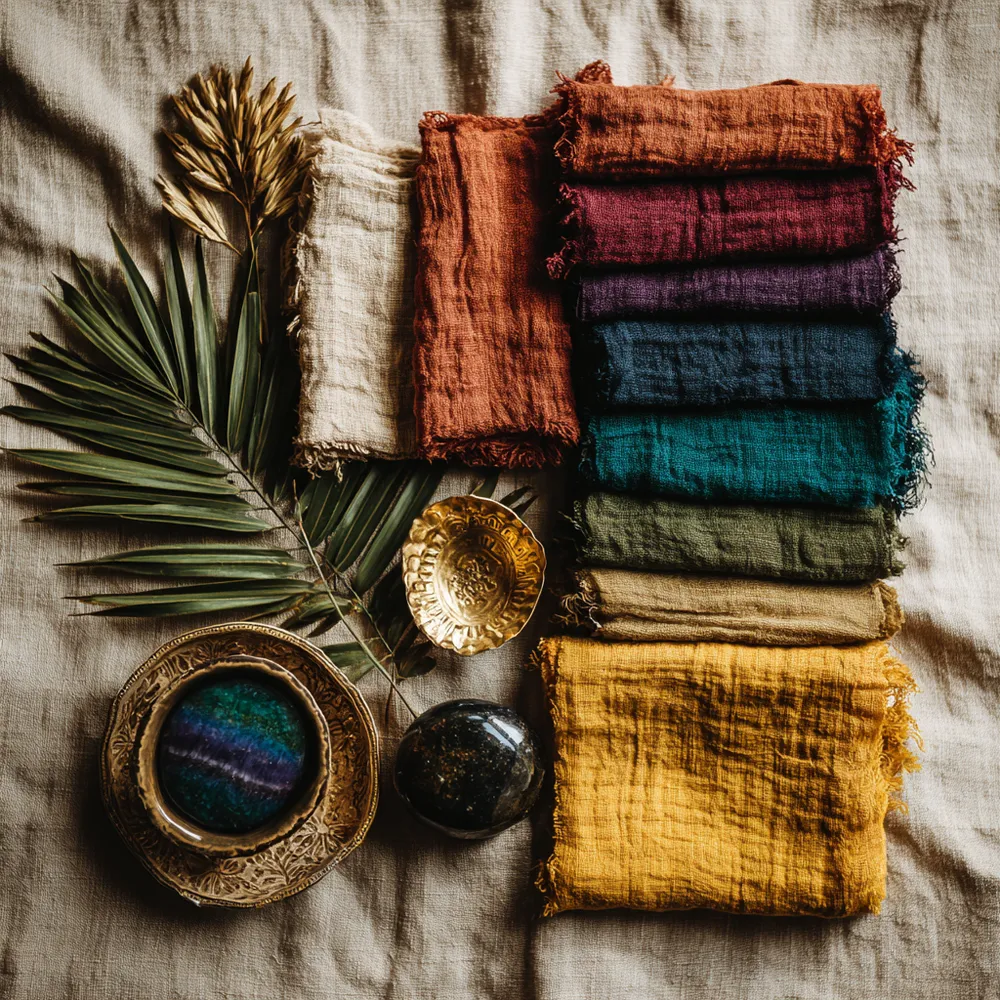
Boho Color Palette: Earthy Tones & Jewel Tones 🤎🧡💜