1/33
What colors go best with butter yellow? 8 equally delicious shades to pair with spring's hottest color trend
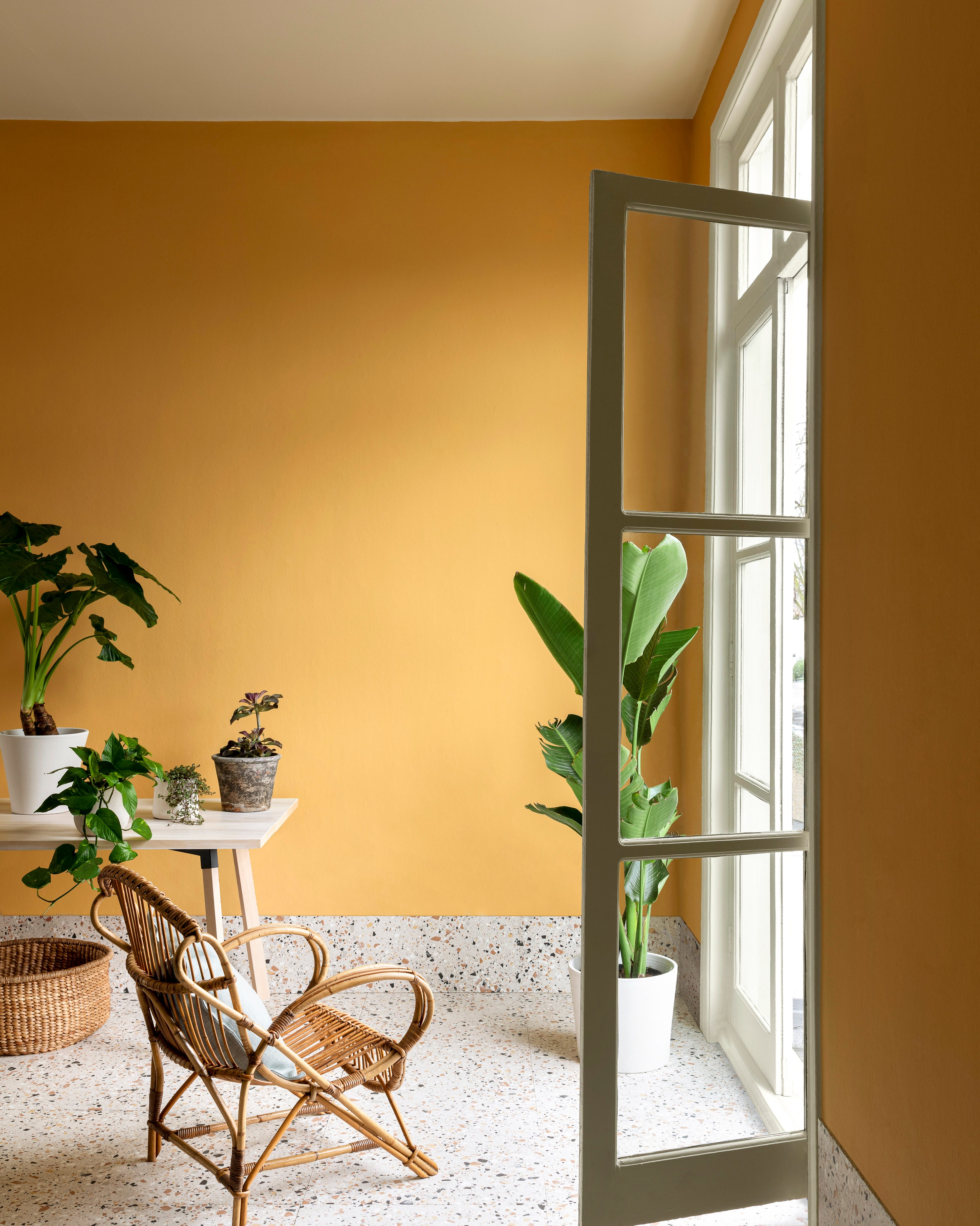
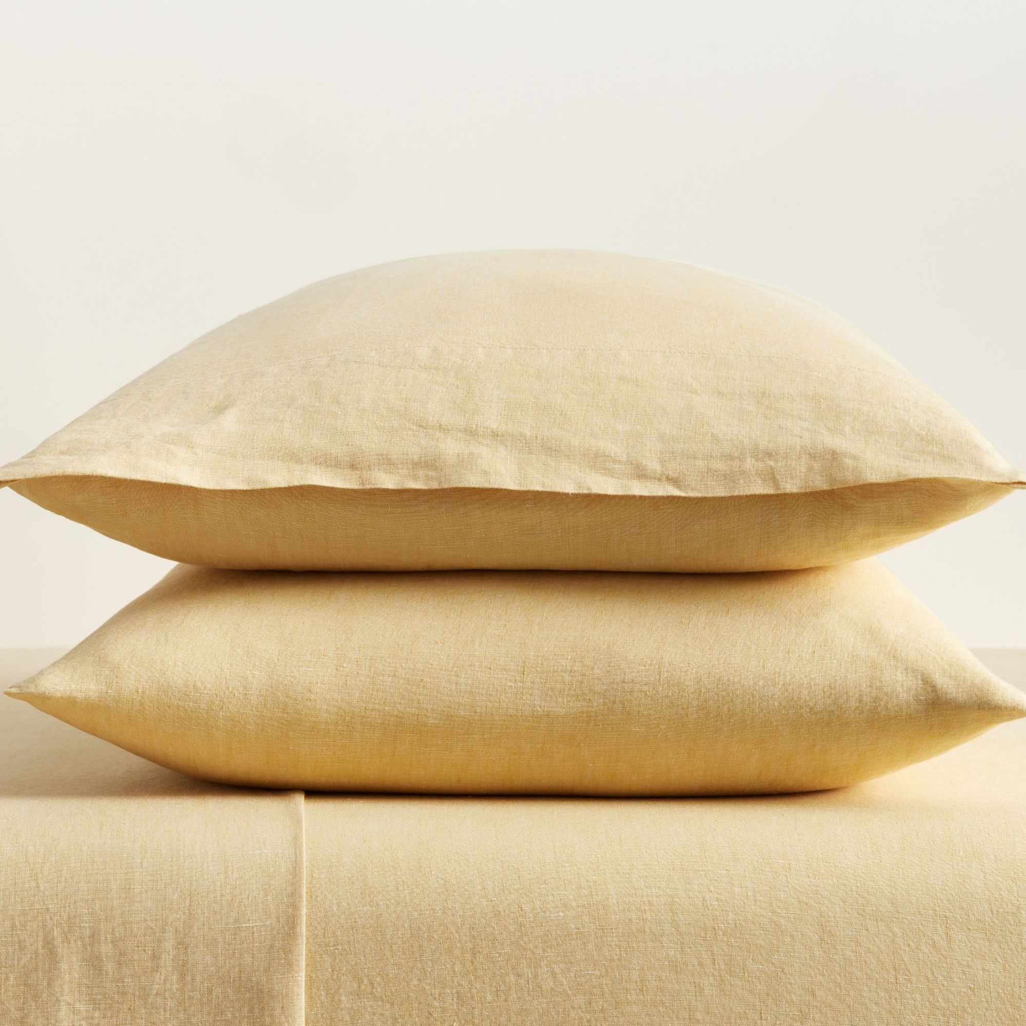
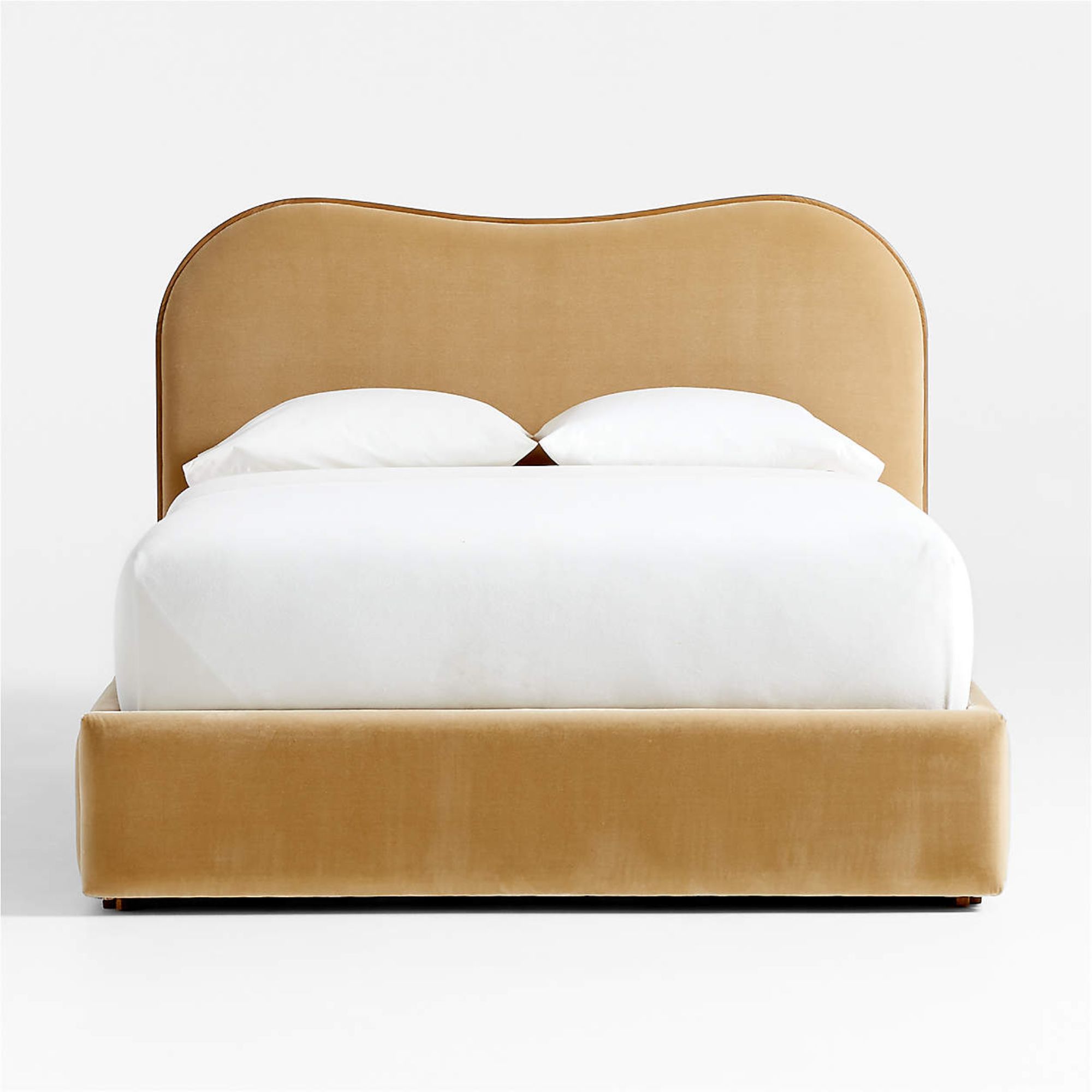
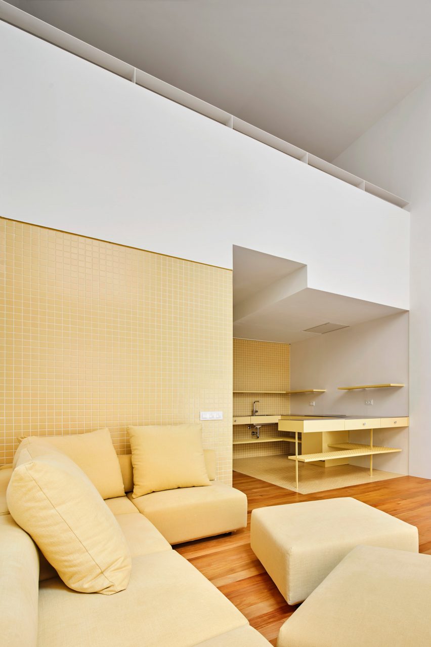
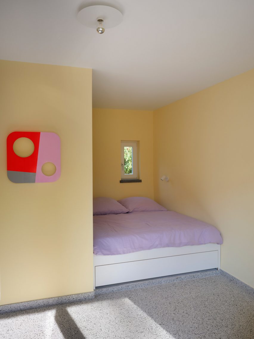
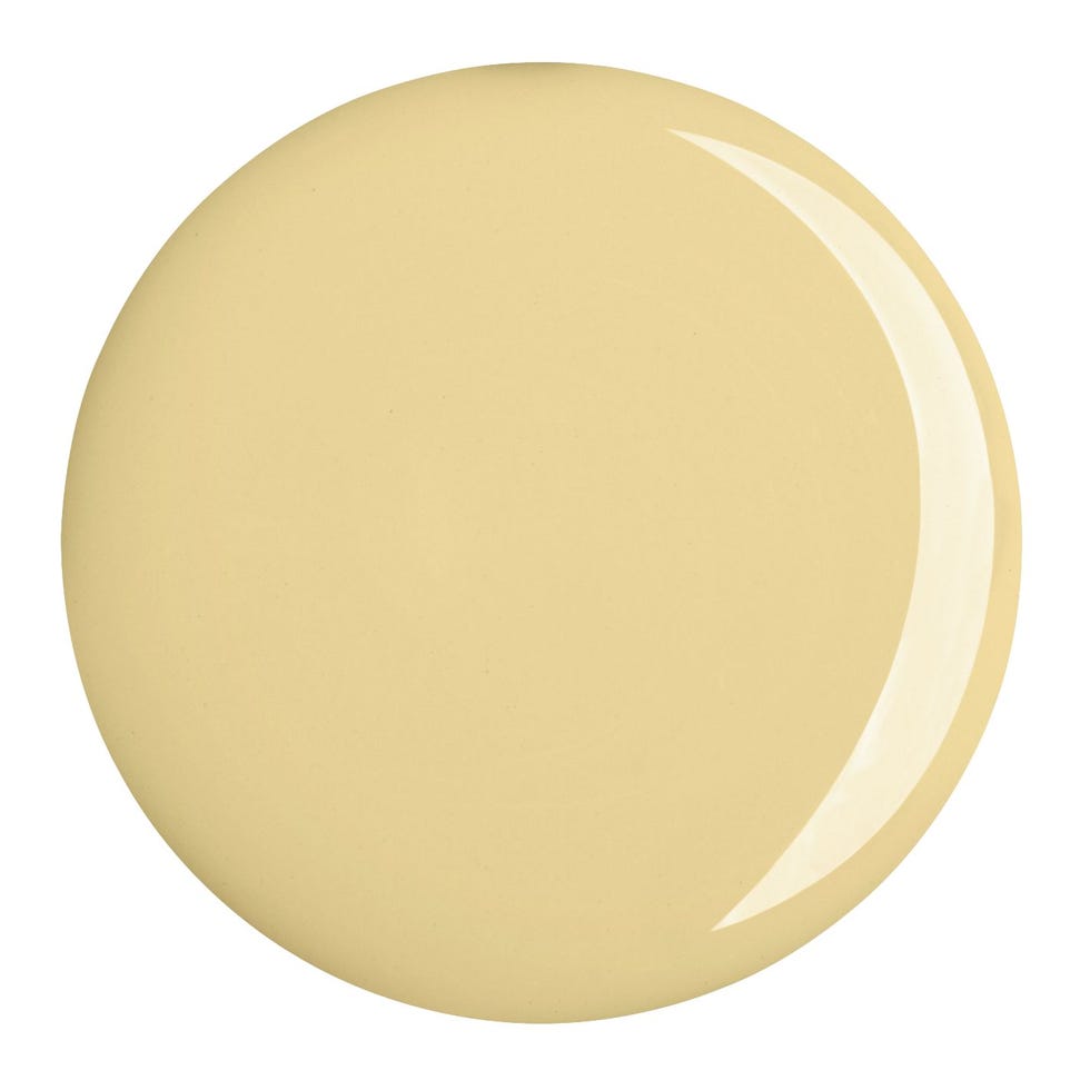
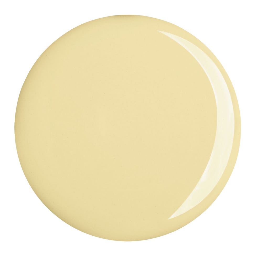
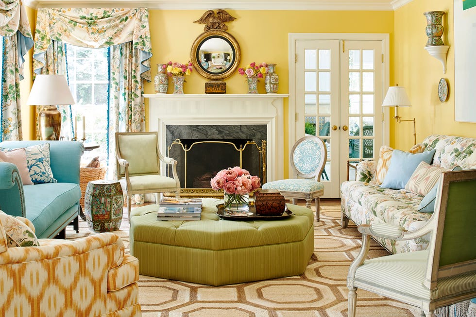
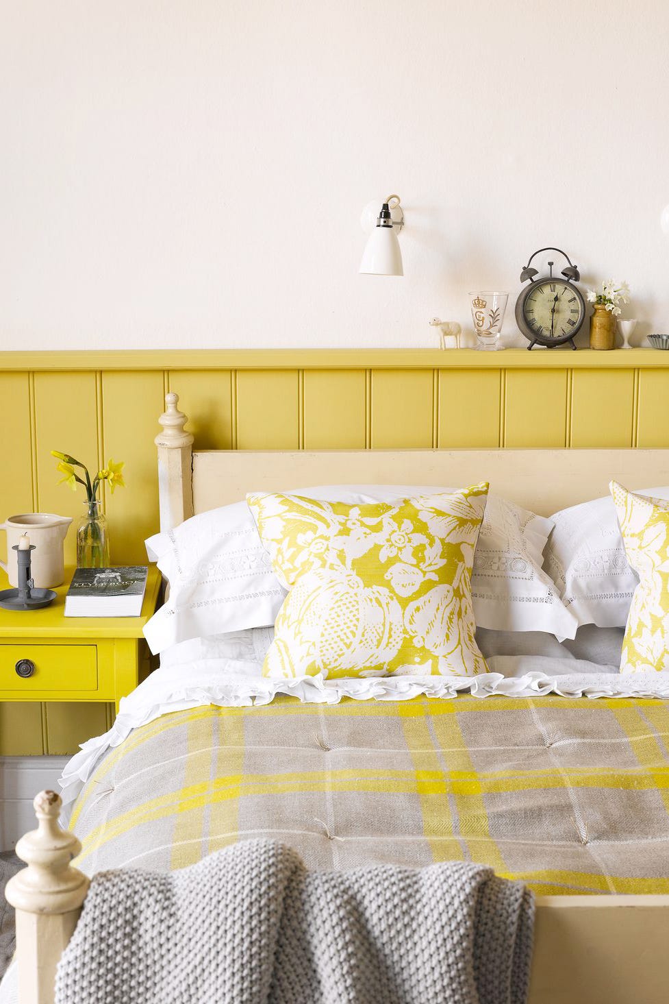
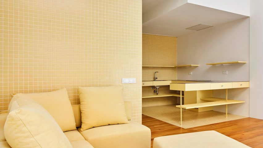
The article explores the best color combinations to pair with butter yellow, a popular and versatile hue in interior design for spring and summer 2025. Butter yellow is described as a soft, nostalgic, playful, and soothing color that exudes warmth, optimism, and an emotionally uplifting aura. According to Tash Bradley, Director of Interior Design at Lick and a color psychologist, this shade creates a welcoming environment.
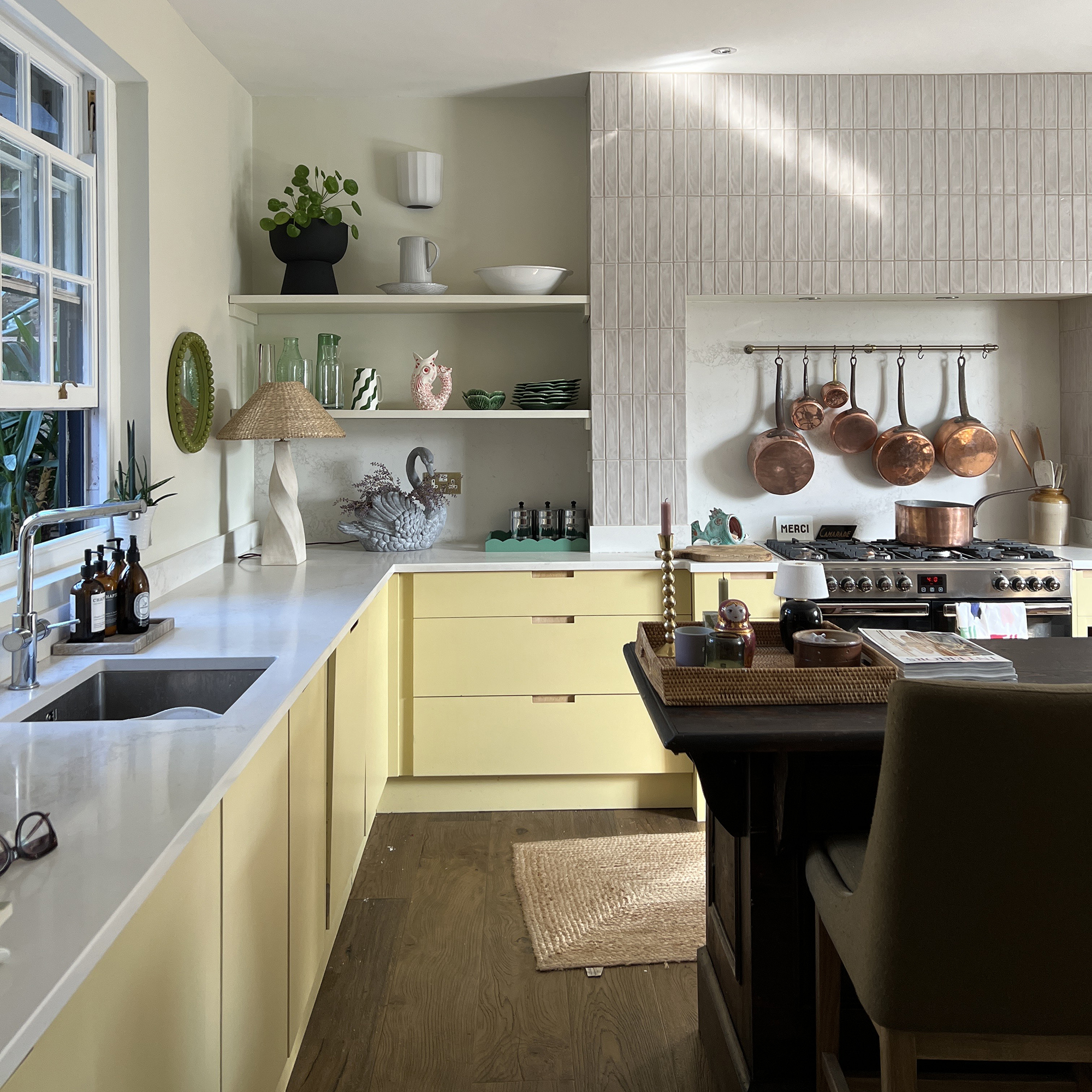
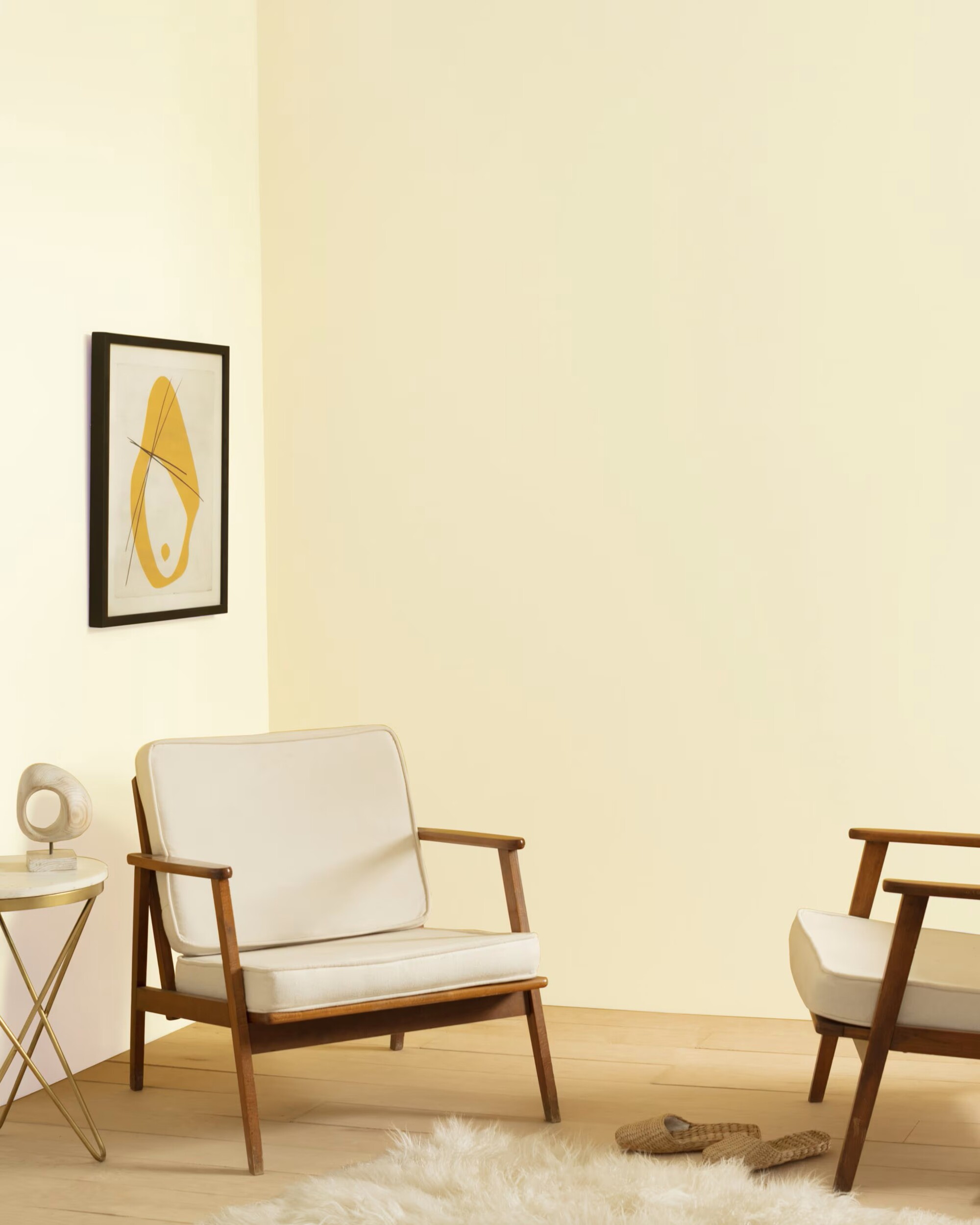
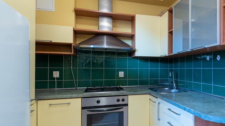
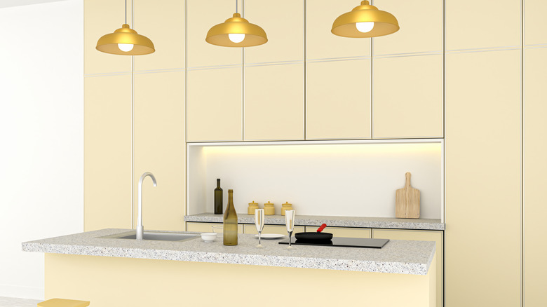
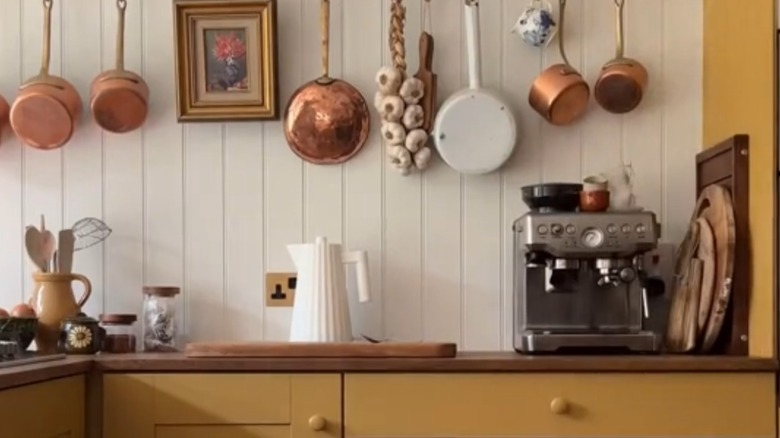
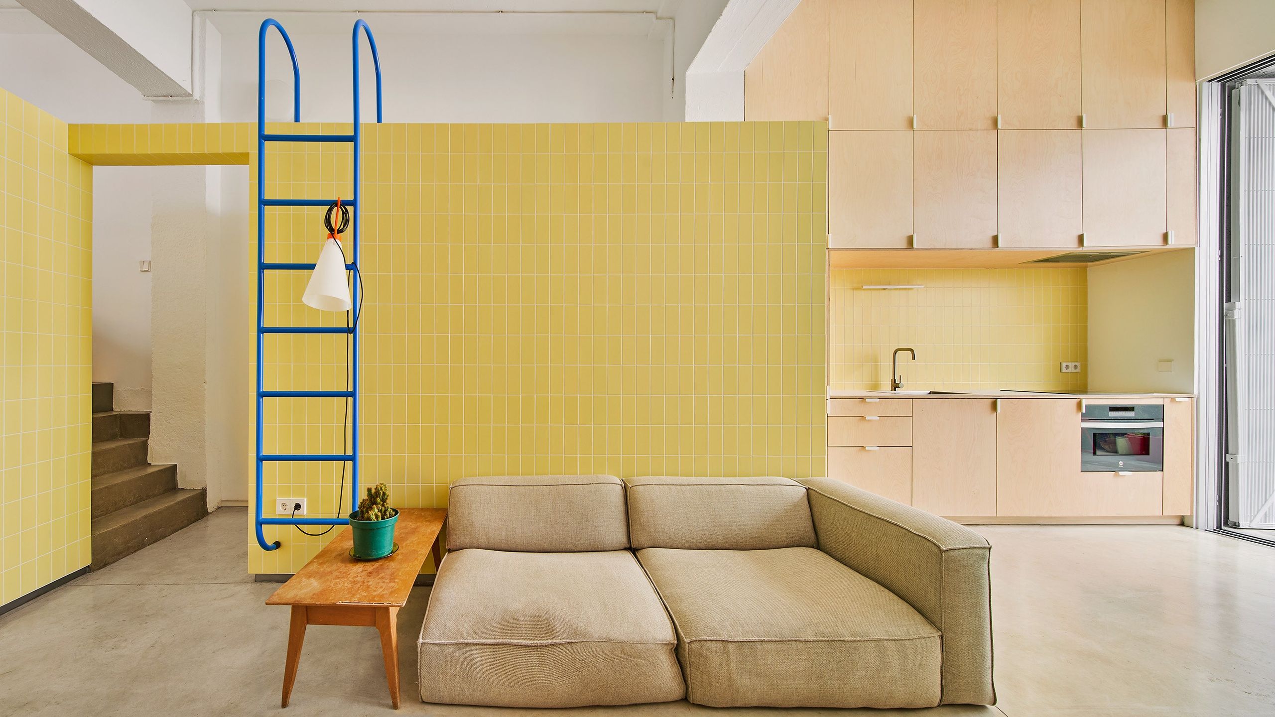
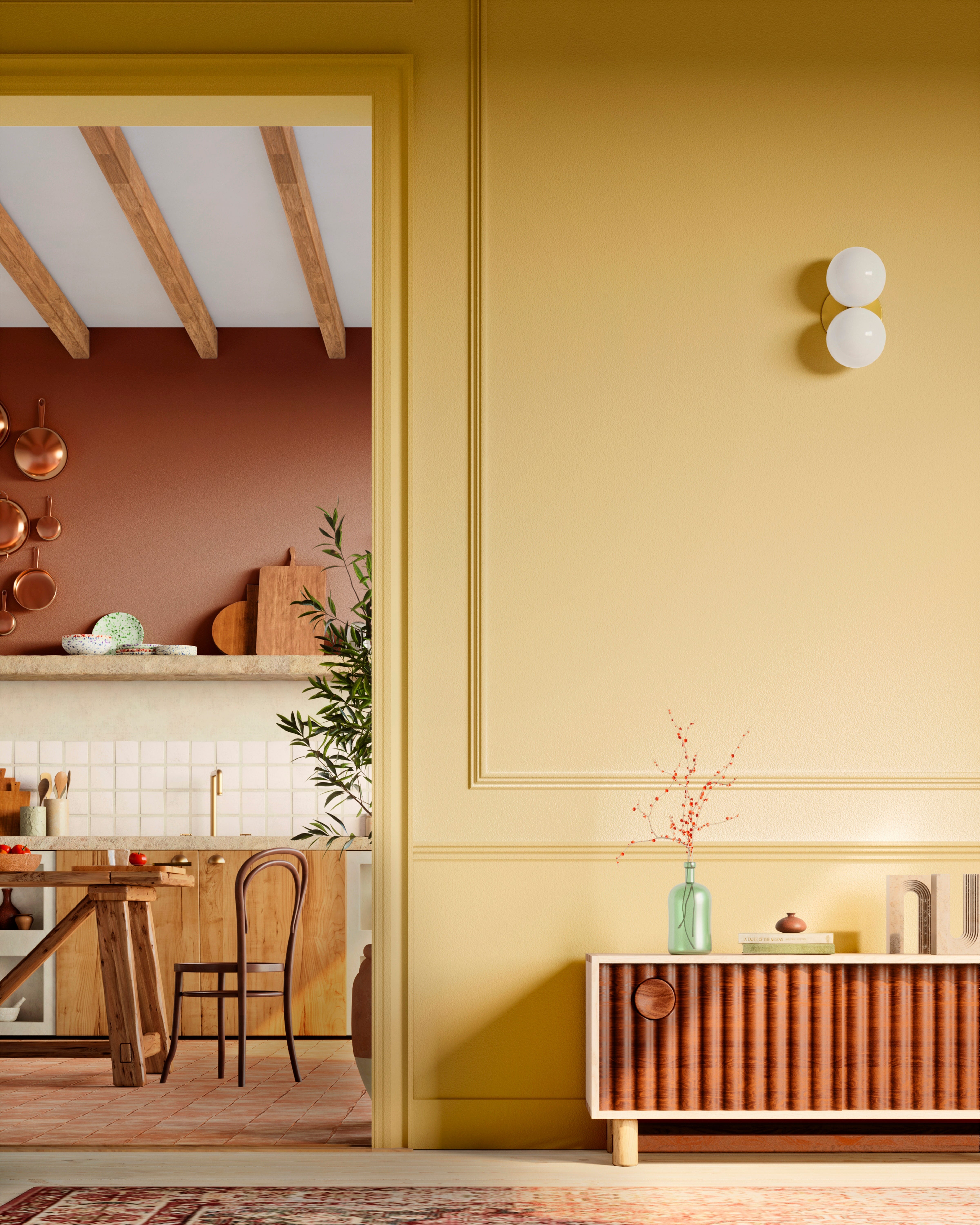
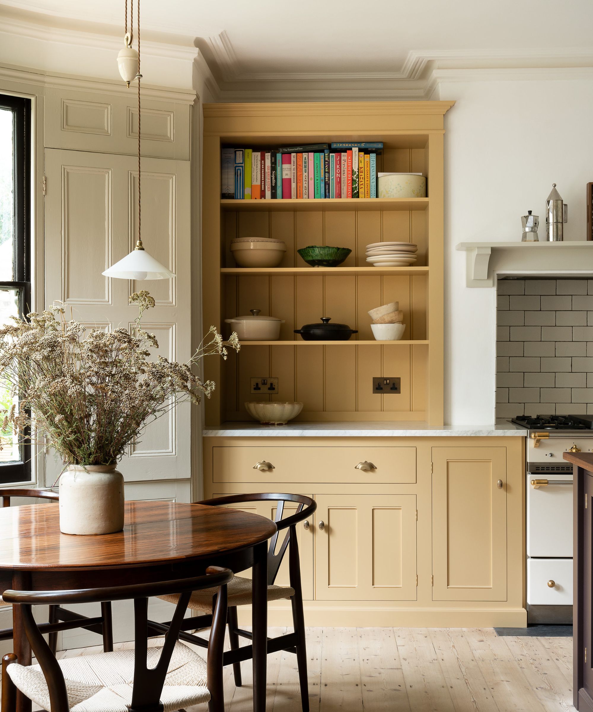
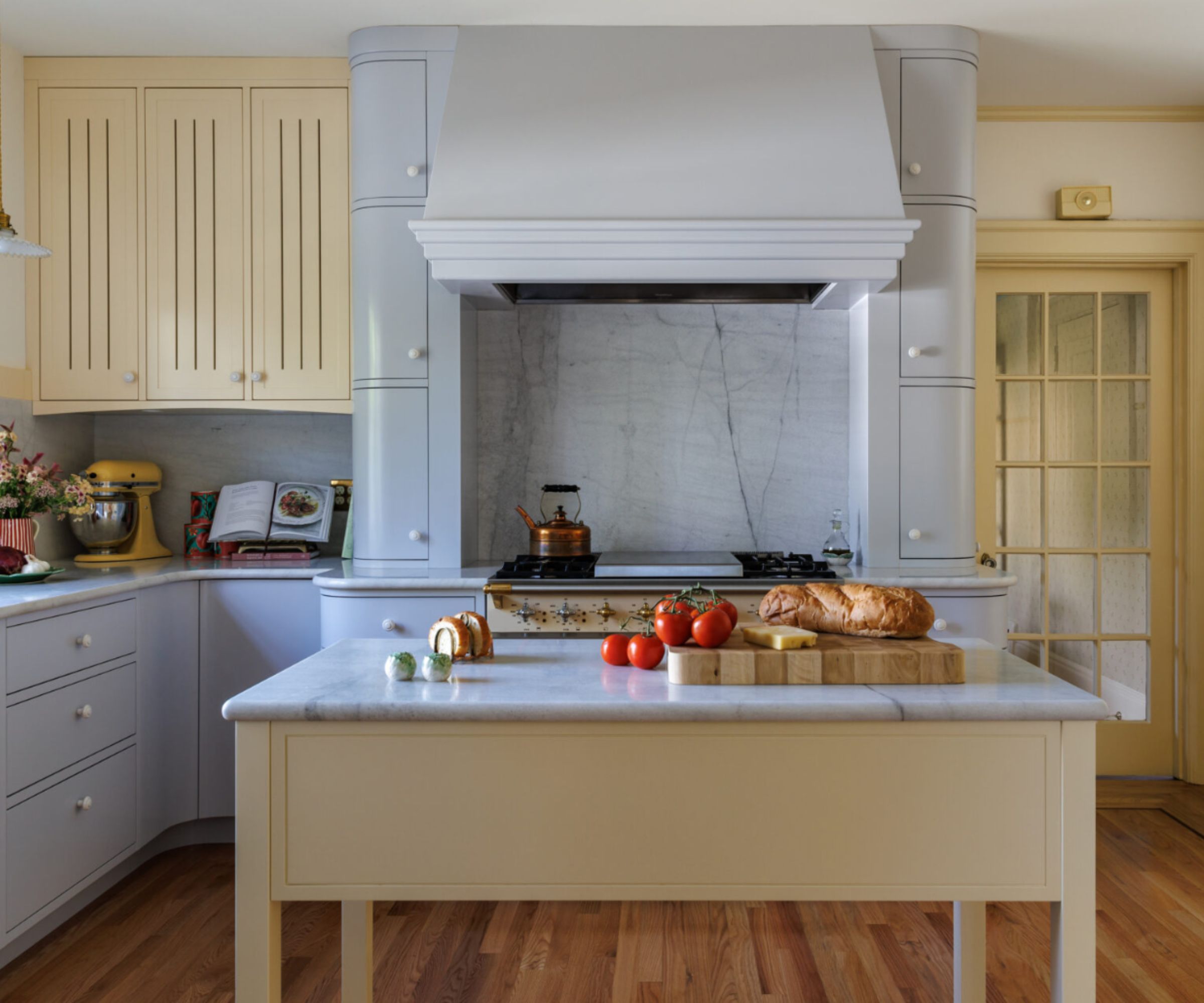
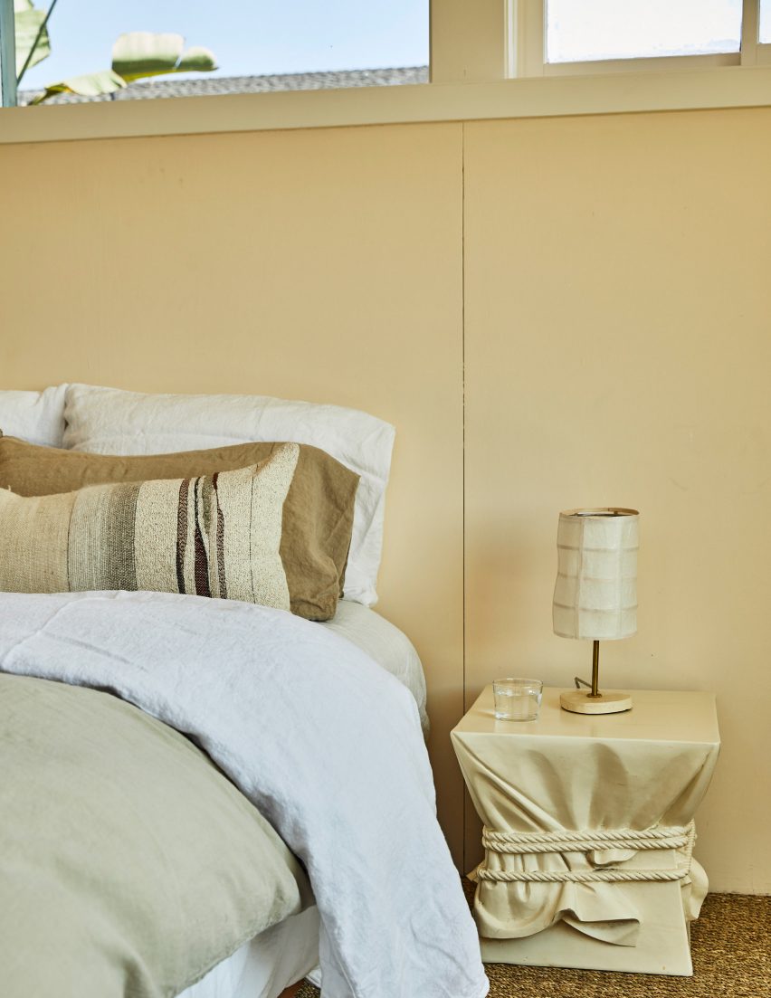
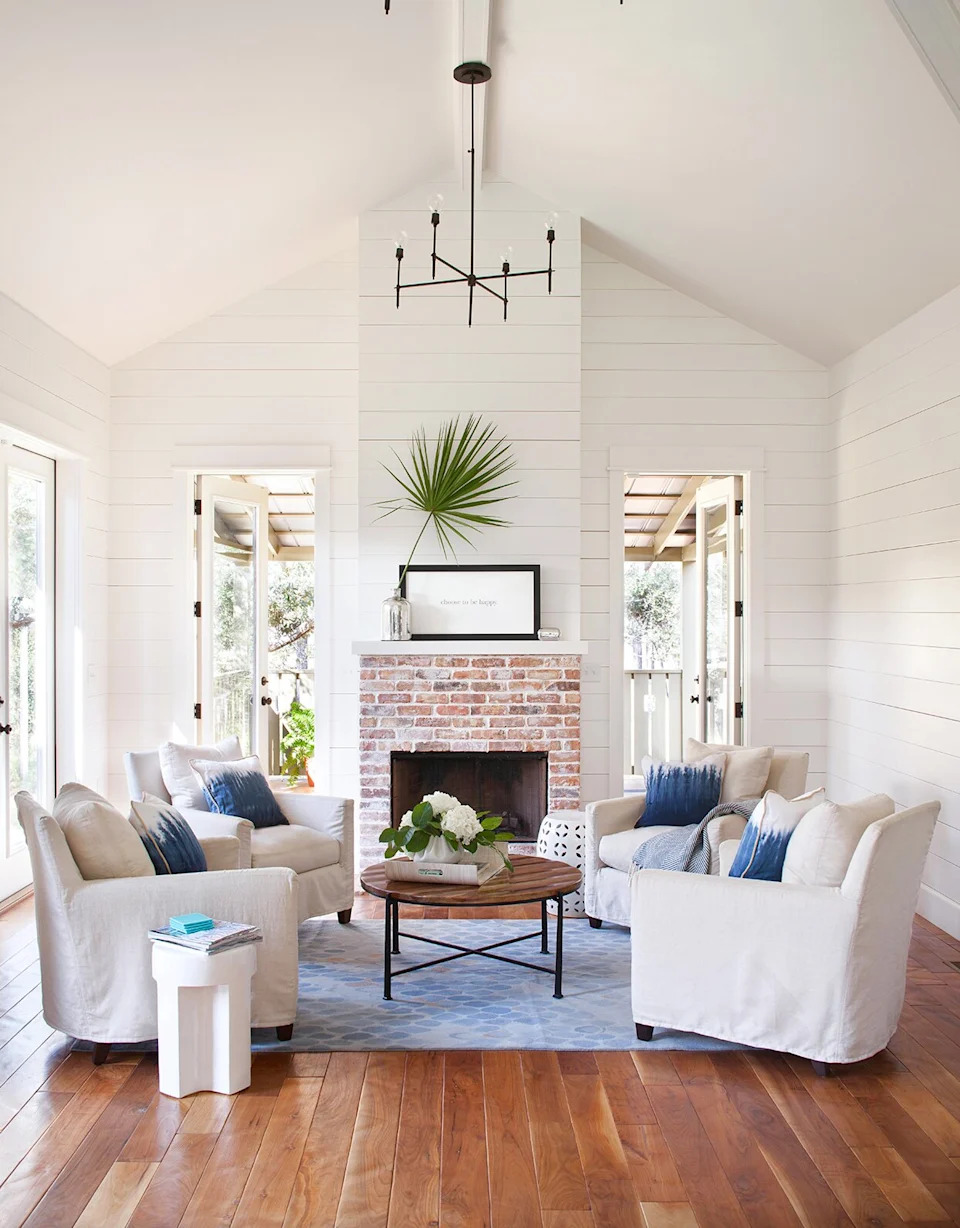
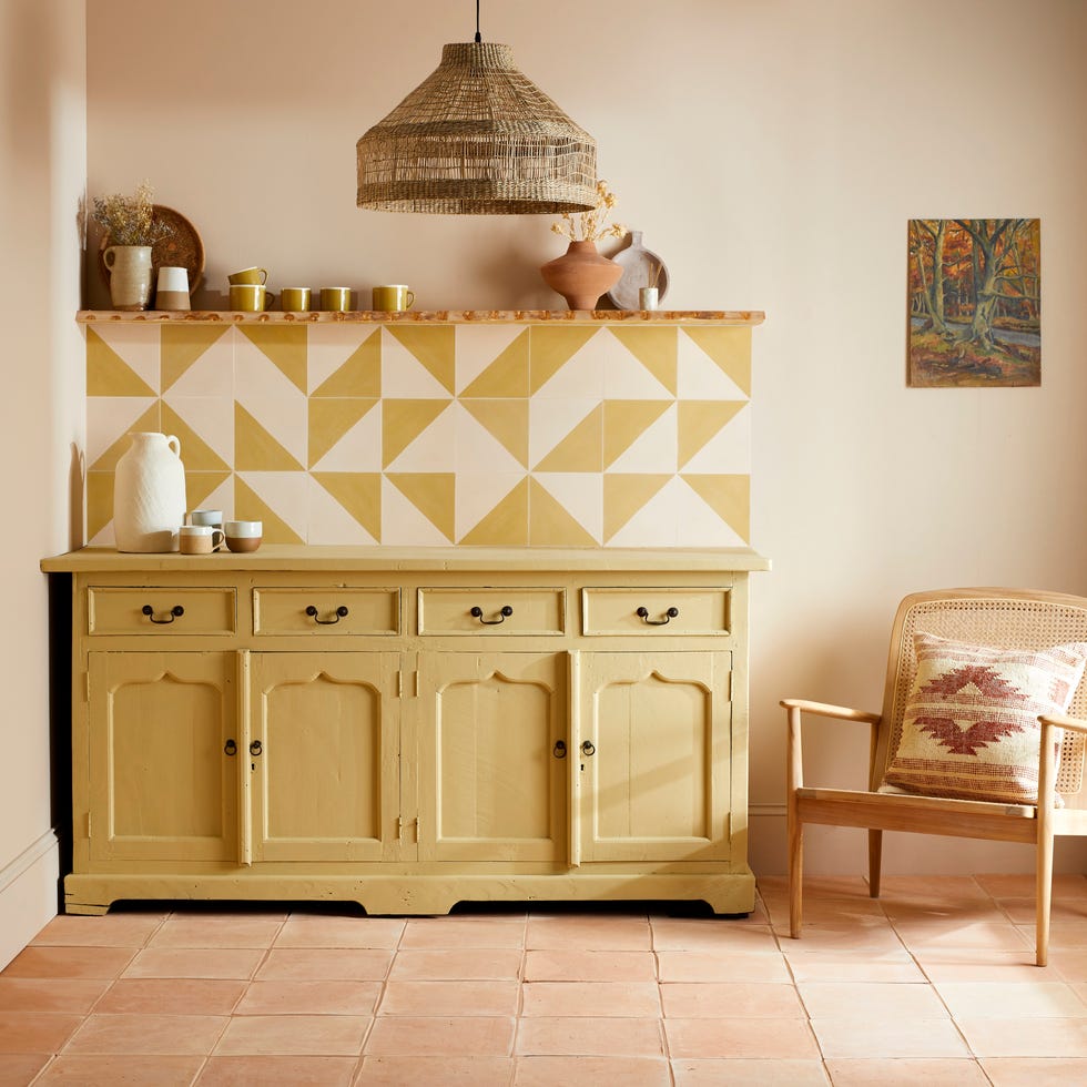
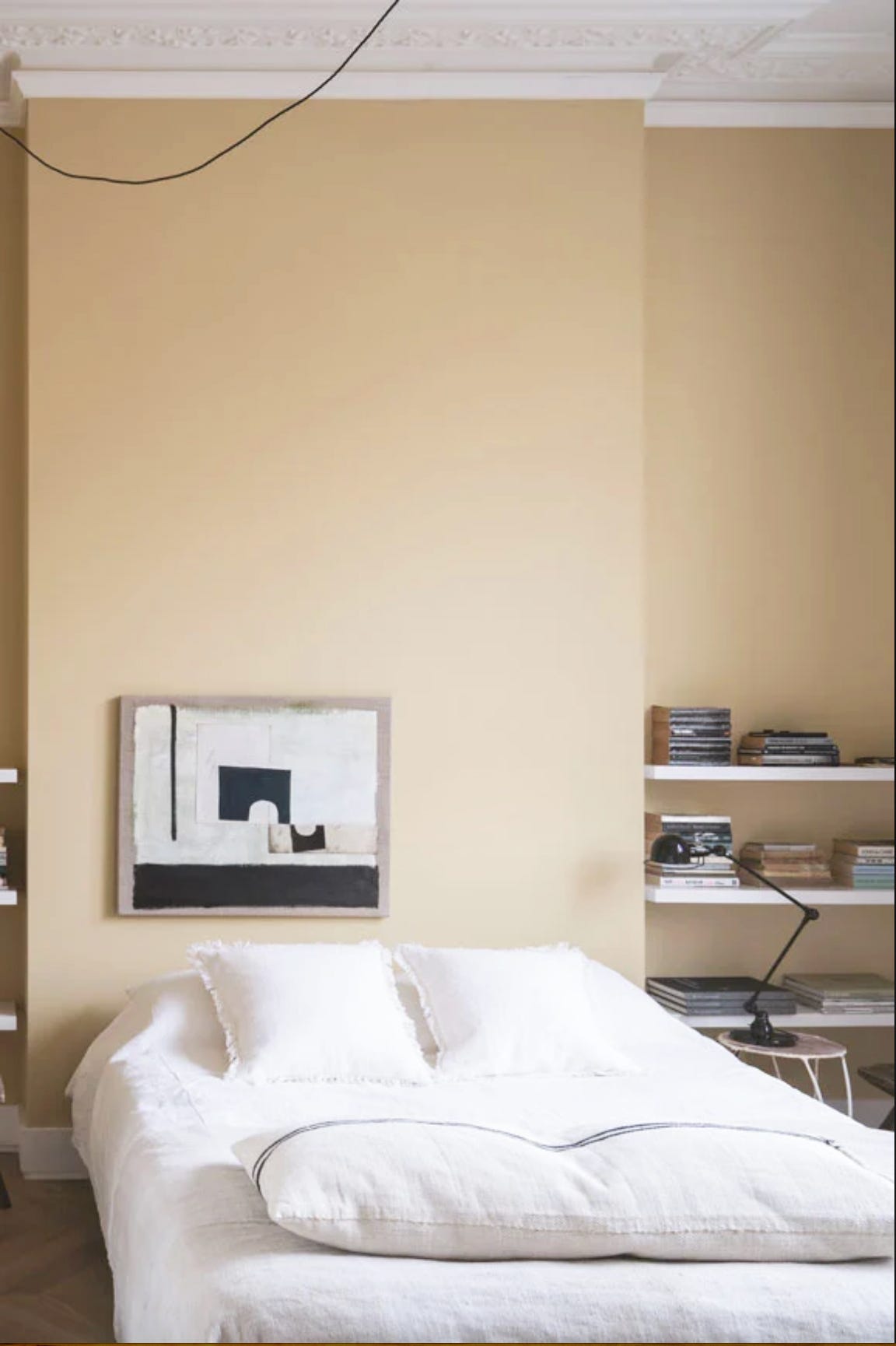
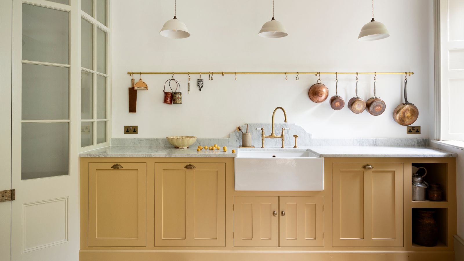
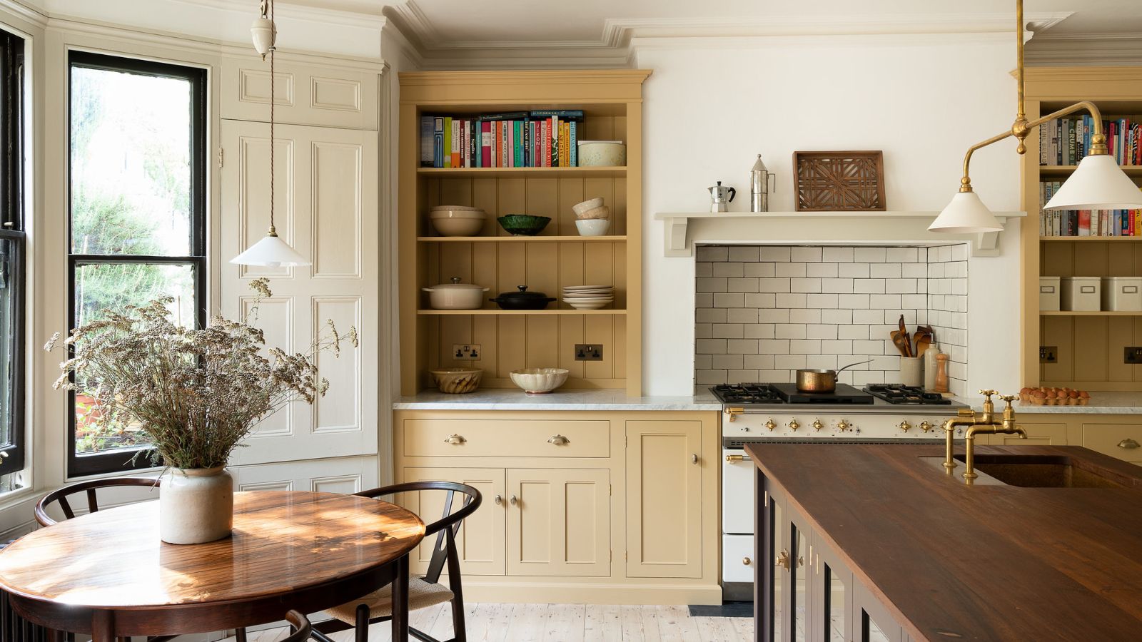
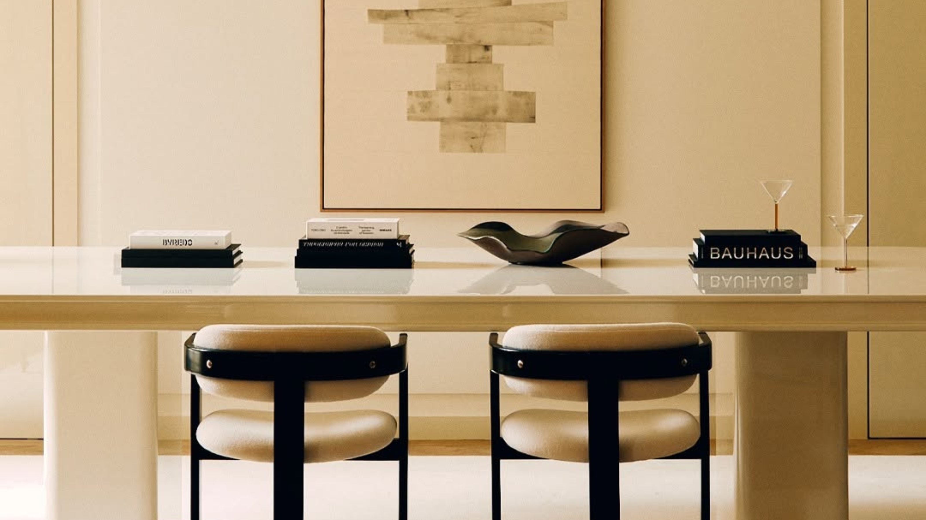
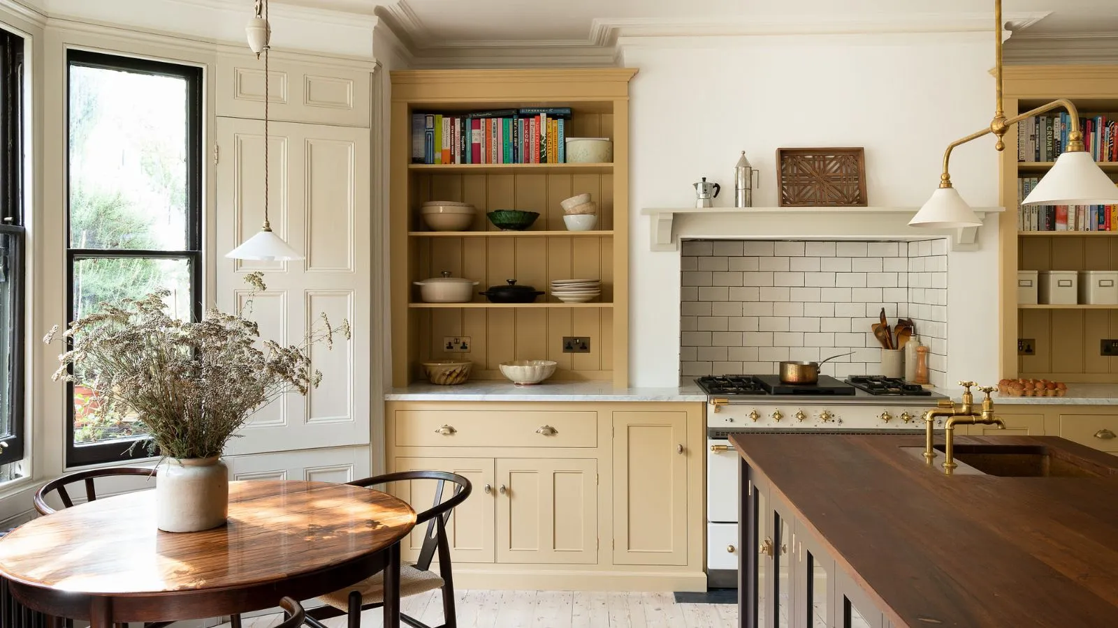
The article highlights eight distinct color pairings recommended by interior designers to enhance butter yellow's aesthetic appeal. First, creams and whites are suggested for an understated, minimal look, emphasizing nuances in tones and textures while benefiting from the cheerful yellow. Examples include pairing butter yellow kitchen cabinets with white walls and brown wood accents, or using Lick's Yellow 07 with White 03 or White 05 for a contemporary or traditional feel, respectively.
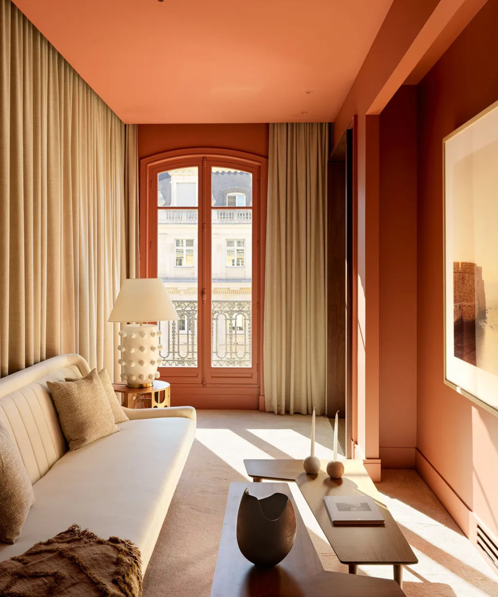
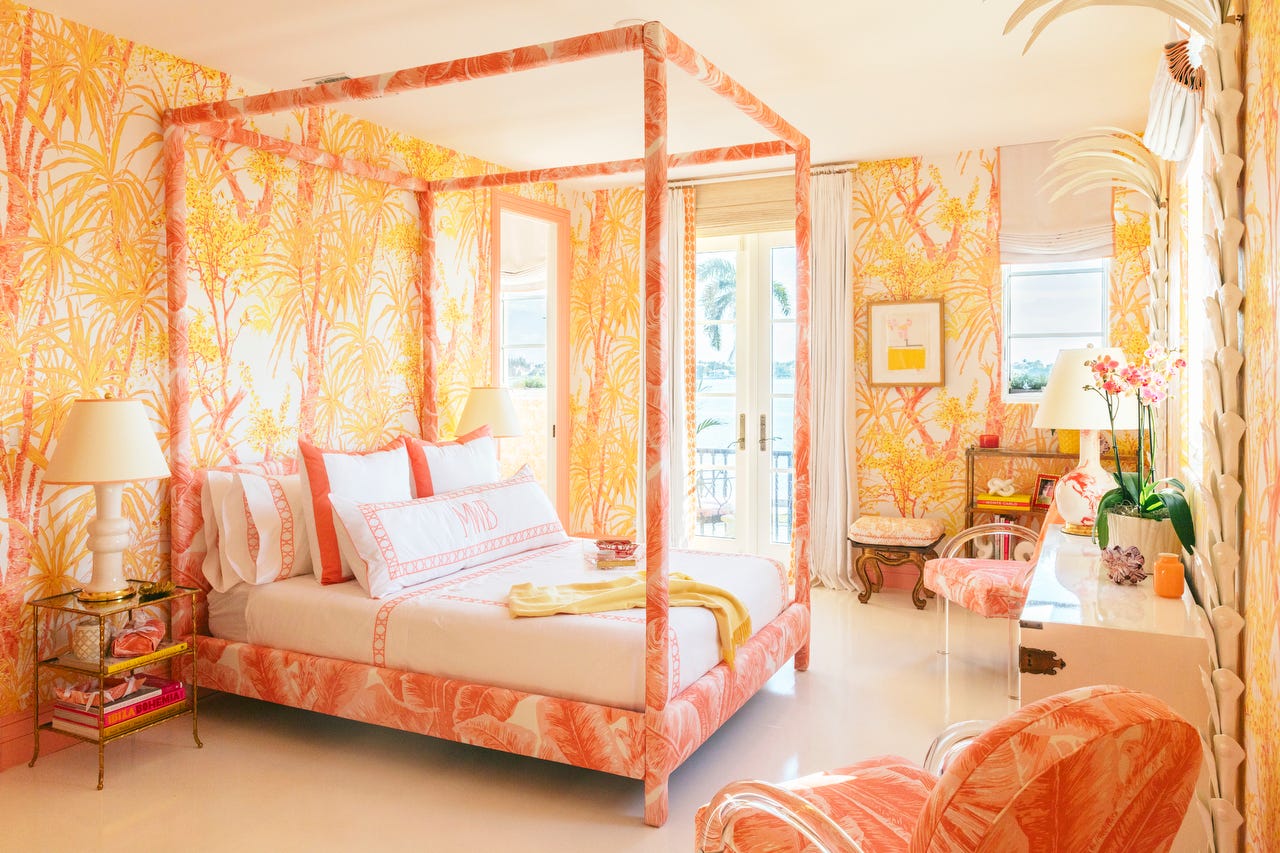
Second, rust tones and terracotta are recommended to lean into butter yellow's warmth. These earthy shades provide a natural and grounded look without being overly vibrant. Interior designer Amanda Jacobs notes that butter yellow pairs effortlessly with rust, clay, and pinkish tones, as well as browns and reds for a richer aesthetic.
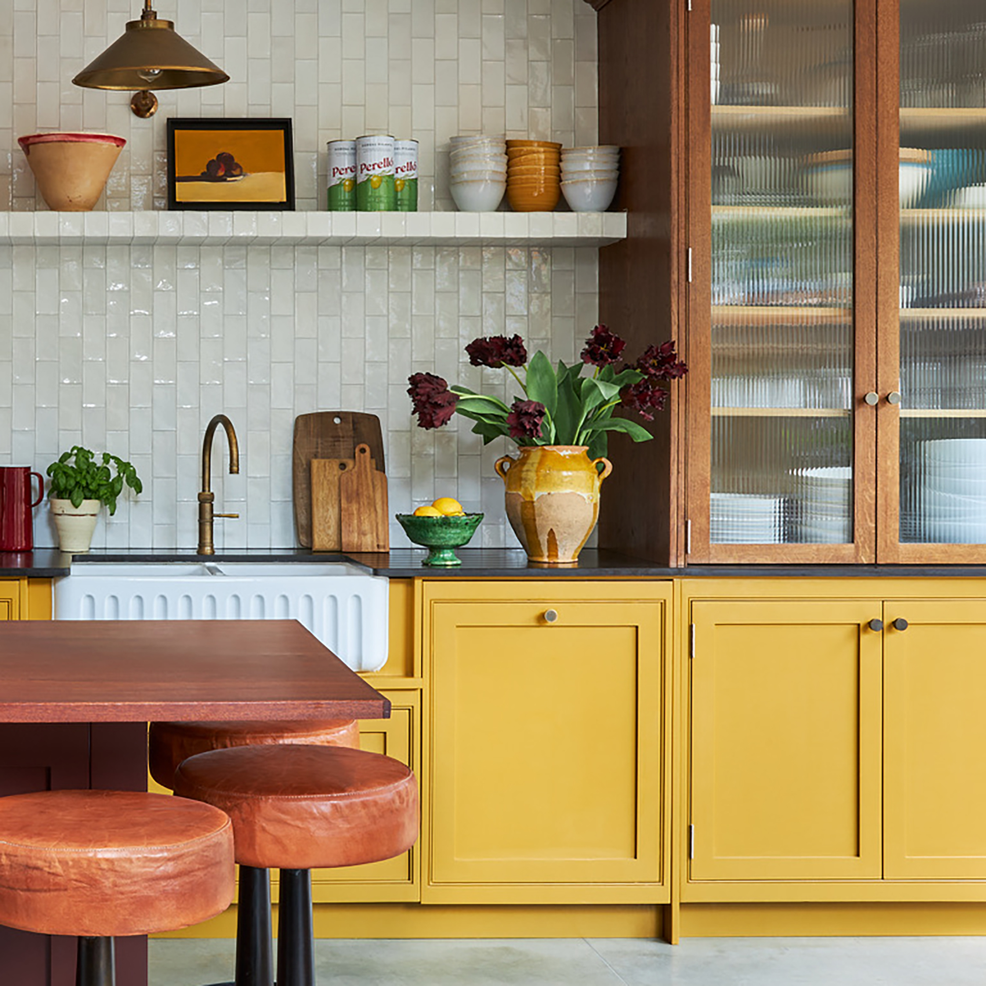
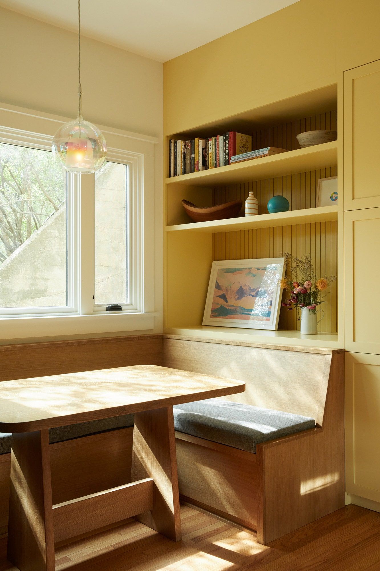
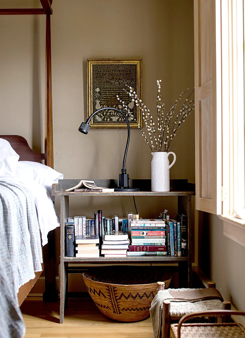
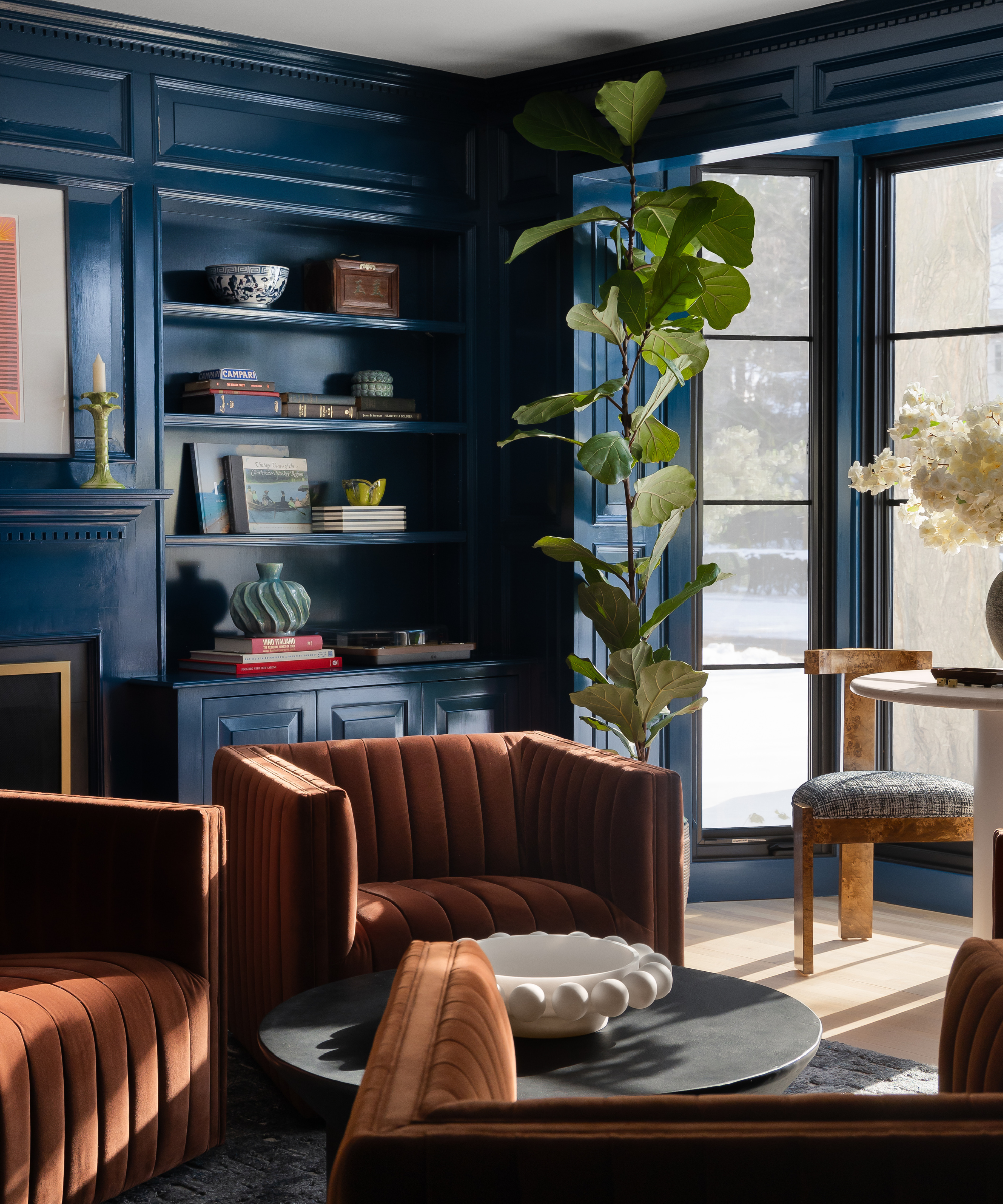
Third, brown tones, particularly from natural wood, create a timeless and pared-back scheme. Farrow & Ball's Hay paint is cited as a good match for wooden ceiling beams, offering a sophisticated balance to the playful yellow. Designers Thea Bloch-Neal and Christina Kelley emphasize that butter yellow and rich browns or earthy ochres create a harmonious interplay of lightness and depth.
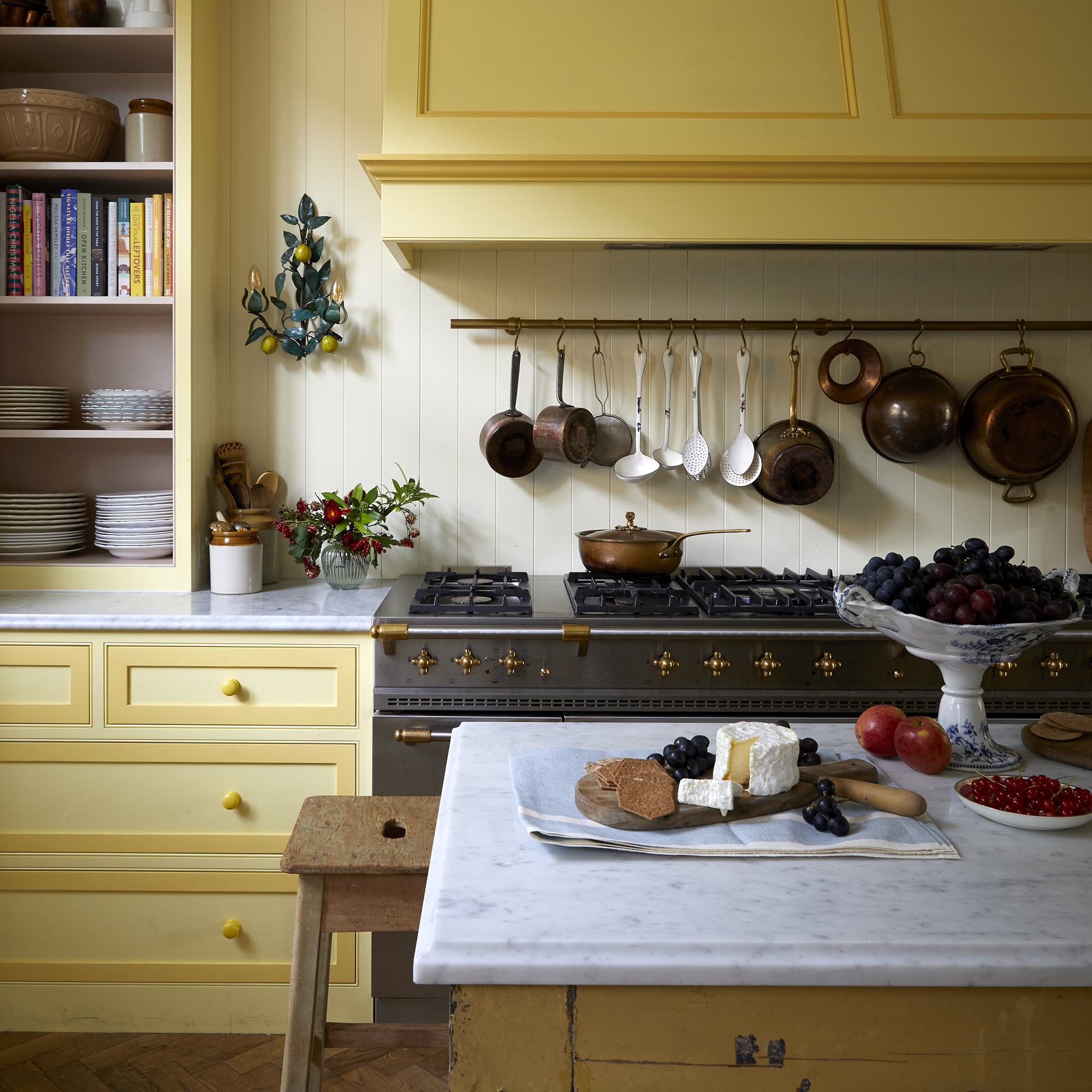
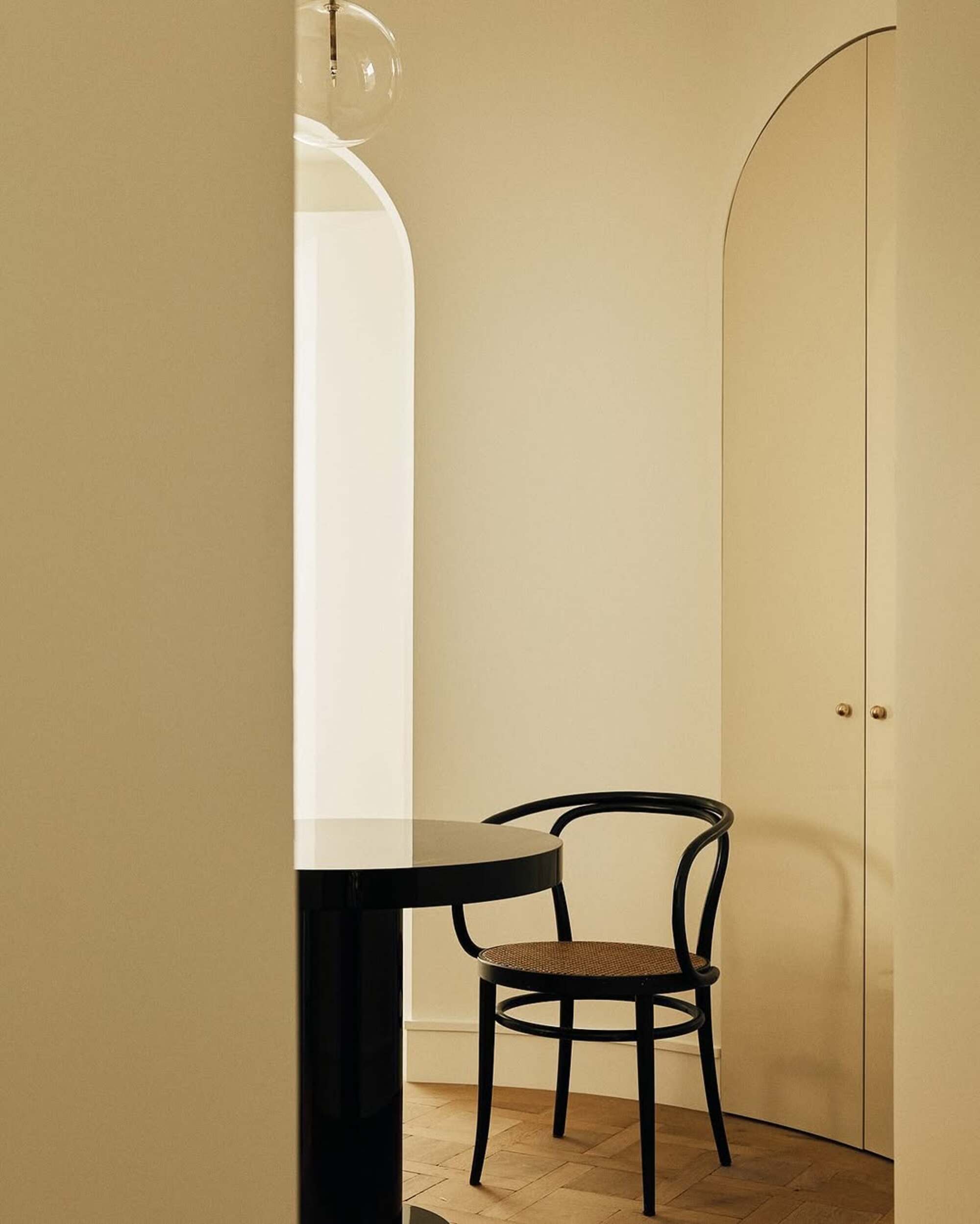

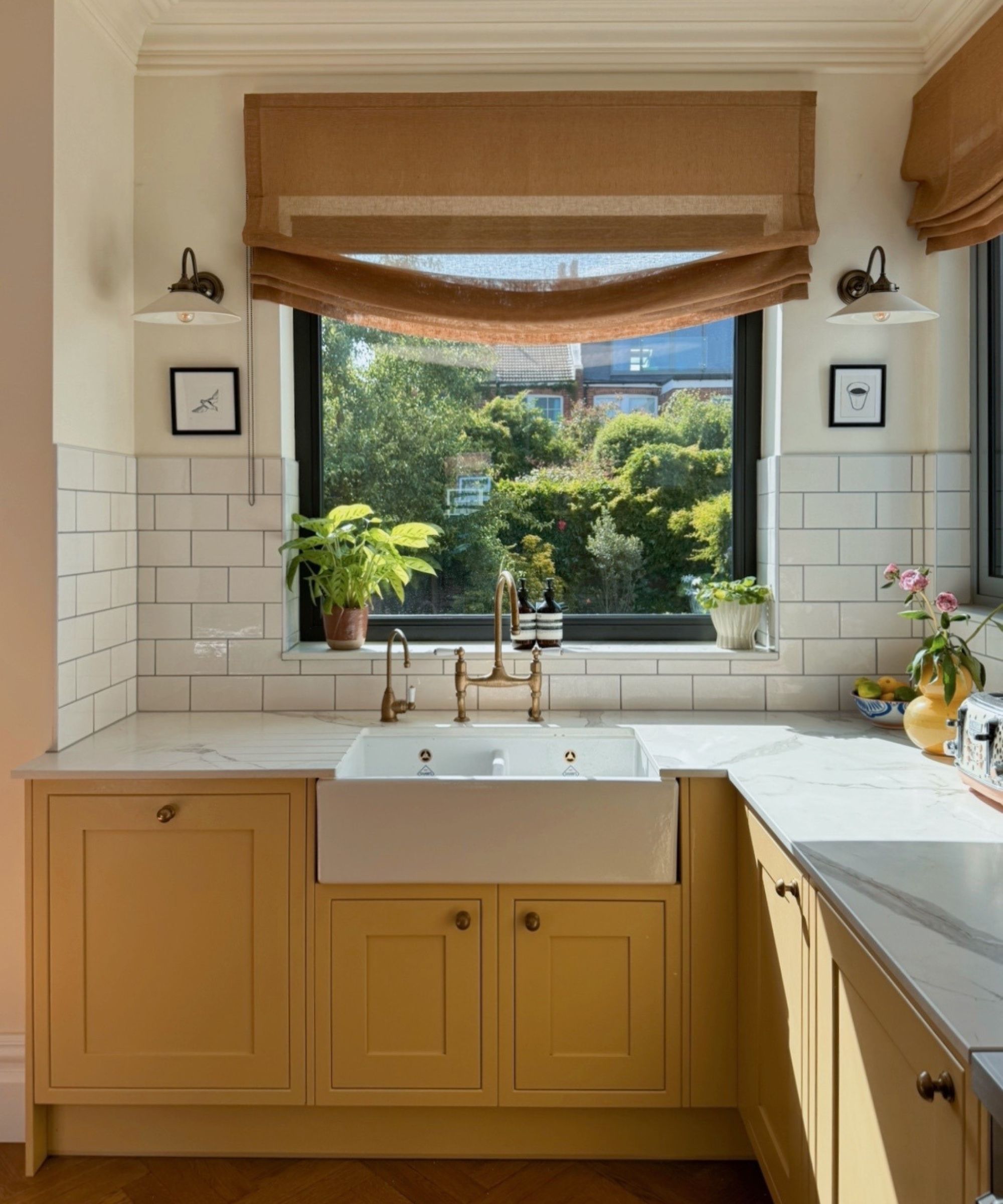
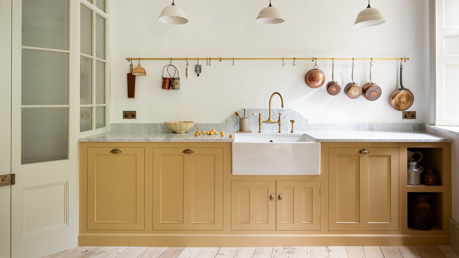
Fourth, warm brass is presented as an ideal metallic accent for butter yellow, as both share a golden warmth. Elizabeth Taich suggests that brass fixtures elevate the yellow with a refined touch, advising against cool metals like chrome or nickel.
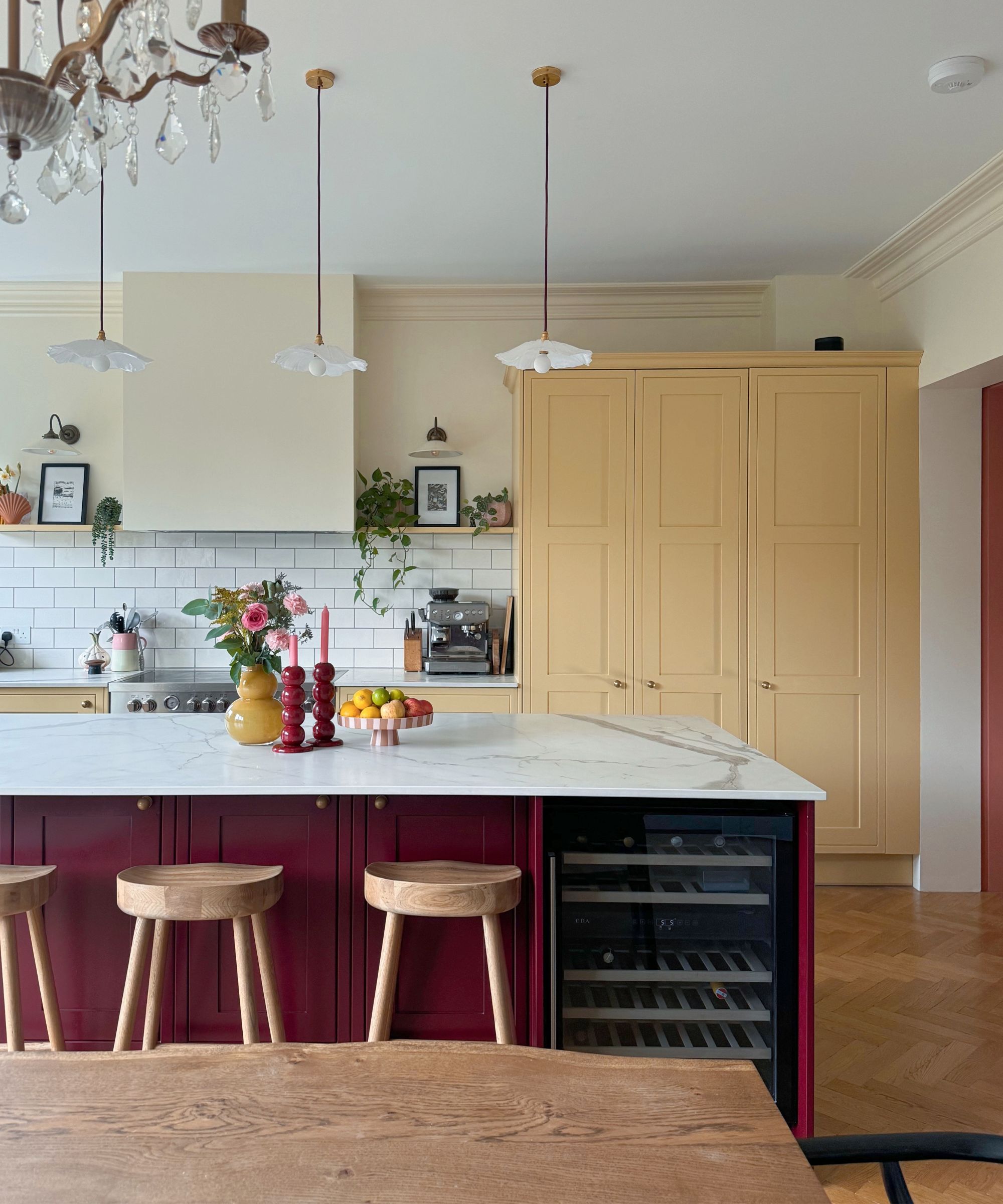
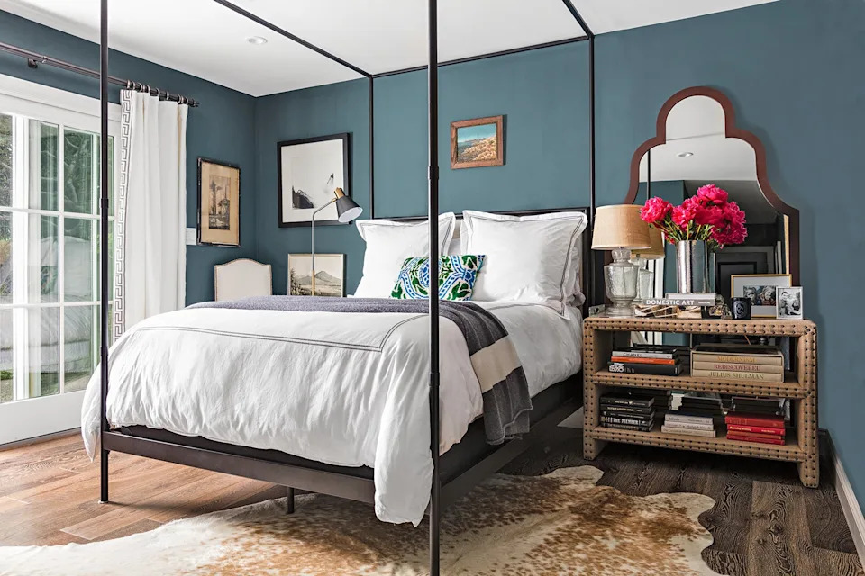
Fifth, dark pinks, such as berry pink or deep burgundy, offer an unexpected yet soothing contrast. Designer Alexis Warren emphasizes ensuring enough saturation in the pink to create sufficient contrast, while Miranda Cullen suggests using one color as a lead and the other as an accent for impact.
Sixth, cool blues are introduced as a complementary color, creating a vibrant combination when chosen carefully. Ruth Mottershead, Creative Director at Little Greene, explains that pastel light blue with butter yellow can evoke a charming, traditional, sunlit feel, recommending Air Force Blue with Carys or Light Gold.
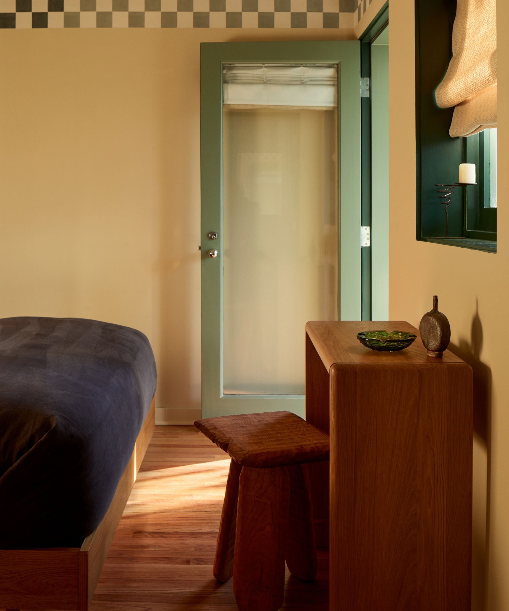
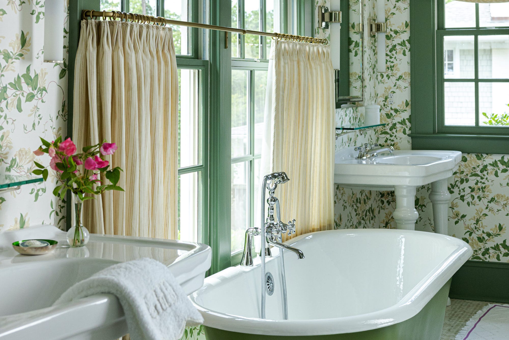
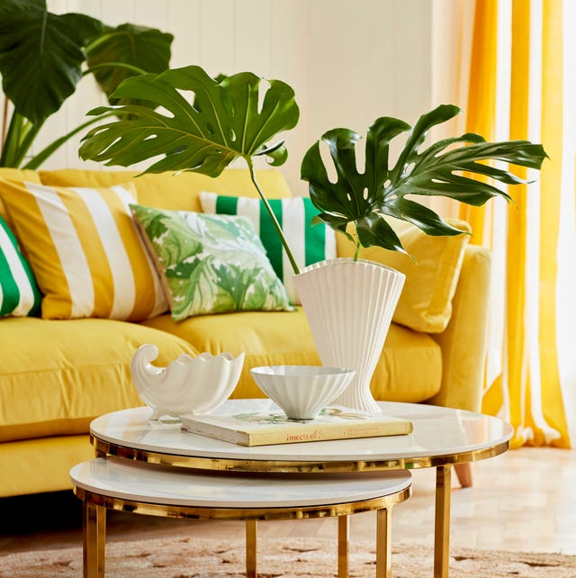
Seventh, greens, especially soft olive green or deep earthy greens, are presented as stylish companions to yellow. Vyanca Soto and Jessica Whitley suggest that green grounds the palette, while yellow adds light and optimism, creating a fresh take on heritage colors.
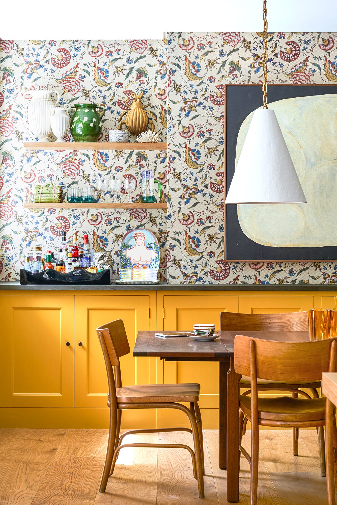
Finally, red can be used for a bold and confident scheme. Ruth Mottershead recommends layering yellows and neutrals with a red accent, such as an Atomic Red painted chair in a kitchen. Daniela Araya suggests incorporating red through flexible elements like coffee table books or picture frames to test personal color tolerance. Overall, the article demonstrates the versatility of butter yellow, allowing for both vibrant and subtle interior design choices.
#ButterYellow #ColorCombinations #InteriorDesign #HomeDecor #PaintColors #ColorPsychology #DesignTrends #HomeStyling #DecoratingTips #ButterYellow #ColorCombinations #InteriorDesign #HomeDecor #PaintColors #ColorPsychology #DesignTrends #HomeStyling #DecoratingTips
Toplam 0 yorum
 Henüz yorum yok
Bu da beğenebilirsiniz
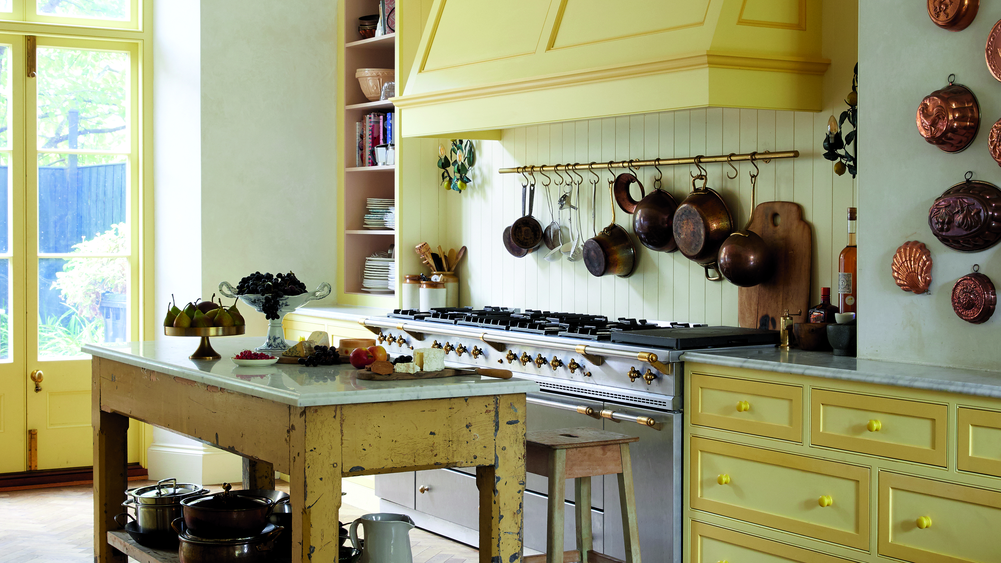
Butter yellow is the kitchen colour of the season - this is how to make the delicious shade work
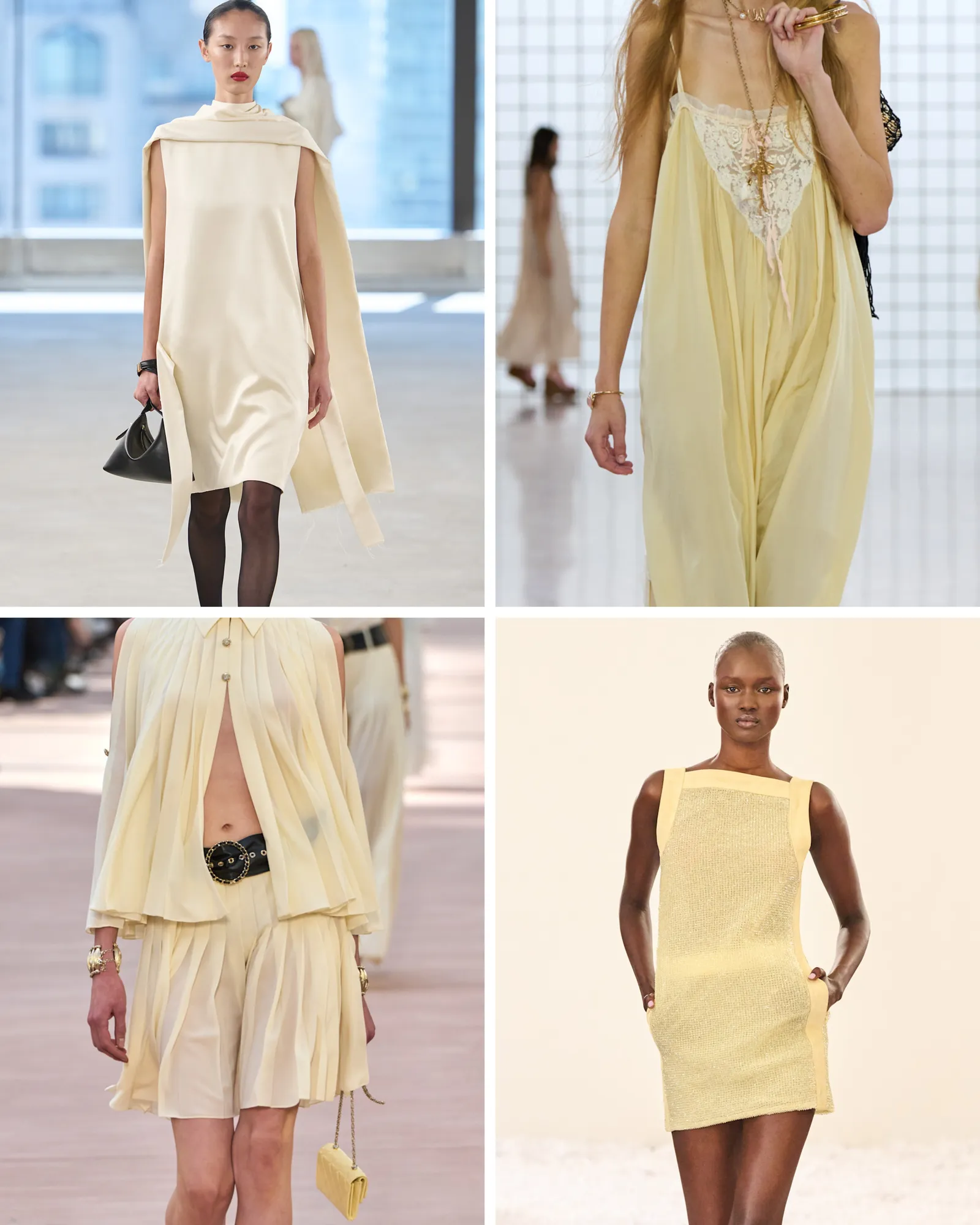
This Spring Colour Is the New Beige for Fashion People Everywhere

Eight eclectic home interiors spread with buttery yellow tones
Butter yellow is the perfect 'new neutral' that celebrities are decorating with
5 Butter Yellow Paints That Designers Swear By — So You Can Get This Trending Color on Your Walls With Confidence

8 Bold Yellow Decorating Ideas That Will Brighten Any Room

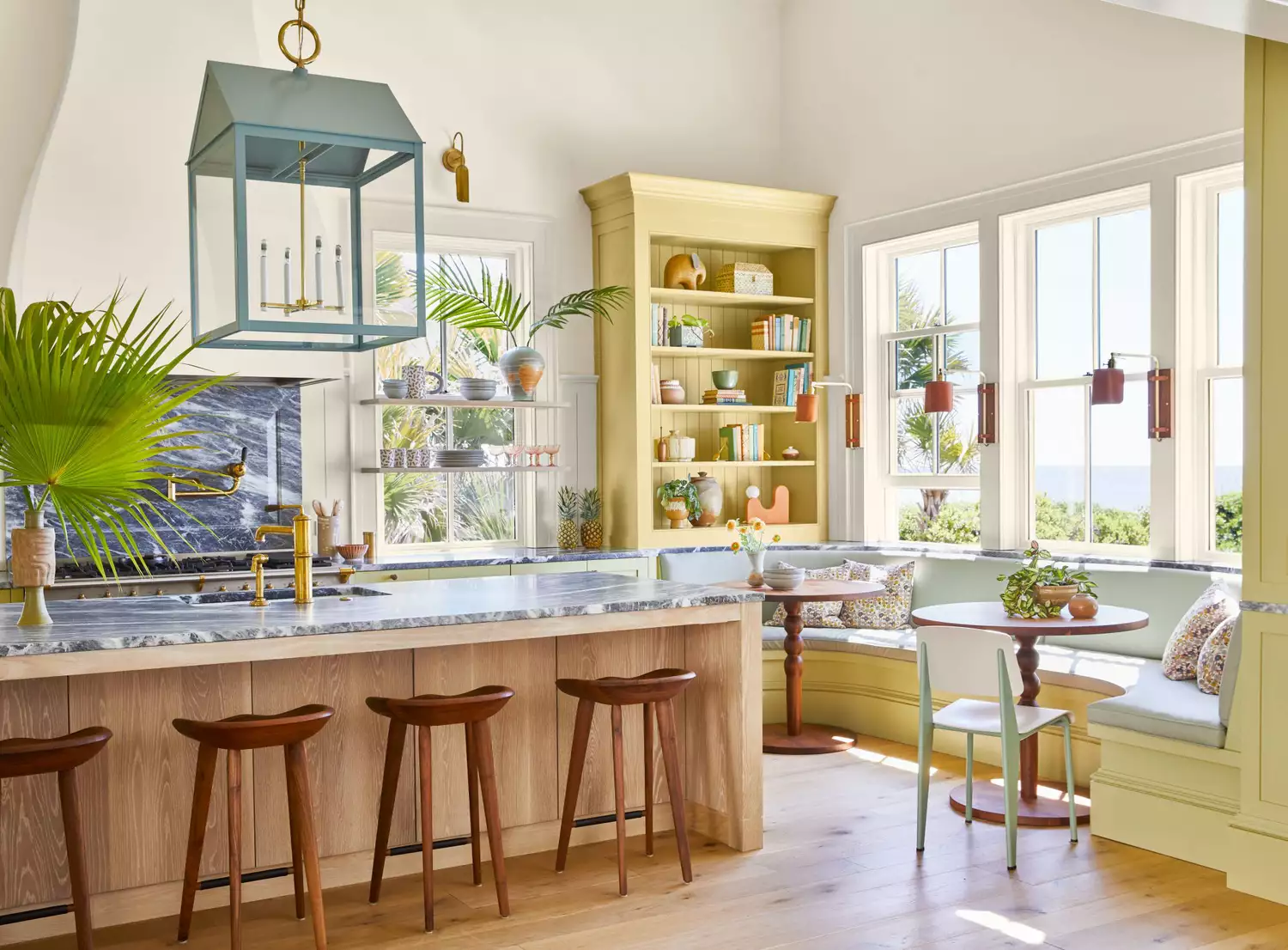
The 1950s Paint Color Trend Taking Over In 2025 That Designers Call ‘Refreshing’ And ‘Nostalgic’
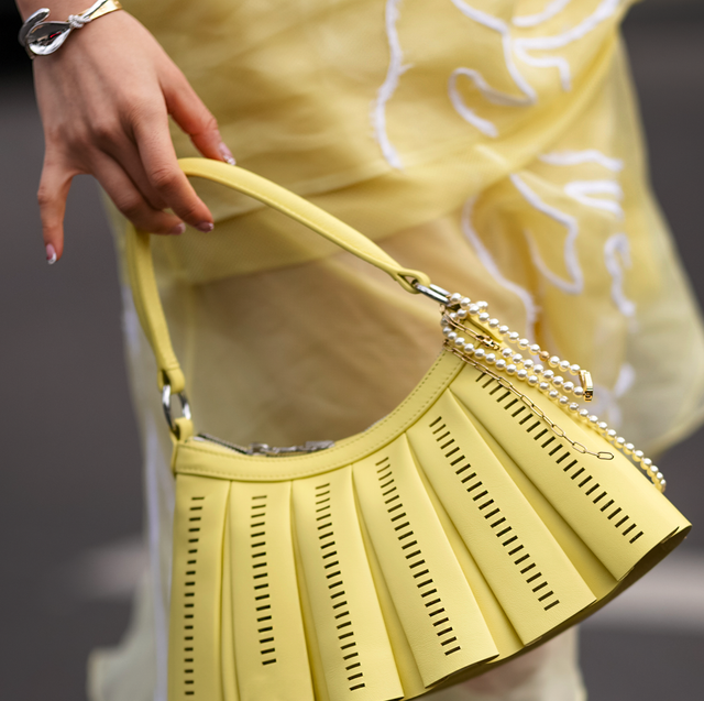
How to Wear Chartreuse Like Amanda Seyfried
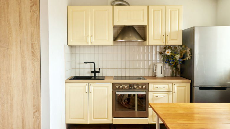
17 Perfect Paint Color Combinations To Pair With Trendy Butter Yellow Cabinets

Butter Yellow Is the Deliciously Soft Shade Your Home Needs

8 Paint Colors That Pair Beautifully with Yellow Wood Tones
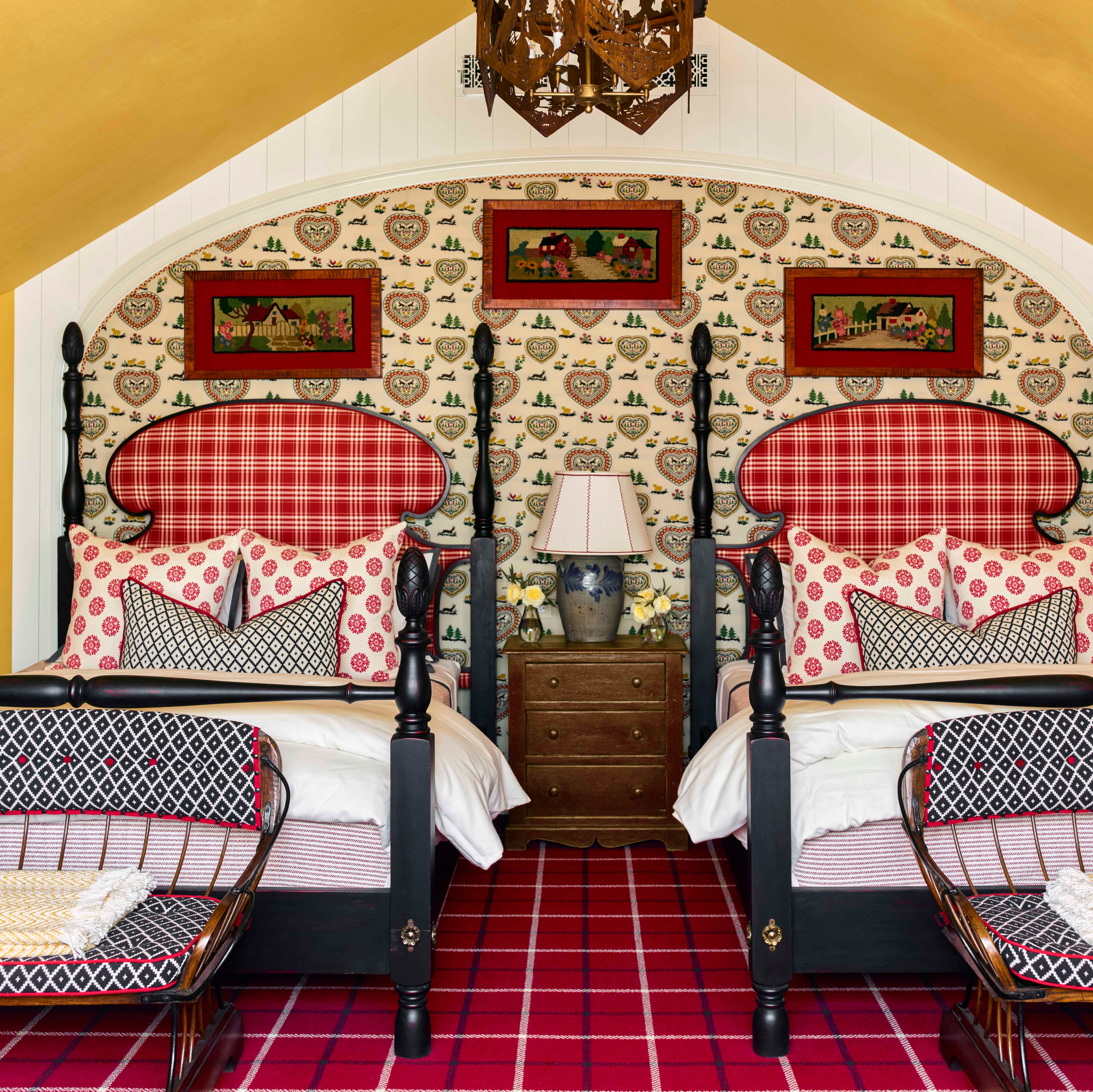
9 Colors That Pair Perfectly with Yellow, According to Designers

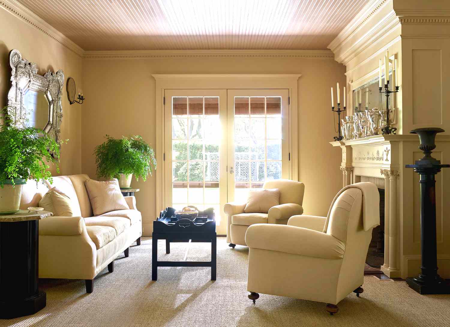
8 Butter Yellow Paint Colors That Will Bring a Charming, Serene Aesthetic to Every Room in Your Home
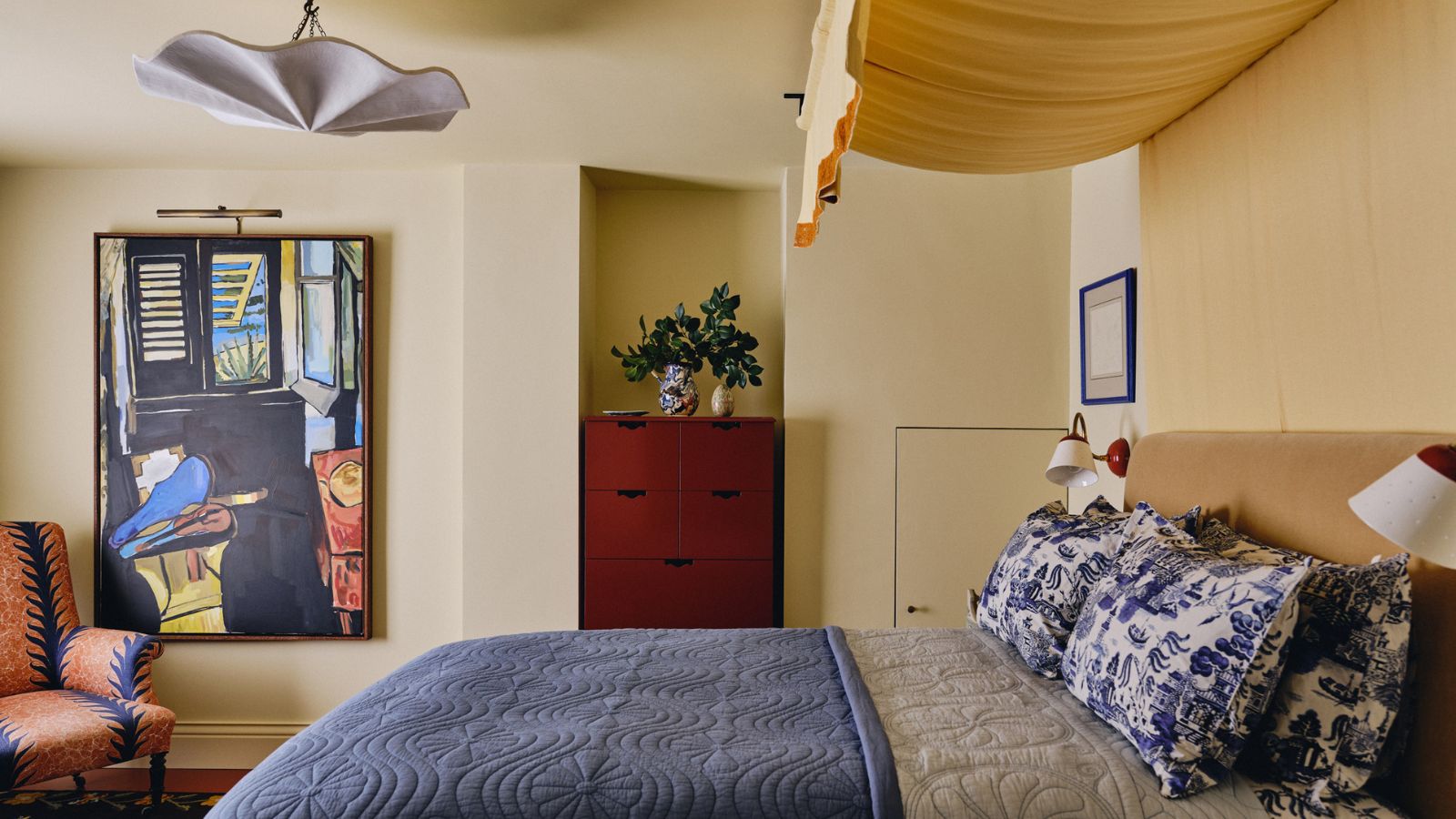
Butter yellow is 2025's new neutral – and these 12 delicious pale yellow buys have convinced me it beats my once-loved beige
Has butter yellow's reign come to an end? Designers have mixed opinions, but think these are the new colors that might dethrone it
14 Happy Shades of Yellow You Never Expected to Fall In Love With

Butter Yellow and the Foodification of Color

Butter yellow kitchens are dividing opinions – but these 7 designs prove this soft hue is more than just a fleeting trend
9 On-Trend Yellow Paint Colours For 2025

The next butter yellow? I just spotted a vibrant twist on 2025's most beloved color on Emilia Clarke's country kitchen cabinets