1/26
The 18 Best Paint Colors for Blue Kitchen Cabinets, Straight From Our Favorite Spaces
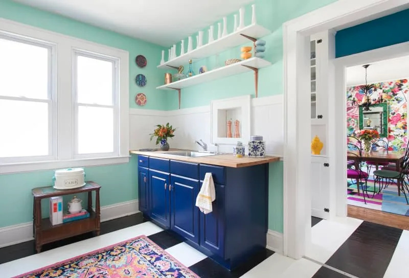
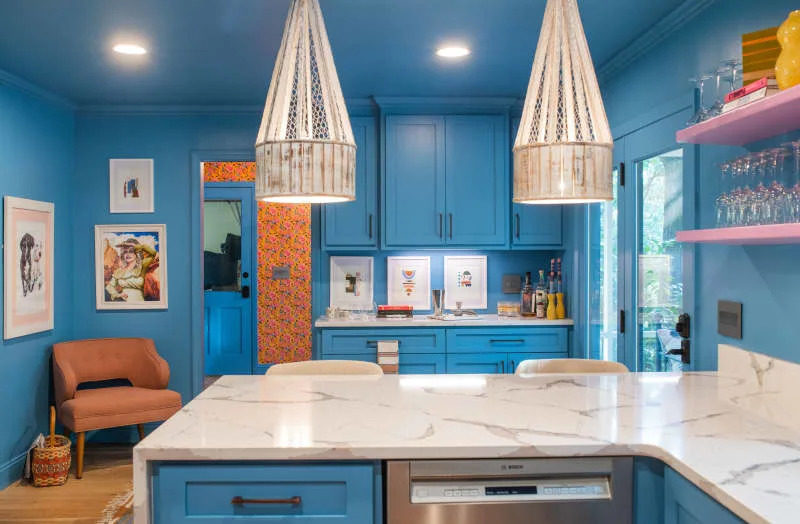
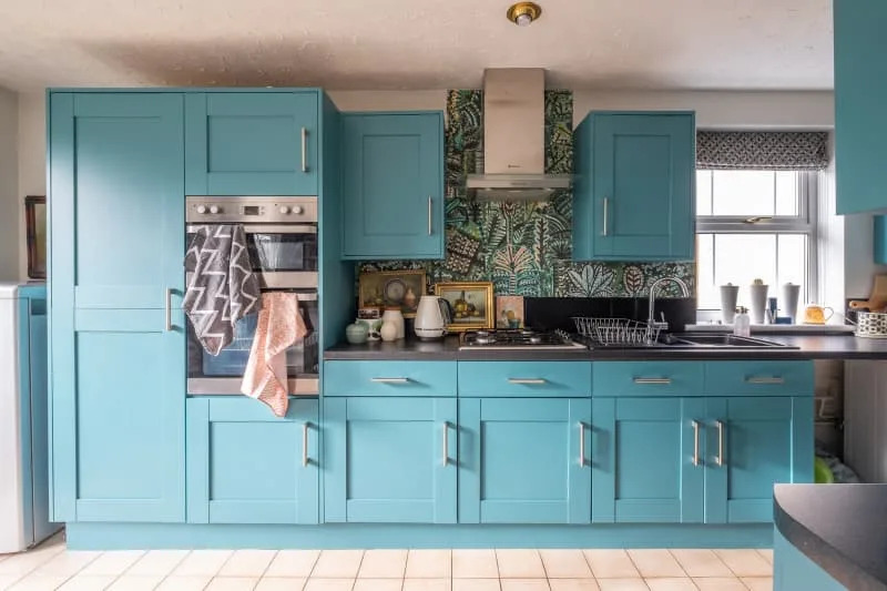
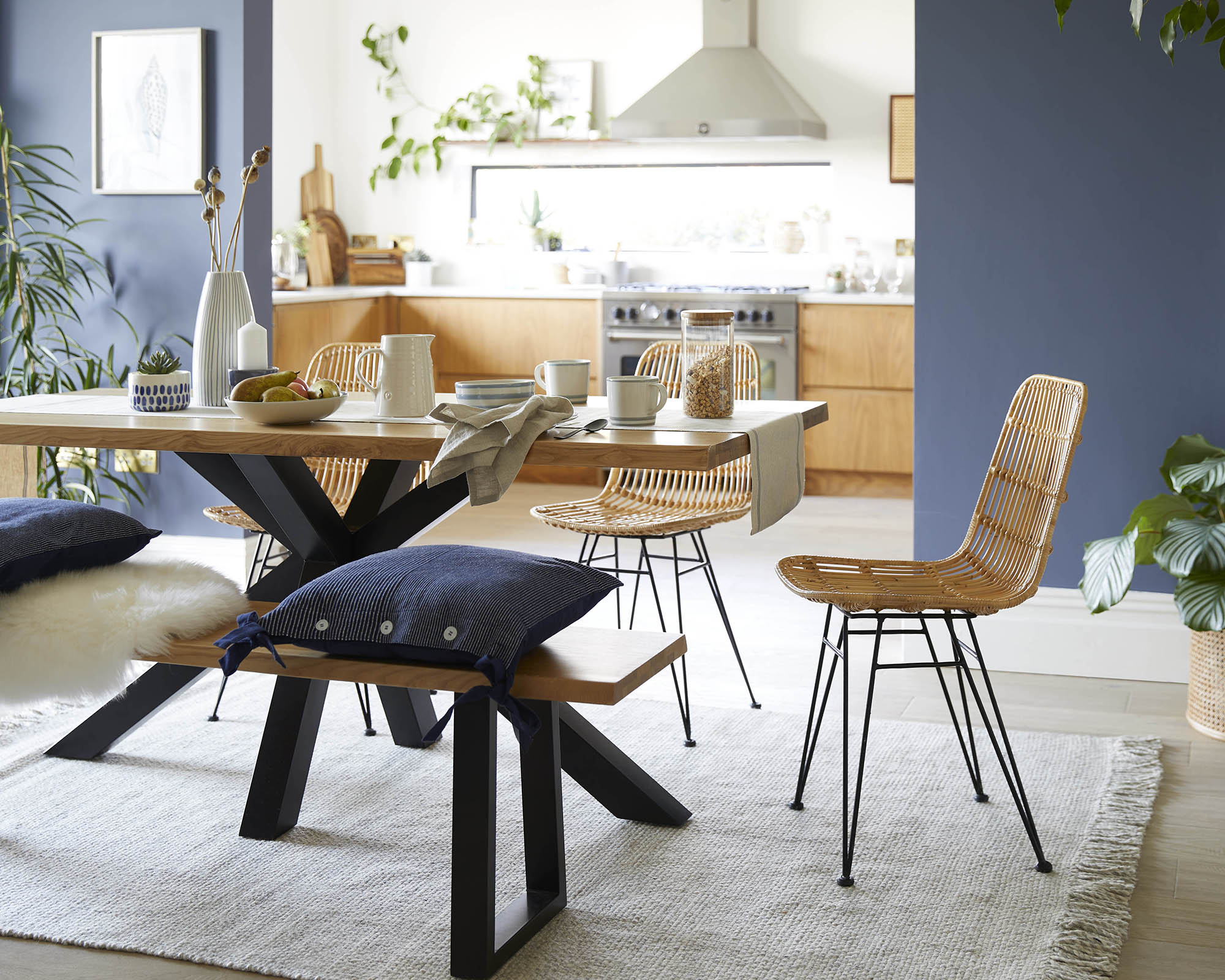
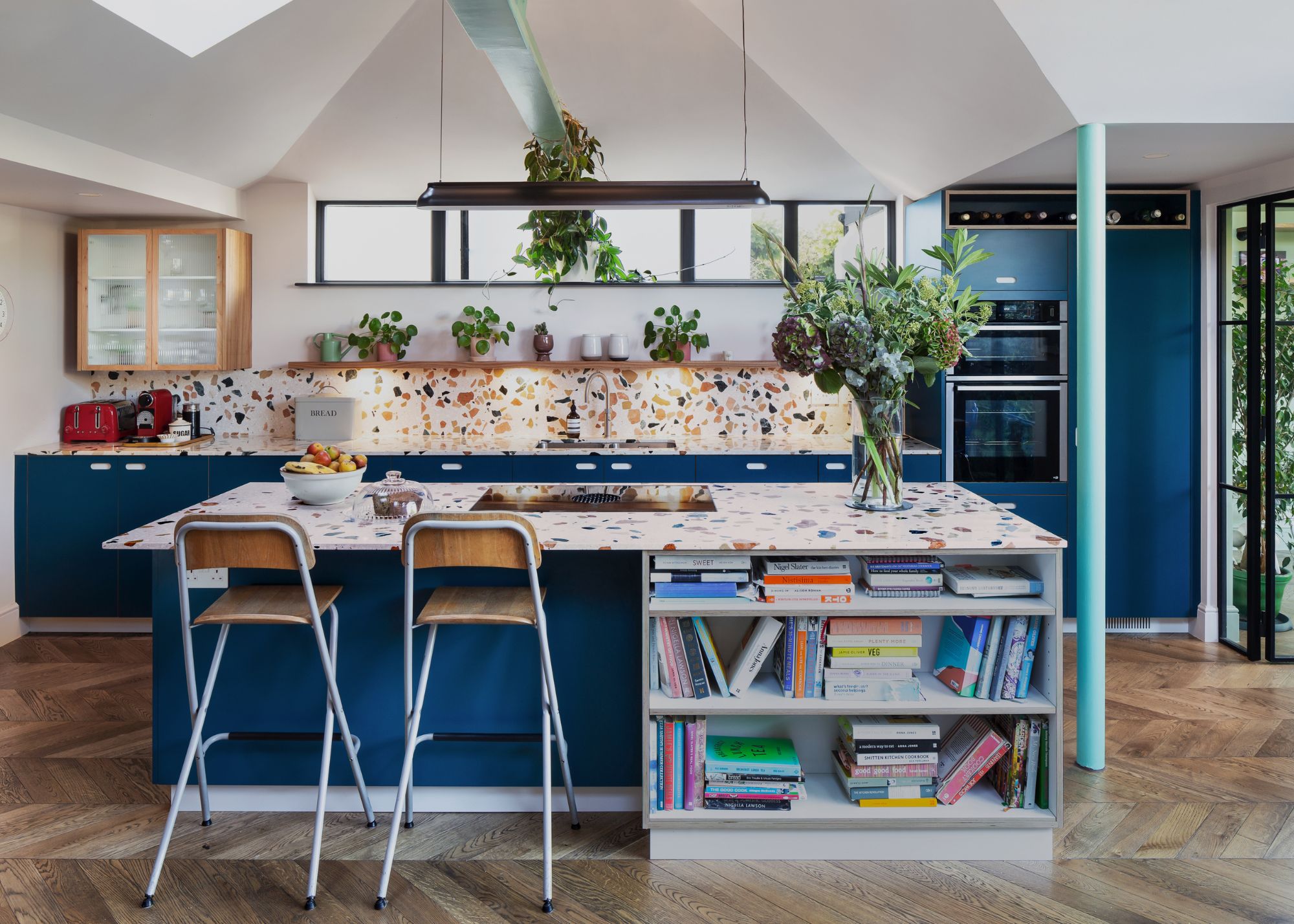
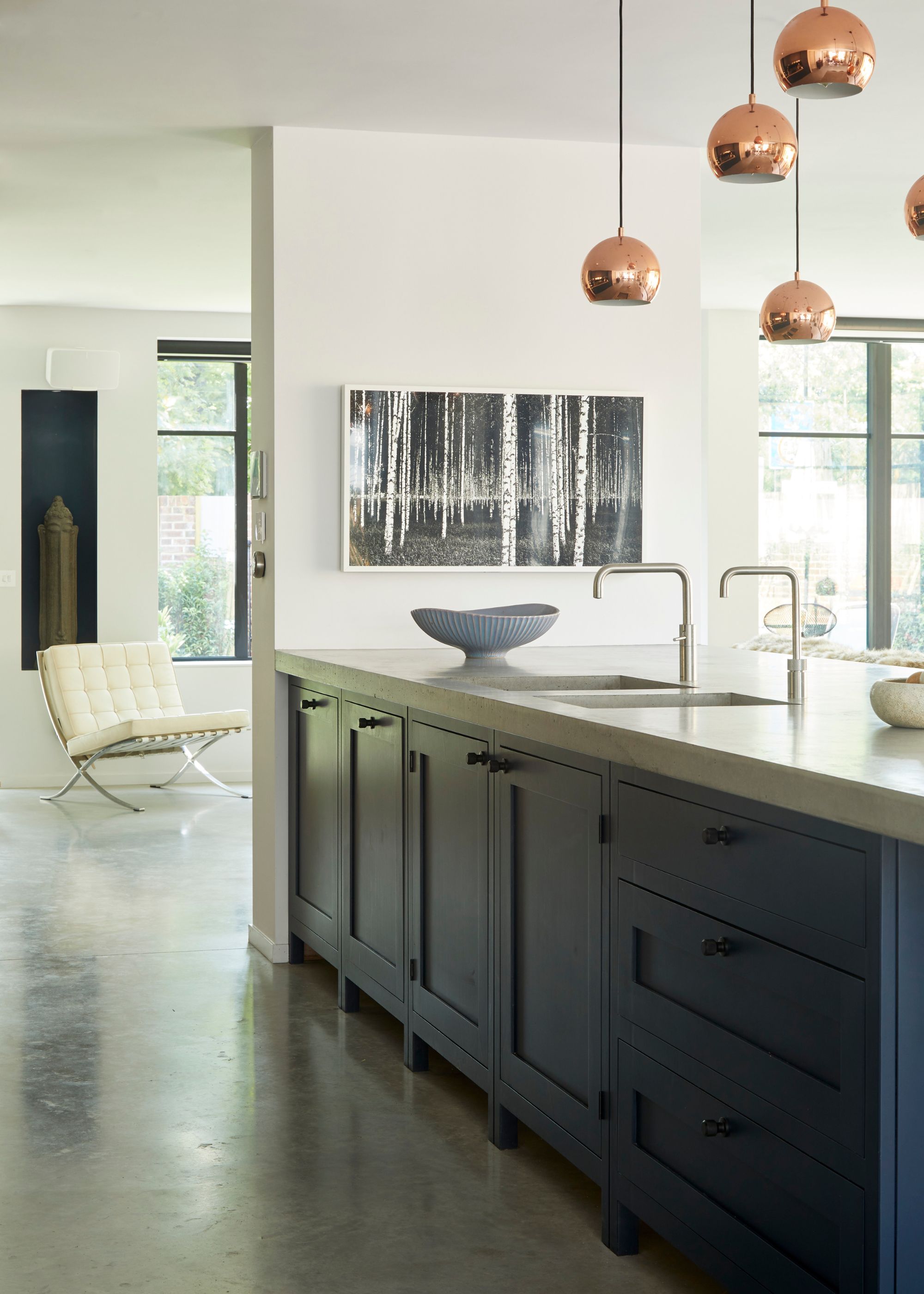
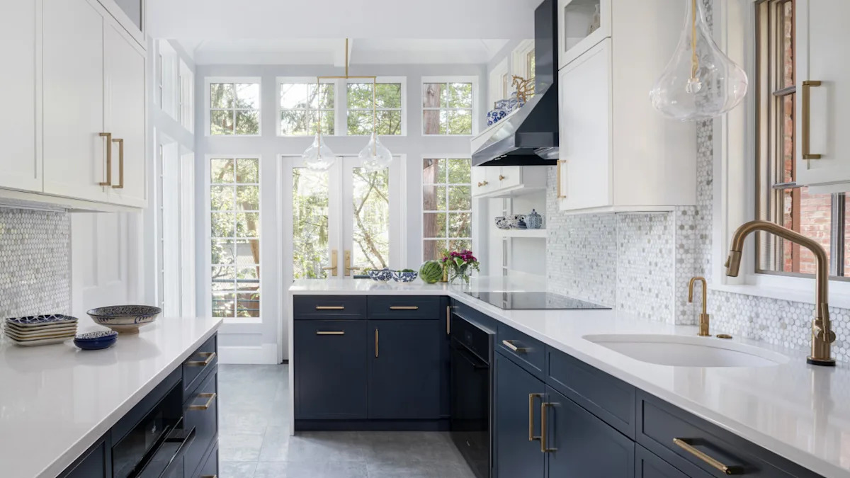
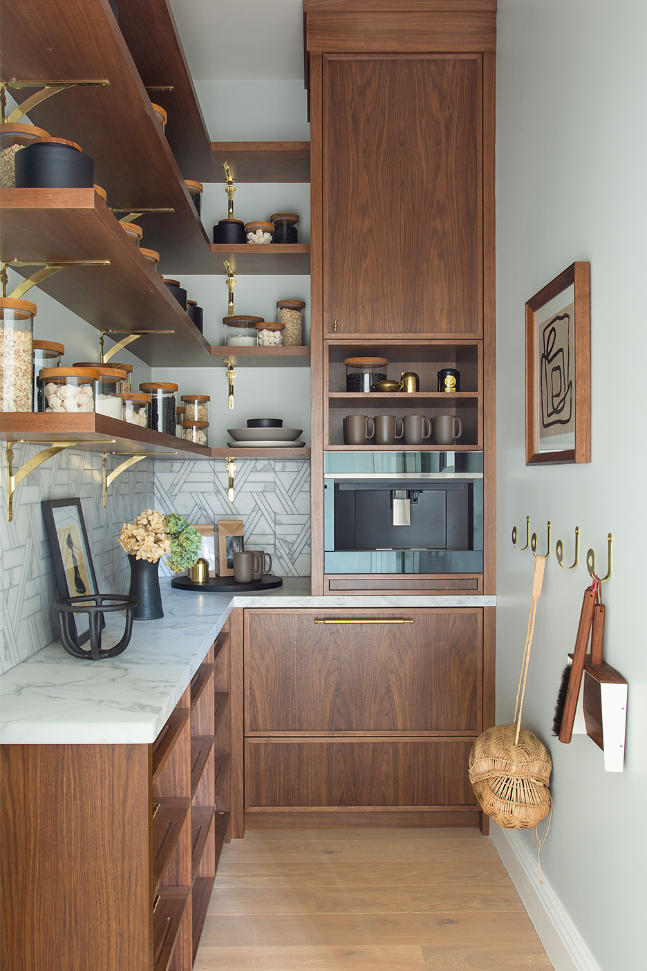
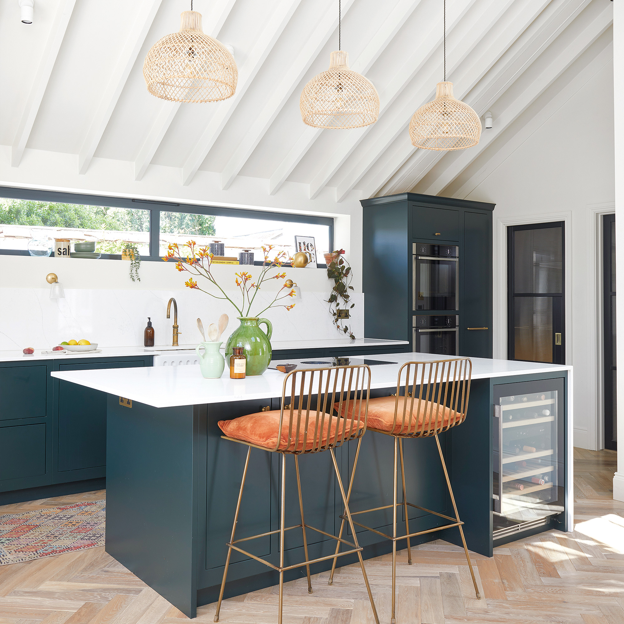
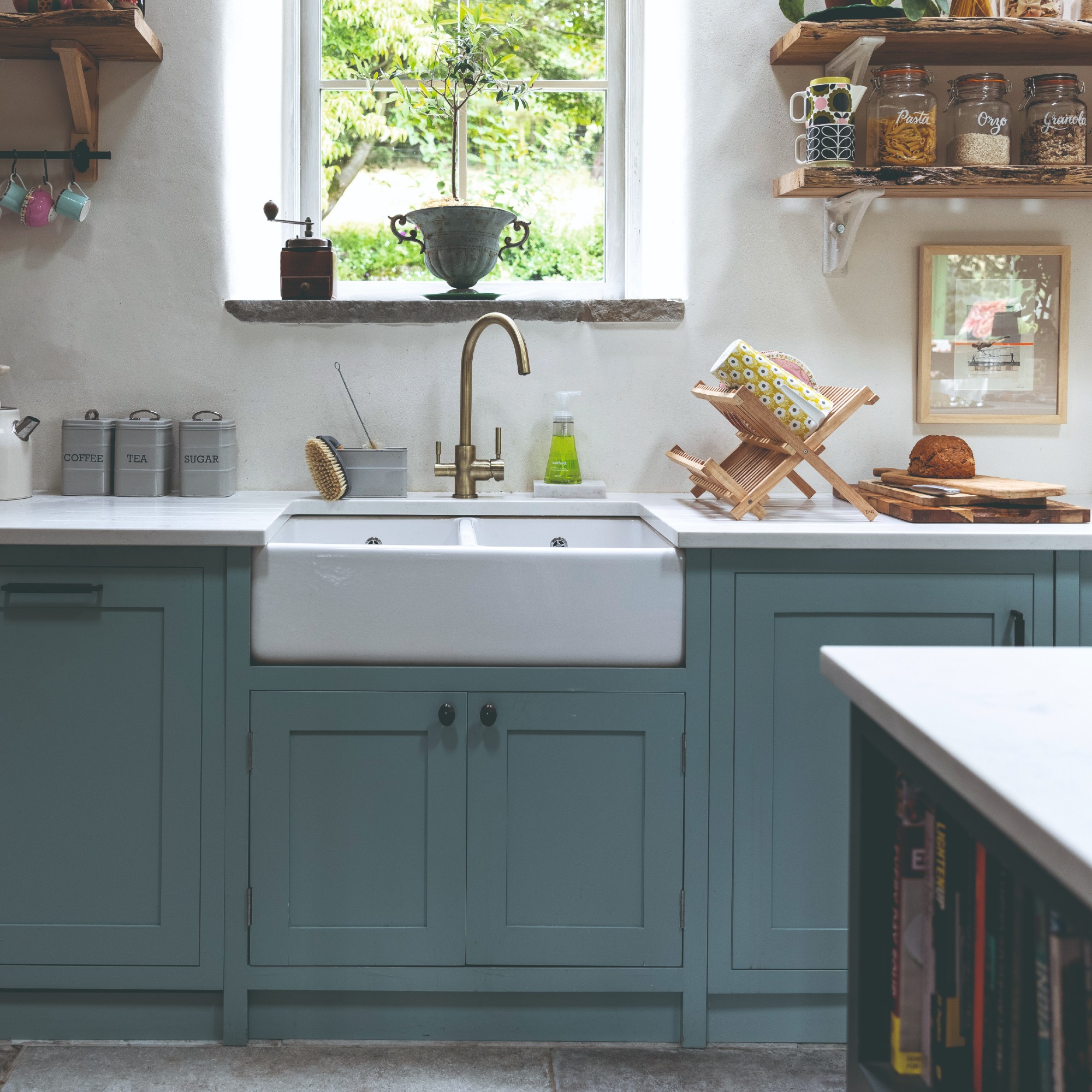
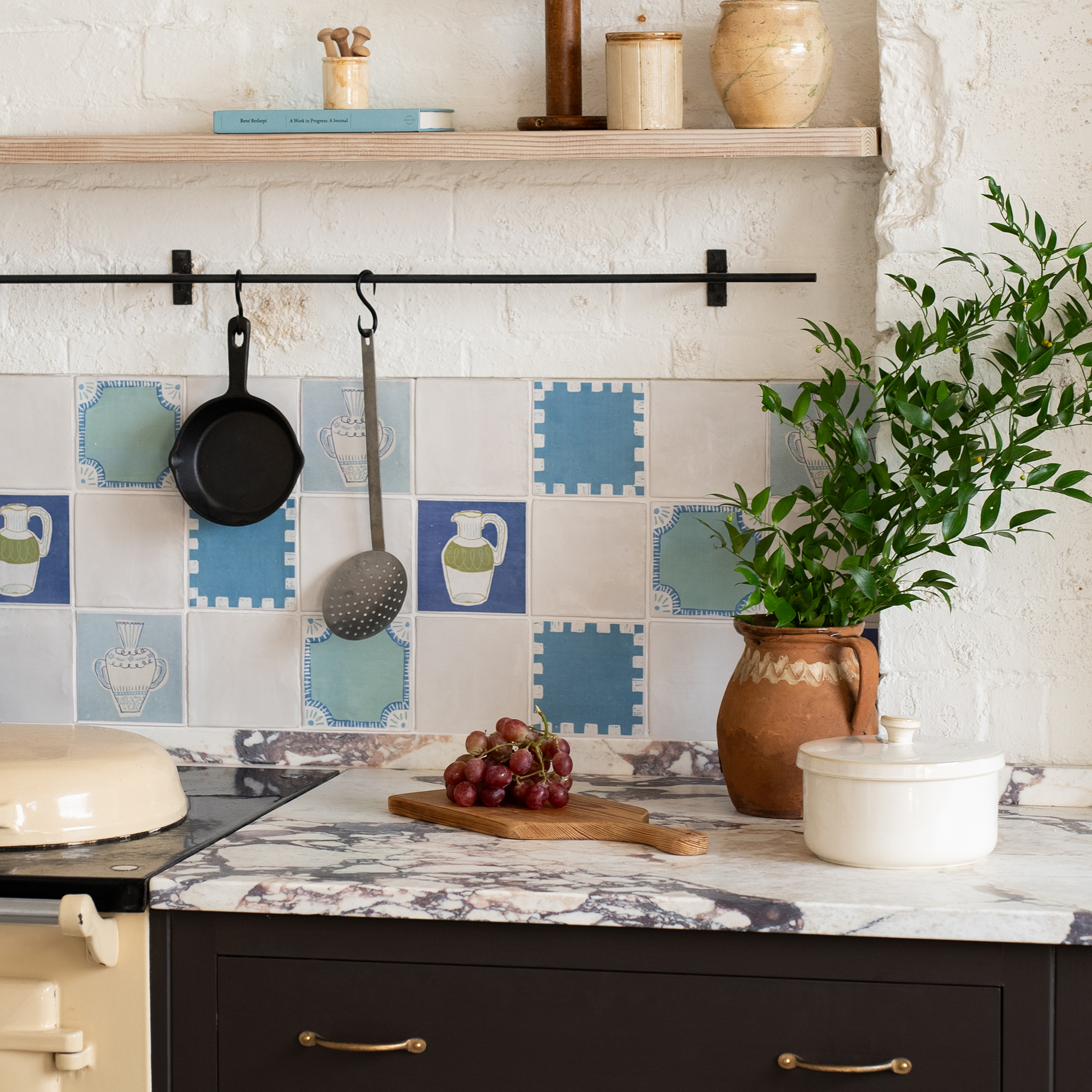
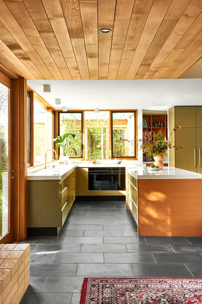
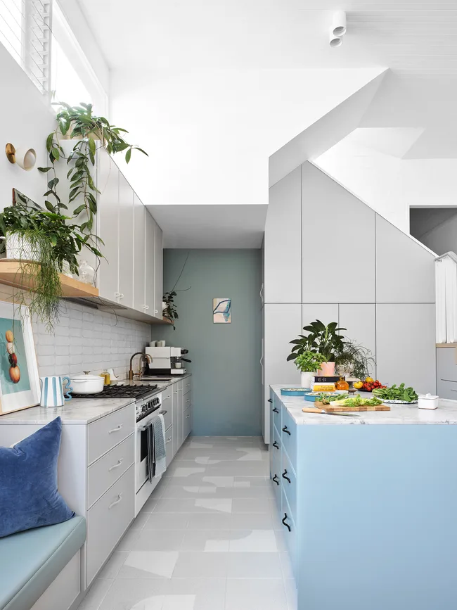
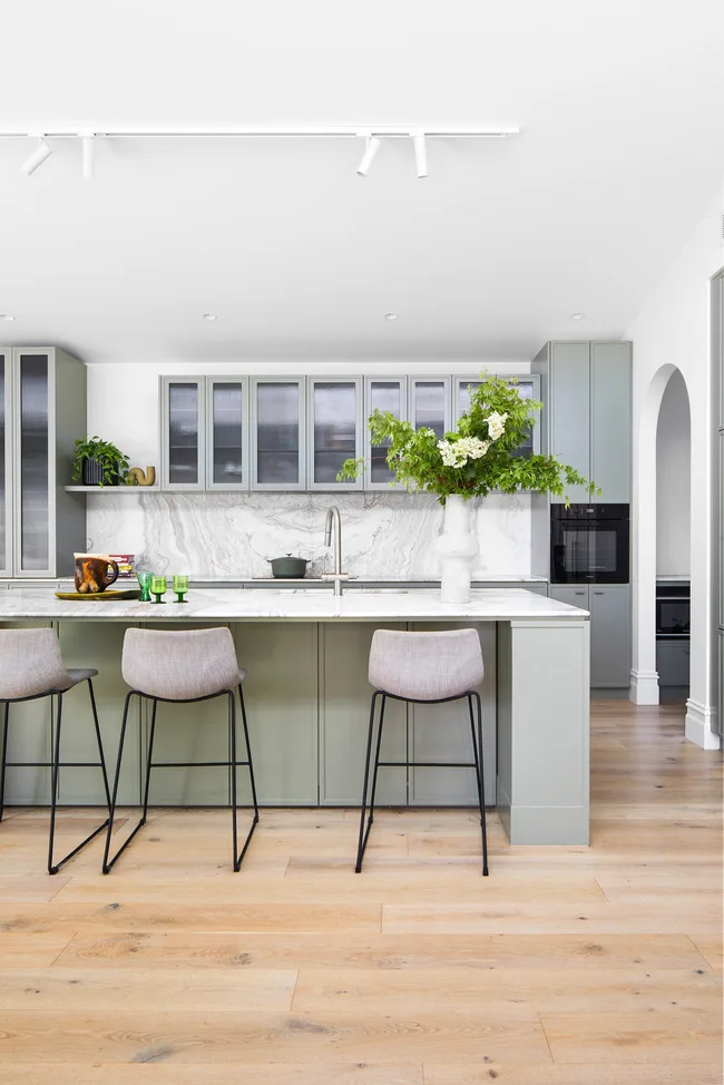
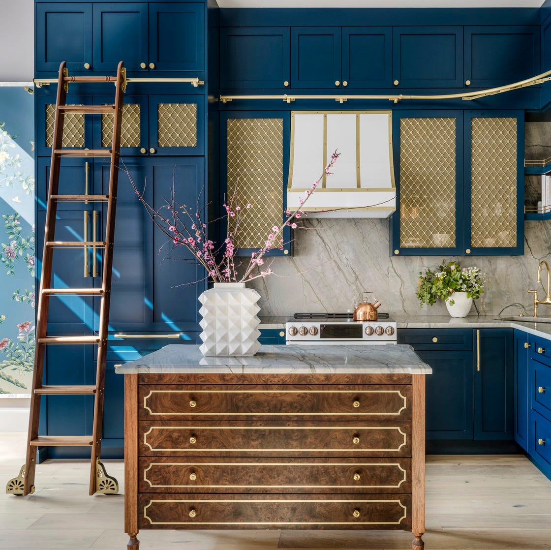
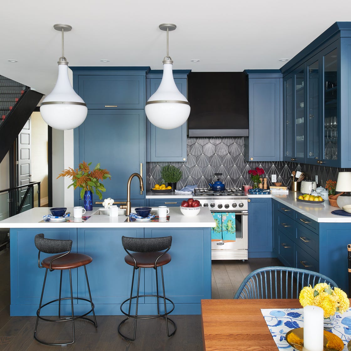
Blue paint colors have become a significant trend in interior design, particularly in kitchens, where they add a bold yet livable touch. This blog post explores 18 different shades of blue, ranging from deep navies to barely-there sky blues, showcasing their versatility and appeal in various kitchen settings. Each example is drawn from real-world designs, featuring insights from homeowners and professional designers, and provides the exact paint color names and brands.
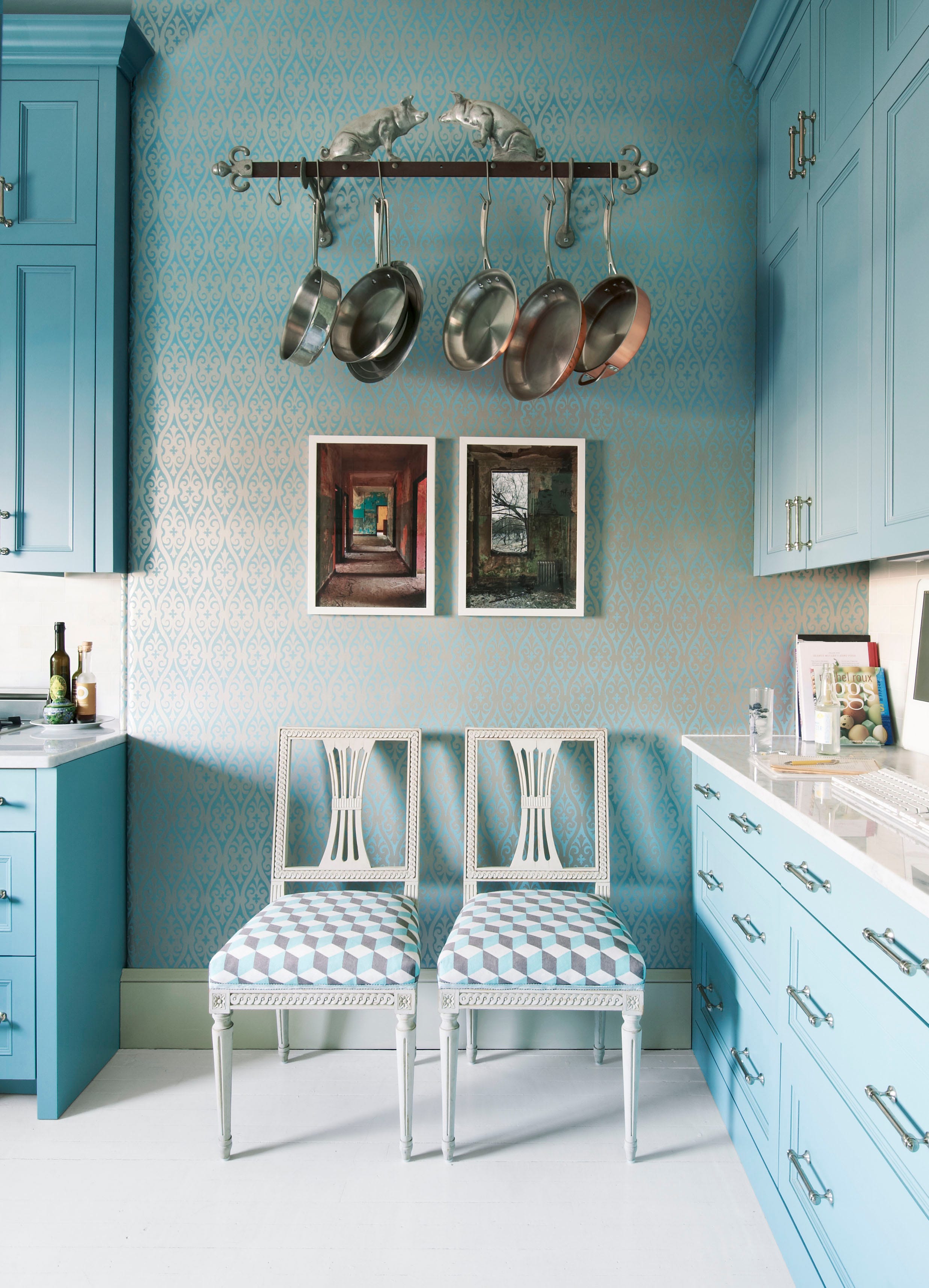
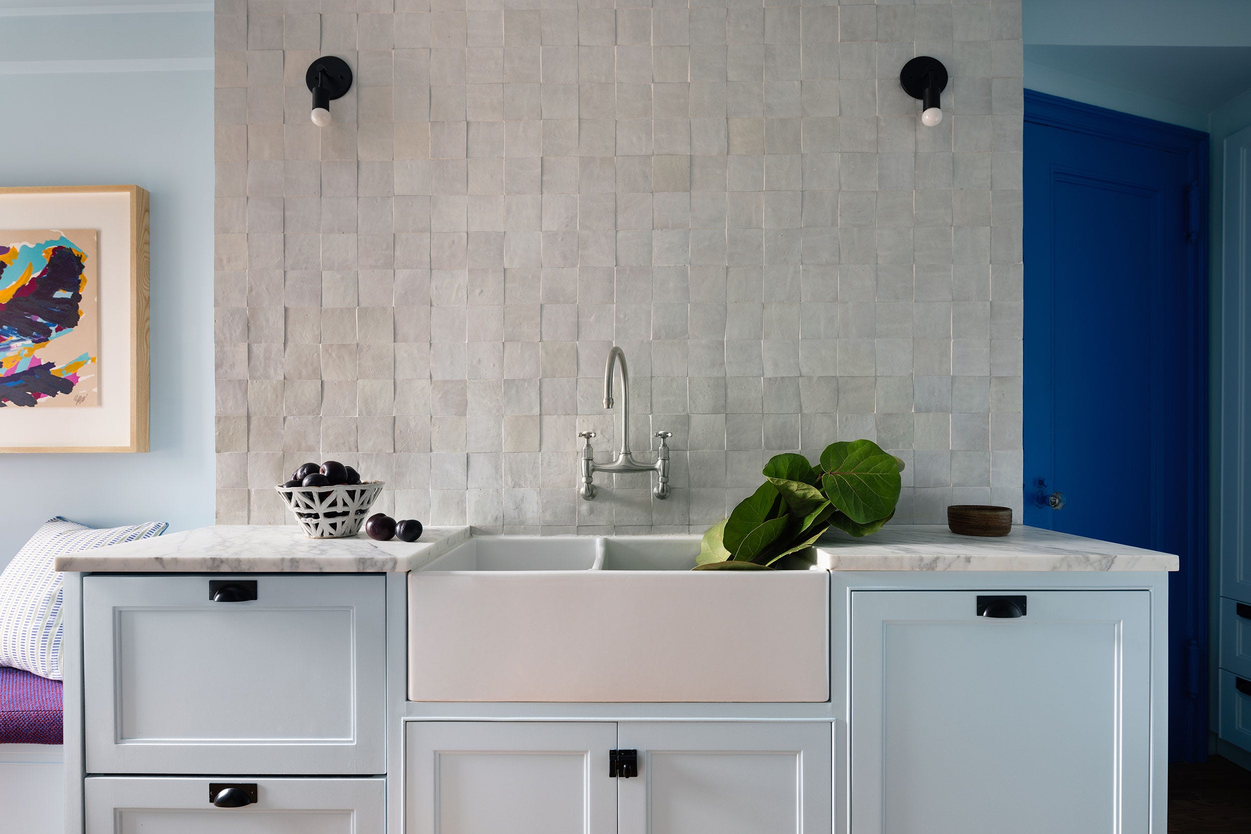
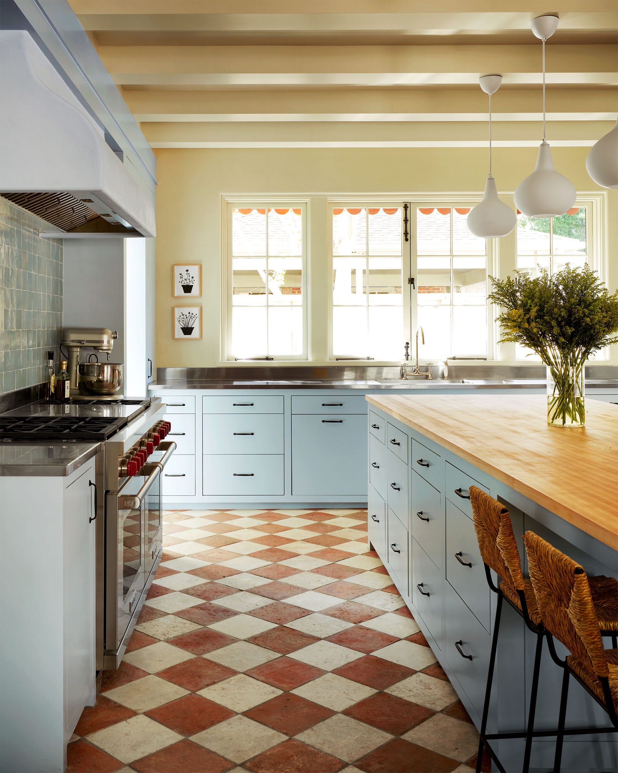
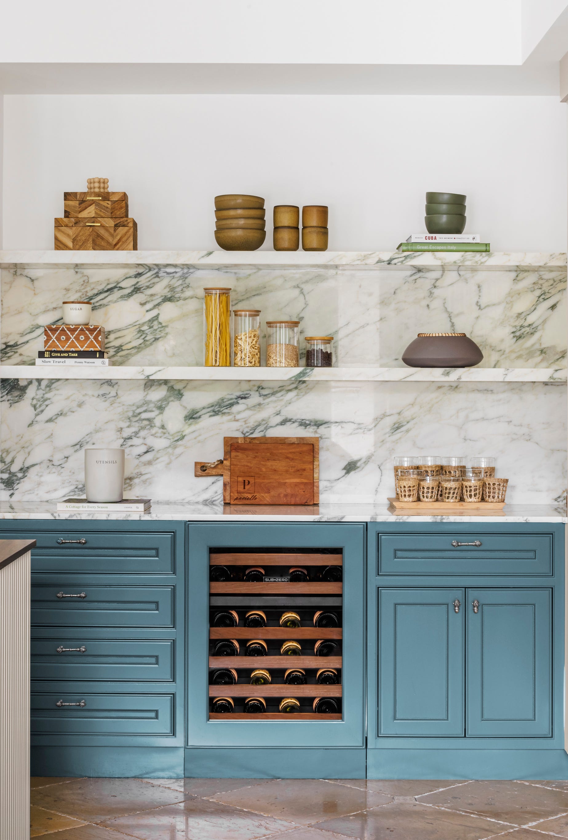
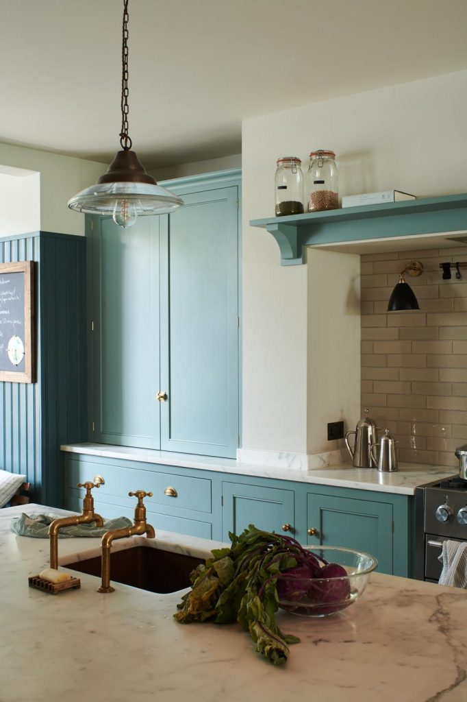
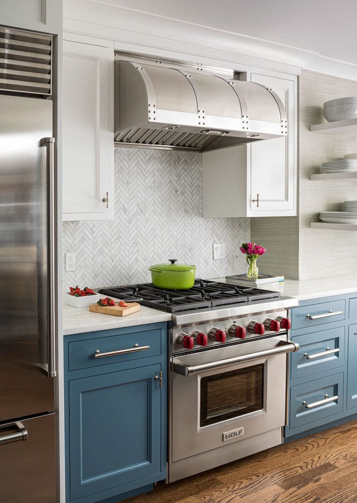
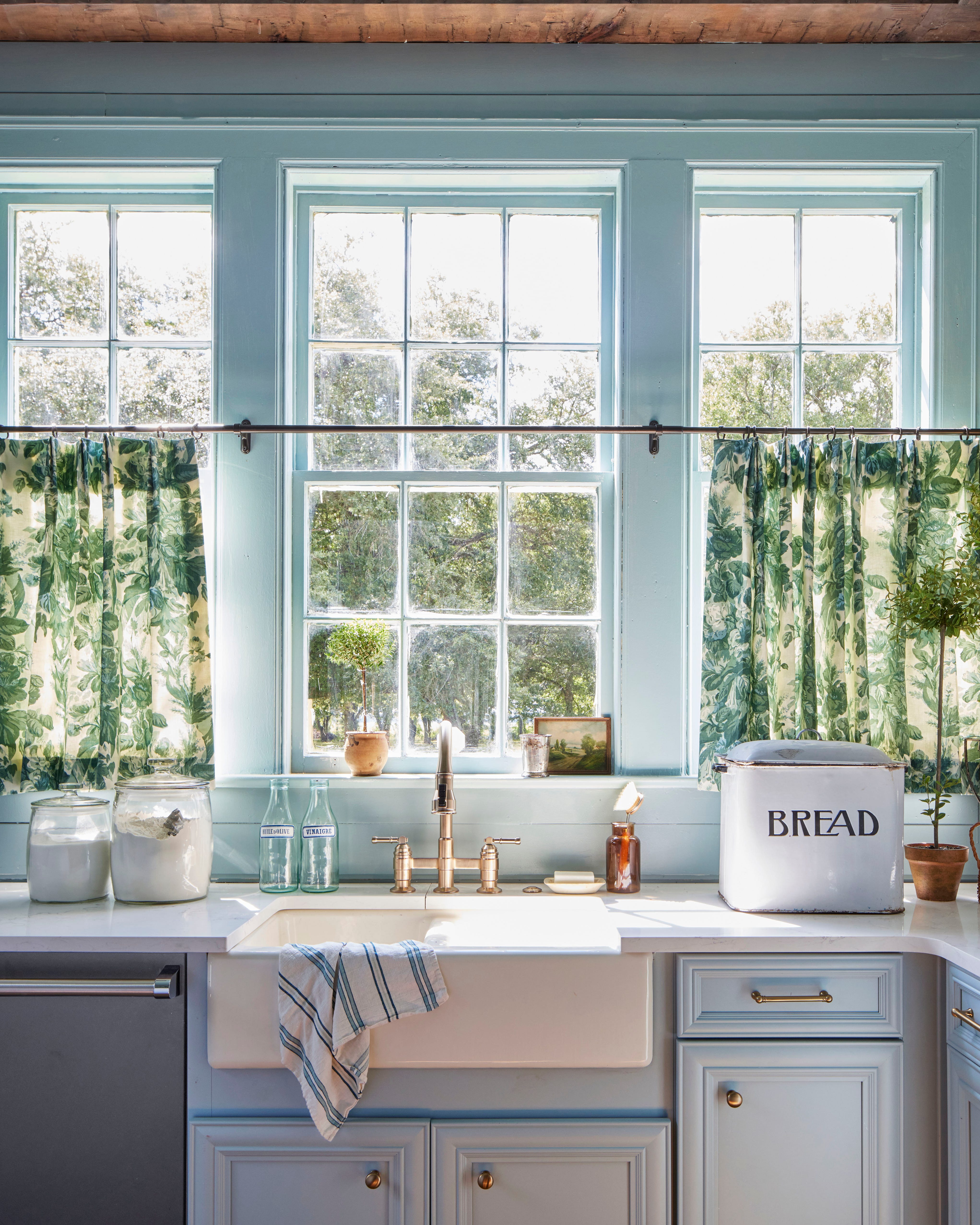
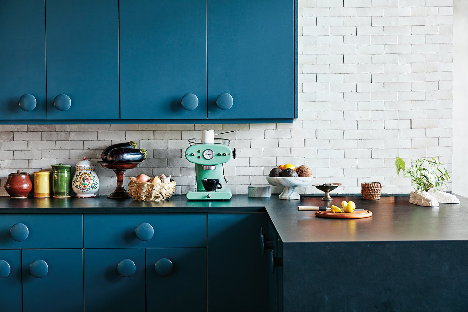
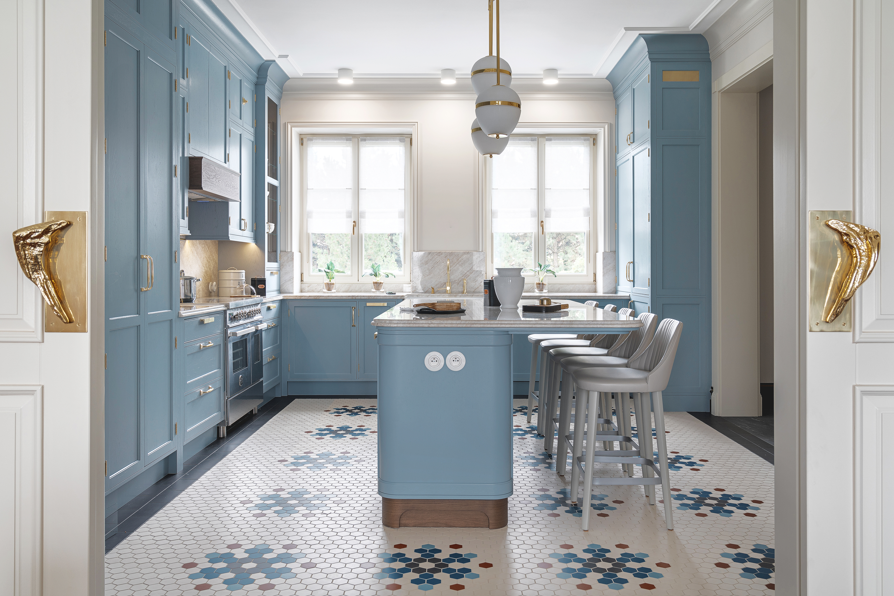
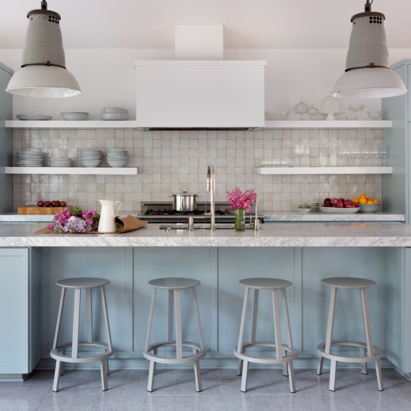
The featured blue paints offer a spectrum of moods and styles. For instance, Sherwin-Williams' Marea Baja, a cool denim blue, was used in a Hamptons home to create a whimsical yet sophisticated farmhouse feel. Paint & Paper Library's Bluebird, a breezy light blue, is ideal for tall pantry cabinets, allowing other colors to be integrated into the kitchen design while maintaining an airy atmosphere. Farrow & Ball's Pale Powder, Light Blue, and De Nimes were combined by designer Zoe Feldman to create a calming, gradient effect on existing kitchen cabinetry, demonstrating how multiple shades of blue can harmonize.
Benjamin Moore's Beach Glass, with its hints of gray and seafoam, was chosen for a motel kitchen in Montauk, complementing flagstone floors and a cobalt backsplash to evoke a soothing, coastal vibe. Behr's Soft Turquoise brought vibrant, tropical energy to artist Abel Macias's Los Angeles kitchen, matching the original 1920s linoleum floor. Argile Pinture's Bleu Byzance, a rich gray-blue, transformed Julia Rouzaud's kitchen cabinets, appearing like cornflower when paired with terracotta and rosewood accents.
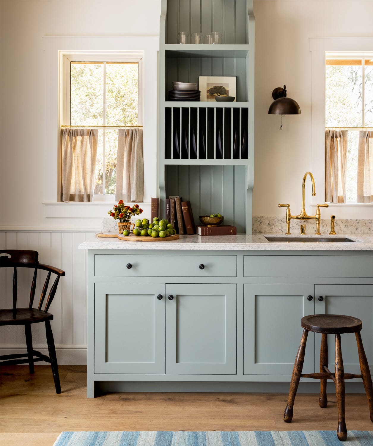
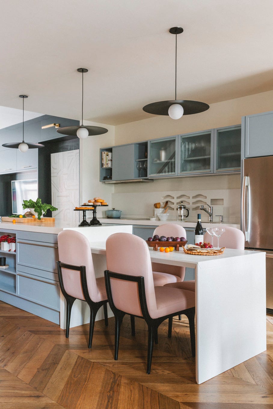
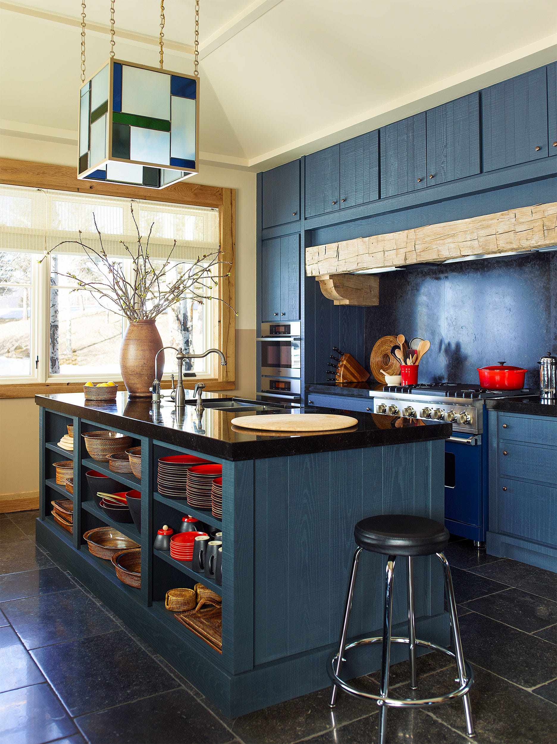
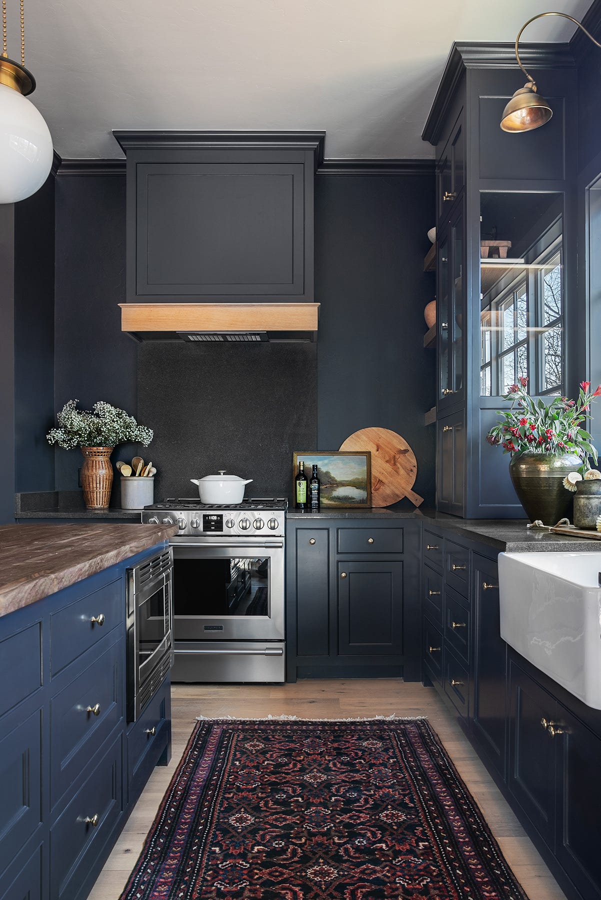
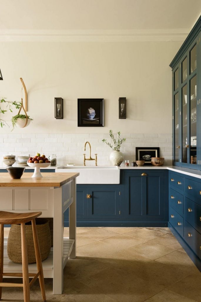
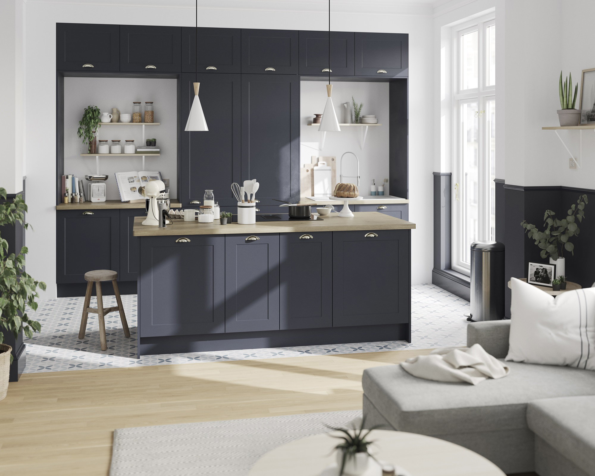
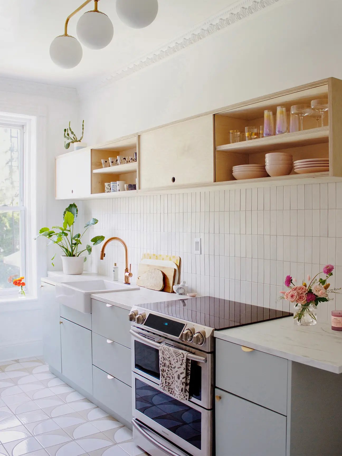
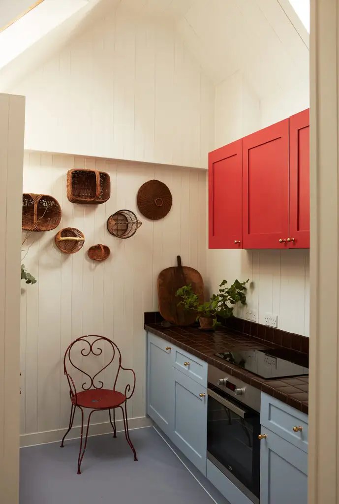
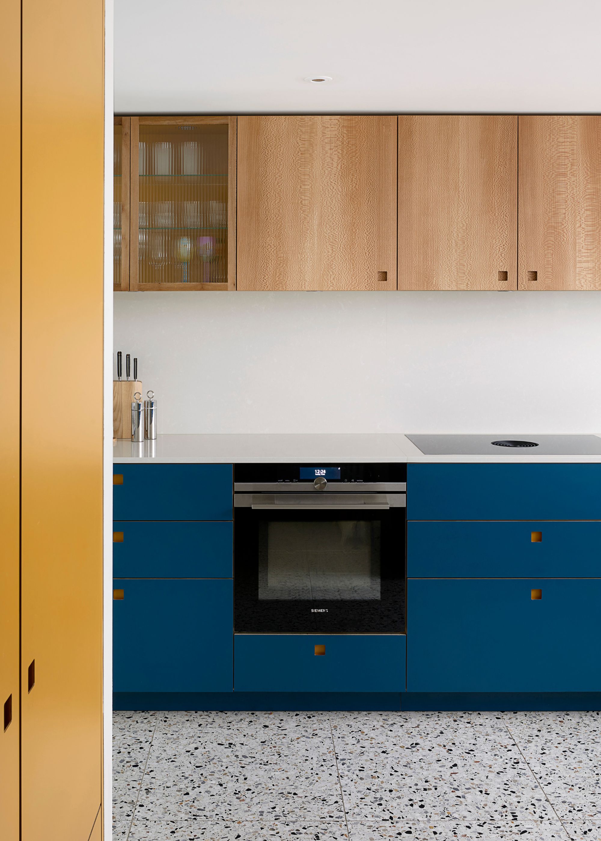
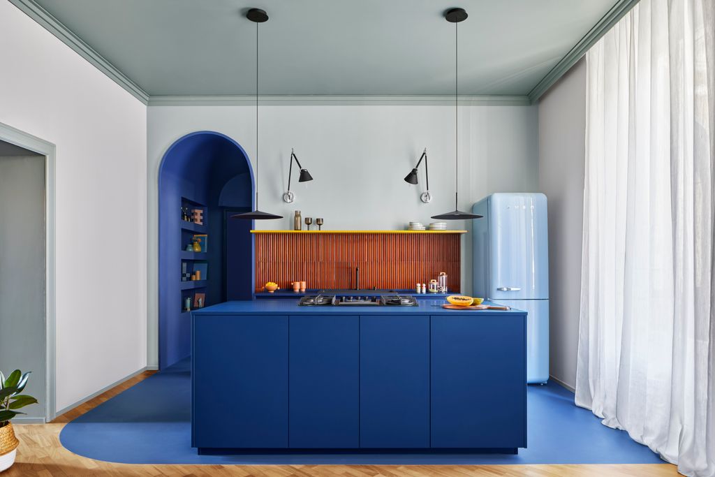
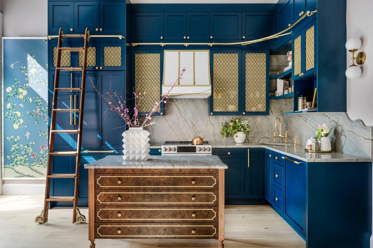
Other notable blues include Benjamin Moore's Solitude, a sophisticated sky blue used by designer Elizabeth Stamos to refresh cherrywood cabinets, and Benjamin Moore's Blue Note, a saturated navy that acts as a grounding force in an otherwise white kitchen. Little Greene's Hicks Blue, a matte, dreamy shade, suited an Edwardian house in England, painted across cabinets and an adjacent wall for a unified look. Mylands' Lambeth Walk, a pale blue with vintage vibes, was used in a London kitchen with cutouts instead of hardware, enhanced by cherrywood accents. Benjamin Moore's Kentucky Haze offers a soft, neutral gray-blue inspired by the American landscape, blending seamlessly with inset appliances.
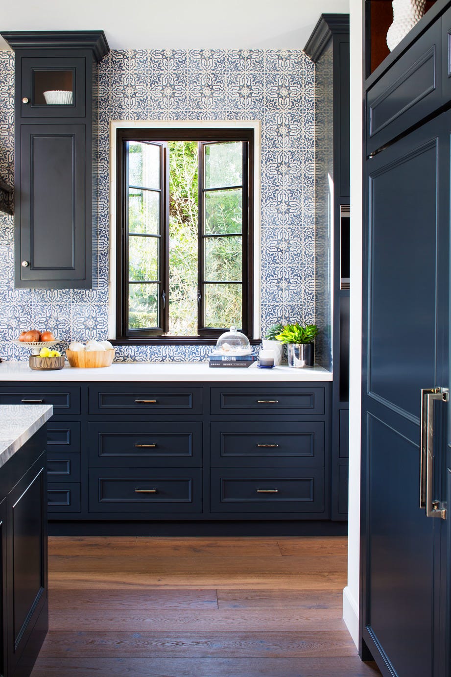
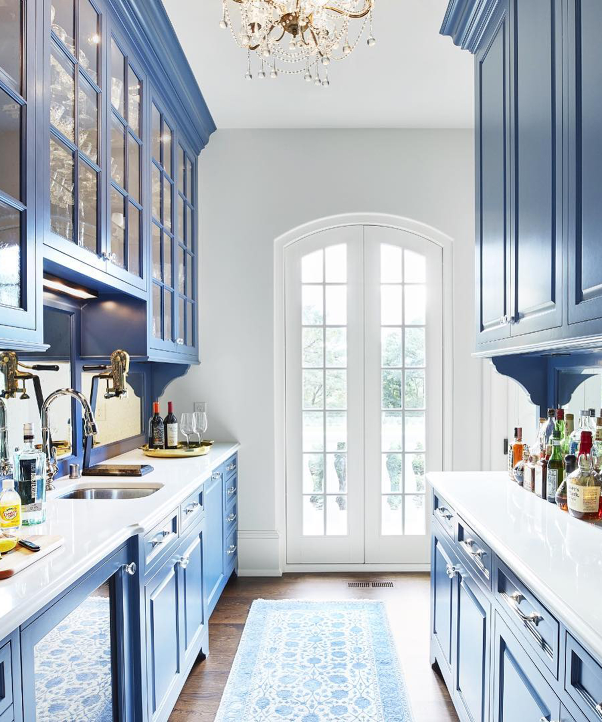
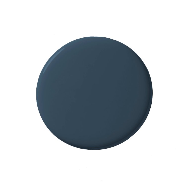
Farrow & Ball's Oval Room Blue, a maritime blue, complemented waterfront views in a coastal Maine home, while their Hague Blue is highlighted as a versatile fan-favorite, showcased in a San Francisco home with a Mediterranean-inspired tiled backsplash. Benjamin Moore's Gentleman’s Gray, described as formal and classic, proved adaptable for contemporary designs when juxtaposed with black marble. Benjamin Moore's In the Tropics, a vibrant turquoise, created a vacation-like ambiance in a New York City kitchen, used strategically in a smaller space for maximum impact. Portola's Heron Blue, a traditional and balanced hue, offered coastal cool or inland sophistication in a Marina Del Rey retreat. PaperMint's Boro, a moody, sea-inspired indigo, provided a relaxed bohemian vibe in a Sydney kitchen, anchoring a mix of humble materials. Finally, Benjamin Moore's Olympus Green, a green-blue, served as a playful compromise in a Los Angeles home renovation, paired with a Carrara quartz countertop.
#BlueKitchenCabinets #KitchenDesign #PaintColors #InteriorDesignTrends #HomeRenovation #Cabinetry #DesignInspiration #ColorPalette #BlueKitchenCabinets #KitchenDesign #PaintColors #InteriorDesignTrends #HomeRenovation #Cabinetry #DesignInspiration #ColorPalette
Toplam 0 yorum
 Henüz yorum yok
Bu da beğenebilirsiniz
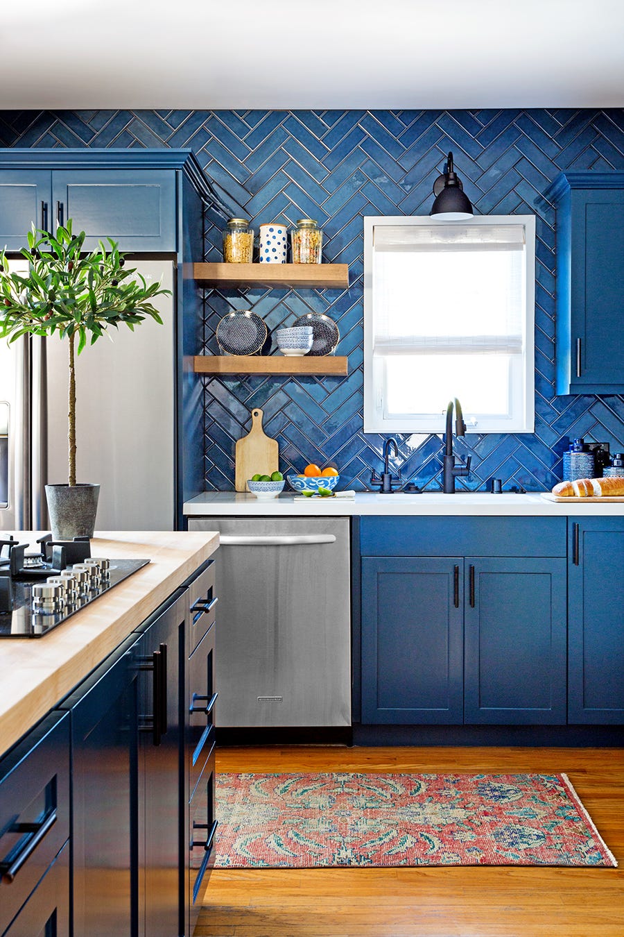
20 Modern Blue Kitchen Cabinet Ideas That Are Trendproof

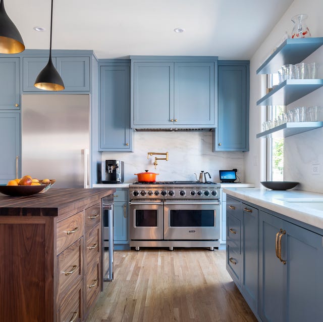
Chic Spaces That Prove Blue Kitchen Cabinets Are Here to Stay

16 Blue Kitchen Ideas That Celebrate This Timeless Shade to Its Very Best

15 Cabinet Paint Colors That Look STUNNING in Any Kitchen

18 Gorgeous Kitchen Cabinet Paint Colors, According To Kitchen Designers

Which Color is Sexy, Daring, and “a Craze” Right Now? An Expert Fills Us In

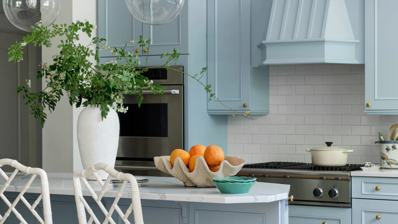
21 Stunning Blue Cabinet Ideas That Transform Any Kitchen

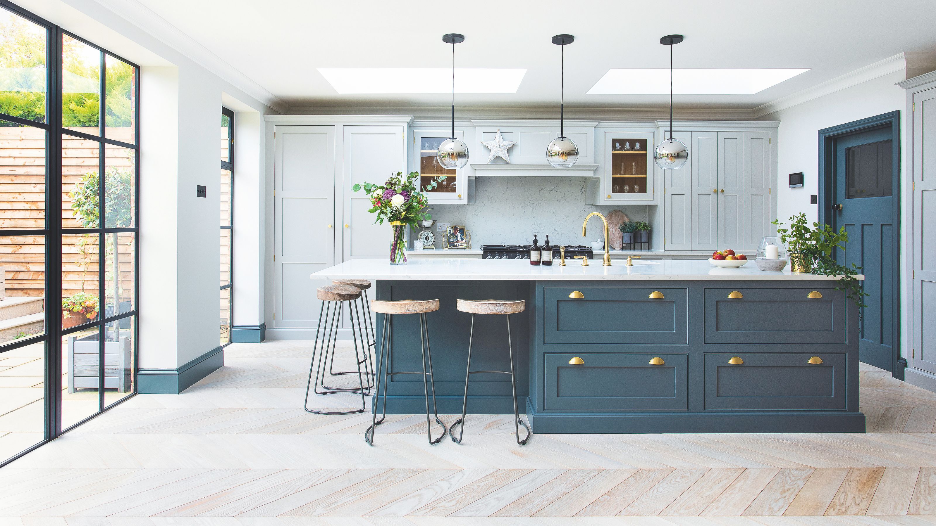
10 blue kitchen ideas to inspire a bright, airy and on trend cooking space
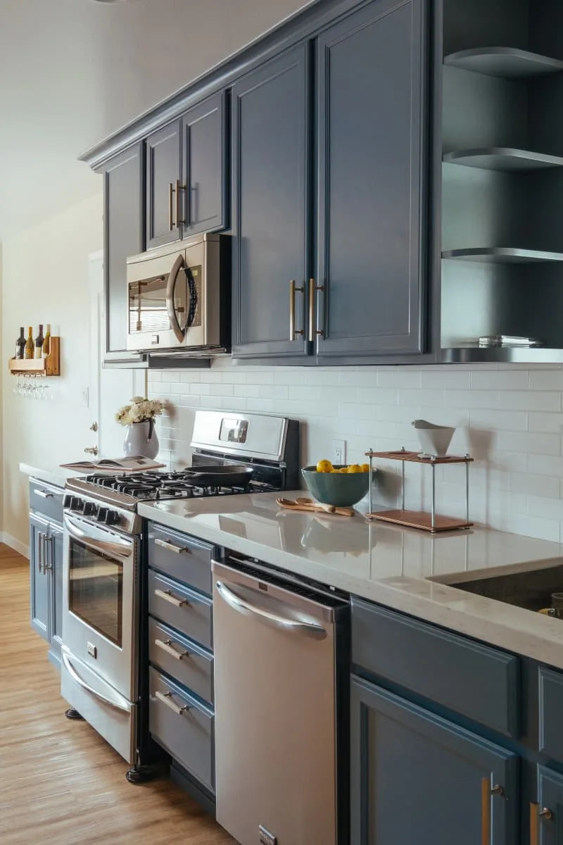
15 Gorgeous Blue Kitchen Cabinet Ideas That’ll Never Go Out of Style
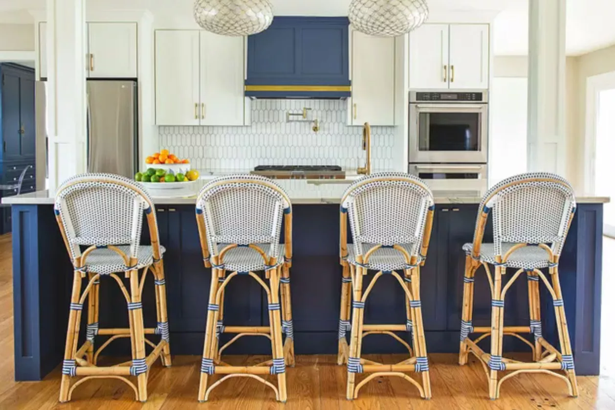
The 14 Best Blue Paint Colors For Your Kitchen, According To Designers
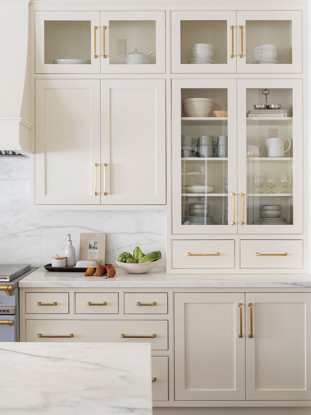
Our 87 Favorite Kitchen Cabinet Colors, All Gathered in One Place
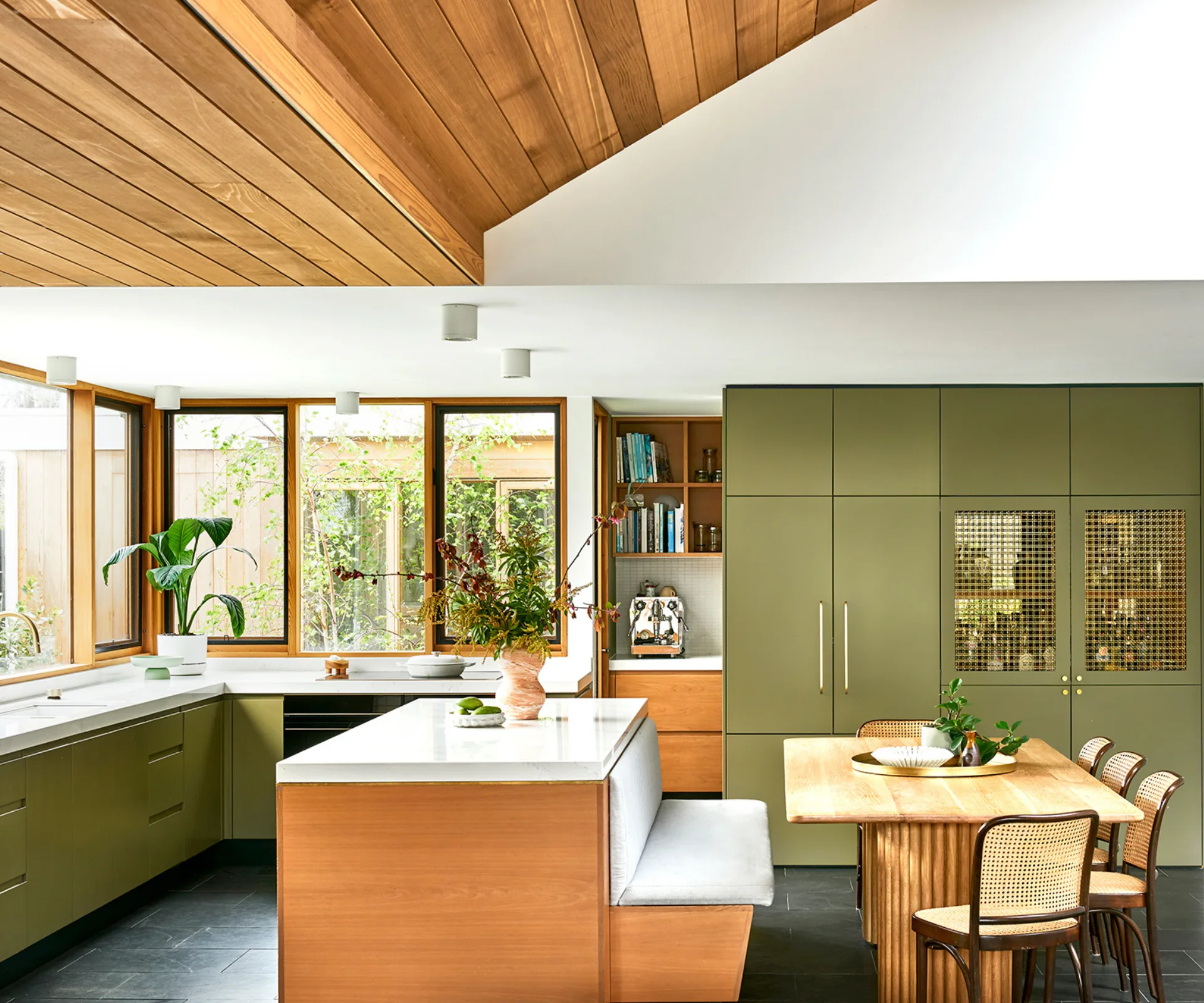
17 bright kitchen cabinet colour ideas to try in your home

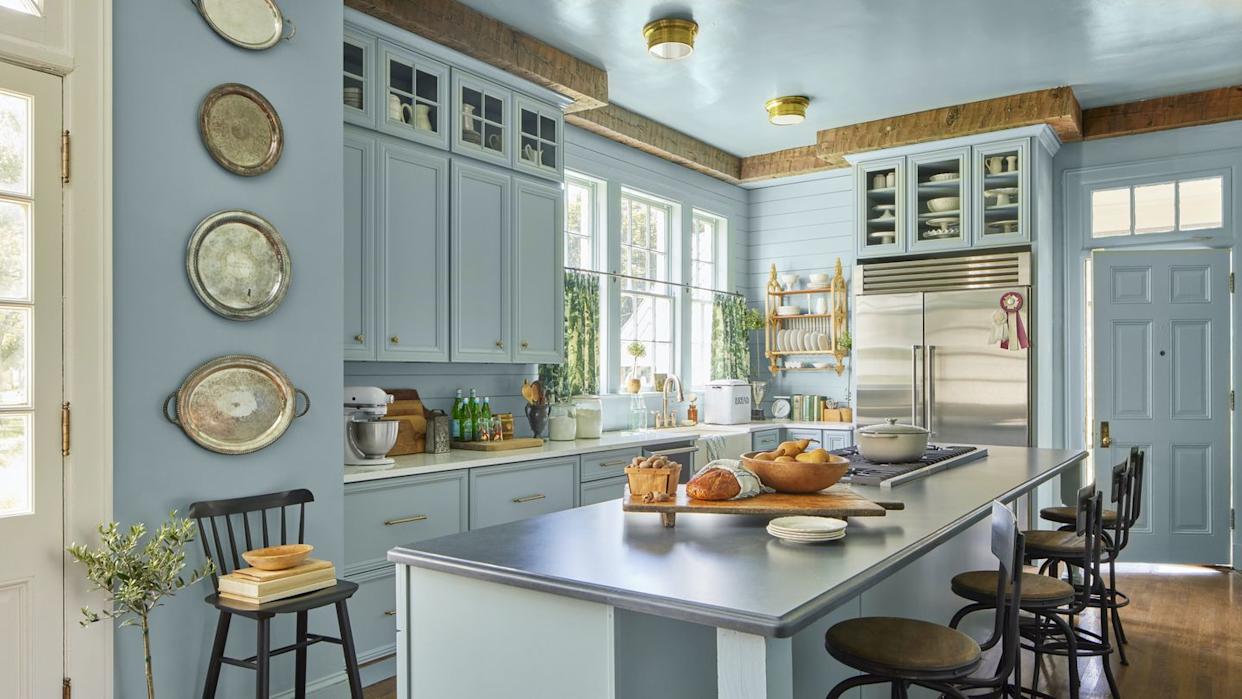
Feeling Blue? You'll Love These Beautiful Blue Kitchen Cabinet Ideas
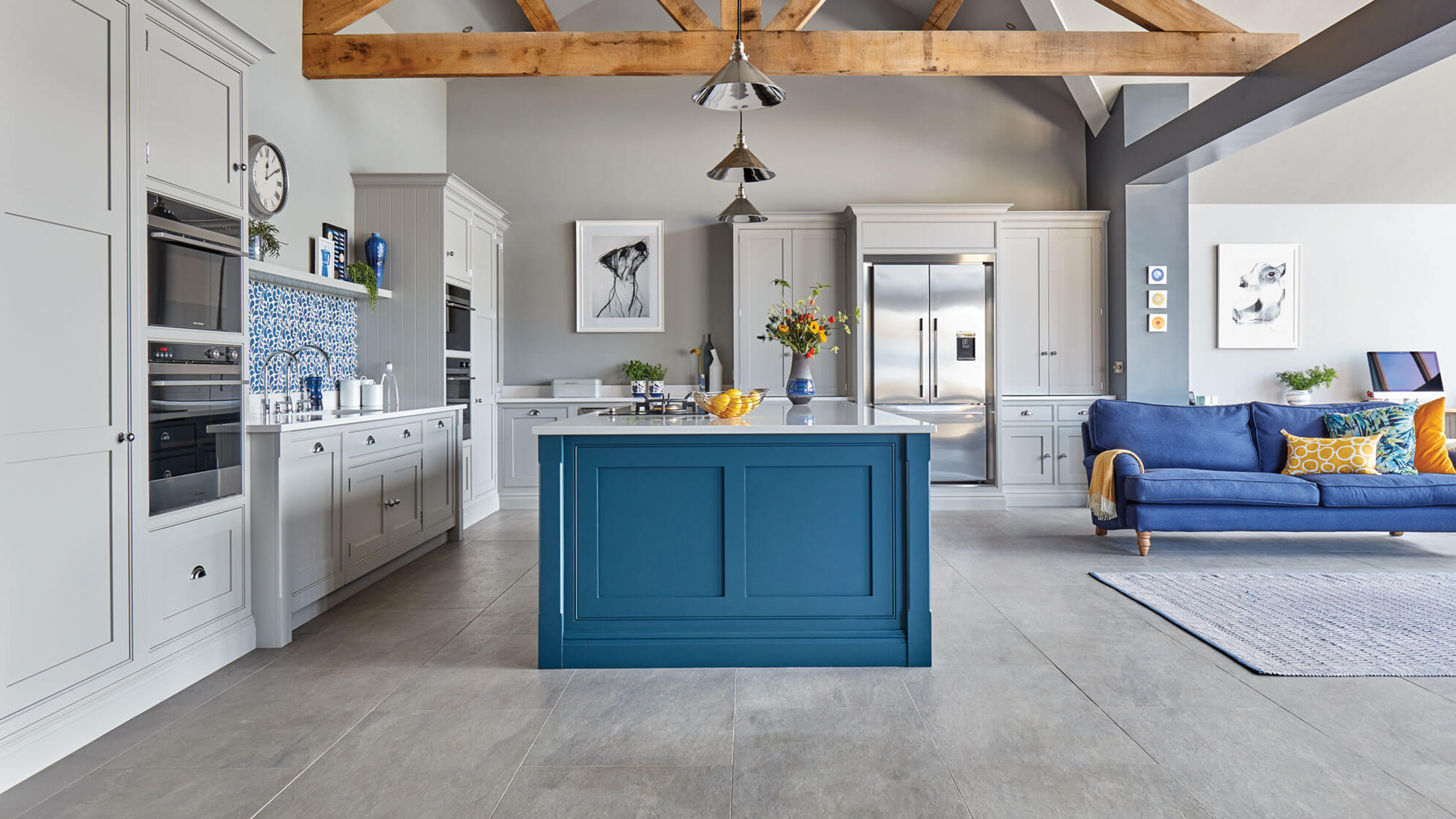
15 blue kitchen ideas to make you want to try this on trend look

15 Cabinet Paint Colors That Look STUNNING in Any Kitchen
The 60 Best Blue Paint Colors for Every Room in Your Home
32 Kitchens That Prove Why Blue Is the Most Flattering Cabinetry Color

This Paint Color Is Way More Popular With Lower Cabinets Than Upper Ones
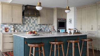
13 Blue Kitchen Ideas to Steal, From the Boldest Pops of Color to Clever Tilework

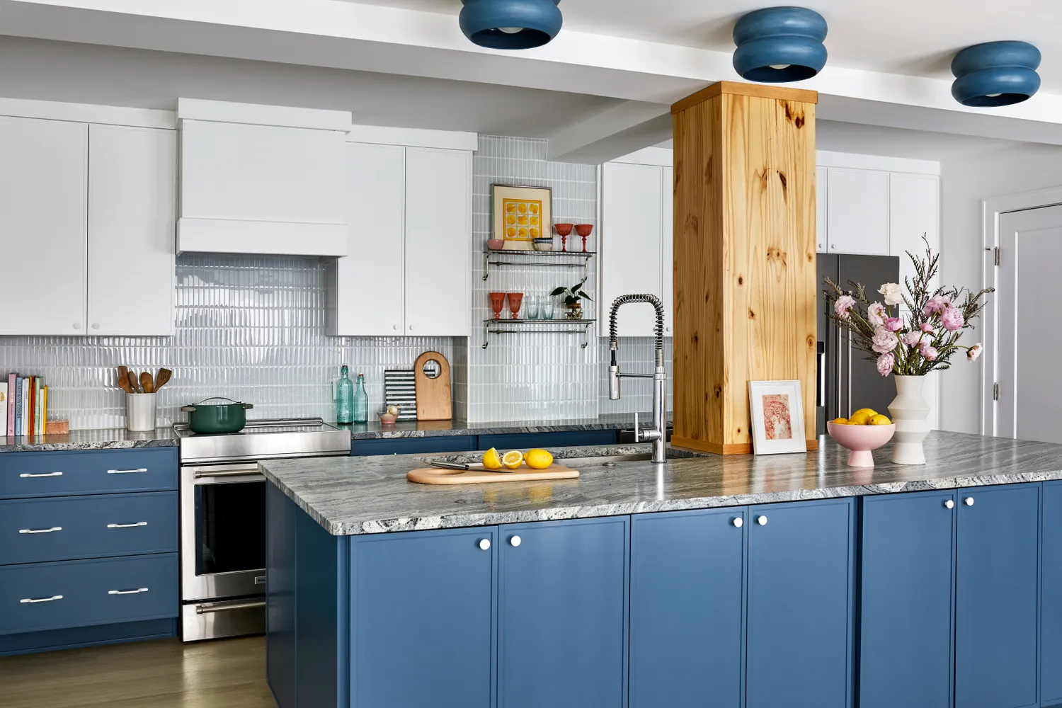
We Asked Designers for Their Favorite Kitchen Cabinet Paint Colors—and Not One Picked White