Designers Reveal 7 Exterior Paint Colors They Always Use for Their Projects
Selecting an exterior paint color for a home involves considering personal style, neighborhood aesthetics, natural surroundings, and landscaping. This decision is significant due to the commitment involved. To simplify this process, two designers, Nina Lichtenstein and Dana Lee Calabrese, shared their top exterior paint color choices and preferred shades for client homes. Their selections prioritize versatility and the ability to complement diverse architectural styles and natural environments.
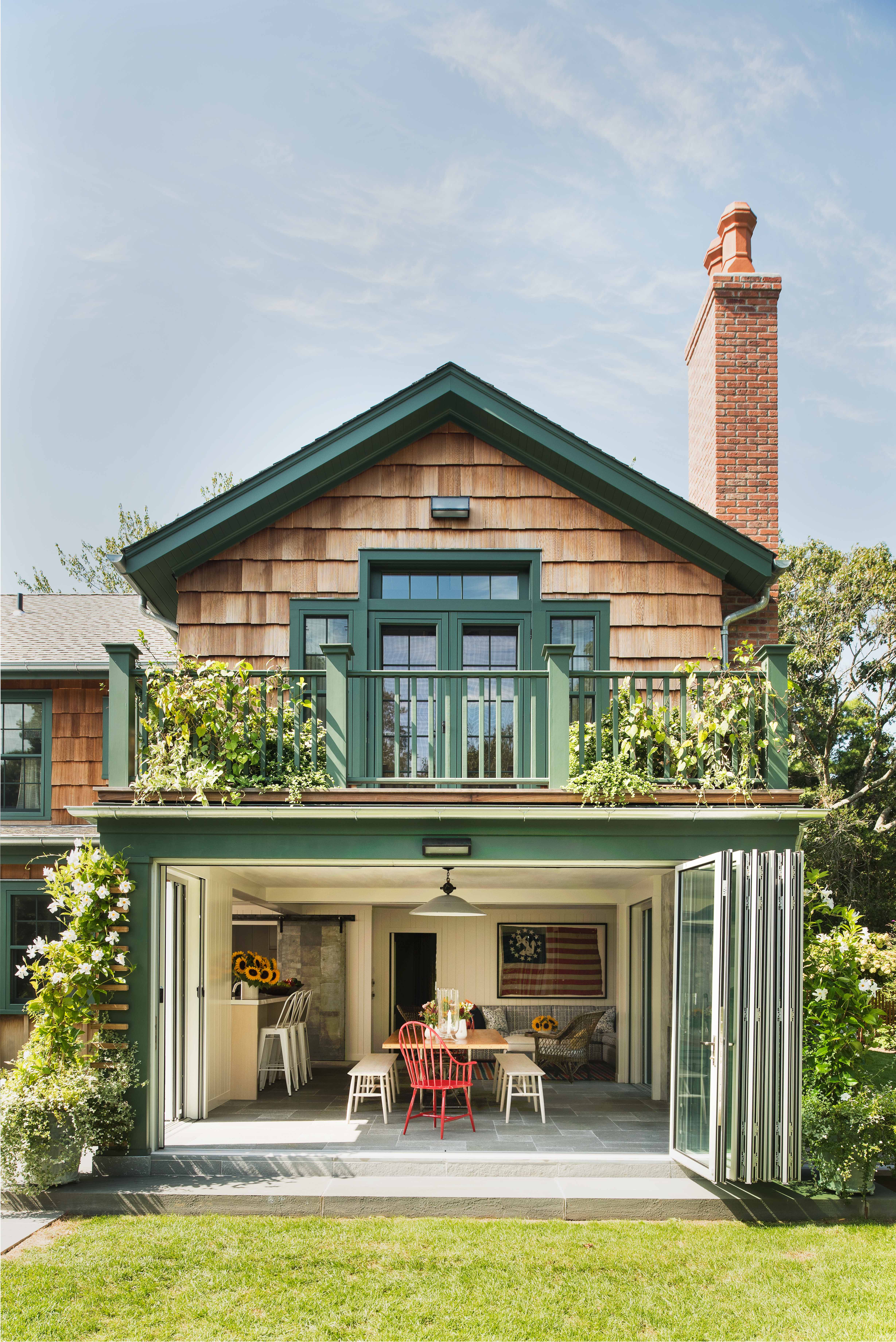
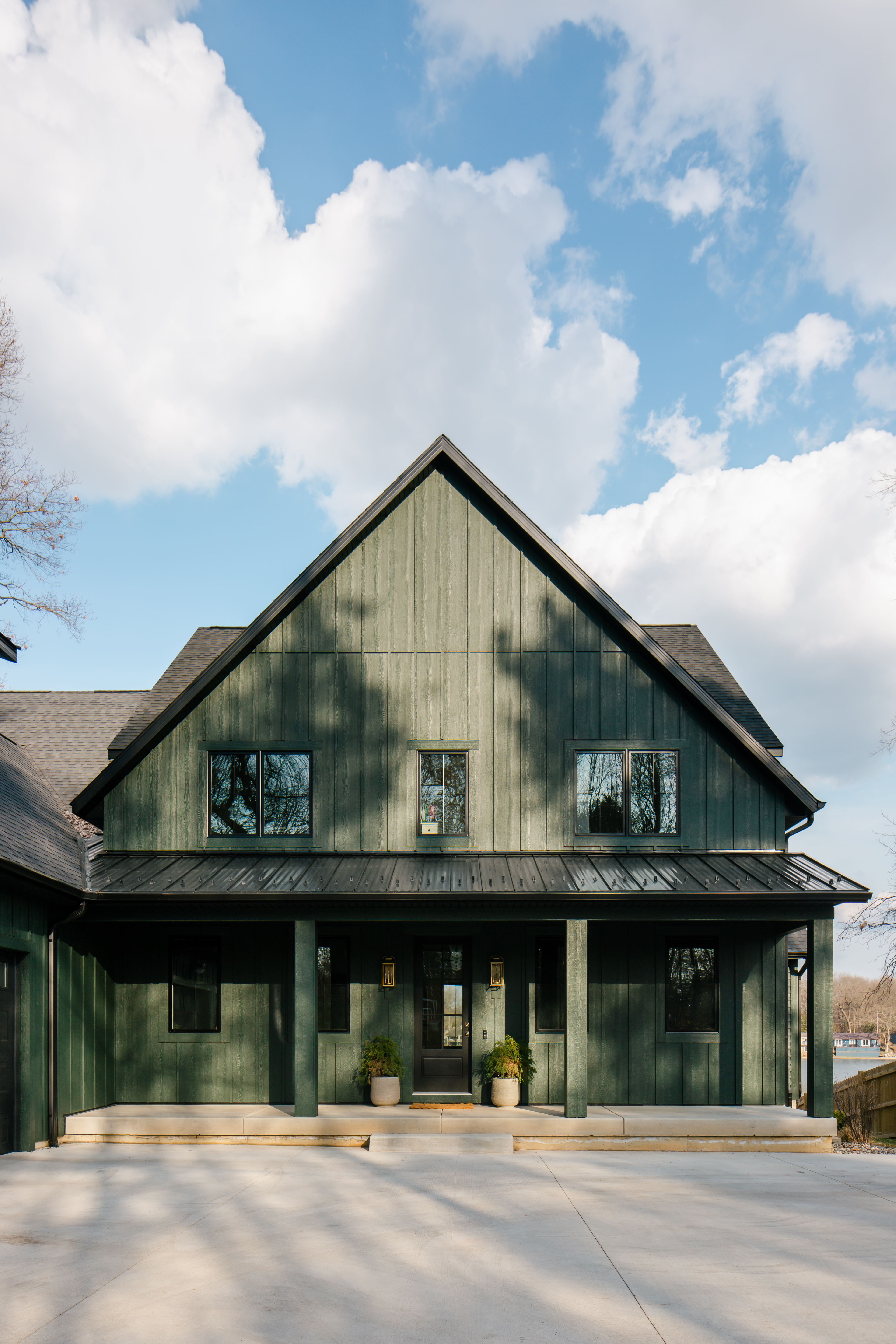
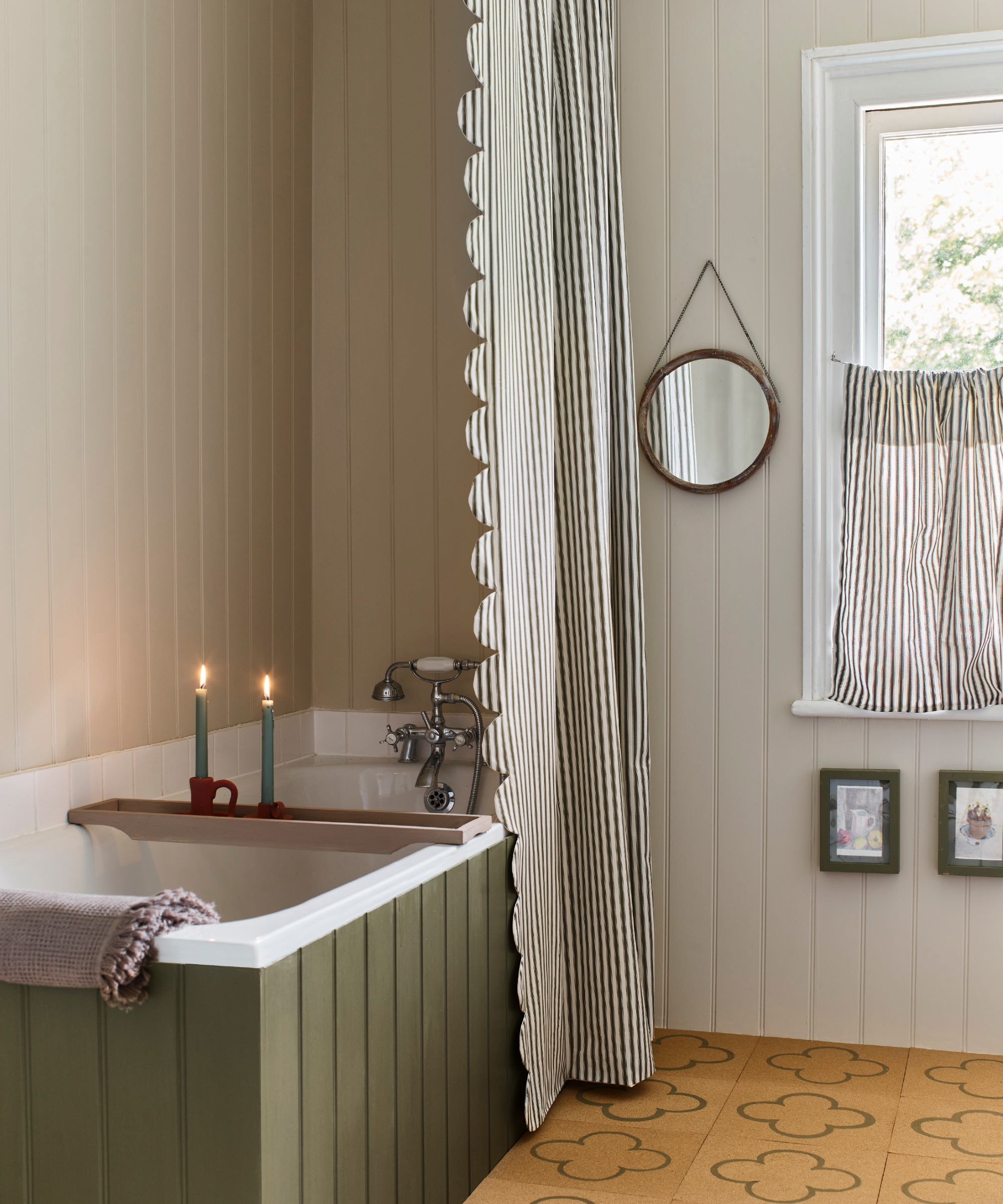
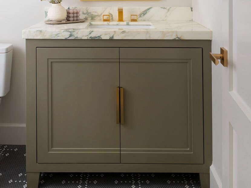
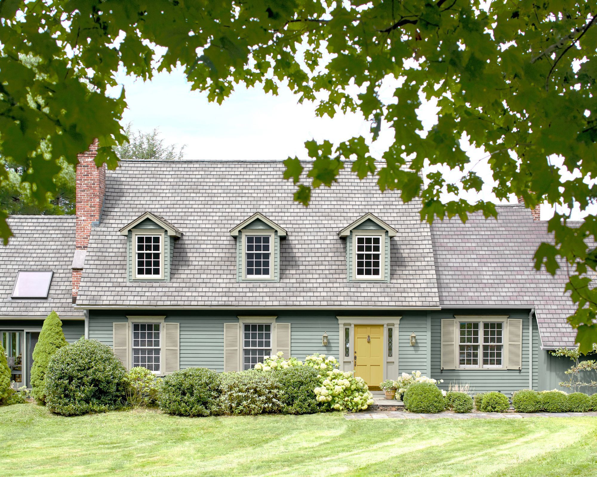
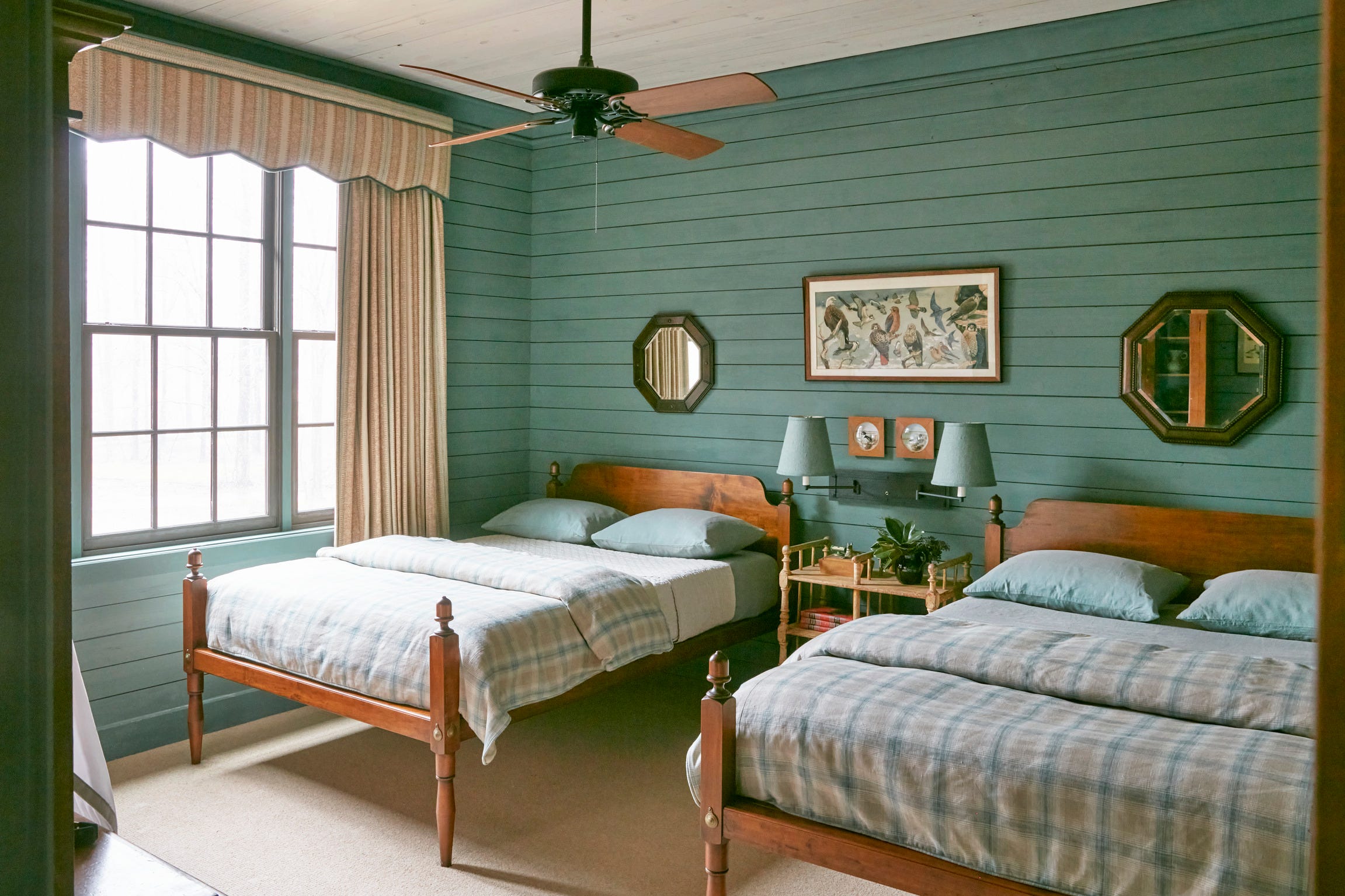
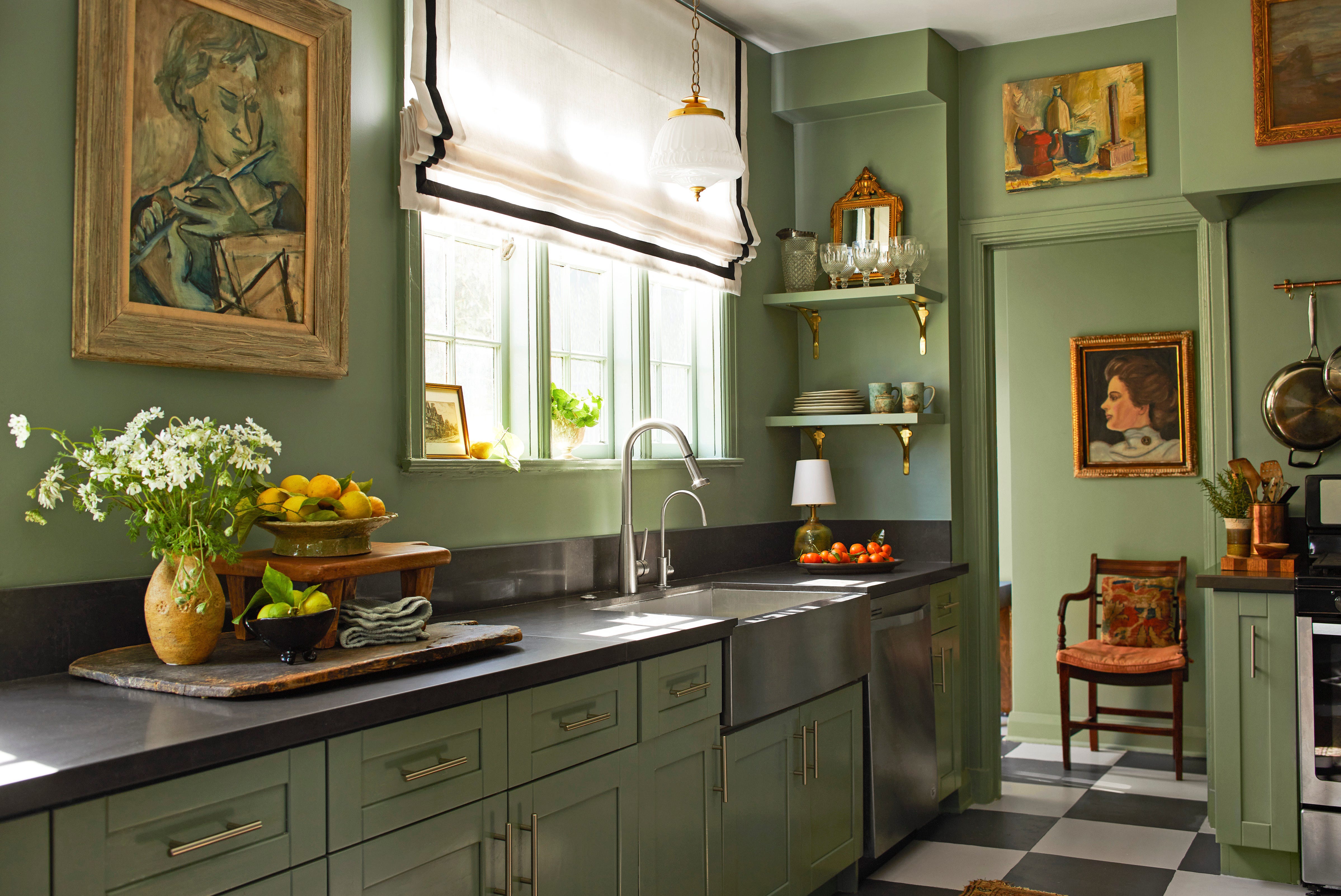
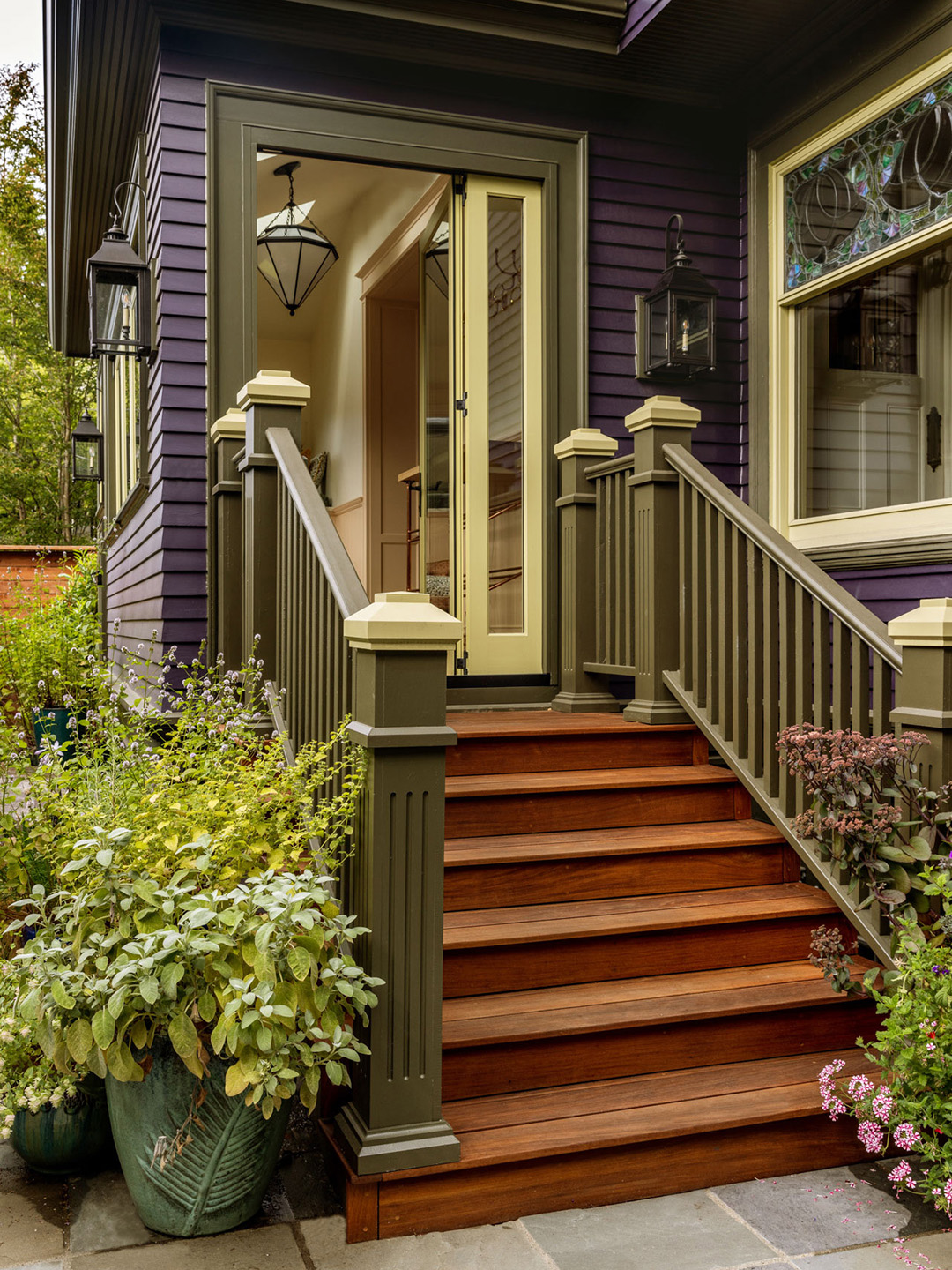
Green is a favored choice, particularly earthy greens paired with browns, for their ability to evoke a natural and serene atmosphere. These shades are well-suited for homes located amidst lush gardens or wooded areas. Nina Lichtenstein, founder of Nina Lichtenstein Custom Home Design, and Dana Lee Calabrese, founder of Dana Lee Creative, often draw inspiration from the natural settings of their clients' homes. Calabrese specifically recommends "Deep River" by Benjamin Moore for a moodier dark green look, noting its compatibility with wood doors for a nature-inspired feel. For a softer approach, she suggests "Clary Sage" by Sherwin-Williams for front doors, offering a gentle contrast.
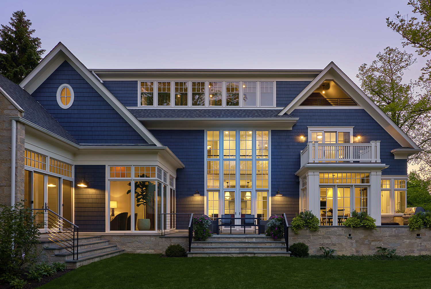
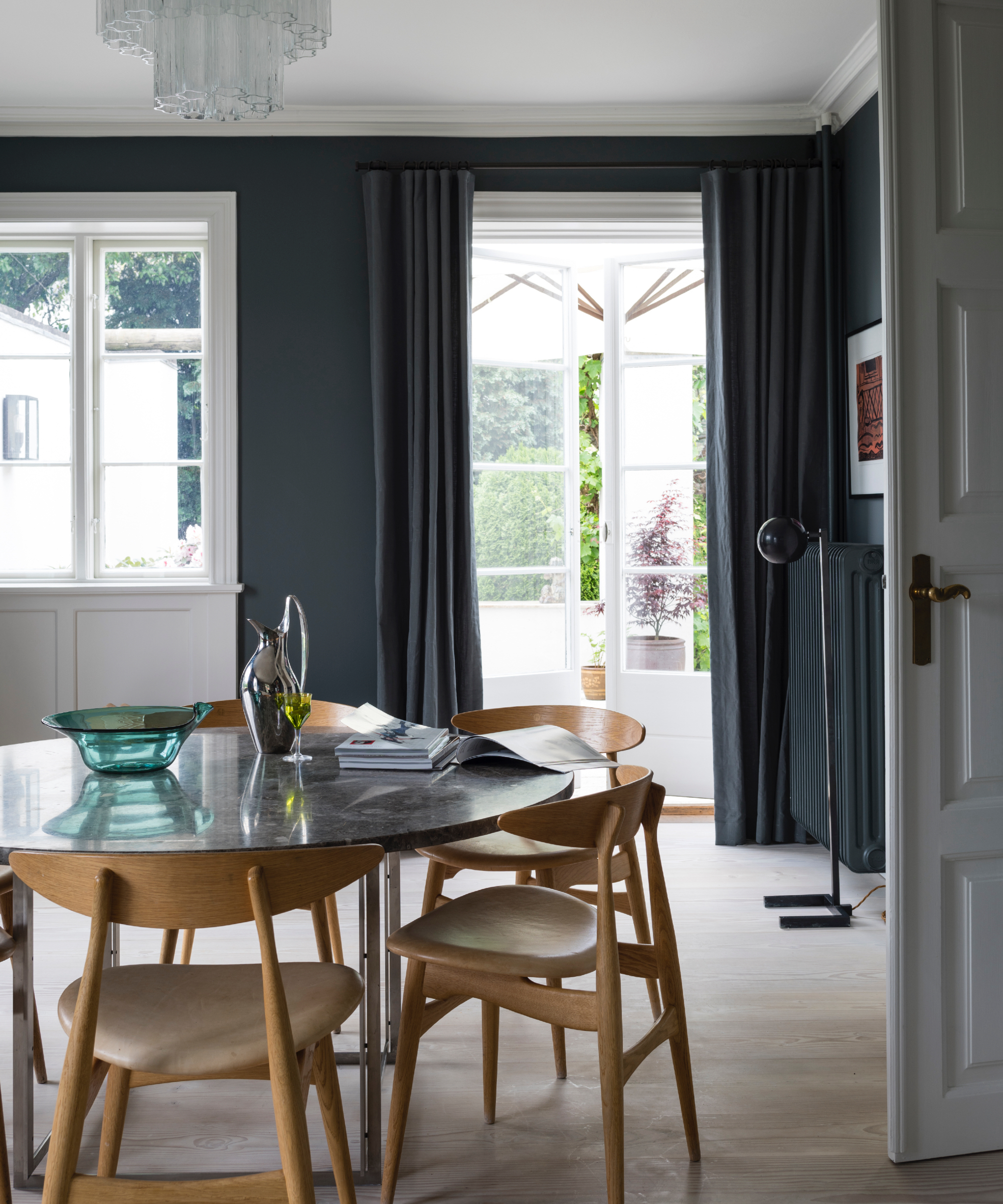
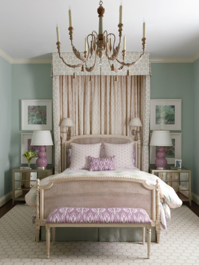
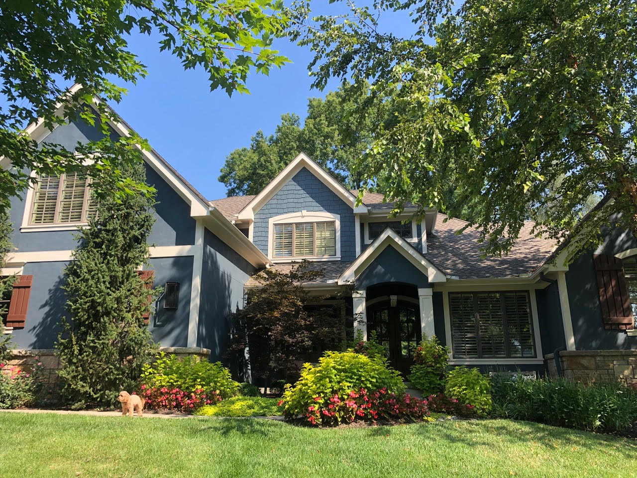
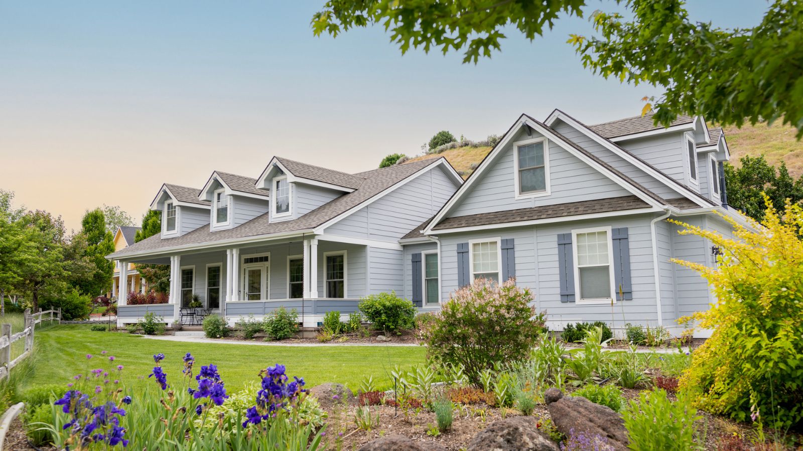
Blue-gray is another sophisticated option, bringing a calming effect to home exteriors. This hue, inspired by the sky, is ideal for coastal or farmhouse architectural styles and blends harmoniously with the natural environment. Lichtenstein highlights its versatility across both modern and traditional designs.
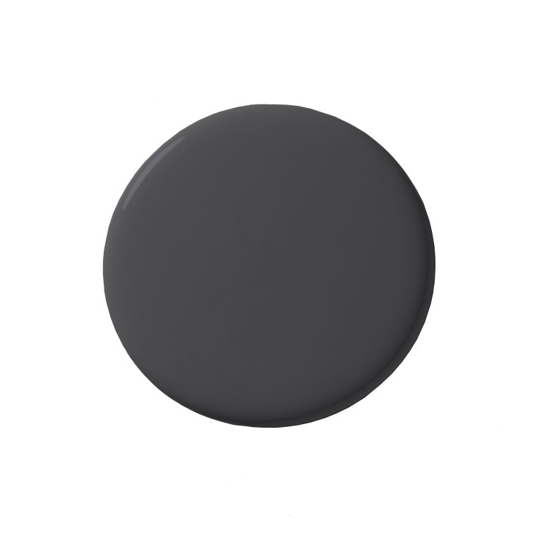
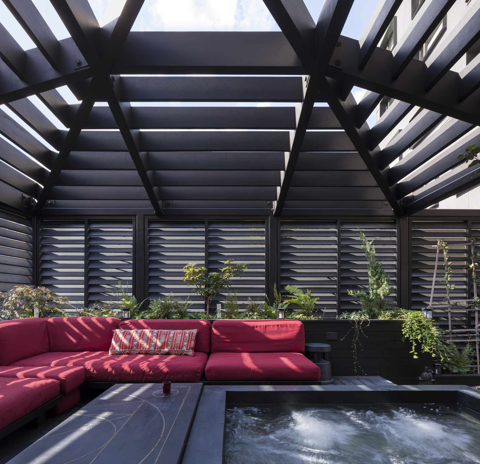
For a bold and modern statement, black is Calabrese's preferred exterior paint color. While acknowledging it may not appeal to everyone, she emphasizes its ability to create a striking contrast, particularly in mountainous regions against pines and snowy peaks, making a home stand out.
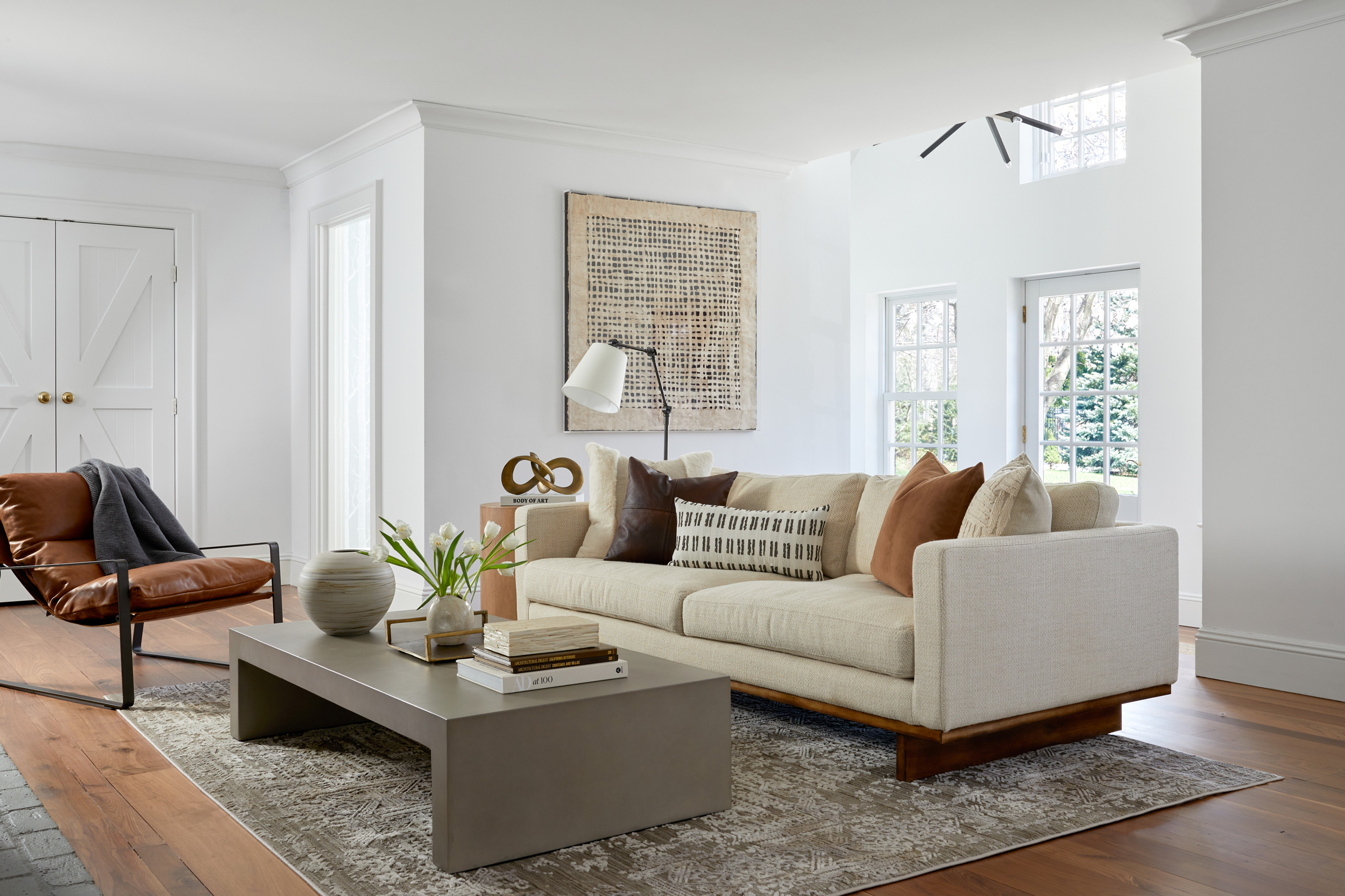
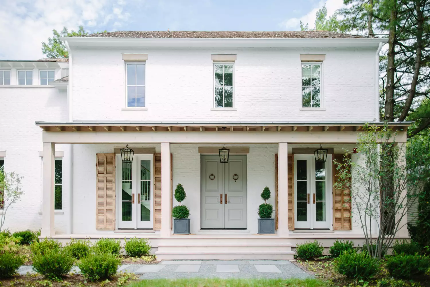
Off-white colors are considered a timeless choice by both designers, suitable for various settings including deserts, suburbs, and seaside locations. These soft, classic hues contribute to a clean and inviting appearance, making homes seem larger. They also allow accent colors to be prominently featured. Calabrese specifically recommends "Alabaster" by Sherwin-Williams for cladding due to its soft aesthetic.
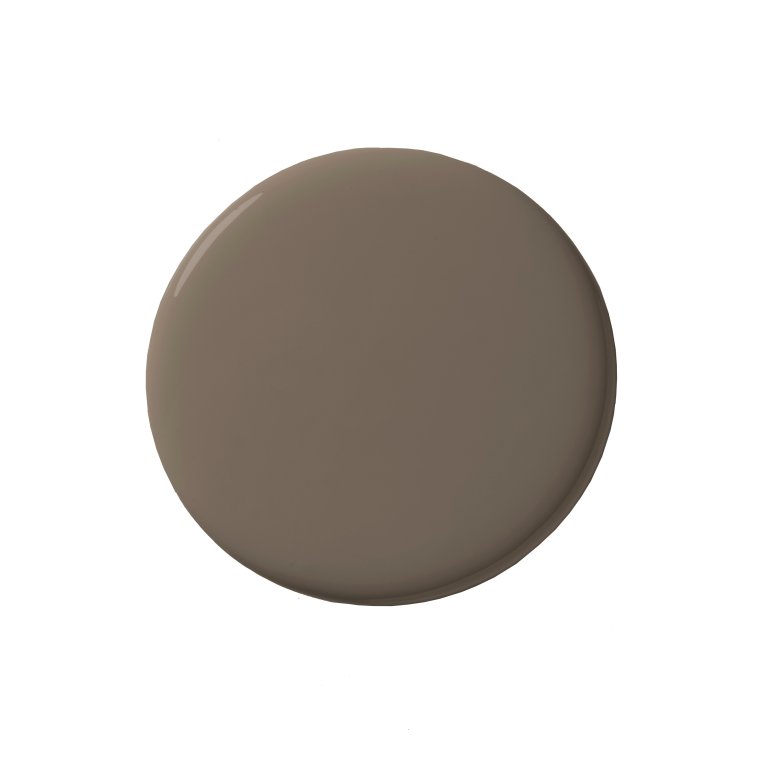
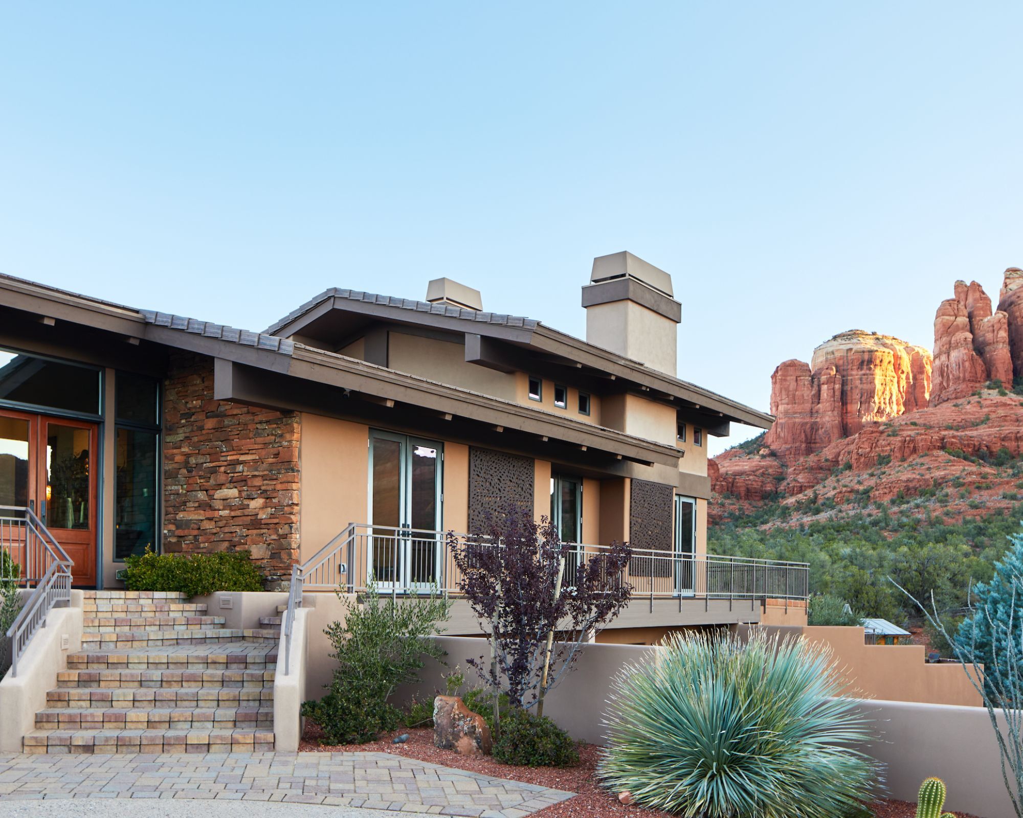
Beige is another versatile neutral color that both designers endorse. It seamlessly integrates with diverse architectural styles and landscapes, making homes feel warmer and more inviting while complementing landscaping elements. Lichtenstein points out the versatility of neutral tones like beige and taupe, while Calabrese favors "Accessible Beige" by Sherwin-Williams for front doors, especially when paired with white cladding.
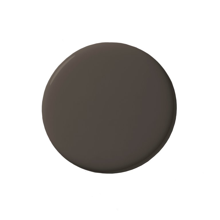
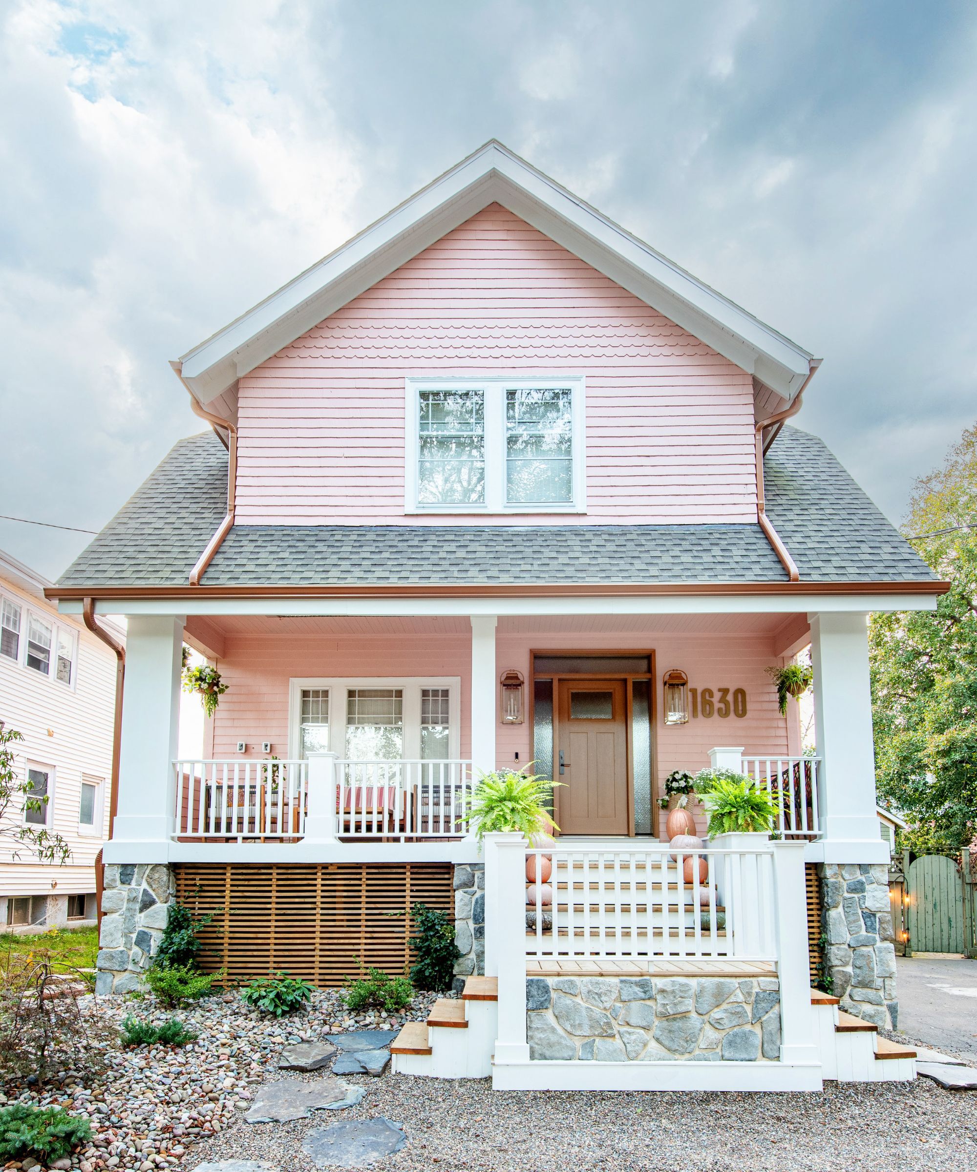
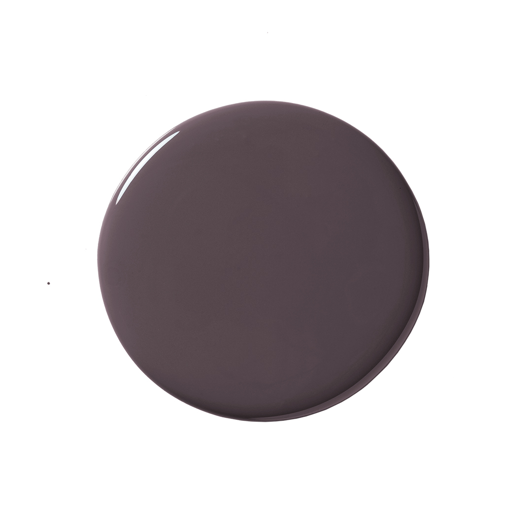
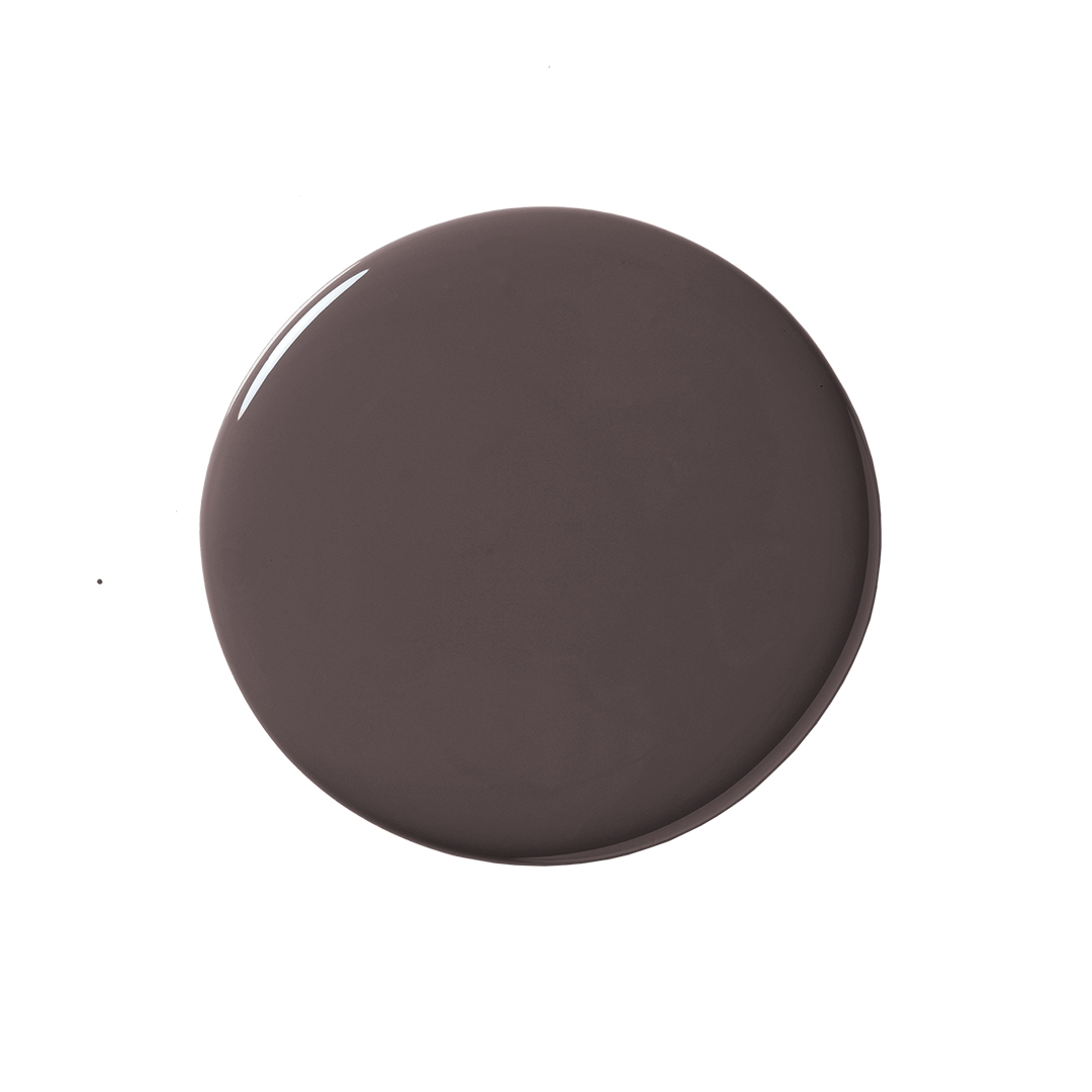
Gray, in its light, medium, and dark variations, is a classic option frequently recommended by Lichtenstein. Darker grays can be used for the main body of the house to draw attention upwards, while mid-tone grays can highlight roof peaks and areas under windows as focal points. Lighter grays can provide contrast on the sides of the house or as accents, creating a layered effect and emphasizing specific architectural details like chimneys. Considering trim color is also crucial, with white being a popular choice for its clean and crisp outline, complementing almost any exterior paint color. Designers' favorite color combinations include warm off-white main exteriors with dark brown or greige trim for a modern, high-contrast look, and various shades of gray with white accents to mimic natural sky and cloud elements, adding depth and visual interest.
#ExteriorPaintColors #HomeDesign #InteriorDesigners #PaintTrends #HomeImprovement #ArchitecturalStyles #ColorPalettes #ExteriorPaintColors #HomeDesign #InteriorDesigners #PaintTrends #HomeImprovement #ArchitecturalStyles #ColorPalettes
0 ความคิดเห็นรวม
 ยังไม่มีความคิดเห็น
คุณอาจจะชอบอีกด้วย
7 rules designers always follow to find the best exterior paint for your home

19 go-to paint colors that Dallas designers love

4 Interior Designers Share the Biggest Paint Color Trends Right Now (and What’s Out!)

The Best Exterior Paint Colors, According To Designers
The Best Exterior Paint Colors Designers Have Ever Used

Designers Share Their Tried-and-True Shades From the Best Interior Paint Brands
7 Sherwin-Williams Paint Colors Interior Designers Can’t Stop Using

The Moody Shade That Will One-Up White Exteriors in 2026

9 Neutral Paint Colors Designers Constantly Reach For — "It's My Tried-and-True"

7 Bold Paint Colors Interior Designers Are Longing to Use on Their Next Projects
5 Vibrant Color Palettes Designers Are Using to Add Energy and Excitement to Decor

An A-List Designer’s Secrets To Picking Perfect Paint Colors

Four Designers Pick Their Fave Exterior Paint Color For Your Abode


8 Favorite Paint Colors of Local Interior Designers

10 of the best exterior paint colors according to designers – these are the go-to shades from tried and trusted brands

The most timeless paint colors according to designers

7 of the most versatile and easy to use paint colors according to designers
7 Colors Designers are Painting Outdoor Furniture in 2024

Designers Swear By These 11 Sage Green Paint Colors

7 Color Combos That ALWAYS Look Good Together, According to Designers