1/21
Here Are the Best Cream Paint Colors, According to Design Pros
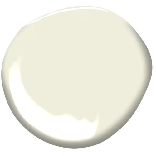
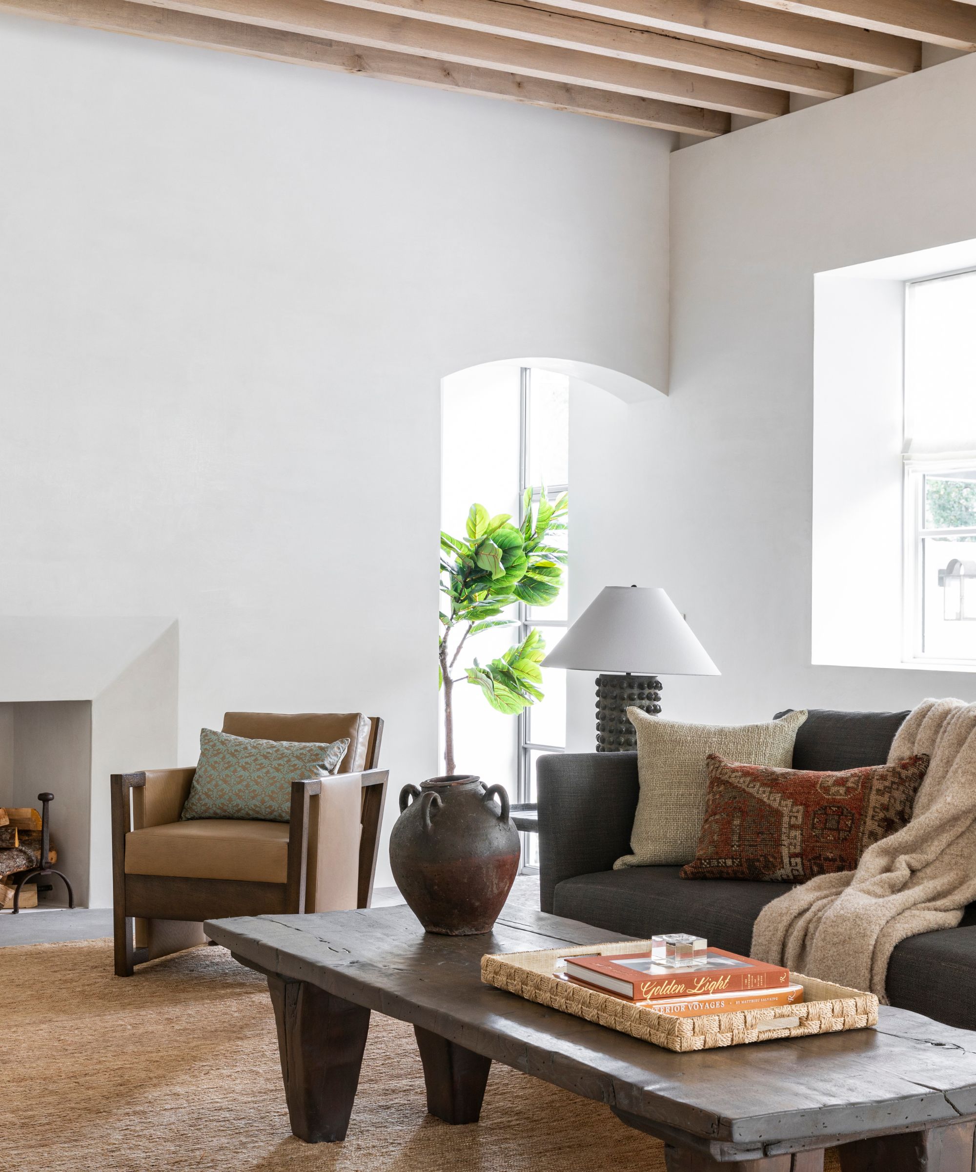
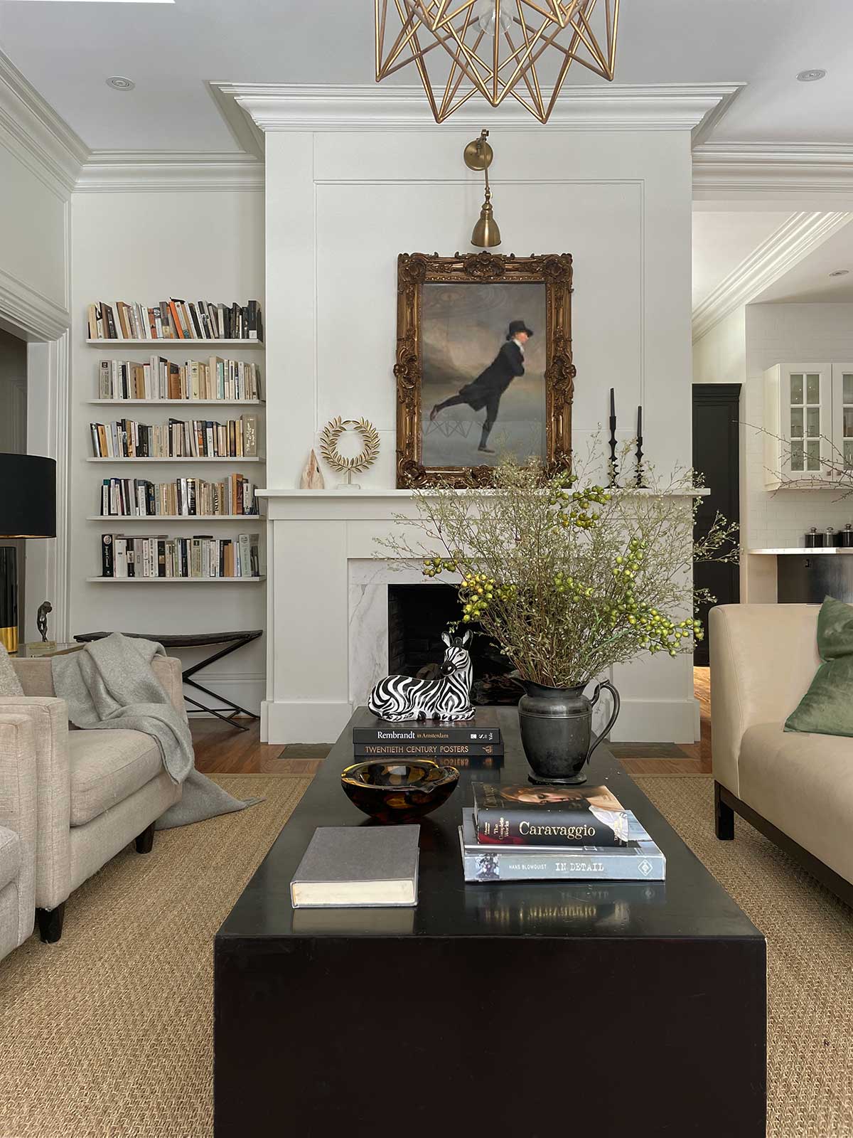
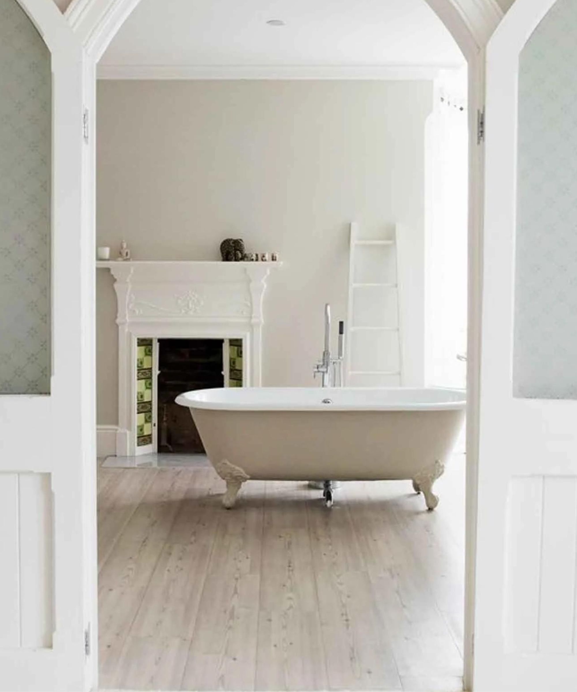
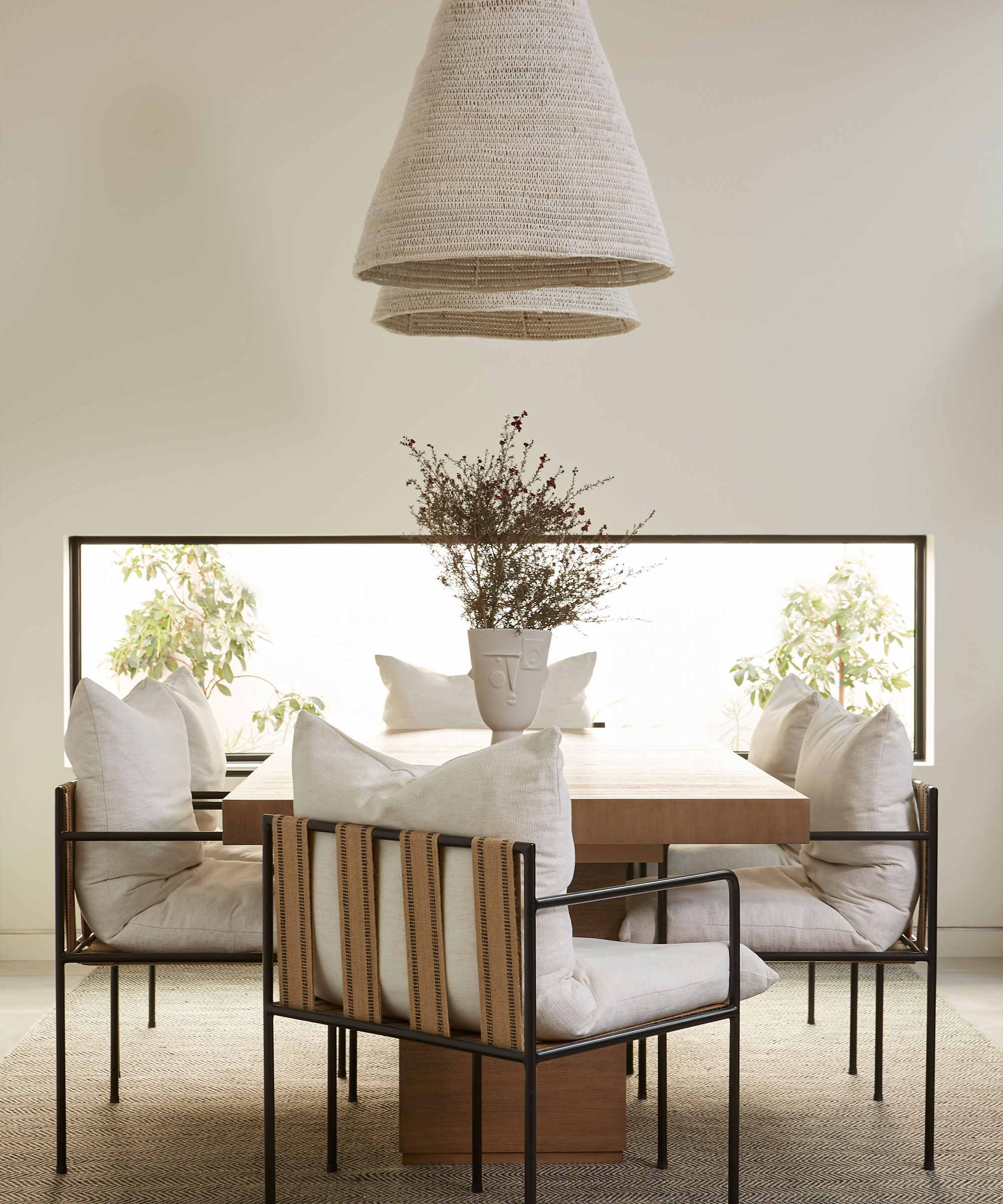
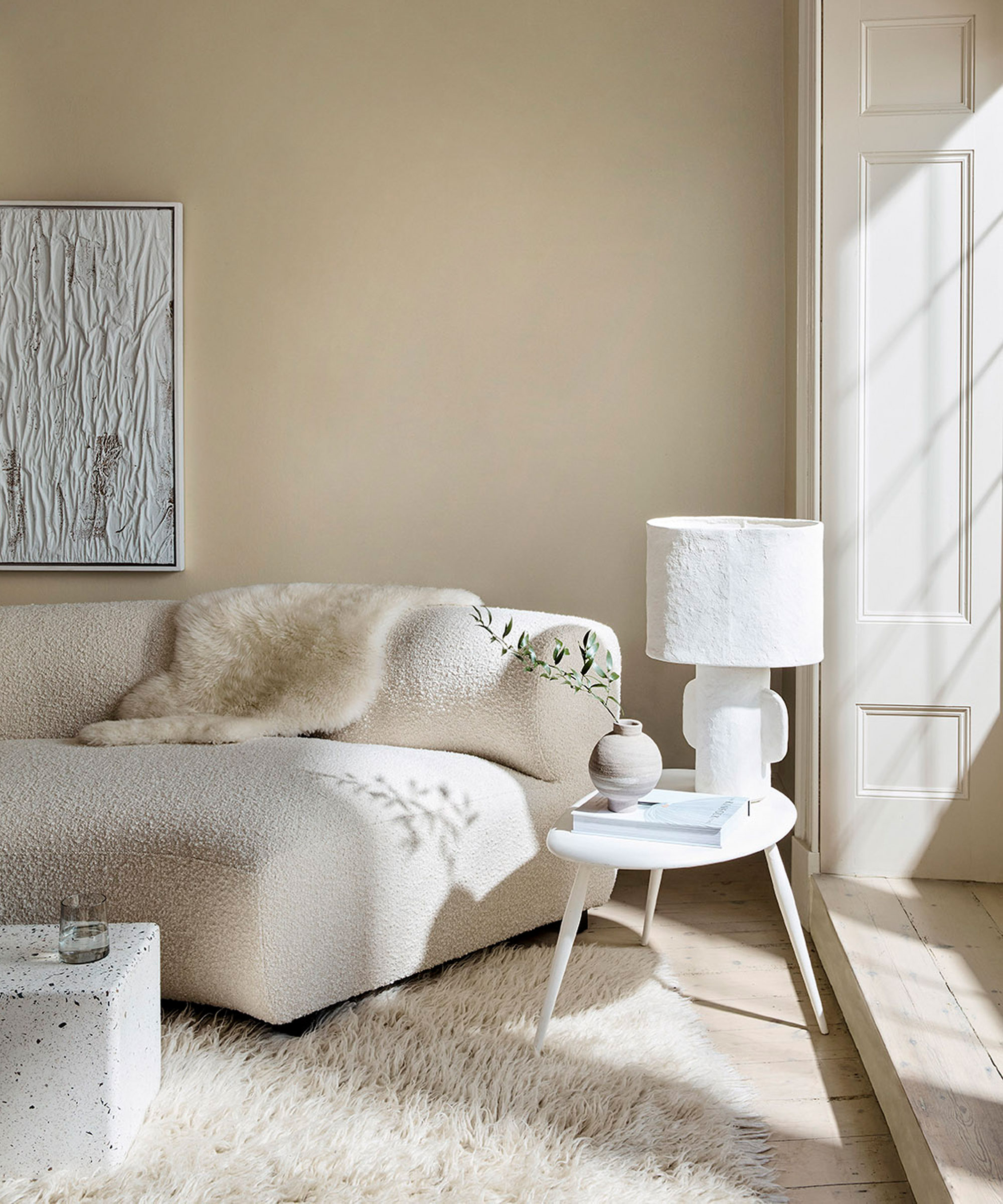
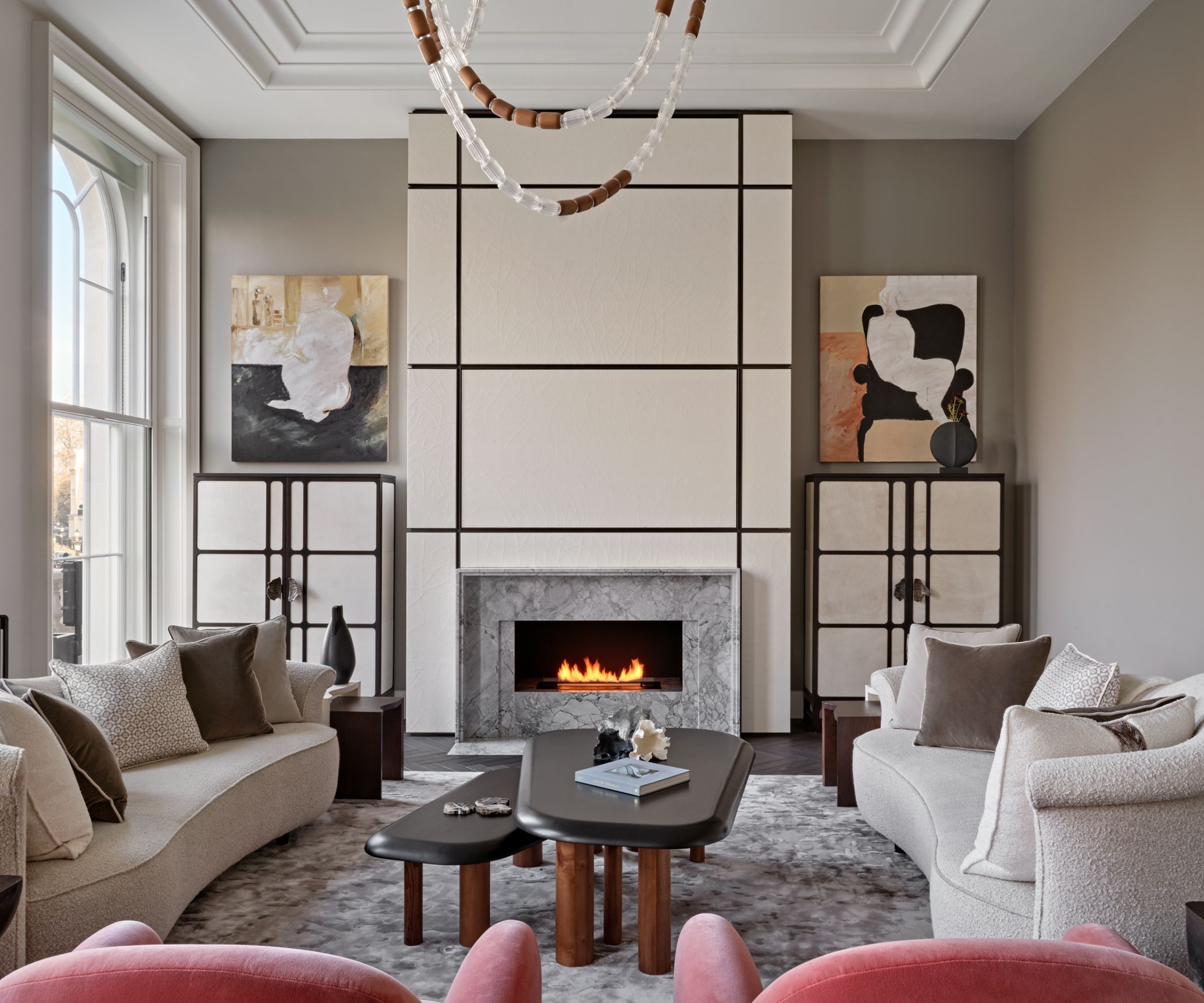
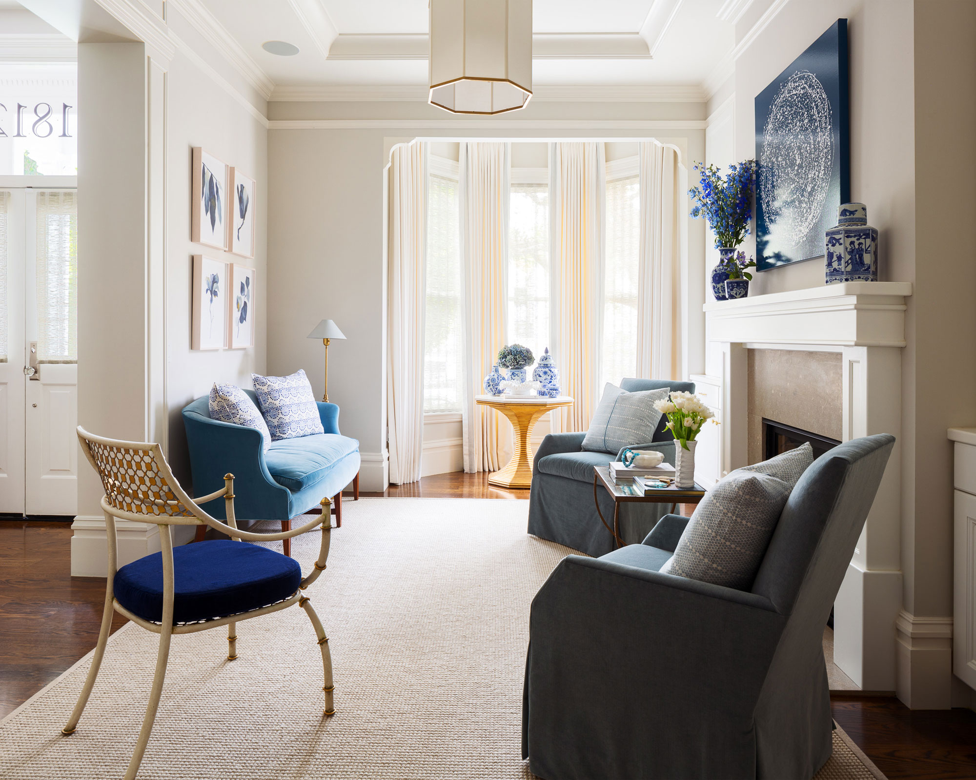
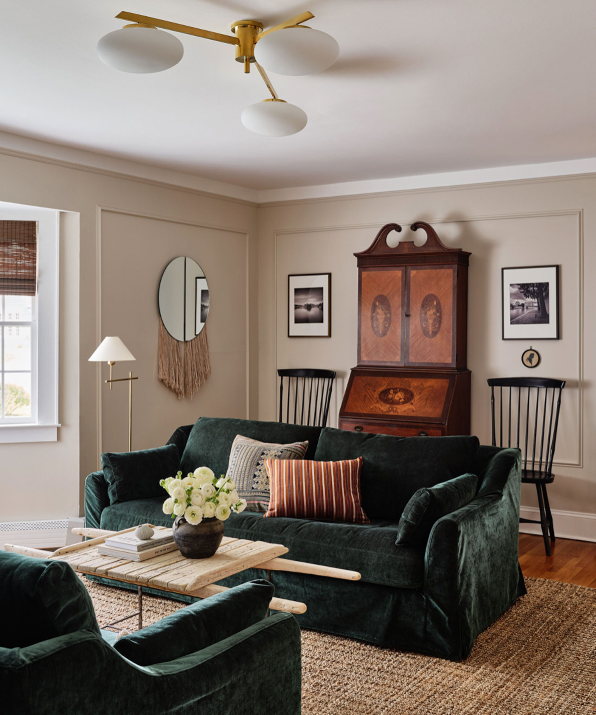
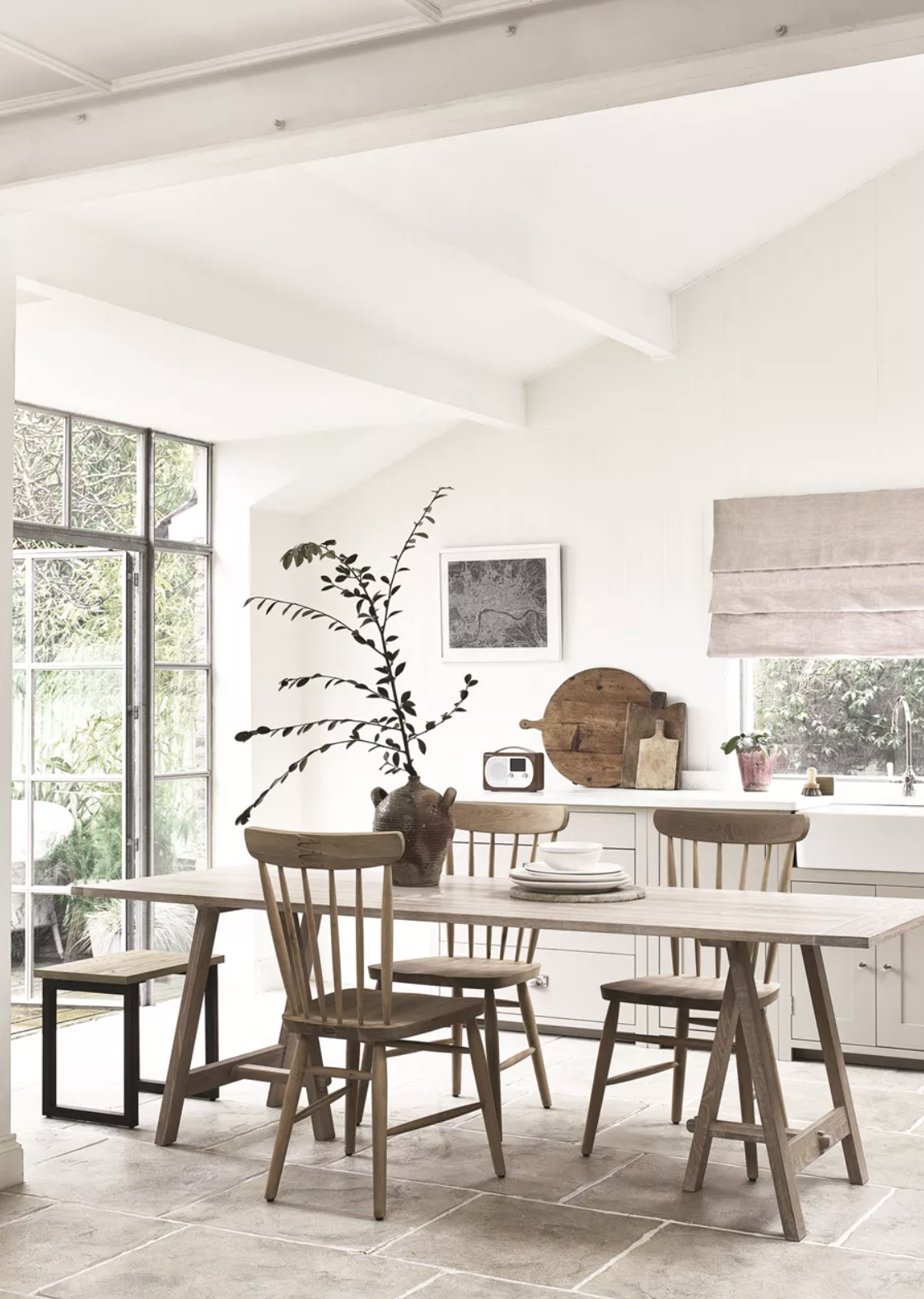
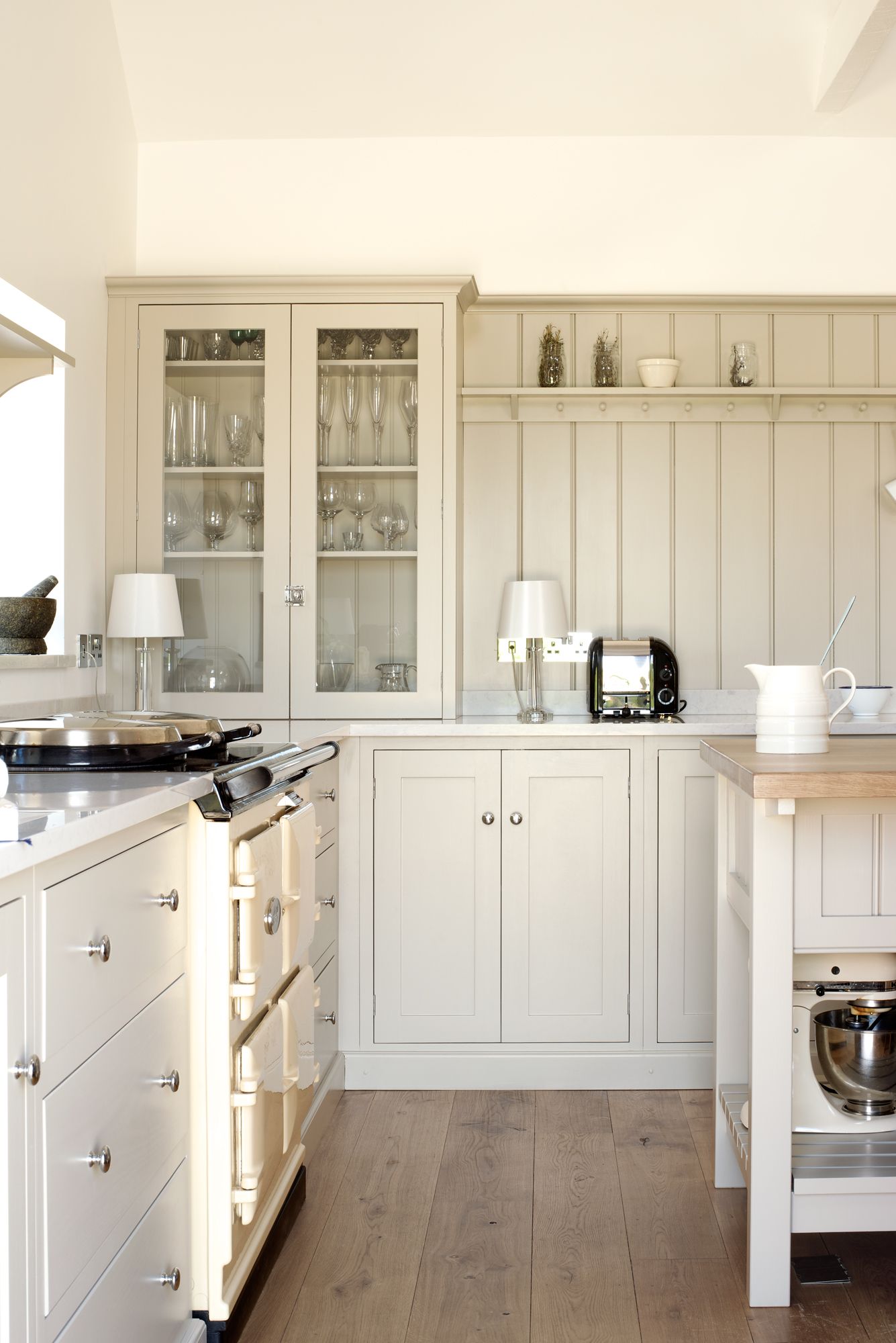
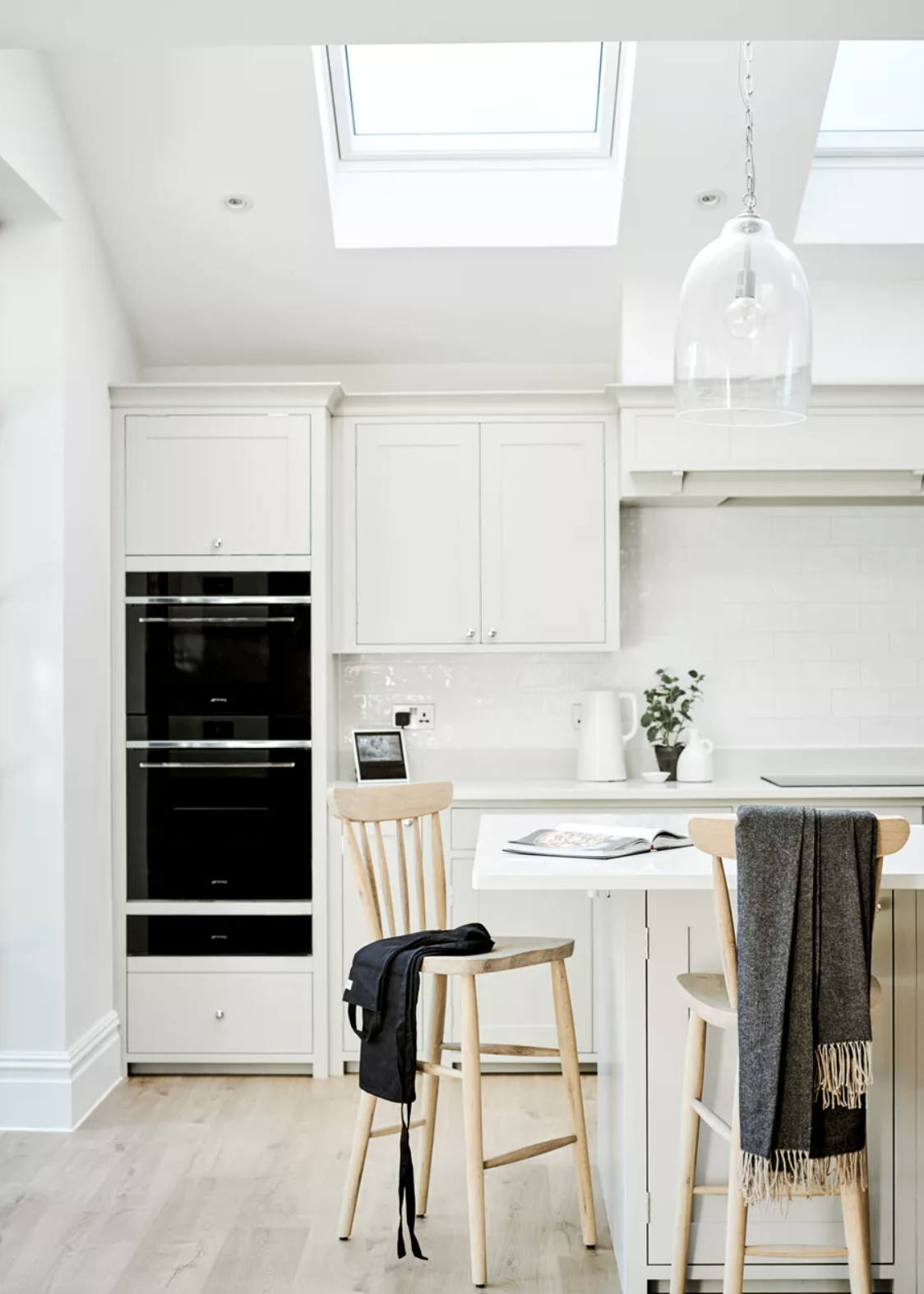
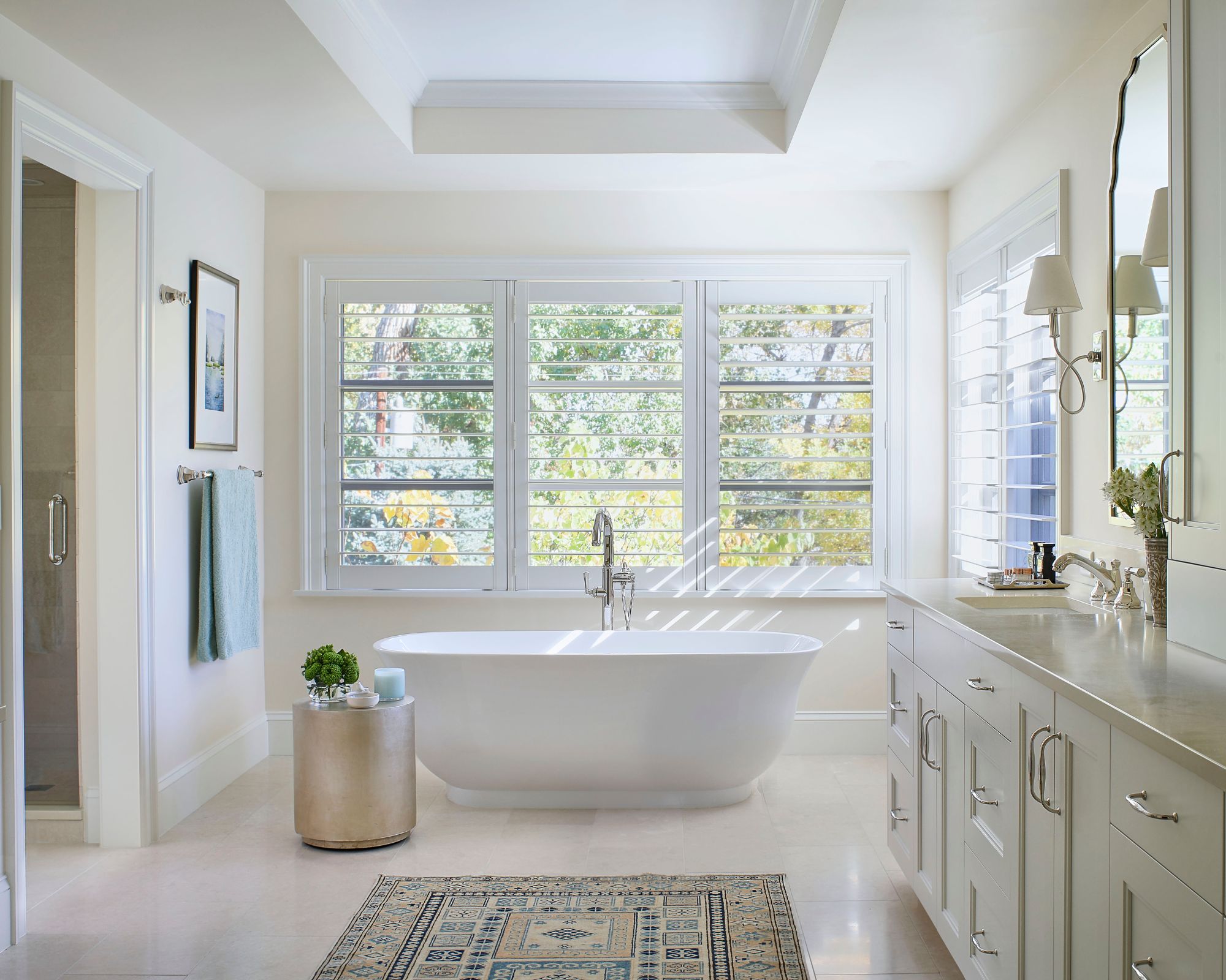
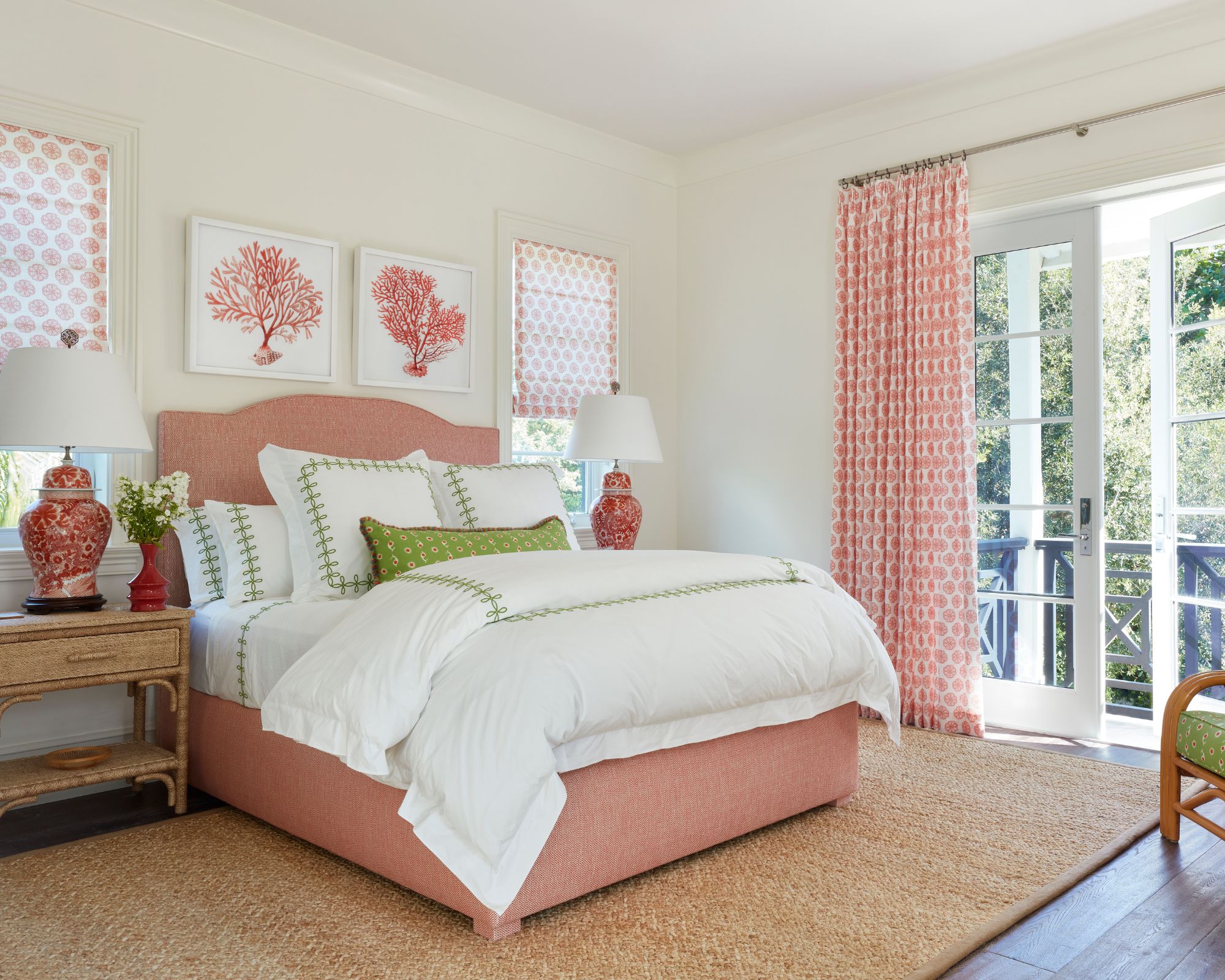
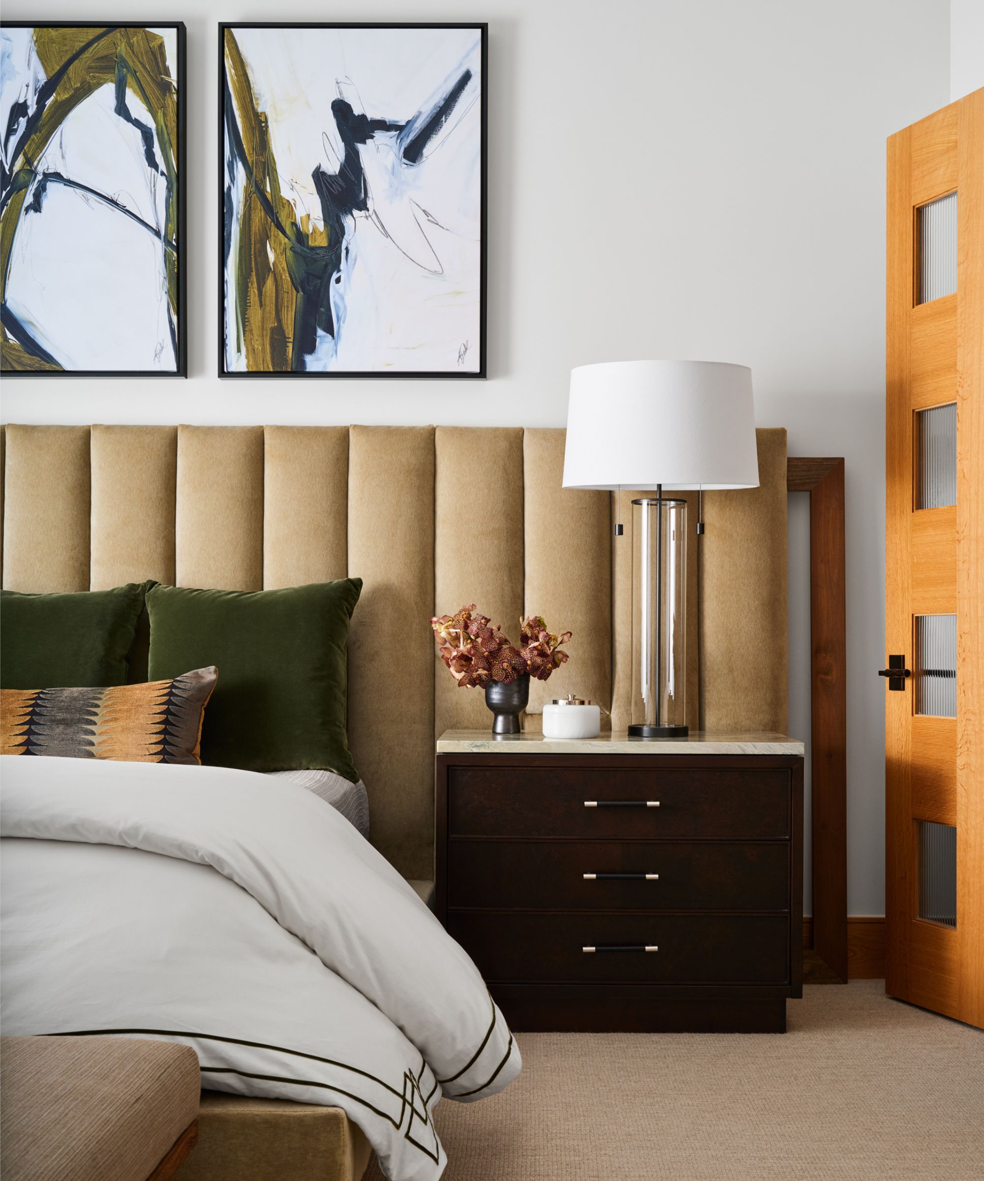
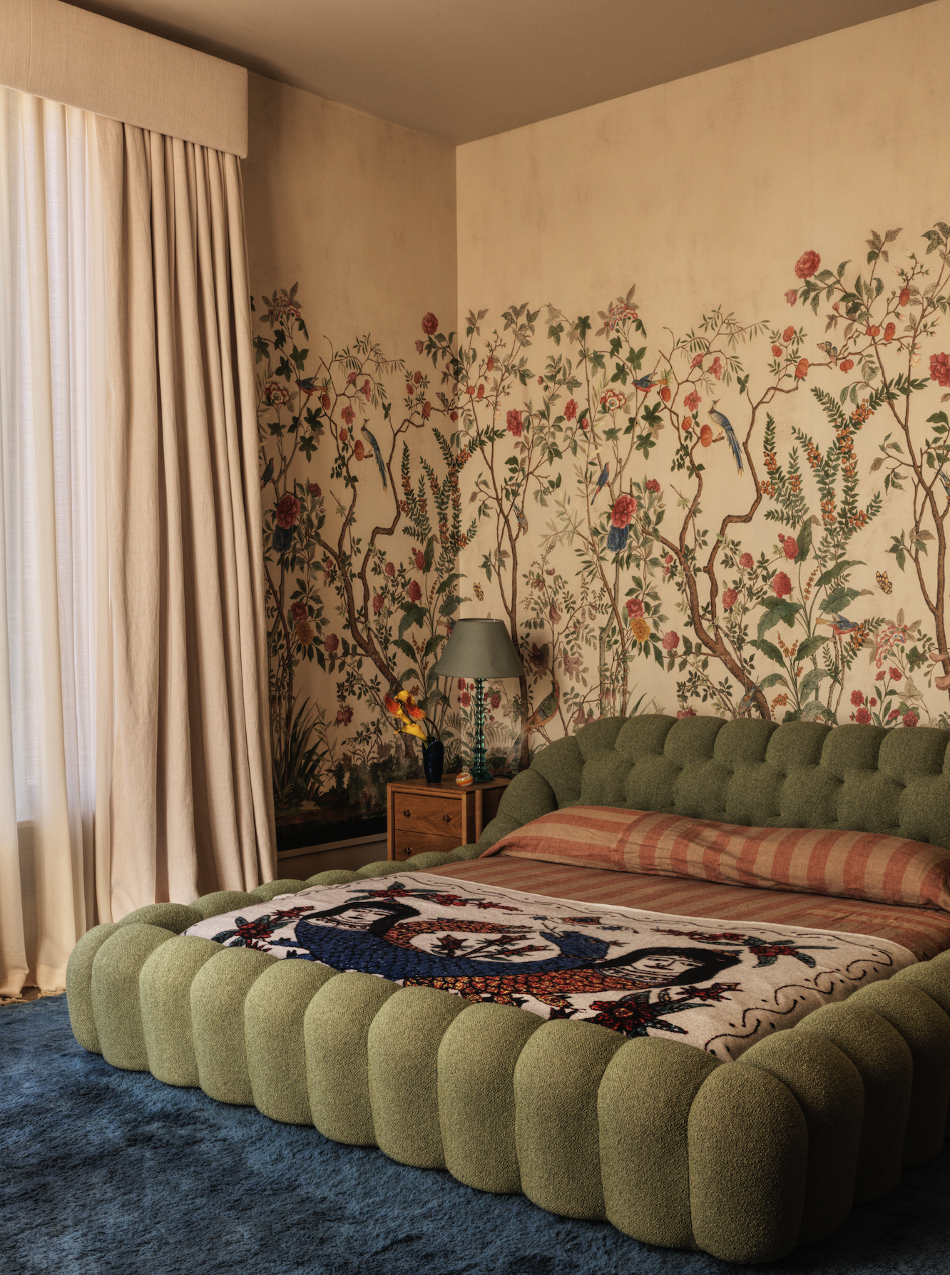
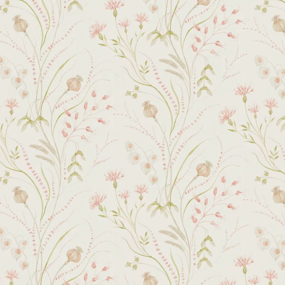
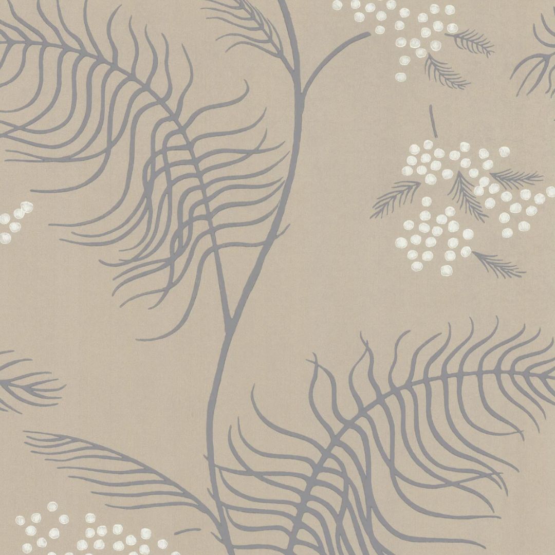
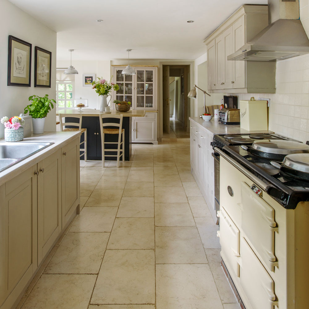
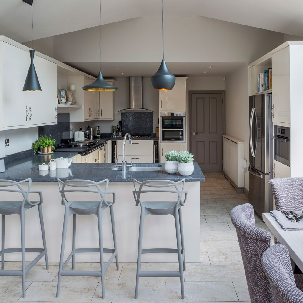
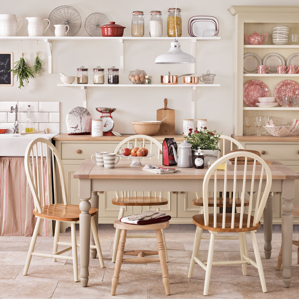
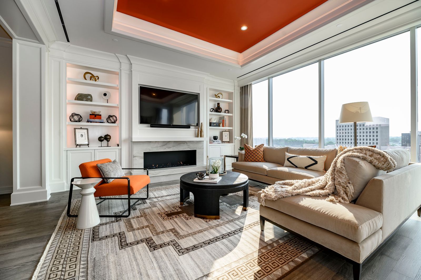
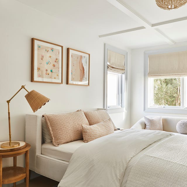
The article presents a curated list of 20 top cream paint colors, as recommended by interior designers and color experts. It highlights the versatility and warming qualities of cream shades, noting their ability to brighten and soften a space, making them suitable for various rooms including living rooms, bedrooms, and kitchens, and compatible with diverse home styles. The article emphasizes that not all cream paints are identical, as their undertones — which can range from yellow, green, and pink to gray or blue — significantly influence their appearance in different settings.
Key considerations for selecting the right cream paint color are outlined, with experts advising on the importance of testing paint samples directly on walls. This allows individuals to observe how the color interacts with natural and artificial light throughout the day, ensuring satisfaction with the chosen hue. A practical tip shared involves comparing paint swatches against a solid, forgiving white, such as Benjamin Moore's Simply White, to better assess the cream's vibrancy and undertones. This comparative method helps in discerning the subtle differences between various cream shades.
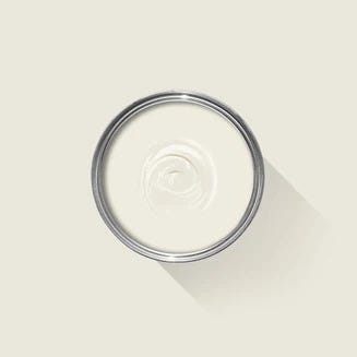
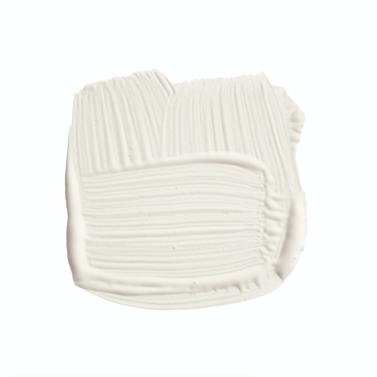
The featured paint colors include notable selections from leading brands like Benjamin Moore, Farrow & Ball, Sherwin-Williams, Glidden, HGTV Home by Sherwin-Williams, Behr, and Dunn-Edwards. For instance, Benjamin Moore's Lancaster Whitewash is noted for its yellow tint and light-bouncing properties, creating a cozy yet bright atmosphere. Farrow & Ball's Tallow is praised for its pale cream base with hints of yellow and pink, ideal for uplifting darker spaces. Sherwin-Williams' White Flour is suggested for those seeking a creamy white that balances brightness with warmth.
Other recommendations include Glidden's Pearls and Lace for its refined beige undertones, HGTV Home by Sherwin-Williams' Vanillin for its warm, adaptable pigment, and Sherwin-Williams' Mushroom, a rich beige with gray undertones, particularly suited for bedrooms. Farrow & Ball's Pointing is highlighted for its ivory tone that avoids excessive yellow, fitting well in most spaces. Benjamin Moore's Painted Sands offers a more intense cream with orange undertones, complementing white or black accents. Behr's Shoelace, a creamy off-white with dusty yellow and brown undertones, pairs well with natural textures and earthy tones. Dunn-Edwards' Cashmere, with subtle peach and pink undertones, is presented as a timeless neutral for relaxing spaces.
Further options encompass Benjamin Moore's White Dove, a clean white with gray or beige undertones; Farrow & Ball's Slipper Satin, a chalky off-white that balances white, off-white, and gray; Benjamin Moore's Swiss Coffee, a brighter cream with yellow undertones; and Farrow & Ball's Shadow White, a soft white with a gray hint. Sherwin-Williams' Creamy is described as a chameleon color due to its adaptable yellow undertones, and Benjamin Moore's Cream Silk offers a breezy pale shade with lemon-lime hints. Natural Choice by Sherwin-Williams is a creamy, cool white suitable for interiors and exteriors, while HGTV Home by Sherwin-Williams' Techno Gray provides a blend of warm and cool tones. Benjamin Moore's Seapearl, with its cool gray undertones, and Behr's Heavy Cream, a deep off-white with umber undertones, complete the list, each offering unique characteristics to create comfortable and inviting home environments.
#InteriorDesign #PaintColors #HomeDecor #CreamPaint #NeutralPalette #DesignTips #PaintUndertones #InteriorDesign #PaintColors #HomeDecor #CreamPaint #NeutralPalette #DesignTips #PaintUndertones
0 комментариев всего
 Комментариев пока нет
Вам также может понравиться
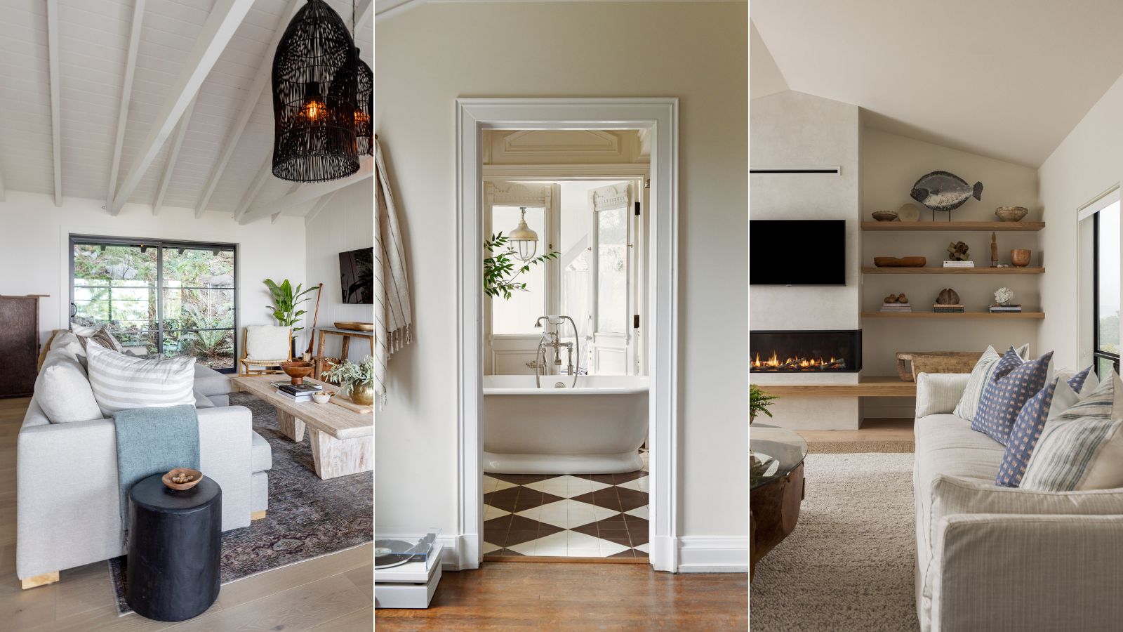
5 best cream paints, as chosen by interior designers
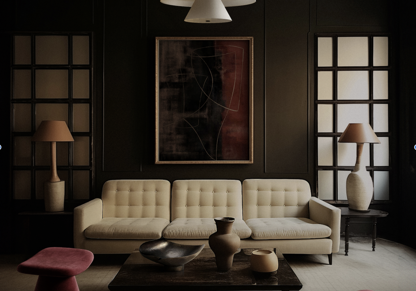
What Colors Go With Cream? 10 Crème de la Crème Pairings That Go Perfectly With the Warm Neutral

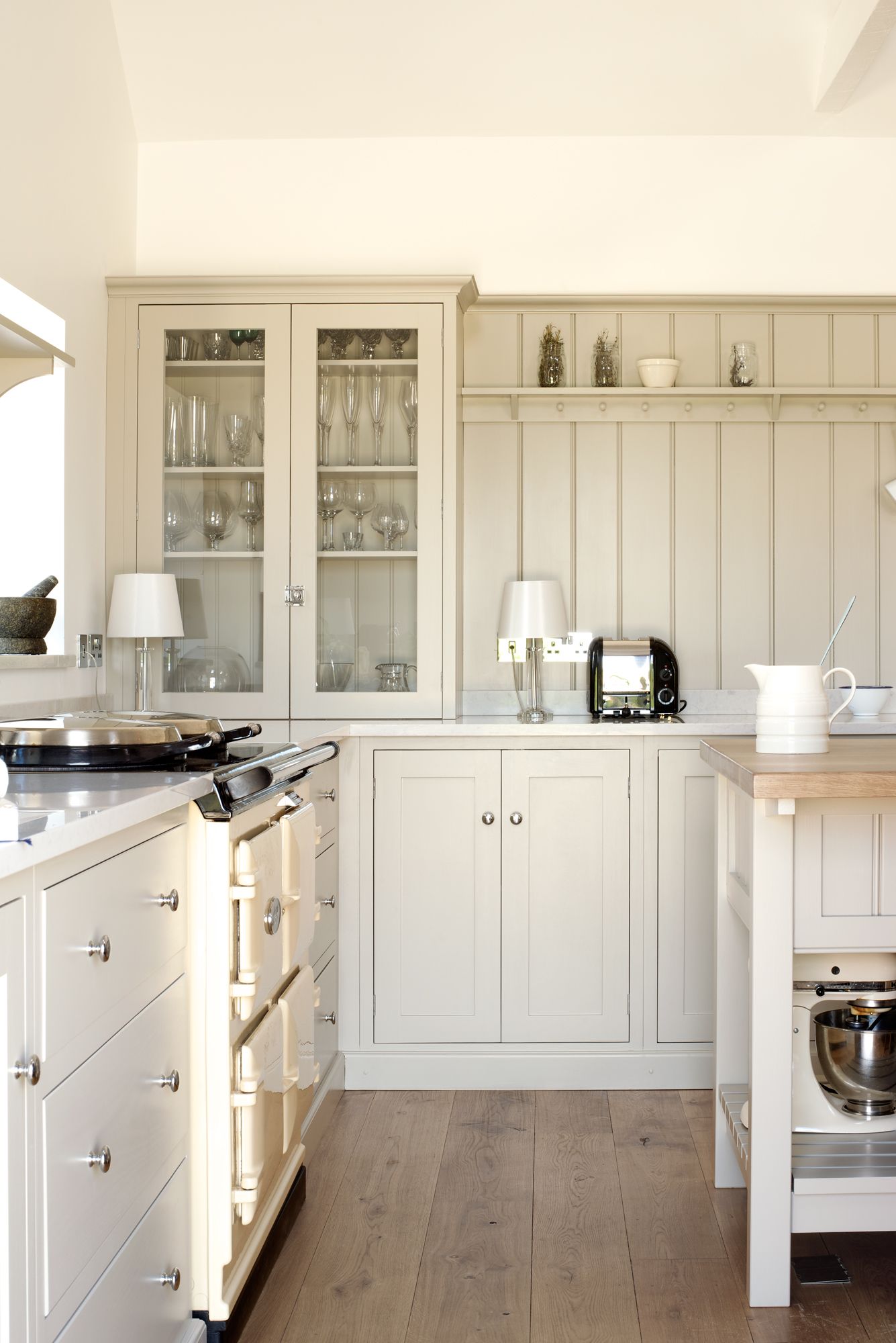
13 cream kitchen ideas that prove beige is back

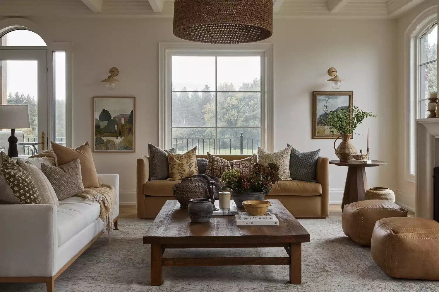
From the Living Room to the Bedroom, These Cream Paint Colors Work Anywhere

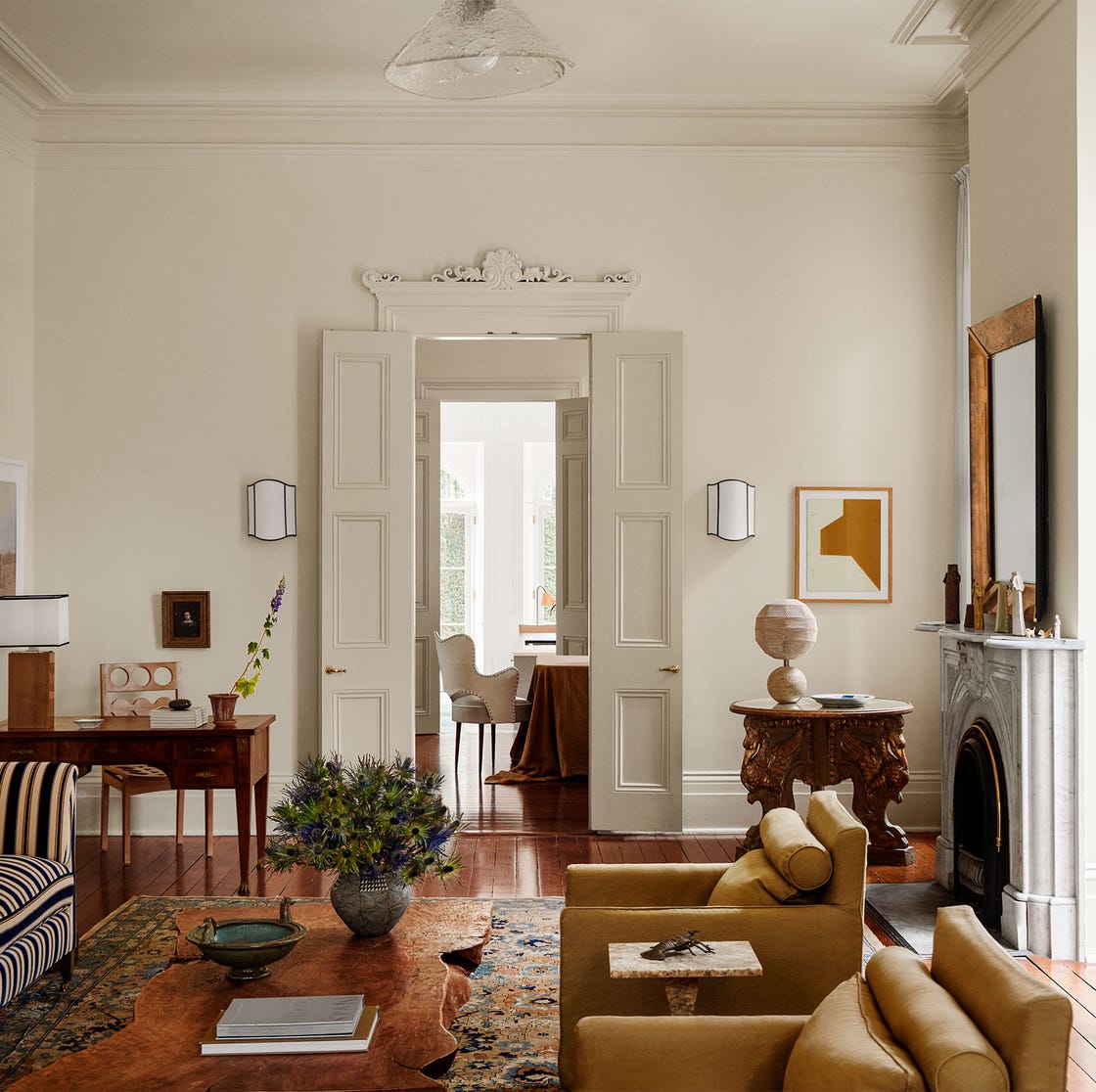
Interior Designers Share Their Favorite Cream Paint Colors
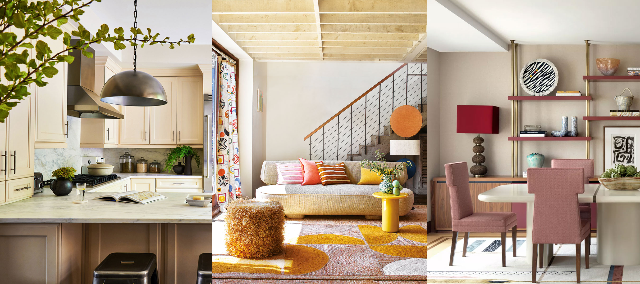
What colors go with cream? 8 complementary colors for this neutral favorite
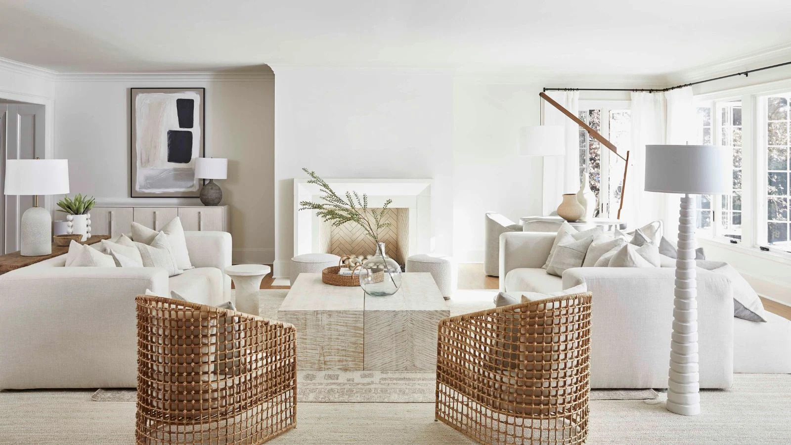
7 of the best cream wall paint colors, as chosen by designers – 'they look modern, and anything but magnolia'

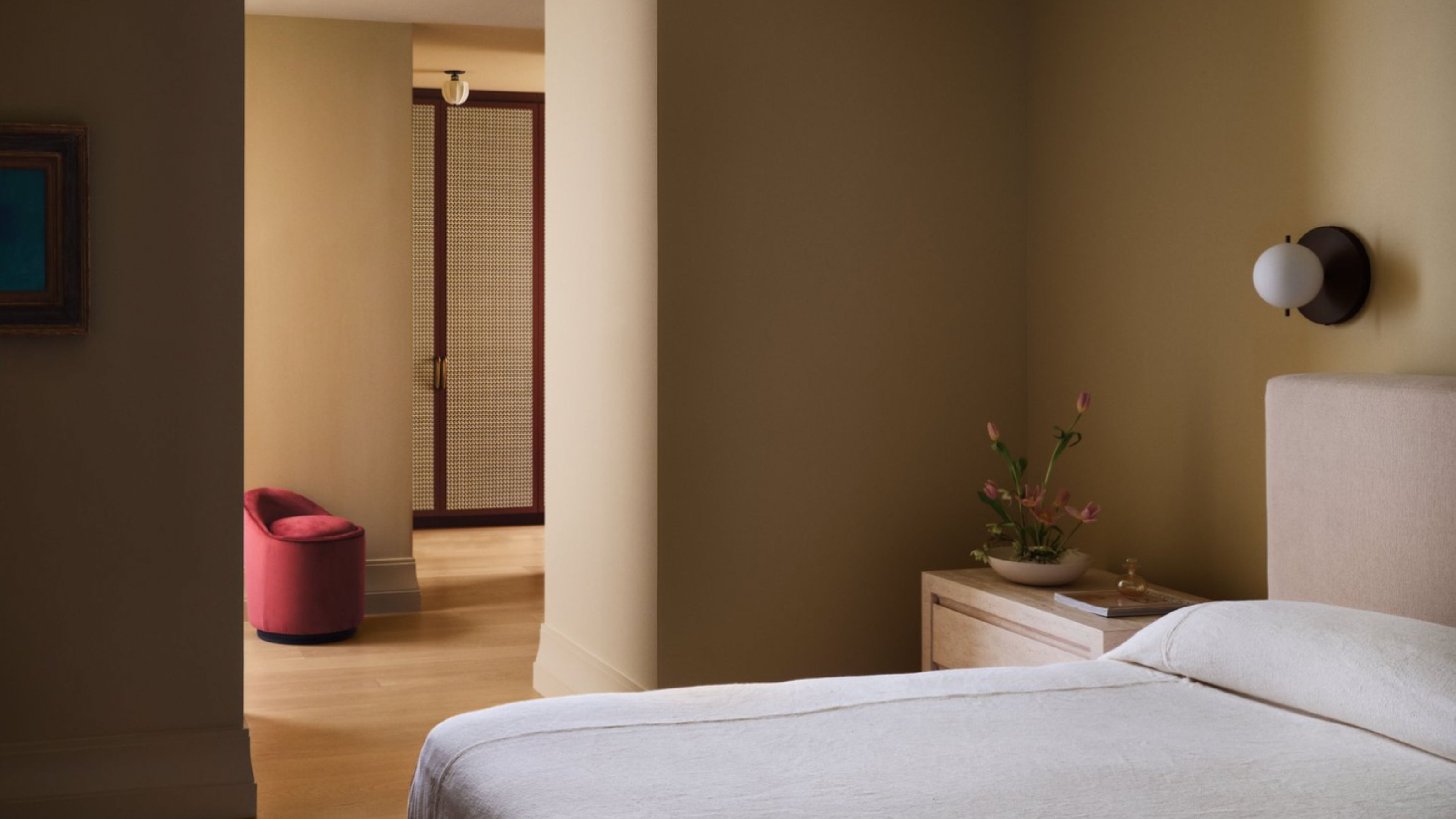
10 Cream Bedroom Ideas That Prove This Velvety Shade is Anything But Boring
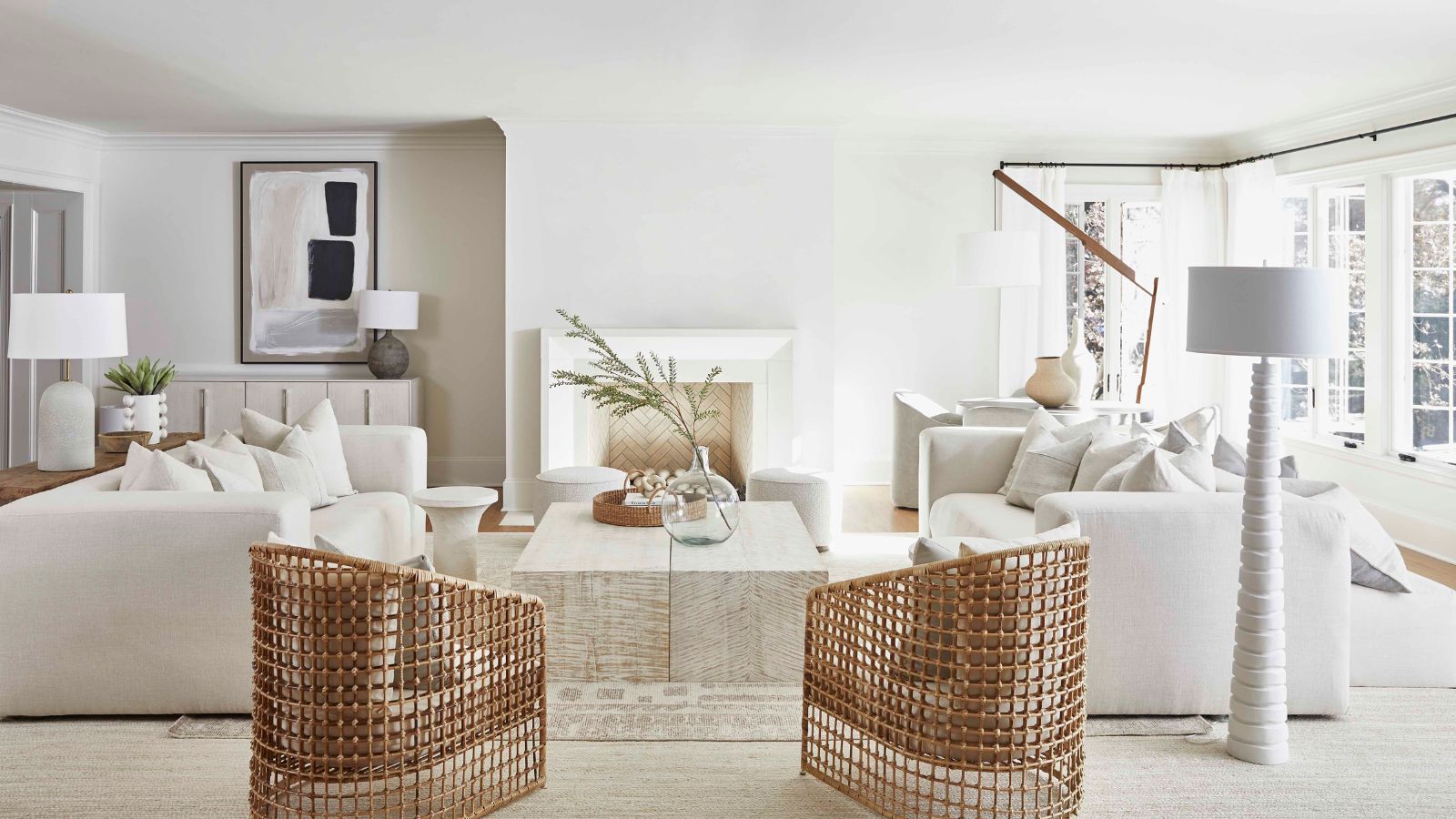
7 of the best cream wall paint colors, as chosen by designers – 'they look modern, and anything but magnolia'
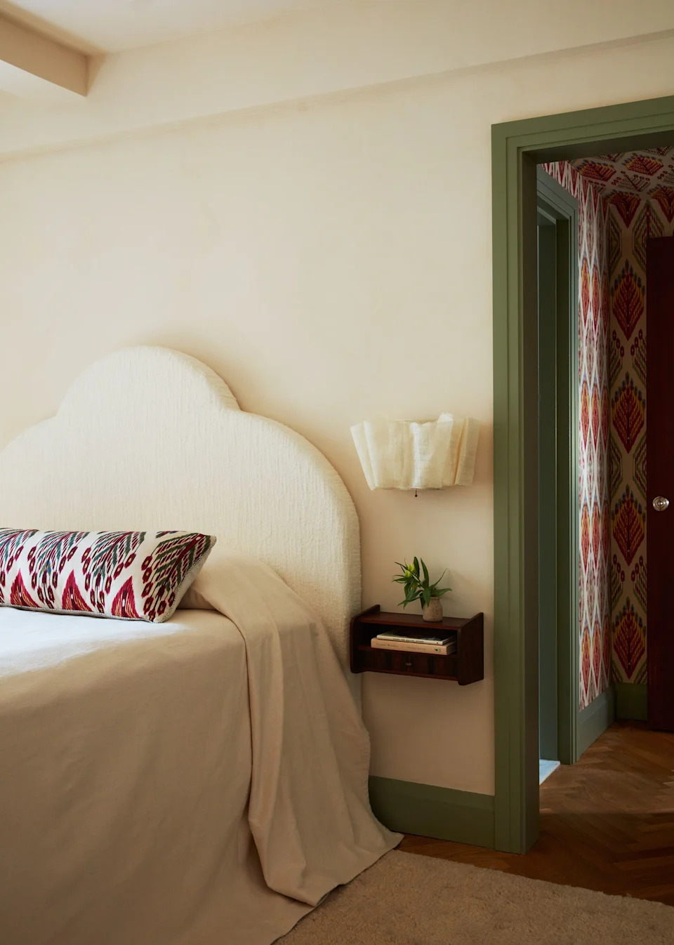
23 Versatile Cream Paint Colors That Will Pair with Basically Anything

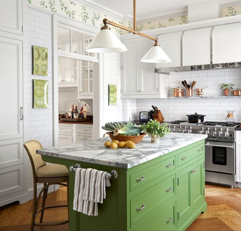
It’s Official: These are the Best Kitchen Paint Colors, According to Designers
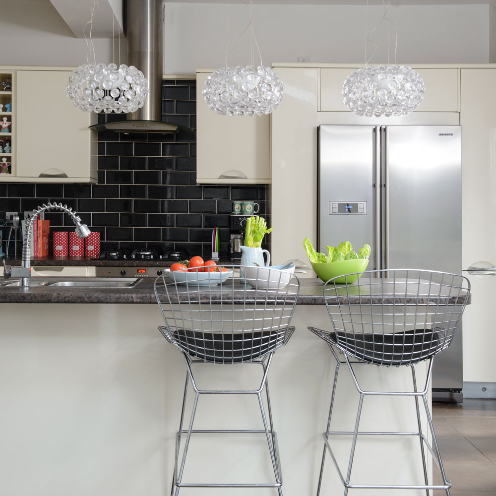
Cream kitchen ideas – all beautifully classic and sure to stand the test of time
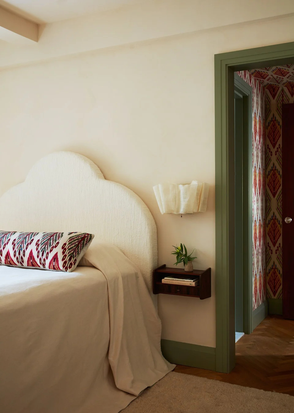
23 Versatile Cream Paint Colors That Will Pair with Basically Anything

14 Best CC Creams - Top Color Correcting Cream for Flawless Skin

The Best Cream Colored Sweaters To Add To Your Wardrobe Now
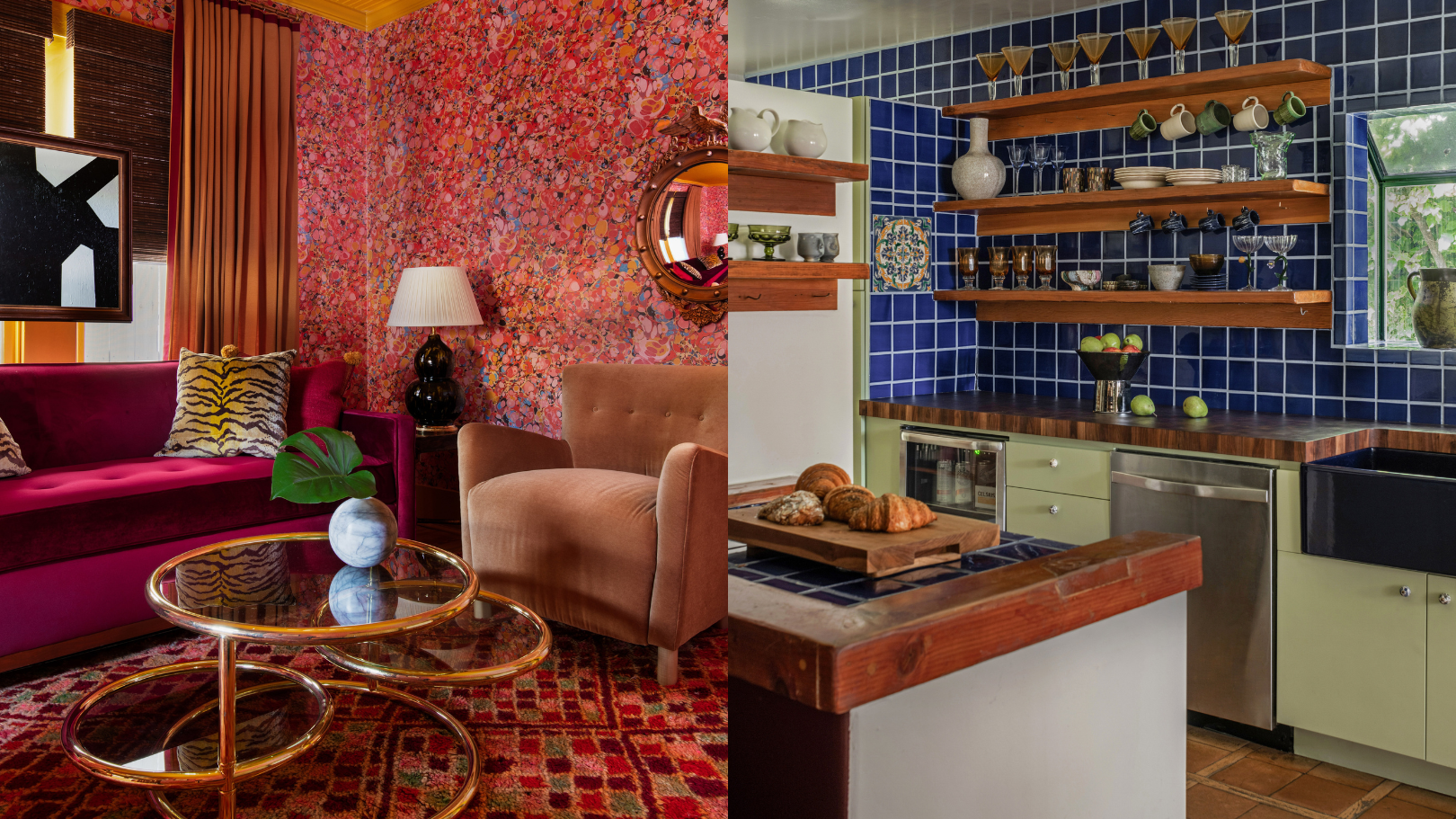
9 'good weird' paint colours approved by designers

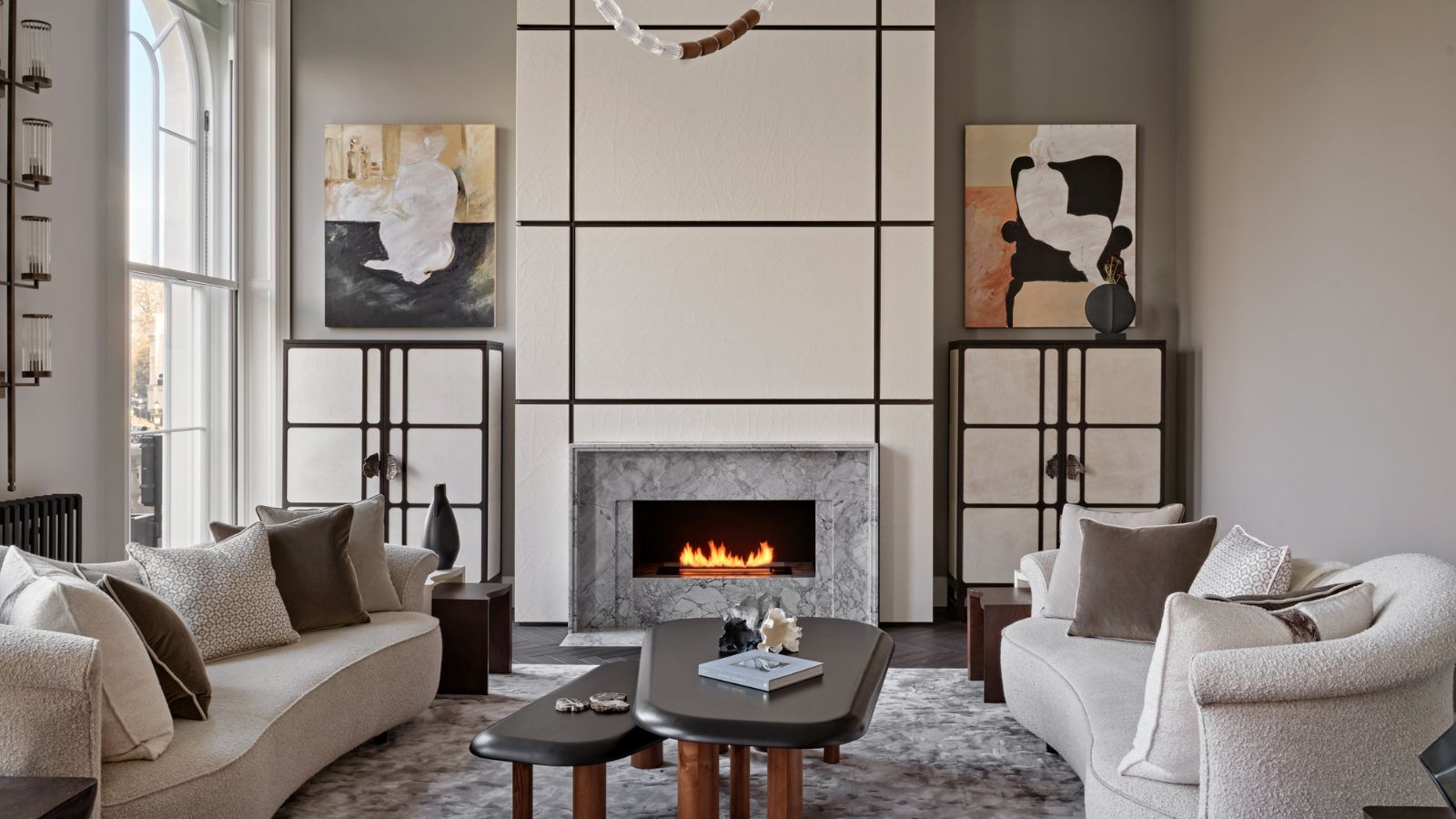
Is cream paint back on trend? 7 ways interior designers use this once shunned shade

The 12 Best Cream Eyeshadows for a Professional-Level Makeup Look
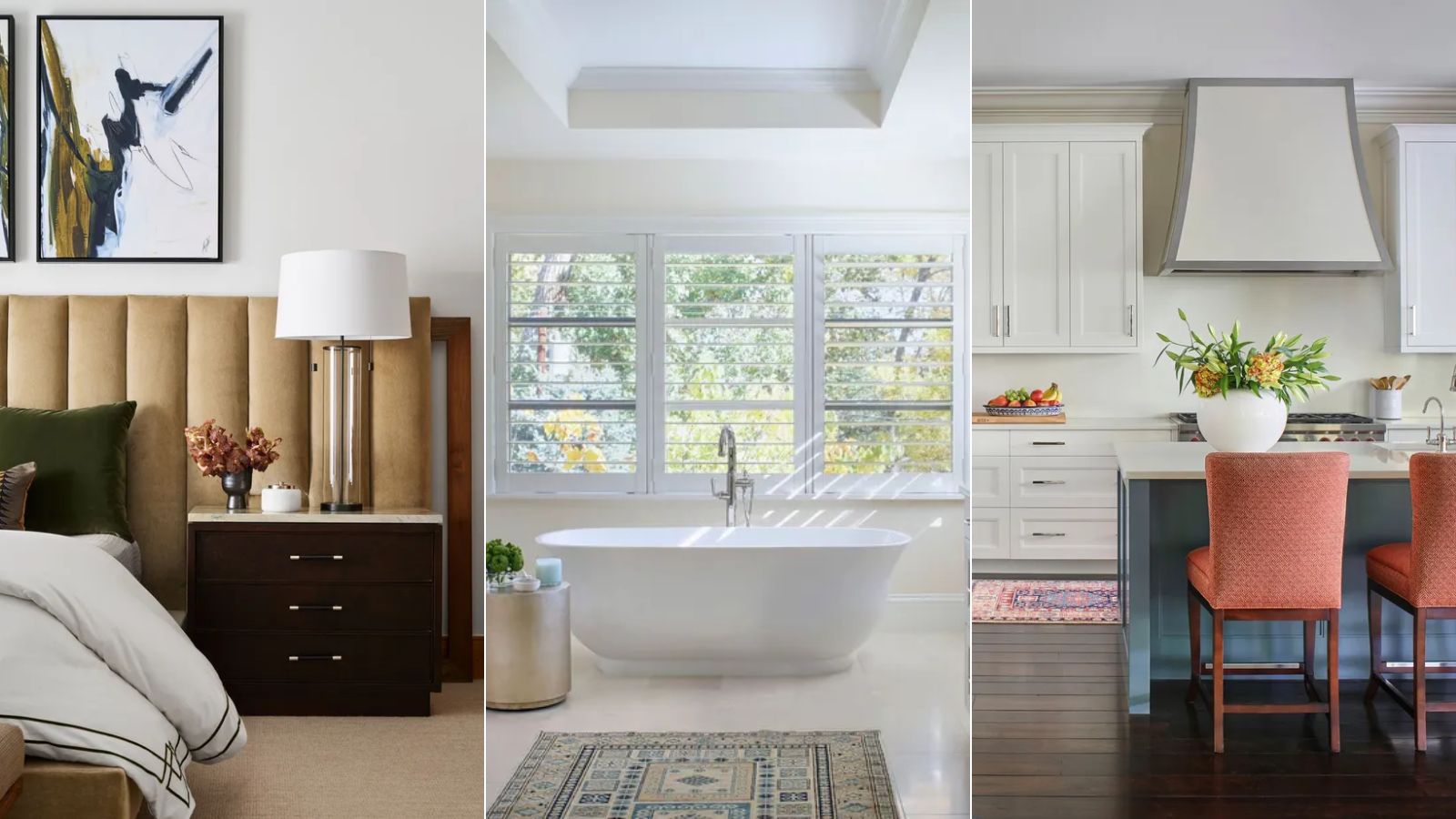
White vs Cream: designers weigh in on these enduring neutrals
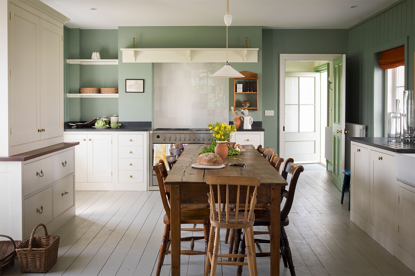
6 Cream-Colored Kitchen Cabinet Paints the Pros Swear By