1/9
5 bedroom colors going out of style in 2025 – and what designers are using instead for a stylish sleep space
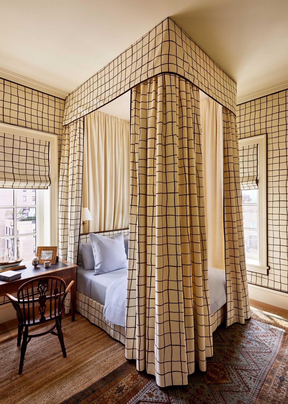
This article discusses five bedroom paint colors that are considered outdated for 2025 and suggests contemporary alternatives to create a more soothing and on-trend sleep environment. The recommendations are based on insights from interior designers and color specialists who emphasize the importance of calming hues in a bedroom.
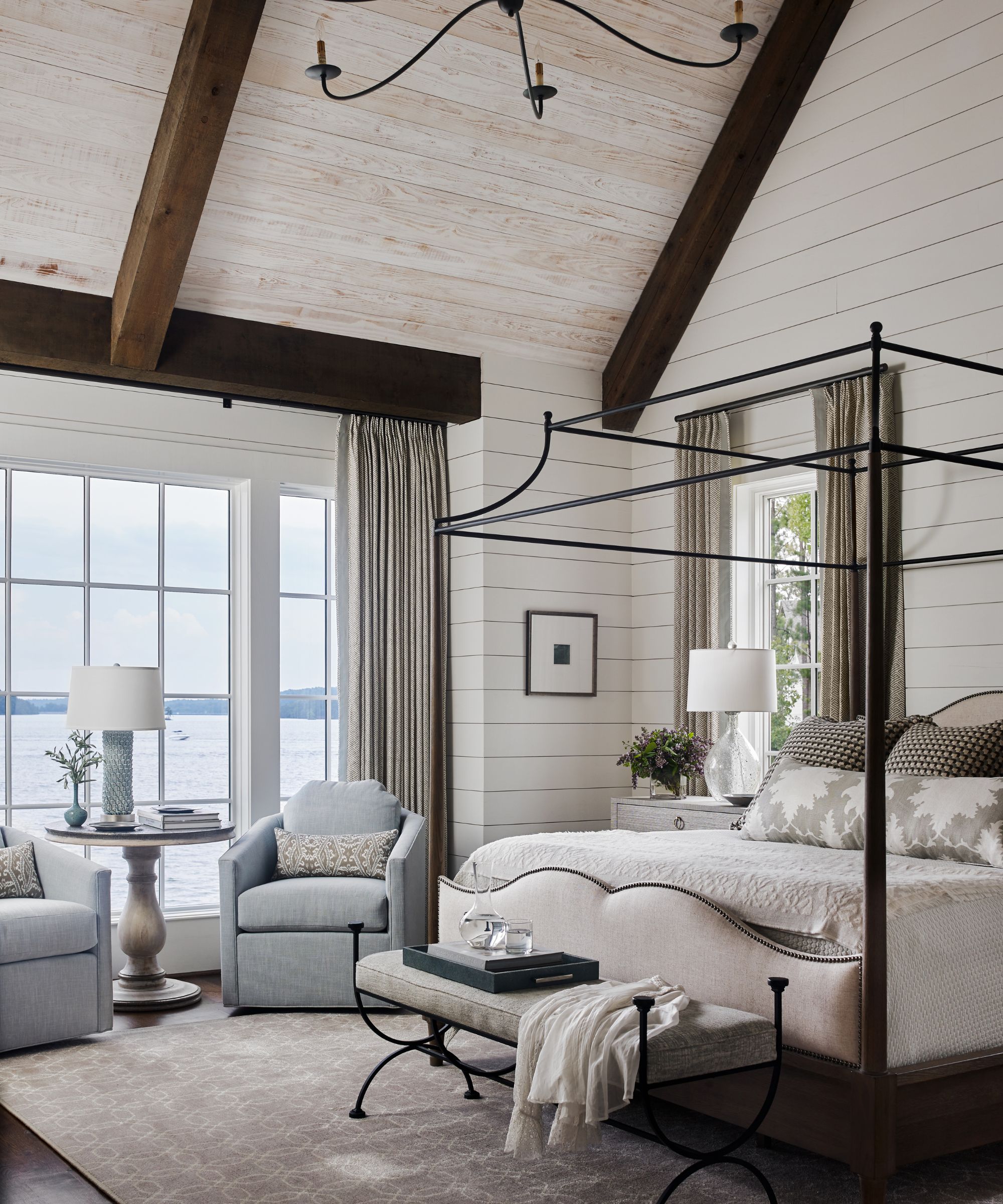
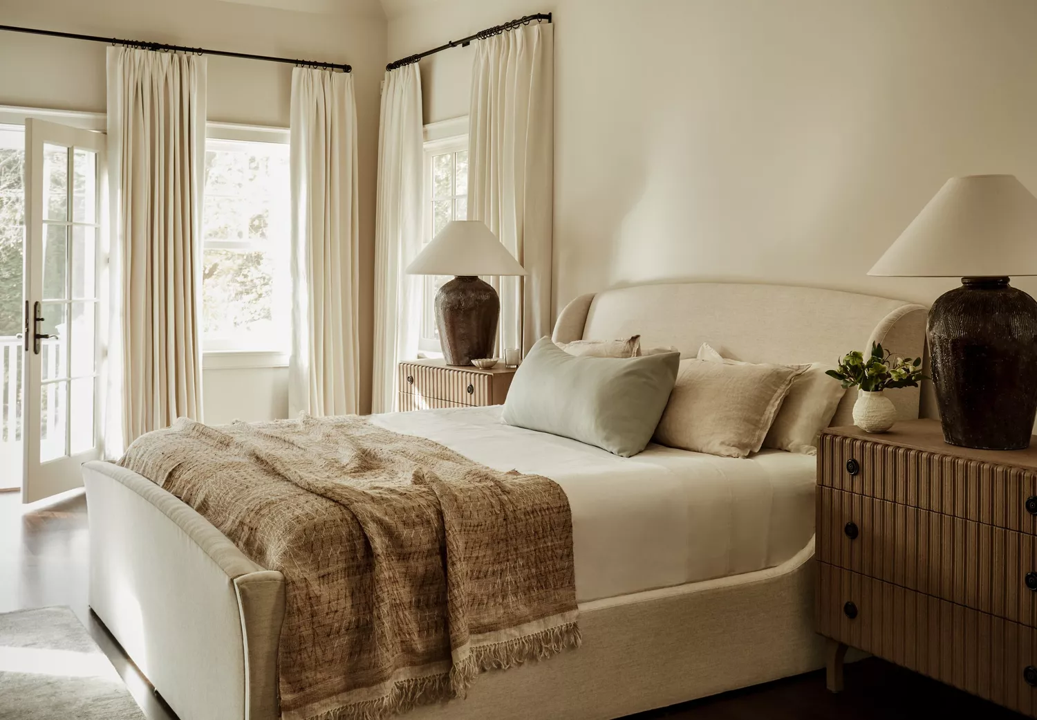
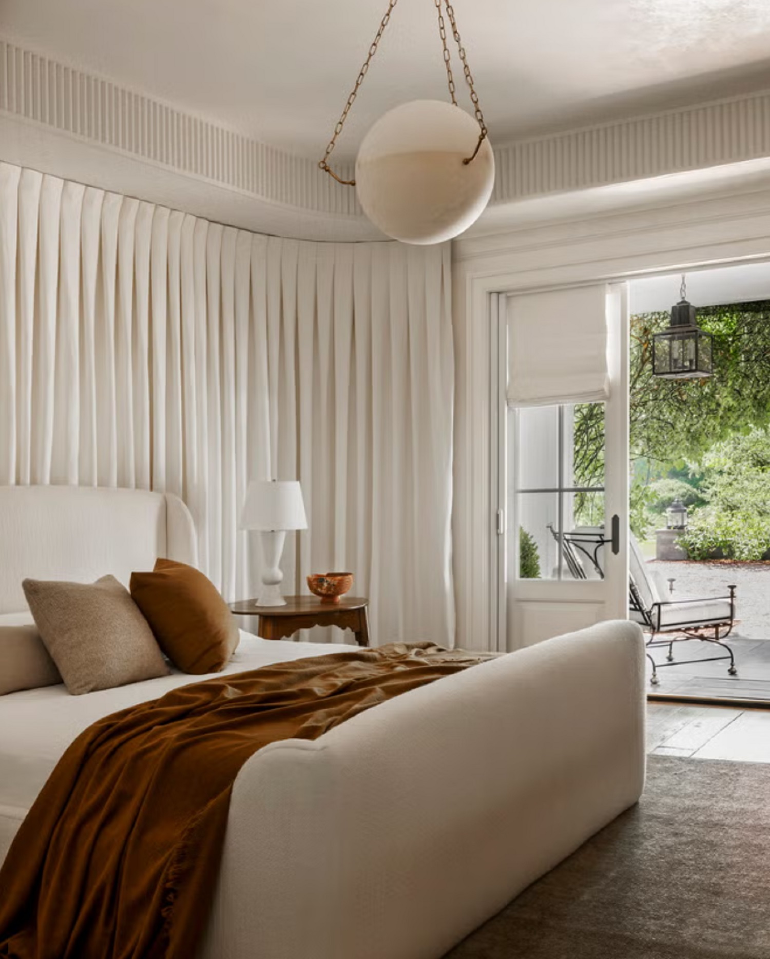
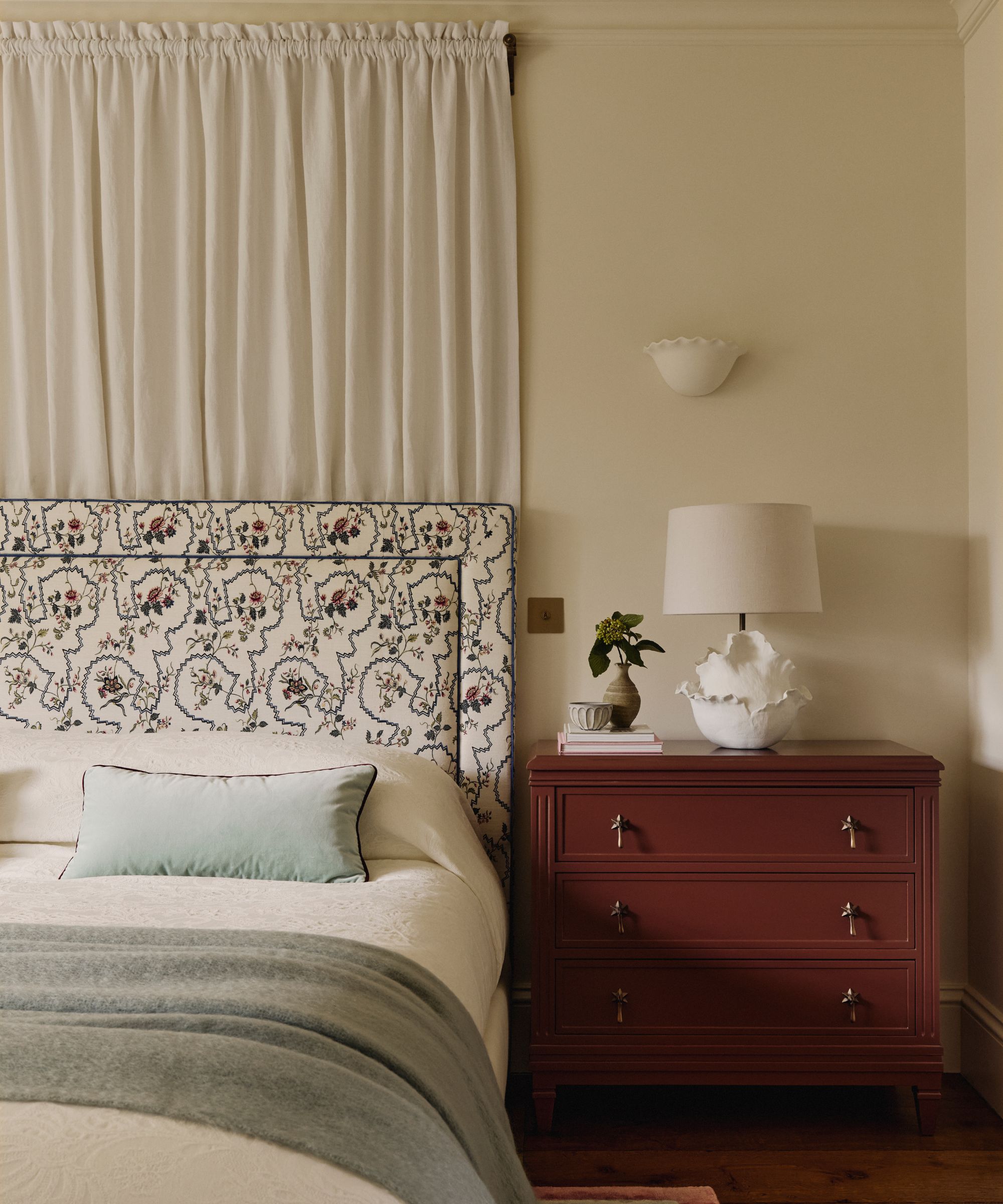
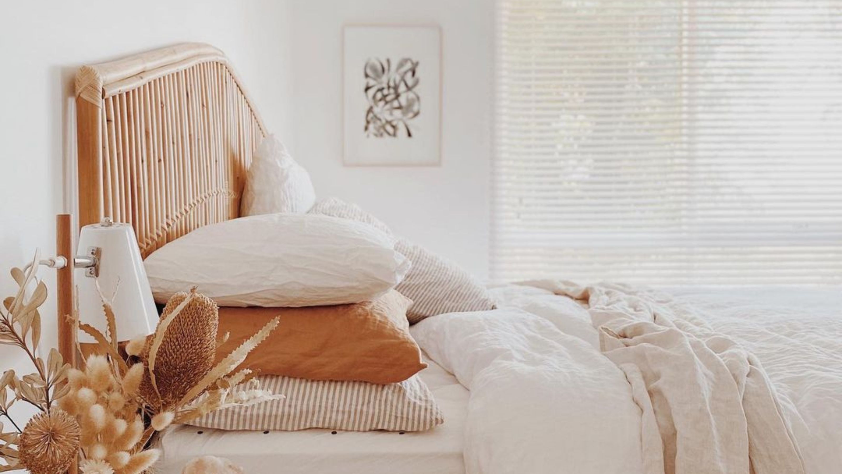
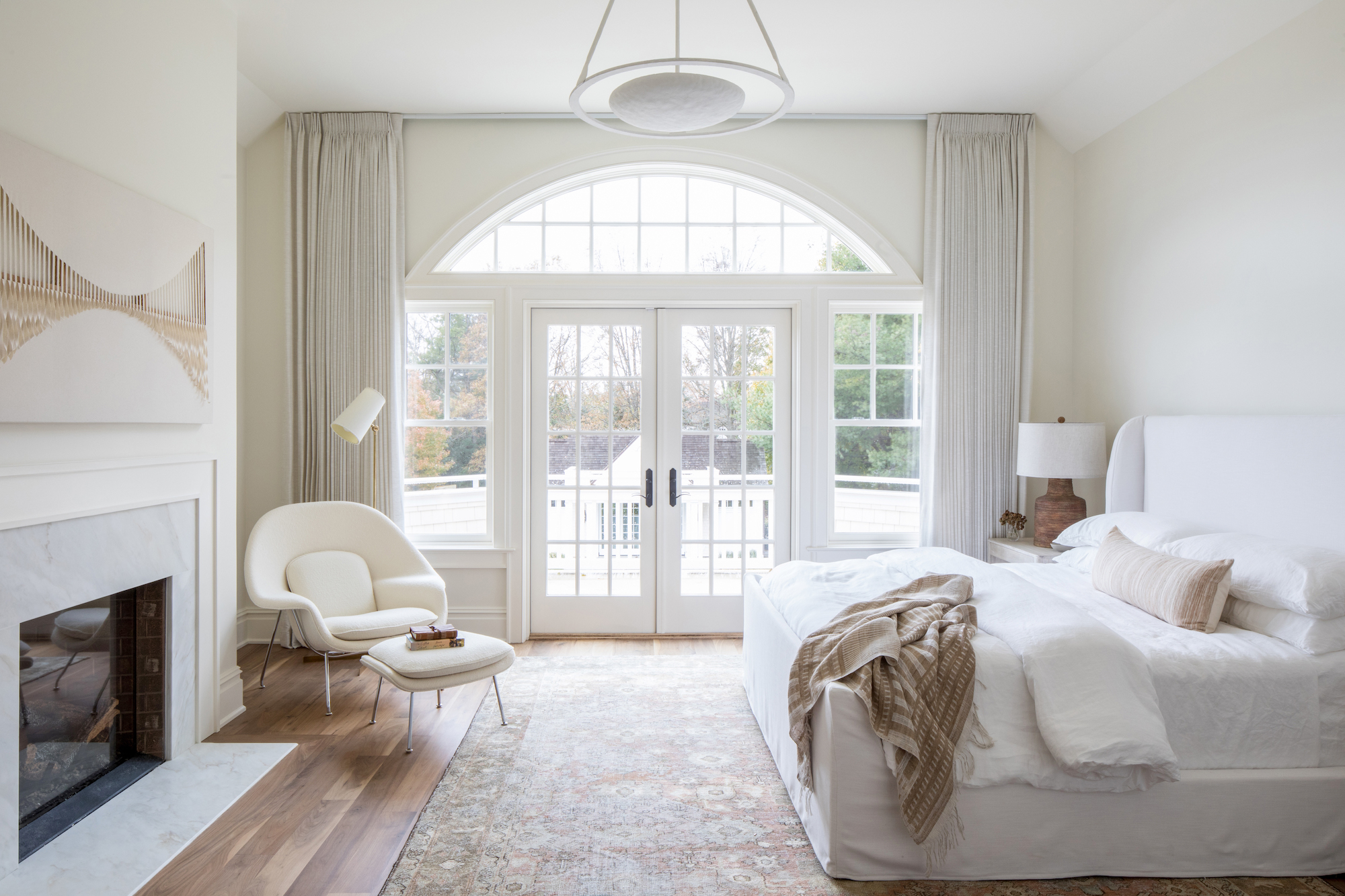
White is identified as a color that is losing favor for bedrooms. While popular in some areas, designers argue that white can feel too stark and lack the warmth necessary for a serene retreat. Instead, warmer off-whites and light neutrals like Benjamin Moore's Collingwood, Revere Pewter, or Stone Hearth are recommended. These shades introduce subtle warmth, contributing to a more inviting atmosphere. The article highlights that the shift is towards colors with more depth and character, moving away from plain, safe neutrals that can appear uninspiring.
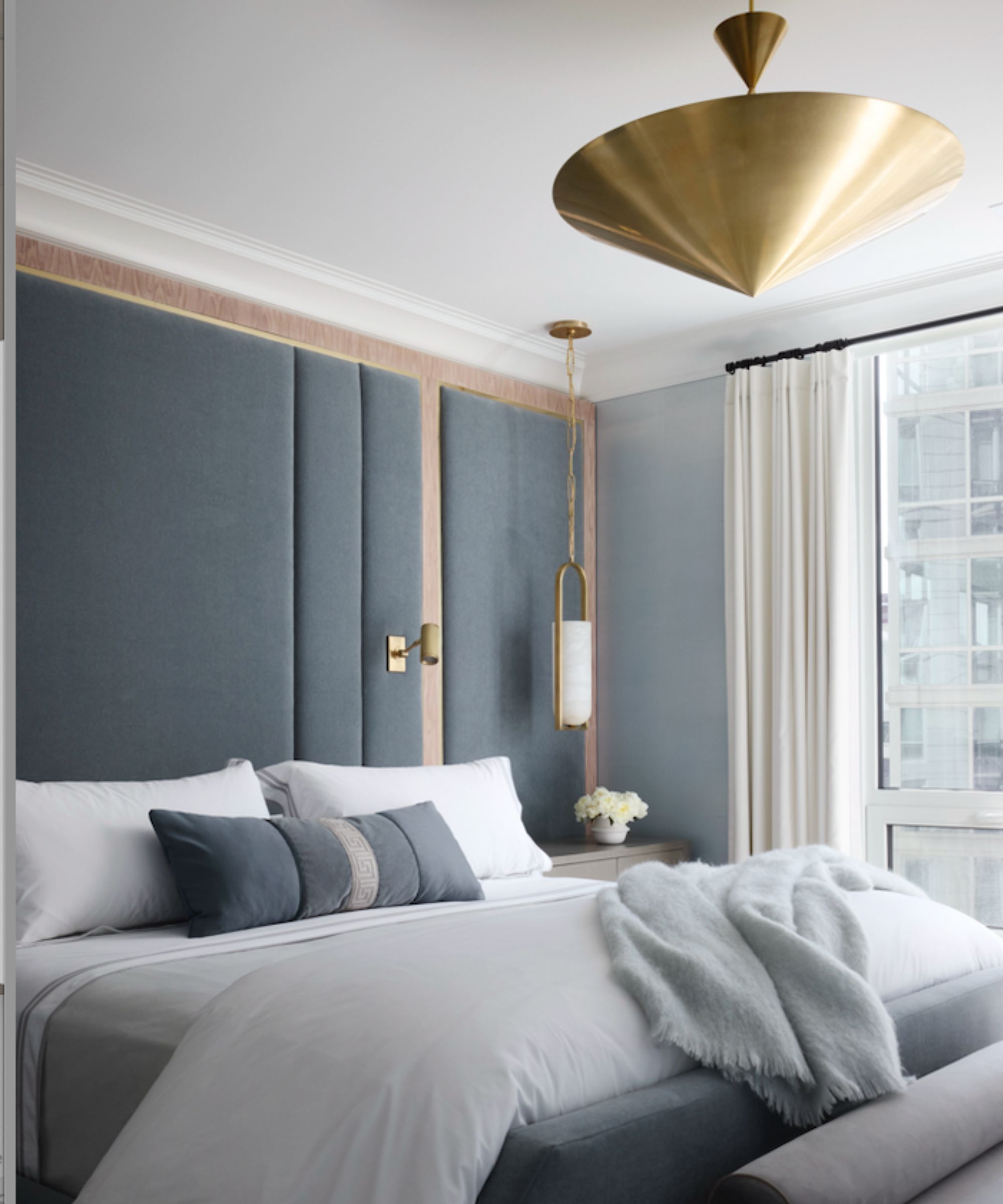
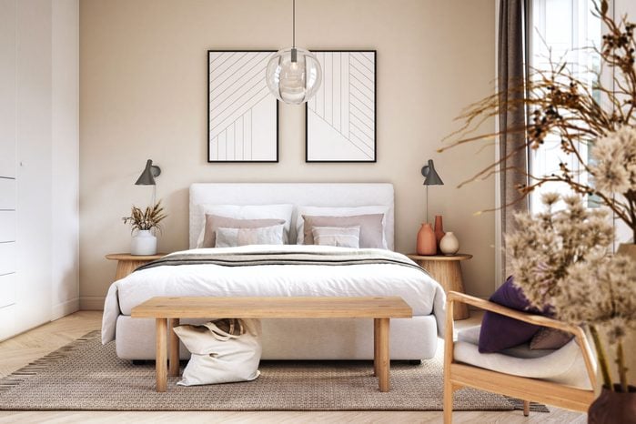
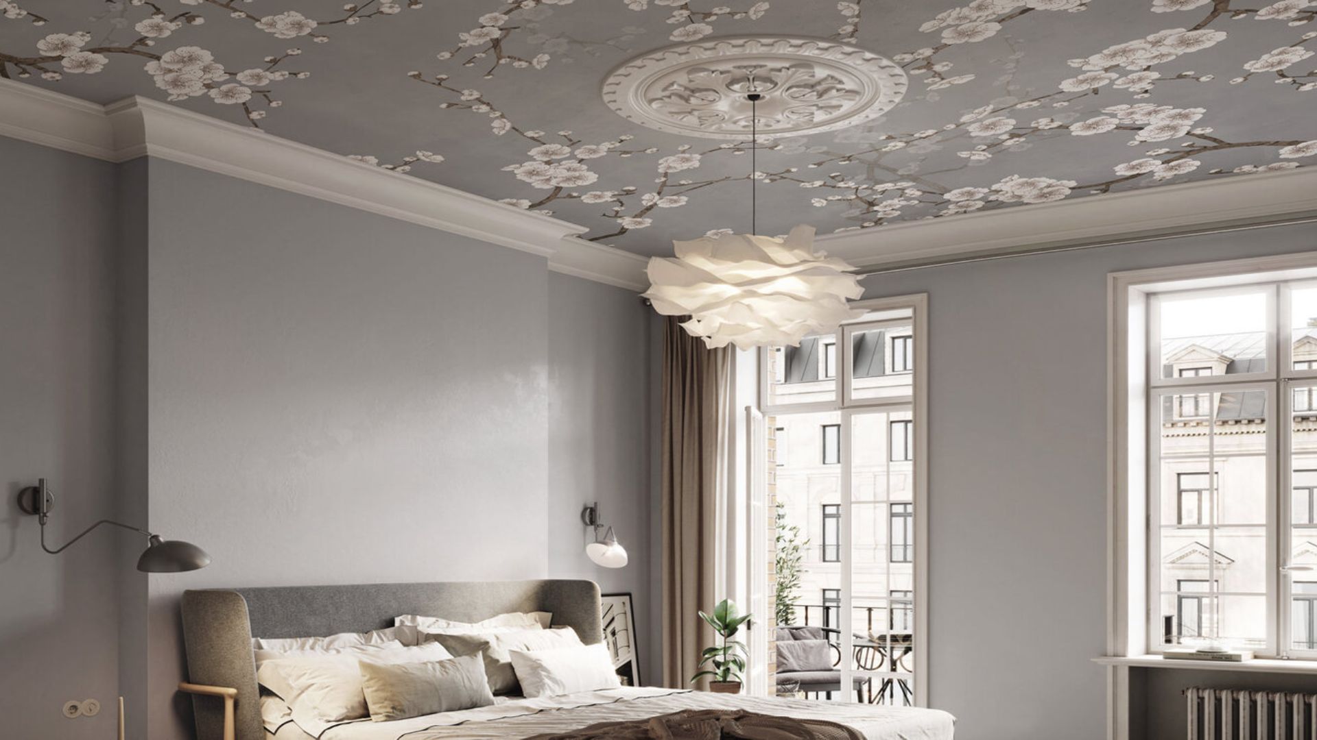
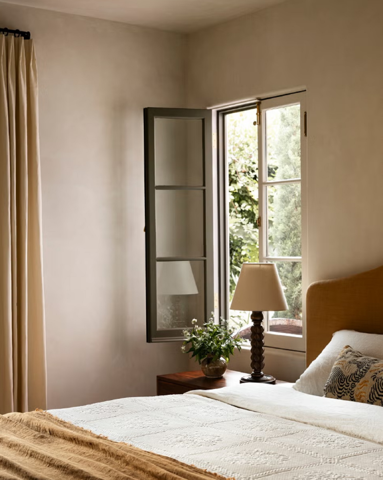
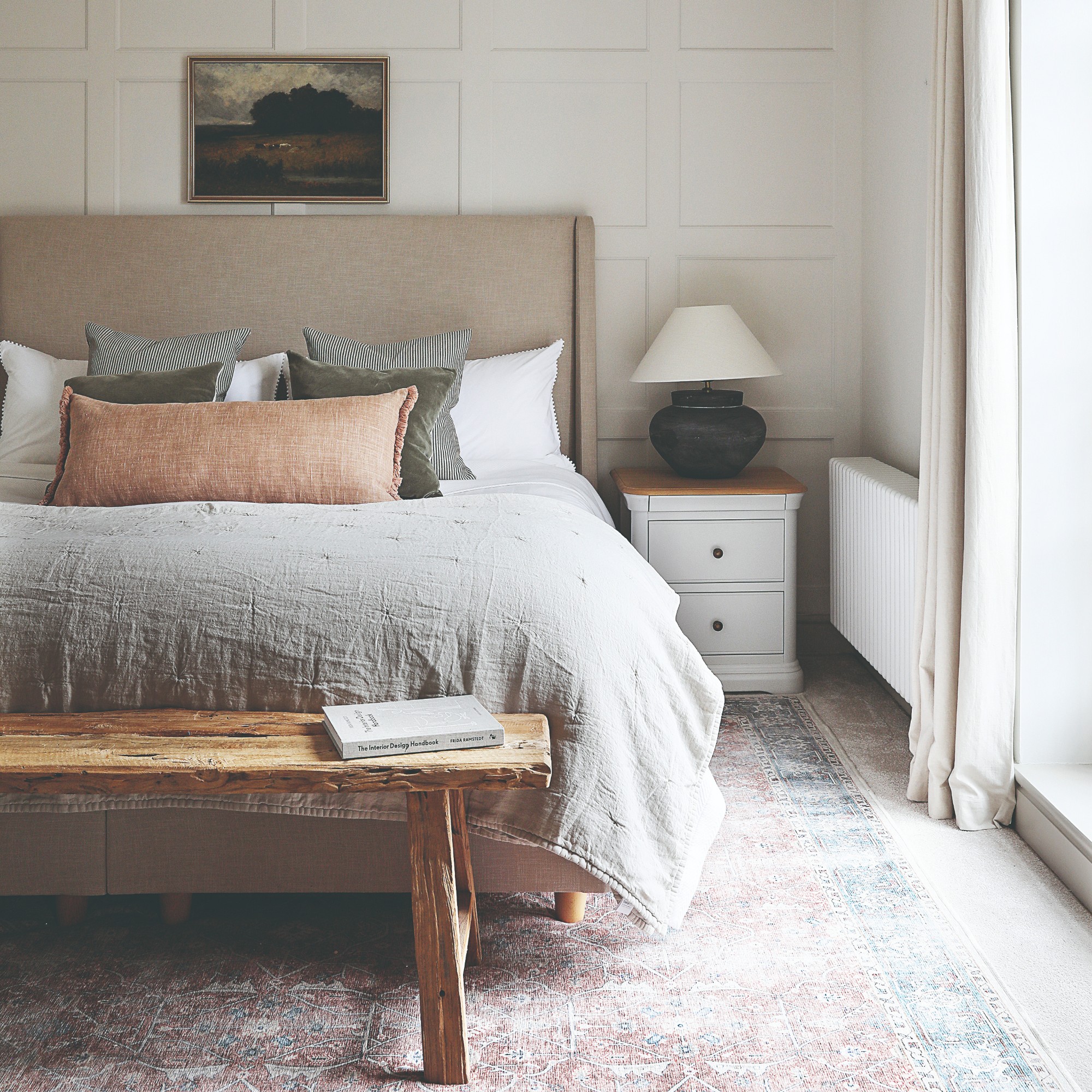
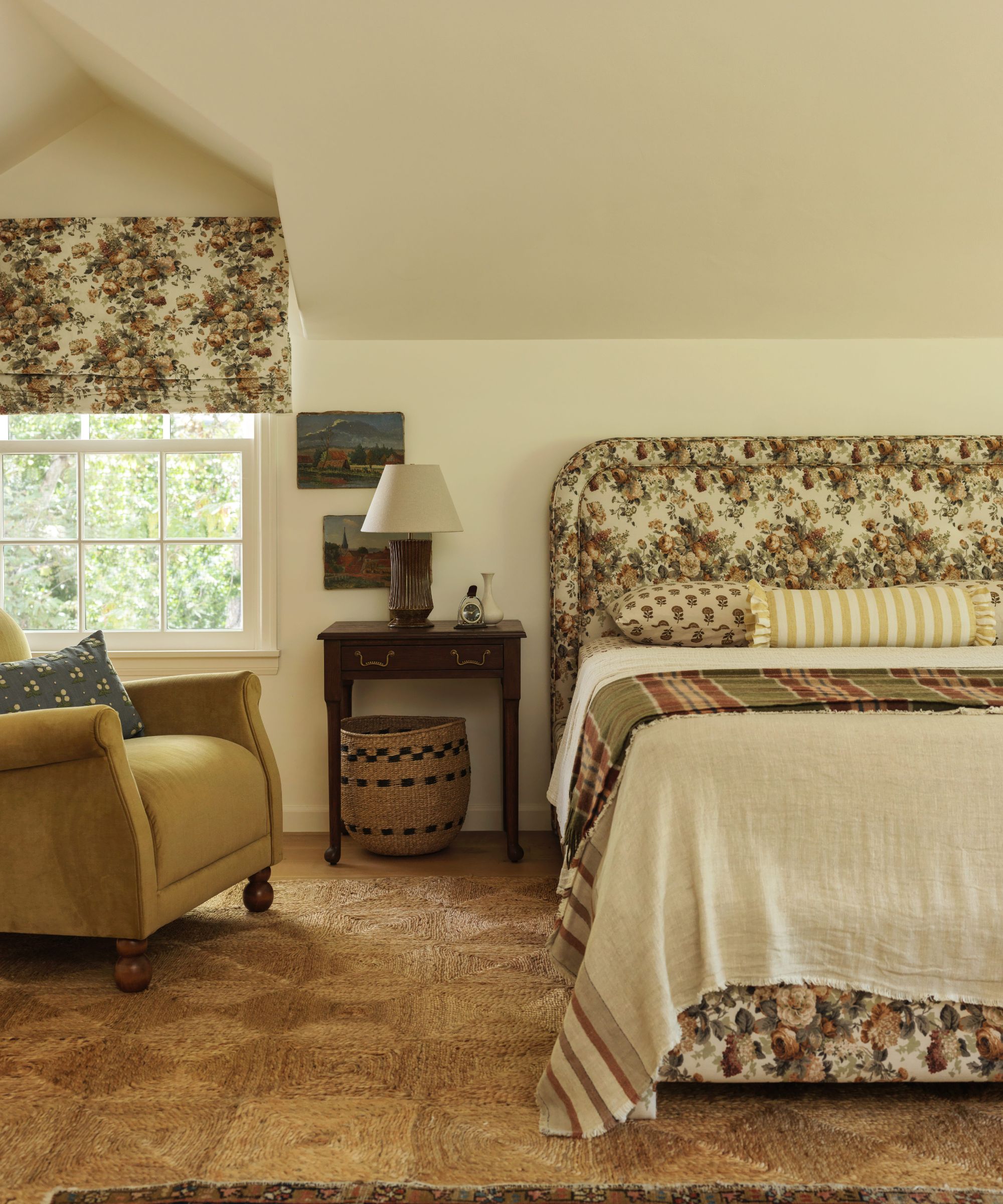
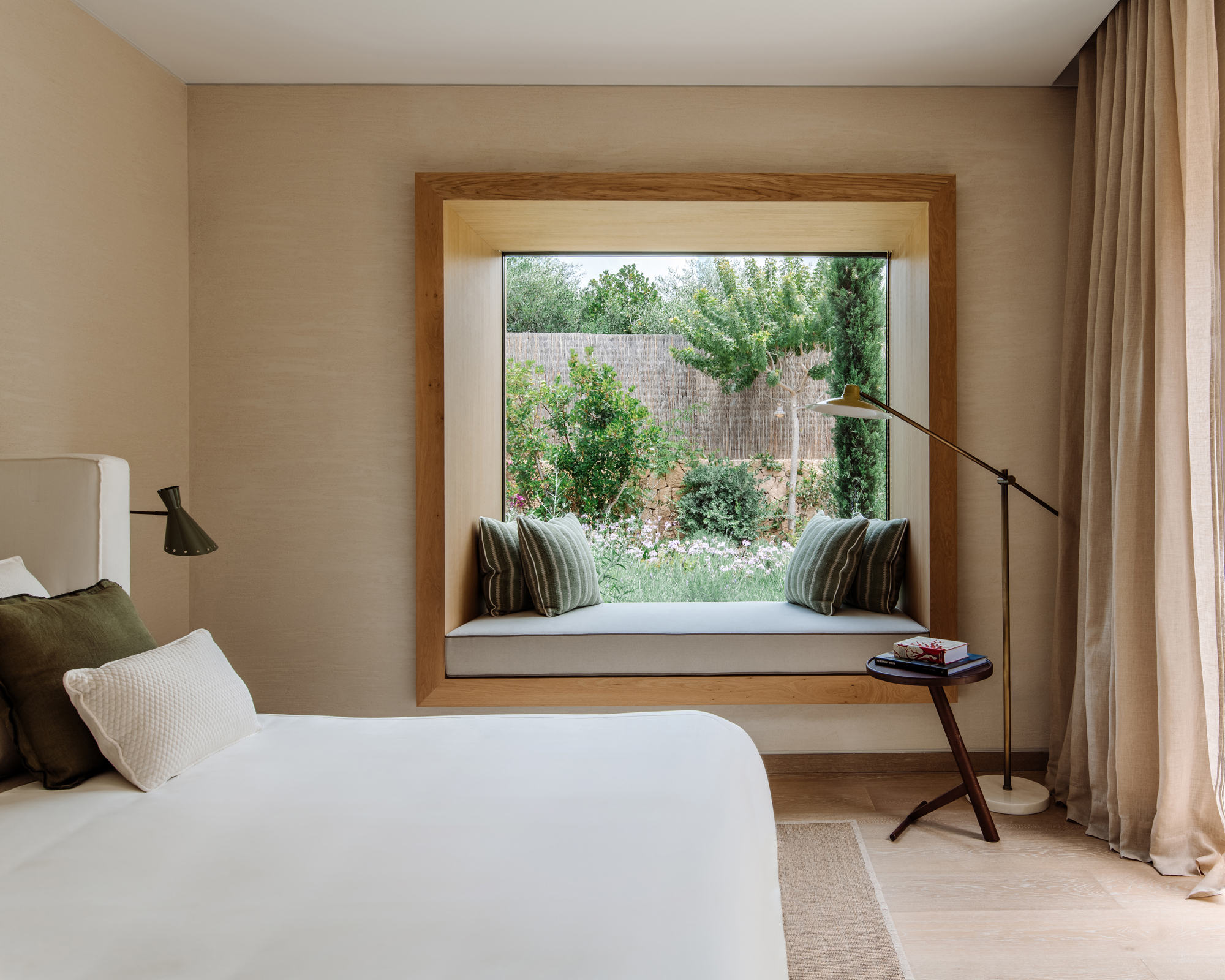
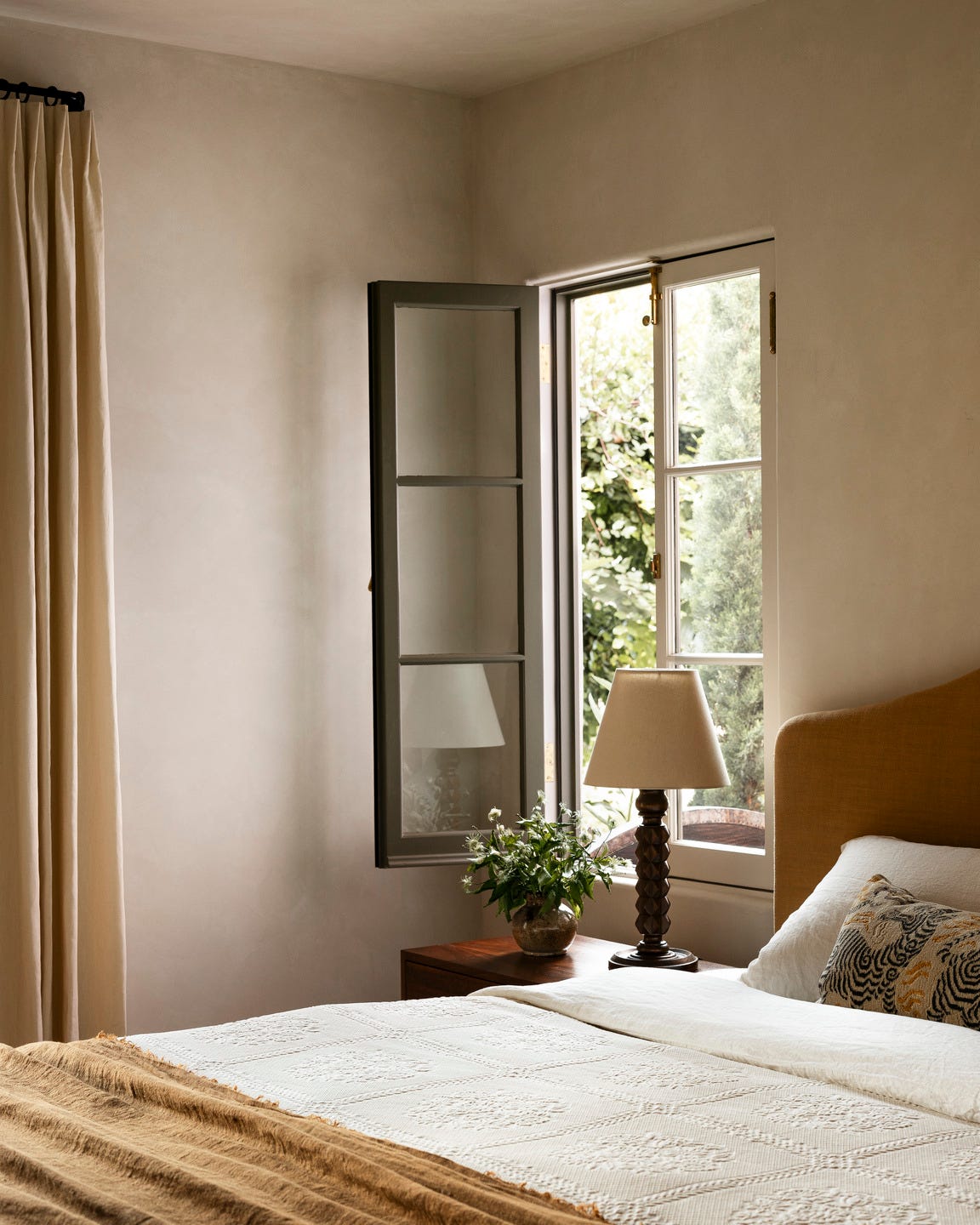
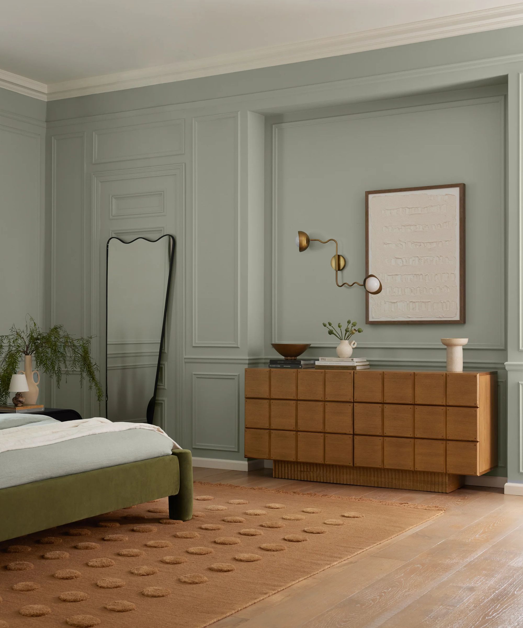
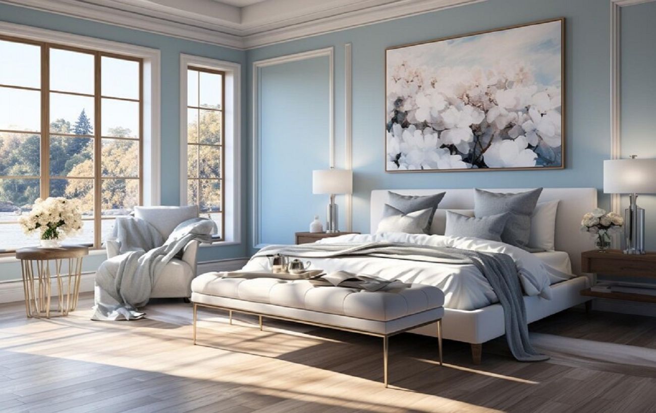
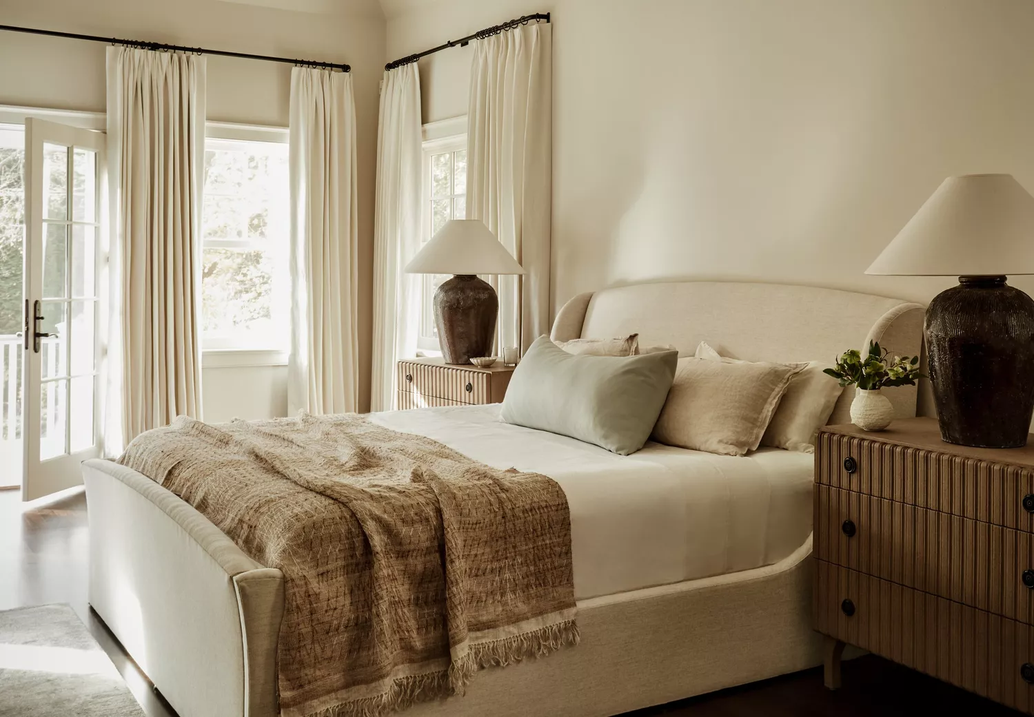
Cool neutrals, particularly gray, are also noted as an outdated choice. Once popular for its perceived ability to appeal to a broad audience in home sales, the overuse of gray has led to it being perceived as cold and sterile, especially in intimate spaces like bedrooms. Designers now advocate for warm-toned neutrals such as taupes, soft beiges, and muted clays. These earth-toned alternatives are said to provide a grounded and inviting feel, balancing sophistication with natural ease. Matte or textured finishes are suggested to further enhance the organic appeal of these warm neutrals.
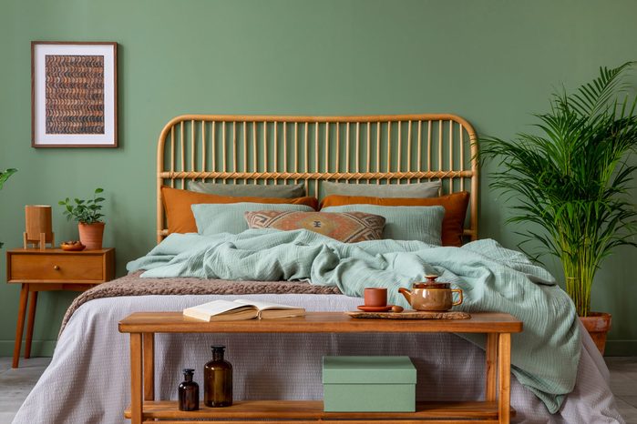
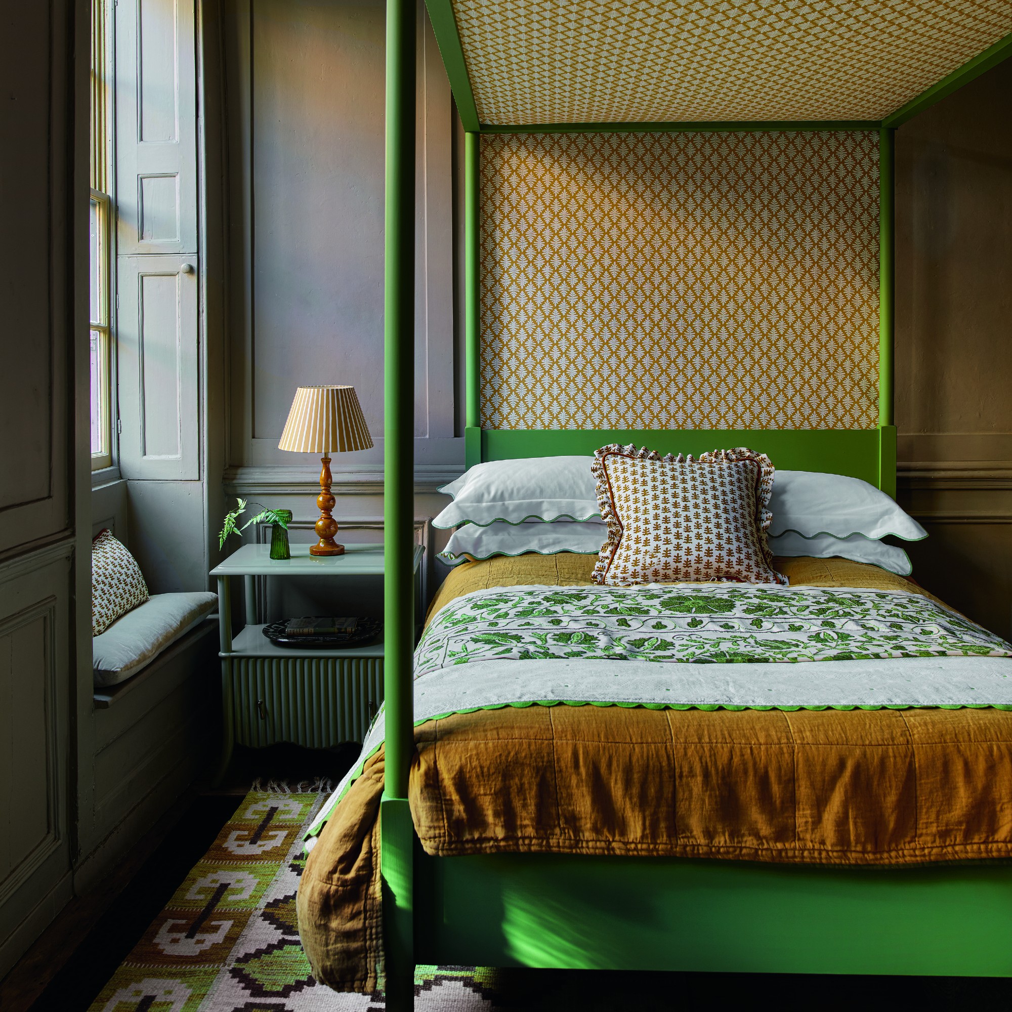
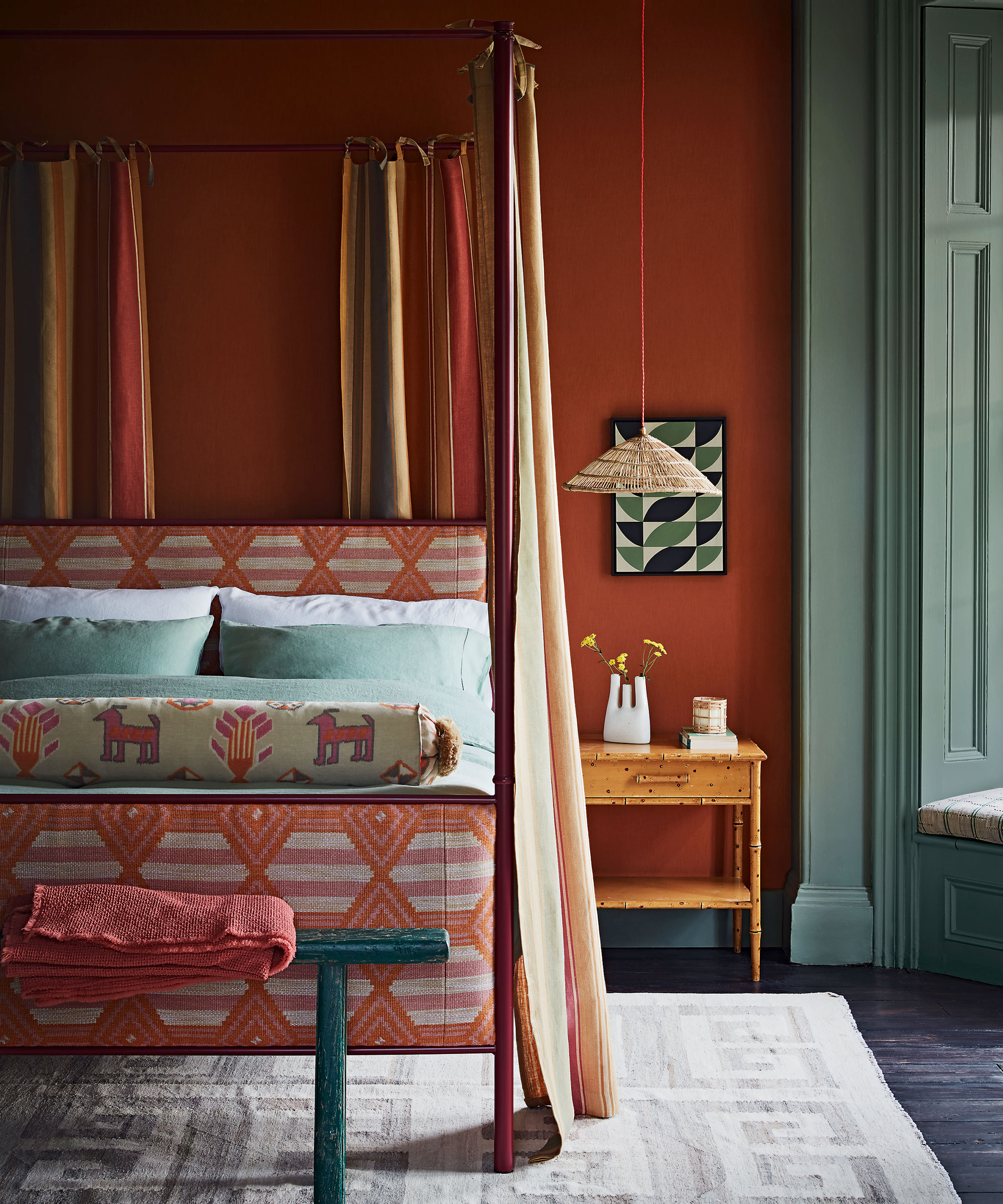
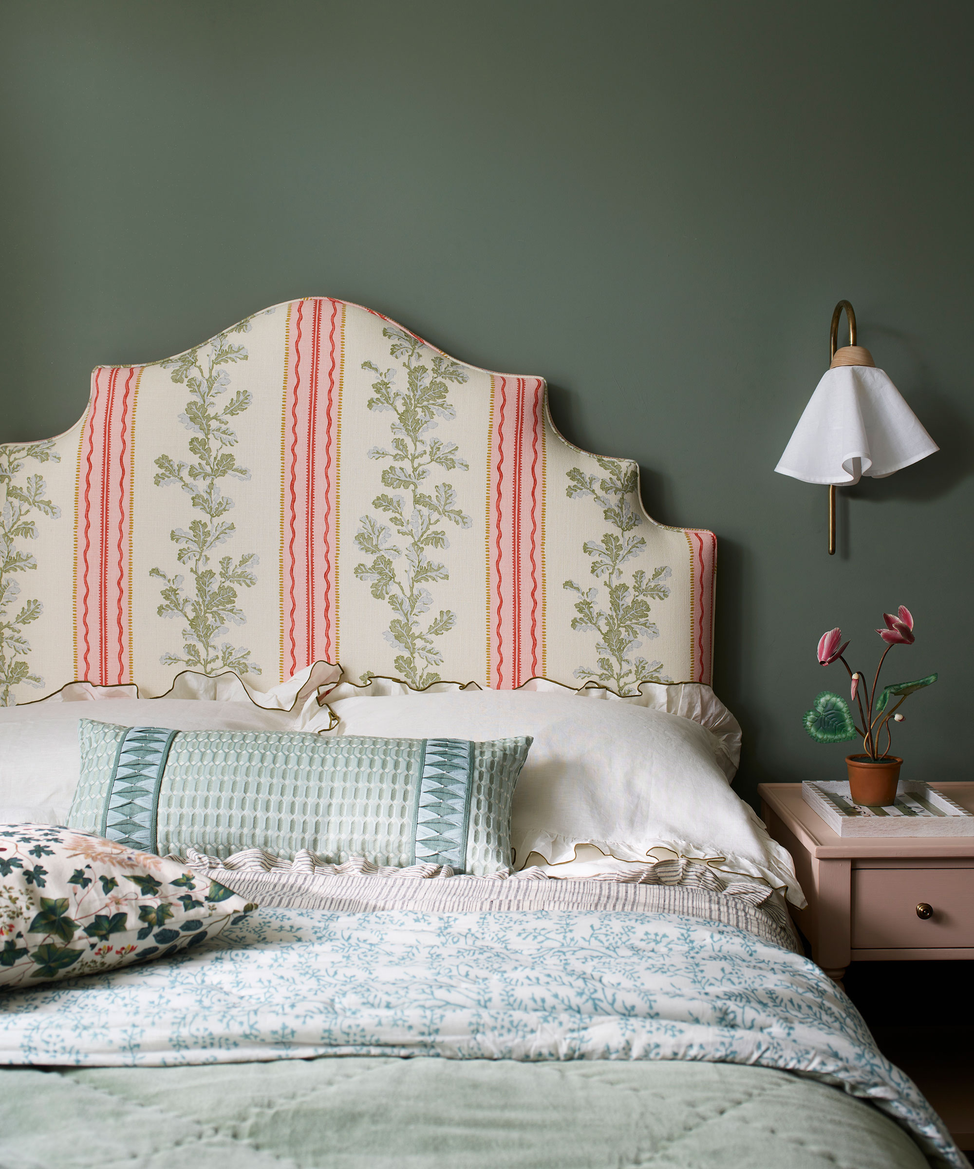
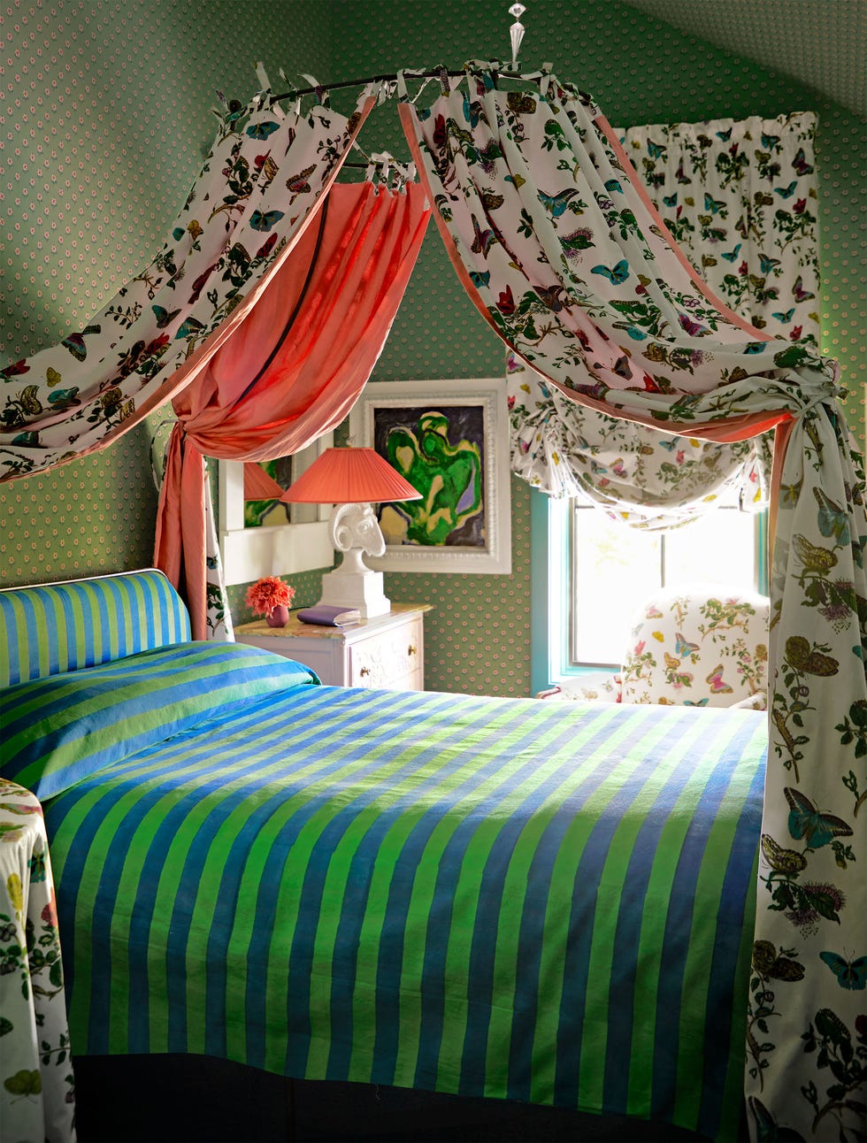
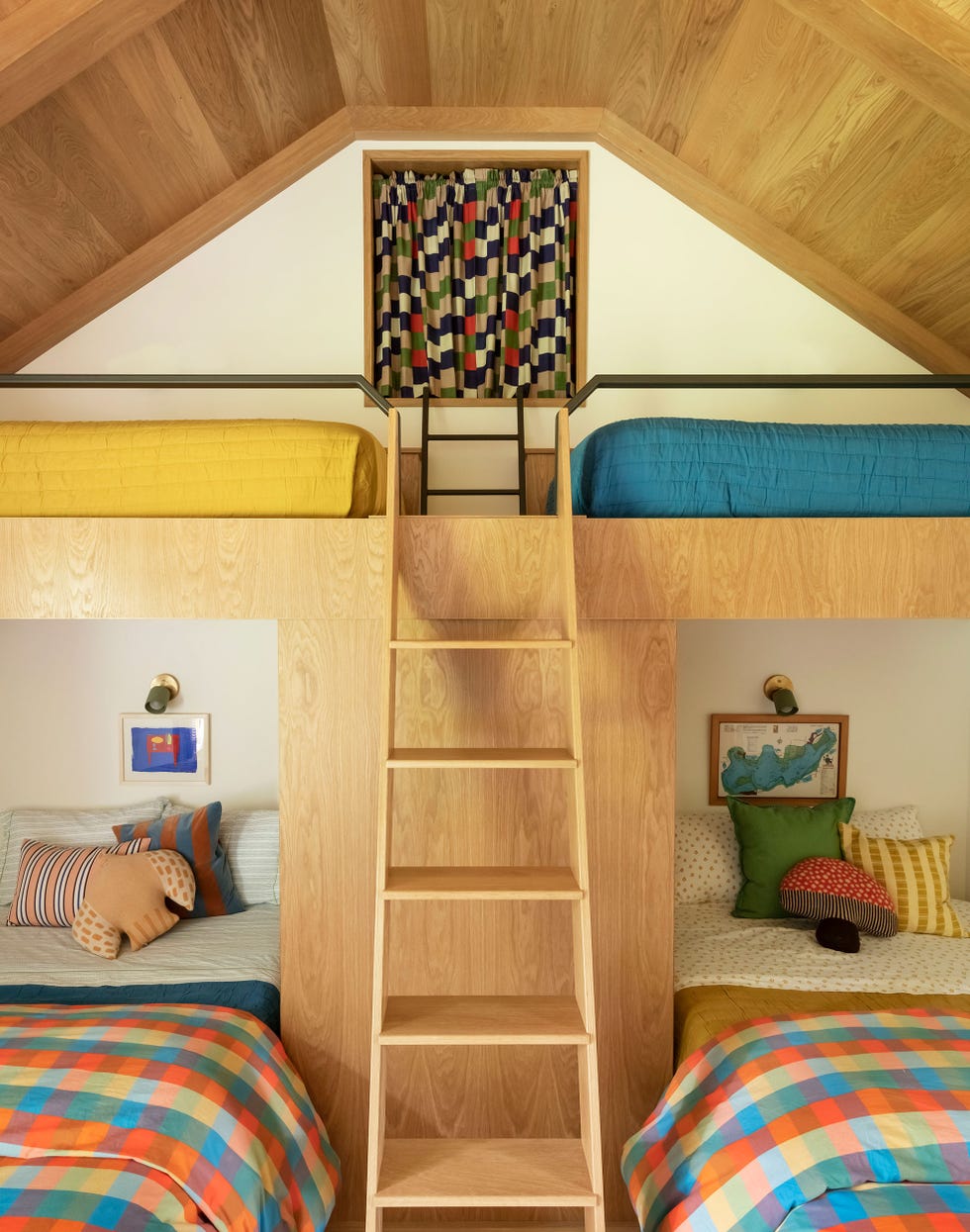
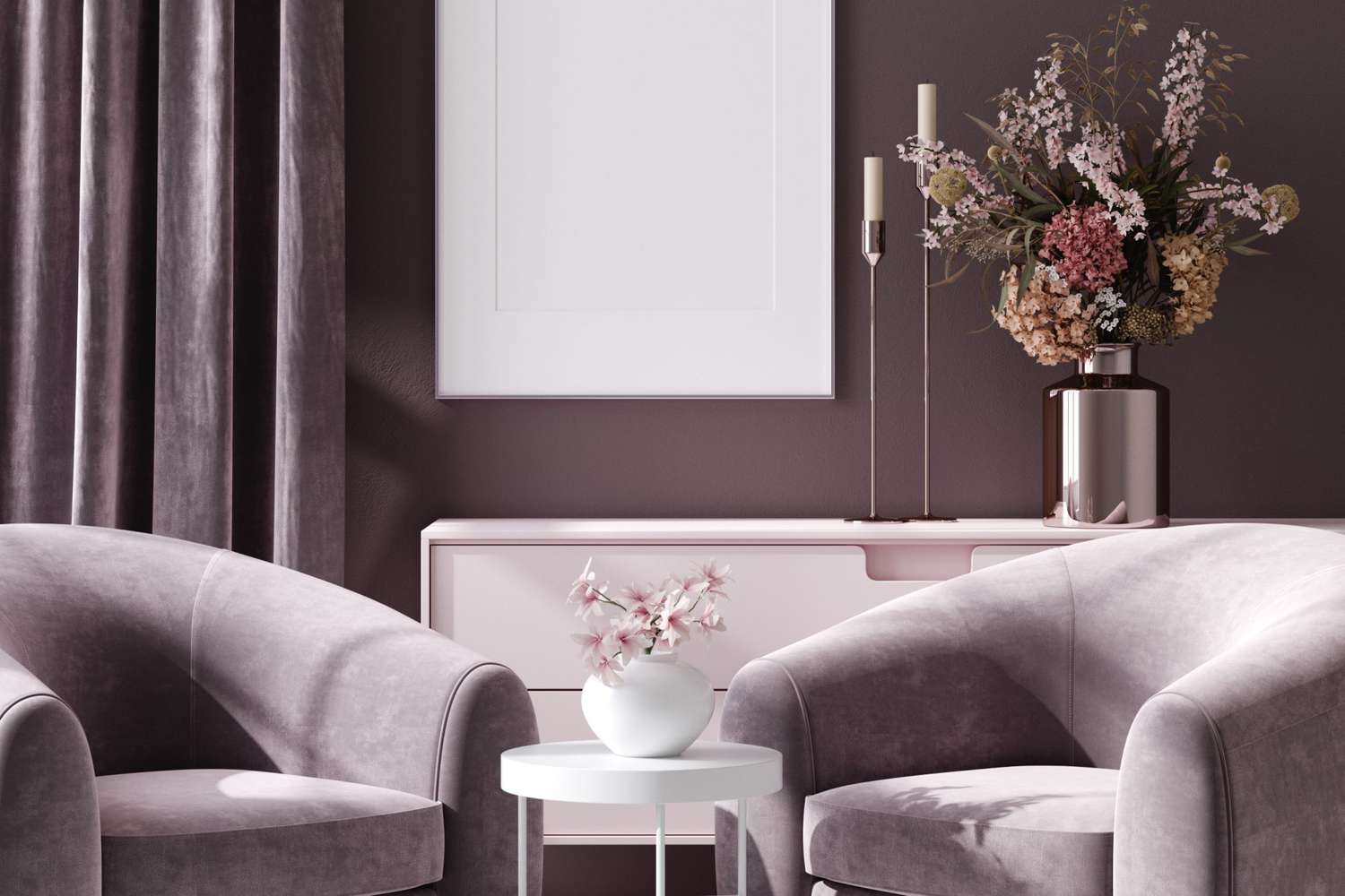
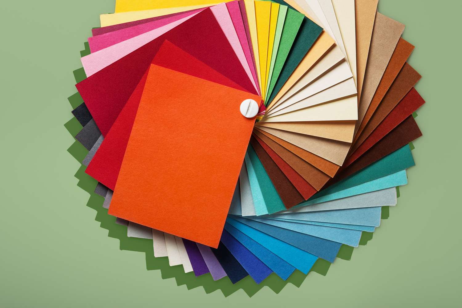
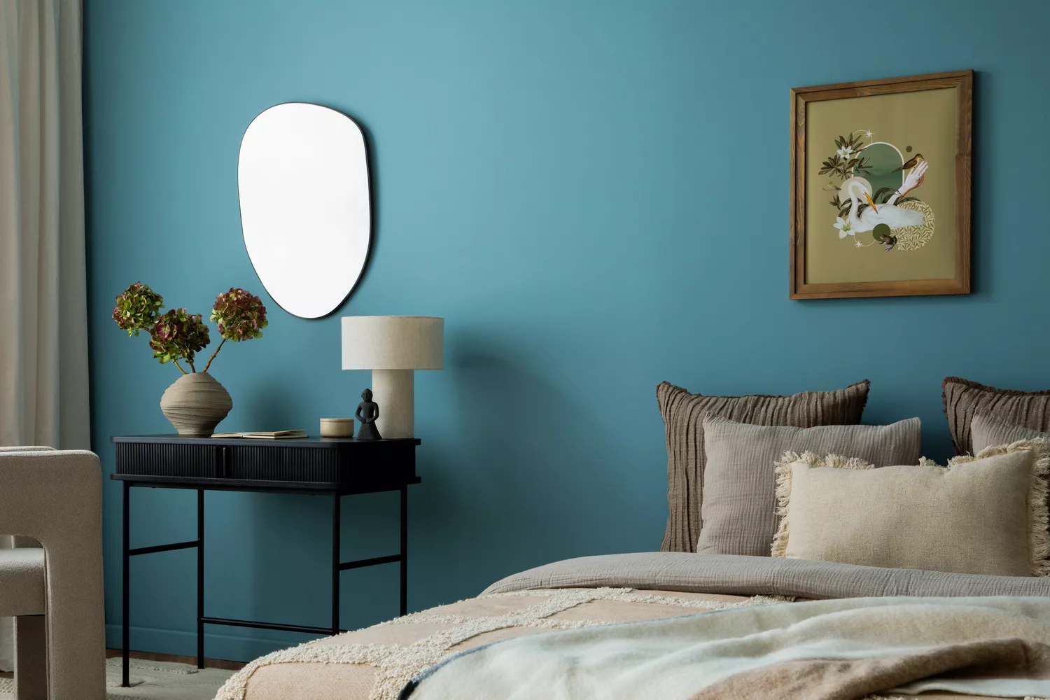
The article also advises caution against using overly bright and saturated colors in bedrooms. While bold hues can energize a space, they are generally considered unsuitable for a room intended for rest and relaxation. Instead, a more muted and subtle palette is encouraged. For warm tones, mauve, terracotta, and sienna are suggested. For cool tones, sage, slate, and lavender are presented as better options. These softer variations allow for a colorful aesthetic without being overstimulating. The discussion notes that cooler colors like blues, greens, and violets are naturally associated with tranquility and are often preferred for bedrooms, with examples such as Benjamin Moore’s October Mist, Silver Lining, and Quiet Moments. Darker, cocooning hues like Velvet Cloak are also mentioned for creating a sanctuary-like feel.
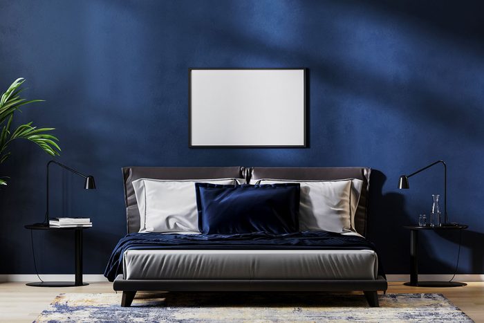
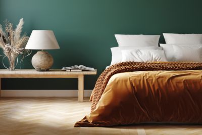
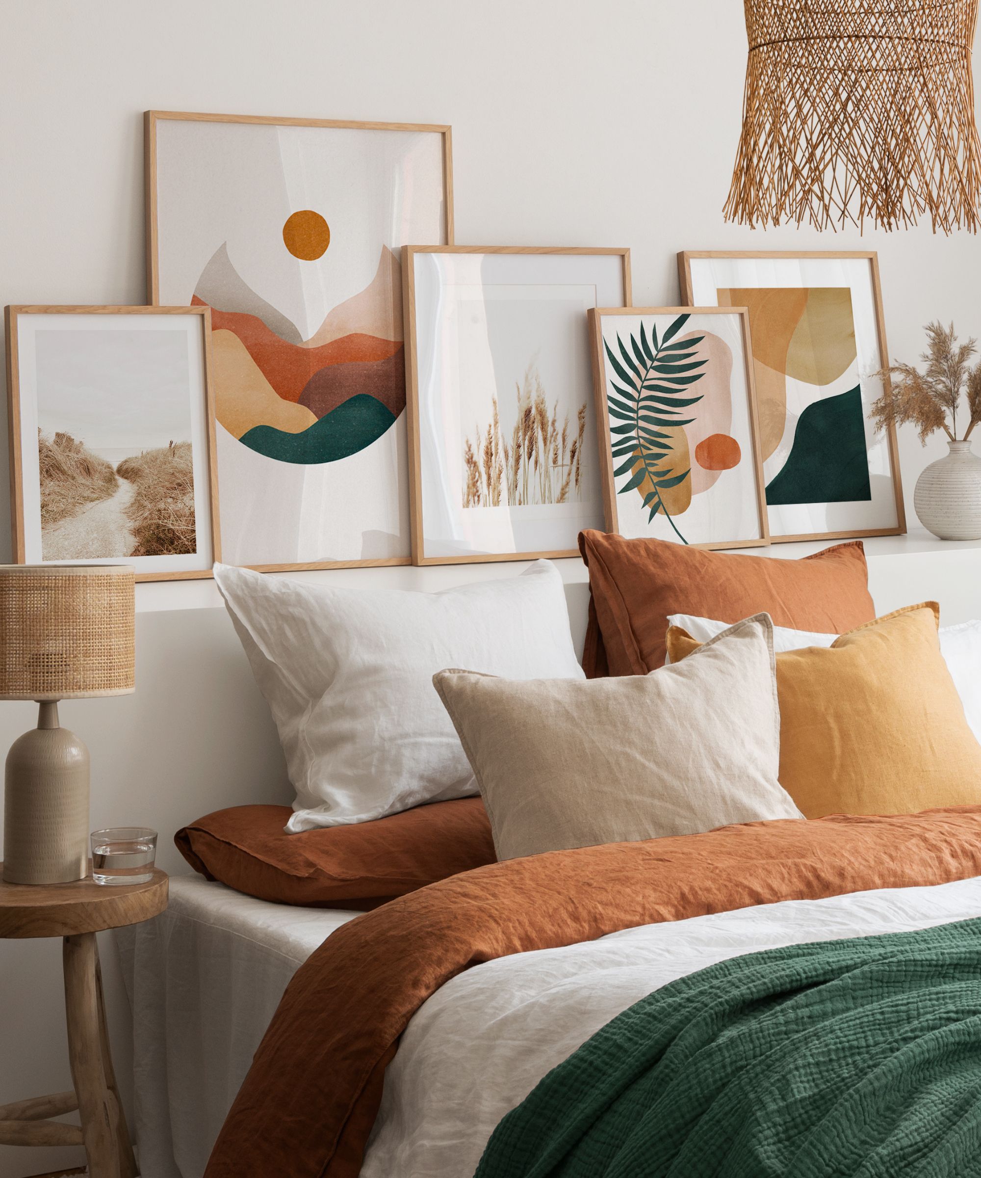
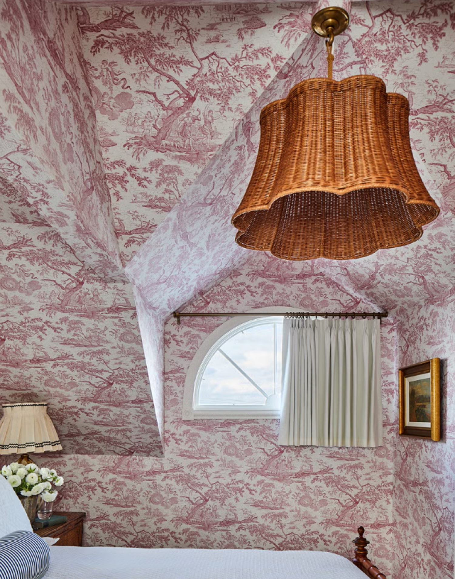
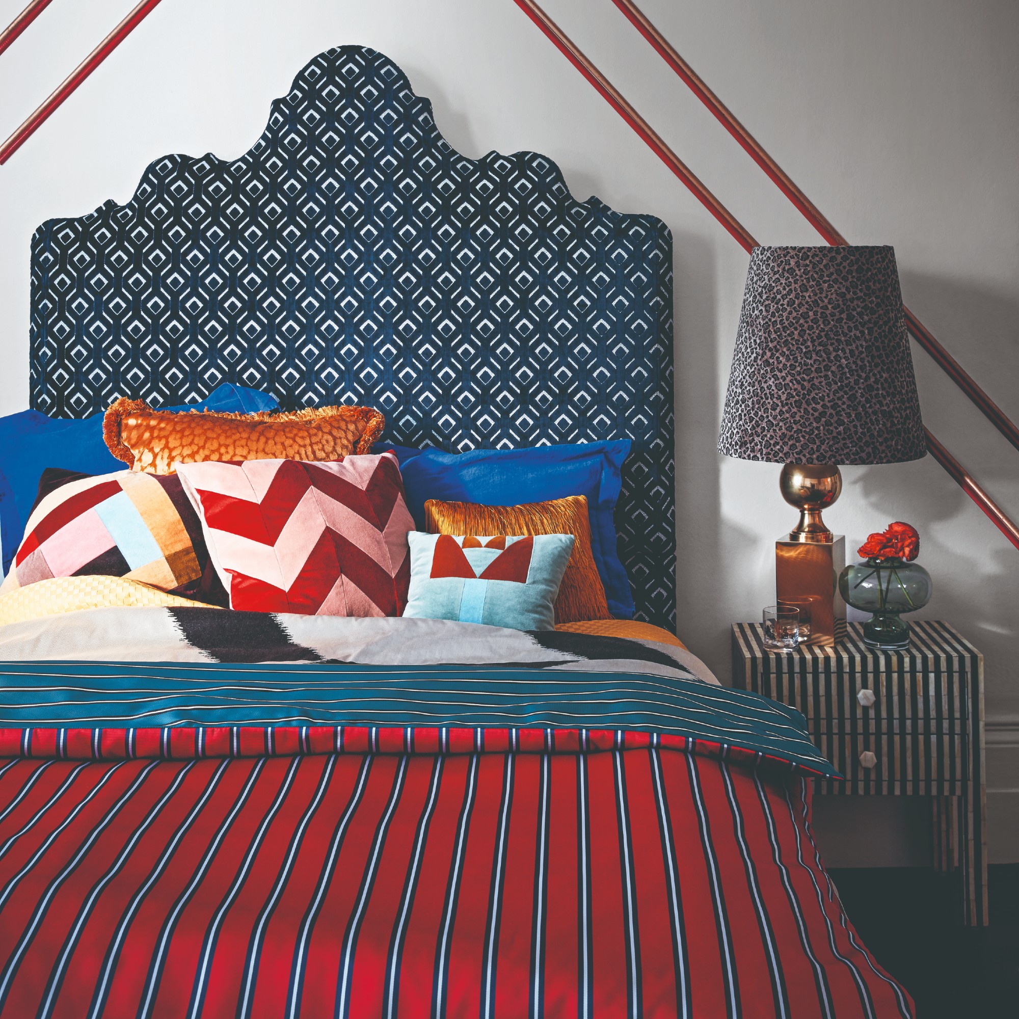
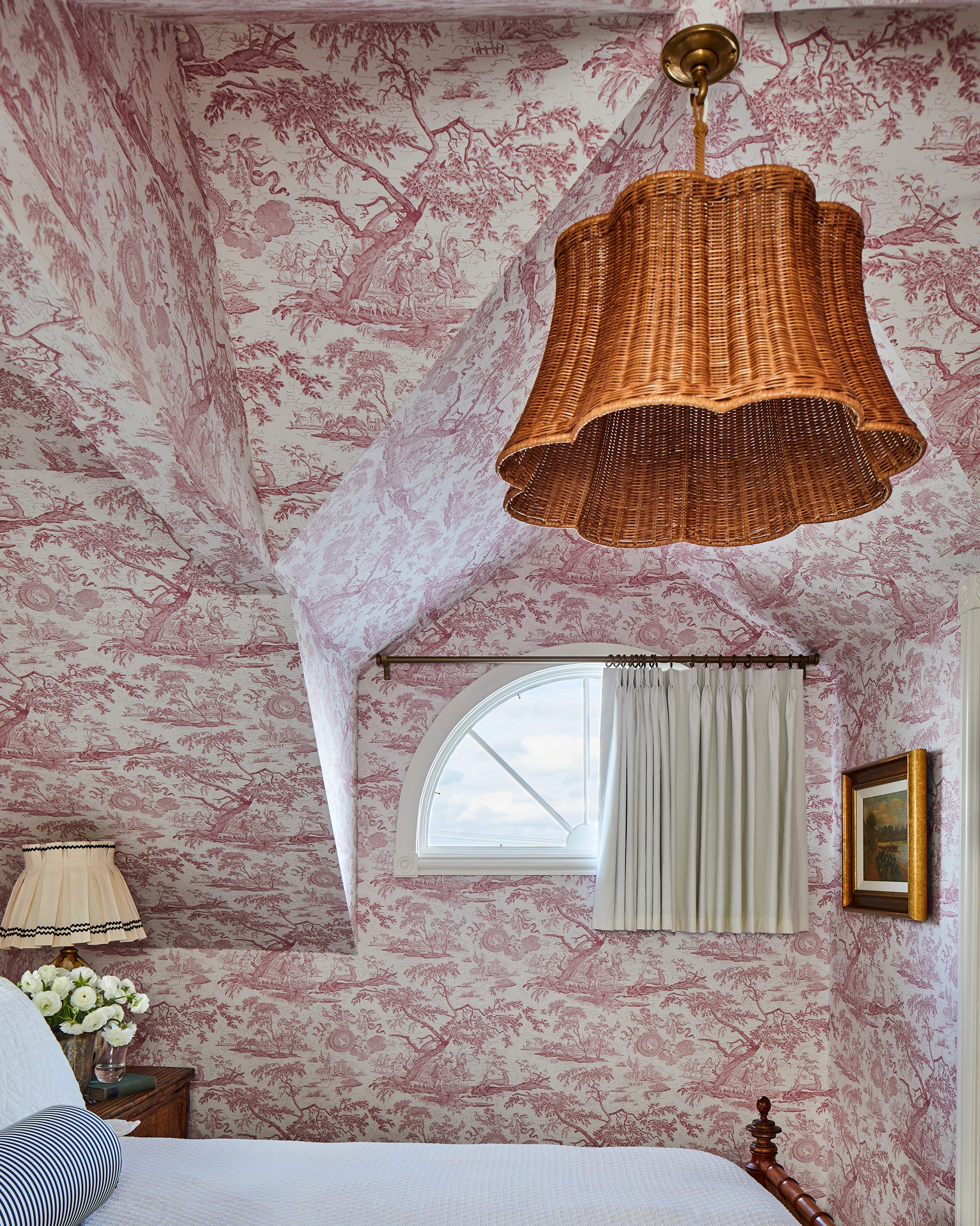
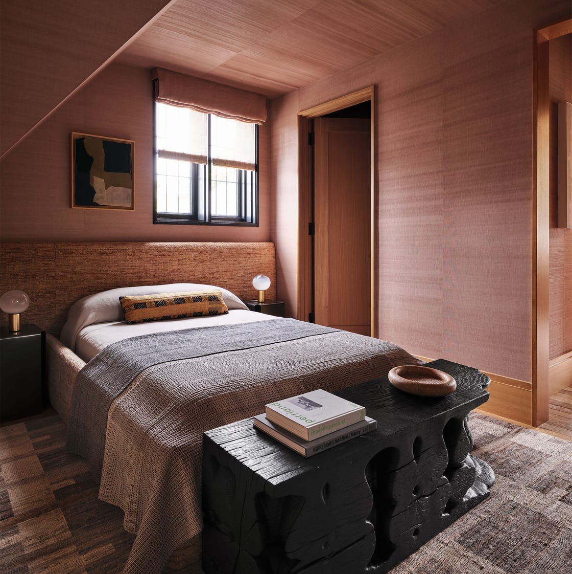
Navy blue, despite its classic appeal, is another color facing a decline in popularity for bedrooms. Experts believe it can feel too heavy and emotionally distant for a space meant to foster comfort and connection. The trend is moving towards warmer, more nurturing tones, including soft terracottas, blush-toned beiges, and warming pinks. These colors are described as providing a comforting and intimate atmosphere, aligning with a growing desire for emotional well-being in home design.
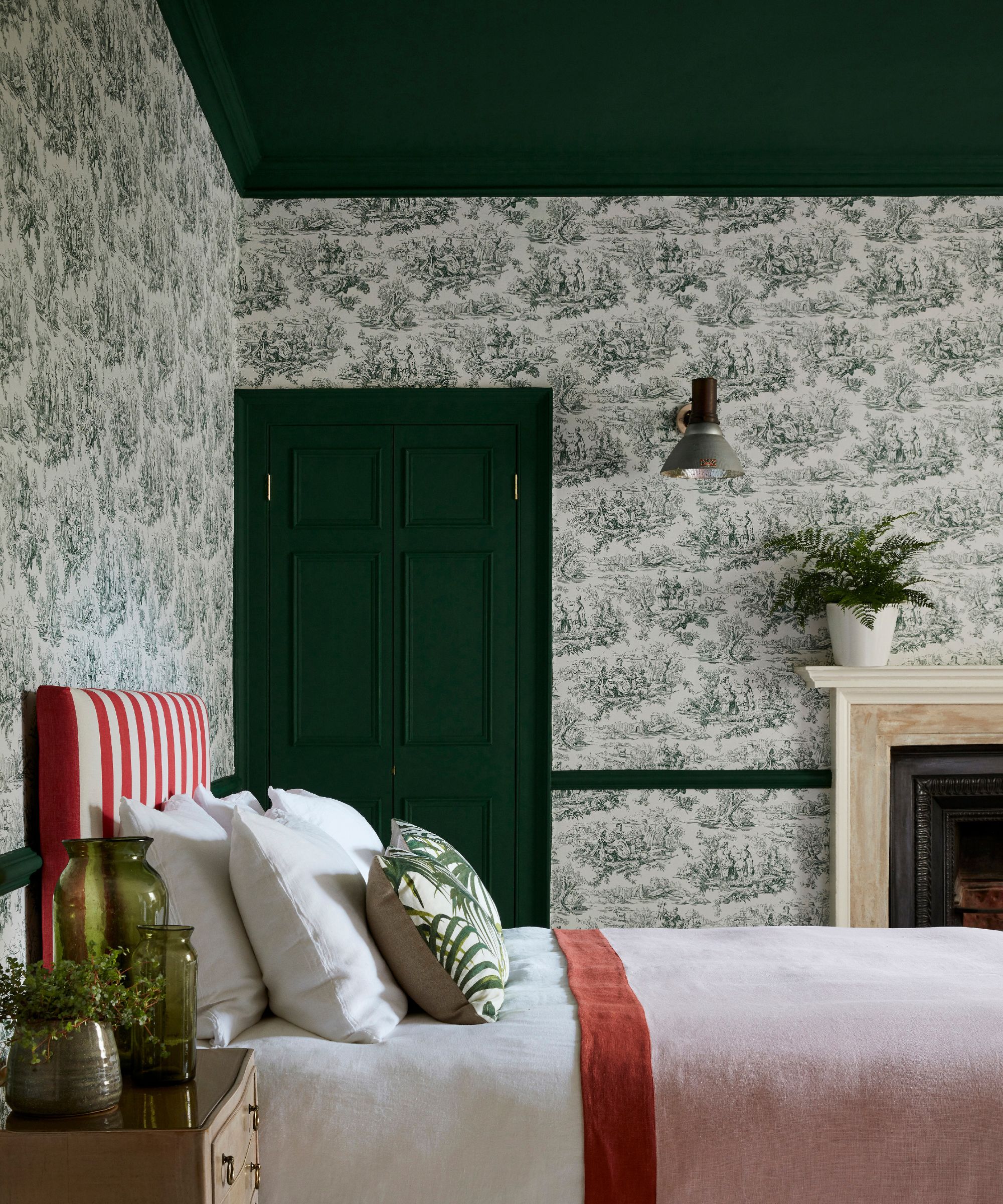
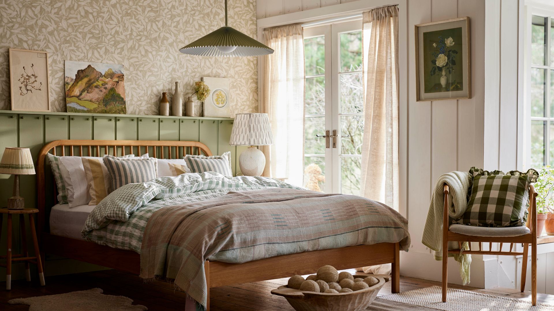
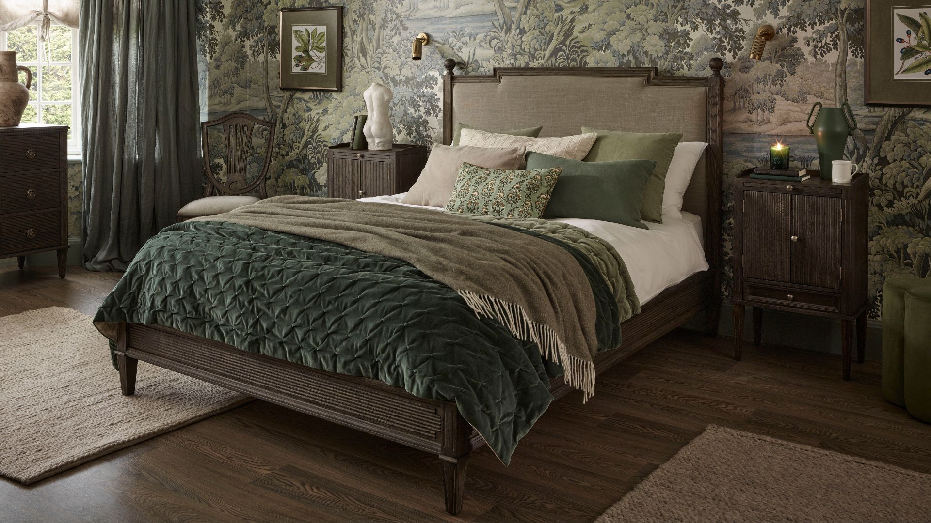
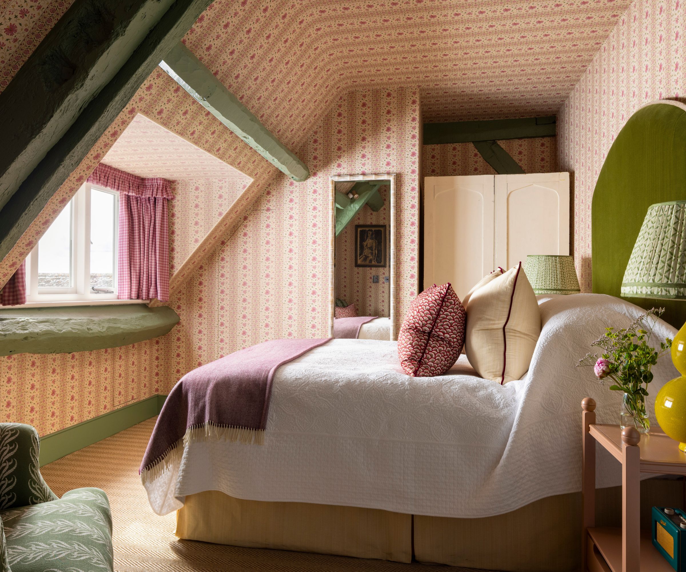
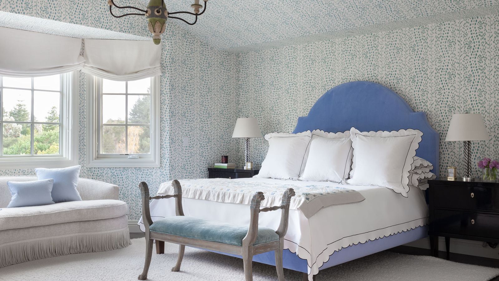
Finally, pale pastels are identified as less stylish for bedrooms in 2025. While inherently calming, they are often perceived as lacking depth and coziness. The article suggests replacing them with richer, earthier tones for a more sophisticated and enveloping look. Warm, deep neutrals like Split Pink and Nether Red from Little Greene, or bolder yet natural options such as Baked Cherry, Invisible Green, and Cordoba, are recommended to add depth and create a cozy, cocooning effect. The article concludes by emphasizing that while color choice is subjective, opting for warm neutrals over harsh whites and cool grays, and choosing muted or deeper warm-toned colors over overly saturated or pale pastels, can lead to a more stylish and restful bedroom environment. #BedroomDesign #PaintColors #InteriorDesignTrends #HomeDecor #ColorPsychology #RestfulSpaces #NeutralPalette #EarthTones
0 комментариев всего
 Комментариев пока нет
Вам также может понравиться
Bedroom color trends 2025 – 10 shades interior designers are using for the most stylish sleep spaces

5 outdated bedroom trends design experts say are snooze-worthy in 2024 and what to try instead

6 bedroom paint colors going out of style for 2024 – and the colors to use instead
5 Paint Colors That Will Take Over in 2025, According to Interior Designers

5 Trending Bedroom Paint Colors for 2024

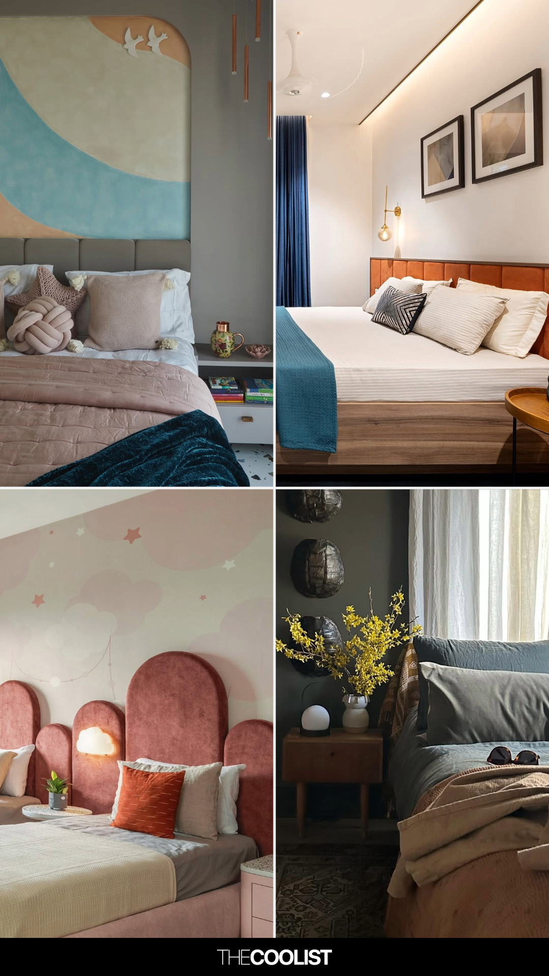
Bedroom design trends of 2025 - What designers choose
26 Bedroom Color Schemes That Interior Lovers Are Quietly Copying in 2025

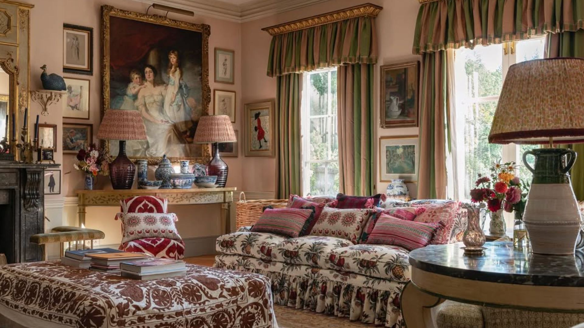
5 living room paint colors going out of style in 2025
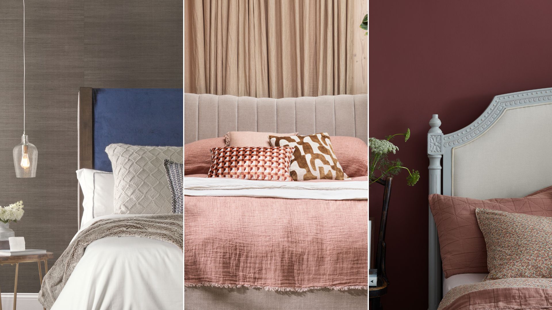
Bedroom trends 2025: Interior experts reveal 9 trending colours and designs

We Asked Designers to Predict the Top Bedroom Paint Colors for 2025, Here's What They Said
5 Bedroom Design Trends to Spice Things Up in 2024

What couch colors are going out of style in 2025? Designers say these 6 shades should be avoided
5 Bedroom Paint Color Trends You'll See Everywhere in 2025, According to Designers

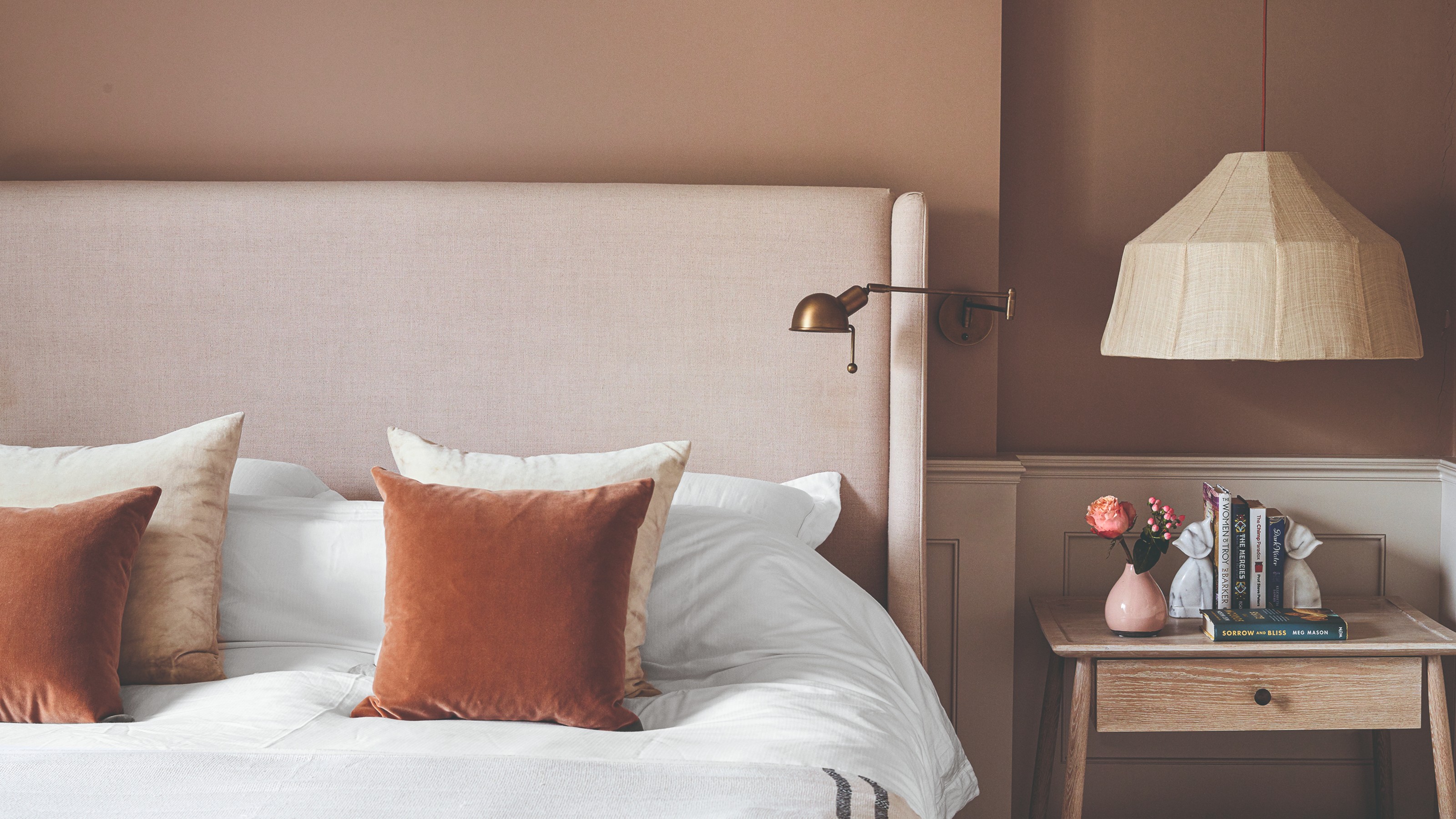
Bedroom trends 2025 – the 9 most important styles and looks of the year to decorate your sleep sanctuary with
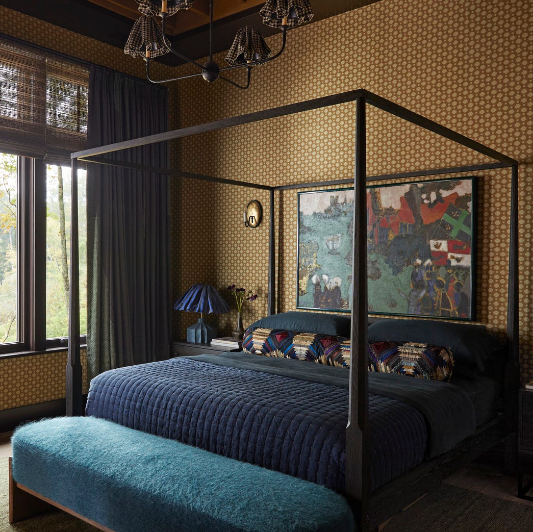
These Are the Top Bedroom Trends for 2025, According to Designers

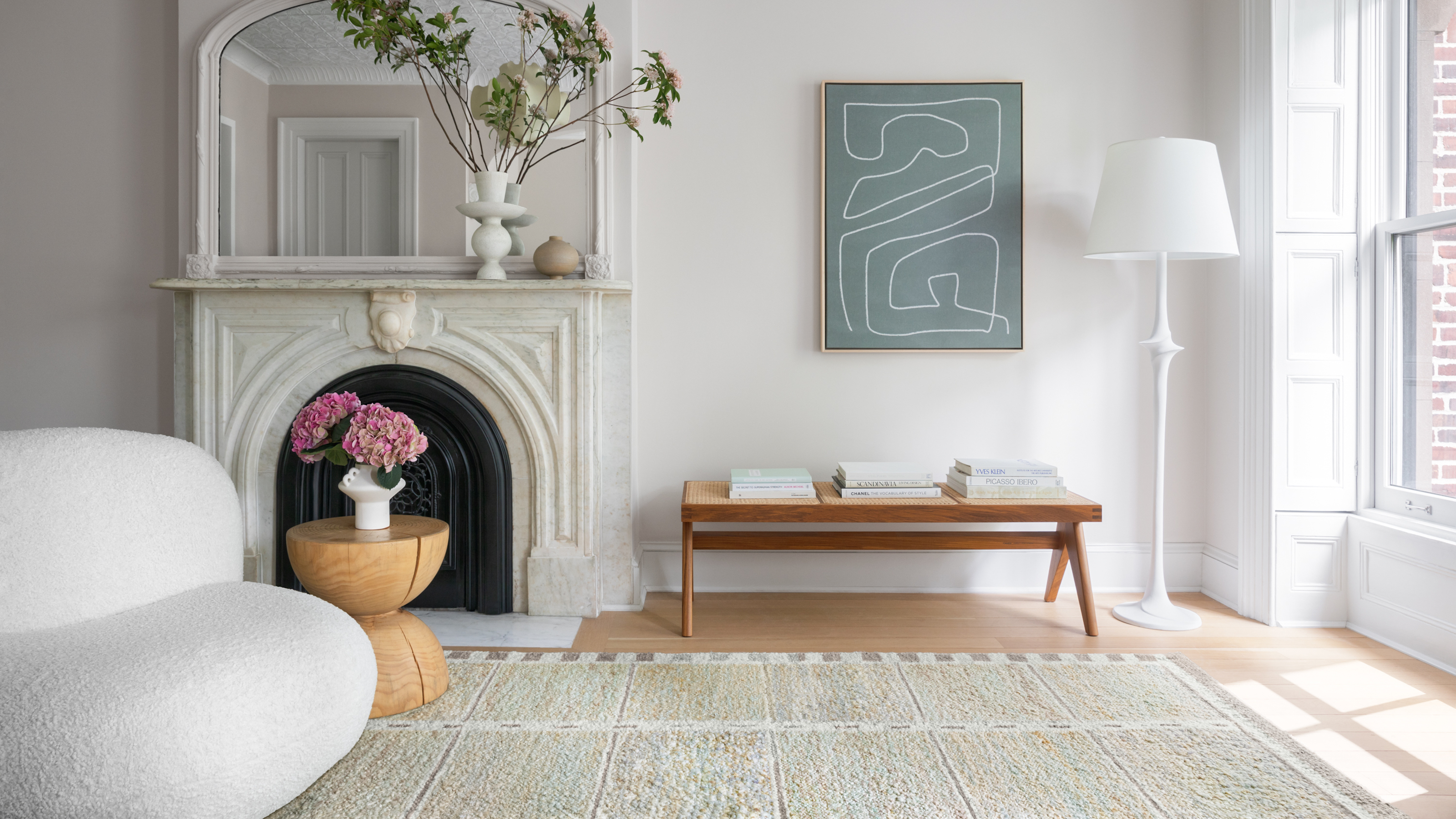
These 5 rug colors are going out of style for 2025, according to interior designers
The top bedroom design trends of 2025 to inspire a dreamy makeover of your most important space

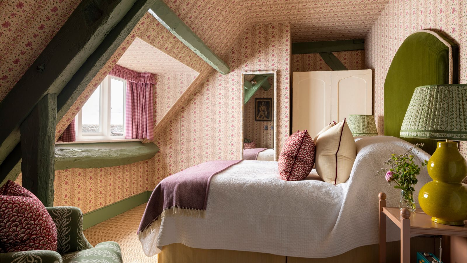
These 5 Dated Bedroom Trends Are Giving Interior Designers Nightmares in 2026 – Here's Why You Should Avoid Them in Your Sleep Space
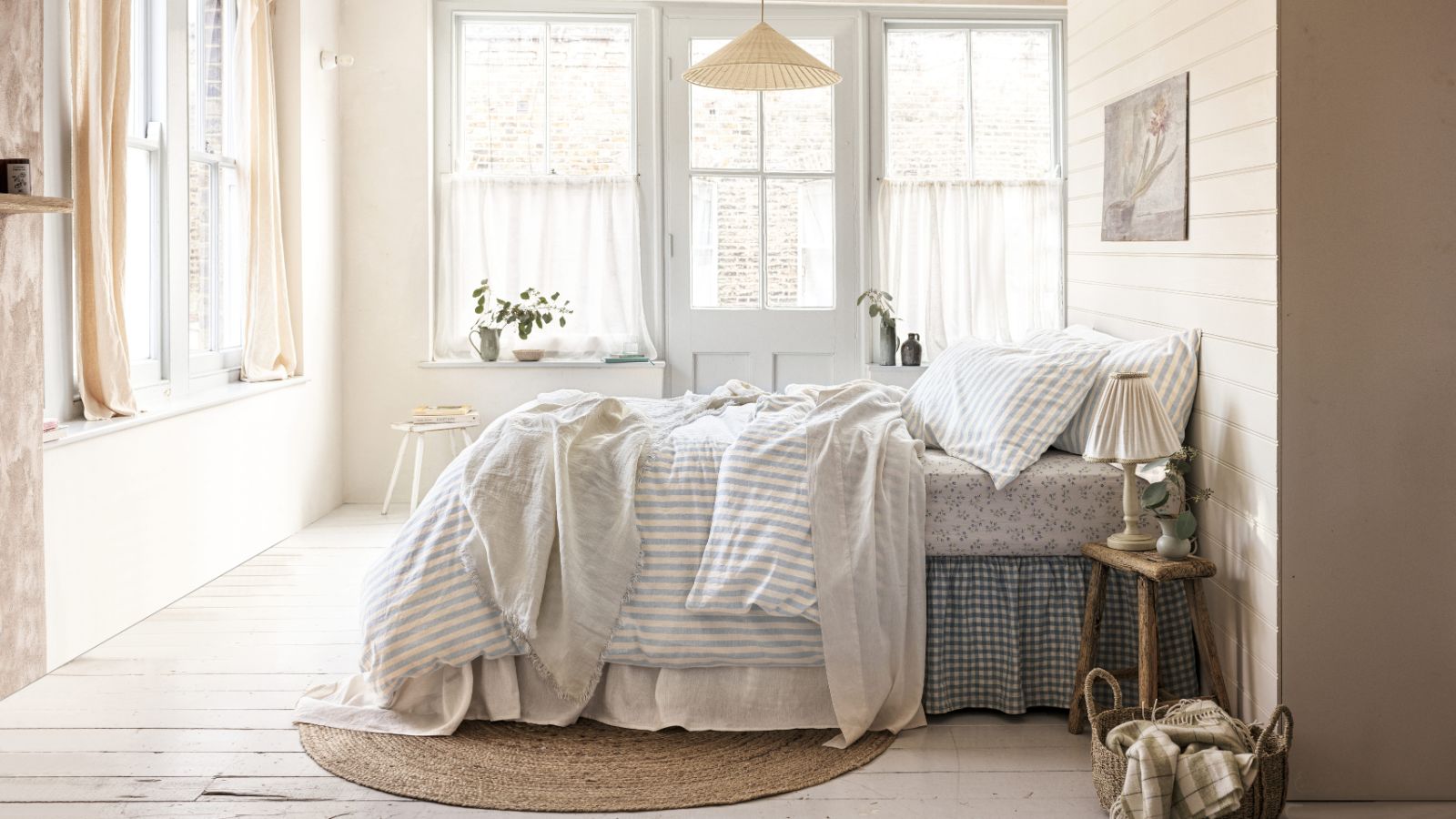
Sleep in style with the 5 must-know bedding trends that will make your bed look and feel amazing in 2025
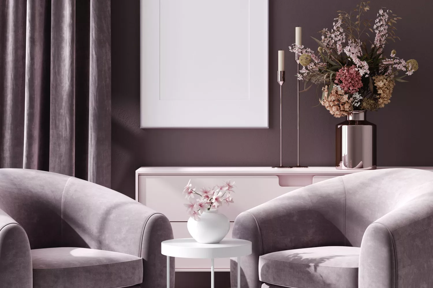
5 Paint Colors That Are Out for 2025, According to Interior Designers