6 Paint Colors Going Out of Style in 2026
The choice of paint color can significantly impact a room's atmosphere and perceived trendiness. As design trends evolve, certain colors, while popular in previous years, are projected to become less fashionable. This article identifies six specific paint colors that interior designers anticipate will fall out of style by 2026, offering insights into why these shades are losing their appeal and suggesting alternative approaches for homeowners.
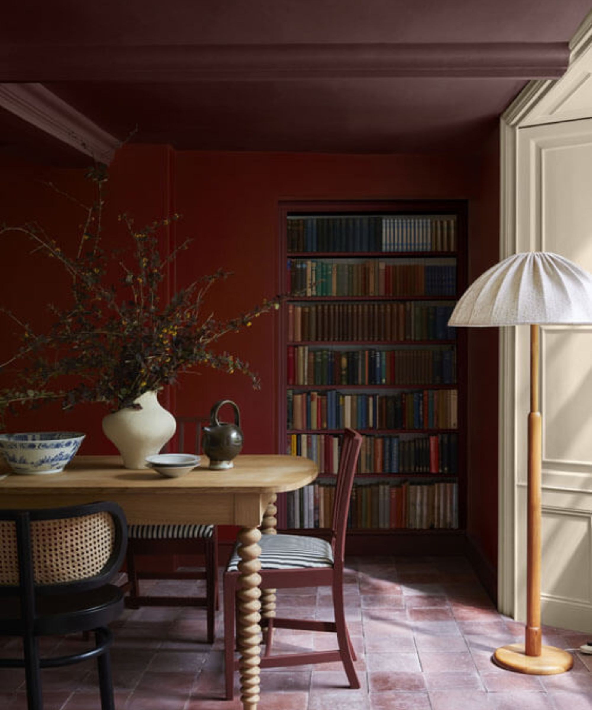
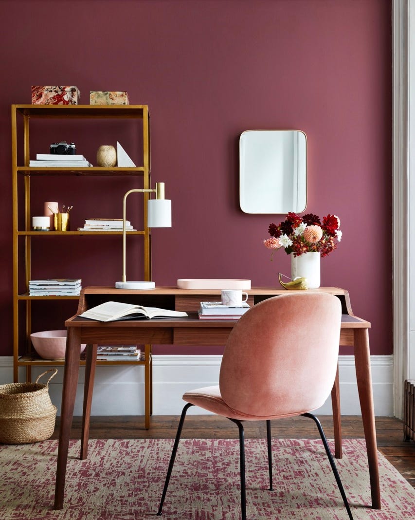
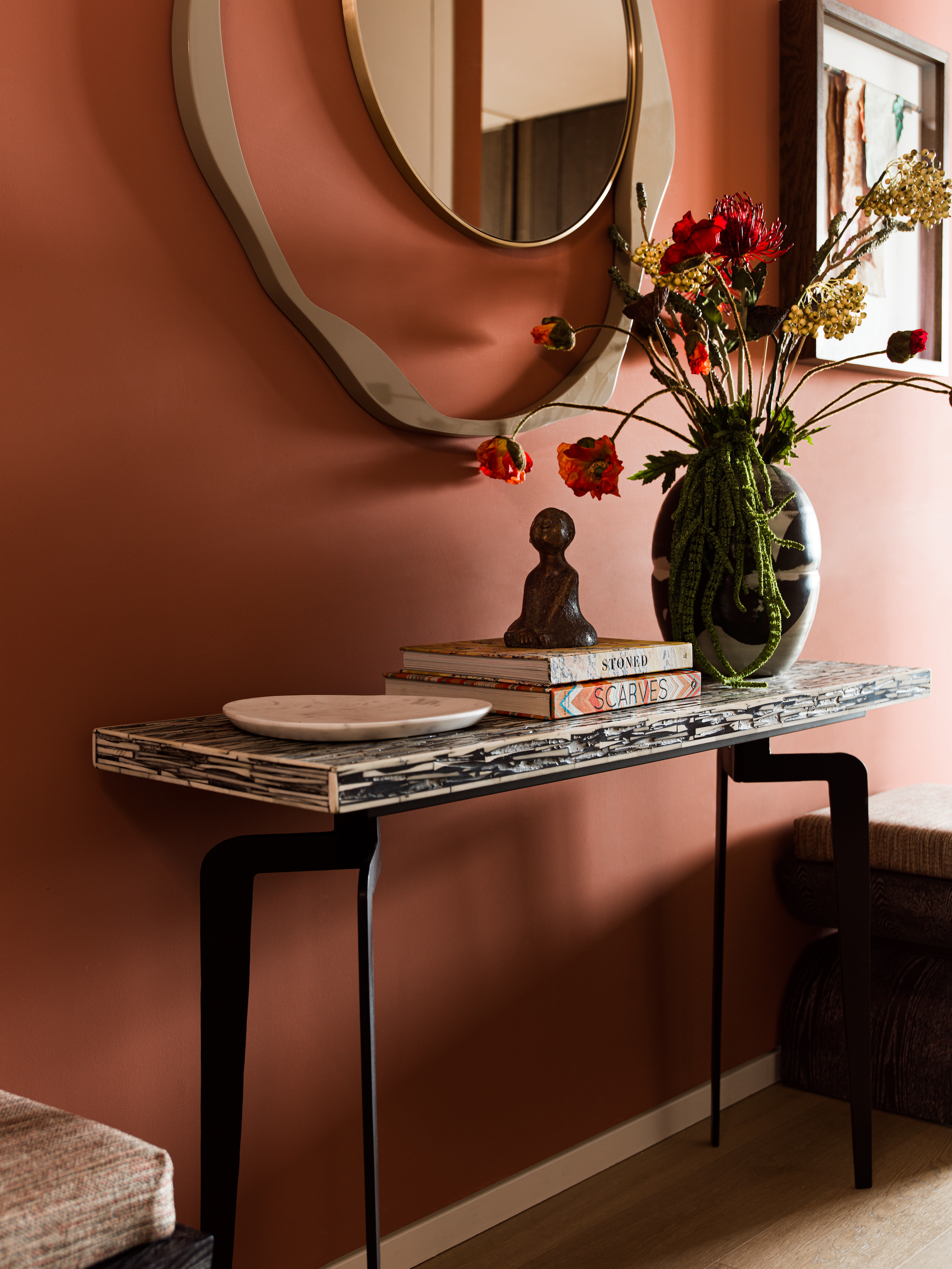
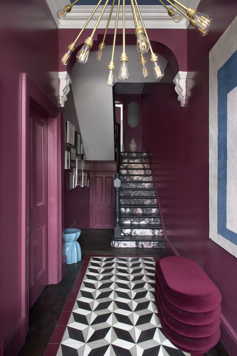
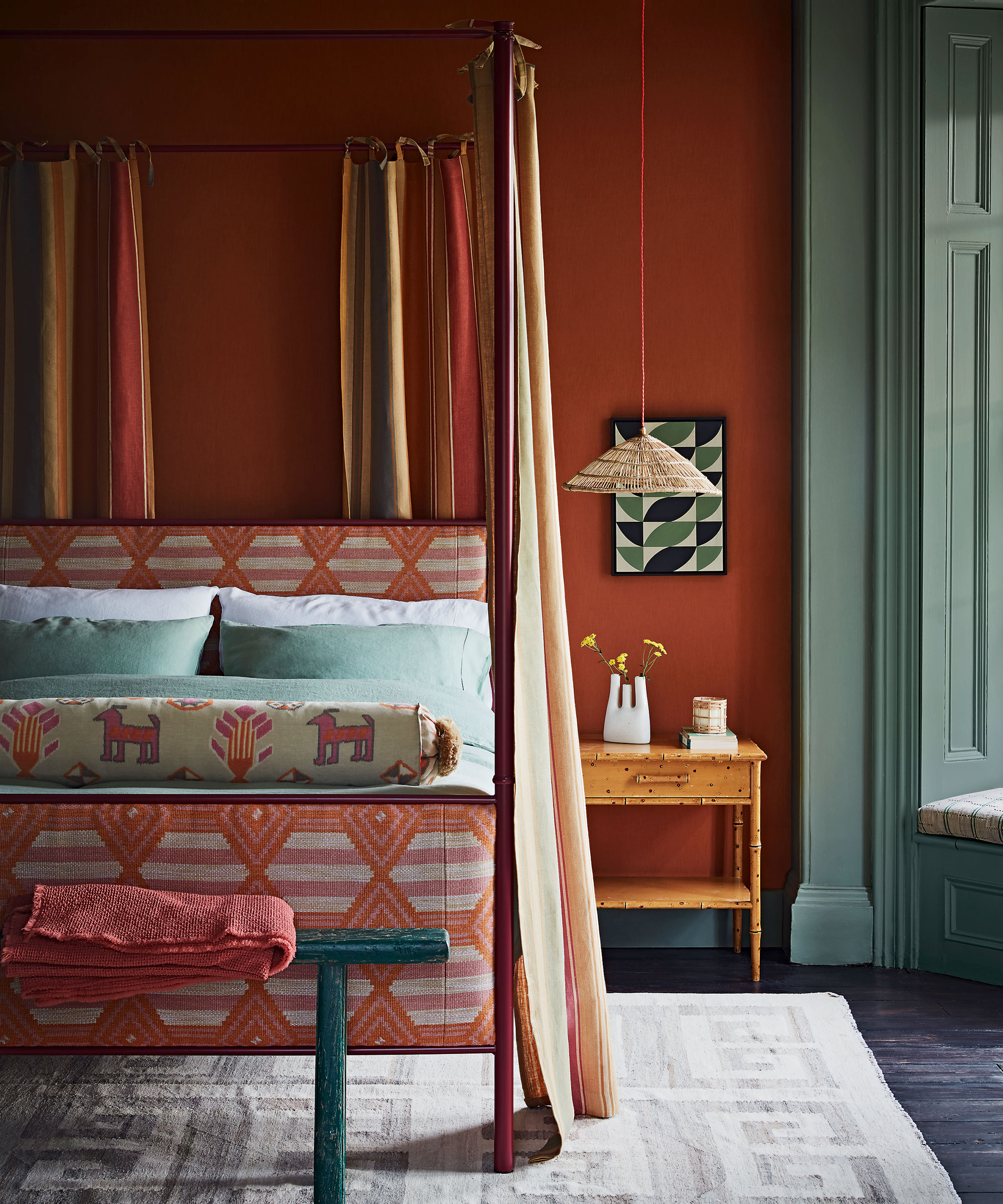
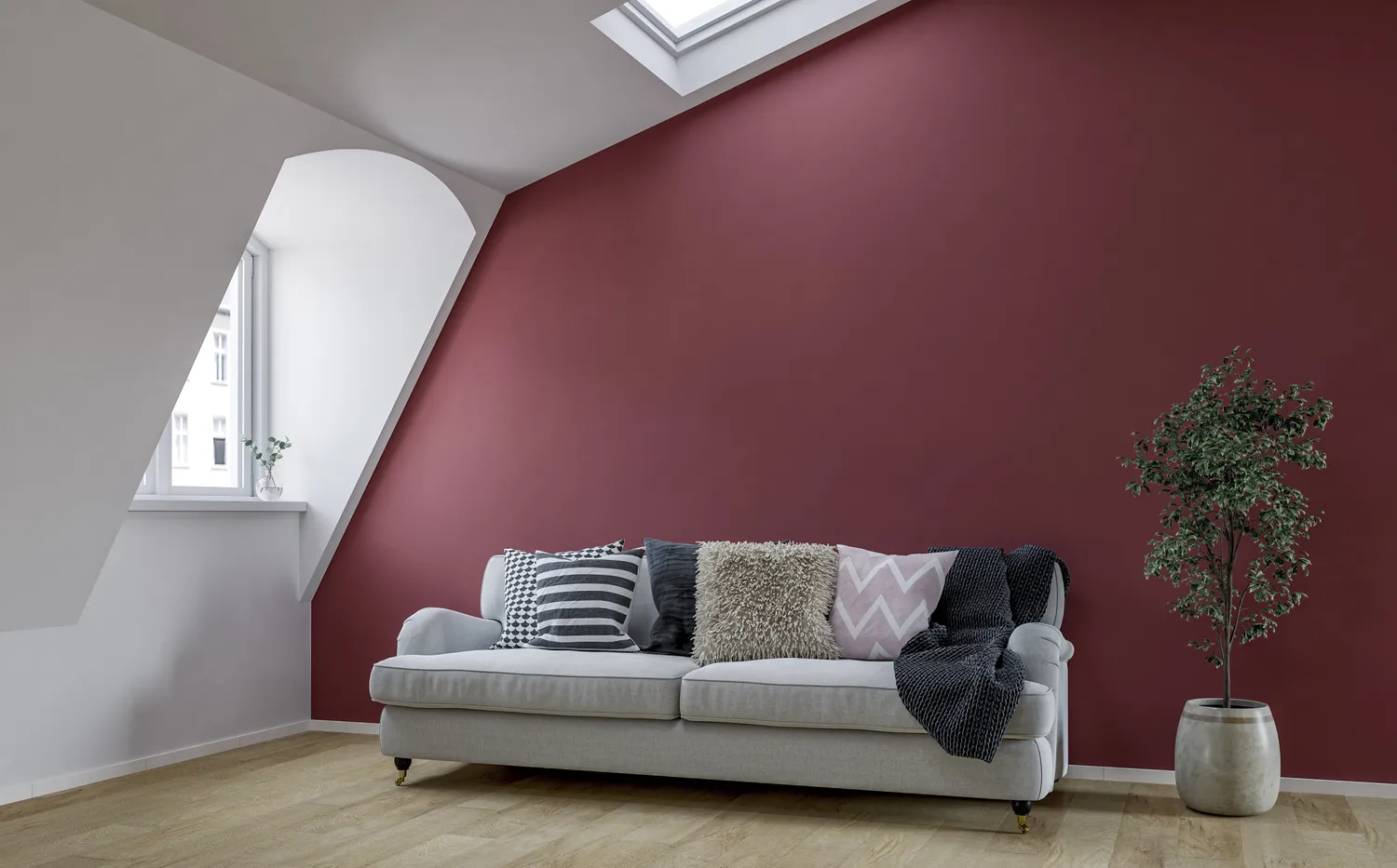
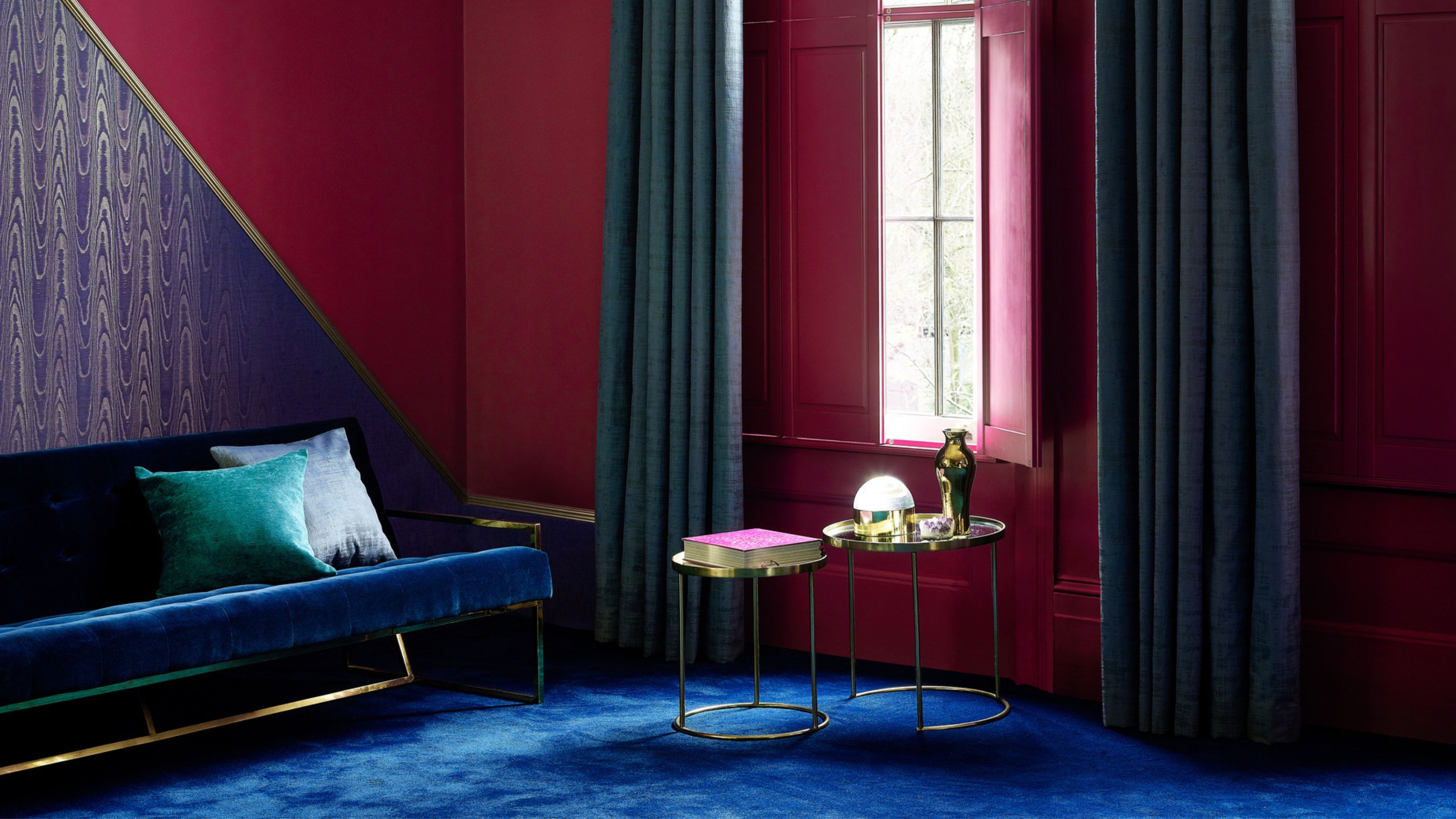
Deep reds and wine-colored hues, although recently popular, are expected to have limited longevity. While these rich colors can add character to small spaces like powder rooms, their intensity can overwhelm larger areas such as living rooms or open-concept layouts. The consensus among designers is that these shades can make a space feel less like a sanctuary and more demanding of attention, suggesting they will quickly appear on lists of outdated colors in the near future. Homeowners are advised to use these bold colors only if they genuinely love them, rather than solely following a trend.
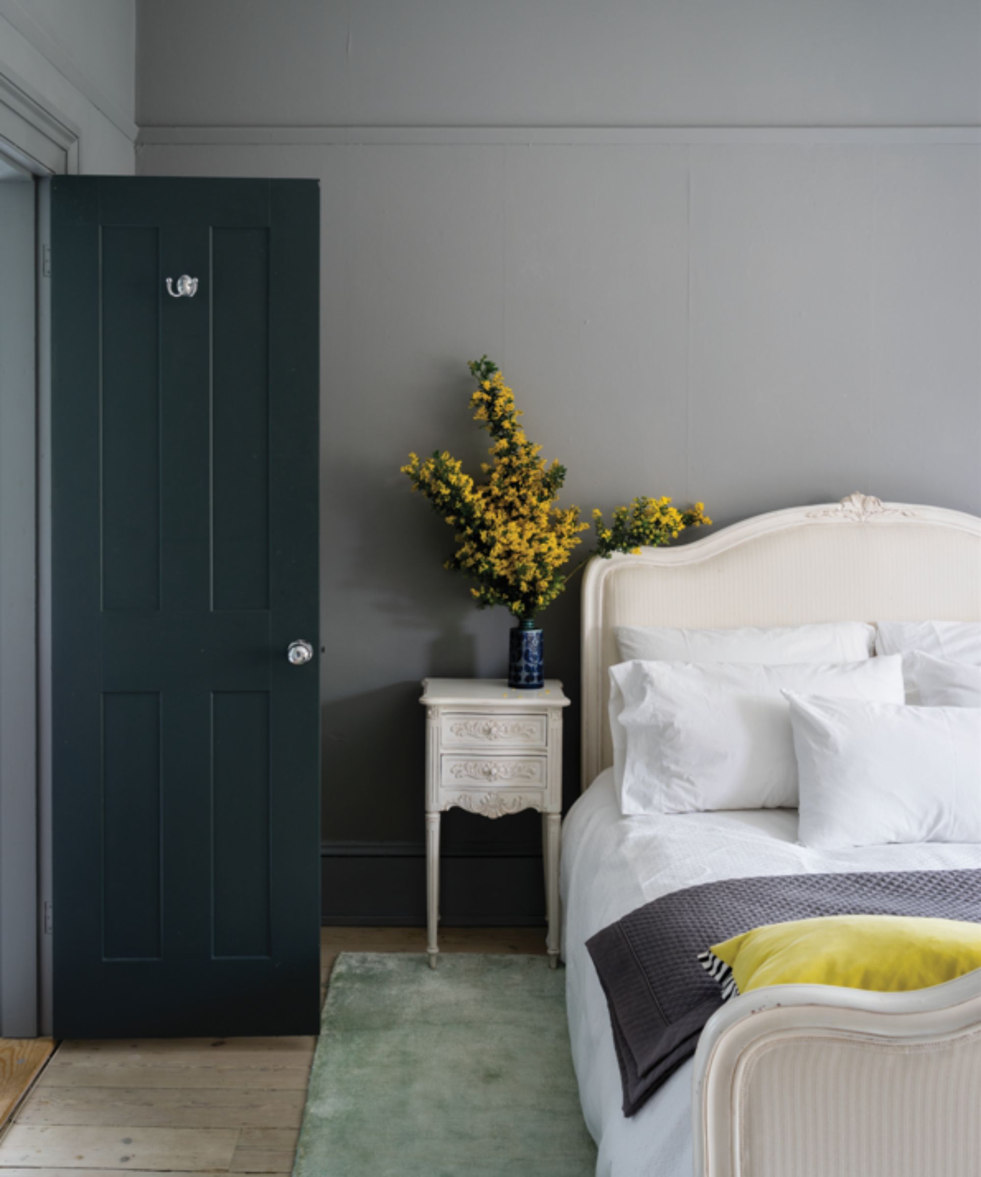
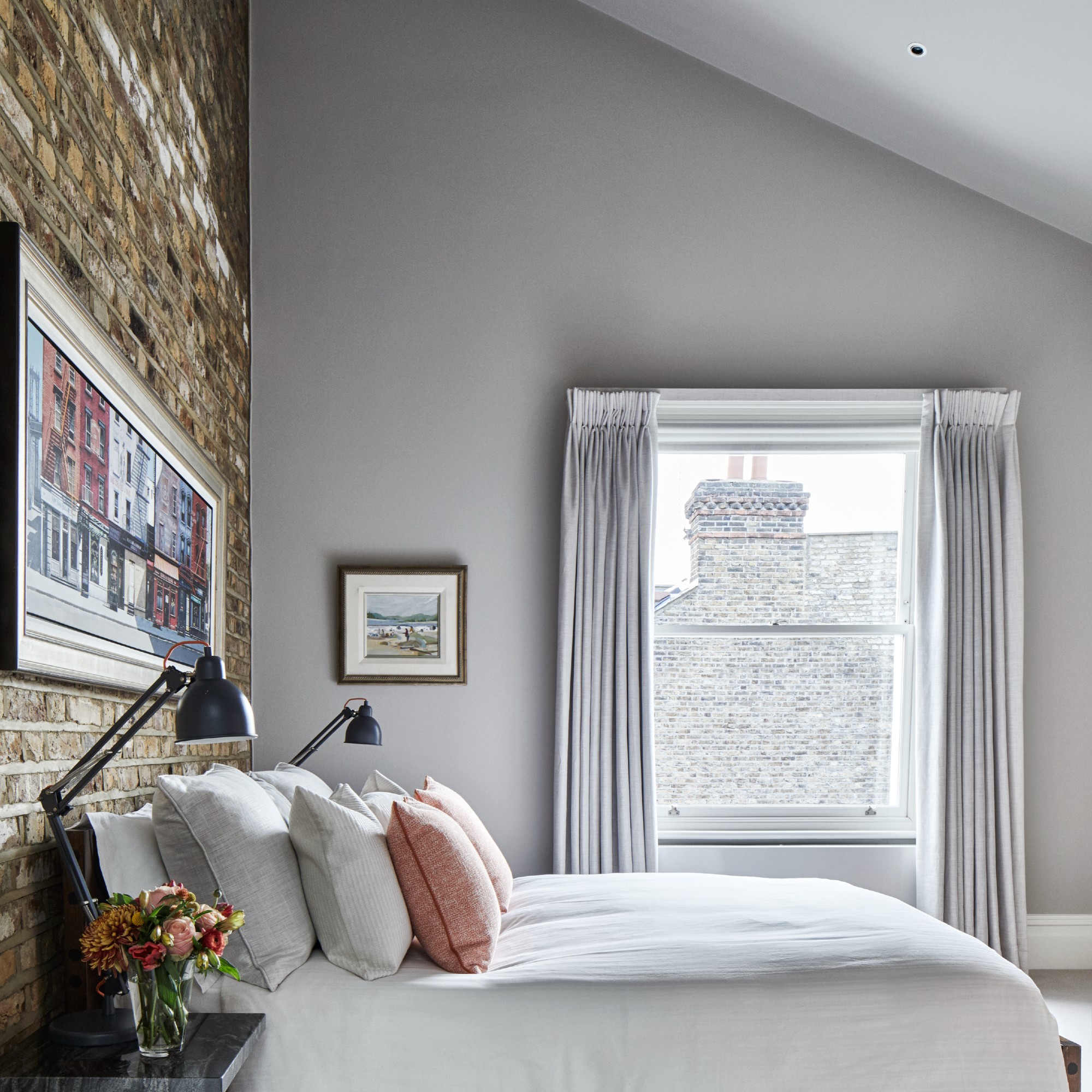
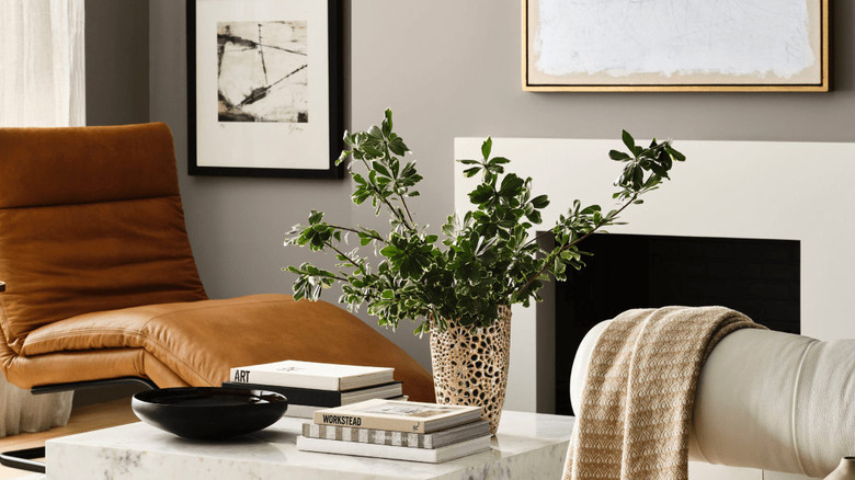
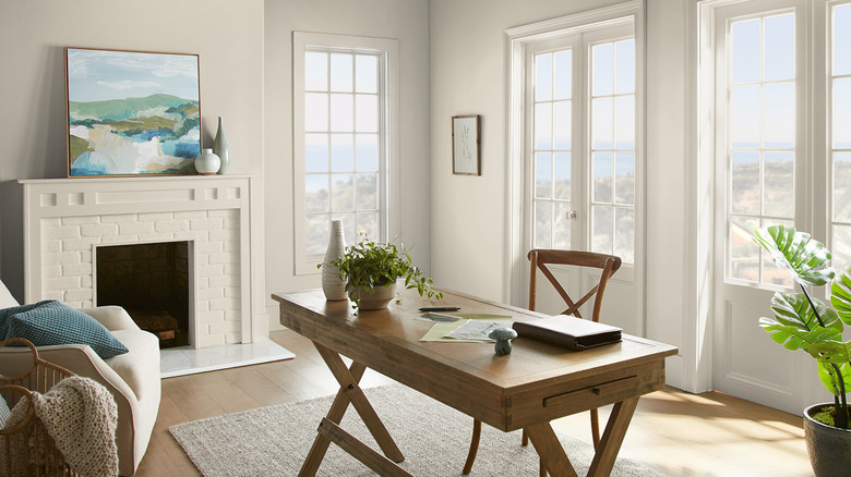
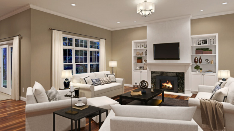
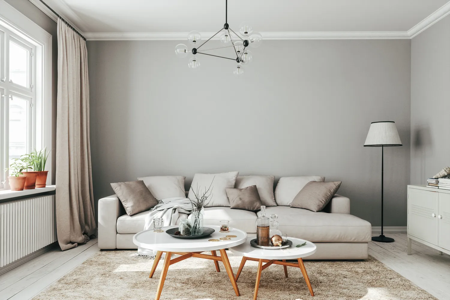
Shades of gray, particularly cool and icy tones, which experienced immense popularity approximately a decade ago and saw a brief resurgence, are now considered officially out. These grays are criticized for their flat and sterile vibe, failing to provide the warmth and dimension that contemporary home aesthetics demand. The shift is towards colors that offer more inviting and dynamic qualities, moving away from the coldness associated with these gray variations.
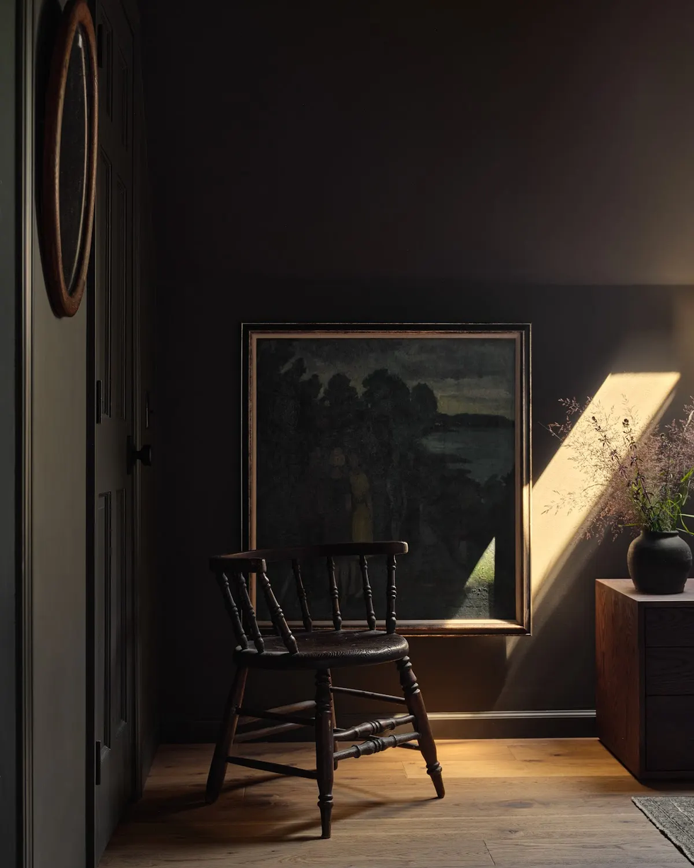
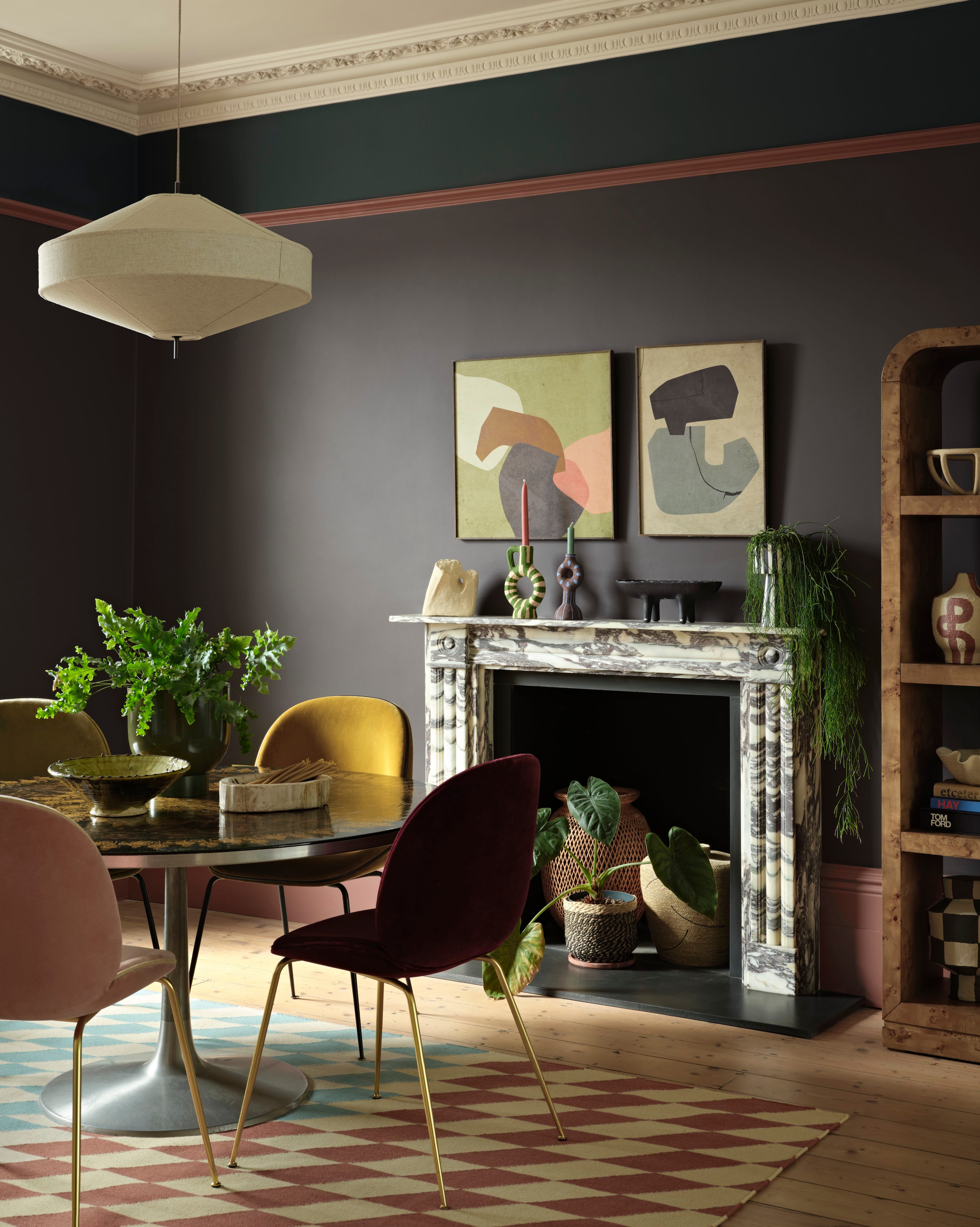
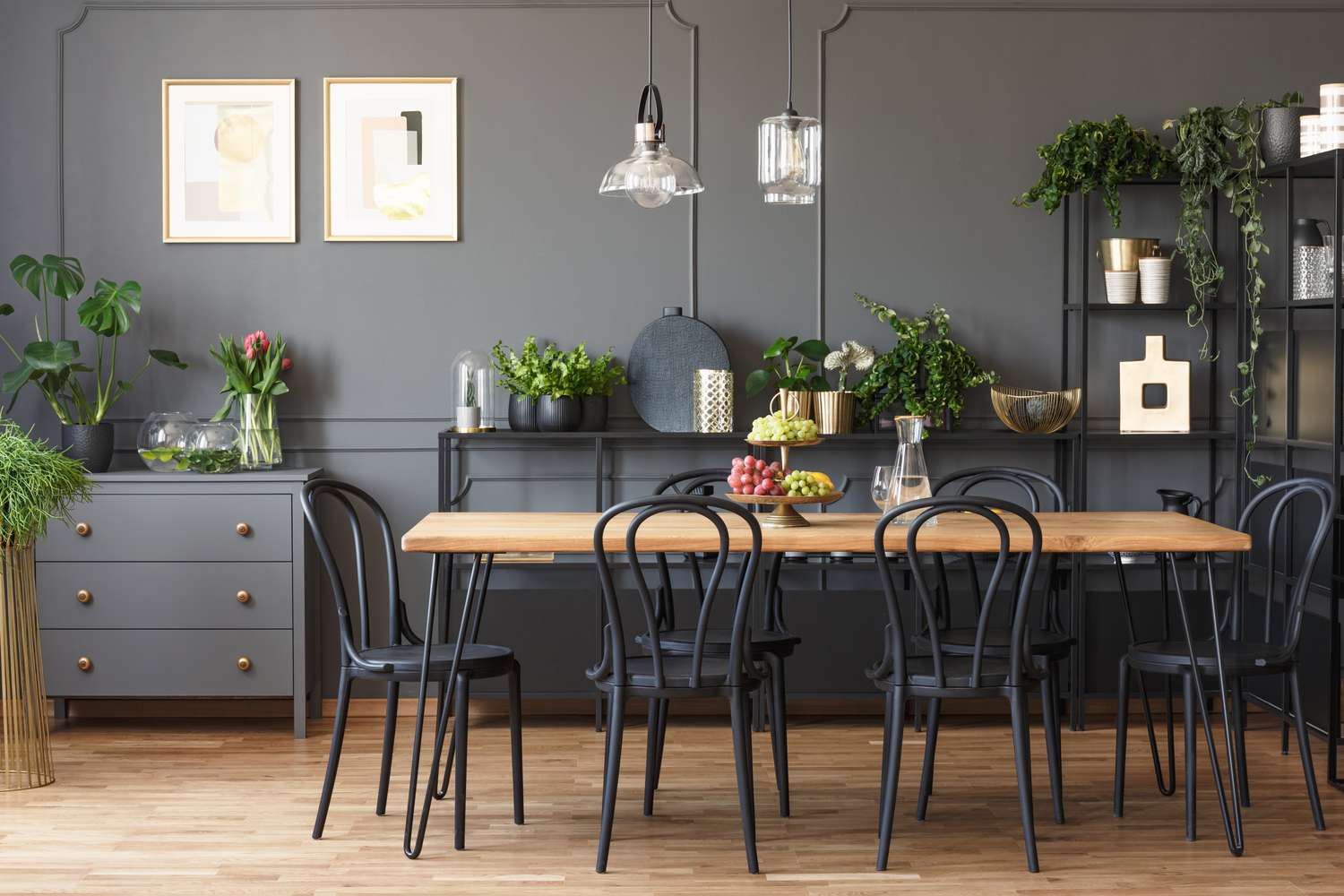
Blacks, including deep charcoal and pure black, are also predicted to fade in popularity. Despite their dramatic potential, these colors are often challenging to work with in typical home settings. Their intensity can lead to an overwhelming or overly dramatic effect, making them less suitable for the average homeowner seeking a comfortable and balanced living environment. The overuse of these dark shades has also contributed to their diminishing appeal.
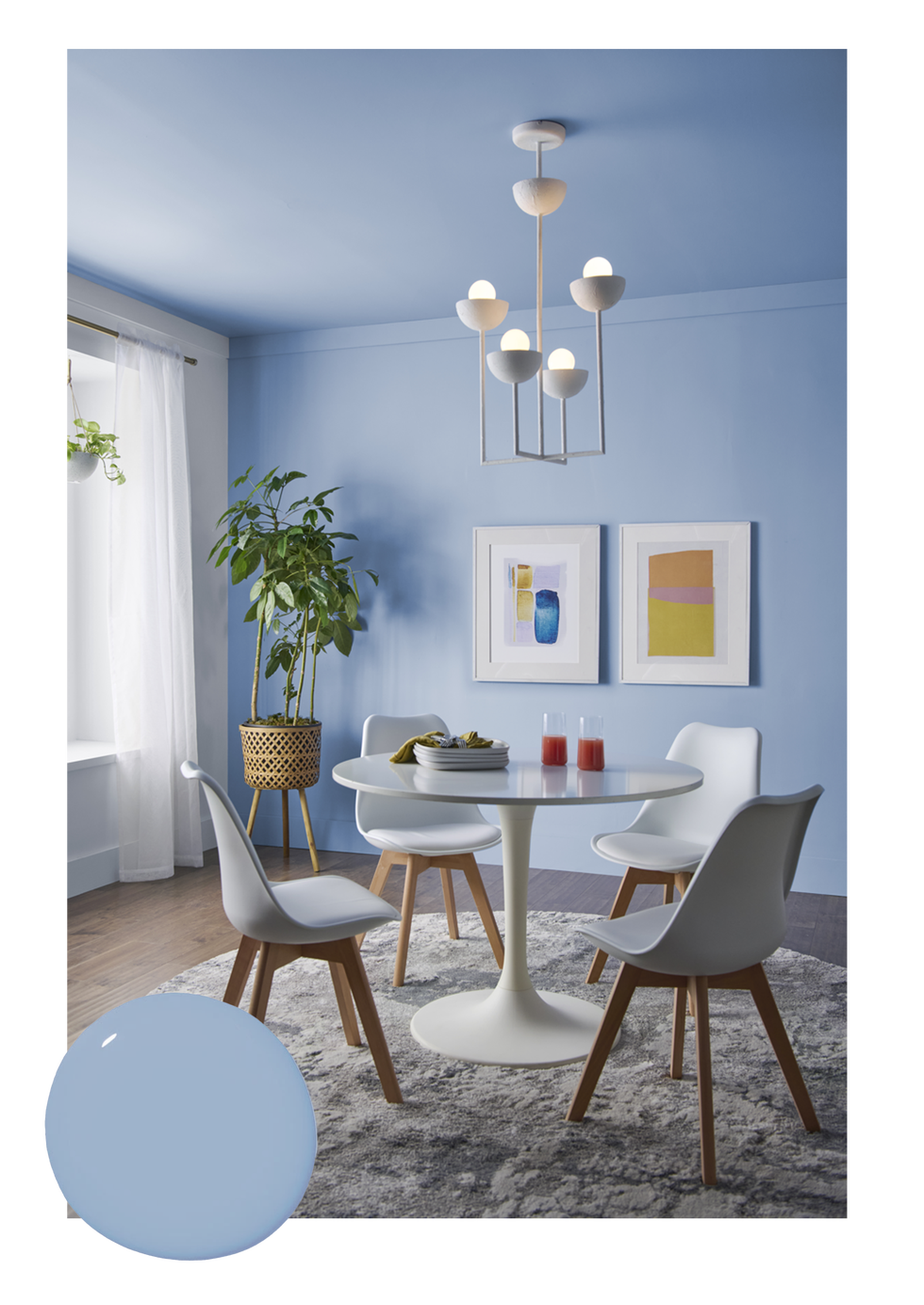
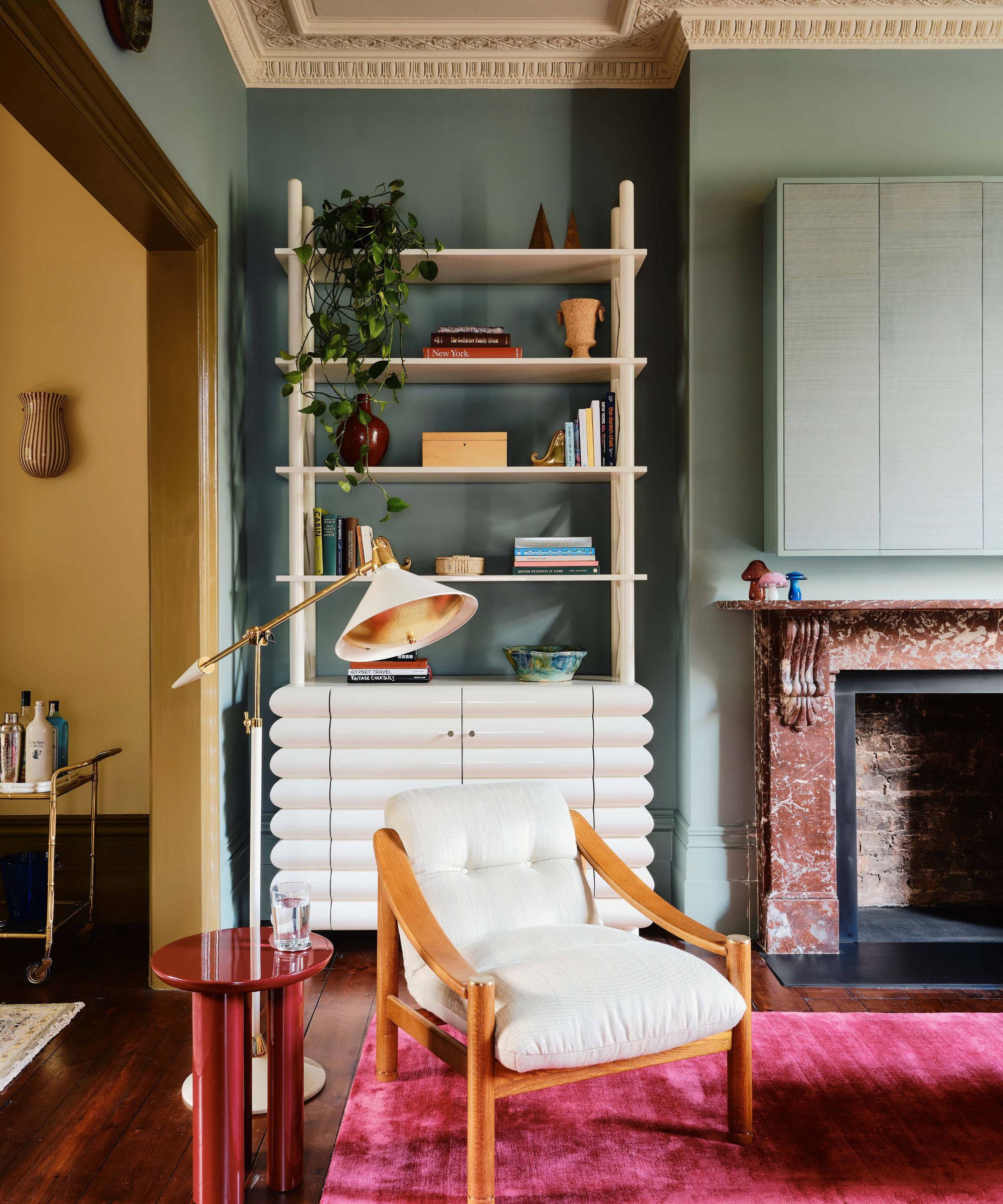
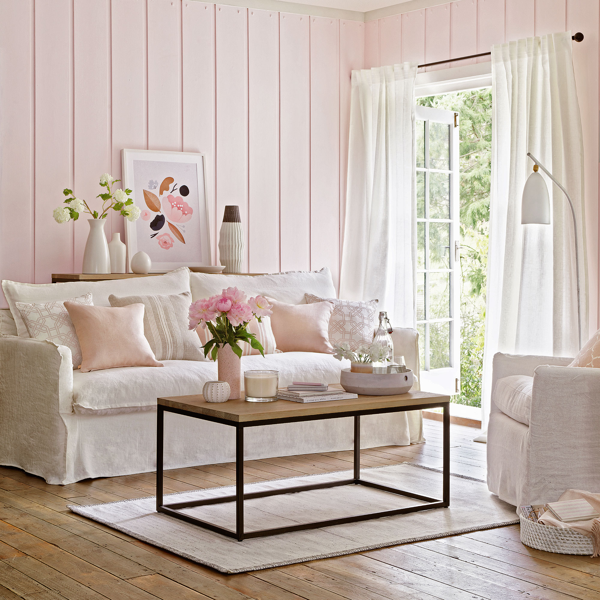
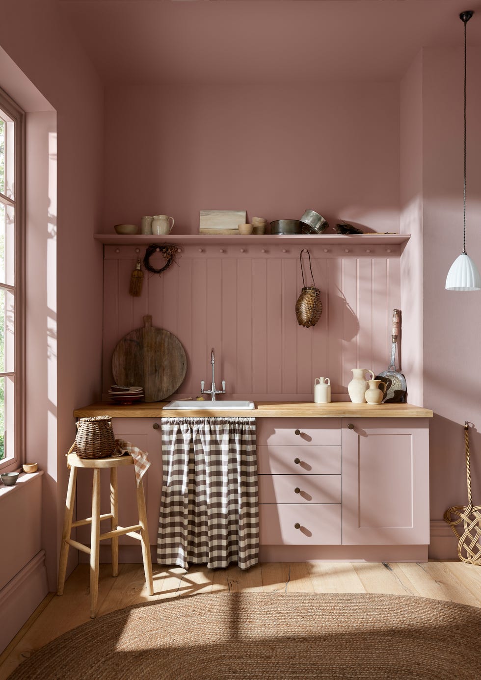
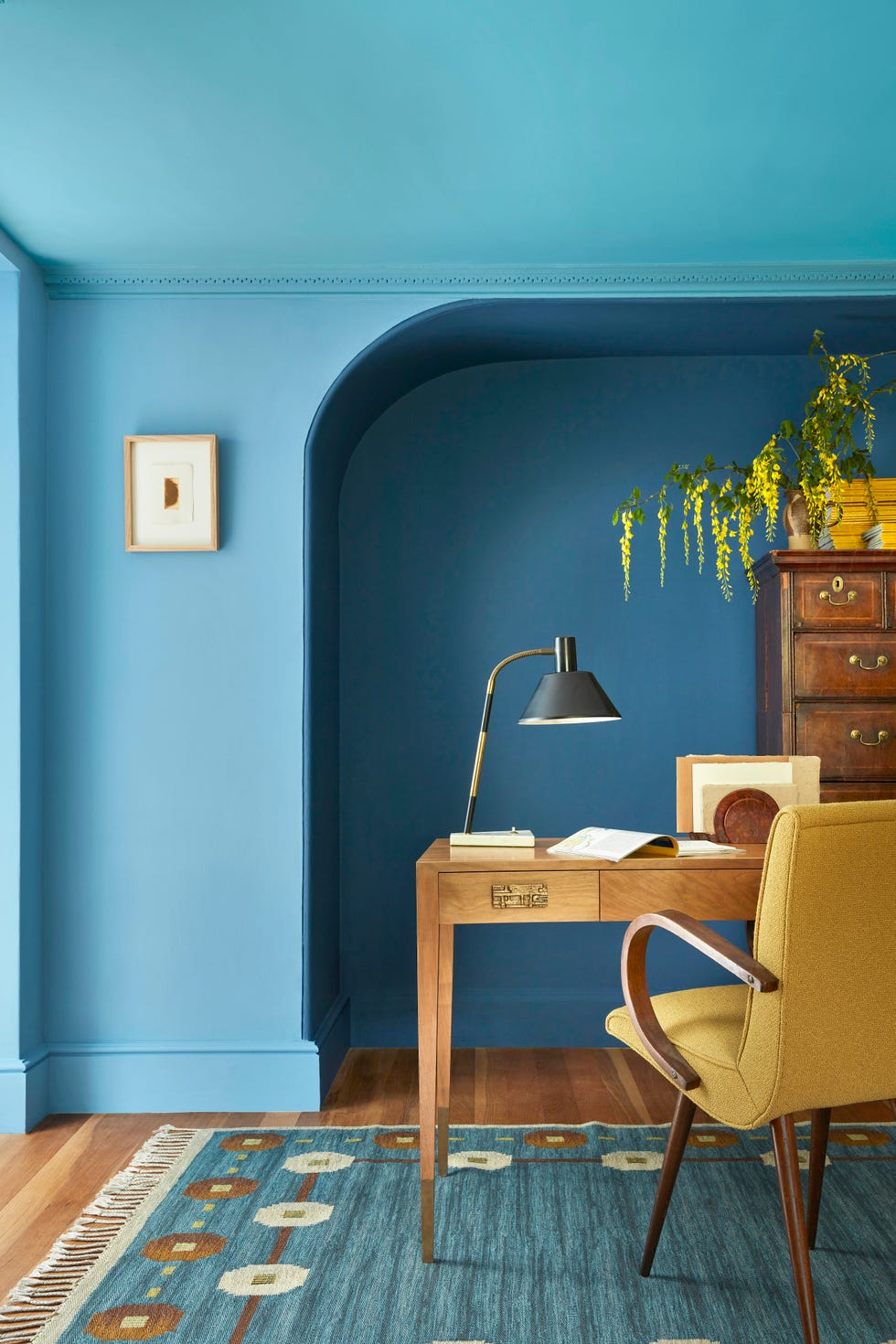
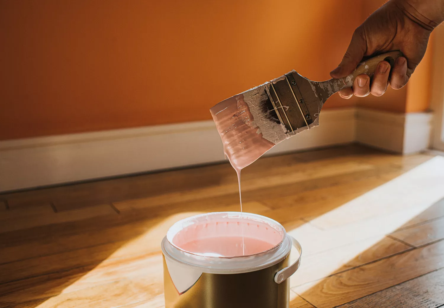
Sugary pastels, such as powder blue and bubblegum pink, are losing favor because they lack the richness and depth characteristic of current trending palettes. While these colors can be playful, they often fail to convey sophistication. For those who still appreciate pastels, designers suggest confining their use to specific, smaller spaces like powder rooms, playrooms, or children's bedrooms, where their whimsical nature can be more appropriate.
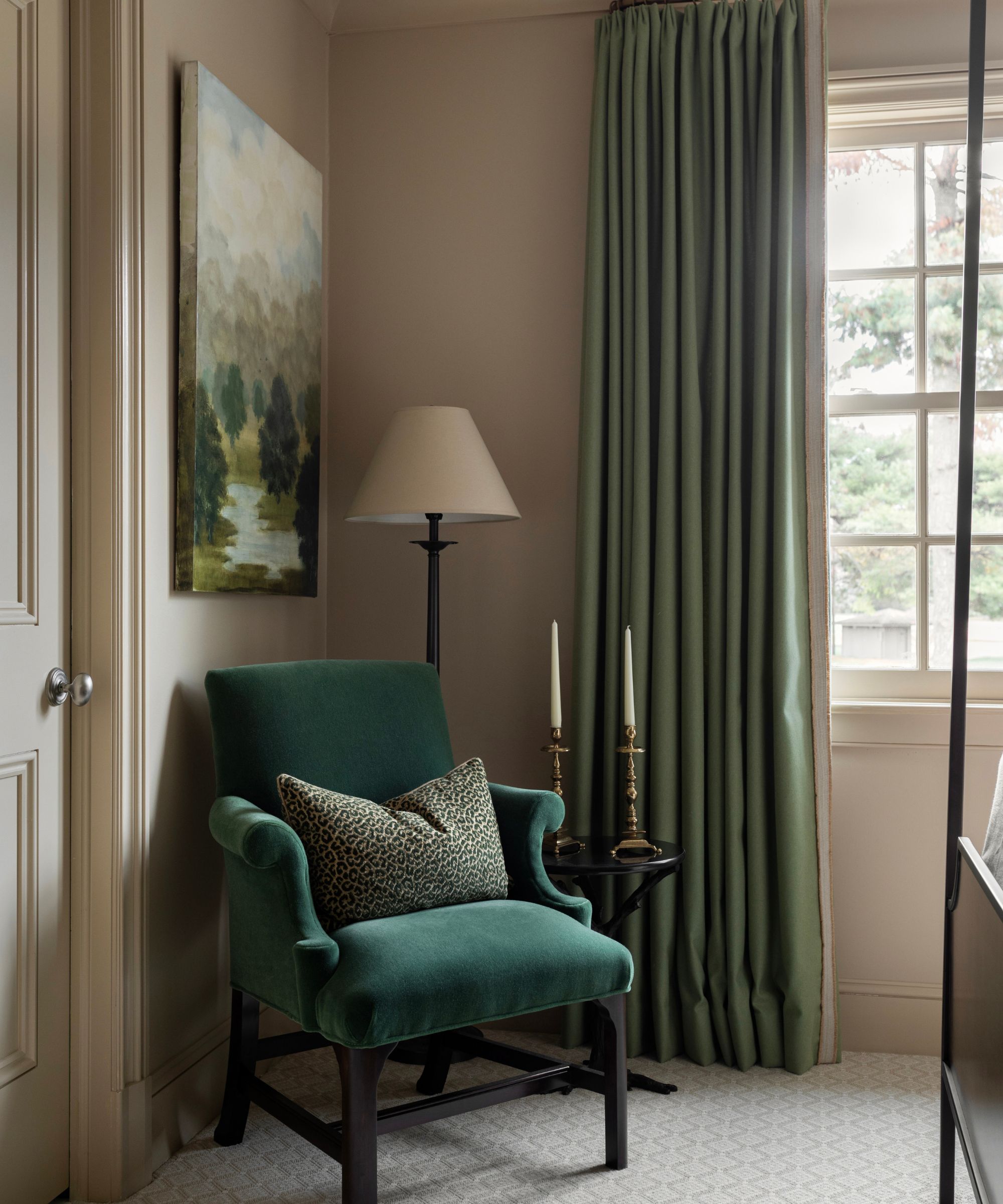
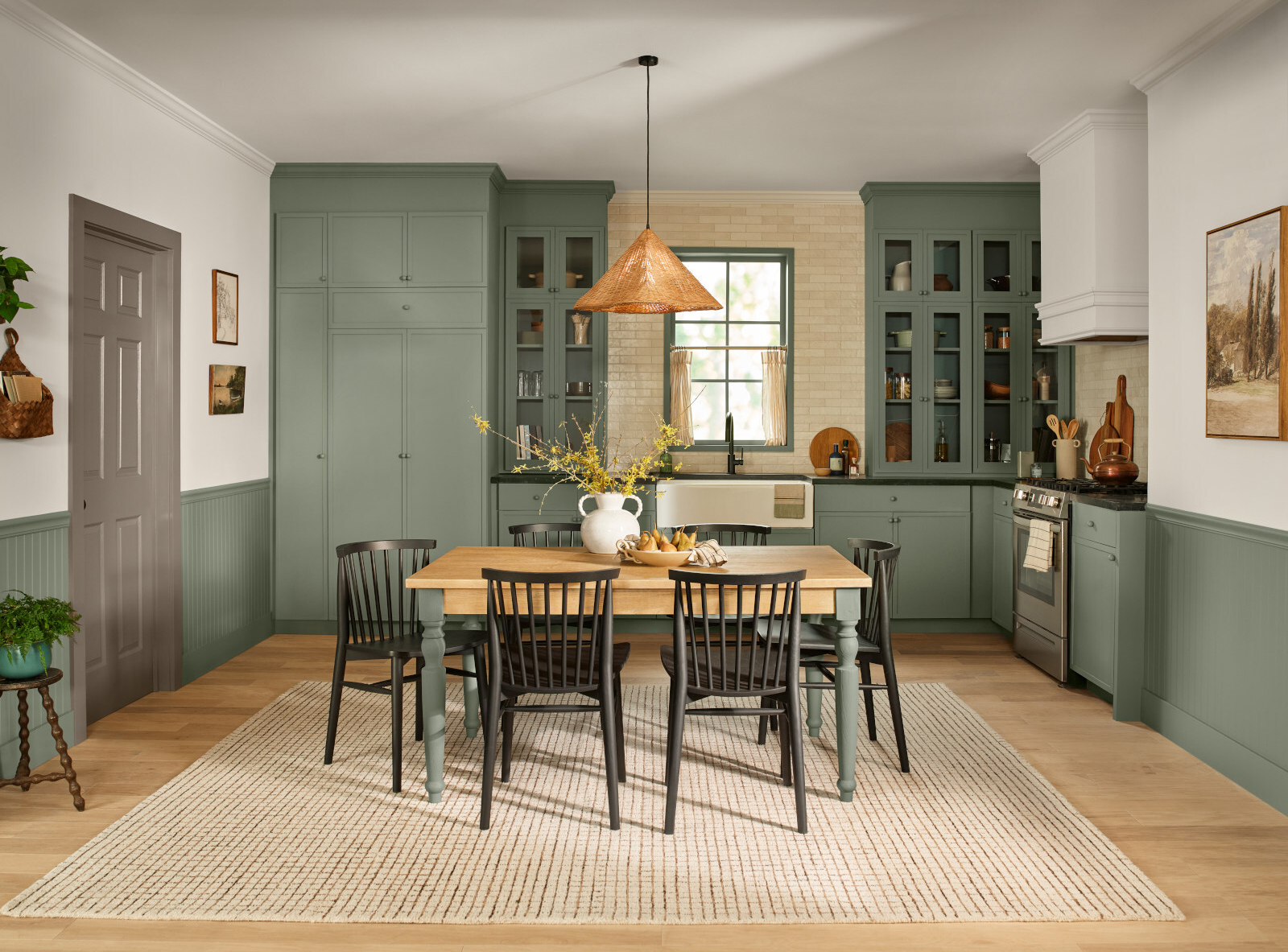
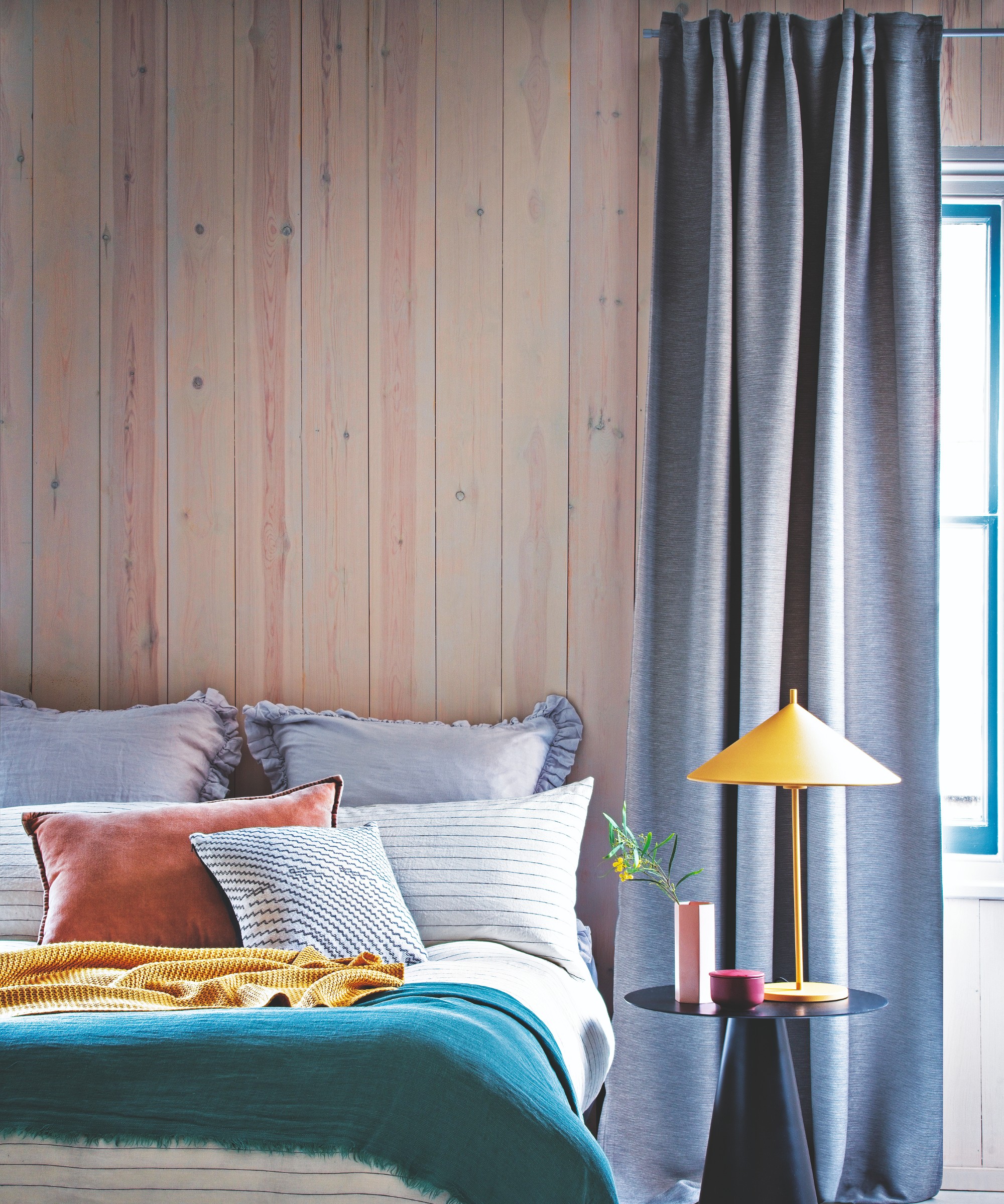
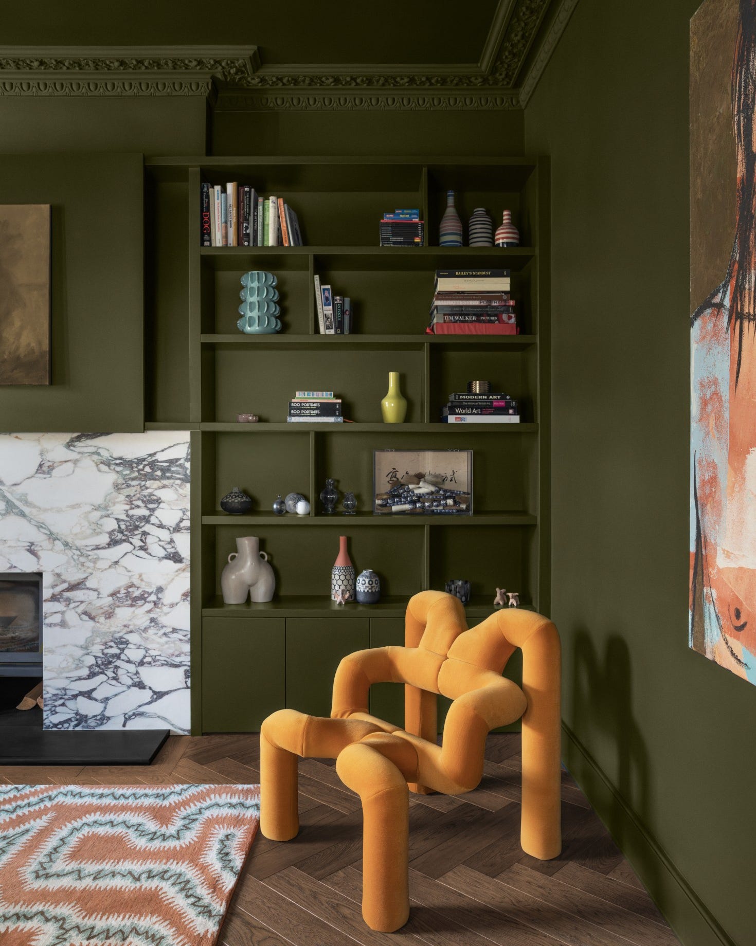
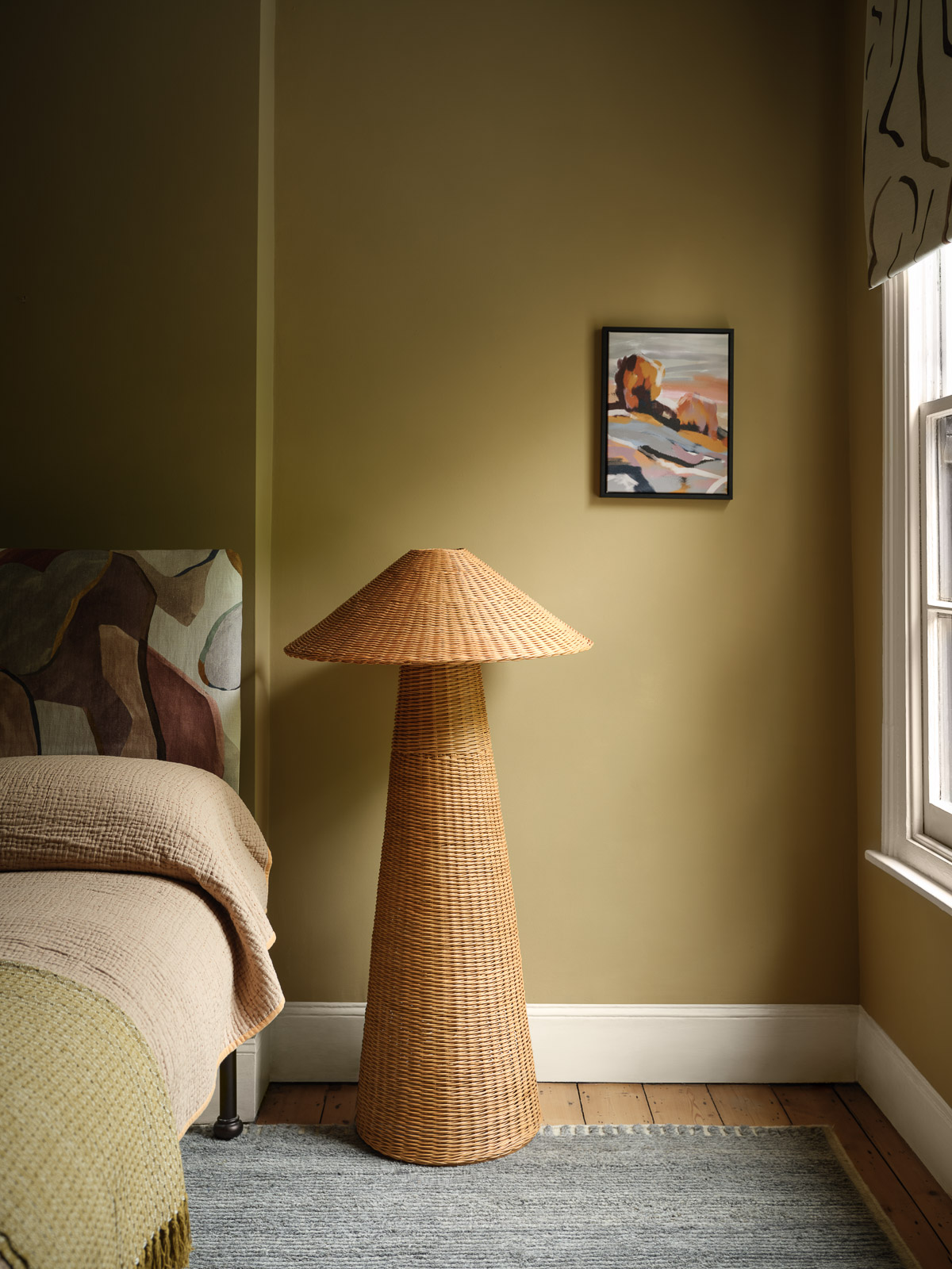
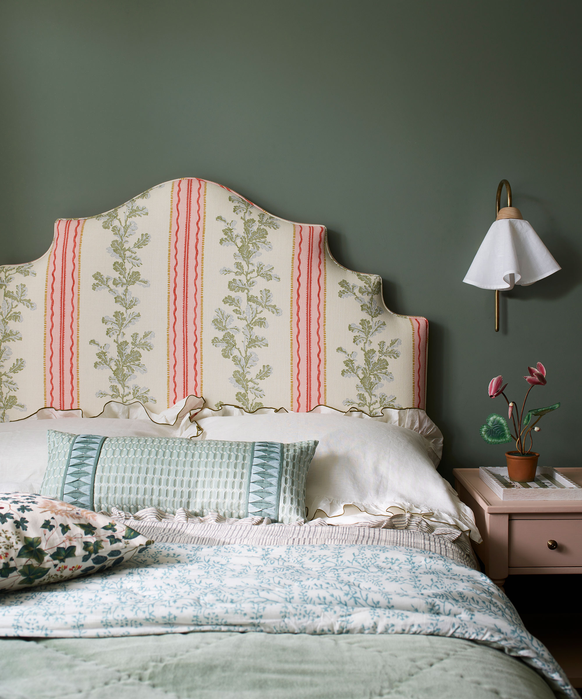
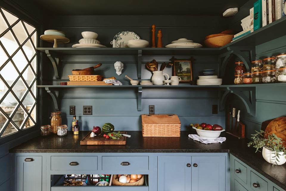
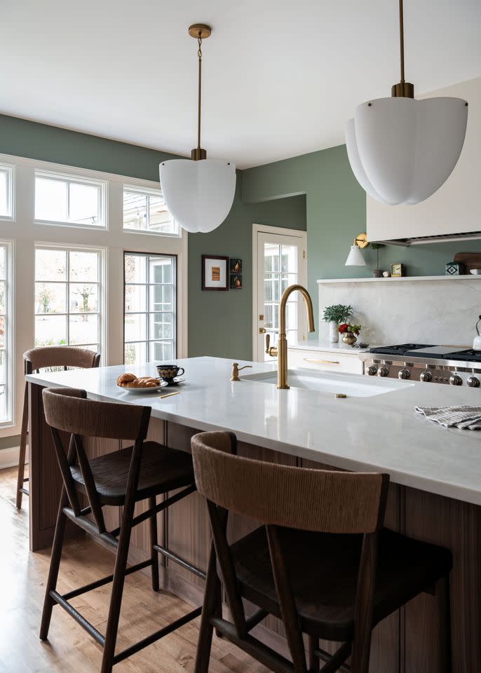
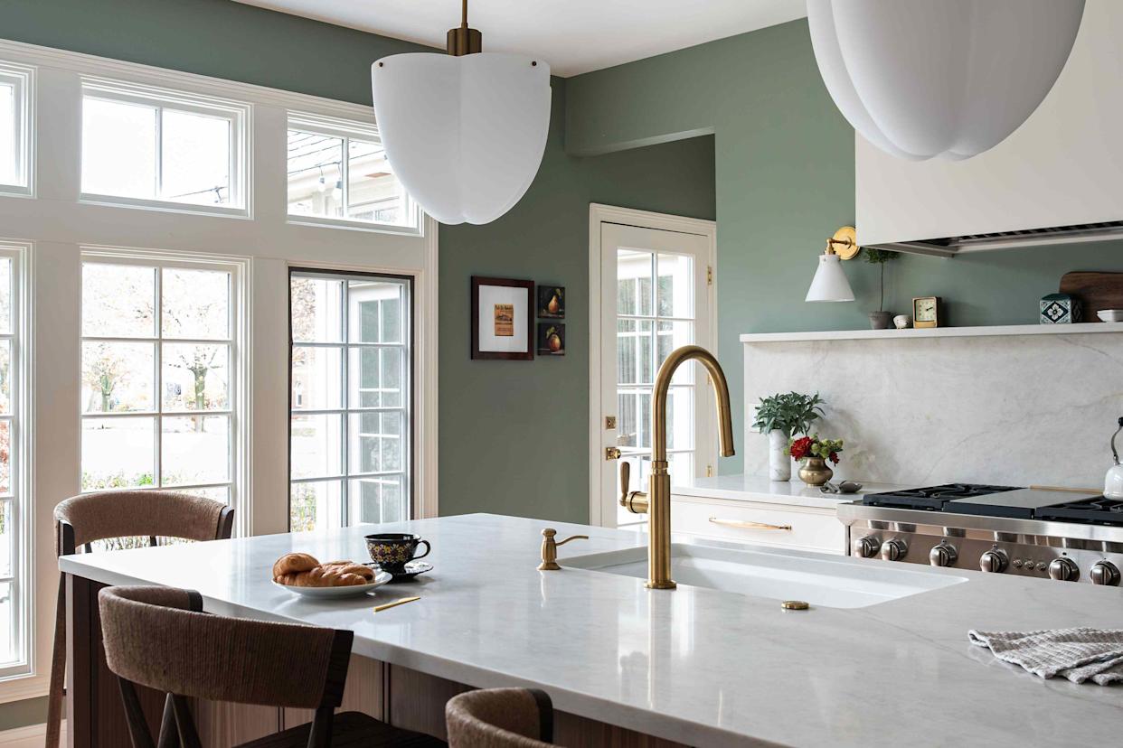
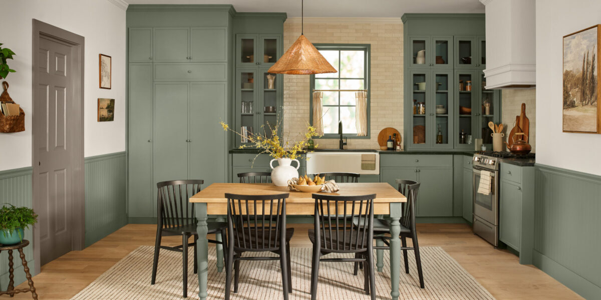
Sage green, despite its recent widespread presence in home decor across walls, cabinets, and textiles, is another color that designers believe has reached its peak. The oversaturation of sage green has led to a growing weariness among homeowners and designers alike. The overarching theme for colors losing favor is that they either feel harsh or have become overplayed, paving the way for palettes that offer greater complexity, warmth, and a fresh perspective.
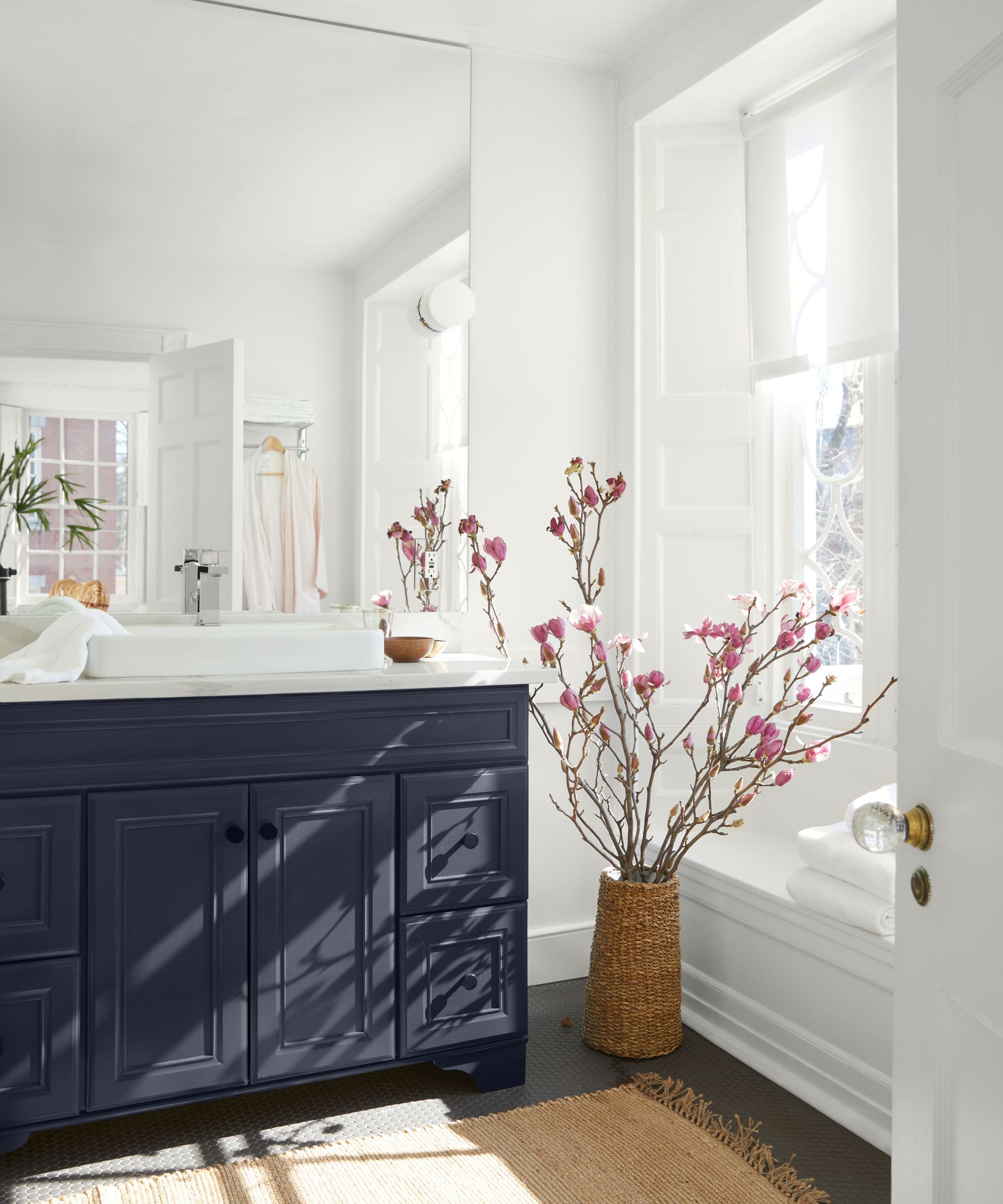
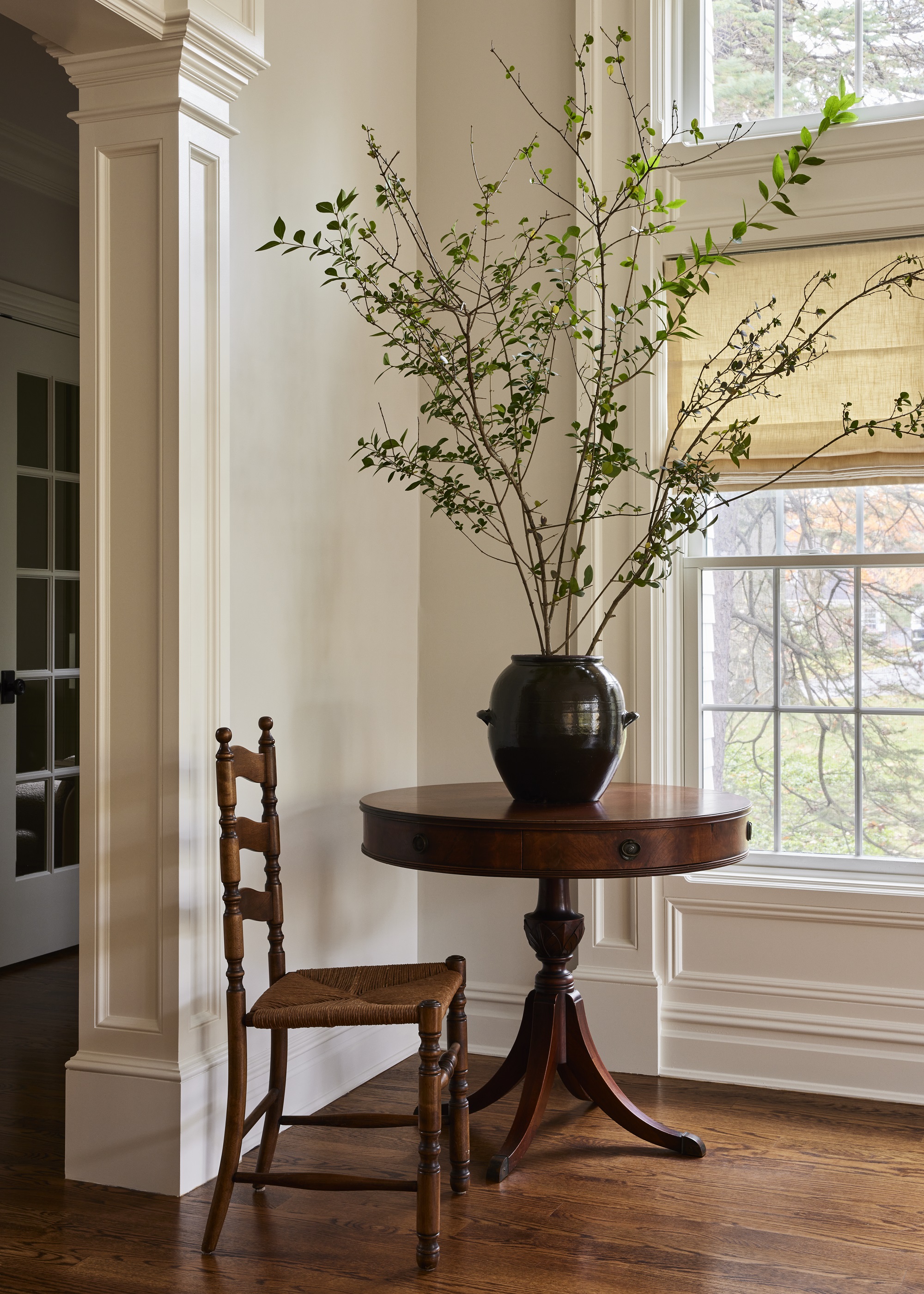
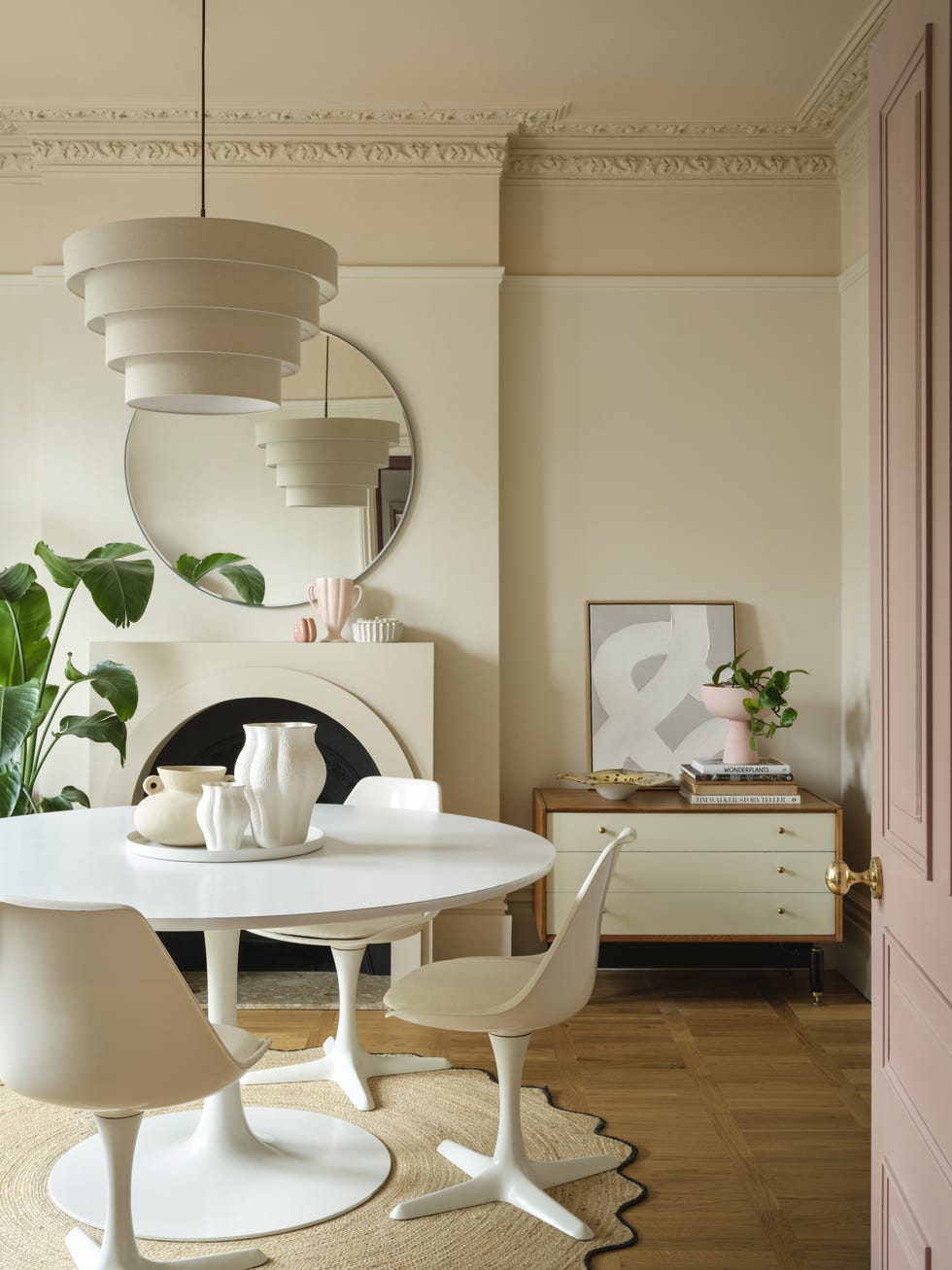
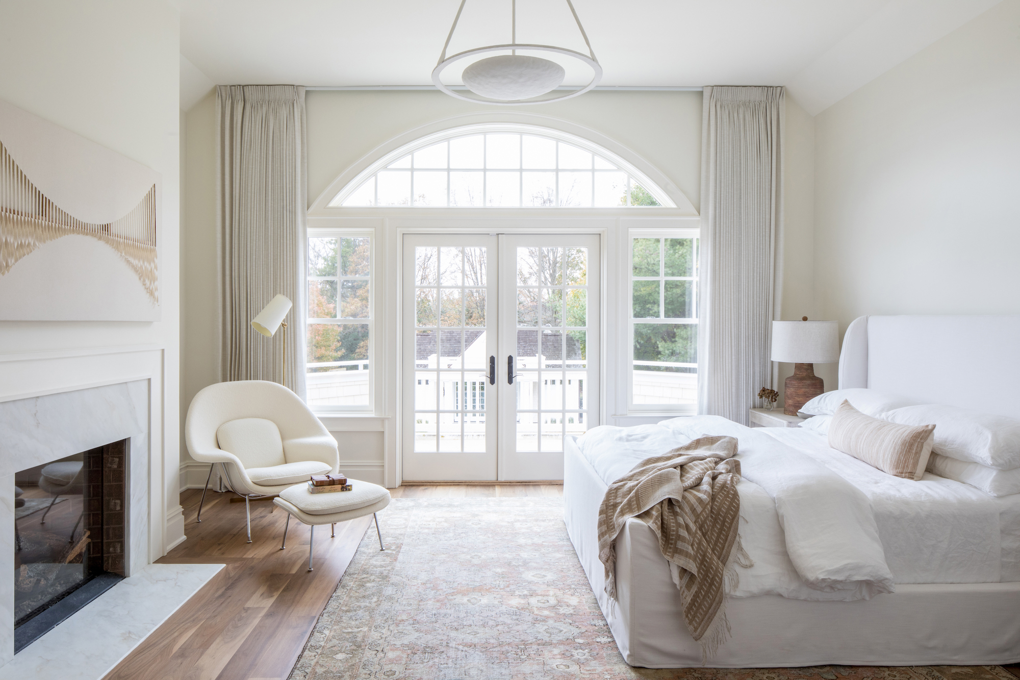
Finally, stark whites are increasingly being avoided due to their clinical and unforgiving nature, especially in busy family homes with children. These whites are perceived as too cold and impractical for everyday living. The move away from stark whites reflects a broader shift towards a more practical and personalized approach to home design, where color choices are made to reflect the unique personalities and stories of the inhabitants, creating spaces that are both current and comfortable.
#PaintColors #InteriorDesignTrends #HomeDecor #ColorTrends #HomeImprovement #ShayHolland #AmySwitzerDesign #Decorating #PaintColors #InteriorDesignTrends #HomeDecor #ColorTrends #HomeImprovement #ShayHolland #AmySwitzerDesign #Decorating
0 комментариев всего
 Комментариев пока нет
Вам также может понравиться
What Paint Colors Will Rule 2026? Designers Make Their Predictions

These are the 3 curtain colours going out of style in 2026
6 entryway paint colors going out of style for 2024 – and the shades to use instead

The Outdated Paint Color That's Coming Back In A Major Way In 2026
Paint colors going out of style in 2025
What Paint Colours will Rule 2026? The Experts Make Their Predictions

6 Outdated Paint Colors Designers Don't Want to See in Homes Anymore in 2026

6 bedroom paint colors going out of style for 2024 – and the colors to use instead

Experts Say These 5 Paint Colours Will Be Everywhere In 2026
6 Outdated Paint Colors We're Saying Goodbye to in 2025, According to Designers
5 Paint Colors Going Out of Style in 2025 — And What You Should Replace Them With Before Then

6 Kitchen Paint Color Trends That Are Already Taking Over Walls in 2026
These Will Be the Most Popular Paint Colors in 2026


These 6 Colors Will Rule Interiors in 2026, According to Experts

These 20 Trendy Paint Colors Will Be Taking Over Walls In 2026
Interiors experts predict this will be the biggest paint trend of 2026

According to Designers, These Are The Outdated Color Trends for 2026

8 Paint Color Trends You'll ACTUALLY Want to Live With in 2026, According to Designers
What couch colors are going out of style in 2025? Designers say these 6 shades should be avoided

Designers Agree: These 7 Underrated Paint Colors Will Be Huge in 2026