


1/4

Harmonious Hues: Creating Balance in Your Bedroom Palette ☁️🌙
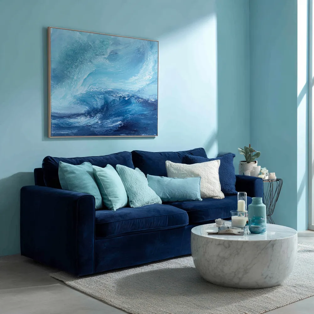
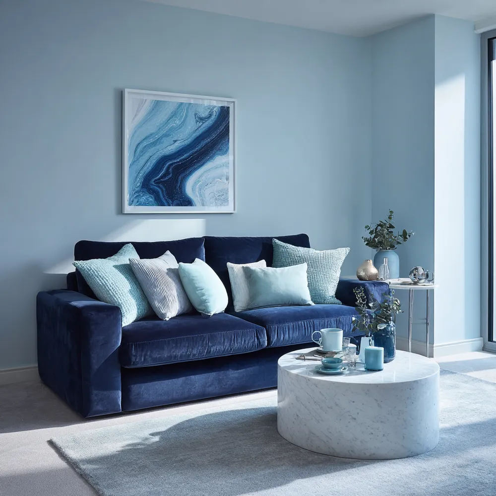
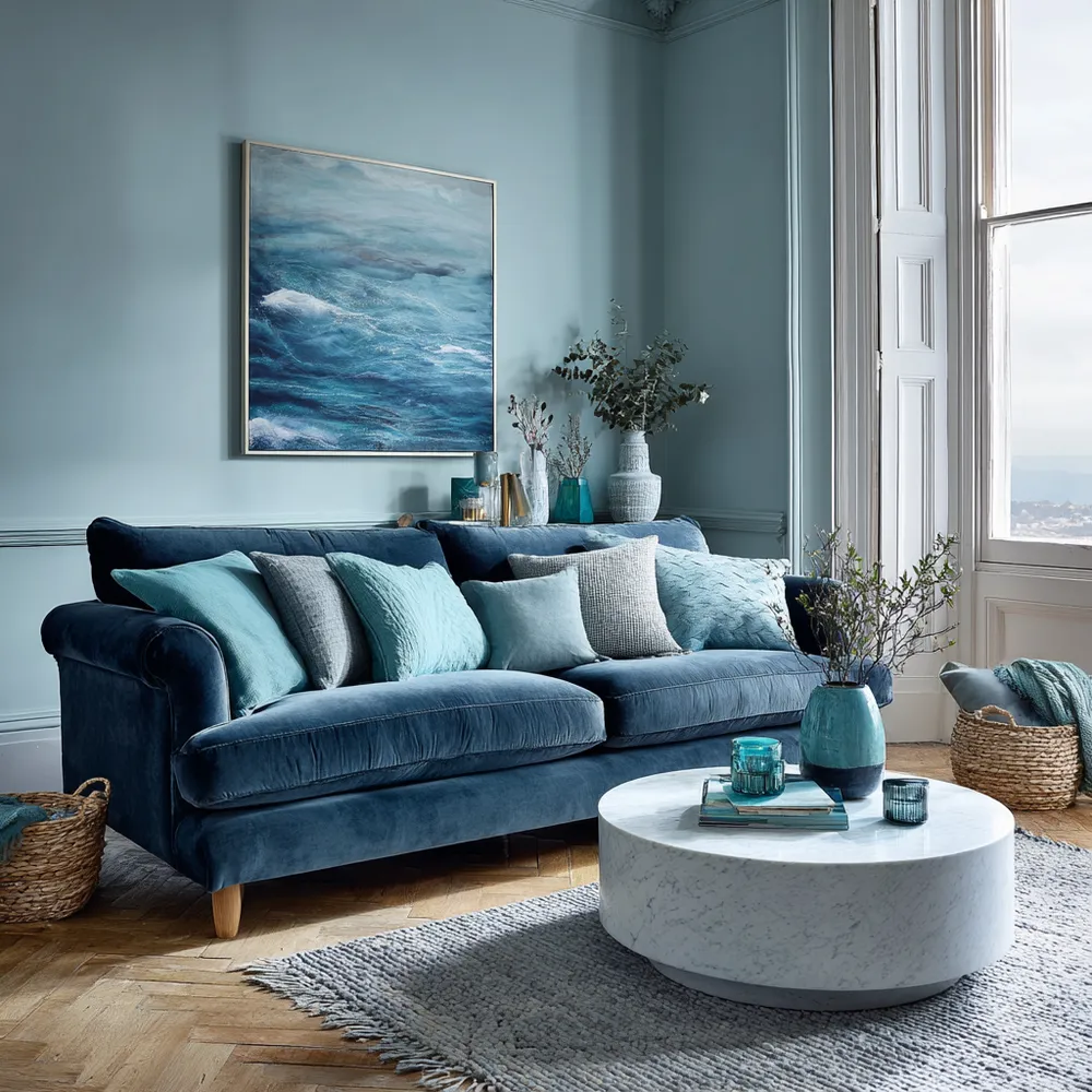
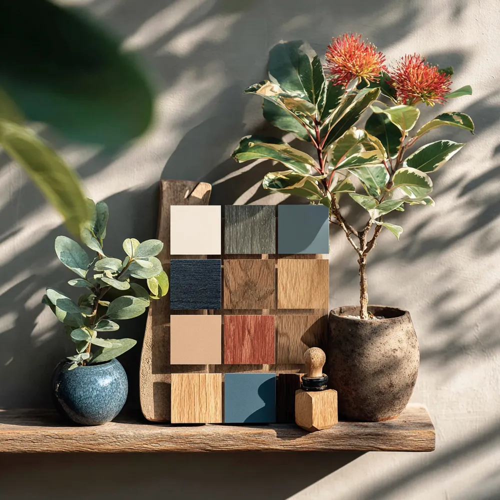
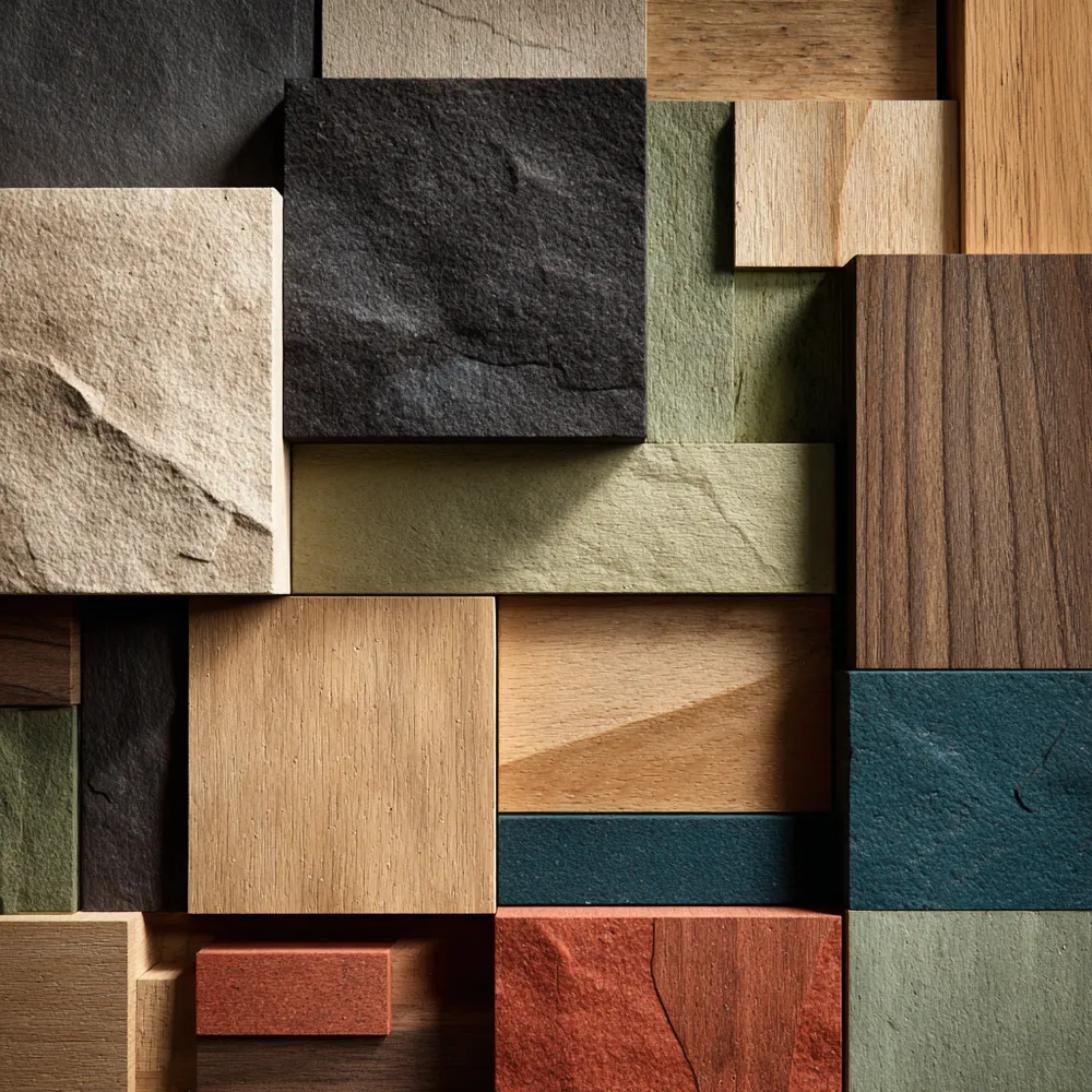
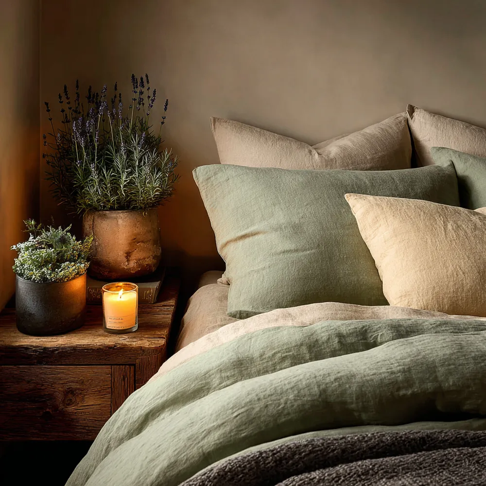
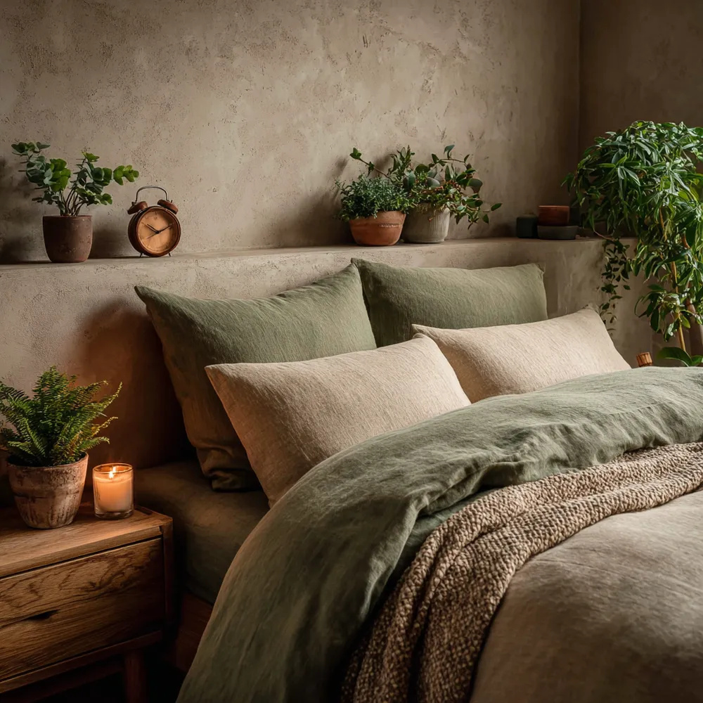
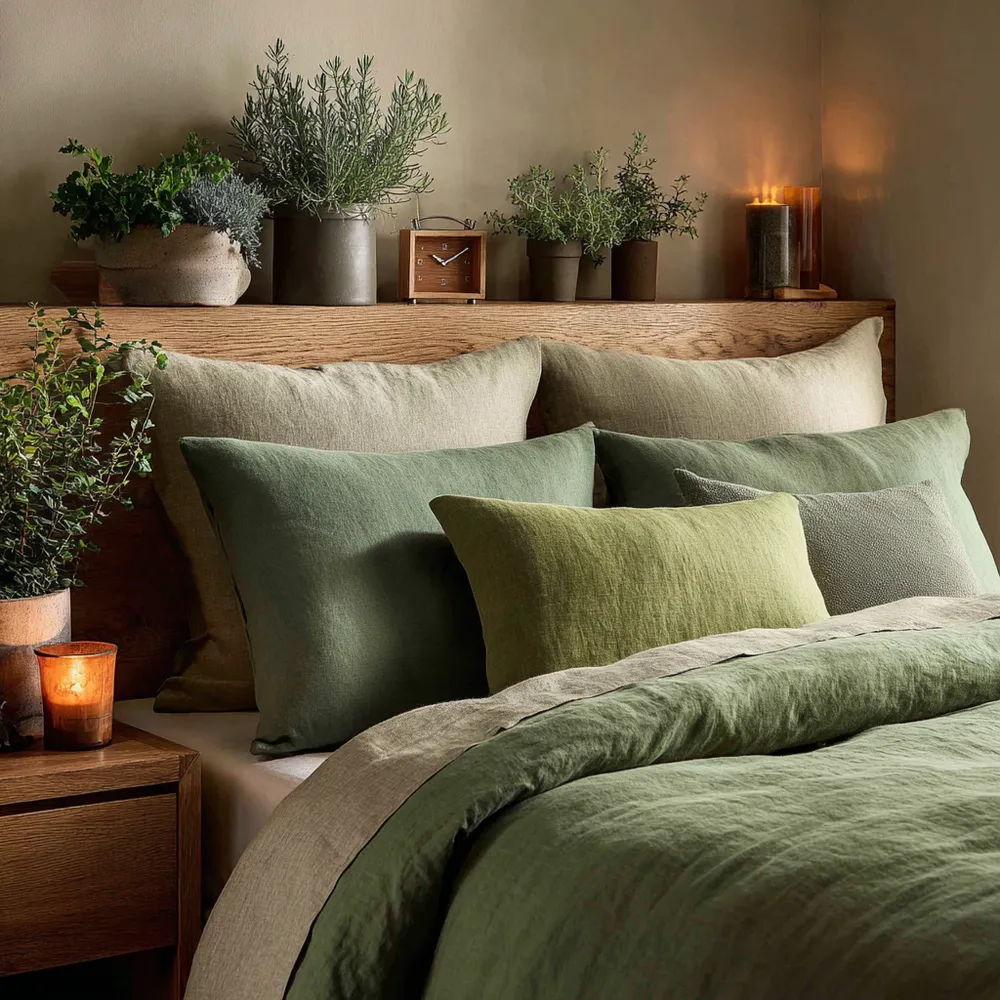
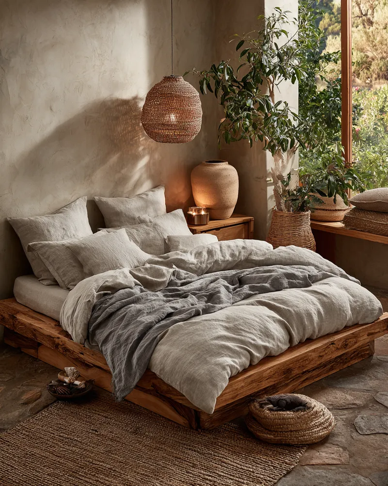
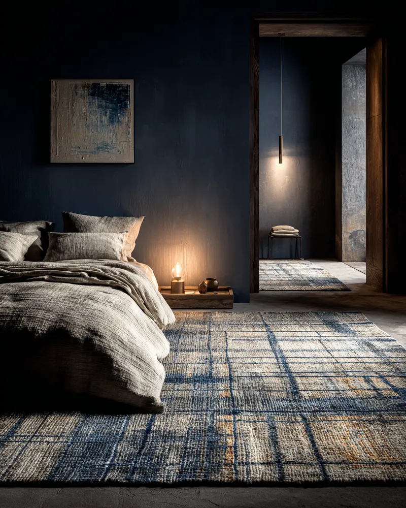
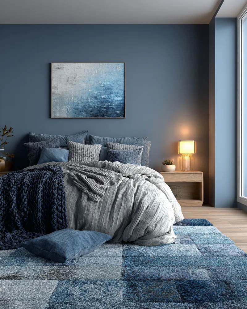
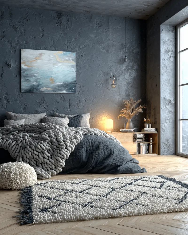
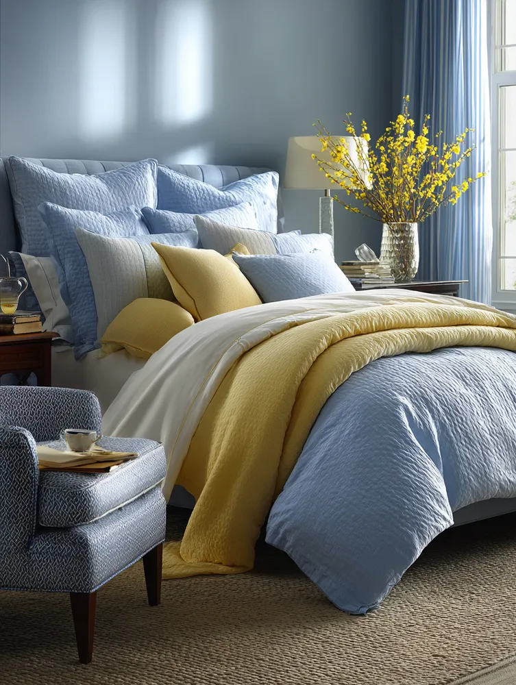
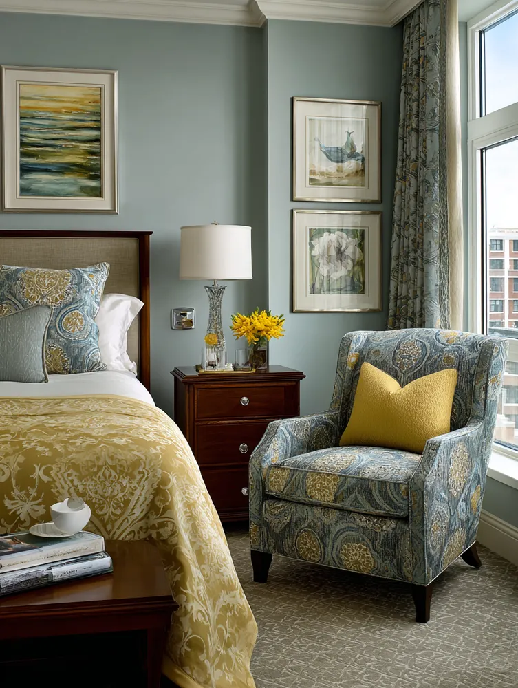
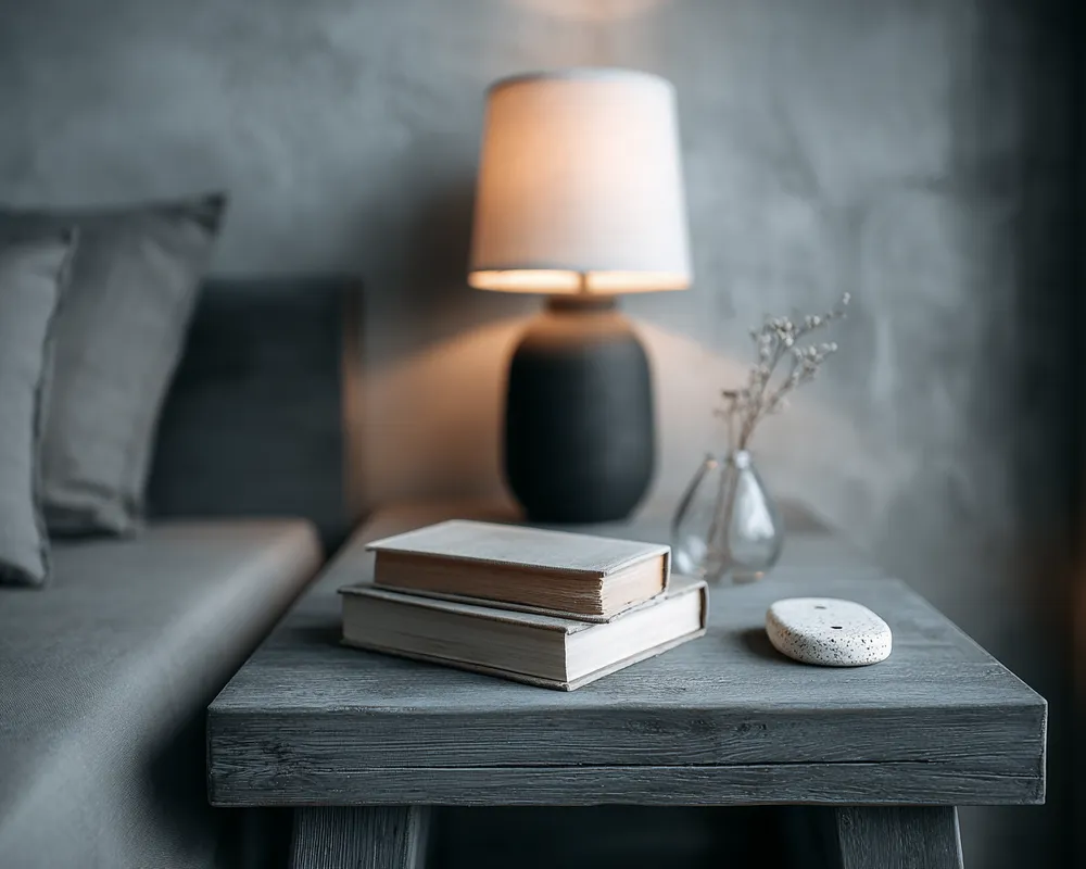
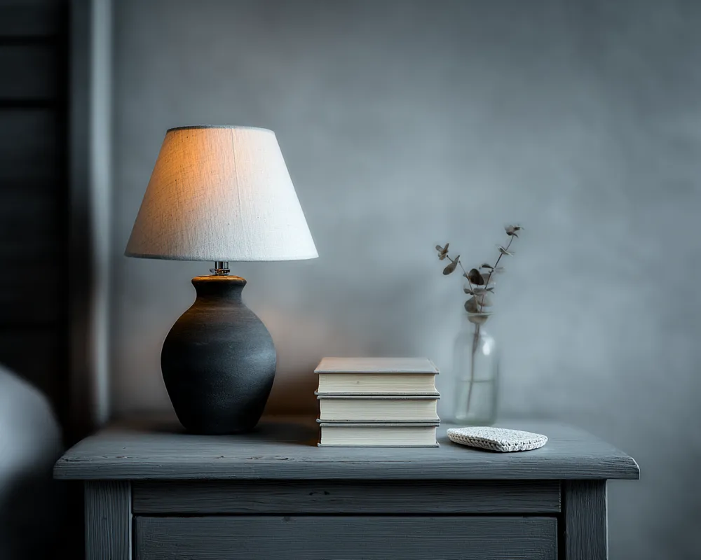
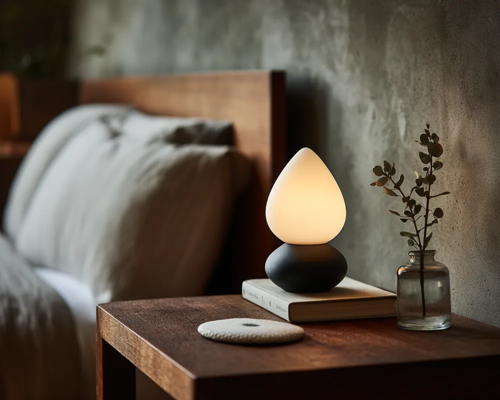
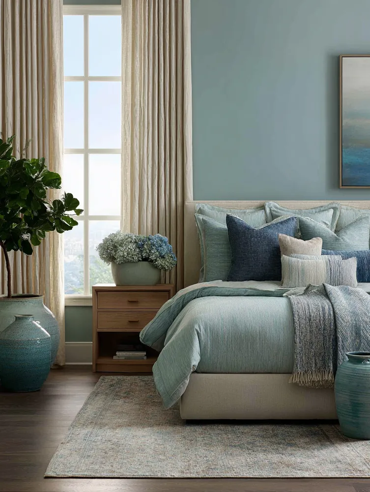
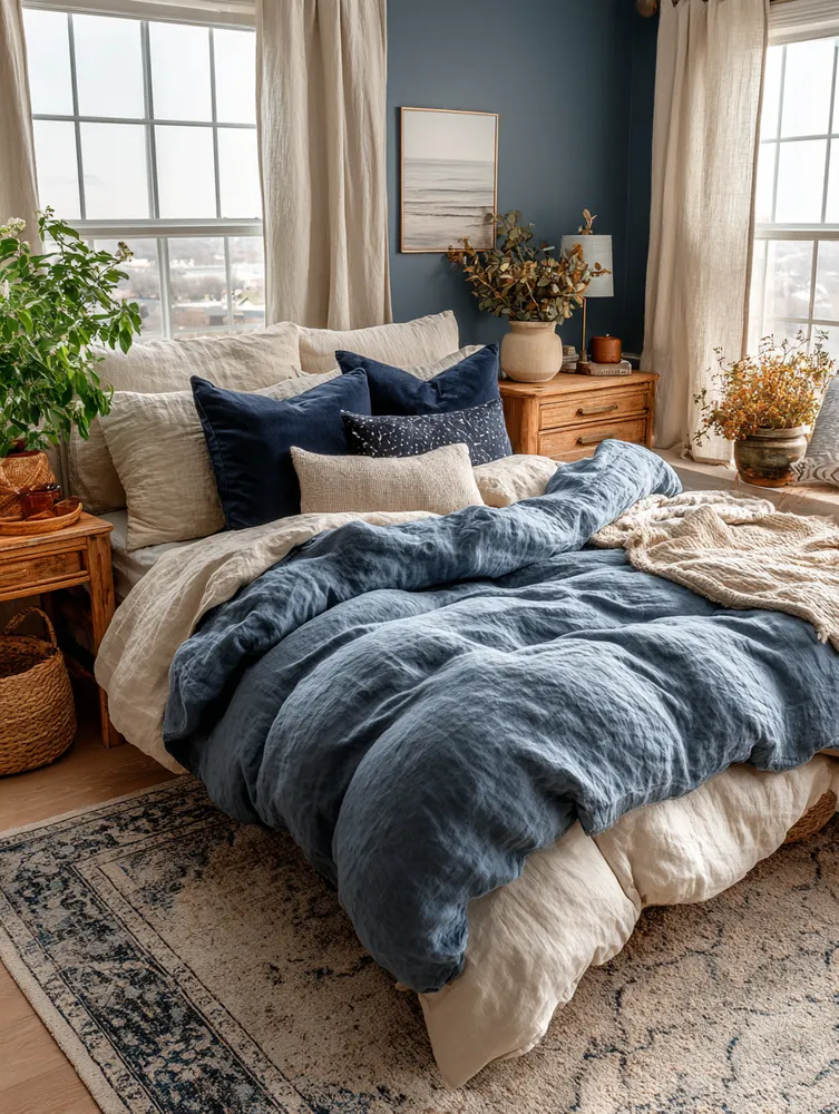
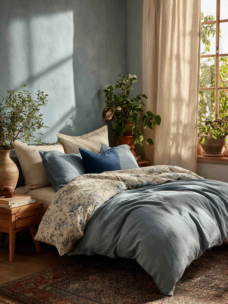
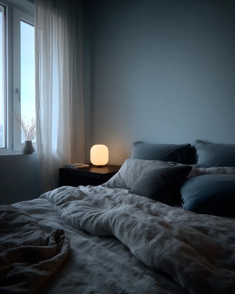
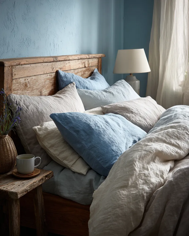
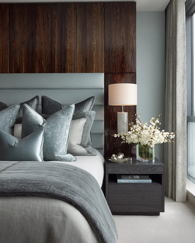
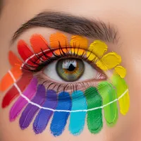
Dreaming of a serene sanctuary? Achieving color harmony in your bedroom is key to a truly restful space. 💖 It’s not about being boring, but about using hues that calm the mind and soul.
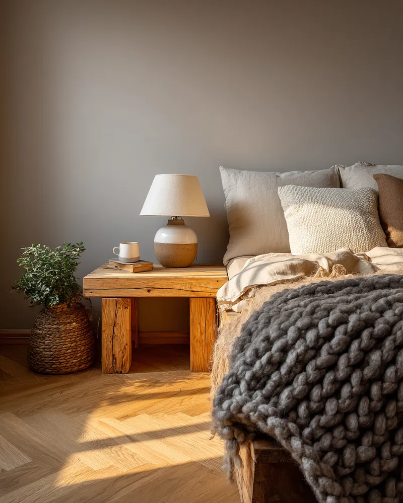
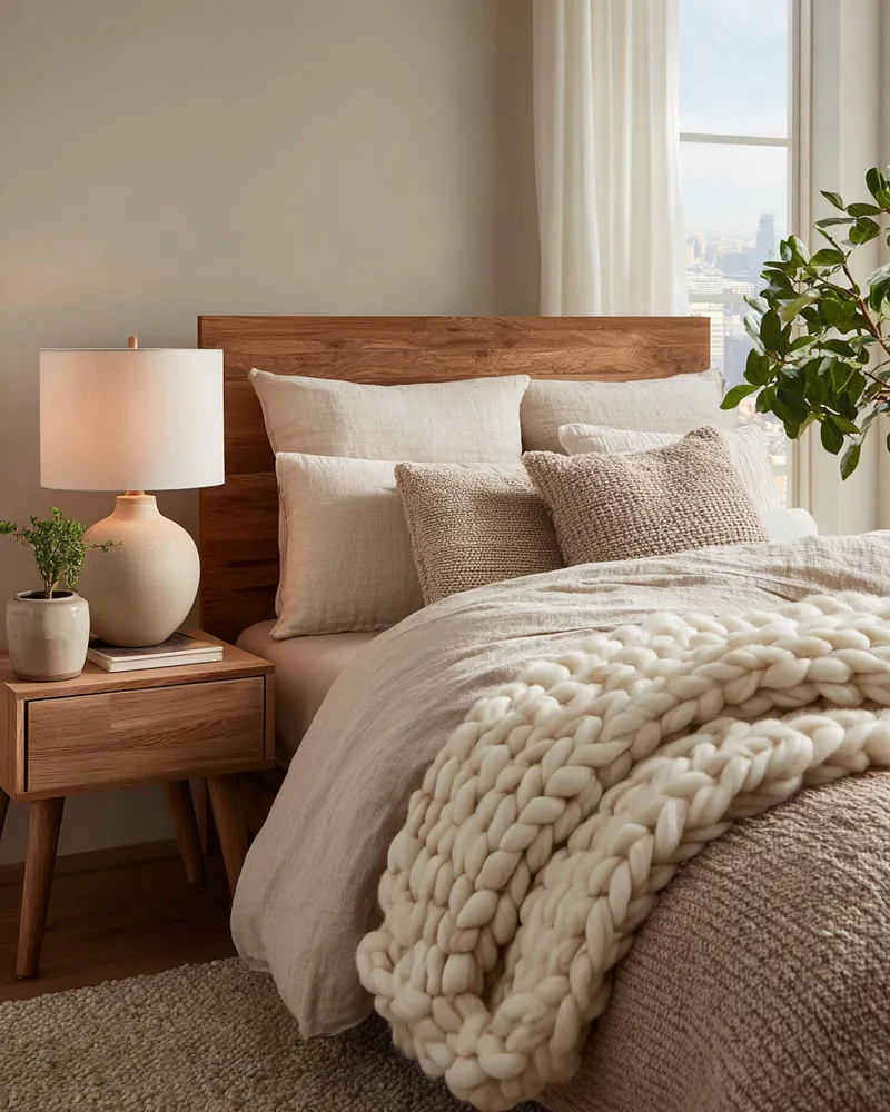
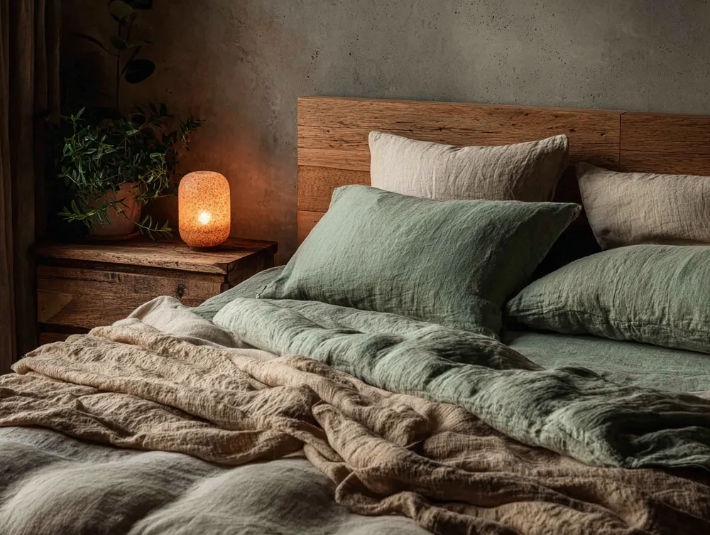
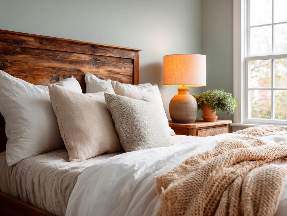
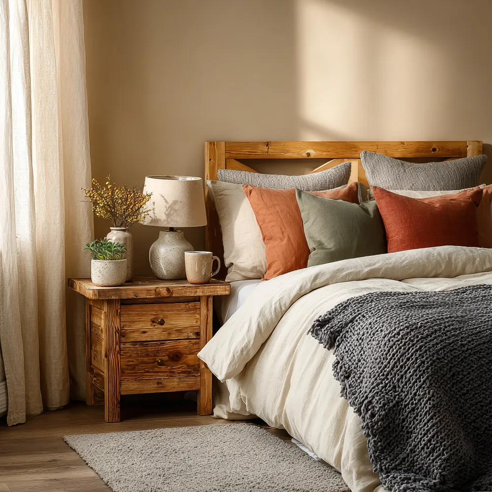
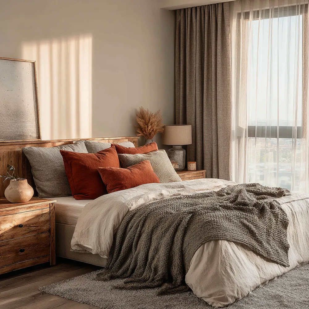
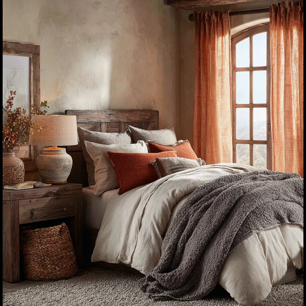
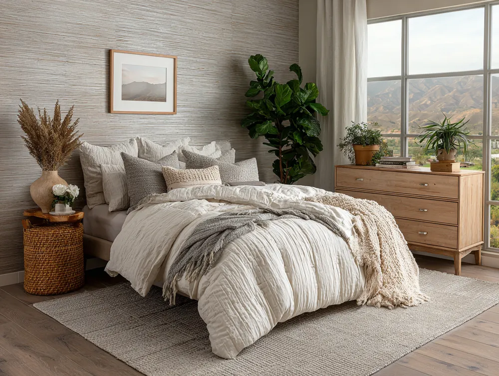
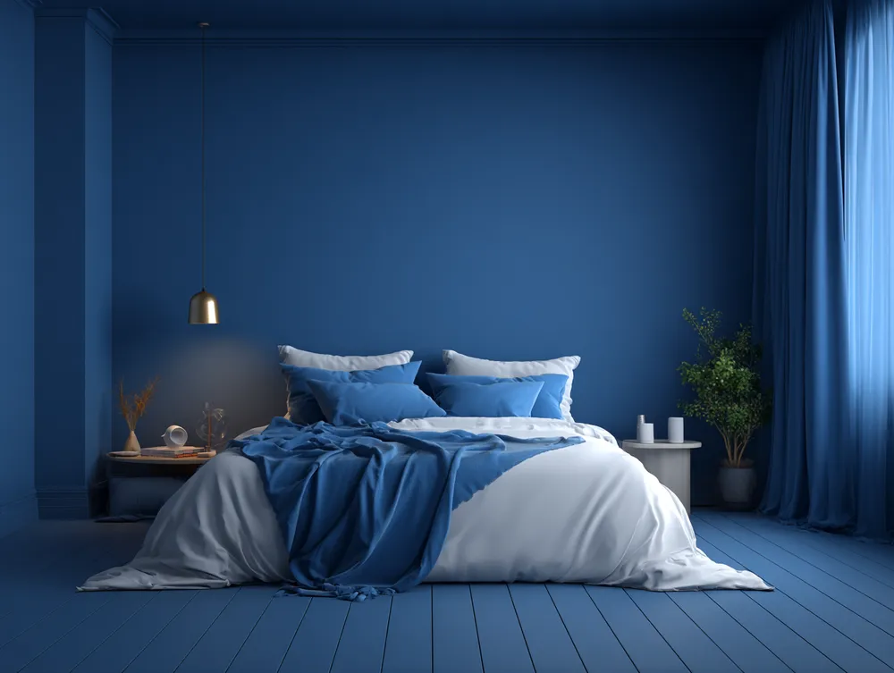
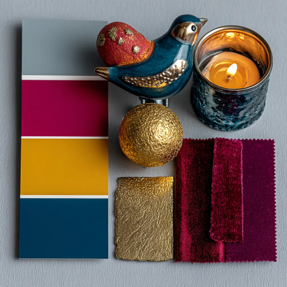
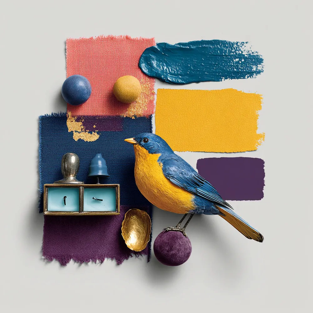
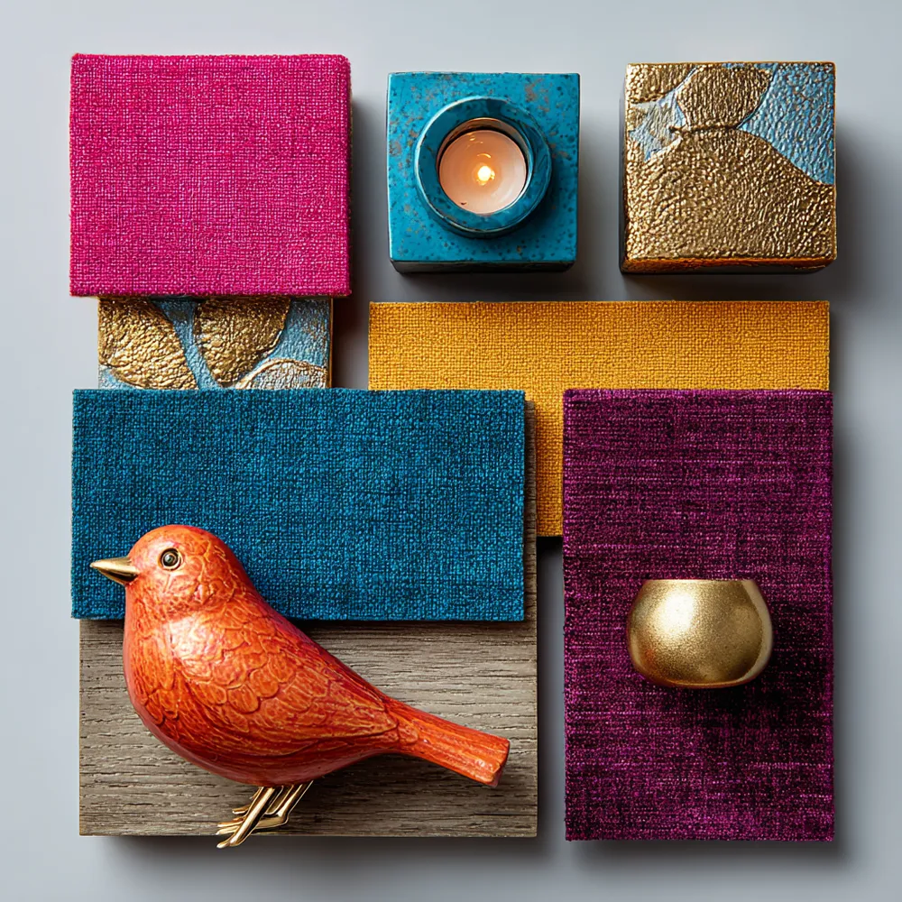
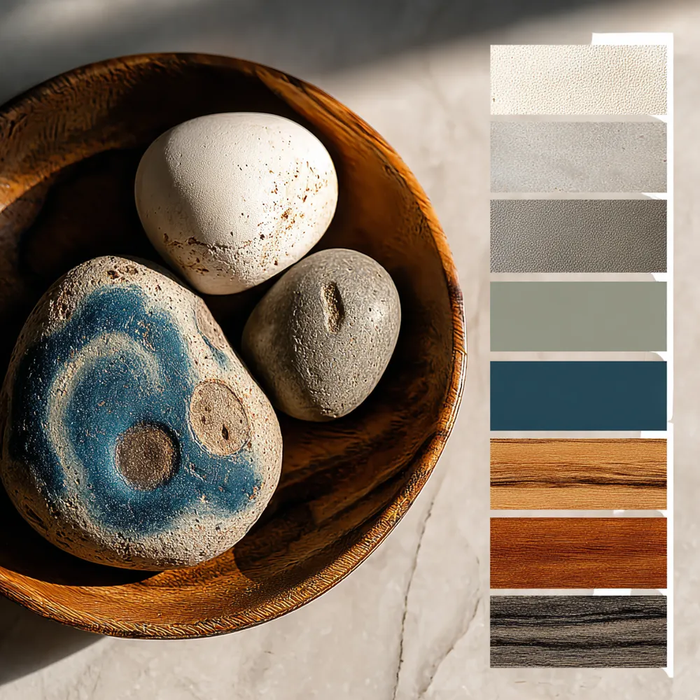
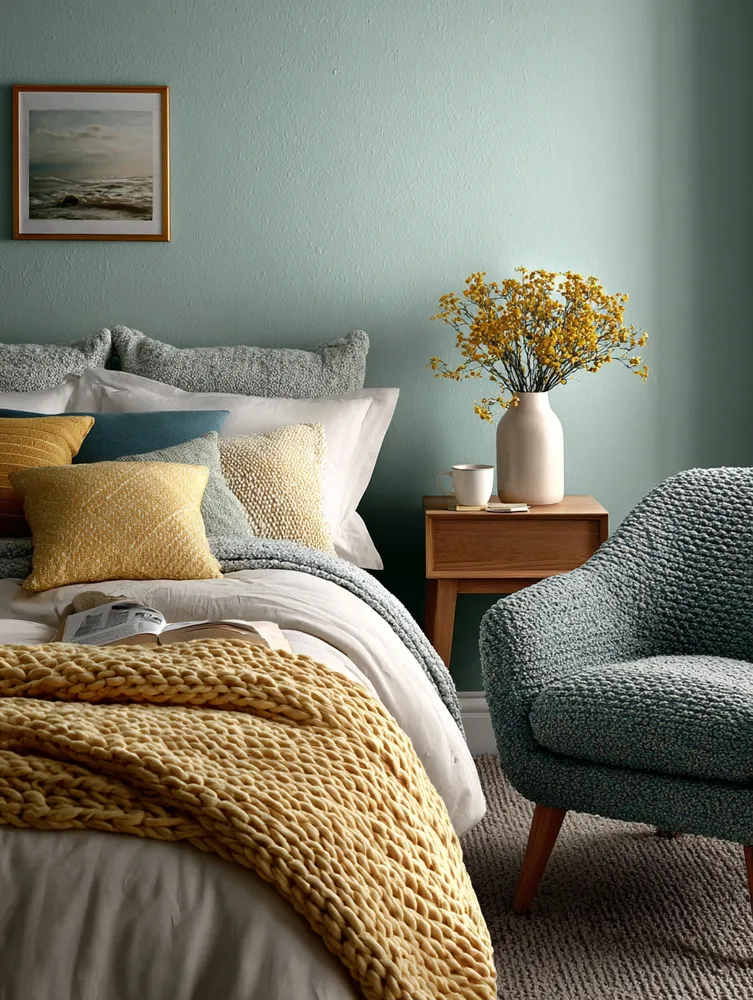
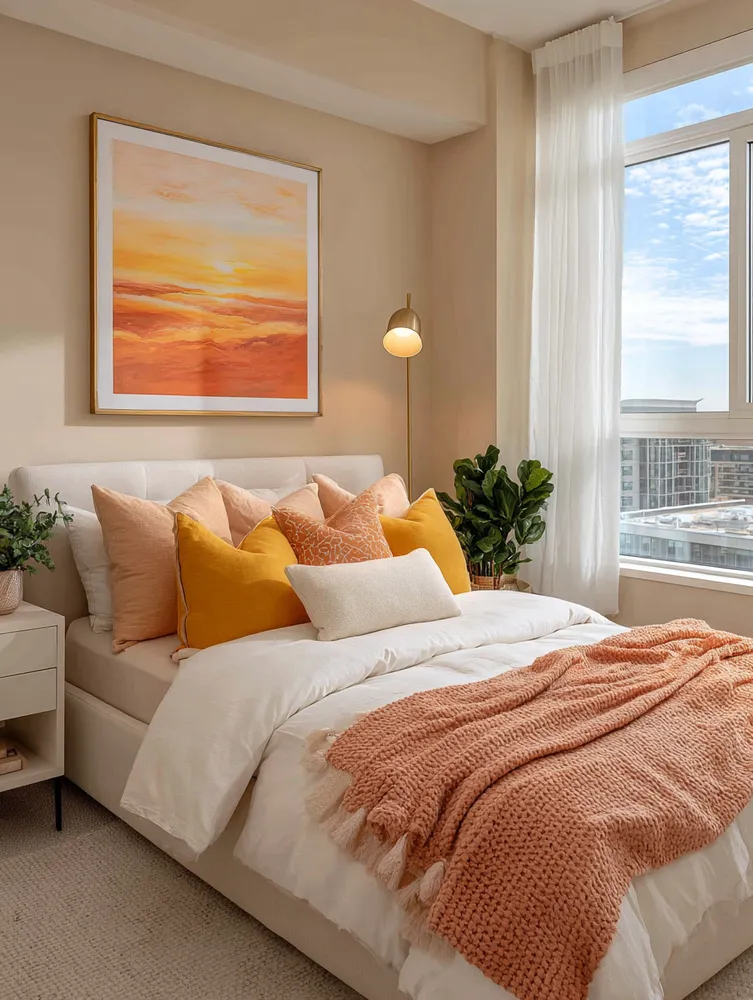
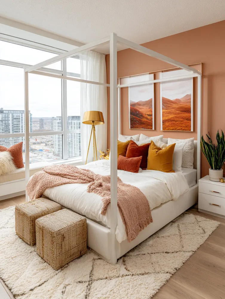
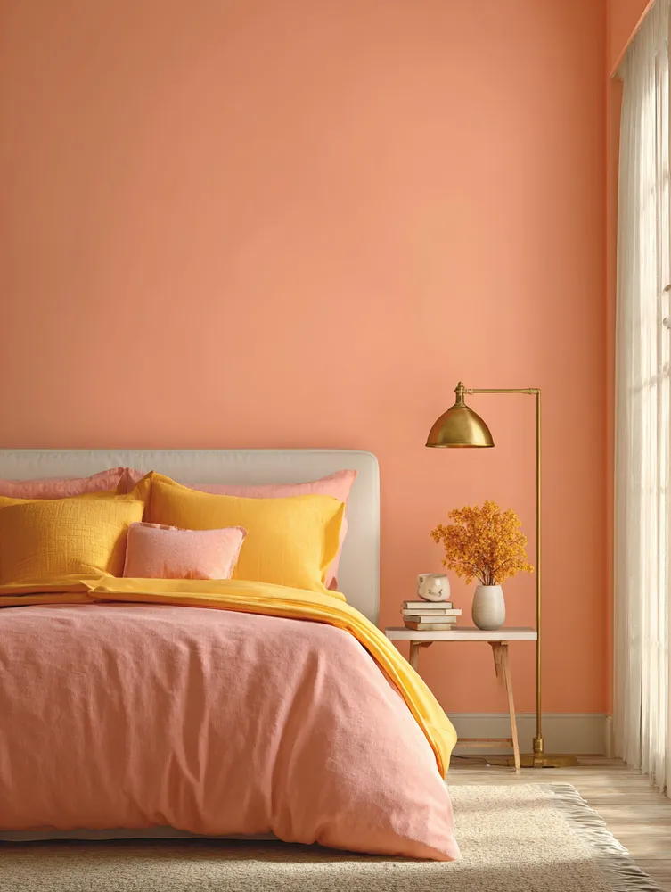
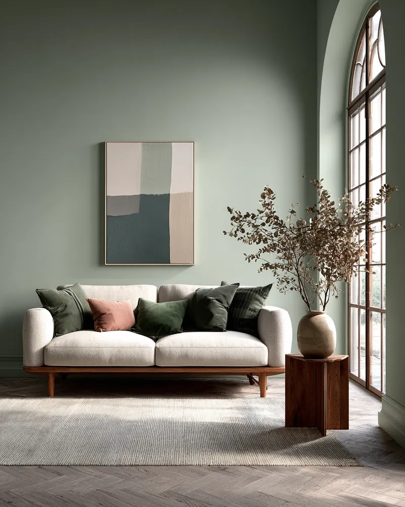
My go-to approach involves selecting a dominant color and then layering in 2-3 complementary or analogous shades.
Think:
* **Soft Lavenders & Greys:** For ultimate tranquility.
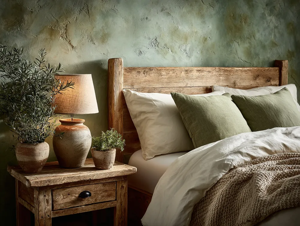
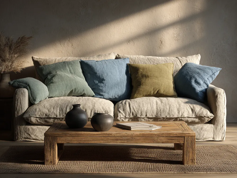
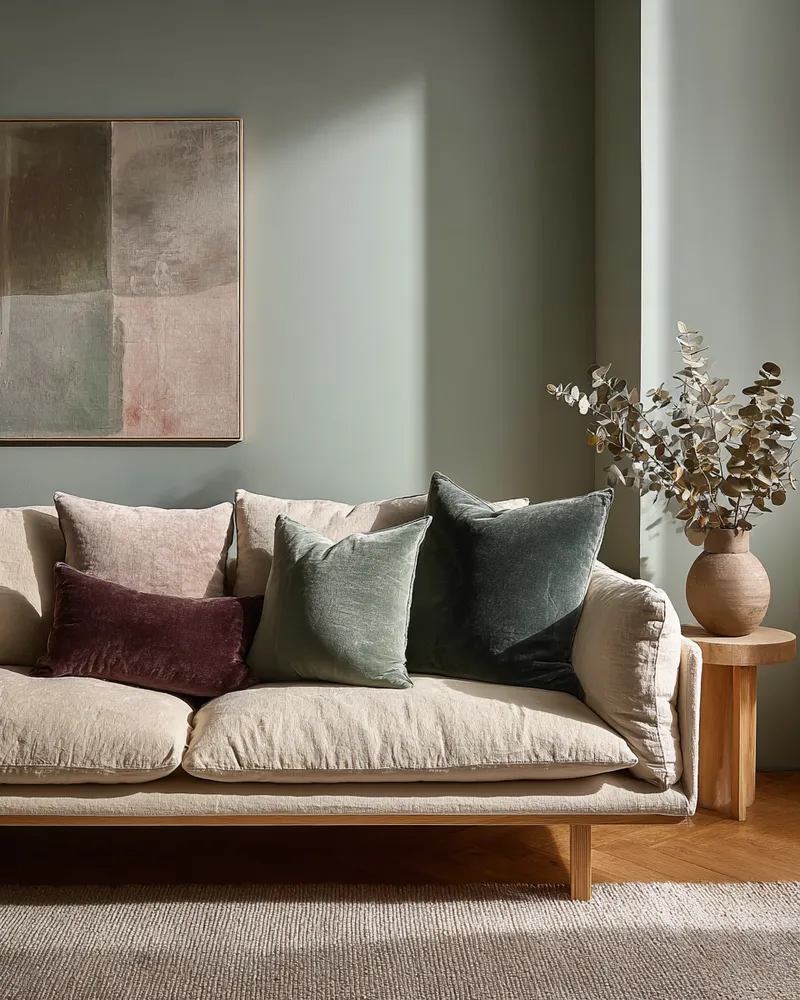
* **Sage Green & Muted Blues:** Evokes nature's calm.
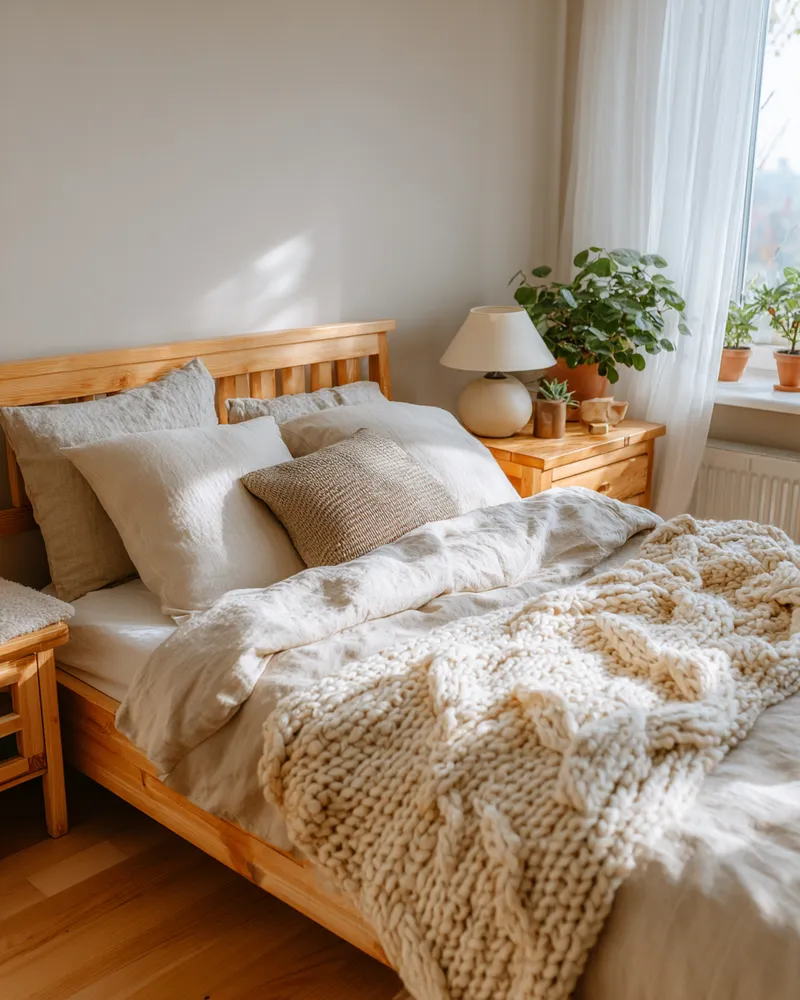
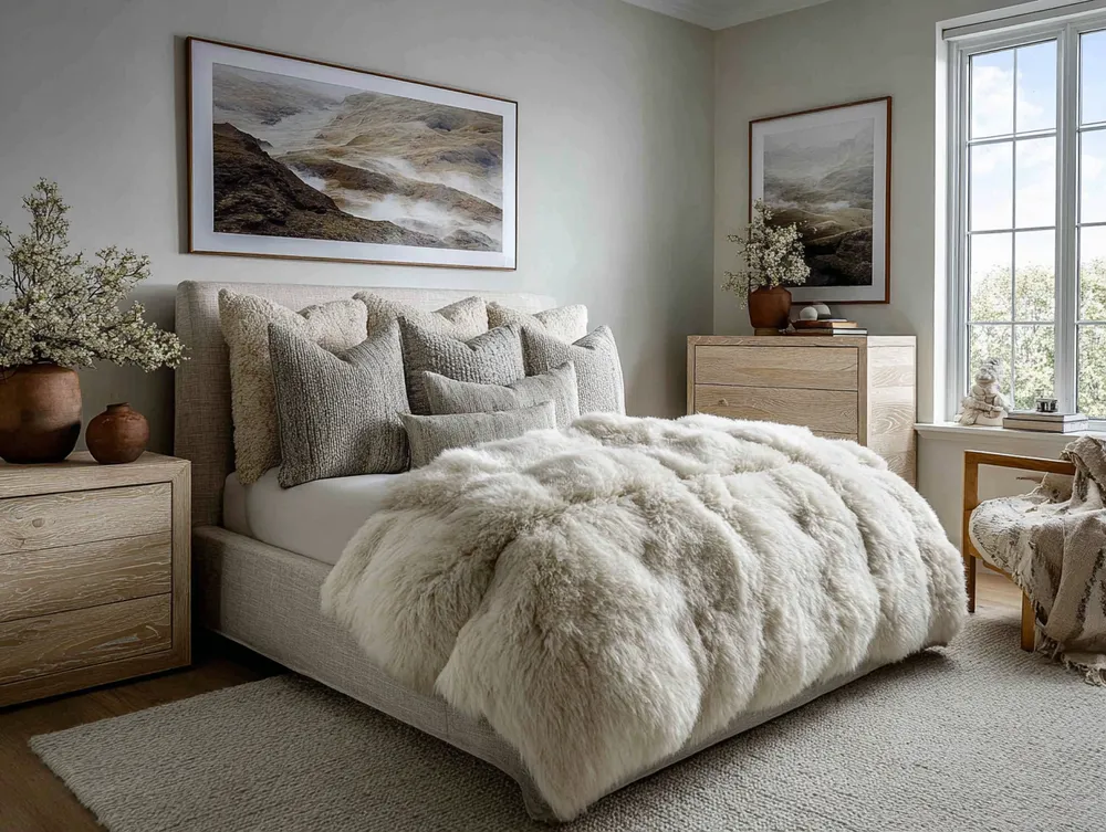
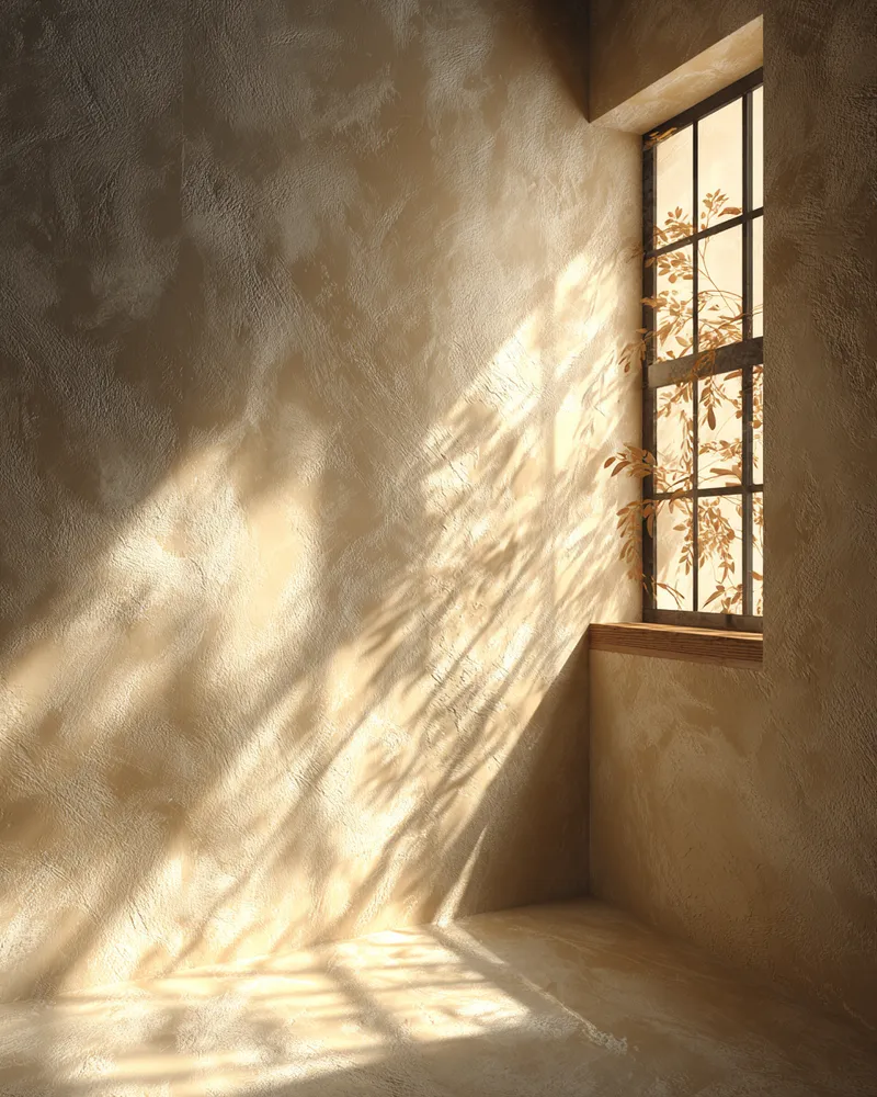
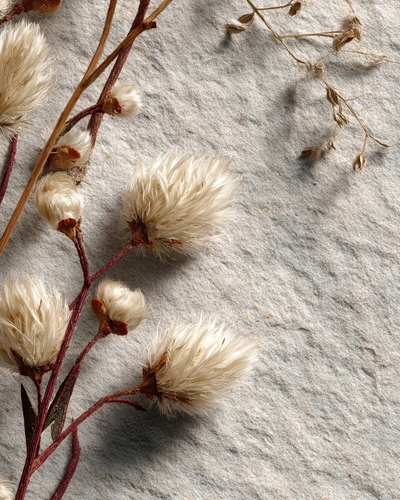
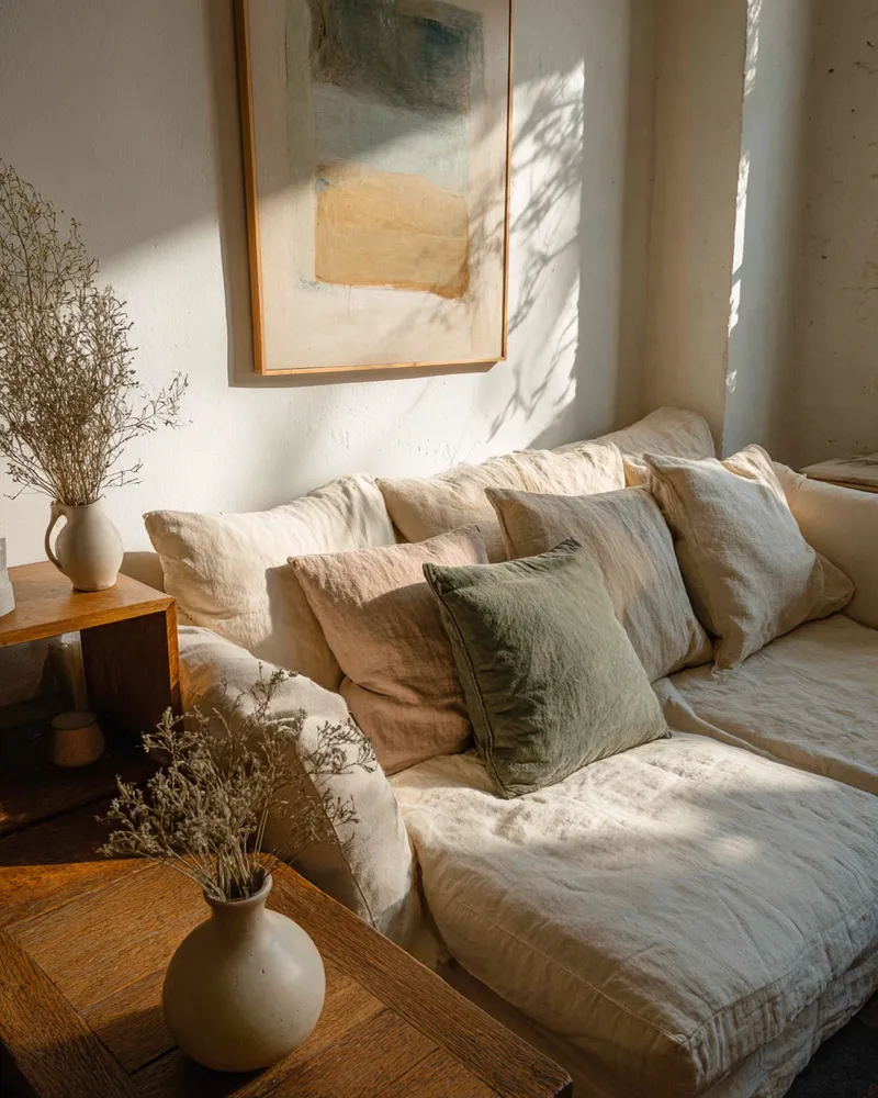
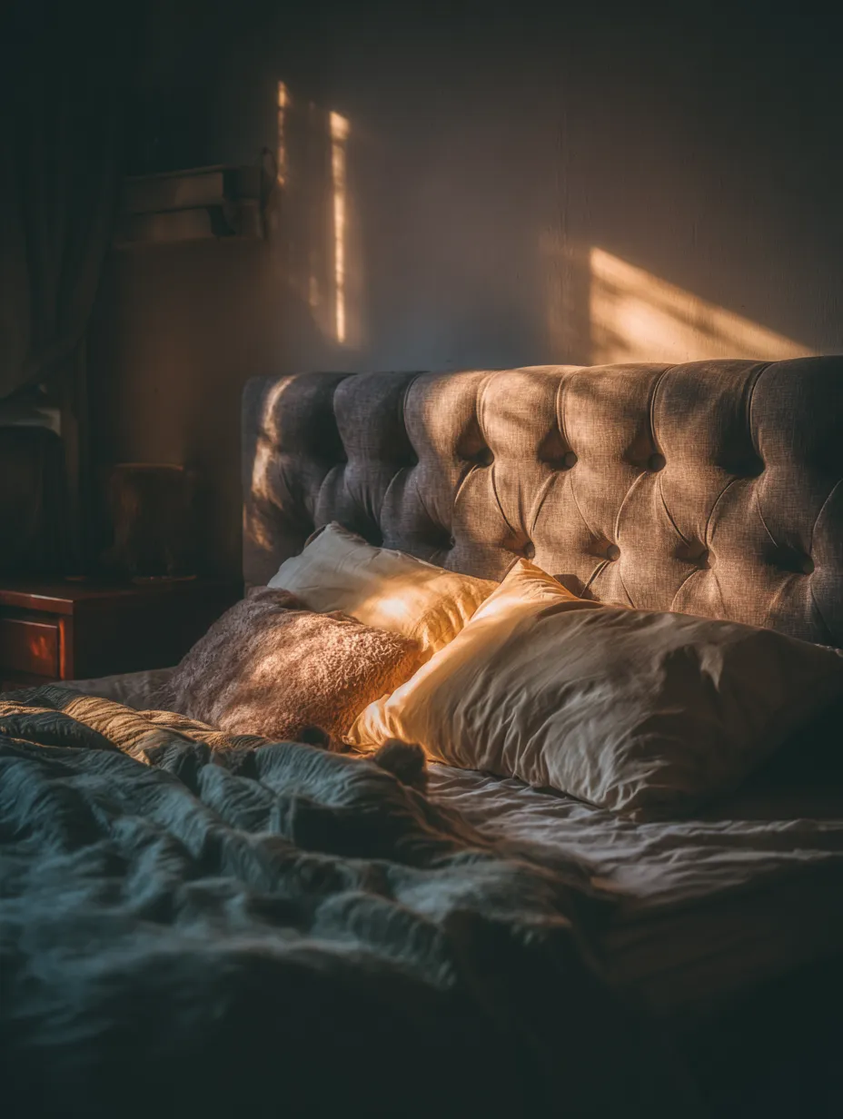
* **Warm Neutrals & Creamy Whites:** Timeless and comforting.
* **Dusty Pinks & Taupes:** Gentle and romantic.
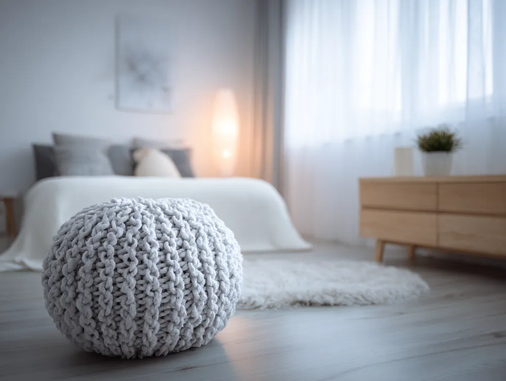
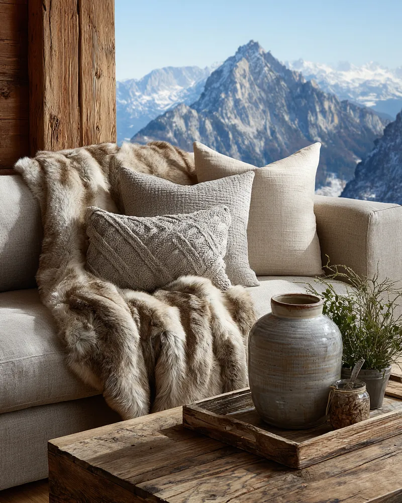
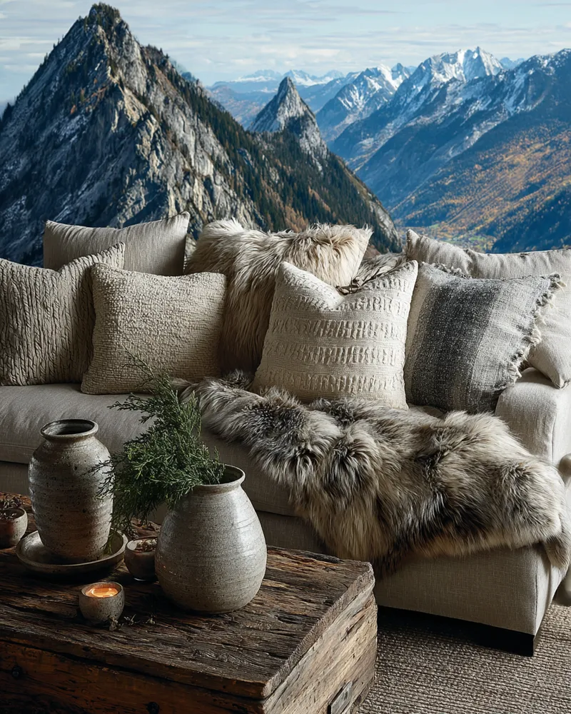
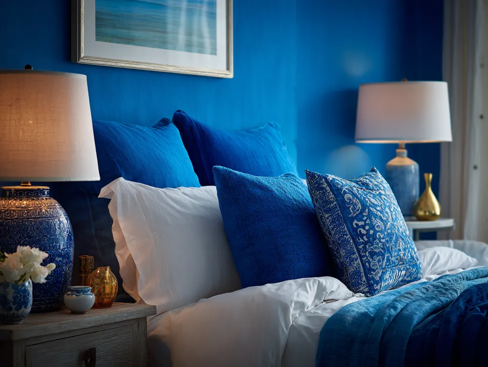
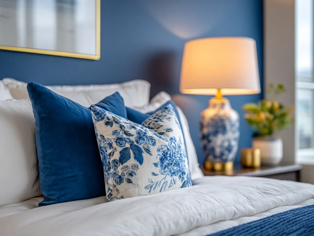
Focus on texture as much as color – a chunky knit throw or velvet cushions can add depth without overwhelming the palette. Save this for your dream bedroom design! 💫 #HarmoniousHuesIdeas #BedroomColorIdeas #CalmBedroomIdeas #SereneInteriorsIdeas #ColorHarmonyIdeas #InteriorDesign #HomeDecor #RestfulSpace #ColorInspiration #DreamBedroom
28 de out. de 2025
Copiar Estilo
 Ainda não há comentários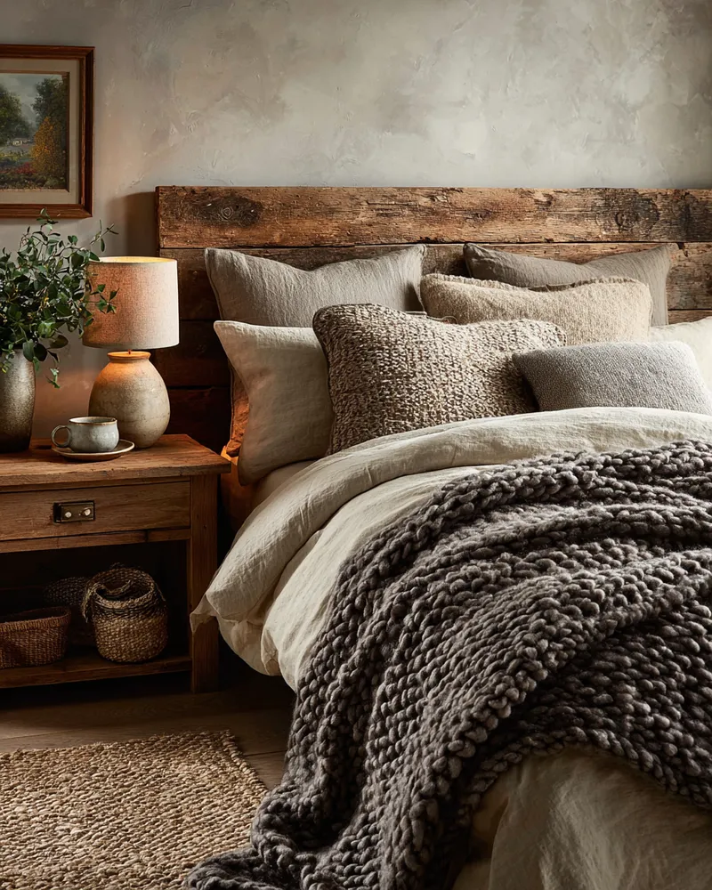
Earth-Toned Harmony: Creating a Serene Palette for Your Bedroom! 🤎☁️

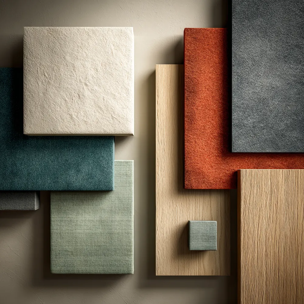
Finding Harmony: Japandi Color Palettes for a Tranquil Home ✨
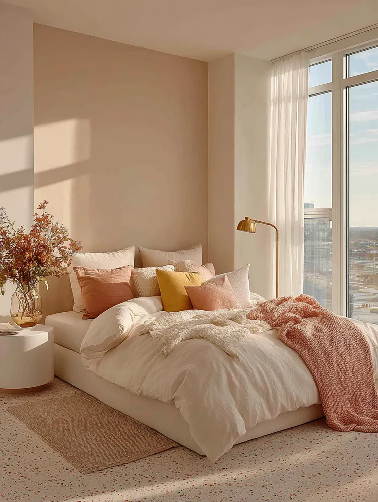
Sunrise Palette: Creating a Cheerful & Energizing Bedroom ☀️
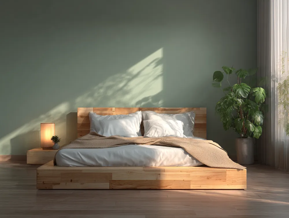
Harmonious Hues: Achieving Balance with a Natural Palette 🌿

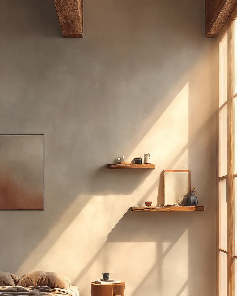
Serene Bedroom Walls: Japandi Color Palettes That Soothe ☁️

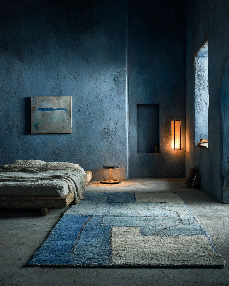
Serene Indigo Haven: Your Ultimate Blue Bedroom Oasis 💙

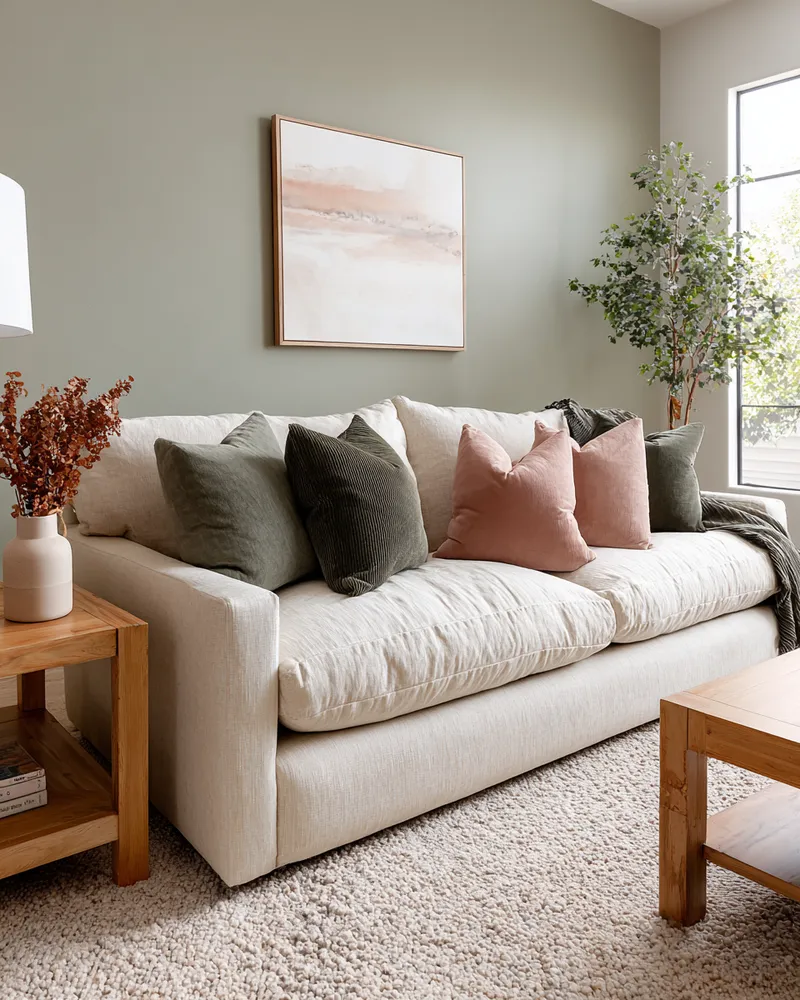
Unlocking Serenity: A Guide to Mindful Color Palettes 🎨
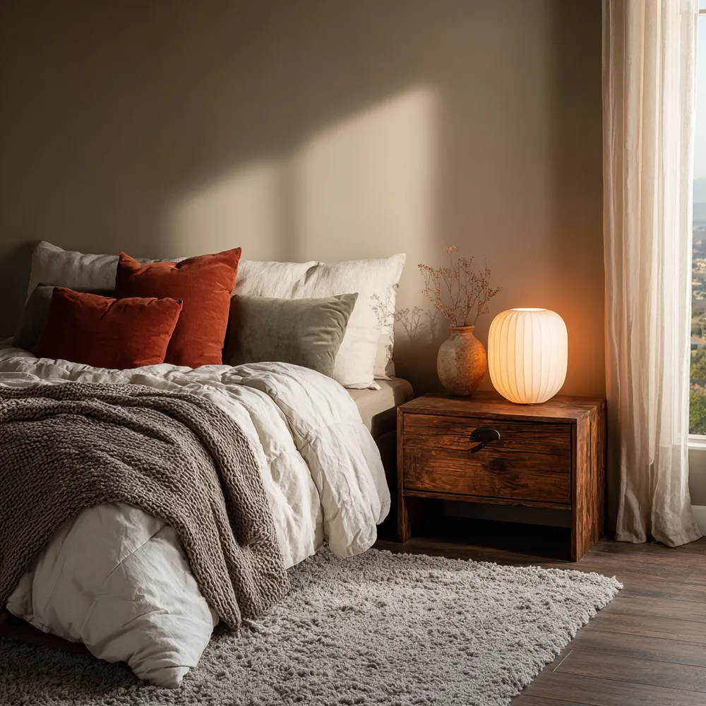
The Art of Layering Color: A Cozy Hygge Bedroom ☕

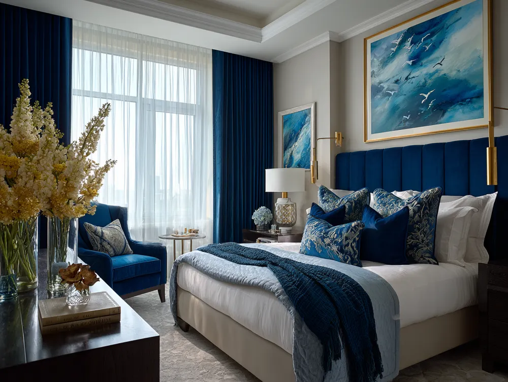
Royal Blue Dreams: Creating a Tranquil & Inspiring Bedroom 👑
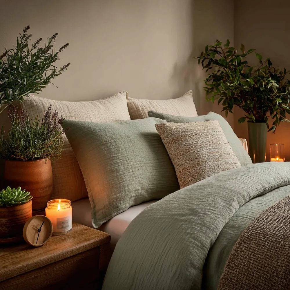
The Soothing Power of Herbal Hues in Your Bedroom 🌙
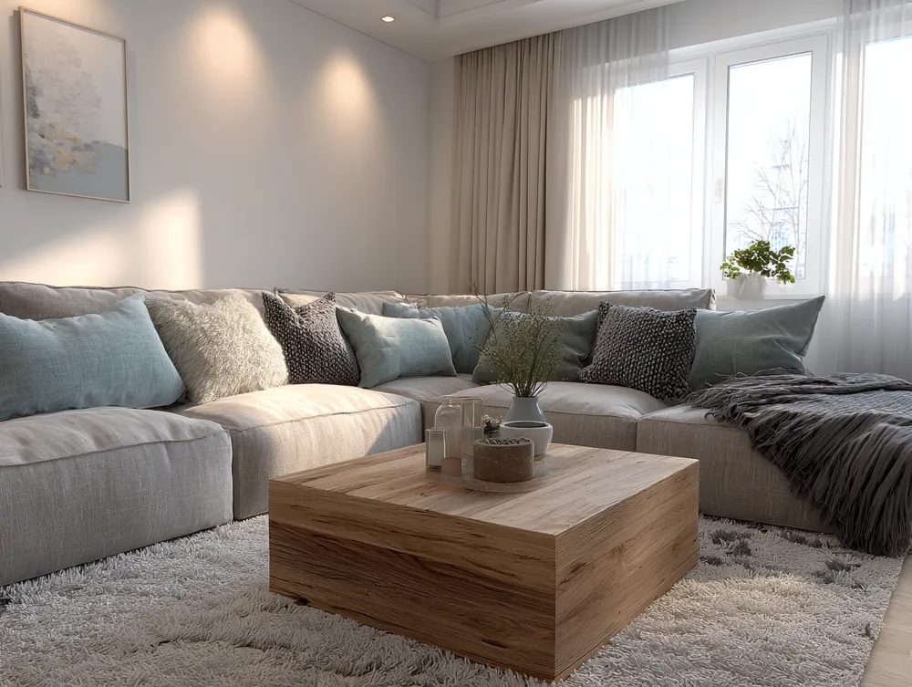
Bringing Balance: Japandi Approach to Color Palettes 🎨

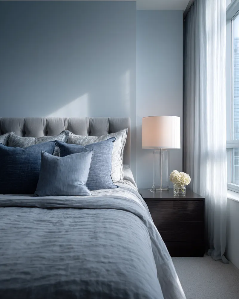
Blues & Greys: The Ultimate Tranquil Bedroom Palette ☁️
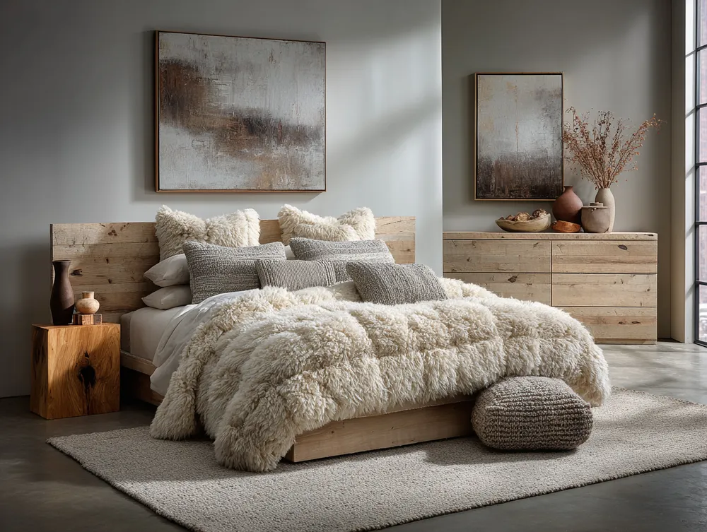
Monochromatic Magic: Chic Neutrals in the Bedroom 🤍
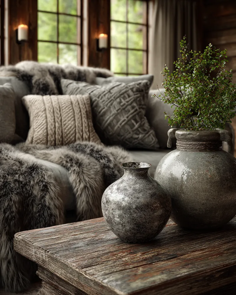
Textural Harmony: Cozying Up Your Living Space 🏔️

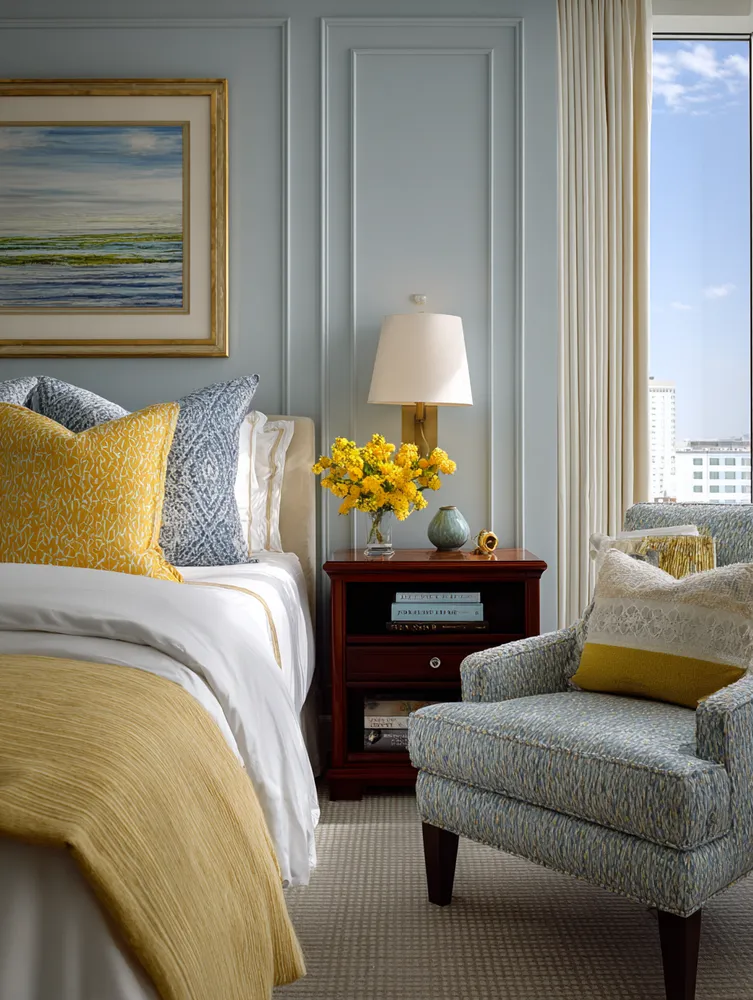
Elevate Your Bedroom with These Serene Blue & Yellow Hues! 💙💛

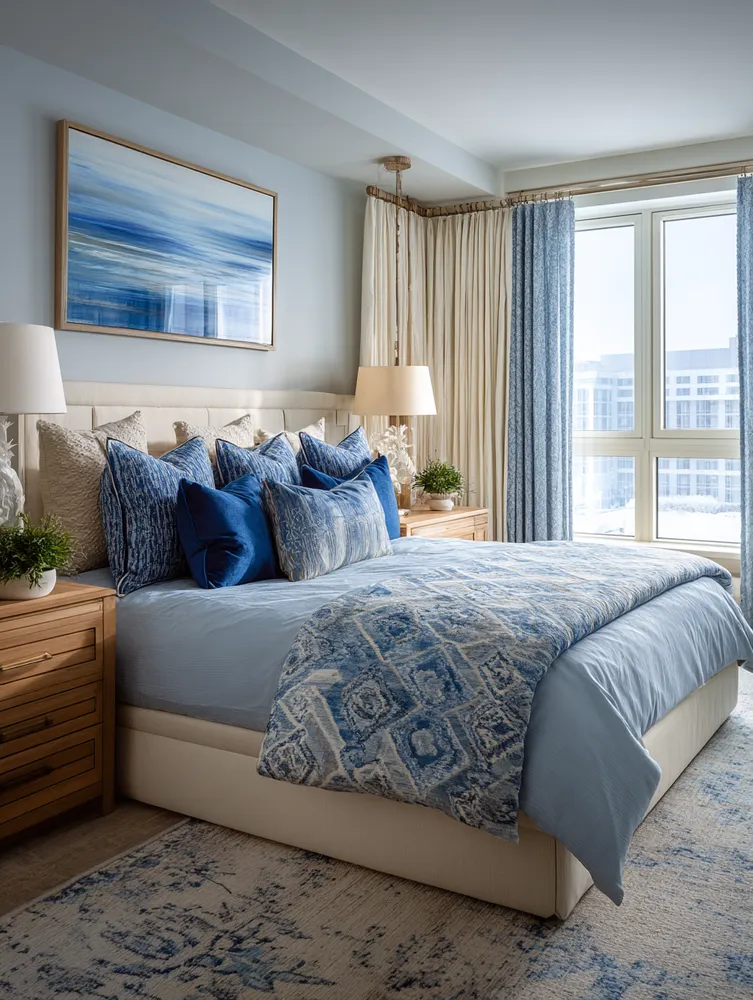
Mastering Serene Blue Hues for Your Zen Bedroom Retreat 💙
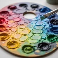
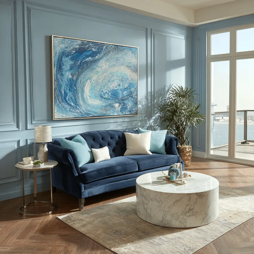
The Power of Blues: Creating Calm Spaces with Color 💙

Curated Color Palettes for a Playful Home 🌈🎨

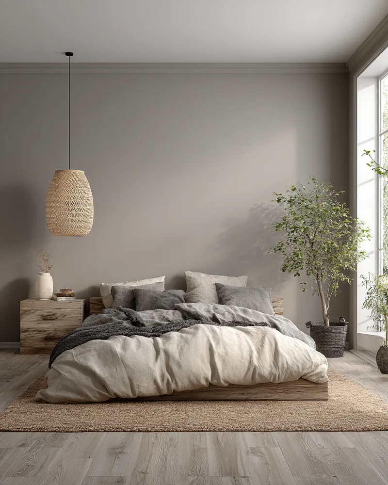
Mastering Serenity: Japandi Bedroom Palette 🛌

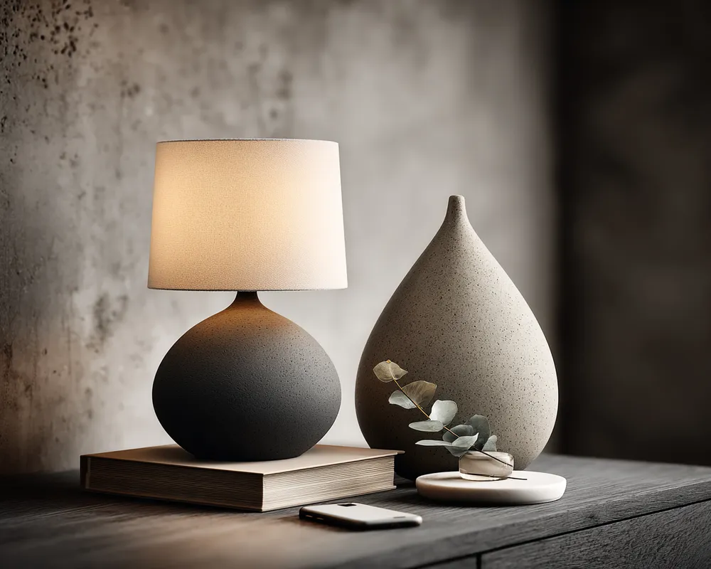
Bedside Bliss: Monochromatic Style for Ultimate Calm 🌙