1/11

Light Summer Color Palette for a Fresh Home Look
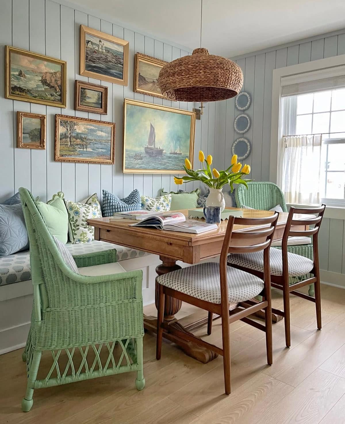
Ready to refresh your home for the sunny season? ☀️ Let’s talk about the light summer color palette—a dreamy way to bring soft, airy vibes into every room! If you’re new to color palettes, here’s the scoop: the light summer color palette is a blend of gentle, cool, and muted shades inspired by early summer mornings and breezy coastal days. Think powdery blues, gentle lavenders, soft blushes, and misty greys.
Using a light summer color palette in your home makes spaces feel open, calm, and sophisticated. I love pairing a soft summer color palette with natural textures like linen, rattan, and light wood for that California-cool look. Try a true summer color palette in your living room—think misty blue walls with pale pink cushions and silvery grey throws for an instant lift.
Want to lean into cooler shades? A cool summer color palette is perfect for bedrooms and bathrooms—just layer in icy blues, mint greens, and gentle purples for a restful, chill vibe. If you’re looking for inspiration for a more personalized touch, the light summer color palette asian style mixes these light shades with subtle patterns, bamboo, and simple, elegant décor for a tranquil retreat.
Pro tip: Stick to 2-3 main colors from the light summer color palette and add touches of white to keep things fresh. Use art, vases, and textiles to pull the look together. The result? A home that feels light, inviting, and oh-so-summery!
Embrace the light summer color palette and let your home glow with soft, cool elegance all season long. 🌿
#SummerColorPalette #HomeDecor #LightSummerPalette #InteriorInspo #FreshHome
Which color from the light summer color palette would you use first—powder blue, blush pink, or soft grey? Drop your pick below!
13 de jun. de 2025

My Coastal Color Palette for Tranquil Spaces 🐚🎨


Exploring the Power of Color in Interior Design


Pastel Perfection: Creating a Dreamy & Airy Home ☁️


Peach & Teal Harmony: A Serene Color Story! 🍑💙


Vernal Vibe Home: Fresh Colors & Natural Light Integration Ideas 🌷✨


Butter Yellow: Soft Sunshine for a Cozy Feel 💛


Coastal Living Room Palette: The Ultimate Guide to Serenity 🌊


My Go-To Palette: Creating Calm with Japandi Color Schemes 🎨


Bring Summer Indoors: Sunny Orange & Aqua Duo! ☀️🌊


Curated Color Palettes for a Playful Home 🌈🎨


The Power of Blues: Choosing Serene Hues for Coastal Homes 🌊

Yellow Alchemy: How to Bottle Sunshine at Home ☀️✨


A Burst of Color for Your Home and Garden🌹

Coastal Kitchen Color Palette: Refreshingly Serene 💙🤍


Colors house

Color Palette Perfection: Muted Tones for Shaker Spaces 🎨


Coral & Comfort: Warmth for Cozy Living Spaces 💖

Sunrise Palette: Creating a Cheerful & Energizing Bedroom ☀️


My Secret to a Light-Filled, Natural Living Room ✨ Home Decor Tips

Creating Calm: Color Palettes for Minimalist Homes 🎨