1/12
Pink living room ideas – 10 creative ways to use this enchanting hue
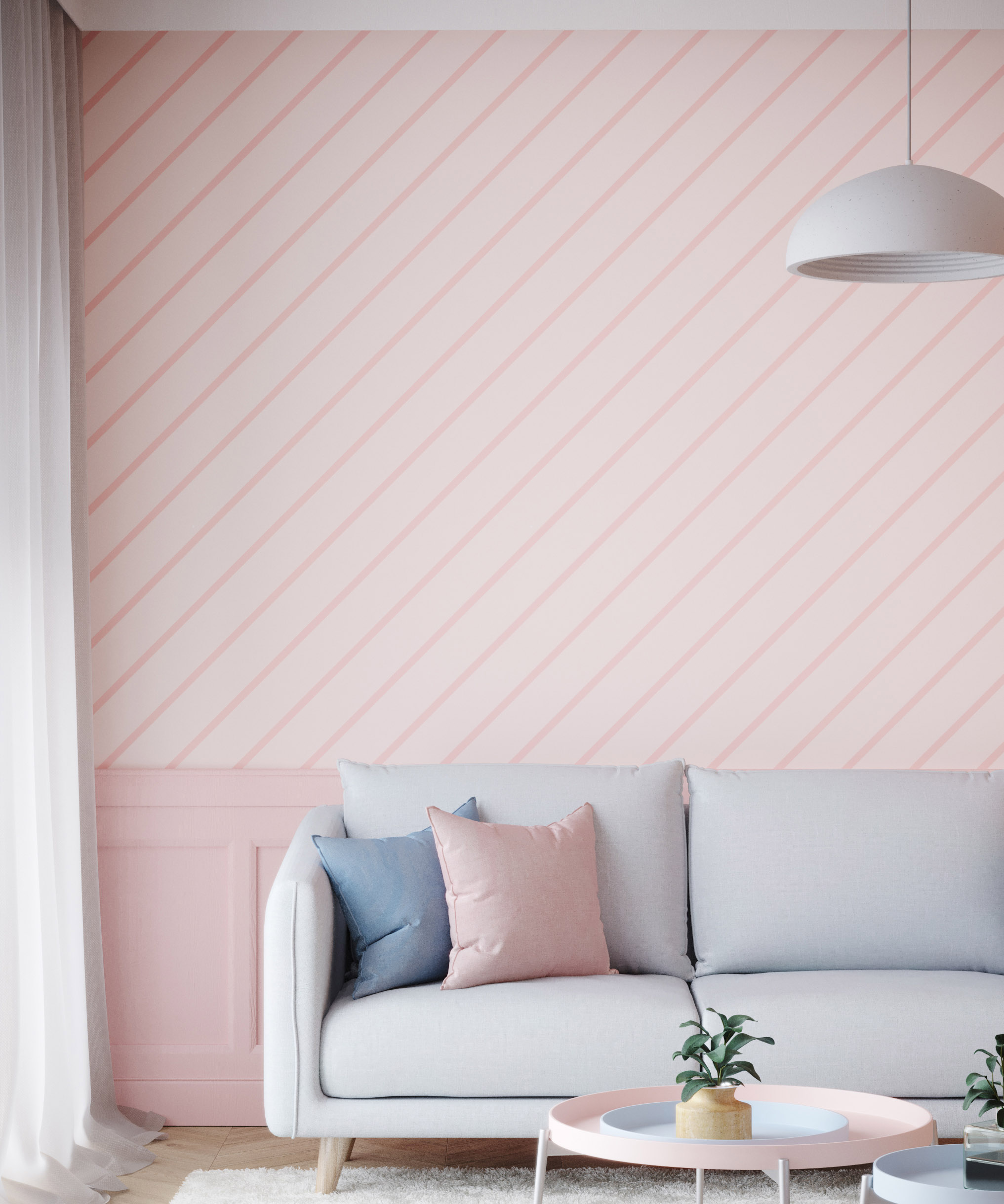
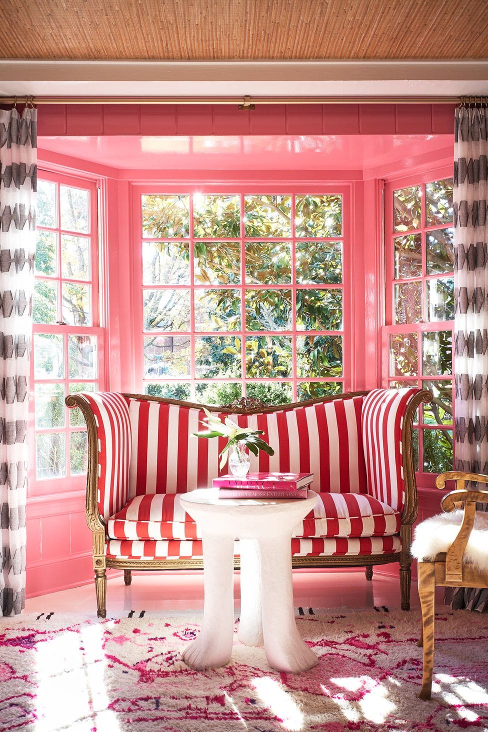
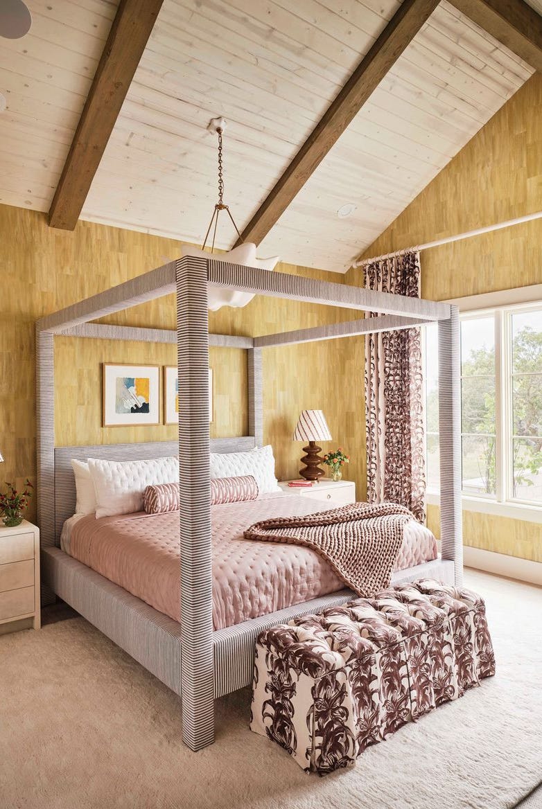
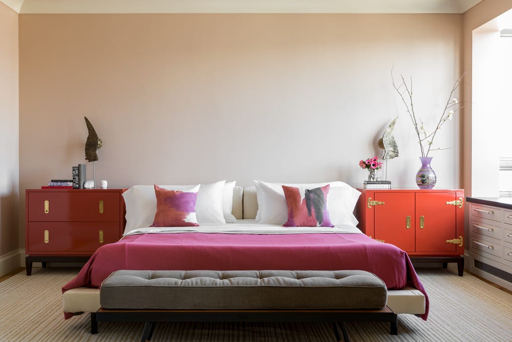
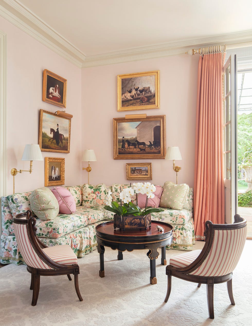
The article explores ten creative approaches to incorporating pink into living room design, highlighting its versatility from soft blushes to vibrant magentas. It emphasizes that pink, far from being limited to specific aesthetics, can be fresh, modern, and delightful, serving as an unexpected design element. Jennifer Morris, a Brooklyn-based interior designer, notes pink's ability to create an intimate vibe or contribute to relaxation, suggesting its use not only on walls but also as an accent in chairs or rugs.
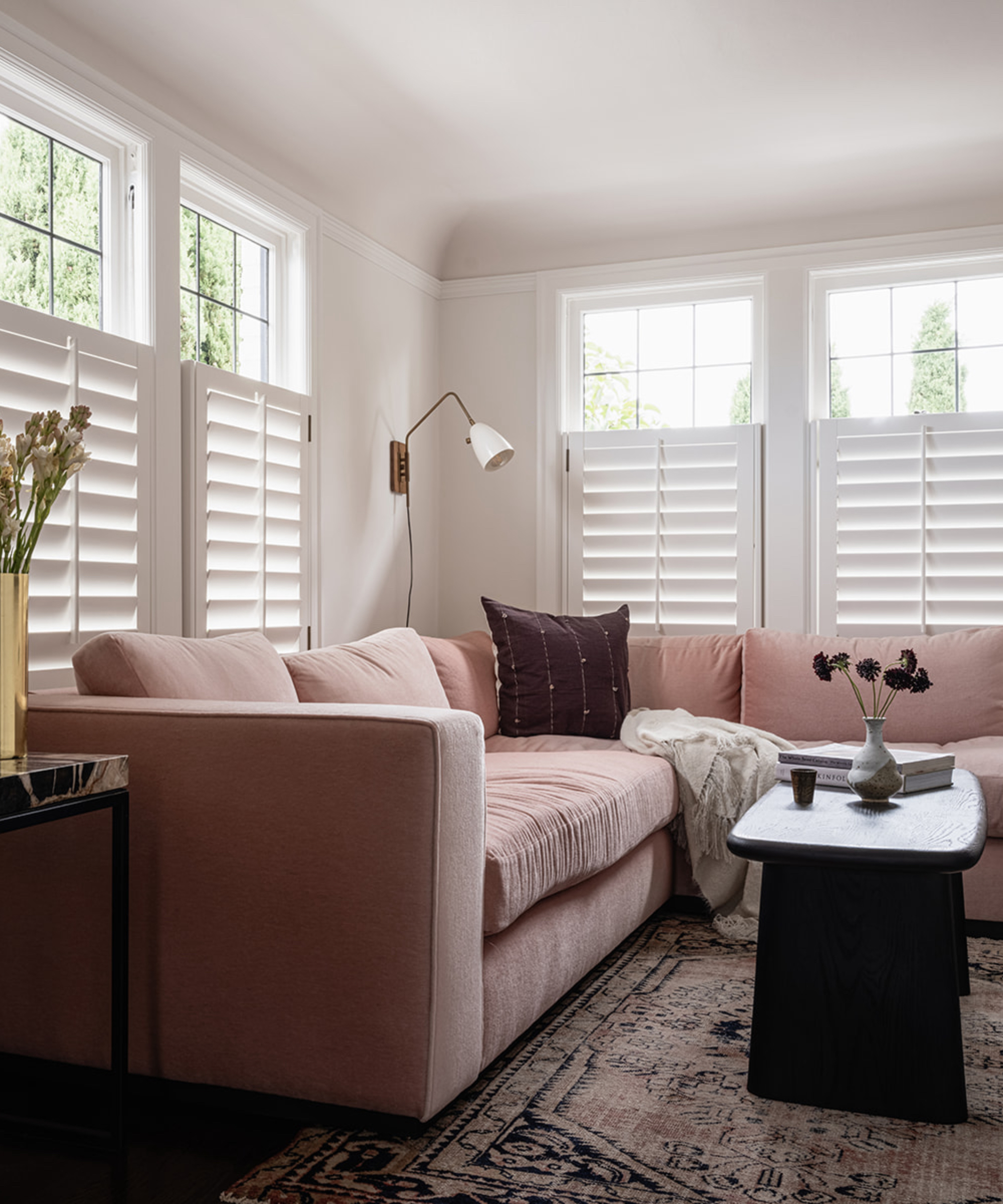
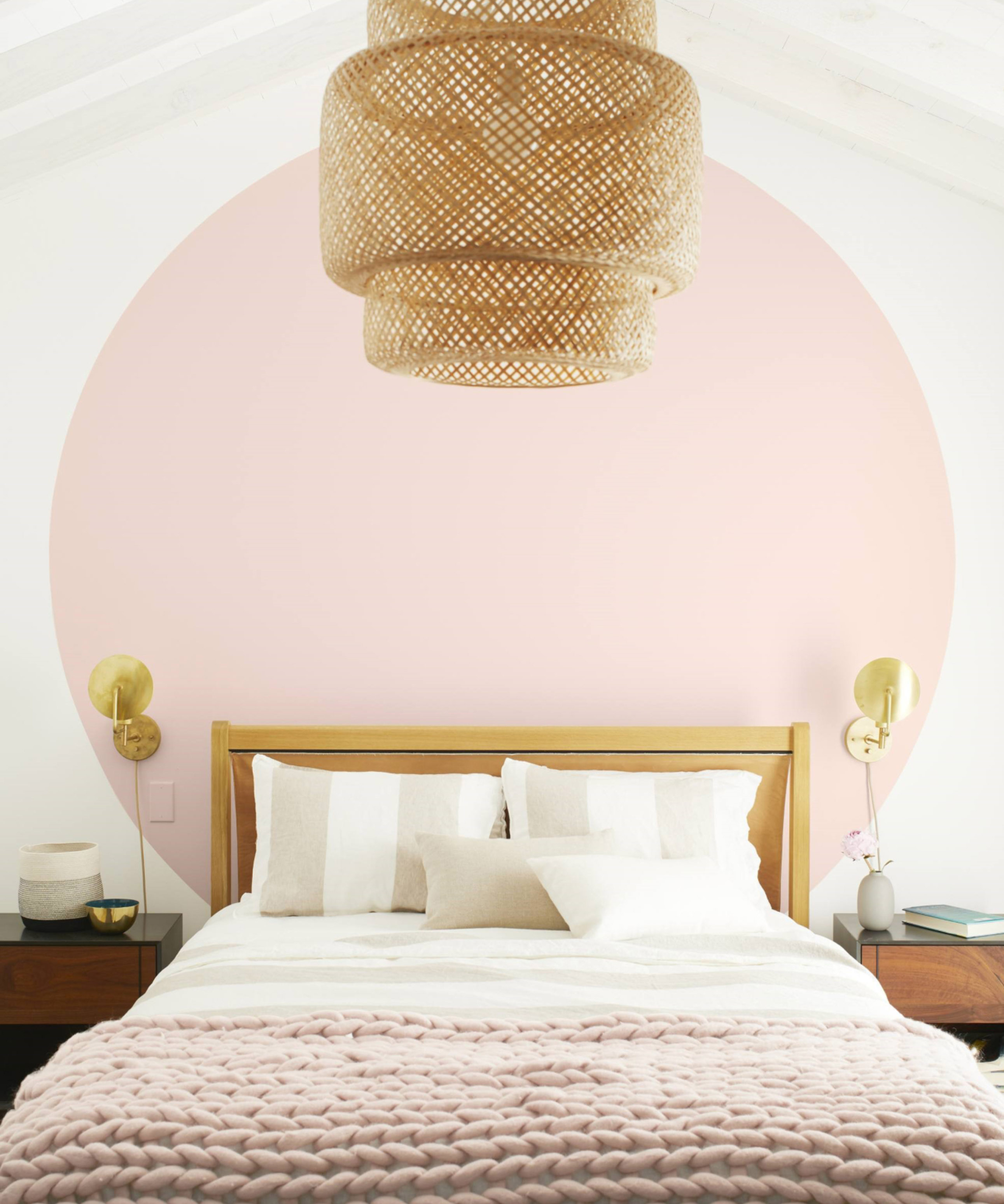

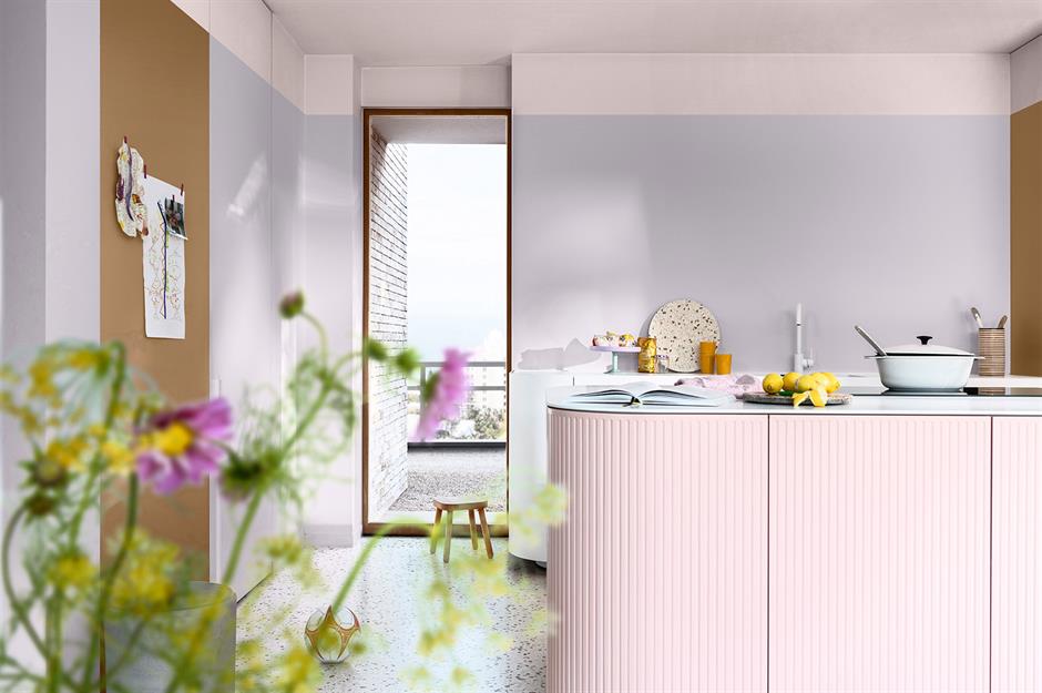
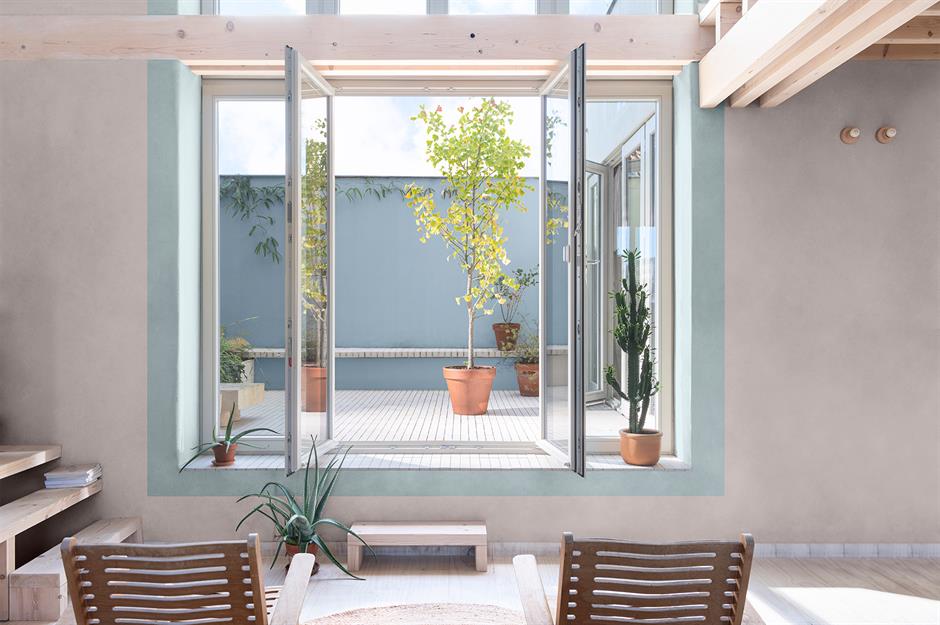
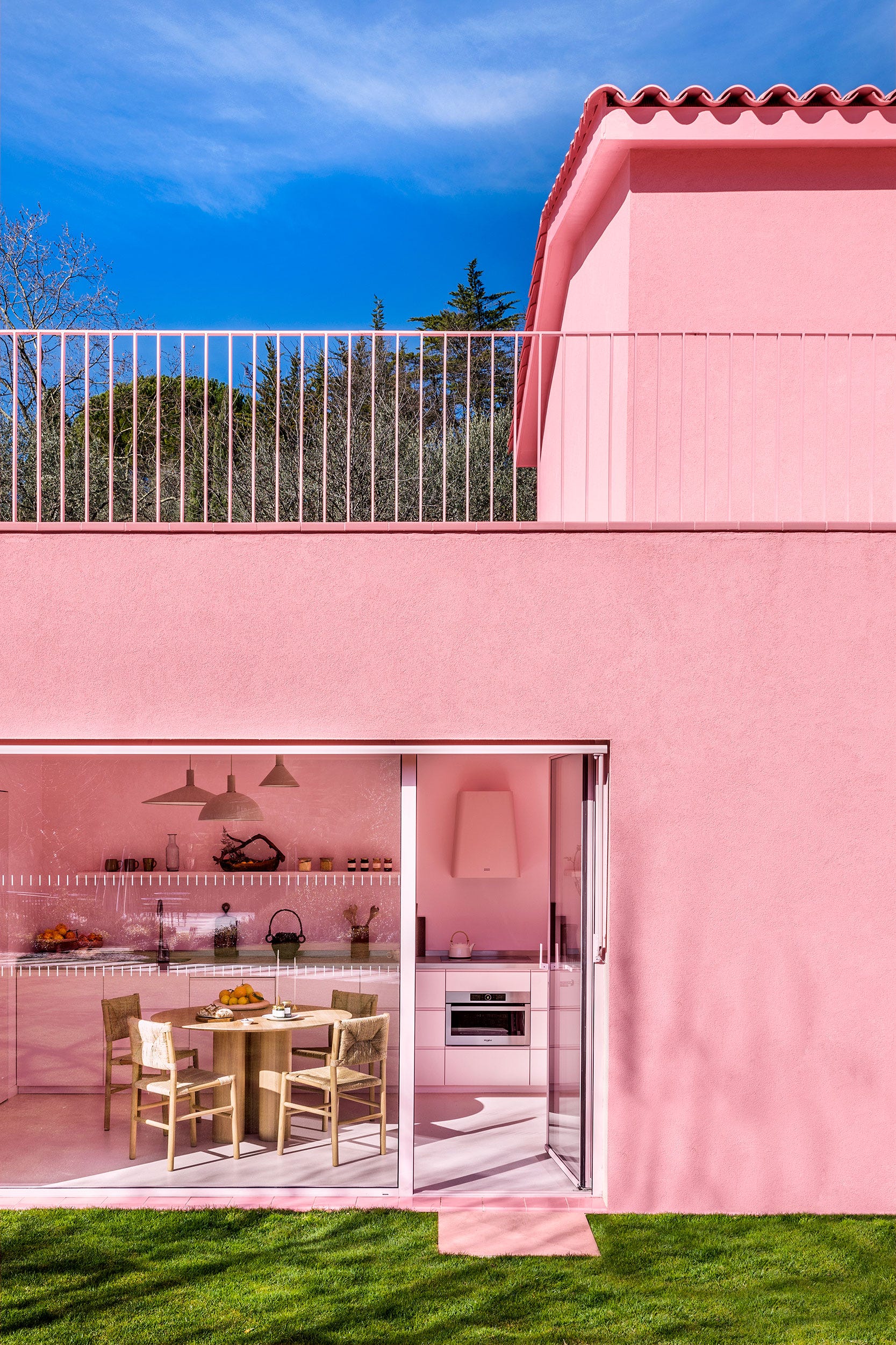
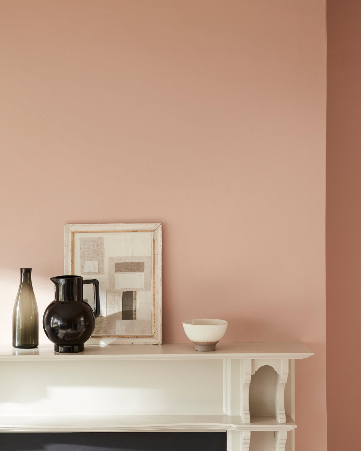
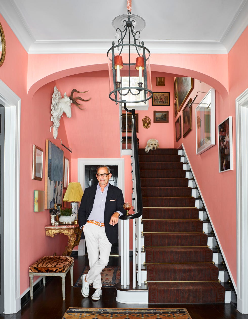
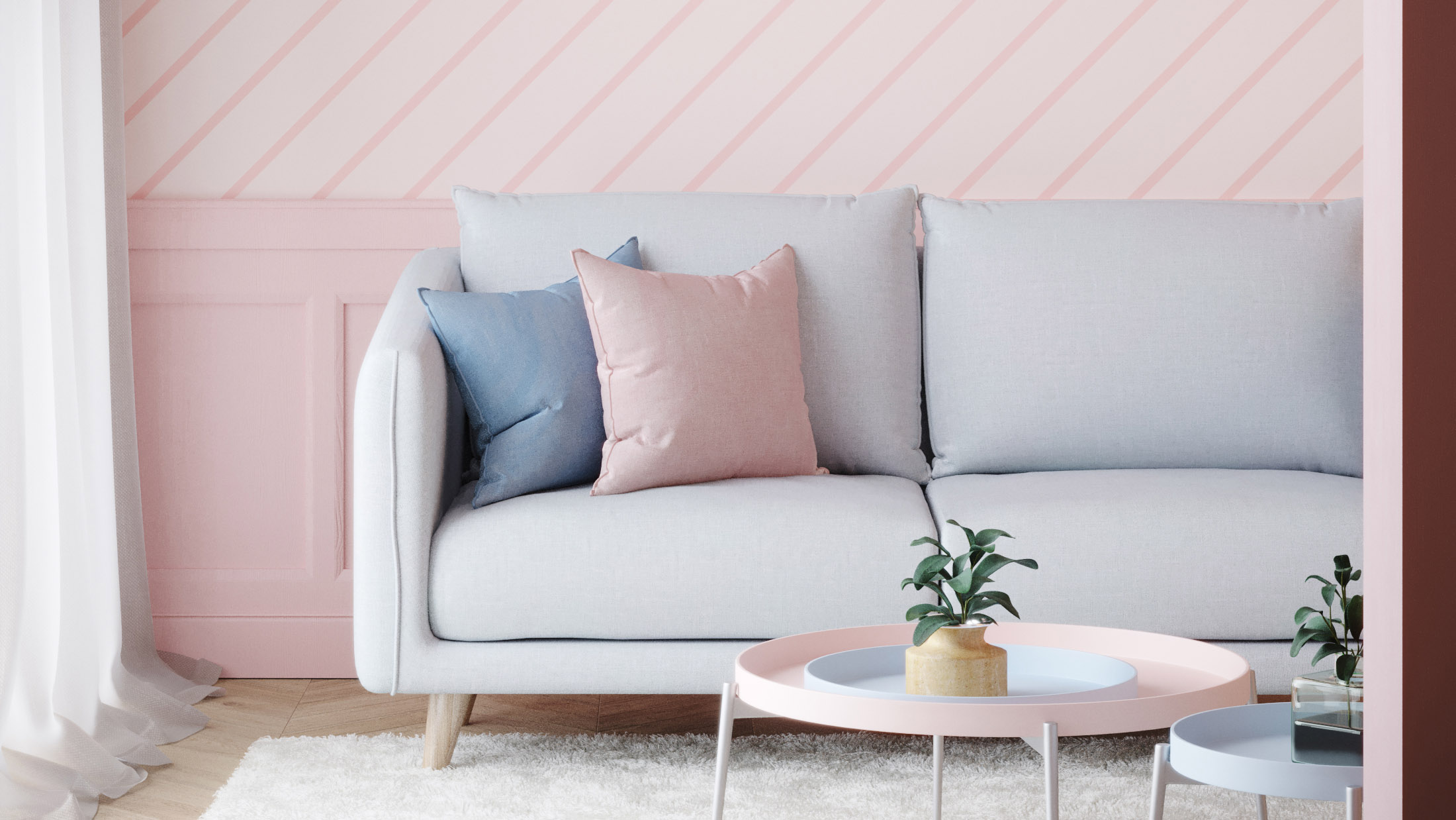
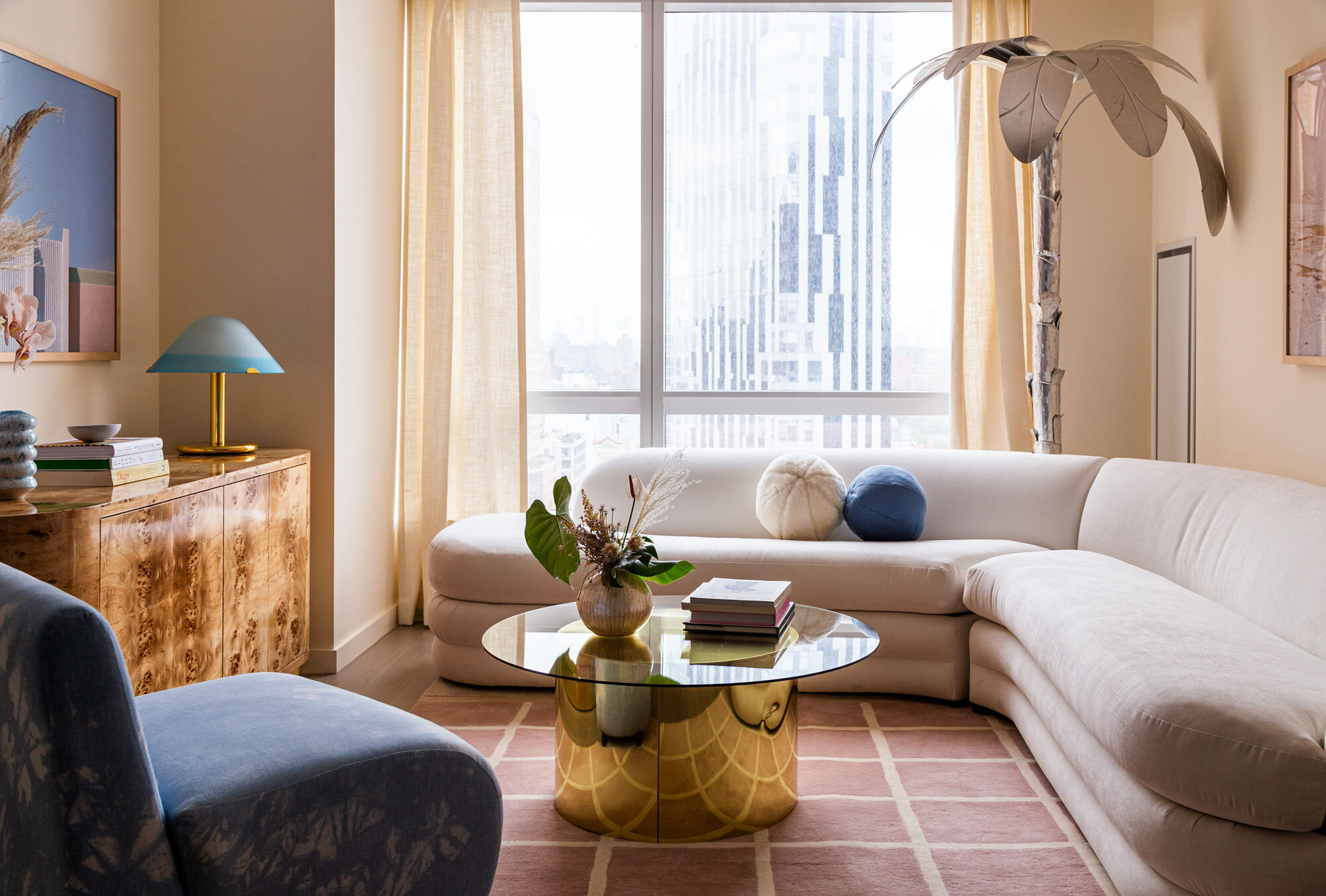
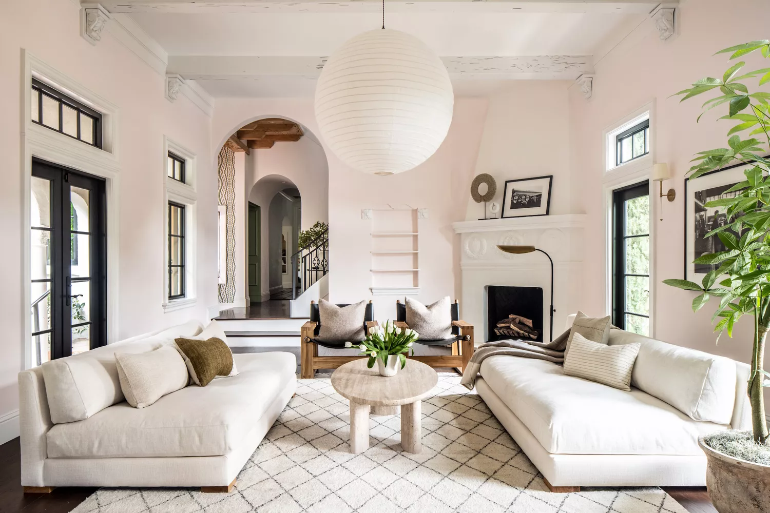
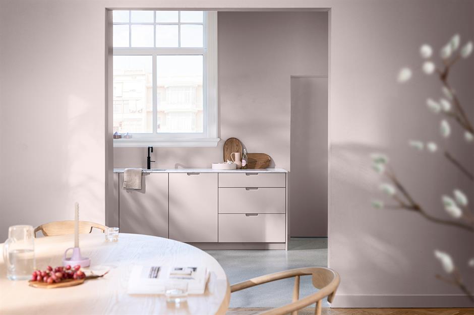
One key idea presented is the use of softer pink shades to create a space-boosting effect. These less saturated hues, tinted with white, can act as a more interesting neutral alternative to beige, enhancing natural light and making a living room feel brighter and airier. Caroline Milns from Zulufish suggests combining soft pink with white for a timeless, modern palette or adding contrasting shades for a surprising effect. She also points out that pink fills a room with a soft, suffused glow, providing warmth and flattering skin tones.
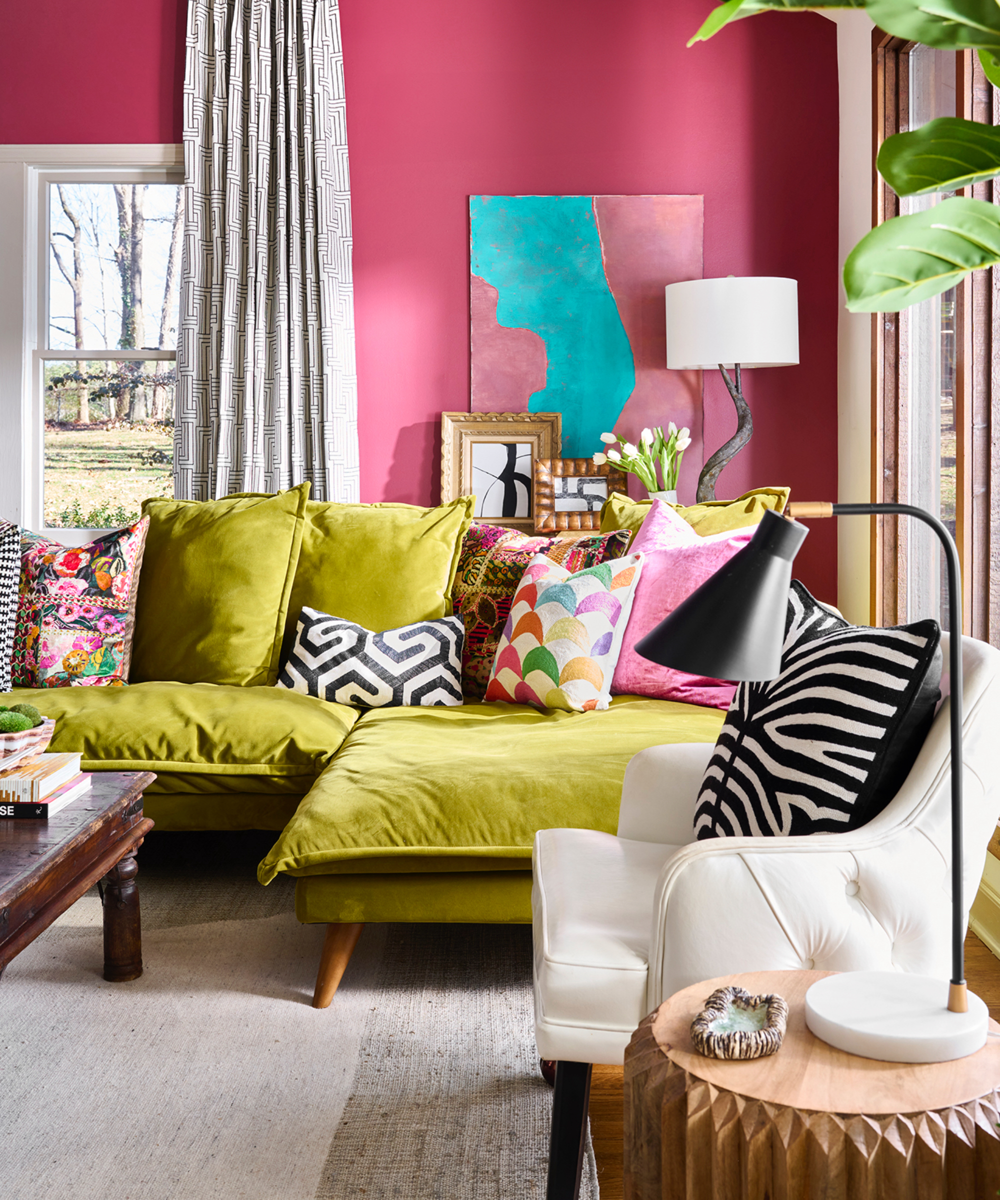
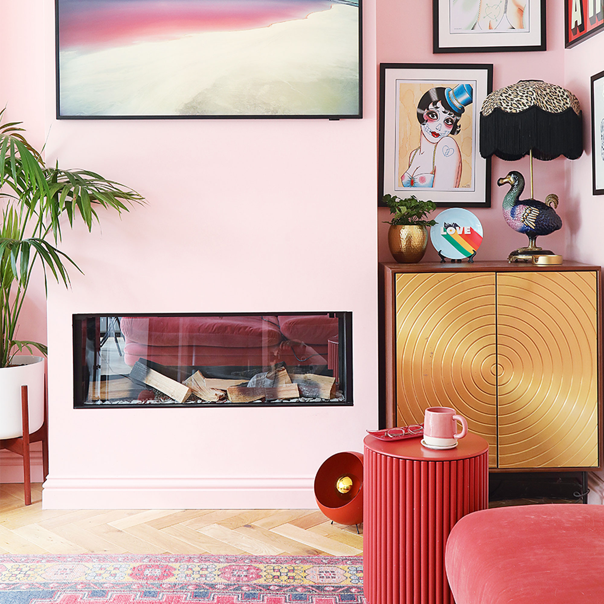
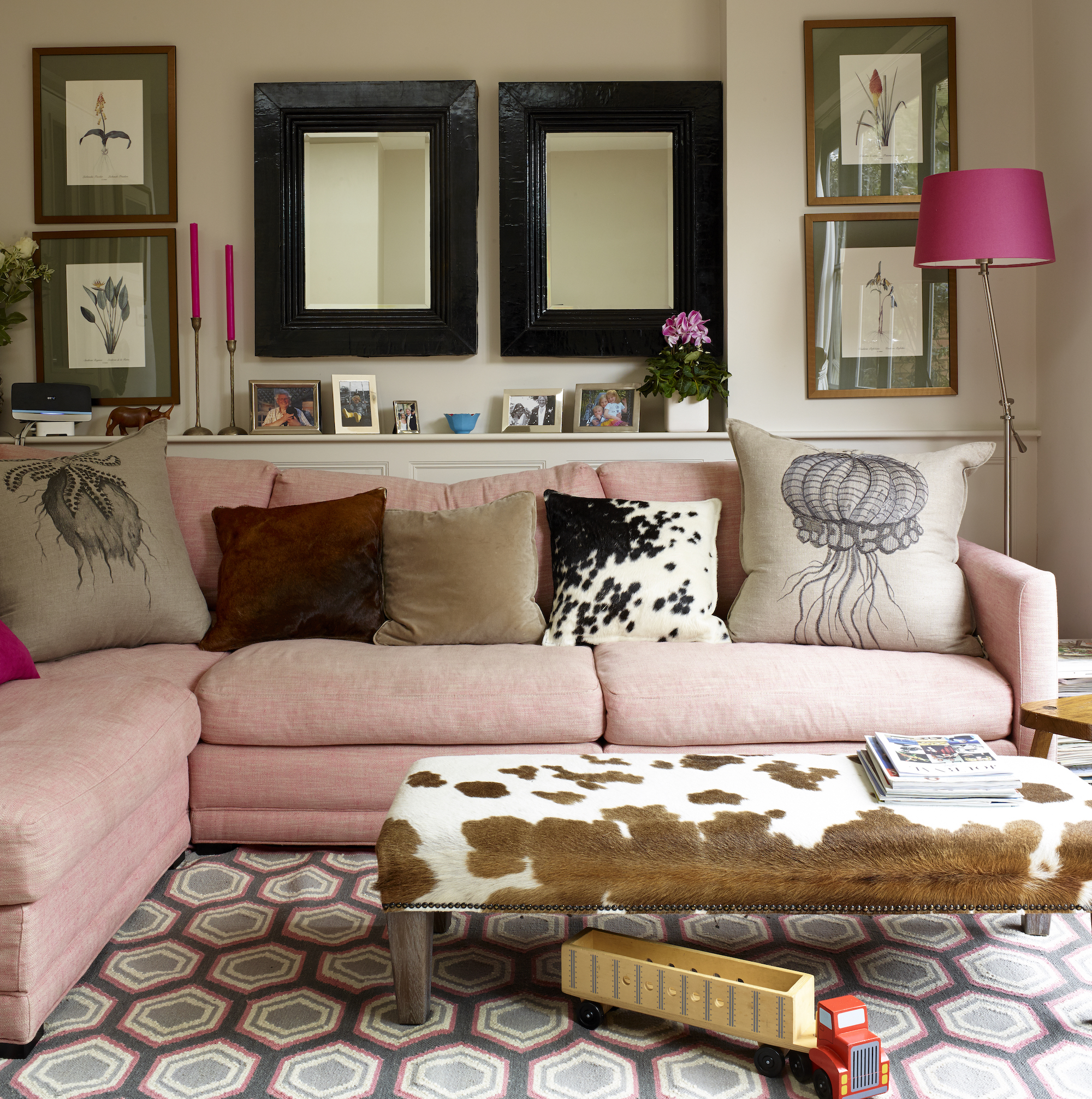
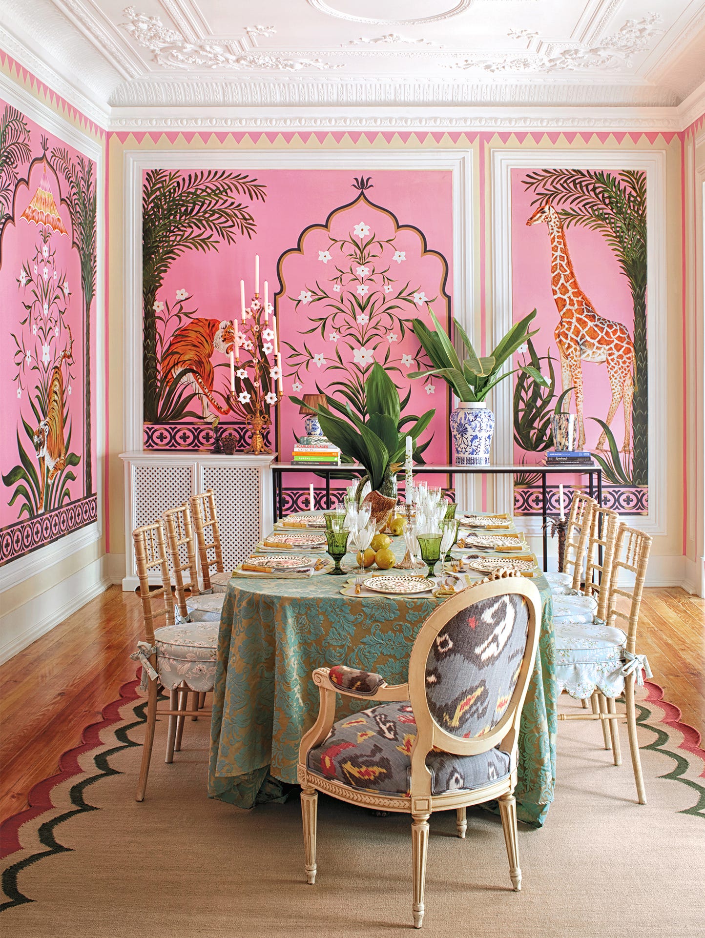
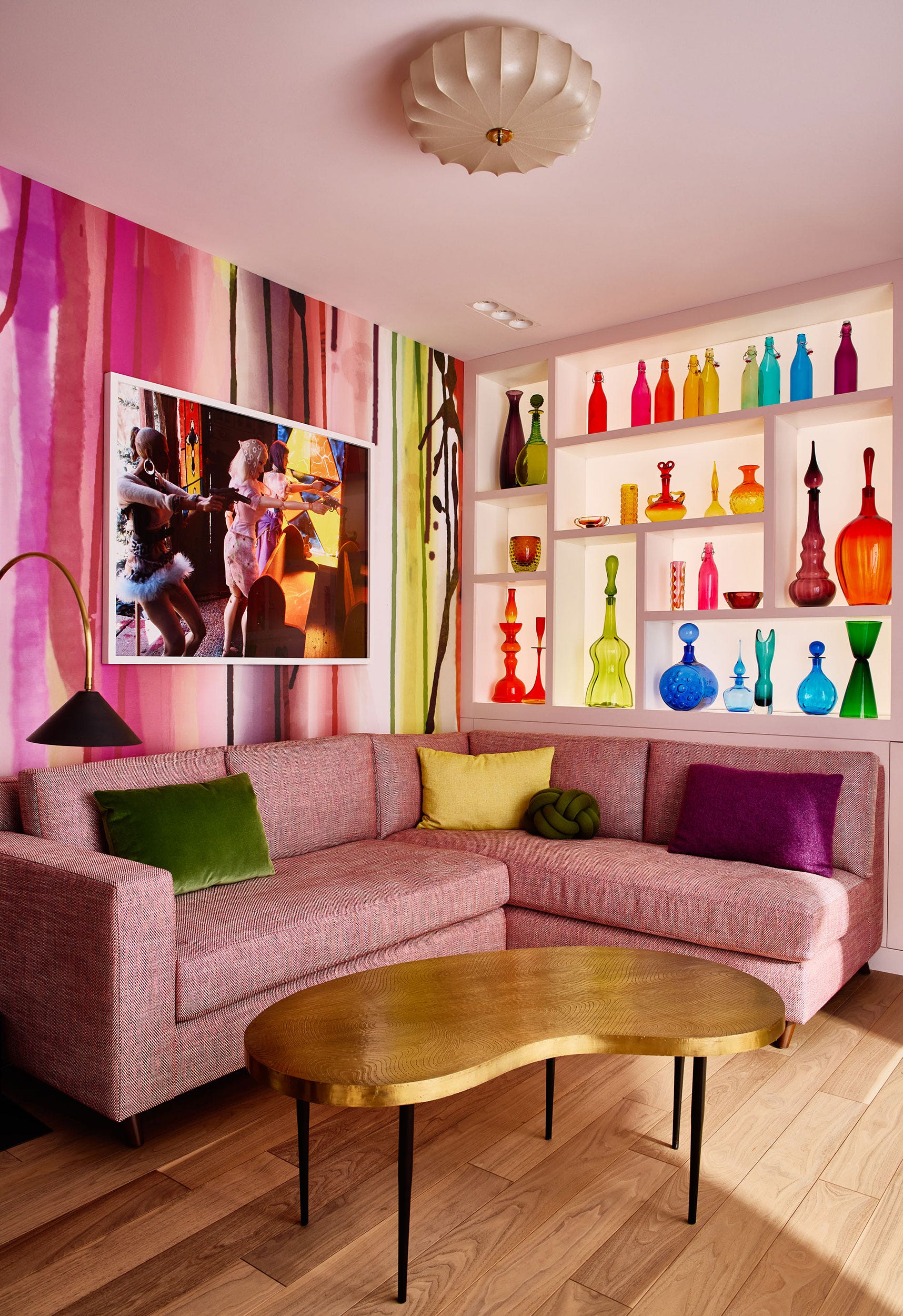
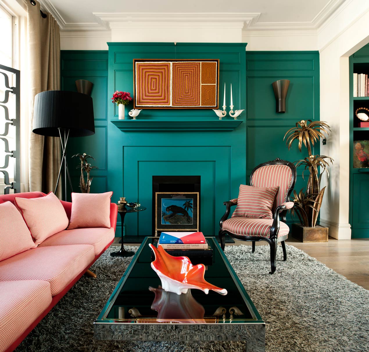
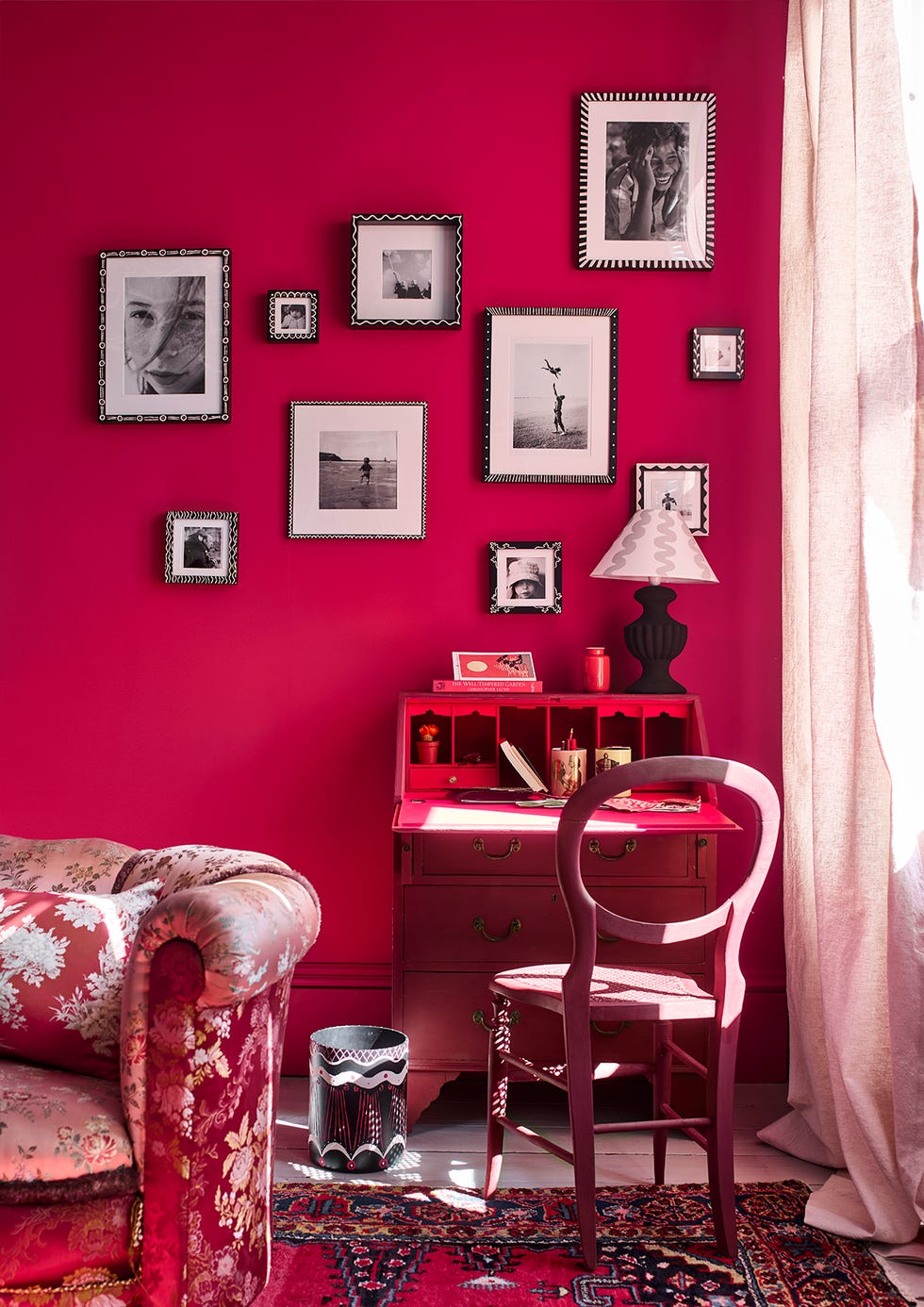
For those seeking a glamorous living room, raspberry pink is recommended. This daring, high-energy tone, being on the redder side, pairs well with dark wood, dark grey, and metallic accents. Large prints can further enhance this glamorous aesthetic. Additionally, bright raspberry can be effectively used for color clashing, creating an eclectic and modern look when combined with charcoal grey, black, or even green. Helen Shaw of Benjamin Moore highlights the surprising range of pink paint and its ability to warm a room and evoke positive, welcoming feelings.
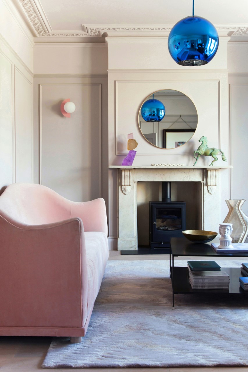
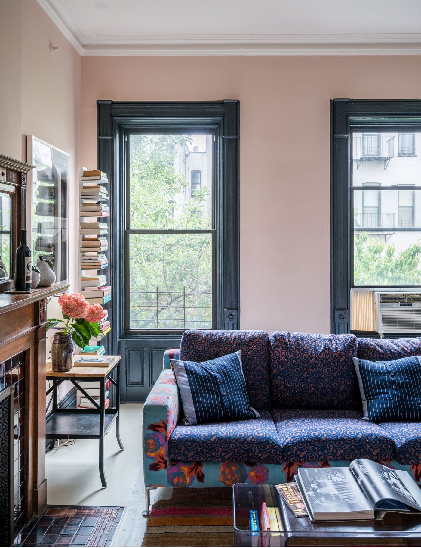
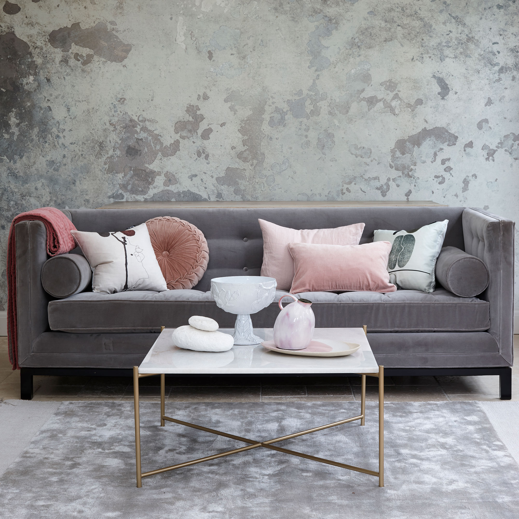
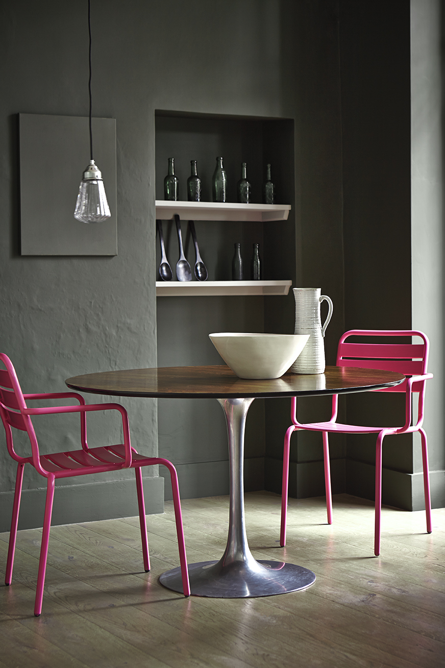
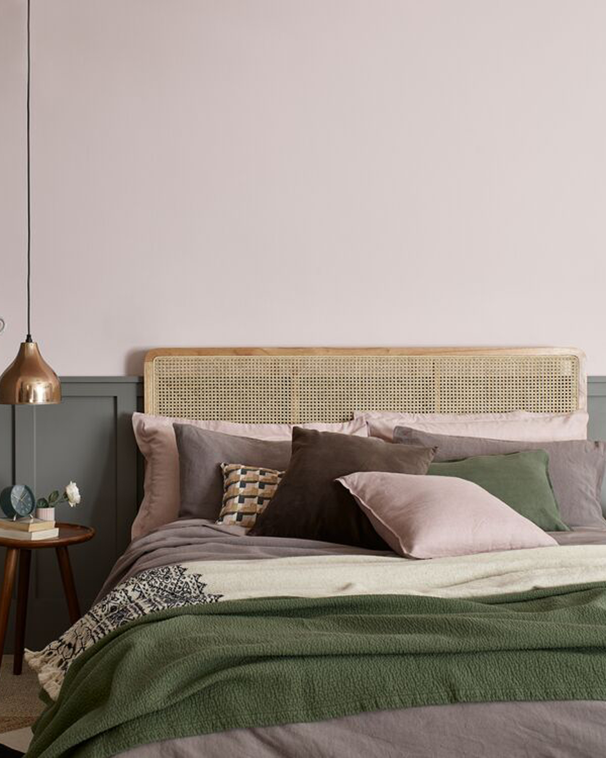
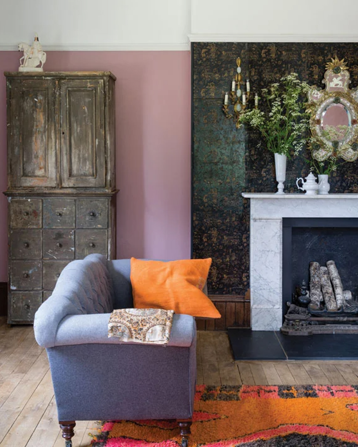
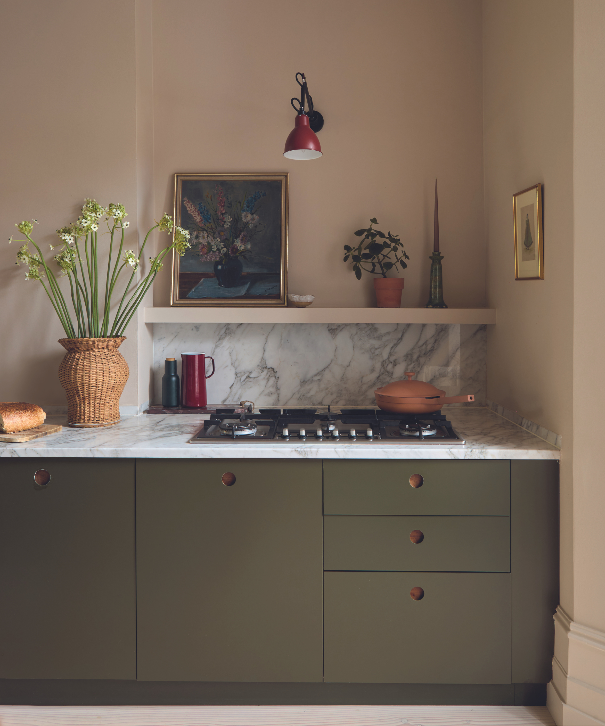
The article also discusses contrasting pink with complementary colors, asserting that pink has a strong personality and is versatile. Examples include pairing dark navy blue with deep pink for a contemporary setting, or sage green with light blush pink for a subtler feel. Grey and pink are identified as a striking combination, particularly in industrial settings where grey acts as a neutral and pink enlivens the scheme. In rustic interiors, blush pinks are suitable backdrops for concrete and metal. Mimi Pearce of Run For The Hills illustrates this with an interplay of feminine and masculine shades in a townhouse.
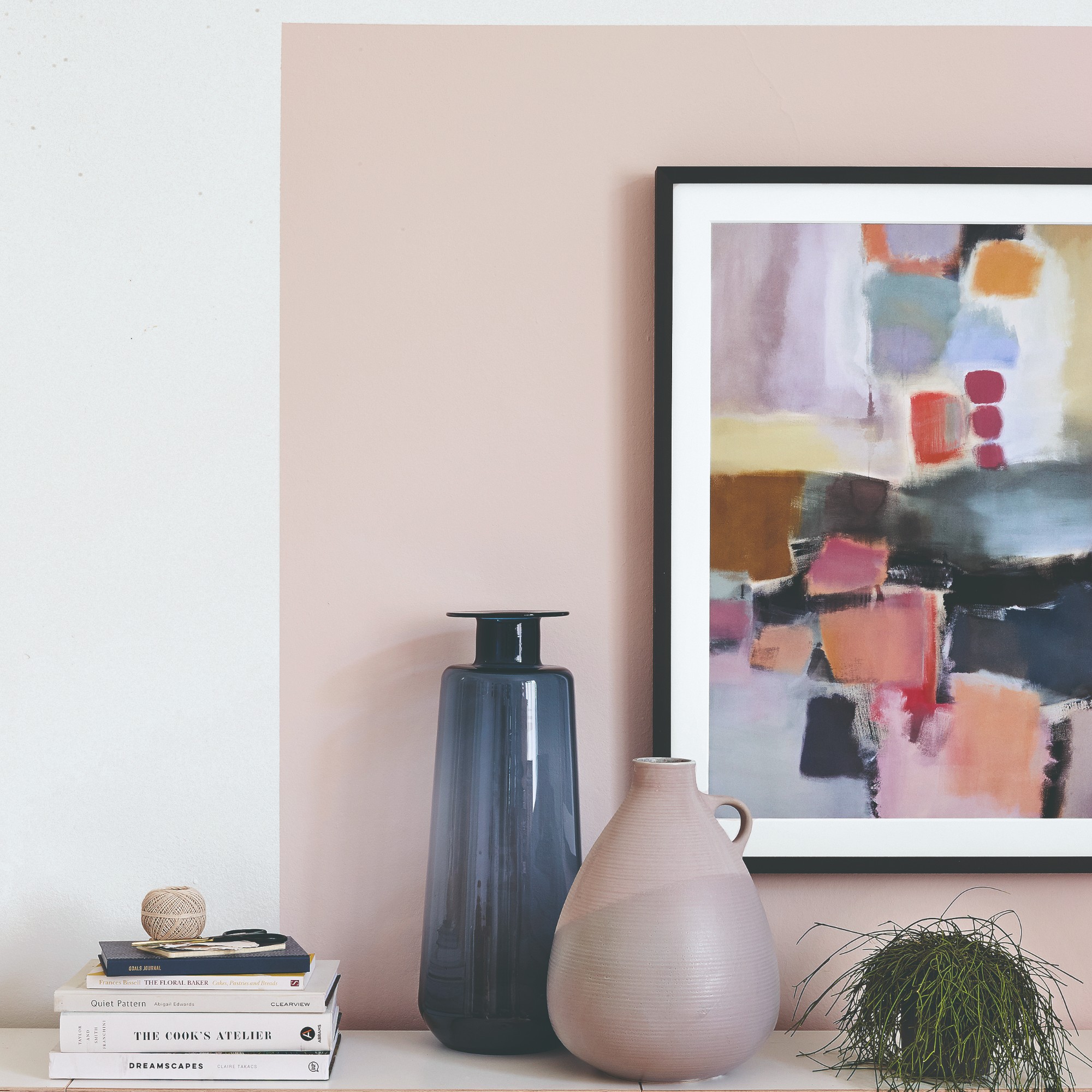
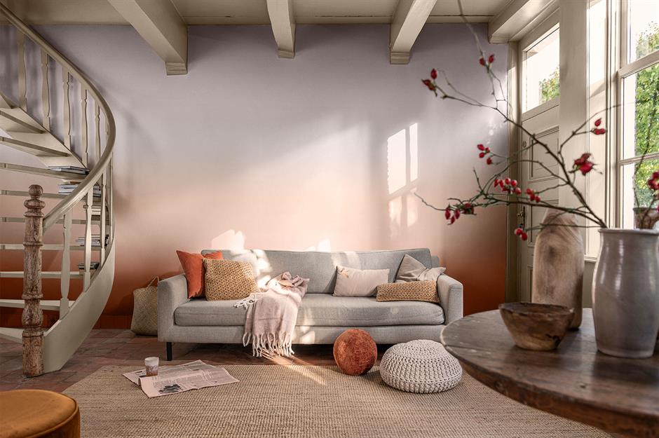
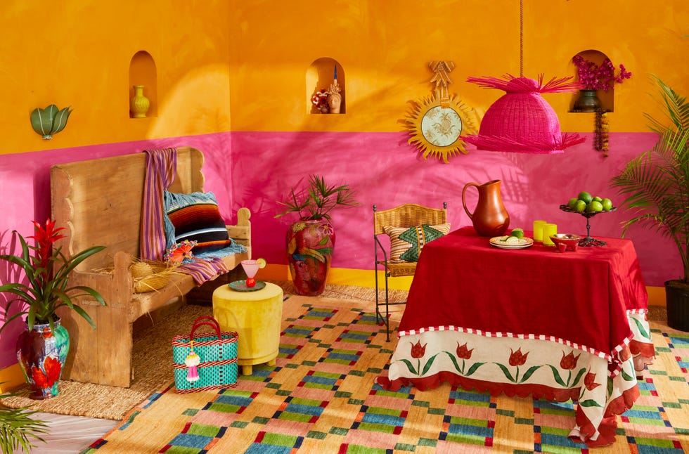
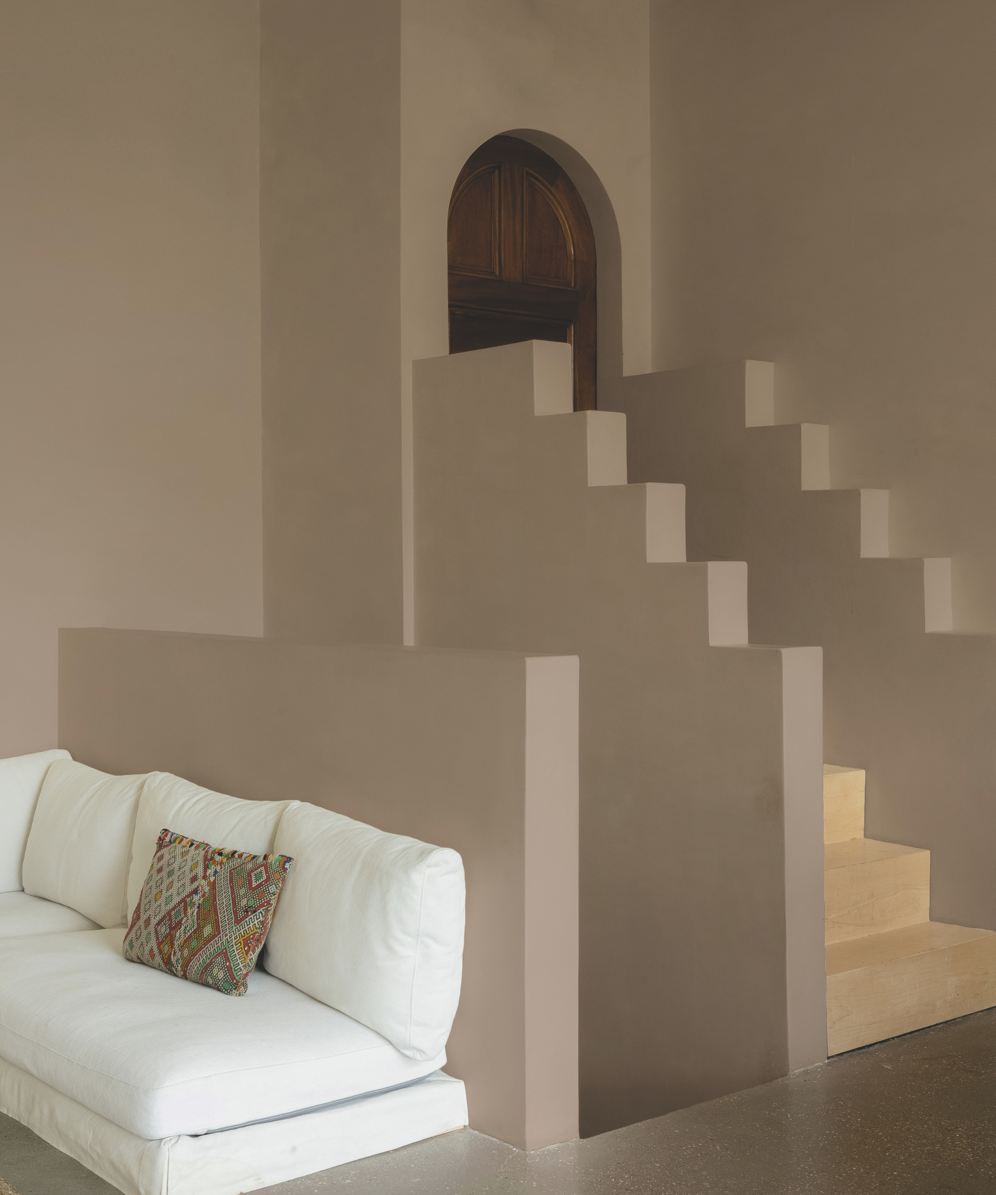
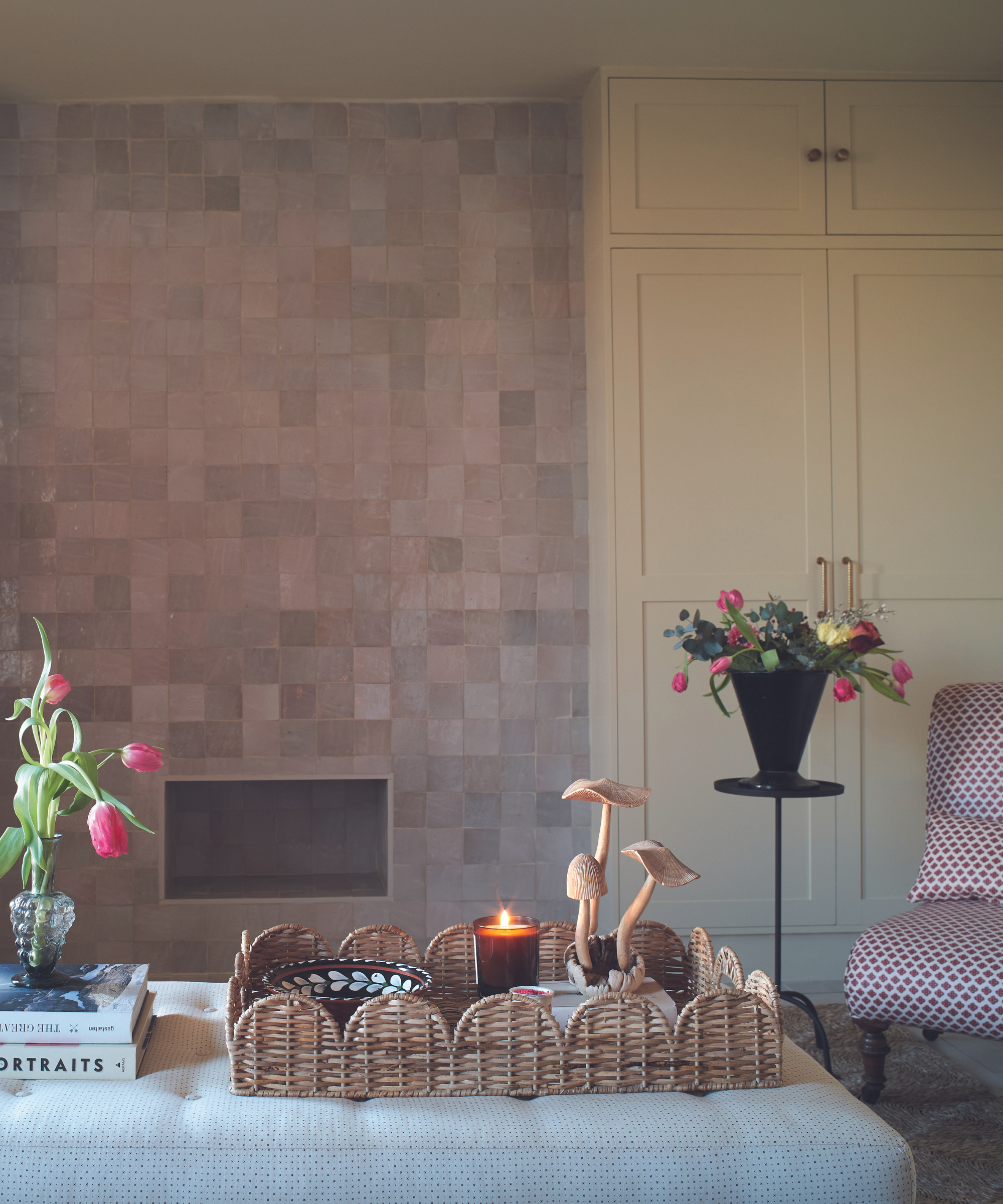
Color blocking with blush tones is another technique, allowing for the pairing of different solid hues to create striking spaces. This can be achieved with subtle shades, and accessories can unify the overall palette. Noorein Kapoor explains how an Arizona desert color palette was used to color block a corner, adding character and interest. Furthermore, combining wooden elements with dusty pink creates an earthy scheme, where powder pink walls are balanced with warm neutrals and enhanced by textures like linens and woven accessories.
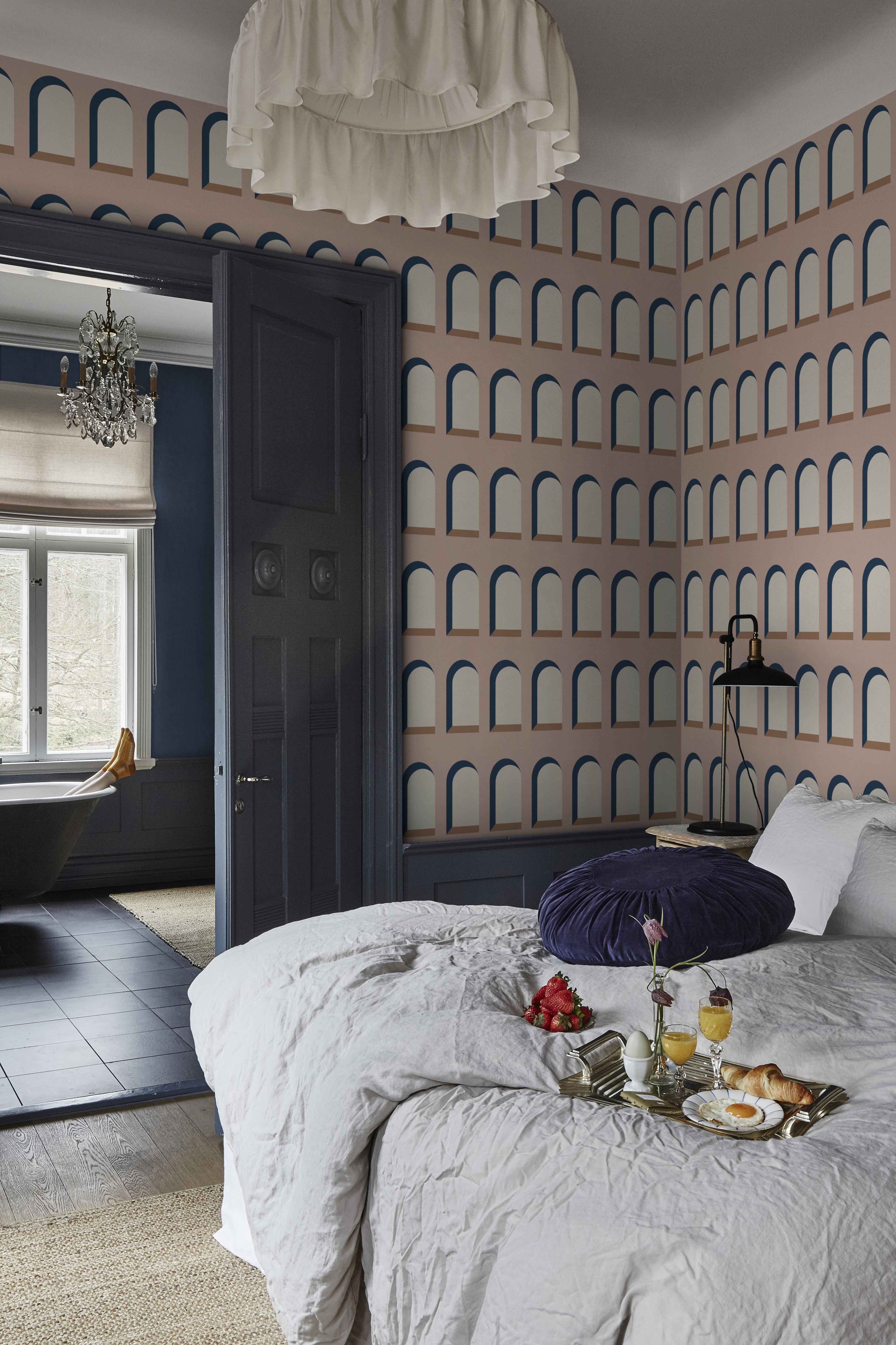
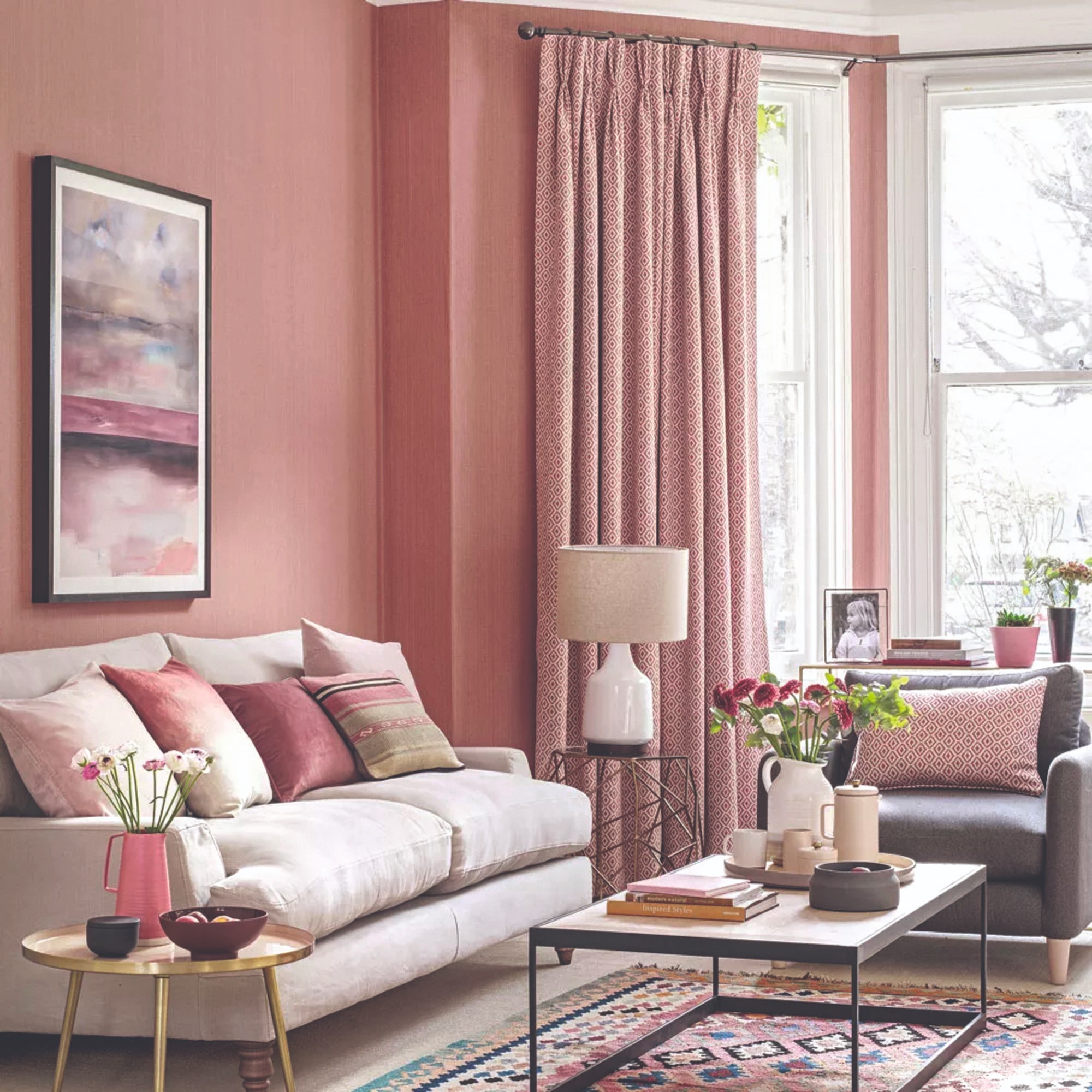
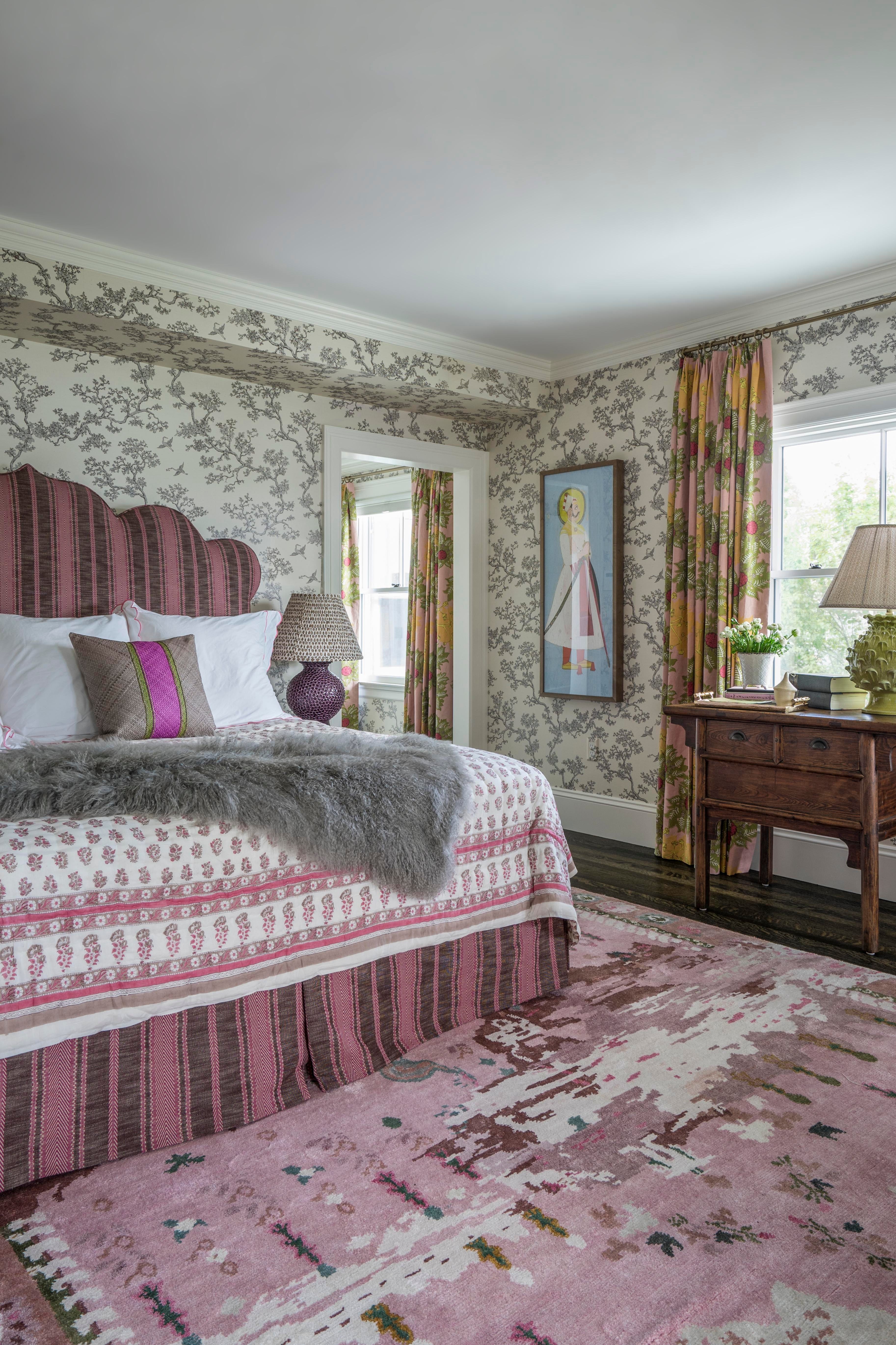
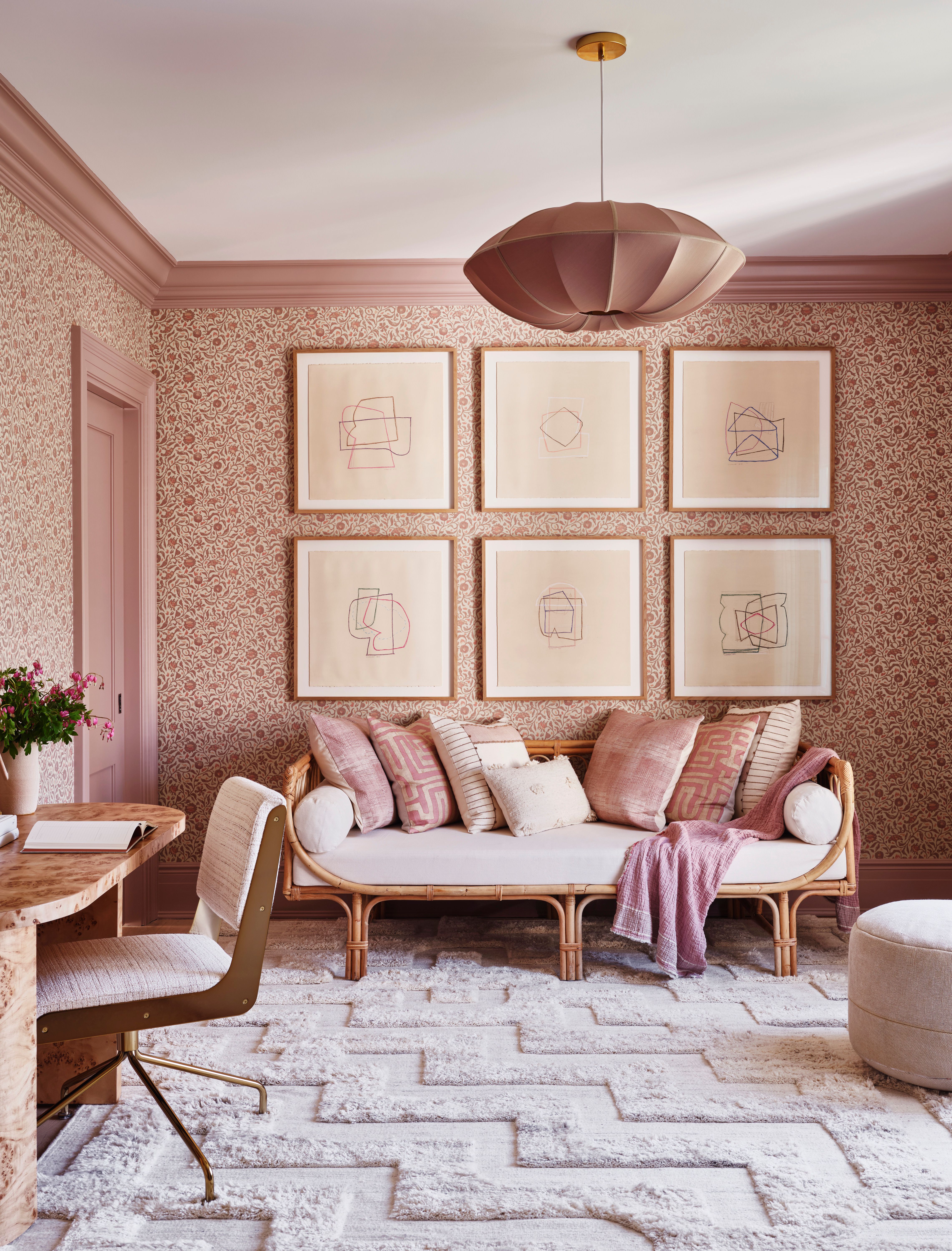
Introducing dusky pink through patterned wallpaper is explored as a way to add depth and grounding. Selecting patterns with dusky pink shades and texture, along with taupe curtains and muted metallic accents, can create a contemporary vibe. For a warmer feel, pink wallpaper can be contrasted with grey floor tiles. The article also suggests adding pops of rose pink with a rug, serving as a grounding element for layering other colors and pieces, preventing the room from feeling overly soft.
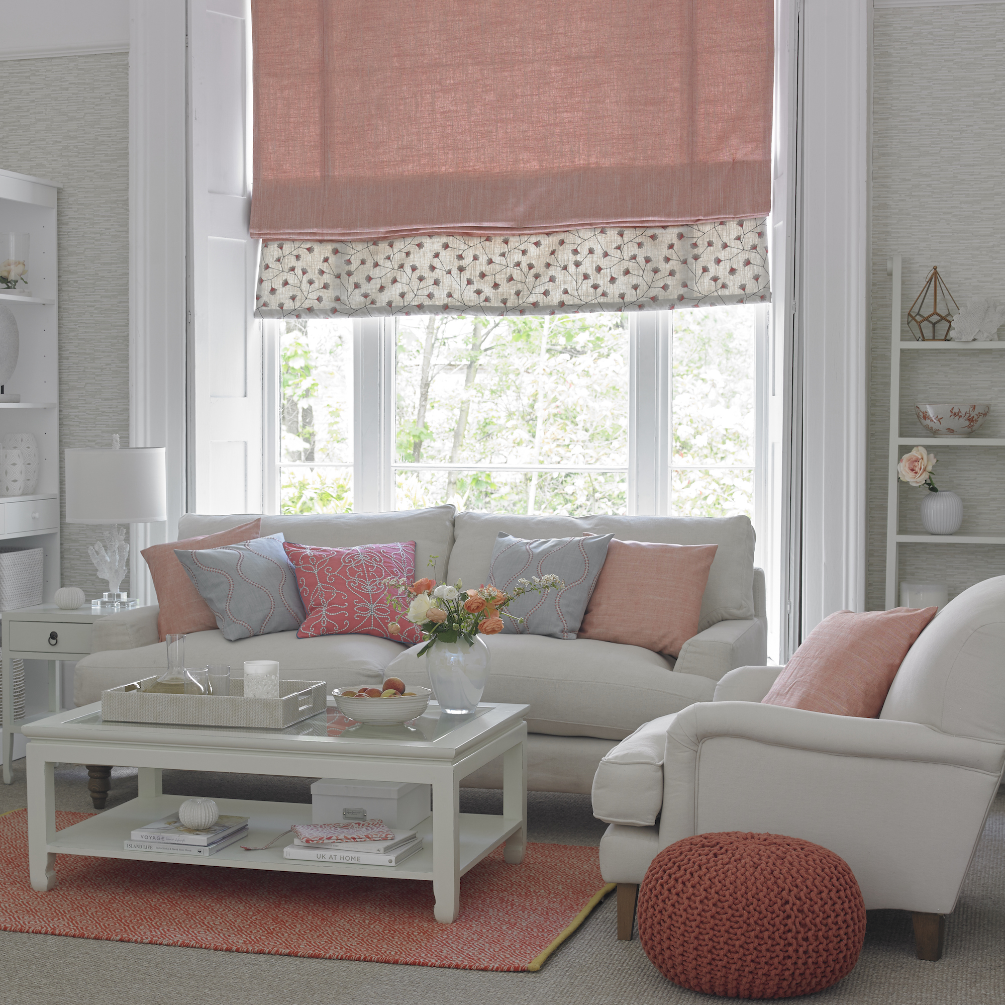
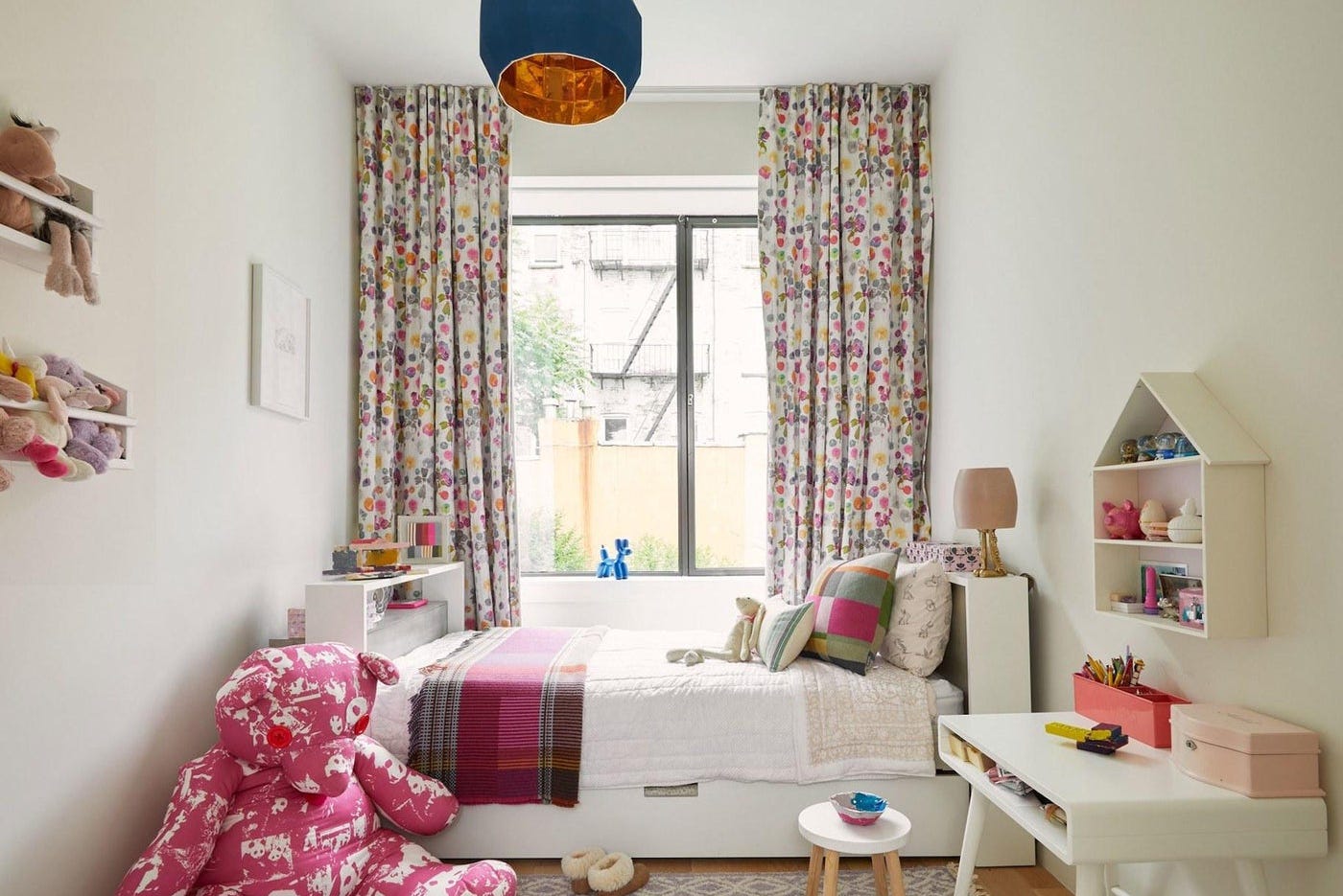
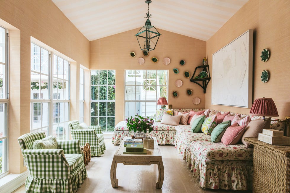

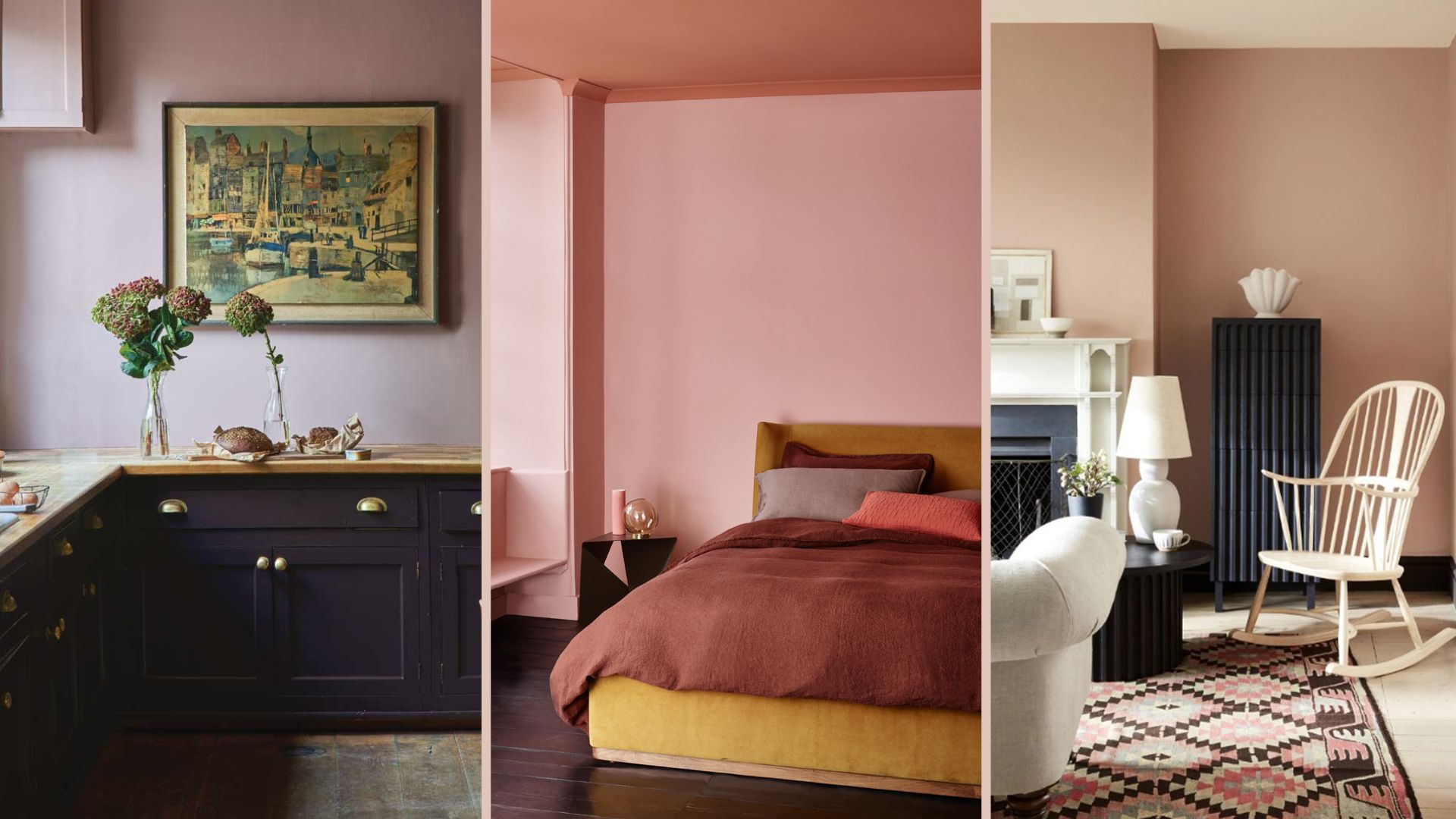
Plaster pink for wall decor is presented as an option for a joyful and uplifting living space. Marianne Shillingford of Dulux notes its ability to warm up north-facing rooms and its compatibility with houseplants and green accessories. Textured walls, especially in plaster pink, can add movement and character while hiding imperfections. Layering rosy hues in a palette is encouraged, starting with a soft pink base and building with patterns in upholstery, window treatments, cushions, and rugs. The importance of lighting, from pendants to spotlights, and accessories like vases and flowers, is highlighted to complete the layered look.
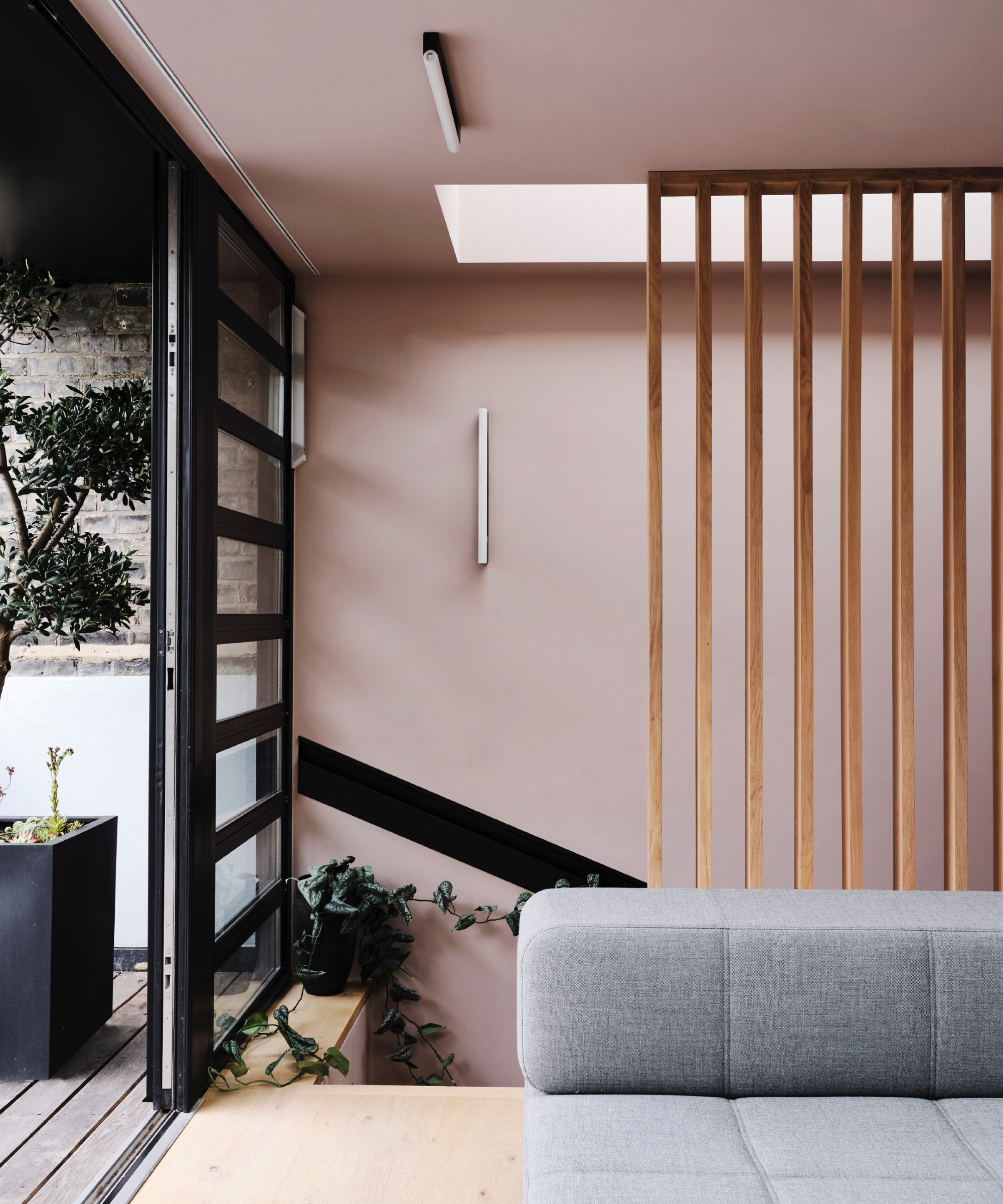
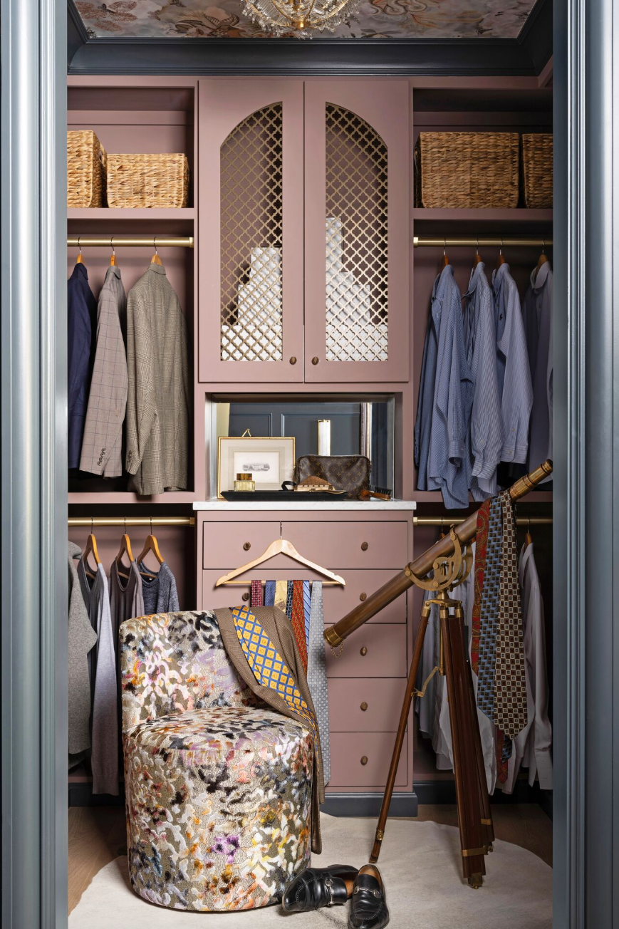
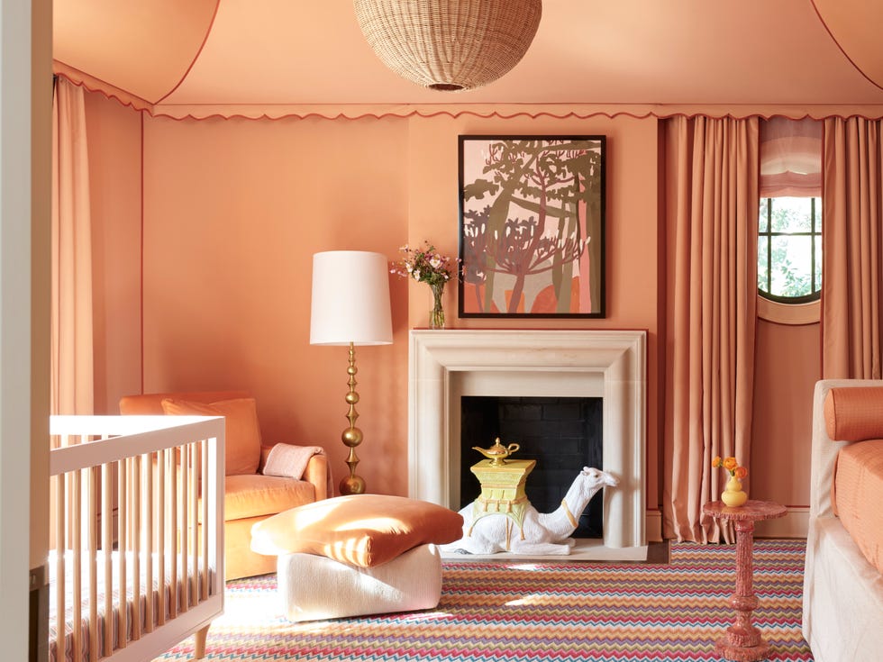
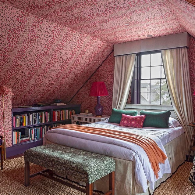
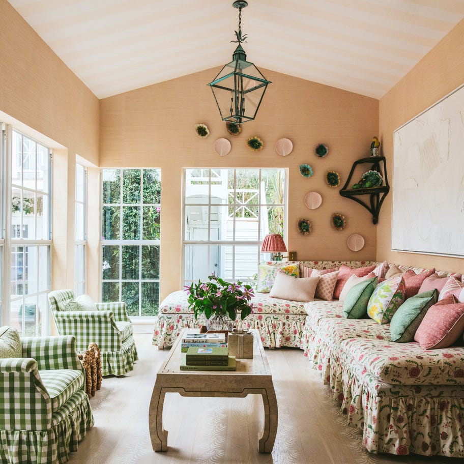
Finally, the article suggests adding dark pink in unexpected places, such as painting ceiling beams, to accentuate architectural features and adjust room height. A lilac-pink ceiling, for instance, can cocoon a muted room. The author clarifies that pink is a timeless color, emphasizing that dominant pink palettes should ideally use no more than three tonal shades, with white as a base to avoid a garish look. Jennifer Morris points out that paint colors with pink undertones can offer subtle hints of pink depending on light quality. Pink can also be introduced through fabrics, such as occasional chairs, cushions, or ombre sheer curtains, and through accessories, creating a layered effect that disperses the color's boldness. Coloring joinery or trims in pink can subtly introduce the hue, adding uniqueness to the room’s overall scheme.
#PinkLivingRoom #InteriorDesign #ColorSchemes #HomeDecor #DesignIdeas #ModernLiving #ColorBlocking #TexturedWalls #WallpaperTrends #PinkLivingRoom #InteriorDesign #ColorSchemes #HomeDecor #DesignIdeas #ModernLiving #ColorBlocking #TexturedWalls #WallpaperTrends
Há 0 comentários no total
 Ainda não há comentários
Você também pode gostar
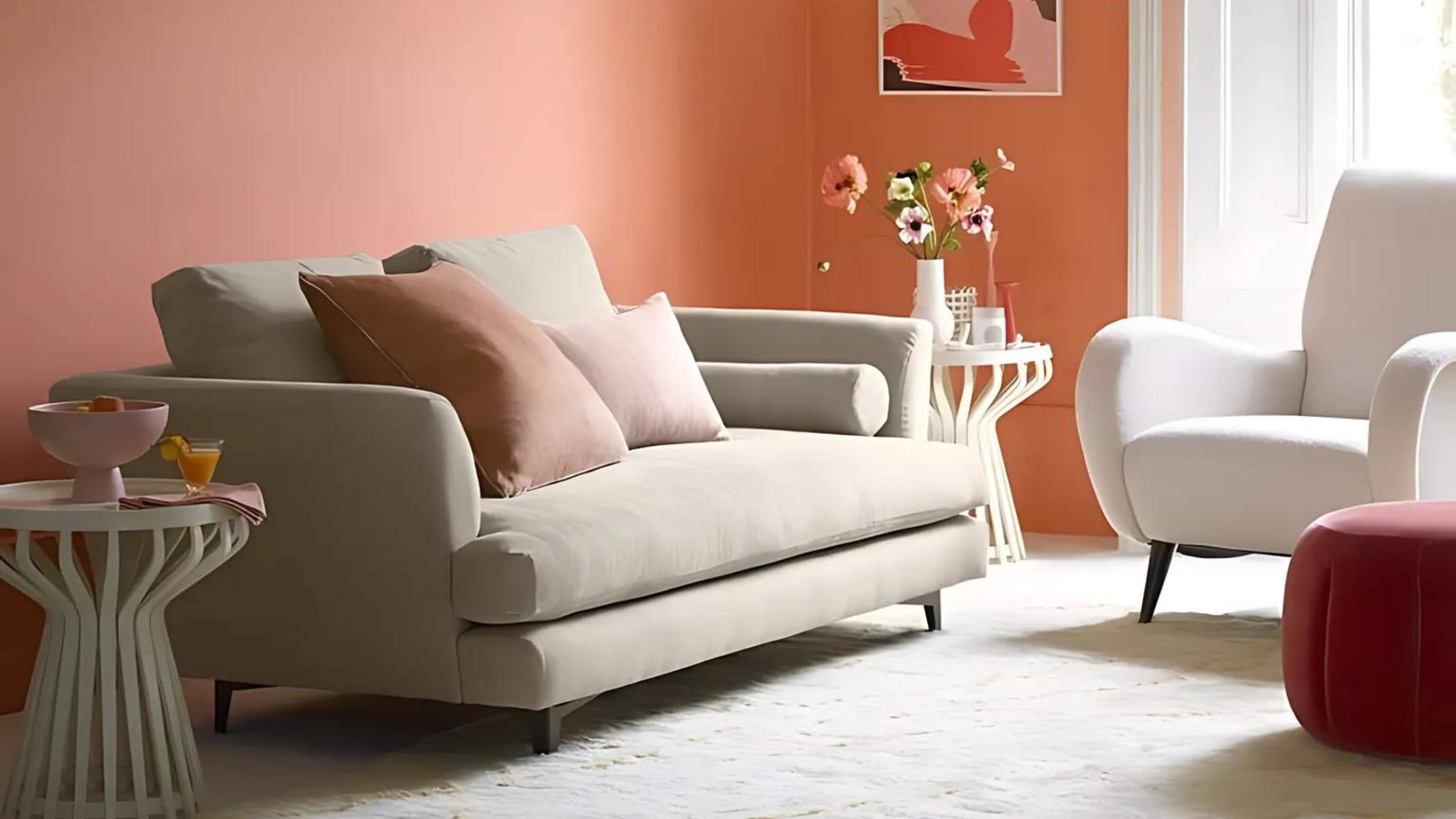
8 pink living room ideas – liven up your space with this joyful color

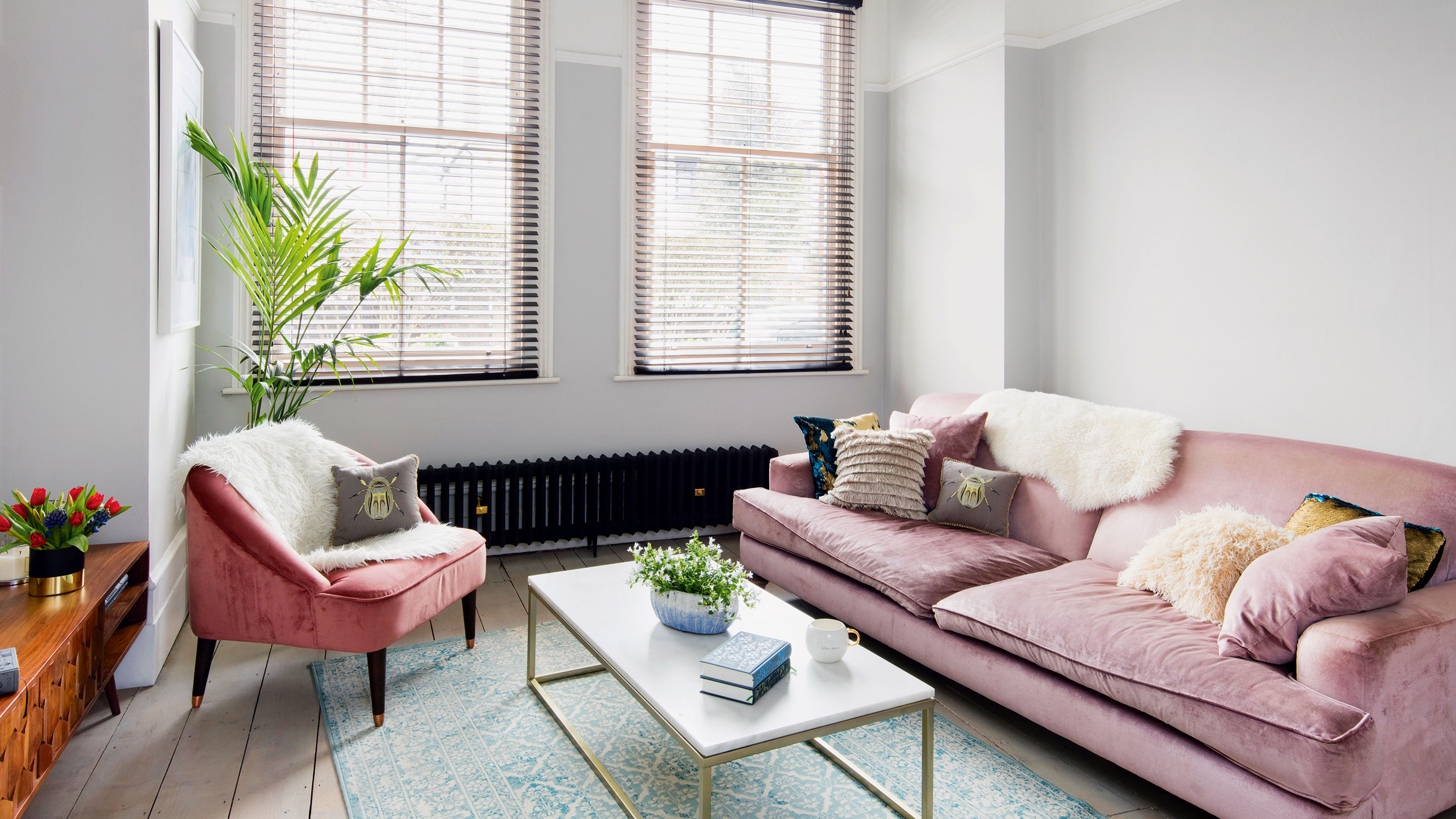
Pink and grey living room ideas - 11 ways to work this popular duo
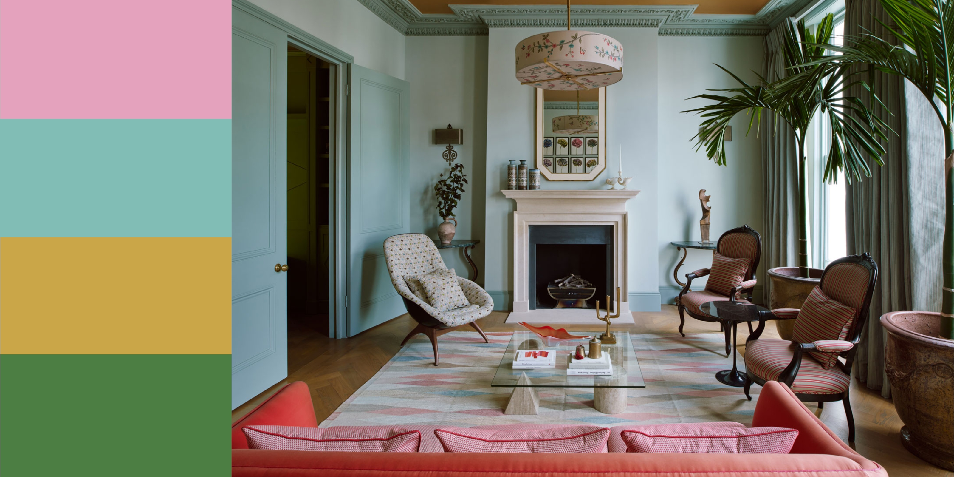
11 Colors That Go With Pink That Work in Homes Now
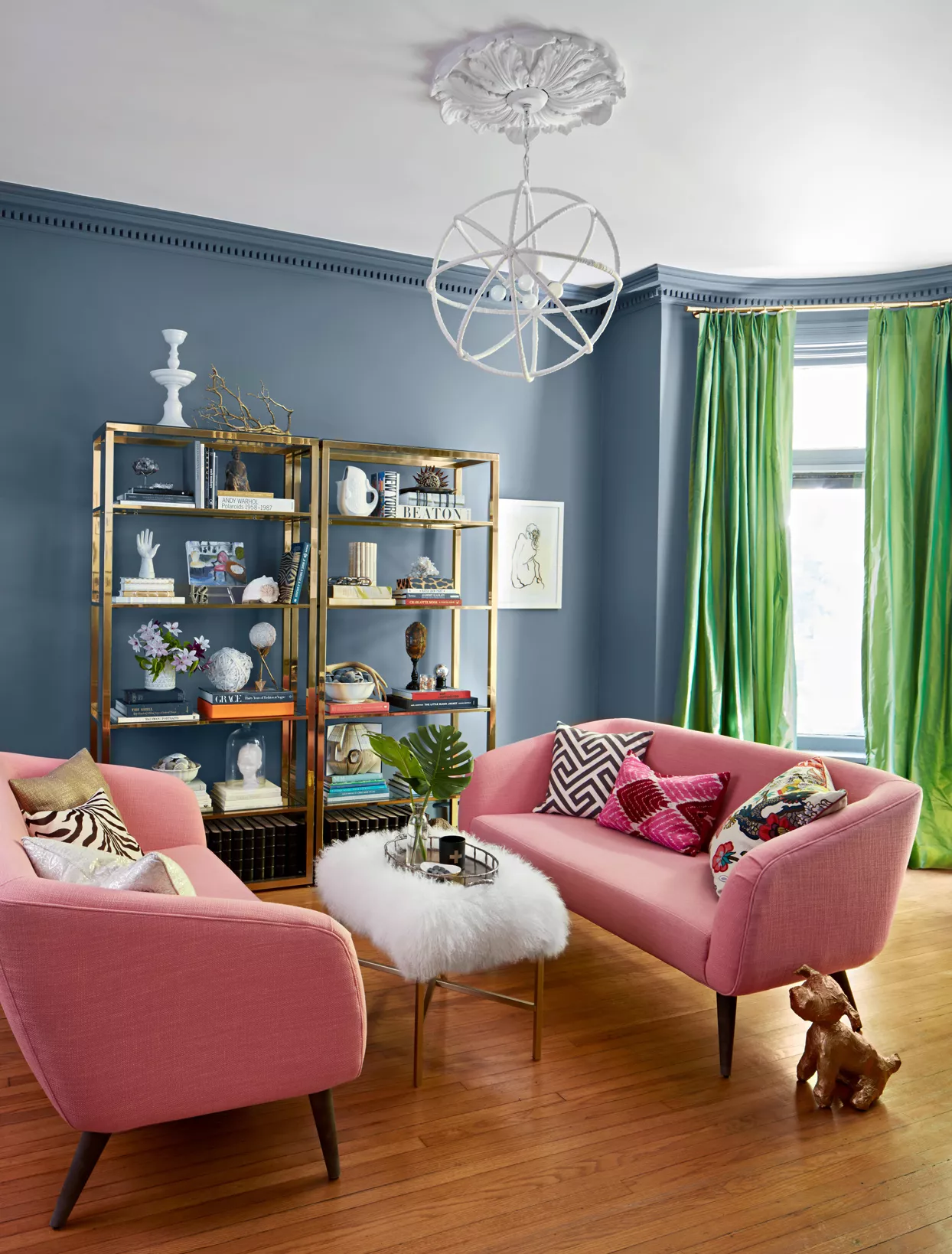
What Color Goes with Pink? 16 Pretty Pairings to Try

Pink room decor ideas: 28 ways to use this sweet shade
14 Chic Pink Color Combinations Designers Swear By

12 Colors That Go With Pink: Classic and Modern Ideas

How to decorate with plaster pink tones – 5 ways to bring this timeless yet trendy hue into your home

Pink and grey living room ideas – 10 ways designers have refreshed this soothing palette
Pink Room Decor Ideas: 39 Ways to Use the Shade Throughout Your Home
34 Dreamy Bedrooms That Will Make You Rethink Pink

You Should Seriously Consider Painting Your Ceiling Pink—Here's Why

21 Colors That Go With Light Pink That Work in Any Room
Pretty in pink: decorating ideas for this year's hottest colour | loveproperty.com
18 sophisticated pink paint colors recommended by interior designers

Color Therapy: Design That’s Pretty in Pink
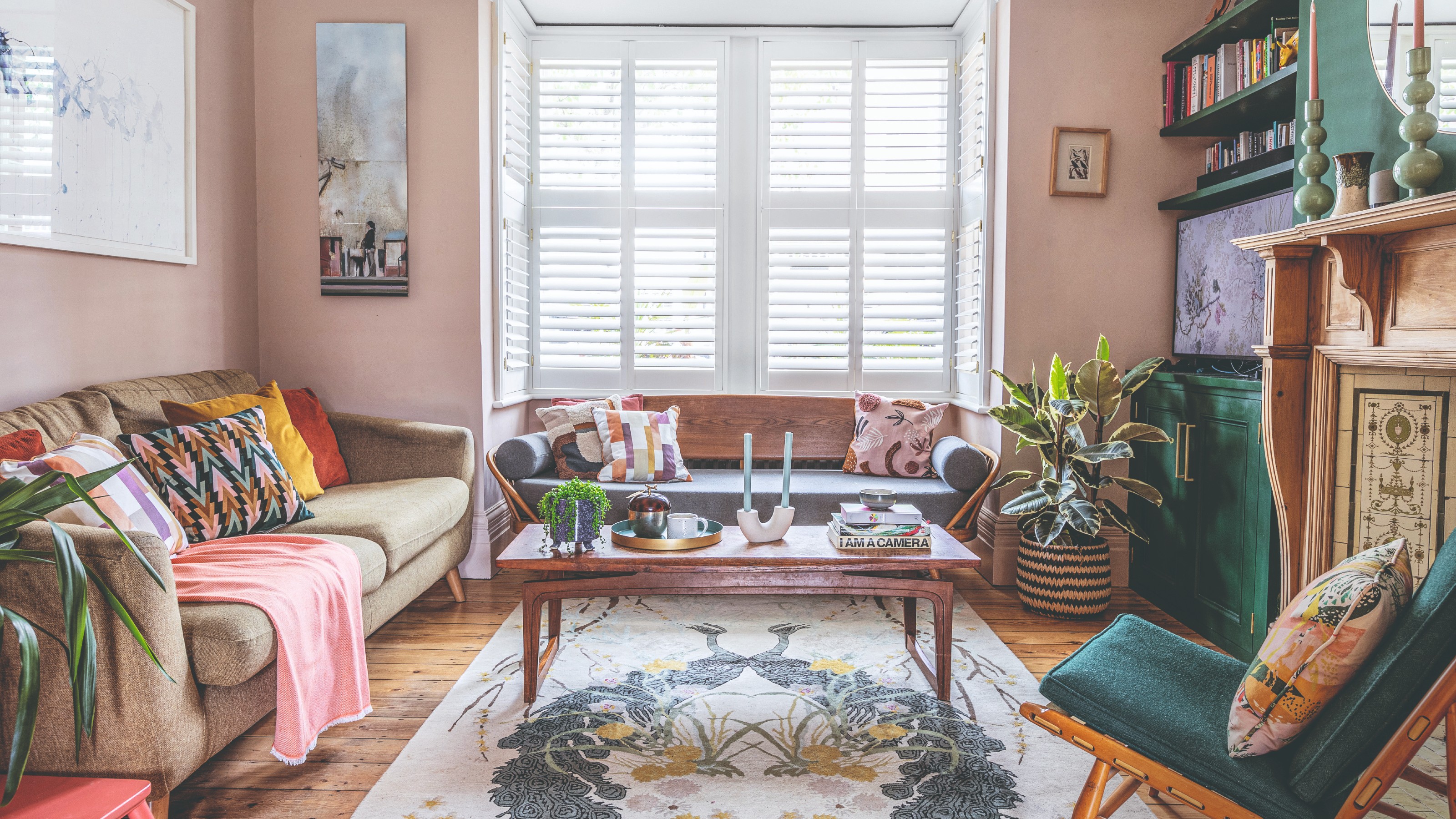
13 sophisticated pink living room ideas to inject your lounge with this new calming neutral
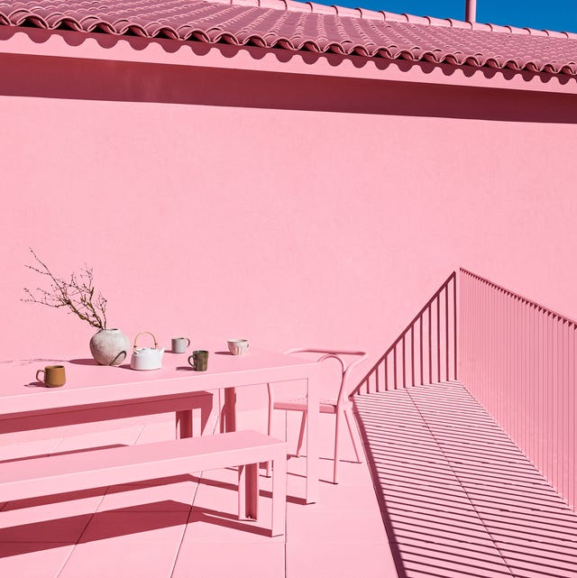
25 Pink Room Ideas to Satisfy Your Barbiecore Dreams

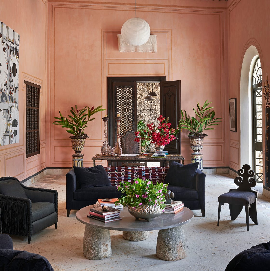
The *Right* Way to Decorate with Pink, According to Design Experts
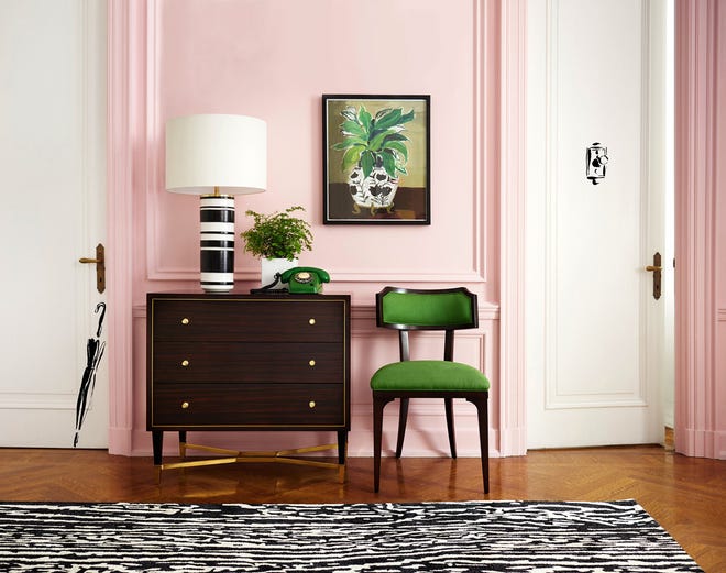
Home design: Add some pink