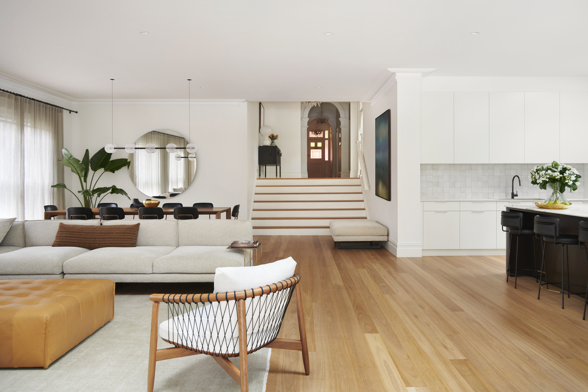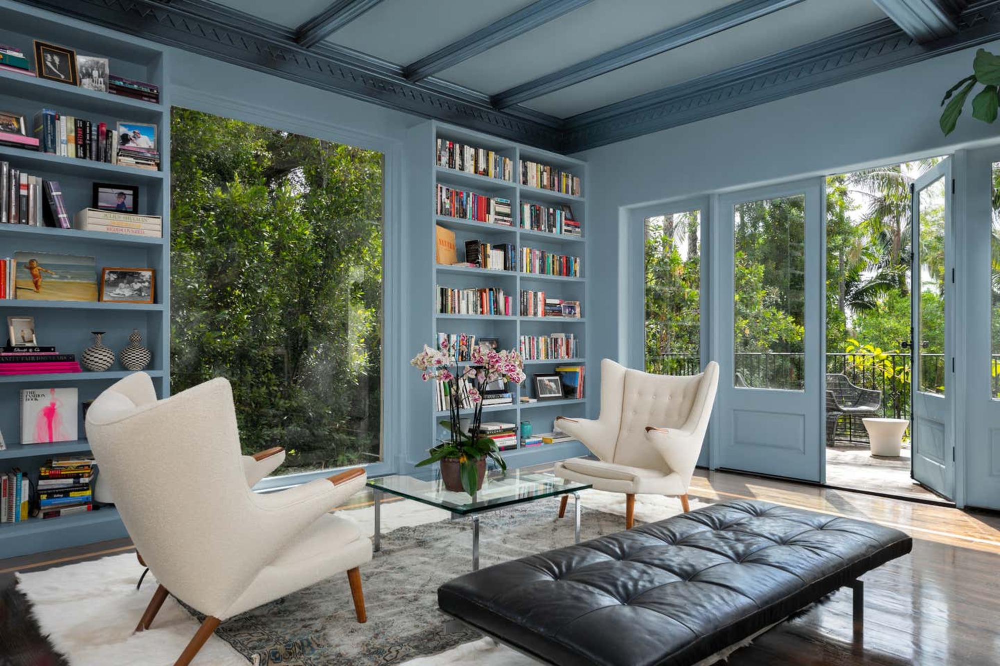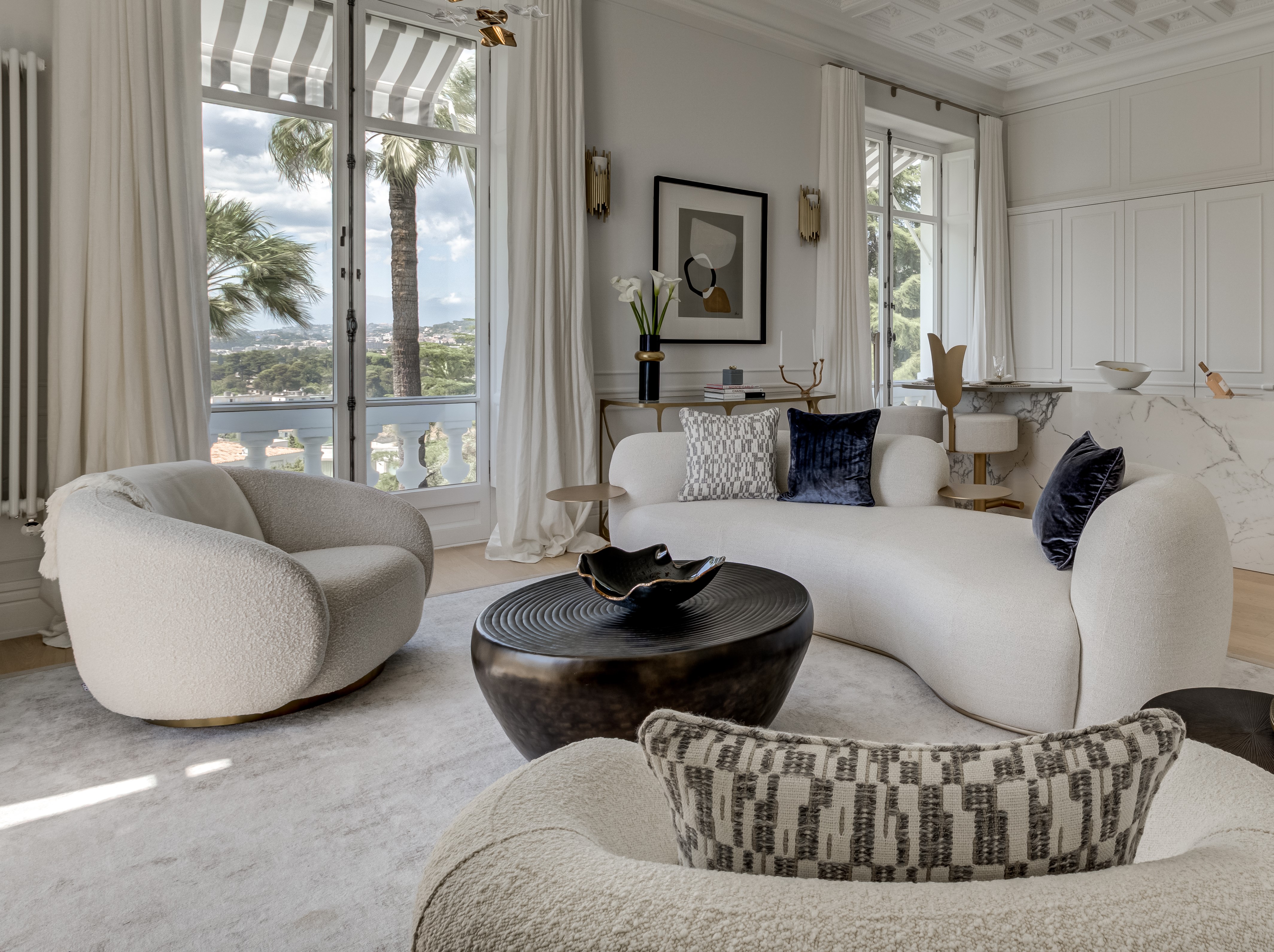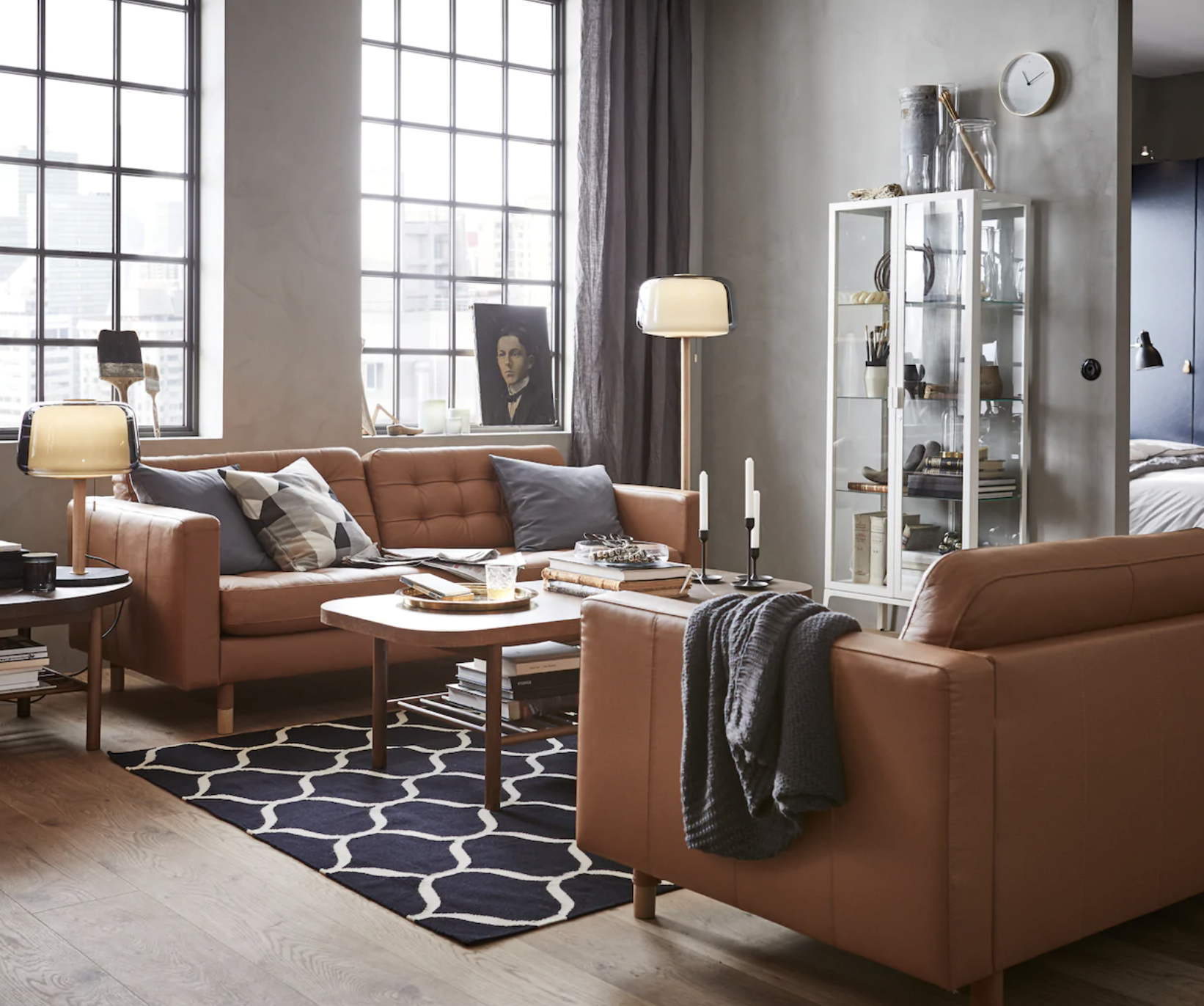
A versatile neutral, gray goes with anything
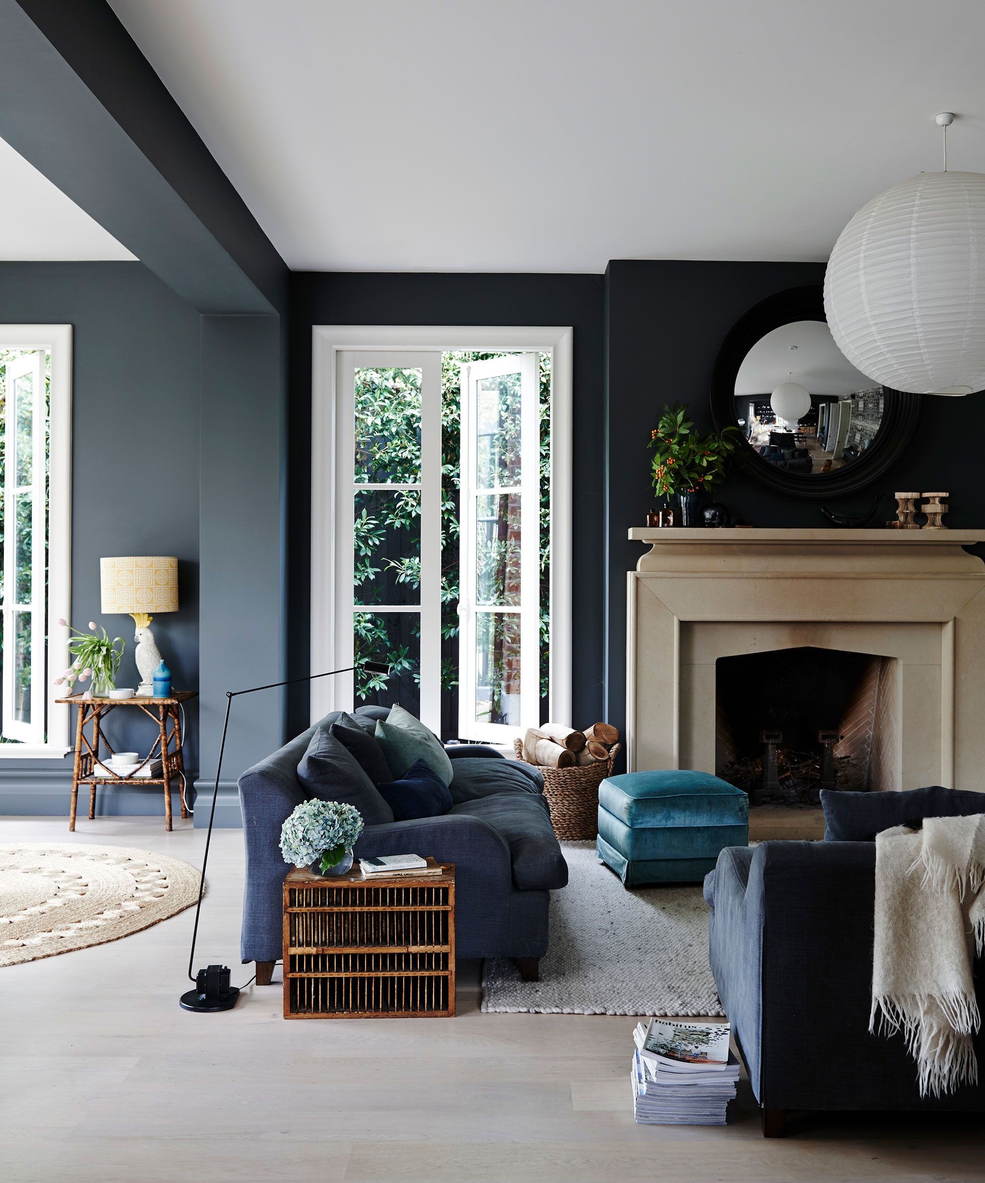
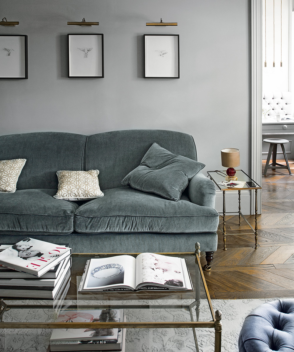
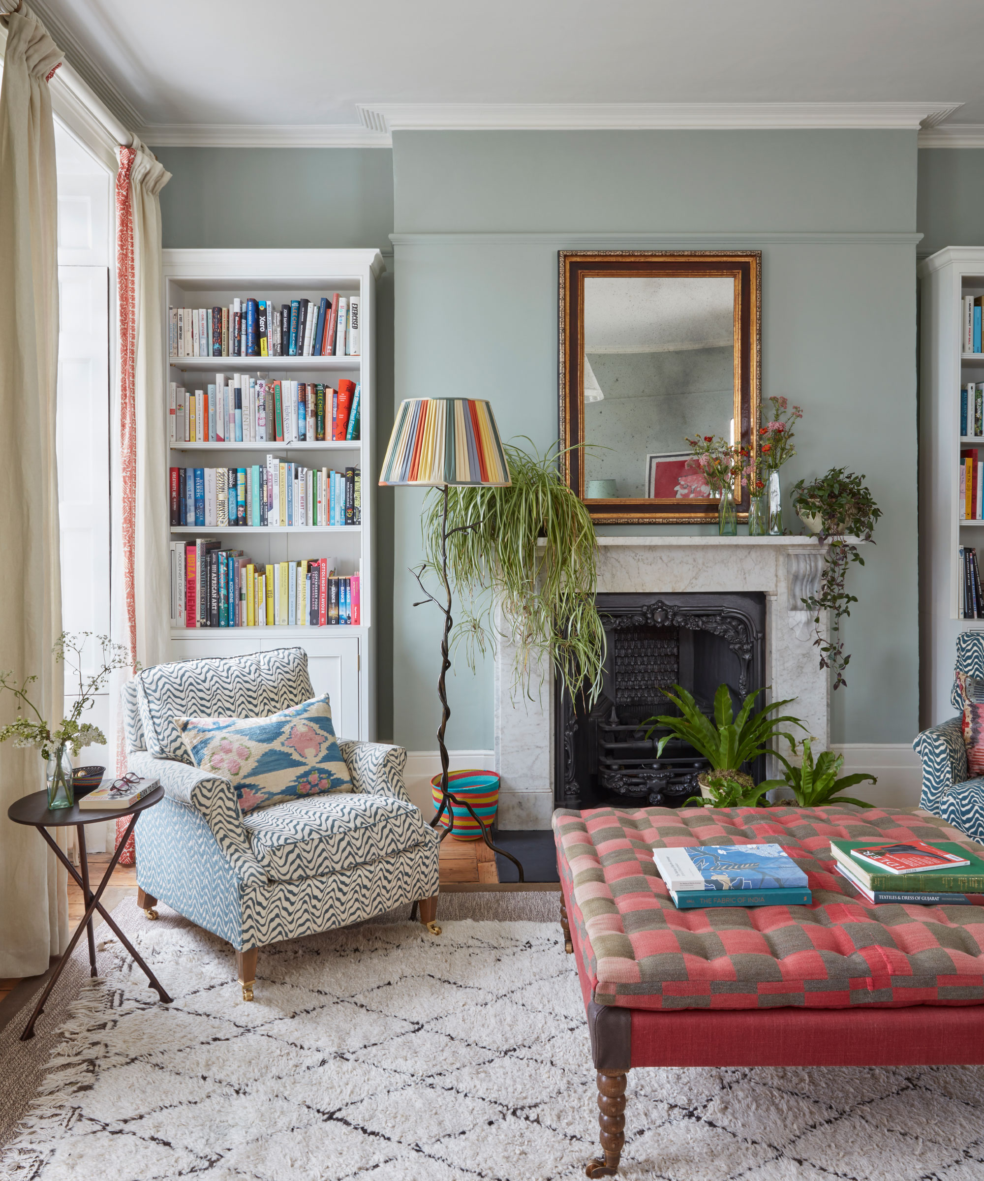
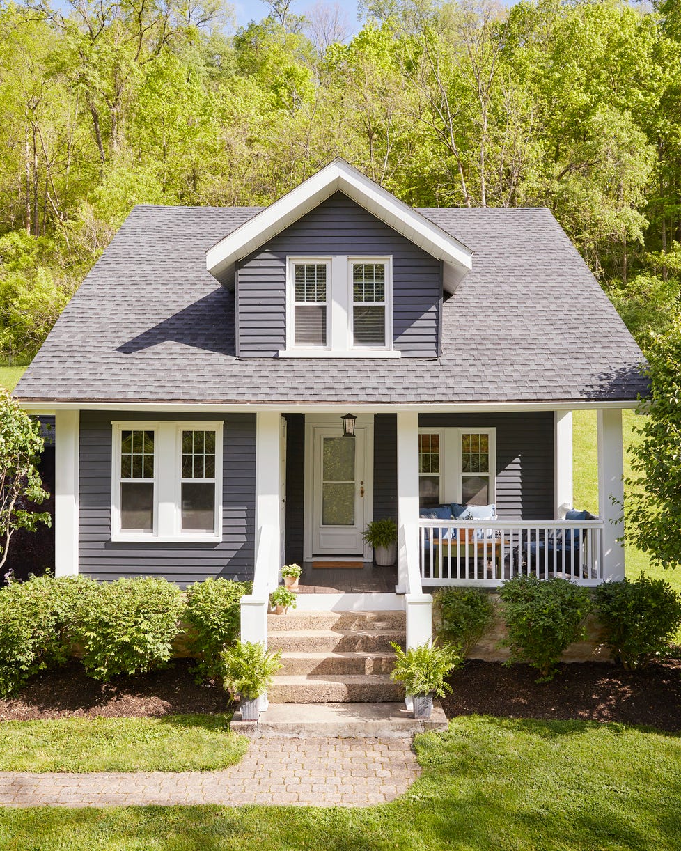
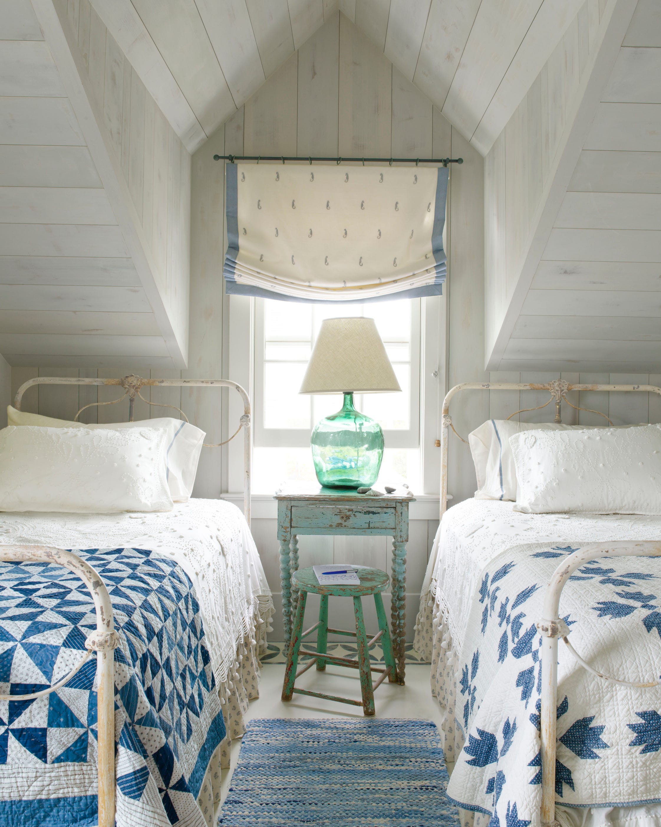
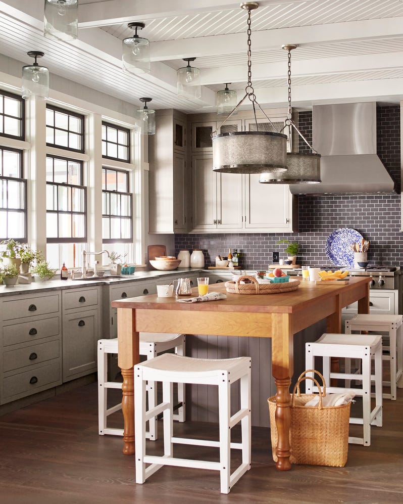
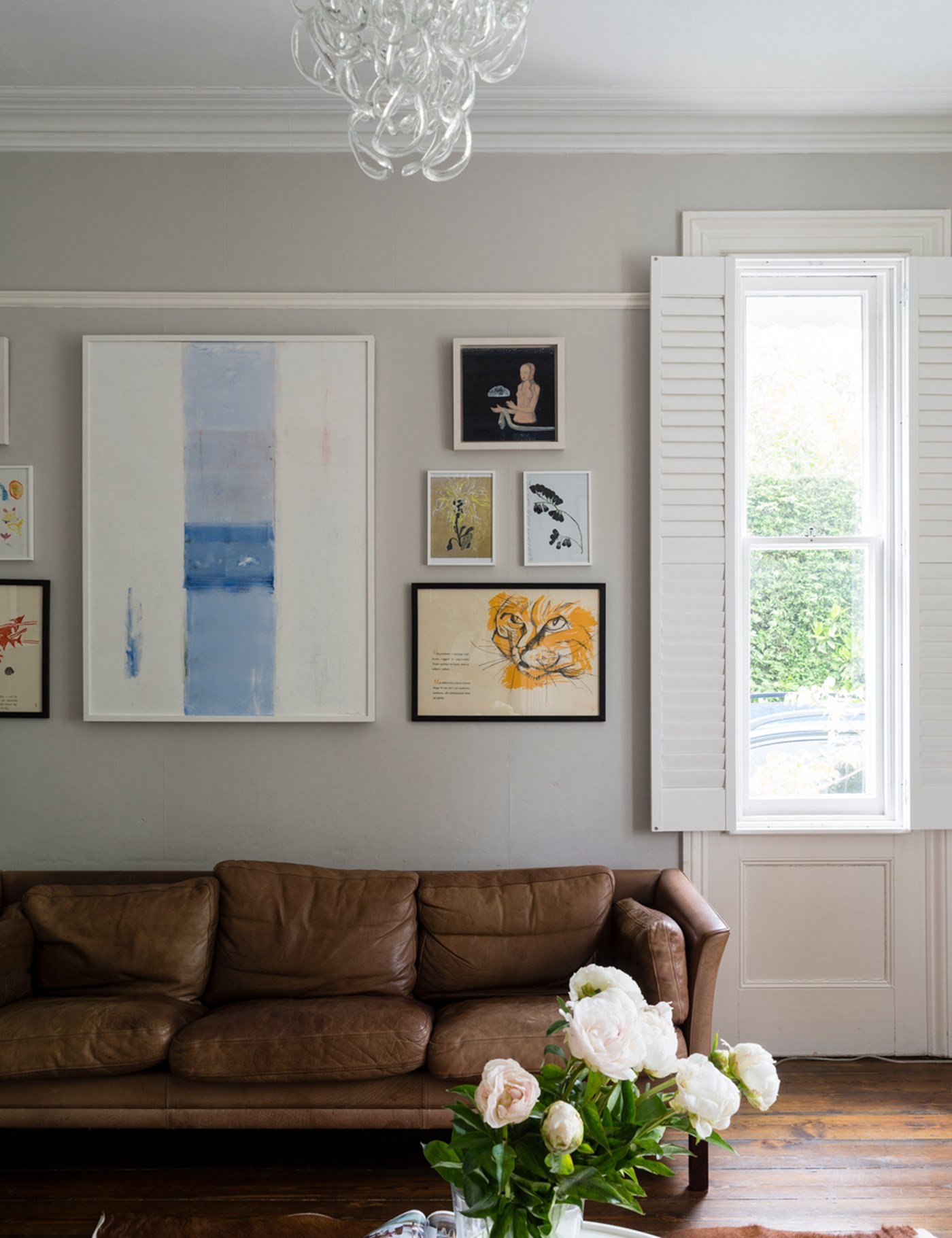
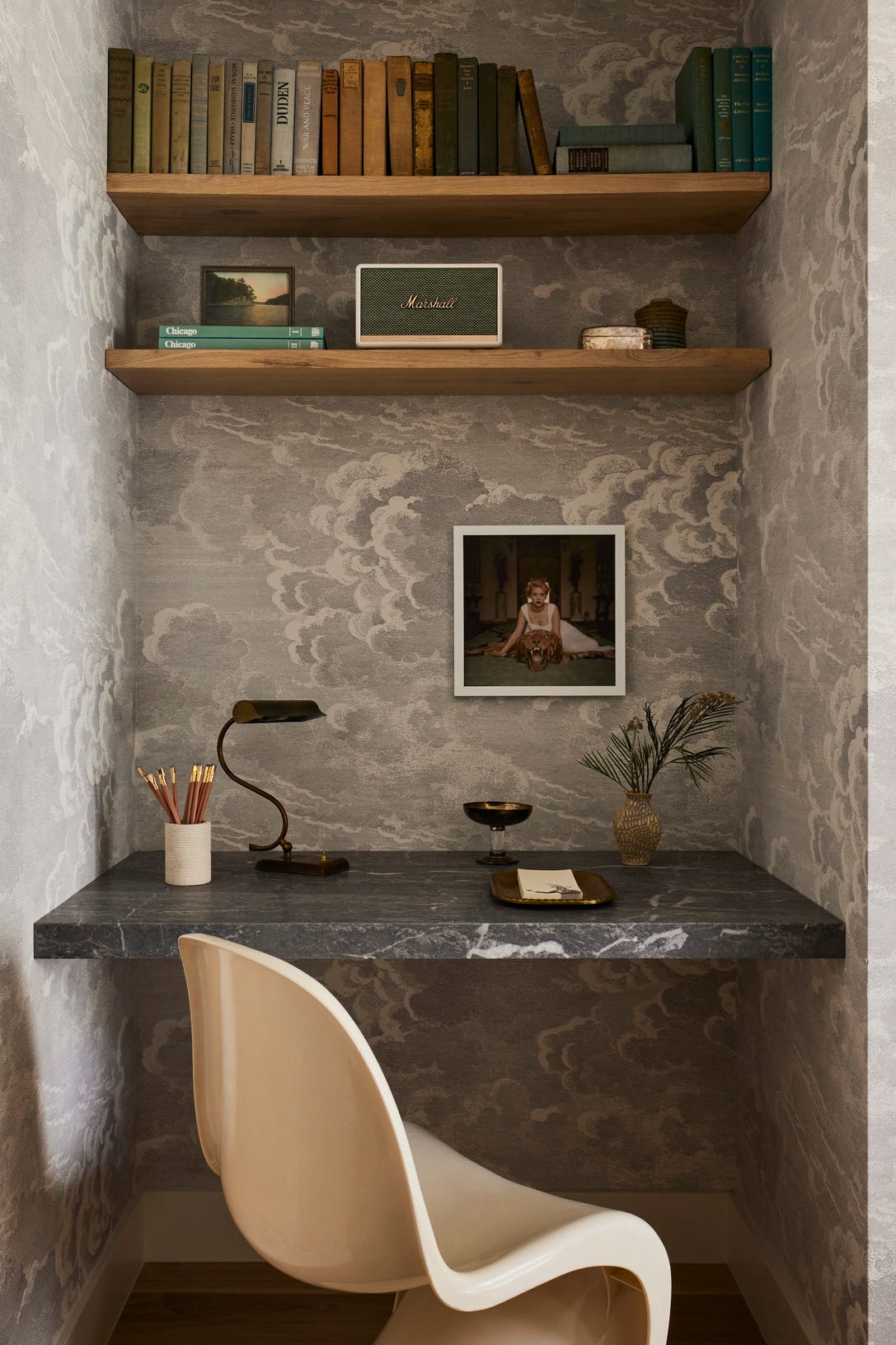
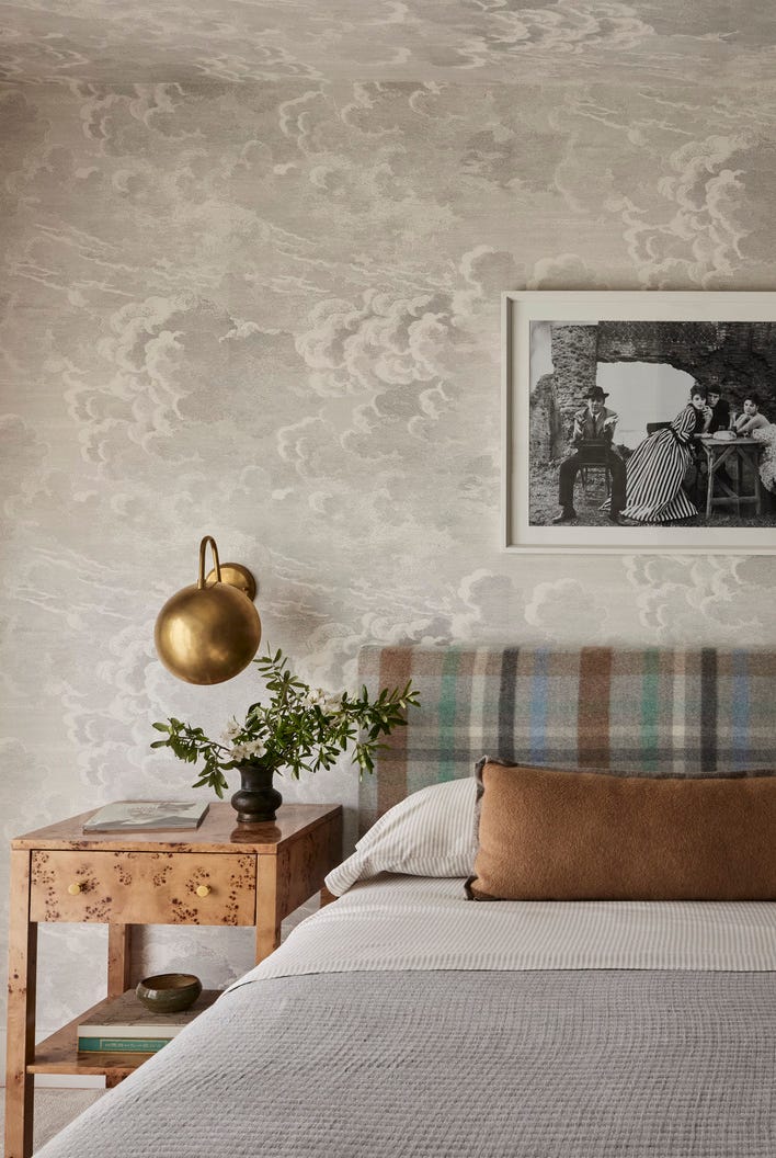
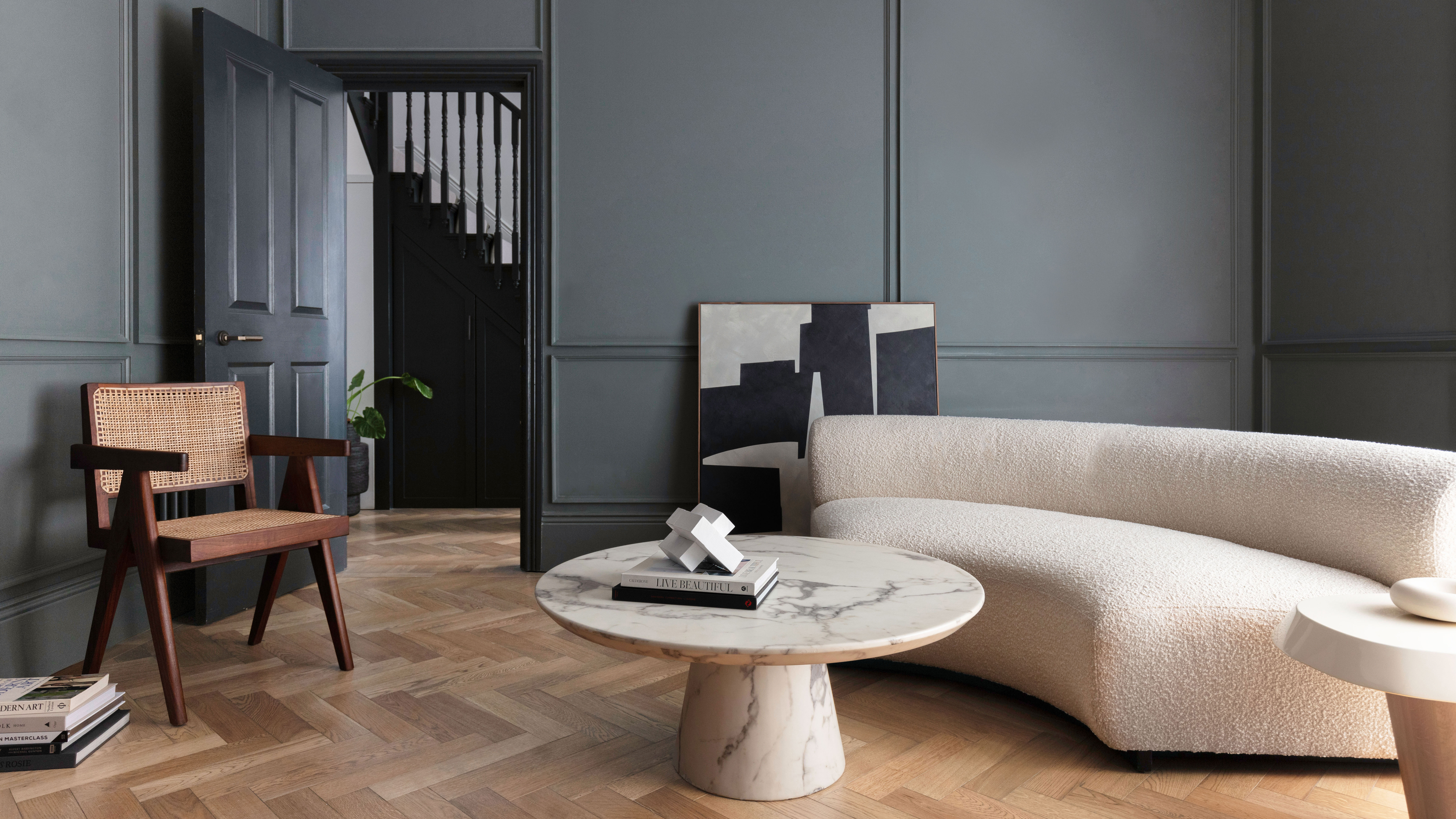
Gray has evolved into a predominant neutral color in interior design, moving past its previous perception as a depressing and difficult hue. Designers now consider gray a versatile solution for various design challenges. It can soften bold colors, making them appear more subtle and sophisticated, and pairs well with almost any color on the color wheel, a characteristic not shared by older neutrals like tan and beige.
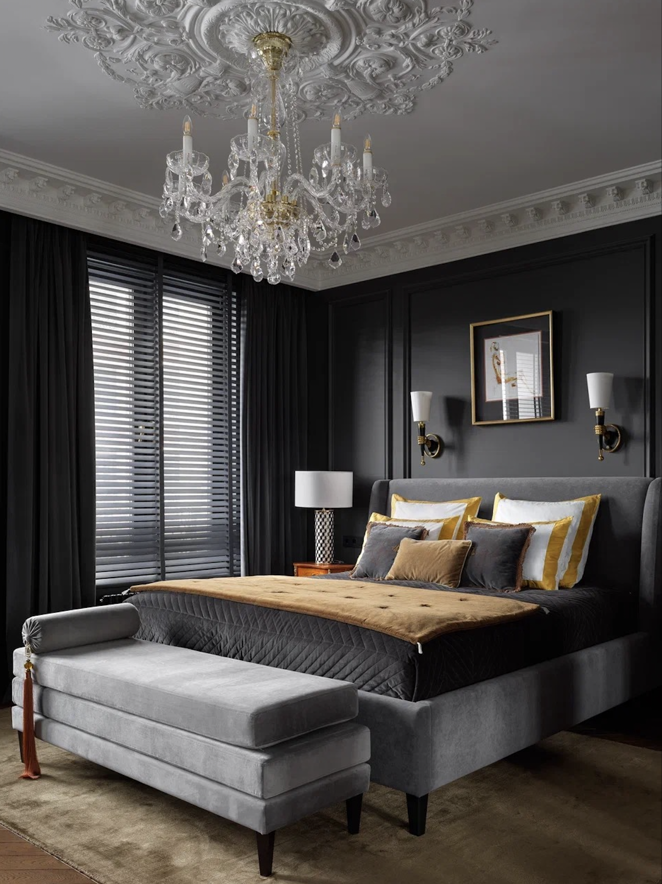
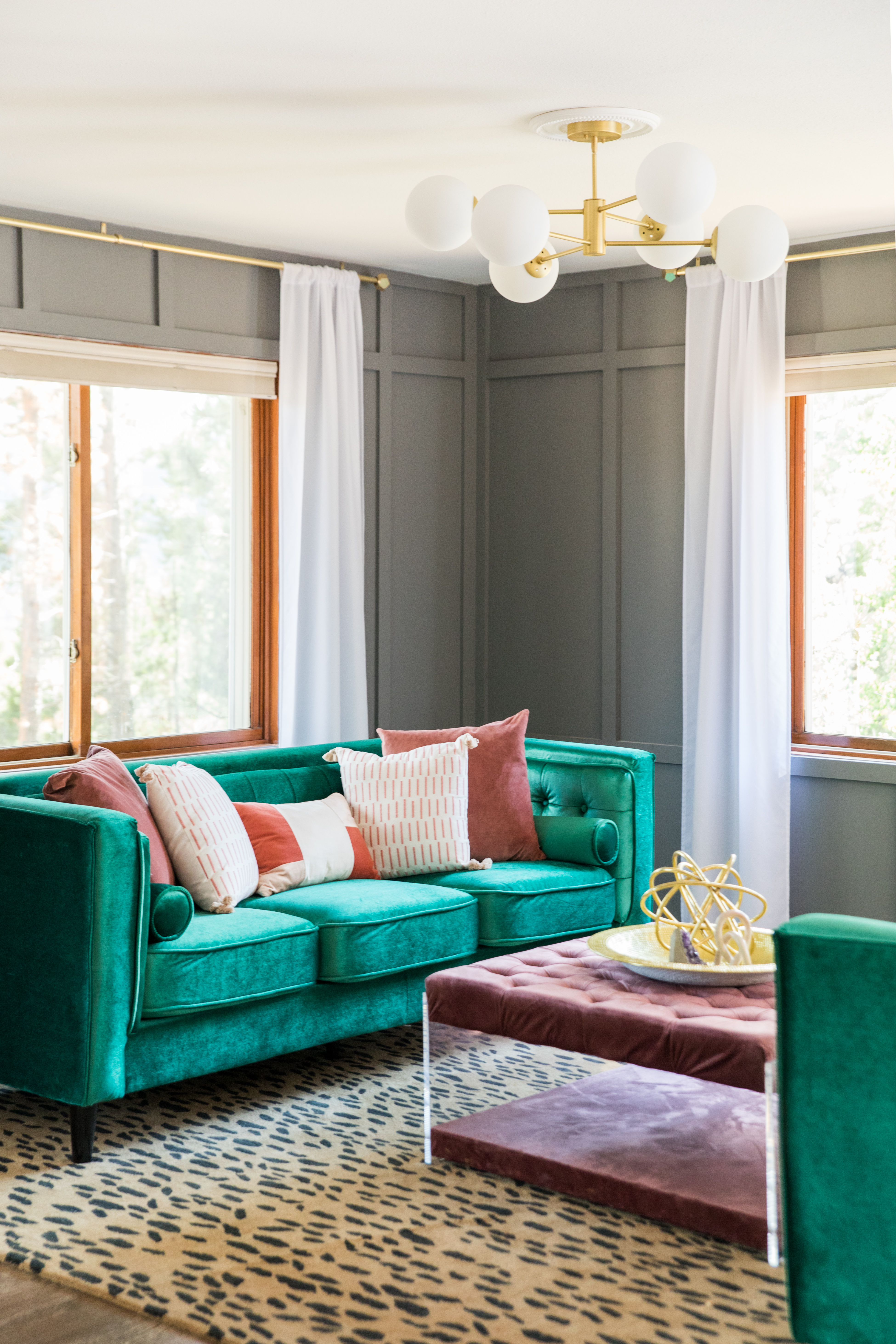
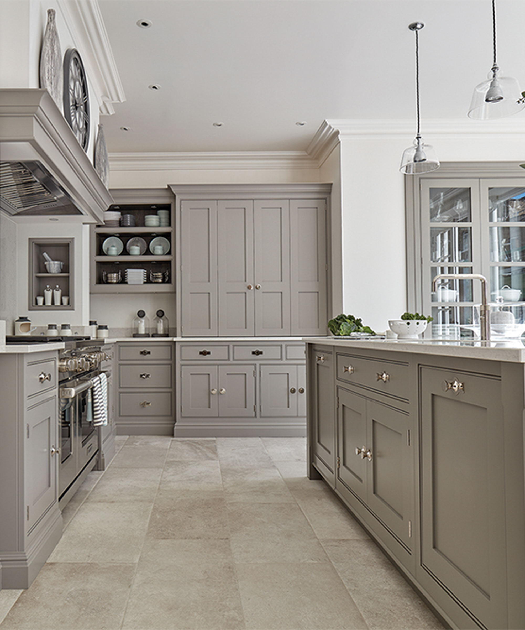
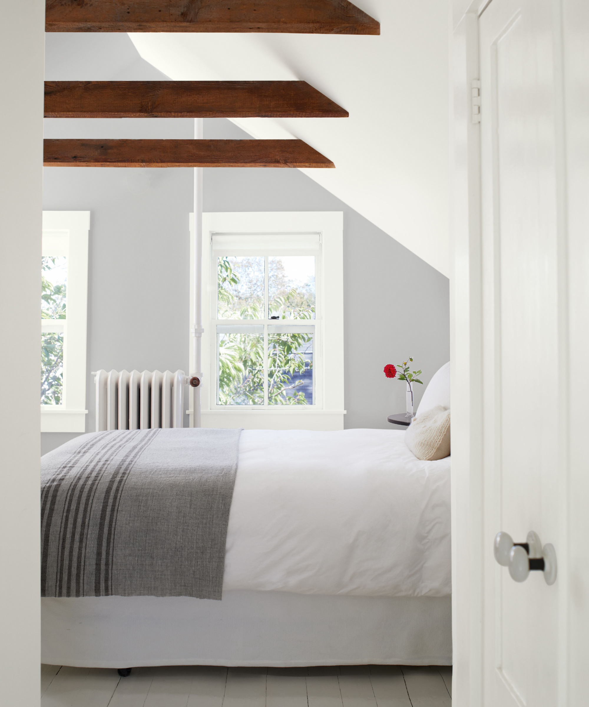
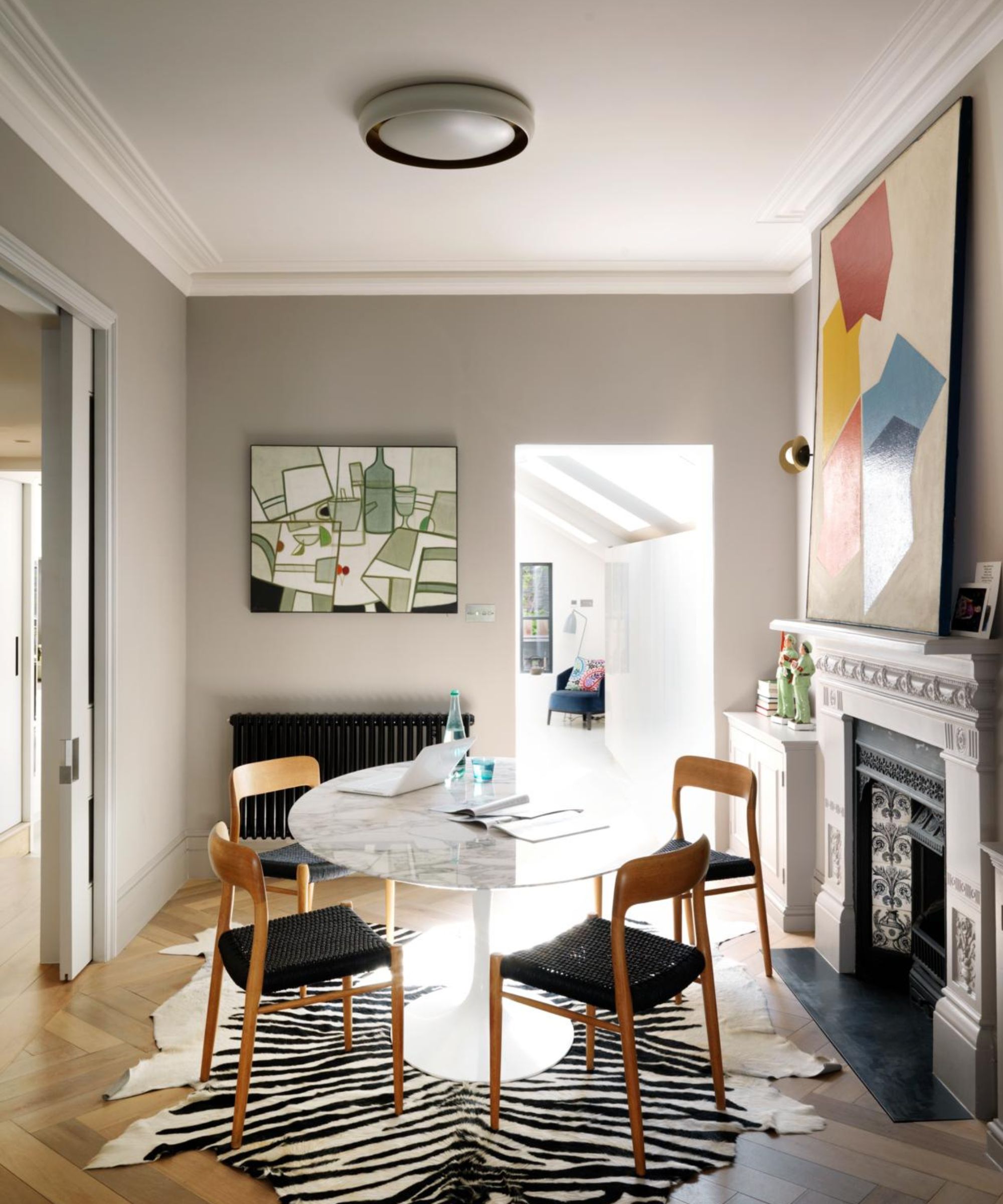

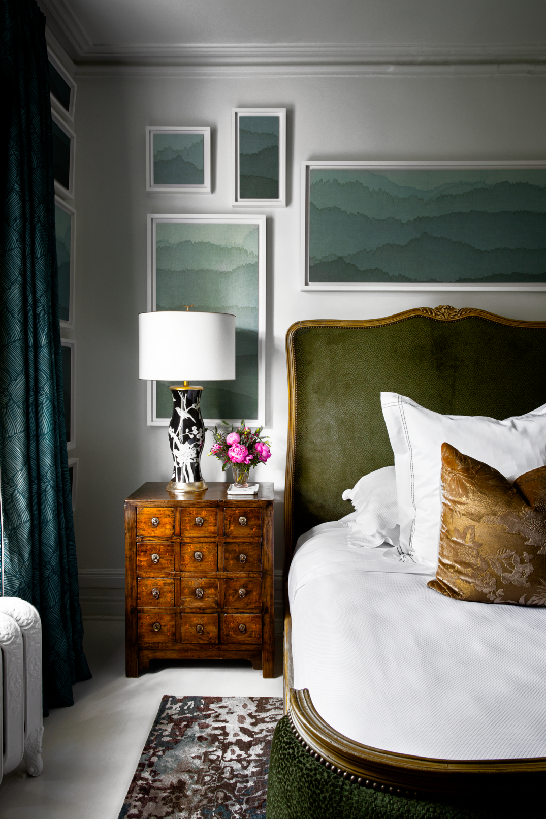
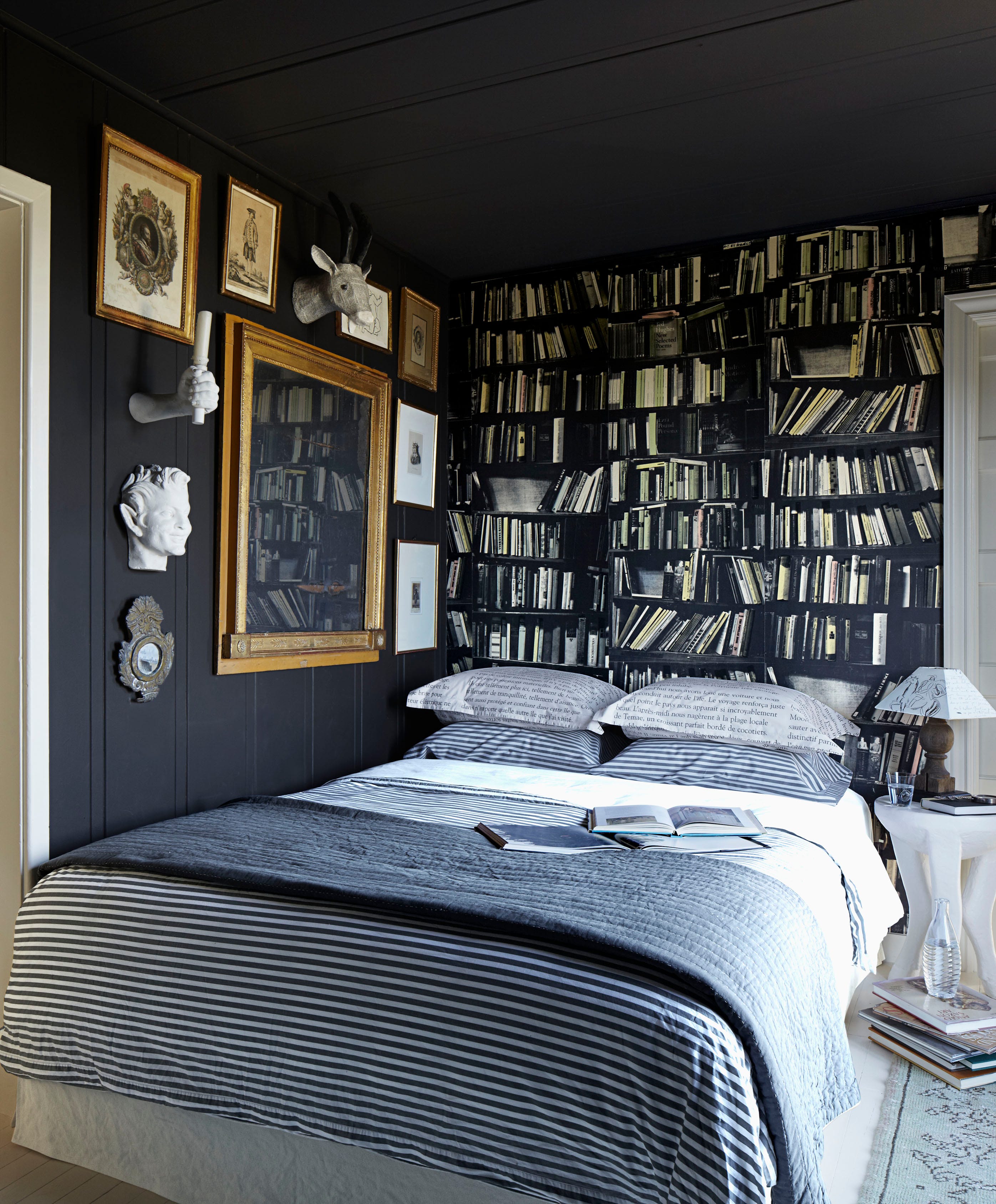
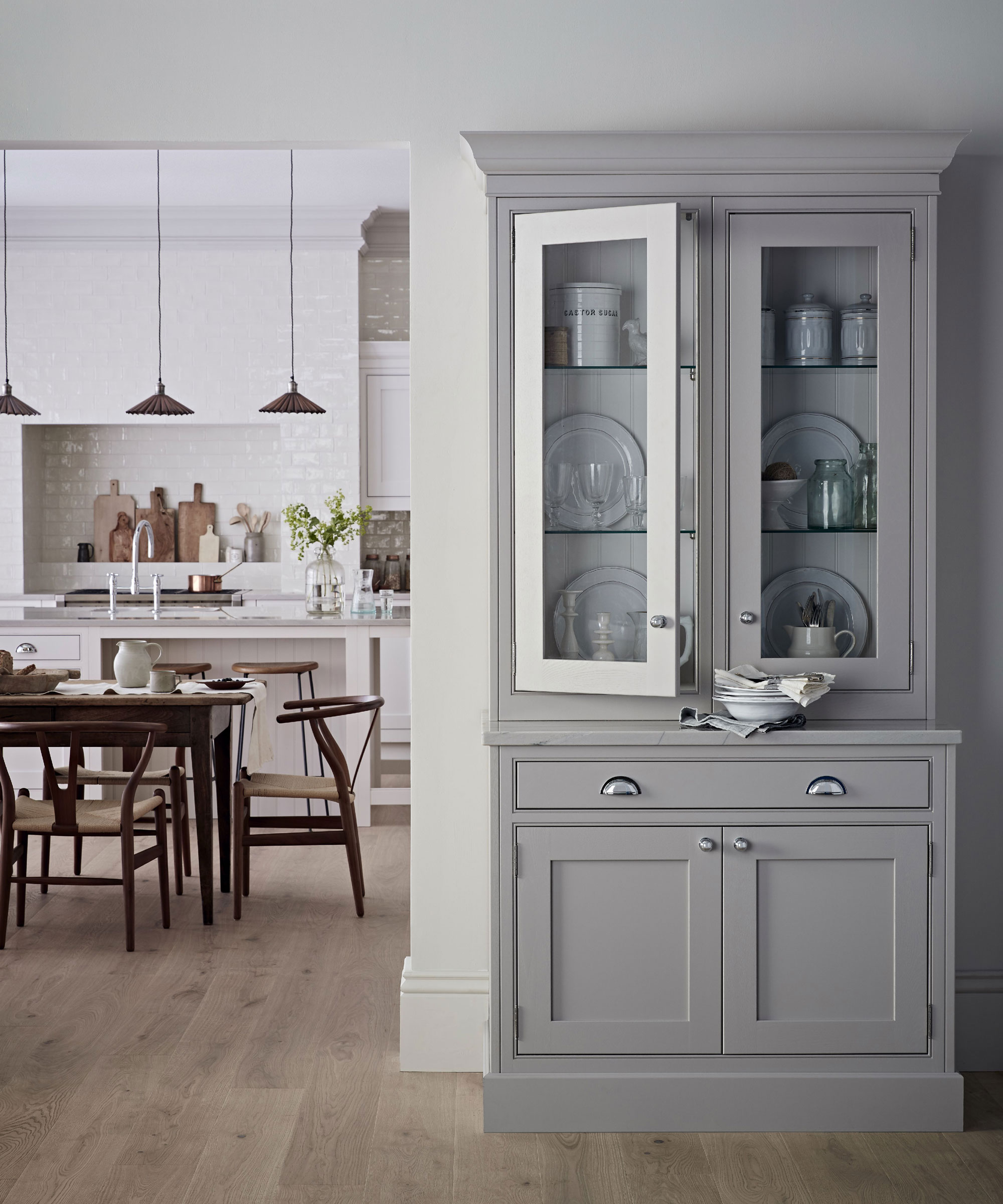
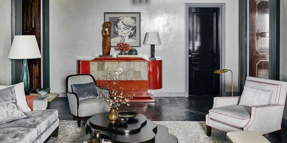
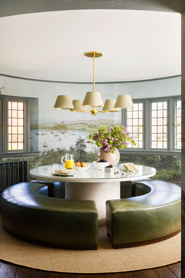
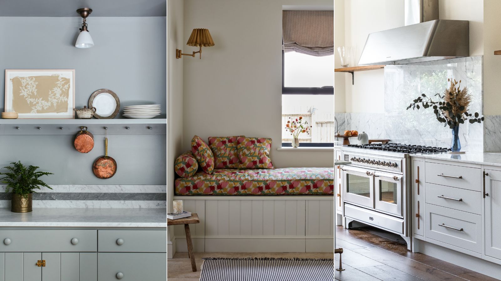
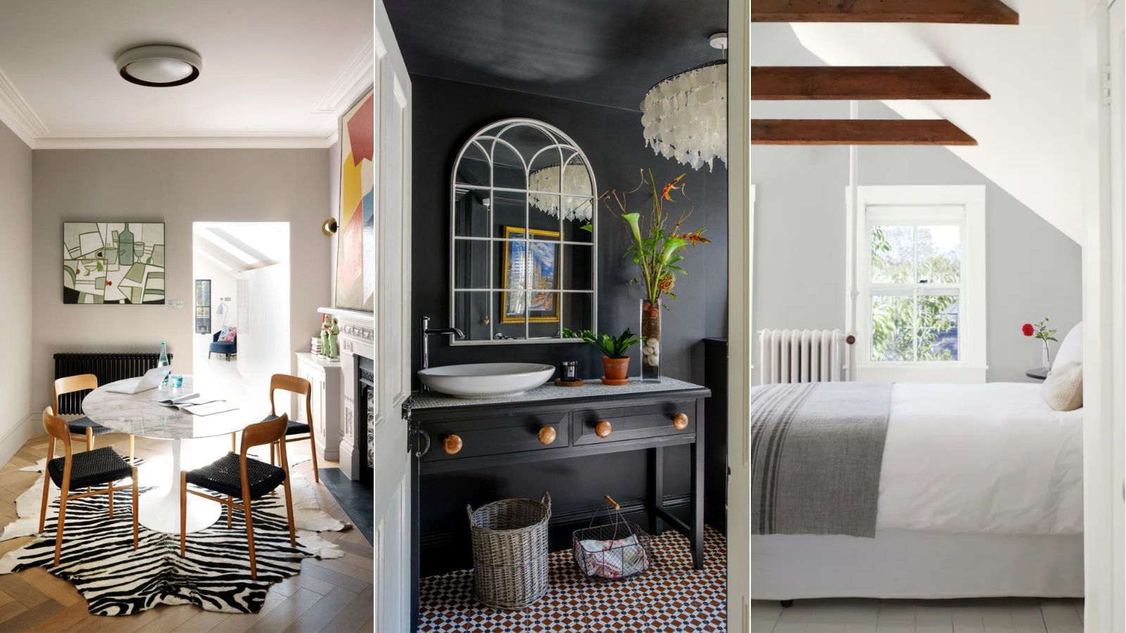
Gray's adaptability extends to all decorating styles, from traditional to modern, and can create a significant visual impact without requiring a large quantity of accents. Interior designers like Betsy Burnham utilize dark gray kitchen cabinetry with a satin finish and softer shades like Benjamin Moore's "Gray Owl" for walls, often complemented by crisp white trim. Brian Patrick Flynn employs gray to moderate more dramatic colors, such as pairing it with "greige" to reduce the contrast with black or using dove gray or blue gray as a backdrop for vibrant reds or oranges. He also suggests a sophisticated combination of charcoal gray with dark hunter green and black for a glamorous yet rustic aesthetic.
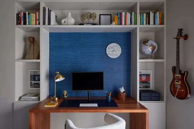
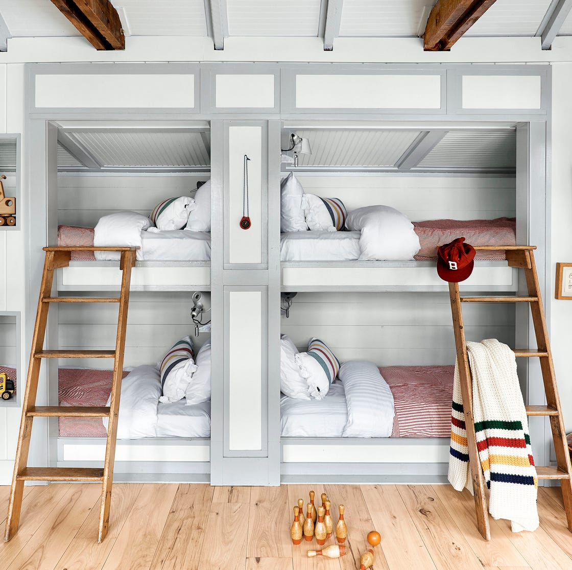
Furthermore, gray is a practical choice for children's rooms and nurseries due to its gender-neutral quality and ability to be accented with a wide array of colors. Mollie Ranize advocates for mixing grays with deep shades of plum and various blues, from navy to teal, to achieve an emotional impact without overwhelming the space.
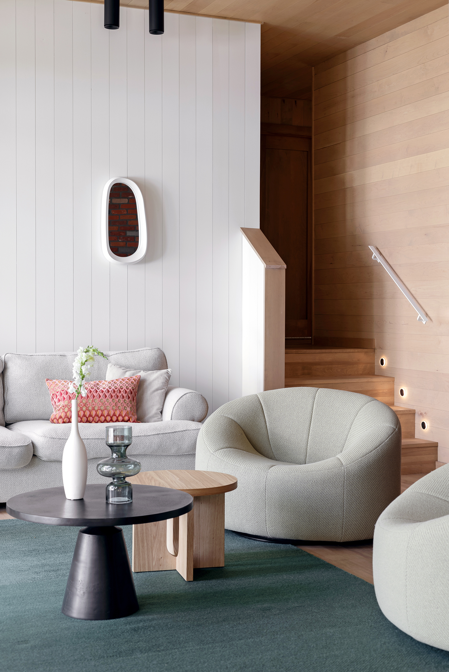
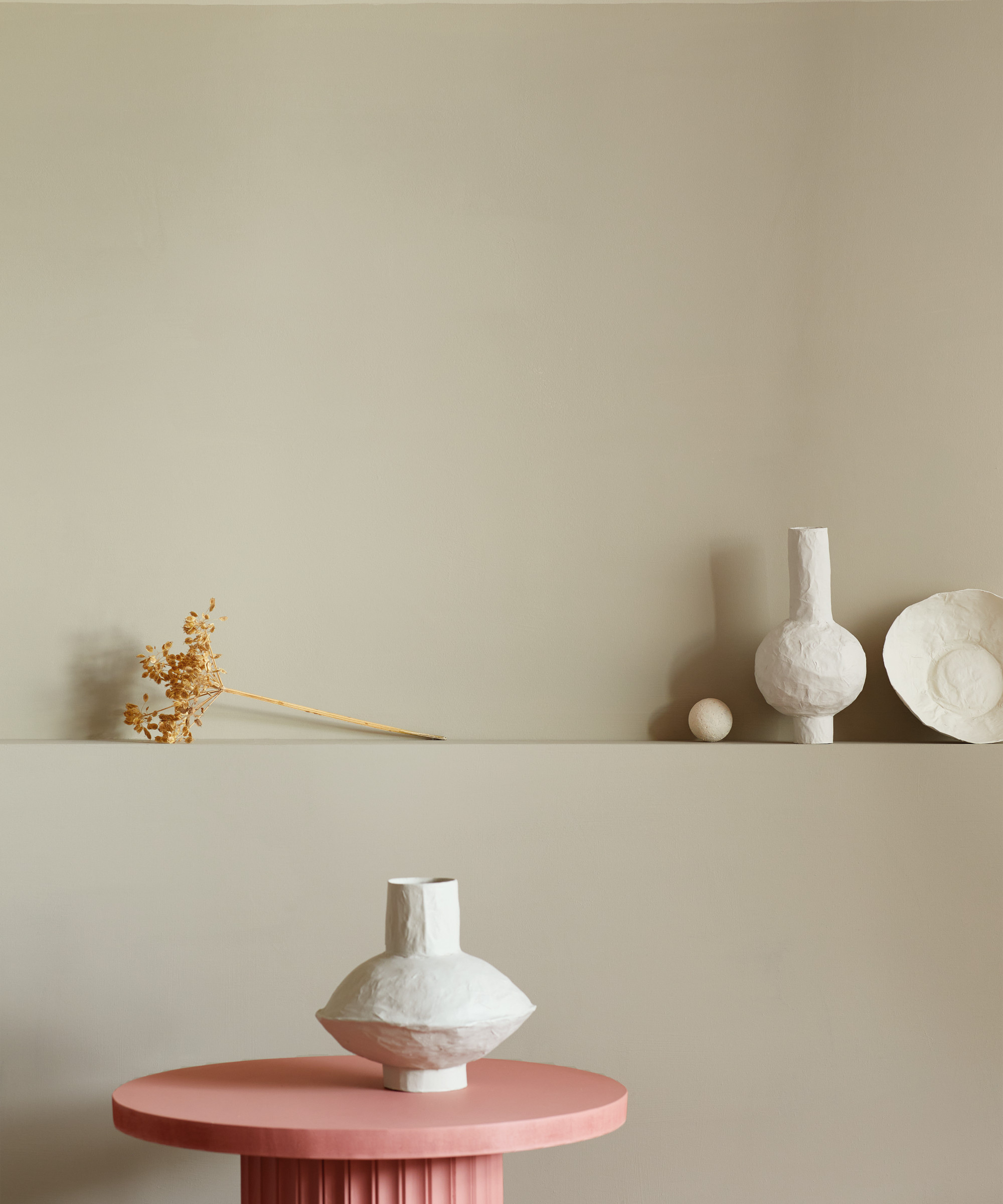
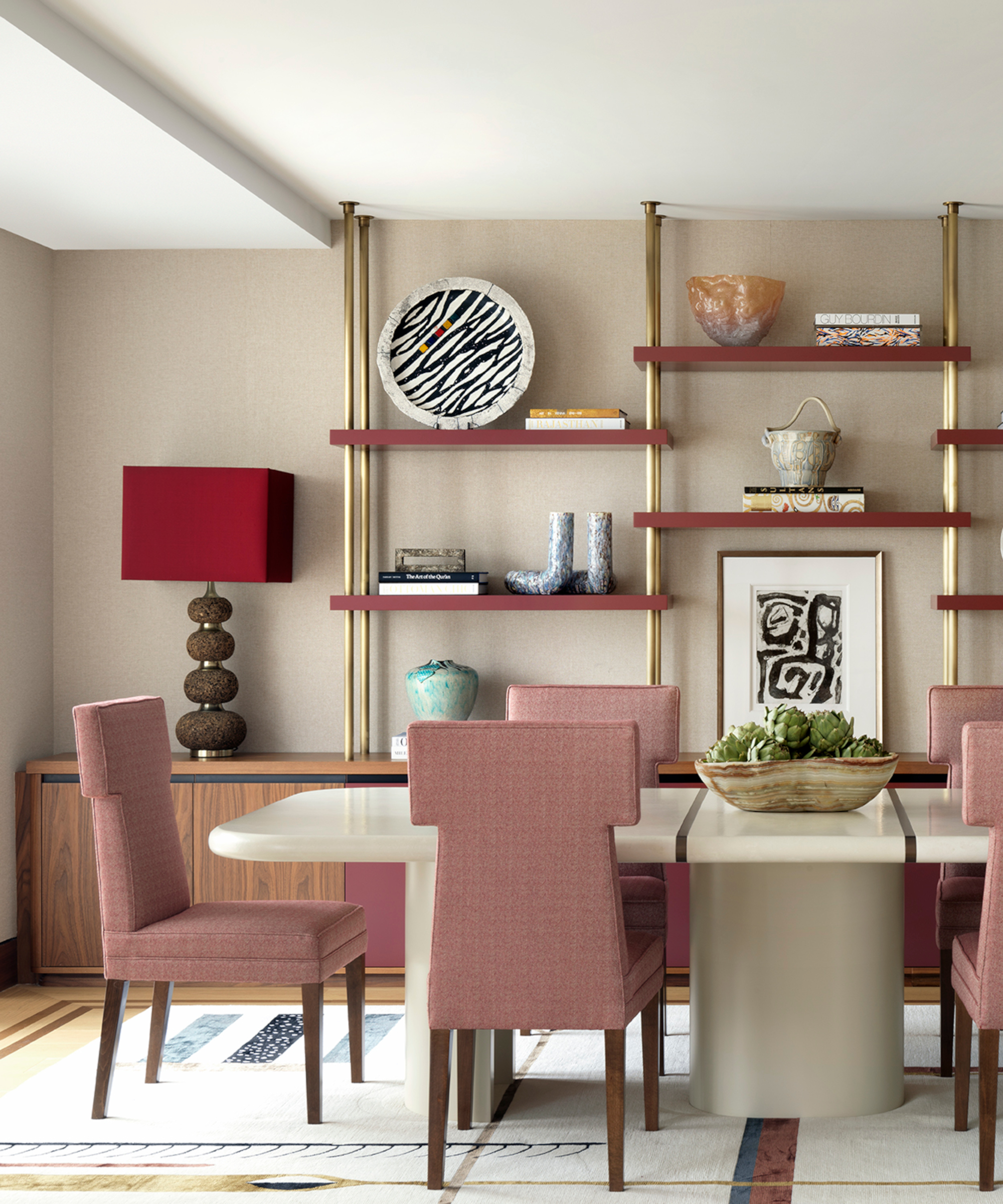
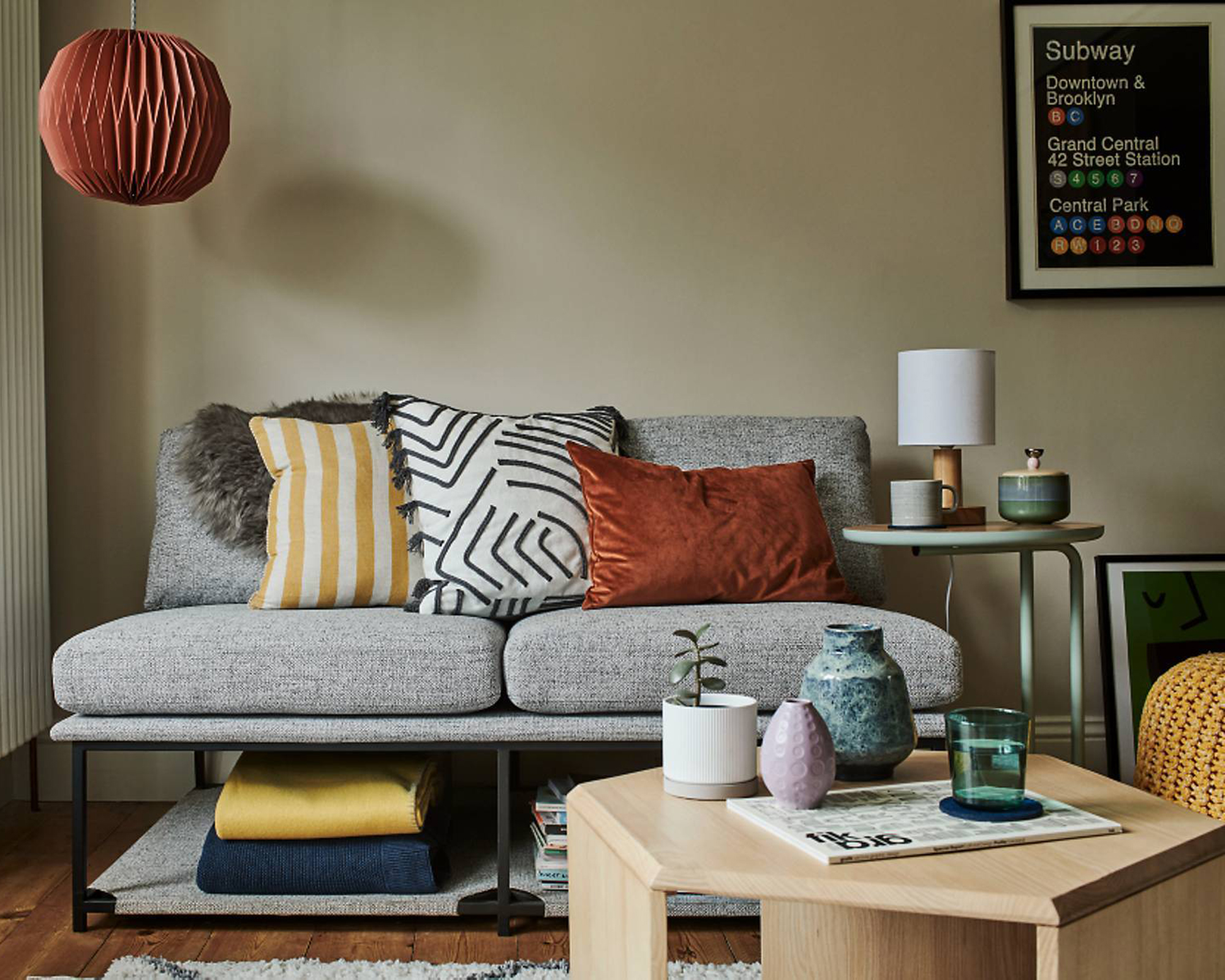
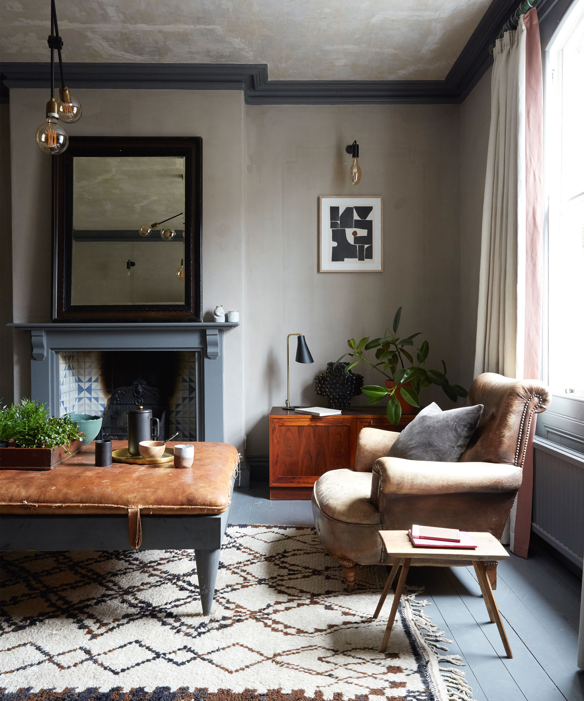
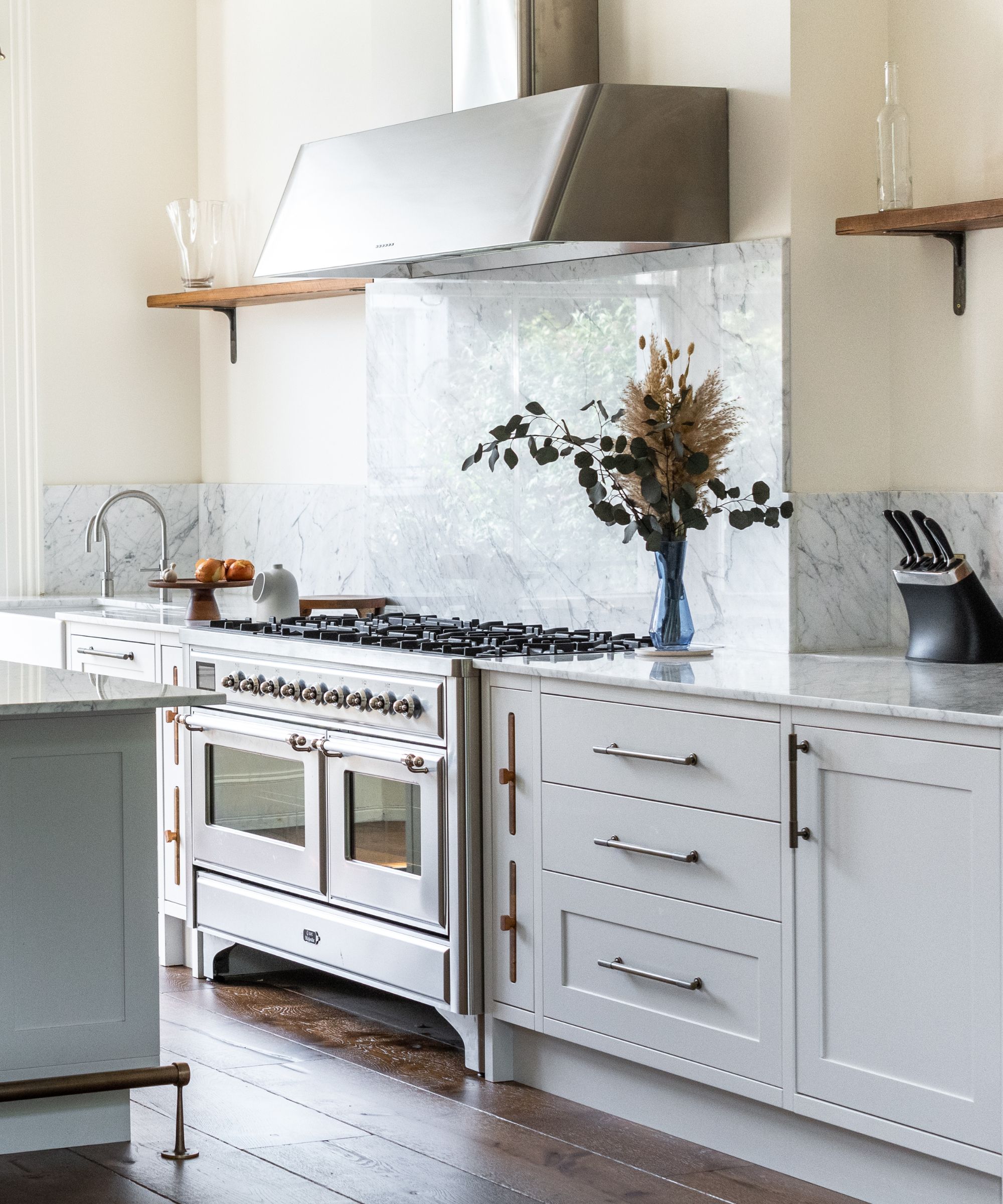
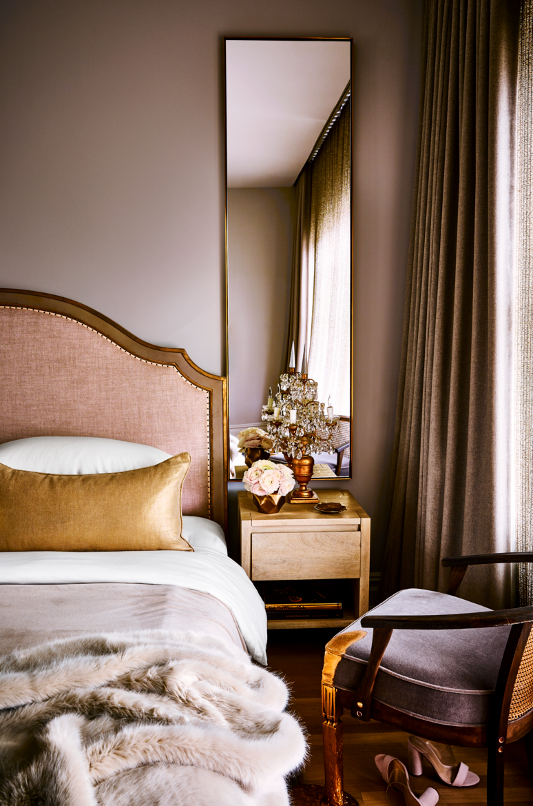
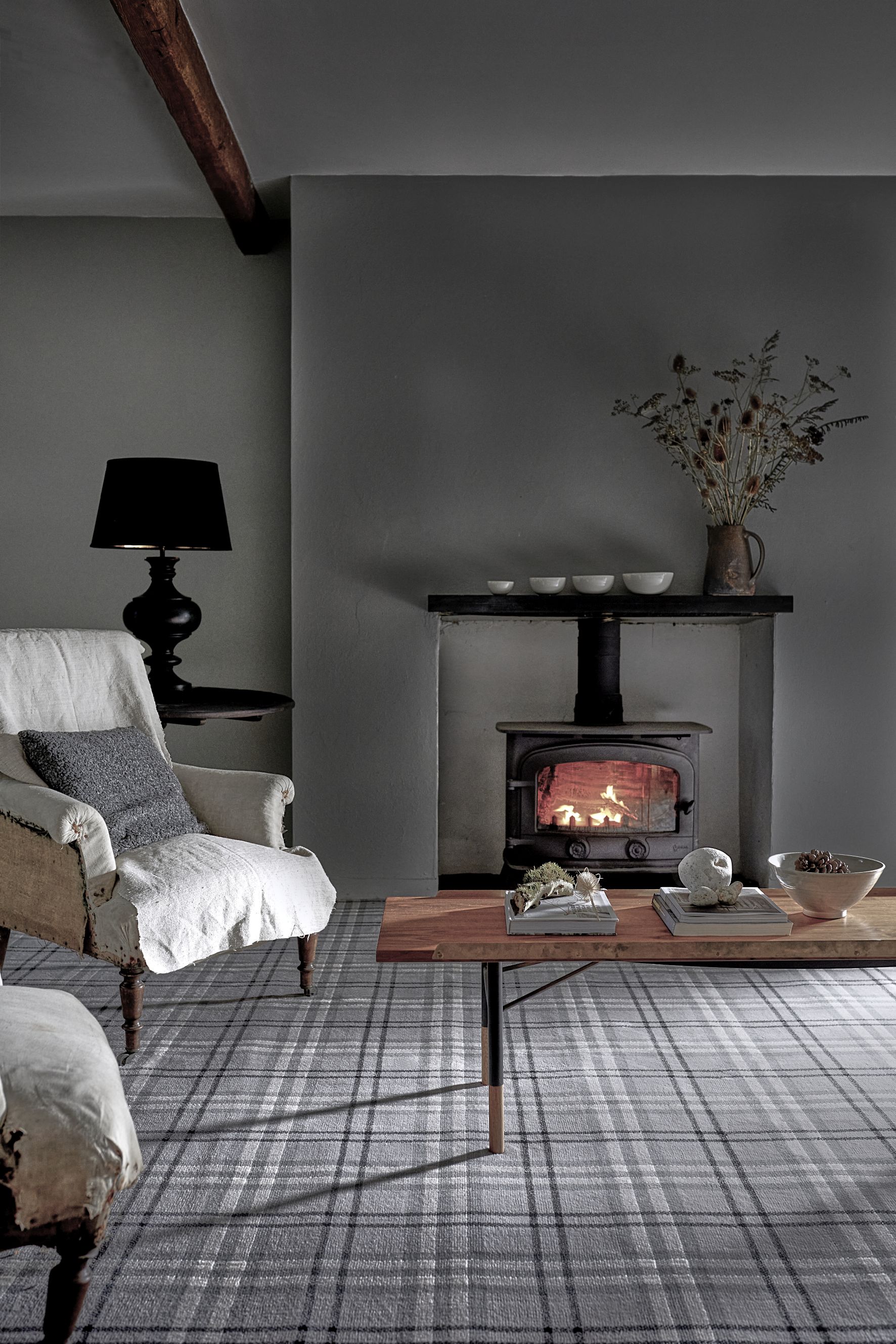
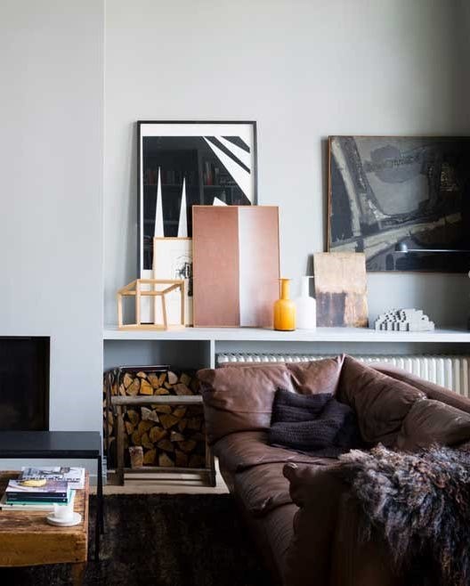
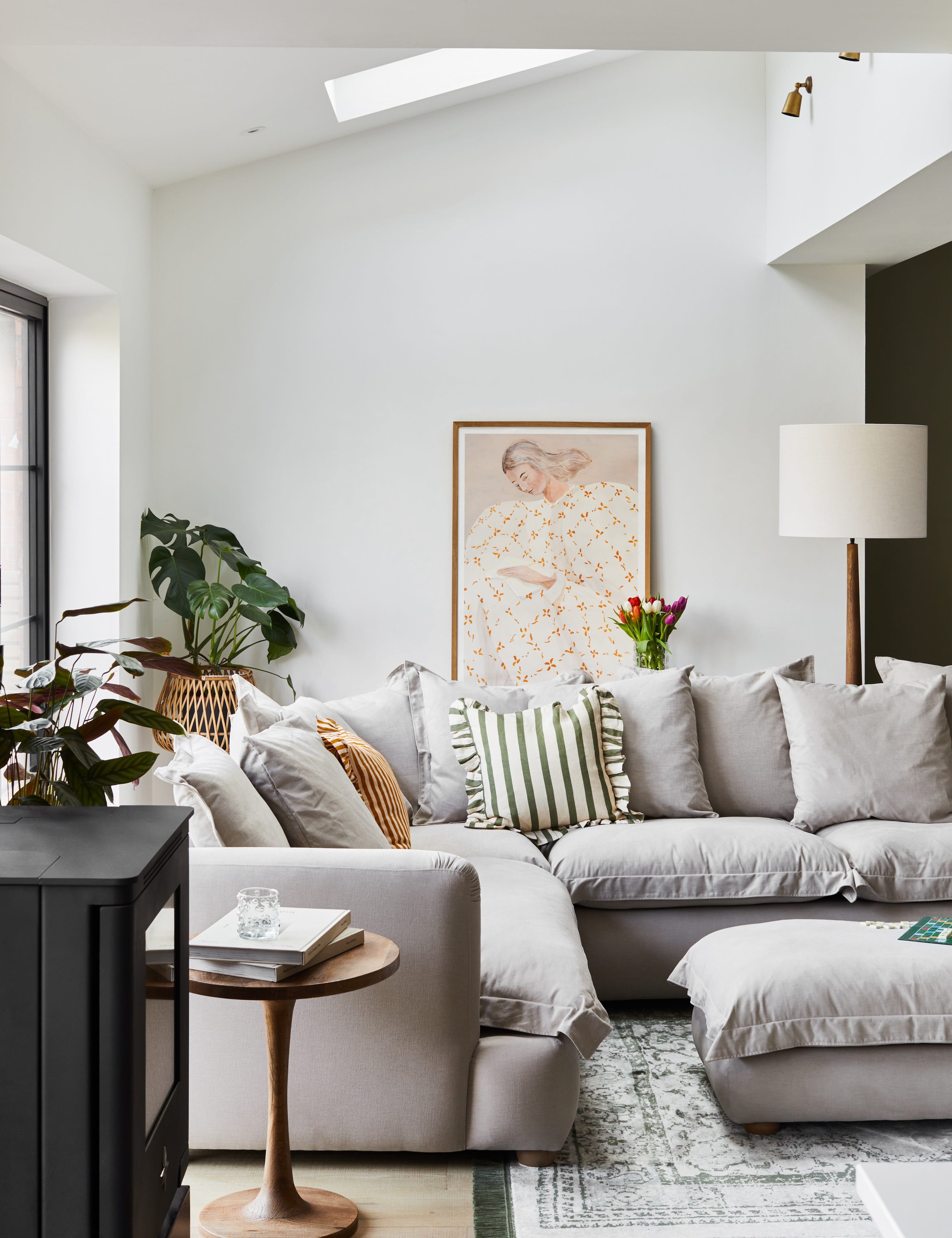
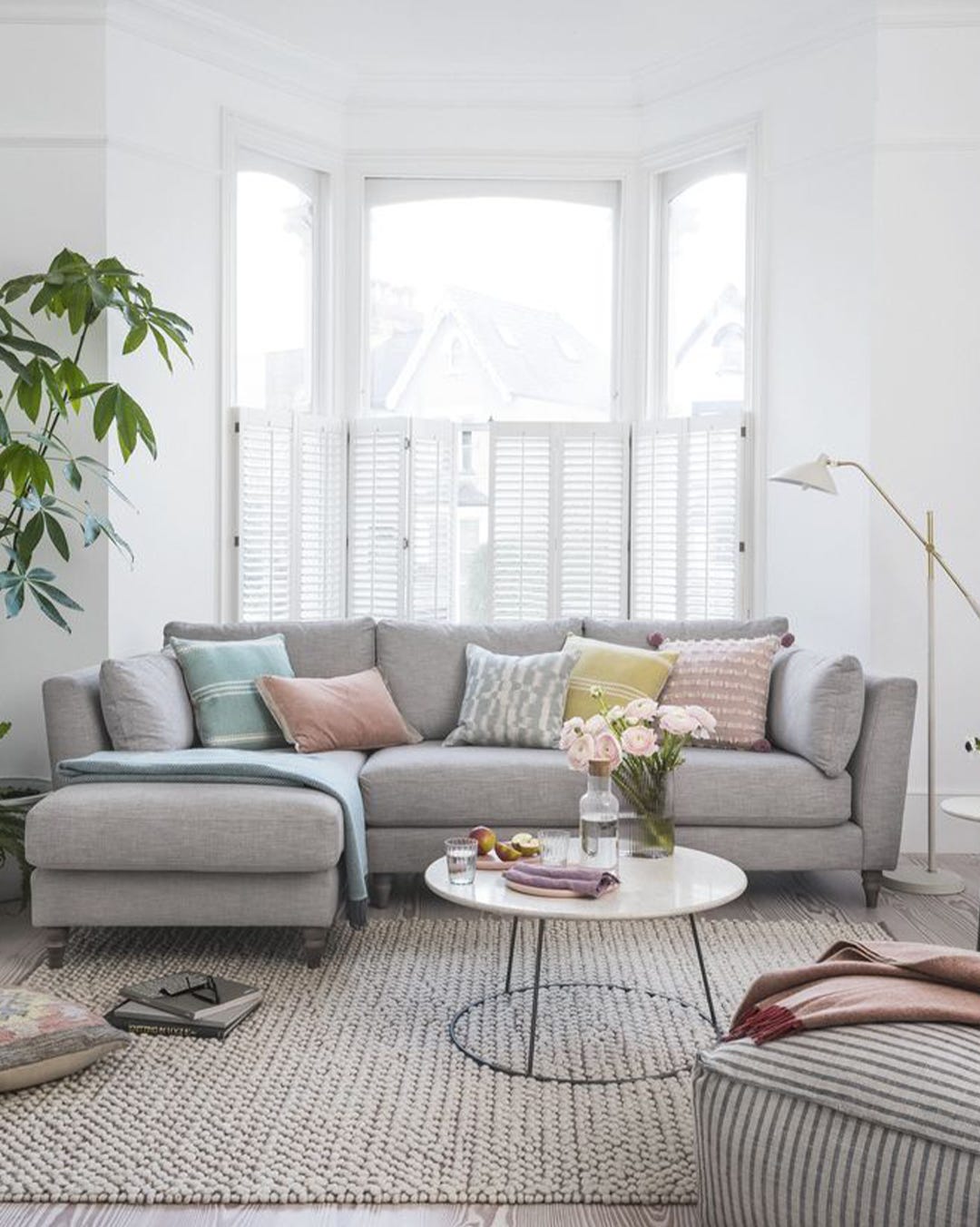
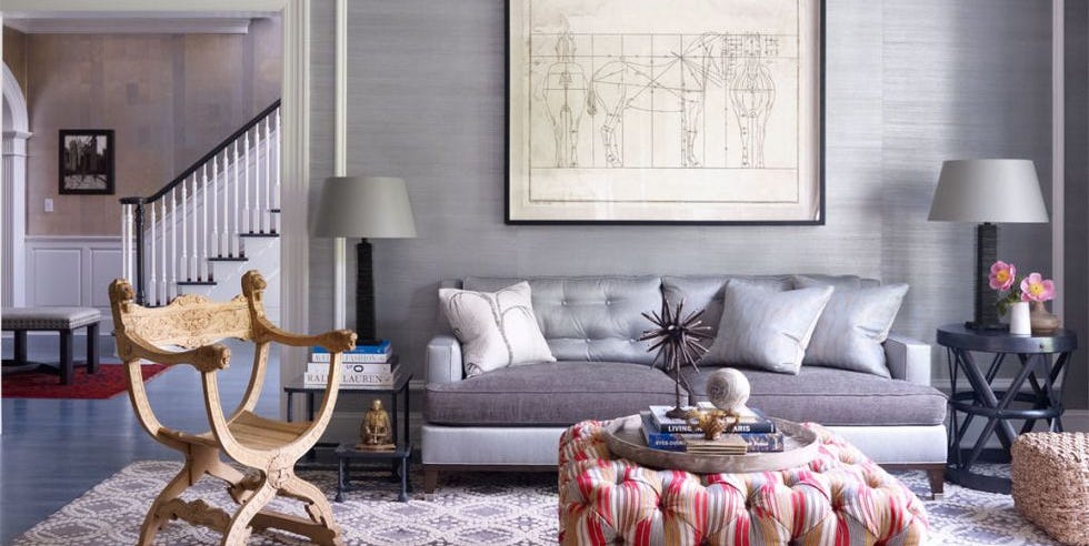
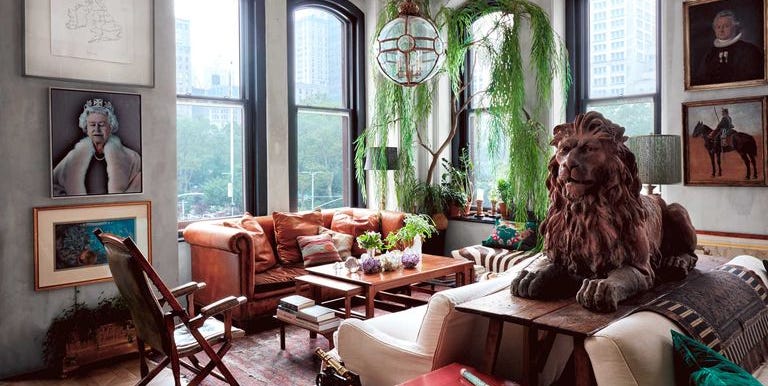
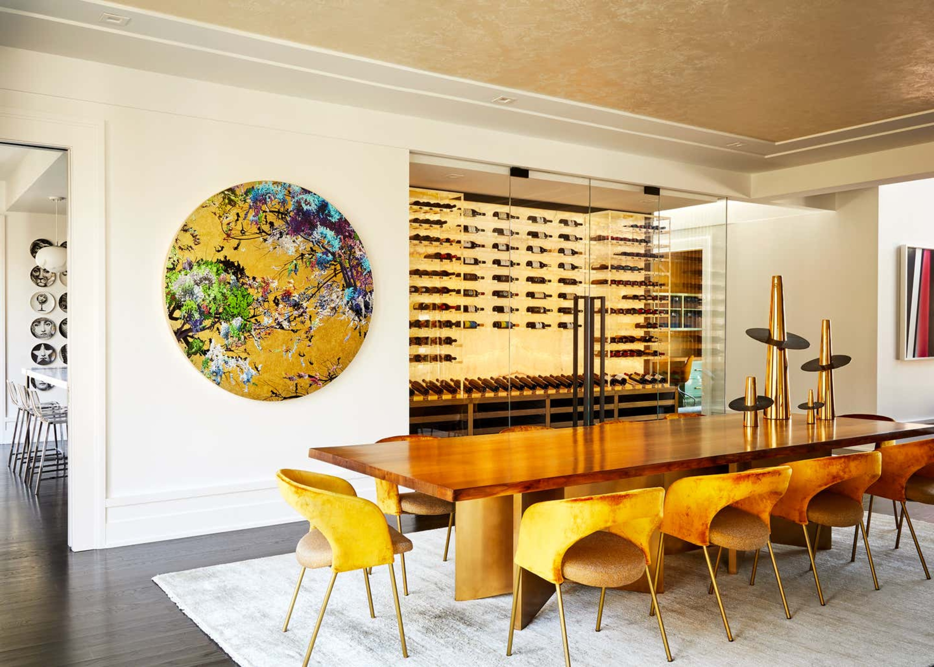
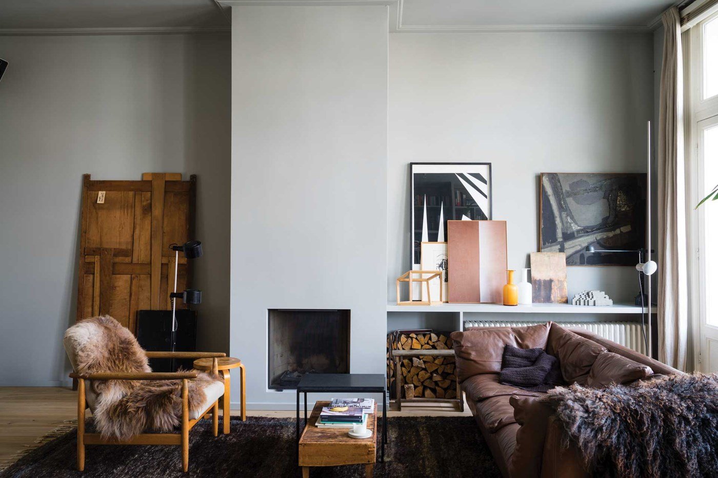
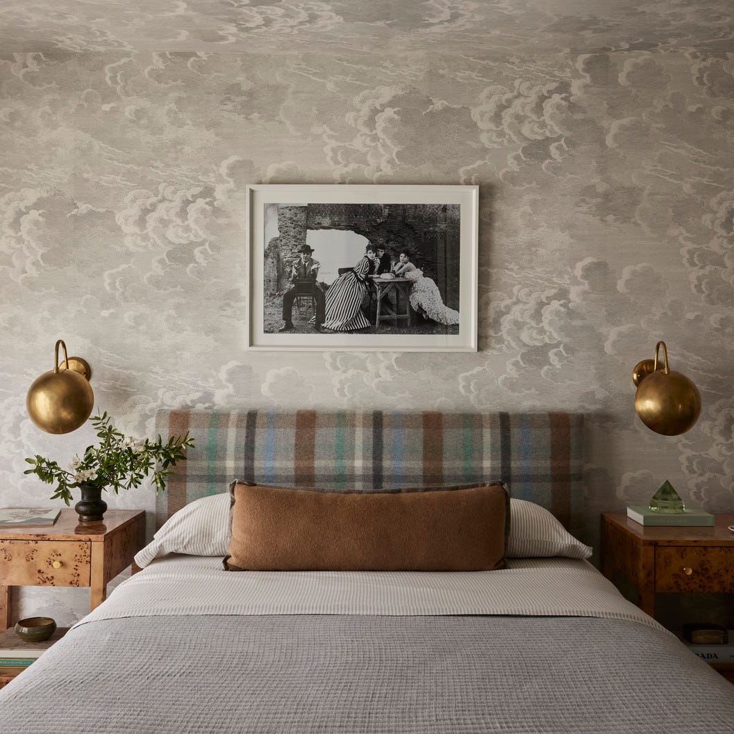
To prevent gray rooms from feeling cold or stark, designers recommend incorporating warm shades of gray alongside organic elements such as pottery, plants, natural wood floors, and furniture. Pairing gray with colors like mustard, olive, or soft pinks can also effectively warm up a room. The natural light in a room should influence the choice of gray hue. For dim rooms, selecting items that reflect light, such as woven silk rugs, subtly shimmering wallpaper, lustrous upholstery, or marble tabletops, can brighten the space. Lighter grays are also advised to prevent the room from becoming too intense, especially when combined with dramatic colors like red.
Ranize suggests using gray as the foundational color of a room, applying soft gray paint or wallpaper, and then layering in more gray shades through flooring and furniture. This approach creates a dynamic space that is not overtly flamboyant. For new home constructions, opting for gray as a base color throughout the property offers a more personable and sophisticated alternative to traditional beiges, creams, and taupes often used by builders and real estate agents. When expertly applied, gray can convey a luxurious, chic, or understated ambiance.
#InteriorDesign #GrayColorPalette #HomeDecor #NeutralColors #DesignVersatility #ColorPsychology #ModernDesign #TraditionalDesign #InteriorDesign #GrayColorPalette #HomeDecor #NeutralColors #DesignVersatility #ColorPsychology #ModernDesign #TraditionalDesign
Há 0 comentários no total
 Ainda não há comentários
Você também pode gostar
What Colors Go With Gray? 19 Arresting Combinations With This Time-Tested Neutral

23 Colors, Patterns, & Textures To Pair With Gray
Are gray interiors really out of style? Interior designers weigh in on how to use this cool shade

15 Best Greige Paint Colors for Every Decorating Taste

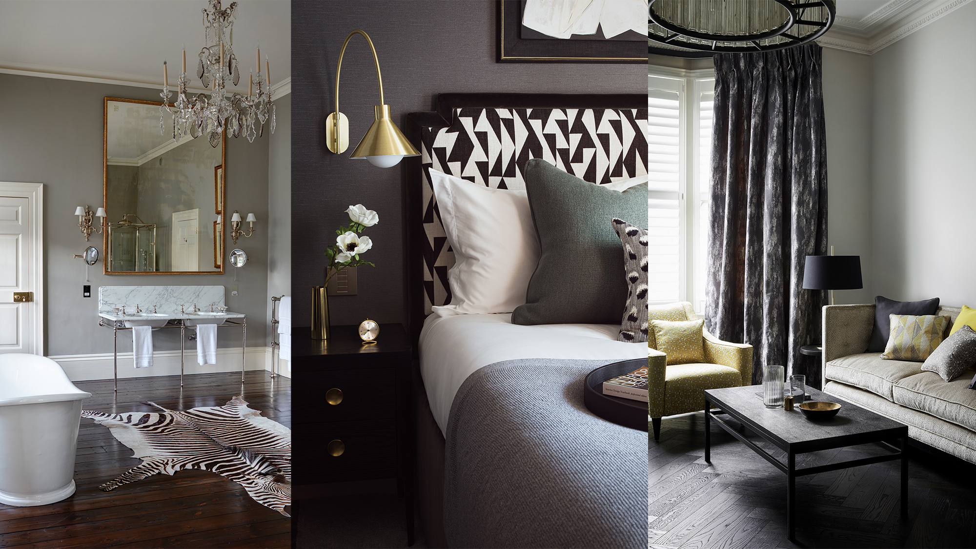
Grey room ideas – 12 ways to use this versatile shade

Unexpected Neutrals: Beige + Dark Grey + Camel

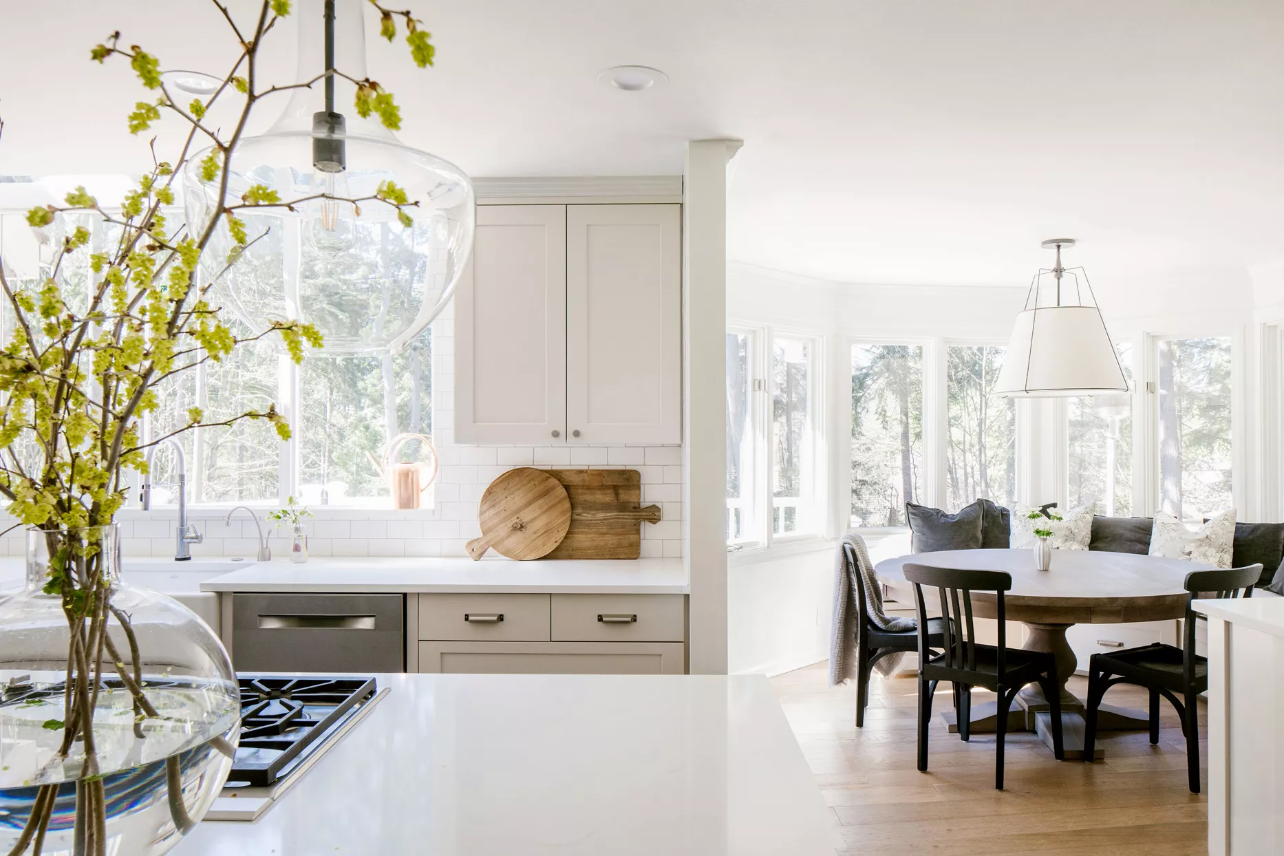
Top 32 Expert-Recommended Gray Paint Colors, Plus How to Pick the Best Shade

These Gray Living Rooms Are Full of Style

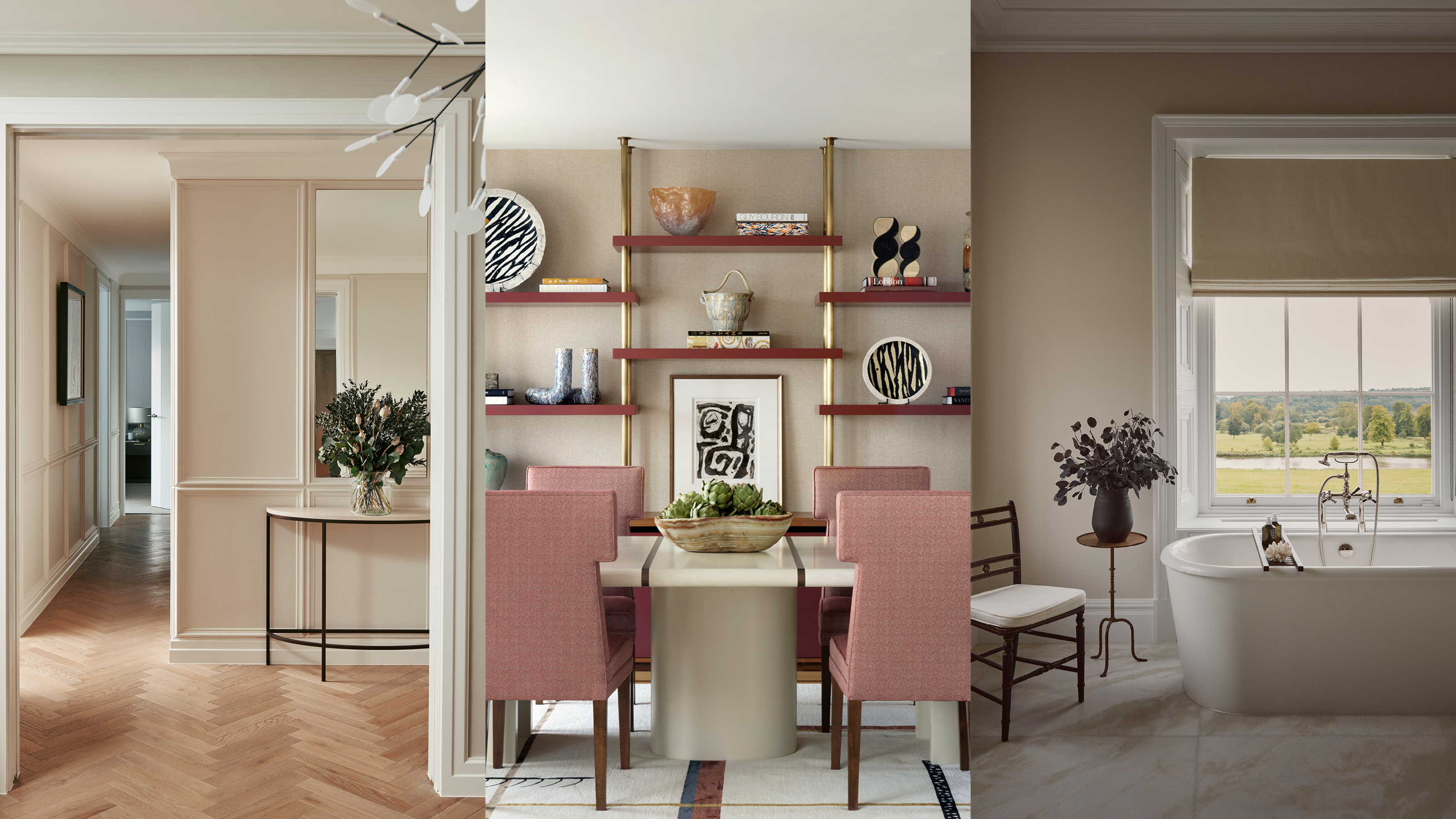
Beige-grey – the timeless paint color perfect for a barely-there backdrop
Top Best Neutral Area Rug & Gray Area Rug Ideas in 2022
Why Gray Is the Most Versatile Bedroom Color

The Gray, Cream, and Navy Items I Swear Out-Rich Every Other Color Trend (Yes, Even Black)

The 11 Best Gray Paint Colors for a Stylish Bedroom
What colors will go best with my grey rug? Here's how to decorate around this timeless floor covering
REVEALED: Is grey paint going out of style?

Committed to Your Millennial Gray Walls? Designers Share the Best Colors to Pair With It
Is gray still on trend? Designers explain how to use this cool-toned hue in a world of warm color schemes
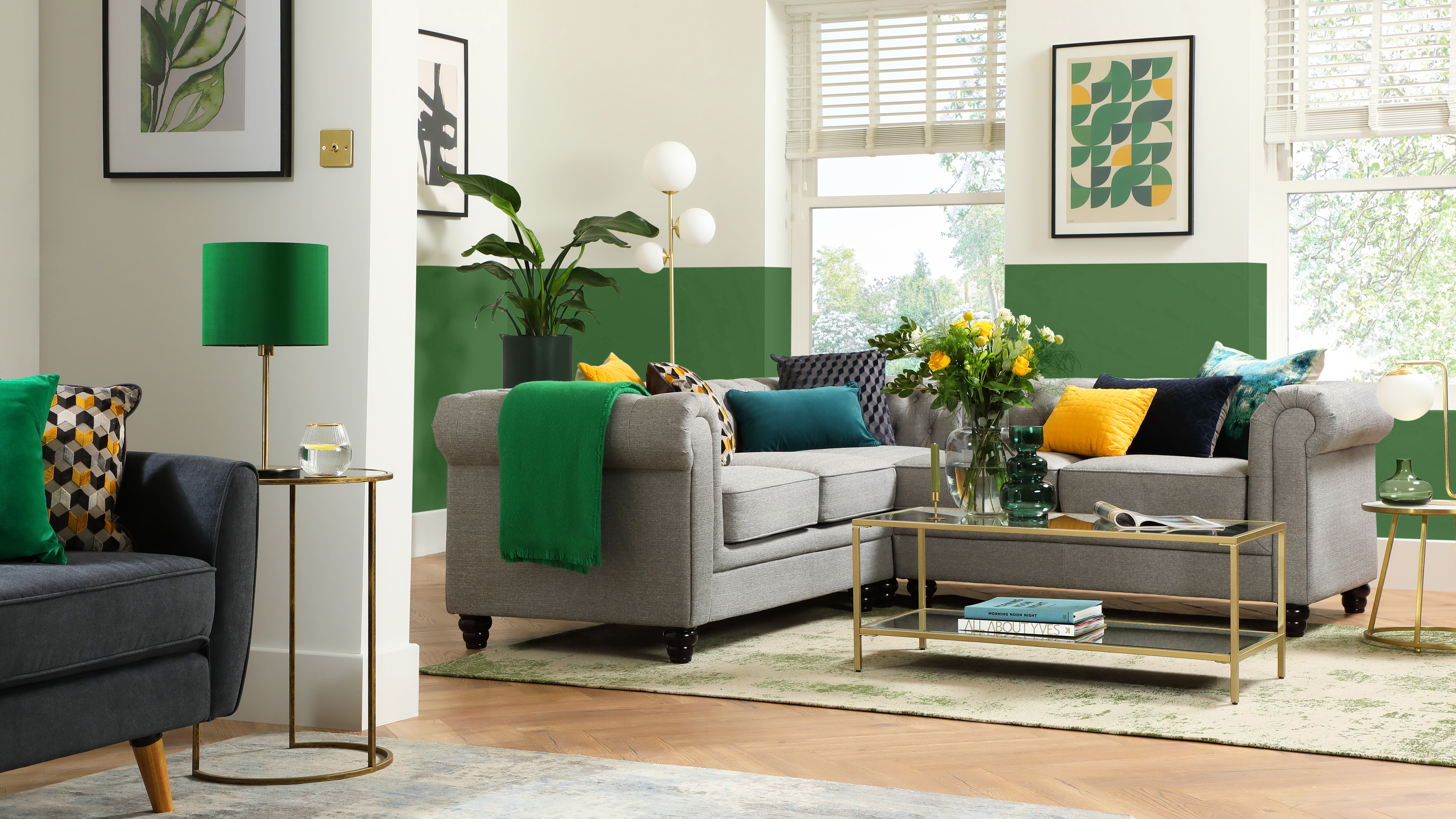
What colors go with grey? 13 palette pairings according to interior designers
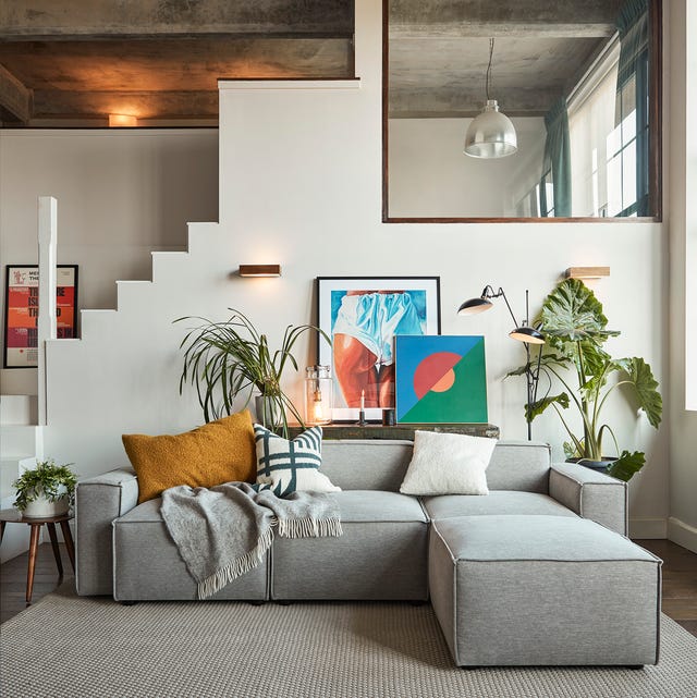
These grey living room ideas will make you want to redecorate

The interior-design world has turned on gray. What finally killed the color?