1/21
55 Tried-and-True Blue Paint Colors
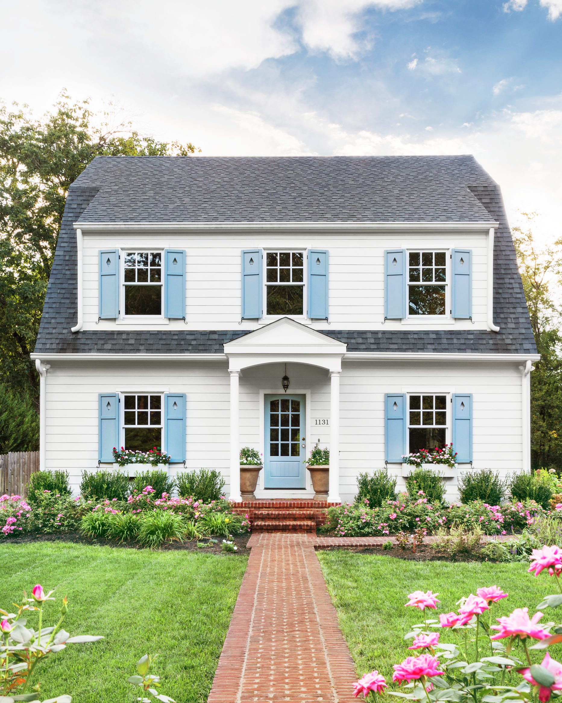
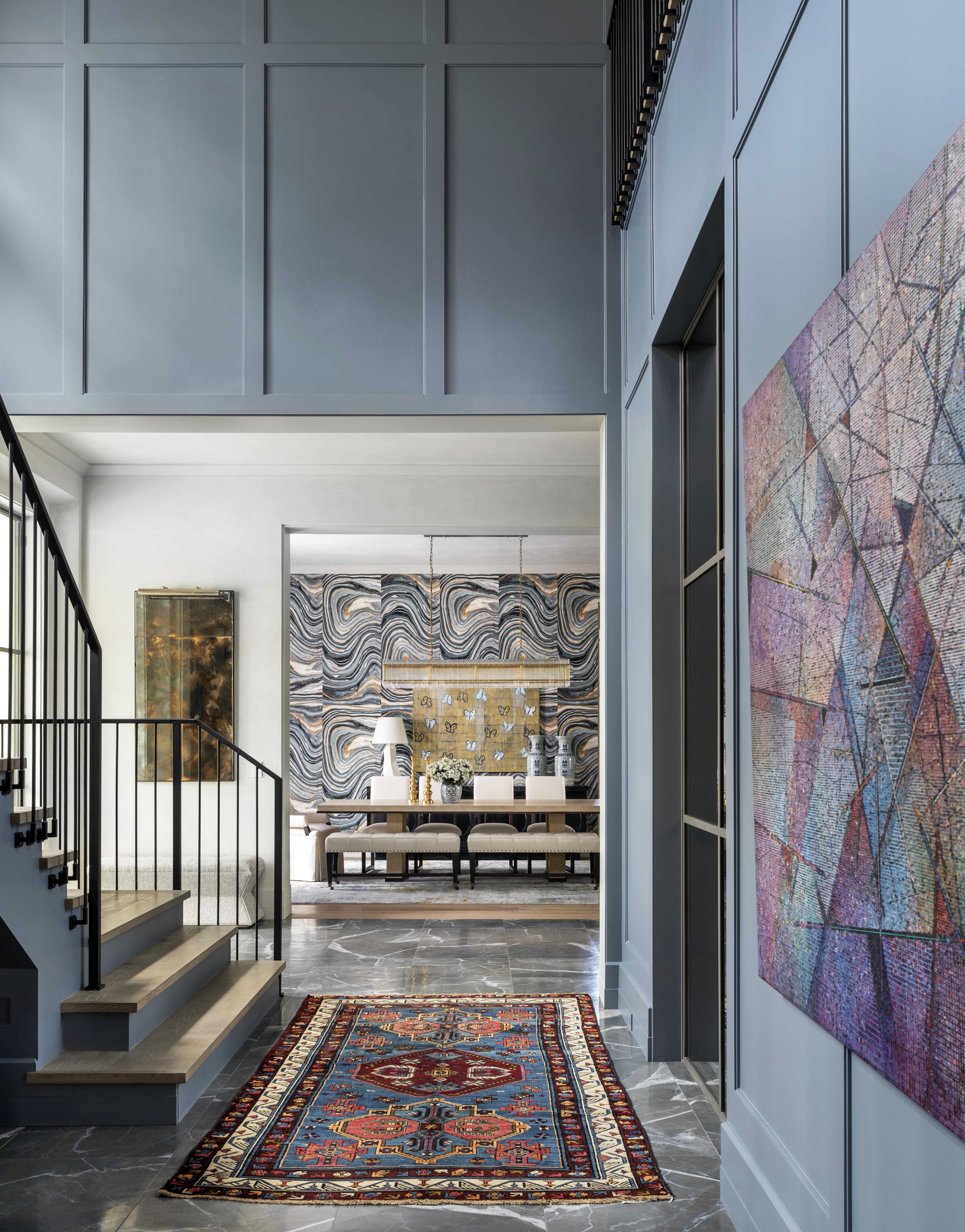
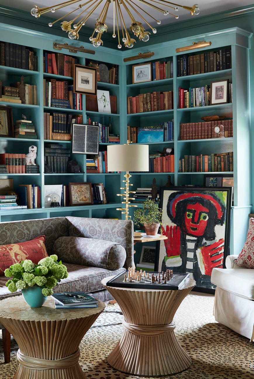
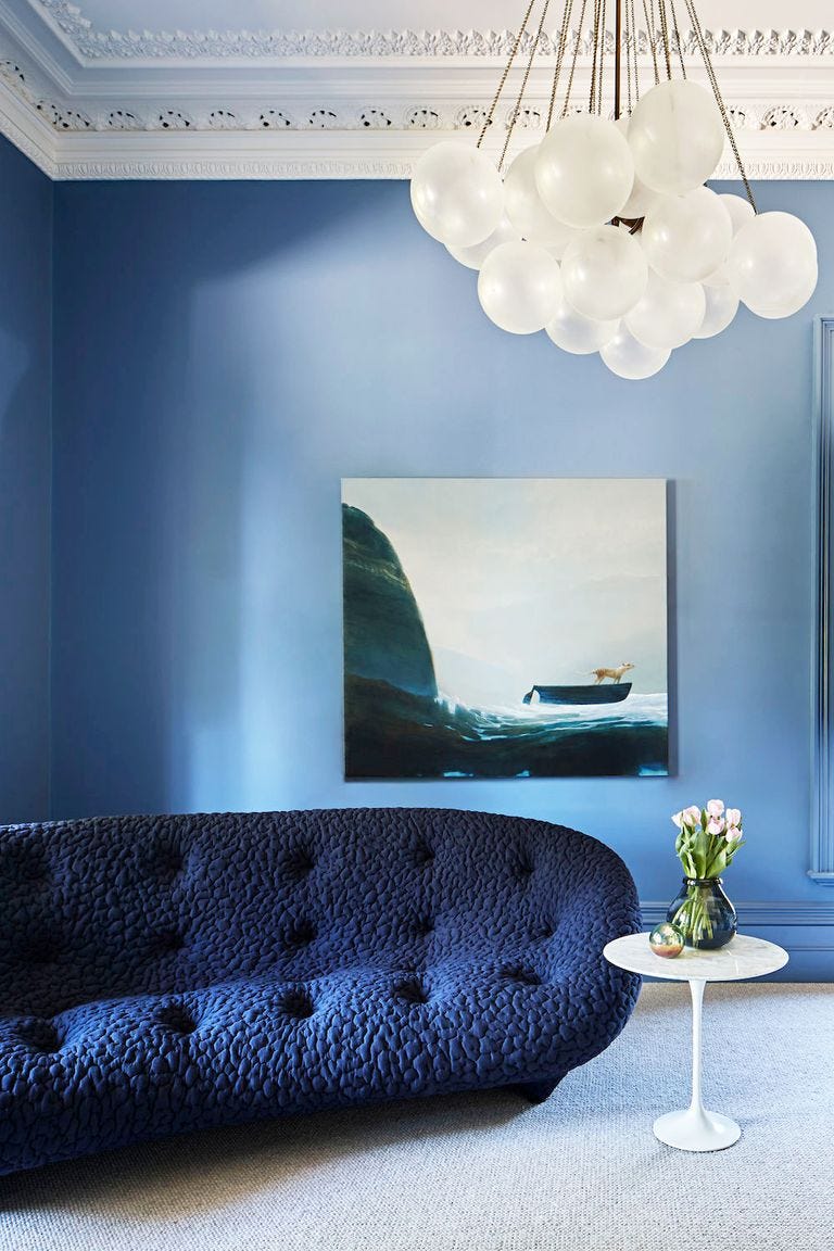
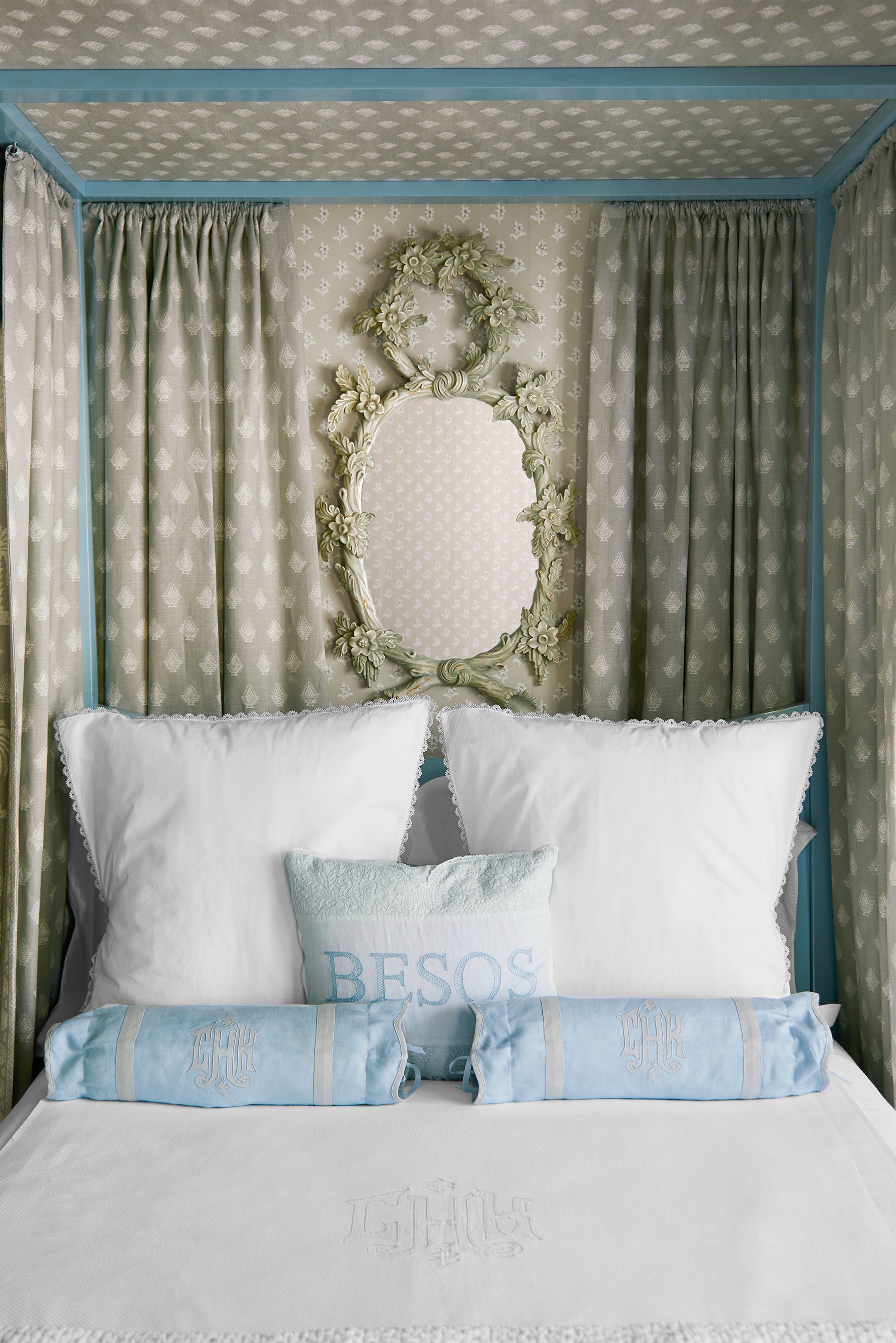
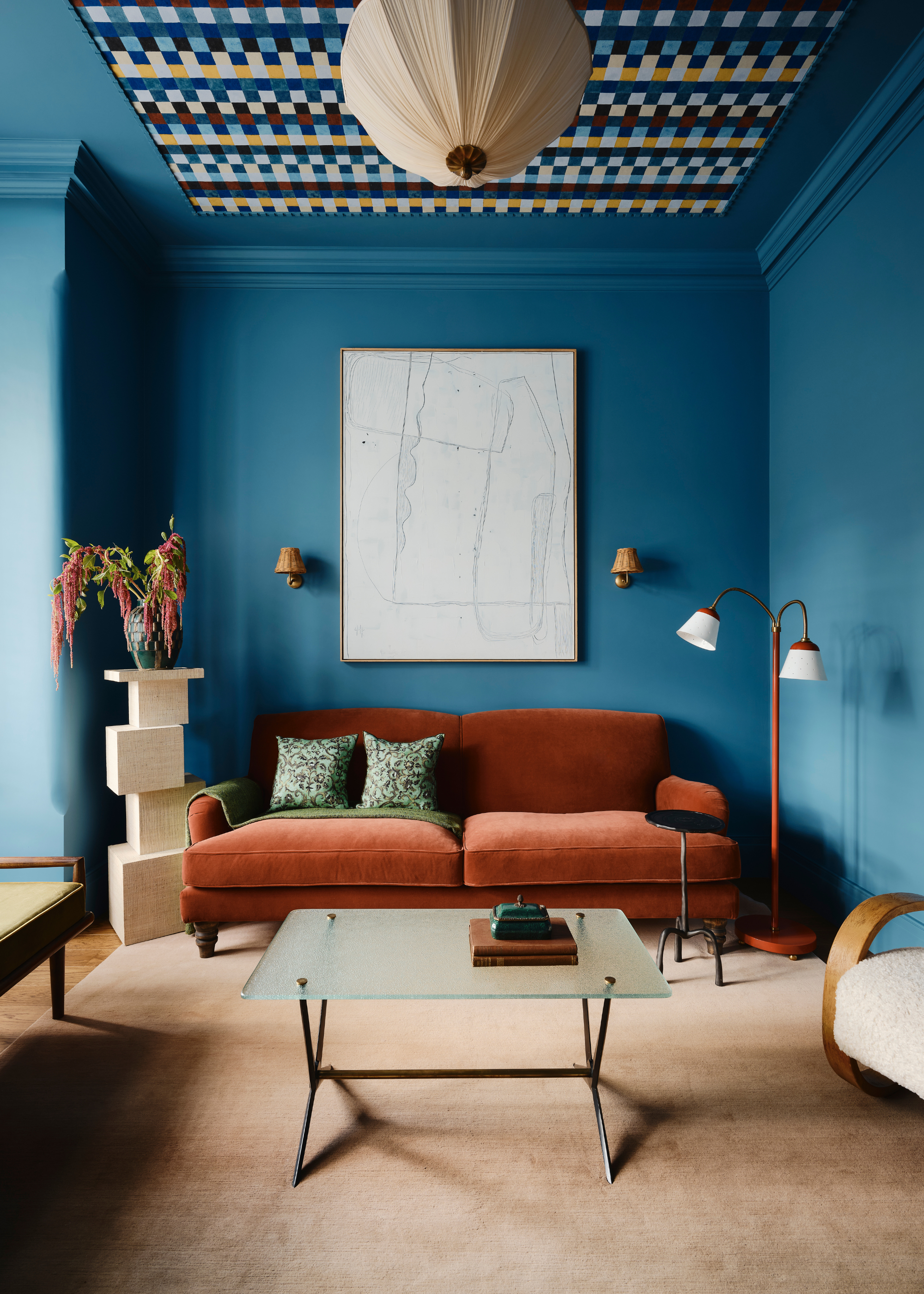
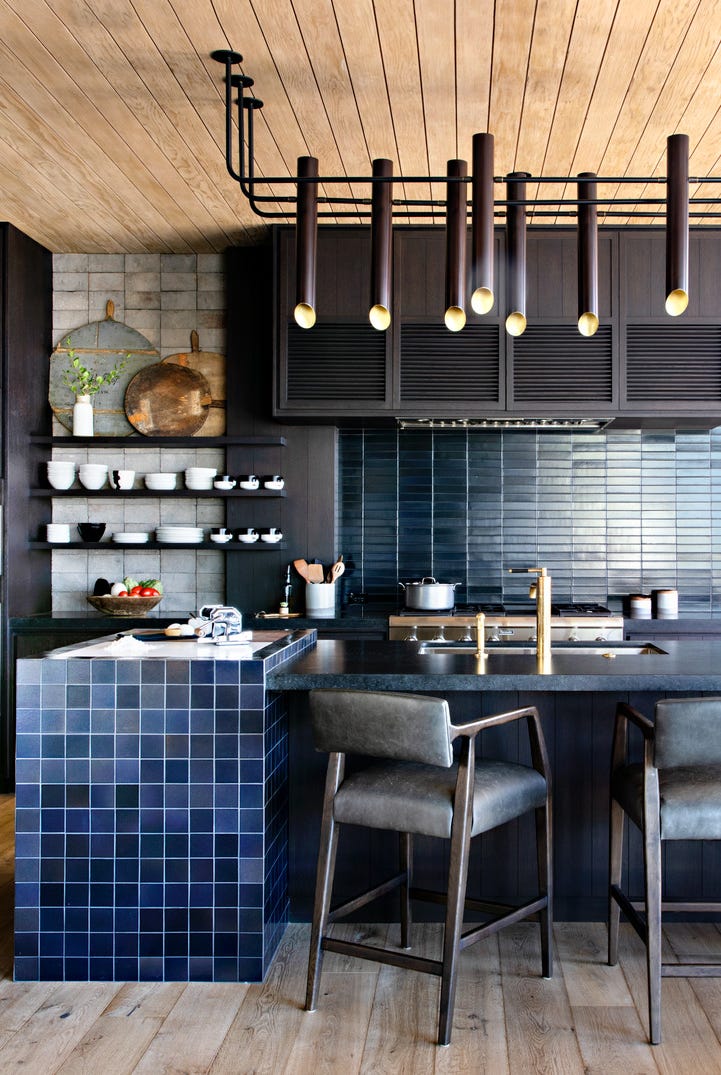
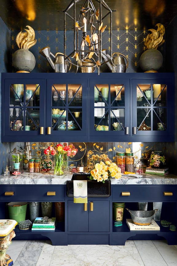
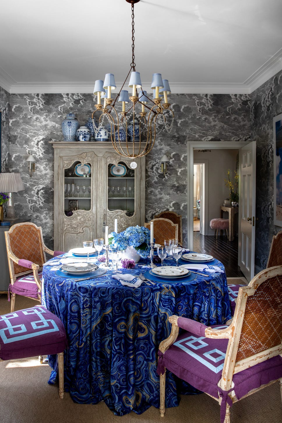
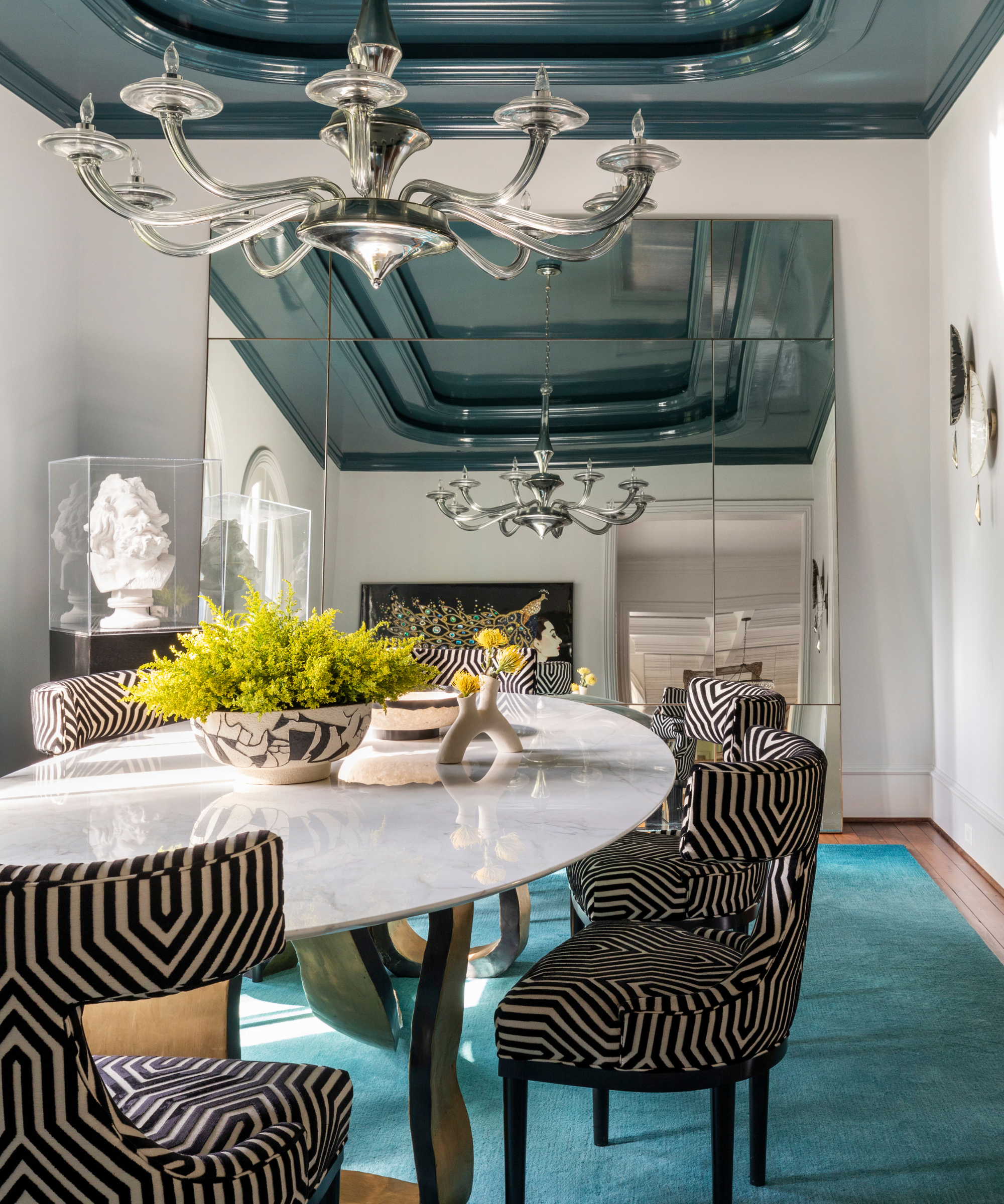
Blue is a timeless and versatile color that has been an integral part of design for centuries, from historical art periods to iconic azure-coated locations like Chefchaouen, Morocco, and Santorini, Greece. In interior design, blue is celebrated for its soothing power, psychologically linked to tranquility and peace, making it an ideal choice for creating a sense of refuge in homes. Arianna Barone, color marketing manager at Benjamin Moore, highlights blue's universal appeal and adaptability across various aesthetics, suggesting it as an excellent introductory color for those hesitant to use bolder hues.
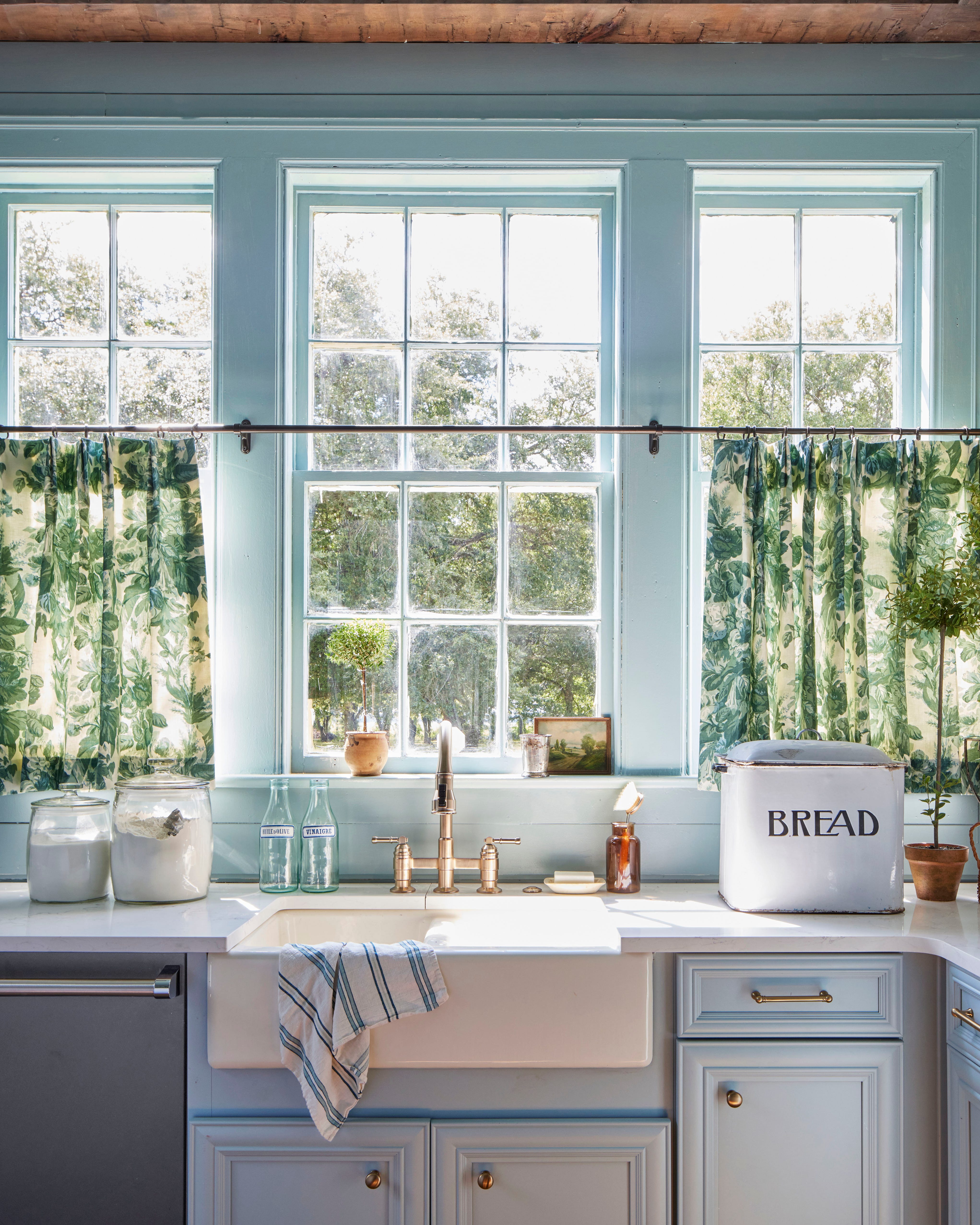
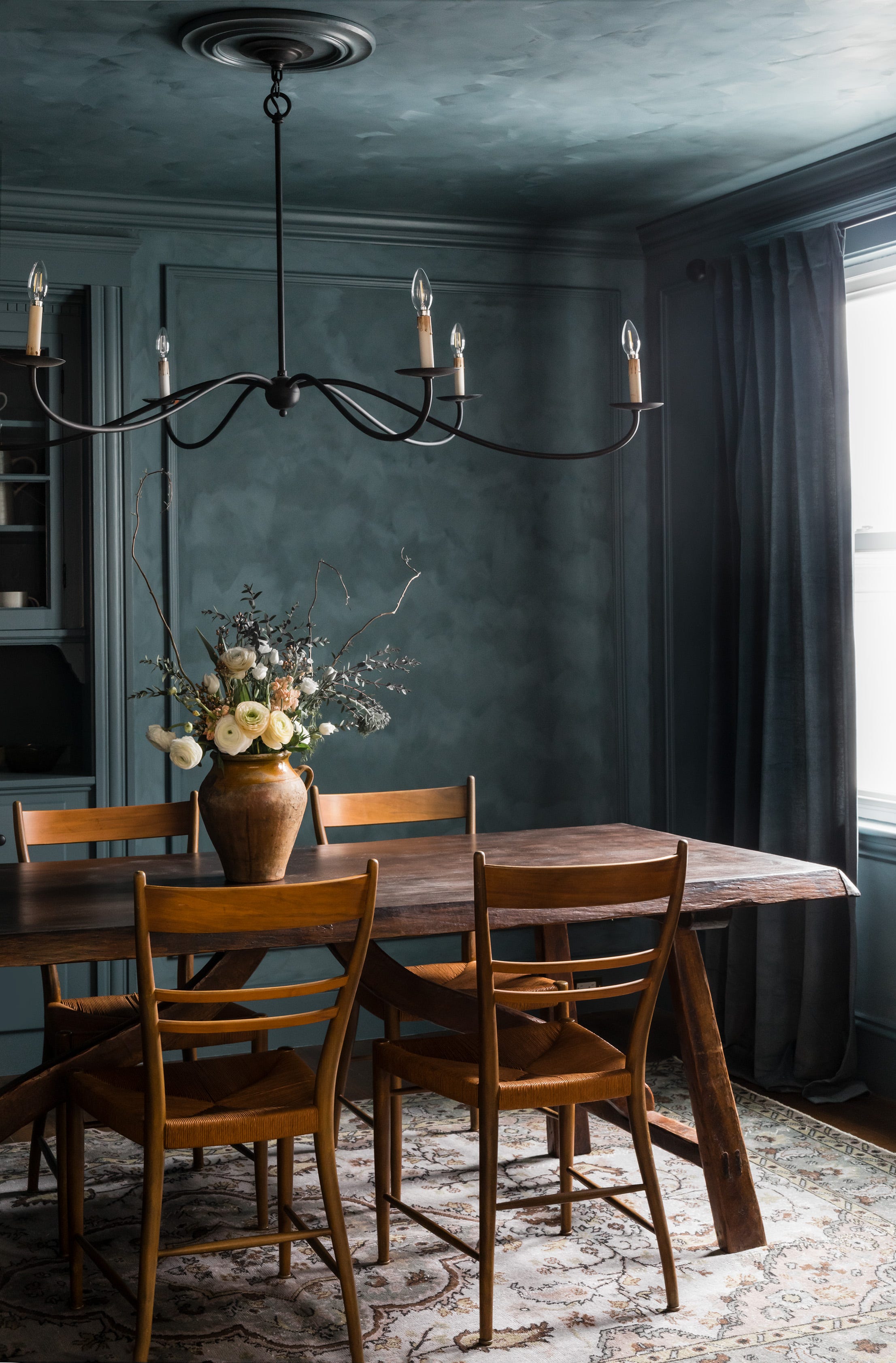
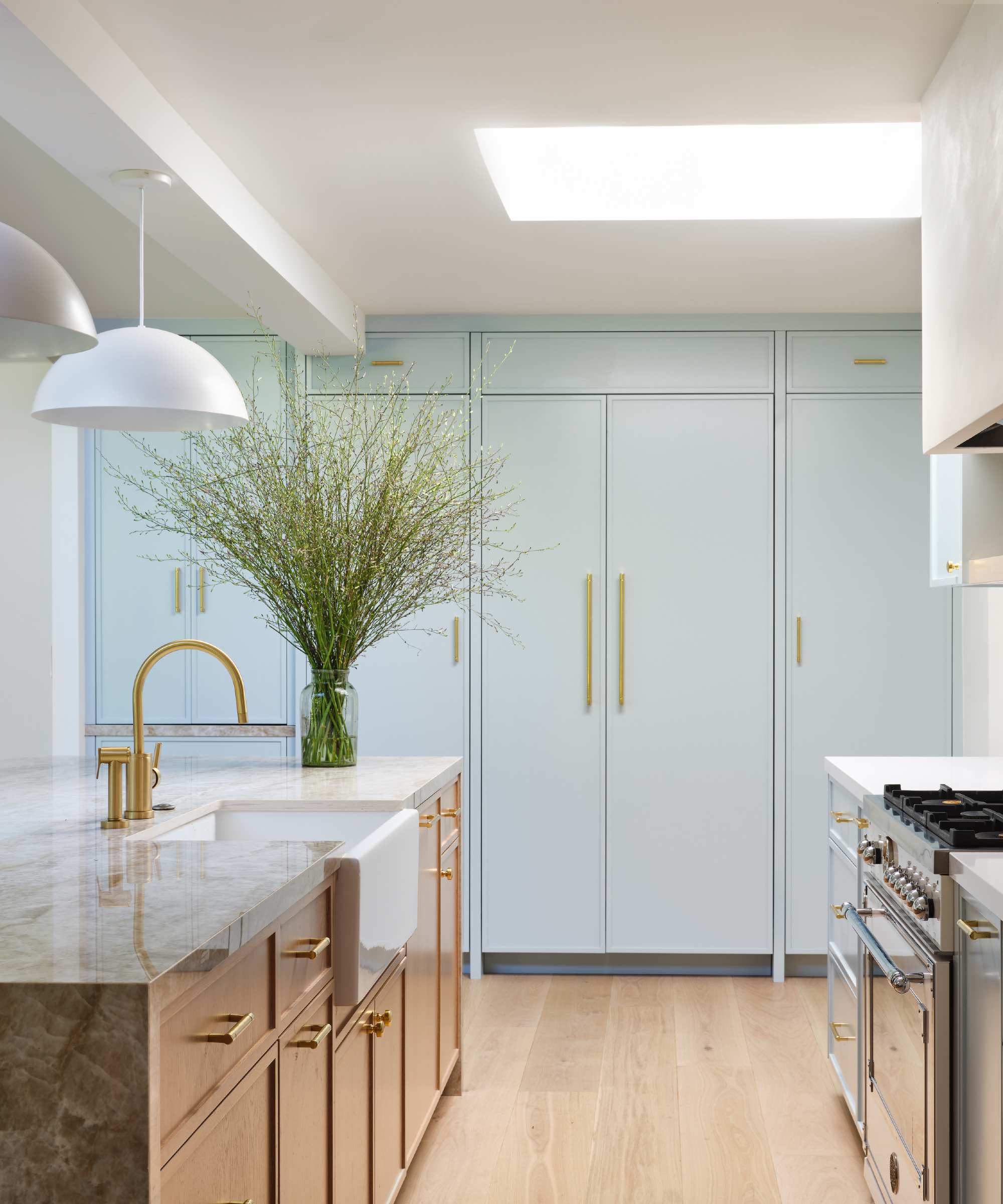
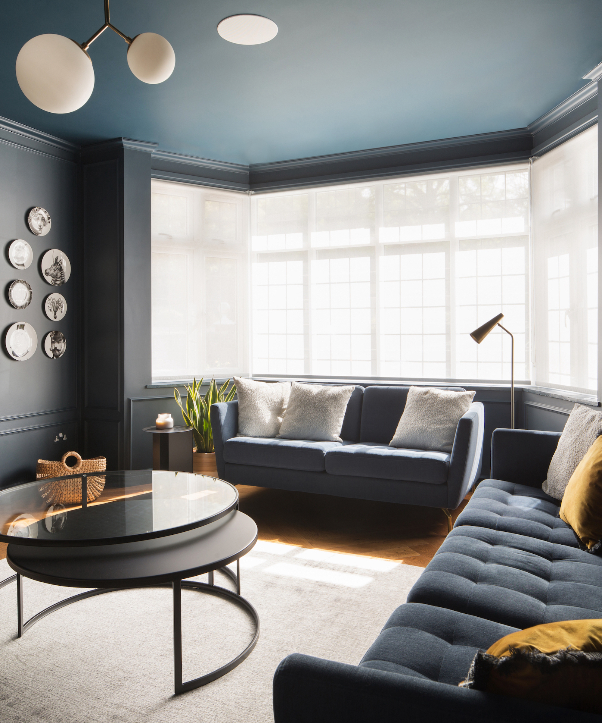
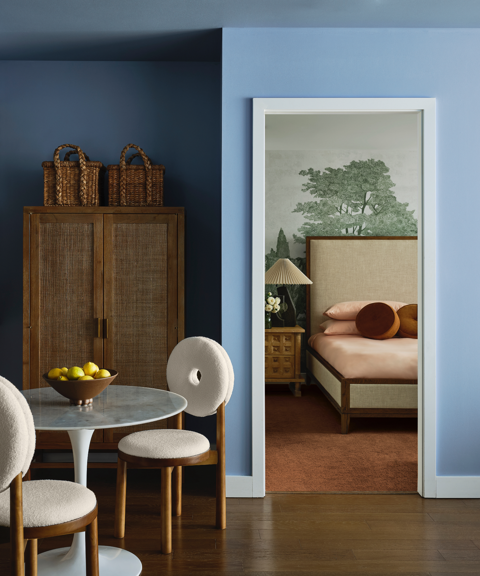
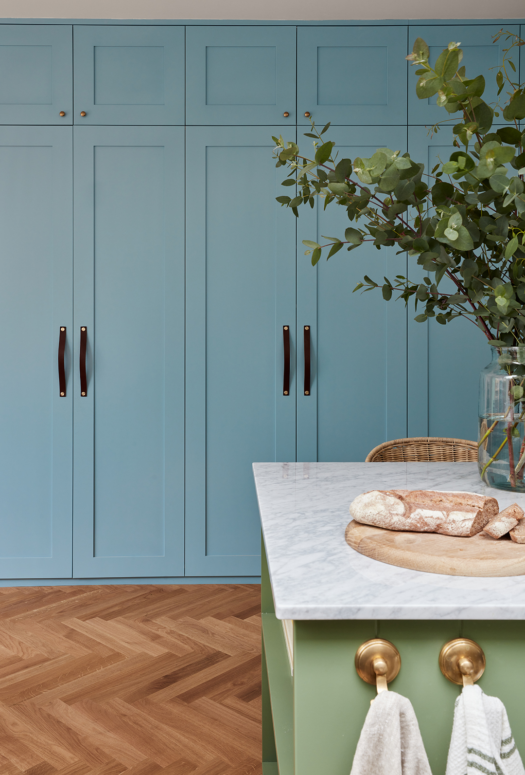
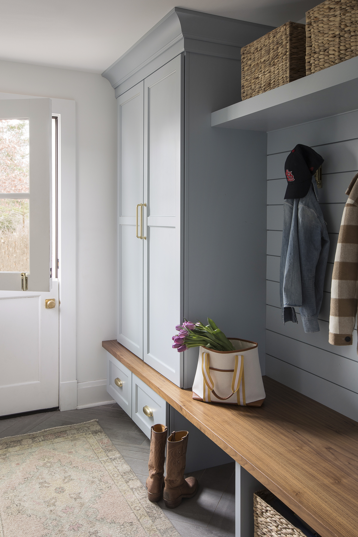
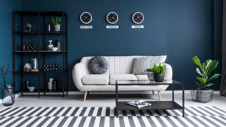
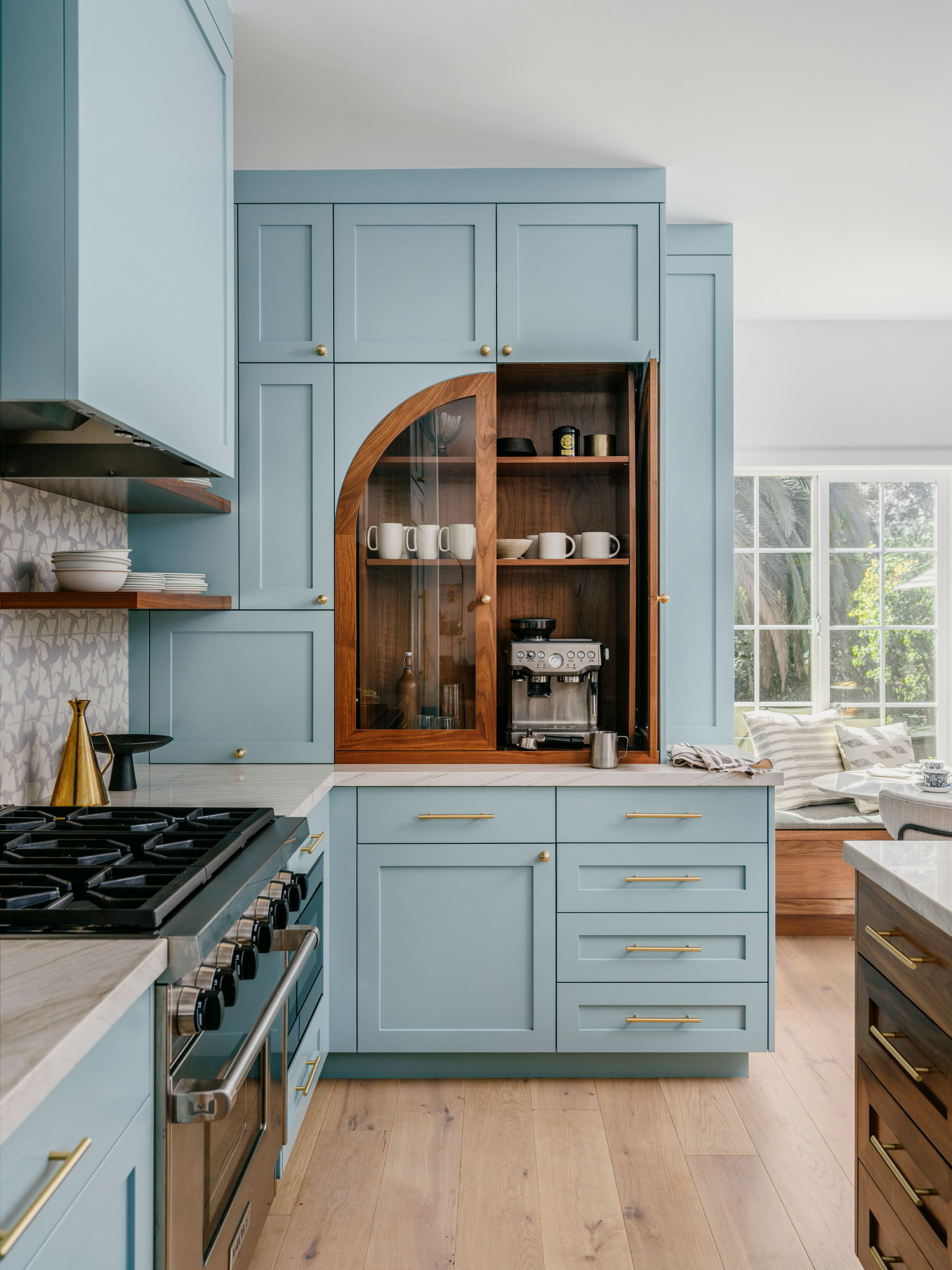
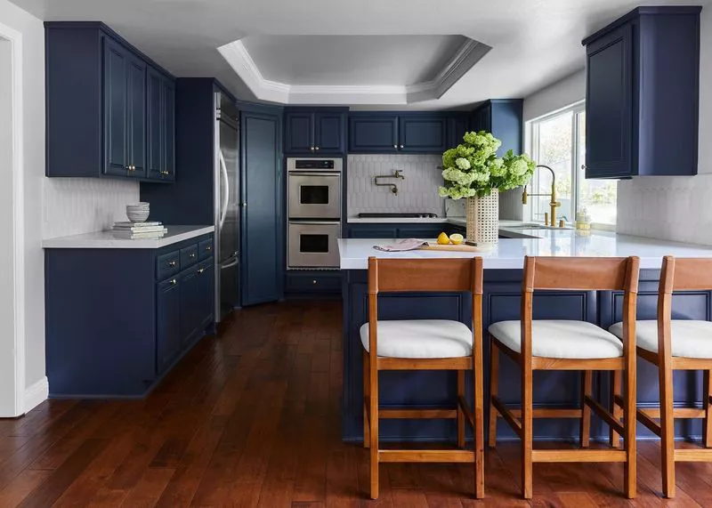
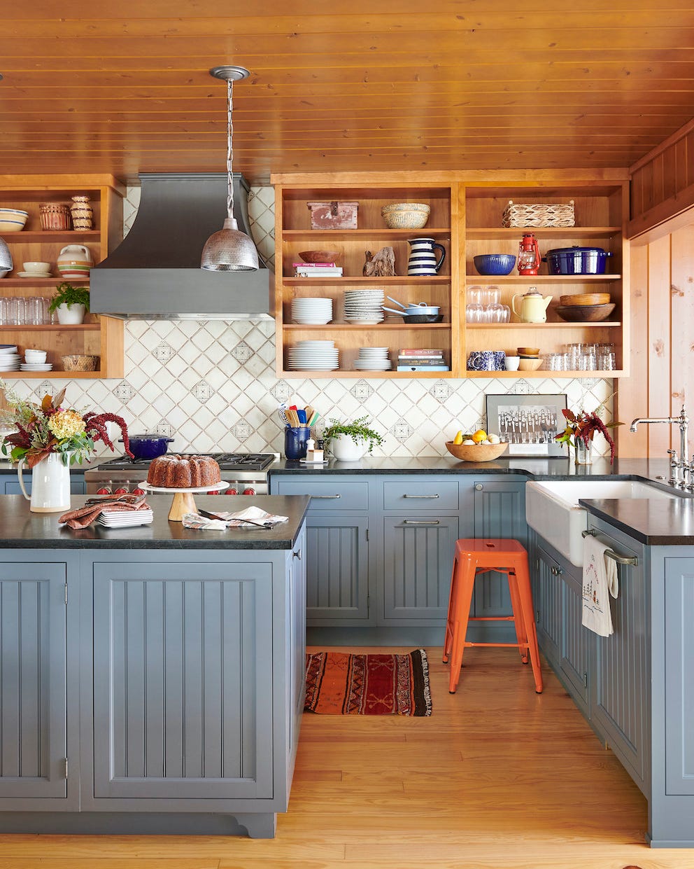
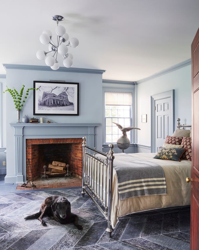
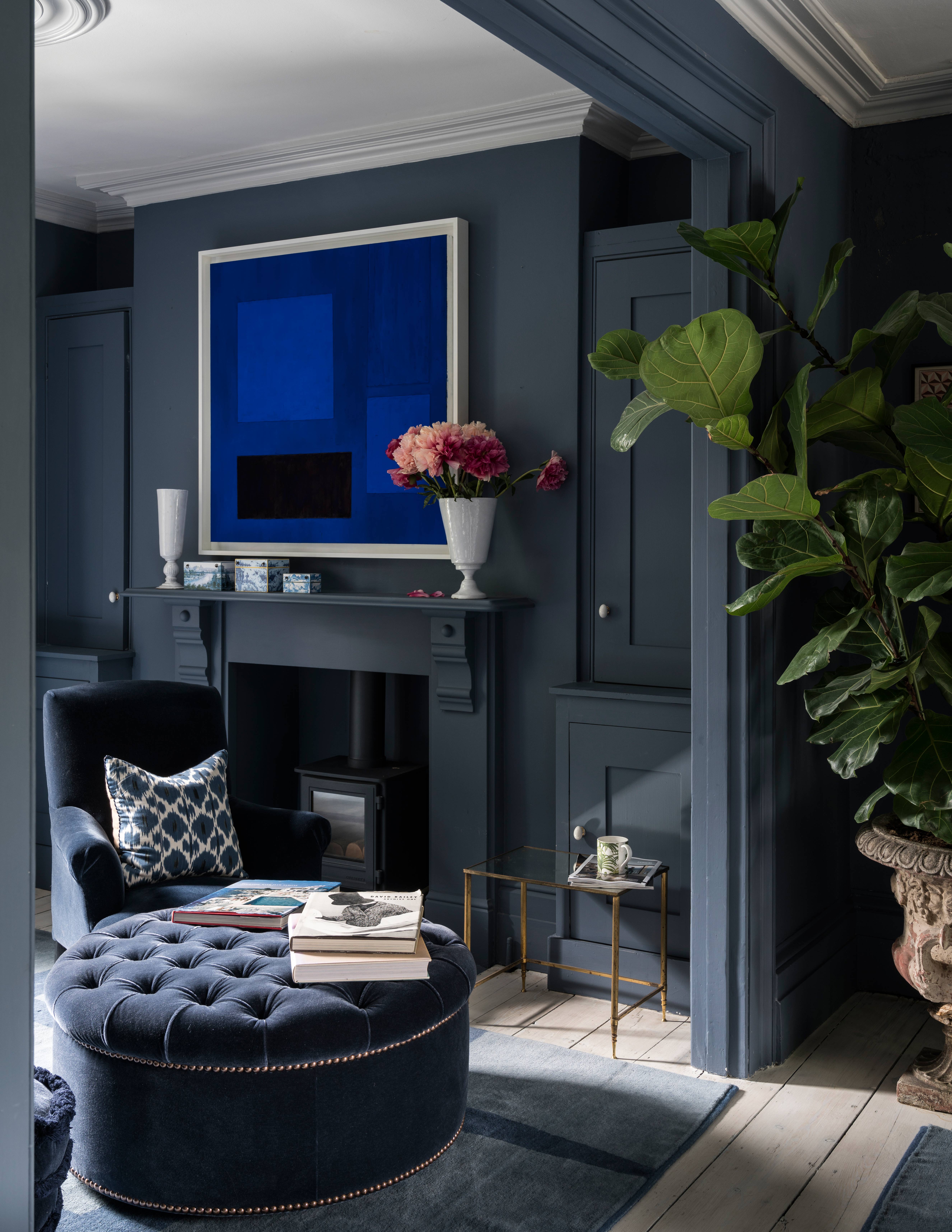
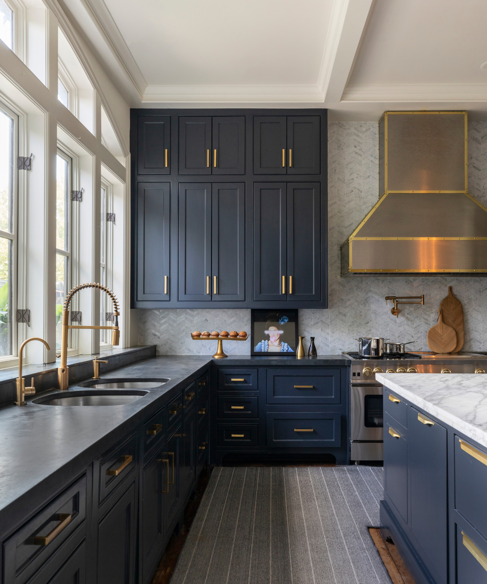
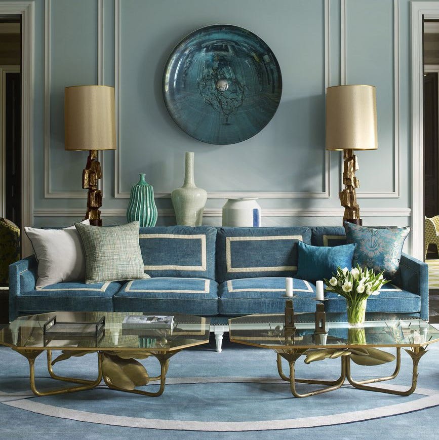
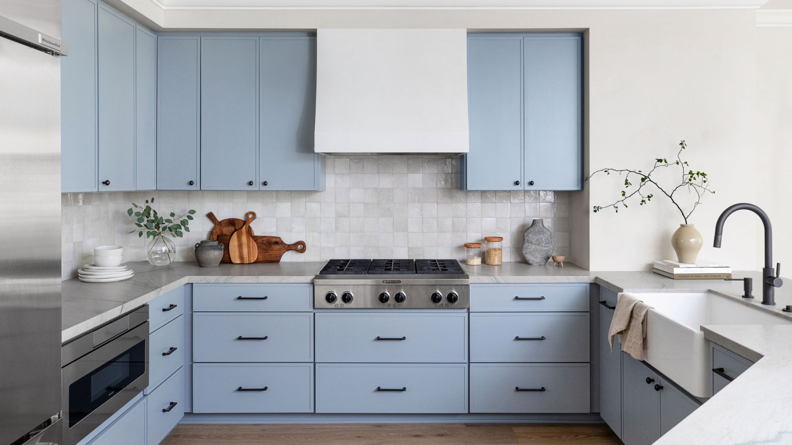
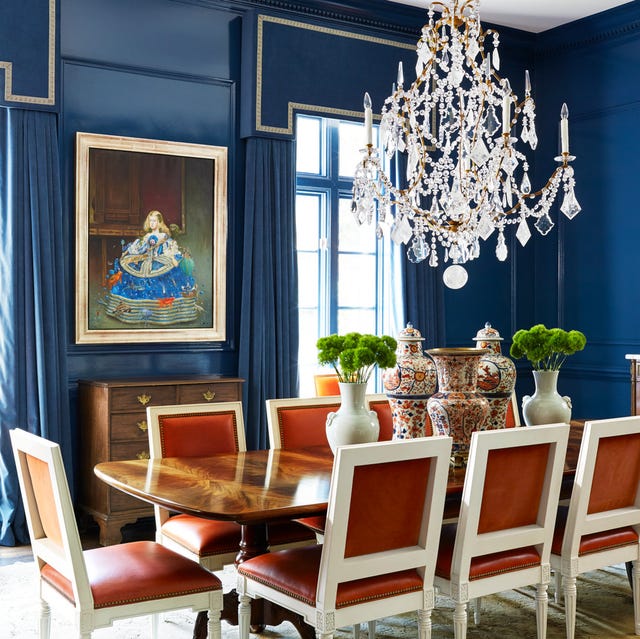
Lighter, silvery blues are recommended for bathrooms and bedrooms to enhance serenity, while darker blues are suitable for offices and dining rooms for a bolder statement. Blue-gray tones offer versatility for common areas and transitional spaces like living rooms, kitchens, and hallways. The diverse range of blue shades allows it to serve as both a dominant and a complementary color. For instance, a light cornflower blue can add a traditional touch to kitchen cabinets, whereas an inky blue can introduce drama to a powder room. The article aims to simplify the selection process by presenting designer-approved blue paint colors, acknowledging that factors like finish, natural light, and project scope are also crucial considerations.
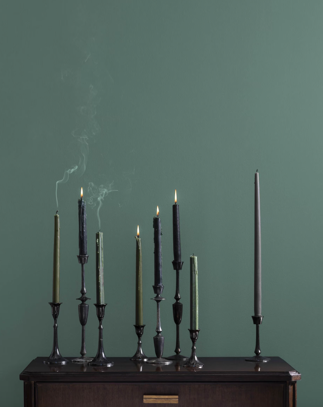
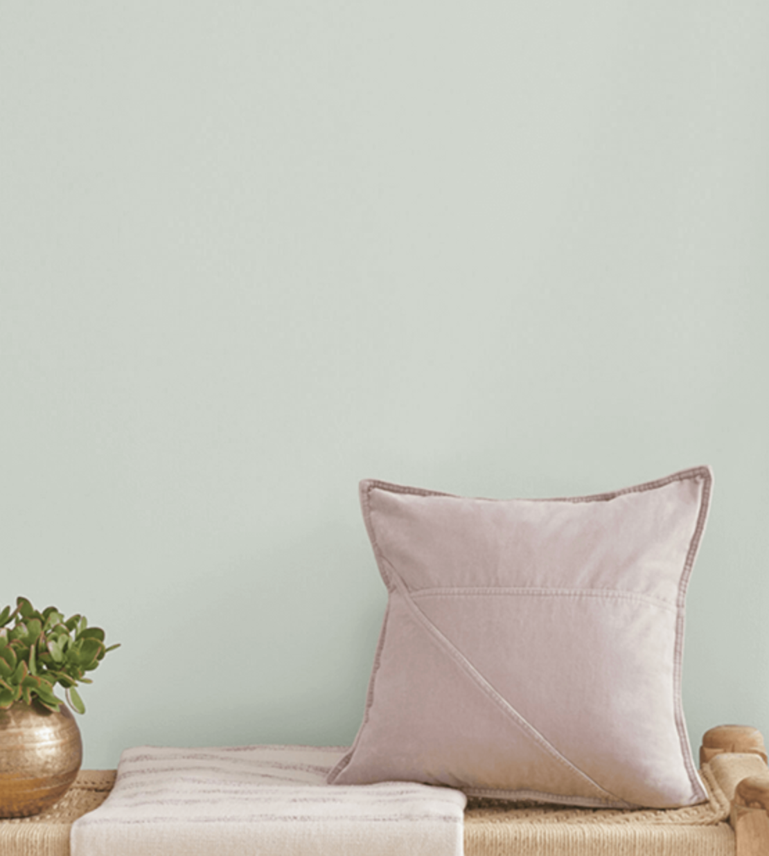
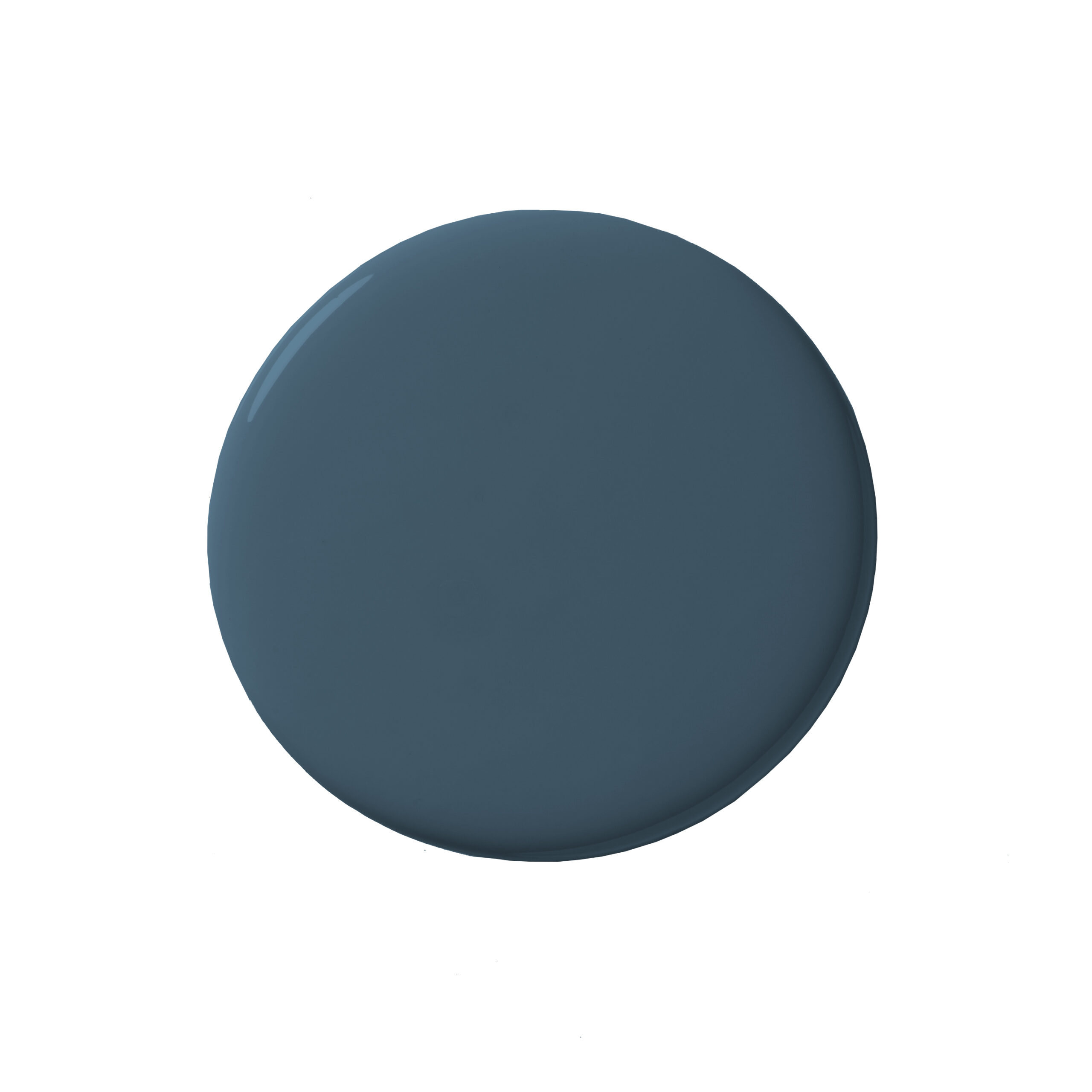
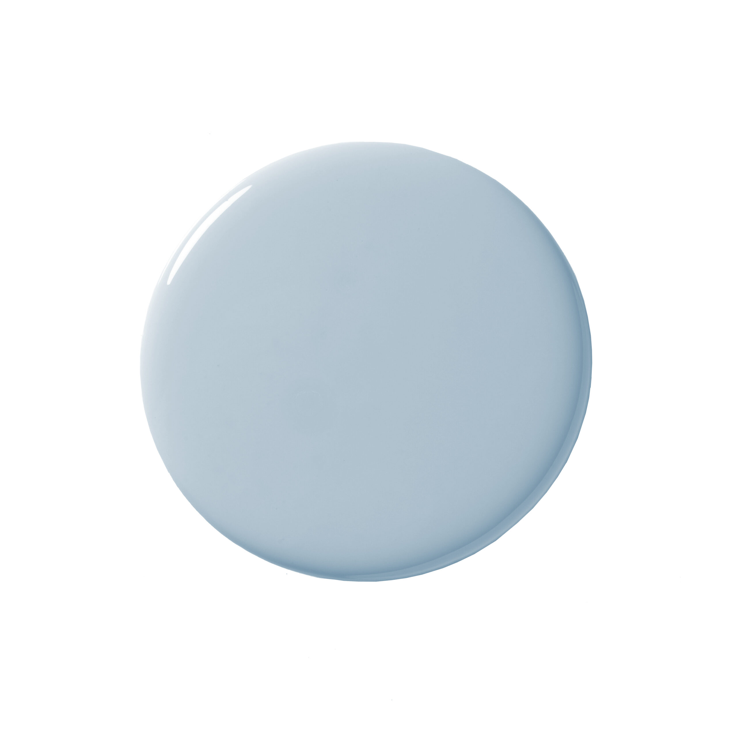
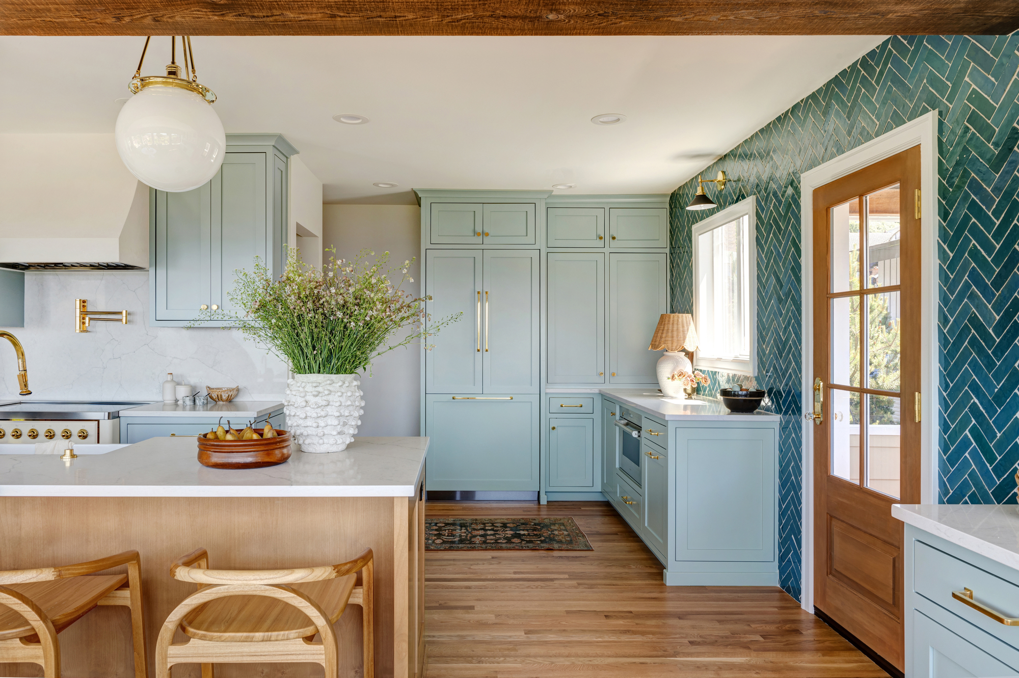
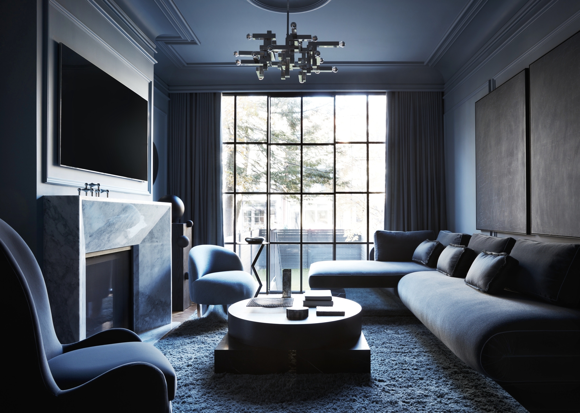
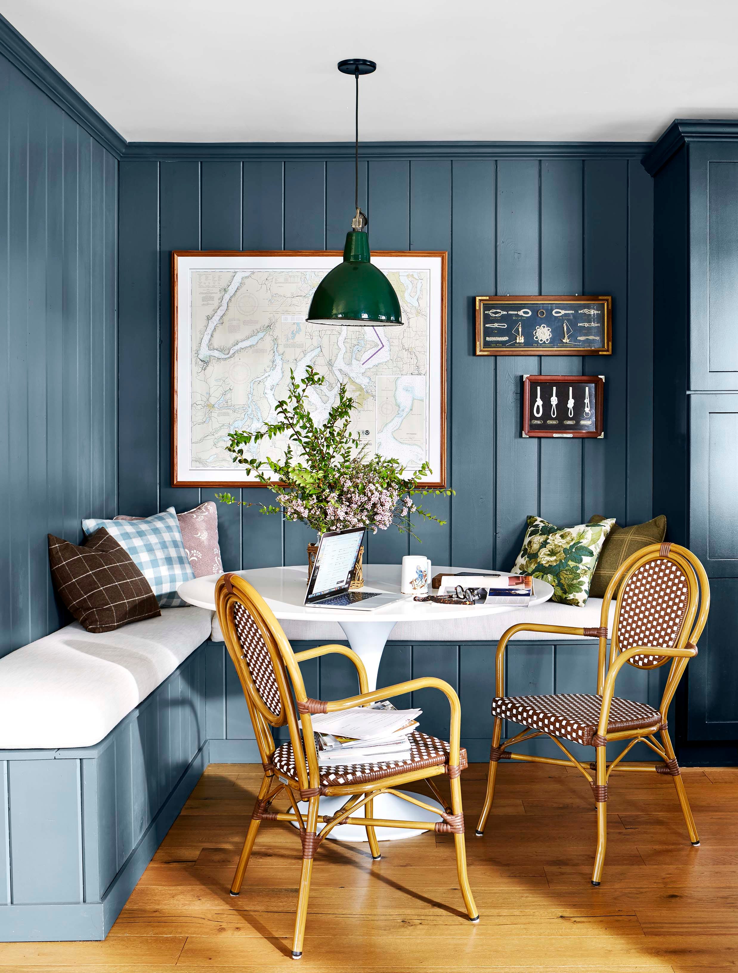
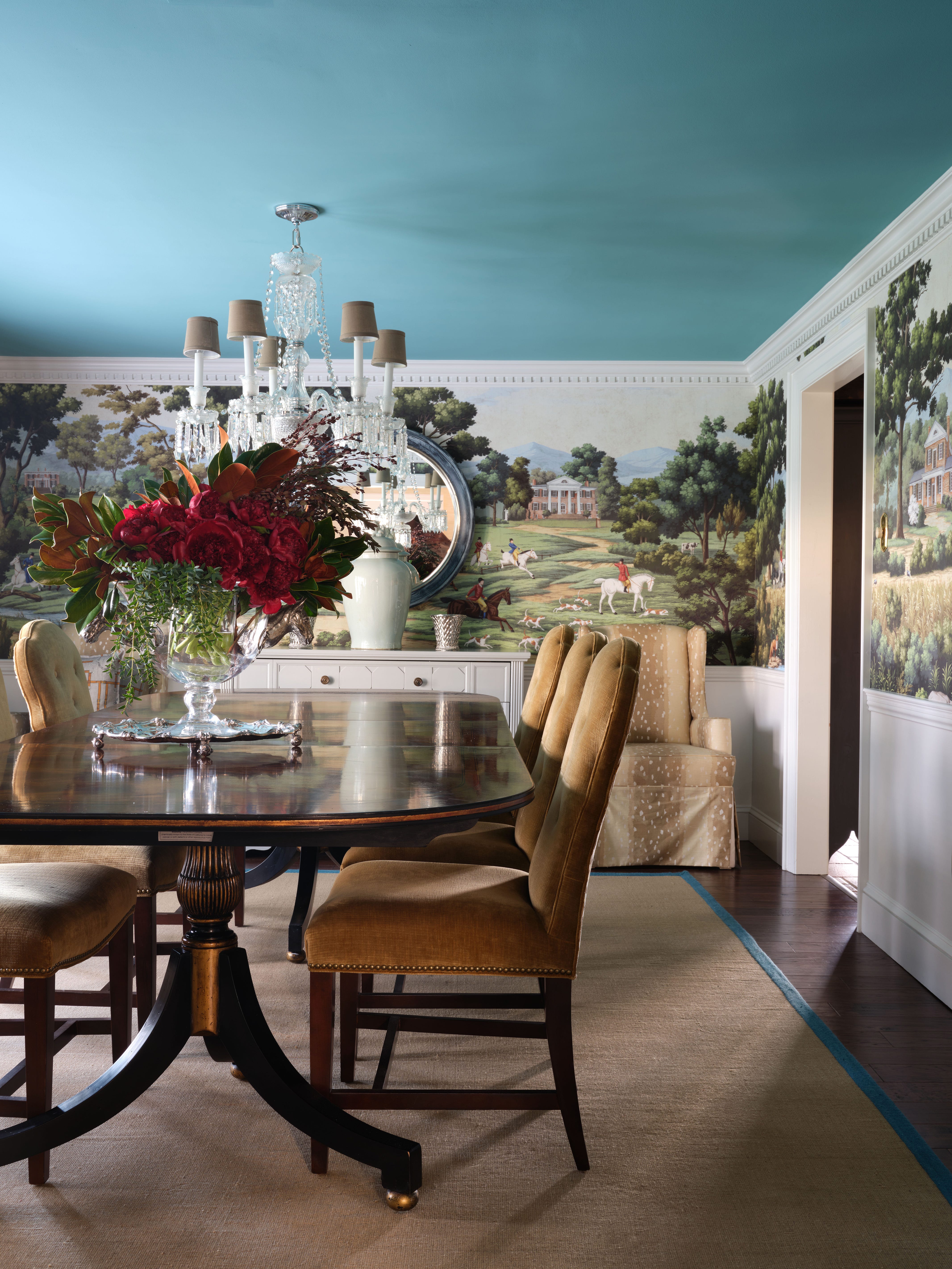
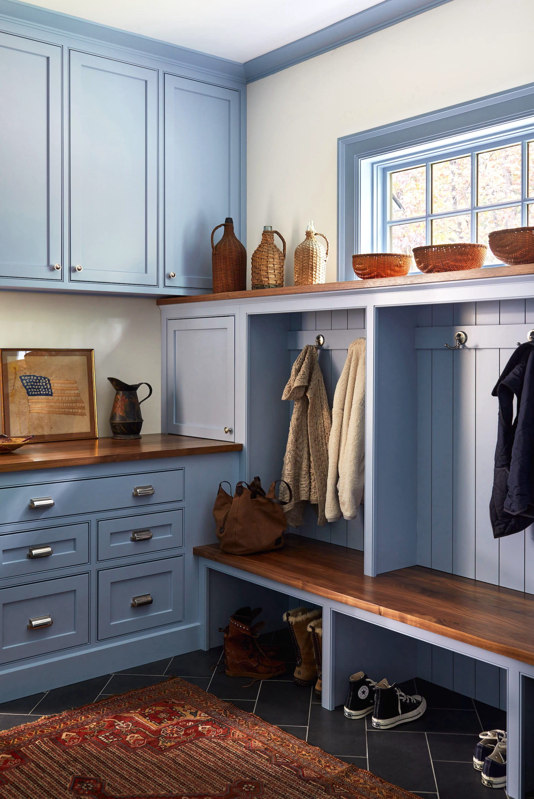
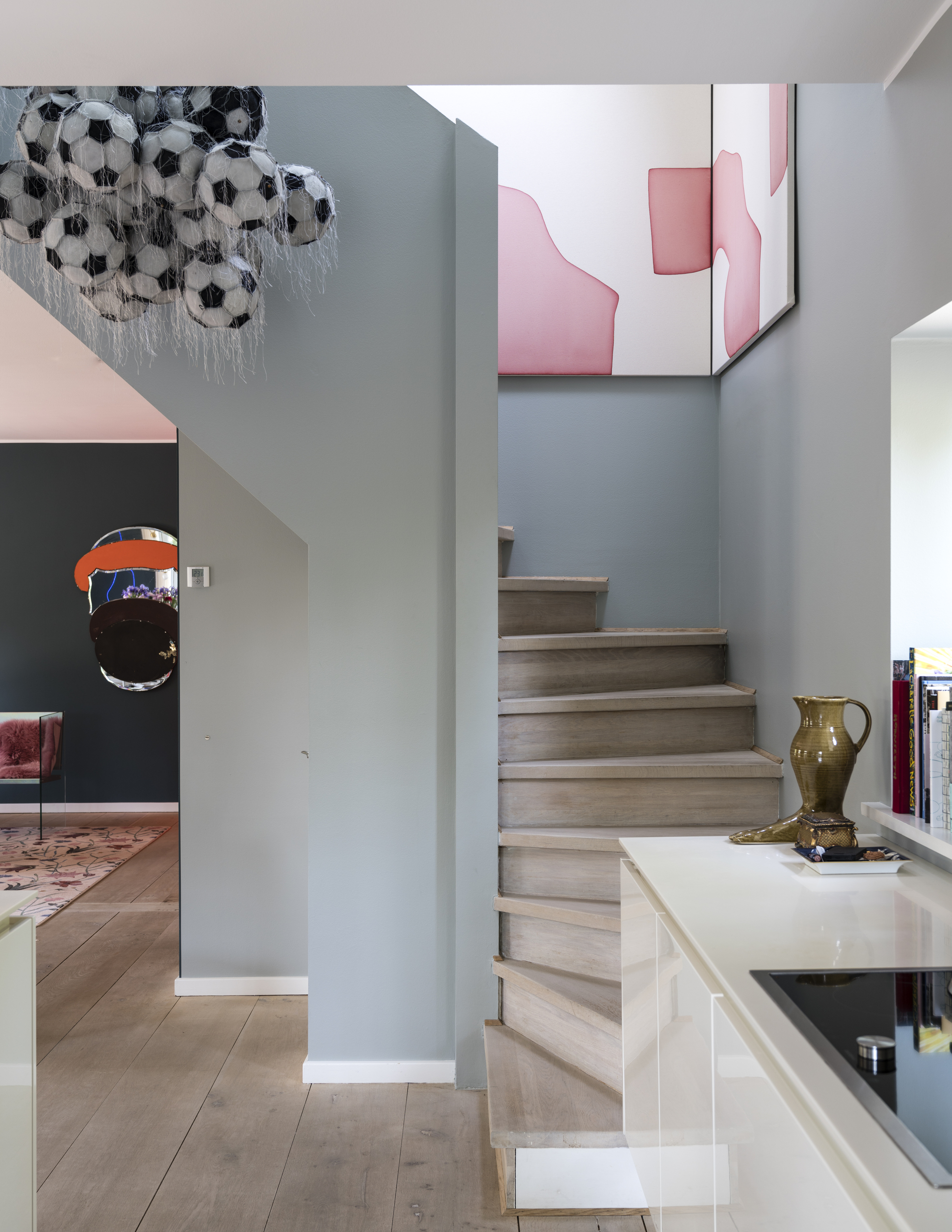
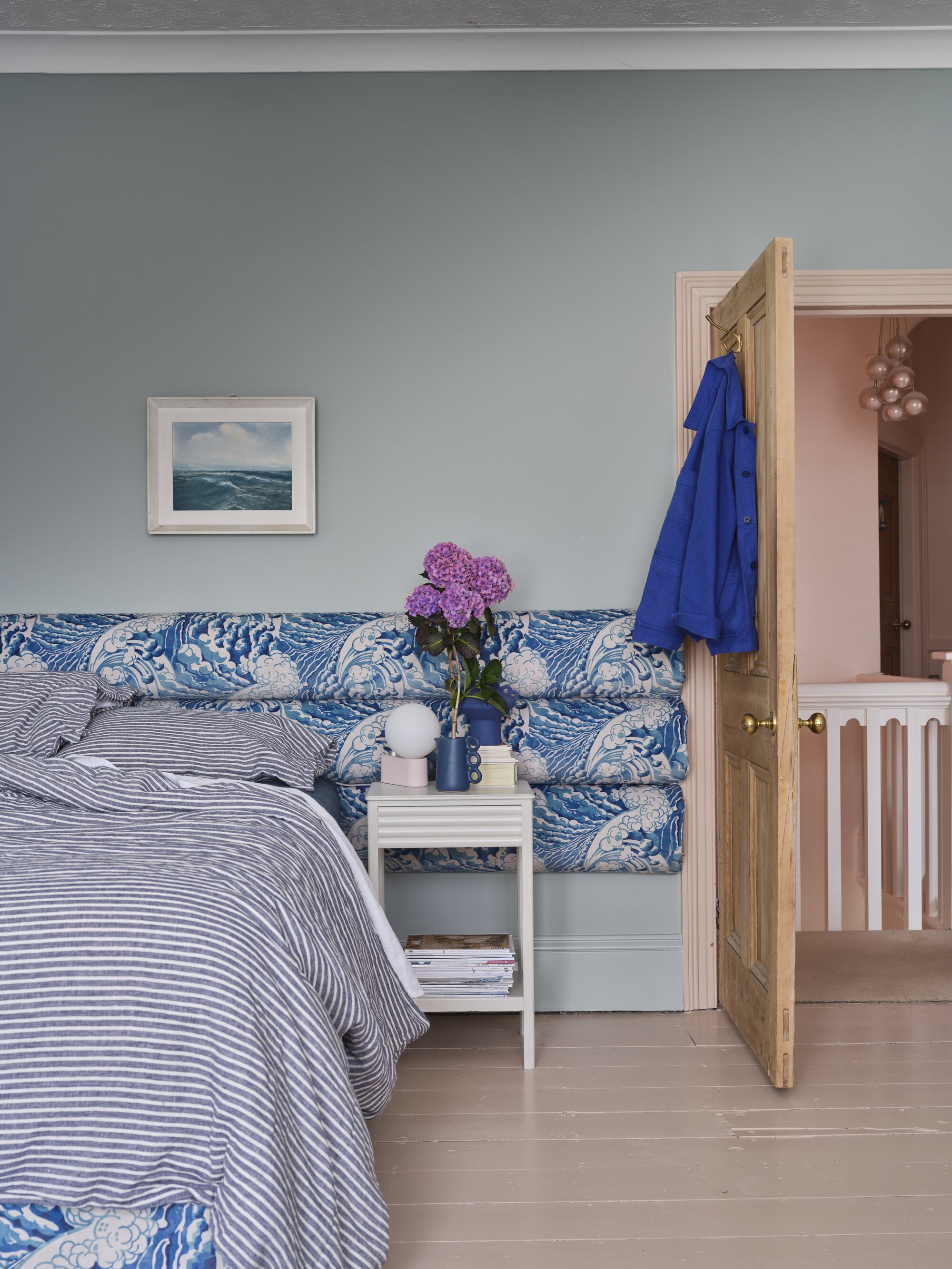
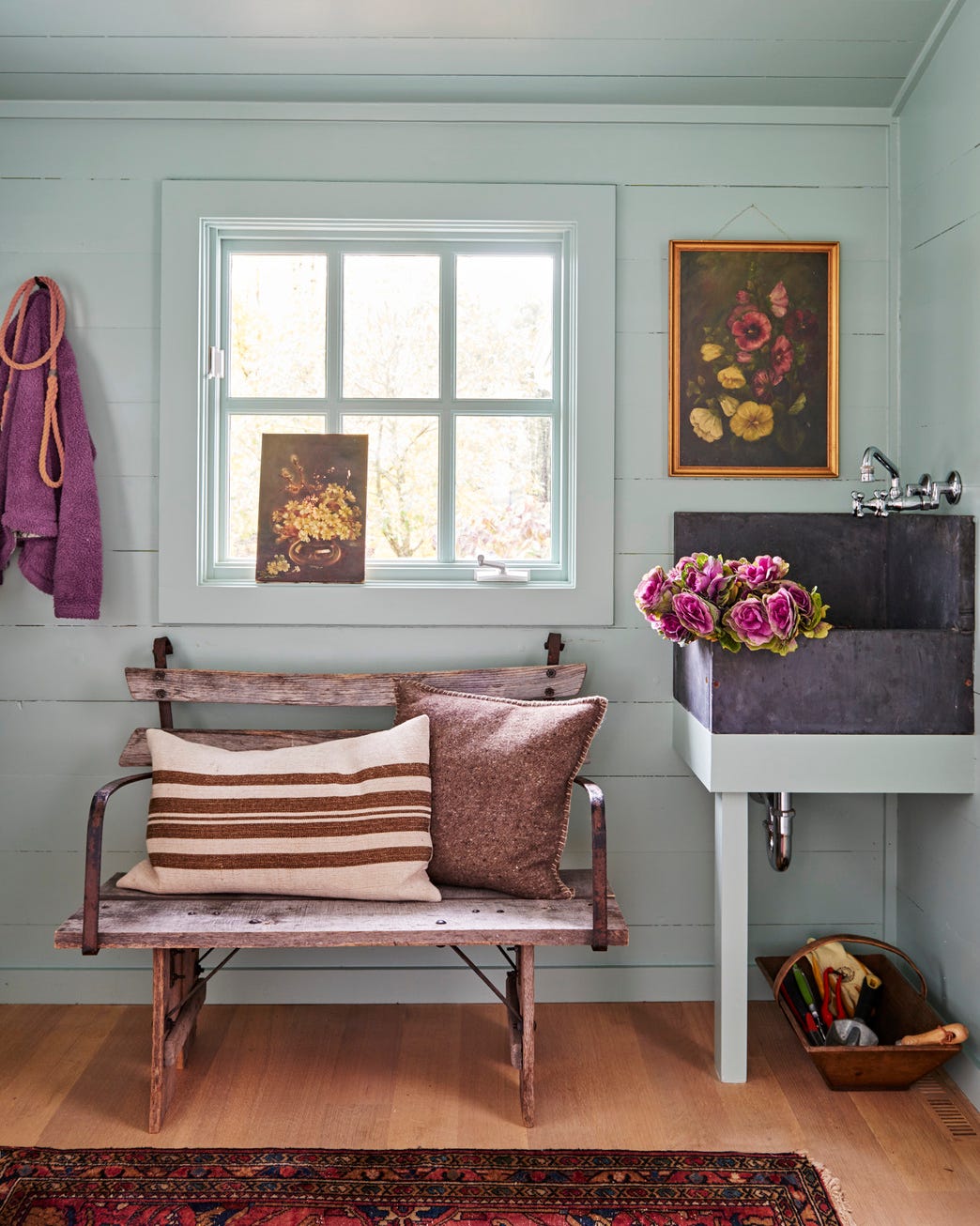
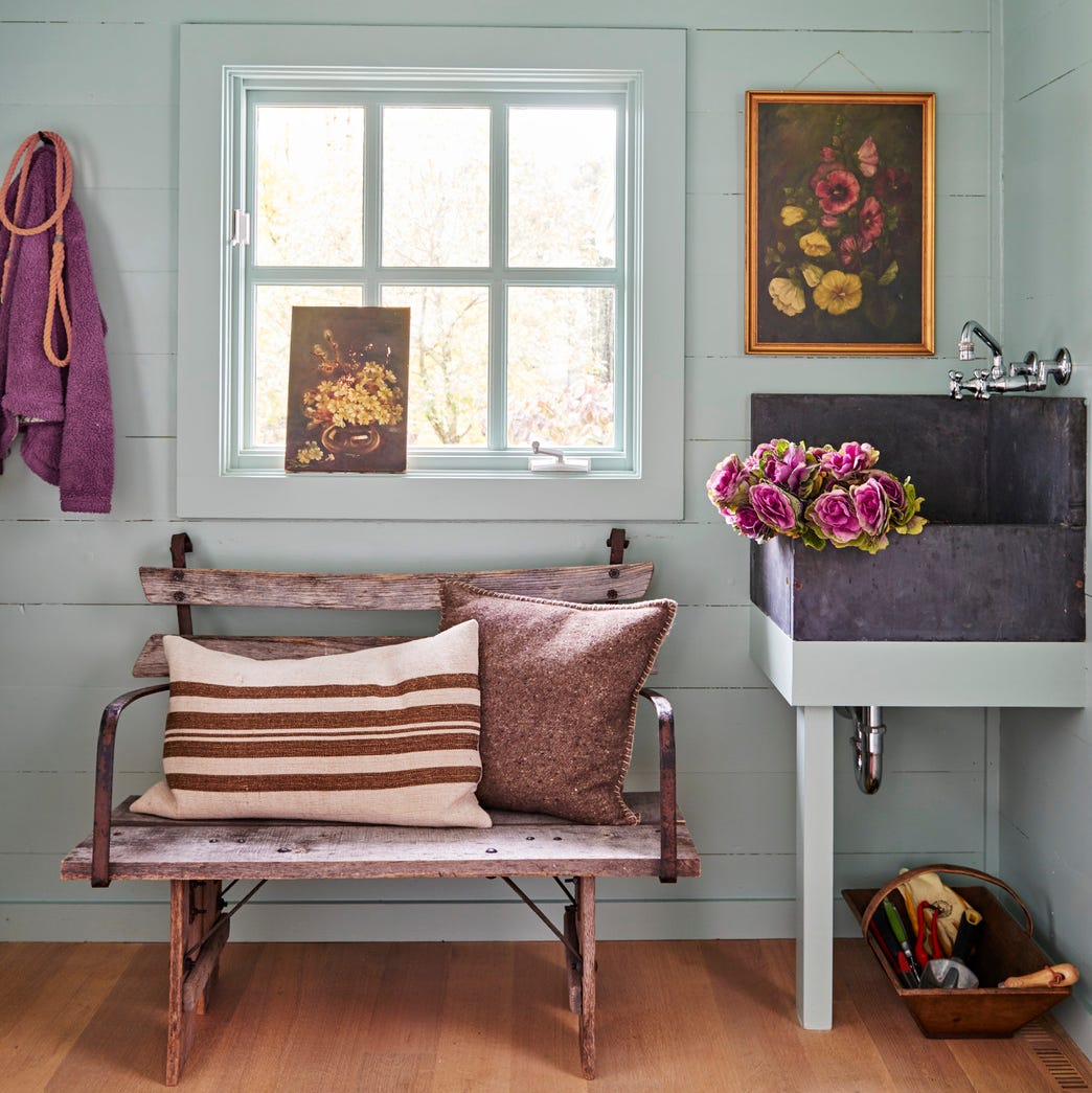
The article then lists several blue paint recommendations from various designers, showcasing a wide array of options from different brands like Benjamin Moore and Farrow & Ball. Each recommendation includes the specific paint name and code, along with a designer's quote explaining why they favor that particular shade and where they typically use it. Examples include Benjamin Moore's Slate Teal for its calming effect, Farrow & Ball's Dix Blue for a beachy vibe, and Benjamin Moore's Dusty Cornflower for its light and airy yet mature feel. Other suggestions cover pale blue-grays like Farrow & Ball's Skylight for serene bedrooms, and blue-green hues like Benjamin Moore's Kensington Green for sophisticated spaces with levity.
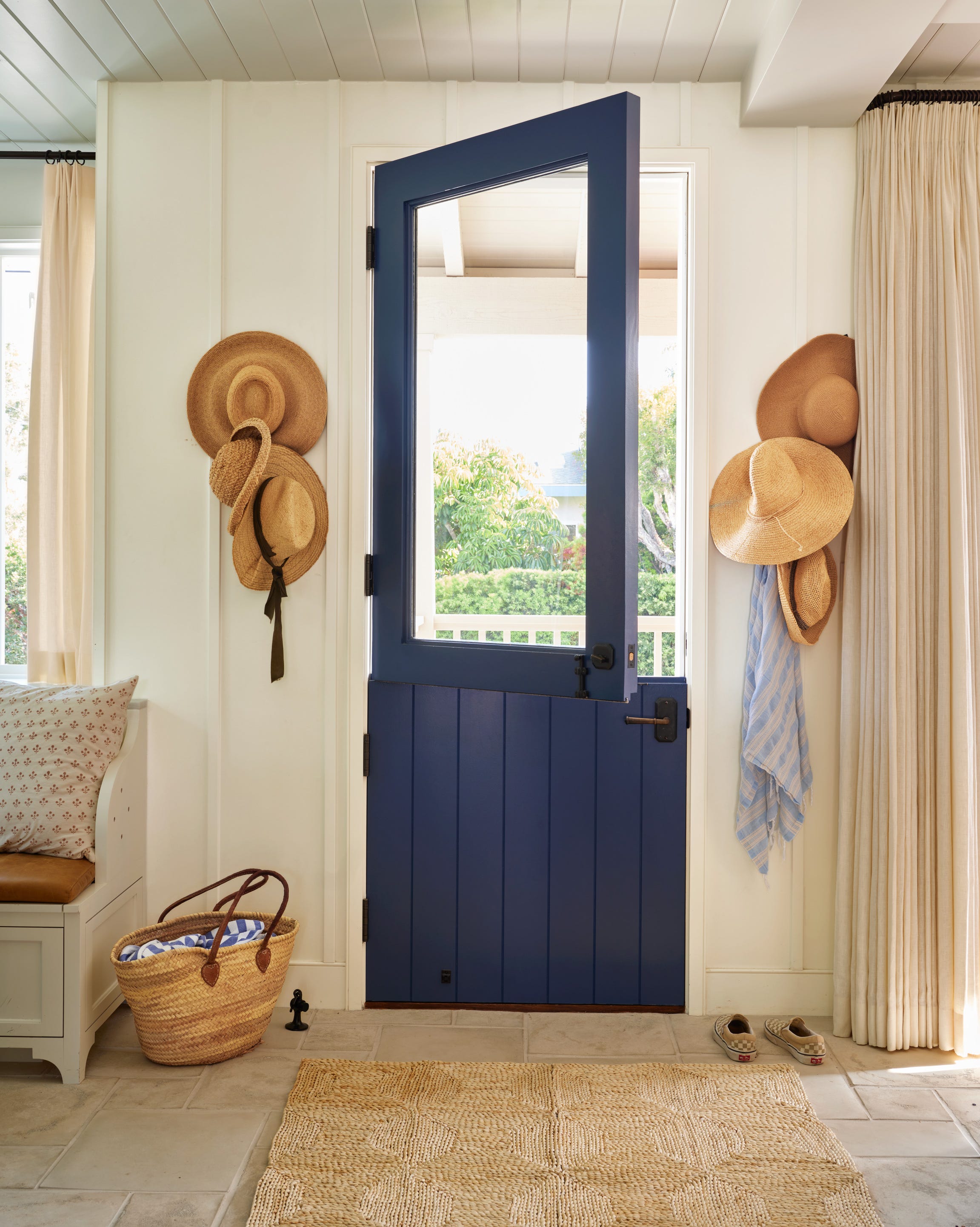
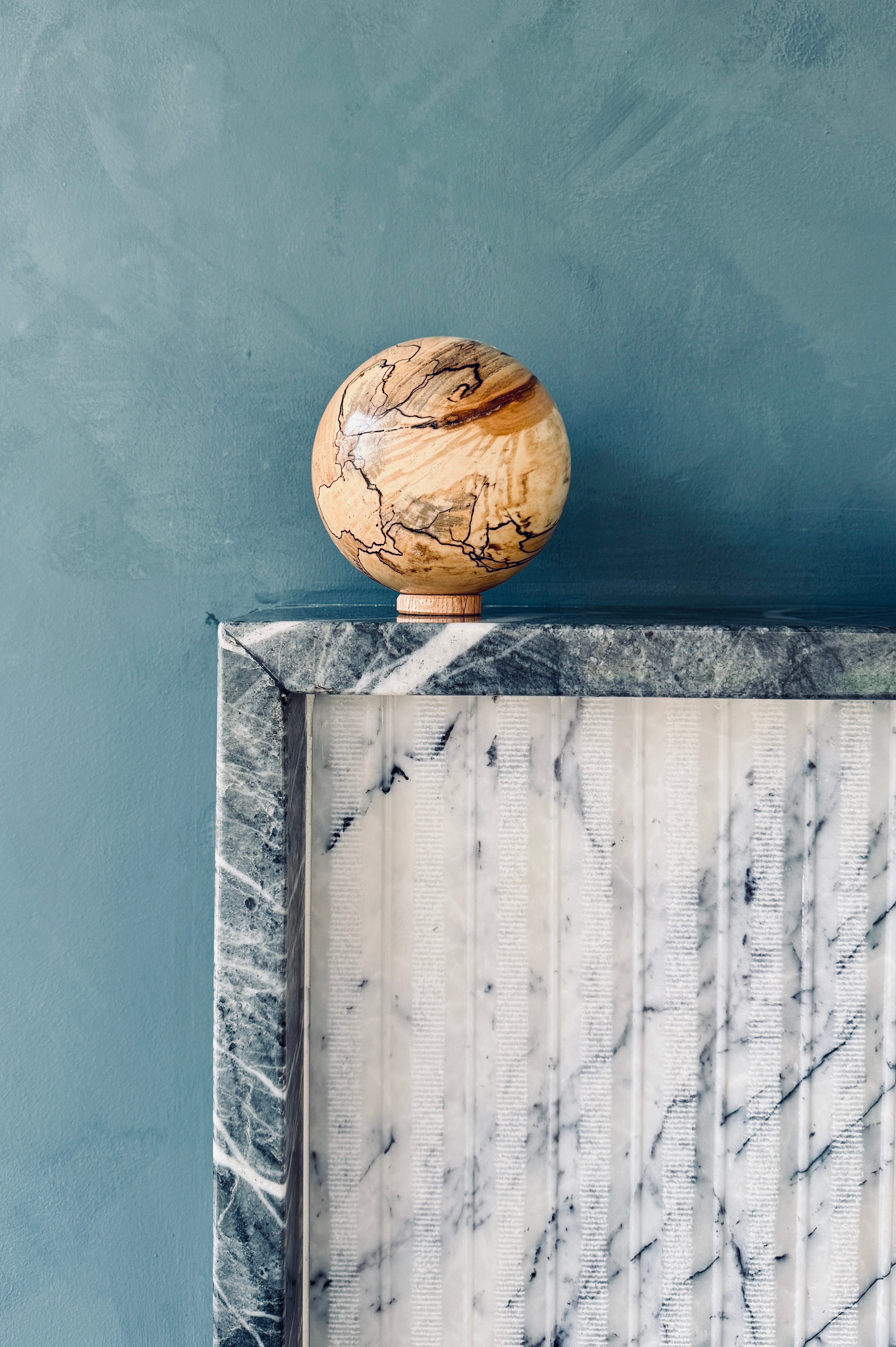
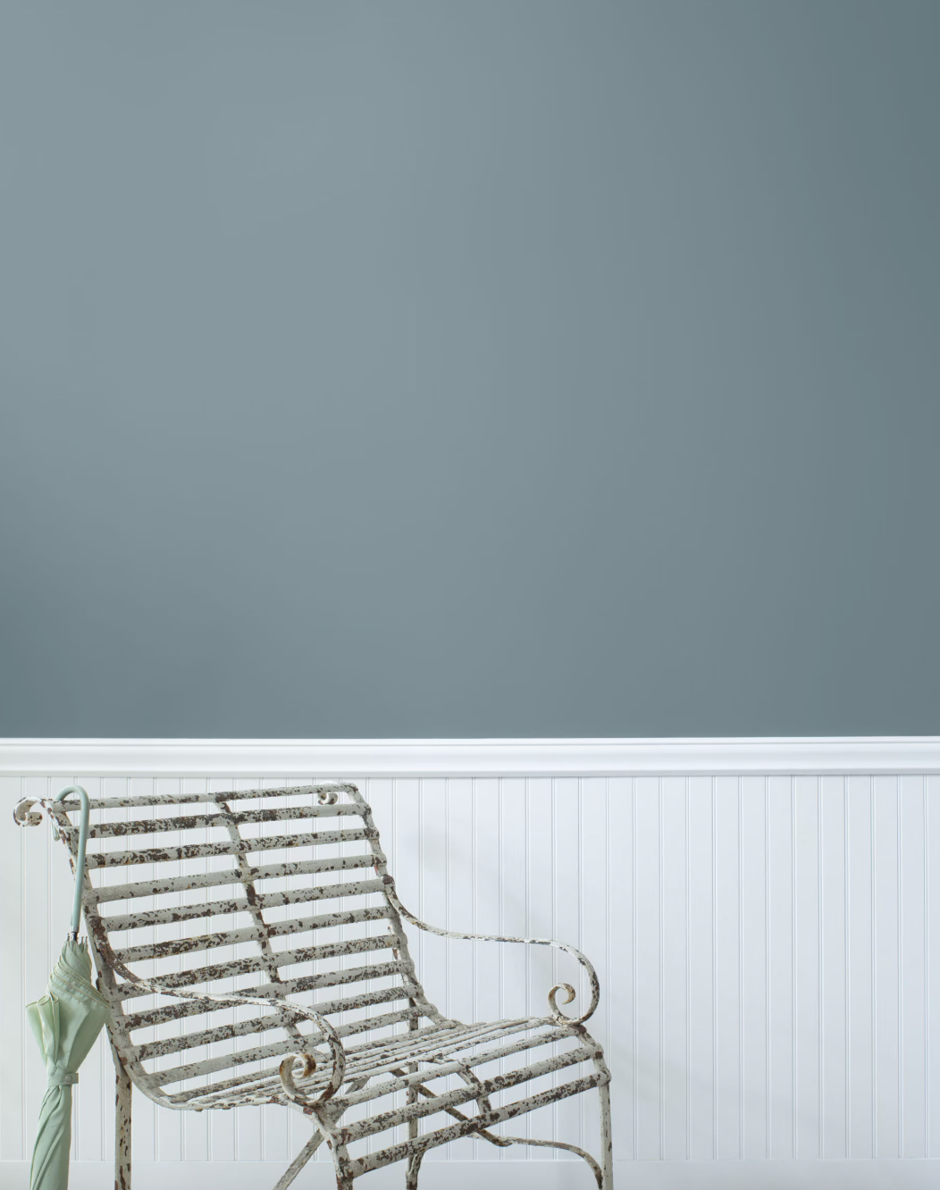
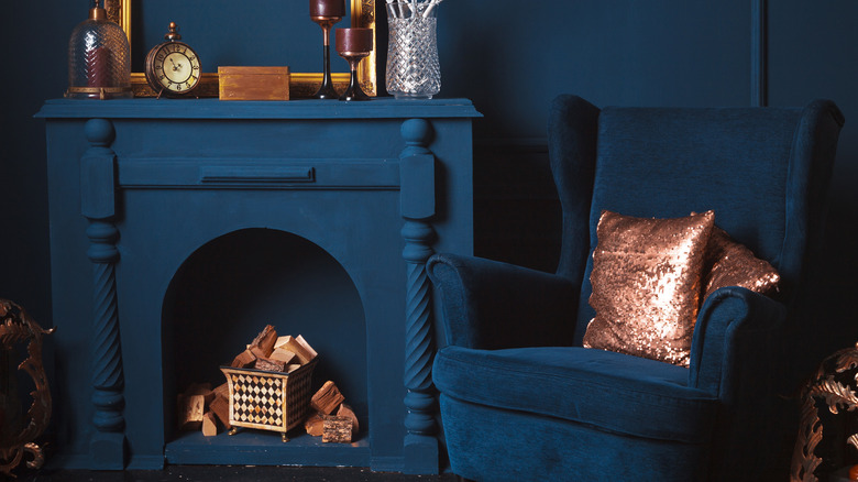
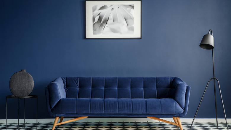
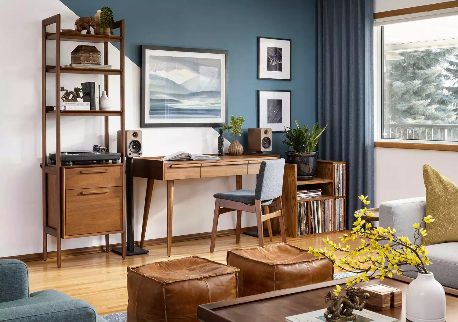
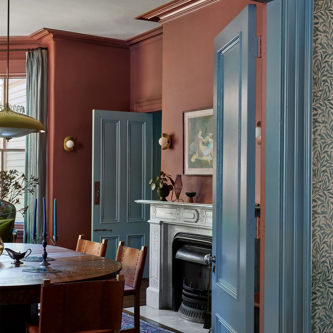
Darker shades such as Farrow & Ball's De Nimes are noted for their versatility as both vibrant pops and grounding neutrals, especially with a high gloss finish. Benjamin Moore's Boothbay Gray, despite its name, is praised as a stunning blue accent. Deep, bluish-gray hues like Benjamin Moore's Blue Note offer coziness and neutrality, while Narragansett Green (a deep teal blue) provides saturated color without being overtly vibrant. Light blue options like Valspar's Smoke Infusion create magical and airy breakfast nooks. The list continues with classic deep navies like Benjamin Moore's Hale Navy, deep blues with green undertones like Farrow & Ball's Hague Blue, and elegant, matte options such as Benjamin Moore's Blue Spruce for built-ins. More whimsical and sophisticated blues like Farrow & Ball's Stiffkey Blue and Parma Gray are highlighted for classic and refined looks, avoiding a 'baby' or pastel aesthetic. The article also includes Marine Blue for vibrancy, Lead Gray for a smoky blue on cabinets, and Windmill Wings for its ethereal, soothing aura with hints of lavender. Blue Danube, with its teal touch, is noted for its versatility and mood-altering qualities. Bird's Egg is described as capturing the elegance of a Tiffany box, adding subtle sophistication. The selections emphasize blue's capacity to evoke various moods and complement diverse design styles, making it a reliable choice for any home.
#BluePaintColors #InteriorDesign #HomeDecor #PaintTrends #ColorPsychology #DesignerApproved #BluePaintColors #InteriorDesign #HomeDecor #PaintTrends #ColorPsychology #DesignerApproved
Há 0 comentários no total
 Ainda não há comentários
Você também pode gostar
The 60 Best Blue Paint Colors for Every Room in Your Home
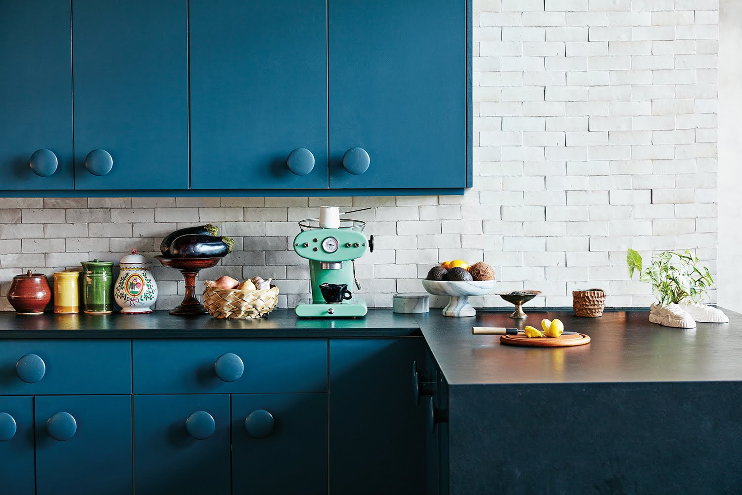
The 18 Best Paint Colors for Blue Kitchen Cabinets, Straight From Our Favorite Spaces

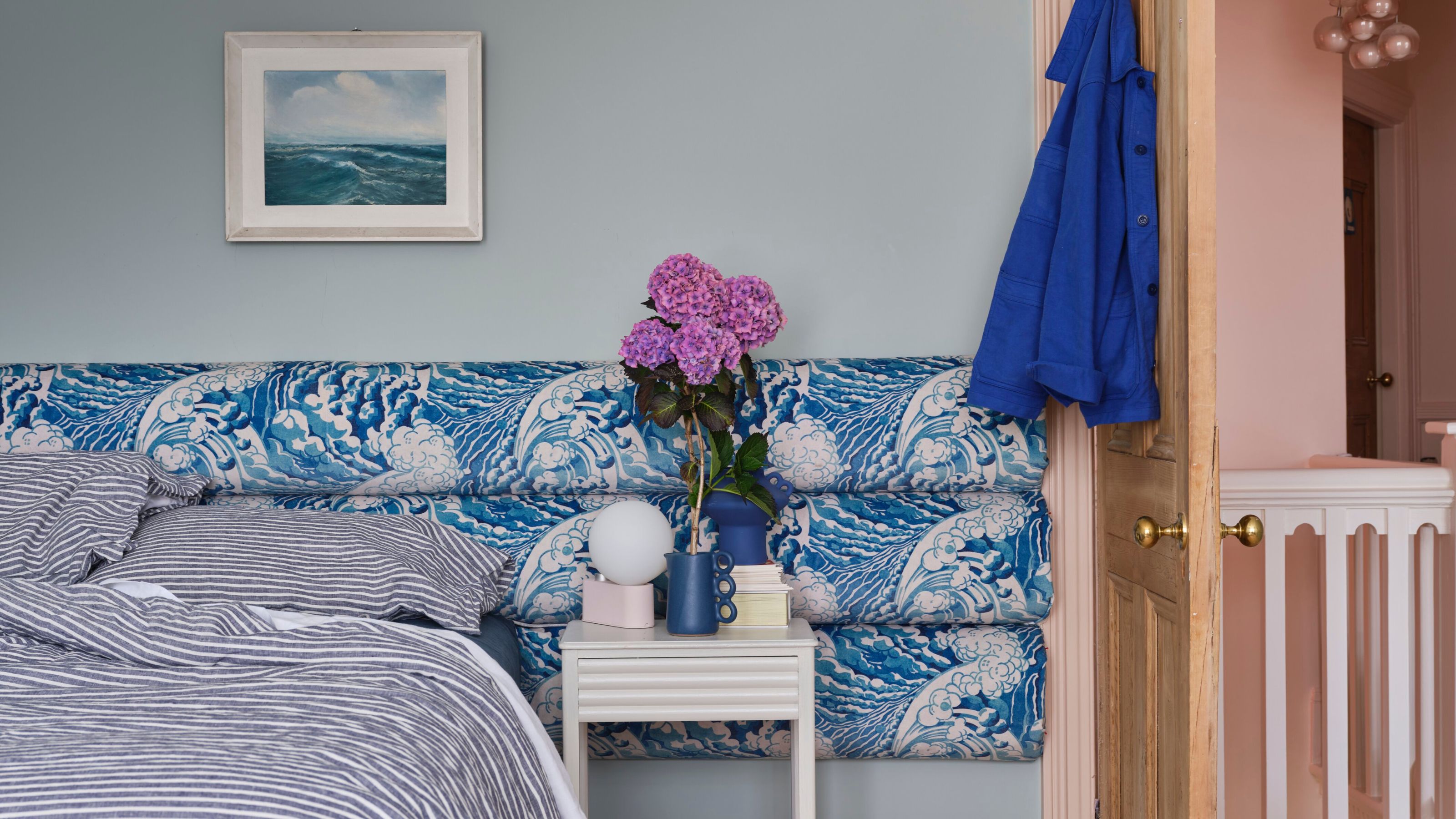
What a Paint Color Expert Would Pair With Light Blue Walls

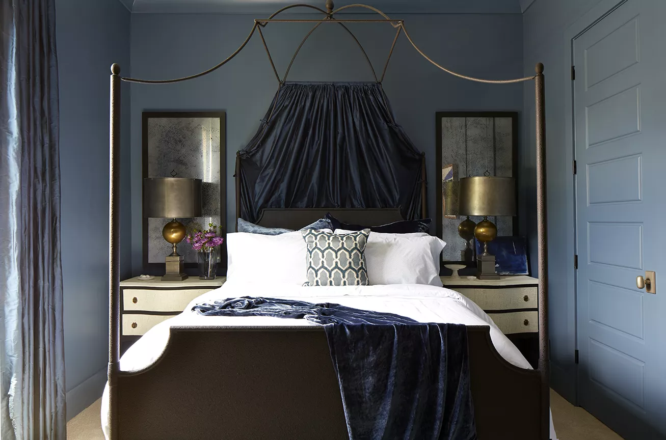
Looking for the Perfect Dark Blue Paint Color? Look No Further Than These Top Picks

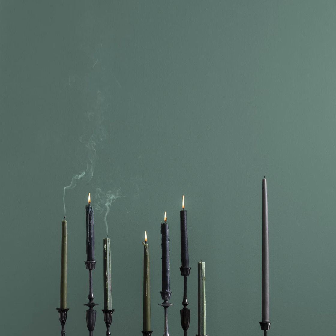
The 10 Best Blue-Green Paint Colors Designers Can't Stop Using
We Asked Designers: What's the Best Light Blue Paint Color? Here's 6 Shades They Swear By
These 10 Colors Always Look Beautiful With Blue
25 Dreamiest Blue-Gray Paint Colors for Any Room in the House
15 Designer-Approved Blue-Gray Paint Colors That Will Never Go Out of Style
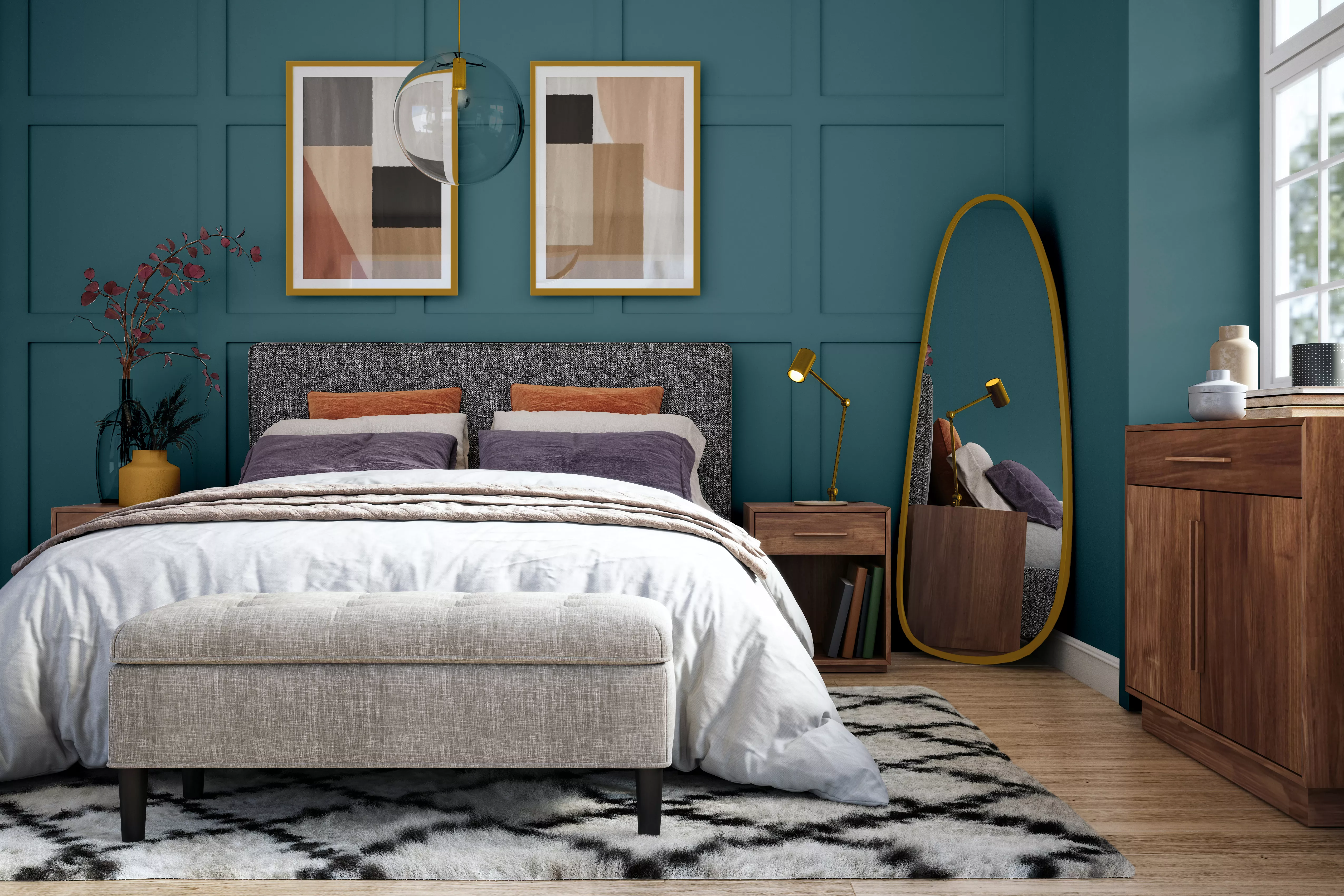
15 Blue-Green Paint Colors the Experts Recommend

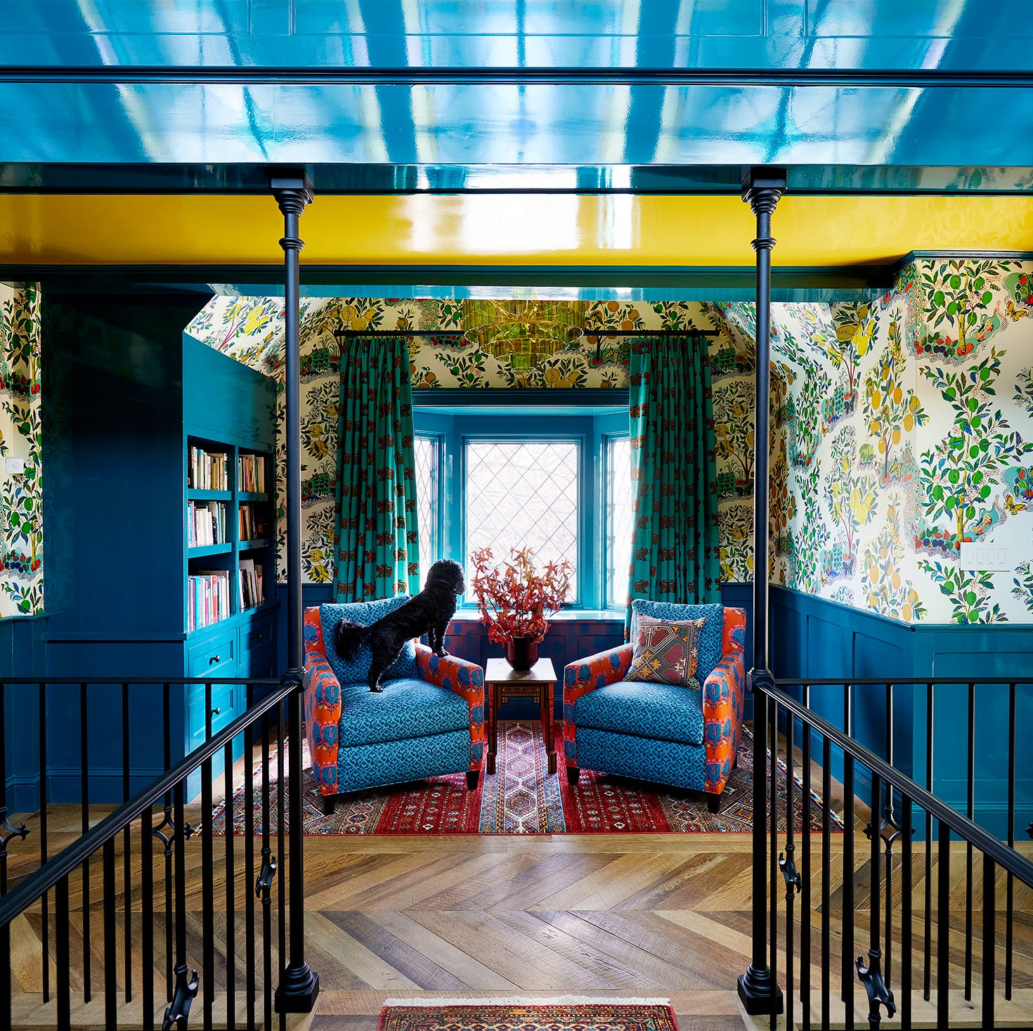
45 Blue Rooms That Prove It's the Most Amazing Color in the Rainbow

Designers LOVE Pairing These Unexpected Colors With This One Timeless Hue
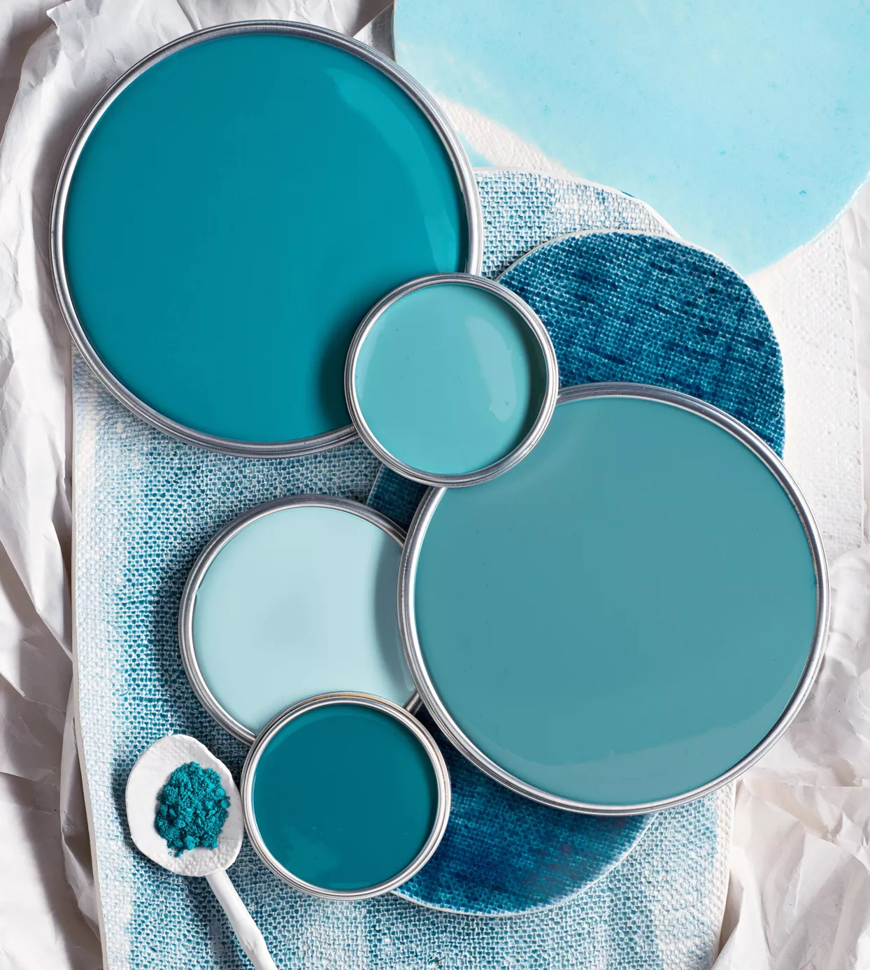
29 Best Blue Paint Colors for Perfectly-Hued Walls
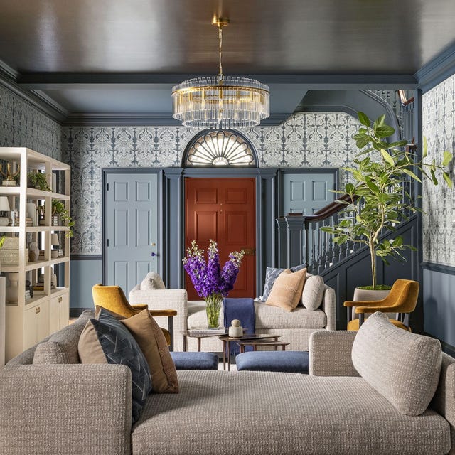
This Is the Best Blue Paint Color, According to Designers

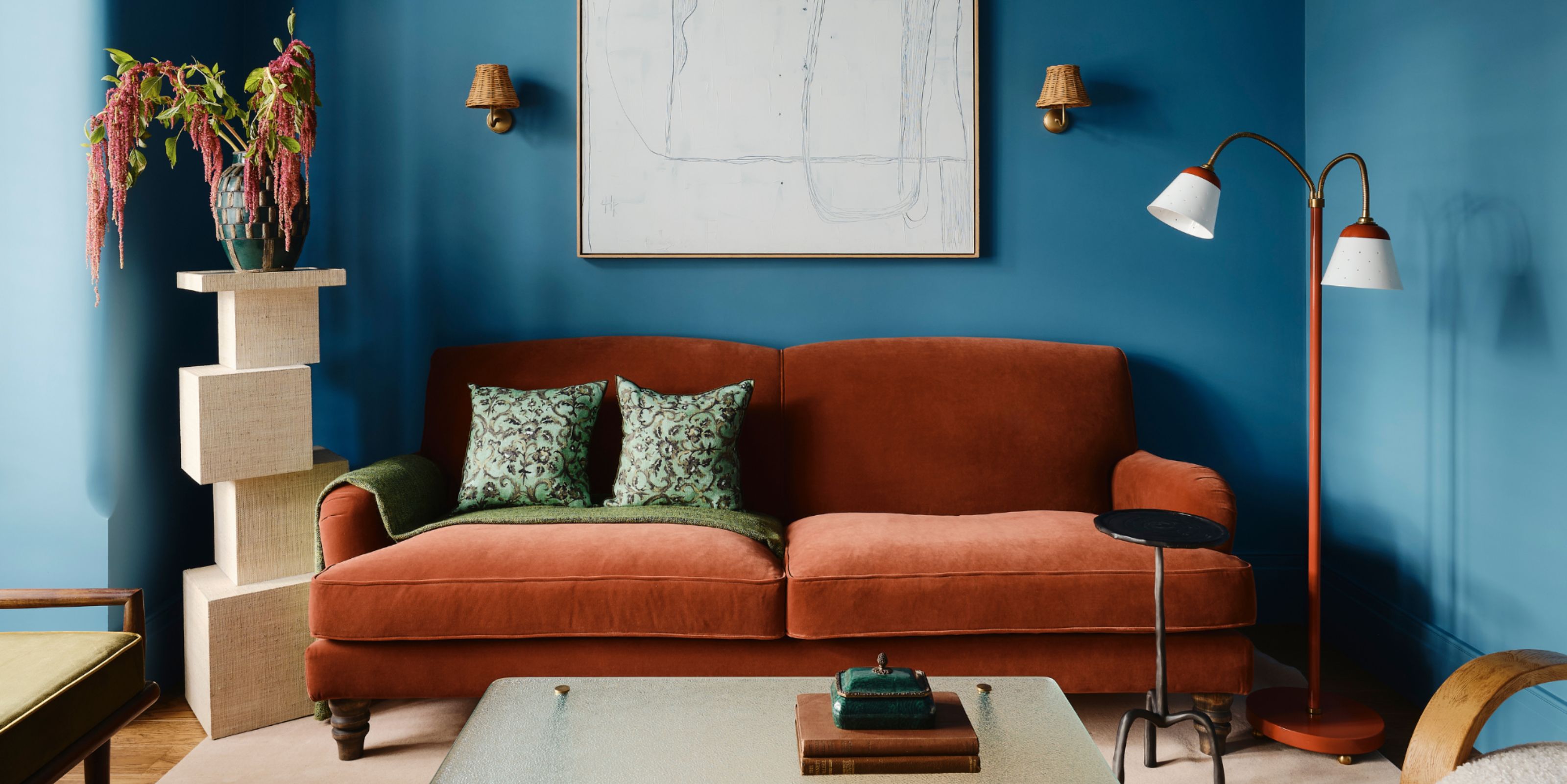
Colors That Go With Blue — 16 Pairings Designers Depend on for Bold, Breezy, and Perfectly Balanced Palettes
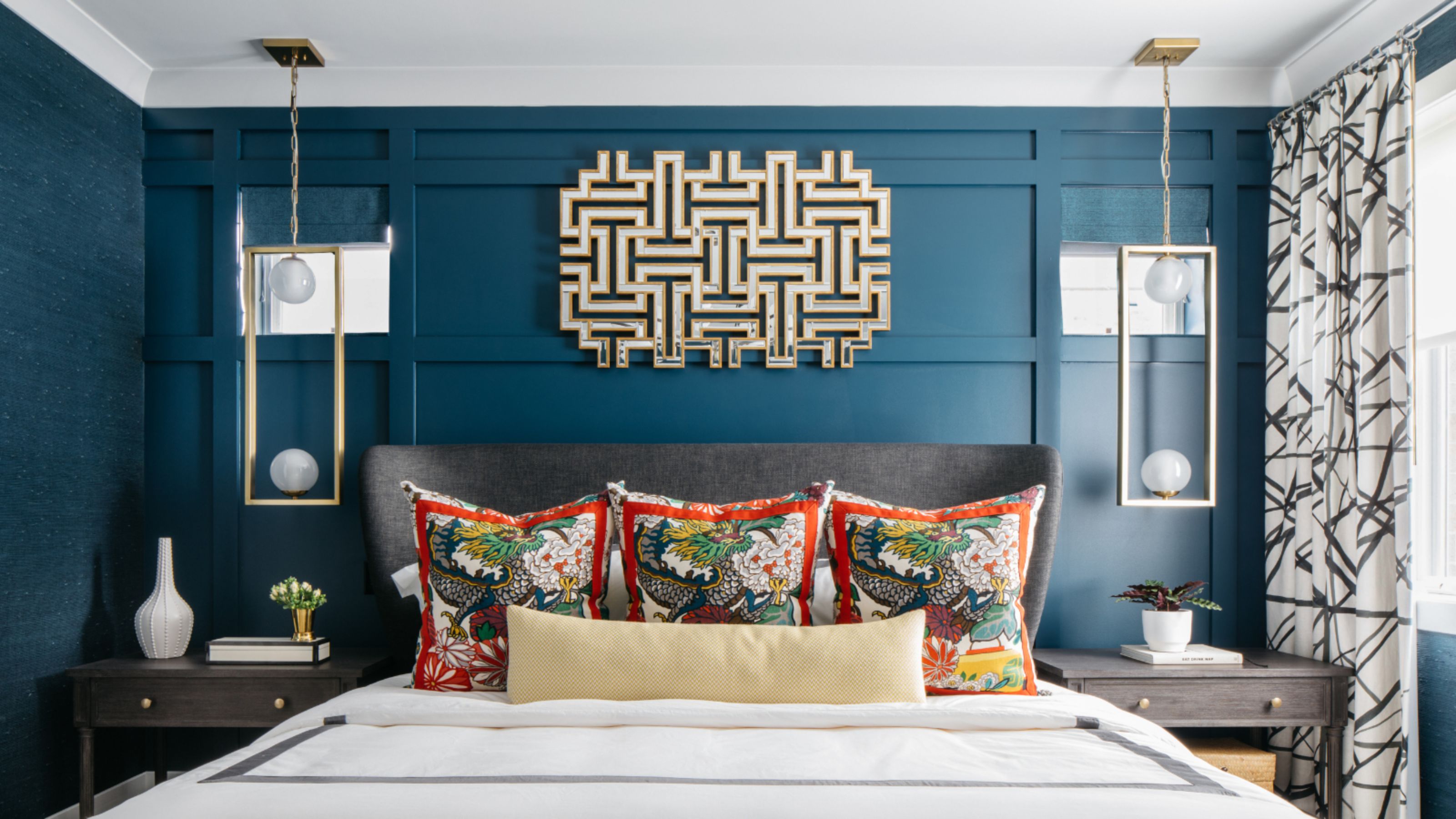
What Is the Most Expensive-Looking Blue? 7 Specific Shades to Paint Walls That Will Always Elevate Your Home
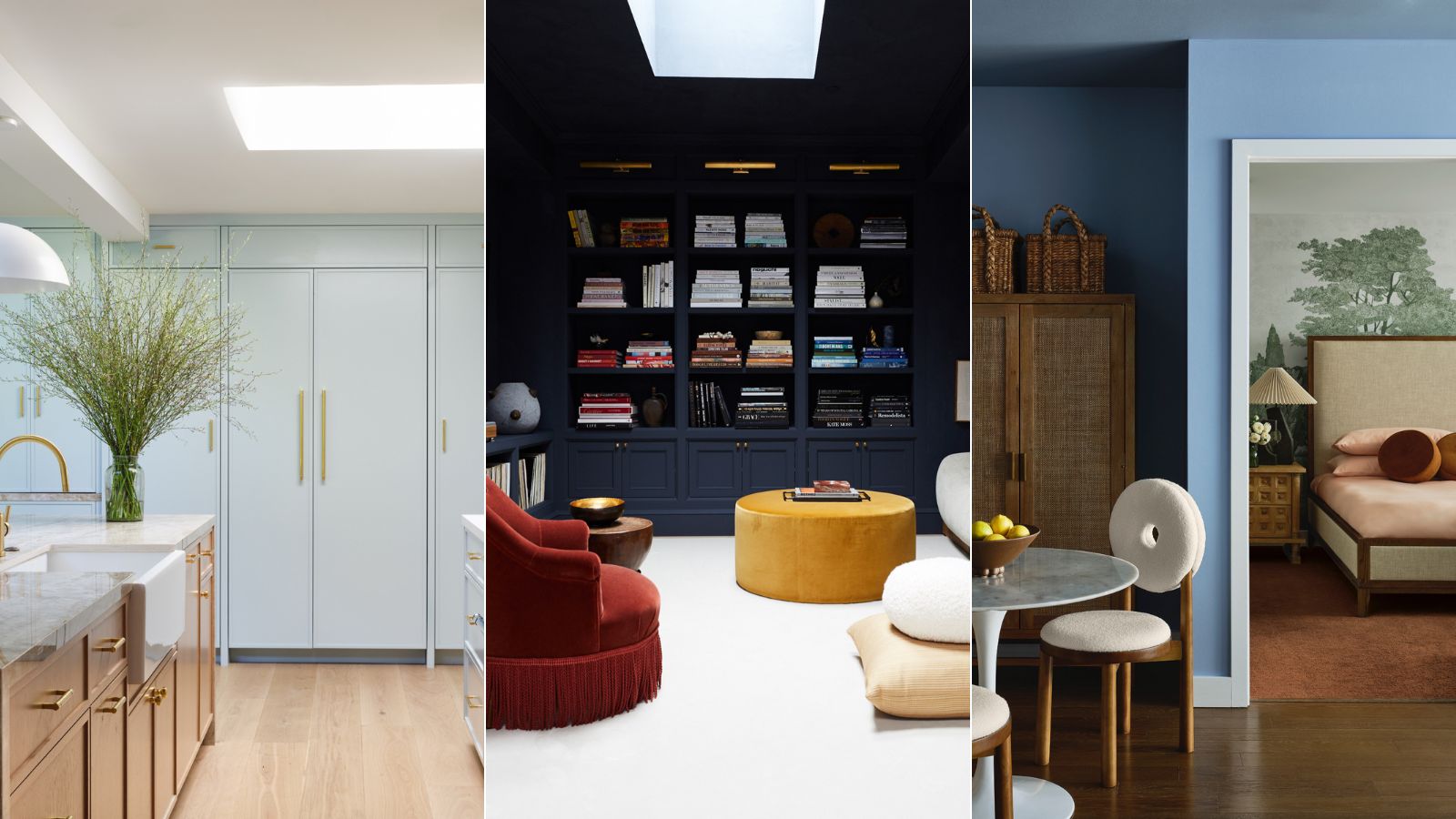
5 best blue paints as chosen by interior designers

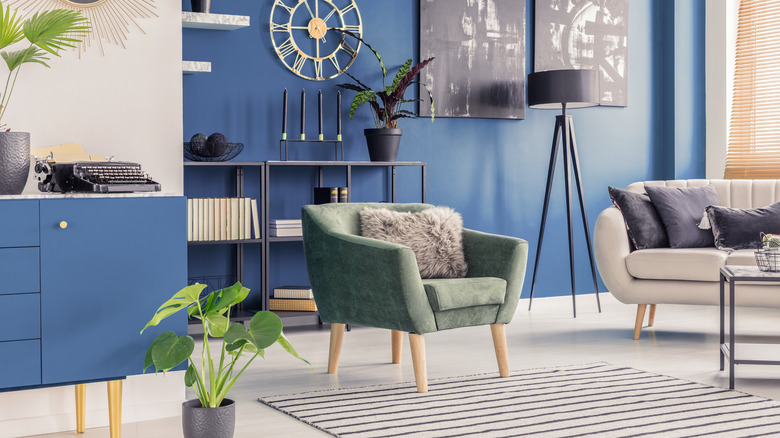
10 Dazzling Navy Blue Paint Colors That Are Perfect For Any Home
18 Designer-Approved Colors That Go With Navy Blue
18 Blue-Gray Paint Colors That Are Versatile, but Never Boring