1/2
10 Taupe Paint Colors That Are Always Right
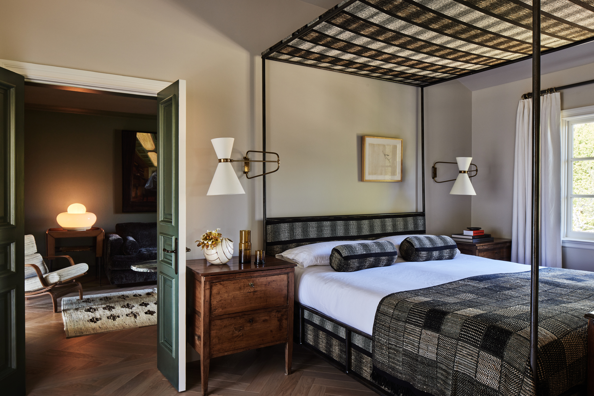
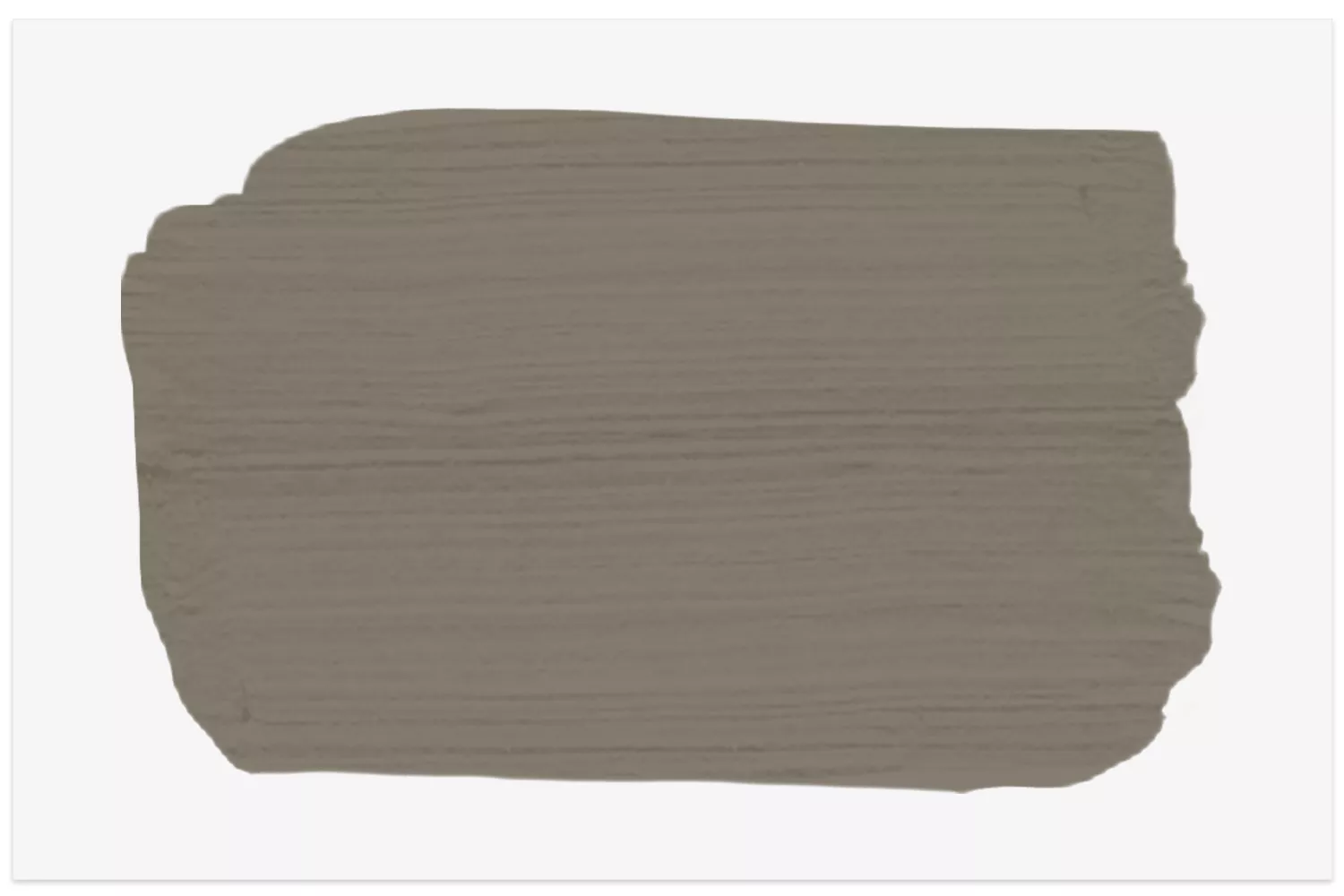
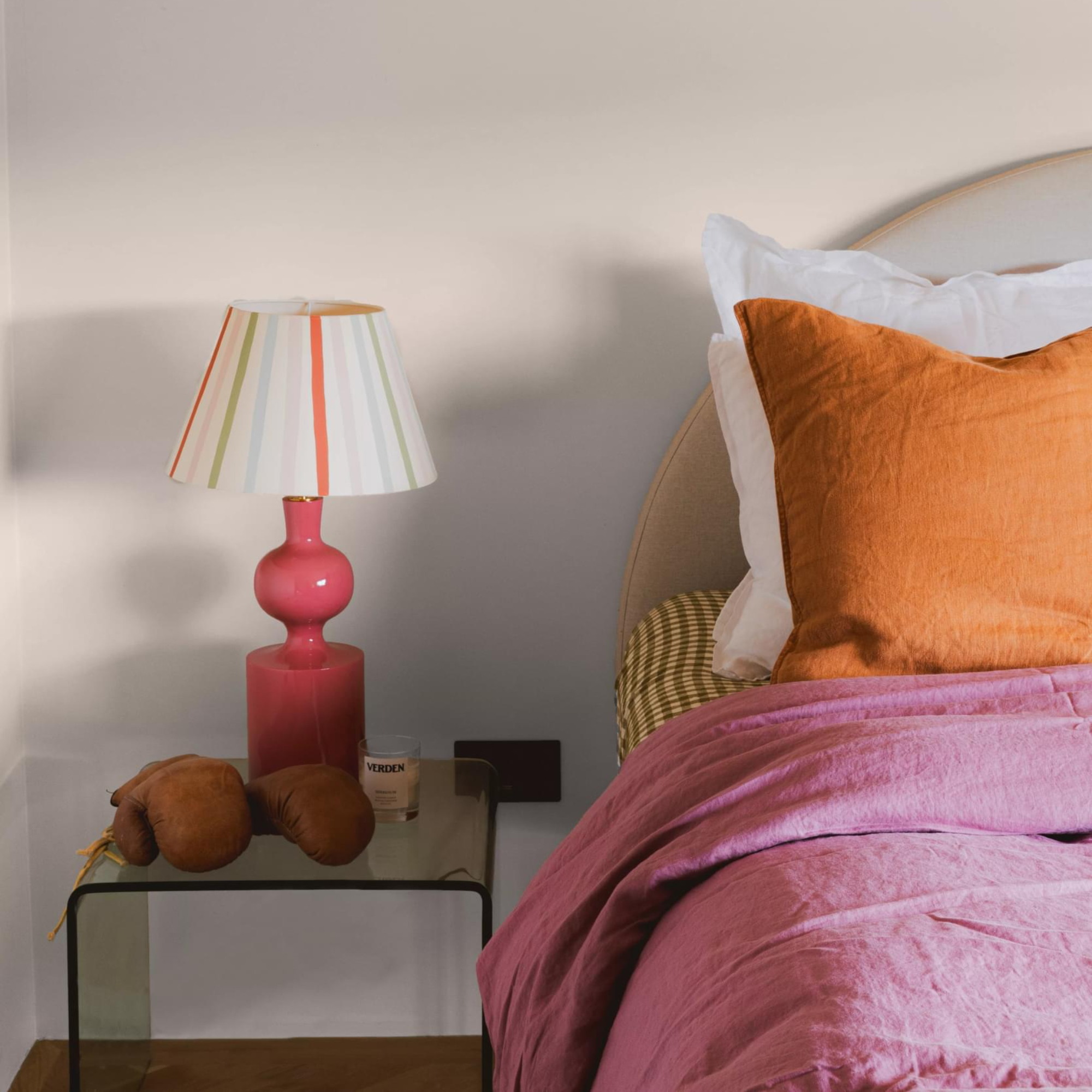
The article discusses ten different shades of taupe paint colors, emphasizing the versatility and timeless appeal of this neutral hue. It begins by differentiating taupe from greige, noting that while both are versatile neutrals, greige tends to be cooler with gray undertones, whereas taupe offers a warmer balance of brown and gray. This distinction is crucial for selecting the right shade for a desired aesthetic. The article highlights taupe's ability to create a cozy and sophisticated atmosphere, making it a suitable choice for various interior design styles, from traditional to contemporary.
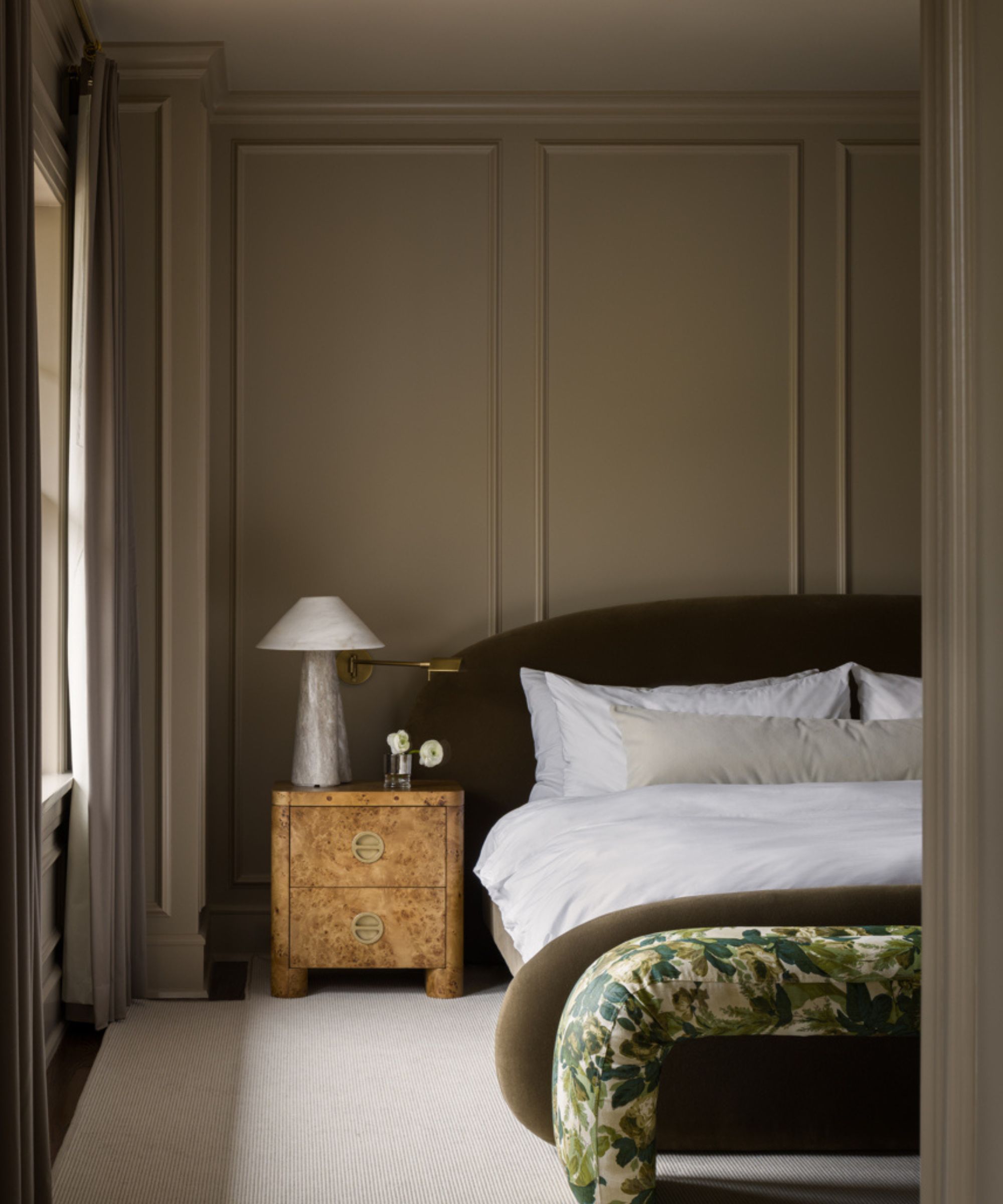
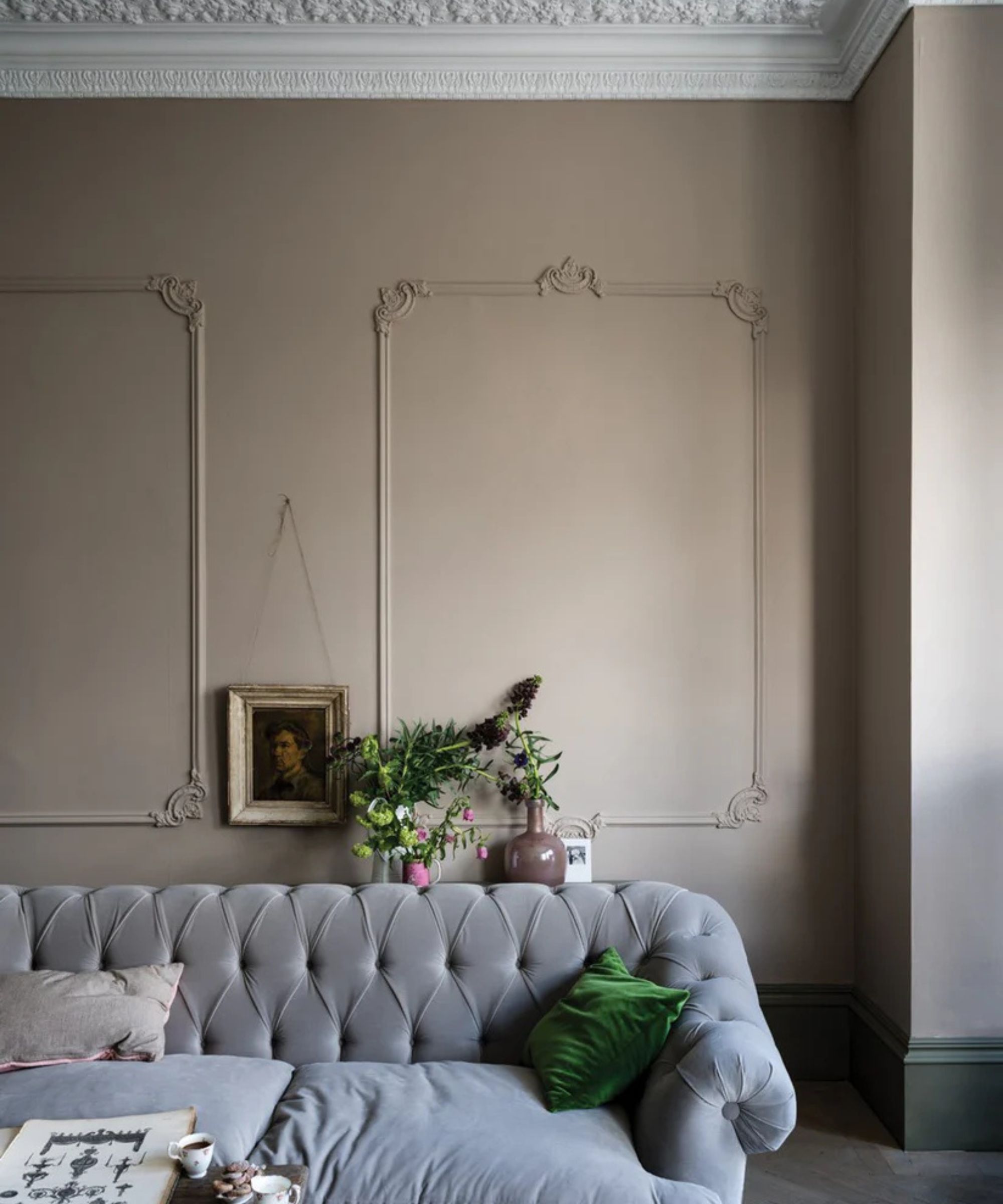
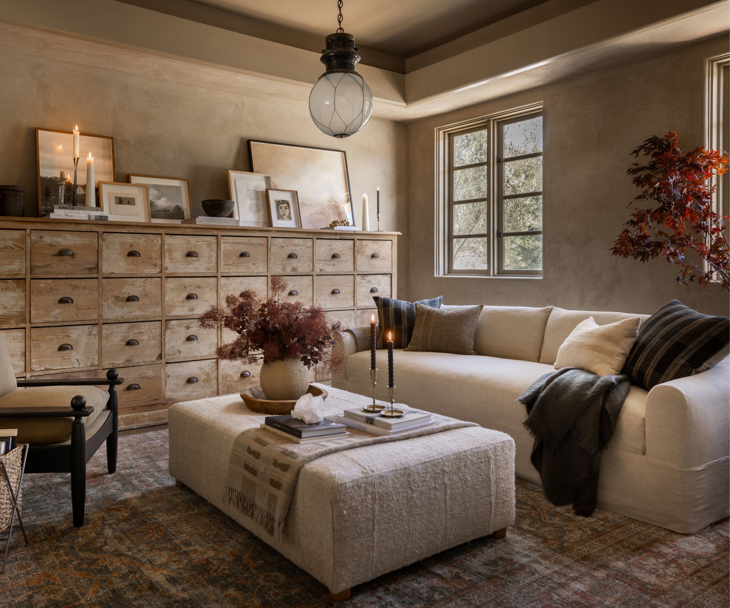
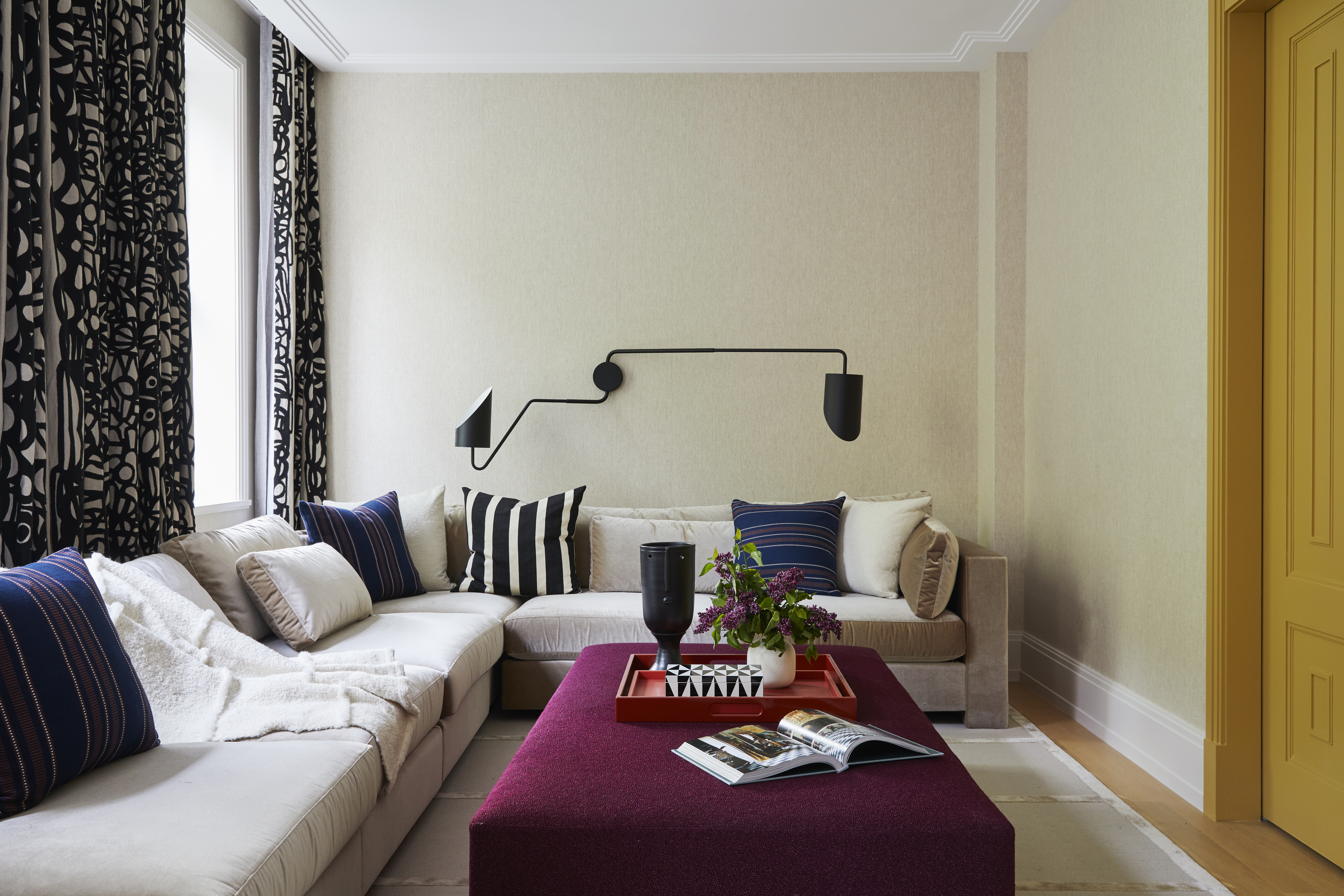
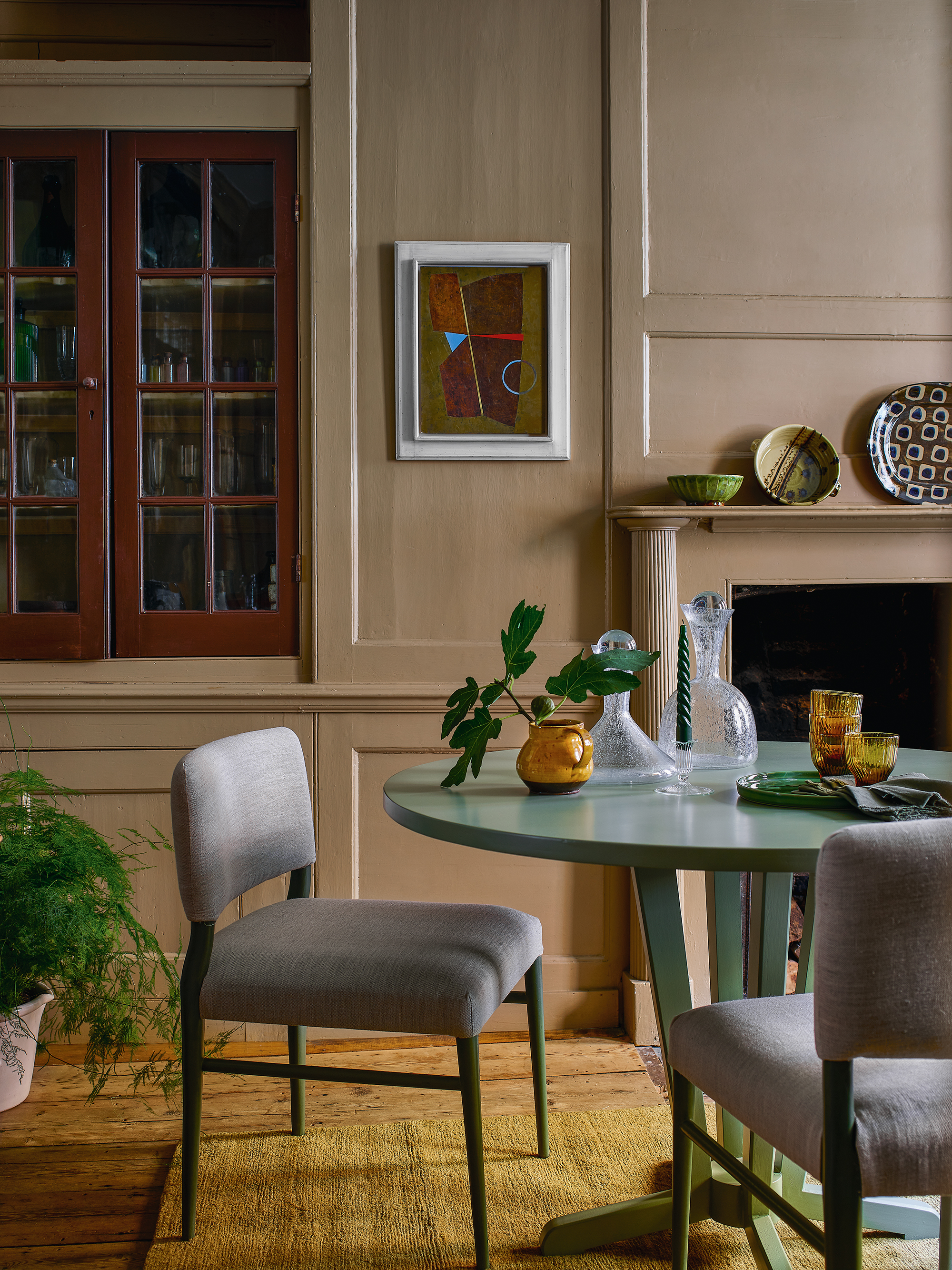
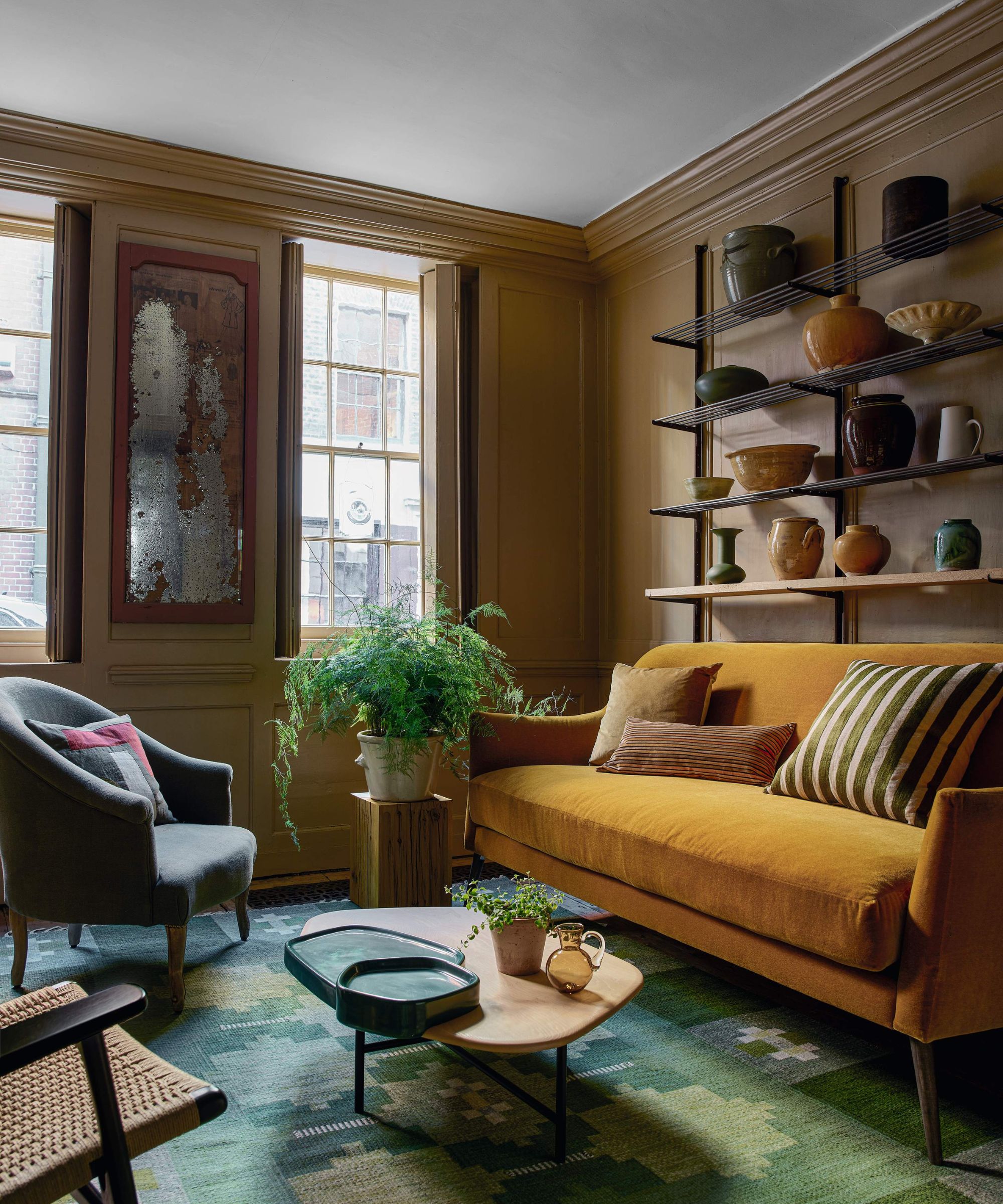
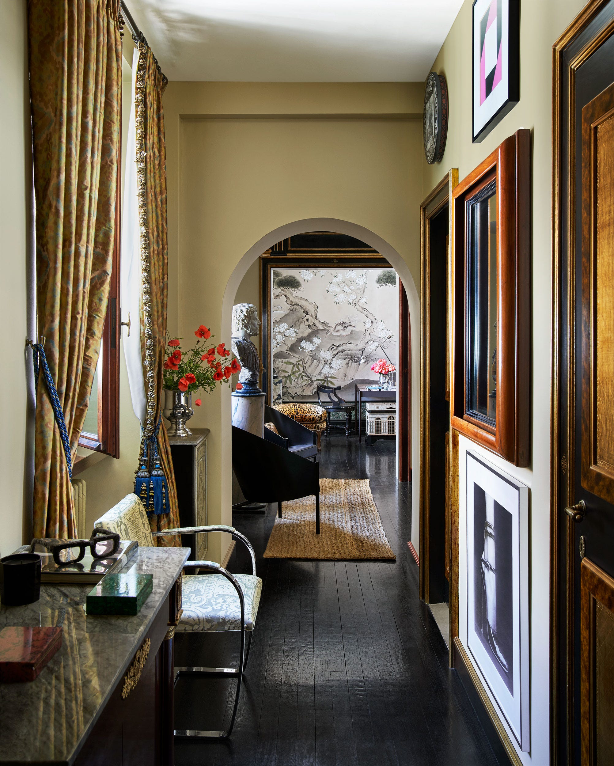
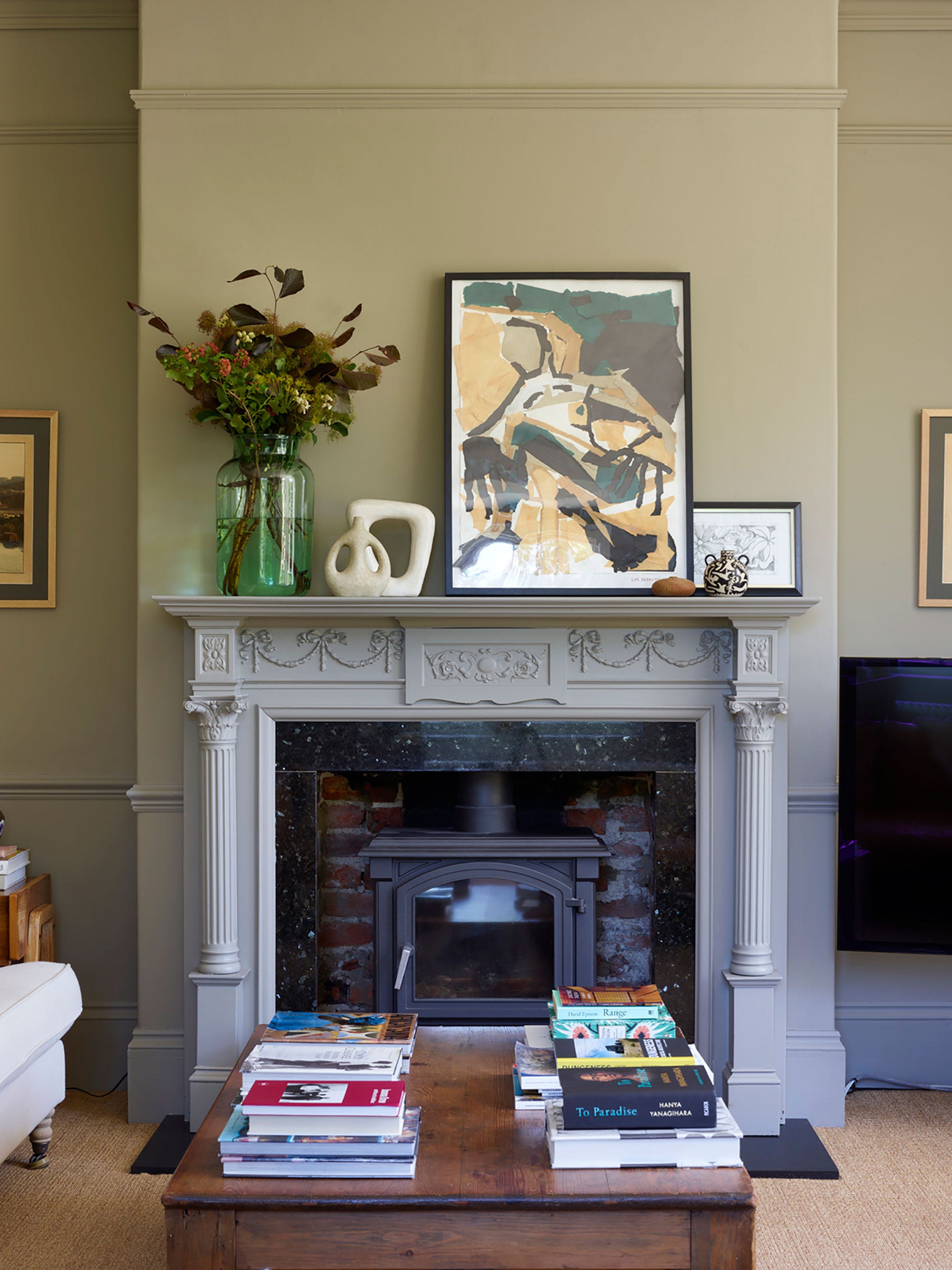
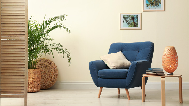
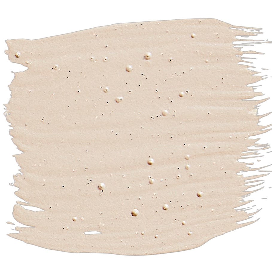
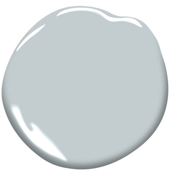
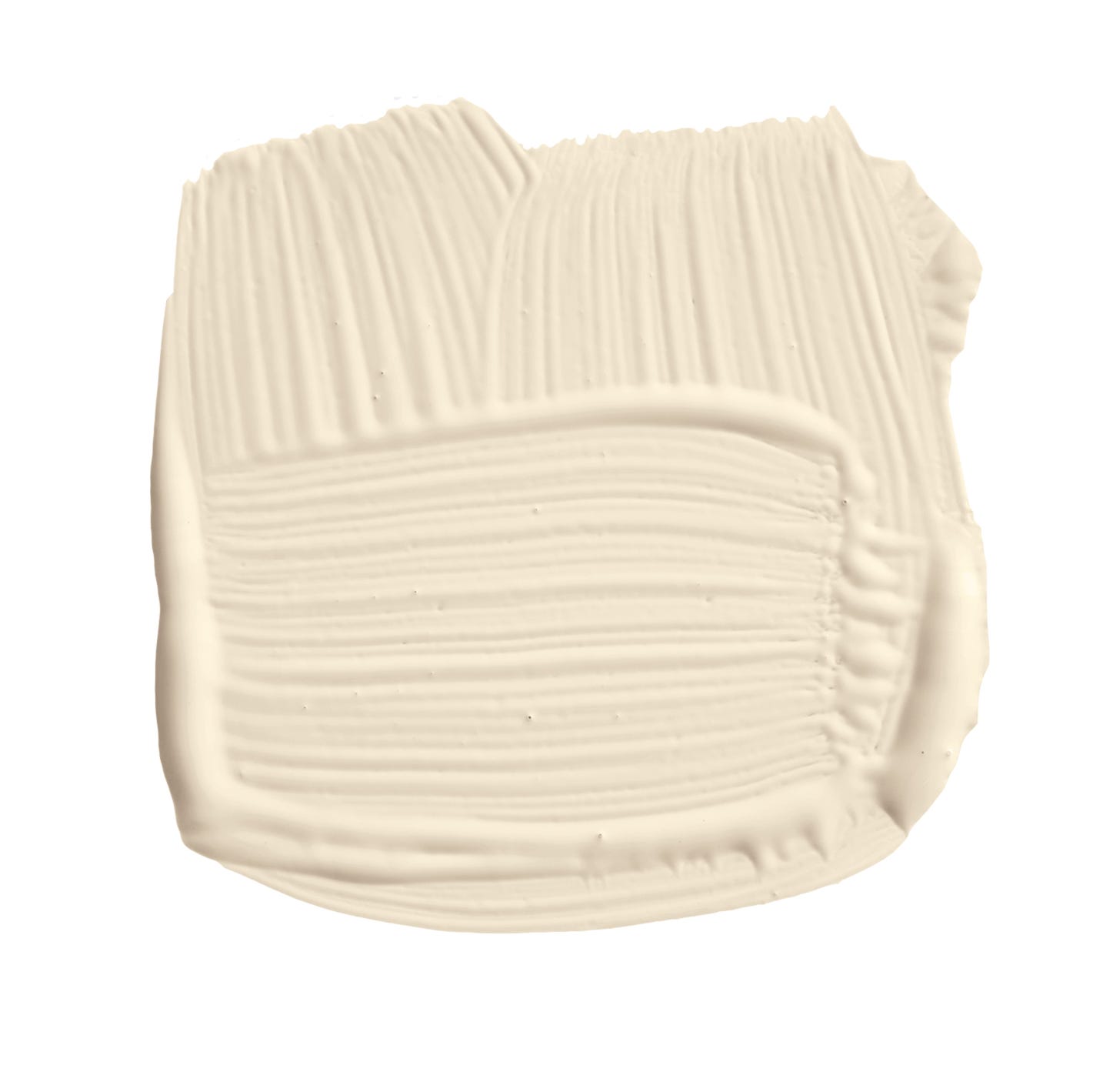
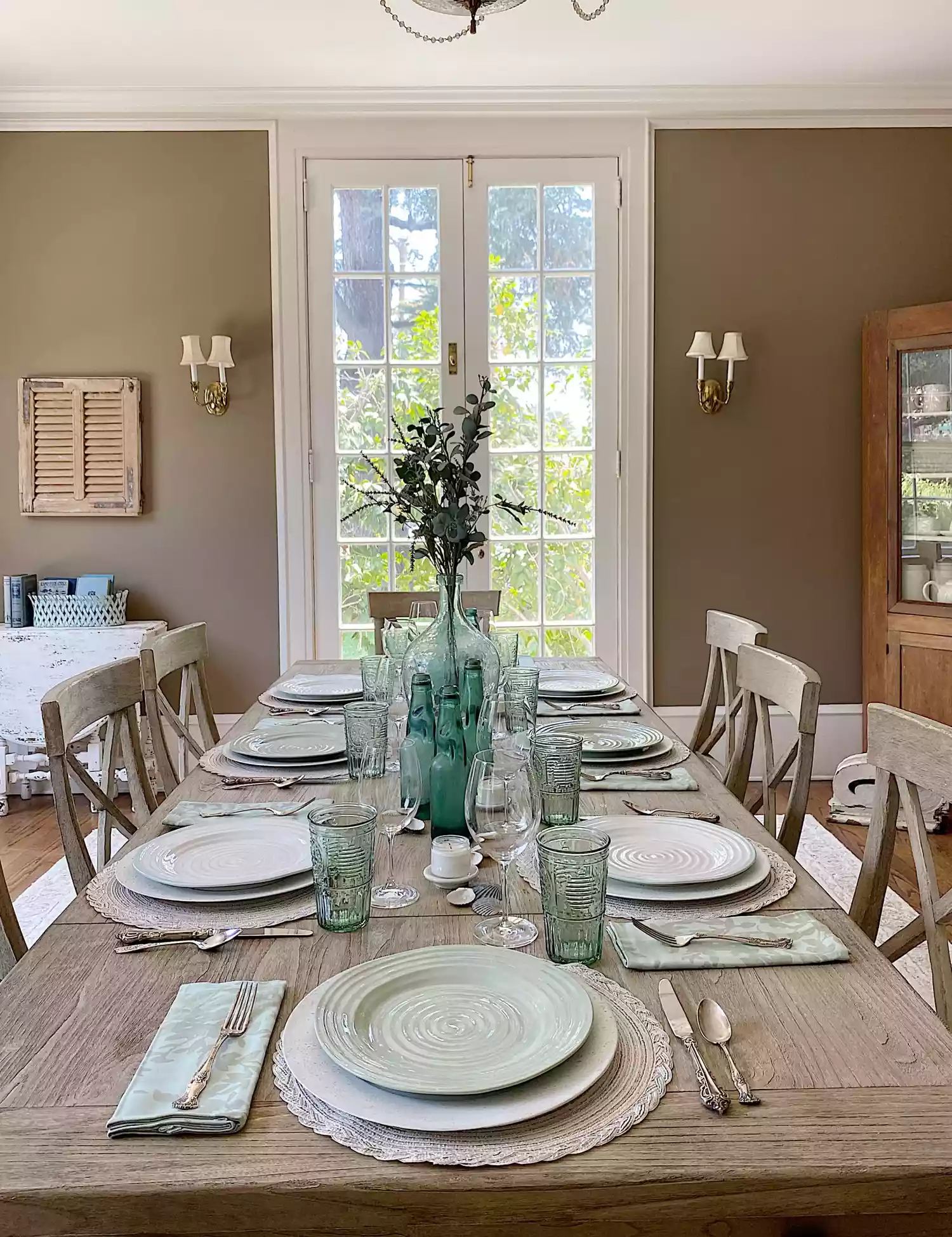
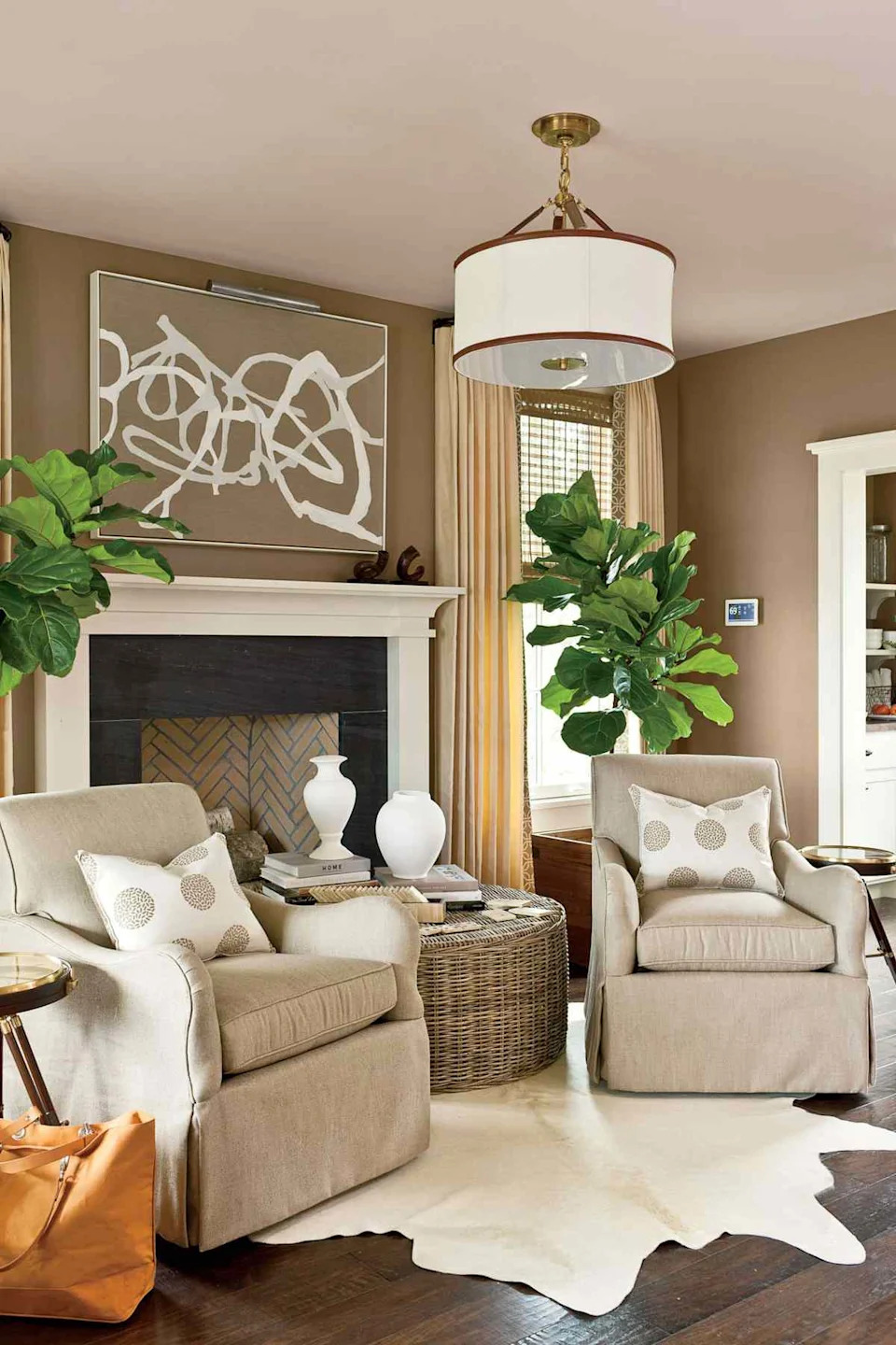
The featured taupe paint colors are selected for their unique characteristics and ability to complement different spaces and lighting conditions. For instance, some taupe shades lean more towards a creamy, beige-like appearance, offering a soft and inviting feel. These warmer taupes are ideal for living rooms, bedrooms, or areas where a relaxed and comfortable ambiance is desired. They pair well with natural wood tones, soft textiles, and traditional furnishings, creating a harmonious and understated elegance. The article suggests considering the natural light in a room when choosing these warmer taupes, as they can appear more saturated or lighter depending on the exposure.
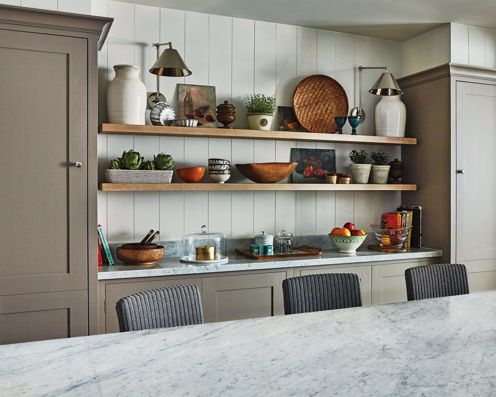
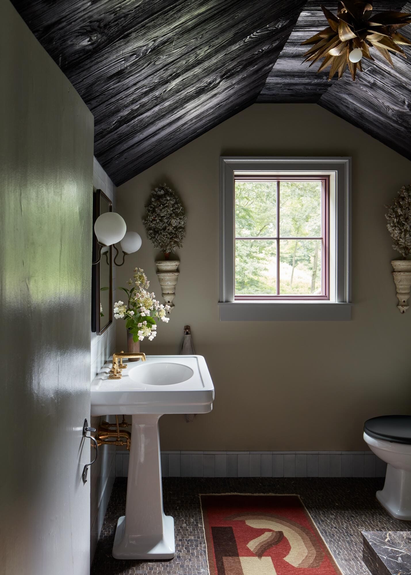
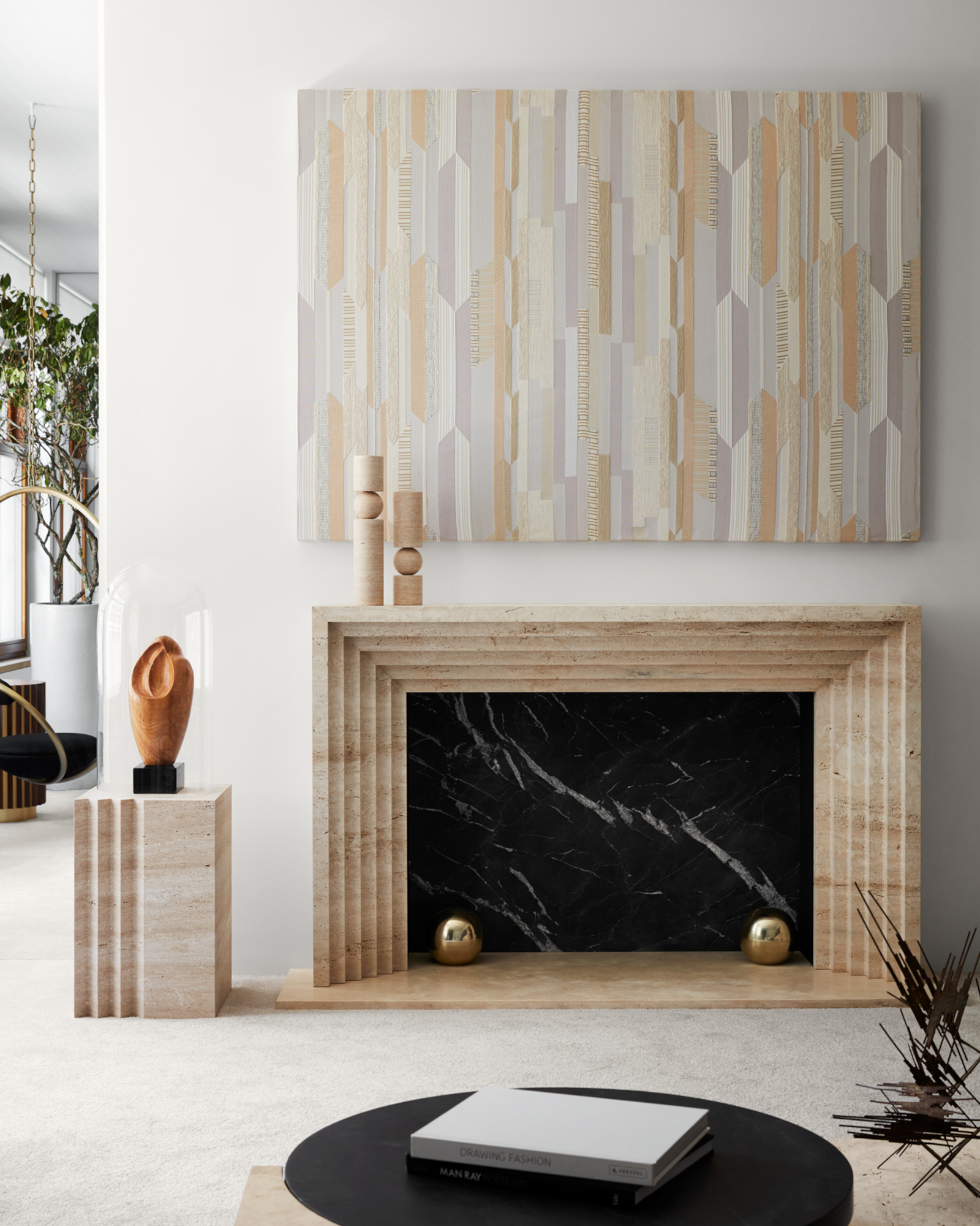
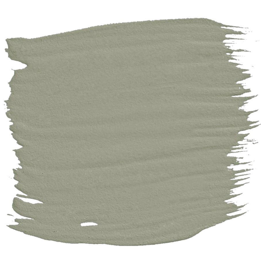
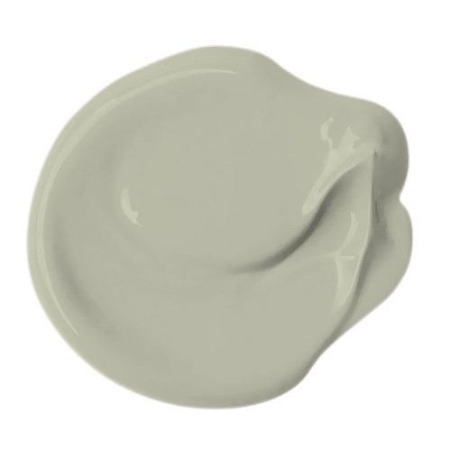
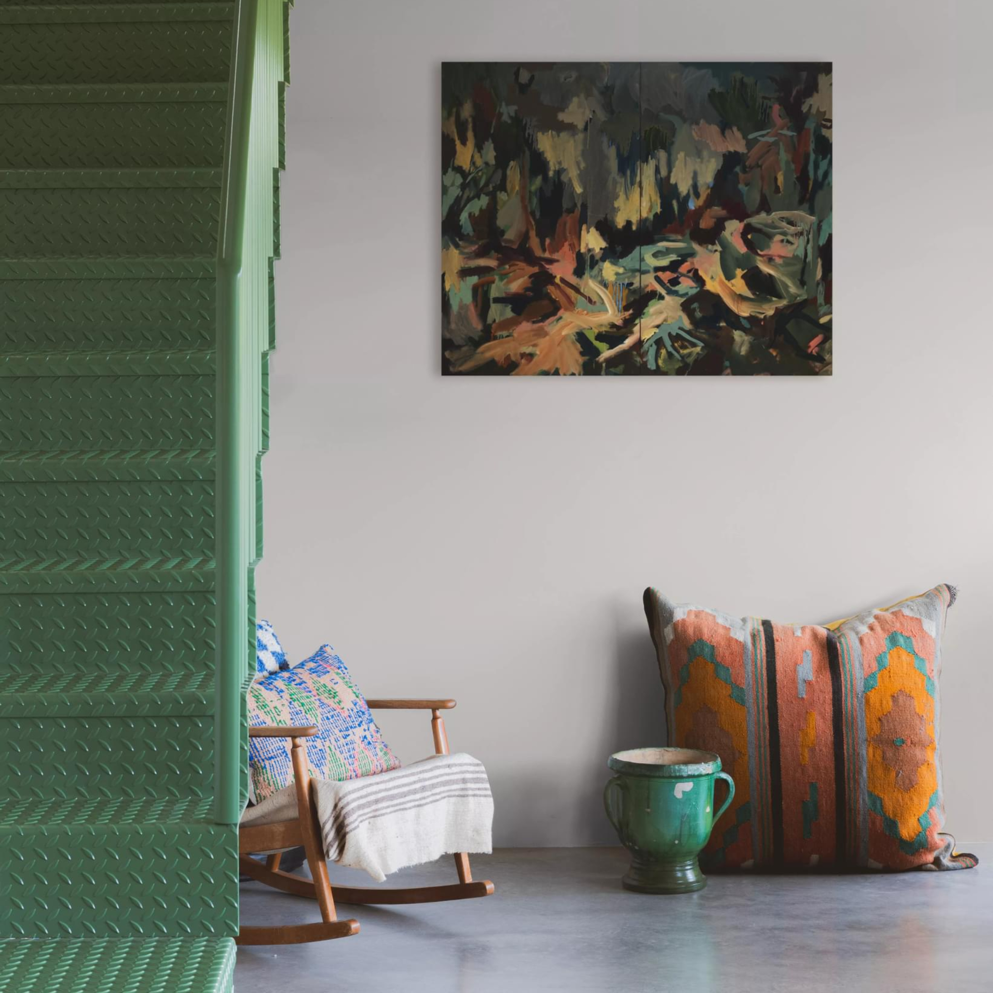
Conversely, other taupe selections in the article possess stronger gray undertones, providing a more modern and crisp look. These cooler taupes are particularly effective in contemporary settings, bathrooms, or kitchens where a clean and sophisticated backdrop is preferred. They can enhance minimalist designs and serve as a subtle contrast to bolder accent colors or metallic finishes. The piece also delves into the interplay of artificial lighting, explaining how different light sources can alter the perception of a taupe shade, making it appear more brown, gray, or even with subtle purple or green hints.
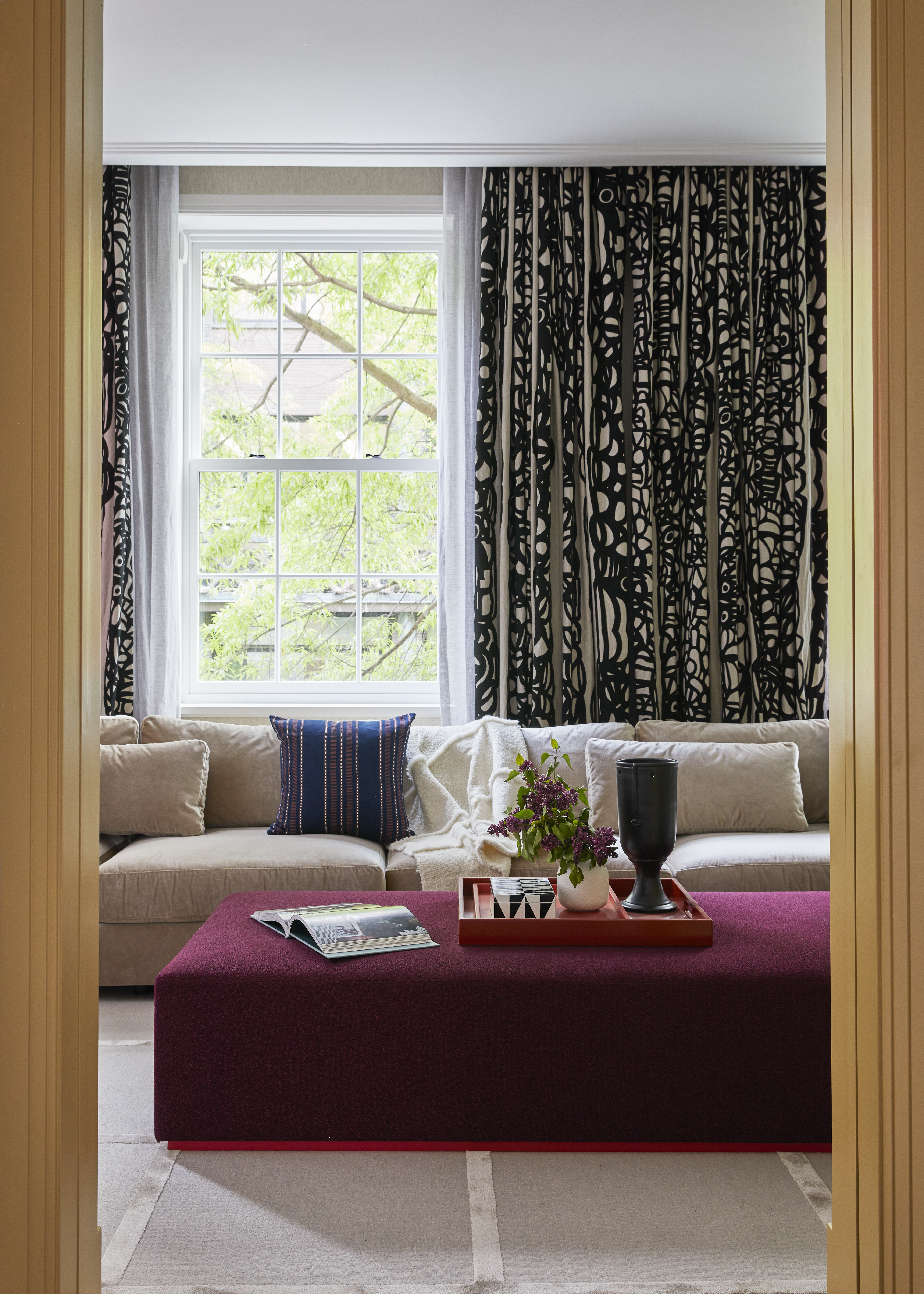
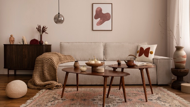
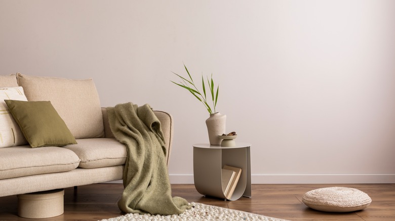
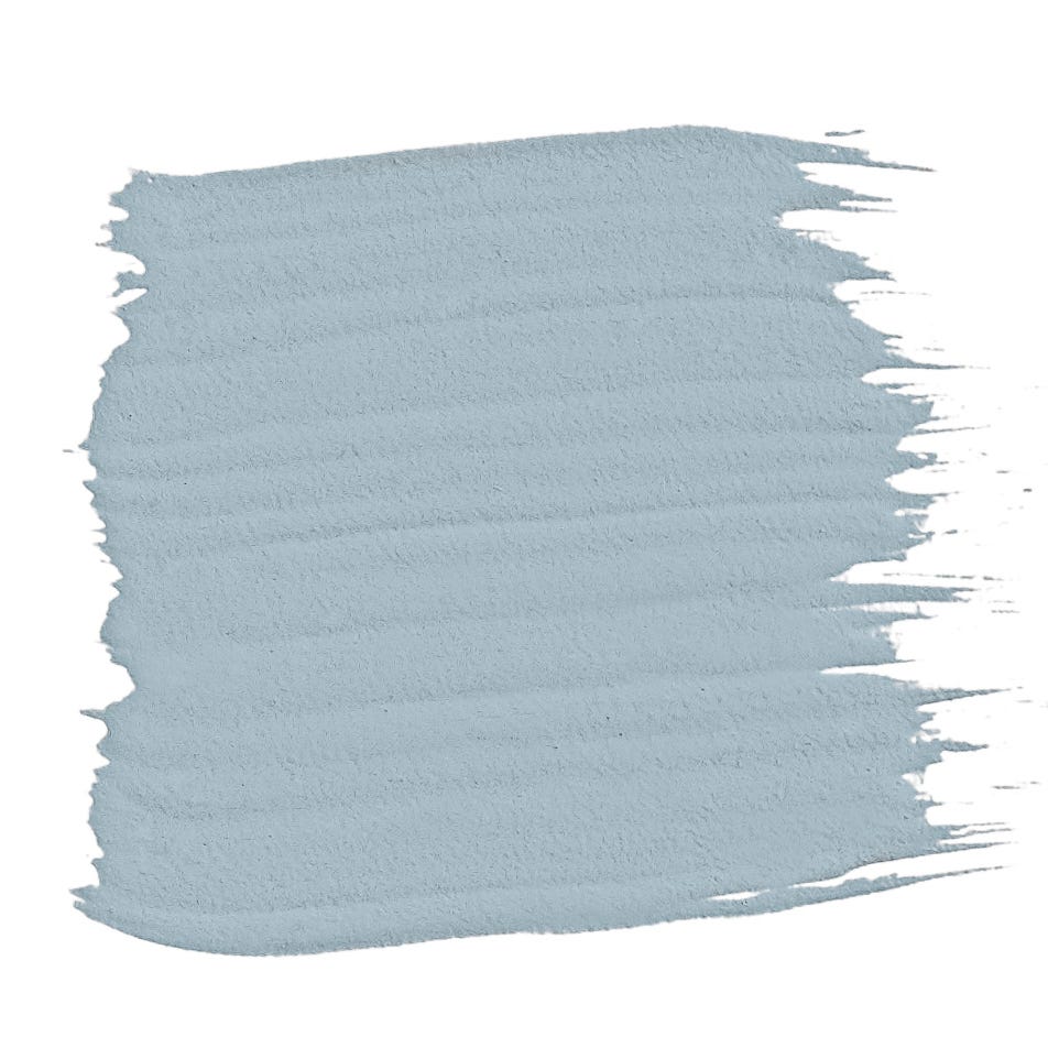
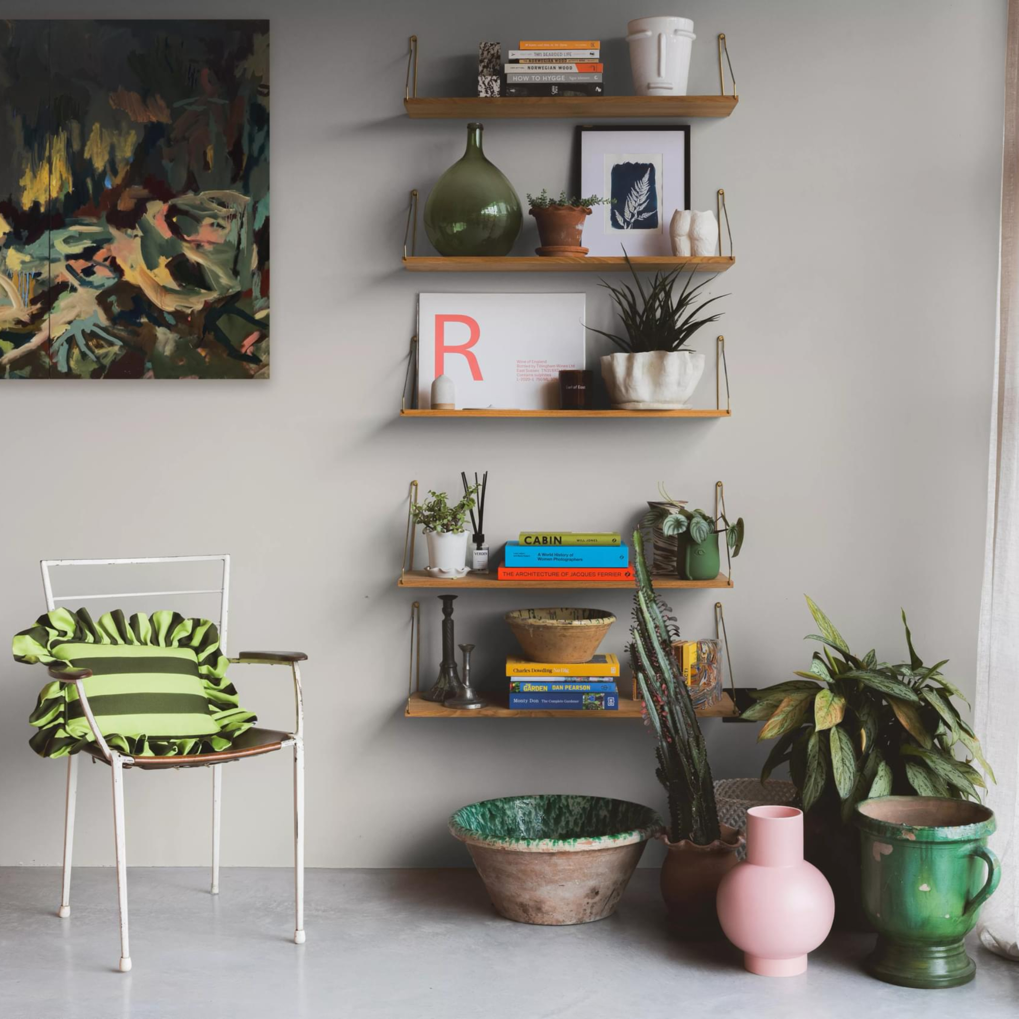
Furthermore, the article offers practical advice on how to effectively incorporate taupe into home decor. It recommends using taupe as a foundational color that allows other elements in the room to stand out. It suggests complementing taupe walls with trim in off-white or a slightly darker taupe for added depth. The piece also provides guidance on furniture and accessory choices, advising on materials and colors that harmonize with taupe, such as natural fibers, muted metallics, and accent colors like deep blues, greens, or even soft pastels, depending on the specific taupe shade.
Each of the ten taupe paint colors is presented with a brief description, highlighting its undertones and the type of mood it creates. This detailed breakdown assists readers in visualizing how each shade would look in their own homes. The article also touches upon the psychological effects of color, positioning taupe as a grounding and calming color that promotes relaxation and balance. Ultimately, the article serves as a comprehensive guide for homeowners and designers looking to harness the understated elegance and versatility of taupe paint to create inviting and stylish interiors.
#TaupePaint #InteriorDesign #PaintColors #HomeDecor #NeutralColors #ColorSelection #DesignTips #HomeImprovement #TaupePaint #InteriorDesign #PaintColors #HomeDecor #NeutralColors #ColorSelection #DesignTips #HomeImprovement
Há 0 comentários no total
 Ainda não há comentários
Você também pode gostar
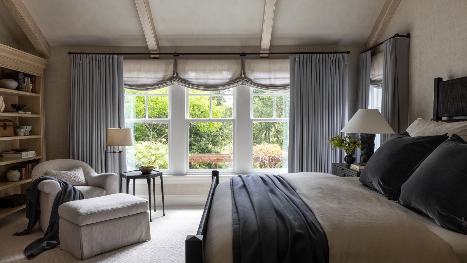
The best colors to pair with taupe, according to designers – 5 shades to complement this grounding neutral


5 Timeless Paint Colors That Will NEVER Go Out of Style, According to Designers


The most timeless paint colors according to designers
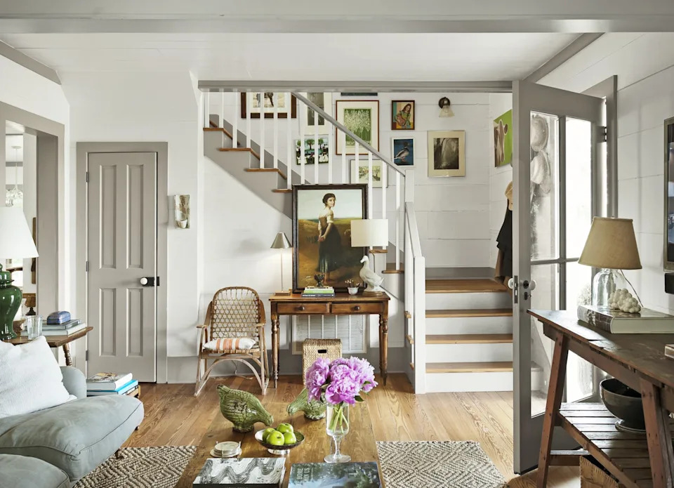
17 Classic Taupe Paint Colors For Every Room In Your Farmhouse

How to decorate with taupe

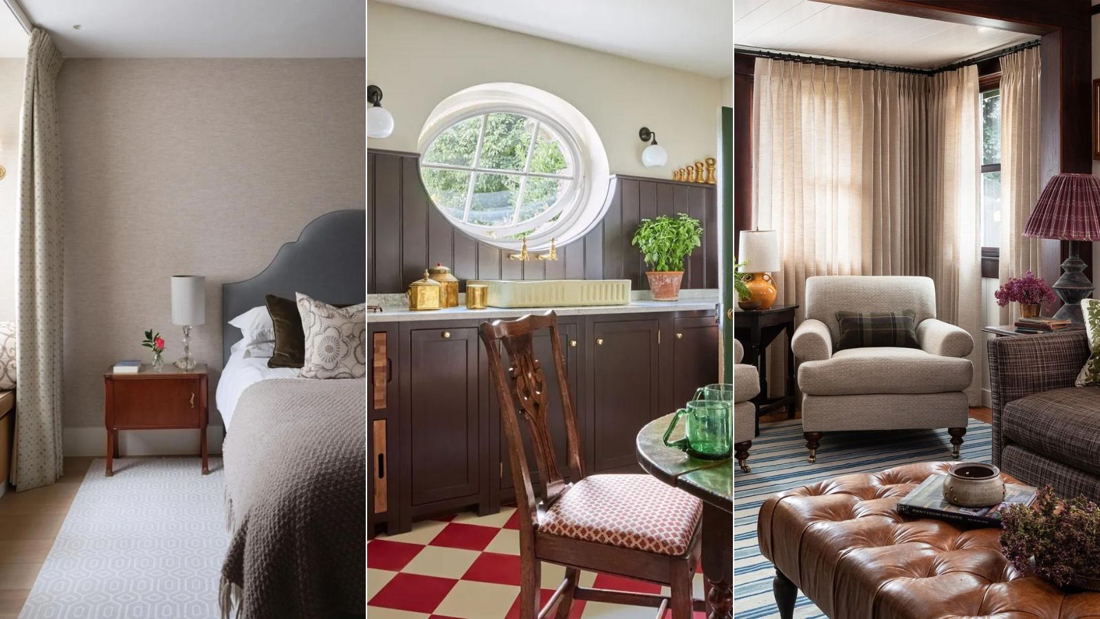
What color is replacing beige? This is the one color we prefer to use instead of beige in 2024, say designers
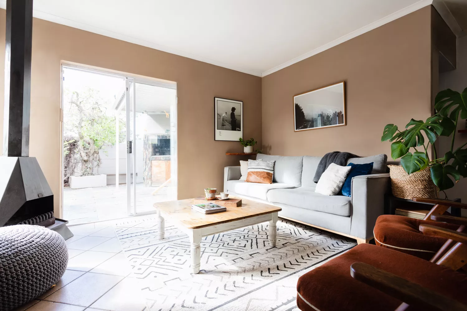
The 17 Best Taupe Paint Colors, According to Design Experts


10 Timeless Living Room Paint Colors Designers Swear By
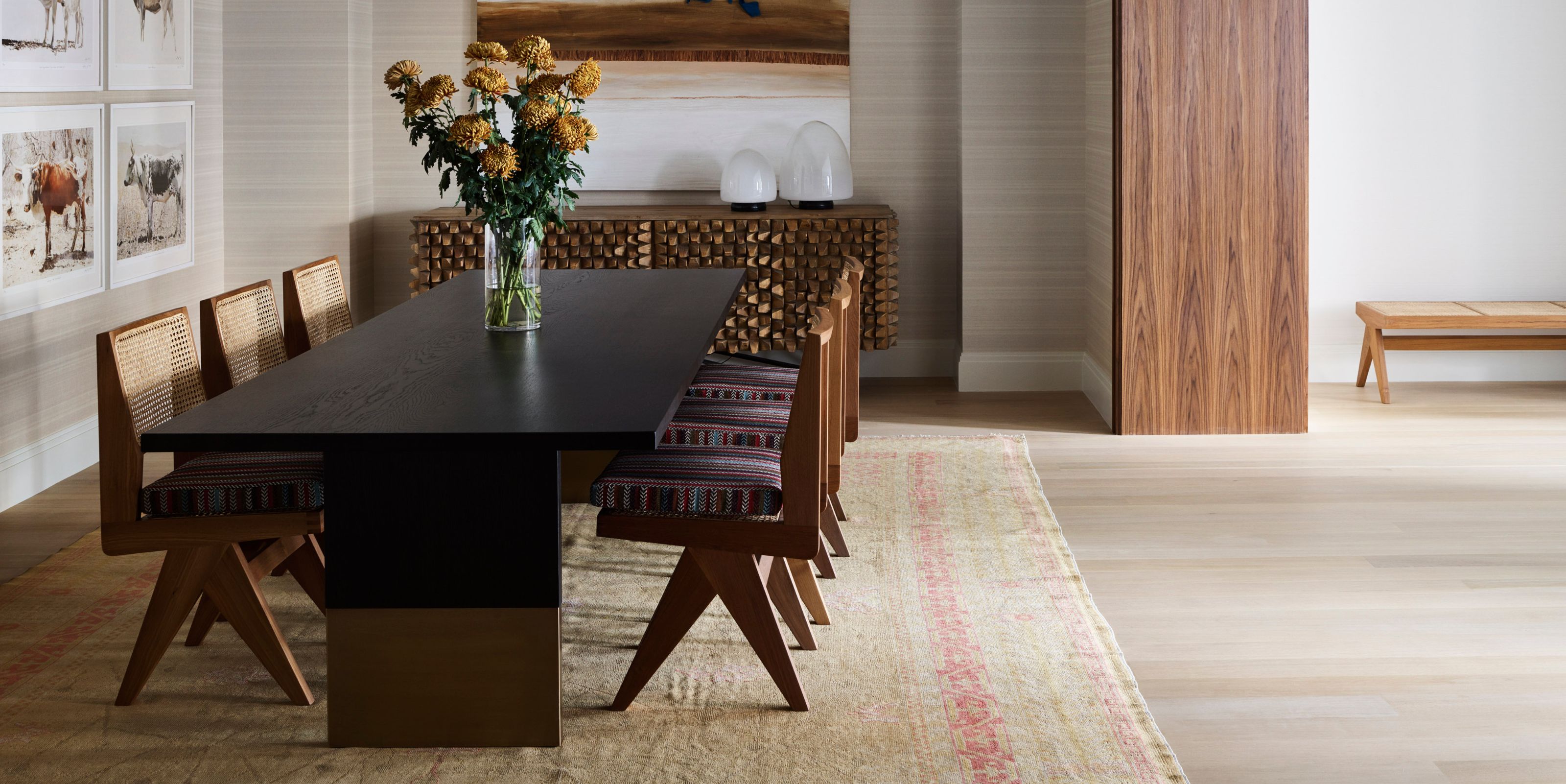
What Color Is Taupe? Plus 5 Ways To Decorate With This "Thoughtful" Shade in Your Home

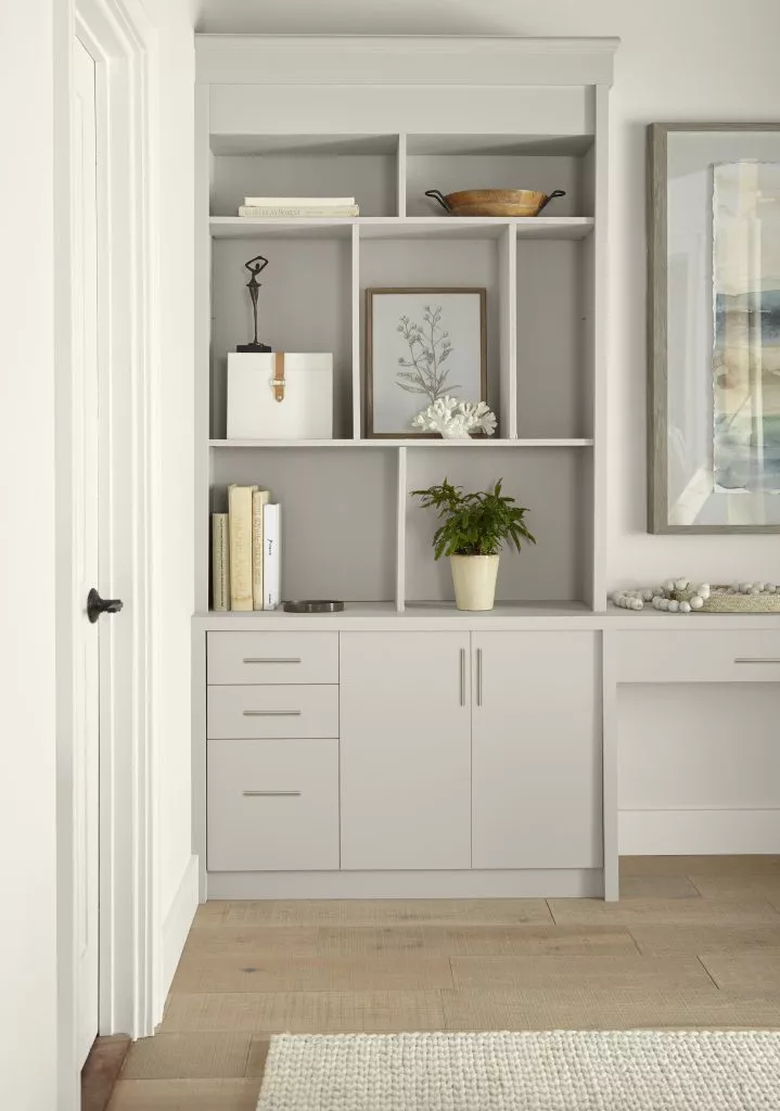
The Best Taupe Paint Colors for Timeless Elegance

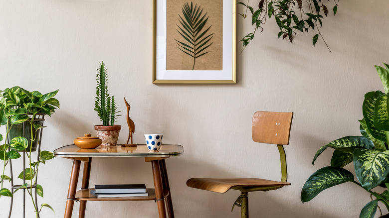
10 Colors That Will Perfectly Accent A Tan Room
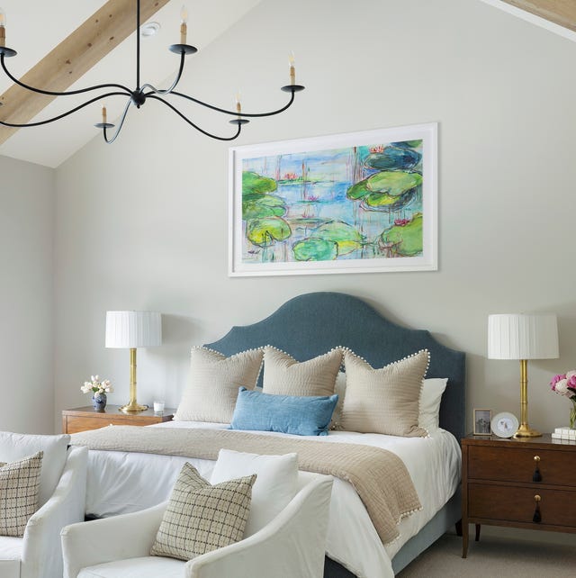
These 20 Paint Colors Will Never Go Out of Style, According to Designers

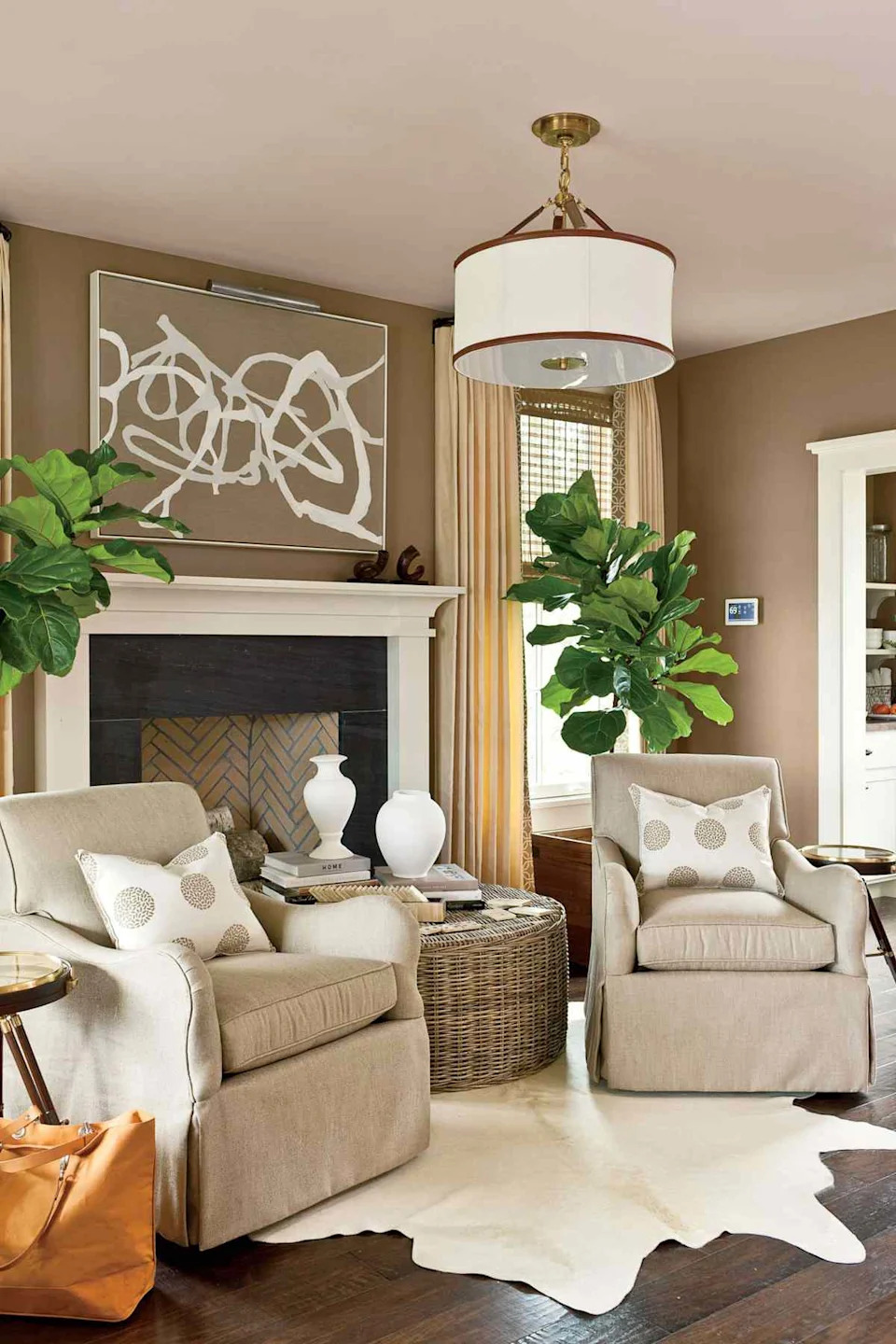
10 Taupe Paint Colors That Are Always Right
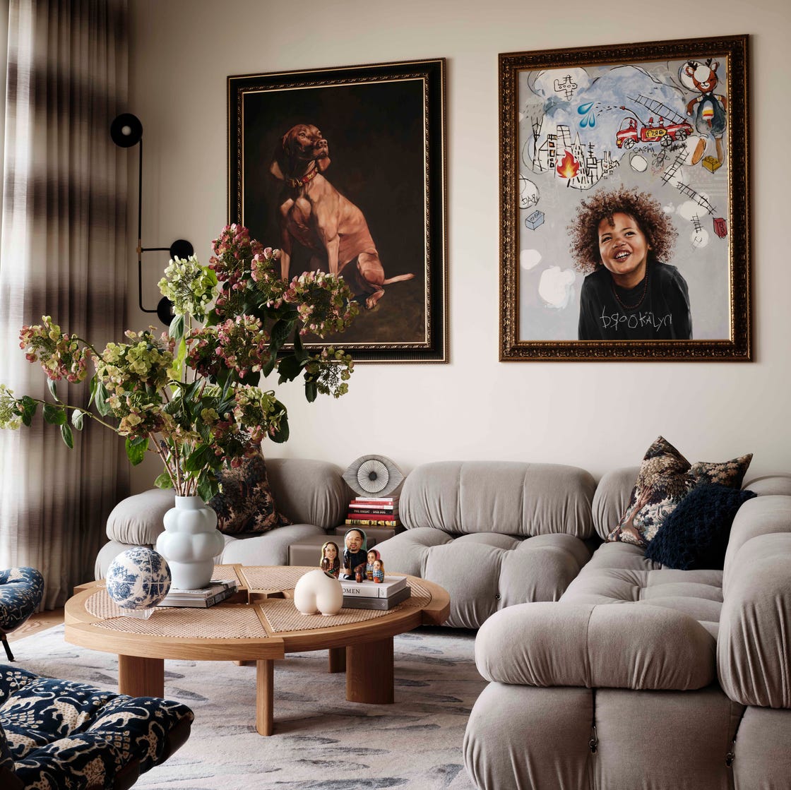
Why You Should Ditch Gray Walls in Favor of Taupe

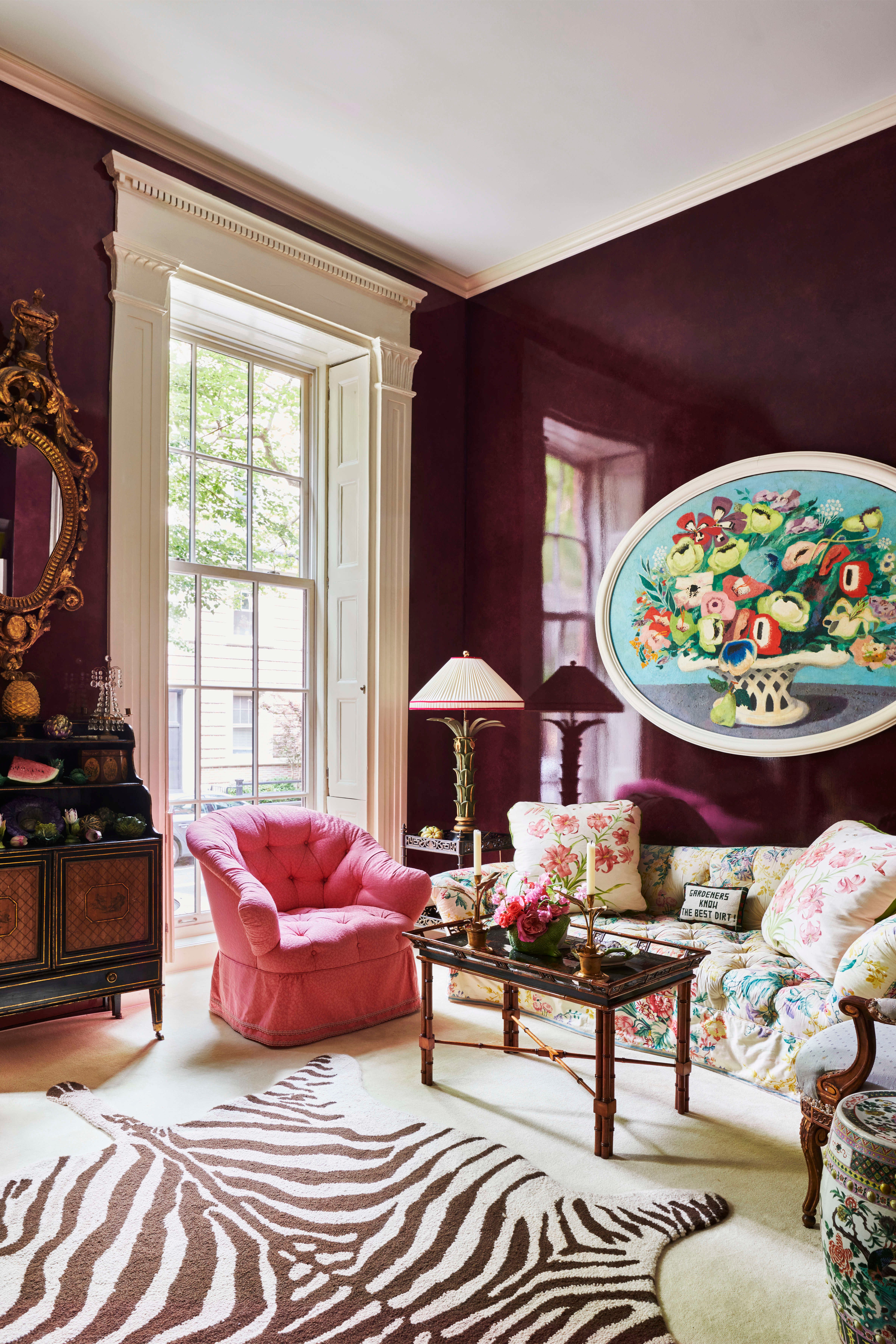
Top Designers Reveal the 16 Best Purple Paint Colors They Absolutely Swear By

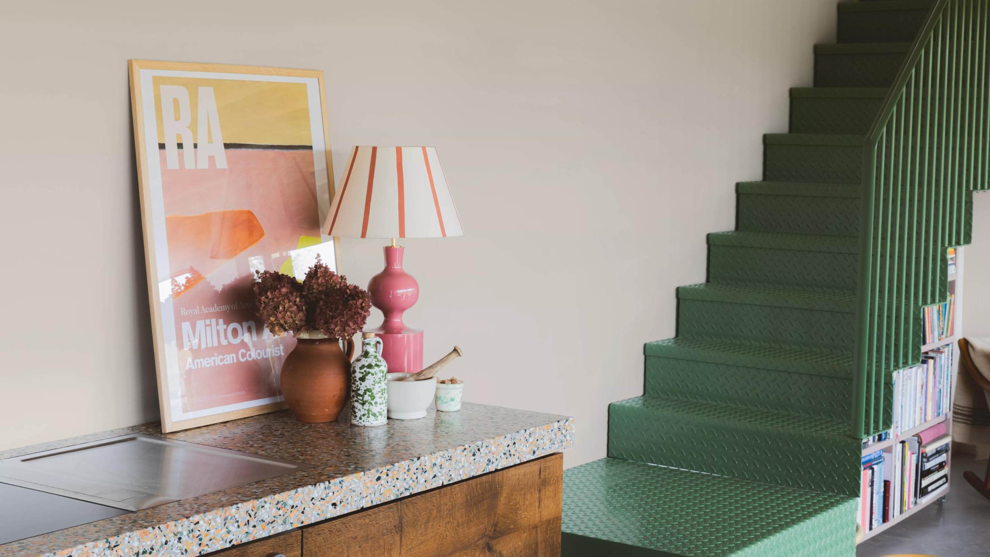
COAT Paints' newest palette is an antithesis to the Colour of the Year – embracing 'timeless' over 'trendy'


10 Paint Color Apps Every DIYer Should Know About

9 Neutral Paint Colors Designers Constantly Reach For — "It's My Tried-and-True"
10 Kitchen Paint Colors You Won’t Regret in 10 Years, According to Designers
What Color Is Taupe? 20 Ways to Use This Designer-Favorite Color at Home