1/3
8 Mistakes You’re Probably Making When Hanging a Gallery Wall
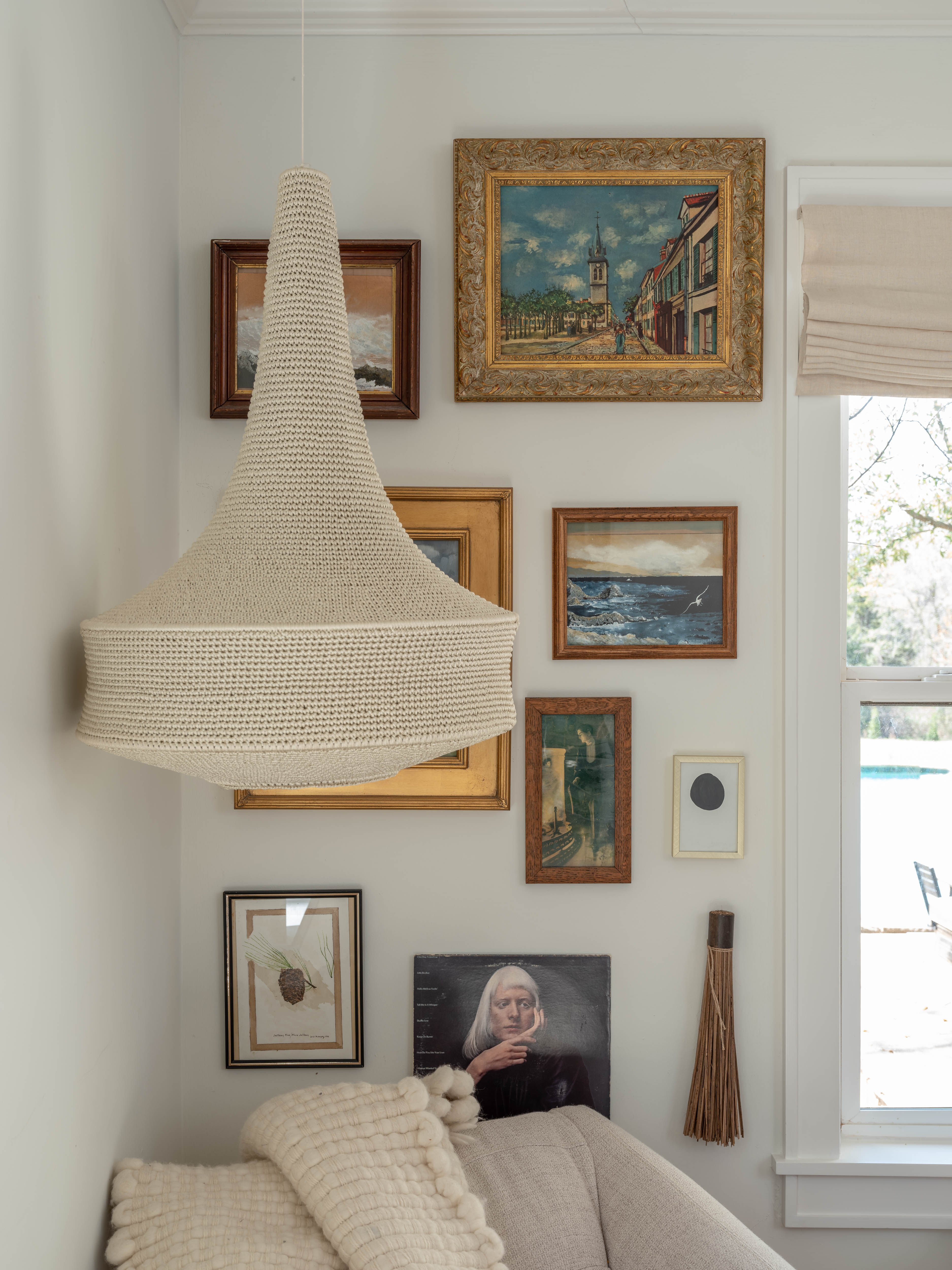
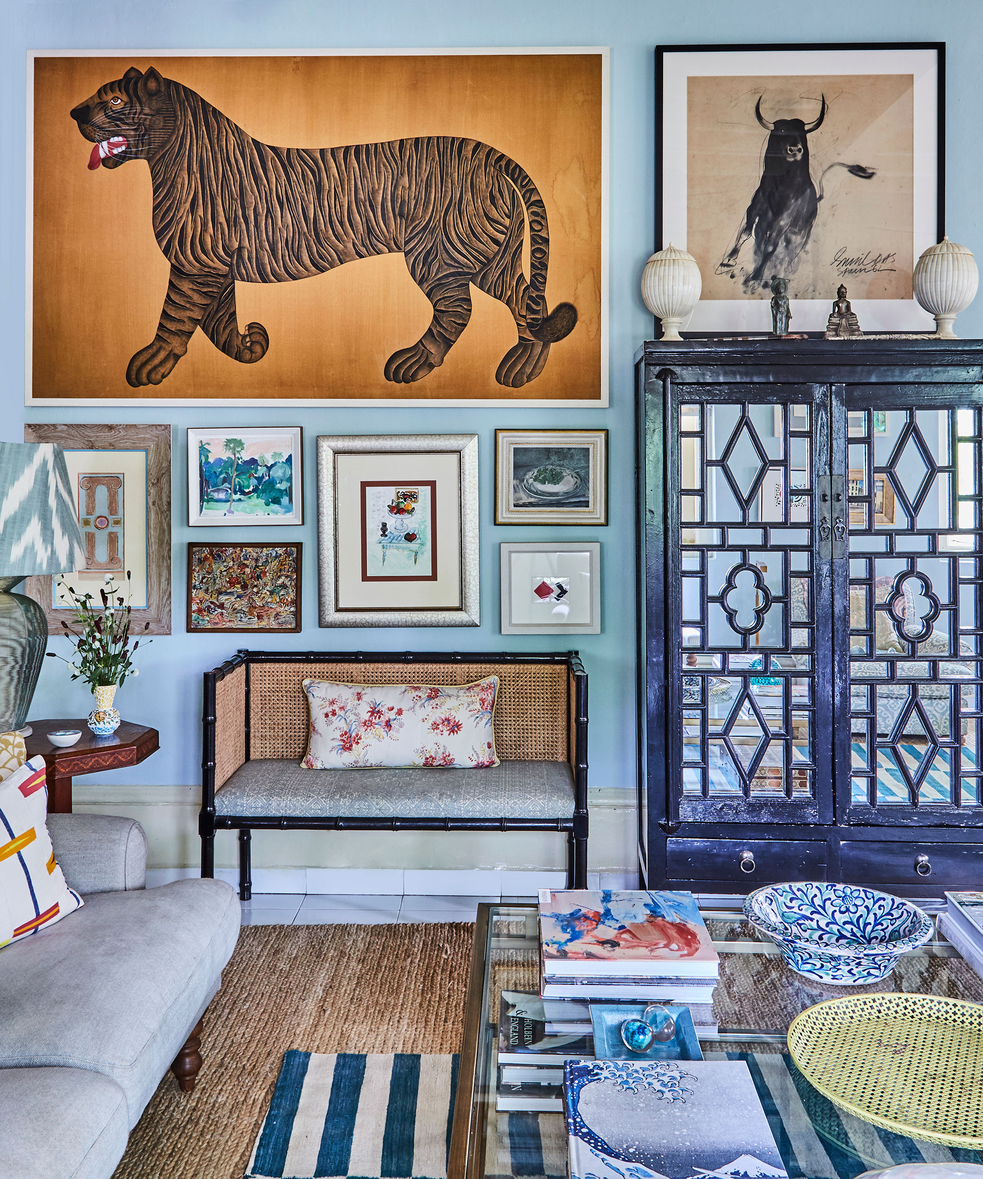
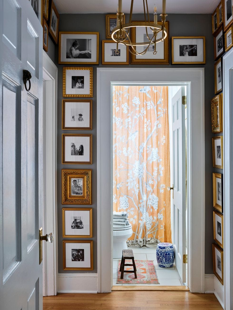
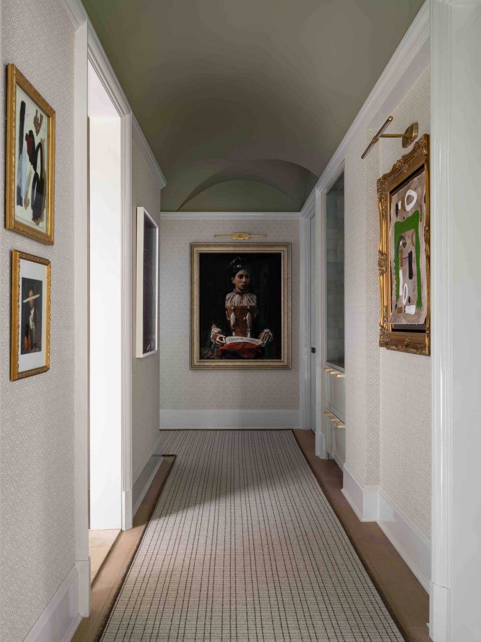
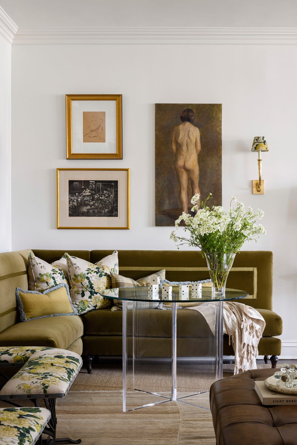
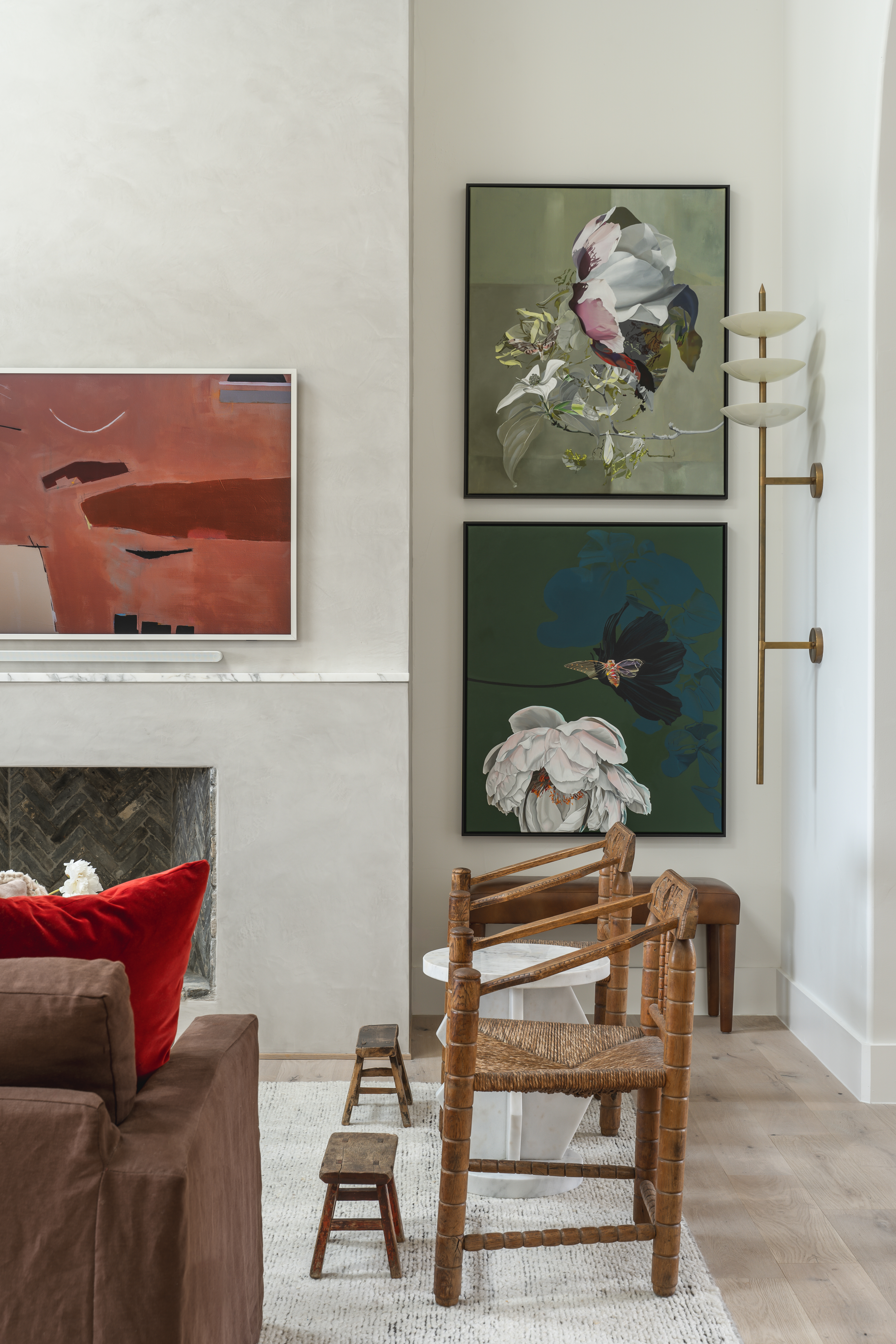
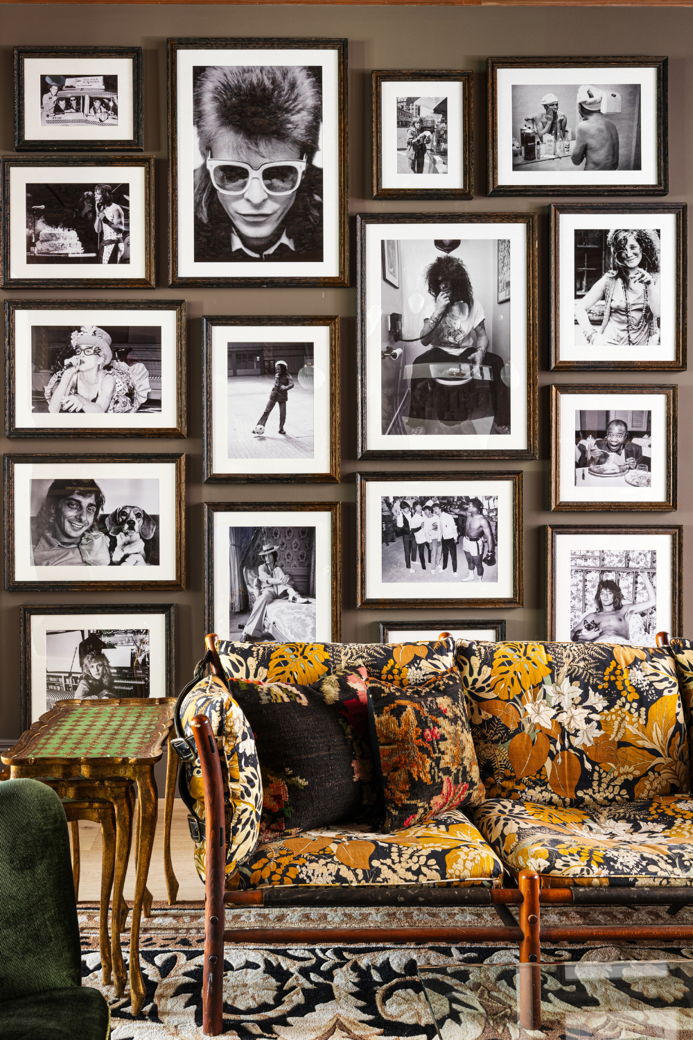
The article explores common pitfalls homeowners encounter when creating gallery walls and offers professional advice from interior designer Jenn Feldman. It emphasizes that artwork serves as the "jewelry" of a home, capable of unifying a space and introducing color and visual interest. However, the process of hanging art, especially in a gallery wall format, requires careful planning to avoid a cluttered or uncoordinated appearance. Feldman stresses the importance of curating art that resonates with personal style, avoiding the necessity of forcing pieces. She advises against selecting multiple pieces from a single artist, instead suggesting a mix of like-minded artists and various mediums to enhance texture and create a collected feel.
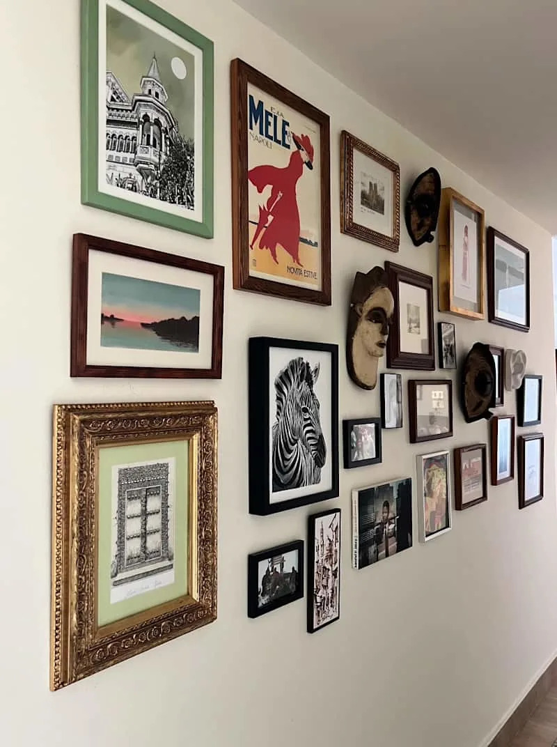
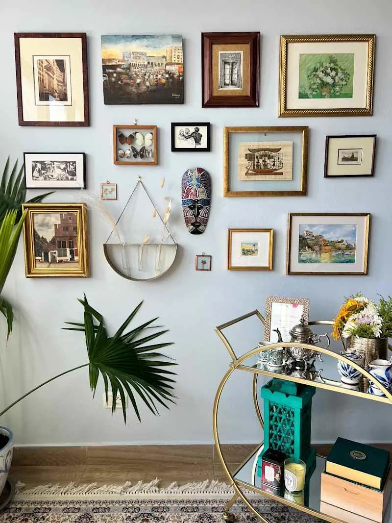
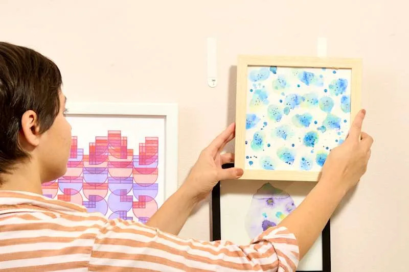
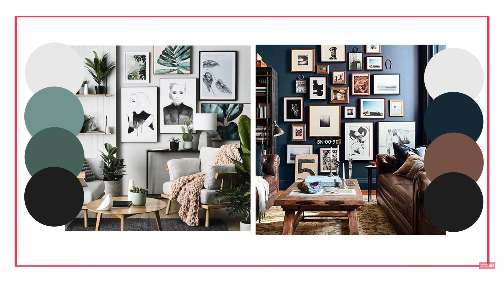
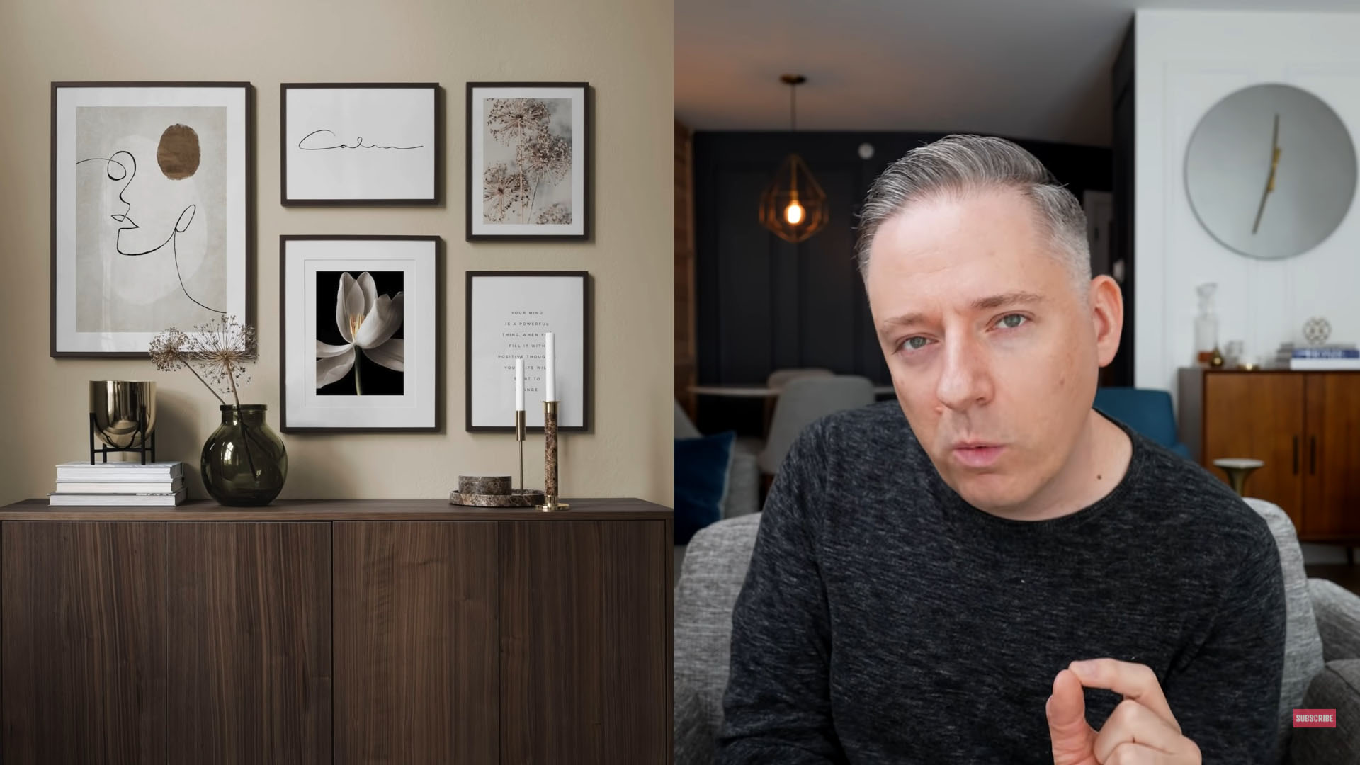
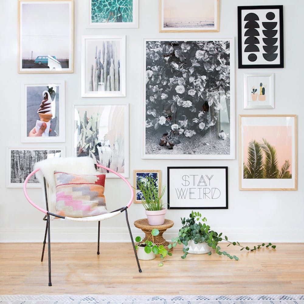
The article outlines eight specific mistakes and their solutions. The first mistake is a lack of patience, with Feldman recommending the use of a large open floor space to meticulously map out frame arrangements. This allows for experimentation with groupings of three, maintaining visual balance, and capturing photographs of different layouts for comparison. The second common error involves choosing art that is the wrong size for the wall, emphasizing that frames suitable for a bookcase shelf are generally too small for a wall display. Thirdly, neglecting a unifying theme or common thread within the gallery wall can lead to a disjointed look. Feldman suggests maintaining cohesive elements such as frame color or mat color to establish a rhythm.
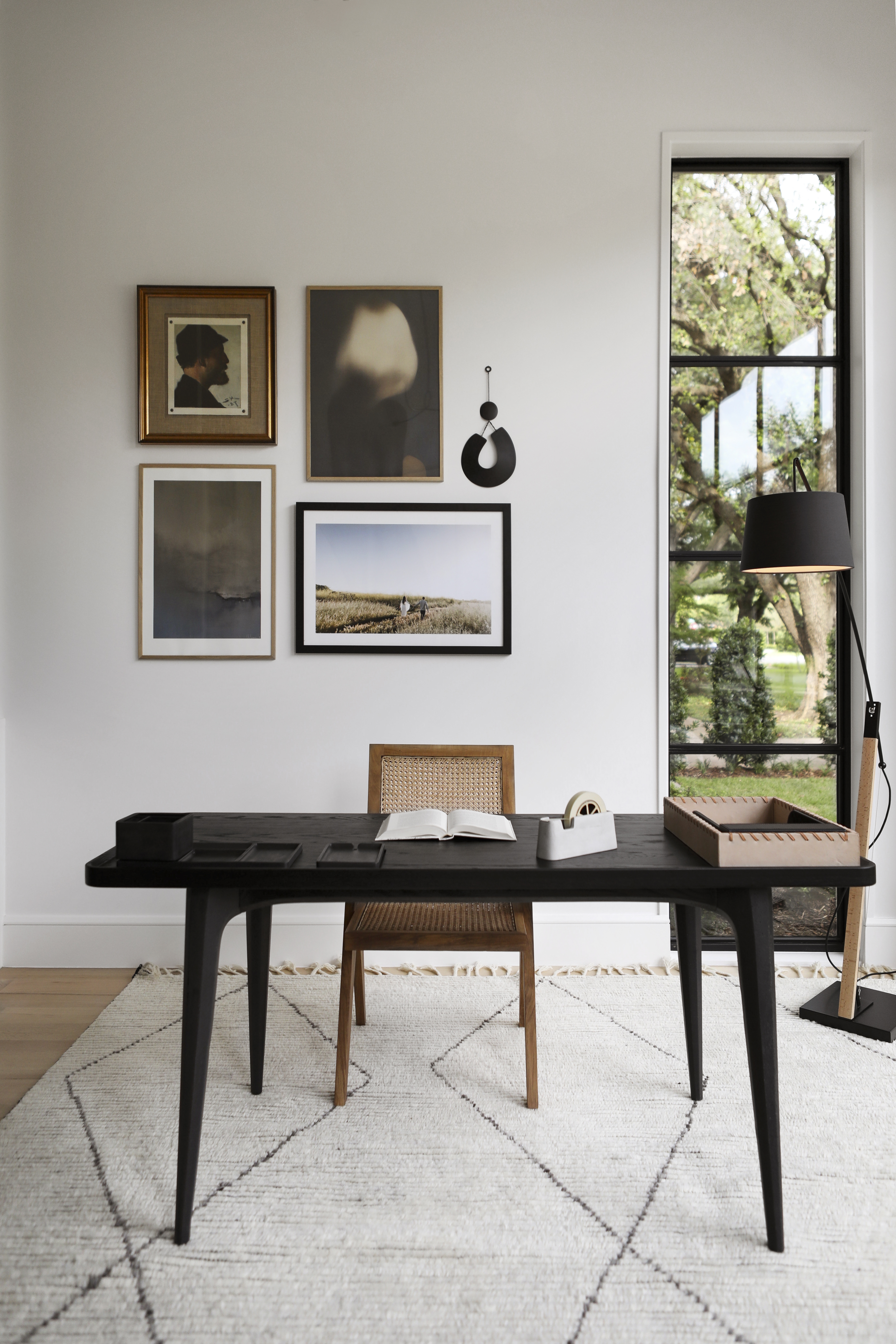
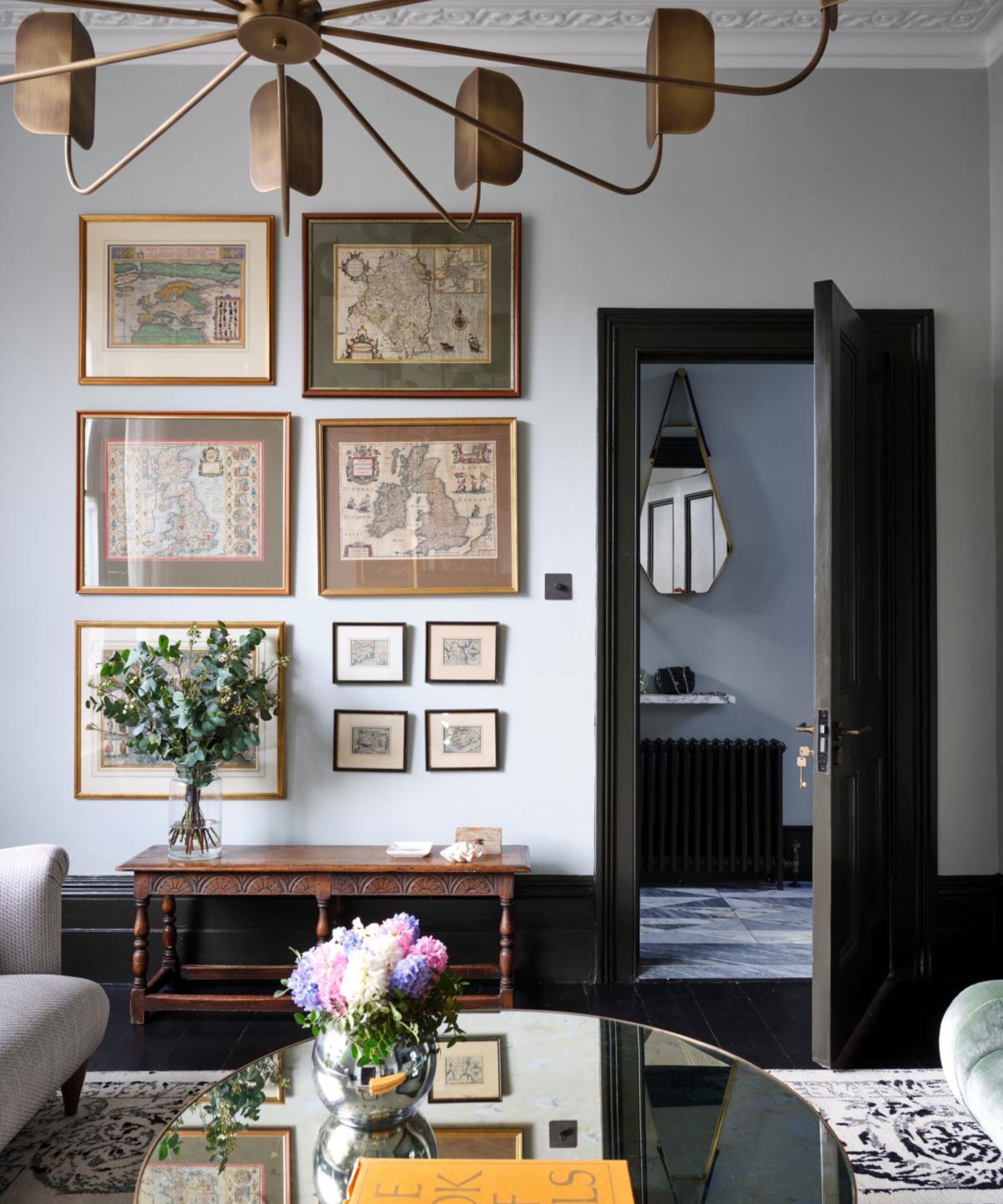
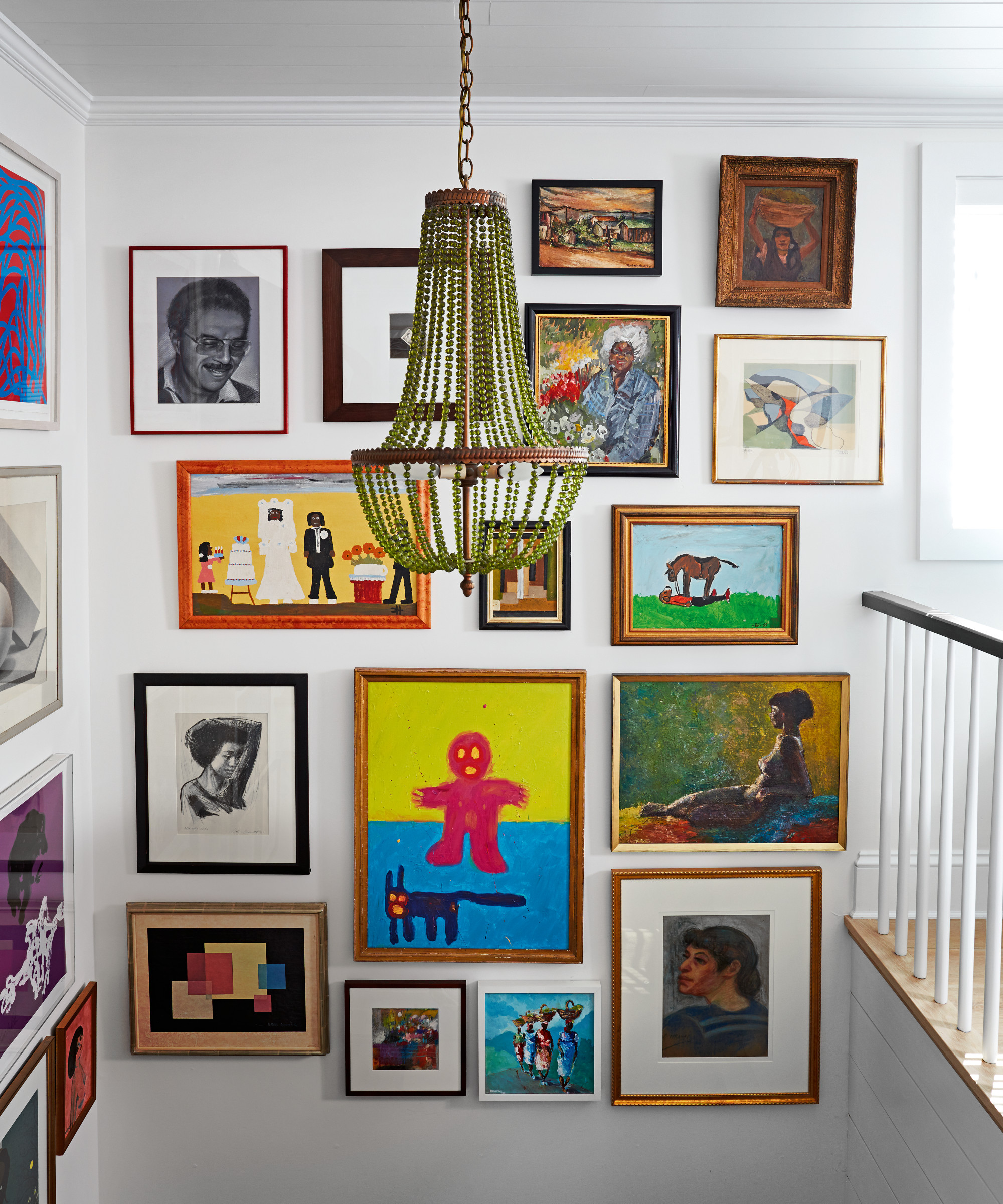
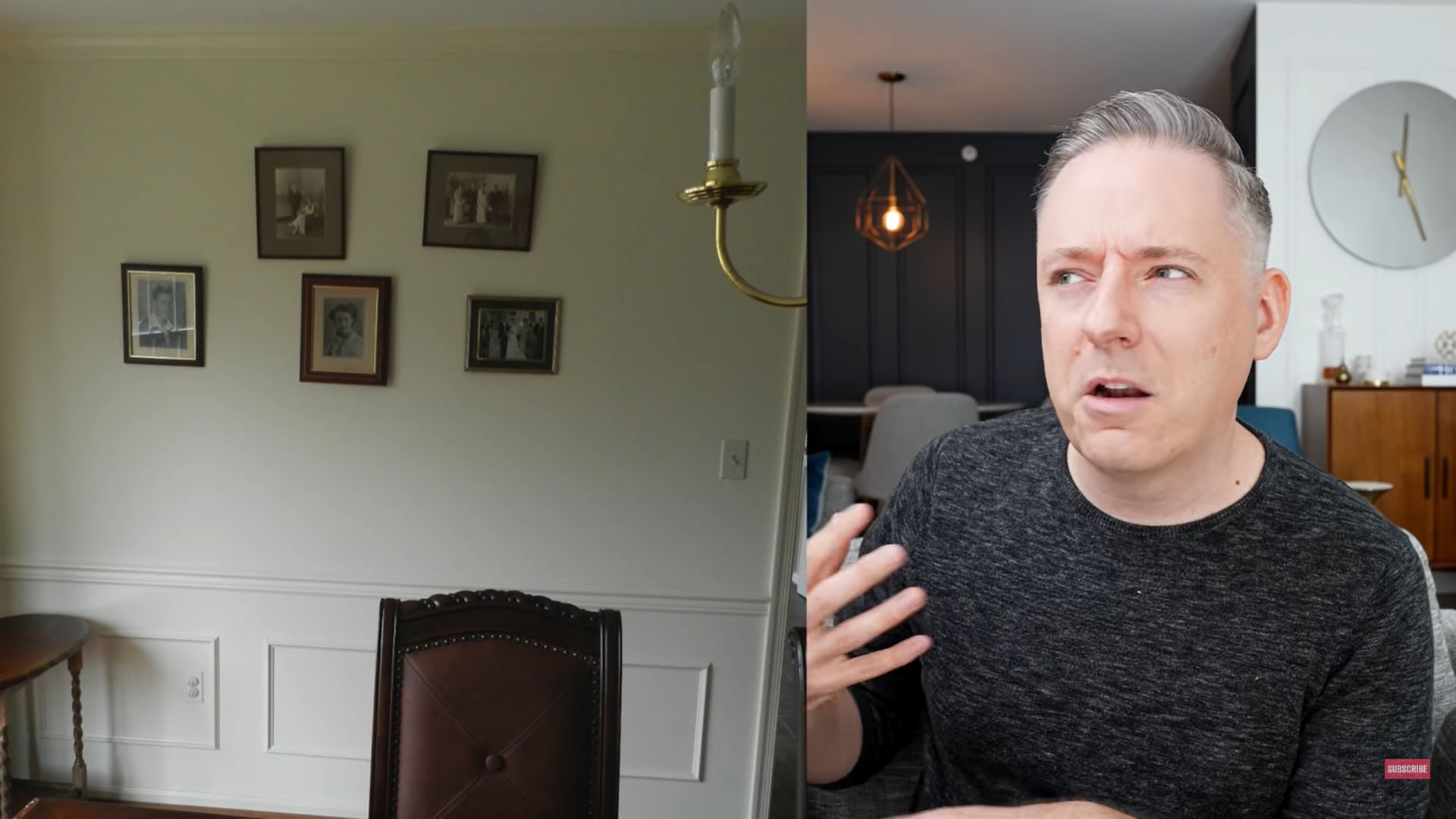
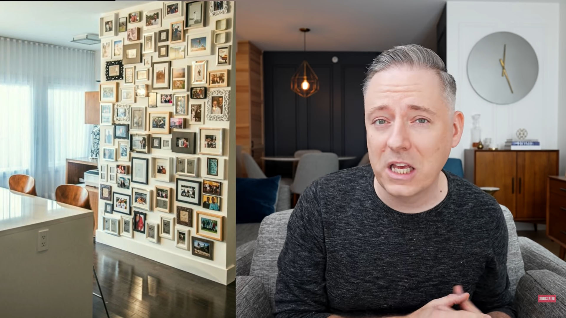
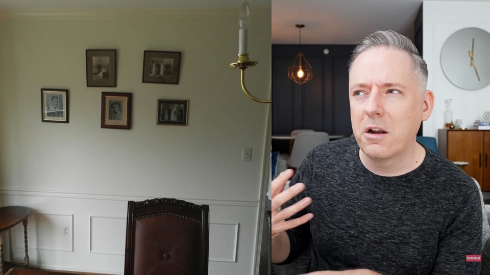
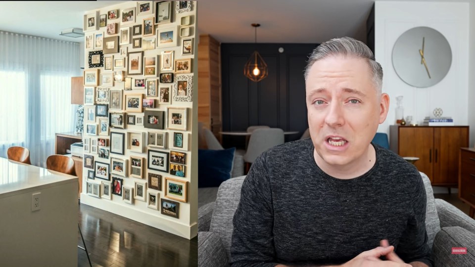
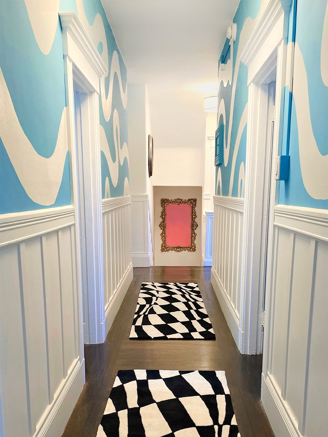
Another mistake is hanging art too far apart; for gallery walls, a tight arrangement within a defined space is recommended to create a unified block. Grouping art in even numbers is also identified as a misstep, as the human eye naturally connects in sets of three, making odd numbers appear more organic and less forced. The sixth mistake concerns incorrect hanging height. Feldman advises starting the center of the gallery at eye level, typically between 64 to 68 inches from the floor, to ensure intimacy and proper visual engagement. Placing art in tricky areas, such as staircases, without considering scale and proportion is the seventh error. While not discouraged, these areas require extra attention to ensure the art complements the space. Finally, the article highlights the importance of investing in quality framing, particularly for original or valuable pieces. While smaller, less significant items can use pre-made frames, professional framing protects art from damage and enhances its aesthetic appeal, making it a worthwhile investment for cherished artworks.
Overall, the article guides readers through the intricacies of creating a visually appealing and harmonious gallery wall, transforming a potentially daunting task into an achievable home design project. It underscores that successful gallery wall design is a blend of thoughtful curation, meticulous planning, and an understanding of visual balance and proportion, ensuring the art enhances the home’s overall aesthetic rather than detracting from it.
#GalleryWall #HomeDecor #InteriorDesign #ArtPlacement #DecoratingTips #DesignAdvice #FramingArt #HomeStyling #GalleryWall #HomeDecor #InteriorDesign #ArtPlacement #DecoratingTips #DesignAdvice #FramingArt #HomeStyling
0 komentarzy łącznie
 Brak komentarzy jeszcze
Możesz również polubić
5 common gallery wall mistakes designers warn to always avoid – to create the chicest of displays


I'm an interior designer - how to create a gallery wall without it looking tacky - people always make the same mistakes

5 Places You Should Never Hang Art in Your Home

Why gallery walls are the worst

7 DIY tips for how to hang a gallery wall from experts
You're Styling Your Gallery Wall All Wrong—Here's How to Get It Right, According to Experts

The Stress-Free Way to Hang Art (Published 2021)

7 Wall Murals In, This DIYer’s Top Paint Tip Is to—Gasp!—Not Use Tape

I’ve Hung 5 Tricky Gallery Walls — Here’s What I Learned the Hard Way

Style at Home: Creating the perfect gallery wall

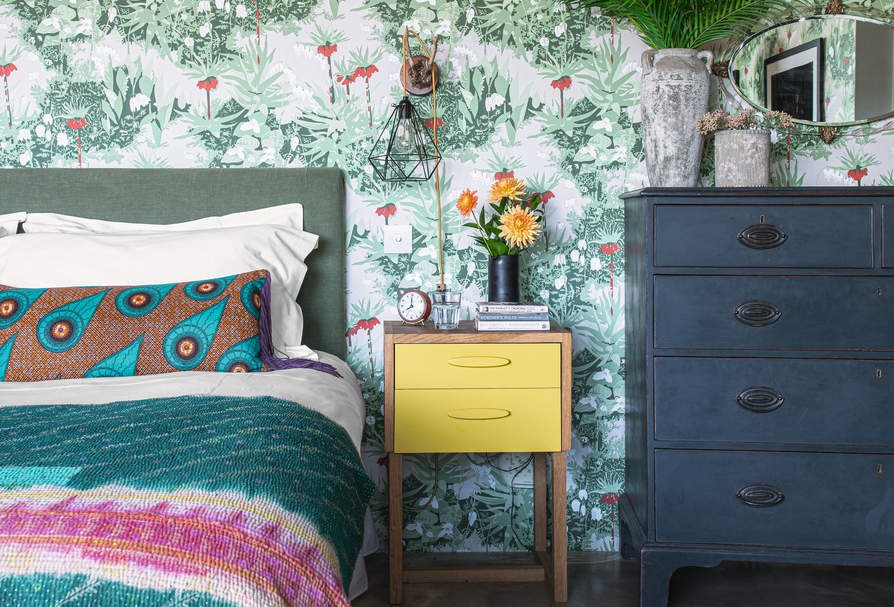
Wallpaper mistakes to avoid – 7 of the most common errors and how to solve them
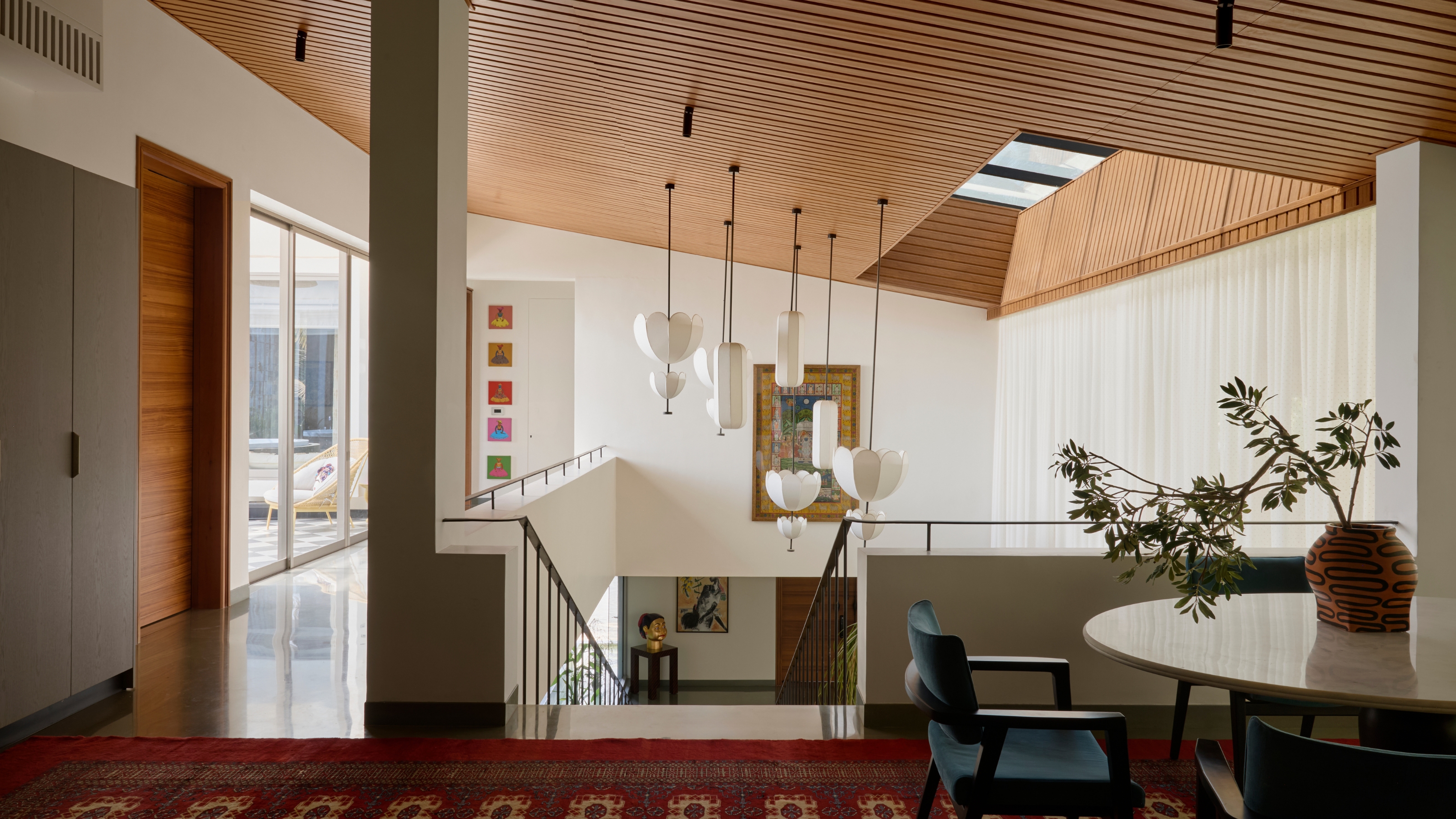
There's Hanging Art, and Then There's Hanging Art Like an Interior Designer — Here's How to Do the Latter
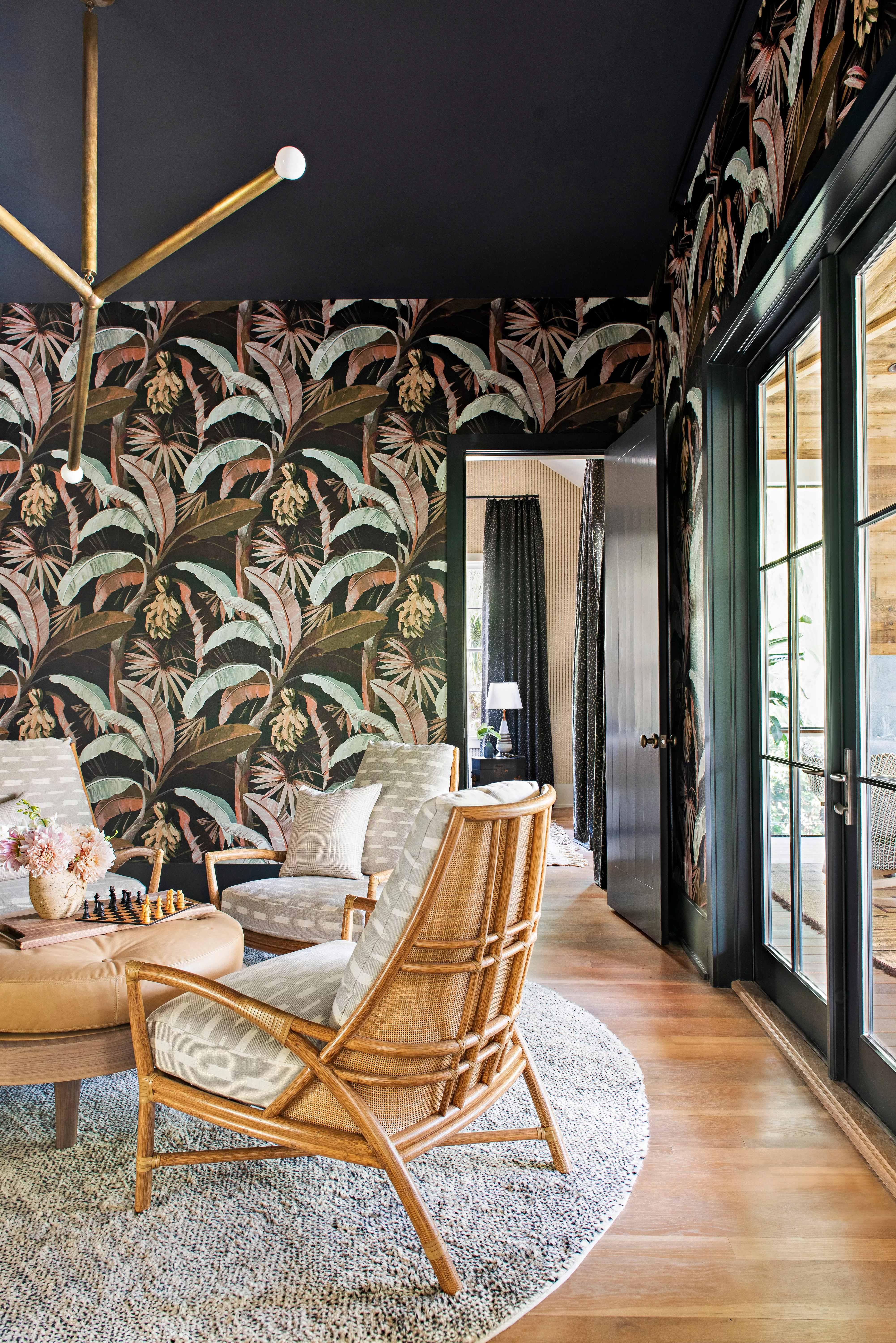
8 Common Wallpaper Mistakes (and How to Fix Them)


to create a gallery art wall - Ideas & Advice

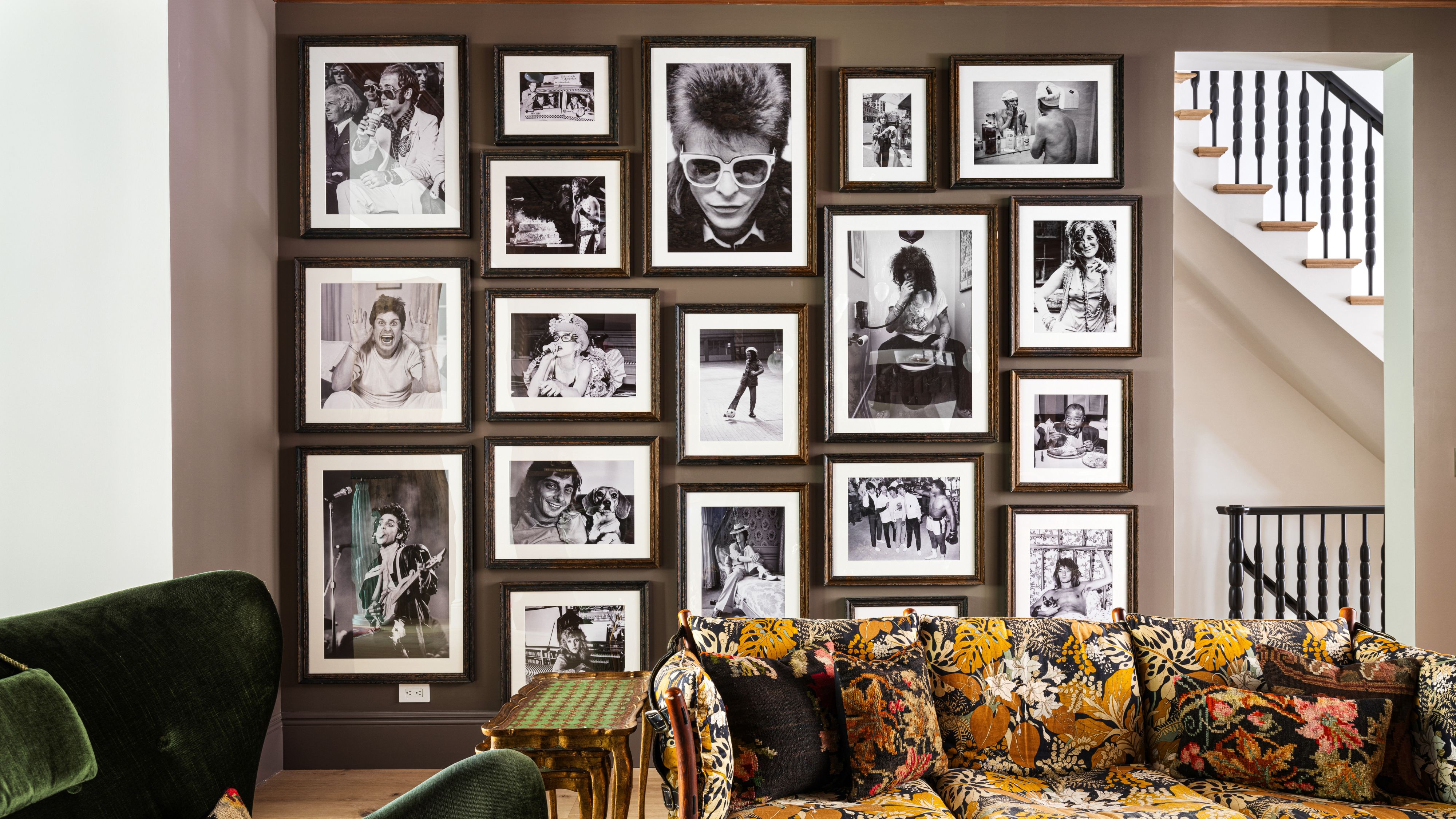
Gallery Walls Aren’t Dated – They’re Just Being Done Wrong

RS Recommends: The Best Hanging Kits Will Make Your Gallery Wall Dreams Come True

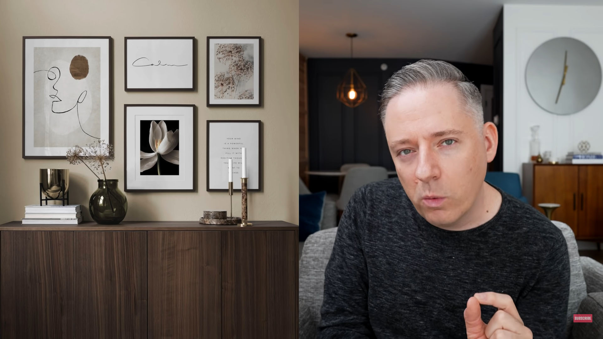
I'm an interior designer - how to create a gallery wall without it looking tacky - people always make the same mistakes

6 painting mistakes that are making your walls look 'dirtier' – and what you should be doing instead
Yes, You Can Hang Art Like a Pro | Reviews by Wirecutter
28 Gallery Wall Ideas to Spiff Up Your Space