1/2
5 Outdated Kitchen Paint Colors That Interior Designers Are Tired of Seeing
This article, written by Natasha Bazika and published on June 7, 2025, addresses kitchen paint color trends, highlighting five shades that interior designers consider outdated. While acknowledging that context is key to any color's appeal, the piece focuses on colors that, despite past popularity, now tend to make a kitchen feel less current. The objective is to guide homeowners seeking to refresh their kitchen aesthetics by identifying colors to reconsider and suggesting modern alternatives or approaches to using these hues. The article features insights from two design experts: Alyssa Anselmo, architect and founder of Studio Anva, and Daniel Joseph Chenin, architect, interior designer, and founder of Daniel Joseph Chenin Ltd.
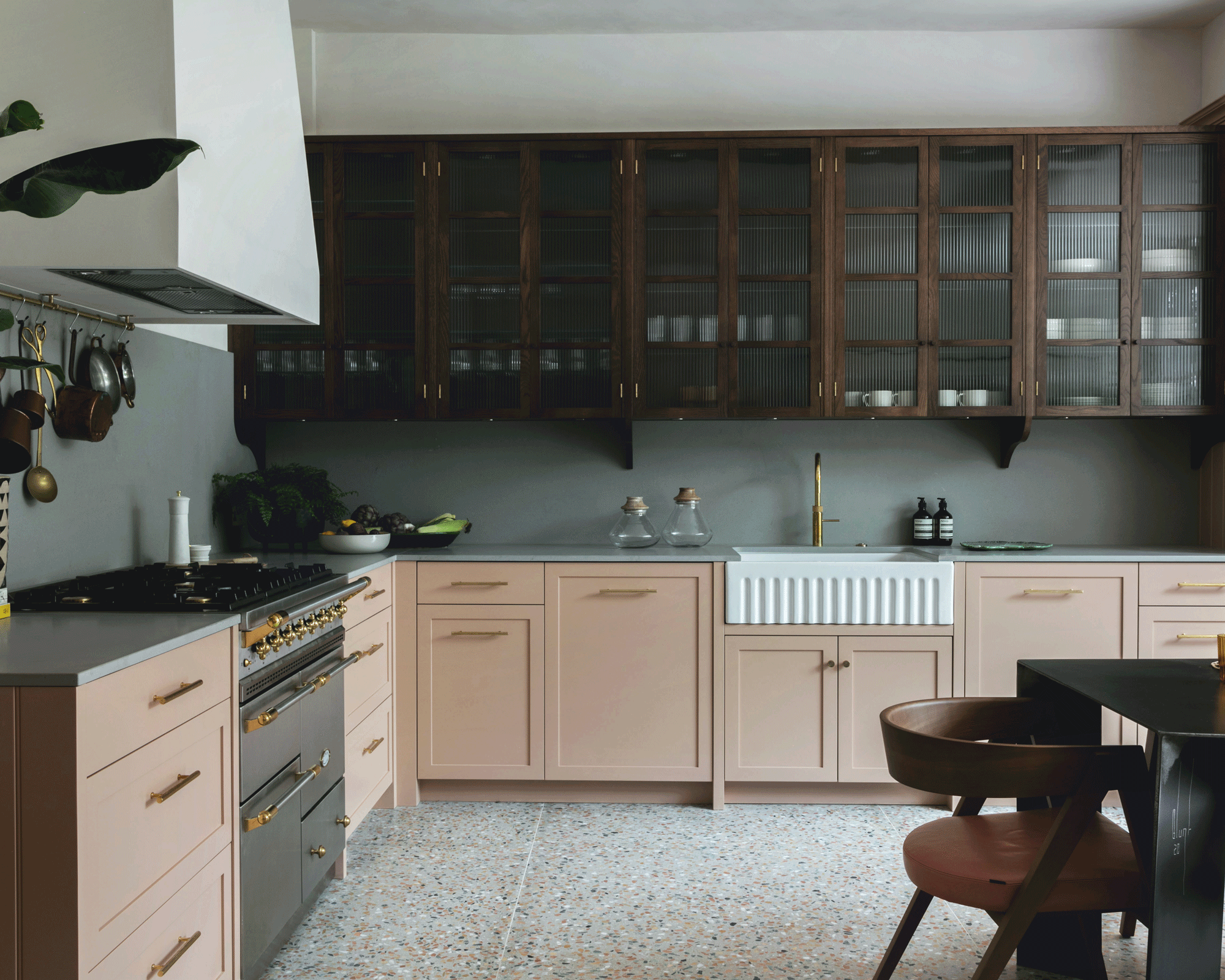
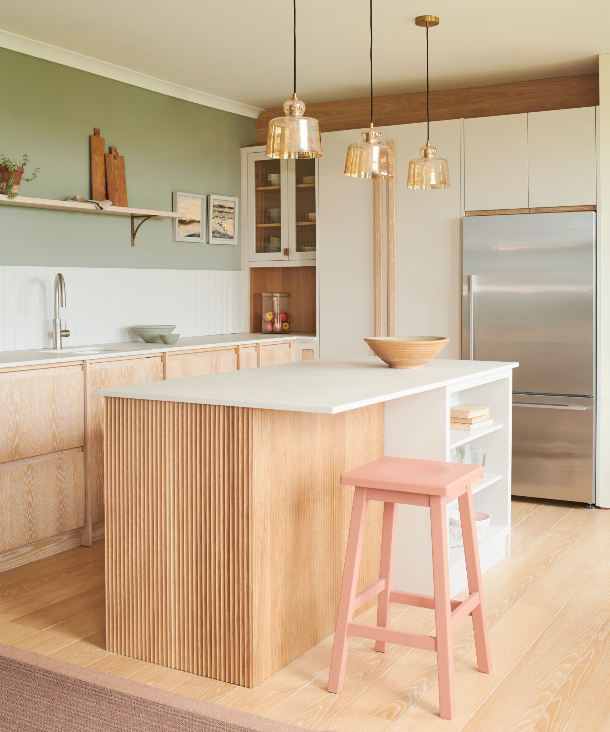
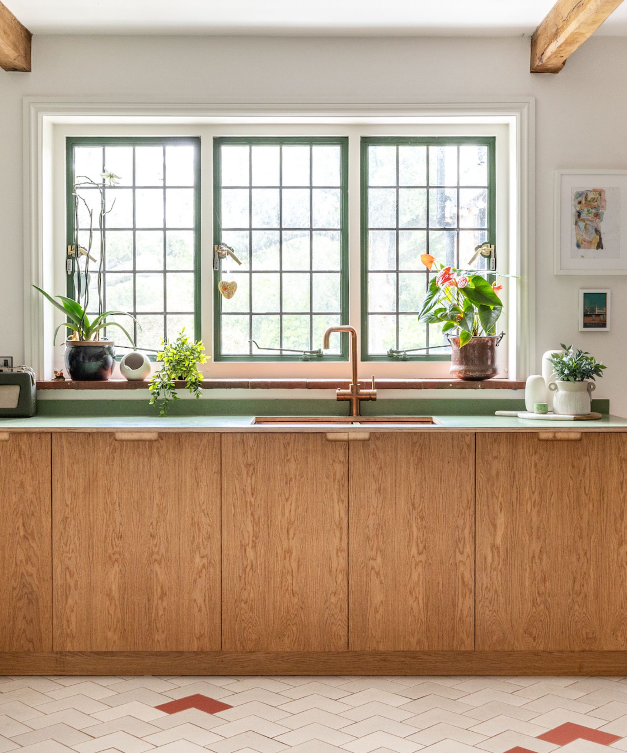
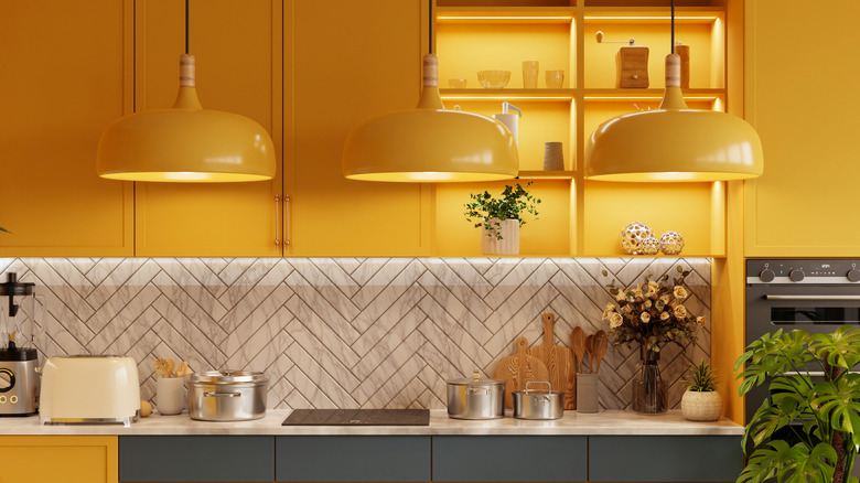
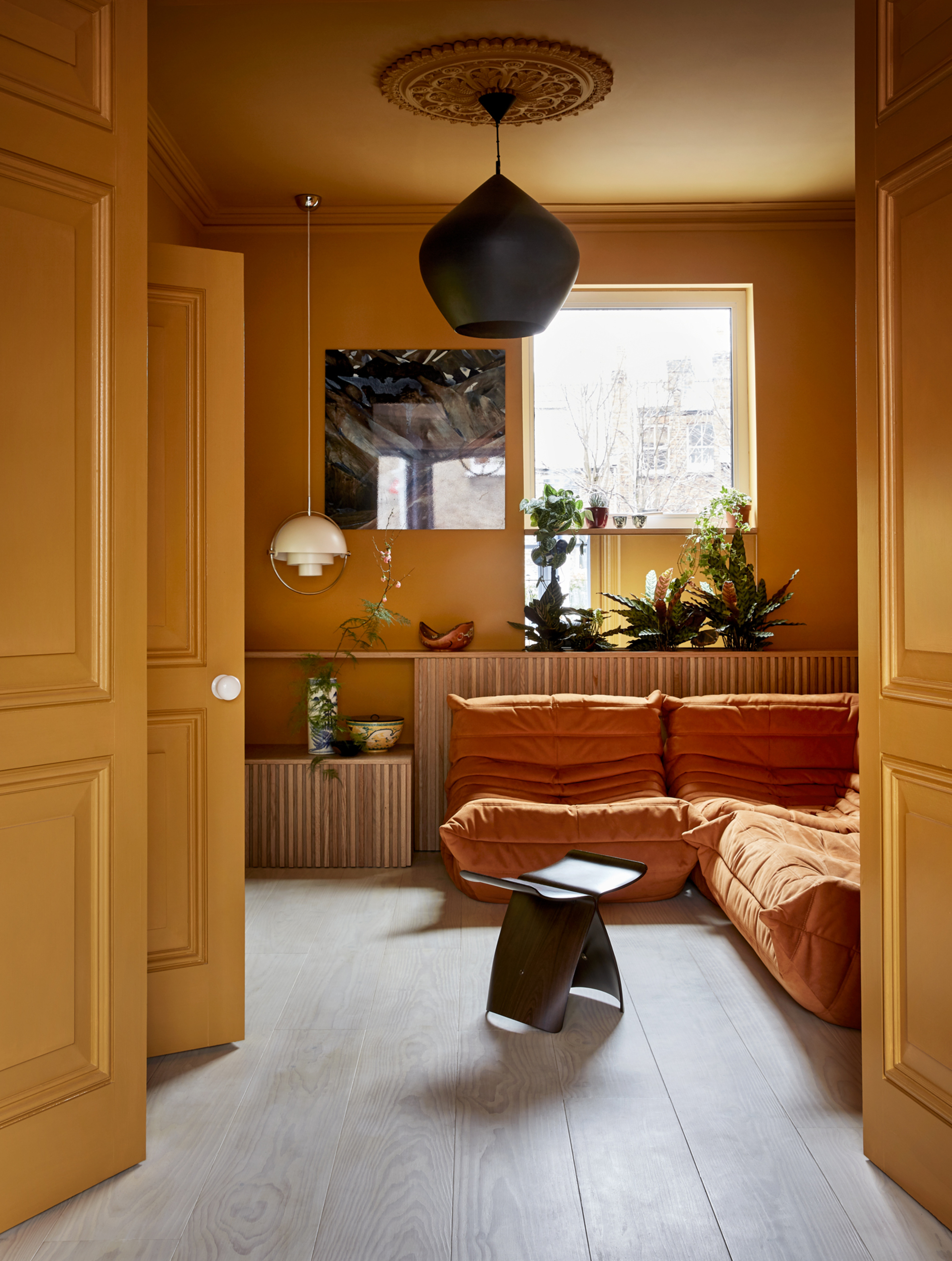
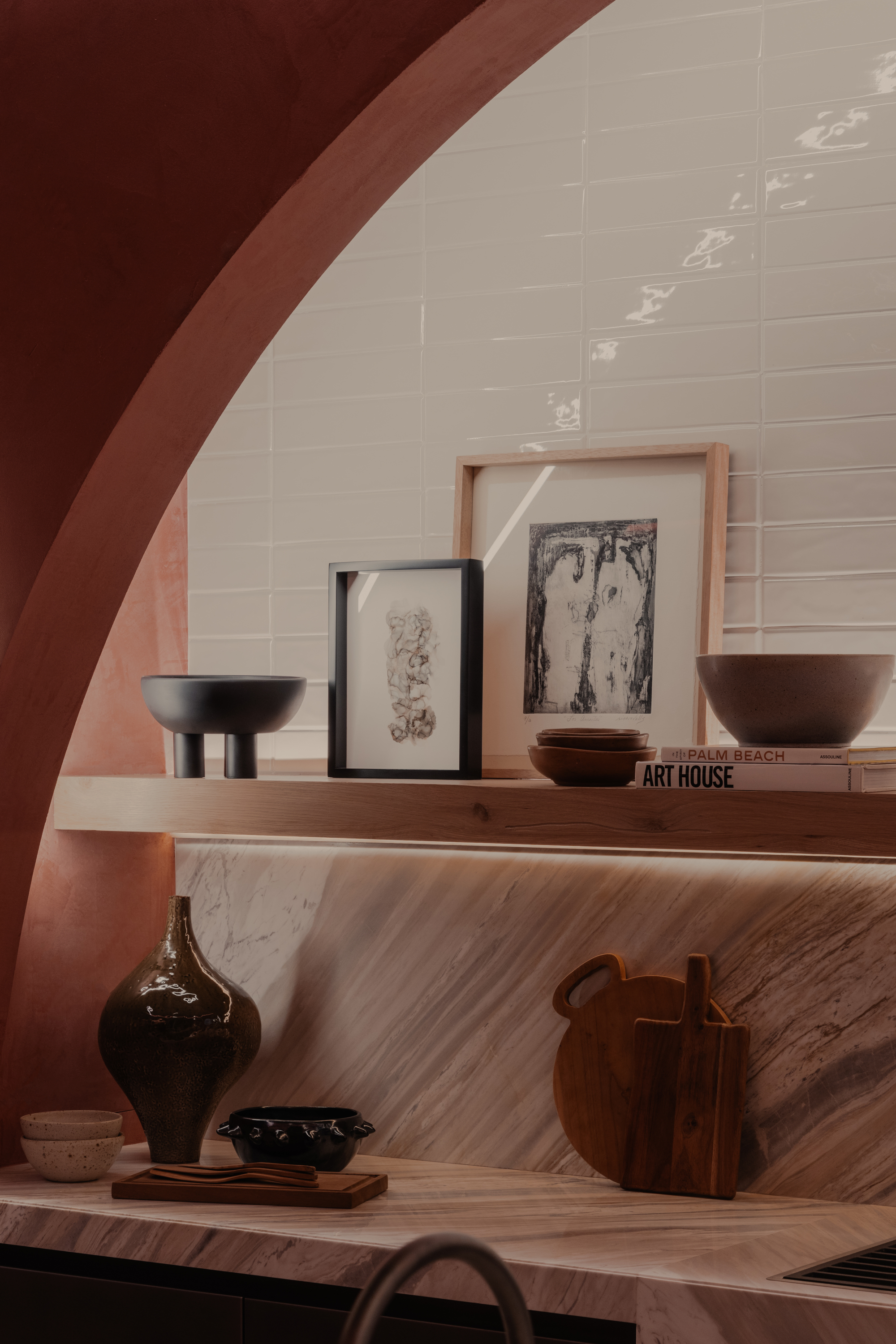
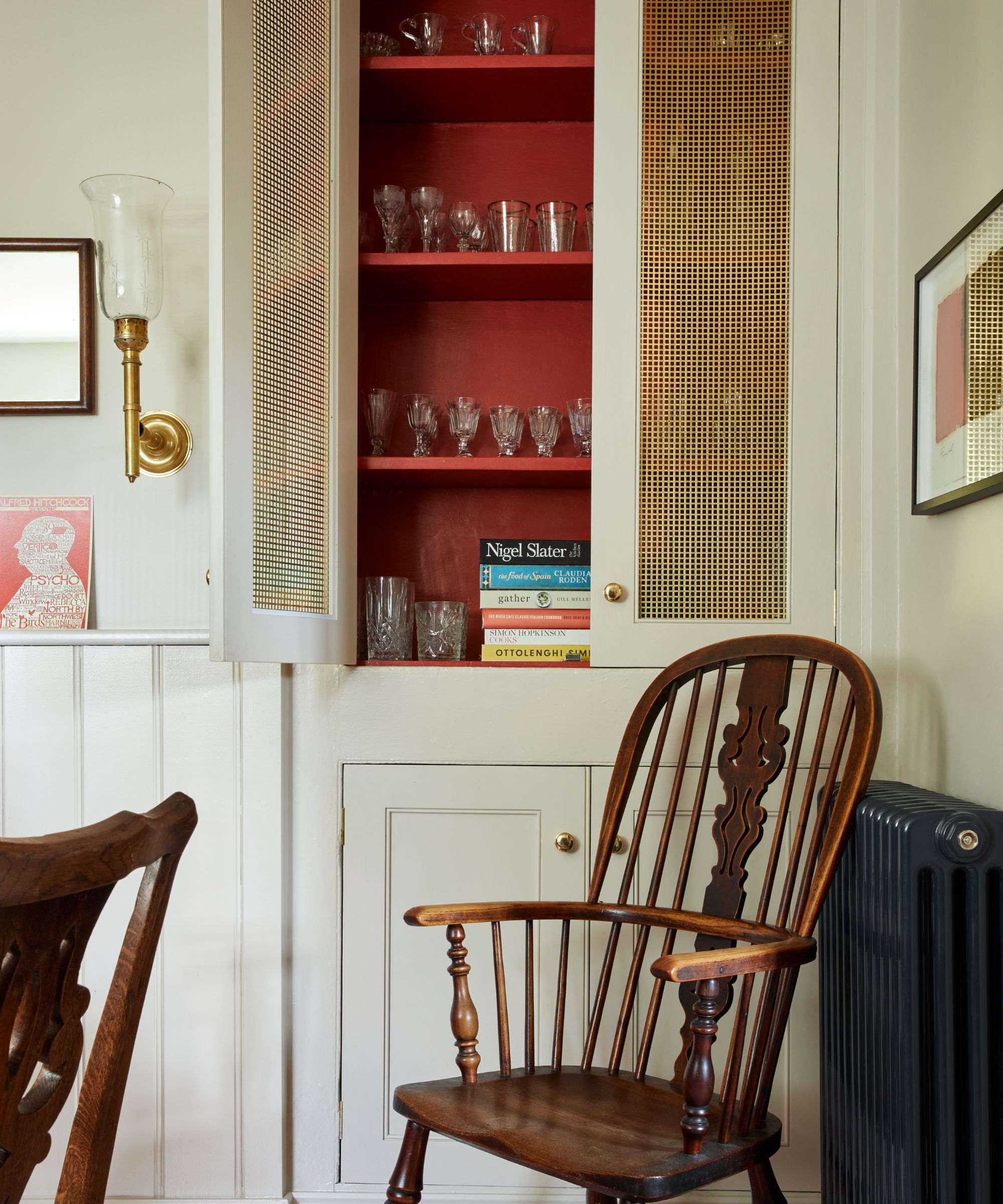
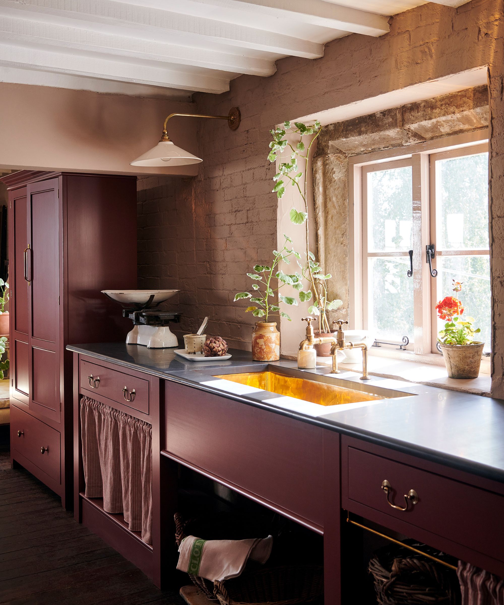
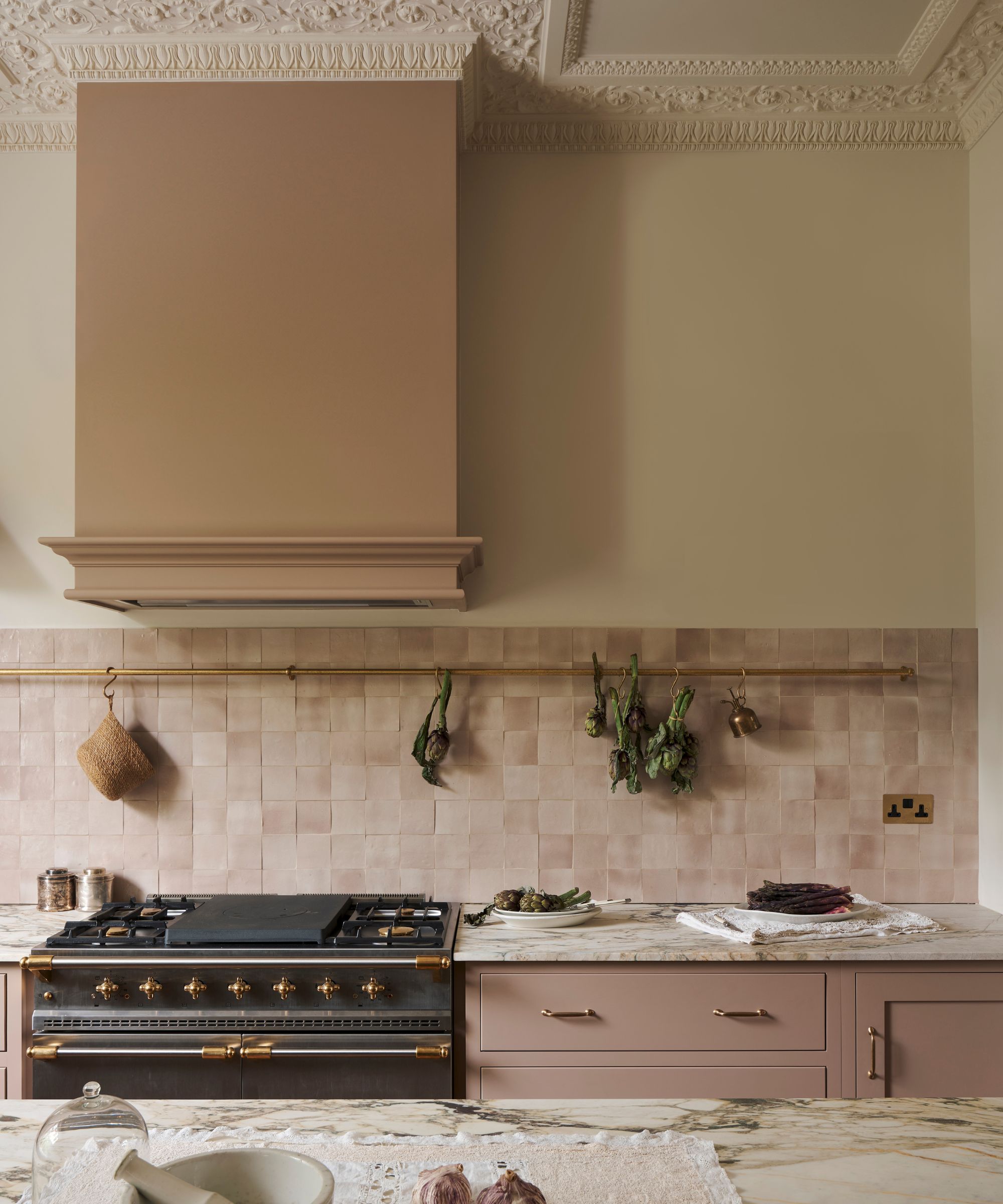
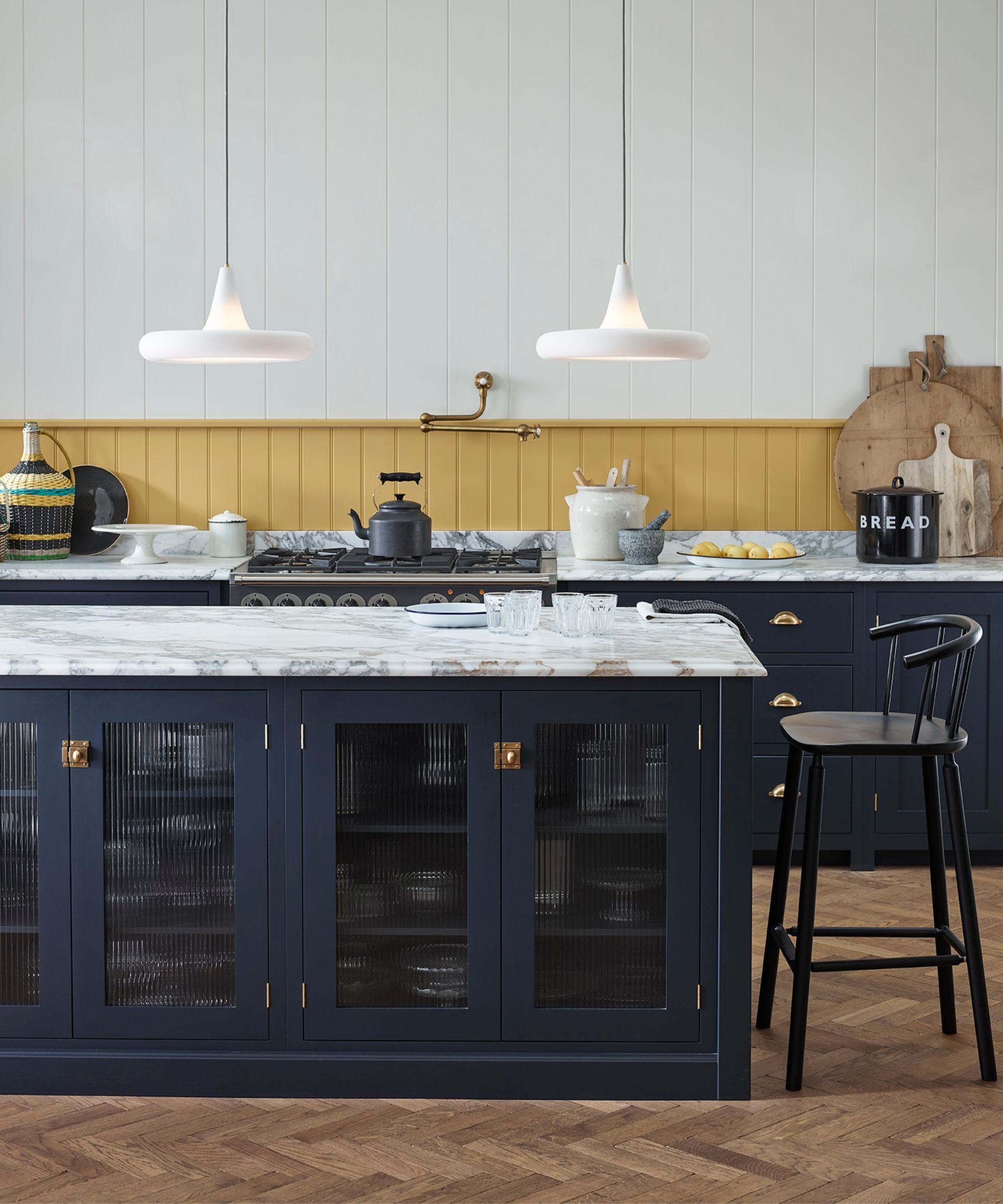
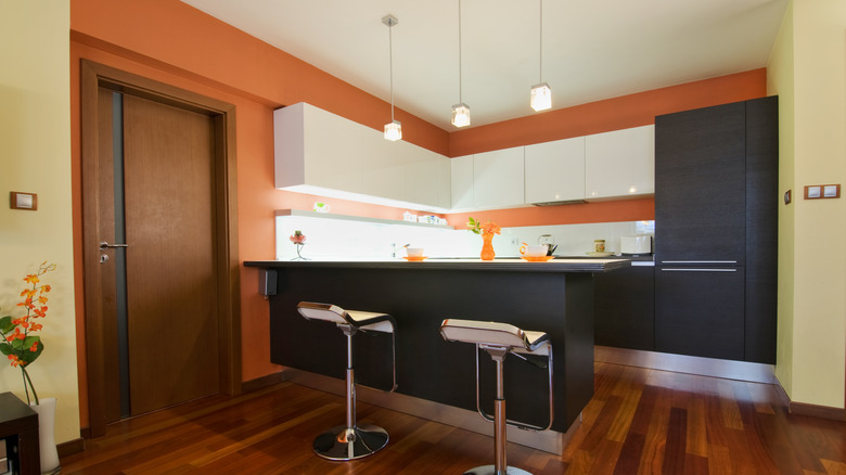
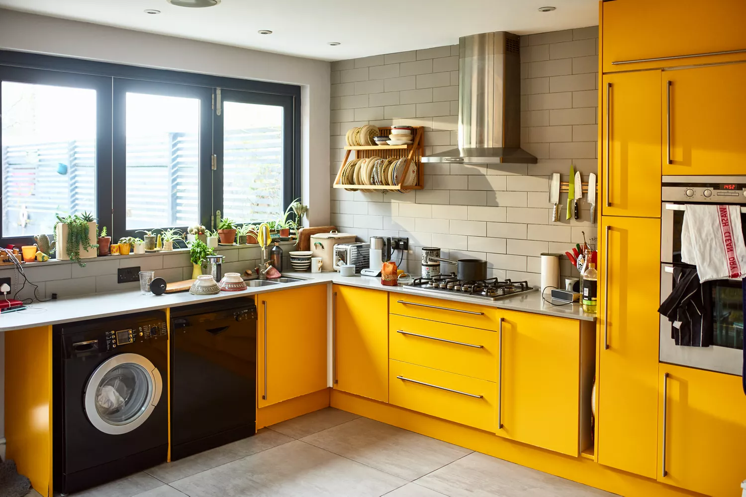
Burnt orange and mustard yellow are identified as colors that can evoke a heavy, 1970s retro vibe. While not inherently bad, these shades are challenging to modernize, particularly when used on prominent features like cabinetry or walls. Anselmo suggests these emotionally charged colors are best applied sparingly, such as in small objects or textiles, to avoid overpowering the space. Red lacquer kitchens, once considered ultramodern and bold, are now seen as aggressive and synthetic, with a glossy, plastic-like finish that is difficult to integrate into softer designs. Anselmo advises against bright red, whether lacquered or not, for entire kitchens, advocating for its use in small, flexible accents like stools or ceramic bowls.
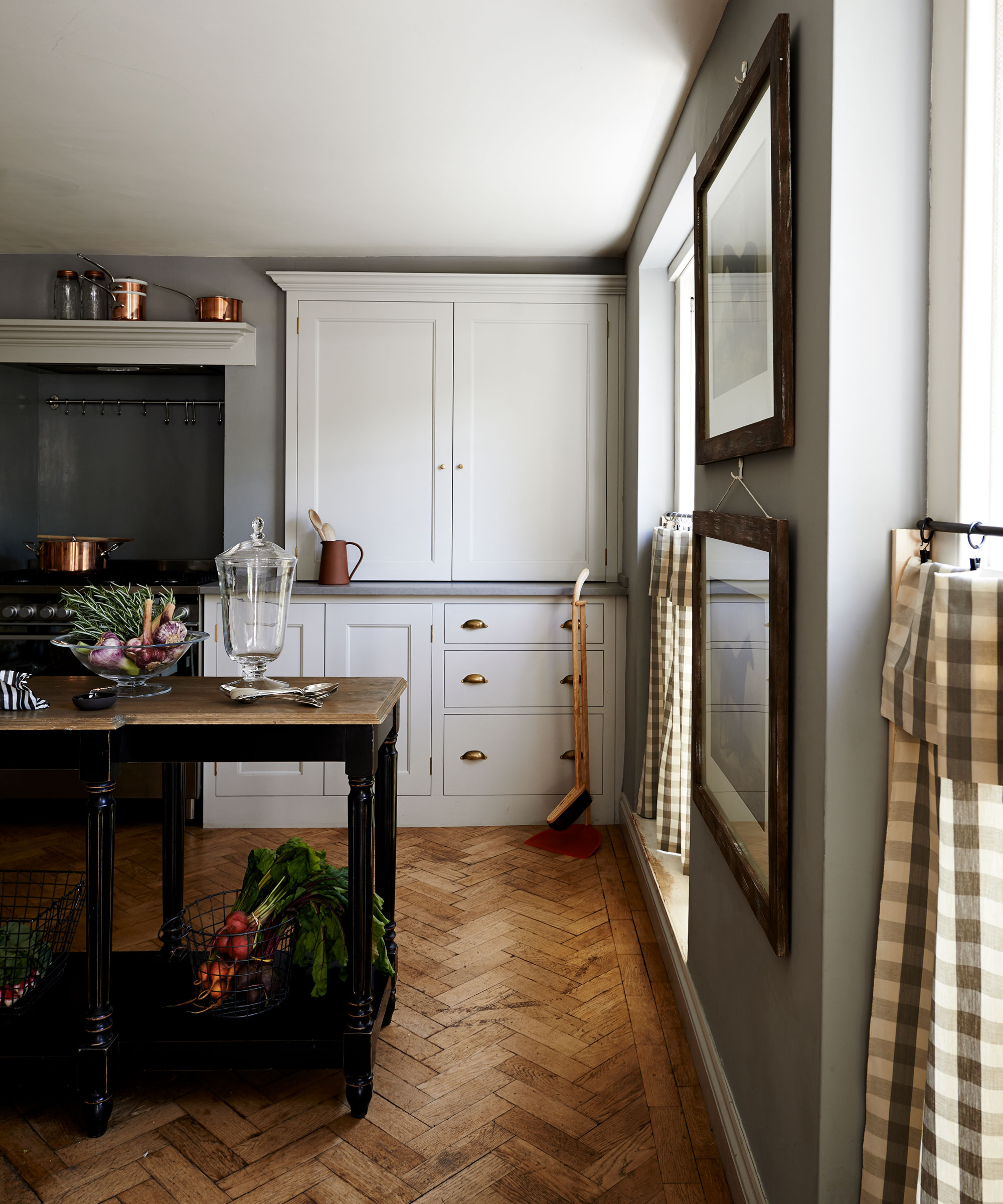
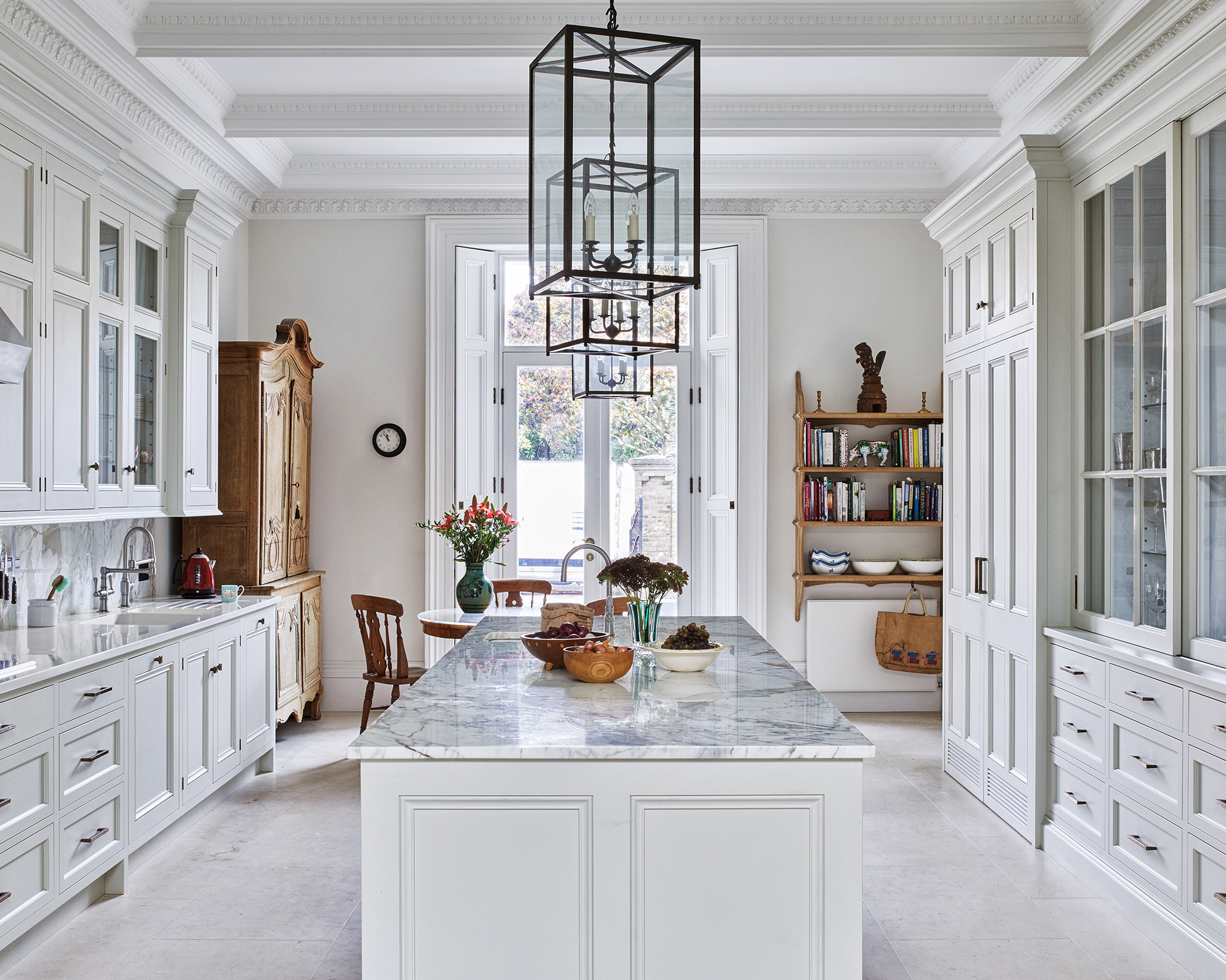
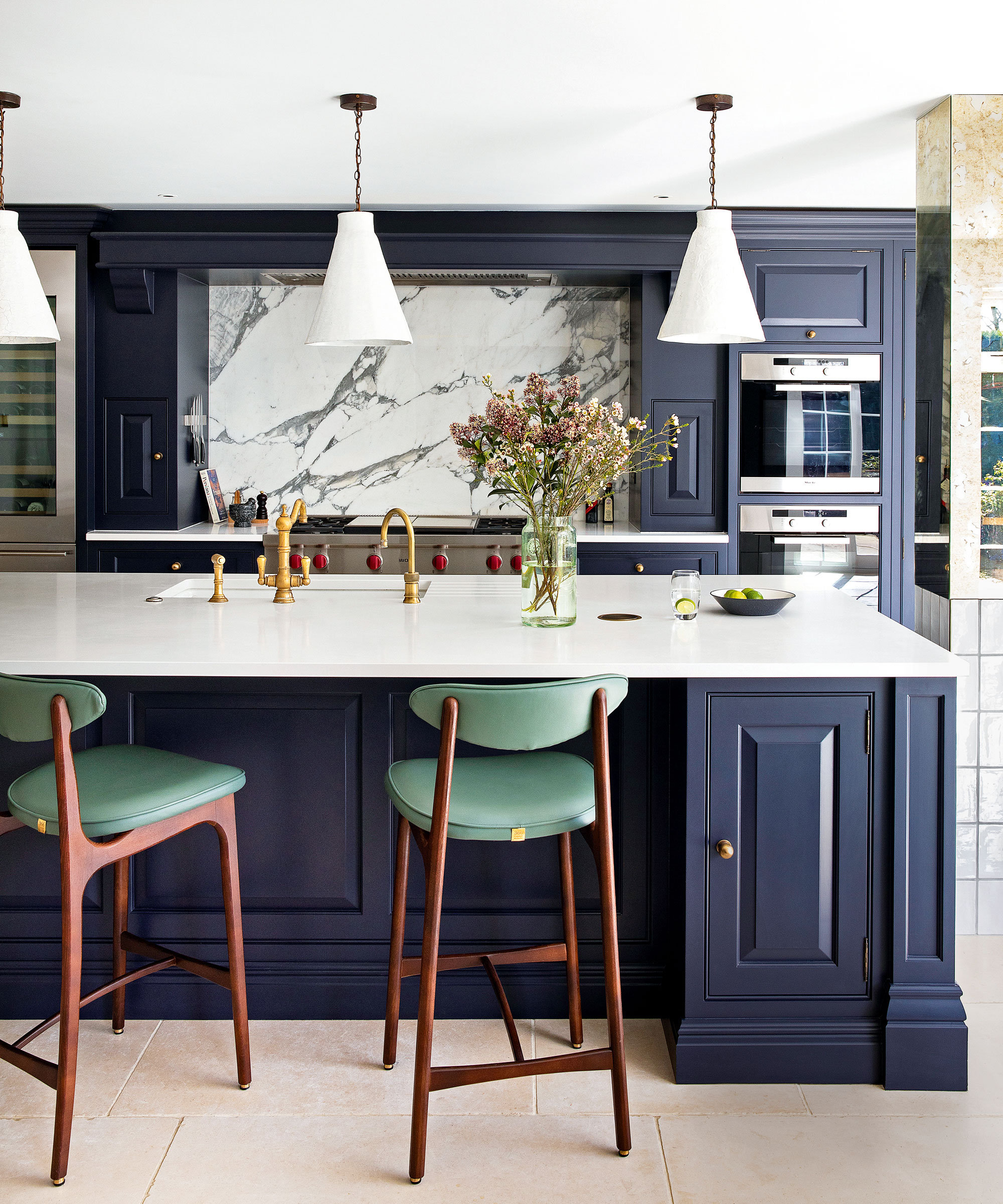
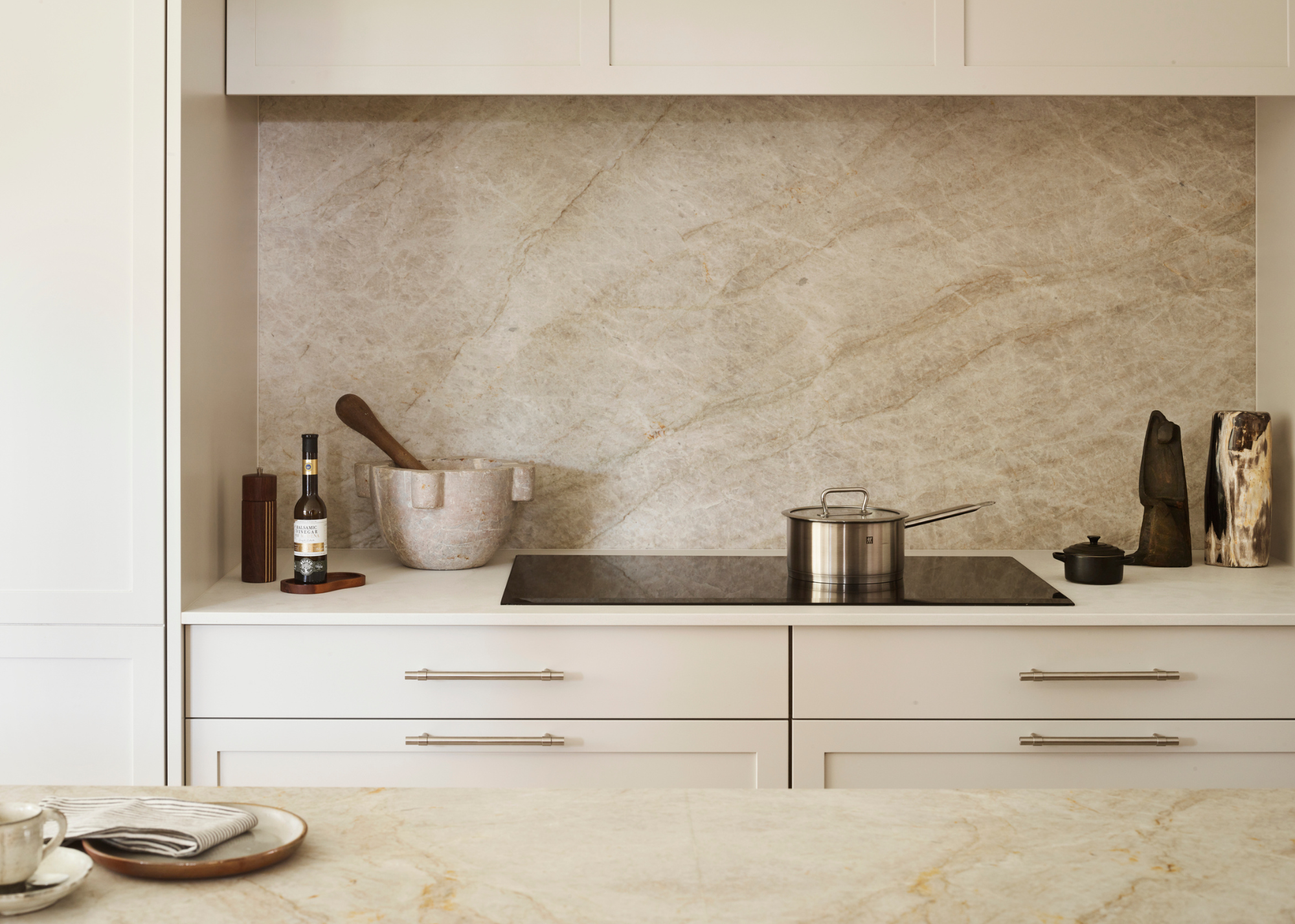
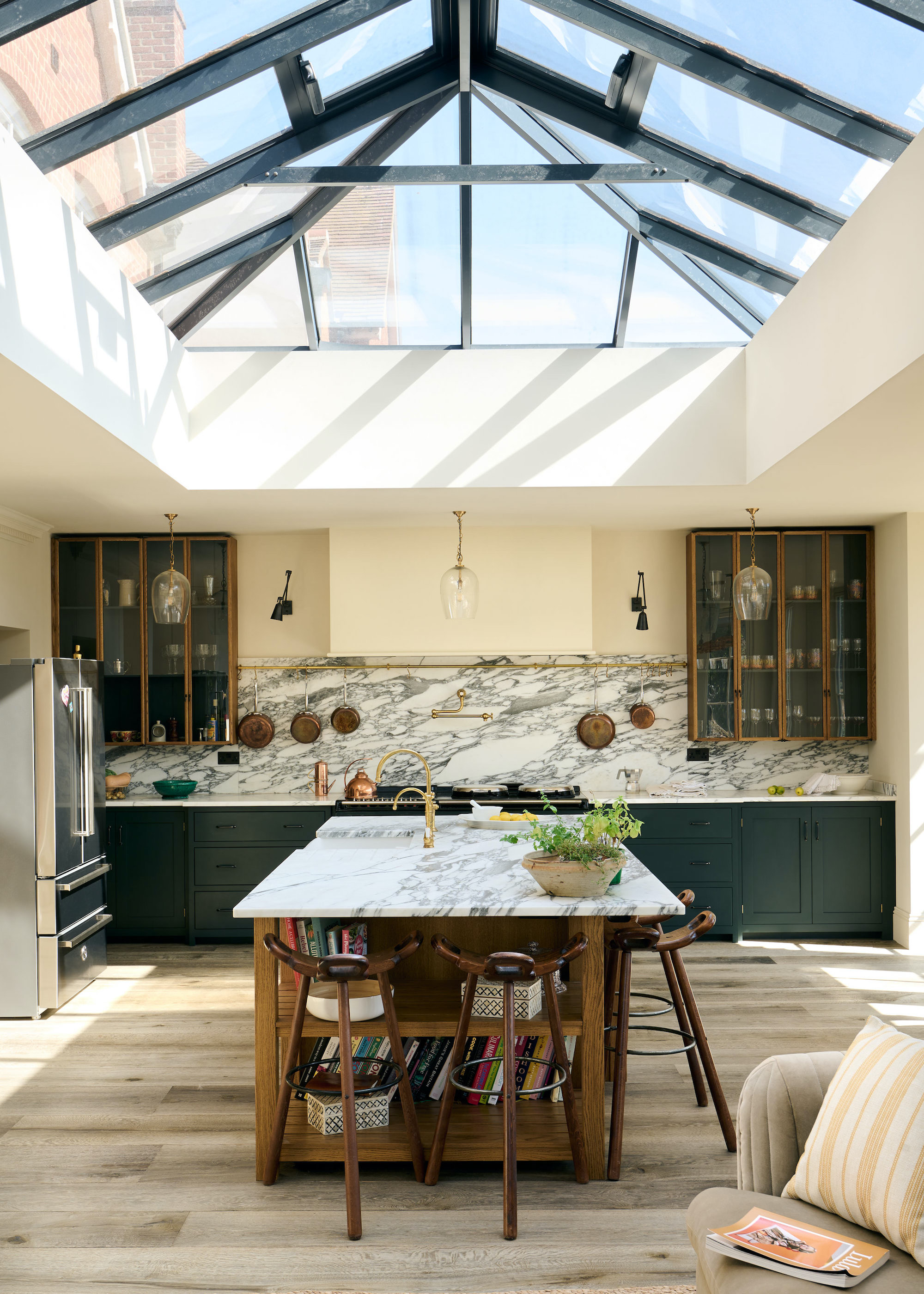
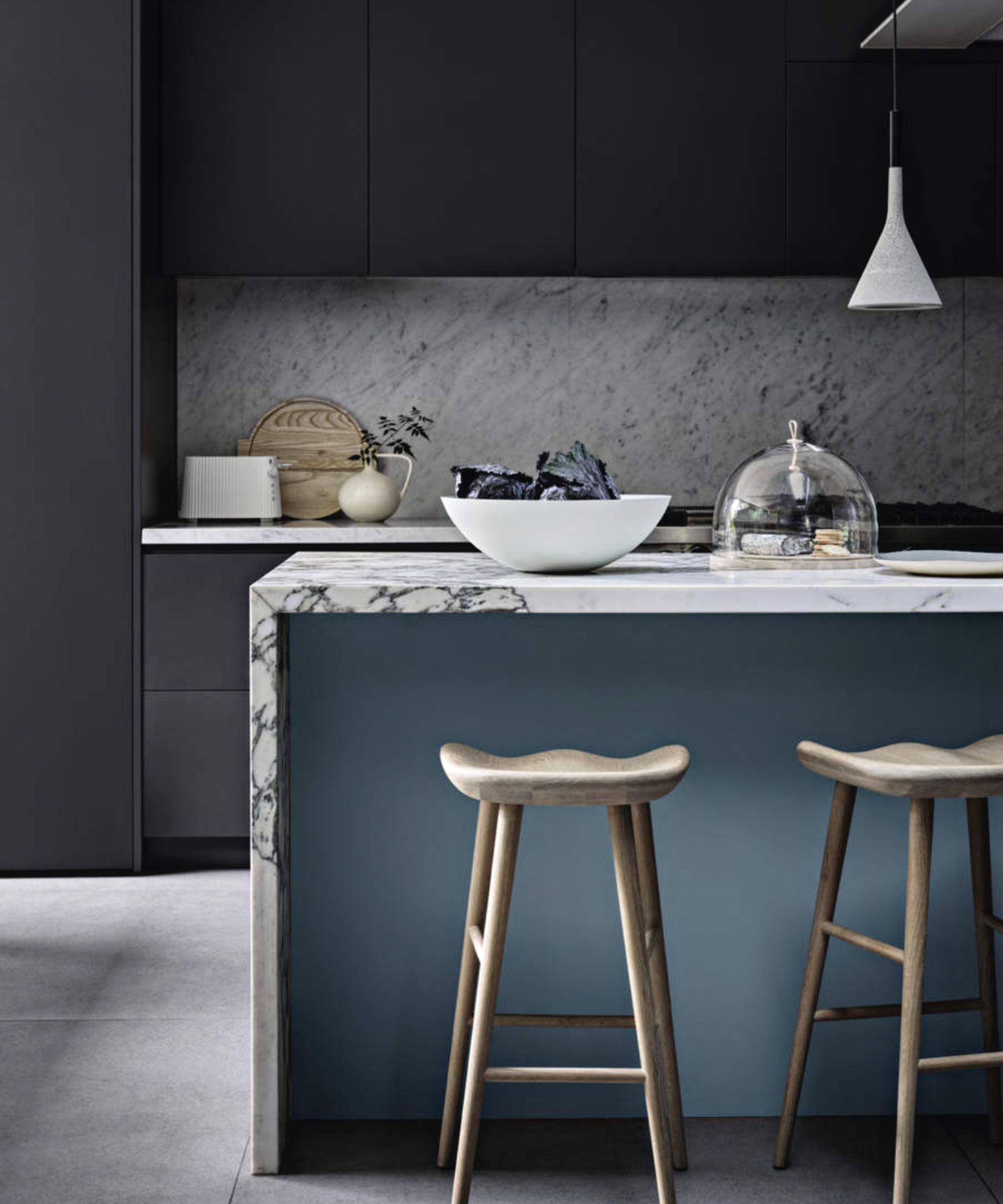
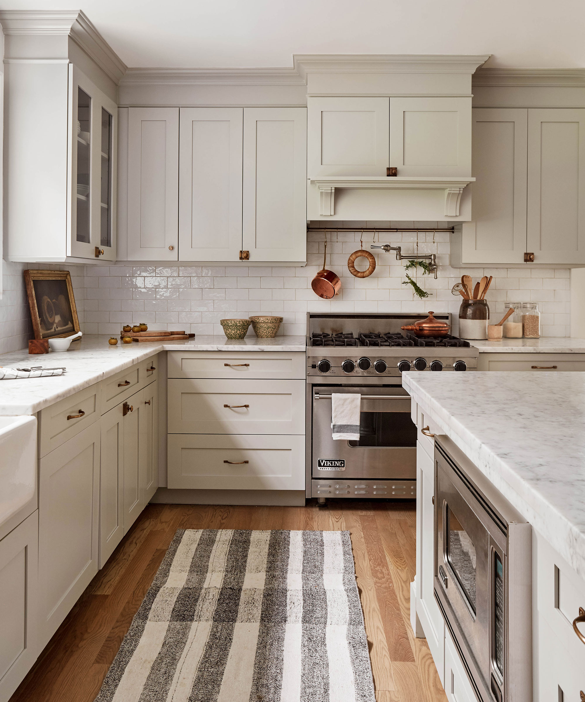
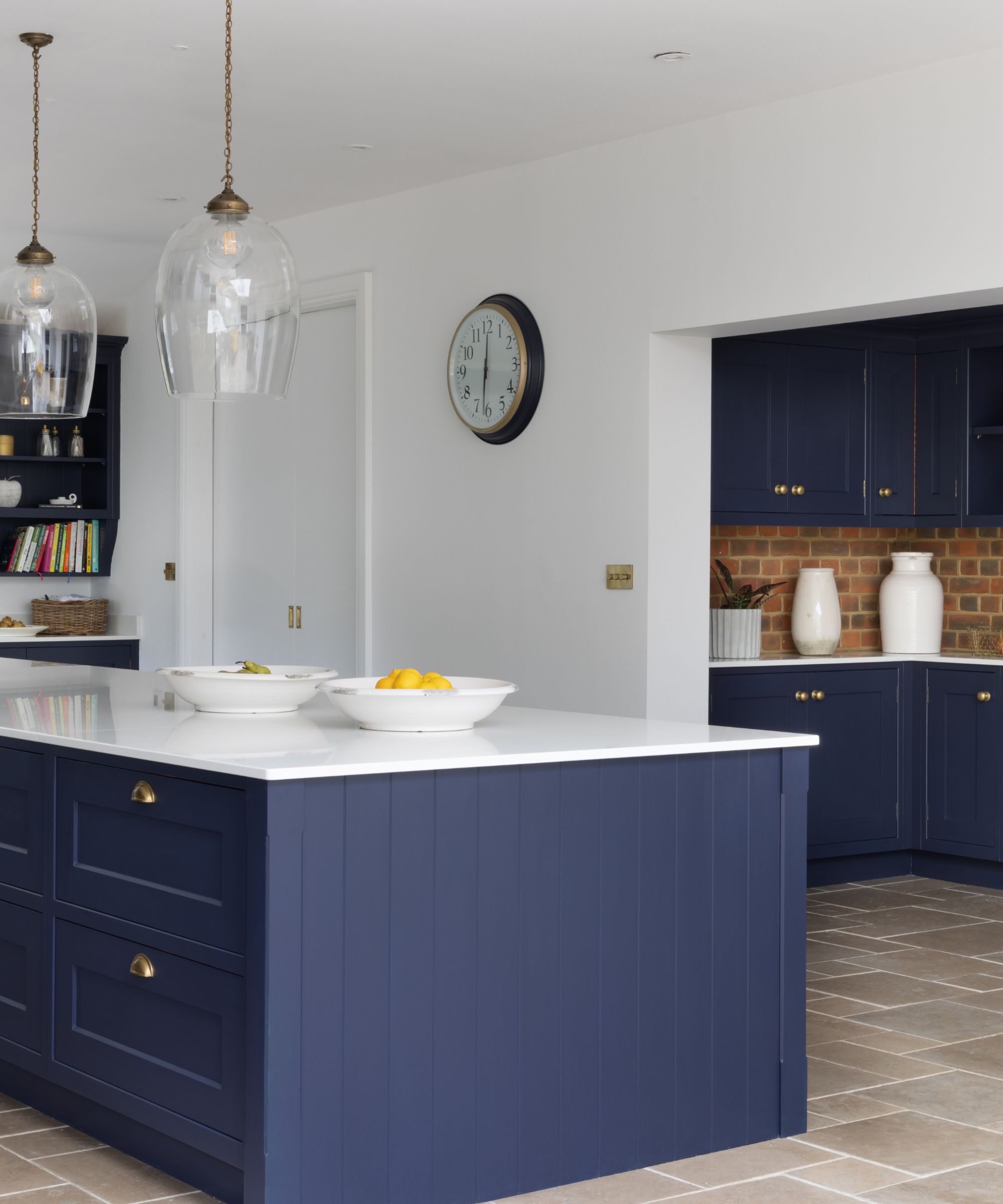
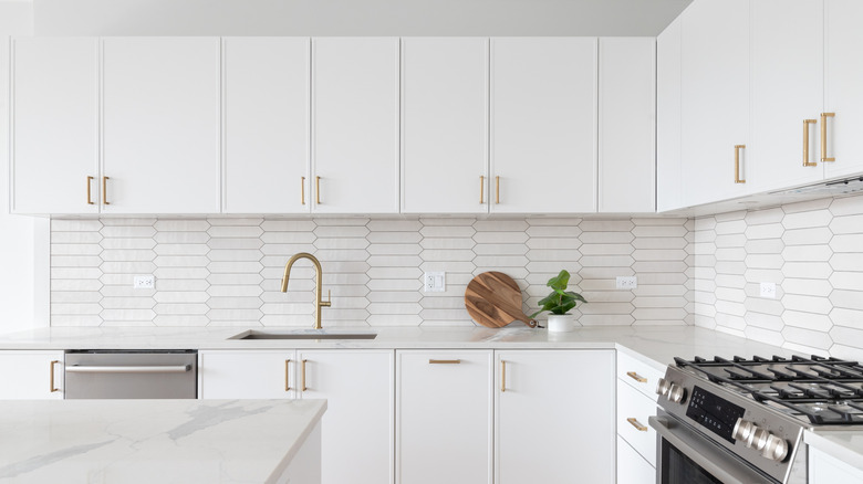
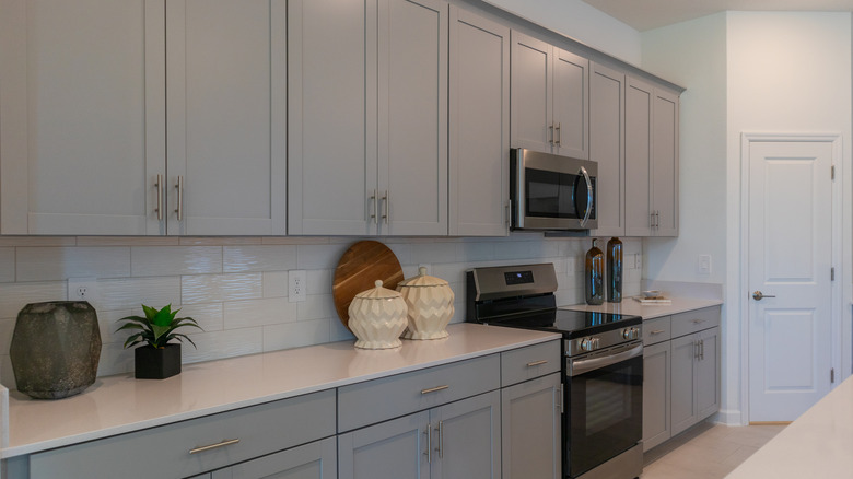
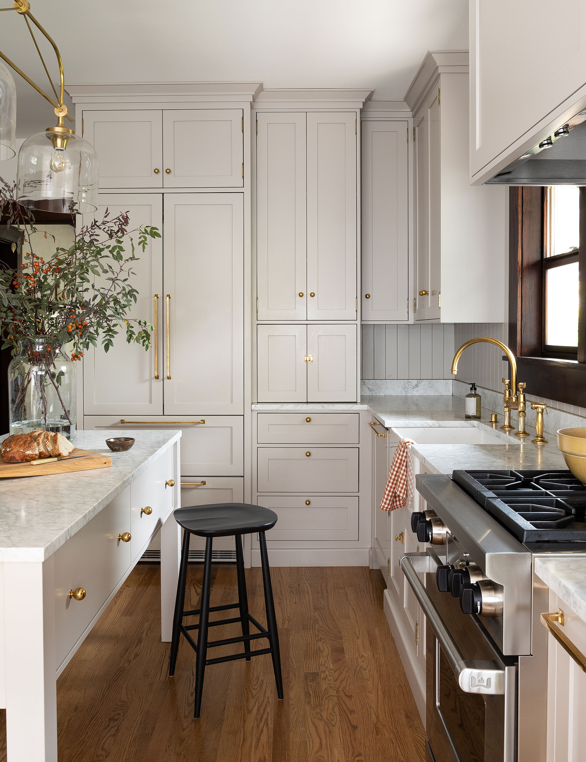
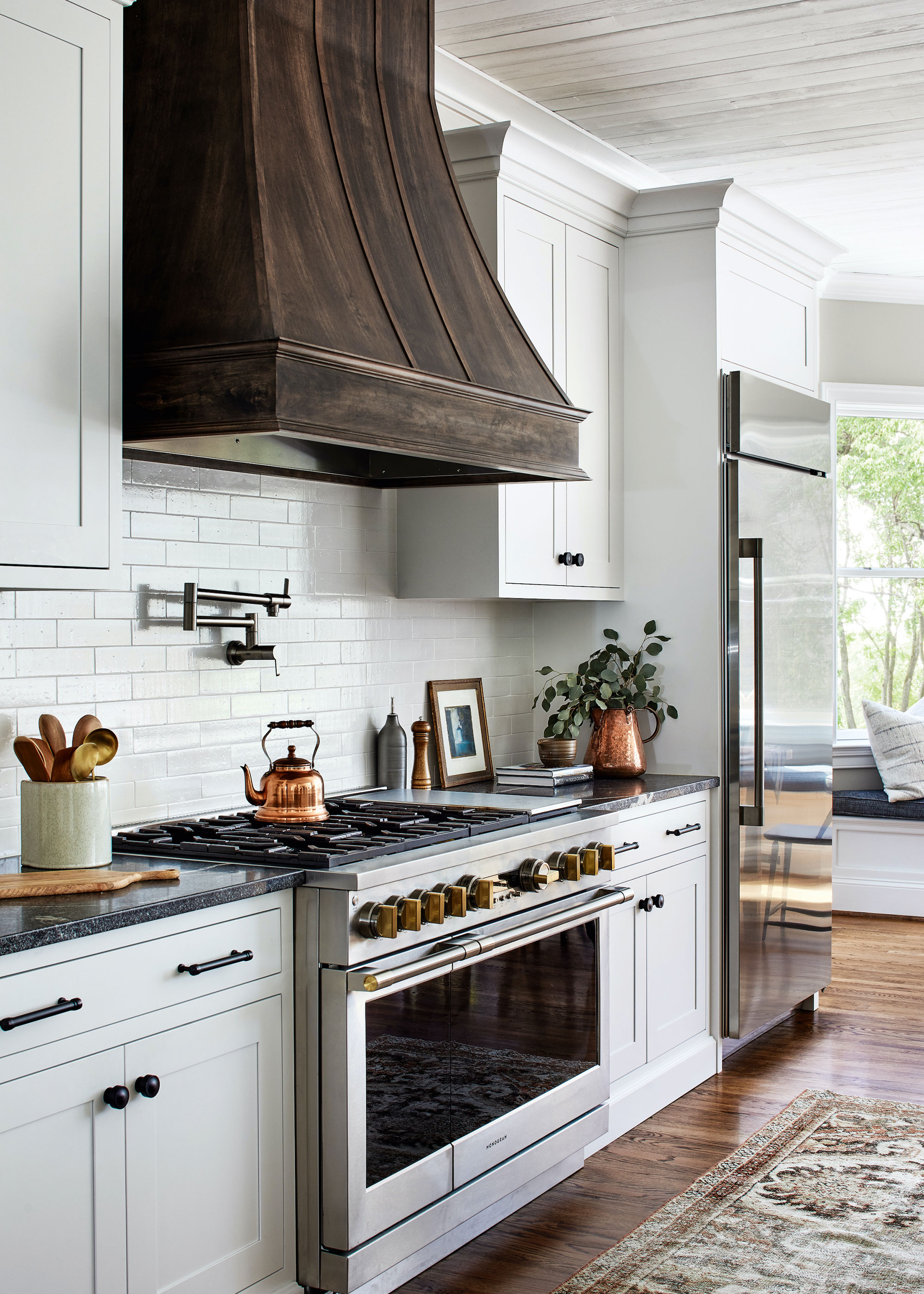

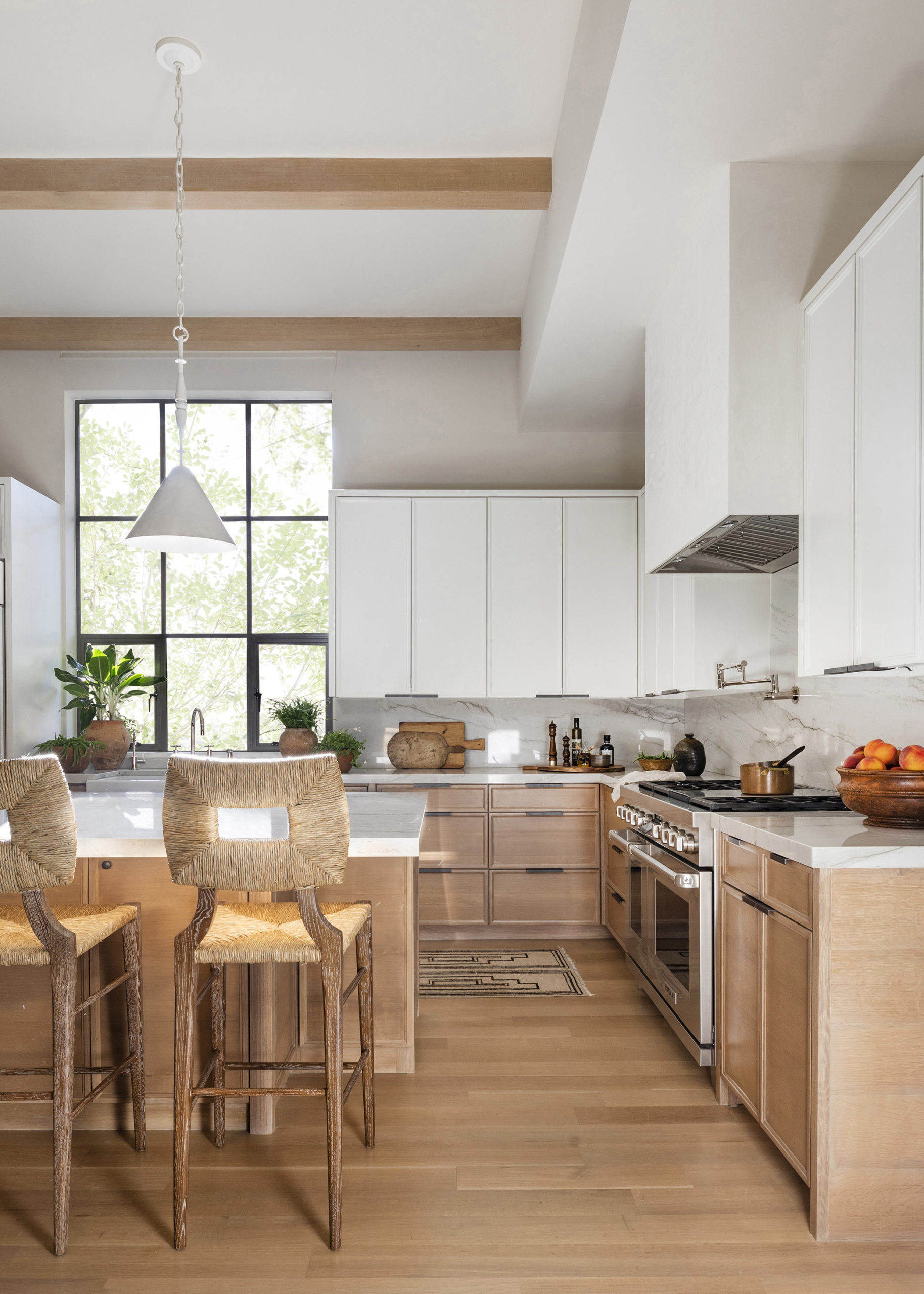
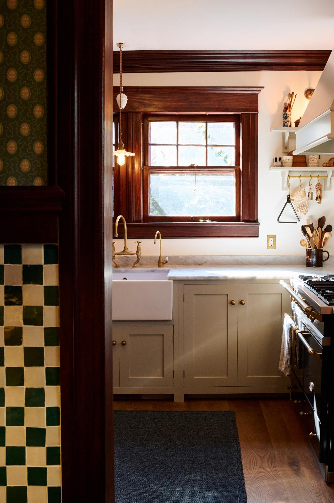
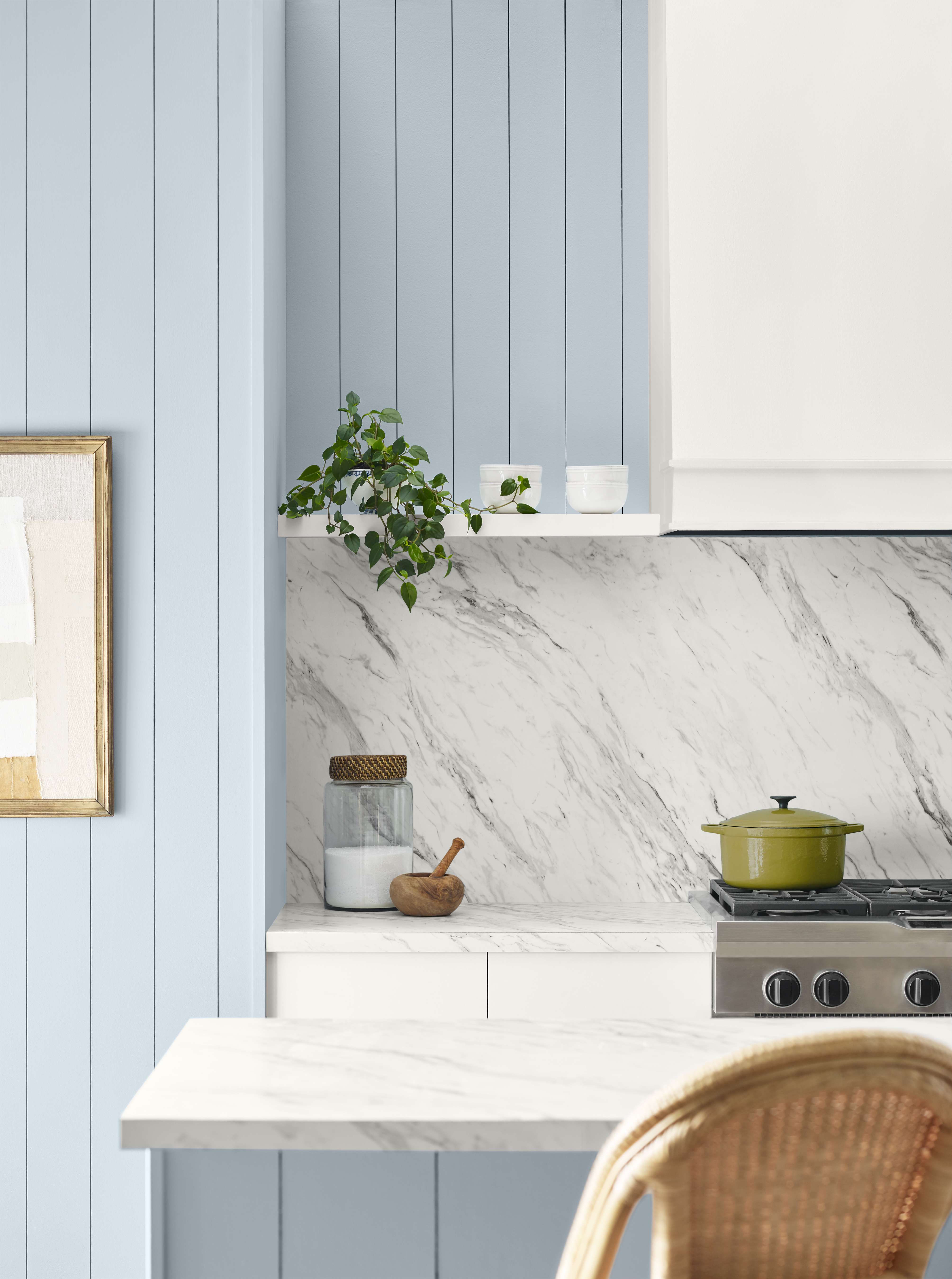
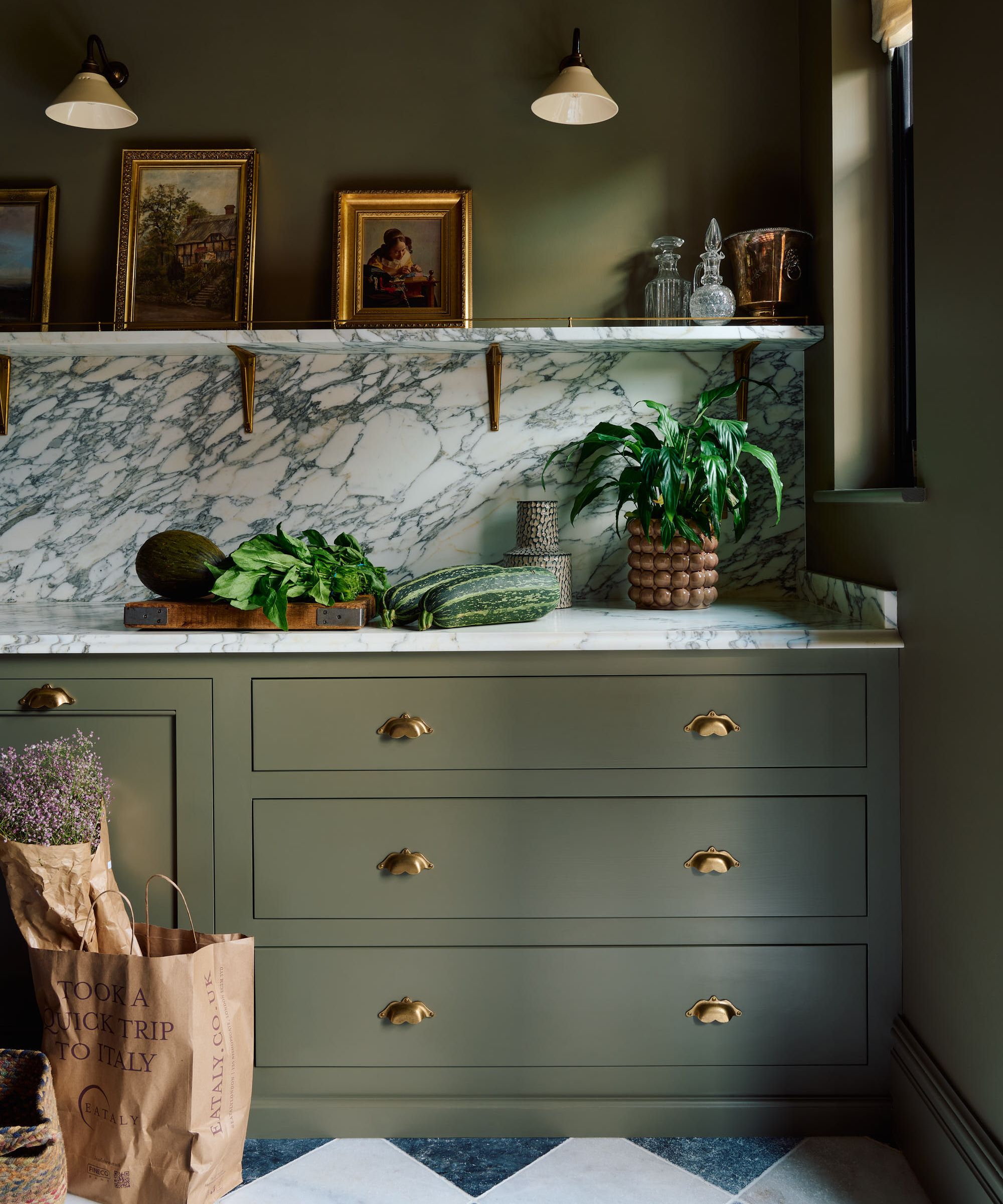
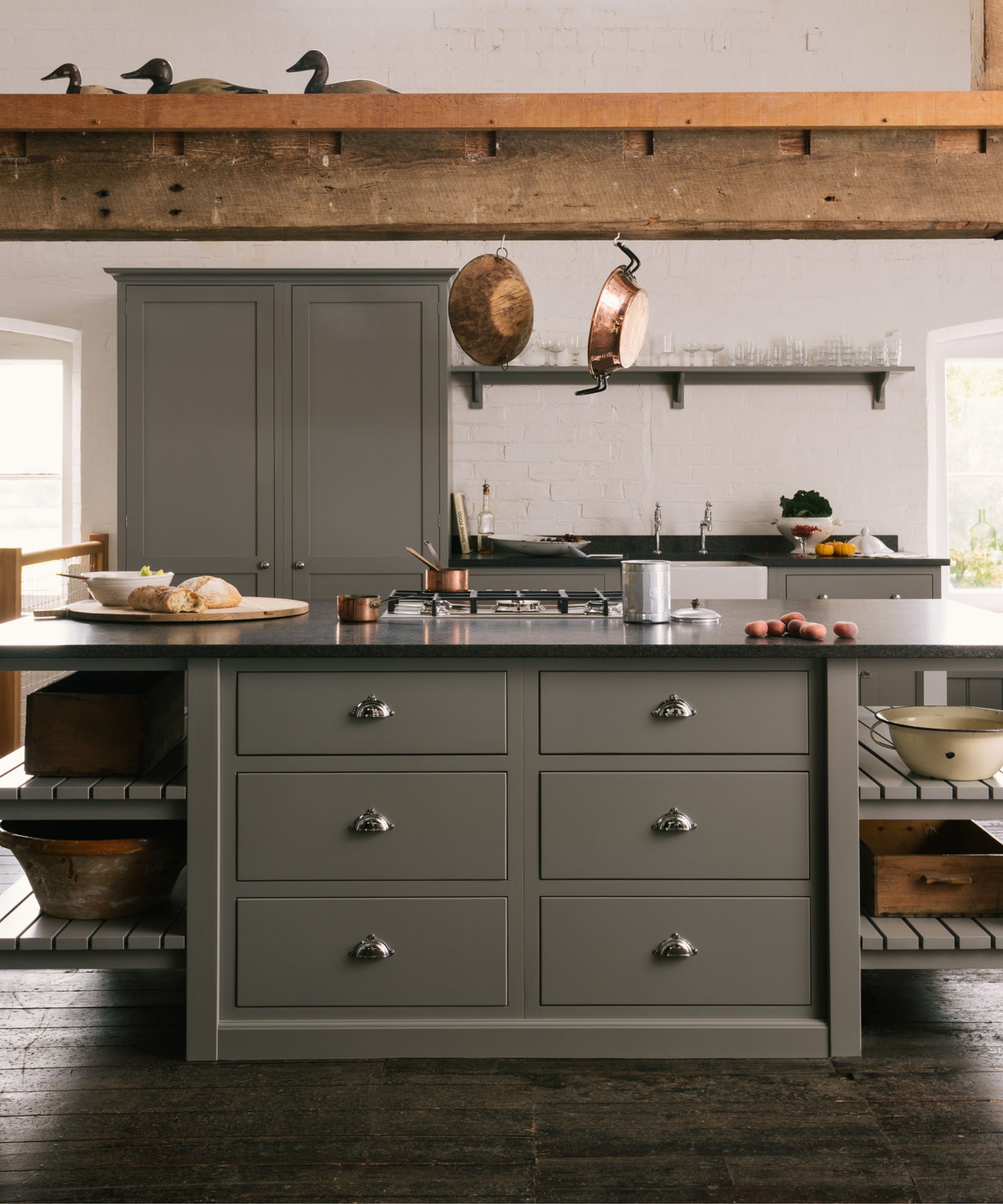

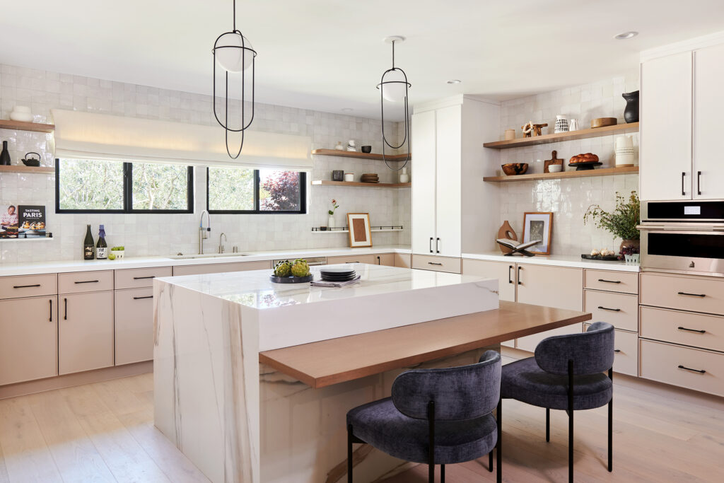
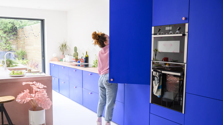
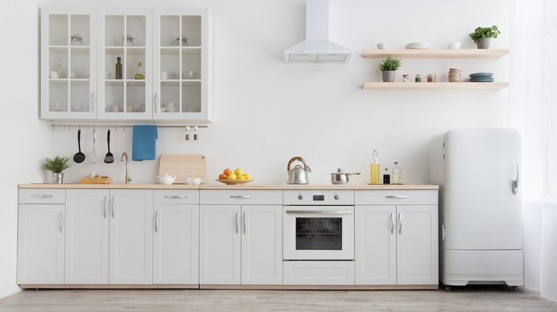
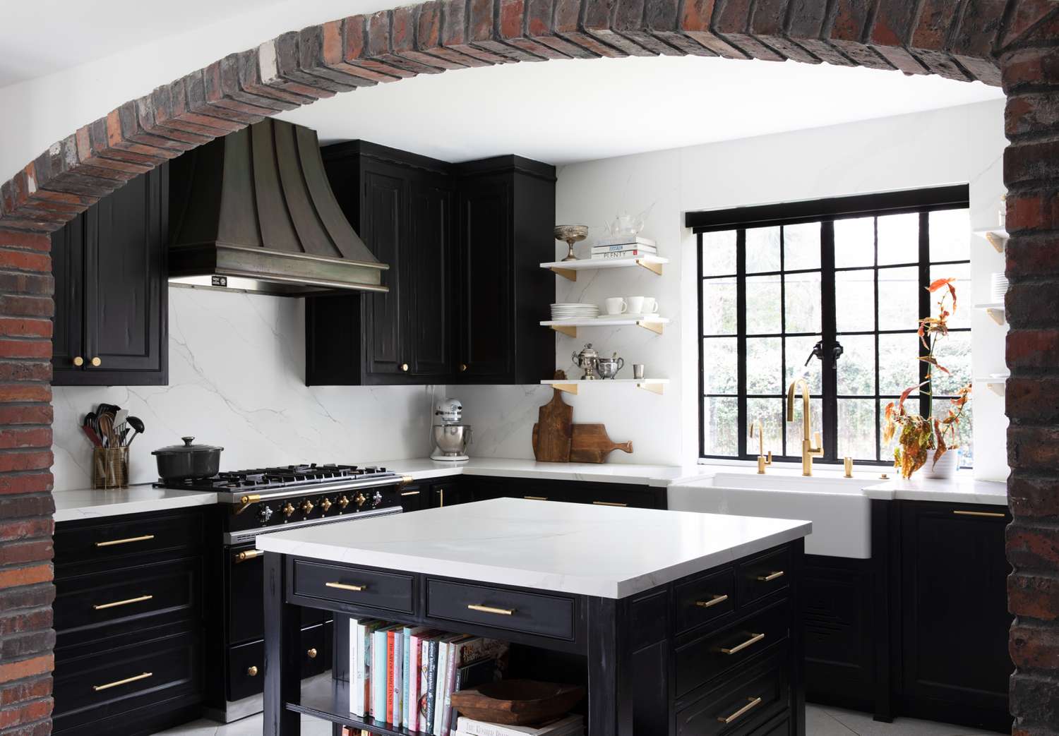
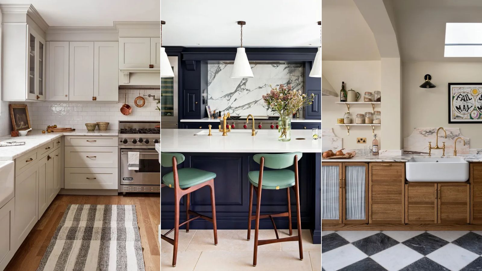
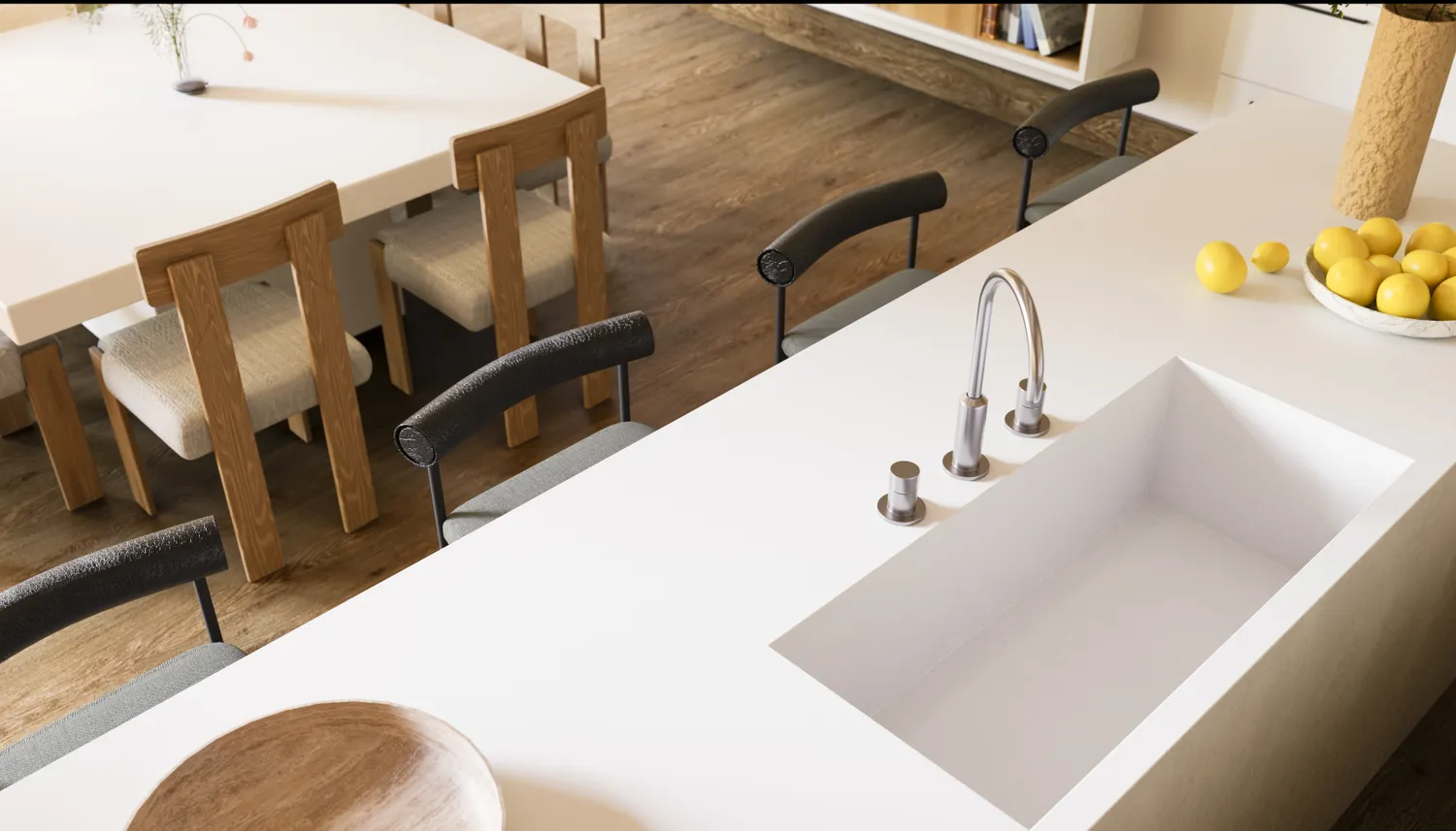
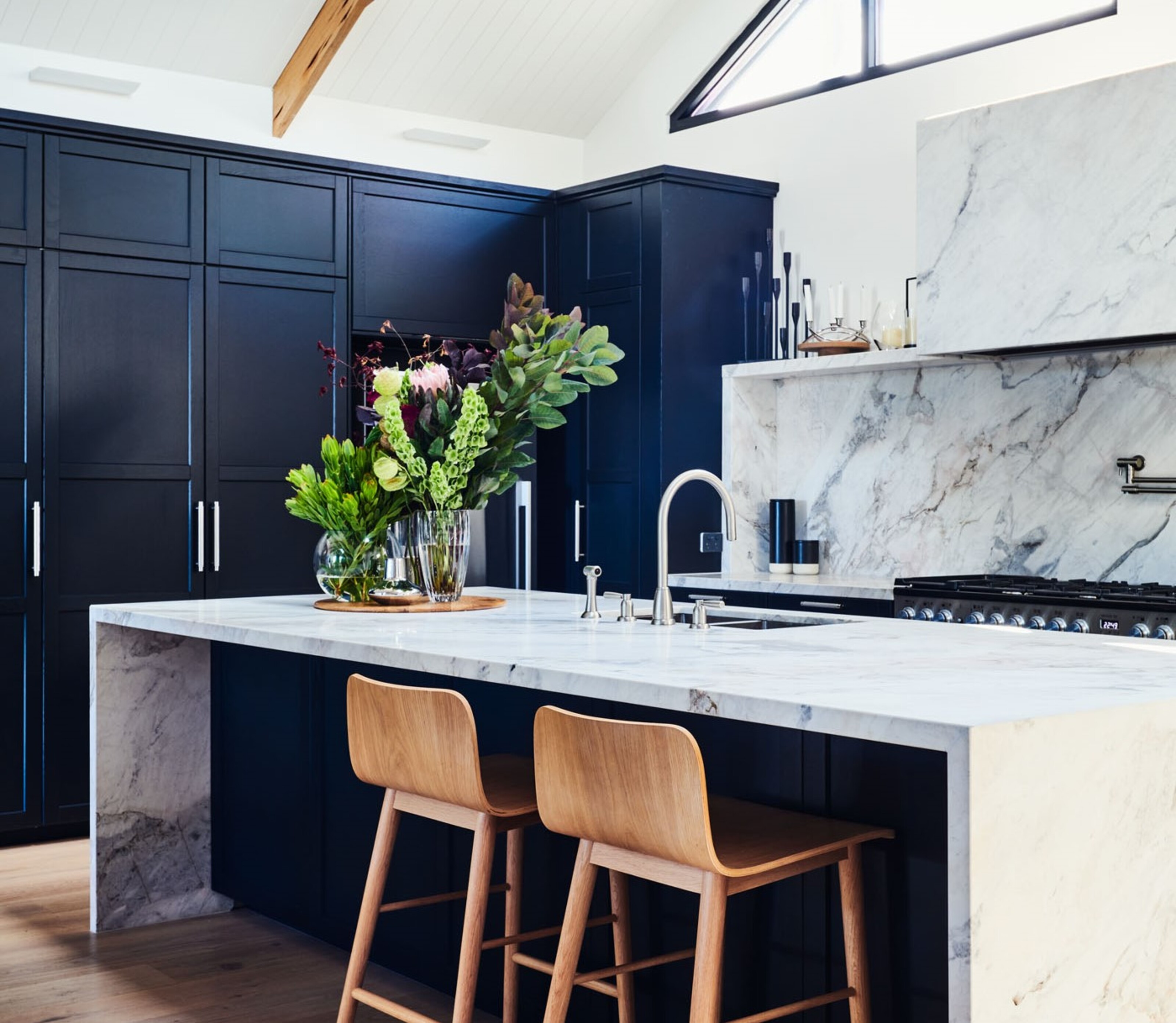
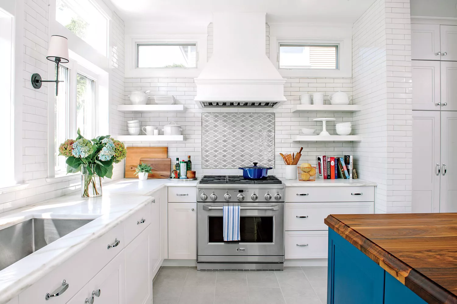
Navy blue, a long-time favorite for kitchen cabinetry, has become predictable due to its widespread use. Daniel Joseph Chenin notes that deep blue can create a heavy or overly formal atmosphere, which may not align with the desire for comfort in a kitchen. He recommends earthy greens or muddy teals as fresher alternatives that offer similar richness and depth while maintaining a connection to nature. Charcoal gray, a past staple for its sleek and urban aesthetic in modern kitchens, now often appears cold and overly industrial, especially when combined with other hard surfaces. Chenin suggests warmer grays with brown or taupe undertones to create a softer, more inviting look, especially when paired with natural wood or brass. Finally, glossy white kitchens, which gained popularity for their fresh, clean, and modern appeal and ability to make spaces feel larger, are now perceived as clinical and unforgiving. Their glossy surfaces also highlight fingerprints and smudges. Chenin advises opting for warmer whites with matte or satin finishes, such as bone, ivory, or soft linen, to achieve a more welcoming ambiance.
#KitchenPaintColors #InteriorDesignTrends #KitchenDesign #HomeDecor #ColorTrends #OutdatedColors #PaintPalettes #KitchenRefresh #KitchenPaintColors #InteriorDesignTrends #KitchenDesign #HomeDecor #ColorTrends #OutdatedColors #PaintPalettes #KitchenRefresh
0 komentarzy łącznie
 Brak komentarzy jeszcze
Możesz również polubić
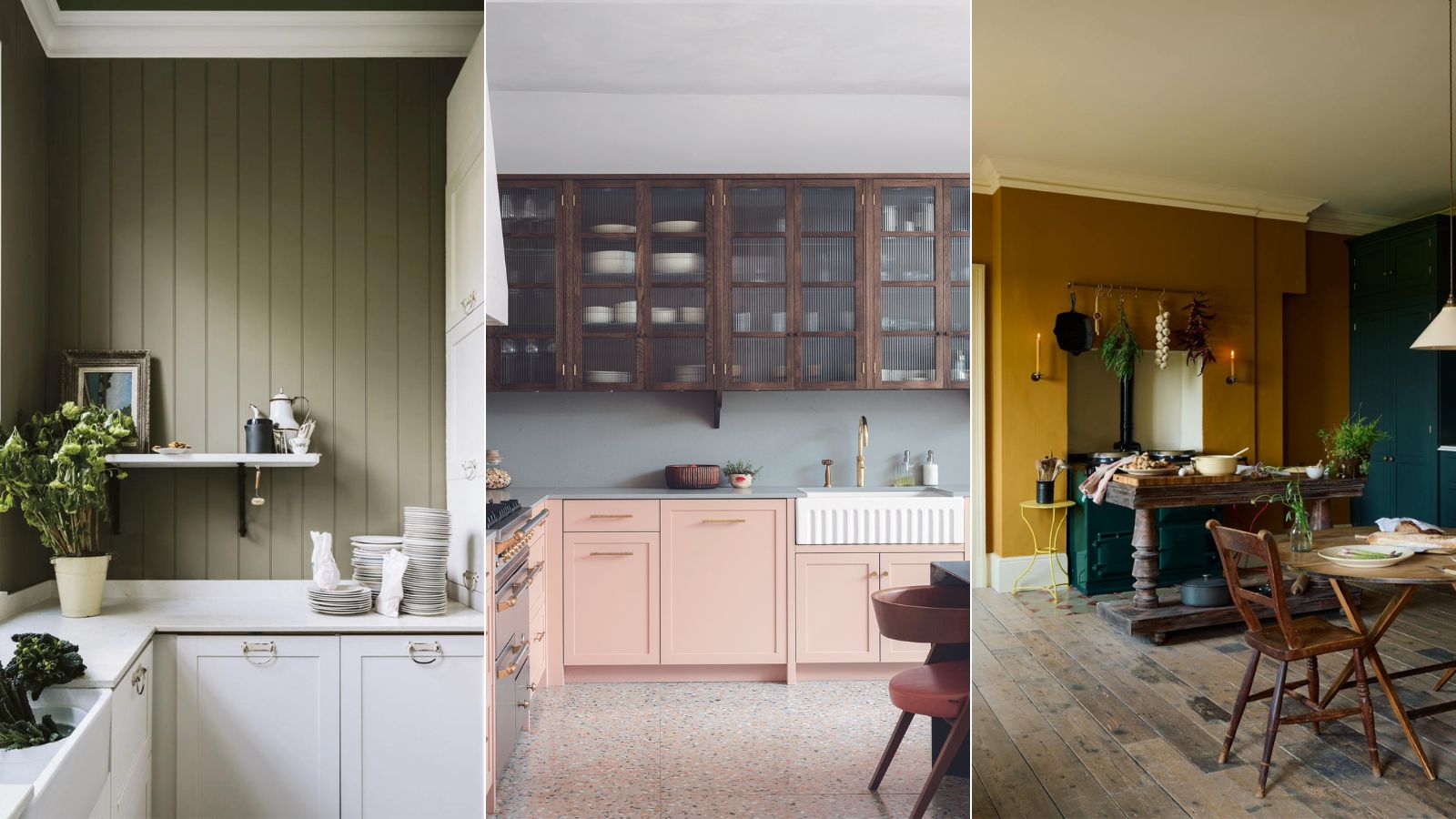
5 outdated kitchen cabinet color trends to avoid if you don't want your kitchen to look unfashionable, say designers

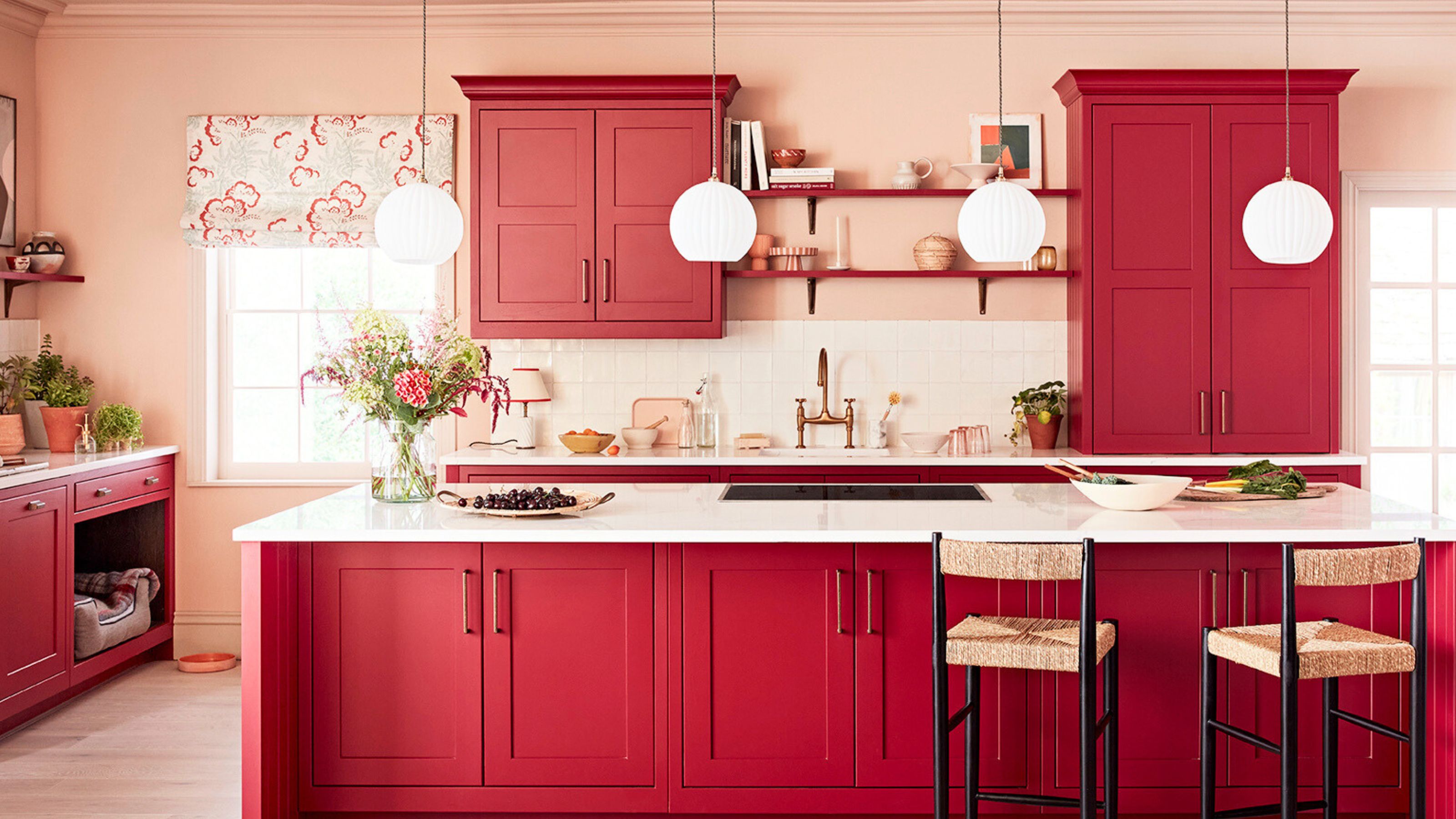
7 outdated kitchen cabinet colors designers say you should wave goodbye to, plus what to try instead

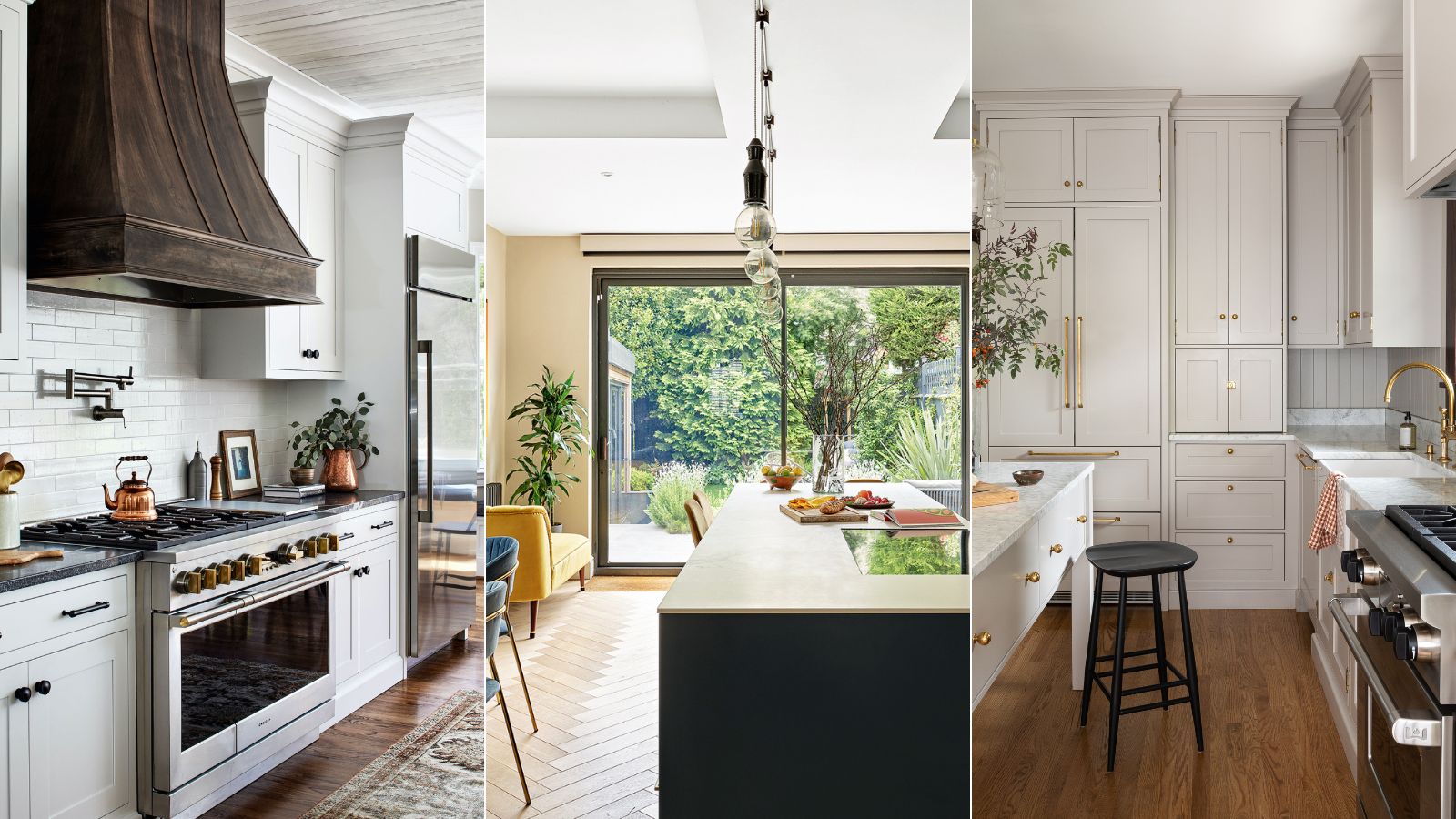
Outdated kitchen trends – 5 overdone looks that designers like to avoid, and here's why you should too
5 Timeless Kitchen Cabinet Paint Colors Designers Love
Outdated kitchen color trends – 5 colors to avoid in 2025, and what to use instead
9 Outdated Kitchen Cabinet Colors We Hope To Never See In 2026
6 Kitchen Countertop Colors That Make Your Home Look Outdated

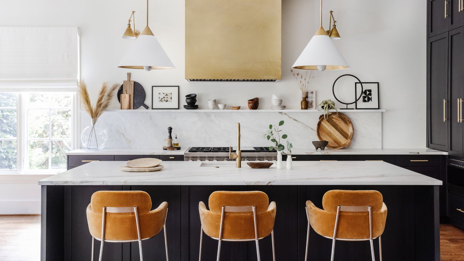
Kitchen paint colors going out of style – 3 shades designers are ditching in 2025
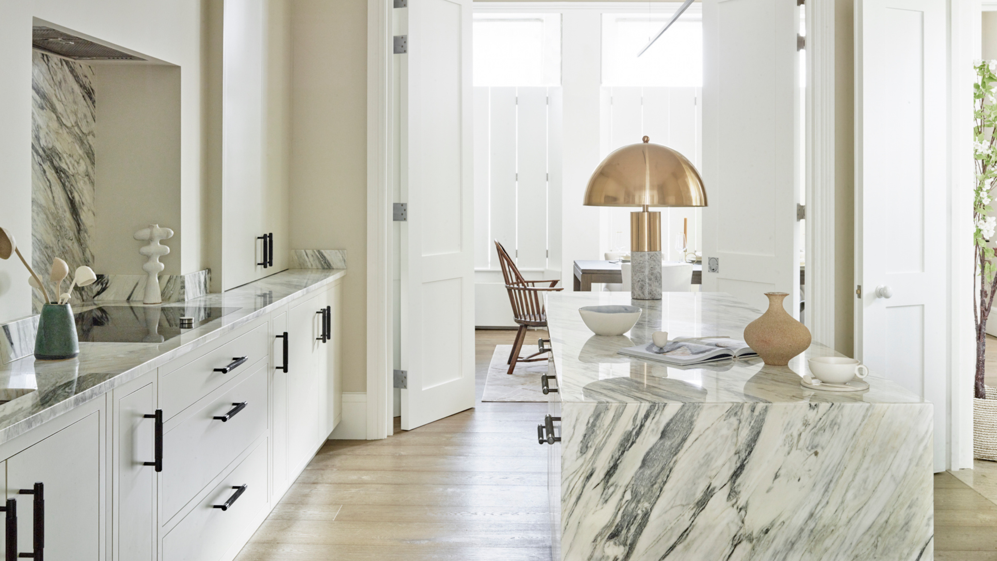
5 Countertop Colors That Are Going Out of Style, and What You Should Choose Instead — According to Kitchen Designers

6 Kitchen Countertop Colors That Make Your Home Look Outdated

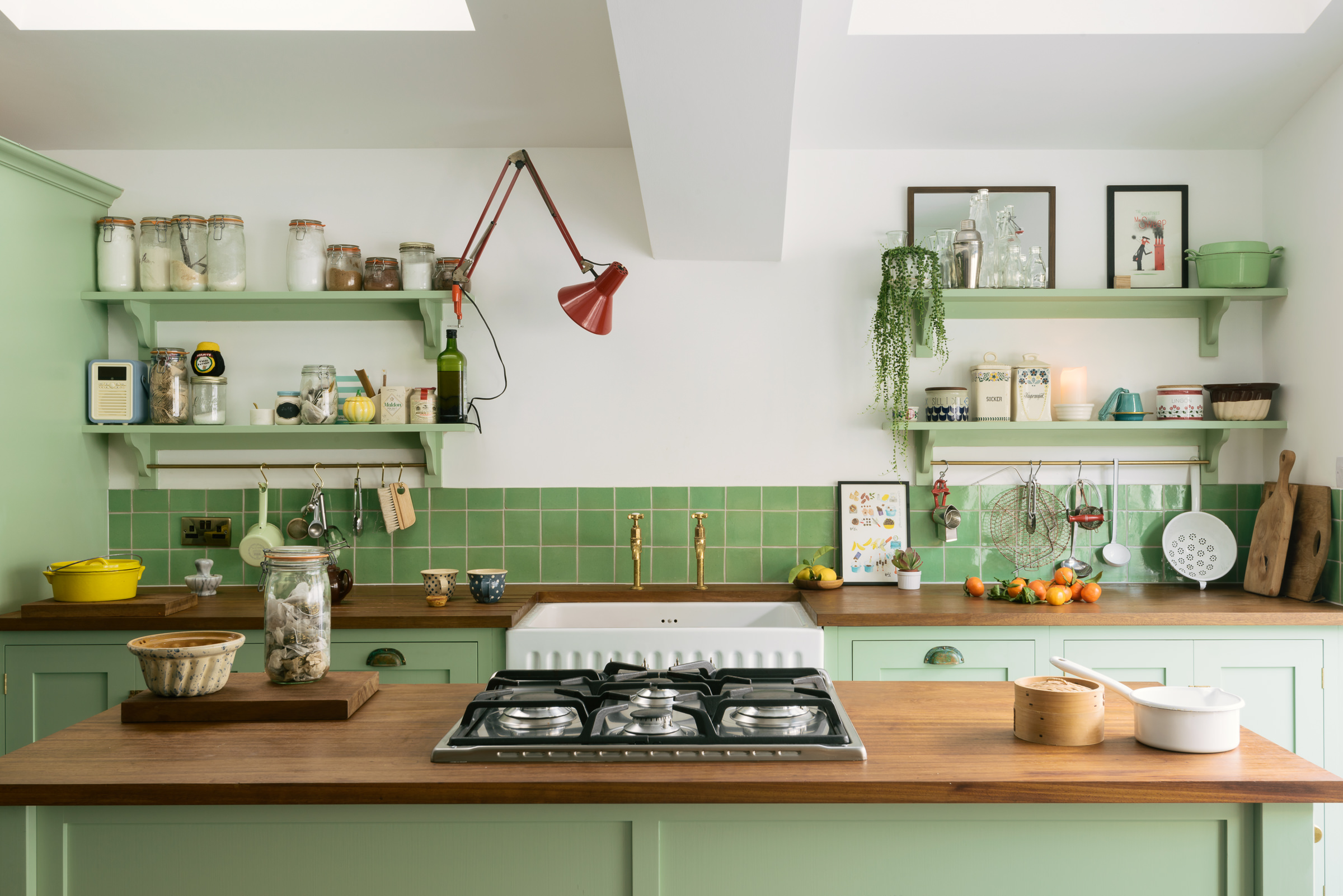
5 kitchen colors going out of style for 2024 – plus the 5 shades designers are replacing them with
The 6 Paint Colors for Your Kitchen That Will Never Go out of Style
These 7 Kitchen Cabinet Colors Are So Outdated, According to Interior Designers

9 Outdated Kitchen Cabinet Colors We Hope To Never See In 2026

5 kitchen cabinet colors interior designers are avoiding for 2024 - and the shades they're picking instead
6 Worst Colors To Paint Your Kitchen (And What To Choose Instead)
Outdated color trends – 5 overdone colors that designers no longer love, and what to use instead
5 outdated paint trends that interior designers are glad to see the back of – and what they're doing instead
Kitchen paint colors going out of style in 2024 – and the classic colors you should be using instead
7 Paint Colors To Never Use In Your Kitchen, According To Designers