1/9
My closet is suddenly filled with baby blue – here's how I am bringing this on-trend spring shade into my home too
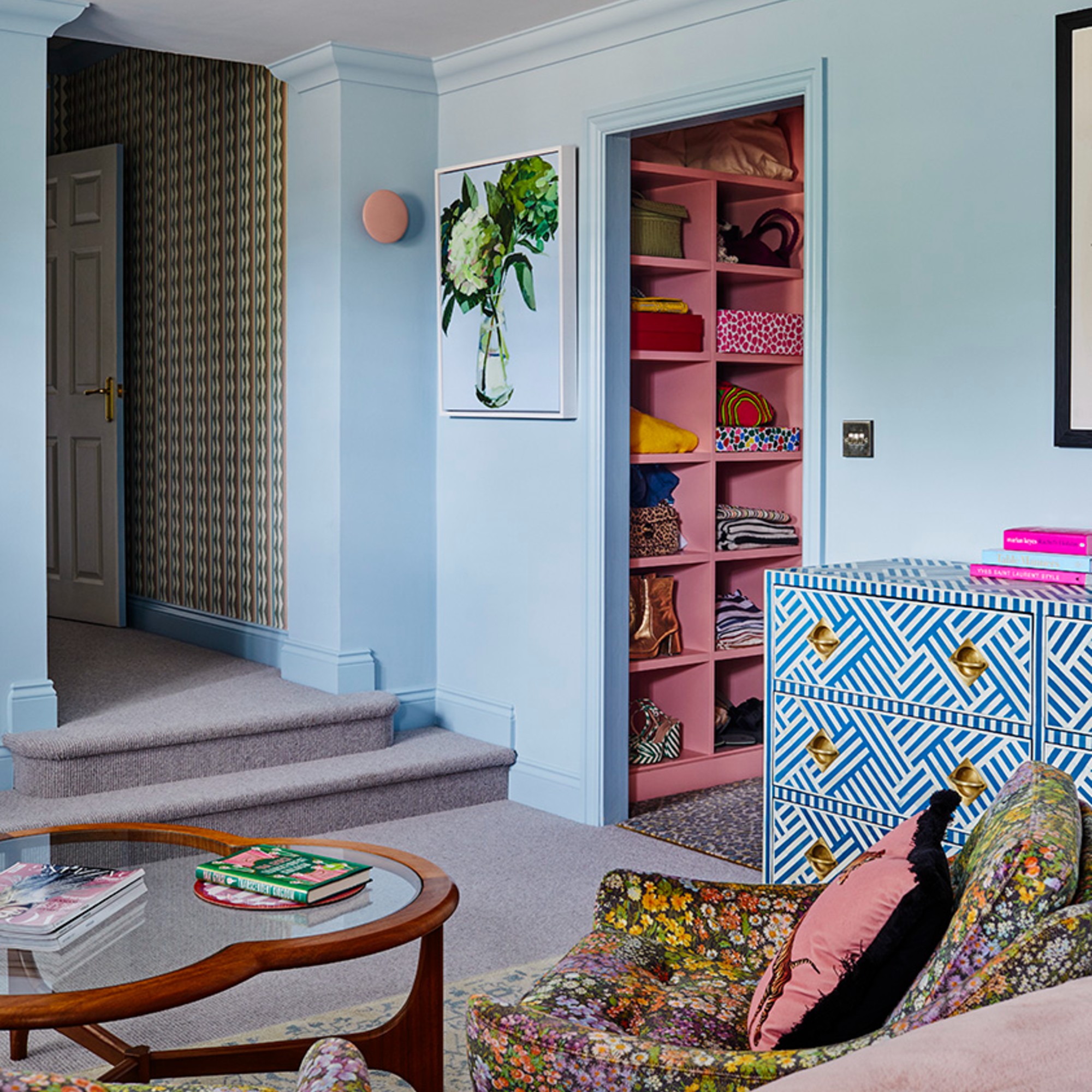
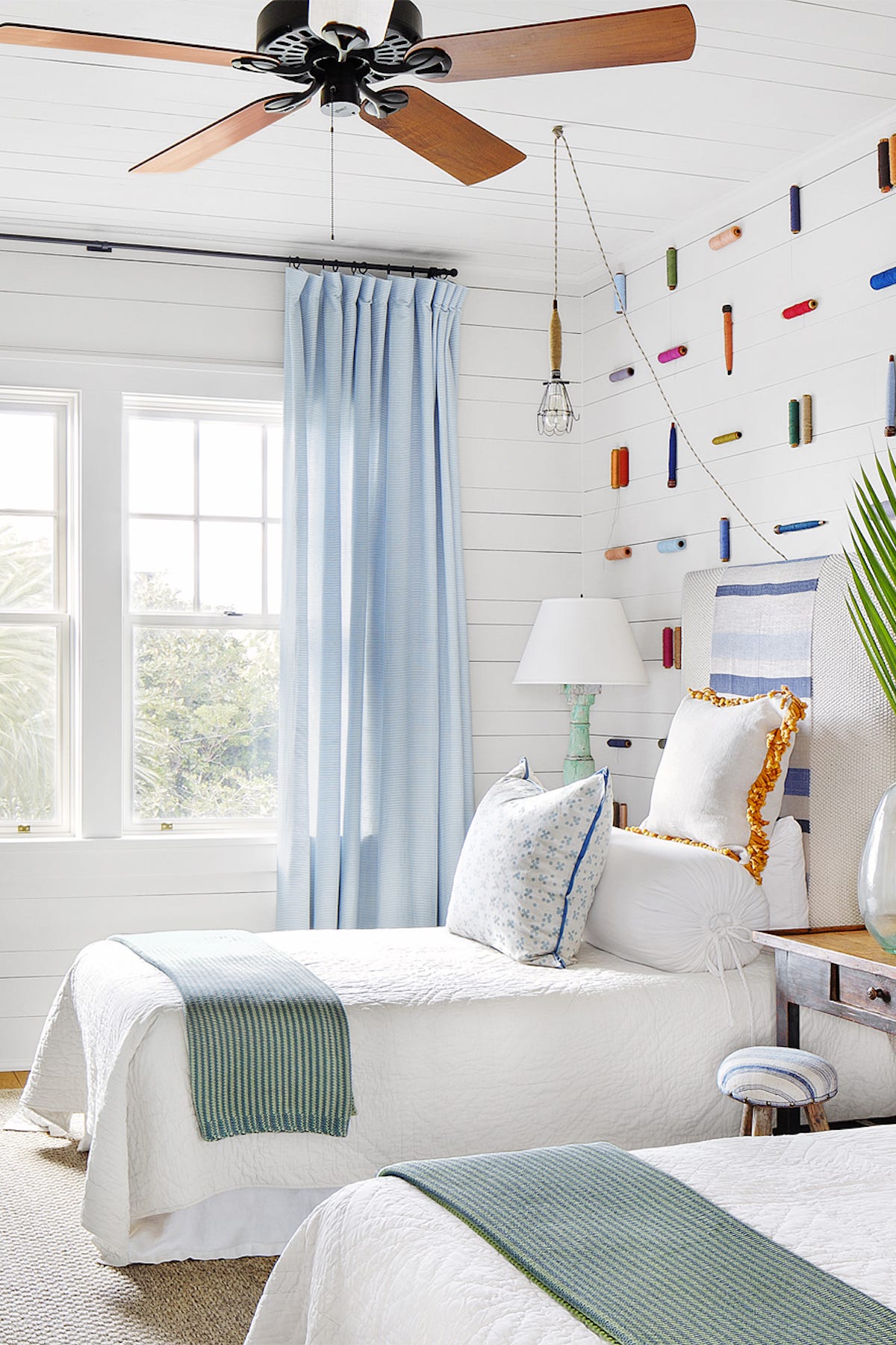
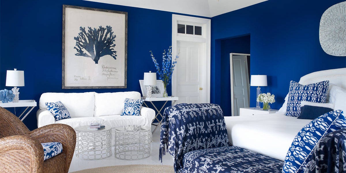
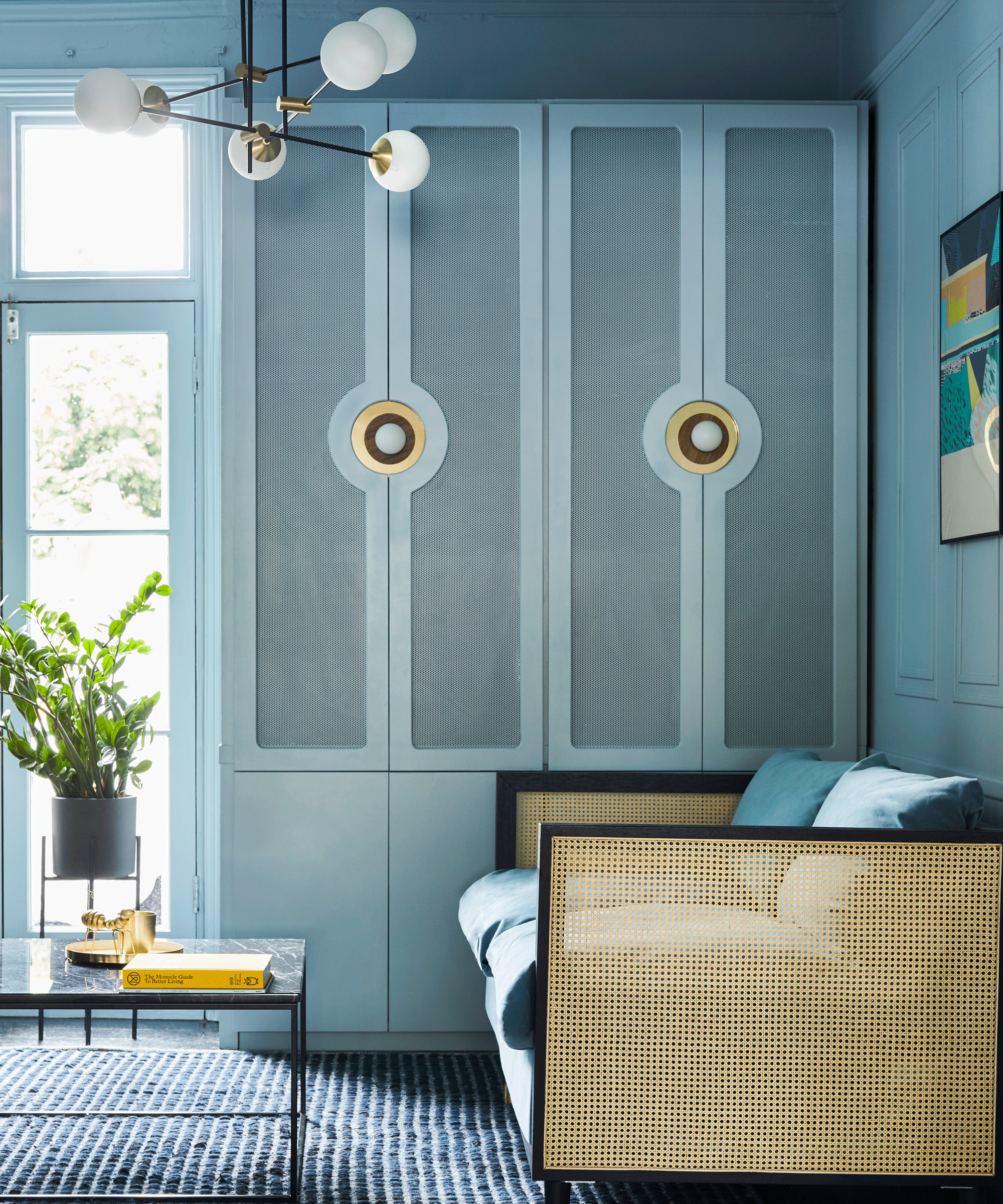
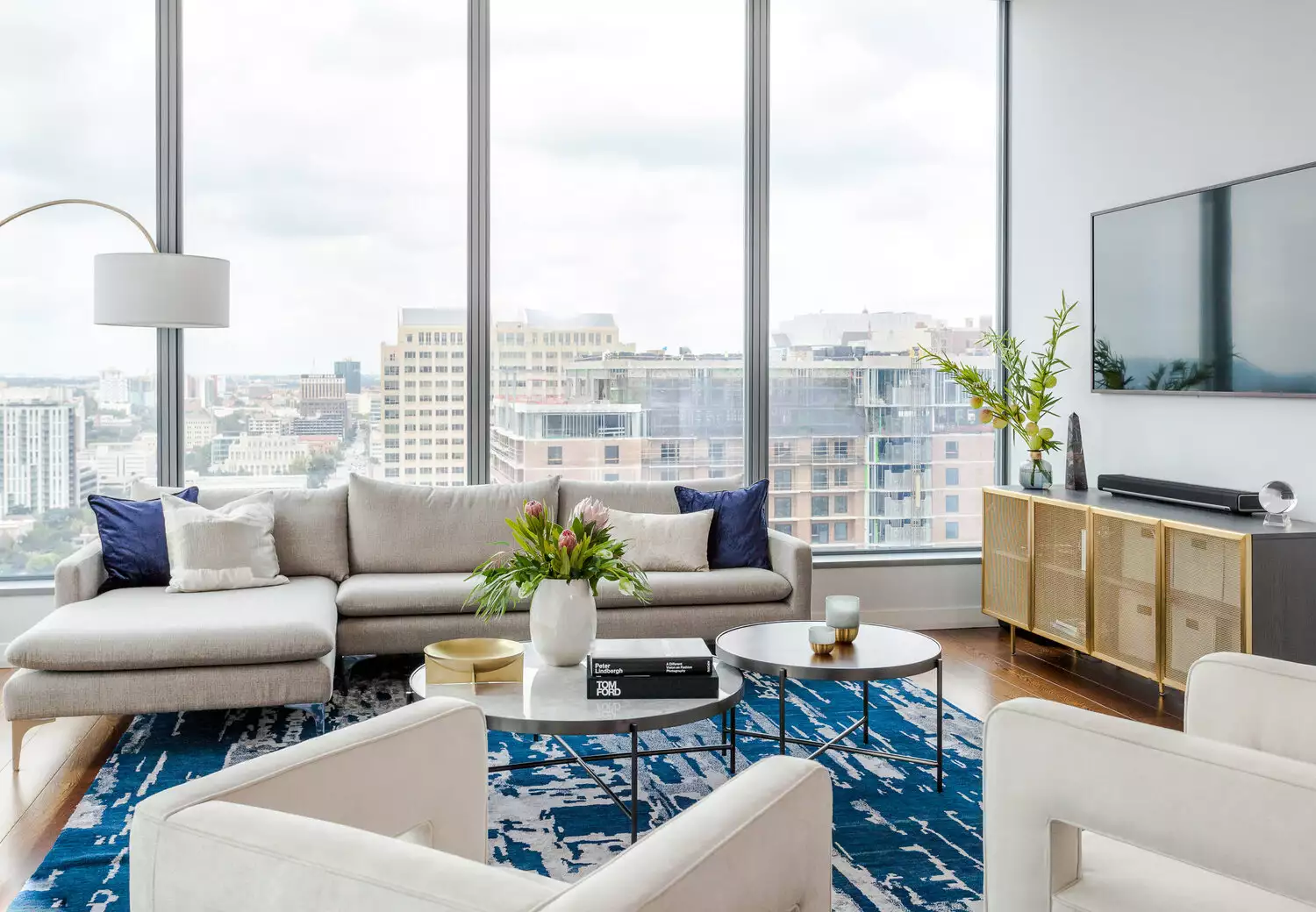
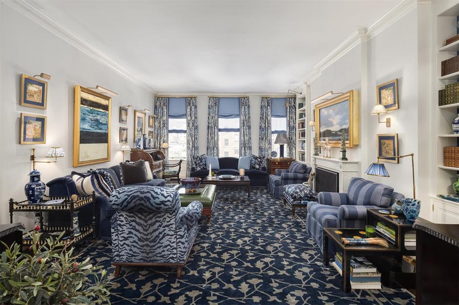
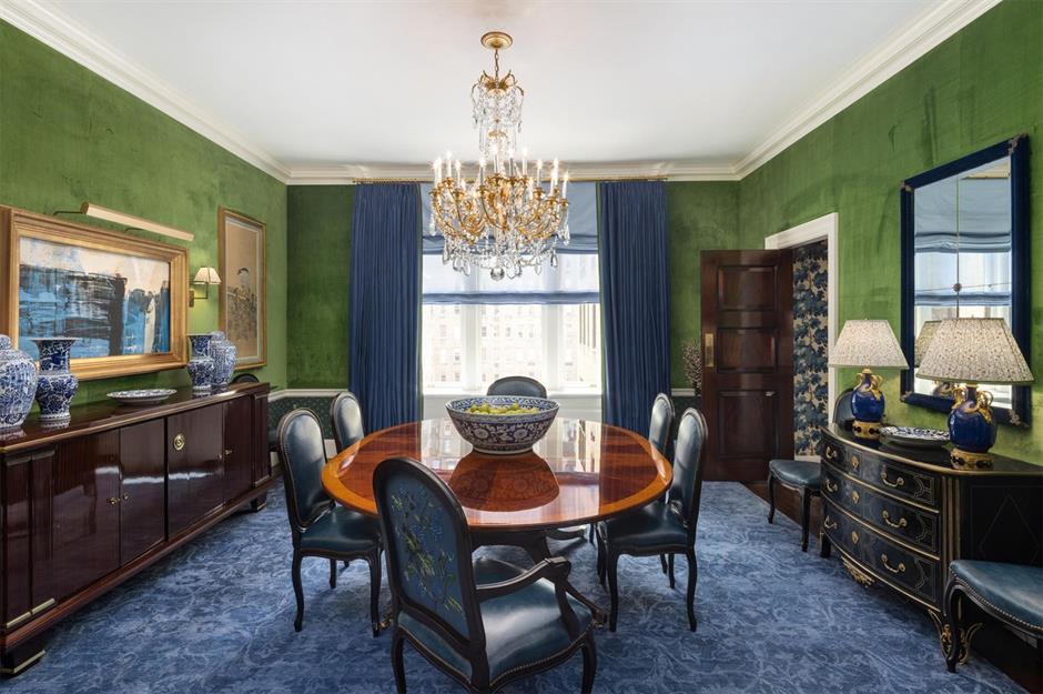
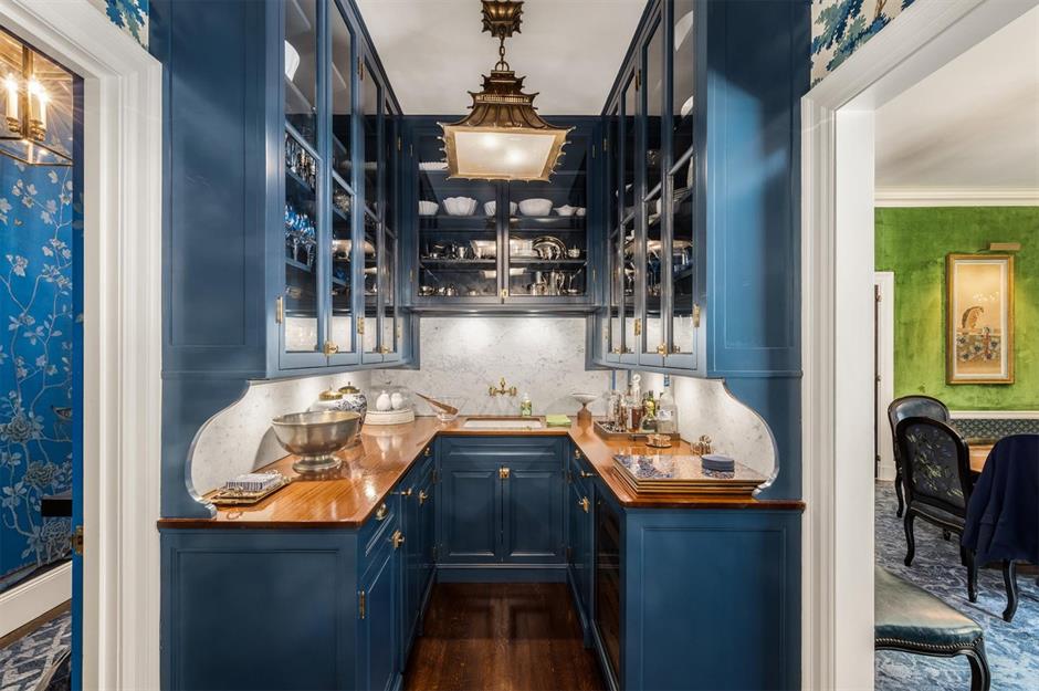
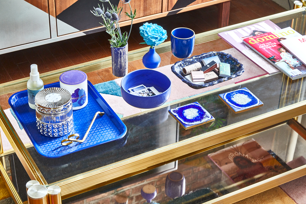
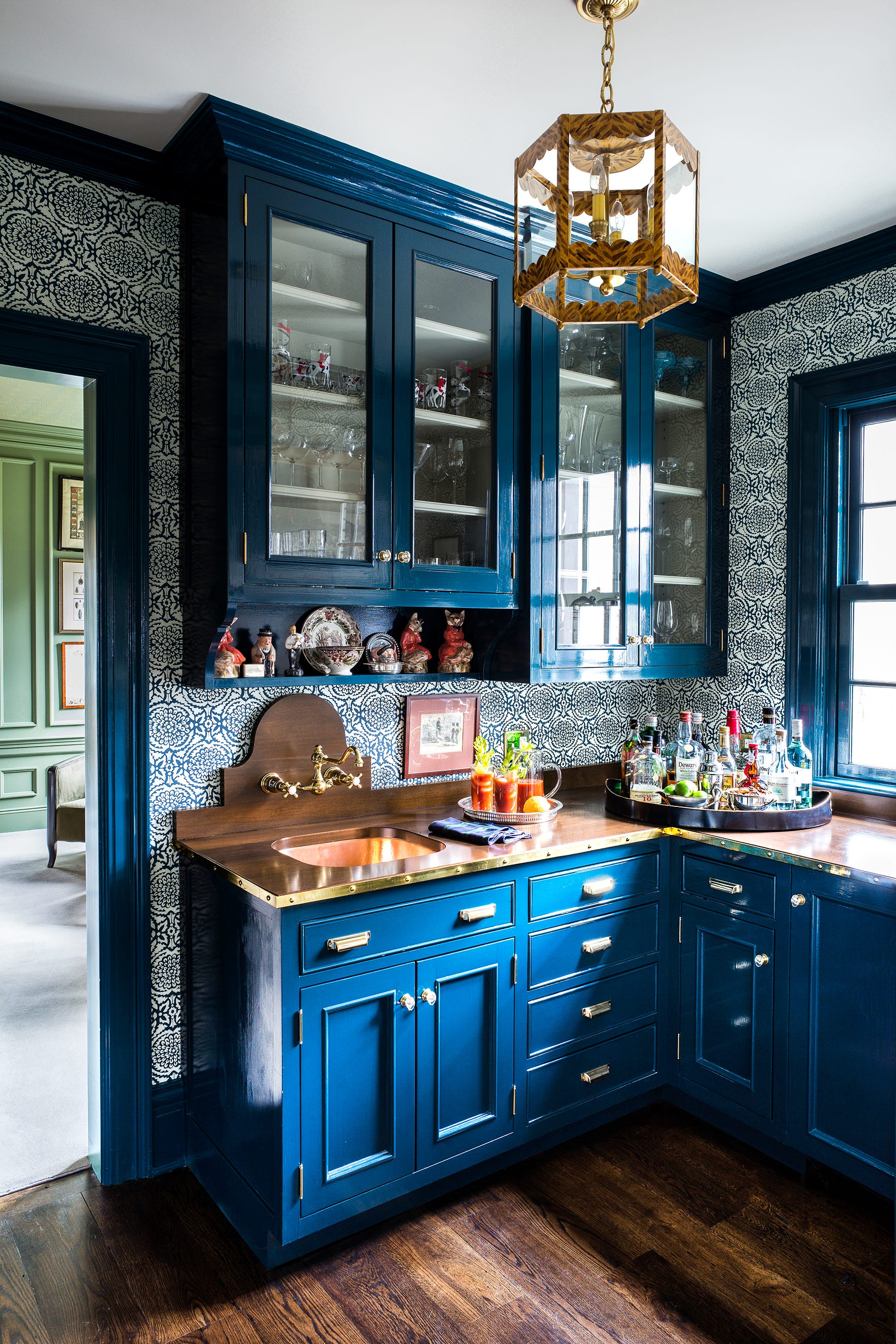
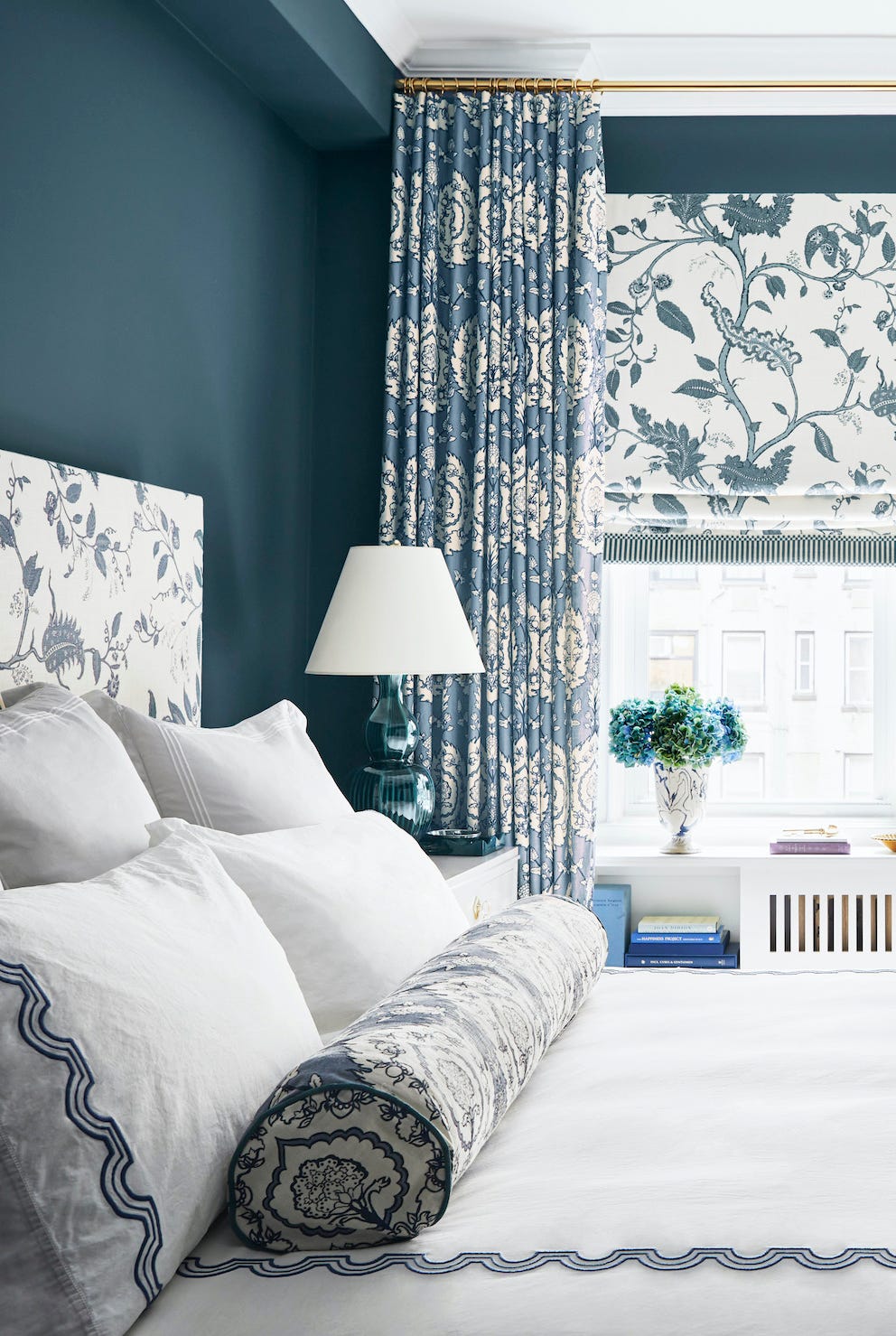
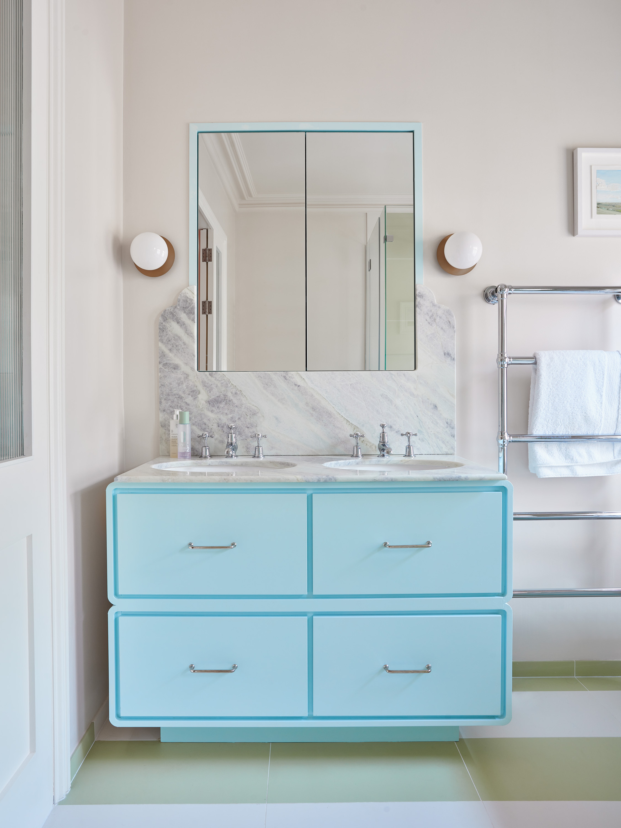
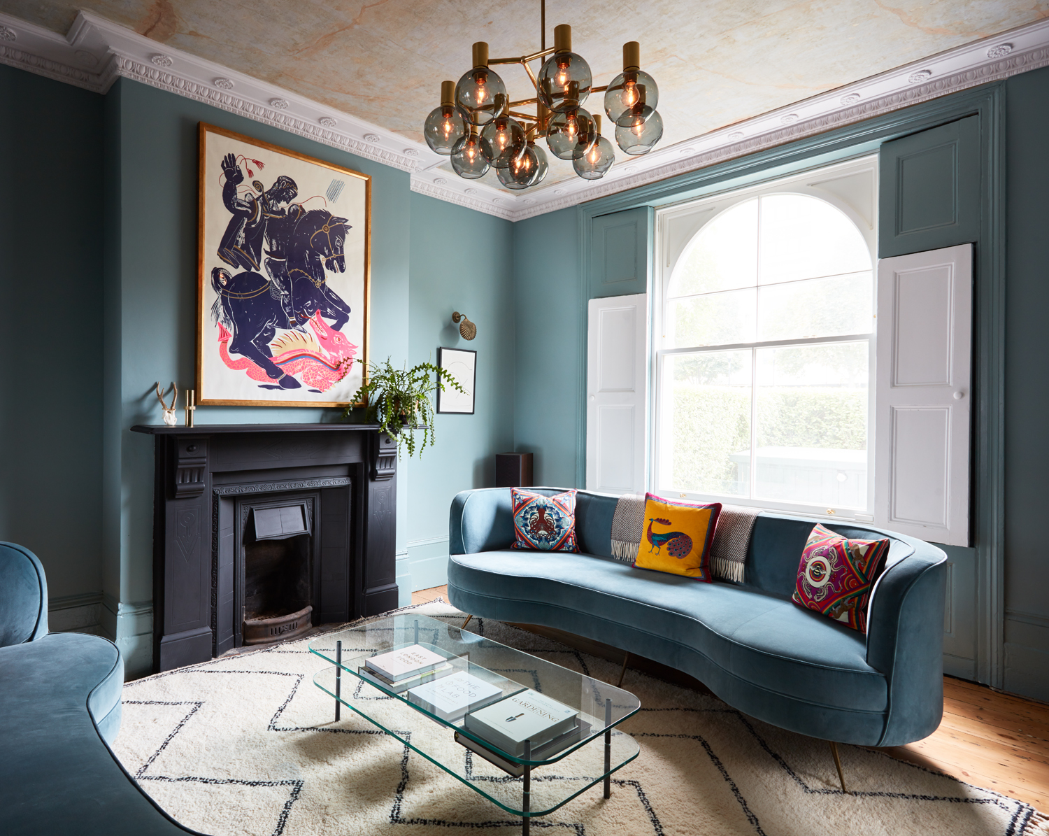
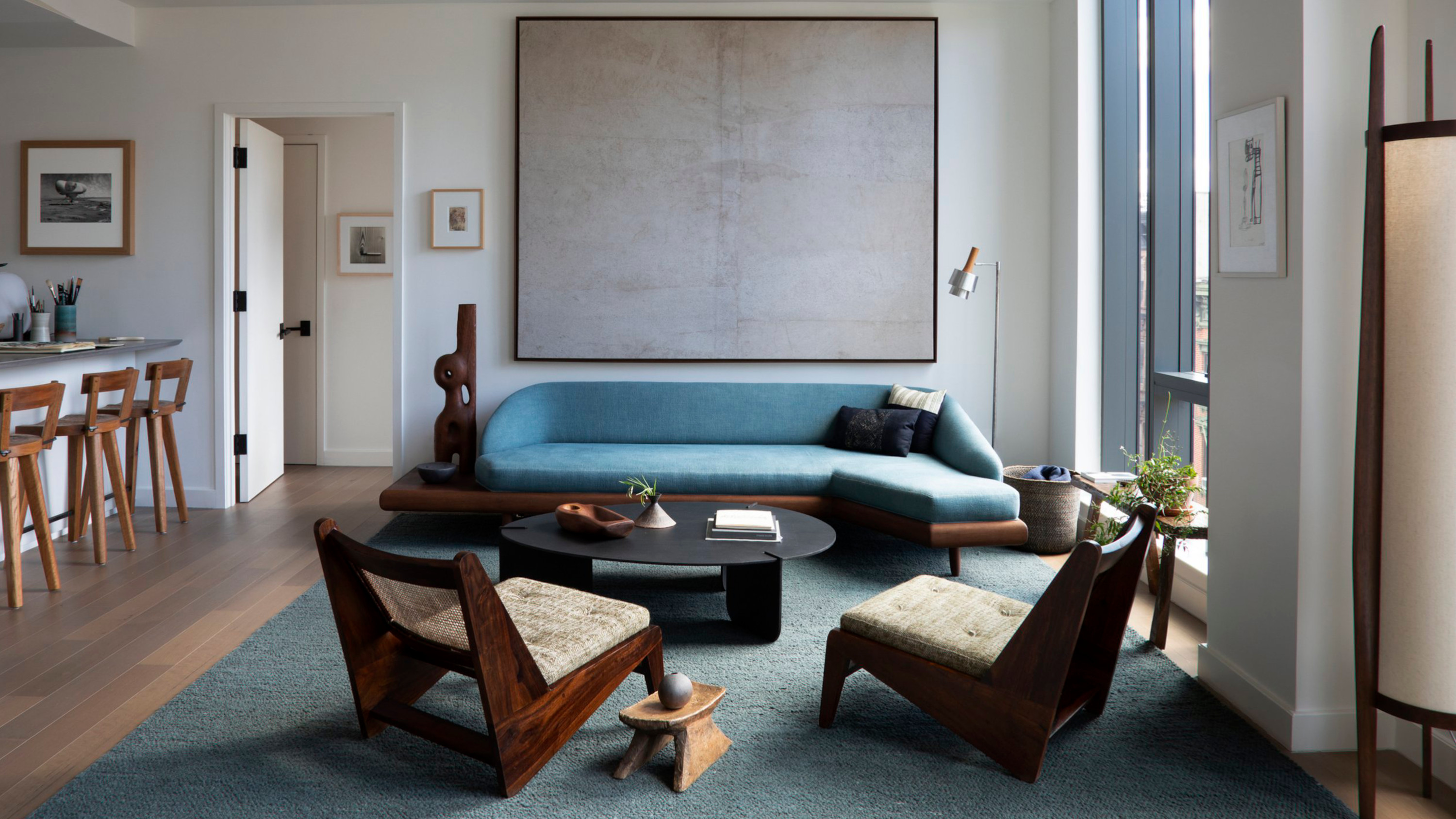
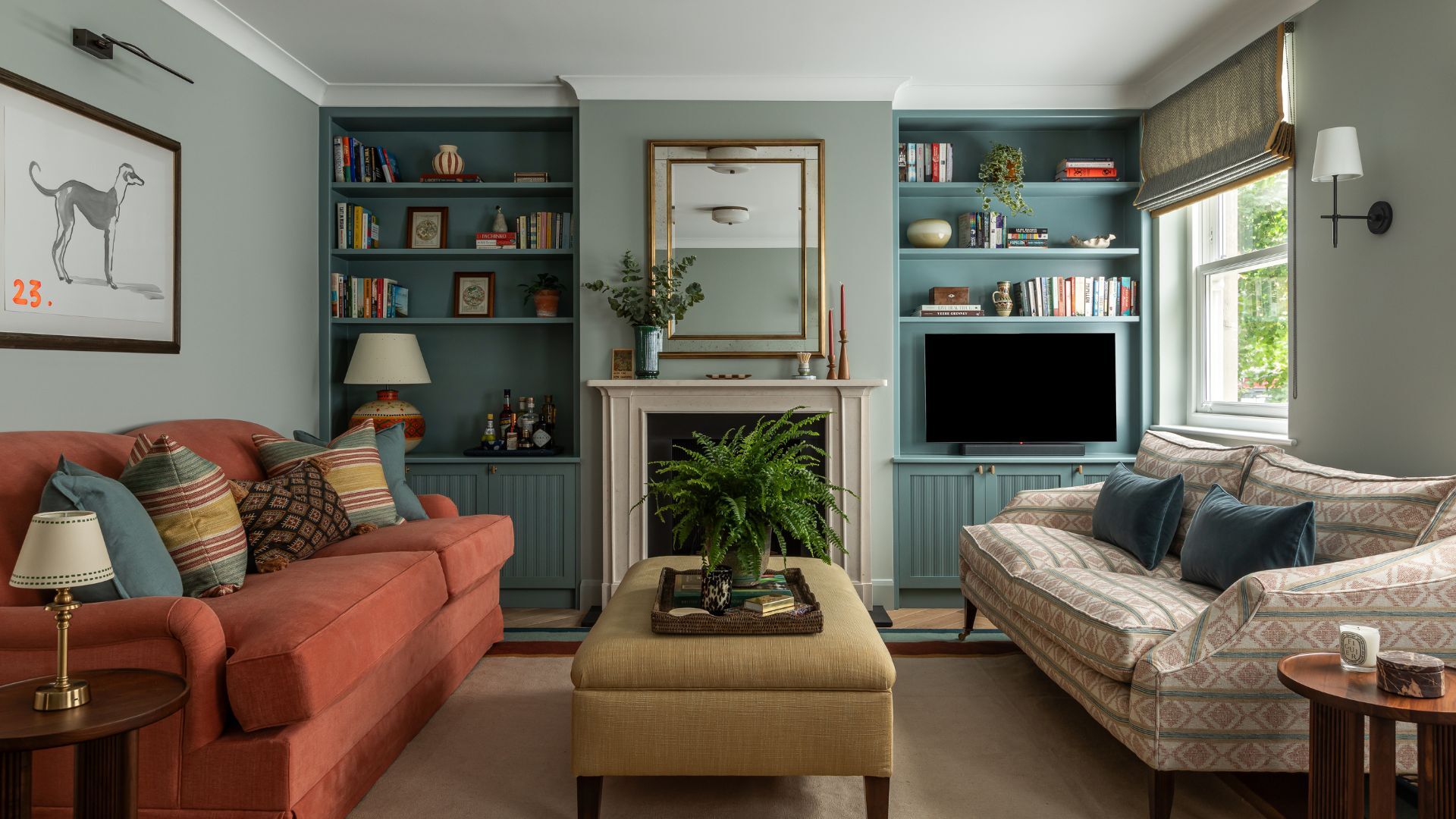
Baby blue, a color often associated with nurseries and powder rooms, is experiencing a resurgence in popularity, extending from fashion into interior design. This hue is currently prominent in magazines and social media feeds, with interior designers utilizing it to create serene, clear, and elegant spaces. It is being re-evaluated from its former perception as an overly saccharine pastel to a sophisticated and versatile design choice.
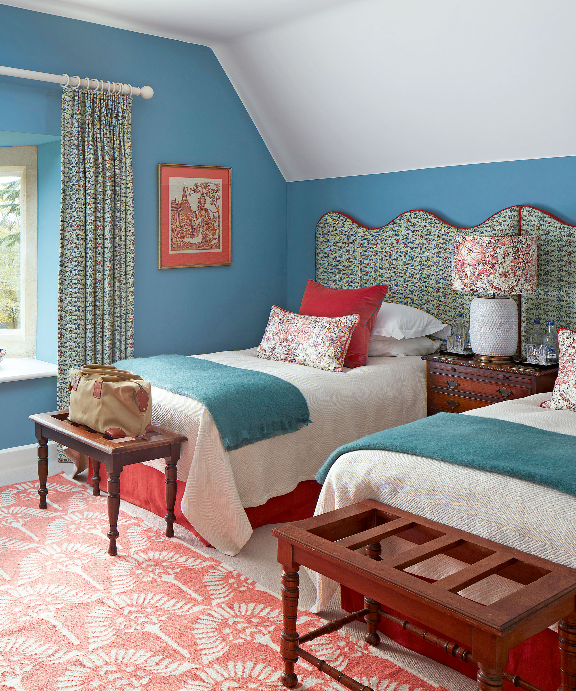
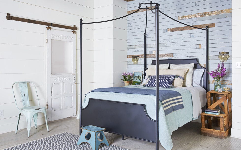
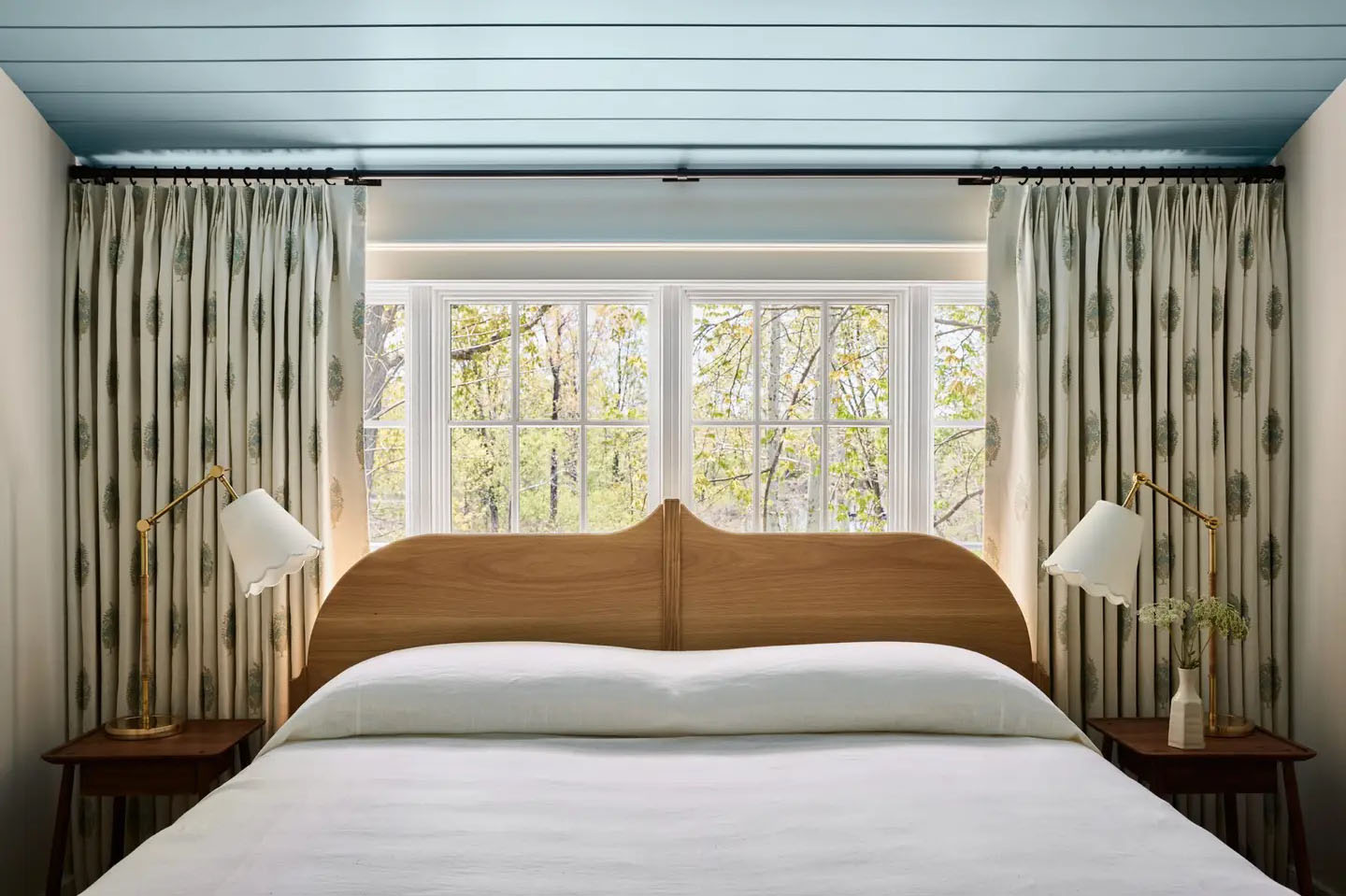
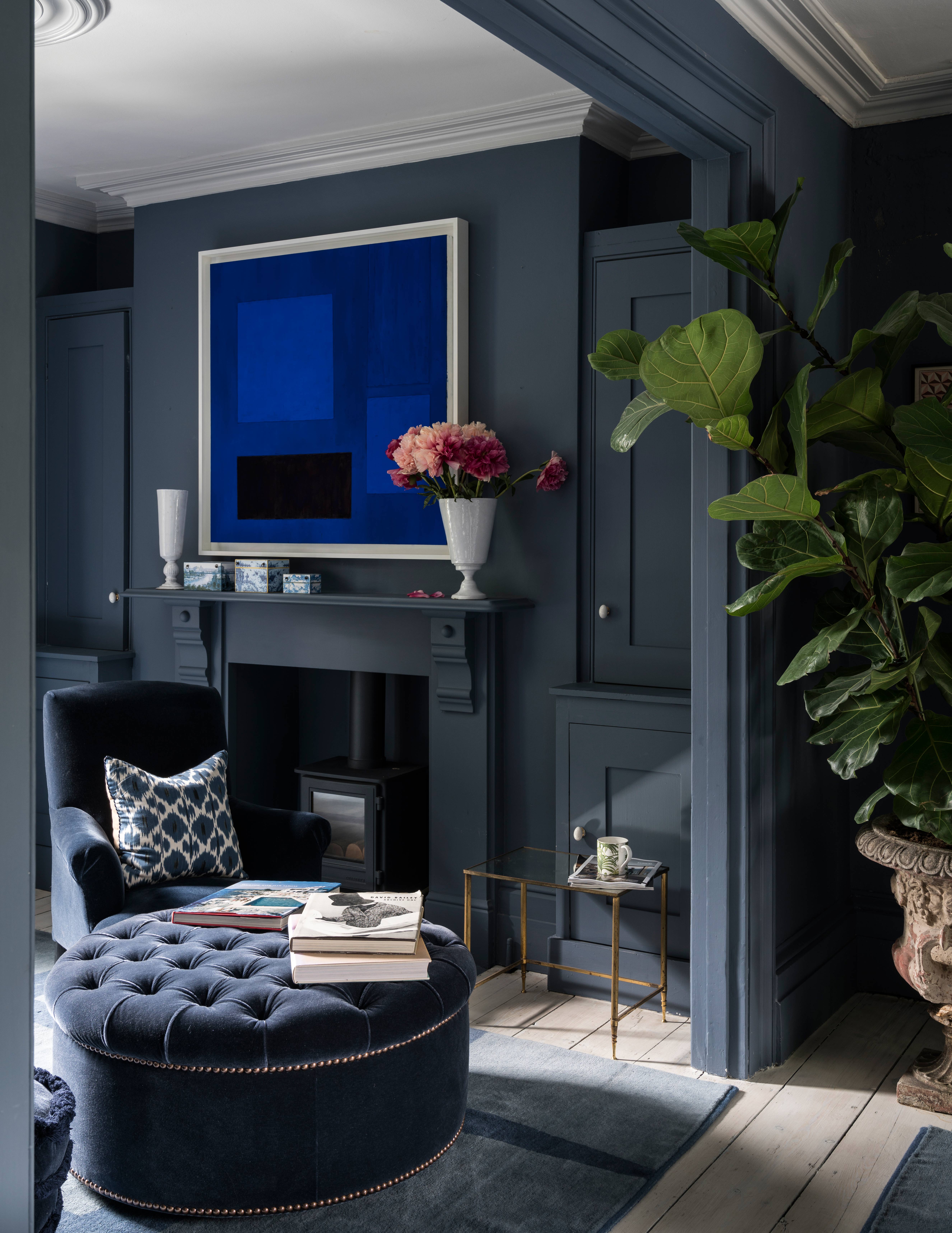
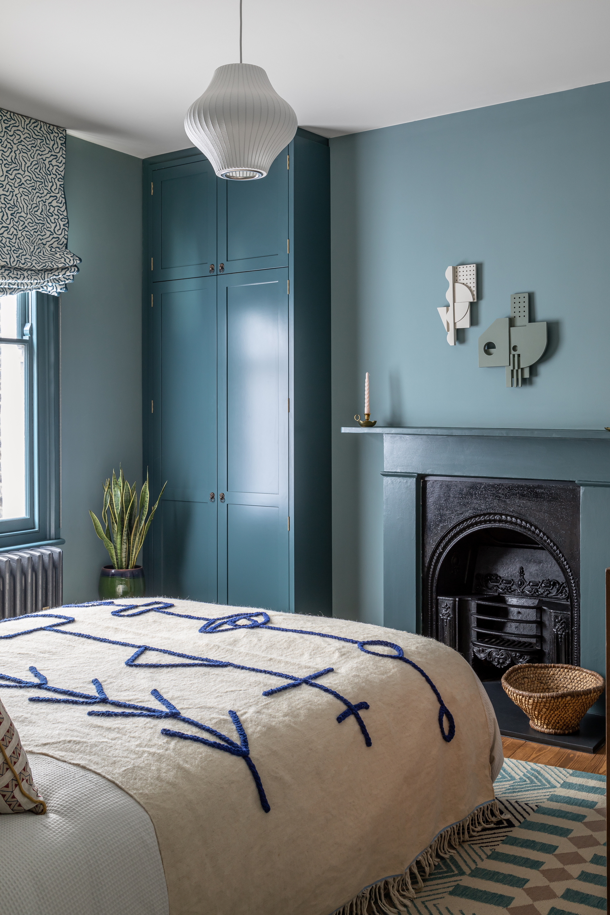
According to Alexandra Keith, an interior designer at Otta Design, baby blue is suitable beyond children's nurseries and can enhance serene bedrooms or sophisticated drawing rooms. For bedroom aesthetics, it offers a fresh and calm ambiance, reminiscent of clean linen and fresh air. Specific shades recommended for traditional interiors include Farrow & Ball’s Lulworth Blue and Little Greene’s Pale Wedgewood, while Farrow & Ball Hazy is suggested for more modern spaces.
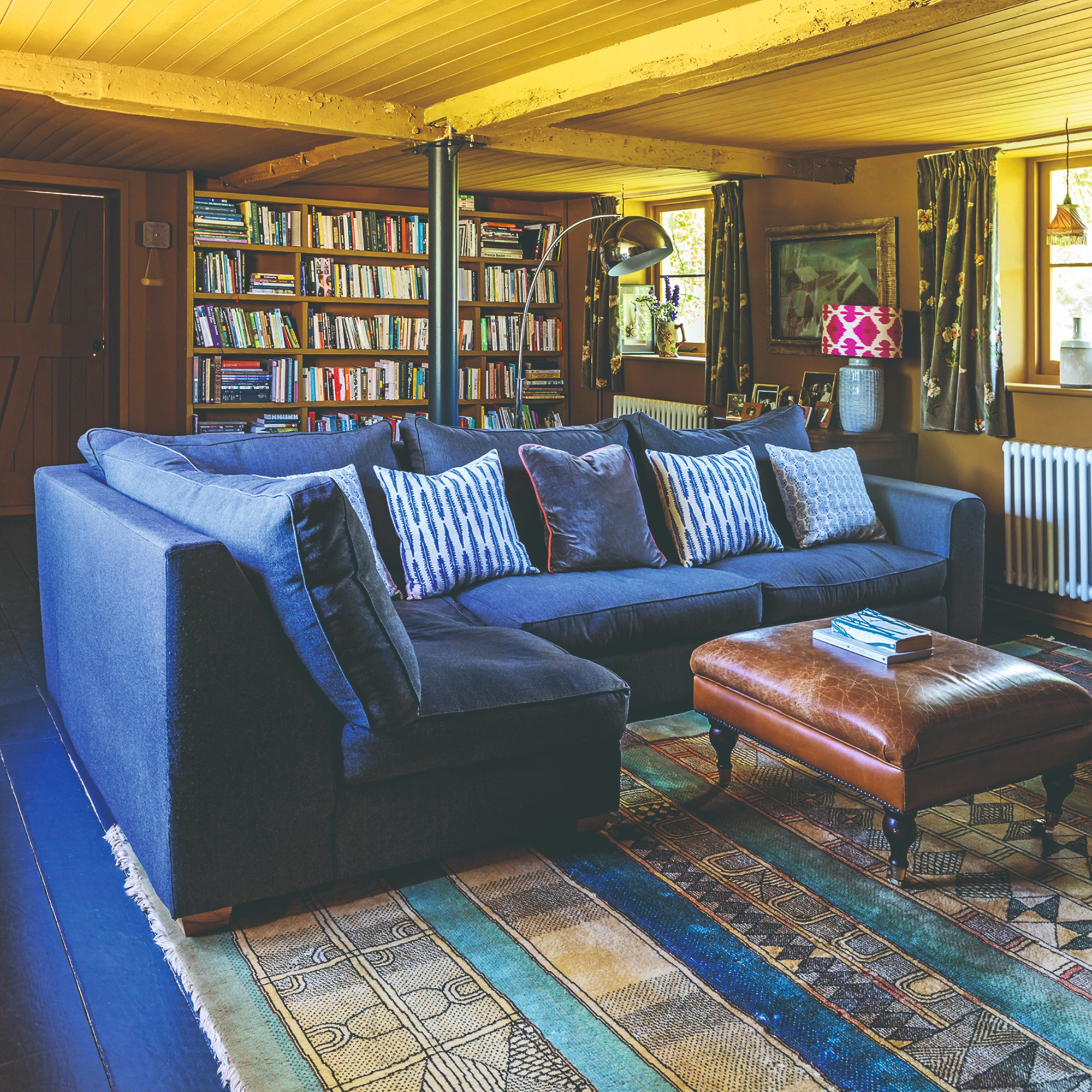
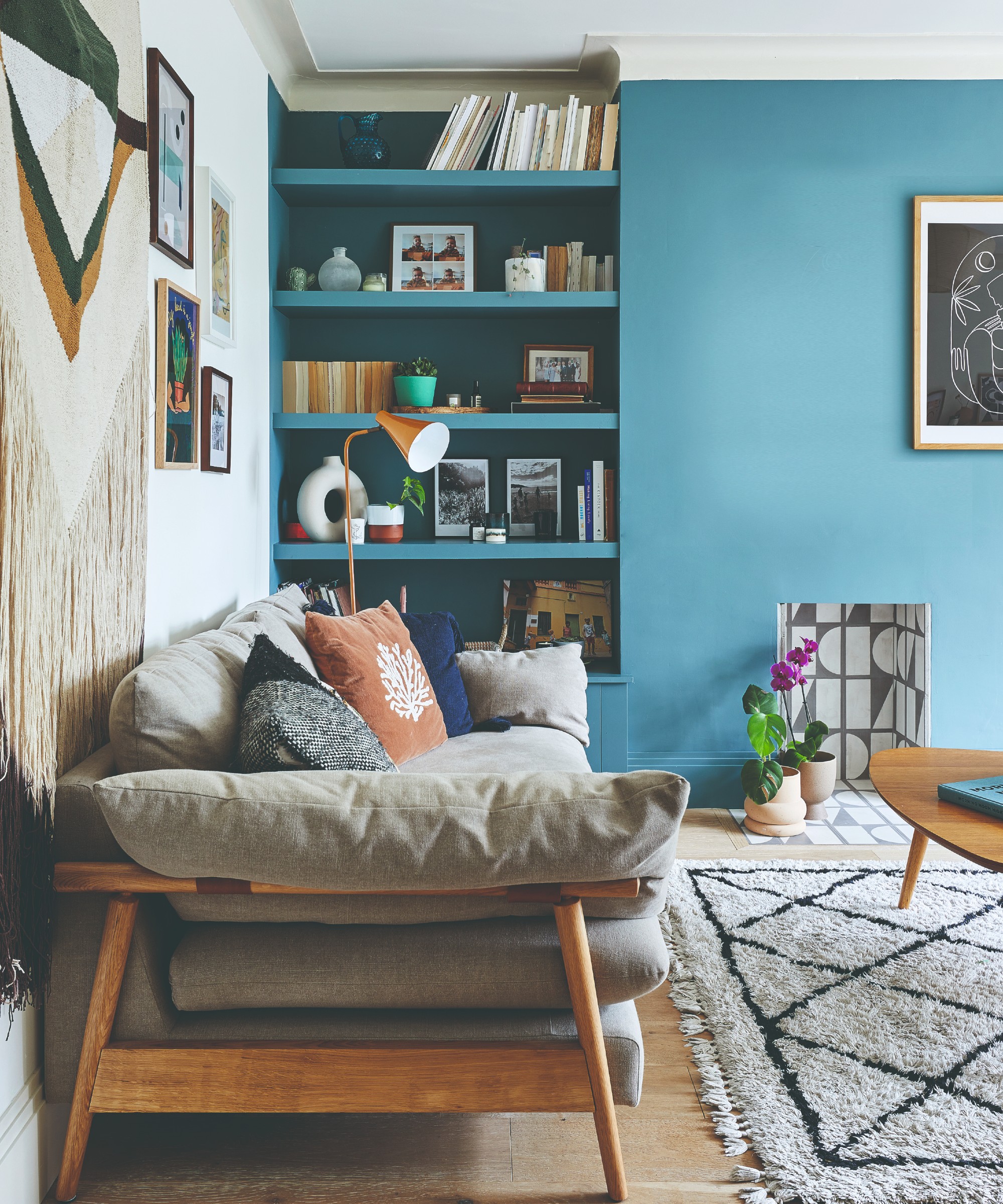
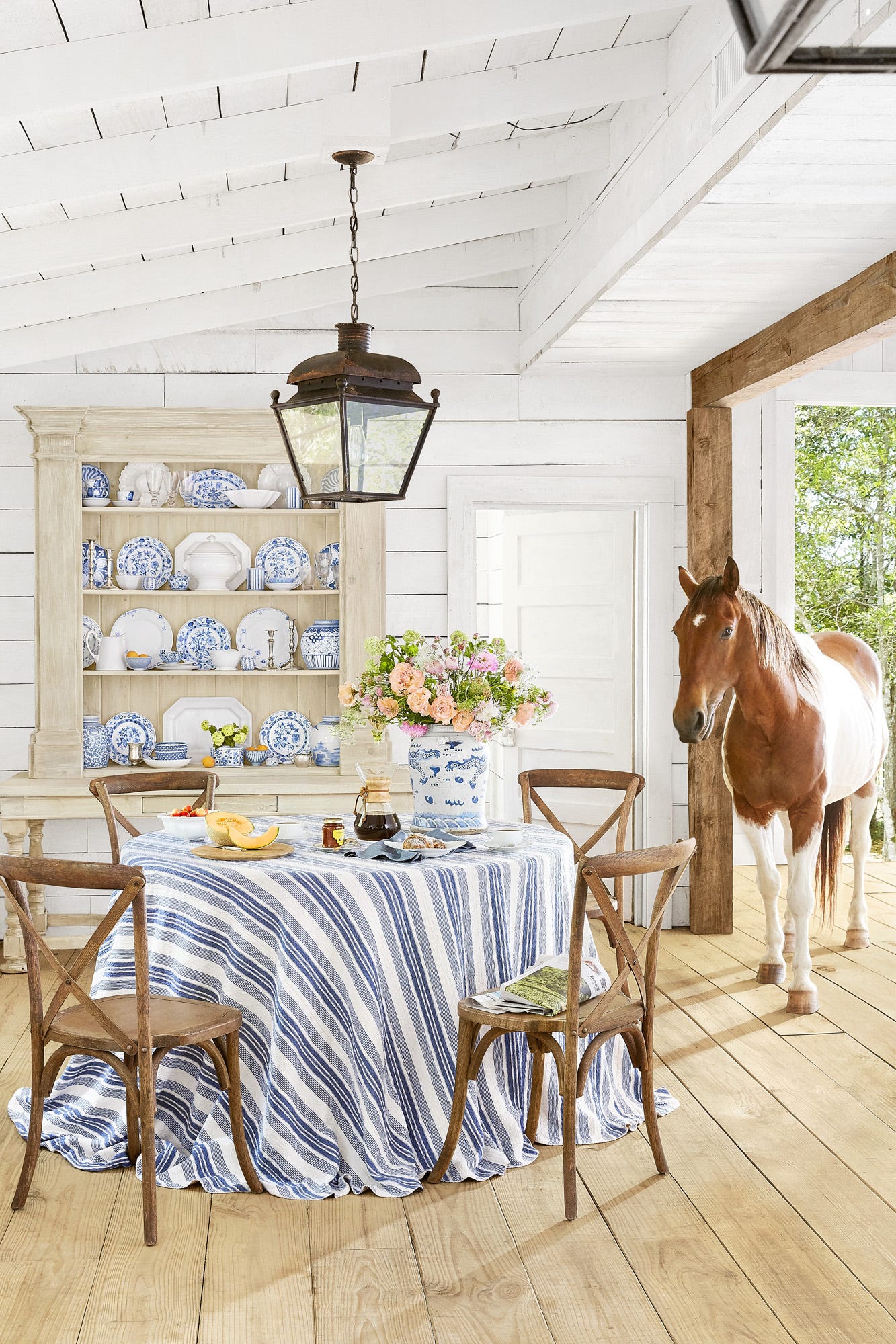
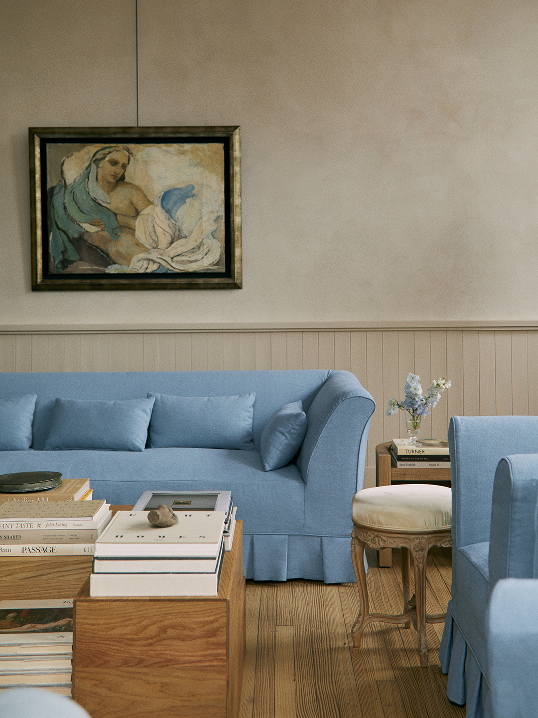
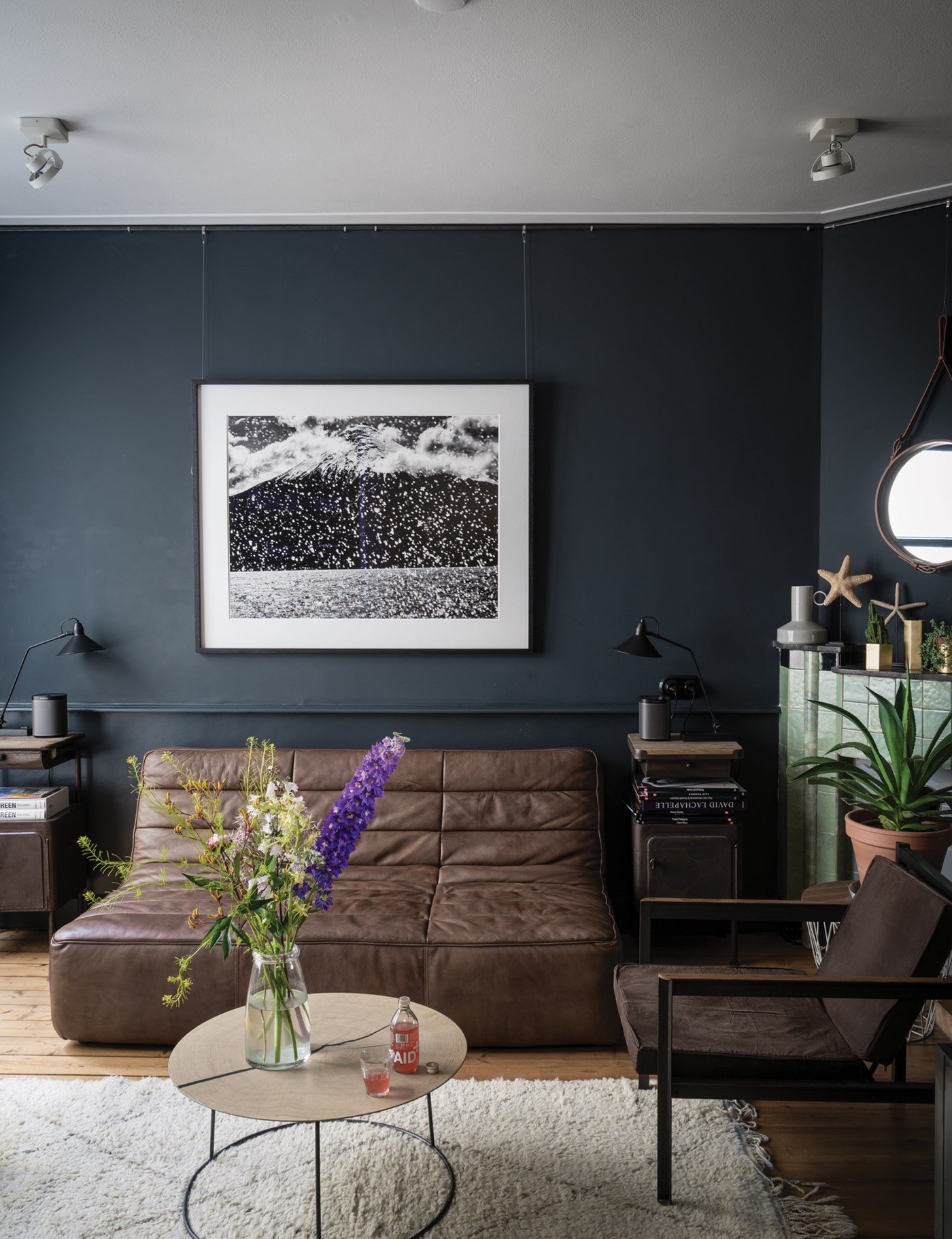
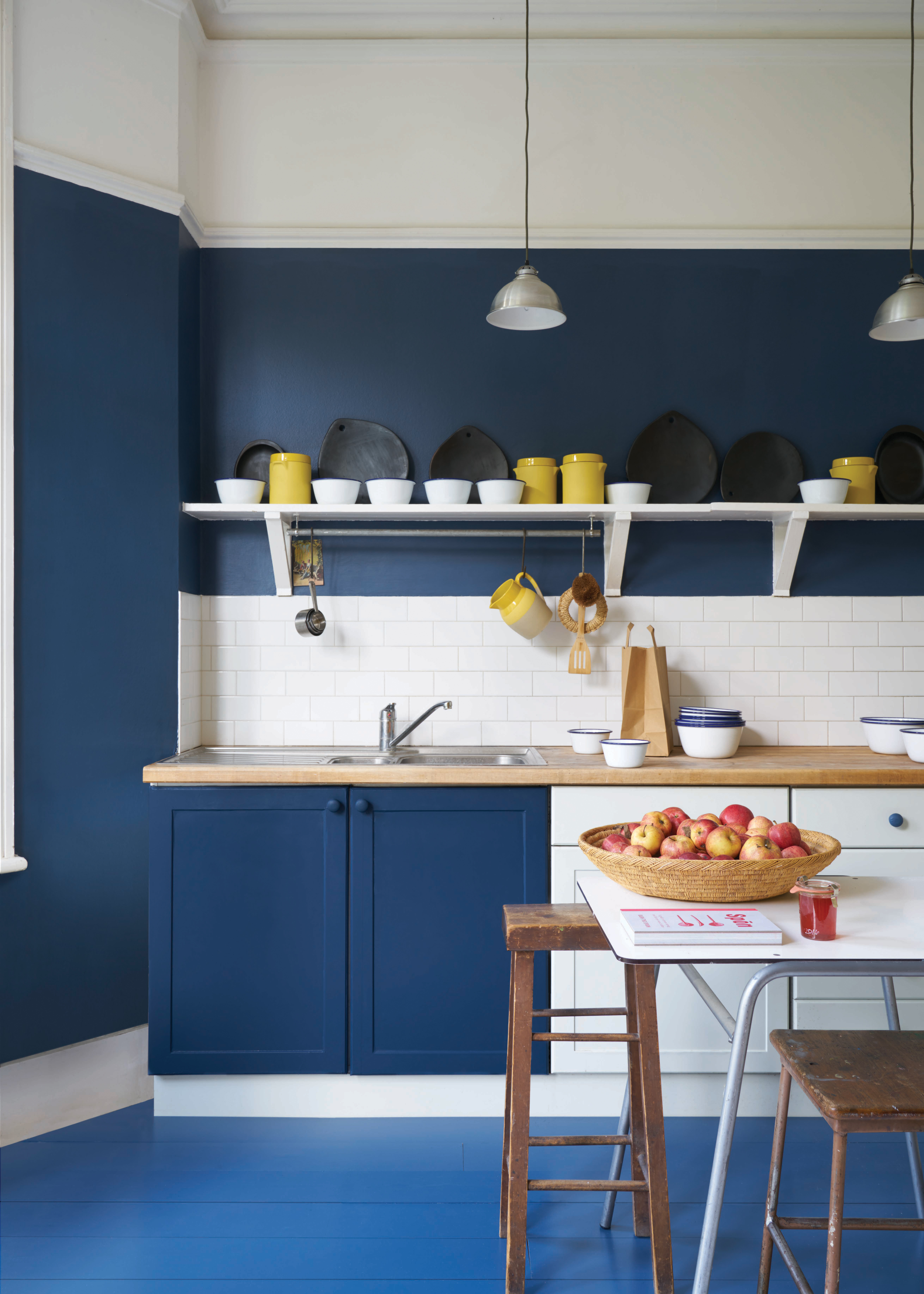
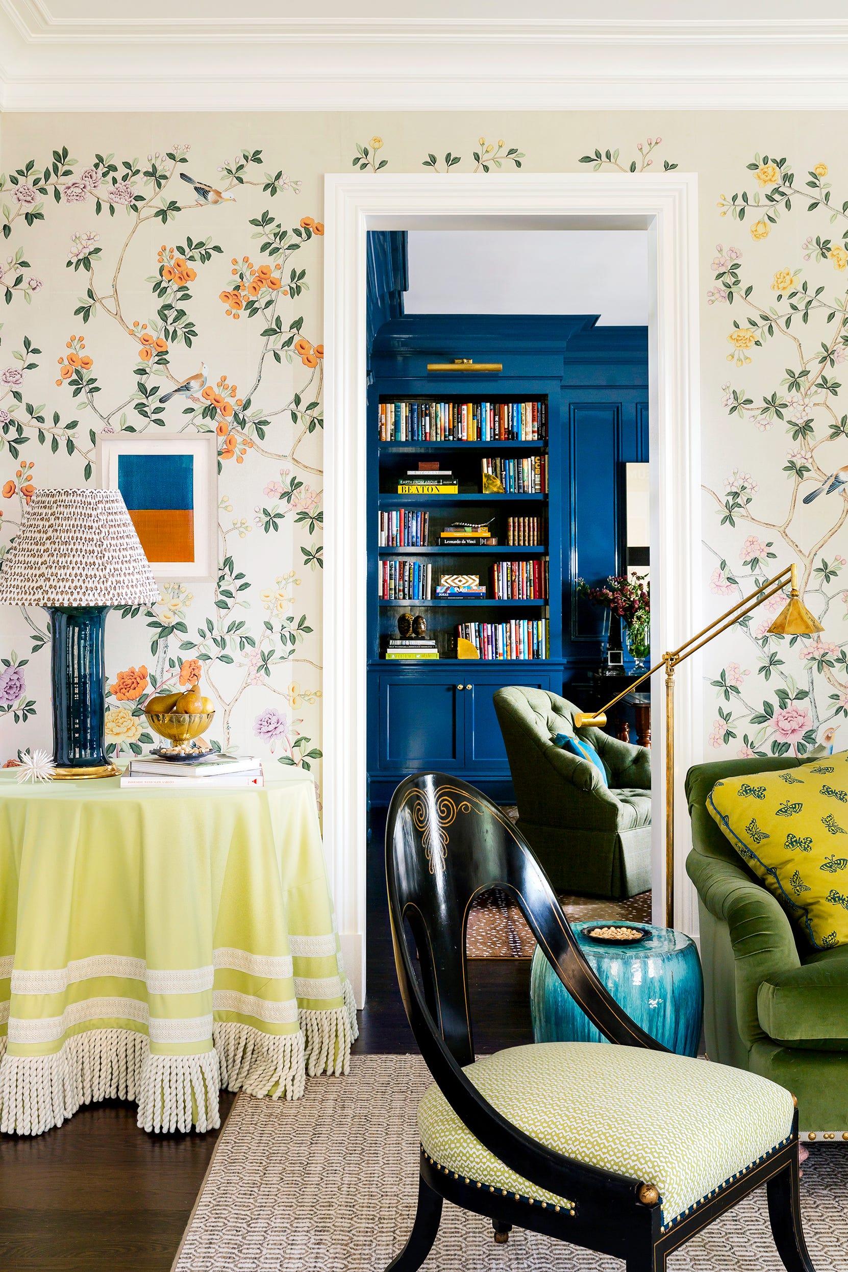
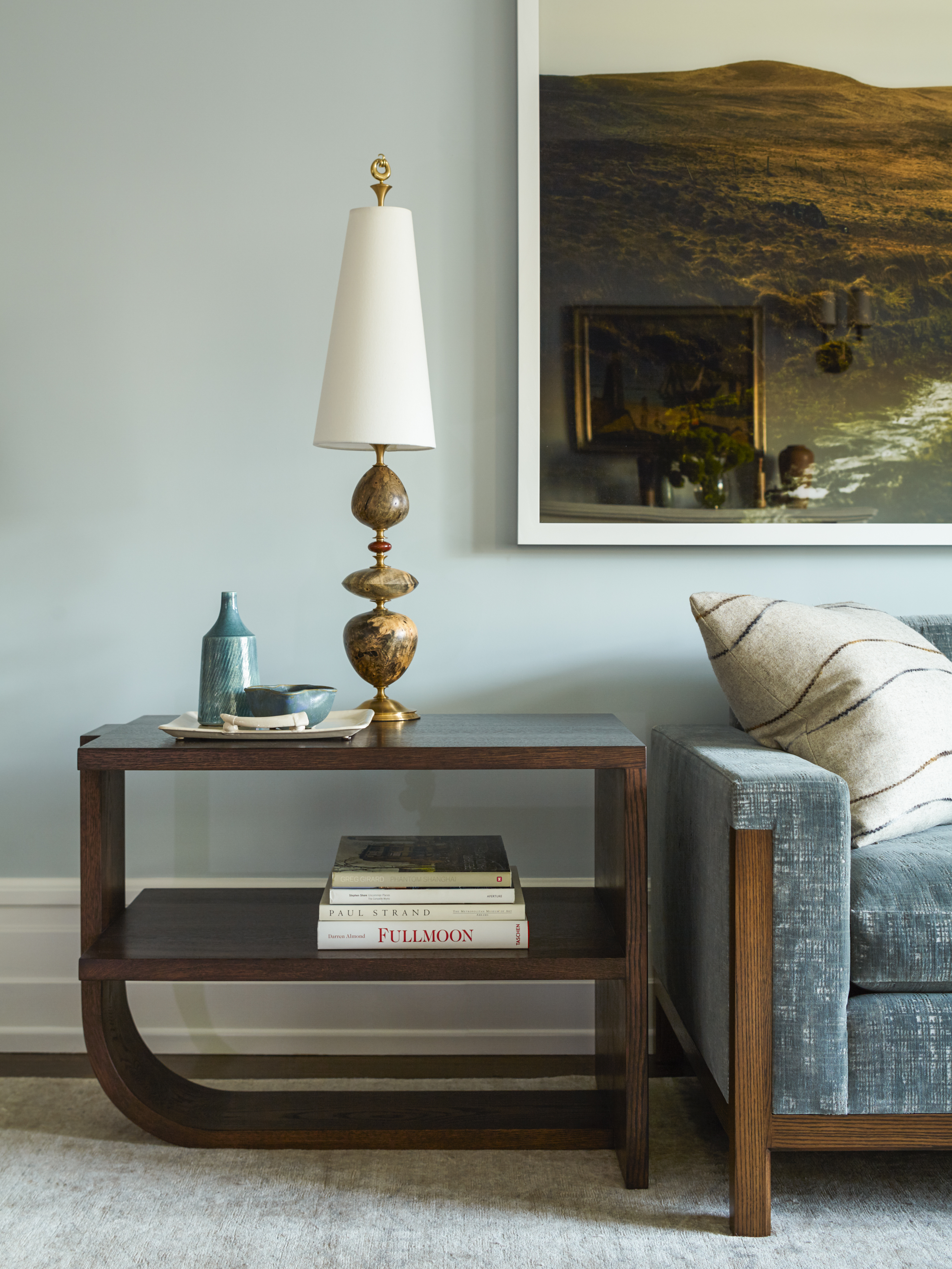
The versatility of baby blue allows for easy color pairing. When combined with brown and tobacco tones or vibrant red accents, it achieves a unique effect. Soft blues and greens evoke freshness and nature, whereas aubergine introduces a more mature aesthetic suitable for formal dining or powder rooms. Sean Symington, another UK-based interior designer, highlights the calming quality of baby blue, noting its adaptability across various rooms like kitchens, bedrooms, and bathrooms. He recommends pairing it with fresh yellows, greens, and corals, and emphasizes its appeal when set against antique brown furniture. When used with white for trims and woodwork, a white with warmer undertones, such as Wimborne White by Farrow & Ball, is advised to prevent a stark contrast.
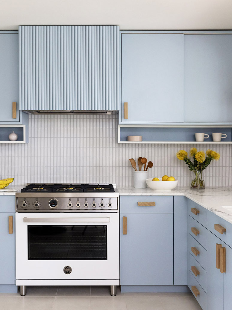
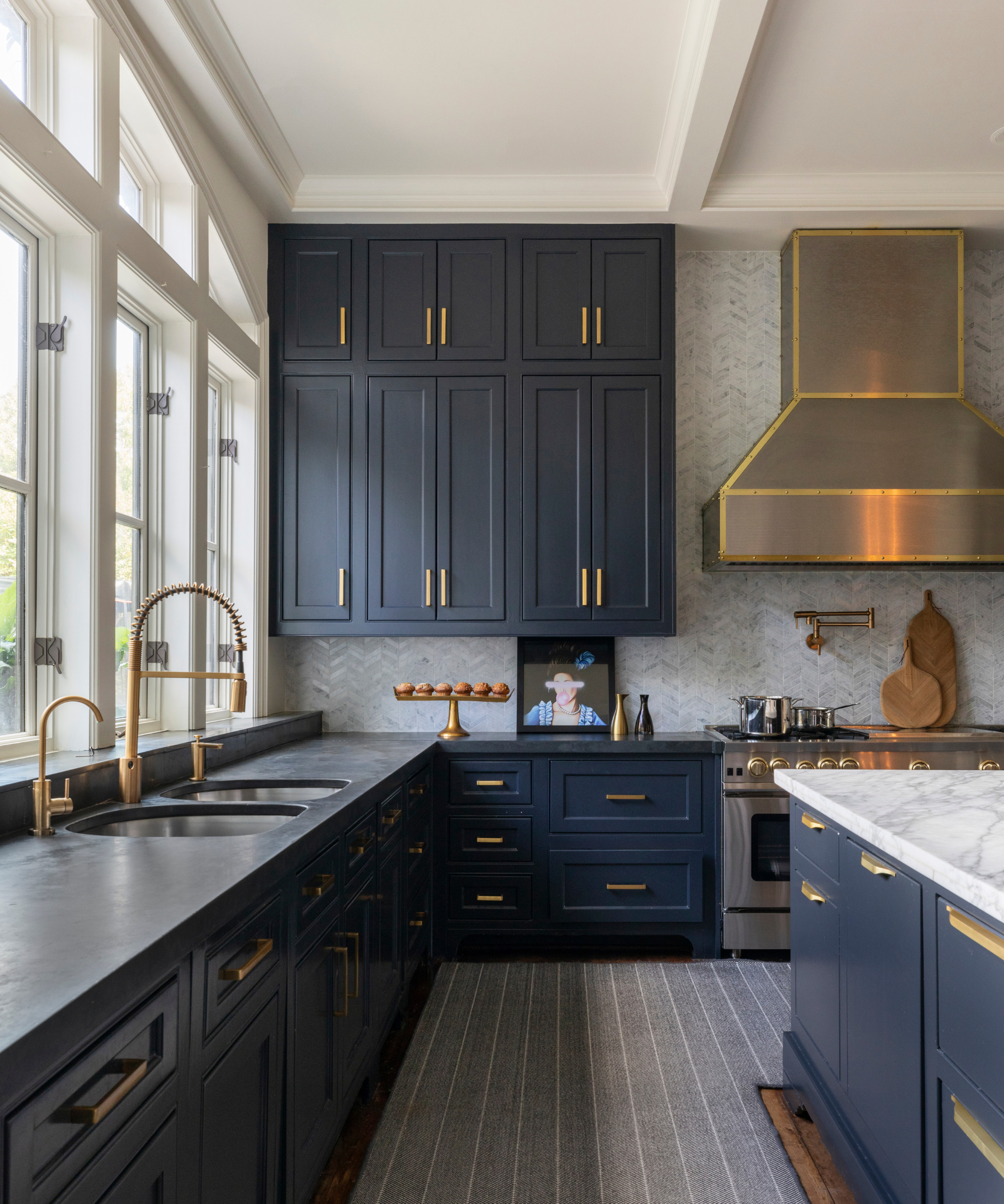
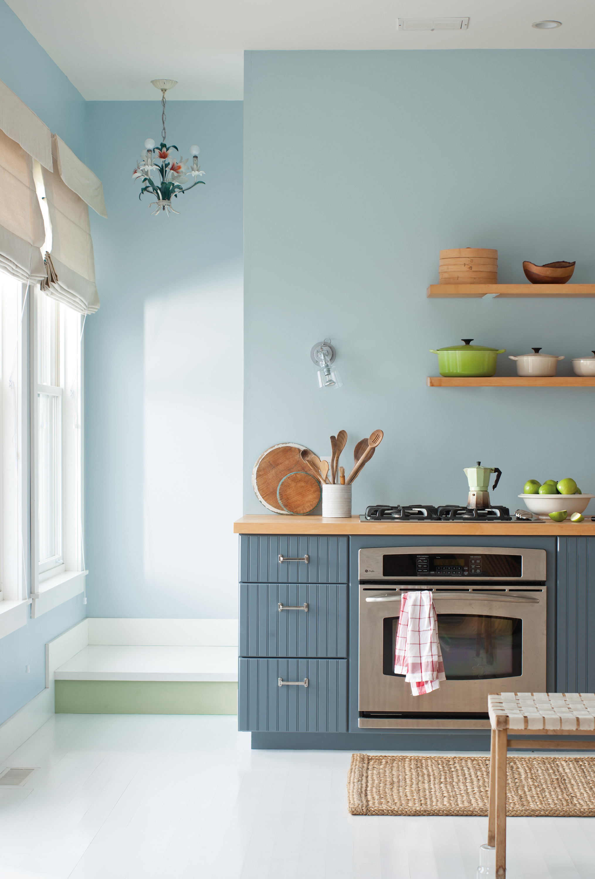
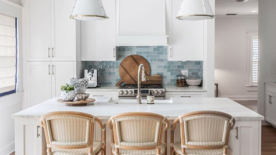
Baby blue performs optimally in well-lit spaces, where it can reflect light and make rooms feel more expansive. This characteristic makes it an excellent choice for a 'color drenching' technique. The adoption of baby blue is not limited to paint; it can be integrated through wallpaper, textiles, tiles, and smaller decorative accents. The article's author, inspired by deVOL Kitchens, personally incorporated baby blue into kitchen drawers and a side table, noting positive feedback from visitors. This choice serves as a soothing alternative to grey paint in kitchens, which the author finds too clinical.
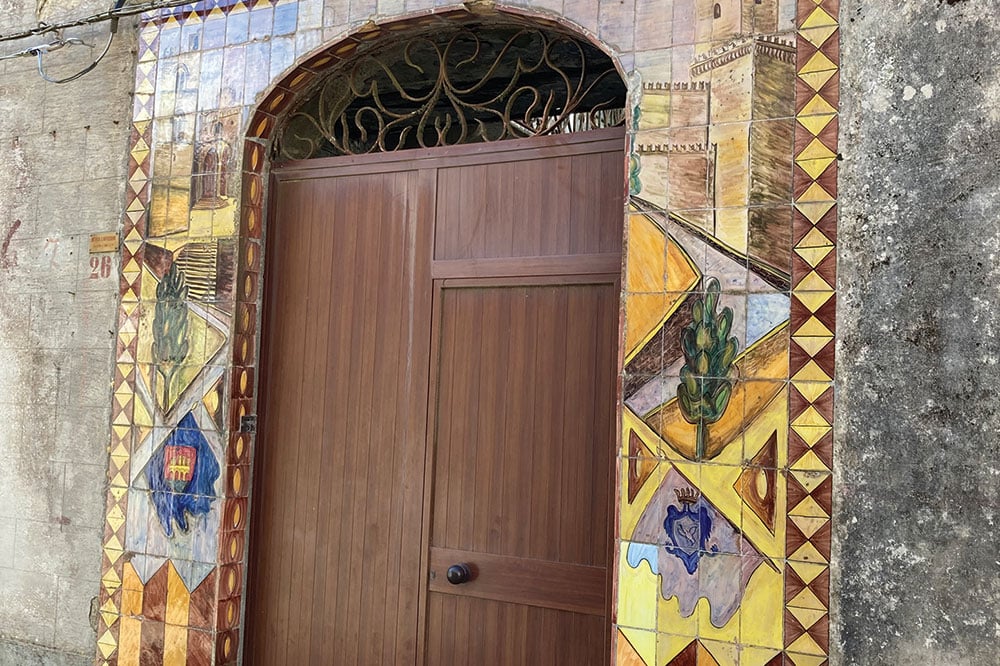
Furthermore, baby blue can act as a subtle backdrop for vibrant colors like bright orange or electric pink. Unlike white, which can intensify bold hues, baby blue allows these colors to stand out without overwhelming the space. The author also recounts painting her front door in a pale blue shade, transforming its previous black appearance into a fresh and inviting entrance. For front doors, she suggests avoiding hues with cold gray undertones and opting for shades with more depth, such as Brighton or Tea with Florence by Little Greene.
For those considering incorporating baby blue, it is recommended to test several pale blue paint swatches in their home for an extended period to observe how the color appears under different lighting conditions and to ensure long-term satisfaction.
#InteriorDesign #ColorTrends #BabyBlue #HomeDecor #PaintColors #DesignTips #ColorPalette #DecoratingIdeas #HomeImprovement #InteriorDesign #ColorTrends #BabyBlue #HomeDecor #PaintColors #DesignTips #ColorPalette #DecoratingIdeas #HomeImprovement
0 opmerkingen in totaal
 Nog geen opmerkingen
Dit vindt u mogelijk ook leuk
Blue is one of the UK’s most popular living room colours – this is how to elevate your lounge with the timeless hue
Give Your Home a Tranquil Makeover With the Color Blue

Feeling blue about your current space (figuratively)?

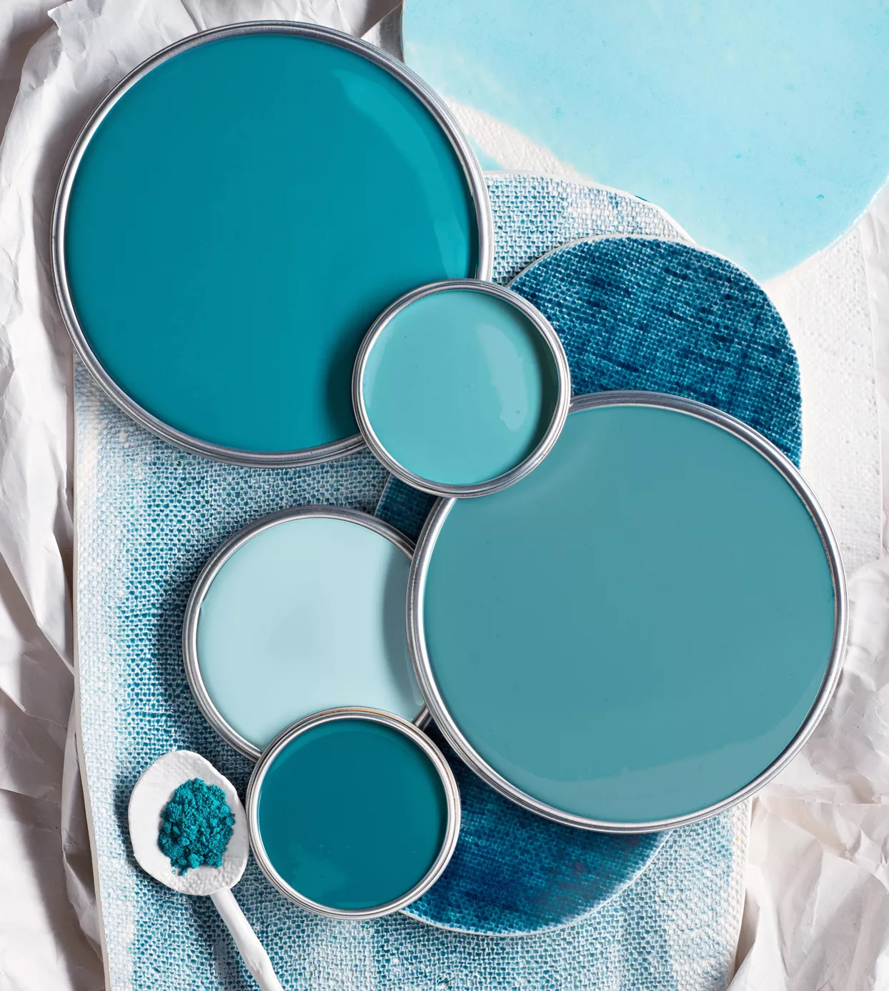
29 Best Blue Paint Colors for Perfectly-Hued Walls

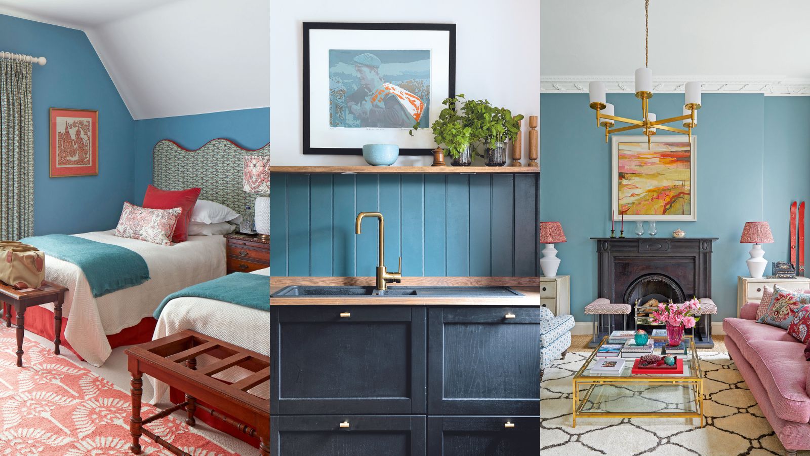
Blue room ideas – 27 timeless and fresh ways to use blue at home

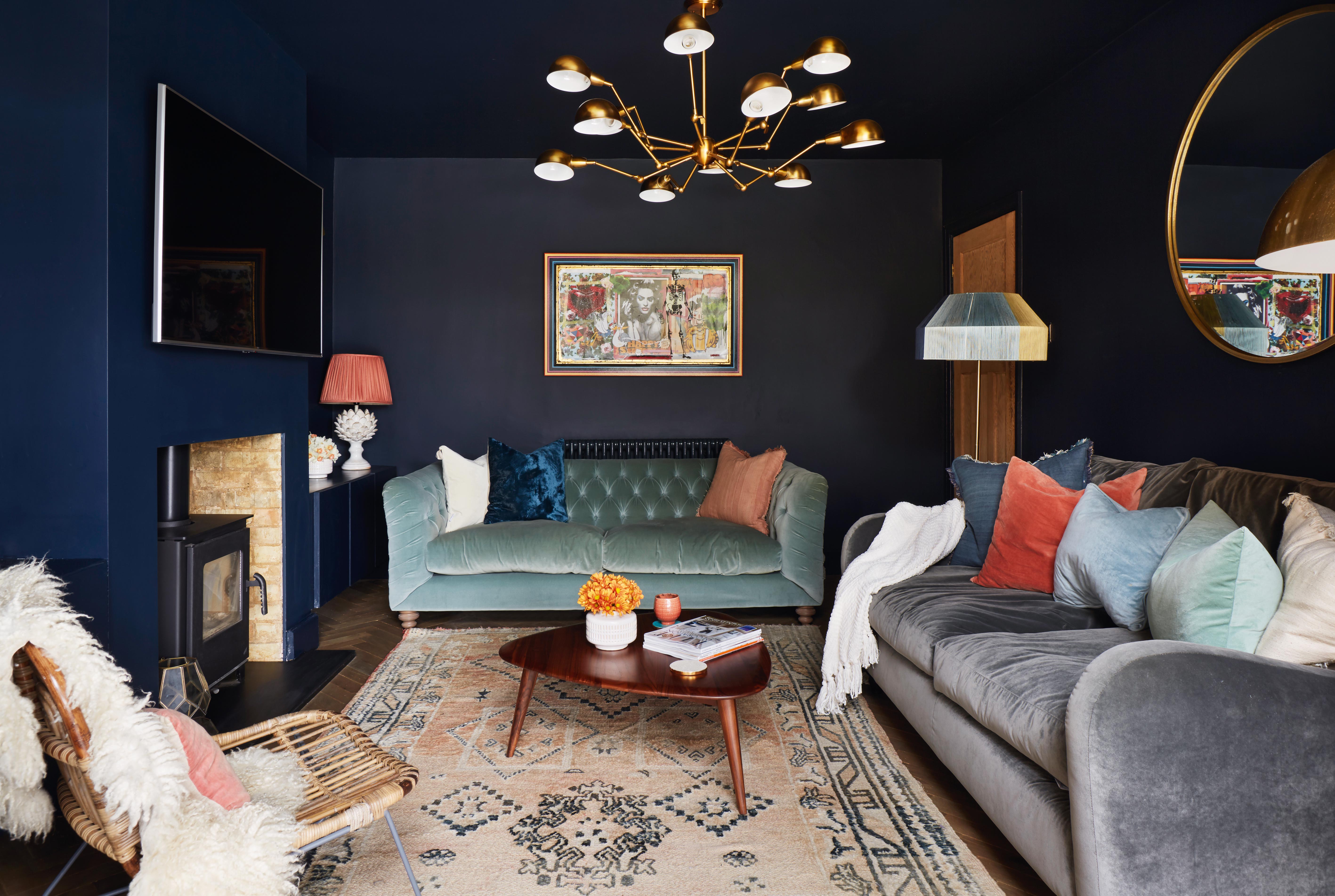
11 blue living room ideas to show to how to work with this on trend hue

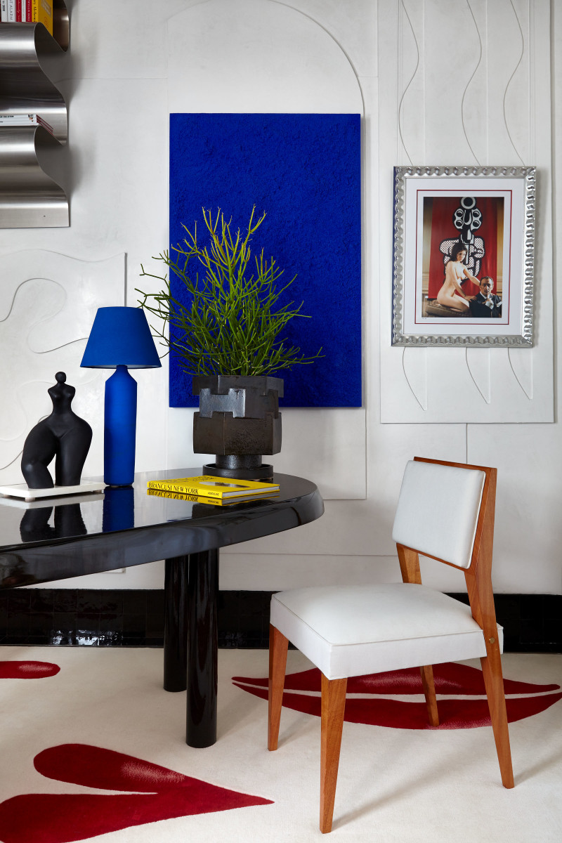
Klein Blue Is the Color Du Jour, But What Exactly Is It?

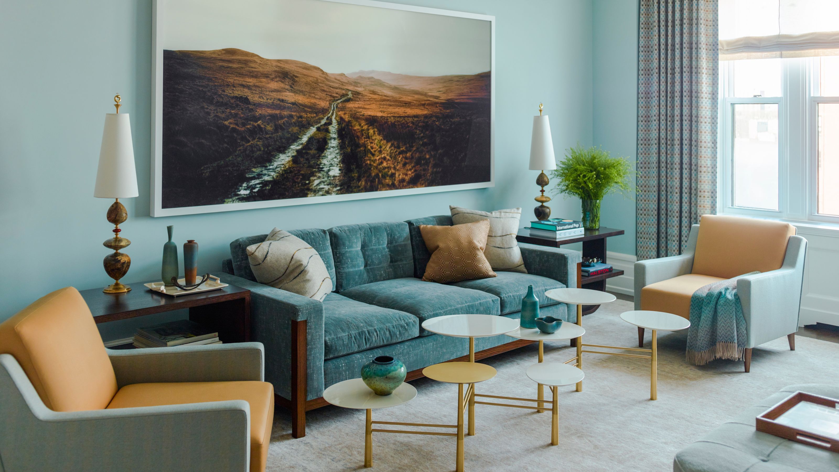
6 Light Blue Living Rooms That Find the Perfect Balance Between Cool and Cozy

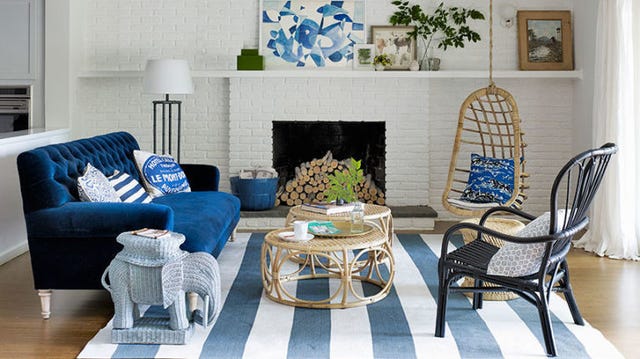
25 Reasons Why Blue Is the Best Color for Decorating Your Home
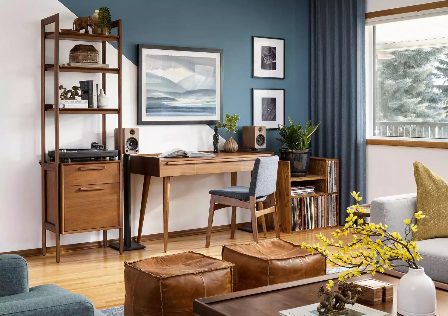
These 10 Colors Always Look Beautiful With Blue

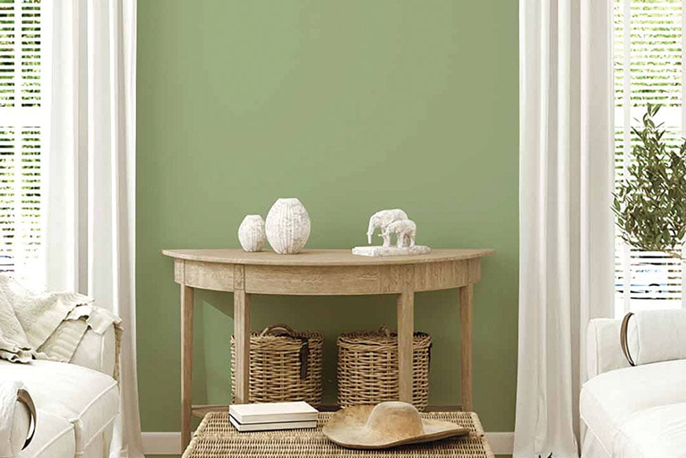
How To Incorporate The Latest Color Trends in Your Home


Designers LOVE Pairing These Unexpected Colors With This One Timeless Hue
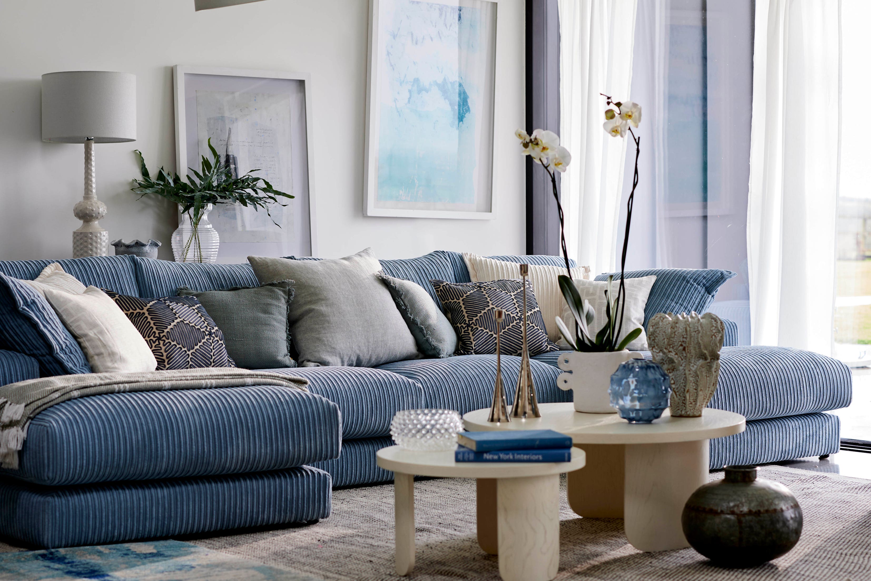
9 must-have brilliant blue homewares and decor
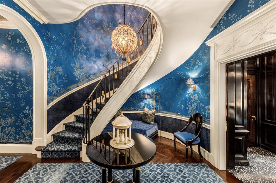
Beautiful blue decorating ideas for every room | loveproperty.com
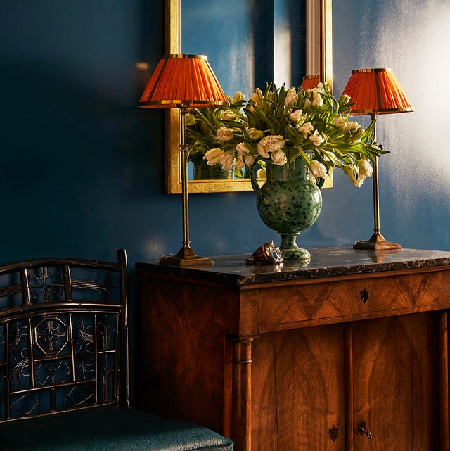
Why Designers Love This Shade of Blue Paint for Just About Any Room In the House

Brown is the colour of the moment — here's how to use it in your home
From Cabinetry to Upholstery, This Soothing Color Is About to Upstage Sage

What Is the Most Expensive-Looking Blue? 7 Specific Shades to Paint Walls That Will Always Elevate Your Home
I'm a Color Expert — This Is How I Think You Should be Decorating with Blue
Bring In Calming Vibes: 5 Instagram-Inspired Ways To Do Beautiful Blue in Your Kitchen