1/9
Emily Henderson just shared her tried-and-true tips for hanging art – this is how to get a gallery-like look
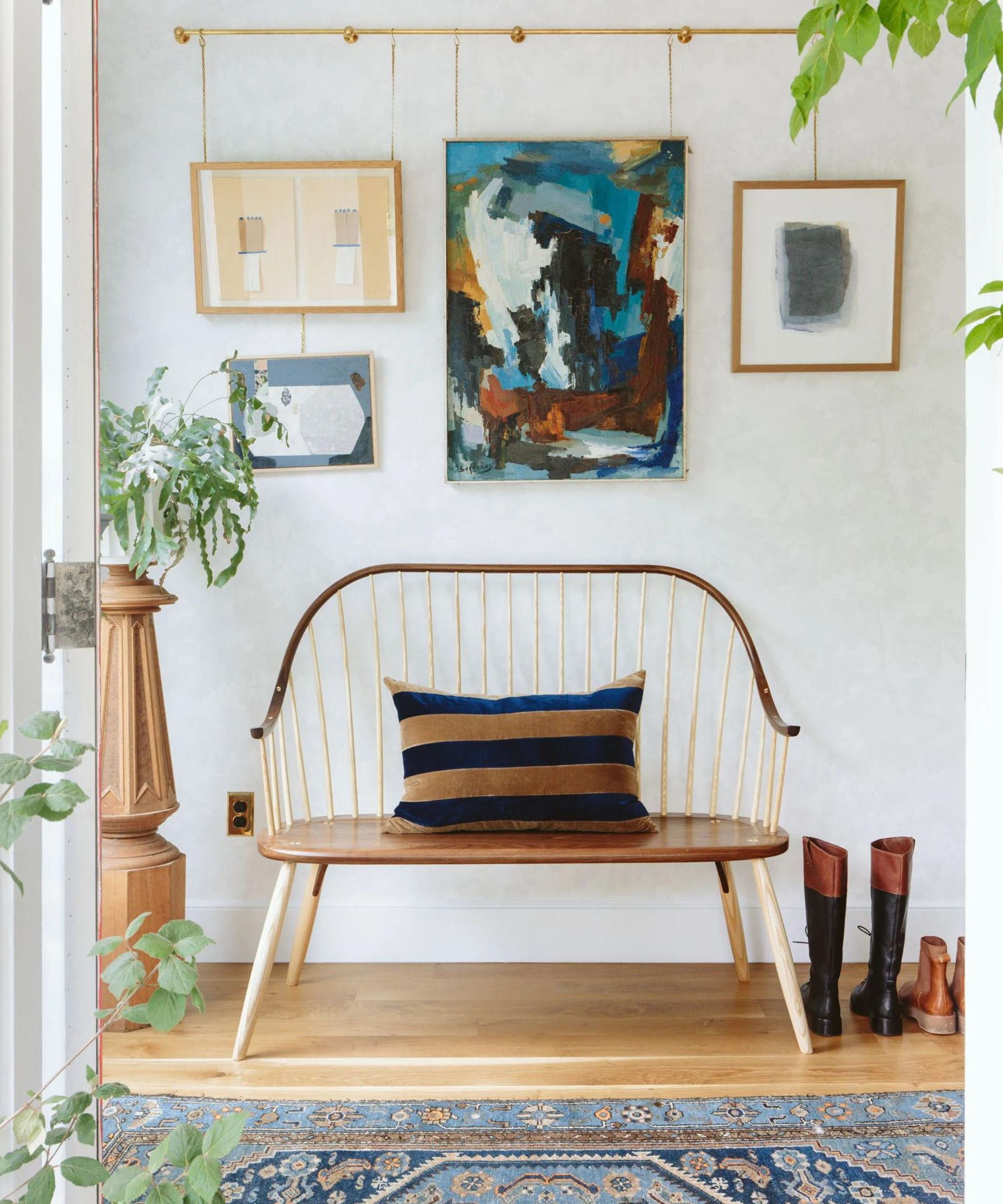
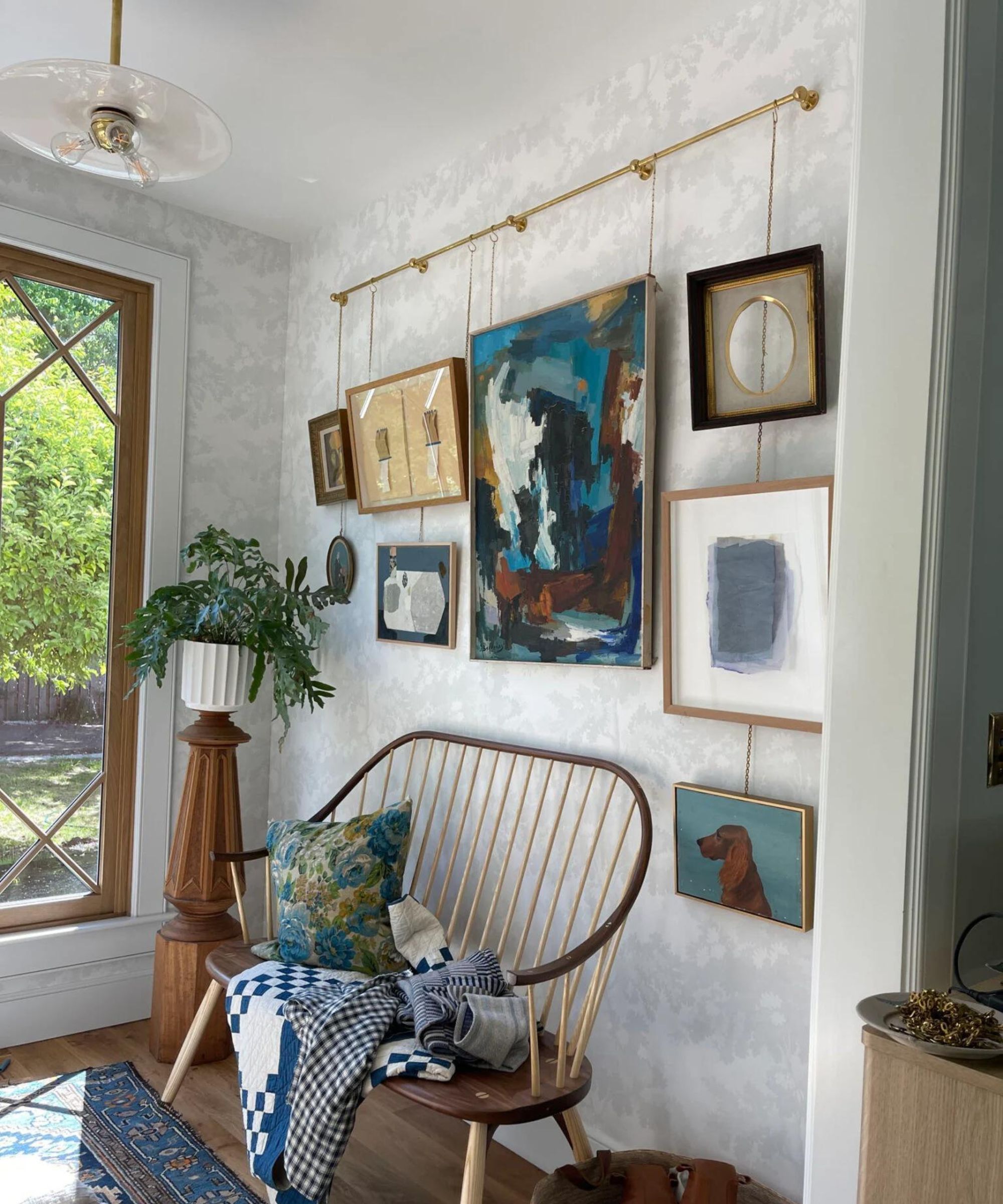
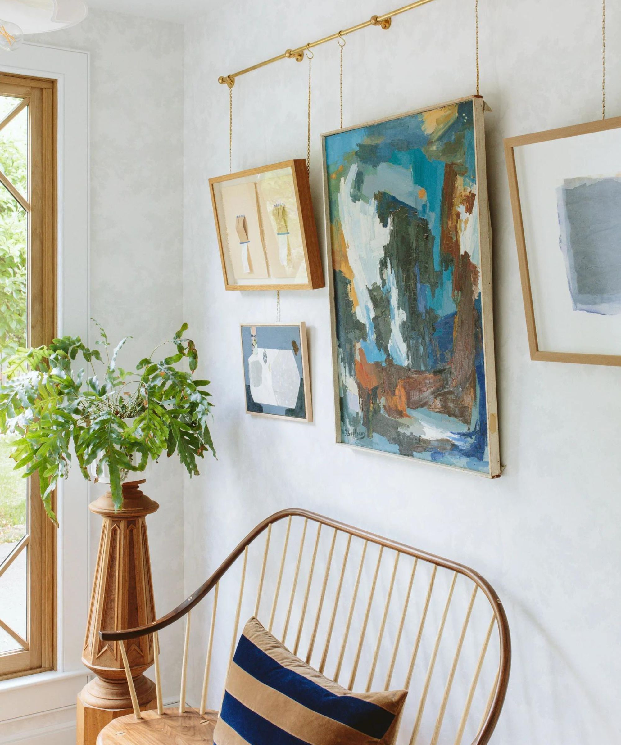
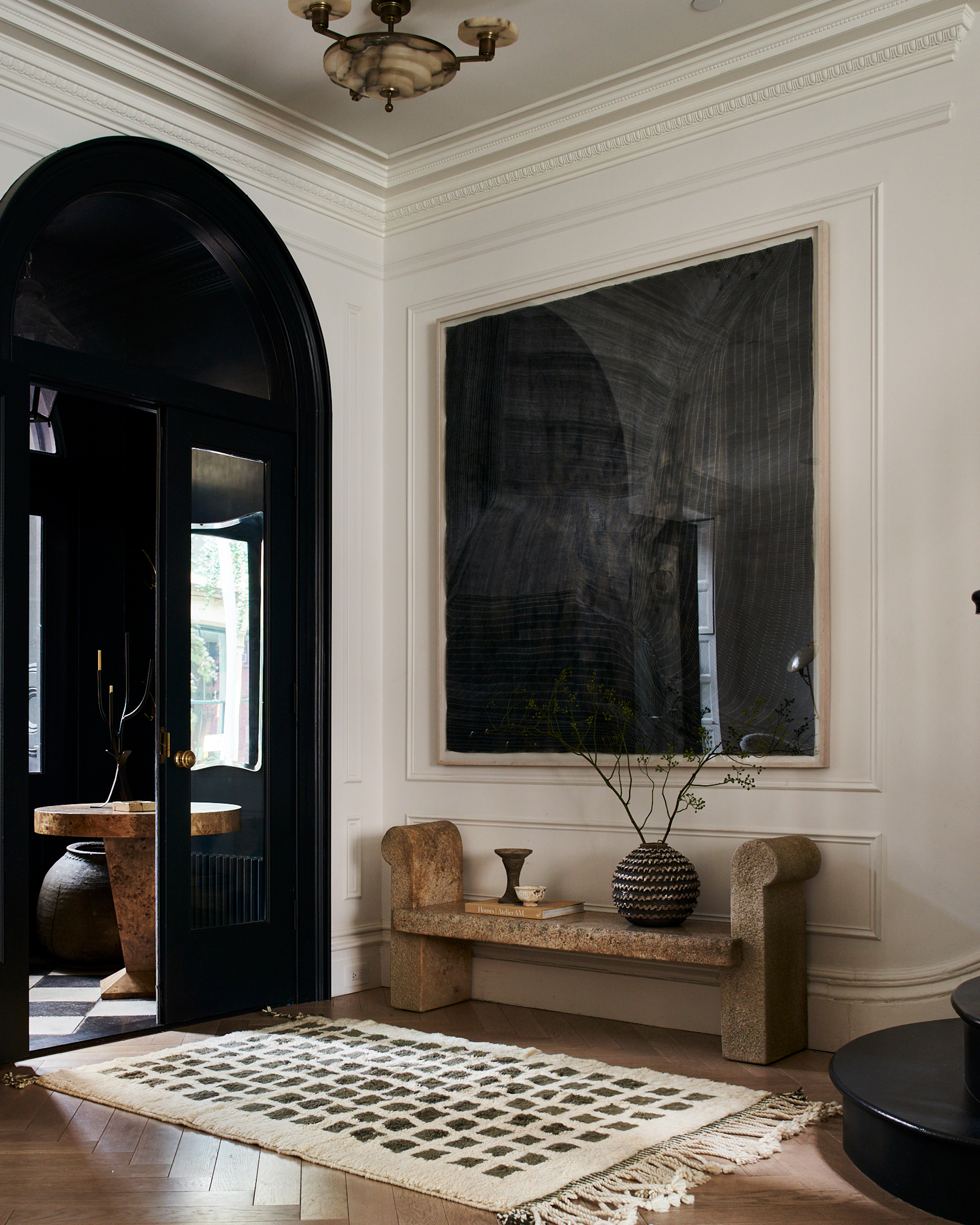
Interior designer Emily Henderson offers expert guidance on effectively hanging art to enhance any space, aiming for a sophisticated, gallery-like appearance. Her advice addresses common mistakes and provides actionable strategies to ensure artwork is displayed to its best advantage, integrating seamlessly with the room's overall design while also drawing attention. This article delves into three primary tips from Henderson, complemented by additional insights on pitfalls to avoid.
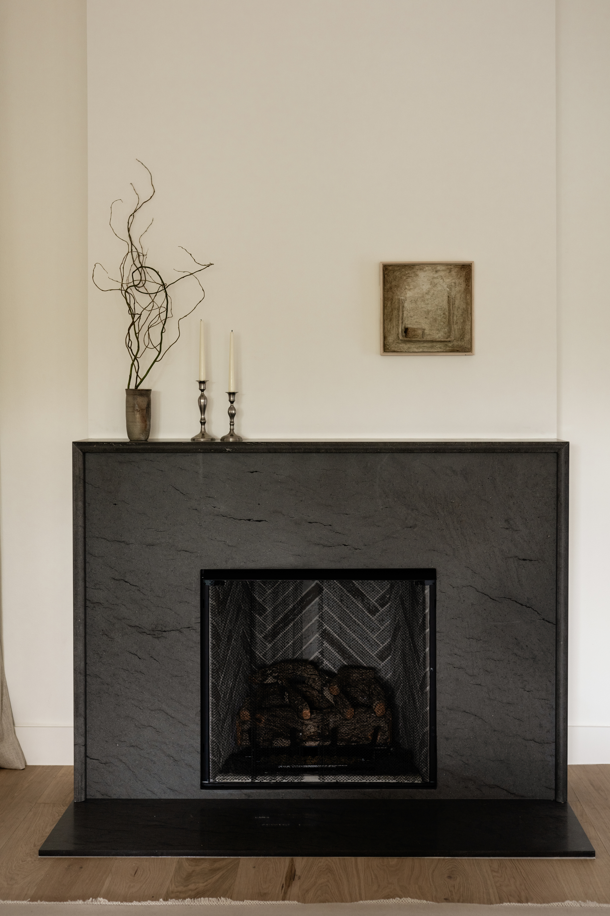
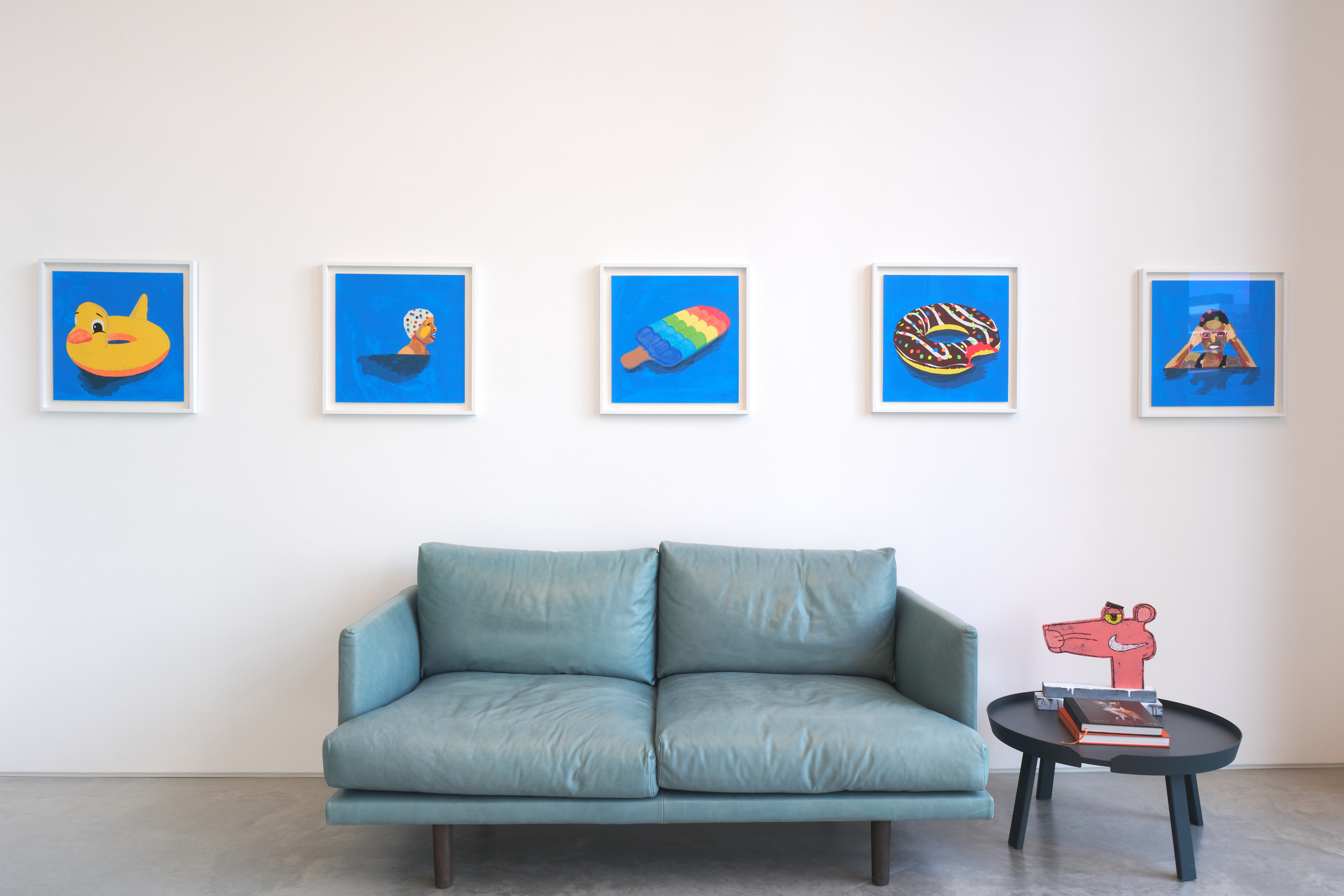
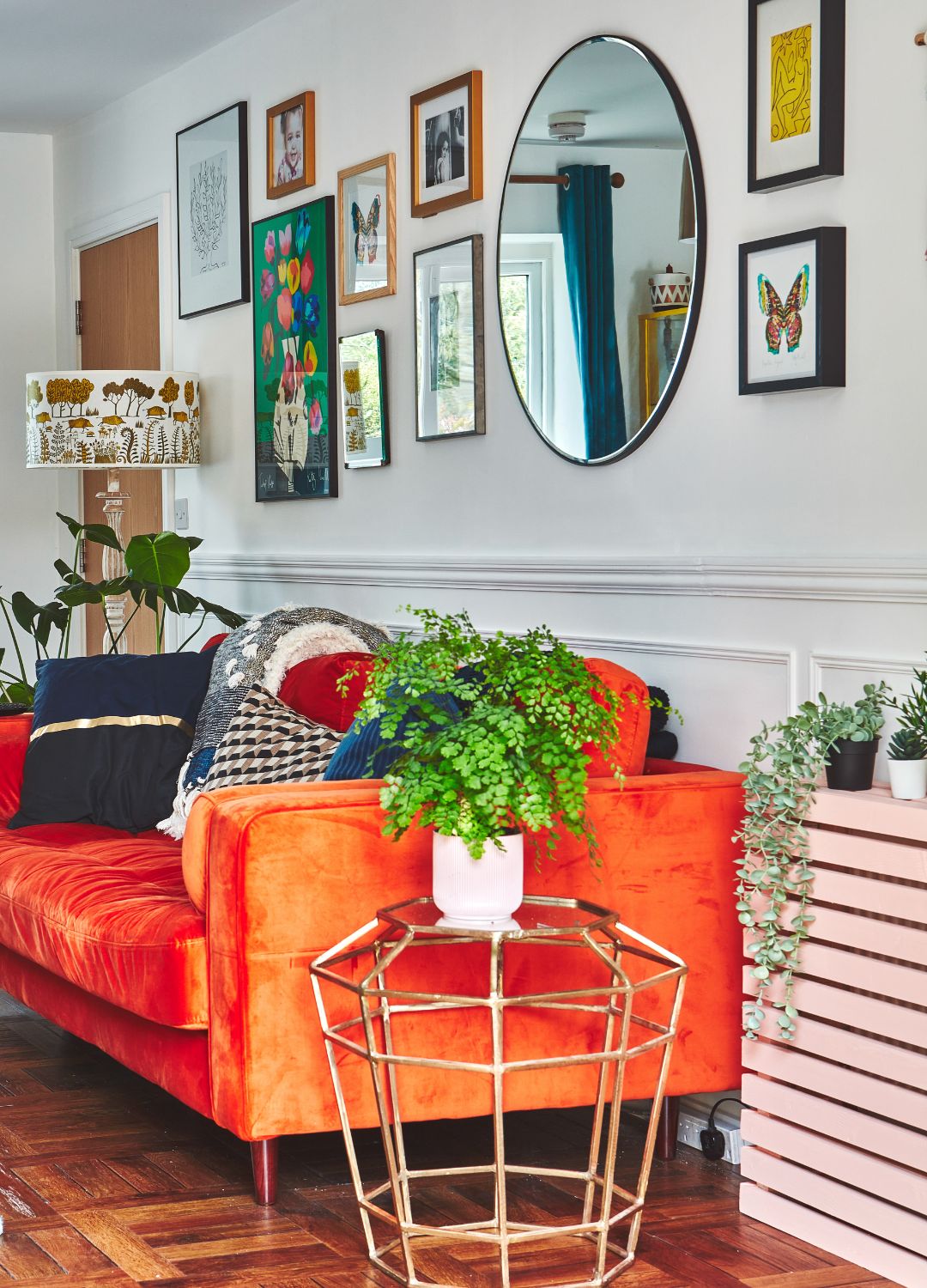
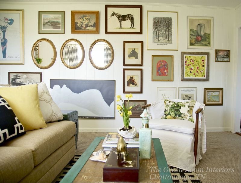
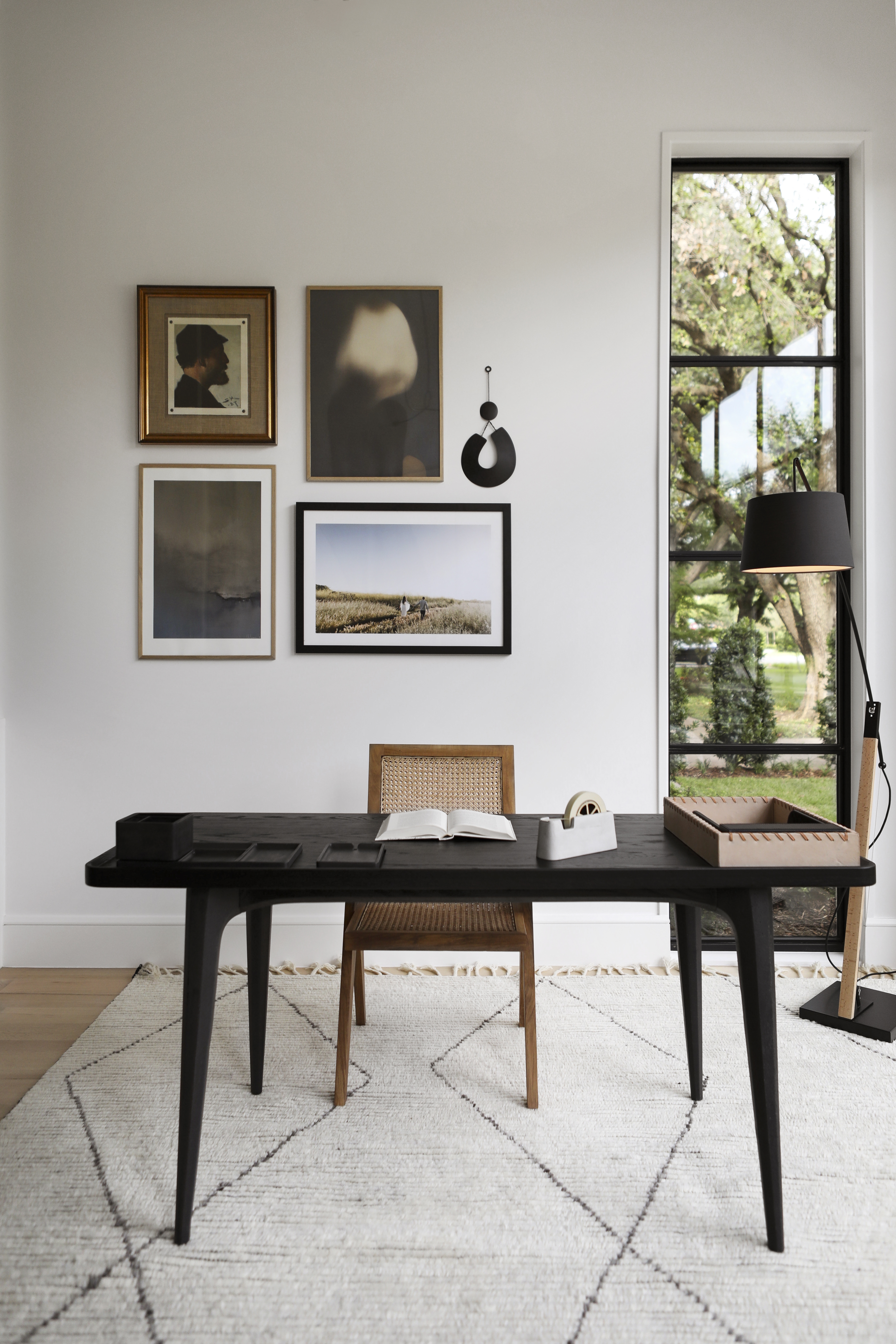
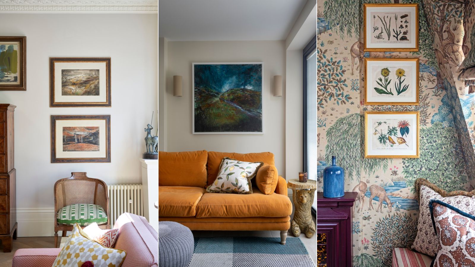
The first crucial tip emphasizes hanging art at or near eye level. Henderson suggests conceptualizing the wall as divided into four vertical sections, with the ideal placement for framed art being within the upper middle quadrant. This strategic positioning ensures that the artwork naturally captures attention upon entering the room. She underscores that proper balance is key, as art hung too high or too low without deliberate intent can disrupt visual harmony and negatively impact the viewer's experience of the space. Achieving this balance is essential for creating a visually pleasing and comfortable environment.
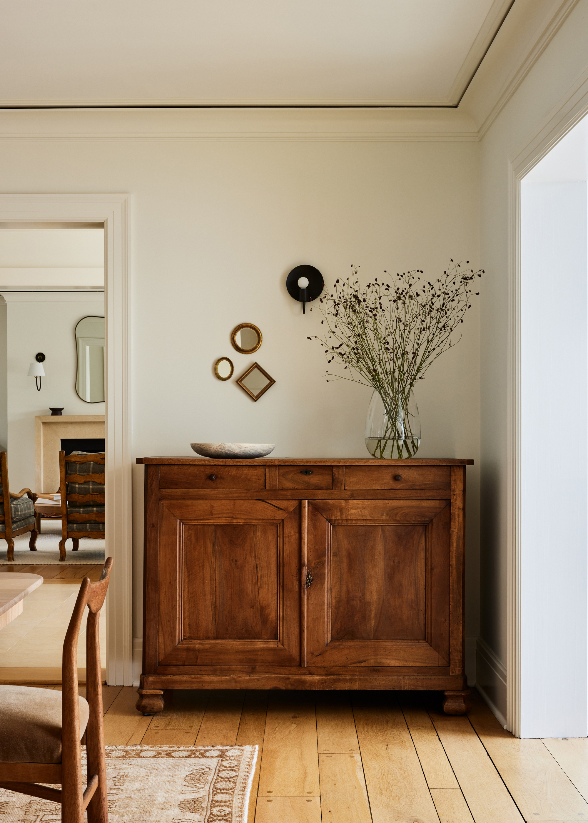
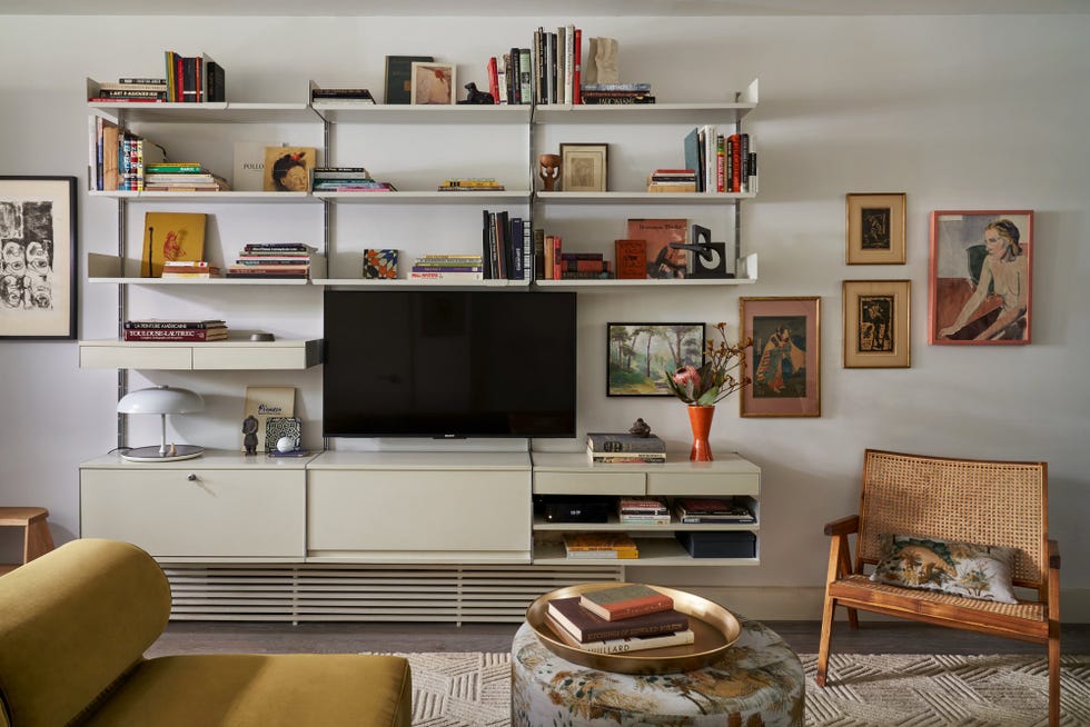
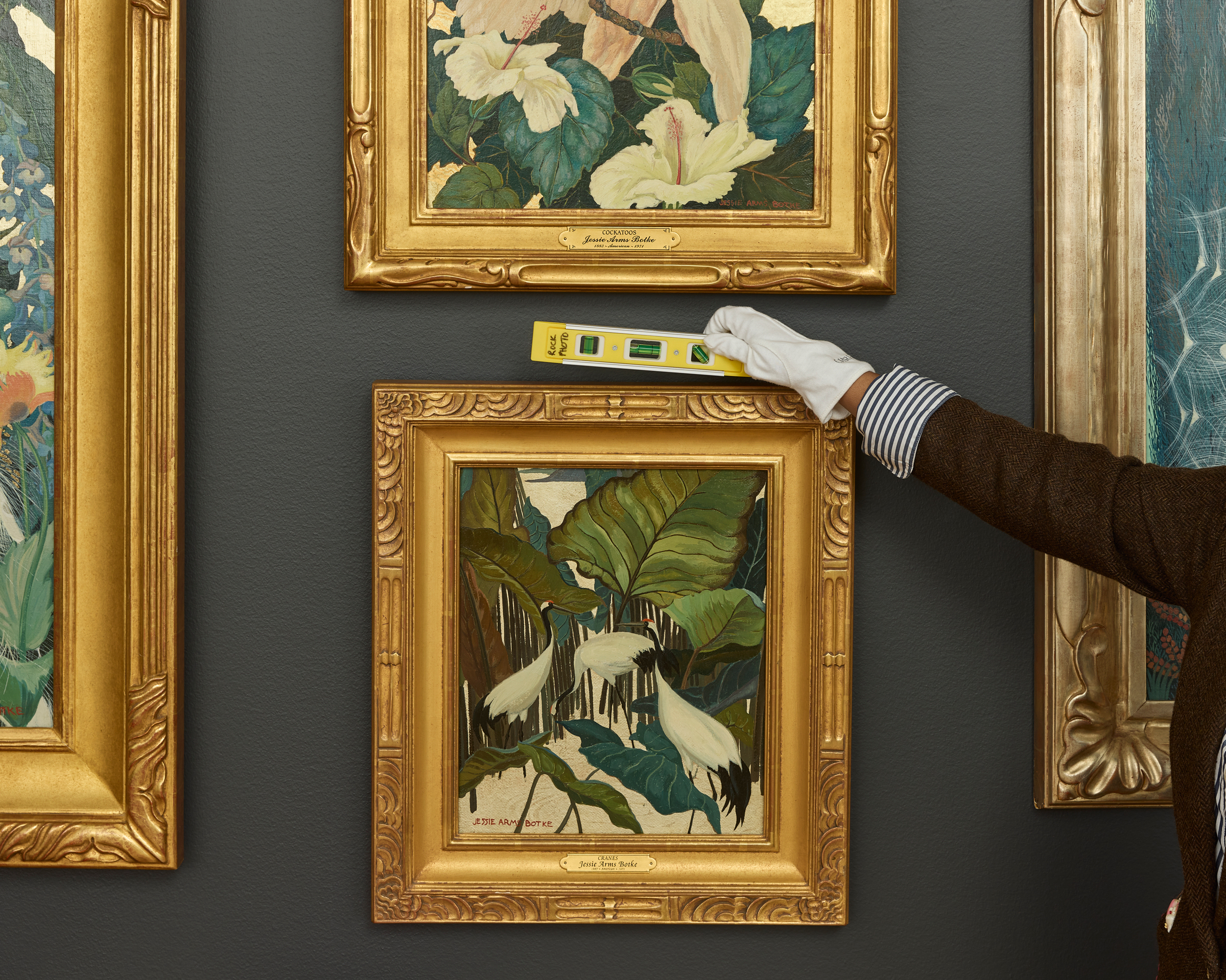
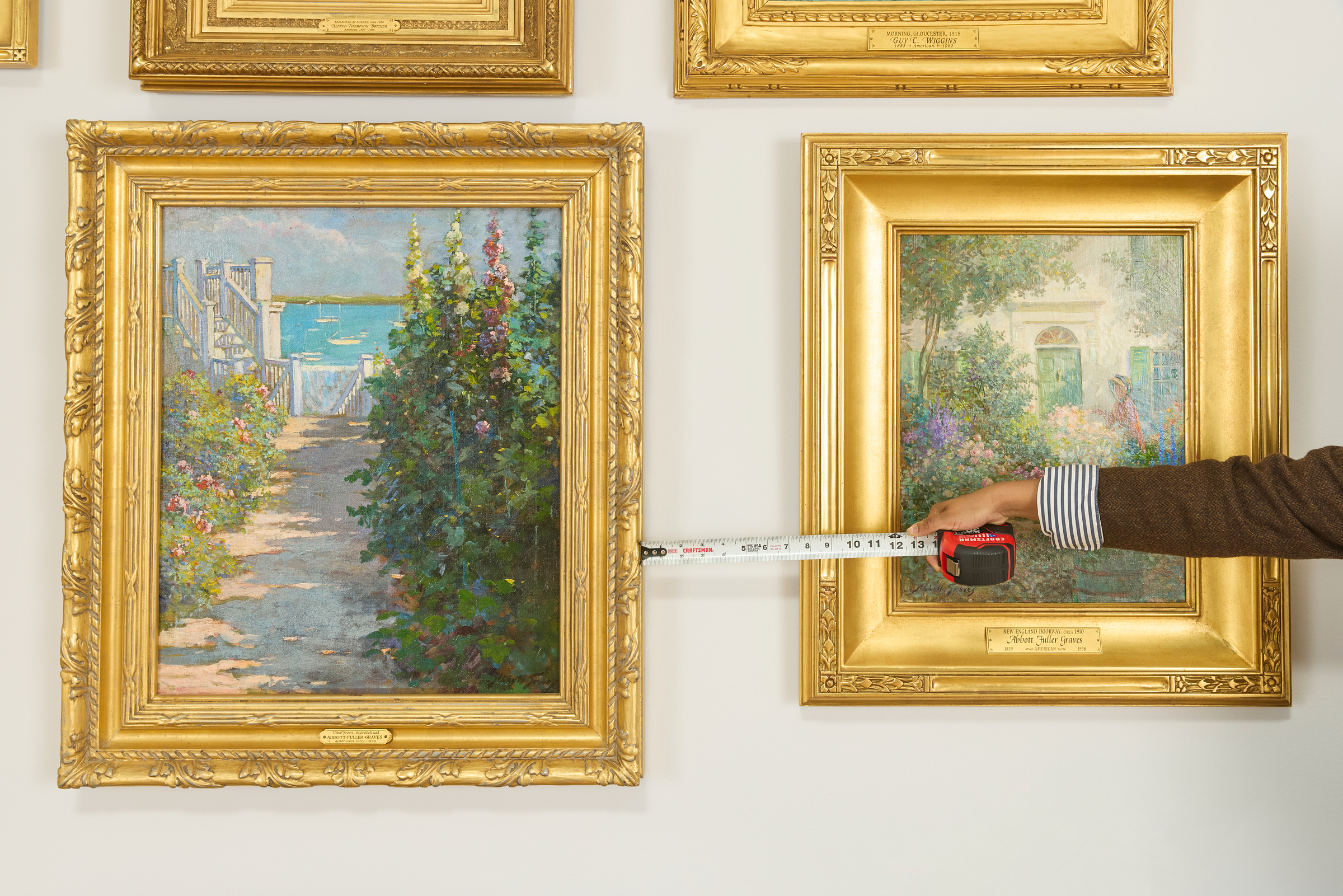
Secondly, Henderson advises establishing adequate space between artwork and accompanying furniture. While art often looks appealing when situated above furniture, it is important to allow each design element sufficient room to 'breathe.' She recommends positioning art approximately eight inches above furniture pieces. This separation prevents a cluttered or overly busy aesthetic, contributing to a sense of openness and sophistication. Although specific measurements may vary depending on the room's scale, beginning with this approximate distance helps cultivate a thoughtful and deliberate arrangement, allowing each piece to stand out without competing for attention.
Thirdly, the article highlights the importance of using furniture as a reference point for scaling artwork. Henderson notes that art pieces measuring between half and two-thirds the size of nearby furniture tend to create the most harmonious balance and design refinement. She stresses that proper scale is fundamental to a well-designed room. By relating the size of artwork to that of furniture, such as a sofa, individuals can ensure that their selections contribute positively to the room's overall coherence and aesthetic. This method aids in maintaining visual equilibrium and preventing pieces from appearing either too dominant or too insignificant within the space.
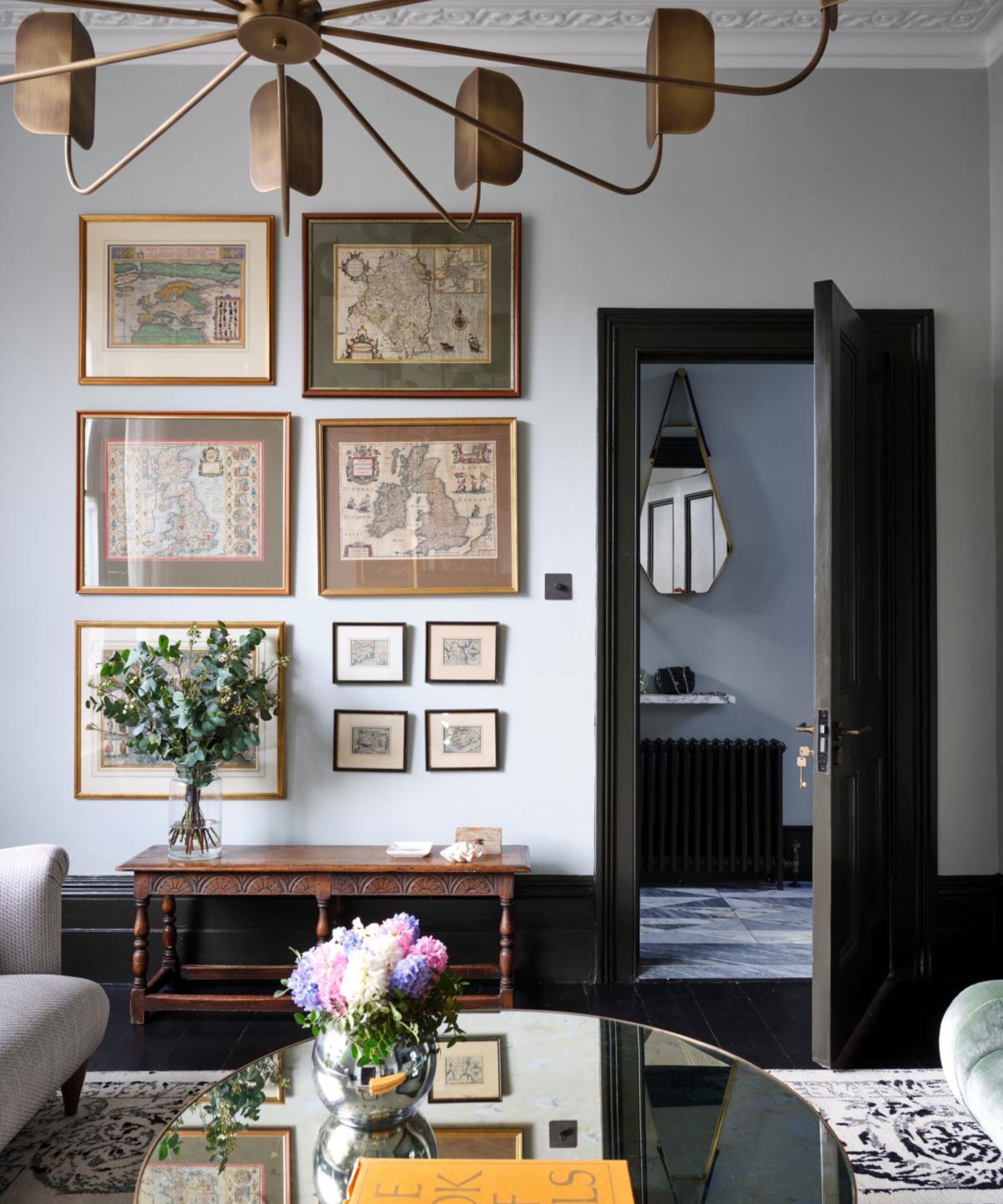
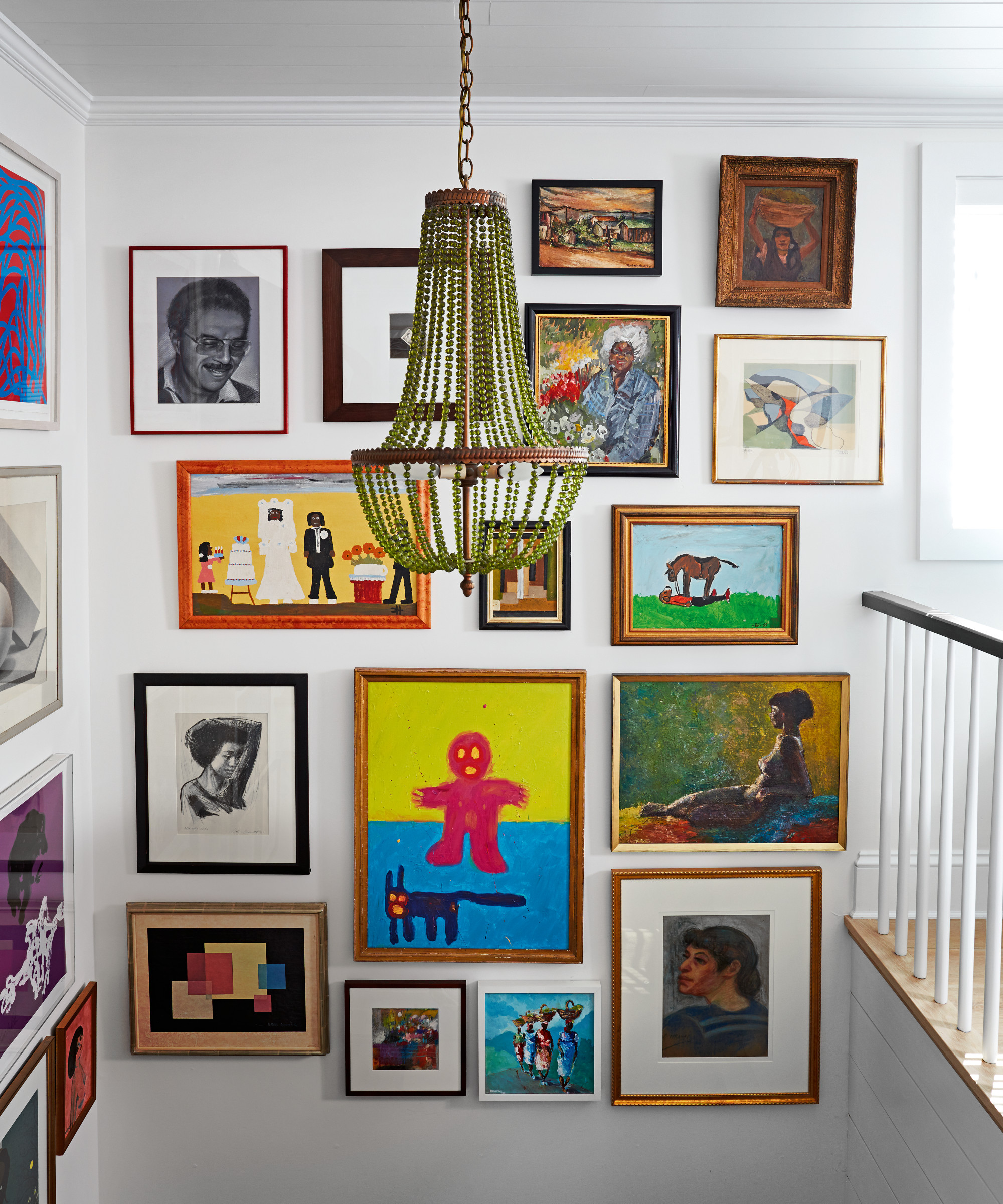
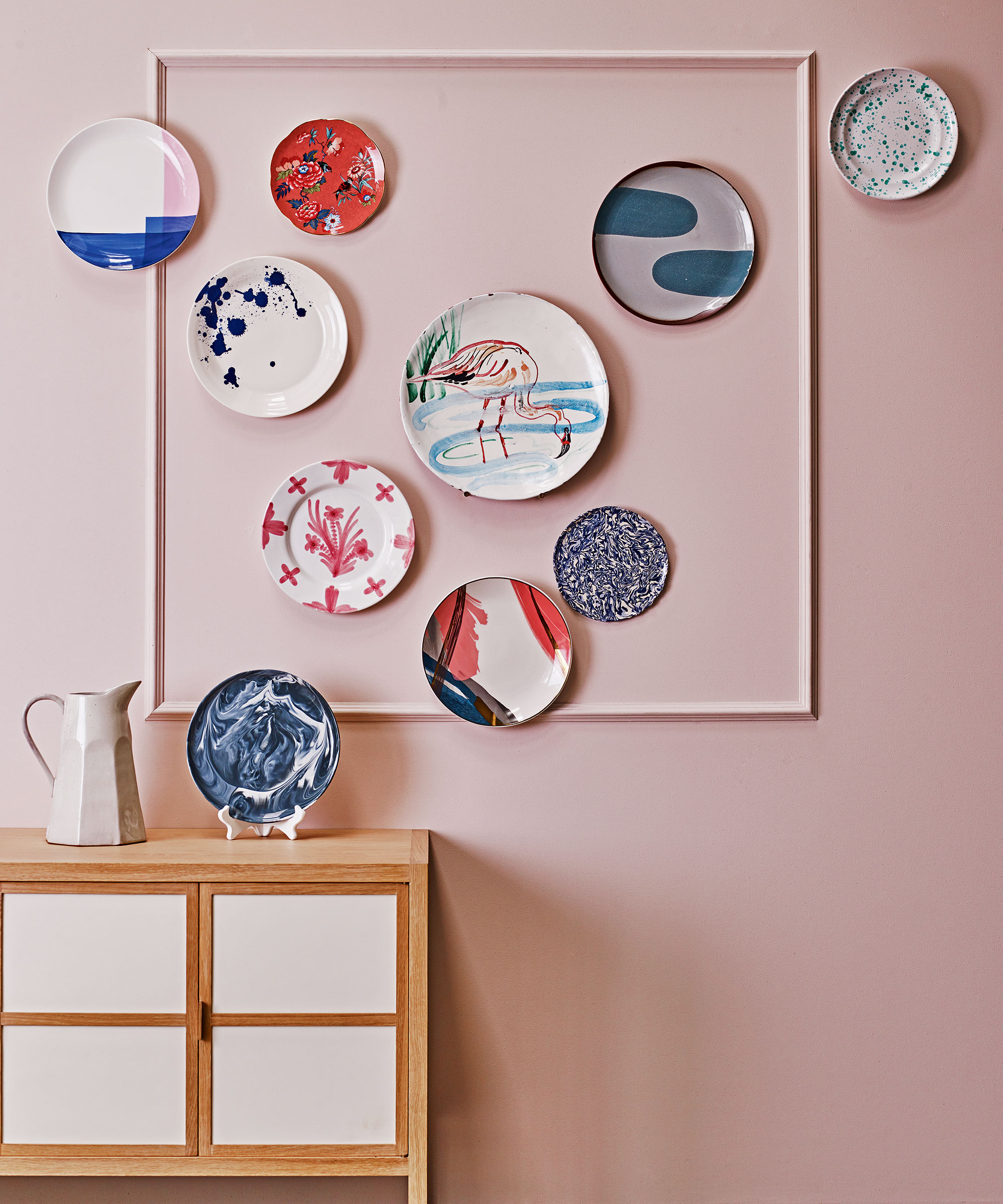
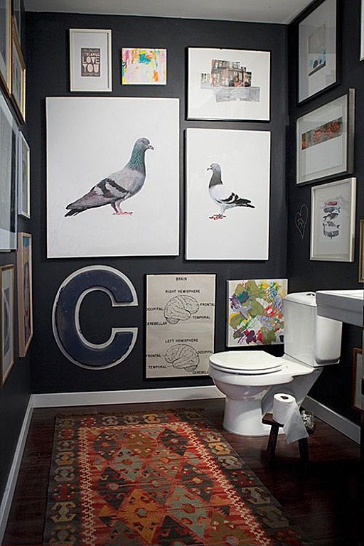
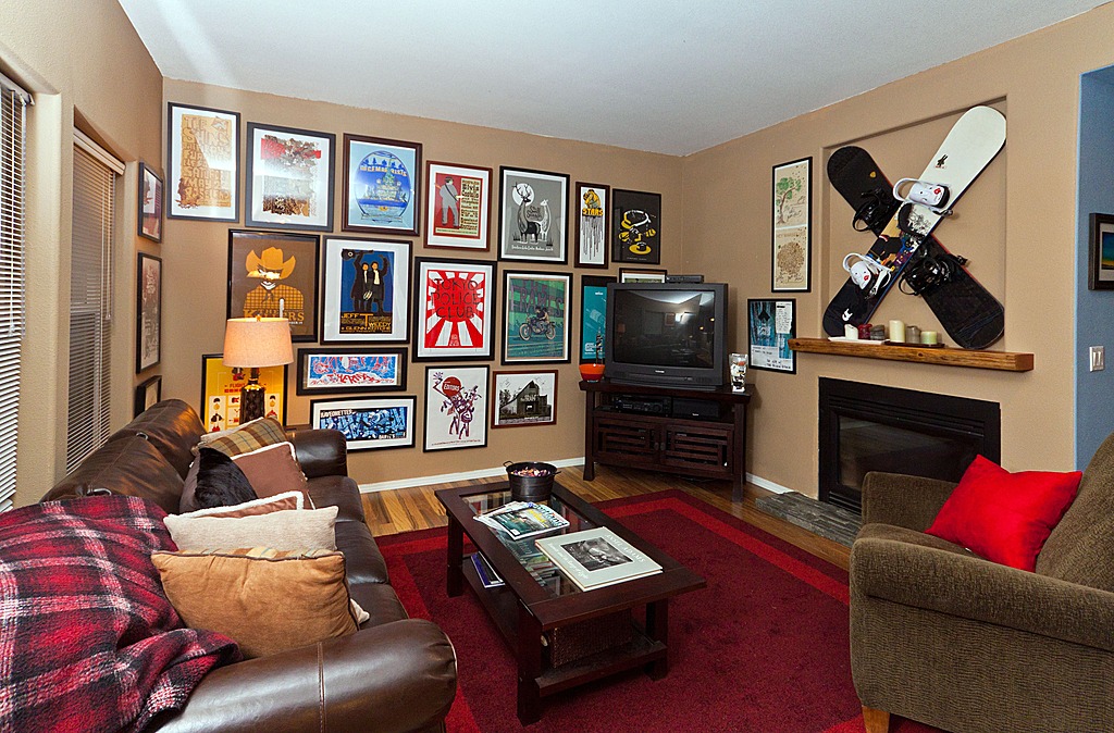
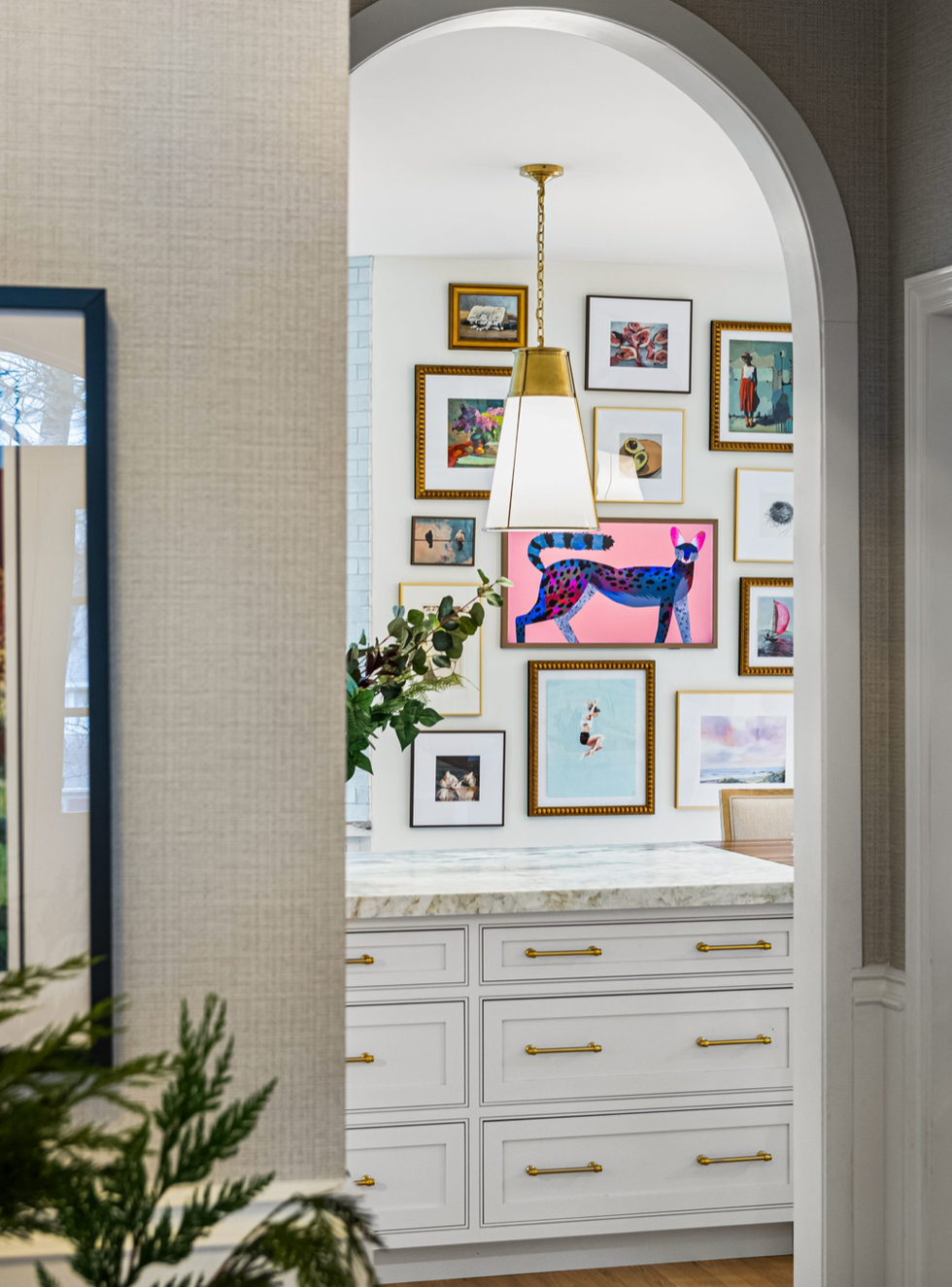
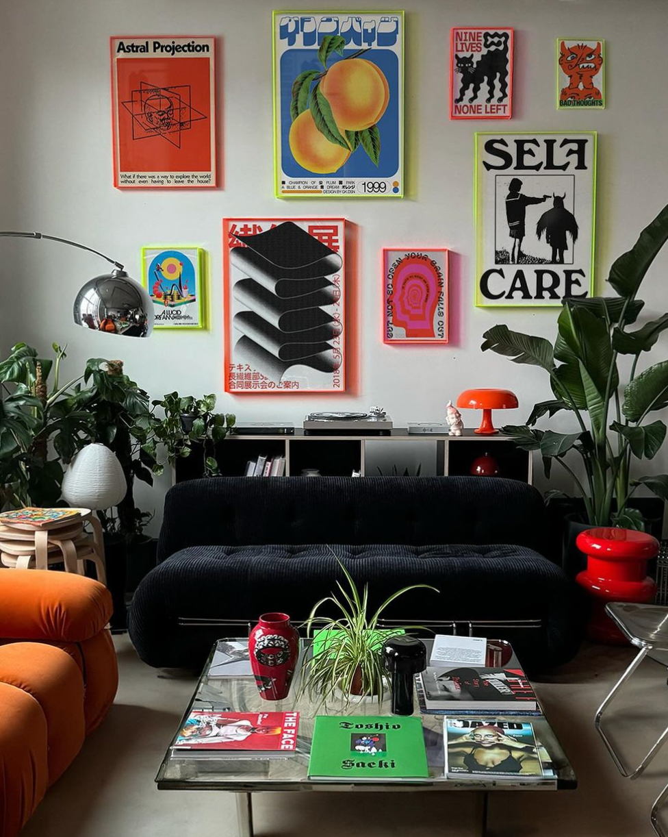
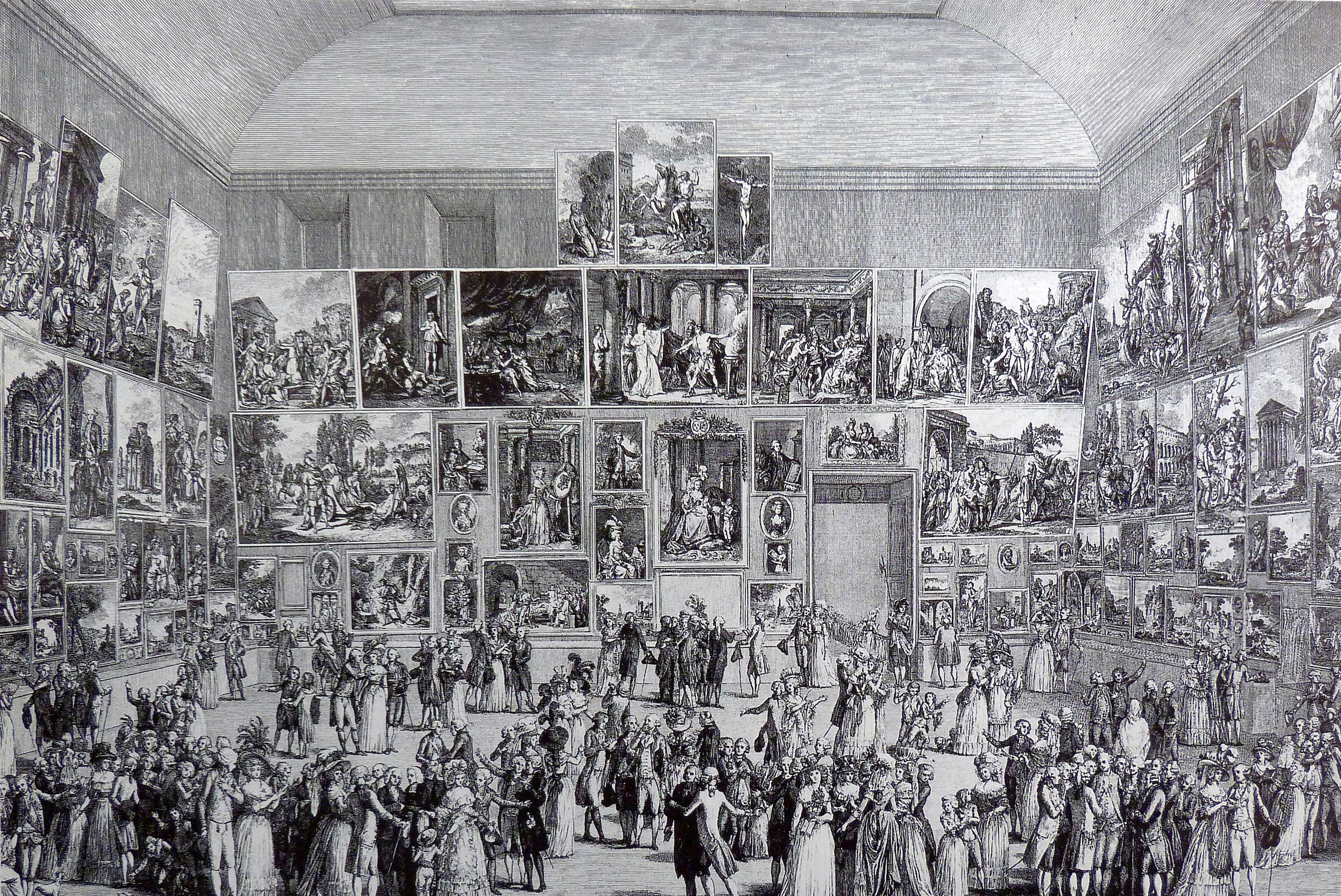
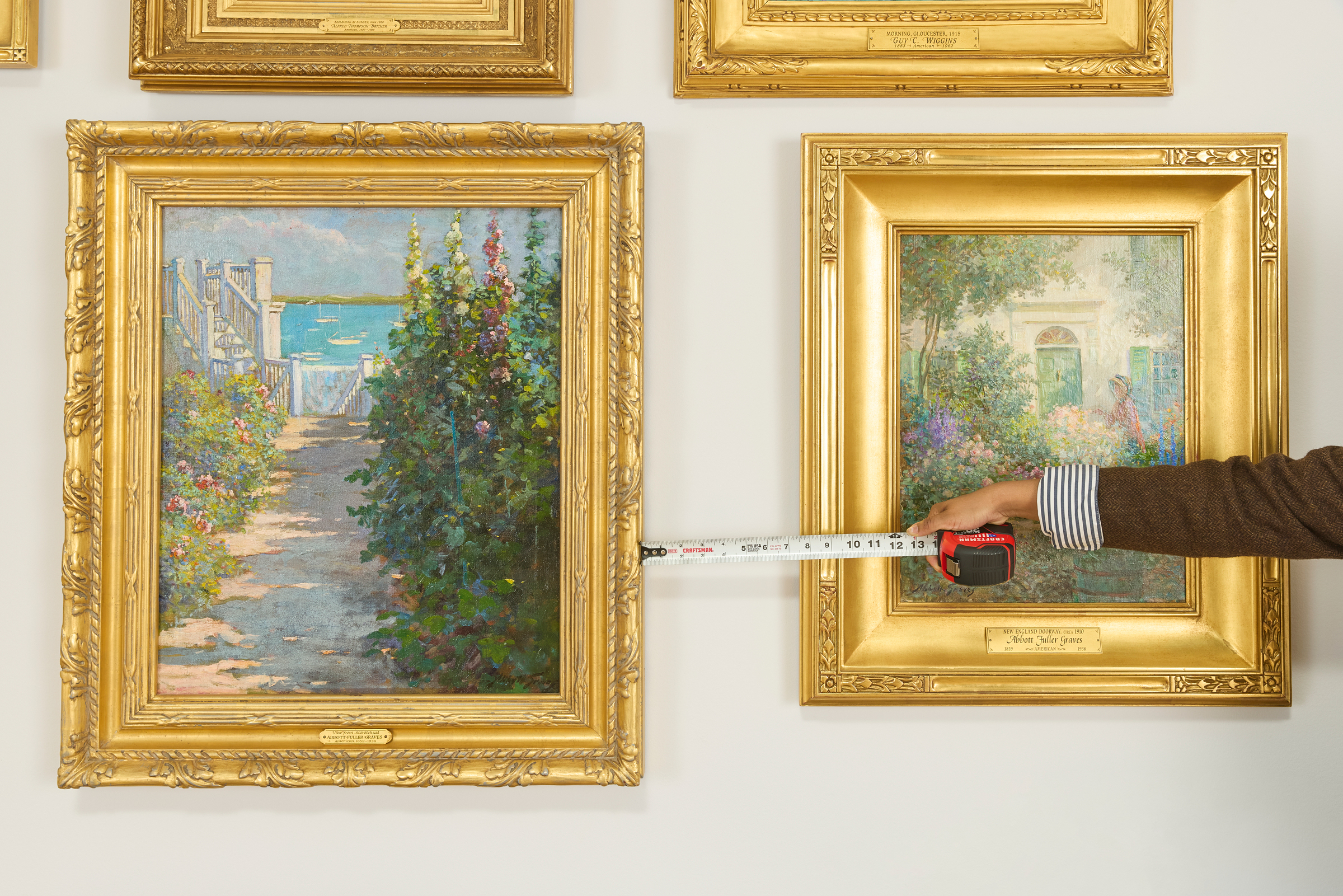
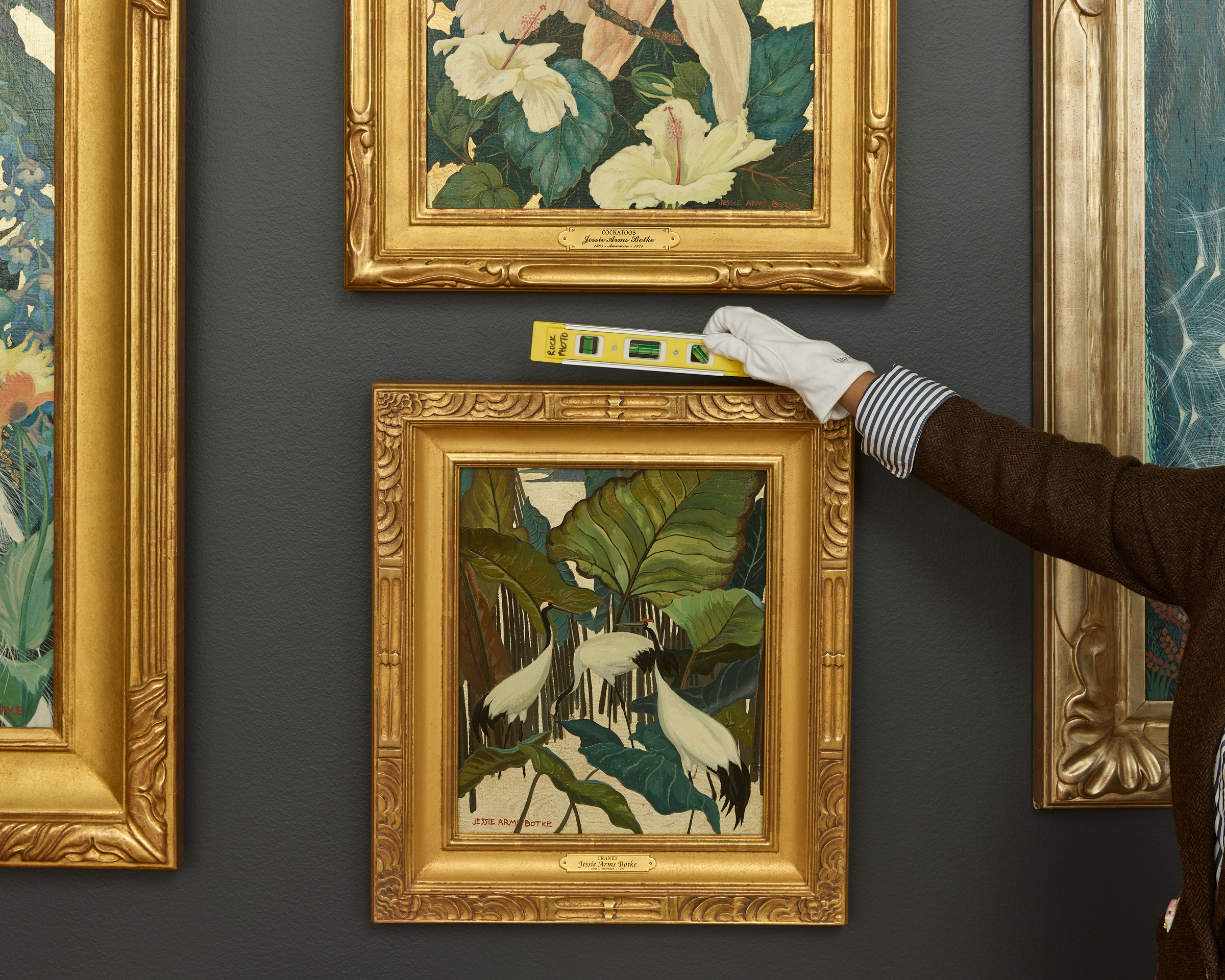
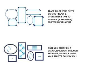
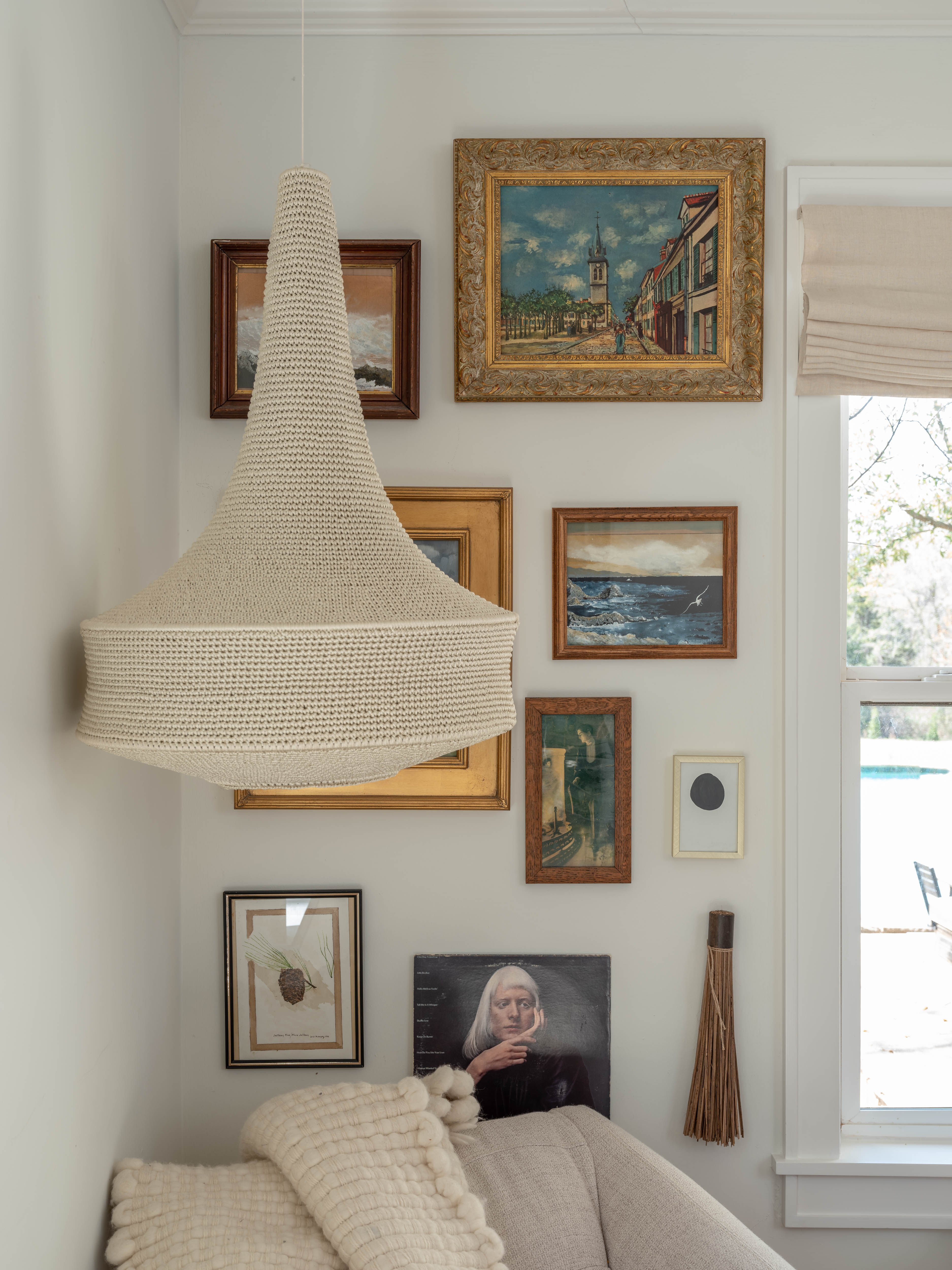
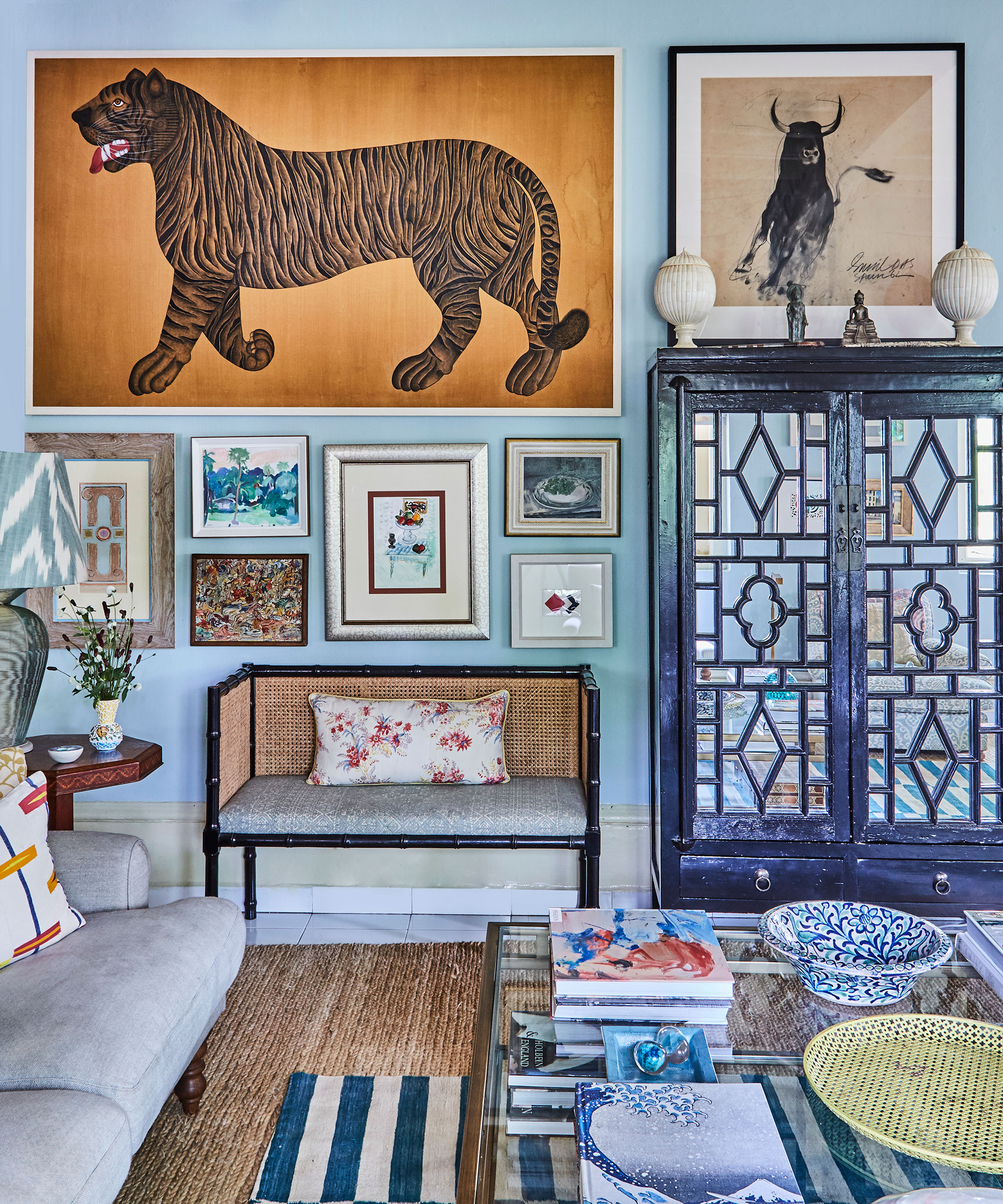
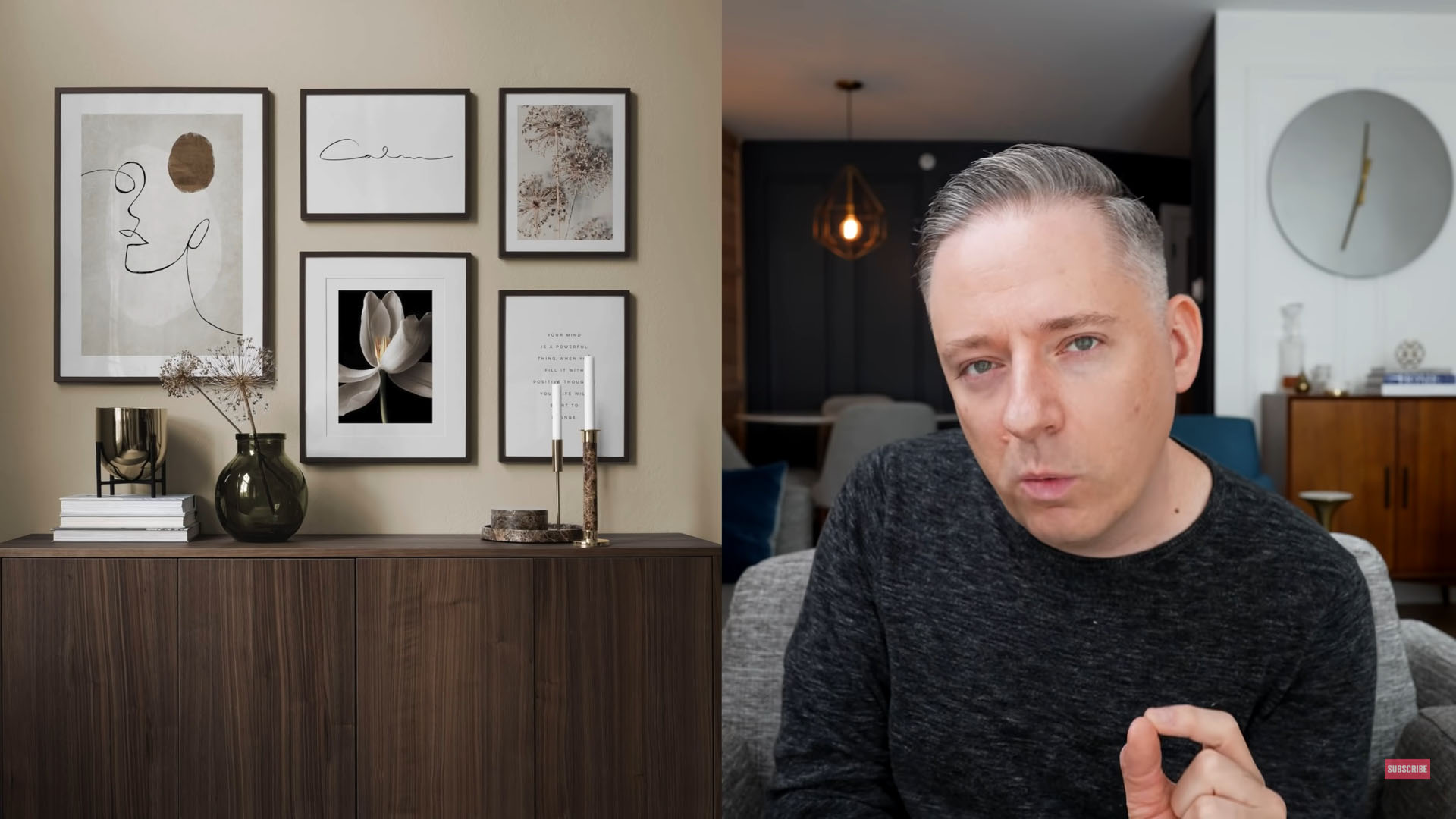
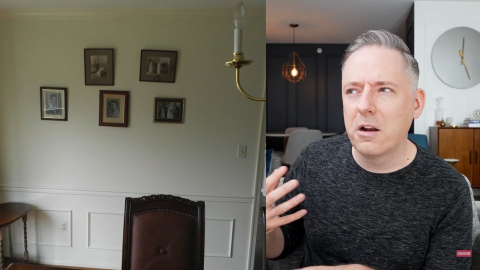
Beyond these core recommendations, Henderson also points out additional errors to circumvent. A prevalent mistake is selecting artwork that is disproportionately small for the room. To successfully incorporate smaller pieces, she suggests arranging them in a vertical stack to form a mini 'gallery wall,' thereby creating a more substantial visual impact. She further cautions against hanging art too closely together, as this can result in a cluttered appearance, unless such proximity is part of a highly intentional design scheme. Instead, she recommends leaving a reasonable amount of 'breathing room' between pieces when decorating a wall. While there is no universal measurement, the goal is to provide enough space to appreciate each item individually without creating excessive blank wall space. Following these guidelines helps achieve a serene and polished aesthetic, making the collected works shine and transforming the space into something akin to a well-curated museum, in the most appealing sense.
#EmilyHenderson #ArtHangingTips #InteriorDesign #HomeDecor #GalleryWall #ArtworkPlacement #ScaleAndProportion #DecoratingWithArt #EmilyHenderson #ArtHangingTips #InteriorDesign #HomeDecor #GalleryWall #ArtworkPlacement #ScaleAndProportion #DecoratingWithArt
0 opmerkingen in totaal
 Nog geen opmerkingen
Dit vindt u mogelijk ook leuk
Emily Henderson just shared a simple trick for hanging art – giving your gallery wall a refresh has never been easier
Even newbies can master this popular home-decor trend
How to create a gallery wall in your home
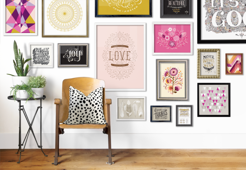
How to build a gallery wall for your home

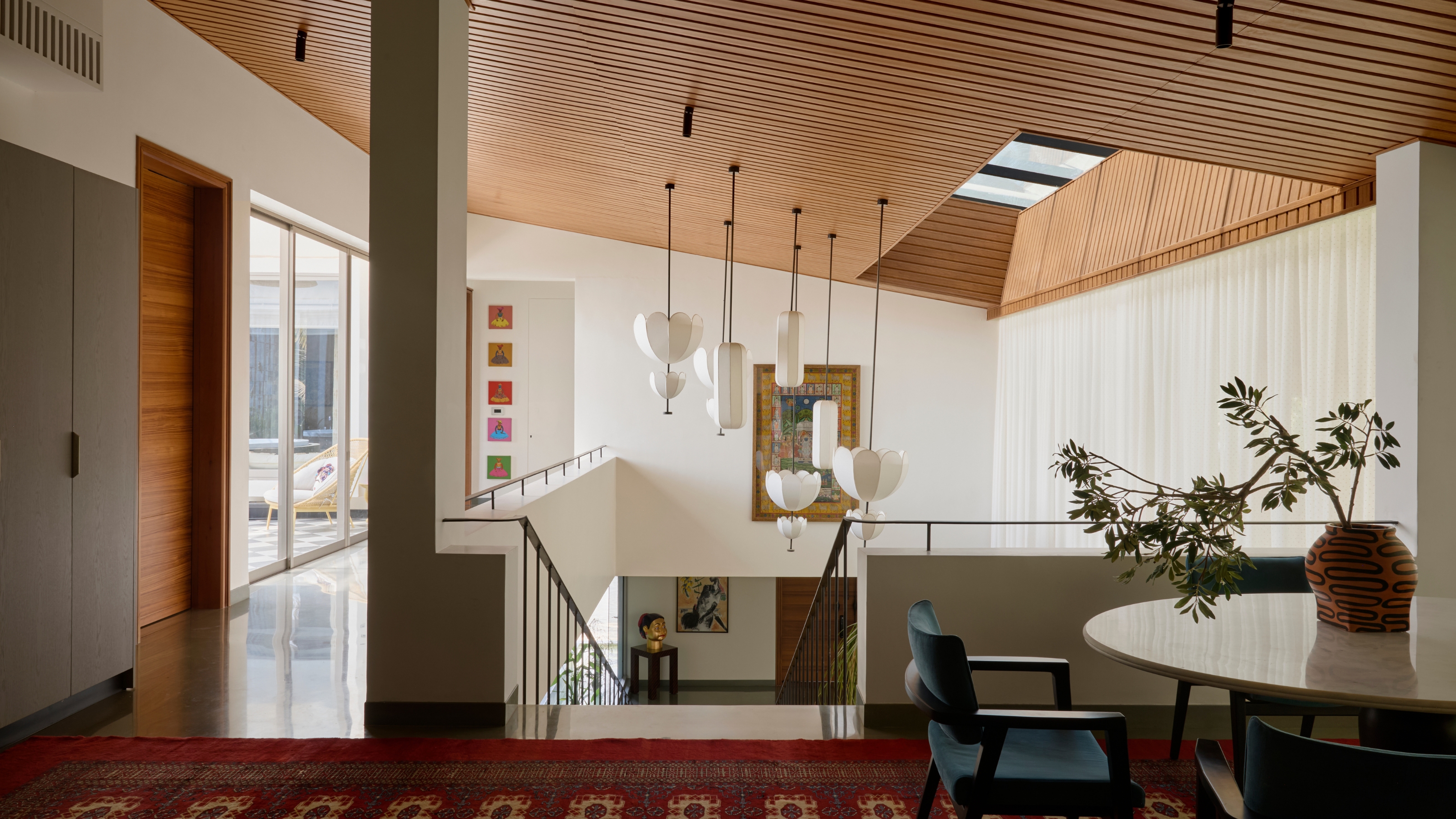
There's Hanging Art, and Then There's Hanging Art Like an Interior Designer — Here's How to Do the Latter

Yes, You Can Hang Art Like a Pro | Reviews by Wirecutter
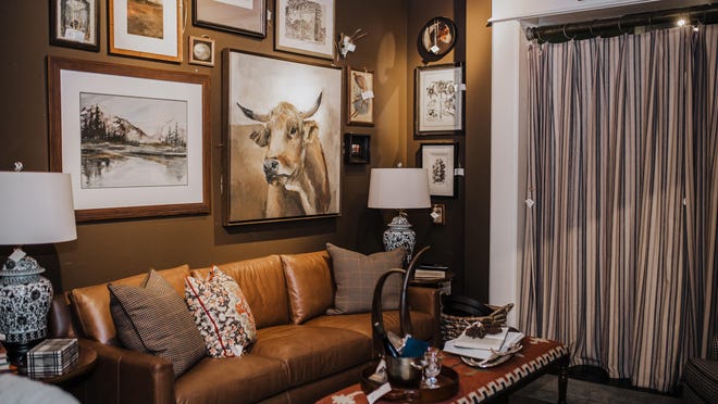
Style at Home: Creating the perfect gallery wall

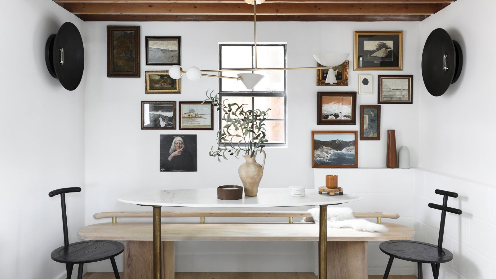
5 common gallery wall mistakes designers warn to always avoid – to create the chicest of displays
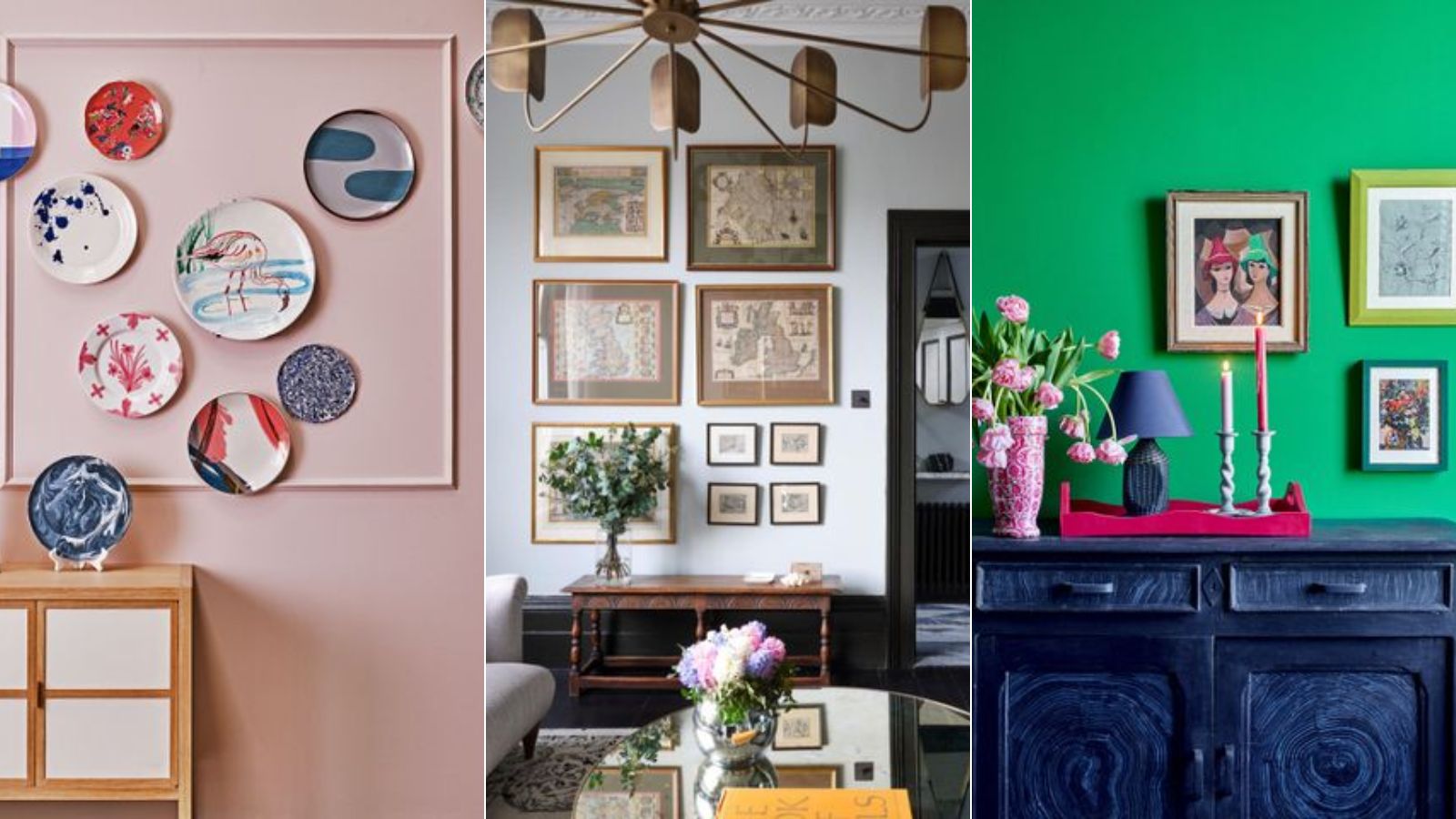
7 DIY tips for how to hang a gallery wall from experts
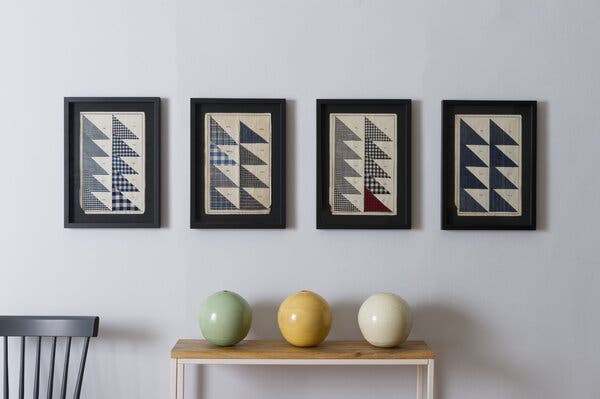
The Stress-Free Way to Hang Art (Published 2021)

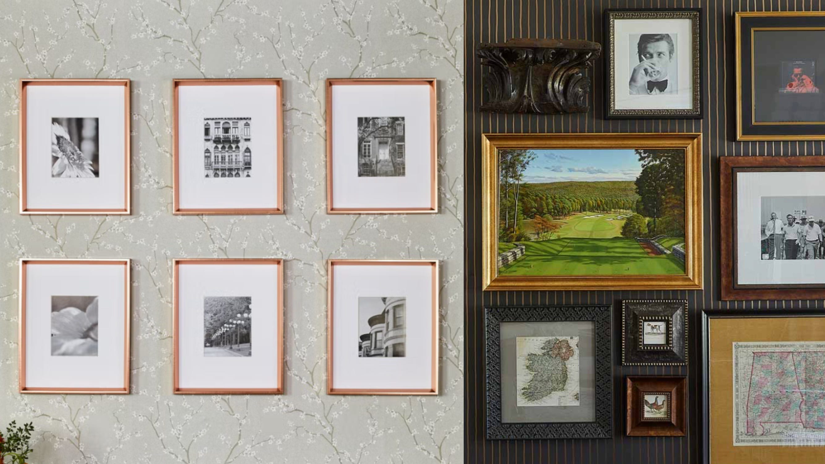
Matching or Mismatched Gallery Wall? Big-Time Designers Have a VERY SPECIFIC Preference


I'm an interior designer - how to create a gallery wall without it looking tacky - people always make the same mistakes

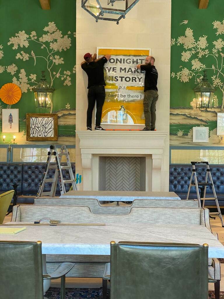
Art Hanging Tips From an Expert
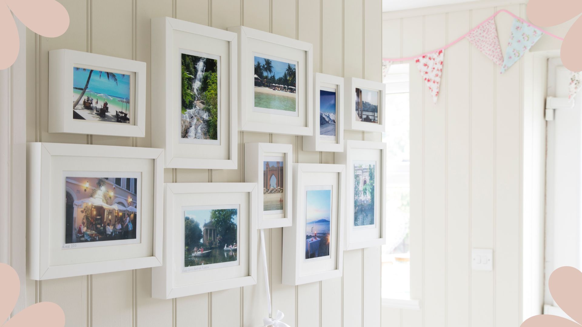
Kelly Hoppen reveals her foolproof trick for achieving perfect gallery wall placement every time

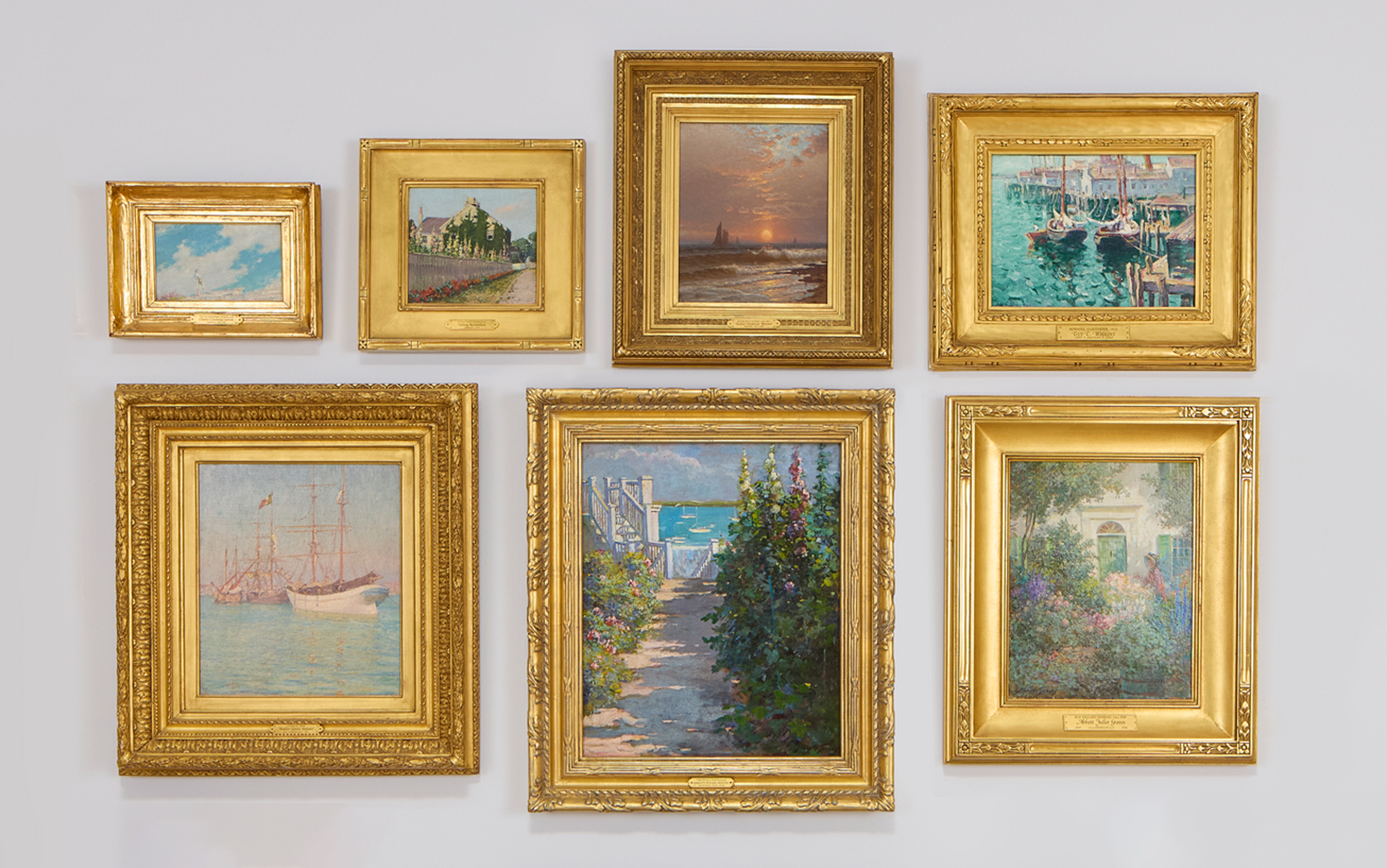
Hanging art salon style: everything you need to know

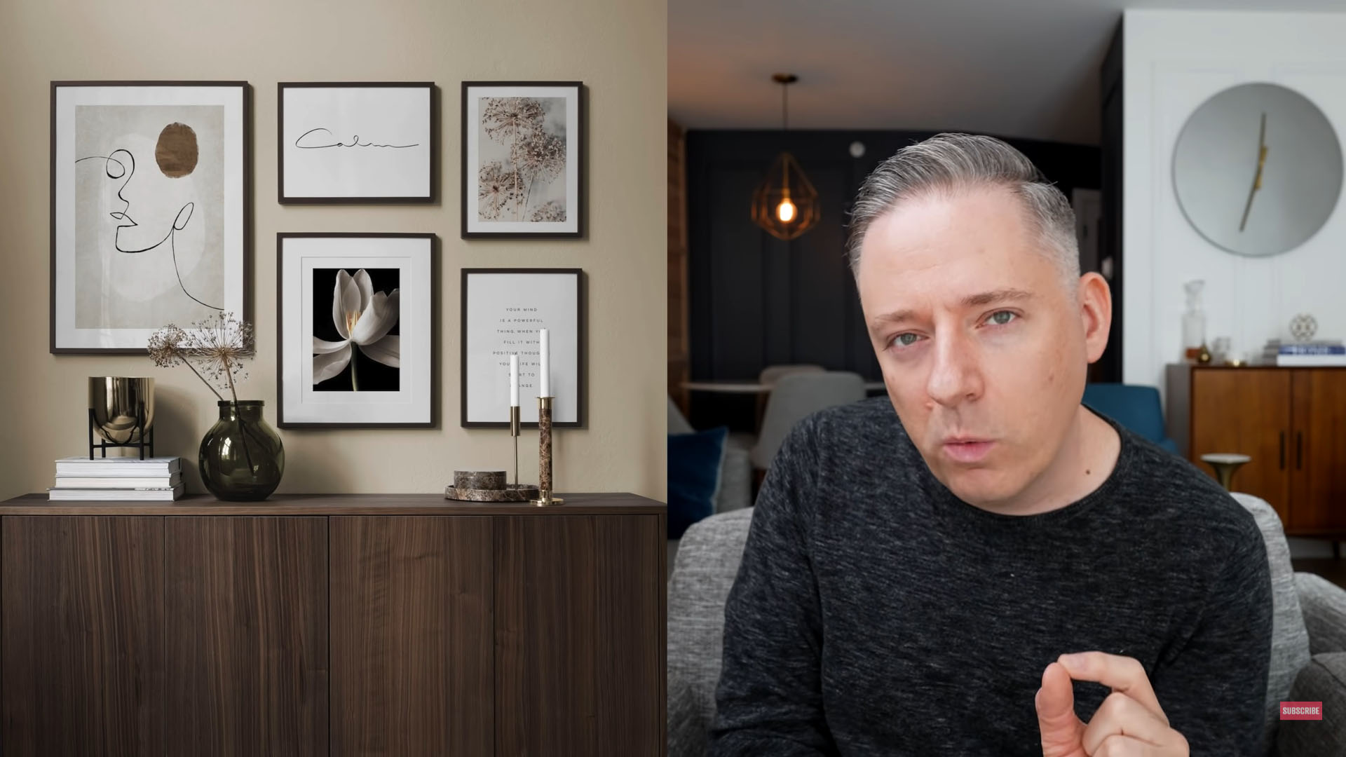
I'm an interior designer - how to create a gallery wall without it looking tacky - people always make the same mistakes

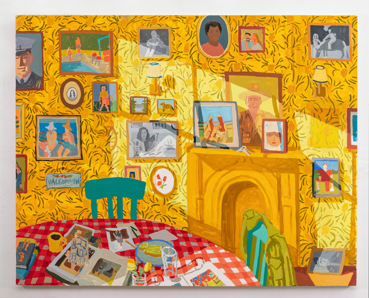
How to Hang an Art Collection Like an Expert
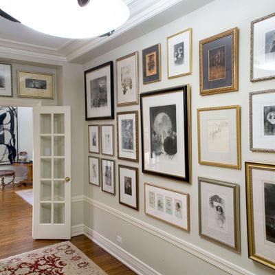
How to Hang Pictures, Mirrors, and Plates, According to an Expert
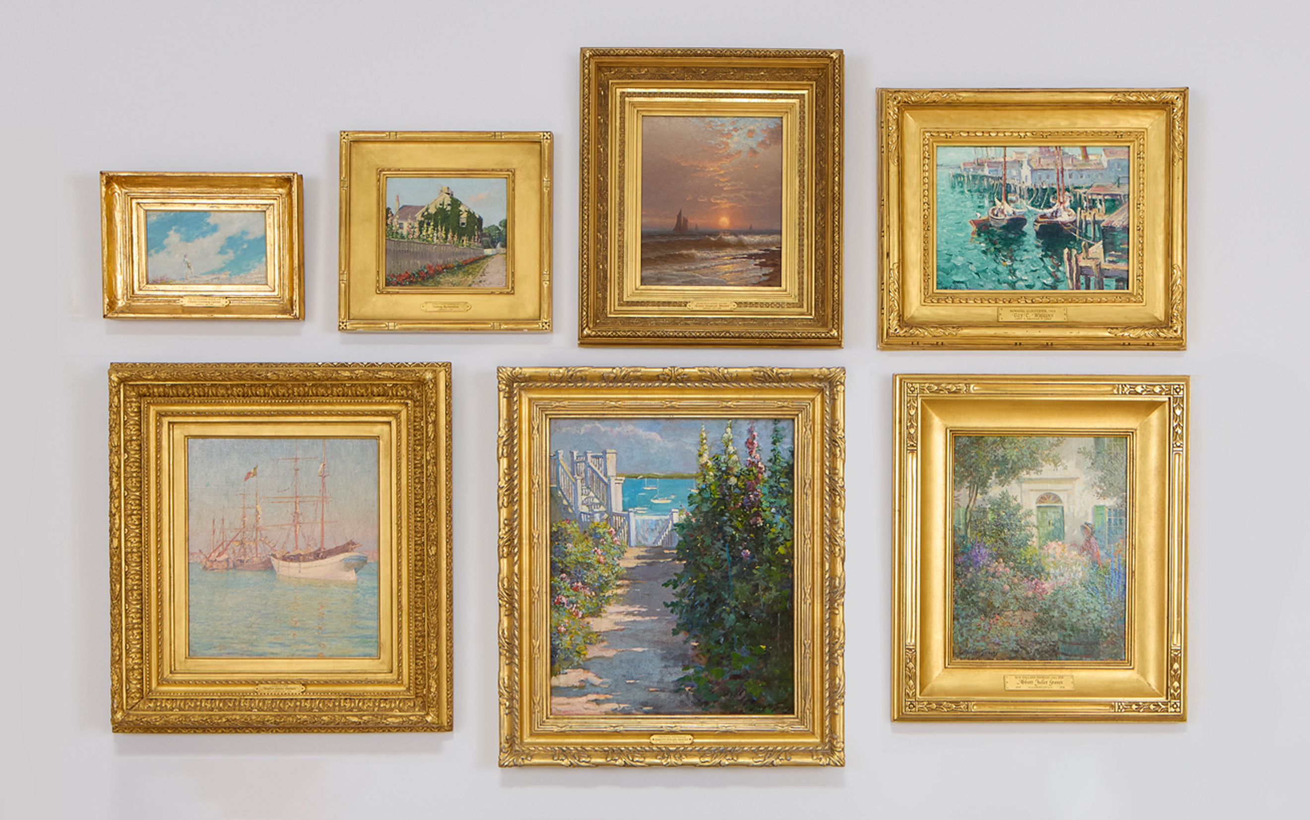
Hanging art salon style: everything you need to know
Hanging A Stunning Gallery Wall, Demystified