


1/4

The Neutral Palette: Colors of Japandi Design 🎨
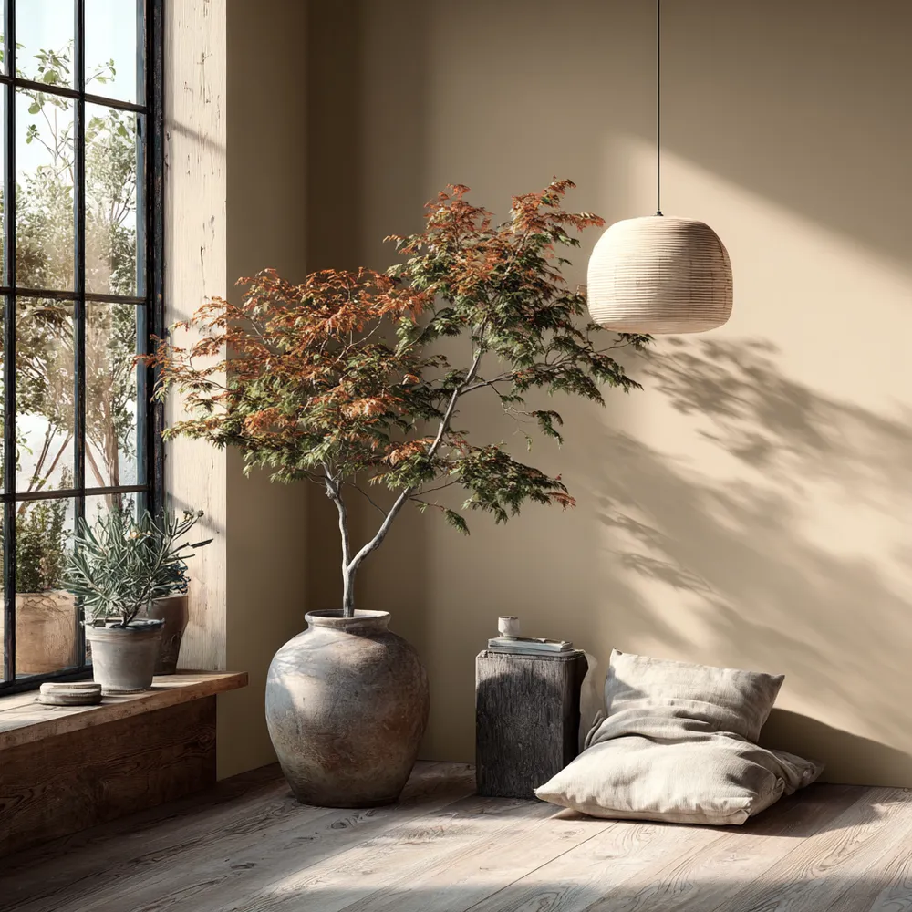
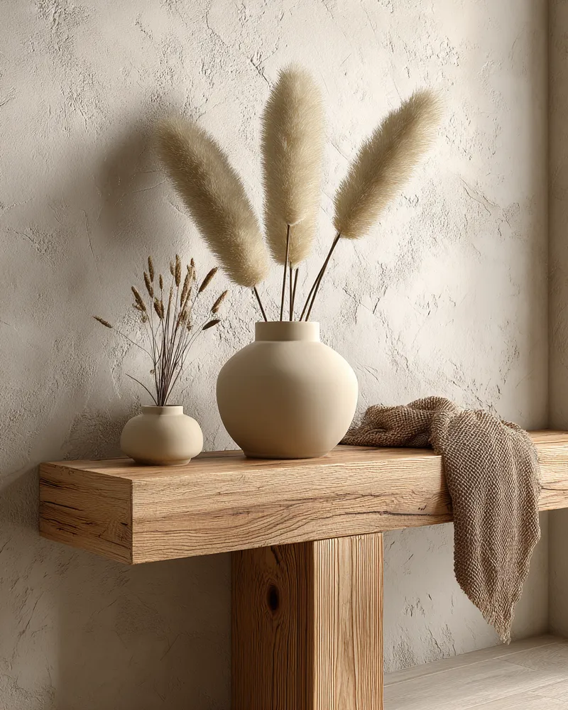
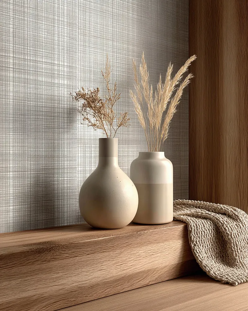
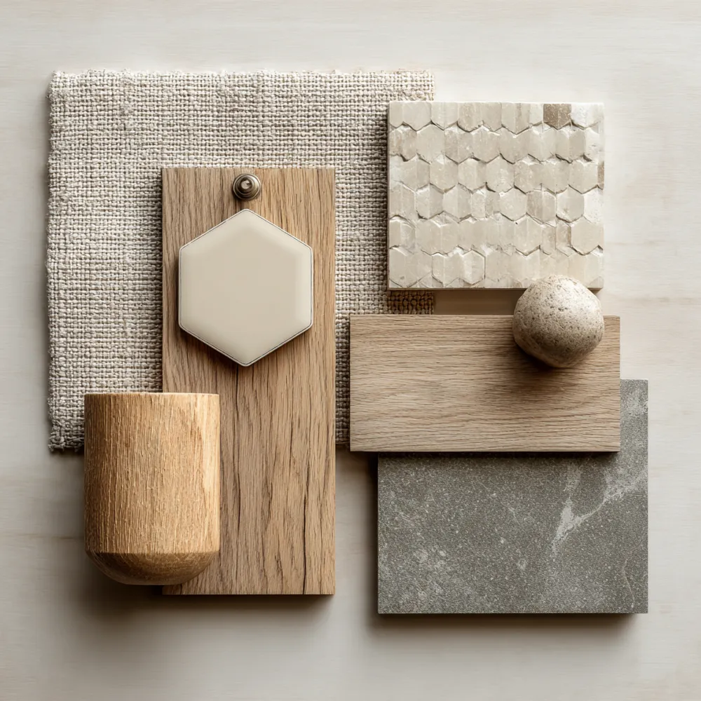
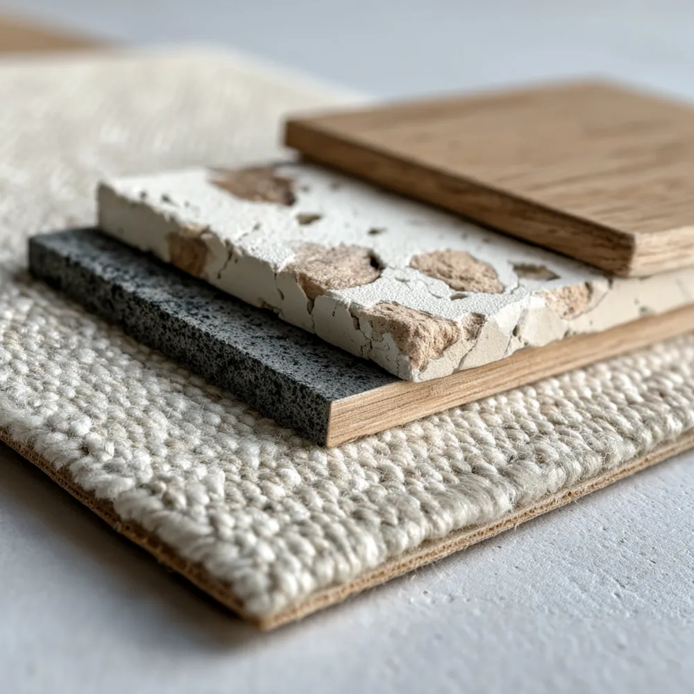
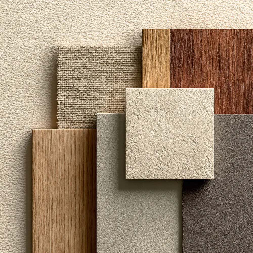
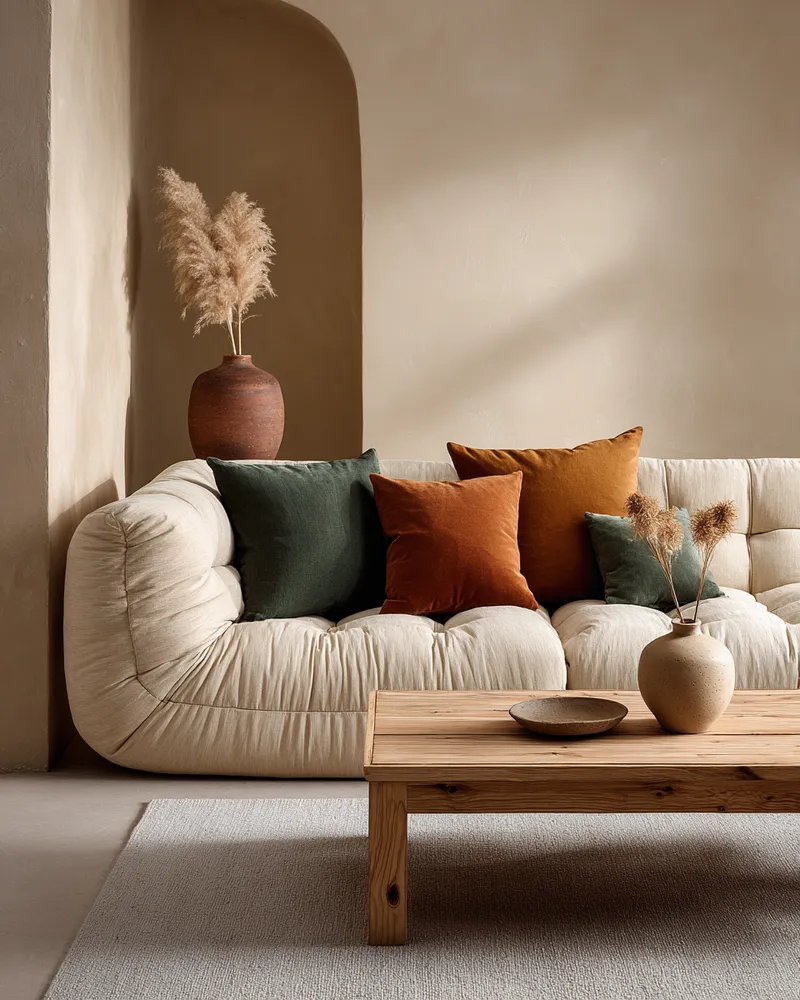
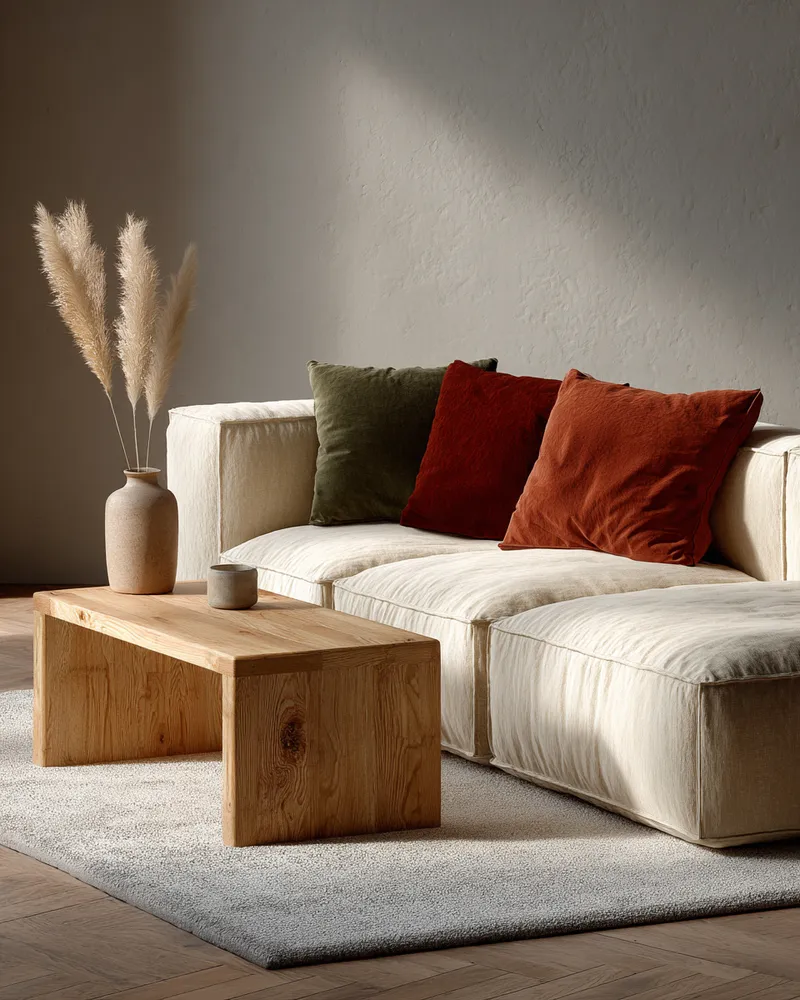
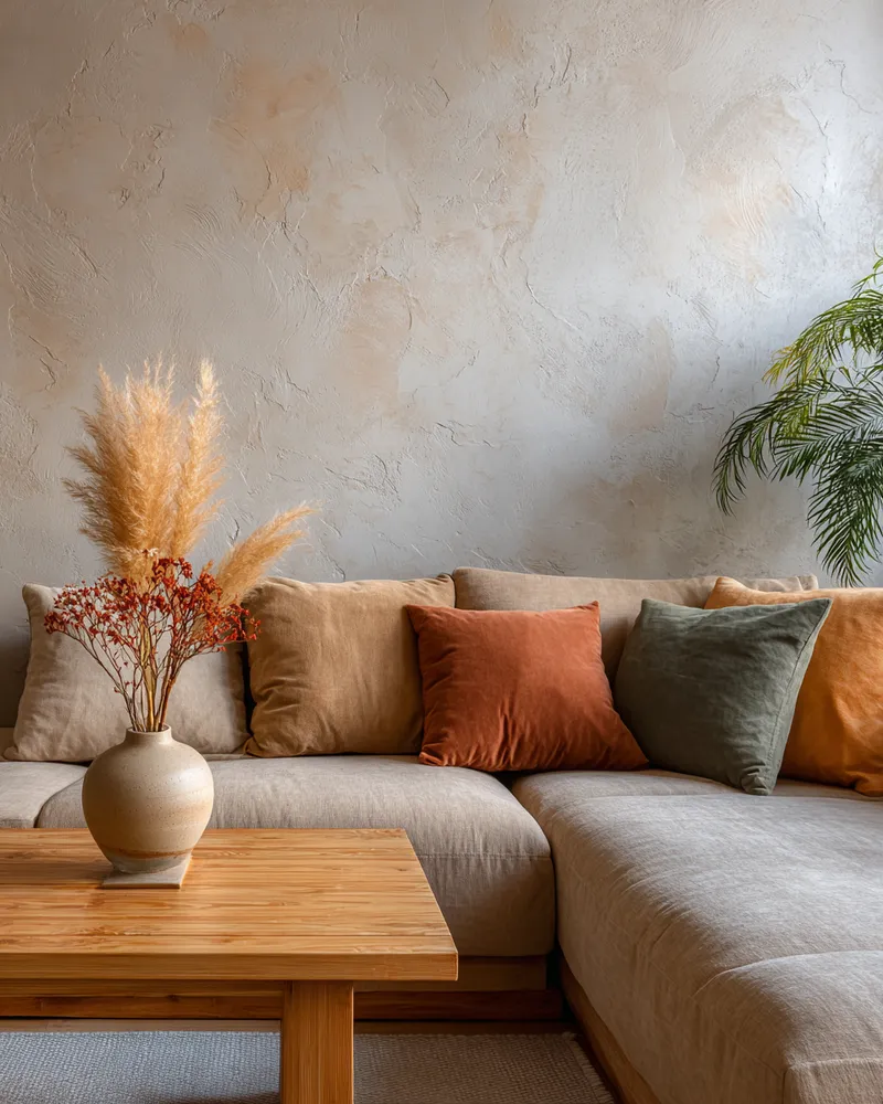
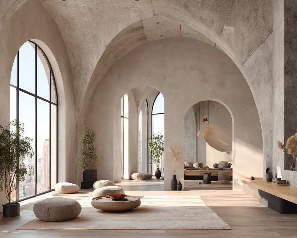
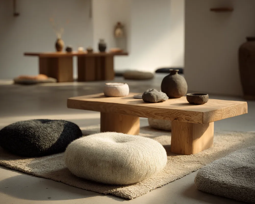
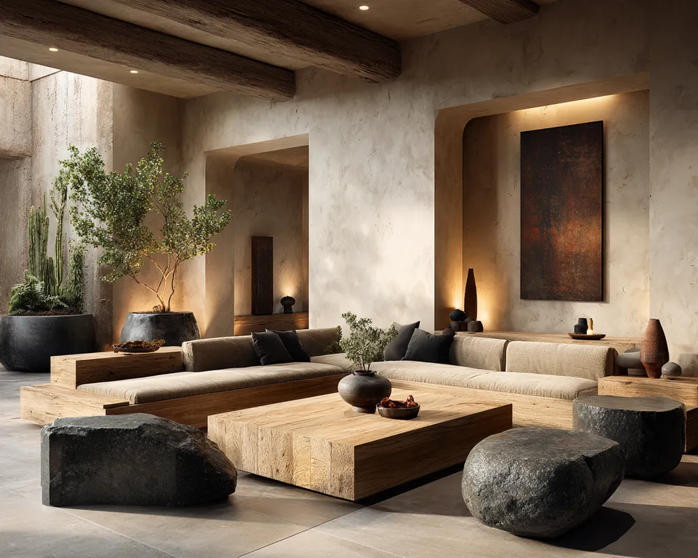
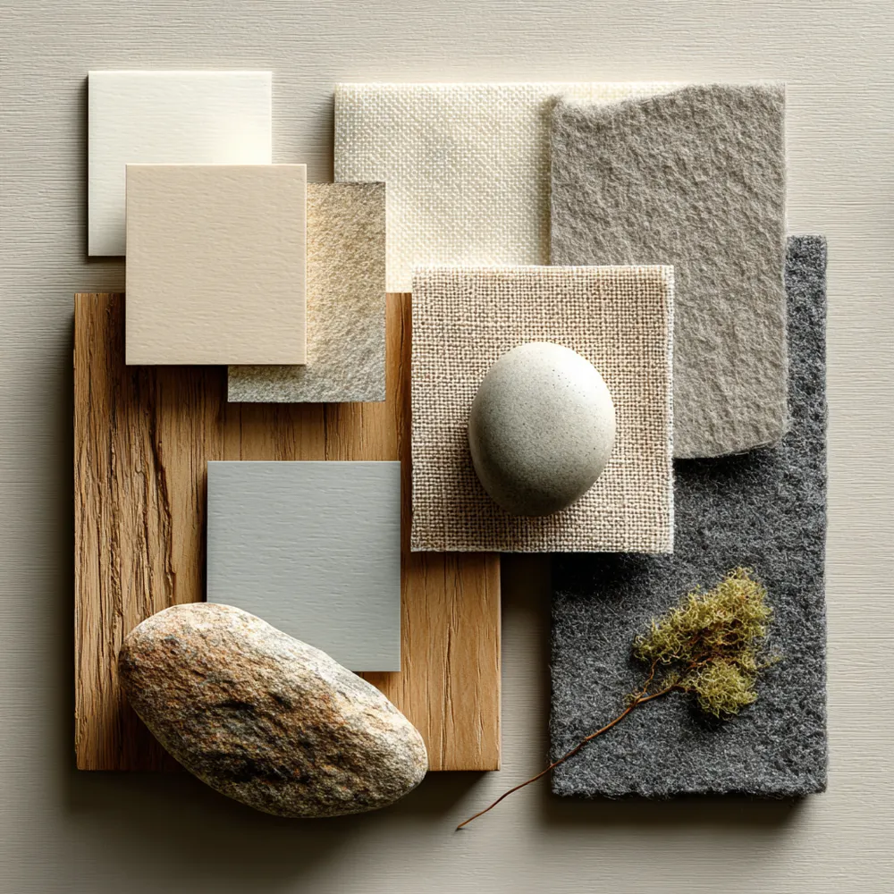
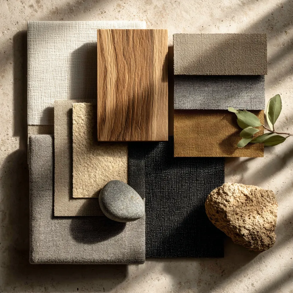
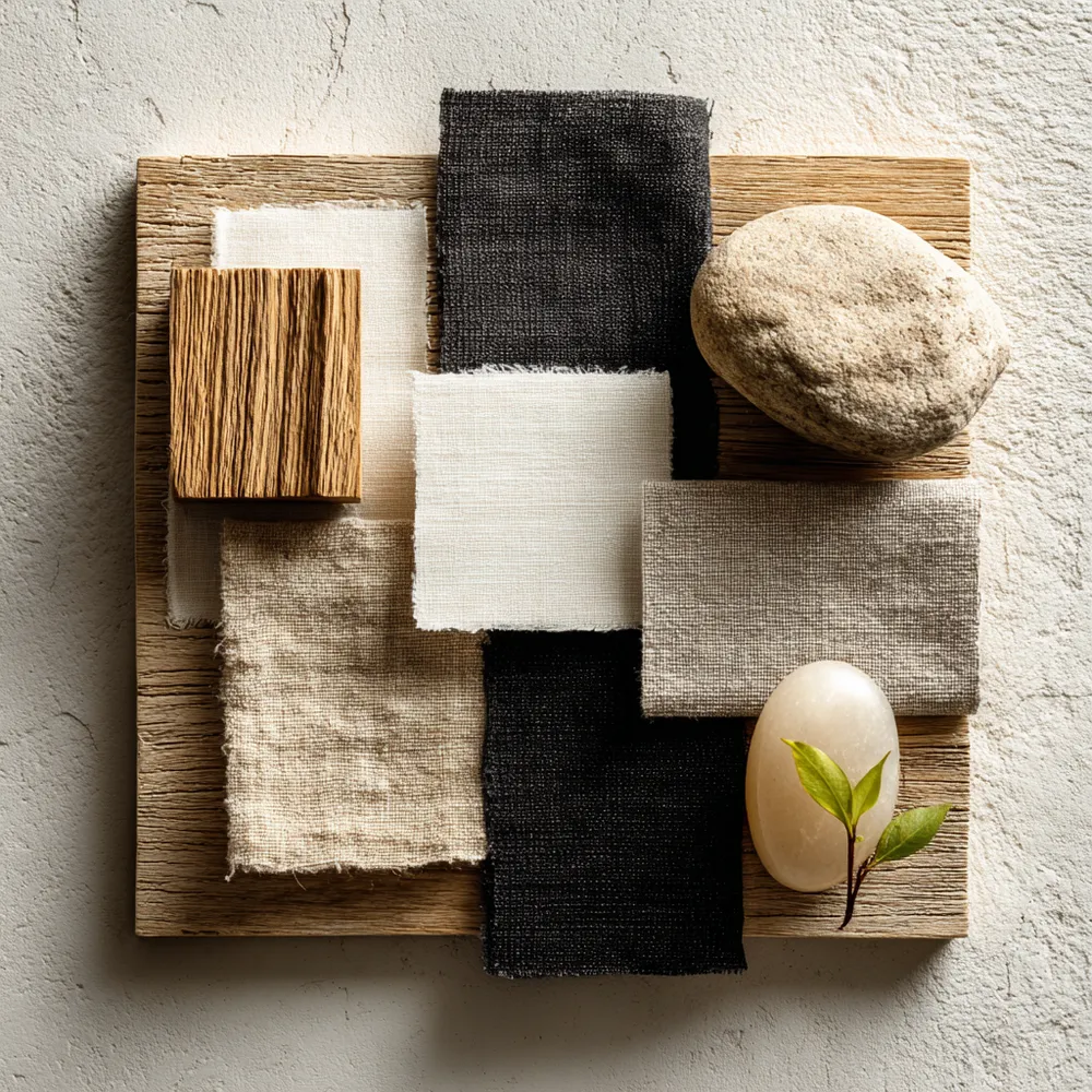
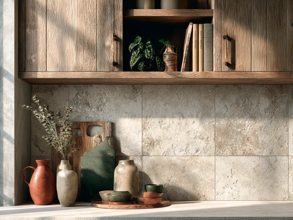
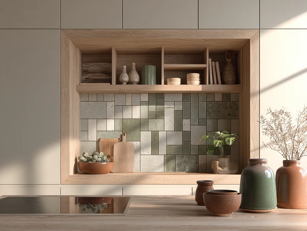
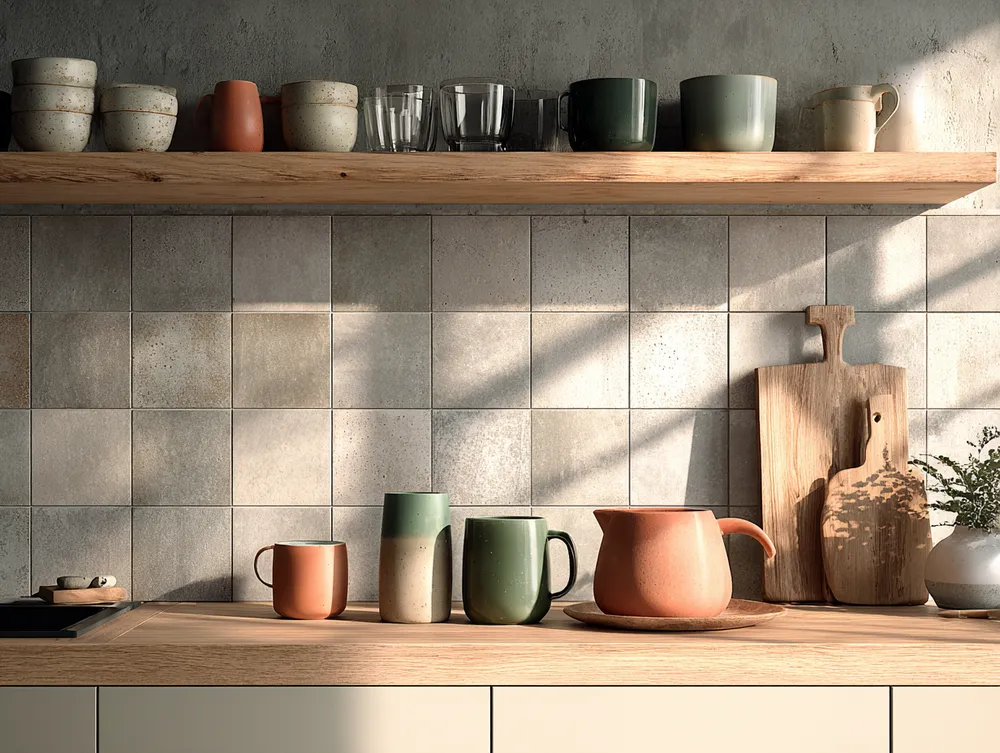
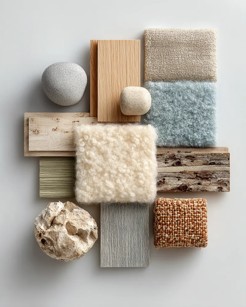
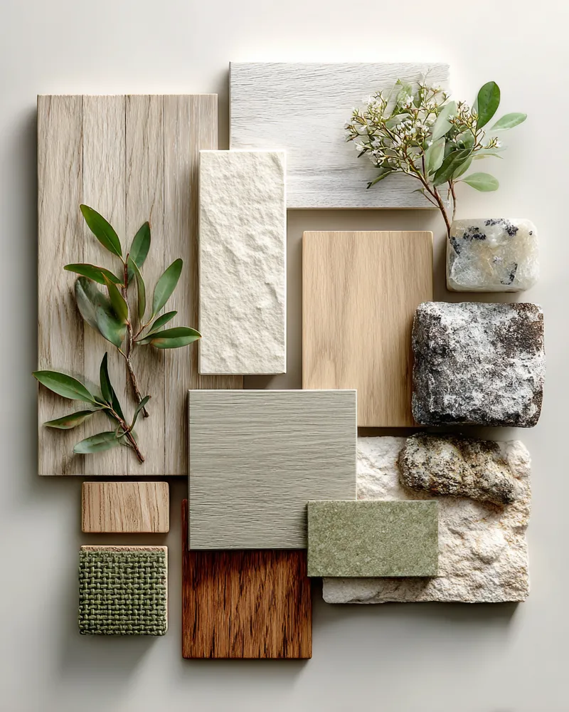
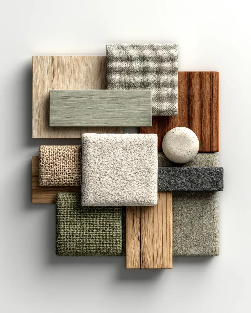
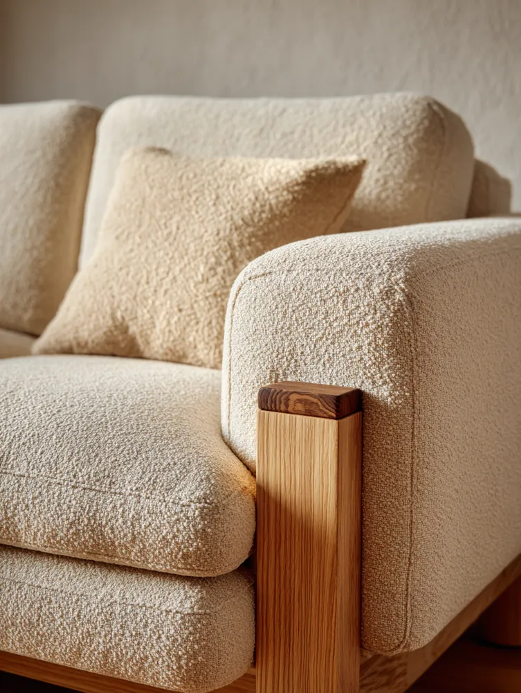
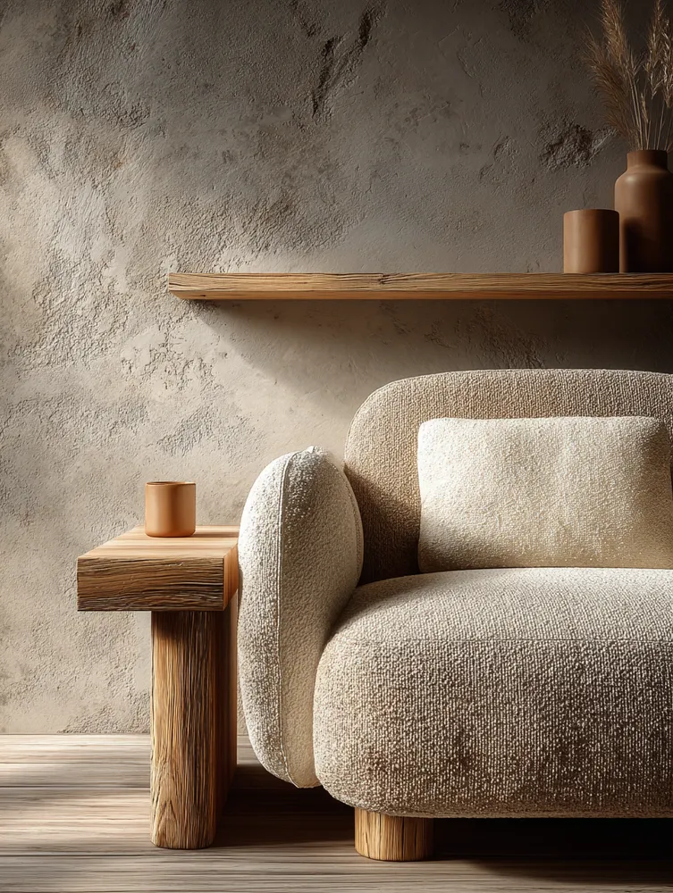
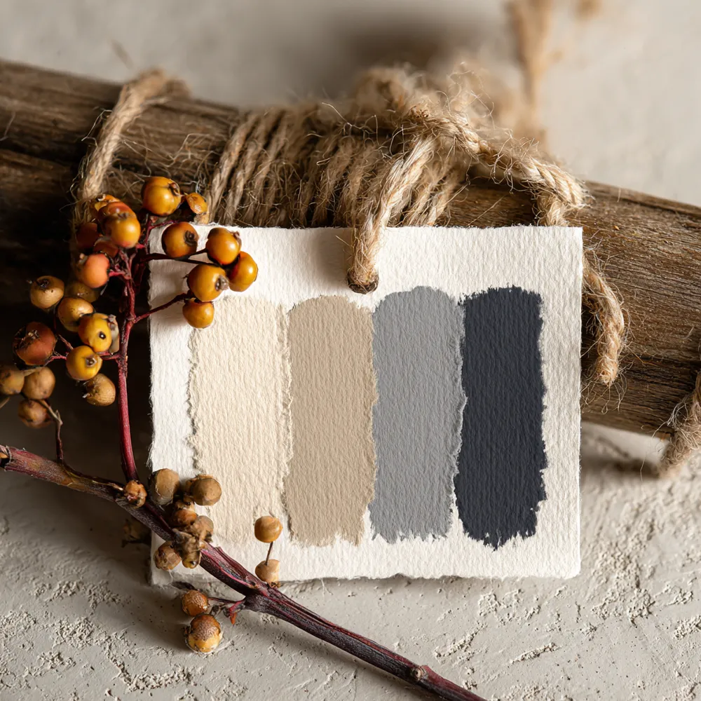
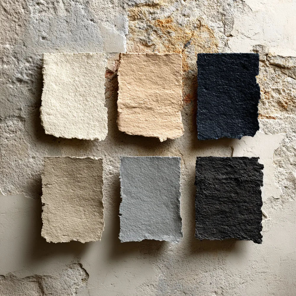
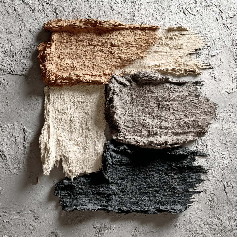
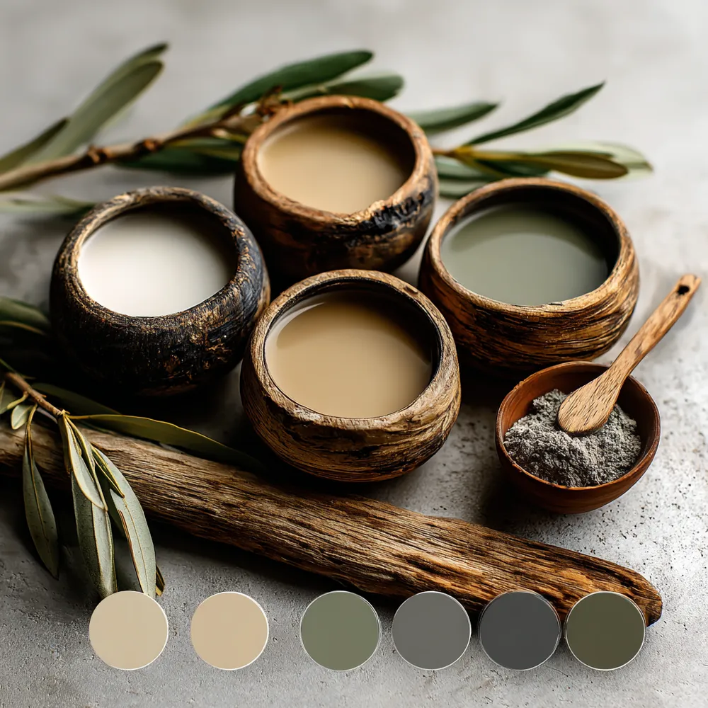
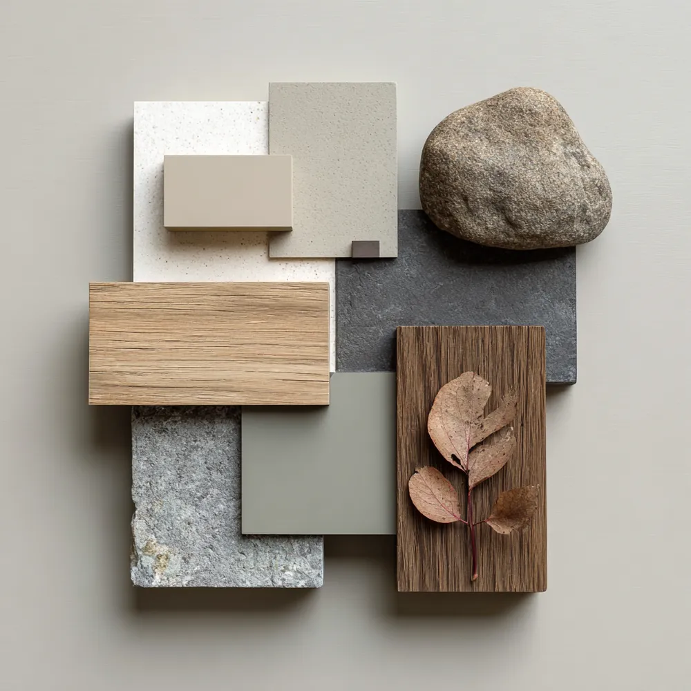
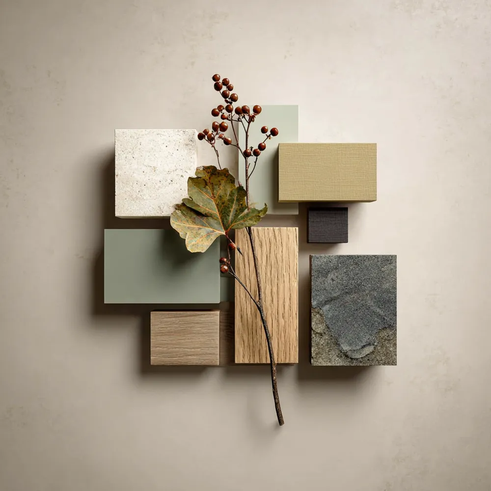
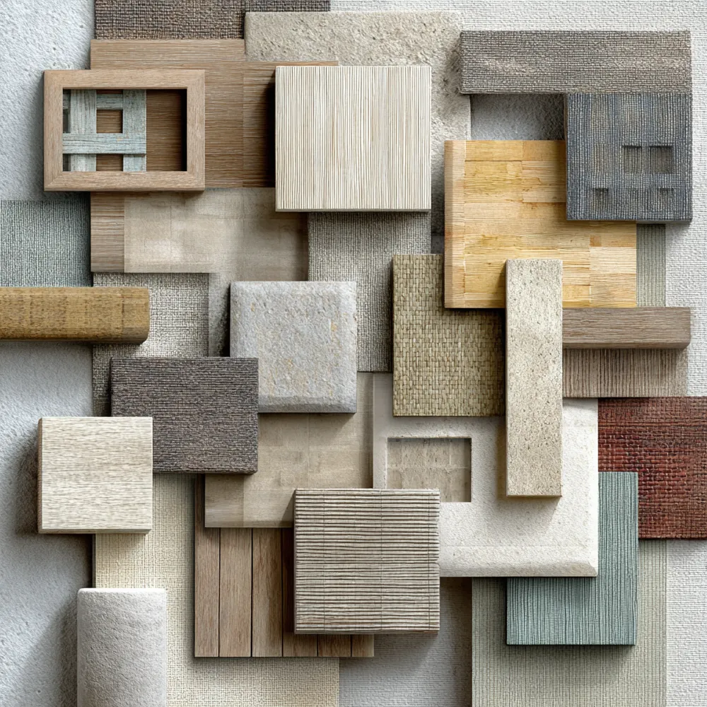
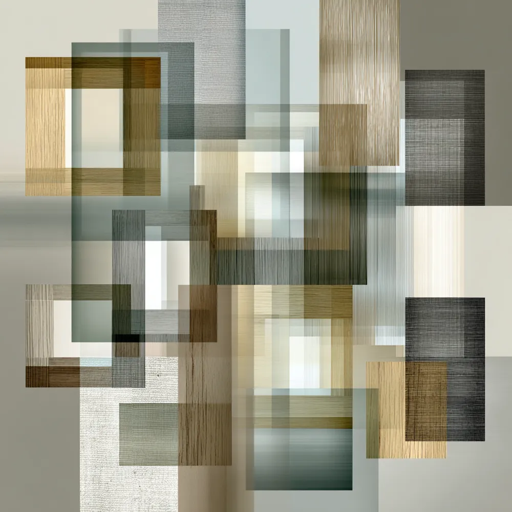
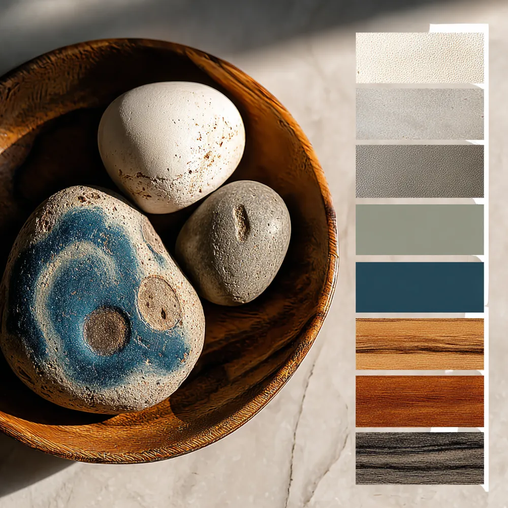
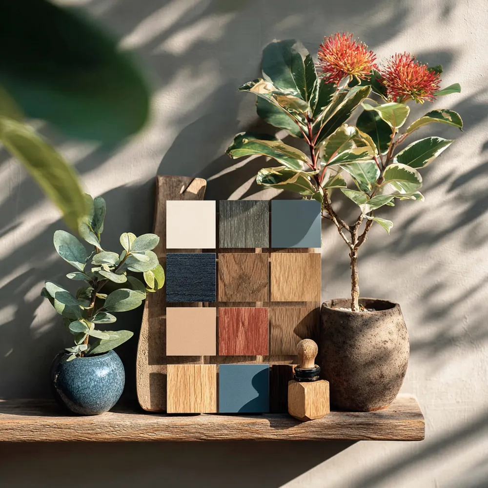
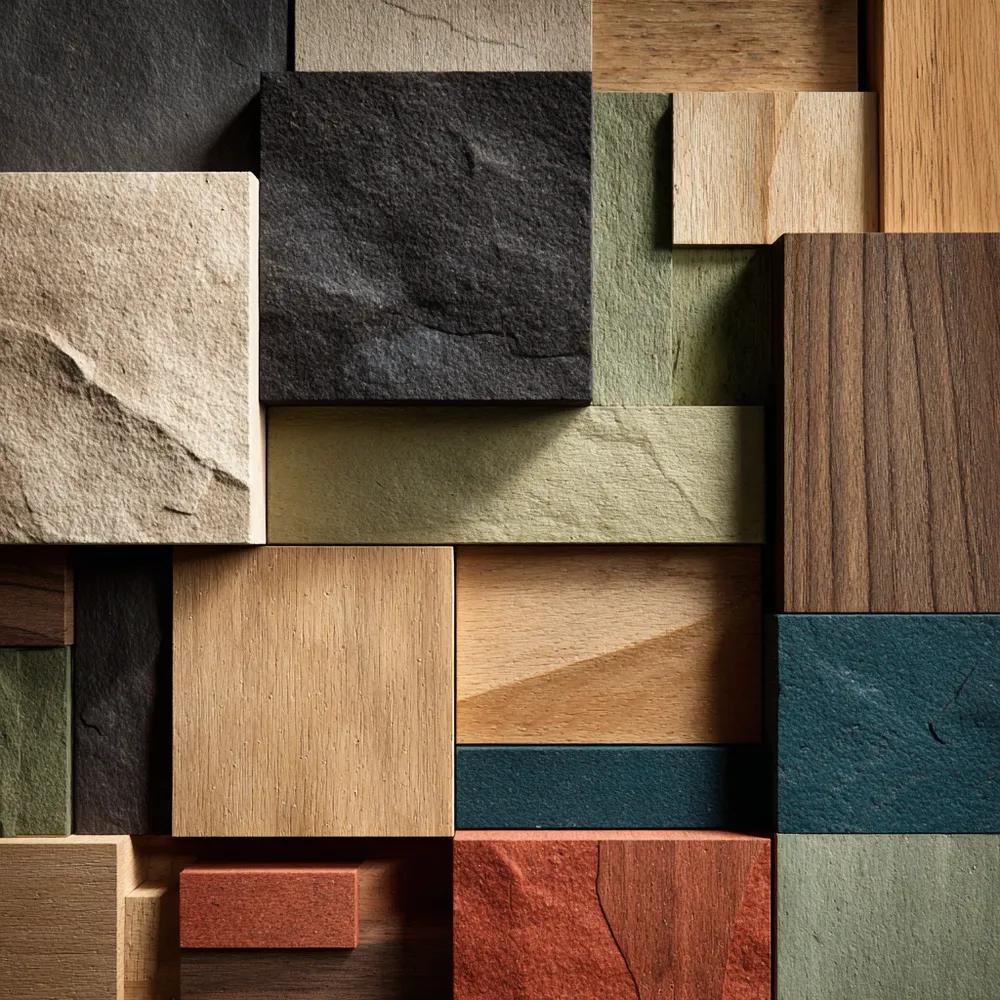
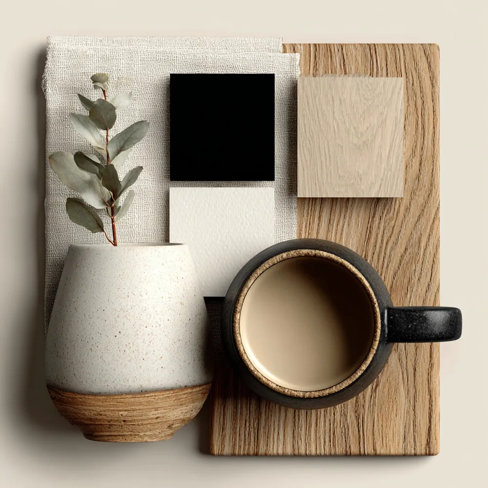
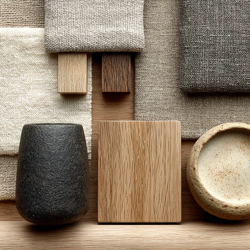
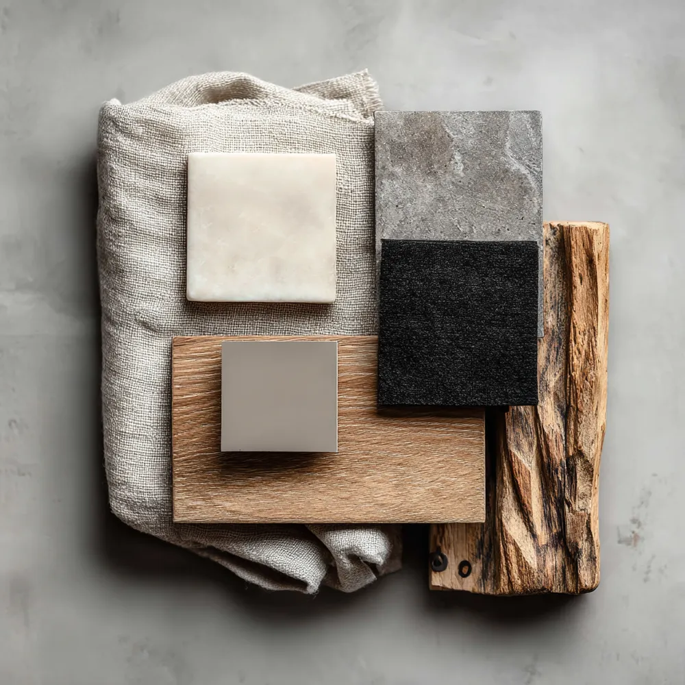
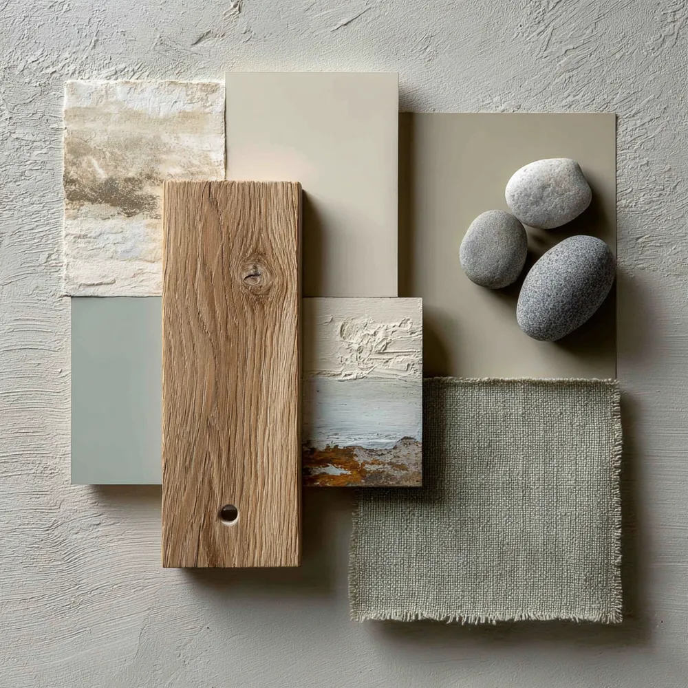
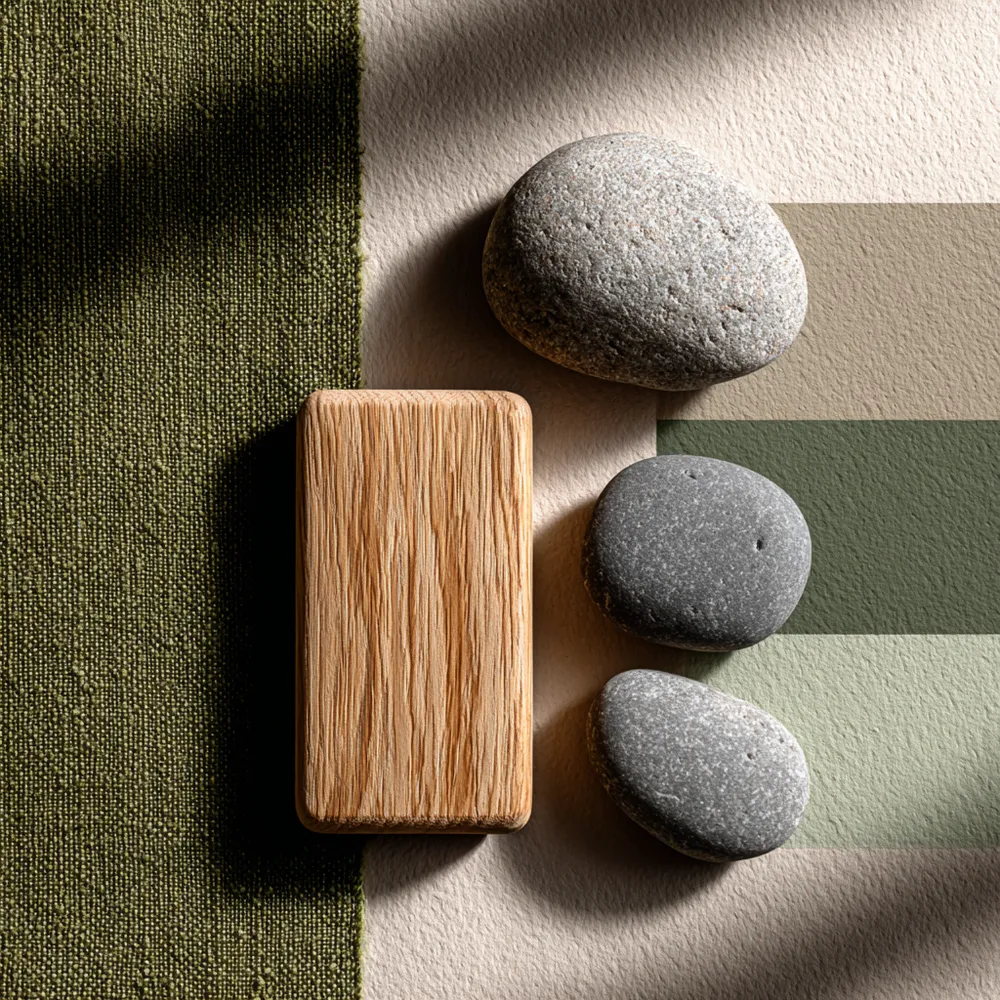
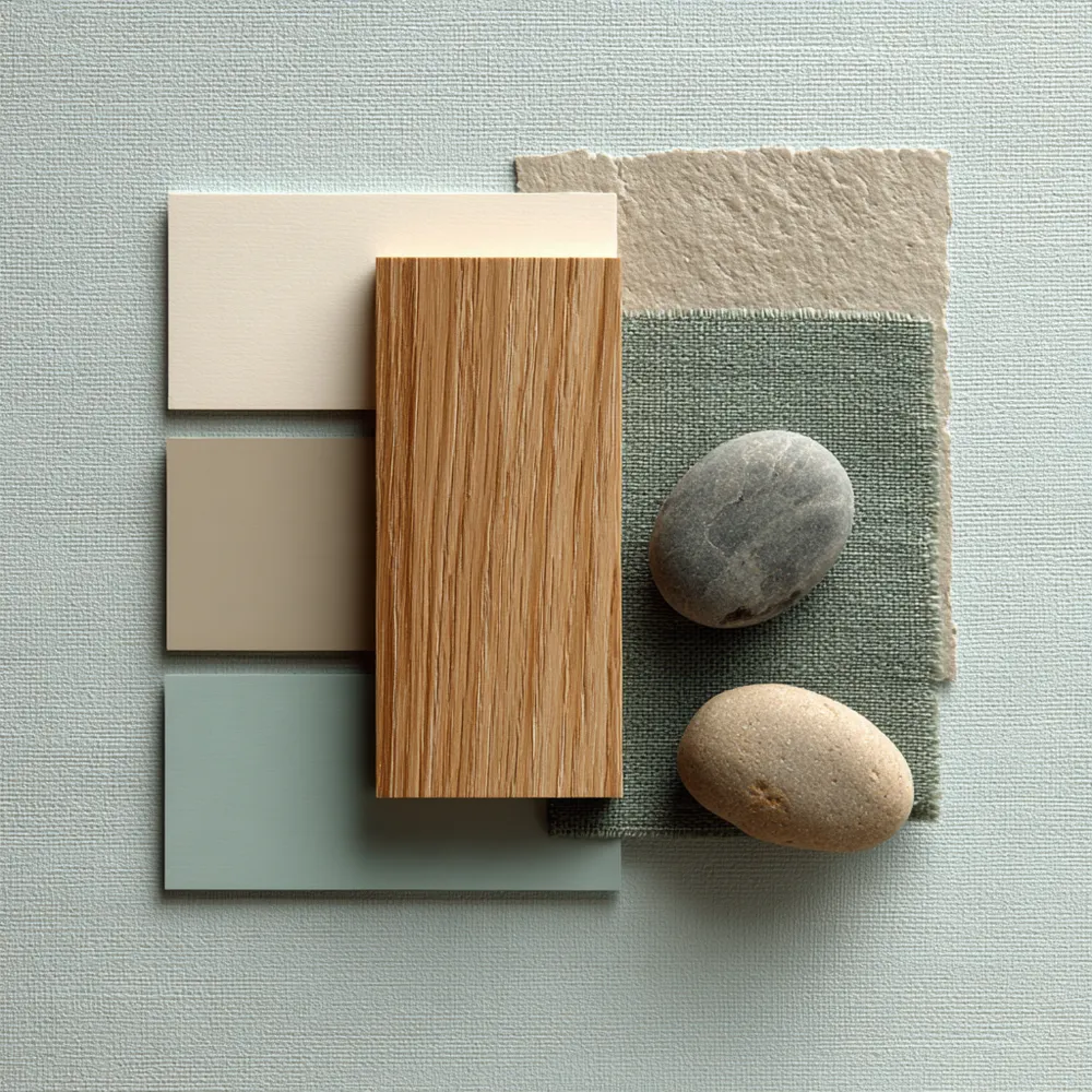
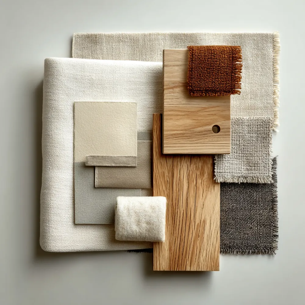
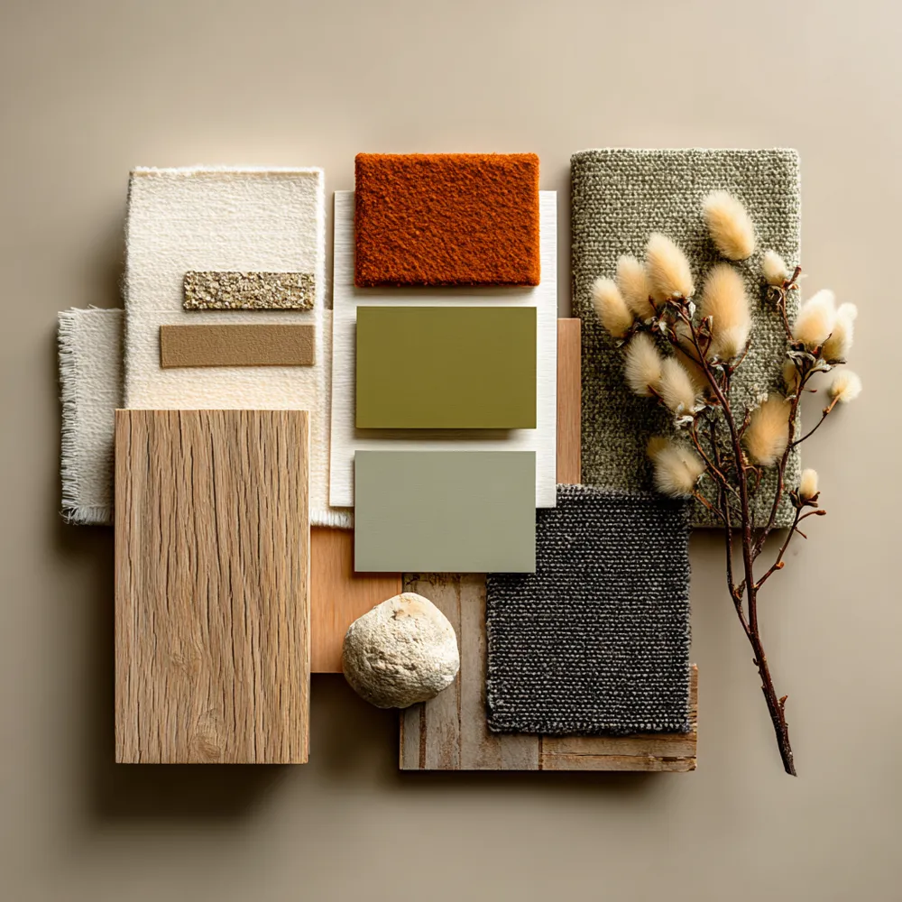
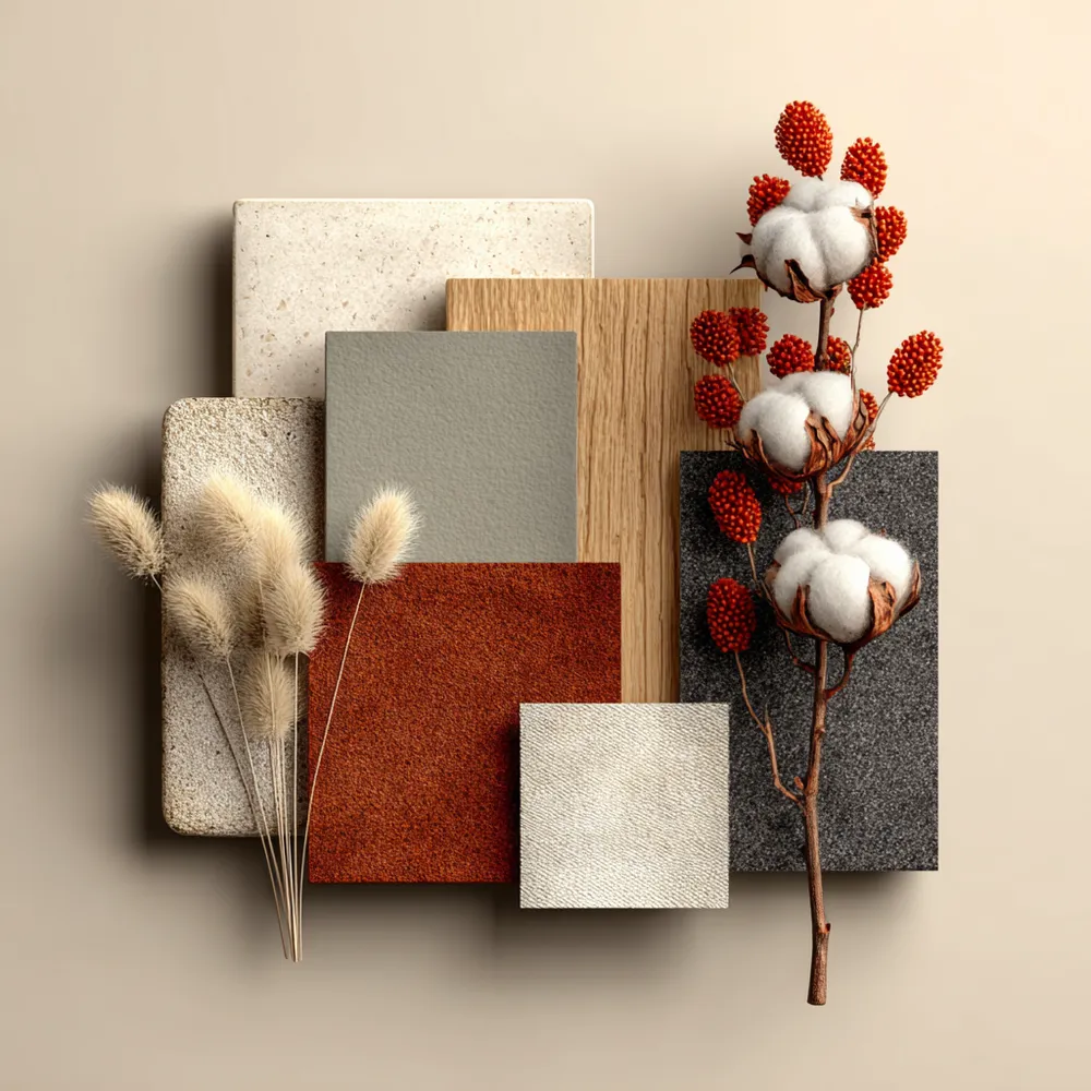
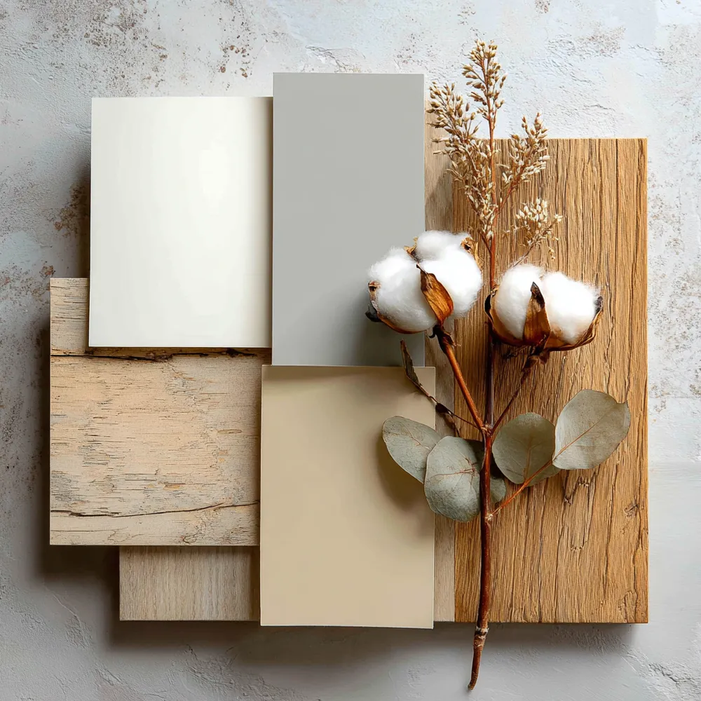
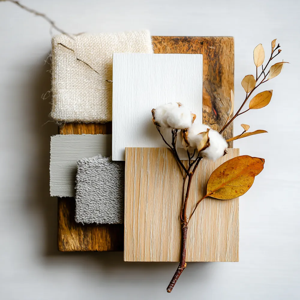
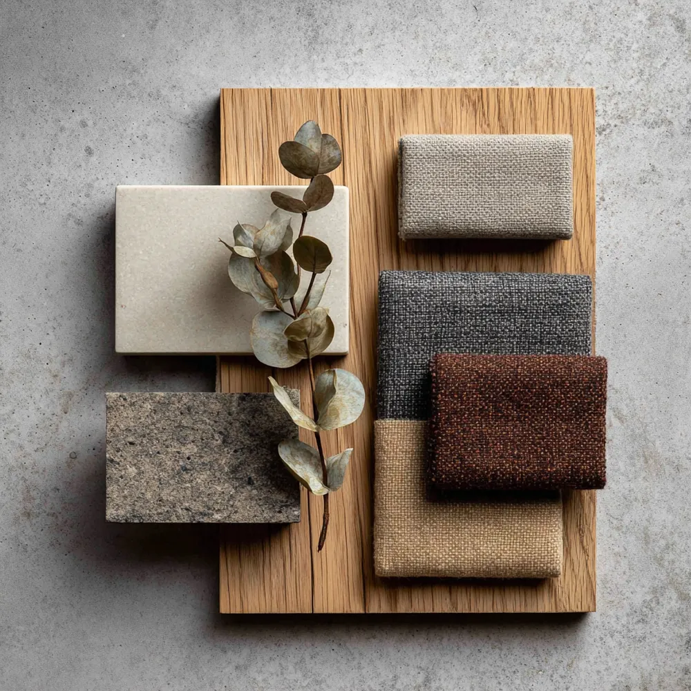
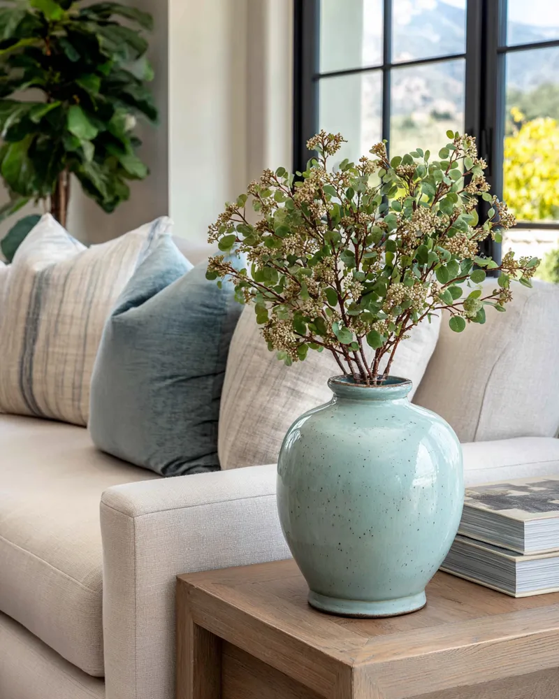
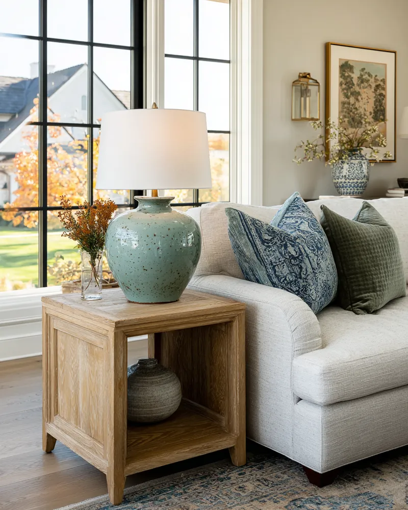
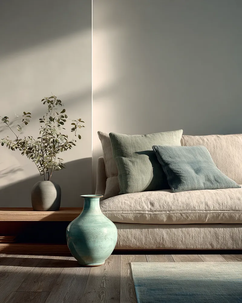
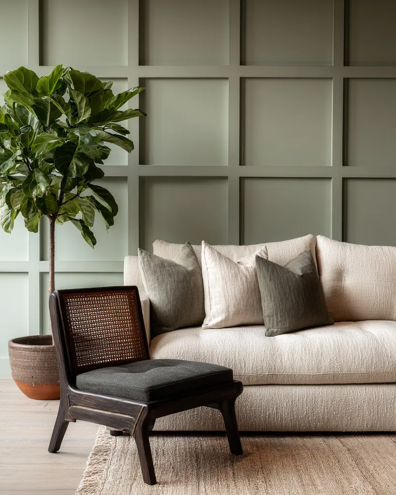
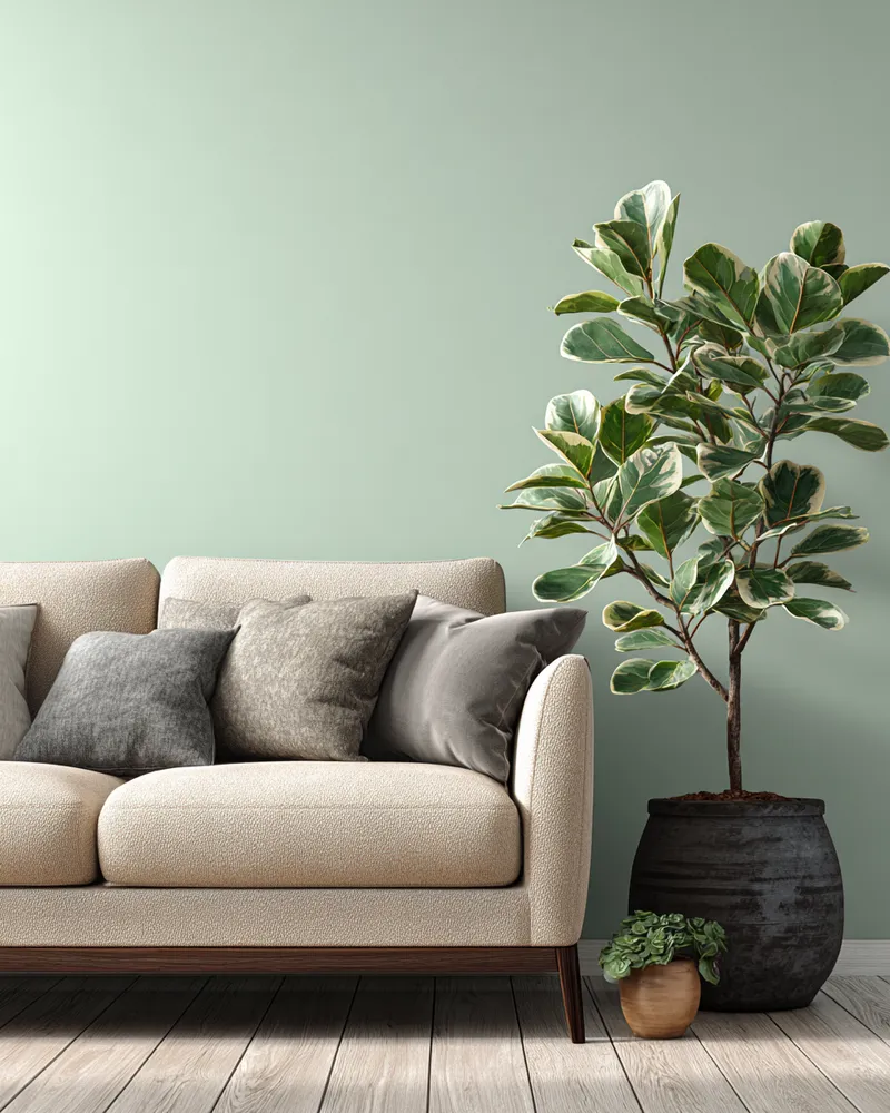
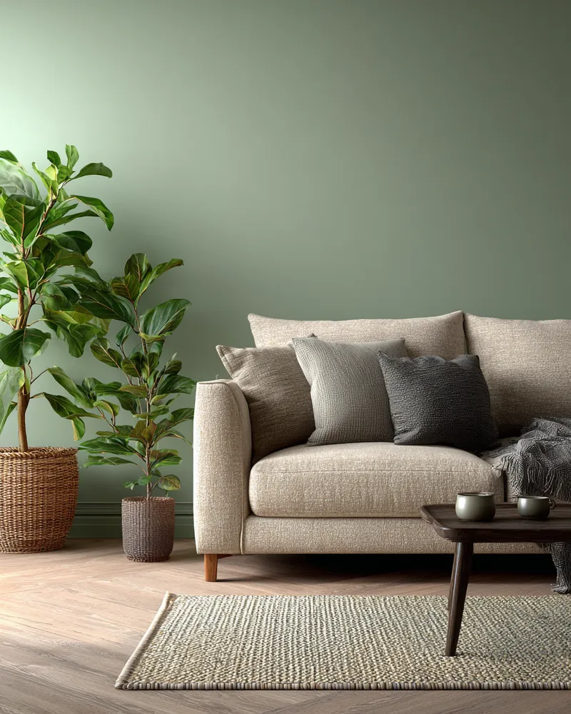
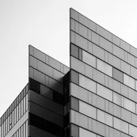
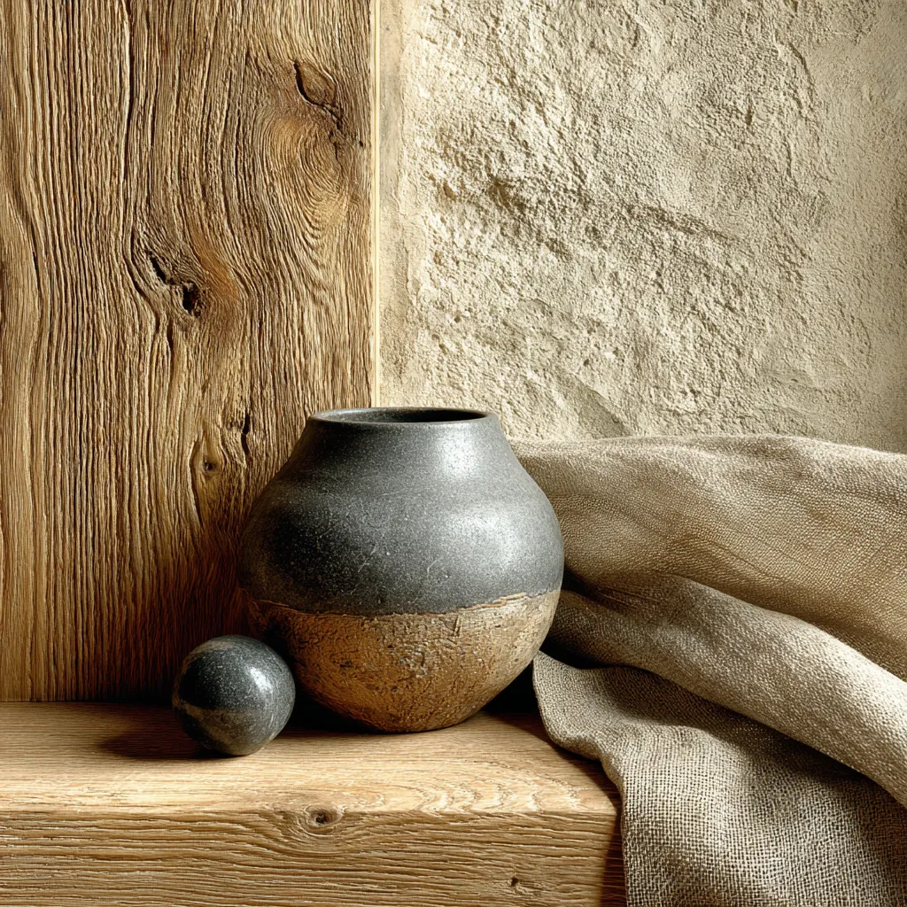
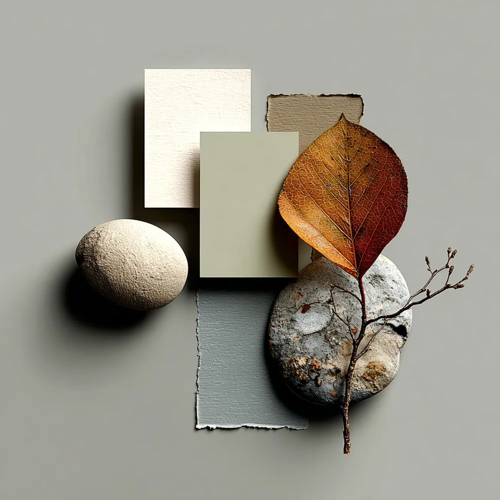
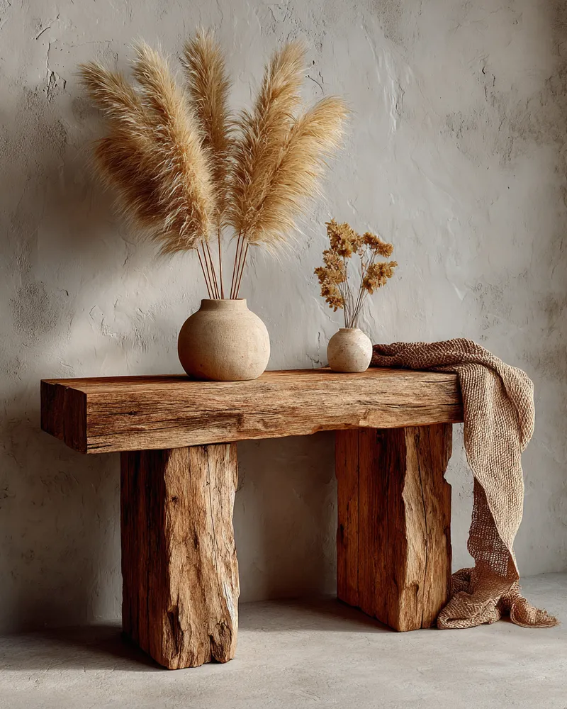
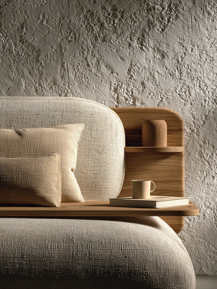
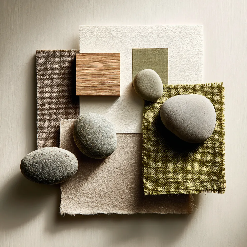
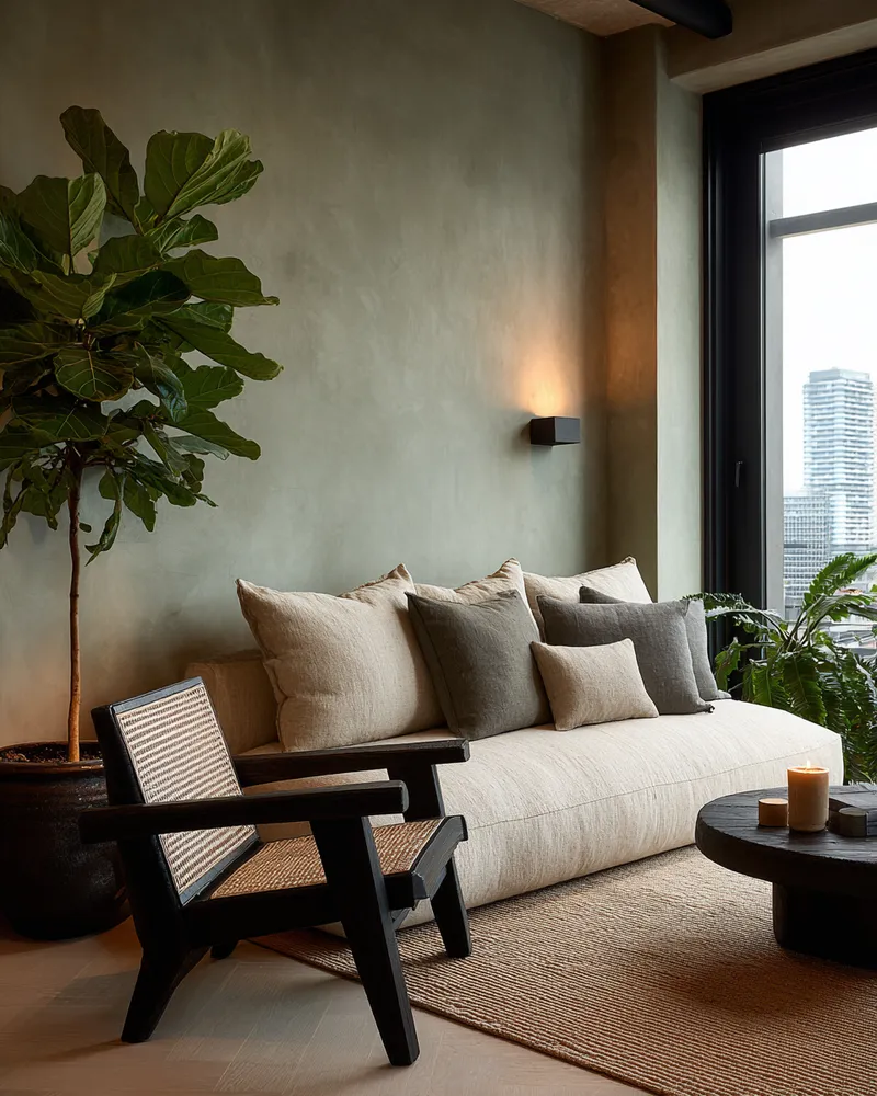
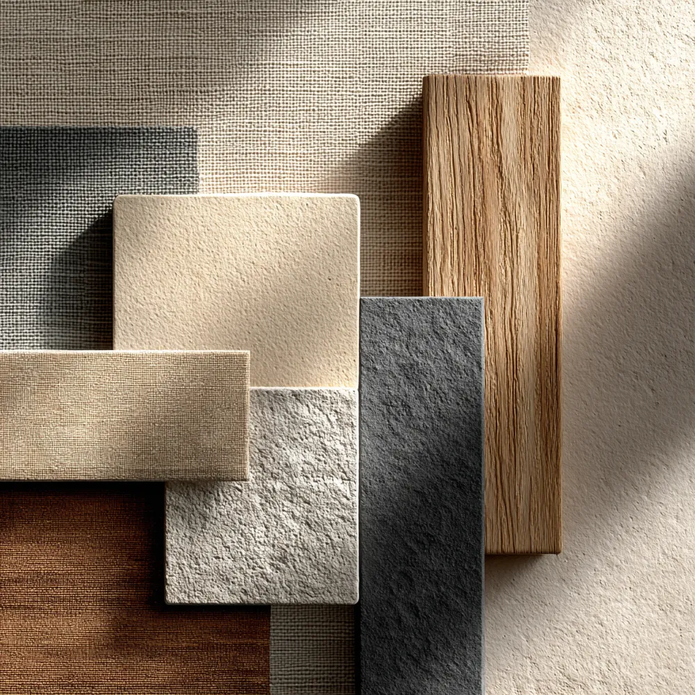
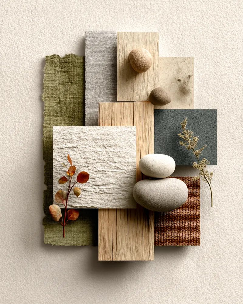
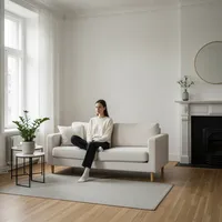
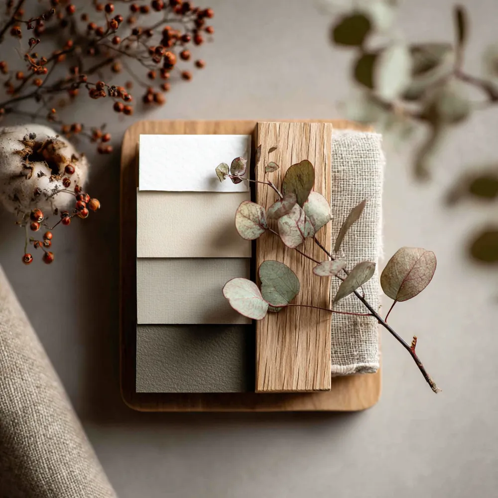
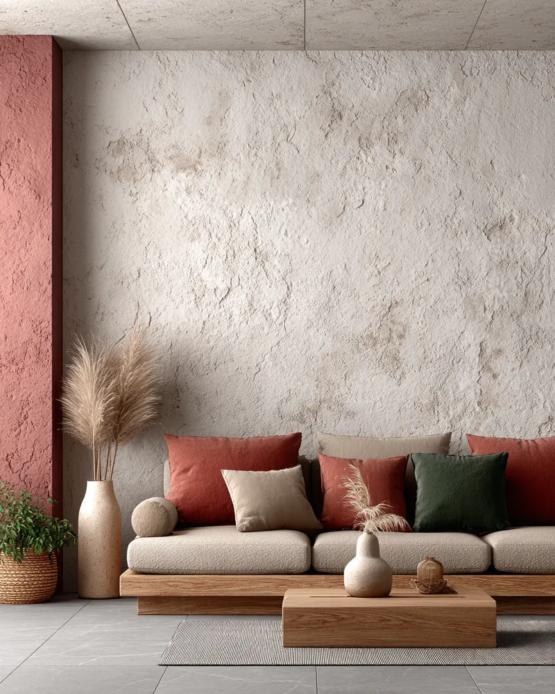
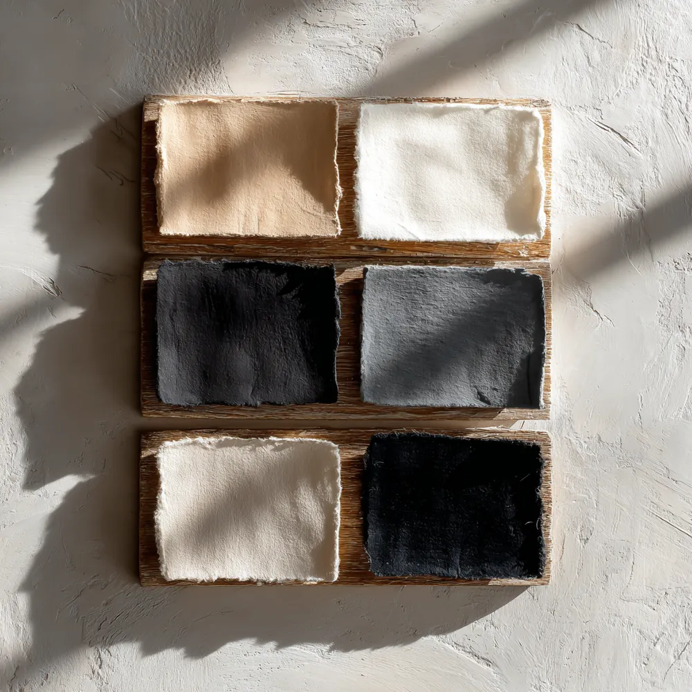
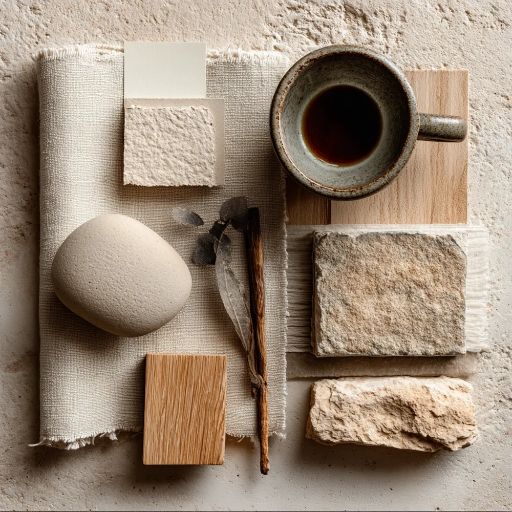
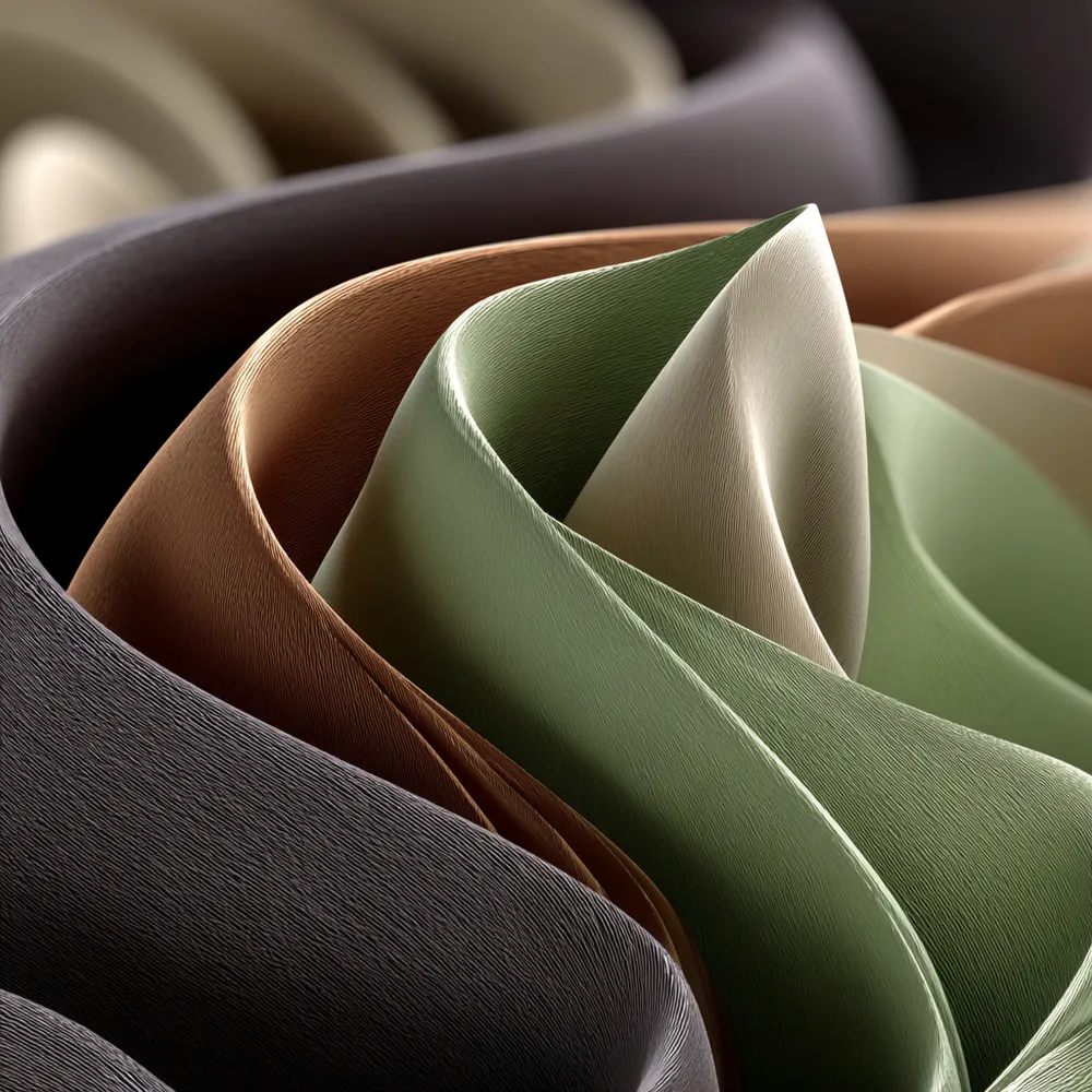
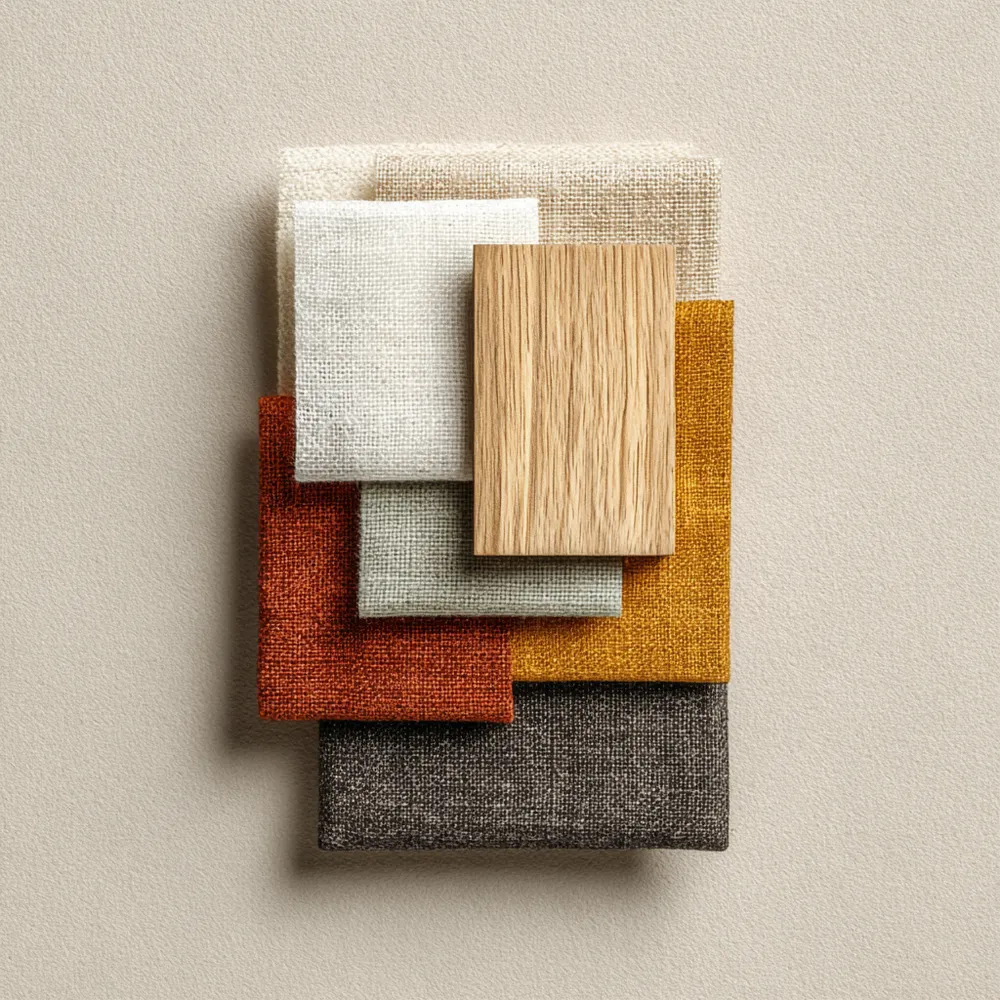
Japandi design embraces a refined, calming neutral palette. Think soft whites, muted beiges, earthy greys, and warm, natural wood tones. This limited color scheme promotes a sense of peace and spaciousness. The focus is on the interplay of light and shadow on different textures, rather than bold color statements. Occasional hints of charcoal or deep green can provide subtle contrast. This serene palette creates a tranquil backdrop for the architectural forms and natural materials to shine. Soothing and sophisticated! ☁️🪵 #JapandiIdeas #ColorPaletteIdeas #JapandiColors #NeutralDecor #CalmingColors #InteriorColor #DesignPalette #MinimalistColor #HomeDecorTips #TheArchitecturalLens
2025년 10월 28일
스타일 복사
0개의 댓글이 총 표시됩니다.
 아직 댓글이 없습니다
추가로 마음에 드릴 만한 콘텐츠
Neutral Palettes: Japandi's Serene Color Scheme 🤍

The Japandi Kitchen Palette: Neutrals & Nature Inspired Tones 🍎
The Japandi Color Palette: Serene & Earthy Tones 🎨

Minimalist Japandi Color Palette: Serenity Found 🎨

Japandi Color Palettes: The Power of Neutrals 🤍

Understated Elegance: The Role of Neutral Palettes in Japandi ☁️

✨ Japandi Color Palette: The Serenity Secret!

Nature's Palette: Calming Colors for Your Home 🌿
Color Palette Perfection: Japandi Neutral Tones 🤍
Color Palette: The Serene Neutrals of Japandi Living 🎨

Finding Harmony: Japandi Color Palettes for a Tranquil Home ✨
Creating Tranquility: Japandi Color Palette Inspiration 🎨
Soft Neutrals & Earthy Tones: The Japandi Color Palette 🤎

The Japandi Color Palette: Serene Neutrals for a Calm Home 🤍
The Japandi Palette: Embracing Serene, Earthy Tones 🤍
Beyond Beige: Adding Depth with Japandi Greens & Blues 🌿💧
The Power of Neutrality: Japandi Color Schemes 🤍

Japandi Color Palette: Soothing Neutrals & Earth Tones 🎨
Harmonious Hues: The Japandi Color Palette 🎨

Creating Calm: Japandi Color Palettes for Your Home 🎨