


1/4

My Go-To Palette: Creating Calm with Japandi Color Schemes 🎨
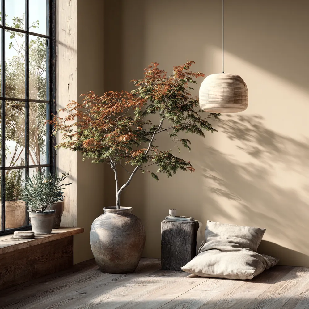
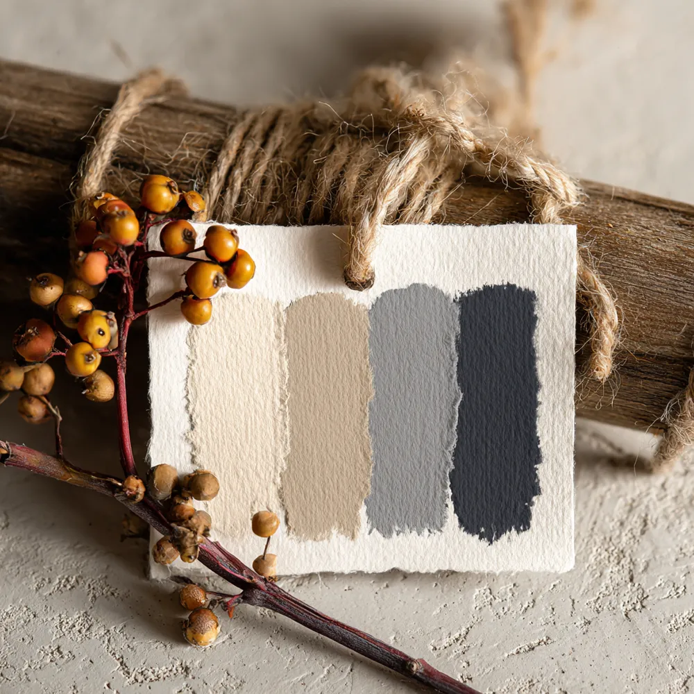
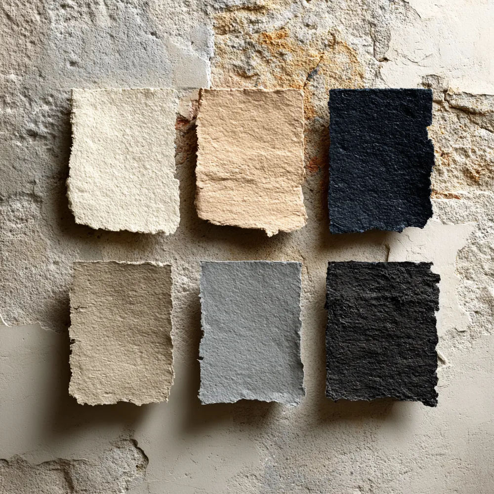
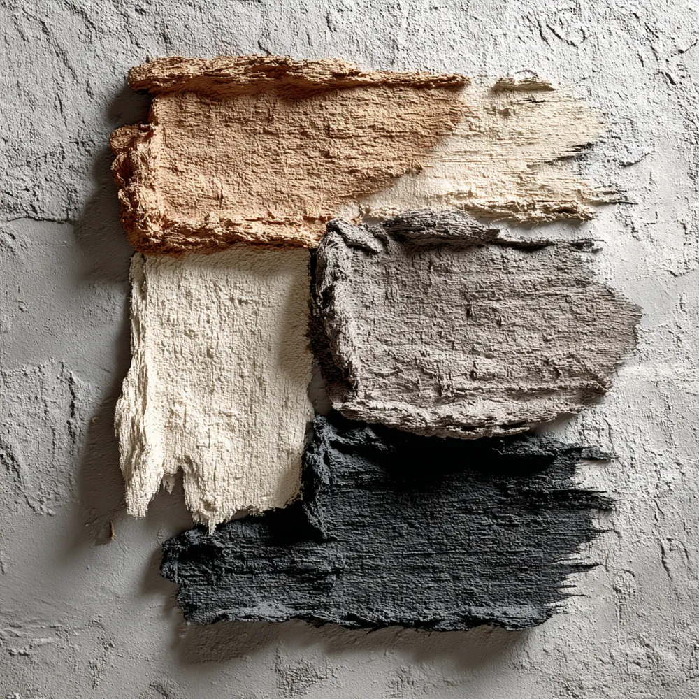
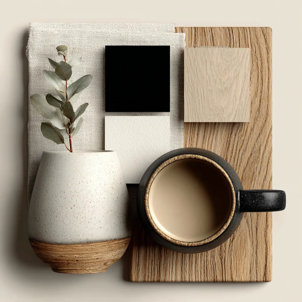
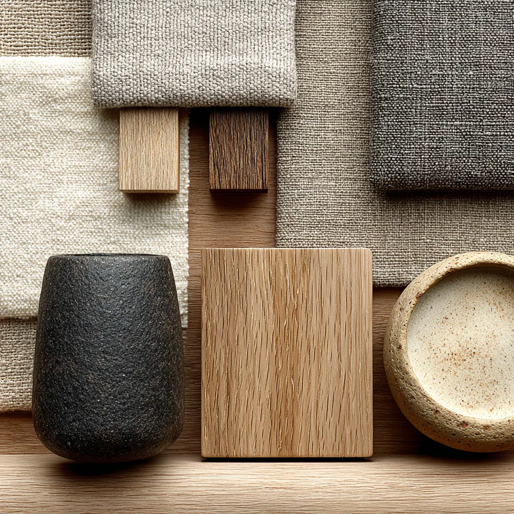
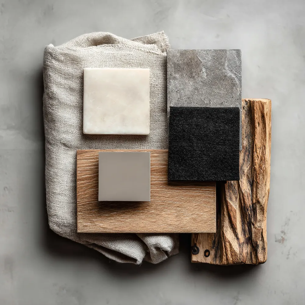
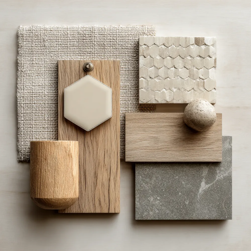
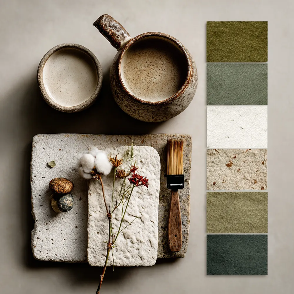
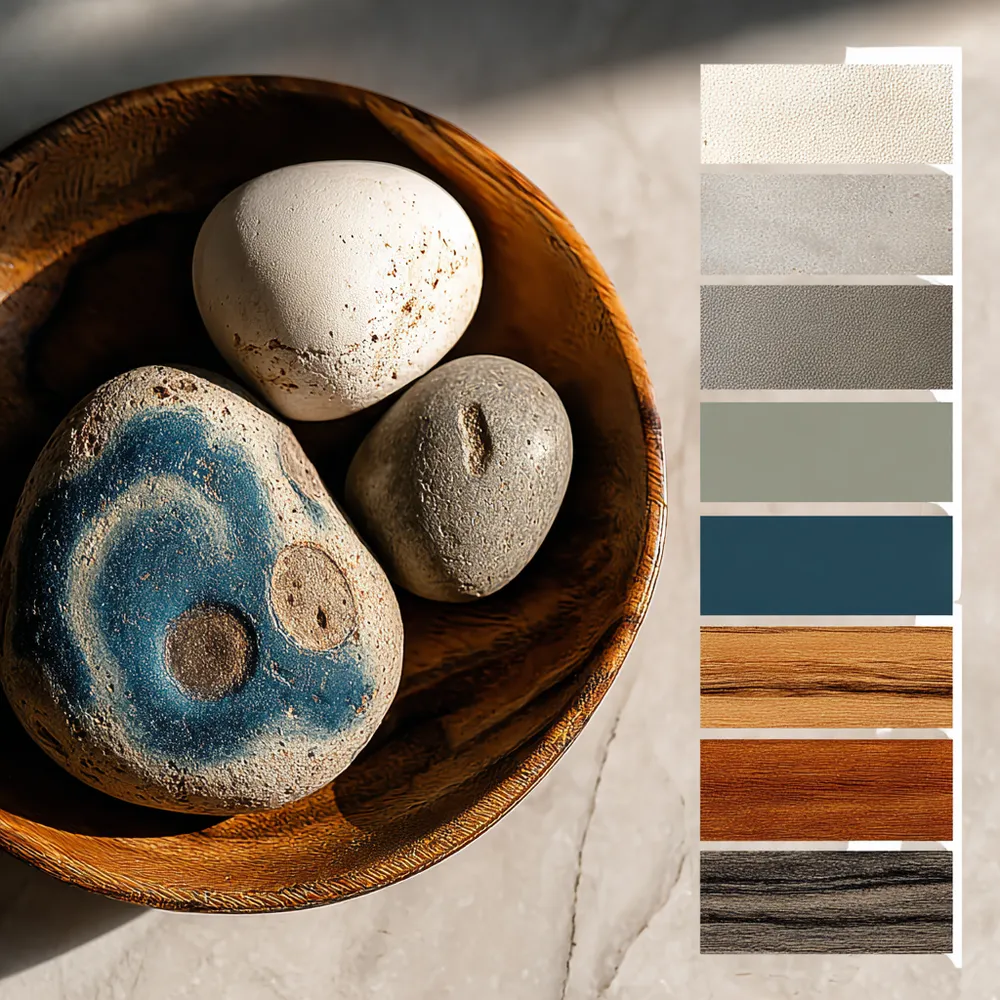
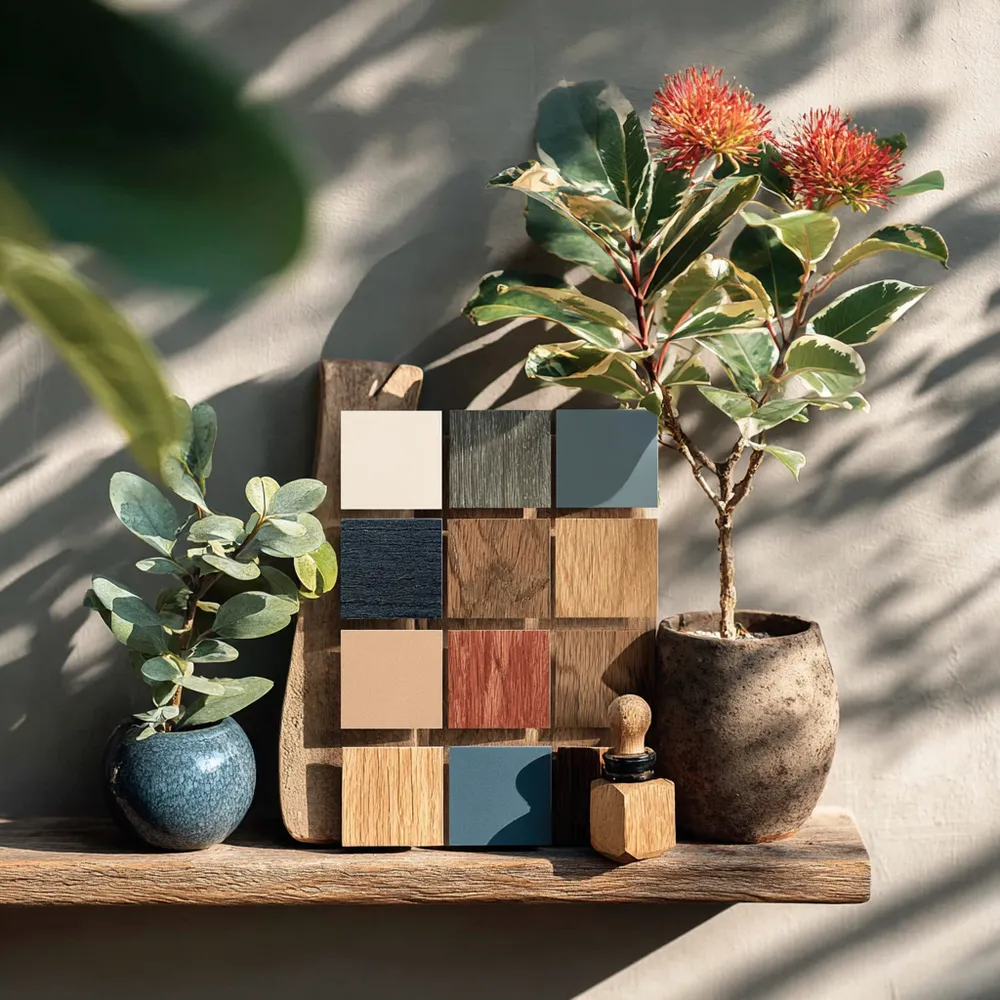
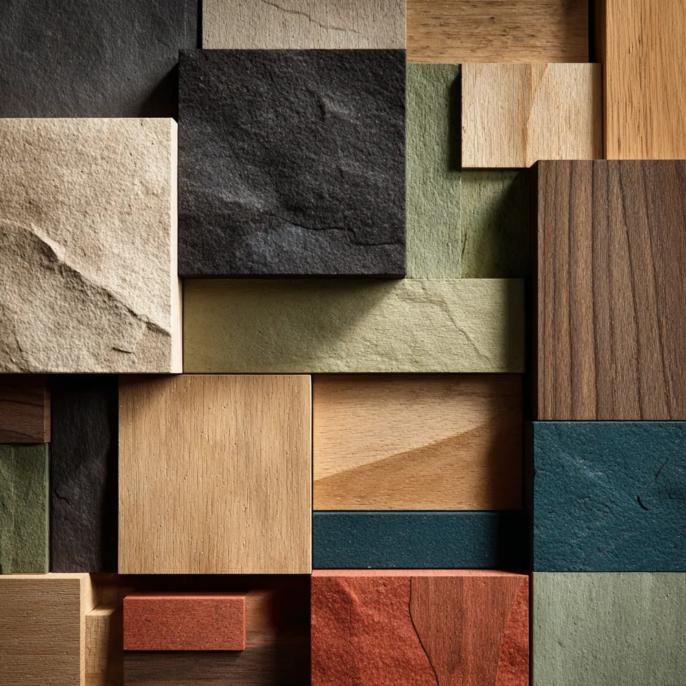
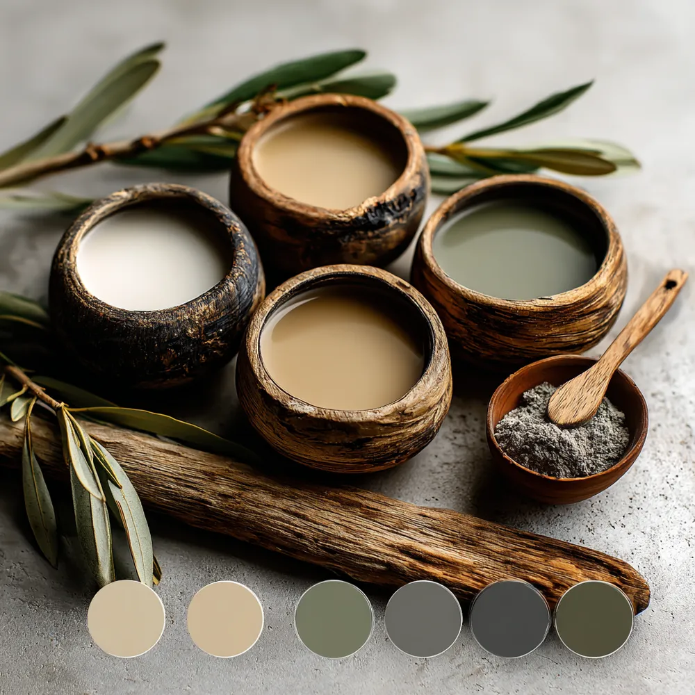
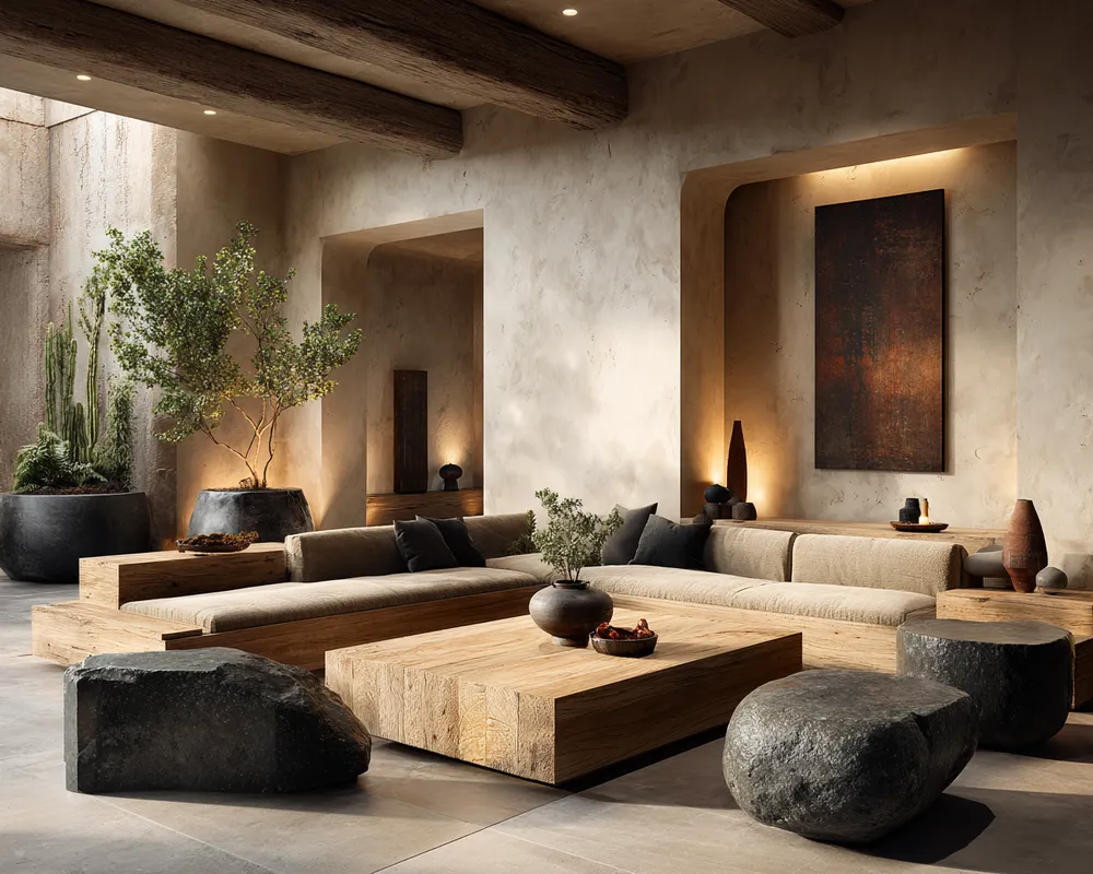
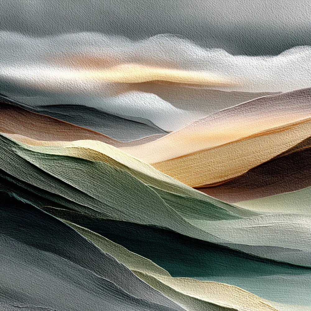
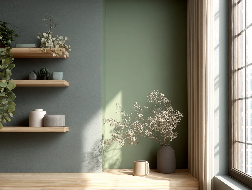
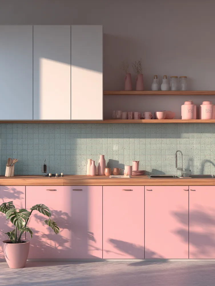
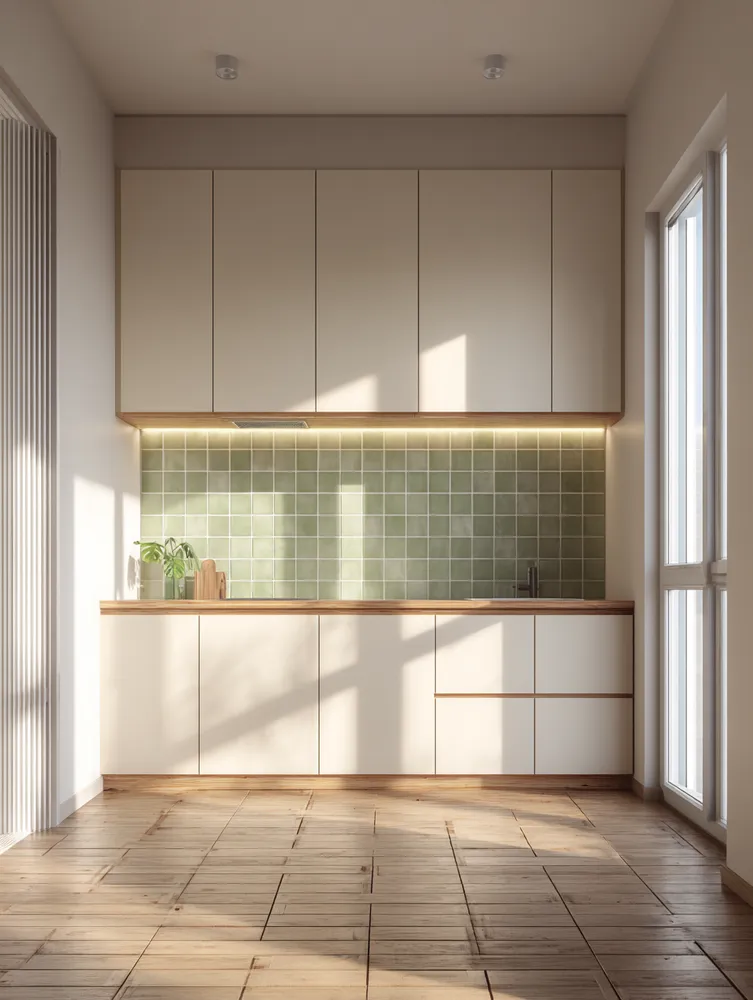
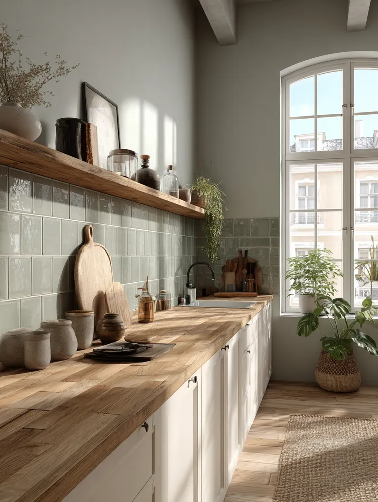
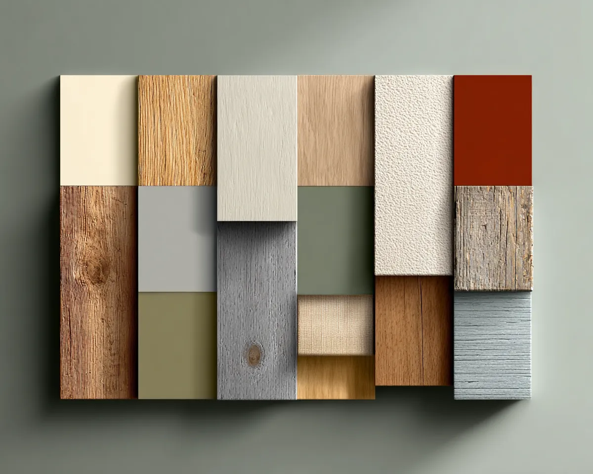
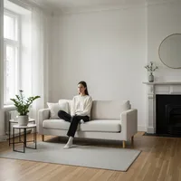
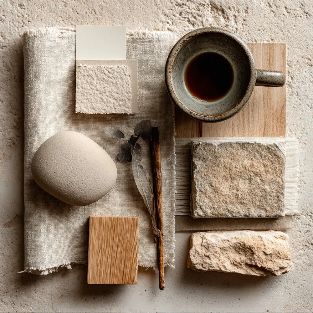
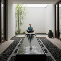
Choosing the right color palette is crucial for achieving that serene Japandi feel. It's all about harmonizing nature and simplicity. 🤍
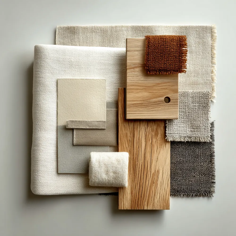
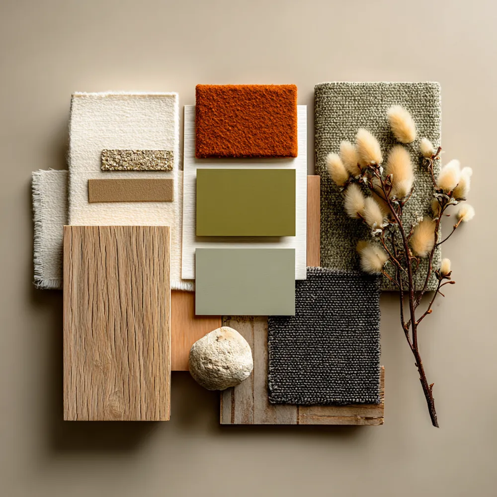
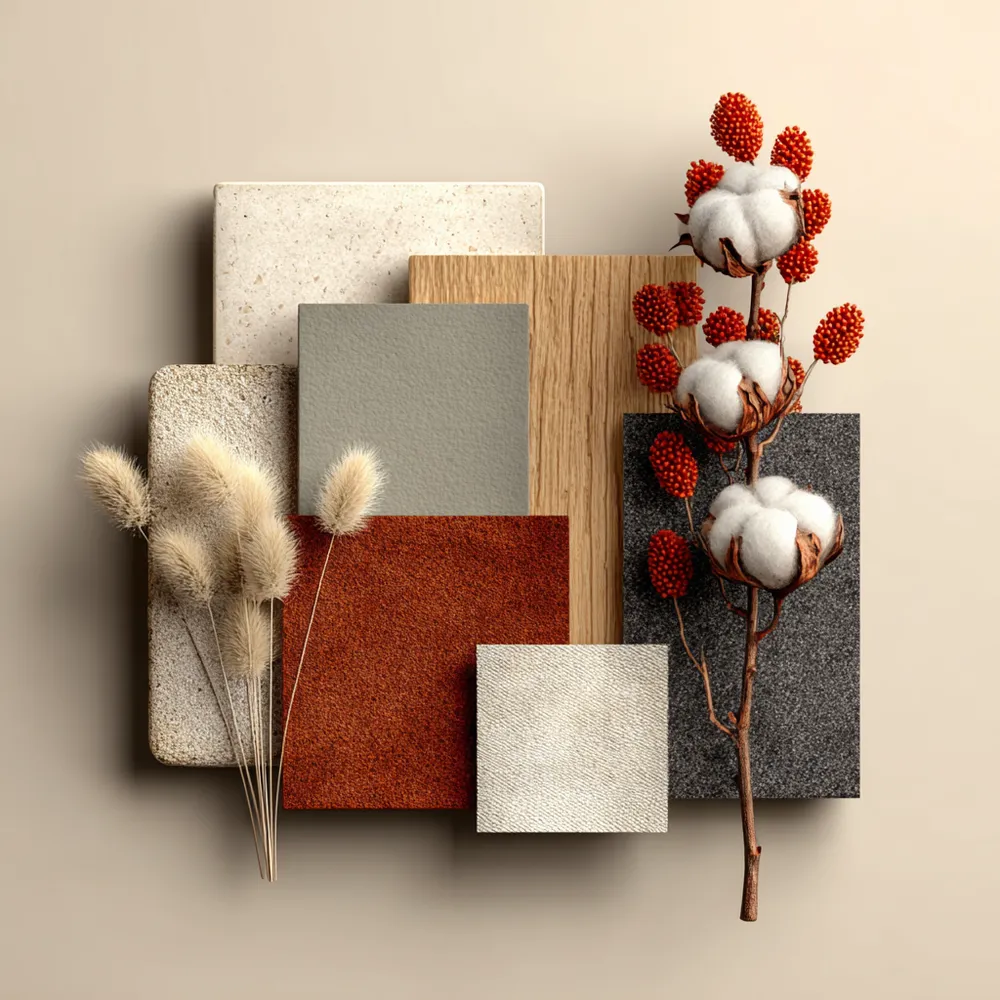
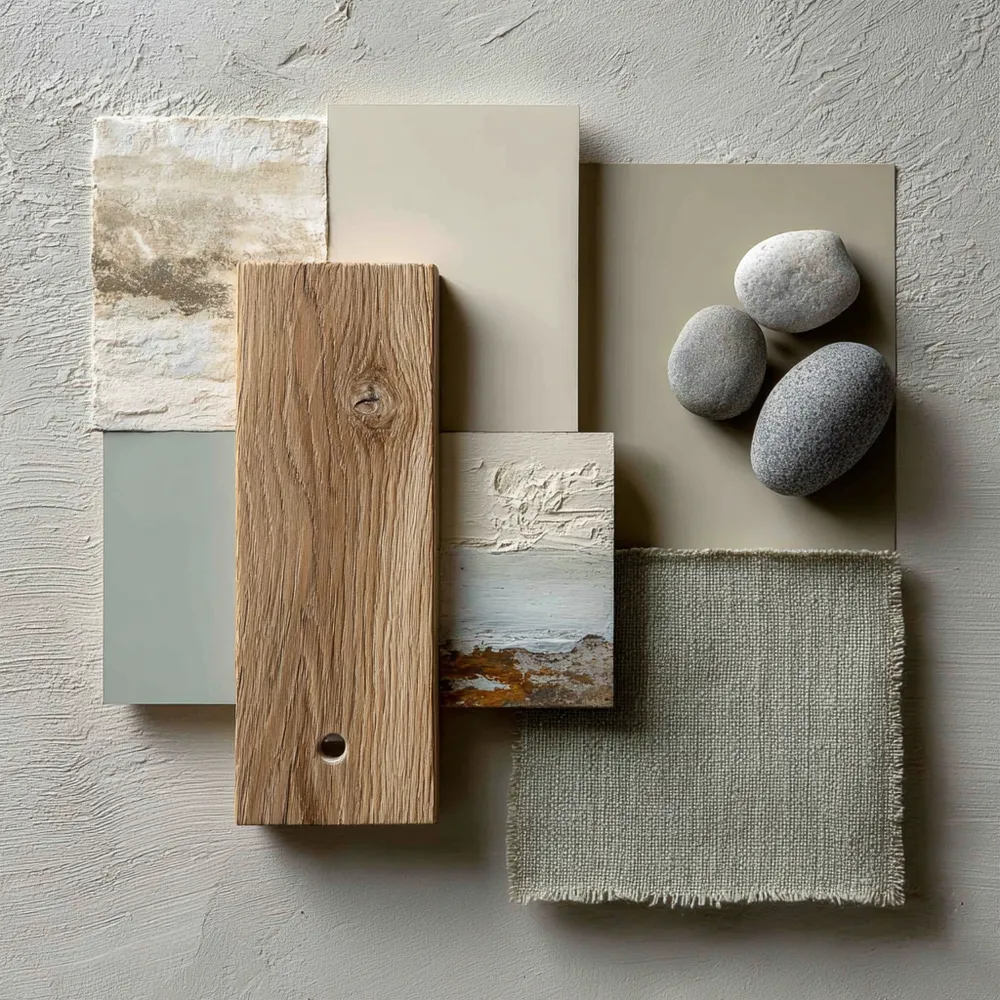
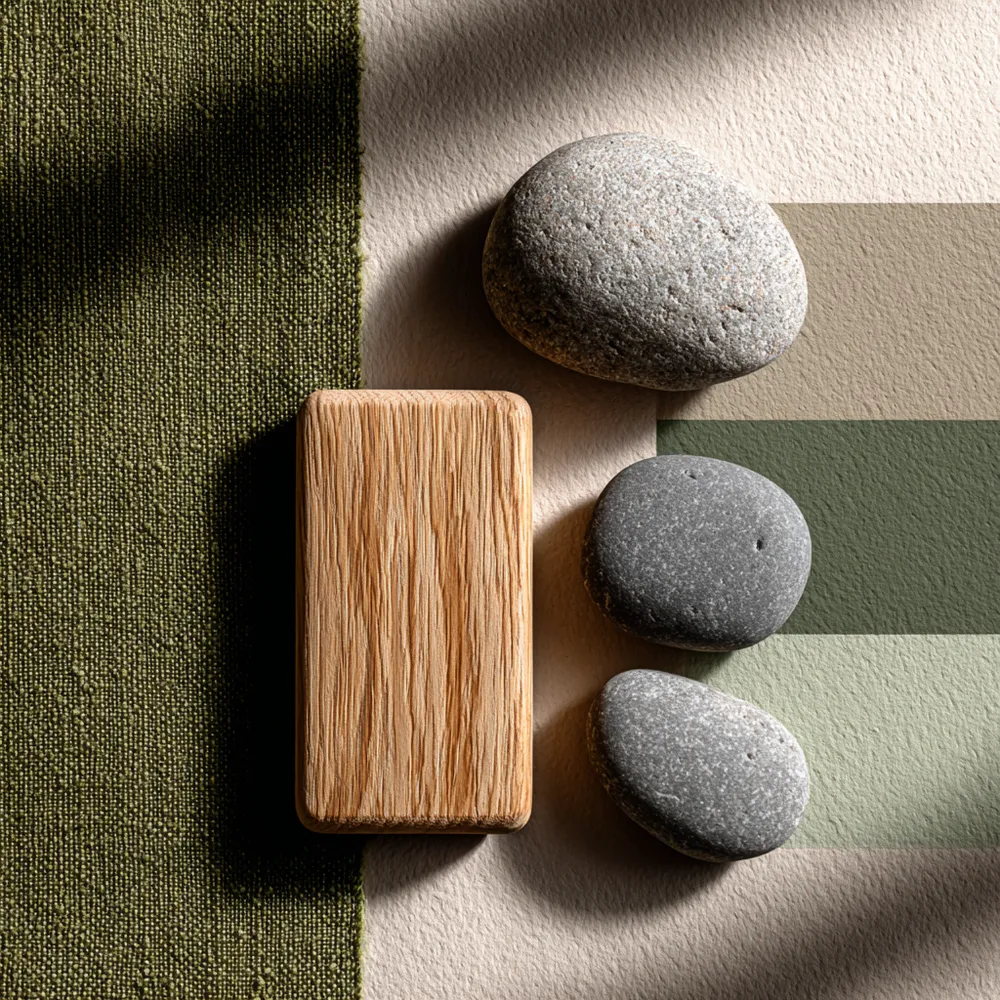
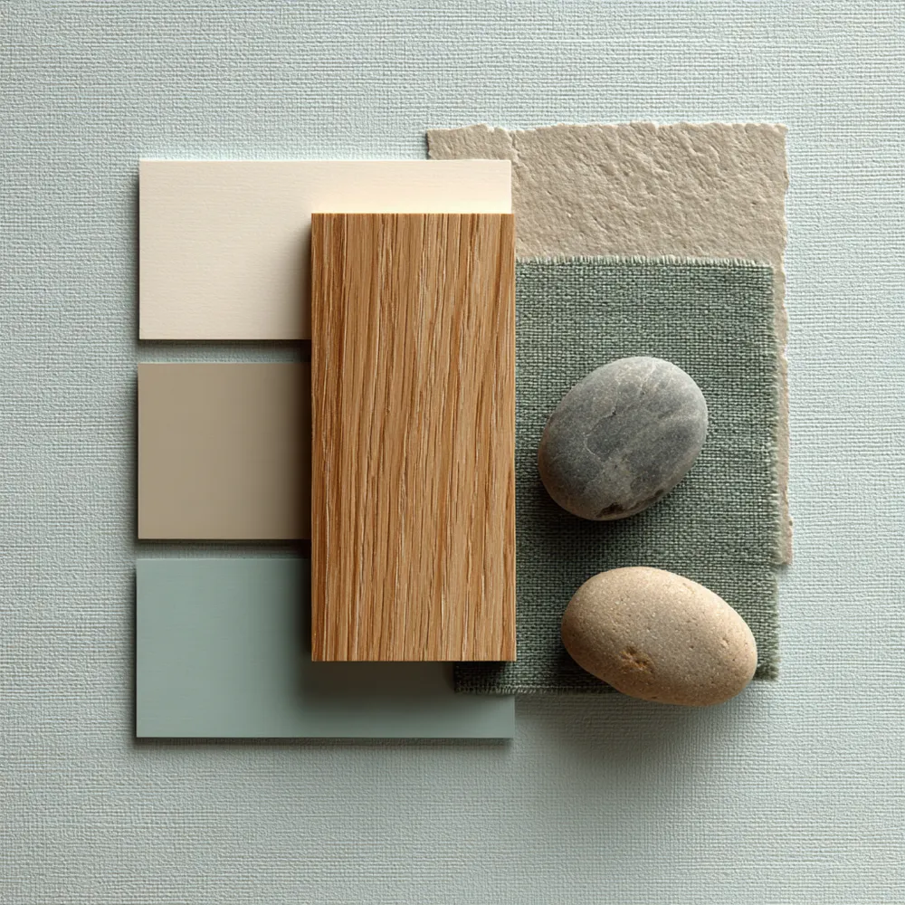
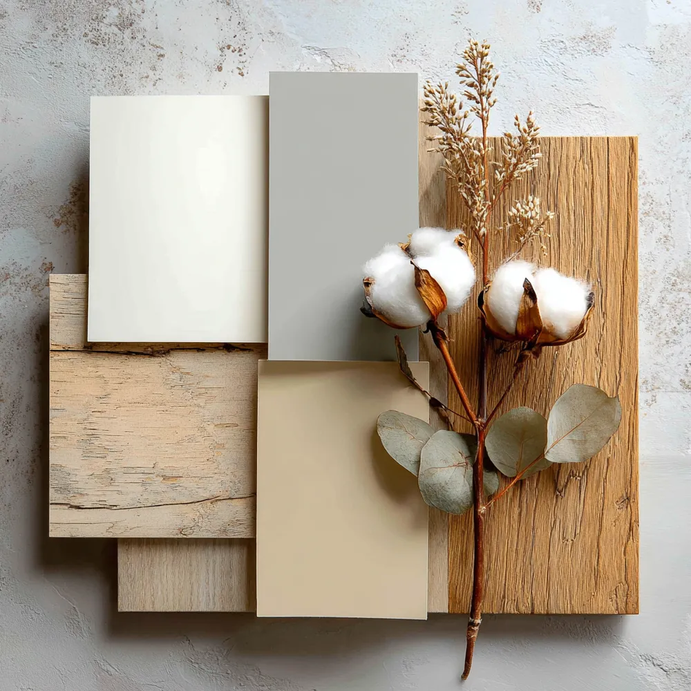
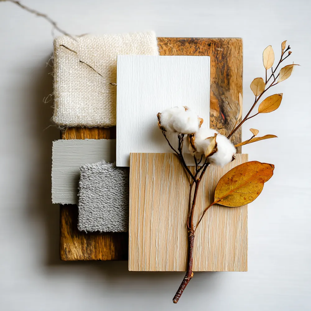
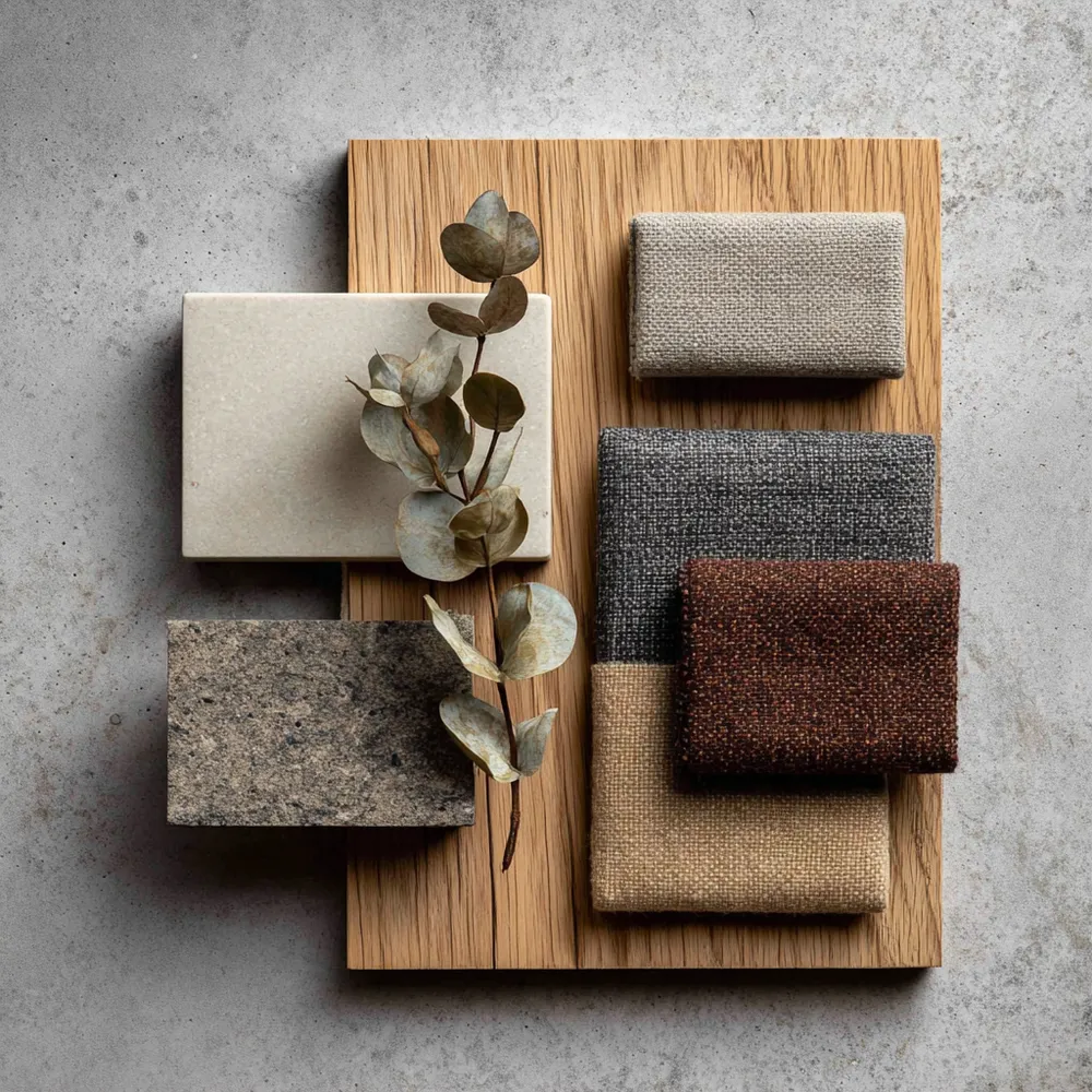
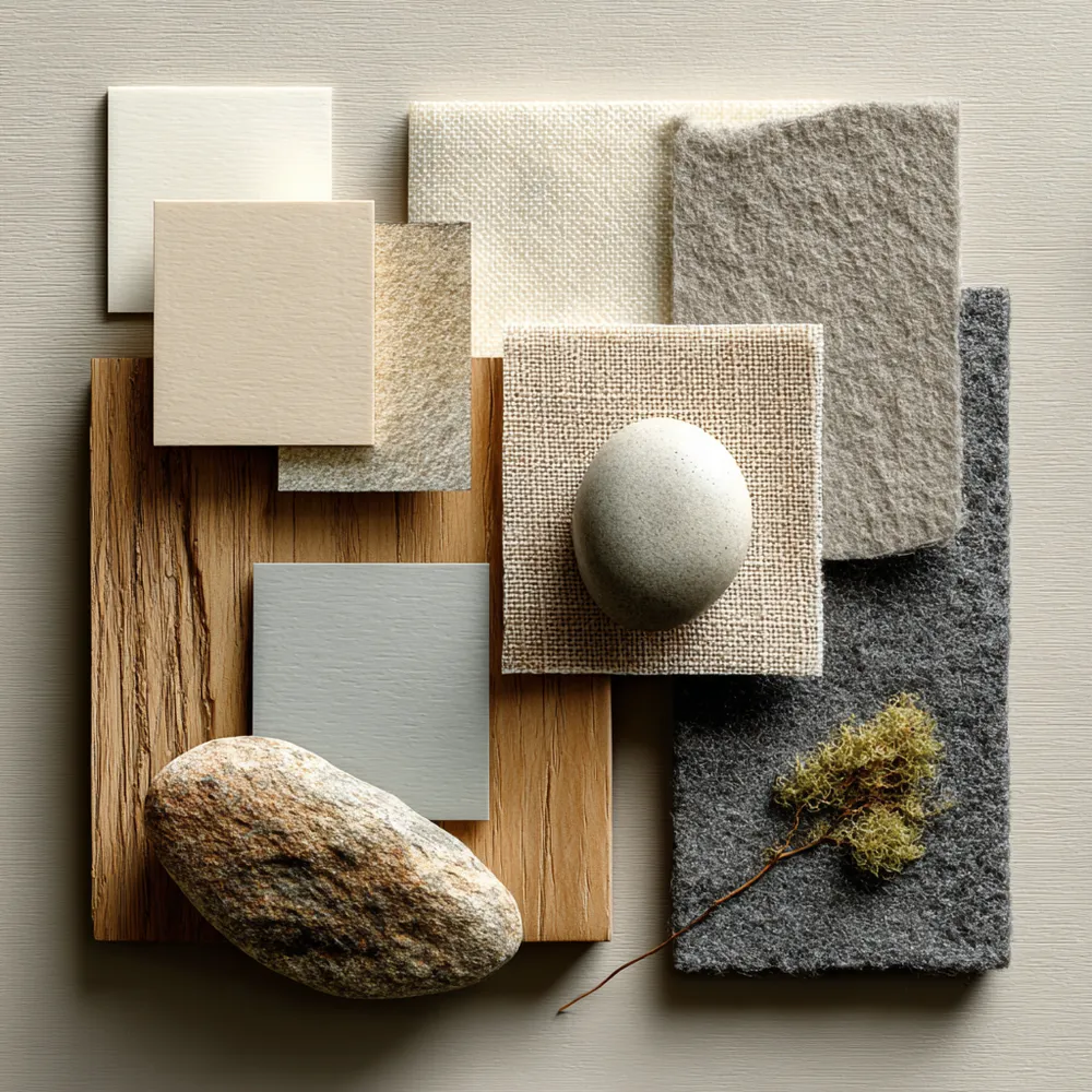
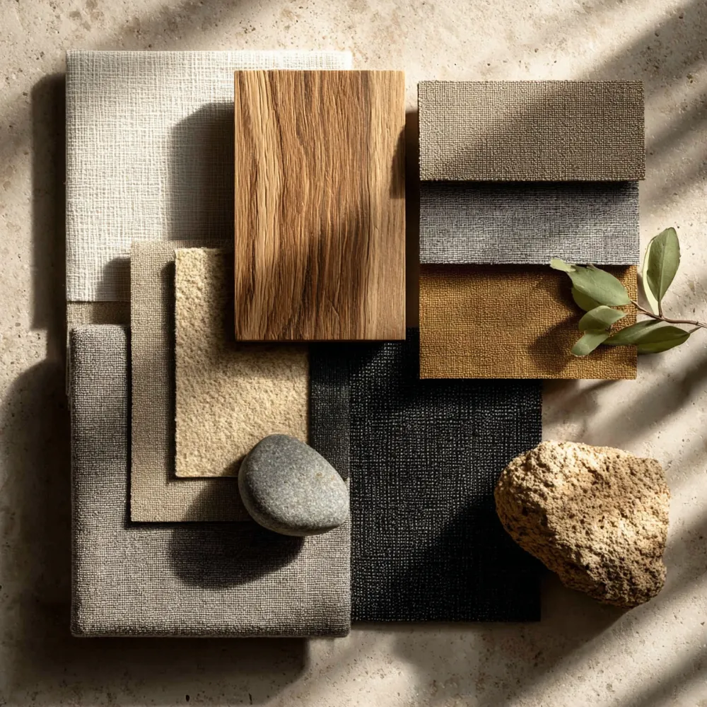
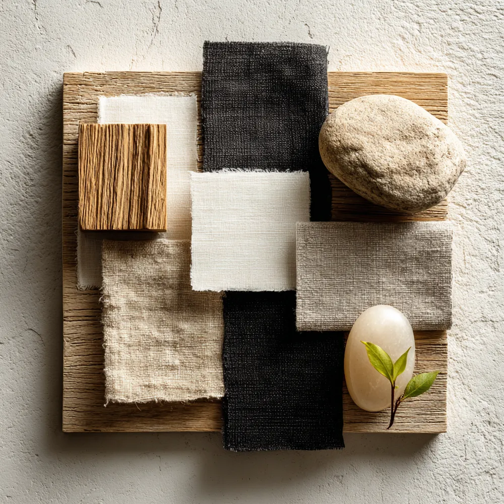
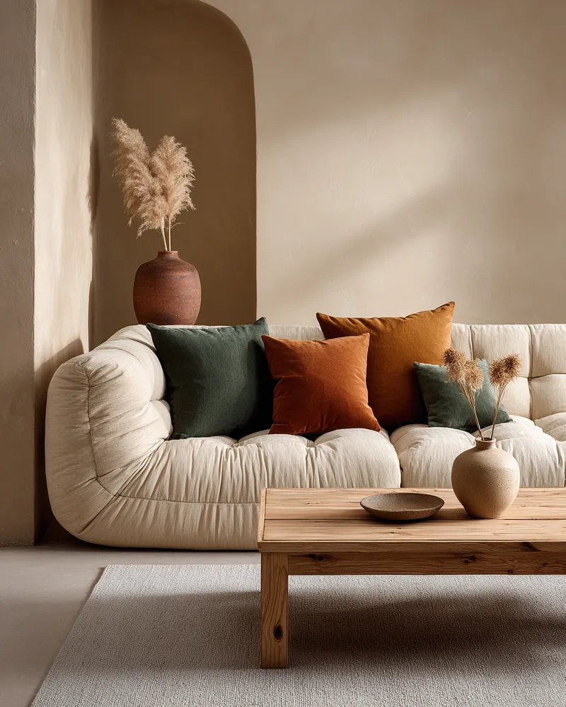
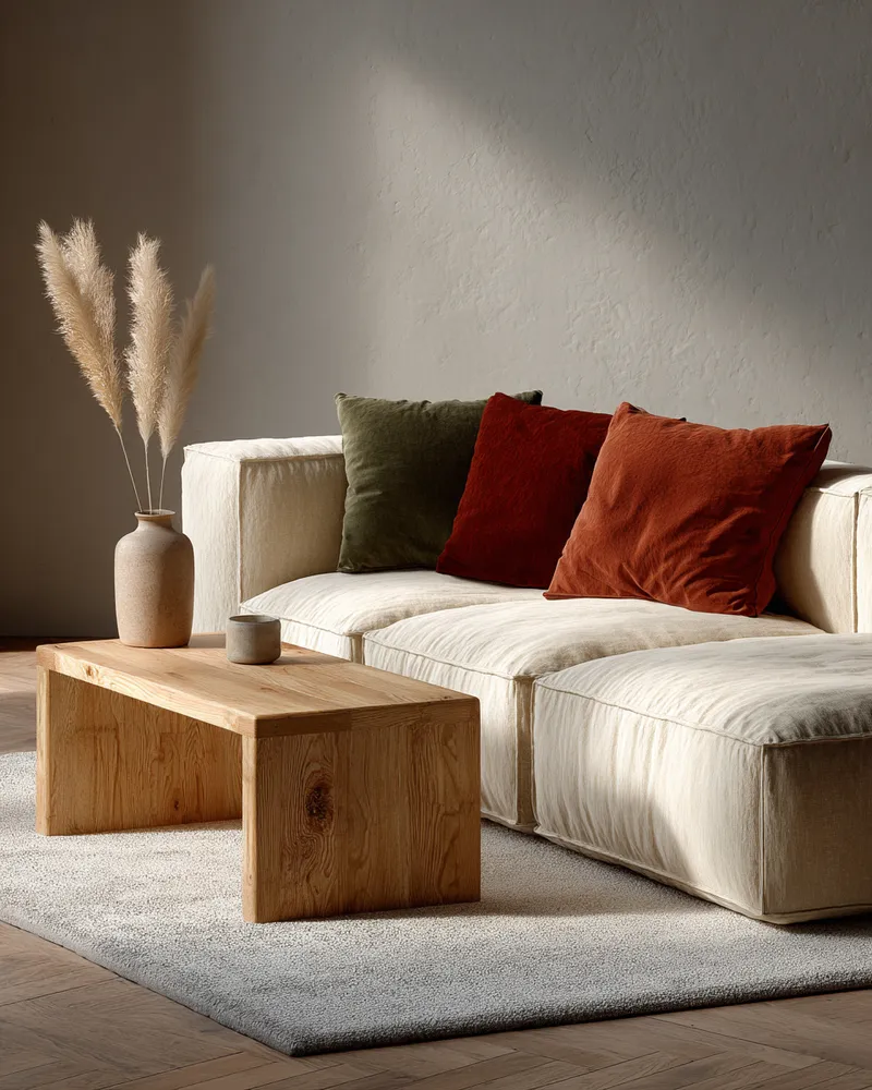
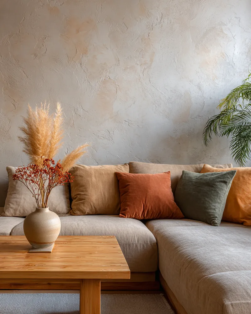
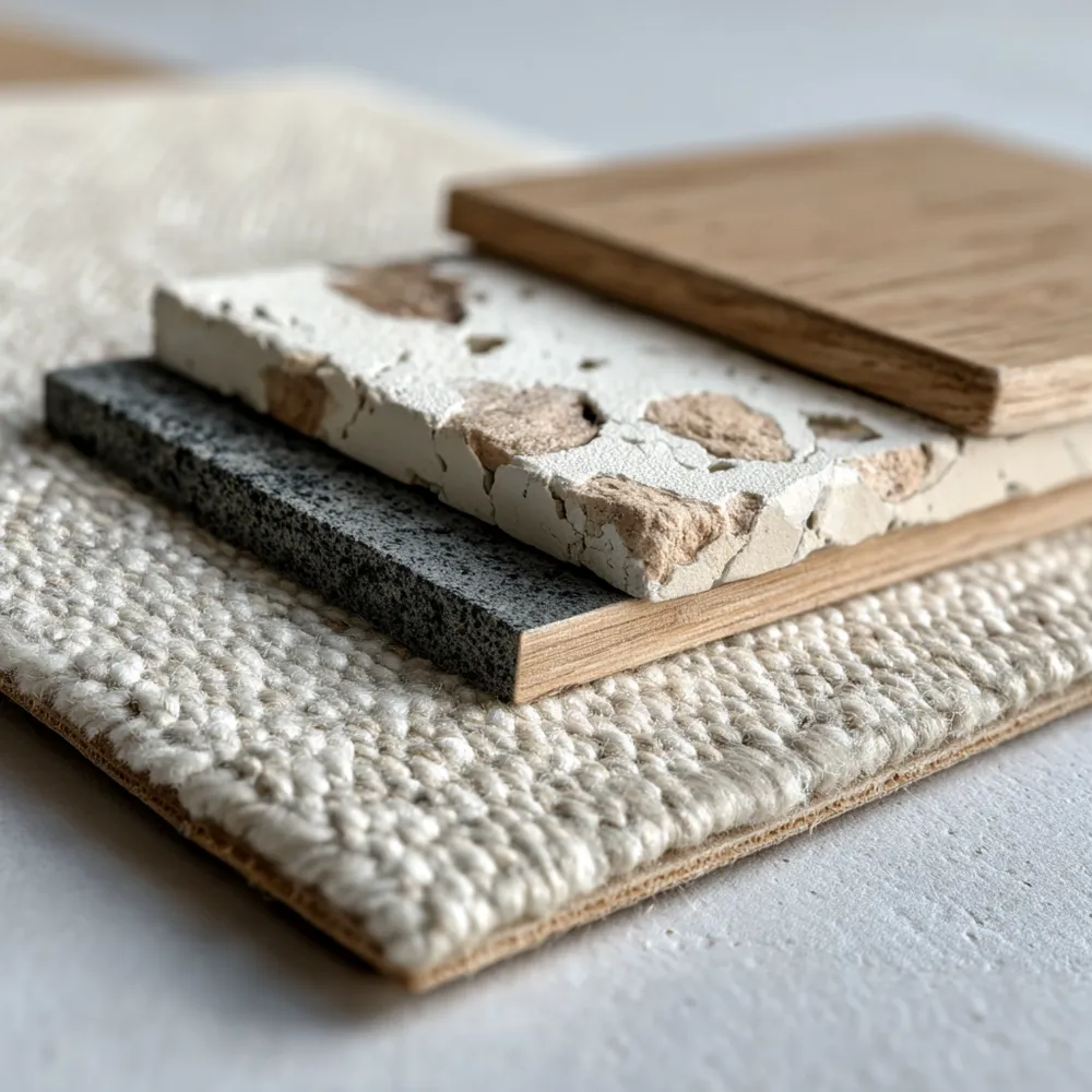
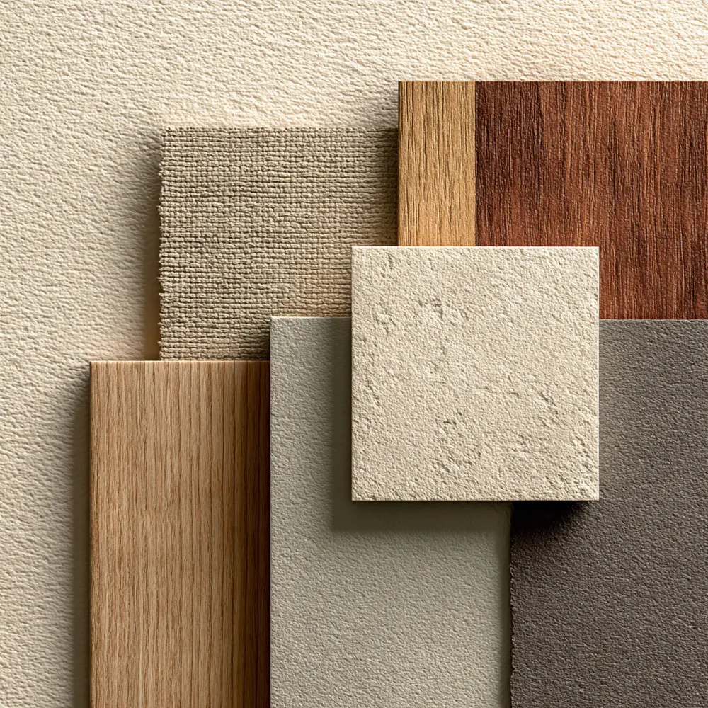
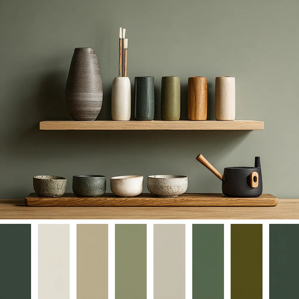
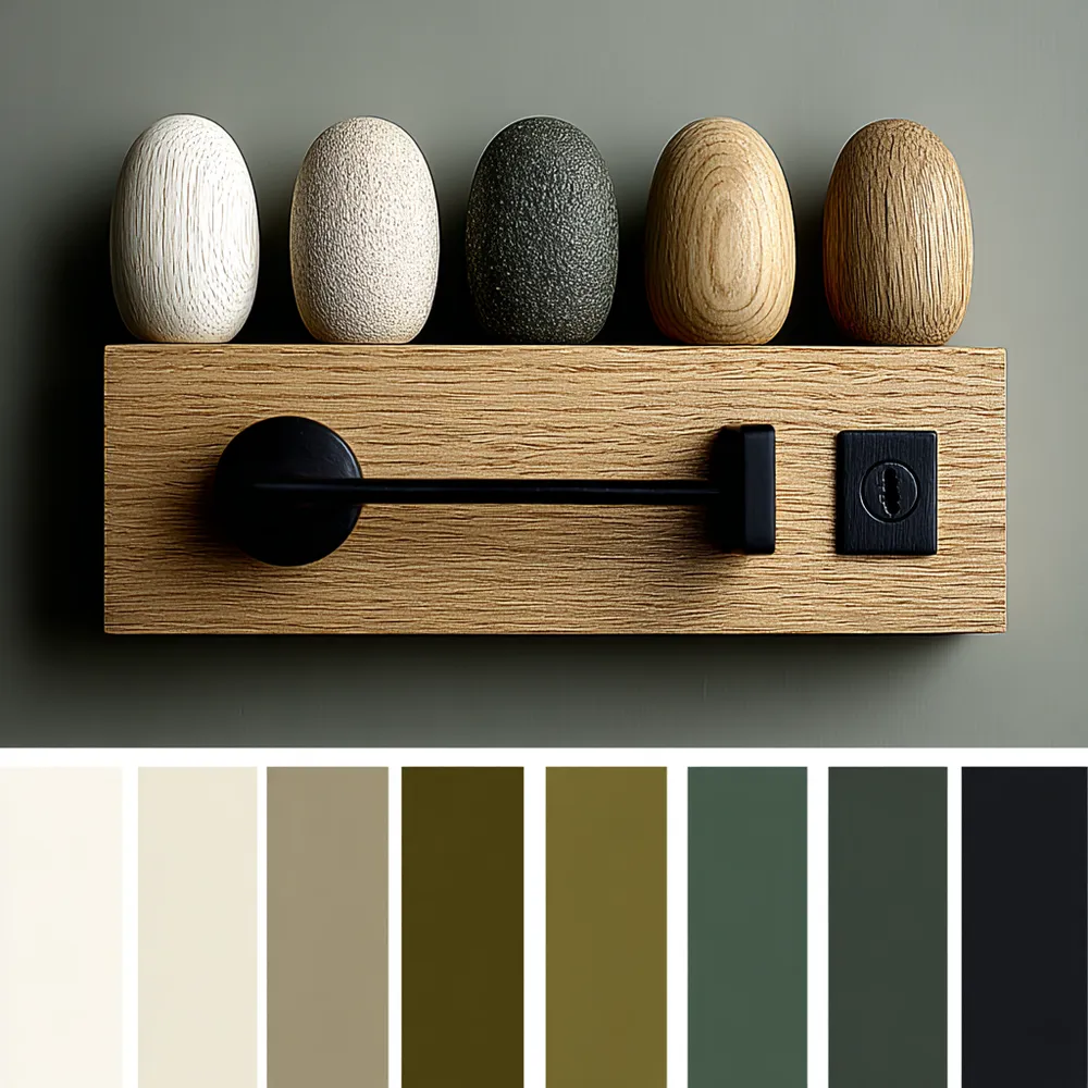
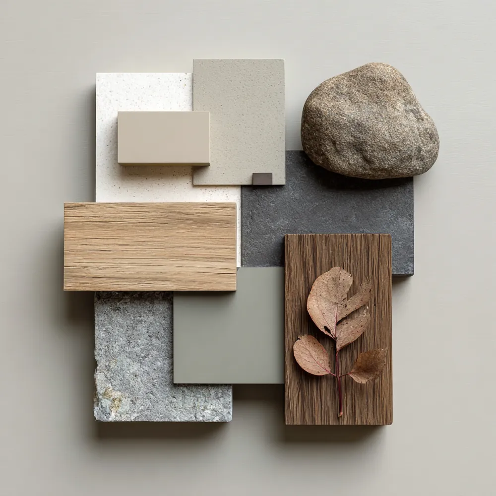
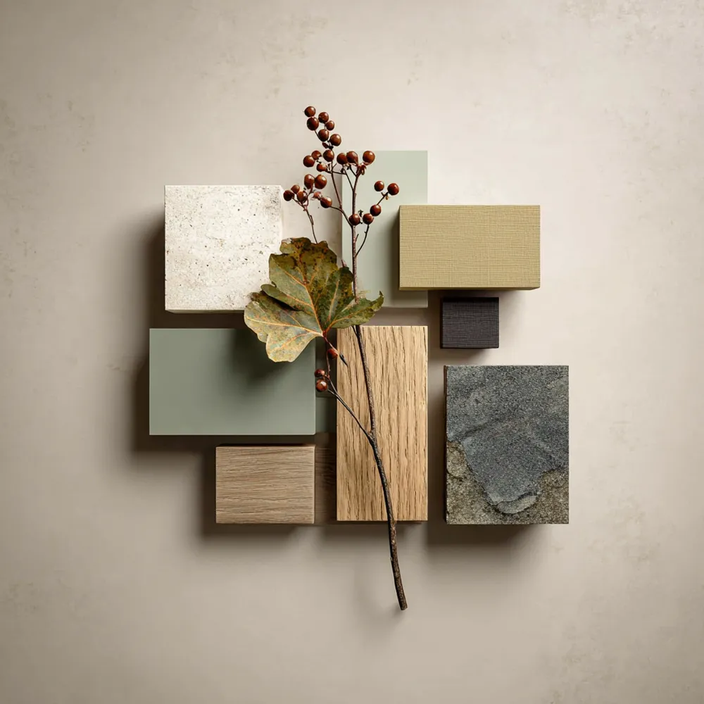
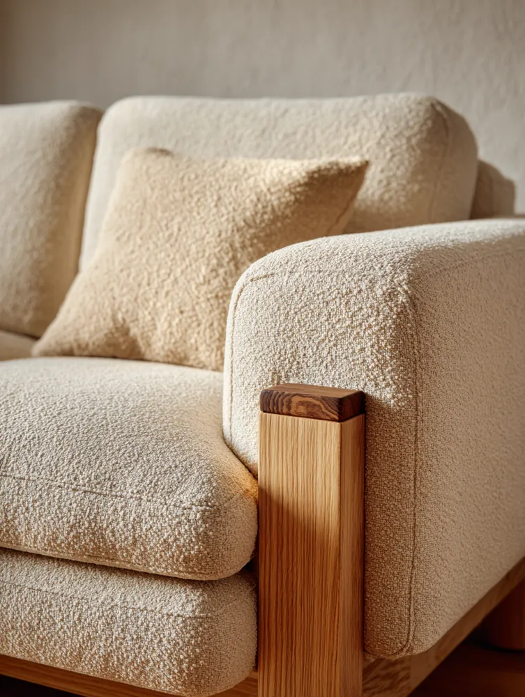
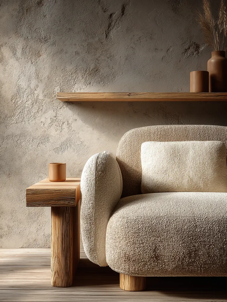
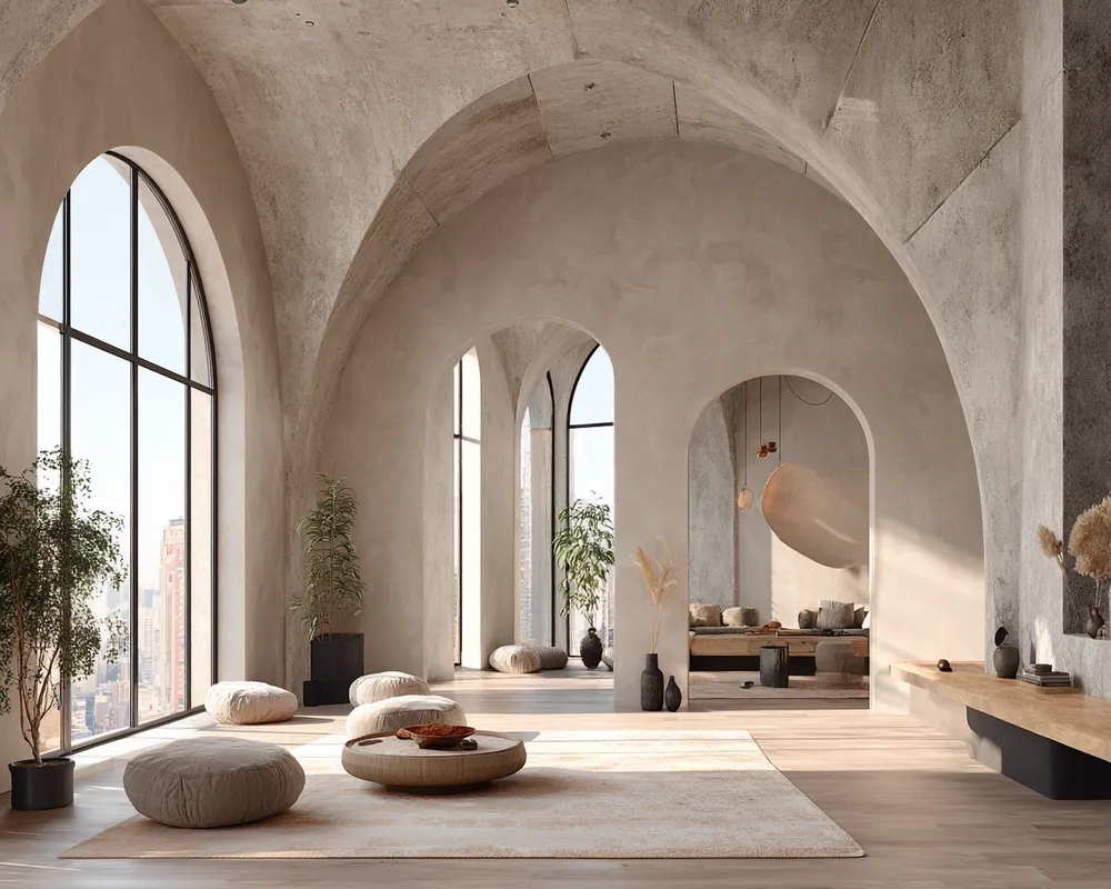
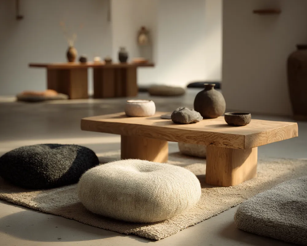
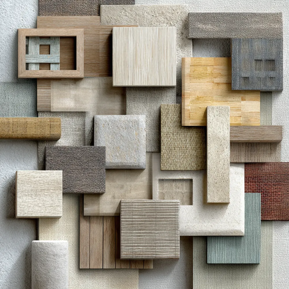
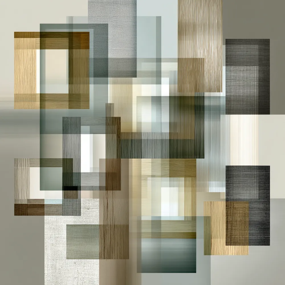
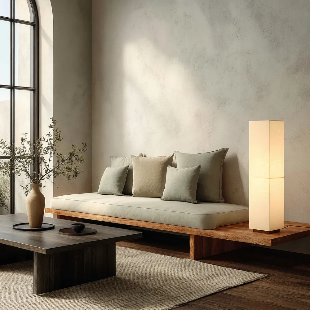
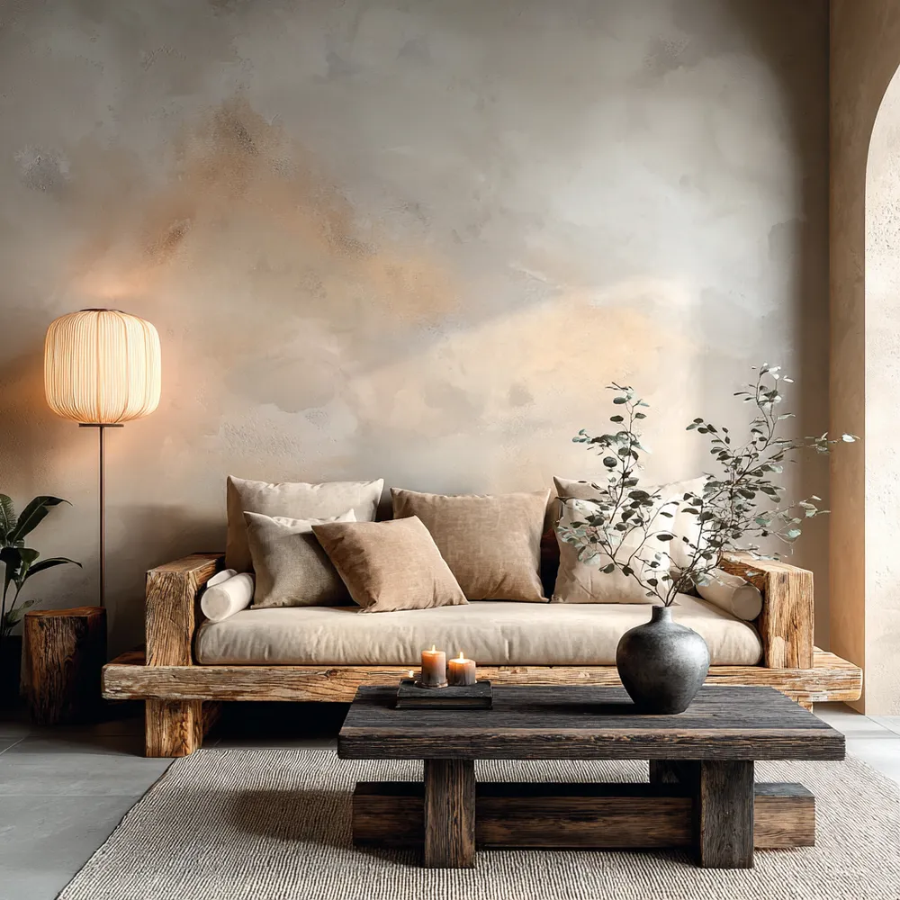
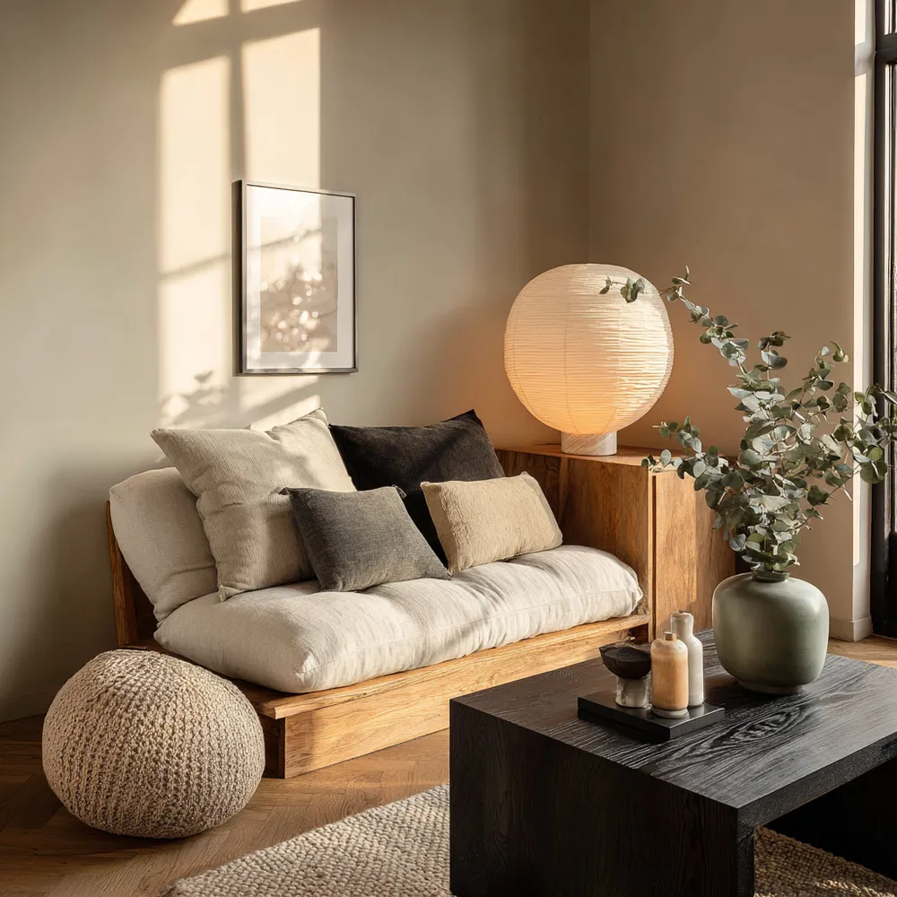
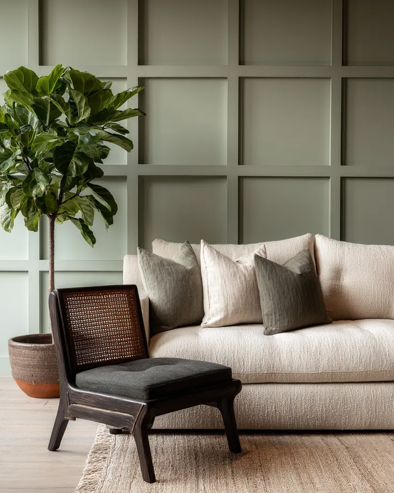
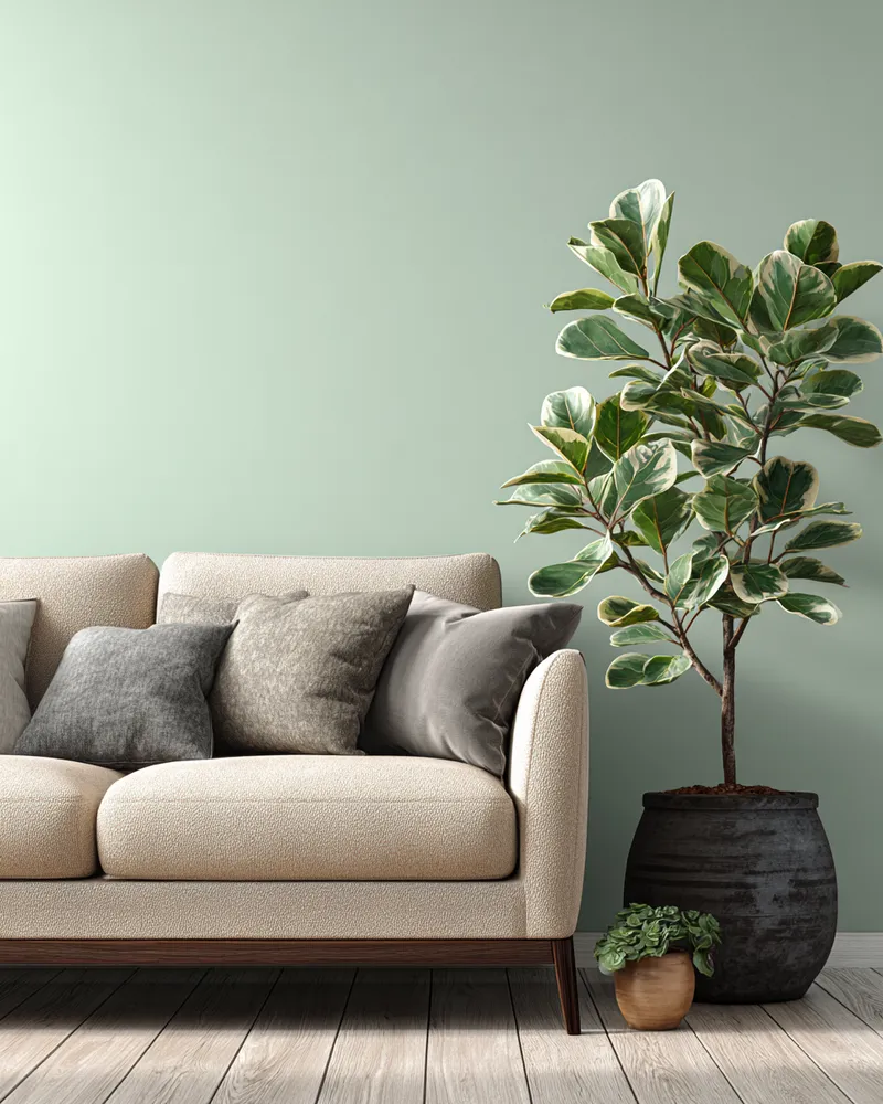
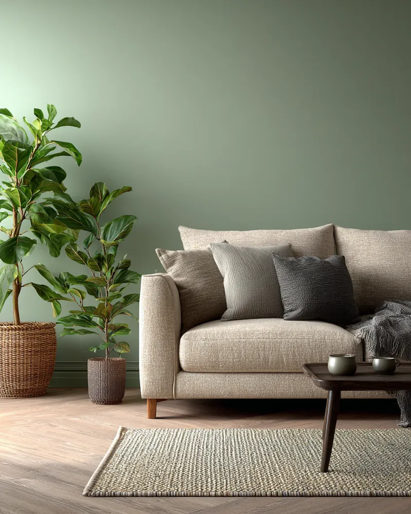
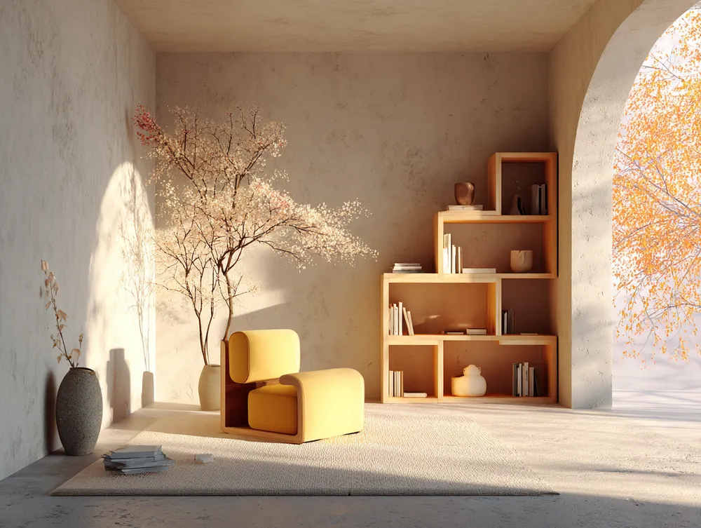
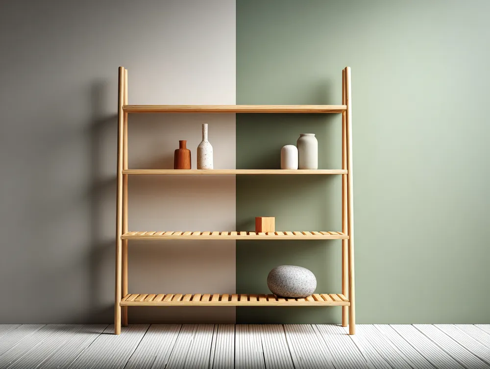
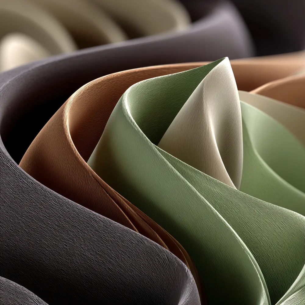
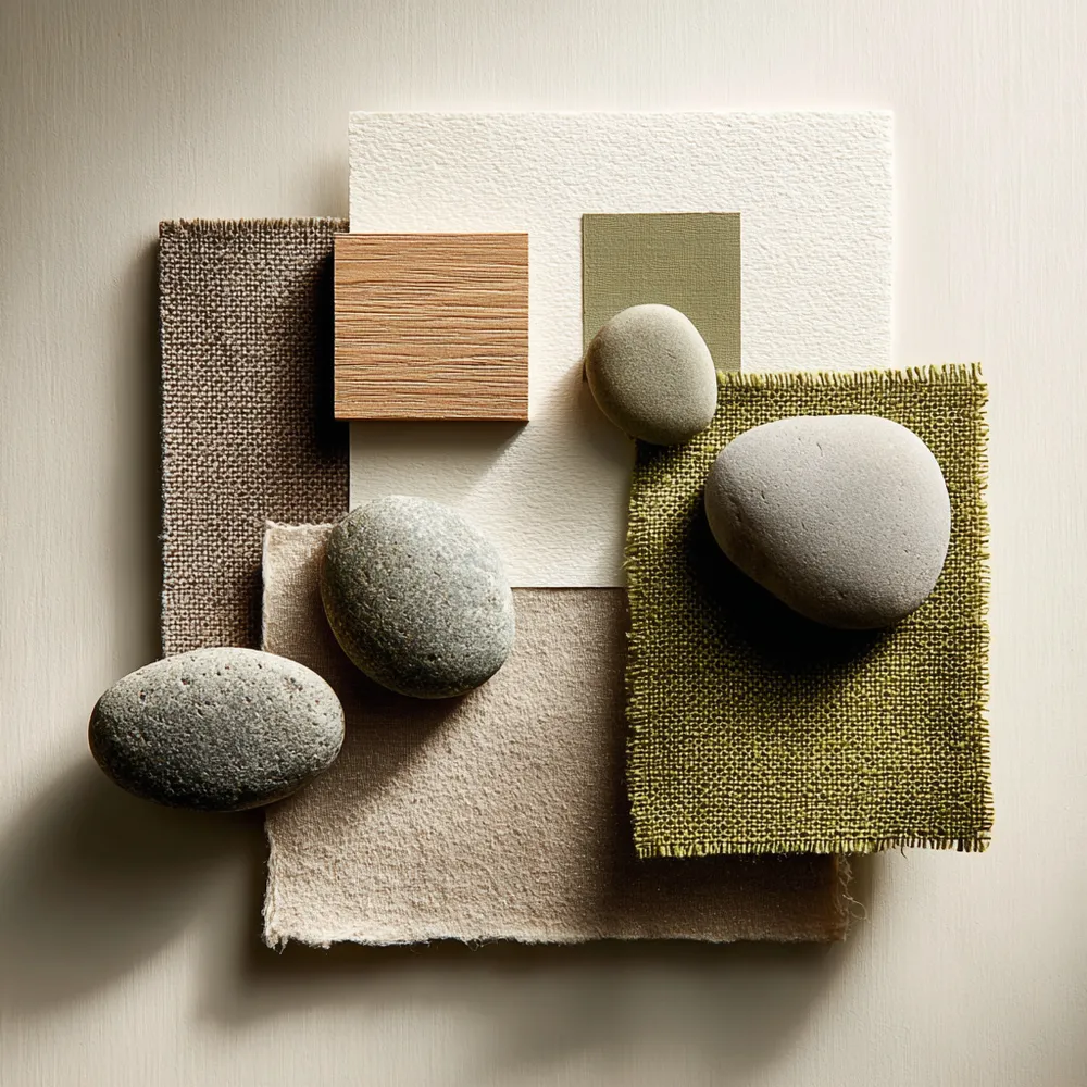
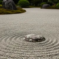
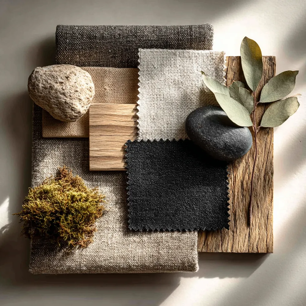
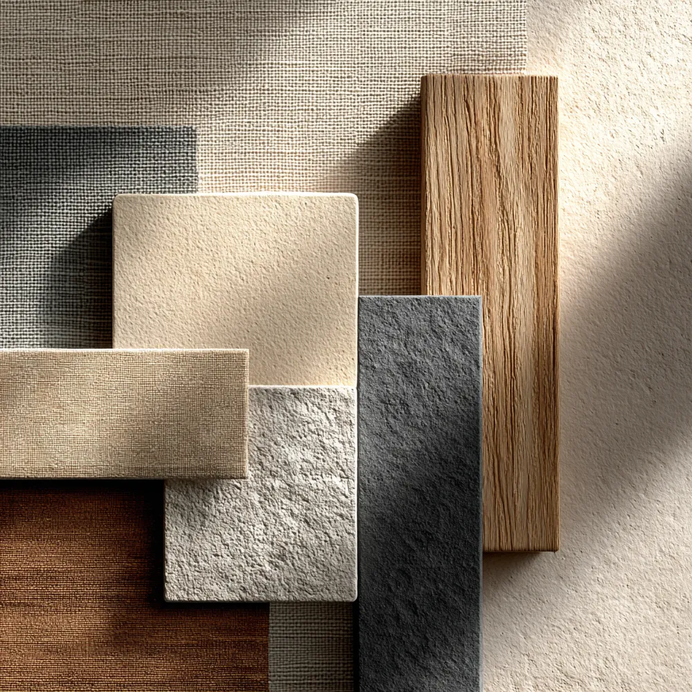
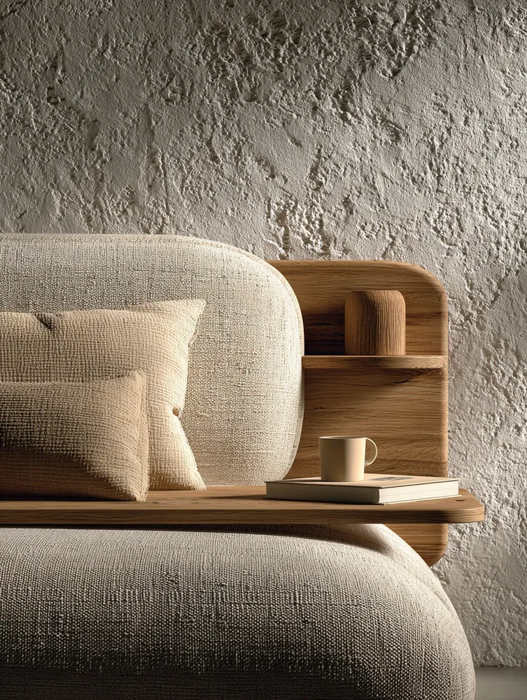
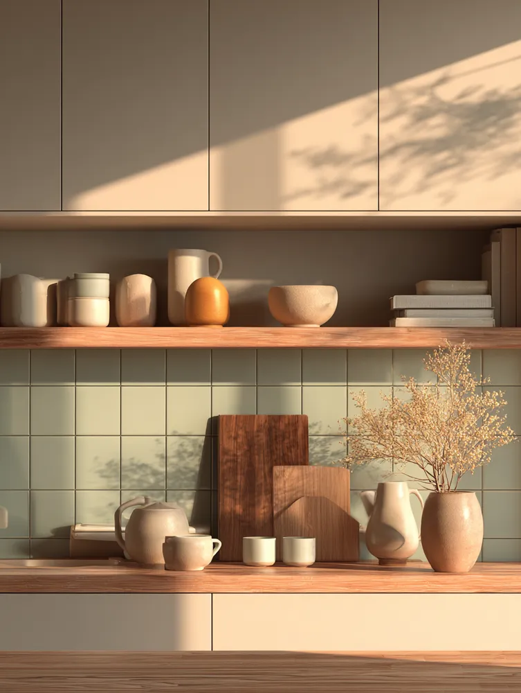
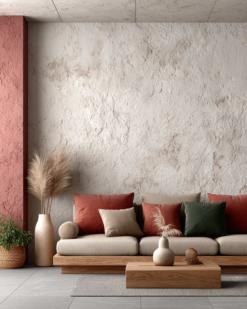
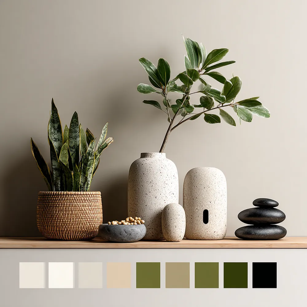
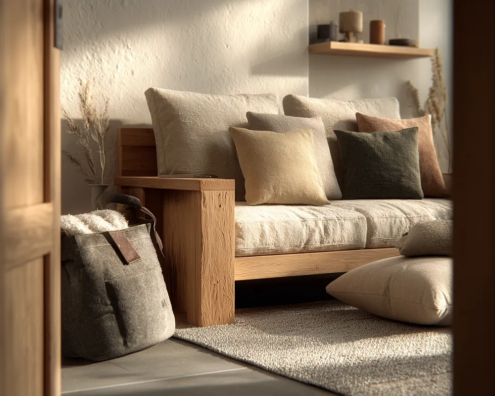
Think earthy neutrals: soft whites, creamy beiges, warm greys, and muted browns. These form the foundation for a tranquil space.
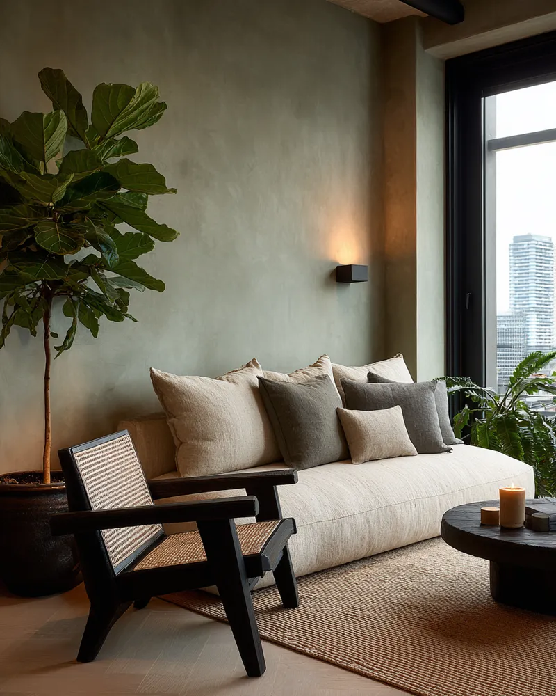
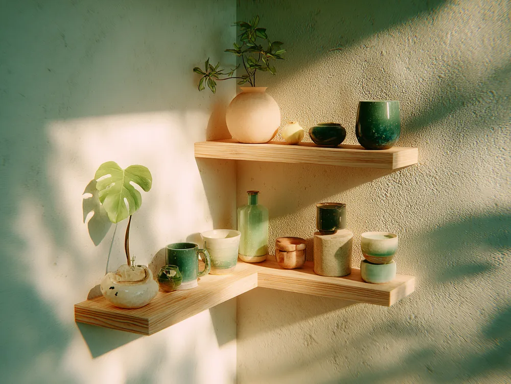
Introduce depth with natural wood tones – light oak, ash, or bamboo. Accent colors should be subtle and organic: the deep green of a plant, the soft charcoal of stone, or the gentle blue of natural linen.
The aim is a sophisticated, layered palette that feels grounded and restorative. It creates an atmosphere of peace and mindfulness in your home. Save this for your next color inspiration! #JapandiColorIdeas #ColorPaletteInspo #MinimalistColors #NeutralColorPalette #HomeColorIdeas #InteriorColor #CalmColor #DesignPalette #SereneInteriors #ColorInspiration
2025년 10월 28일
스타일 복사
 아직 댓글이 없습니다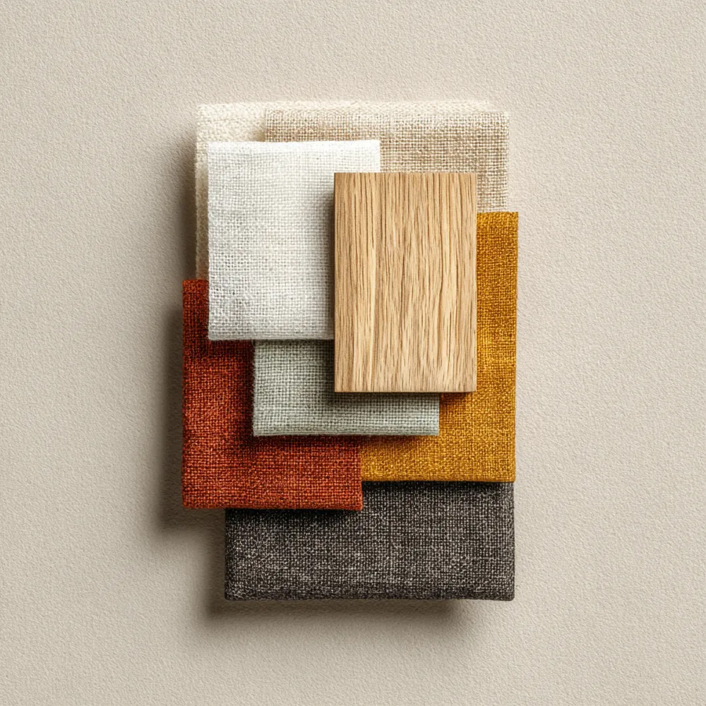
Creating Calm: Japandi Color Palettes for Your Home 🎨
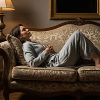
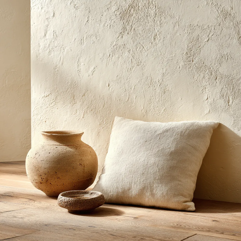
Neutral Palettes: Japandi's Serene Color Scheme 🤍
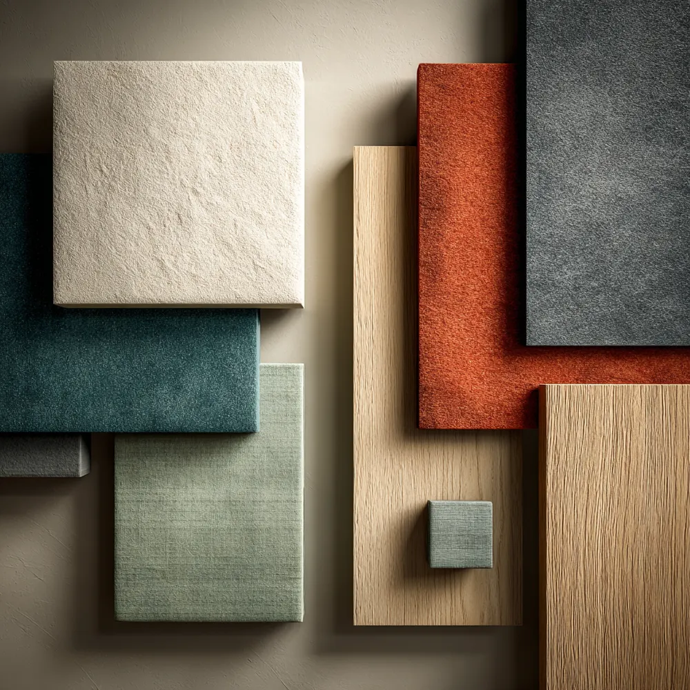
Finding Harmony: Japandi Color Palettes for a Tranquil Home ✨
Harmonious Hues: The Japandi Color Palette 🎨
✨ Japandi Color Palette: The Serenity Secret!
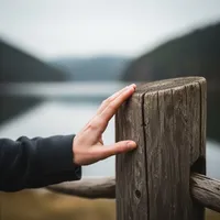
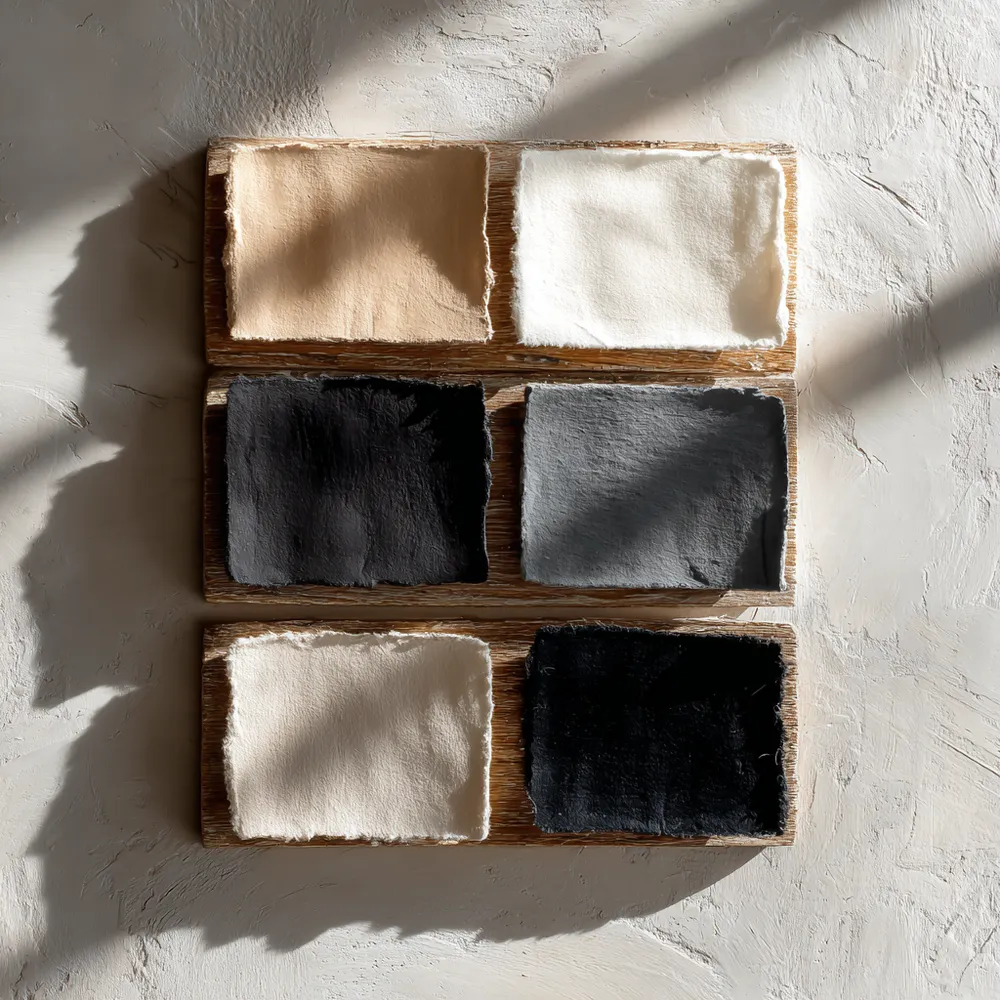
The Japandi Color Palette: Serene Neutrals for a Calm Home 🤍
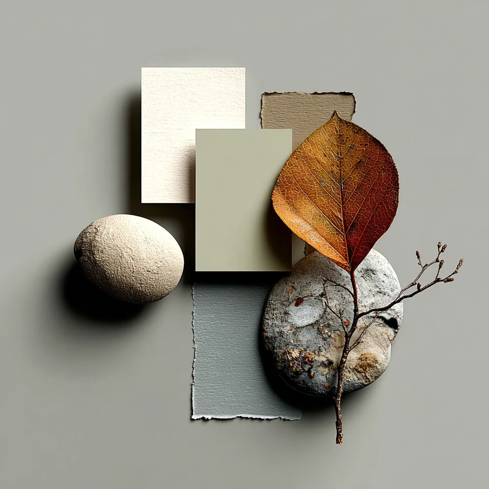
The Japandi Color Palette: Serene & Earthy Tones 🎨
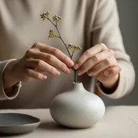
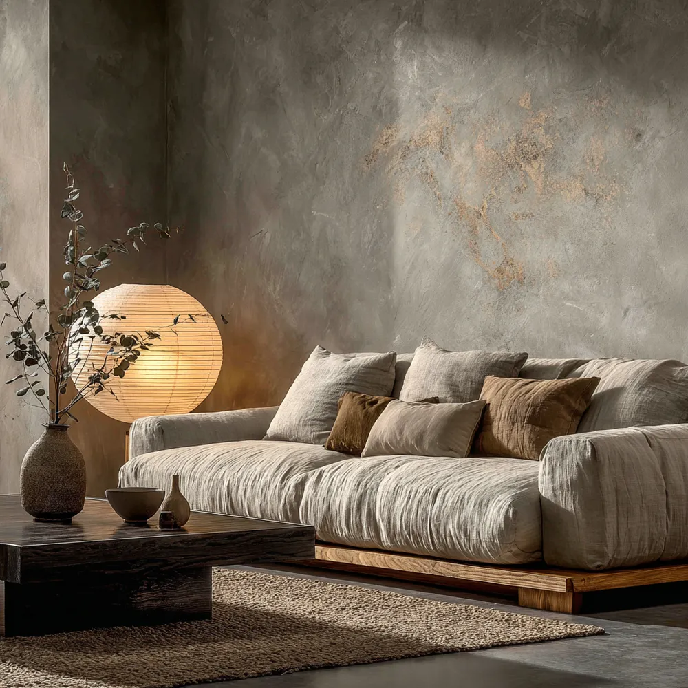
Unlock Serenity: 3 Dreamy Color Palettes for Your Japandi Haven ✨

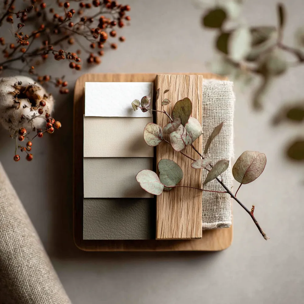
Creating Tranquility: Japandi Color Palette Inspiration 🎨
The Japandi Palette: Embracing Serene, Earthy Tones 🤍
Minimalist Japandi Color Palette: Serenity Found 🎨
Nature's Palette: Calming Colors for Your Home 🌿
Japandi Color Palette: Soothing Neutrals & Earth Tones 🎨
Color Palette Perfection: Japandi Neutral Tones 🤍
Understated Elegance: The Role of Neutral Palettes in Japandi ☁️
The Joyful Calm of Muted Pastels: A Japandi Kitchen Palette 🌸

Soft Neutrals & Earthy Tones: The Japandi Color Palette 🤎
Balancing Act: Japandi Color Palette Secrets 🎨💚
The Power of Neutrality: Japandi Color Schemes 🤍
Creating Calm Walls: Japandi Color Palettes 🎨