1/12
'The renaissance of this color is not surprising' – 11 pink kitchens that are timeless and soothing
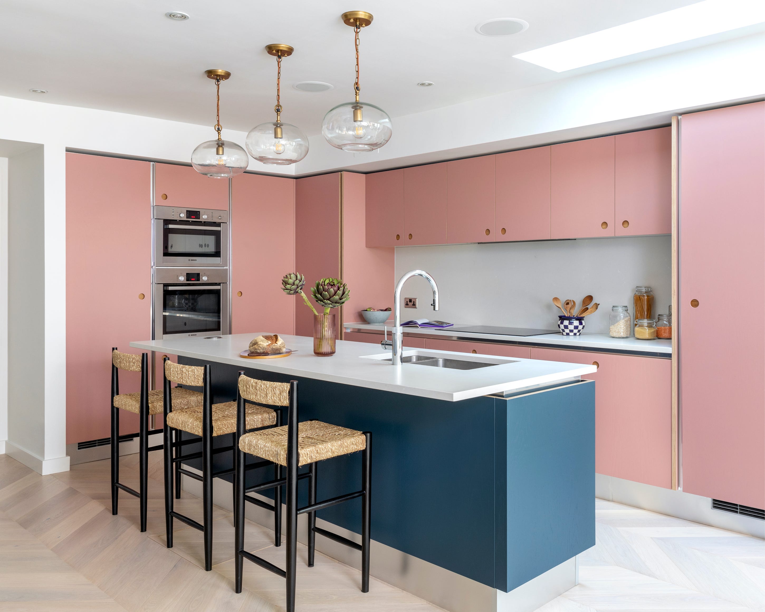
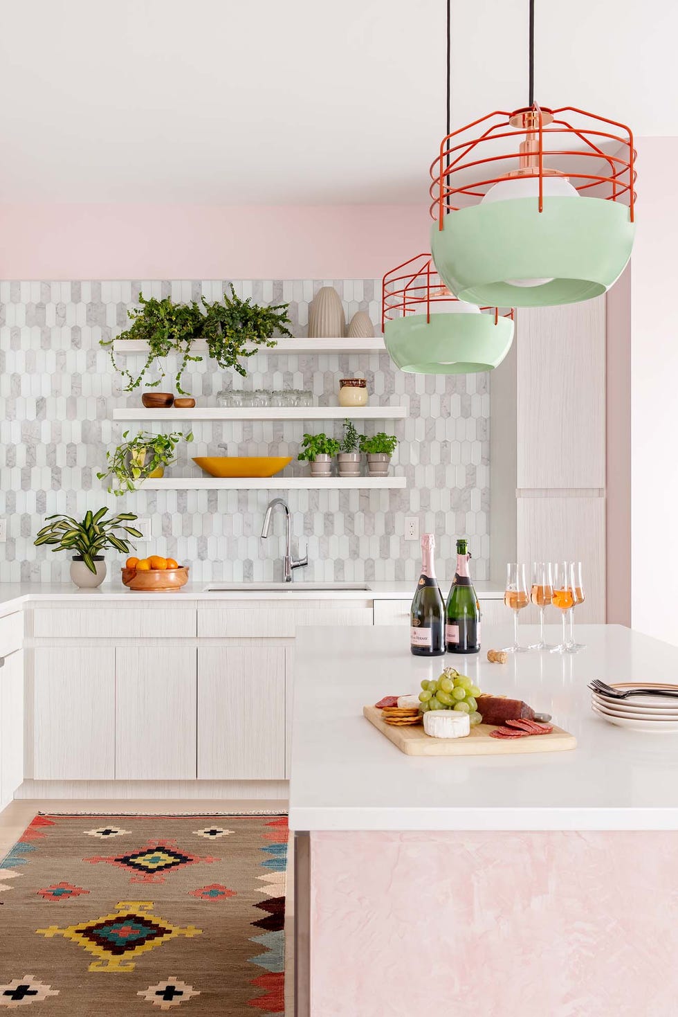
The color pink is experiencing a significant renaissance in kitchen design, moving beyond traditional associations to become a versatile and sophisticated choice. This article explores eleven distinct ways to integrate pink into kitchen aesthetics, demonstrating its timeless appeal and soothing qualities. Pink, with its rich cultural associations ranging from celebration and rebirth in Japan to love and femininity in the West, offers a broad spectrum of tones that designers find highly adaptable.
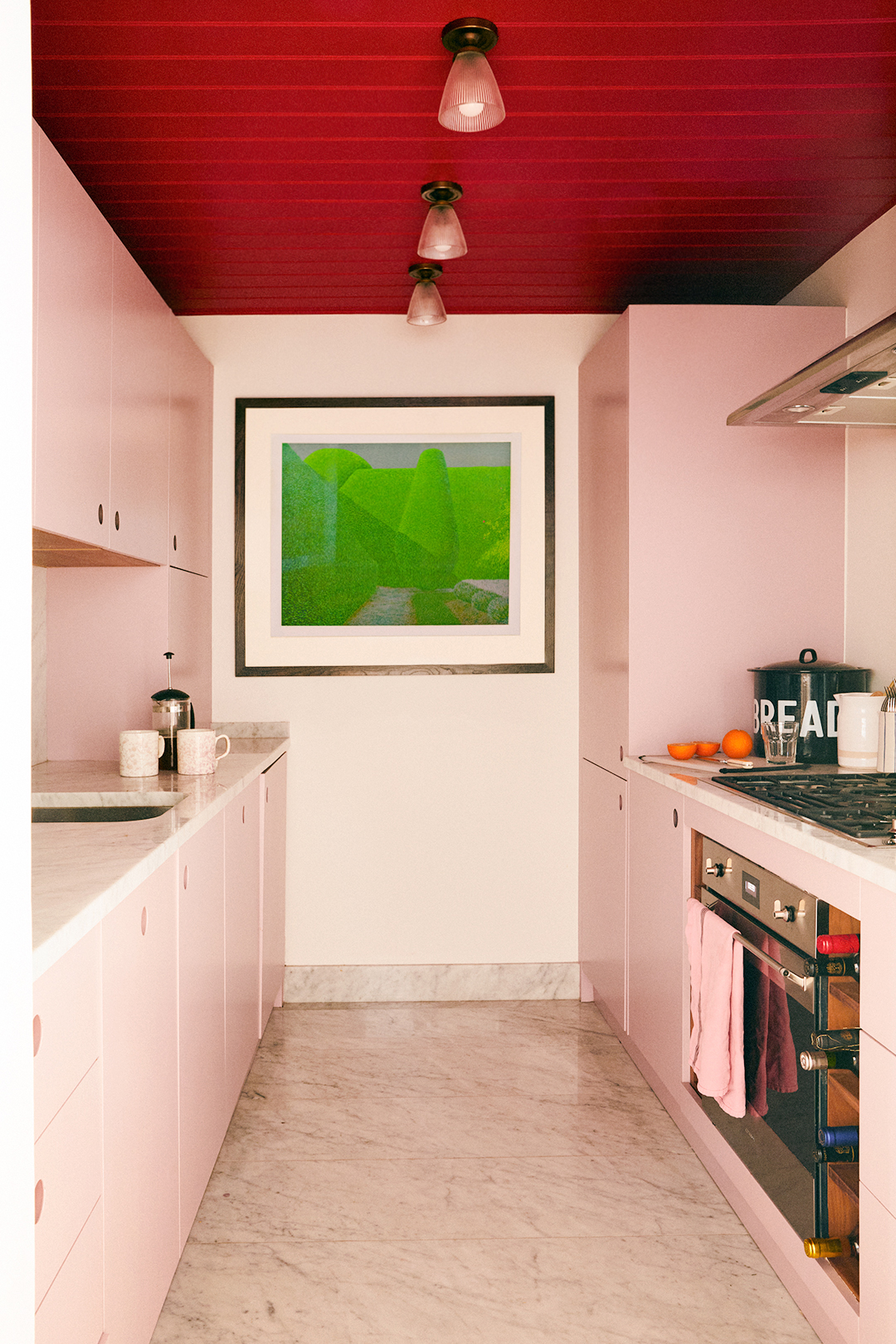
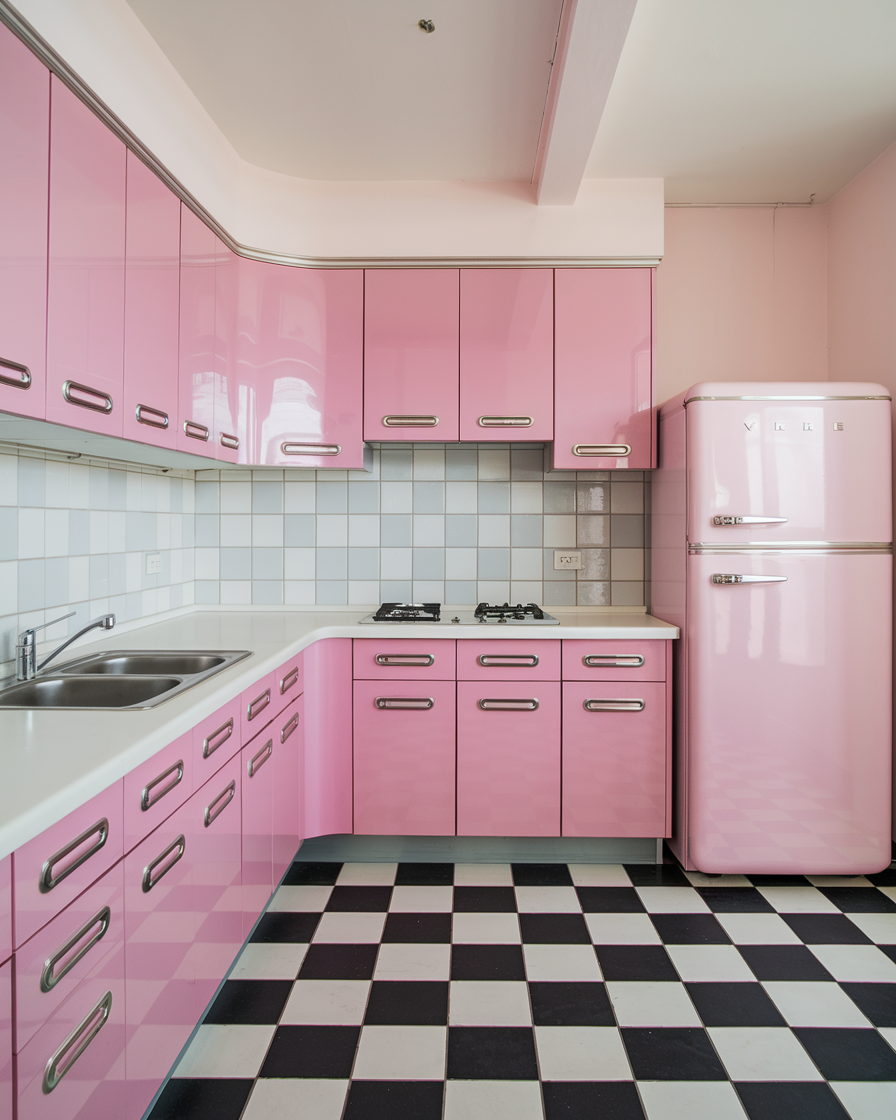
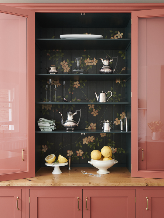
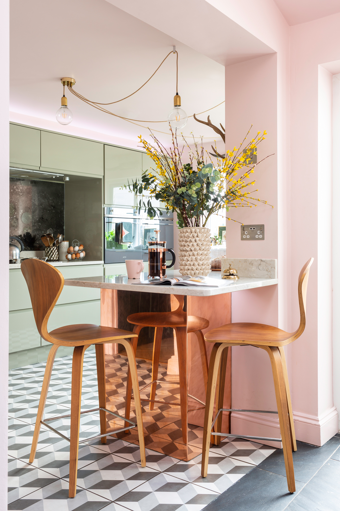
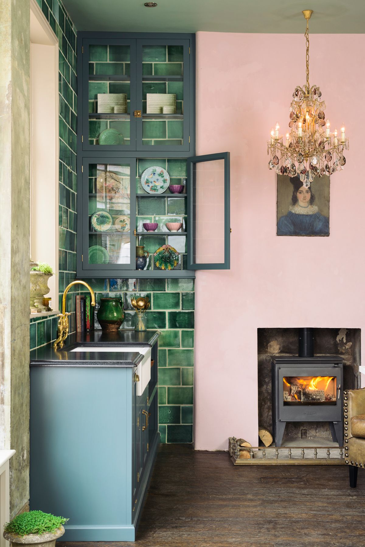
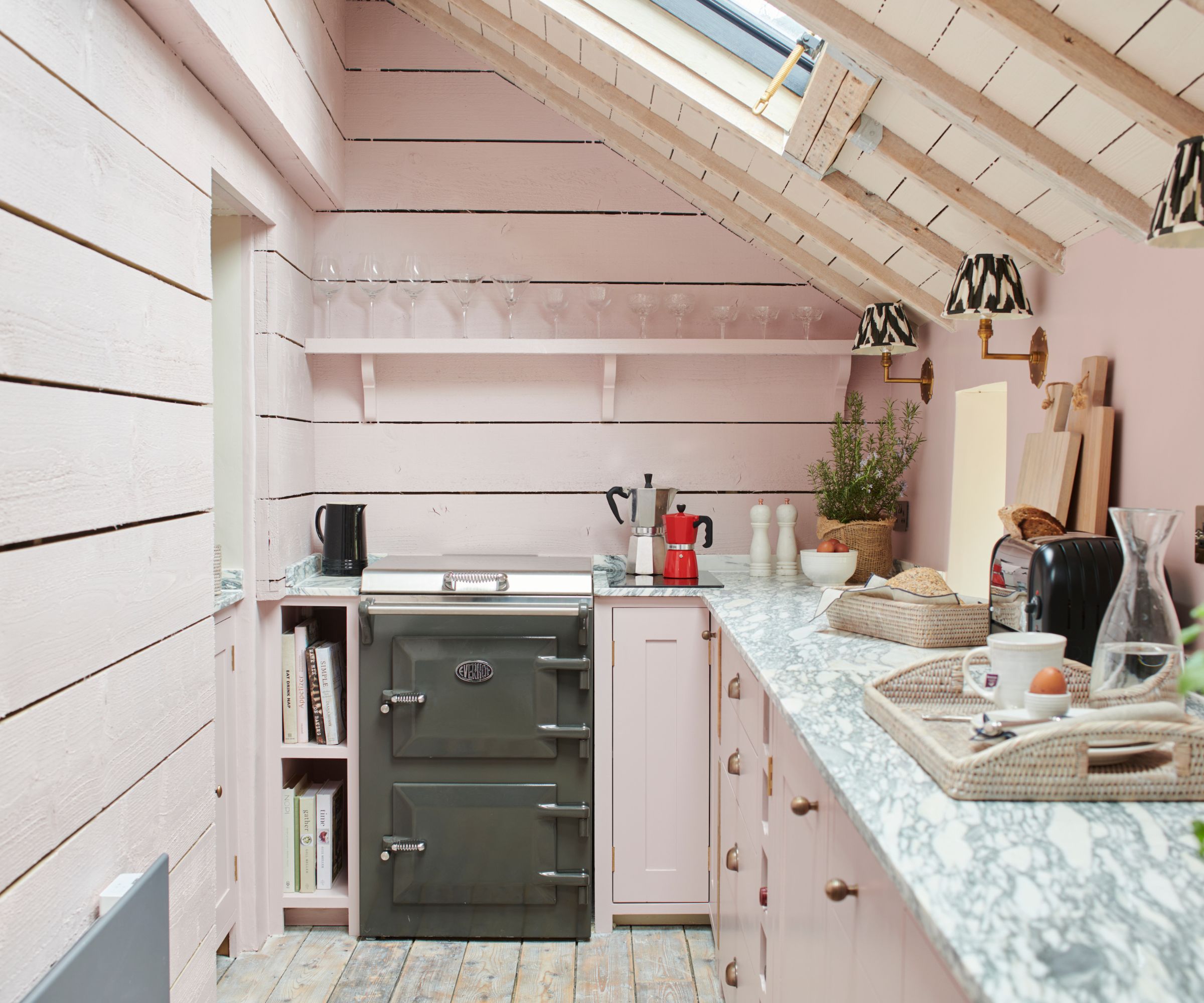
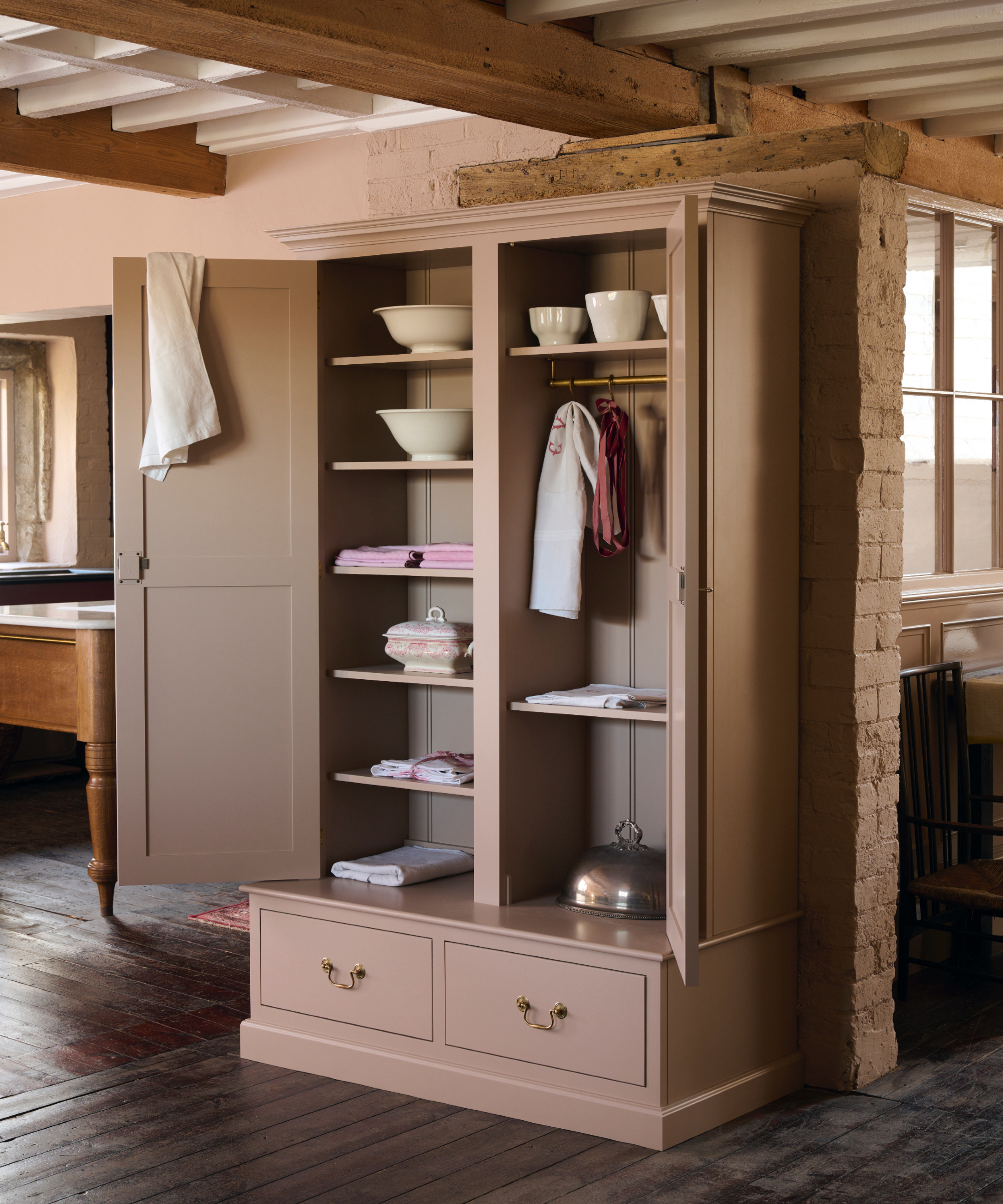
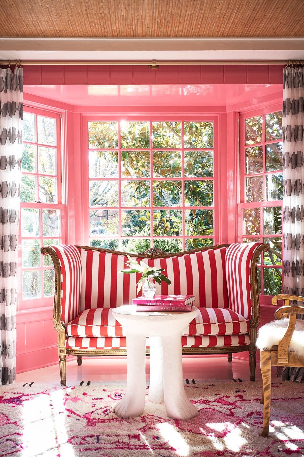
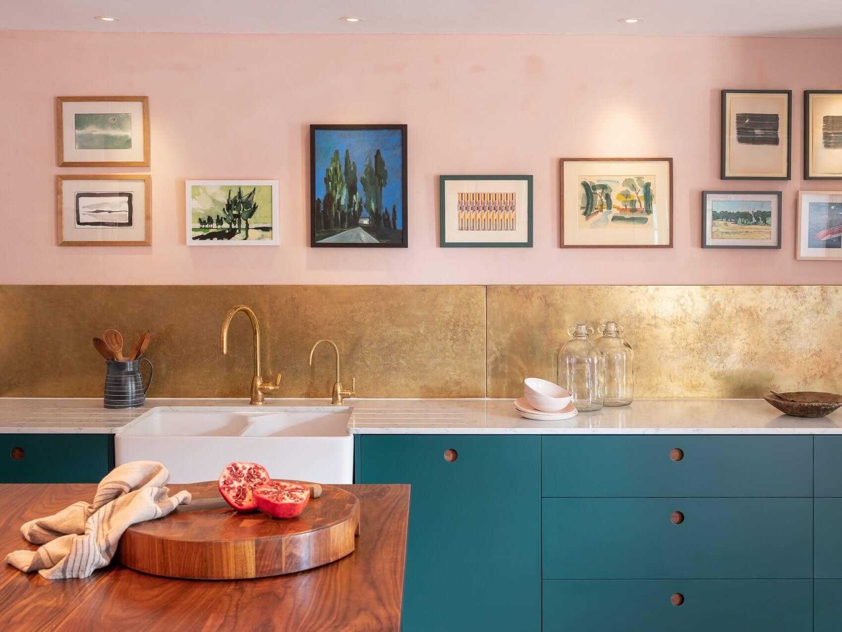
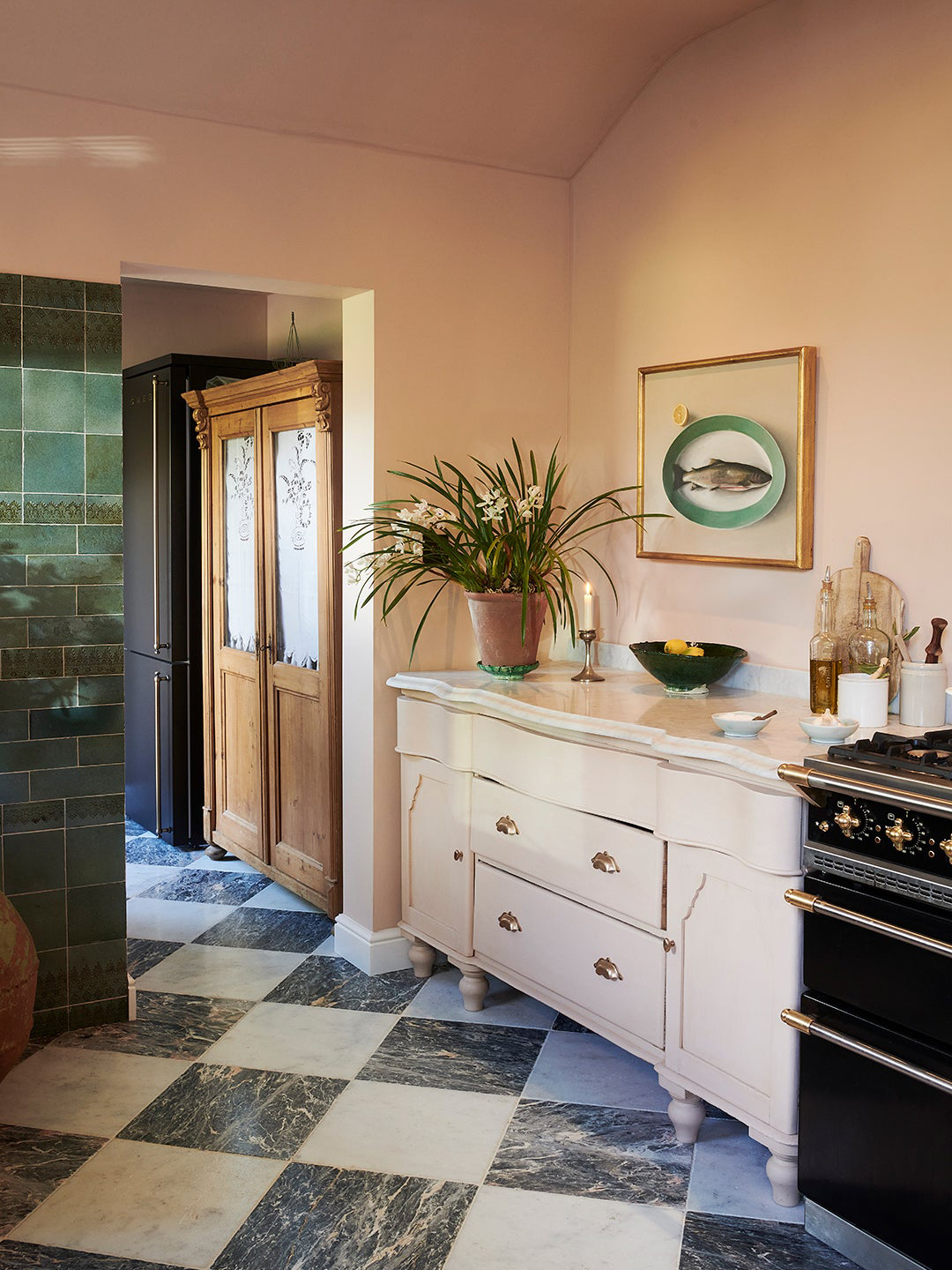
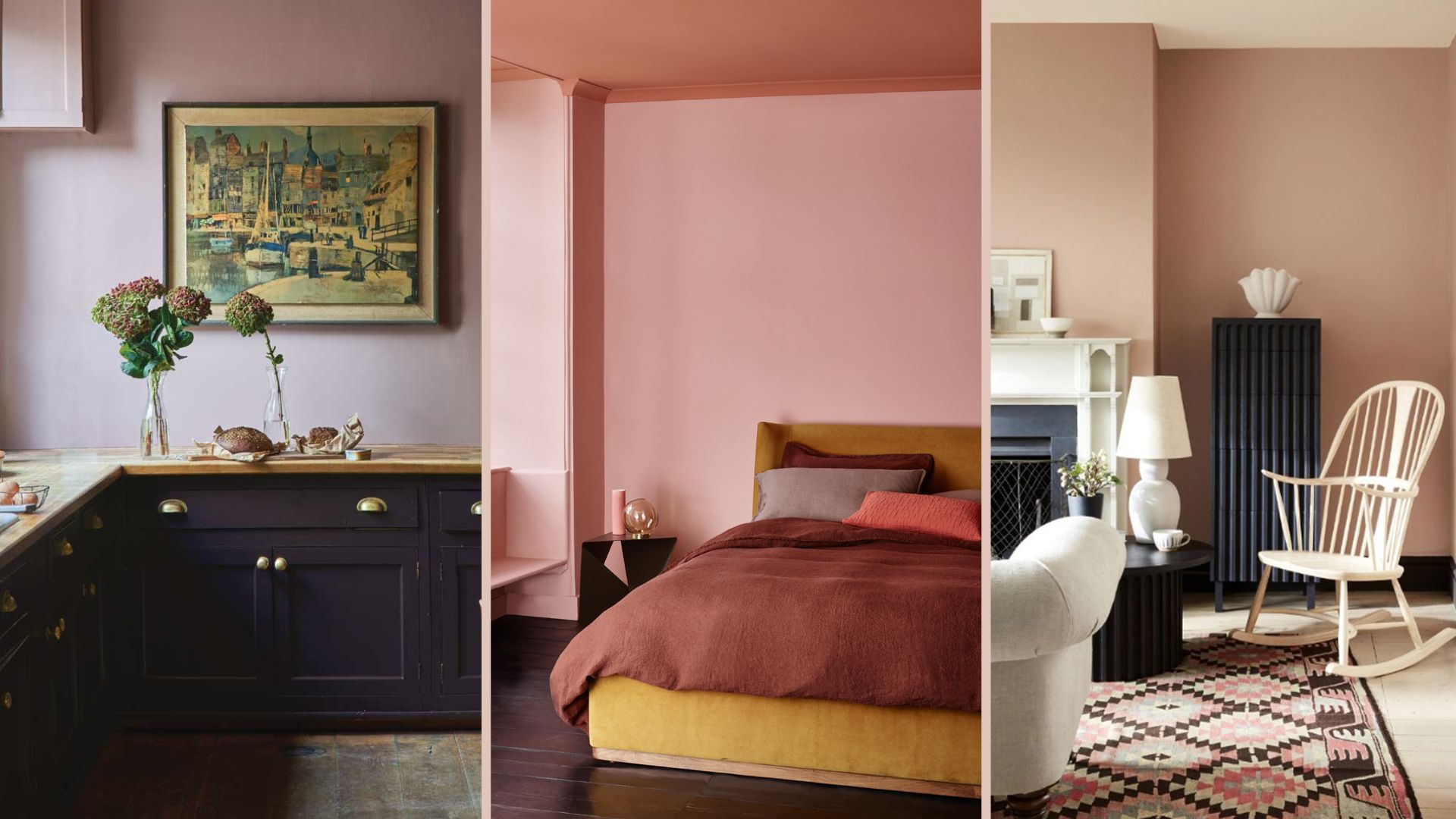
One approach is to fully commit to pink by painting all walls and even the ceiling. Helen Parker, creative director at deVOL, advocates for this bold commitment, arguing that an entire room painted in a soft pink creates a stylish and understated warmth. This method provides an excellent backdrop for contrasting colors and materials, such as emerald green tiles, navy blue accents, black and white floor tiles, natural wood, and brass details, creating a harmonious and layered look.
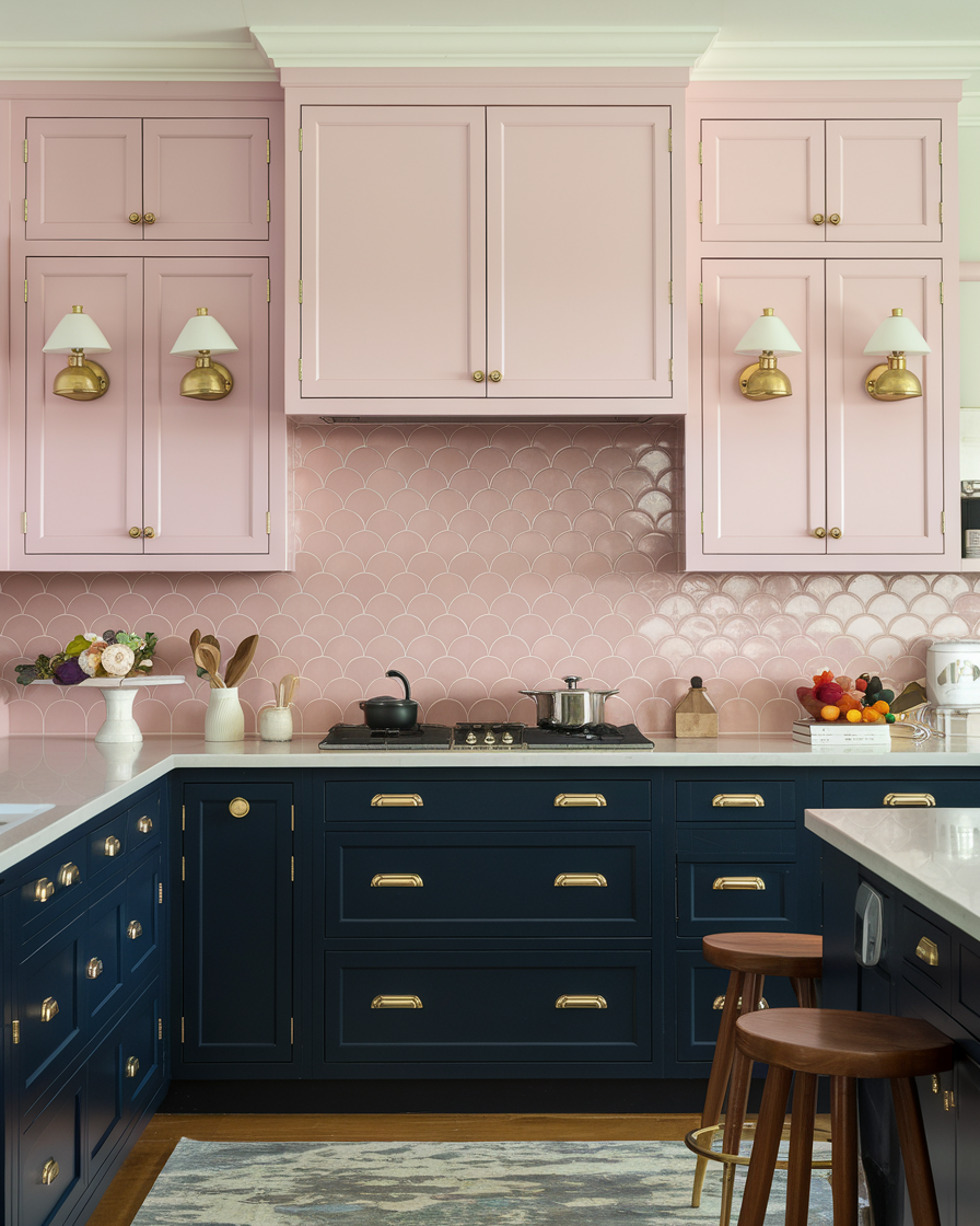
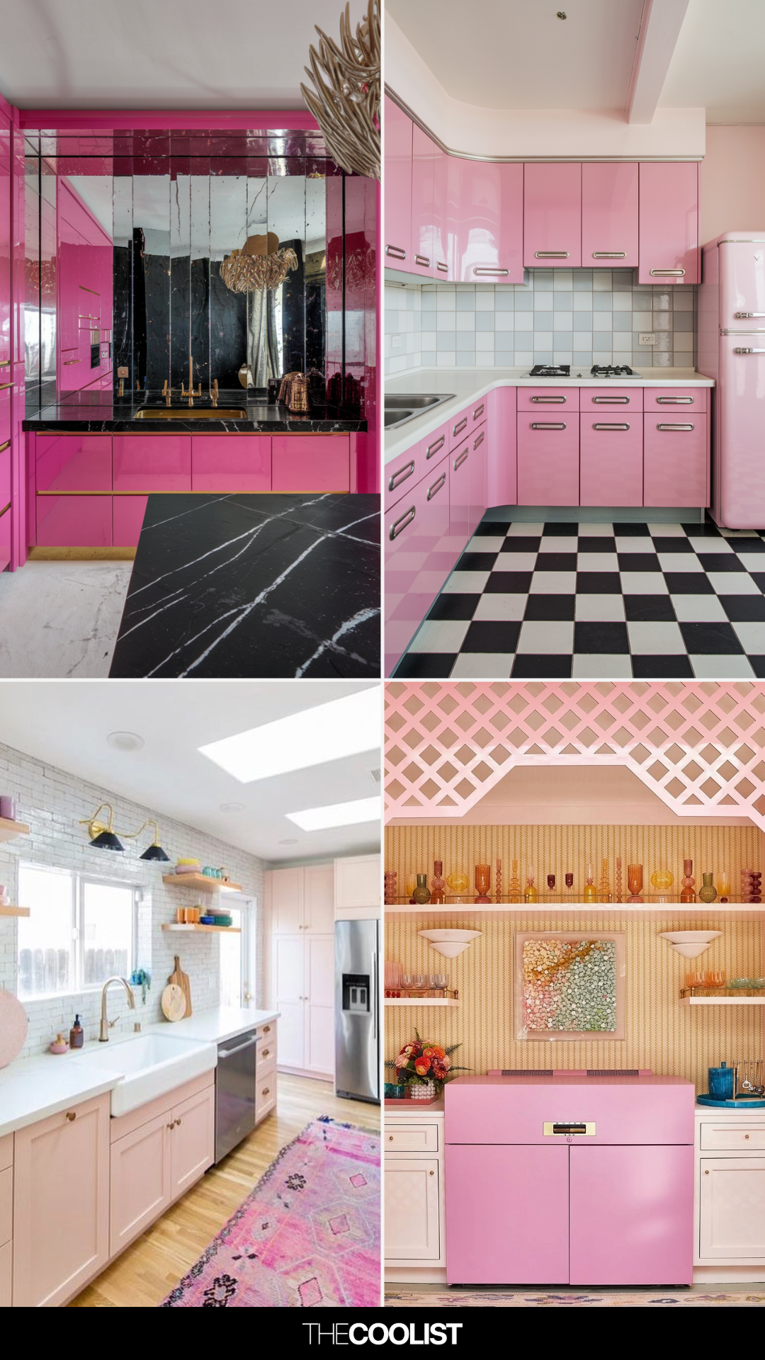
For those hesitant about an all-pink commitment, incorporating pink through feature tiles or a splashback offers a subtler introduction. This method allows for the addition of texture and softness without overwhelming the space. An example given is a kitchen that uses two-tone pink tiles in a central unit, effectively enhancing wooden elements and softening darker surfaces like black worktops and backsplashes.
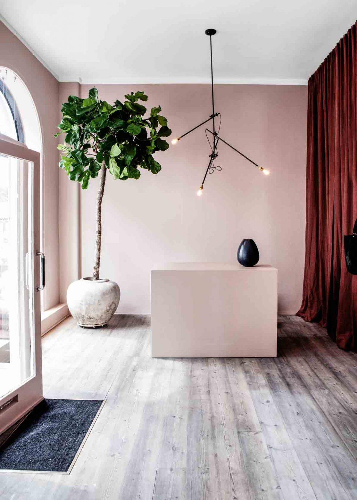
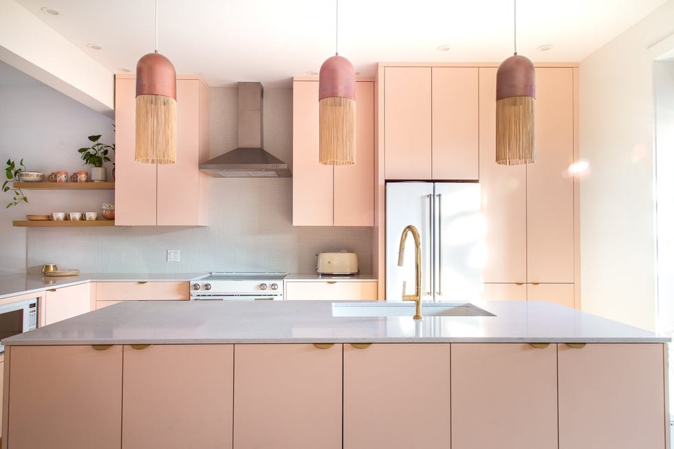
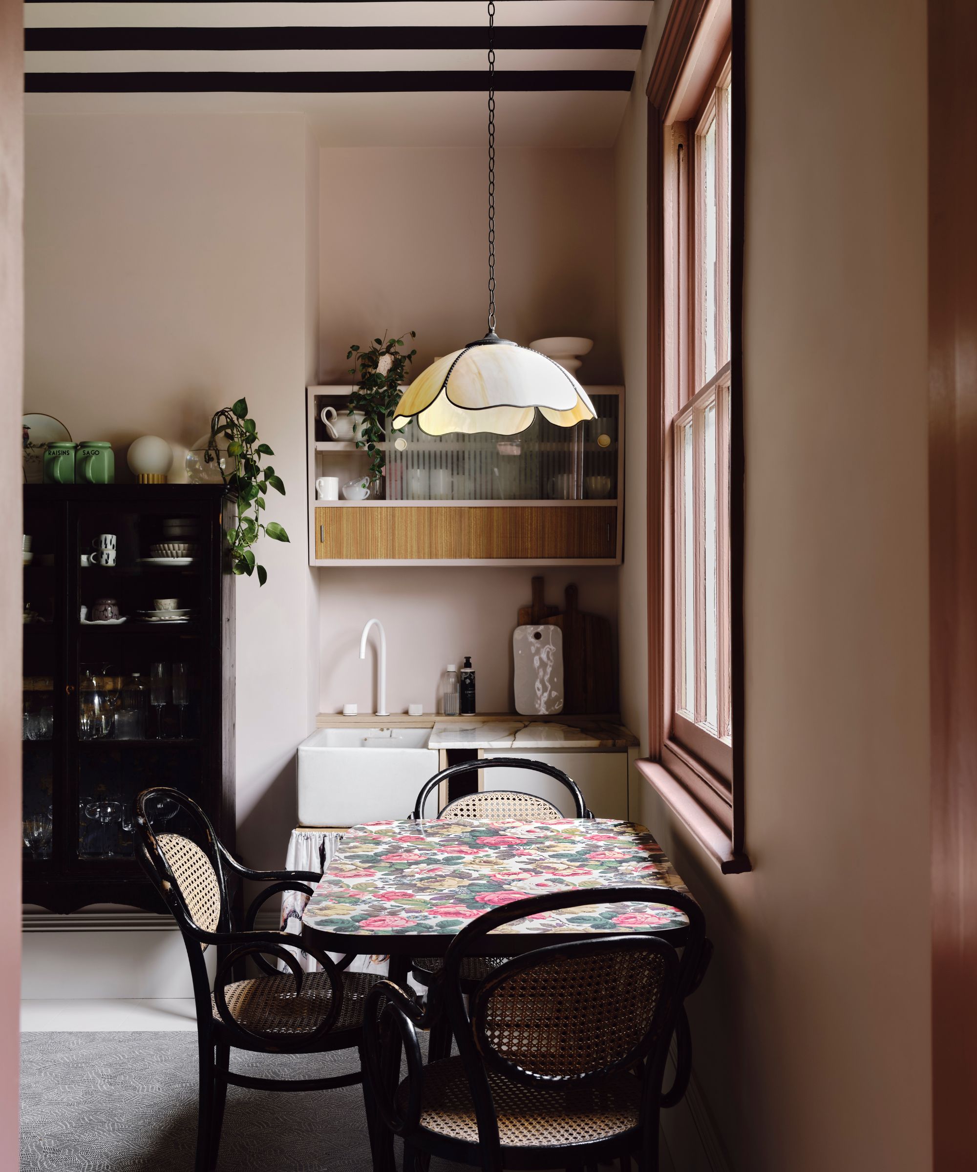
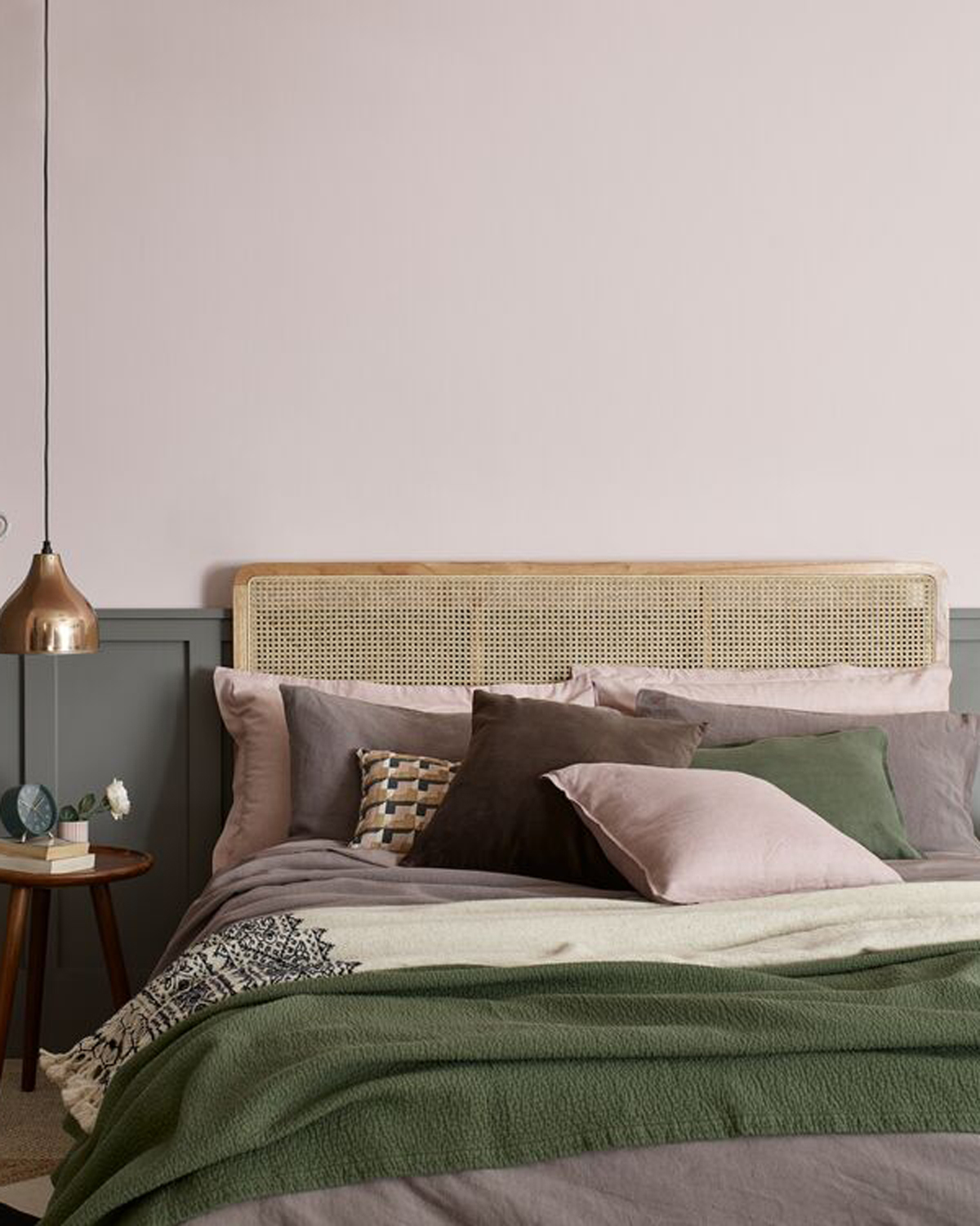
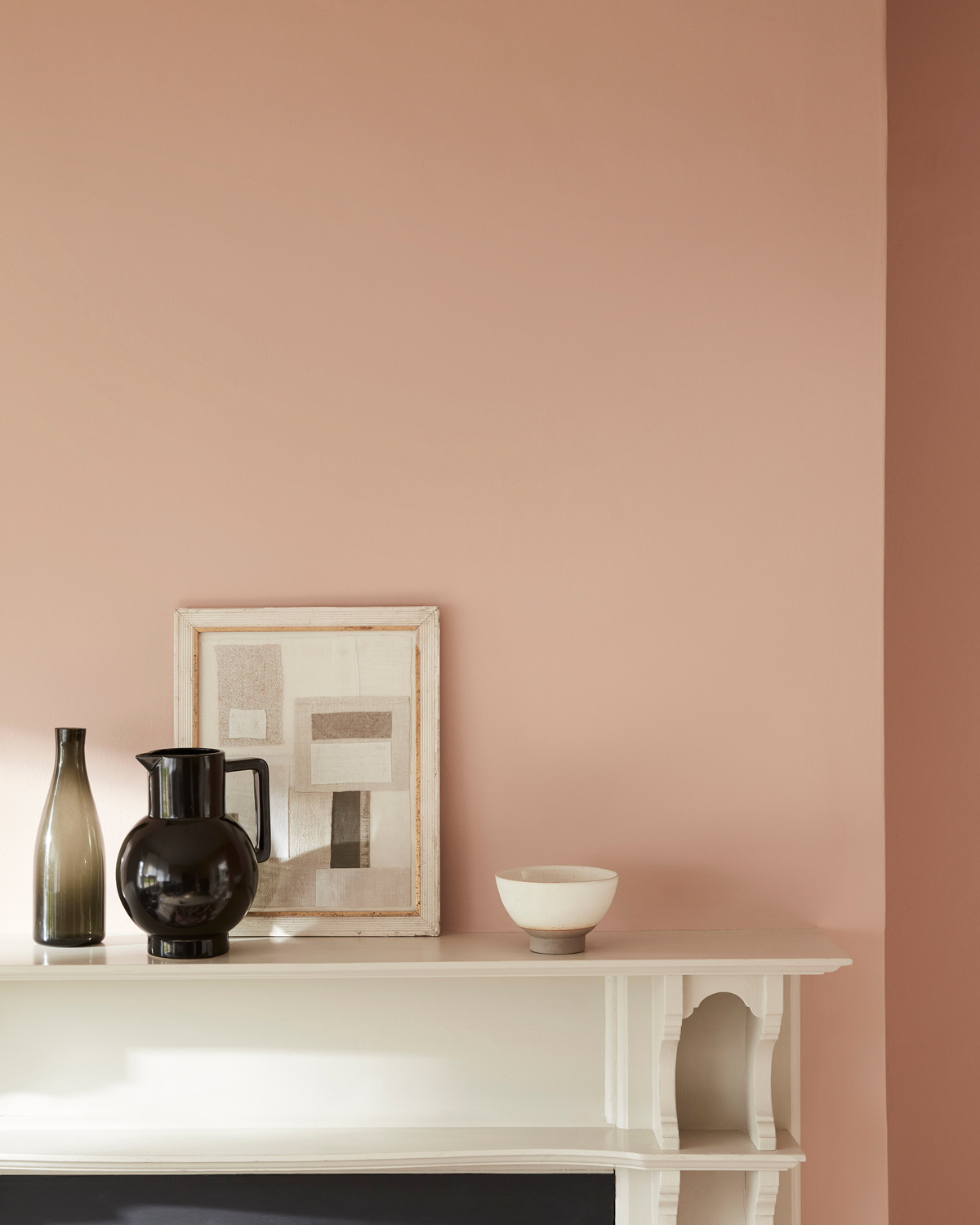
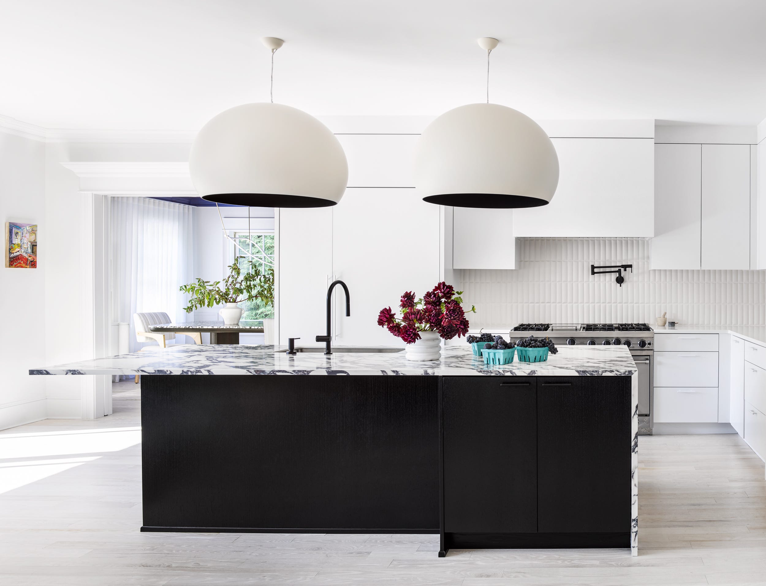
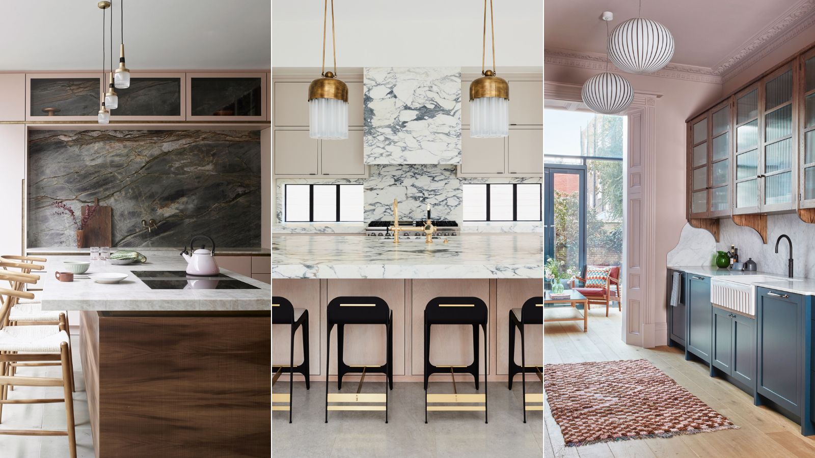
Interior designer Jennifer Welch suggests using pink carefully, favoring blush tones for a delicate effect. She emphasizes that subtle pink undertones can introduce significant warmth and balance, creating an appealing and sophisticated atmosphere, especially when paired with black chairs and brass accents. This approach highlights pink's ability to be almost imperceptible yet profoundly impactful.
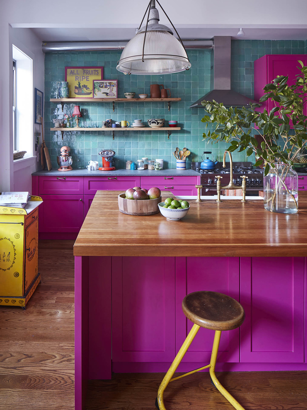
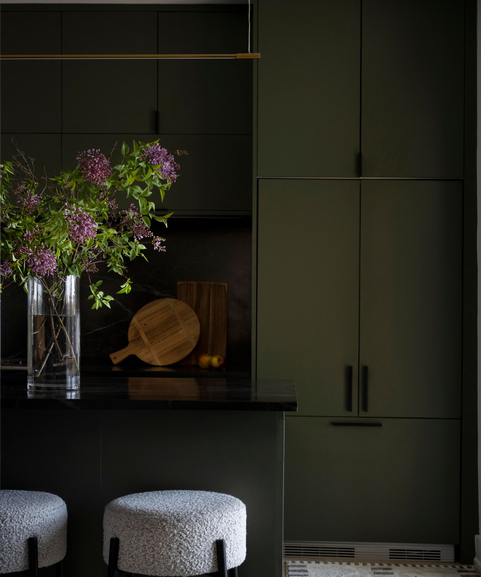
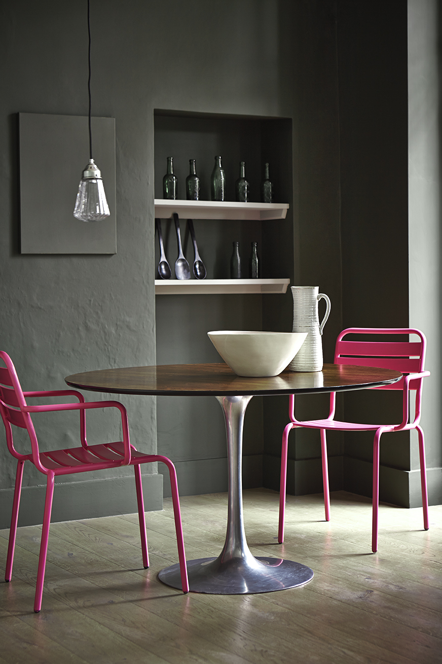
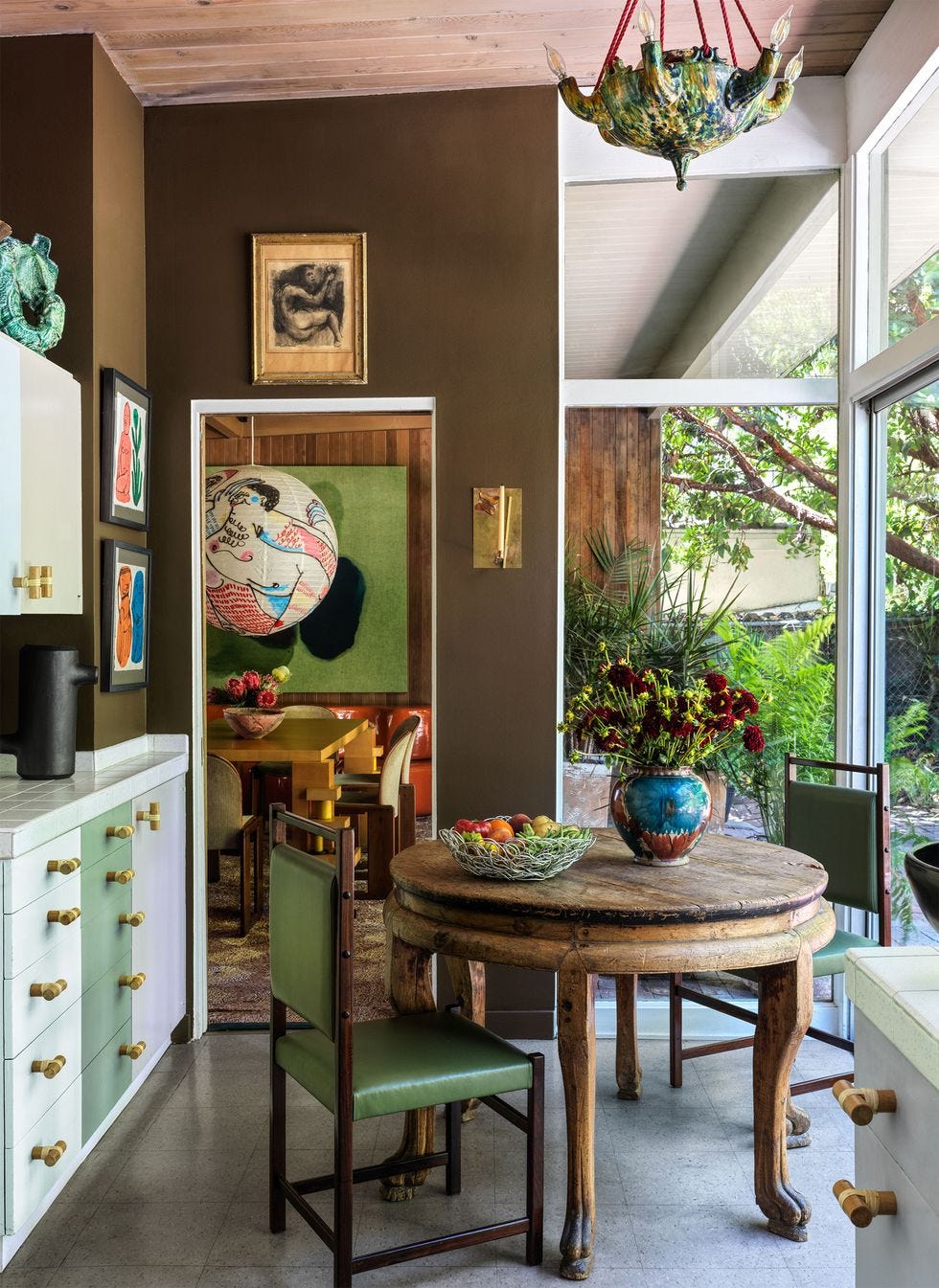
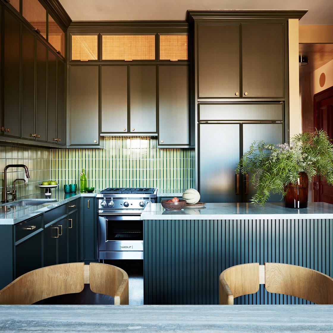
In smaller kitchens, where white is often chosen to maximize space, the article proposes using bolder colors, including pink, to create depth and interest. Pairing dark colors like olive green with a sweet strawberry pink, and adding visual height with a white ceiling and light window fabrics, results in a stylish and impactful design that defies the conventional wisdom for small spaces.
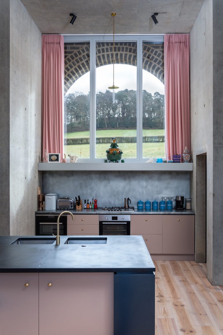
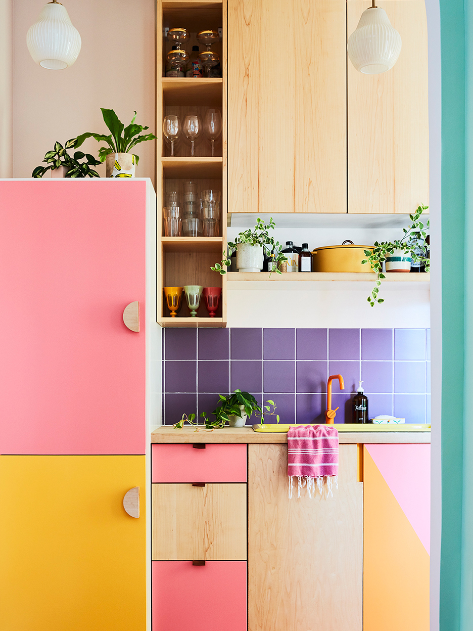
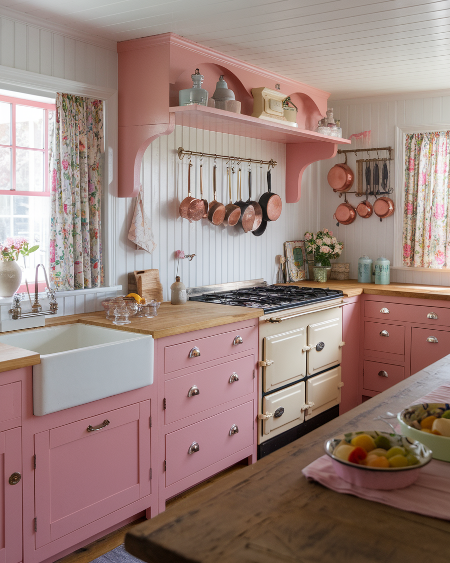
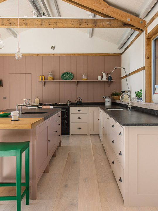
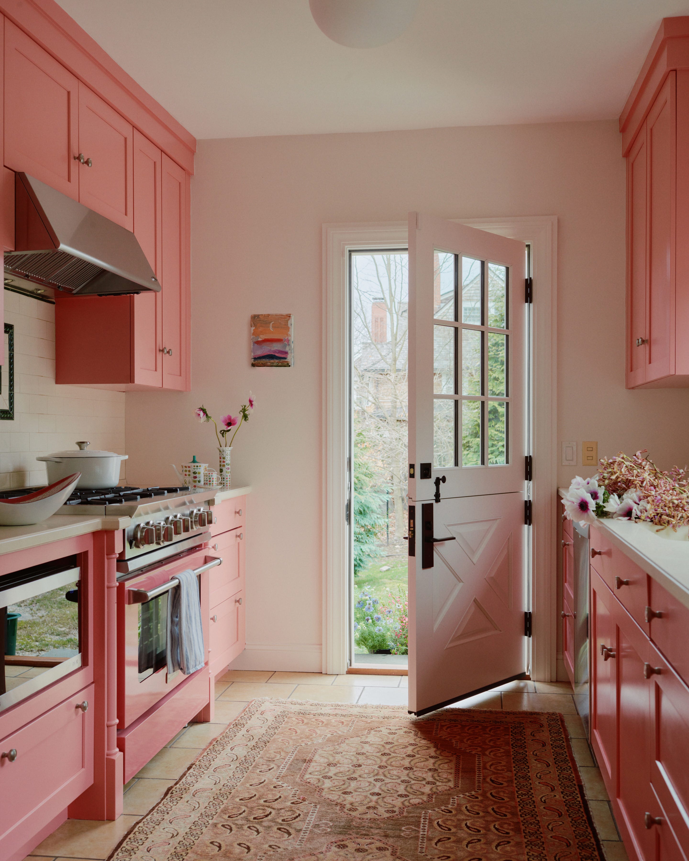
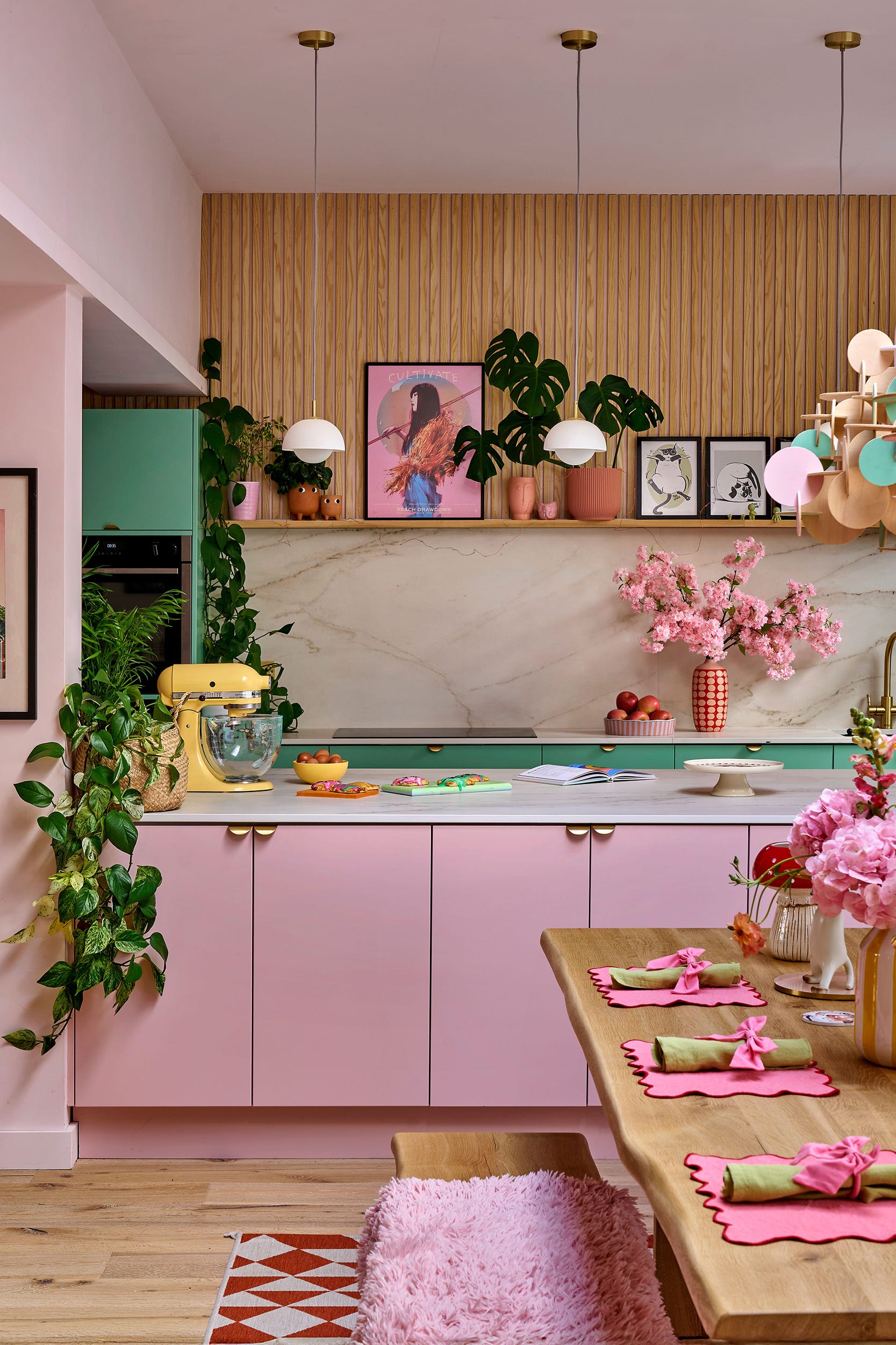
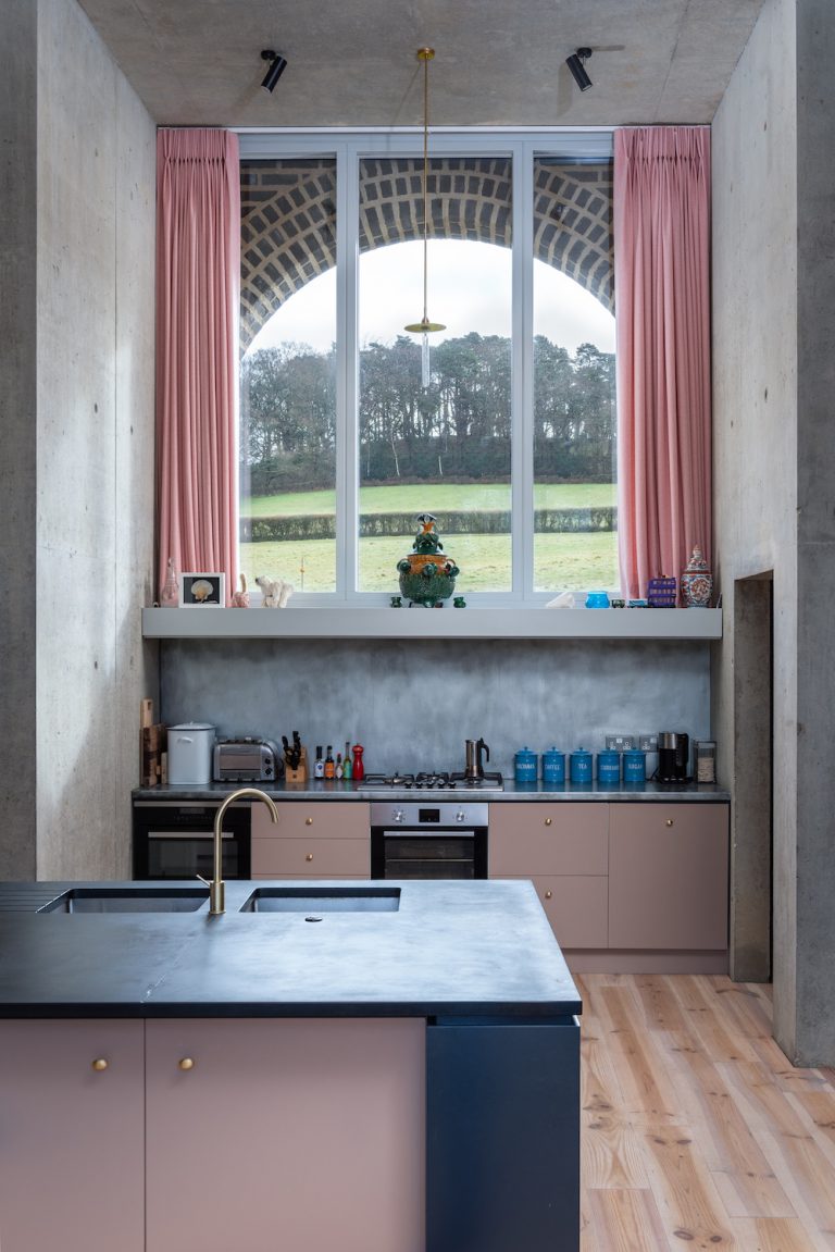
Pink is also increasingly being used as a new neutral, replacing traditional whites or beiges. Ben Burbidge, managing director of Kitchen Makers, notes the rise in adventurous color choices in kitchens, with pink offering a warm and inviting alternative to stark white. This neutral application allows for thoughtful finishing touches with handles, backsplashes, textiles, and rugs to enhance the luxurious feel.
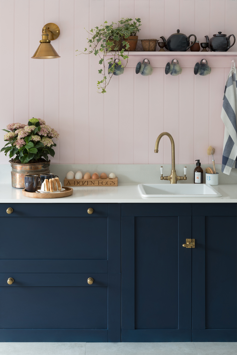
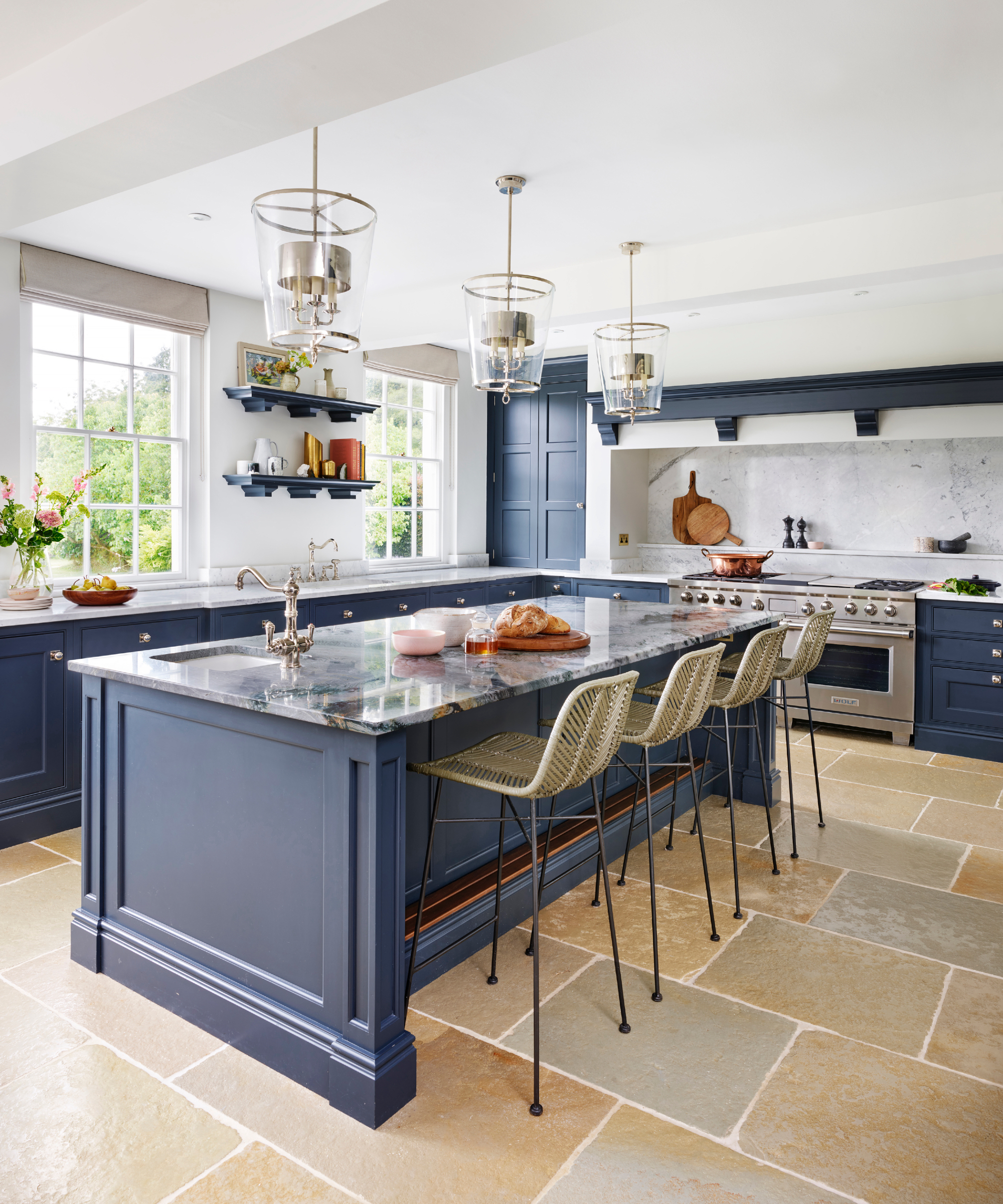
Contrasting pink with another bold color, such as blue, creates a contemporary and playful aesthetic in a traditional kitchen. This juxtaposition of a vibrant blue with a softer pink works well with natural materials like wood and marble, and a consistent hardware choice can elegantly unify the two colors. The article also suggests employing a variety of pink hues within a single scheme, leveraging pink's versatility and its elements of both warmth and coolness to complement natural palettes of greys, browns, and greens.
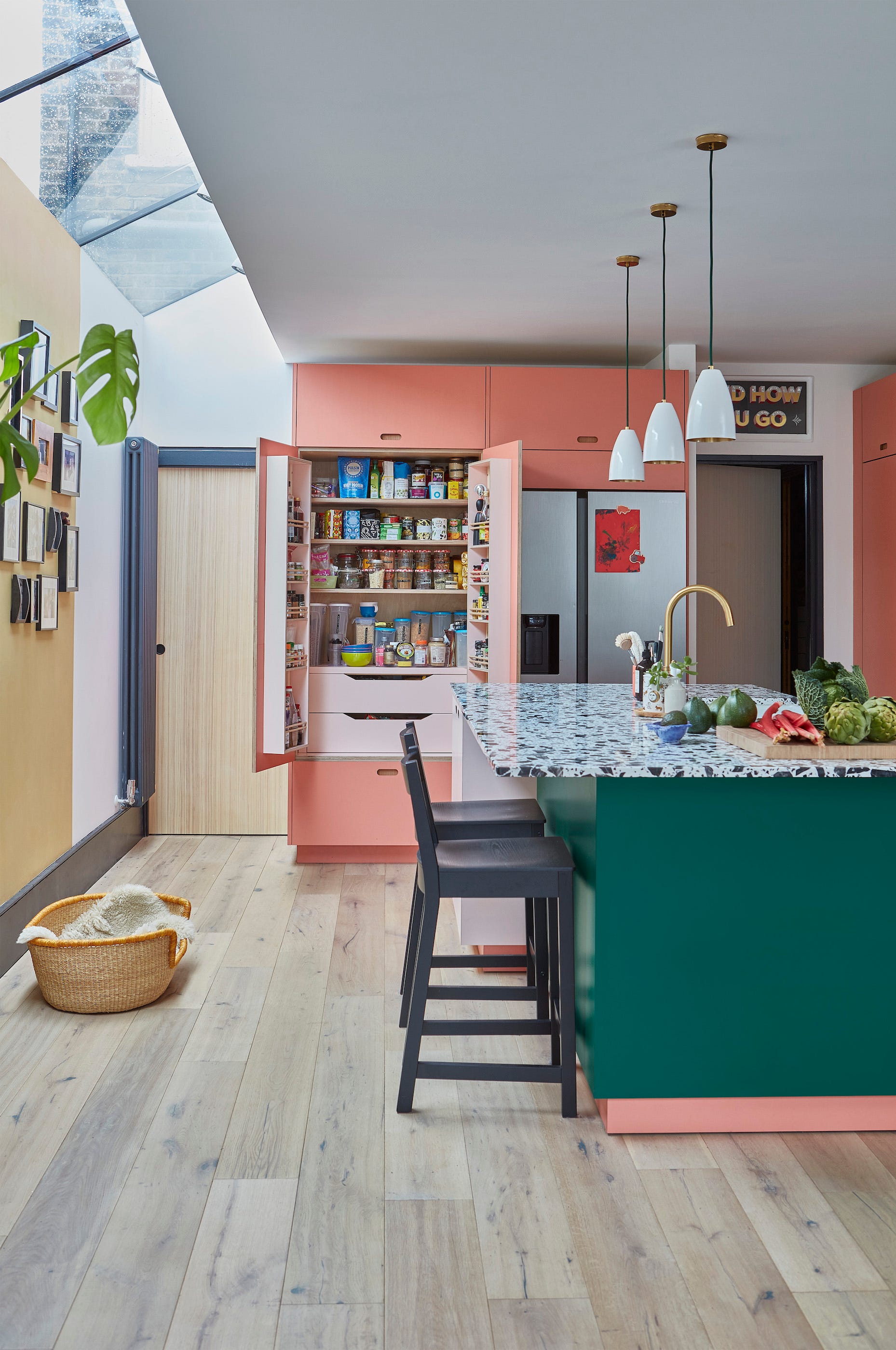
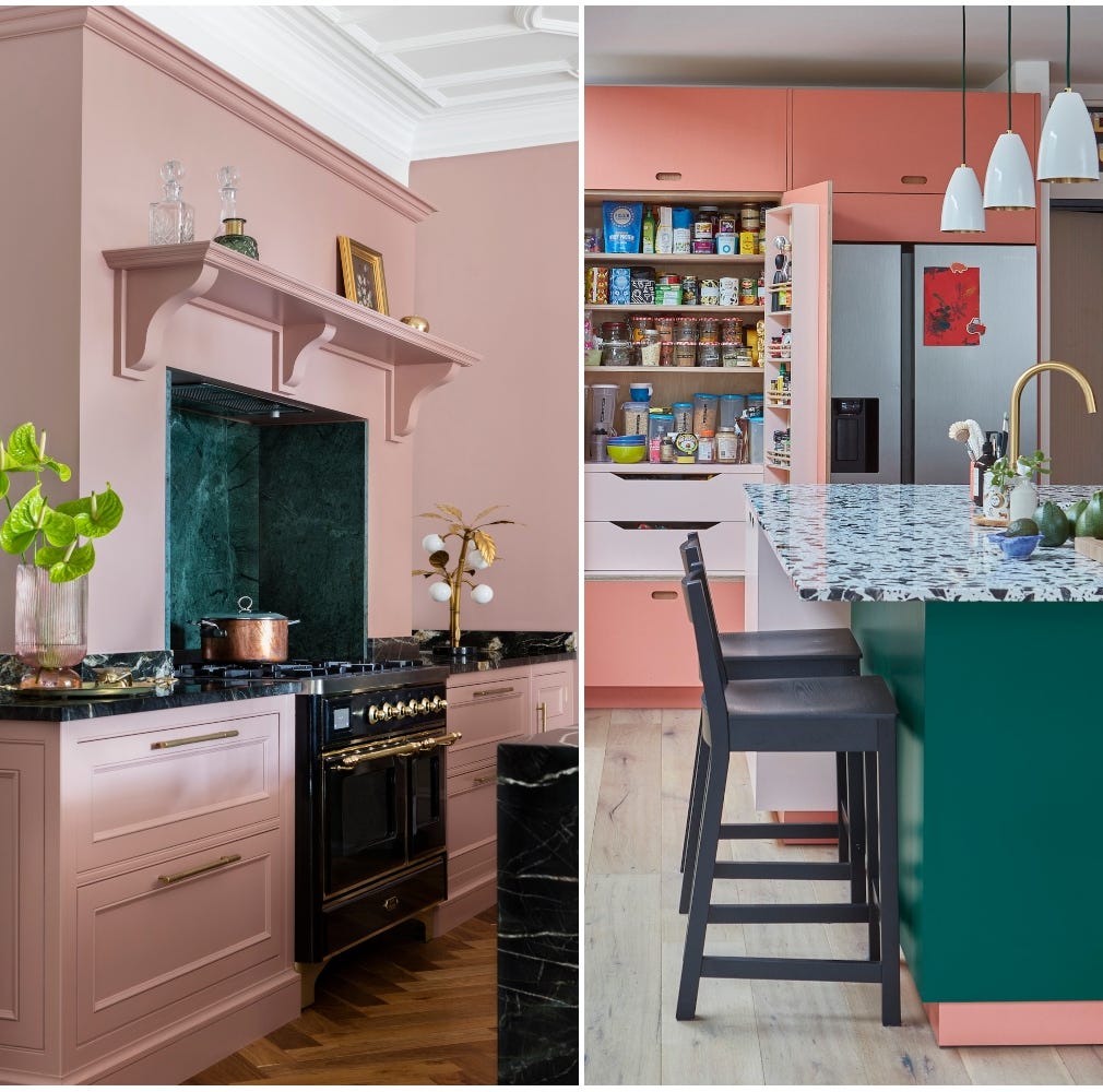
Soft pink can also temper bold design elements. In Charlotte Cosby's kitchen, a subtle pink provides a warming backdrop, while bold countertops, such as mottled jade terrazzo, add contrast and playfulness. For connecting multiple spaces, a warm pink can serve as a unifying neutral tone, allowing for bolder colors and patterns to be introduced elsewhere, adapting to different light conditions across rooms.
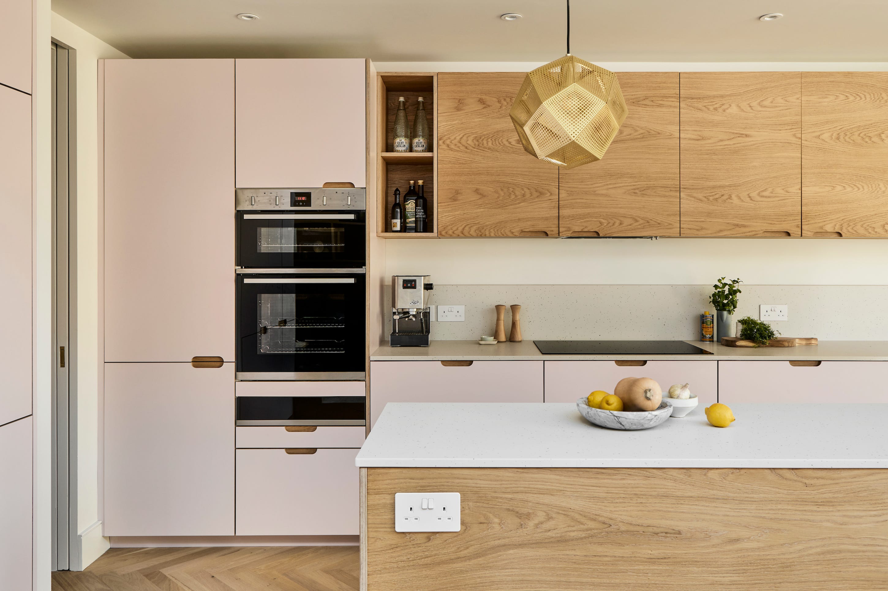
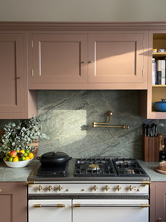
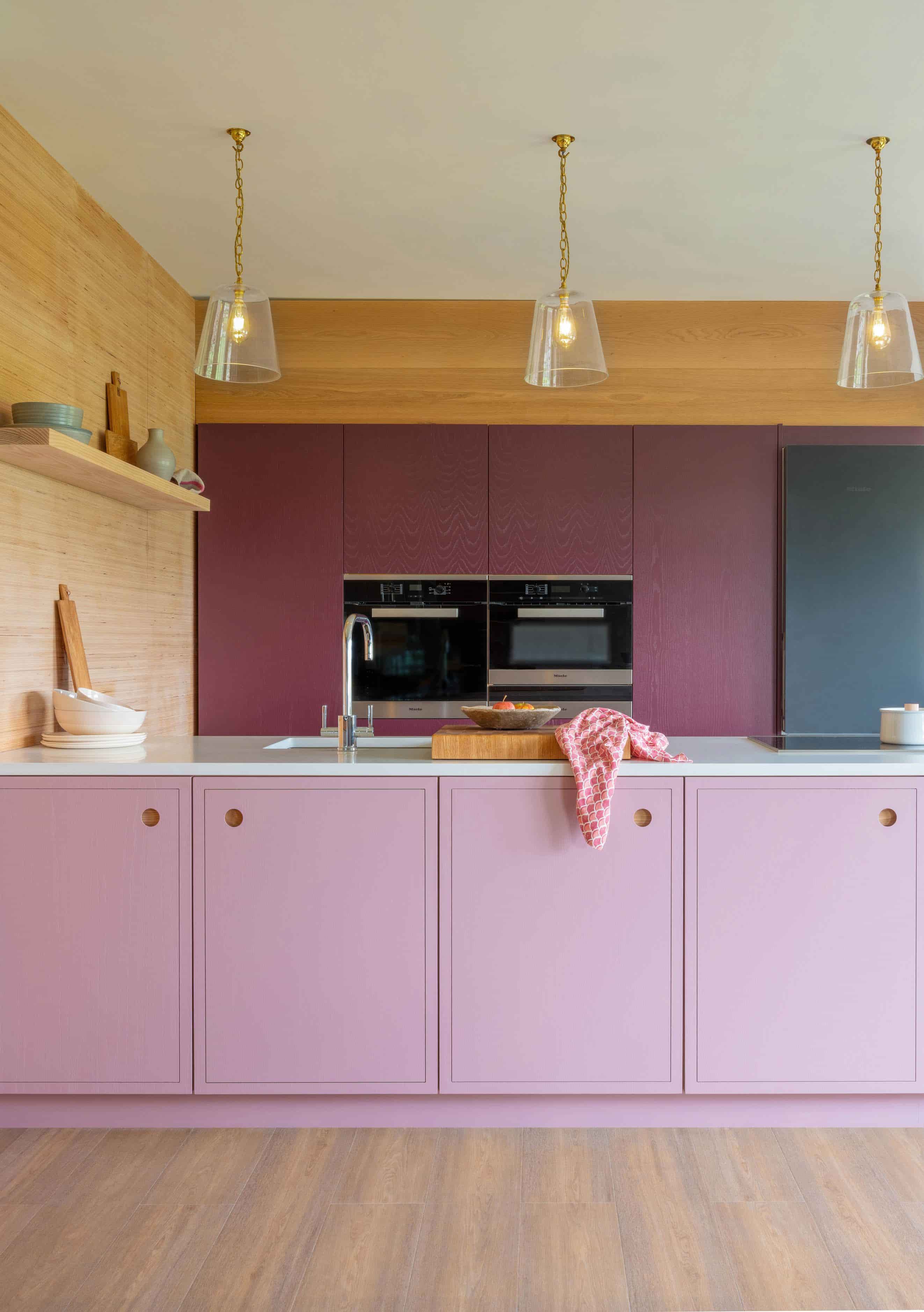
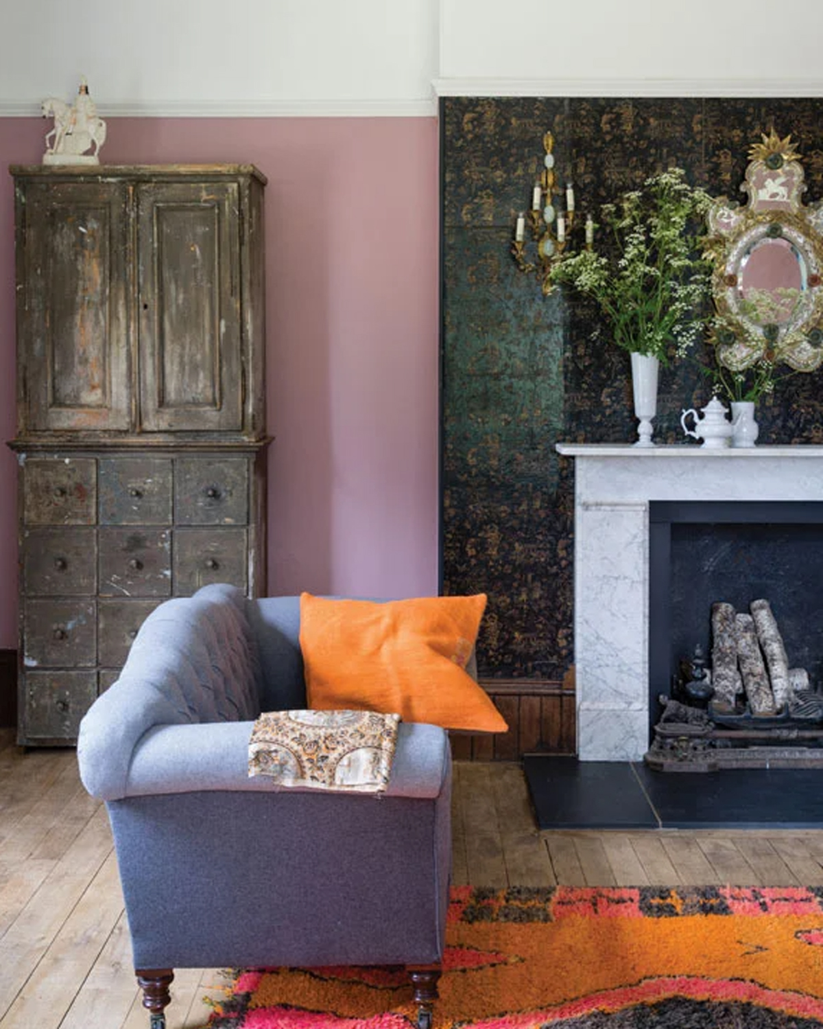
Finally, brass emerges as a natural design companion to pink, with its metallic sheen complementing pink's warmth. Incorporating brass trims, handles, and lighting, along with natural materials like wood, marble, and quartzite, creates a cohesive and elegant look. Additionally, pairing pink with deep aubergine purple and neutral shelving adds sophistication and depth, demonstrating pink's capacity to partner faultlessly with various elements.
Overall, the article underscores pink's extreme versatility and aesthetic potential in kitchen design, arguing that it should be embraced as a primary color for its ability to introduce warmth, humor, and depth, transcending its stereotypical associations.
#PinkKitchen #KitchenDesign #InteriorDesignTrends #ColorSchemes #HomeDecor #KitchenRenovation #ModernKitchen #HomeStyling #DesignVersatility #PinkKitchen #KitchenDesign #InteriorDesignTrends #ColorSchemes #HomeDecor #KitchenRenovation #ModernKitchen #HomeStyling #DesignVersatility
0개의 댓글이 총 표시됩니다.
 아직 댓글이 없습니다
추가로 마음에 드릴 만한 콘텐츠
So, you want a pink kitchen?

And the Next It Kitchen Cabinet Color Is…
11 Colors That Go With Pink That Work in Homes Now

7 Kitchen Trends That Will Never Go Out of Style

21 Pink Kitchen Ideas: How to get the on-trend kitchen colour right |
15 pretty pink kitchen ideas that are practically perfect in every way

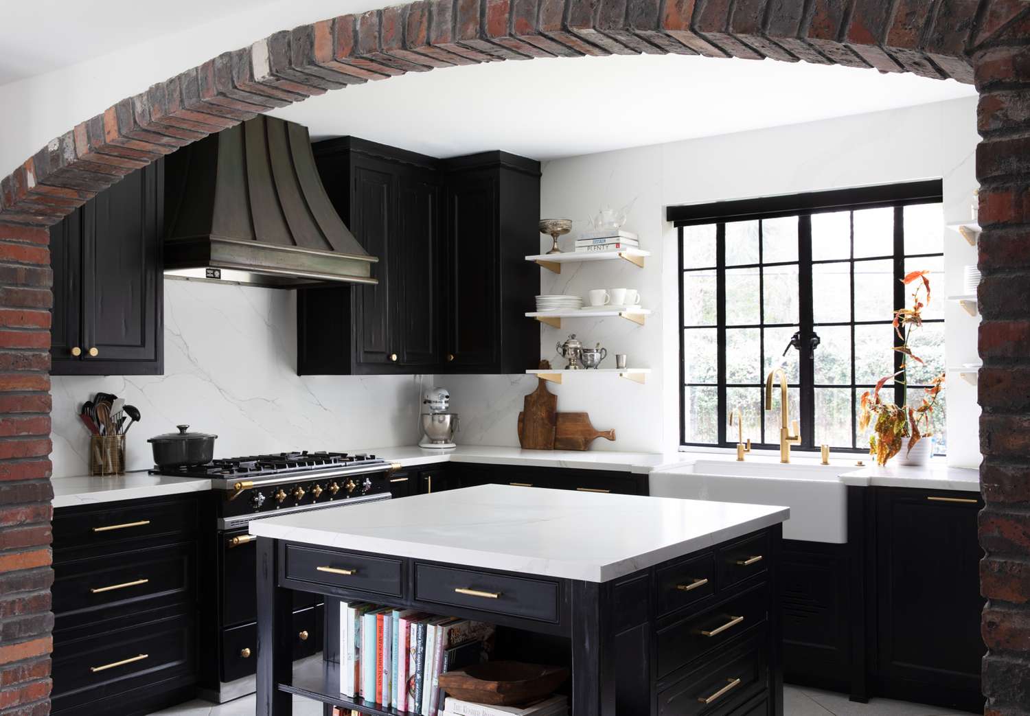
5 Timeless Kitchen Cabinet Paint Colors Designers Love
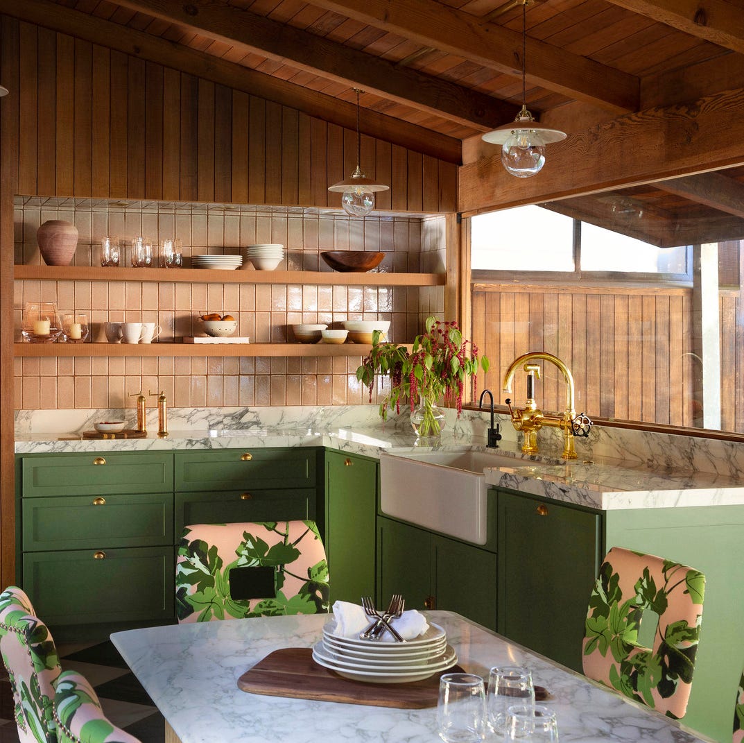
The Kitchen Colors Designers Call “Forever Favorites”
Some People “Can’t” With This Cabinet Color, But There’s No Denying It’s on the Rise

5 Outdated Kitchen Paint Colors That Interior Designers Are Tired of Seeing
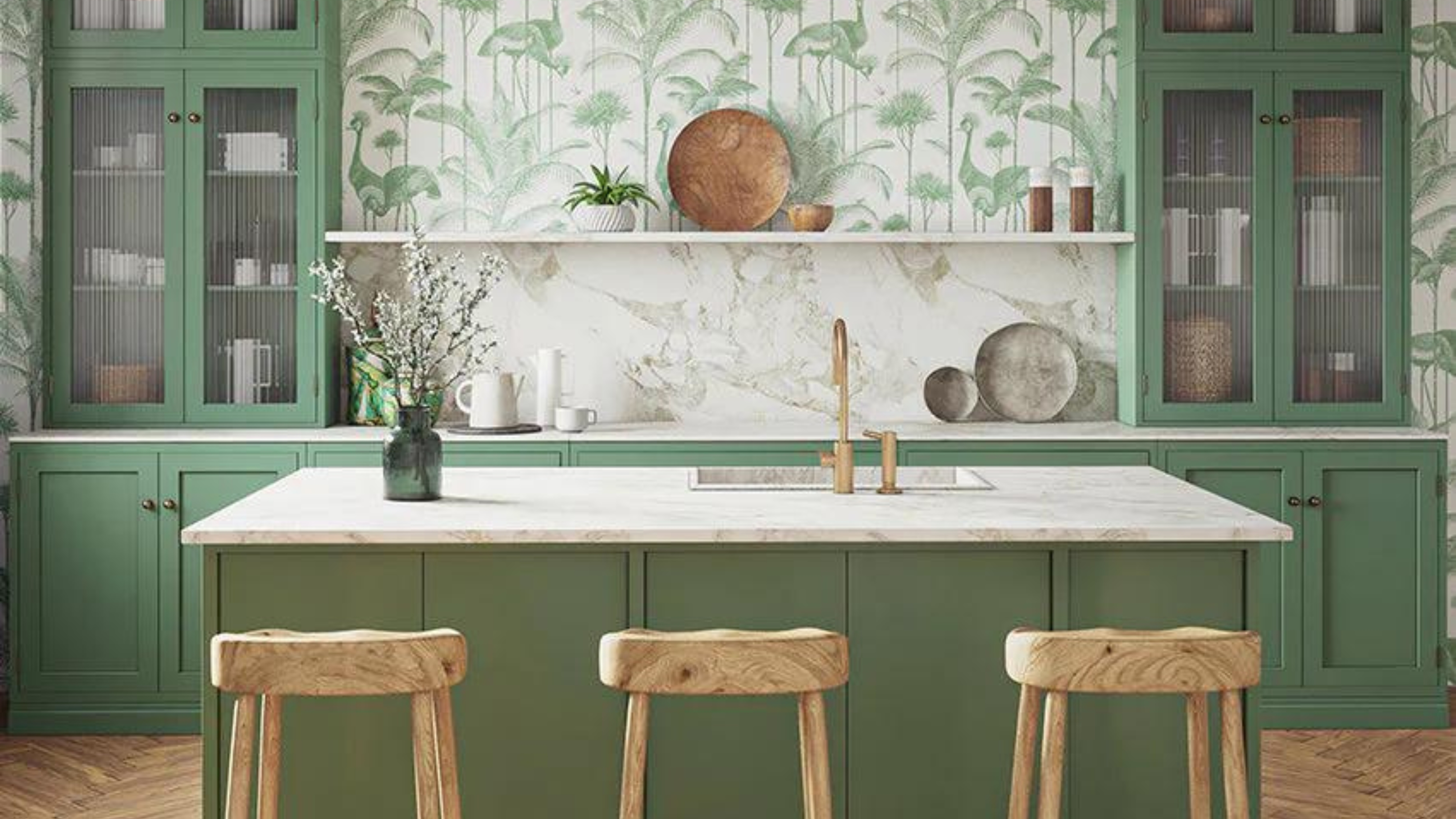
Which kitchen color is timeless? Our experts give us their take

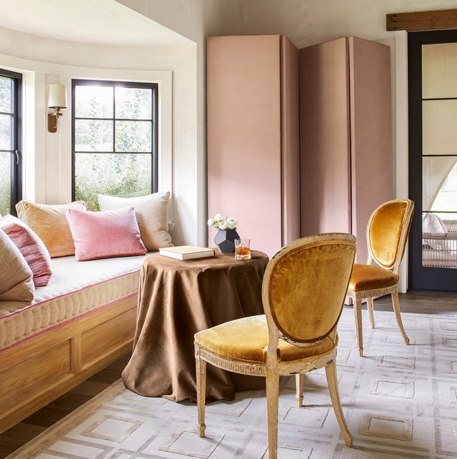
14 Chic Pink Color Combinations Designers Swear By
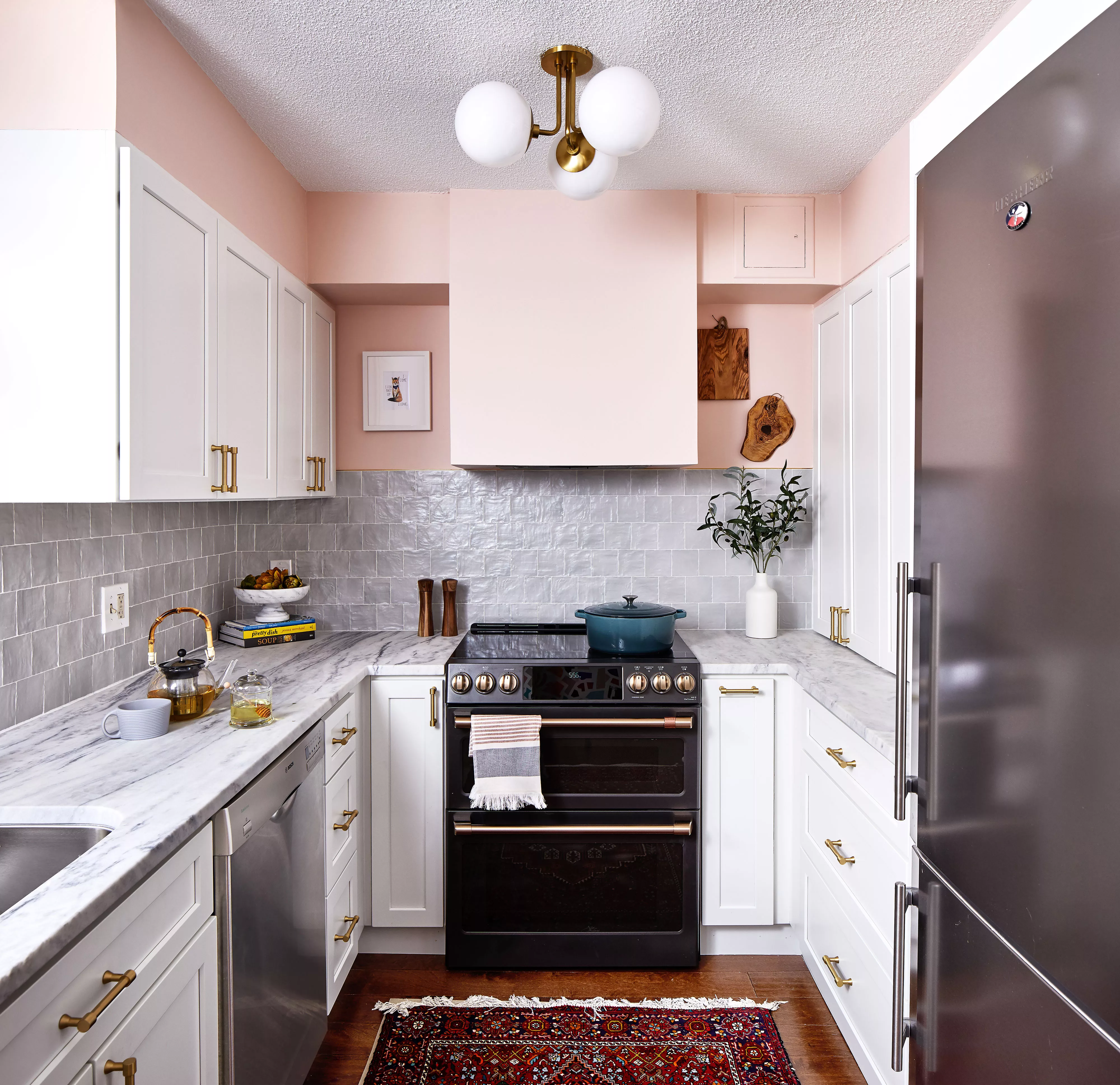
Pink Kitchens Are Trending, but Not Because of Barbie—Here’s How to Get the Look

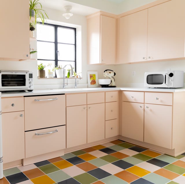
The Surprising Retro Kitchen Design That's Making a Major Comeback

18 sophisticated pink paint colors recommended by interior designers

10 Timeless Decorating Ideas from a Gingham-Filled Kitchen
19 Pink Kitchen Ideas That Feel Stylish, Not Over-the-Top

9 color-drenched kitchens that prove this paint trend is totally timeless when used in this hardworking space
16 Designer-Approved Kitchen Color Schemes You’ll Want to Steal
These Will Be the Most Popular Kitchen Paint Colors In 2025, According to Interior Designers