1/7
How to decorate with Sherwin-Williams' Drift of Mist – an 'airy and inviting' gray
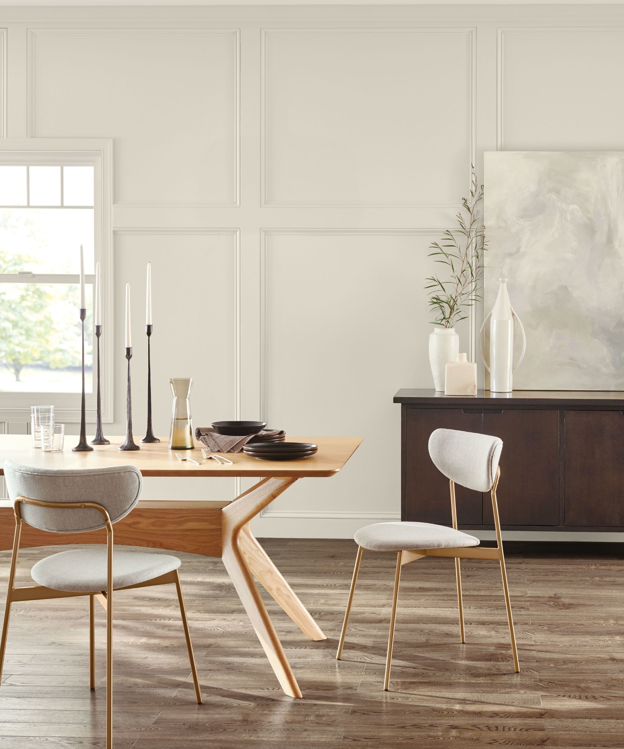
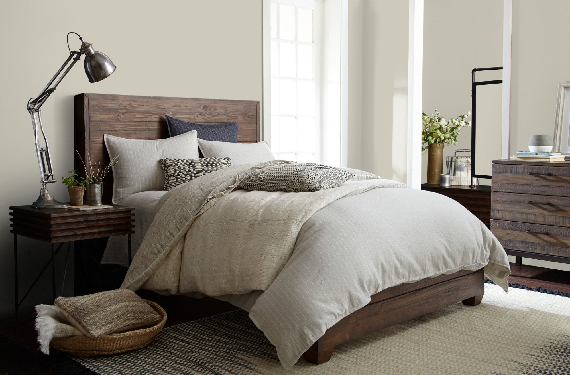
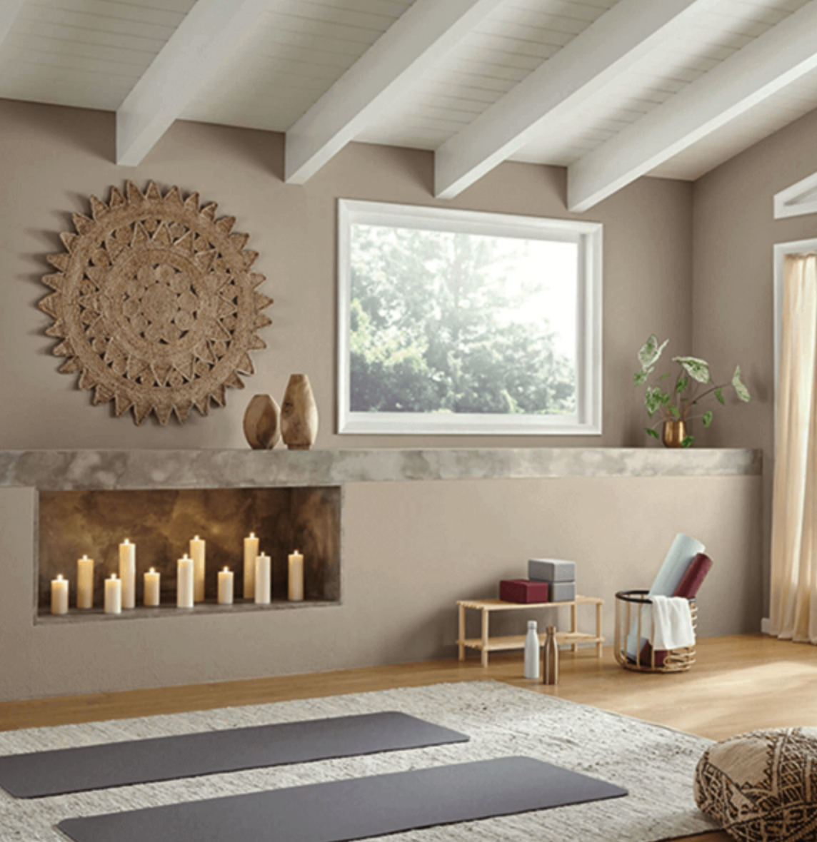
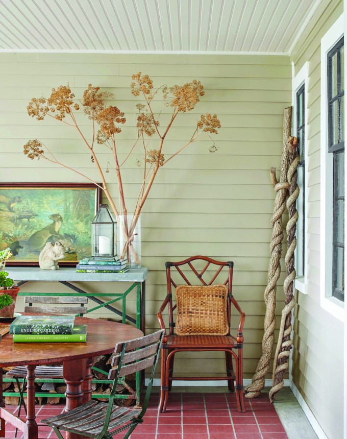
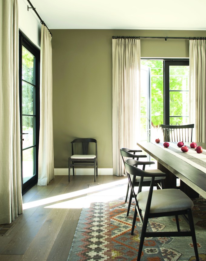
The article explores the versatility and aesthetic appeal of Sherwin-Williams' Drift of Mist, a warm greige shade, highlighting why it has been chosen as February's Color of the Month and is a favorite among interior designers. This hue is lauded for its serene and inviting influence, making it suitable for various rooms and design styles. It pairs effectively with both layered neutrals and vibrant accent colors, and responds well to natural light and organic decor elements.
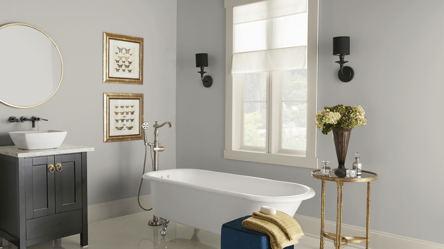
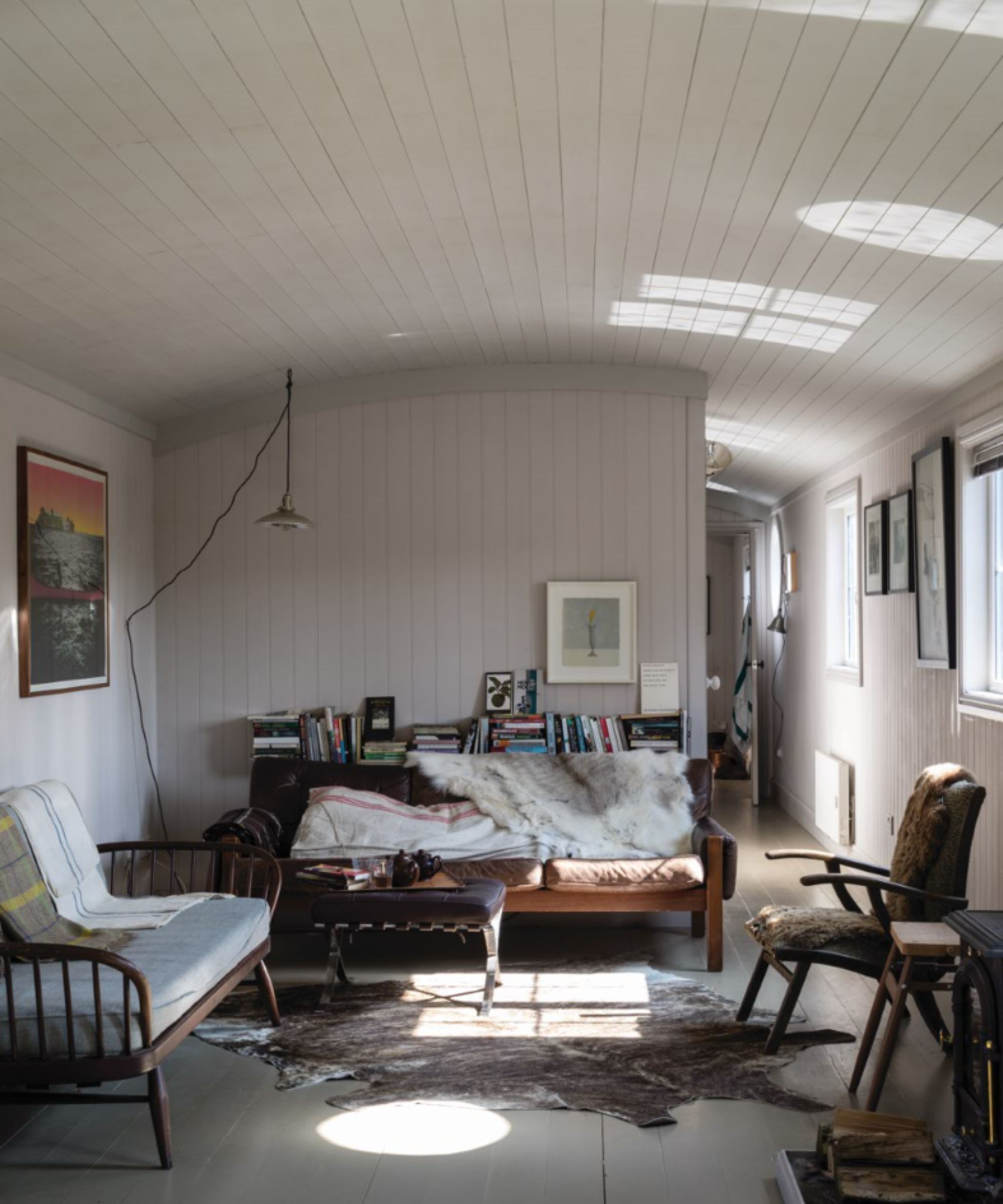
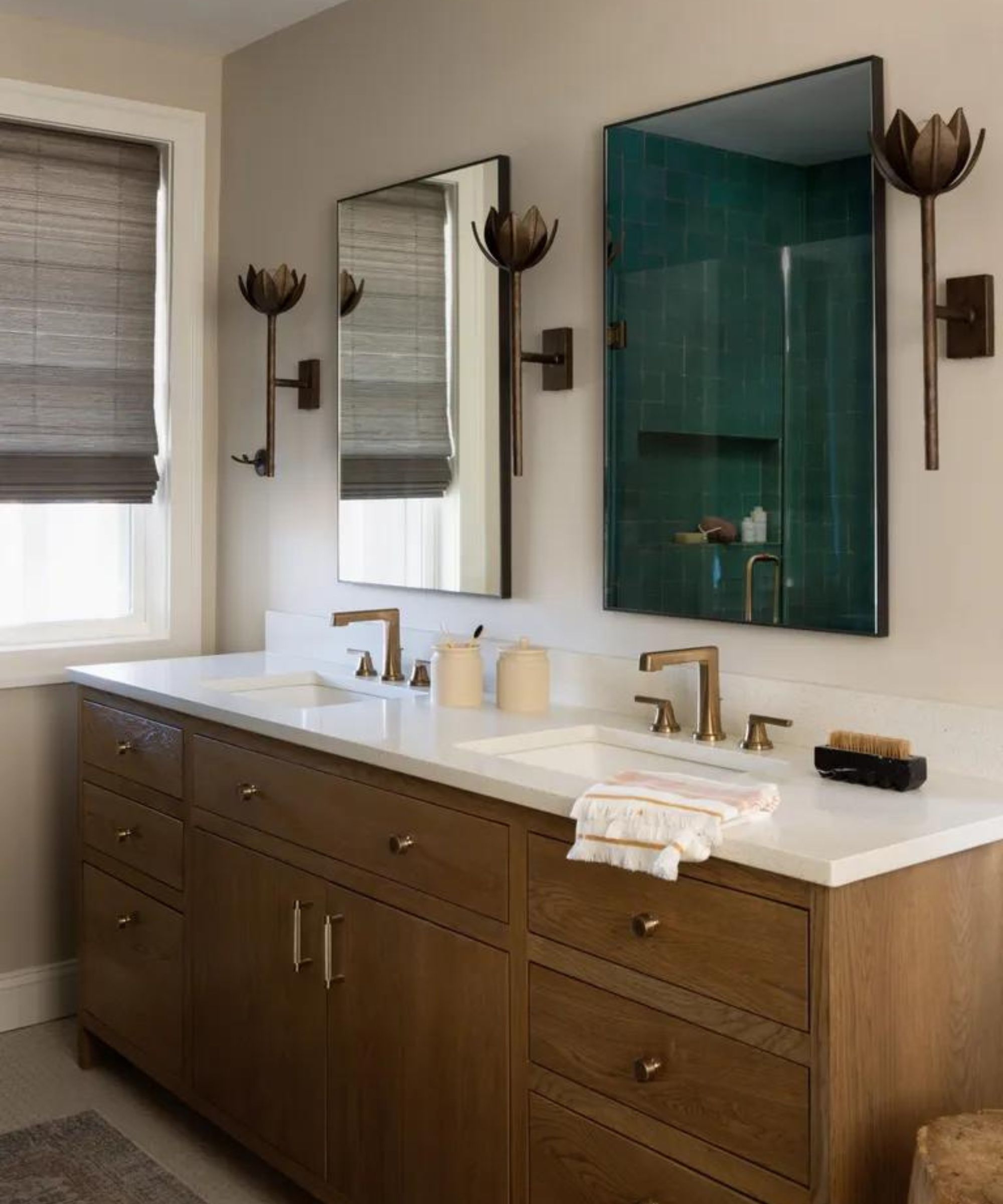
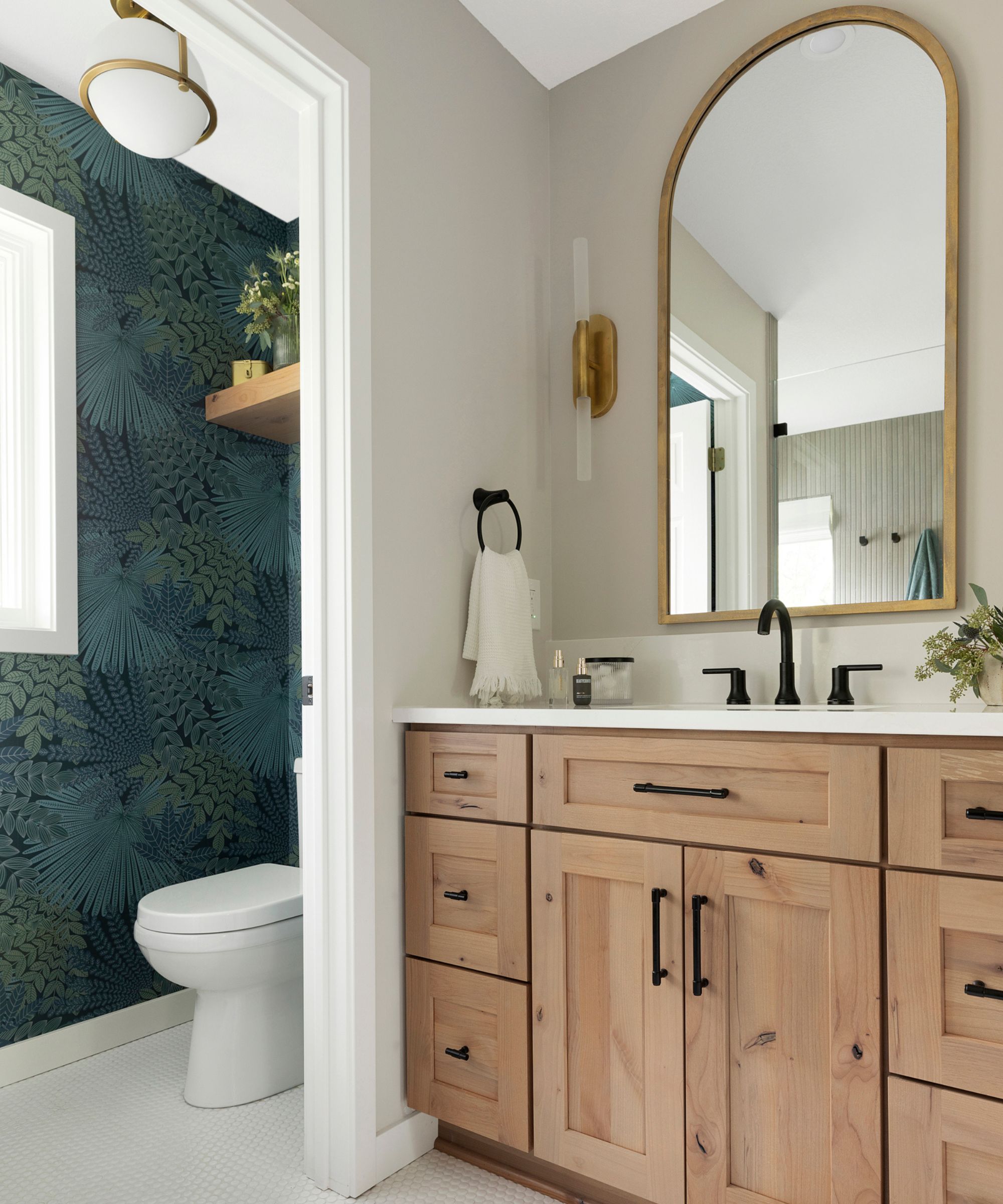
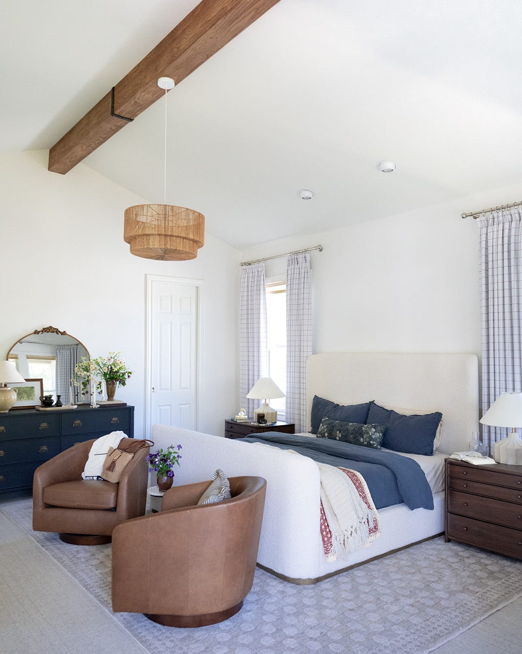
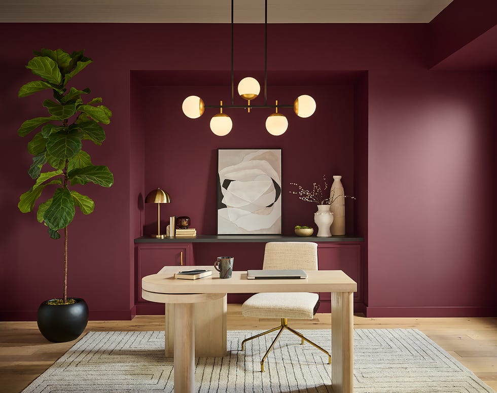
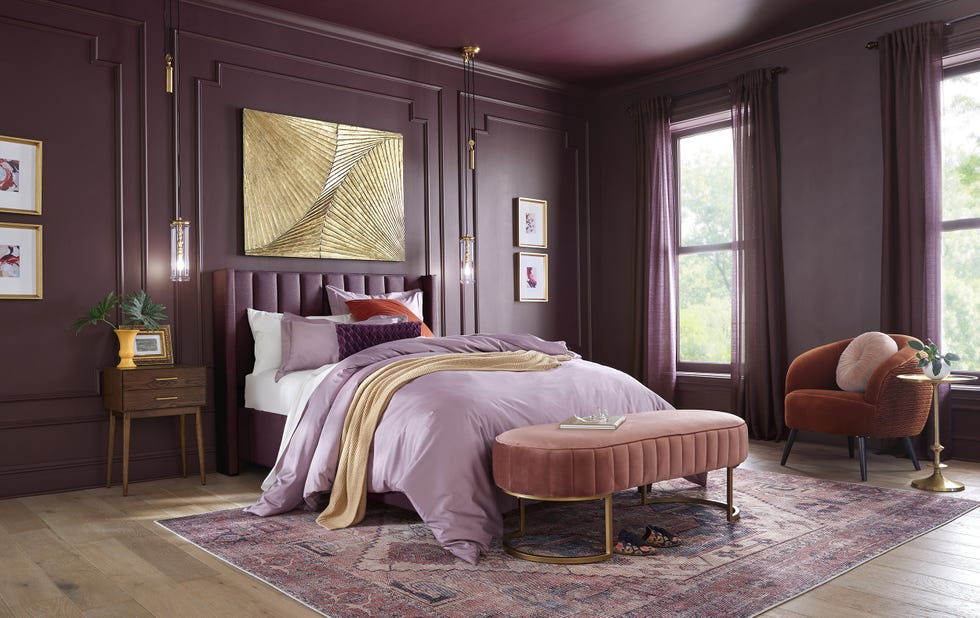
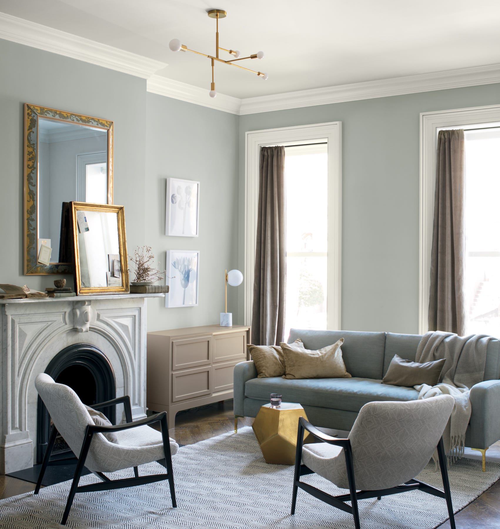
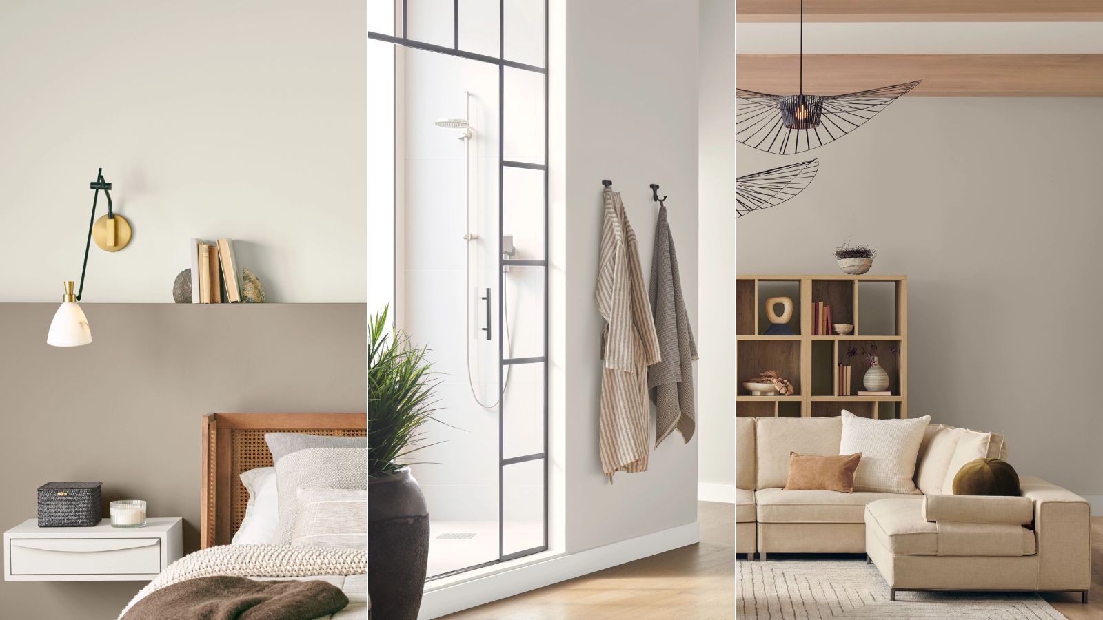
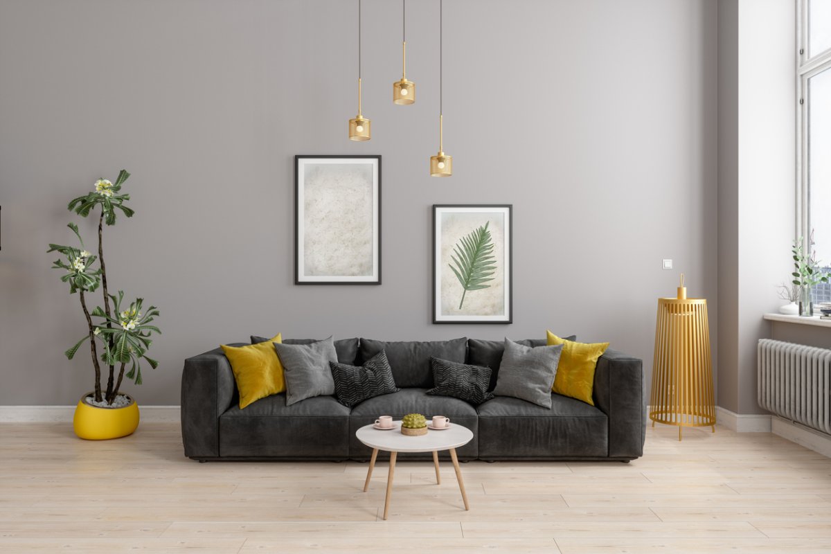
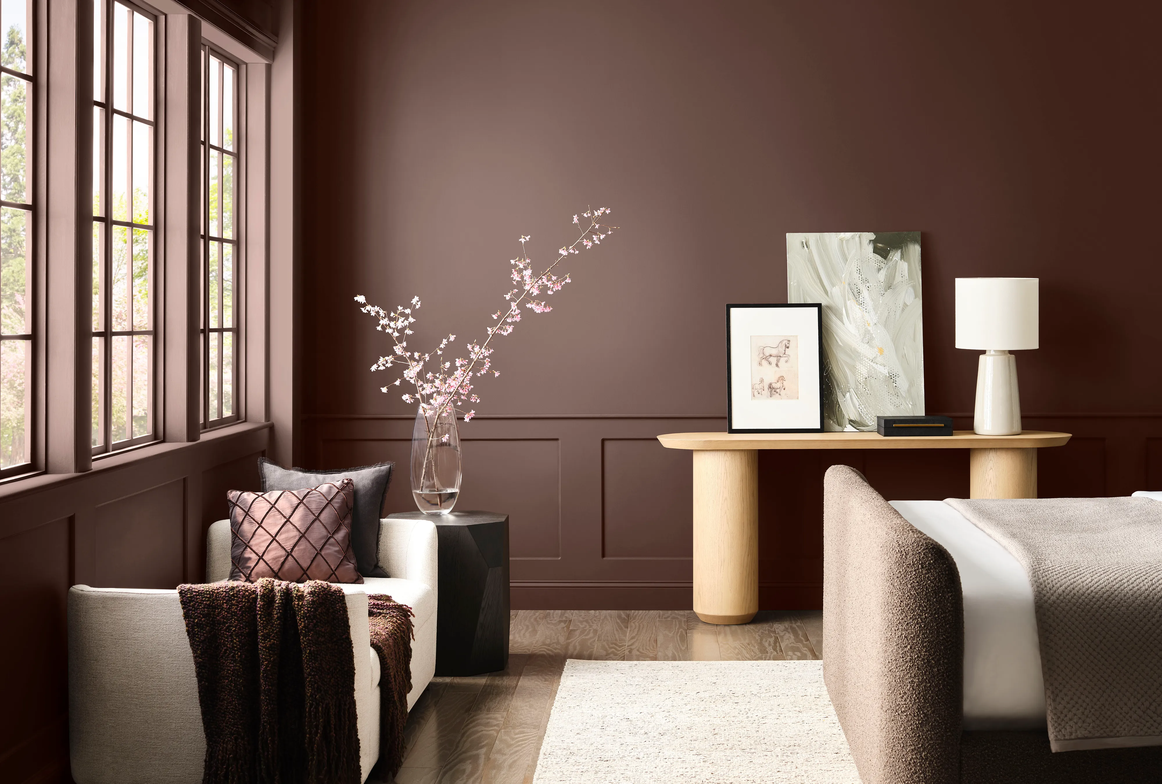
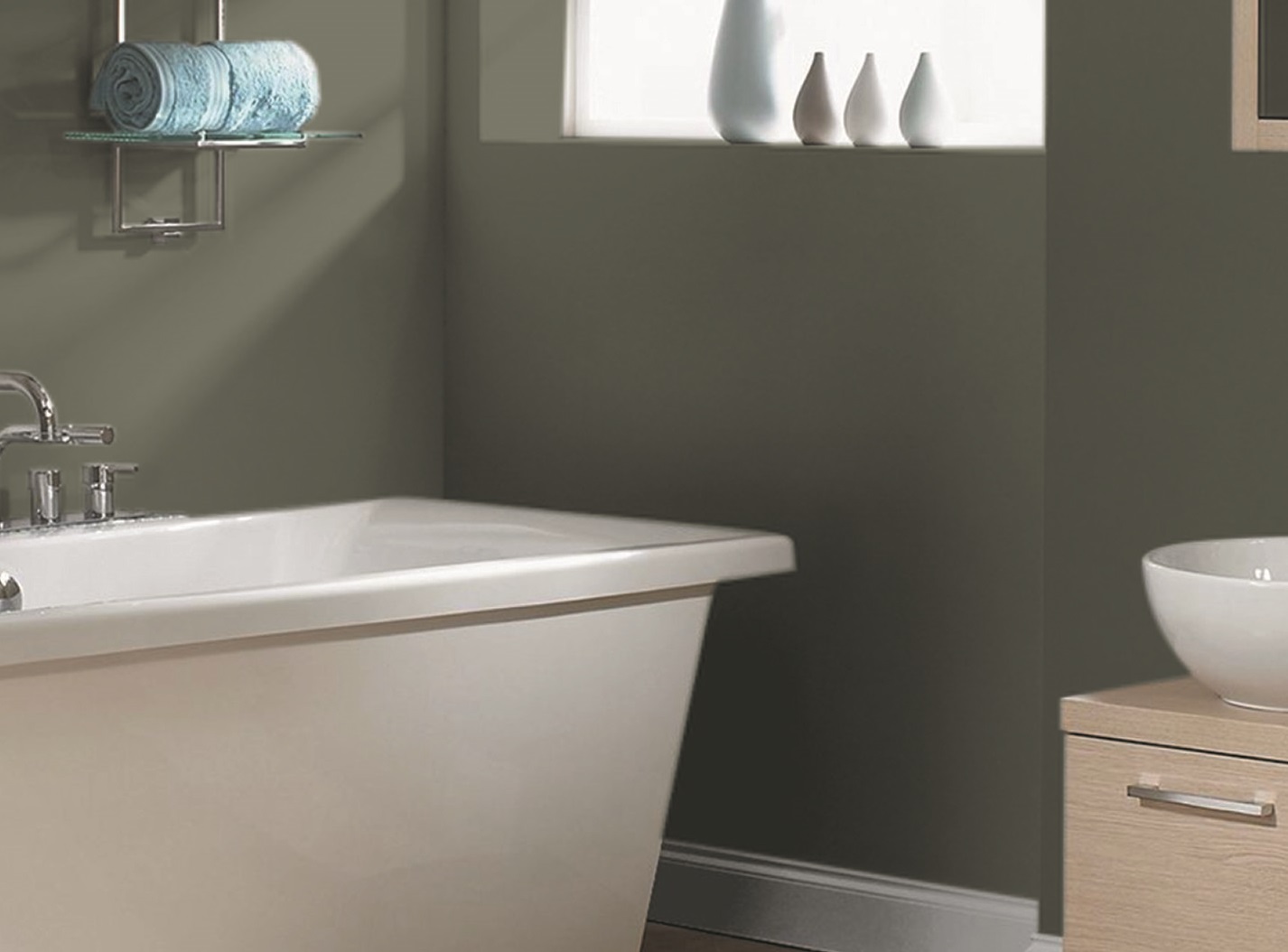
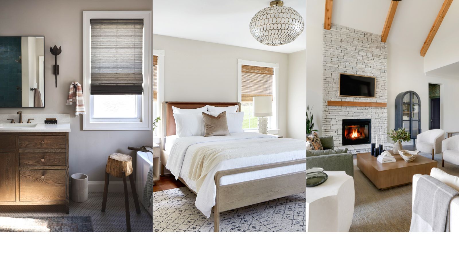
Several design experts offer their insights on how to best utilize Drift of Mist. Sue Wadden, Director of Color Marketing at Sherwin-Williams, notes its ability to brighten spaces lacking natural light. She emphasizes its calming and minimalist qualities, suggesting pairings with ethereal blues and greens, such as Sherwin-Williams' 2024 Color of the Year, Upward, or a deep dramatic dark like Carnelian. Wadden recommends the shade for creating relaxing bedrooms, spa-like bathrooms, or soft living room retreats, underscoring its broad applicability across different areas of the home.
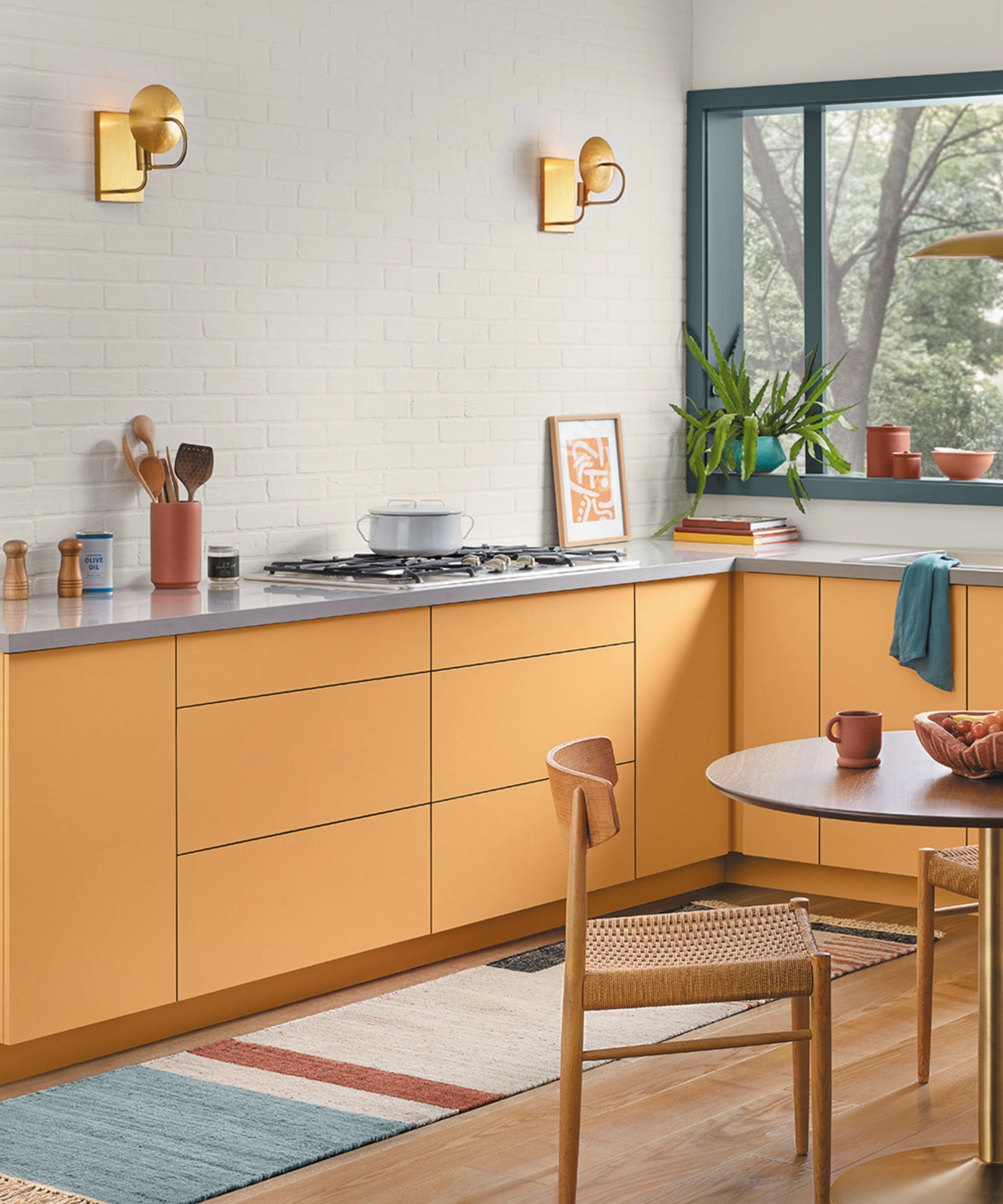
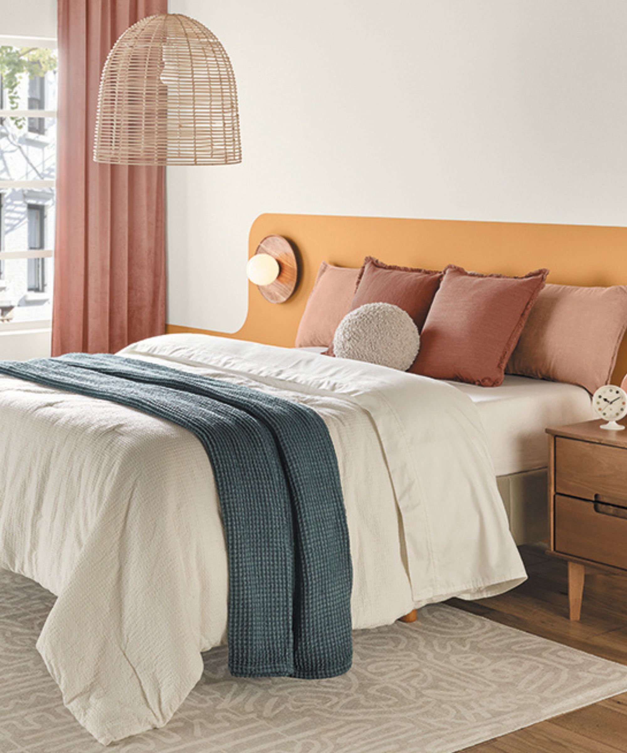
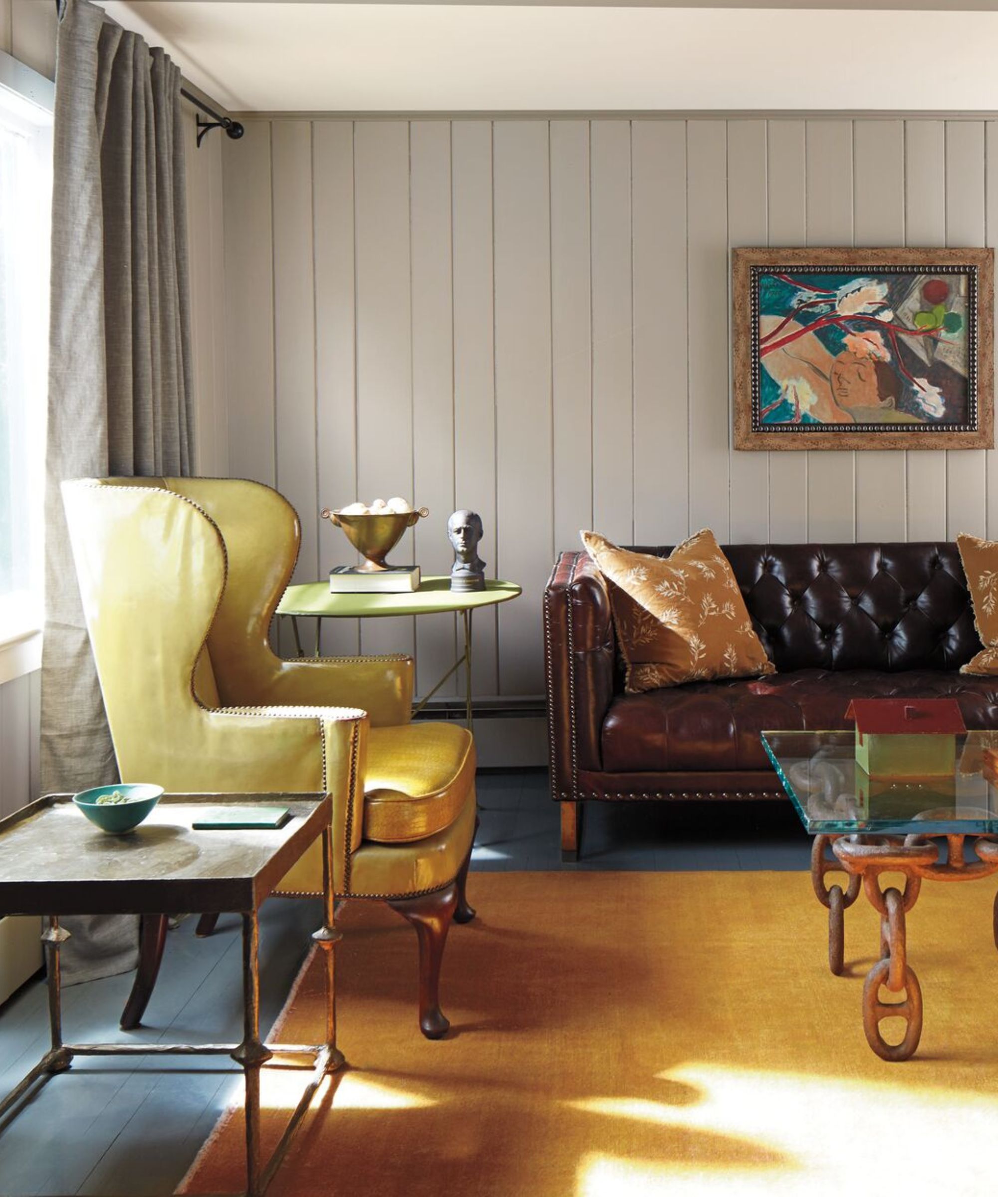
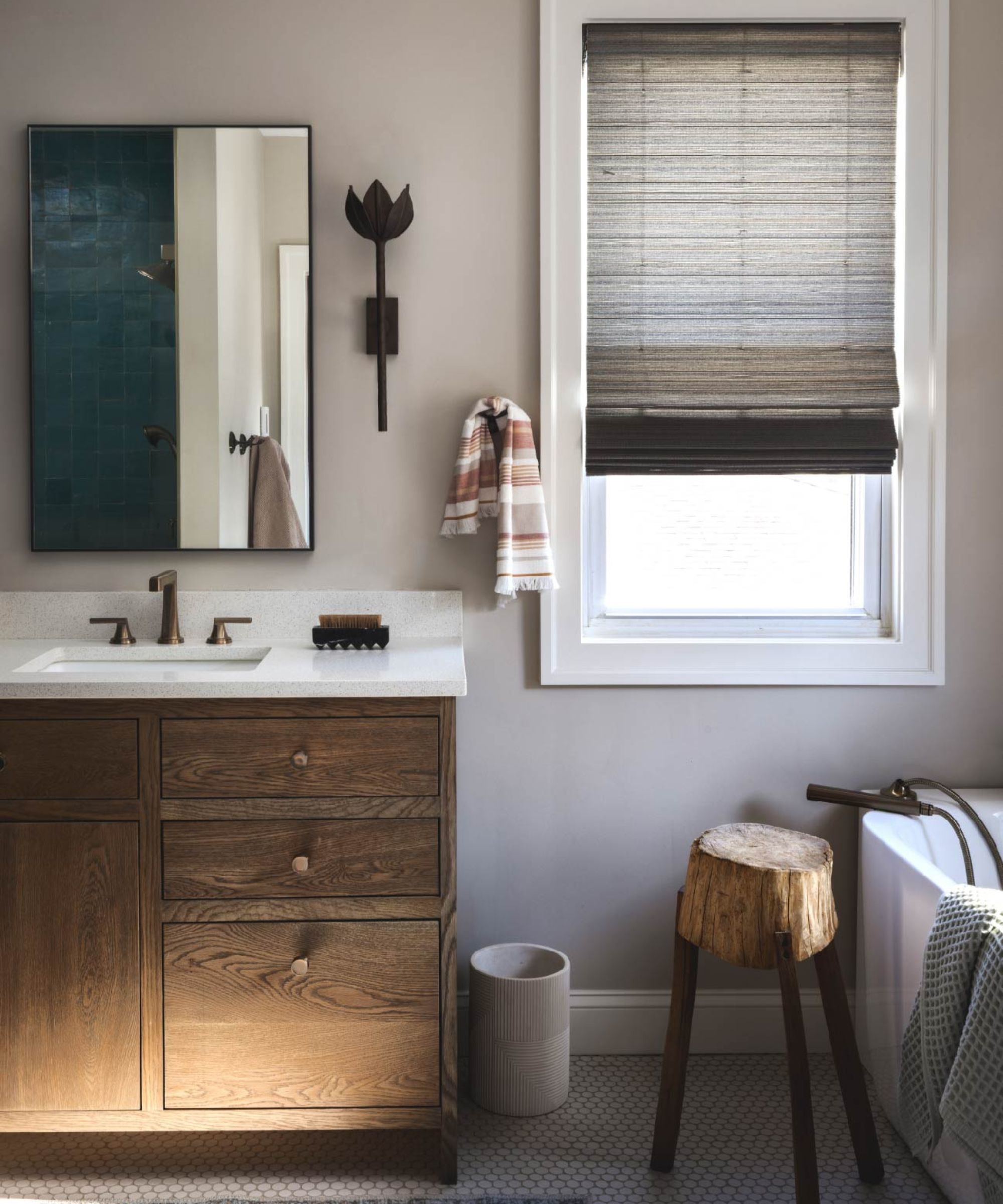
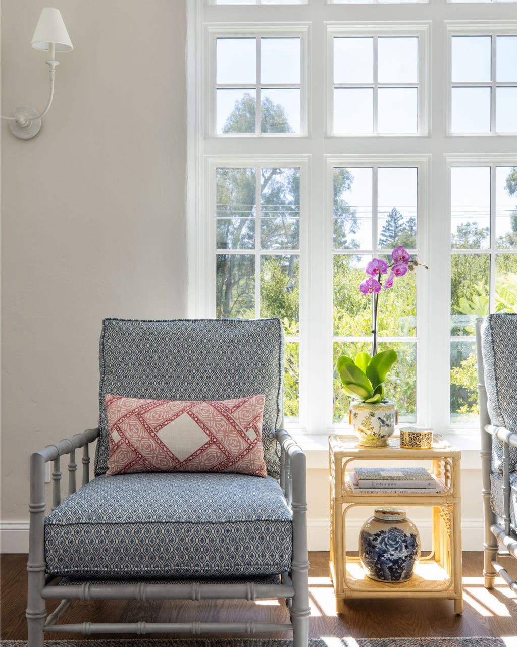
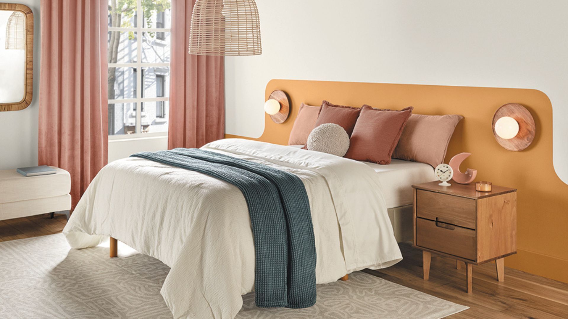
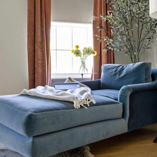
Audrey Scheck, founder of Audrey Scheck Design, appreciates Drift of Mist for adding a subtle yet impactful hint of color. She points out its warm undertones contribute to a welcoming atmosphere, making it adaptable to almost any space. Scheck advises combining it with other warm accents like creamy beige, salmon, and marigold. She suggests using Drift of Mist for entire walls and then introducing these warm hues through furniture, pillows, or throws, thereby creating a cohesive and inviting interior palette.
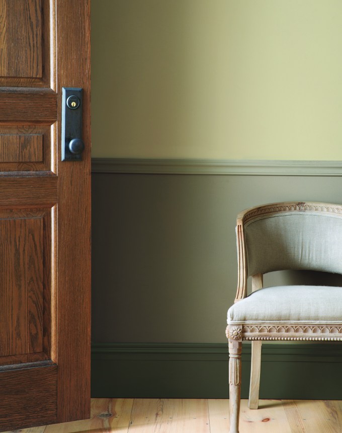
Devin Kimmel, Architect and Managing Principal of Kimmel Studio Architects, highlights the paint's predictable and reliable effect on design schemes. He explains that Drift of Mist does not unexpectedly reveal strange undertones like pink, yellow, or green, which can be a common concern with neutral paints. Kimmel anticipates its continued relevance in the design industry for various applications, including wall color with a satin sheen, millwork selections in semi-gloss, and as an alternative to white for molding, showcasing its functional flexibility beyond just wall application.
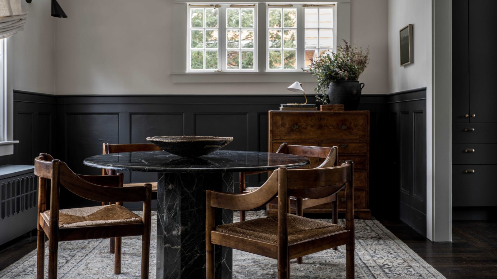
Dani Crawford, Lead Interior Designer and Senior Associate at Kimmel Studio Architects, discusses how Drift of Mist adapts to different lighting conditions. She notes that the shade can appear cooler and more gray in northeastern light or with blue-and-white interior lighting, while in south-facing rooms or those with warm-dim lighting, it leans towards a warmer beige. This adaptability makes it a suitable choice for spaces with varying light exposures, allowing it to create diverse atmospheres within a home.
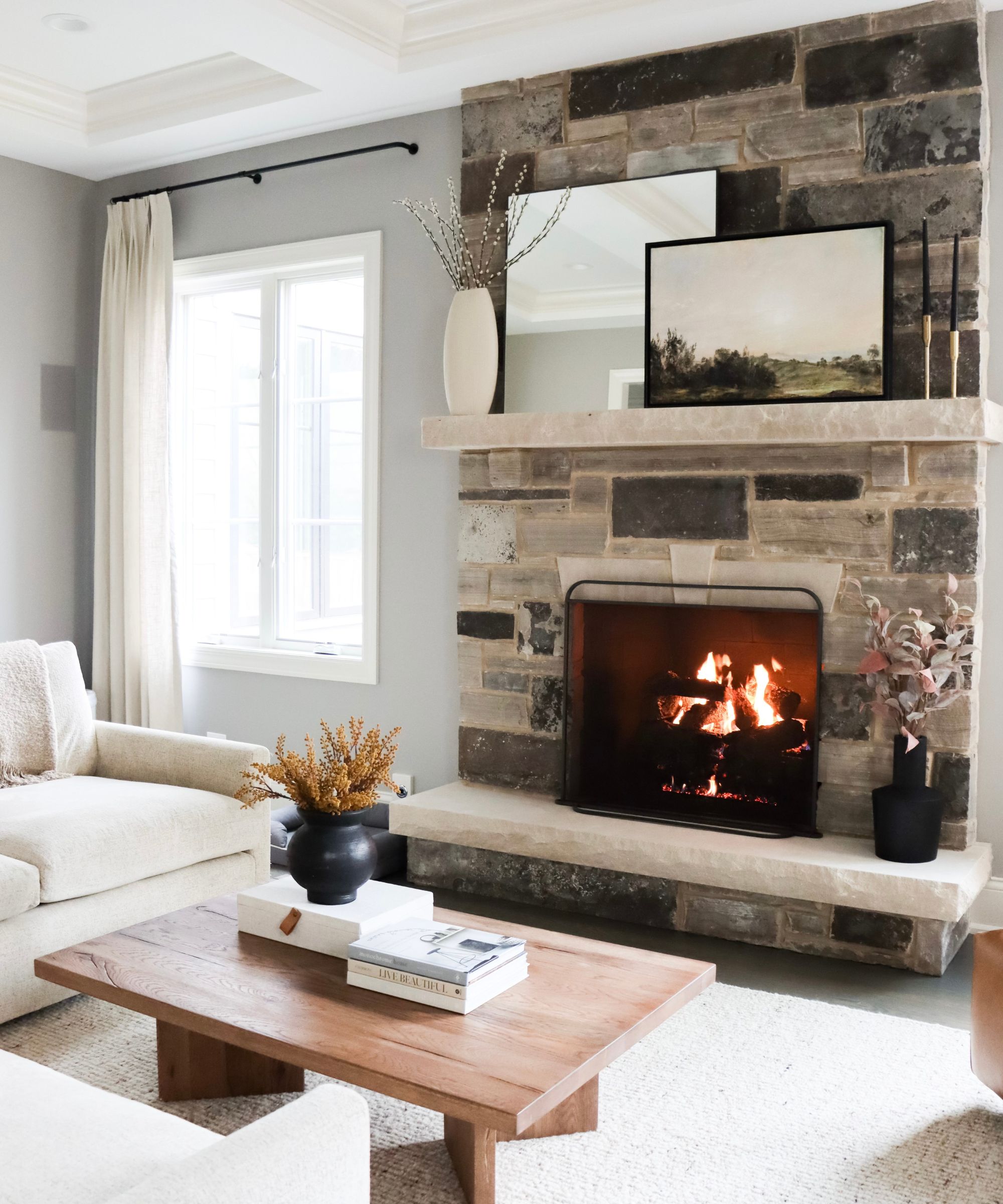
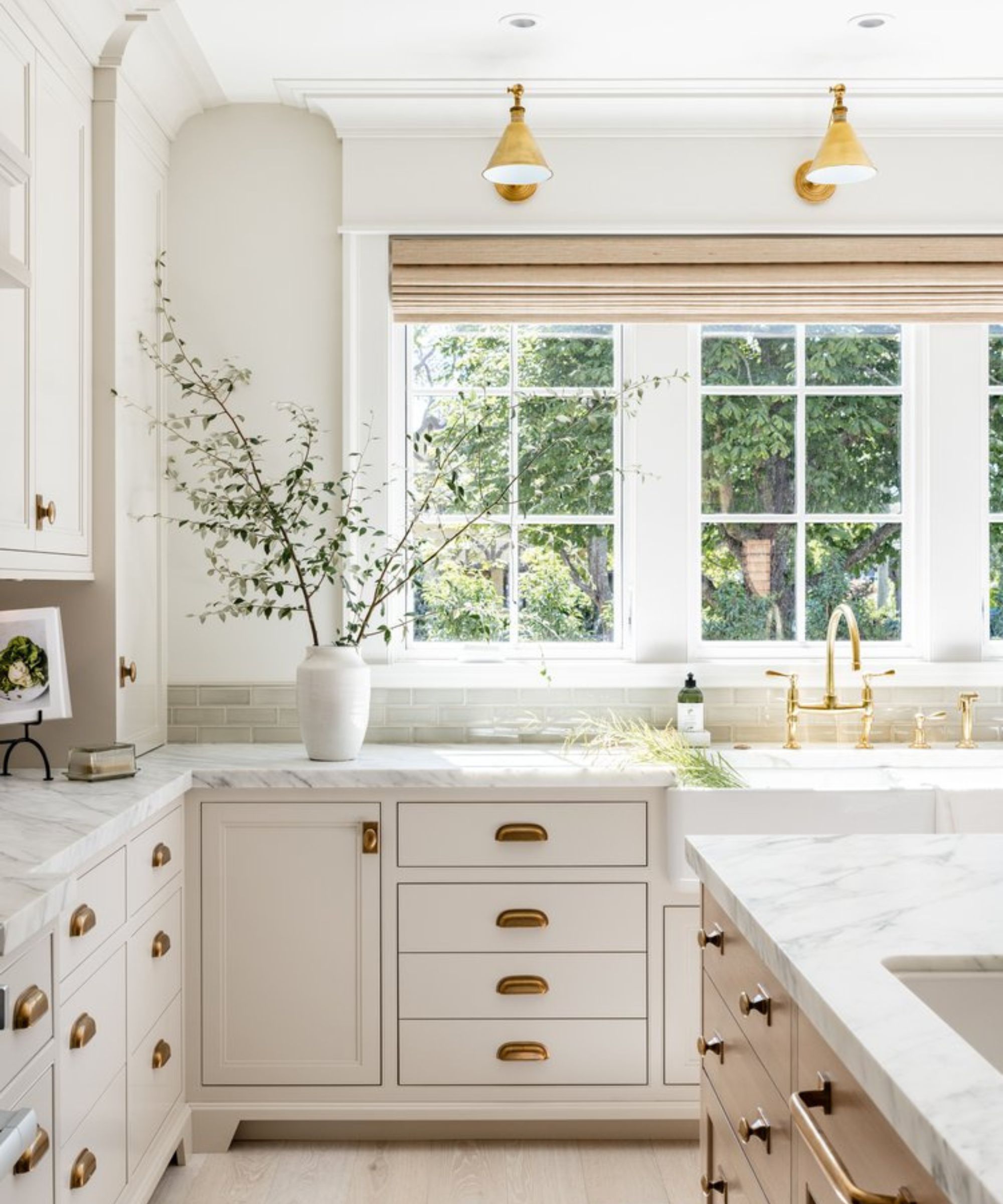
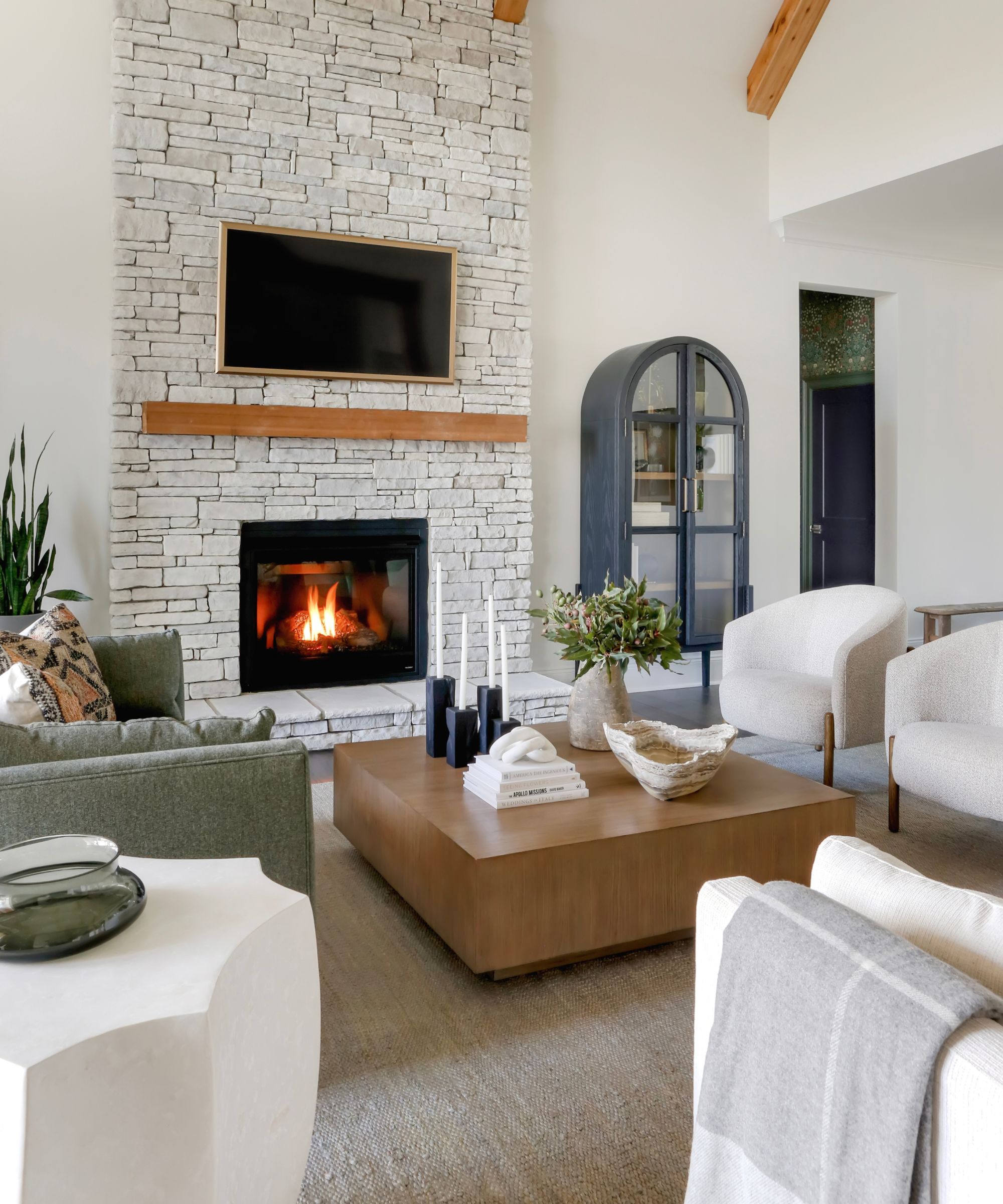
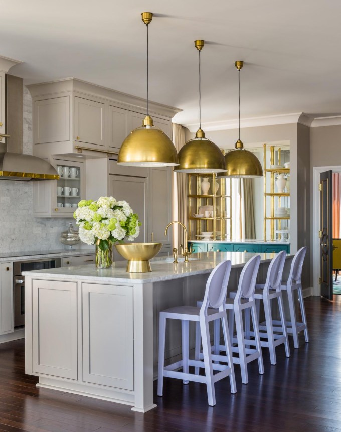
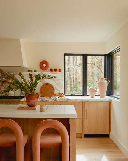
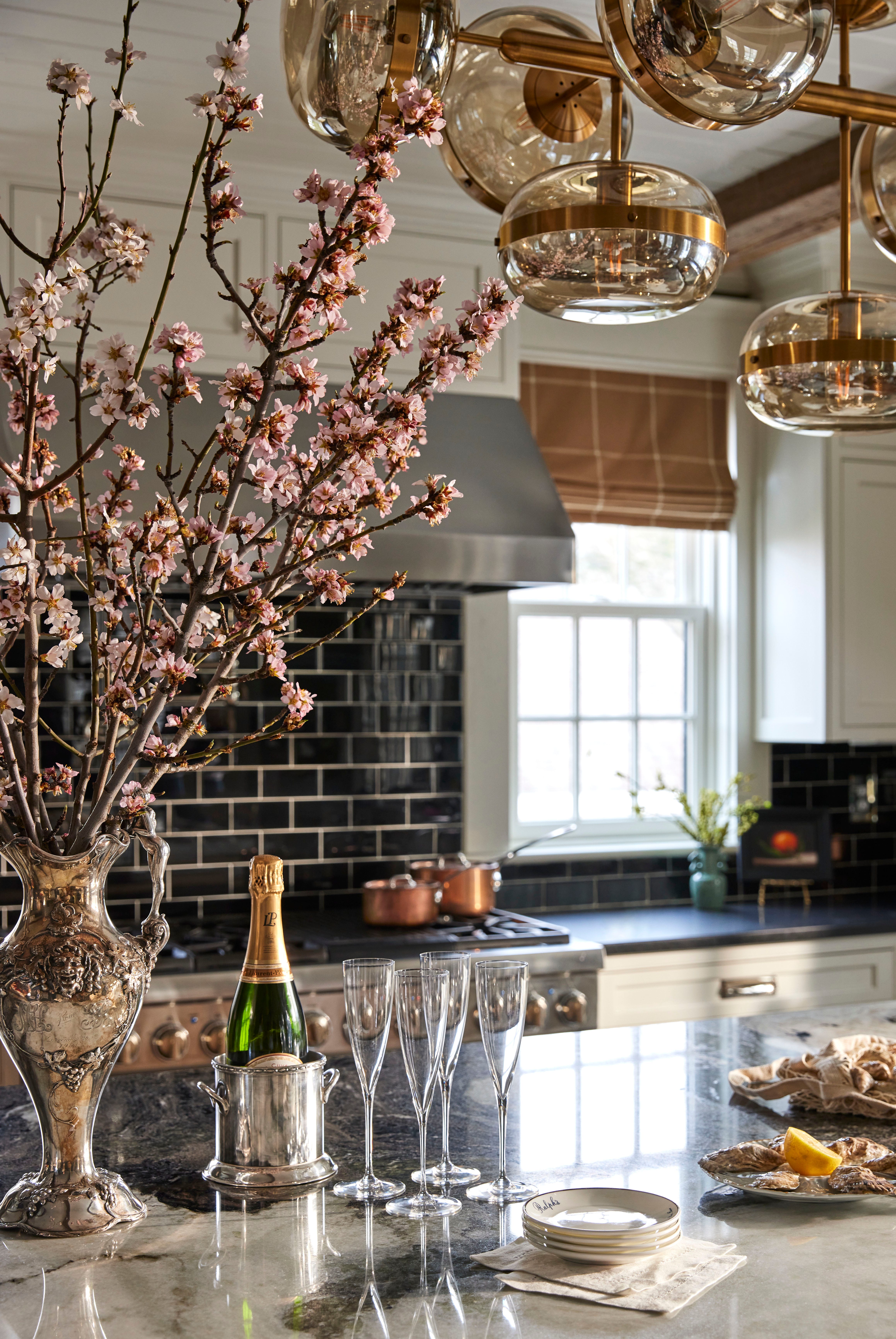
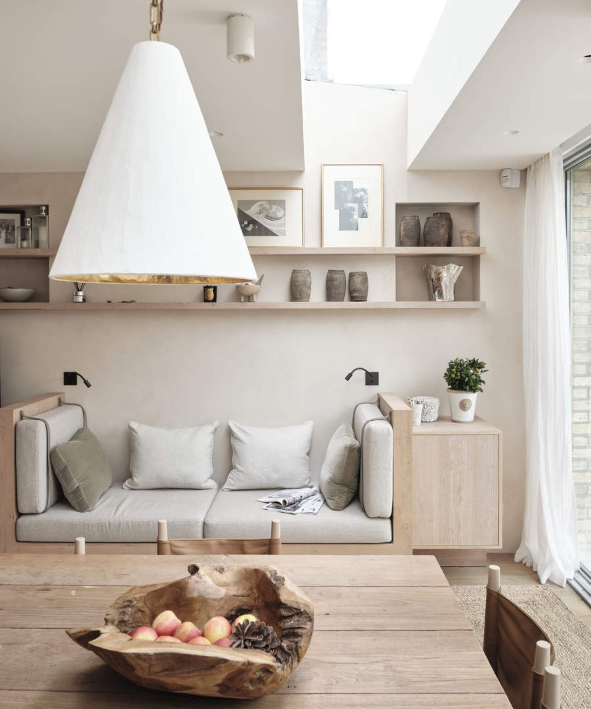
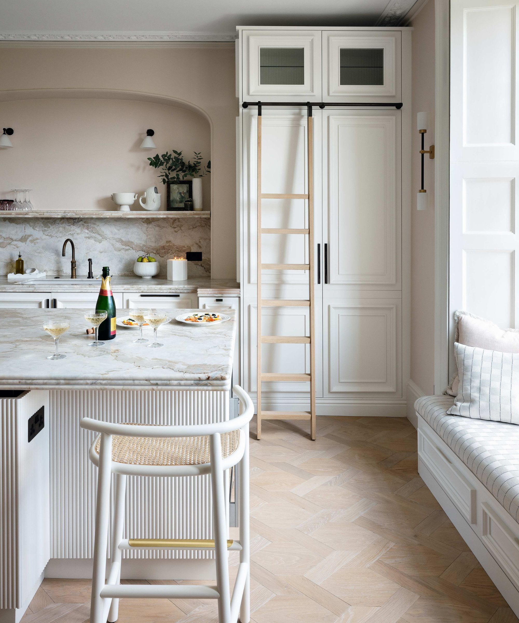
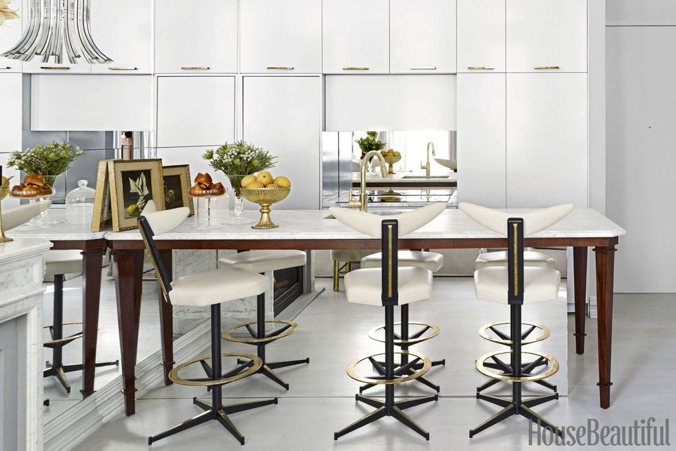
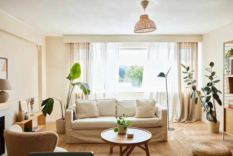
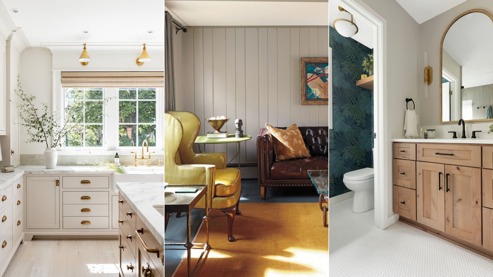
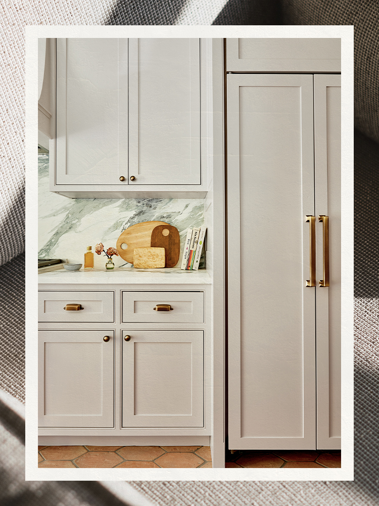
Emma Beryl, founder of her eponymous design firm, praises Drift of Mist as a beautiful warm neutral base that facilitates endless design possibilities. For kitchen designs, she proposes using it on cabinetry and complementing it with cream-toned stone countertops. She also suggests incorporating a natural wood kitchen island with a dark stain and the same stone to enhance warmth. In living rooms, Beryl recommends painting walls and ceilings in Drift of Mist, then bringing in natural, organic elements like wood tones, blush- and cream-toned fabrics, and nature-inspired art to evoke a sunny and cozy ambiance.
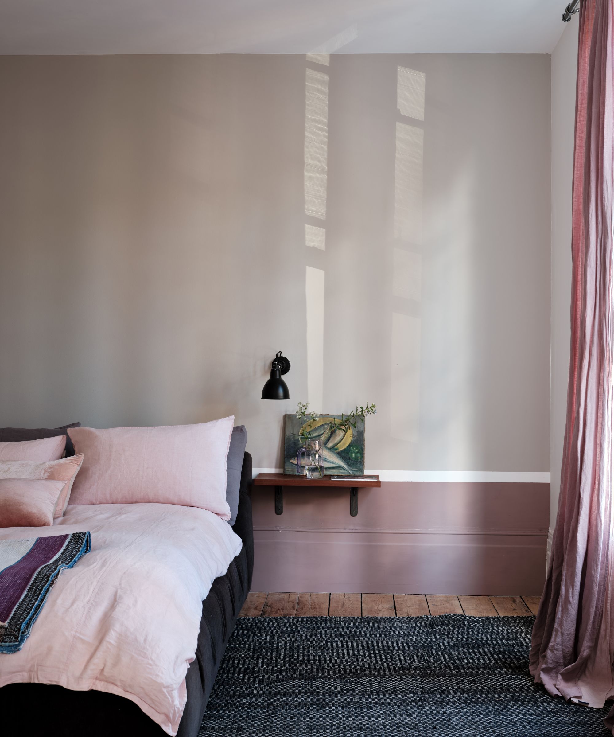
Becky Shea, interior designer and founder of Becky Shea Design, expresses her admiration for Drift of Mist's subtle charm, drawing parallels to Benjamin Moore's Baby Fawn, a shade she frequently uses for millwork. She suggests pairing Drift of Mist with vibrant, eclectic colors for millwork, such as Farrow and Ball's Pink Drab, to create captivating visual contrast and add personality. For kitchens, Shea recommends combining the warm gray hue with soapstone countertops and backsplashes to enhance natural elegance and infuse the space with serene sophistication. The collective expert opinions affirm that Drift of Mist is a highly versatile and enduring color trend, capable of creating cozy and inviting interiors that reflect individual style.
#InteriorDesign #PaintColors #SherwinWilliams #DriftOfMist #NeutralPalette #HomeDecor #DesignTrends #InteriorDesign #PaintColors #SherwinWilliams #DriftOfMist #NeutralPalette #HomeDecor #DesignTrends
合計0件のコメント
 まだコメントはありません
あなたも好きかもしれません
How to decorate with Sherwin Williams’ Iron Ore – a ‘sophisticated, warm and timeless gray’

The Best Greige Paint Colors for a Warm, Welcoming Home

The 13 Best Greige Paint Colors to Buy Right Now
Sherwin-Williams Predicts These 4 Color Palettes Will Dominate Homes in 2026—and One May Surprise You

Sherwin-Williams' Agreeable Gray is one of the country's favorite gray paints – but is it the right choice for you?
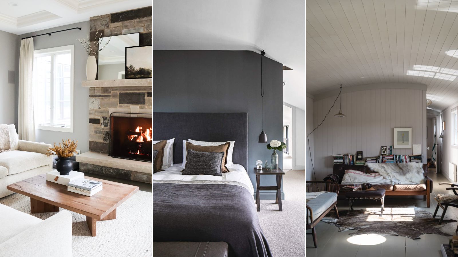
5 of the best gray paints that interior designers love using
10 Greige Paint Colors Designers Recommend Again And Again
Incorporate Color Drenching Into Your Home Design

6 Ways to Decorate with Sherwin Williams' 'Dried Thyme'

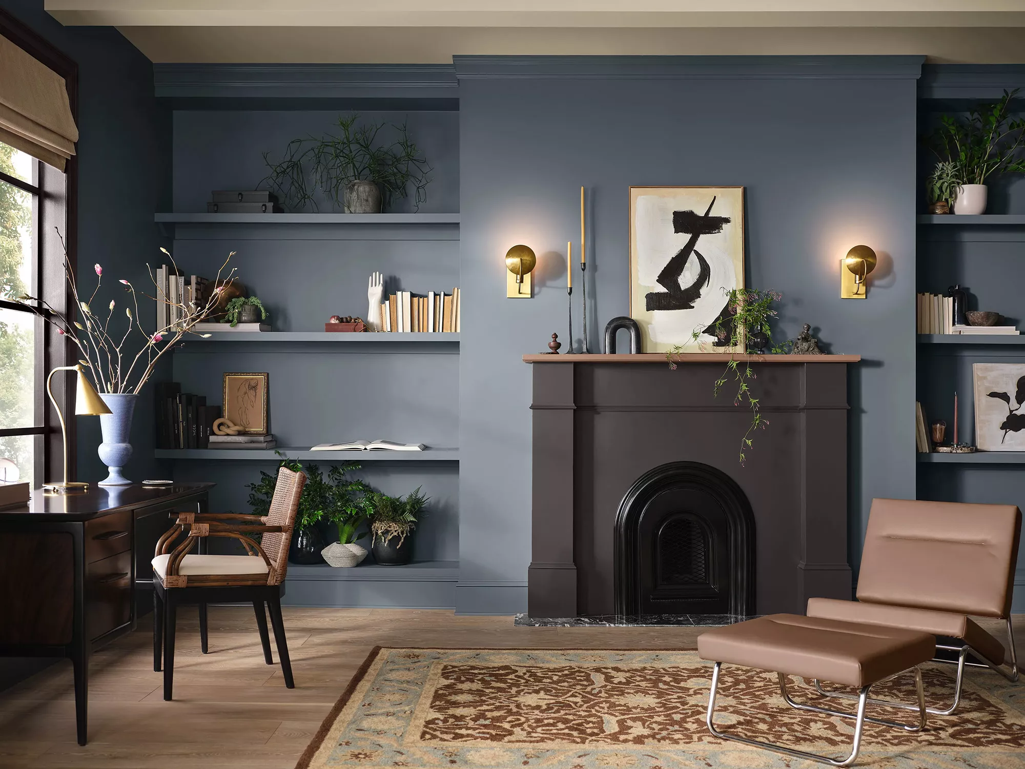
24 Blue-Gray Paint Colors the Experts Swear By
13 Best Off-White Paint Colors, According to Interior Designers

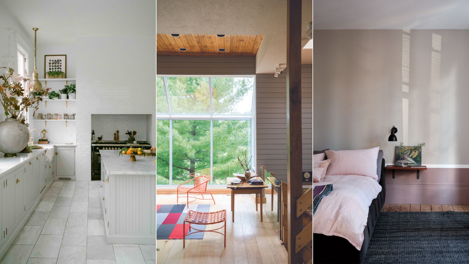
This is the most versatile shade you can bring into your home – designers share the 5 best greige paints
This Controversial Interior Paint Color Is My All-Time Favorite

5 ways to decorate with Edgecomb Gray, Benjamin Moore's softest gray paint
For a "Cool-Looking" Home, Designers Say Use This Finish

Why Benjamin Moore's Classic Gray Is a Designer-Favorite Paint Color

8 Favorite Paint Colors of Local Interior Designers

6 ways to decorate with Revere Pewter, Benjamin Moore's best-selling gray paint
A Guide to Every Color of the Year for 2025 (So Far)

The Best Gray Paint Colors Interior Designers Swear By