1/5
Fashion favourite Christopher John Rogers on creating a rainbow range for Farrow & Ball
Christopher John Rogers, an acclaimed womenswear designer known for his vibrant and kaleidoscopic creations, has ventured into the world of interiors through a collaboration with the renowned decorating brand, Farrow & Ball. Rogers, whose designs have been worn by prominent figures such as Rihanna and Kamala Harris, has applied his distinctive aesthetic to a new collection of paints and wallpapers, named 'Carte Blanche.' This partnership merges Rogers' bold fashion sensibility with Farrow & Ball's heritage of quality and tradition.
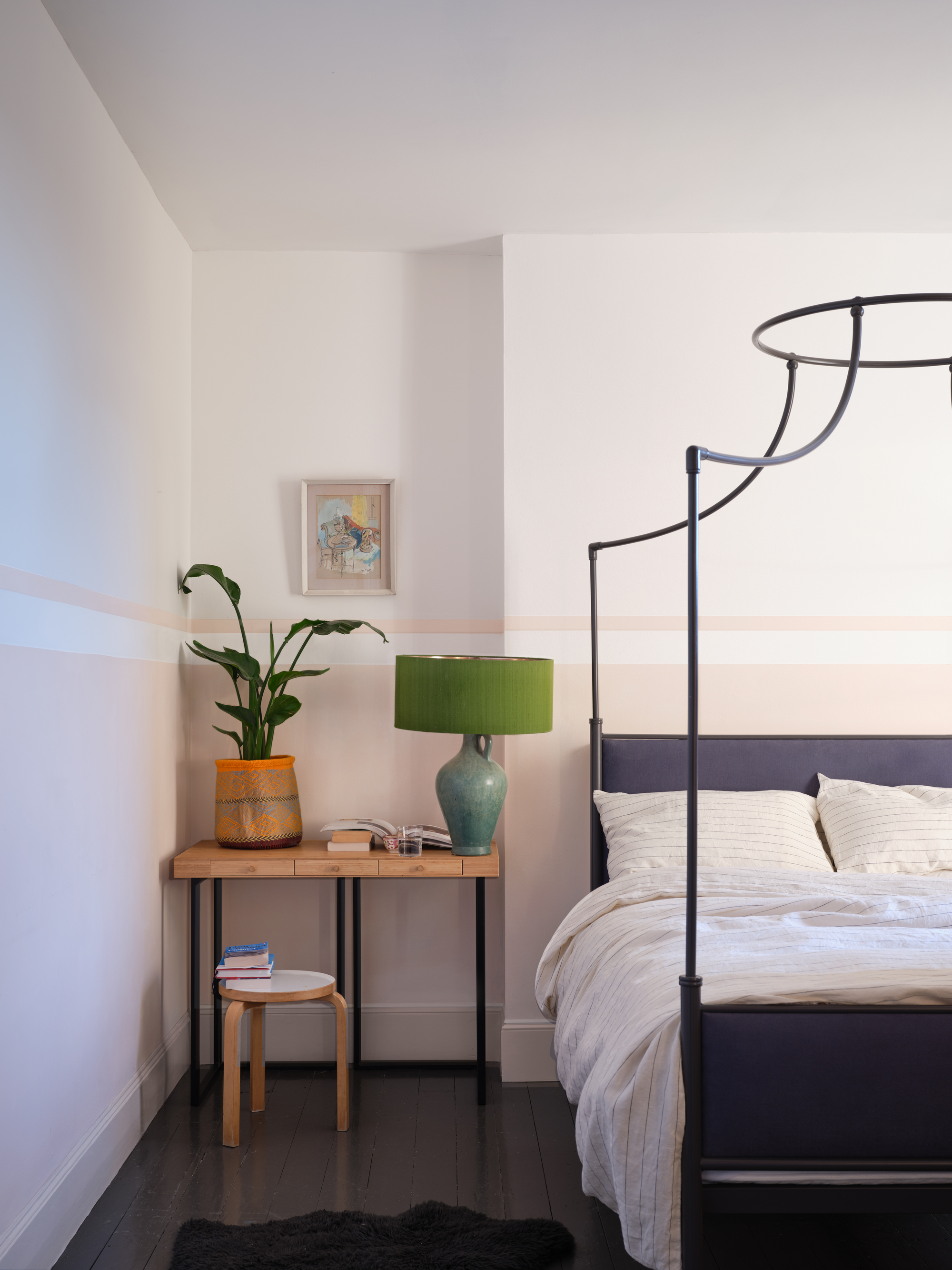
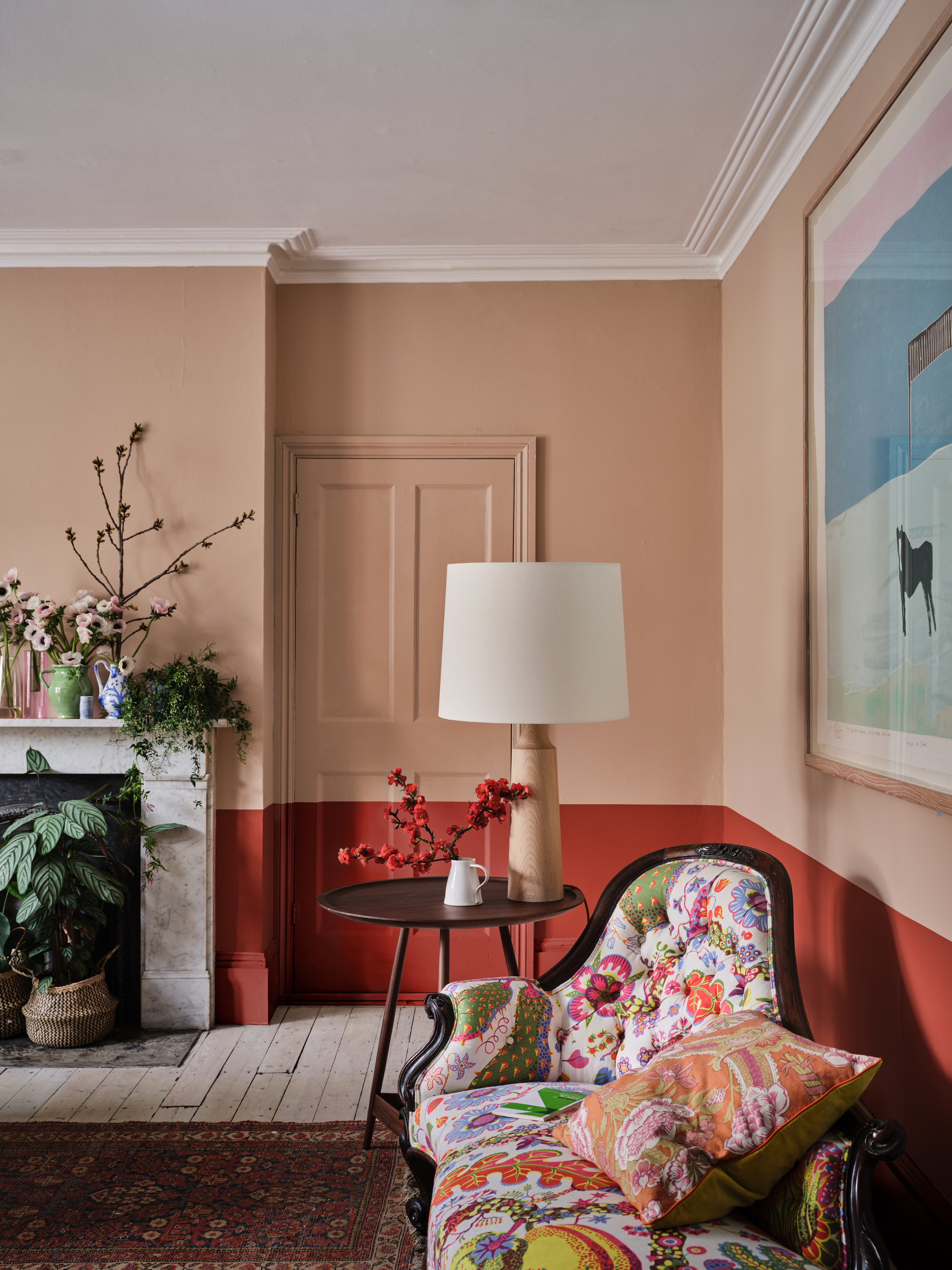
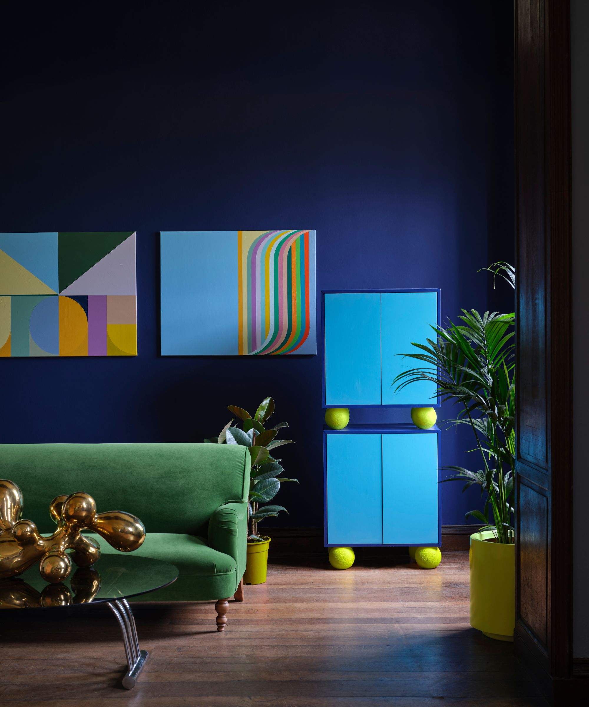
The genesis of this collaboration dates back to early 2022 when Farrow & Ball's creative director, Charlotte Cosby, initiated contact with Rogers, deeply impressed by his innovative use of patterns and shades in his fashion lines. Despite the initial surprise that Rogers would agree, the collaboration blossomed, leading to the creation of 12 new paint colors and three distinct wallpaper patterns. The collection is characterized by its playful exploration of shape and scale, with each wallpaper design available in three colorways and printed using the new paint range. The 'Carte Blanche' title signifies creative freedom and individuality, allowing for diverse combinations of paints and patterns.
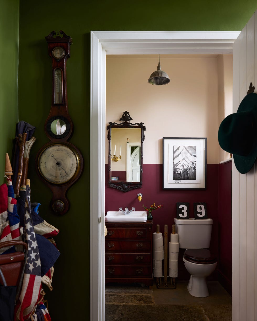
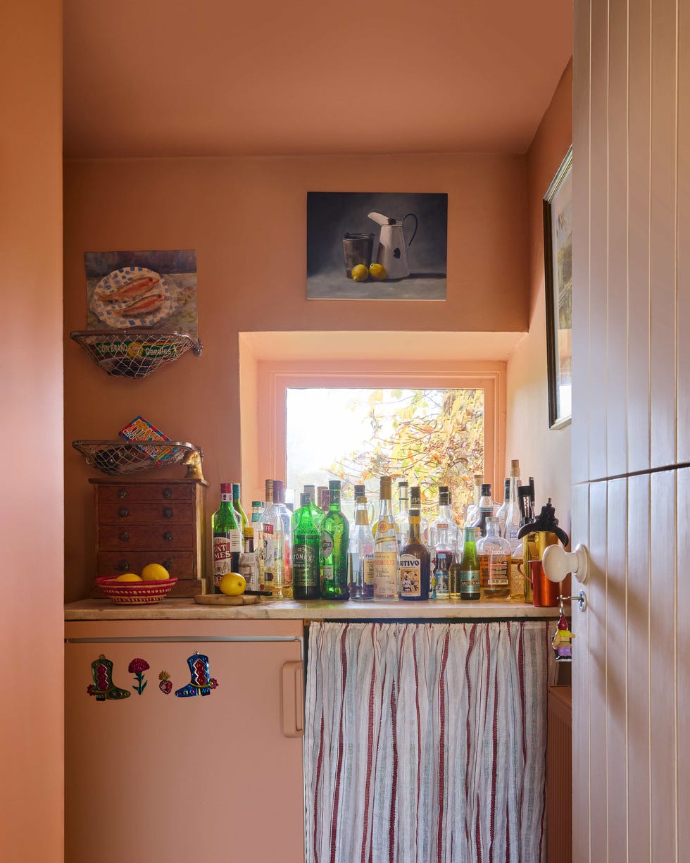
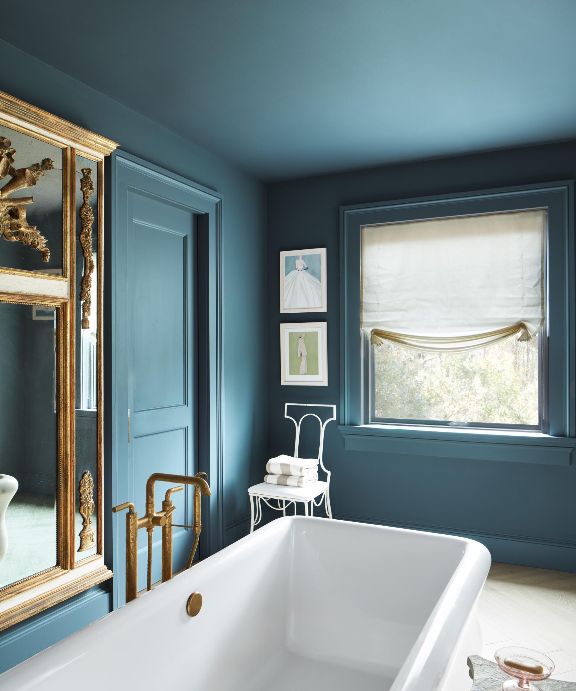
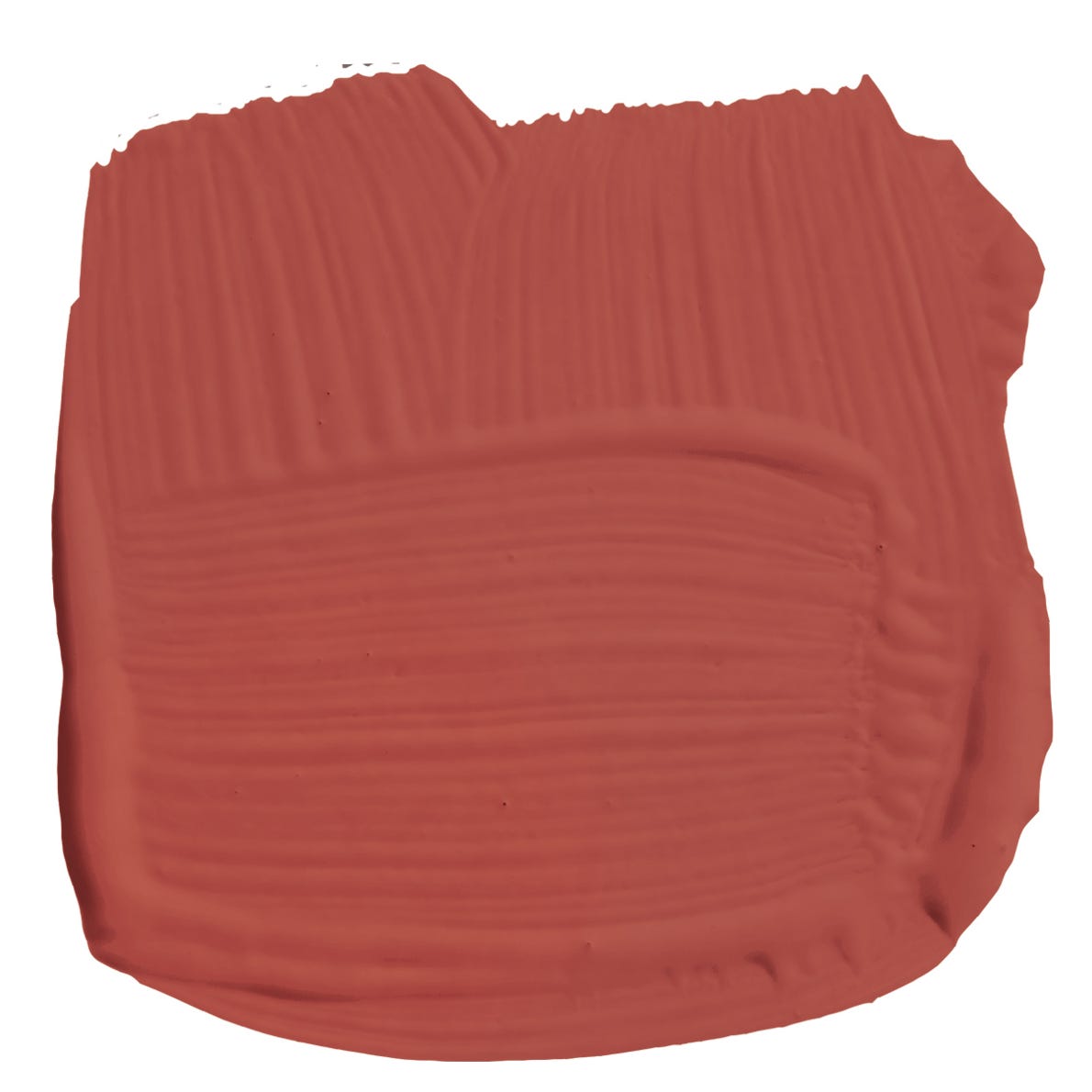
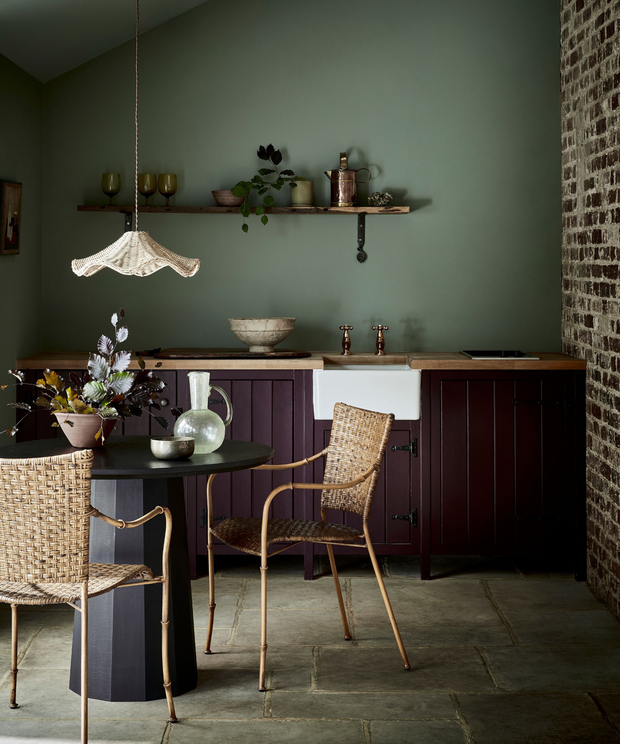
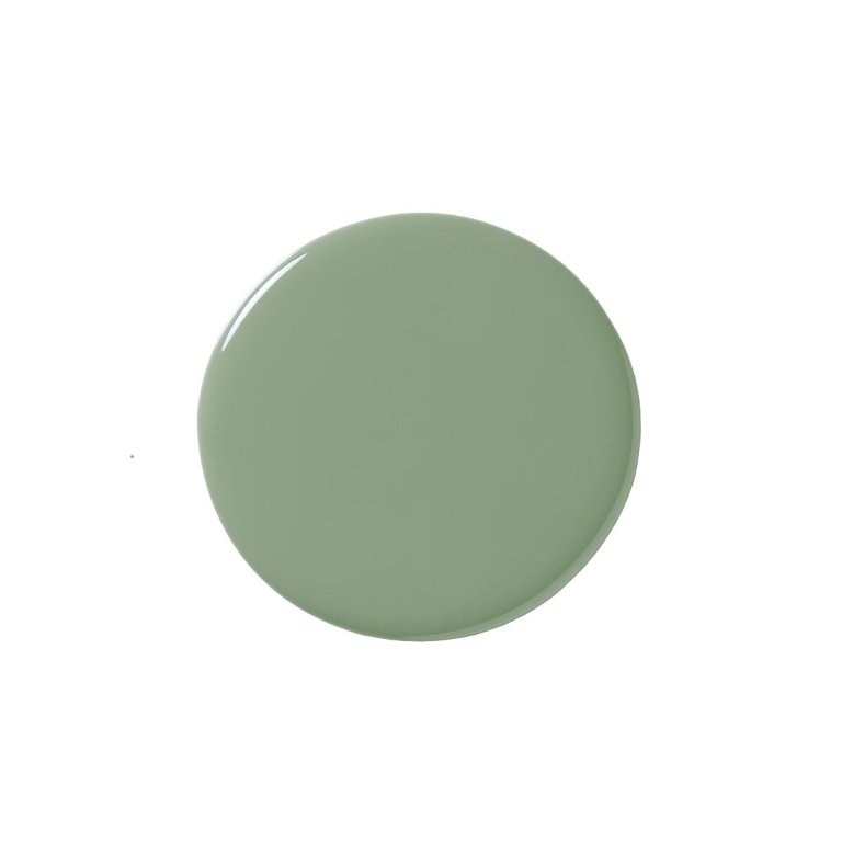
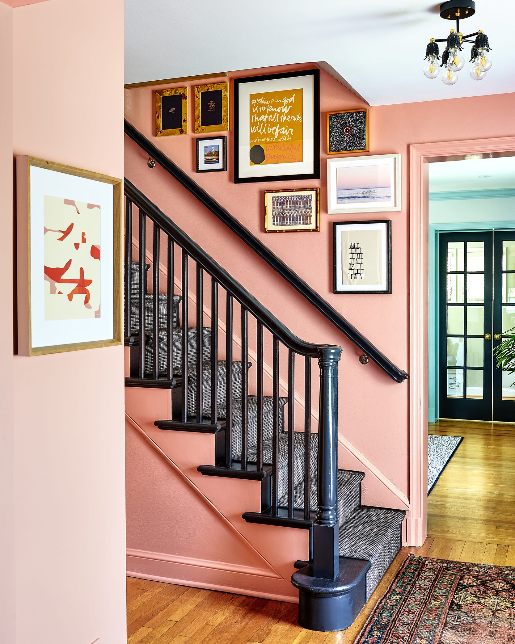
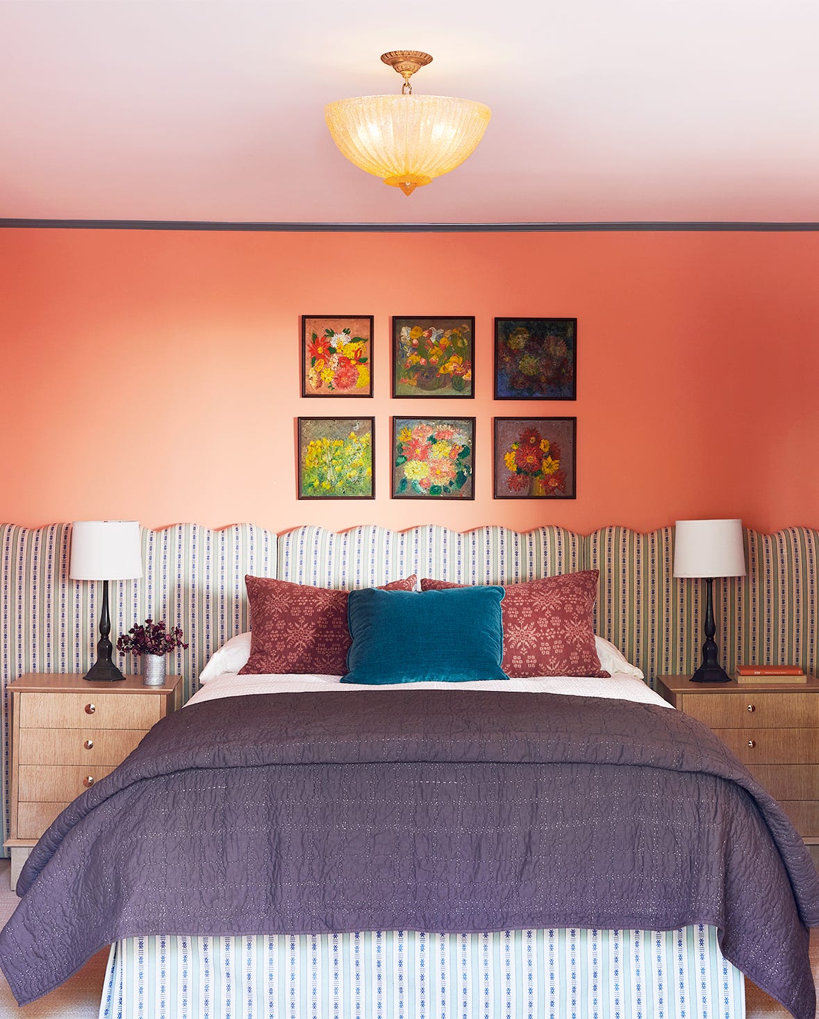
Rogers, a fan of design, expressed his admiration for Farrow & Ball's legacy and commitment to high-quality standards, viewing the collaboration as a natural fit given his own focus on timelessness over fleeting trends. The paint colors in the 'Carte Blanche' collection are a testament to Rogers' personal history and cultural background, drawing inspiration from cherished memories of food and family. Examples include 'Shallot,' a punchy pink reminiscent of Cajun cuisine; 'Sardine,' a silvery-blue named after his grandfather's favorite snack; and 'Raw Tomatillo,' a glorious green inspired by his grandmother’s fried green tomatoes. Rogers appreciates unexpected yet descriptive color names that also possess a sense of humor.
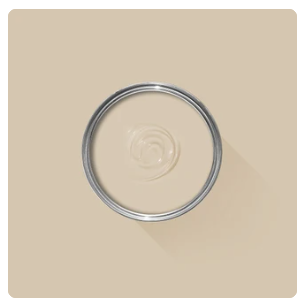
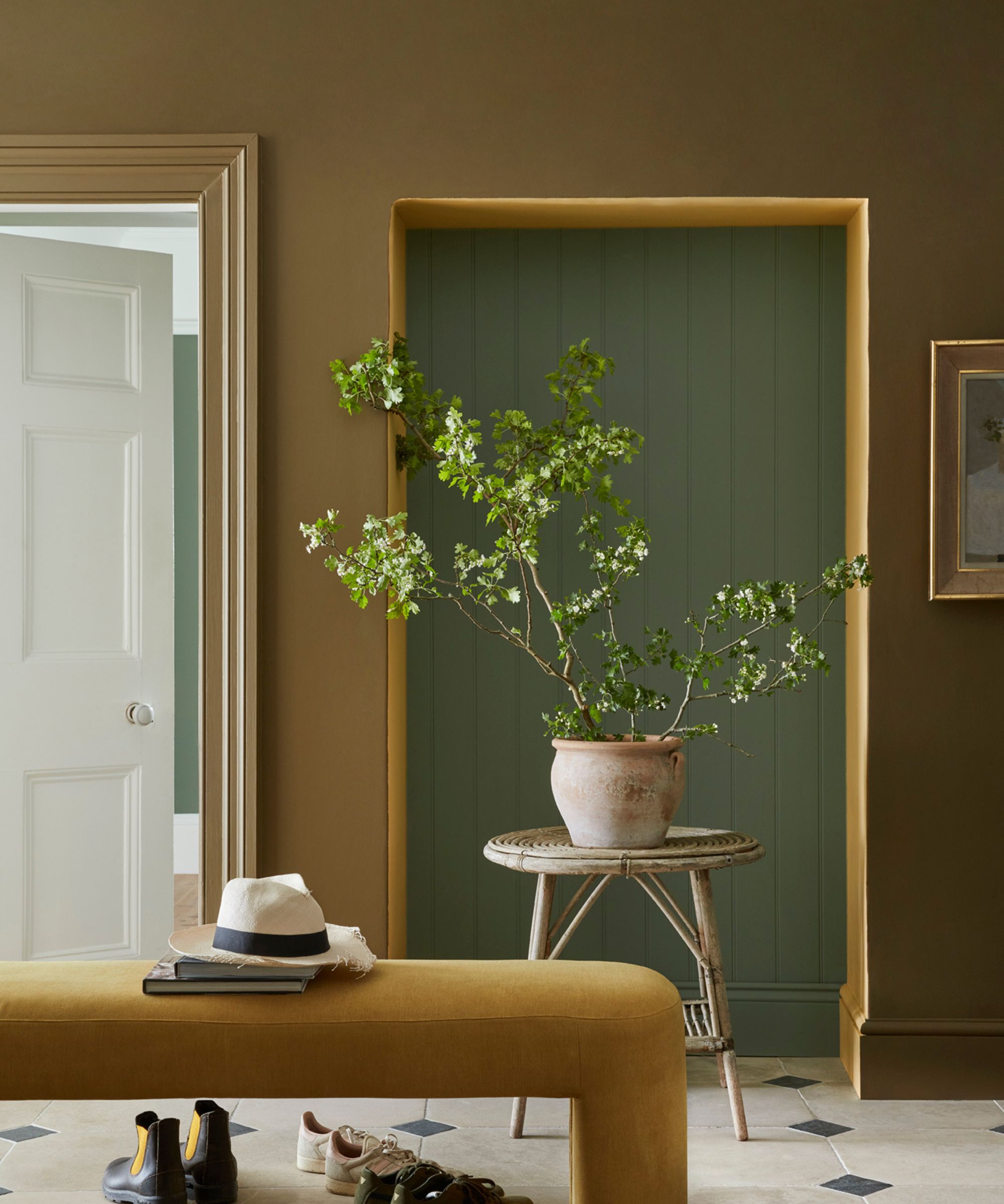
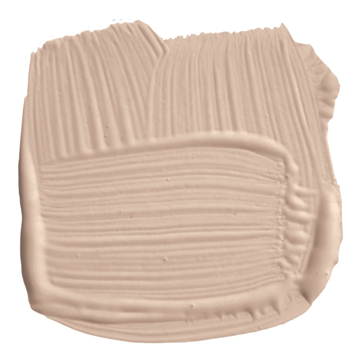
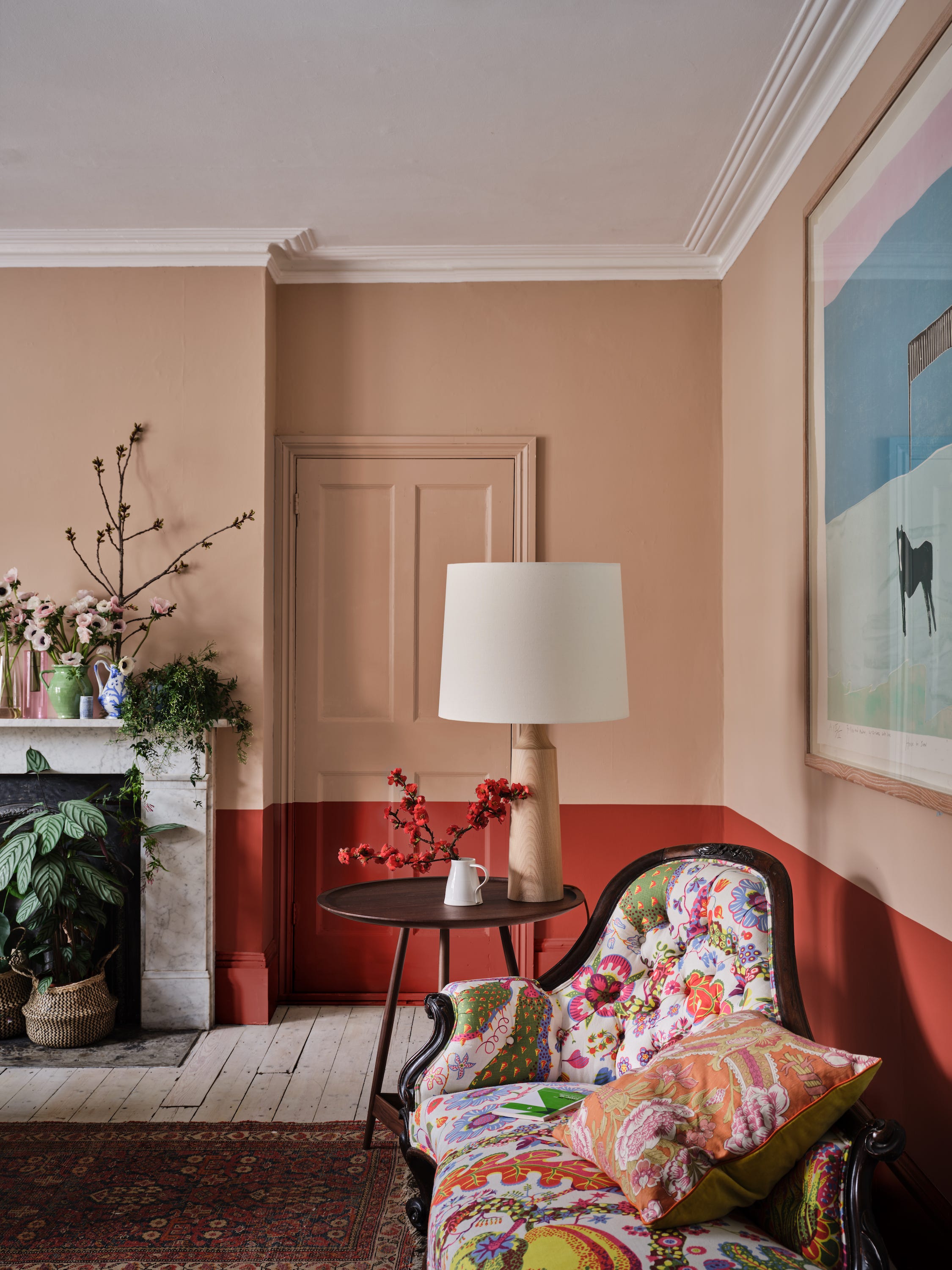
Initially, the collection was conceived with eight shades, but the need for neutral tones to balance the intense hues became apparent. Cosby highlighted Rogers' nuanced approach to color, where each tone is given space to breathe, whether in a multicoloured garment or as a pop of color against a neutral backdrop. This philosophy is reflected in the paint collection, with neutrals like 'Au Lait' and 'Romesco' designed to temper the brights, offering versatility for decorating entire rooms or highlighting specific elements.
The three wallpaper designs, 'Dot,' 'Stripe,' and 'Check,' directly reference Rogers' signature motifs, marking Farrow & Ball's first-ever wallpaper collaboration with an external creative. This move represents a modern and fresh direction for the brand, aligning with Rogers' contemporary ethos of challenging expectations and subverting norms. Rogers views color as a starting point for self-expression, embracing a lack of hierarchy in his creative process, where diverse influences, from children's television to 1960s architecture, contribute to his unique vision. The 'Carte Blanche' collection, set to launch in September, embodies this spirit, reflecting Rogers' characteristic exuberance and joy in his work.
#ChristopherJohnRogers #FarrowAndBall #InteriorDesign #ColorPalette #WallpaperDesign #FashionCollaboration #HomeDecor #CreativeFreedom #TextileArt #ChristopherJohnRogers #FarrowAndBall #InteriorDesign #ColorPalette #WallpaperDesign #FashionCollaboration #HomeDecor #CreativeFreedom #TextileArt
合計0件のコメント
 まだコメントはありません
あなたも好きかもしれません

What's Your Fancy: Farrow & Ball's Color Guru Takes on Entertaining
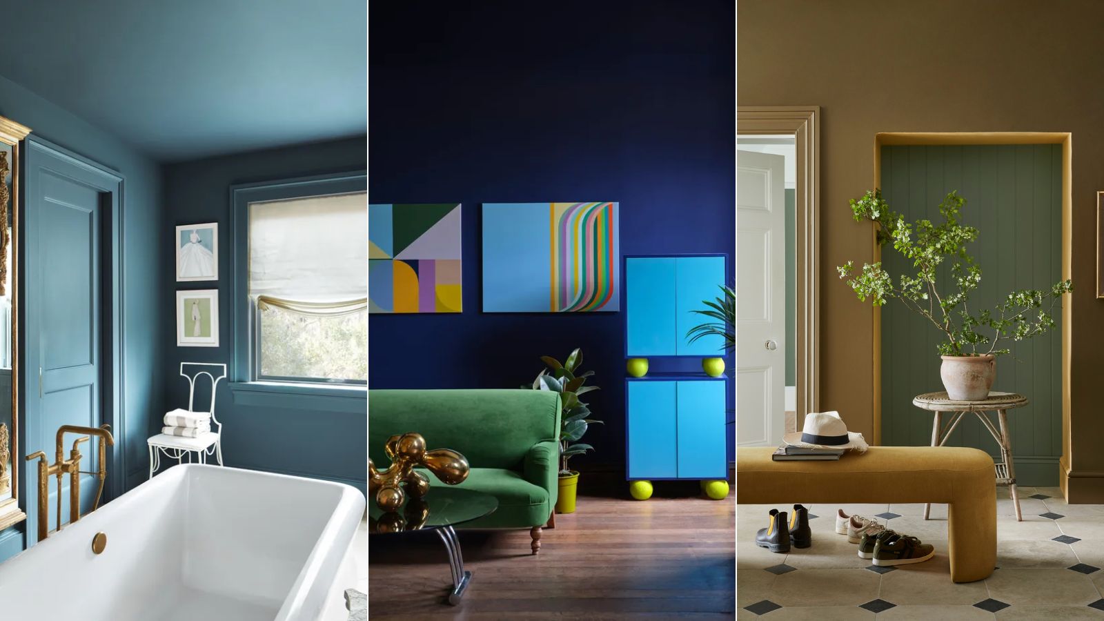
I asked 3 interior designers for their must-try paint colors in 2025 – they are all the perfect 'in-between' shades

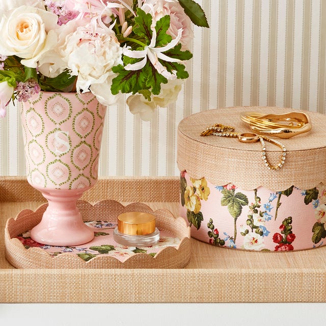
This Royal-Approved Design Brand Just Dropped a Home Decor Collab Filled With Iconic Prints

9 Paint Colors for When You Need a Fresh Start

Farrow & Ball's new colors have just launched – we ask designers how to use this calm, yet colorful palette

First look! Farrow & Ball has just released 11 new colours
Calamine pink, or Dead Salmon? What’s behind paint names

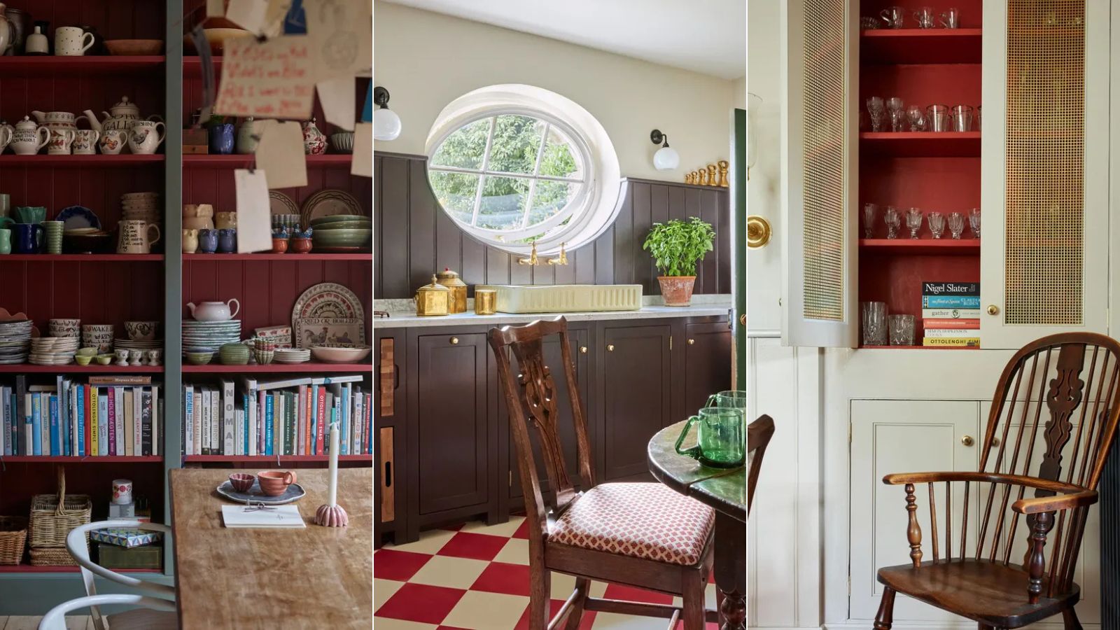
Farrow & Ball's 60-second kitchen color scheme is all about red
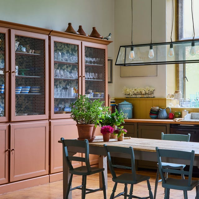
The Woman Behind Farrow & Ball’s Most Iconic Colors Has a New Favorite for 2025

David Coggins Shares His Interior Design Insight

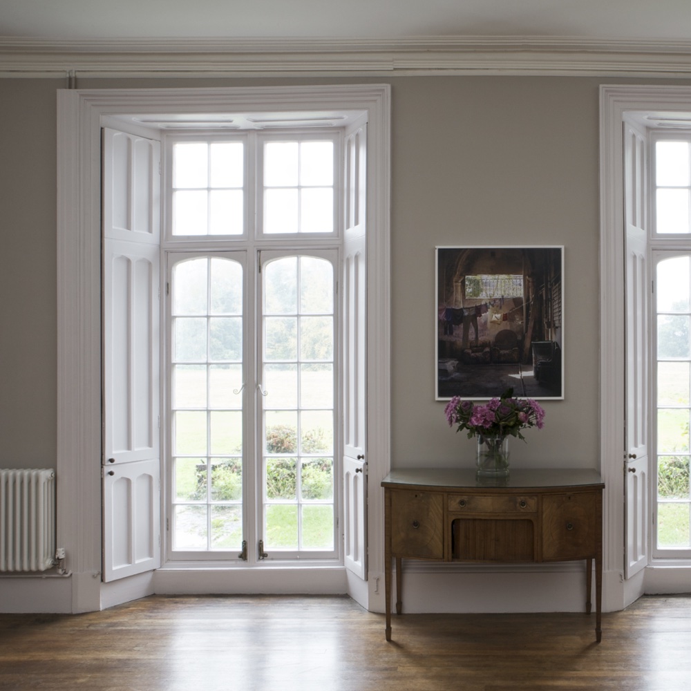
The top 54 paint colours of the decade – all the shades we couldn't live without
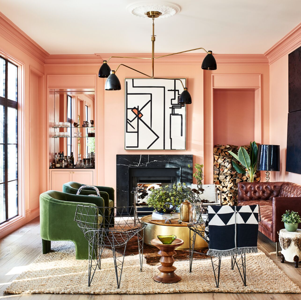
13 Coral Paint Colors to Brighten Your Walls
Shea On Farrow & Ball's New Paint Colors
Interior designers' favorite Farrow & Ball paint colors
Where are the best places to buy paint? 6 go-to paint brands used and loved by interior designers
5 of the best gray paints that interior designers love using
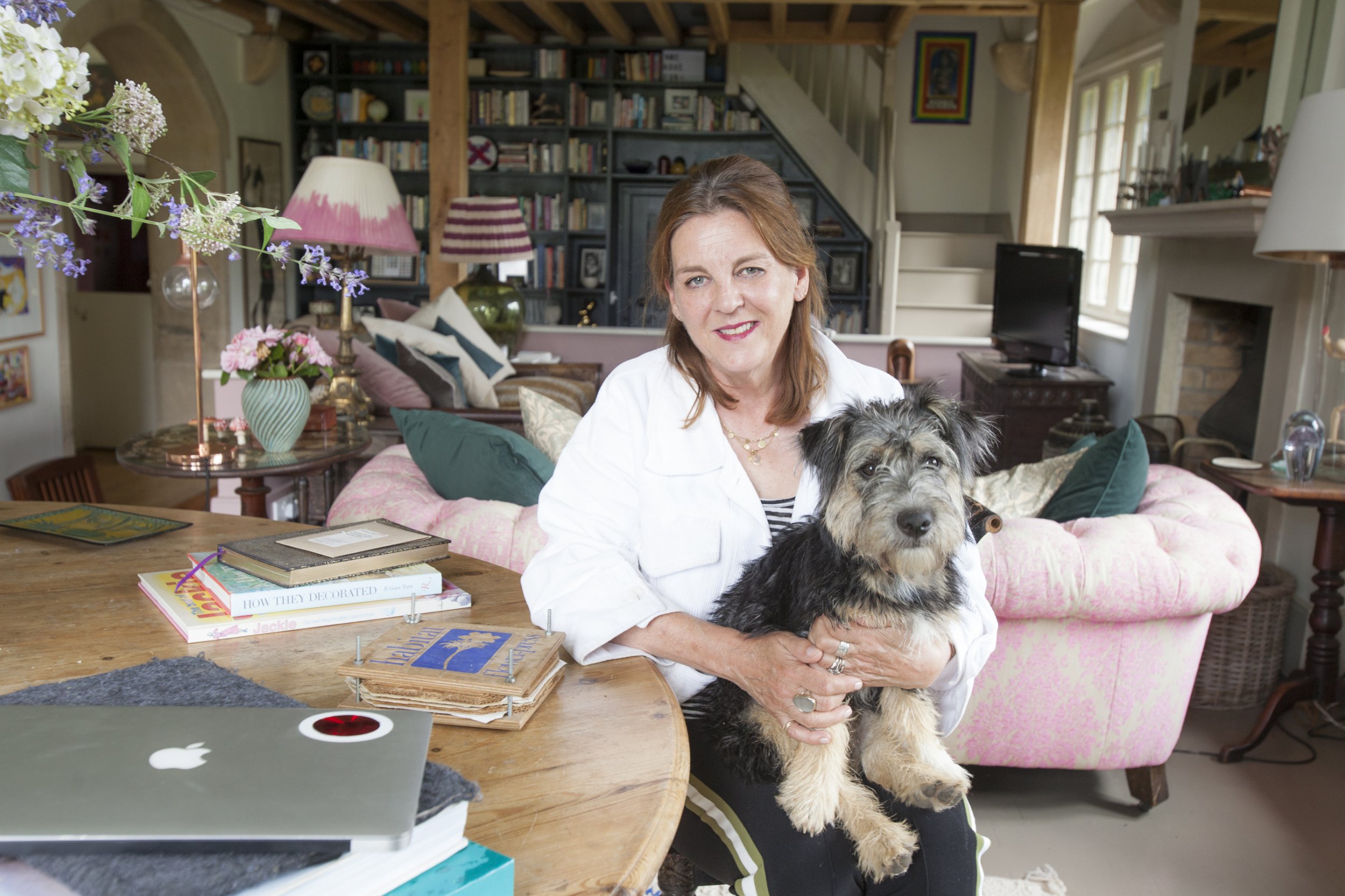
Peek inside the vibrant dream home of Farrow & Ball's colour curator

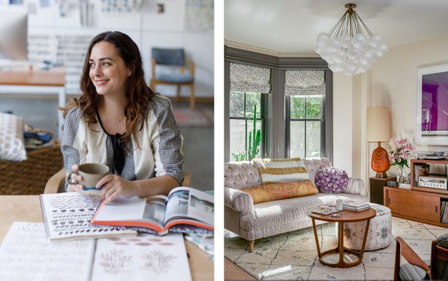
This Popular Fabric Designer Reveals the Right Way to Decorate with Color
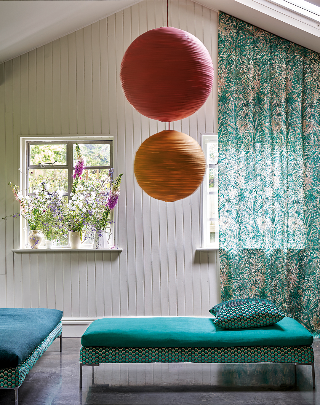
Farrow & Ball and Liberty Just Made Matching a Paint Color to Your Sofa Infinitely Easier

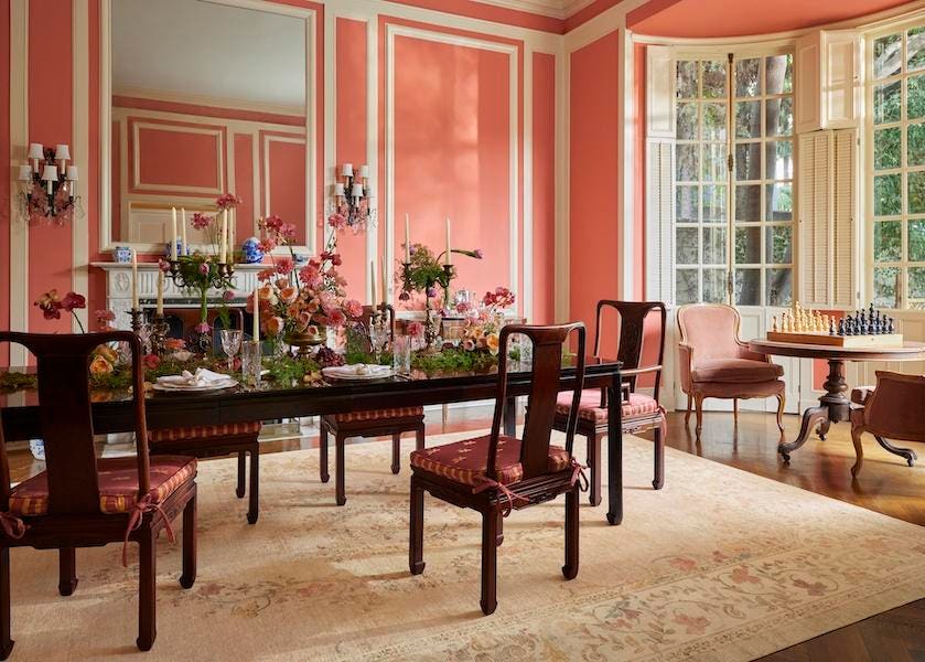
Ruggable Launches A ‘Bridgerton’ Rug Collection