1/21
The 20 Best Neutral Paint Colors for Your Home in 2025
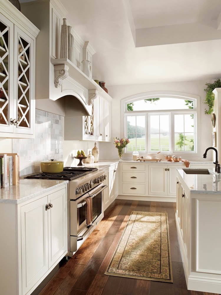
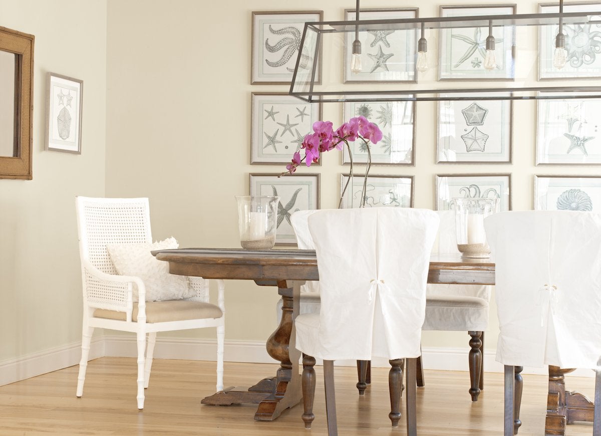
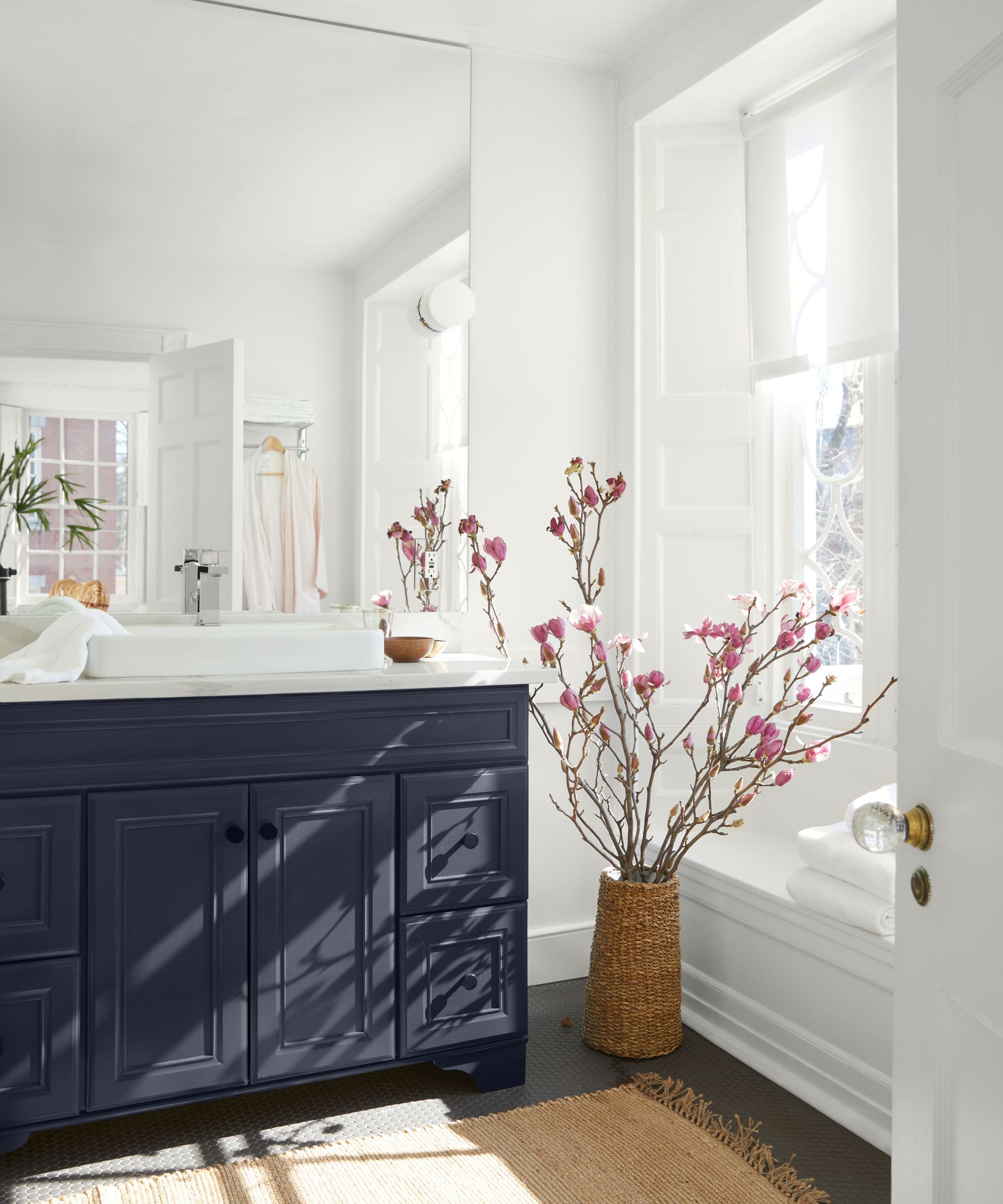
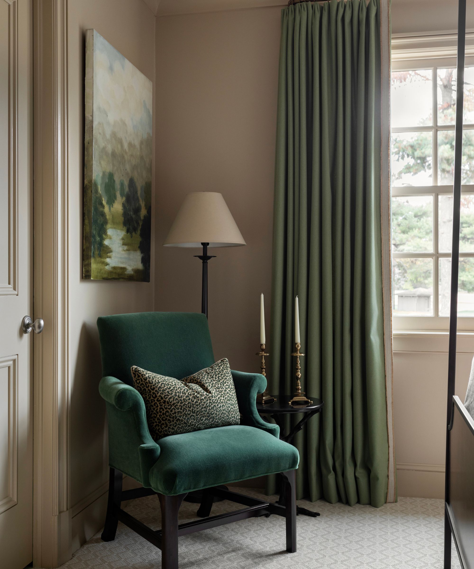
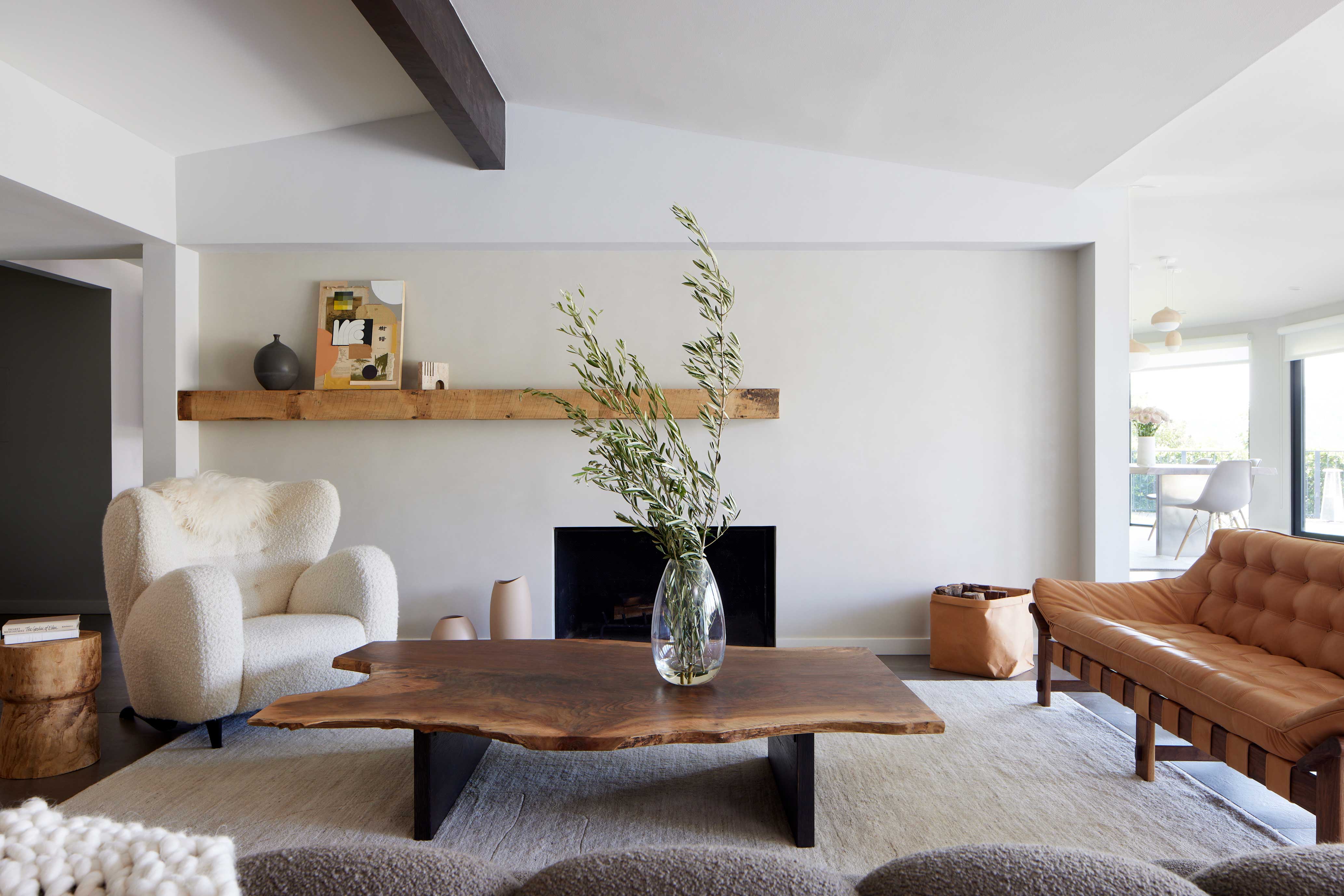
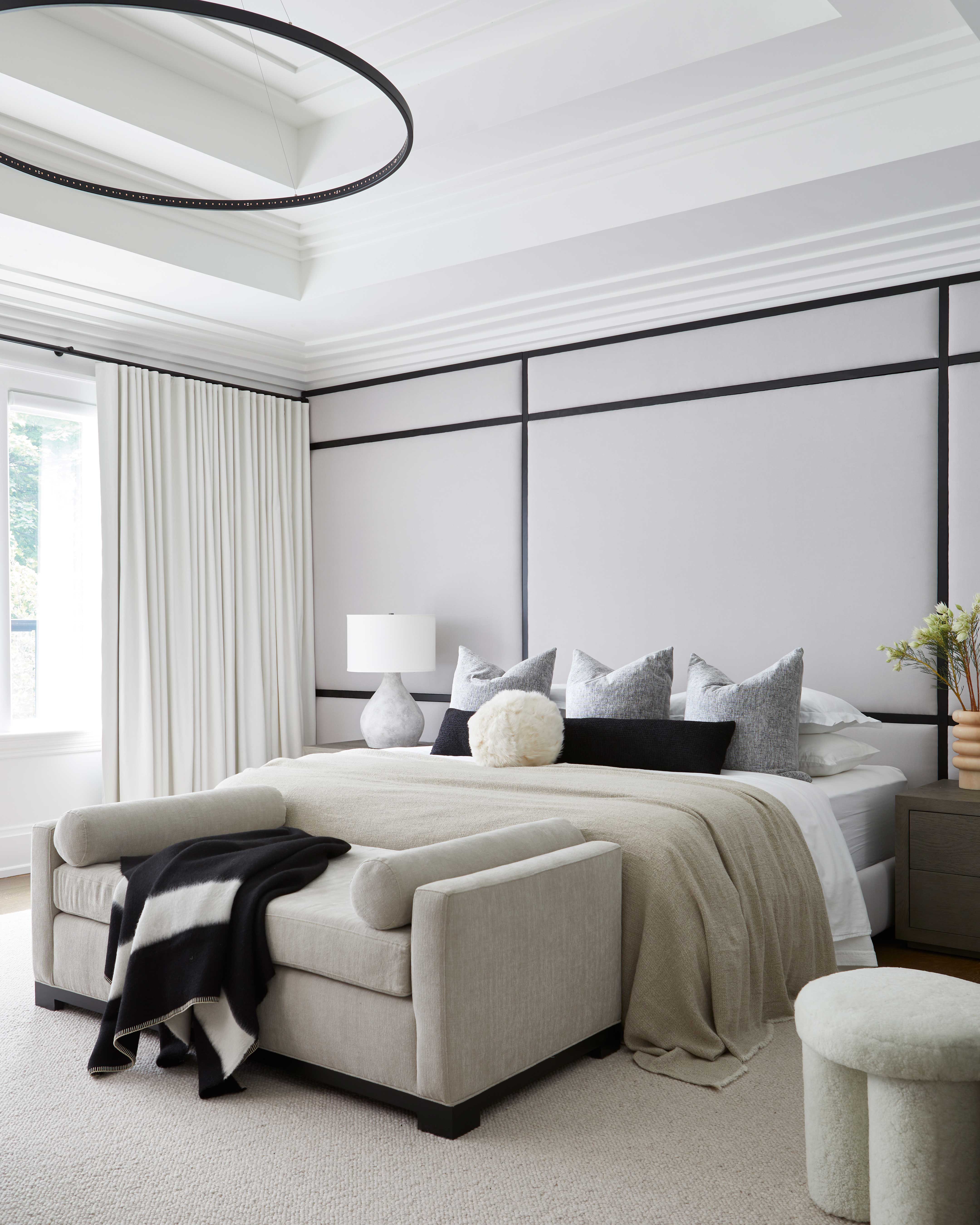
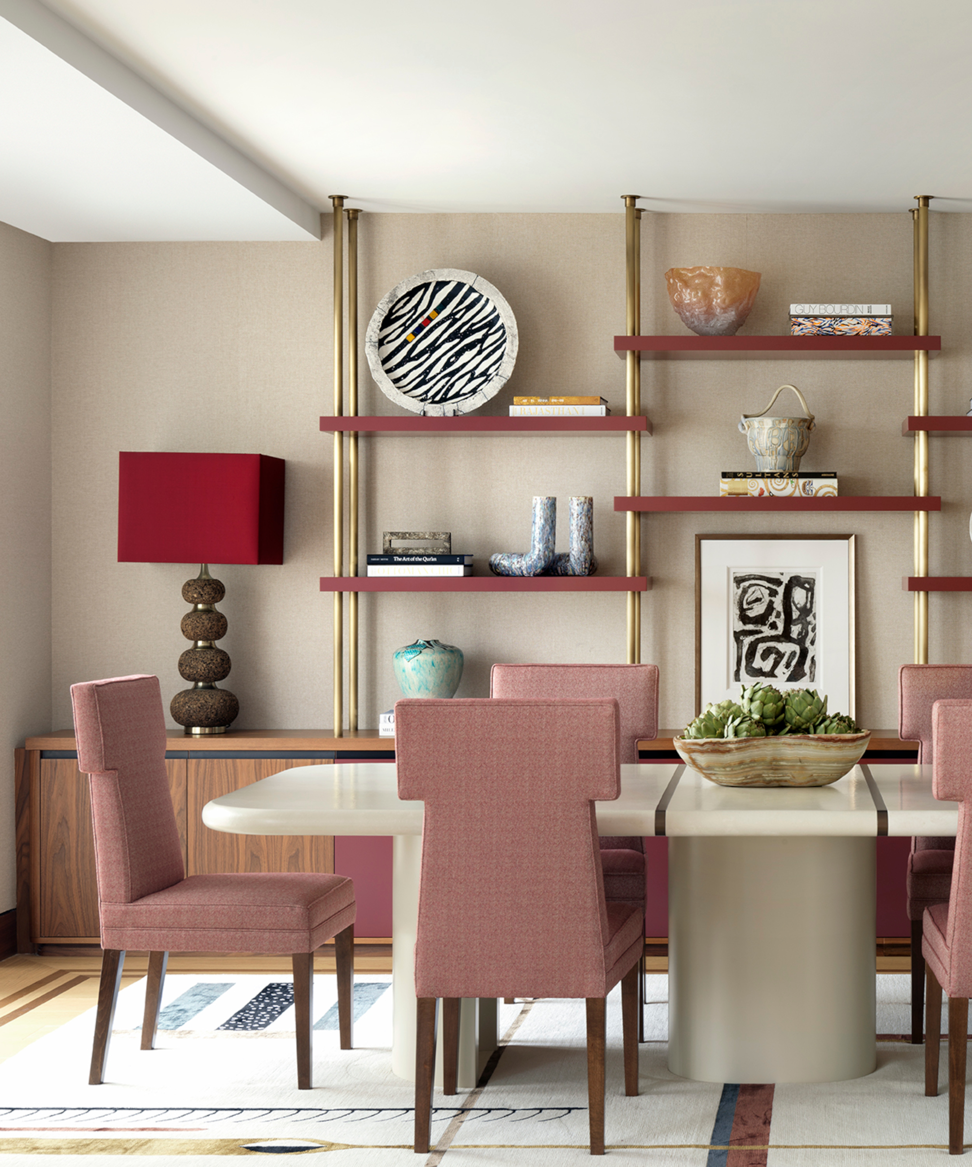
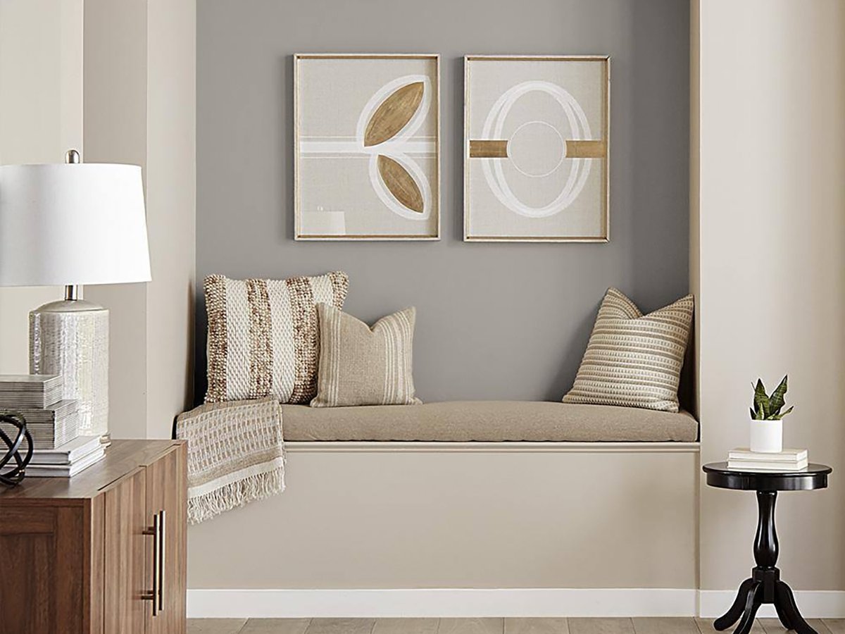
The article presents a comprehensive guide to the top 20 neutral paint colors for home interiors in 2025, moving beyond traditional beige and gray to embrace nuanced undertones that add depth and character. The selections are curated by design experts who emphasize versatility and the ability of these colors to create calm, sophisticated, and adaptable spaces. The expert insights highlight how these neutrals serve as subtle backdrops, allowing textures, furnishings, and accent colors to take prominence, promoting cohesive and balanced designs.
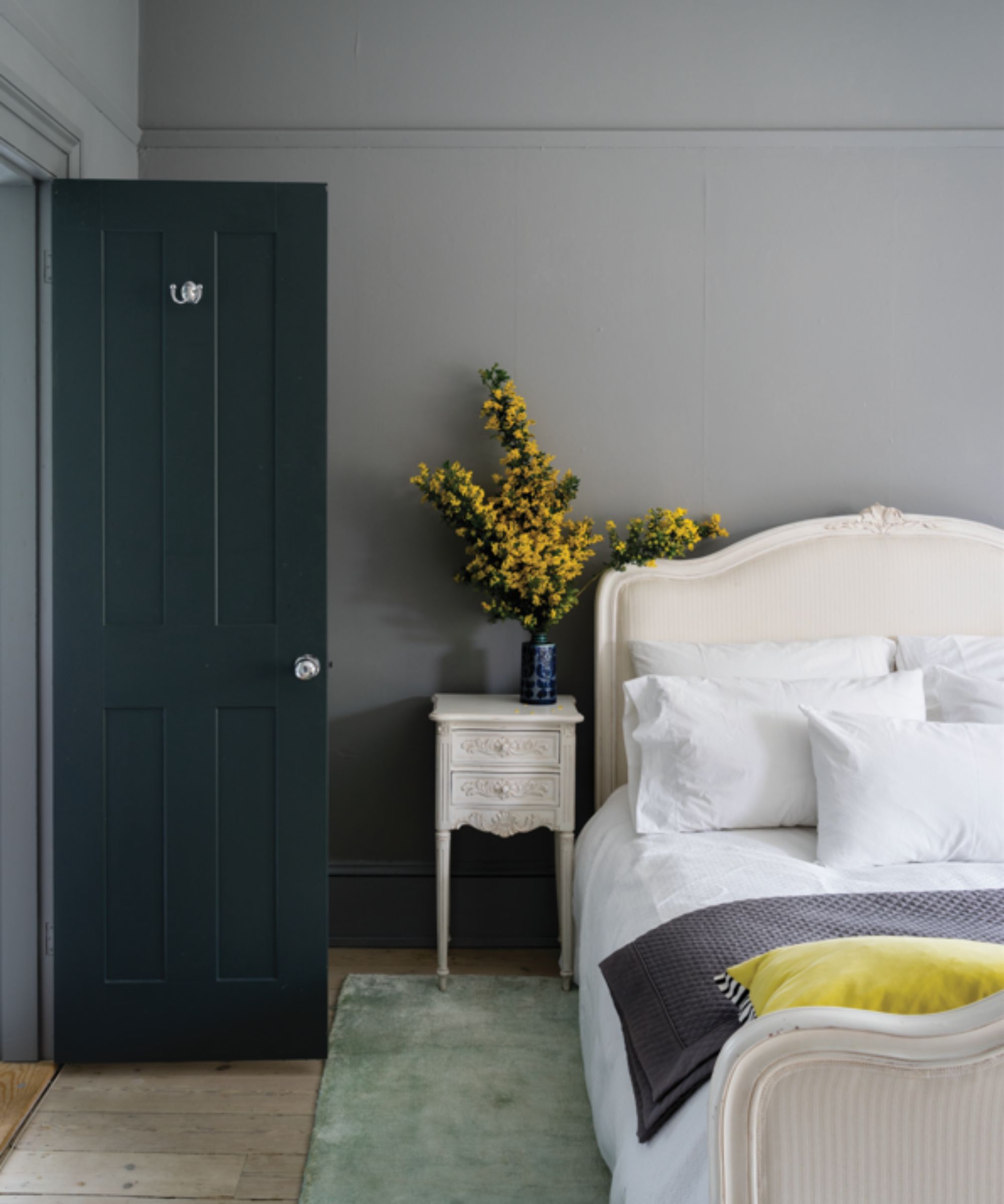
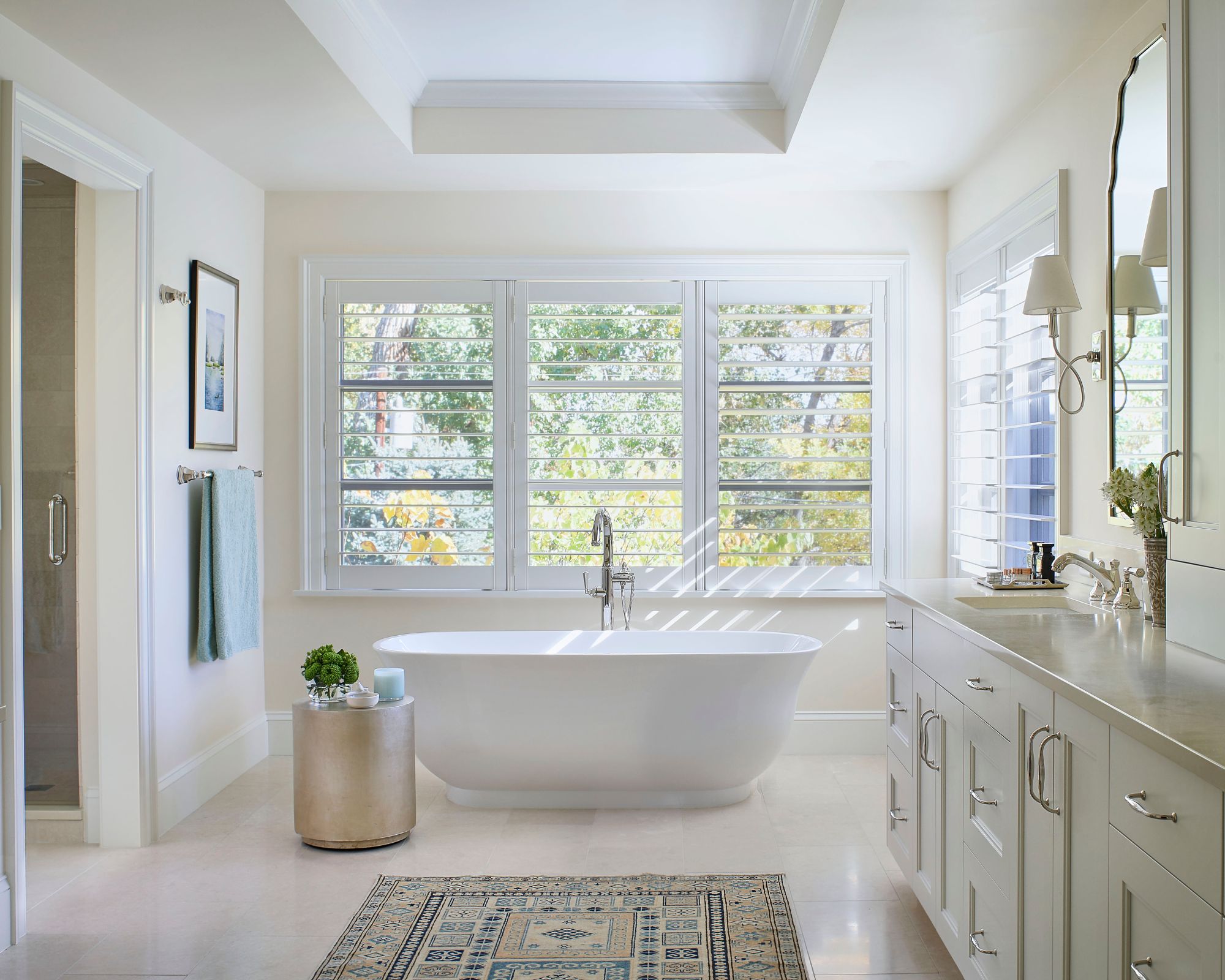
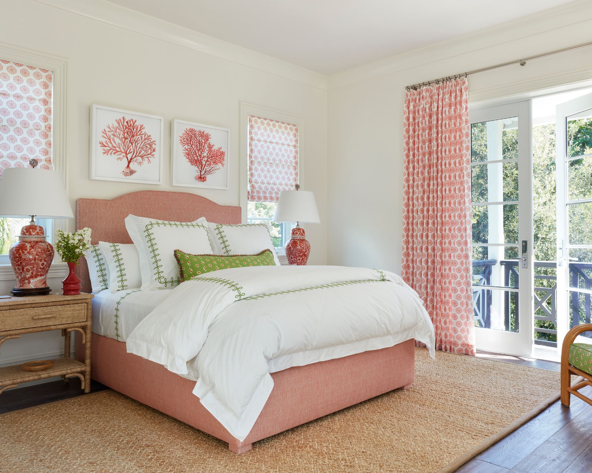
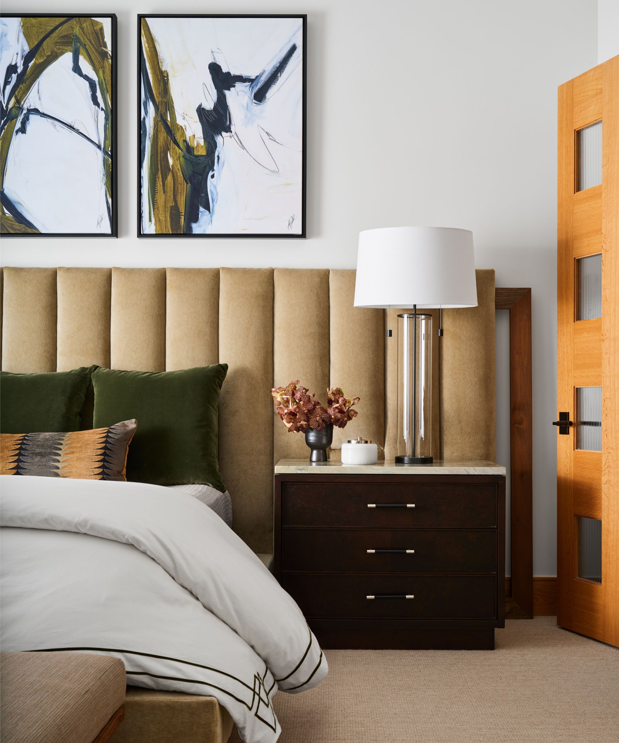
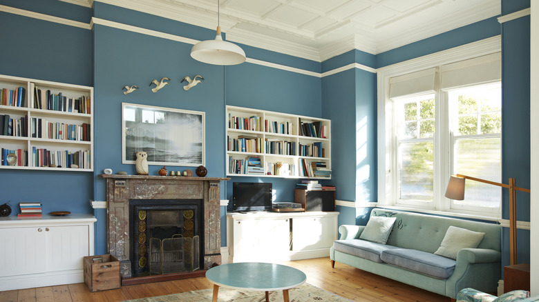
Twenty specific paint colors are detailed, each with a brief description and an explanation of its unique qualities and suitability for different rooms or design styles. For example, Valspar's Adirondack Path is noted for its earthy greige balance of warm and cool tones, ideal for organic, nature-inspired spaces like living rooms and bedrooms. Glidden's Blue Opal is introduced as a subtle light blue that functions as a neutral, catering to those who desire a hint of color without compromising serenity, perfect for bedrooms and bathrooms. Sherwin-Williams' Essential Gray is described as an earthy mid-tone warm gray that provides more depth than previous gray trends, creating an inviting backdrop for both modern and traditional furnishings, and is especially suited for basements due to its warm undertones.
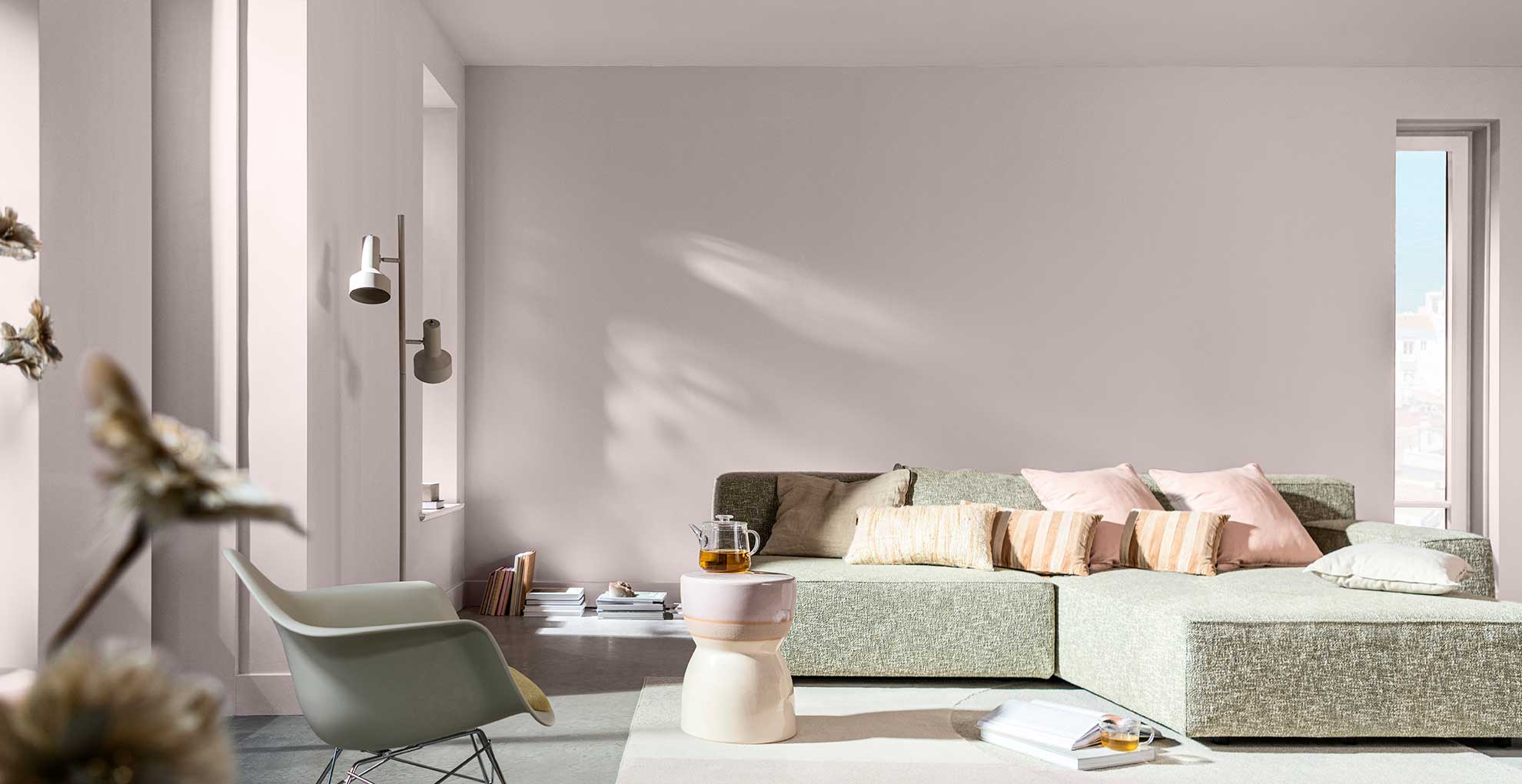
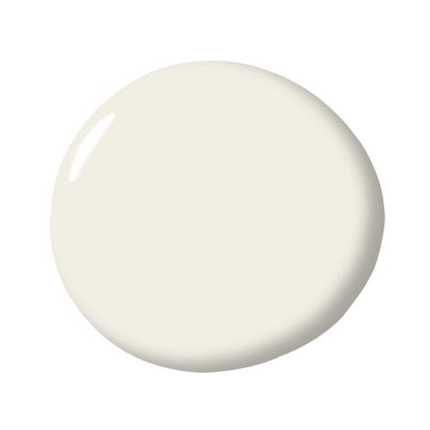
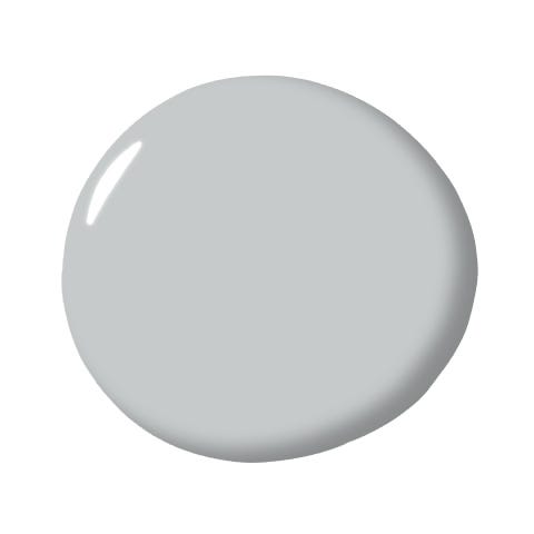
Other notable selections include Glidden's Commercial White, a sophisticated off-white that offers warmth without becoming too beige, effective in brightening spaces with limited natural light. Behr's Fashion Gray is presented as a modern gray with a balance of warm and cool undertones, highlighting architectural features. Glidden's First Frost, with its subtle blue undertone, acts as an atmospheric neutral, creating a cooling effect. Behr's Foxglove is a subtle mauve that injects understated elegance, suitable for bedrooms or dining rooms seeking a touch of warmth. Valspar's Freshly Baked is a warm, creamy neutral that modernizes beige, creating an inviting atmosphere, particularly for relaxation-oriented spaces.
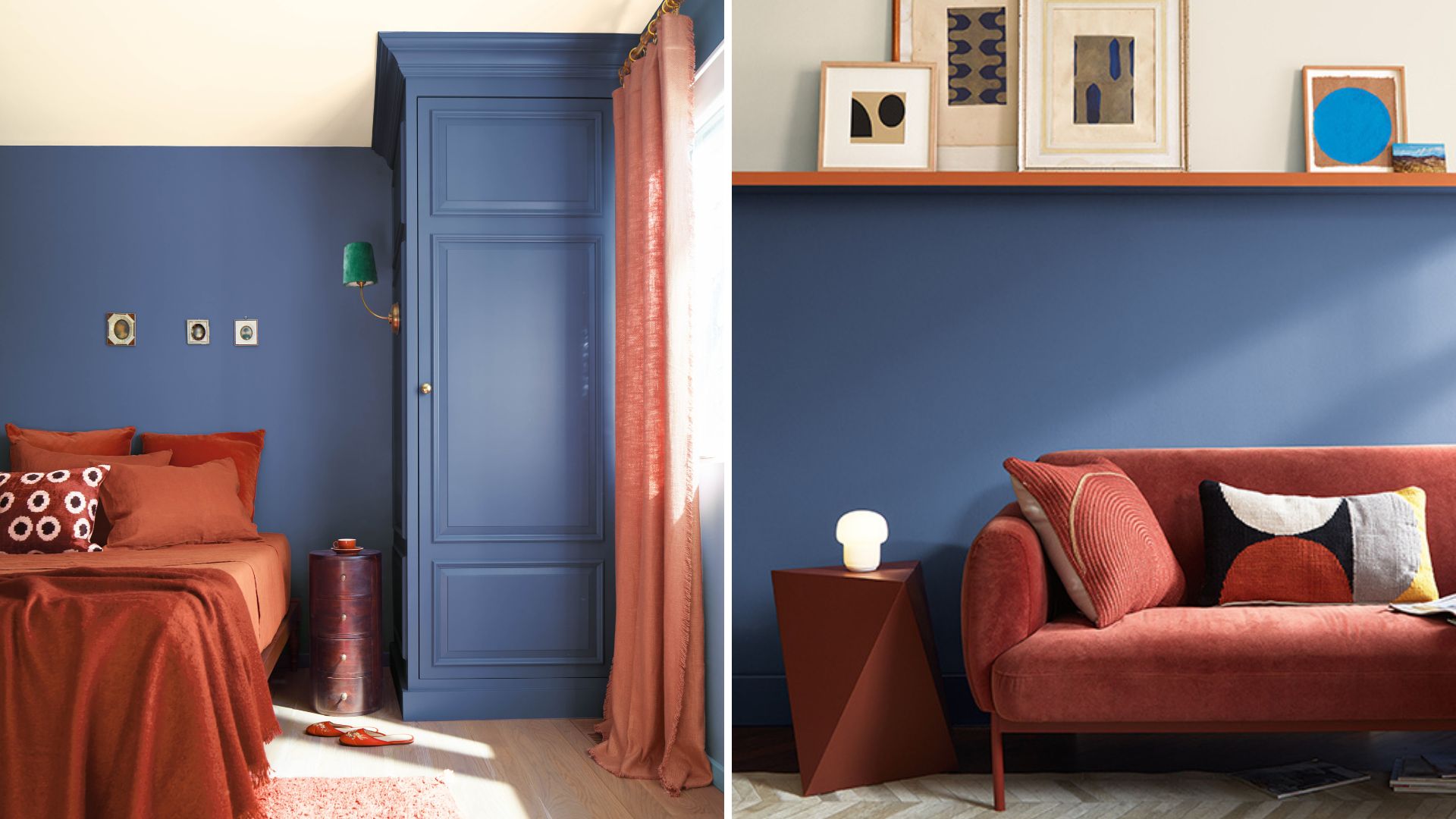
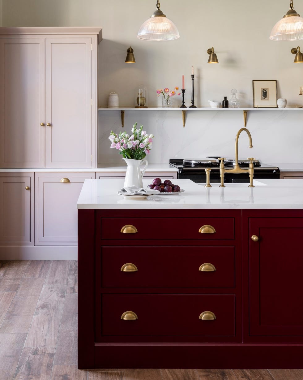
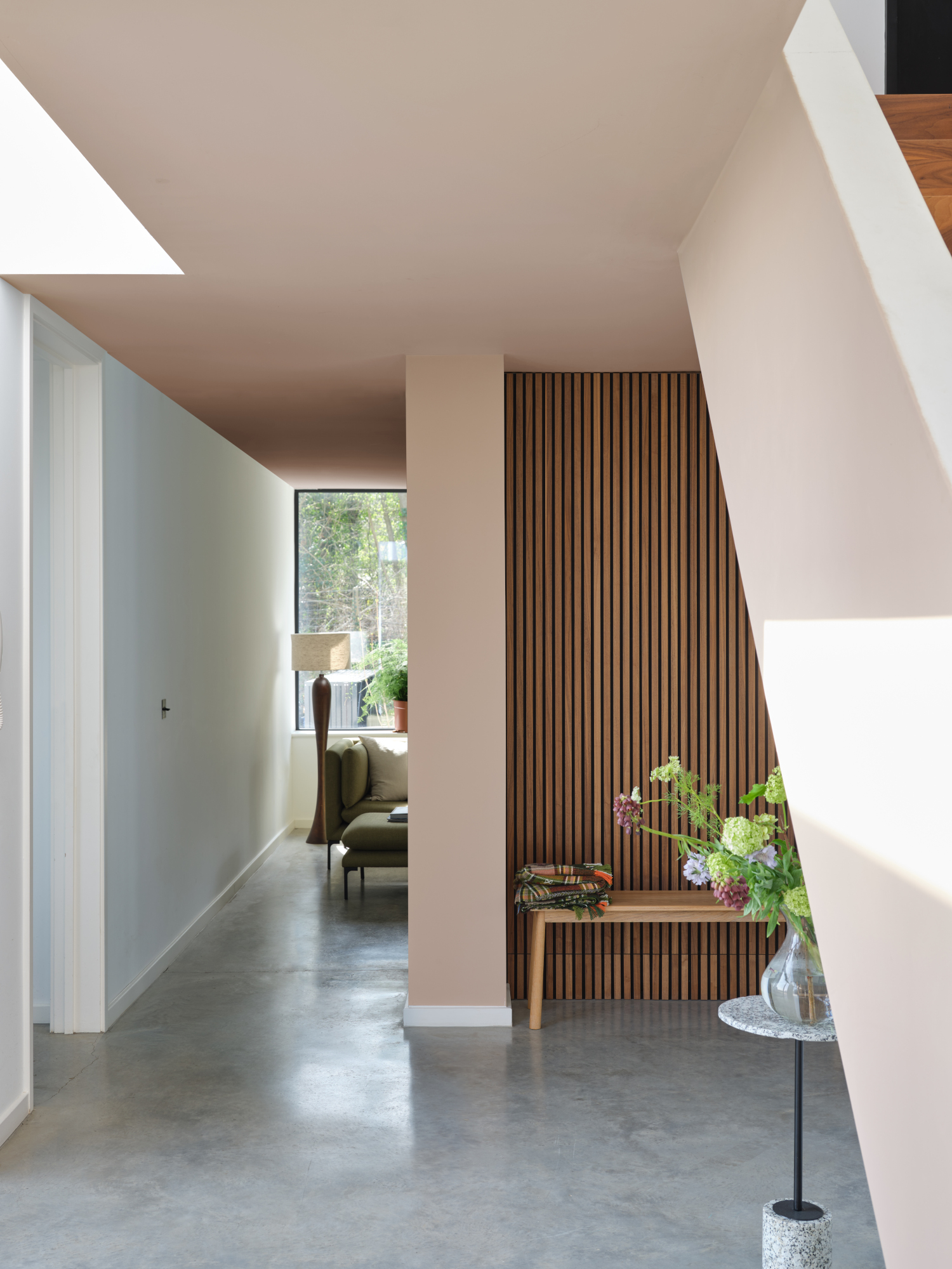
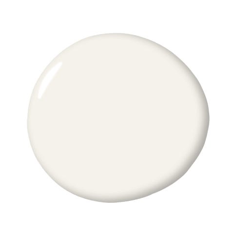
Sherwin-Williams' Icelandic, a sophisticated hue with a light blue undertone, bridges the gap between neutrals and statement colors, adding unexpected sophistication. Sherwin-Williams' Insightful Rose is a pink with a gray undertone, offering a soft, dusty rose appearance for a subdued aesthetic. PPG's My Alibi is a light beige that balances warmth and lightness for a contemporary feel. Sherwin-Williams' Natural Linen is highlighted as a modern, bright beige with subtle warmth, ideal for kitchens and general light backdrops. Sherwin-Williams' Olympus White is a refined white with subtle shifting undertones, maximizing light reflection while adding depth.
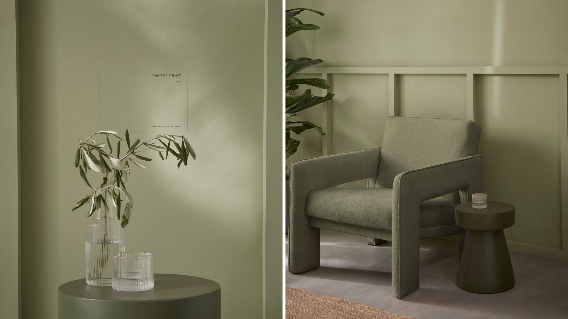
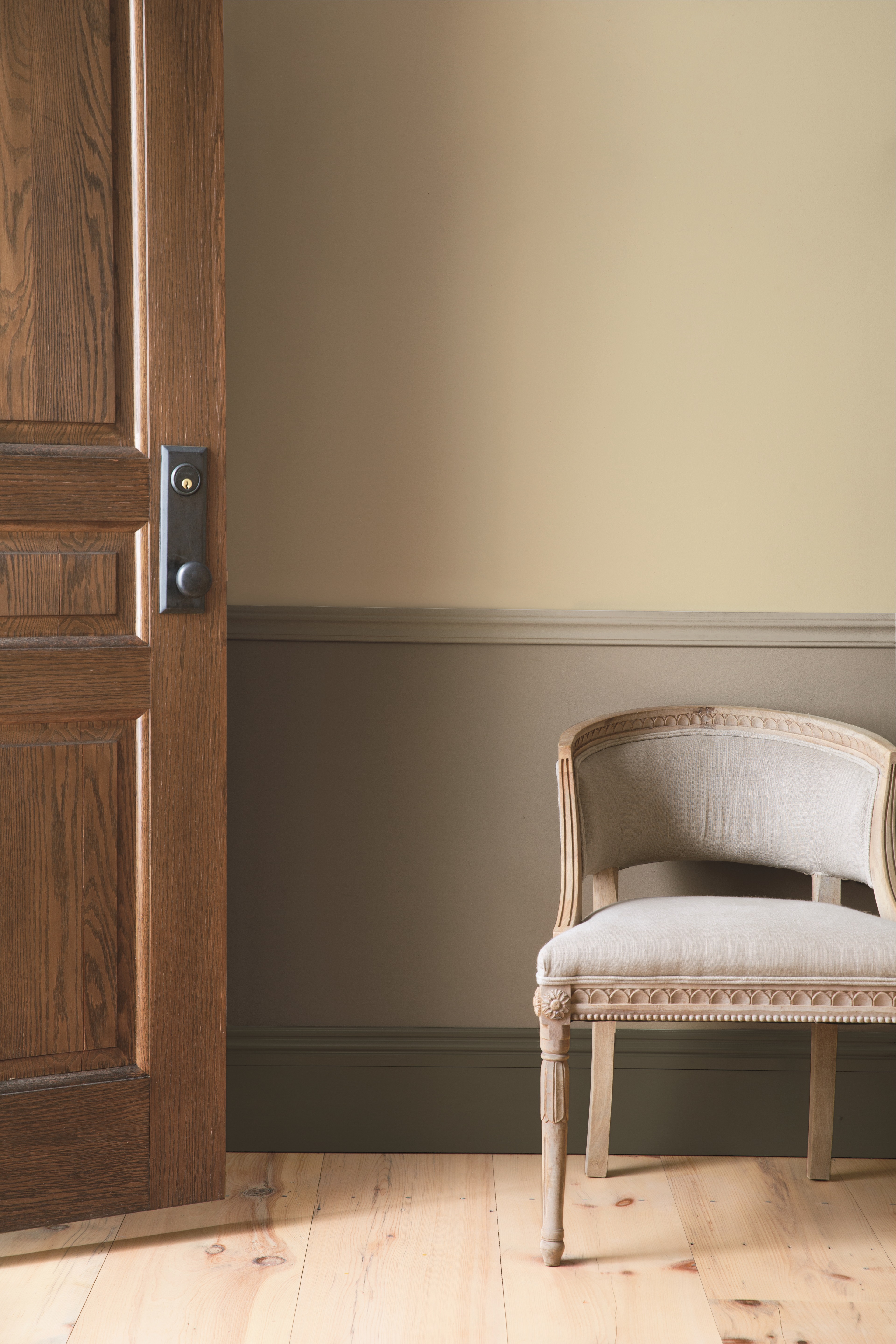
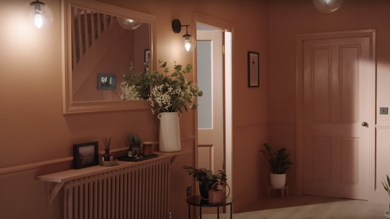
Behr's Peaceful Blue, a muted blue, functions as a calming neutral for bedrooms and bathrooms. Behr's Plateau is a soft, pastel orange that brings optimism without intensity, suitable for family rooms. PPG's Quicksilver, a rich gray-blue with lavender undertones, adds drama and sophistication. Sherwin-Williams' Restoration is a balanced greige/taupe, versatile for various rooms. Kilz's Spanish Fortress is an earthy neutral providing warmth without being overtly terracotta. Kilz's Statue Green, a weathered sage, offers mature elegance and a natural, refined atmosphere. Finally, PPG's Stonehenge Greige combines gray and beige into a robust, balanced neutral, appealing to those who desire sophistication with welcoming qualities, adaptable to diverse decor styles.
#NeutralPaintColors #HomeInteriors #InteriorDesignTrends #PaintSelection #ColorPalettes #HomeRenovation #DesignTips #AccentColors #NeutralPaintColors #HomeInteriors #InteriorDesignTrends #PaintSelection #ColorPalettes #HomeRenovation #DesignTips #AccentColors
0 commenti in totale
 Nessun commento ancora
Potresti anche gradire
5 Paint Colors Going Out of Style in 2025 — And What You Should Replace Them With Before Then

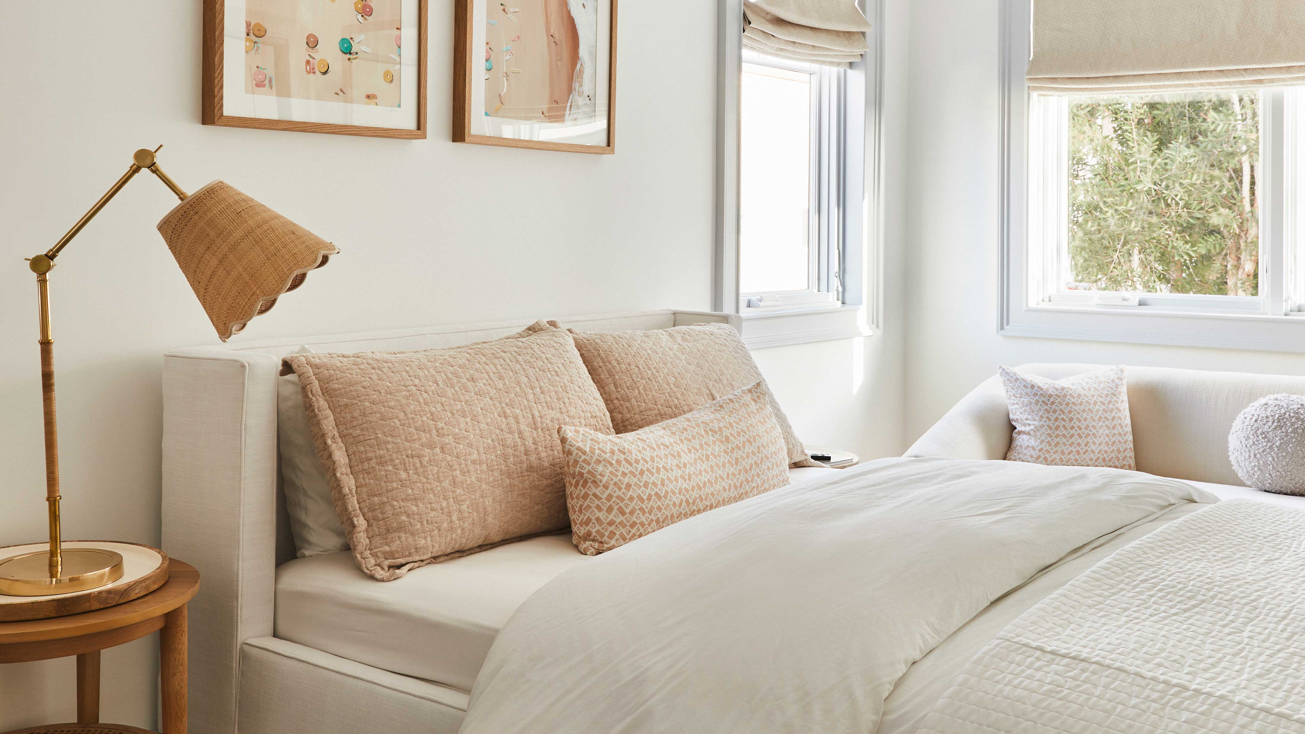
What Neutral Wall Color Should I Pick in 2024? These are the Big Neutral Color Trends, Say Designers
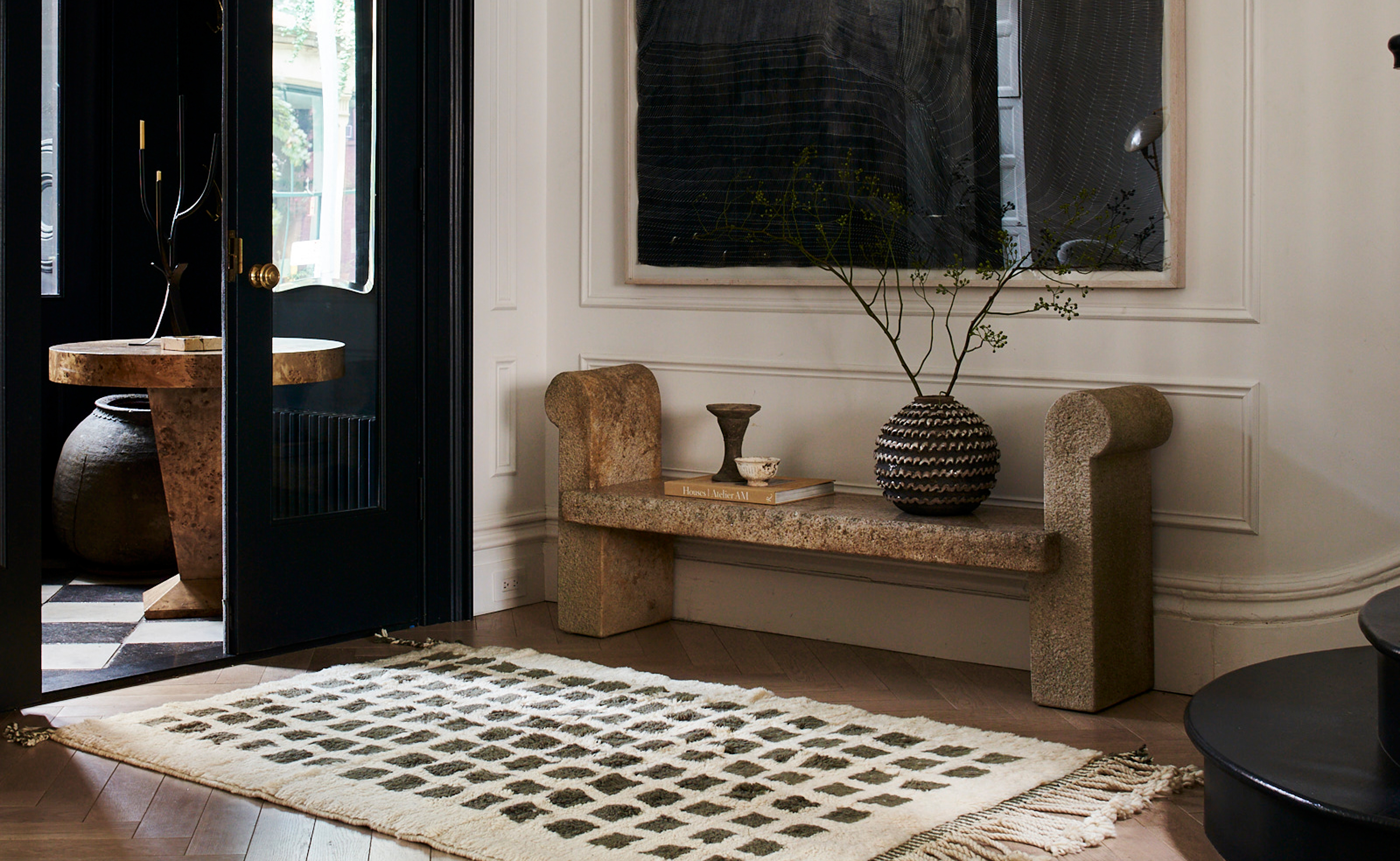
The 3 Best Neutral Entryway Paint Colors to Set the Right Tone for a Sophisticated Home
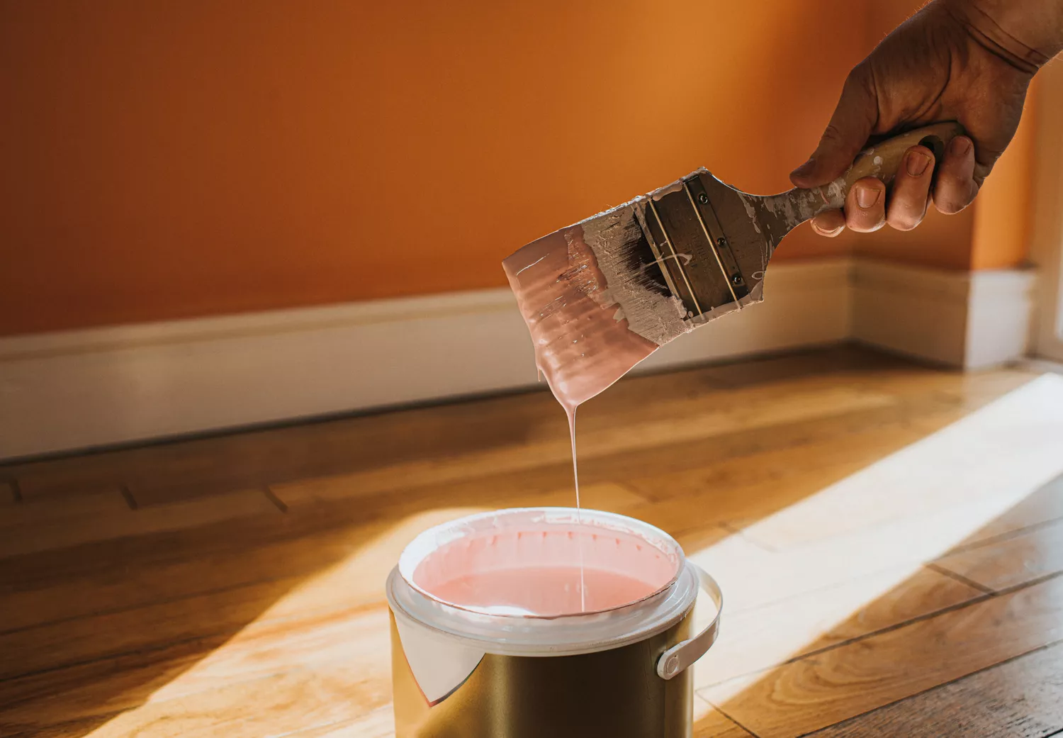
6 Outdated Paint Colors We're Saying Goodbye to in 2025, According to Designers

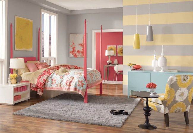
The Most Popular Paint Colors in America

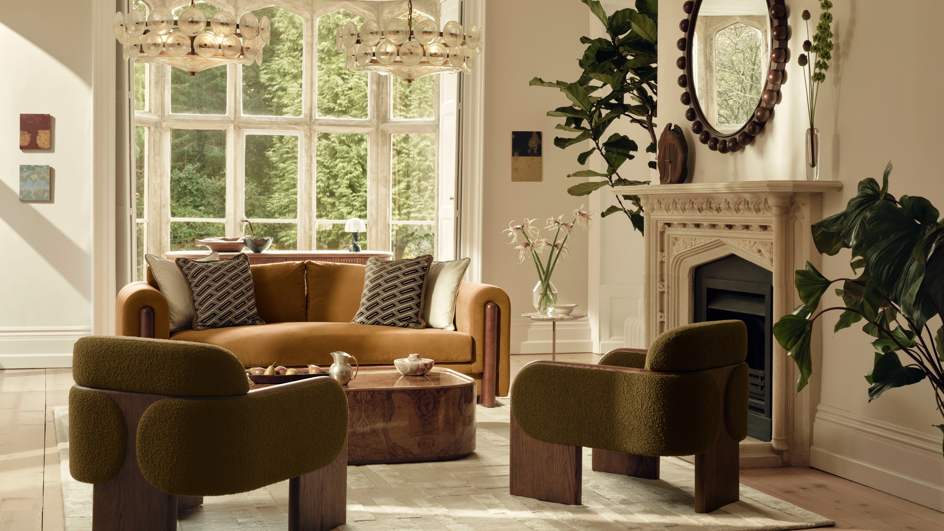
These Are the 3 Living Room Colors That Are Out of Style in 2025 — And the Shades to Use Instead
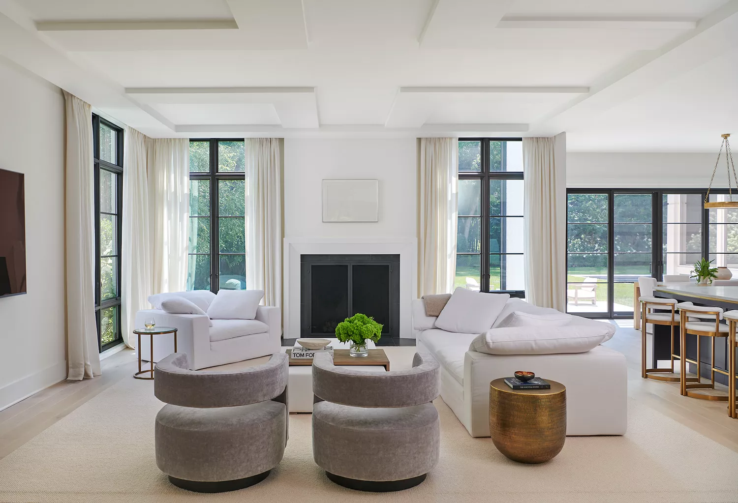
12 Neutral Paint Colors That Will Look Beautiful in Every Room

8 Paint Color Trends You'll ACTUALLY Want to Live With in 2026, According to Designers

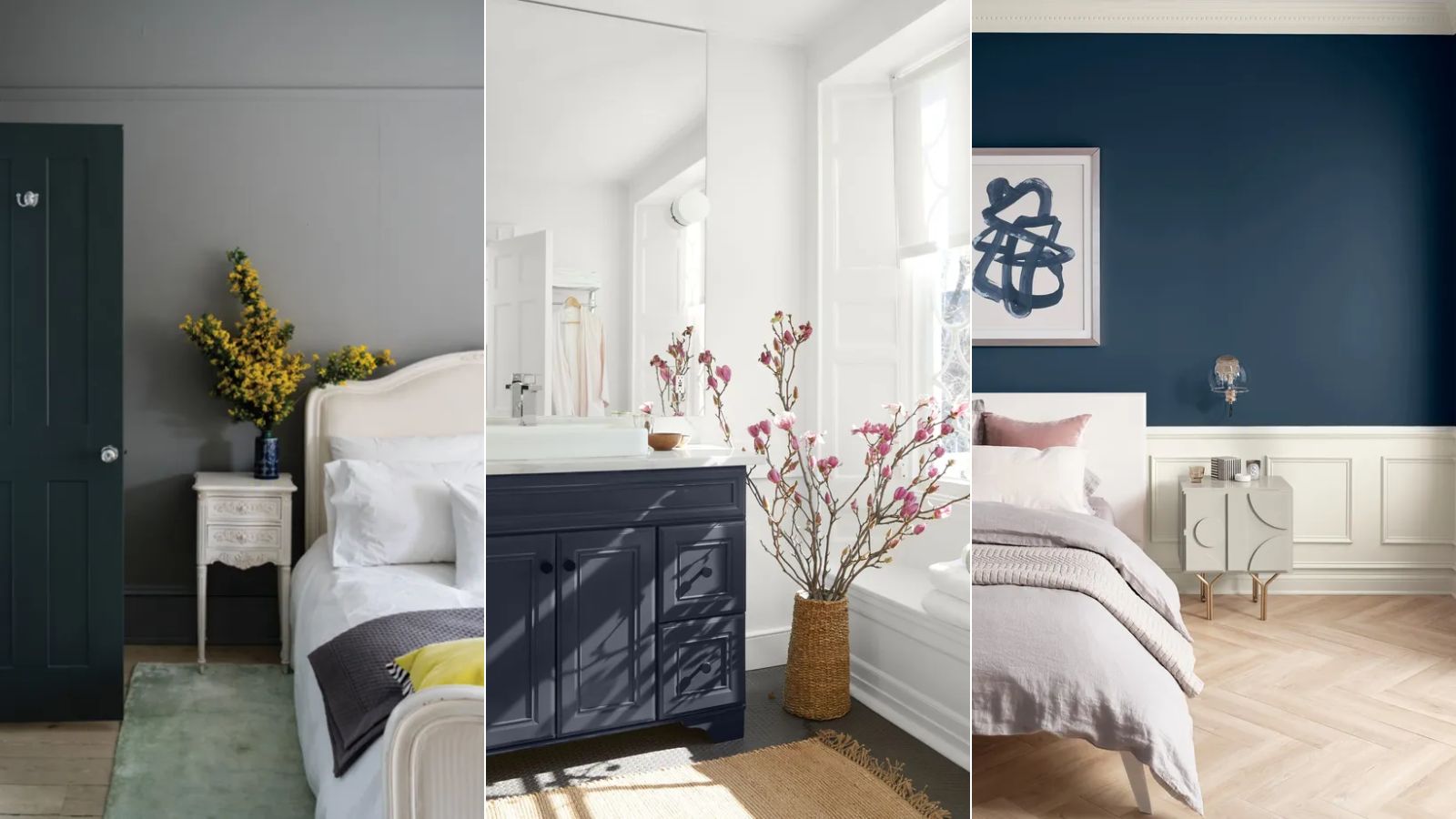
Paint colors going out of style in 2025

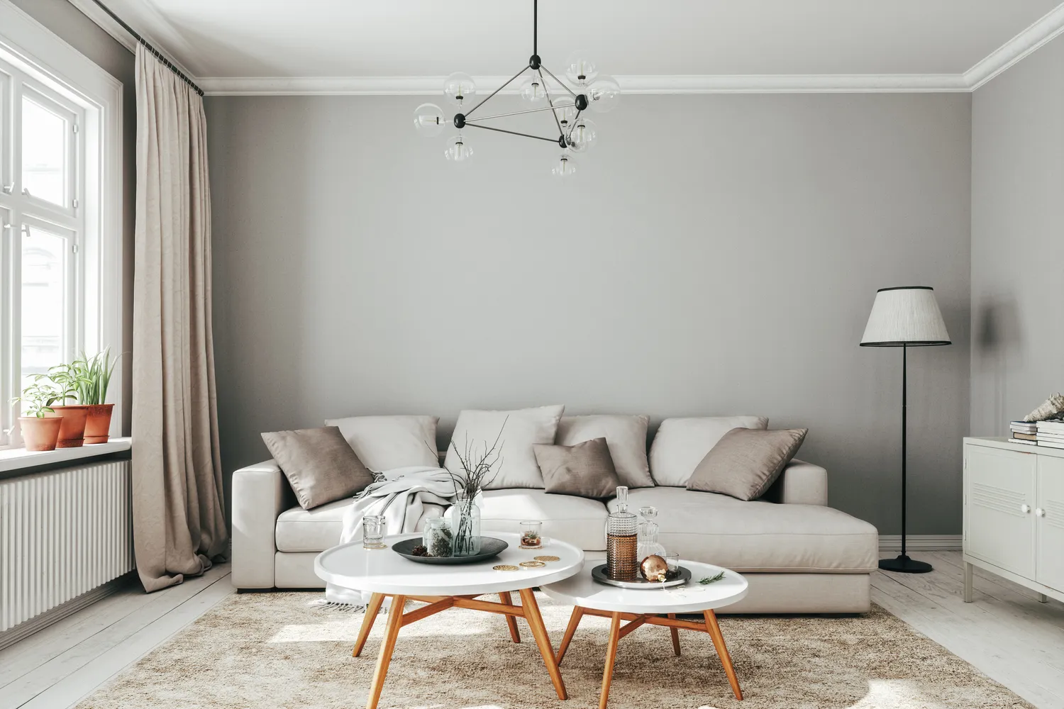
6 Outdated Paint Colors Designers Don't Want to See in Homes Anymore in 2026
Hottest Exterior Paint Colors of 2020
8 Stunning Paint Trends To Keep Your Home's Interior Fresh In 2025
8 Paint Colors Going Out of Style In 2025, According to Designers

White vs Cream: designers weigh in on these enduring neutrals
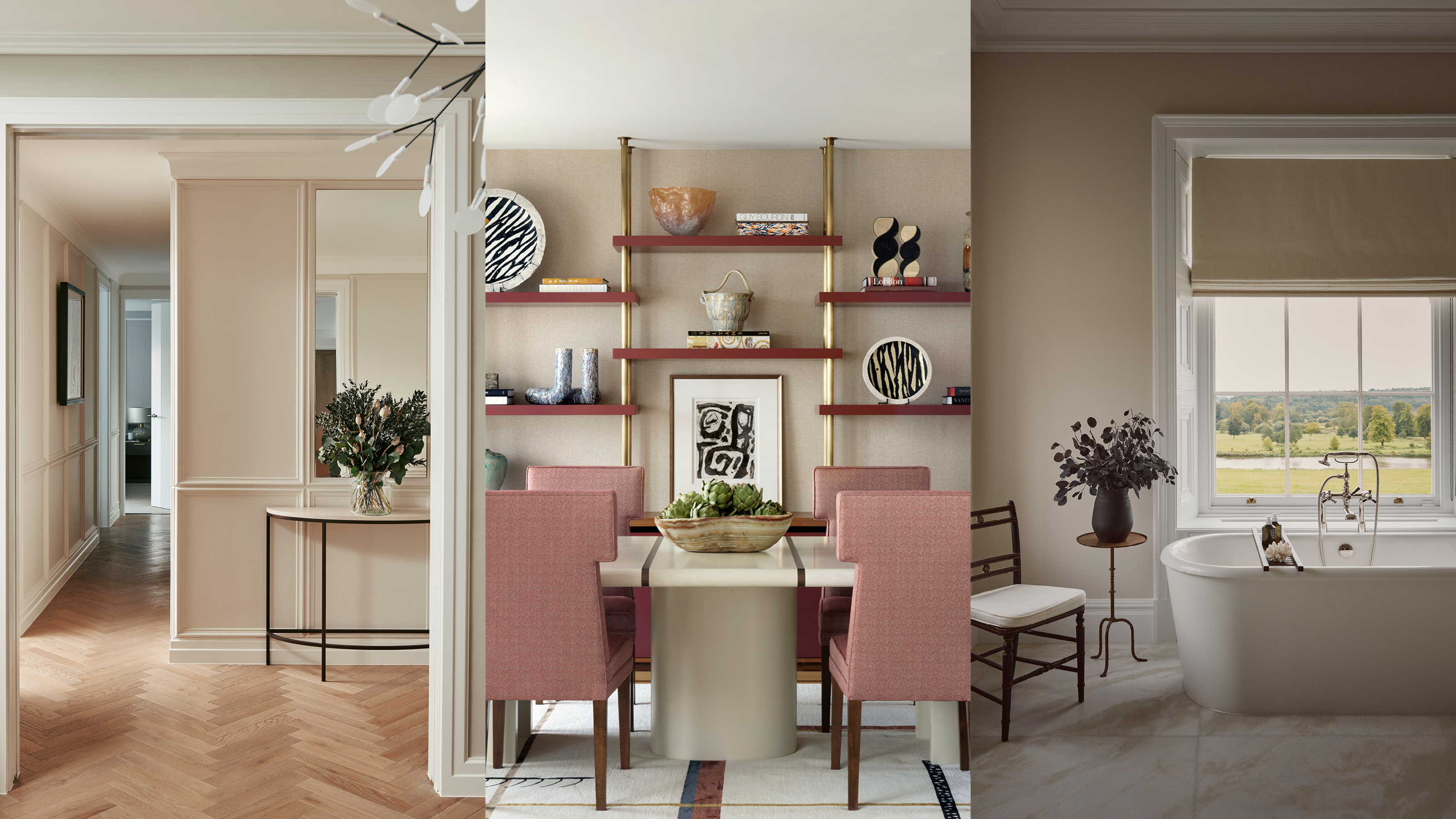
Beige-grey – the timeless paint color perfect for a barely-there backdrop
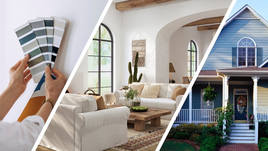
Real Estate Experts Reveal the Paint Colors That Decrease Your Home Value—and Tricks for Finding the Perfect Hue
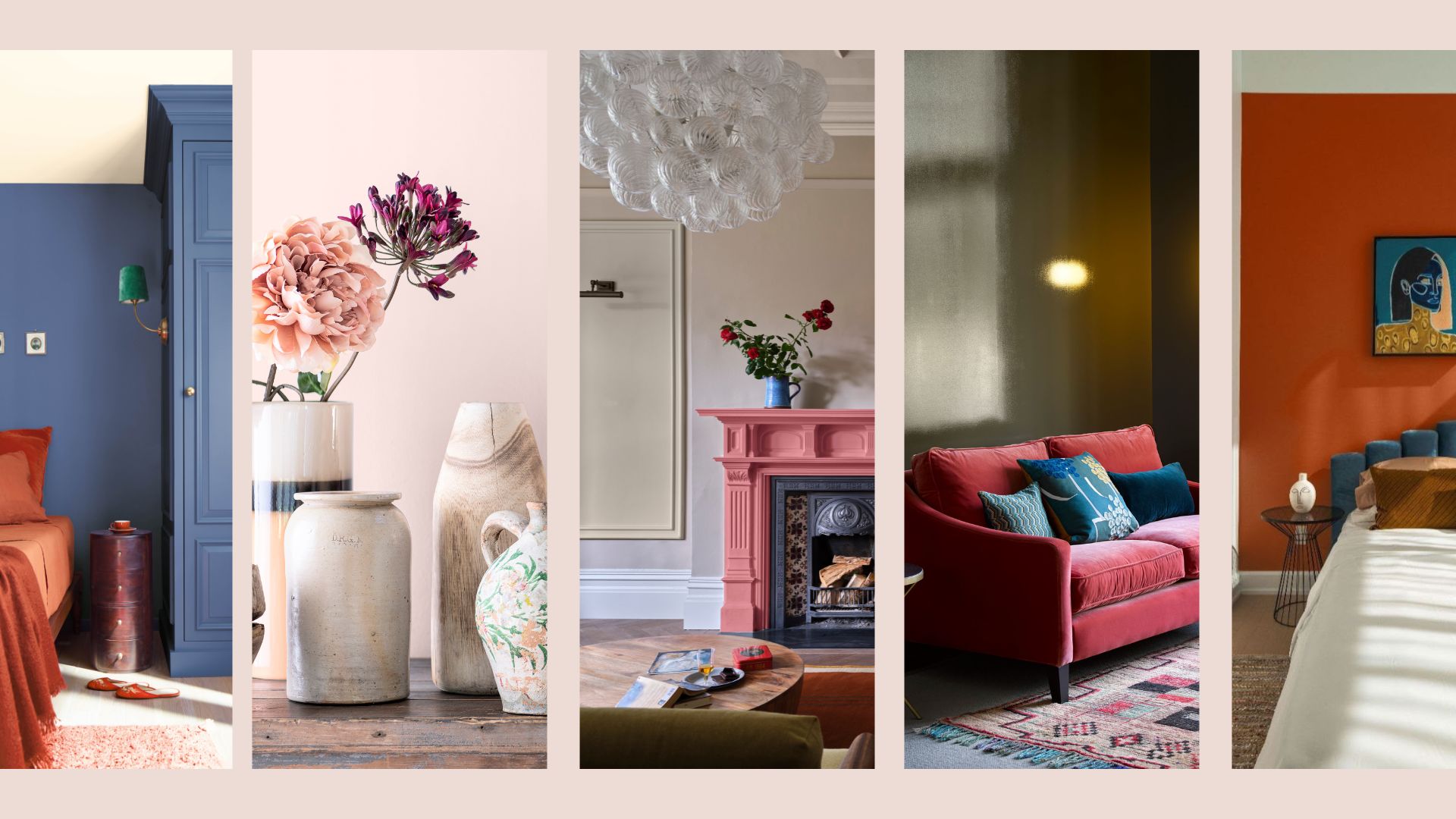
Interior Paint Colour Trends 2024: 14 influential shades to inspire our homes

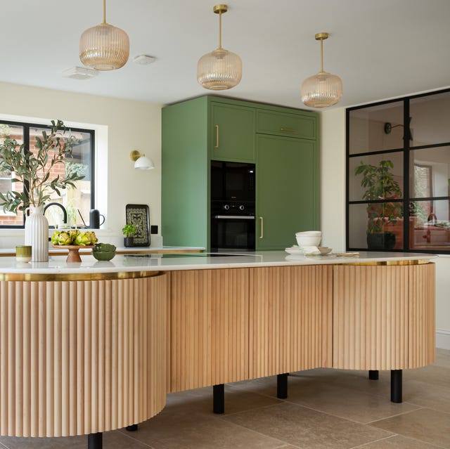
These kitchen paint colours will be everywhere in 2025 – and there's even one for neutral lovers

These Are The 12 Best-Selling Paint Colors From All Your Favorite Brands
The 8 Best-Selling Paint Colors of 2024: Greens, Whites, and Neutrals