1/11
'It is a shade we return to time and time again' – why designers love Farrow & Ball's quietly indulgent Pointing

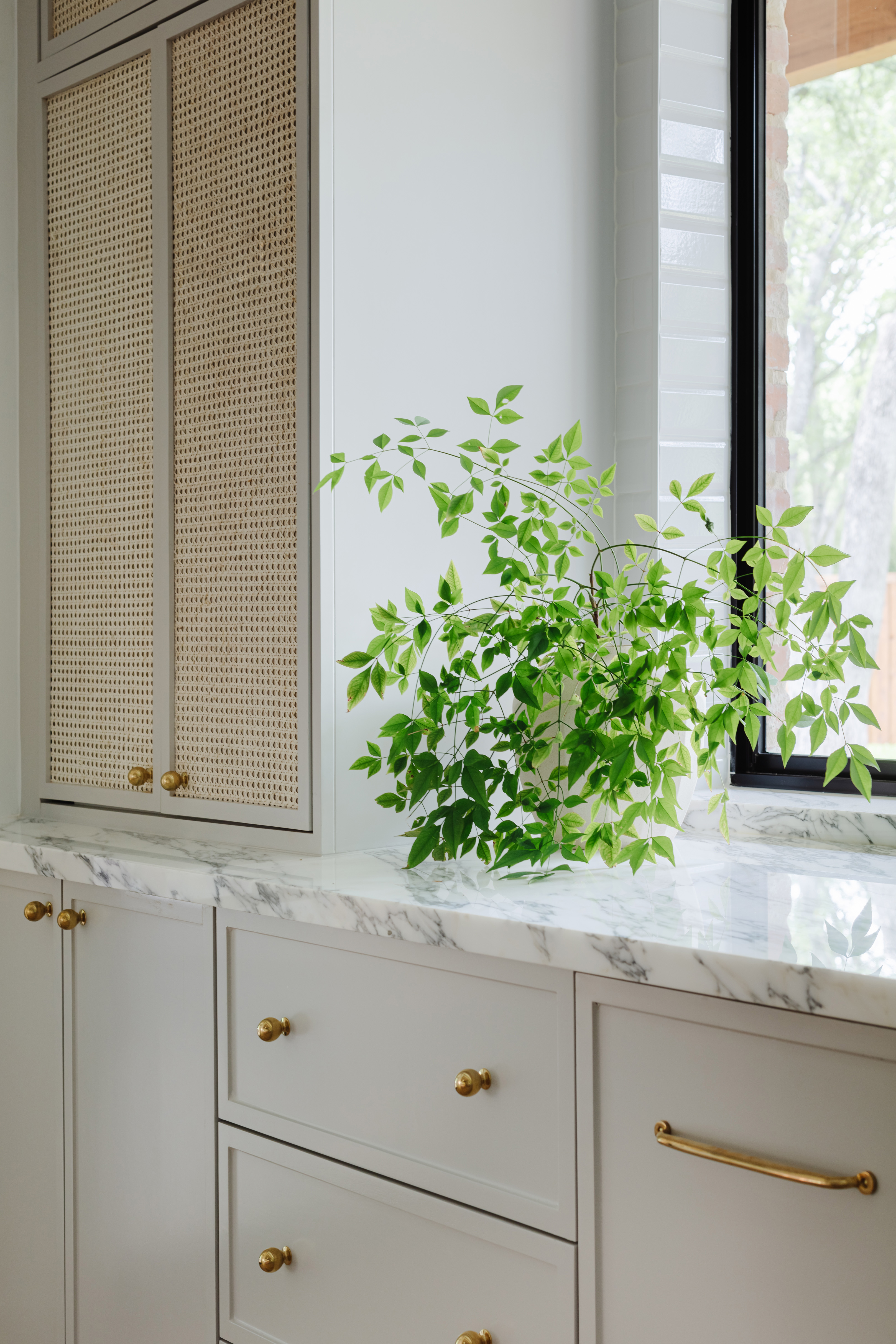
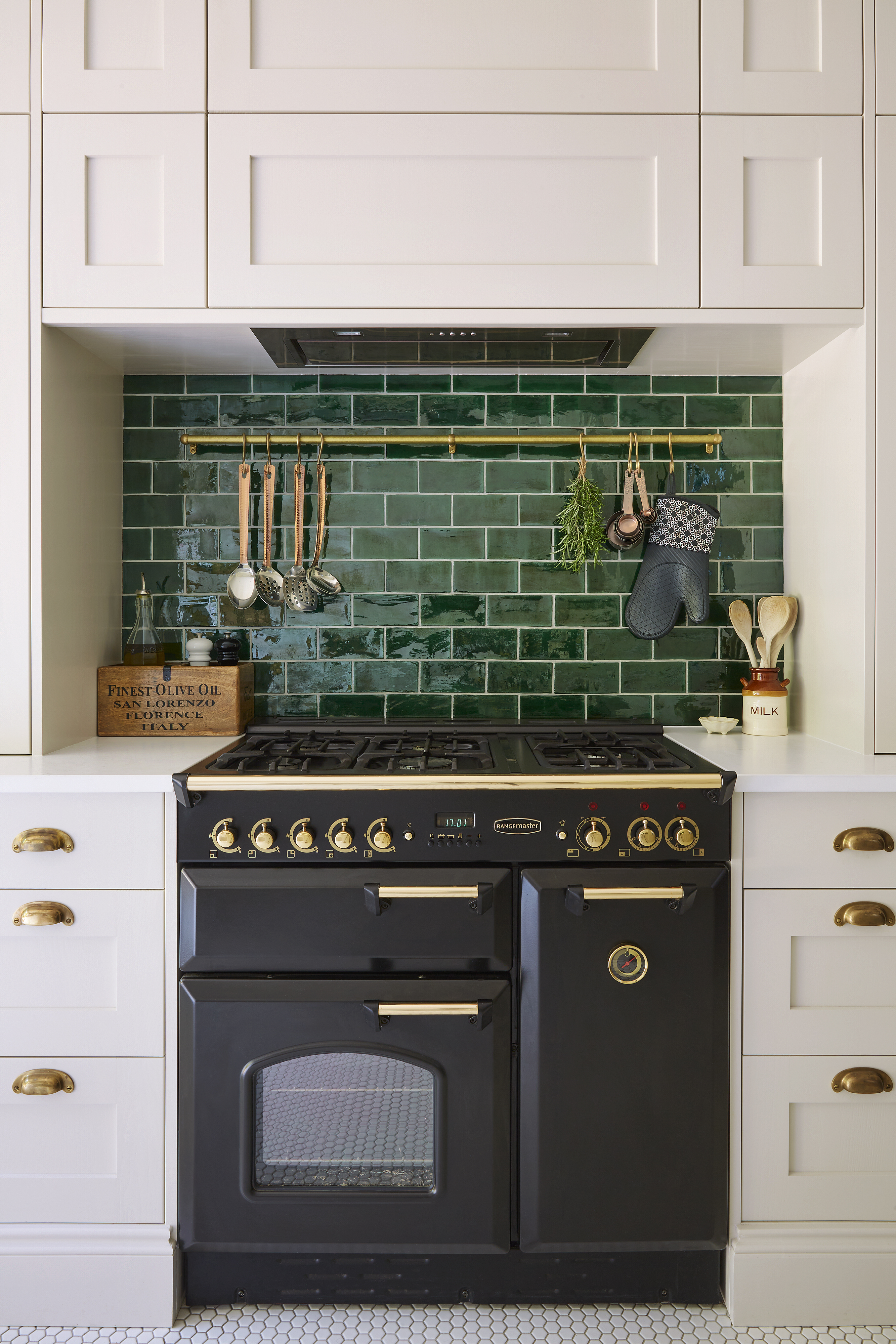
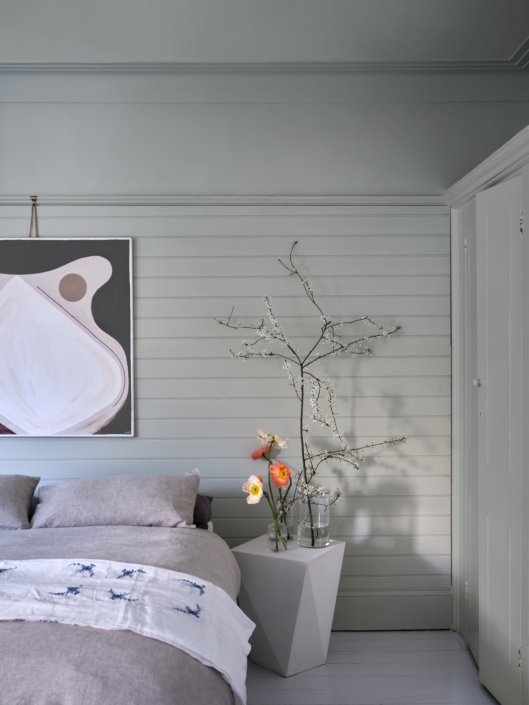
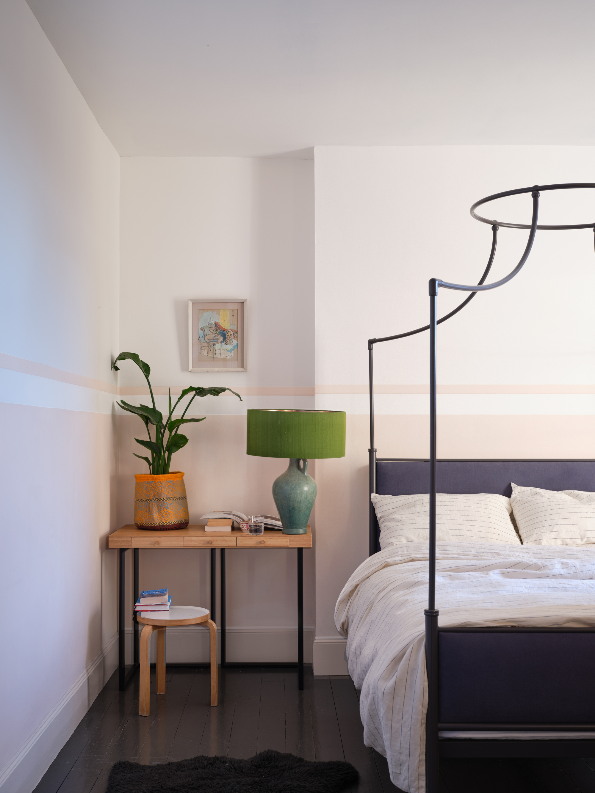
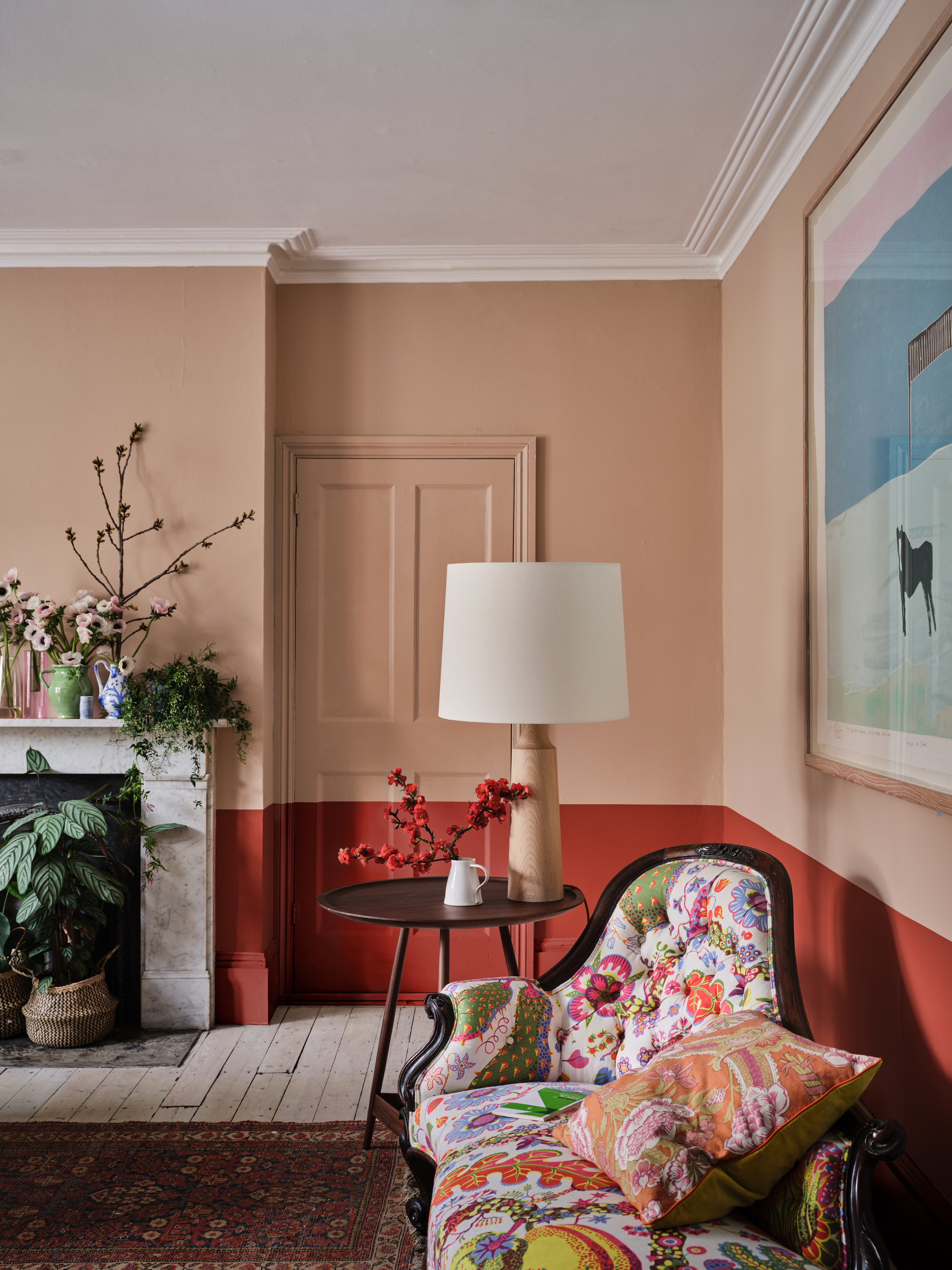
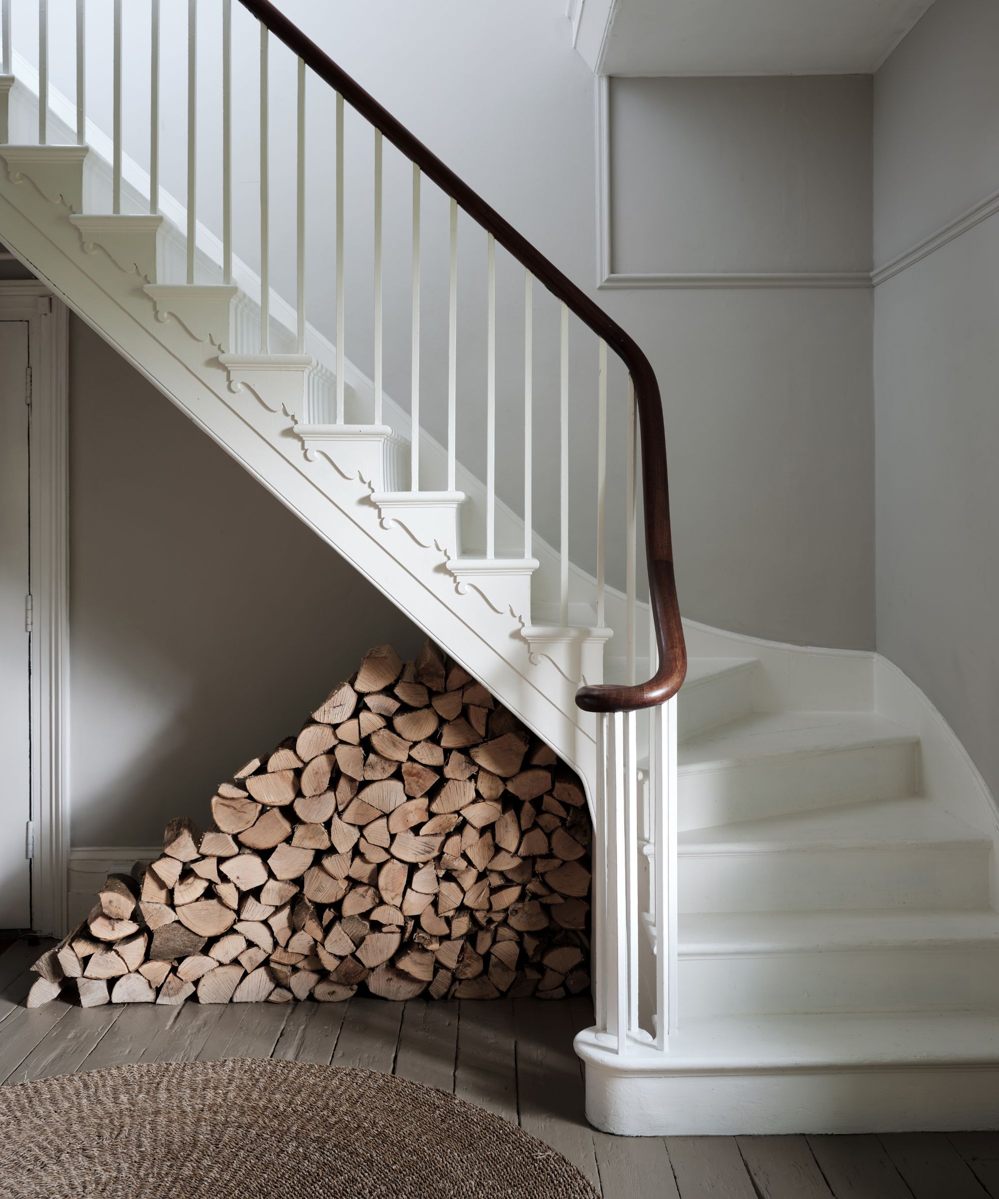
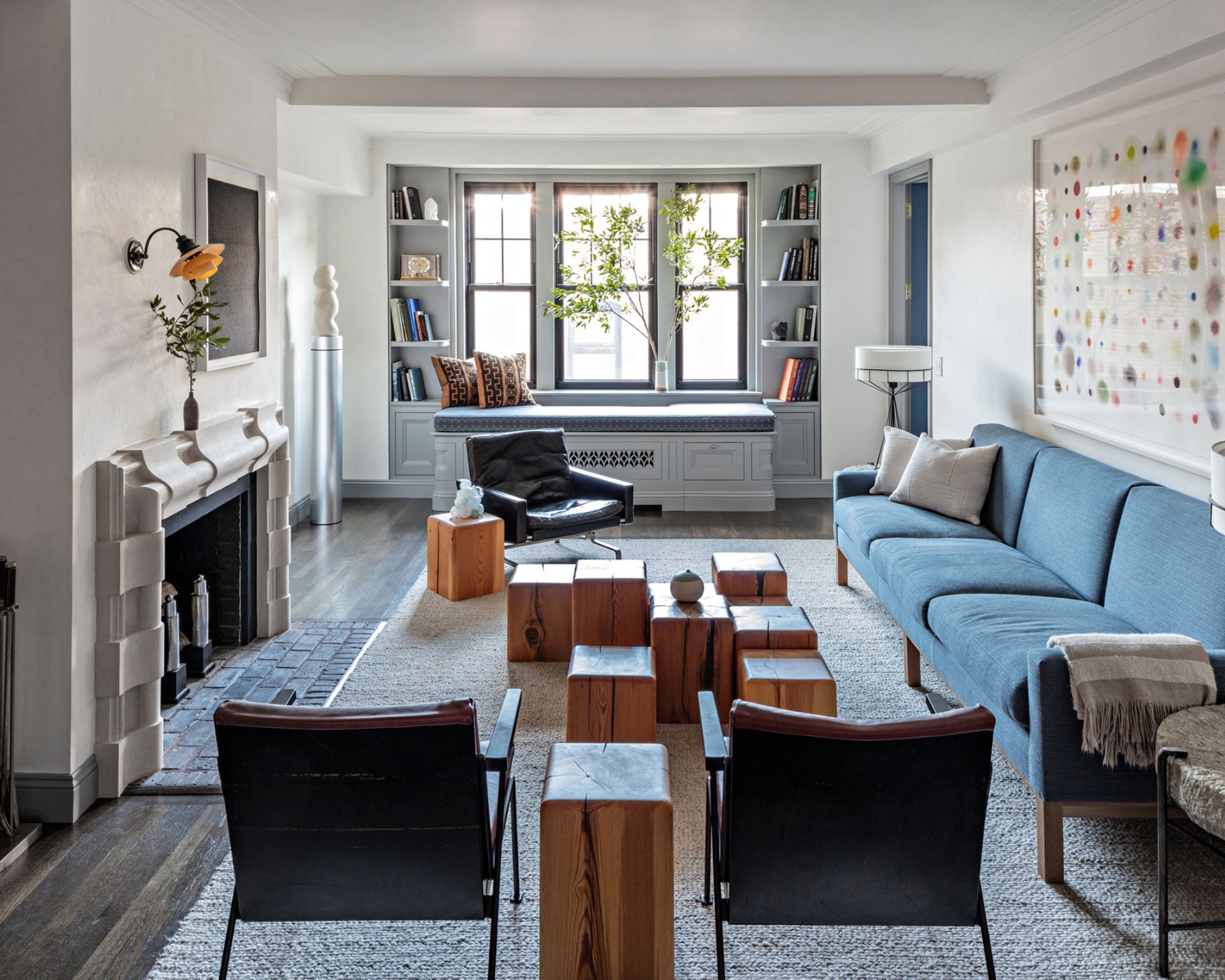

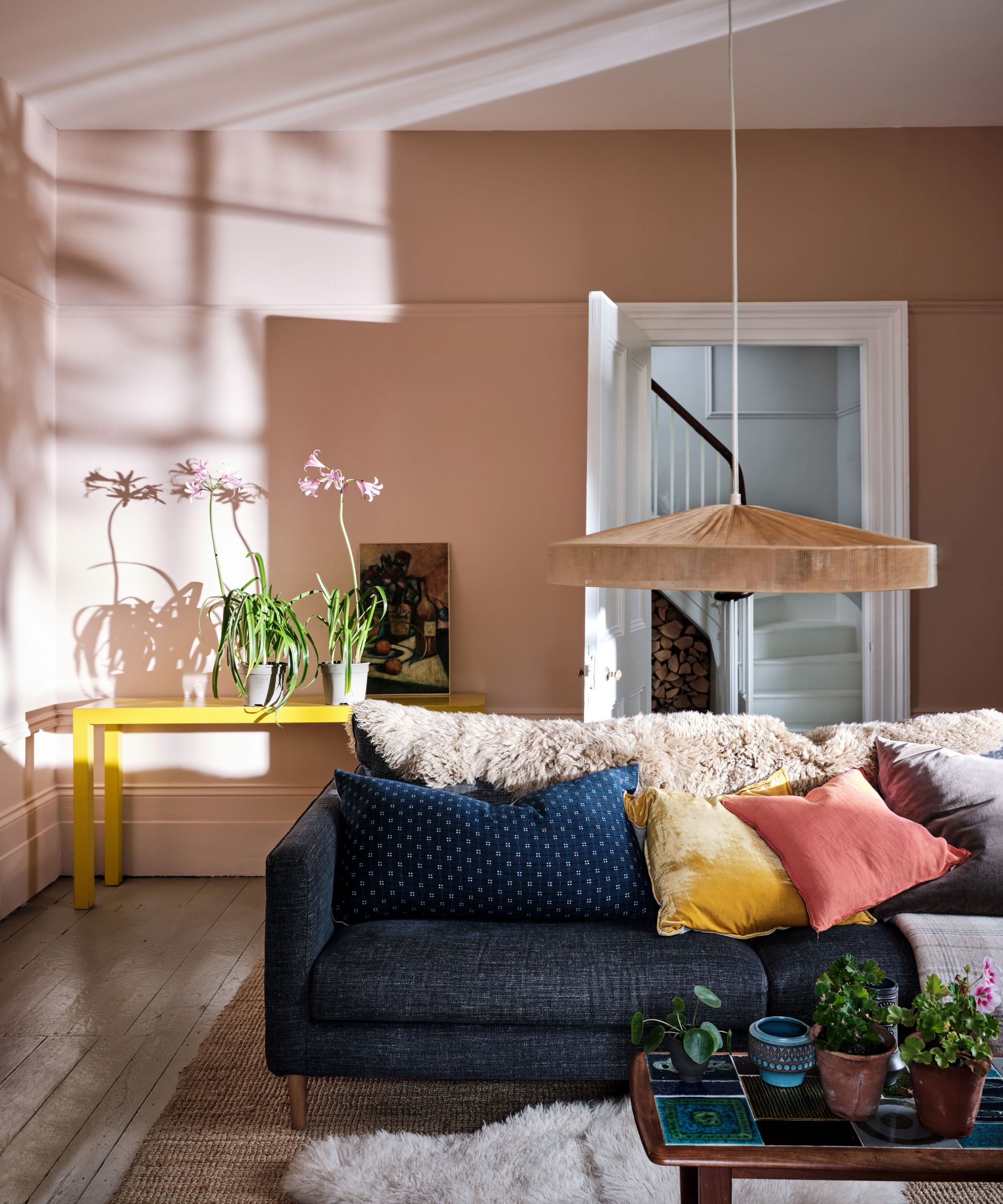
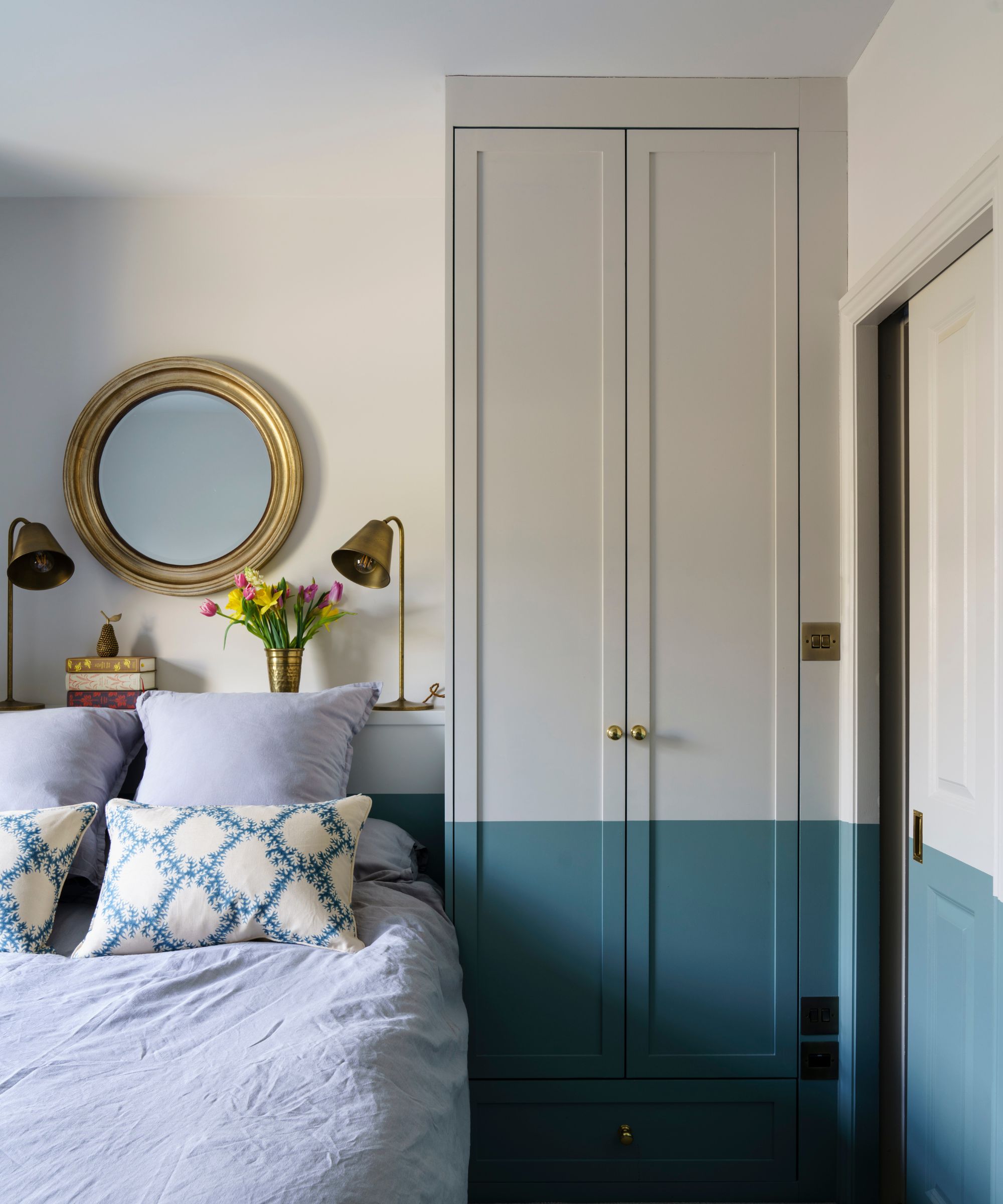
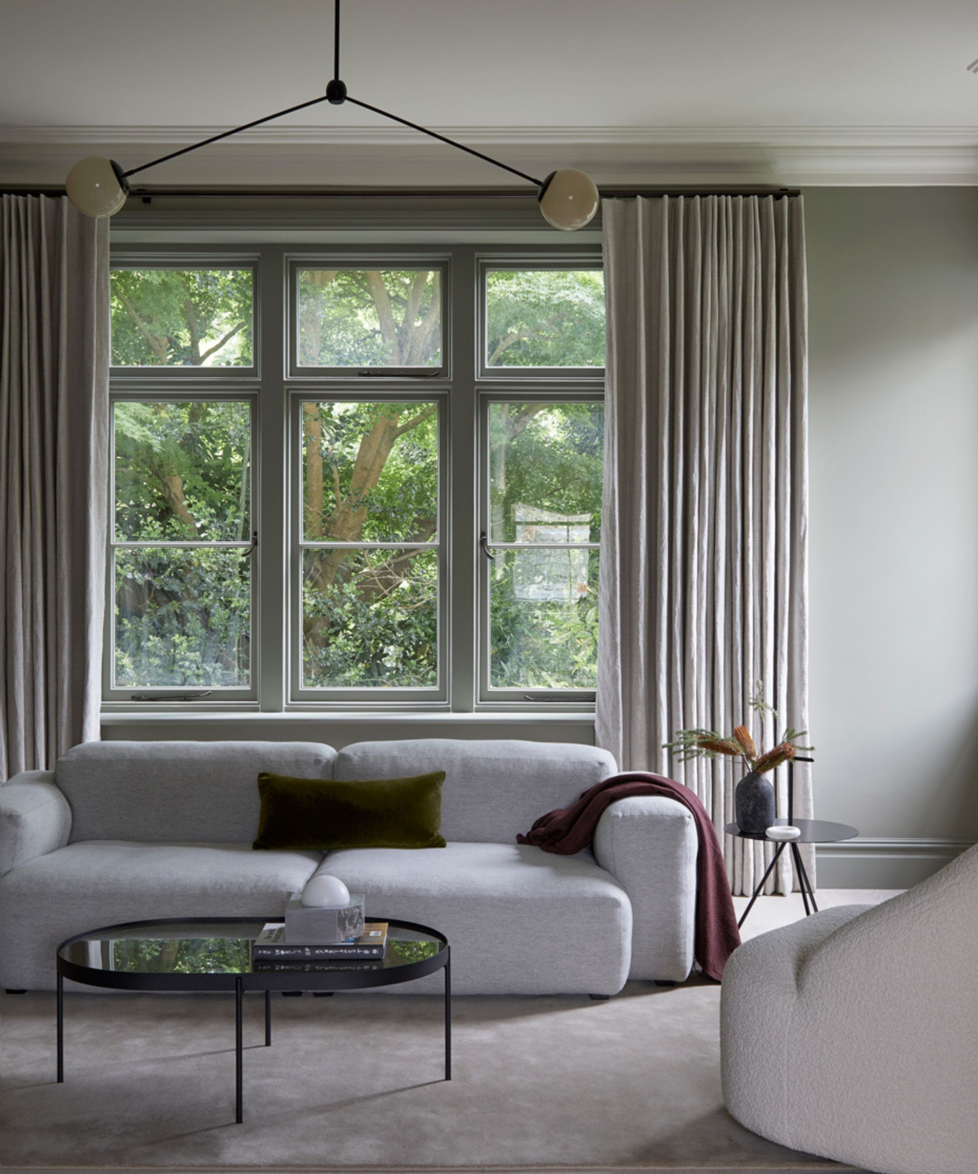
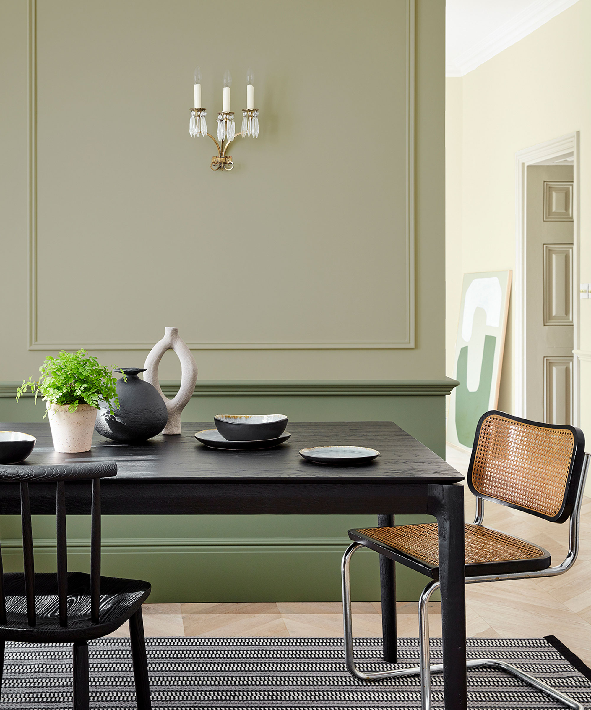
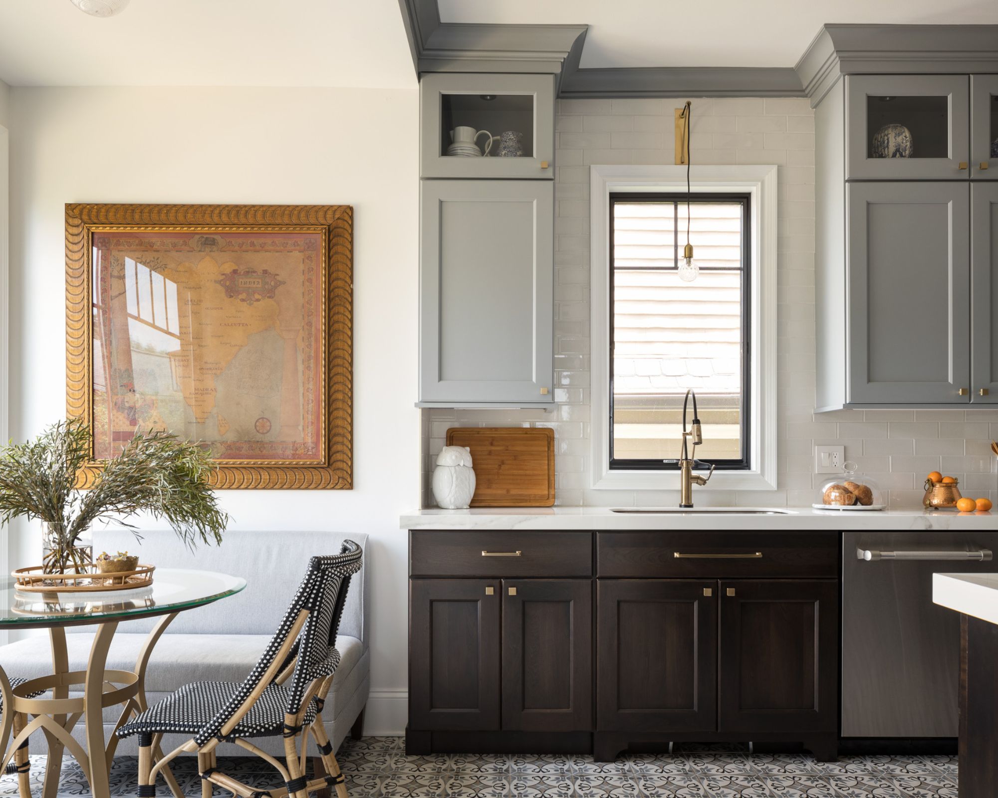
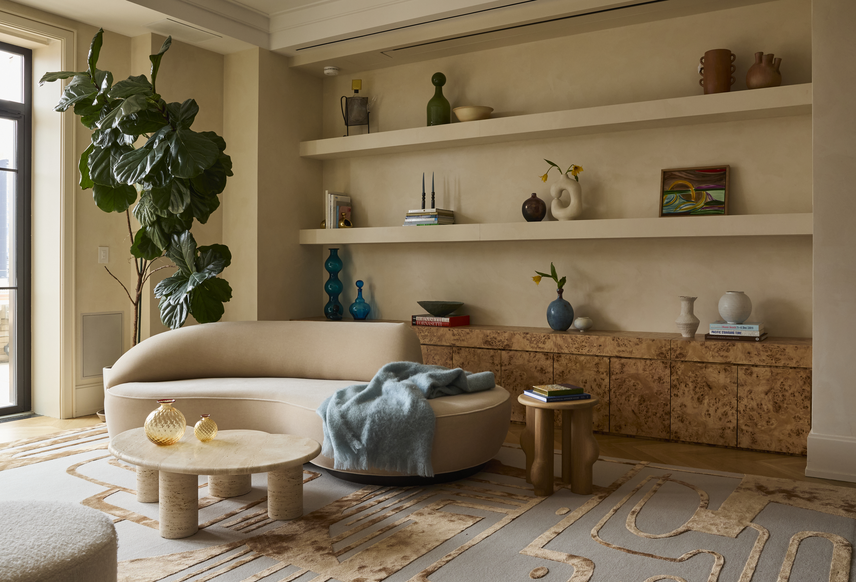
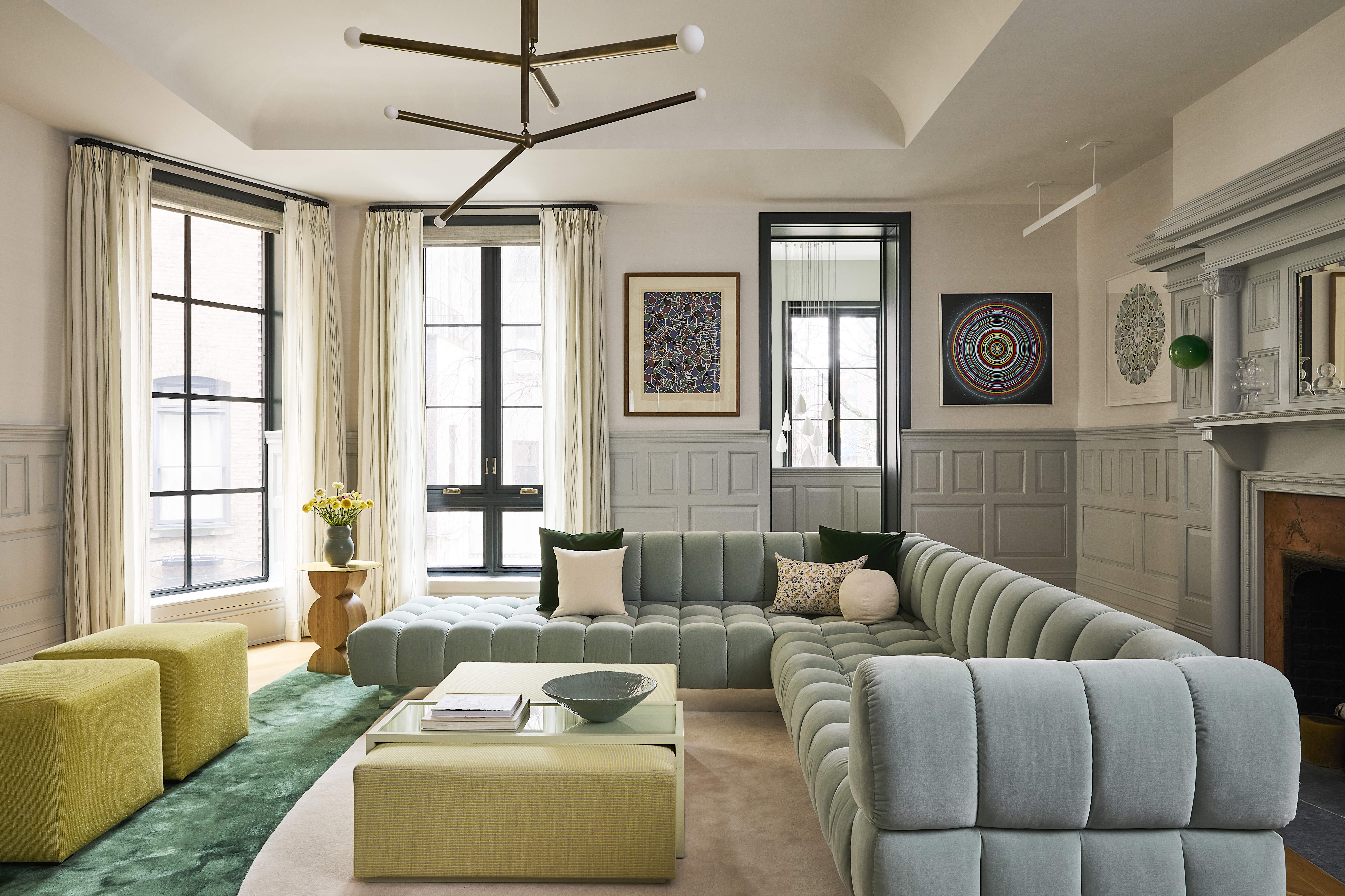
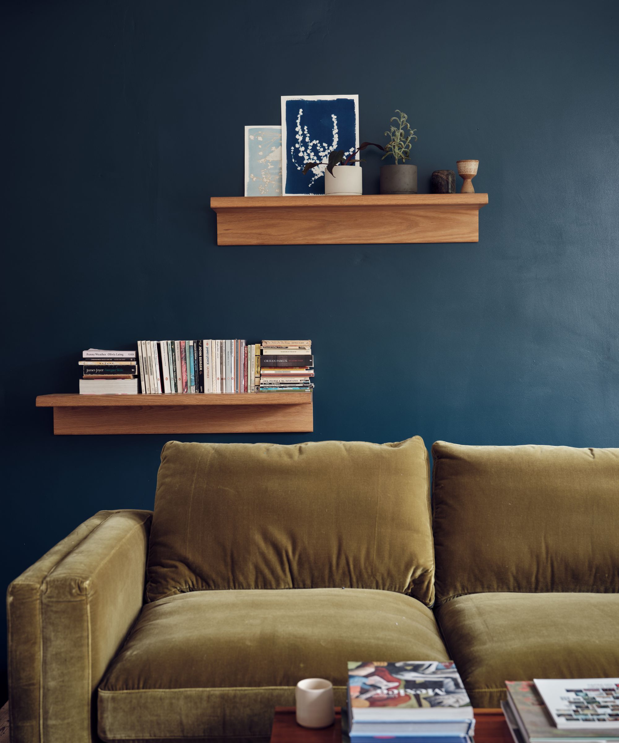
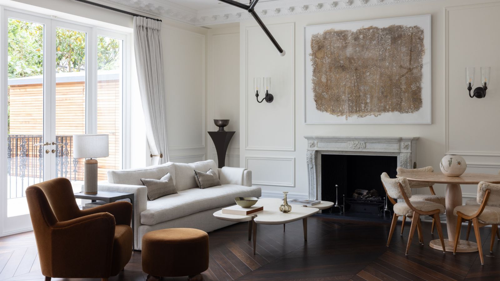
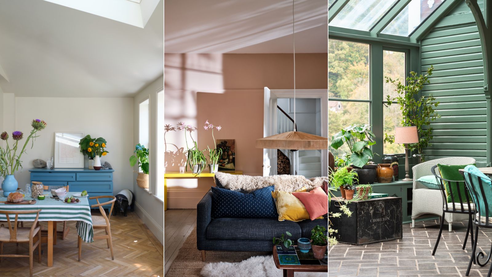
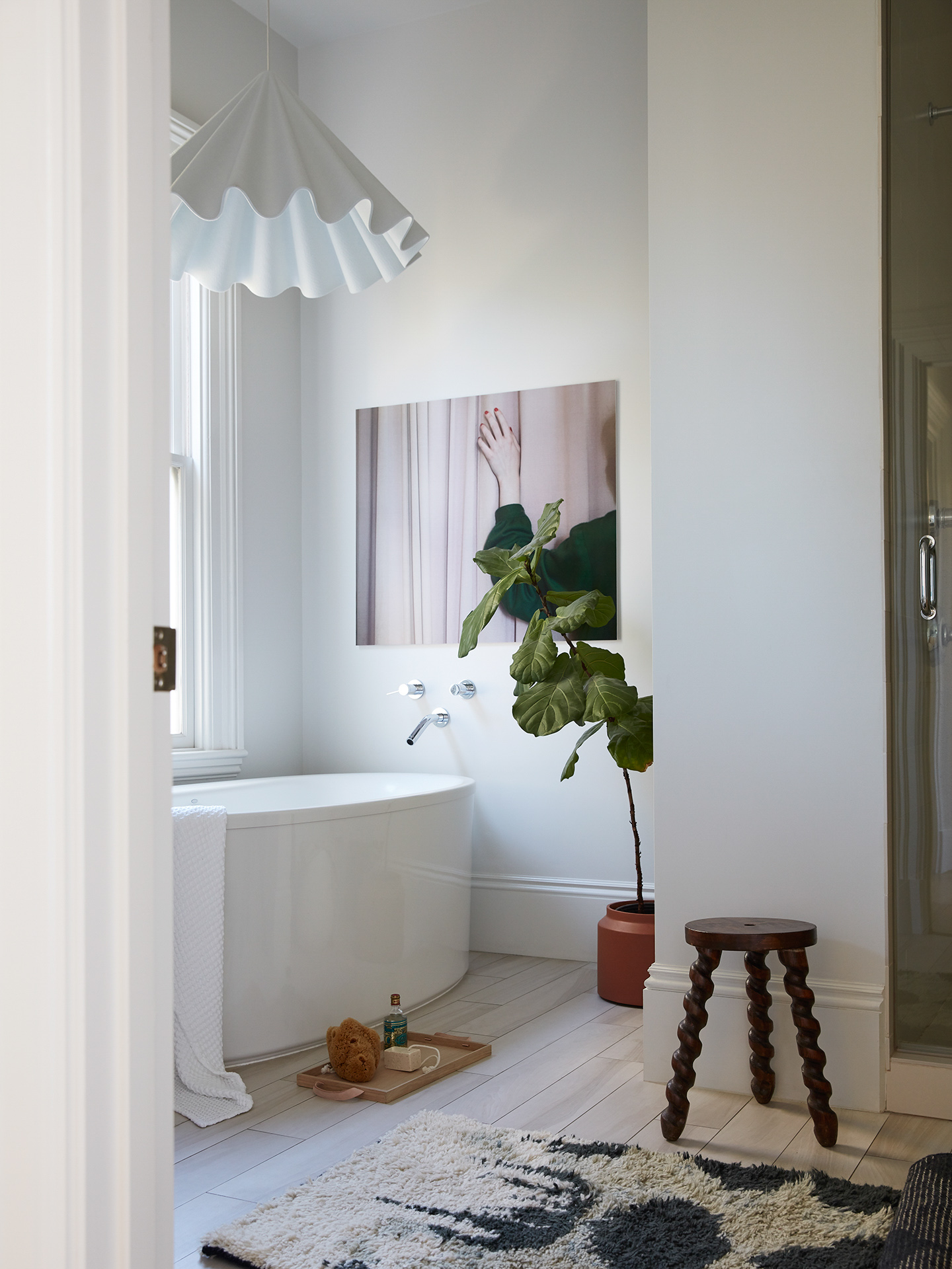
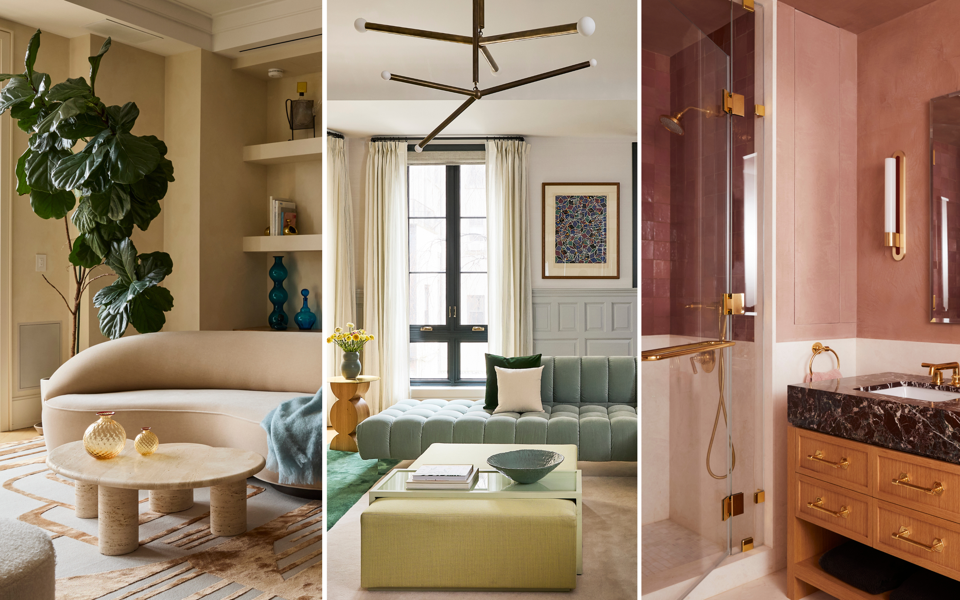
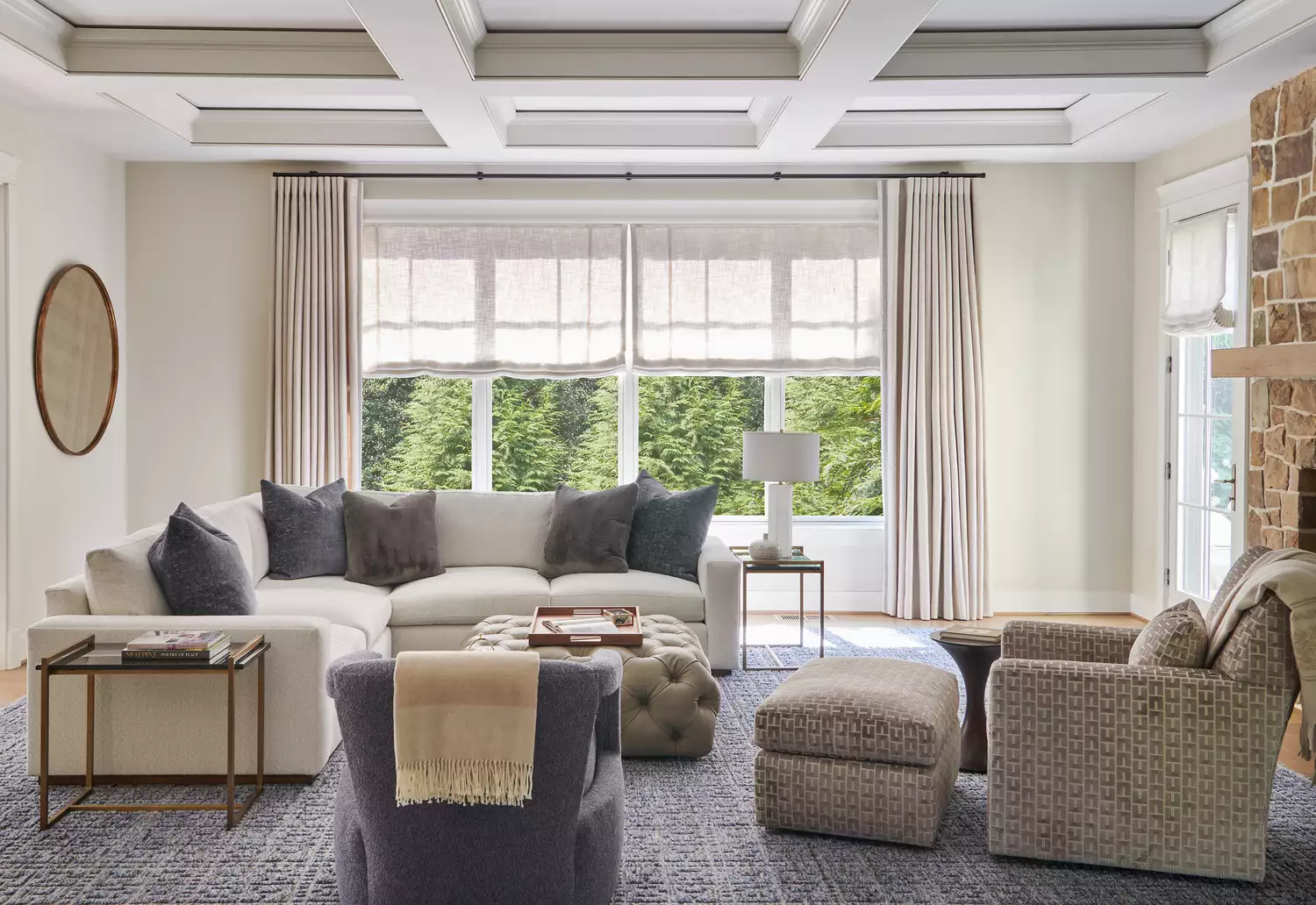
Farrow & Ball's Pointing, a subtle off-white paint, is gaining significant popularity among interior designers for its remarkable versatility. This creamy, warm, and neutral shade, though less flamboyant than bolder colors like Hague Blue or Railings, is one of Farrow & Ball's best-selling paints. Its appeal lies in its ability to adapt to diverse design schemes, functioning effectively in rooms with varying light conditions, from bright to low, and complementing both calming aesthetics and vibrant, patterned environments. Designers extensively use Pointing for various applications, including walls, ceilings, and kitchen cabinetry, highlighting its role as an unsung hero in interior design.
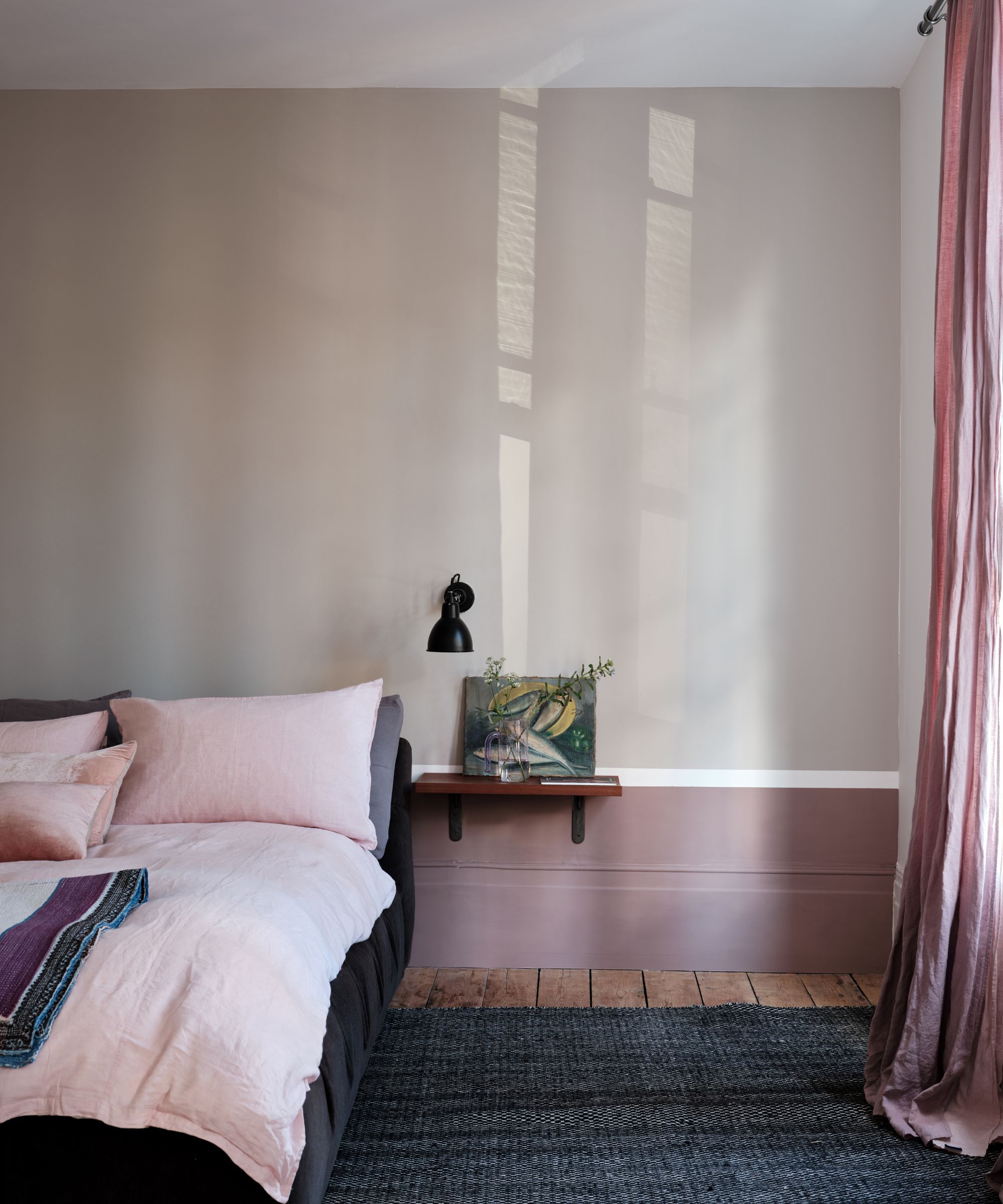
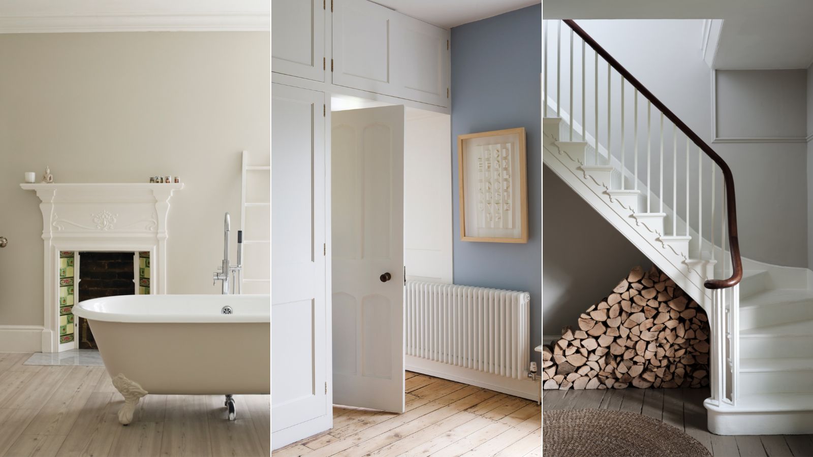
Decorator Ashley Aspin emphasizes Pointing's strength in its restraint, providing warmth and freshness without overshadowing other design elements. This makes it ideal for spaces where stronger colors are introduced through art, furniture, tiles, or paneling. Aspin notes its particular effectiveness in smaller rooms and those with compromised lighting, as it brightens spaces, including south-facing ones. Patrick O'Donnell, Farrow & Ball's brand ambassador, describes Pointing as the red-based counterpart to Wimborne White, cherished for its perfect softness and suitability for ceilings and trim, offering a classic look devoid of the harshness often associated with generic whites. Its subtle red undertone makes it a harmonious choice for delicate pinks and warm neutrals, while remaining flexible enough to pair with a wide spectrum of other colors.
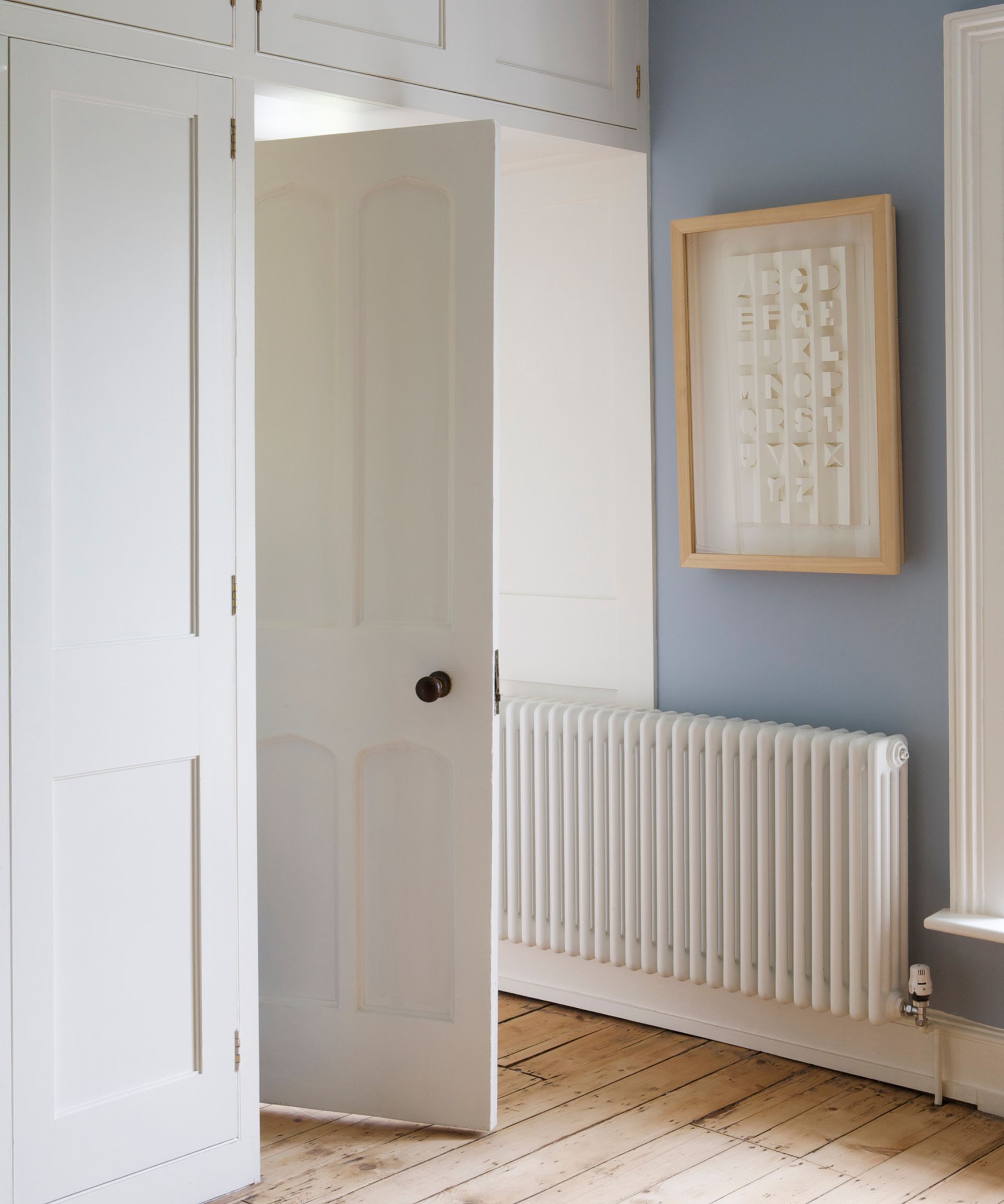
Designers leverage Pointing for several key reasons. Will Taylor, an interiors author and content creator, utilizes it for ceilings and crown molding to introduce a soft, warm undertone that enhances coziness, contrasting with the crispness of a sludgy wall color without the starkness of brilliant white. Portia Fox, known for her luxurious and calm schemes, selected Pointing for the walls of a living room, study, entryway, and staircase after extensive trials, appreciating its fresh warmth and compatibility with various material palettes. Rebecca Fisher of Homeshaped values Pointing for its comforting, earthy quality, often employing it on room details like double doors and sills to soften edges and blend indoor and outdoor aesthetics, particularly in south-facing rooms.
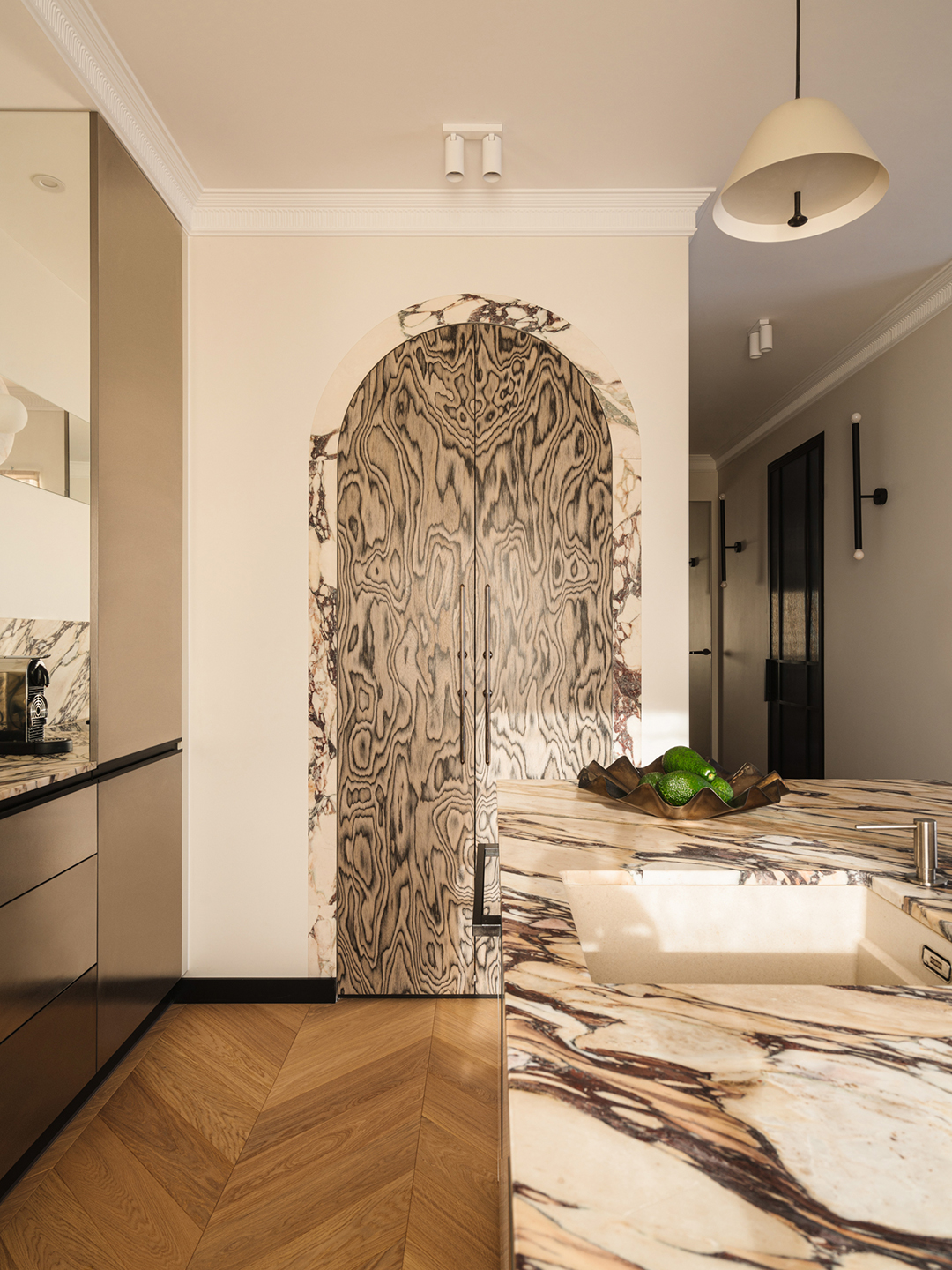
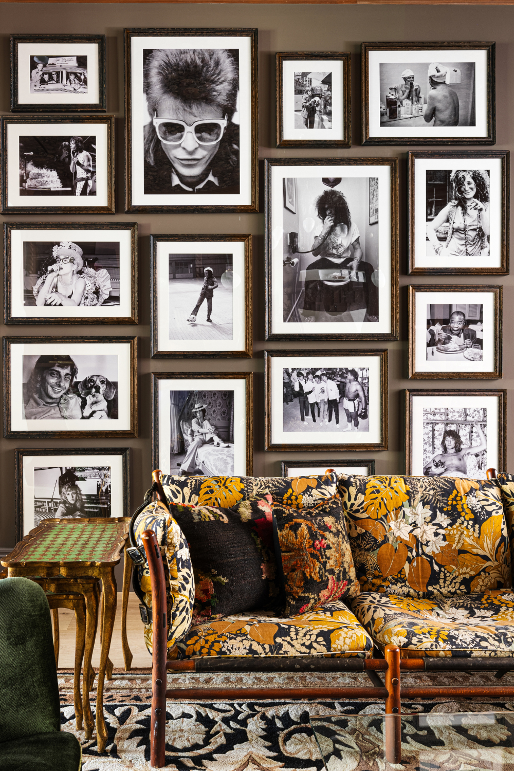
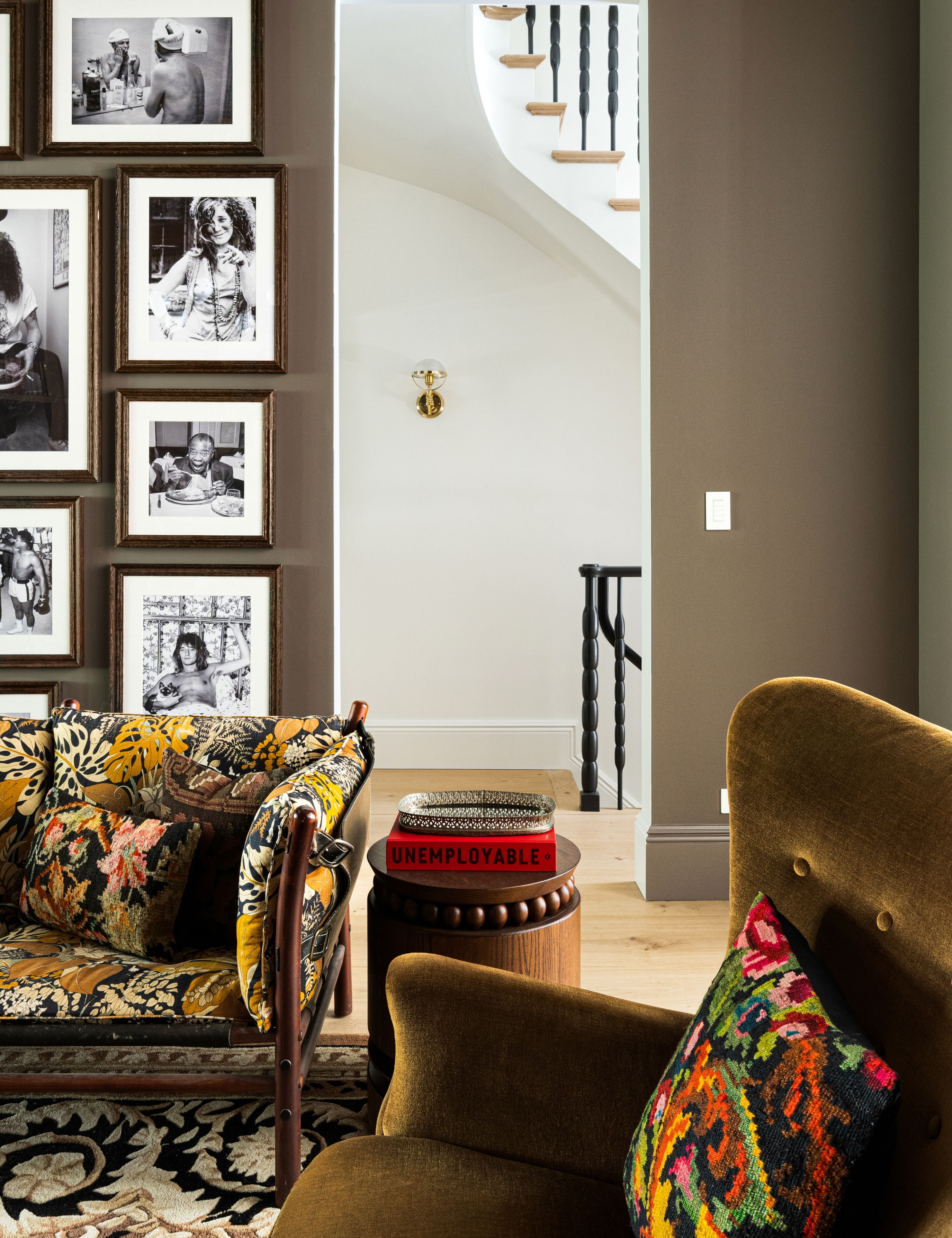

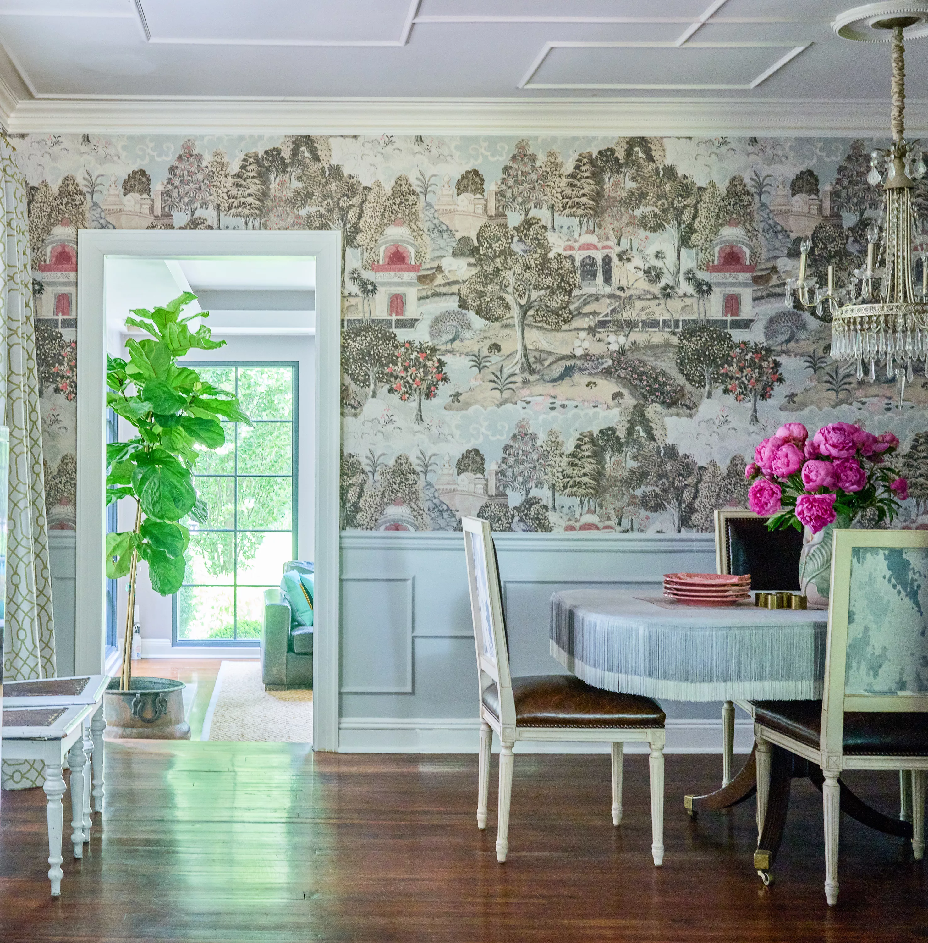
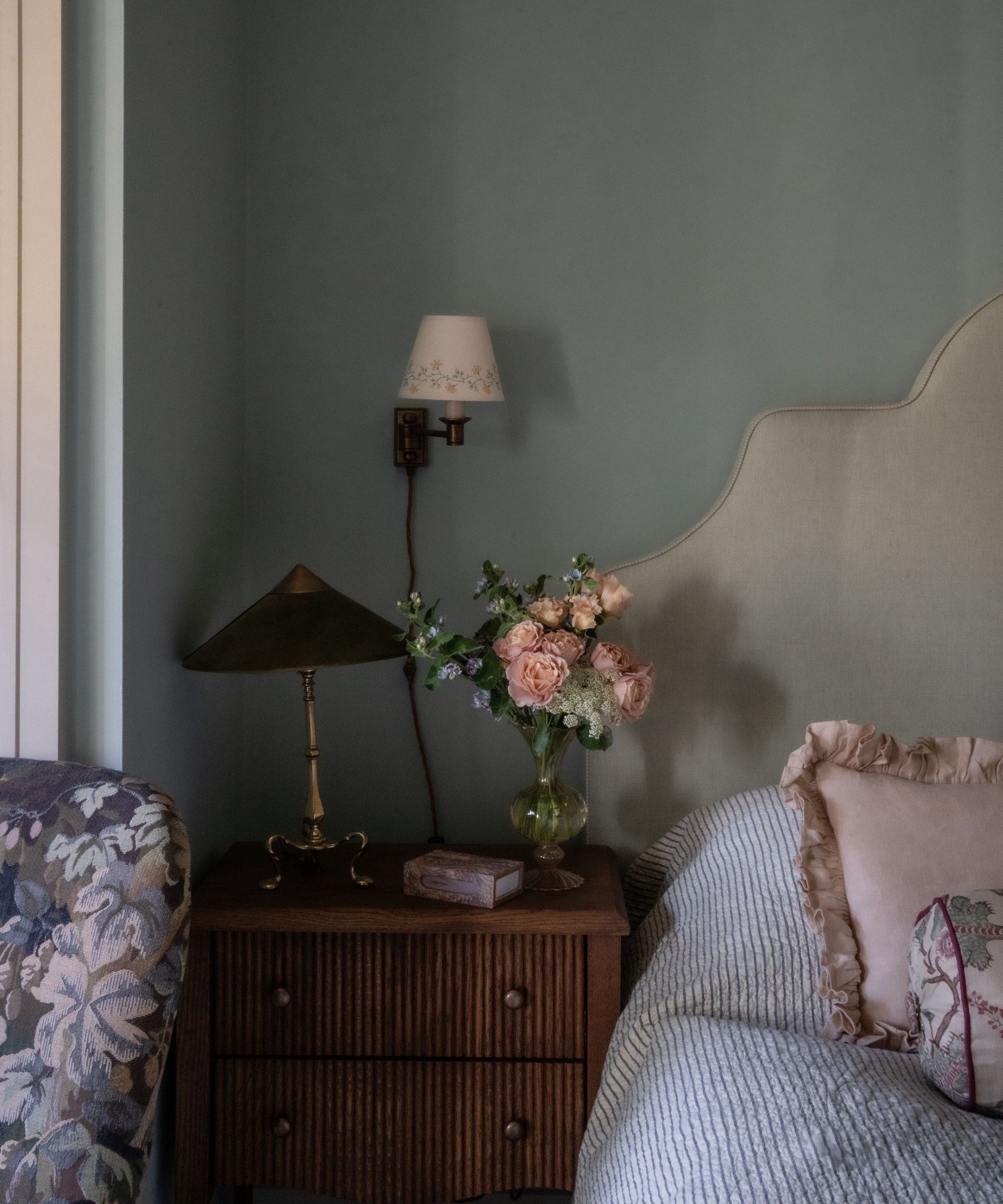
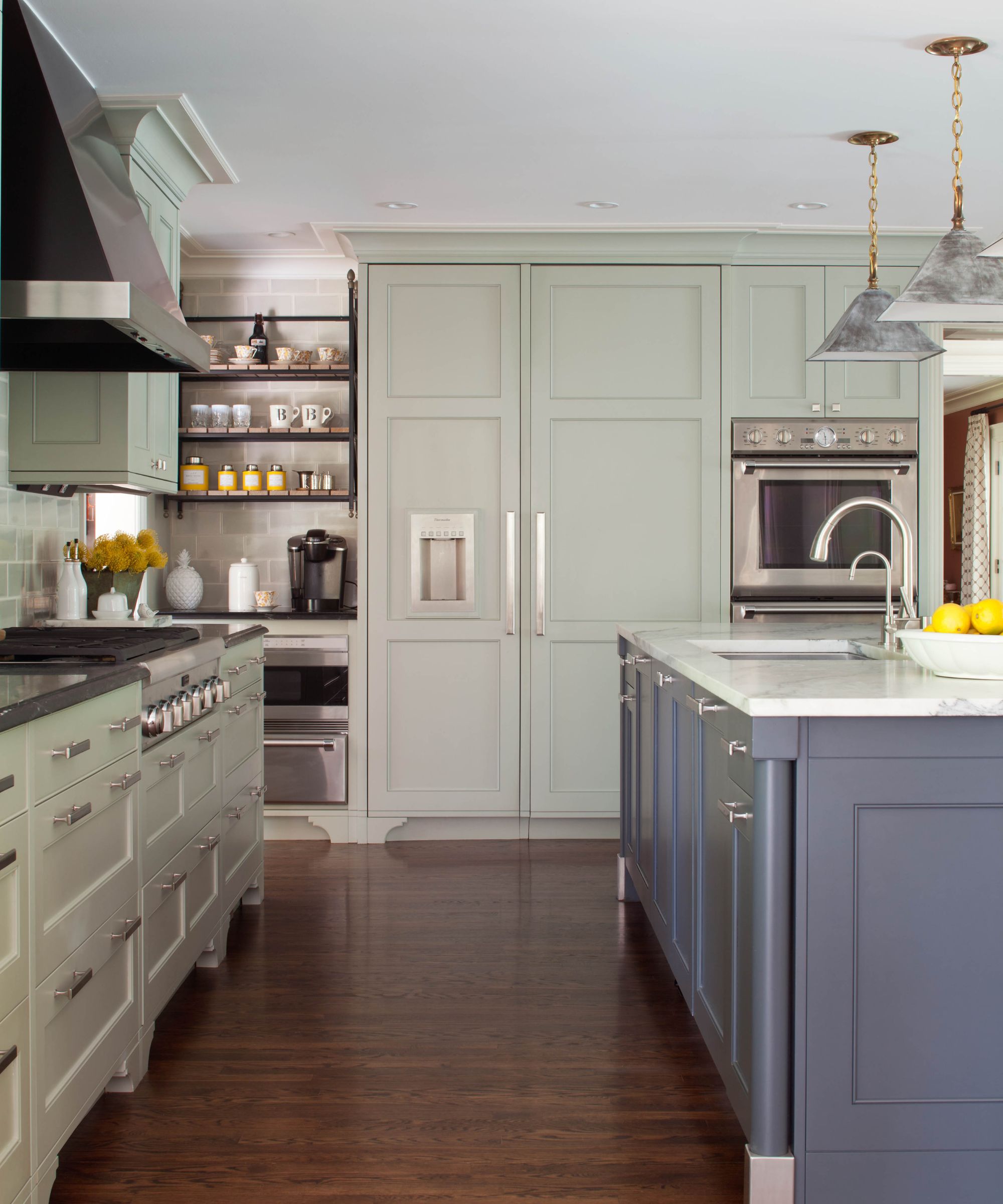
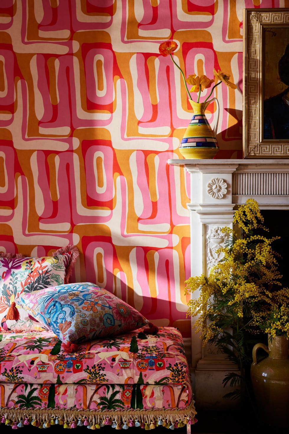
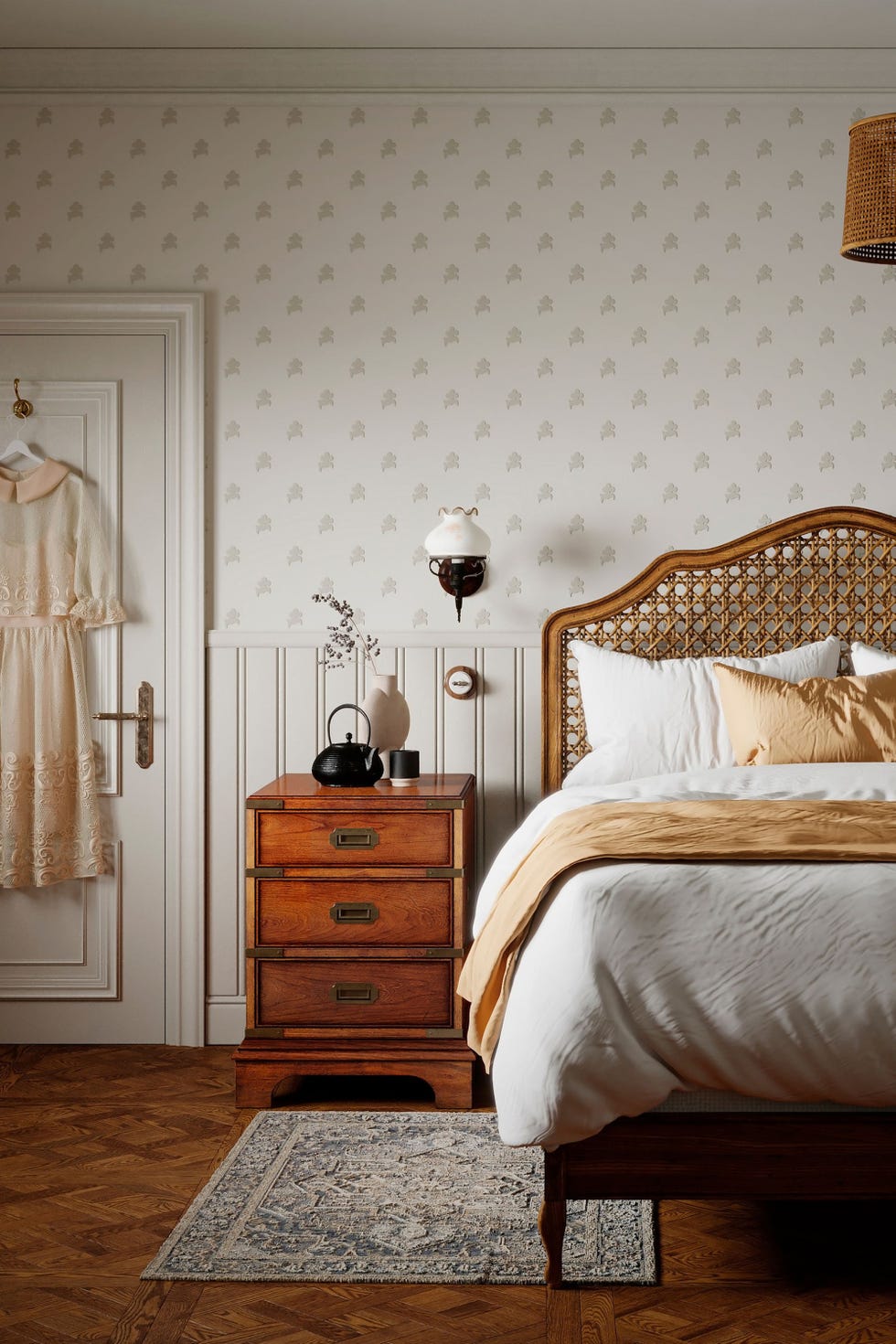
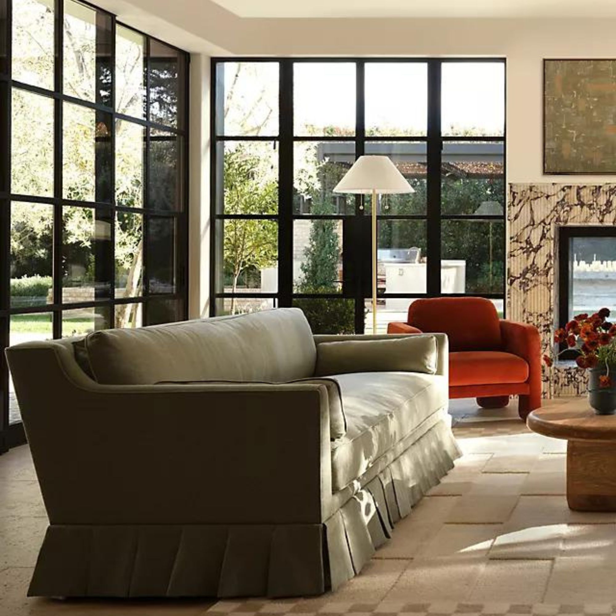
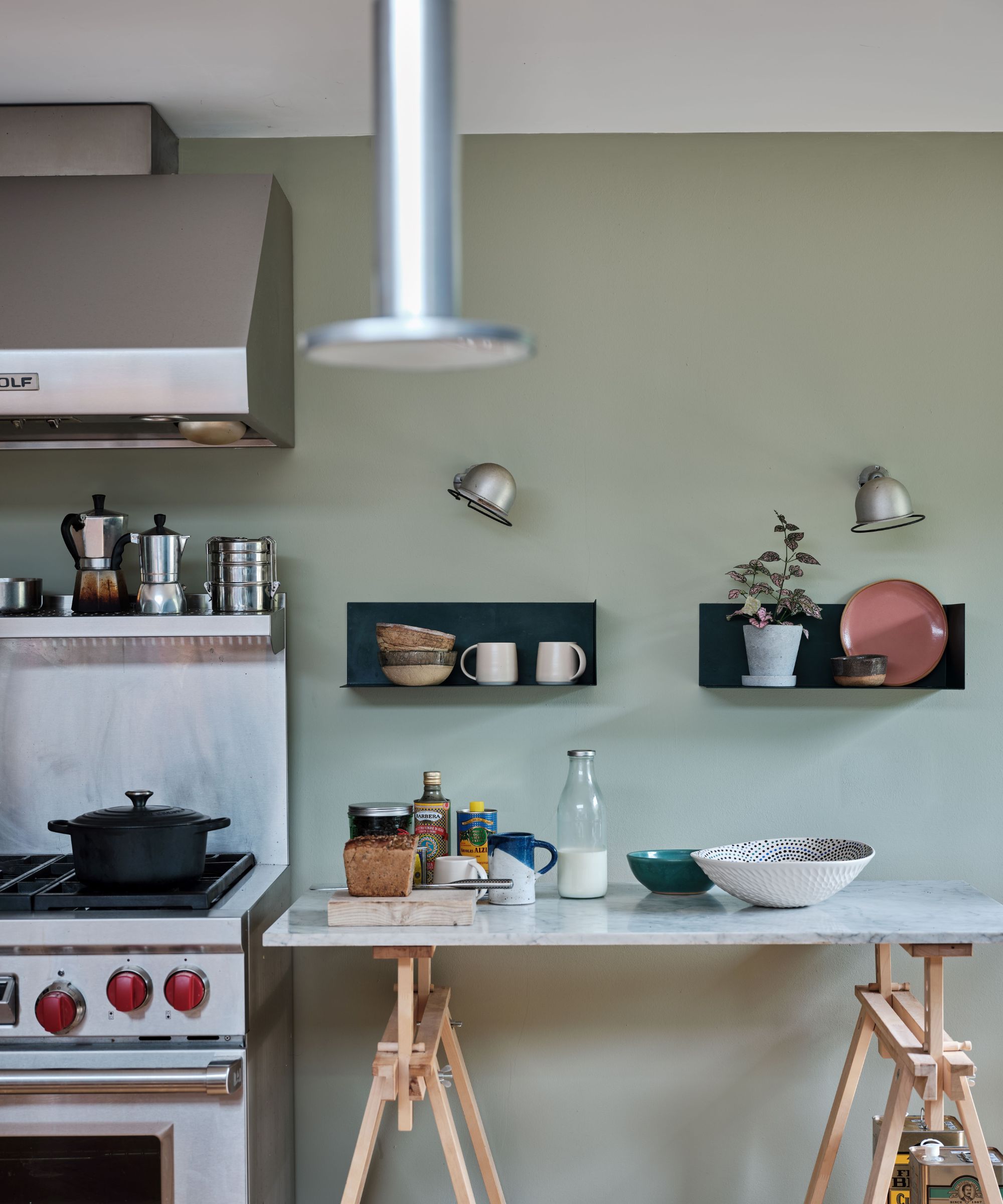
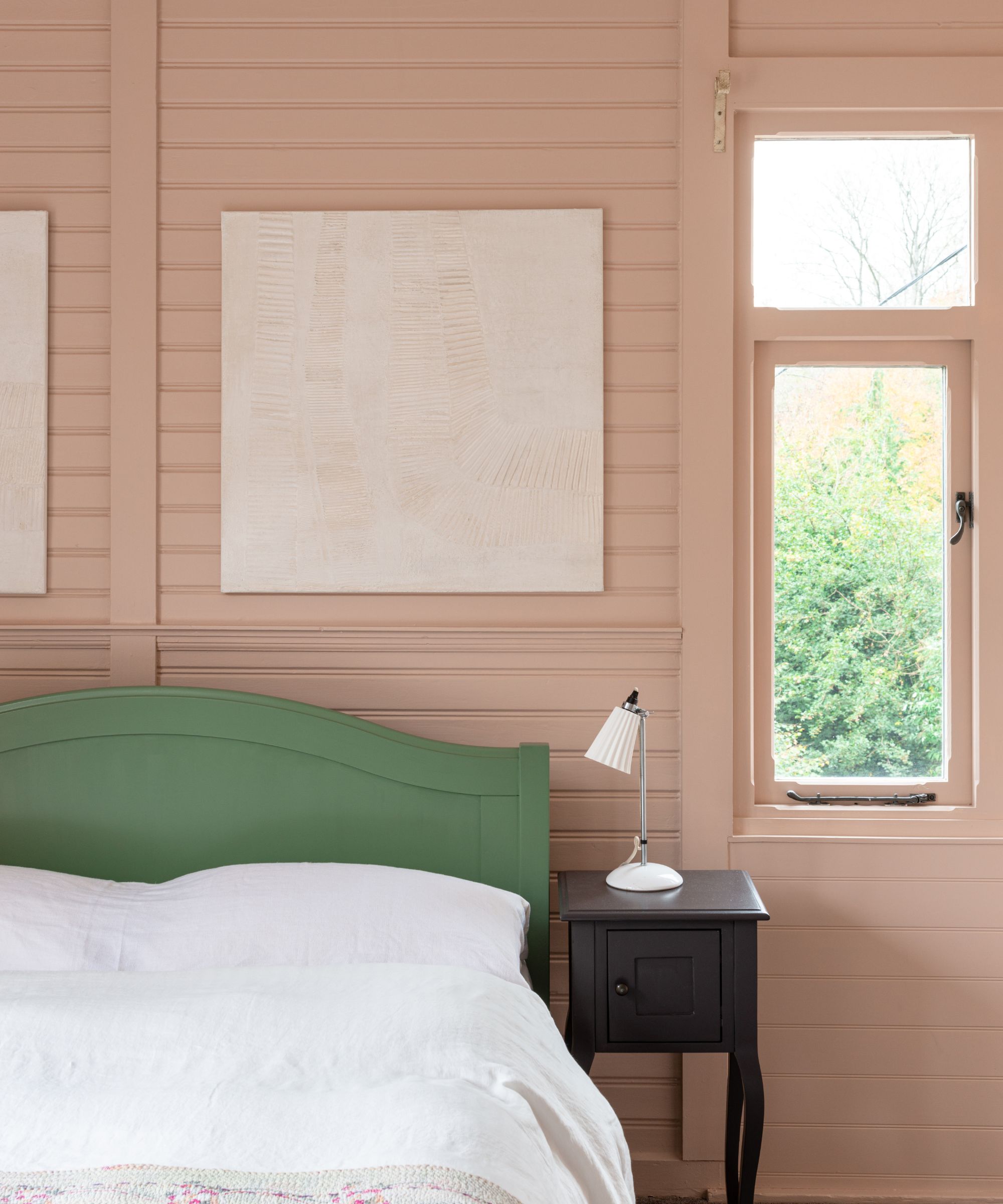
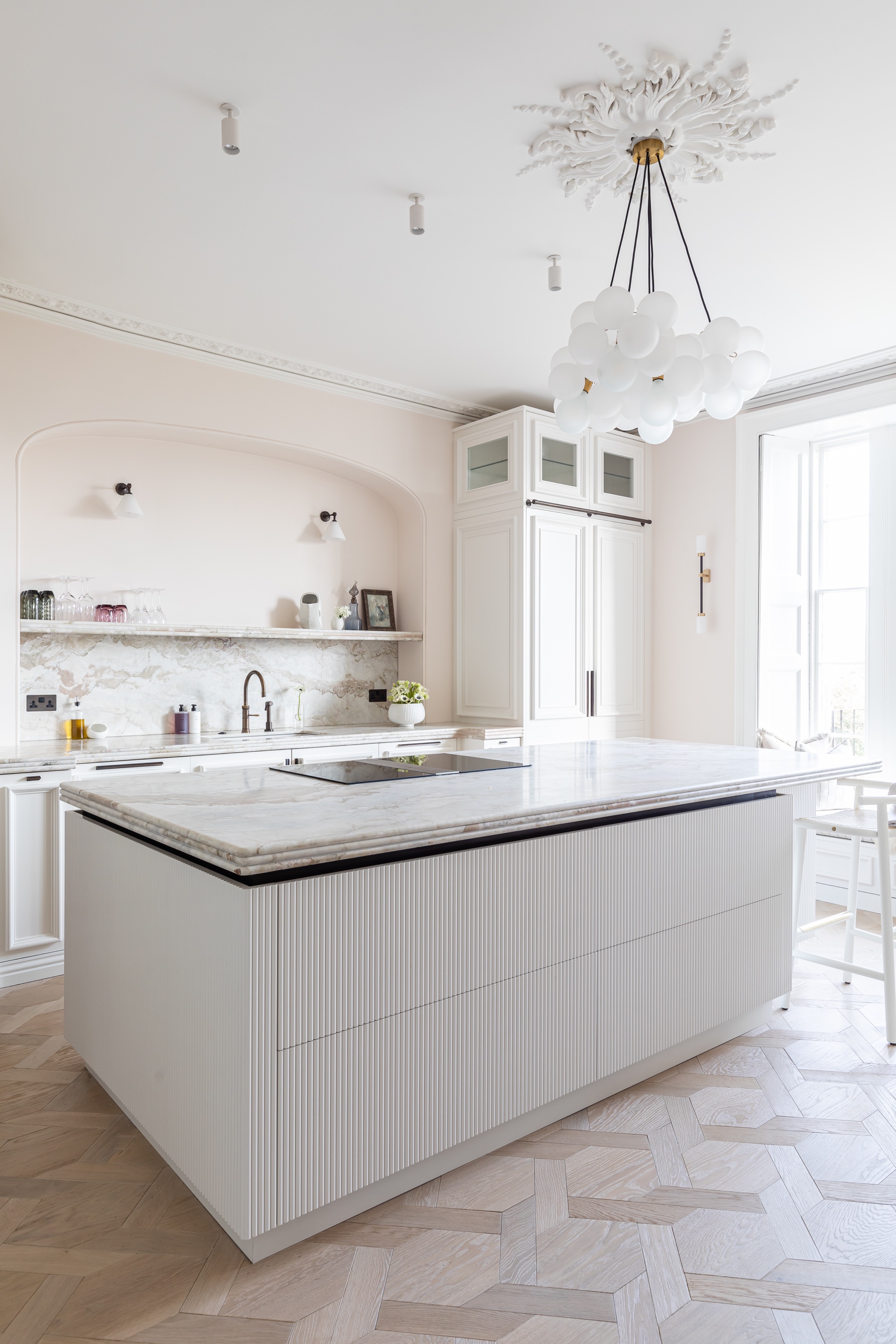
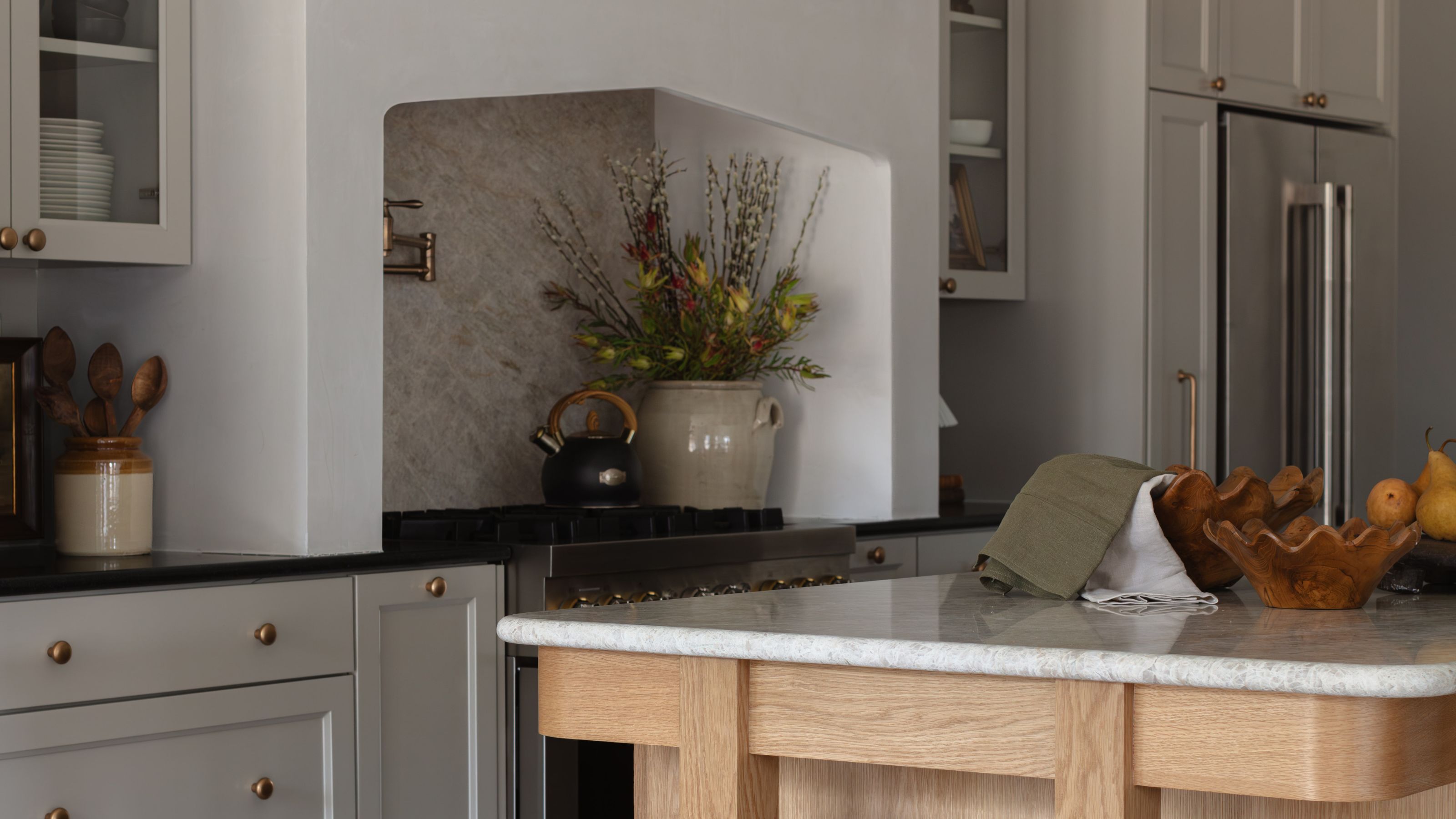
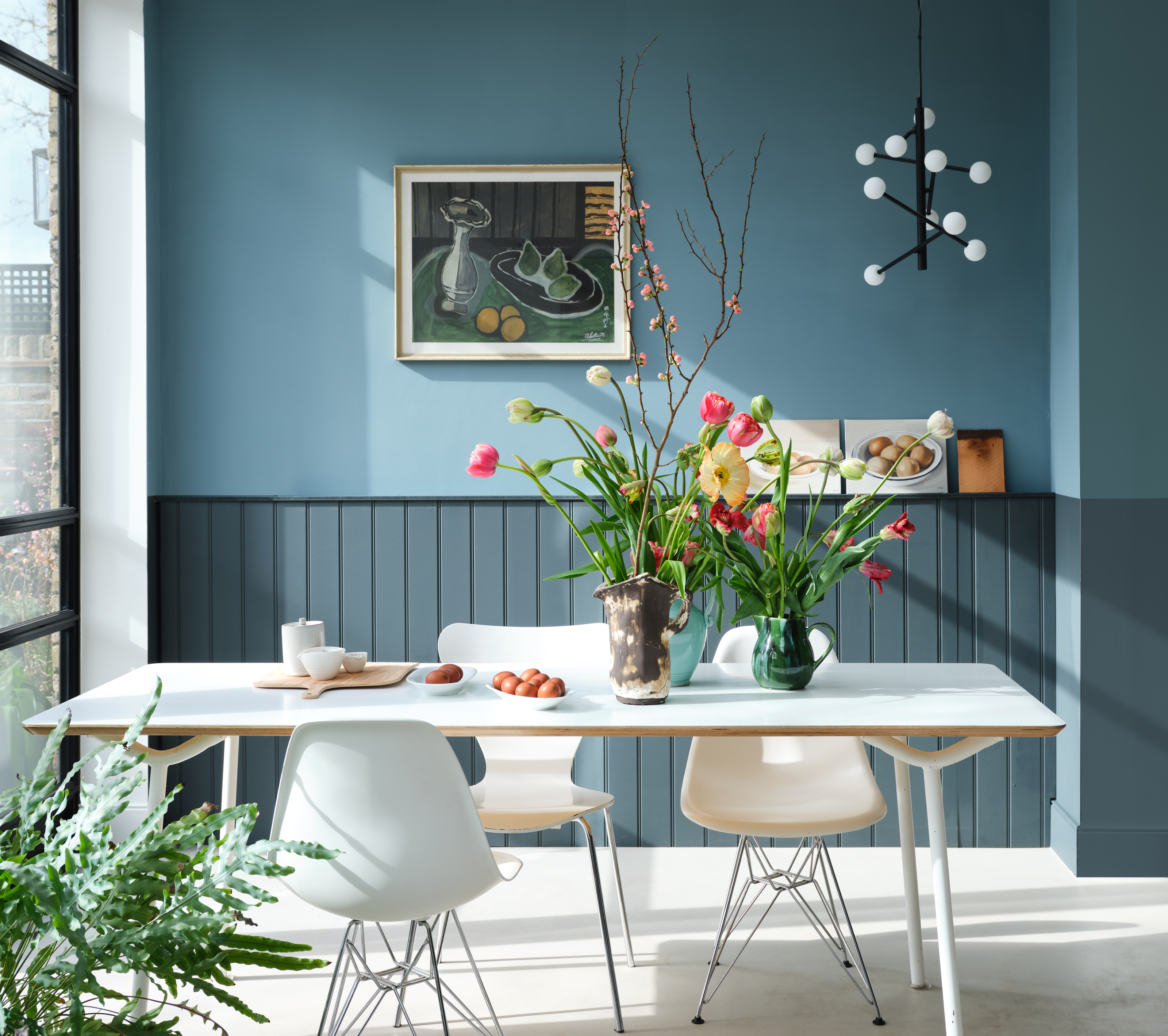
Pointing also finds its place in kitchen design, where Angelia Squire of Studio Squire used it for cabinetry to provide a bright white contrast against a bold marble counter, achieving a sharp, crisp, and clean look. Danielle Edwards of Moths Interiors views Pointing as an indulgent shade that imparts a sense of luxury and softness, enhancing spaces with velvets and candlelight, and capturing the warmth of golden hour sunlight. Rachael Curzons of Bailey Curzons extensively applied Pointing to joists, paneling, kitchen cabinets, and window frames in light-filled dining rooms, noting how its rich, warm undertones prevent spaces from feeling clinical or hollow. Pheobe Hollond of Studio Hollond appreciates Pointing’s versatility in north-facing rooms and against bold patterns, where its darker pigments and warm character bring an uplifting feeling. Finally, Rachel Gowdridge chose Pointing for an entire project to maintain a neutral yet warm backdrop, allowing art and accessories to stand out, and appreciating its ability to create a lived-in, timeless feel with a subtle, chalky quality that adds depth and age. Tasmin Love echoes this sentiment, choosing Pointing for a bedroom to provide a versatile, classic, and elegant backdrop that is easy to maintain and conveys warmth.
#FarrowAndBallPointing #NeutralPaintColors #InteriorDesignTrends #HomeDecor #PaintSelection #WarmNeutrals #DesignVersatility #LuxuryInteriors #CozyHome #FarrowAndBallPointing #NeutralPaintColors #InteriorDesignTrends #HomeDecor #PaintSelection #WarmNeutrals #DesignVersatility #LuxuryInteriors #CozyHome
0 commenti in totale
 Nessun commento ancora
Potresti anche gradire
Farrow & Ball's 'Skimming Stone' Is an "In Between" Shade That Designers Say Works in Every Space

Farrow & Ball's Wimborne White is an ever-popular paint – here's why experts love this 'empathetic' white
These 10 Farrow & Ball colors are their most popular paints – from earthy neutrals to deep and dark shades
The One Lighting Feature Designers Hate But Home Buyers Love

Farrow & Ball's new colors have just launched – we ask designers how to use this calm, yet colorful palette
Farrow & Ball's 'Hague Blue' is a Bold Navy That Acts Like a Neutral — Here's How Designers Use It
Interior Designers and Stylists Can’t Get Enough of This New Target Line

The unexpected 'microtrends' that designers say are actually timeless
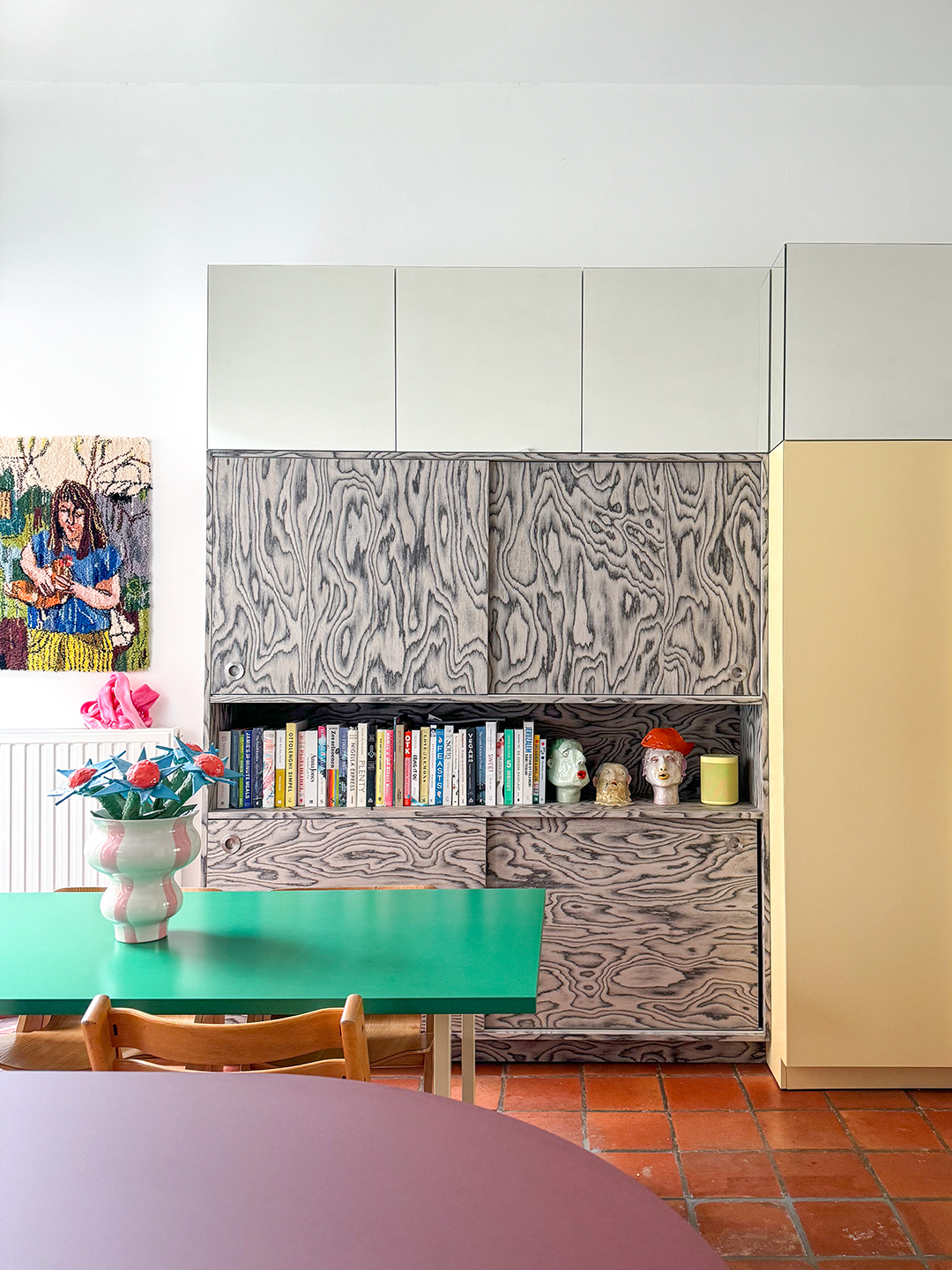
Move Aside, Ply—Designers Are Loving This Wood for Its Captivating Pattern

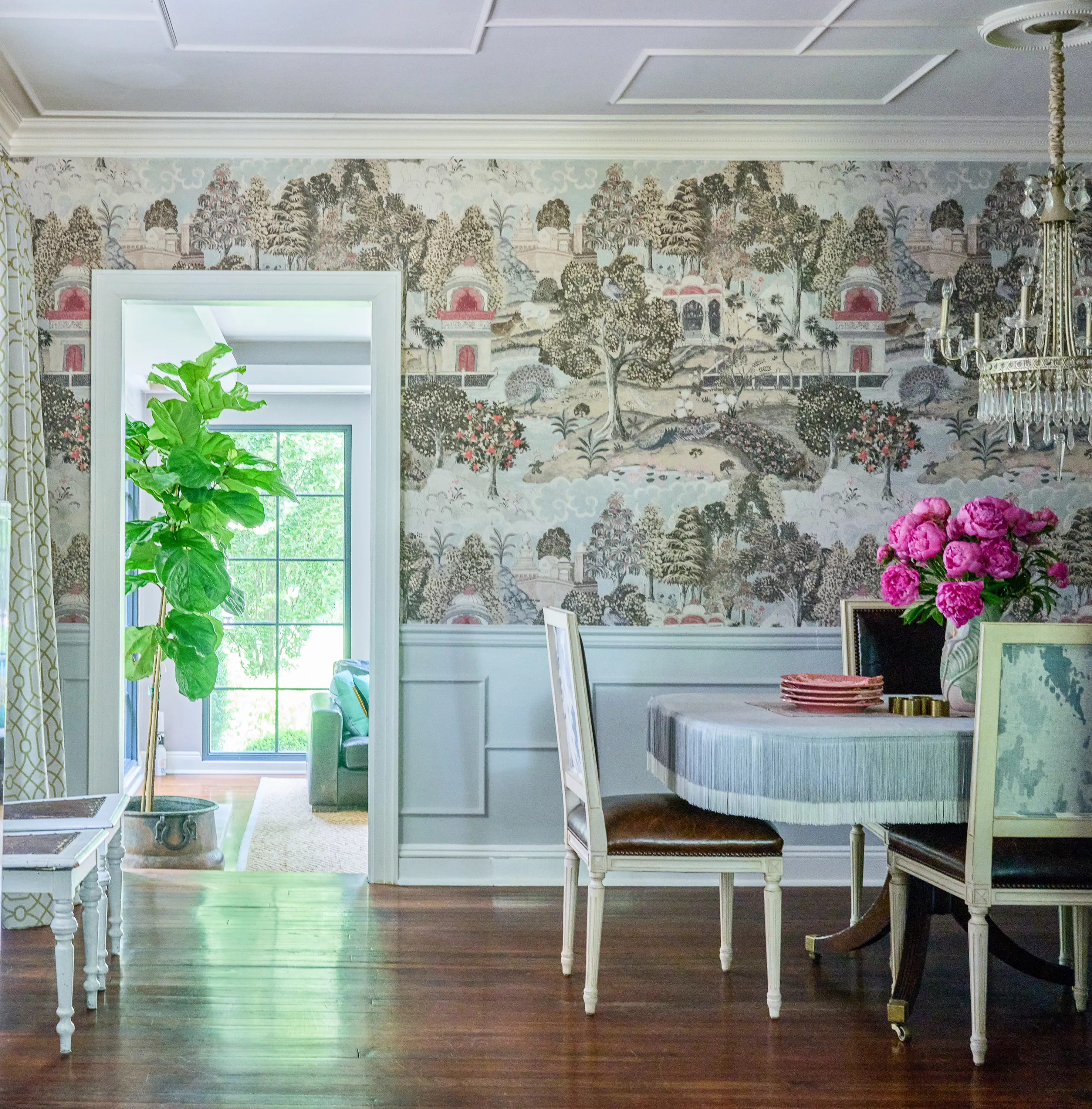
Fringe Is Back and Better Than Ever—Here's How Designers Are Embracing the Trend

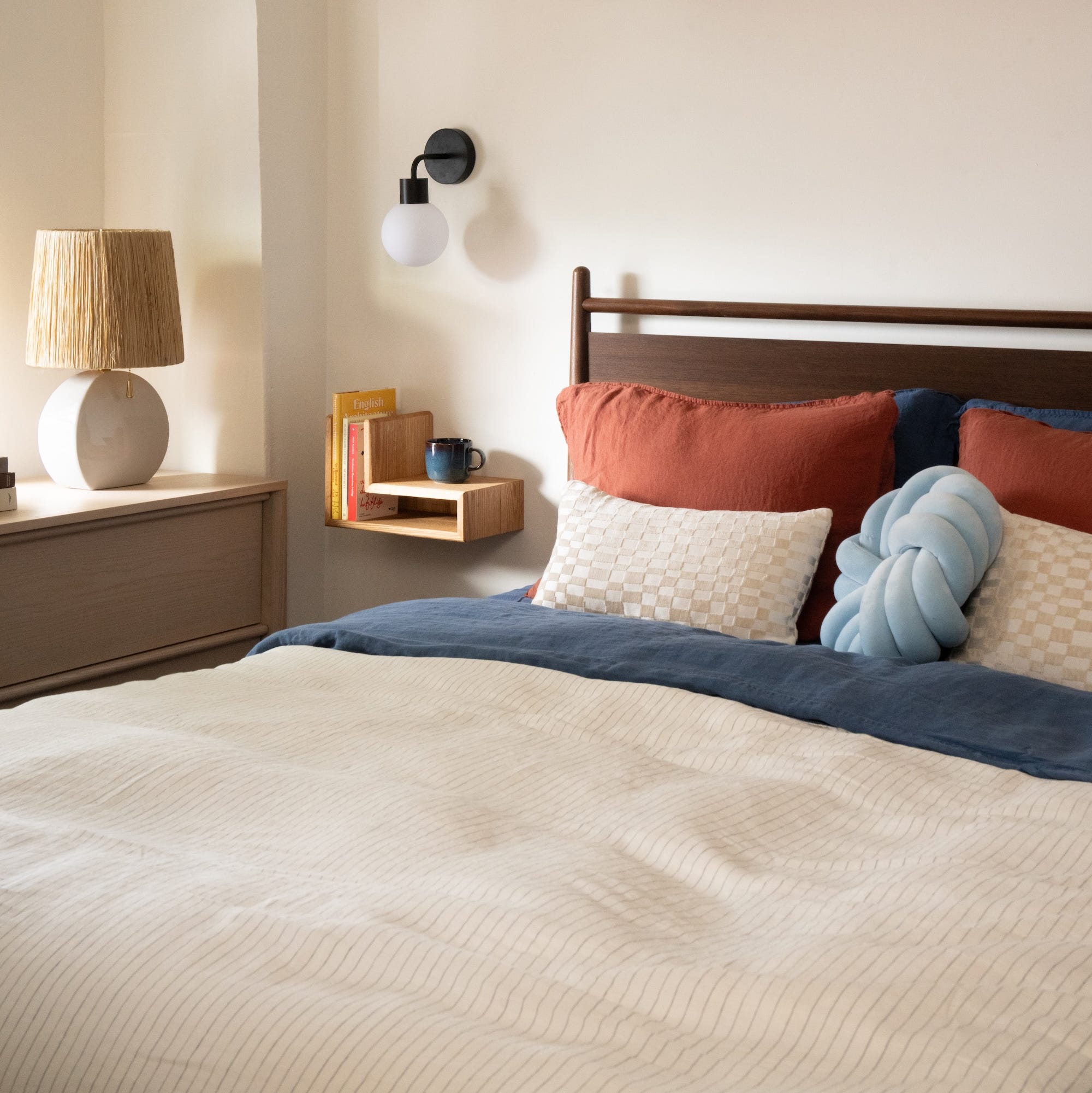
Adhesive Sconces Are Everywhere Right Now—And Designers Love These

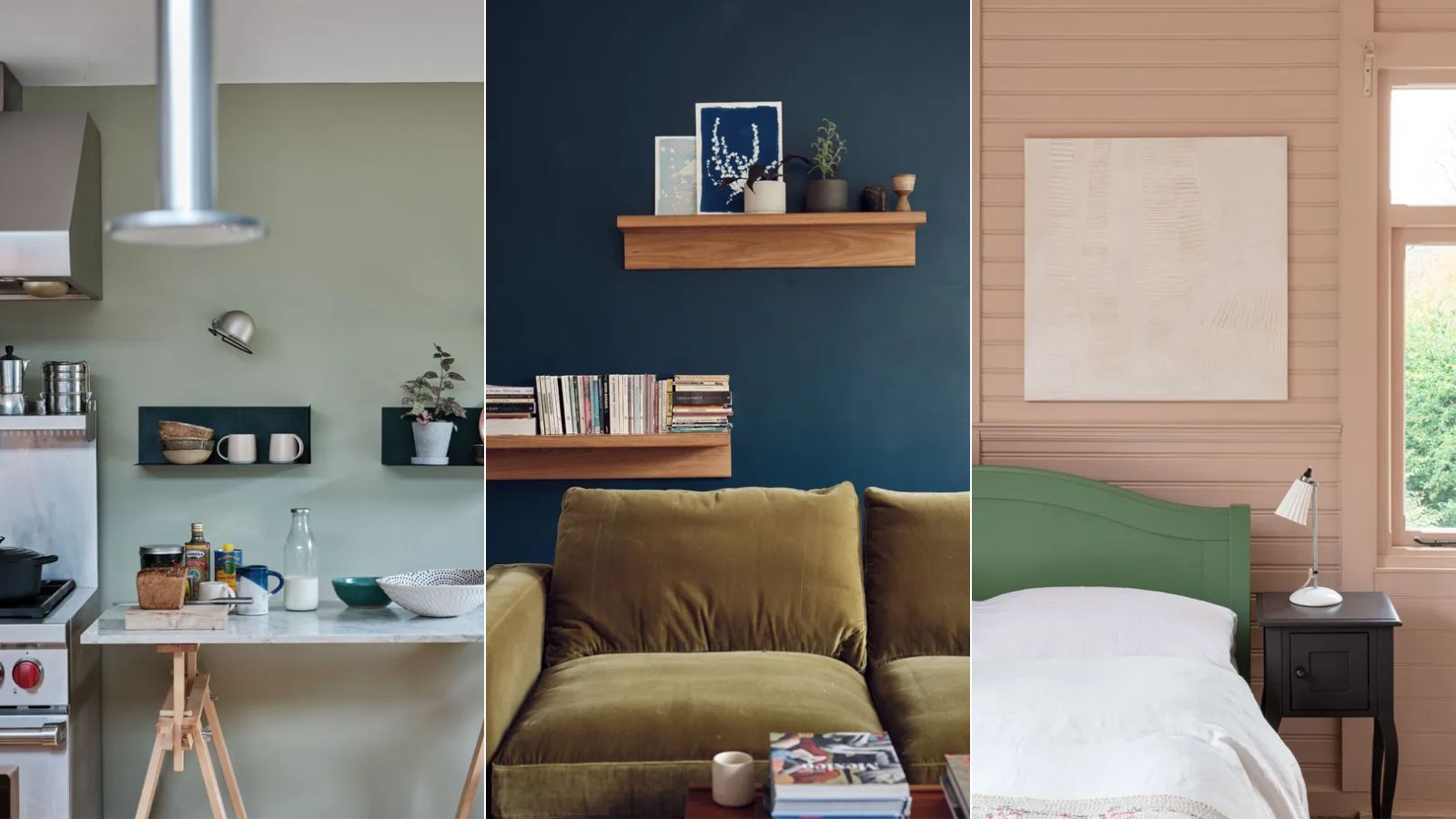
These are Farrow & Ball's current 'most loved' paints – and how to decorate with them throughout the home
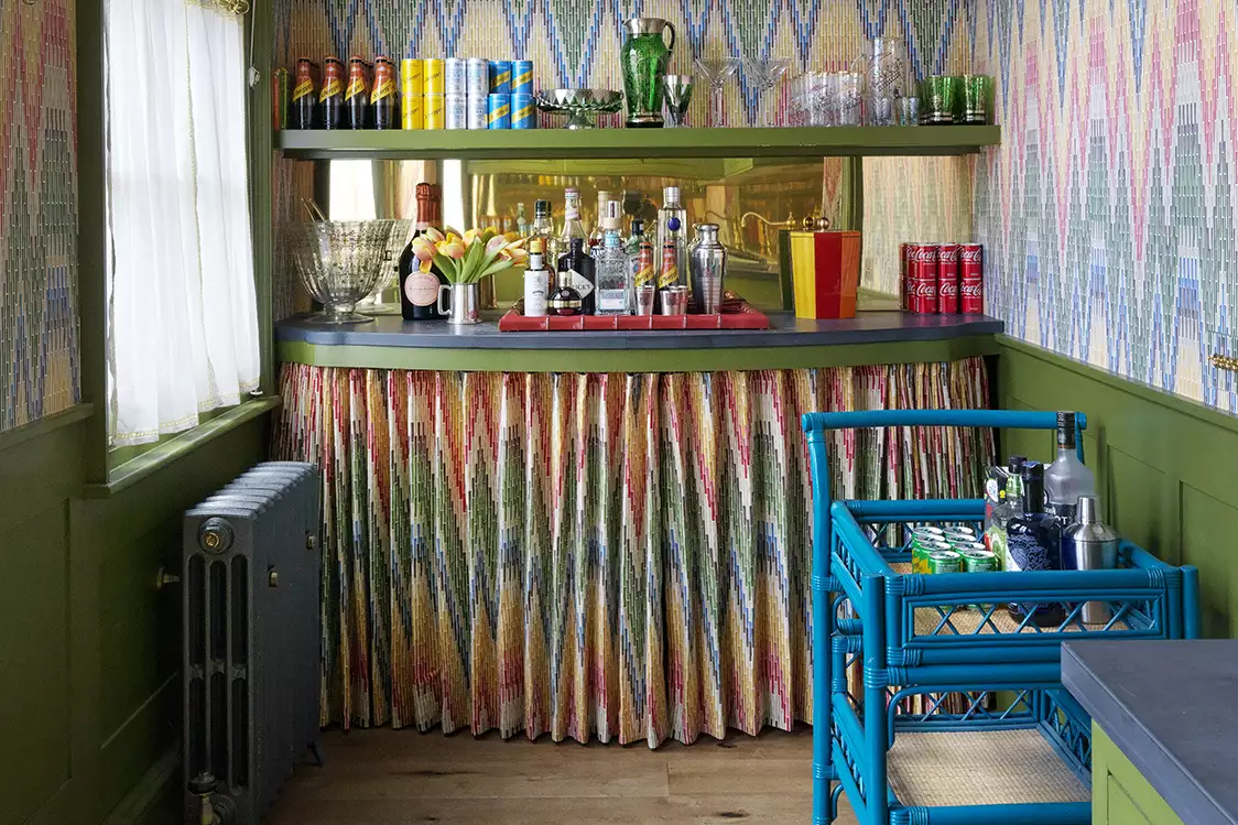
This Throwback Trend Is Coming Back in Style—and Designers Have Mixed Opinions

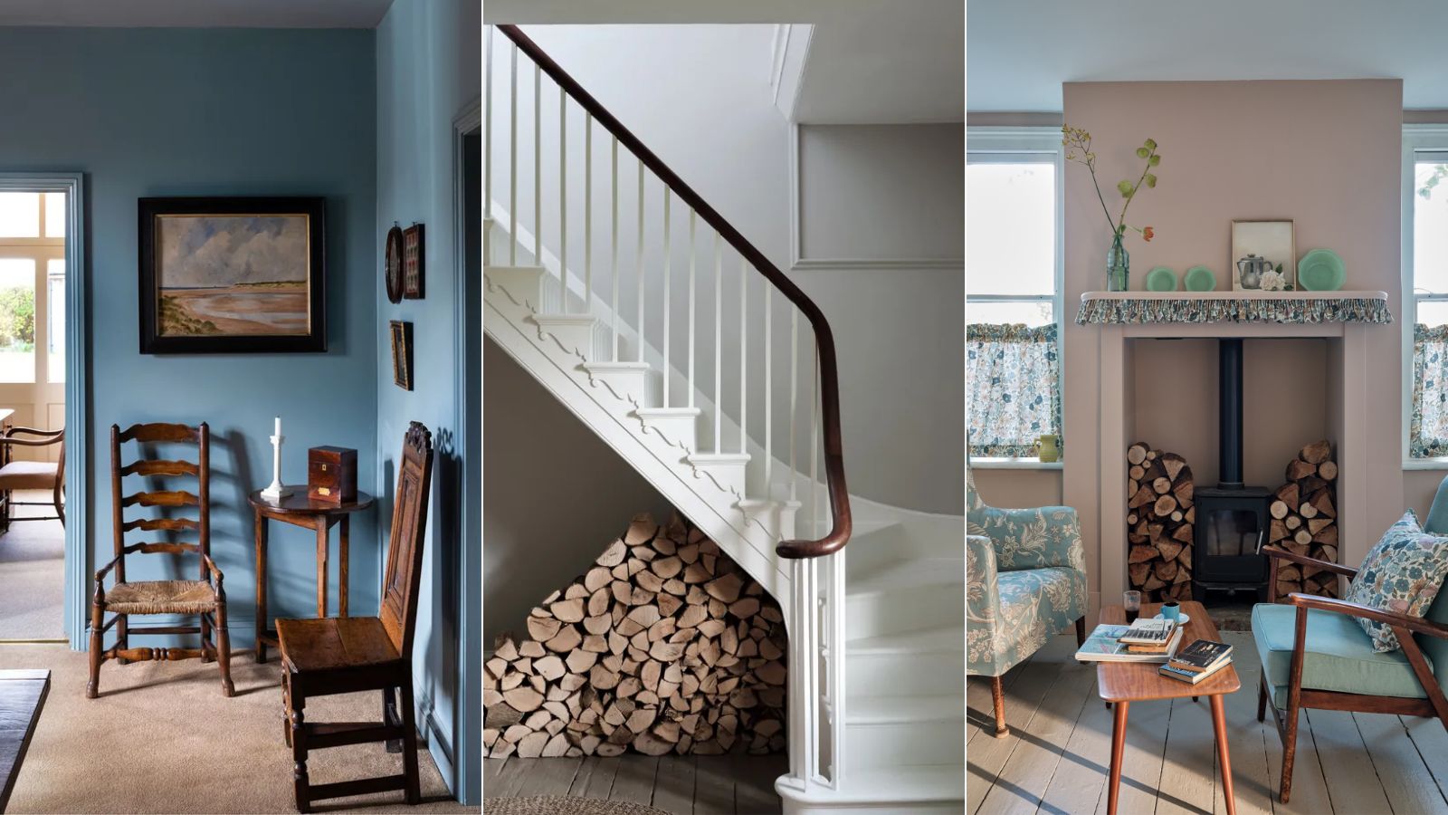
Interior designers' favorite Farrow & Ball paint colors
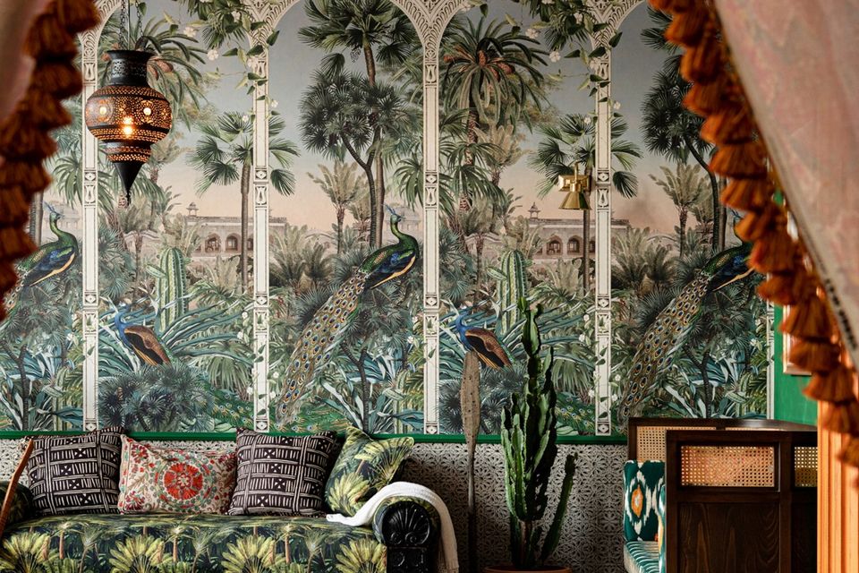
Interiors: In praise of pattern
Fluting: 9 times interior designers have inspired us with this key new look
This Designer’s Take on a Once-Dated Trend Proves…
The enduring comfort of nostalgiacore – and why it's loved by designers
5 enduring colors designers always return to when they have trend fatigue
The Throw Pillow Formula Designers Swear By for a Perfectly Layered Look