1/8
7 dark colour palette ideas that won’t overwhelm your space
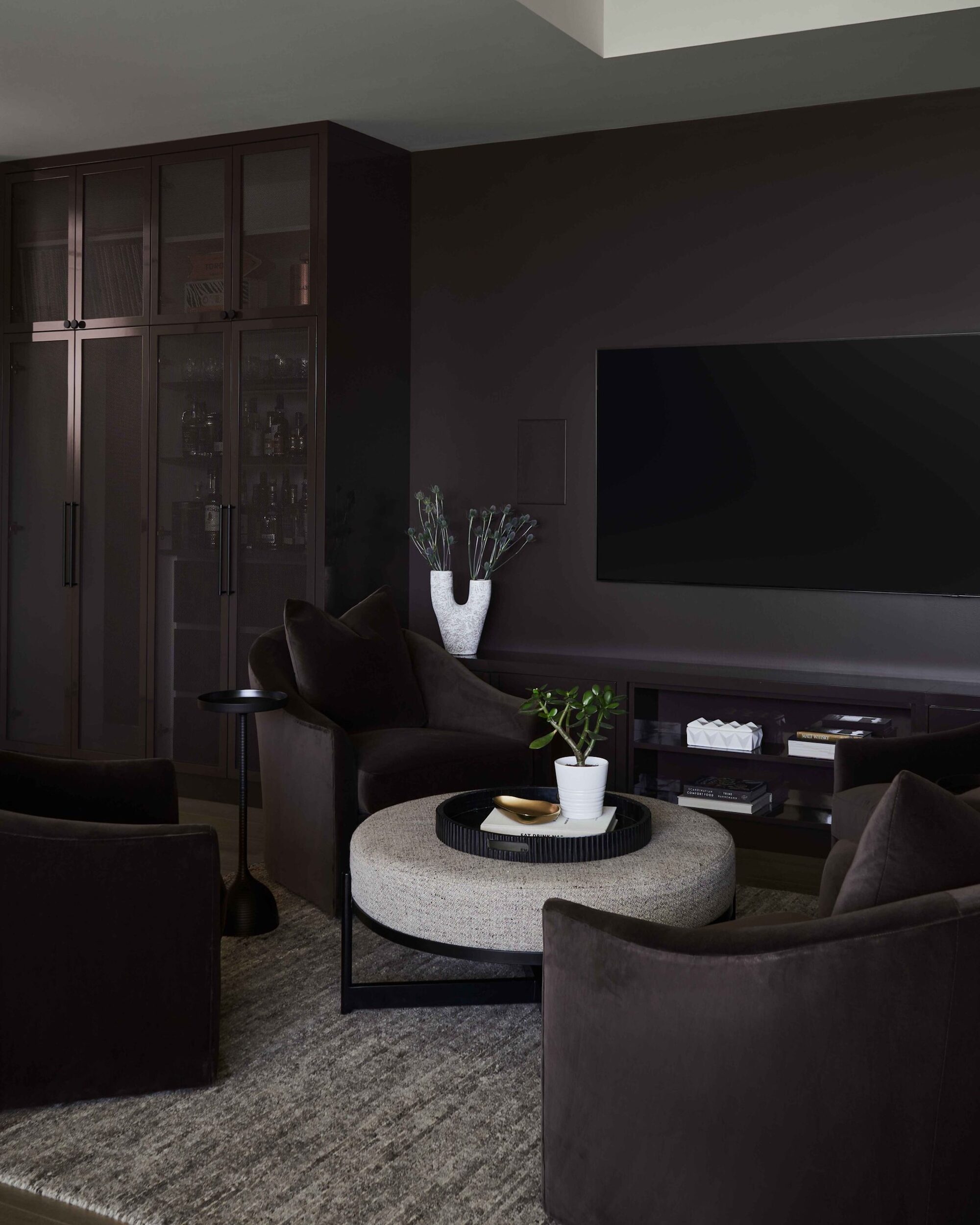
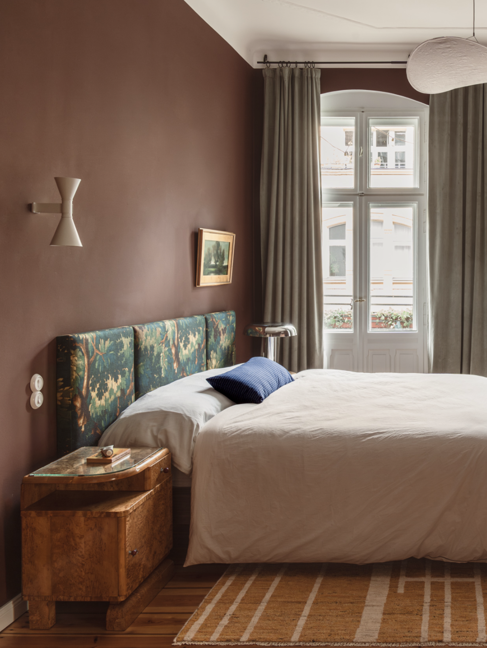
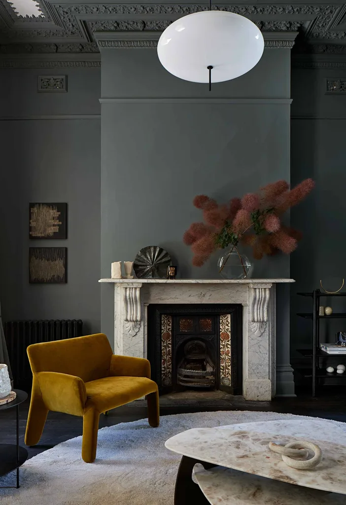
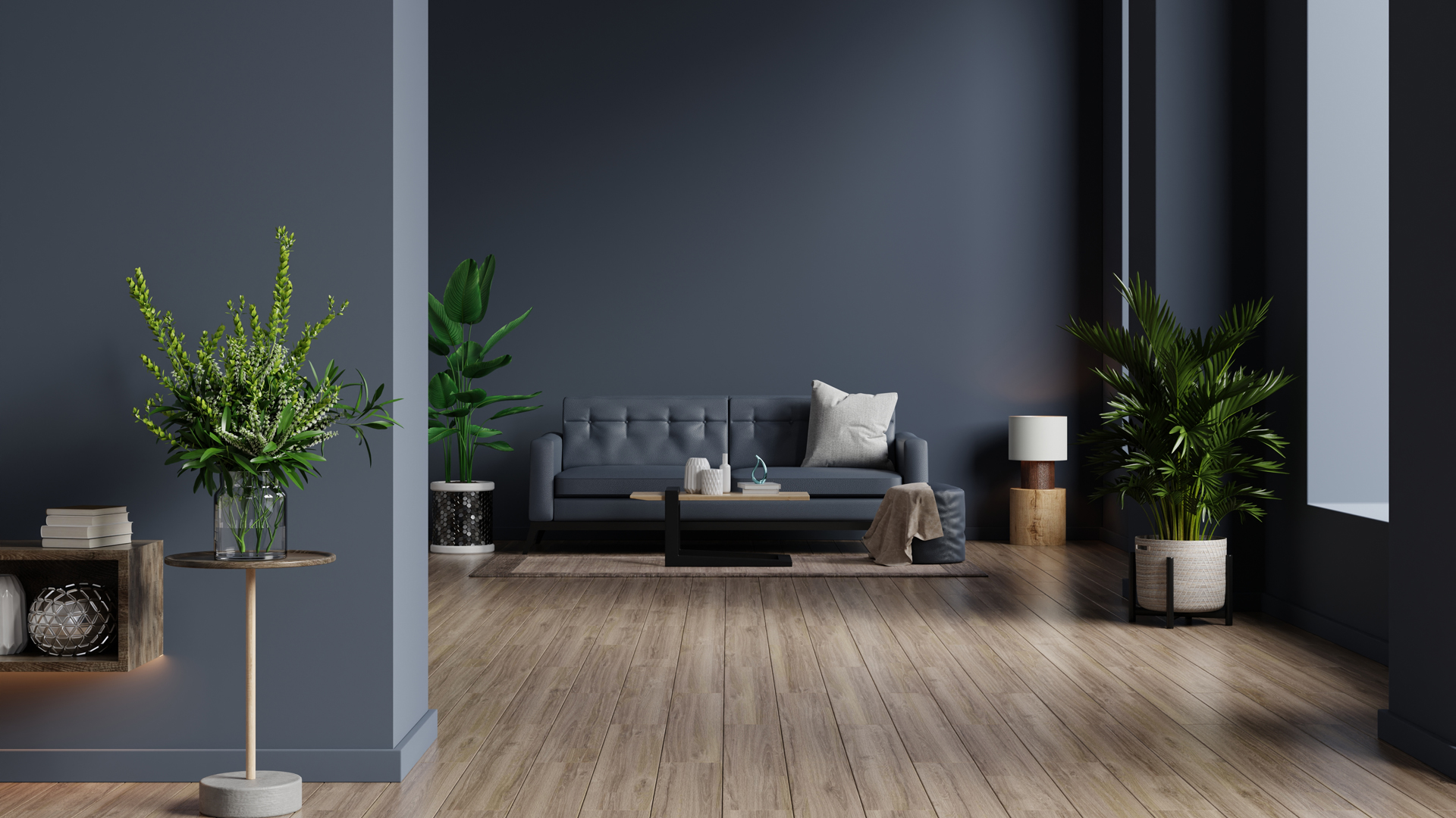
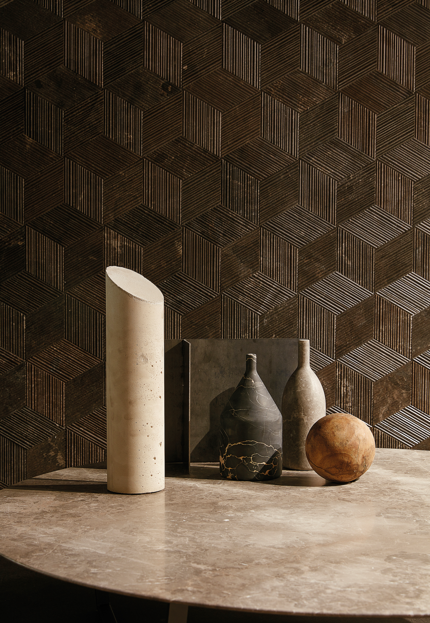
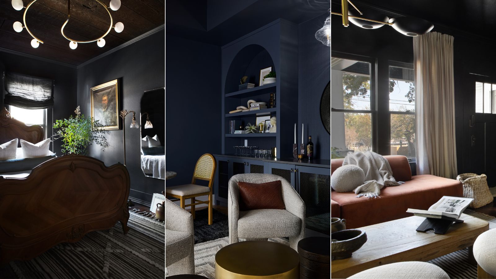
This article explores various strategies for incorporating dark color palettes into living spaces without making them feel gloomy or oppressive. It challenges the conventional preference for light and bright interiors, arguing that rich, dark hues can introduce depth, character, and a sense of grounding to a room. According to interior designers like Phillip Thomas, dark colors can create an enveloping and cozy atmosphere, making living rooms ideal retreats. Bria Hammel emphasizes that moody areas often become client favorites, sparking conversation and adding unique personality.
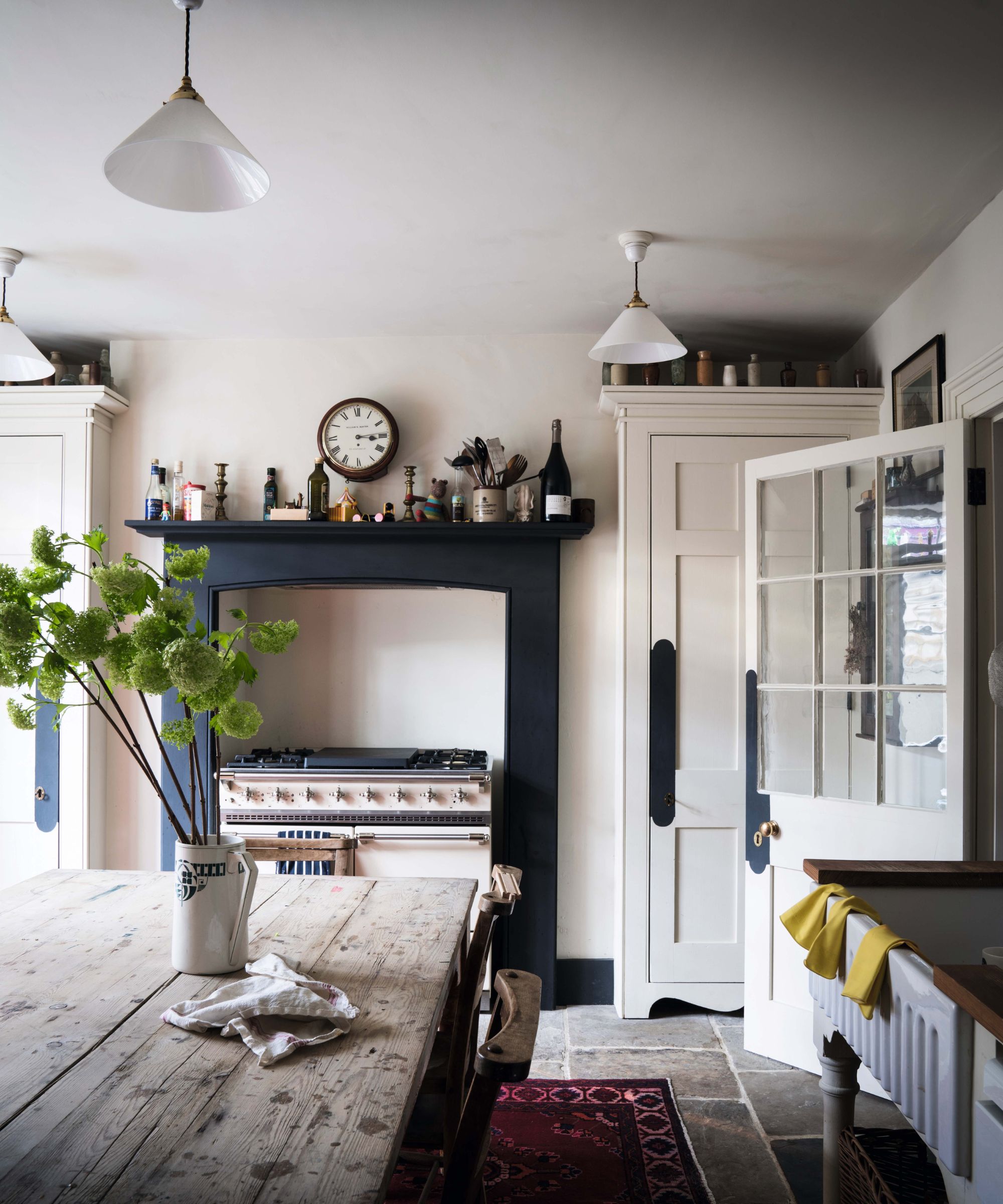
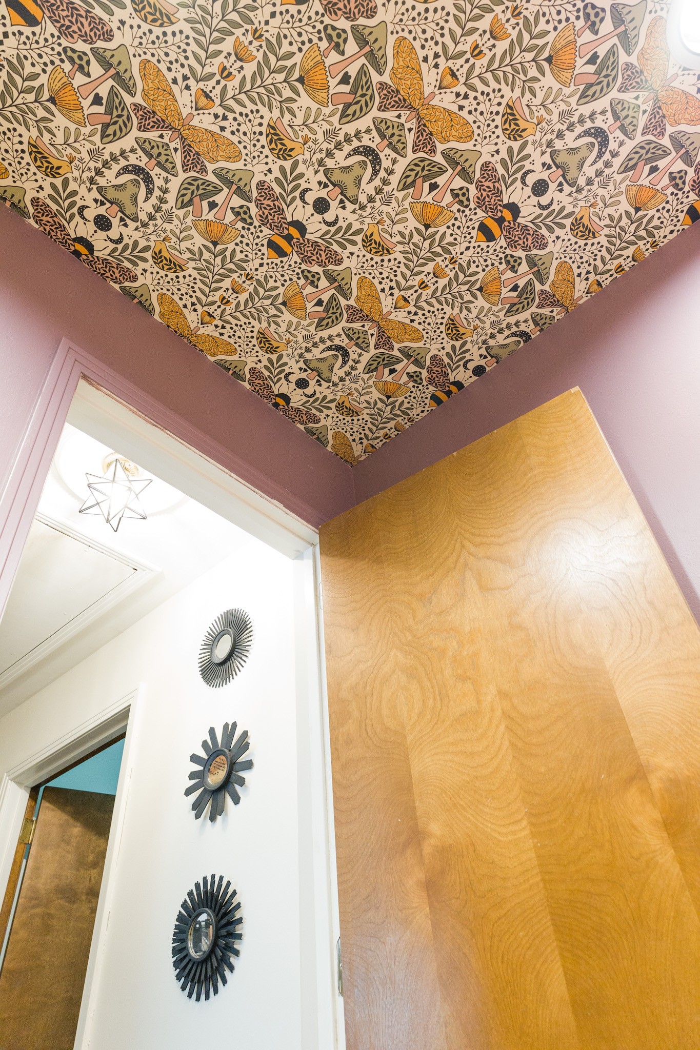
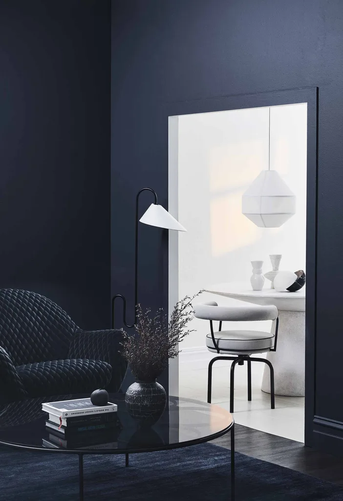
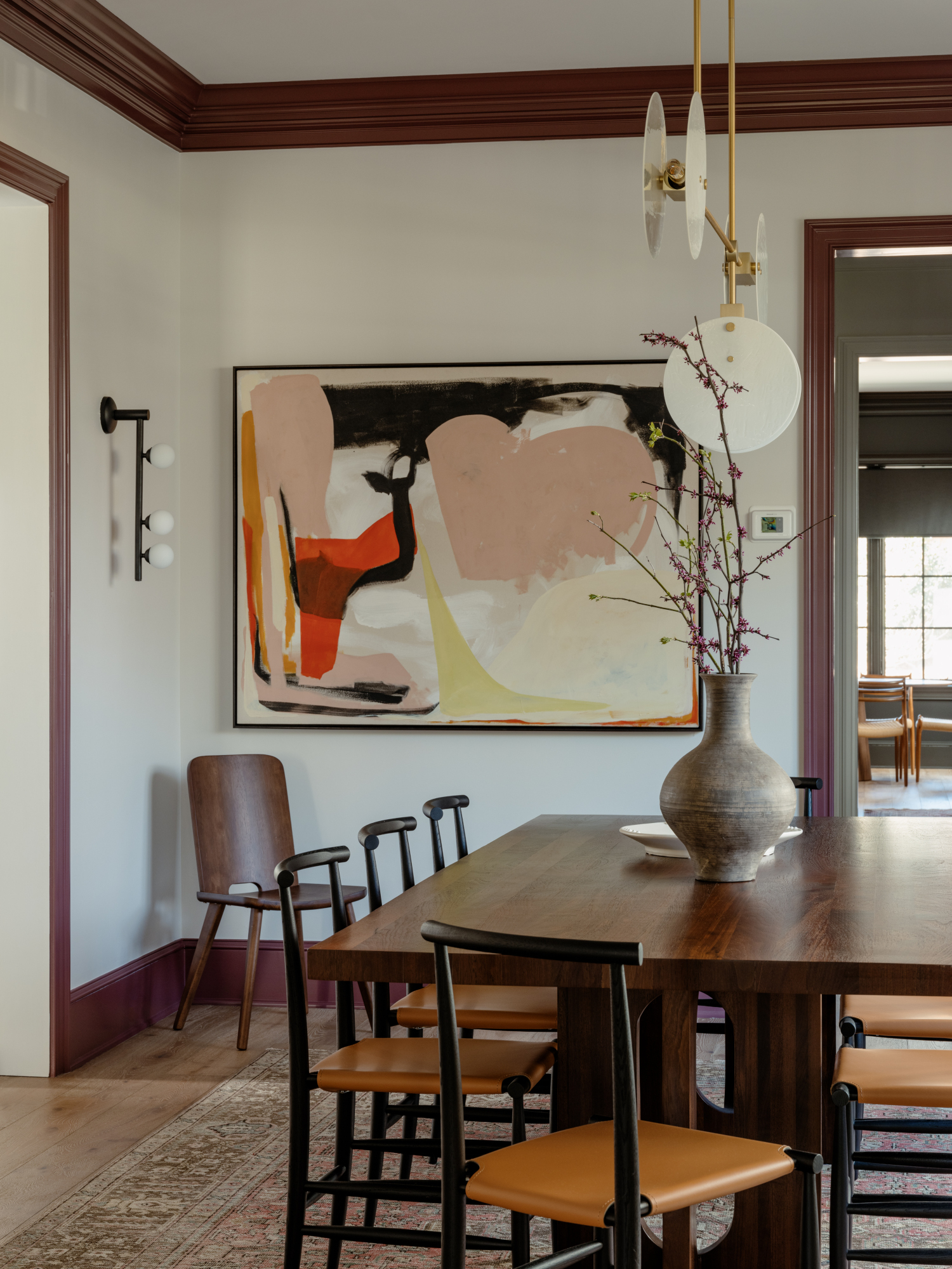
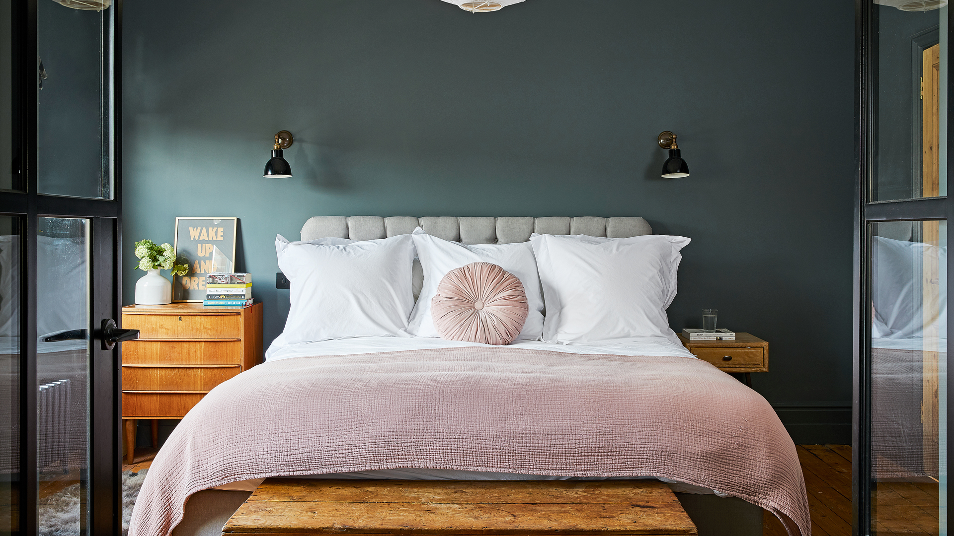
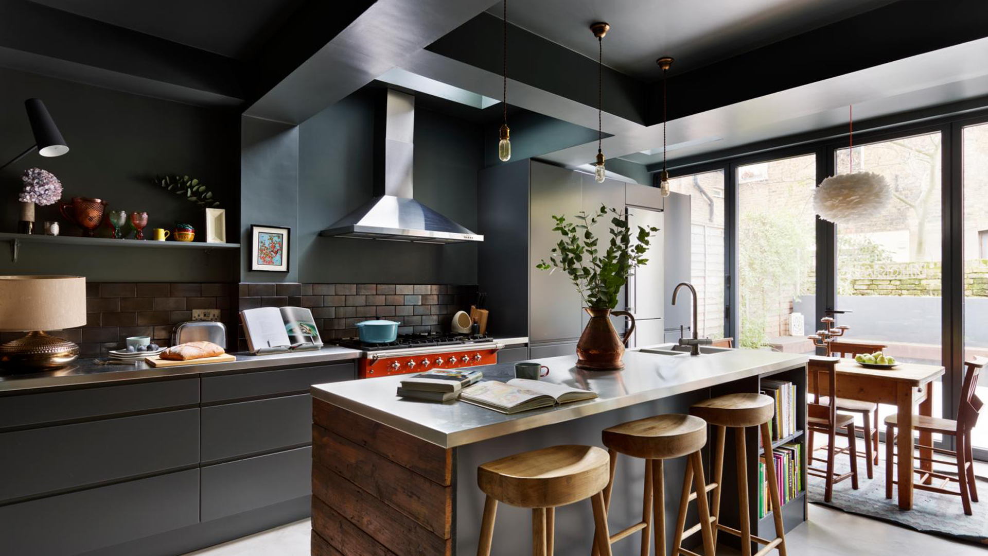
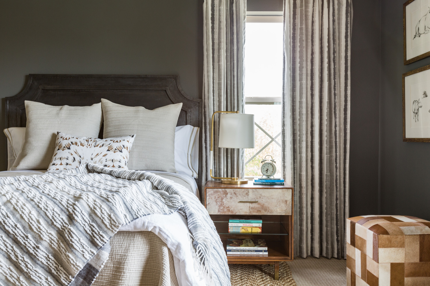
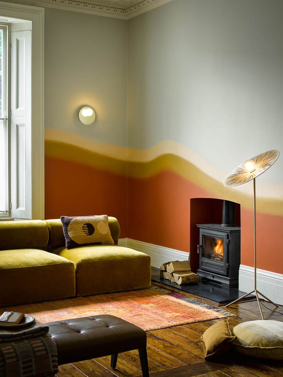
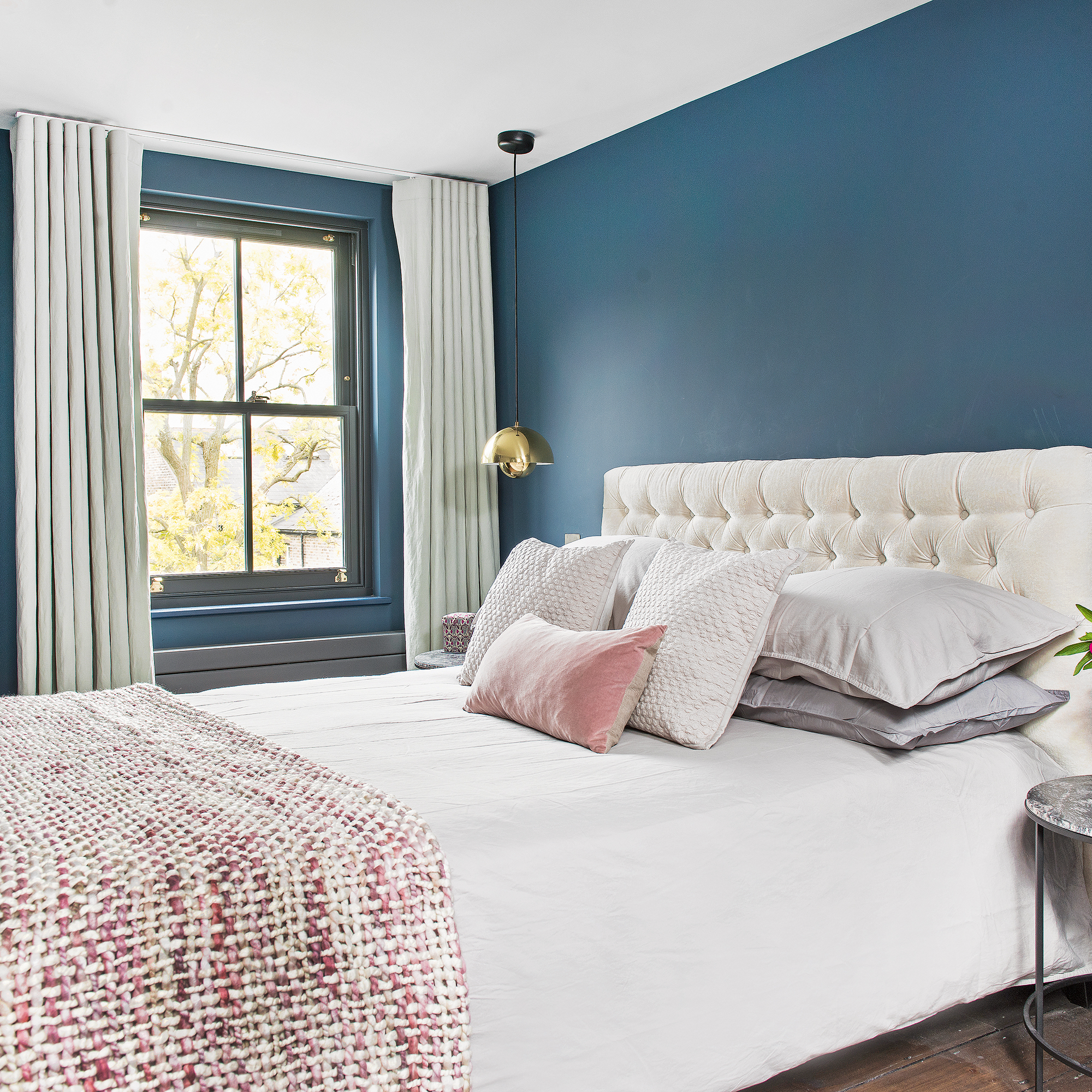
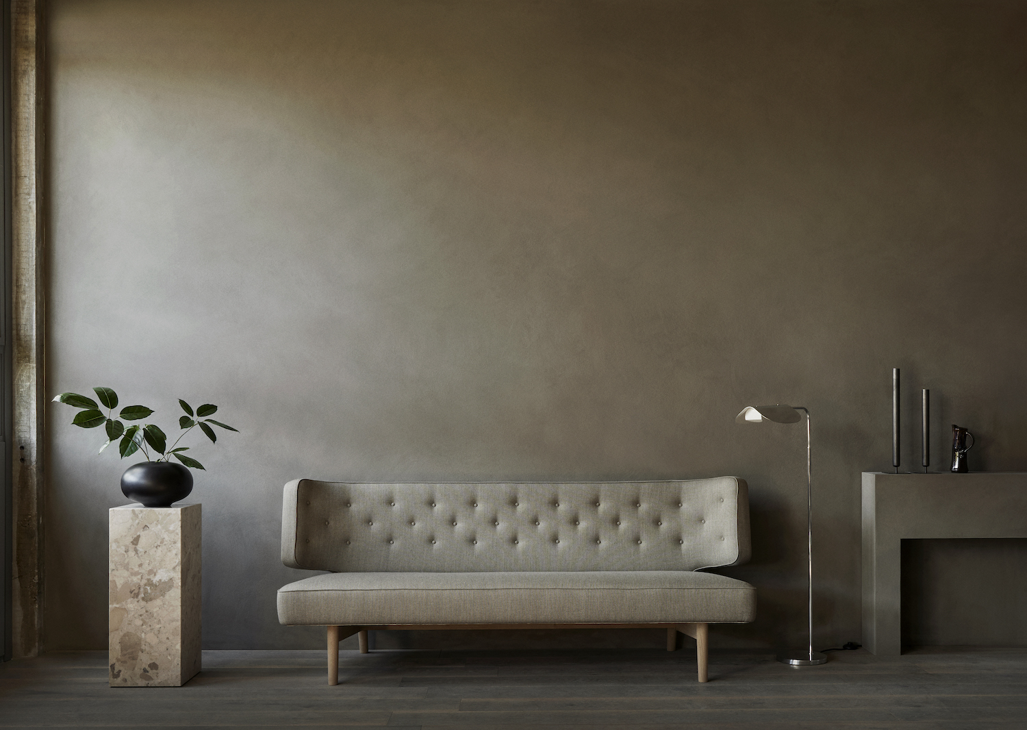
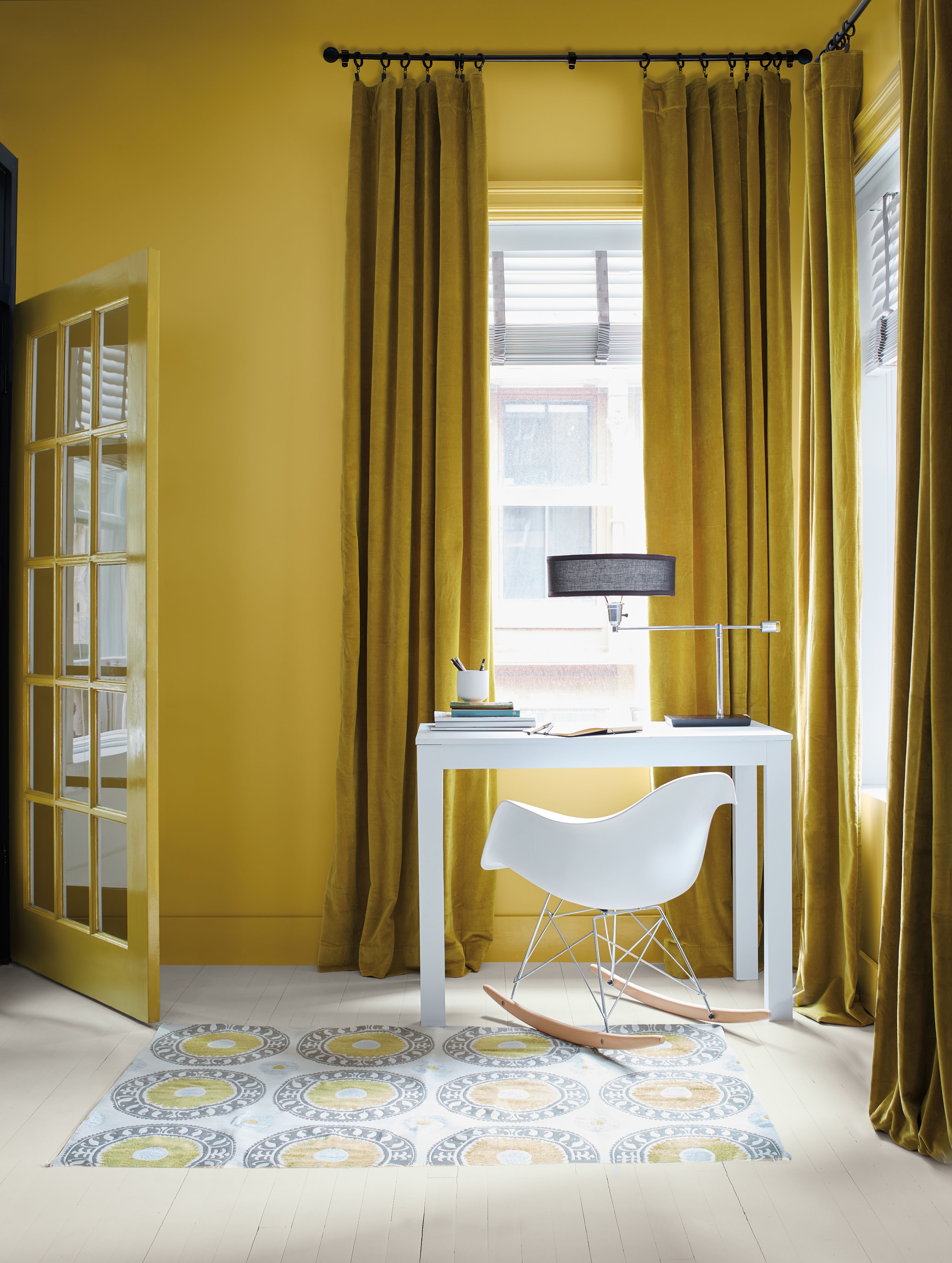
The article provides seven distinct tips for successfully integrating dark accents. The first tip suggests using tonality, where the same dark color is applied to walls and trim with varying sheens, alongside a tonal fabric for elements like drapery. This layering technique, as recommended by Jess Weeth, creates a cohesive and immersive feel rather than a jarring one. The second strategy involves easing into dark colors with ombre effects, particularly beneficial for those timid about bold hues. Designer Holly A. Kopman highlights how a gradient effect, such as walls fading like San Francisco fog, strikes a perfect balance between light and dark.
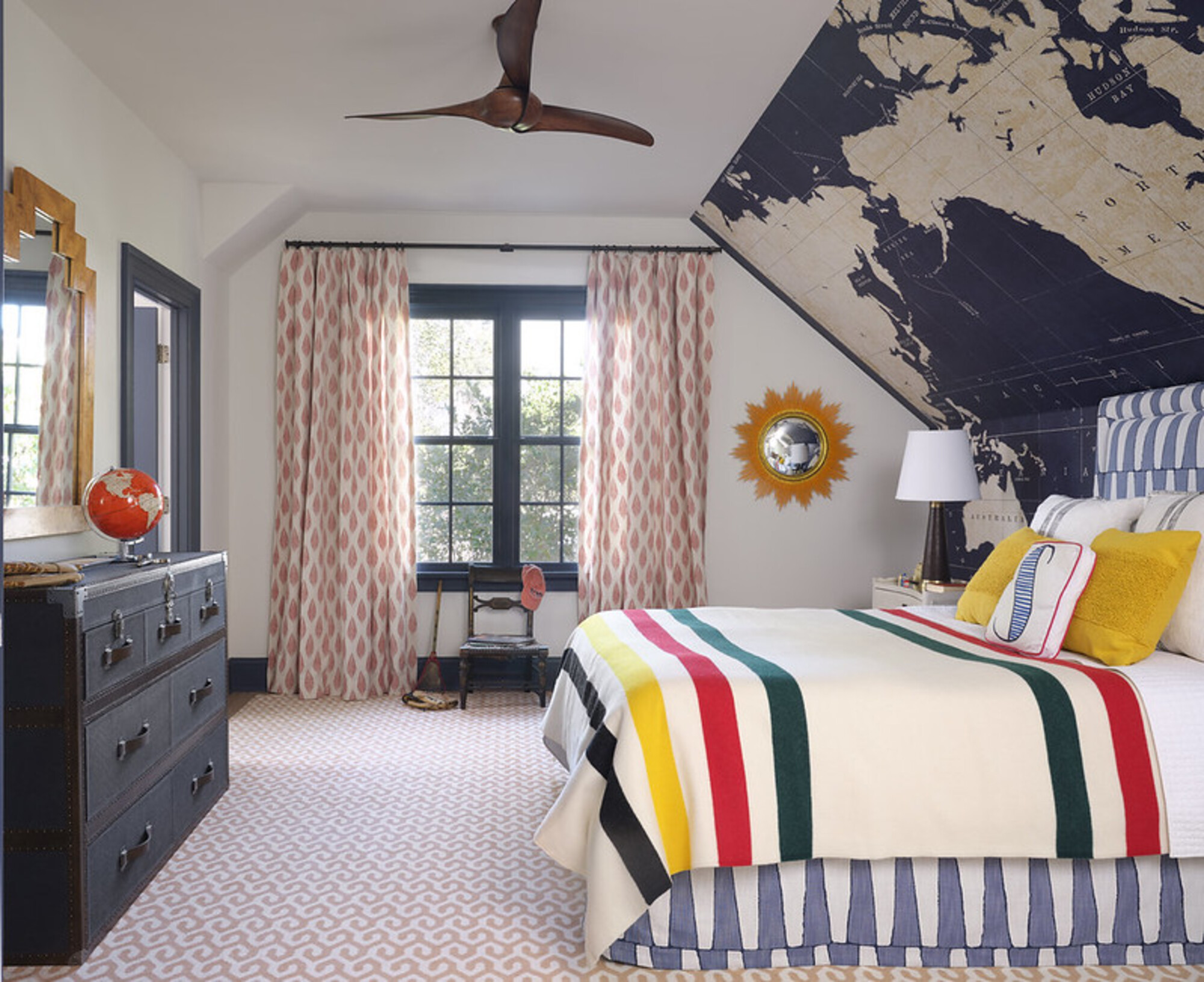
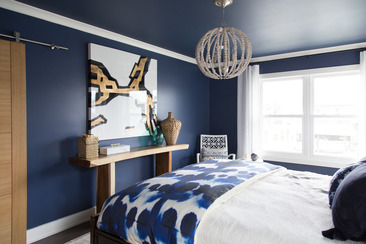
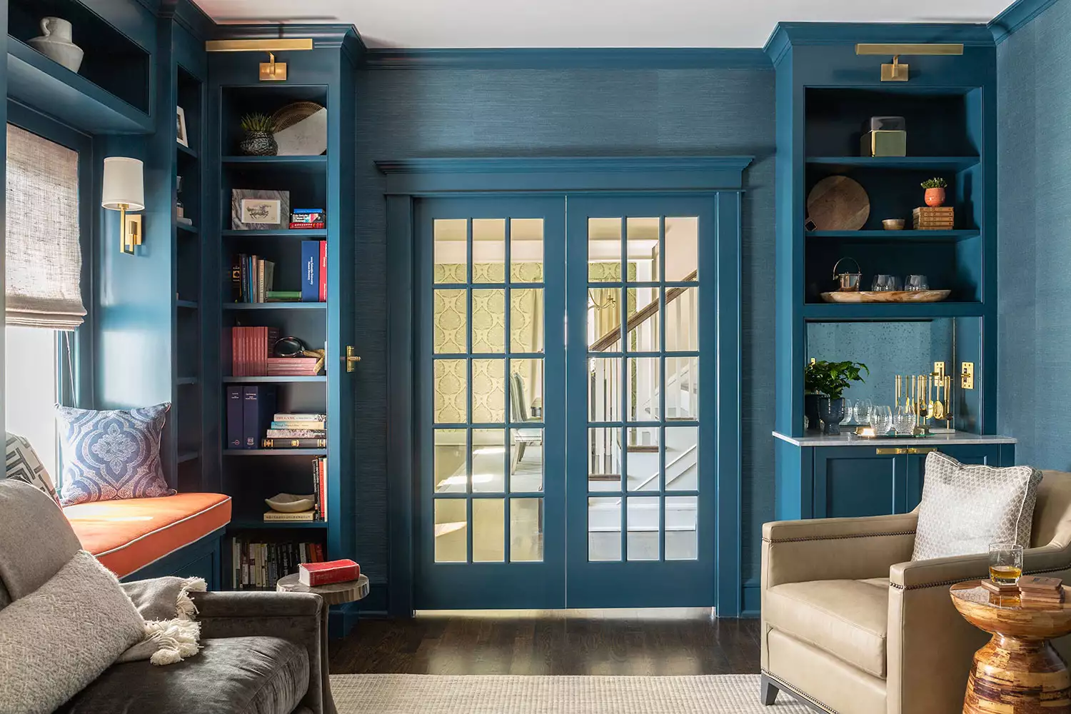
Natural light plays a crucial role in balancing dark color schemes. The third tip advises leveraging bright rooms, as ample light allows for more leeway with deep colors. For example, Bria Hammel used navy paint for built-in bookshelves in a well-lit home office, ensuring the space retained an open feel. This can be further balanced with lighter wood tones, rugs, and seating. Phillip Thomas also suggests high-gloss paint on ceilings in conjunction with dark floors to reflect light and prevent the room from feeling overpowered.
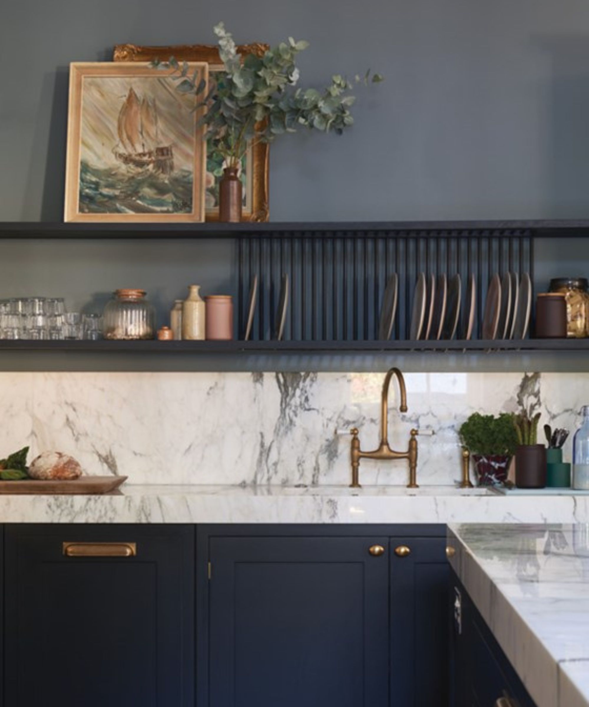
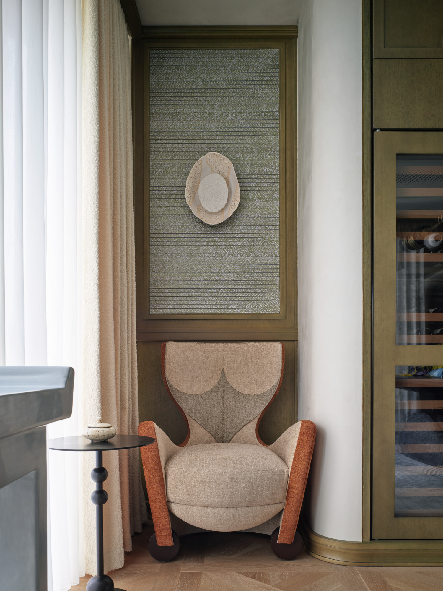
For those hesitant about full commitment, incorporating dark accessories is the fourth suggestion. Tulsa-based designer Jill Croka uses dark planters or side tables to introduce comfort and relaxation. She also recommends rich yet subtle gray saturated colors for larger furniture pieces, offset by lighter rugs and blankets. The fifth tip encourages mixing dark colors with earthy tones, drawing inspiration from nature. Hammel’s design of a reading nook with a verdant paint, leather chair, and light wood elements exemplifies how natural textures can soften dark hues.
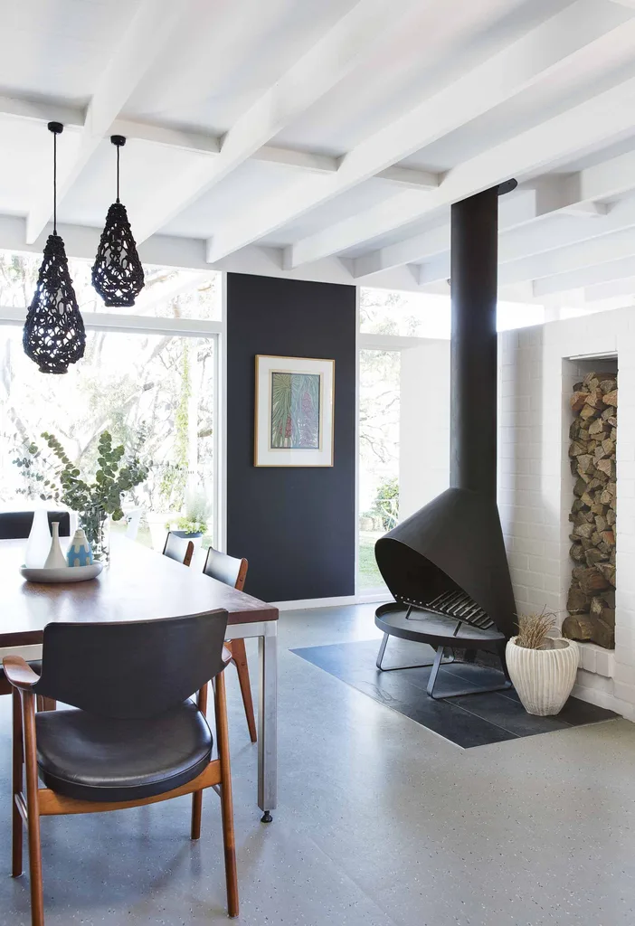
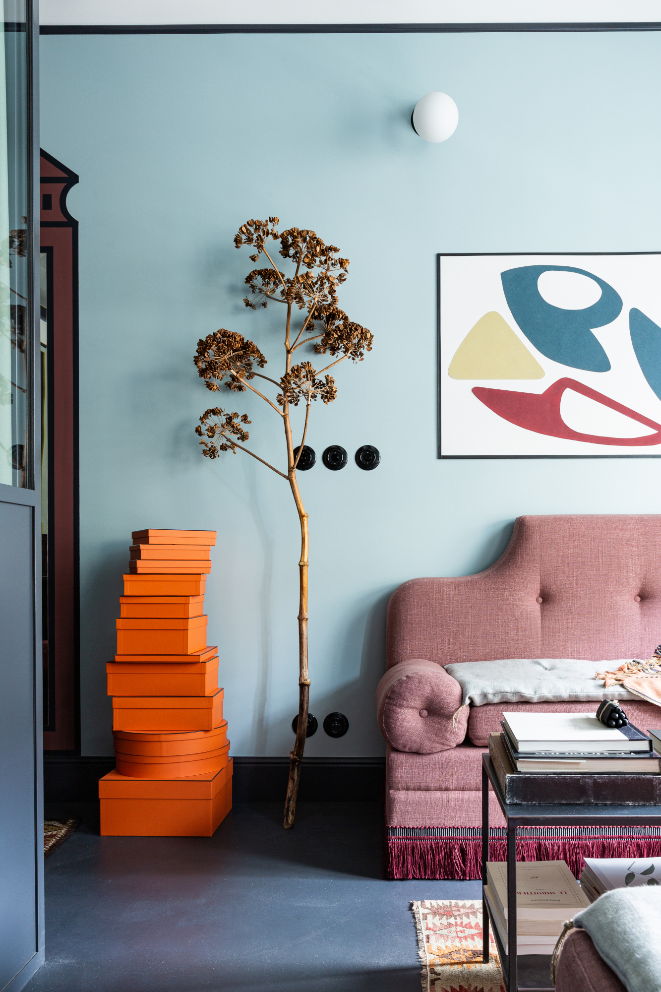
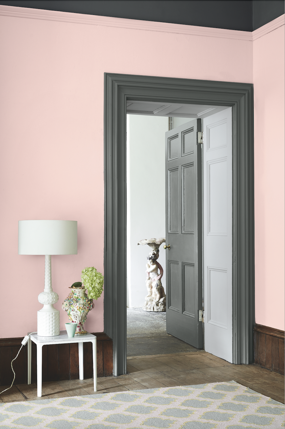
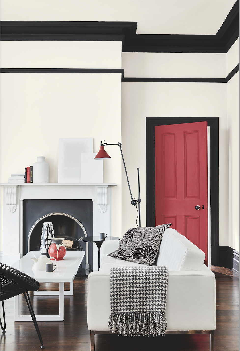
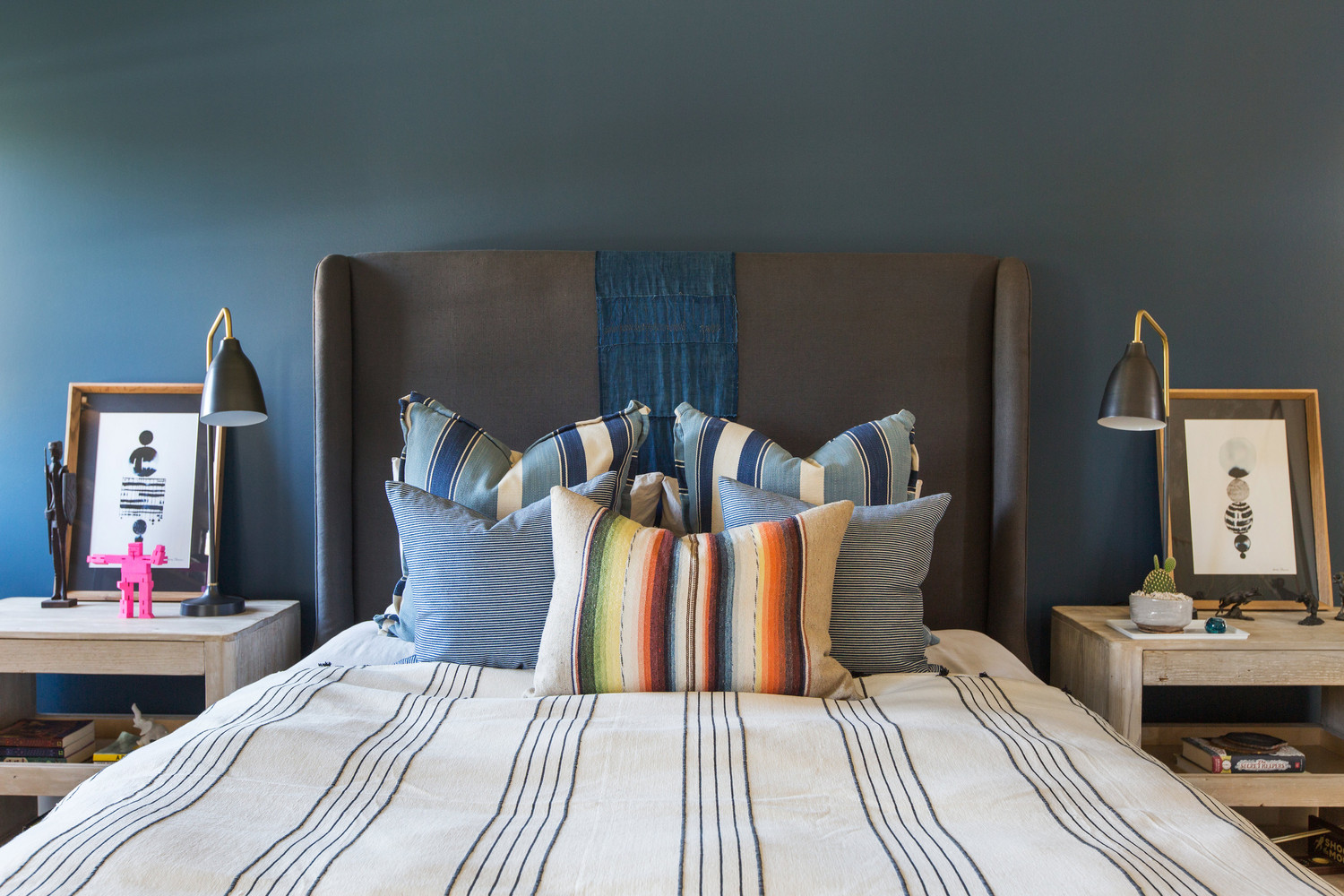
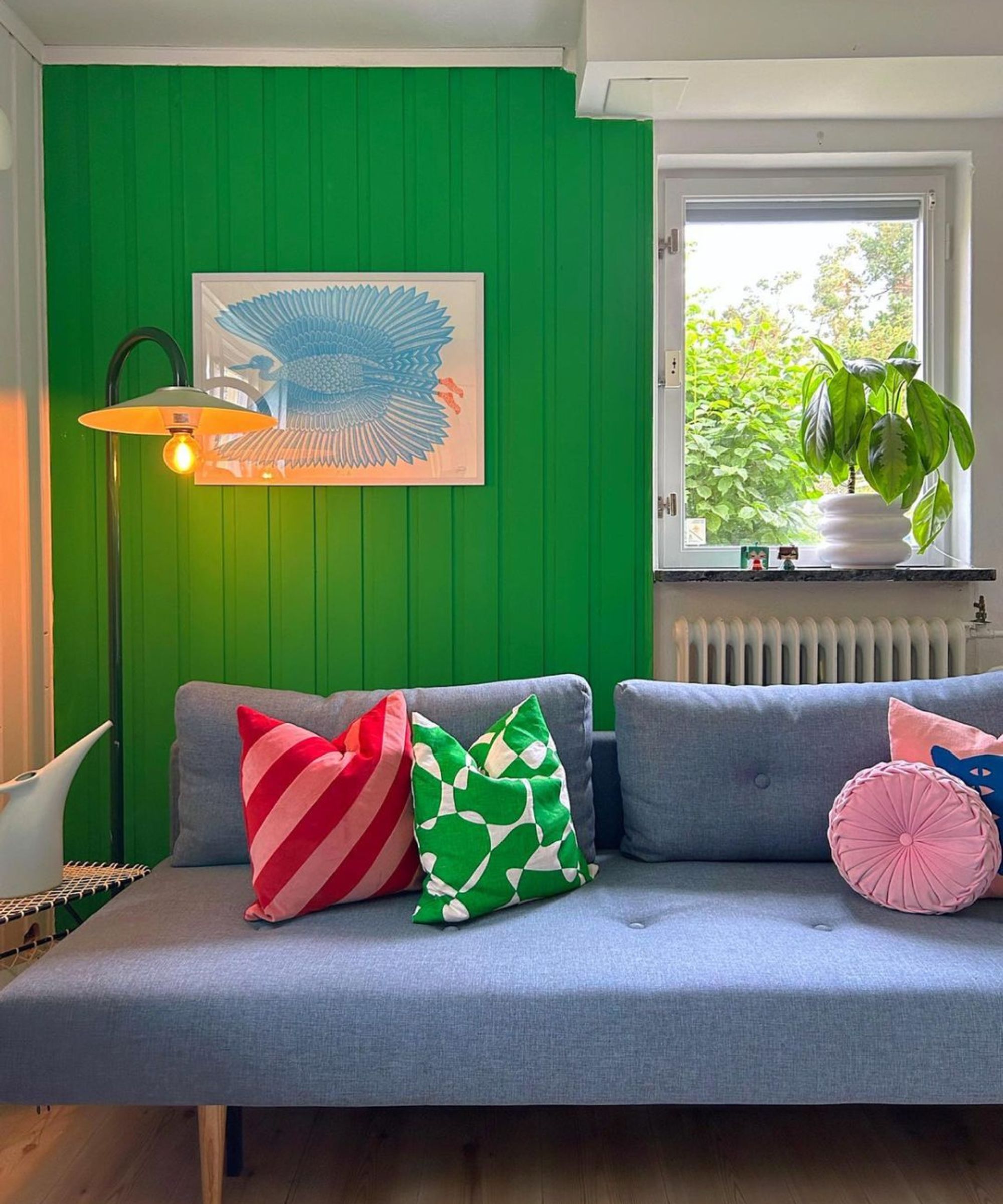
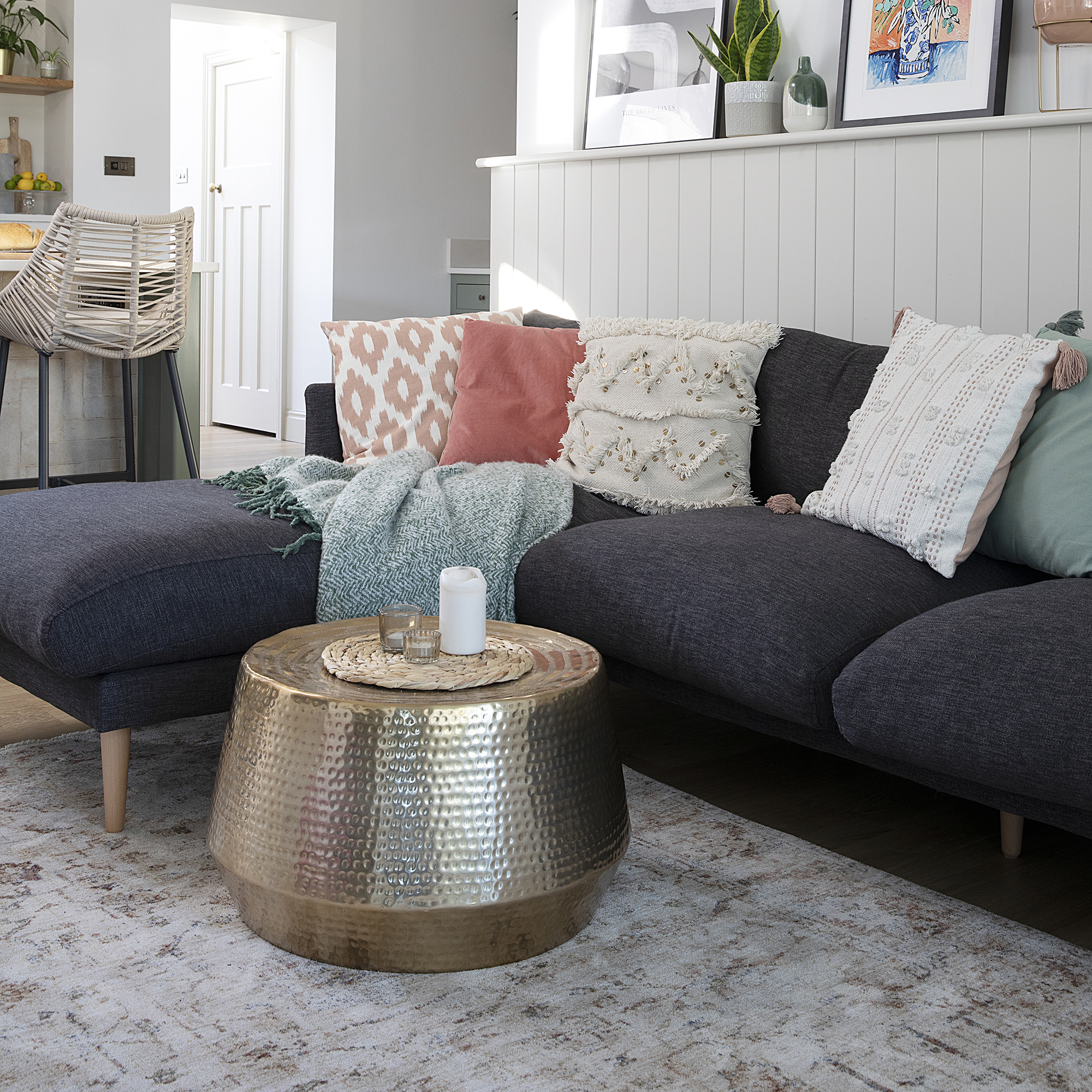
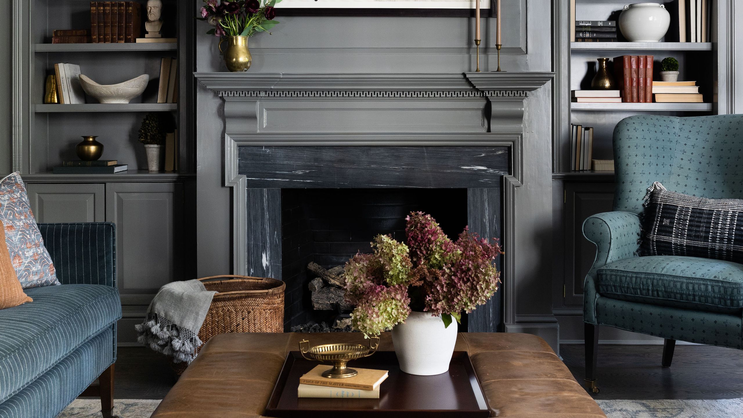
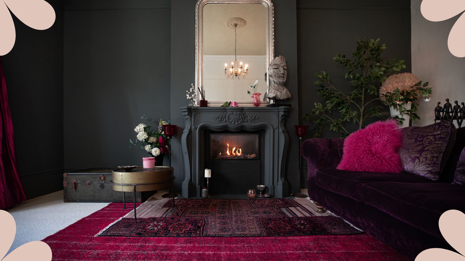
Adding jewel colors is the sixth method to prevent dark palettes from feeling ominous. Phillip Thomas suggests layering vibrant fabrics for pillows and upholstery to create a "cozy jewel box" effect. Finally, the seventh tip involves a "pop of dark" for those who prefer mostly bright spaces. This could be a fireplace framed in a rich tone or a single piece of dark furniture like a charcoal couch, offering a chic accent without a full commitment to a dark scheme. These strategies collectively demonstrate that dark color palettes can be versatile and inviting, rather than merely dreary, when applied thoughtfully.
#darkColorPalette #interiorDesign #livingRoomDesign #homeDecoration #colorSchemes #designTips #moodyInteriors #homeStyling #paintColors #darkColorPalette #interiorDesign #livingRoomDesign #homeDecoration #colorSchemes #designTips #moodyInteriors #homeStyling #paintColors
0 commenti in totale
 Nessun commento ancora
Potresti anche gradire
6 Dark Paint Colors That Designers Use to Bring Glamour

The 13 Best Paint Colors for Low-Light Rooms


8 ideas for light walls with dark trim that capture this paint trend perfectly
17 dark and moody wall ideas that will elevate any home

This Is the Best Paint for Dark Rooms — 6 Shades Interior Designers Swear By for Light-Limited Spaces
8 of the best dark paint colours for your home and how to use them
14 Perfect Dark Paint Colors, According To Interior Designers
Is it better to paint small rooms light or dark? Here's what the top colour experts have to say
7 best dark paints loved by interior designers

7 Dark Paint Colors That Will Convince You to Swap Your Neutrals

An interior designer reveals the 5 mistakes to avoid when painting with dark colours

8 tricks to create a minimalist color palette that doesn't feel one-dimensional - elevated and enriching schemes
5 of best dark colors to paint small rooms, as chosen by designers – 'they'll make them feel bigger, and ceilings higher'

8 dark trim paint color schemes from interior designers that nail the look - 'they're cozy, cocooning and dramatic'
Why You Should Paint Your Bedroom a Dark Color
8 of the best paint colors to enhance small spaces, according to experts

How To Successfully Paint Small Spaces Dark Colors & Actually Make Your Room Look BIGGER


5 colors you should never paint a small room – designers warn us to steer clear of these hues, and what to pick instead
8 colorful small living room ideas that will brighten, not overwhelm your space

The Best Dark Kitchen Cabinet Colors for a Moody Space