1/2
The One Paint Color Designers Always Avoid in Kitchens—and What They Use Instead
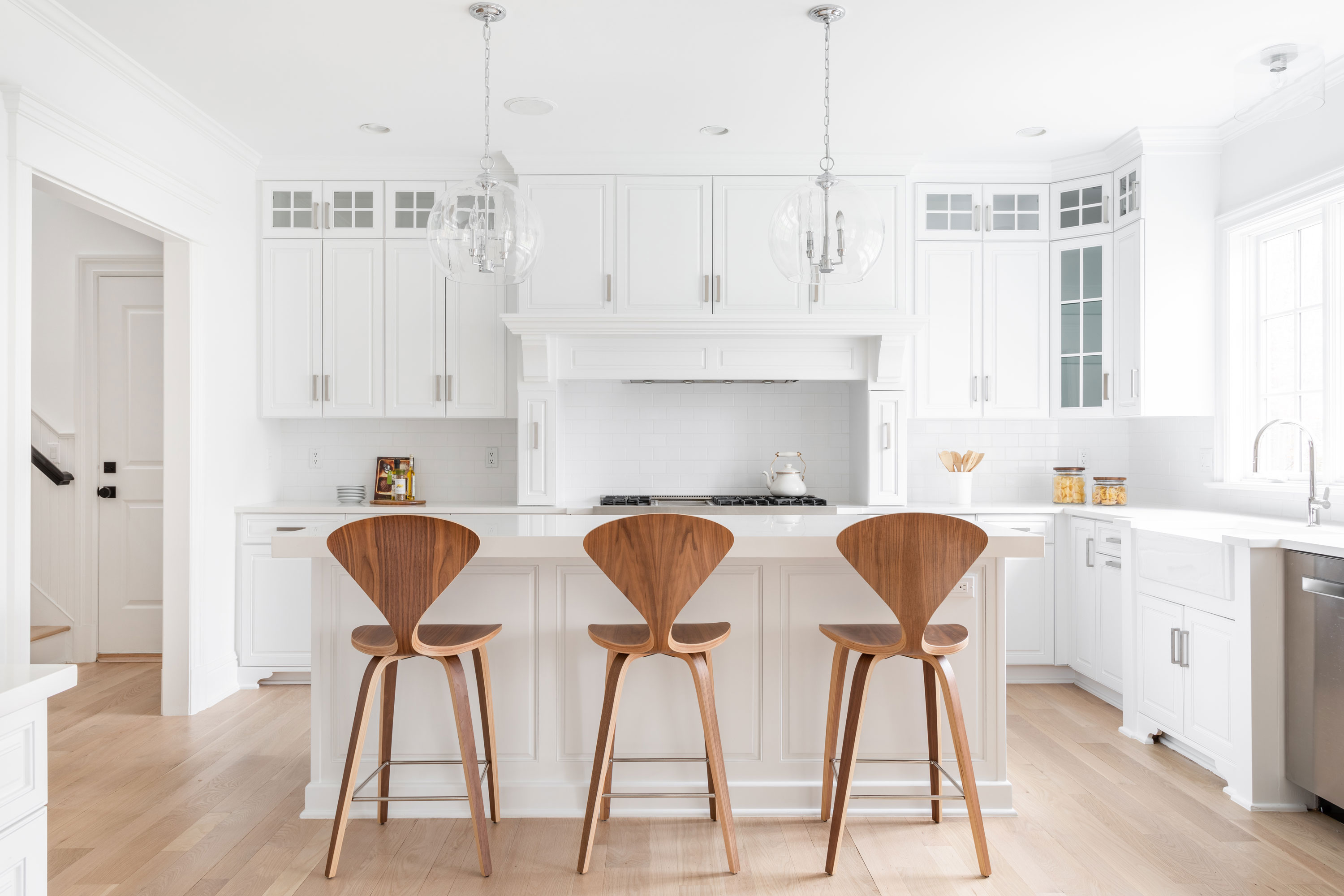
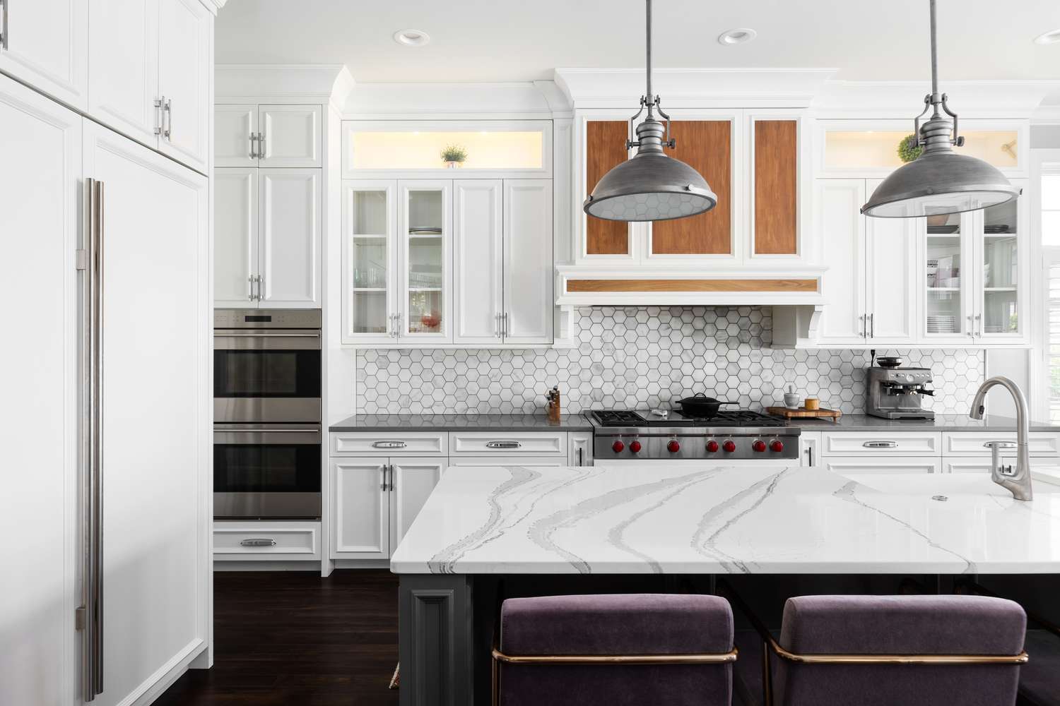
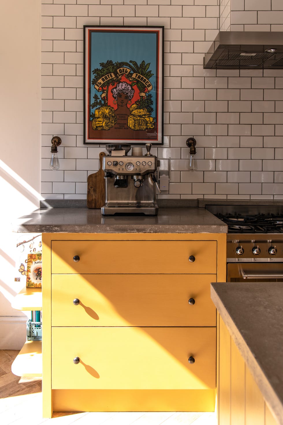
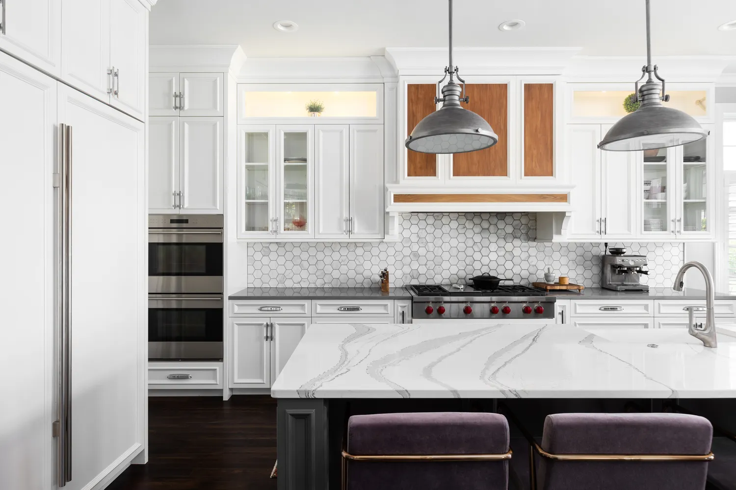
The choice of kitchen color is a critical decision in home design, influencing the room's aesthetics and practicality. Designers emphasize considering color psychology, as the kitchen is often considered the most important room in a home. While many options exist, there's a consensus among designers regarding one specific color to avoid in kitchens: stark white. This color, despite its initial appeal for its perceived cleanliness and ability to match appliances, is deemed impractical and uninspiring for a high-traffic area like the kitchen.
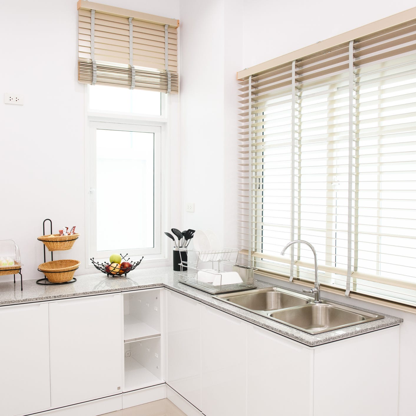
Leigh Spicher, national director of design studios at Ashton Woods Homes, explains that stark white kitchens often lack drama and character, failing to inspire in a space that experiences significant daily use. The primary practical drawback of stark white is its tendency to highlight every mess and imperfection, requiring constant cleaning to maintain a pristine appearance. This makes it a less forgiving option for a functional kitchen environment.
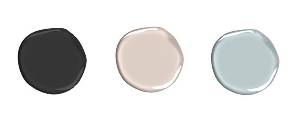
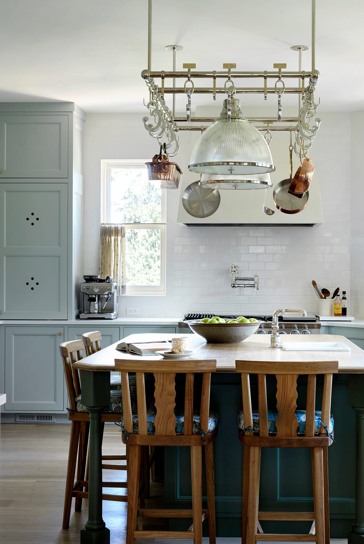
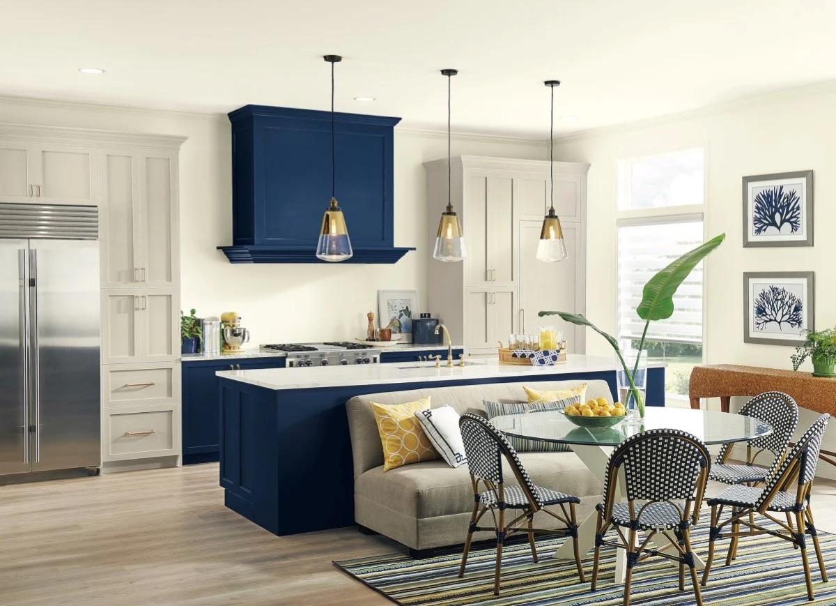
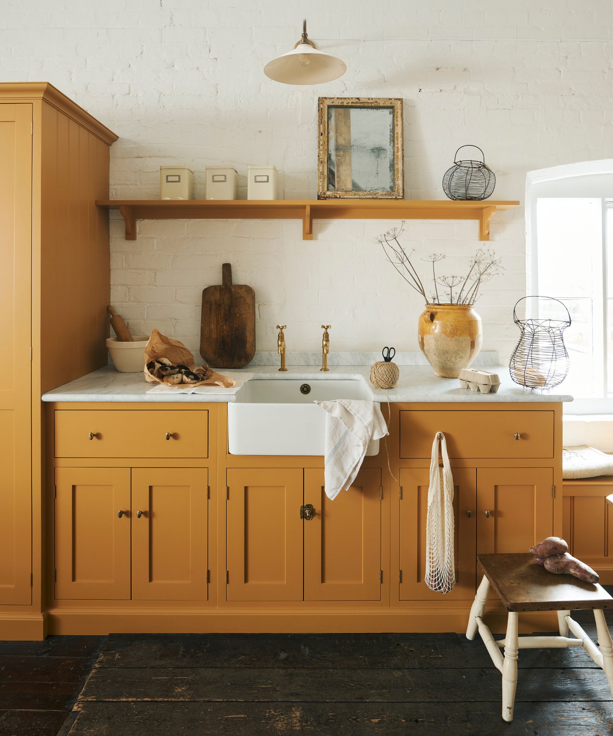
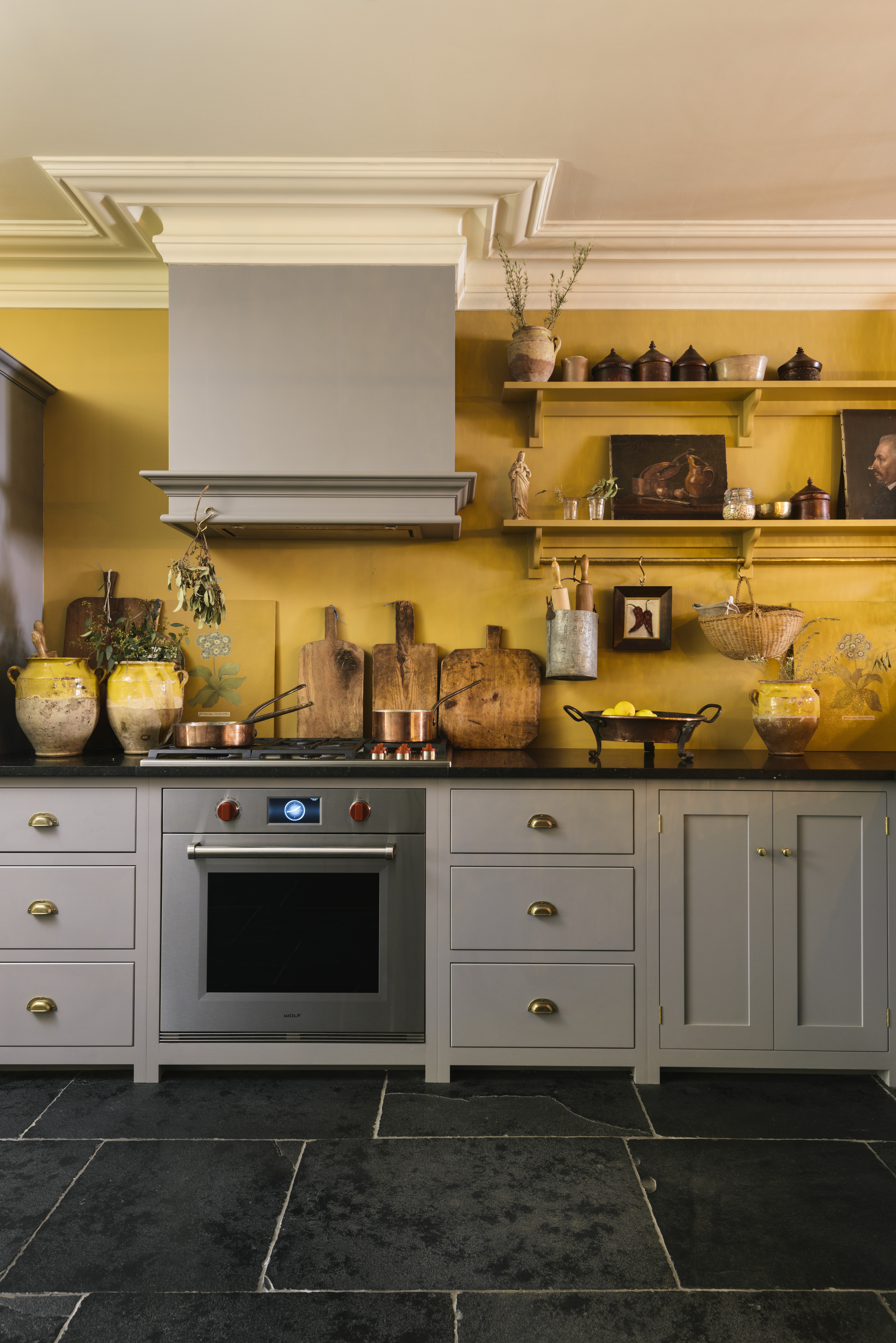
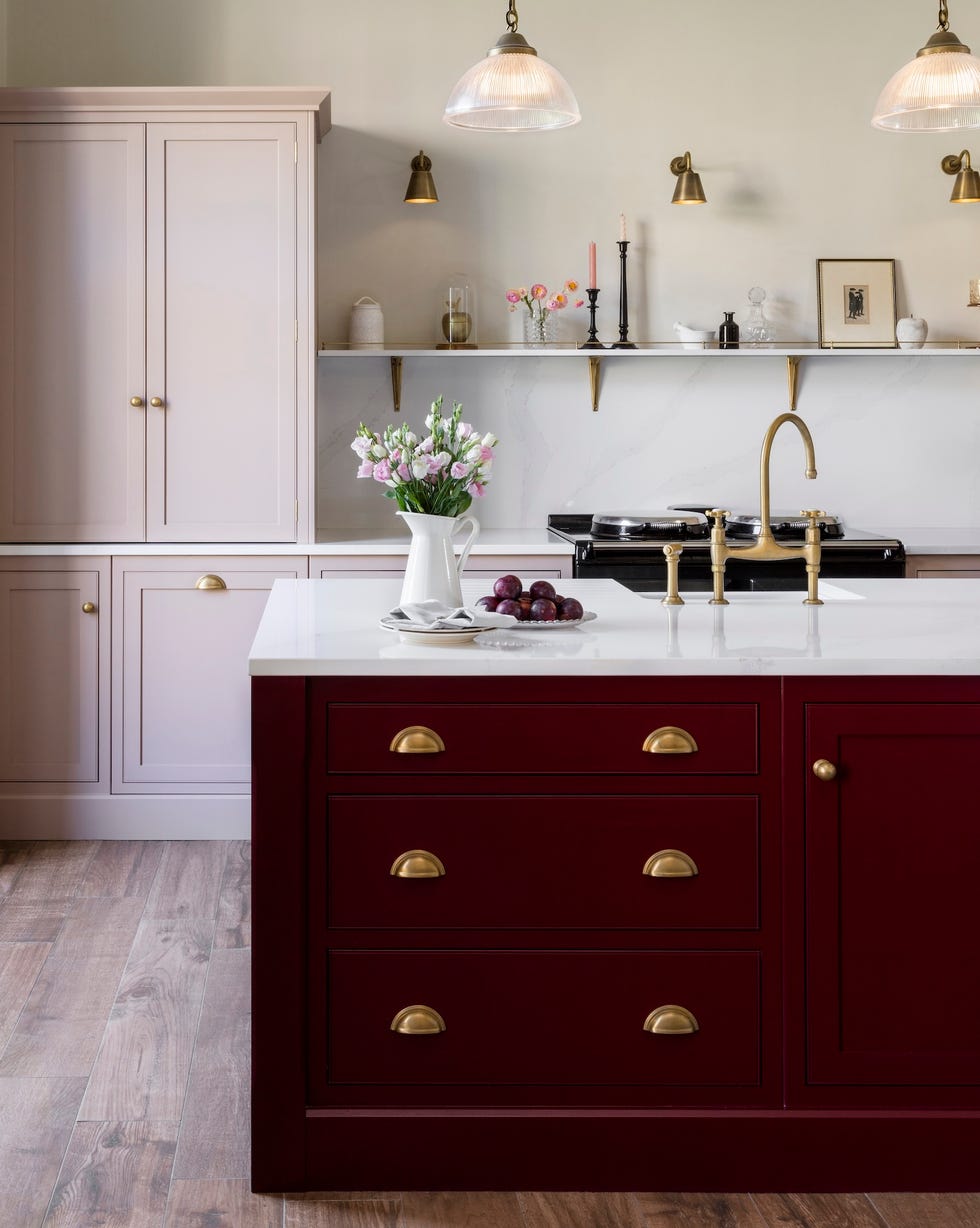
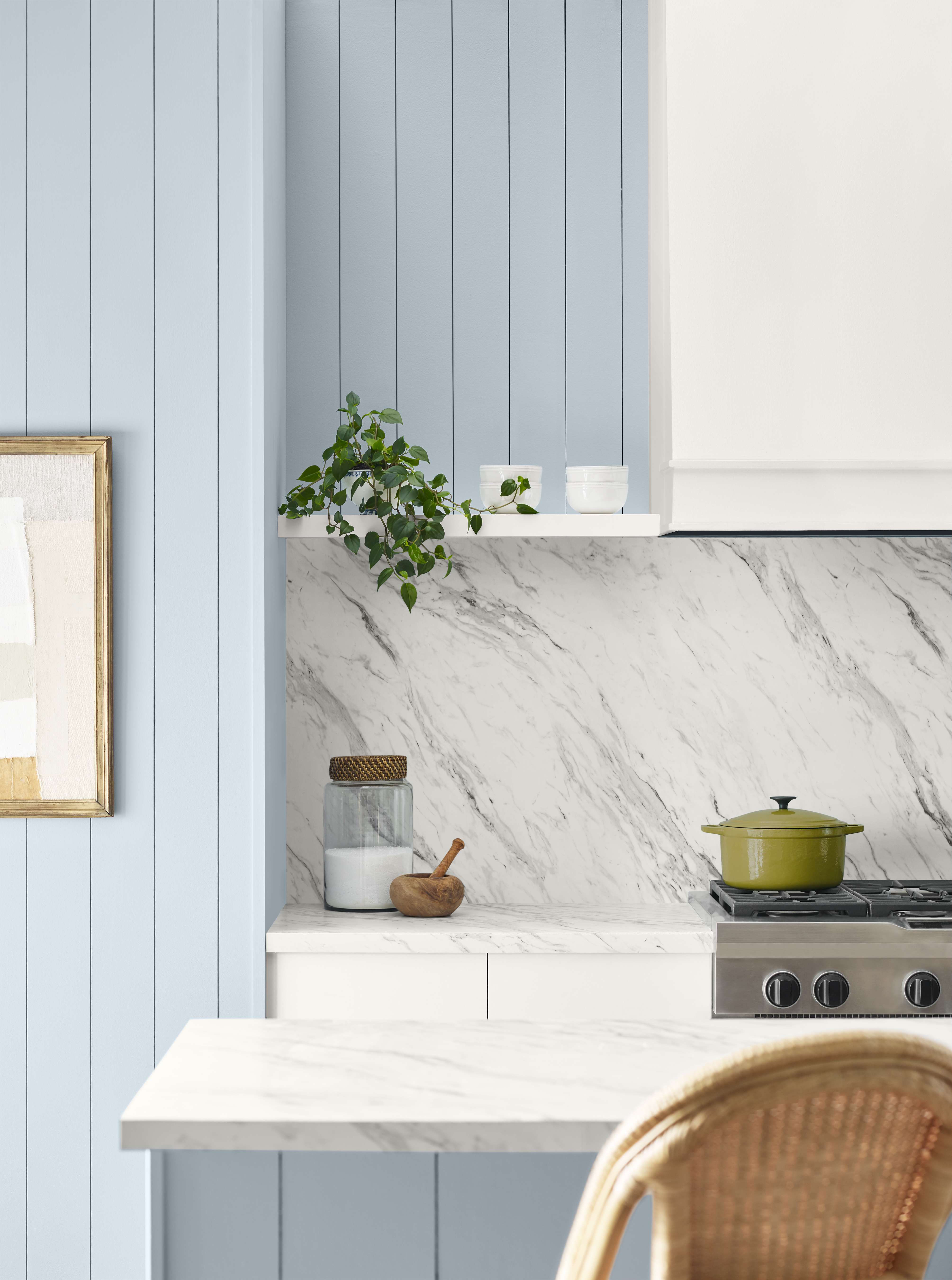
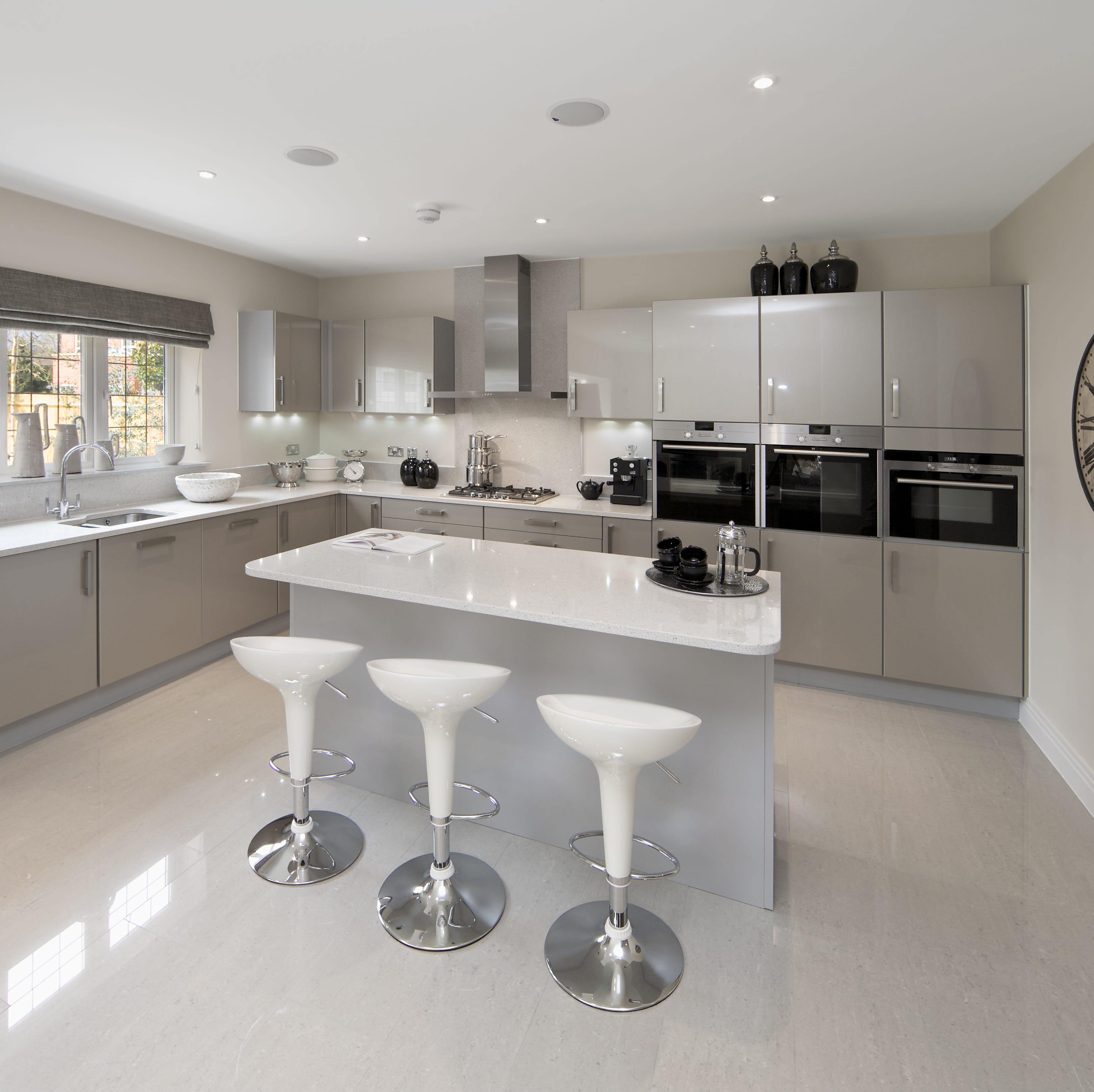
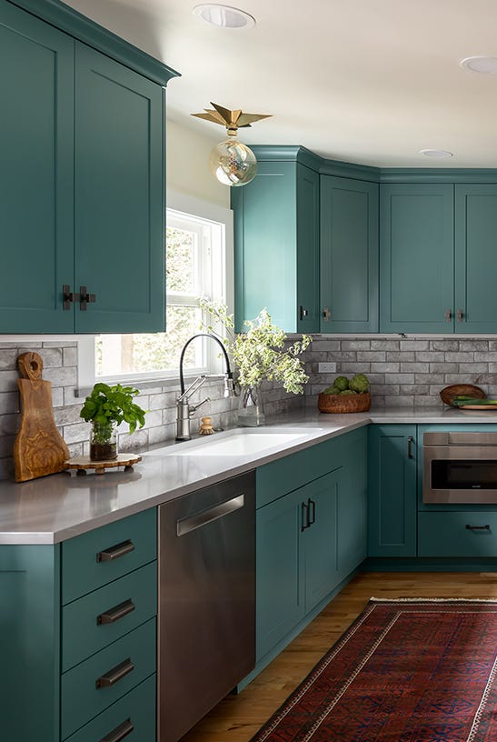
Instead of stark white, designers advocate for more forgiving alternatives that offer similar brightness while enhancing warmth and hospitality. Laura Lees Gilbert, owner and principal designer at L. Gilbert Design, highly recommends creamy whites, particularly those with warm undertones. These shades offer a balance of coziness and cleanliness, creating an inviting and open atmosphere crucial for entertaining and daily family life. Similarly, warm, light gray or greige colors are praised for their universally flattering appeal and ability to establish a balanced and sophisticated interior. These neutrals provide a welcoming backdrop without the harshness or maintenance demands of pure white.
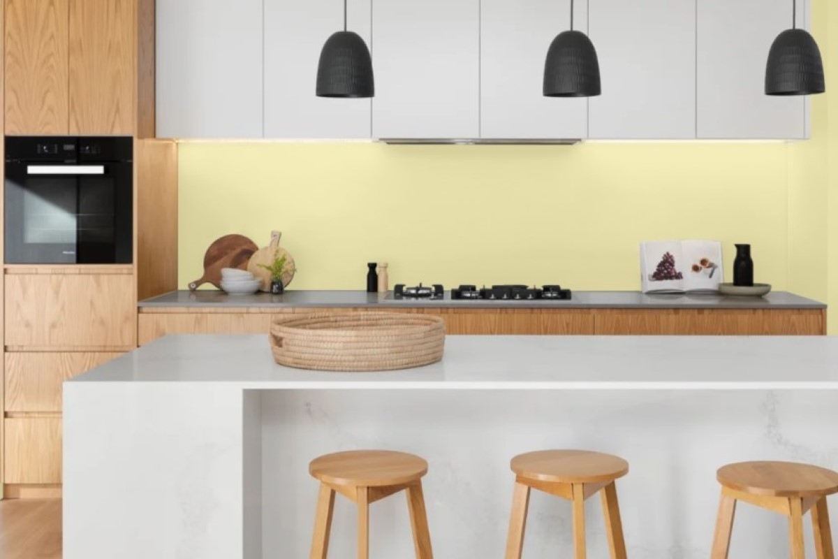
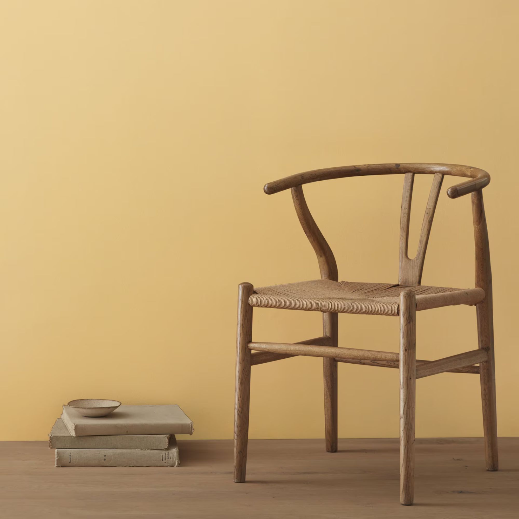
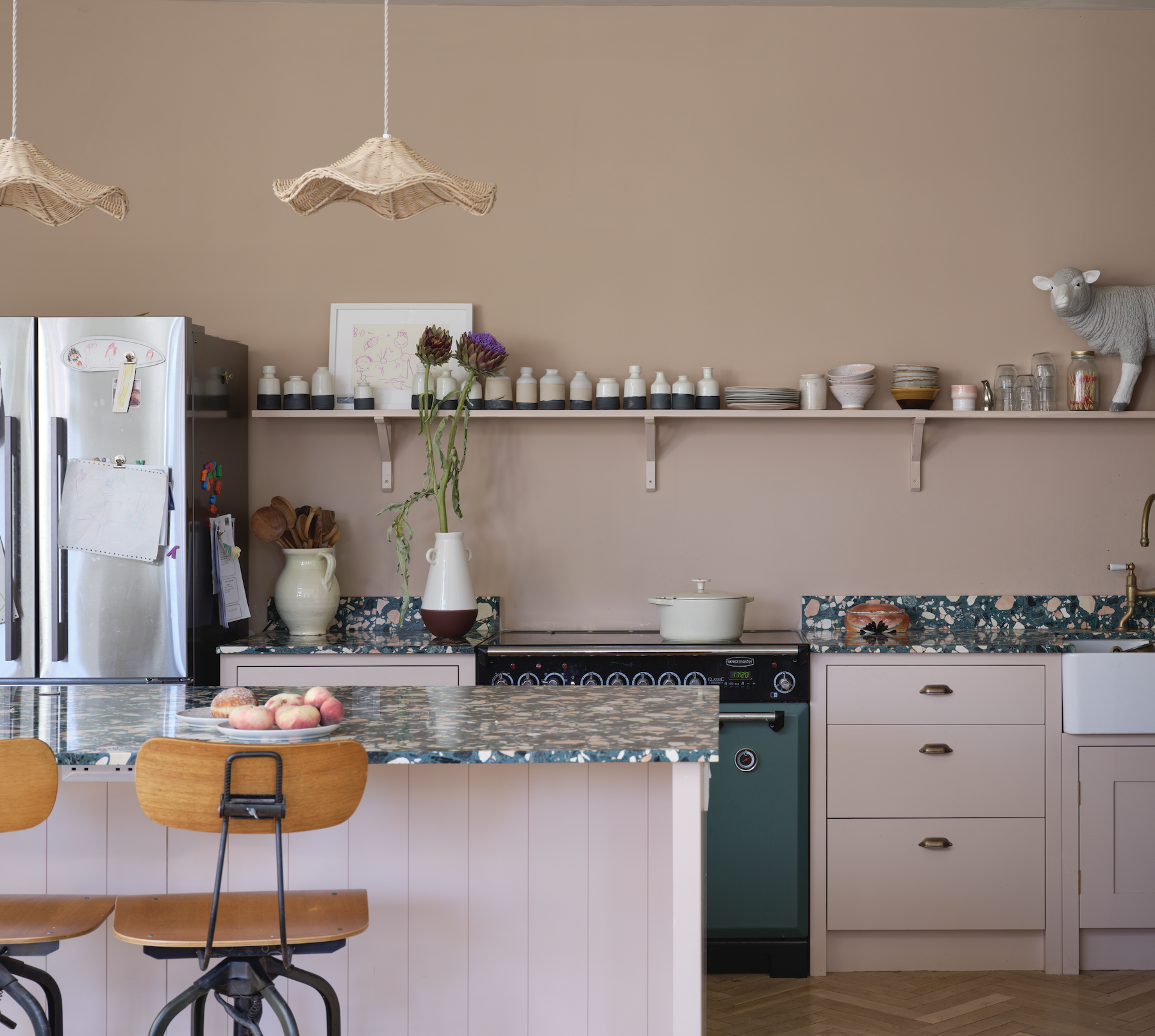
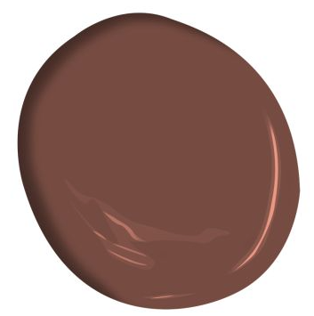
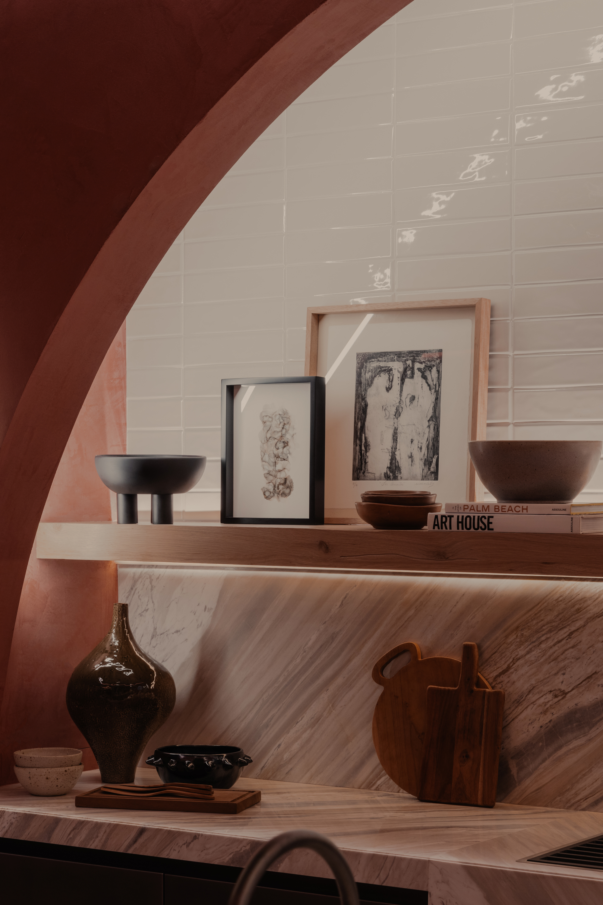
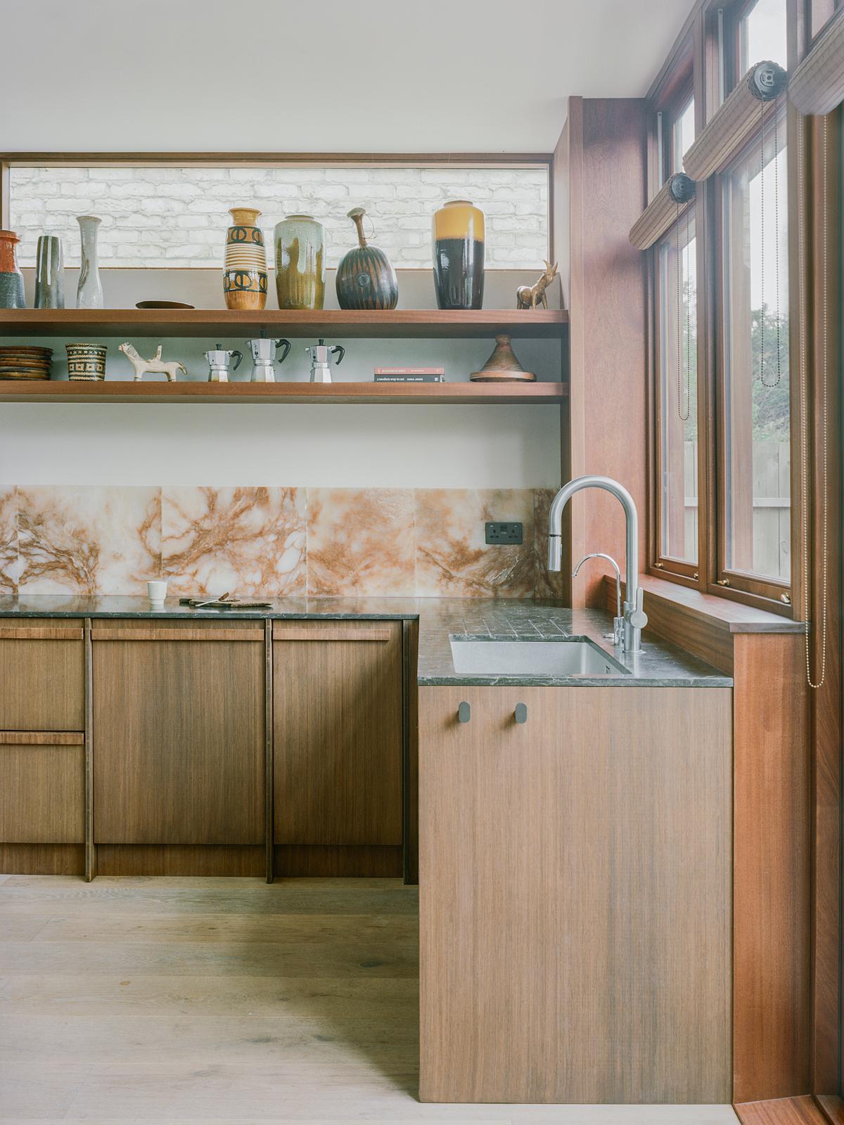
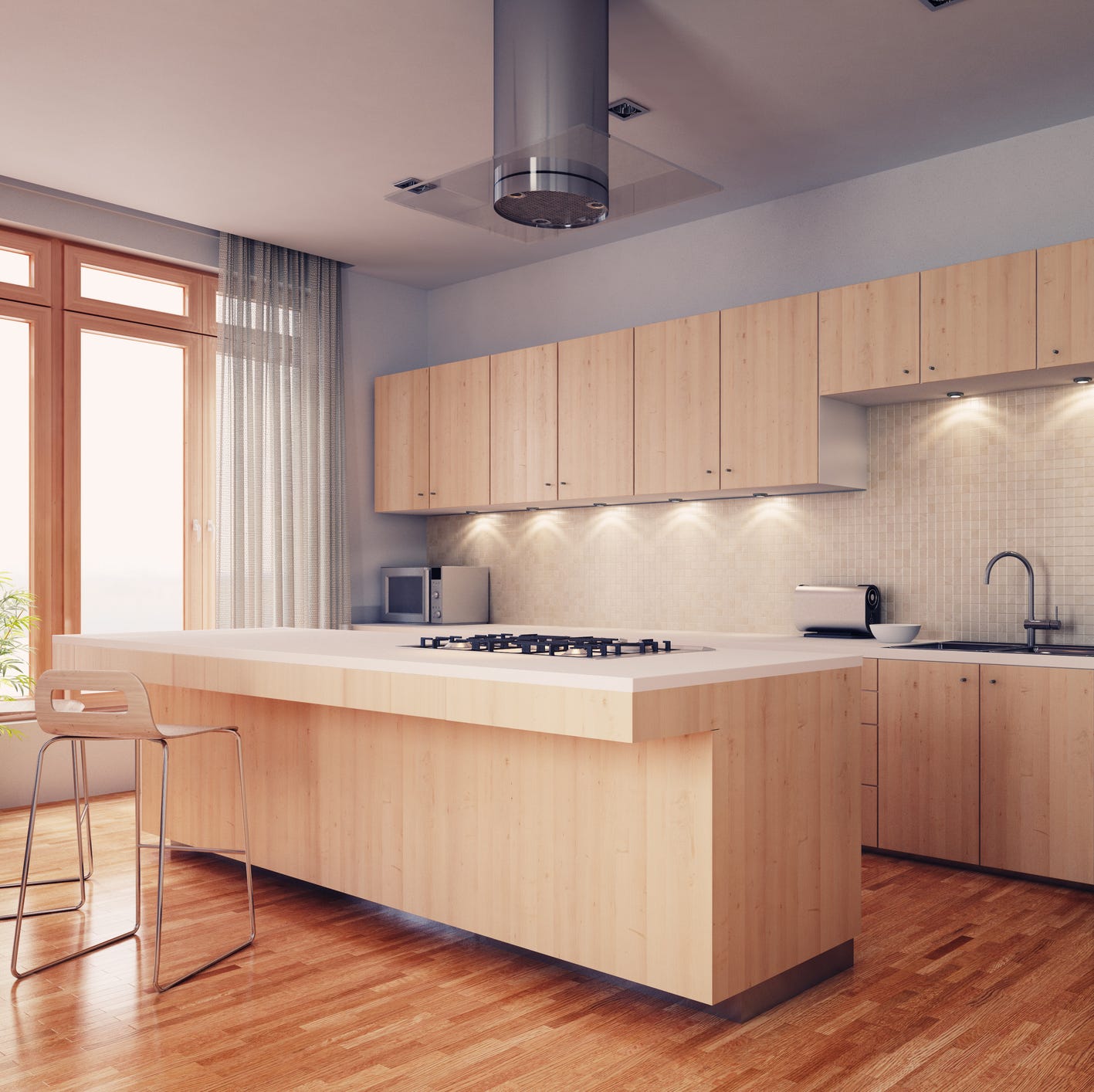
Another trend designers are embracing is the use of taupe and natural wood tones. Spicher highlights the return of natural grain woods and stains, associating them with the hearth – a traditional symbol of gathering and warmth. Taupe, described as a time-tested neutral, provides character and warmth, preventing the sterile feeling often associated with cold, stark colors. The influence of Pantone's Chocolate Mousse as the 2025 color of the year further underscores the growing popularity of warmer, earthy tones in kitchen design.
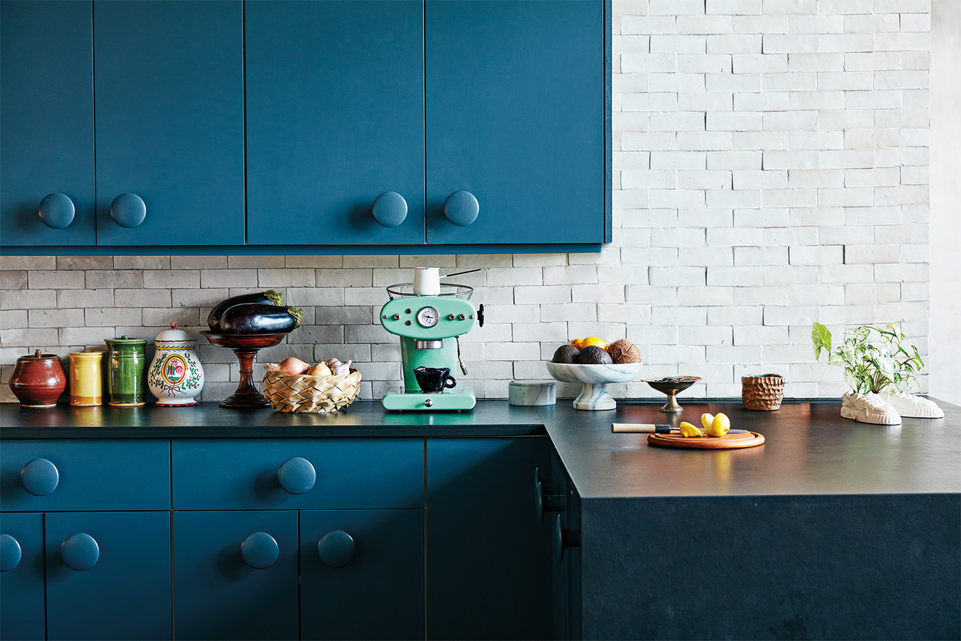
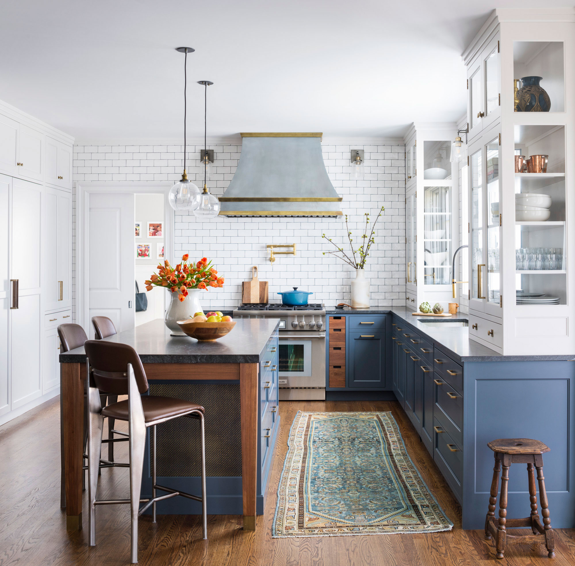
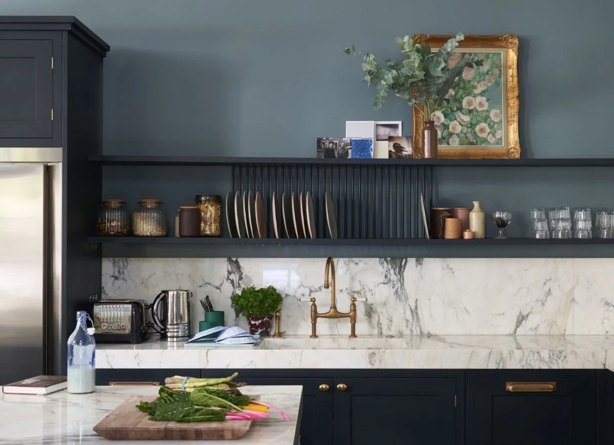
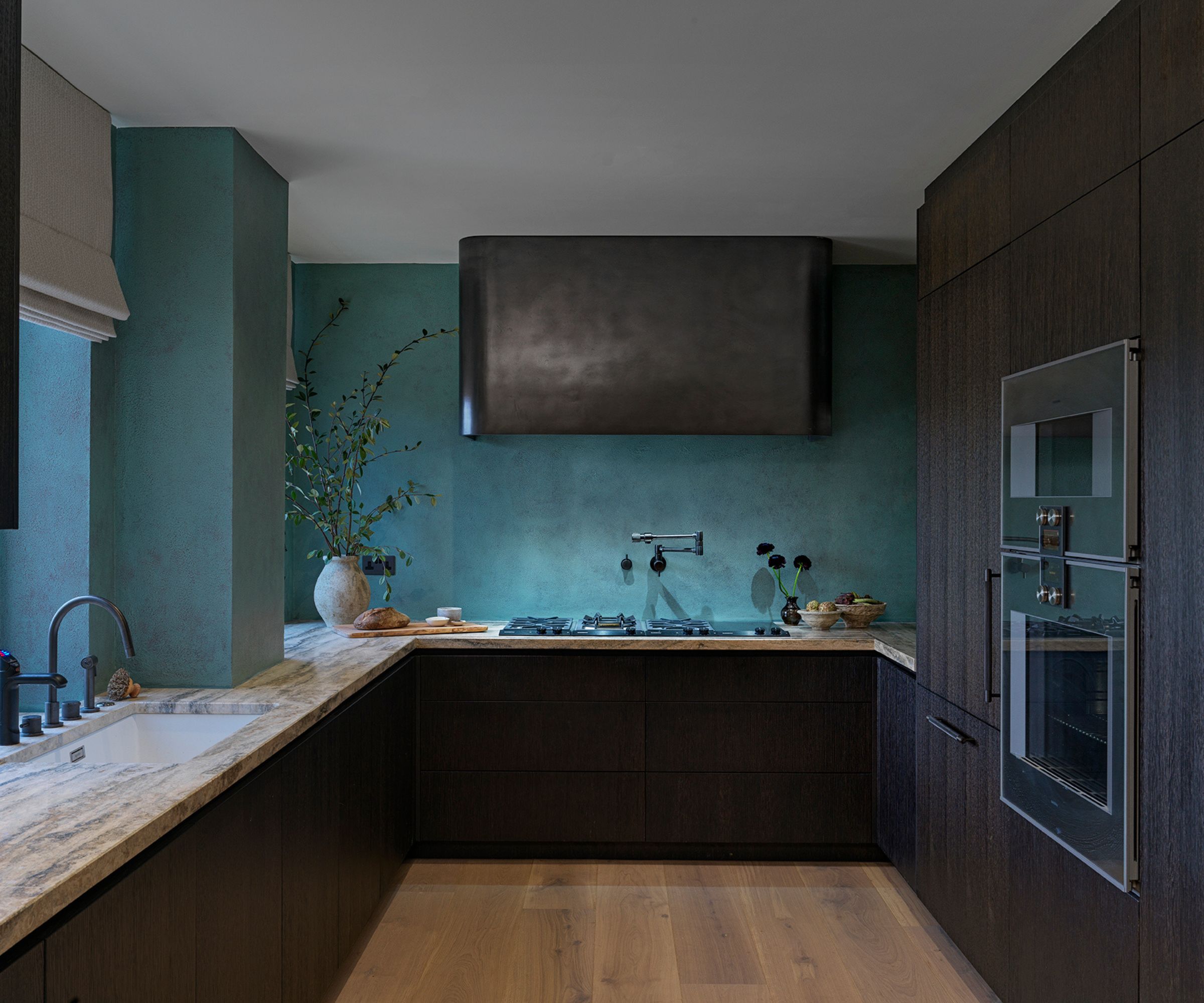
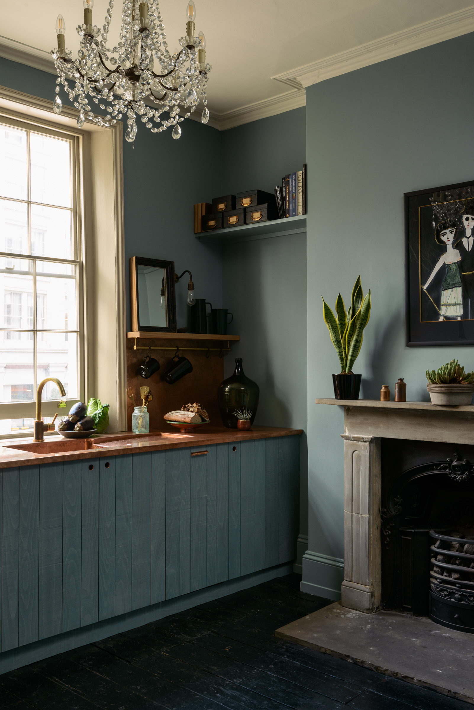
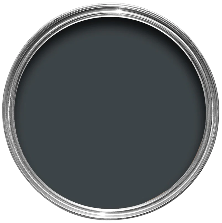
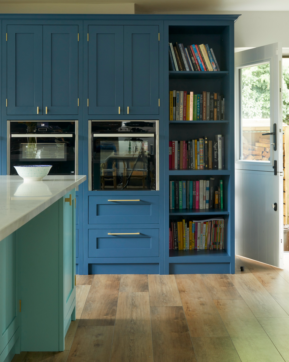
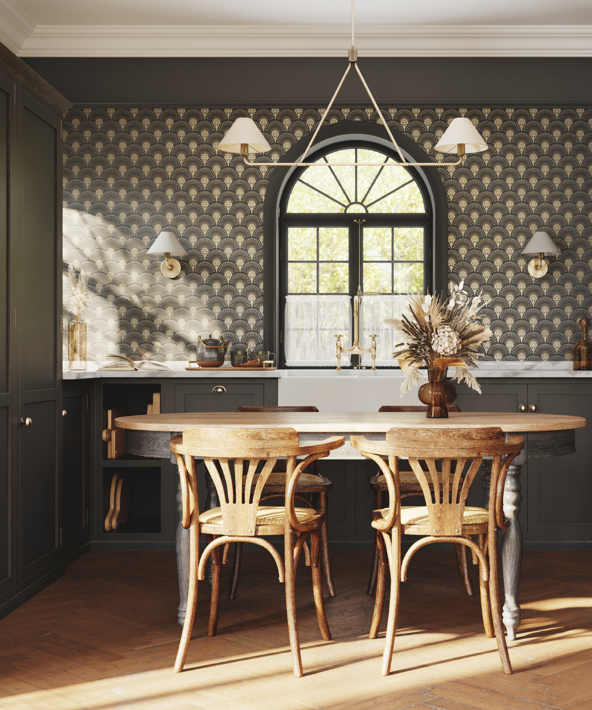
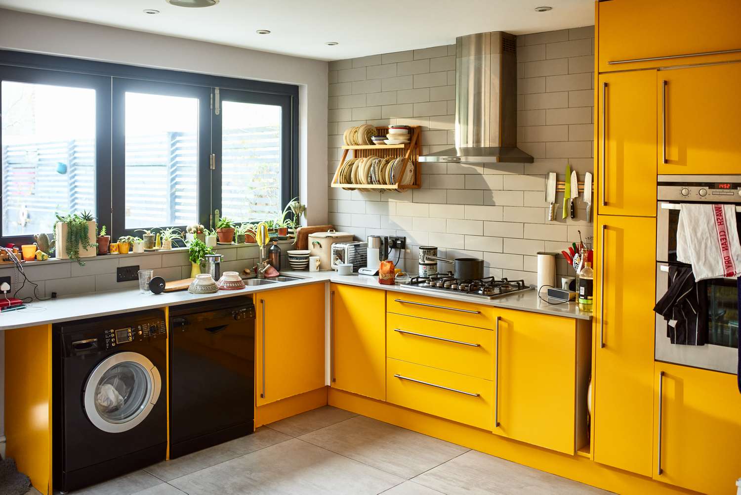
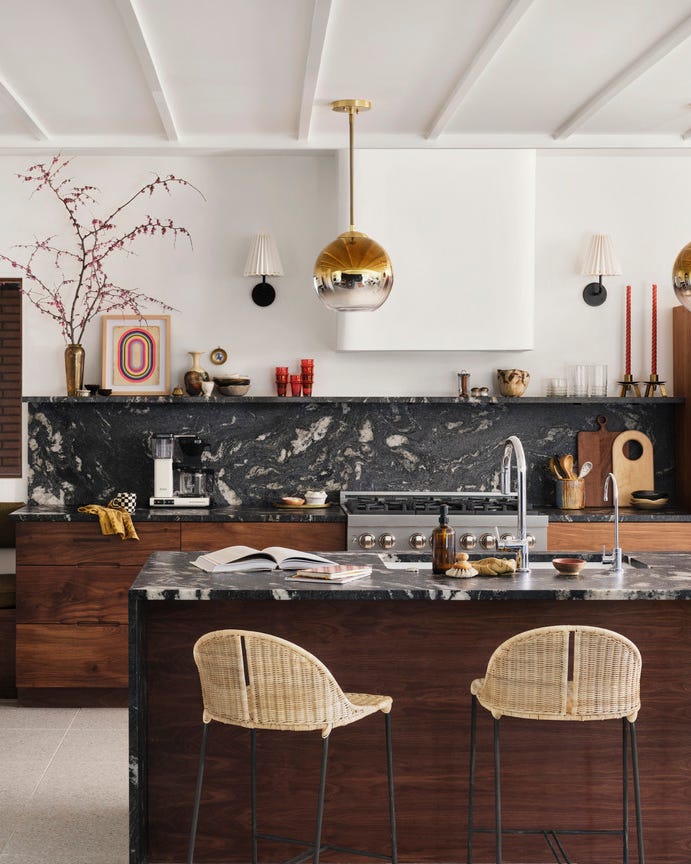
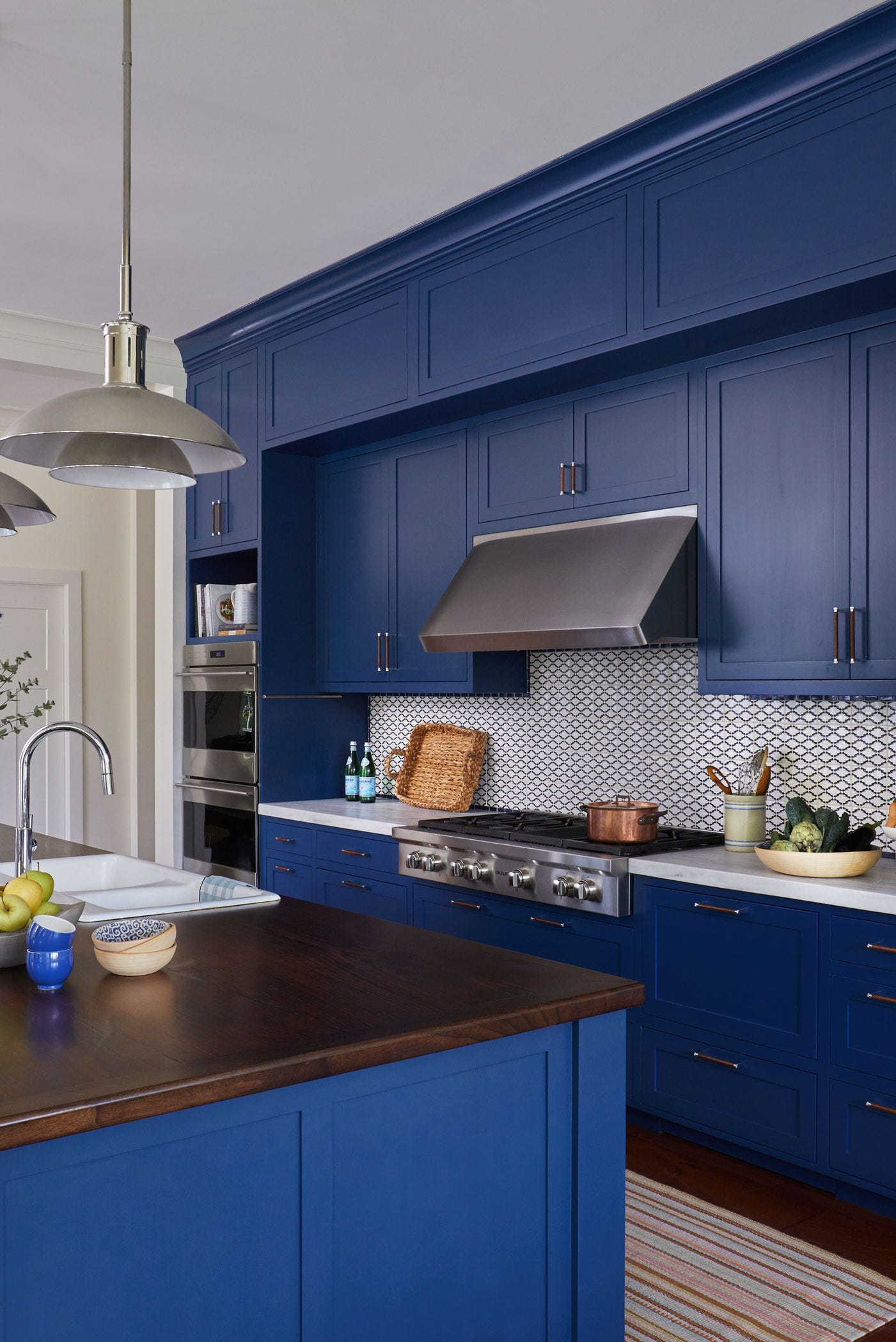
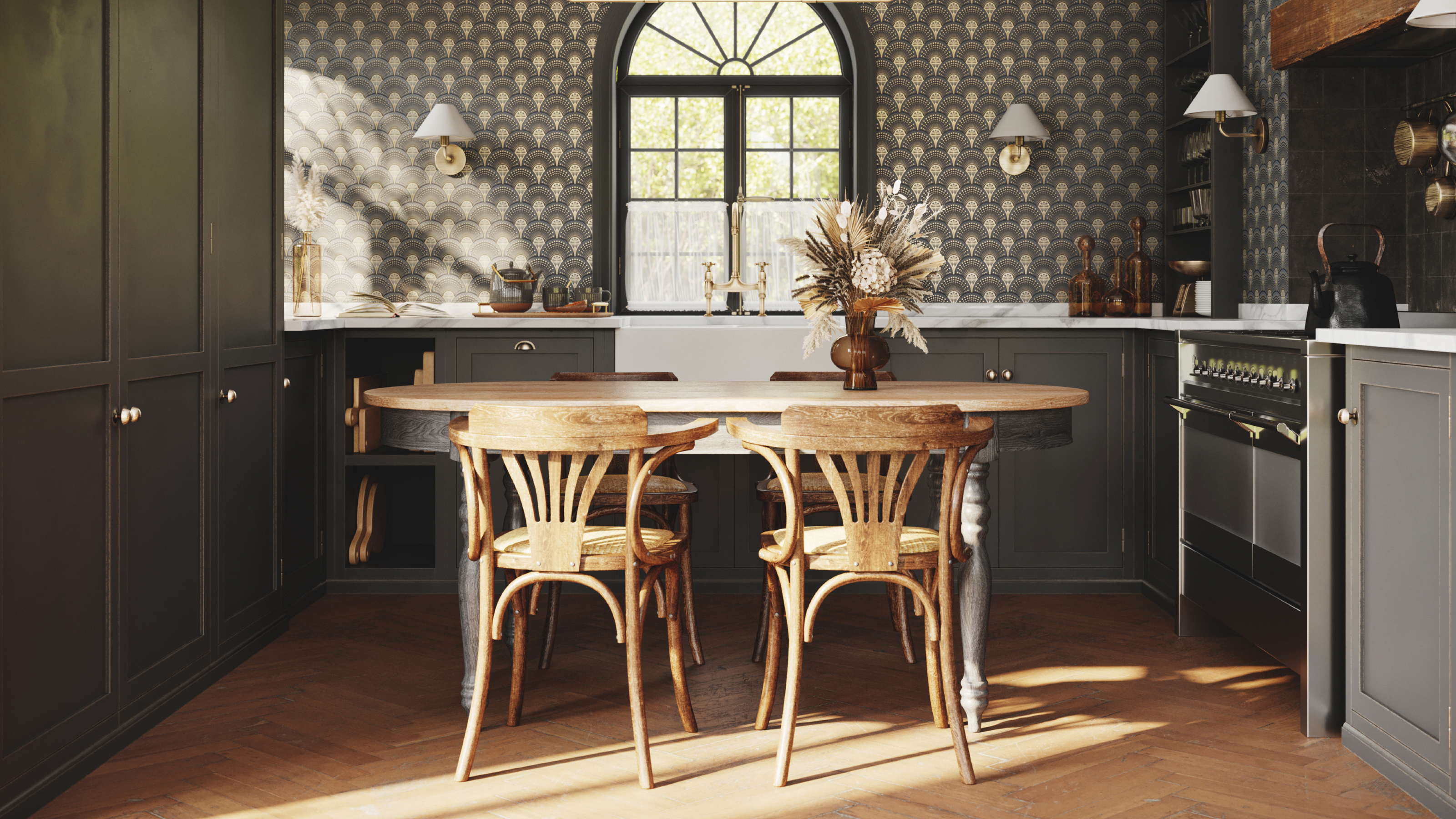
While there is general agreement on avoiding stark white, the use of black in kitchens elicits differing opinions among designers. Gilbert advises against black, citing its tendency to reveal wear and tear more easily and its potential to make a room feel smaller and darker, especially in spaces with limited natural light. Conversely, Spicher is a proponent of black kitchens, believing they can instill confidence and authority, particularly for those who enjoy cooking. She suggests that dark colors can add a level of formality and empowerment to the culinary space. This divergence in opinion highlights that while some color choices have broad designer consensus due to practicality and psychological impact, others remain subjective and dependent on personal preference and desired aesthetic.
#KitchenDesign #InteriorDesign #PaintColors #HomeDecor #NeutralColors #DesignTips #KitchenRemodel #ColorPsychology #KitchenDesign #InteriorDesign #PaintColors #HomeDecor #NeutralColors #DesignTips #KitchenRemodel #ColorPsychology
0 commenti in totale
 Nessun commento ancora
Potresti anche gradire
The Color to Never Paint Your Kitchen Cabinets, According to a Top L.A. Designer
29 Best Paint Colors for a Kitchen You’ll Never Want to Leave


5 colors you should never paint a pantry – designers share the shades they swerve

5 Outdated Kitchen Paint Colors That Interior Designers Are Tired of Seeing
Kitchen Color Selection Tips from 5 Designers
3 overlooked colors you never thought could work in your kitchen – but interior designers swear by them
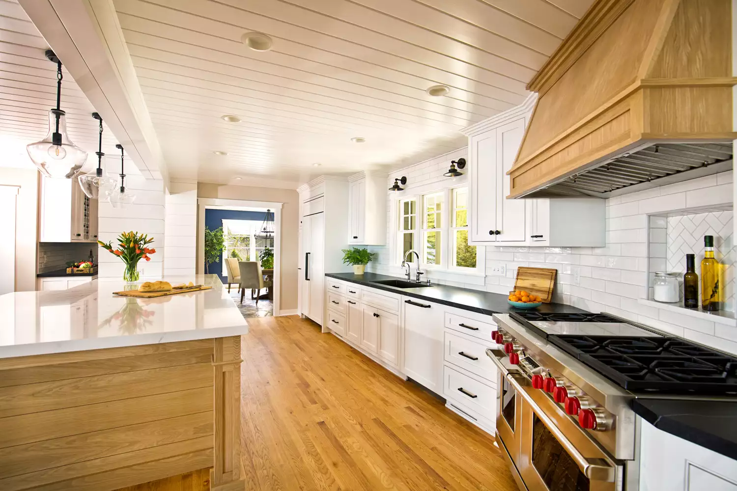
7 Kitchen Cabinet Colors Designers Never Want to See Again
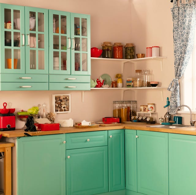
26 Most Popular Kitchen Paint Colors Throughout the Decades

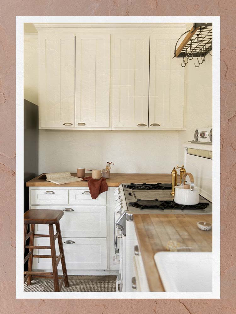
The Best Kitchen Paint Colors All Have This One Thing In Common
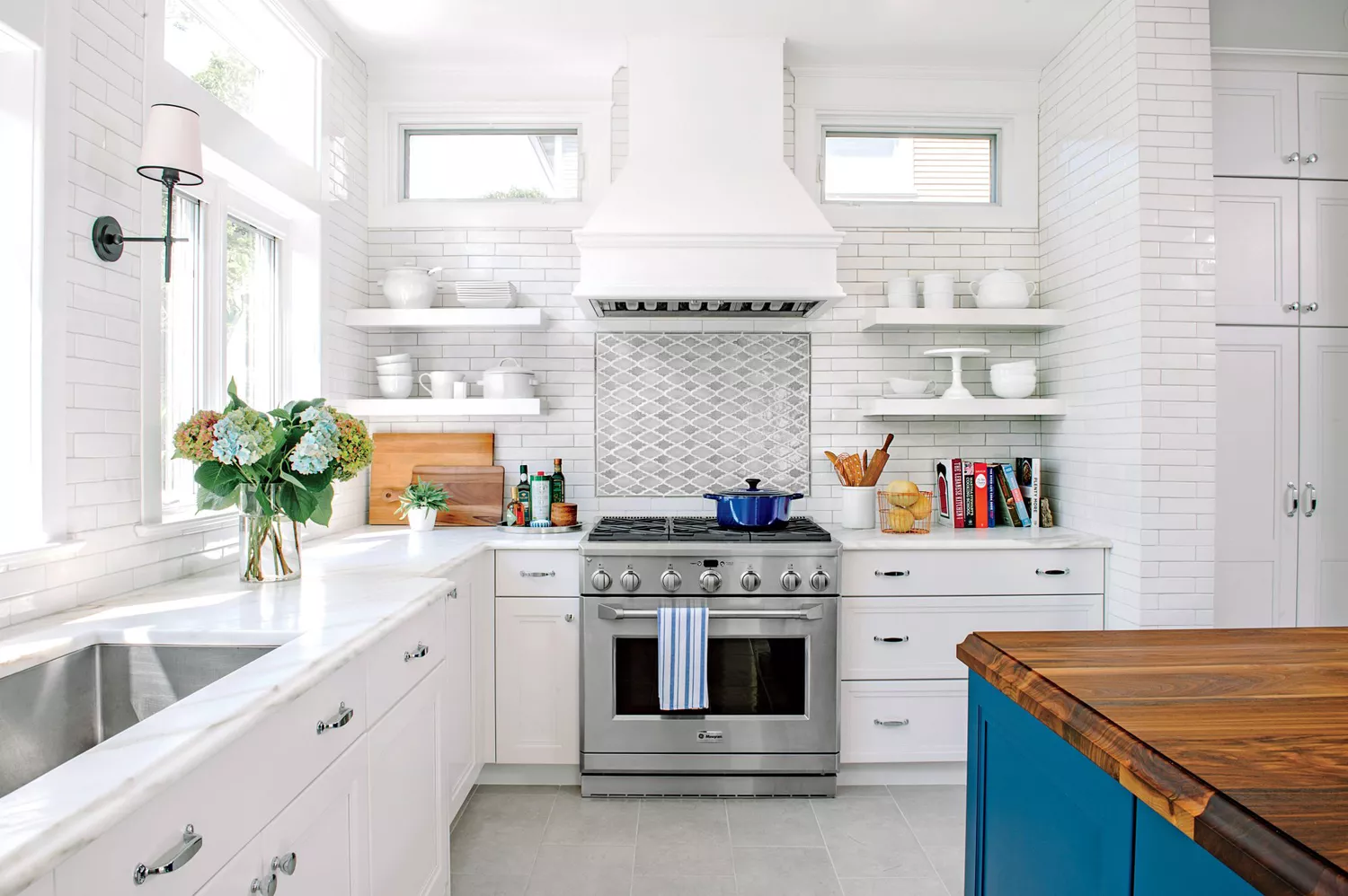
7 Paint Colors To Never Use In Your Kitchen, According To Designers
These kitchen paint colours will be everywhere in 2025 – and there's even one for neutral lovers

Five Mistakes People Make When Selecting Kitchen Cabinets—and How to Avoid Them
The Kitchen Paint Color Designers Refuse to Use—And the Shades They Love Instead
5 Reasons You Shouldn't Paint Your Kitchen Walls White — And the Alternatives You Need to Try

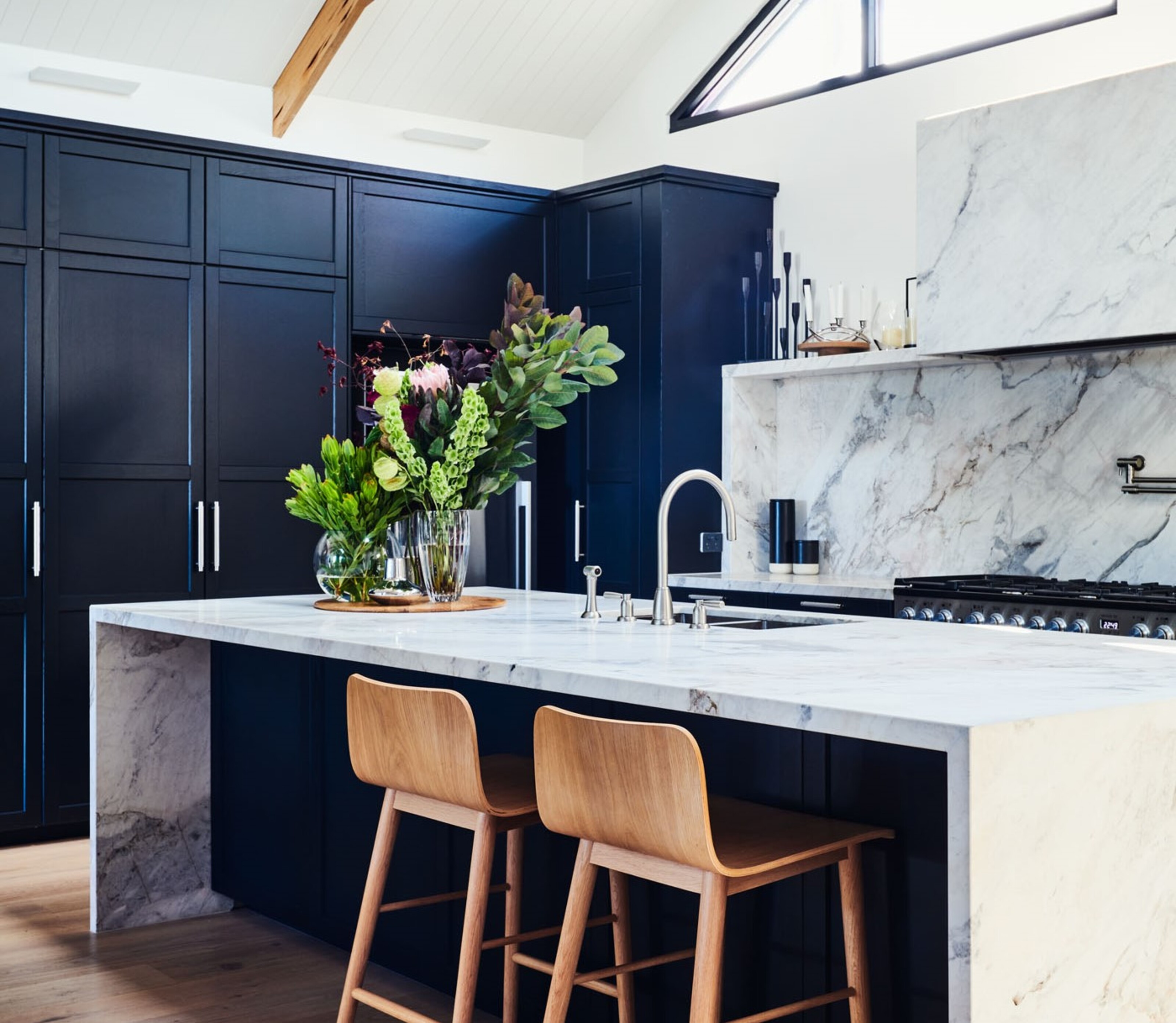
5 kitchen cabinet colors interior designers are avoiding for 2024 - and the shades they're picking instead
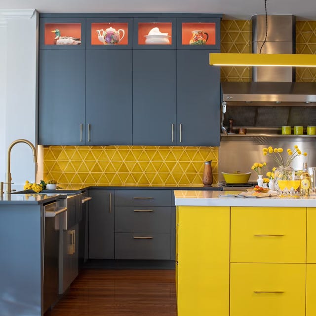
Ditch the White! Try One of These Designer-Approved Kitchen Colors
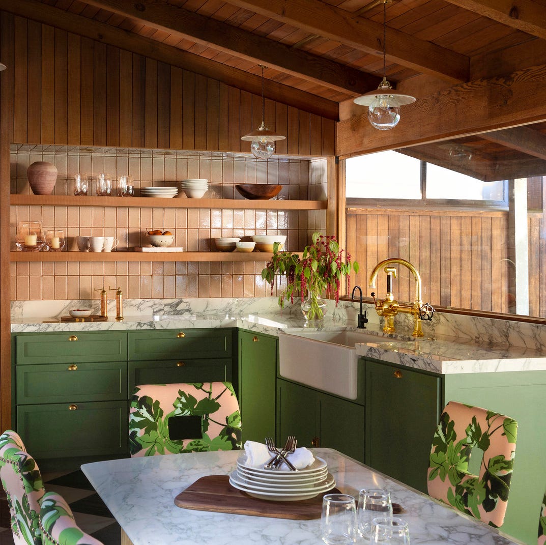
The Kitchen Colors Designers Call “Forever Favorites”
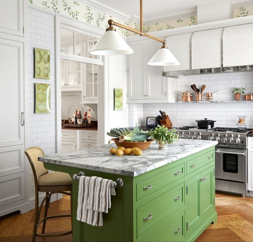
It’s Official: These are the Best Kitchen Paint Colors, According to Designers
8 colors you should never paint kitchen cabinets according to the experts

9 Paint Colors You’ll Never Find in an Interior Designer’s Home